Inside the Espresso: Modern Tiny Living’s 20-Foot Tiny House on Wheels That Proves Small Can Be Bold

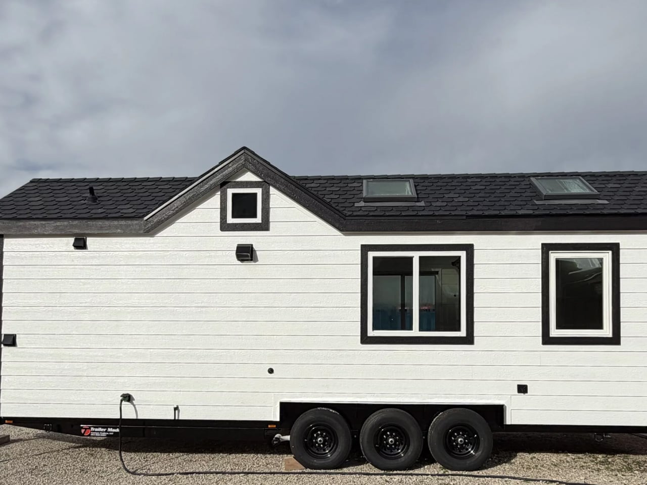
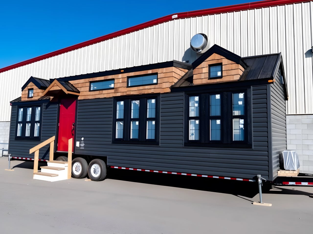
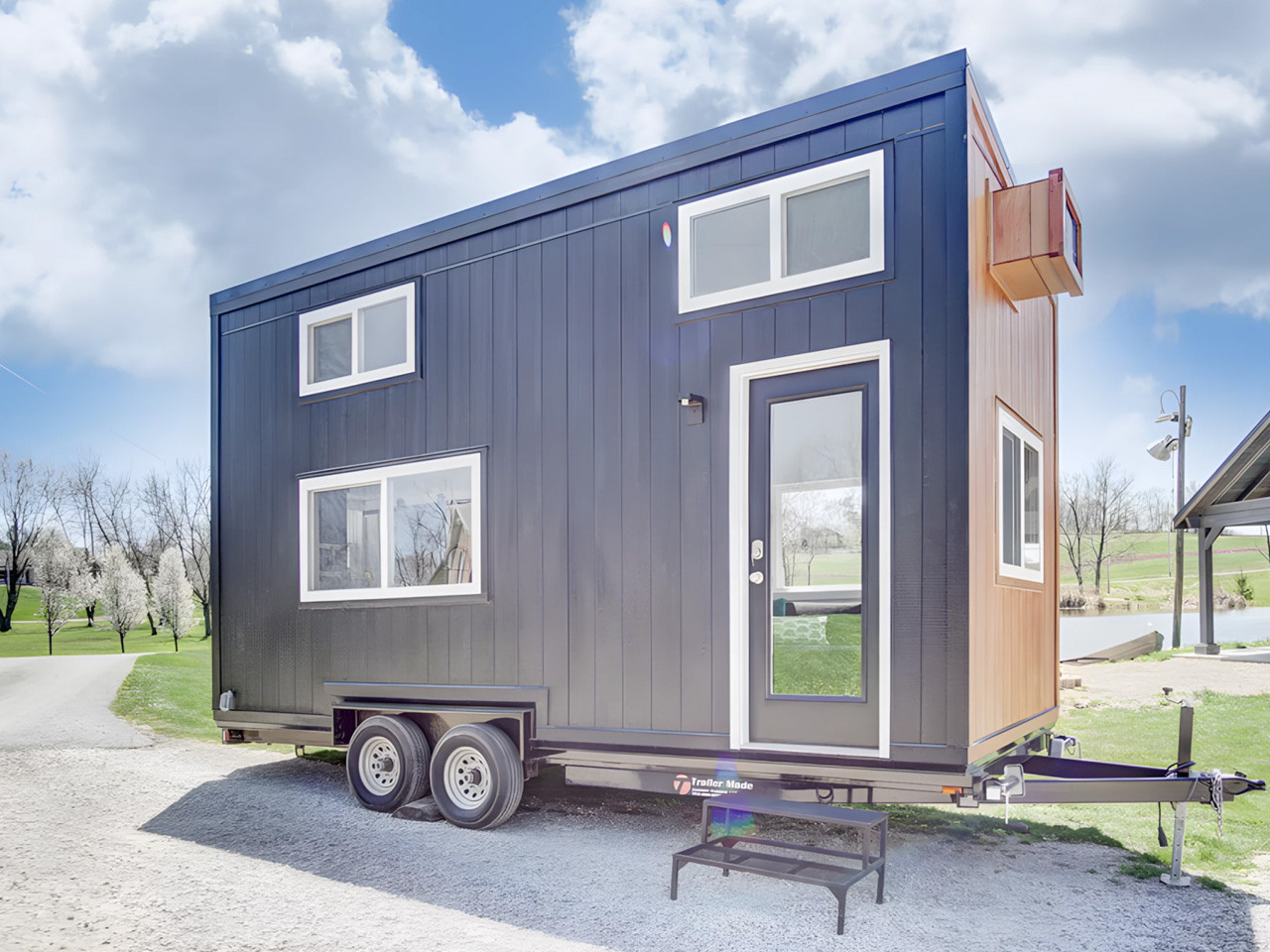
There’s a version of small living that doesn’t ask you to compromise. The Espresso, built by Ohio-based Modern Tiny Living on their popular Mohican platform, makes that case in just 20 feet. Bold and daring, the Espresso is a tiny house on wheels defined by deep blacks, warm wood accents, and a design sensibility that punches well above its square footage.

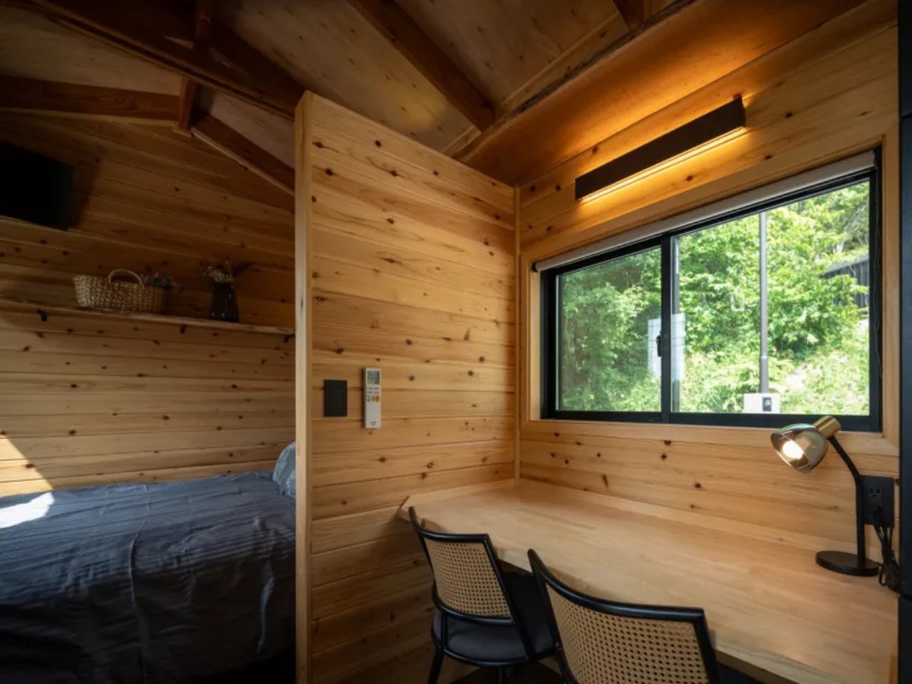
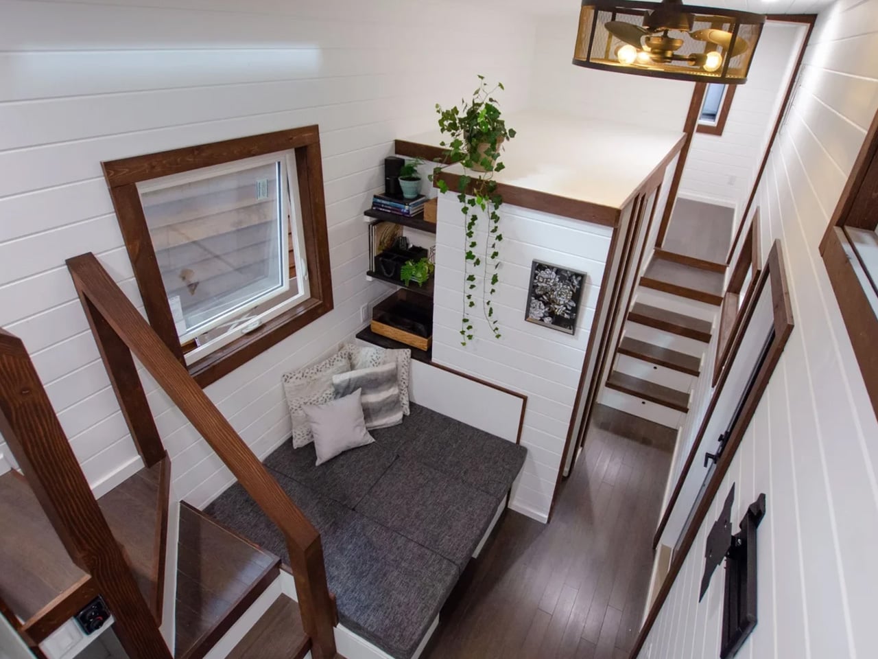
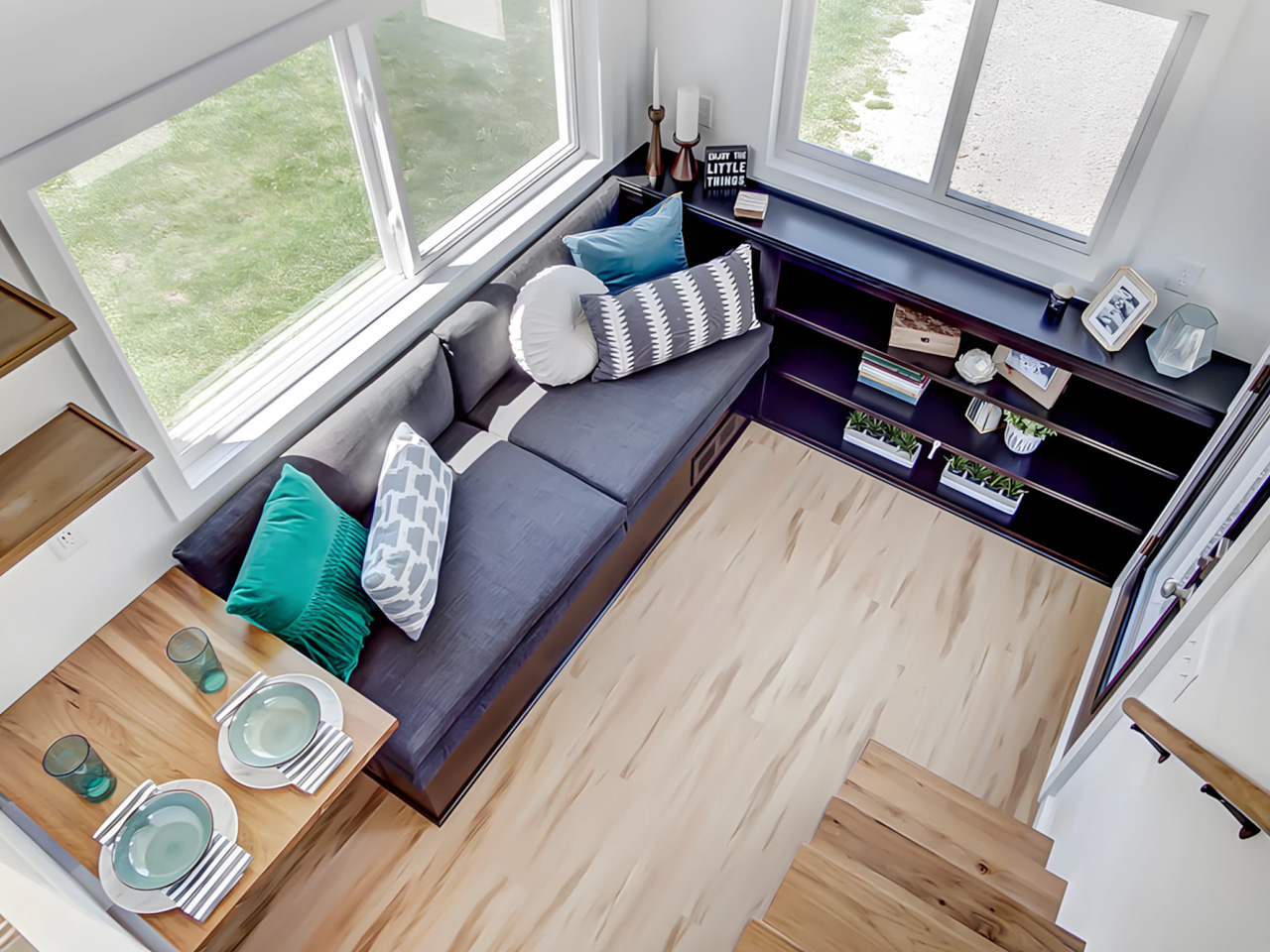
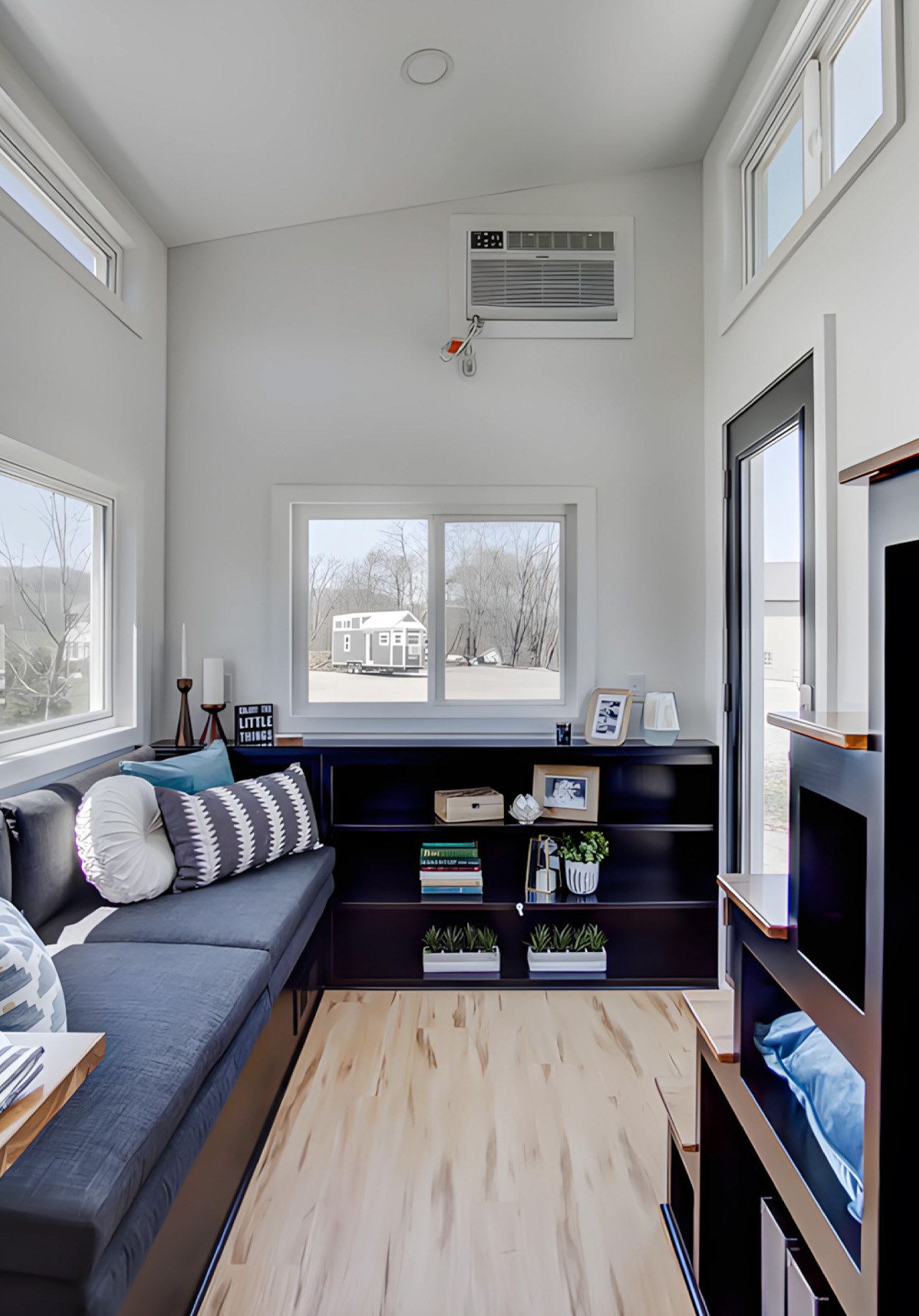
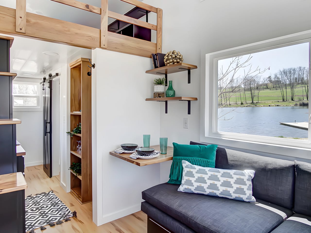
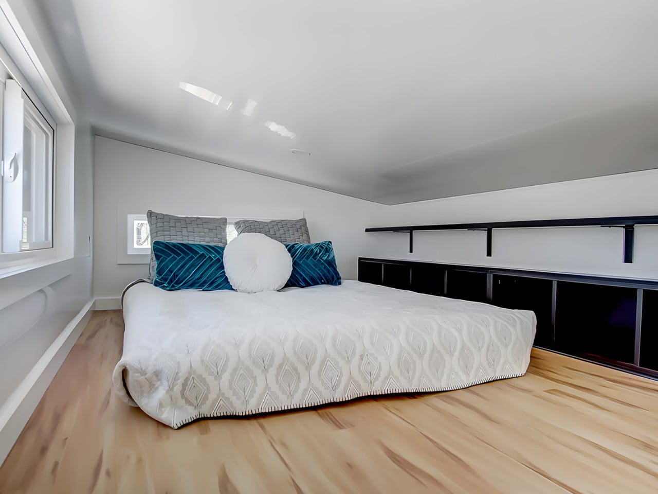
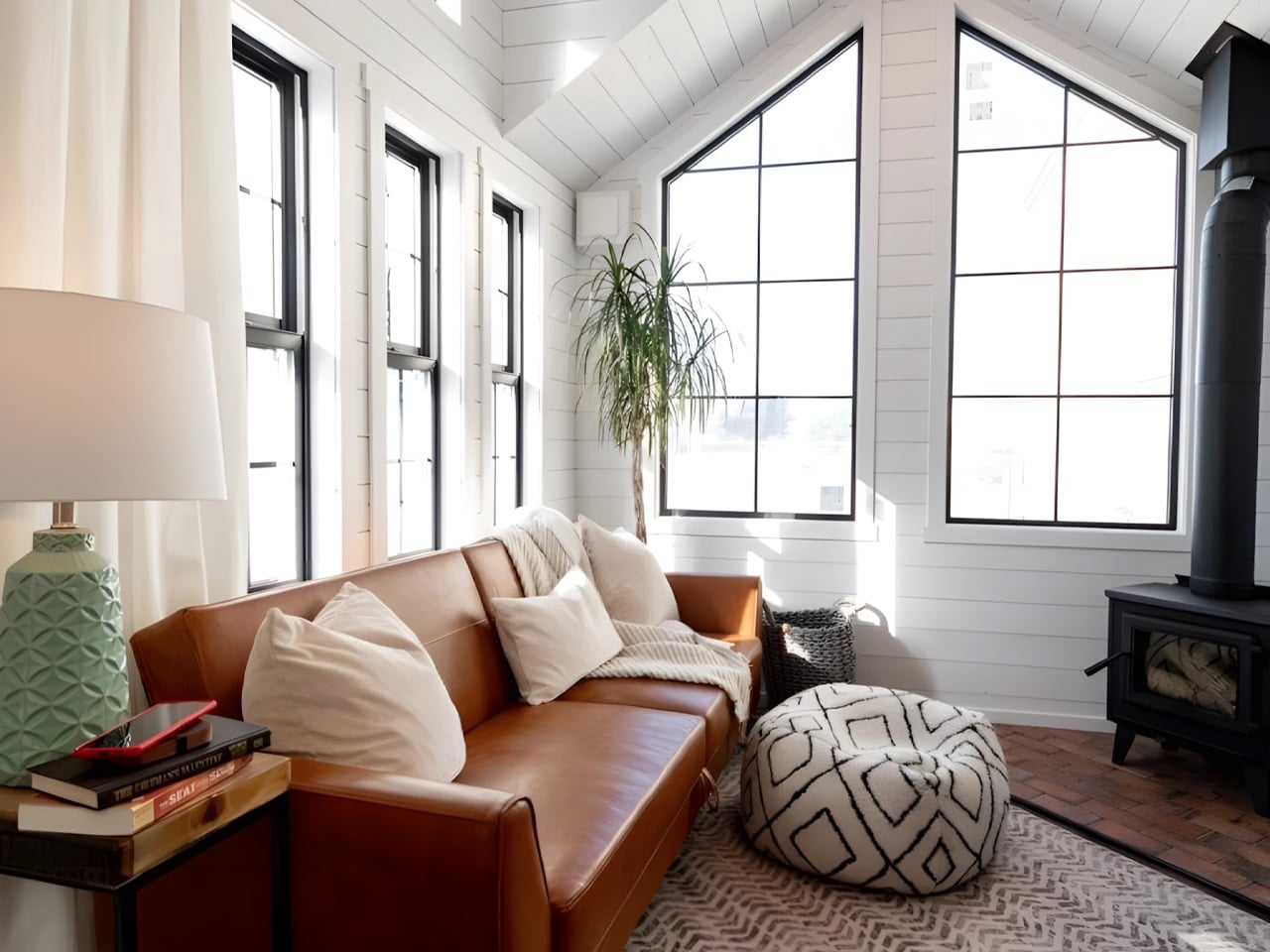
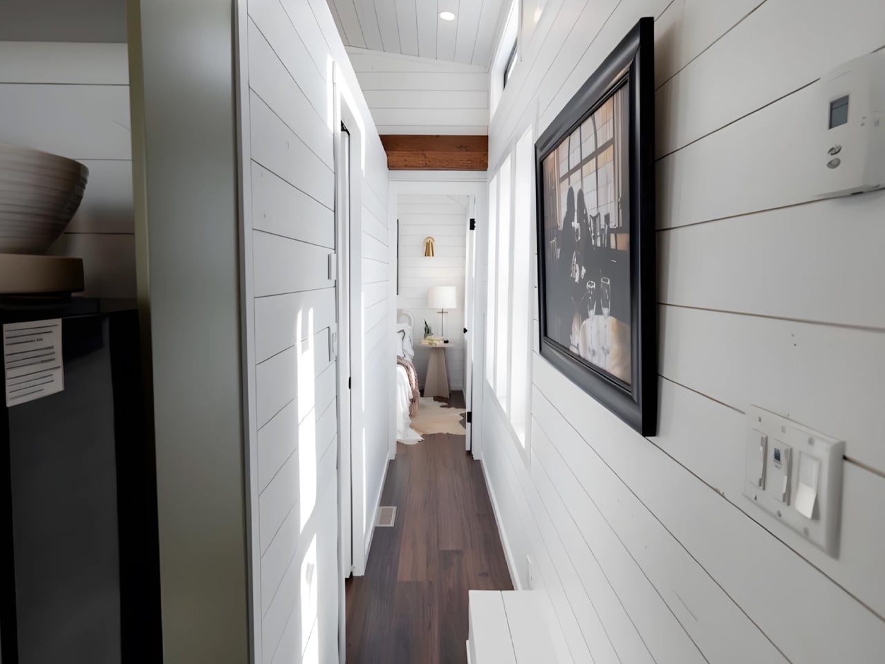
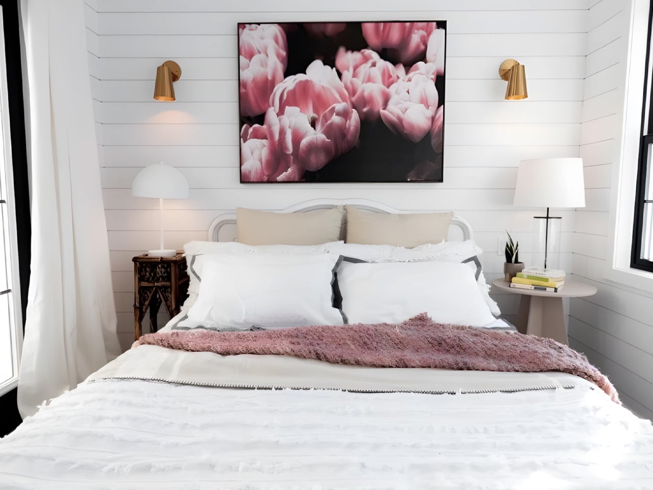
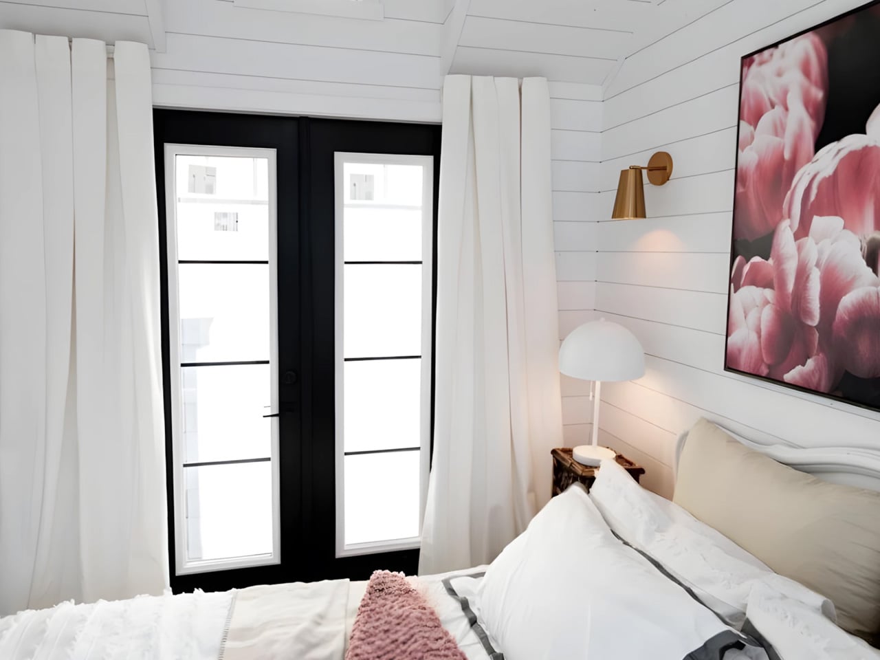
At its core, the Espresso is a study in restraint done right. The main floor clocks in at 160 square feet, with a 70-square-foot queen bedroom loft above, complete with custom built-ins and shelving. It’s a tight footprint by any measure, but the way the space is organized keeps it from ever feeling like it. The living room anchors one end of the home with a pull-out bench, built-in shelving, and a drop-down dining table that doubles as a desk, making it equally suited to a quiet morning or a dinner for two.

Designer: Modern Tiny Living

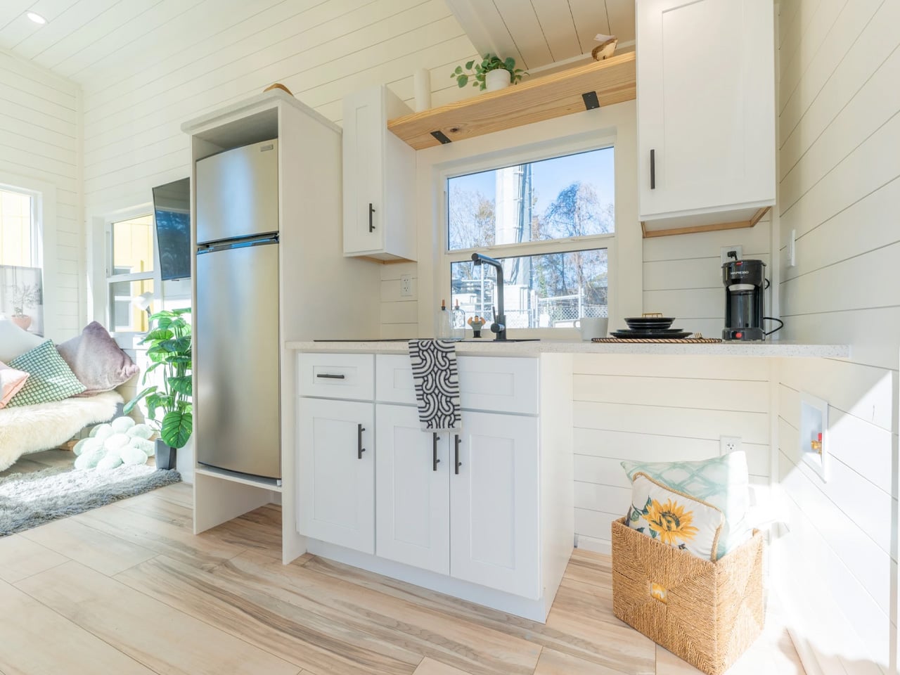
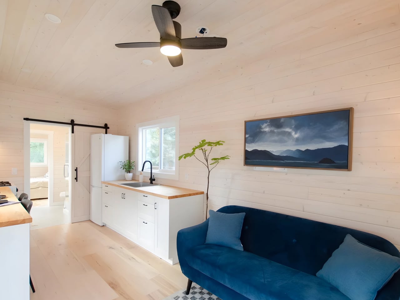
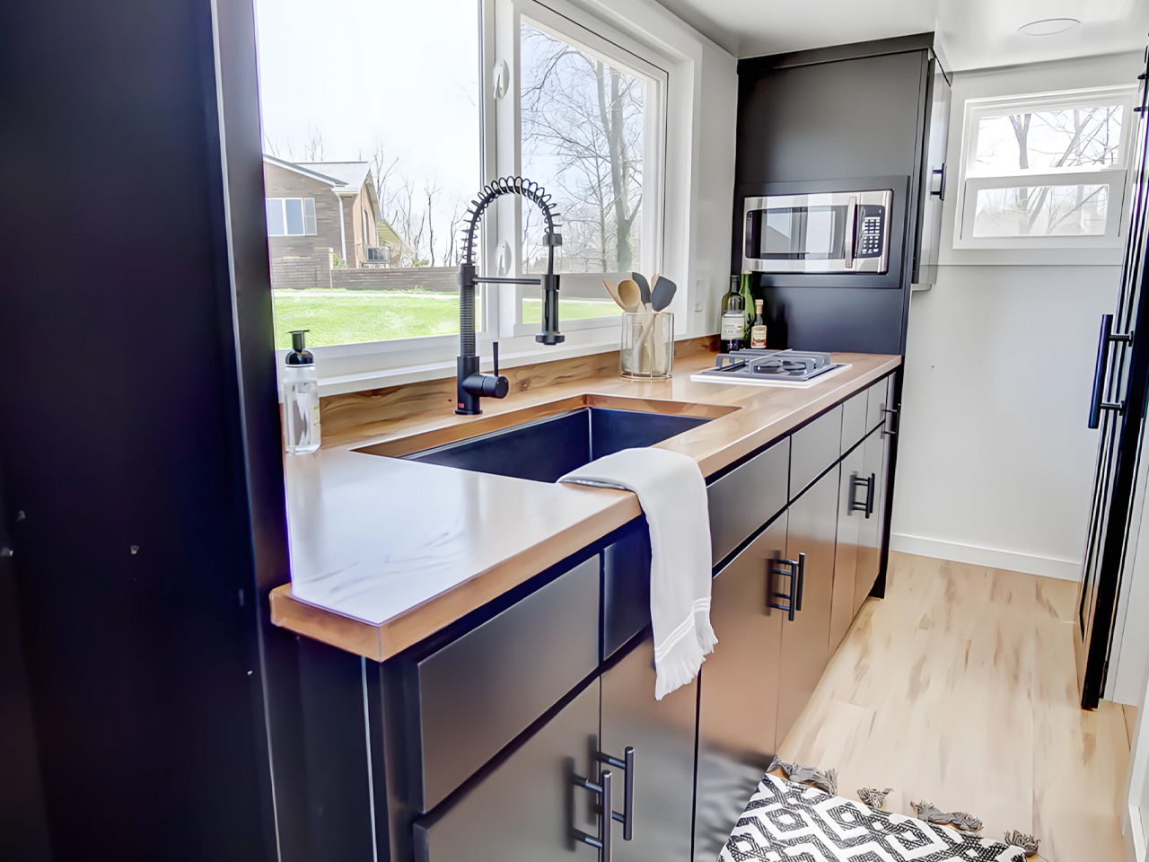
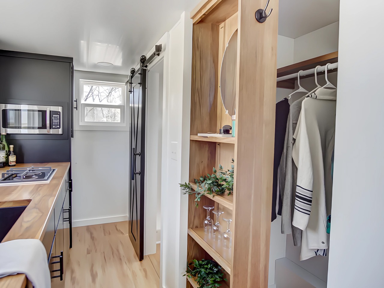
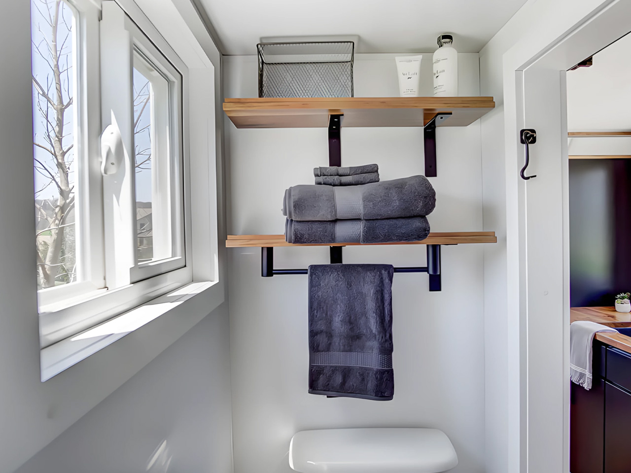
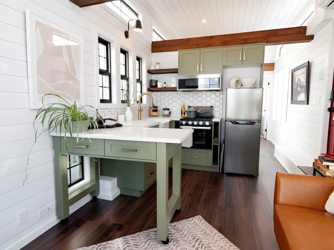
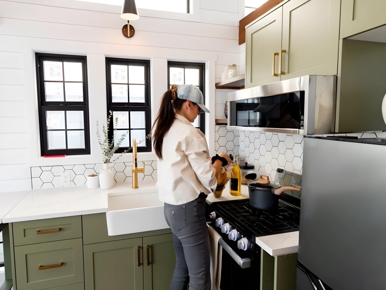
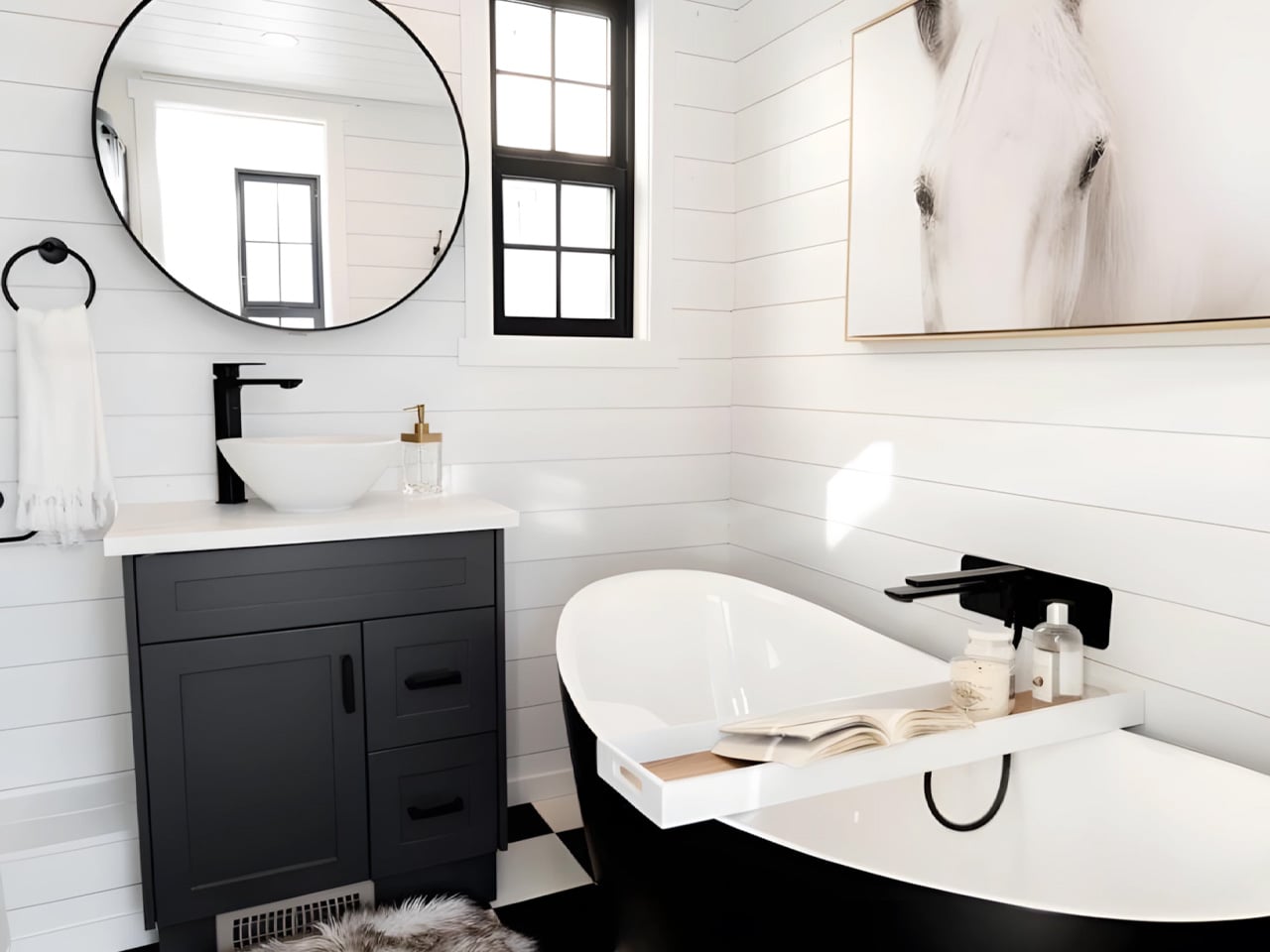
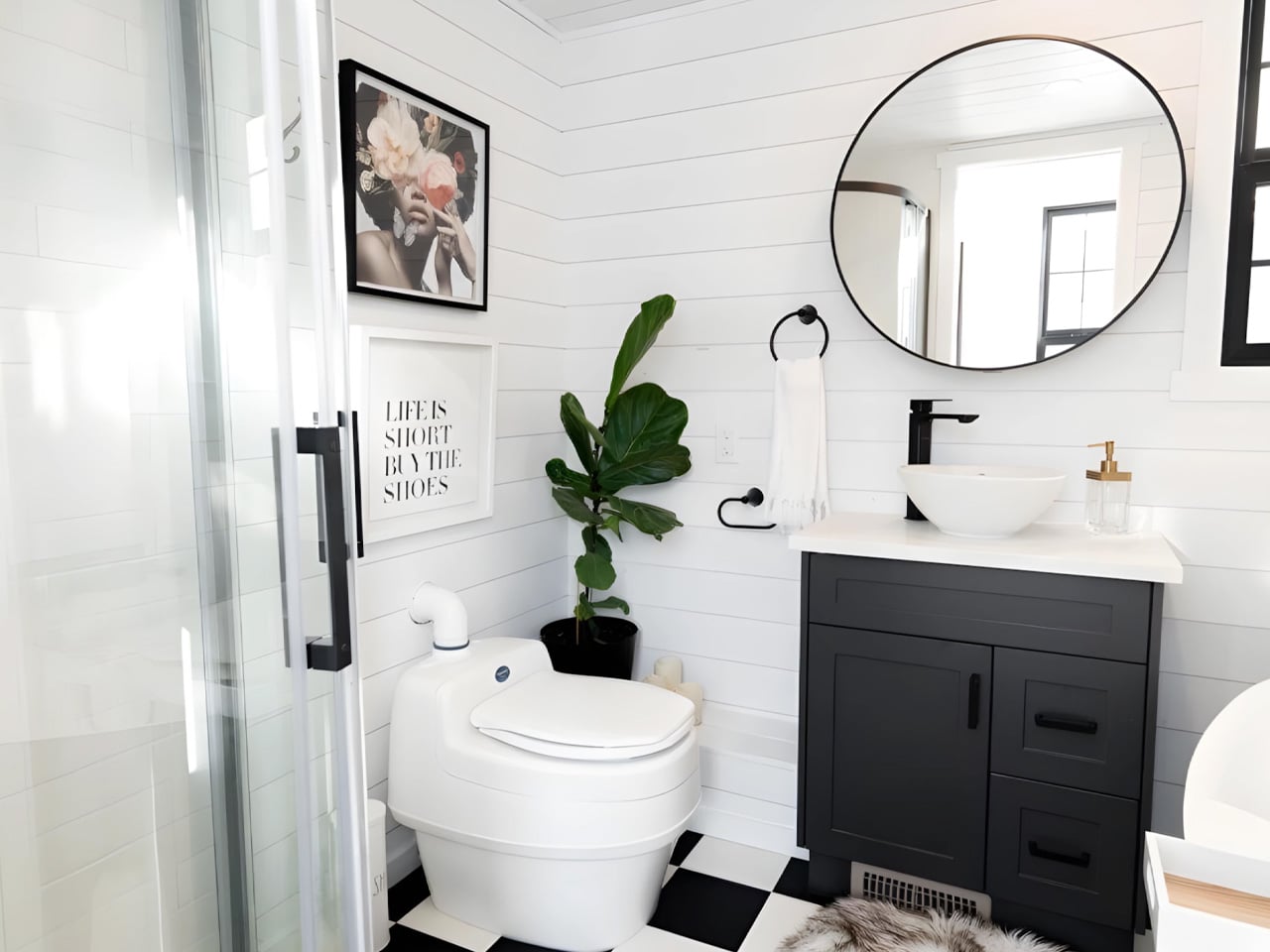
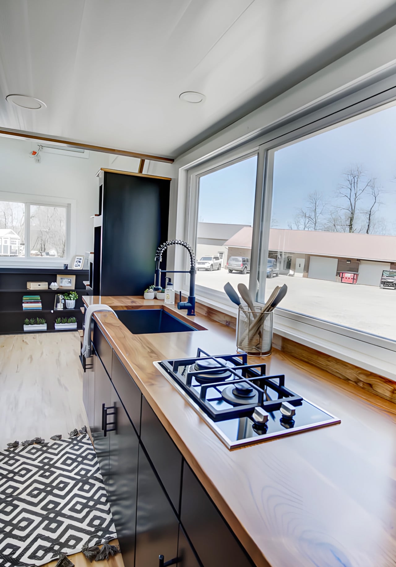
The kitchen is where the Espresso’s aesthetic really comes into focus. An undermount black granite sink pairs with a pull-down matte black faucet, solid wood countertops, a 9.9 cubic foot refrigerator, a two-burner propane cooktop, and a microwave, all working within a palette that feels deliberate rather than default. The matte black hardware package runs throughout the home, tying each room back to the same considered thread. Across from the kitchen, an open closet leads into the bathroom, which keeps things equally functional with a fiberglass insert shower, a flush toilet, and open shelving.

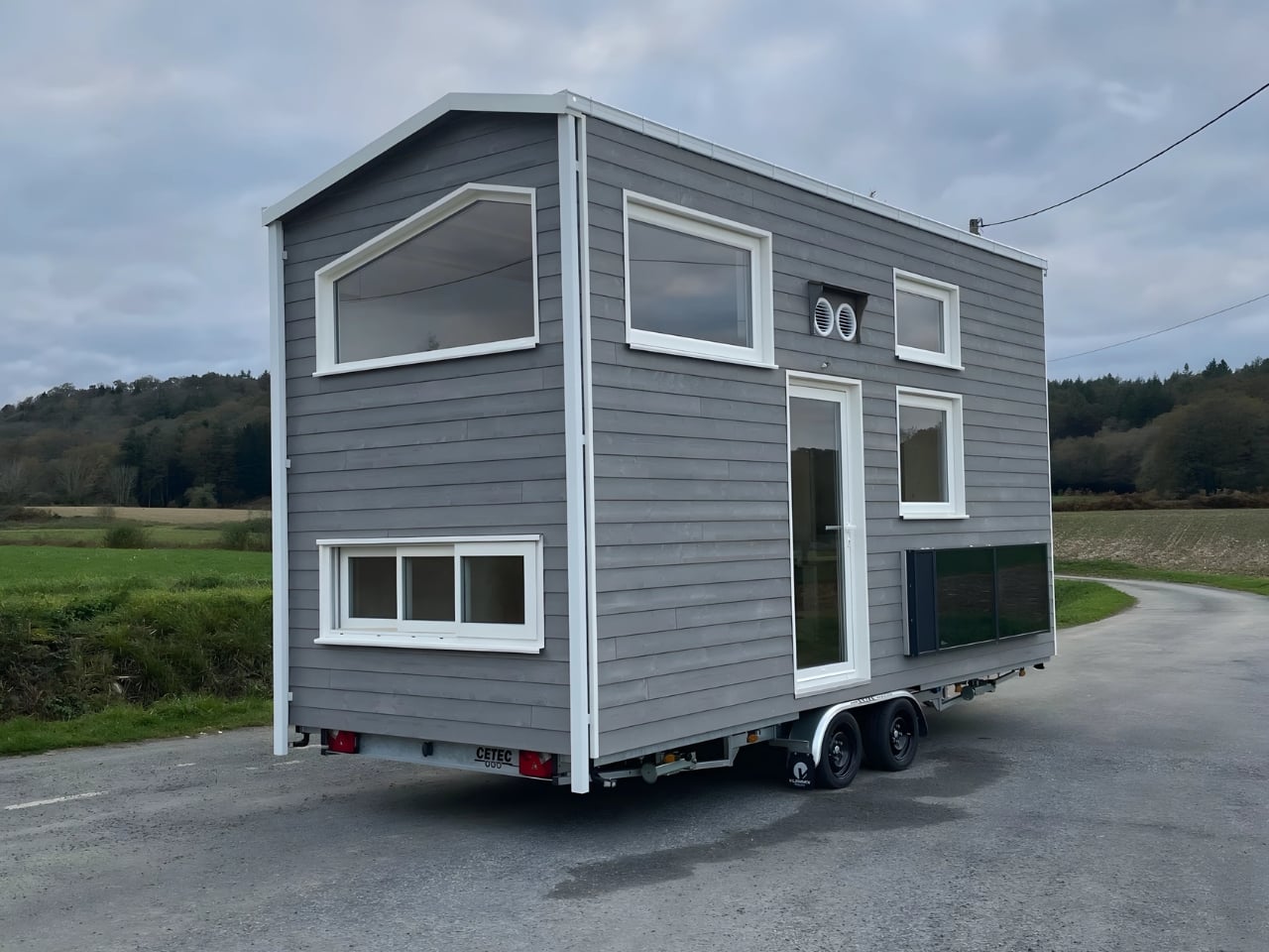
On the outside, the Espresso sits on a double-axle trailer and is finished in engineered wood with a steel roof, keeping maintenance low and durability high. A small exterior storage box handles propane bottles and similar items, quietly solving the off-grid practicalities without interrupting the clean lines of the exterior. The home weighs approximately 9,000 pounds, and its closed-cell spray foam insulation — three inches in the walls and ceilings, four in the floors — means it’s built to handle varied climates without compromise.

What makes the Espresso work isn’t any single feature. It’s the way everything adds up: the convertible furniture, the considered storage, the finish quality that makes the space feel lived-in rather than merely occupied. Modern Tiny Living designed it to deliver all the comforts of modern living in a compact, move-in-ready package, and the result is a tiny home that earns its name in more ways than one. Rich, concentrated, and hard to forget.

The post Inside the Espresso: Modern Tiny Living’s 20-Foot Tiny House on Wheels That Proves Small Can Be Bold first appeared on Yanko Design.

Studioninedots’ Light House Is a Vertical Amsterdam Home Built From Playfully Stacked Boxes

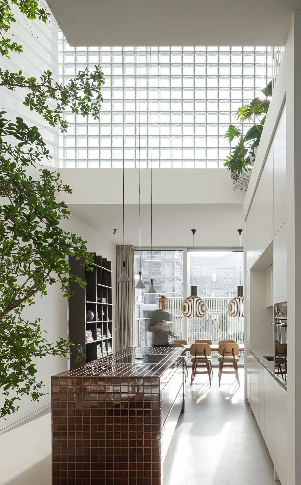
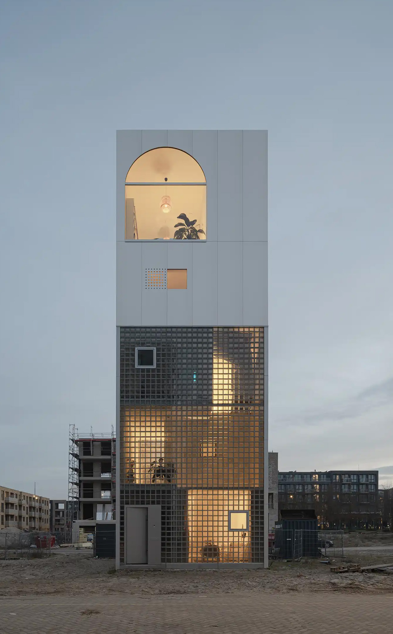
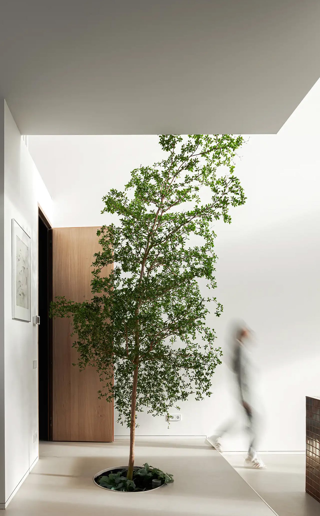
What does a home look like when you throw out the floor plan entirely? For Amsterdam-based firm Studioninedots, the answer is a tower of playfully stacked boxes, each one dedicated to a single moment in life, that rises above one of the Dutch capital’s newest neighborhoods. Completed in 2025, Light House sits on Centrumeiland, a newly developed artificial island district defined by its self-build culture and strong sustainability ambitions.

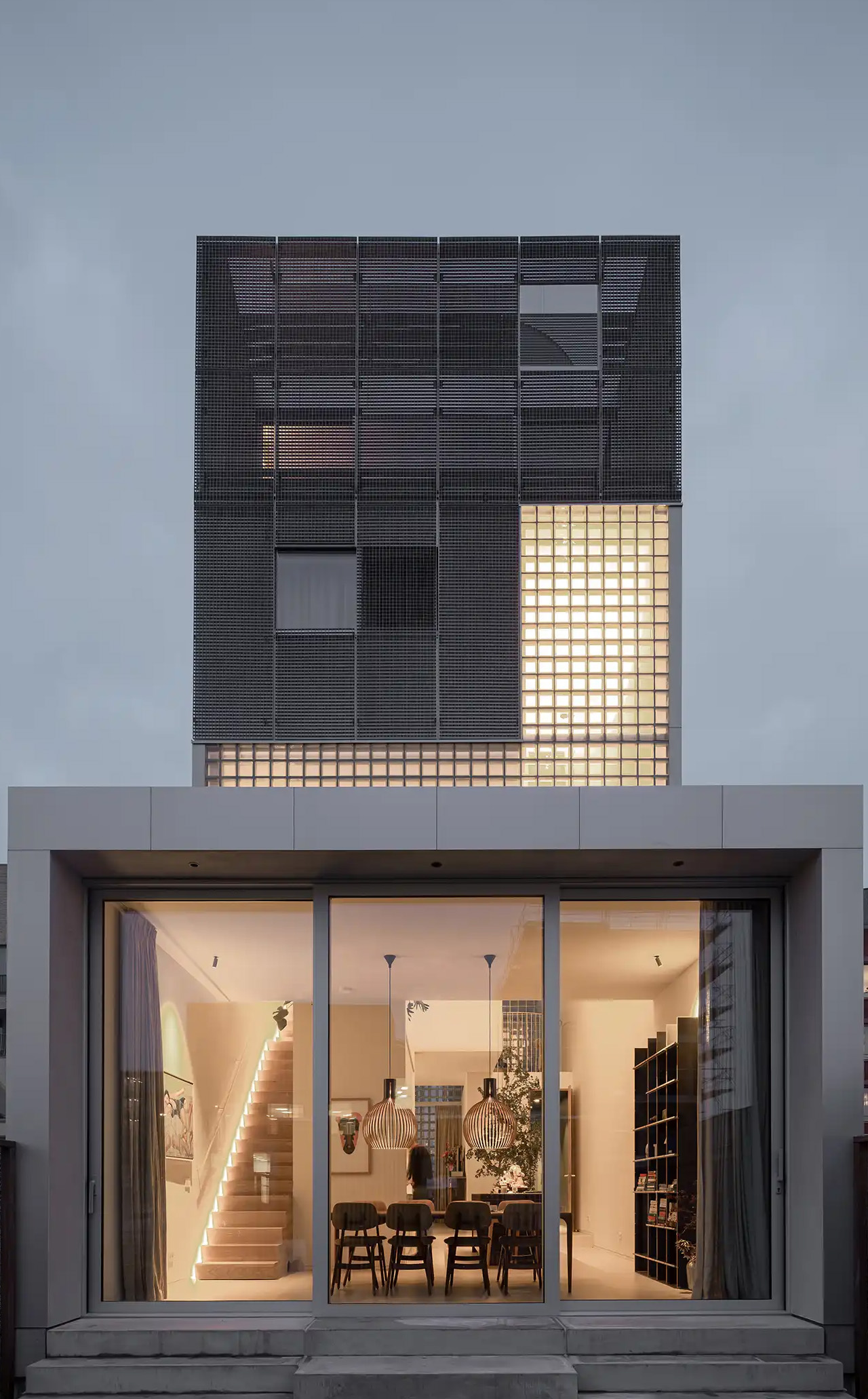
The project began with a simple brief from a couple with two children who wanted a home that would genuinely bring them together. Rather than anchoring daily life to the ground floor the way most houses do, Studioninedots dedicated each of the family’s key activities — eating, gathering, cooking, relaxing — to its own distinct volume, then arranged those volumes vertically into a single, tightly considered composition. The result is a 257-square-meter residence that feels less like a stacked building and more like a small vertical neighborhood.

Designer: Studioninedots

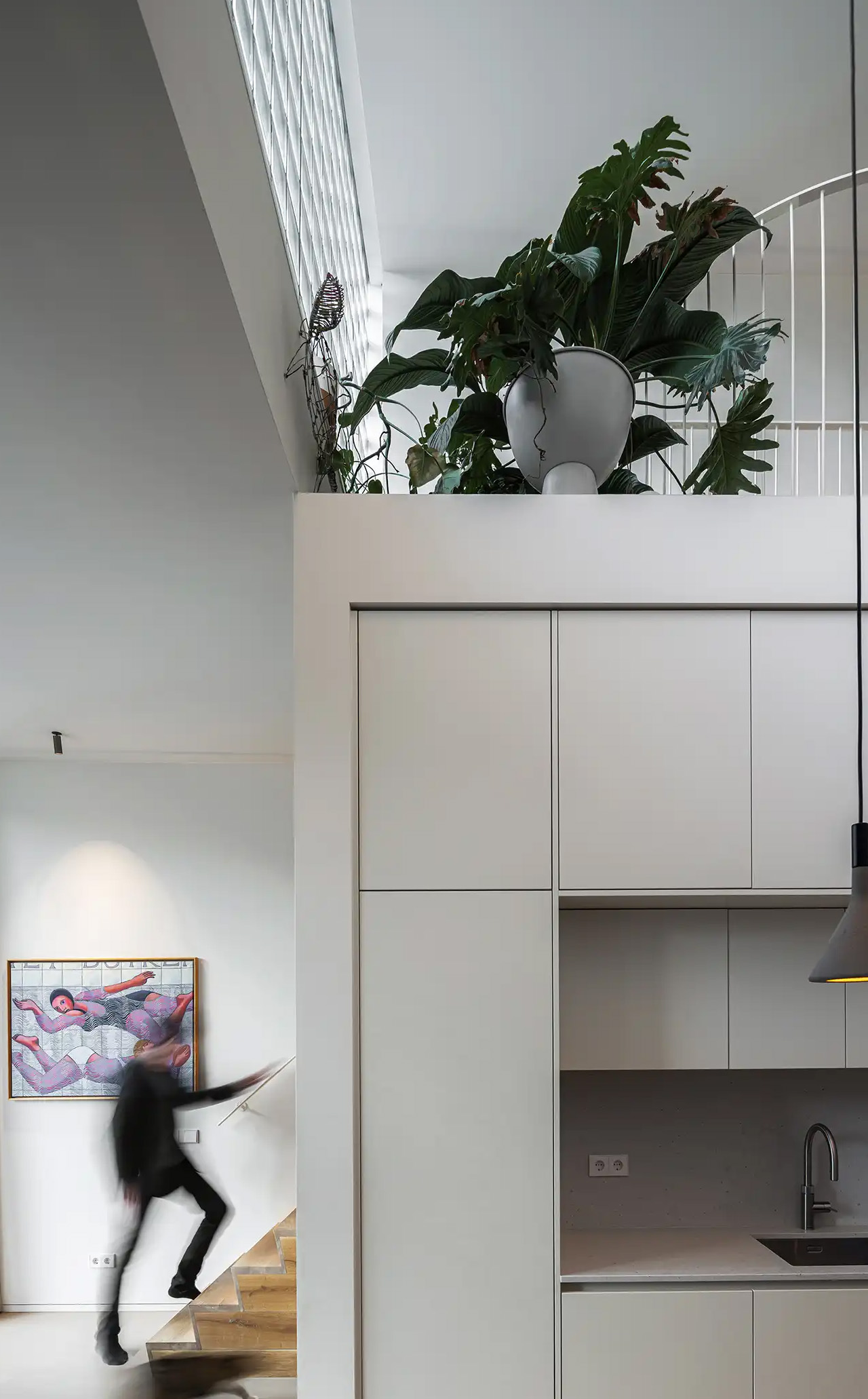
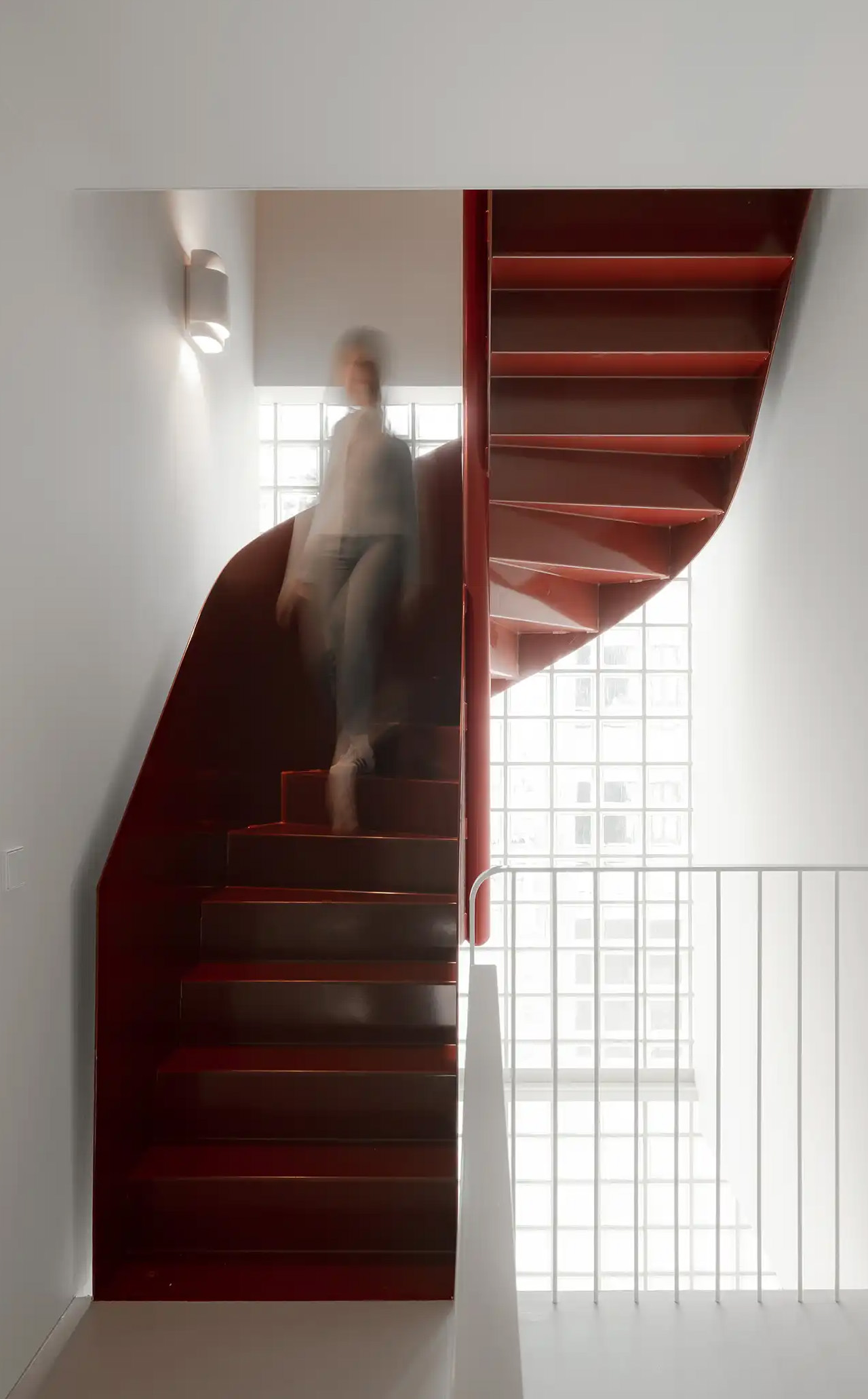
Movement through the home unfolds through a sequence of open passages and compressed zones, where shifts in scale produce entirely different spatial moods. Smaller, enclosed areas carve out space for focused, quieter activities, while larger voids open up visual connections across levels, dissolving any conventional sense of what is above and what is below. Hovering above the kitchen is a sheltered, secluded volume ideal for yoga or film watching, while the journey through the house culminates at the top in what the architects describe as a “holiday home” within the city. Flanked by arched ceiling-height glass openings, this 14-metre-high gathering room commands panoramic views across the IJmeer lake.

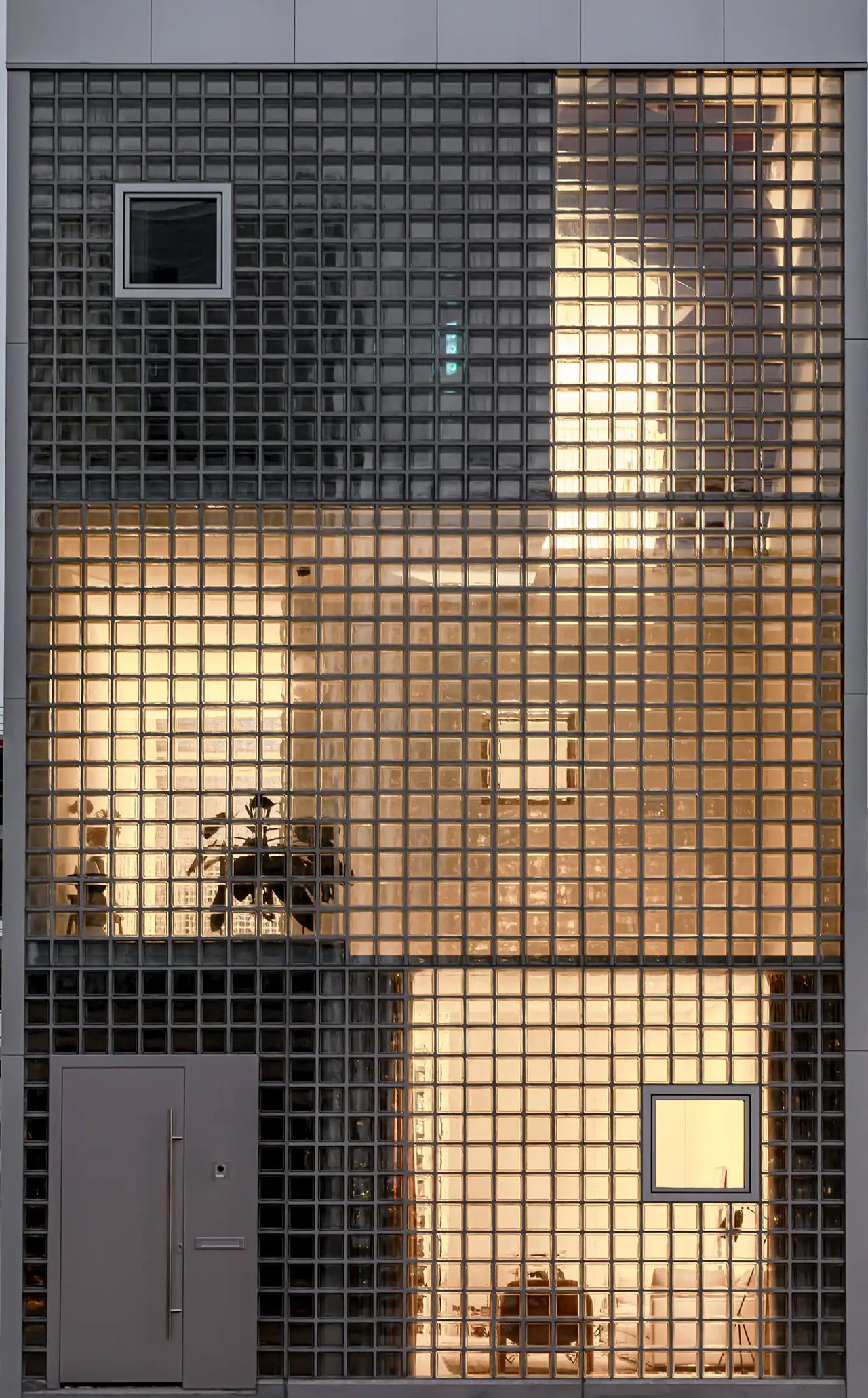
The facade does a lot of the design’s heavy lifting. A wall of square glass blocks wraps the front of the building, filtering natural light into the interior while abstracting the life inside, offering privacy without sacrificing the warmth of daylight. At night, the facade glows from within, giving the house an almost lantern-like presence on the street.

Sustainability is baked into the structure itself. Light House is built as a lightweight system using prefabricated timber components inside a steel frame, a circular and modular method that allows for flexibility, long-term adaptability, and ease of disassembly. The layout is not fixed either, as children grow and priorities shift, the home can be reconfigured to meet whatever the family needs next. Light House is a rare thing: a home that feels entirely personal yet completely considered, one where architecture quietly gets out of the way and lets life fill the space.

The post Studioninedots’ Light House Is a Vertical Amsterdam Home Built From Playfully Stacked Boxes first appeared on Yanko Design.

5 Best Tiny Homes of April 2026 Prove You Don’t Need More Space to Live Better

The tiny home is having a genuine design moment. Not the kind driven by social media aesthetics or minimalism as a lifestyle brand, but the kind where builders are solving real problems, and the results are getting sharper each season. What once felt like a compromise category has grown into a serious architectural conversation, one where craft, livability, and genuine spatial intelligence are setting the standard. The homes arriving this April reflect that maturity clearly.

Each home on this list approaches compact living from a distinctly different angle. One eliminates the loft bed that most tiny houses treat as structural law. Another was designed from the ground up around a growing family’s daily rhythms. A third draws from Japanese craft traditions to build something that feels purposeful at every scale. These are not the tiny homes of five years ago. They are fully realized dwellings that simply happen to take up less space, and the best five of April 2026 make a case worth hearing in full.

1. Betty — The Towable That Finally Gets the Bedroom Right
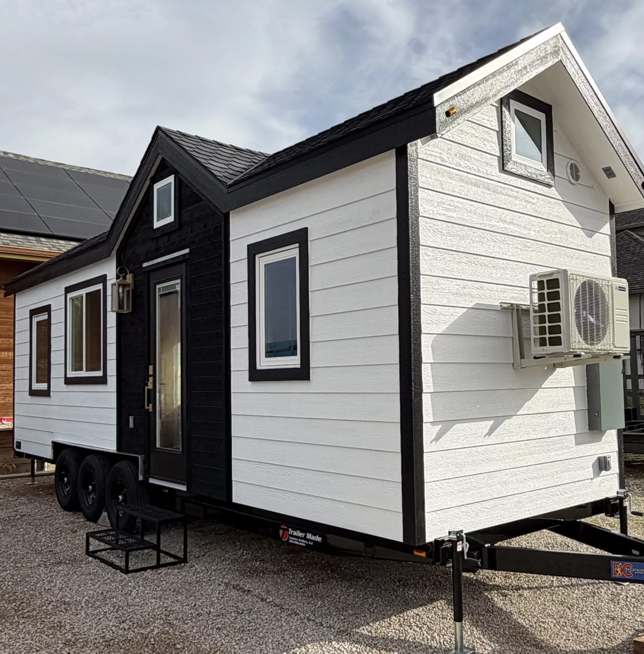
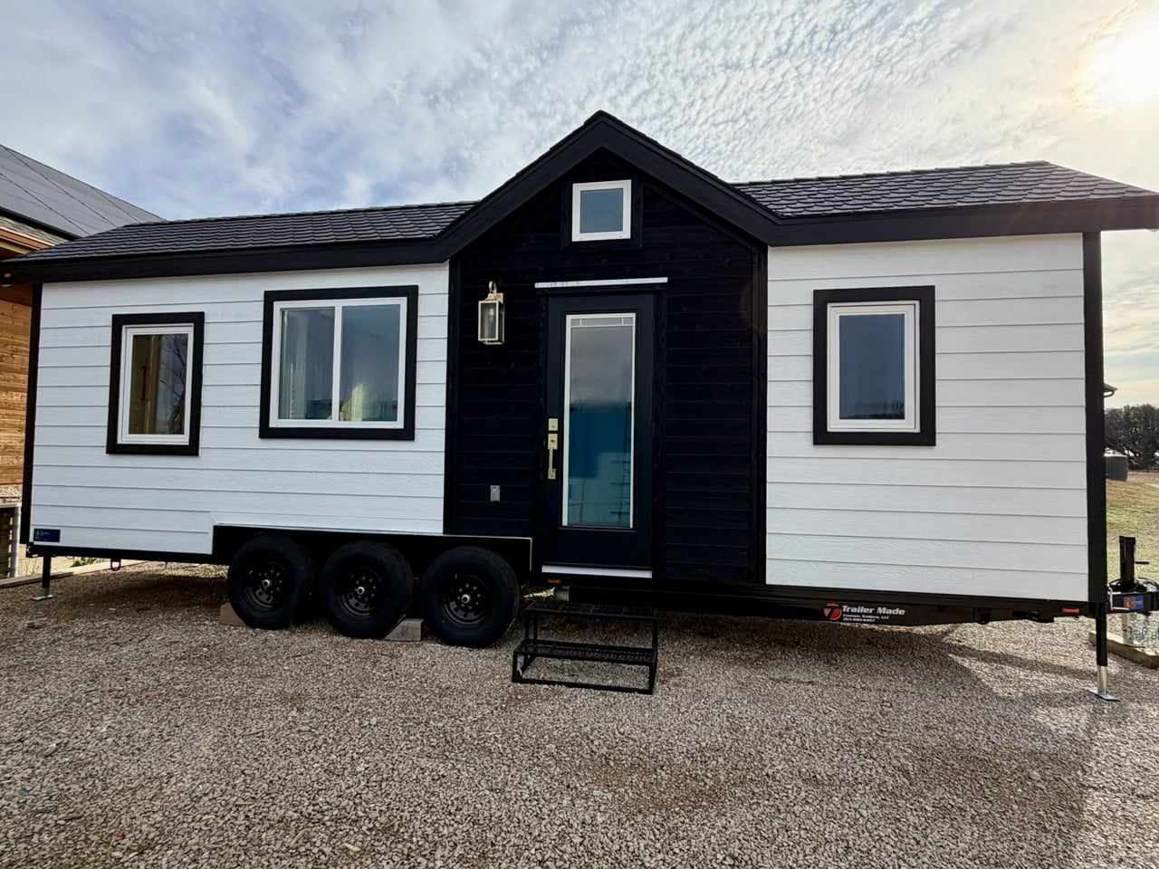
Tiny house living often demands tough trade-offs between mobility and livability, but the Betty by Decathlon Tiny Homes aims to strike a balance that most towable homes fail to find. At 28 feet long on a triple-axle trailer, it sits comfortably in the mid-size category without feeling cramped. The exterior clad in engineered wood with composite roof shingles keeps things durable and low-maintenance, a practical foundation for a home designed to spend much of its life on the road with two occupants.

The ground-floor bedroom is what separates the Betty from most of its competition. Where loft beds dominate tiny home layouts, this room offers full standing headroom, a queen bed platform with two large integrated storage drawers, a built-in wardrobe, and a skylight that floods the space with natural light. A wall-mounted TV, a mini-split AC unit in the living area, and a sliding barn-style door complete a setup that never quite asks you to feel like you are settling for something.

What we like:

  • The ground-floor bedroom with full standing headroom is a rare feature in this size category, making the space feel genuinely livable rather than something you climb into at the end of the day.
  • Engineered wood cladding and composite roof shingles offer real long-term durability without demanding intensive upkeep, a sensible material choice for a home that moves regularly.

What we dislike:

  • The living room footprint is modest enough that two people spending extended stretches at home may find it limiting over longer periods together.
  • There is no dedicated workspace mentioned in the layout, which matters increasingly for buyers who plan to work remotely as their primary daily routine.

2. Mizuho — Japanese Craft Meets Intentional Living
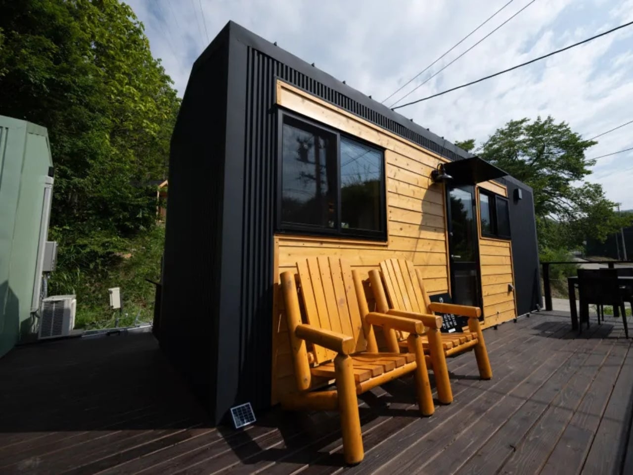
The Mizuho does not try to look like every other tiny home on the market, and that restraint is its first strength. Designed by Ikigai Collective and named after the Japanese philosophy of purposeful living, this home measures 6.6 meters long, 2.4 meters wide, and 3.8 meters tall. It is built for one person or a couple who genuinely want to live with less, combining traditional Japanese aesthetics with modern building technology in a way that feels coherent rather than borrowed.

What makes the Mizuho stand apart is its commitment to authenticity. Ikigai Collective works directly with local partners in Nozawaonsen, Japan, to craft each home to strict quality standards. Every material choice and spatial decision reflects a coherent set of values rooted in simplicity, mindful living, and environmental care. For those drawn to the Ikigai philosophy of finding meaning in everyday life, this home does not reference that tradition from the outside. It builds it into every wall and surface.

What we like:

  • Authentic Japanese craftsmanship sourced through local partners in Nozawaonsen gives the Mizuho a material integrity that most tiny homes, regardless of their aesthetic direction, simply cannot replicate.
  • The eco-friendly design philosophy extends beyond surface-level choices, reflecting a genuine commitment to sustainable and intentional living that runs through every aspect of the build.

What we dislike:

  • At 6.6 meters long and 2.4 meters wide, the dimensions are compact even by tiny home standards, making it a tight fit for couples who value clearly defined personal space.
  • The deeply specific aesthetic may feel limiting for buyers who appreciate the minimalist philosophy but prefer more visual flexibility in how their space looks from day to day.

3. Sora 20′ — More Room for the Way People Actually Work Now
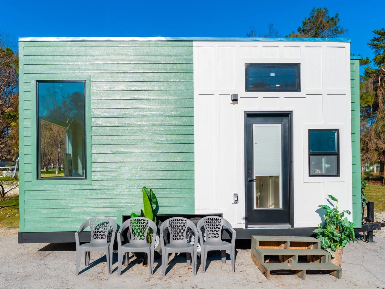
The Sora 20′ arrived as a direct response to what Dragon Tiny Homes customers were asking for: more space, without losing the clarity that made the original Sora worth buying in the first place. Expanded from the popular 16-foot model, this version offers increased square footage while maintaining the bright, practical design philosophy its predecessor established. The layout flows from one area to the next in a way that makes daily routines feel effortless rather than choreographed around a tight and unforgiving floor plan.

At $61,000, the Sora 20′ puts full-time tiny living within reach for a broader range of buyers, particularly remote workers who need a home that functions just as well as a workspace. Large windows keep the interior naturally bright throughout the day, and every element earns its place through purpose rather than habit. Dragon Tiny Homes has built something that does not feel like a clever workaround. It feels like a home that simply chose to be more efficient than the ones built around it.

What we like:

  • The $61,000 price point is one of the most accessible in the full-featured tiny home category, making the Sora 20′ a genuinely attainable starting point for first-time buyers entering the market.
  • Large windows and a well-considered floor plan create a sense of openness that consistently exceeds what the square footage would suggest when you look at the numbers alone.

What we dislike:

  • Expanded from a 16-foot base, the layout density may still feel tight for two full-time residents with distinct work schedules and separate daily routines running simultaneously.
  • Published details on built-in storage solutions are limited compared to competing homes in this roundup, which is a meaningful gap for buyers planning a permanent and fully committed move-in.

4. Starling — The Family Tiny Home That Doesn’t Ask You to Lower the Bar
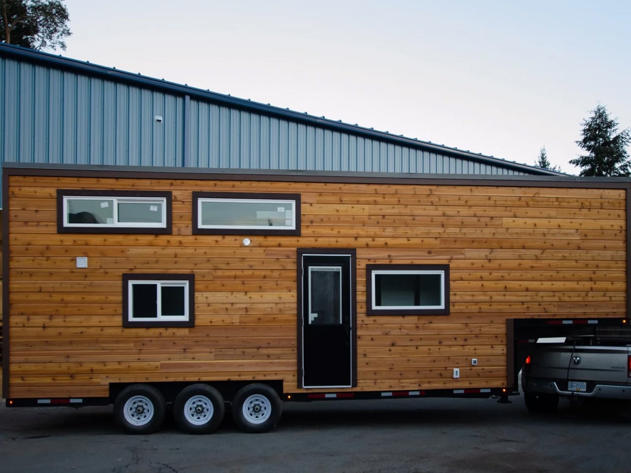
The Starling quietly dismantles the assumption that tiny living means fewer people. Built by Rewild Homes in Nanaimo, British Columbia, this 33-foot gooseneck tiny house was designed with a growing family at the center of every decision. The raised gooseneck section creates genuine spatial separation between living zones, something most tiny homes attempt to achieve with curtains or partitions rather than actual architecture. Natural wood cladding under a metal roof grounds the exterior against the Pacific Northwest landscape it was clearly built for.

Inside, the details compound quickly. A convertible dining banquette folds flat into a third sleeping space, with hidden storage built beneath every seat. The U-shaped kitchen anchors daily life with dark wood countertops, a breakfast bar, a four-burner propane range, a high-efficiency fridge with a bottom freezer, a double sink, and pull-out cabinetry. None of it feels like a workaround. It feels like a kitchen that simply chose to exist somewhere smaller, designed by people who understand that a family’s daily rhythm doesn’t shrink just because the footprint does.

What we like:

  • The gooseneck configuration creates real architectural separation between living and sleeping areas, a level of spatial privacy that is genuinely rare in tiny homes at this scale and price range.
  • The convertible dining banquette adds a functional third sleeping space with integrated storage beneath, making the Starling meaningfully more capable for families without adding a single foot to the overall length.

What we dislike:

  • At 33 feet on a triple-axle gooseneck trailer, the Starling sits at the larger end of the towable category, which may complicate towing logistics and limit suitable placement options for some buyers.
  • The family-forward layout and three-sleeping-zone configuration may feel over-engineered for solo occupants or couples without children who won’t make use of the additional sleeping flexibility.

5. Barred Owl — Single-Level Living That Removes the One Thing Nobody Wanted
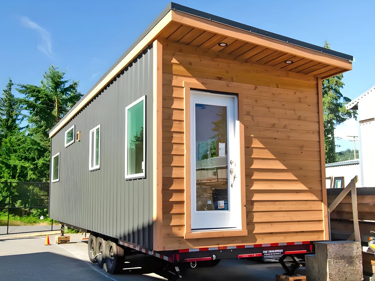
At $119,000, the Barred Owl makes one clear argument: sometimes the most intelligent upgrade in tiny home design is the one that removes something entirely. Rewild Homes built this 34-foot home on a single-level plan, eliminating the loft bed that most tiny houses treat as a structural inevitability. Mounted on a triple-axle trailer and measuring 10 feet wide, 1.5 feet wider than the North American standard, the Barred Owl transforms how the interior functions at every point of the day, from the moment you walk in.

The layout moves in railroad apartment fashion, with rooms connecting directly to one another. Entry opens into a bright living room finished in whitewashed pine tongue-and-groove. The galley kitchen features butcherblock counters wrapping into an eating bar that doubles as a dedicated workspace, alongside a full-size refrigerator, a four-burner propane cooktop, and an oven. A dining area seats two comfortably, and the bedroom sits at the far end, private, accessible, and at floor level. It is a home that takes the inconveniences of tiny living seriously and removes them methodically, one by one.

What we like:

  • The single-level layout eliminates the loft bed, delivering a bedroom that functions like an actual room rather than a sleeping platform accessed by a ladder at two in the morning.
  • At 10 feet wide, the Barred Owl offers noticeably more floor space than the standard North American tiny home, and that extra room is felt immediately in how naturally the interior breathes.

What we dislike:

  • At $119,000, the Barred Owl sits at the premium end of the tiny home market, which narrows its accessibility significantly compared to several other strong options featured in this roundup.
  • The railroad-style floor plan, while highly functional, offers limited visual or acoustic separation between the living and dining zones for buyers who prefer more distinctly defined spaces within the home.

The Tiny Home Has Arrived

The five homes on this list represent the clearest thinking in compact residential design right now. They don’t ask you to lower your expectations. They ask you to redirect them toward what actually matters: light, function, thoughtful proportion, and craft that earns its keep over the years rather than simply photographs well on first look. From the Mizuho’s Japanese authenticity to the Barred Owl’s single-level conviction, each one makes a case that is genuinely hard to dismiss.

What is becoming clear is that the tiny home is no longer a reaction to excess. It is a legitimate design category with its own standards, ambitions, and evolving vocabulary. Builders like Rewild Homes, Ikigai Collective, and Dragon Tiny Homes are pushing that vocabulary forward, season by season. If April 2026 is any indication, the most compelling residential design thinking isn’t happening in expansive floor plans. It’s happening in 20 to 34 feet of very carefully considered space.

The post 5 Best Tiny Homes of April 2026 Prove You Don’t Need More Space to Live Better first appeared on Yanko Design.
Genji Kyoto Is a Hotel You Read Like a 1,000-Year-Old Book

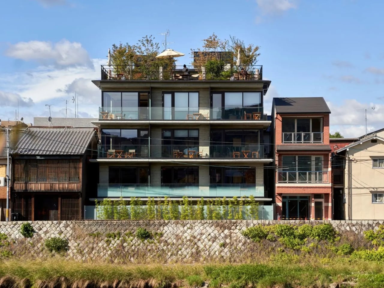
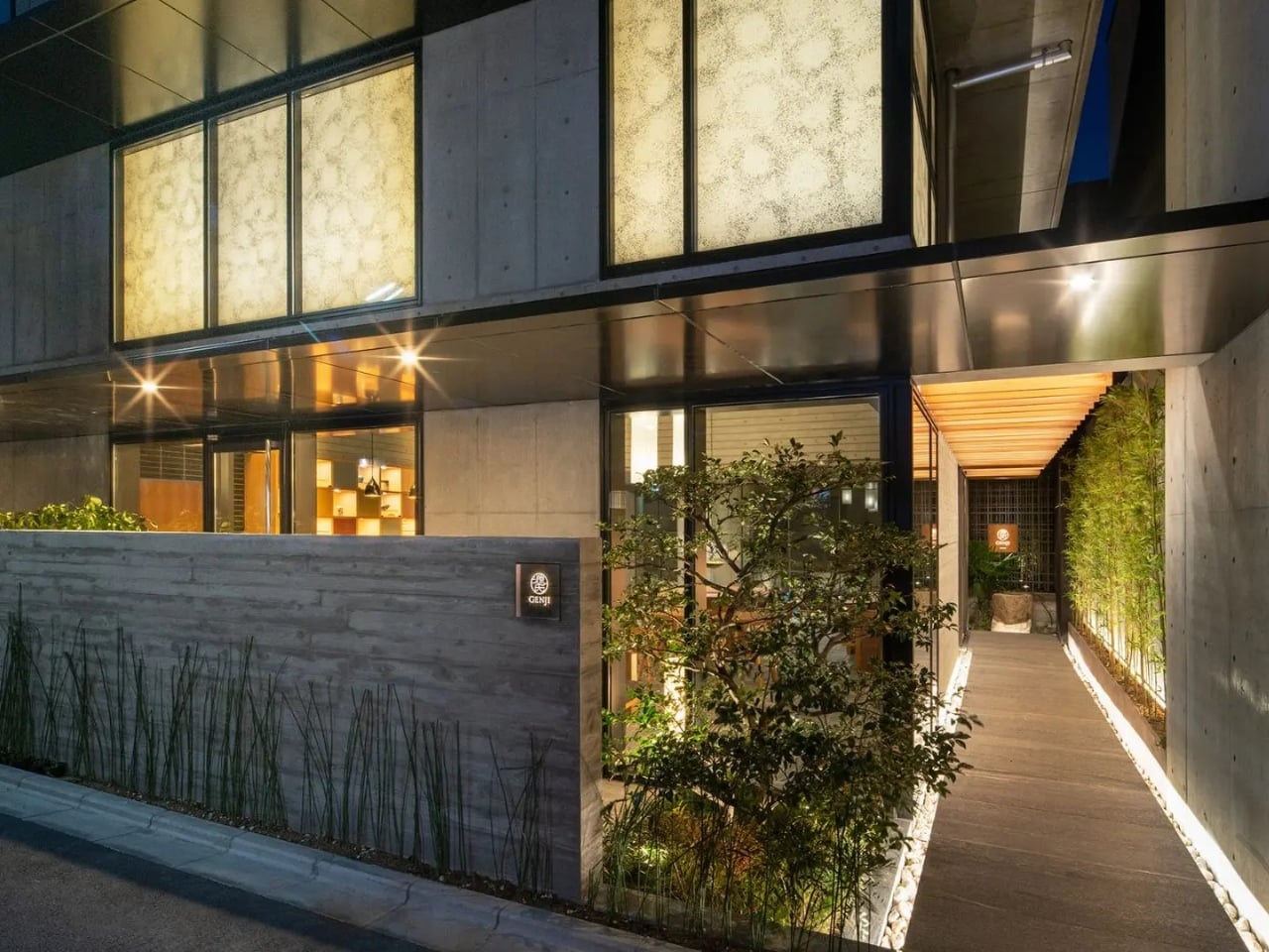
Most hotels ask you to check in. Genji Kyoto asks you to pay attention. Nestled along the Kamo River in Kyoto, Japan, this 19-room boutique hotel is the kind of place that architects talk about in hushed, reverent tones. And for good reason. It was designed by Geoffrey P. Moussas of Design 1st, a New York-born, MIT-trained architect who has called Kyoto home since 1994. That detail matters more than it might seem.

Moussas didn’t fly in with a mood board and a deadline. He has spent over three decades restoring and redesigning more than 40 traditional Japanese structures: machiya townhouses, tearooms, kura storehouses, and even a 400-year-old Buddhist temple. His work has been featured in the Financial Times, CNN, and NHK, and exhibited at Kiyomizu Temple and Nijo Castle. When someone like that builds a hotel, you’re not just booking a room. You’re stepping into a lifetime of accumulated understanding.

Designer: Geoffrey P. Moussas of Design 1st

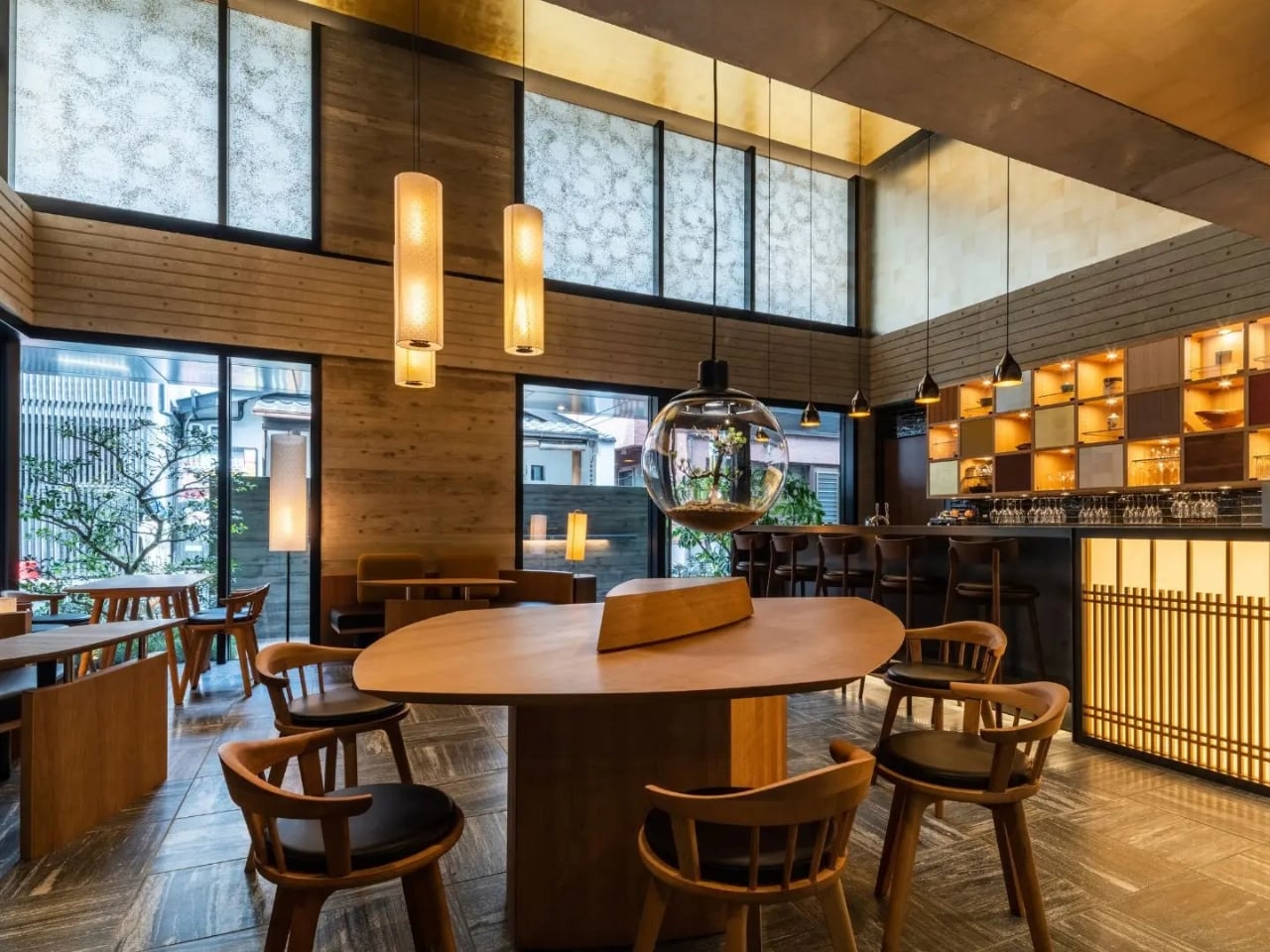
The concept behind Genji Kyoto traces back to an 11th-century Japanese novel, The Tale of Genji, widely considered one of the world’s first novels. When the design team discovered that the hotel’s site was historically tied to the story’s actual locations in Kyoto, the whole project shifted. The design moved away from a simple machiya prototype and toward the aesthetic world of the Heian period, over a thousand years ago. But Moussas wasn’t interested in imitation. His approach was to distill the spirit of Heian architecture, specifically the Shinden Zukuri style, characterized by pavilions woven through interconnected gardens, rather than recreate its surface. That distinction is everything. It’s the difference between a themed restaurant and a genuinely good one.

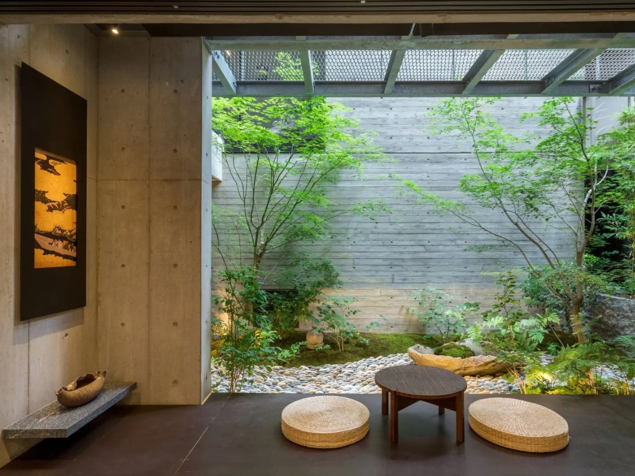
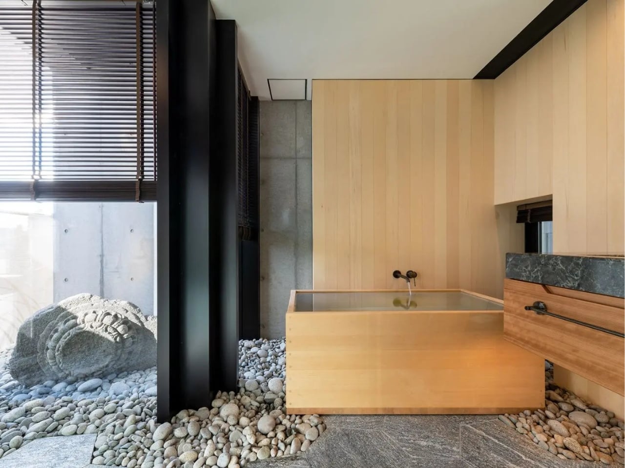
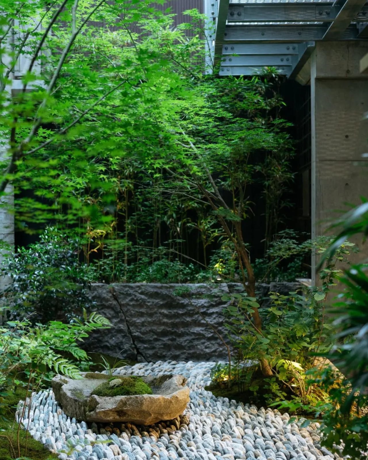
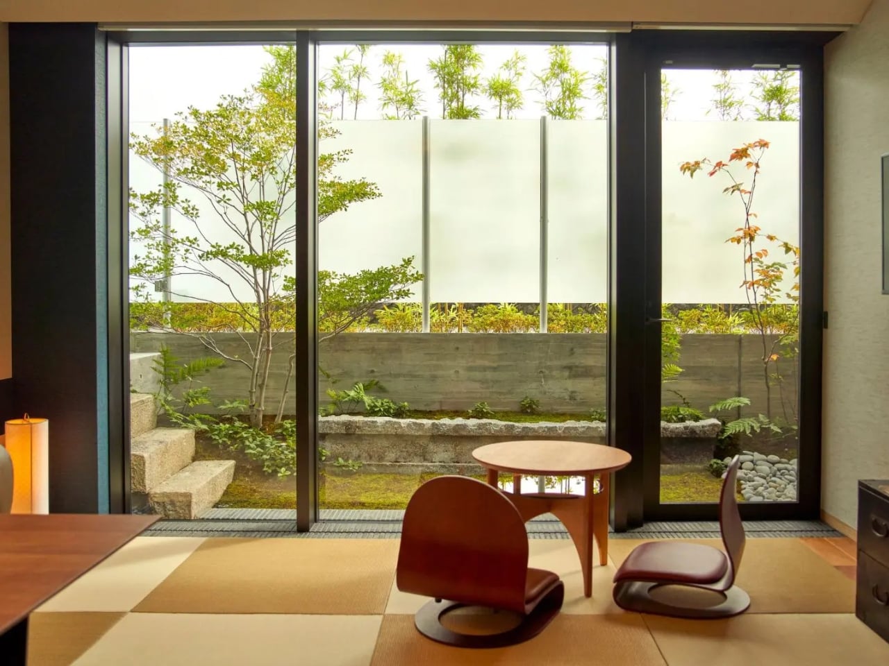
The guiding philosophy here is a Japanese concept called Teioku Ichinyo, which translates roughly to “building and garden are one.” Every spatial decision at Genji Kyoto flows from this idea. Gardens aren’t decorative; they’re structural. They guide movement, frame views, and carry what the Japanese call ki, the life force that animates a space. Even the small tsubo pocket gardens tucked around the guest rooms, a tradition dating back to Heian palace residences, do serious work, turning what could be a blank interior wall into a living, breathing view.

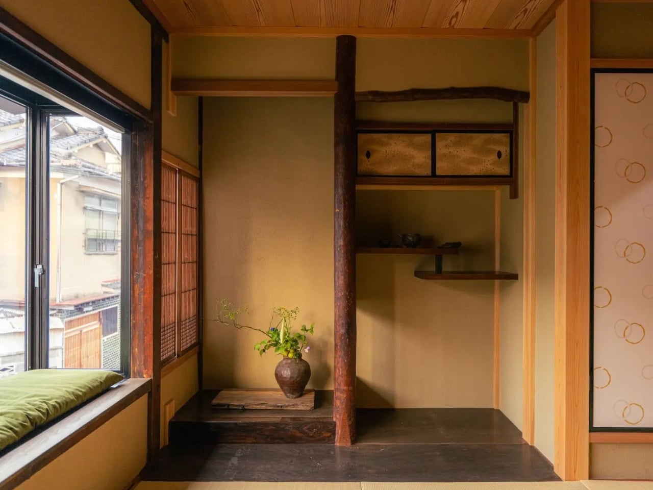
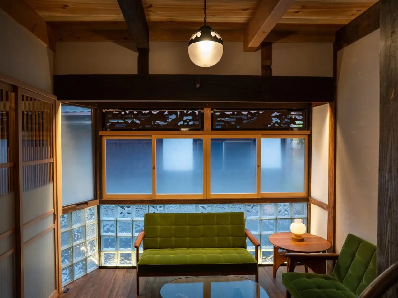
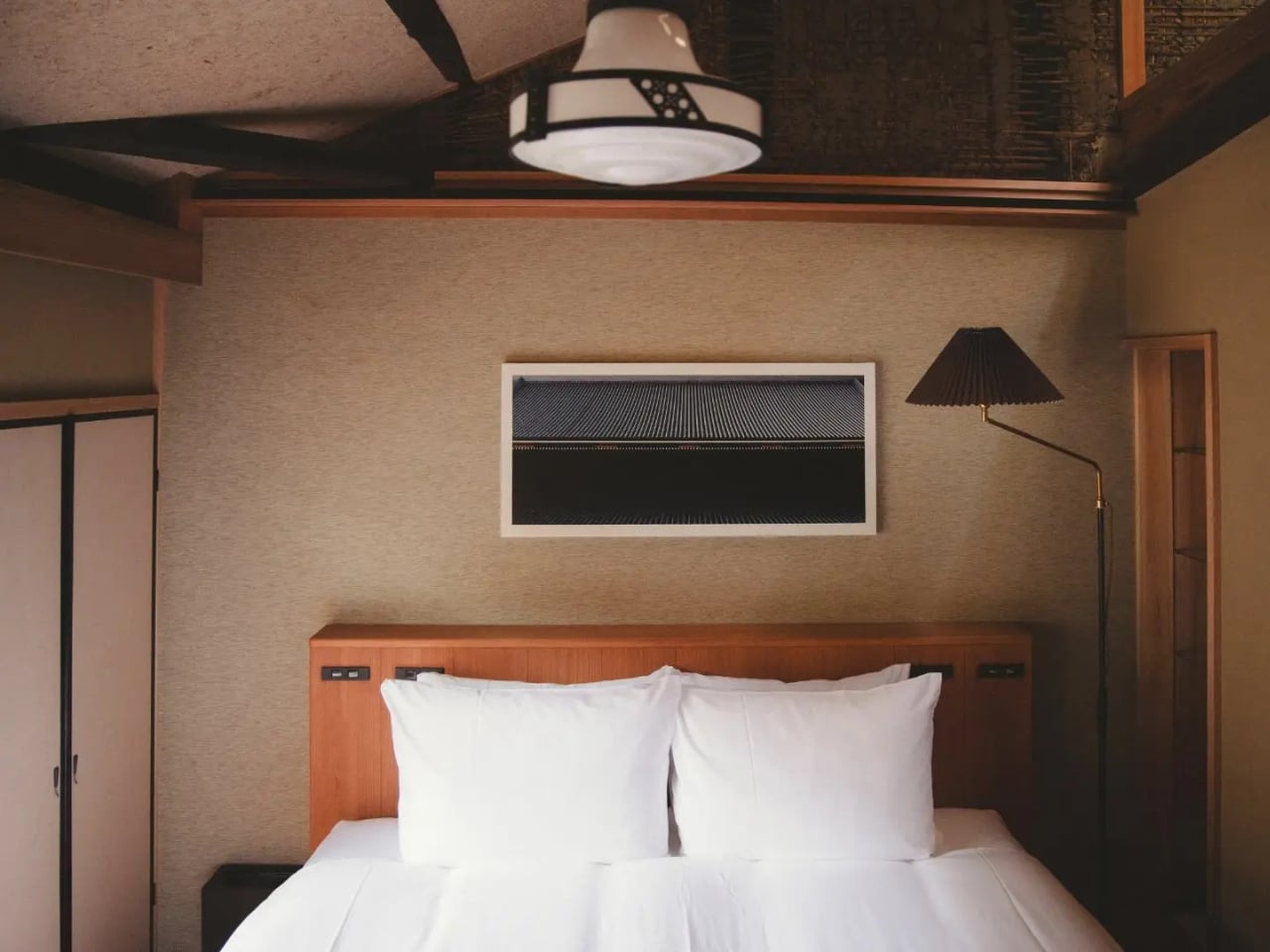
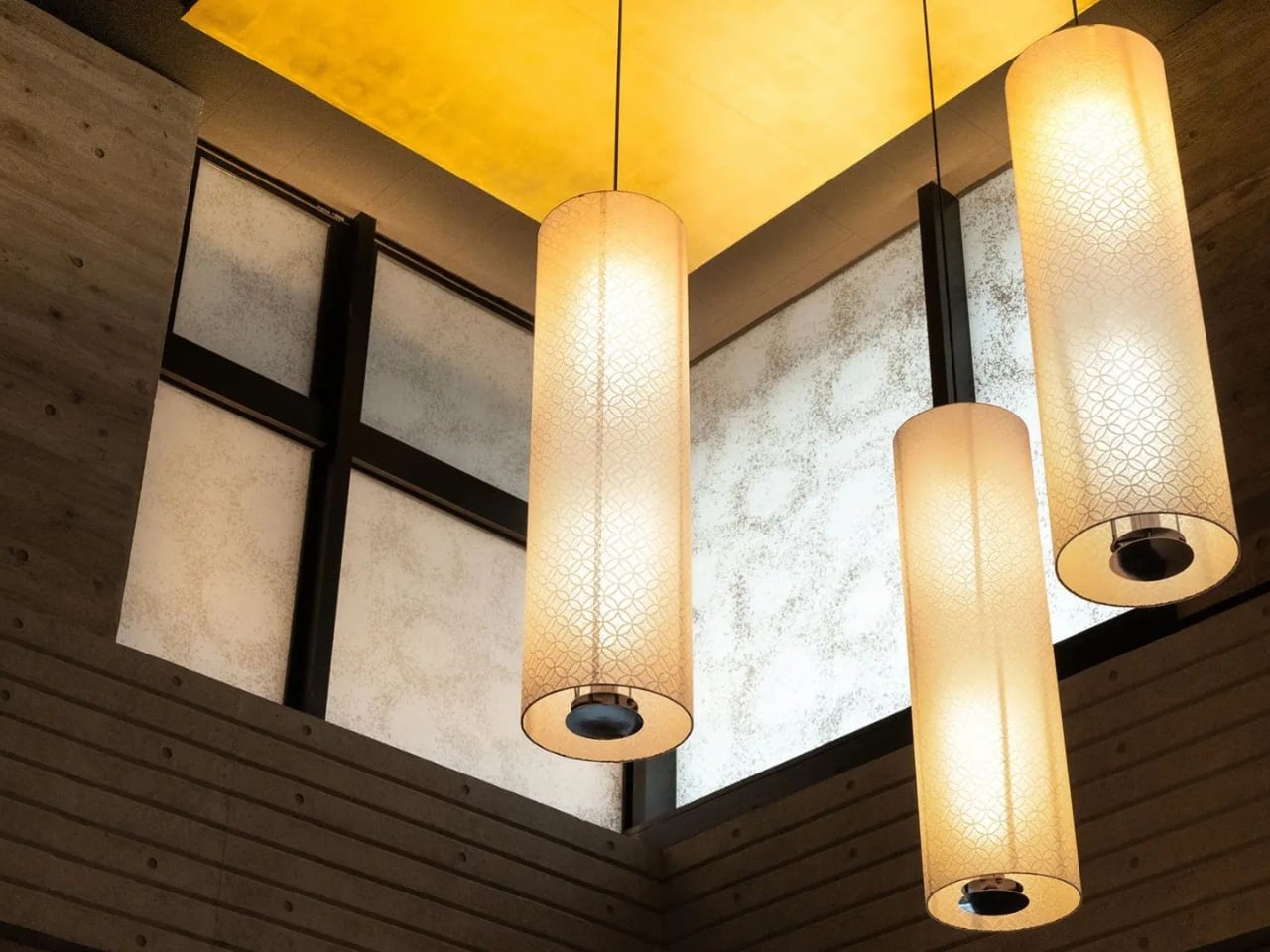
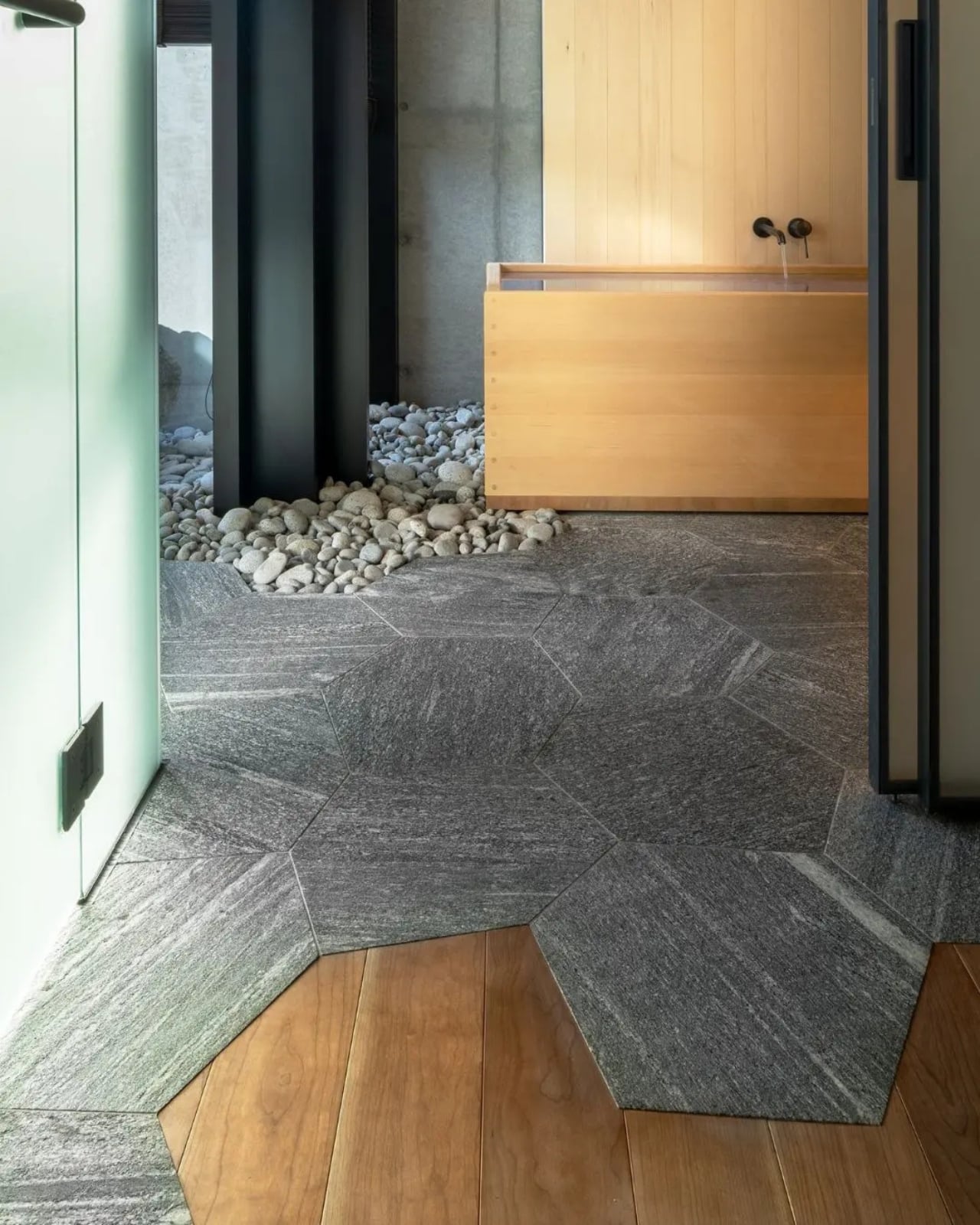
The materials are just as considered. Cedar-imprinted concrete shows up throughout the hotel, hard surfaces pressed with the warmth of wood grain, creating a tension that reads as both ancient and completely new. Large-scale washi paper panels function as architectural elements, not just decoration. Guest rooms have solid cherry wood floors, tatami mats made from natural rush, and furniture entirely handmade by Kyoto craftsmen. Jun Tomita, who handled interior design alongside Moussas, drew motifs directly from The Tale of Genji for every custom piece. And then there’s the detail I keep coming back to: during construction, a heritage water basin and a small shrine were discovered on-site. Rather than remove them, the team built the garden around them. That kind of decision tells you everything about where the priorities were.

There are 19 rooms in total, each one different. River views, city views, garden views. No two stays are the same, and that’s by design. Each room also features an original painting by a Kyoto artist, with every piece drawing on a different theme from The Tale of Genji, so even the art tells a chapter of the same story. Moussas has said he wanted guests to have a different experience every time they return, and the hotel is built to make that true. The rooftop garden and bar take it further still, offering panoramic views that make the hotel feel like it belongs to the entire city, not just its footprint.

Genji Kyoto’s real achievement isn’t any single detail. It’s the commitment to depth over spectacle. A lot of contemporary design is about the first impression, the photograph, the wow moment. This hotel asks for more time than that. It reveals itself in layers, the way a good book does. You have to slow down. You have to look twice. That’s a rare ask in hospitality. And it’s a rarer thing to pull off.

The post Genji Kyoto Is a Hotel You Read Like a 1,000-Year-Old Book first appeared on Yanko Design.

These Steel Chairs Are Too Big to Sit In: Walk Through Them Instead

Most public art earns its place on a pedestal and stays there. It asks you to look, maybe photograph it, and walk away. The relationship between viewer and work rarely extends beyond that brief transaction. That’s been the convention for a long time, but there’s a growing push for installations that don’t just occupy public space but actually do something within it.

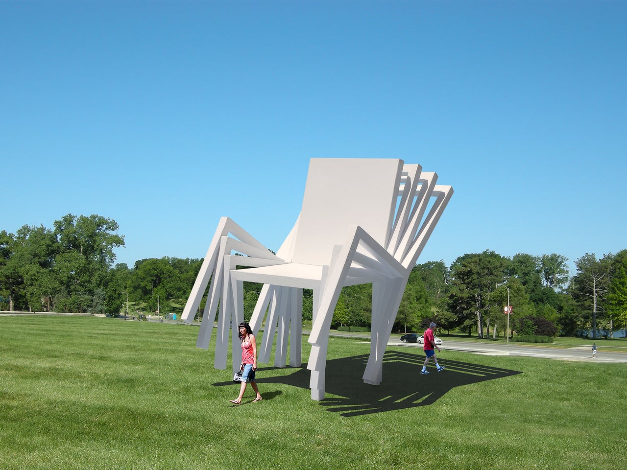
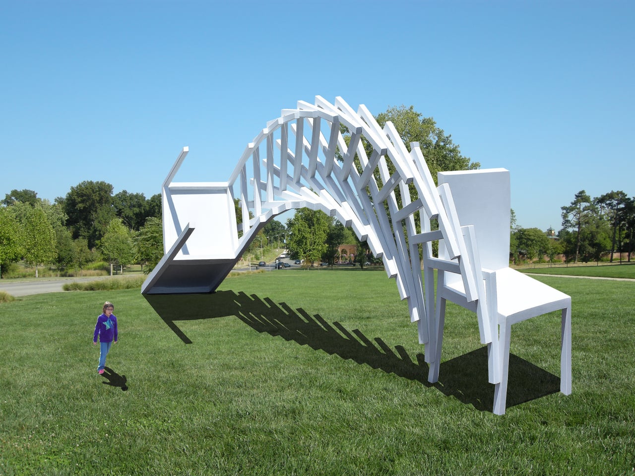
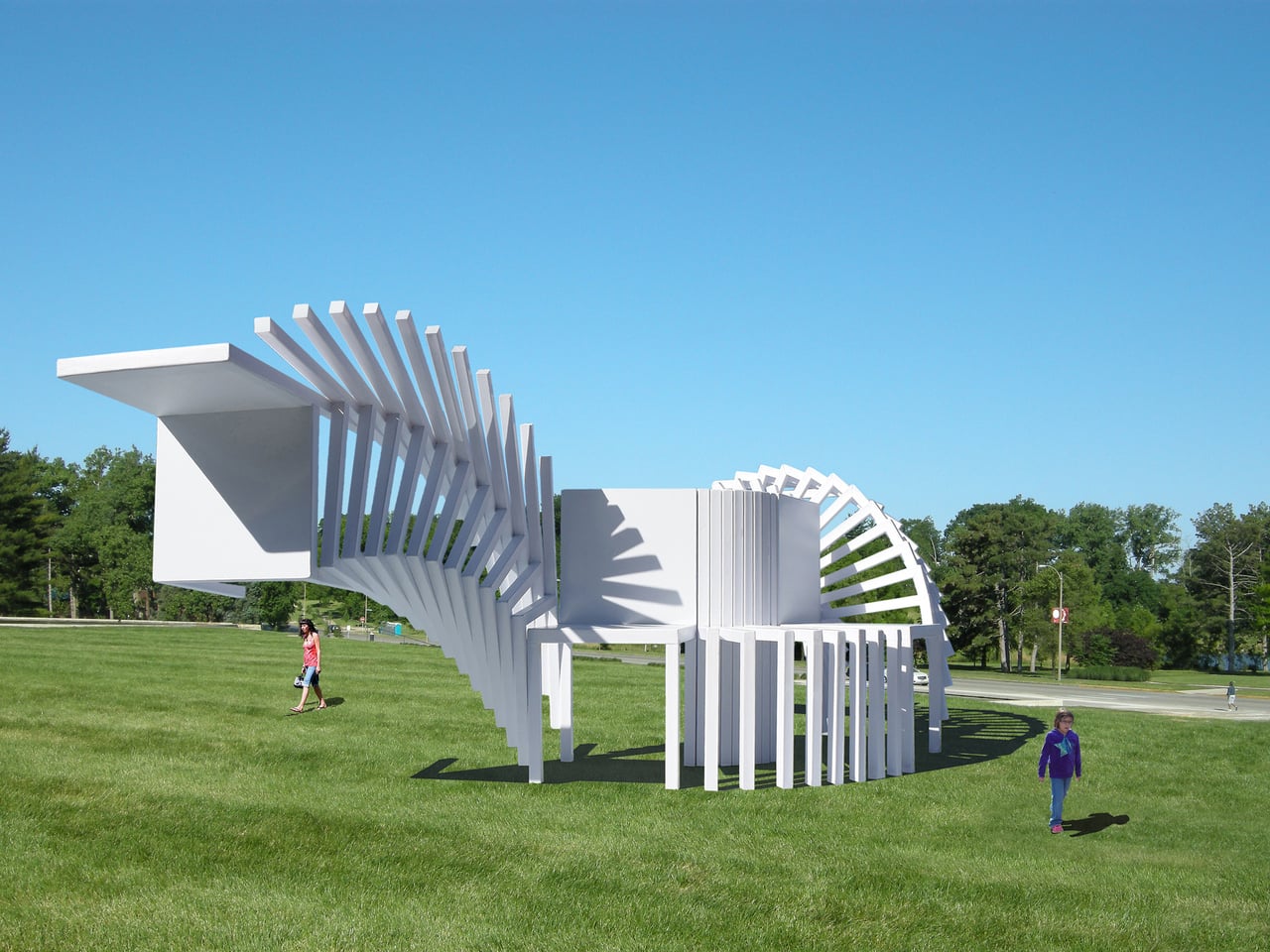
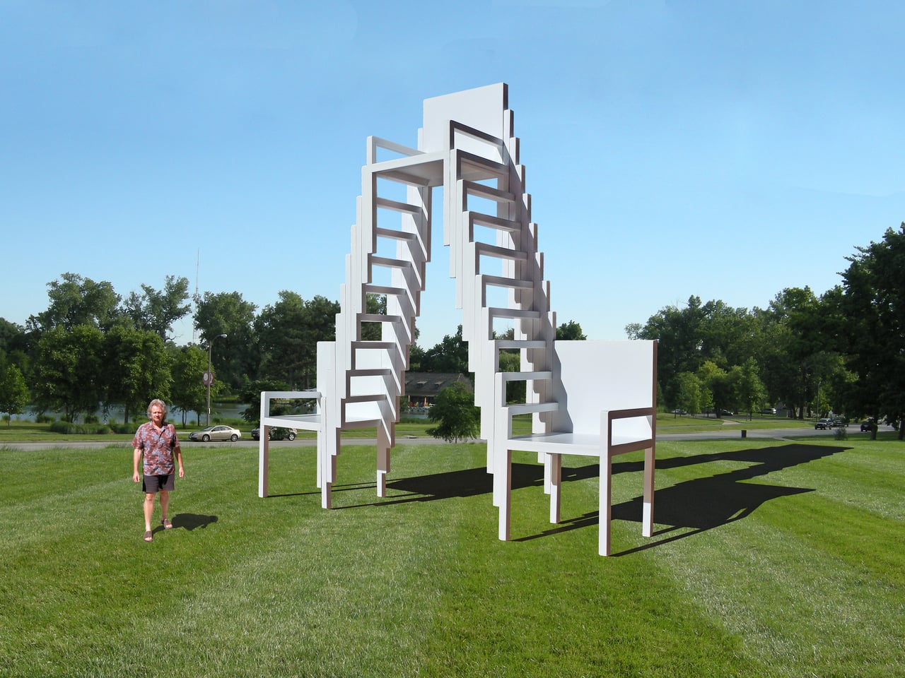
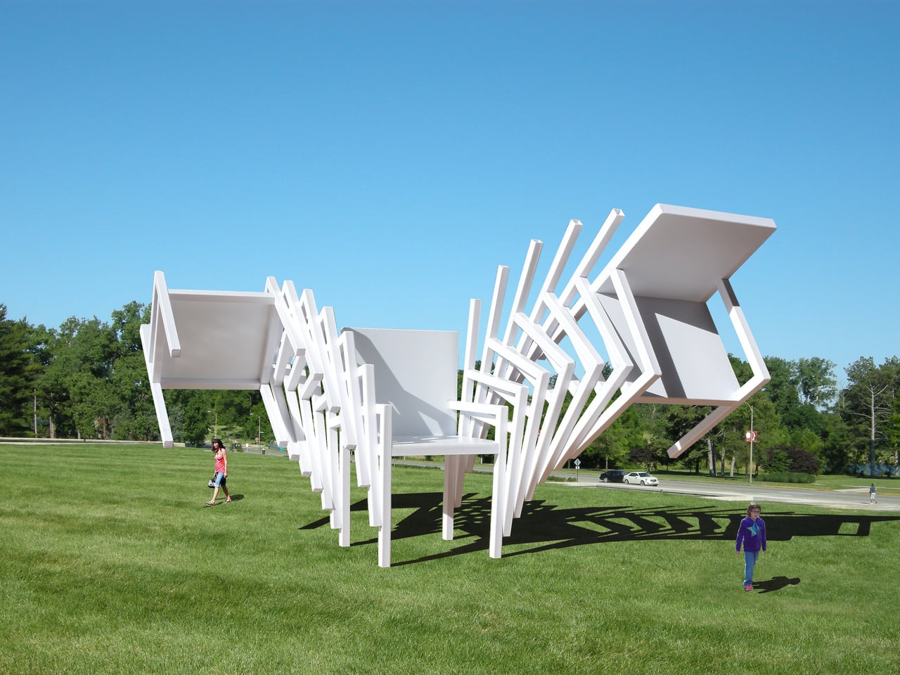
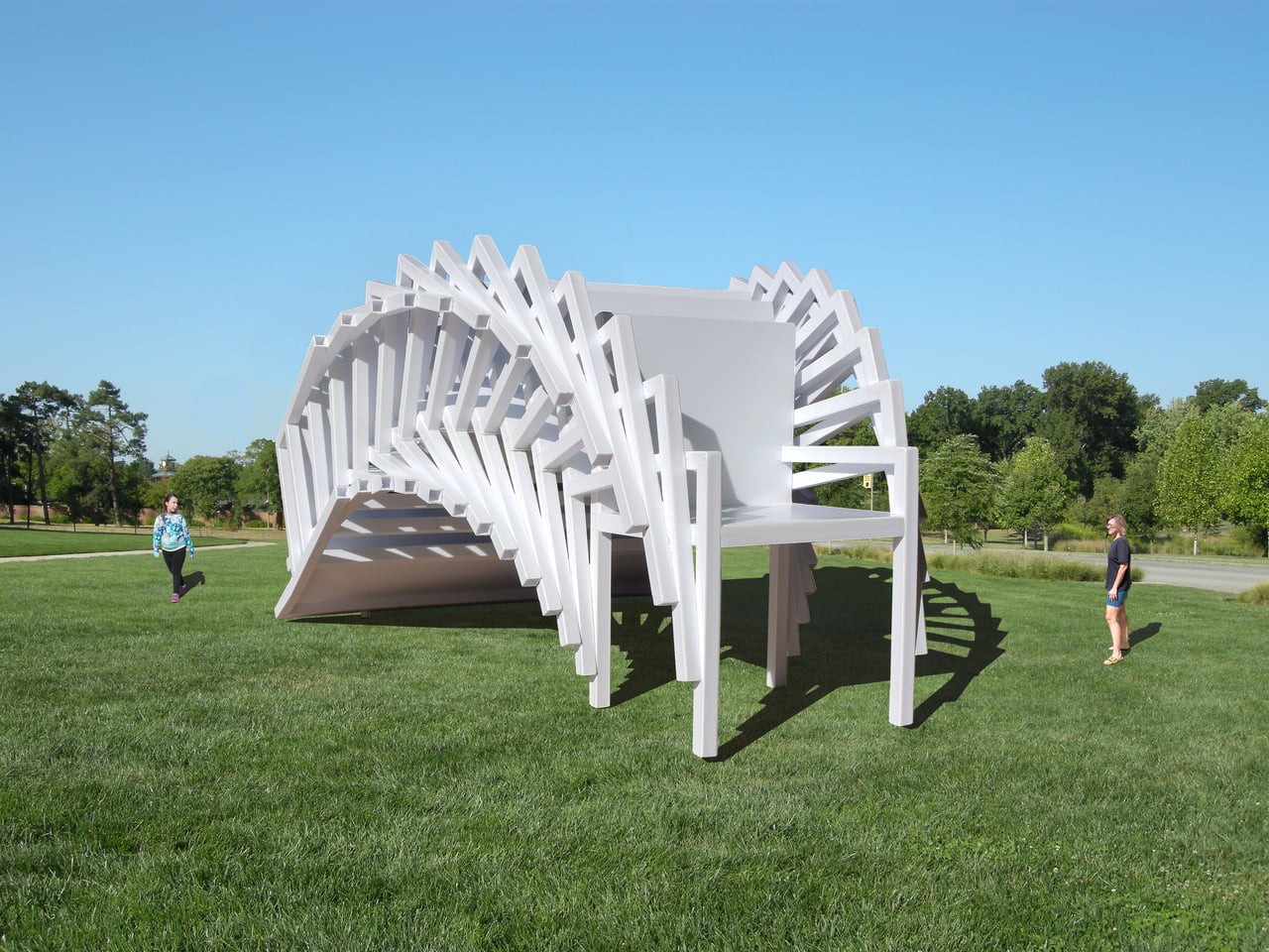
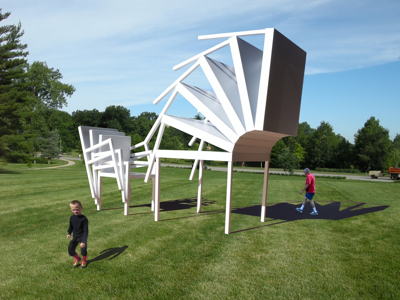
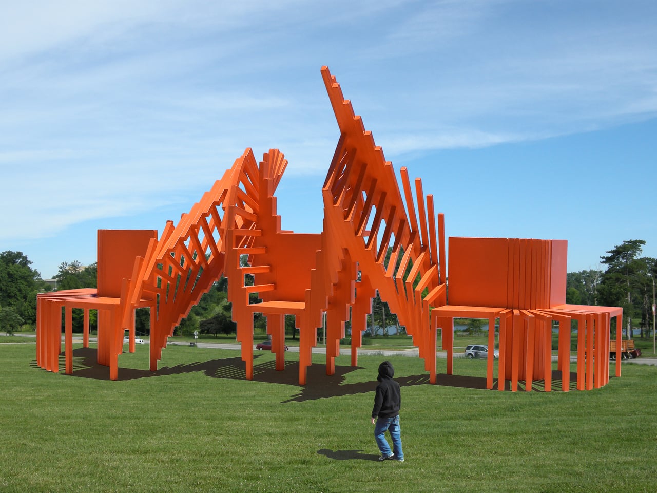
Michael Jantzen has been exploring that tension for years. His Moving Furniture series applies a simple idea to ordinary chairs and tables: take each object’s form and repeat it in progressive intervals as if capturing it mid-movement, then connect those moments into a single piece. The result is something you can still sit in or set a drink on, even if it no longer looks quite built for that.

Designer: Michael Jantzen

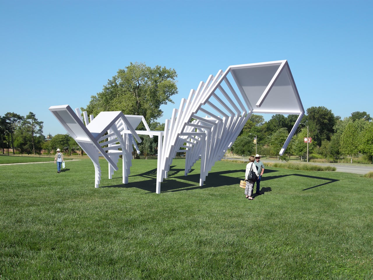
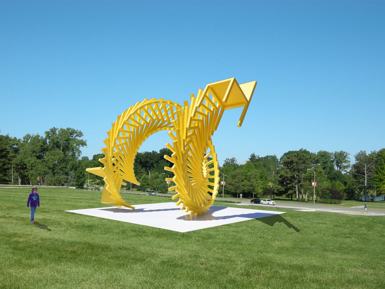
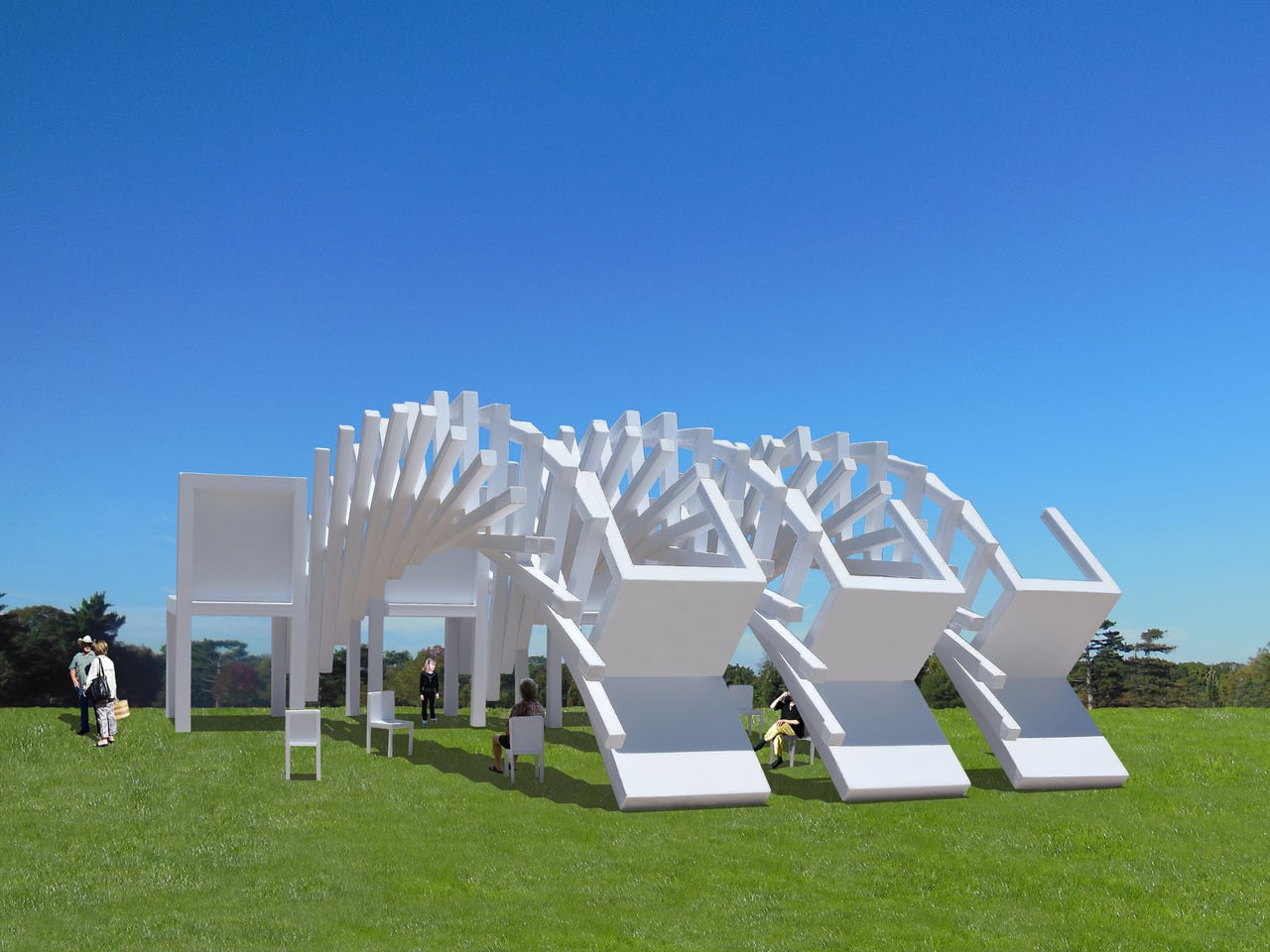
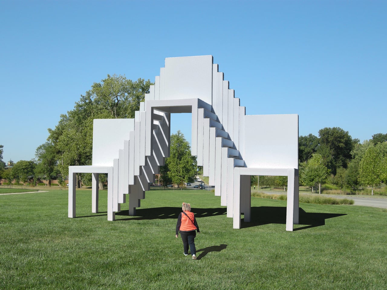
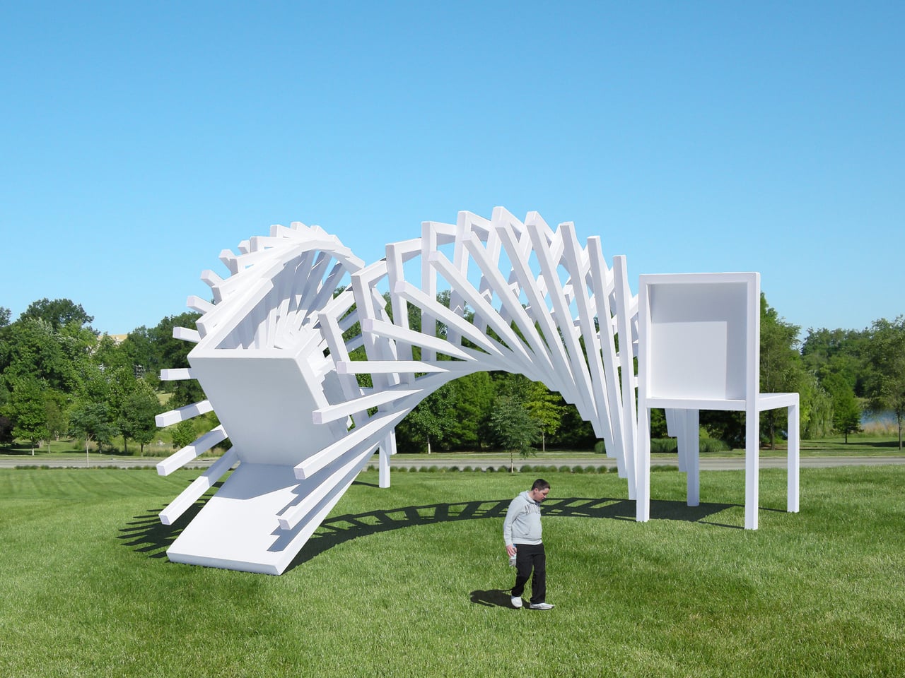
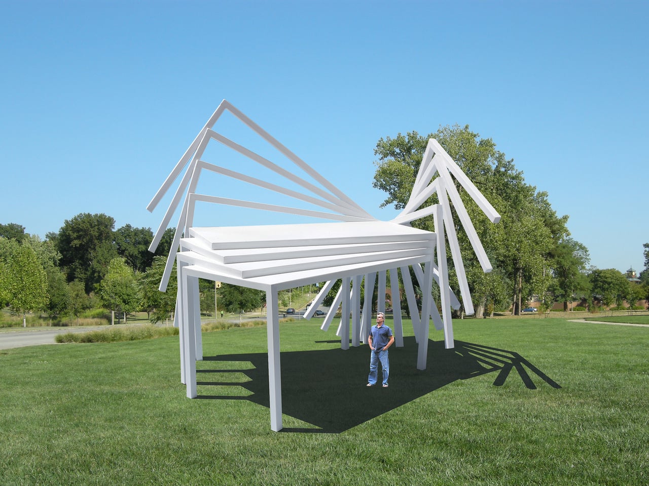
Monumental Moving Furniture takes that same concept into architectural territory. Built from painted steel, the series consists of abstracted chair and table forms, each generated by moving the original object through space and time and locking its path into a chain of connected segments. At this scale, what started as a reference to everyday objects feels closer to a building than a piece of furniture.

The method behind each piece is consistent. A chair or table is set in motion through space and time, with each interval frozen and joined to the next. Some pieces move only part of the original form; others shift the whole thing. The result is a structure that stops belonging to any single discipline and starts reading as furniture, sculpture, and architecture at once.

Despite being too large to sit in, these sculptures aren’t purely decorative. Each is large enough to walk under and through, giving it a practical function as a pavilion and shelter. That’s not something most public art can claim. Instead of asking people to observe from a polite distance, these structures pull you in, turning a passive encounter into something more physical and immediate.

The series covers both chair forms and table forms, each treated with the same sequential abstraction. Individual pieces have also been grouped into configurations that suggest more complex structures, as if each were a building block for something larger. Painted in vivid, solid colors like white, orange, and yellow, each structure commands attention from a distance and rewards a closer look once you’re standing beneath it.

Public spaces deserve more than objects to look at. They deserve things to experience. Monumental Moving Furniture earns its place on both counts, offering structures large enough to shelter visitors while giving them something genuinely puzzling to engage with. These forms don’t demand reverence. They invite curiosity, exploration, and the kind of slow, circling attention that good public space has always been designed to encourage.

The post These Steel Chairs Are Too Big to Sit In: Walk Through Them Instead first appeared on Yanko Design.

These Steel Chairs Are Too Big to Sit In: Walk Through Them Instead

Most public art earns its place on a pedestal and stays there. It asks you to look, maybe photograph it, and walk away. The relationship between viewer and work rarely extends beyond that brief transaction. That’s been the convention for a long time, but there’s a growing push for installations that don’t just occupy public space but actually do something within it.

Michael Jantzen has been exploring that tension for years. His Moving Furniture series applies a simple idea to ordinary chairs and tables: take each object’s form and repeat it in progressive intervals as if capturing it mid-movement, then connect those moments into a single piece. The result is something you can still sit in or set a drink on, even if it no longer looks quite built for that.

Designer: Michael Jantzen

Monumental Moving Furniture takes that same concept into architectural territory. Built from painted steel, the series consists of abstracted chair and table forms, each generated by moving the original object through space and time and locking its path into a chain of connected segments. At this scale, what started as a reference to everyday objects feels closer to a building than a piece of furniture.

The method behind each piece is consistent. A chair or table is set in motion through space and time, with each interval frozen and joined to the next. Some pieces move only part of the original form; others shift the whole thing. The result is a structure that stops belonging to any single discipline and starts reading as furniture, sculpture, and architecture at once.

Despite being too large to sit in, these sculptures aren’t purely decorative. Each is large enough to walk under and through, giving it a practical function as a pavilion and shelter. That’s not something most public art can claim. Instead of asking people to observe from a polite distance, these structures pull you in, turning a passive encounter into something more physical and immediate.

The series covers both chair forms and table forms, each treated with the same sequential abstraction. Individual pieces have also been grouped into configurations that suggest more complex structures, as if each were a building block for something larger. Painted in vivid, solid colors like white, orange, and yellow, each structure commands attention from a distance and rewards a closer look once you’re standing beneath it.

Public spaces deserve more than objects to look at. They deserve things to experience. Monumental Moving Furniture earns its place on both counts, offering structures large enough to shelter visitors while giving them something genuinely puzzling to engage with. These forms don’t demand reverence. They invite curiosity, exploration, and the kind of slow, circling attention that good public space has always been designed to encourage.

The post These Steel Chairs Are Too Big to Sit In: Walk Through Them Instead first appeared on Yanko Design.

How Architects Turned a Postwar London Terrace Into an Open-Plan Home Without Touching the Facade

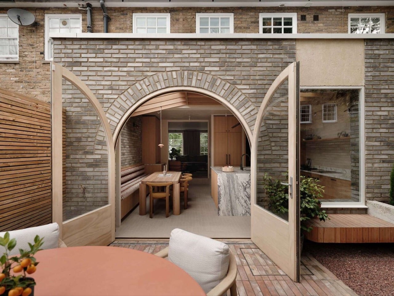
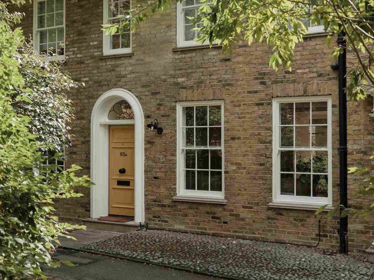
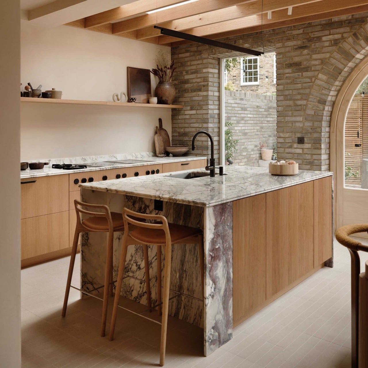
Islington houses tend to resist openness. The typical Victorian or Edwardian terrace was built for a world of separate rooms, each with its own function and its own door, and even postwar Neo Georgian rebuilds like this one on St Paul’s Road inherited that spatial logic. Hamish Vincent Design and Architecture for London treated that inheritance as a starting point rather than a constraint, keeping the facade exactly as it found it and reorganizing everything behind it around a different set of priorities.

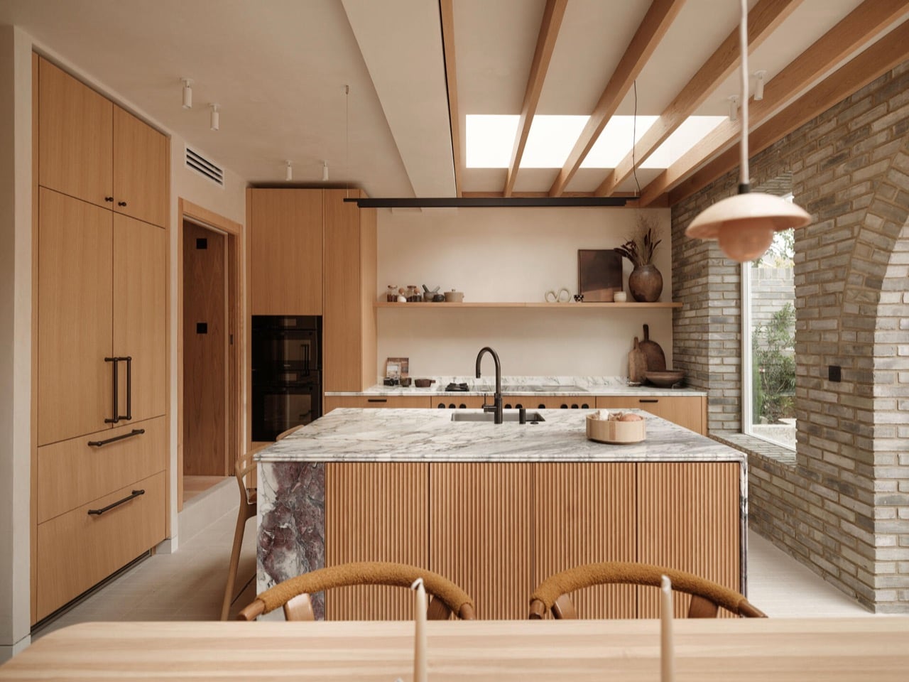
The ground floor has been reworked into a single continuous environment where kitchen, dining, and living dissolve into each other with remarkable ease. A rear brick extension anchors the move, punched through with a full-height arched opening that frames the garden like a painting. Douglas fir beams overhead, a marble and fluted timber kitchen island, a bespoke helical staircase rising through three floors: every decision here is load-bearing, materially and spatially.

Designer: Hamish Vincent Design & Architecture for London

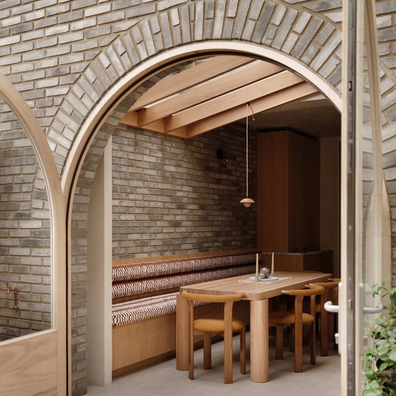
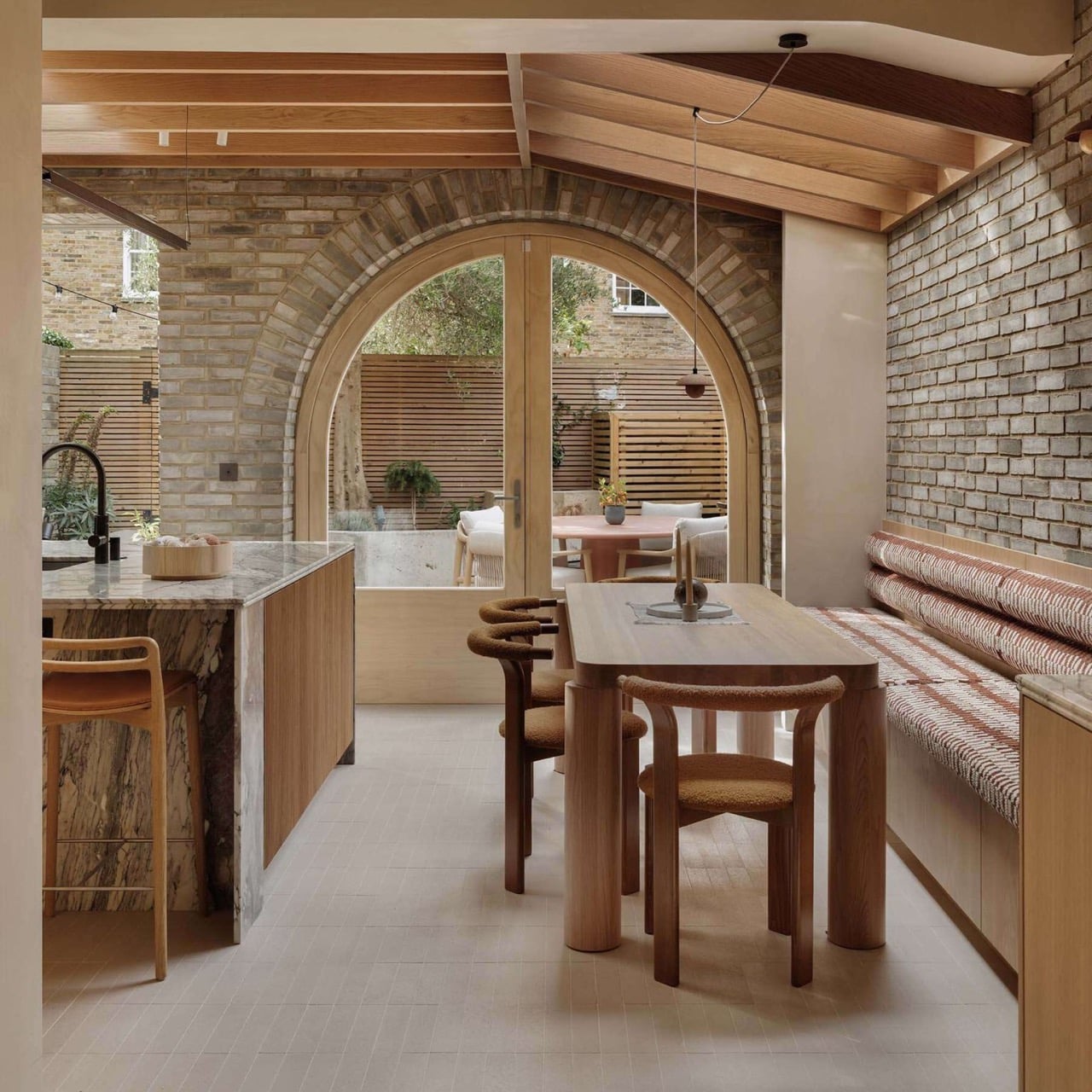
The extension is built in the same grey-green handmade brick as the original rear elevation, which is the kind of decision that sounds obvious but rarely gets made. Most rear extensions announce themselves, either in glass or in a conspicuously different material, as if embarrassed by the ambition. Here the new fabric reads as continuous with the old, and the arched opening cut through it does all the work of signaling that something has changed. That arch is timber-lined on the interior face, brick-voussoir on the exterior, and it frames the entire open-plan ground floor when viewed from the garden with the precision of a composed photograph.

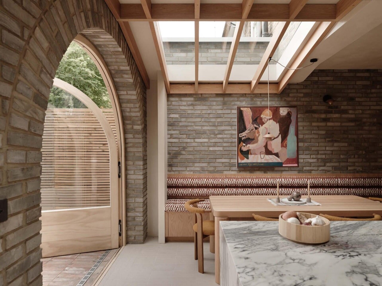
The kitchen island features a top with a heavily veined white marble slab. The body is clad in vertical fluted timber. The end panel, the short face you see from the dining side, is a column of deep purple-toned quartzite with the kind of geological color that reads almost violet in certain light. Three materials, one object, zero apology. The surrounding cabinetry is flat-fronted oak with black hardware, deliberately quiet so the island can operate at full volume without the room feeling overwhelmed.

The dining zone sits between the island and the garden wall, anchored by a built-in banquette upholstered in a red and cream woven fabric against exposed brick. A timber dining table with rounded legs and a pendant light overhead completes the arrangement. Skylights cut into the roof above flood the entire zone with natural light, which matters because the extension sits behind the main house footprint and would otherwise feel basement-adjacent. The ceiling beams are exposed douglas fir, running parallel to the garden wall, and they give the space a warmth that keeps the brick from reading as cold or industrial.

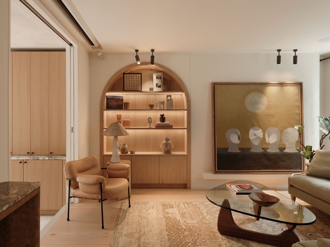
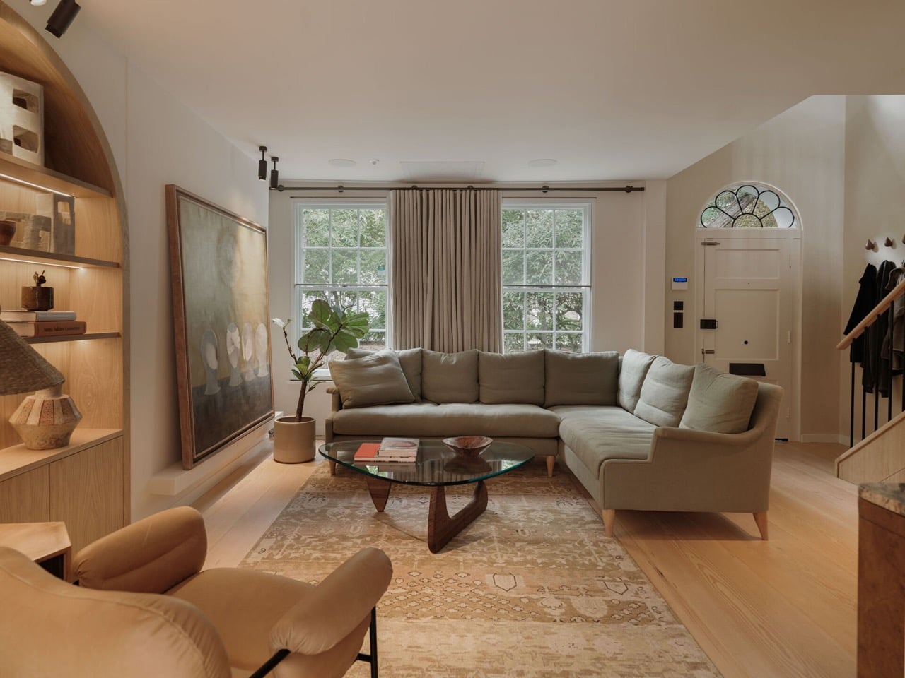
The living room pulls back from the material intensity of the extension. Lime-plastered walls, a Noguchi coffee table in walnut and glass, a vintage rug, and a built-in arched shelving unit with backlit display niches. The arch appears again here, and its recurrence across the garden threshold, the shelving, the staircase handrail, and the original front door fanlight is what gives the project its internal coherence. A single borrowed form, deployed with enough variation that it reads as a theme rather than a tic.

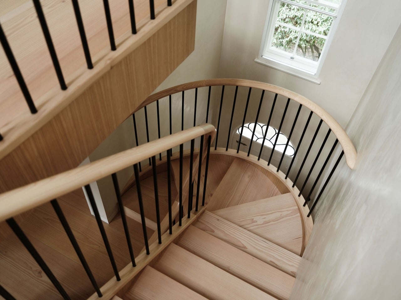
The staircase got repositioned as part of the redesign, which is a significant structural intervention often undersold in project descriptions. Moving a stair in a terraced house means rethinking the entire circulation logic, and the payoff here is a three-story helical structure with douglas fir treads, a curved timber handrail, and slim black metal balusters. Viewed from above, the stair winds down toward the original fanlight above the front door, a Georgian semicircular window that now sits framed at the base of the void like a deliberate full stop.

The Canonbury Conservation Area will never know what hit it. From the street, number 65A reads exactly as it always has: handsome, reticent, correctly proportioned. The ochre door gives nothing away. Behind it, Hamish Vincent Design and Architecture for London have built a ground floor that operates on an entirely different register, one organized around material conviction and a single recurring geometric idea rather than the room-by-room compartmentalization the building was born into. The arch did all the heavy lifting, and the house let it.

The post How Architects Turned a Postwar London Terrace Into an Open-Plan Home Without Touching the Facade first appeared on Yanko Design.

The Daphne Is a Tiny Home That Thinks It’s an Apartment

Most tiny homes ask you to live smaller. The Daphne skips that conversation entirely. It doesn’t try to be a tiny home — it tries to be a home, full stop. Built by Alberta-based Teacup Tiny Homes, a builder that has been crafting thoughtfully designed compact dwellings since 2016, the Daphne is a park model that reframes what small-scale living can actually look and feel like.

Originally custom-designed and built for a client in Ontario, the Daphne sits on a triple-axle trailer and measures 36 feet long by 10 feet 6 inches wide, a noticeably generous footprint by tiny home standards. That extra width is the whole point. Where most road-legal tiny homes max out at 8.5 feet across, the Daphne’s park model classification allows it to stretch into a proportion that feels closer to an apartment than a camper. The result is 378 square feet of interior space that sleeps up to four people, all on a single floor, with no lofts in sight.

Designer: Teacup Tiny Homes

The exterior makes a clean first impression. Horizontal lap siding wraps the structure, punctuated by cedar accents that add warmth and a sense of craft without veering into rustic territory. Large windows run throughout, drawing in natural light and giving the interior an openness that defies the square footage. Inside, the design reads like a well-edited apartment, bright, modern, and deliberately finished. Fine materials and considered details are present throughout, reflecting the kind of specificity that comes with a custom build.

The kitchen earns its title as a gourmet space, offering full-sized functionality in a layout that doesn’t feel squeezed. The living area is generous enough to actually use, and the main floor bedroom includes built-in storage that keeps the space feeling uncluttered. But the bathroom might be Daphne’s boldest move: it includes both a freestanding bathtub and a separate shower, a feature that’s rare even in full-sized homes, let alone tiny ones. It signals clearly that this is a home built around comfort rather than compromise.

For those looking at seasonal retreats, full-time living, or a secondary dwelling on a larger property, the Daphne presents a genuinely compelling case. It doesn’t ask its owner to give anything up. The proportions are right, the finishes are right, and the floor plan flows the way a real home should. Teacup Tiny Homes has always argued that small doesn’t have to mean less, and the Daphne is the clearest version of that argument yet.

The post The Daphne Is a Tiny Home That Thinks It’s an Apartment first appeared on Yanko Design.

The French Tiny House That Put the Bedroom on the Ground Floor

The tiny house world has a habit of recycling the same design logic: loft bedroom up top, living area below, ladder in between. It works, and nobody really argues with it. But every once in a while, a designer asks “what if we did this completely differently?” and the result is something you can’t stop thinking about.

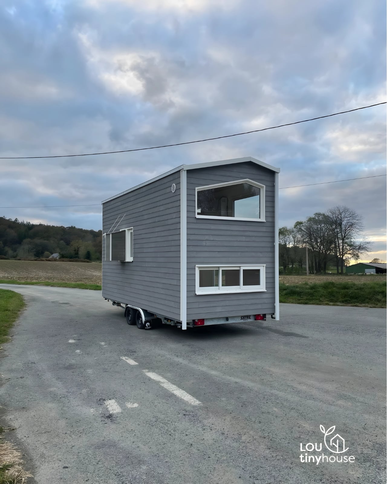
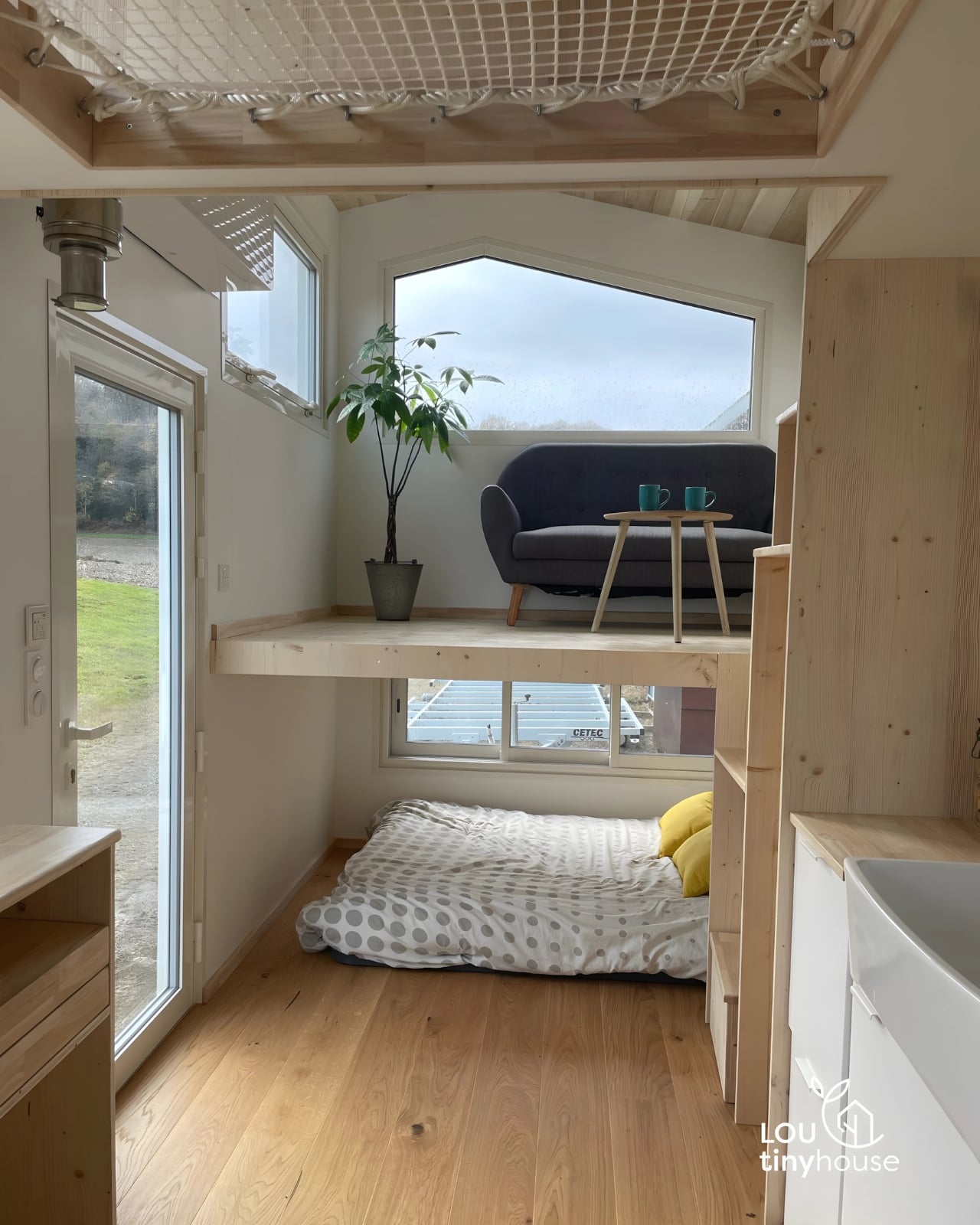
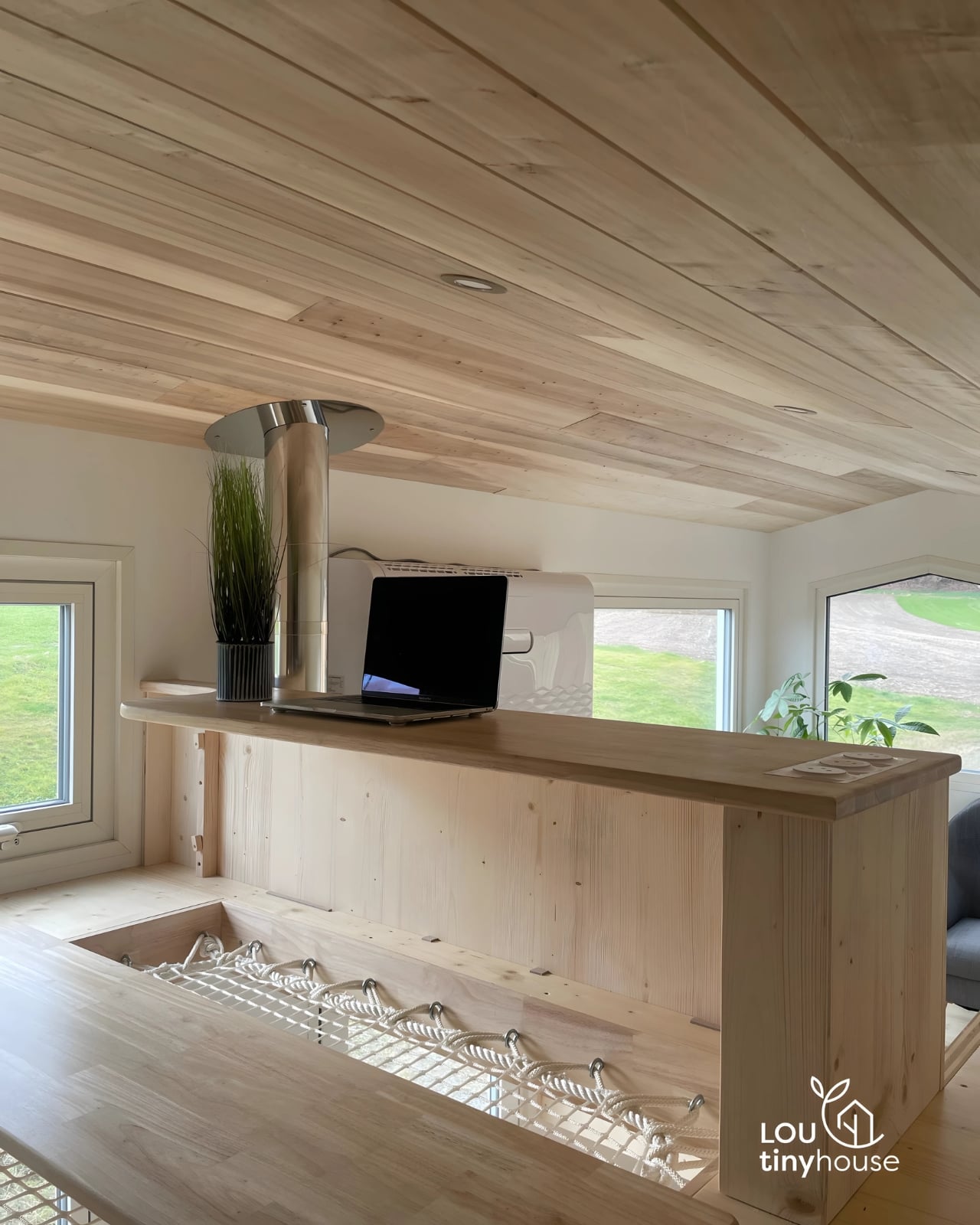
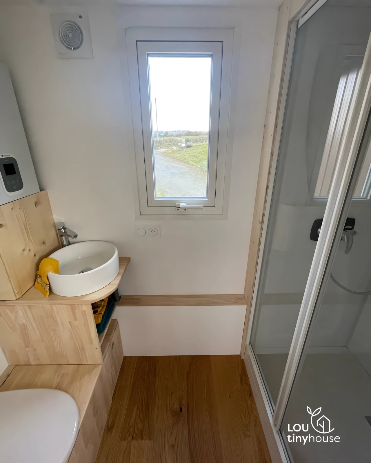
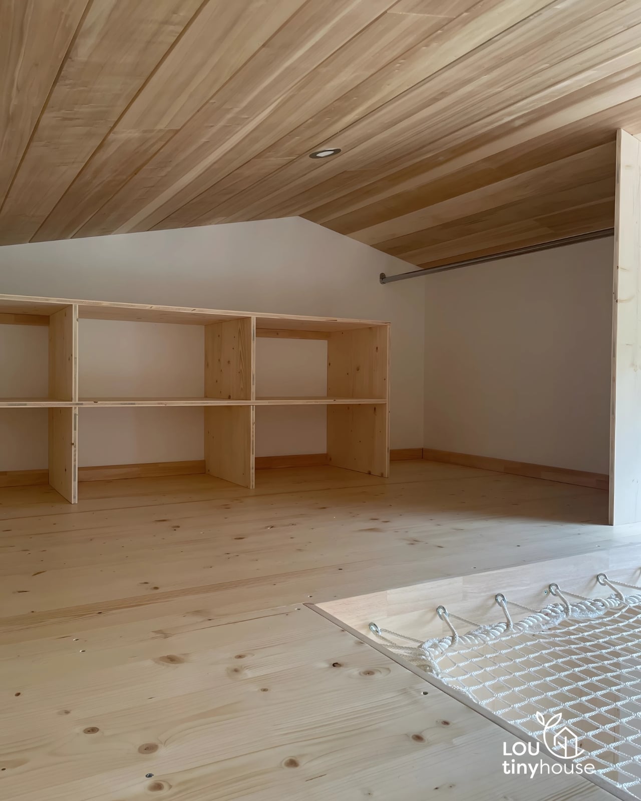
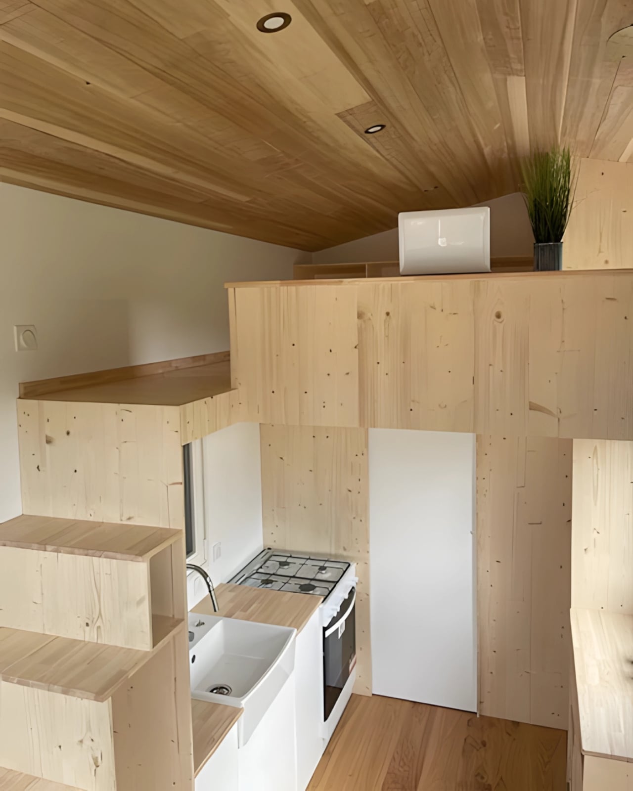
That’s the Véronique, a compact towable home crafted by France’s Lou Tiny House, and its most quietly radical choice is this: the bedroom is on the ground floor, and the loft is the living space. Upside down by tiny house convention, but somehow, on second thought, completely obvious.

Designer: Lou Tiny House

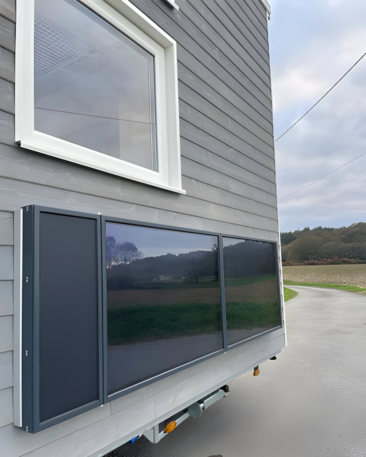
At just 5.80 meters (19 feet) long and set on a double-axle trailer, the Véronique is small by any standard, tiny house included. It’s clad in spruce wood on the outside and topped with a metal roof, which gives it a clean, almost Scandinavian edge despite its French origins. The whole thing was built for a musician named Véronique, yes, the house is named after its owner, who planned to park it in the mountain region of Cantal, a place known more for rough winters than beachside ease. Lou Tiny House, whose workshop sits at the foothills of the Pyrenees, knows that climate well, and it shows in how thoughtfully the home was built to handle it, including a passive heating system designed to keep things comfortable without running up an energy bill.

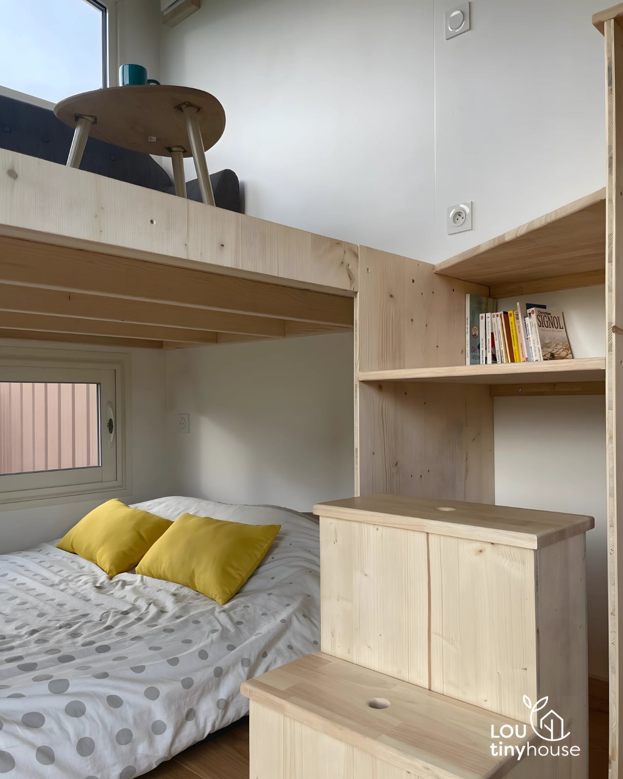
The decision to flip the layout isn’t just an aesthetic quirk, it’s a practical one. In a conventional tiny house, climbing into a loft bedroom is fine when you’re in your twenties and don’t mind a ladder at midnight. But it’s a different story when the space needs to work long-term, or when you simply want to get in and out of bed like a normal person. Putting the bedroom on the ground floor solves that problem entirely. The bedroom gets a double bed, a generous row of windows for light and air, and a sense of calm that feels genuinely restful rather than squeezed-in.

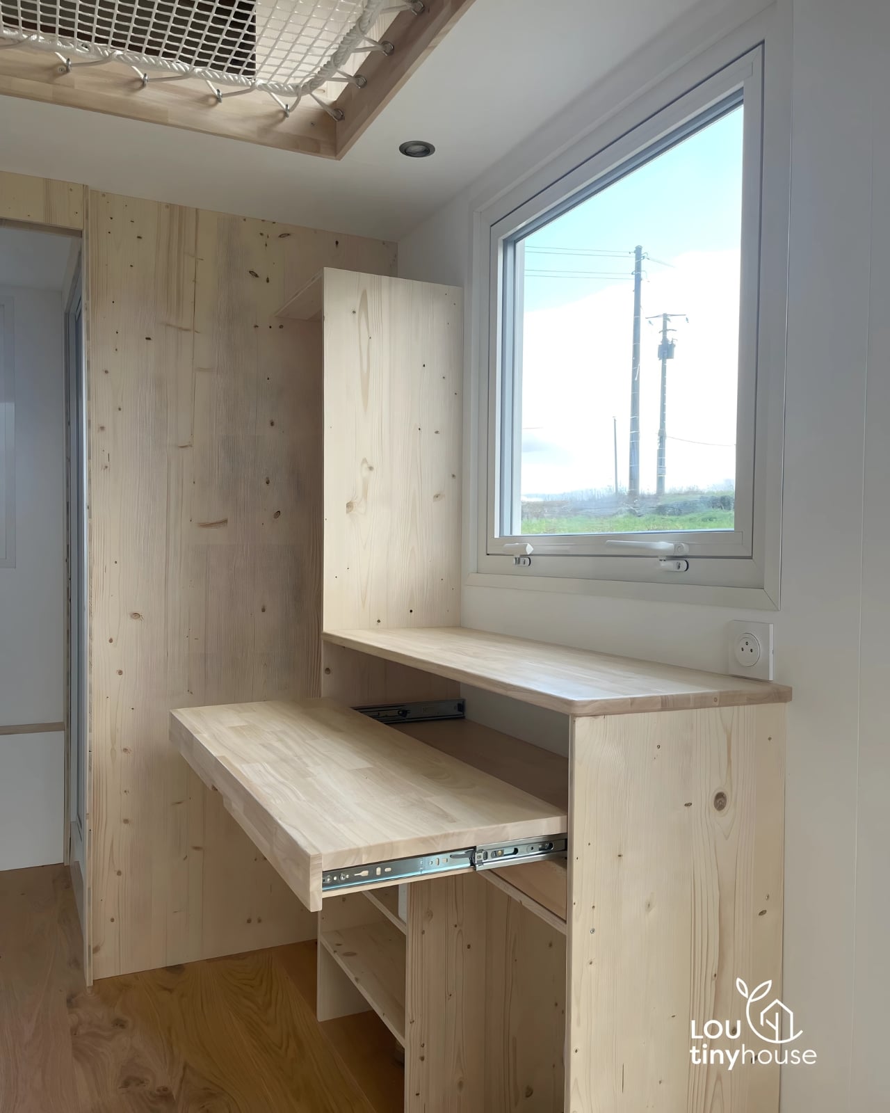
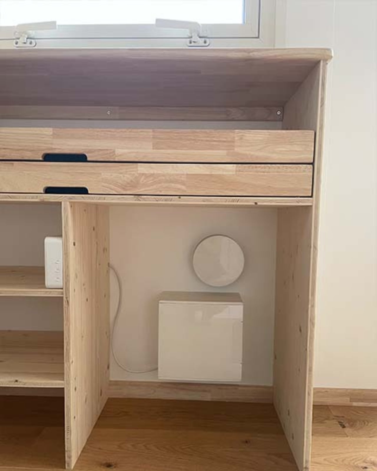
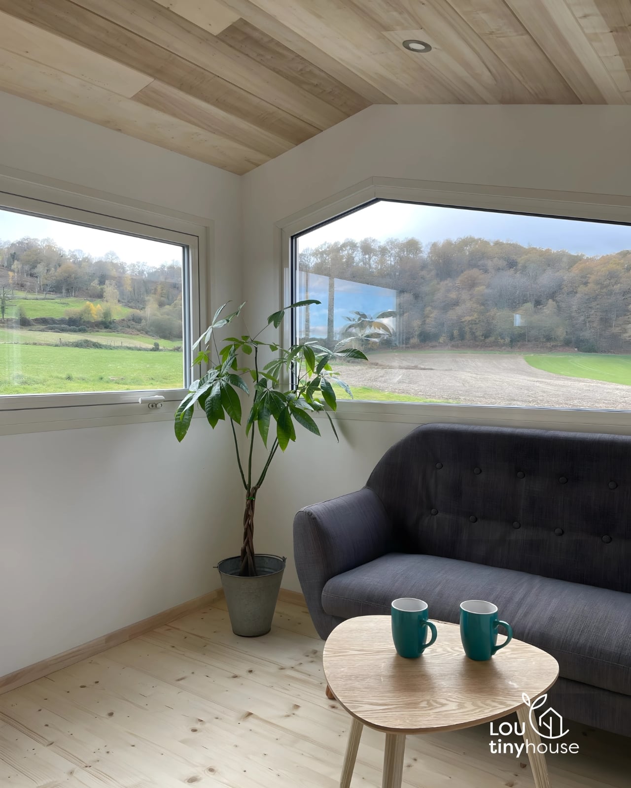
The loft, meanwhile, becomes the social hub: a sofa, a coffee table, some greenery, and enough breathing room to feel like a real living space rather than an afterthought. It’s the kind of setup that could just as easily serve as a reading nook or a quiet place to work. The design also handles storage needs through the custom loft layout, which matters more than ever now that so many people are working from wherever they happen to be parked.

I’ll admit I have a personal bias toward tiny house designs that treat the bedroom as a sanctuary rather than a sleeping shelf. The climbing-a-ladder-in-the-dark routine has always felt more like a dorm room compromise than a deliberate design choice, and the Véronique is a refreshing pushback against that. The upside-down layout reframes the whole idea of what “small” can feel like. It doesn’t feel like a sacrifice. It feels considered.

Lou Tiny House has built a reputation for custom, handcrafted interiors that lean into natural materials and honest craftsmanship, and the Véronique carries that aesthetic throughout. The warm wood interior, the raw textures, the way everything seems to have been placed with intention rather than squeezed in as an afterthought: it all reads as deeply French in the best possible way. There’s a quiet refusal to apologize for the size of the space, and instead a firm insistence that good design can make even 19 feet feel generous.

The tiny house movement has always been as much about philosophy as it is about square footage. The Véronique fits that spirit, but it brings something extra: a willingness to question conventions that have become so standard in the space that most people don’t even realize they’re conventions anymore. It was built for one specific musician in one specific climate, and that specificity is exactly what makes it feel universal. Good design usually works that way.

The post The French Tiny House That Put the Bedroom on the Ground Floor first appeared on Yanko Design.
The Red Cabin Sitting Alone on a 1,000-Year-Old Island in China

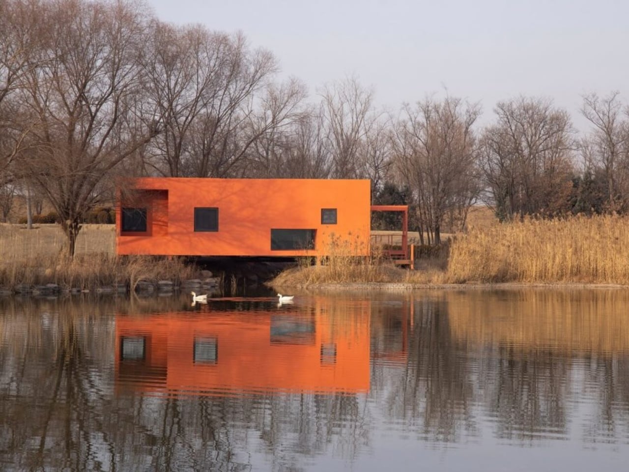
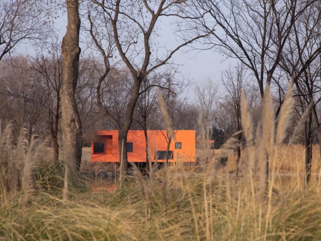
The first time I saw images of the Red Bridge Cabin, I spent a good five minutes just staring at them. Not scrolling. Not clicking through. Just staring. A small red structure sitting on a quiet island, reflected in the water around it, surrounded by the stillness of a thousand-year-old heritage park in Zhengzhou, China. It looked like something out of a dream someone had while reading ancient poetry. It makes me want to spend a few hours in it. That’s the kind of thing good architecture can do to you.
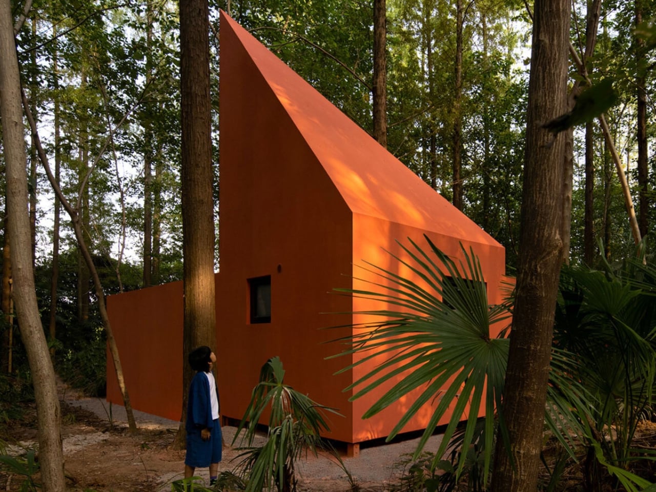
Designed by Wiki World and the Advanced Architecture Lab, the Red Bridge Cabin is the 138th entry in Wiki World’s ongoing “Wild Home” series, a collection of experimental small-scale dwellings that push back against conventional ideas about what a home needs to be. At just 79 square meters, the cabin sits within Yuancheng Cultural Park, a free-admission heritage park built around the Yuanling Ancient City Site in the Zhengzhou Airport Economy Zone. The site is a nationally protected cultural landmark that integrates historical preservation, ecological landscapes, and family-friendly leisure all in one place. Parking a bold red wooden cabin in the middle of that requires either tremendous confidence or a very specific kind of audacity. I’d argue it requires both.

Designers: Advanced Architecture Lab, Wiki World (photos by Arch Exist)

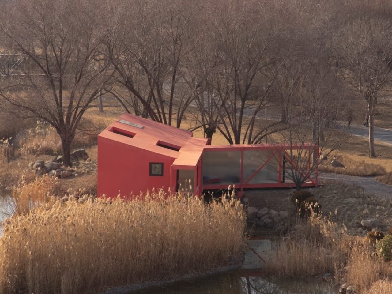
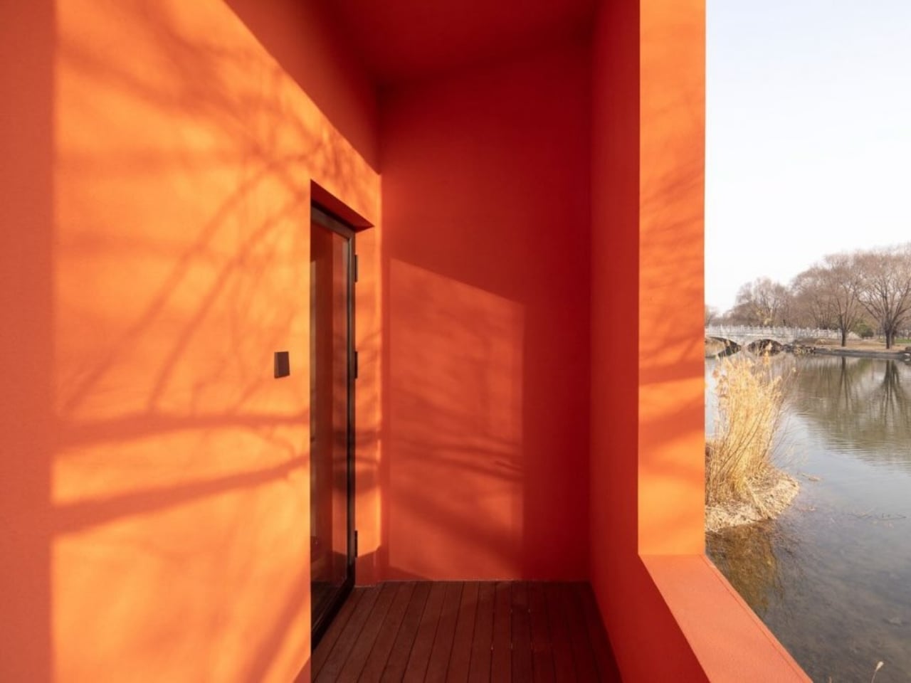
The name comes from the bridge. You reach the cabin by crossing a narrow, translucent bridge over the water, which immediately sets the tone. This isn’t a building you stumble into. You approach it, and that approach is already part of the experience. The designers describe it as a place where “comfort and wilderness, engagement and detachment, become indistinct, like longing itself, beautifully blurred.” I know that reads a little poetic for a press release, but I think they actually meant it, and looking at the photographs, it’s hard to argue against it.

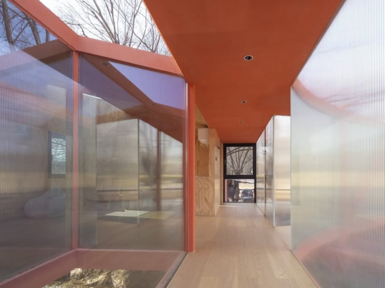
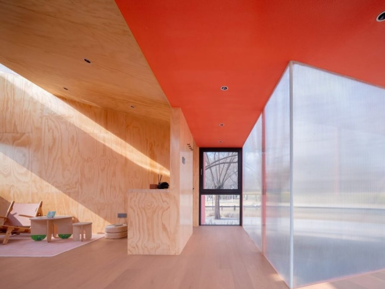
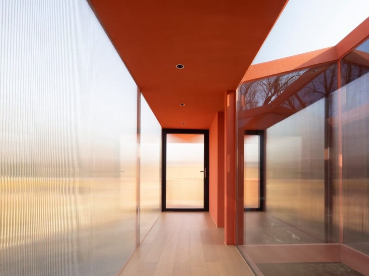
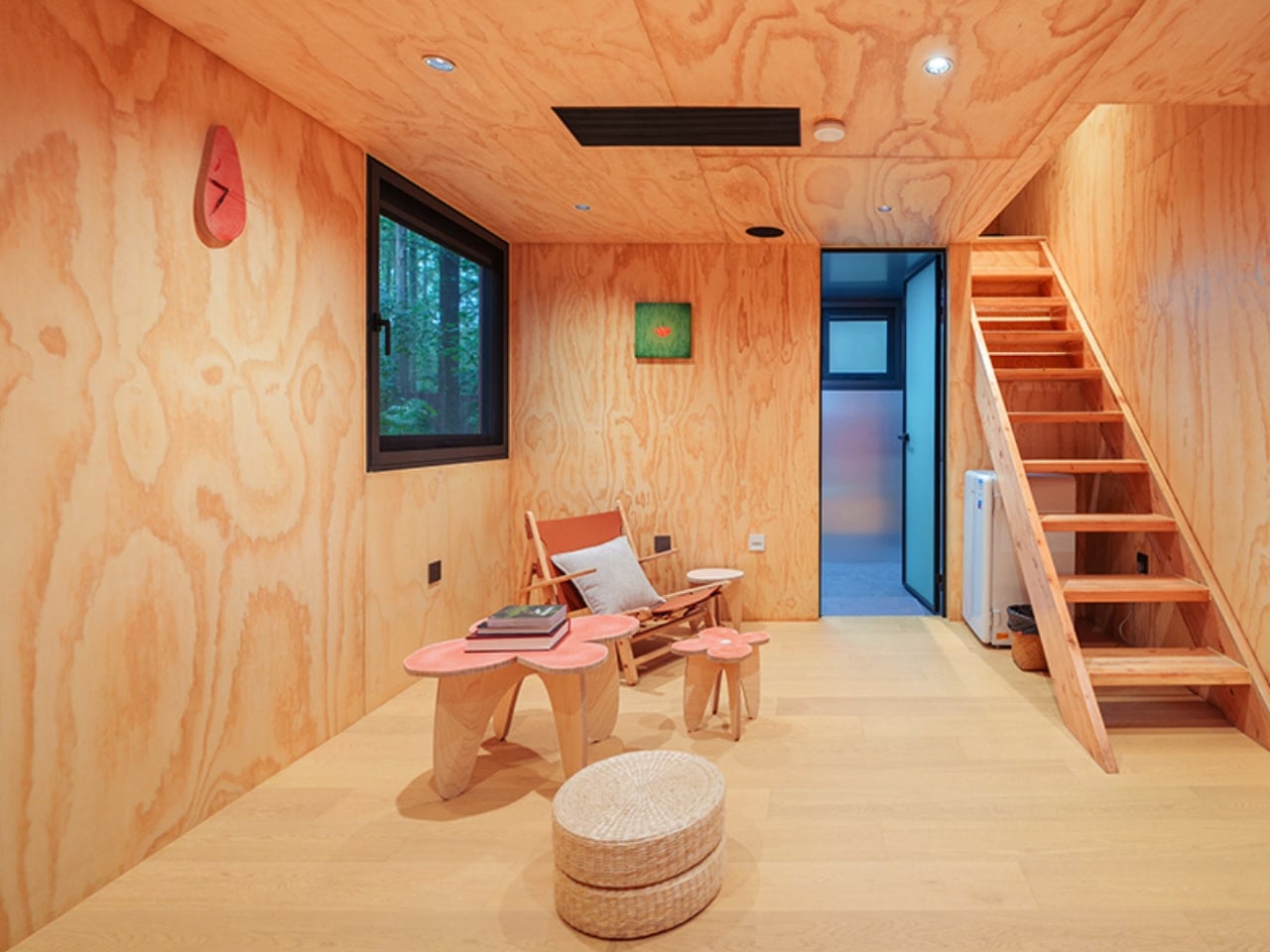
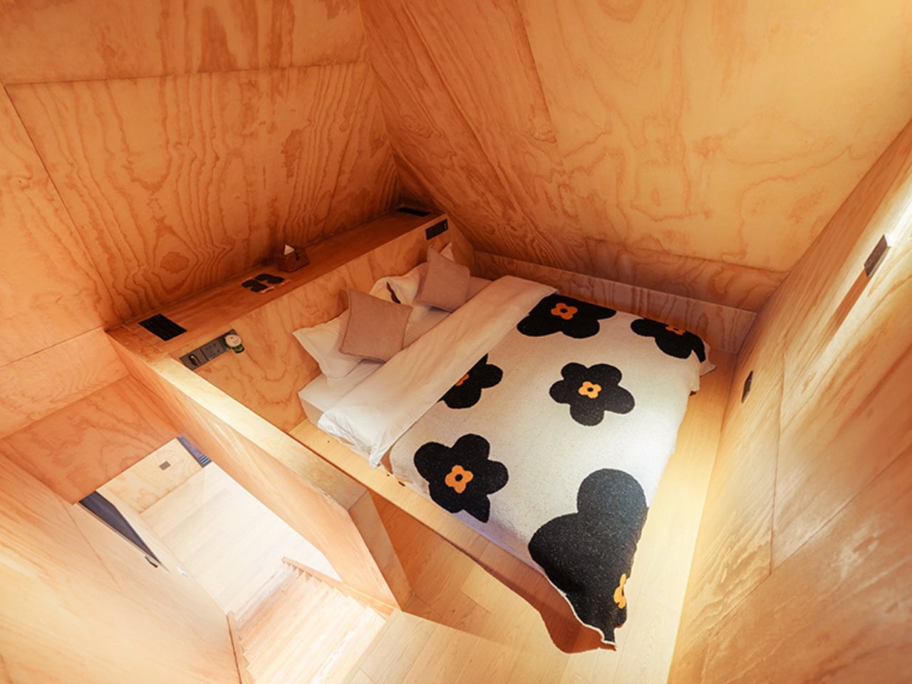
Inside, the cabin incorporates two courtyards and a large skylight, which together create what the designers call “a landscape within the living space itself.” That phrase sounds abstract until you see it in practice. Natural light moves through the interior differently at different times of day. Translucent screens blur the surrounding views into soft silhouettes while carefully placed windows frame specific sightlines outward. It’s a small space that feels intentionally porous, as if the boundary between inside and outside was always meant to be negotiable.

The construction method deserves its own moment. The entire structure is built from glued laminated timber, with every irregular component and joint digitally designed and custom-fabricated for full prefabricated assembly. Small metal connectors link the timber elements, and the whole thing can be disassembled and reassembled without permanently altering the site. The designers frame this as a feature, not a workaround, and for a cabin sitting on protected heritage ground, it’s the only approach that makes any sense. The cabin belongs to the landscape without claiming it.

Wiki World has been building this kind of experimental wilderness dwelling for years, and their consistency is a big part of what makes the Red Bridge Cabin feel interesting rather than just pretty. They’re genuinely working through a set of ideas about small-scale living, about what it means to be physically close to materials, about how reducing space can make a person more sensitive to their surroundings. Their phrase, “small brings us closer to the material,” sounds like design philosophy, but it also sounds like something that could apply to how most of us live, if we let it.

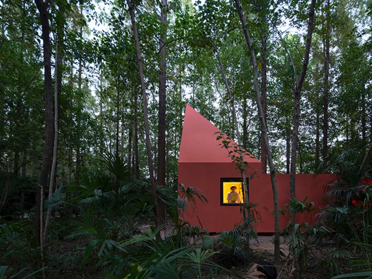
The cabin is painted a deep, saturated red, which at first feels like a deliberate provocation against its natural setting. But the more you look at it in those photographs, reflected in still water against muted greens and ancient earth, the more it starts to feel inevitable. Like it was always supposed to be there. Like the landscape had been waiting for something to mark it. I’m not entirely sure if that’s great design or great photography. Probably both. Either way, I keep returning to those images, and that feels like its own kind of answer.

The post The Red Cabin Sitting Alone on a 1,000-Year-Old Island in China first appeared on Yanko Design.