This Designer Turns Children’s Imagination Into Furniture They Can Truly Own

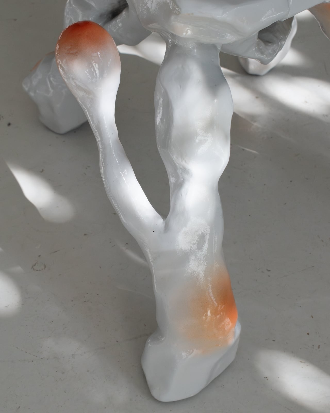
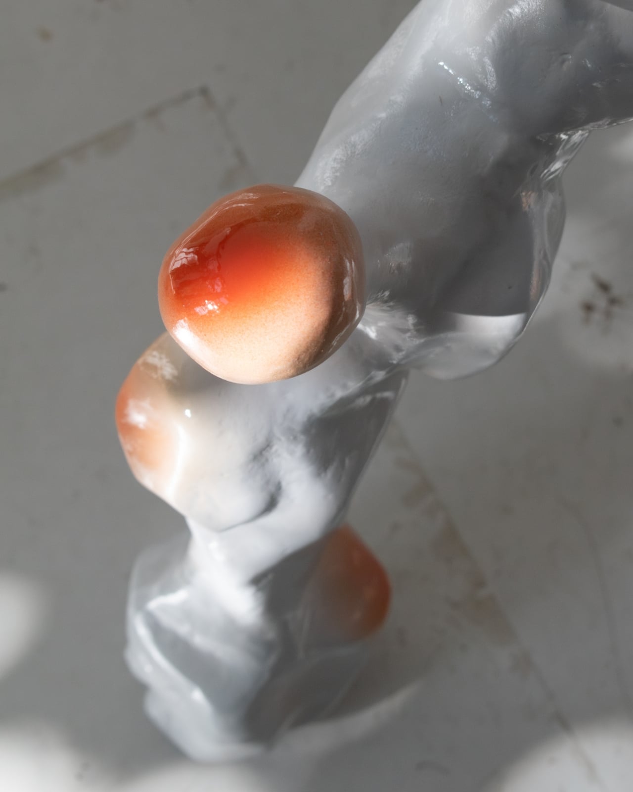
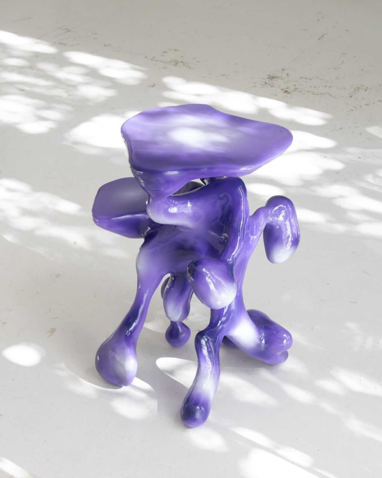
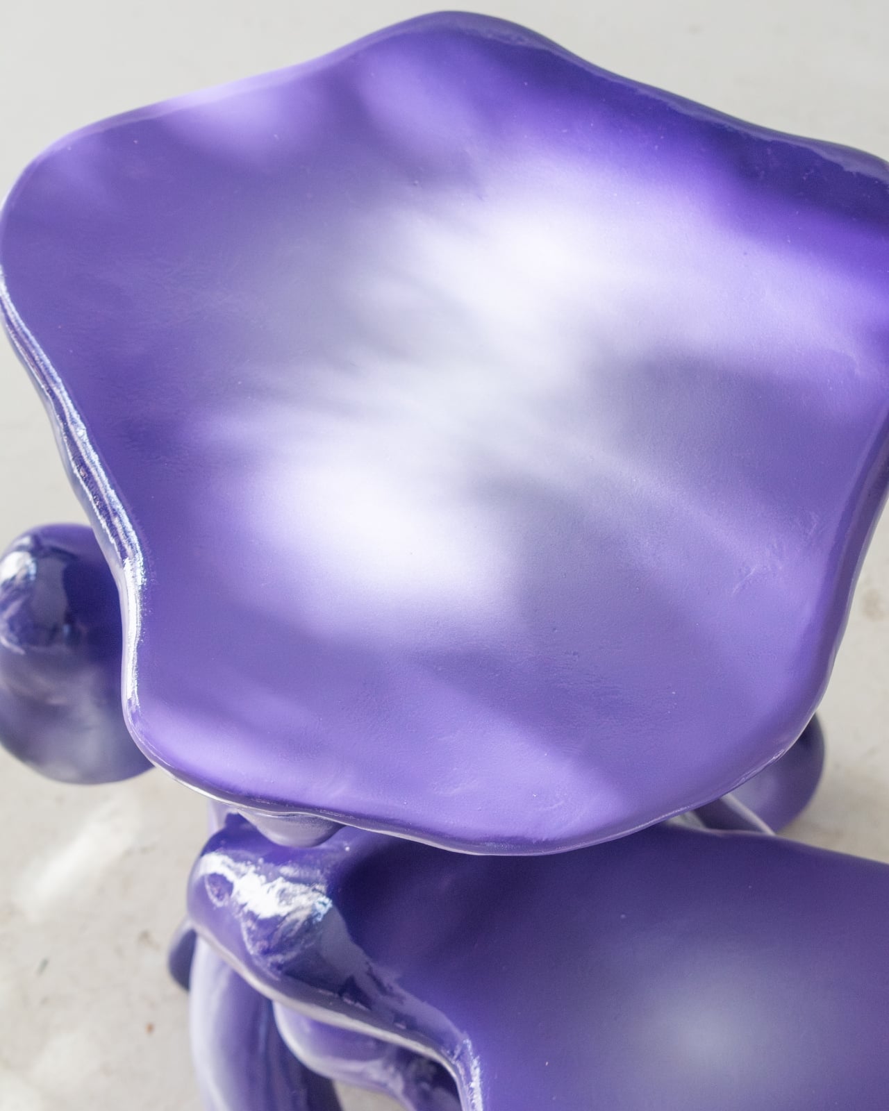
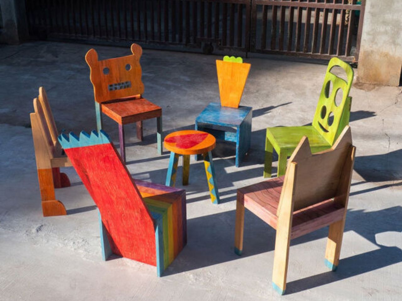
One of the most powerful moments in the creative process is seeing an idea transform into something real. For a child, that moment carries even greater weight. It builds confidence, validates imagination, and reinforces the belief that creativity is not limited by age. Chair for Kids, a participatory design project developed by Taekhan Yun, captures this experience by translating children’s playful and imperfect drawings into fully functional and usable chairs that children can see, touch, and use every day.

Created in collaboration with students from an English school in Siem Reap, the project places children at the center of the design process. Rather than correcting or refining their ideas to fit adult notions of good design, the project embraces the rawness of children’s imagination. More than seventy children participated, each drawing their own version of a chair or stool as an initial exploration of form, balance, and function. These drawings were treated as genuine starting points rather than symbolic exercises.

Designer: Taekhan Yun
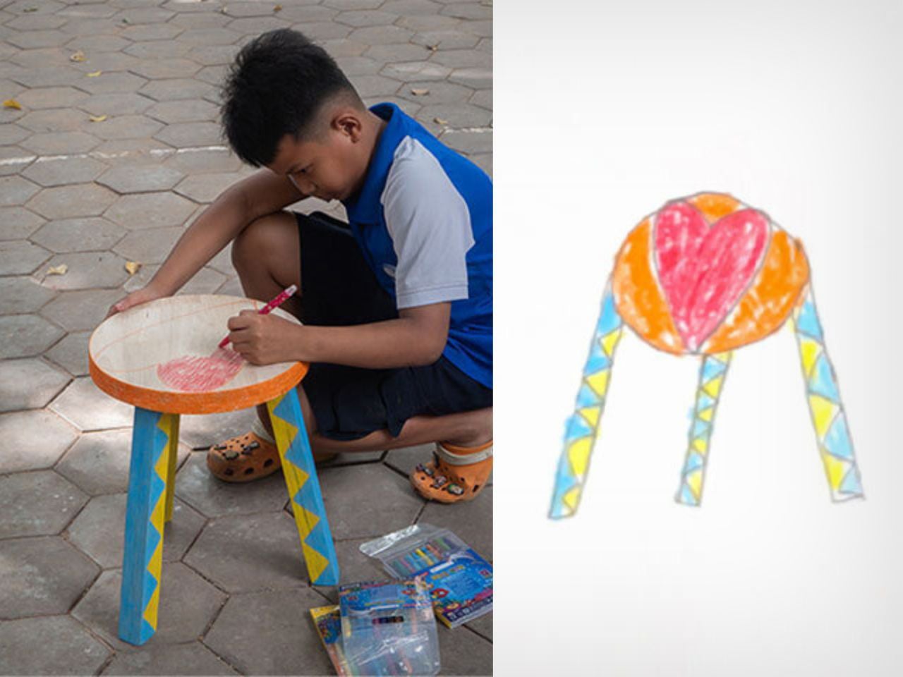
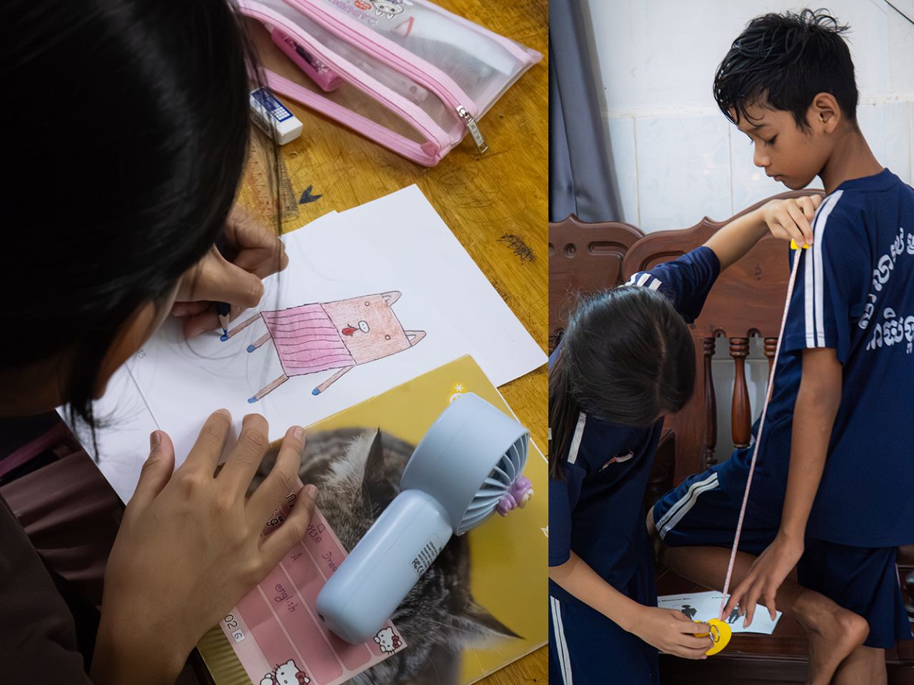
Collaboration played a key role throughout the process. Children gathered to look at and share each other’s drawings, discussing differences in shape, structure, and intention. They then worked in pairs to measure their own height and body dimensions, learning how scale and proportion affect comfort and usability. Based on these measurements, the children described the type of chair they wanted to make, introducing basic ergonomic thinking in an intuitive and accessible way. Each chair was designed specifically to fit the child’s own body, reinforcing the connection between design and lived experience.

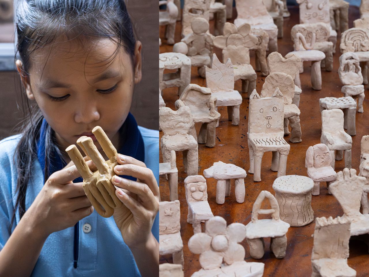
To translate drawings into three-dimensional objects, the children created clay prototypes of their chairs. Clay was chosen for its low cost, accessibility, and ease of manipulation, allowing children to freely experiment with volume and structure. These models helped bridge the gap between imagination and fabrication and served as references for the final chairs produced by Taekhan Yun. The resulting forms retain the charm of the original drawings with crooked legs, unexpected angles, and playful proportions while remaining structurally sound and functional.

In the final stage, the children actively participated in finishing their chairs. Crayons were used to apply color directly onto the surfaces, transforming each piece into a personal expression of identity. Acrylic lacquer spray was then applied to seal the drawings, followed by varnish to protect the finish. This process preserved the spontaneity of the children’s marks while ensuring durability, resulting in furniture that feels joyful, expressive, and intentional.
Beyond individual expression, Chair for Kids also highlights the potential for scalability. The chairs are low-cost and easy-to-build designs that rely on simple materials and straightforward construction methods. This makes them well-suited for mass manufacturing and adaptation across schools, community centers, and educational environments, particularly in resource-constrained contexts. The project demonstrates how participatory design can produce furniture that is not only meaningful and educational but also practical, affordable, and replicable.

Each chair reflects the imagination of a single child while contributing to a collective outcome. Chair for Kids shows how design education rooted in participation and making can empower children, build confidence, and reimagine furniture as a tool for learning, inclusion, and creativity.

The post This Designer Turns Children’s Imagination Into Furniture They Can Truly Own first appeared on Yanko Design.
This Footstool Finally Fixes WFH Posture by Rocking Like a Toy

We’ve all been there. You’re deep into hour three of sitting at your desk, and suddenly you realize your feet are doing that weird thing where they’re contorted into some unnatural position that definitely wasn’t what your body had in mind. Maybe they’re tucked under your chair at an odd angle, or perhaps they’re desperately stretching for that one sweet spot on the floor that somehow feels less terrible than all the others.

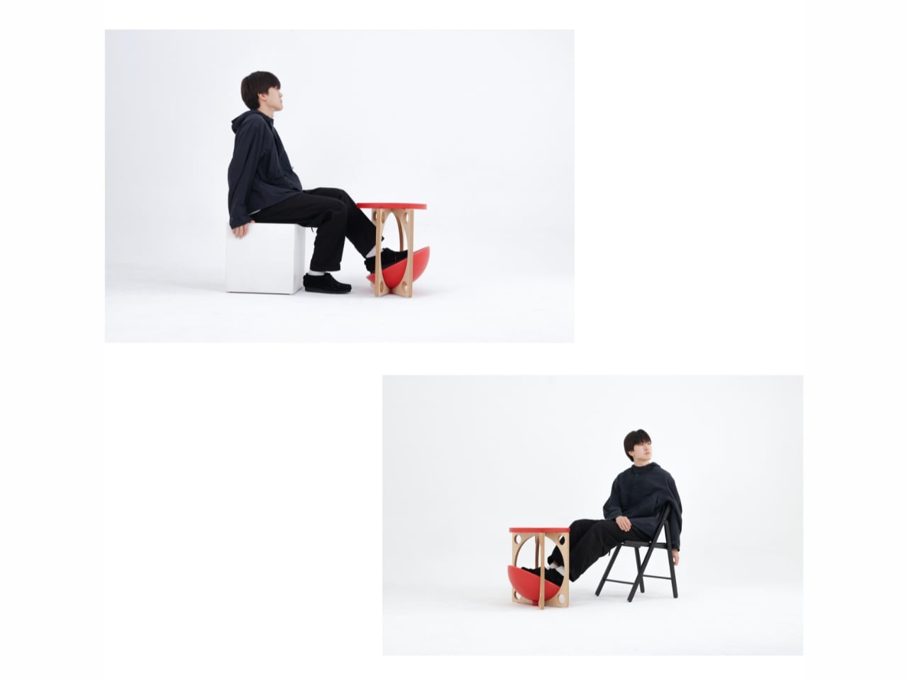
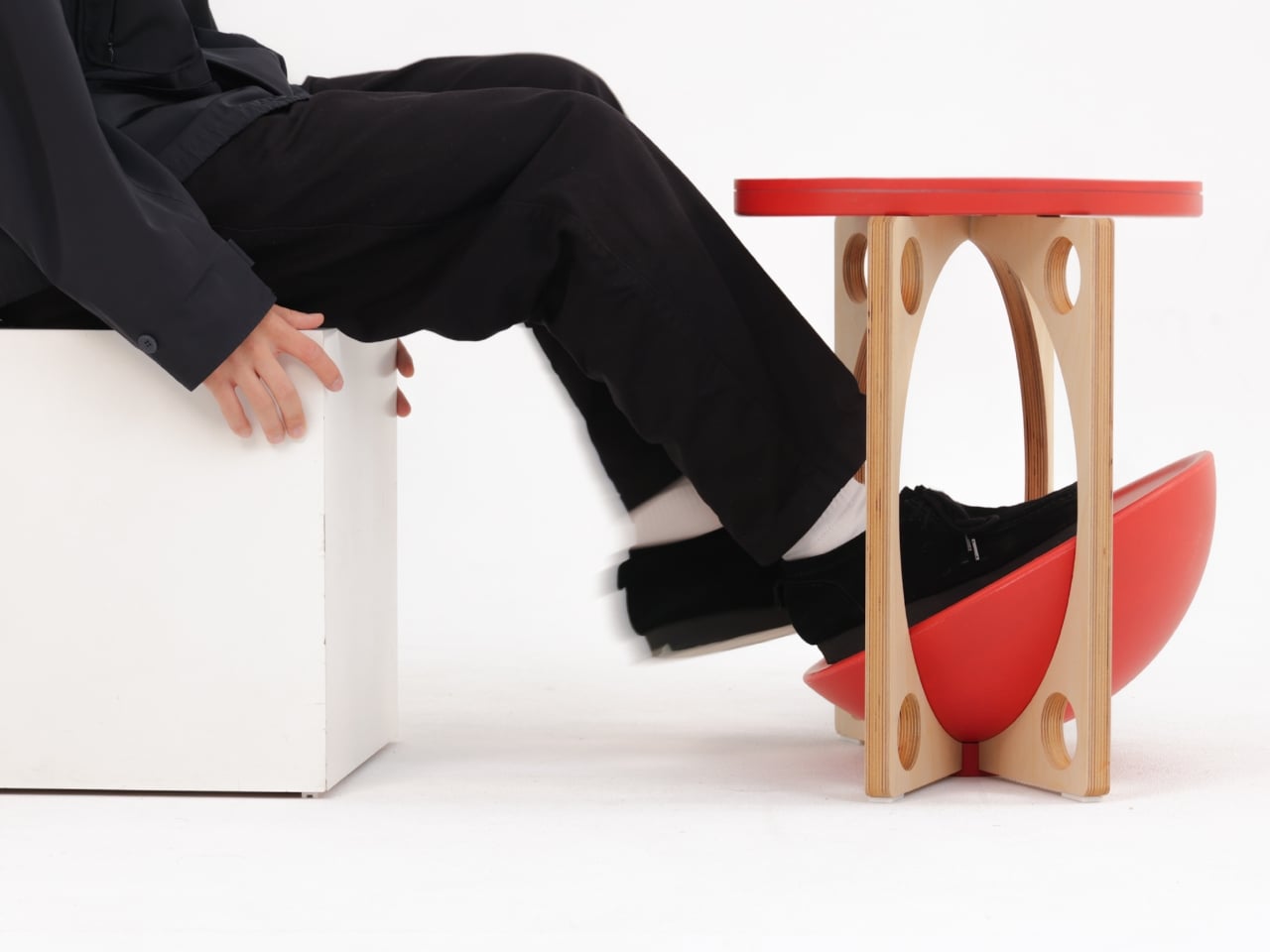
Here’s the thing about traditional footstools: they’re rigid. They sit there in one fixed position, forcing you to adapt to them rather than the other way around. It’s like having a friend who only ever wants to meet at the same coffee shop, never considering that maybe, just maybe, you’d like a little flexibility in your life. Enter OTTO, a footstool by designer Woonghee Ma that takes its inspiration from the most unlikely source: the roly-poly toy. You know the one. That round-bottomed toy from childhood that always bounces back upright no matter how hard you knock it over. In Korea, it’s called Ottogi, which is where this clever little piece gets its name.

Designer: Woonghee Ma

The genius of OTTO lies in its convex base. Instead of planting itself stubbornly on the ground like every other footstool, it rocks. It moves. It responds to the way your body actually behaves when you’re sitting for long stretches. As you shift your weight and adjust your position throughout the day (because let’s be honest, no one sits perfectly still), the footstool moves with you, naturally settling into whatever position feels most comfortable in that moment.

Think about it: your body is constantly making tiny adjustments. Your legs shift, your posture changes, you lean forward to focus on something on your screen, then lean back when you’re thinking. Why should your footstool stay frozen in place while all this is happening? OTTO essentially becomes a dynamic support system rather than a static obstacle.

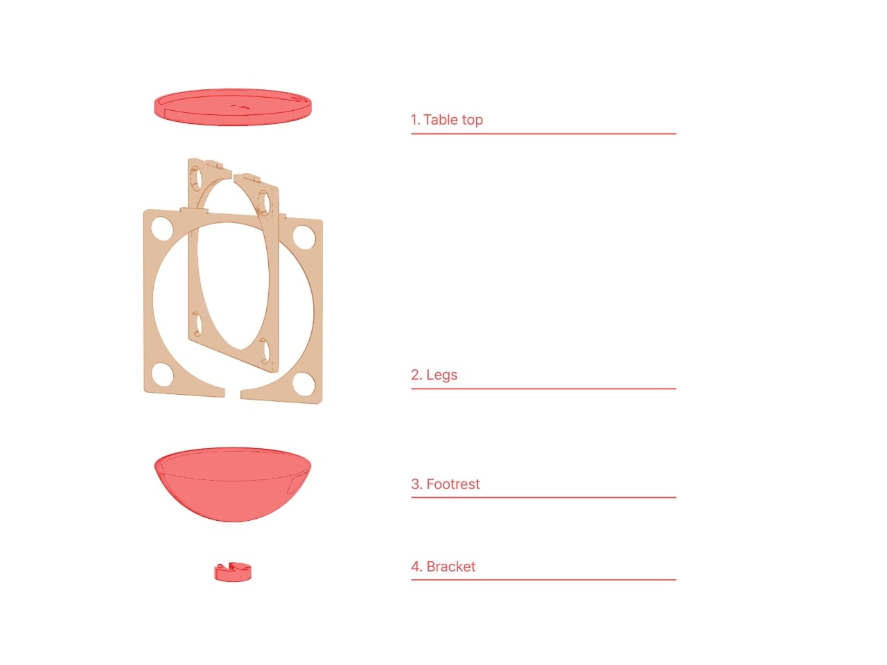
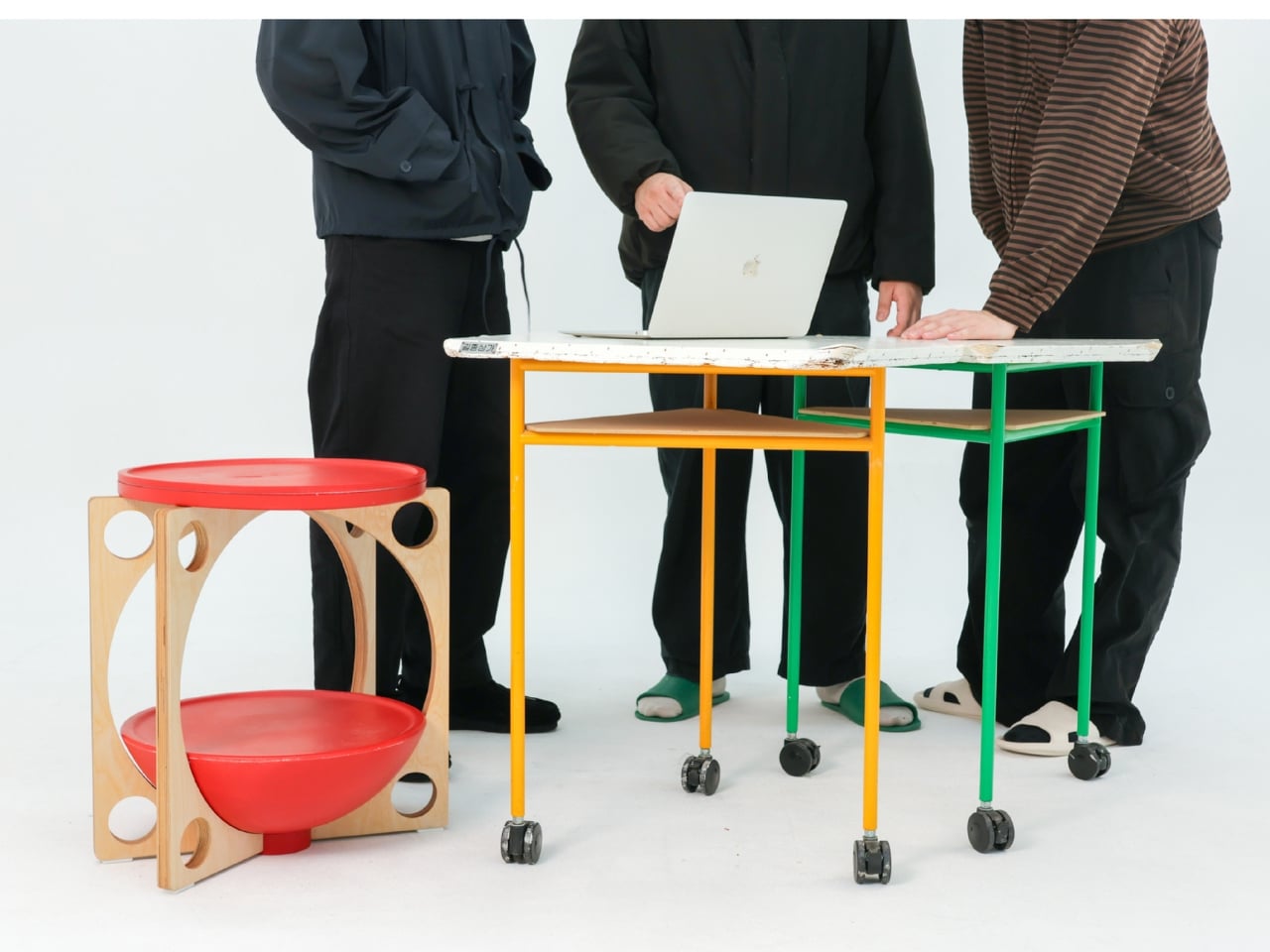
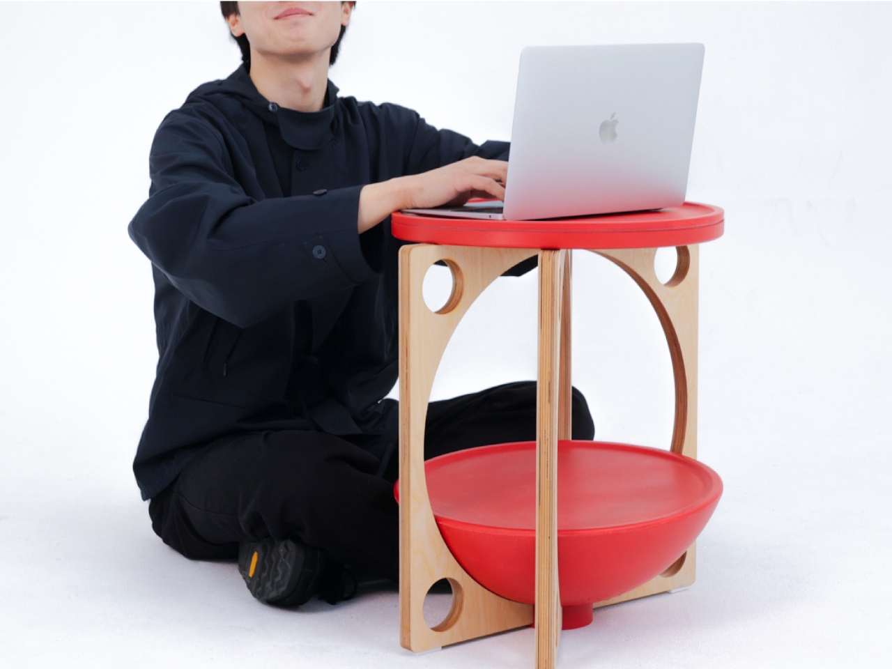
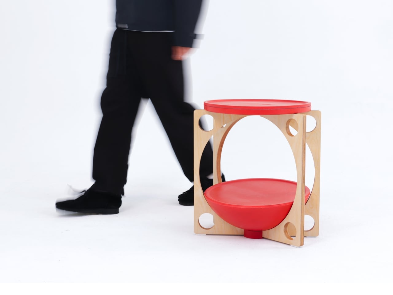
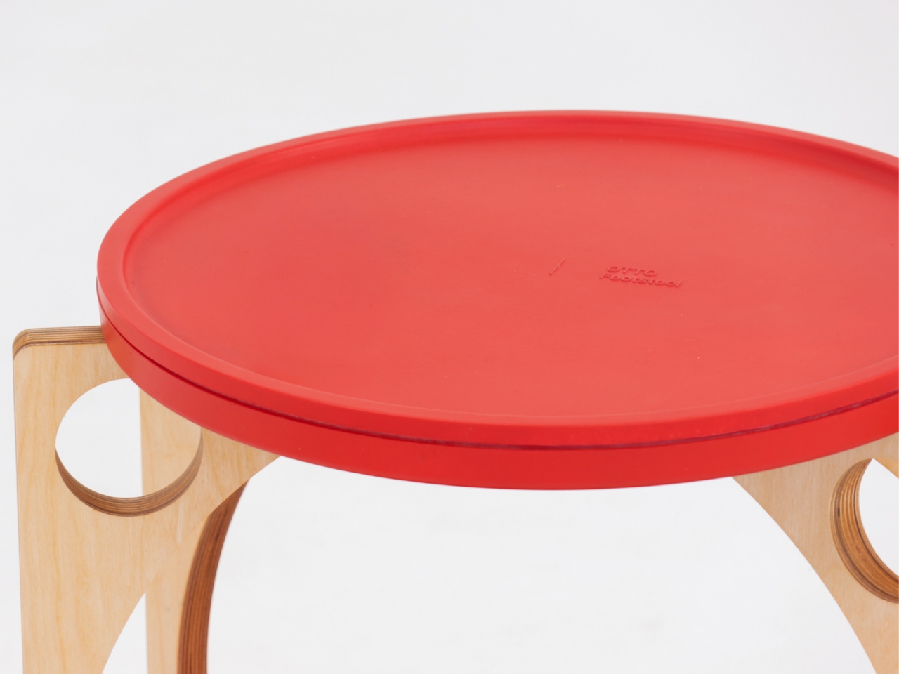
What really sells this design is how deceptively simple it looks. The structure consists of just four components: a circular table top, plywood legs with organic cutouts, a bowl-shaped footrest, and a bracket to hold everything together. The legs feature these beautiful curved openings that give the piece an almost sculptural quality, like negative space art that happens to be functional furniture. The top and footrest come in a bold coral-red that pops against the natural wood tone of the legs.

Assembly is refreshingly straightforward. Attach the legs to the bracket, set the top plate and footrest in place, and you’re done. No Allen wrenches, no confusing instructions with illustrations that look nothing like the actual parts, no leftover screws that make you question your entire assembly process. It’s designed to be easy to put together and just as easy to move around your space.

But here’s where OTTO gets even more interesting: versatility. Sure, it’s a footstool. But that top surface? Perfectly functional as a side table for your water bottle, phone, or that coffee cup that’s perpetually within arm’s reach. Need to hold some supplies while you’re working on the floor? OTTO’s got you. Want a low stool for kids or a casual seating option when friends come over? It can do that too.

The design speaks to a larger shift happening in how we think about furniture, especially in the work-from-home era. We’re moving away from rigid, single-purpose pieces toward objects that adapt to our needs rather than forcing us to adapt to them. OTTO embodies this philosophy beautifully. It’s not trying to correct your posture through force or rigid positioning. Instead, it works with your natural movements, offering support that feels intuitive rather than prescriptive.

There’s also something deeply satisfying about the aesthetic. The combination of natural plywood and that vibrant coral creates a look that feels both Scandinavian-minimal and playfully modern. It’s serious enough for a professional home office but fun enough that it doesn’t feel stuffy or overly corporate.

We’re now spending more time than ever sitting and staring at screens so maybe what we need isn’t more rigidity. Maybe what we need is furniture that understands that bodies move, preferences change, and comfort isn’t one-size-fits-all. OTTO gets it. And honestly? That roly-poly toy inspiration is pretty brilliant. Who knew the secret to better sitting was something we learned in kindergarten?

The post This Footstool Finally Fixes WFH Posture by Rocking Like a Toy first appeared on Yanko Design.
This Airport Lounge Turned Mondrian’s Boogie-Woogie into Wood Islands

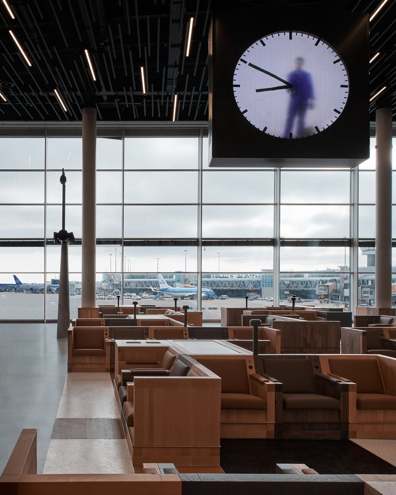
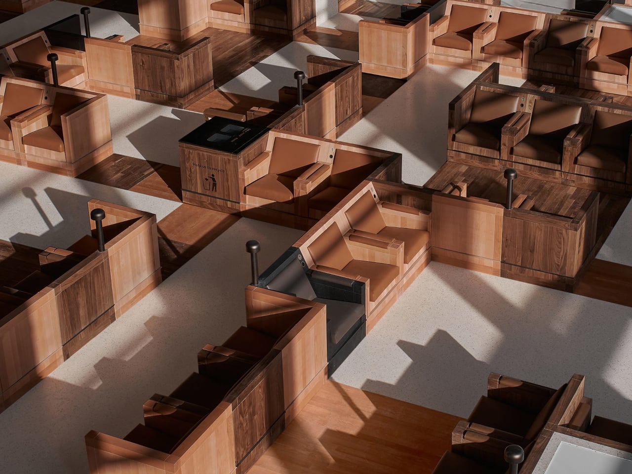
Long layovers usually mean seas of identical metal chairs, bright signage, and constant motion that makes rest feel impossible. Even premium lounges often feel like slightly nicer waiting rooms, not places with a point of view beyond arranging seating in rows. Schiphol’s Lounge 2 sits in the flat Haarlemmermeer polder outside Amsterdam, which gave Beyond Space a specific landscape and design history to work with when redesigning the 1,000 square meter space.

The studio looked at that polder and the Dutch De Stijl movement it inspired, particularly Mondrian’s orthogonal paintings. His late Boogie-Woogie works are essentially abstractions of that landscape, grids of lines and colored planes forming rhythmic compositions. Beyond Space took those paintings as an organizing principle, using sequences of orthogonal lines and planes to define where and how people sit instead of just dropping furniture onto a floor.

Designer: Beyond Space

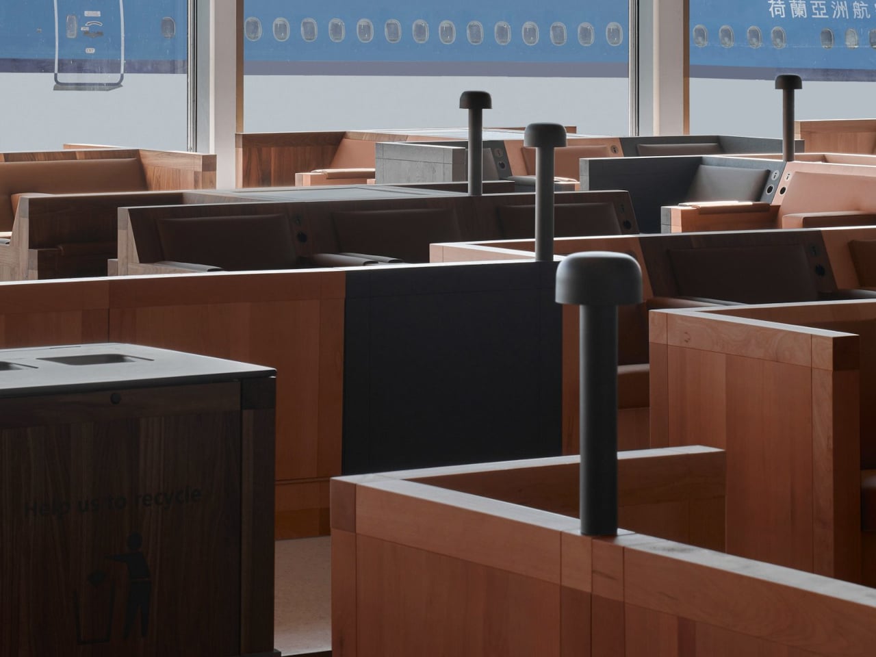
Entering the lounge, you realize you are not looking at rows of chairs but a low wooden city. Connected seats form islands of different sizes that plug into the existing architecture, creating pockets for solo travelers, pairs, and larger groups. You can choose a corner that feels tucked away, a spot with a direct runway view, or a cluster where a family can spread out without blocking circulation.

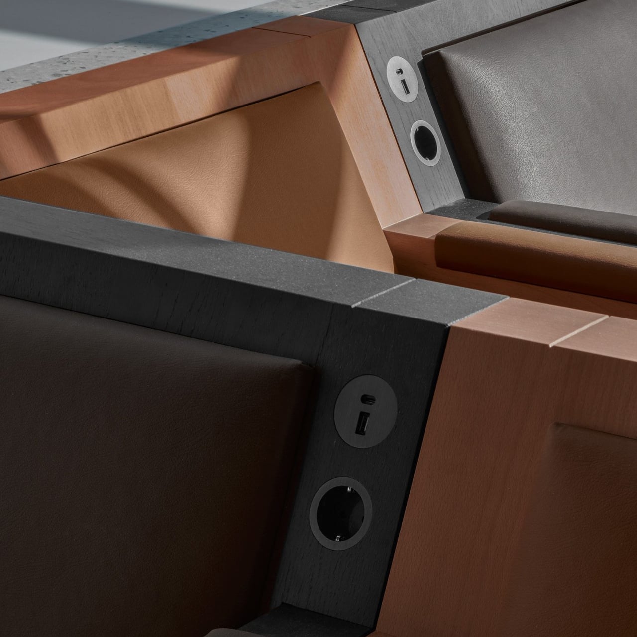
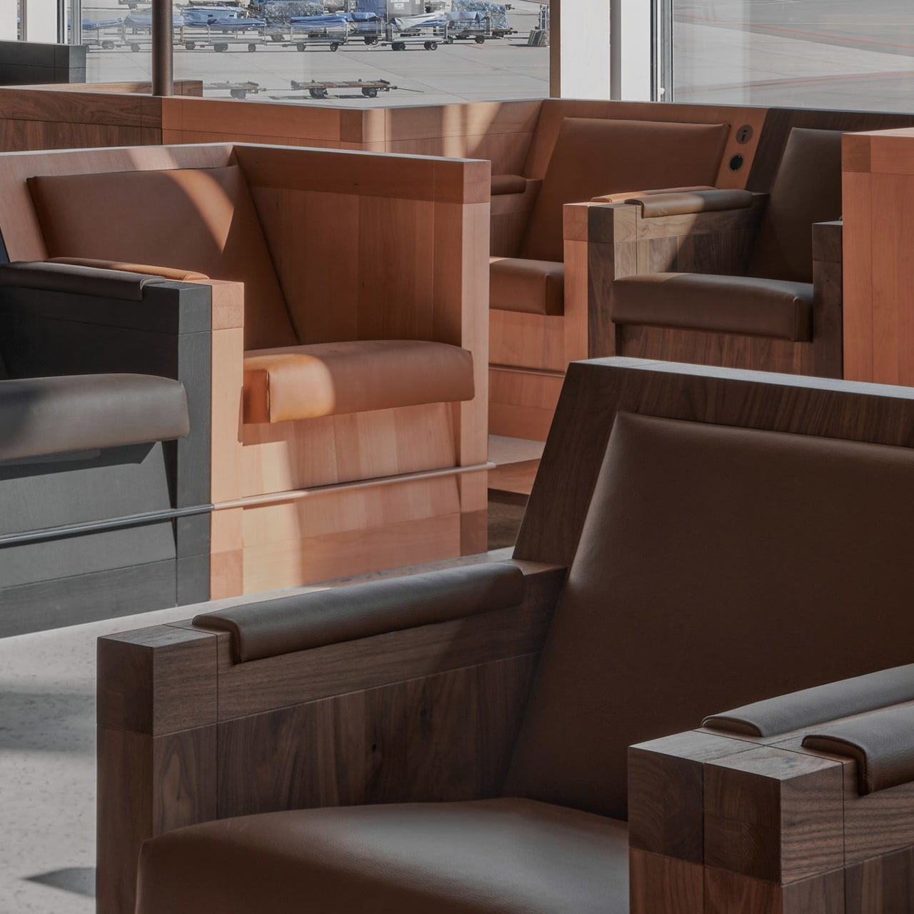
Instead of Mondrian’s red, yellow, and blue, the designers used solid wood from European tree species Mondrian once painted in his early landscape work. That swap keeps the De Stijl grid and rhythm but trades visual shouting for warmth and calm. In a terminal full of screens and branding, the consistent wood tones and leather upholstery act like a noise-cancelling layer without resorting to beige blandness.

The orthogonal layout hides surprising variety, armchairs with side tables, benches, back-to-back arrangements, and larger platforms for groups. Power outlets are integrated into the wooden blocks, so charging a laptop does not mean hunting for a wall socket or sitting on the floor. The grid gives order, but within it you can find a spot that matches how you actually want to wait.

Because seating follows a clear grid aligned with the architecture, it is easier to orient yourself and remember where you were sitting when you come back with coffee. The repetition of similar forms, combined with daylight from large windows and a neutral floor, creates visual tranquility rare in airports. It feels designed to let your brain idle instead of constantly scanning for threats.

The lounge treats waiting not as dead time to fill with more screens, but as a chance to sit in a space with a clear idea behind it. By abstracting the landscape outside and channeling Mondrian without copying his colors, Beyond Space turns a generic airport zone into a small wooden blueprint of Dutch design history that just happens to be comfortable between flights.

The post This Airport Lounge Turned Mondrian’s Boogie-Woogie into Wood Islands first appeared on Yanko Design.

This 1970s Kids’ Desk Flatpacked Before IKEA Even Existed

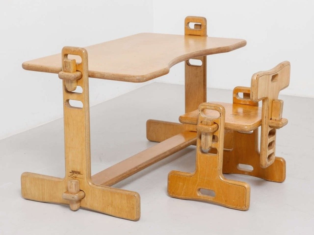
Here’s something to blow your mind: decades before IKEA convinced us all that assembling furniture with an Allen wrench was somehow fun, a visionary designer named Luigi Colani was already flatpacking children’s furniture in the 1970s. And get this, it wasn’t just about convenience. His Tobifant desk and chair set was actually genius problem-solving at its finest.

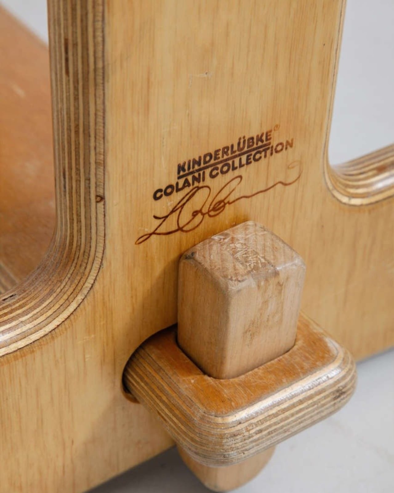
If you know anything about Luigi Colani, you know he was the king of curves and organic shapes. This is the guy who designed everything from streamlined trucks to futuristic cameras, always with that signature bio-design aesthetic. But with the Tobifant collection, created for West German children’s furniture brand Kinderlübke, he tackled a problem every parent faces: kids grow way too fast.

Designer: Luigi Colani

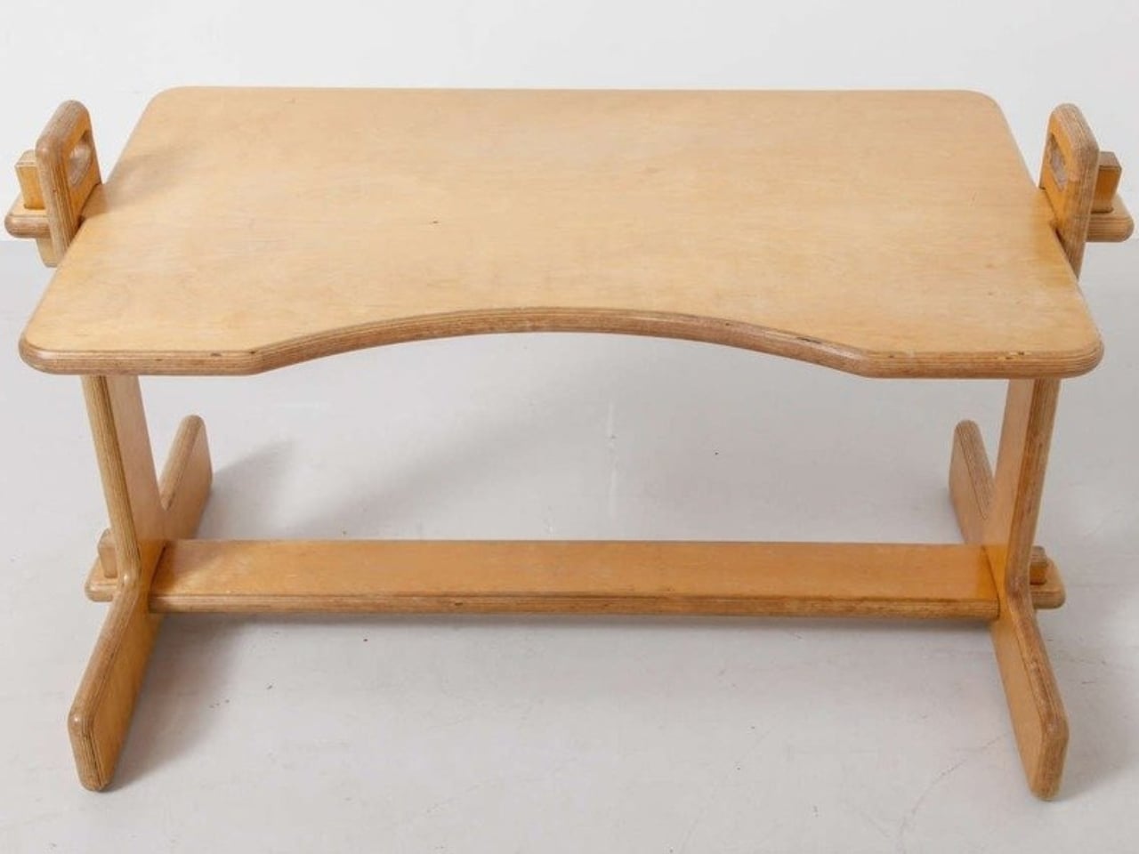
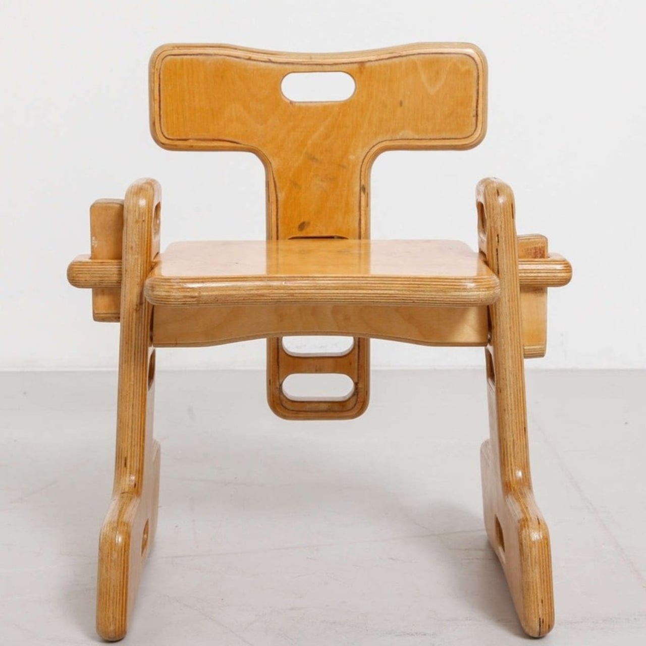
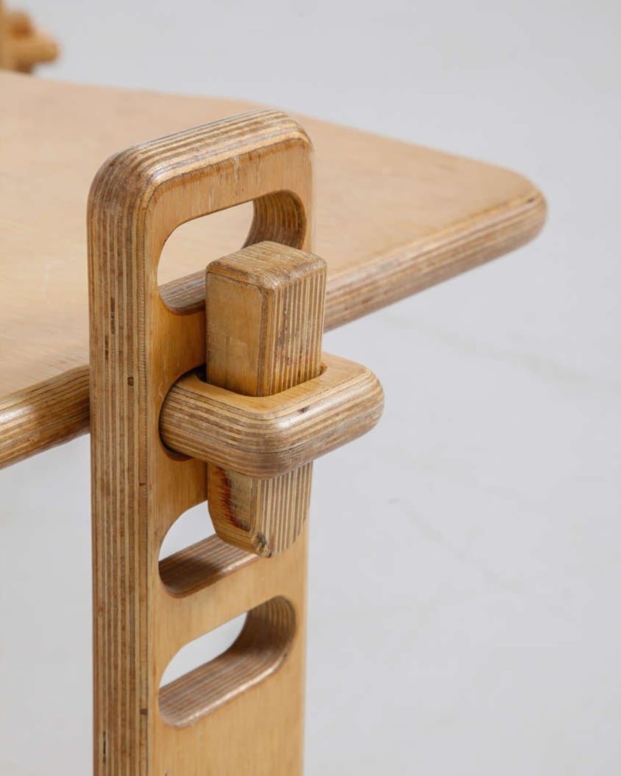
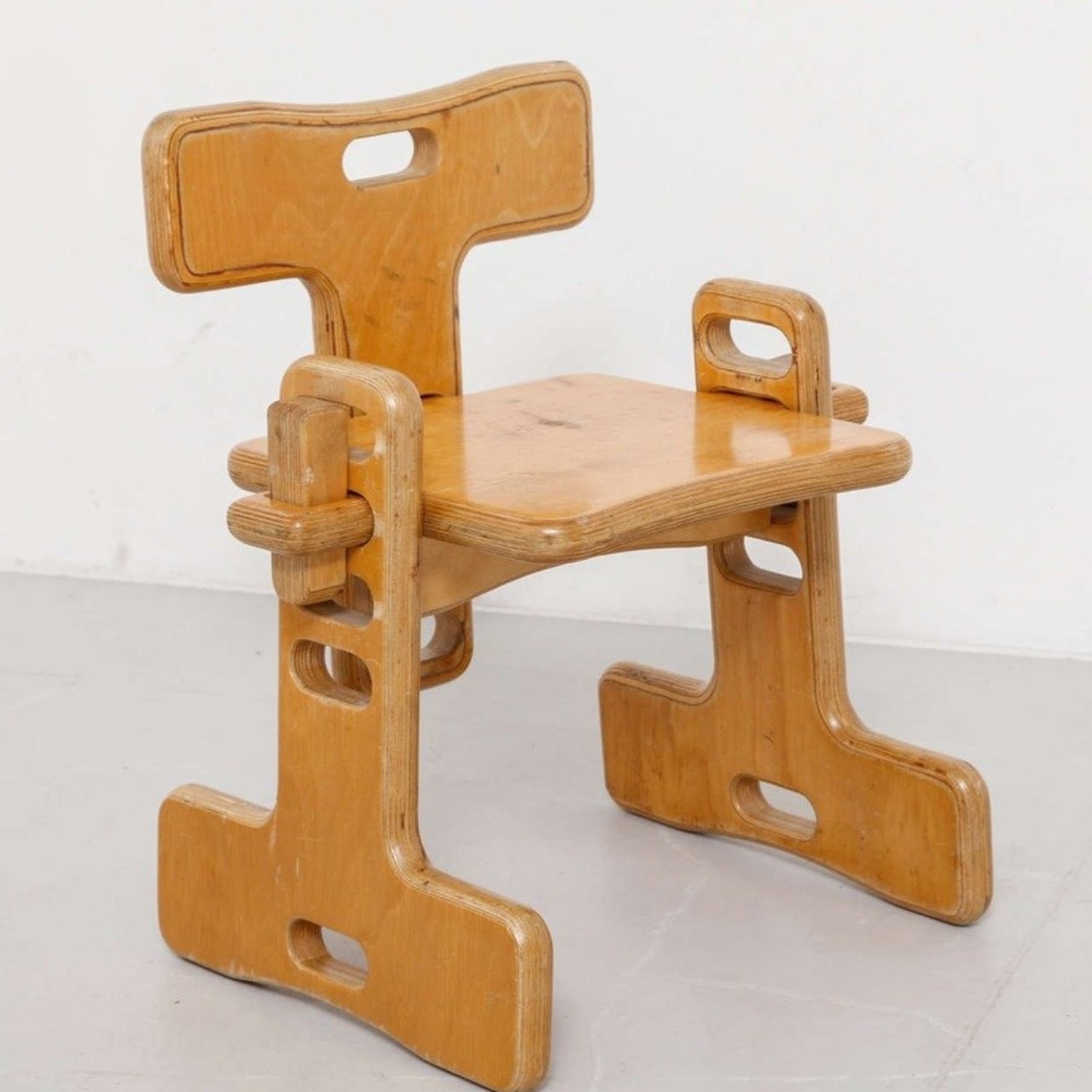
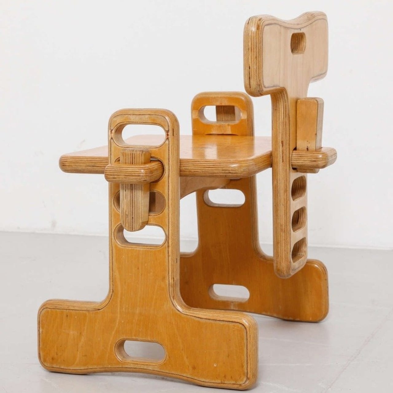
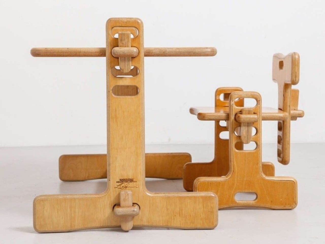
The Tobifant set came flatpacked (yes, in the ’70s!), but that was just the beginning of its brilliance. Made from beech plywood, both the desk and chair featured height-adjustable frames, so you could raise the seat, backrest, and writing surface as your child sprouted upward. Instead of buying new furniture every couple of years, parents could invest once and adjust as needed. It was sustainable before sustainability became a design buzzword.

Think about what a radical concept this was. It was a time when most children’s furniture was either cheap throwaway pieces or expensive heirlooms that kids outgrew almost immediately. Colani created something practical, beautiful, and adaptable. The furniture could literally grow with your child, which meant it could potentially serve them from toddlerhood through their early teens.

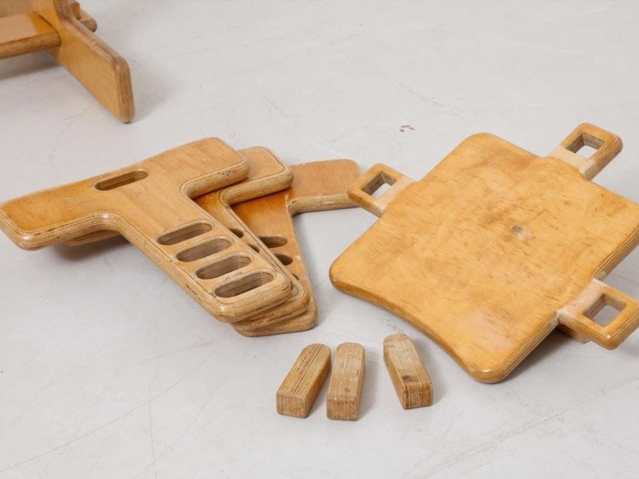
But wait, there’s more. Colani didn’t just stop at smart construction. He actually specified that each Tobifant desk should come with one kilogram of modeling clay and three wooden tools. Because apparently he understood that a desk isn’t just a place to do homework. It’s a creative laboratory, and kids need to be encouraged to make things, to experiment, to get their hands dirty (or clayey, as it were). How many furniture designers think about what happens after the sale? Colani was playing 4D chess while everyone else was still figuring out checkers.

The flatpack design wasn’t just about shipping efficiency, though that was certainly a bonus. It was about democratizing good design. By making the furniture easy to transport and assemble, Colani made it more accessible to regular families. This was thoughtful, human-centered design at work.

What’s really striking when you look at photos of the Tobifant set today is how modern it still looks. The clean lines, the warm plywood finish, the elegant simplicity of the adjustable mechanism… it could easily sit in a contemporary home without looking dated. That’s the mark of truly timeless design. While so much ’70s furniture screams its decade with harvest gold upholstery and chrome everywhere, the Tobifant feels almost minimalist in its restraint.

The set went into production in the late 1970s, and today surviving examples pop up on vintage reseller sites, often commanding impressive prices from collectors. It makes sense. Original Colani pieces are increasingly rare, and the Tobifant represents such a perfect intersection of form, function, and forward-thinking design philosophy.

What’s fascinating is how Colani’s approach predated so many trends we think of as recent innovations. Flatpack furniture? Check. Modular, adjustable design? Check. Sustainability through longevity? Check. Child-centered functionality that doesn’t sacrifice aesthetics? Double check. He was essentially doing what today’s best furniture startups are trying to do, except he did it before many of them were even born.

So next time you’re wrestling with those cryptic IKEA instructions, spare a thought for Luigi Colani and his Tobifant collection. He proved that flatpack furniture could be more than just affordable practicality. It could be beautiful, innovative, and genuinely improve how families live. That’s the kind of design legacy that deserves way more recognition than it gets.

The post This 1970s Kids’ Desk Flatpacked Before IKEA Even Existed first appeared on Yanko Design.
This 1970s Kids’ Desk Flatpacked Before IKEA Even Existed

Here’s something to blow your mind: decades before IKEA convinced us all that assembling furniture with an Allen wrench was somehow fun, a visionary designer named Luigi Colani was already flatpacking children’s furniture in the 1970s. And get this, it wasn’t just about convenience. His Tobifant desk and chair set was actually genius problem-solving at its finest.

If you know anything about Luigi Colani, you know he was the king of curves and organic shapes. This is the guy who designed everything from streamlined trucks to futuristic cameras, always with that signature bio-design aesthetic. But with the Tobifant collection, created for West German children’s furniture brand Kinderlübke, he tackled a problem every parent faces: kids grow way too fast.

Designer: Luigi Colani

The Tobifant set came flatpacked (yes, in the ’70s!), but that was just the beginning of its brilliance. Made from beech plywood, both the desk and chair featured height-adjustable frames, so you could raise the seat, backrest, and writing surface as your child sprouted upward. Instead of buying new furniture every couple of years, parents could invest once and adjust as needed. It was sustainable before sustainability became a design buzzword.

Think about what a radical concept this was. It was a time when most children’s furniture was either cheap throwaway pieces or expensive heirlooms that kids outgrew almost immediately. Colani created something practical, beautiful, and adaptable. The furniture could literally grow with your child, which meant it could potentially serve them from toddlerhood through their early teens.

But wait, there’s more. Colani didn’t just stop at smart construction. He actually specified that each Tobifant desk should come with one kilogram of modeling clay and three wooden tools. Because apparently he understood that a desk isn’t just a place to do homework. It’s a creative laboratory, and kids need to be encouraged to make things, to experiment, to get their hands dirty (or clayey, as it were). How many furniture designers think about what happens after the sale? Colani was playing 4D chess while everyone else was still figuring out checkers.

The flatpack design wasn’t just about shipping efficiency, though that was certainly a bonus. It was about democratizing good design. By making the furniture easy to transport and assemble, Colani made it more accessible to regular families. This was thoughtful, human-centered design at work.

What’s really striking when you look at photos of the Tobifant set today is how modern it still looks. The clean lines, the warm plywood finish, the elegant simplicity of the adjustable mechanism… it could easily sit in a contemporary home without looking dated. That’s the mark of truly timeless design. While so much ’70s furniture screams its decade with harvest gold upholstery and chrome everywhere, the Tobifant feels almost minimalist in its restraint.

The set went into production in the late 1970s, and today surviving examples pop up on vintage reseller sites, often commanding impressive prices from collectors. It makes sense. Original Colani pieces are increasingly rare, and the Tobifant represents such a perfect intersection of form, function, and forward-thinking design philosophy.

What’s fascinating is how Colani’s approach predated so many trends we think of as recent innovations. Flatpack furniture? Check. Modular, adjustable design? Check. Sustainability through longevity? Check. Child-centered functionality that doesn’t sacrifice aesthetics? Double check. He was essentially doing what today’s best furniture startups are trying to do, except he did it before many of them were even born.

So next time you’re wrestling with those cryptic IKEA instructions, spare a thought for Luigi Colani and his Tobifant collection. He proved that flatpack furniture could be more than just affordable practicality. It could be beautiful, innovative, and genuinely improve how families live. That’s the kind of design legacy that deserves way more recognition than it gets.

The post This 1970s Kids’ Desk Flatpacked Before IKEA Even Existed first appeared on Yanko Design.
This Oak Sideboard Has Doors You Can’t Stop Touching

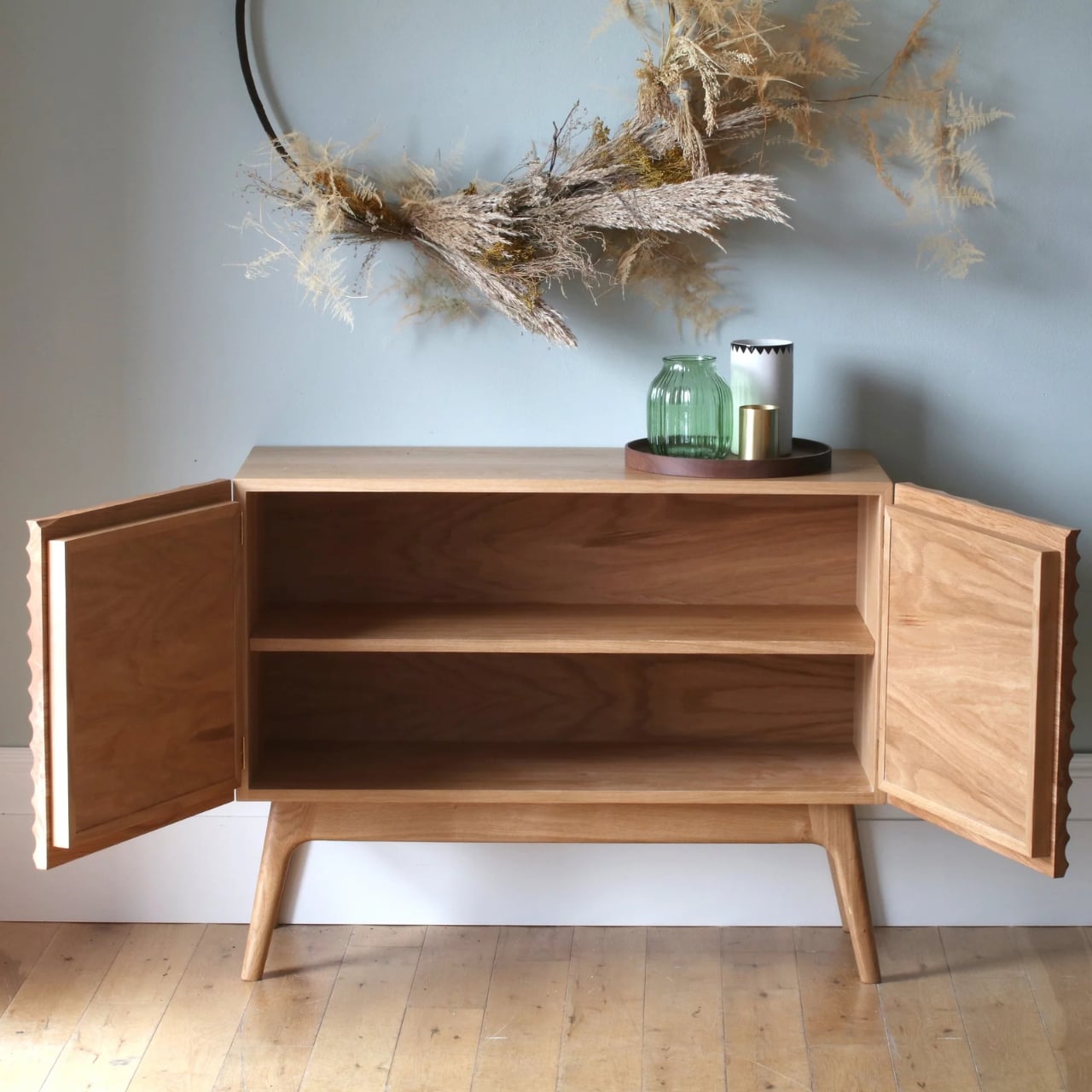
You know that feeling when you run your fingers across something and the texture makes you stop in your tracks? That’s exactly the vibe British furniture maker Nick James is going for with his sideboard featuring sculpted doors. And honestly, it’s the kind of piece that makes you rethink what furniture can be.

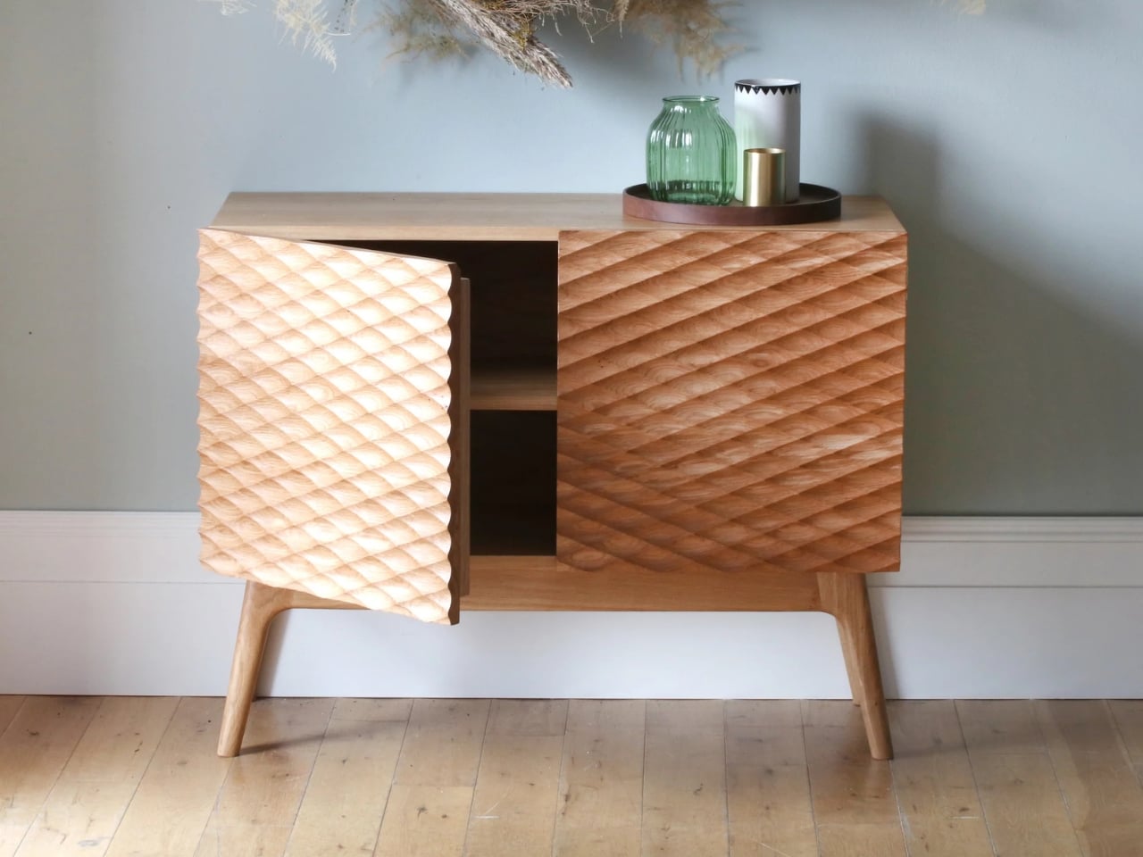
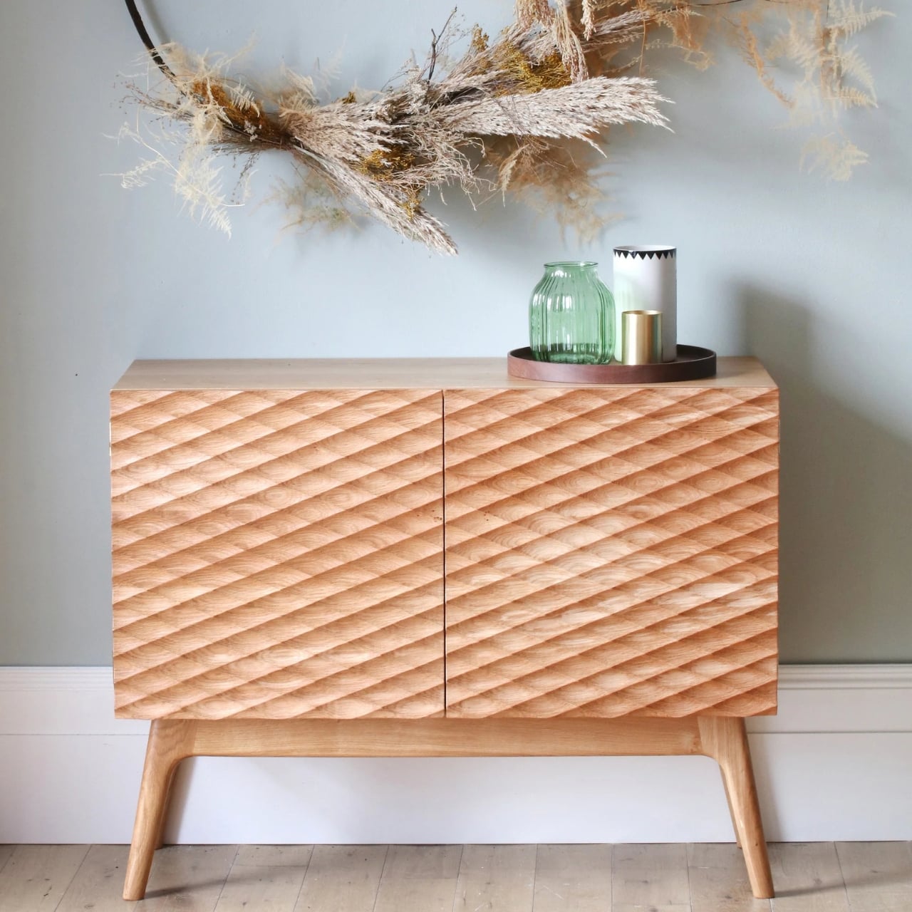
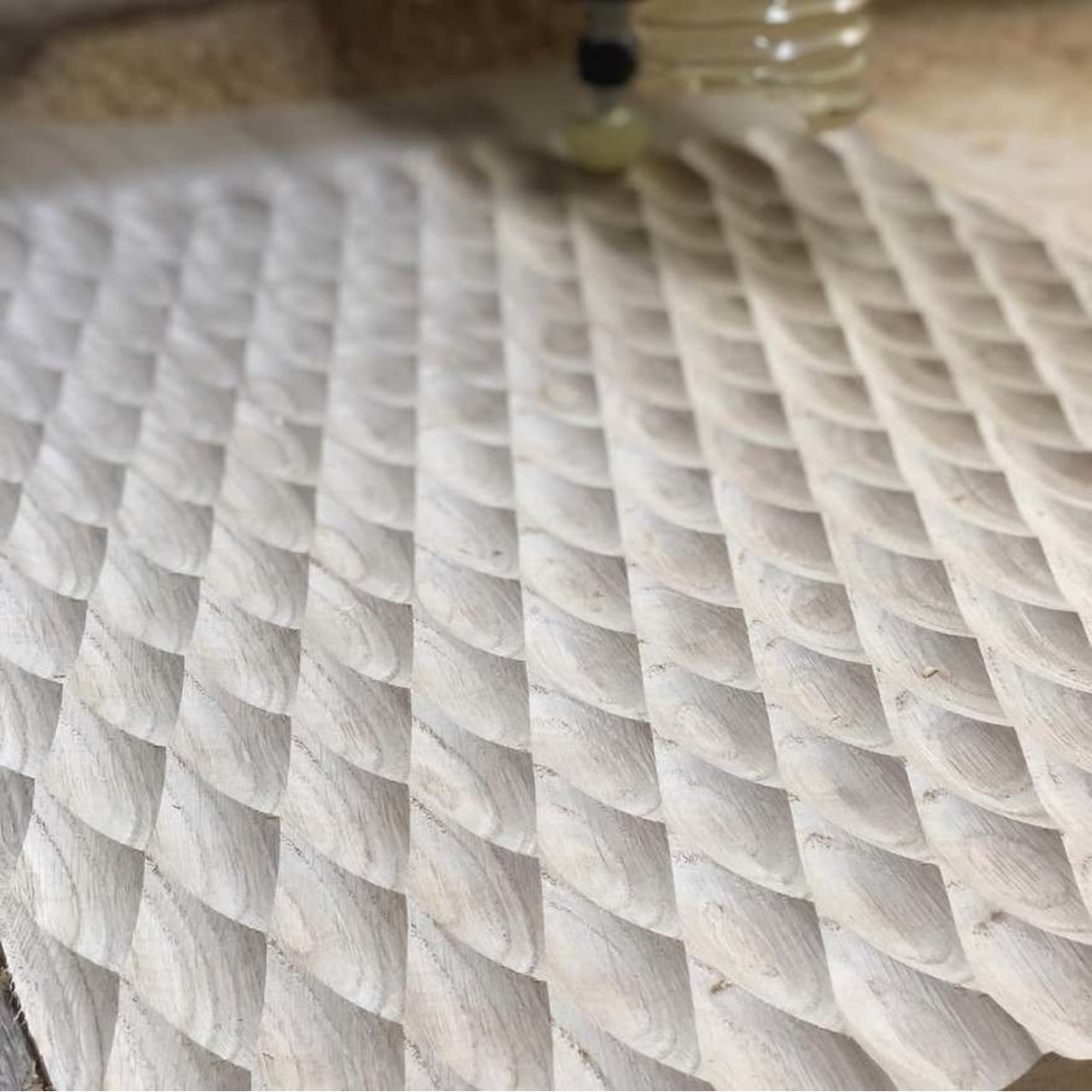
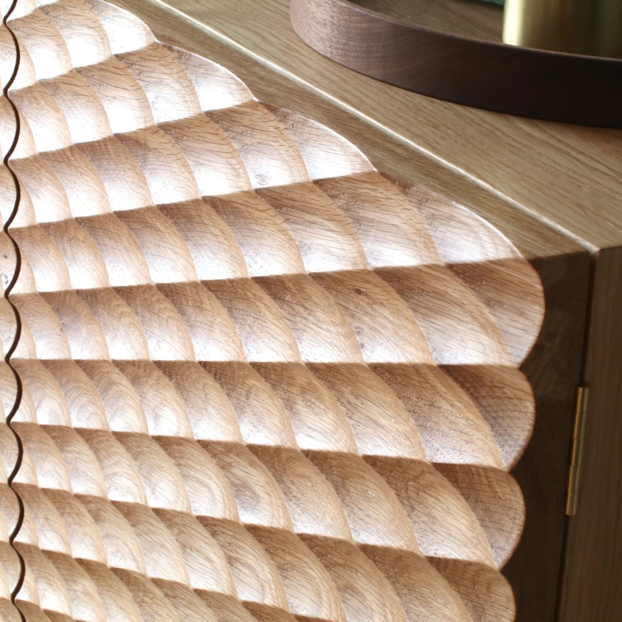
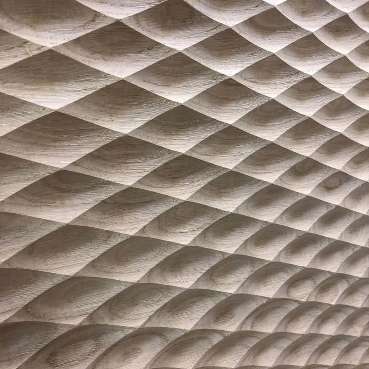
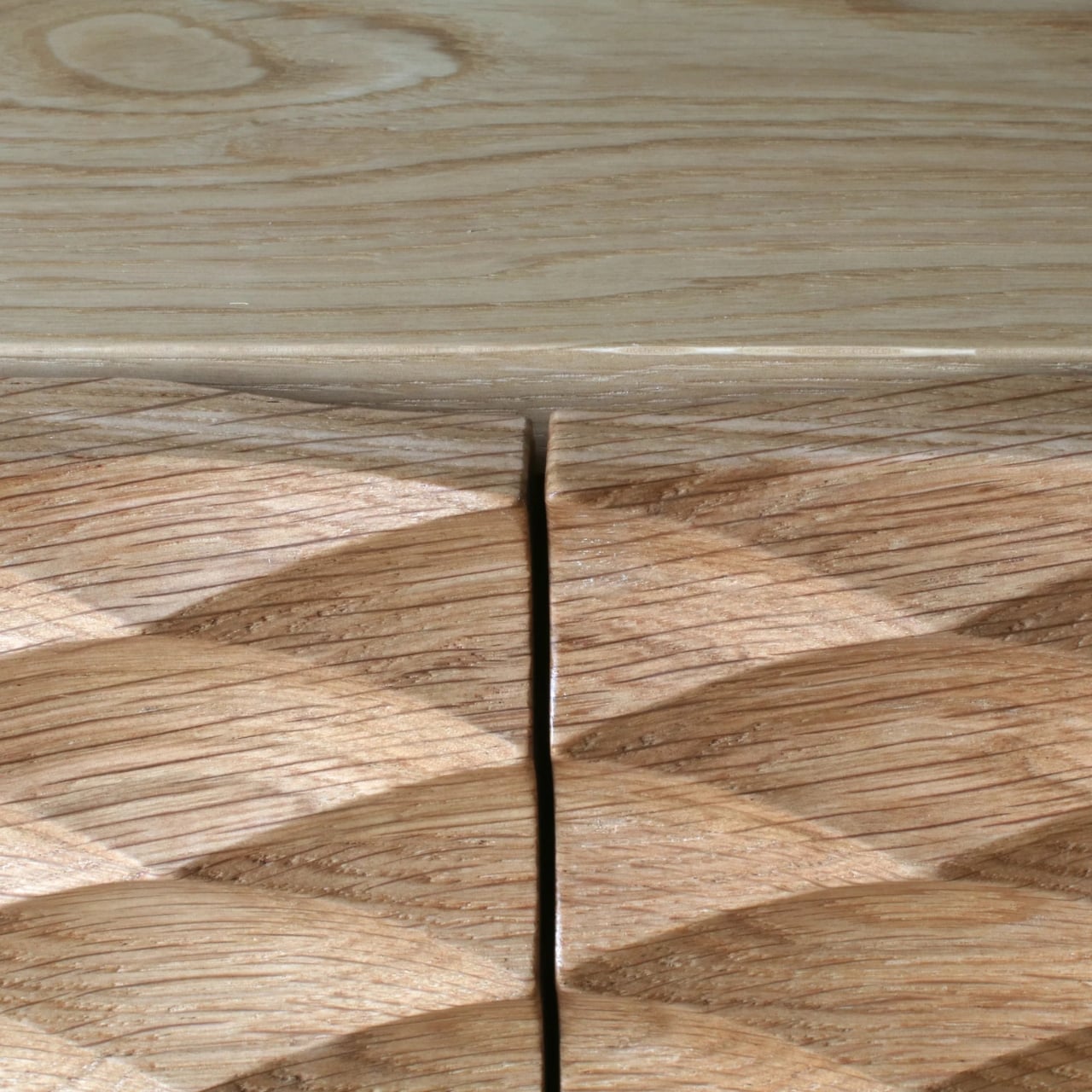
At first glance, it looks like a solid oak sideboard. Clean lines, classic proportions, nothing too flashy. But then you get closer and realize those doors aren’t just doors. They’re carved with flowing, wave-like patterns that transform the flat surface into something that feels almost alive. The sculpting reveals the oak’s grain in ways you’d never see otherwise, creating shadows and depth that shift as you move around the piece.

Designer: Nick James

This isn’t Nick James’s first dance with texture. The British designer has built a reputation for bringing tactile interest to traditional furniture forms. His approach is about celebrating the material itself, letting the wood grain become the star of the show rather than hiding it under layers of paint or veneer. In a world where so much furniture feels mass-produced and anonymous, there’s something refreshing about a piece that proudly shows off its origins.

The sideboard itself is practical in all the ways you’d want. It measures a generous size, perfect for dining room storage or as a living room statement piece. Inside, you’ll find a height-adjustable shelf, so whether you’re storing wine bottles or board games, you can configure it to fit your life. The hardware is minimal, keeping the focus on those sculptural doors that really deserve center stage.

What makes this piece particularly interesting is how it straddles different design worlds. There’s a mid-century modern sensibility to the proportions and the floating quality of the case. But the textured doors feel almost Art Deco, with their geometric repetition and emphasis on craftsmanship. And then there’s an undeniably contemporary edge to the whole thing, because let’s face it, most traditional furniture makers aren’t carving wave patterns into cabinet doors.

The price point sits at £2,950, which puts it firmly in the investment furniture category. But here’s the thing about pieces like this: they’re made to order from solid oak, hand-finished, and designed to last decades. In an era when we’re all supposed to be buying less but buying better, a sideboard like this makes the case for choosing quality over quantity. Plus, it’s the kind of furniture that only gets better with age as the oak develops its patina and character.

Some design purists might argue about the use of CNC technology to create the repetitive carved pattern. There was even a comment on Core77 suggesting that precision CNC texturing lacks soul. But I’d push back on that. The technology is just a tool, like a chisel or a lathe. What matters is the design vision behind it and the quality of execution. James uses the precision to reveal something beautiful about the material itself, not to disguise it as something it’s not.

The sideboard also speaks to a broader trend we’re seeing in contemporary design: texture is having a major moment. Whether it’s fluted glass, ribbed wood, scalloped tiles, or carved surfaces, designers are moving away from the ultra-minimalist smooth finishes that dominated the 2010s. People want furniture that invites touch, that creates visual interest through shadow and form, that makes you want to get up close and really look.

What I love most about this piece is that it doesn’t shout for attention. It’s not trying to be the loudest thing in the room. Instead, it rewards the people who take time to notice the details. The way the light catches the carved surface. How the grain pattern emerges from the sculpting. The contrast between the textured doors and the smooth frame. These are the kinds of subtle pleasures that make living with good design so satisfying.

The post This Oak Sideboard Has Doors You Can’t Stop Touching first appeared on Yanko Design.

Someone Made a Flat-Pack Stool from Glass That Loops Like Frozen Water

Flat-pack furniture is usually shorthand for budget compromises, cardboard boxes stuffed with dowels, and Allen keys that disappear the moment you need them. It is something you tolerate for convenience rather than admire, defined by getting furniture to your door cheaply rather than making you excited about assembly. The tension between wanting sculptural pieces and needing things that can actually ship and fit through narrow stairwells rarely gets resolved gracefully.

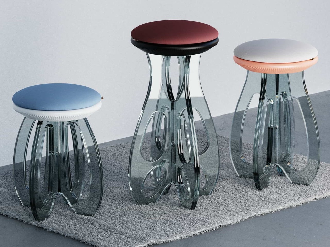
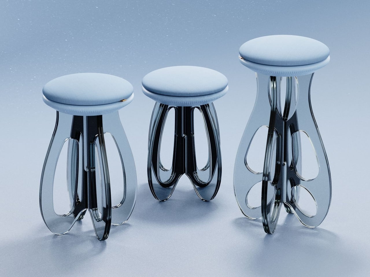
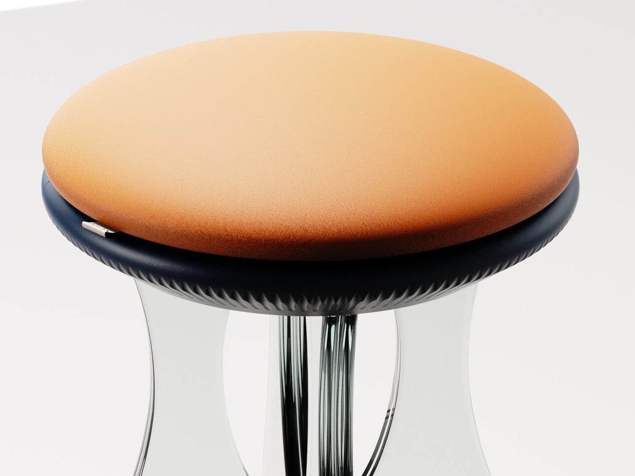
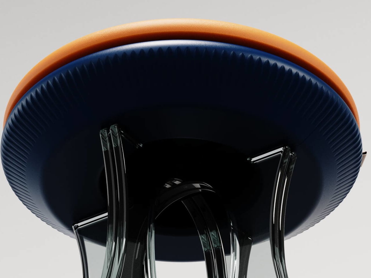
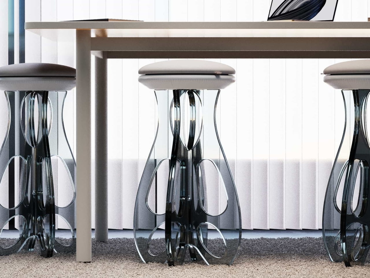
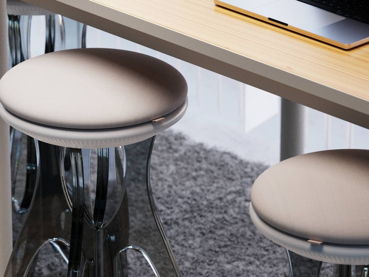
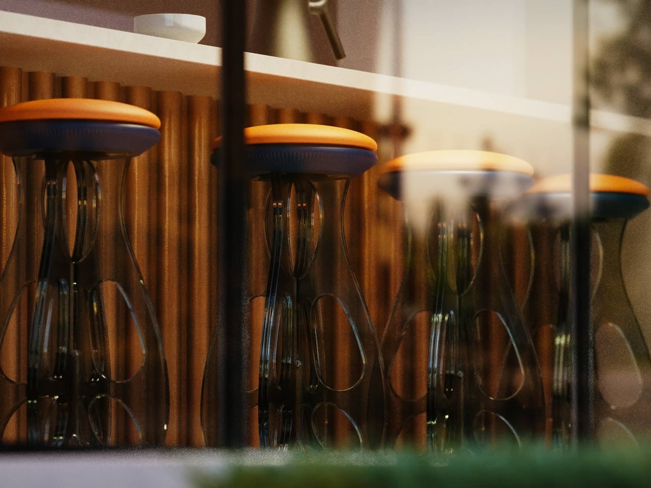
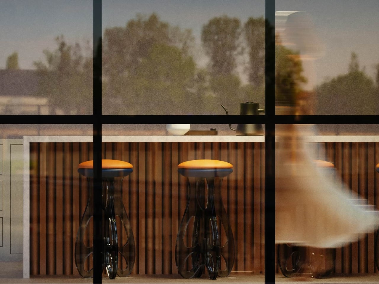
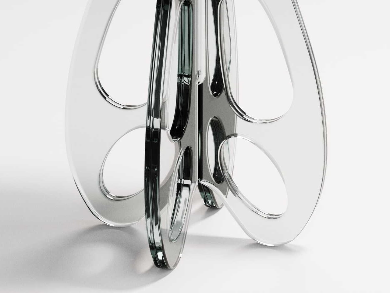
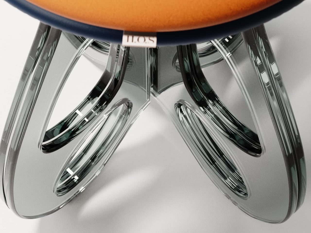
Tide Stool treats flat-pack as a starting point for luxury instead of a constraint. Designed by Vinayak Syam for DreamDeadline Works and produced by House of Sach, it is built from toughened glass legs, precision 3D-printed joinery, and hand-finished upholstery. The structure rises from a flat kit into a flowing form, shaped by curves and loops rather than brute-force mass, with the name being very much intentional.

Designer: Vinayak Syam

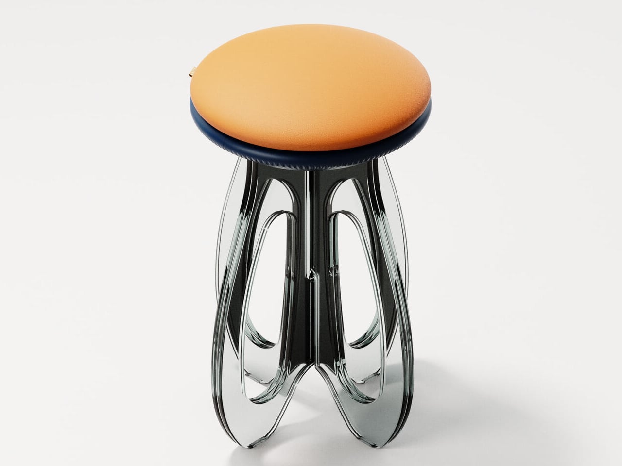
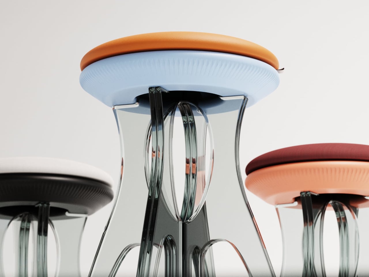
Instead of chunky wooden legs, Tide uses transparent glass fins that fold and loop around a central axis, carrying load through geometry. The panels curve out and back in, sharing weight across their profiles, so strength comes from the path the glass takes rather than thickness. It flips the usual hierarchy where glass is treated as fragile skin and heavier materials are trusted with structural work.

Receiving Tide as a flat set of glass pieces and joinery turns assembly into a building ritual rather than a chore. Slotting the fins into 3D-printed nodes lets you watch the structure emerge from motion, where overlapping curves and visible joints become part of the composition. The design makes those connections part of the visual language, so engineering reads as an aesthetic feature rather than something to hide.

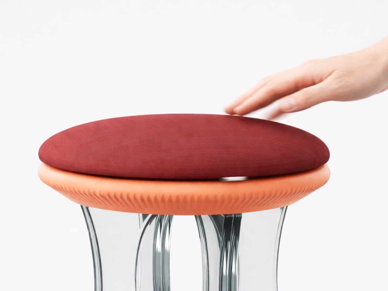
The upholstered top sits above the glass base as a soft disc that comes in more than thirty colour finishes. Upholstery is offered in fabric and vegan leather, with Deep Sienna being the leather option and the rest using elevated textiles. That palette lets the same glass base feel quiet and monochrome in one space or warm and expressive in another, without losing its sculptural identity.

Flat-pack construction makes shipping and moving easier, especially for people who rearrange or relocate often, yet once assembled, the stool reads as a single object rather than a kit. The toughened glass and looping geometry give real load-bearing confidence while keeping the footprint visually light. It is the rare piece that respects both logistics and living rooms without asking you to choose between practicality and presence.

Tide turns apparent fragility into a quiet expression of resilience. The transparent legs, visible joinery, and soft seat work together to make strength feel like a product of balance and flow rather than heaviness. For anyone tired of choosing between sculptural furniture and flat-pack practicality, a glass stool that arrives as parts and stands like a tide frozen mid-rise feels like a surprisingly thoughtful middle ground.

The post Someone Made a Flat-Pack Stool from Glass That Loops Like Frozen Water first appeared on Yanko Design.
This Umbrella Stand Disappears When You Don’t Need It

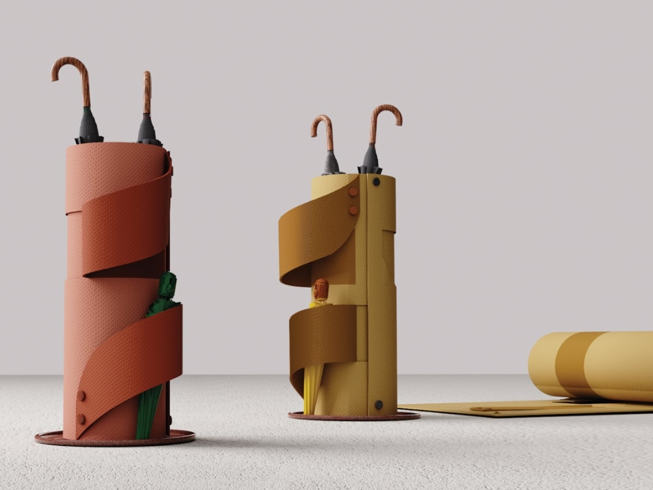
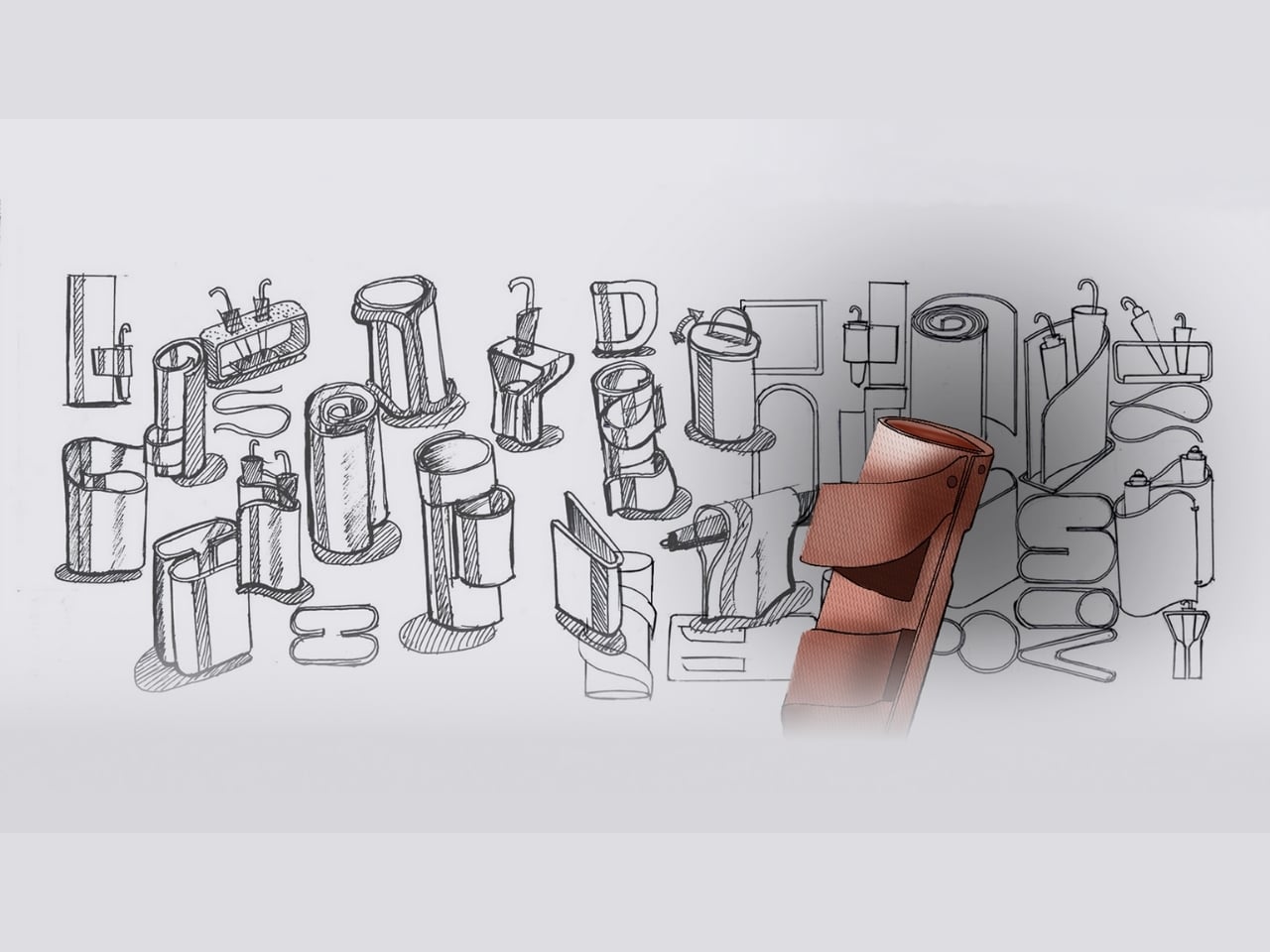
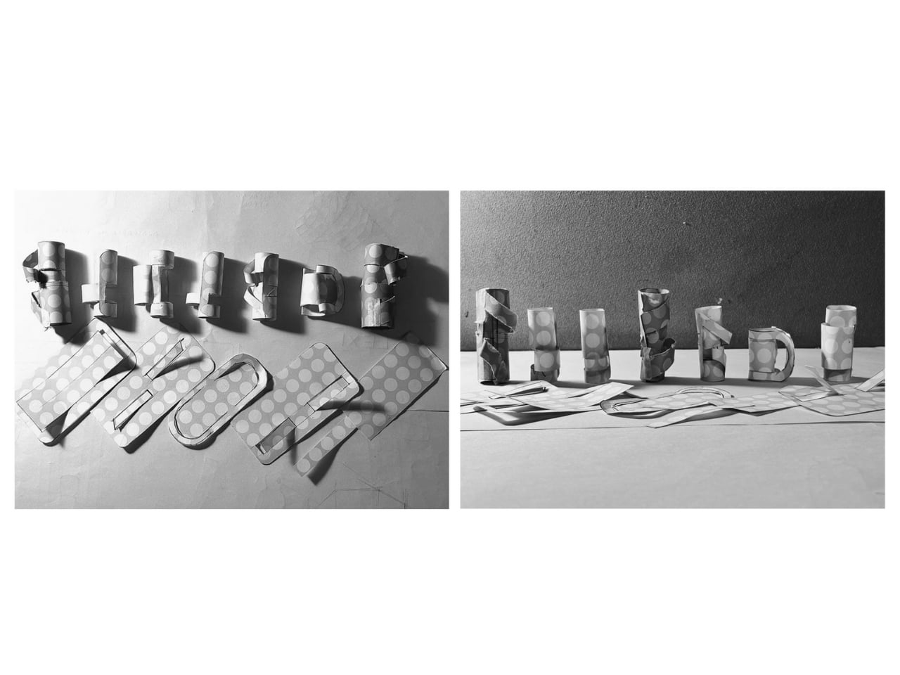
You know that metal umbrella stand gathering dust in your entryway? The one that’s been repurposed into a catch-all for tennis rackets, dog leashes, and that broken tripod you keep meaning to fix? Yeah, that one. Designer Aishwarya Ajith looked at this universal furniture problem and asked a brilliantly simple question: why do we need a permanent umbrella stand when rain is seasonal?

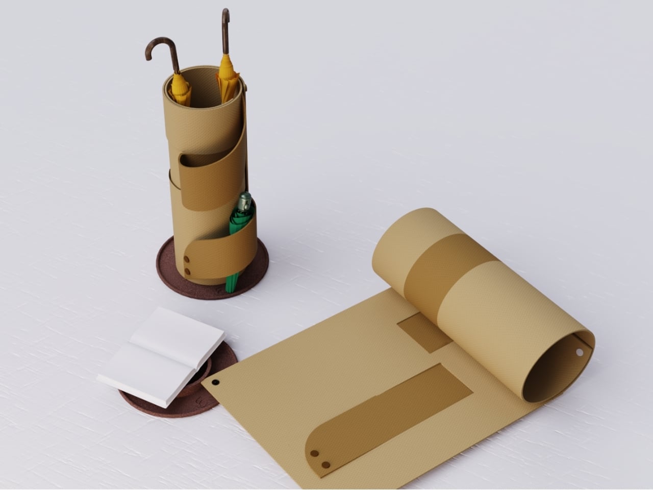
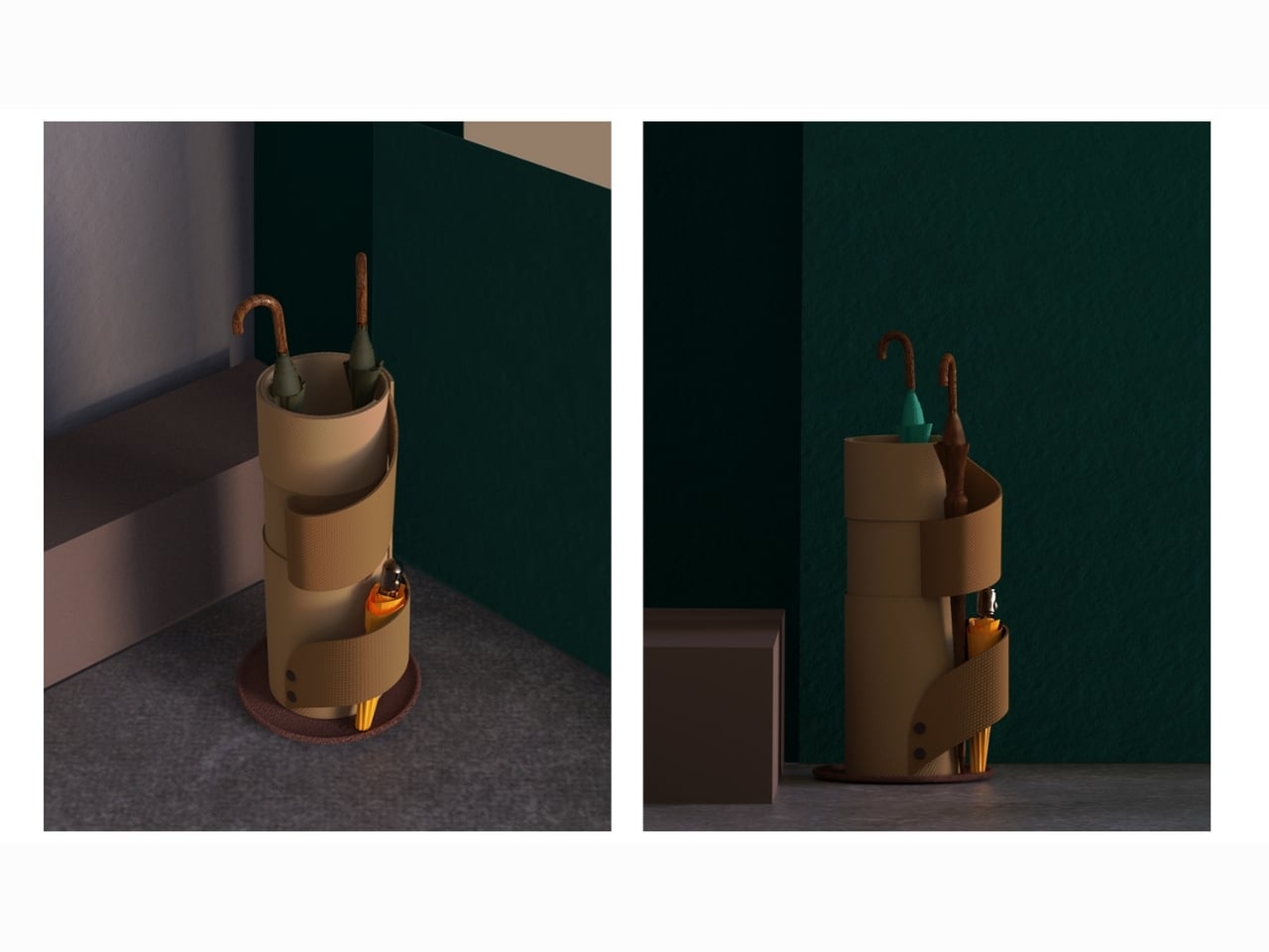
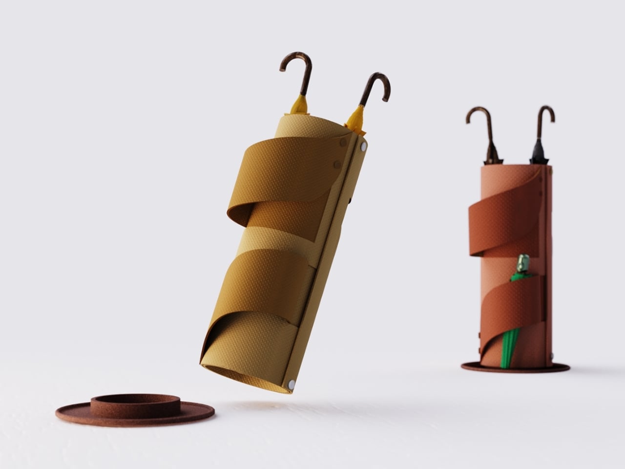
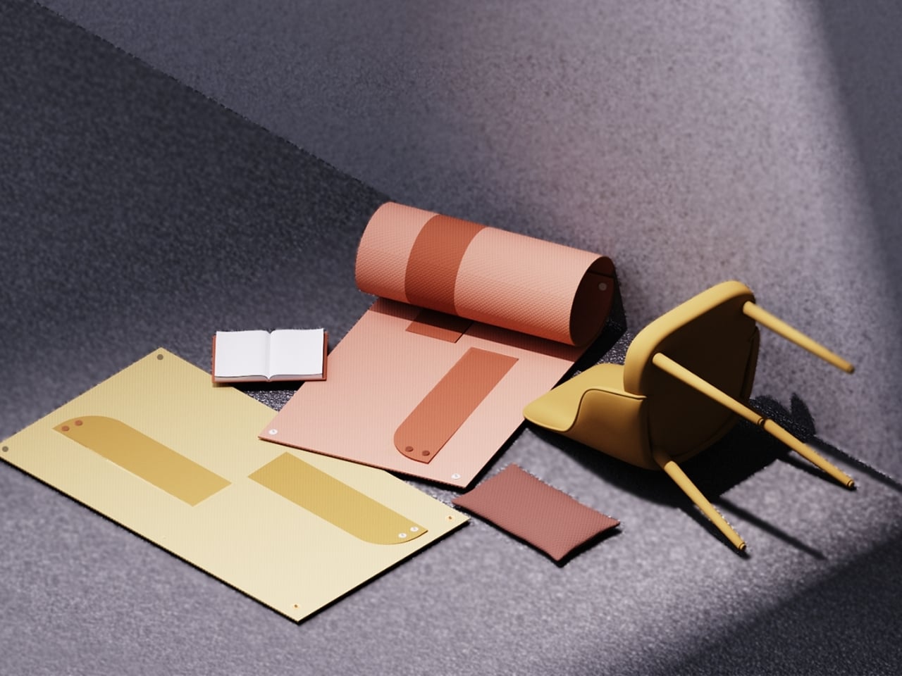
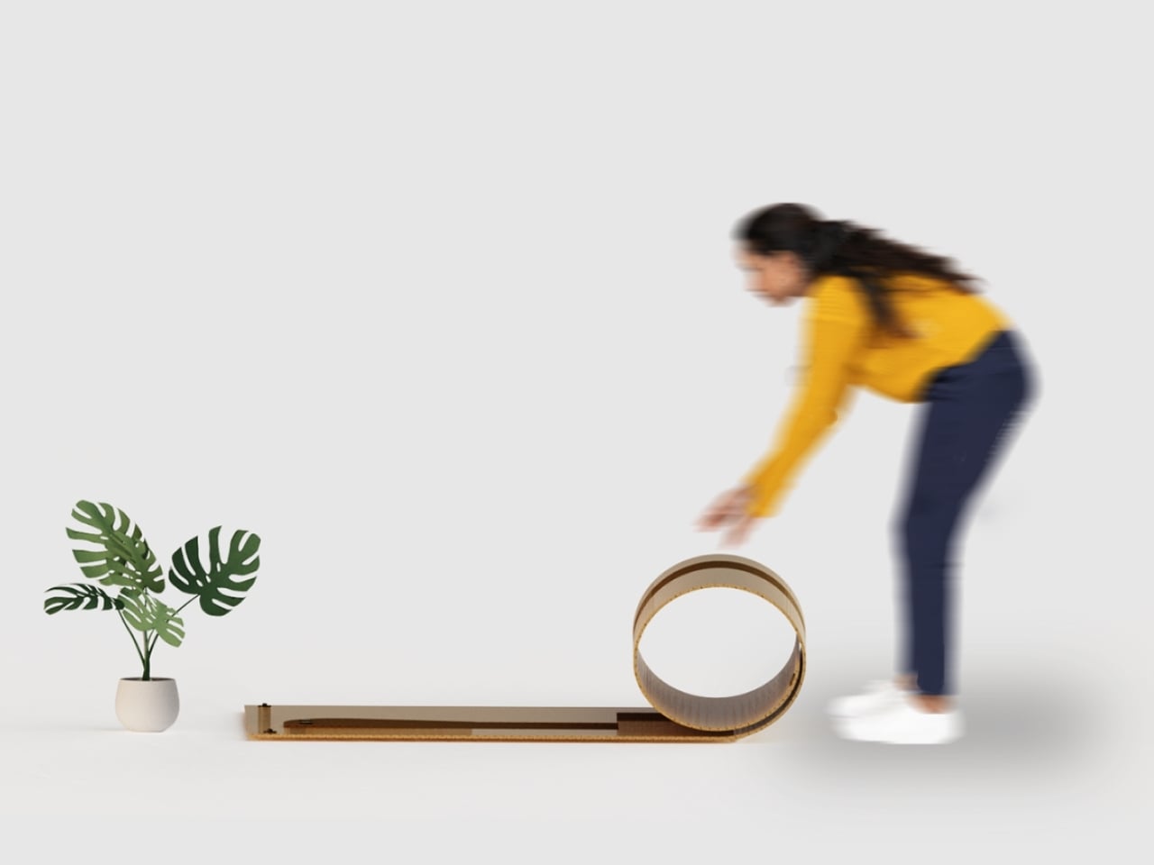
Enter Coilo, an umbrella stand that challenges everything we assume about furniture. It’s not a traditional stand at all. Instead, it’s a rollable mat that transforms into a temporary umbrella holder only when you actually need it. When the skies clear and your umbrellas are tucked away, Coilo returns to its flat form, practically disappearing from your space entirely.

Designer: Aishwarya Ajith

The concept is rooted in what Ajith calls “situational furniture,” objects that exist only when needed and remain visually unobtrusive the rest of the time. It’s a refreshingly honest approach to design that acknowledges how we actually live rather than clinging to outdated notions of what furniture should be.

The inspiration came from observing life in compact spaces, particularly in Indian hostels and shared dormitories where every square foot matters. In these environments, people routinely lay out mats on the floor for group discussions and social gatherings. During monsoon season, wet umbrellas demand immediate attention, dripping all over entryways and creating puddles. But once the rain passes, that urgency evaporates. So why should the solution take up permanent real estate?

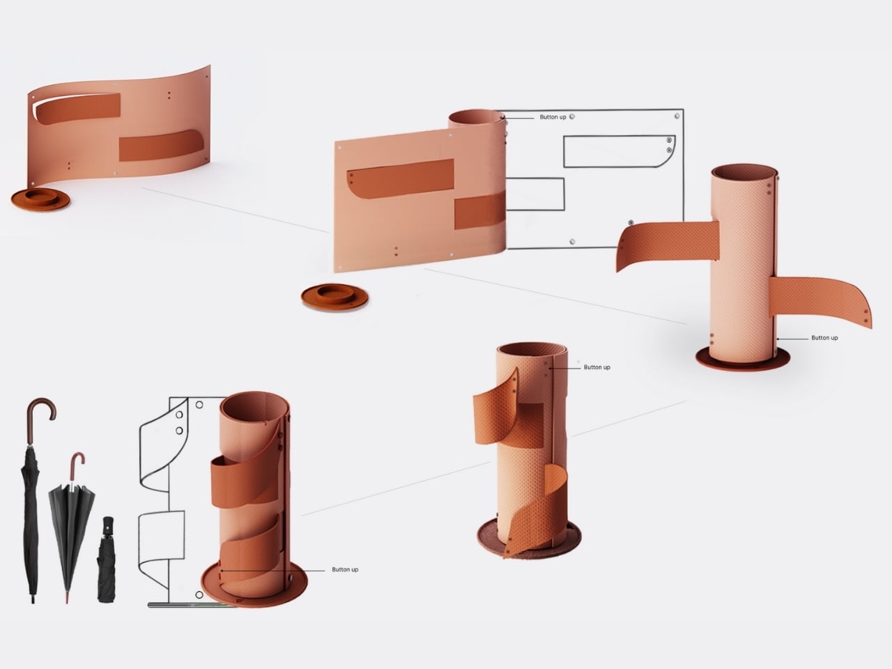
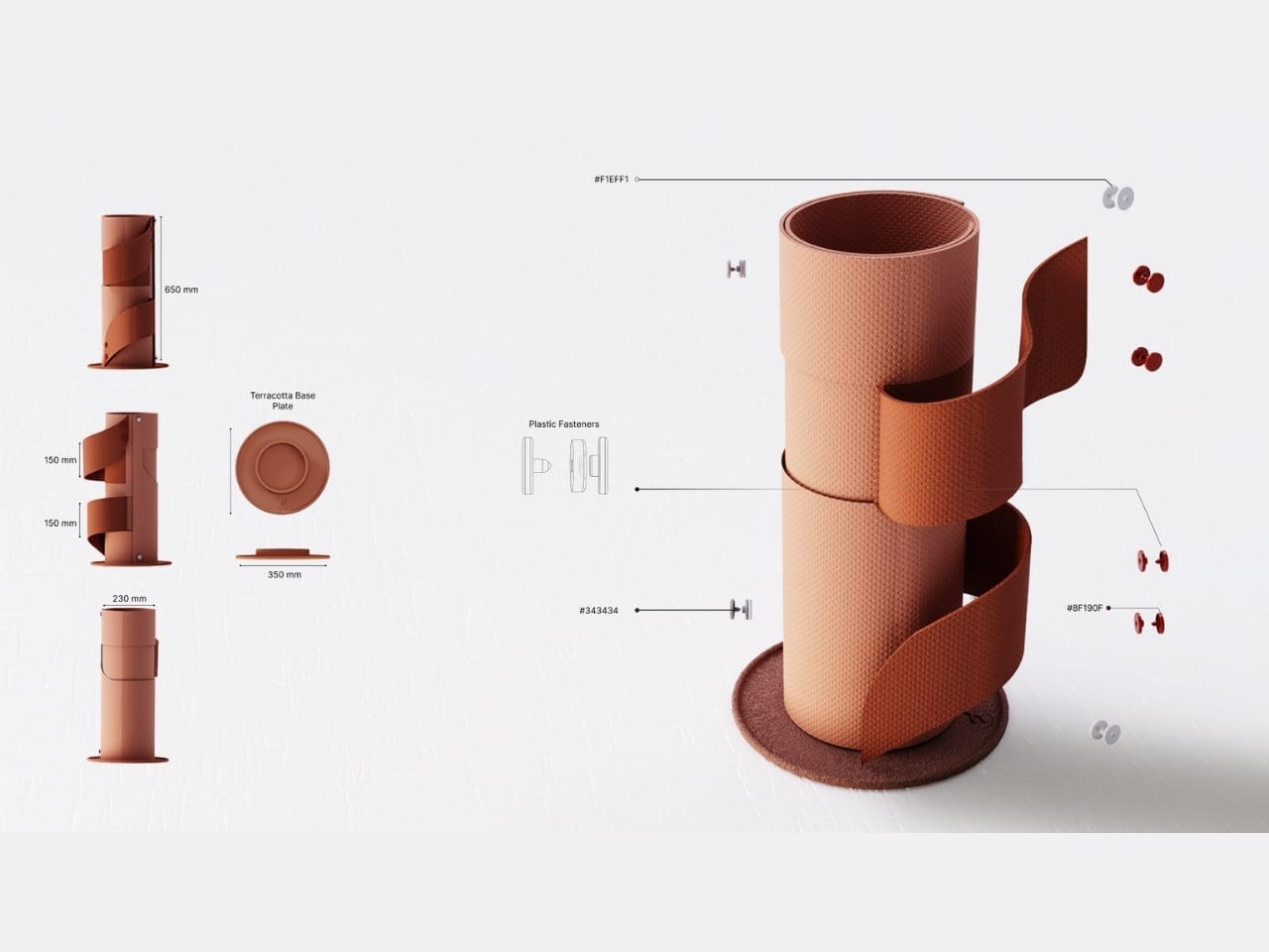
Coilo’s design is deceptively simple yet remarkably clever. The mat is crafted from flexible, water-resistant EVA foam that can be rolled into a cylindrical form. Thanks to a simple joint system, the coiled structure achieves surprising stability without requiring complex mechanisms or hardware. Supporting flaps button together in a distinctive pattern that gives the stand character and allows it to accommodate umbrellas of varying heights.

The base plate deserves special mention. It’s made from terracotta clay, a material choice that’s both practical and thoughtful. Terracotta is naturally absorbent, wicking away moisture from wet umbrellas rather than letting it pool on your floor. It’s the kind of detail that reveals genuine problem-solving rather than purely aesthetic decision-making.

What makes Coilo particularly fascinating is how it fits into broader conversations about sustainable design and conscious consumption. We’re living in an era where urban apartments are shrinking, minimalism is trending, and people are questioning whether they really need all the stuff previous generations accumulated. Coilo doesn’t just save space; it challenges the assumption that furniture must be static and permanent.

This philosophy resonates especially with younger generations navigating shared living situations, frequent moves, and smaller living quarters. Students in dormitories, young professionals in co-living spaces, and anyone dealing with limited square footage will immediately grasp Coilo’s appeal. It’s furniture that adapts to your life rather than demanding you adapt to it. The visual design also breaks from traditional umbrella stand aesthetics. Those buttoned flaps create a sculptural quality that makes Coilo a conversation piece when deployed. It looks intentional and interesting rather than purely utilitarian. When rolled flat, it could easily pass as a decorative floor mat or yoga mat, maintaining a presence without announcing itself as single-purpose furniture.

Ajith’s exploration opens up fascinating possibilities for the future of home furnishings. What else could transform and disappear? Could we design coffee tables that fold into wall art? Dining chairs that become storage? Desks that morph into room dividers? Coilo represents more than just a clever umbrella solution. It’s a prototype for how we might rethink everyday objects in an age where flexibility, adaptability, and space efficiency matter more than ever.

The post This Umbrella Stand Disappears When You Don’t Need It first appeared on Yanko Design.
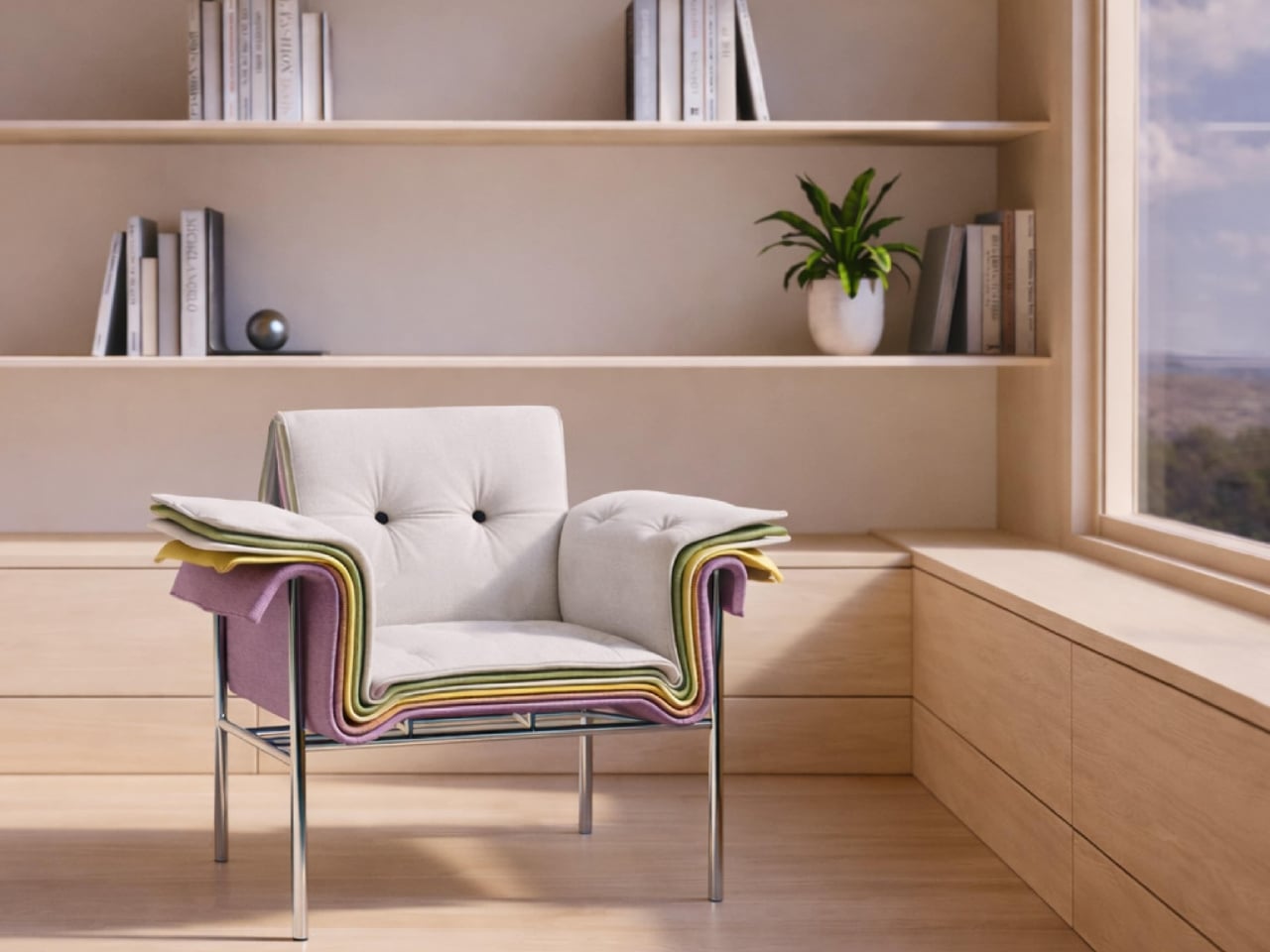
This Chair Looks Like a Material Swatch Book

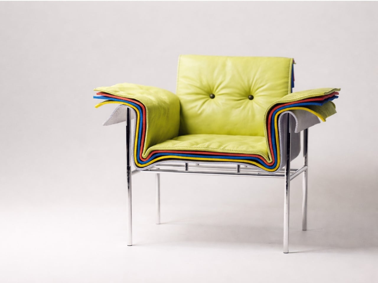
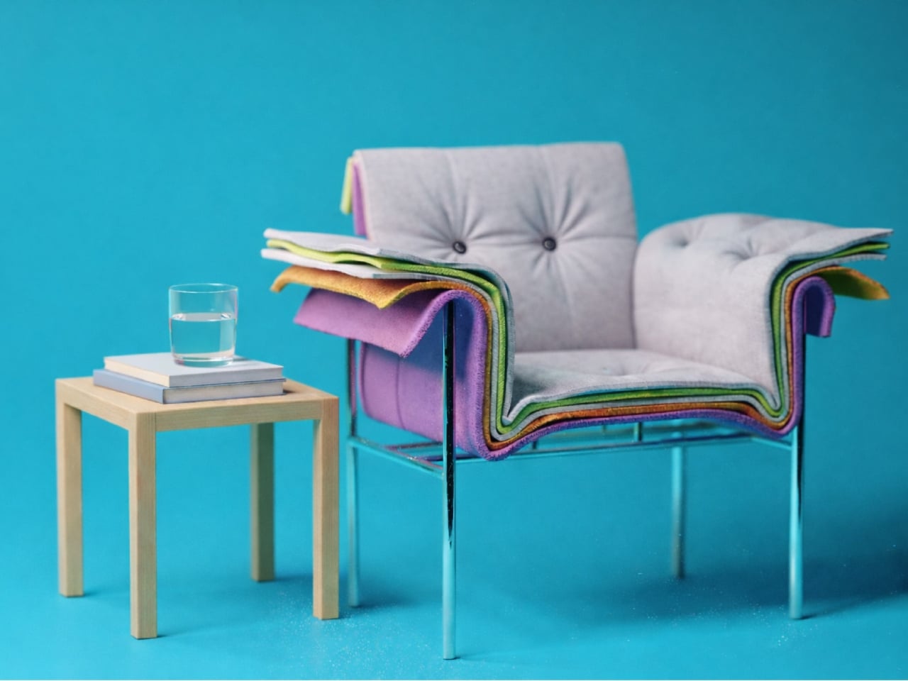
You know those material swatch books at fabric stores where every color fan out in perfect rainbow order? Designer Fatih Demirci apparently looked at one and thought, “What if that was a chair?” The result is the Kartela Chair, a concept design that turns the humble material sample into something you’d actually want to sit on.

Let’s be real. Most furniture design either plays it safe with neutrals or goes so wild that you’d only see it in a modern art museum. The Kartela Chair manages to walk this delightful line between practical and playful. Looking at it feels like stumbling upon a design secret, where function meets whimsy in the most unexpected way.

Designer: Fatih Demirci

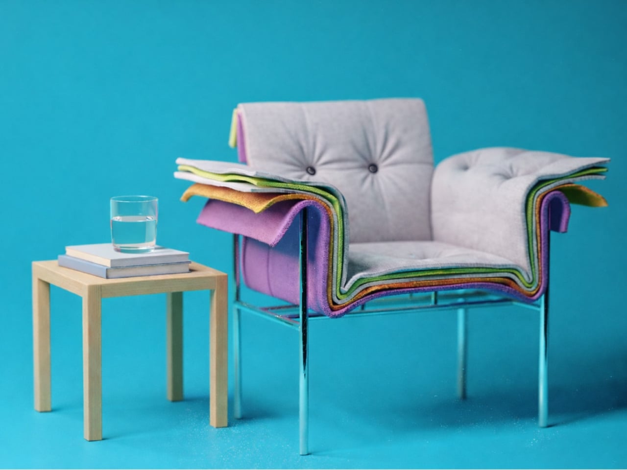
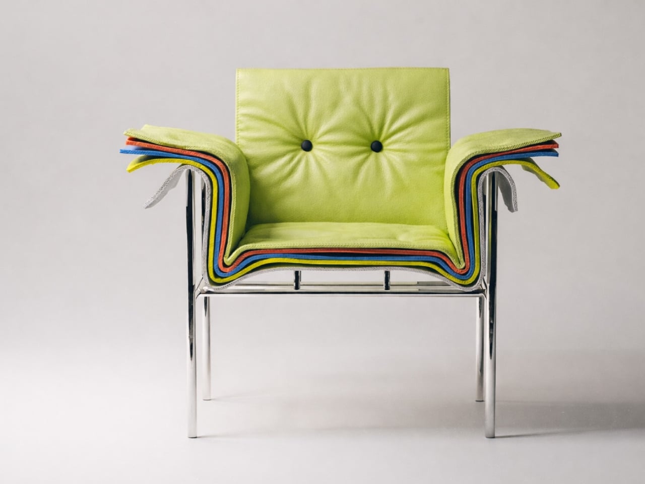
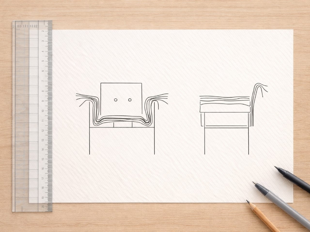
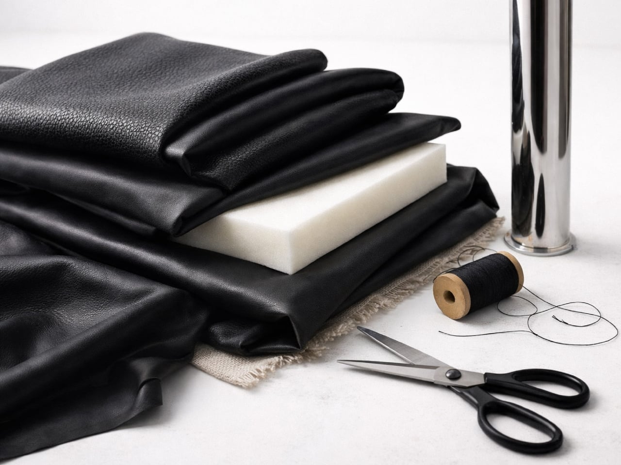
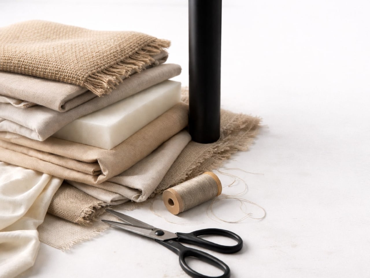
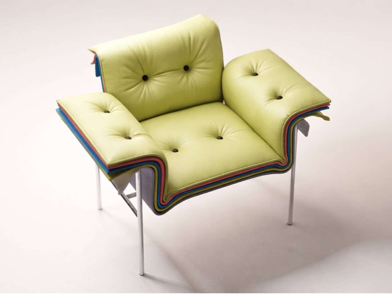
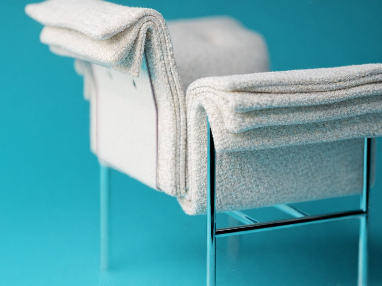
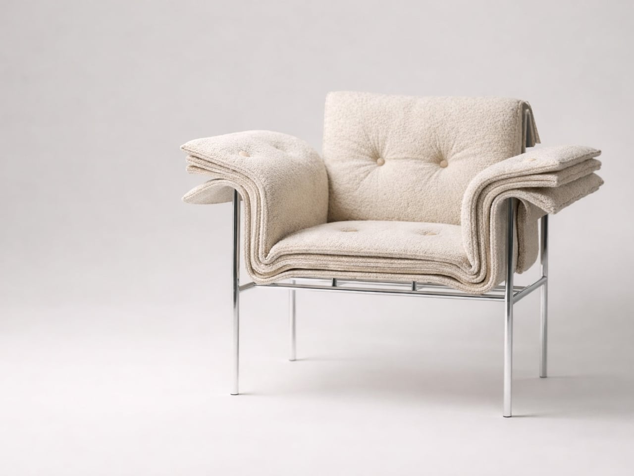
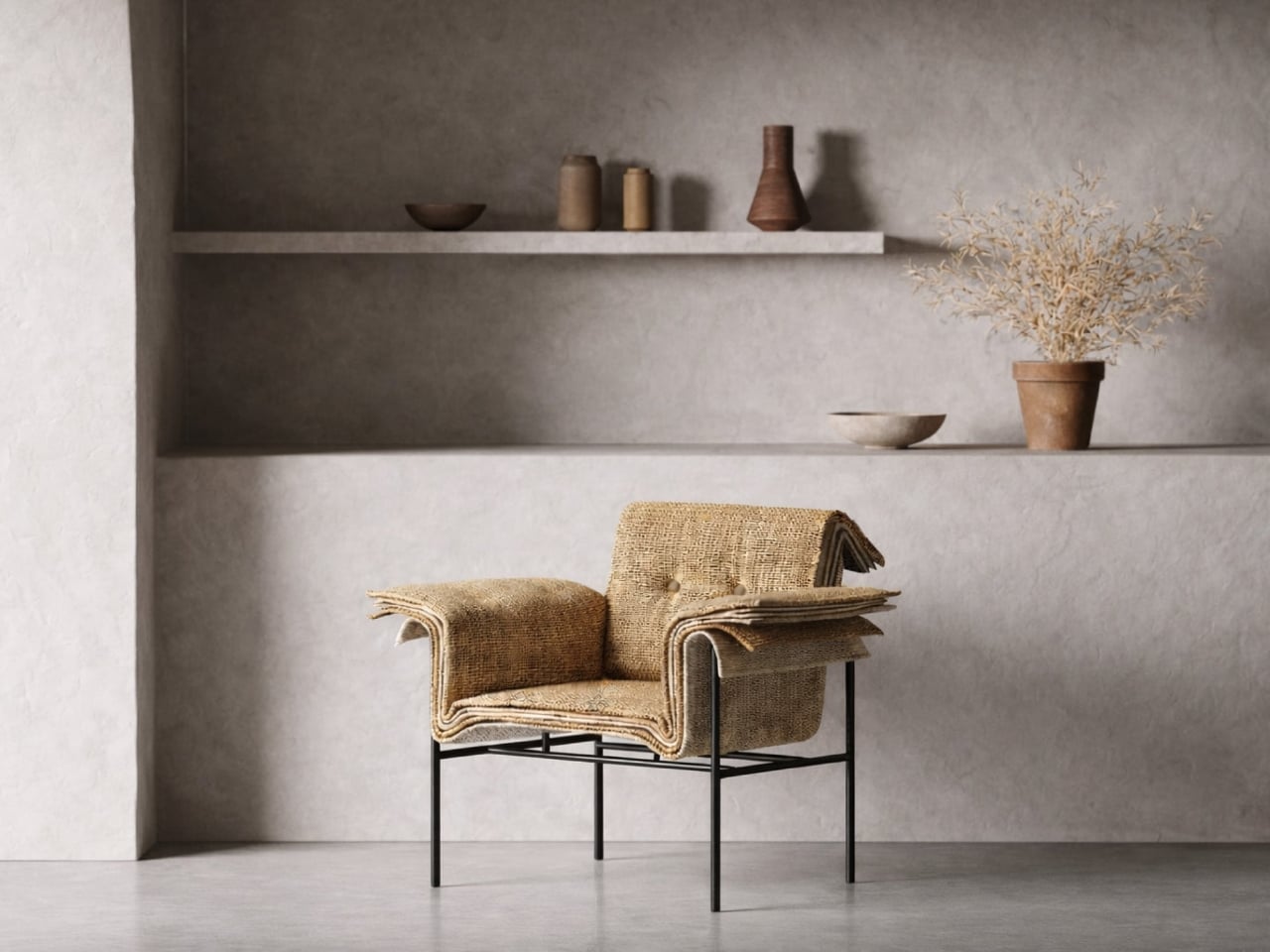
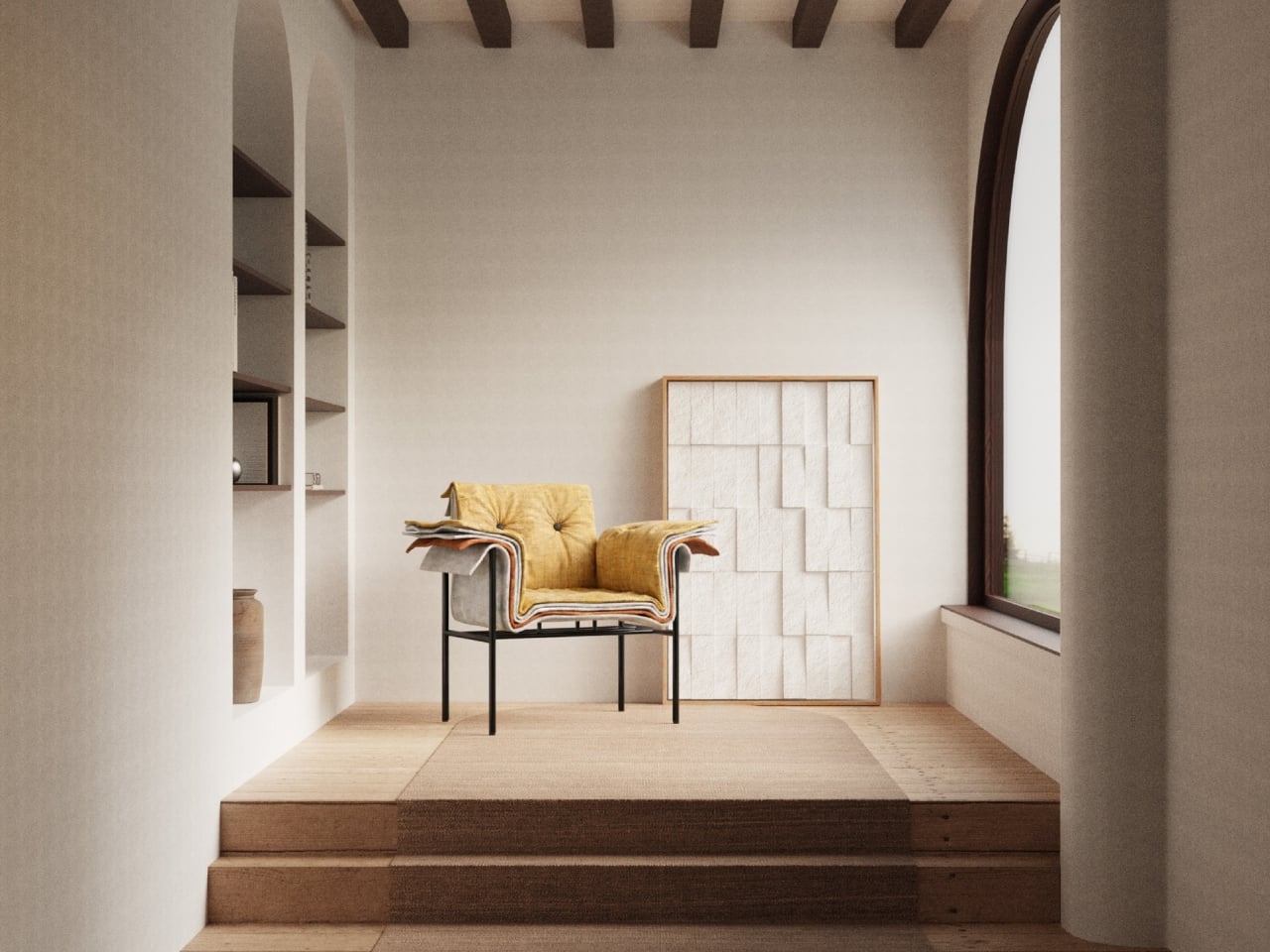
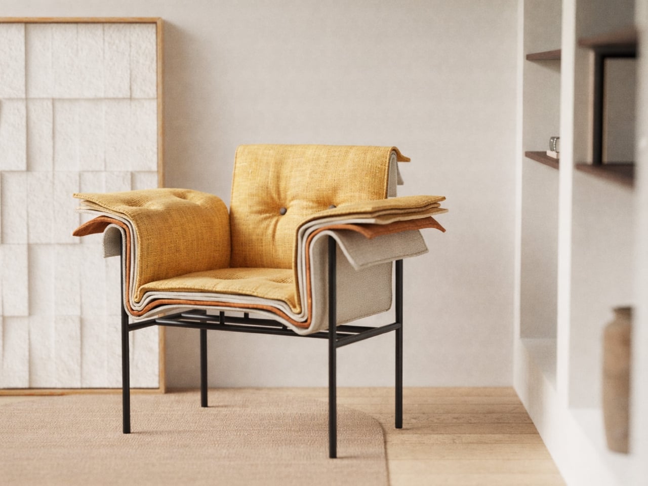
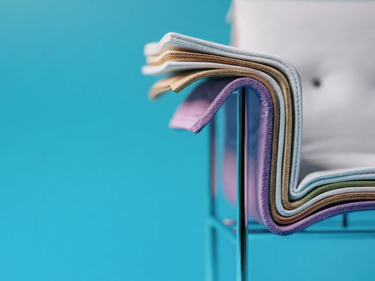
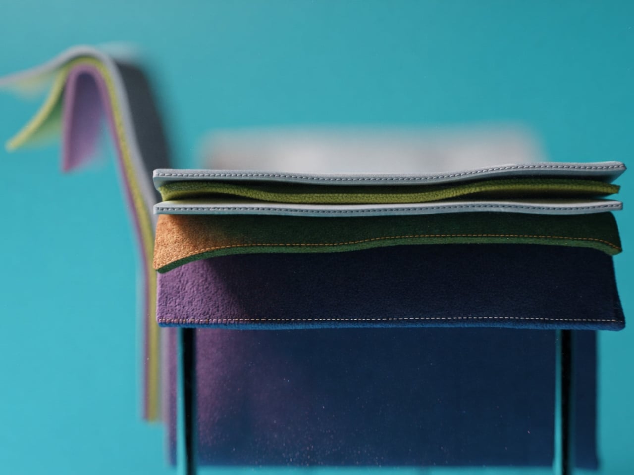
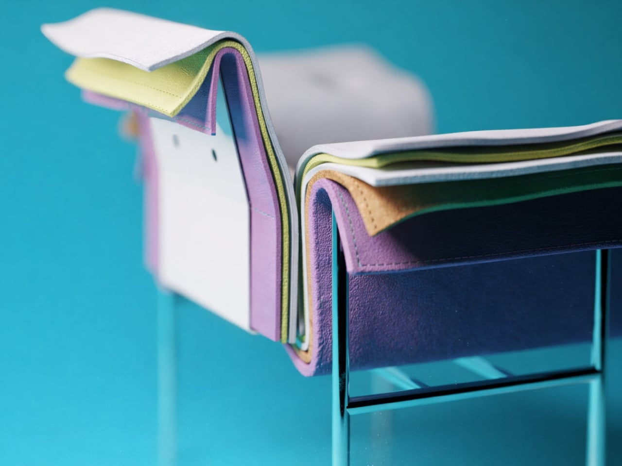
The concept is brilliantly simple yet visually striking. The chair features layers upon layers of cushioned upholstery stacked together, creating this incredible rainbow effect along the edges. Each layer represents a different color or texture, much like flipping through pages in a designer’s sample book. It’s the kind of thing that makes you do a double take. From one angle, you see a sophisticated seating piece with a clean, minimalist frame. From another, you catch those vibrant cascading layers that give it personality and depth.

What really gets me about this design is how it celebrates the materials themselves. Usually, upholstery is hidden away, tucked and stapled underneath where no one sees the construction. Demirci flips that script entirely. Here, the layers become the main event. Every fold, every color transition, every texture is on full display. It’s like the chair is saying, “Hey, look how I’m made, and isn’t it beautiful?”

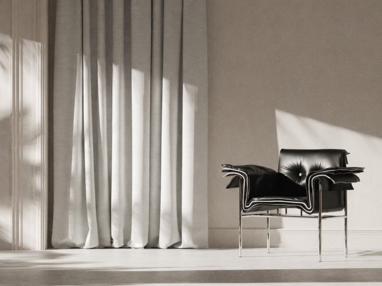
The Kartela Chair comes in different colorways, which honestly makes it even more fun. There’s a lime green version that practically vibrates with energy, perfect for someone who wants their furniture to make a statement. Then there are softer pastel combinations in lilacs, blues, and creams that feel more serene but still maintain that playful edge. And for those leaning toward earthy vibes, there are warm tones in mustards, tans, and terracottas that bring all that visual interest without overwhelming a space.

The frame itself keeps things grounded. Slim metal legs in either white or black powder coat give the chair an airy, almost floating quality. It’s a smart move. With all that cushioned drama happening above, a heavy base would make the whole thing feel clunky. Instead, the minimal structure lets those colorful layers take center stage while still providing solid support.

From a practical standpoint, this concept is interesting because it challenges how we think about customization. Imagine being able to choose your layer combinations like picking nail polish colors. Want more blues? Go for it. Prefer a monochromatic fade? That works too. The design naturally lends itself to personalization in a way that most furniture doesn’t.

There’s also something nostalgic about the aesthetic. Those tufted buttons on the seat and back cushions give off vintage vibes, like something your cool aunt might have had in her 70s living room, but updated for today. It’s retro without being costume-y, which is a hard balance to strike.

Of course, this is still a concept design, which means we’re looking at rendered images rather than something you can order online tomorrow. But that’s part of what makes furniture concepts so exciting. They push boundaries and make us reconsider what’s possible. Even if the Kartela Chair never makes it to mass production, it’s already done its job by sparking conversation and inspiring other designers to think outside the traditional furniture box. Whether this chair ever graces showroom floors or remains a digital darling, Fatih Demirci has created something that makes people smile. And in the end, isn’t that what good design should do?

The post This Chair Looks Like a Material Swatch Book first appeared on Yanko Design.
This Furniture Looks Like It’s Growing and Evolving

There’s something unsettling and deeply fascinating about furniture that looks back at you. Not literally, of course, but in that way certain objects seem to have presence, personality, almost a pulse. That’s exactly the vibe French designer Vincent Decat is going for with his Living Series, a collection of sculptural furniture pieces that feel less like static household items and more like strange, beautiful companions sharing your space.

Decat, who studied at the prestigious Design Academy of Eindhoven, has built his practice around a provocative idea: what if our furniture behaved like living beings? What if instead of just using objects, we formed relationships with them, caring for them the way we might care for a pet or a plant? It’s a concept that might sound precious or overly conceptual, but when you see the pieces themselves, something clicks. These aren’t just conversation starters. They’re genuinely compelling objects that make you reconsider what furniture can be.

Designer: Vincent Decat

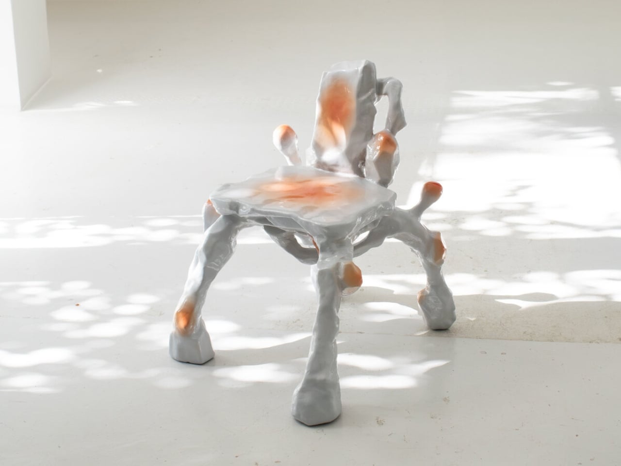
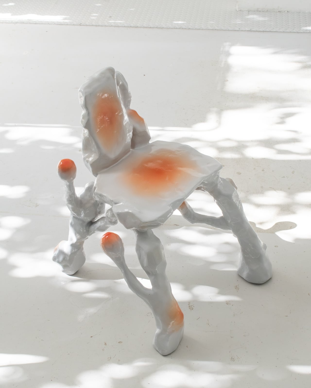
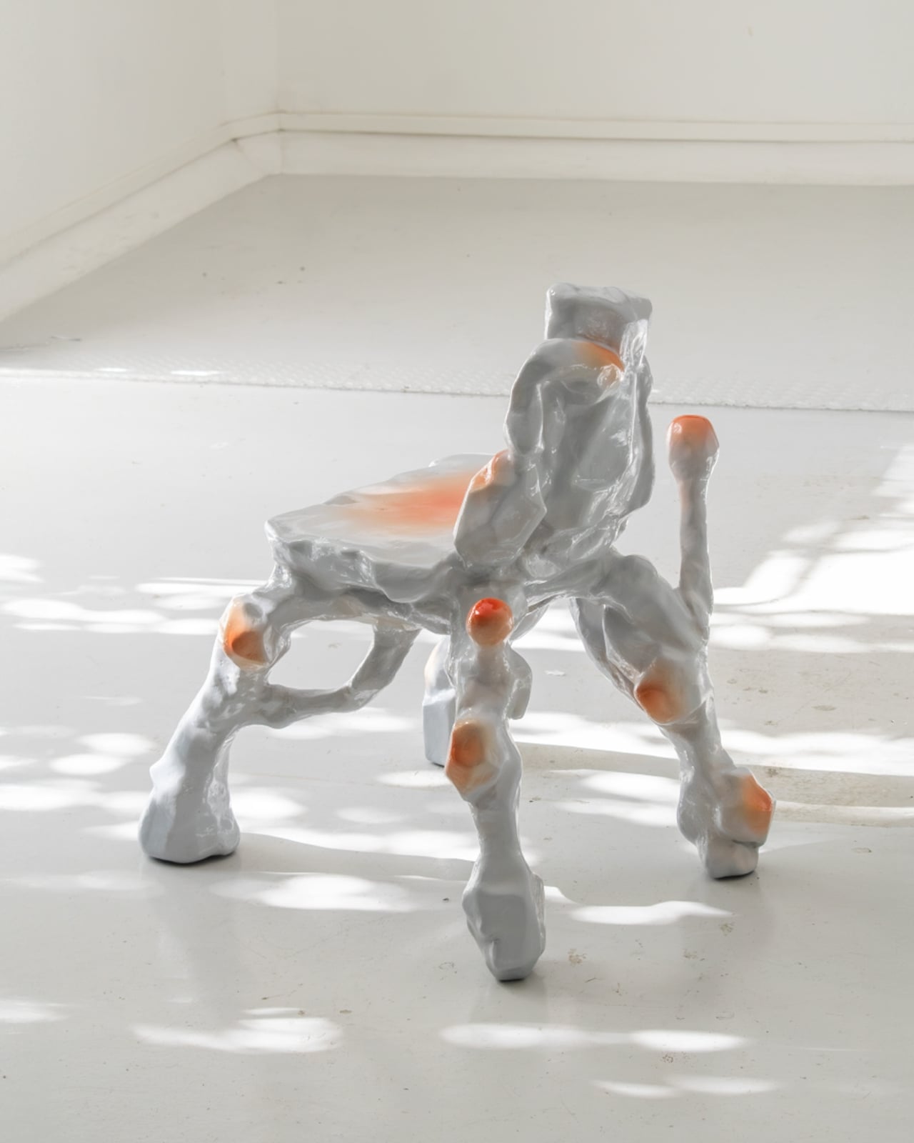
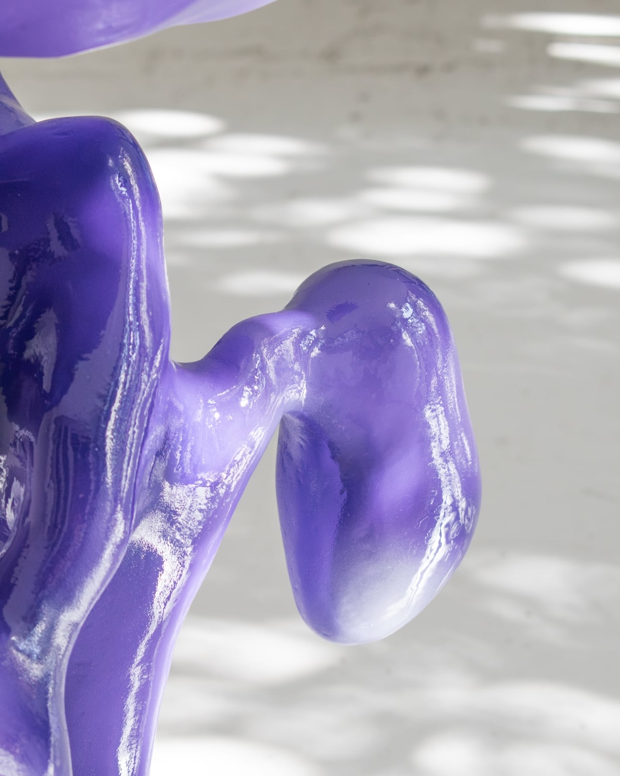
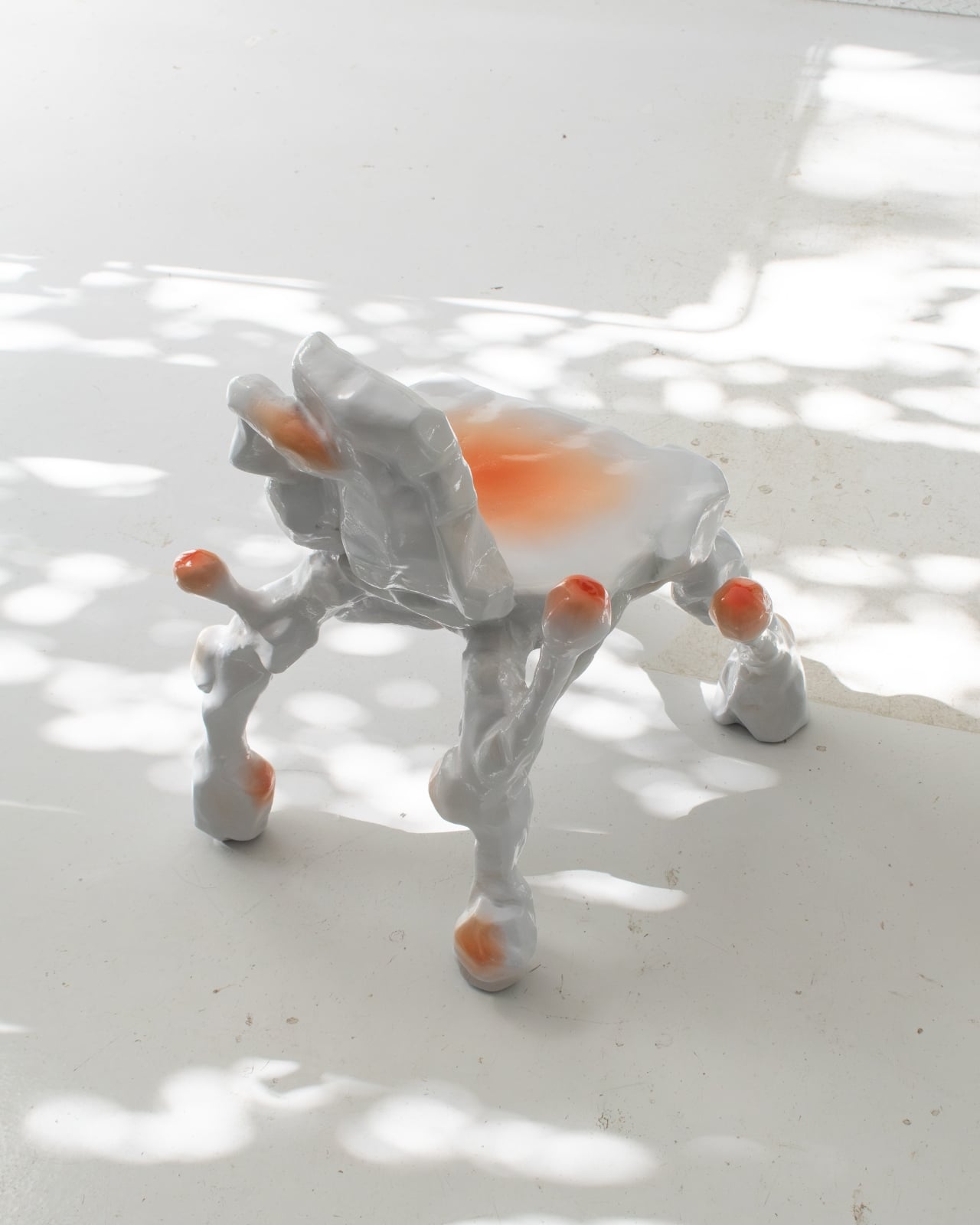
The Living Series includes three main pieces, each exploring different aspects of biological growth and organic development. First up is “One Thing Led To Another,” a sculptural chair that looks like a landscape caught mid-transformation. With its irregular contours and vivid orange elements sprawling across the surface, it suggests something being colonized or regenerated, like coral spreading across rock or moss creeping over stone. The piece combines wood, steel, resin, acrylic paint, and varnish, standing 80 centimeters tall and measuring 70 by 60 centimeters. It’s handcrafted in a way that emphasizes the materiality and the sense that this object has evolved rather than simply been constructed.
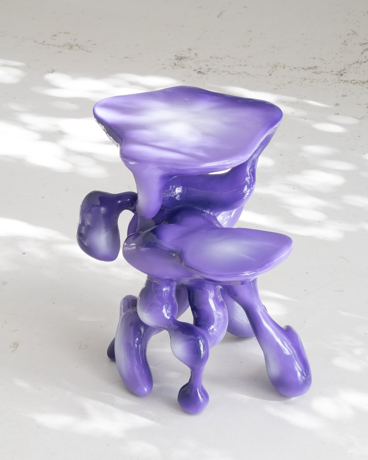
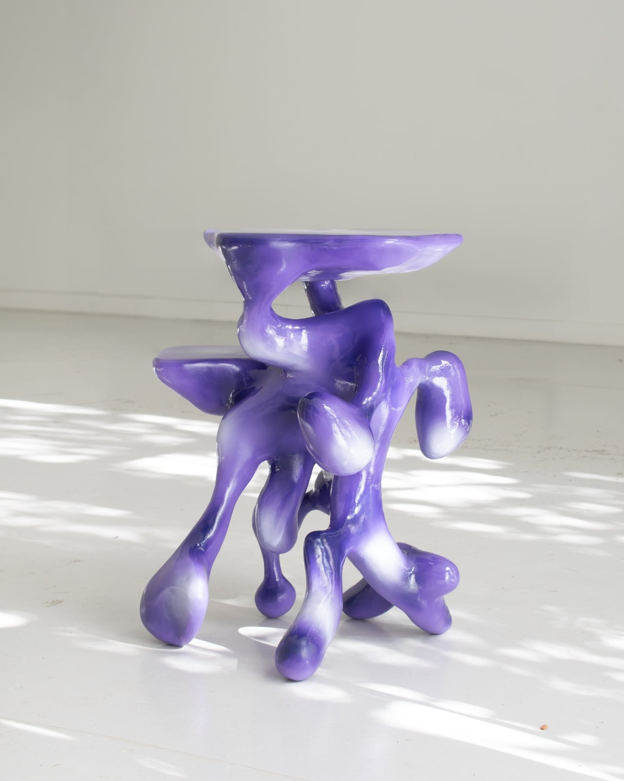
Then there’s “Came Uninvited,” a side table that feels like it wandered into your living room from some other dimension. This piece evokes what Decat describes as a “transformed organism,” something that references human impact on natural systems. There’s an element of the uncanny here, the way the forms seem both familiar and alien, organic yet artificial. It’s 60 centimeters tall with a 46 by 50 centimeter footprint, crafted from PLA (a biodegradable plastic often used in 3D printing), resin, acrylic paint, and varnish. The colors and textures suggest something living that has adapted, mutated, or been fundamentally altered by its environment.

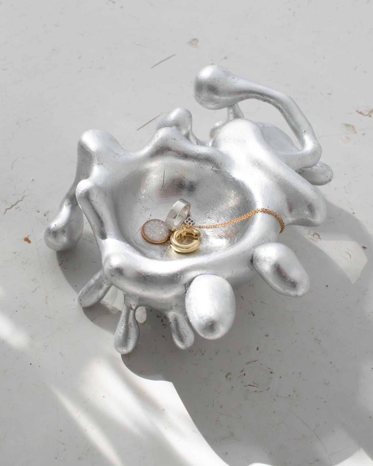
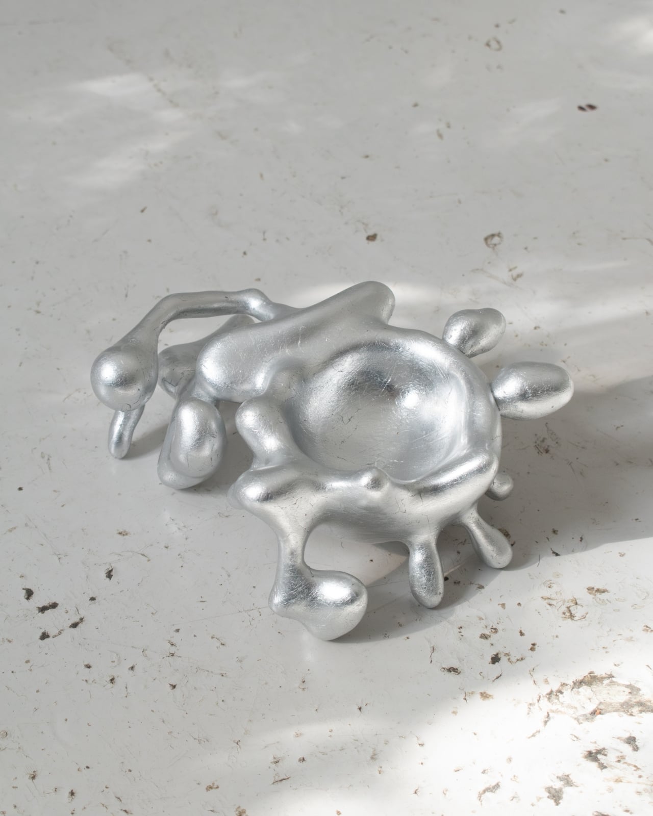
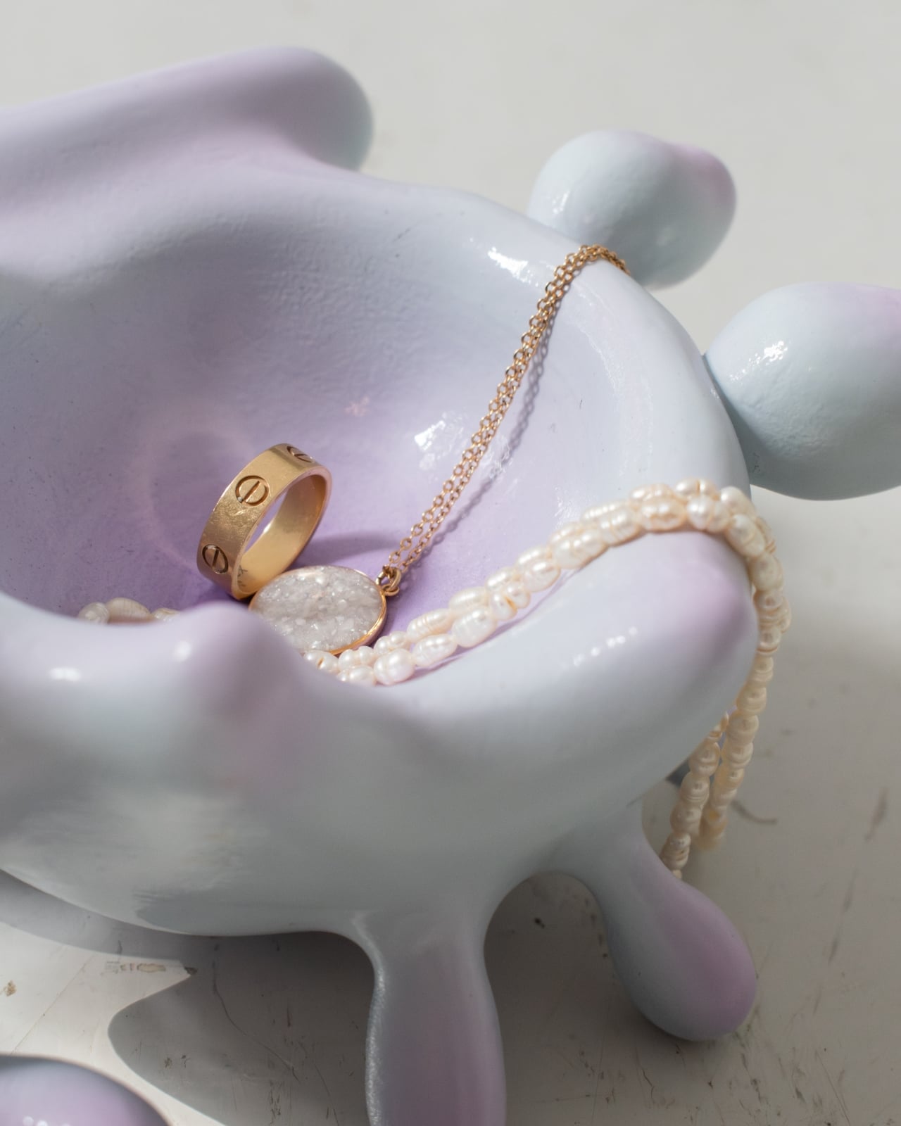
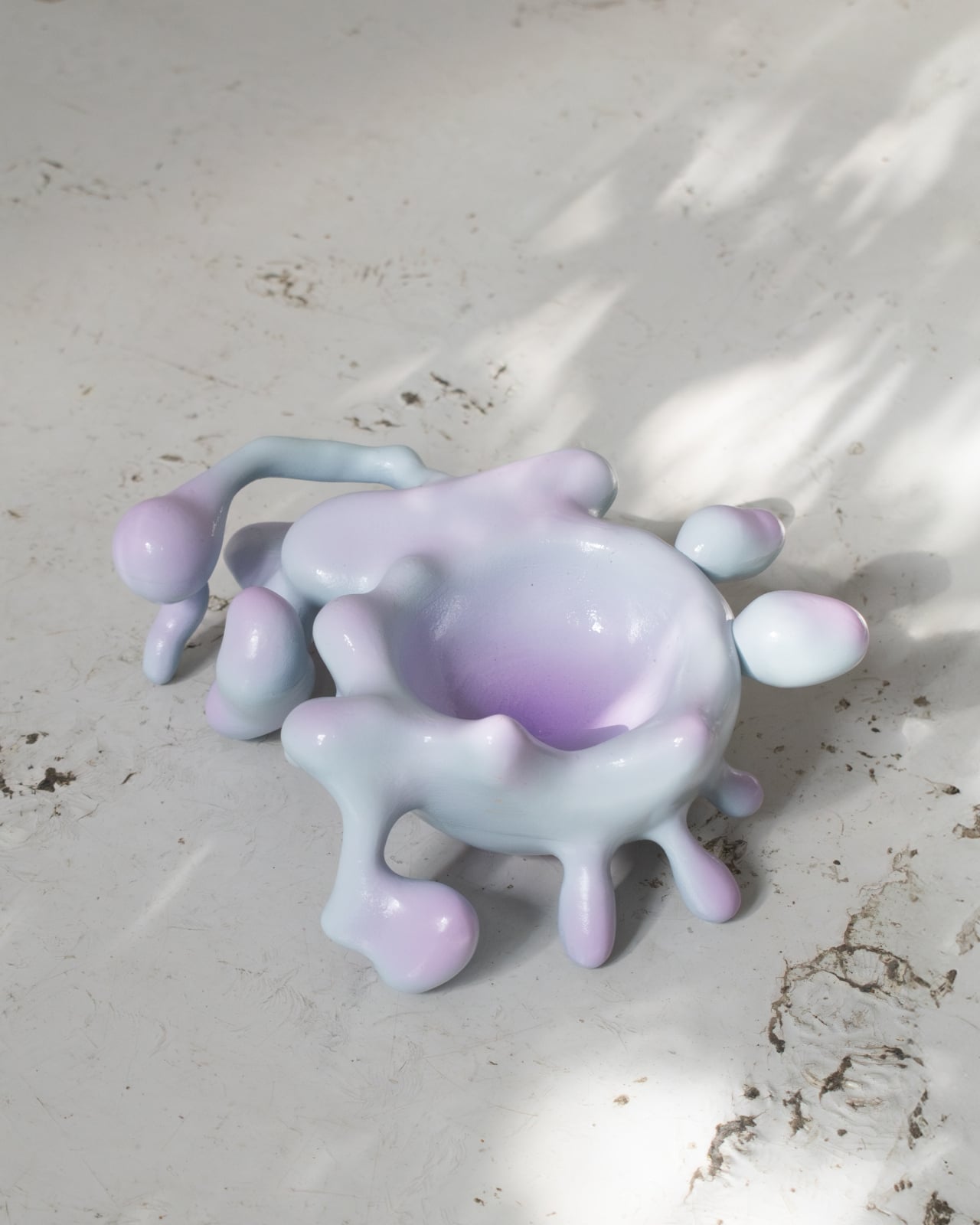
The third piece, “Stage One,” takes the biological metaphor to its logical beginning: embryonic development. This tray adopts compact, evolving geometry that suggests growth over time. Fabricated through 3D printing and available in two hand-finished variations (one with acrylic paint, another with aluminum leaf), Stage One feels like witnessing the earliest phases of life. It’s the smallest and most contained piece in the series, but it carries perhaps the most conceptual weight, asking us to see even the humblest domestic objects as things in process, things with potential.

What makes Decat’s work particularly relevant right now is how it taps into our growing awareness of materiality, sustainability, and our relationship with the objects we surround ourselves with. In an era of disposable IKEA furniture and Amazon basics, the idea that furniture could be something you bond with, something that deserves care and attention over time, feels almost radical. The designer positions his work against the throwaway culture of contemporary consumption, suggesting that durability isn’t just about how well something is built, but about whether it can sustain an emotional connection over years.

The Living Series also reflects broader trends in contemporary design, where the boundaries between art, craft, and function are increasingly blurred. These pieces work as furniture (you can actually sit on that chair, use that table, place things on that tray), but they also function as sculptural objects that transform a space. They’re conversation pieces that happen to be useful, or useful pieces that happen to start conversations.

Decat’s approach involves extensive material experimentation and surface treatment. Each piece is carefully finished by hand, which means every one is unique, with its own particular character and quirks. The combination of traditional techniques like woodworking with cutting-edge technology like 3D printing creates objects that feel simultaneously ancient and futuristic.

Ultimately, the Living Series asks us to slow down and reconsider our relationship with the everyday objects we live with. In Decat’s vision, furniture isn’t just something you buy, use, and eventually replace. It’s something you live alongside, something that changes as you change, something that becomes part of your story. Whether that sounds appealing or pretentious probably depends on your tolerance for design philosophy, but there’s no denying the pieces themselves have a compelling, almost magnetic quality that makes you want to reach out and touch them, to understand what they’re made of and how they came to be. And maybe that’s the point: furniture that makes you curious, that invites interaction and care, that refuses to disappear into the background of daily life.

The post This Furniture Looks Like It’s Growing and Evolving first appeared on Yanko Design.