MJ Fraser Just Turned His Childhood Garden Into Living Light

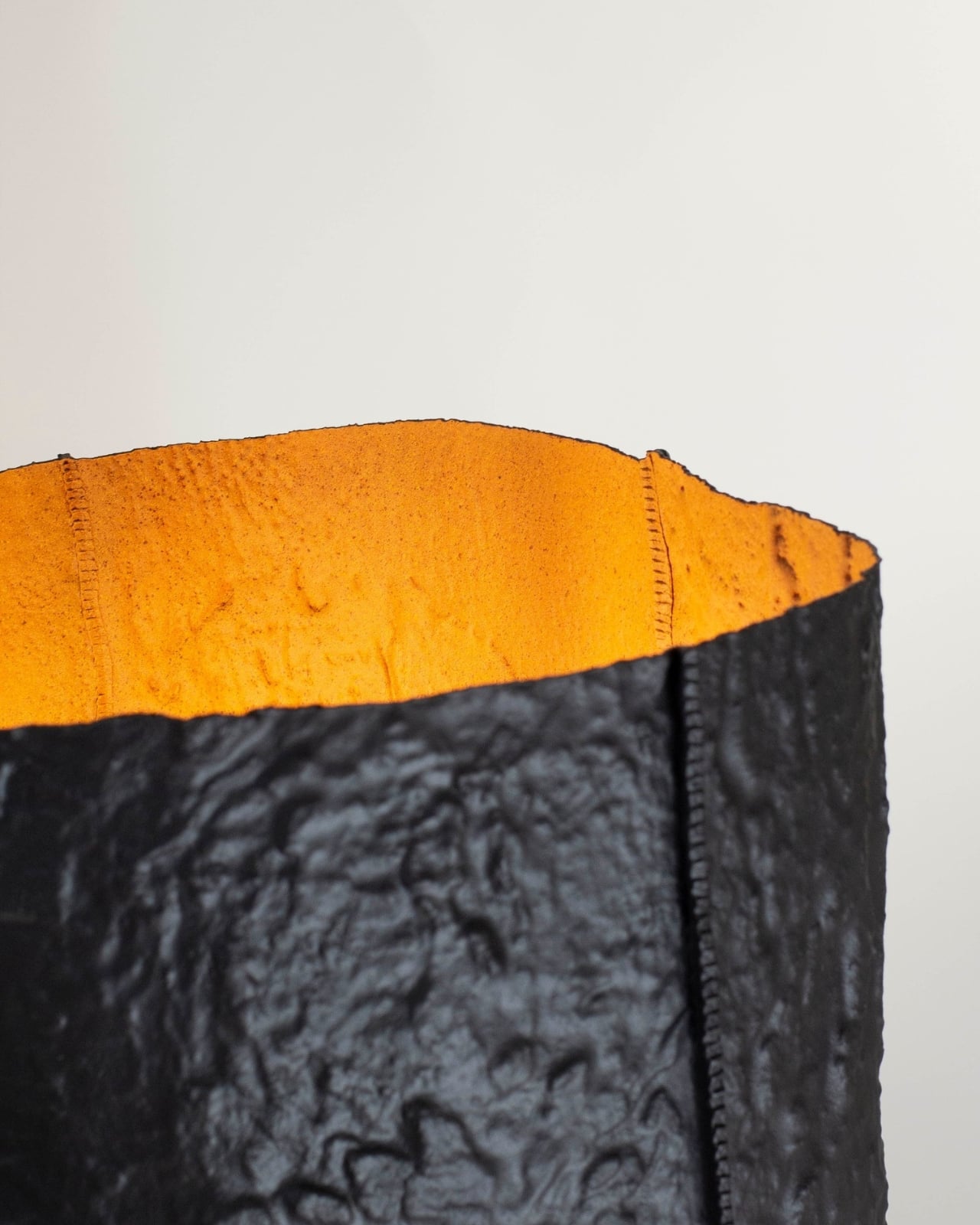
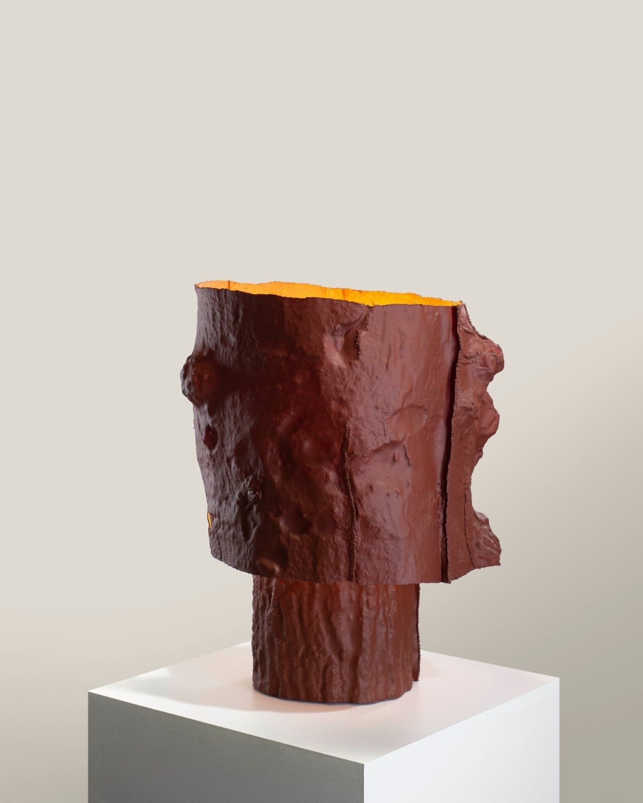
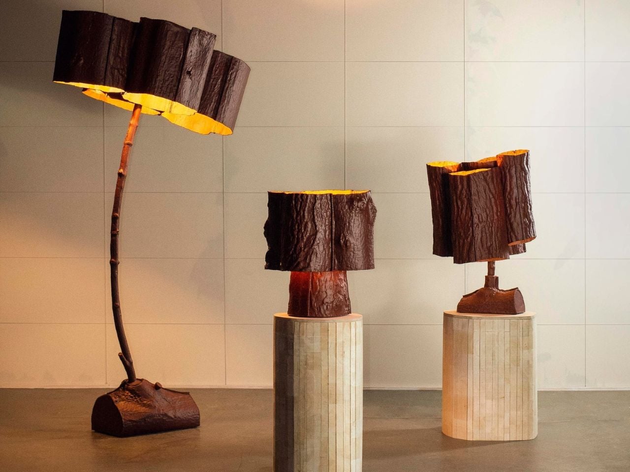
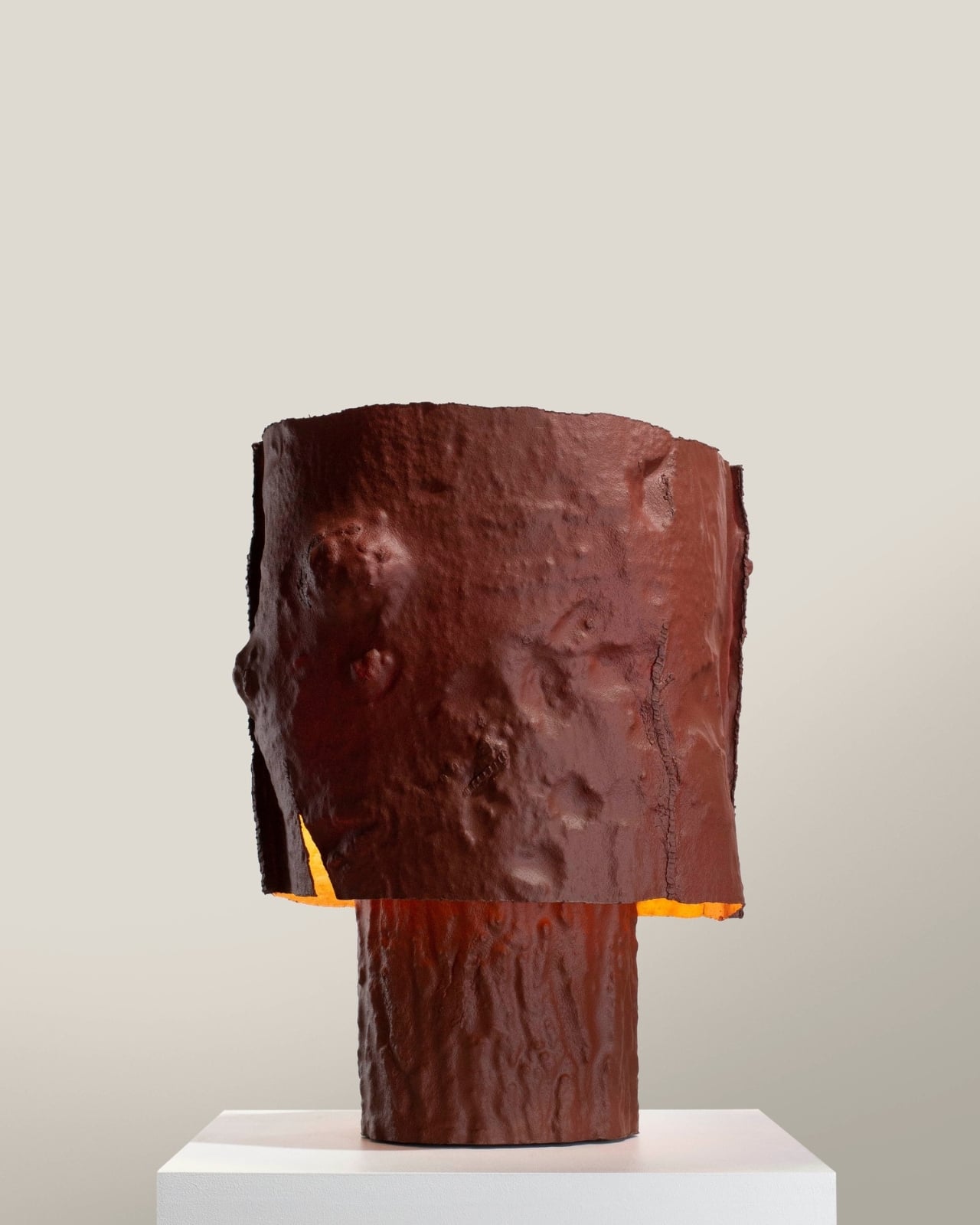
Most lamps get designed around a concept. MJ Fraser designed his around a memory. His Trees From The Garden collection started not with a mood board or a material swatch, but with the actual trees that grew in his childhood garden. He pressed the bark and branches directly into moulds, one section at a time, and the result is a series of lamps that look like they were pulled straight from the forest floor, still carrying the warmth of something lived in.

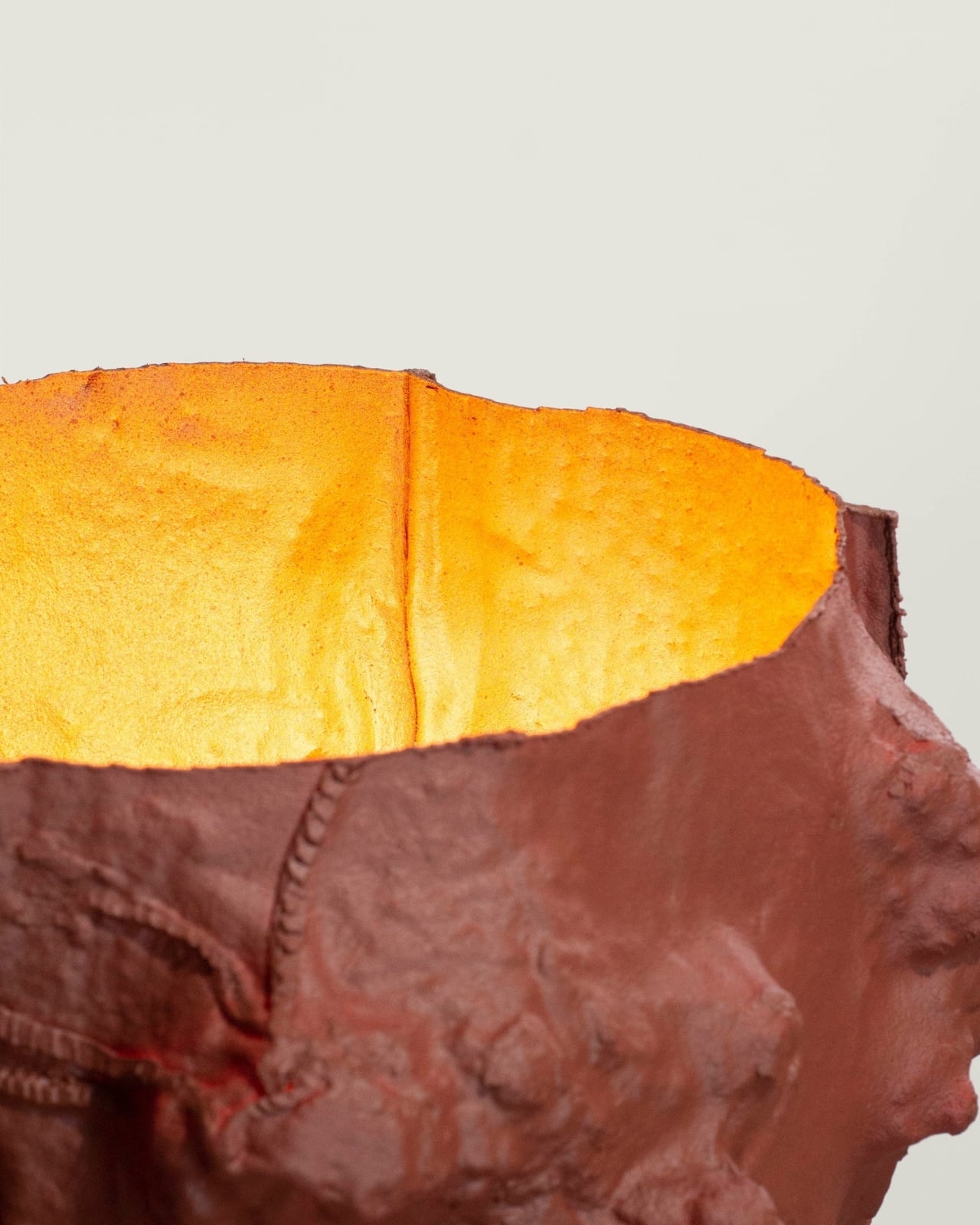
That personal starting point matters more than it might seem at first. A lot of sustainable design today leans heavily on the idea of nature while keeping a safe aesthetic distance from it. Fraser collapsed that distance entirely. The irregular textures across each piece, the way no two lamps in the series look exactly alike, these aren’t stylistic choices made in a studio. They’re what happens when you let nature do the actual drafting.

Designer Name: MJ Fraser
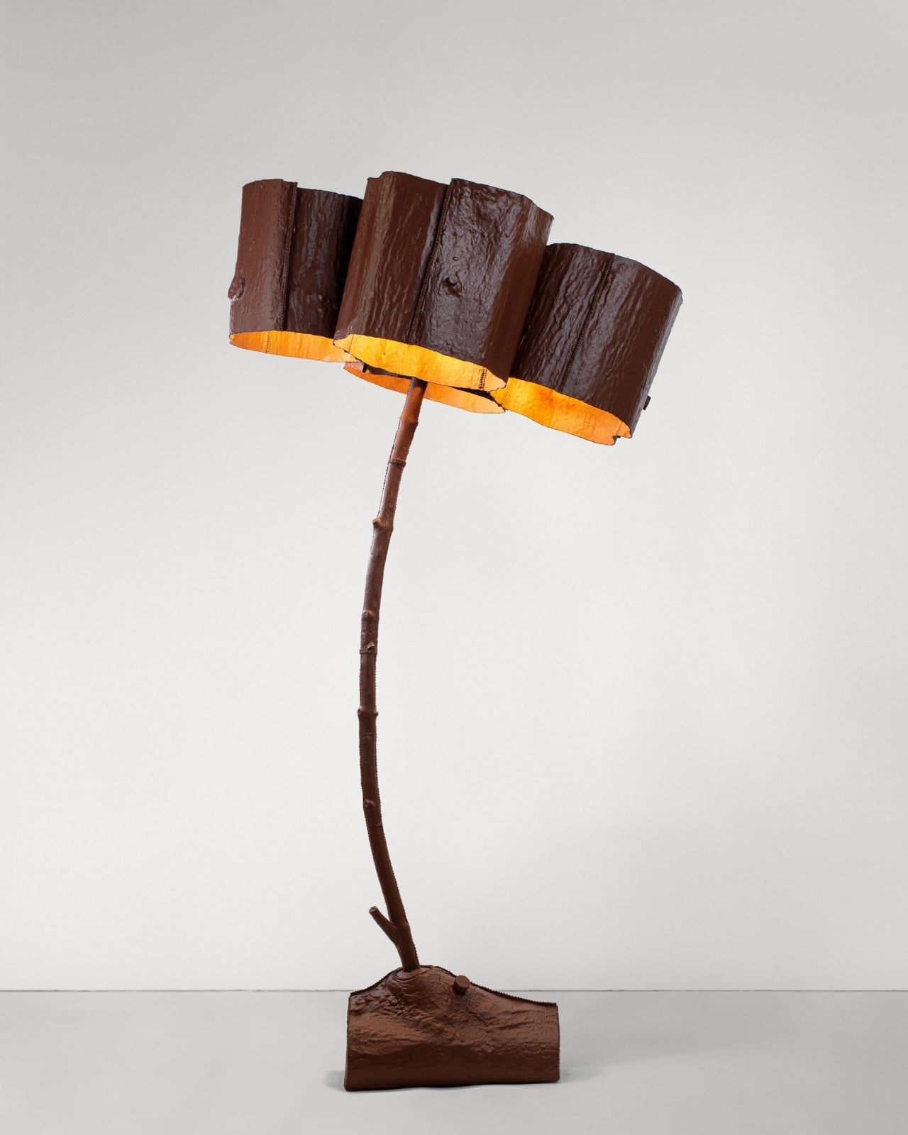
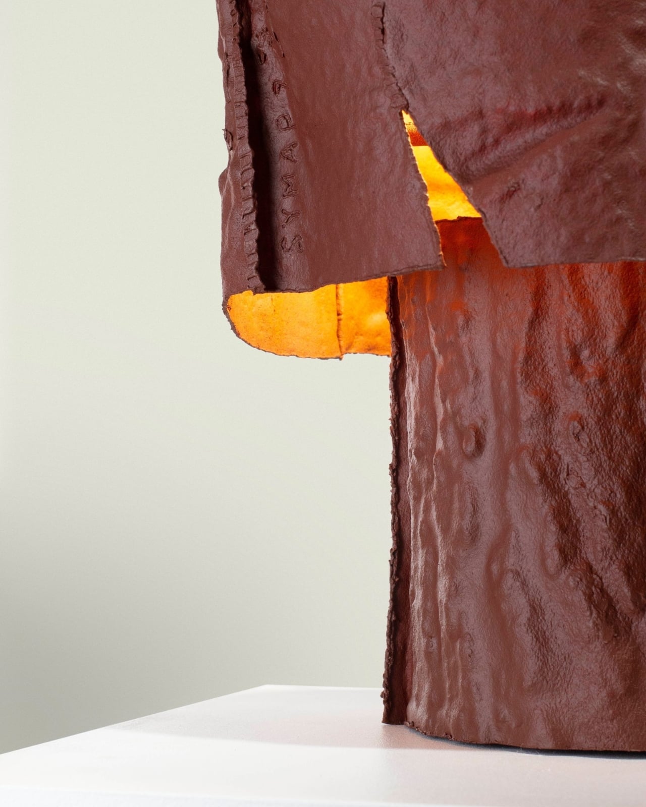
The material Fraser works with is Worbla, a biodegradable thermoplastic that contains roughly 30 percent waste sawdust. That sawdust detail is worth sitting with for a moment. The material is literally made, in part, from the same kind of organic matter it’s being shaped to resemble. It’s a closed-loop logic that feels almost poetic, and it carries through into the production process as well. Offcuts from fabrication don’t get discarded. They get reheated and folded back into the work as welding material or as internal structural support for the pieces. The heat-activated adhesive properties of the material mean no additional bonding agents are needed, which removes one more synthetic component from the equation. Surfaces are finished with natural mineral paint, keeping the material story clean from start to finish.

All of that restraint shows up in the final objects. These aren’t lamps trying to look rustic, and they’re not performing sustainability for a press release. They carry an honesty that is harder to manufacture than the pieces themselves. Looking at them, you get the sense that Fraser wasn’t chasing recognition for the materials. He just wanted the materials to be right.

I’ll be upfront: I think the design conversation around sustainable materials has grown a little comfortable with congratulating itself. A project announces it uses a bio-based material and that tends to become the whole story. What Fraser is doing here is structurally different. Every decision in the process has a reason, and those reasons loop back into each other. The sawdust in the thermoplastic connects to the trees. The scrap material folds back into the structure. The moulds taken from real bark connect back to the childhood garden where the whole thing began. Nothing in this collection is decorative justification.

The lamps also resist the visual sameness that tends to flatten sustainable design into a single recognizable aesthetic. Because each mould comes from a specific section of a specific tree, each piece in the collection reads differently. The series is unified by process and material, not by uniformity, and that’s a meaningful distinction. It means the collection gets more interesting the more pieces you encounter, rather than feeling like variations on the same idea.

There’s a growing appetite right now for objects with a legible origin, things you can trace back to a source, a decision, a place. Consumers are more skeptical of greenwashing than they’ve ever been, and the visual language of sustainability, the linen textures, the muted tones, the vague nods toward nature, has started to feel hollow when it’s not backed by real process thinking. Trees From The Garden lands as a direct answer to that skepticism, not because Fraser set out to make a statement, but because the work is too specific to be anything other than genuine.

A lamp made from a mould of bark from a childhood garden is, on one level, an incredibly quiet object. On another level, it’s a pretty compelling argument for what design can look like when nostalgia and material rigor are given equal weight.

The post MJ Fraser Just Turned His Childhood Garden Into Living Light first appeared on Yanko Design.

MJ Fraser Just Turned His Childhood Garden Into Living Light

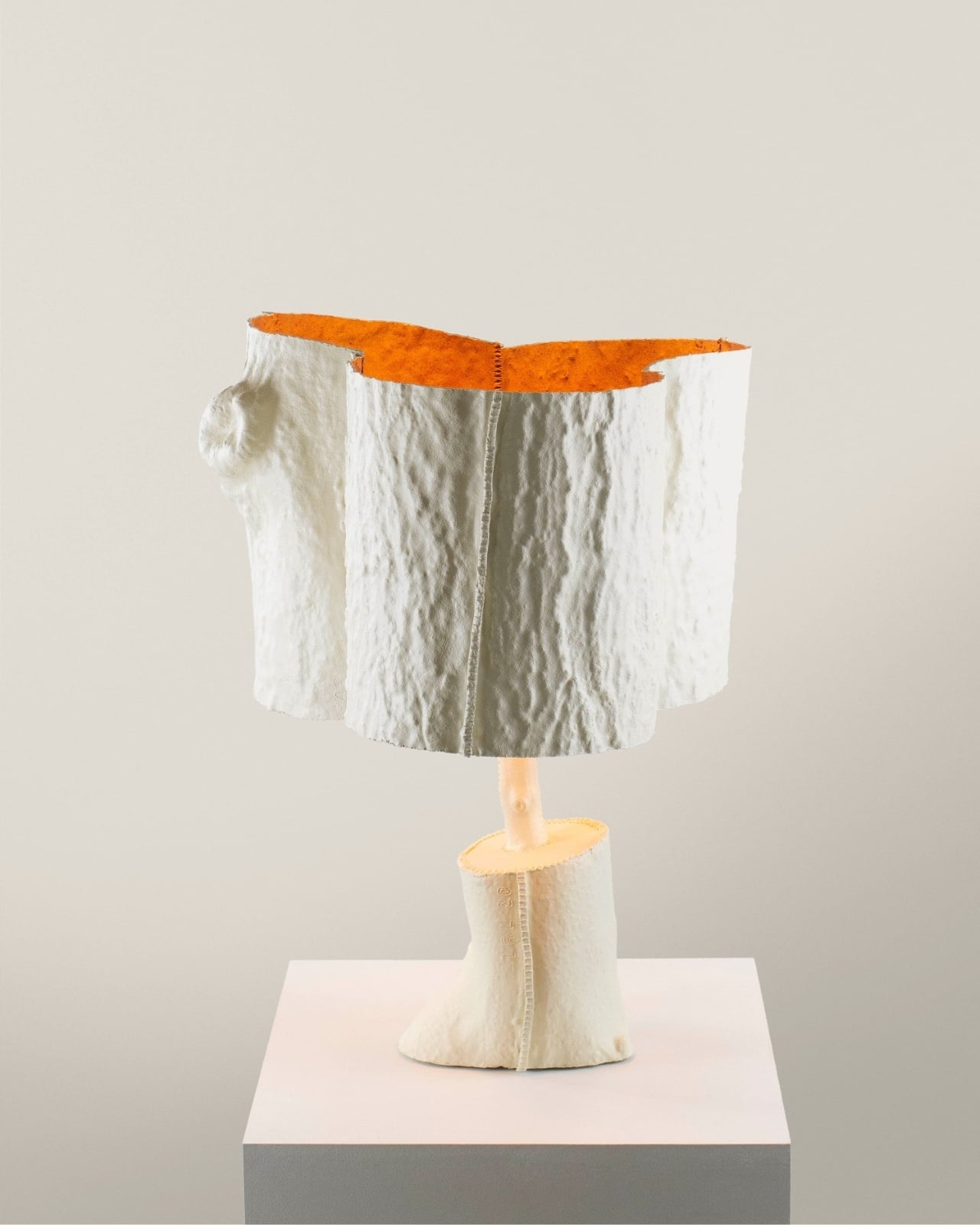
Most lamps get designed around a concept. MJ Fraser designed his around a memory. His Trees From The Garden collection started not with a mood board or a material swatch, but with the actual trees that grew in his childhood garden. He pressed the bark and branches directly into moulds, one section at a time, and the result is a series of lamps that look like they were pulled straight from the forest floor, still carrying the warmth of something lived in.

That personal starting point matters more than it might seem at first. A lot of sustainable design today leans heavily on the idea of nature while keeping a safe aesthetic distance from it. Fraser collapsed that distance entirely. The irregular textures across each piece, the way no two lamps in the series look exactly alike, these aren’t stylistic choices made in a studio. They’re what happens when you let nature do the actual drafting.

Designer Name: MJ Fraser

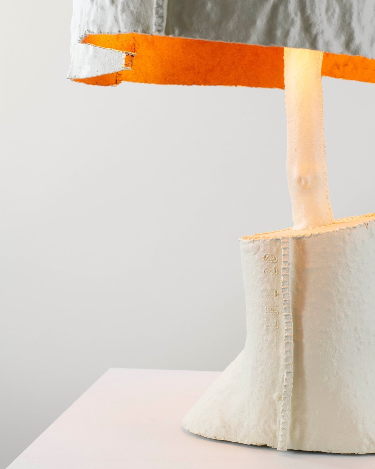
The material Fraser works with is Worbla, a biodegradable thermoplastic that contains roughly 30 percent waste sawdust. That sawdust detail is worth sitting with for a moment. The material is literally made, in part, from the same kind of organic matter it’s being shaped to resemble. It’s a closed-loop logic that feels almost poetic, and it carries through into the production process as well. Offcuts from fabrication don’t get discarded. They get reheated and folded back into the work as welding material or as internal structural support for the pieces. The heat-activated adhesive properties of the material mean no additional bonding agents are needed, which removes one more synthetic component from the equation. Surfaces are finished with natural mineral paint, keeping the material story clean from start to finish.
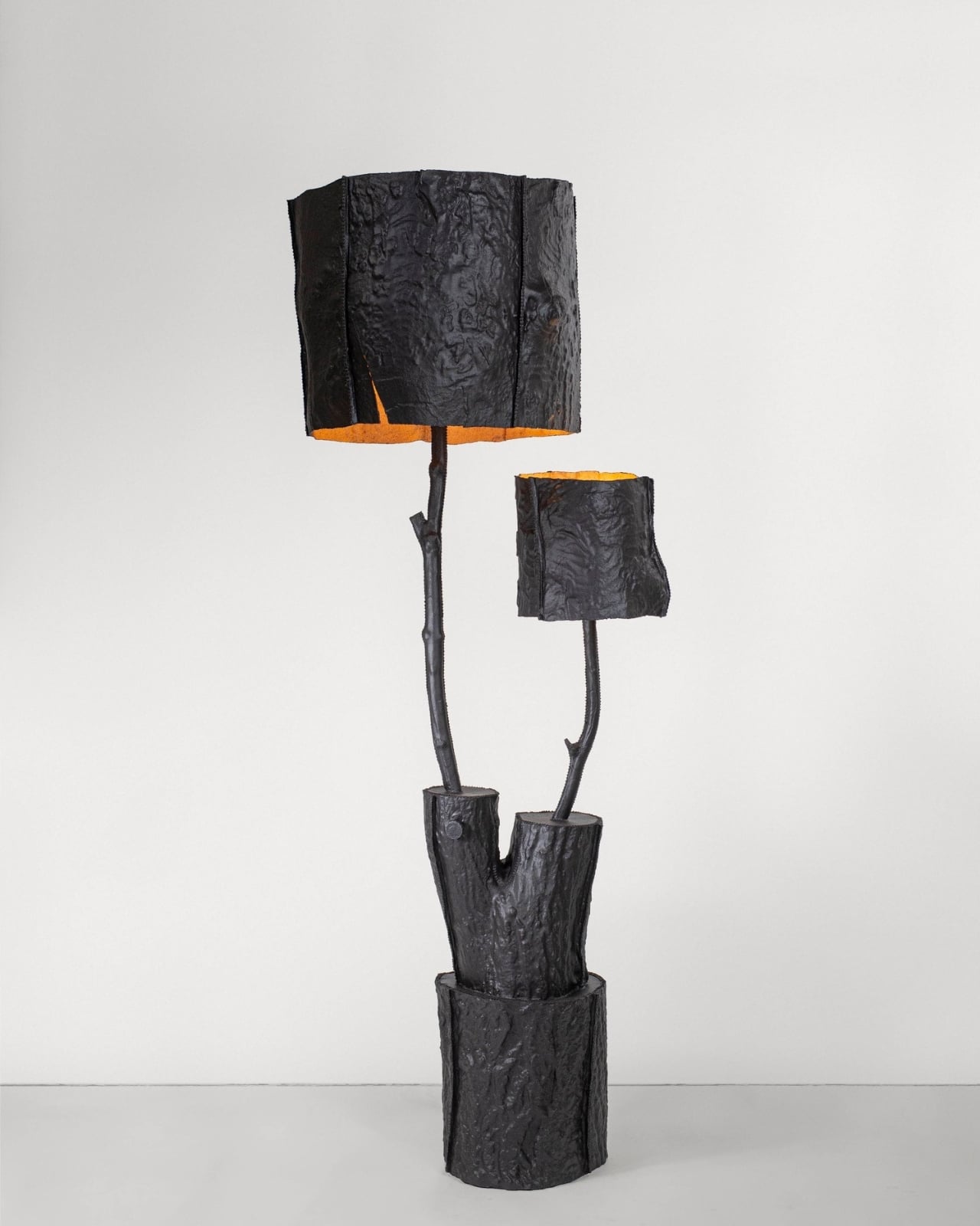
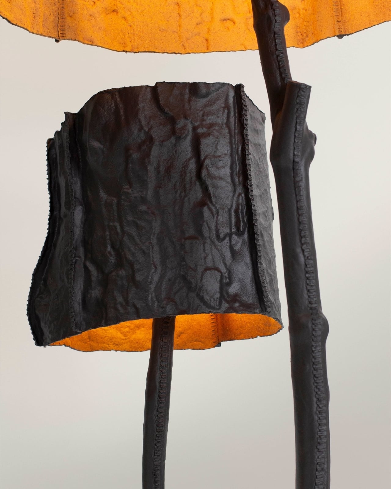
All of that restraint shows up in the final objects. These aren’t lamps trying to look rustic, and they’re not performing sustainability for a press release. They carry an honesty that is harder to manufacture than the pieces themselves. Looking at them, you get the sense that Fraser wasn’t chasing recognition for the materials. He just wanted the materials to be right.
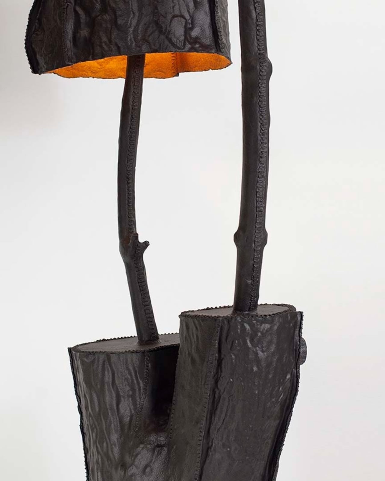
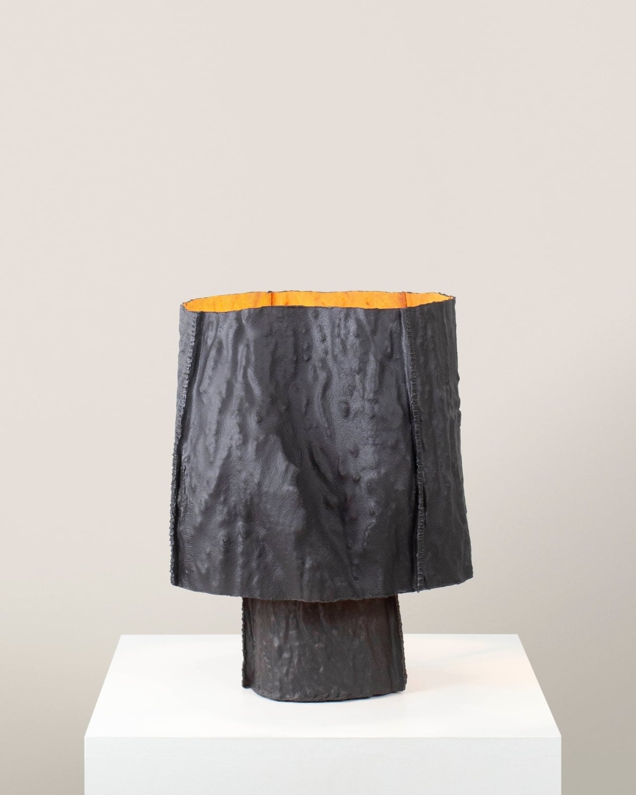
I’ll be upfront: I think the design conversation around sustainable materials has grown a little comfortable with congratulating itself. A project announces it uses a bio-based material and that tends to become the whole story. What Fraser is doing here is structurally different. Every decision in the process has a reason, and those reasons loop back into each other. The sawdust in the thermoplastic connects to the trees. The scrap material folds back into the structure. The moulds taken from real bark connect back to the childhood garden where the whole thing began. Nothing in this collection is decorative justification.
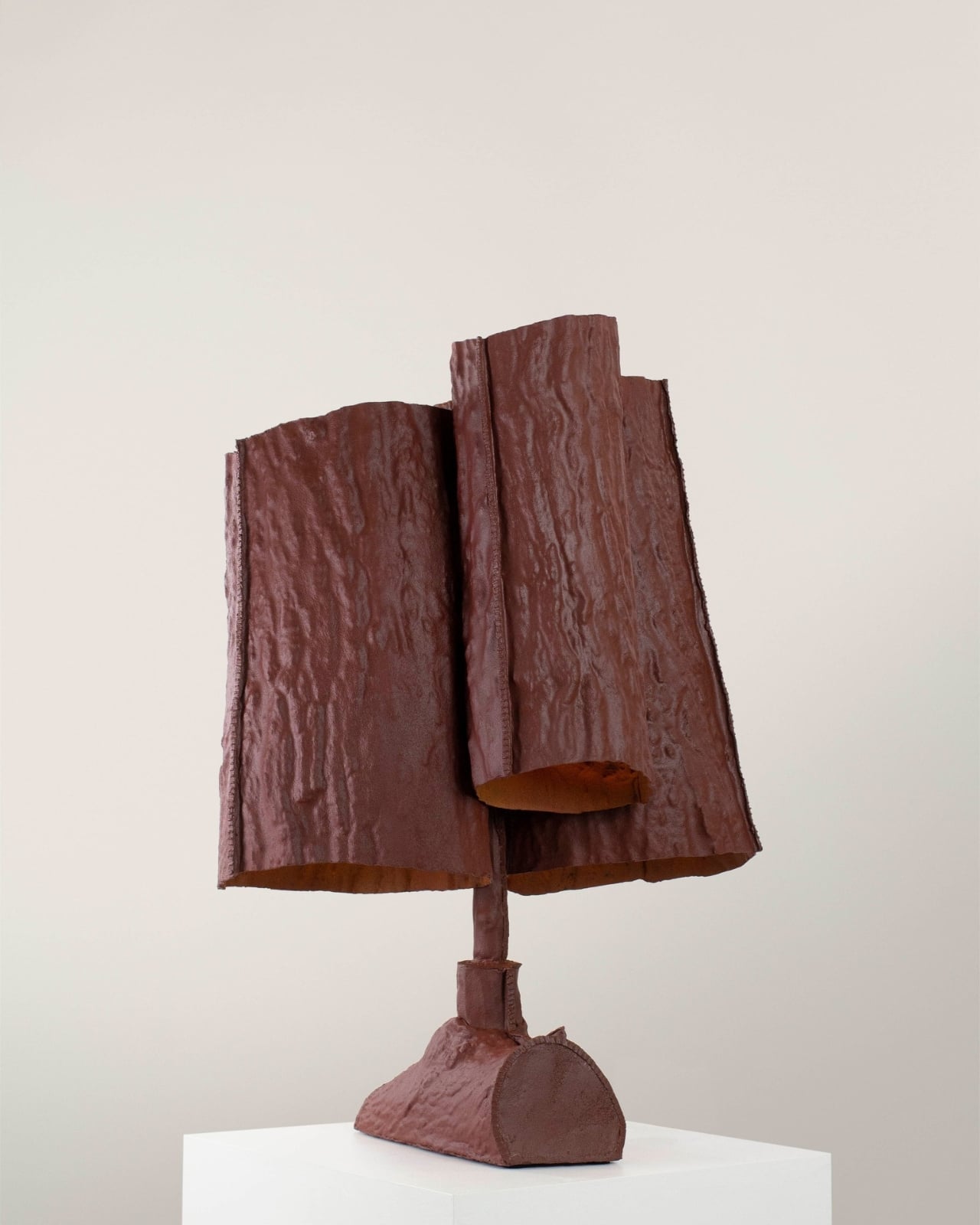
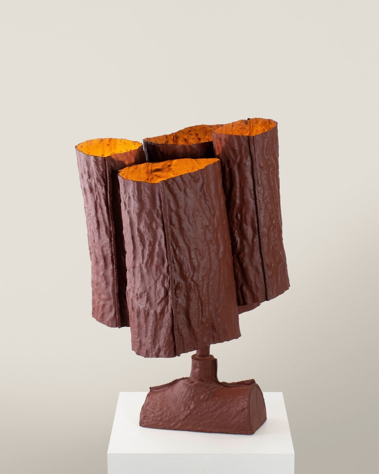
The lamps also resist the visual sameness that tends to flatten sustainable design into a single recognizable aesthetic. Because each mould comes from a specific section of a specific tree, each piece in the collection reads differently. The series is unified by process and material, not by uniformity, and that’s a meaningful distinction. It means the collection gets more interesting the more pieces you encounter, rather than feeling like variations on the same idea.
There’s a growing appetite right now for objects with a legible origin, things you can trace back to a source, a decision, a place. Consumers are more skeptical of greenwashing than they’ve ever been, and the visual language of sustainability, the linen textures, the muted tones, the vague nods toward nature, has started to feel hollow when it’s not backed by real process thinking. Trees From The Garden lands as a direct answer to that skepticism, not because Fraser set out to make a statement, but because the work is too specific to be anything other than genuine.
A lamp made from a mould of bark from a childhood garden is, on one level, an incredibly quiet object. On another level, it’s a pretty compelling argument for what design can look like when nostalgia and material rigor are given equal weight.

The post MJ Fraser Just Turned His Childhood Garden Into Living Light first appeared on Yanko Design.
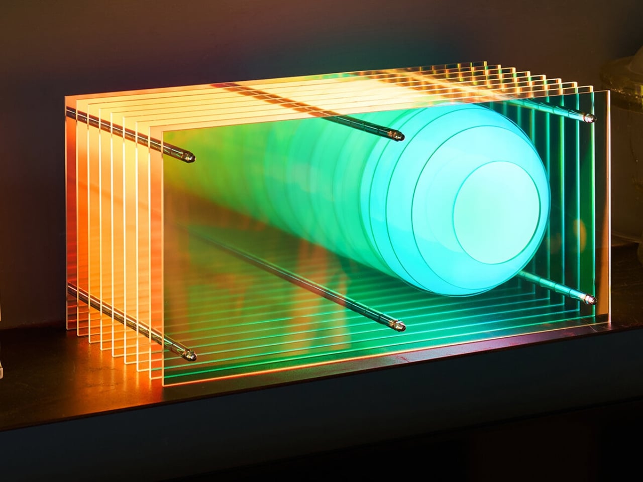
BằNG Just Dropped a Lamp That Looks Like a Living Cloud

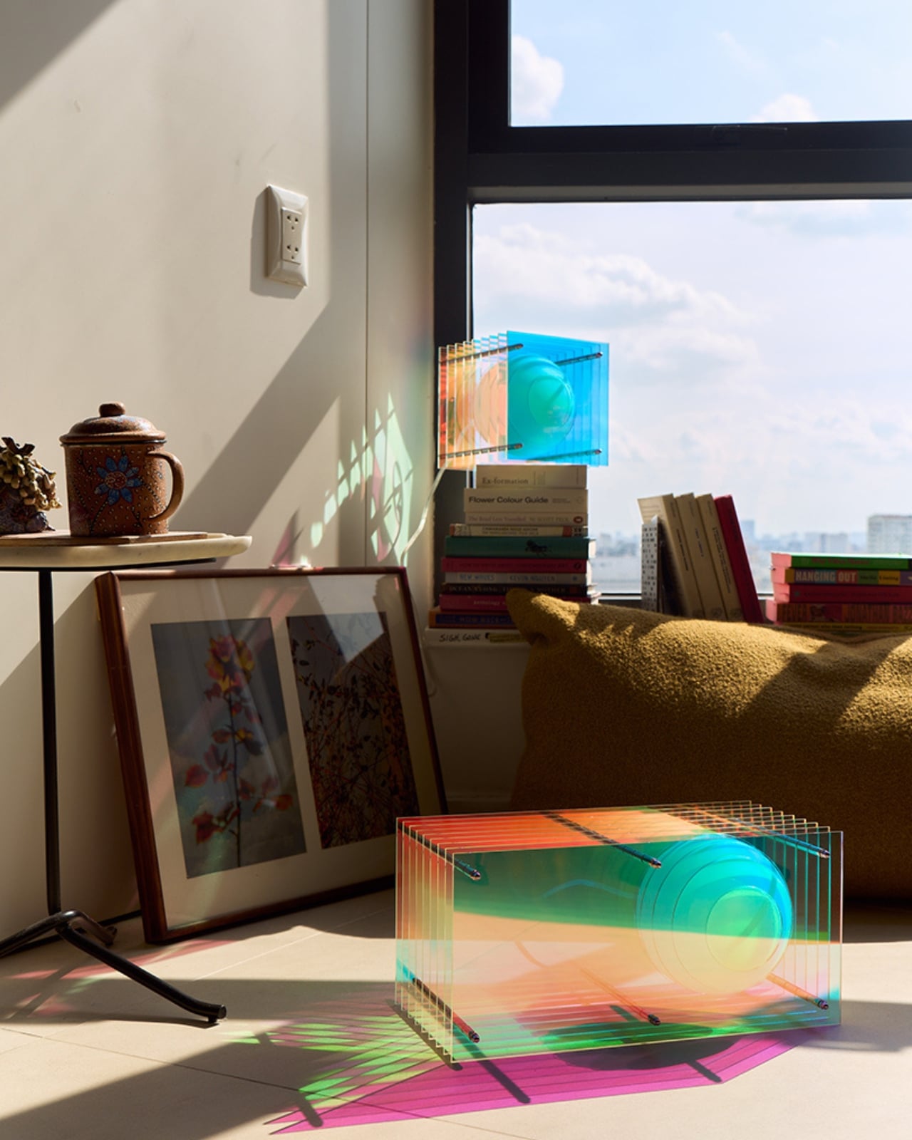
Most lamps exist to be useful. A few exist to be beautiful. Almost none manage to feel like they’ve captured an actual atmospheric phenomenon and suspended it inside a room. BằNG’s Dreamy Lớp lands very firmly in that last category, and I haven’t been able to stop thinking about it since I first saw it.

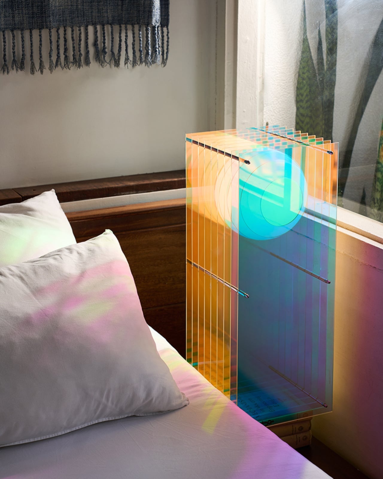
BằNG is a Vietnamese furniture and lighting brand, and Dreamy Lớp is the newest chapter of its already award-winning Lớp sculptural lighting collection. The collection was conceived by co-founder and creative director Thomas Bình-Minh Vincent around a deceptively simple idea: a sphere floating within layers. It sounds almost zen when you say it out loud, and the visual result is exactly that kind of quiet, can’t-look-away quality that makes you realize how rarely furniture actually earns your attention. The Dreamy series is the latest evolution of that original concept, pushing it further with new material choices and a striking new visual language.

Designer: BằNG

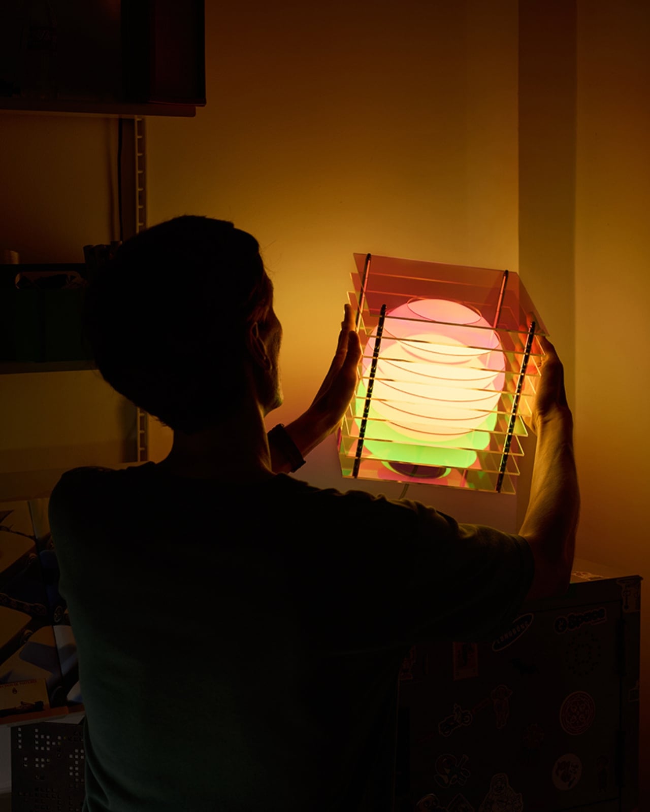
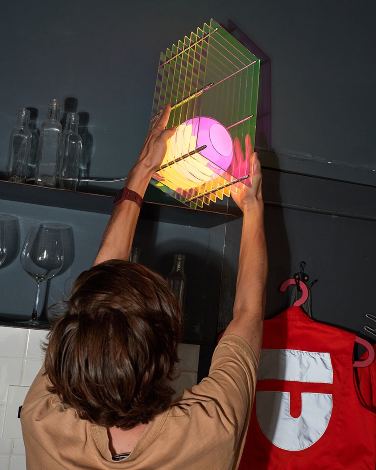
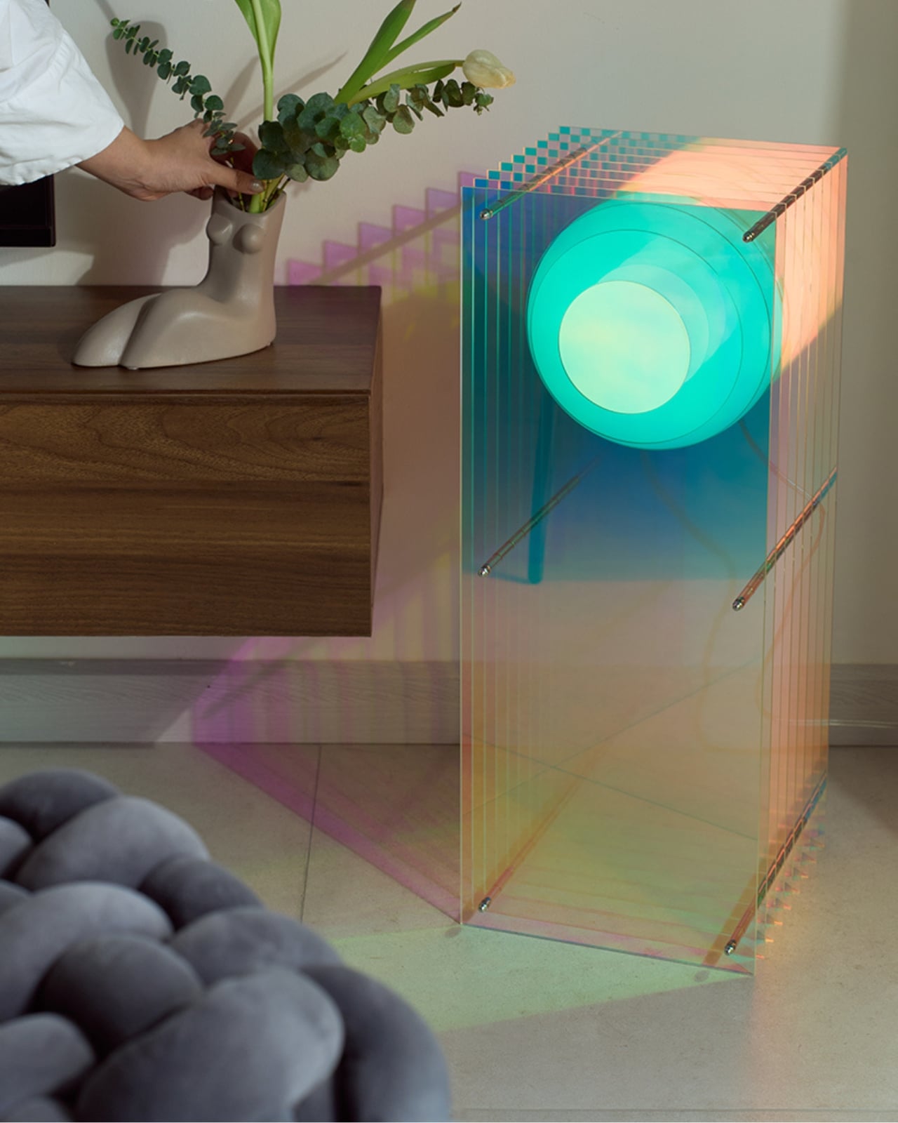
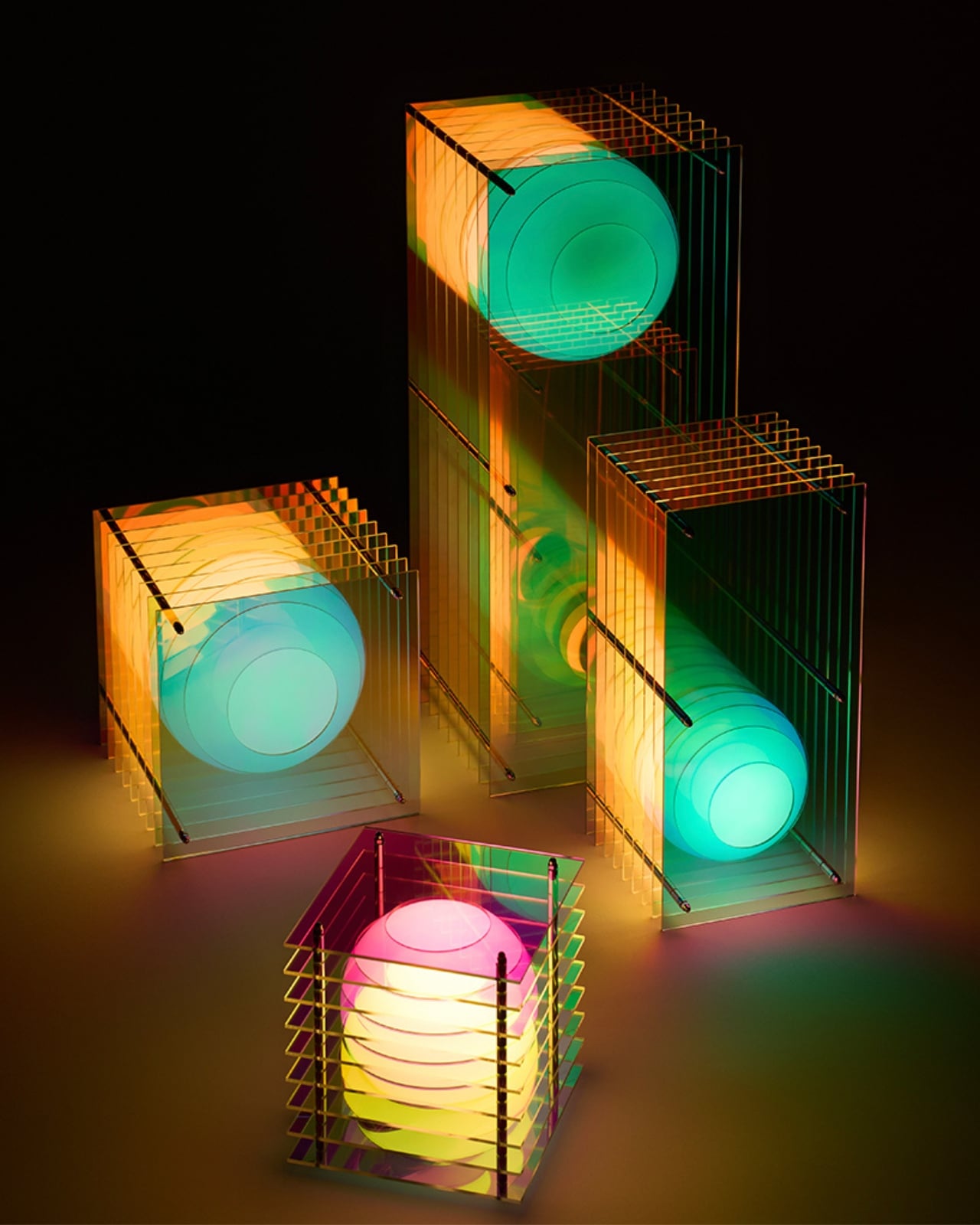
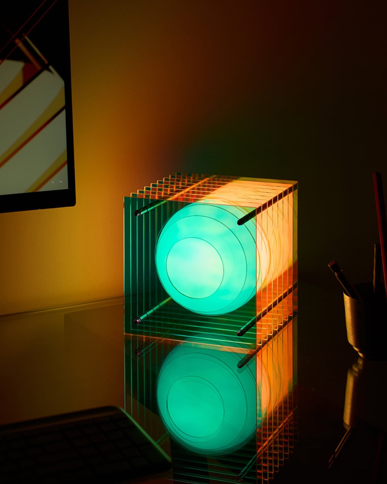
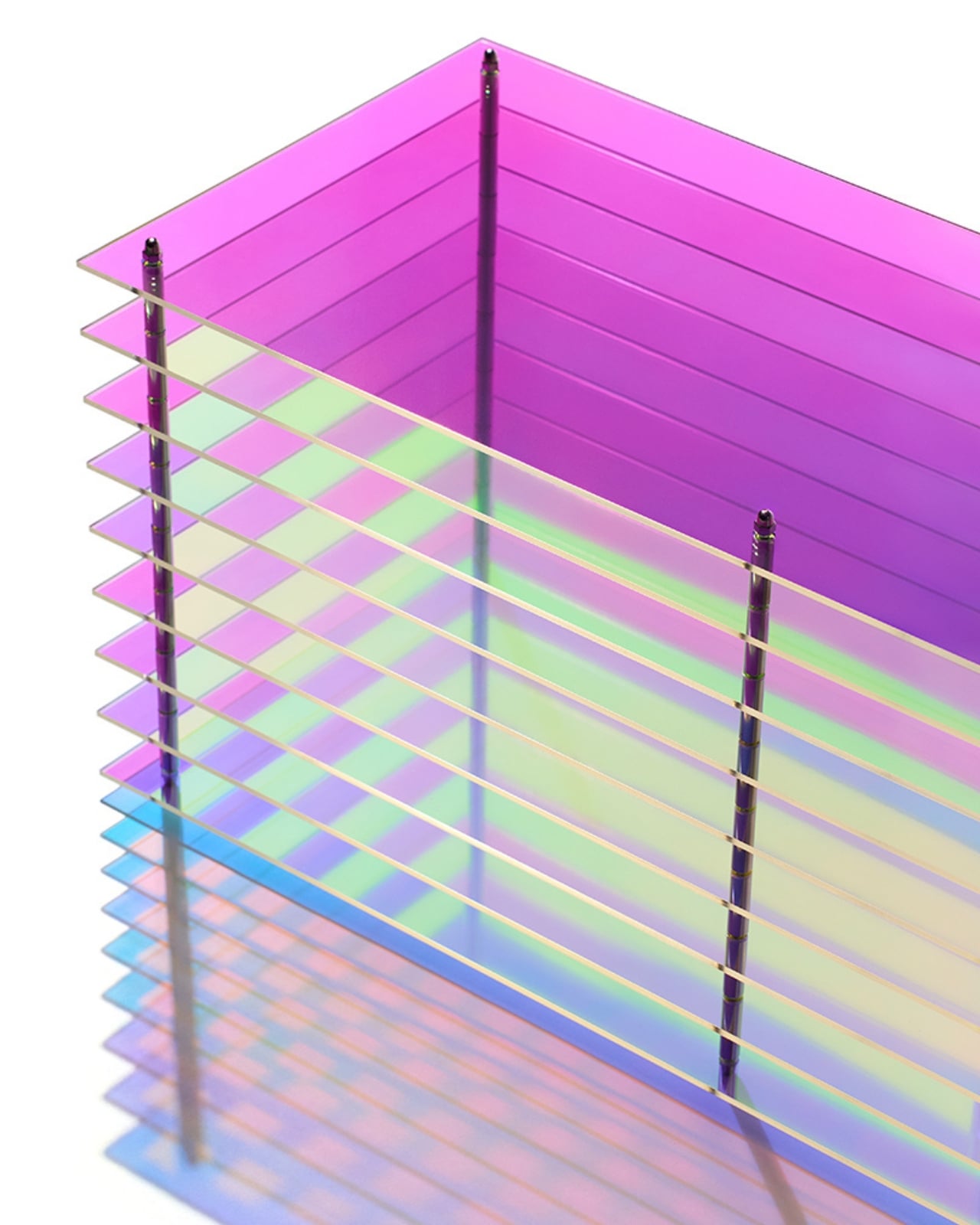
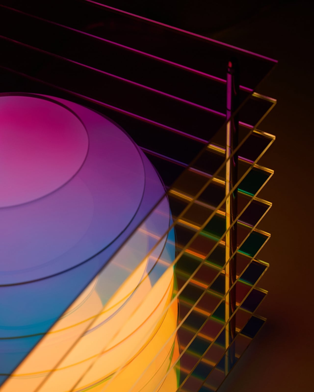
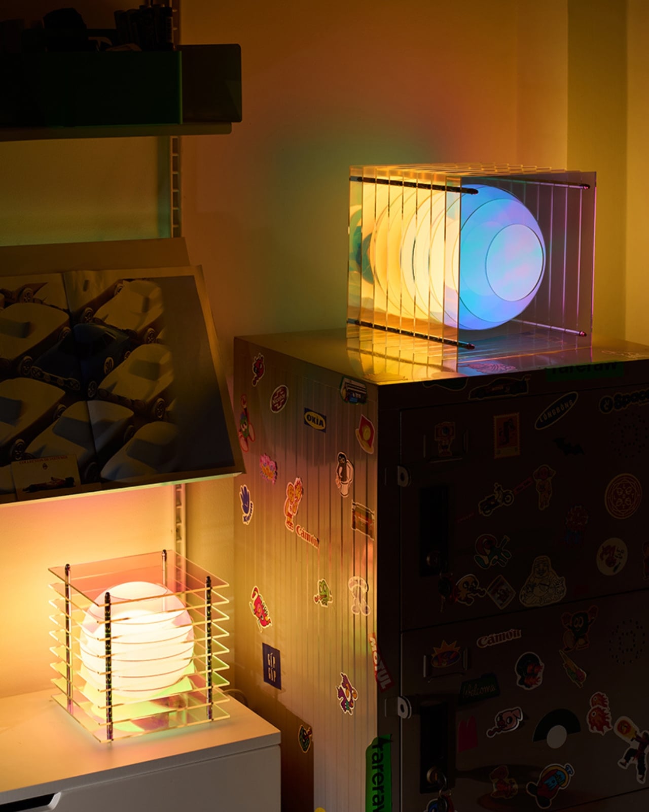
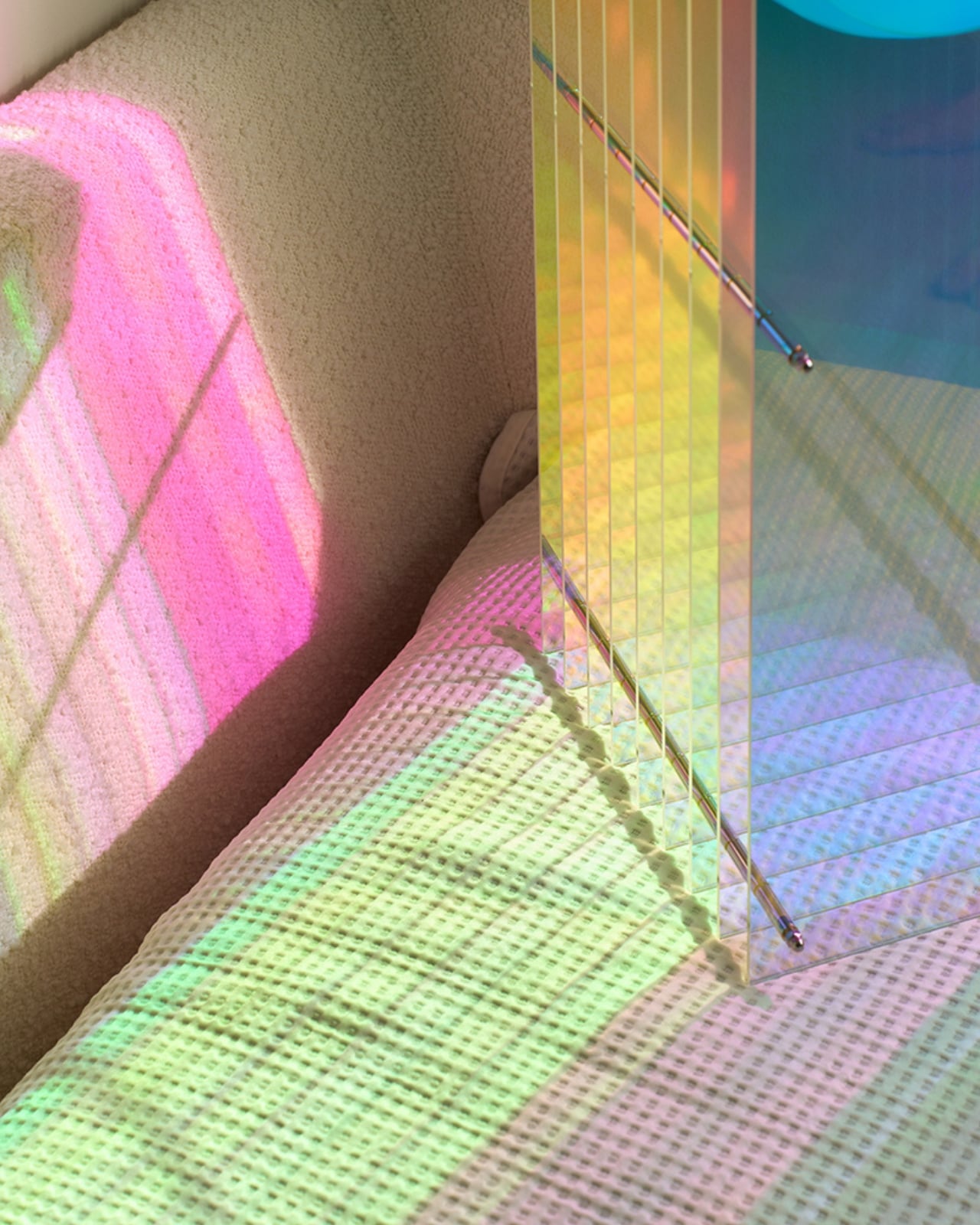
The Dreamy iteration introduces dichroic acrylic into the mix, and that single material choice changes everything. The lamp is built from precise layers of translucent acrylic sheets separated by polished inox spacers, creating consistent gaps that give the piece its signature rhythm and depth. At the center sits a matte opal glass sphere. When light hits the dichroic acrylic, the colors shift depending on your angle and the ambient light around it. One moment it reads as a cool blue. Move slightly and it blooms into warm gold or a soft green. The lamp isn’t just emitting light, it’s refracting it, filtering it, playing with it in a way that feels almost alive.

The design reference point is cloud iridescence, that rare atmospheric effect where sunlight diffracts through high-altitude ice crystals or water droplets and scatters into shifting, painterly color. It’s the kind of thing you catch in the sky for thirty seconds before it’s gone, and you’re left wondering if anyone else saw it. Vincent’s goal was to translate that fleeting, almost-too-beautiful-to-be-real quality into a controlled lighting object you can actually live with. From what I can see, it works. The lamp doesn’t try to replicate nature literally. It just borrows its logic, and that restraint is where the real design thinking lives.

Five design awards say other people agree. Dreamy Lớp carries recognition from the Archiproducts Design Award, the German Design Award, and MoMA’s historic Prize Design Award, among others. That’s not a small list. Awards in design can sometimes feel like insider industry congratulations, a round of applause from people who already understand the language, but in this case the recognition reflects something genuinely visible in the object. The craftsmanship is precise. The concept is tight. The execution doesn’t overcomplicate itself, which is much harder to pull off than it looks.

Practicality is worth noting too, because beautiful objects that are impossible to actually live with are a particular kind of frustrating. Dreamy Lớp was designed for multiple orientations and scales, meaning it can adapt to homes, cafés, and galleries without demanding that any of them rearrange themselves around it. It’s also repairable, which matters more than most lighting brands want to discuss. The entire piece is rooted in BằNG’s workshop-driven philosophy, where form comes directly from materials and fabrication processes rather than starting with a slick rendering and working backward.

What I keep coming back to is how rare it is for a lamp to feel like a genuine conversation piece without trying too hard to be one. Dreamy Lớp has the confidence of something that knows exactly what it is. It doesn’t need to be loud. The shifting color does the talking on its own, casting unexpected shadows in natural sunlight and projecting soft hues into whatever room it inhabits. It turns a corner of your home into something slightly otherworldly, and it does it without ever announcing itself. Good design tends to make you feel something before you understand why. This lamp is exactly that.

The post BằNG Just Dropped a Lamp That Looks Like a Living Cloud first appeared on Yanko Design.
This Limited Edition Desk Lamp Has Four Legs and Looks Like It’s Alive

The line between product design and sculpture has been blurring for years, but most objects still declare their purpose plainly. A lamp looks like a lamp. Its form is a familiar enough gesture that it becomes invisible, something you reach for and forget. The more interesting territory is what happens when a designer begins with something alive and works backward into a functional object.

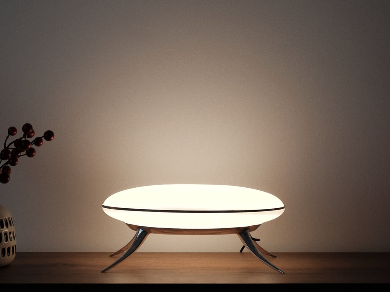
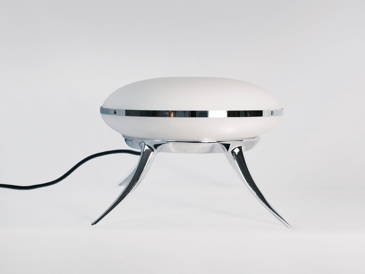
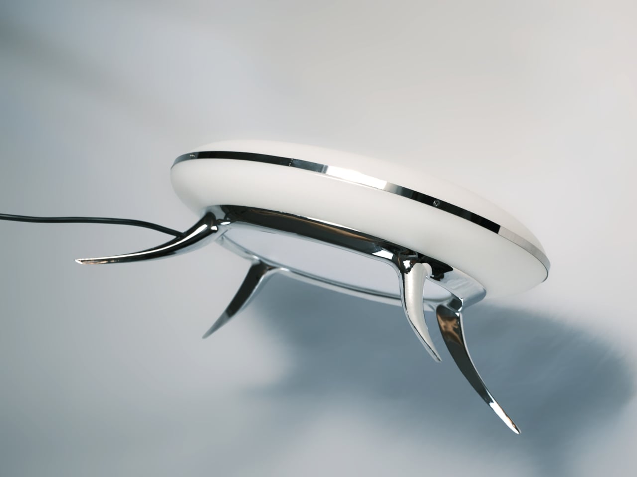
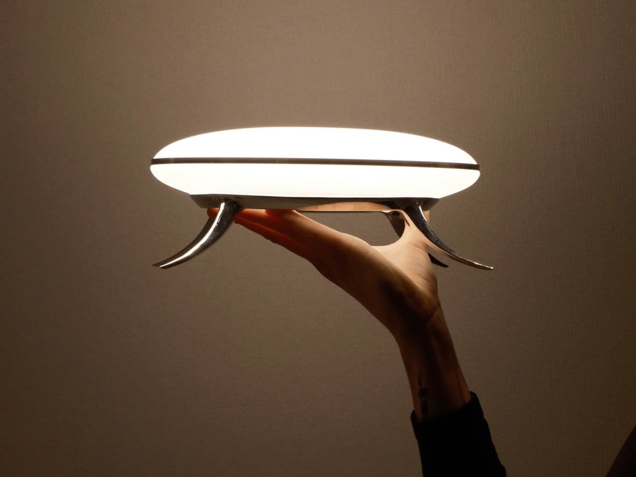
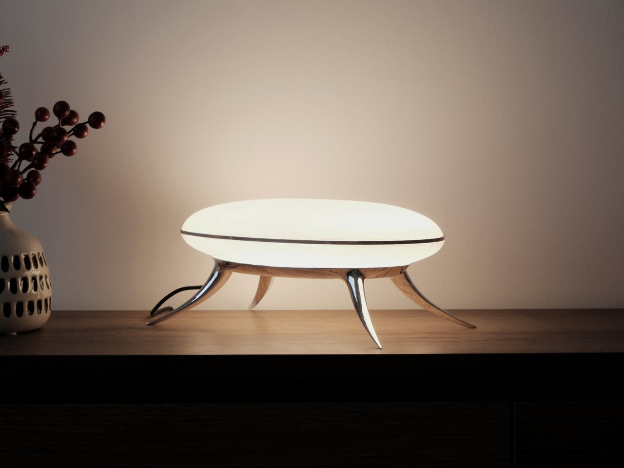
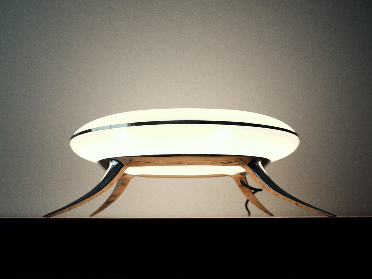
That’s what Hazel Villena did with the Bean Lamp, a limited-edition desk light designed in Brooklyn in 2026 that functions as a light source and a quietly unsettling presence at the same time. Villena started with the creature first and then solved the engineering around it. The legs exist to hold the disc of light. That they read as limbs is entirely deliberate.

Designer: Hazel Villena

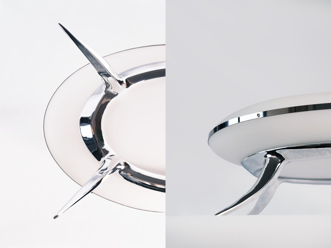
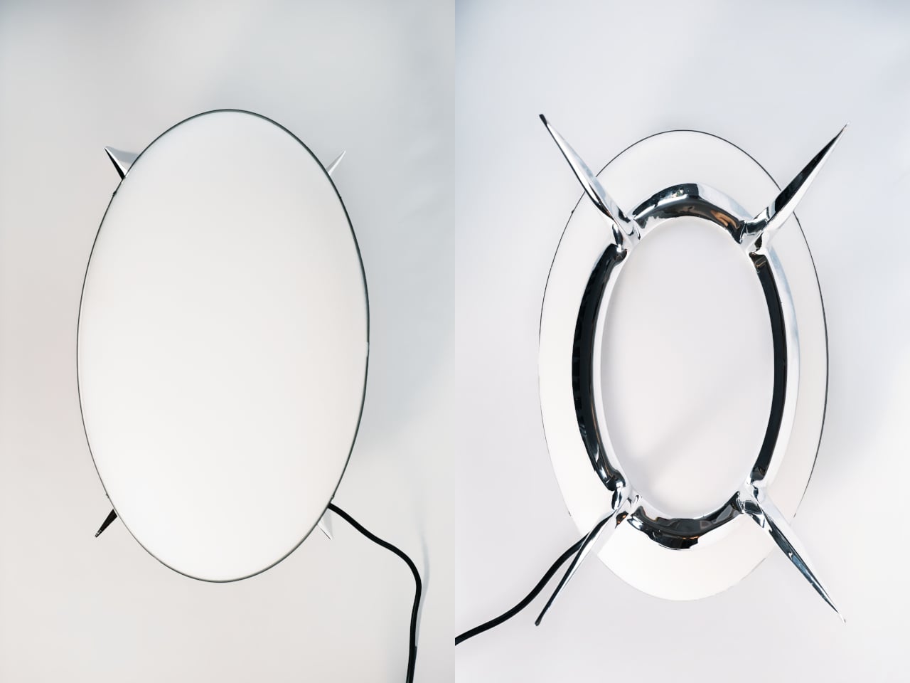
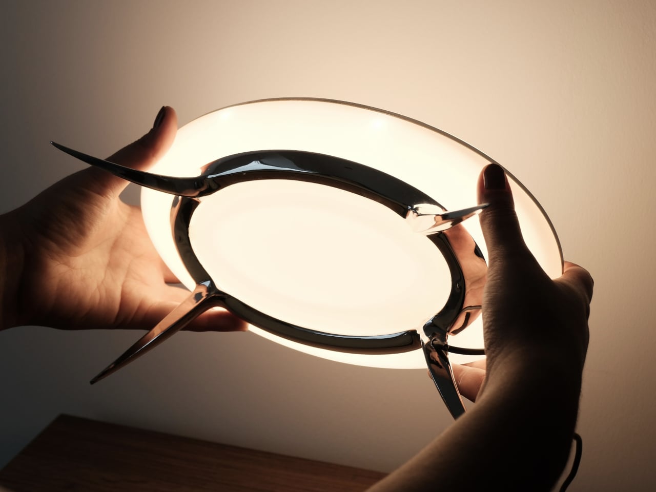
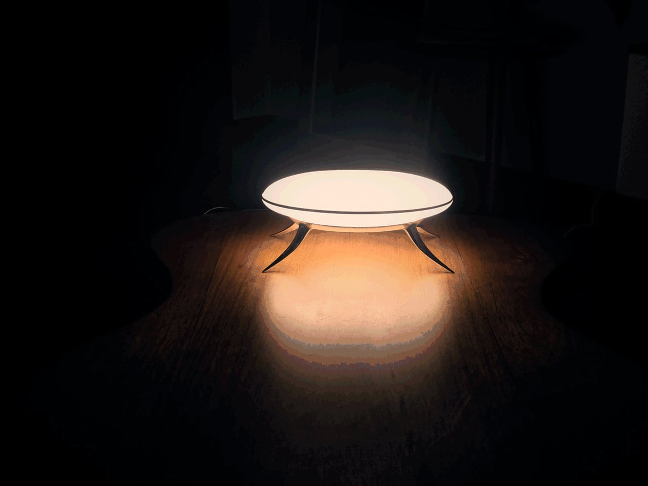
The body is cast copper with a chrome finish, sculpted into a low, wide stance on four tapered legs that curve and splay at angles borrowed more from biology than furniture. A polished aluminum ring joint at the center holds the matte polycarbonate diffuser in place, and the integrated LED disc inside throws a soft, contained pool of warm light across the surface beneath it.

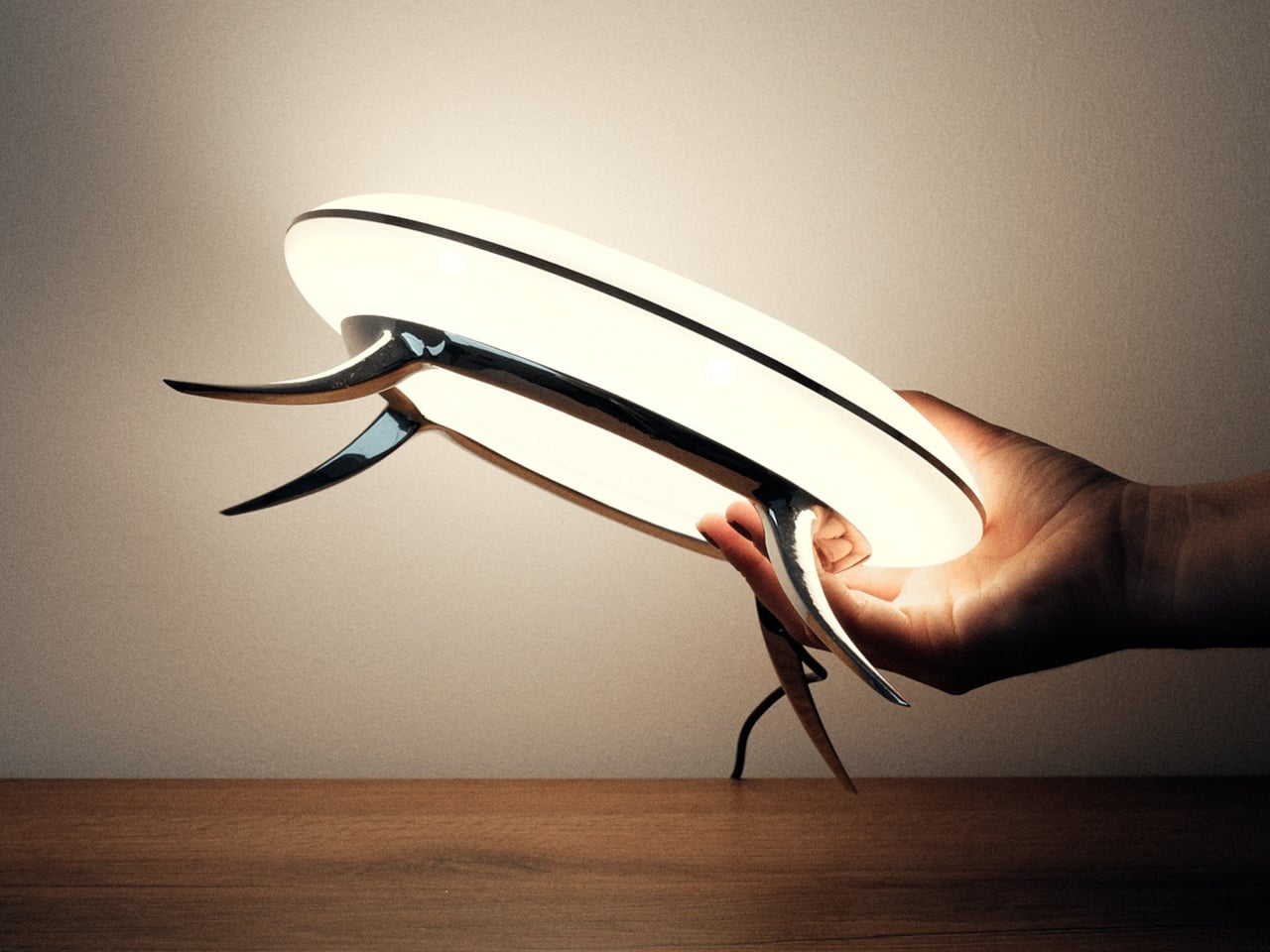
At 10.5 inches long and 4.5 inches tall, the Bean Lamp is compact enough to sit on a desk or shelf without dominating the space, though it tends to hold the eye. Proportion was a significant part of the design process, giving an elementary silhouette more gravity than its simple form suggests. The chrome catches light, the matte disc diffuses it, and the four curved legs suggest something caught mid-pause.

There’s also how it comes apart. The Bean Lamp is mechanically assembled rather than bonded, which means it can be fully disassembled when needed. The shade and LED unit can each be replaced or upgraded independently, extending its life beyond any single component. At the end of its life, the copper body and aluminum ring separate cleanly into existing metal recycling streams, a quiet argument for longevity built directly into the object.

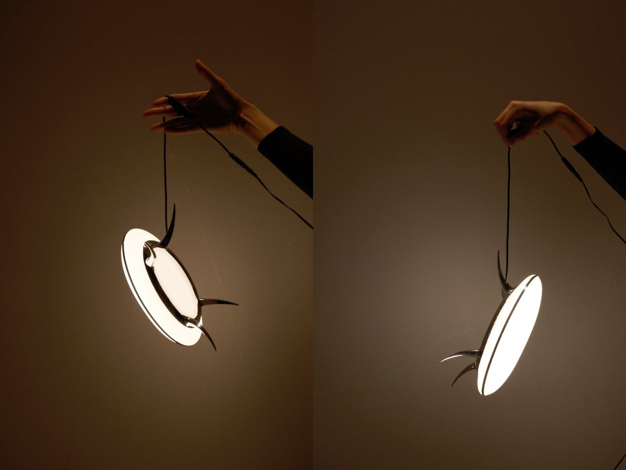
The lamp runs on a 12V cord with an in-line switch, keeping the operation uncomplicated. Plug it in, turn it on, and it does what a lamp is supposed to do: lights a small, deliberate area of wherever you’ve put it. What it also does, and what takes longer to resolve, is sit there looking like it might eventually decide to move on its own when nobody’s watching.

It reads differently across the room than it does up close, and differently still once it’s switched on. Villena’s stated goal was an object that sits in a deliberate blur, familiar enough to understand, strange enough to stop you. The Bean Lamp lands there without apology and seems to have no intention of clarifying itself further.

The post This Limited Edition Desk Lamp Has Four Legs and Looks Like It’s Alive first appeared on Yanko Design.
This Levitating Orb Lamp Drifts Toward You in the Dark Before You Ask

Artificial lighting has come a long way, but most of it still operates on the same basic logic. You plug something in, it stays where you put it, and you arrange your life around it. The growing understanding that light quality directly affects mood, sleep, and well-being has pushed designers to rethink what a lamp should do, but rarely where it should go.

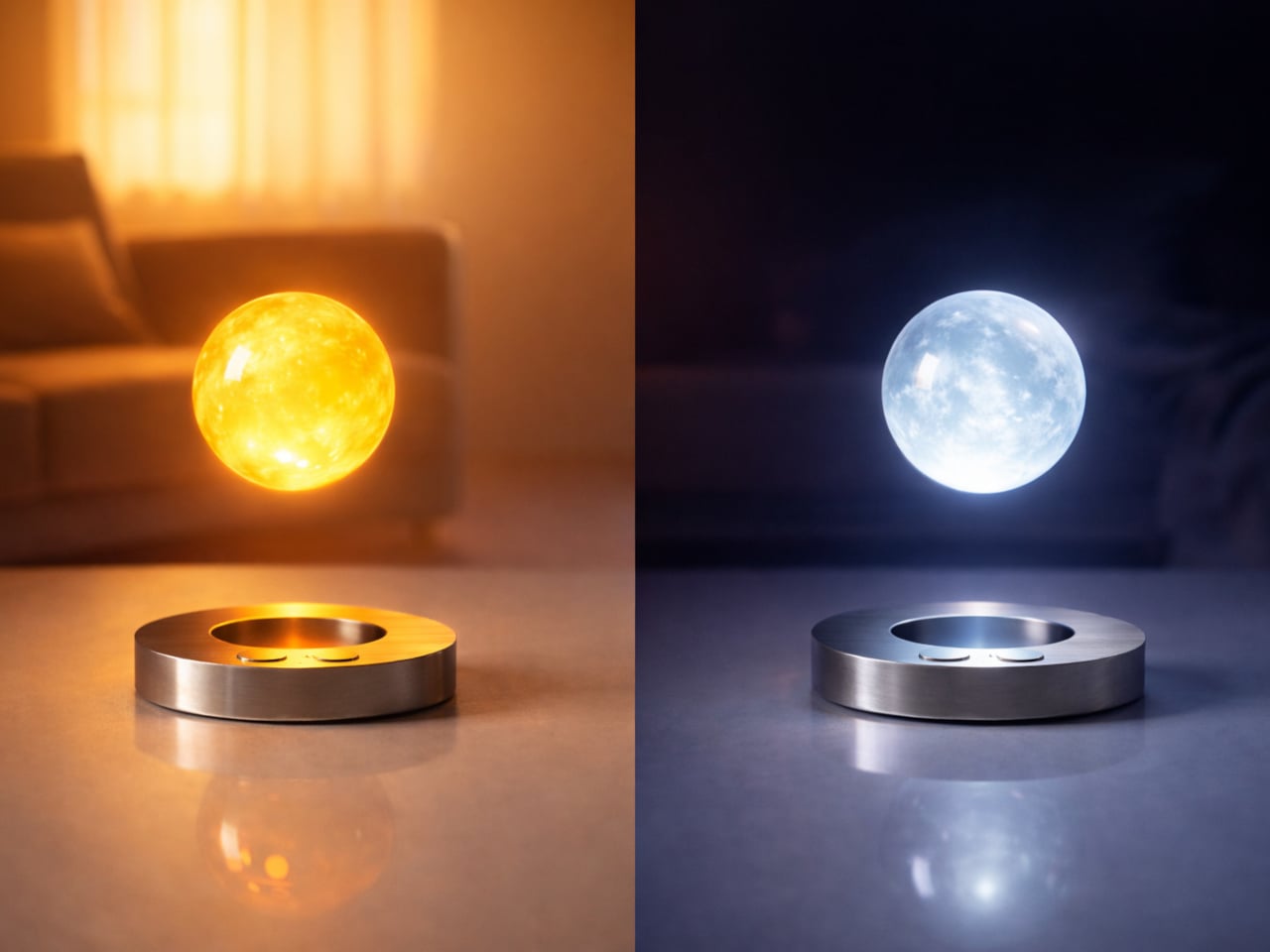
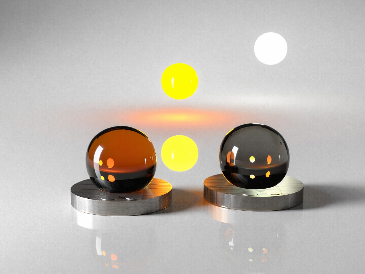
Ivana Nedeljkovska’s Flying Moon & Sun takes a different position on that. Her conceptual design doesn’t ask you to move toward the light; it imagines the light moving toward you. Drawn from the natural rhythms of the sun and moon, it proposes a mobile, levitating lamp that follows you through your home and adapts to whoever it’s meant to illuminate.

Designer: Ivana Nedeljkovska

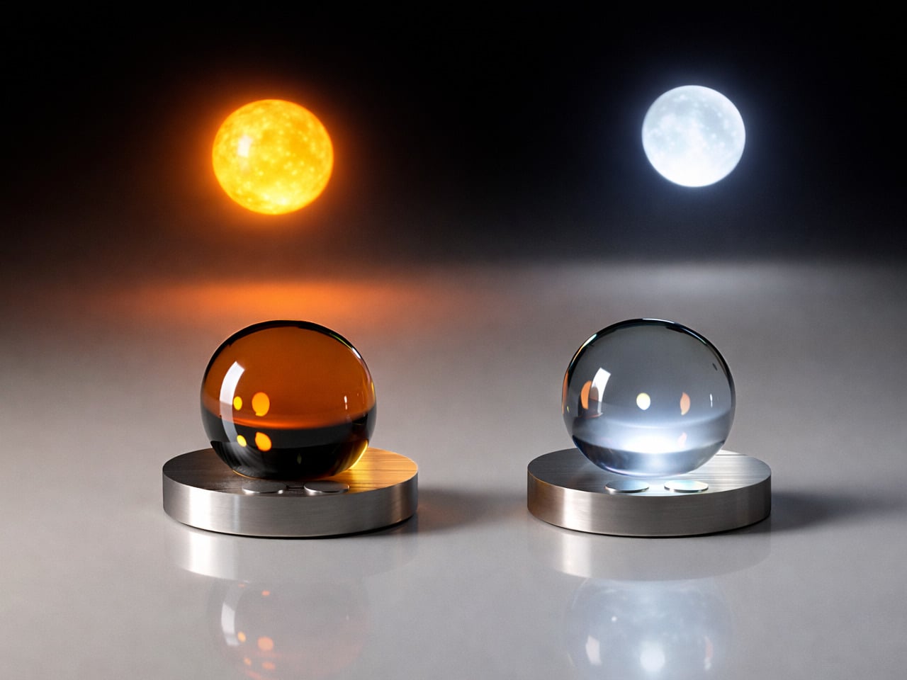
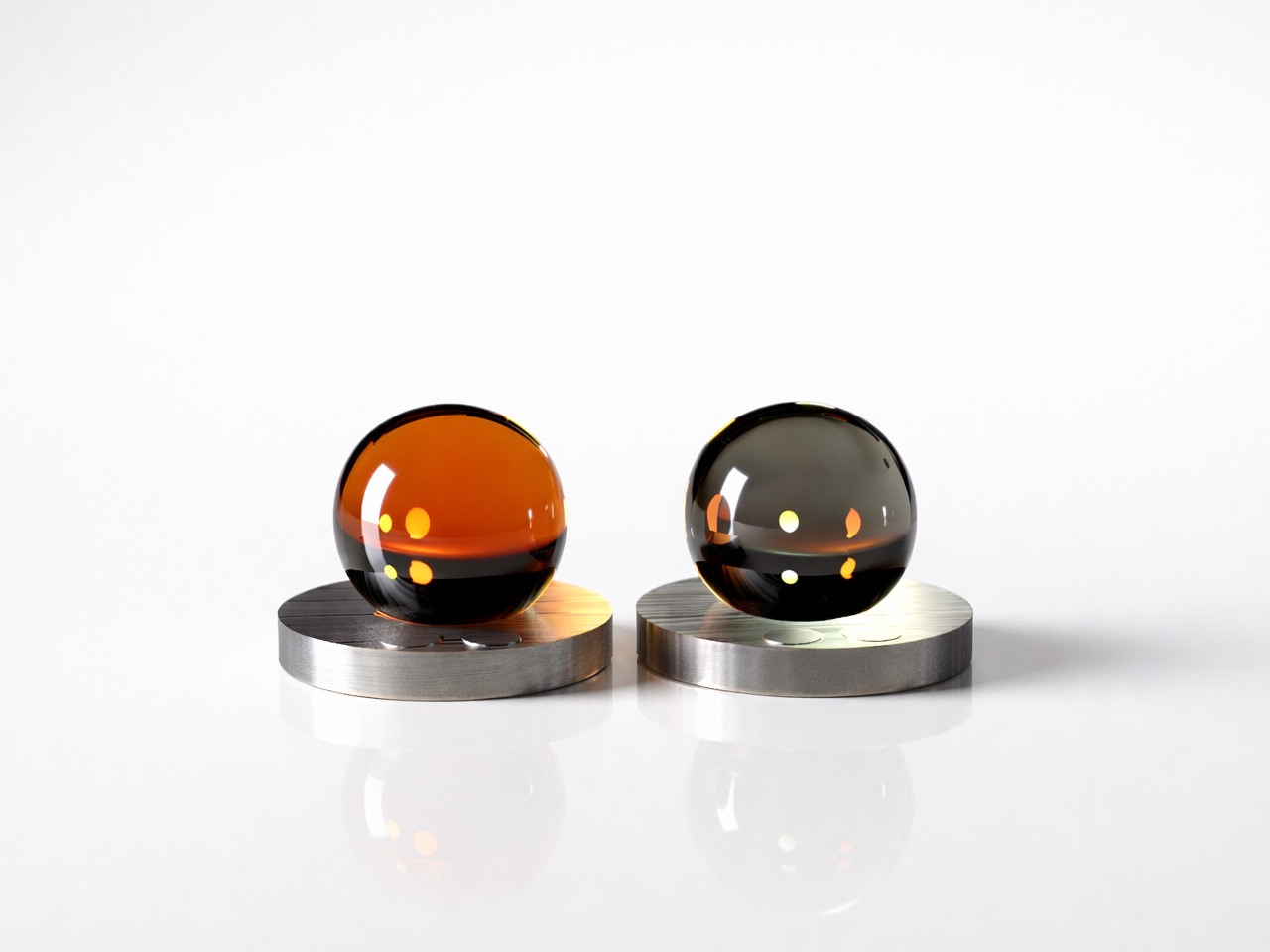
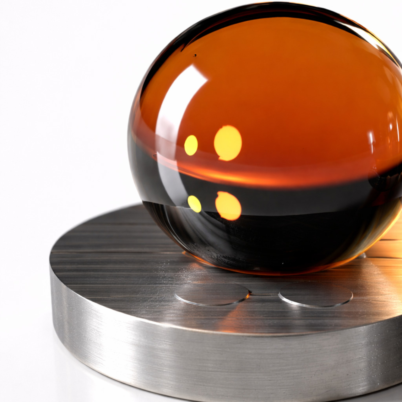
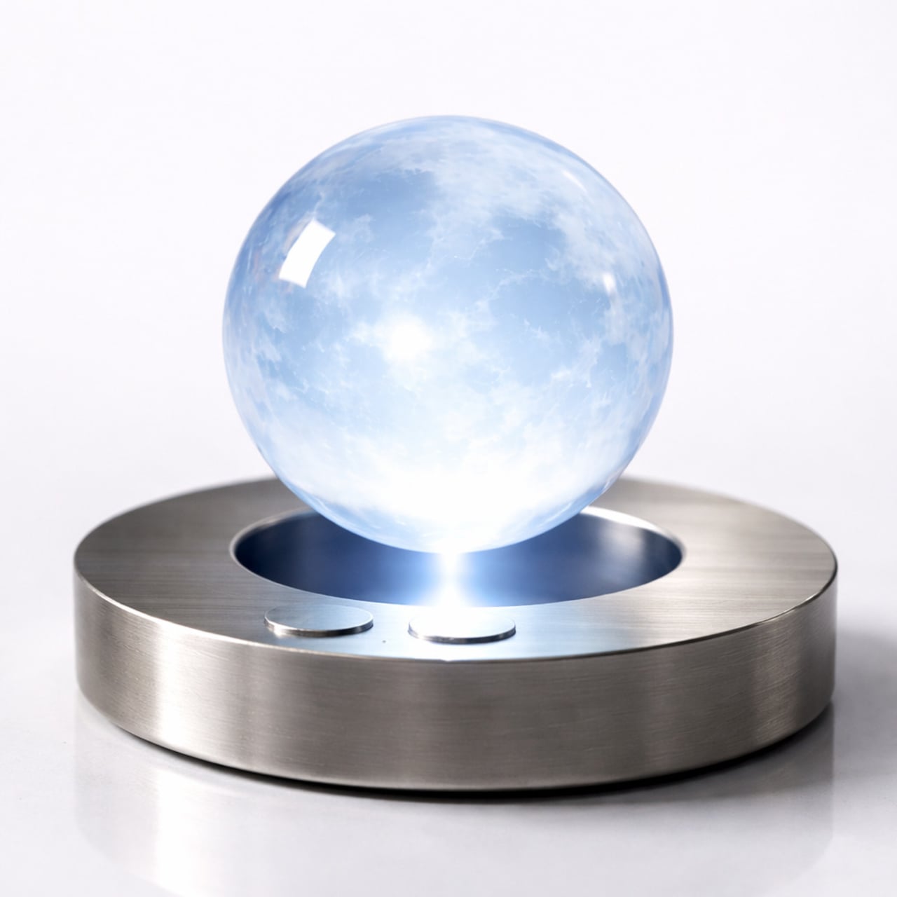
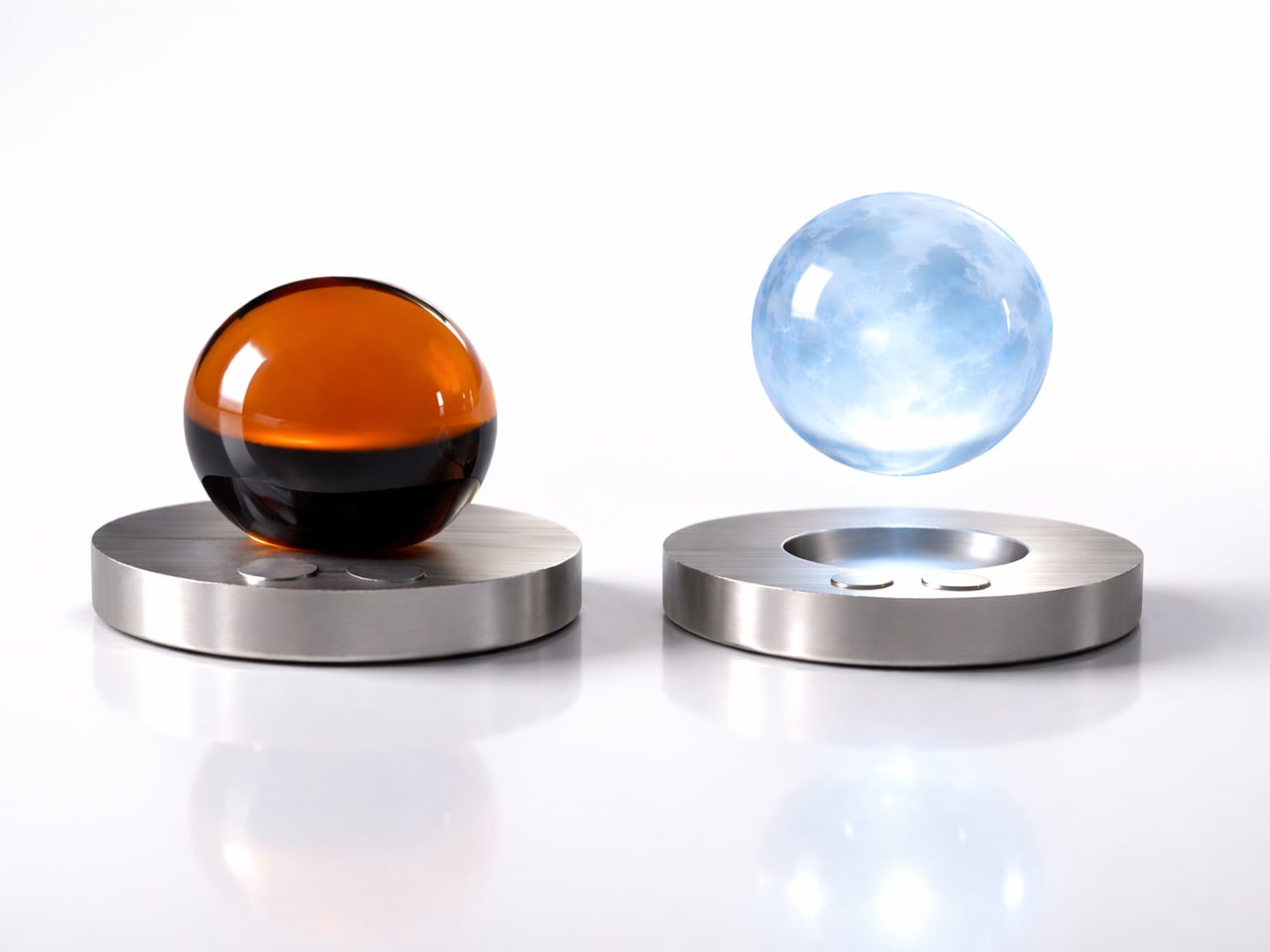
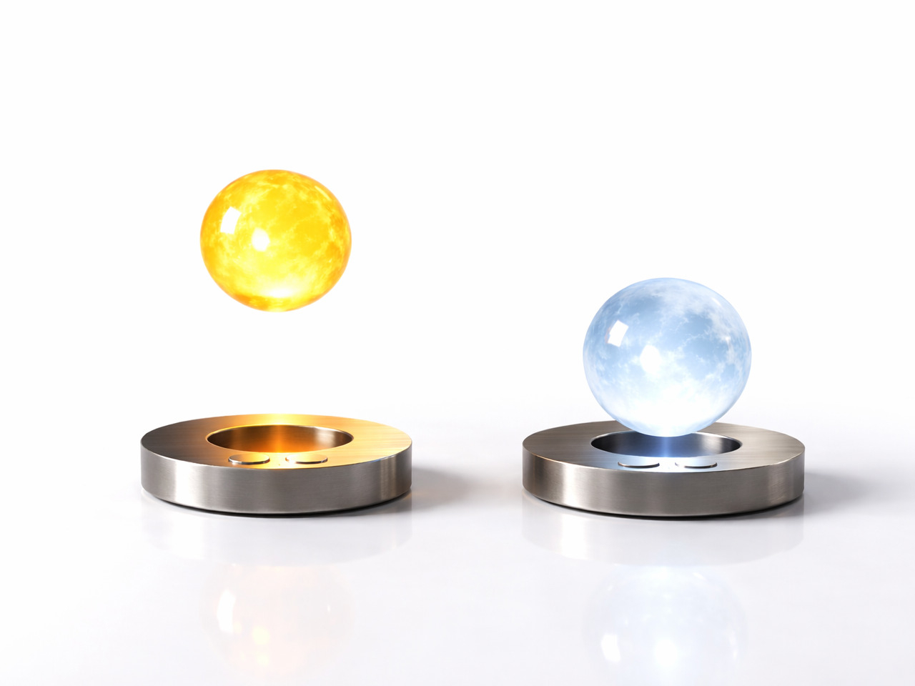
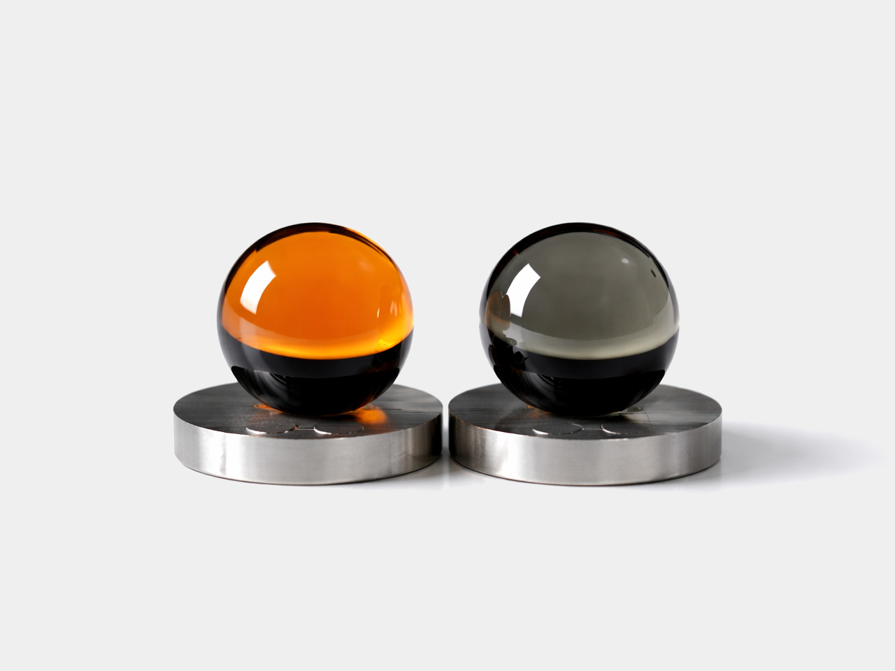
The concept takes shape as two glass orbs, one in warm amber that channels the sun’s energy, and one in cool frosted blue that mirrors the moon’s quieter character. Each rests on a brushed circular metal base, capable of levitating above it through magnetic force. That floating quality physically expresses the central idea, that this is a light that doesn’t feel tied to any single spot.

The two orbs aren’t just stylistically distinct; each serves a purpose tied to the body’s natural cycles. The warm, sun-toned orb supports alertness and activity, while its cool lunar counterpart eases the body into rest. By mapping its light to the gradual arc from sunrise to sunset, the design draws on circadian science, offering something that most smart bulbs attempt through apps but rarely manage to make feel genuinely natural.

Nedeljkovska was thinking about people who don’t always have the option of adjusting their environment easily. For someone with visual or sensory challenges, a light that moves toward them rather than waiting to be repositioned carries real value. The concept doesn’t frame this as a special accommodation; it simply makes intuitive, responsive behavior the default, which is what good inclusive design tends to do.

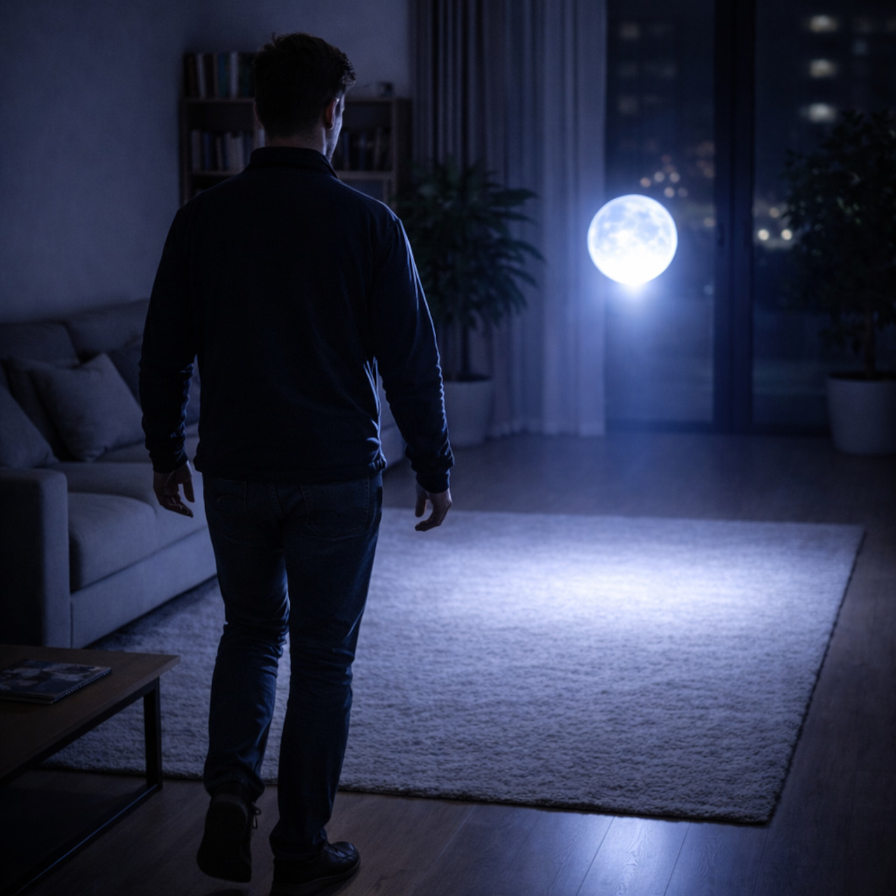
That mobility is perhaps the most striking aspect of the idea. Imagine waking at night and finding a glowing orb already near a doorway, having drifted to where you’ll likely need it next. For older users, or anyone navigating in the dark, that kind of preemptive illumination offers a quiet, practical benefit that no ceiling fixture or bedside lamp can really replicate.

The form reinforces the emotional ambition. There are no buttons, no menus, no settings to configure. The smooth glass surfaces and soft inner glow make the orbs feel more like objects found in nature than anything in a typical lighting store. That’s a deliberate choice, one that tries to make a lamp feel comforting rather than functional, which is a harder design problem than it sounds.

Flying Moon & Sun is still a concept, but the questions it raises are genuine. How much of our discomfort with artificial light comes from having to work around it, rather than having it work around us? A lamp that floats, follows, and shifts with the hour is ambitious, but the premise that light should serve the person rather than the room is hard to argue with.

The post This Levitating Orb Lamp Drifts Toward You in the Dark Before You Ask first appeared on Yanko Design.
Your Next Sleep Tracker Isn’t a Watch, It’s Your Bedside Lamp

Sleep has quietly become one of the most closely watched aspects of personal health. Around one in three people struggle with it, and roughly half of Americans already use a wearable device to track their sleep each night. That growing awareness has made sleep monitoring mainstream, turning the wrist and the finger into familiar real estate for all kinds of sleep-tracking sensors.

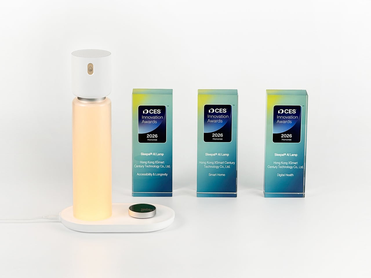
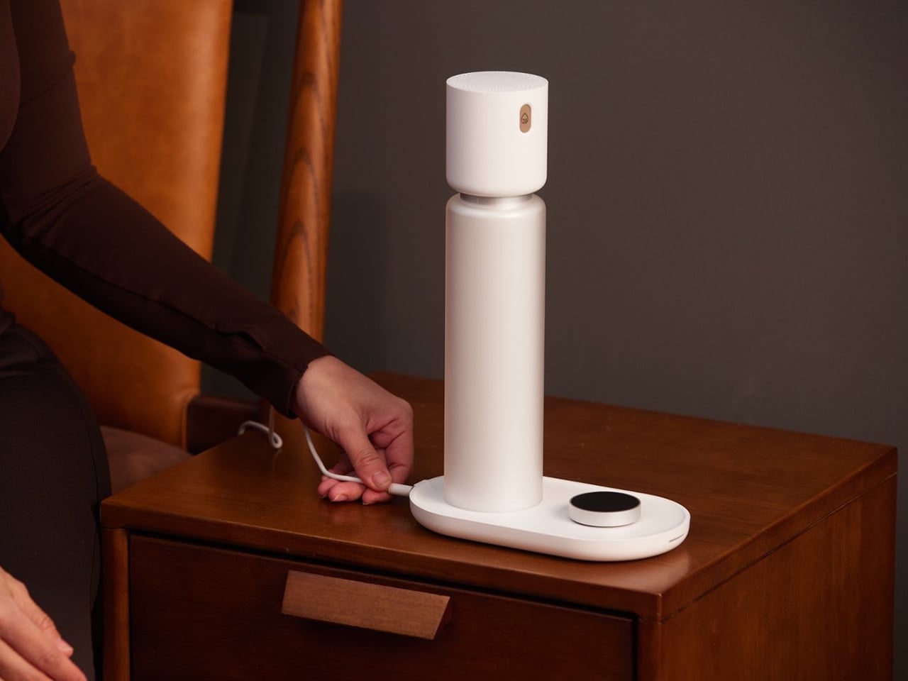
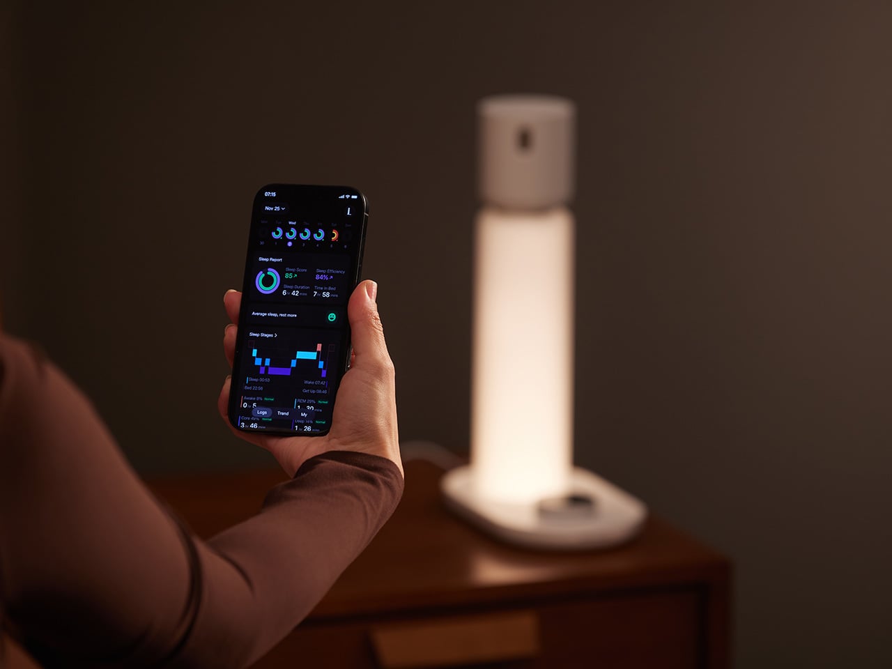
The irony, of course, is that wearing a device to bed can get in the way of the very thing you’re trying to improve. A watch or ring adds a layer of physical awareness that makes settling in harder, especially for someone who already struggles with sleep. Sleepal addresses that contradiction by embedding the tracking technology inside something already on your nightstand: a bedside lamp.

Designers: Ningning Li, Haorong Liu, Jiantao Sha

Click Here to Unlock Best Price Now!

That choice of form factor carries real design logic. Around 70% of people already own a bedside lamp, and it’s naturally tied to the rituals of winding down and waking up. Building contactless sleep monitoring into that familiar object means Sleepal enters the bedroom without asking anything of you. No new habits to form, no extra device to charge, nothing to adjust to before lights out.

And setting it up is just as effortless. You plug it in, scan the device with the app, and after that, there’s really nothing else to manage. No nightly adjustments, no calibrations, nothing to put on before getting into bed. You simply sleep as you normally would and check your sleep report the next morning, which makes the whole experience feel remarkably frictionless.

Behind that calm, unhurried exterior sits some serious sensing technology. Sleepal uses 60 GHz millimeter-wave radar with a detection precision of 0.1 mm, picking up the subtle chest micro-movements that come with breathing and a heartbeat. Those signals combine with environmental data and run through a sleep AI model built from scratch with nearly 100 million parameters, making the sleep-stage picture both thorough and precise.

And that technical foundation is backed by genuine clinical work. Sleepal collaborated with multiple hospitals to build one of the world’s largest radar-based sleep databases, including more than 2,000 datasets collected alongside polysomnography testing. This medical-grade data foundation is a key source of its accuracy, and based on Sleepal’s test results, its sleep-tracking accuracy is higher than that of most mainstream wearables.

Because it functions as a lamp, the light itself becomes part of how it supports your sleep. It adapts through the night, softening as you settle in and brightening gently as morning approaches. Plus, it reads the room’s environmental conditions, capturing the ambient factors that affect rest and giving you a fuller picture of your night by combining physiological and environmental data.

The wake-up experience gets the same level of thought. When you set a target time in the app, Sleepal doesn’t just ring at that exact moment. It looks for a more natural waking window, steering clear of deep sleep and REM in favor of lighter stages. A turn of the body triggers snooze, and if you drift off again, the alarm continues until it detects you’ve left the bed.

Getting to sleep is handled just as carefully. Breathing guidance, meditation, and relaxation audio are all built in, giving you a non-pharmaceutical way to ease into rest before the tracking even begins. Heck, for a lot of people, better sleep doesn’t come from gathering more data alone; it comes from having practical tools to actually wind down, and Sleepal has a solid set of those.

One of the more quietly impressive things about Sleepal is how much it conceals. There’s no camera, and a physical control for key sensors adds a layer of discretion, while all that advanced sensing sits behind a lamp that simply looks like it belongs. The design emphasizes comfort and calm over any overt technological statement, making it easy to trust in a space as personal as a bedroom.

Click Here to Unlock Best Price Now!

The post Your Next Sleep Tracker Isn’t a Watch, It’s Your Bedside Lamp first appeared on Yanko Design.
Eclipse Wall Lamp Casts a Shadow That Appears to Have No Source

Wall lamps tend to fall into one of two camps. They’re either purely functional fixtures you stop noticing the moment you move in, or purely decorative pieces that look good in daylight and do little else after dark. The gap between ambience and ornament is rarely explored, and most wall lighting ends up forcing you to choose between the two.

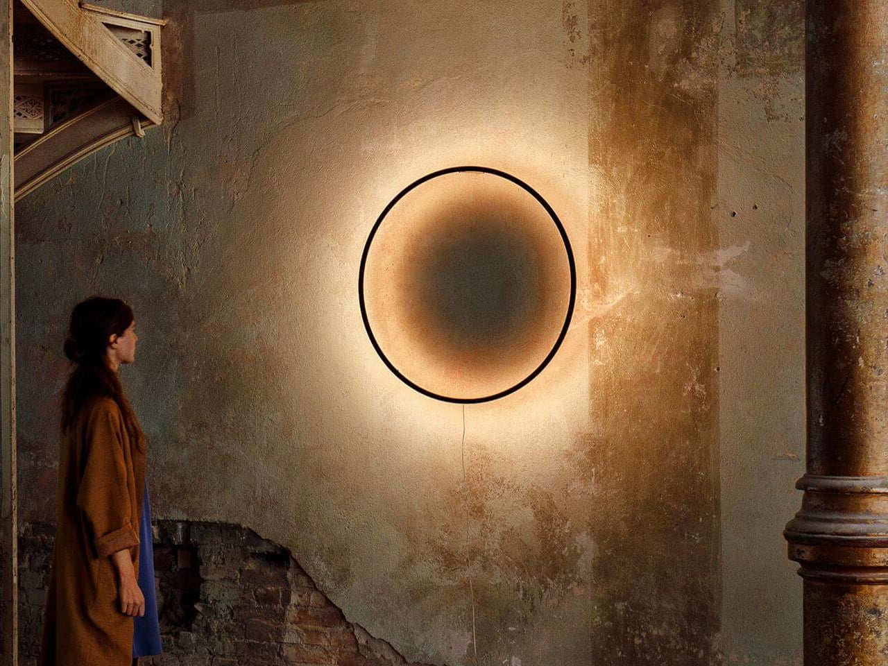
Slovenian designer Tilen Sepič’s Eclipse wall lamp sits right in that gap. First designed in 2012 and still in production today, it’s a piece that earns its keep in a room during the day just as much as it does at night, functioning as a sculptural object when the sun is up and something far more atmospheric once it goes down. That’s a harder balance to strike than it sounds.

Designer: Tilen Sepič

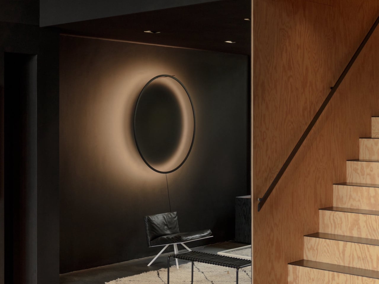
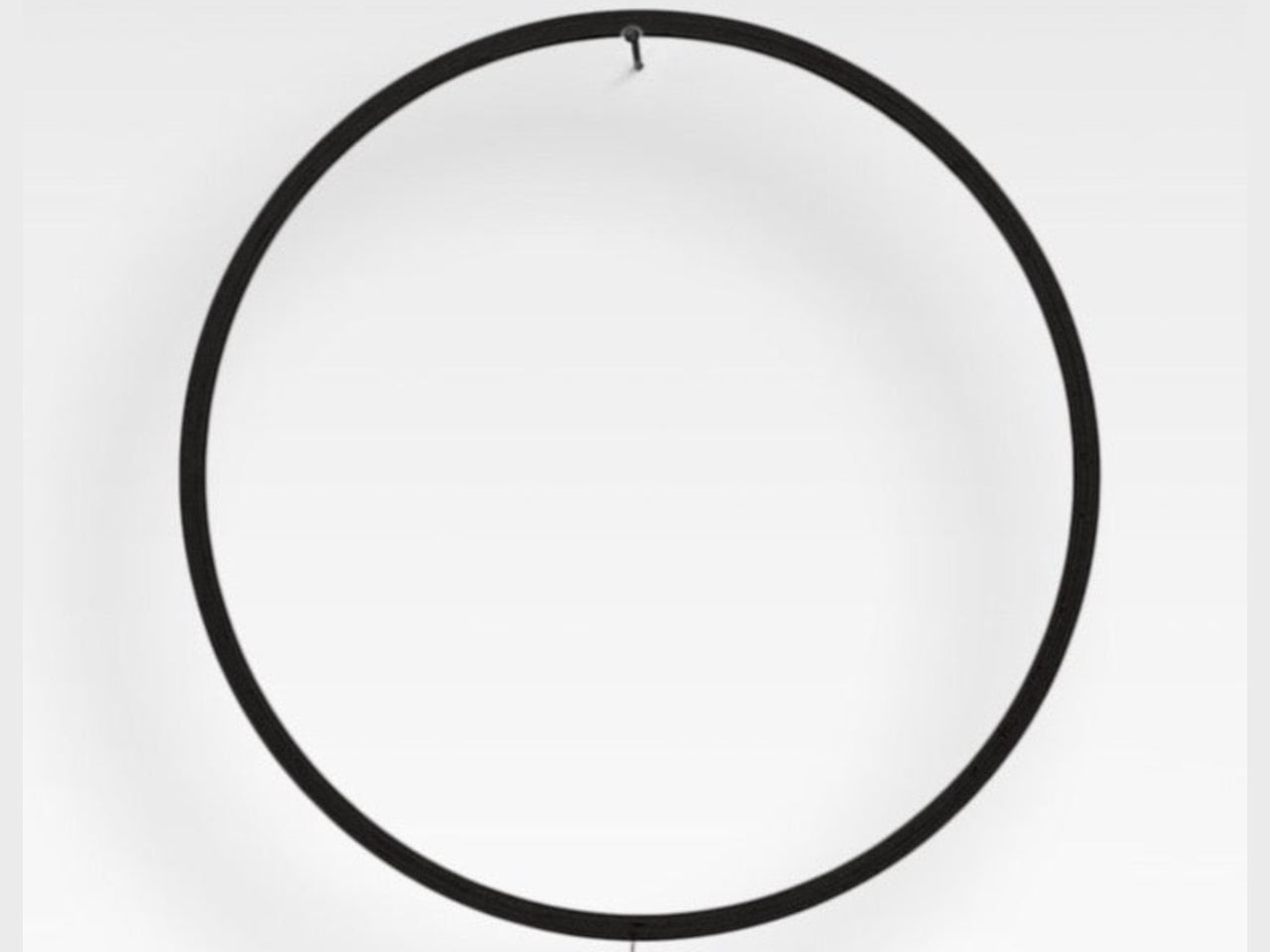
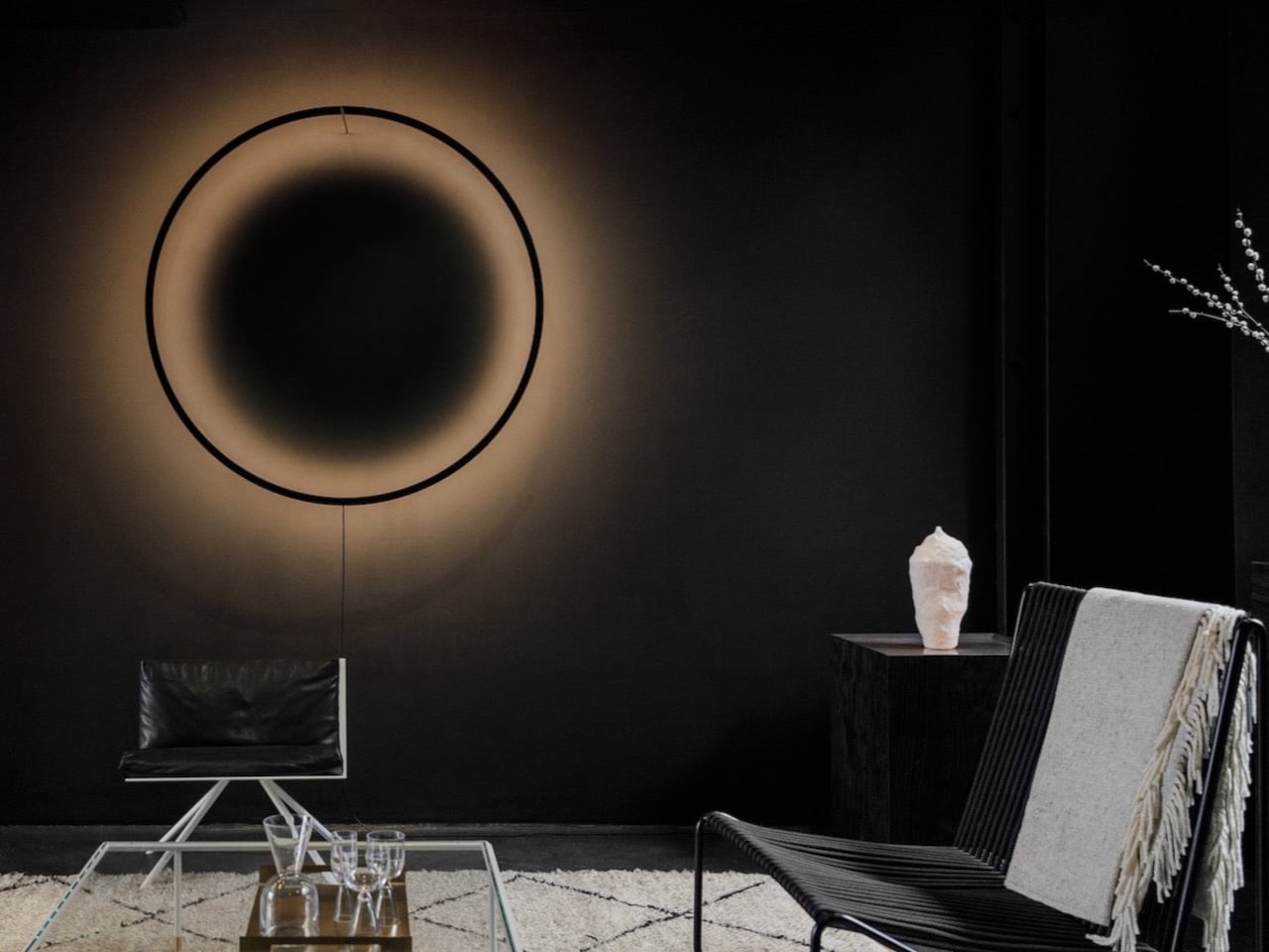
Hang the Eclipse during the day, and it reads as a clean circular ring of bent wood, not a lamp in any conventional sense. Available in natural laminated beech, white, or burnt wood finishes, it carries the kind of restraint that suits most interiors without disappearing entirely. It’s the sort of object that sits somewhere between a decorative piece and a quiet architectural presence.

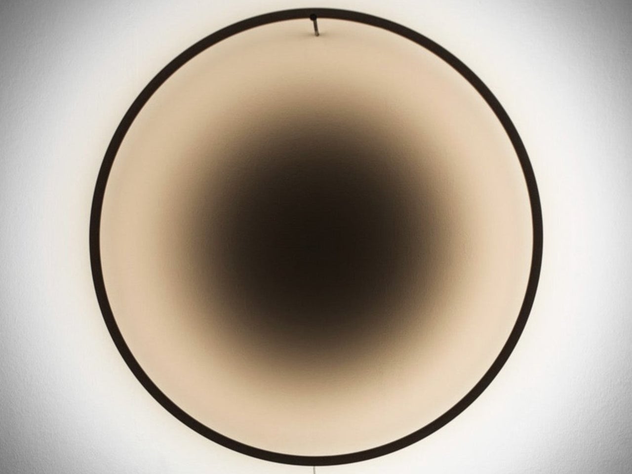
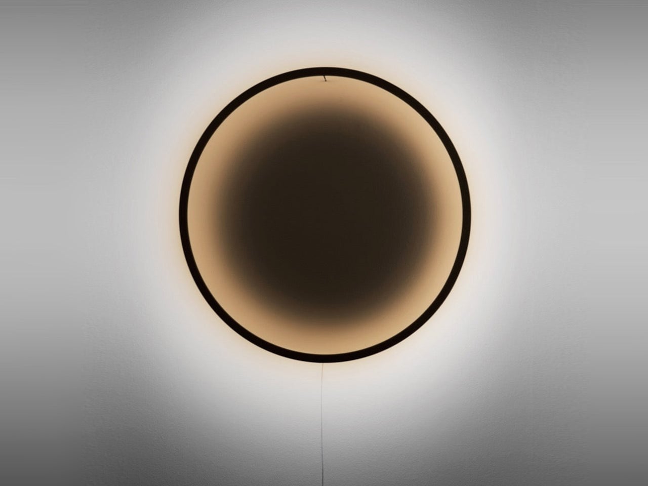
Switch it on, and the lamp’s character shifts entirely. A high-CRI warm-white LED strip runs along the inner edge of the ring, outputting up to 3,000 lm of diffused light that bounces off the wall behind it. At a color temperature of 3,000 to 3,200 K, the warmth sits in the range most people associate with relaxed, residential lighting, enough to settle a room without tipping into amber.

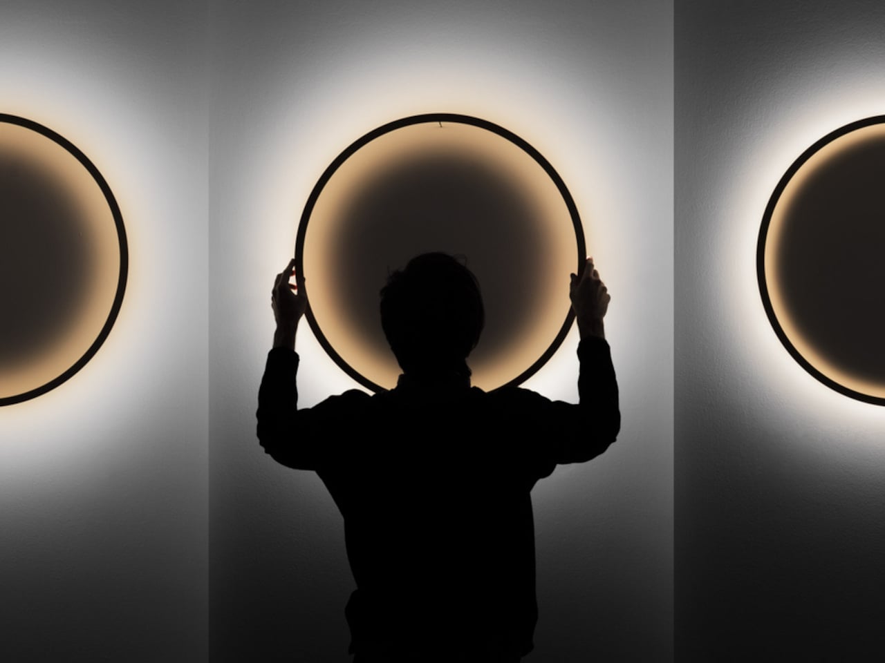
What makes the Eclipse stranger and more interesting than most accent lamps is the shadow it produces alongside the light. The ring casts a deep circular shadow in the center of its glow, one that appears to exist without a clear origin or reference point. A slight gradient in the shadow’s color temperature reportedly mimics the quality of natural afternoon light.

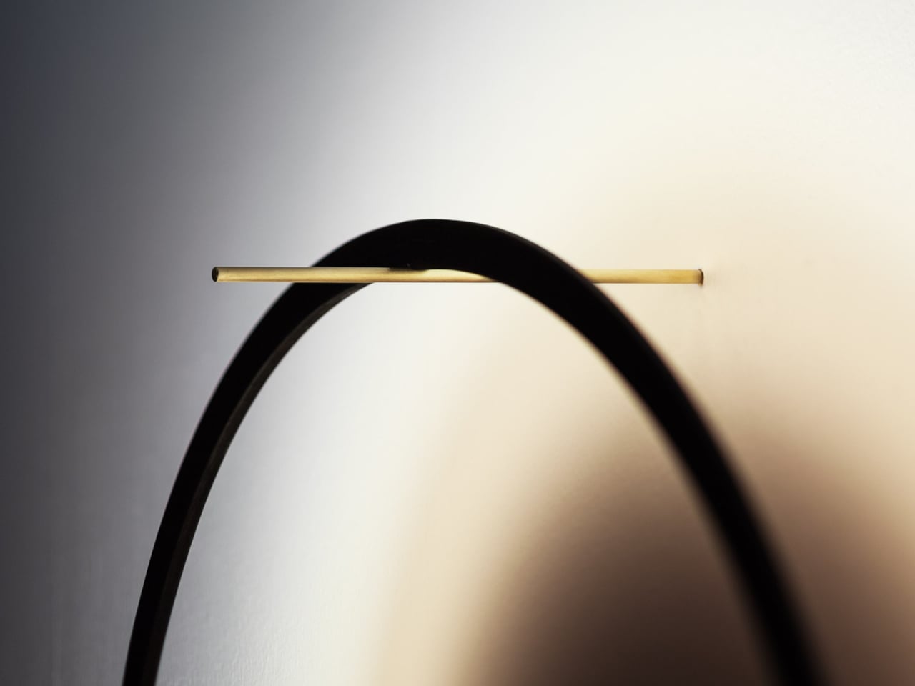
The ring’s distance from the wall isn’t fixed, which is where the Eclipse gets more interesting still. Pulling the frame outward softens and widens the glow; pushing it closer sharpens the effect and deepens the contrast. This single manual adjustment can completely change the mood of a room, and Sepič frames each change as a deliberate act rather than a routine one.

The wooden edition comes in 70 cm and 90 cm sizes, starting from €585 for the 70-cm version, and is a handmade piece by piece in Slovenia with a lead time of three to four weeks. For larger architectural installations, Bazar Noir offers a version in powder-coated aluminium at 120 cm and 150 cm diameters, which pulls the design into more monumental territory. It’s a lamp that genuinely rewards attention, one that gives back a little more the longer it stays on your wall.

The post Eclipse Wall Lamp Casts a Shadow That Appears to Have No Source first appeared on Yanko Design.
Forget Upholstery: Lærke Ryom Tailors Furniture Instead

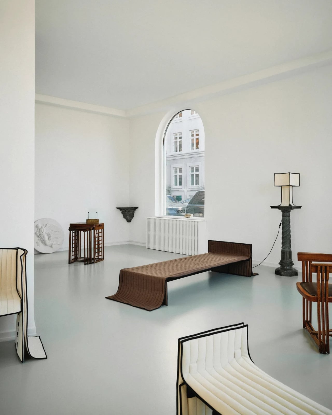
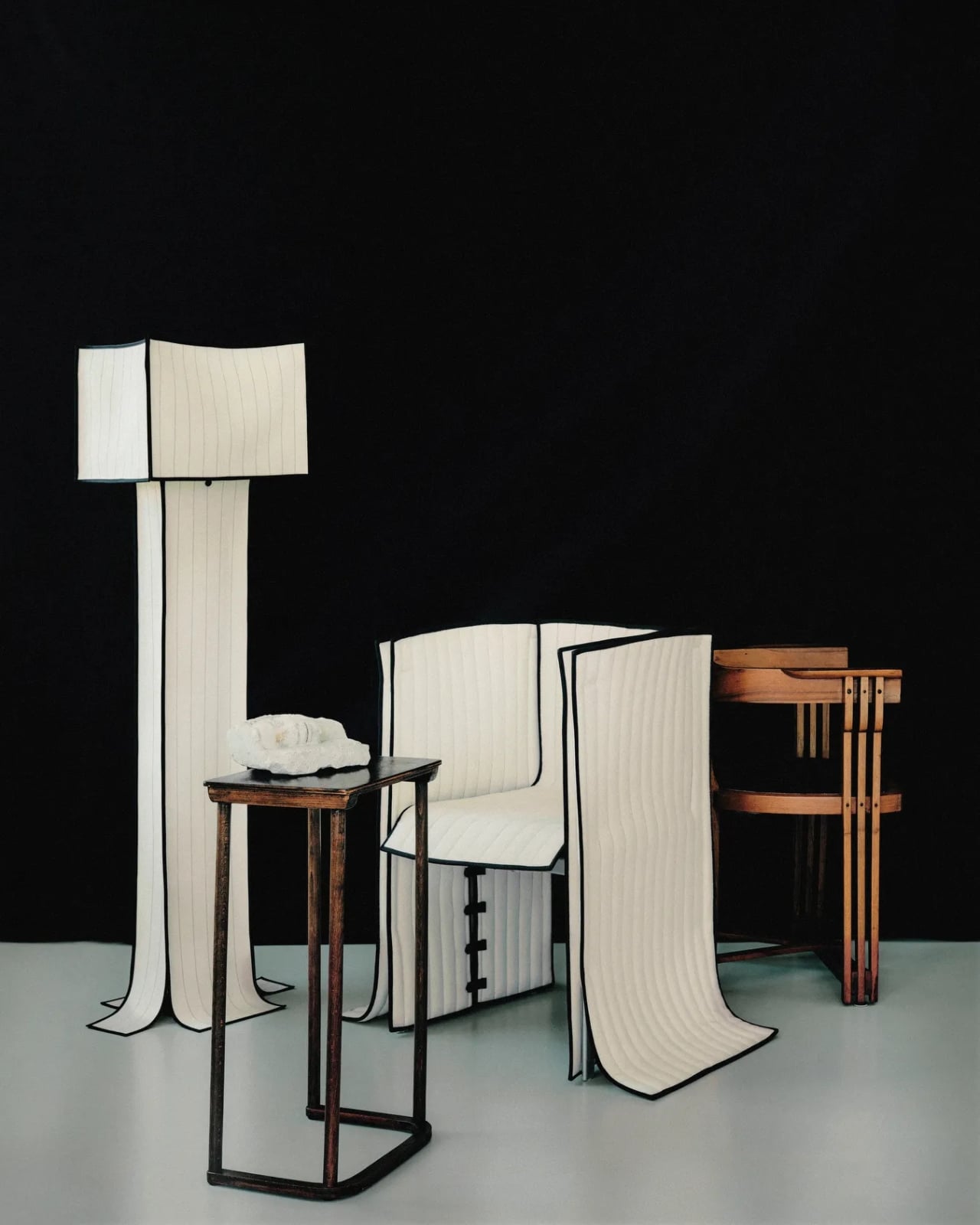
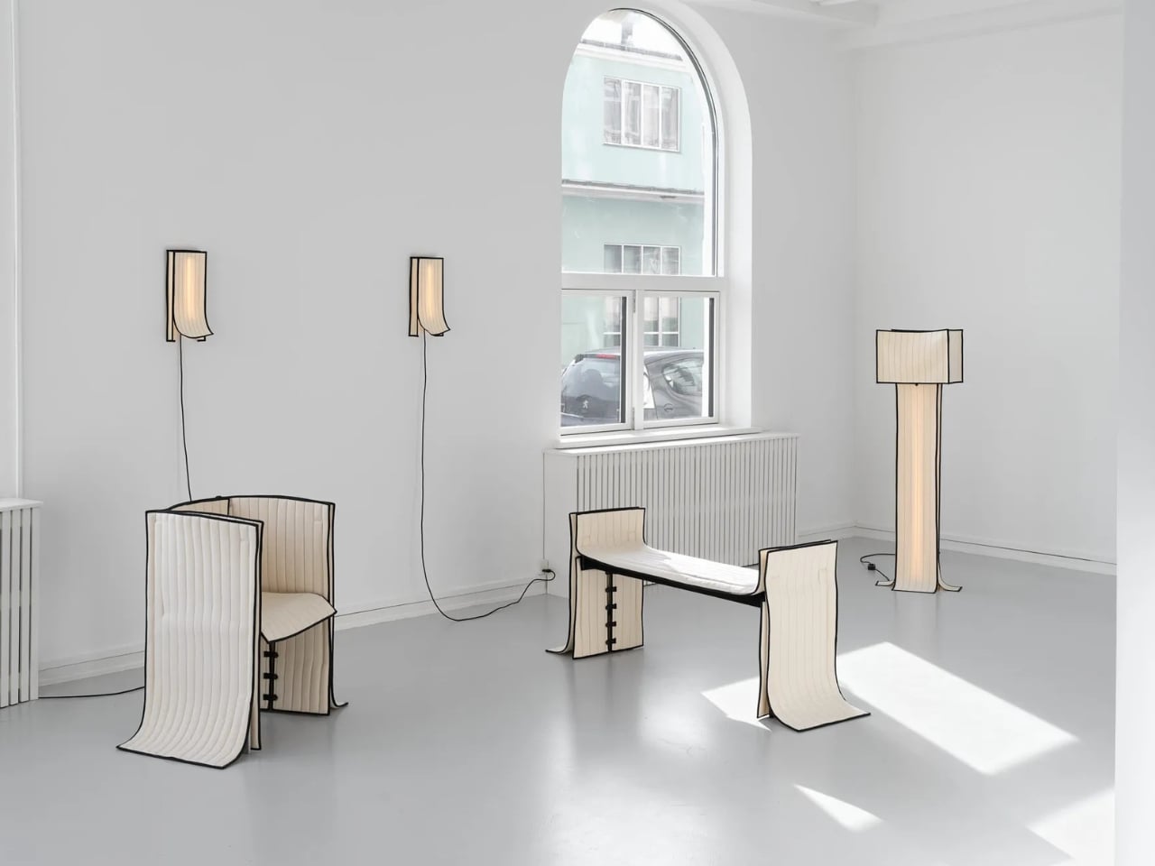
Most upholstered furniture is essentially furniture under stress. Fabric gets stretched, stapled, pulled taut, and forced into submission over rigid frames. It is, fundamentally, a question of control. Danish designer Lærke Ryom looked at that process and decided to do the opposite. Her debut solo exhibition, Raiments, now open at Innenkreis gallery in central Copenhagen, is built entirely around that single act of refusal.

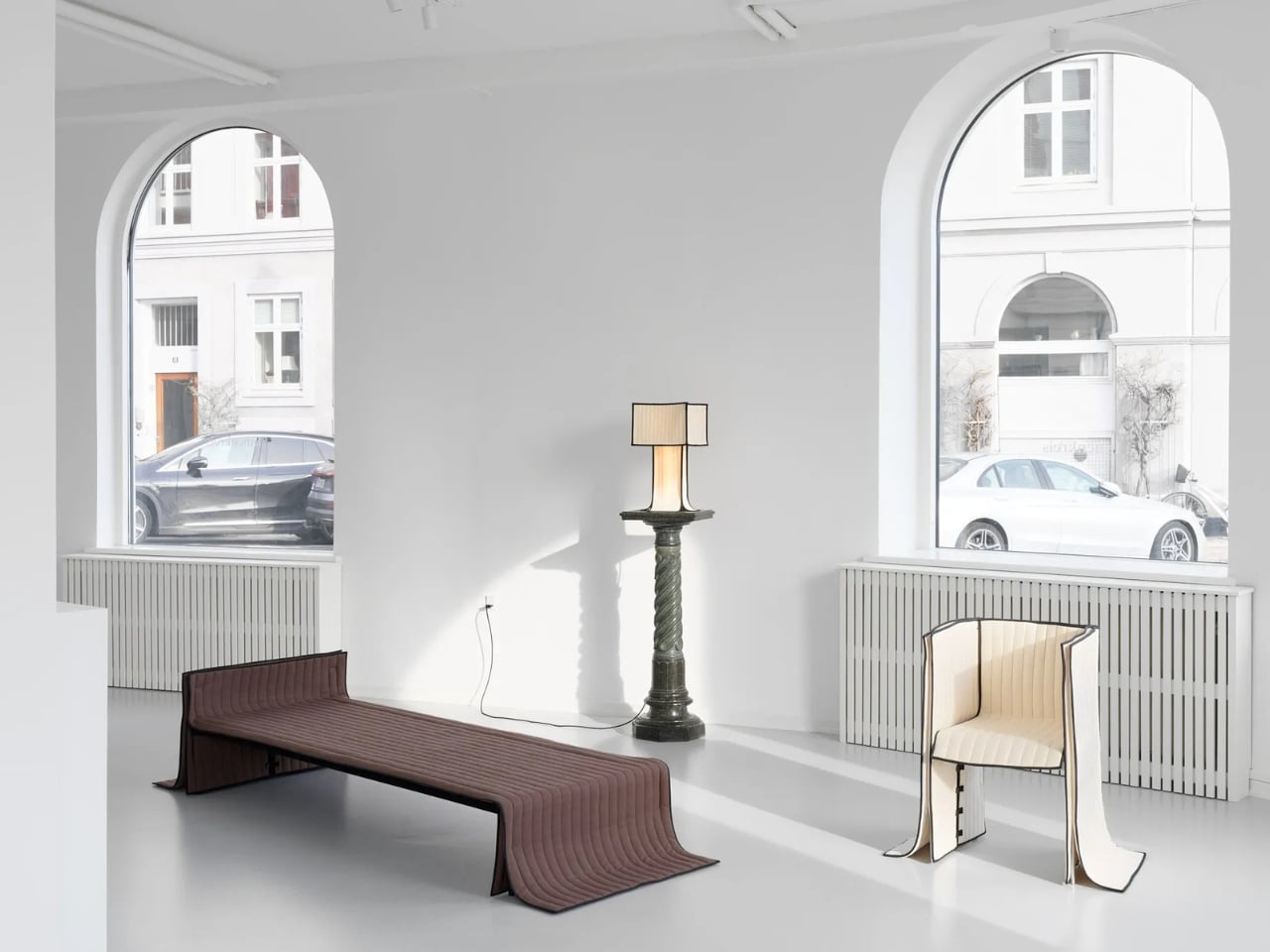
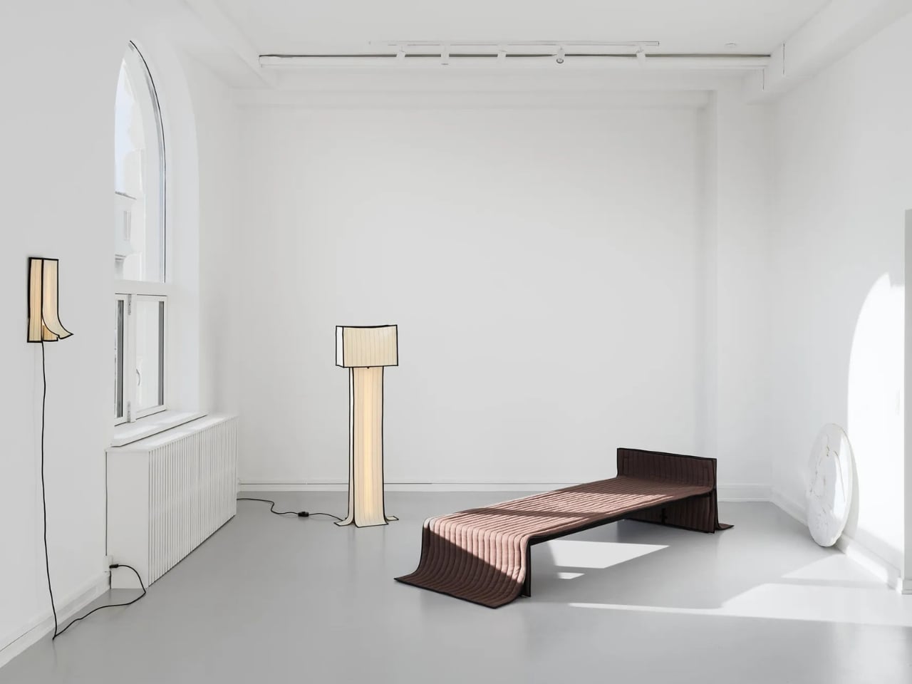
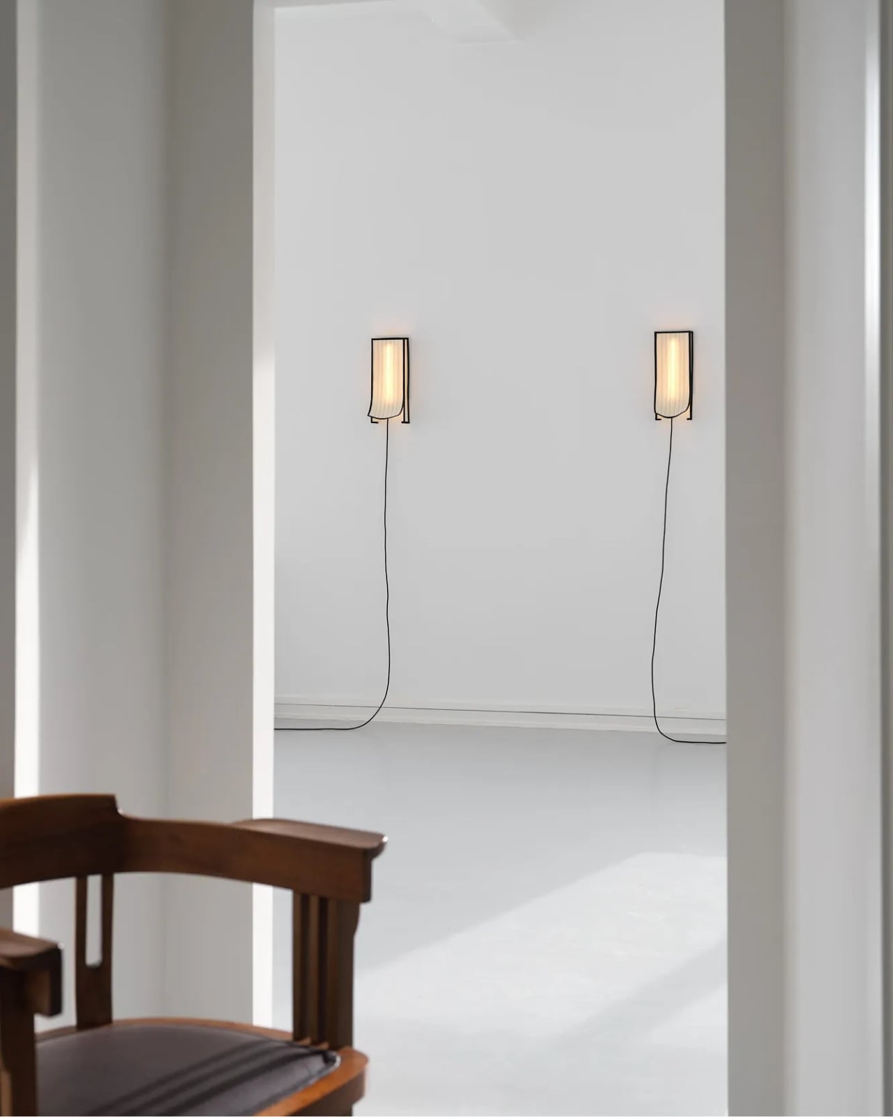
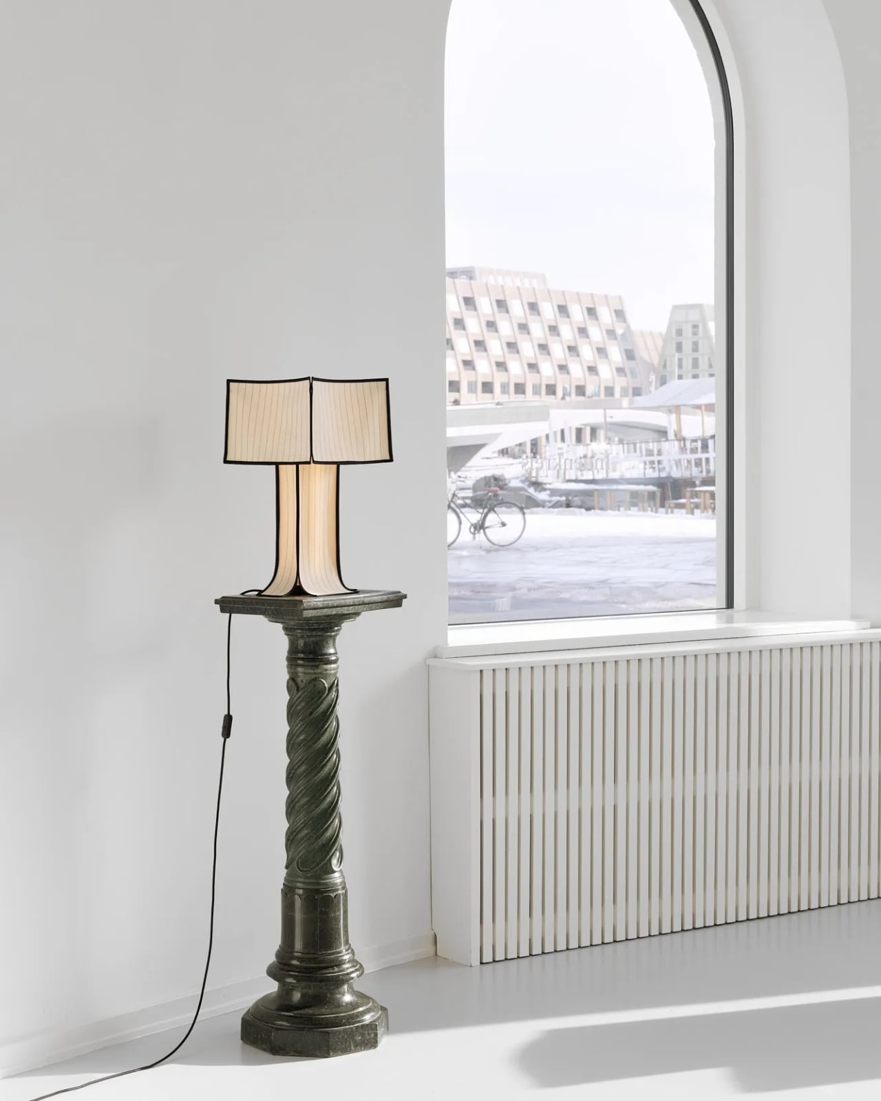
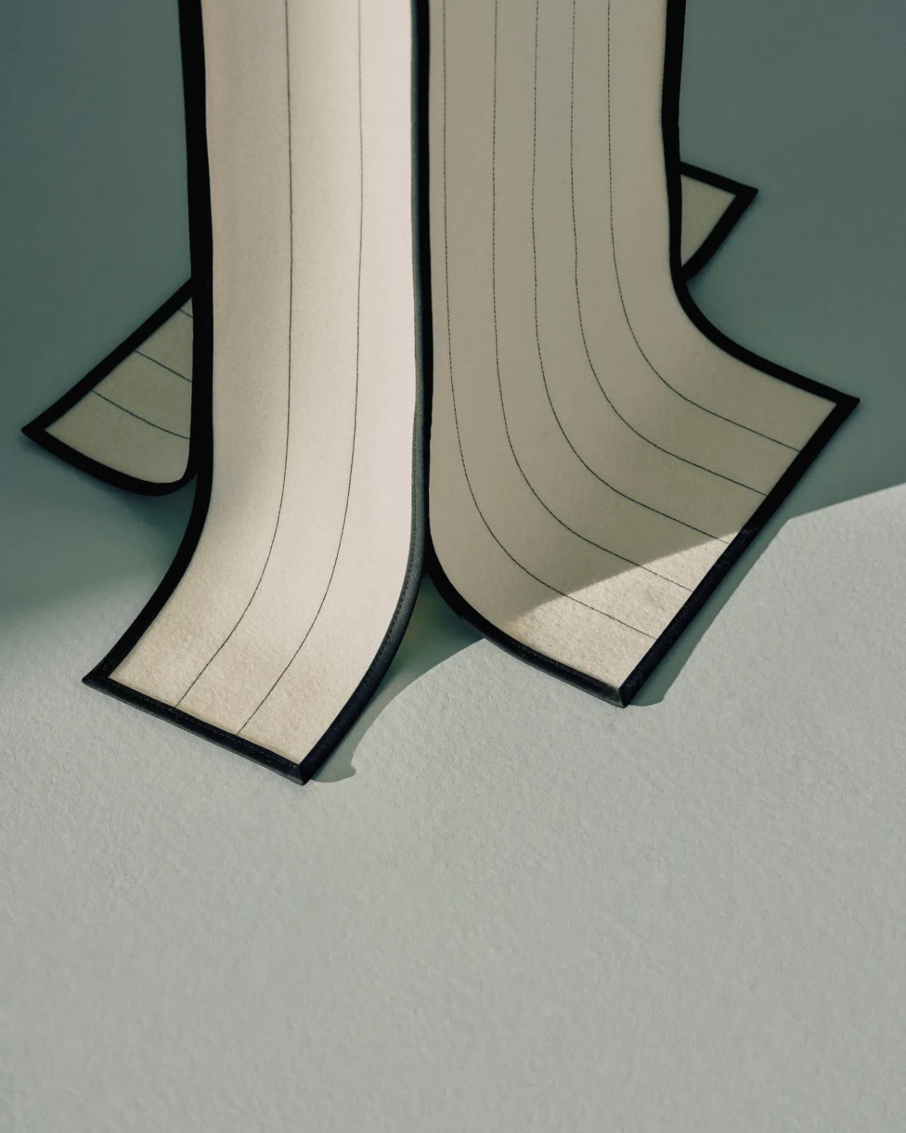
The collection includes a daybed, a chair, a bench, table lamps, a floor lamp, and wall lamps, all presented in soothing cream and chocolate-brown hues. The palette is calm and considered, which makes sense. These are pieces that ask you to slow down and look closely, because the detail is where the story actually lives.

Designer: Laerke Ryom

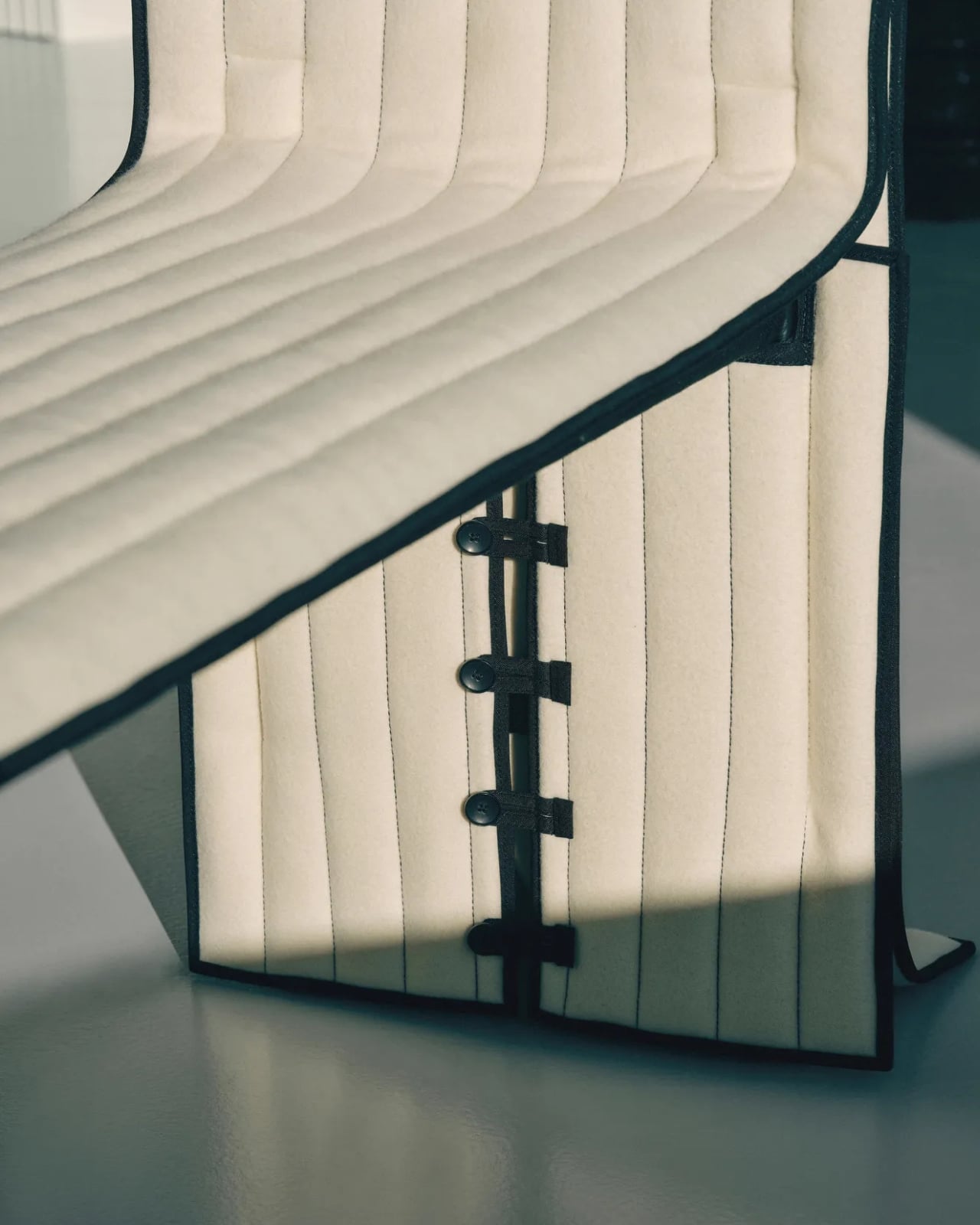
The daybed is probably the clearest expression of the concept. Long, low, and dressed in Kvadrat wool with visible quilting stitches running across its surface, it reads more like a made bed than a piece of showroom furniture. The fabric is not pulled over the form but rather allowed to settle onto it, the way a well-cut linen drapes over a body. The powder-coated steel frame beneath does its structural job quietly, without announcing itself.

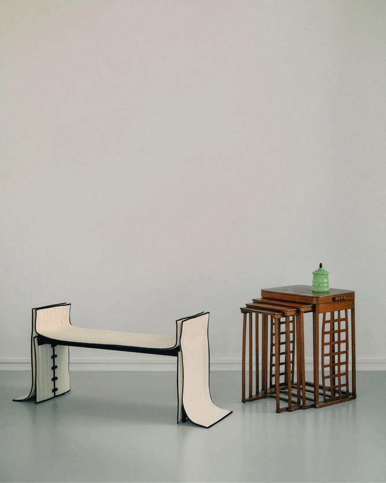
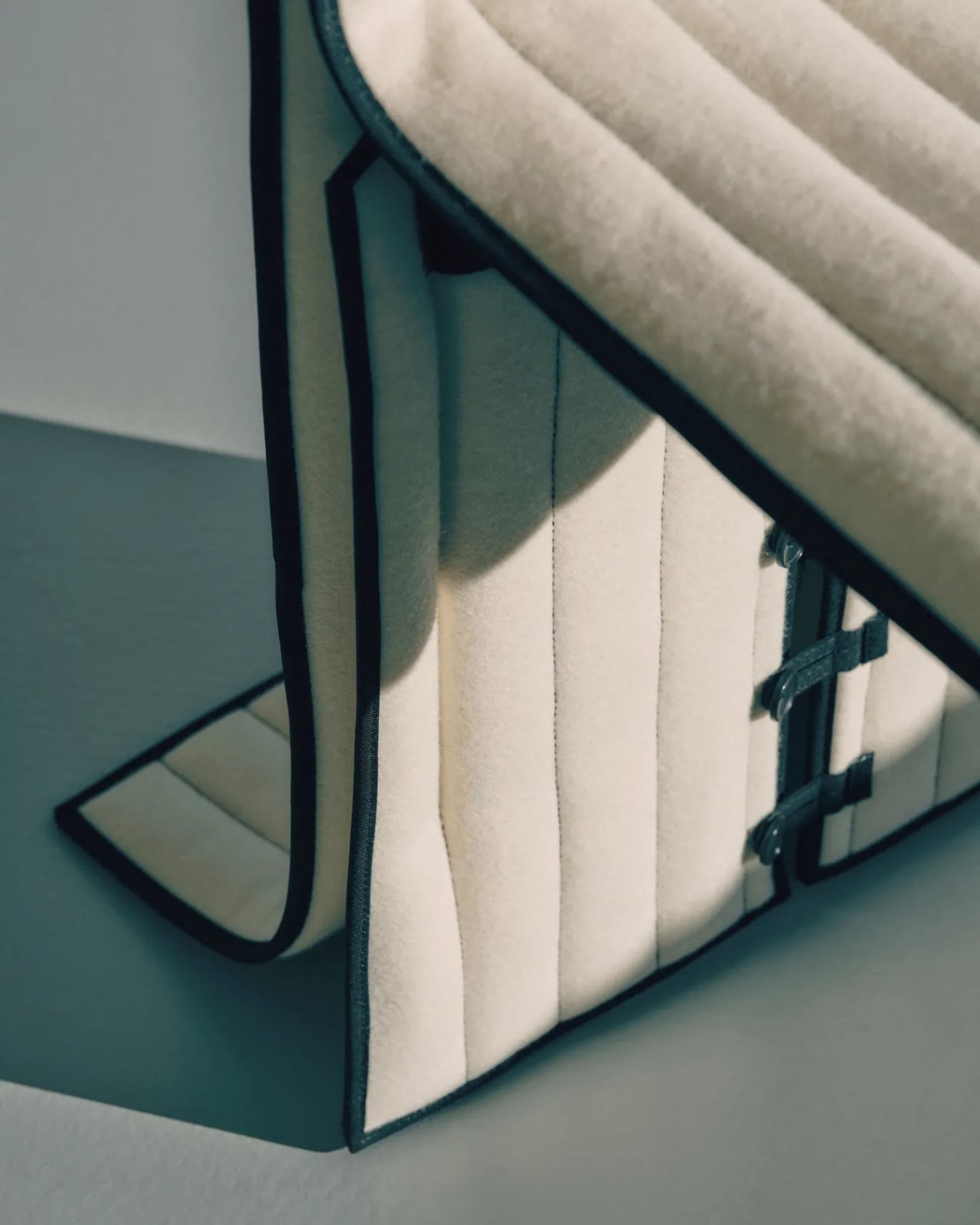
The bench follows a similar logic. Compact and precise, it carries the same quilted wool surface and the same twill weave edge banding that appears across the collection. That edge band is a detail worth pausing on. Ryom chose it specifically because twill weave is a technique rooted in clothing and home textiles rather than furniture. “It places the upholstery pieces somewhere in between,” she has said, “adding to the feeling of a tailored piece rather than upholstery.” It is a small choice with a large effect on how the finished object feels.

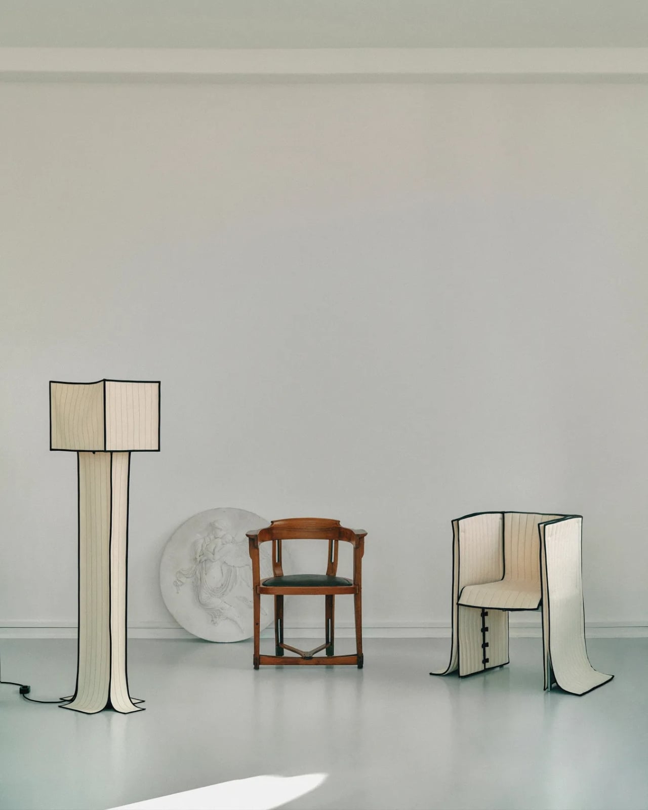
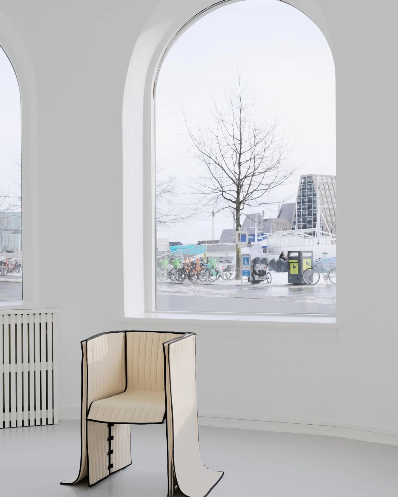
The chair, built on an aluminium frame rather than steel, is the lightest piece structurally, and it shows. It sits with a kind of ease that heavier upholstered chairs rarely manage. The wool covers it without gripping it, and the stitching adds just enough surface interest to reward a second look without demanding one.

The lighting pieces are where the tailoring metaphor gets genuinely interesting. The floor lamp and table lamps, both on powder-coated steel bases, incorporate fabric shades that are constructed the same way as the seating pieces, draped and stitched rather than stretched and glued. The wall lamps, built on stainless steel bases, carry the same approach. Seeing the textile treatment applied to lighting as well as furniture makes the collection feel like a genuine system of thinking rather than a one-off experiment. Ryom is not just applying a technique to a single object type. She is testing a philosophy across an entire interior.

Underlying all of it is a material choice that matters. The Kvadrat wool she selected deliberately lacks visible weaving, which gives the stitching room to become the primary surface detail. The quilting is not decorative in a fussy sense. It is structural and honest, doing exactly what it appears to do, which is hold the fabric in place without adhesives or staples. The result is upholstery that can be disassembled, repaired, and eventually recycled. The clothes metaphor is not just aesthetic. It is practical in the most direct way possible.

Ryom, born in 1995 and working out of The Factory for Art and Design in Copenhagen’s Amager district, has been exploring alternative upholstery techniques for several years. Raiments feels like the point where that exploration becomes a fully formed position. The pieces are not minimal for the sake of it. They are restrained because restraint is what the concept requires. Every choice, from the aluminium chair frame to the stainless steel wall lamp bases to the twill edge banding, is in service of the same idea: that furniture should be dressed, not wrestled.

Whether or not that idea changes how people think about upholstery at large is probably too early to say. But Ryom has made a collection that is hard to look at and then go back to thinking about furniture the old way. That, for a debut solo show, is more than enough. Raiments is on show at Innenkreis, Herluf Trolles Gade 28, Copenhagen, through 23 May.

The post Forget Upholstery: Lærke Ryom Tailors Furniture Instead first appeared on Yanko Design.
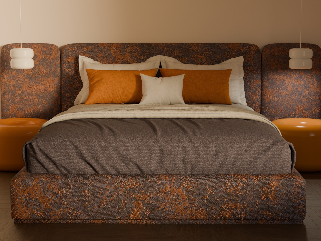
These Ceramic Lamps Look Like 90s Caramel Candy and Stack Any Way

The interiors most people aspire to these days tend to share a common trait: they’re clean, restrained, and almost aggressively neutral. Scandinavian minimalism, Japandi aesthetics, and muted palettes have dominated home design for years, and while there’s nothing wrong with a well-curated beige room, a lot of modern spaces have started to feel emotionally flat, like showrooms rather than places where people actually live.

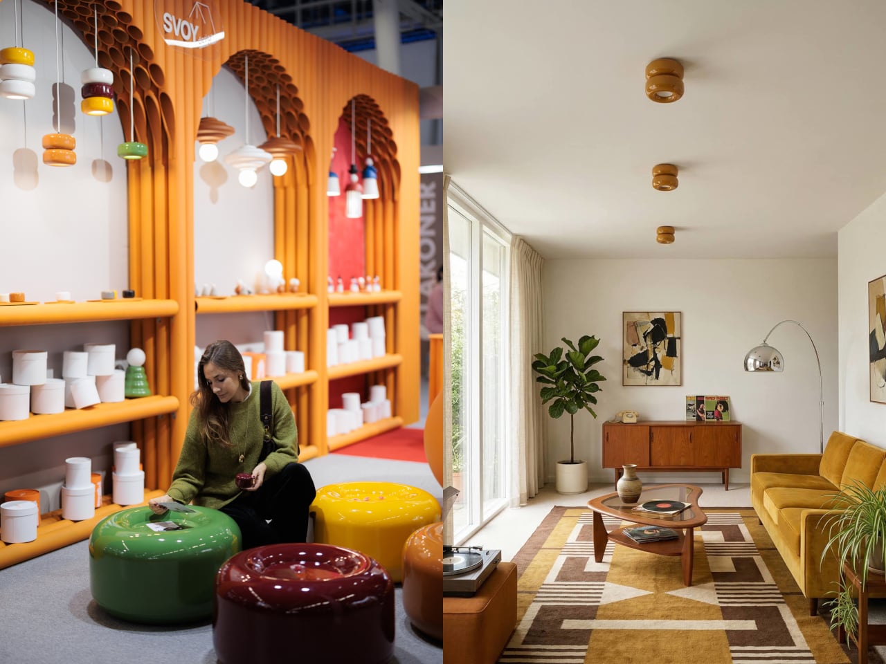
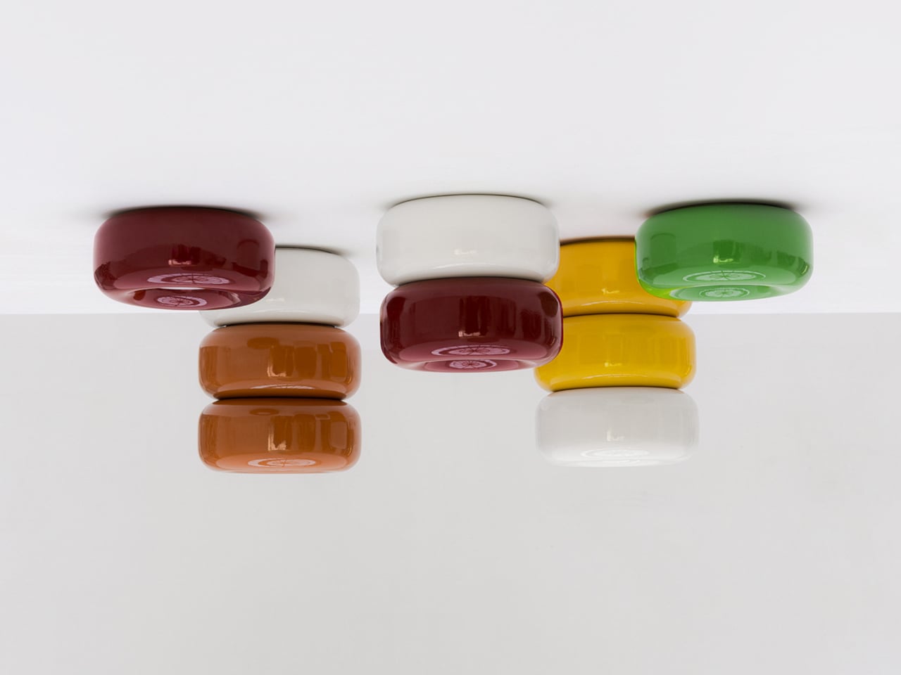
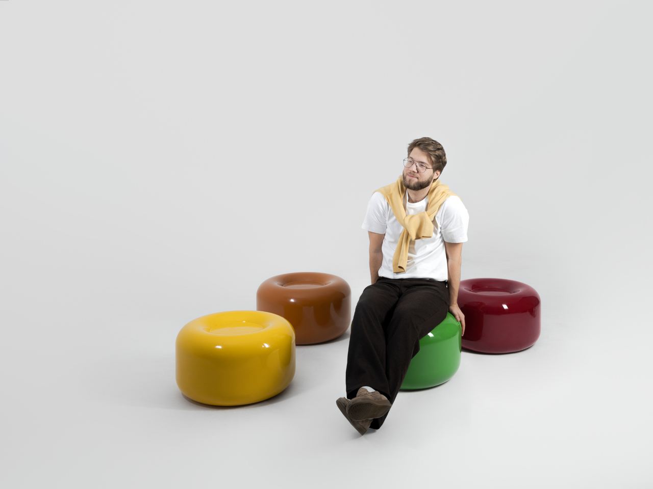
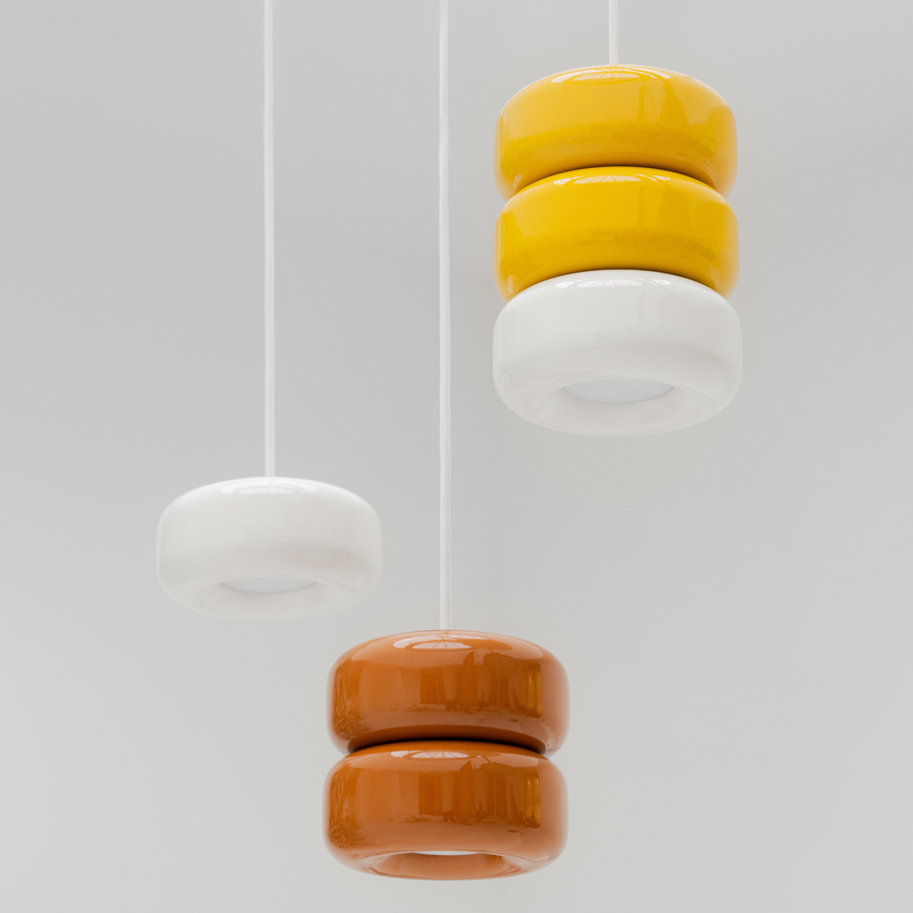
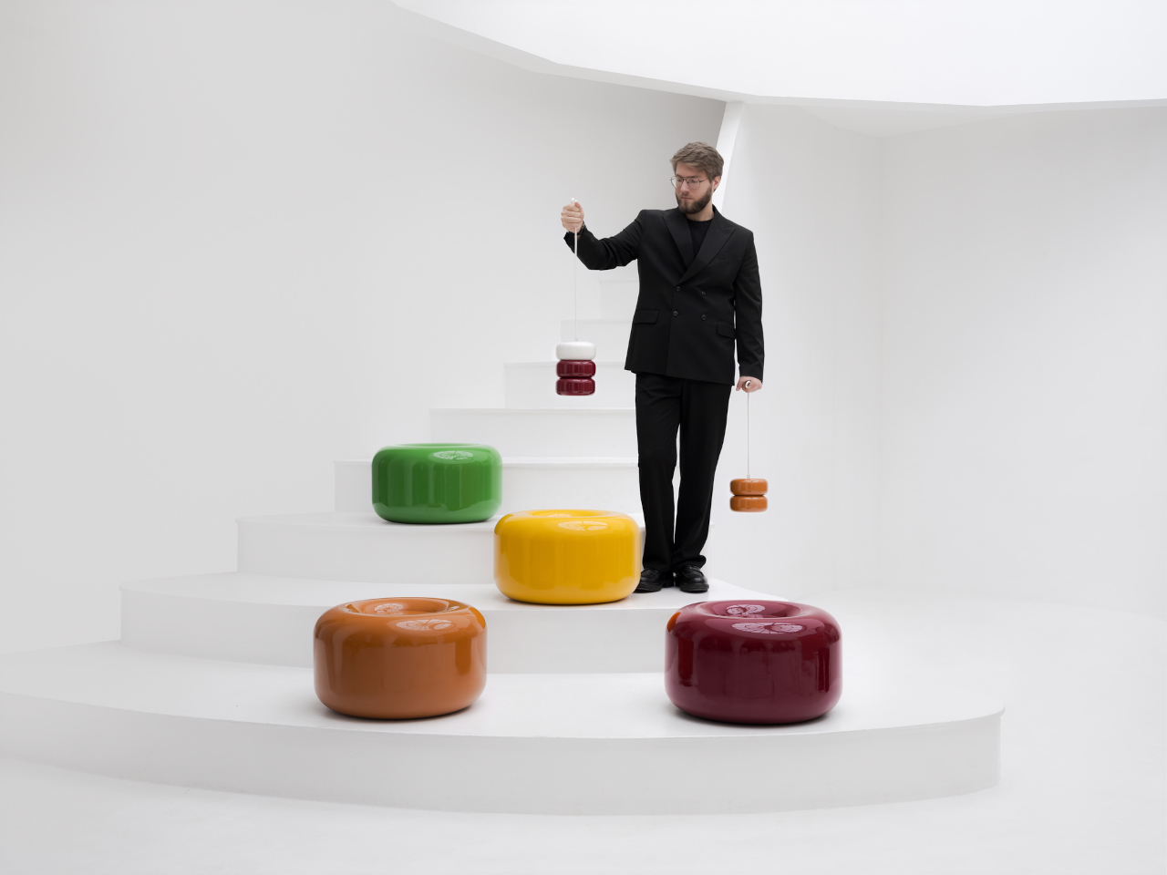
That’s where the Caramel collection comes in. Designed by Moscow-based product designer Maxim Tatarintsev in collaboration with Russian brand Svoy Design, this new series of ceramic lighting and furniture takes a very different approach to interior objects. Rather than adding another understated piece to a polished shelf, it reaches back to a simpler, sweeter time, asking whether a lamp or a side table can carry something as intangible as joy.

Designer: Maxim Tatarintsev

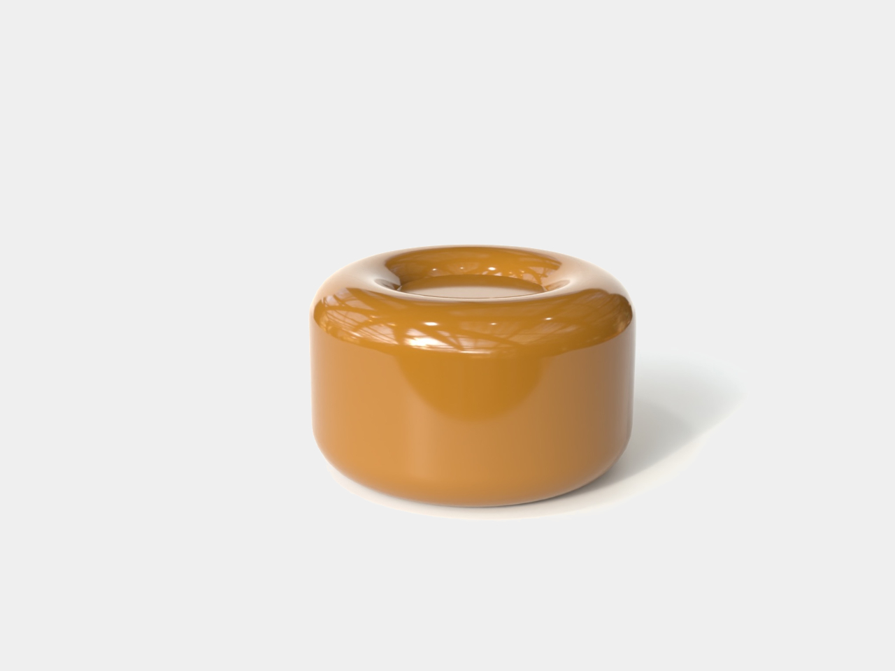
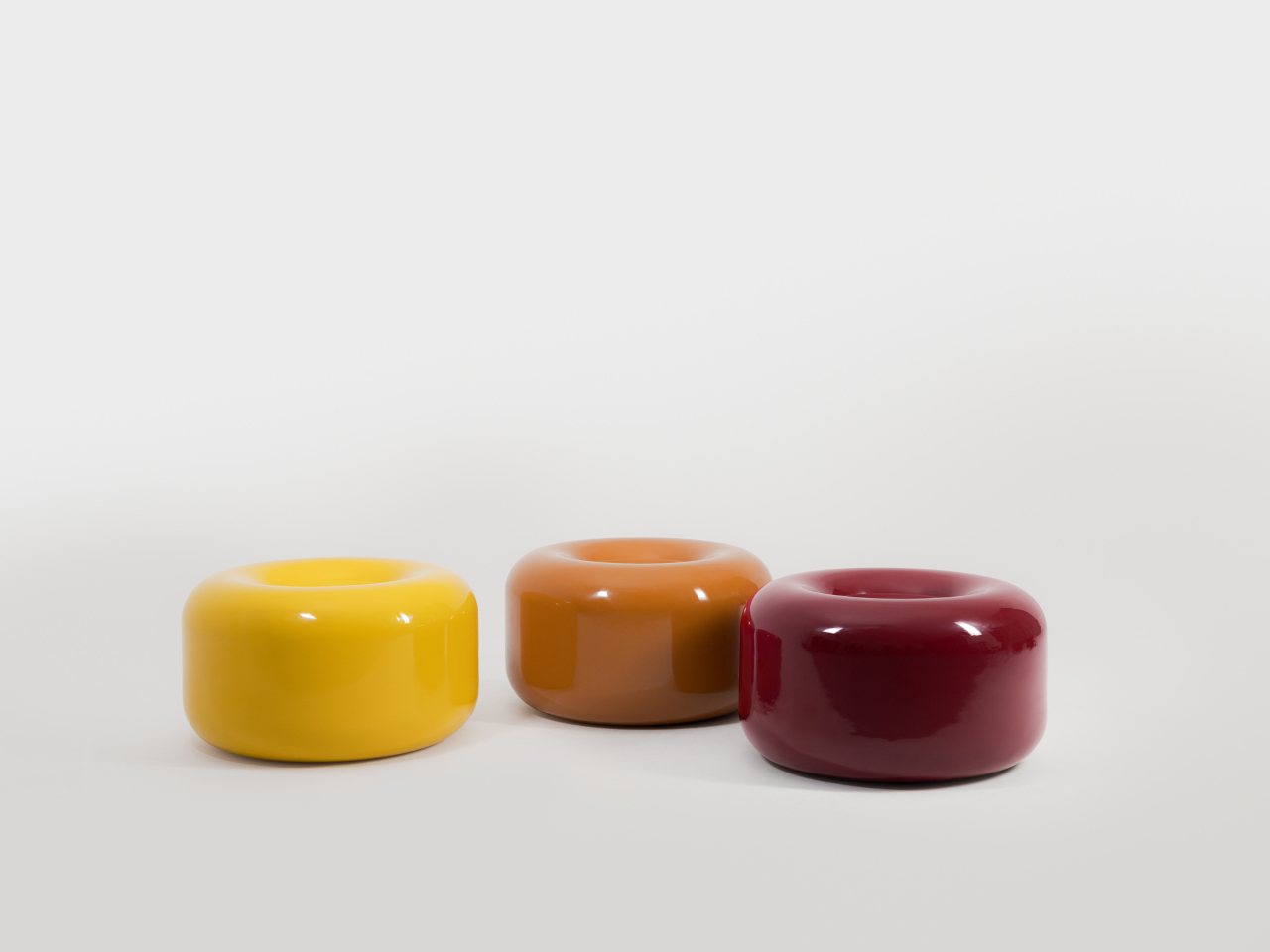
Tatarintsev’s inspiration came from a period of deep personal reflection. Amid what he describes as the noise of contemporary life, he looked inward and found his answer in childhood, specifically in the candy that practically every kid growing up in the 90s and early 2000s would recognize. That small, glossy, jewel-toned caramel sweet became both his muse and his design vocabulary, shaping everything from the forms to the color palette.

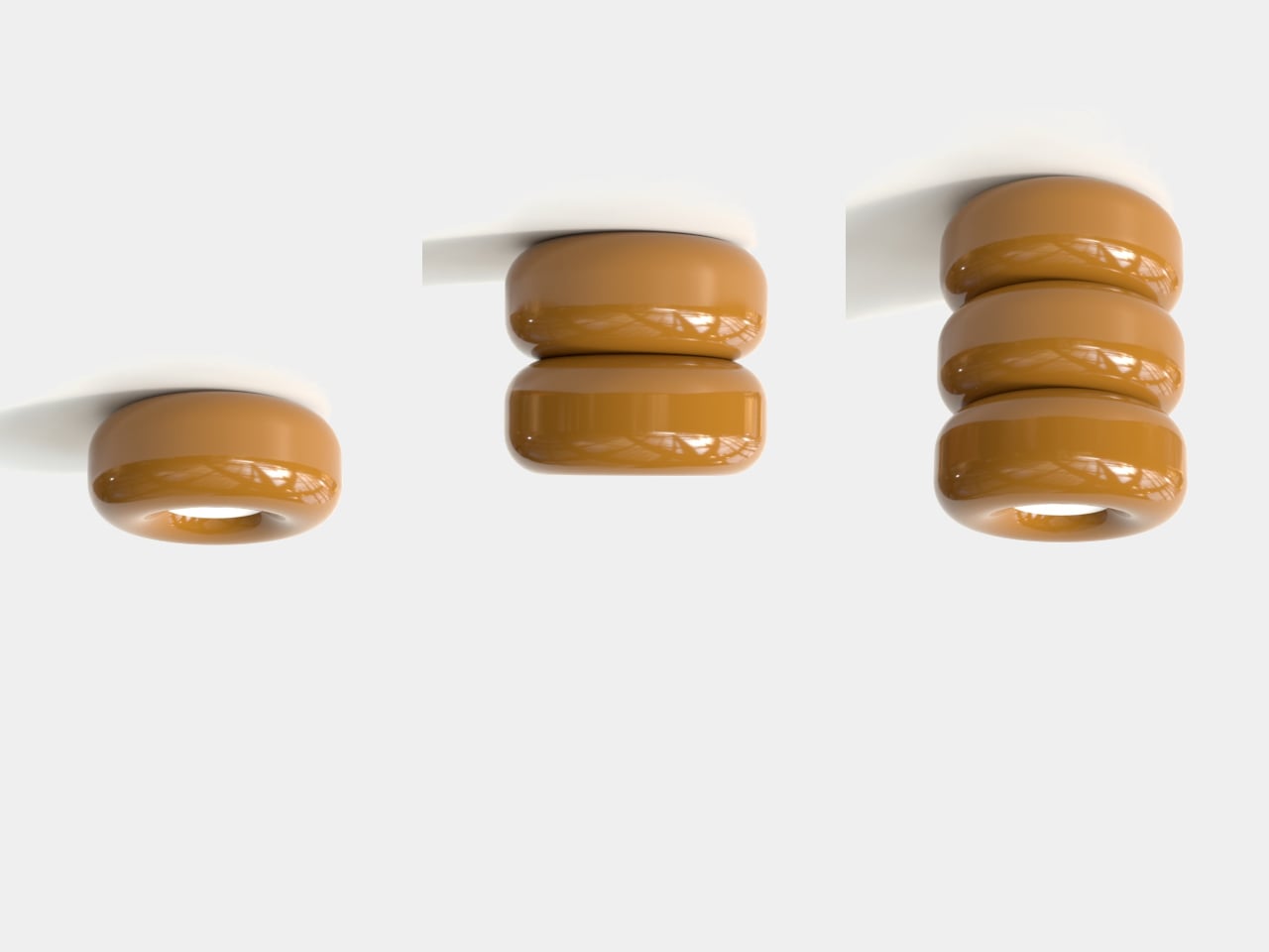
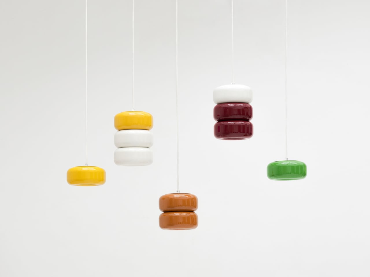
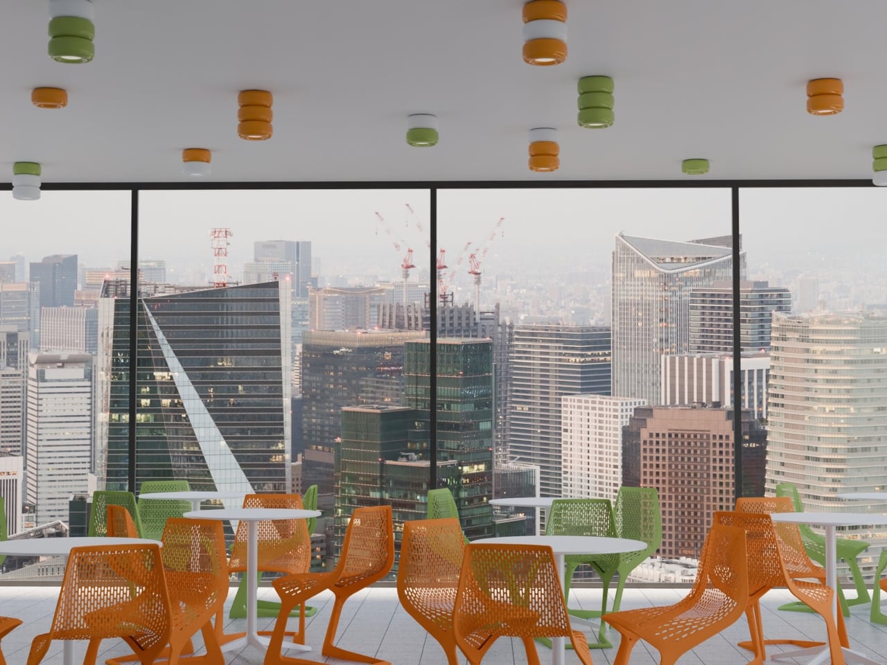
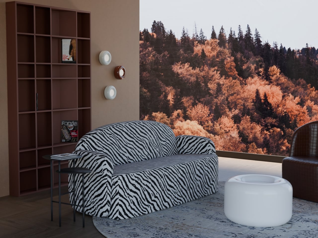
The collection spans pendant lights, ceiling fixtures, and wall-mounted lamps, all crafted from semi-porcelain, as well as a low-profile side table made from a proprietary composite material. What stands out is the modular approach: each ceramic unit can be combined and reconfigured, letting you stack or cluster them into different lighting arrangements depending on the mood or corner of the room you’re working with.

Think of it like assembling your own arrangement from a jar of sweets. One configuration might call for a single pendant above a kitchen island; another might cluster a few units along the ceiling of a reading nook. The point isn’t to follow a prescribed layout but to put that creative decision in the hands of the person actually living in the space, not just the designer who furnished it.

The craftsmanship behind the lighting is traditional and deliberate. Each piece starts as a slip-cast semi-porcelain form, drying for several days before being fired at 1,100°C inside a muffle furnace. A coat of glaze and paint follows, giving the finished modules their signature smooth, candy-like sheen. It’s a fairly labor-intensive process for what might look like a simple geometric shape, but that’s precisely what gives each piece its quiet depth.

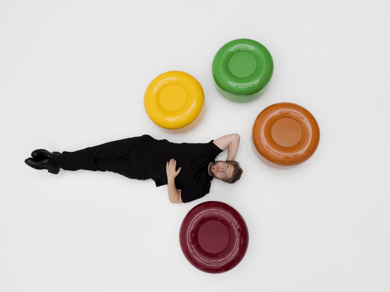
The side table takes a different manufacturing route altogether. Made from a proprietary composite rather than ceramic, it’s significantly more durable and comes in two versions, one for indoor use and one for covered outdoor settings. At first glance, it reads as a low, rounded ottoman, and people will probably be unable to resist using it as a delicious seat instead.

None of that is accidental. Tatarintsev’s stated goal wasn’t to produce pretty objects but to create what he calls “emotional anchors,” pieces capable of sparking a genuine reaction in whoever encounters them. A set of lamps you can rearrange on a whim, a table that moonlights as a seat, and a color palette borrowed from childhood treats make for a collection that gives any room a personality it actually earned.

The post These Ceramic Lamps Look Like 90s Caramel Candy and Stack Any Way first appeared on Yanko Design.
This Moon-Inspired Lamp Has No App, No Cord, 100% Recycled Aluminum

The lamp has gotten interesting again. What was once a fixture relegated to task lighting and matching living room sets has turned into something more intentional, especially among people who care about how their spaces feel at different times of day. Cordless, portable table lamps have become a genuine category of their own, offering the kind of flexibility that hard-wired fixtures simply can’t.

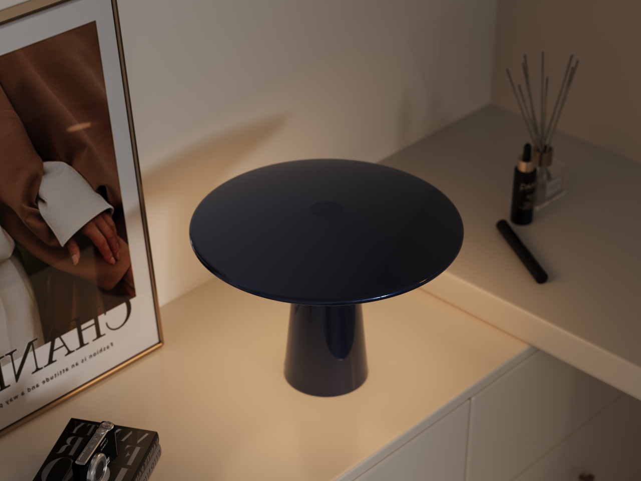
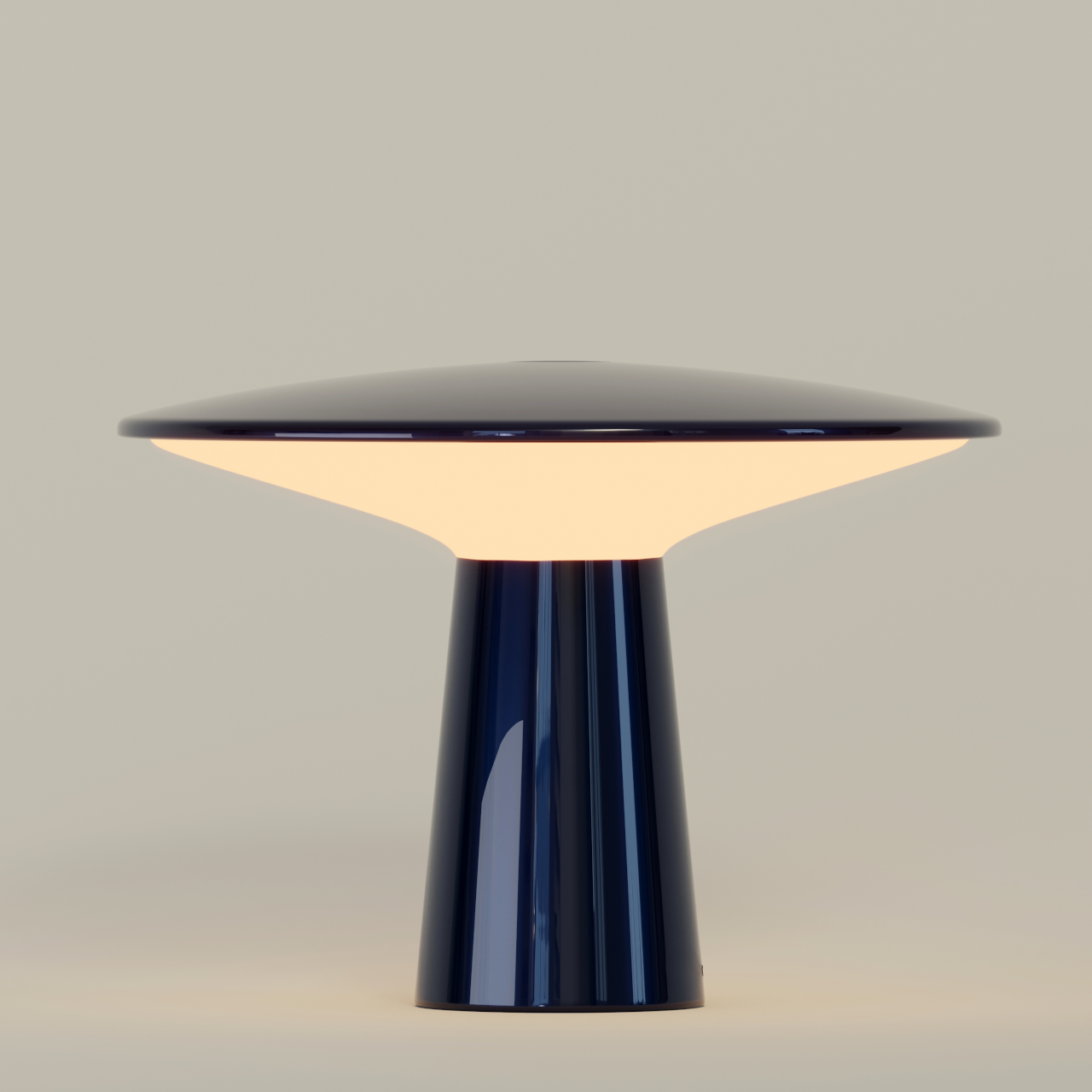
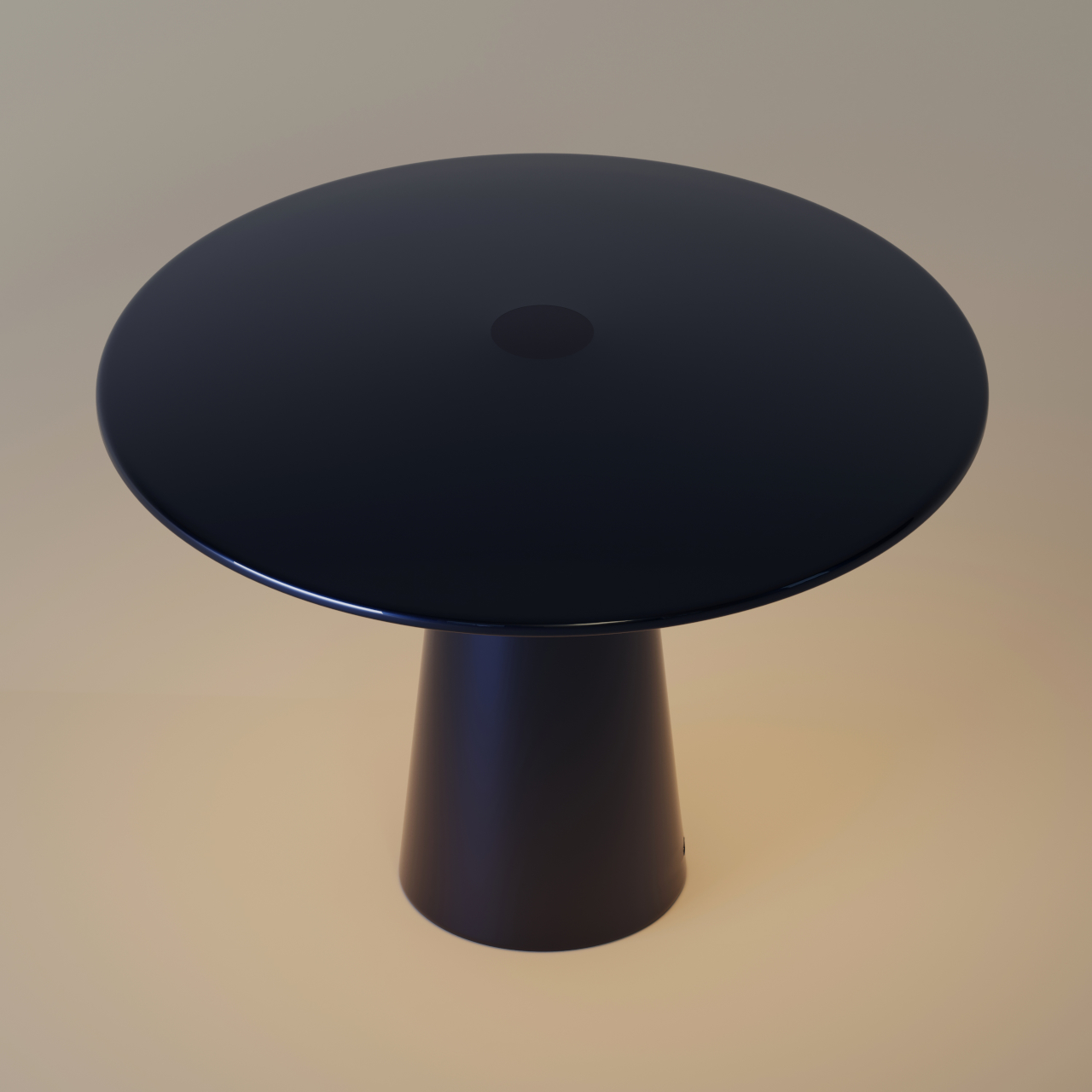
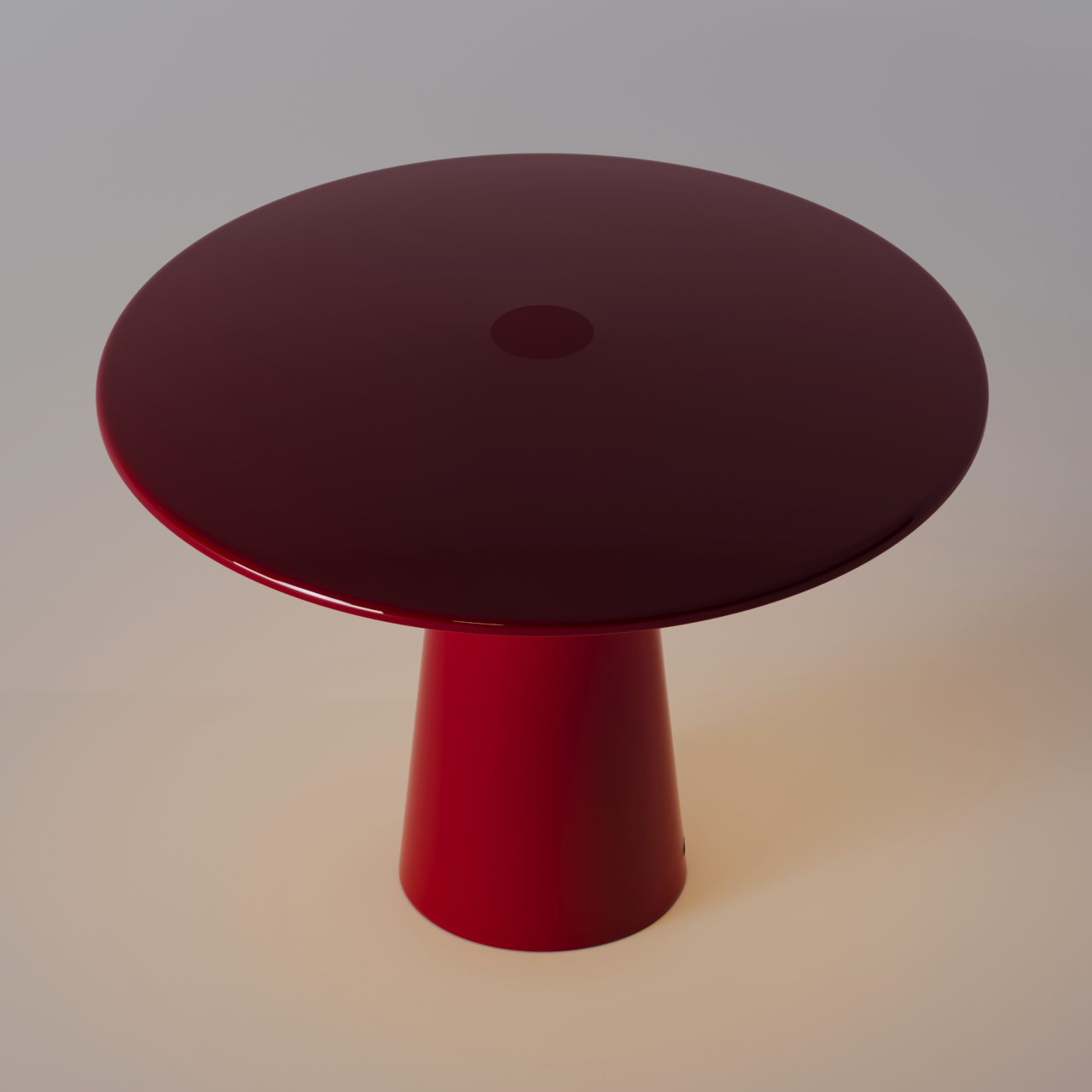
Designer Rahi Seyedi’s Monir, developed for Rey Studio, slots right into that world while carrying a concept that goes a bit further than most. The 29cm cordless lamp is inspired by the way moonlight sits between the sky and the earth, and that idea drives every decision in the design, from the shape of its dome to the materials holding it all together.

Designer: Rahi Seyedi

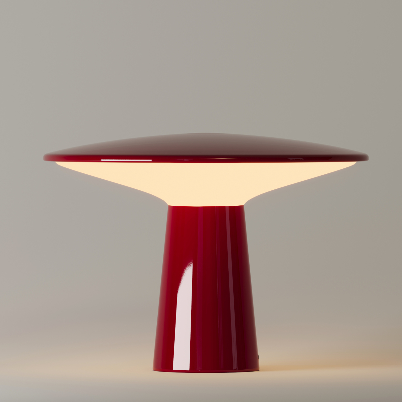
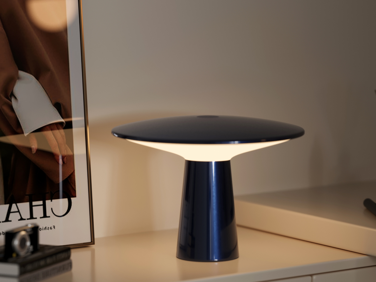
The form reads pretty clearly once you know what it’s referencing. A dark, grounded base anchors the lamp below, standing in for the weight of the earth, while the translucent dome above lets the LED ring scatter light in a way that mimics the gentle diffusion of moonlight. Nothing about the design is there for decoration alone. Every detail serves the concept, and you can tell.

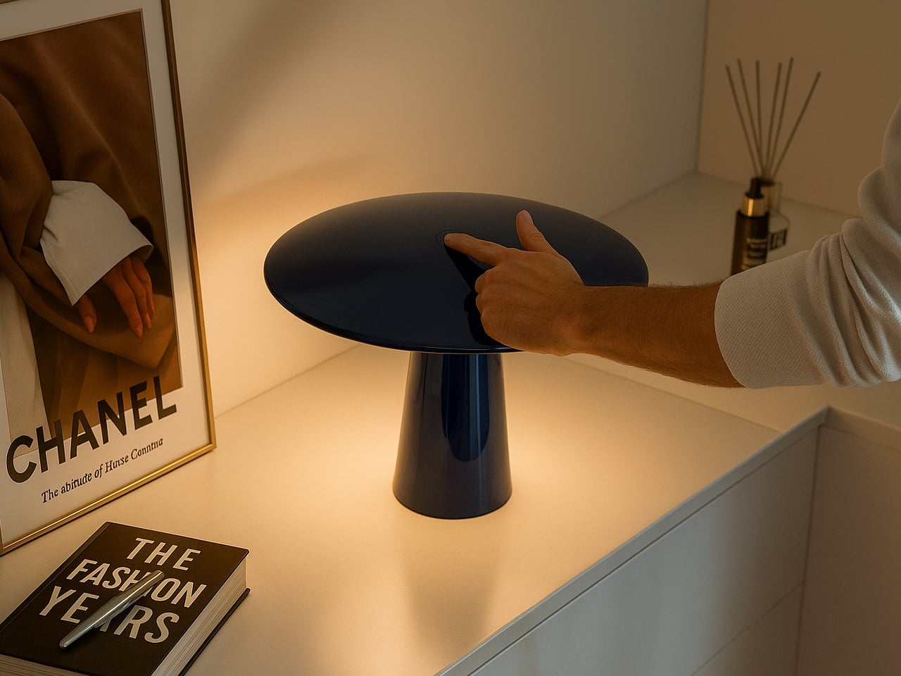
Using it is about as frictionless as a lamp can get. A tap switches it on, and gently rotating the upper section moves through three brightness levels. That’s it. There’s no app, no remote, and nothing to configure before you can actually use it. You just pick it up, place it where you want it, and adjust the brightness until the light feels right.

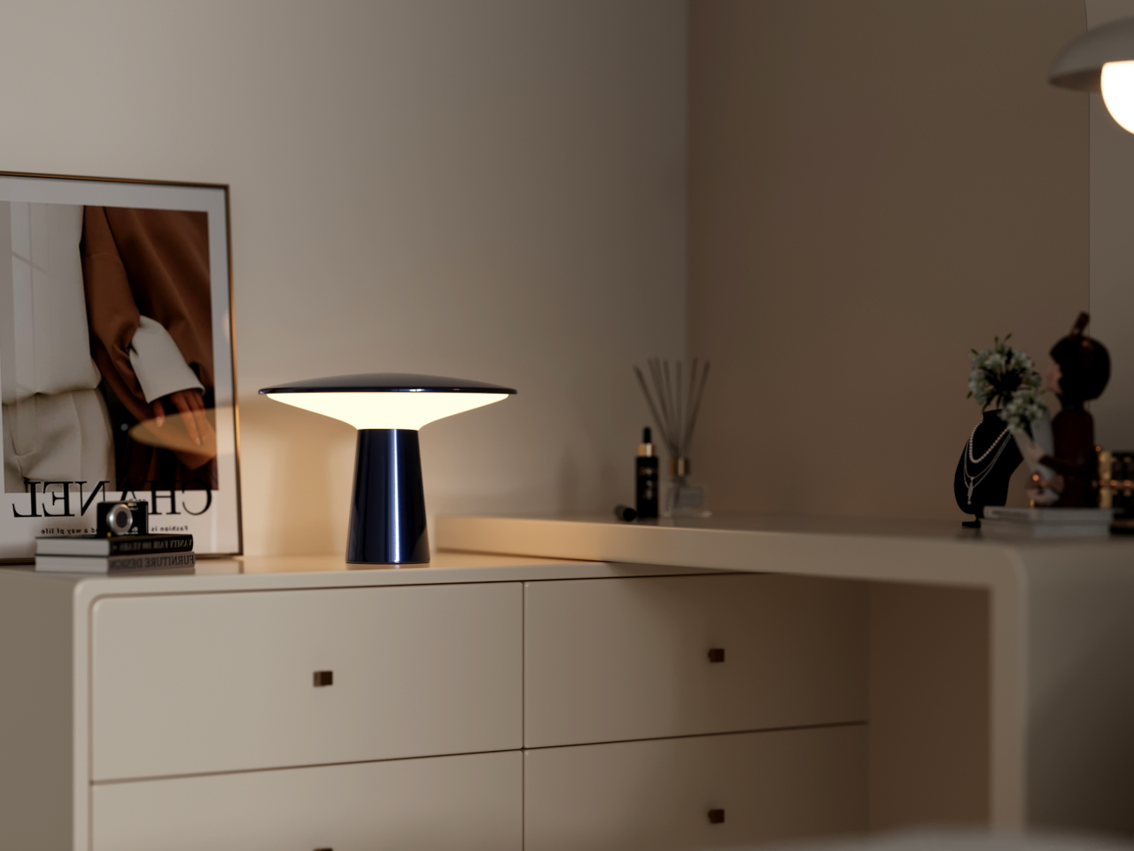
On a desk, Monir keeps things steady without being intrusive. The diffused glow is warm enough to take the edge off the contrast between a bright screen and a dark room, which is exactly what you want during a long stretch of work or reading. It doesn’t replace proper task lighting, of course, but it makes the hours you spend at a desk noticeably more comfortable.

Move it to a side table when the day winds down, and the lamp takes on a different role entirely. At its lowest settings, the warmth it puts out is the kind that encourages you to put your phone down and actually be in the room. Overhead lights off, Monir on, and the space feels genuinely different in a way that’s hard to explain but pretty easy to appreciate.

Sustainability was factored into Monir well before the final form was settled, and it shows. The base and dome are both made from 100% recycled aluminum, while the diffuser uses bio-based polycarbonate, a plant-derived material that doesn’t end up in a landfill. For something that asks so little of you visually and physically, that’s not a small thing, and as lighting objects go, Monir keeps its intentions quiet and its results remarkably clear.

The post This Moon-Inspired Lamp Has No App, No Cord, 100% Recycled Aluminum first appeared on Yanko Design.