House of Cards Quietly Turns an Old Foundation Into a Feature

The most interesting part of House of Cards may be the part you cannot see. Vantieghem Talebi designed this family home in Koksijde, Belgium, on the foundations of an earlier coastal house, with a limit on how high the new building could rise. That combination can leave architects trying to disguise a compromise. Here, the inherited footprint gives the house its unusual shape. I like that the design begins with a problem it cannot simply erase.

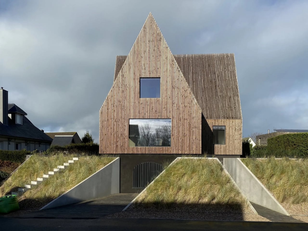
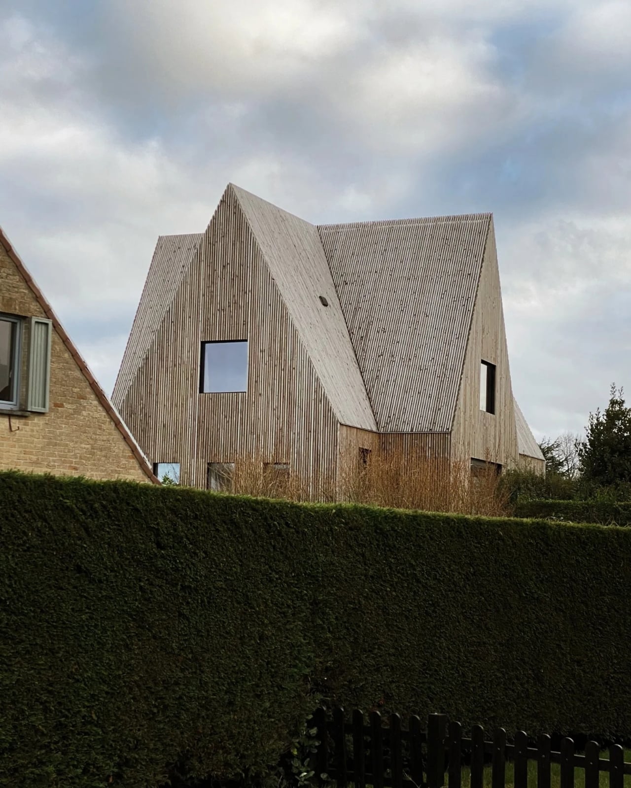
The old foundation has an asymmetrical, cross-shaped layout. Instead of forcing a conventional box onto it, the architects developed each section into a distinct house-like form, creating the layered composition behind the name House of Cards. It looks playful, but the arrangement is rooted in the site rather than added for effect. That distinction matters: an expressive home is much easier to appreciate when its shape has a reason.

Designer: Vantieghem Talebi
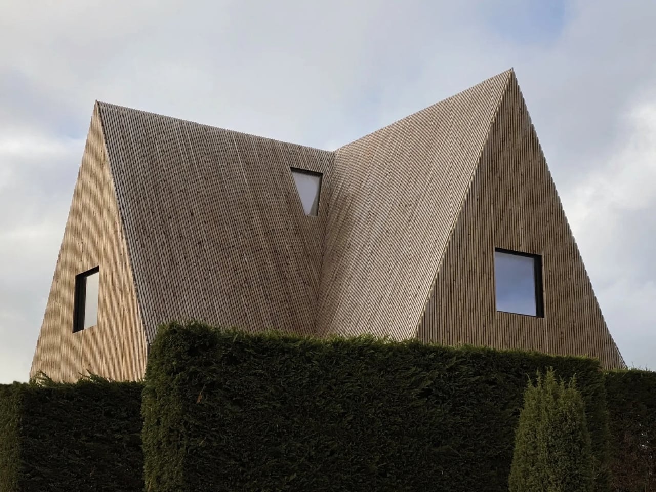
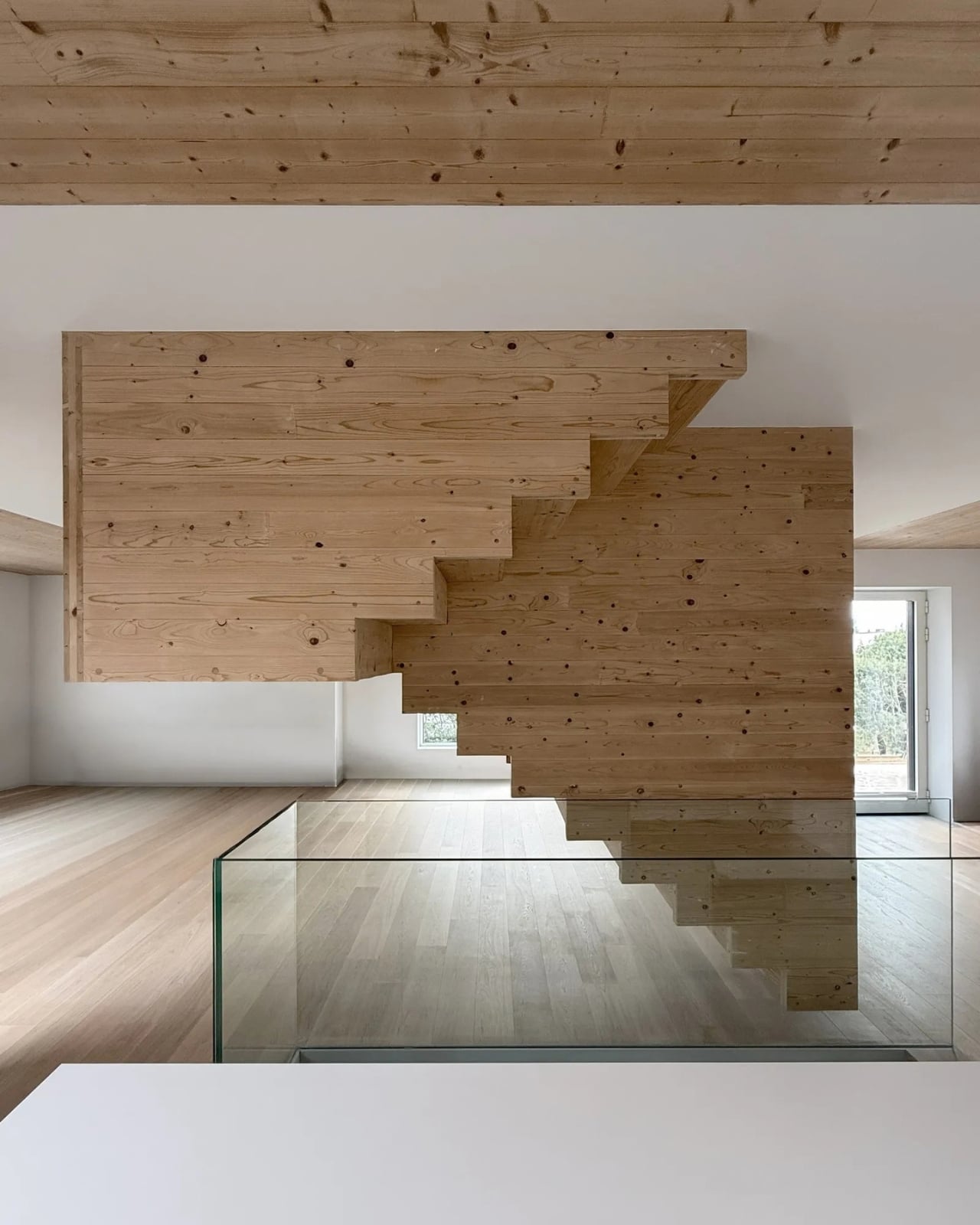
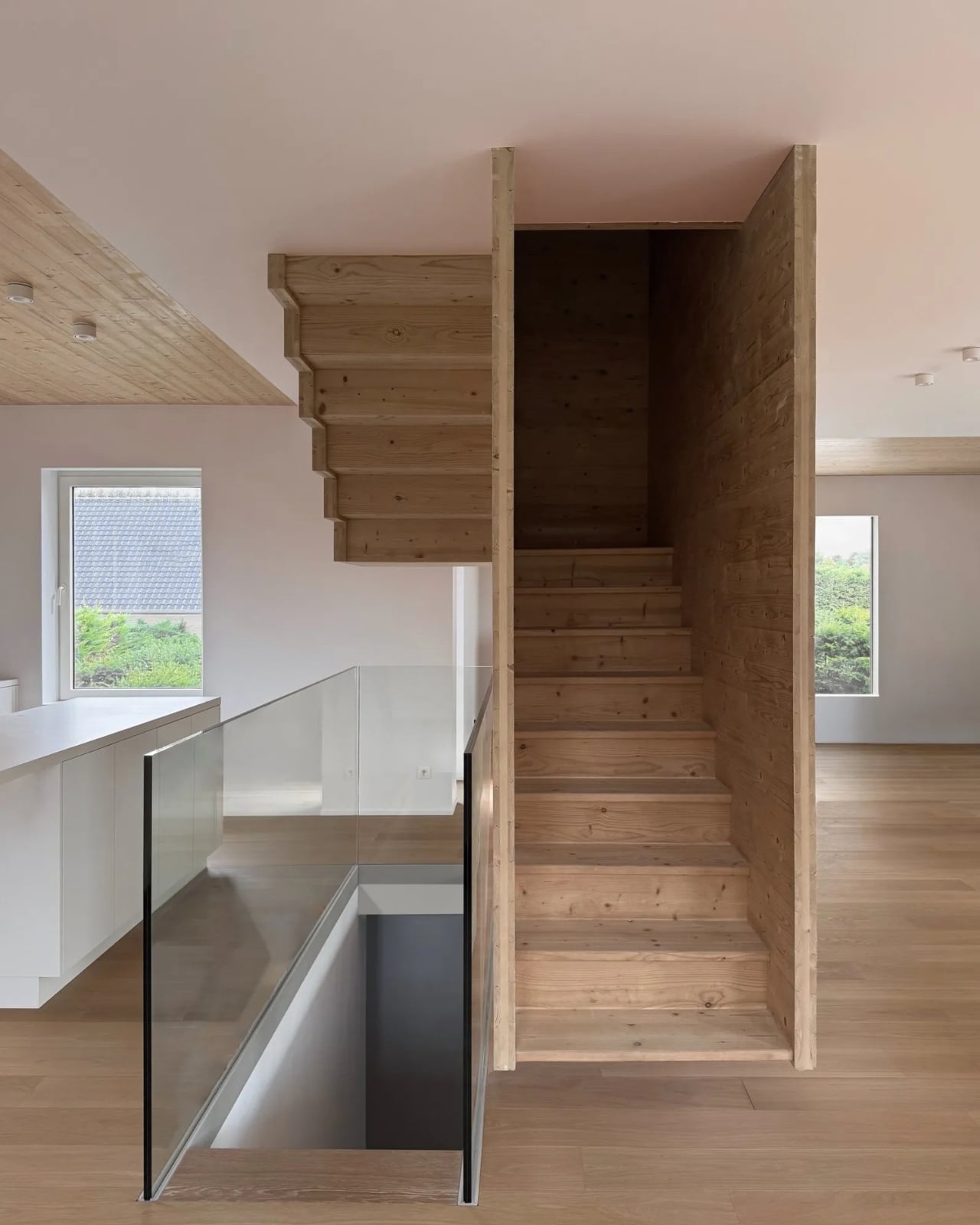
The exterior is wrapped in finely detailed Douglas fir, giving the project a warmth that balances its sharp geometry. Timber could have been treated as a softening finish, something to make an unconventional building feel more approachable. In House of Cards, it has a more substantial role. The studio describes skin, structure, and space as parts of the same idea, so the surfaces you see feel closely tied to the building beneath them.

There is also a conversation with its surroundings. The steep roof angles recall the historic beach houses of the area, even as the overlapping forms give that familiar silhouette a different rhythm. I appreciate that approach more than a design that tries to stand apart from its neighbors at every opportunity. House of Cards has a clear point of view, but it still seems interested in belonging where it was built.
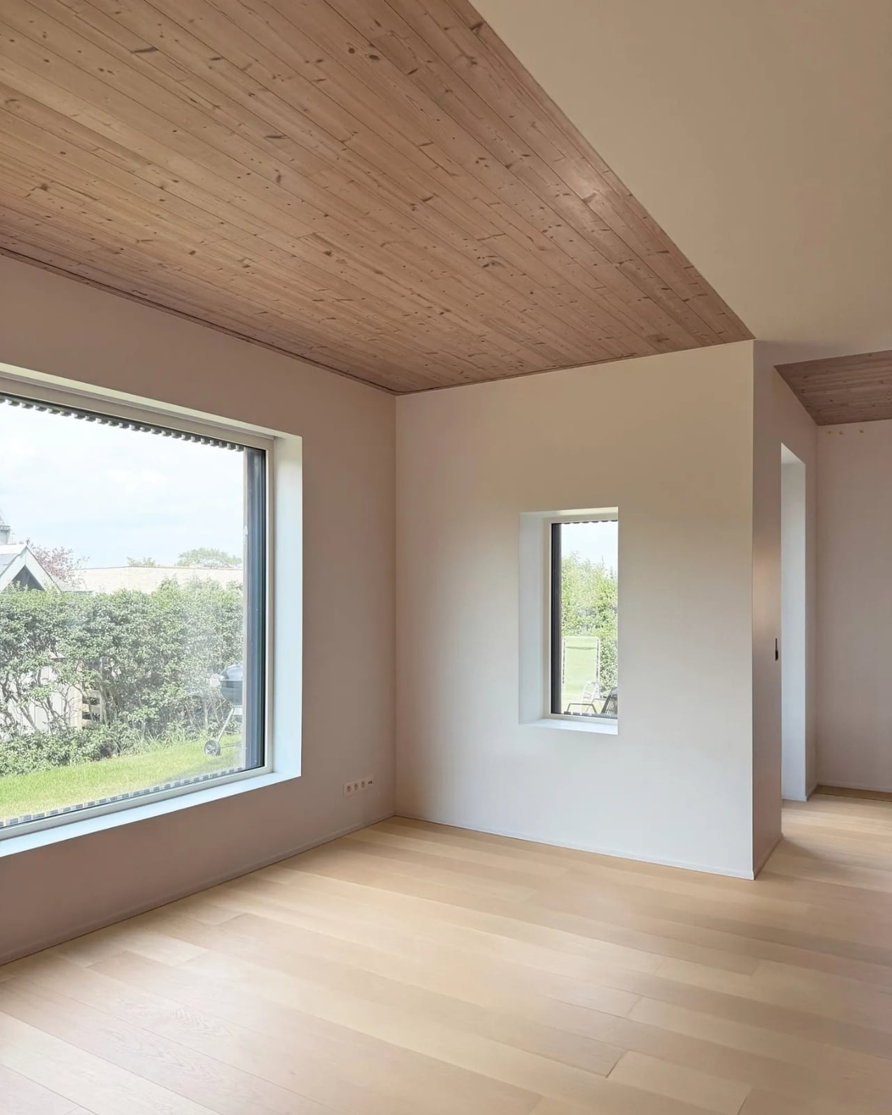
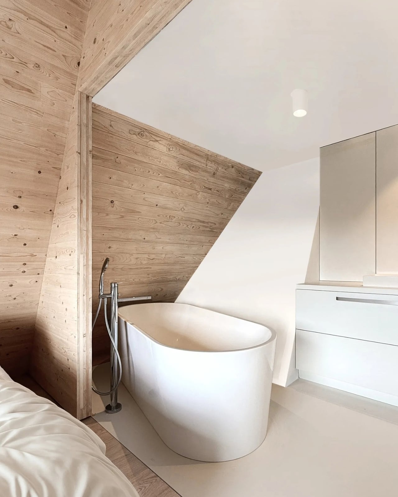
That makes the name especially fitting. A house of cards suggests something temporary, maybe even a little precarious, while this one is the result of working carefully through structural and zoning limits. The contrast gives the project a sense of humor without making it feel like a joke. From one angle, you might notice the recognizable outline of a pitched-roof home. From another, the intersecting volumes make you look again.

The architects also used prefabrication techniques in developing the structure and envelope. That detail is less immediately charming than the roofline, but it helps explain how an intricate design could be treated as a coherent whole. It would be easy to look at a house like this and see only a striking exterior. The more compelling story is how its construction, materials, and constraints were considered together from the start.
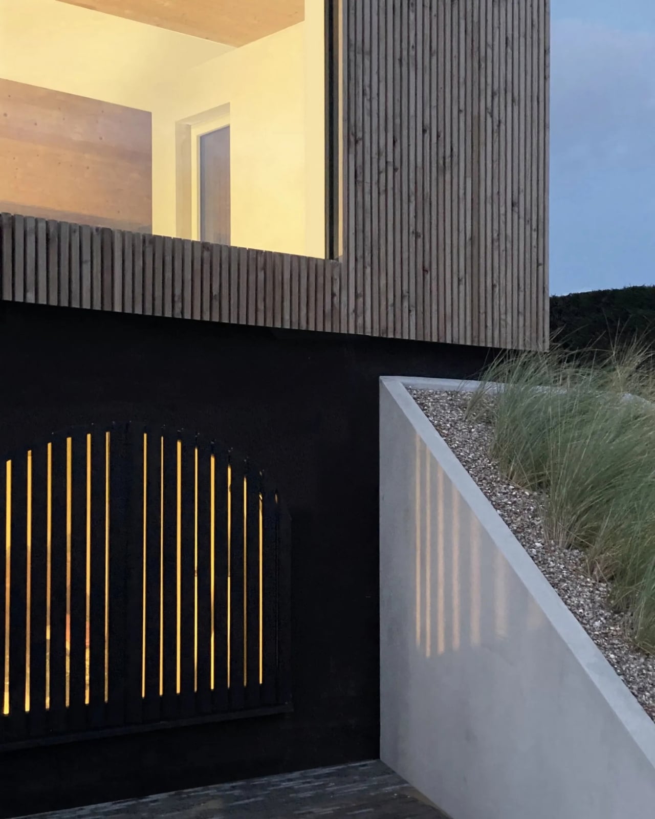
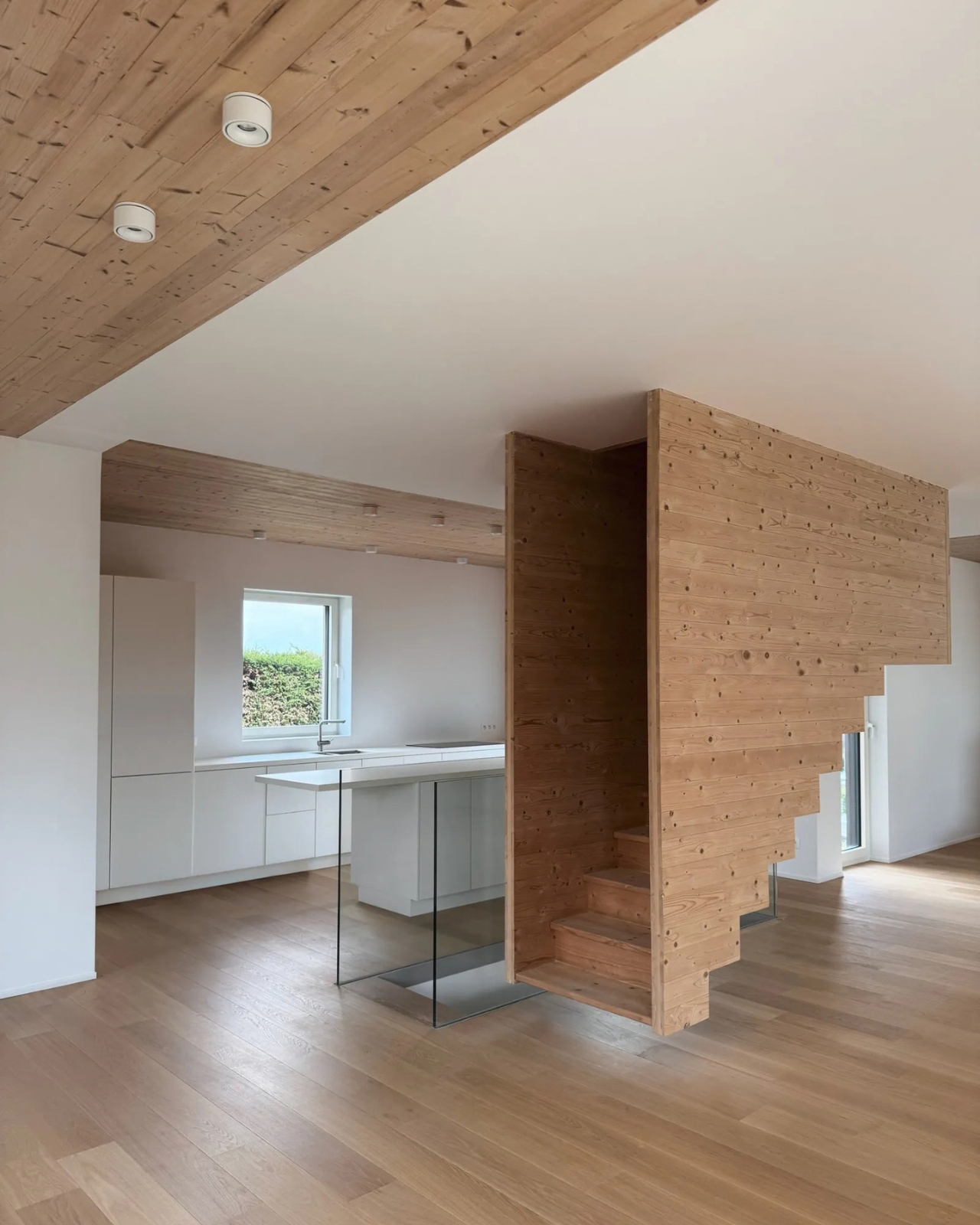
Of course, House of Cards is a custom home, not a ready-made answer for every aging property. An old foundation can present practical questions that a beautiful photograph will never settle, and unusual geometry is not automatically a better way to live. Still, the project makes a persuasive case for examining what a site already offers before assuming that a blank slate would produce a better design.

That idea feels particularly relevant when so many new homes borrow the same handful of visual cues. A pitched roof, timber cladding, a carefully composed profile: none of those elements is novel on its own. House of Cards gets its character from the way they respond to a specific footprint and a specific place. It suggests that familiarity and originality do not have to compete. Sometimes the recognizable shape is what makes the unexpected one legible.
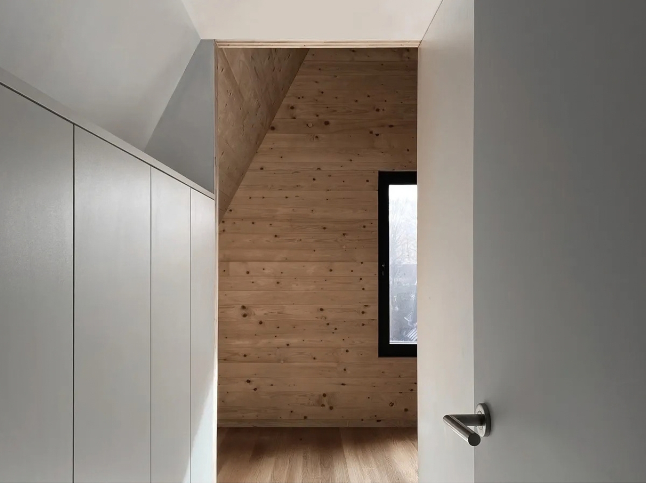
I would love to know how the family experiences those intersecting forms from inside, beyond what the exterior can tell us. But even from the outside, the house offers a useful reminder. The conditions designers inherit are not always obstacles to overcome as quickly as possible. Given enough attention, an awkward starting point can become the detail that makes a home worth remembering.

The post House of Cards Quietly Turns an Old Foundation Into a Feature first appeared on Yanko Design.


This $50,000 BRABUS electric motorcycle gives urban riders a rare Fragment design experience

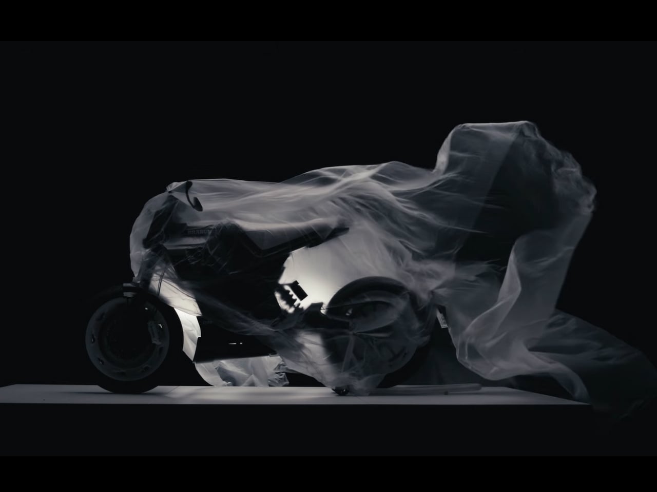
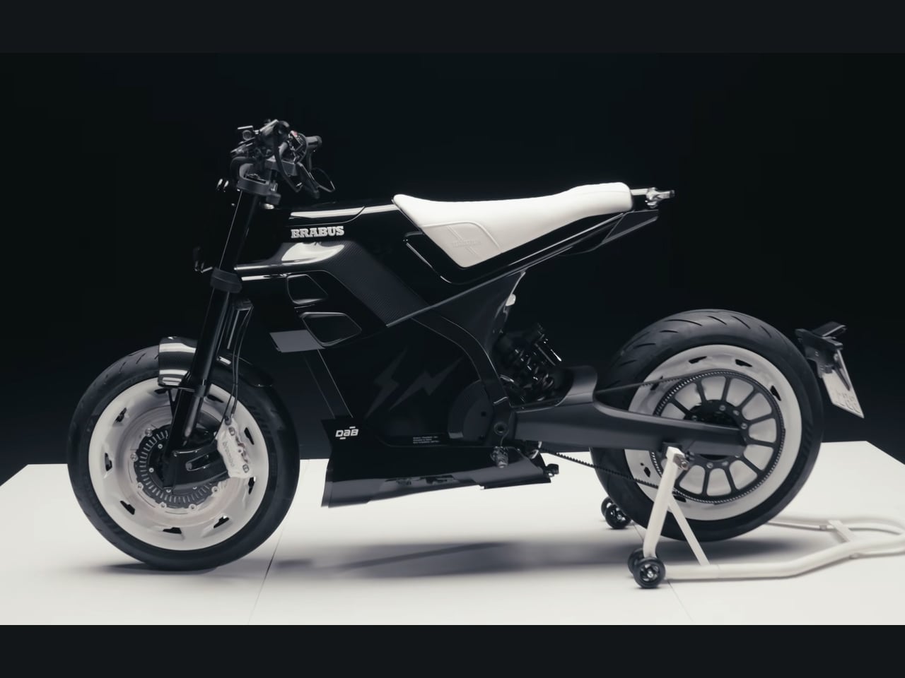
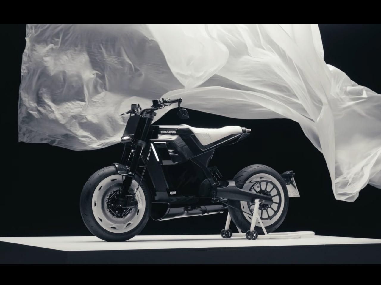
BRABUS has given its Urban E electric motorcycle a unique personality with the new Urban E Fragment Edition, created with Japanese designer Hiroshi Fujiwara’s Fragment Design and French electric motorcycle maker DAB Motors. Limited to just 10 examples worldwide, the special edition motorcycle – debuted at ComplexCon in Los Angeles – is a design object as much as it is a performance machine.

The collaboration began with an unexpected encounter. Fujiwara spotted a BRABUS Urban E while in Milan for Design Week in April 2026 and was drawn to its design. He subsequently bought a First Edition model for himself, eventually leading to the idea of creating a Fragment interpretation of the electric motorcycle. The creation retains the Urban E’s underlying mechanical package while introducing a much more restrained visual language.

Designer: BRABUS and DAB Motors

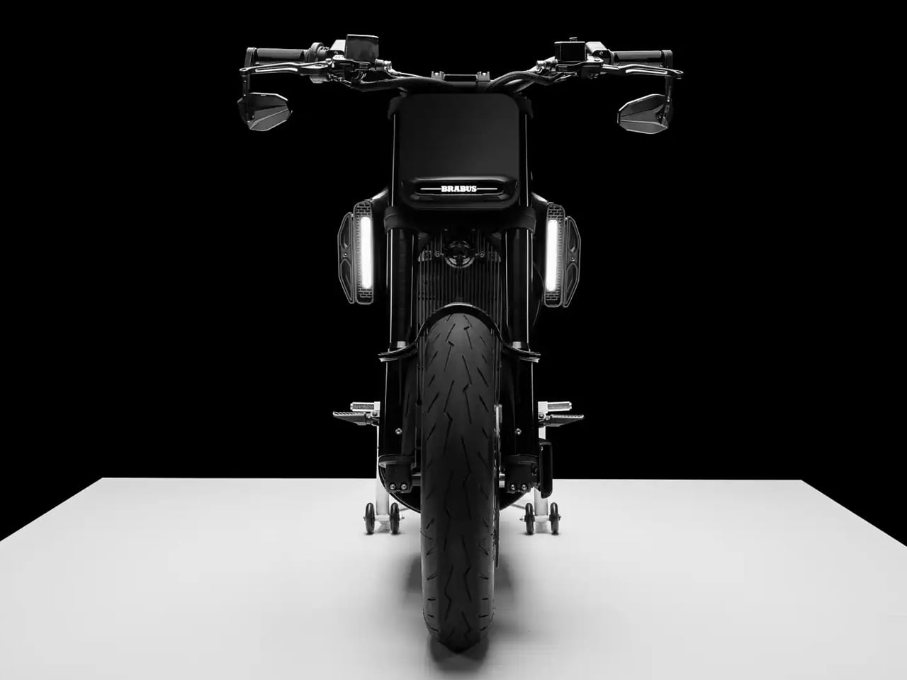
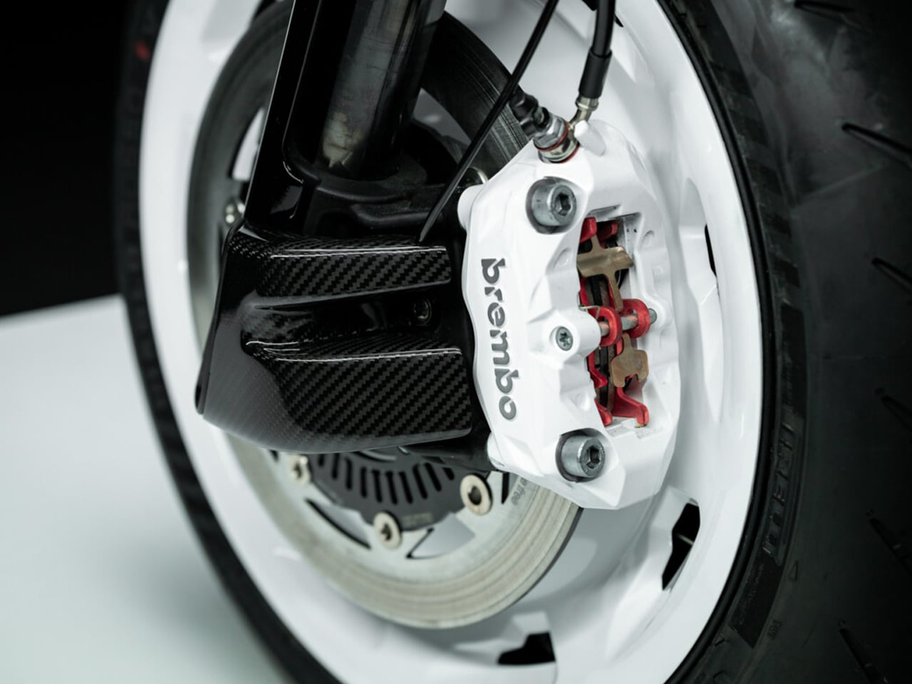
The Fragment Edition replaces the standard bike’s darker bodywork and colored accents with a precise black-and-white treatment. Exposed carbon fiber remains visible across the front fender, belly pan, motor side cover, rear winglets, and other components, while white carbon-fiber wheel covers and Brembo brake calipers provide the strongest contrast. A custom BRABUS Masterpiece seat is finished in white leather with the brand’s Shell quilting pattern.

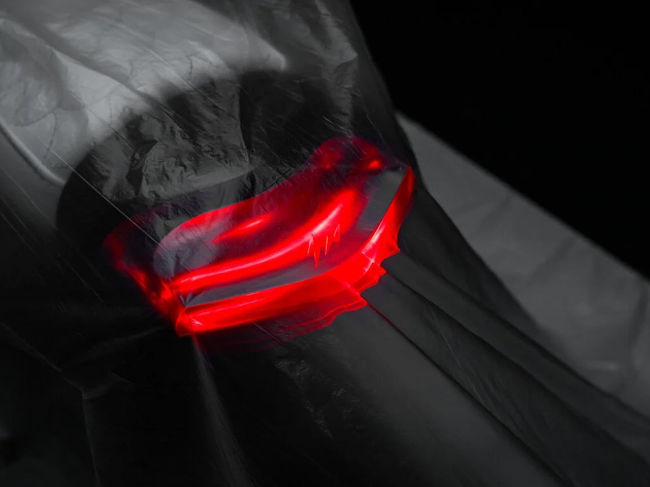
Fragment’s influence is particularly subtle. Its lightning-bolt logo is integrated into a translucent monoblock LED taillight beneath the seat rather than simply being applied as an exterior badge. The approach fits Fujiwara’s minimalist design language, where small changes can significantly alter the character of an existing object.

The motorcycle retains the Urban E’s 27-kW electric motor, producing 37 hp and up to 475 Nm of torque at the wheel. Power reaches the rear wheel through a low-maintenance carbon belt, while a 72-volt, 7.1-kWh lithium-ion battery provides up to 150 km (93 miles) of range in city riding. Combined-cycle range is lower, at around 120 km, according to DAB Motors.

Top speed is 120 km/h (75 mph), and riders can choose between Eco, Street, Sport, Reverse, and Nitrous modes. The latter provides a temporary burst of maximum power for up to 10 seconds. Charging from 20 to 100 percent takes around three hours, while a full charge from empty requires approximately 3.5 to 4 hours using a 220-volt outlet.

The Urban E’s compact proportions are complemented by a 46-mm adjustable inverted fork and adjustable rear shock, both offering 100 mm of travel. Brembo supplies the braking hardware, including a four-piston radial caliper with a 320-mm front disc and a single-piston rear caliper with a 240-mm disc. Dual-channel ABS is standard.

A PIN code replaces a conventional key, while a 2.8-inch LCD displays speed, battery status, charging information, and system temperature. The front mask incorporates an illuminated BRABUS logo around the charging port, with a projector headlamp below it and vertical daytime running lights integrated into the side scoops.

The Urban E Fragment Edition is priced at $50,000 in North America, while its German price is €53,550 including VAT. That is considerably more than the regular Urban E, but exclusivity is central to the proposition. BRABUS and Fragment Design are also extending the collaboration into a small capsule collection of leather gloves, a riding jacket, and a fleece zip hoodie.

The post This $50,000 BRABUS electric motorcycle gives urban riders a rare Fragment design experience first appeared on Yanko Design.

Wing’s Walmart drones are coming to Denver and Seattle — and they won’t drop your parcels in the pool

Lindsey Austen of Richmond, Texas, ordered cat food, light bulbs, and shoe insoles, then watched a drone hover over her backyard, open its hatch, and drop everything into her pool and hot tub. She had not realized drone delivery was selected at checkout, which might be the most 2026 sentence ever written. Her video of the splash went around the internet, and Amazon called the whole thing rare. I bring it up because that was an Amazon Prime Air drone, and it has very little in common with the Wing aircraft headed for Denver and Seattle. Same sky, completely different philosophy about where a package should end up.

Wing and Walmart announced on October 5 that Denver and Seattle join their drone network in 2027, part of a plan covering 270-plus Walmart stores. Wing’s Hummingbird hovers around 23 feet up and lowers the box on a tether, so a pool is only in play if you tell it to aim there. It cruises at up to 60 mph, and the bigger version carries up to five pounds (Wing’s own numbers). Walmart sells the whole thing as groceries in as little as 30 minutes, with Wing claiming a 23 minute average. I wanted to know what that promise looks like over your street, and what it means for delivery drivers.

Designer: Wing for Walmart

The Hummingbird is a hybrid, which means rotors for vertical lift and a fixed wing for cruising, so it launches like a drone and travels like a tiny airplane. Wing’s two versions weigh 14 and 24.3 pounds at max takeoff, per FAA filings, and the heavier one hauls up to roughly five pounds of payload. Both come out of Wing’s Aircraft Library, a parts-bin approach where shared components get remixed into different sizes. Wing built the bigger one after finding about 30 percent of deliveries needed multiple flights, according to The Register. Neither lands in your yard. They hover, lower the box on a tether, and release it at ground level.

Compare that with Amazon’s MK30, which weighs about 78 pounds empty (per DroneXL’s comparison table) and, according to Axios, comes down closest to the customer. Wing’s bet is the opposite: keep the heavy part high and put only a cardboard box within reach of your dog. It also skips a parachute, which Zipline’s 55 pound aircraft carries, so the safety case rests on being small and light. I love that as industrial design logic, because every ounce shaved is a risk shaved. Parachute research like the kirigami parachute concept chases safety by adding something, while Wing chases it by subtracting.

Wing’s own presentation puts average flight time at five minutes or less, which implies most of that 23 minutes happens on the ground. In the air, FAA filings authorize up to 400 flights per nest per day across 368 nests, which DroneXL tallies to 147,200 flights daily on paper. Wing has had a crash too: a drone on a return flight went down and caught fire in Kemah, Texas on March 1, with a power line suspected and nobody hurt. Part 108, the FAA’s routine beyond-line-of-sight rule, has sat at the White House since July 10. Meanwhile, Castle Rock and Parker froze hub permits, though towns control the parking lot and the FAA controls the sky.

Five pounds is a hard ceiling, so drones chase the small stuff first, and Walmart says customers use them for forgotten ingredients and cold medicine. DoorDash insists Dashers stay central as it launches its own drone service, while a Wing operations director has described drones as skipping recruiting, insurance, commissions, and no-shows. Concepts like the DJI Express UAV already imagine cargo hopping between cities without a dedicated driver, so the direction of travel is clear. I’d guess the first gigs to feel the squeeze are the quick, small, suburban runs. The Hummingbird’s whole trick is delivering small things gently, and Austen’s hot tub is a reminder that picking the drop spot is half the job.

The post Wing’s Walmart drones are coming to Denver and Seattle — and they won’t drop your parcels in the pool first appeared on Yanko Design.

LA’s 60-Foot Light Sculpture Actually Makes Music Visible

An orchestra can fill a room with sound, yet the experience of that sound is mostly invisible. For someone curious about live classical music, a screen might seem like the obvious way to make a performance feel more immediate. But projected images can also pull attention away from the musicians. Grimanesa Amorós’s Radiance offers a more interesting answer: let the room itself help tell the story.

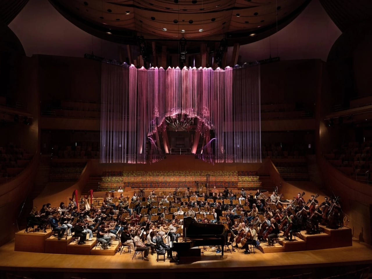
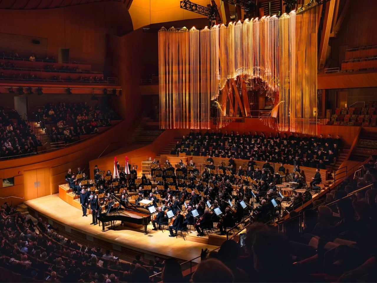
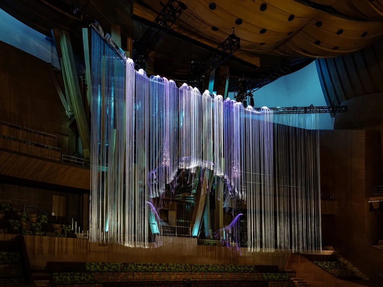
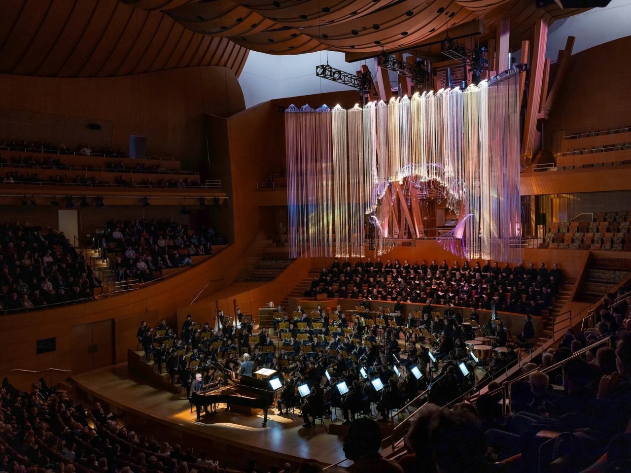
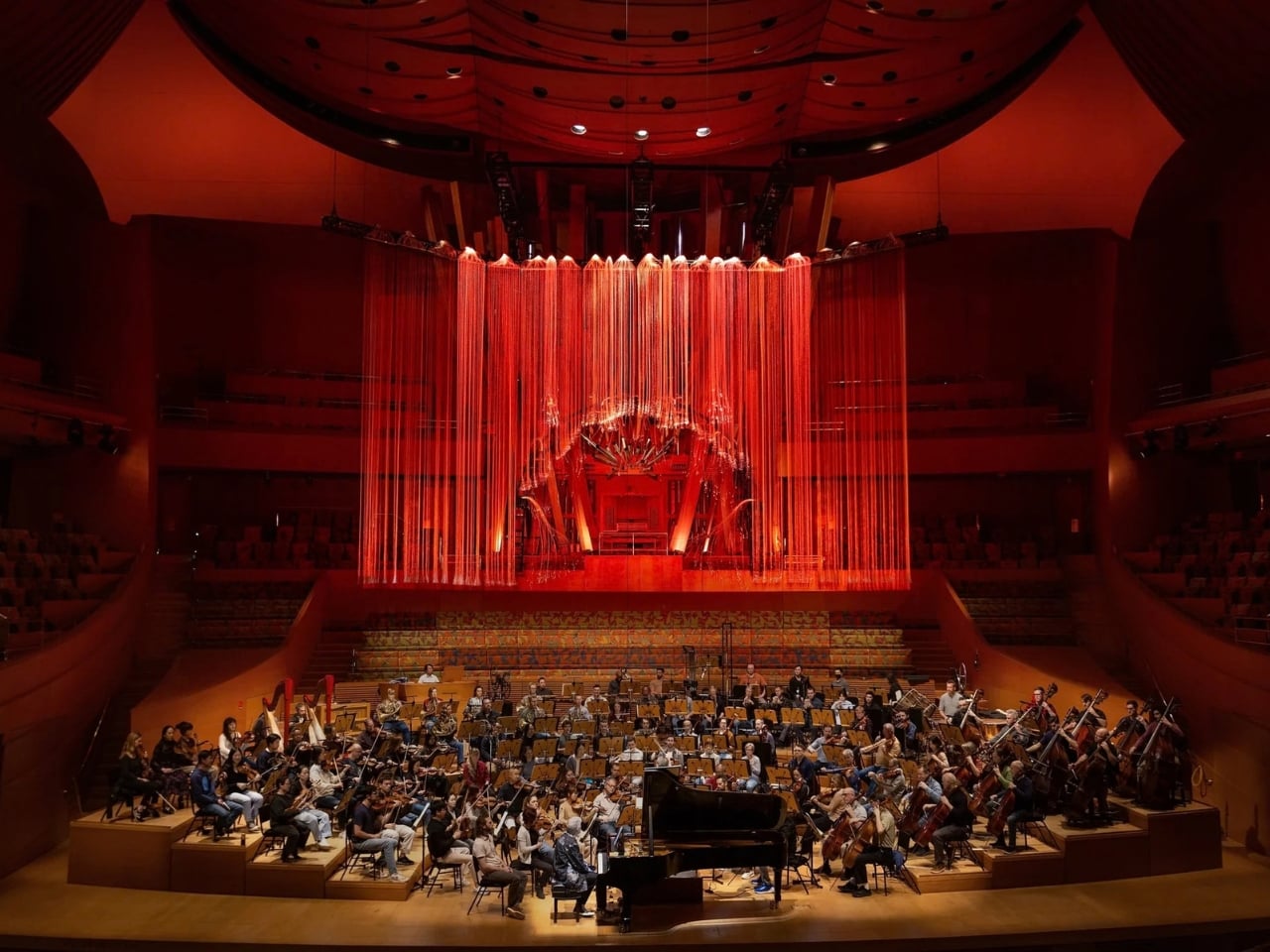
Commissioned by the Los Angeles Philharmonic, the light sculpture was created for performances of Alexander Scriabin’s Prometheus: The Poem of Fire at Walt Disney Concert Hall. It hung above the orchestra while a programmed sequence of colors unfolded with the music. Amorós also coordinated the hall’s existing lights with the sculpture, so the effect reached beyond the stage and into the audience’s surroundings.

Designer: Grimanesa Amorós

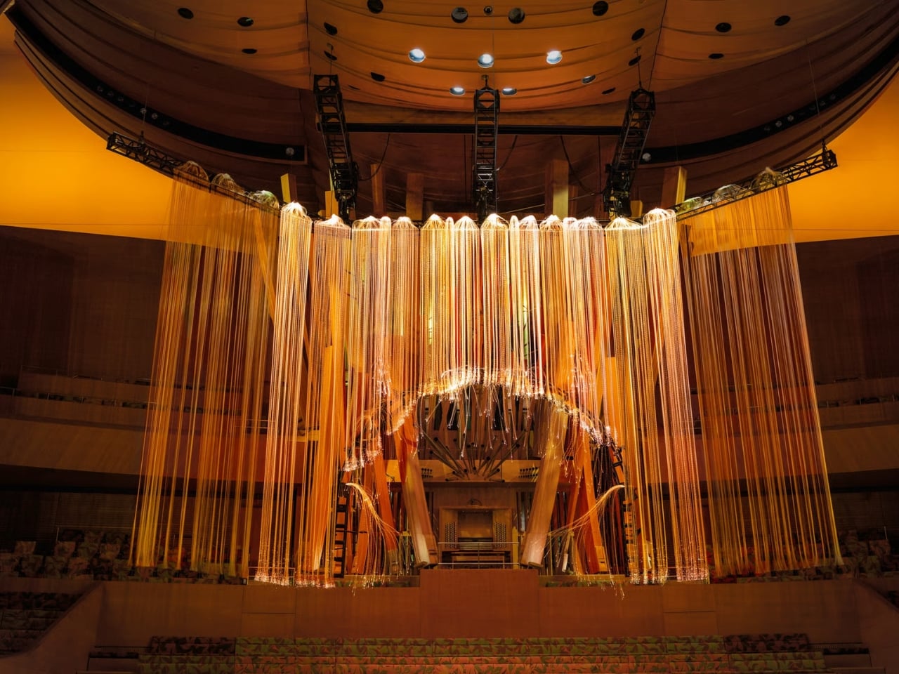
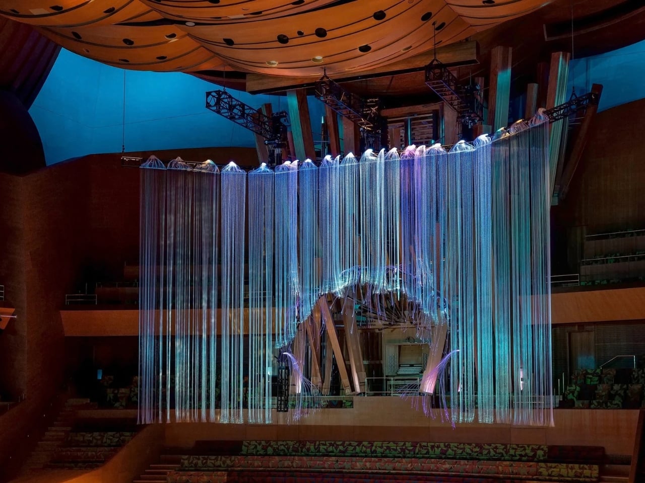
At 60 feet long and 35 feet wide, Radiance has the scale to command a room. It is made with reflective material and rope-like LED tubing that changes color. Those practical details matter because this is not a video pretending to be a physical object. The light occupies real space above real musicians, and its shifting glow can change how the hall feels without replacing the performance at its center.

The sequence was planned second by second around the orchestra, with six major synchronized moments. I like that distinction. A lighting effect that reacts to every beat could easily become a demonstration of clever technology. Here, the programming is closer to staging: deliberate enough to give a musical passage a visual shape, but not so busy that it asks the audience to watch for the next trick.

Fire is the work’s starting point, which makes sense beside a piece called Prometheus. Amorós draws on both the Greek figure who gave fire to humanity and Viracocha, an Incan creator deity. That could have led to a very literal display of flames. Instead, Radiance treats fire as an idea that can move through color, intensity and space. Its subject is transformation, not an illustration of a myth.

That choice gives the installation room to breathe. A red glow above the orchestra can feel urgent; amber spreading across the sculpture, stage and seating can feel warmer and more expansive. Neither color needs to tell viewers precisely what the music means. The visual experience can accompany the sound while leaving people free to make their own connections, which is more generous than spelling out every emotion for them.

Walt Disney Concert Hall is hardly a blank canvas. Its interior already gives a performance a strong visual setting. Rather than treating that architecture as a backdrop, Amorós made the house lighting part of the same sequence as the sculpture. That feels like the smartest design move here. If the room changes with the music, the audience is included in the experience instead of simply looking up at an object.

It is tempting to describe a project like this as a concert crossed with a light show, but that sells both halves short. The appeal is not that classical music has been dressed up to compete with a pop spectacle. It is that visual design can make an existing performance feel more accessible without demanding a new set of habits from the listener. You can follow the colors closely or let them register at the edges of your attention.

There is a risk with any large-scale installation that the photographs become the main event. Radiance certainly photographs well, especially when its strands glow against the hall’s interior. But its real purpose depended on timing, sound and the shared experience of sitting in the room. Presented across three performances, it was made for a particular encounter rather than an endlessly repeatable display.

That is why Radiance stays with me as a design idea. It does not try to explain Scriabin’s music or promise that light can replace listening. It addresses a smaller, more human problem: how to help an audience feel connected to something they cannot see. By giving the music a presence overhead and around the seats, Amorós made the concert hall feel less like a container for a performance and more like part of it.

The post LA’s 60-Foot Light Sculpture Actually Makes Music Visible first appeared on Yanko Design.