SPARKX i7 Nano Makes Multi-Color 3D Printing Compact
Creality SPARKX i7 Nano combines four-color printing, AI monitoring, a compact filament system, and 500 mm/s speeds at a EUR299 starting price.
As sustainability becomes a key focus in design, architecture, and product development, natural materials are gaining renewed attention. Among these materials, cork stands out as a versatile, renewable, and lightweight resource with remarkable environmental benefits. Harvested from the bark of cork oak trees without harming them, cork is biodegradable, recyclable, and highly durable.
Designers and manufacturers are incorporating cork into furniture, home interiors, footwear, and innovative product concepts. Its unique combination of flexibility, strength, insulation, and aesthetic appeal makes it an ideal material for creating solutions that balance functionality with environmental responsibility.
Cork offers a unique set of properties that make it highly desirable for sustainable design applications. It is naturally lightweight, elastic, water-resistant, and capable of absorbing shocks and vibrations. These characteristics allow designers to create products that are practical and durable while reducing material weight.
In addition to its physical benefits, cork is one of the most sustainable materials available. The harvesting process does not require trees to be cut down, allowing forests to continue absorbing carbon dioxide and supporting biodiversity. This renewable production cycle makes cork an environmentally responsible alternative to many synthetic materials used today.
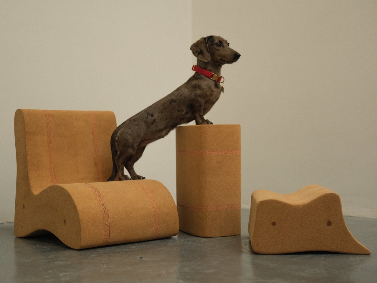
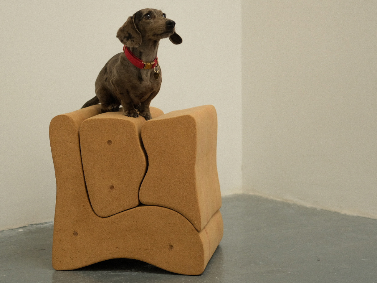
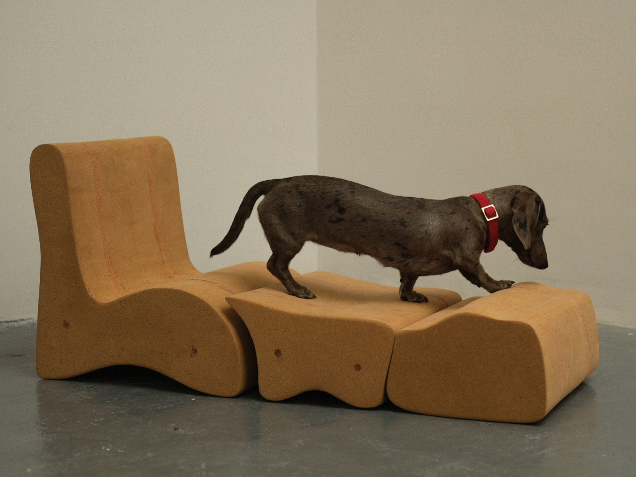
Kidou, designed by Isabel Vera, reshapes modular seating with a playful and highly adaptable approach. Rather than serving a single function, the system encourages users to rearrange, connect, and stack its components to suit different needs throughout the day. A row of stools can quickly transform into a stage, a reading nook, a play structure, or an informal table, making Kidou an ideal solution for homes, classrooms, and creative spaces. Its versatility allows users to customize layouts effortlessly, creating furniture that evolves alongside daily activities.
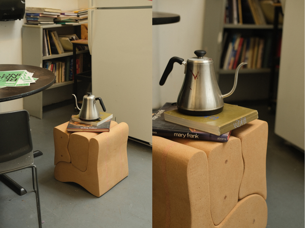
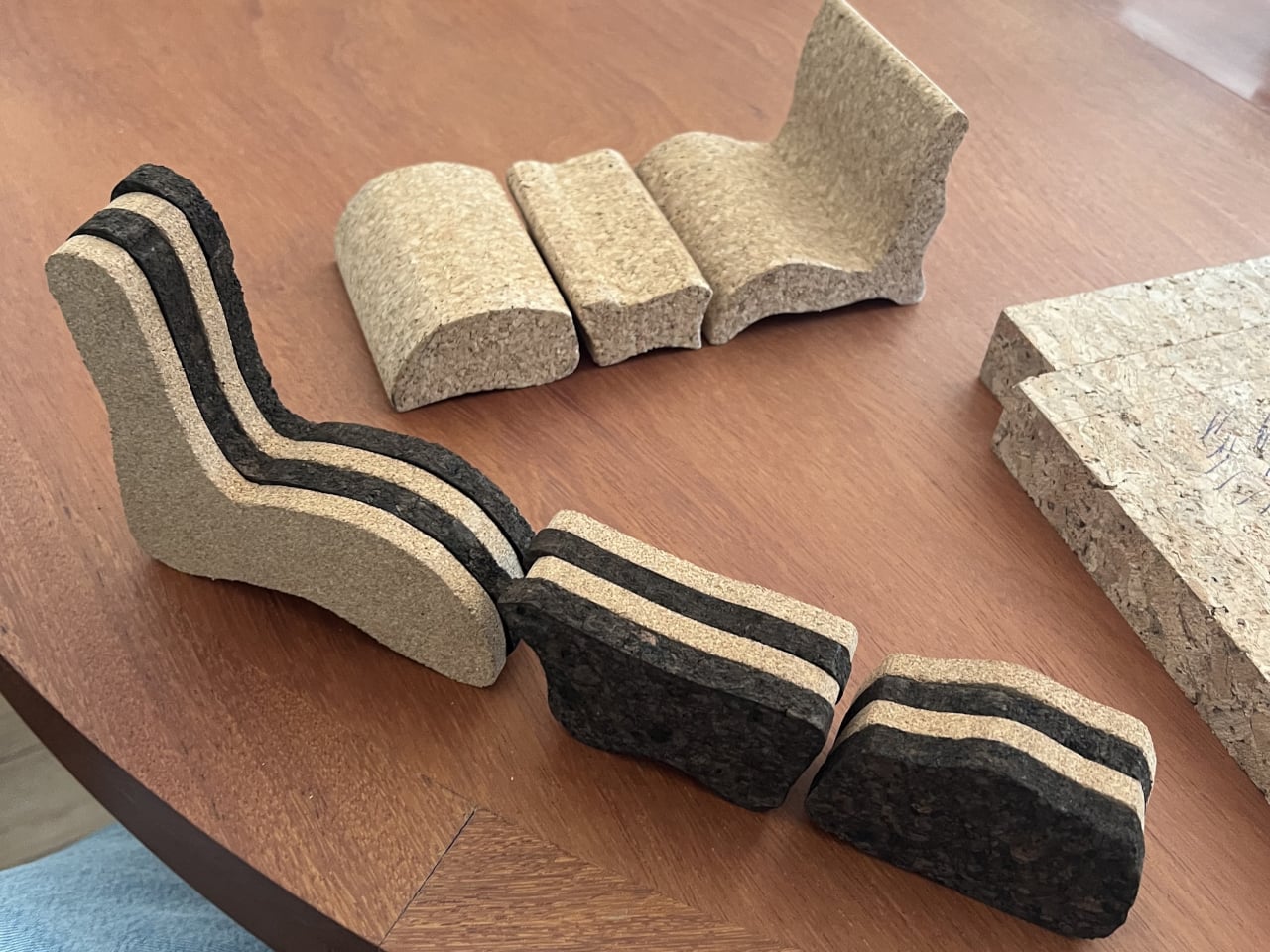
Crafted primarily from cork, Kidou combines functionality with sustainability. The lightweight material makes every piece easy to move, while its warm, soft texture enhances comfort and usability. Rounded forms, smooth surfaces, and a calming palette of earthy tones give the collection a welcoming character that blends naturally into a variety of interiors. Beyond its practical benefits, Kidou introduces a sculptural quality to a room, turning modular seating into an engaging design feature that promotes creativity, flexibility, and interaction.
Furniture designers are exploring cork as a primary material for seating, tables, and multifunctional products. Its lightweight nature makes furniture easier to move and reconfigure, while its durability ensures long-term performance. Modular seating concepts, stools, and benches made from cork show how the material can support flexible living environments.
Beyond functionality, cork introduces a warm and natural aesthetic that complements modern interiors. Designers appreciate its distinctive texture and organic appearance, which can create inviting spaces without relying on resource-intensive materials. As demand for eco-conscious furniture grows, cork continues to inspire innovative and practical design solutions.
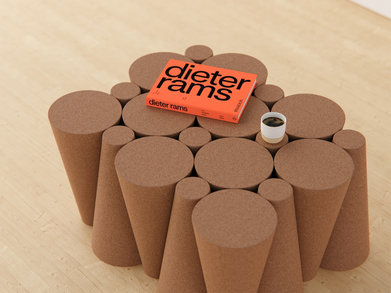
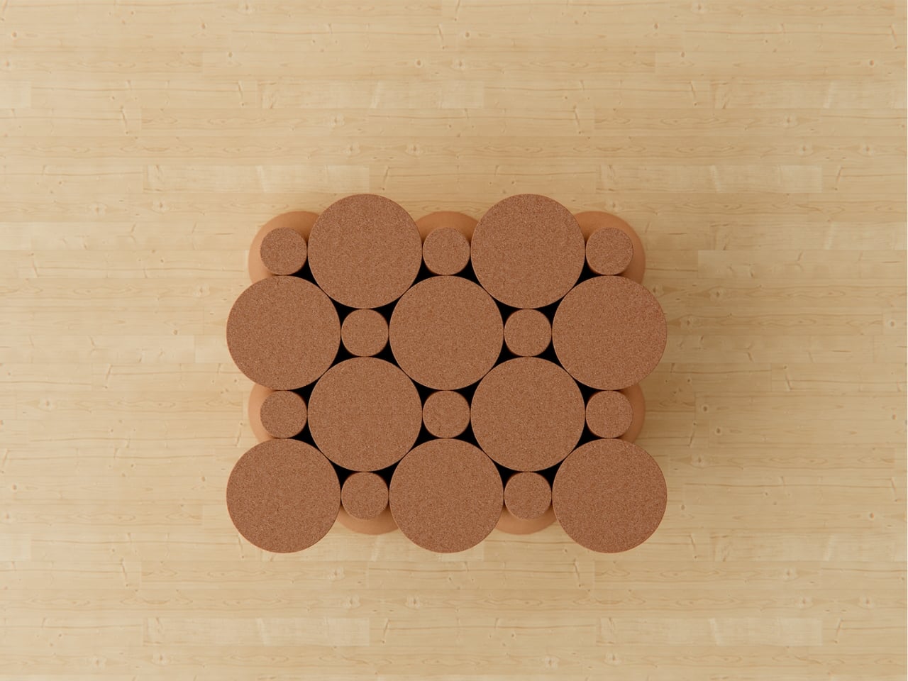
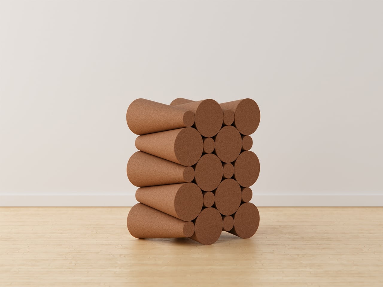
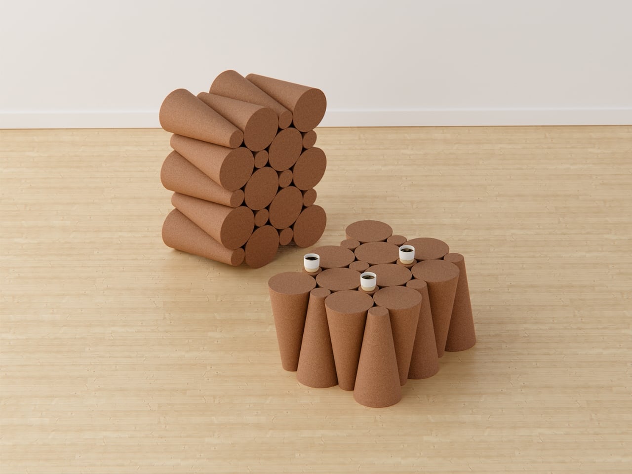
The Polka Coffee Table by Liam de la Bedoyere is a brilliant fusion of smart functionality and joyful design, turning an everyday necessity into an exciting visual experience. Inspired by a simple cone sketch, the tabletop is energized with inverted cork cones that double as built-in coasters, instantly solving the constant search for a place to set your drink. The playful polka-dot arrangement transforms the surface into something lively, dynamic, and full of character, making every interaction feel intuitive and satisfying.
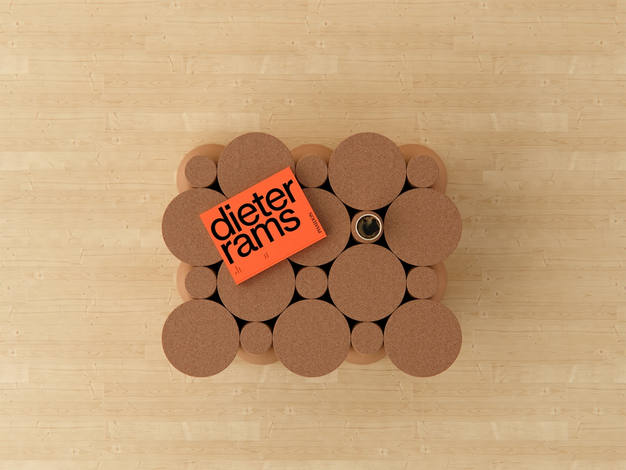
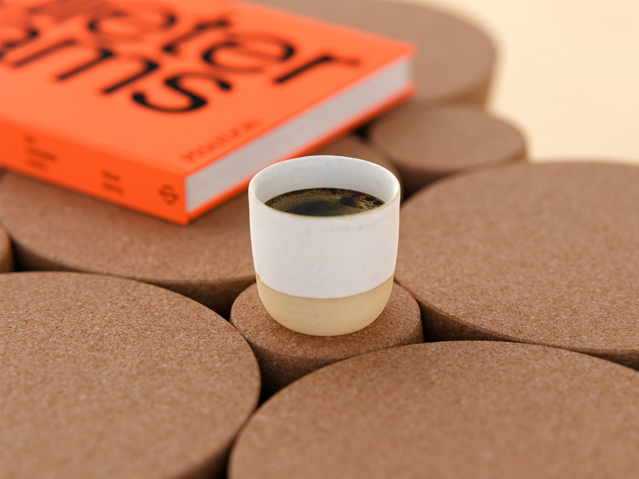
Crafted with beautifully tactile cork, each cone is perfectly sized for stability, comfort, and everyday ease, while offering natural resistance to heat and scratches. Precision-crafted and thoughtfully arranged, every detail reflects care, craftsmanship, and clever innovation. More than just a coffee table, it becomes a bold centerpiece that sparks delight, conversation, and admiration. The Polka Coffee Table brings together practicality, creativity, and charm, making everyday living smoother, brighter, and far more enjoyable.
The architectural industry has also embraced cork for its insulation properties and environmental advantages. Cork can be used in wall panels, flooring, ceilings, and exterior cladding, helping improve energy efficiency while reducing a building’s environmental footprint. Its thermal and acoustic insulation capabilities contribute to more comfortable indoor environments.
Architects are integrating cork into renovation and construction projects that prioritize sustainability. The material’s natural appearance allows it to serve functional and decorative purposes. By replacing conventional materials with cork, designers can create buildings that are visually distinctive while supporting long-term environmental goals.
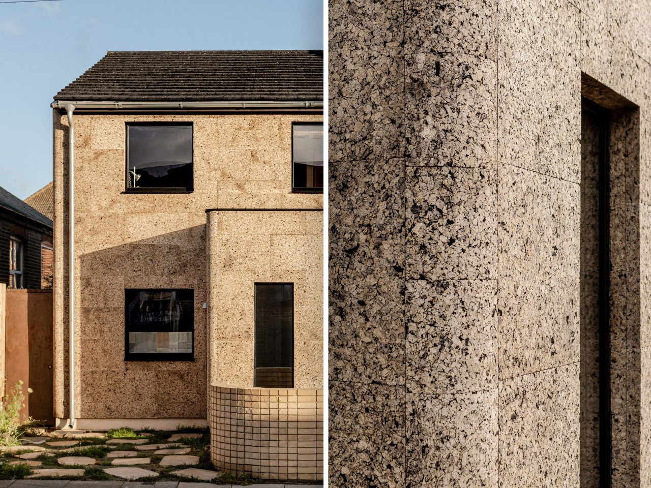
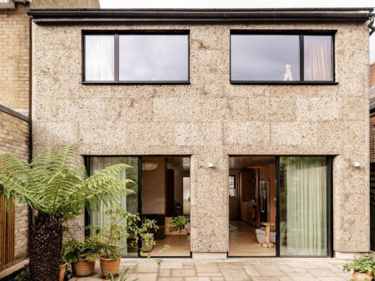
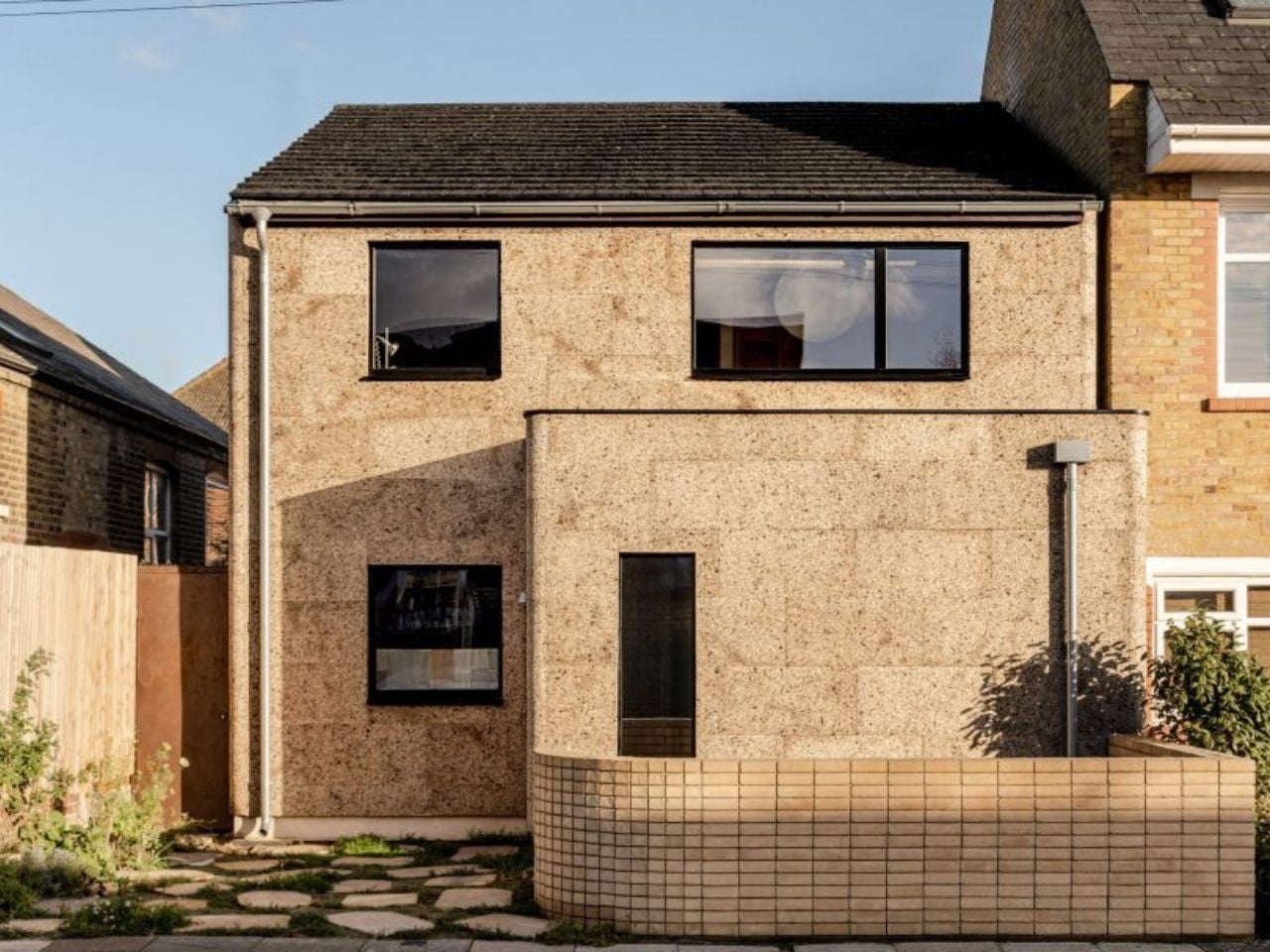
Nina’s House by Nina+Co and ROAR Architects is a bold and uplifting transformation of a 1970s clergy house into a vibrant, future-ready family home wrapped in rich, tactile cork. The exterior is fully clad in expanded cork panels, giving the building a warm, expressive, and inviting character. What was once a plain facade now feels alive and engaging, turning the home into a standout neighborhood landmark that reflects comfort, curiosity, and forward-thinking ecological design.
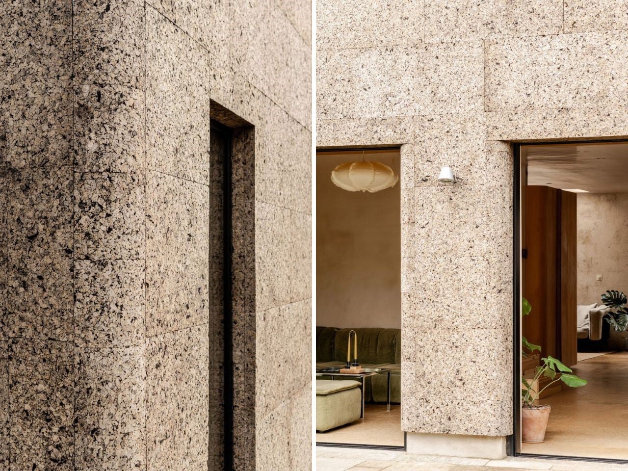
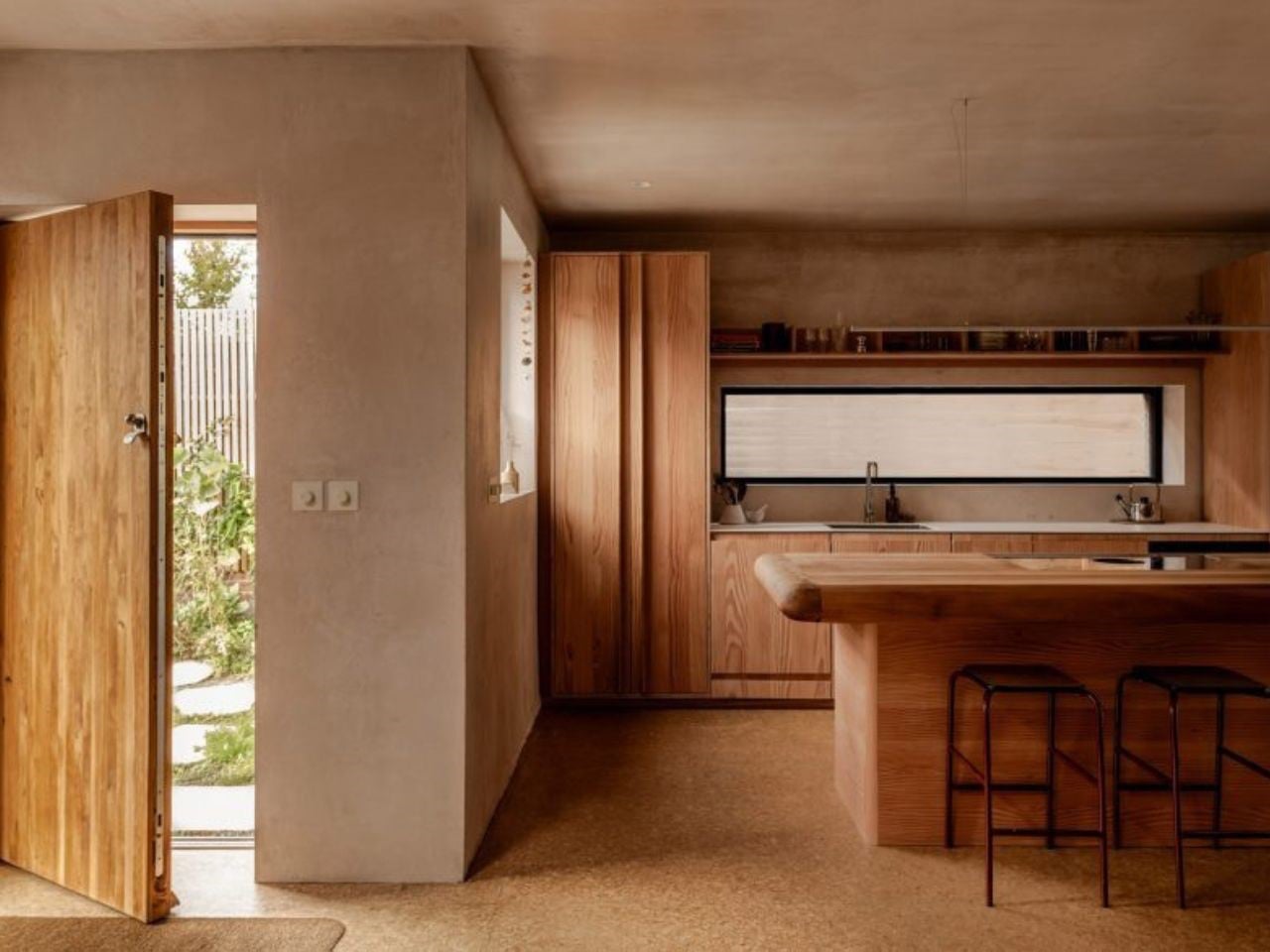
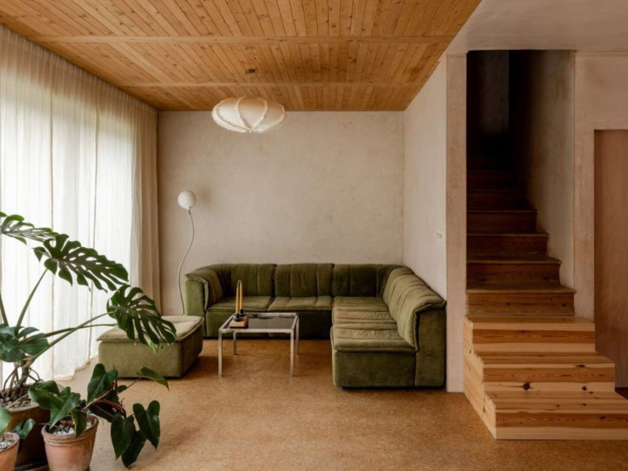
Inside and out, cork takes center stage, delivering outstanding insulation, energy efficiency, and acoustic calm while adding natural beauty and texture throughout the space. Its soft, earthy presence brings warmth to every surface, from the breathable exterior skin to interior flooring and lime-based cork plasters.
Cork’s adaptability extends beyond furniture and architecture into a wide range of product innovations. Designers have experimented with cork in shoes, coffee tables, storage solutions, home accessories, and modular systems that can transform to meet changing user needs. Its flexibility encourages creative thinking and enables multifunctional designs.
The material also enhances user experience through its tactile qualities and lightweight construction. Products incorporating cork often require fewer resources during production and transportation, further reducing environmental impact. These qualities make cork an attractive choice for designers seeking sustainable alternatives without compromising usability or aesthetics.
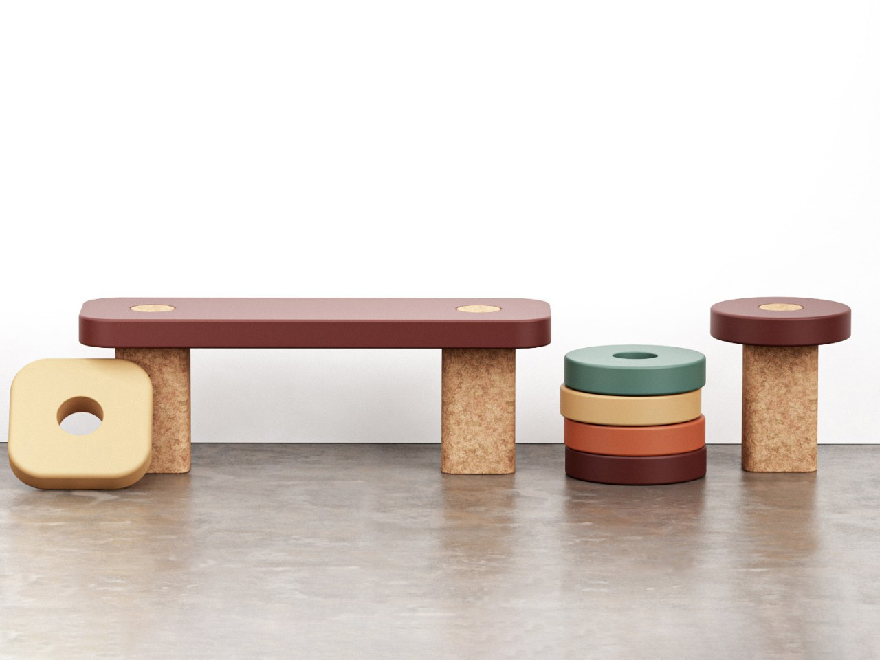
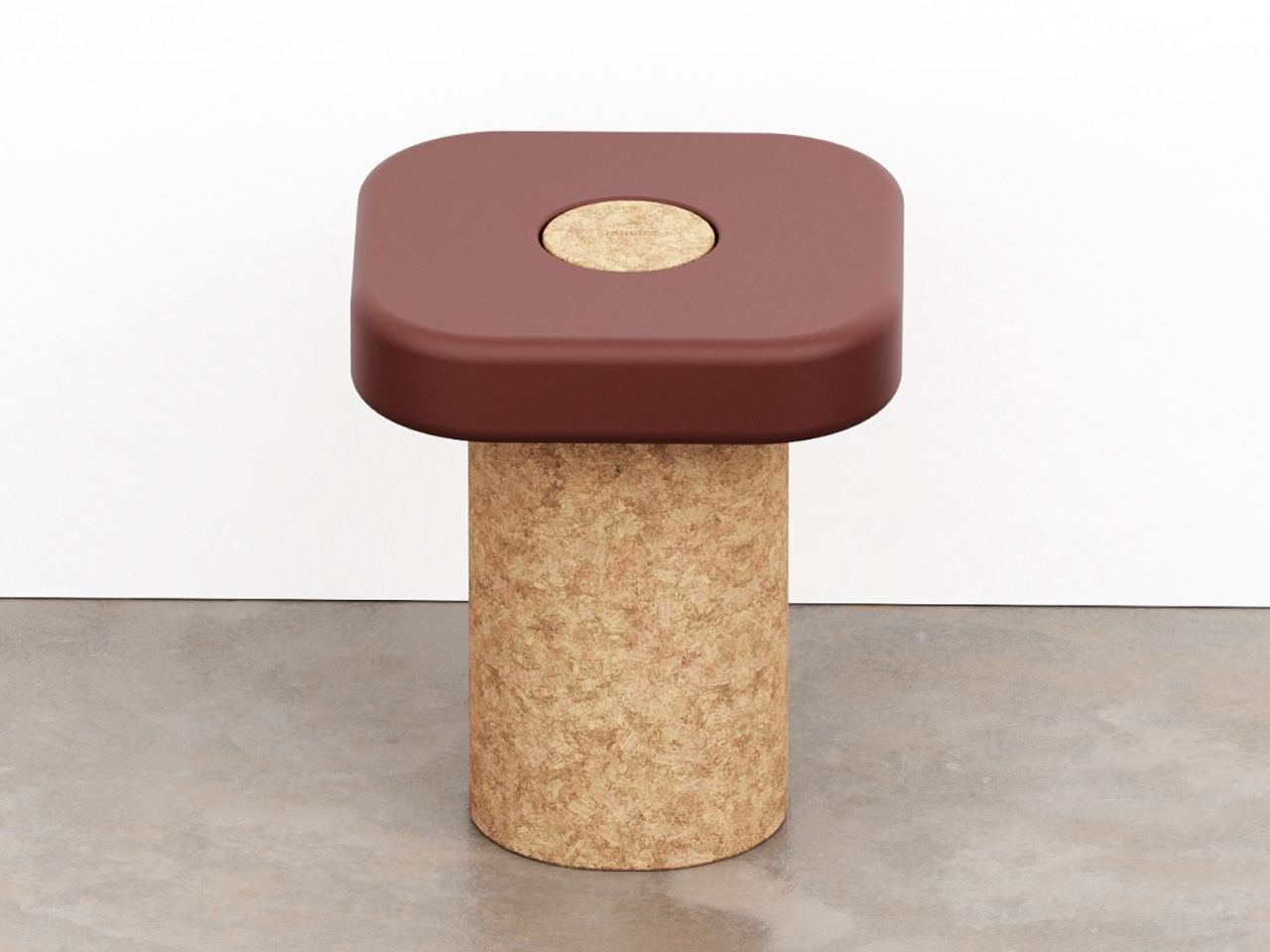
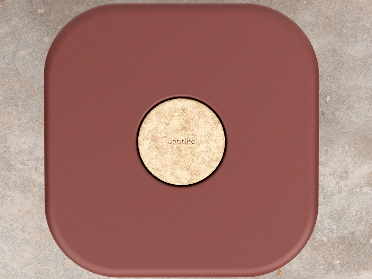
Sitting plays a central role in everyday life, and this minimalist stool concept by Erika Avery and Stu Cole responds with a flexible, high-performance approach to changing spatial needs. Instead of fixed seating that often leads to waste when requirements shift, the design allows two stools to transform into a bench or function independently as single seats. This adaptability reduces unnecessary replacement while keeping the system practical for homes, public spaces, and dynamic environments.
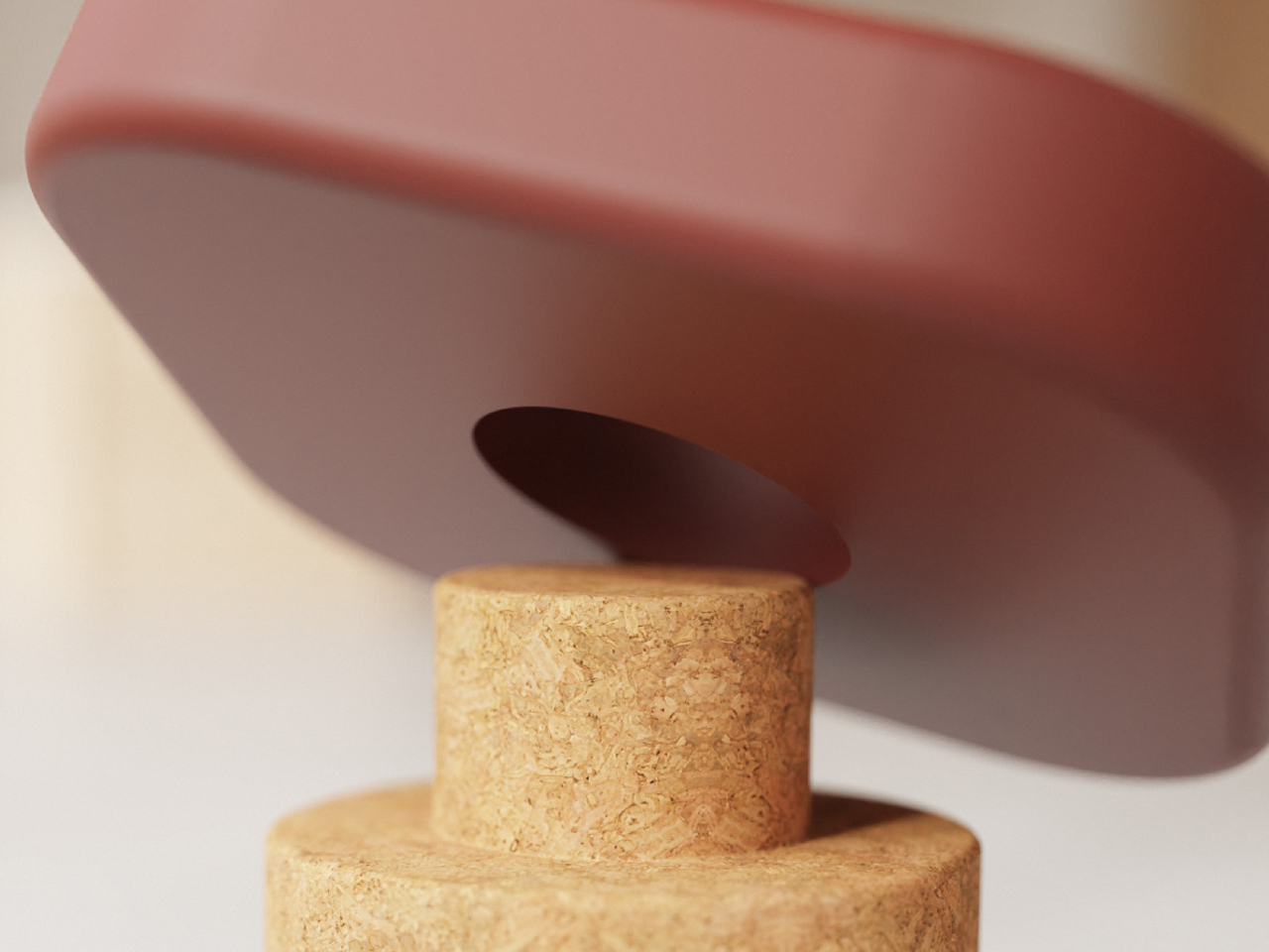
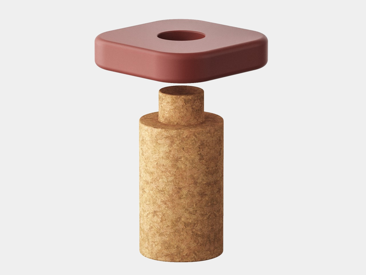
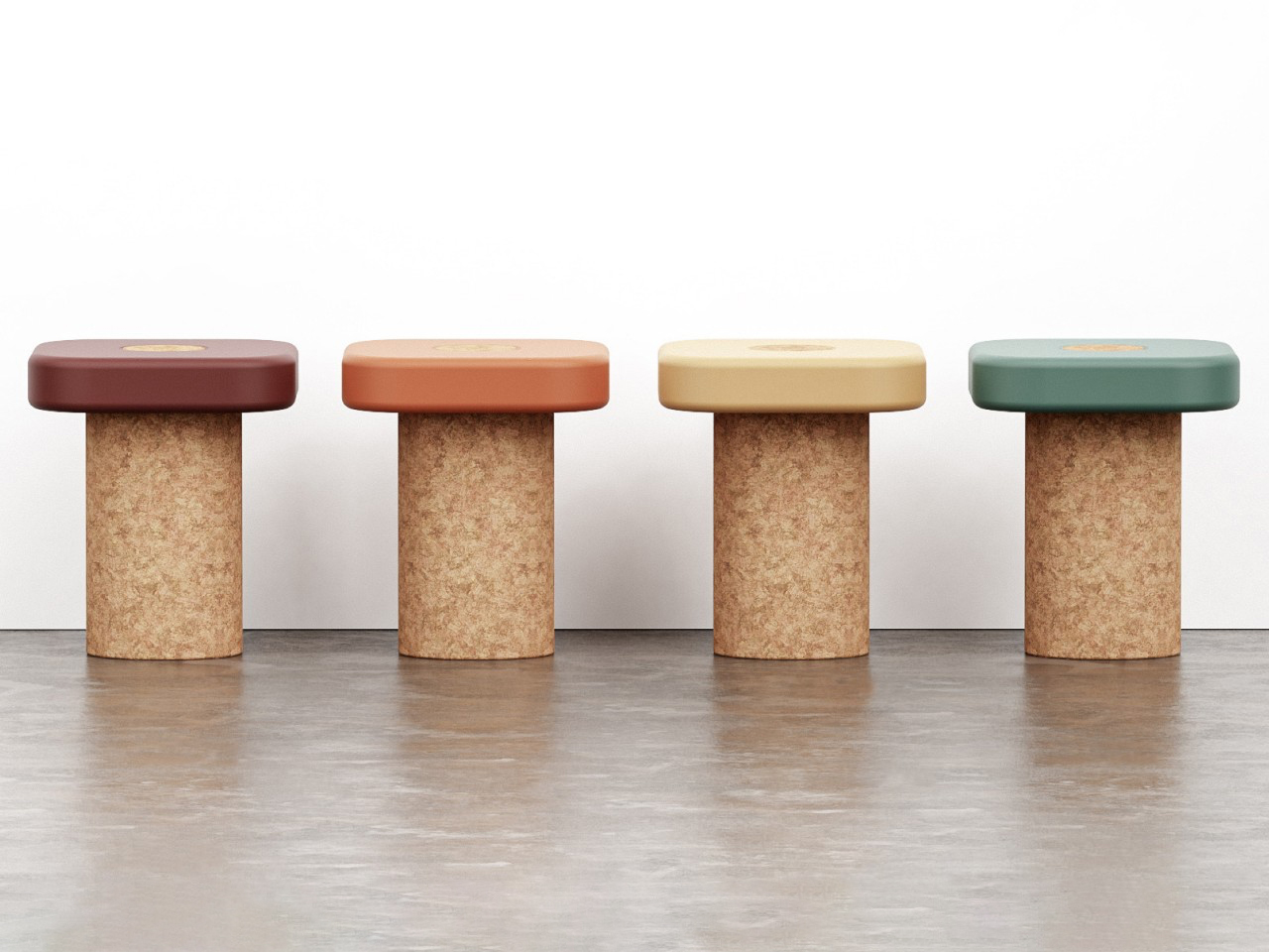
At the core of the design is a strong cylindrical cork base, chosen for its sustainability, stability, and natural appeal. A simple connector system allows removable seat tops to lock in without screws or complex mechanisms, making assembly and maintenance effortless. The seat itself can vary in shape and material, from compact circular forms to elongated panels that create bench configurations. This modular intelligence results in a versatile, efficient, and environmentally conscious seating system that prioritizes longevity, flexibility, and reduced material waste.
Cork offers a renewable alternative to traditional materials while providing comfort, durability, and visual appeal. As consumers become more environmentally conscious, demand for responsibly sourced materials continues to grow. Cork’s renewable nature, combined with its versatility across industries, positions it as a key material for future sustainable innovation. Its expanding use highlights how natural resources can support both modern design and environmental stewardship.
As designers and manufacturers continue exploring innovative applications, cork is a natural material that can deliver performance and environmental benefits. As a result, industries can move toward a more sustainable future while creating products and spaces that are functional, attractive, and environmentally responsible.
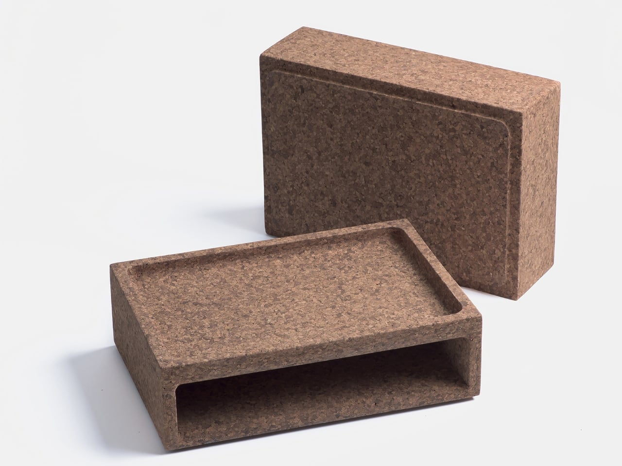
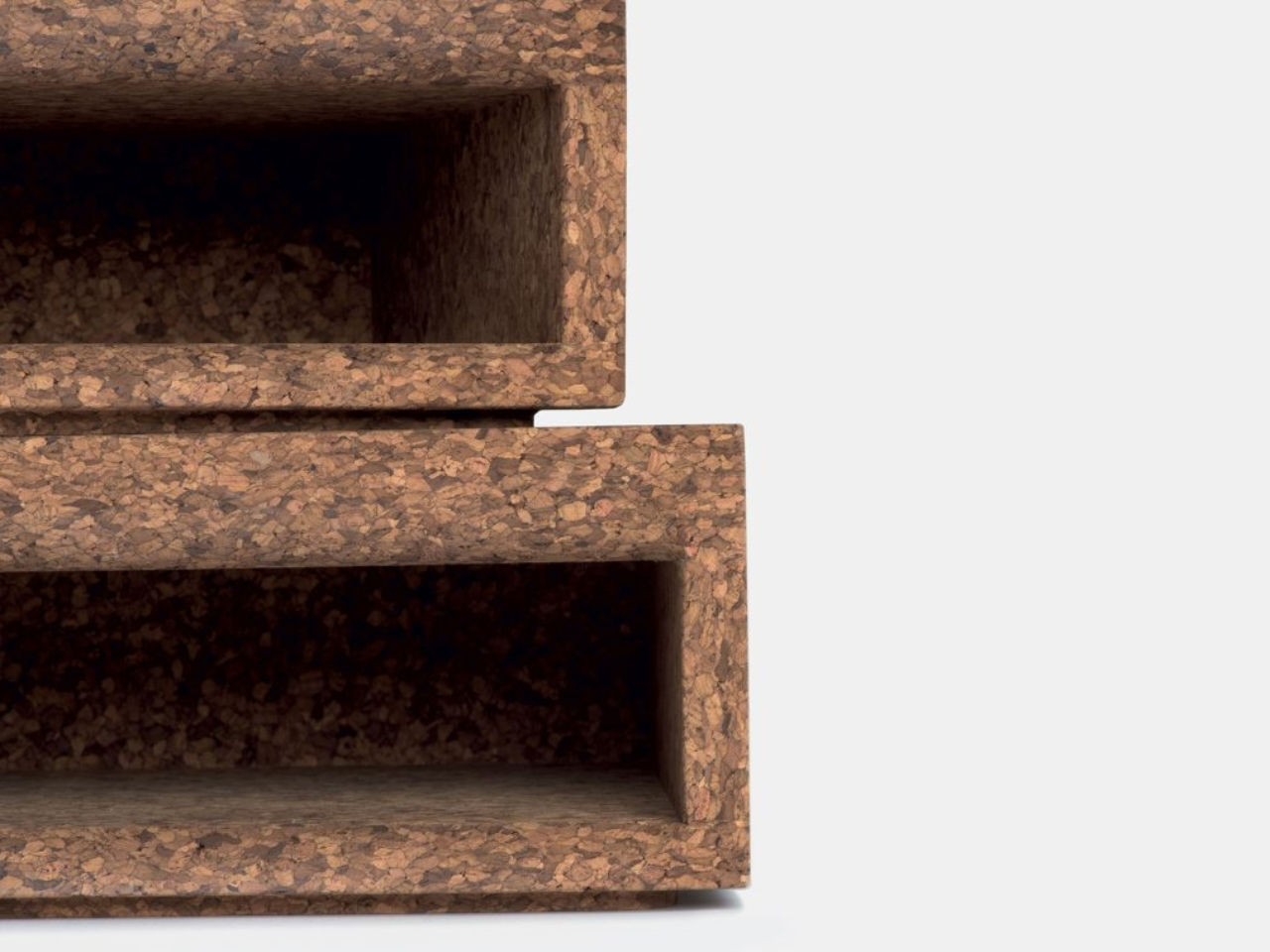
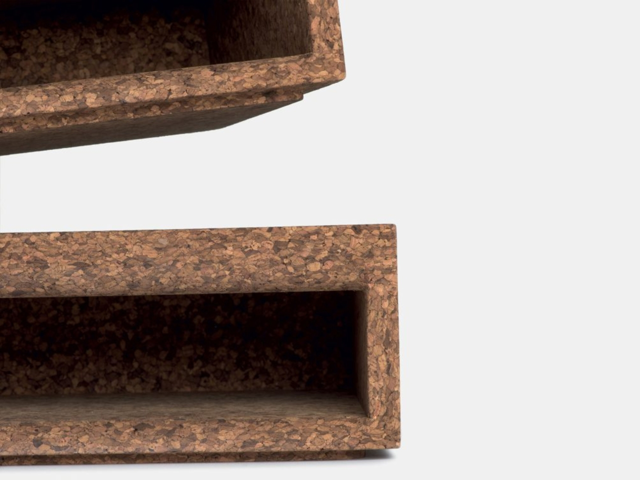
The Cork Box by Ana Relvao and Gerhardt Kellermann of Relvaokkellermann is a beautifully refined storage solution that blends modern design with natural sustainability. More than just a container, it introduces a warm, tactile presence to interiors, turning everyday organization into a visually pleasing experience. Its stackable form allows users to build flexible storage systems that adapt easily to changing needs in homes, studios, or workspaces.
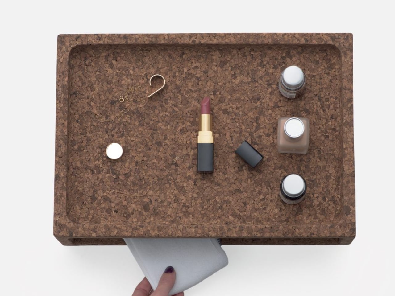
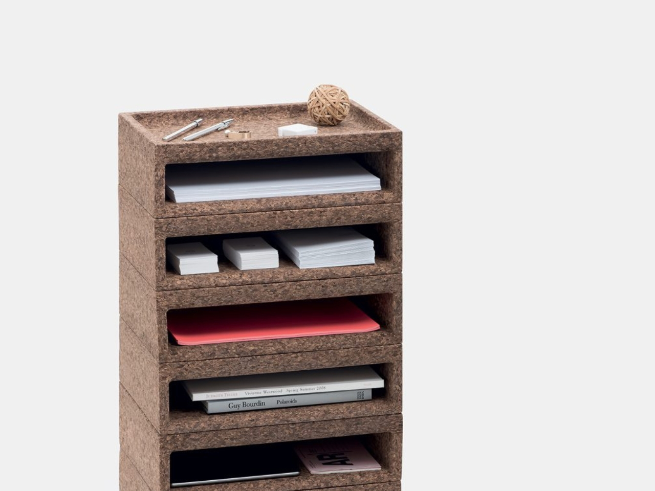
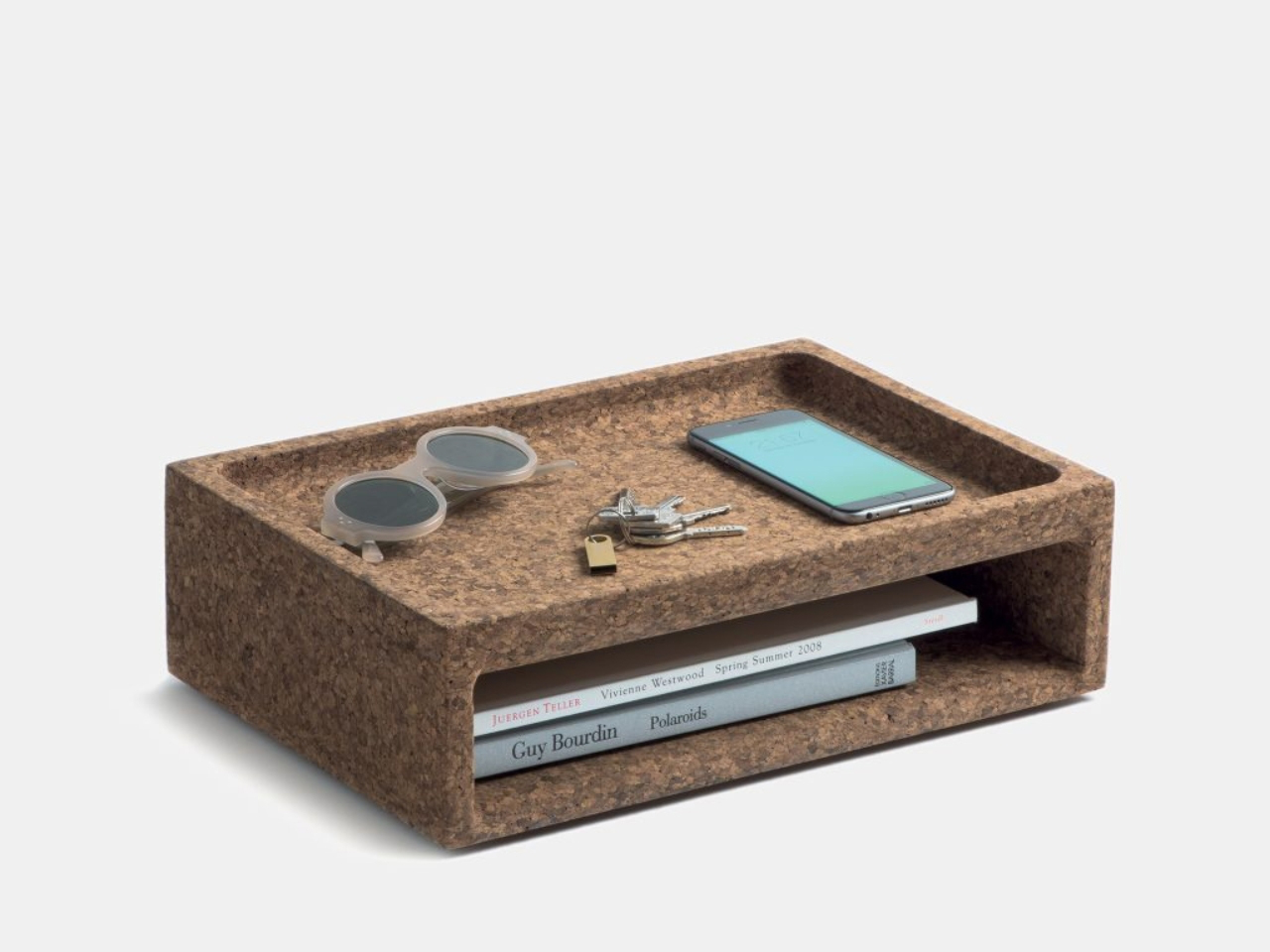
Made from natural toasted cork agglomerate, the Cork Box stands out for its eco-friendly construction, created through a heat-activated process that binds cork granules without chemicals or adhesives. This lightweight yet durable structure retains cork’s organic texture and softness. Rounded edges and smooth finishes enhance its inviting feel, while its neutral tones integrate effortlessly into a wide range of interior styles. Practical, adaptable, and visually calming, the Cork Box transforms storage into a smart, sustainable, and elegantly designed everyday essential.
Cork enables lightweight, durable, and sustainable solutions across design and architecture. Its natural renewability, versatility, and low environmental impact make it an ideal material for creating efficient, eco-friendly products that combine performance, comfort, and responsible innovation.
The post Why Designers Are Suddenly Using Cork for Everything in 2026 first appeared on Yanko Design.
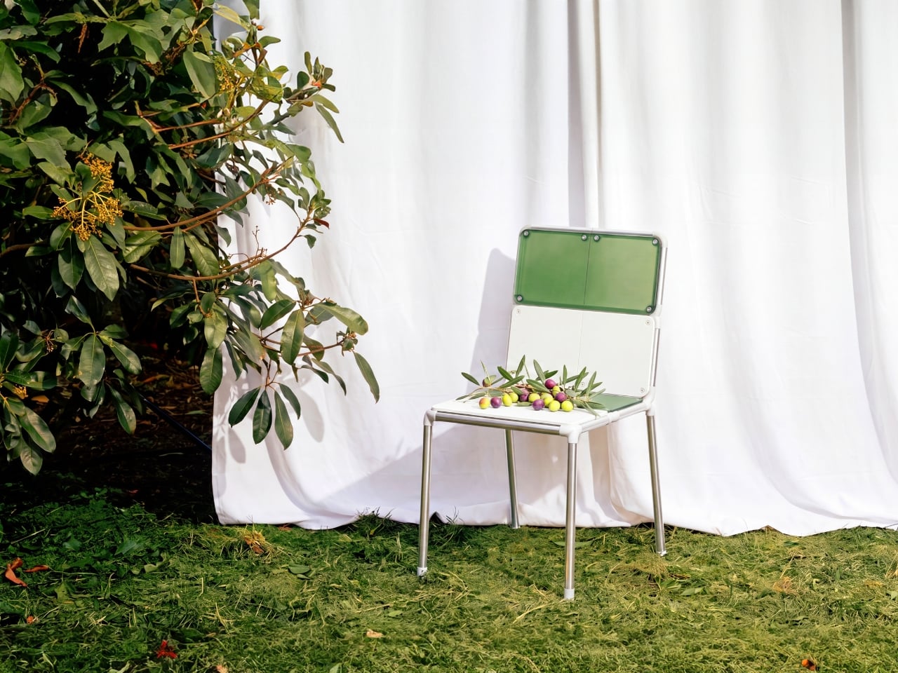
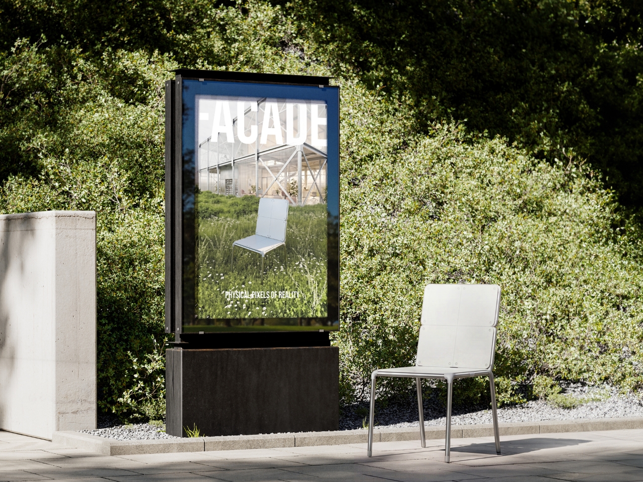
Most furniture asks one question at the point of purchase: do you like it enough to live with it, possibly forever? Junha Kahm’s Facade modular chair asks something different. It asks what you want from it right now, with the understanding that the answer is allowed to change.
The design breaks down into two primary systems: a stainless steel tube frame built on a 1:2 proportion ratio, and eight symmetrical PETG panels that clip into it. That proportion isn’t arbitrary. It gives the chair a visual discipline that reads immediately as intentional, a grid logic that references the structural composition of industrial architecture without cosplaying as a building. The frame is the constant. The panels are the conversation.
Designer: Junha Kahm
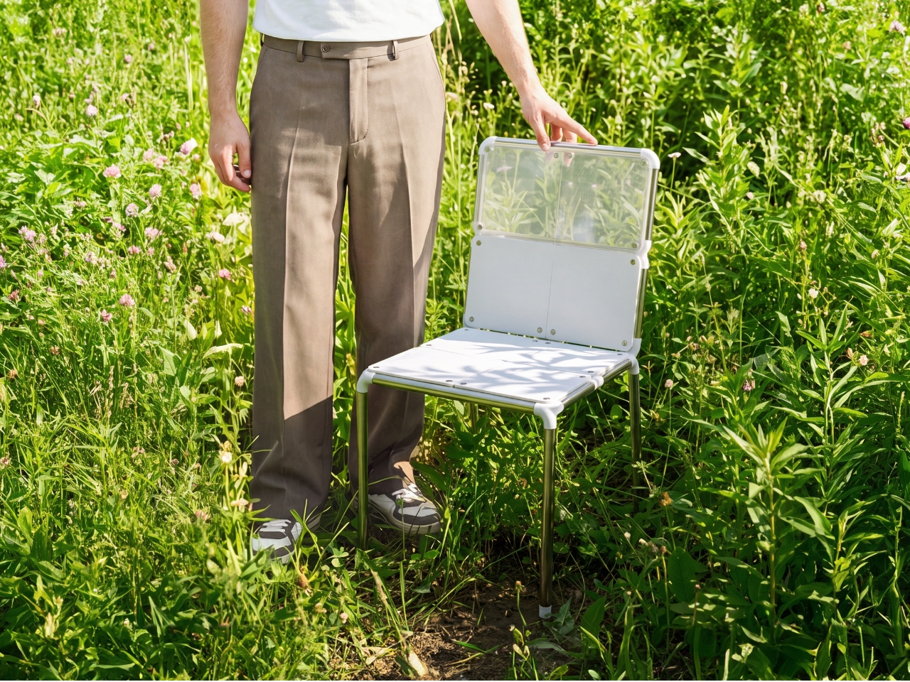
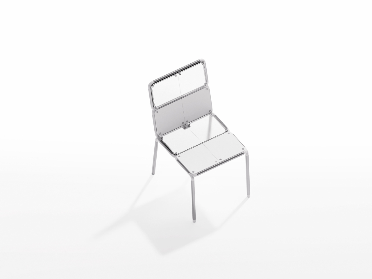
Each of those eight panels is identical in its symmetry, meaning the A and B parts mirror each other across both the seat and backrest. This is smart, deliberate engineering. Symmetrical components reduce manufacturing complexity and make component replacement genuinely practical rather than a design promise that falls apart the moment you try to source a spare. The panels attach to the frame via bolts and threaded inserts, making disassembly straightforward rather than surgical. The whole chair breaks down into components that, notably, fit inside a standard shopping basket. Kahm included that image in the project, and it lands as both a practical statement and a quiet joke at the expense of furniture that makes you feel like you need a logistics team to move it.
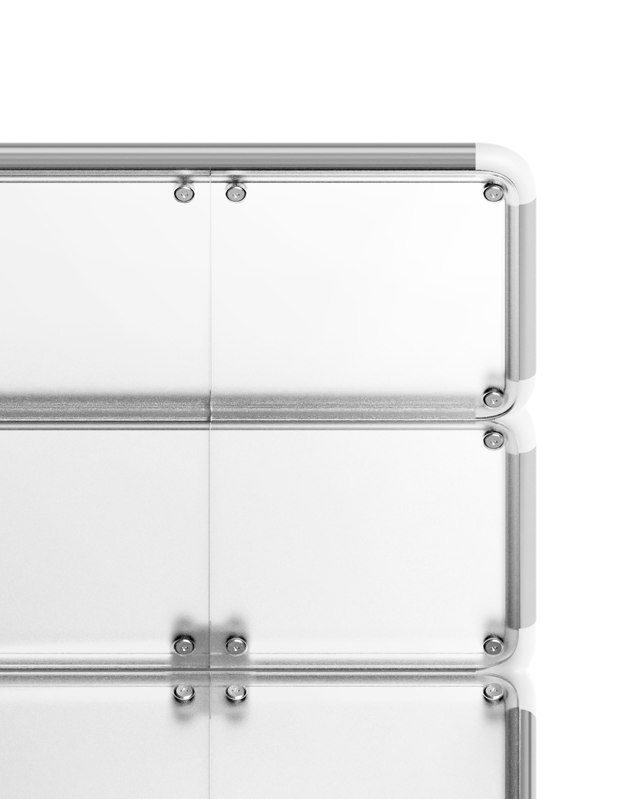
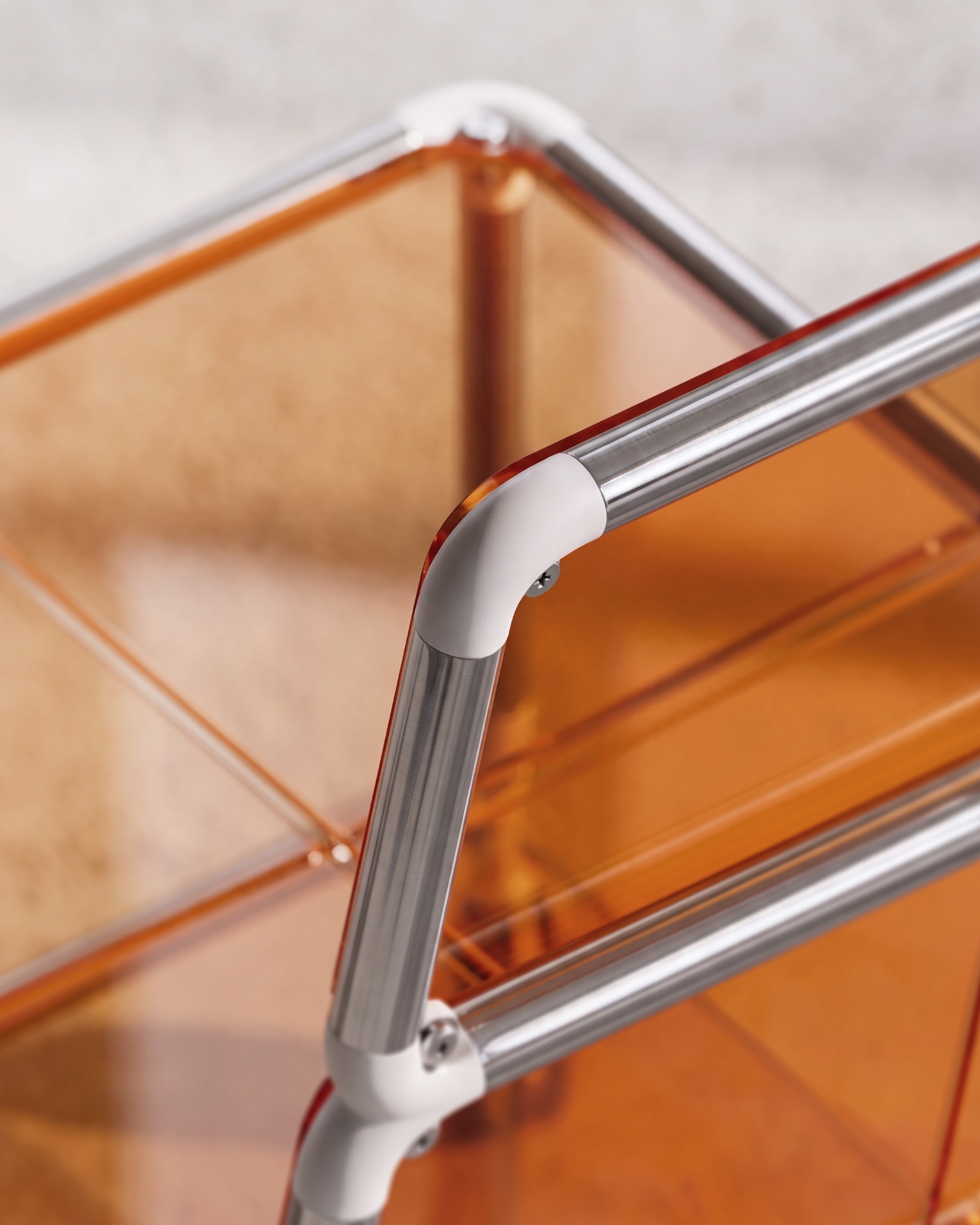
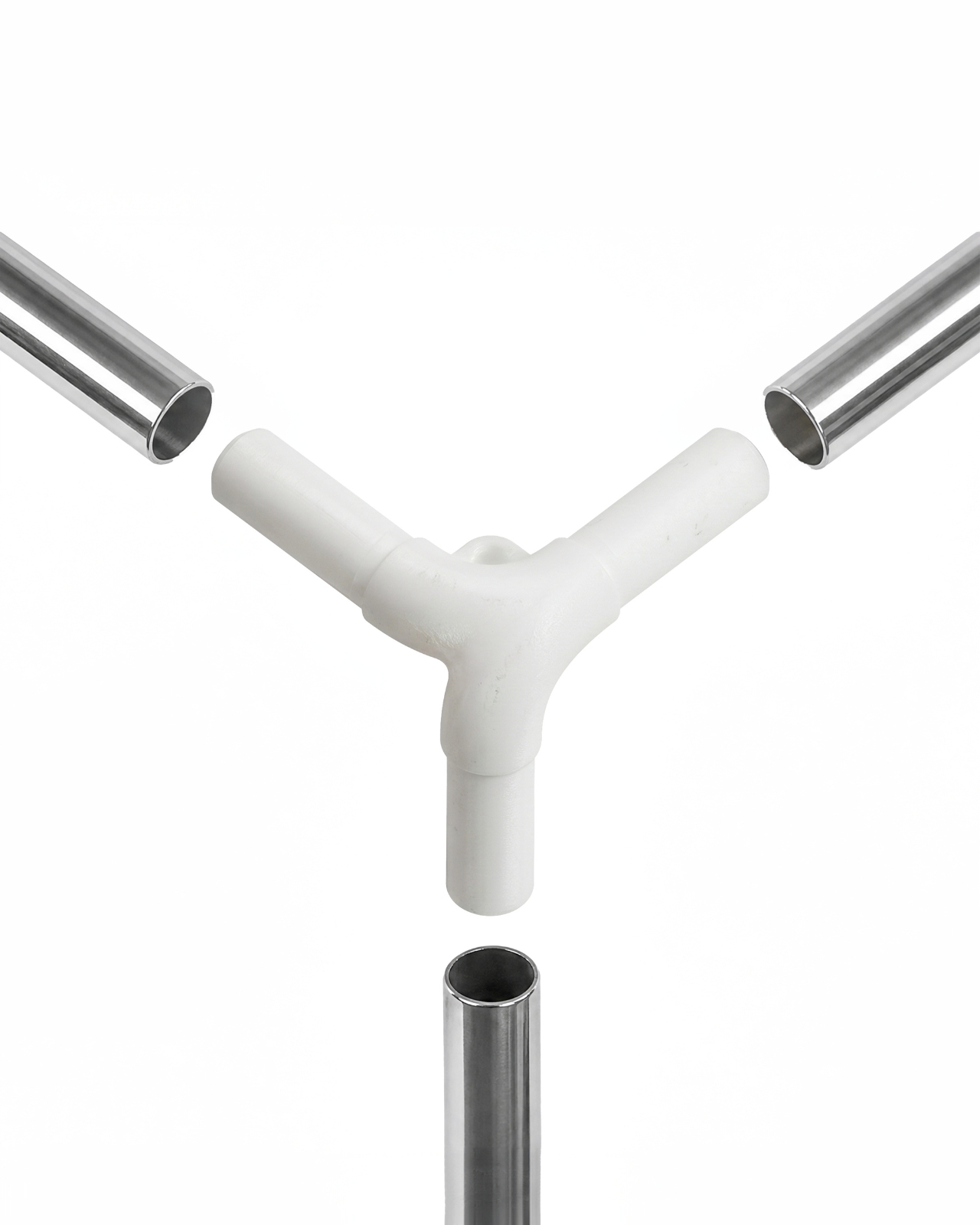
The joints connecting the stainless steel tubes deserve particular attention. Made from PETG in a rounded elbow form, they’re molded in white and sit at the intersections of the frame with a deliberate softness that contrasts cleanly against the brushed metal tubes. The angles are precise: 14 degrees at the rear leg splay, with 3 and 8 degree variations at other connection points. These aren’t decorative choices. They give the chair stability and a subtle forward lean that makes the silhouette feel considered rather than rigid.
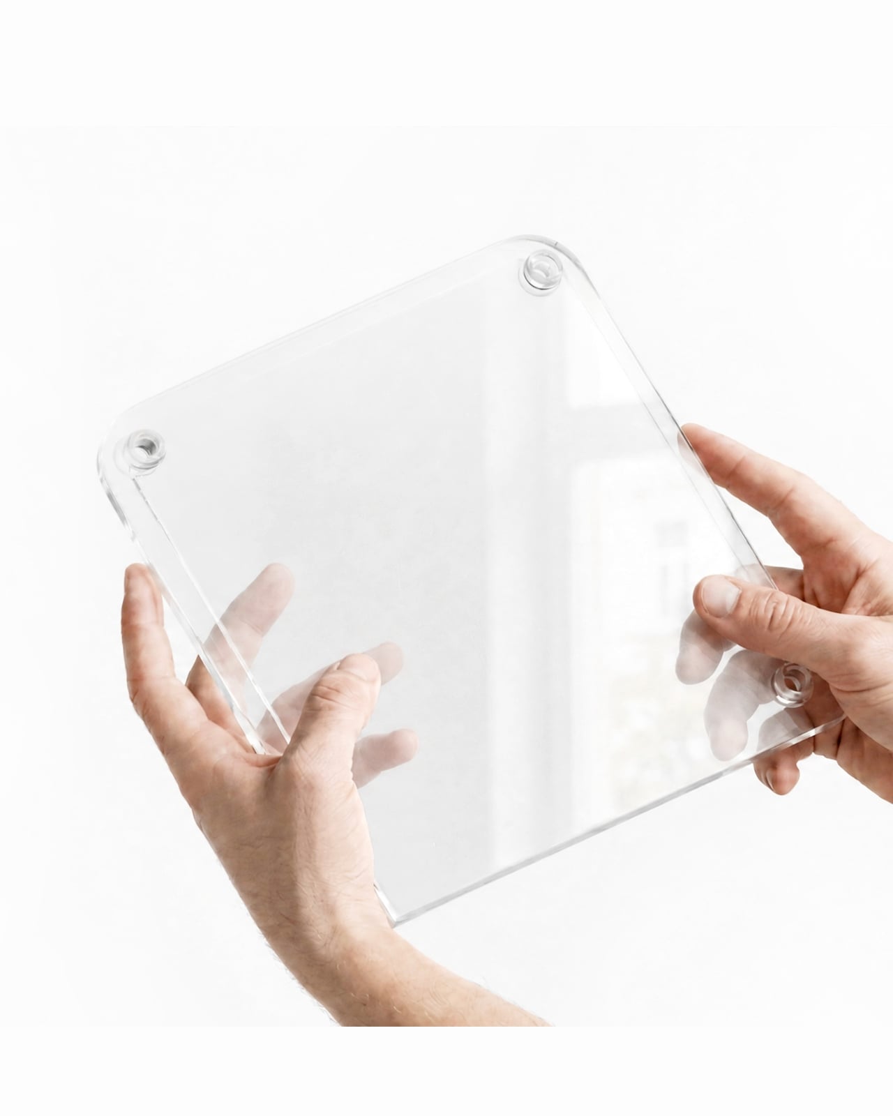
The panel material opens the design up in a direction that’s genuinely interesting. PETG is semi-rigid, lightweight, and takes color well, which is where the CMF possibilities come in. The translucent versions let the stainless frame read through the surface, keeping the chair visually light. The opaque panels, seen in white and amber orange across different configurations, shift the chair’s entire personality. In orange, sitting against warm light, the Facade looks like something from a terrace in the south of France. In white, it’s crisp and minimal, closer to a studio or a modern dining room. Same chair. Different skin. That’s the point, and Kahm communicates it with a tagline in the project’s moodboard that cuts straight to it: “one point. sixteen panels. infinite facades.”
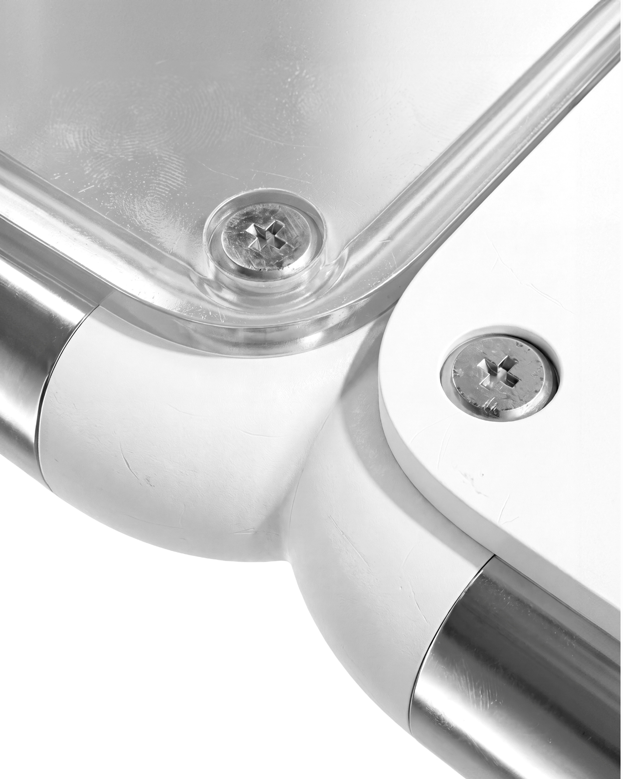
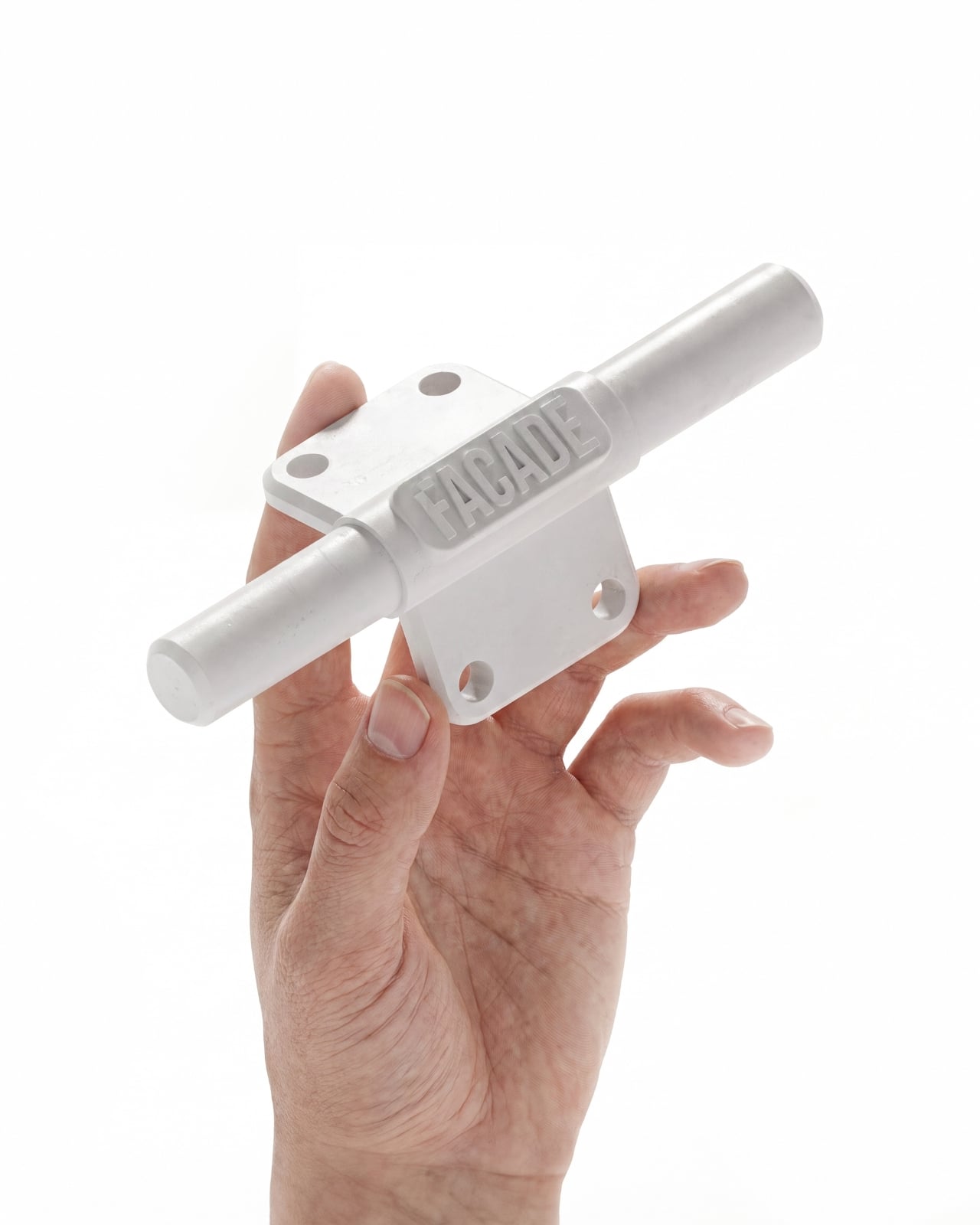
The architectural reference holds up because Kahm doesn’t use it superficially. Building facades serve real functional purposes: they regulate the relationship between structure and environment, they’re the part of a building most exposed to change and weathering, and on good buildings, they can be updated without touching the core structure. The Facade chair operates on the same logic. The frame is the architecture. The panels are the cladding. If one gets damaged, scratched, or simply becomes the wrong color for the room it’s in, you replace the panel, not the chair.
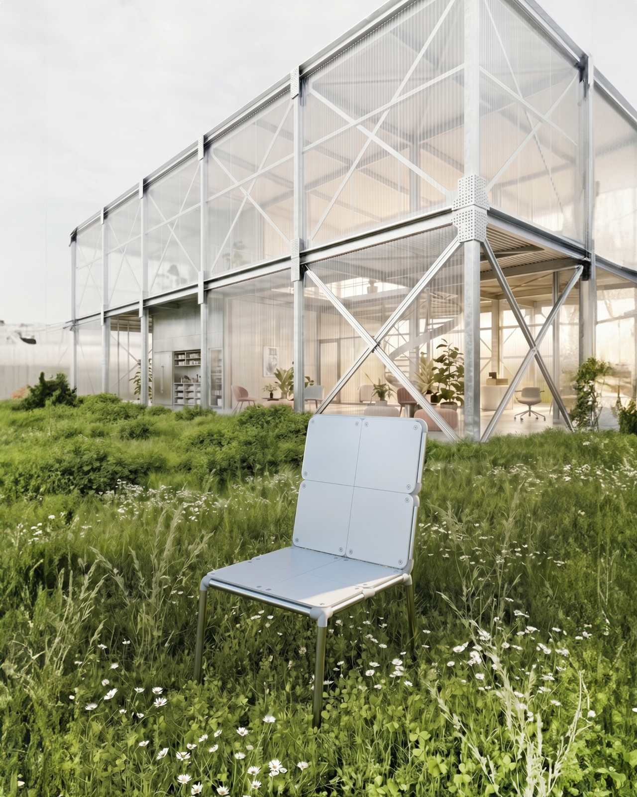
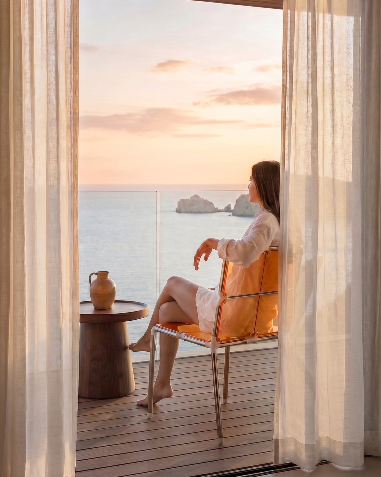
That reframing matters. The sustainability conversation in furniture design has leaned heavily on material sourcing, which is important, but it often ignores the simpler question of longevity through repairability. The Facade doesn’t require you to care deeply about sustainability to benefit from its approach. You just have to occasionally want things to look different, and most of us do. The clean grid composition keeps all of this from feeling overwrought. The Facade doesn’t announce itself. It sits quietly, reads as a well-proportioned chair, and holds its adaptability as a structural fact rather than a selling point worn on its sleeve. That restraint is, in its own way, the strongest part of the design.

The post The Modular Chair That Lets You Swap Parts Like a Building first appeared on Yanko Design.


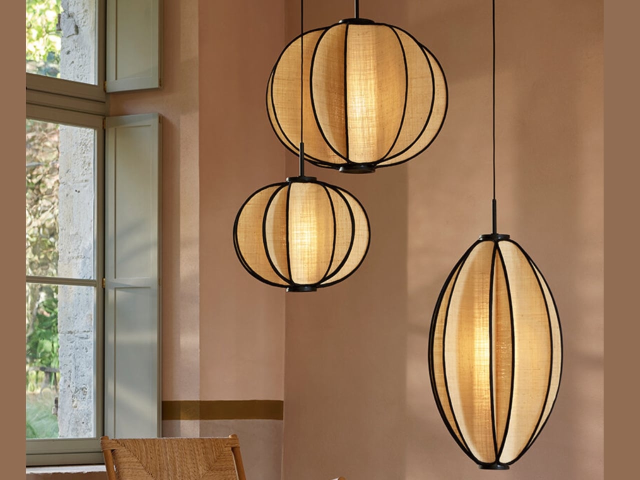
If you’ve ever stood in a room and felt the light fundamentally change your reading of the space, you’ll understand immediately why the Solis collection by Forestier stopped me in my tracks. Designed by German-born, Netherlands-based Jette Scheib, these pendant lights are doing something that most contemporary lighting design doesn’t bother to attempt anymore: they’re asking you to slow down and actually look at what’s above you.
Scheib has been a longtime creative partner with Maison Forestier, a French lighting brand founded in 1992 that has consistently built its identity around natural materials and handcraft. Their collaboration isn’t a commissioned-and-done arrangement; it’s a genuine alliance that has shaped the brand across multiple collections. Solis is the latest result, and it feels like the kind of piece that only comes from two parties who trust each other enough to take a real design risk.
Designer: Jette Scheib
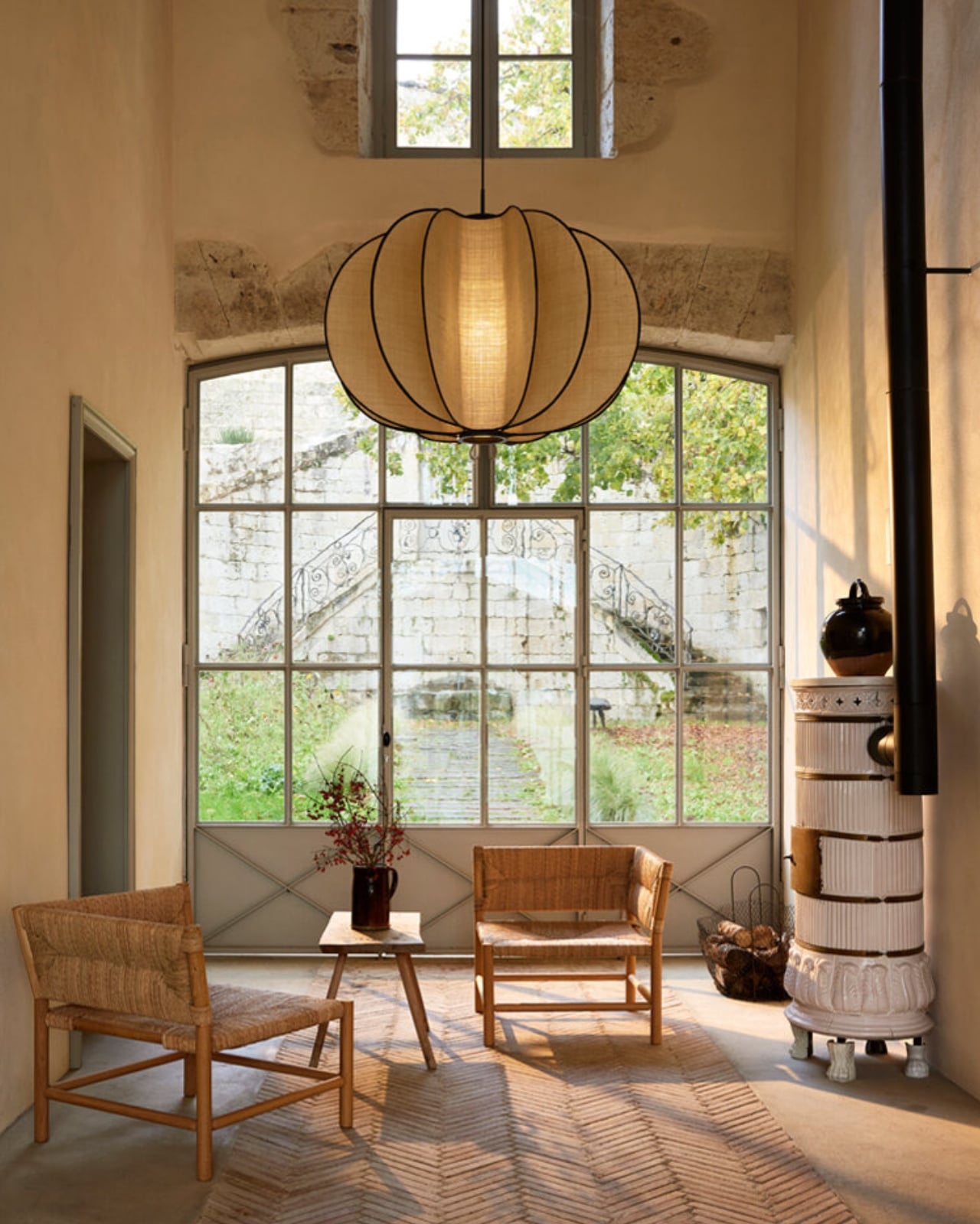
The design itself is deceptively simple. Organic plant fiber, specifically raphia, is hand-woven and stretched over rigid metallic frames, with fine black edging tracing the silhouette. The light that passes through is soft and diffused, mimicking the gentle warmth of late afternoon sun rather than the hard, directed brightness we’ve come to expect from modern interiors. That distinction matters more than people typically give it credit for. Most lighting design optimizes for performance. Solis optimizes for feeling.
The name gives it away, if you know where to look. Solis is Latin for sun, but Scheib built in a second layer of meaning that’s genuinely clever: it also alludes to what grows under the sun, the plant fibers that give these lamps their texture and warmth. A lamp named for both the light it casts and the material born from light. That kind of conceptual coherence is rare, and when it shows up, it elevates an object from product to something closer to poetry.
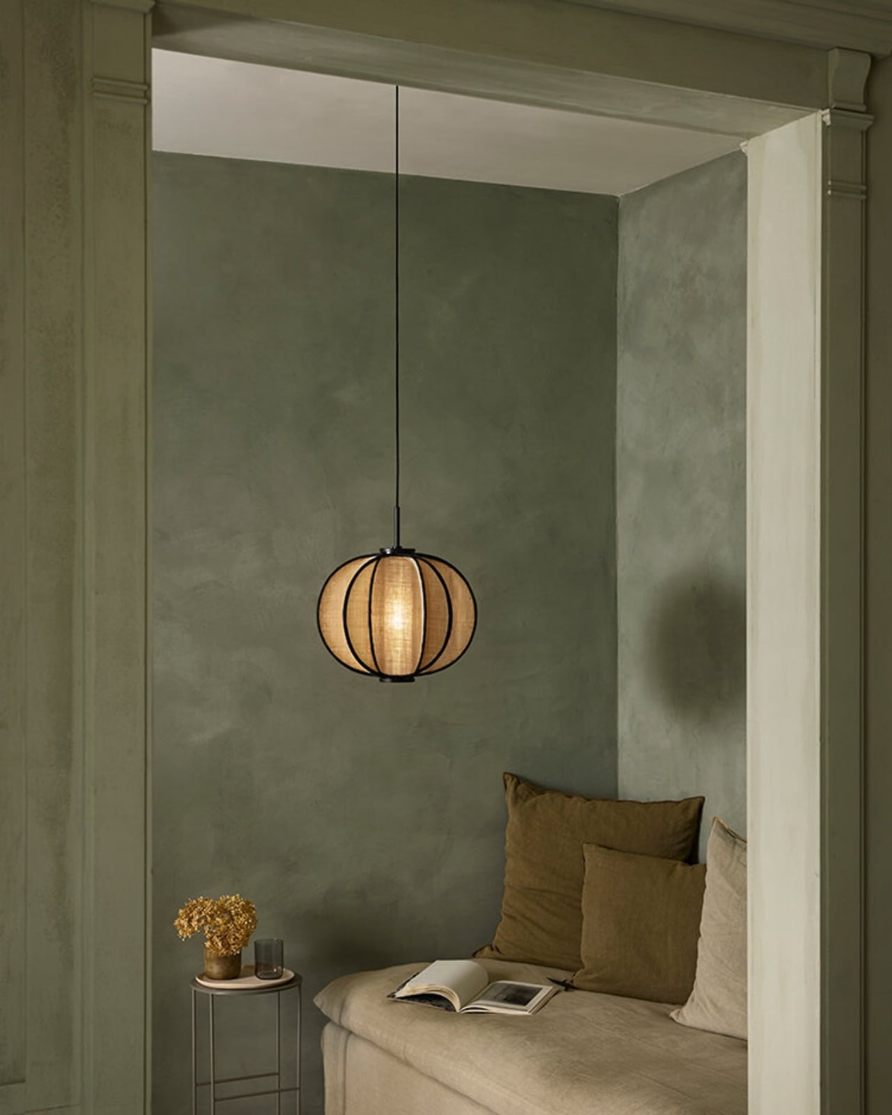
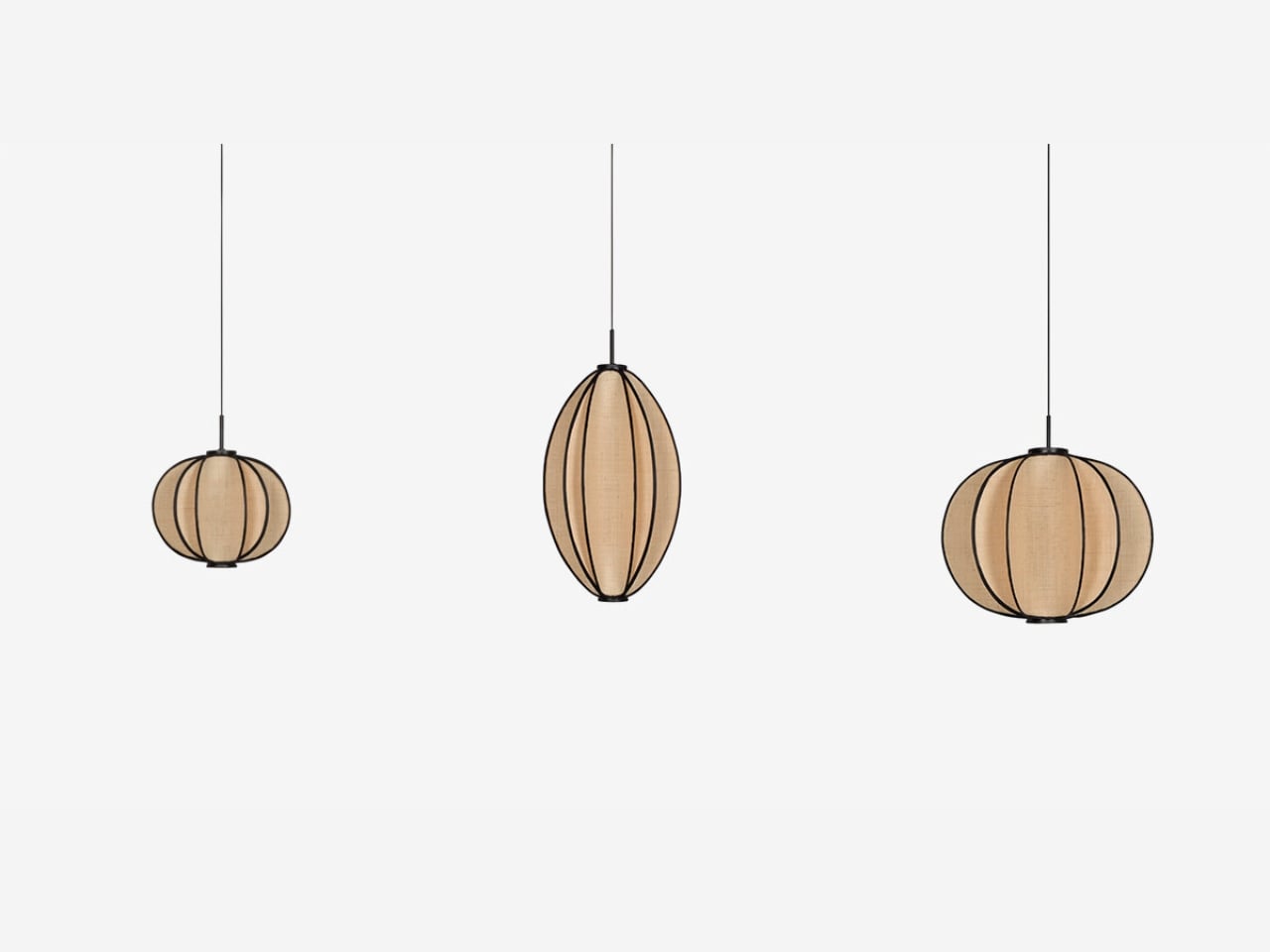
Solis behaves interestingly in space. The silhouettes shift subtly depending on your angle and the time of day, so the lamp you see at 9am is not quite the same lamp you see at 6pm. Volume appears to expand or contract; weight seems to change. The organic shape can read as a seed from one angle and something closer to a radiant star from another. Scheib’s stated focus was the tension between solidity and lightness, and she’s pulled it off in a way that doesn’t feel like a design statement, just a lamp that happens to feel alive. Because raphia carries natural irregularities, no two Solis pendants are identical either. Every one is technically its own object.
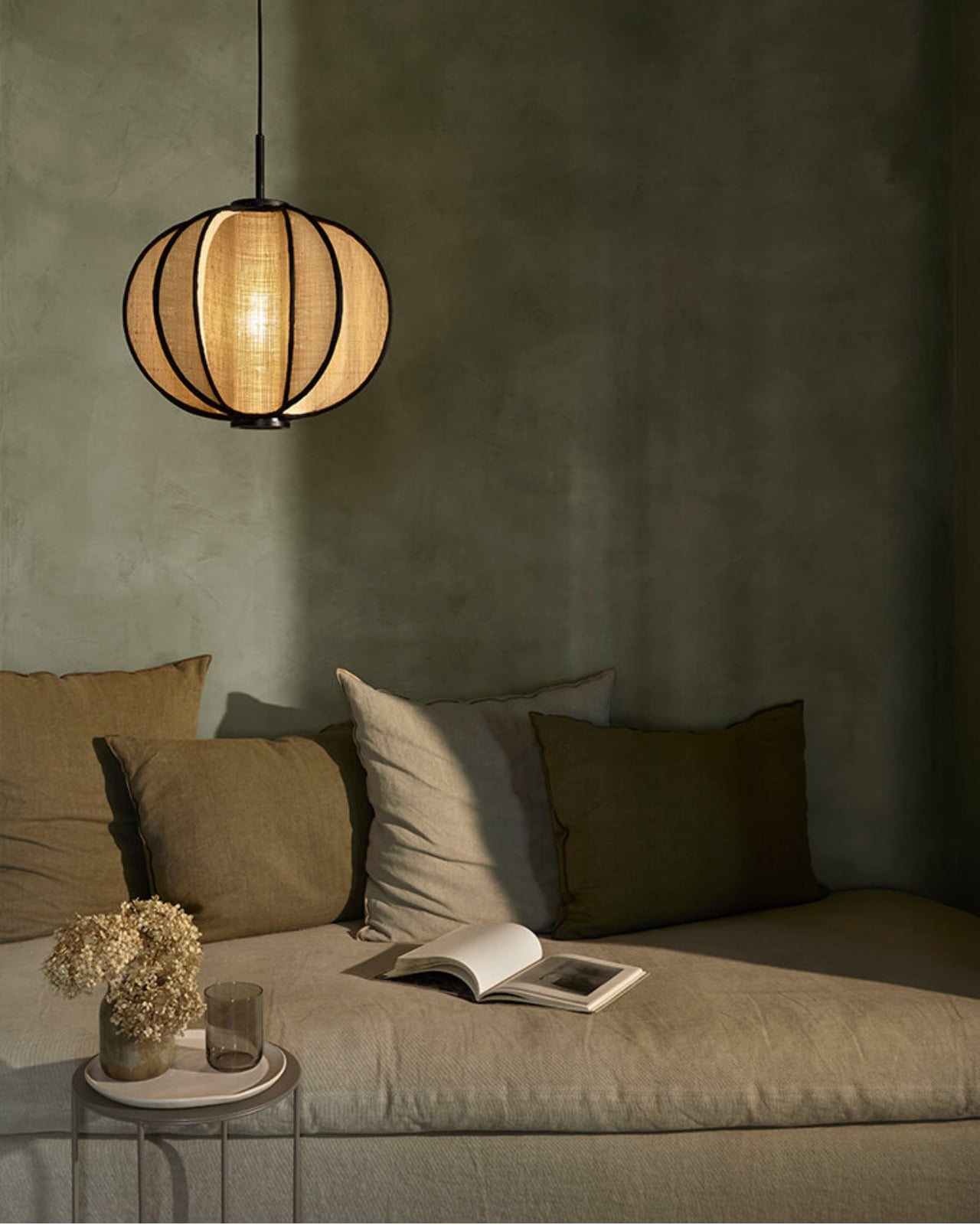
The craftsmanship behind the collection is rooted in a fifteen-year partnership with specialized workshops in the Philippines, where weaving and basketry skills have been passed down through generations. Aesthetics tend to dominate design coverage, but the provenance of an object like this deserves equal attention. The lamp isn’t just something to admire from across the room; it’s the physical result of skill that exists in specific places and specific hands. Forestier’s relationship with those workshops is long enough to be structural, and that’s the real difference between sourcing craft and actually valuing it.
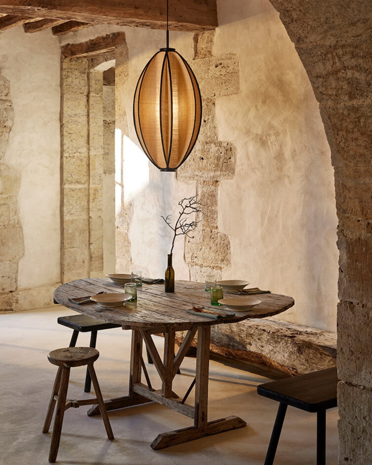
Solis is available in sizes from 40cm to 100cm in diameter, which makes it genuinely flexible. It can anchor a dining table or settle quietly in a corner without demanding attention. It reads well in both contemporary and rustic interiors without looking like it’s trying too hard to belong somewhere specific, which is rarer than it sounds in pendant lighting.
Design objects earn their place by doing more than filling space. The best ones shift your experience of a room, subtly enough that you might not even notice immediately. Solis does that. The light it casts is warm and a little sun-like. The form changes on you. The fiber holds the story of where it came from. That’s not a small thing for a pendant light to carry, and Scheib makes it look genuinely effortless.
The post Forestier’s New Solis Pendant Looks Like a Seed, Then a Star first appeared on Yanko Design.

Samsung’s Ultra lineup has been on a gradual softening trajectory. The hard, squared-off corners that made early Galaxy S Ultra and Note phones feel deliberately architectural gave way to progressively rounder edges with each generation, culminating in the S26 Ultra’s fully rounded ergonomic corners. For users who preferred the original boxy confidence of those older devices, that direction has been a slow farewell to something they actually liked.
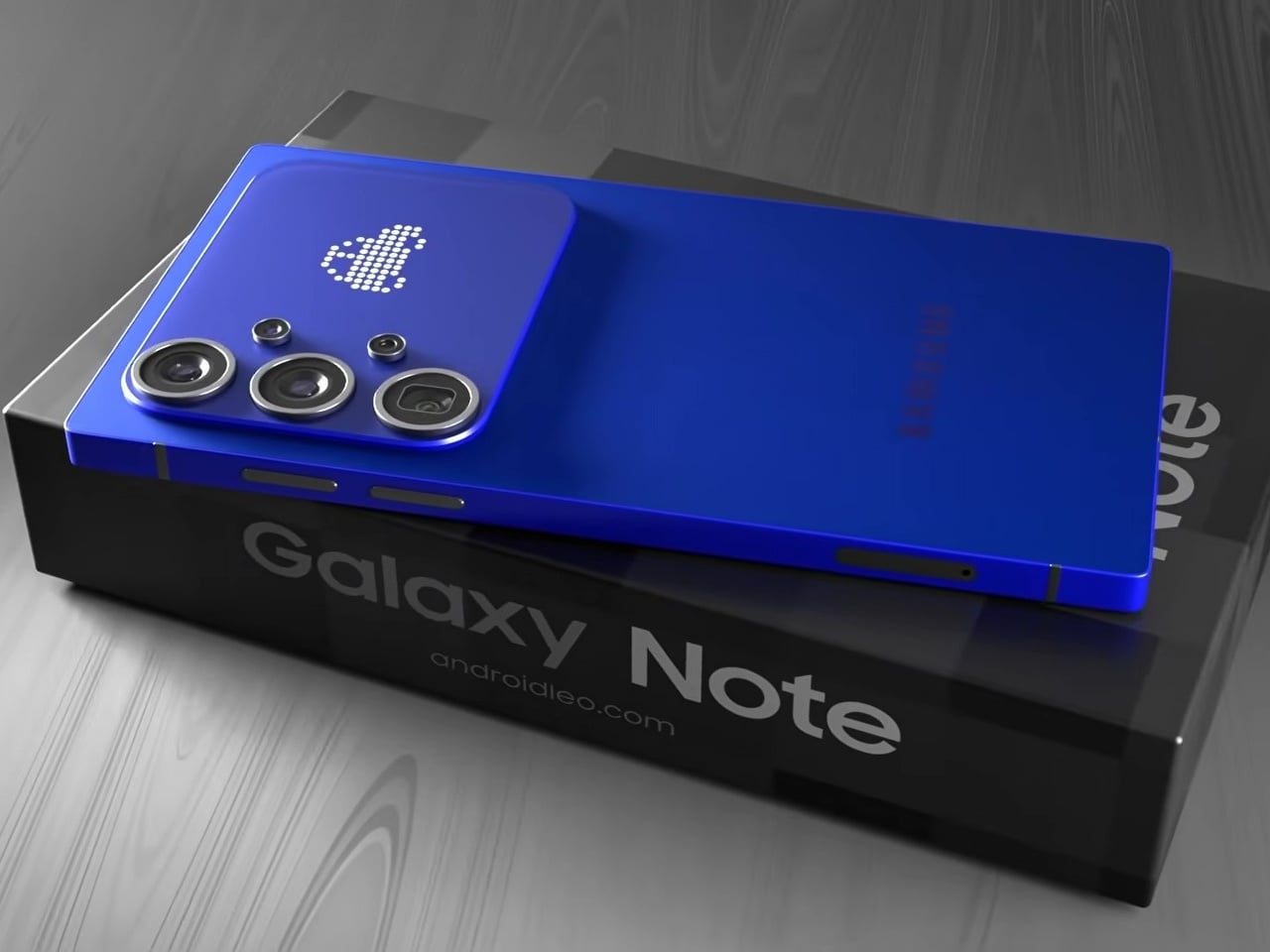
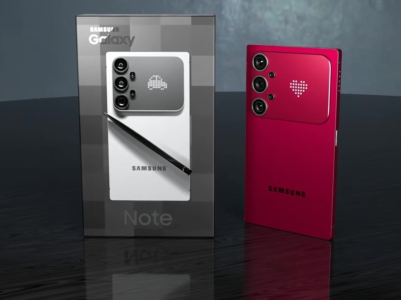
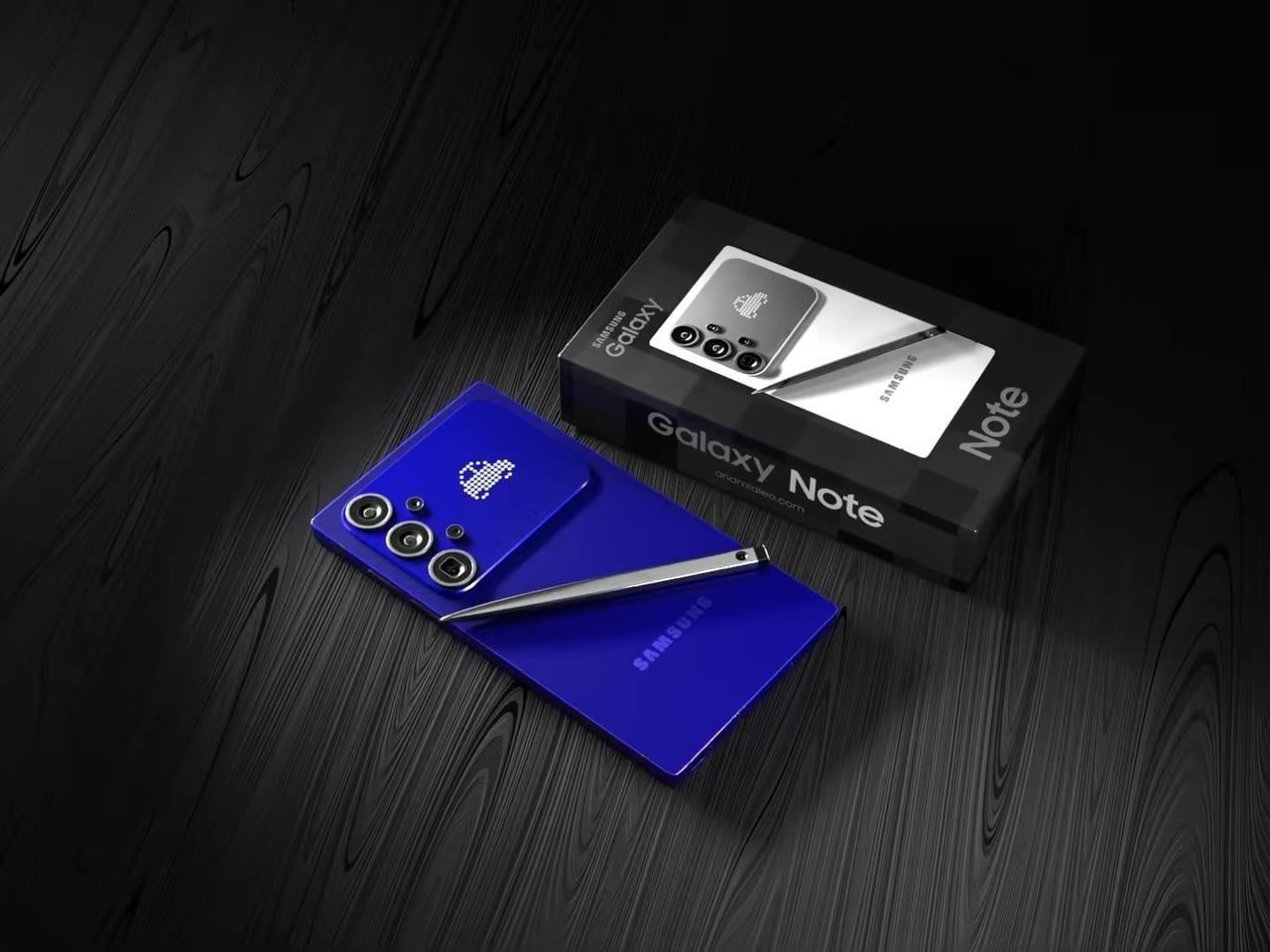
This concept for a Galaxy S27 Ultra reverses that. The sharp 90° corners are back, along with flat top and bottom edges that give the phone a distinctly geometric presence. The “Galaxy Note” name appears on the packaging, framing this as a full revival of Samsung’s discontinued productivity flagship identity rather than just another Ultra iteration. It’s a design argument about what the phone should have stayed.
Designer: AndroidLeo
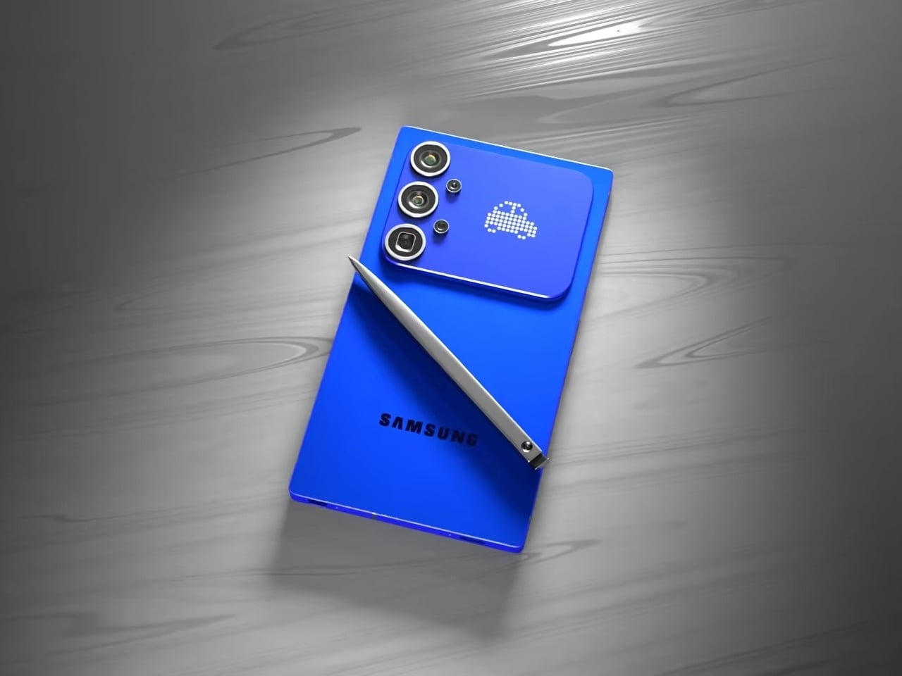
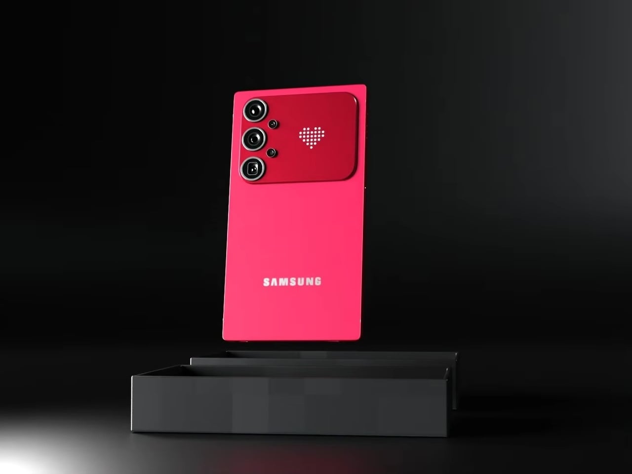
The most unexpected element on the back isn’t the camera. Nestled beside the vertical triple-lens array is a dot-matrix LED display that shows customizable pixel art animations, swapping between icons as conditions change. It’s the same logic that Nothing applied with its Glyph Matrix and that ASUS uses on ROG devices: the back of a phone has real estate that can do something, and simply leaving it matte glass feels increasingly like an opportunity missed.
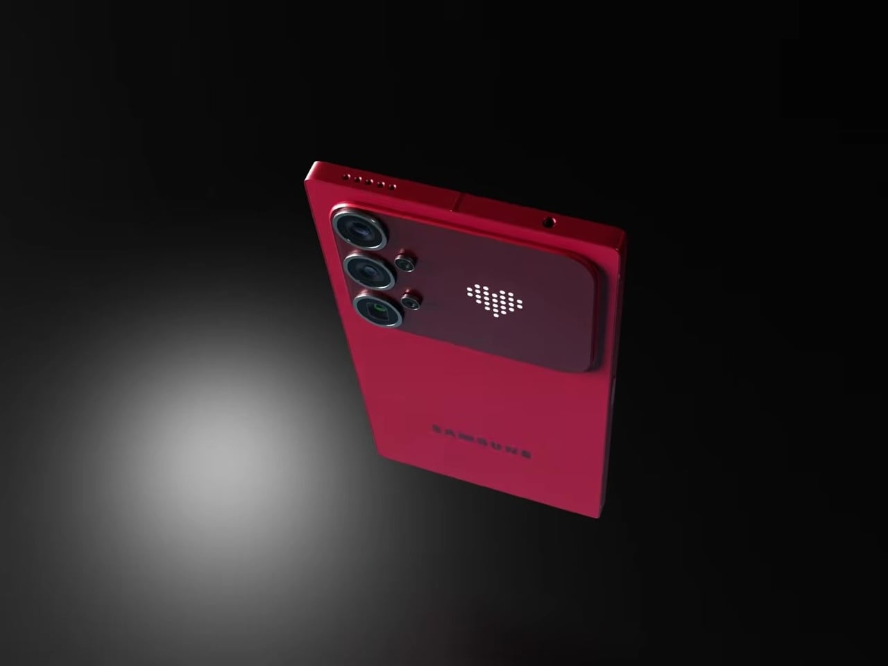
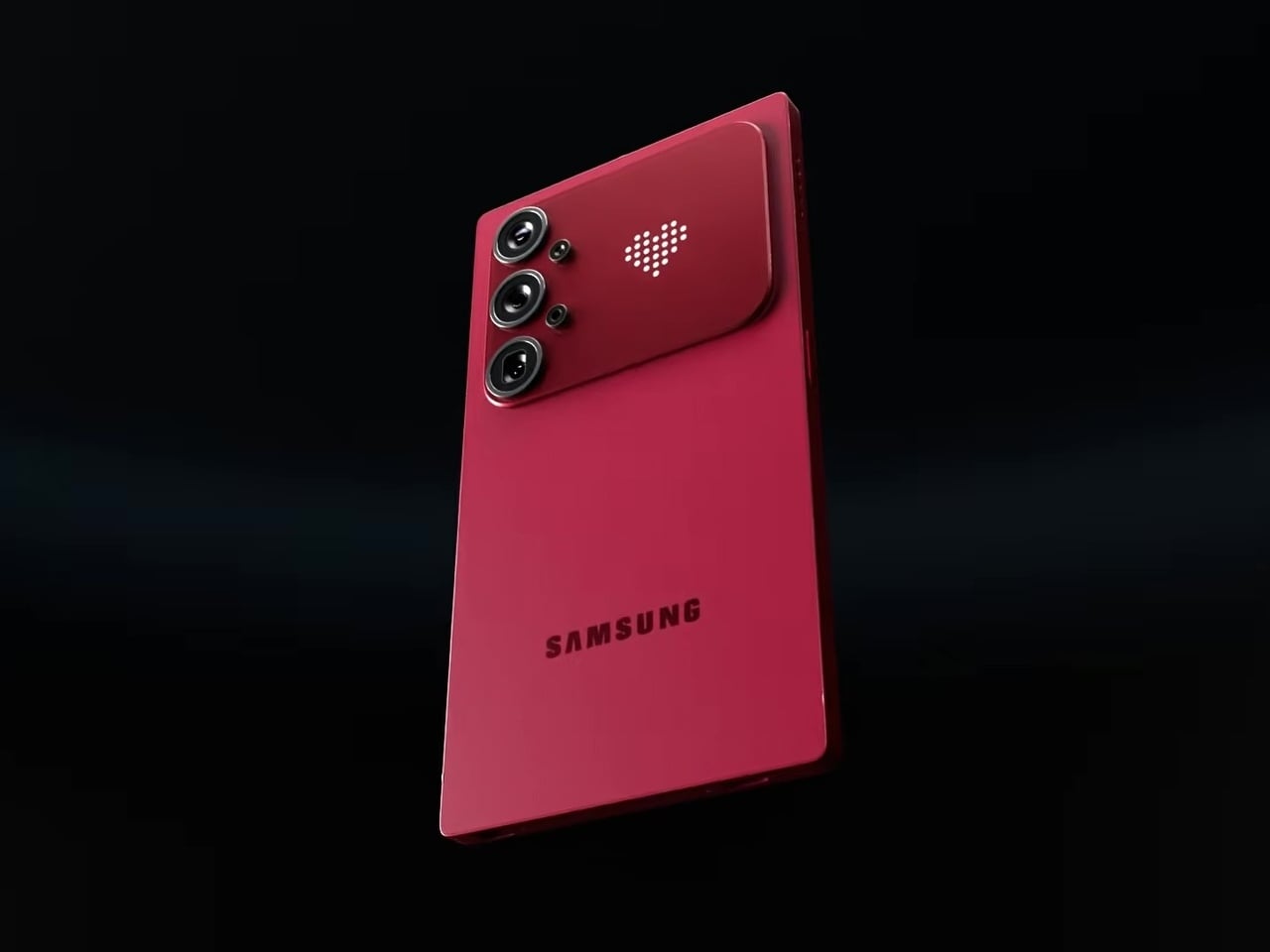
In practice, that small display becomes a second layer of expression without pulling attention away from the main screen. Notification icons, charge indicators, and personalizable graphics all live on a surface that’s visible when the phone rests face down or sits on a desk, the exact moment when the front display is least useful. The concept proposes this as an attention filter as much as a personalization feature.
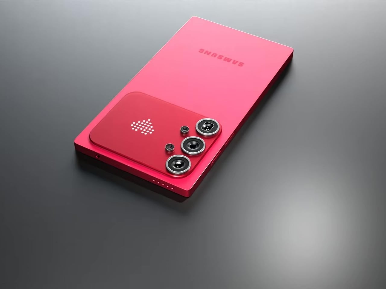
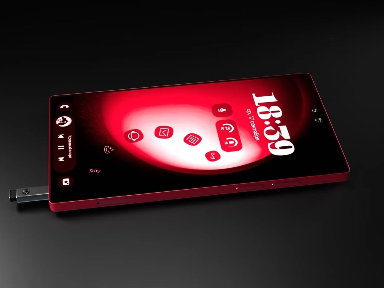
The S Pen slots into the bottom rail via a spring-ejected silo, appearing chunkier than the slim stylus Galaxy Note and Ultra users are familiar with, which may be more a rendering artifact than an intended design change. The front is a flat, edge-to-edge panel with a dual punch-hole selfie camera configuration at the top center, serving the kind of stylus-optimized interface that the Note series built its identity around. The high-contrast red UI reads as purpose-designed for wide-open canvas navigation.
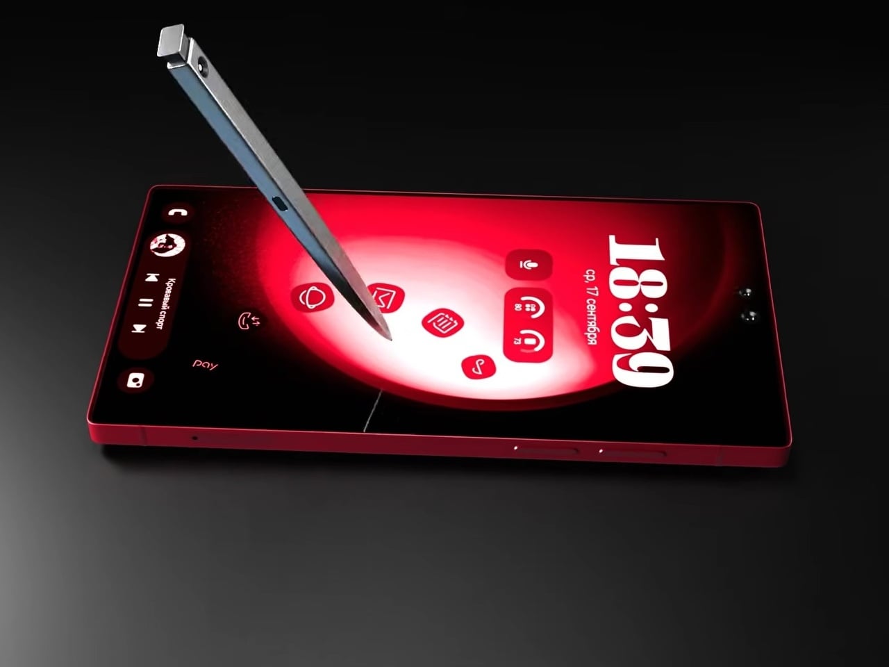
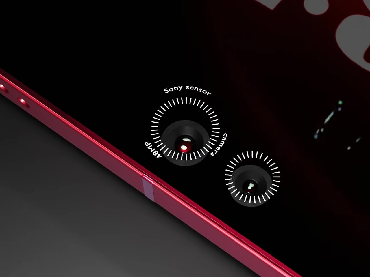
Camera specifications go ambitious: a 200MP main sensor paired with 48MP Sony sensors and periscope telephoto optics round out the vertical lens configuration. The USB-C port, notably, isn’t centered on the bottom edge, a small but visible deviation from convention. And this is where the whimsical and fantastical nature of the design shows through.
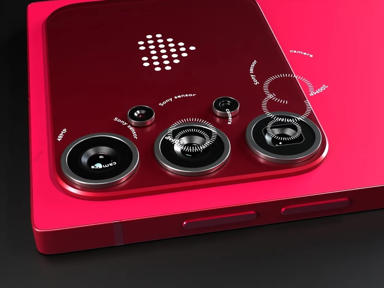
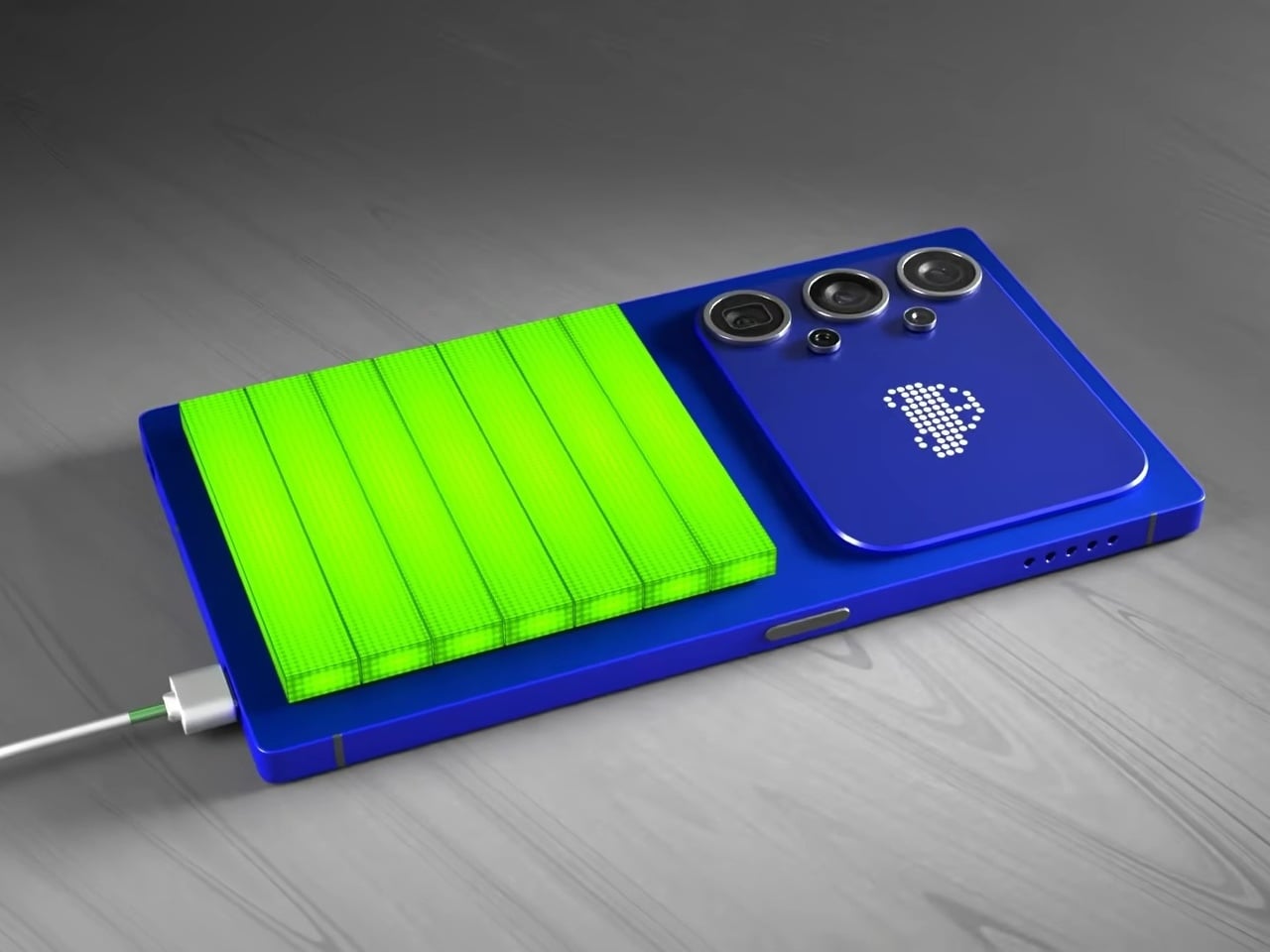
None of this is real, of course. Samsung hasn’t announced any plans to revive the Note name, and the dot-matrix display exists in the realm of render enthusiasm rather than confirmed engineering. What the concept captures is a reasonable frustration: the Ultra line has drifted from the qualities that made it distinct, and features appearing elsewhere, like Nothing’s Glyph Matrix, suggest the broader market hasn’t fully moved past wanting the back of a phone to say something.

The post Samsung Killed the Galaxy Note, but This S27 Concept Brings It Back first appeared on Yanko Design.