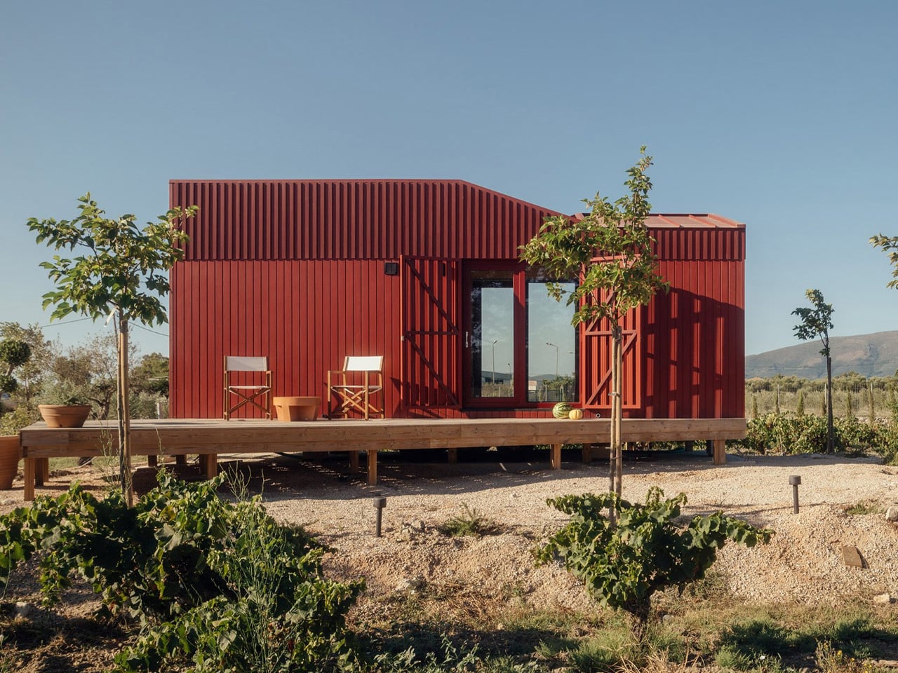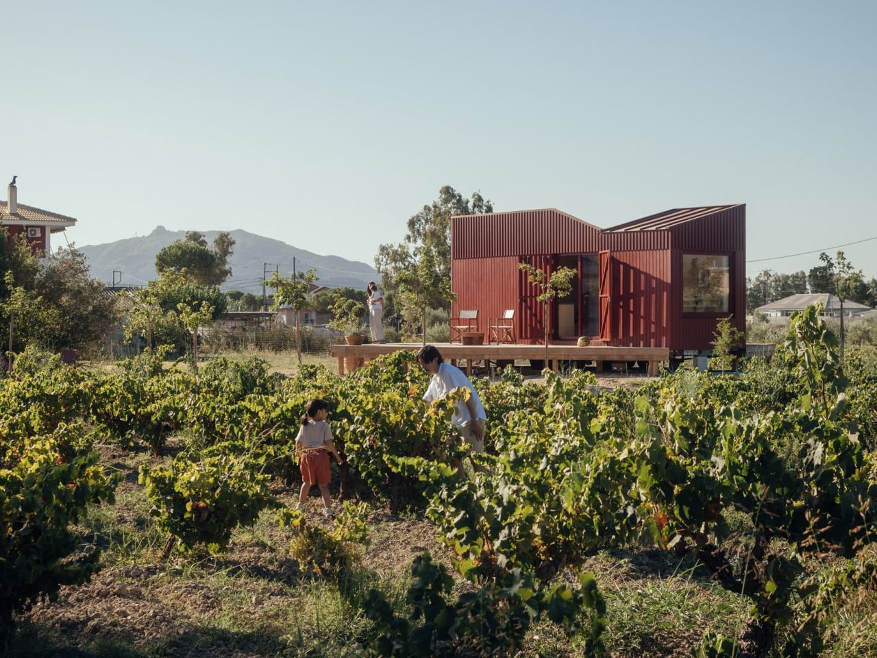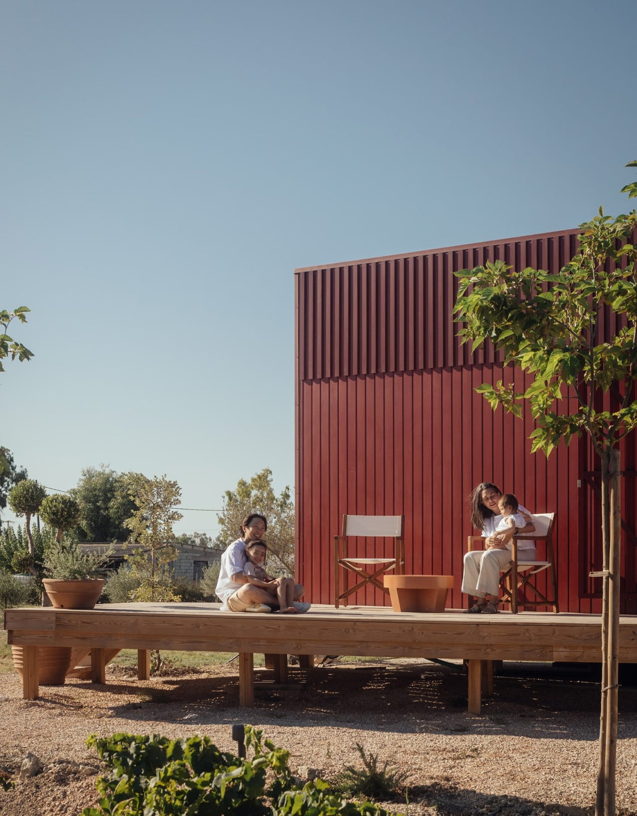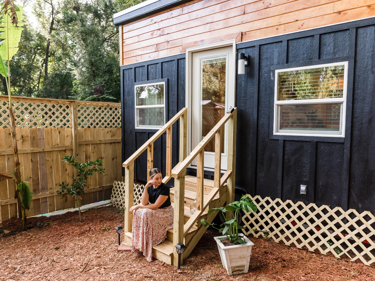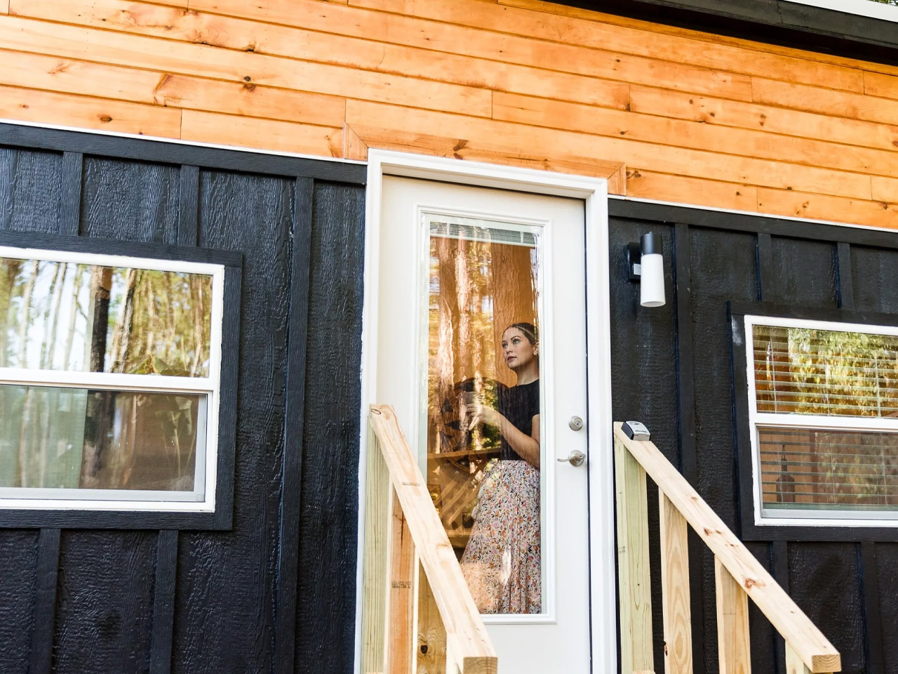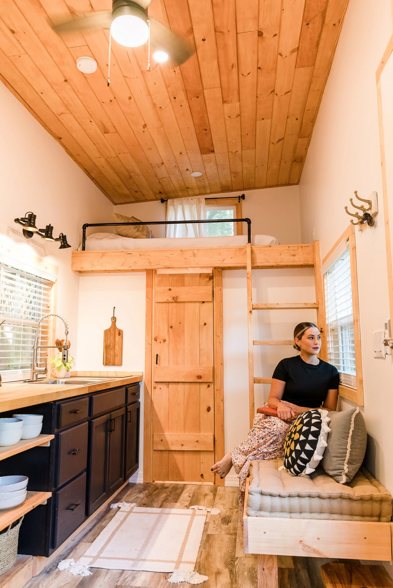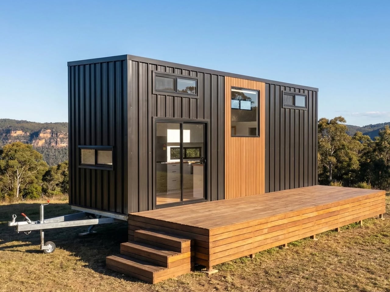
The Byron Bay by Removed Tiny Homes is not that version. Built by the Brisbane-based builder that has quietly become one of Australia’s most talked about names in the tiny home space, this model is as generous as the coastal town it’s named after. It arrives with two loft bedrooms, a full galley kitchen, and a layout that manages to feel more like a considered home than a scaled-down one.
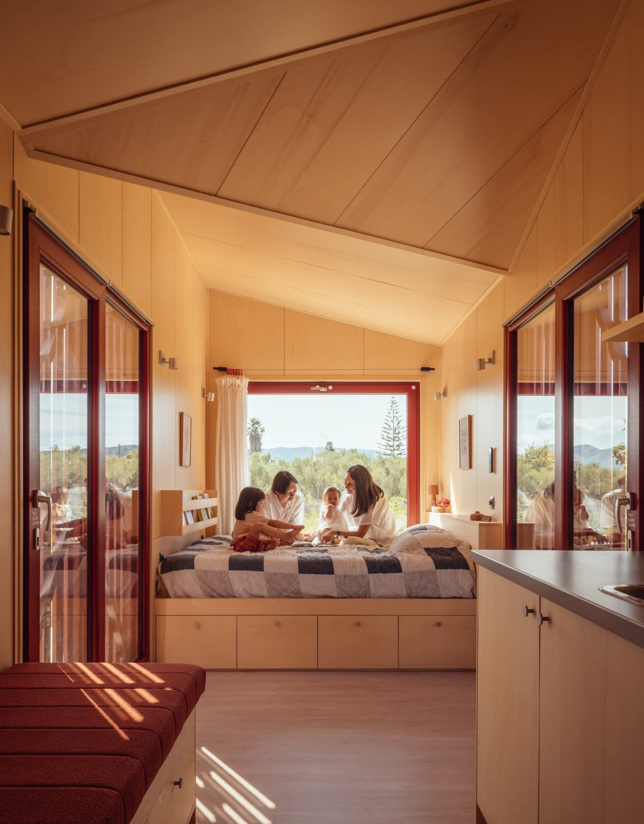
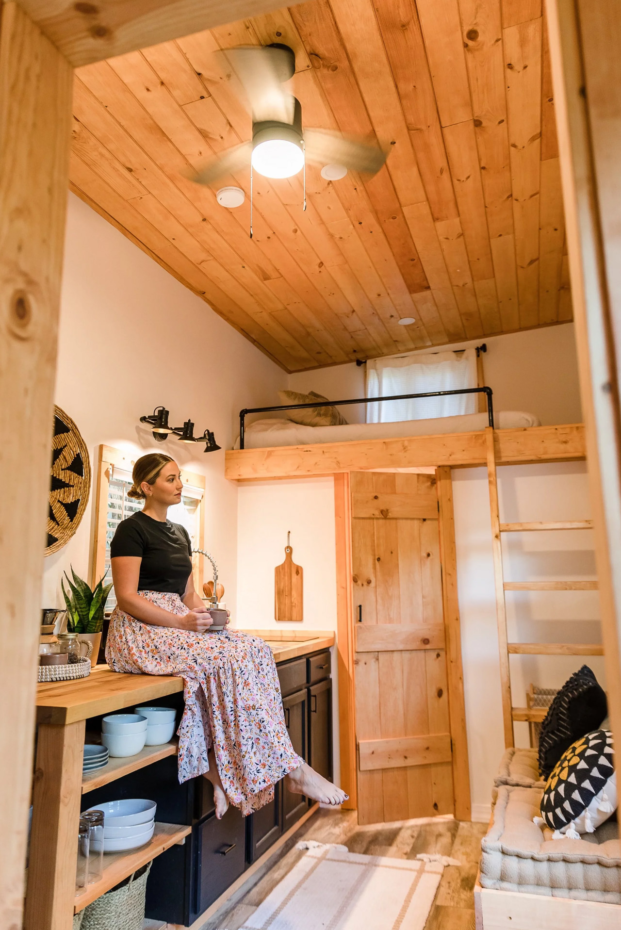
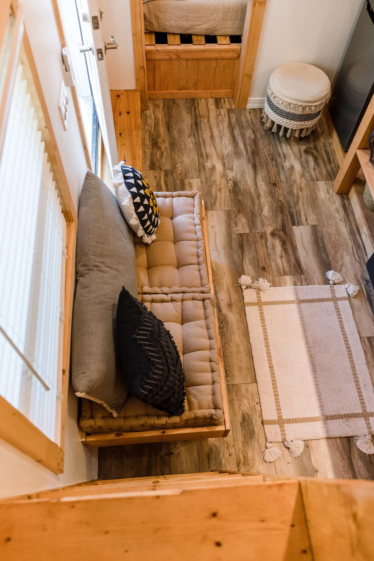
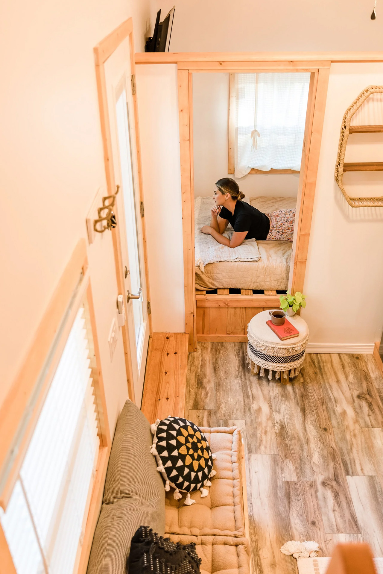
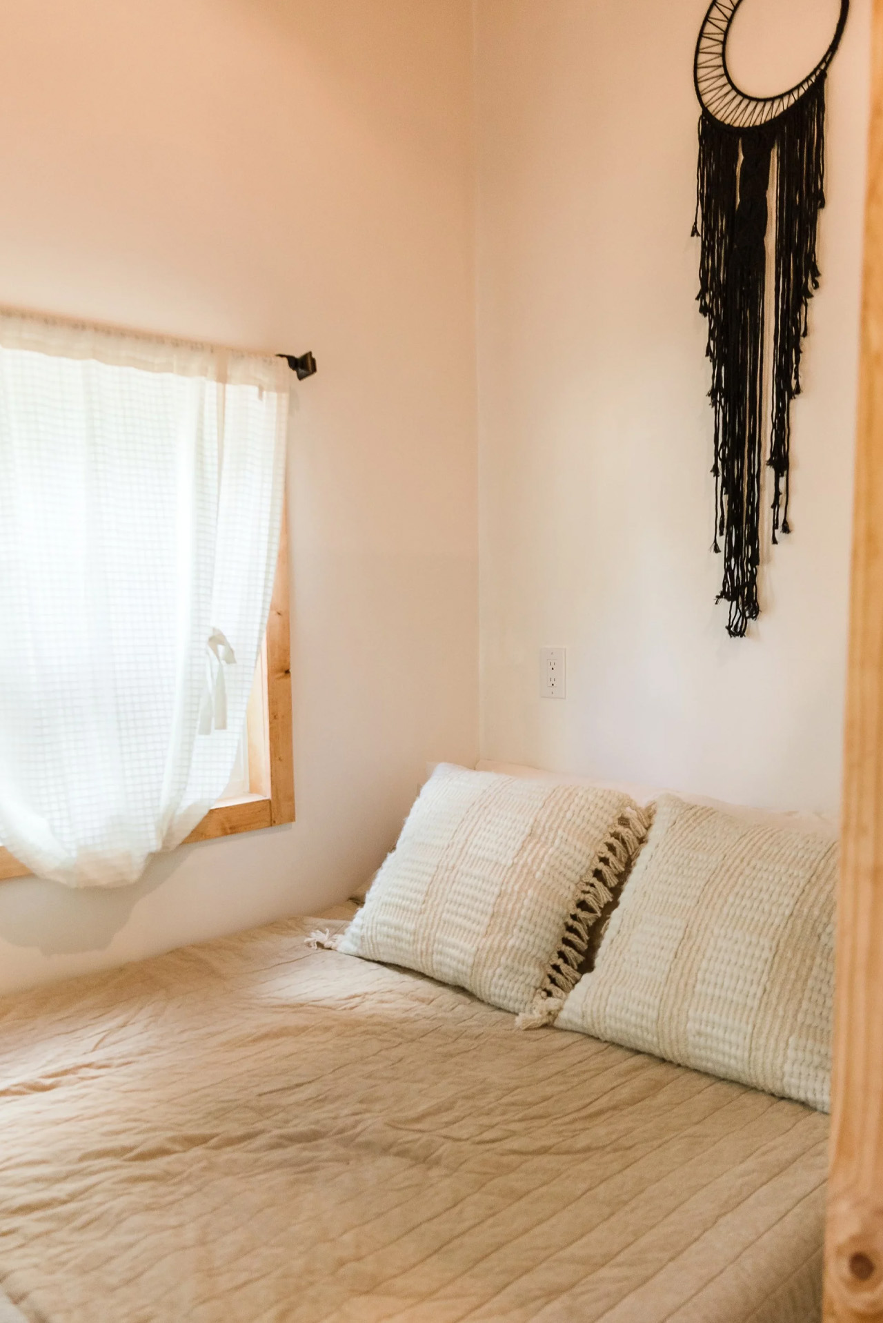
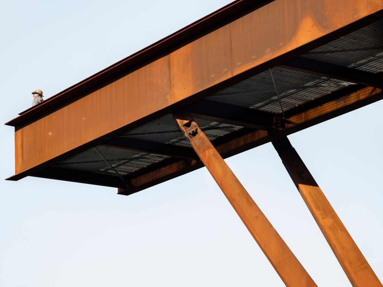
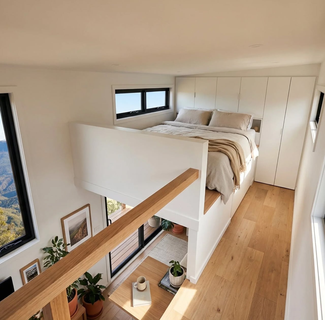
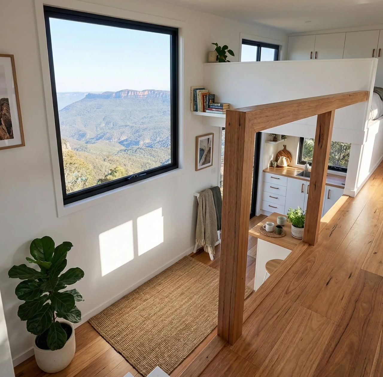
At 8.4 metres long, 2.5 metres wide, and 4.3 metres tall, the Byron Bay sits at the larger end of what road-legal tiny homes can offer. That scale is put to work immediately. The two upstairs lofts are connected by a full standing height walkway, which sounds like a small detail until you realise how much it changes the experience of moving through the space. There is no crawling, no hunching, no reminder that you made a trade-off. The lofts feel like actual bedrooms, not storage shelves with pillows on them.
Designer: Removed Tiny Homes
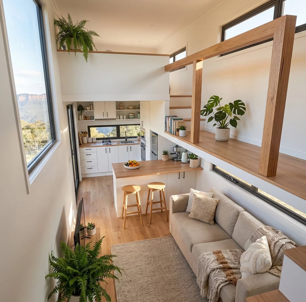
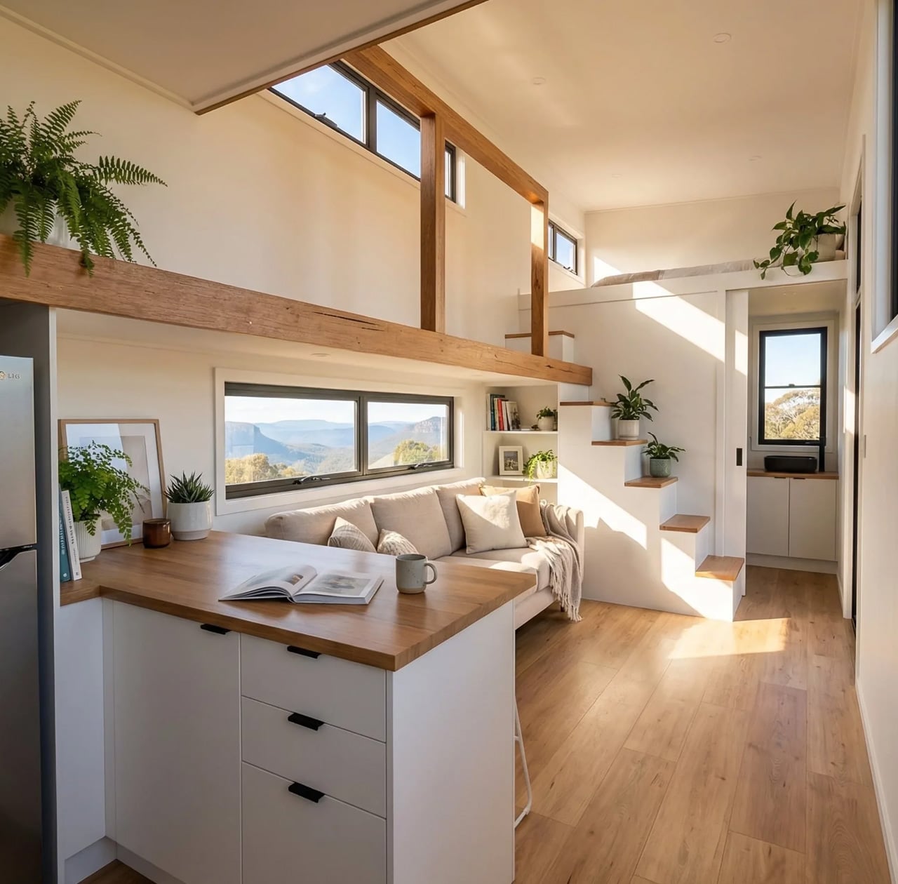
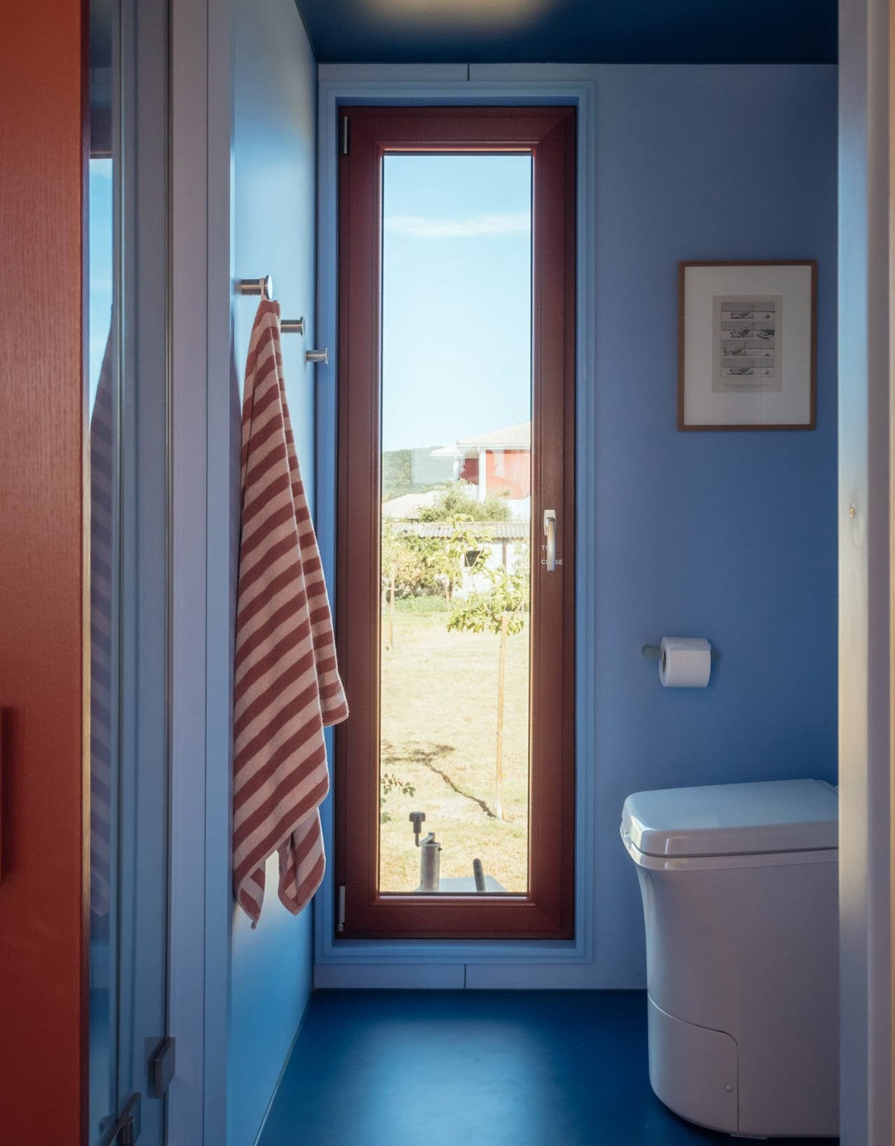
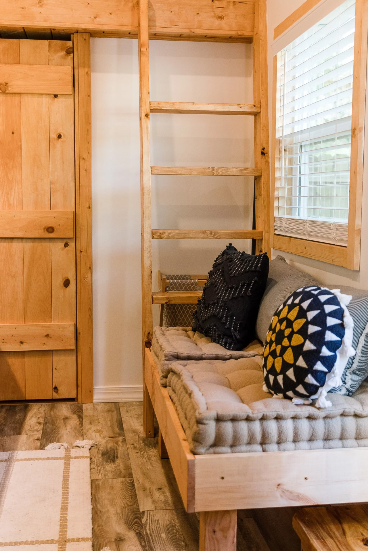
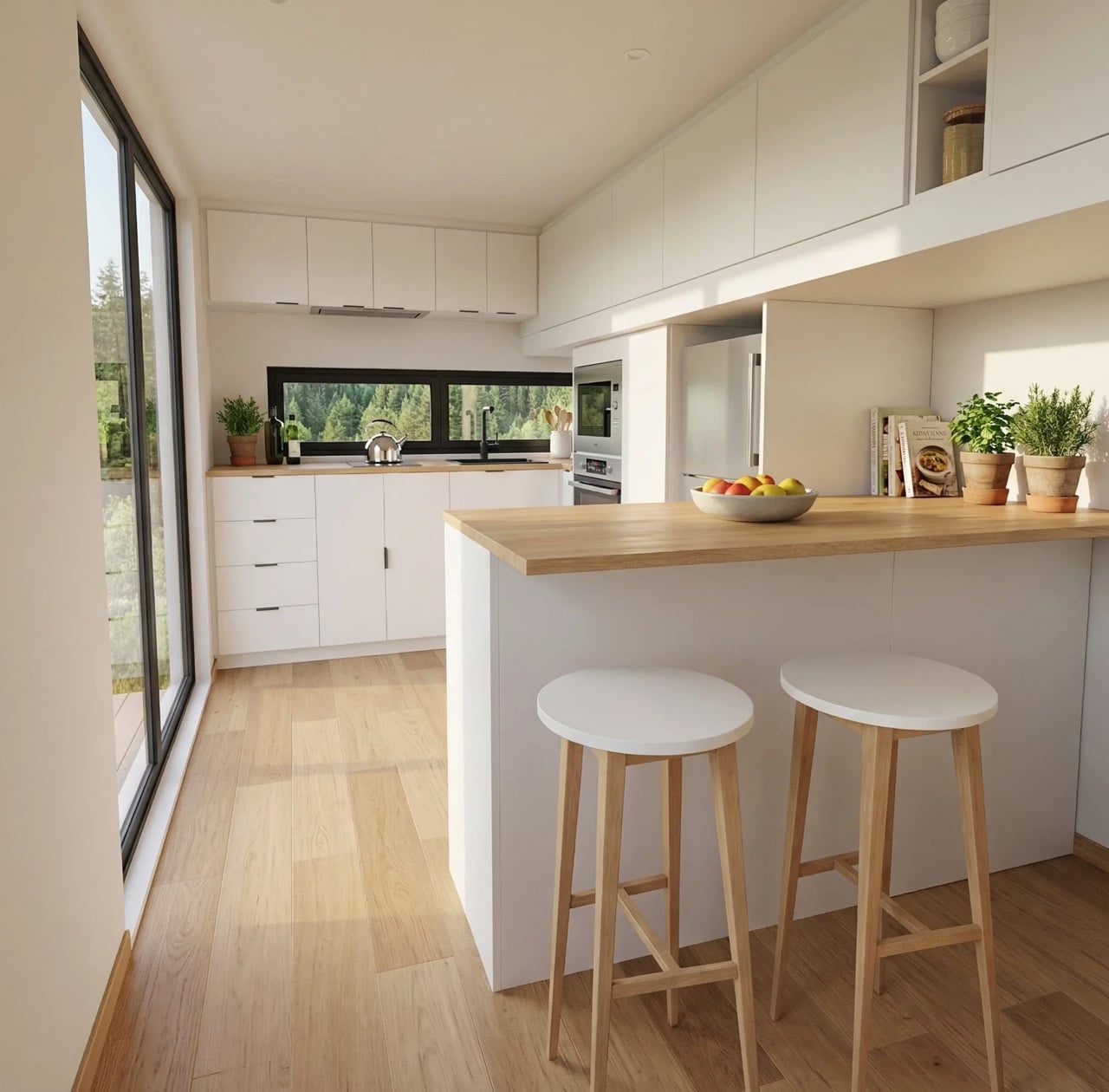
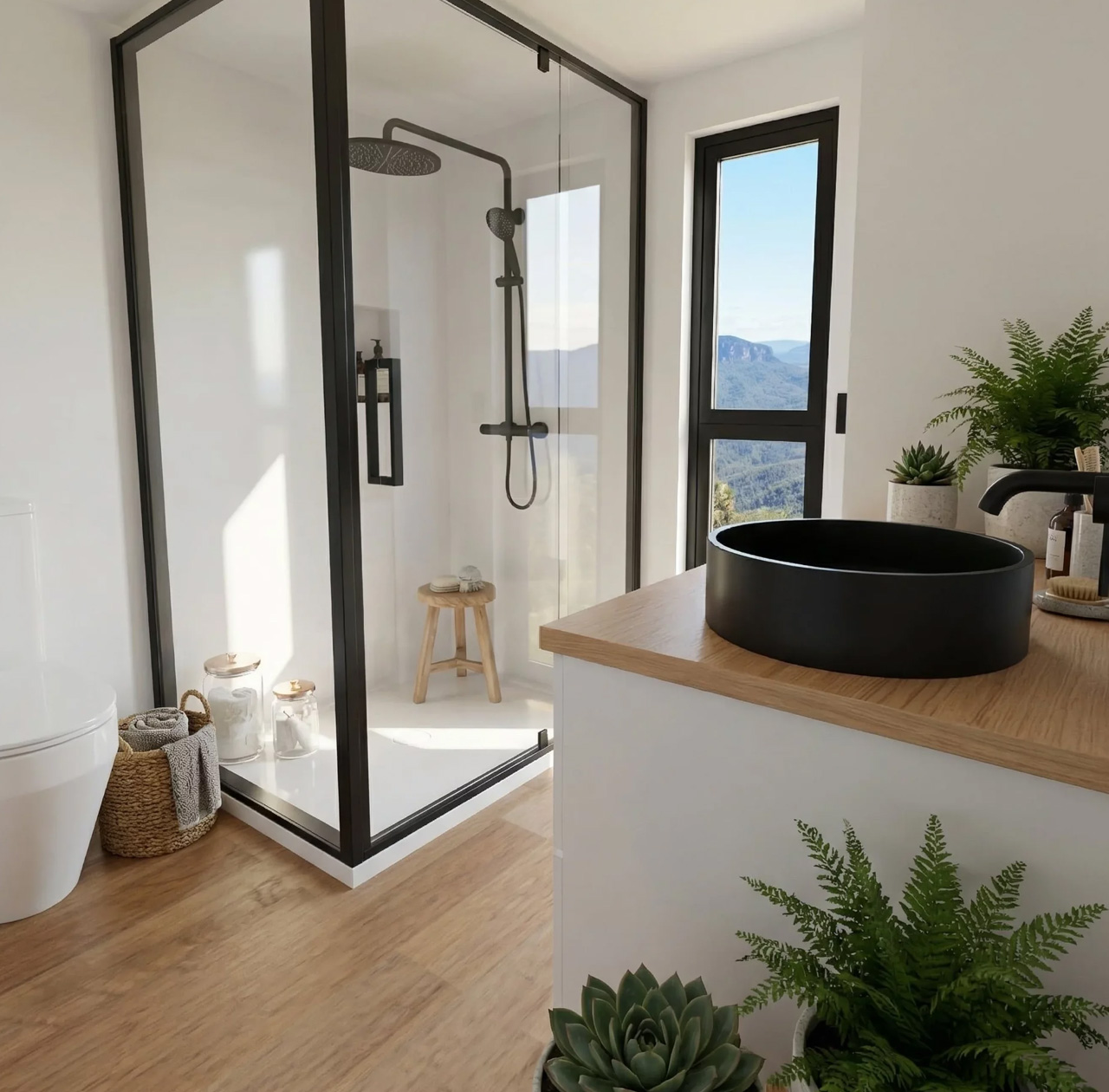
Downstairs, the open-plan living area is anchored by a large kitchen fitted with a picture window. Light moves through the interior in a way that makes the 33 square metres read closer to double that. The design team at Removed has clearly thought hard about storage, building it into nearly every surface without letting it dominate the aesthetic. The result is a home that feels edited rather than cluttered.
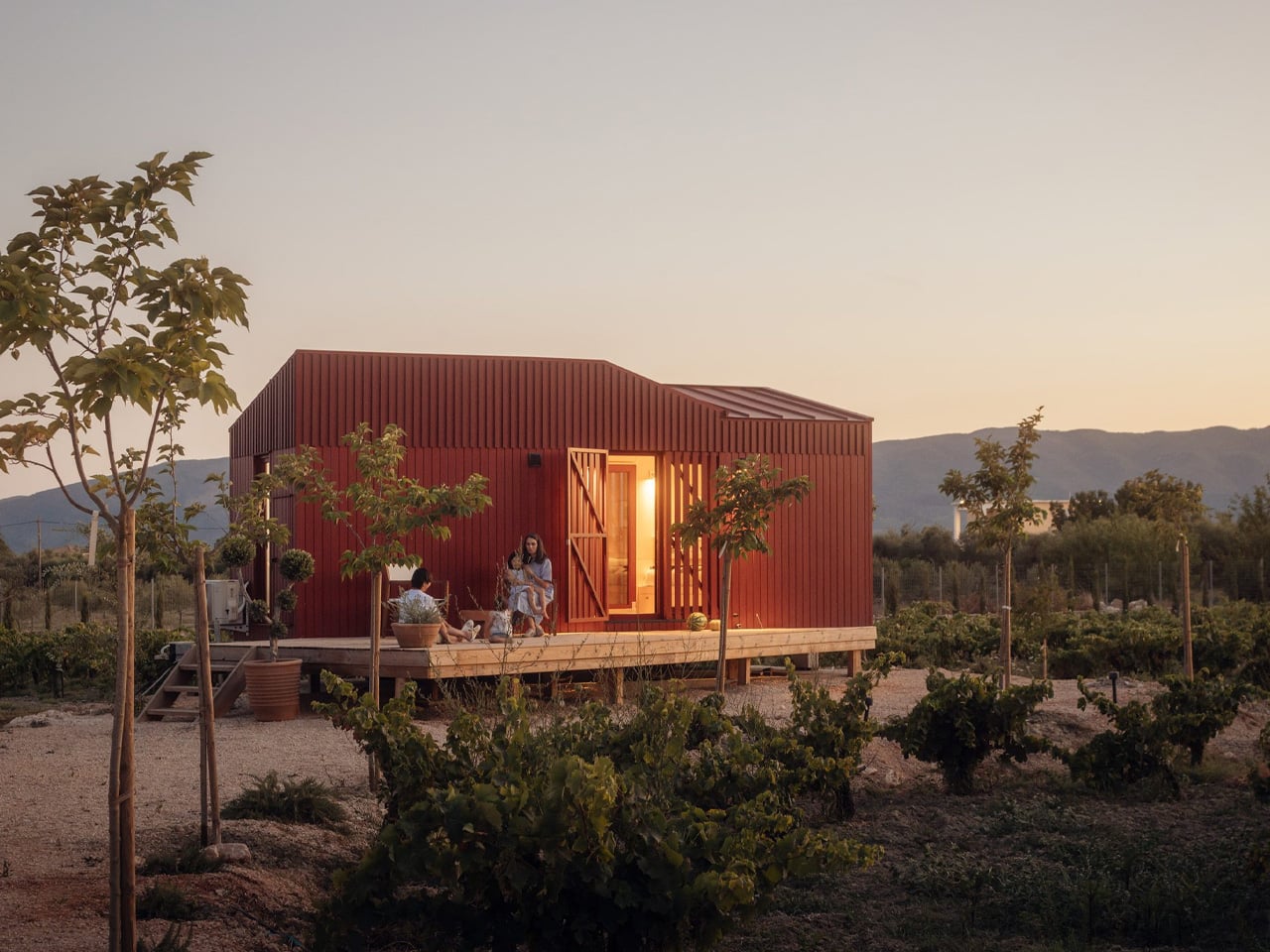
What makes Byron Bay particularly compelling right now is its off-grid capability. Recent builds leaving the Removed factory have been fully off-grid spec, designed for families planting themselves on rural land or lifestyle blocks far from the grid. For a generation priced out of the traditional housing market, that combination of mobility and self-sufficiency is not a novelty. It is a strategy.
Removed Tiny Homes describes Byron Bay as ideal for families, and you can see why it has become one of their most requested models. Two sleeping spaces, serious kitchen infrastructure, and a layout that prioritises flow rather than function alone. Starting from US$104,000, it positions itself as a genuine alternative to a first home, not a weekend experiment.
Byron Bay does not try to convince you that less is more. It just builds the space well enough that you stop counting square metres and start thinking about where to put it.
The post This Australian Tiny Home Has Two Bedrooms, a Picture Window, and Zero Compromises first appeared on Yanko Design.