10 Modular Sofas That Rearrange Like Furniture-Grade Lego

The sofa has always been the most consequential decision in a living room. It’s the largest piece, the one that dictates traffic flow, color direction, and whether guests feel welcome or squeezed. For a long time, it also came with a kind of finality: once it was in the room, that was that. One shape, one configuration, and very little room for second thoughts.

That’s changed considerably. The best modular sofas today don’t ask you to commit to a single layout. They expand, split apart, hide extra surfaces, wrap around awkward corners, or grow alongside a family over the years. Curved modular sectionals are tracking as one of the clearest furniture directions of 2026, and this list pulls together ten designs that show just how far the category has come.
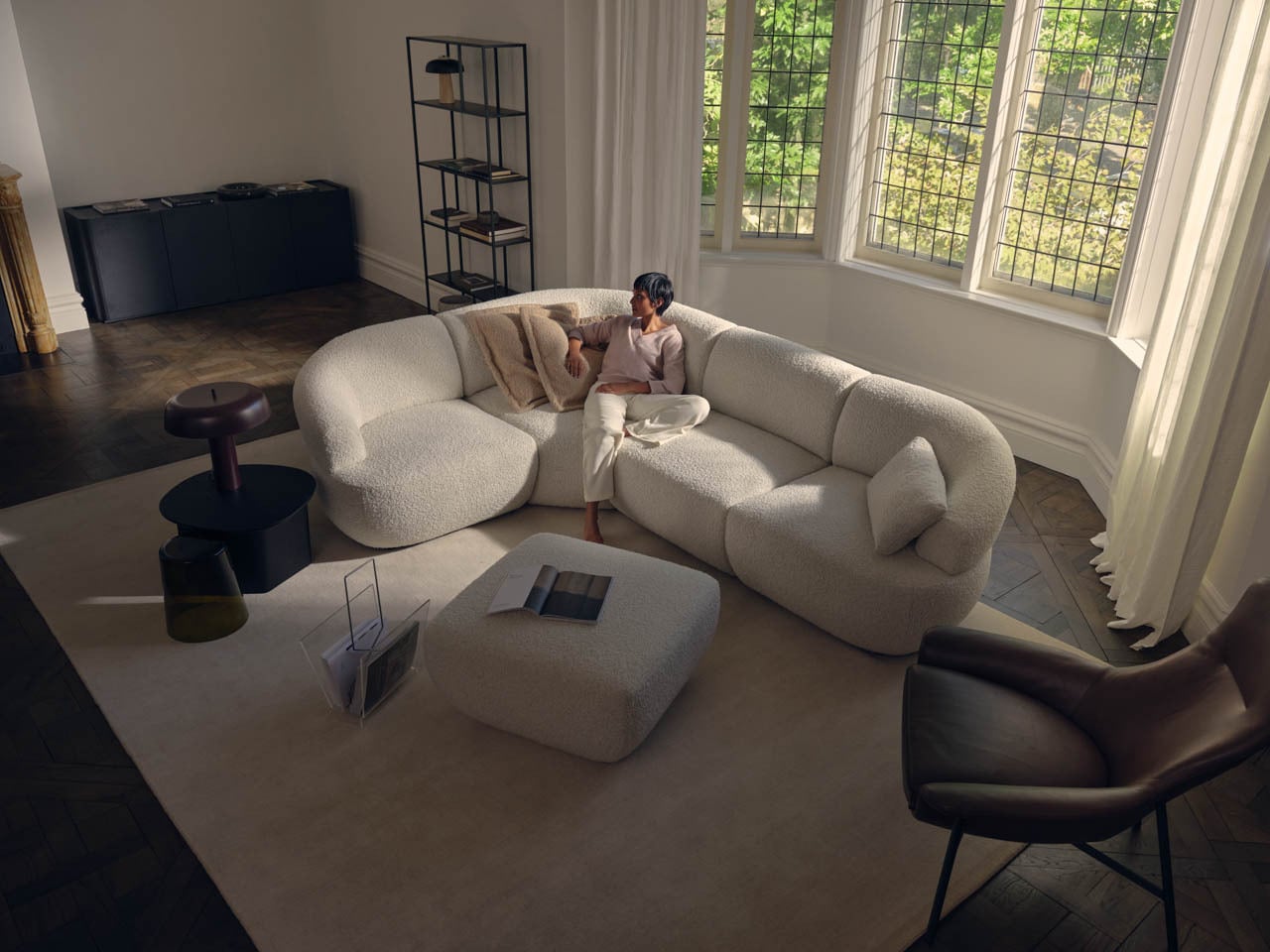
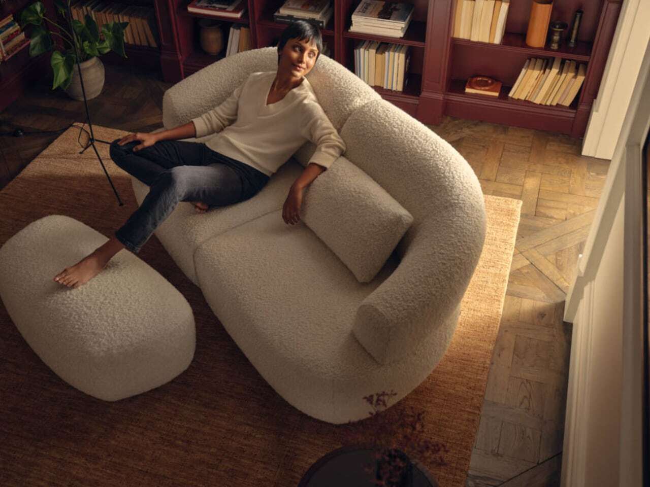
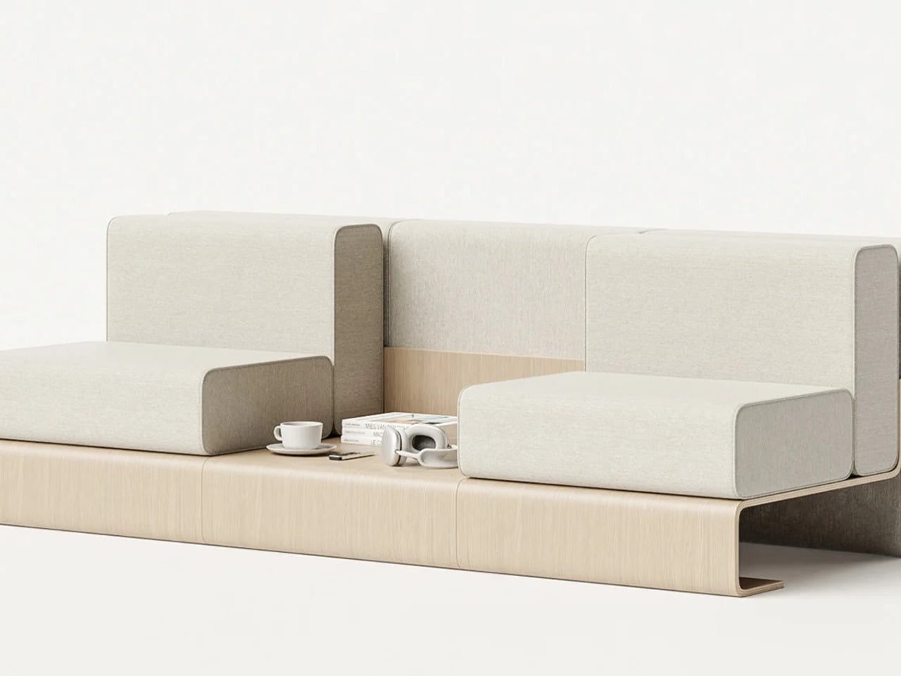
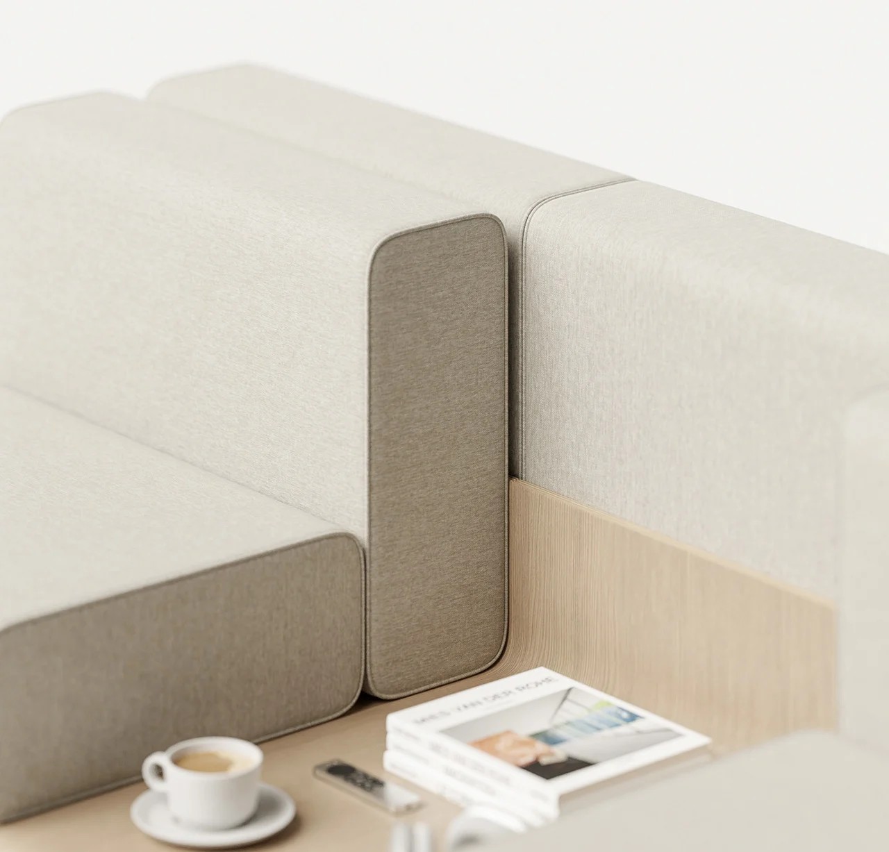
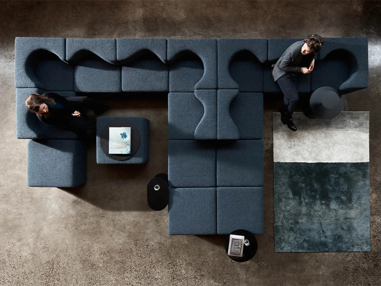
Aura Sofa

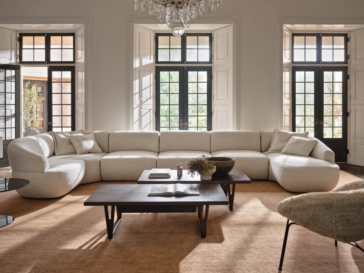
Most modular sofas make their flexibility obvious, which isn’t always a compliment. The Aura Matrix Sofa by King Living is the exception, a curved modular sectional that looks less like a configurable system and more like a single, sculpted object. The pieces flow into each other so naturally that the seating arrangement feels designed rather than assembled, which is a harder thing to pull off than it sounds.

Designer: King Living

What makes it genuinely useful is that the same fluidity works in your favor when the room changes. The modules can follow a bay window, open up for a larger gathering, or pull inward for something more intimate, without ever looking like you just rearranged the furniture. For a room where aesthetics and flexibility both matter, this is the kind of modular sofa that doesn’t force a compromise.

Modular Sofa for Small Spaces, and Small Pets

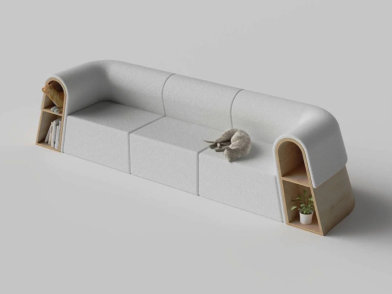
Apartment living comes with constraints that most furniture brands still treat as the buyer’s problem. This modular sofa takes the opposite approach, designed specifically with compact floor plans and the reality of pet ownership in mind. The sections are scaled to fit tighter rooms without making the space feel overrun, and the layout includes thoughtful allowances for small animals that usually end up on the furniture anyway.
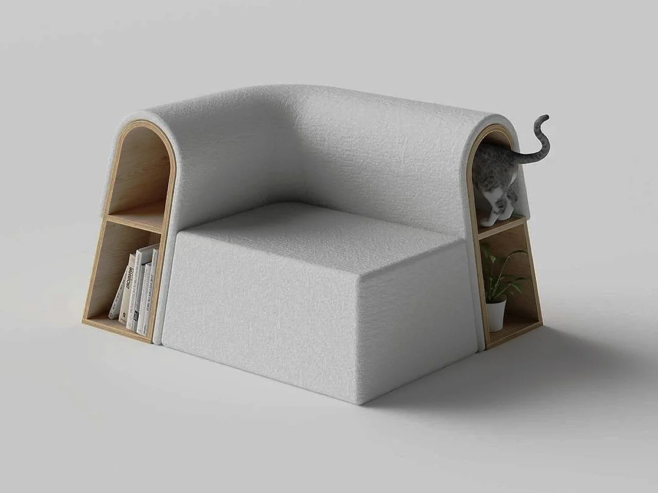
Designer: Sunriu

In a small apartment, furniture that serves more than one purpose without looking like it’s trying too hard earns its keep quickly. This modular sectional sofa manages that by being genuinely comfortable for people while still carving out a spot that a small dog or cat can claim. It’s a small distinction, but one that changes the dynamic of sharing a compact space with a pet considerably.

Silky

A modular sofa that brings its own coffee table along sounds like the kind of feature that gets mentioned once and forgotten in production. The Silky sofa takes it seriously, integrating the table directly into the sectional layout so it becomes part of the arrangement rather than an afterthought. The result is a modular sectional that does the work of two pieces without doubling the footprint.

Designer: Teixeira Design Studio

What that means in practice is a room that feels more composed and less cluttered with competing furniture. Drinks, books, remotes, and phones have somewhere to go without requiring a separate surface to be dragged over and moved again. For smaller living rooms, especially, reducing the number of objects you need to manage without sacrificing comfort is a quietly valuable thing.

Twiny

The Twiny sofa carries a similar idea but takes a more playful approach to hidden utility. Instead of making the table a visible part of the sectional layout, it tucks a surface away inside the sofa that can be pulled out when needed, including by kids who tend to find that kind of reveal irresistible. It’s furniture that has a little surprise built into it.

Designer: Nurettin Badur for Ziel Home Furnishing Technology Co., Ltd.

It matters more than it might seem in homes where the living room doubles as a play space, snack zone, and homework corner within the same afternoon. A modular couch that can quietly produce an extra surface without requiring anyone to drag something over from another room changes the flow of those moments in a small but meaningful way. The hidden table isn’t a novelty; it genuinely earns its place.

The Lounge Chair That Becomes a Sofa When Paired

Not everything on this list started out as a modular sofa. This particular design begins as a lounge chair, and it’s only when you put two of them together that they form a convincing two-seater. The premise is clever, not because it’s a novel trick but because it reframes modularity as a compositional question, asking what furniture should look like when you’re not ready to commit to a full sectional.

Designer: Liam de la Bedoyere

The option to split the seating into two independent chairs when you need floor space is genuinely useful in a studio or single-bedroom apartment. You can open the room for a workout, a gathering, or a change of scenery, then push them back together when you want more casual seating. It’s a flexible arrangement that doesn’t even look like a modular system.

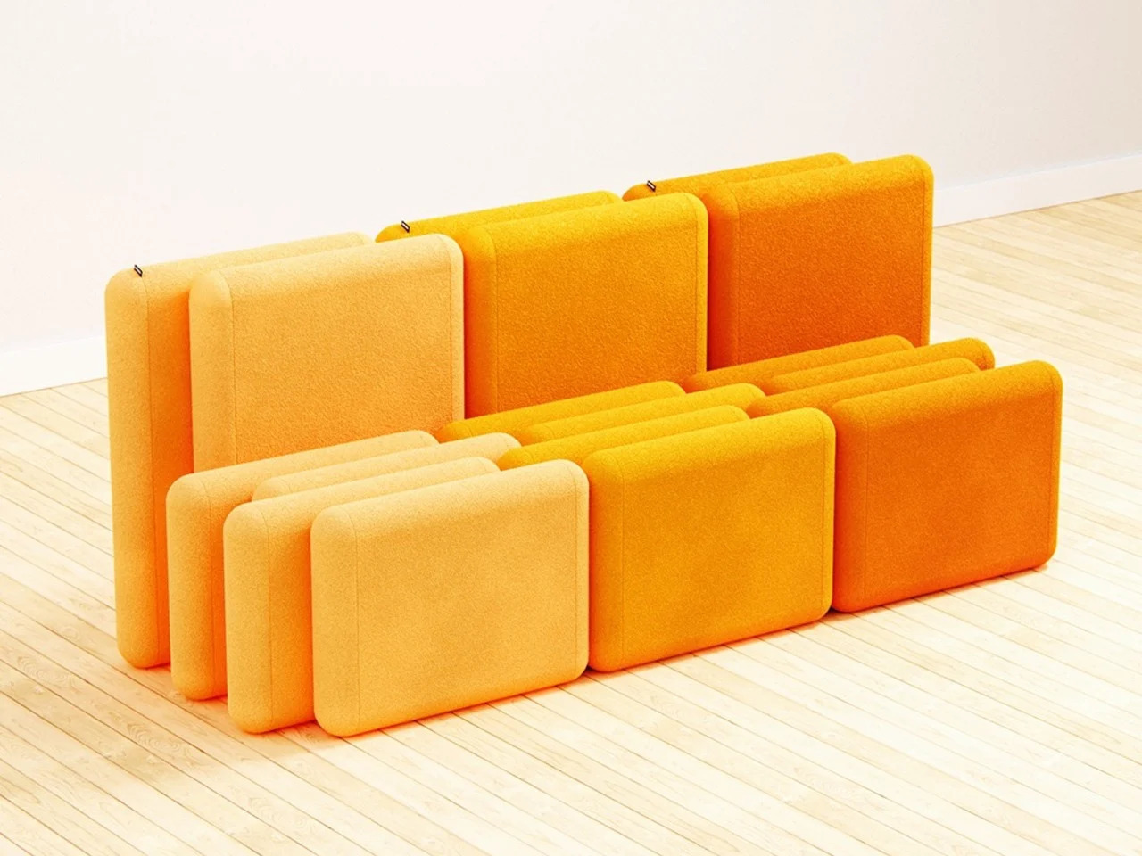
The Crocs-Meets-Lego Modular Seating System

If Lego and Crocs had a furniture design meeting and somehow settled on Japanese minimalism as the shared aesthetic, the result might look something like this modular seating concept. The system is built around interlocking units that snap together in a way that makes rearranging the layout feel low-effort, treating configuration as part of the experience rather than a one-time decision you eventually regret.

Designer: Arman Farahmand

Furniture that invites rearrangement has a way of making a space feel more alive, especially for renters still figuring out how they want a room to work. The clean lines keep the system from looking like a children’s toy, but the assembly logic is approachable enough that adjusting the layout on a weekend doesn’t feel like a major undertaking. It changes with your mood.
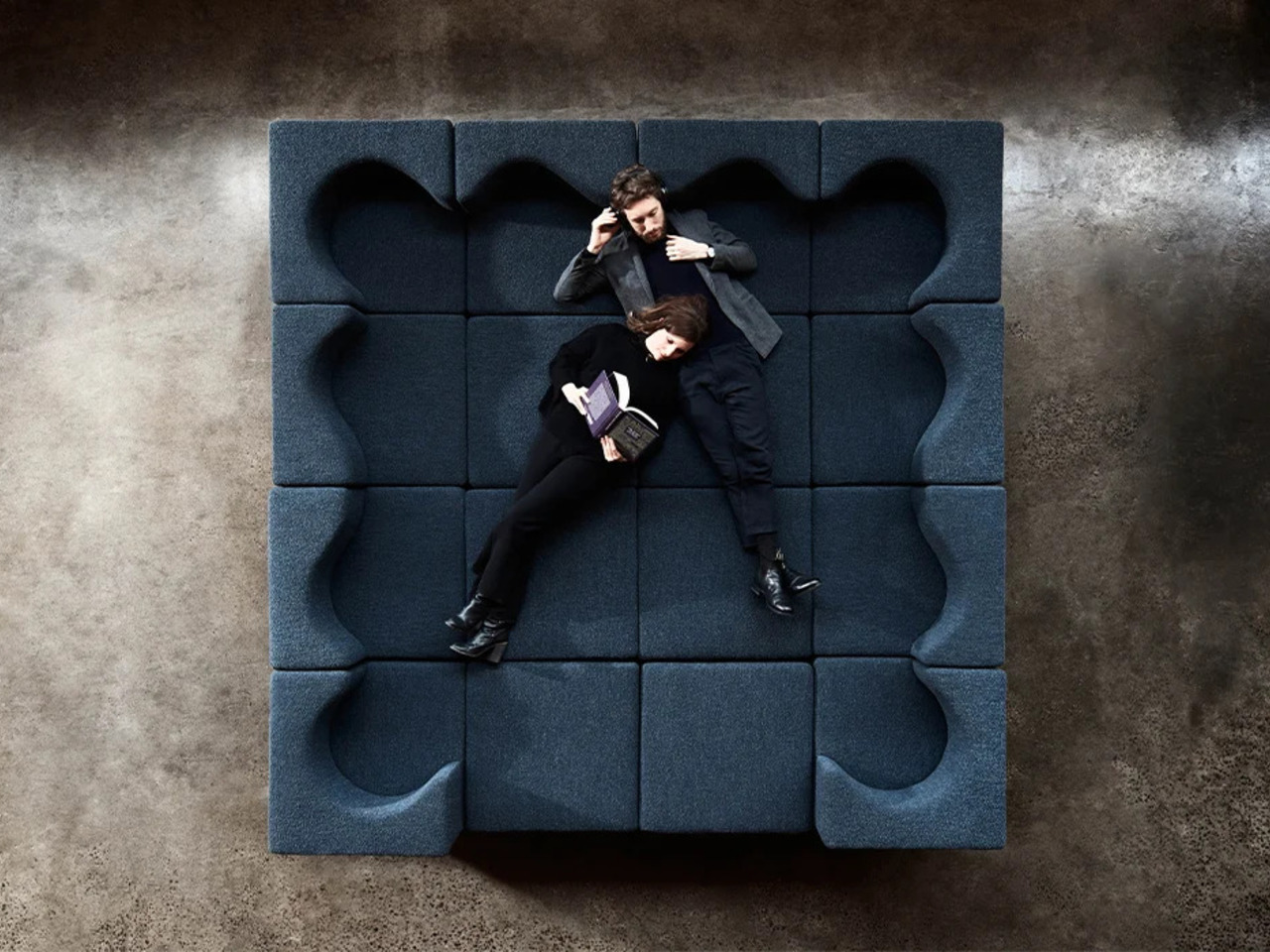
The Accordion Sofa

Modularity usually describes what a sofa can do once it’s in the room. This design moves the conversation earlier, to the part that most furniture brands still treat as the buyer’s problem: getting it through the door. The accordion-compression mechanism lets the sofa collapse into a much smaller form for delivery, which sounds like a technical footnote until you’ve tried maneuvering a full sectional through a narrow hallway.

Designer: Yuqi Wang

For renters and frequent movers, a large sofa that can compress for transport removes one of the most consistent headaches that comes with furnished apartment living. There’s no need to wait for a professional delivery team or spend an afternoon dismantling something that wasn’t designed to be taken apart. Once it’s in the room, it opens back up and behaves like a normal sofa, which is the whole point.

Modular Couch for Waiting Spaces

Not every modular sofa belongs in a living room. This design was built for waiting areas, the kind of shared spaces that usually default to rigid rows of institutional seating and very little else. The modular system makes it possible to arrange the furniture into natural clusters, creating smaller pockets of space that feel more considered than the typical lineup of chairs bolted to a wall.

Designer: Sander Mulder

The emotional dimension matters as much as the spatial one here. Waiting rooms are rarely designed with comfort in mind, and the furniture usually makes that obvious. A modular seating system that allows for softer arrangements, varied orientations, and a more human scale changes the experience without requiring a full overhaul. It’s a quiet reminder that shared spaces don’t have to feel punishing to be in.

The Work-from-Home Modular Lounge System

Working from home still means managing the fact that the sofa tends to be many things in the same room: a desk-adjacent perch in the morning, a lunch spot at noon, and a proper lounge space by evening. This modular lounge system was designed around that reality, with sections that support upright sitting for work-mode postures and reconfigure into something more relaxed when the day winds down.

Designer: Foolscap Studio

The flexibility here doesn’t require the room to look like an office. The modular sections shift without dismantling anything, so moving between a work posture and a full lounge is quick enough to actually happen. For anyone whose living room has to serve double duty on a daily basis, that kind of seating system starts to feel less like an option and more like a given.

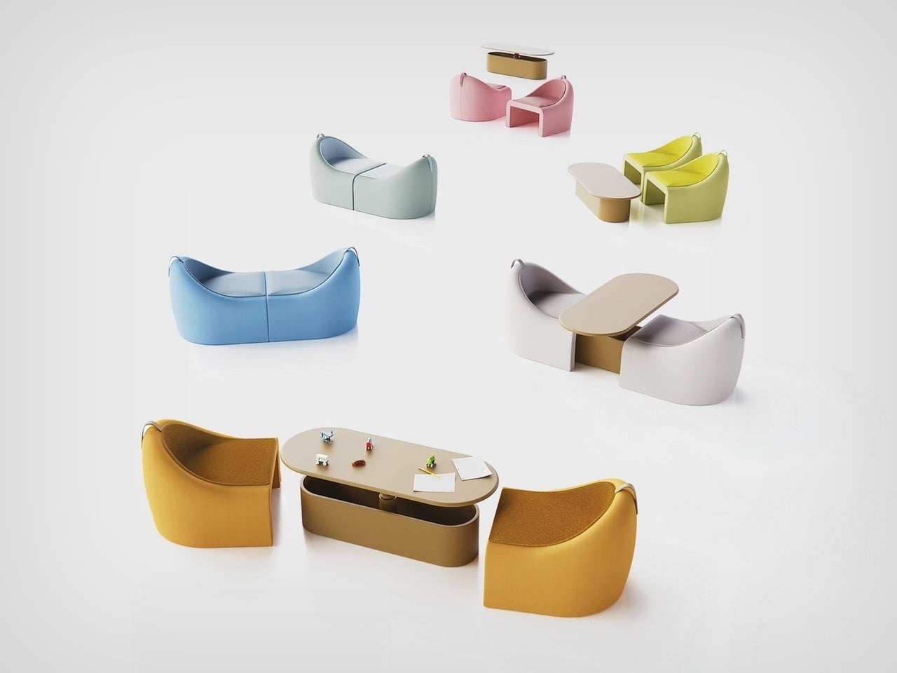
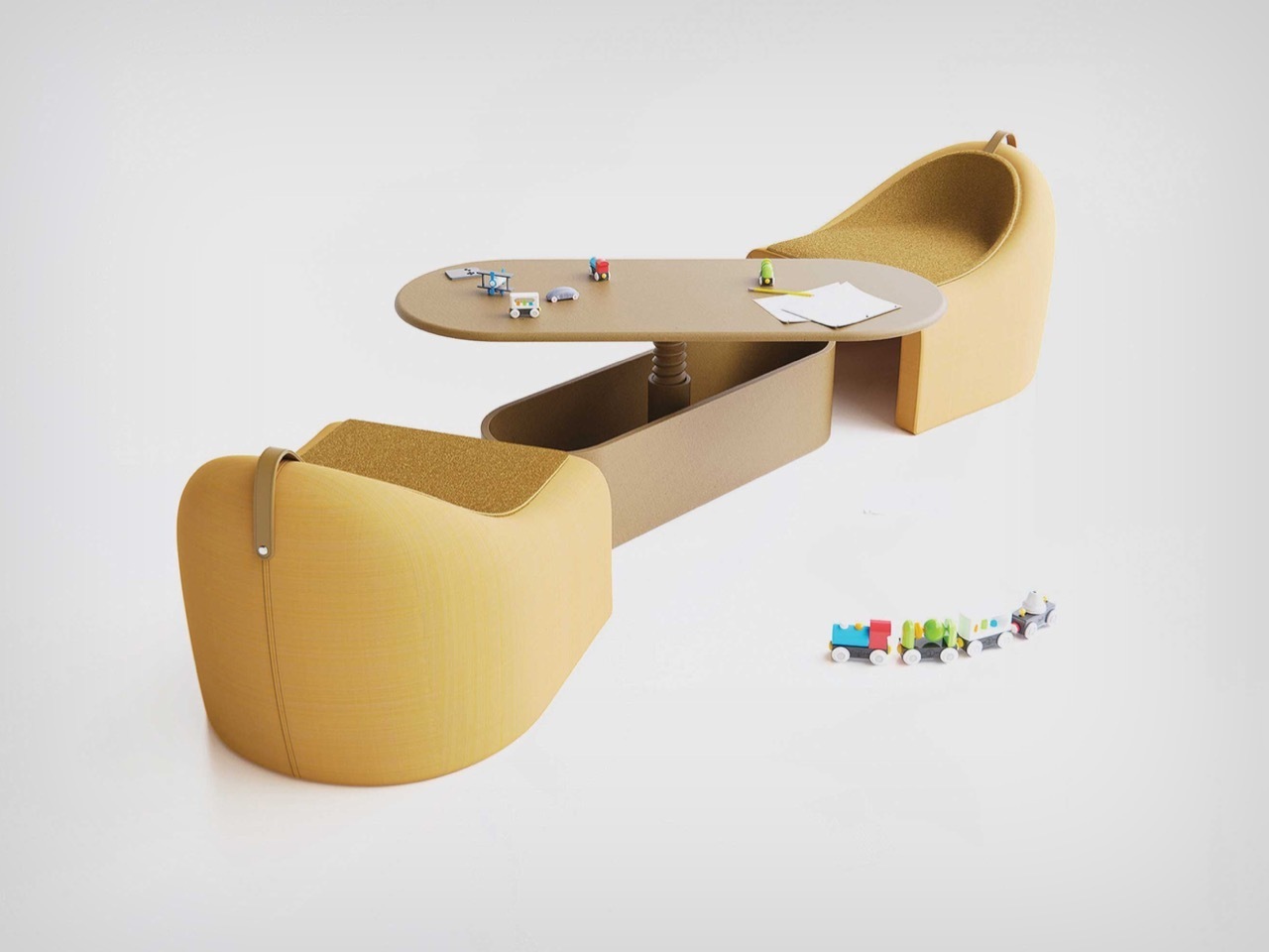
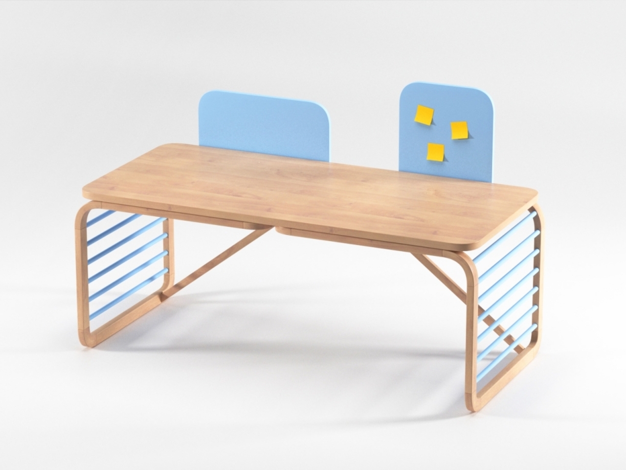
The Crib That Eventually Becomes a Couch

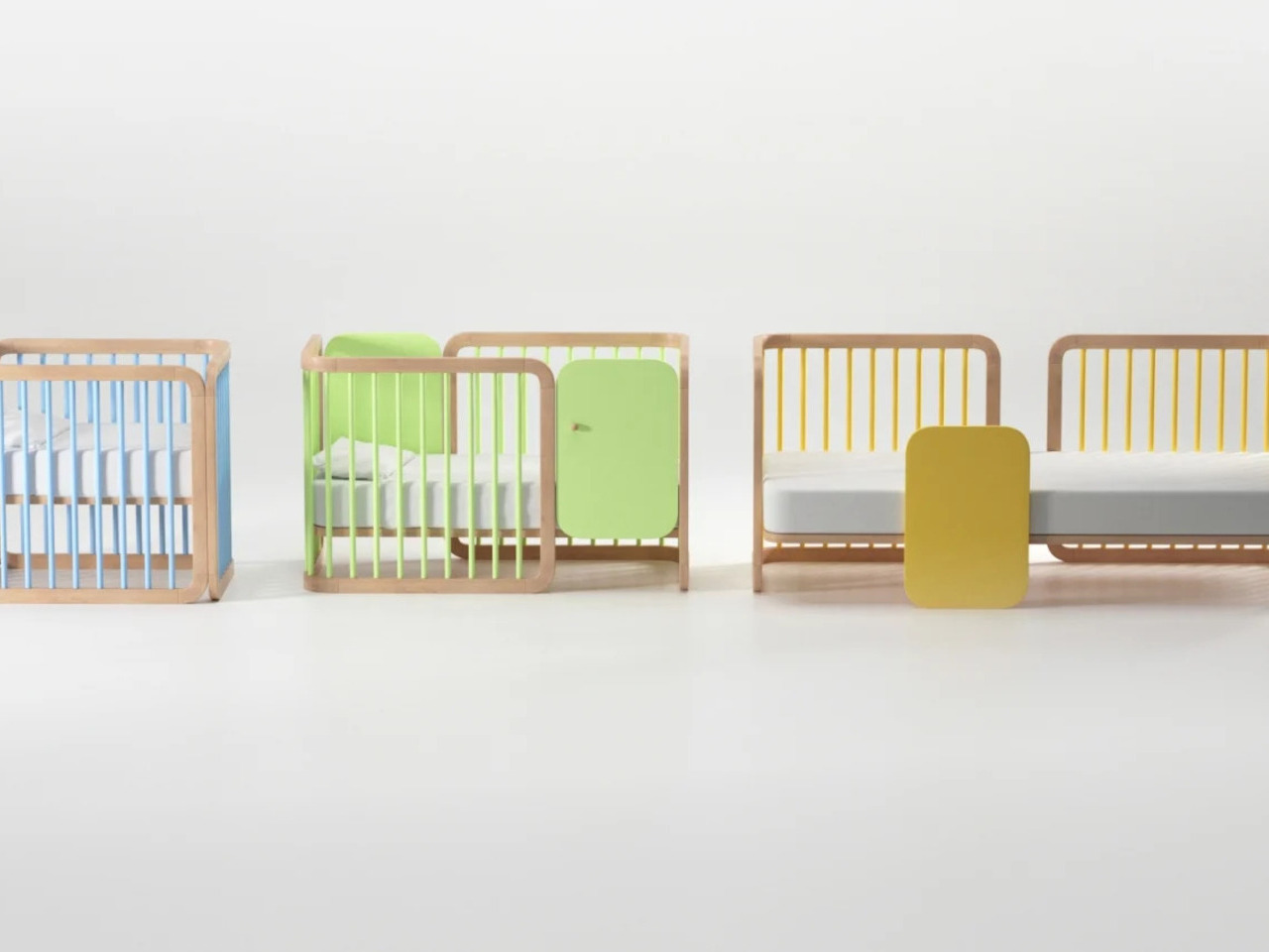
The most dramatic transformation on this list doesn’t involve flipping a sectional into a new shape or pulling a hidden surface out of a compartment. This design changes category entirely, starting as a crib and converting into a couch as the child grows out of it. It’s a long-game approach to furniture that most brands aren’t interested in, largely because selling two separate pieces is the easier model.

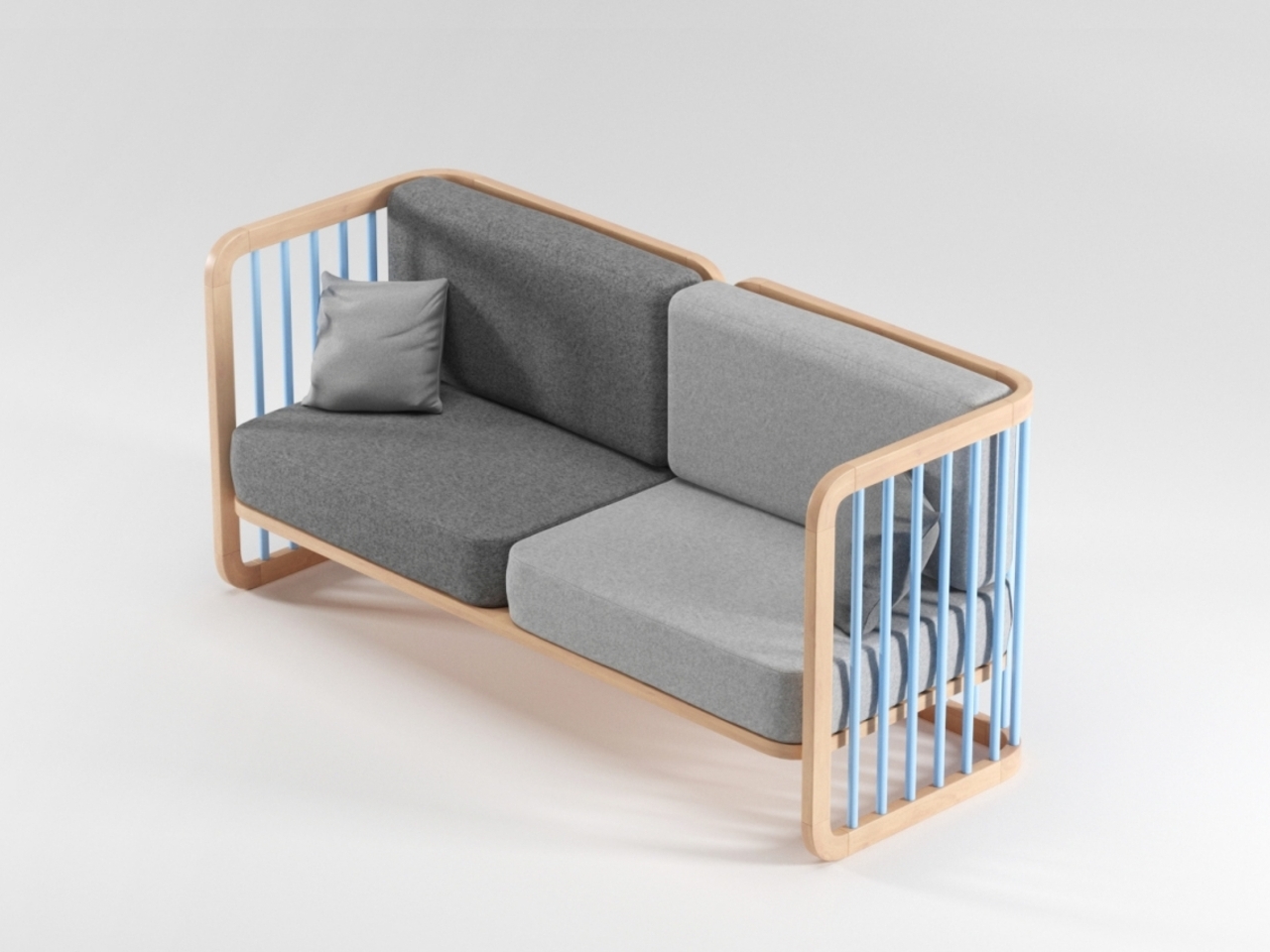
Designer: Vedran Erceg

Children outgrow nursery furniture fast, and most of it ends up in storage or a garage sale before it’s had much chance to earn its keep. A piece that moves from one stage of family life to another sidesteps that cycle almost entirely, which makes it more sustainable, more economical, and a smarter way to think about what furniture should actually do over the long run.

The post 10 Modular Sofas That Rearrange Like Furniture-Grade Lego first appeared on Yanko Design.

This Stationary Tiny Home Has More Room Than Most City Apartments

Most tiny houses ask you to make a trade-off. You get the romance of compact living, but sacrifice the one thing that makes a home feel like a home — space. Craft House, a modular builder operating across Poland, Austria, and Ireland, decided to flip that script entirely with the Samuel, a non-towable module house that prioritizes spacious full-time living over the freedom to hitch and go.

The Samuel sits at 10 meters (32 ft) long and an unusually generous 3.2 meters (10.6 ft) wide, measurements that push well beyond the European tiny home average. That extra width is deliberate. It’s what allows the interior to breathe in a way that most towable models simply can’t, opening up a layout that reads less like a cleverly compressed box and more like a well-considered apartment. The structure wears a single-pitched roof, topping out at 4.1 meters at the ridge, and is finished in engineered wood and metal, a clean pairing that reads industrial without feeling cold.

Designer: Craft House

Inside, the ground floor spans 26 square meters, with a 13-square-meter mezzanine sitting above and a 4.3-square-meter bathroom rounding out the floor plan. The layout makes room for two distinct sleeping areas, and the volume created by the sloped ceiling gives the mezzanine level a loft-like quality that larger homes often fail to capture. Optional off-grid upgrades are also on the table, making the Samuel a realistic candidate for plots far beyond urban infrastructure.

What Craft House understood when designing the Samuel is that the tiny home market has two very different buyers. There’s the nomad, always ready to hitch the trailer and head somewhere new. Then there’s the person who simply wants a well-designed, right-sized home that doesn’t carry the financial weight of a conventional build. Samuel is clearly built for the latter. By dropping the wheels and leaning into a fixed footprint, Craft House was able to allocate width and volume in ways that towable structures prohibit by law and logistics.

Priced at around US$72,000, the Samuel lands in a range that makes it a genuinely viable alternative to traditional housing in several European markets. It isn’t trying to be everything. You won’t be parking it in a new location every season. What it offers instead is something arguably more valuable: a permanent, considered space that proves small doesn’t have to mean cramped, and that the best tiny homes aren’t always the ones with the biggest adventures, but the ones that make staying put feel worth it.

The post This Stationary Tiny Home Has More Room Than Most City Apartments first appeared on Yanko Design.

This NYC Restaurant Was Built From Materials Other Designers Threw Away – And It Looks Stunning

Interior design has a quiet problem that rarely makes it into glossy magazine spreads. Behind the polished renders and immaculate finishes lies an uncomfortable truth. Enormous amounts of material are discarded in the pursuit of perfection. Samples are ordered and then rejected. Finishes are replaced for being slightly off. Entire surfaces are redone for the sake of visual consistency. Waste is not a byproduct. It is often built into the process.

Gourmega in Manhattan offers a different way of thinking.  The restaurant does not attempt to hide imperfections. It leans into it. It reframes it. And in doing so, it turns restraint into a form of luxury.

Designer: Mariam Issoufou Architects

The space is described as a zero-waste restaurant, but that label only scratches the surface. The design is not just about reducing waste. It is about redefining what is considered valuable in the first place. The black lime-washed walls hold uneven textures that catch light differently across the room. The black-stained cork floor carries a softness and irregularity that feels lived in rather than manufactured. Walnut chairs with black vegan leather sit quietly within this palette, never demanding attention but always belonging.

Founder Mariam Issoufou grounds this material honesty in history. The site was once known as the Land of the Blacks, a place where African-owned farms and early Black social spaces existed in New York. Rather than translating this into literal symbols, the design holds it in the atmosphere. The darkness is not emptiness. It is density. It is memory. It is a way of anchoring the present within a layered past.

Then, just when the room settles into its depth, a moment of contrast appears. A translucent yellow circular pivot door marks the transition to the kitchen. It glows. It moves. It reveals silhouettes of chefs at work. What could have been a simple divider becomes a performance. The act of cooking is no longer hidden. It becomes part of the dining experience, flickering in and out of view like a living backdrop.

At the center of the space sits the most radical decision. A circular communal table made of alabaster and travertine. It can be split into seven smaller tables, allowing the restaurant to shift from a daytime cafe to a nighttime supper club. But its real impact is social. Circular seating removes hierarchy. There is no head of the table. No privileged position. Every diner shares the same spatial status. In a city defined by speed and stratification, this simple gesture feels quietly revolutionary.

The project extends beyond its walls through its collaboration with Rethink Food. Gourmega contributes to a system that provides free meals across New York, linking fine dining to food access in a way that feels integrated rather than performative. Sustainability here is not just about materials. It is about relationships and responsibility.

Even the walls resist finality. They are treated as exhibition surfaces for local African American artists, including bronze panels by Nifemi Marcus-Bello. The space is designed to change, to hold new stories over time, rather than remain frozen as a finished object.

Gourmega does something that many interiors avoid. It accepts that making something meaningful does not require making it perfect. It suggests that beauty can come from constraint, that history can be carried through material choices, and that design can hold both dignity and imperfection at once. In a discipline obsessed with control, this restaurant offers something far more compelling. It lets go.

The post This NYC Restaurant Was Built From Materials Other Designers Threw Away – And It Looks Stunning first appeared on Yanko Design.

5 Best Tiny Homes of May 2026 Prove Tiny House Design Stopped Being Cute — It Became a Category

Tiny homes had a moment. Then they had another. Then, somewhere between the Instagram hashtags and the weekend specials, they quietly became something more serious. The designs releasing in 2026 aren’t pitching a lifestyle fantasy — they’re solving real problems: family space, year-round comfort, material quality, and genuine mobility. The builders showing up this year aren’t compensating for square footage. They’re rethinking what square footage is even supposed to accomplish.

What’s changed is the thinking behind the build. Reverse floor plans. Apartment-scale dimensions on trailer frames. Japanese material sensibility packed into a 130-square-foot shell. Choices that match what you’d find in a well-funded apartment remodel, not a budget cabin kit. These five tiny homes, all surfacing this spring, represent what the category looks like when builders stop apologizing for the format and start designing with full conviction.

1. Onda

The Tiny Home That Put Bedrooms on the Bottom and Changed the Entire Conversation

The Onda doesn’t tweak the tiny home formula — it inverts it entirely. Australian builder Removed Tiny Homes placed all three bedrooms on the ground floor and pushed the kitchen, living room, and bathroom to the elevated upper level, a reverse loft plan that nobody had executed quite like this before. Built on a double-axle trailer and finished in steel with warm wooden accents, it measures 10 meters long, 3.4 meters wide, and 4.5 meters tall, pushing it firmly into apartment territory.

What the upside-down layout gives you is privacy on your own terms. Bedrooms stay quiet, dark, and grounded — actual breathing room away from the communal noise above. A full-height hallway with 200cm of standing clearance connects each room below, so moving through the home never feels cramped. An optional deck spills the upper-level living space into the open air. For a family that wants to downsize without shrinking their sense of home, this is the most coherent answer currently on the market.

What We Like

  • The reverse loft layout is genuinely original — private spaces below, communal life above — and the spatial logic holds up completely once you see it in practice
  • At 70 square meters across a double-axle trailer, the scale rivals a proper apartment without surrendering mobility or road-legal status

What We Dislike

  • The 4.5-meter height may face clearance restrictions in some regions, limiting where the Onda can realistically be parked or towed permanently

2. Audrey

The Single-Level Build That Makes Efficient Living Look Effortless

There’s a certain confidence in keeping things flat. CozyCo’s Audrey is a single-level build, 7.2 meters long and mounted on a triple-axle trailer, and its restraint is exactly what makes it work. The exterior pairs corrugated aluminium with timber-look panels — a combination that slots into a bush property, a coastal block, or a suburban backyard without missing a beat — while a neatly tucked propane storage box keeps the silhouette clean. It looks like a home that knows precisely what it wants to be.

Inside, the open studio layout does what smart single-level design does best: it makes the space feel larger by refusing to fight itself. Sliding glass doors bring in light and dissolve the boundary between inside and out. R2.5 insulation, double-glazed windows, gas, hot water, and air conditioning mean you can live in the Audrey year-round without a second thought. A storage bed removes the need for bulky furniture. Whether you’re running it as a guest suite, a short-stay rental, or a granny flat, it earns its position effortlessly.

What We Like

  • The combined thermal package — R2.5 insulation, double-glazed windows, and full air conditioning — makes it genuinely livable across every season without requiring expensive upgrades after purchase
  • Single-level circulation eliminates the ladder-and-loft compromise that makes most tiny homes feel like clever camping rather than actual living

What We Dislike

  • Sleeping comfortably up to two people limits the Audrey’s appeal — it isn’t a family home and doesn’t pretend to be, but that’s a real ceiling on its long-term versatility
  • At 7.2 meters, the footprint sits on the smaller end, even for a tiny house, meaning storage and layout flexibility have a defined and non-negotiable limit

3. Harmony

The Family Tiny Home That Proves Four People Don’t Need Four Thousand Square Feet

The Harmony was originally commissioned by a family of four in Southern Alberta who were done with the time and financial weight of conventional living. What emerged from that brief is one of the most thoughtfully designed family tiny homes on the market right now. Built by Alberta-based Teacup Tiny Homes on a triple-axle trailer and clad in metal and wood, it measures 34 feet long and 8.5 feet wide — road-legal across North America, towable without a special permit — with 423 square feet of considered interior space.

That floor plan matters because it holds the things families actually use. A sofa, a fireplace, and a dedicated TV wall mean family evenings don’t have to be compressed into a bench seat. What the Harmony gives you specifically is the freedom to move — across provinces, across states — without putting your life into storage. Mobility and stability, sharing the same triple-axle frame. For a family that wants flexibility without surrendering the feeling of a real home, this is one of the most convincing arguments the tiny home world has produced.

What We Like

  • Standard 8.5-foot road-legal width means the Harmony can be towed anywhere across North America without a special permit — genuine mobility, not just the promise of it
  • 423 square feet with a sofa, fireplace, and dedicated TV wall means family life doesn’t get flattened into efficiency mode the moment you walk through the front door

What We Dislike

  • The metal-and-wood cladding combination, while durable and practical, is familiar territory — the Harmony doesn’t push any aesthetic boundaries and looks exactly like you’d expect it to
  • At 34 feet long, site placement requires real planning, and not every property has the physical footprint to accommodate it without trade-offs

4. Shoji

The 130-Square-Foot Home That Makes the Case for Japanese Minimalism on Wheels

At 130 square feet and just 5.5 meters long, the Shoji is a study in not flinching. Completed in November 2022 and sited in Brittany, France, it was designed by Koleliba alongside architect Hristina Hristova as the brand’s S Tiny model. The name points directly to its influence: clean lines, natural materials, and a deep respect for negative space. Vertical timber siding, a metal roof, and expansive sliding glass doors give it an exterior that reads equally well in a forest clearing or an open countryside field.

Inside, the birch plywood interior does what Koleliba does best — furniture becomes a seamless continuation of the architecture. A U-shaped couch converts into a queen-size bed. There’s a dedicated home office desk, essential kitchen appliances, a washing machine, and a roomy shower, all packed into a footprint that defies logic. Electric floor heating and solid winter insulation make it genuinely year-round livable. What the Shoji gives you is proof that living with intention — rather than abundance — isn’t a lesser version of home. It’s a stronger argument for what home can be.

What We Like

  • The furniture-as-architecture approach means nothing feels crammed in or improvised — every element is a deliberate continuation of the interior, not an afterthought placed inside it
  • Electric floor heating and serious winter insulation make this a genuine four-season home, not a warm-weather retreat built for photography

What We Dislike

  • 130 square feet is a real constraint — there’s no graceful way to accommodate guests, and solitude becomes a structural feature of the design, whether you planned for it or not
  • As a completed, commissioned project, the Shoji isn’t a ready-to-buy model — interested buyers would need to engage Koleliba directly, with no standard production line to order from

5. Urban Gable Park

The Park Model That Stopped Making Compromises and Started Making a Statement

The Urban Gable Park is what happens when a builder decides to stop apologizing for comfort. At 30 feet long and 11 feet wide — significantly beyond the standard 8.5-foot width that most trailer-based homes are constrained to — it’s a single-level park model that gives rooms actual space to breathe. The bedroom has real headroom. The living area fits a proper sofa. That extra width isn’t just a number on a spec sheet; it fundamentally restructures how the interior feels and how you move through it on an ordinary Tuesday.

The material choices confirm the intent. The kitchen comes fitted with maple slab cabinets, an induction cooktop, a full-size fridge, and a dishwasher, all set within a striking limewash alcove. In the bathroom: a concrete vessel sink, terrazzo tile floors, matte black fixtures, a walk-in shower, and a stacked washer/dryer. These aren’t budget finishes dressed up to photograph well — they’re material decisions made by people who know exactly what they’re doing. The Urban Gable Park gives you apartment-grade quality in a format that doesn’t ask you to keep justifying the choice to everyone you meet.

What We Like

  • The 11-foot width fundamentally changes how the interior reads — rooms have breathing room, and daily living stops being an exercise in constant spatial problem-solving
  • Kitchen and bathroom material quality — limewash alcoves, terrazzo tile, maple slab cabinets — matches what you’d find in a thoughtful urban apartment remodel, not a prefab compromise

What We Dislike

  • The 11-foot width requires a road permit for towing on public roads, which meaningfully limits relocation flexibility compared to any standard road-legal tiny home
  • Built as a park model designed to stay in place, the Urban Gable Park won’t suit buyers expecting the full mobility and spontaneity of a traditional tiny home on wheels

The Cute Phase Is Over — What Replaced It Is Far Harder to Dismiss

What these five homes share isn’t a size or a price point — it’s a standard. None of them asks you to romanticize the limitations of small living. They ask whether those limitations are even real. The Onda inverts the entire floor plan. The Shoji strips everything down to what actually matters. The Urban Gable Park adds width and lets the rooms speak for themselves. Each one represents a distinct position on the same argument: that less space is not, by definition, a lesser life.

The category has grown up. The builders who matter right now aren’t chasing aesthetics for a mood board feature — they’re engineering real precision into formats that serve families, couples, remote workers, and anyone tired of paying for rooms they never enter. If May 2026 is a signal of where tiny home design is heading, the message reads clearly: the cute phase is over. What’s replaced it is something far more interesting, and far harder to dismiss.

The post 5 Best Tiny Homes of May 2026 Prove Tiny House Design Stopped Being Cute — It Became a Category first appeared on Yanko Design.

This Quebec Home Doesn’t Fight the Forest – It Disappears Into It

Certain kinds of architecture don’t announce themselves. La Maraude, the latest project by Nathalie Thibodeau Architecte, is exactly that — a compact residential dwelling tucked into the dense woodlands of Boileau, in Quebec’s Outaouais region, that earns its presence through restraint rather than spectacle. Completed in 2024, it’s one of the more quietly compelling houses to come out of Canada in recent memory.

The name itself carries meaning. ‘Maraude’ — to roam, to forage — hints at the relationship the house cultivates with its surroundings. Rather than claiming a dominant position along the river’s edge, the architects deliberately set the home deeper within the treeline, orienting the house’s interior life entirely toward the forest. It’s a gesture that shapes everything else about the project.

Designer: Nathalie Thibodeau Architects

The design draws directly from Quebec’s vernacular architectural tradition — steeply pitched rooflines, grounded proportions, and a material palette that feels native to the region. The exterior is clad in natural cedar shingles and topped with a metal roof, two materials with deep roots in the local building culture. These aren’t nostalgic choices. They’re translated through a contemporary lens, stripped of ornament, reduced to their essential geometry. “Designed with particular attention to simplicity, functionality, and respect for traditional codes, La Maraude embodies a successful dialogue between contemporary architecture and local traditions,” says Nathalie Thibodeau Architecte.

What makes the spatial sequence genuinely interesting is the use of two courtyards as organizing devices. The plan doesn’t simply open to the outdoors — it pulls the forest in, fragmenting the landscape into a series of framed views that shift with the seasons. One courtyard faces north, more sheltered and partly enclosed by the building itself, oriented toward higher ground. The other faces south, brighter and more expansive, drawing the eye down toward the lower terrain. The result is a house that reads differently in every light condition, every month of the year.

The second volume, arranged over two levels in response to the site’s slope, plays a more introverted role. Openings here are smaller and precisely placed to frame specific moments within the tree canopy — quiet apertures rather than panoramic statements.

Photographed by Maxime Brouillet, La Maraude has the look of a project that will age well, both materially and culturally. It’s already being discussed as a potential anchor for a broader ensemble of small retreats on the site — a first building in what could become a considered, evolving conversation between architecture and landscape.

The post This Quebec Home Doesn’t Fight the Forest – It Disappears Into It first appeared on Yanko Design.

Inside the Log-and-Glass Home Olson Kundig Built for a Builder on Salt Spring Island

Salt Spring Island doesn’t need much convincing — it already has the cliffs, the meadows, and the trees. The name sounds more like a childhood storybook setting than an architectural statement — and that tension is exactly the point. Nestled amidst the trees and rugged cliffs of Salt Spring Island, BC, the Daisy Ranch is Olson Kundig’s most recent residential project, led by design principal Tom Kundig. It’s casual. It’s rugged. And it’s entirely, unapologetically itself.

The house sits at the edge of a sweeping meadow, anchored by a log structure that feels like it could have always been there. The primary move is a rugged glass box paired with a long, cantilevered roof that stretches over a generous deck — a roof that earns its keep through BC’s shifting seasons, offering shelter without closing anything off. What makes it work visually is the layering: large square-cut logs and glass soften the rust-colored patina of weathered steel cladding, giving the exterior a palette that feels earned rather than designed.

Designer: Olsun Kundig

The plan is organized along a clean linear axis, with two distinct volumes bisected by an eastern entry stairway. The front door is tucked under a generous overhang — a small but considered gesture that grounds the arrival sequence without dramatizing it. The northern volume, clad in wood and steel, handles the private program: a primary suite and additional bedrooms, with framed view corridors that offer deliberate glimpses of the landscape rather than full exposure. Privacy and connection, calibrated carefully.

Inside, the bathroom is where the project gets most personal. Widespread use of wood infuses the space with warmth, while a clawfoot tub set before corner windows underscores the home’s persistent connection to the landscape outside. It’s the kind of detail that feels borrowed from an older, more tactile way of building — which is precisely the intention.

The project was designed in close collaboration with the client, Patrick Powers, a builder and fabricator who also served as general contractor. That relationship left its mark. The house doesn’t feel like it was delivered to a site; it feels like it was made with the site, material decision by material decision.

As Kundig put it: “There’s a lineage at play in this project, a quiet innovation that comes from the shared DNA of materials and relationships.” The Daisy Ranch is the kind of project that doesn’t need to announce itself. It sits lightly on its land, opens wide to its meadow, and gets on with the business of being lived in.

The post Inside the Log-and-Glass Home Olson Kundig Built for a Builder on Salt Spring Island first appeared on Yanko Design.

5 Mountain Homes That Look Carved From the Cliffs They Stand On

There is a rare, almost cinematic stillness found only in homes perched high above the world. At elevations ranging from 5,000 to over 10,000 feet, mountain residences occupy a space where clouds drift below terraces and horizons stretch endlessly. By contrast, most cities sit between sea level and roughly 1,500 feet, shaped by density, noise, and constant movement.

Life at altitude reshapes perception. The air feels sharper, the light more vivid, and architecture must respond with both resilience and sensitivity. Today’s mountain retreats move beyond the heavy, dark enclosures of the past, embracing openness, sustainability, and panoramic immersion. Here is how these homes are not just shelters but experiences designed around silence, scale, and awe.

1. A Natural Extension of the Landscape

The most refined mountain homes are conceived not as objects placed upon terrain, but as forms emerging from it. Architects study slope, wind, and geology, shaping structures that echo the lines of ridges and the layered patterns of exposed rock. Locally sourced stone, textured concrete, and weathered timber allow the residence to visually dissolve into its surroundings.

This approach softens the boundary between built space and wilderness. Walls appear to grow from the hillside, terraces align with natural contours, and expansive glazing draws the mountain indoors. The result is a dwelling that feels anchored, quiet, and inevitable, as though the landscape itself had composed the architecture.

Geometric white hotel built among tall evergreen trees, with angular façades and a central tower labeled 'ELA'.

Modern wooden building with glass lattice walls, warm interior lights, and a row of potted evergreens along the entrance.

Modern hotel bedroom with a large angular window wall, a king bed with white bedding and decorative pillows, and a seating nook nearby

Perched high above the Naggar Valley in Himachal Pradesh, India, Eila emerges with quiet restraint rather than spectacle. Designed by MOFA Studio, the art retreat appears to rise organically from the mountainside, its fluid forms tracing the land’s natural contours instead of reshaping them. Developed through advanced computational processes, the cottages respond sensitively to slope, sunlight, and distant horizons, making the architecture feel discovered rather than imposed. A stepped masterplan descends gently along the steep terrain, preserving topsoil and natural rainwater channels while choreographing a gradual spatial experience. The journey begins at the Gate of Confluence, a stone pavilion marking the threshold into a contemplative environment where landscape, art, and structure unfold in quiet dialogue.

A spacious library lounge with white geometric ceiling, colorful wrapped columns, and circular patterned seating surrounded by bookshelves.

Modern white angular building beside a rectangular pool with glass railing and lounge chairs on a sunny day.

Modern hotel room with geometric white walls, a wooden bed and seating area, and panoramic mountain view through angular windows

At Eila, artificial intelligence assists in refining structural and environmental performance, while human intuition guides final decisions. Biomorphic cottages formed from lightweight steel frames and thin concrete shells minimize energy use and visual impact, blending subtly into the Himalayan setting. Skylights and apertures frame the valley like living canvases, drawing light and scenery deep indoors. Locally sourced materials and vegetation-ready shells allow the retreat to evolve with its surroundings, ensuring it settles into the landscape rather than competing with it.

2. The Modern Mountain Home

The modern mountain home embraces a design language defined by clarity, restraint, and structural precision. Glass and steel replace heavy ornamentation, creating spaces that feel visually open and effortlessly connected to the outdoors. Expansive floor-to-ceiling windows dissolve traditional barriers, allowing shifting light, snow, and distant peaks to become part of the interior experience.

Beyond aesthetics, this approach is deeply functional. Industrial materials provide strength against wind, temperature swings, and heavy snowfall, while minimalist forms reduce visual weight. Clean lines, open-plan layouts, and a carefully edited palette produce a home that feels light, airy, and quietly dramatic against the rugged mountain backdrop.

Modern multi‑story house nestled in a dense pine forest with mountains in the background at sunset. A curved-roof garage is visible on the left.

Contemporary multi-story house in a forest, gray exterior, large glass windows, and a rooftop gravel terrace with seating.

Modern multi-level house with large windows in a pine forest, featuring a rooftop deck and outdoor seating.

Set among the pines of Colorado and overlooking the protected expanse of Indian Peaks Wilderness, this residence by Robert Chisholm Architects embodies a grounded interpretation of mountain living. Each room is carefully oriented to frame the surrounding landscape, creating views that feel composed yet effortless. Organized around a central courtyard, the house draws daylight and mountain air deep into its core, establishing a quiet internal anchor. The spatial layout gently distinguishes communal and private zones, allowing moments of gathering and retreat to coexist without disruption. Expansive glazing pulls the horizon indoors, while walnut floors, solid fir doors, and a sculptural fireplace lend warmth and permanence to interiors defined by clarity and restraint.

Bright living room with floor-to-ceiling windows overlooking evergreen trees, leather sofas, and a wooden coffee table.

Bright living room with a wall of tall windows, a black wood stove, and a wooden coffee table.

Rooftop patio with two wooden Adirondack chairs and a small table, overlooking trees and distant mountains.

The kitchen balances durability with artistry, anchored by a deep blue granite island that subtly mirrors the shifting mountain sky. Ash cabinetry and integrated appliances support daily routines and larger gatherings, while a discreet butler’s pantry preserves visual calm. Outdoor living unfolds across a sheltered deck and open rooftop terraces, encouraging seamless movement between interior comfort and alpine air. Practical elements, including radiant floors, dual EV chargers, and a heated garage with built-in storage, reflect thoughtful foresight. Fire-mitigated forest edges and private trails extend the experience beyond the walls, reinforcing a life closely attuned to the land.

3. Bold Angled Geometry

Snow is a breathtaking presence, but its weight demands intelligent design. Contemporary mountain architecture responds with bold, angled geometry, where steeply pitched roofs and sharply defined lines transform necessity into visual drama. These dynamic forms efficiently shed heavy snowfall while giving the structure a sense of movement and tension against the landscape.

Inside, the impact is equally compelling. Angled rooflines generate soaring ceilings, unexpected volumes, and striking plays of light. Cantilevered decks and elevated viewpoints extend living spaces outward, framing valleys and ridges like curated vistas. The result is architecture that feels daring yet purposeful, balancing engineering logic with an unmistakable sculptural presence.

Modern two-story house with a stone base and white upper volume, wooden garage doors, set in a snowy landscape under a blue sky.

Modern house with white angular upper block and stone lower walls on a snowy hillside with forested mountains in the background.

Modern bedroom with a low wooden bed, angled headboard, light bedding, and decorative deer silhouettes on the wall.

Nestled in the Helmos Mountains of Kalavryta, near the Kalavryta Ski Center, Snowfall House occupies a generous 4,000-square-metre site immersed in forested terrain. Designed by Design Over The Norms, the residence unfolds as three intersecting volumes that echo the geometry of the surrounding peaks. Two stone-clad base structures sit diagonally against the slope, anchoring the home firmly to the land, while a third white volume rests above them like a layer of settled snow. This sculptural composition allows natural light to stream through the interiors and frames uninterrupted views of the mountainous landscape throughout the day.

Contemporary two-story house with white and stone exterior sits on a snowy hillside against a mountainous backdrop.

Modern white cubic house with a stone tower and driveway leading to a wooden garage, set in a snowy hillside forest. (Informative)

Suspended black spherical fireplace hanging in a corner with panoramic forest and snow outside, flame visible inside the stove.

The primary rectangular volume accommodates the communal living spaces and master suite, while a smaller ground-level wing functions as a private guest suite. Additional bedrooms are housed within the elevated white structure, and an underground garage discreetly conceals vehicles to preserve the natural setting. Wood and stone define the material palette, capturing the rugged textures of the region. Where the volumes intersect, a sheltered courtyard emerges, offering year-round comfort from both summer sun and winter chill. Inside, clean white walls, herringbone wood floors, and understated furnishings create a calm, timeless retreat in the Greek mountains.

4. Refined Cottage Design

For those drawn to warmth and nostalgia, the mountain cottage offers a gentler architectural expression. Stone chimneys, gabled roofs, and carefully layered façades create a sense of familiarity that feels timeless rather than trendy. Every detail, right from the window proportions to handcrafted woodwork, contributes to an atmosphere of charm and shelter.

Though often modest in scale, cottage interiors deliver a rich emotional experience. Nested layouts, soft lighting, and tactile materials cultivate a deep sense of coziness. This intimate environment forms a comforting counterpoint to the vast, windswept landscape outside, making the retreat feel protective, inviting, and profoundly human.

A modern A-frame cabin with vertical wooden slats on the upper story, glass walls on the ground floor, and a stone retaining wall surrounding the base at sunset.

Wooden cabin with a steep metal roof, framed by pine trees under a blue sky

Wooden cabin with a steep metal roof in a forested mountain landscape.

The Kohútka Cottage by SENAA architekti sits naturally within the Javorníky mountains in the Czech Republic, blending tradition with contemporary living. Designed by Jan Sedláček and Václav Navrátil, the retreat was envisioned for a local mountain complex seeking an authentic Wallachian character without compromising modern comfort. Approached from the east, the cottage reflects regional heritage through its compact windows, deep roof overhangs, and familiar log-cabin silhouette. Its steep roof and restrained detailing respond thoughtfully to the harsh mountain climate, embracing forms that have endured for generations while maintaining refined architectural clarity.

Modern timber house with a steep triangular roof, glass walls, and warm interior lights at night.

Cozy modern living room with wood panel ceiling and a large glass wall opening to a rocky outdoor area; a wooden dining table with moss centerpiece in foreground and a beige sofa area to the left.

Modern living room with wood ceiling, beige sofa, and a large glass wall opening to an outdoor area.

From the west, however, the home opens dramatically with expansive glazing that frames sweeping valley views, transforming the interior into a panoramic observatory. Constructed using prefabricated timber panels assembled in a single day, the structure minimised environmental impact while meeting low-energy standards. Inside, the sloping terrain accommodates a lower-level wellness zone with sauna and relaxation spaces, while mechanical functions remain discreetly tucked away. The result is a timeless mountain dwelling that balances sustainability, performance, and contextual sensitivity.

5. The Essential Cabin Design

The cabin remains the original archetype of mountain living, now reinterpreted through a contemporary lens. From classic A-frames to refined log structures, today’s cabins celebrate essentialism or a return to clarity, function, and honest materials. Designs emphasize compact footprints, efficient layouts, and craftsmanship that prioritizes durability over ornamentation.

At the heart of the cabin is simplicity with purpose. A central hearth anchors the space, natural textures create warmth, and every element serves a role. The aesthetic is unpretentious yet deeply intentional, fostering a direct connection to the surrounding forest. This modernized cabin embodies an off-grid spirit, where minimalism meets comfort and quiet retreat.

Cliffside wooden domed cabins with curved roofs, extended decks, and outdoor seating among tall pines on a rocky slope.

Circular wooden pod house with curved lattice roof nestled among tall trees on a rocky hillside.

Three rounded wooden cabins perched on a rocky cliff edge among pine trees, connected by decks with chairs and loungers.",

The mountain-edge cabin designed by Jorge Luis Veliz Quintana is defined by its organic geometry and strong contextual integration. Each 150 sqm unit adopts a cocoon-like form, positioned directly on large natural boulders to minimize ground intervention. The structural system combines curved timber lattices with concrete platforms that mirror the grey tonalities of the surrounding cliffs. This deliberate material, color, and finish strategy allows the architecture to visually dissolve into the rocky terrain. The sculptural envelope extends outward to form a generous terrace, reinforcing the linear relationship between interior spaces and the expansive mountain views.

Circular wooden pavilion under construction on a deck with striped hammock, two modern chairs, and cushions amid trees and desert mountains in the background.

Curved wooden tunnel lounge with beds, chairs and hanging lanterns, casting striped shadows.

The layout is organized across two levels, responding to both topography and climate. An open-plan upper floor accommodates the bedroom and bathroom, oriented to maximize 360-degree panoramas through continuous glazing. A secondary semi-outdoor level enhances cross-ventilation and environmental responsiveness. The project was developed digitally using SketchUp for three-dimensional modelling, Lumion for rendering and environmental simulation, and Photoshop for final visual refinement, ensuring precision in form, texture, and lighting.

Wooden treehouse pod with curved lattice shell, overlooking a forest, featuring a round deck and lounge chairs on the patio.

Modern mountain homes embody a delicate union of endurance and emotion. They stand resilient against climate yet remain visually light, open, and deeply connected to nature. Whether sculptural and modern or intimate and rustic, these retreats reveal a simple truth: at greater heights, architecture must anchor us, calm us, and elevate the experience.

The post 5 Mountain Homes That Look Carved From the Cliffs They Stand On first appeared on Yanko Design.

This 25-Square-Metre Tiny House on Wheels Makes Most Apartments Look Like a Waste of Space

Sweden has long understood that good design isn’t about size. The Smile by Vagabond Haven makes that case better than most — a compact, Scandinavian-built tiny house that lives far larger than its footprint suggests.

At 25 square metres, the Smile sits at the top of Vagabond Haven’s lineup, classified under their Extra Large category. It measures 7.2 metres in length and 3 metres in width, riding on a steel frame with wheels that allow it to be transported by truck and placed wherever life takes you. That semi-mobile quality is part of the appeal. It’s not a home you’re locked into — it’s one you can genuinely take with you.

Designer: Vagabond Haven

The interior is where the Smile earns its name. High ceilings give the space an airiness that most tiny homes can’t pull off, and large windows flood the living area with natural light throughout the day. The layout is considered and unhurried: a full living room with a sofa and coffee table, a fully equipped kitchen, a spacious bathroom with a shower, and a sleeping loft overhead. Everything has a place, and nothing feels crammed. It reads less like a tiny house and more like a well-edited apartment.

Vagabond Haven’s Scandinavian roots show up in the material choices and the restraint of the overall aesthetic. The interiors lean warm and clean, with a palette that feels calm rather than clinical. There’s a deliberate softness to the design that makes the space feel settled, even when it’s technically on wheels.

Functionality runs deep. The Smile comes equipped with a solar system, a rainwater harvesting setup, a fresh water tank and pump, and an energy-saving electric or gas water heater. Ventilation covers the living room, kitchen, and bathroom, with a recuperator to maintain air quality year-round. Off-grid living isn’t an afterthought here; it’s built into the DNA of the house.

For buyers, Vagabond Haven offers the Smile as a ready-built model available for delivery across Europe within two to four weeks if in stock, or fully customisable in terms of materials, colours, and finishes. A 3D virtual tour is also available for those who want to walk through the space before committing — a small touch that speaks to how seriously the brand takes the buying experience.

The Smile won’t suit everyone. Those expecting the scale of a conventional home will need to recalibrate. But for the person willing to trade square footage for freedom, thoughtful design, and a lighter way of living, it makes a genuinely compelling case.

The post This 25-Square-Metre Tiny House on Wheels Makes Most Apartments Look Like a Waste of Space first appeared on Yanko Design.

The SOMA Is the Three-Bedroom Tiny Mansion Families Have Been Waiting For

The tiny home movement has never quite figured out what to do with families. Removed Tiny Homes, a Brisbane-based builder specializing in off-grid, sustainable builds, has decided to challenge that assumption head-on. Their latest model, the SOMA, is a towable tiny house designed with families firmly in mind — three bedrooms, a generous open-plan layout, and a level of finish that earns the word “mansion” without irony.

The numbers tell a compelling story. The SOMA measures 10m x 3.4m x 4.5m, with an interior footprint of 52 square meters (560 sq ft). That 3.4-meter width is notably wider than the standard tiny house, and it shows — the interior breathes more like an apartment than a caravan. The bulk of that space is given to a large open-plan kitchen and living area, which anchors the home and keeps the social energy flowing between the kitchen island and the lounge, rather than forcing it through a narrow corridor.

Designer: Removed Tiny Homes

Three bedrooms is the headline, and it’s a legitimate one. One sits on the ground floor, while two loft bedrooms occupy the upper level — a layout that gives adults and children a sense of separated territory without requiring a second building. The bathroom is fully tiled, and early buyers receive a Luxury Living Upgrade Pack that layers in skylights and stone kitchen benchtops, elevating the interiors well beyond what you’d expect at this price point.

Outside, the SOMA arrives with a dual-siding facade — Colorbond metal panels paired with warm-toned composite or wood cladding — alongside a split roof profile and large sliding glass doors that open the interior to the outdoors. The display unit shown on the builder’s website sits on a large wooden deck, which extends the liveable footprint considerably and makes the home feel rooted, even when it isn’t.

Pricing starts at roughly USD $145,200, with further customization available at additional cost. For a three-bedroom, road-legal home of this caliber, that figure sits in a competitive space — especially when the alternative is a conventional build on land you may not be able to afford. The SOMA isn’t trying to squeeze a family into a clever floor plan. It’s making the case that tiny living, done right, doesn’t require compromise — just a smarter conversation about what space actually means.

The post The SOMA Is the Three-Bedroom Tiny Mansion Families Have Been Waiting For first appeared on Yanko Design.

Casa Pinhal Proves the Best Brazilian Architecture Barely Touches the Ground

Deep in the Serra da Mantiqueira, where the air is thin and the forest floor barely registers sunlight, Cornetta Arquitetura has completed Casa Pinhal — a 690-square-metre residence in Santo Antônio do Pinhal, São Paulo, that reads less like a building dropped into nature and more like one that grew out of it.

The site is demanding by any measure: a 4,900-square-metre plot with a steep incline and dense native vegetation already well established across it. Rather than fight the terrain, lead architect Pedro Cornetta made the land itself the primary design brief. The project was guided by one clear principle — touch the ground as little as possible. The result is a holiday house that gives its guests the impression of walking among trees rather than beside them.

Designer: Cornetta Arquitectura

The structural language is built around glued laminated timber (MLC — Madeira Laminada Colada) and wood frame construction, executed in collaboration with Rewood using eucalyptus sourced for the project. Rewood completed the entire timber structure in just 30 days — 40 cubic metres of glulam going up with a pace that conventional concrete construction rarely allows. The system combines a column beam frame, a trapezoidal sandwich roof, dry panel floor slabs, and wood frame walls, all working together as a prefabricated assembly that keeps the site footprint minimal and the build time compressed.

Inside, the material palette is quieter than the engineering behind it. Wood, concrete, and expansive glass panels define the interior volumes — a combination that Cornetta has refined across several projects, but here feels especially deliberate given the forest density outside. At night, the house undergoes a shift: internal lighting catches the grain of the timber, bounces off the concrete, and filters through the glass, turning what is a disciplined structure by day into something closer to a lantern. It’s the kind of detail that separates a house that photographs well from one that actually earns its place on a hillside.

Casa Pinhal sits in a lineage of work from Cornetta Arquitetura that treats sustainability not as an add-on feature but as a structural argument. Like Casa Guapuruvus before it — positioned to avoid disturbing existing flora and elevated off the ground to protect wildlife — Casa Pinhal was placed where native vegetation was already under stress, turning conservation into a site strategy rather than a branding point.

It’s a house built with the kind of restraint that takes real confidence. And in the Mantiqueira mountains, restraint might be the loudest architectural statement you can make.

The post Casa Pinhal Proves the Best Brazilian Architecture Barely Touches the Ground first appeared on Yanko Design.