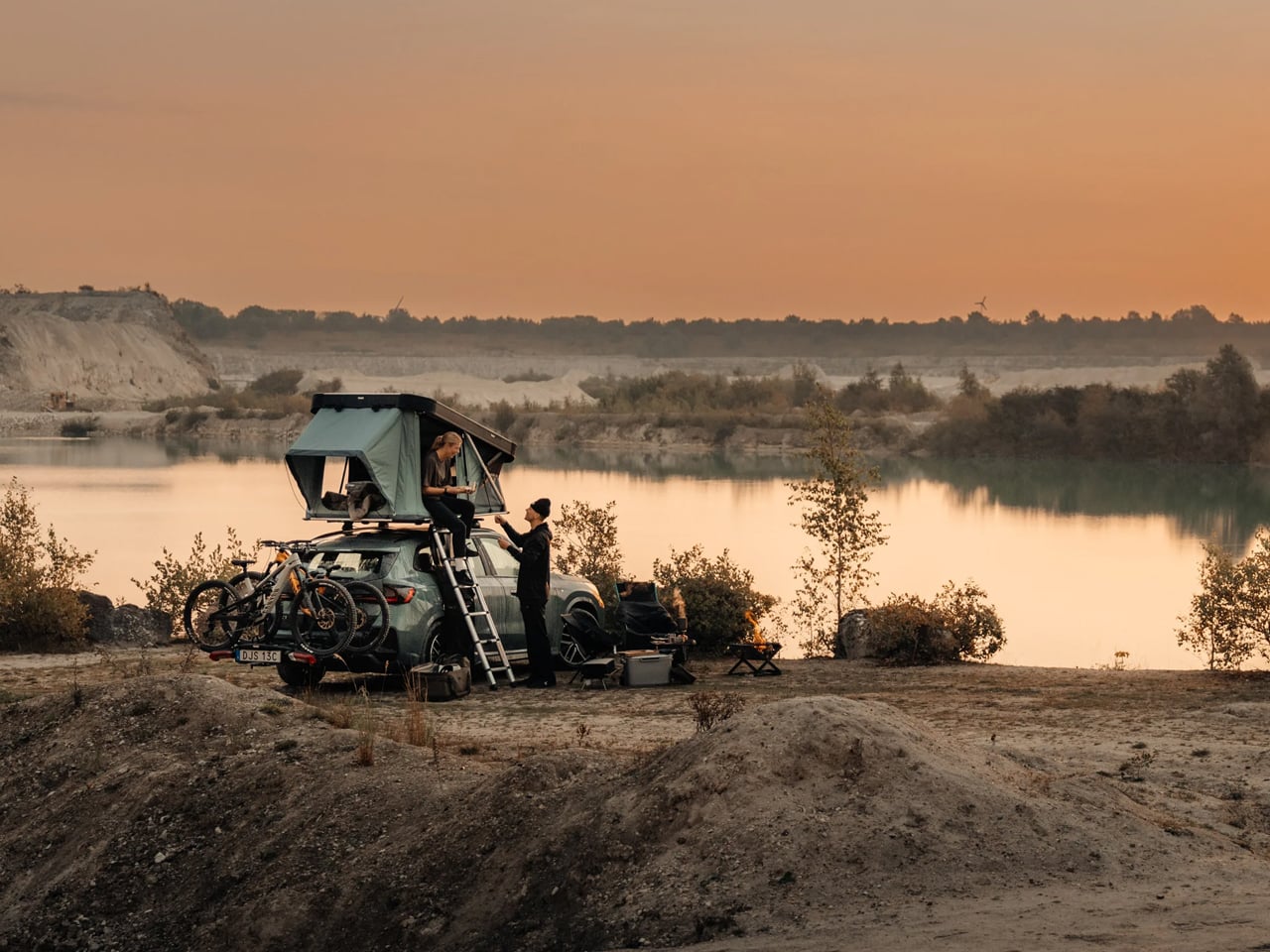
My love for the outdoors rekindles with the fading spring chill, and I hear voices from the woods calling me to come explore. Of course, backpacking is the most viable option, but when I’m planning with my partner, I prefer the rooftop tent. There are two conveniences of the modern hardshell rooftop tents: they’re light on the vehicle – can even transform for ground camping – and are easy to set up and sleep in at the end of the day.
Over the years, these camping solutions have come a long way. We have seen hardshell rooftop tents with their own power stations and those massive enough to sleep an entire family of four. With few options to make a mark, Thule has introduced the Widesky, its first, and probably also the first-ever rooftop tent with a sofa. How’s that for standing out?
Designer: Thule
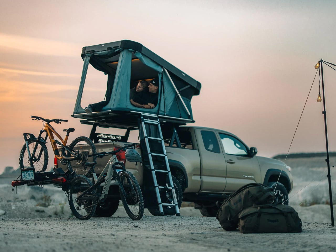
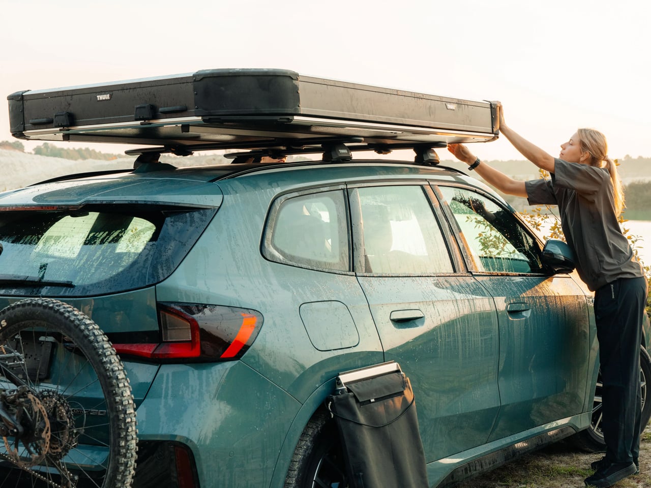
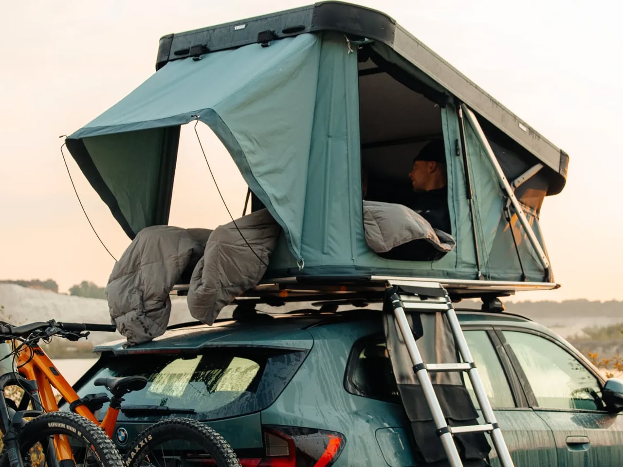
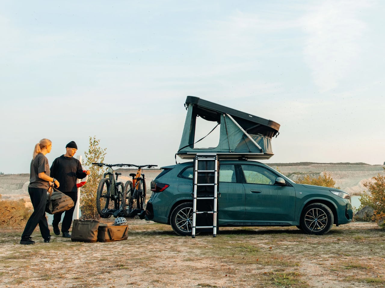
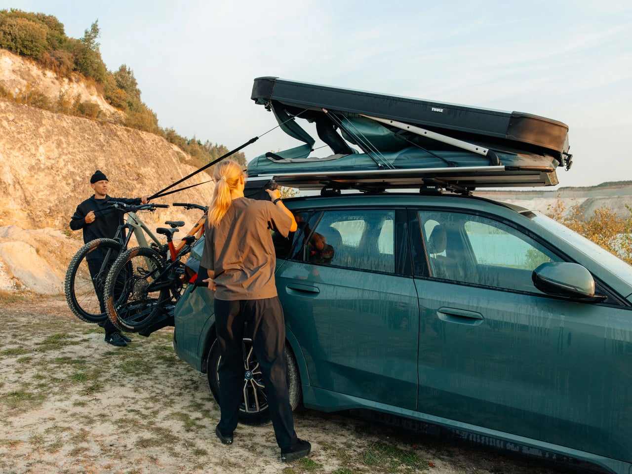
Thule Widesky is a premium hardshell rooftop tent that’s easy to set up in seconds. It arrives in a lightweight aluminum hardshell body with telescopic poles that lift the tent from its closed position to a full-size wedge-shaped tent upon undoing the four latches used to secure it closed. It’s not the construction but the fancy interior that really sets the Widesky apart.
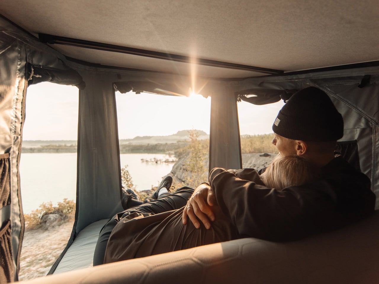
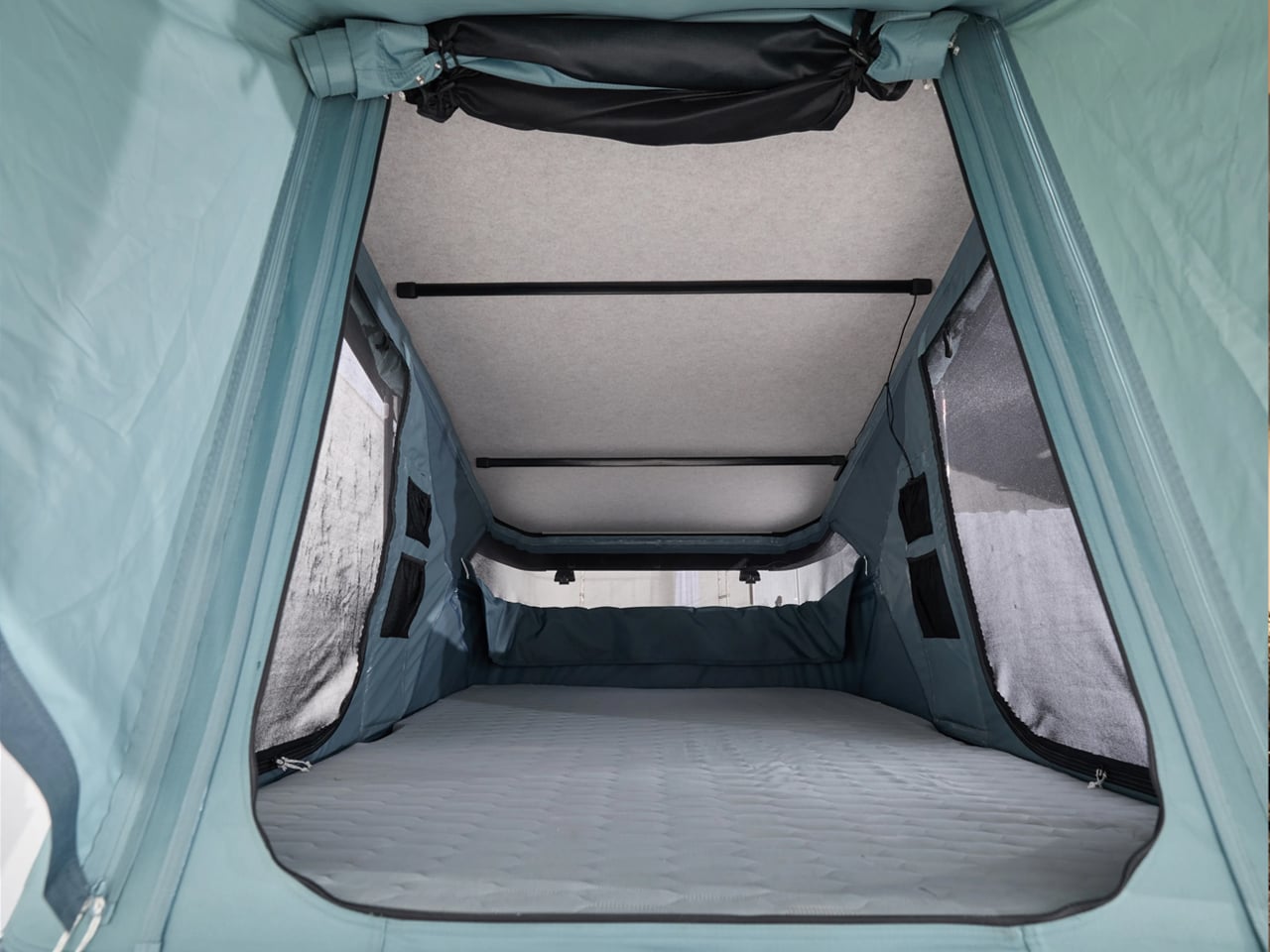
Unlike many rooftop tents, the primary focus of the Thule Widesky is not sleeping. The two-person tent wants travelers to have a comfortable living space inside. By placing a quilted foam mattress inside that converts into a sofa-like setting with a supportive backrest, Thule has transformed the space from the usual sleeper into a living quarter you’d love to retire into when it’s raining outside, or you want to just relax midway. And sitting back, I’m wondering, if it were this simple, why didn’t anyone think of it earlier?
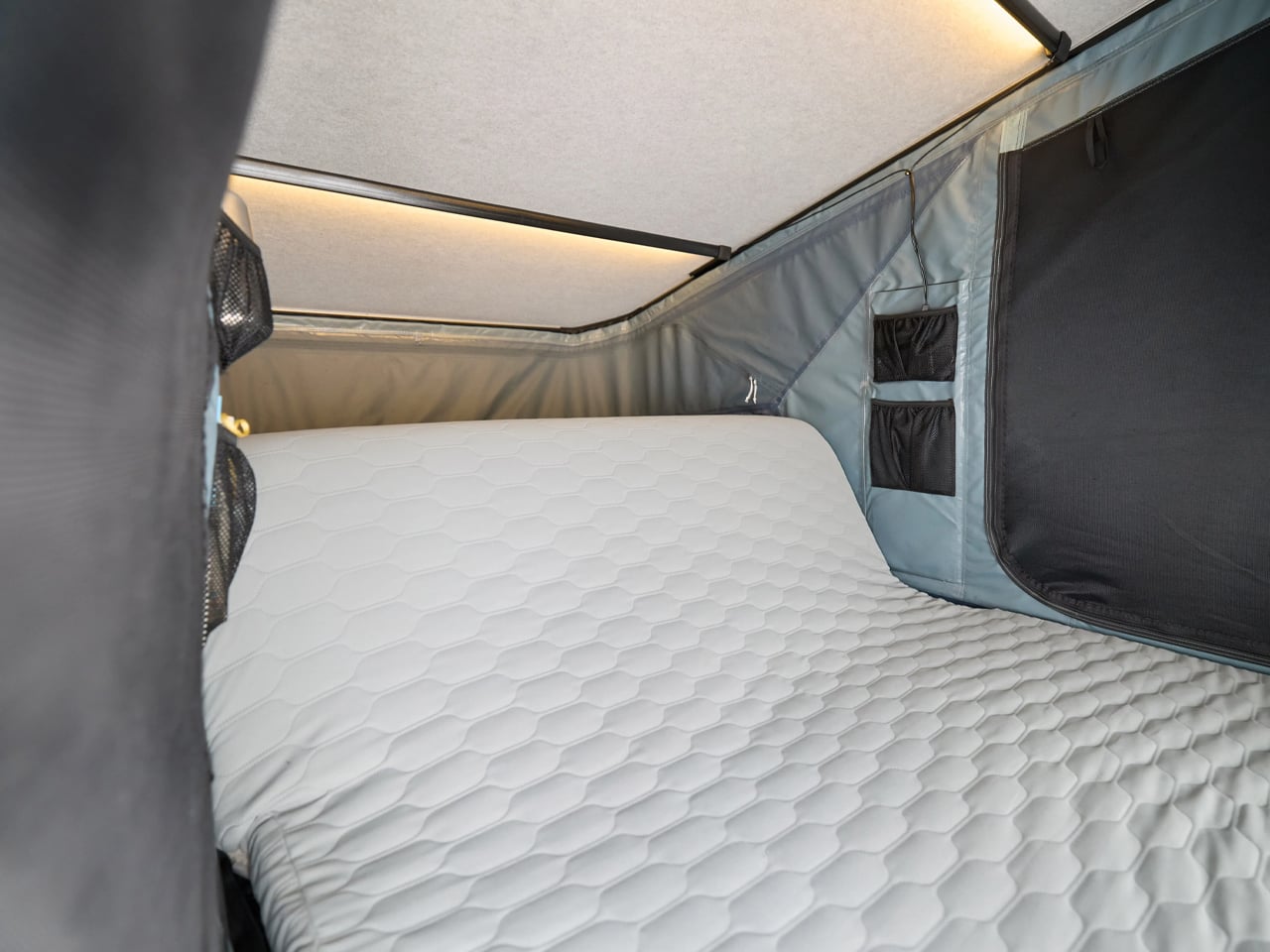
“Widesky is designed to feel just as inviting during the day as it does at night,” Thule confirms. It weighs only 68 kg on the vehicle’s roof and lifts up to 124 cm at the front for a relaxing space inside. When you’re ready to hit the road, the same tent packs back into a hardshell box measuring just 20 cm high. According to the company, it is compatible with most roof rack systems, and courtesy of its durable recycled fabric walls and an all-weather shell, the tent is suitable for more adventures than those tailored for summer days.
“It’s (Widesky) designed for people who… want a rooftop tent that invites them to sit back, relax, and enjoy the view,” Kajsa Levinsson of Thule informs.
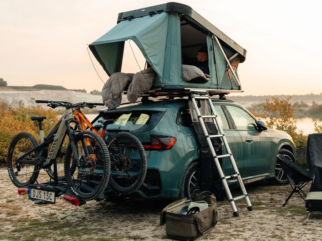
The tent comes with a ladder – mountable on any side of the tent – to climb in. Once comfortably seated/sleeping inside, you can enjoy the vista with the same vividness as you would being outside. To that accord, the Widesky is outfitted with large panoramic doors and mesh panels offering expansive outside views, light, and ventilation. The interior is fashioned with dimmable LED lights to make the space feel warm and welcoming even after sunset. All this goodness is expected to arrive anytime this month, but it will set you back $4,000.
The post Thule builds a new easy-setup Widesky hardshell rooftop tent for more than just sleeping first appeared on Yanko Design.