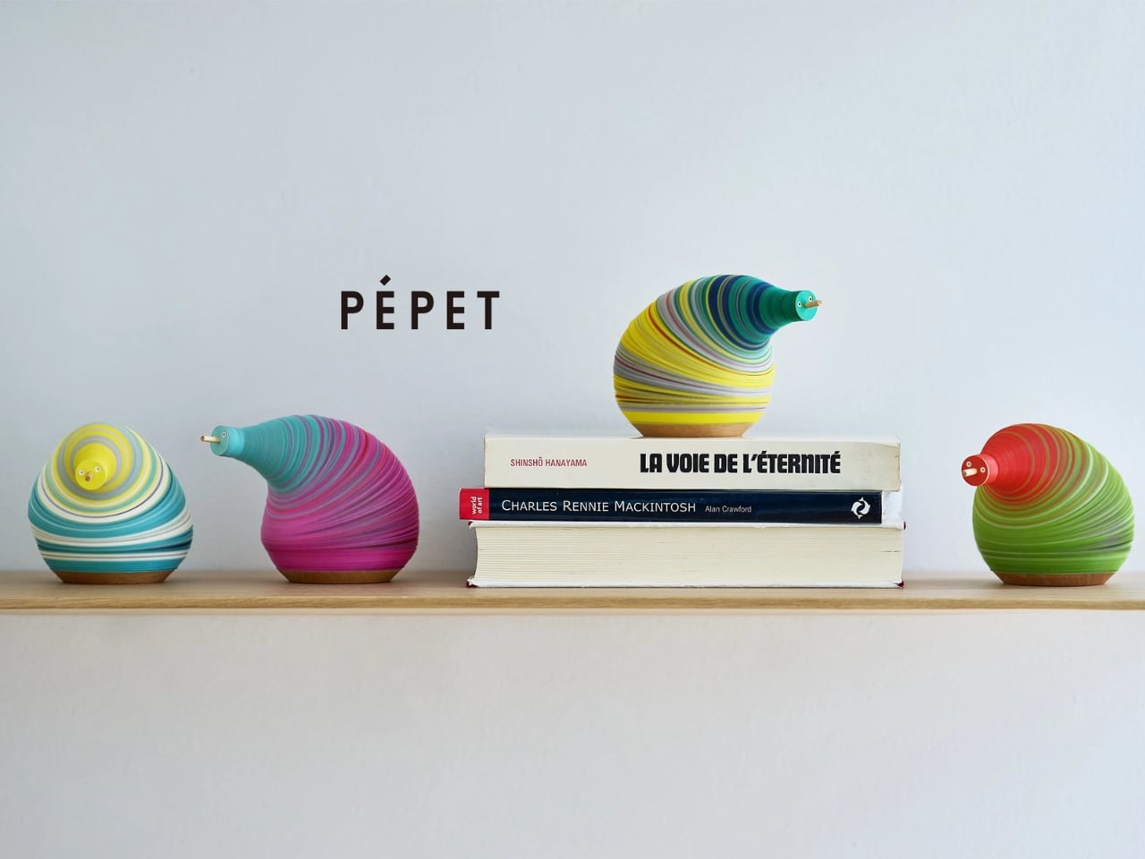
When Paper Does the Heavy Lifting: Sunology’s Storey Packaging

Most of us don’t give packaging a second thought. It arrives, we tear it open, and it goes straight into the recycling bin or, less nobly, the bin under the sink we keep telling ourselves we’ll sort through on a weekend. But every once in a while, a piece of packaging stops you mid-unbox and makes you think: someone really cared about this.

The Storey Battery by French solar tech company Sunology is a compact home energy storage unit, the kind that quietly stores power from your solar panels or the grid and releases it back when you need it most. It can run household appliances through an outage, reduce your electricity costs, and help you step a little further away from grid dependency. Plug-and-play clean energy, designed for the person who cares about both good design and their electricity bill. Swedish industrial design firm Propeller Design handled both the product and its packaging, and if you’ve seen the Storey itself, you already know this is a studio that doesn’t phone things in. The battery has soft, clean forms and an aluminum housing that belongs in a living room, not buried in a utility closet. It also won the BIG SEE Grand Prix 2026 Design Award, which feels entirely deserved.

Designer: Propeller Design

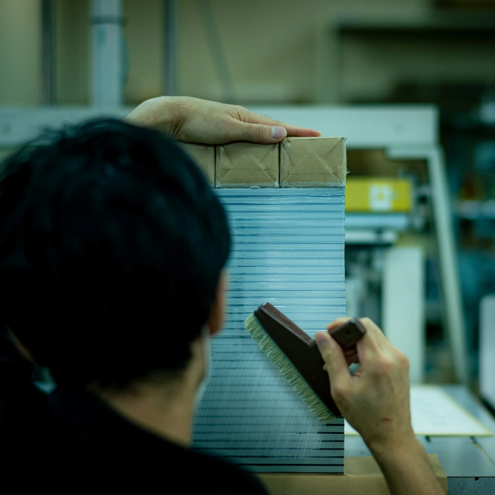
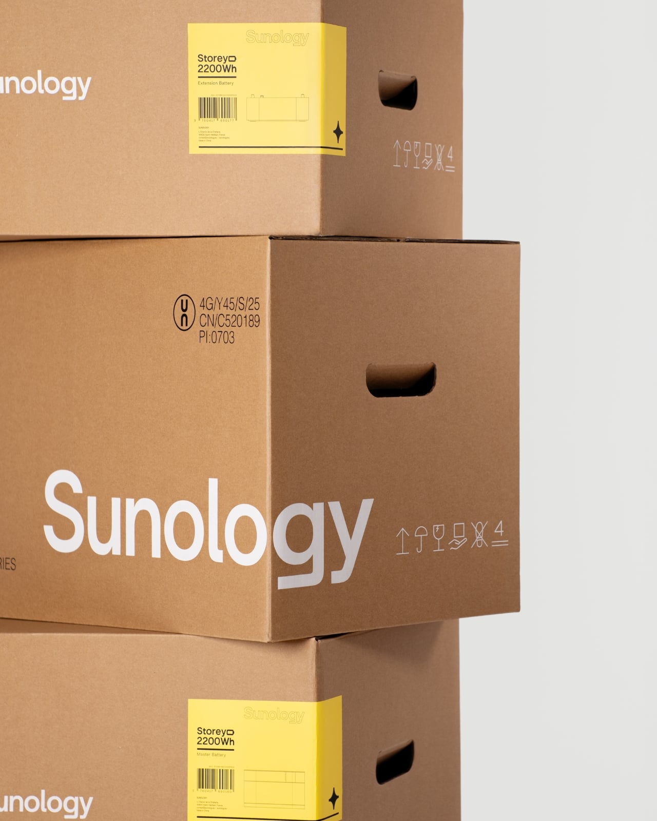
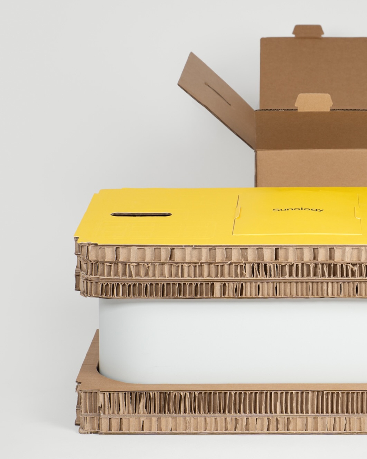
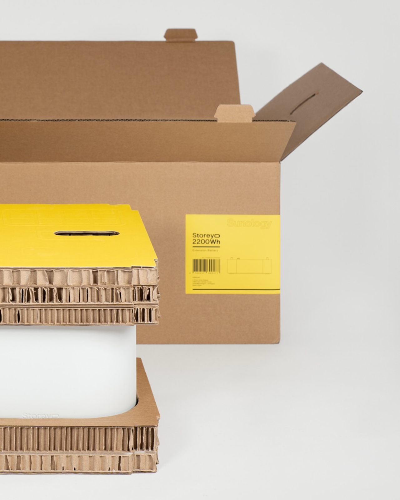
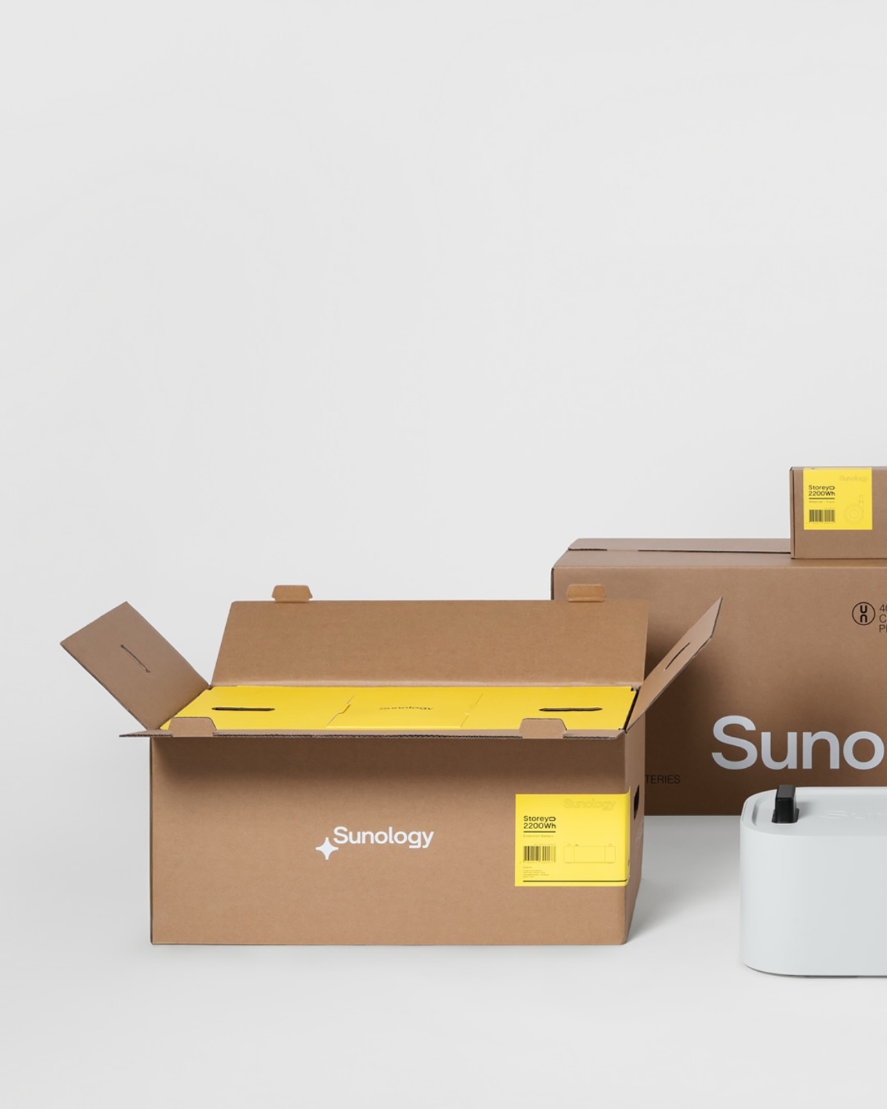
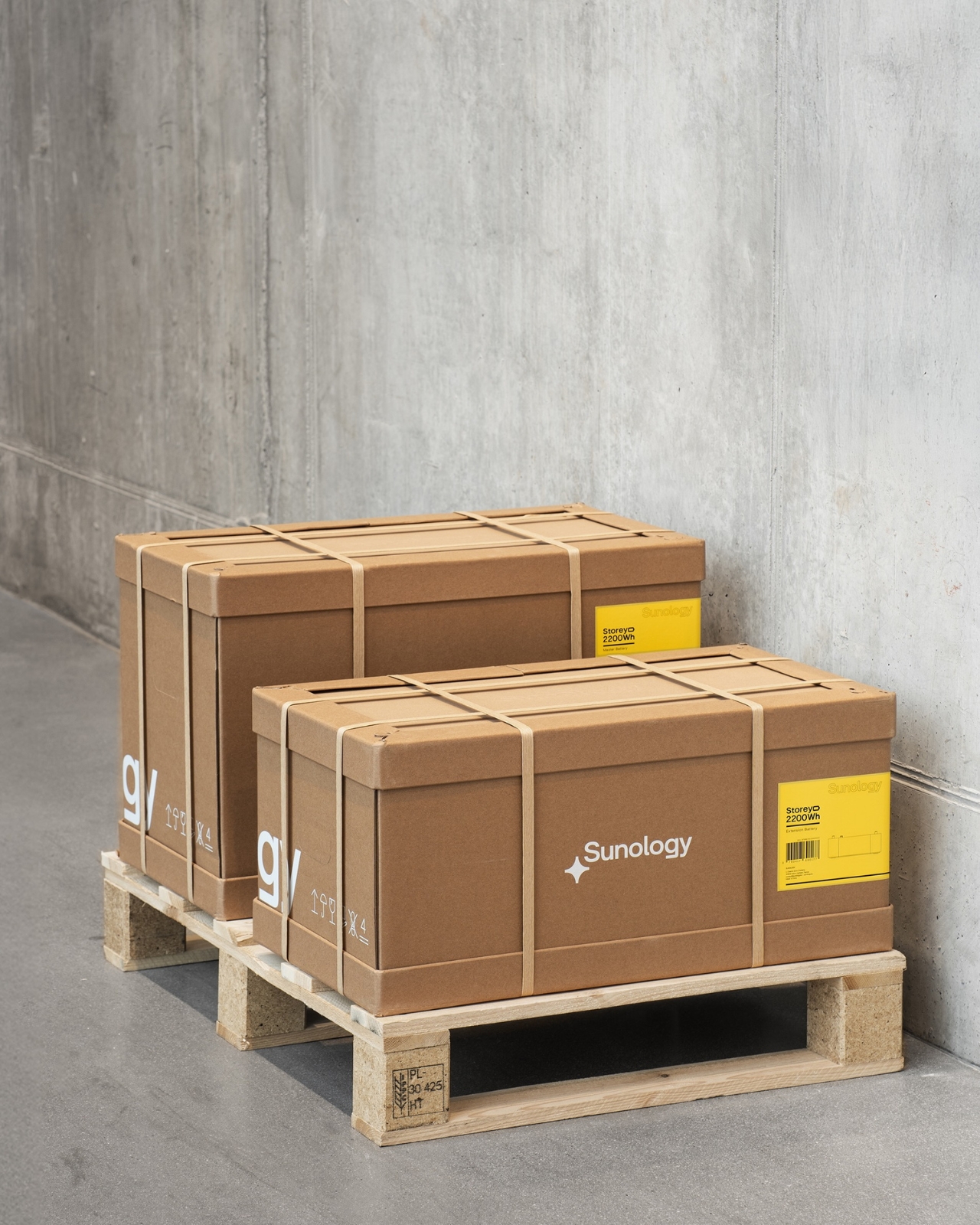
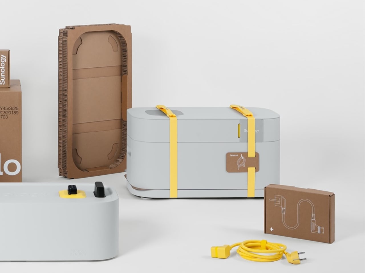
But the packaging is what I want to talk about, because the packaging is quietly extraordinary. The Storey weighs 30.5 kilograms. That’s serious weight for anything to withstand during shipping and freight, and for decades the default answer to that kind of engineering challenge has been foam, plastic, more foam, and maybe some more plastic just to be safe. Propeller went a completely different direction. The entire solution is fiber-based. No plastic. Not even a little bit.

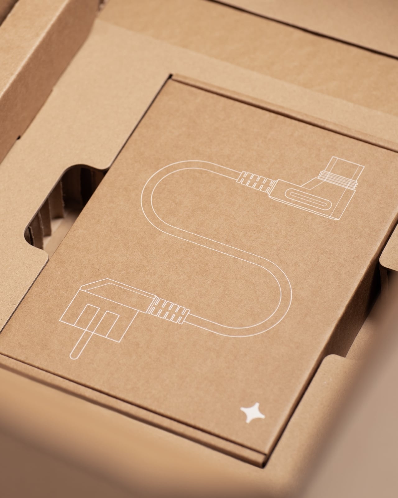
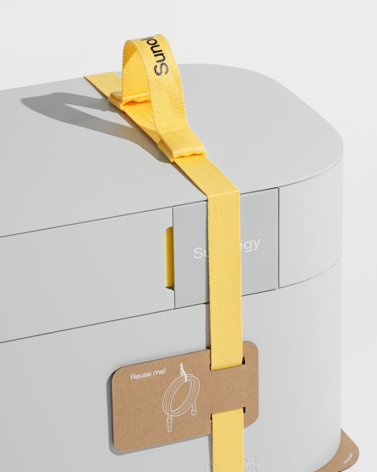
They built the structure around strong honeycomb board, paperboard corner reinforcements, and paper straps. If you’ve ever seen honeycomb board in cross-section, you’ll know it’s deceptively capable. The cellular geometry distributes weight in a way that makes it genuinely strong, the kind of structural work that plastic foam has been quietly getting credit for all this time. The paper straps wrap around the battery unit like a considered branding detail rather than an afterthought, and one of them comes tagged with a small kraft card that reads “Reuse me!” alongside a clean line illustration of a cable. It’s a small gesture, but it signals the right values without making a speech about it.

I think what Propeller understood here, and what a lot of packaging designers still miss, is that sustainable materials don’t have to mean a downgraded experience. There’s a quiet assumption embedded in a lot of eco-friendly packaging that you’re trading aesthetics for ethics, that paper means compromise. This design challenges that directly. The unboxing feels deliberate and considered. The honeycomb cradles the Storey like it was made for it, because it was. The yellow straps against the pale, soft form of the battery are almost gift-like in appearance. It’s the kind of opening experience that justifies being filmed, which, in 2026, is not a small thing to say about any piece of industrial packaging.

The industry conversation around plastic-free packaging has been going strong for years, but execution still tends to lag behind intention. Companies announce pledges and deliver on them for products where plastic-free engineering is relatively manageable. Designing out plastic on a 30.5-kilogram product that needs to survive freight conditions across a global supply chain is an entirely different engineering problem, and Propeller actually solved it rather than simply worked around it.

The Storey battery is built for a future where home energy storage becomes a normal part of domestic life. It follows that its packaging should feel like it belongs in that same forward-thinking vision. Paper strong enough to carry 30 kilograms of clean energy technology is not a small design win. It’s a proof of concept, and one that the rest of the industry probably needs to study closely.

The post When Paper Does the Heavy Lifting: Sunology’s Storey Packaging first appeared on Yanko Design.
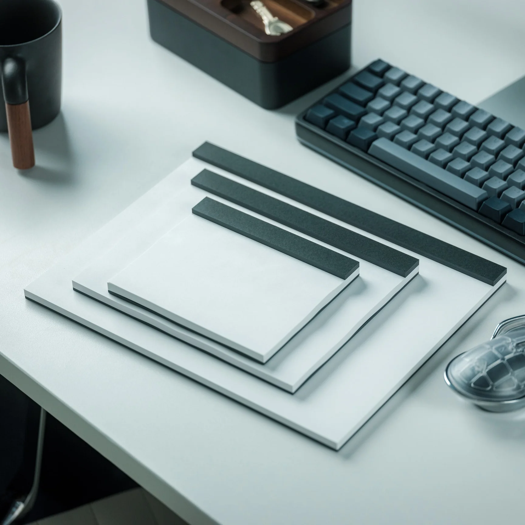
The Soviet Union Built UFO-Shaped Circuses. Now You Can Fold One.

The Soviet Union had a complicated relationship with spectacle. Everything about Soviet ideology pointed toward collective purpose, practical function, and the rejection of excess. And then they went and built circus arenas shaped like flying saucers, out of raw concrete, in capital cities across Central Asia and Eastern Europe. If that is not a contradiction worth paying attention to, I do not know what is.

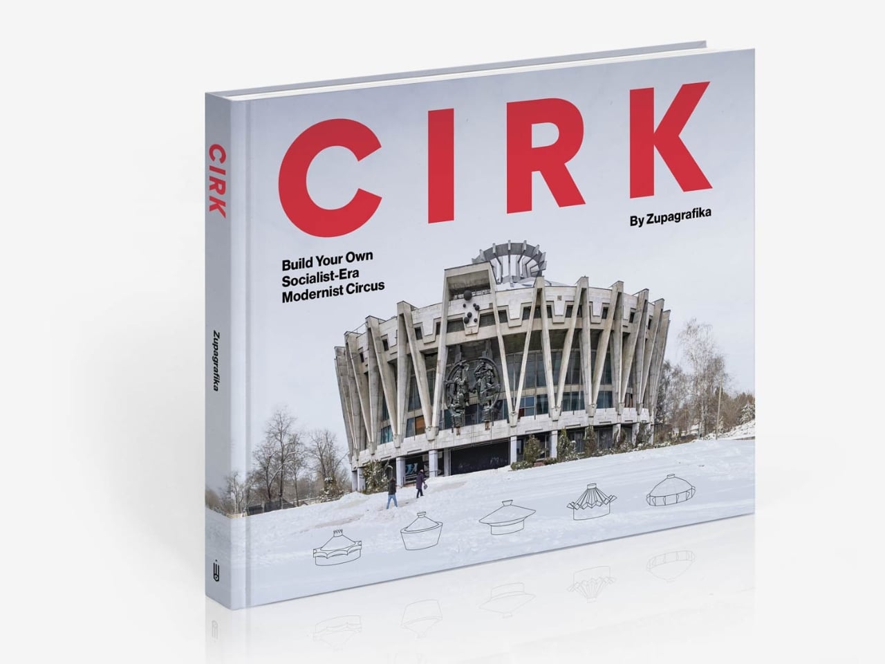
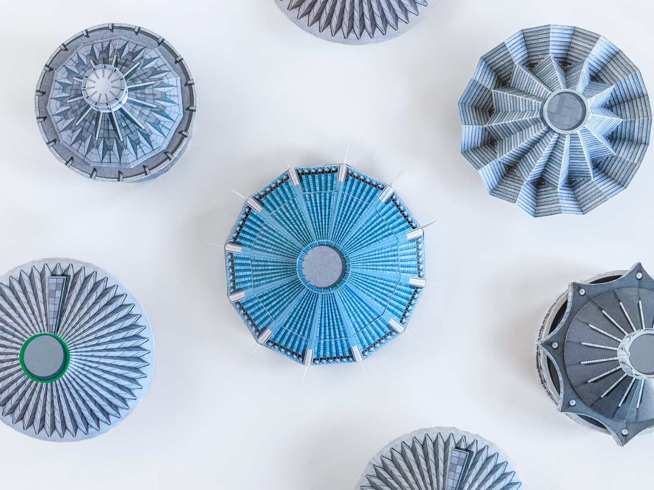
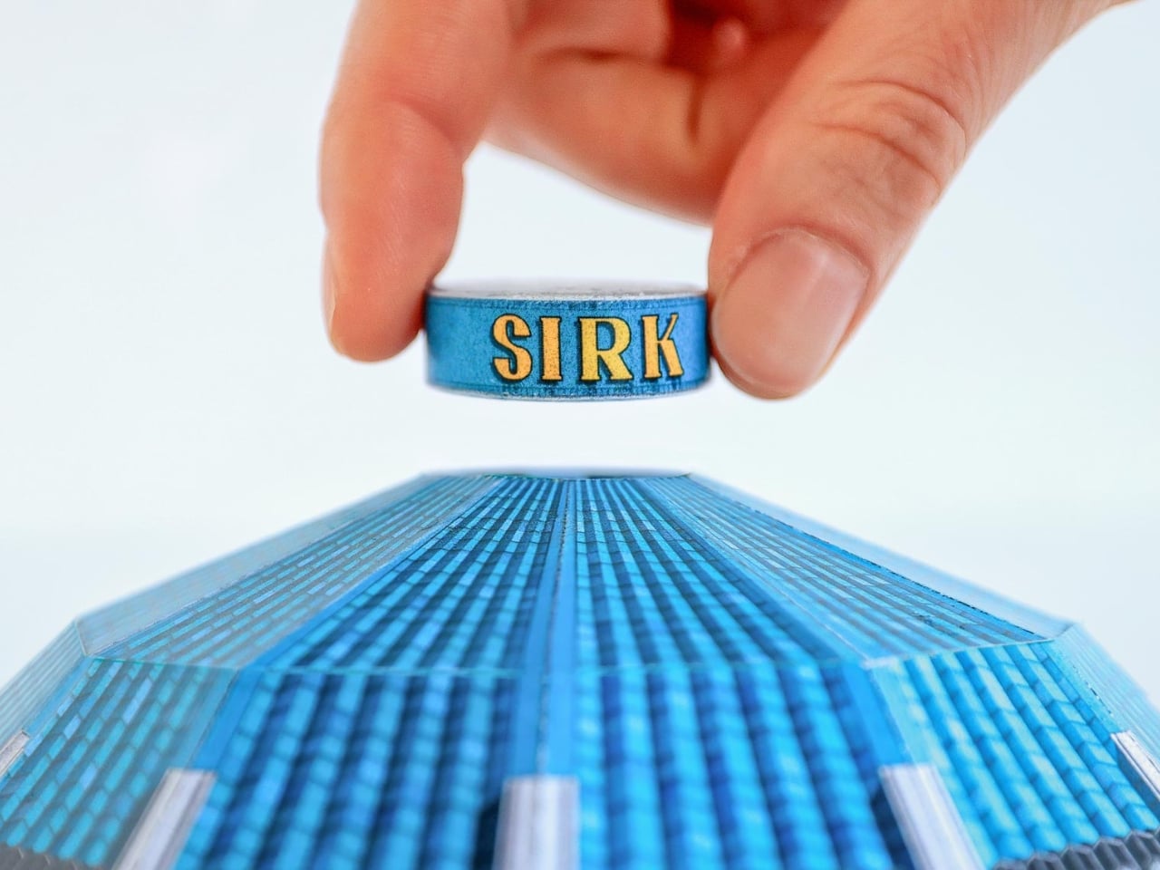
Cirk, a new book from David Navarro and Martyna Sobecka of Zupagrafika, makes that contradiction its entire subject. The Poznań-based design duo have spent over a decade documenting the brutalist and modernist architecture of the former Eastern Bloc, and Cirk is their latest, most playful entry in that ongoing project. The book surveys the permanent circus arenas built across the former USSR from the 1960s through the 1980s, buildings that, as Zupagrafika puts it, combined “socialist modernism, experimental engineering, and choreographed spectacle.” It is an architectural typology most people have never thought about, and yet once you see these buildings, you cannot stop looking.

Designers: David Navarro and Martyna Sobecka

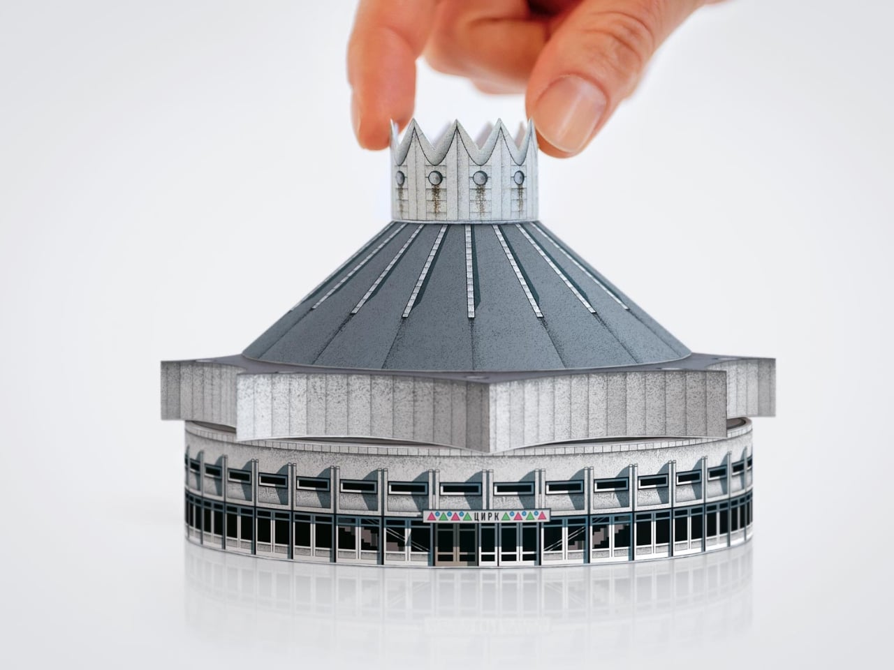
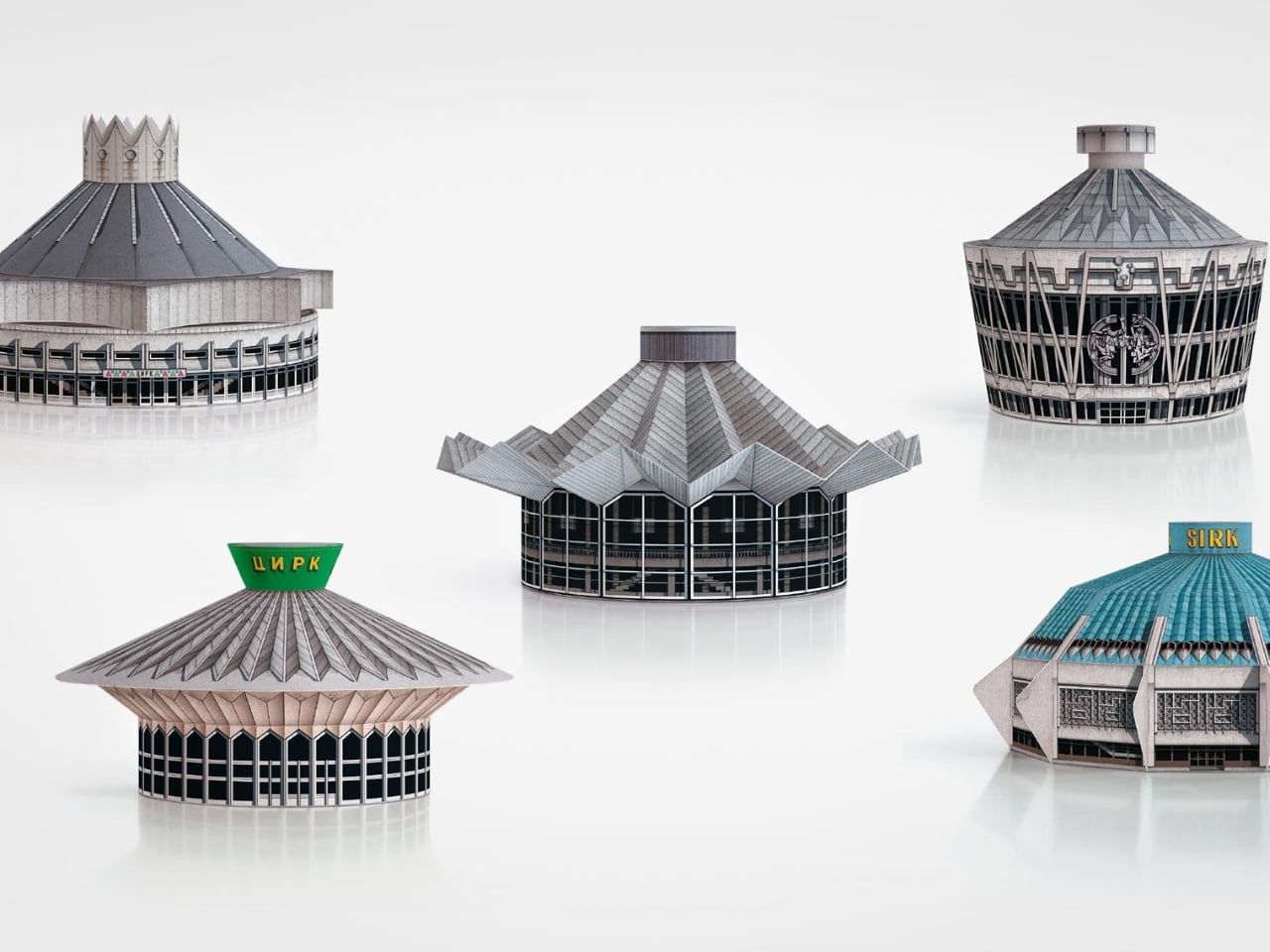
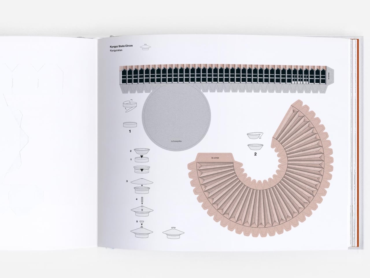
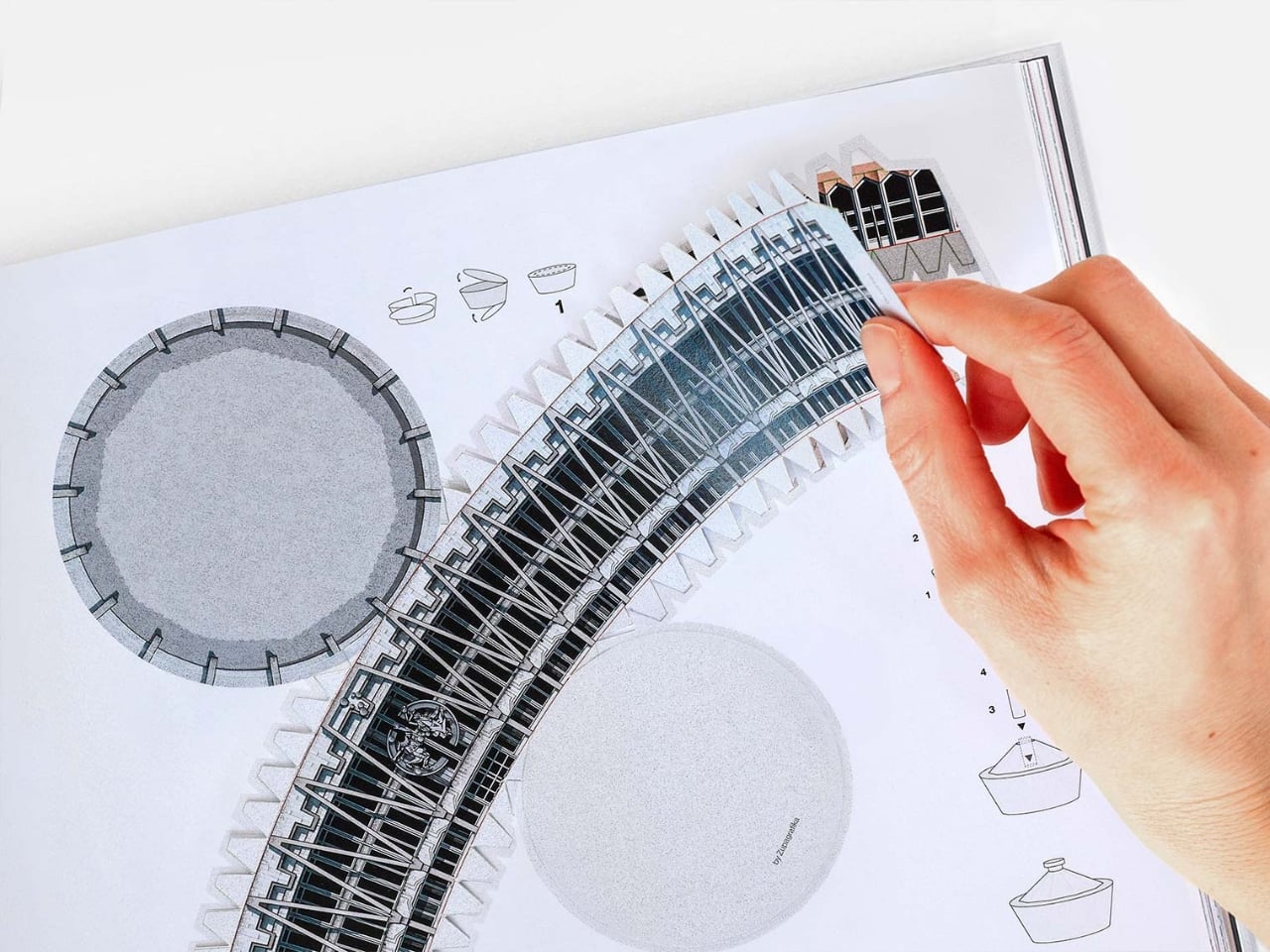
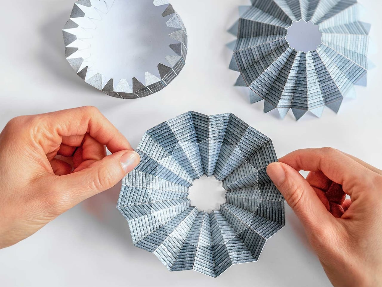
But the part of Cirk that has people talking is not the photography, gorgeous as it is. It is the second half of the book: five press-out paper models of actual circus buildings, designed for readers to punch out and assemble with nothing but glue. The five models represent the Kyrgyz State Circus in Bishkek, the Chișinău State Circus in Moldova, the Dnipro State Circus in Ukraine, the Great Moscow State Circus, and the Tashkent State Circus in Uzbekistan. Five buildings. Five cities. Five strikingly different pieces of architecture, each one reduced to a miniature you can hold in your hands.

I have a genuine soft spot for paper models, and I think their reputation as a “children’s activity” has always undersold what they actually are. A well-designed paper model is an act of translation. Someone has to study a real building, understand its geometry from every angle, figure out how to collapse it into a flat sheet, and do it in a way that holds together when you fold it back up. That is not trivial when the buildings in question are full of curves, cantilevers, and circular geometry. The circus arenas in Cirk are not simple boxes. Many have sweeping domed roofs and wide cylindrical bases, and the kind of sculptural confidence that makes them look like props from a science fiction film. Getting that geometry to behave on paper requires real design skill, and Zupagrafika clearly has it.

The studio has been producing paper model kits alongside their books for years, so this is familiar territory. But tucking five models into the back of a hardcover book feels like a deliberate choice, not an afterthought. The models are not a gimmick. They are an argument. You can look at photographs of the Great Moscow State Circus for a long time, and it will remain something abstract and distant. When you press out those perforated shapes and fold them into a miniature version of that building, something shifts. The scale changes. The building becomes tactile and personal. You start to understand its proportions in a way that a photograph simply cannot deliver.

There is also something quietly political about the whole exercise. These arenas were built as monuments to Soviet power, intended to be overwhelming and permanent. Reducing one to a paper model is almost cheeky. It takes these grand gestures of ideological architecture and makes them domestic, approachable, collectible. The Soviet state is long gone. Someone is now folding the Great Moscow State Circus on their kitchen table. History has a strange sense of humor.

Cirk is a hardcover running 88 pages, sized generously at 30 by 24 centimeters, giving the models room to breathe on the page. The first half carries photography and historical essays, with a foreword from writer Jelena Prokopljević. It is a complete package: context, visual archive, and the hands-on satisfaction of making something. For anyone drawn to architecture, Cold War history, or just the very specific pleasure of a perforated page coming apart cleanly, Cirk is a book that earns its shelf space. The flying-saucer buildings are absolutely worth it.

The post The Soviet Union Built UFO-Shaped Circuses. Now You Can Fold One. first appeared on Yanko Design.
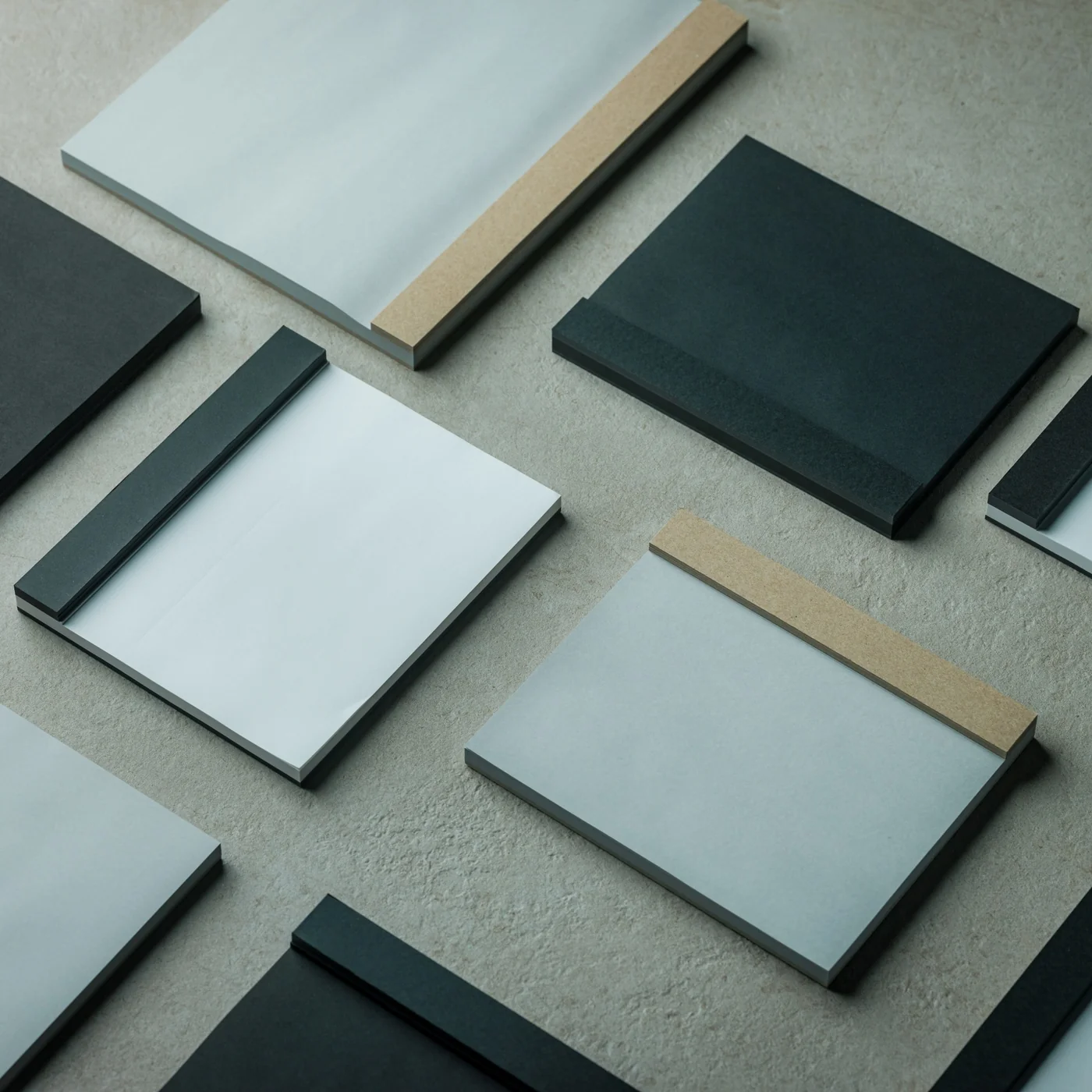
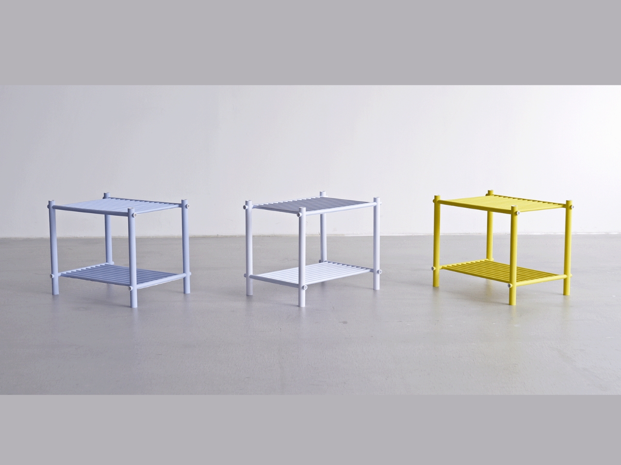
Japanese Designer Just Built a Real Shelf From Rolled Paper Sheets

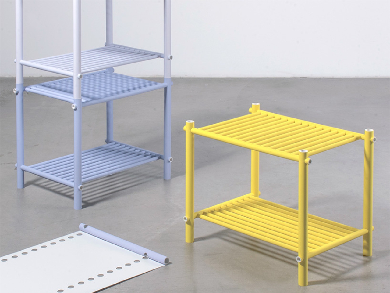
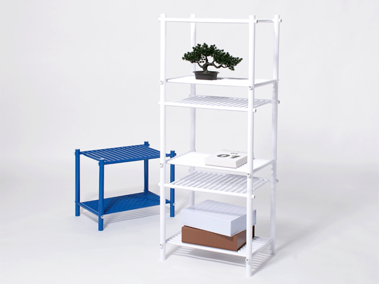
When Japanese designer Muto Yumi set out to make furniture from paper, the result was not what most people would imagine. No papier-mâché. No origami-inspired folding. No cardboard box aesthetics salvaged and called art. What she produced is a modular furniture system so structurally sound and visually precise that it makes you question almost everything you assume about material strength and decorative surface.

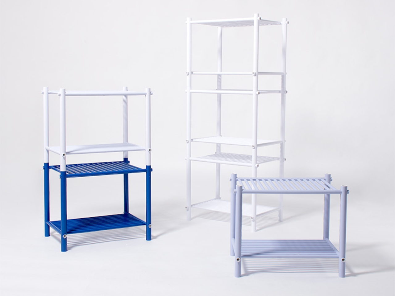
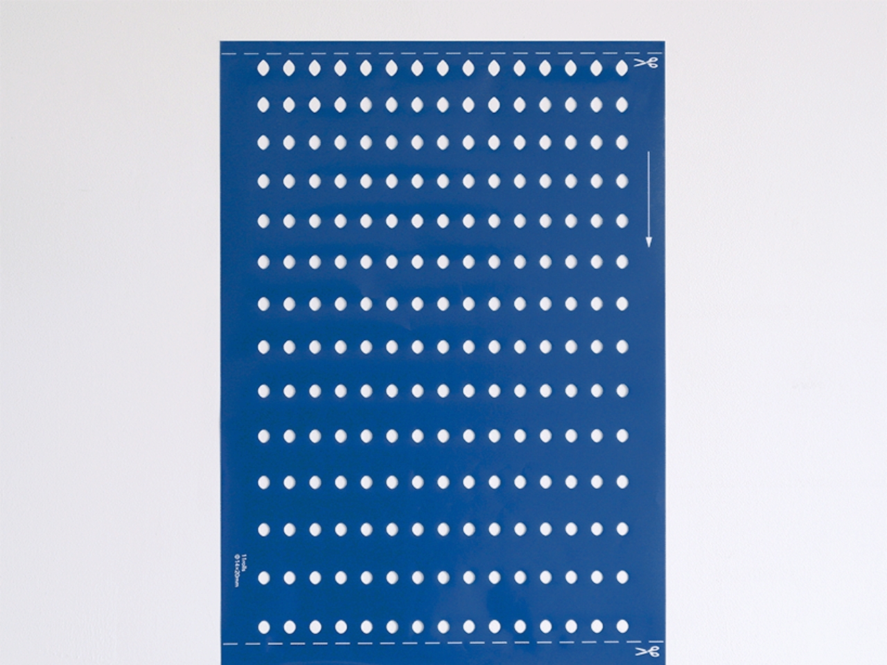
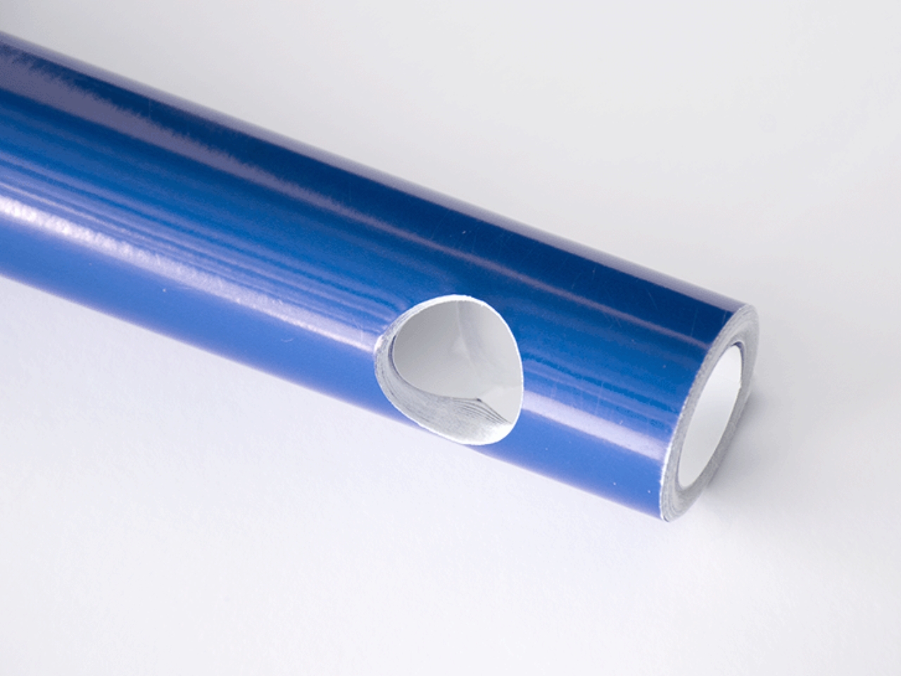
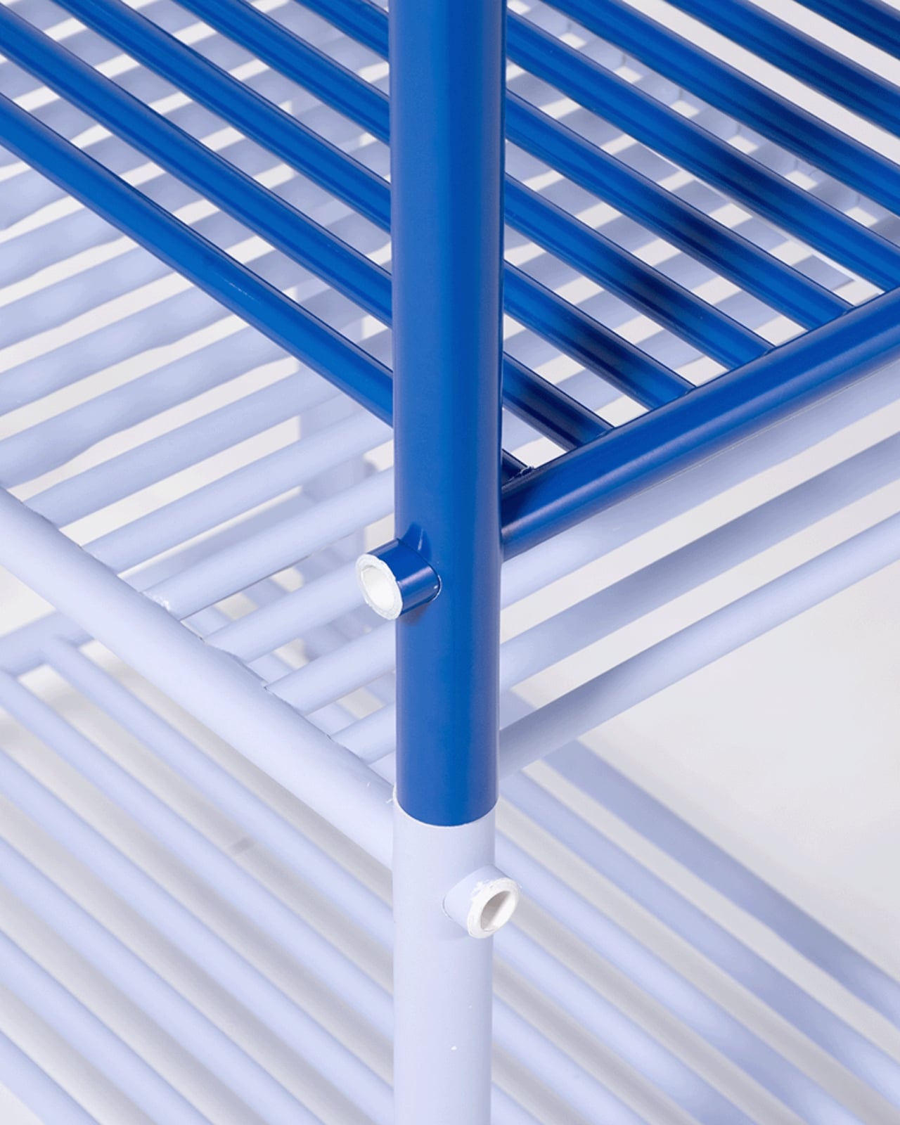
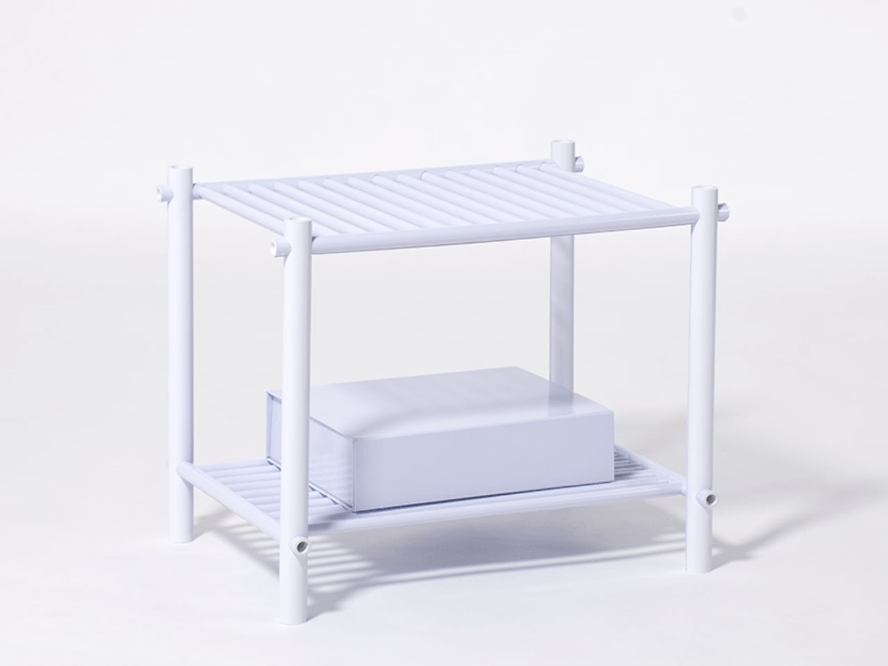
The project is called Pattern as Structure, and the name is not just poetic framing. It is literally the concept. Muto starts with flat sheets of paper pre-cut with holes arranged in a specific pattern. Roll that sheet tightly around itself, layer upon layer, and the paper transforms from something limp and delicate into a dense, rigid rod capable of bearing real weight. The physics of it are intuitive once explained, but watching it happen feels like a magic trick. A single sheet does nothing. Rolled and compressed, it becomes architecture.

Designer: Muto Yumi

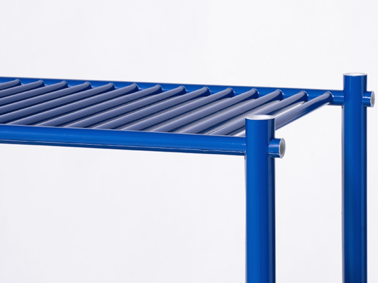
Here is where it gets more interesting. Those pre-cut holes that look like a graphic pattern on the flat sheet? Once the paper is rolled into a rod, those holes become tunnels running through its body. They are the connection points of the whole system. Other paper rods slot through them, linking one piece to the next without glue or hardware. The pattern was never just decoration. It was always the joint, the connector, the system’s logic. The aesthetics and the engineering are the exact same thing.

That kind of design clarity is genuinely rare. Most furniture design separates surface from structure, treating them as two different problems to solve. A frame holds the load; a finish makes it beautiful. Pattern as Structure collapses that division entirely. The surface IS the structure. The decoration IS the joint. You cannot take one away without destroying the other, and that coherence is what makes the project feel so resolved.

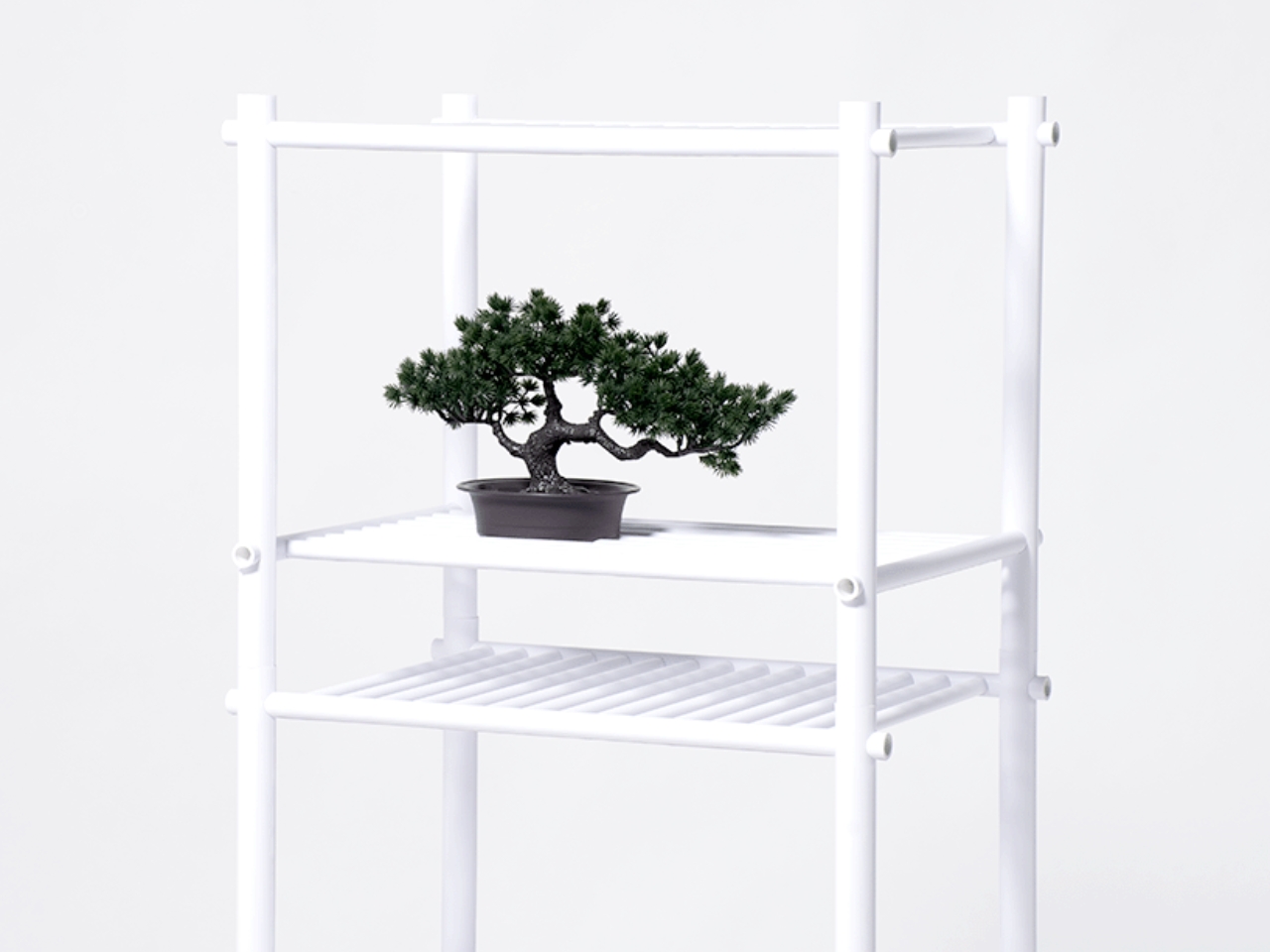
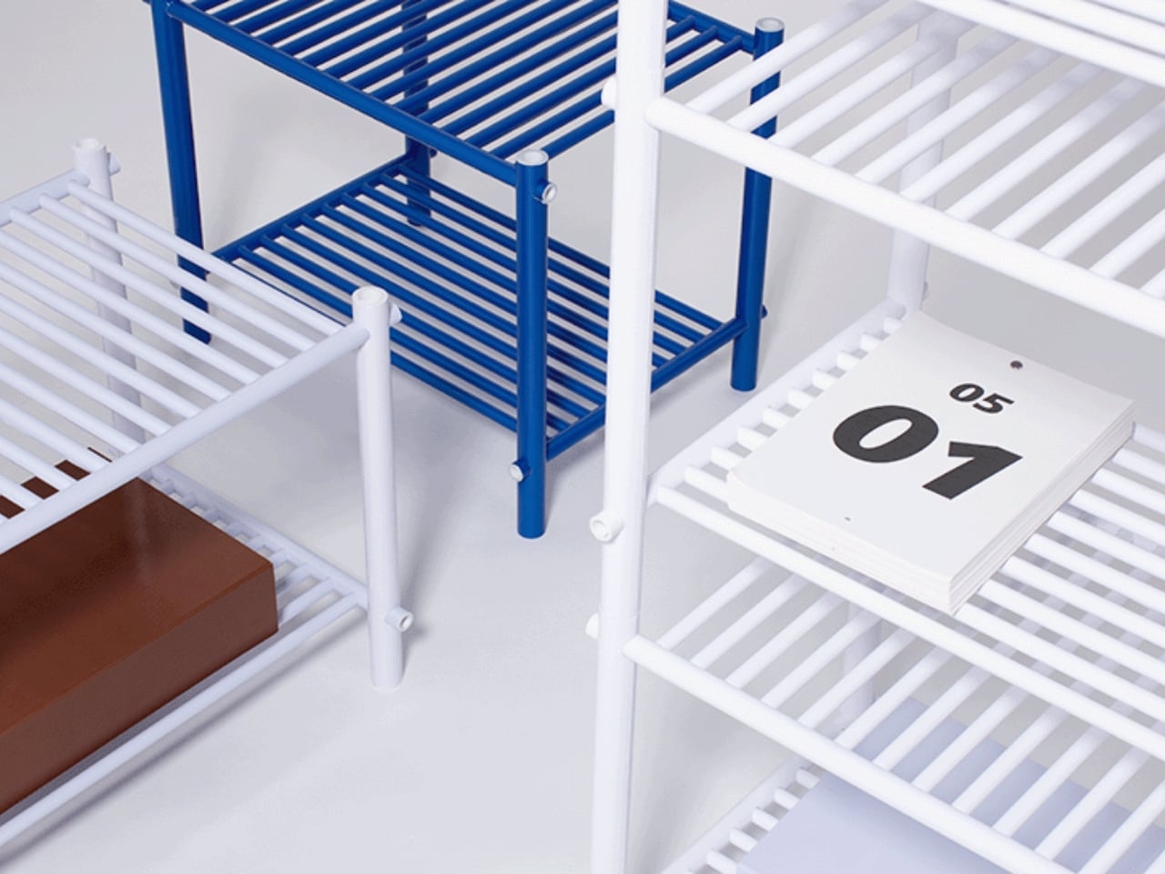
What Muto has produced so far is a family of open shelves in varying sizes. They look clean and slightly architectural, like something you would expect to find in a gallery or a well-curated apartment. But the real achievement here is not the object itself. It is the proof of concept. Because the rods are made from printed paper sheets, the color and graphics on the surface can change infinitely without altering the construction method at all. Want a shelf in deep terracotta? Stripe patterns? Illustrated surfaces? Print the sheet differently and roll it the same way. The structural logic stays identical. The visual language can do whatever it wants.

For anyone paying attention to design right now, this matters. The conversation around sustainable materials has become crowded with beautiful ideas that fall apart under practical conditions. Paper furniture is not new, but paper furniture that is also modular, reconfigurable, and visually customizable without requiring any change to its fabrication process? That is a more sophisticated argument. It asks whether we really need virgin timber, powder-coated steel, or injection-molded plastic to make things that last and look good. Muto’s answer is apparently no.

I keep returning to the honesty of the material choice too. Paper does not pretend to be something else. It does not mimic wood grain or stone texture or metal sheen. It is exactly what it is, and somehow that straightforwardness makes the furniture more interesting, not less. The pattern on each rod is visible. You can see the rolled layers at the cut ends. The making is part of the looking.

Design that is this conceptually tight often sacrifices warmth or approachability in the process. Pattern as Structure avoids that trap. The pieces feel considered without being cold. They feel experimental without being precious. And for a project made from something as unassuming as a sheet of paper with holes punched through it, that balance is quietly remarkable. Muto Yumi is someone worth watching. Not because she is working with expensive materials or chasing spectacle. But because she is asking better questions about what furniture is actually made of, and why.

The post Japanese Designer Just Built a Real Shelf From Rolled Paper Sheets first appeared on Yanko Design.
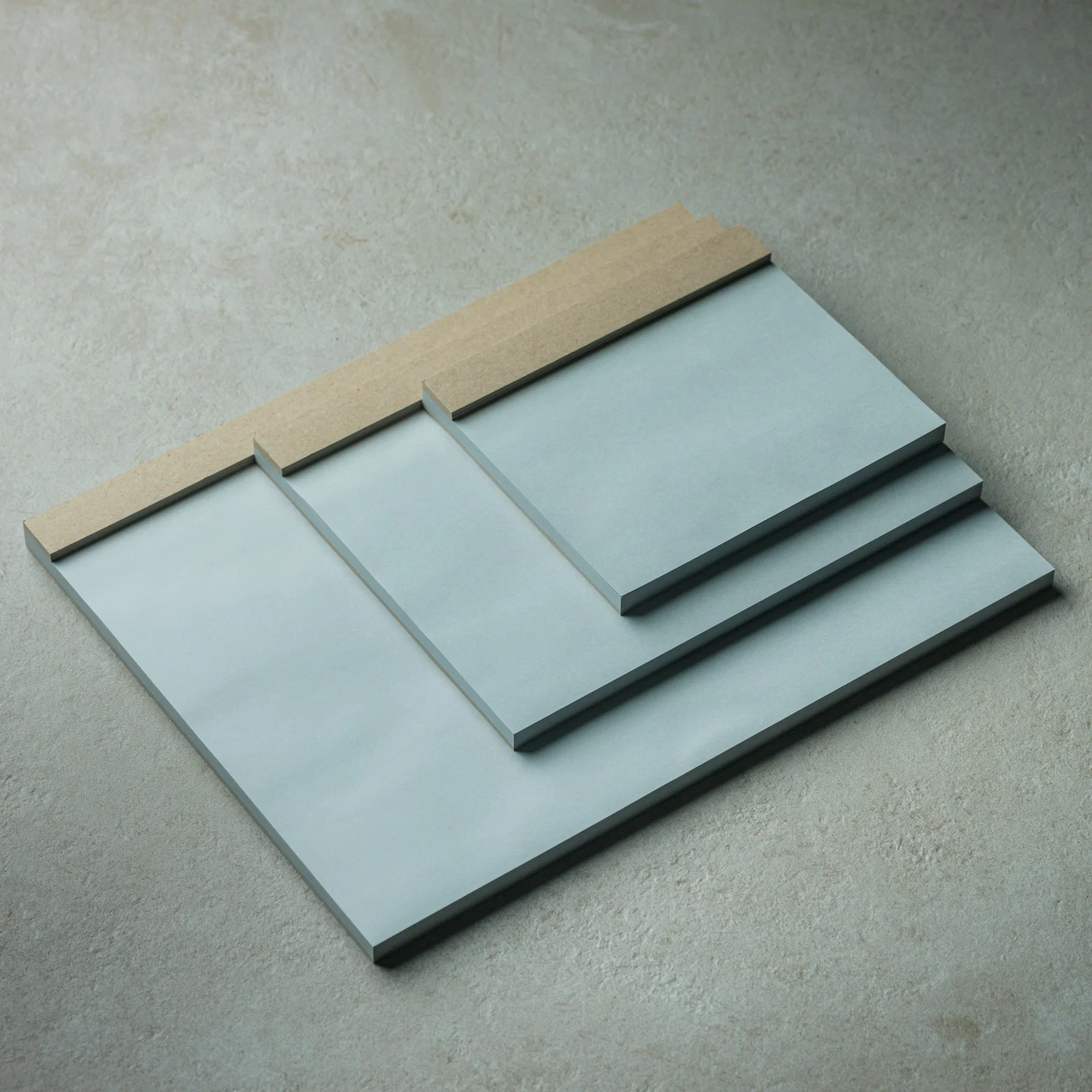
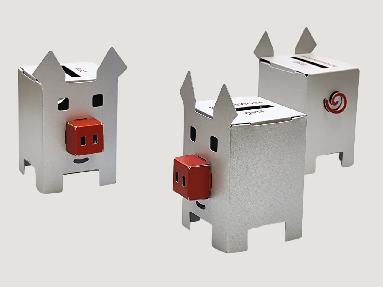
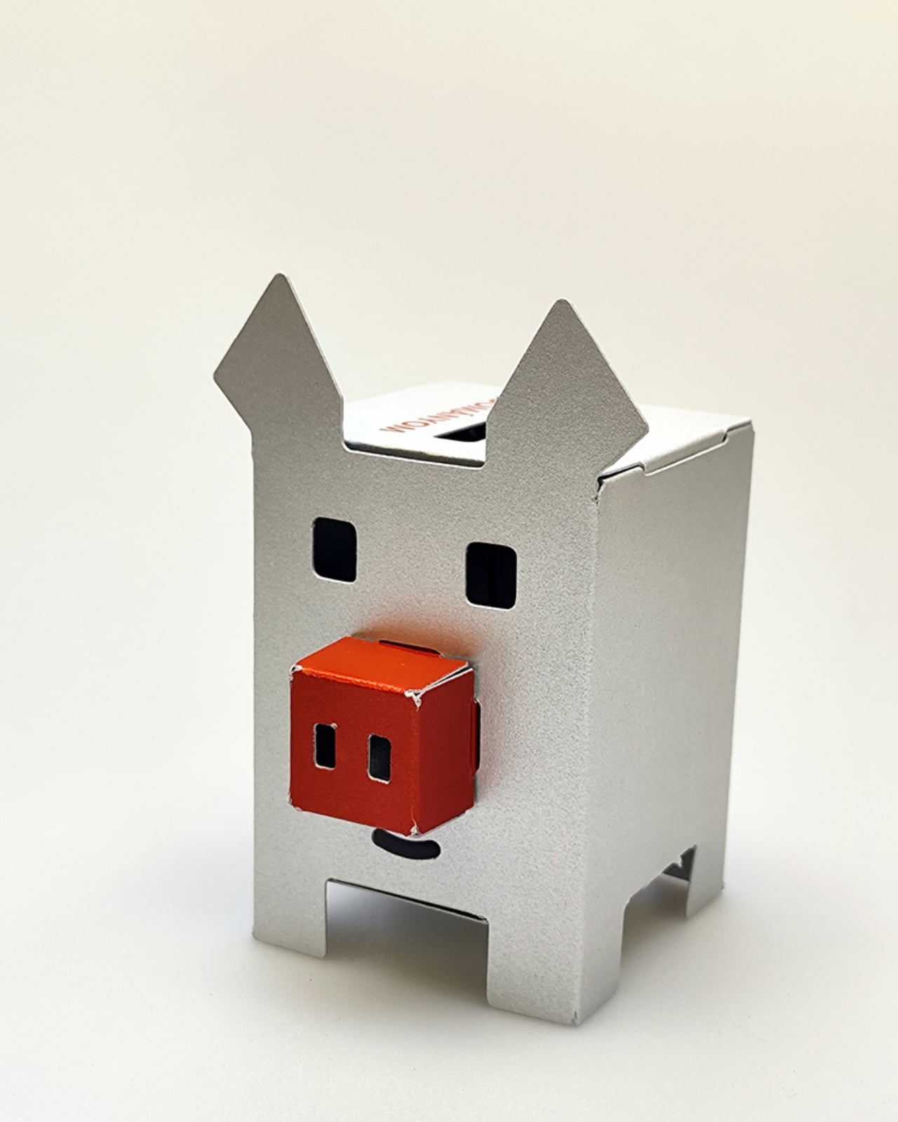
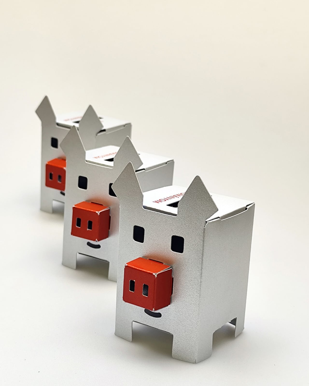
This $10 Metallic Piggy Bank Is Actually Made of Paper

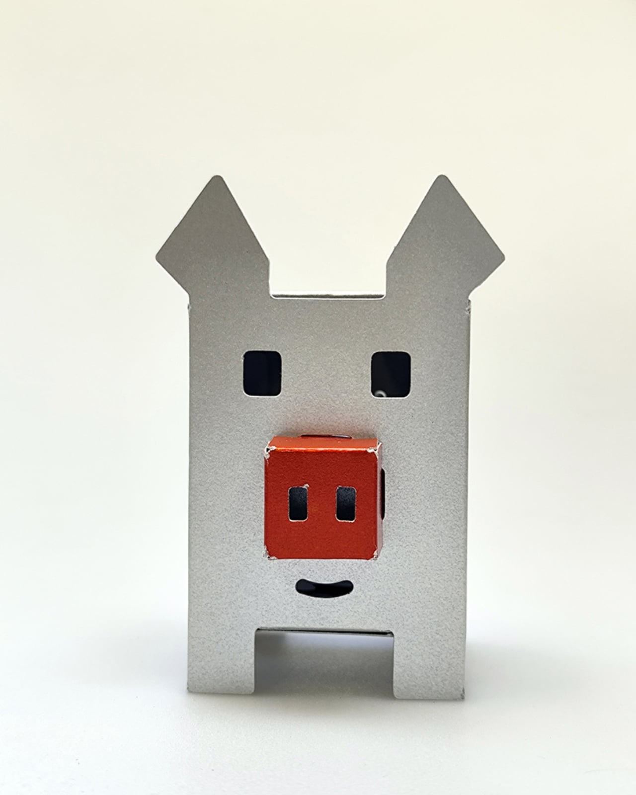
There’s something oddly satisfying about dropping coins into a piggy bank. That little clink sound, the weight gradually building up, the anticipation of finally cracking it open. But let’s be honest, traditional ceramic piggy banks are kind of predictable. So when PLANBUREAU studio decided to reimagine this childhood classic, they went in a direction nobody saw coming: metallic paper.

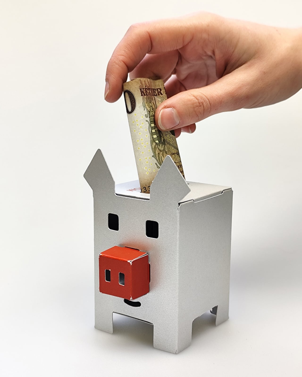
Here’s the twist. The designers, Dániel Lakos and Míra Majoros, didn’t just wake up one day and think “hey, let’s make a paper pig.” They were working on a project for Red Noses International, an organization that supports clown doctors who work with children in hospitals. The brief was pretty specific: create something that encourages young people to save money and donate, all while keeping the price under 10 EUR with minimal production costs. Not exactly an easy ask.

Designer: PLANBUREAU studio

Most designers would’ve gone the obvious route with plastic or cheap ceramics. But PLANBUREAU had a better idea. Paper. Not flimsy craft paper, mind you, but printed metallic paper that looks like it costs way more than it actually does. It’s one of those “why didn’t anyone think of this before?” moments.

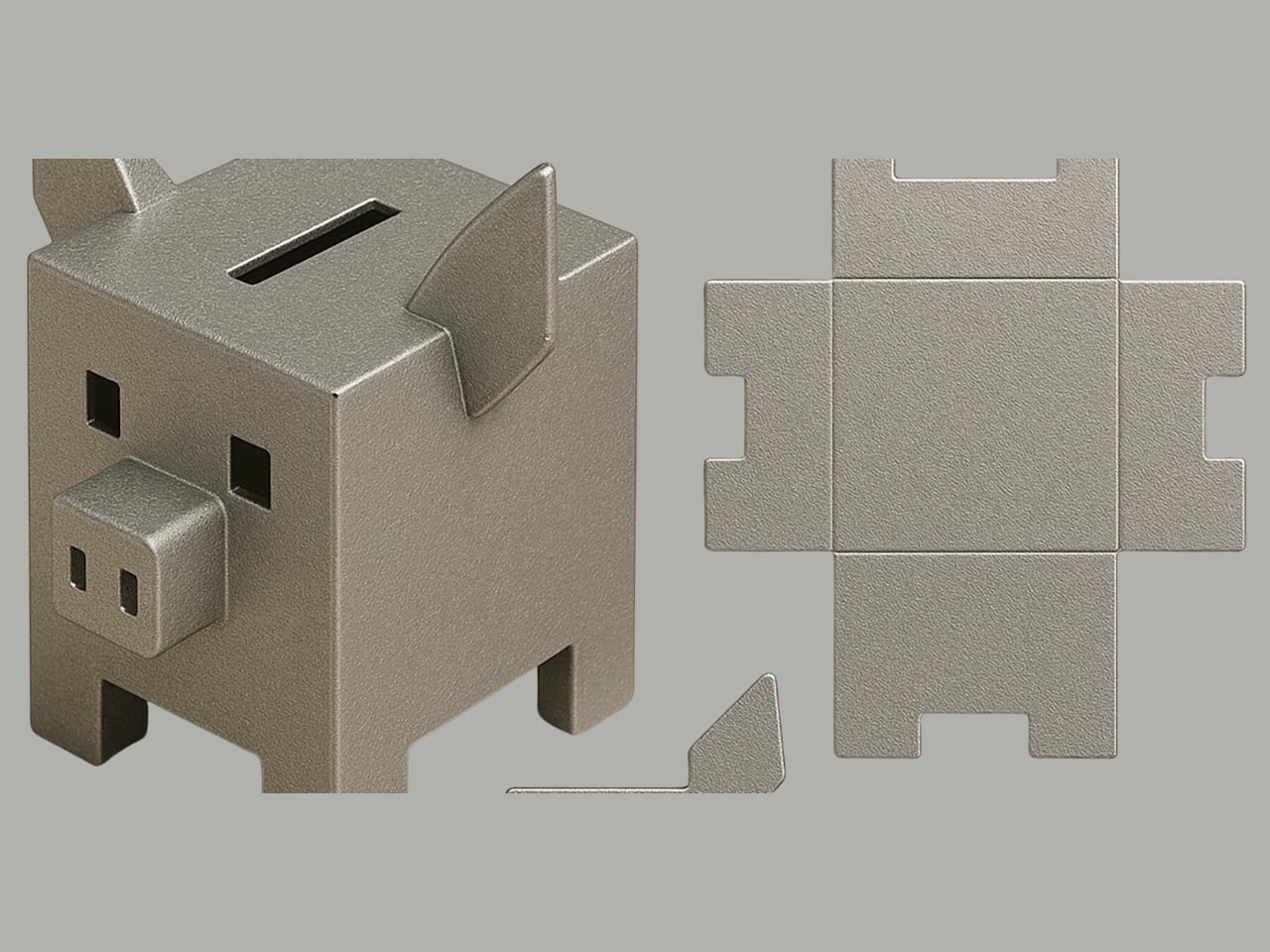
The design process itself is fascinating and honestly pretty modern. They started with ChatGPT, using AI to generate initial concepts. Their first prompt produced a pig that was fine but not quite right. So they asked the AI to make it “more boxy-looking and silver,” then added tweaks like a “cute nose” until they landed on something that felt both contemporary and charming. It’s the kind of iterative design process that shows how technology can actually enhance creativity rather than replace it.

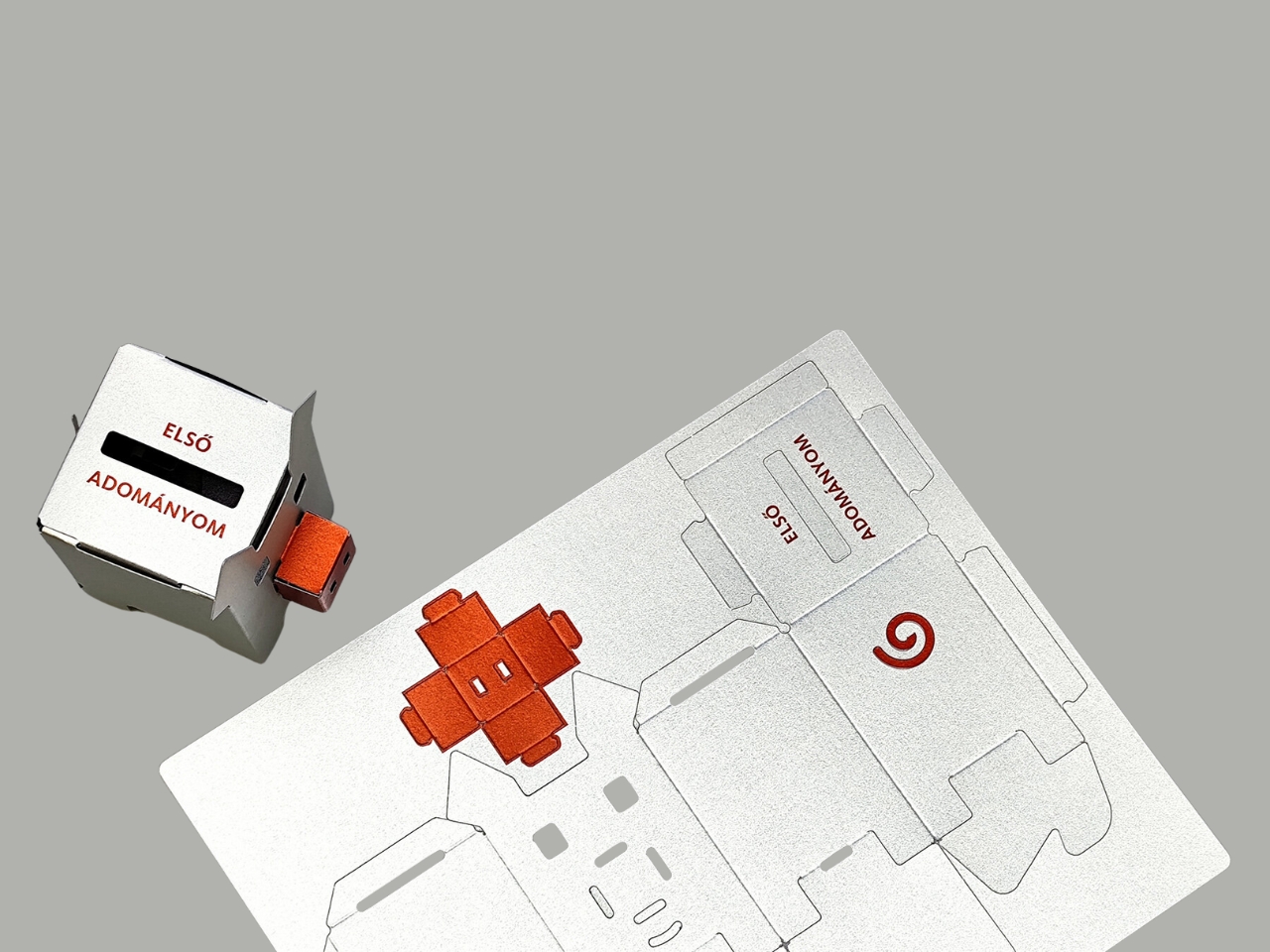
What makes this piggy bank work is its simplicity. It arrives as a flat sheet that you cut and fold yourself. There’s something almost meditative about the assembly process, like adult origami but with a purpose. The metallic finish gives it a modern, almost futuristic vibe that doesn’t scream “kid’s toy.” You could honestly put this on a minimalist desk or shelf and it wouldn’t look out of place. The genius is in the material choice. Paper means easy printing and cutting, which keeps manufacturing costs low. It’s lightweight for shipping. It’s recyclable. And if you’re designing something meant to be eventually destroyed (because let’s face it, that’s how you get the money out), paper actually makes more sense than ceramic shards scattered across your kitchen floor.

There’s also something symbolic about using paper to save money. We’re living in an increasingly cashless society where financial transactions happen with a tap or a click. Physical money feels almost nostalgic. Creating a paper vessel to hold coins becomes this interesting commentary on the materiality of money itself. It’s meta in the best way. For kids especially, this design hits differently. Assembly becomes part of the experience, not just a barrier to use. The act of putting it together creates ownership and investment (pun intended). And when it’s time to donate, breaking open a paper bank feels less destructive than smashing ceramic. There’s no guilt, just satisfaction.

PLANBUREAU studio has carved out a niche making playful, geometric designs, and this piggy bank fits perfectly into their aesthetic. It’s functional but also kind of art. The kind of object that makes you reconsider what everyday items can be. It proves that good design doesn’t require expensive materials or complex manufacturing. Sometimes the best solutions are literally paper-thin. Since we’re constantly looking for ways to make sustainable choices without sacrificing style, this metallic paper piggy bank feels like a small but meaningful answer. It’s affordable, it’s clever, and it makes saving money feel fresh again. Plus, it teaches kids about generosity without being preachy about it. Not bad for something you can fold from a single sheet of paper.

The post This $10 Metallic Piggy Bank Is Actually Made of Paper first appeared on Yanko Design.
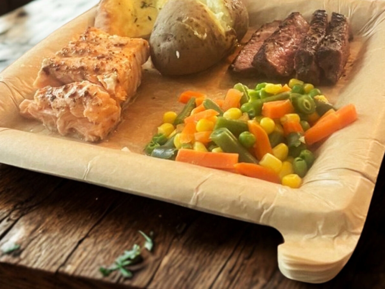
Peel Your Plate Clean: 15 Servings, Zero Dishwashing

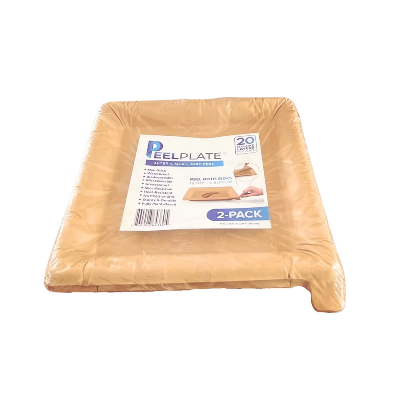
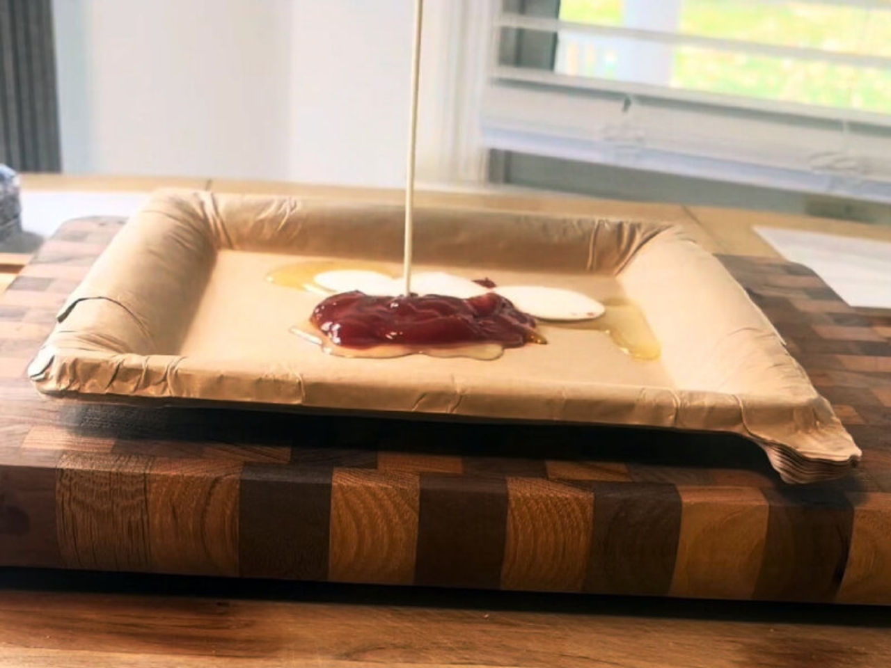
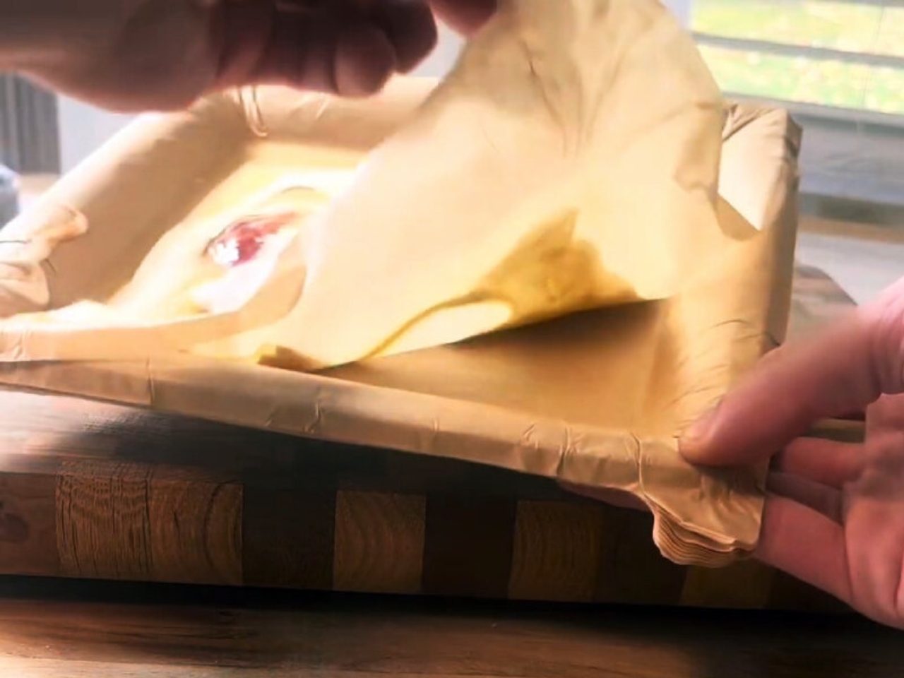
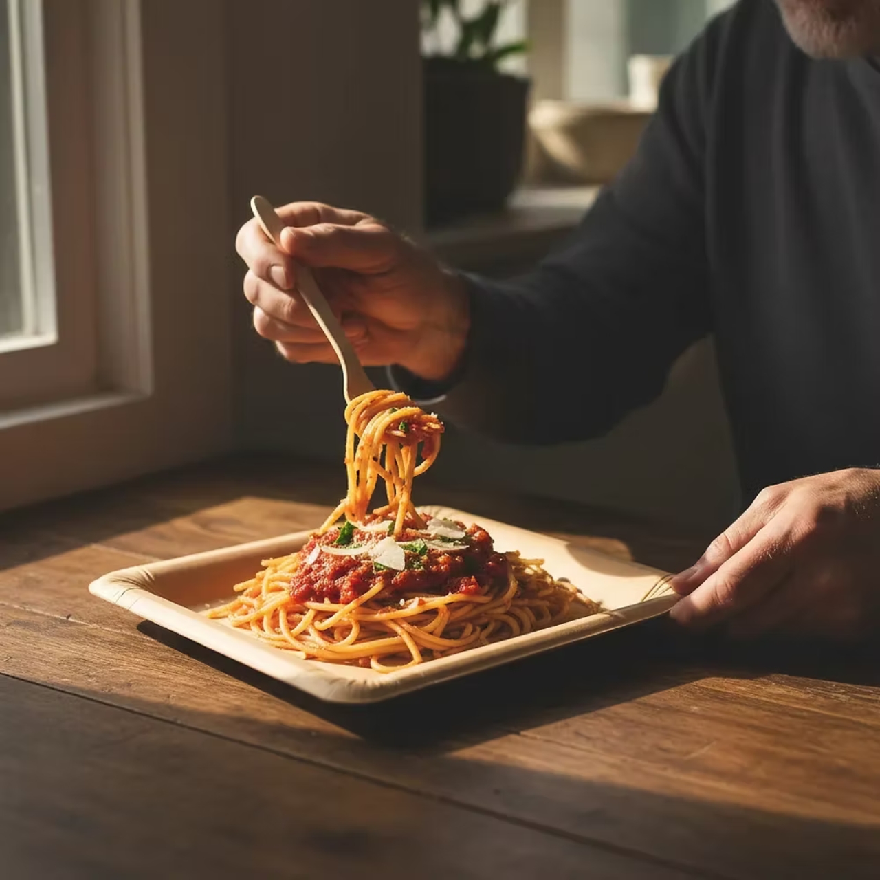
You know that moment when you’re staring at a sink full of dishes after dinner, silently calculating how many paper plates you’d need to never deal with this again? Well, someone finally cracked the code, and it’s kind of brilliant. Meet the Peel Plate from Peelware, a stack of 20 ultra-thin paper layers compressed into one plate that you literally peel away after each meal.

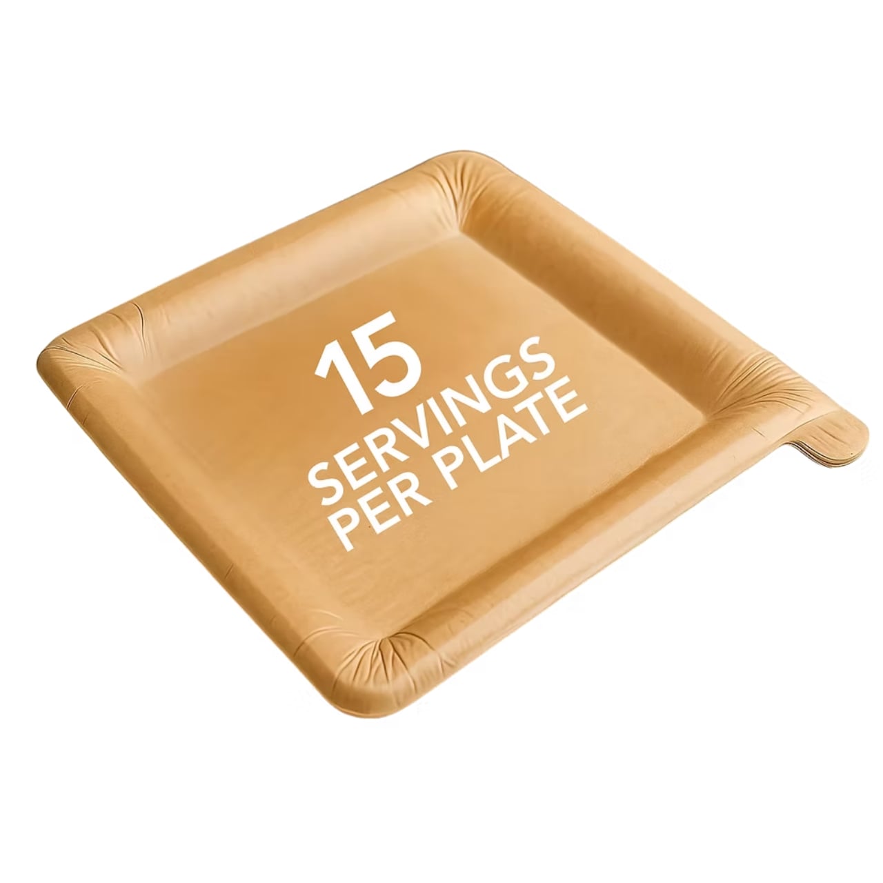
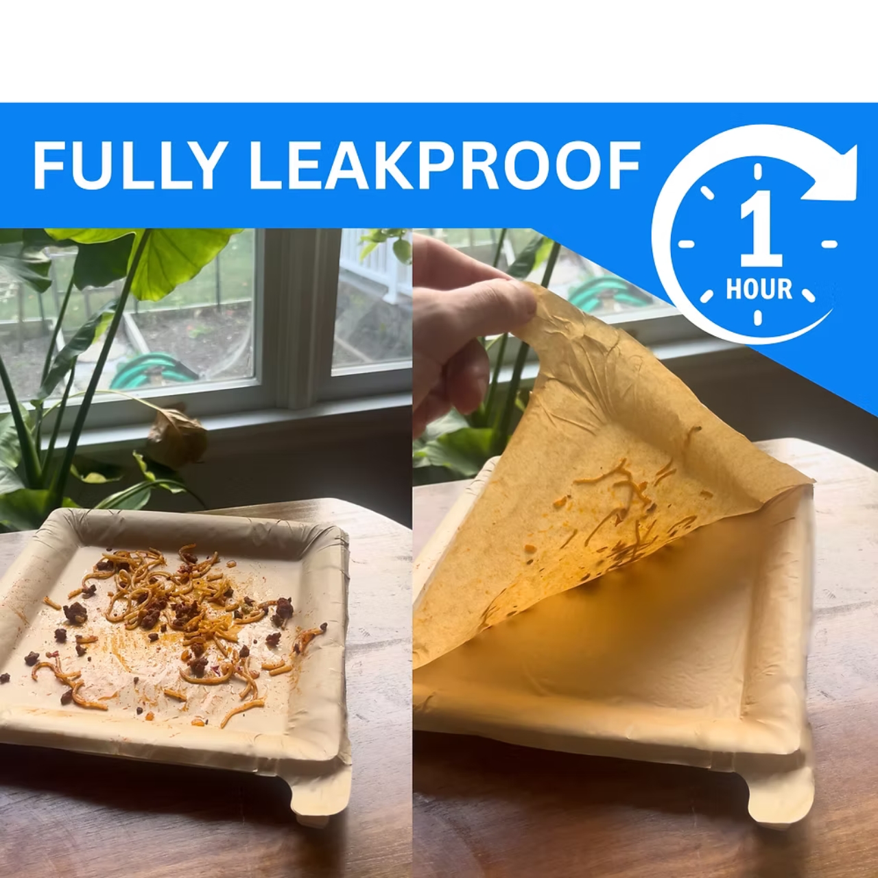
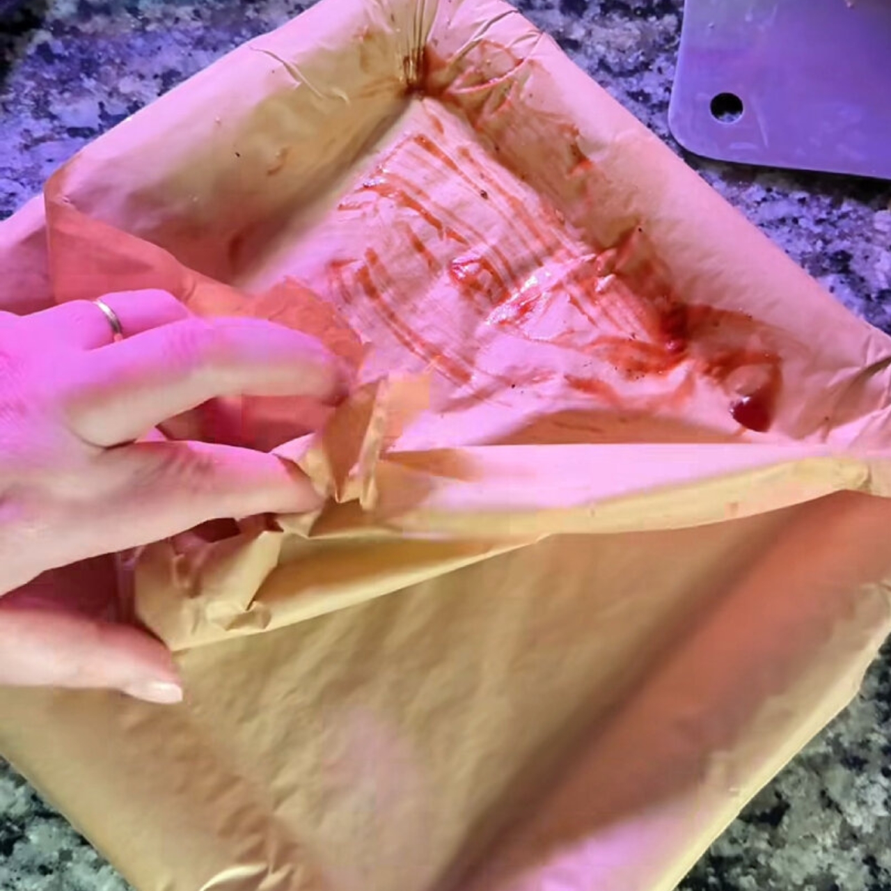
Here’s how it works. You eat your dinner, finish up, and instead of tossing the entire plate or dragging it to the dishwasher, you just peel off the top layer to reveal a fresh, clean surface underneath. Each plate gives you 15 peelable servings, with five thick base layers that stay put to keep the whole thing sturdy. It’s like a notepad for your food, except way more practical and infinitely more satisfying to use.

Designer: Peelware

The design itself is where things get really interesting. These aren’t your flimsy cookout paper plates that buckle under a burger. Peelware uses natural materials like wood pulp and sugarcane bagasse, which are pressed together with heat and pressure instead of glue or chemicals. The fibers in the paper literally bind during compression, creating a stable multi-layer structure that separates cleanly when you peel. No plastic, no dyes, no waxy coatings, and a plant-based waterproof layer means you can load them up with saucy pasta or soup without any sogginess or breakthrough.

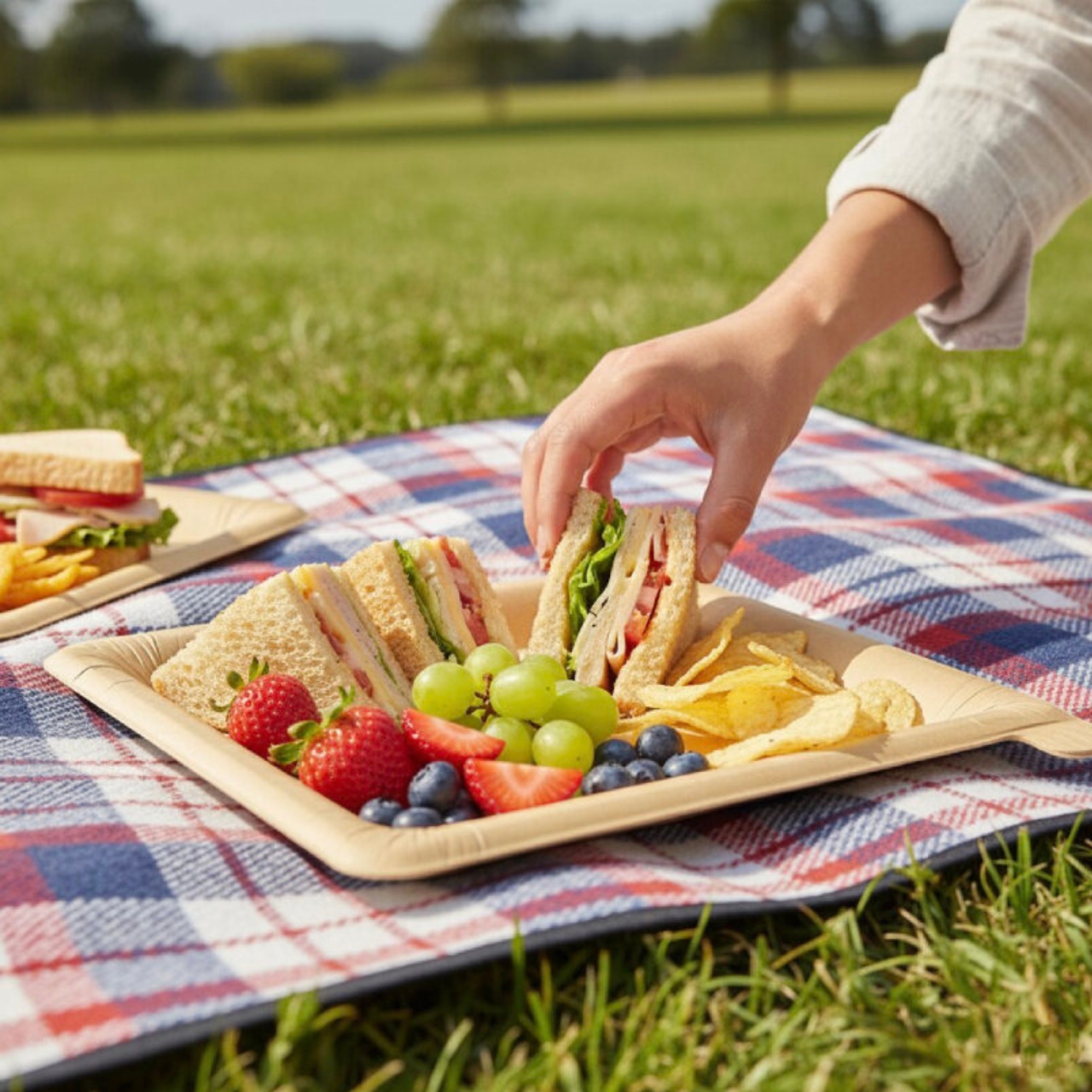
What really makes this product stand out is the sheer efficiency of it all. We’re talking about 90% less paper per use compared to regular disposable plates. A 10-pack of Peel Plates gives you 150 uses, which translates to way less waste piling up in your trash can and a lot more space in your pantry. Imagine storing several months’ worth of plates in the same spot where you used to keep a week’s supply. Plus, they weigh almost nothing, which makes them perfect for camping trips, picnics, or anywhere you can’t exactly haul around ceramic dinnerware.

The whole concept taps into that sweet spot between convenience and sustainability. Single-use plates are easy but wasteful. Reusable dishes are eco-friendly but require water, soap, and effort. Peel Plates split the difference by giving you multiple uses from one item while still being fully biodegradable when you’re done with it. And because the materials are natural and FDA-approved, you’re not eating off anything sketchy or chemical-laden.

Now, are these the answer to all our dish-doing woes? Probably not. If you’re hosting Thanksgiving dinner for twenty people, you’ll still need a game plan. But for everyday meals, late-night snacks, kids’ lunches, or those nights when doing dishes feels like climbing Everest, this is a genuinely clever solution. The plates are cut-resistant, grease-proof, and sturdy enough to handle heavy or hot foods without collapsing. You can slice a steak on one of these and it’ll hold up just fine. There’s something oddly delightful about the peel-away action too. It’s tactile, it’s instant, and it feels like a tiny life hack every single time you use it. You finish eating, give the edge a little tug, and boom, brand new plate. It’s the kind of small moment that makes you wonder why nobody thought of this sooner.

Peelware is planning to expand the product line beyond plates to include other peelable dinnerware by 2026, which could mean bowls, trays, or who knows what else. For now, the Peel Plate is available online starting at around $9.99 for a five-pack, which breaks down to about 13 cents per serving. Not bad for something that saves you time, space, and a whole lot of scrubbing. It’s the kind of innovation that makes sense once you see it but feels almost revolutionary in its simplicity. Less waste, less hassle, and a more sustainable way to handle the meals where washing up just isn’t in the cards. Sometimes the best designs aren’t the flashiest ones, they’re the ones that make everyday life a little bit easier.

The post Peel Your Plate Clean: 15 Servings, Zero Dishwashing first appeared on Yanko Design.
DIY foldable desk organizer is made from recycled Campus notebook paper

As a self-confessed hoarder and maximalist, my desk is anything but neat. I collect a lot of stationery and supplies (sometimes more than I need) and so I have a lot of things lying around. There are of course some desk organizers there but the small items can sometimes be just left scattered all over. This new DIY stationery items can help with that problem.

Designers: Erlend Storsul Opdahl/Milla Eveliina Niskakoski for Kokuyo

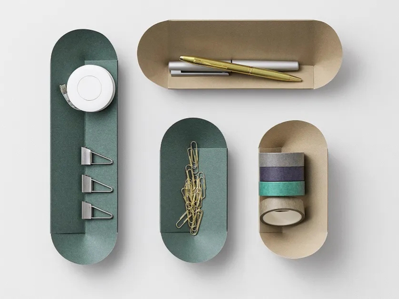
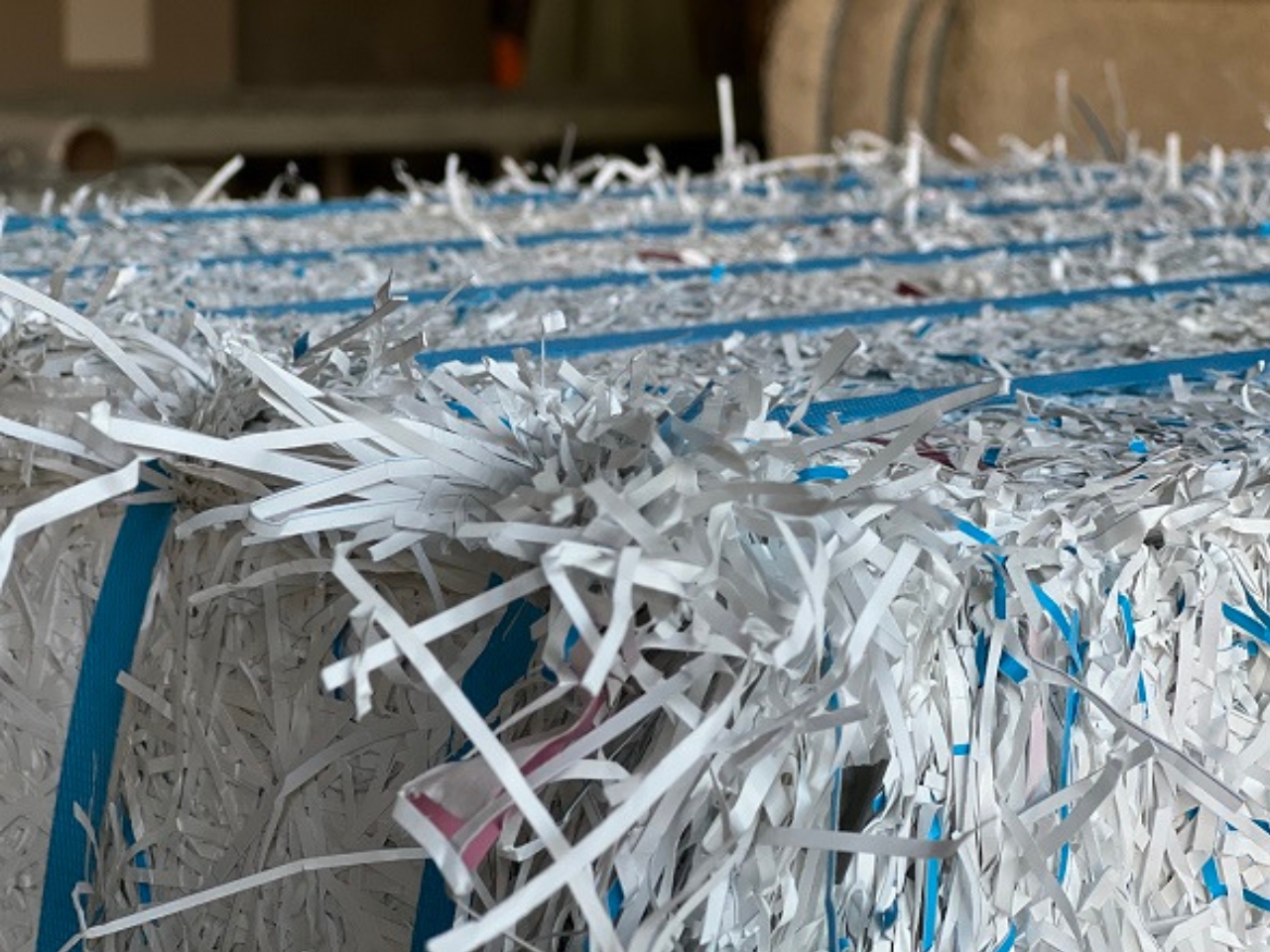
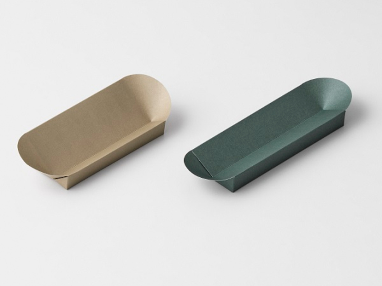
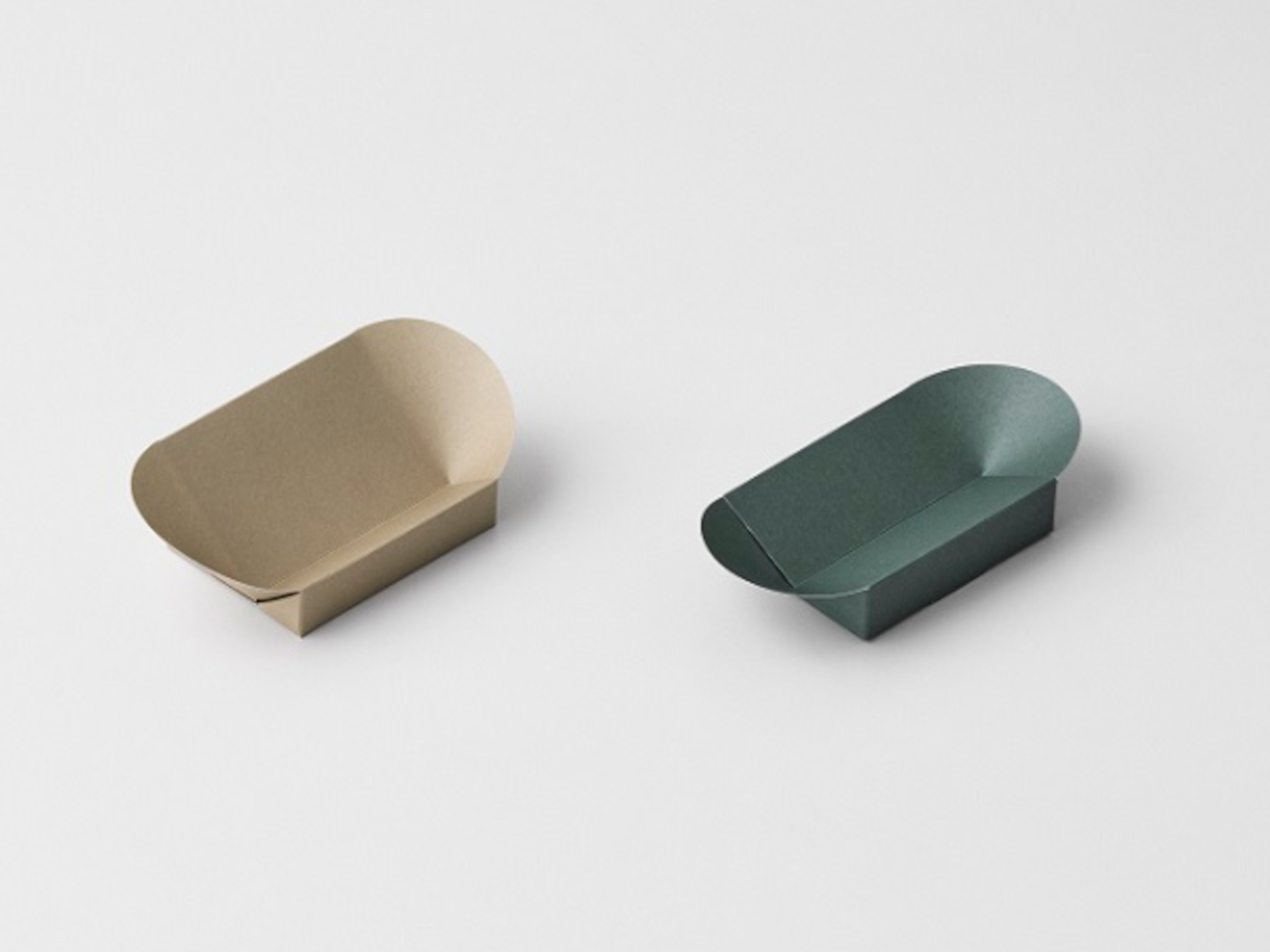
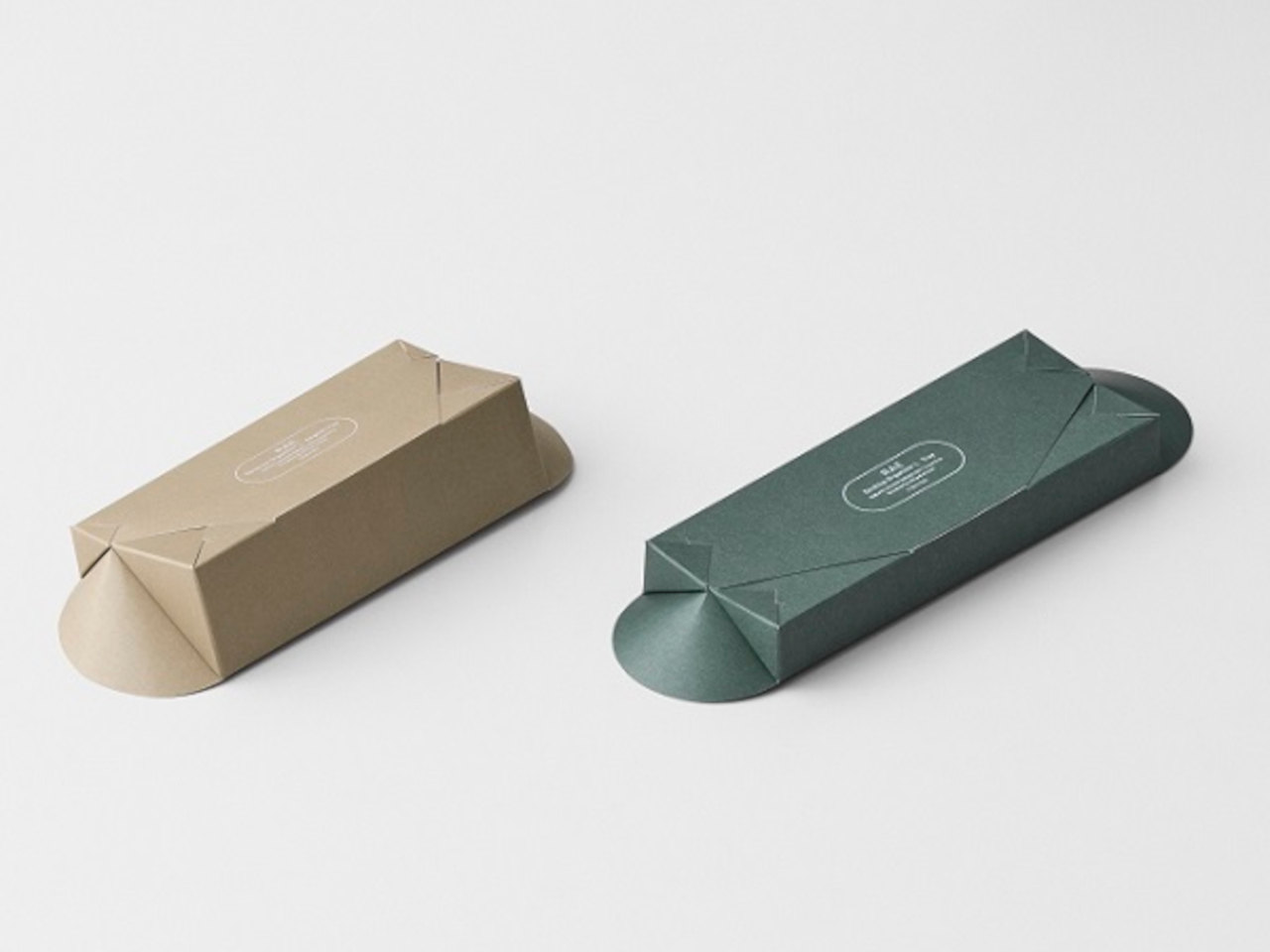
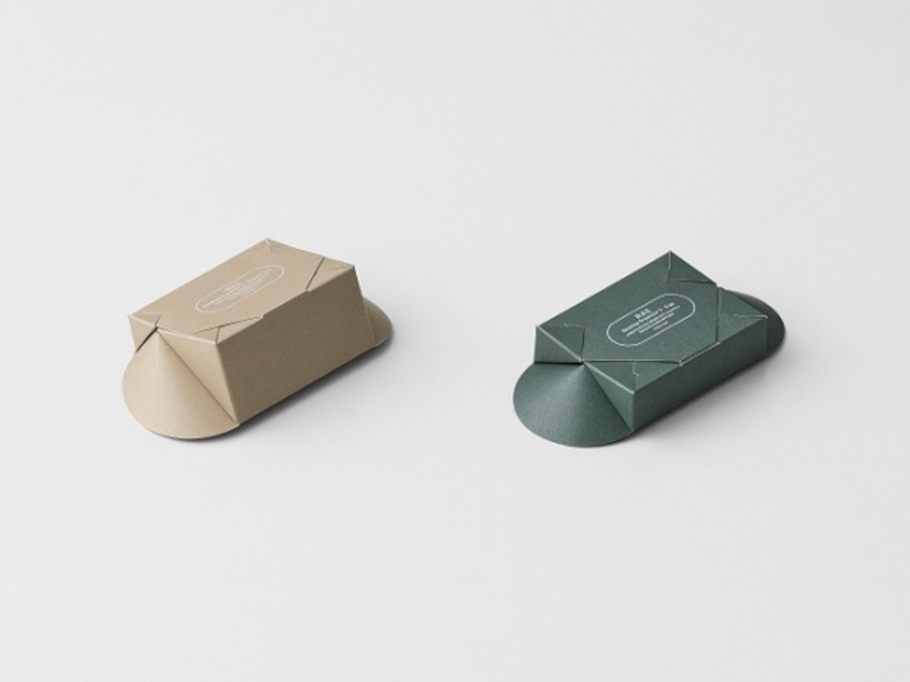
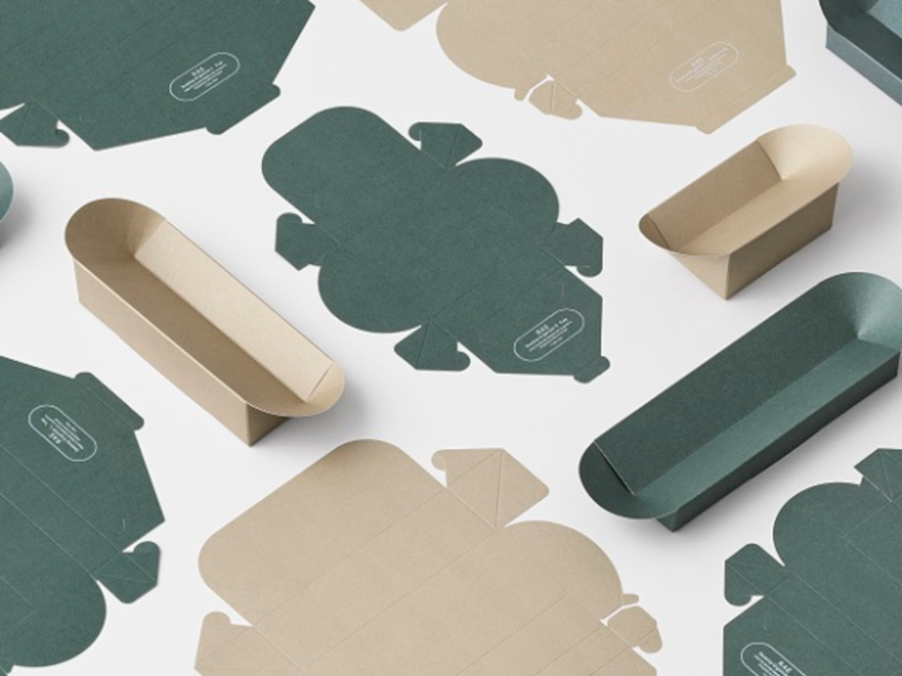
RAE is a desktop organizer that is made from recycled paper from scraps of Campus notebooks from Kokuyo’s manufacturing factories. Since the strength and abrasion resistance is affected if you fully use the recycled fibers as virgin materials, they decided to make that just 50% of the recycled paper.

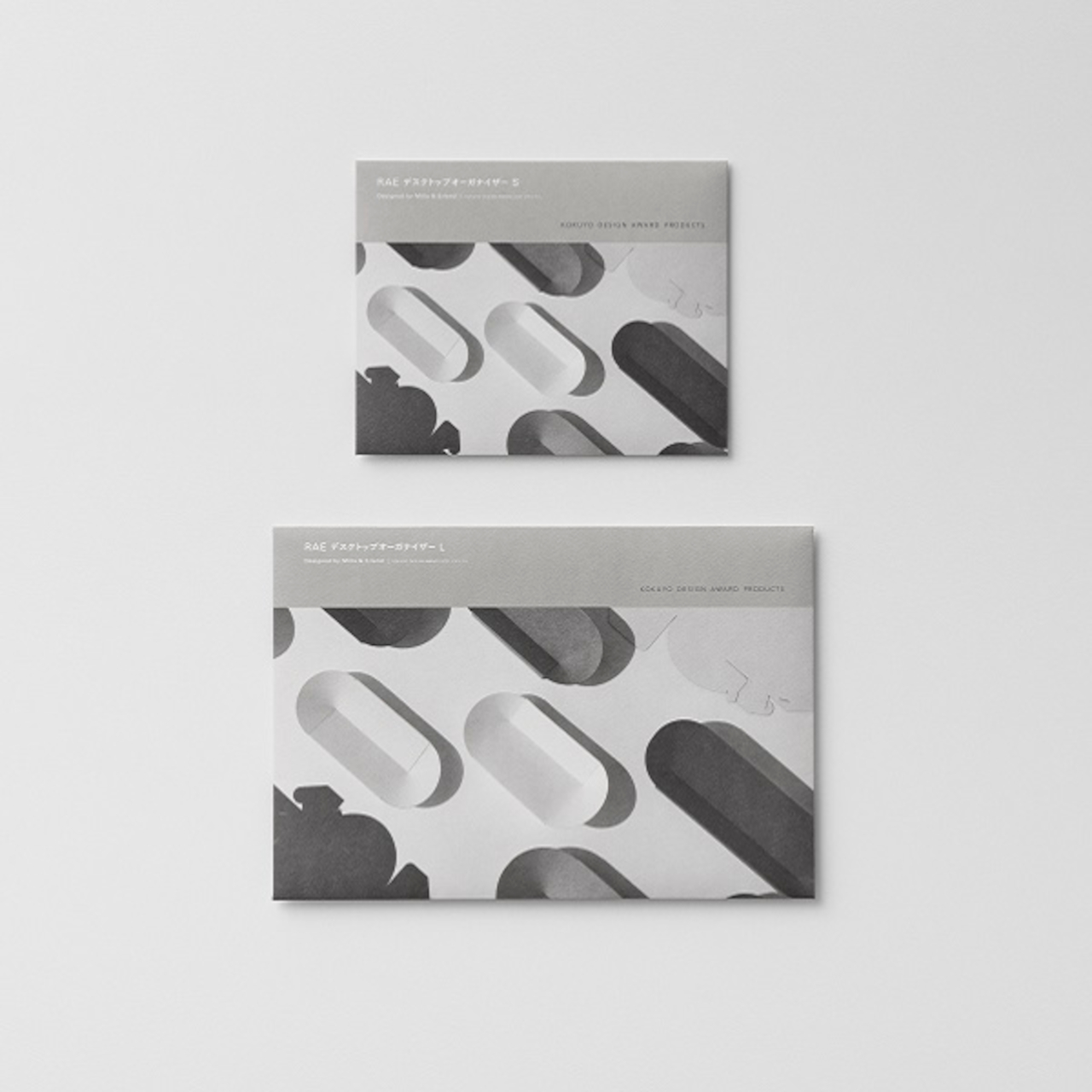
What makes this even more interesting is that the user will be the one to “assemble” the organizer by folding the paper, origami-style. There are two sizes of the paper: the S size (W155 x D70 x H30mm) which is a smaller, squarish kind of organizer and the L size (W250 x D70 x H30mm), a more elongated version. You can place various stationery stuff on it, including pens, paper clips, washi tapes, and other small items you may have lying around.

The package, which contains two pieces, comes with an assembly practice sheet but there’s also a video on YouTube if you need more visual instructions. It comes in beige and khaki colors, keeping with the minimalist feel. It would be cute to have some of these paper organizers on my table, if I can actually follow the instructions.

The post DIY foldable desk organizer is made from recycled Campus notebook paper first appeared on Yanko Design.
Paper vases lets you play around with shapes, colors, patterns

Vases usually take a back seat to the flowers and plants that they house since the main attraction are the flora. Usually they are just functional or if they do have designs, they’re not always that eye-catching and can sometimes be minimalist. But who says you can’t have attractive flowers and also beautiful vases with various colors and patterns?

Designer: Super Nature Design

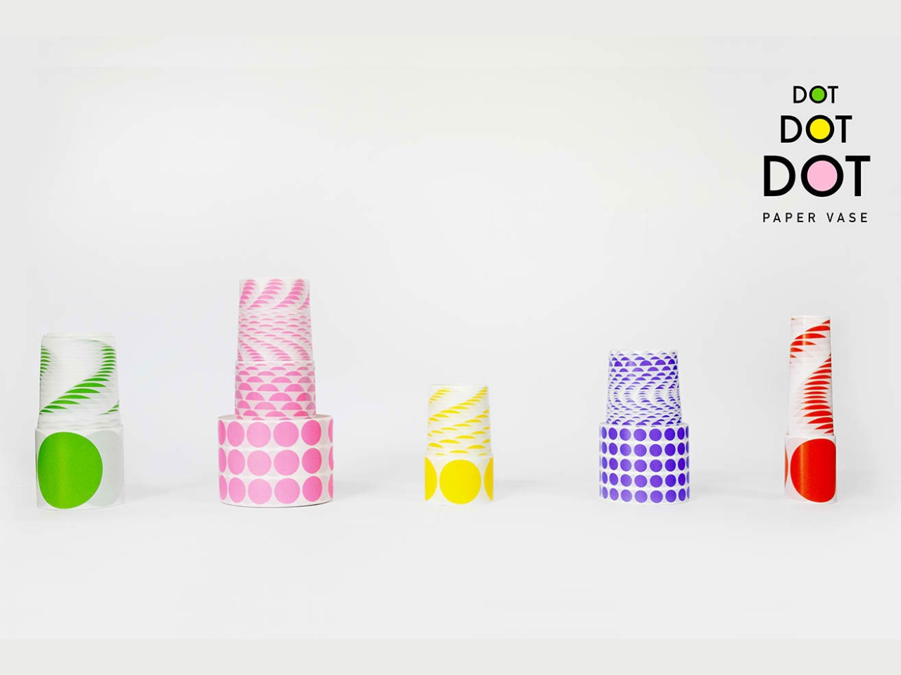
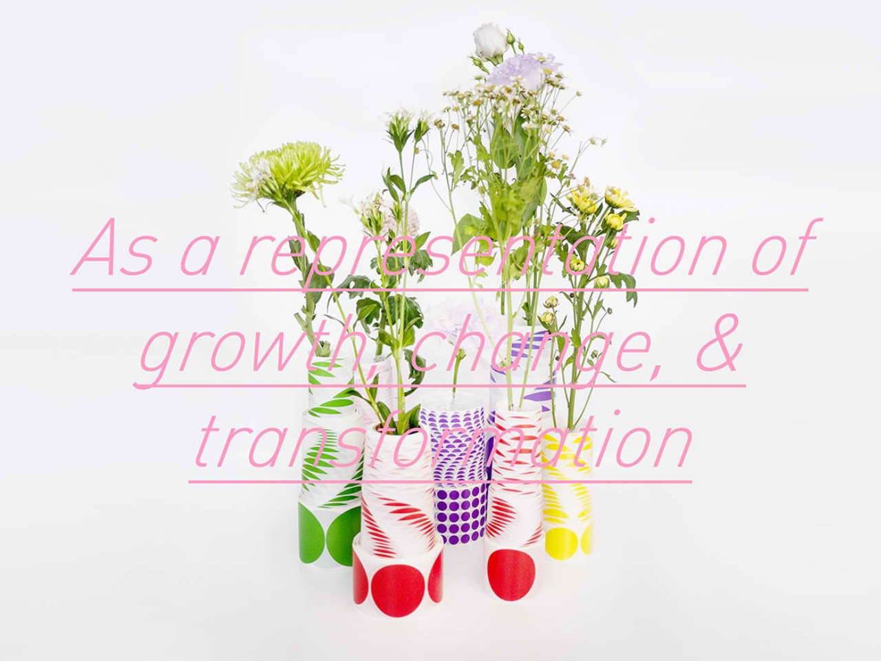
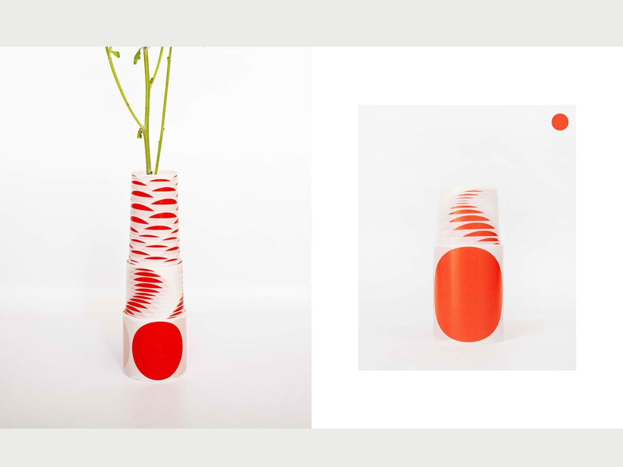
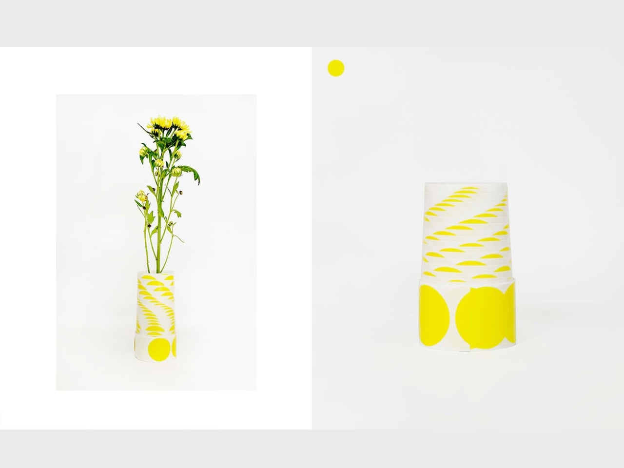
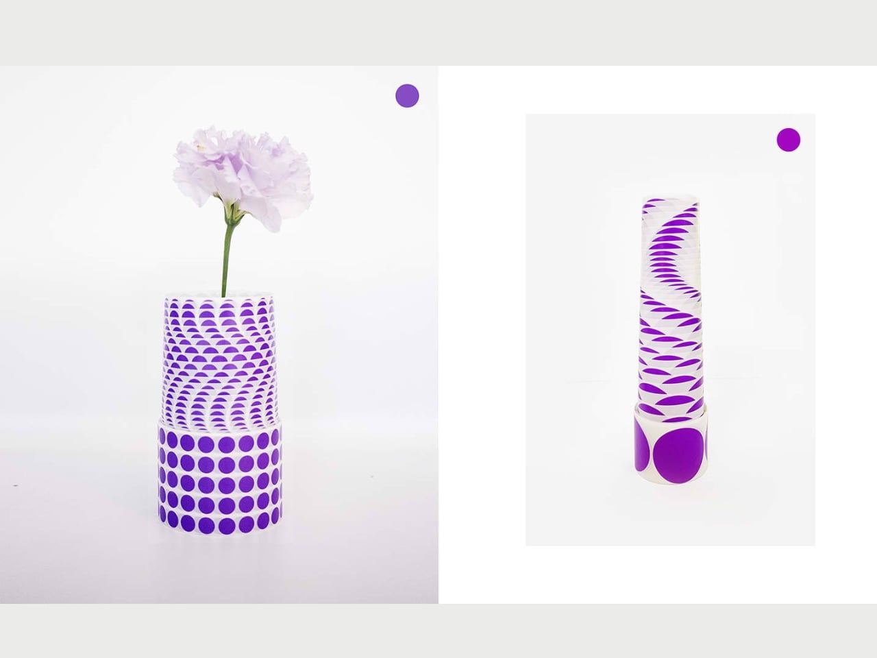
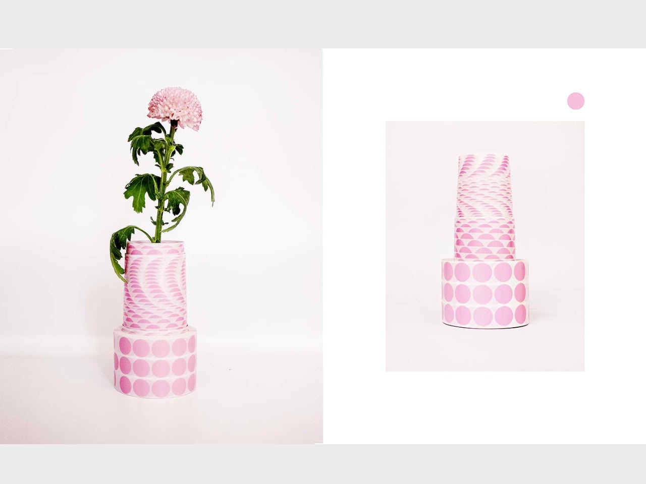
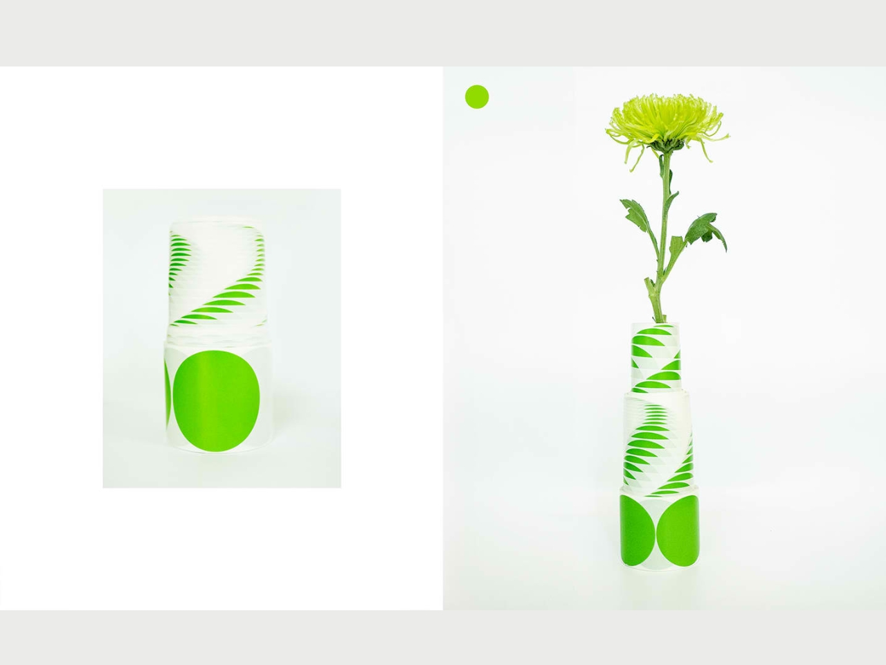
The Dot Dot Dot Paper Vase is one kind of vase that will catch your attention even before you put flowers or plants in them. From its name of course you can deduct that they are made from paper but it’s not just any ordinary paper but ones that have different colors, patterns, and shapes. It can spark creativity in the “viewer” and can also serve as an interactive canvas together with what you’ll put in it.

Since the material is paper, you will also be able to fold, shape, and decorate it in any way you want. You can use it to either complement the flora that you’ll put in it or provide a startling contrast to add to the visual smorgasbord. Minimalists will probably not be that fond of it because of the vibrant colors and the textured patterns.

The paper vases have different colorways like green, red, violet, yellow, and pink, but always with the white color creating patterns. There are also different shapes like circles, spirals, half moons, and lines. They can add an artful feel to your space aside from serving its function as a vessel.

The post Paper vases lets you play around with shapes, colors, patterns first appeared on Yanko Design.
Paper saddlebag hangs over the edge to keep your desk organized

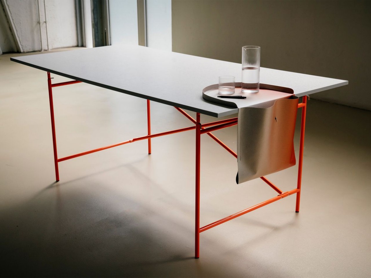
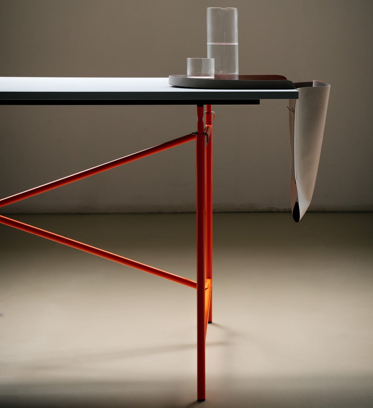
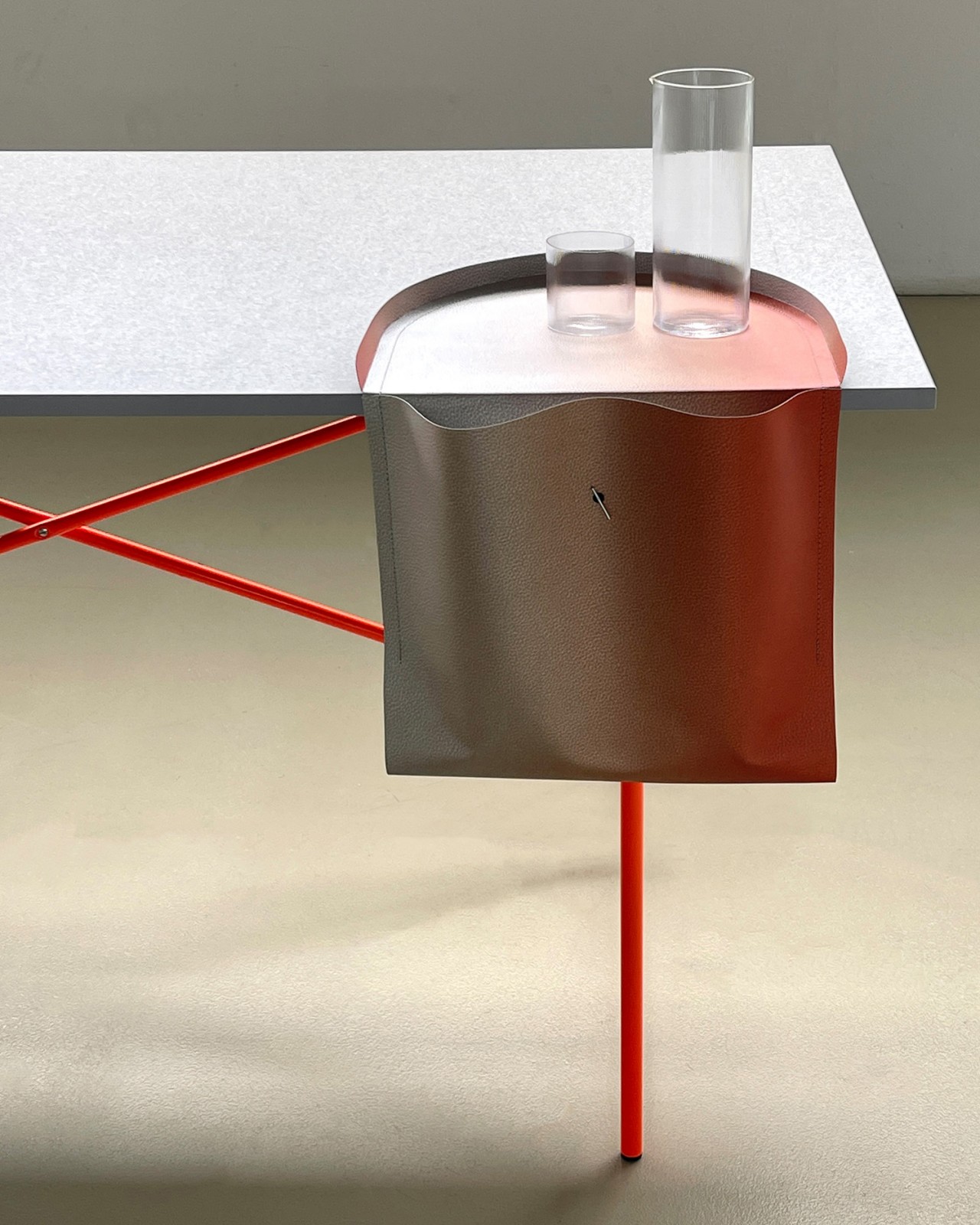
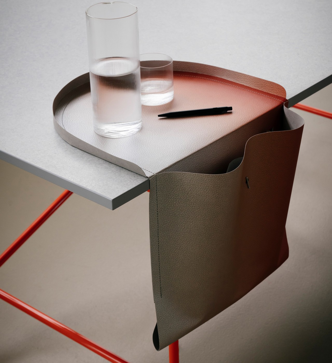
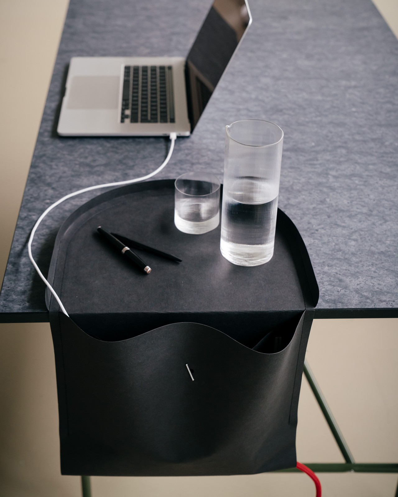
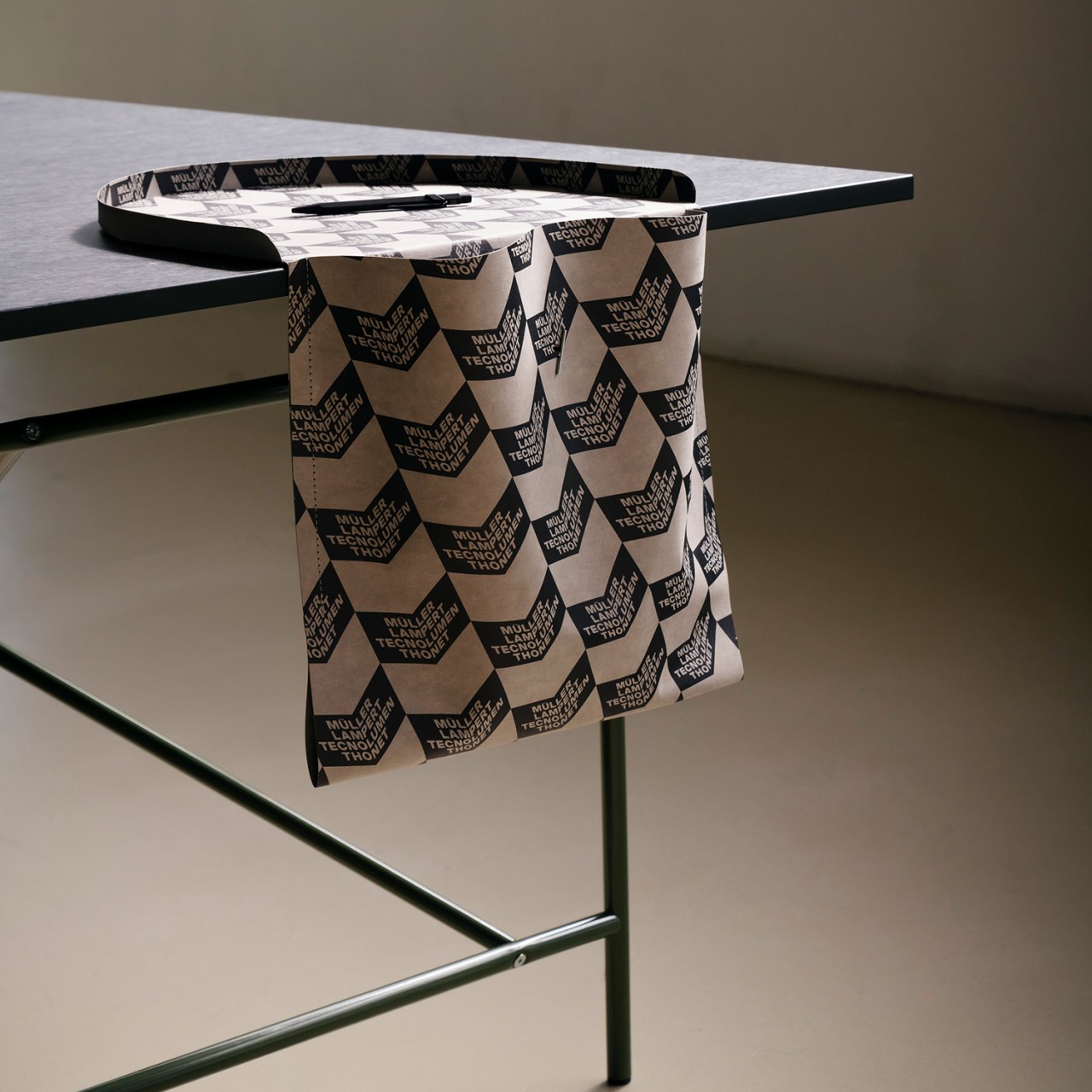
We only have a very finite desk space, constrained by the available area in our rooms or offices. We can always stack up desk organizers or have drawers beneath to make up for it, but those can only go so far. One underutilized area of our desks is often the sides, and there will always be at least two free edges even if you have a corner table. Taking advantage of that unused space, this rather unusual desk organizer hangs a saddlebag on the side of your table, providing not only a place to put pens and notebooks inside, but even a spot for your phone or drink on top. Best of all, it’s made of a sustainable material that looks more like luxurious leather than paper.

Designer: Tilla Goldberg for Richard Lampert

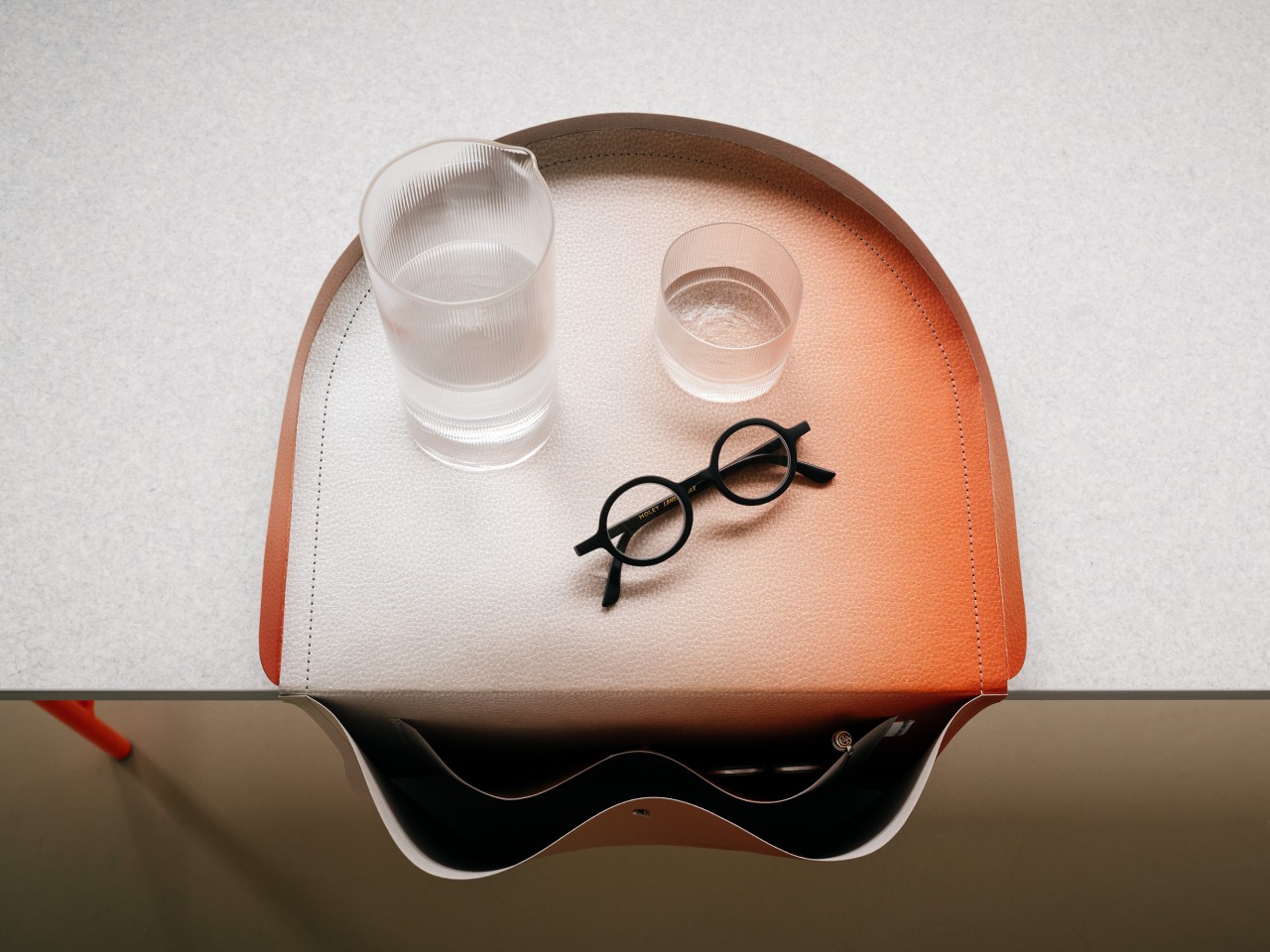
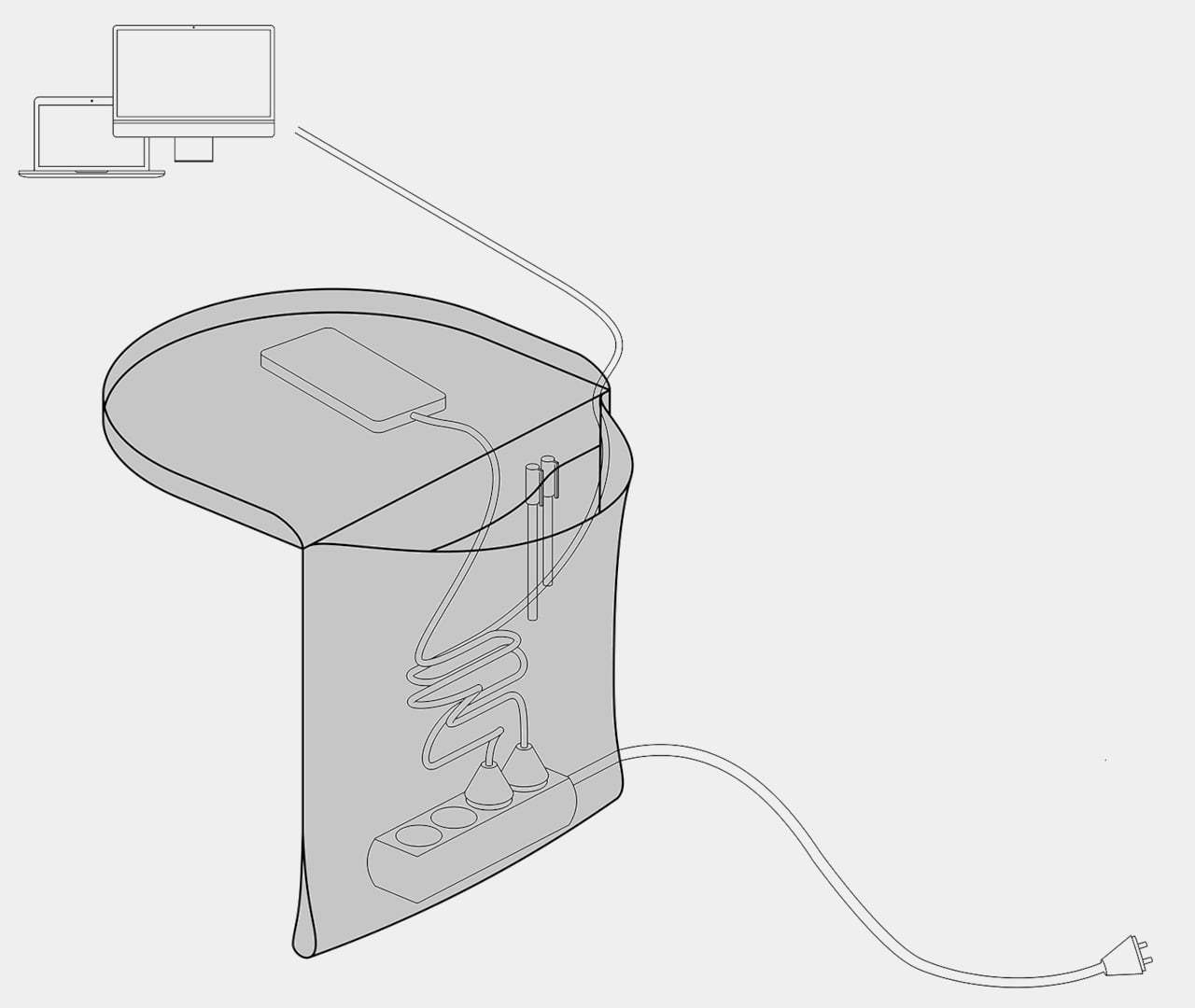
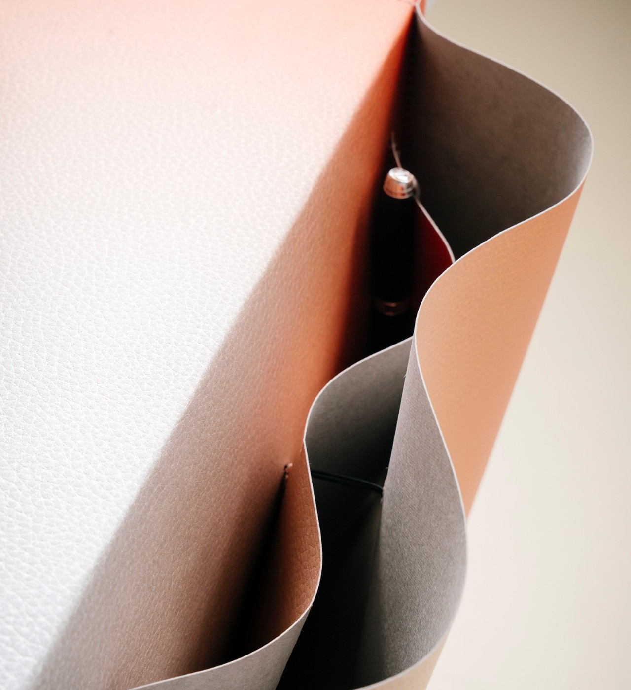
You’d normally hear of saddlebags only in relation to horses or even camels, but our work desks are just as much beasts of burden as these animals. And just like on those, the SALTO dangles off to the side to provide more storage than our overcrowded desks can already accommodate. It’s deep and spacious enough for notebooks, pens, cables, or even headphones, just about anything you want to keep out of sight but still within easy reach.

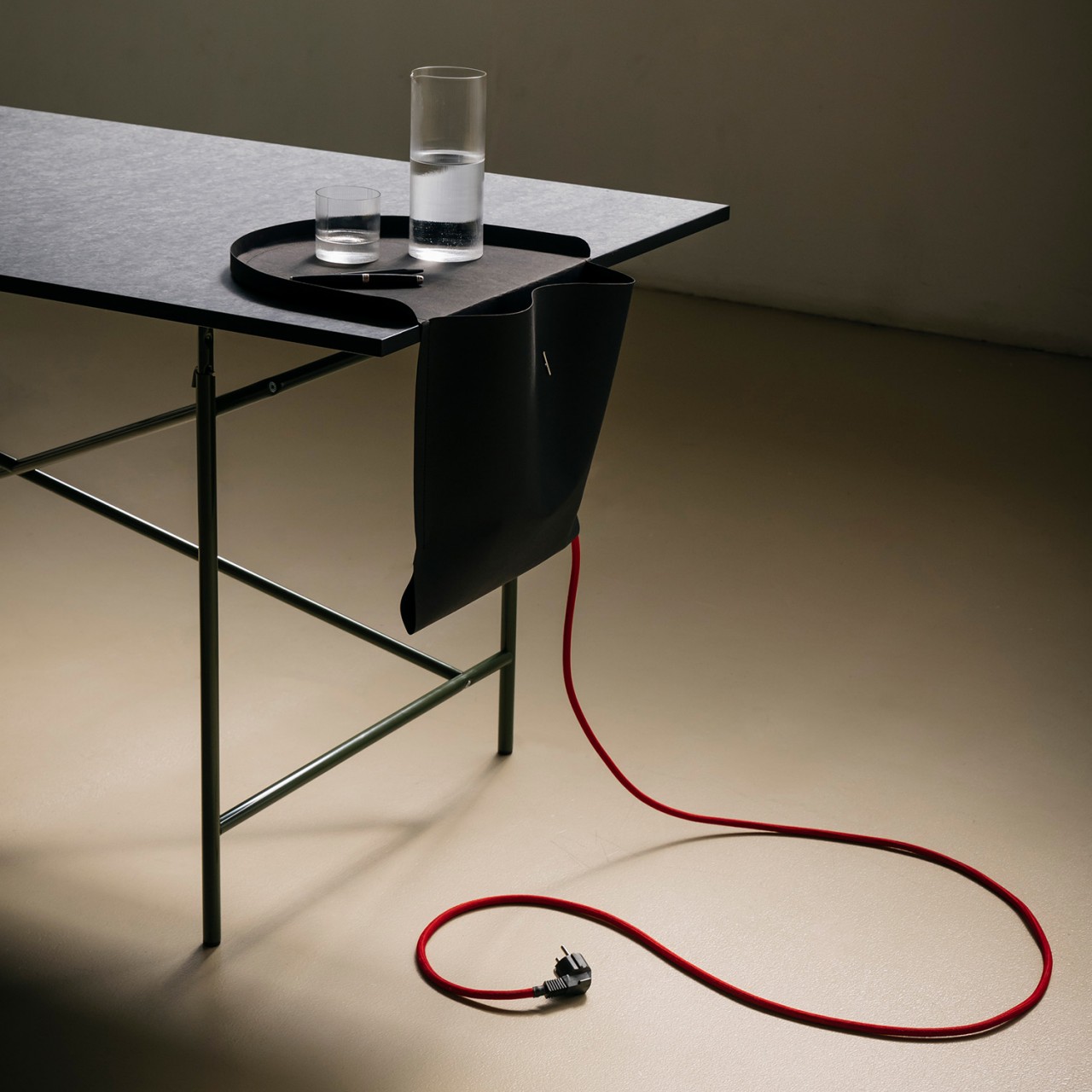
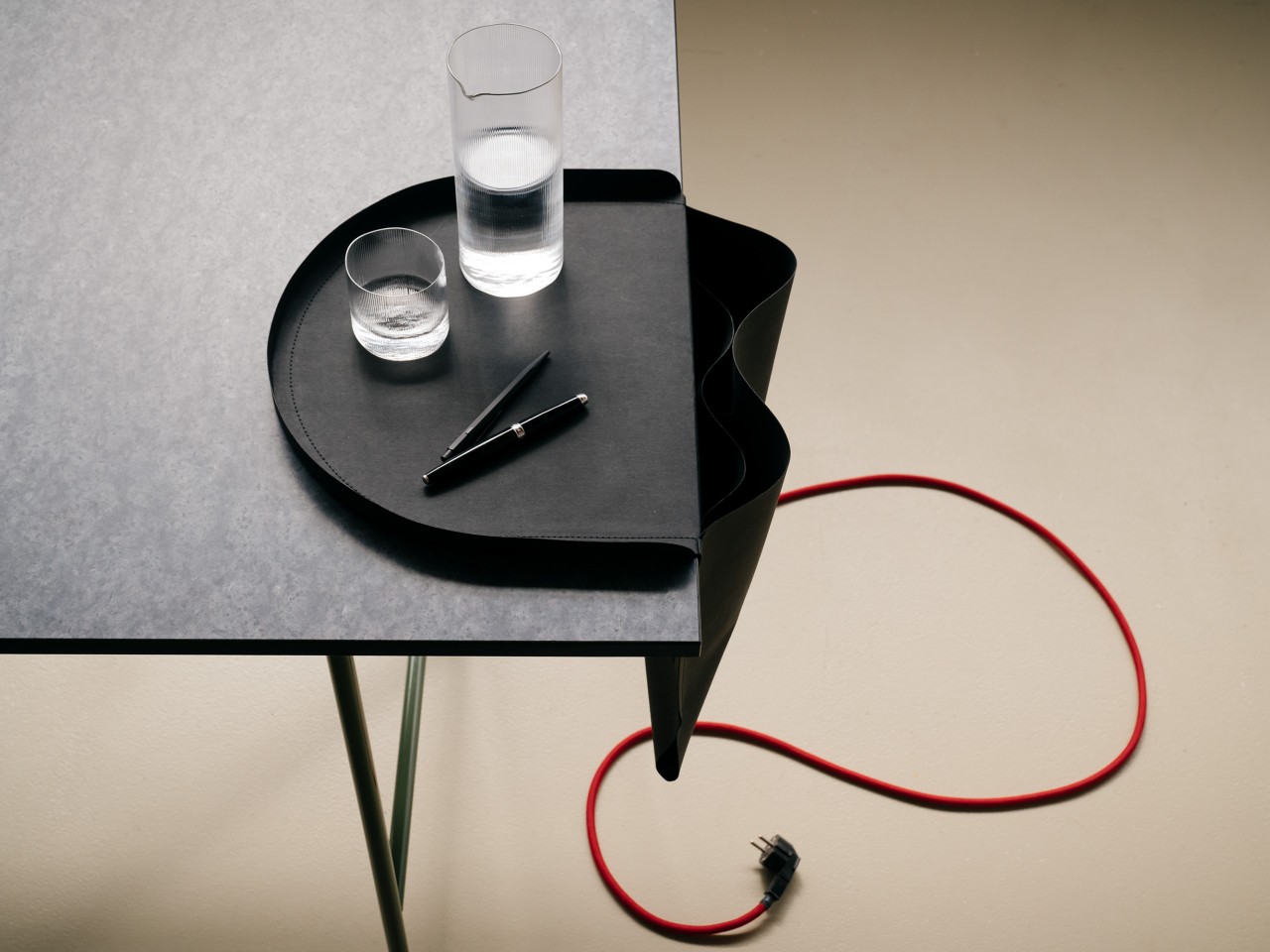
It even has enough room for a power strip, which is probably the last thing you’d think of putting inside. The bag’s design actually creates a simple loop at the bottom for the strip’s cable to pass through, becoming the only location where it snakes its way to a power outlet. It’s an unusual but effective cable management system, letting those wires all drop off to the side and disappear into the abyss that is the SALTO bag.

There is one odd and potentially problematic part of the saddlebag’s design, at least in the way it’s being advertised. The half-circle tray that sits on top becomes a place for more important items you’ll always want to have access to, like your phone or a glass of water. The latter, however, might be a cause for concern, considering how the weight of the bag’s contents could very well be heavy enough to pull that tray off the table. You can probably imagine the disaster if that drink spills inside, especially if there’s a power strip there as well.

The SALTO is also a very sustainable design that’s surprisingly made of paper. Technically, it’s a type of washable vegan paper that’s being used as a leather alternative, which explains its fabric-like texture and composition. It definitely looks elegant and stylish, especially when hanging from a minimalist desk that has all its clutter cleared and dumped into this bag.

The post Paper saddlebag hangs over the edge to keep your desk organized first appeared on Yanko Design.
Sustainable office chair uses paper-like material made from wood by-products

Sustainable furniture and designs are thankfully becoming more common, but the “sustainable” label can actually be applied to different things. They can be made from recycled materials like metal or PCR plastics, or they can be made from new but biodegradable materials like wood, cork, and paper. While both kinds are good, they don’t always address the accumulating material waste that comes from the production of these objects, even the bits and pieces of wood that get left on the cutting room floor and then thrown out. Giving a new purpose to these by-products is another sustainable practice, one that is being applied to a beautifully minimalist office chair that’s made from dozens of sheets of paper.

Designer: Arper

Of course, it’s not literally made from paper, which would be too soft for a chair no matter how many sheets you stack, especially for a sleek and slender seat based on Arper’s iconic Catifa 53. Instead, it uses PaperShell from a Swedish startup of the same name, a material that almost poetically transforms paper, which comes from wood, back to a wood-like material that offers rigidity, stability, and, more importantly, beauty. In a nutshell, it uses both wood by-products like sawdust and chips as well as waste wood like fallen branches in forests to create a new paper-like material that can be used in place of wood, plastic, or fiber composites.

That’s the case with the Catifa Carta, which compresses dozens of these sheets into a composite that’s then bent and formed into an elegant chair with a gentle slope sitting on top of thin yet sturdy metal legs. Unlike its older sibling, this more sustainable version of the chair leaves the seat in its original, unpainted glory. That means you can see the natural imperfections of the PaperShell material, giving each chair a unique character. It’s pretty much the same as the highly prized grains in wood that give designs their natural charm.

What’s even more special about the chair is that even the end of its life has a story to tell. PaperShell can be recycled to produce new and different products, but it can also be turned into biochar to nourish the Earth. The material itself sequesters carbon dioxide which can be used to enrich soil. It’s a truly circular life cycle that starts and ends with the Earth. Appropriately, Arper has made the Catifa Carta easy to disassemble to make this process even easier.

Of course, the chair isn’t just a thing of beauty inside and out, it’s also a functional piece of furniture. Though some might have concerns about the ergonomics of using such a chair for long periods at work, it’s still a well-designed seat that makes you feel good not only about sitting on it but also about the exciting journey that this wood-like material has made since its birth from a seed.

The post Sustainable office chair uses paper-like material made from wood by-products first appeared on Yanko Design.
Sidekick Notepad is a simple writing tool for the digital/analog hybrid workers

Over the years I have learned to embrace a digital + analog hybrid workflow process. While most of my work goes straight to the computer, tablet, or mobile phone that I’m working on at the moment, I still like having a pen and paper with me at all times to jot down things I’m thinking about or things I need to do. There’s something therapeutic about writing it down rather than just typing it out so products that can give me that convenience are always welcome.
Designer: Cortex

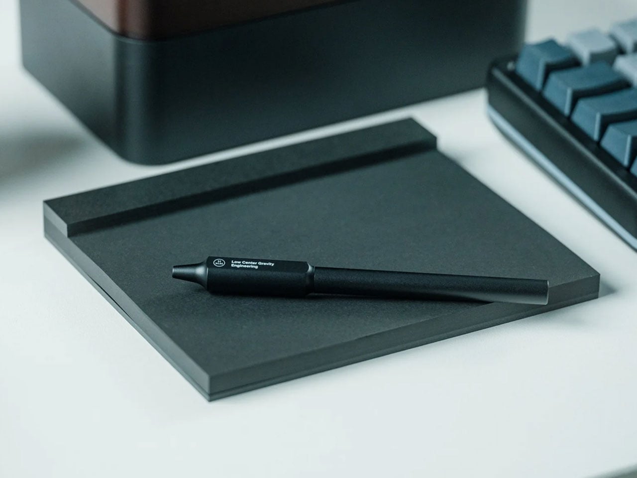
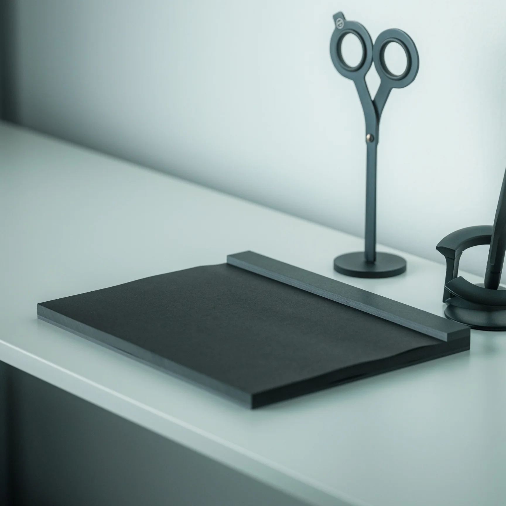
The Sidekick Notepad is basically a writing pad where you can jot things down while having a meeting or while doing your normal, every day tasks. It is designed to fit either above or under your keyboard and is meant to be your “sidekick” if you’re like me that sometimes likes to put her to-do list on paper rather than on pixels. There’s a section to put the date, a huge section for notes, and then on the side, there’s a to-do list section with checkboxes so it’s easier to tick things off.

It’s not meant to be like a journal where you keep it even after the tasks or notes have served their purpose. It’s a tear-away kind of pad where you can just tear it off and then throw it (or compile it somewhere else if that’s your thing). You can also scan your notes for posterity and then save it on your preferred notes app. It doesn’t seem to have a dedicated app that can automatically scan and store things for you so you have to do it the manual way.

The Sidekick Notepad has 60 pages of Munken Lynx paper so if you run out, you’ll have to buy a new notepad since it’s not refillable. The cover is made from something called “Extract”, a paper made from recycled coffee cups. This adds another layer of things that I love so this product seems to be created especially for people like me who still can’t let go of the analog stuff.

The post Sidekick Notepad is a simple writing tool for the digital/analog hybrid workers first appeared on Yanko Design.