
A White House teleprompter operator reportedly won big betting on presidential speeches
The staff member allegedly made over $100,000 on Kalshi.

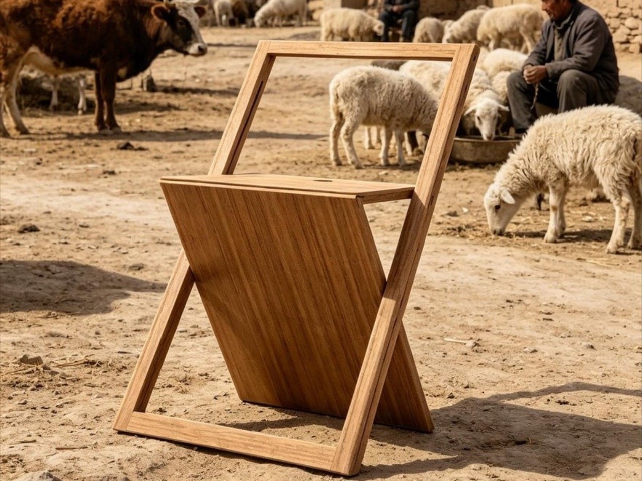
At some point in our collective design consciousness, we collectively decided that a chair could be aspirational. Not just functional. Not just well-made. Aspirational. And Nor Casa’s folding chair, recently described as “flawed but Instagram-friendly,” is basically a case study in exactly that shift.
The chair is striking. The kind of thing that stops your scroll on a Tuesday afternoon when you’re supposed to be answering emails. It has the visual language of something you’d find in a curated boutique hotel lobby or a design fair in Milan: clean lines, considered proportions, the kind of silhouette that photographs beautifully against a white wall or a sunlit concrete floor. Nor Casa, positioned as a distributor rather than a heritage design house, knows their audience. They’re selling a look, and the look lands.
Designer: Nor Casa (distributor)
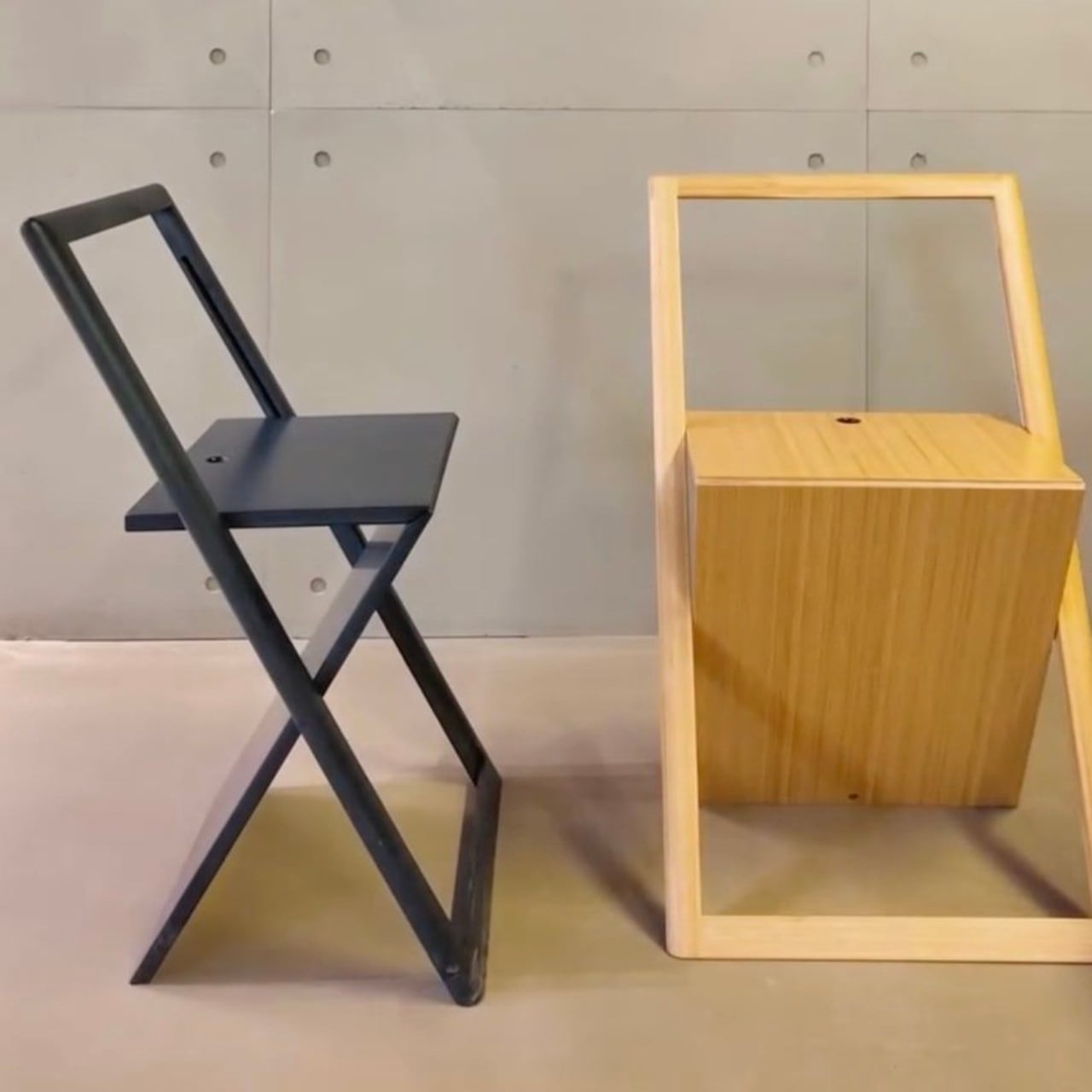
But here’s where it gets interesting. “Flawed but Instagram-friendly” is a phrase that deserves unpacking, because it points to what usually gets compromised when form takes the lead over function: structural integrity, seat comfort, longevity, the kind of quiet durability that makes a chair worth keeping for twenty years instead of two seasons. And I’ll be upfront about where I personally stand. I would rather sit comfortably in an unremarkable chair than perch awkwardly in a beautiful one. A chair’s first job is to hold you well. Everything else is a bonus.

Folding chairs have always occupied an awkward rung in the design hierarchy. They’re the furniture world’s equivalent of the understudies: useful, necessary, but rarely celebrated. The good ones tend to be purely utilitarian, the kind you pull out of a closet for extra guests and fold back up with relief when everyone goes home. The beautiful ones have historically been expensive design objects, carved out of rare wood or engineered with mechanisms that cost as much as a small appliance. Nor Casa seems to be attempting a middle path: a folding chair that photographs like the former and costs closer to something accessible.
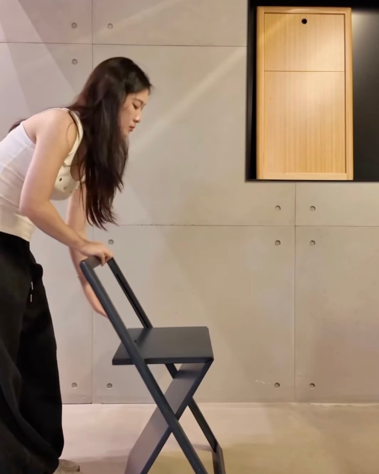
That balance is genuinely hard to get right. The chair may wobble. The finish may not hold up the way the images suggest. The folding mechanism might feel less elegant in person than it does in a product shot with perfect lighting and a muted background. These are not small concerns when you’re buying something meant to be sat in repeatedly by actual human beings. And yet, I find the effort worthwhile to discuss, even if the execution doesn’t fully deliver.
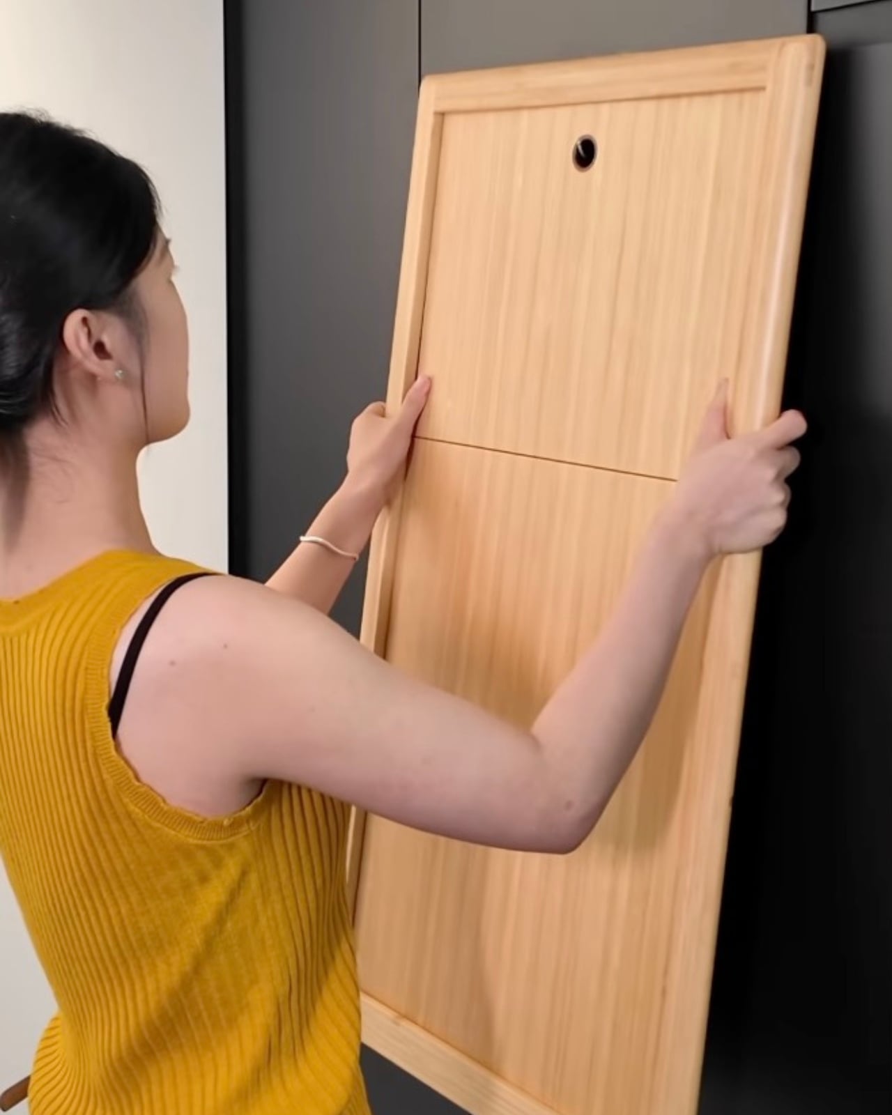
We are living through a moment where design fluency has become democratized in a way that would have been unthinkable thirty years ago. Millions of people who aren’t interior designers or architects now have an eye trained by years of scrolling through design accounts, renovation reveals, and aesthetic-obsessed content creators. They know what a good chair looks like. They want to live with beautiful things. The demand Nor Casa is chasing is real, and it didn’t come from nowhere.

The issue is that visual aspiration without material honesty is a shortcut that tends to disappoint. A chair that performs flawlessly in a photo but creaks under pressure the first time a real person sits in it is not just a design failure. It’s a trust failure. And once a brand earns that reputation, it’s very hard to unlearn.
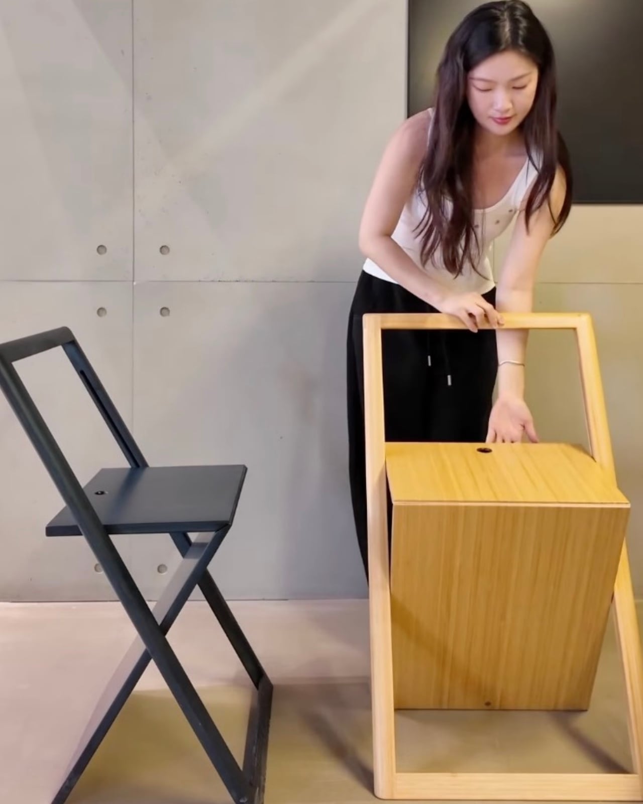
So I’d say this to anyone tempted by the Nor Casa chair: go in with eyes open. If you want it for the way it looks in a corner of your apartment, on a terrace, in the background of every call you take from home, it might genuinely deliver that. But if you need it to hold up under daily use, to last, to justify itself beyond aesthetics, do your homework before you check out.
For me, the choice is simple. Give me the chair I can sink into for hours without thinking about it. The prettiest chair in the room is only as good as the conversation you can have sitting in it. And that conversation gets very short, very fast, when your back starts to ache.

The post The Folding Chair That Looks Great and Sits Terribly first appeared on Yanko Design.
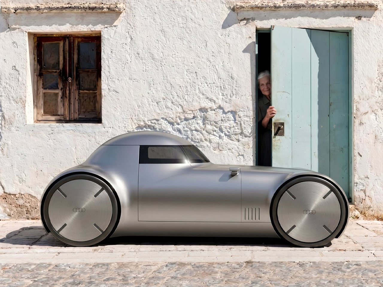
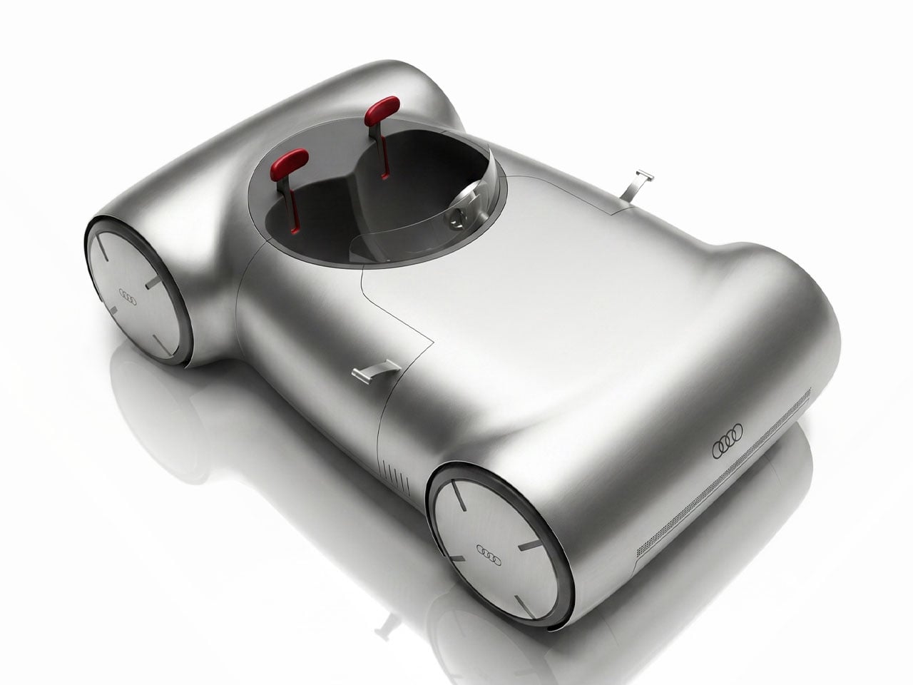
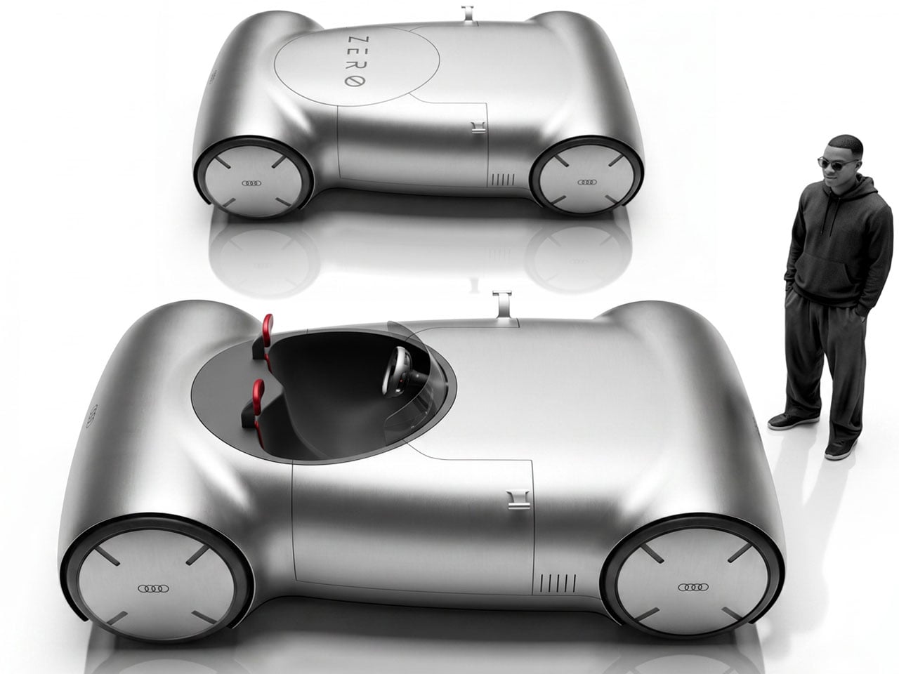
Audi’s futuristic concept vehicles have often pushed the boundaries of automotive design, but independent designer Wini Camacho takes that philosophy even further with the Zero One Sphere. Created as a speculative vision rather than an official Audi project, the electric concept abandons conventional body construction in favor of an eye-catching geometric framework made from four exposed cylindrical tubes. This is an interesting take on what an electric vehicle could look like if designers prioritized structural expression over traditional styling.
Instead of relying on a solid body shell, the Zero One Sphere uses four large tubular elements that define its overall silhouette while appearing to support the vehicle’s key components. This radical approach creates an open, skeletal form that emphasizes lightness and simplicity. The tubes visually connect the front and rear sections, giving the concept an architectural quality that makes it resemble a rolling piece of industrial design rather than a conventional automobile. The exposed structure also leaves much of the mechanical layout visible, reinforcing the idea of honesty in design.
Designer: Wini Camacho
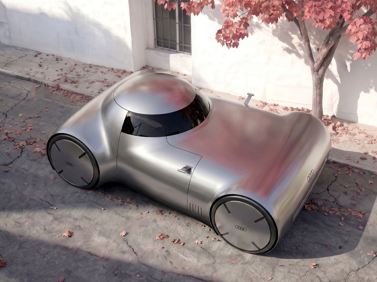
The concept follows Audi’s recent emphasis on geometric purity and minimalist forms, but interprets those themes in a far more experimental manner. Sharp lines and clean proportions replace the layered surfaces typically seen on production vehicles. The signature Audi lighting elements remain recognizable, ensuring the concept retains a connection to the brand despite its unconventional appearance. Thin LED lighting at both ends, a simplified front fascia, and oversized wheels contribute to a futuristic stance while maintaining visual balance.

As an electric vehicle concept, the Zero One Sphere benefits from the flexibility offered by battery-powered platforms, which eliminate the need for a large combustion engine and its associated packaging constraints. This freedom allows the design to focus on proportions and structural creativity rather than on accommodating traditional mechanical components. Although technical specifications have not been revealed, the concept serves primarily as a design exercise exploring how future electric vehicles could rethink both form and function.
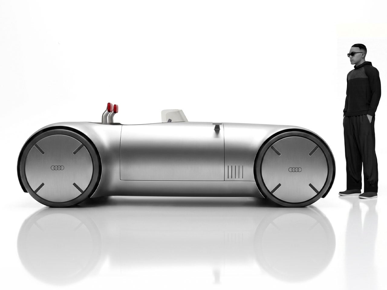
The open architecture also suggests opportunities for modularity and customization. Its visible framework could theoretically allow different body panels, seating layouts, or cargo solutions to be attached without fundamentally changing the underlying structure. While these ideas remain conceptual, they reflect a growing interest in adaptable vehicle platforms that can evolve alongside changing user needs.
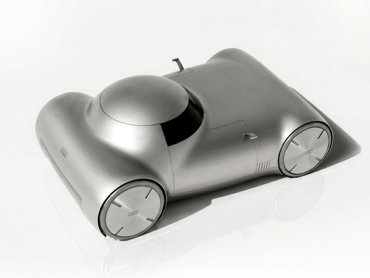
Beyond its unconventional construction, the Zero One Sphere raises broader questions about the future direction of automotive design. As electric powertrains continue to reshape vehicle engineering, designers are increasingly free to experiment with new materials and structural concepts. Wini Camacho’s proposal illustrates how this creative freedom can produce designs that challenge long-standing expectations of what a car should look like. Whether such an exposed tubular structure could ever become practical for production is uncertain, but practicality is not the concept’s primary goal!
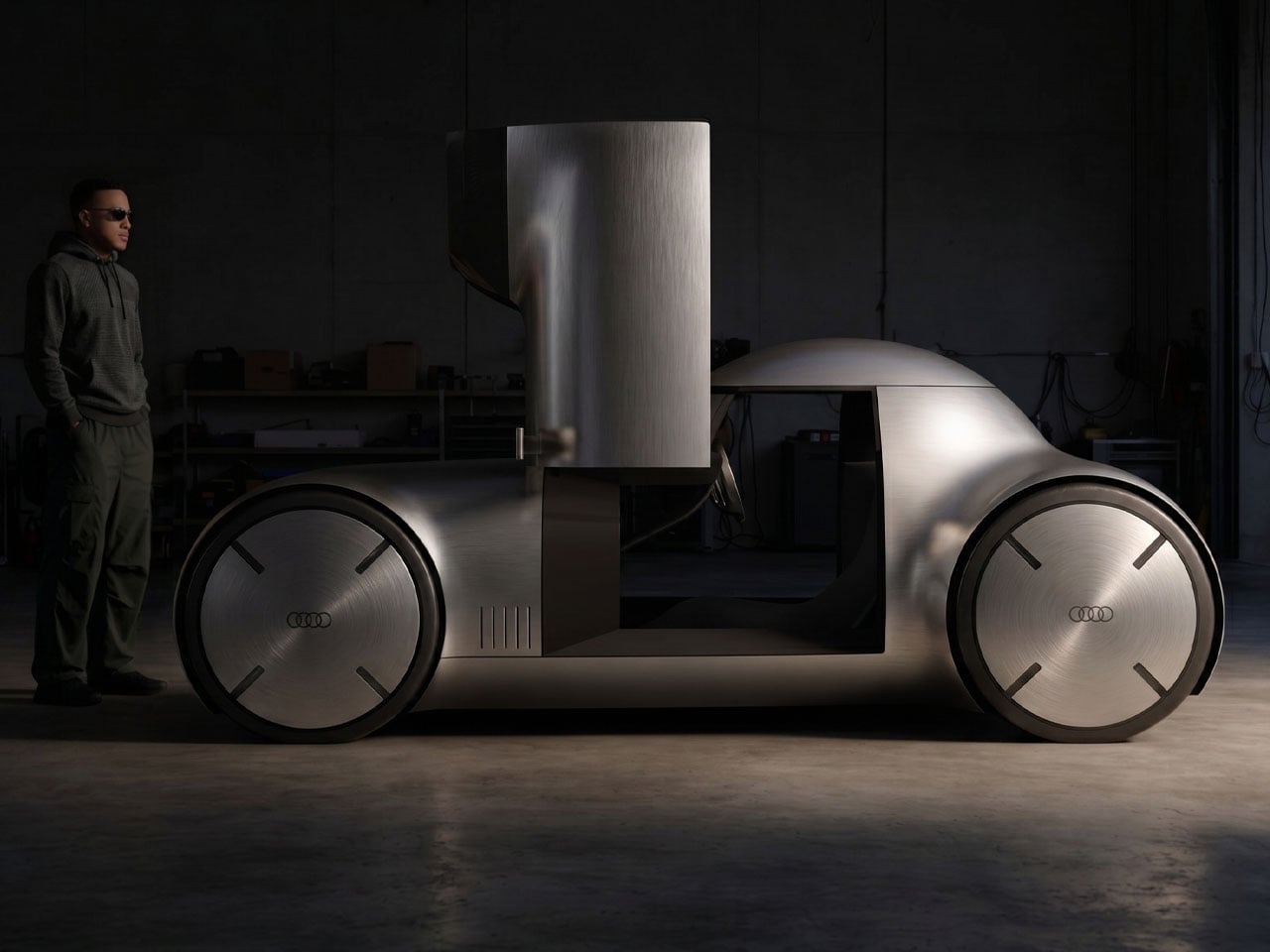

The post This radical Audi EV concept uses four tubes instead of a body to make electric cars feel lighter than ever first appeared on Yanko Design.
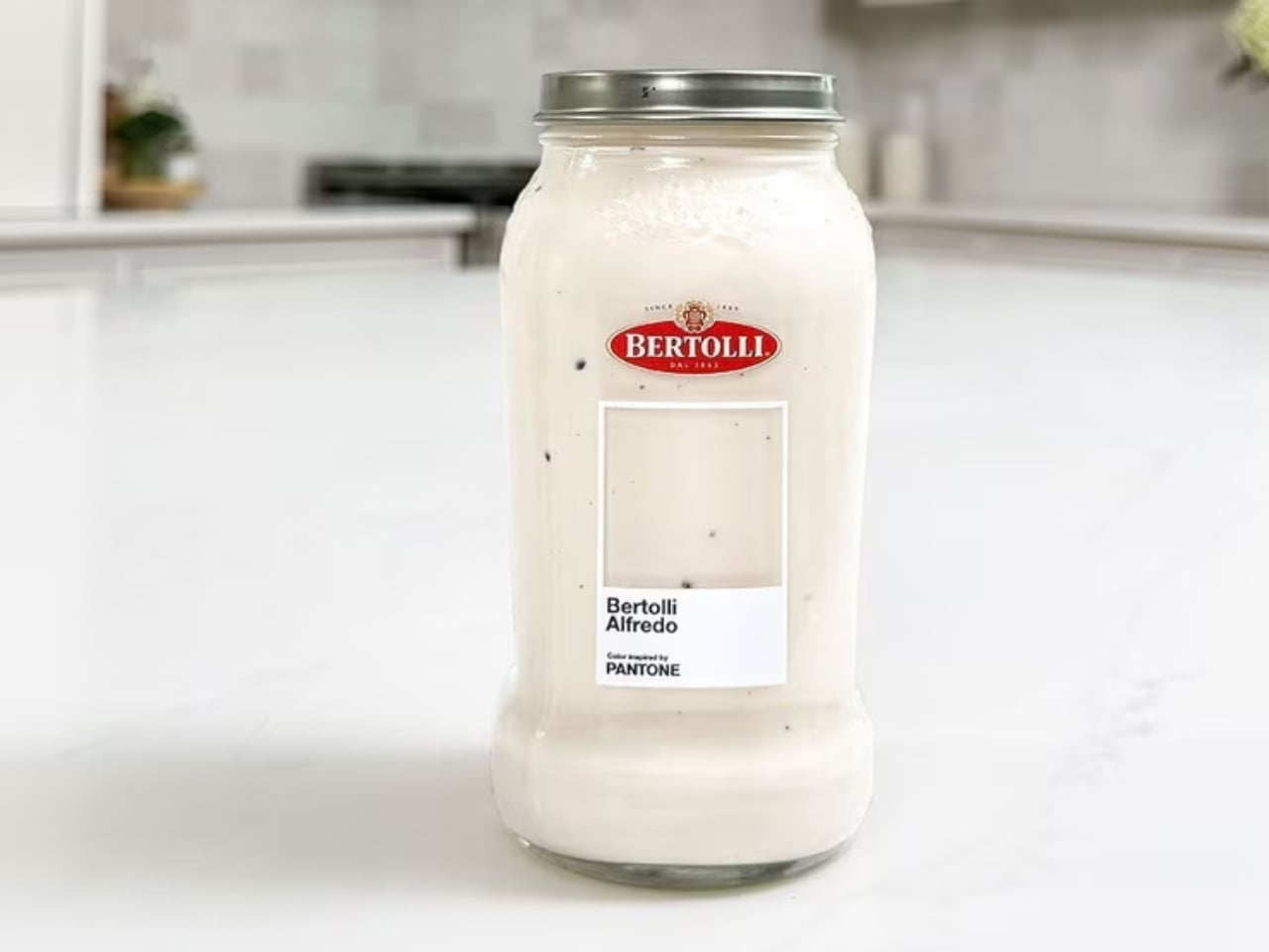
Pantone has officially colored pasta night, and I’m not even slightly mad about it. Bertolli, the Italian food brand that’s been a pantry staple since 1865, just partnered with Pantone to give its best-selling Alfredo sauce an official “Inspired by Pantone” color. The shade? A creamy, off-white hue that’s as comforting to look at as it is to eat. And while some might chalk this up to a clever marketing stunt, I think the collaboration is actually doing something more interesting than it appears.
Let’s start with what Pantone actually does, because it matters here. Pantone doesn’t just slap its name on a color for fun. For decades, the brand has been the definitive authority on color across industries ranging from fashion to interiors to product design. When Pantone certifies a color, it assigns it cultural and commercial weight. It says: this hue means something. Giving that recognition to a pasta sauce is either absurd genius or genuinely inspired branding, depending on your appetite for that sort of thing. Personally, I lean toward the former.
Designer: Bertolli x Pantone
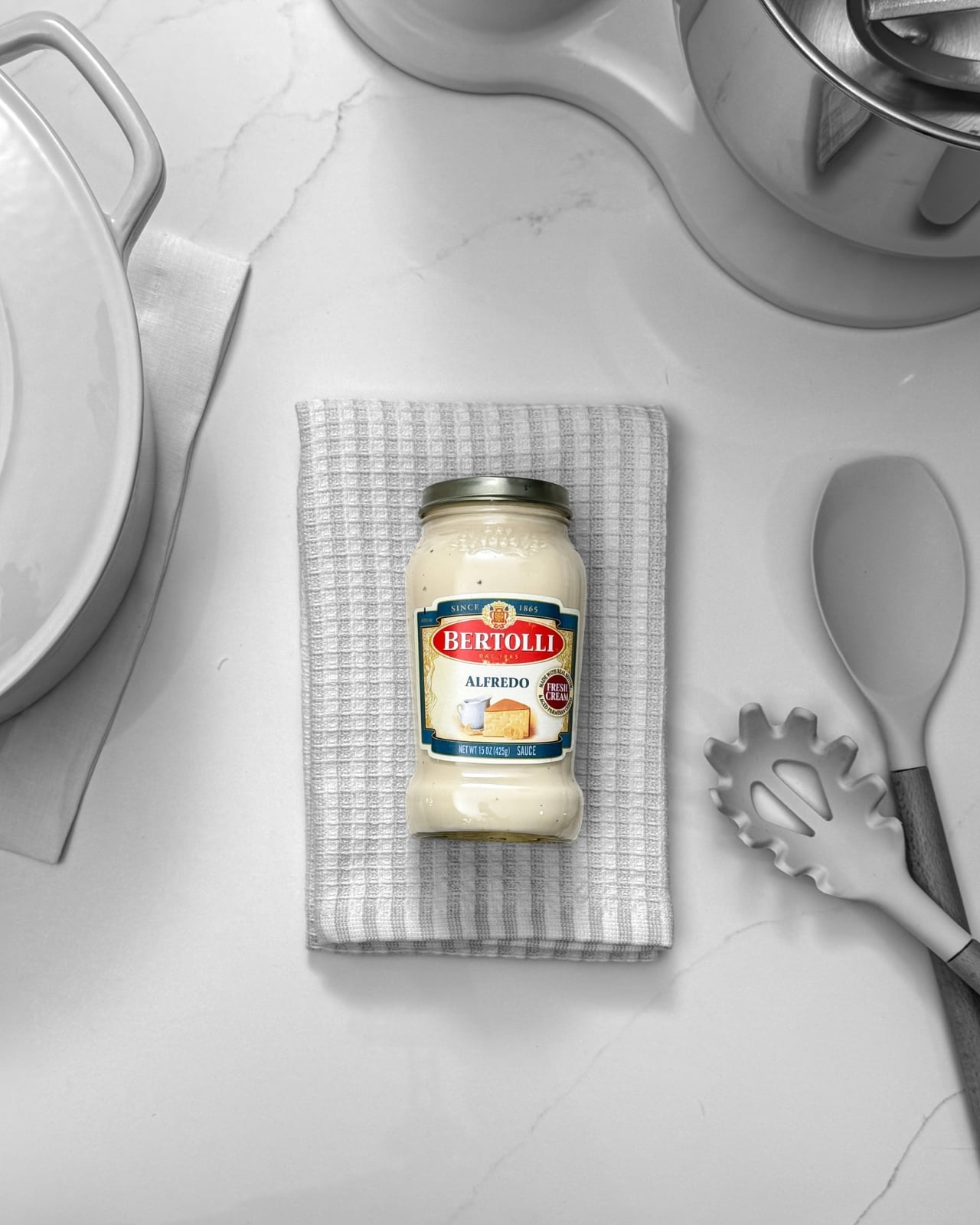
The campaign introduces the creamy off-white as Alfredo’s defining visual identity, with limited-edition Bertolli jars wrapped in Pantone-inspired branding that puts the color front and center. The familiar Pantone square appears on the jar packaging, with a transparent cutout so the sauce itself becomes the swatch. It’s a clever design choice. You’re not just looking at the color, you’re looking through the label to see it in its most natural state.
The brand also ran a sweepstakes giveaway with cookware and kitchen accessories curated in the same creamy off-white palette. Think: a stand mixer, pots and pans, a Dutch oven, cooking utensils. All in Alfredo. The fact that Bertolli thought to extend the color story beyond the jar itself shows real creative confidence. A kitchen dressed in Alfredo white is, objectively, a mood.
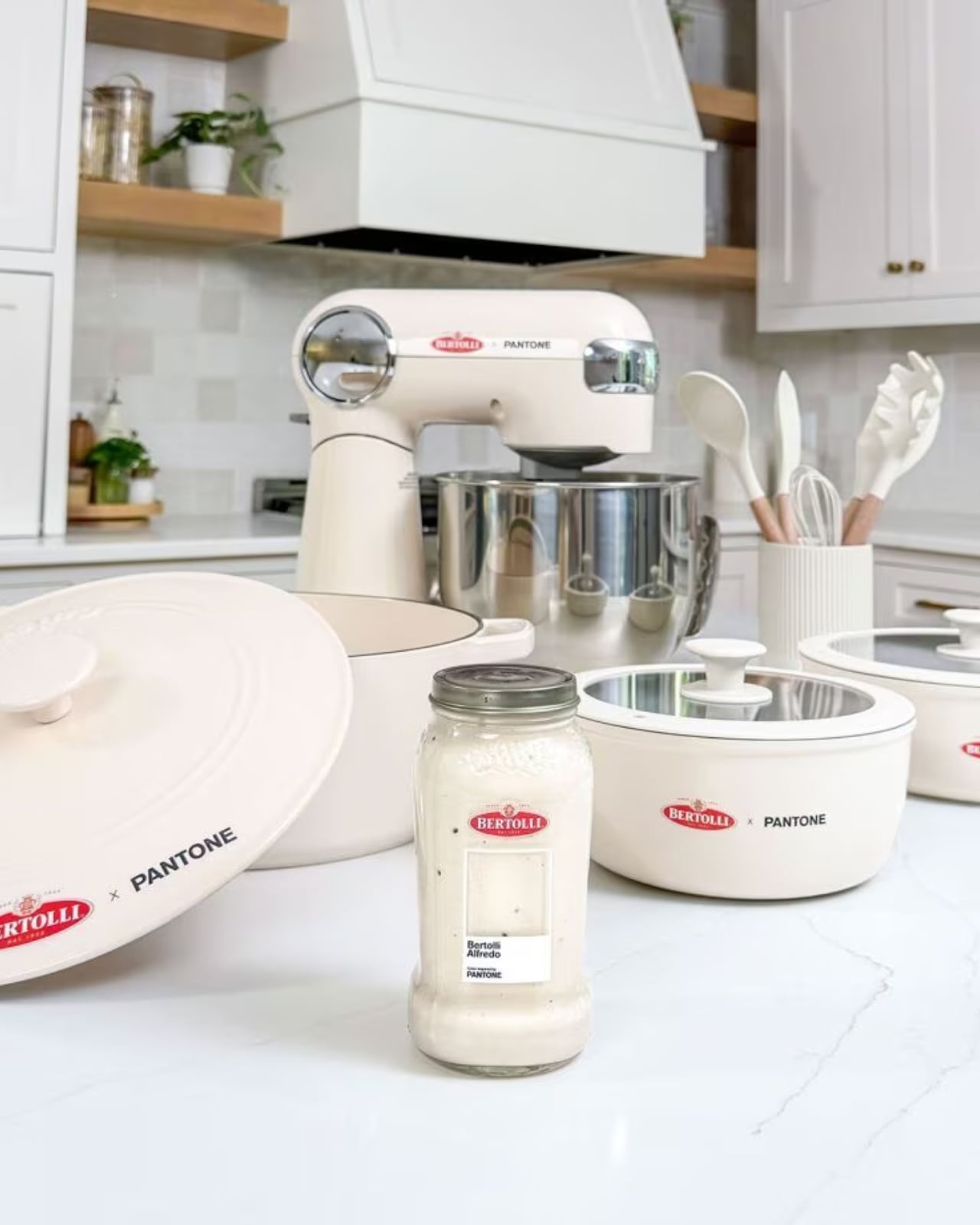
Now, is this a bit of a marketing flex? Yes. Absolutely. But brands claiming colors as their own is nothing new. Tiffany Blue has its own Pantone number. UPS brown is officially trademarked. Owning a color is a legitimate form of brand identity. The difference is that Alfredo sauce has always had an identity problem. Tomato sauce gets the cultural spotlight. Marinara is the classic. Arrabbiata gets the personality points. Alfredo, despite being wildly popular, tends to get lumped into “the other one.” Rich, creamy, beloved by practically everyone who has ever sat down to a bowl of pasta, but rarely celebrated on its own terms.
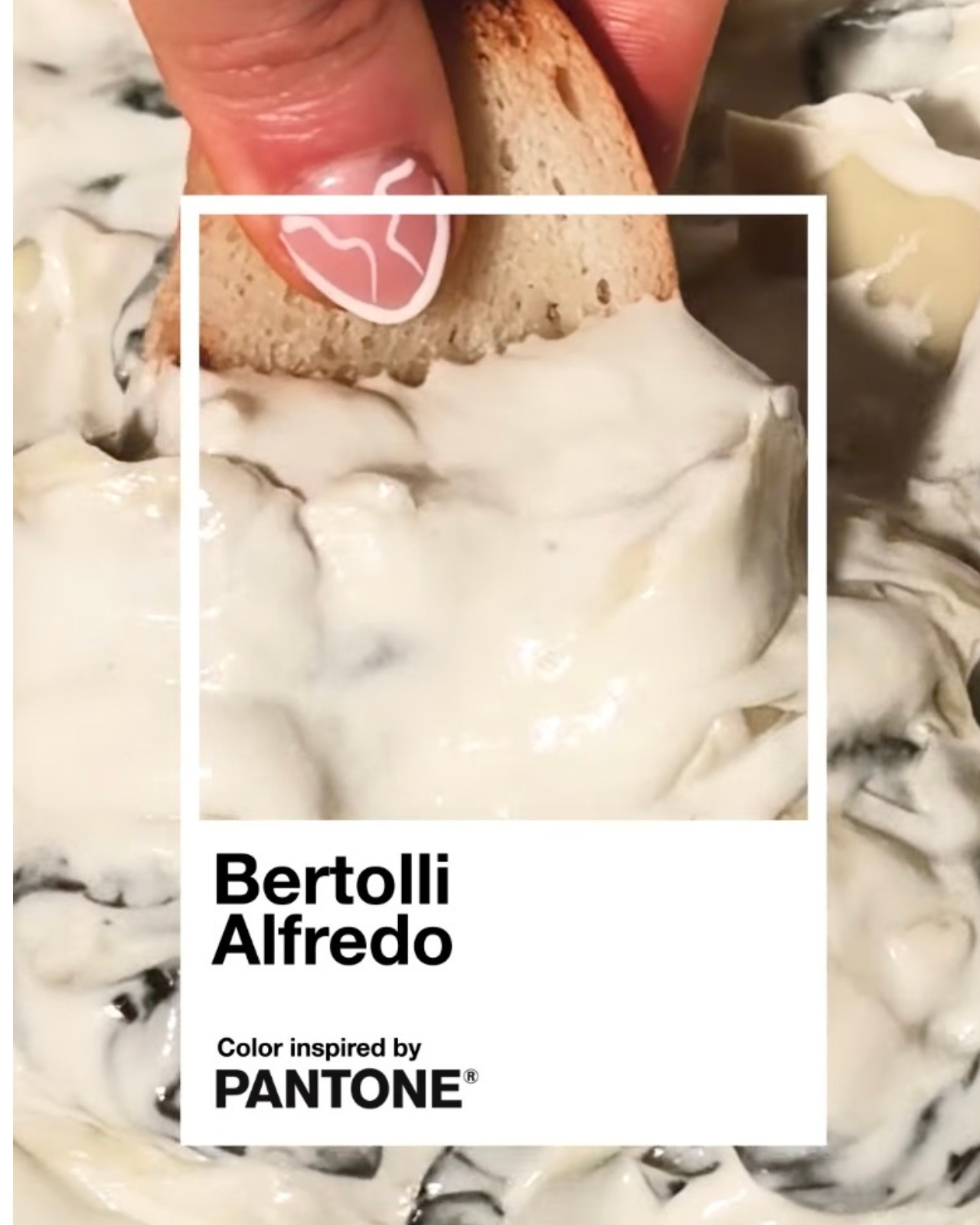
This is Bertolli’s argument that Alfredo deserves its own moment, its own aesthetic language. And credit where it’s due: using Pantone to tell that story is a smart move. Color is one of the most immediate, emotional forms of communication we have. When Pantone named Viva Magenta the Color of the Year, people talked about it for months. Attaching that same institutional gravitas to a sauce most people have in their fridge right now? That’s a cultural bridge worth crossing.
The campaign also encouraged people to “Take the Alfredo” through social media activations and influencer partnerships. The phrase is a little clunky, but the intention behind it is clear: they want Alfredo to feel like a statement, not just a side dish.
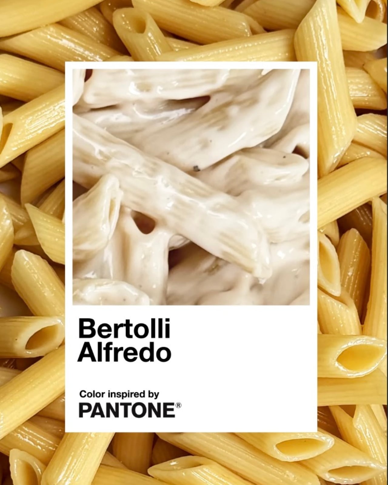
I do think the success of a campaign like this lives or dies by whether it earns its concept, and this one mostly does. The visual execution is clean and considered. The product and the partner make intuitive sense together. Pantone’s “Inspired by” series has previously drawn from art and culture, so extending it to food isn’t much of a leap when you think about how central color is to the way we experience appetite. We eat with our eyes first, and that creamy off-white carries its own quiet appeal.
Bertolli has been feeding people for over 150 years. Getting Pantone to officially say the brand’s signature sauce has a color worth naming? That’s just a long overdue introduction.
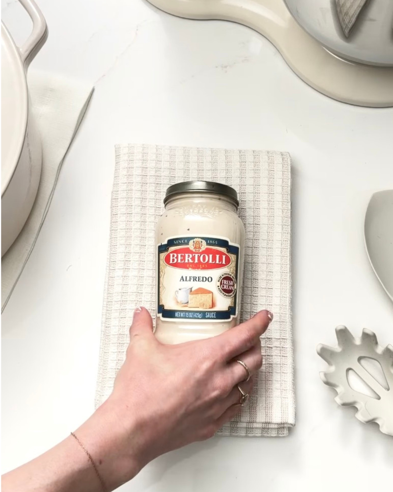
The post Bertolli Just Gave Alfredo Sauce Its Own Official Pantone Color first appeared on Yanko Design.

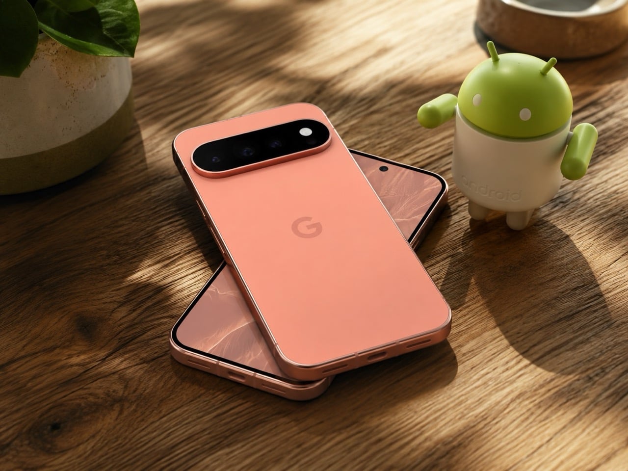
At this point, a Google hardware leak ahead of launch feels almost ceremonial. Long before the keynote lights come up, the phones usually arrive in fragments through retailer pages, spec sheets, teaser campaigns, and the wider rumor mill. The Pixel 11 now seems to be following that familiar script, with Amazon reportedly revealing major details early and introducing an unexpected side character in the form of a Pixel Tag tracker ahead of Google’s August 12 event.
The leaked lineup already sketches out Google’s fall hardware palette in surprising detail. The base Pixel 11 appears in Obsidian, Frost, Hibiscus, and Pistachio, with 256GB storage priced at $899. The Pro shifts to Canyon and Obsidian, the Pro XL climbs from $1,299, and the Pixel 11 Pro Fold stretches the range to $1,899 in Obsidian with an Olive variant that may also be tied to the name Pine. Taken together, the colors feel as intentional as the pricing, and the Pixel Tag mention adds one more clue that Google may be building a broader visual ecosystem around the phones rather than treating accessories as an afterthought.
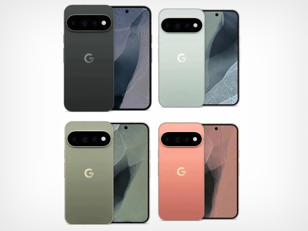
Image Credits: Android Authority
Google appears to be making 256GB the new base storage tier across the Pixel 11 family, which is probably overdue given how aggressively on-device AI has been eating into storage headroom. Droid Life also spotted a 512GB variant priced at $1,019, all but confirming that Google is dropping the longstanding 128GB entry-level option entirely. That’s a sensible call on paper, but it also means buyers have fewer options to quietly trade down on storage to save money at the baseline.
Then the pricing hits, and it hits hard. The Pixel 11 Pro reportedly starts at $1,099 for 256GB in Canyon, with the 1TB configuration reaching $1,449. The Pro XL tops out at $1,649 for 1TB. The Pixel 11 Pro Fold reportedly opens at $1,899 and climbs to $2,249 for a 1TB model. These are numbers that would have seemed audacious five years ago, and in 2026, with the broader economy and RAM shortage doing what it’s doing, I don’t blame you for still wondering what nightmarish timeline we live in. Google is clearly betting that its AI-forward software story justifies the ask, but at nearly $1,900 just to get into Fold territory, it really does feel like Google isn’t betting on this one selling like hot-cakes.
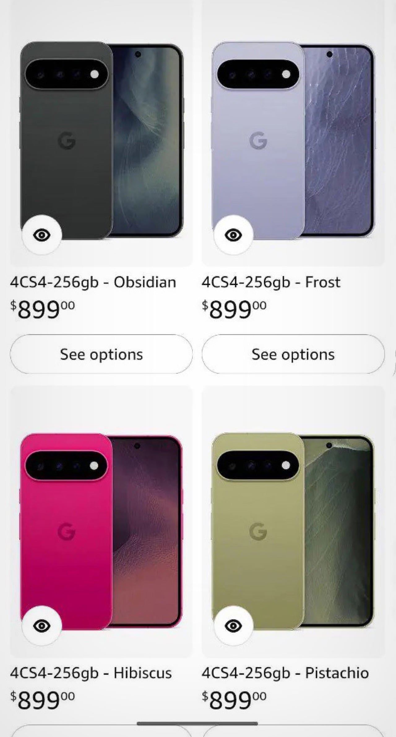
Image Credits: Android Authority
The Pro models also carry an unusual RAM decision I couldn’t help but notice. The 256GB Pixel 11 Pro will reportedly ship with 12GB of RAM, while the 512GB and 1TB variants retain 16GB, a departure from the Pixel 10 Pro lineup where every storage configuration included 16GB. It creates a situation where the least expensive Pro is also the most memory-limited, which sends a strange signal in a product cycle so heavily defined by AI features that depend on RAM headroom to run locally.
One detail on the Fold worth watching is the listed 4,750mAh battery, which would actually be smaller than the Pixel 10 Pro Fold’s 5,015mAh pack. Given that several other listing details appear unfinished, it’s possible this battery figure is also placeholder information. Still, the kind of number that makes you squint twice before scrolling on.
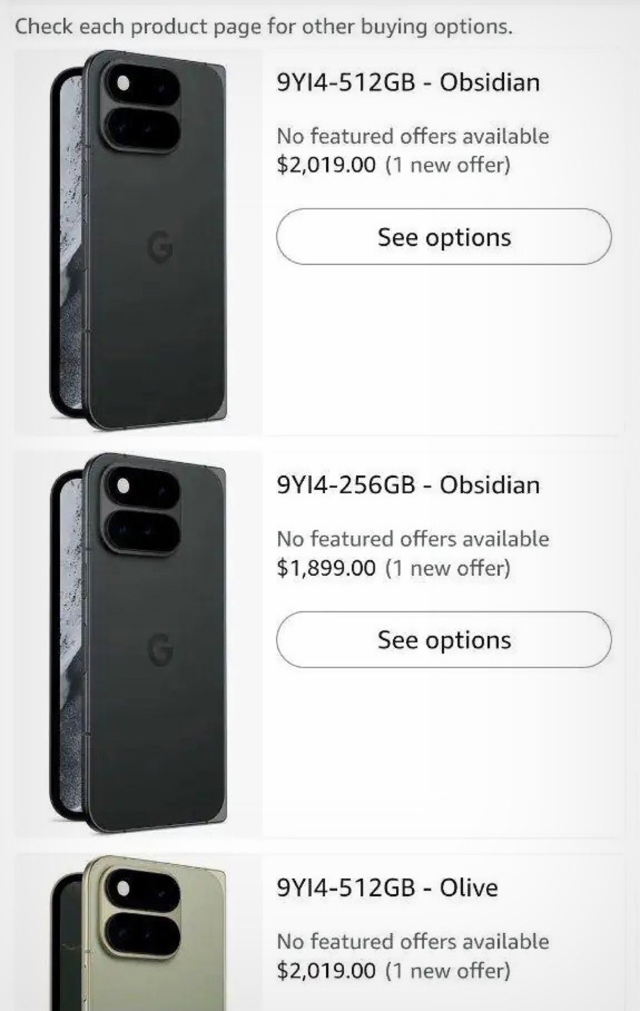
Image Credits: Android Authority
Through all of this, Pixel Tag stays the most intriguing footnote. A first-party tracker from Google would put the company directly in AirTag territory, and while tracker specs are almost beside the point, design language very much is not. Whatever Pixel Tag looks like, it will need to feel at home on a keyring and inside a product lineup simultaneously. If August 12 brings a formal reveal, the smallest object on stage may end up carrying the largest story.
The post Google Pixel 11 Amazon Leak: $899-$1899 Price Range, New Colors, and a Surprise ‘Pixel Tag’ Tracker first appeared on Yanko Design.