This iPhone Air 2 Concept Adds Two Cameras and Suddenly the Phone Makes More Sense

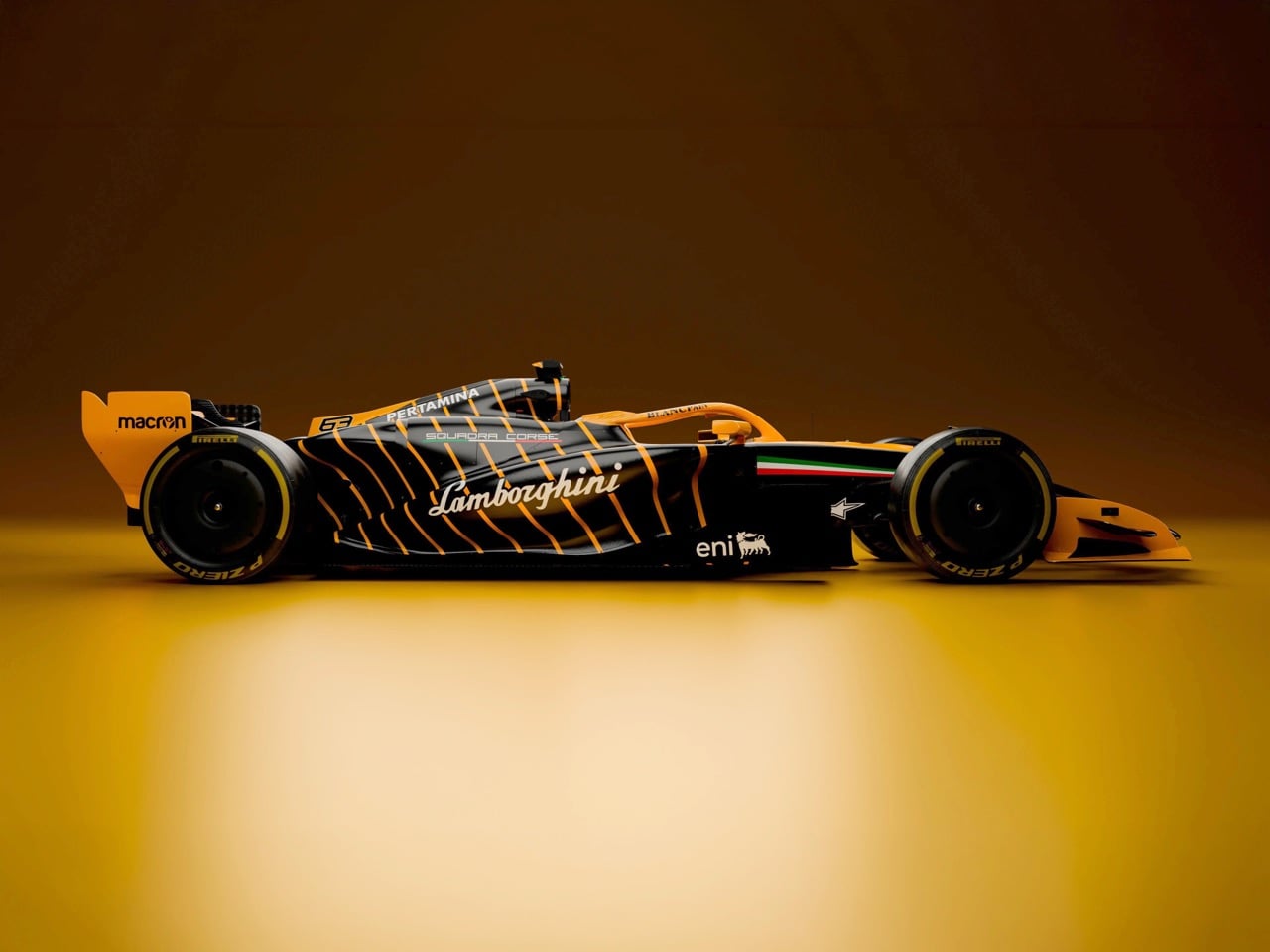
Every first-generation Apple product is essentially a beta test with a premium price tag, and the iPhone Air was no exception. The engineering was genuinely remarkable: 5.6mm thin, a large ProMotion display, A19 Pro performance, and battery life that surprised nearly everyone who reviewed it. What wasn’t remarkable were the two omissions that showed up in every single hands-on: one camera and one speaker, on a phone that cost $999. Those two complaints alone handed buyers a perfectly logical reason to spend the same money on a Pro instead. The Air needed a second generation the moment the first one shipped.

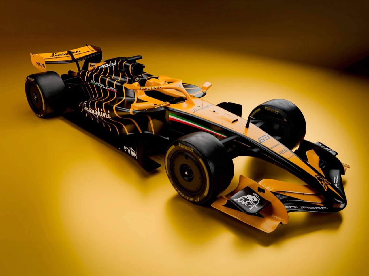
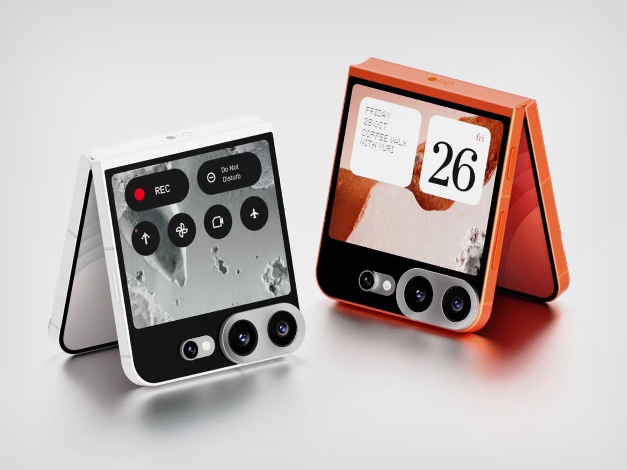
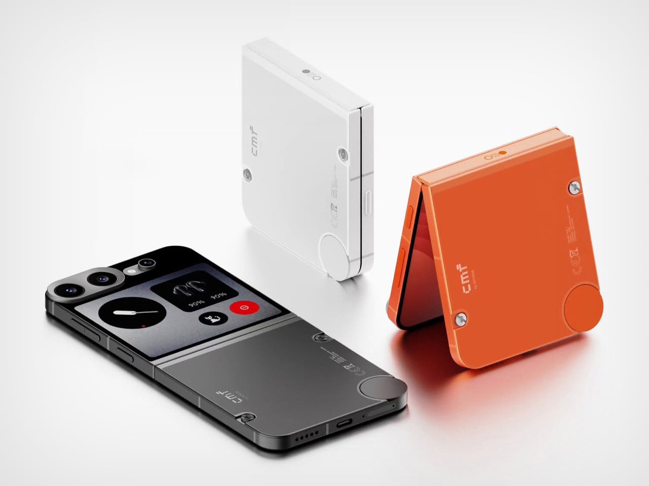
Demon’s Tech has imagined exactly what that second generation could look like, and the concept renders suggest Apple already has a clear path to making the Air the phone it should have been from the start. The dual-camera bar is wide and confident across the top of the phone, housing two lenses with room to spare. The rest of the body is pure restraint, a flat back, centered Apple logo, and a color range vivid enough to give the phone a personality that its specs can now actually back up. If the rumored stereo speaker and efficiency-focused N2 chip join that camera upgrade, the Air 2 goes from interesting to genuinely compelling.

Designer: Demon’s Tech

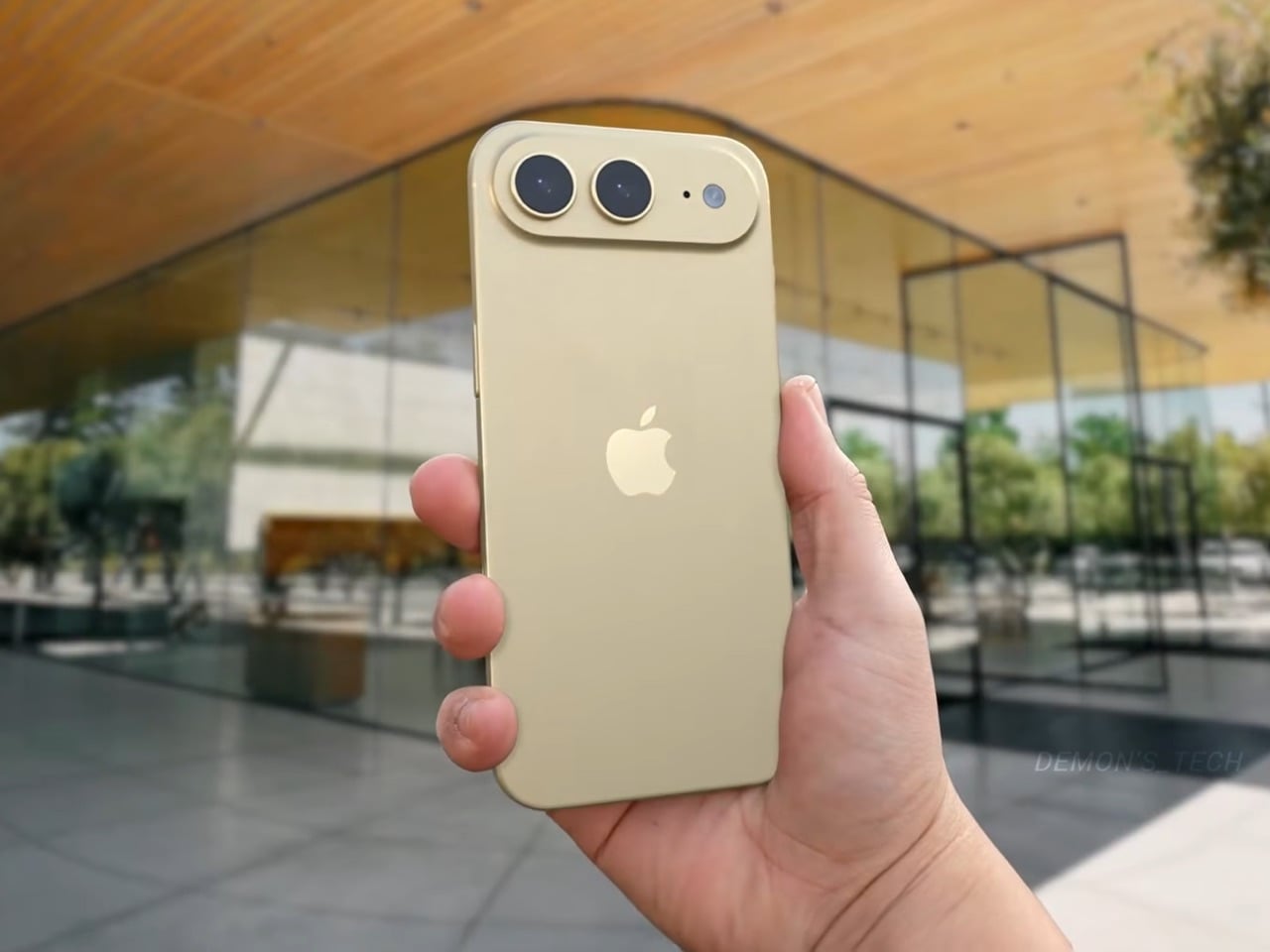
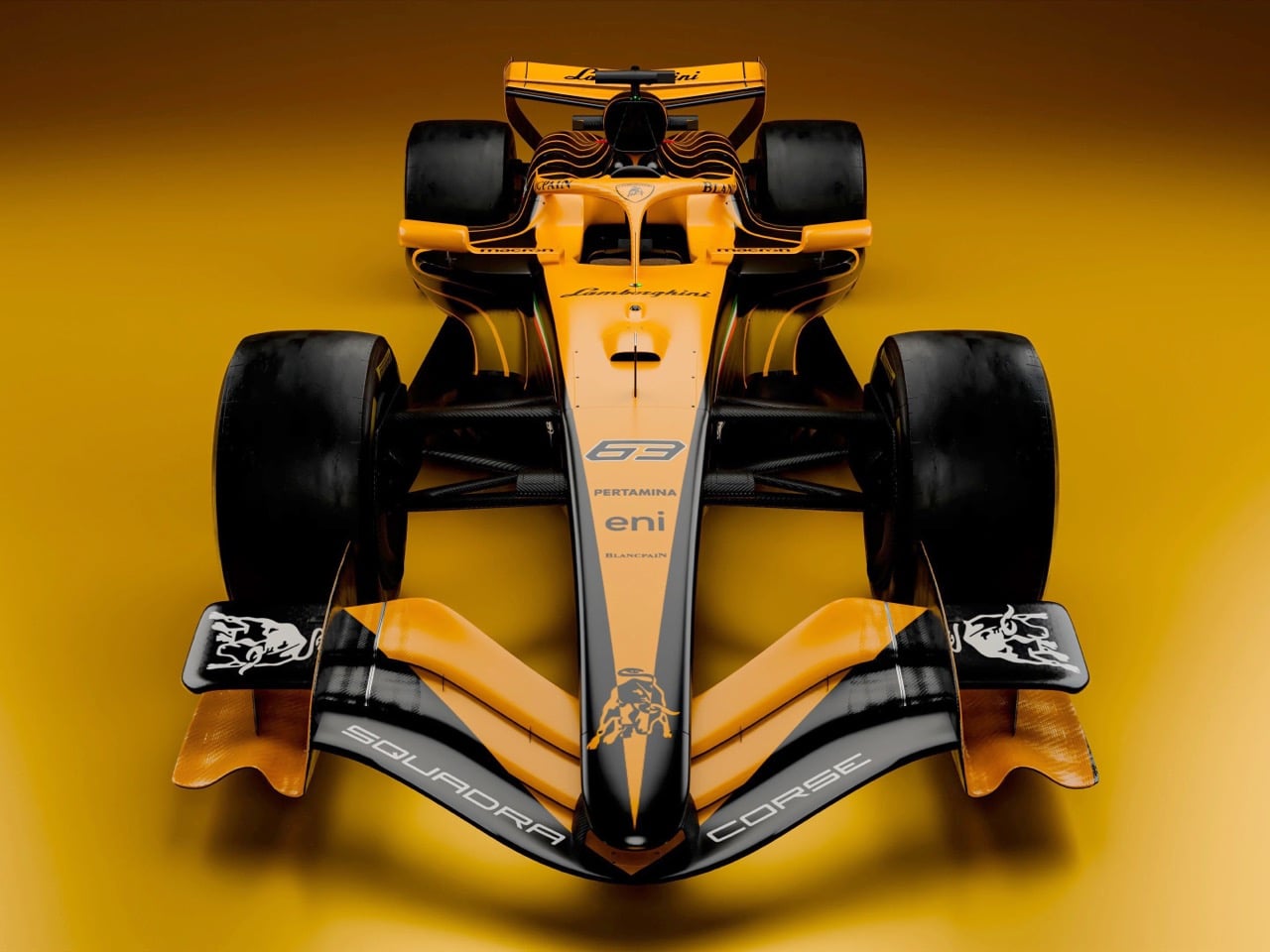
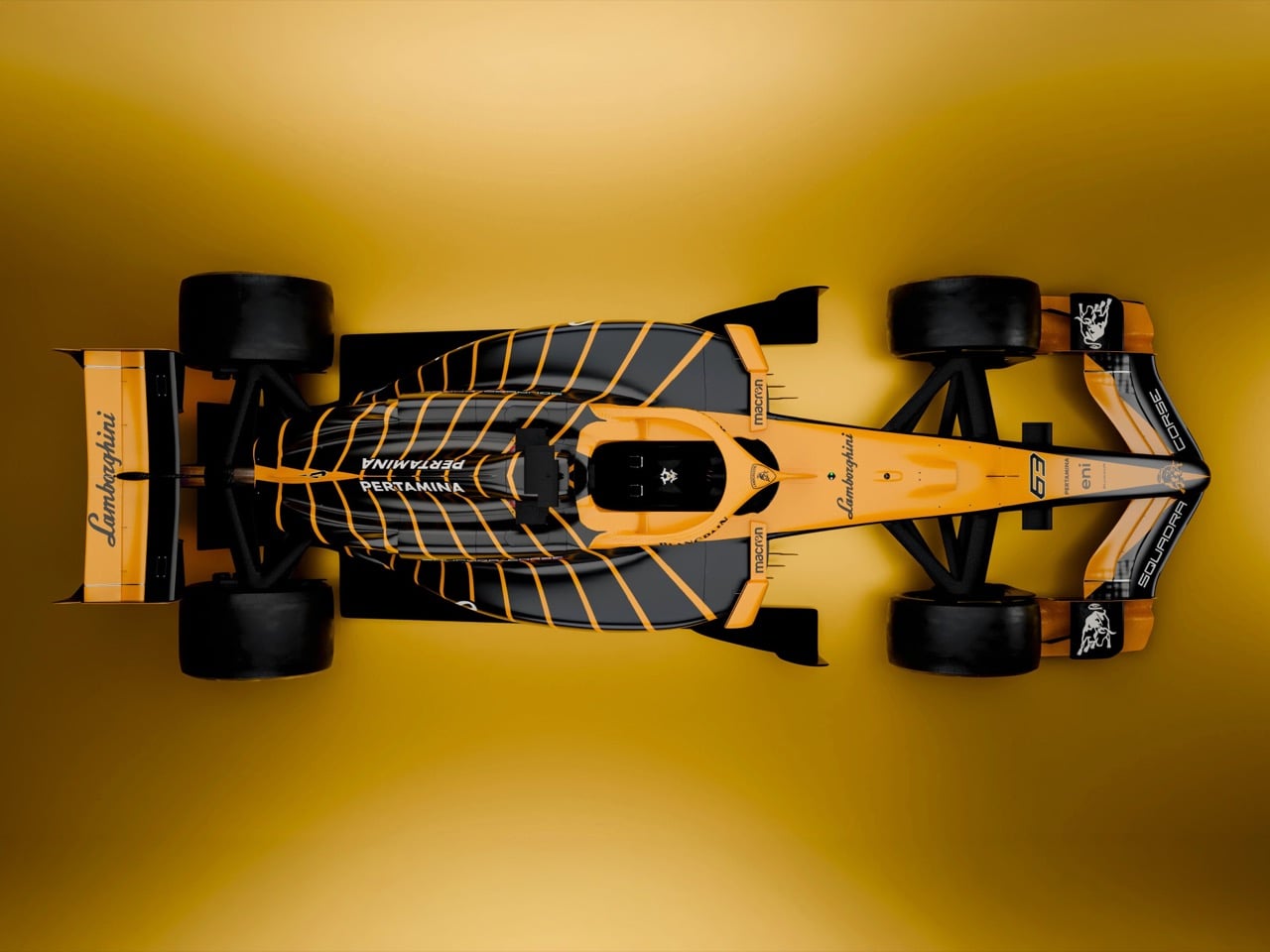
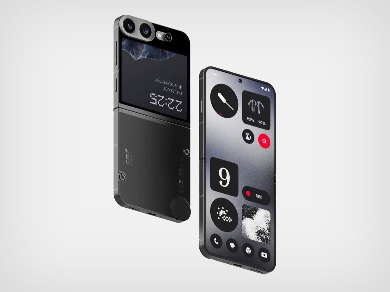
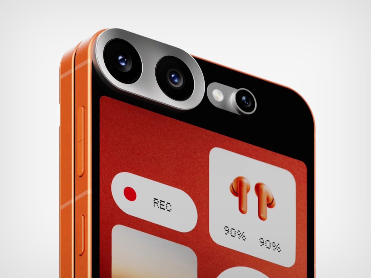
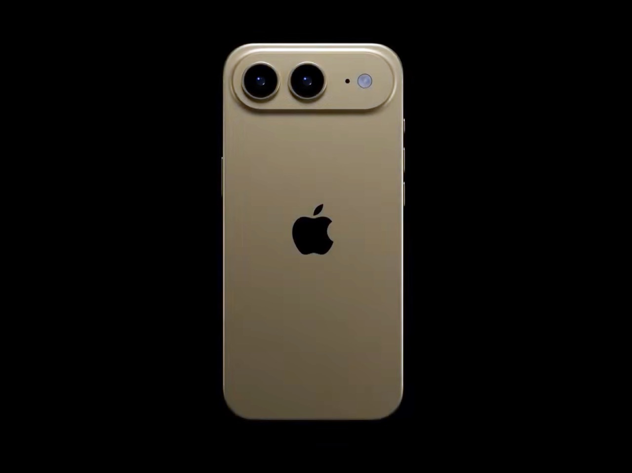
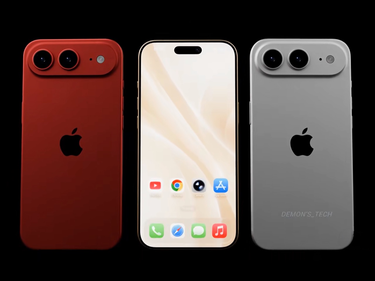
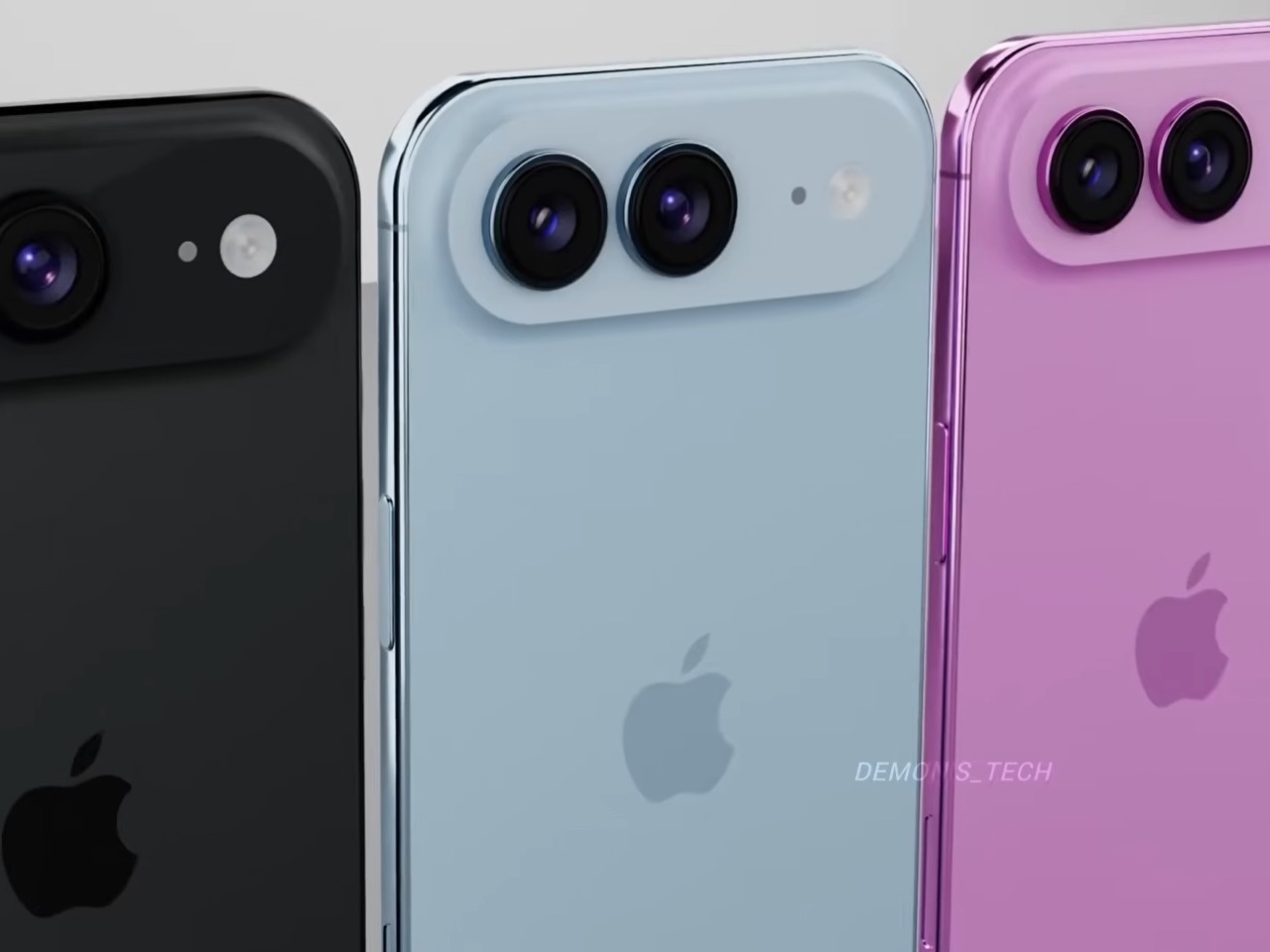
Two 48-megapixel sensors reportedly sit inside the pill-shaped housing, one primary and one ultrawide, which aligns with leaks from Chinese tipster Digital Chat Station suggesting Apple is going for a main-plus-ultrawide configuration rather than a telephoto. That choice makes sense for the Air’s positioning. Telephoto glass demands physical depth that a sub-6mm chassis simply cannot accommodate, and ultrawide coverage is what most non-Pro users actually miss day-to-day. The original Air’s single-lens bar always looked slightly incomplete, like a sentence that trailed off mid-thought, and Demon’s Tech addresses that by stretching the new pill-shaped housing almost the full width of the phone’s upper third, sitting flush and purposeful rather than apologetic. It is a small change on paper that transforms the entire visual logic of the back panel.

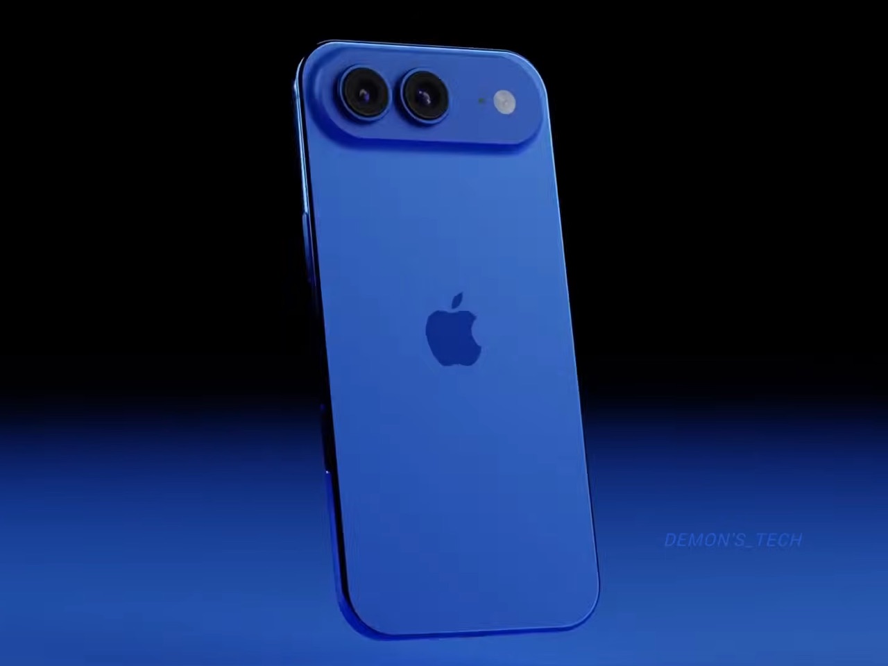
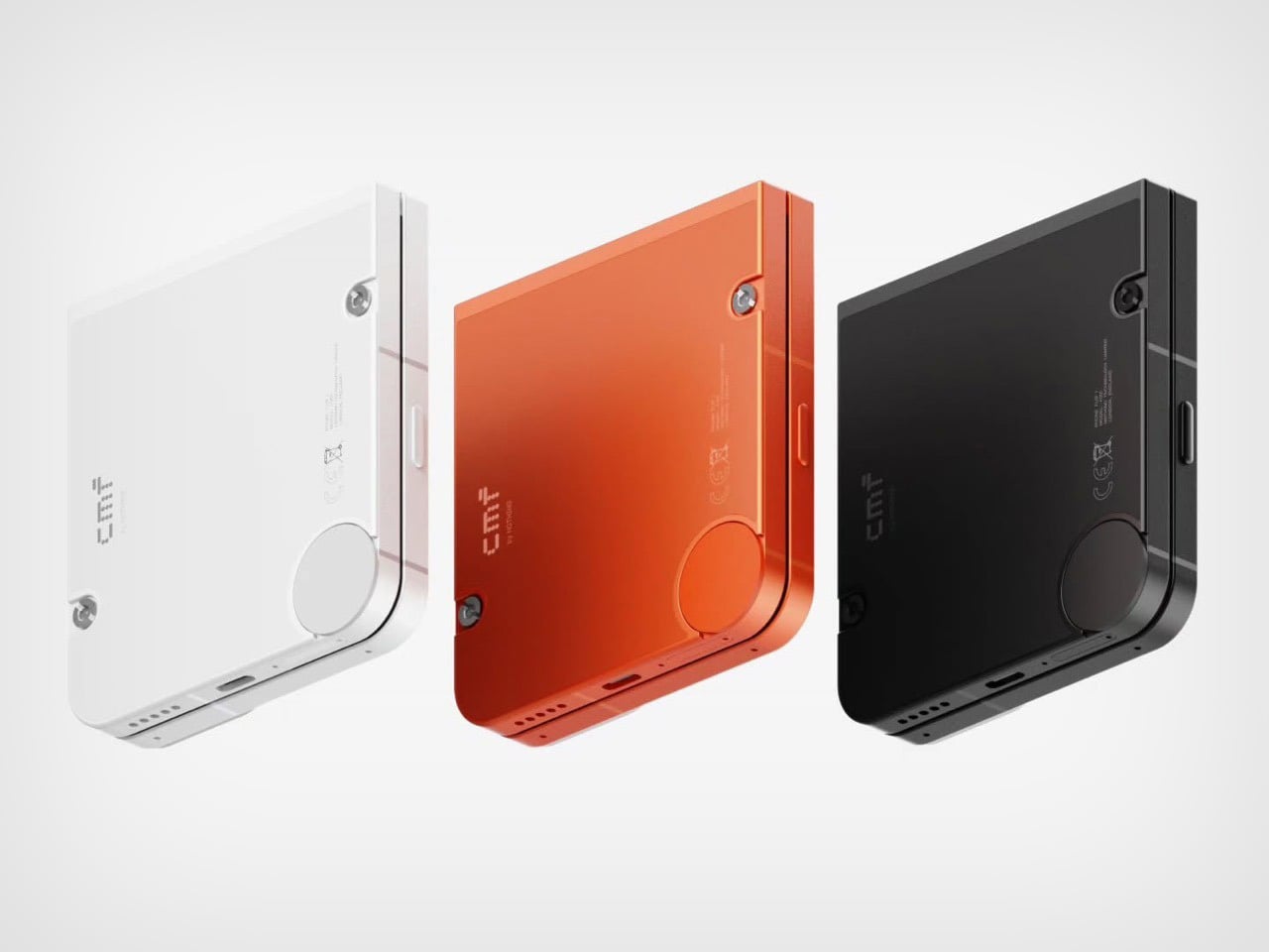
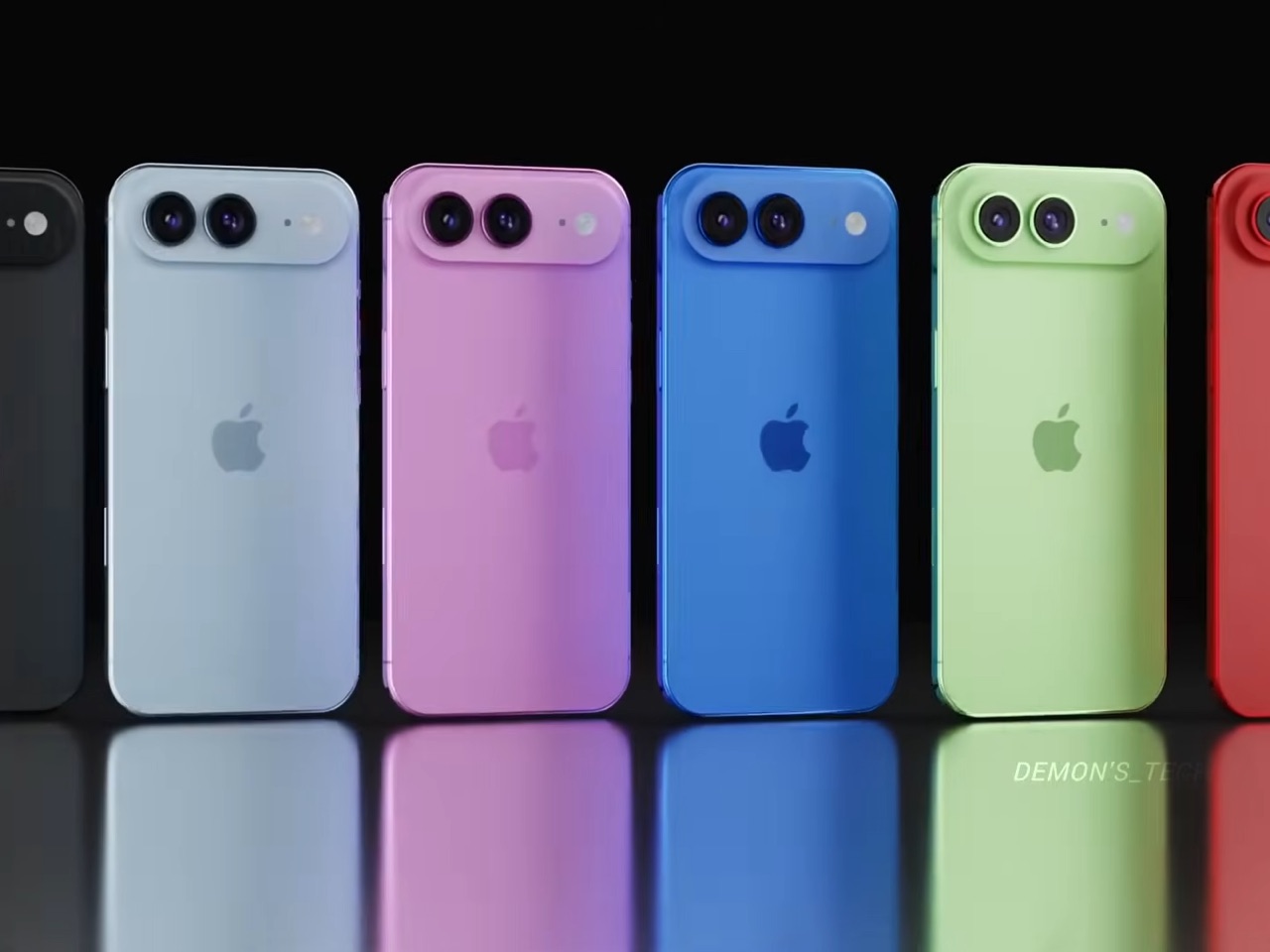
Apple shipped the original Air in four relatively restrained options: cloud white, sky blue, light gold, and matte space black. Demon’s Tech blows that palette wide open, running through violet, cobalt, mint green, and vivid red alongside the sandy gold seen in the hero shots, which is closer to what the iPhone 5C attempted in 2013, a phone that led with color as a statement rather than a courtesy. The Air’s lifestyle positioning actually supports this approach in a way the 5C’s budget framing never quite did. A phone you buy partly because it is extraordinarily thin is a phone you buy to be noticed, and being noticed in muted gold is considerably less fun than being noticed in electric blue. The renders make a quiet argument that Apple’s colorway restraint on the original Air was a missed opportunity, not a deliberate choice.

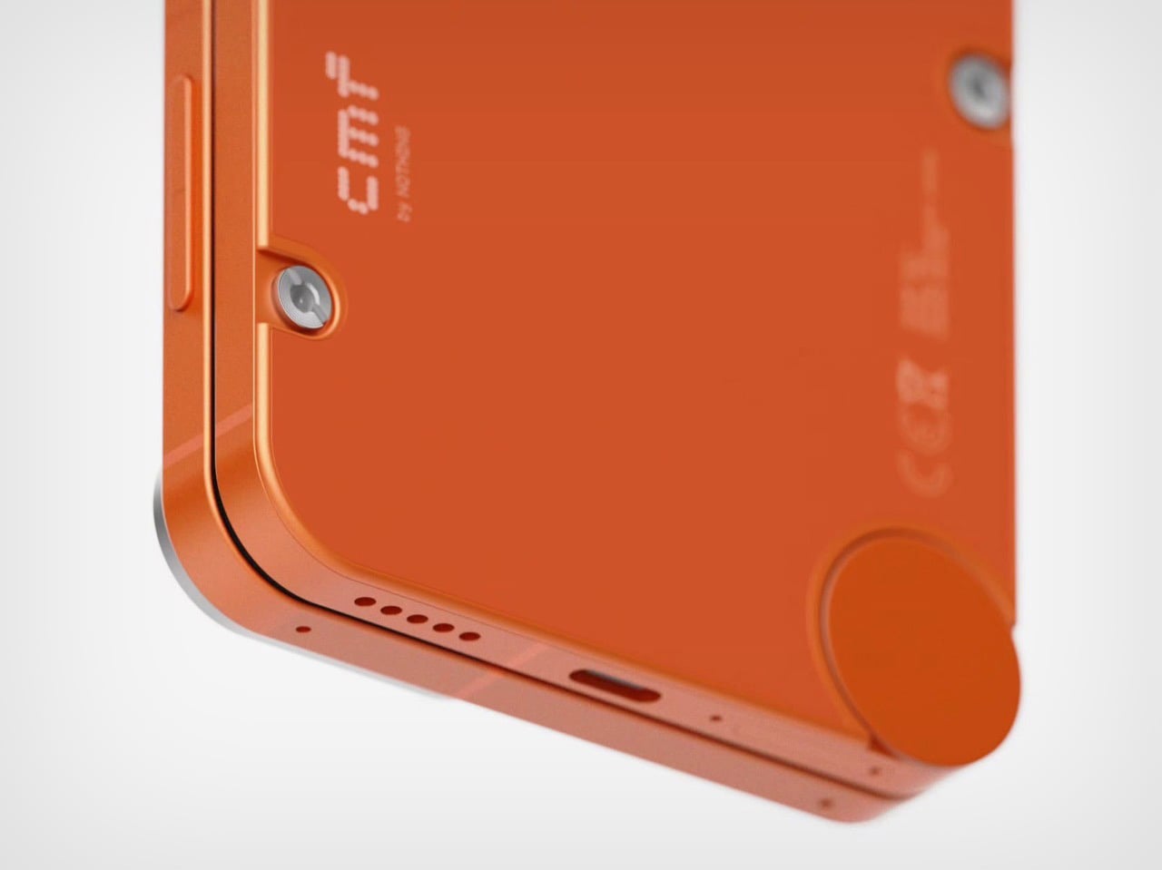
Twelve gigabytes of RAM paired with the A20 Pro keeps the performance story simple: this is a phone that matches the Pro lineup on silicon even if it concedes on optics. The sleeper upgrade is Apple’s rumored N2 efficiency chip, because getting better battery life out of a body that physically has less room for cells requires exactly this kind of architectural work, the same discipline that let the original Air post competitive endurance numbers despite its dimensions. Add stereo sound from a bottom speaker alongside the existing top one, and the two most common complaints about the first Air evaporate inside a single product cycle. That is a more focused corrective than Apple managed with either the Mini or the Plus, both of which spent multiple generations struggling to justify their existence. If Apple lands all of this at the same $999 price point, the value math finally starts working in the Air’s favor.

Apple has confirmed the Air line continues, with the second generation reportedly targeting a spring 2027 release window, landing after the iPhone 18 Pro, Pro Max, and foldable models ship in fall 2026. That later window gives Apple’s engineering teams more time to solve the thermal and battery challenges that come with building capable hardware into an impossibly thin frame, and it gives the Air its own launch moment rather than forcing it to compete for attention against a foldable iPhone. Demon’s Tech’s concept is the best visual argument yet for what that launch moment could look like: a phone that carries its thinness as a given rather than an excuse, and finally has the camera system and audio to back up everything the form factor promises.

The post This iPhone Air 2 Concept Adds Two Cameras and Suddenly the Phone Makes More Sense first appeared on Yanko Design.

This 2026 Lamborghini F1 Livery Proves the Raging Bull Belongs on the Grid (Even If It Never Happens)

The 2026 F1 season marks the biggest technical reset the sport has seen in over a decade, with new power unit regulations that push electric deployment even harder and a reshuffled grid that includes Audi’s factory entry and Cadillac arriving as a legitimate constructor. It’s the kind of moment when the paddock genuinely opens up to new possibilities, when manufacturers who’ve been sitting on the sidelines start doing the math on whether an F1 program could actually make sense. Lamborghini will almost certainly remain on those sidelines, because spending nine figures annually to race in a series where your parent company already fields a team (Audi, also owned by Volkswagen Group) would be corporate redundancy at its most wasteful. But that didn’t stop designer Daniel Rodriguez from asking what a Lamborghini livery would look like if Sant’Agata Bolognese decided to crash the party anyway. If it did, it would be the third bull-based team on the track after Red Bull and Racing Bulls!

Rodriguez’s concept wraps a 2026-spec F1 car in Arancio Borealis and gloss black with a geometric lattice pattern that pulls directly from Lamborghini’s current design vocabulary. The hexagonal graphics echo the Revuelto’s taillight treatment and the angular obsession that defines the brand’s styling language, flowing from dense at the cockpit to sparse at the rear wing. Italian flag accents trace the halo and nose cone, sponsor logos for Macron and Eni add commercial credibility, and the raging bull emblem sits on the rear wing endplates where it would photograph beautifully in the pit lane even if TV cameras never caught it. The renders are good enough to pass for official press shots, lit with the kind of moody amber-to-black gradients that Lamborghini’s own marketing team would approve.

Designer: Daniel Rodriguez

What makes this livery work is that Rodriguez doesn’t try to make the F1 car look like a Lamborghini road car, because that’s impossible and also beside the point. An F1 car is a regulatory sculpture shaped by wind tunnel data and the FIA’s technical rulebook, and no amount of vinyl wrap changes that fundamental reality. Instead, the livery translates Lamborghini’s graphic and color vocabulary into a form factor that has nothing to do with mid-engine supercars, and it does so in a way that feels both authentic to the brand and appropriate for the paddock. The Arancio Borealis orange sits somewhere between molten lava and a traffic cone, instantly recognizable as Lamborghini without requiring the car to sprout scissor doors or a V12 exhaust note. The gloss black creates genuine visual tension rather than just contrast, breaking up the body in a way that emphasizes the car’s aerodynamic surfaces instead of fighting them.

The hexagonal lattice pattern running down the sidepods and over the engine cover is the detail that sells the whole concept. Lamborghini has been obsessed with hexagons since the Aventador introduced them as a recurring motif back in 2011, and they’ve since migrated to every surface the brand touches. Taillights, grilles, interior stitching, wheel designs, all of it hexagons. Rodriguez takes that obsession and applies it to the F1 car’s sidepods in a way that creates visual density without cluttering the canvas. The pattern starts tight and geometric at the front, creating a sense of structural integrity, then gradually opens up as it flows rearward, giving the eye a path to follow from cockpit to diffuser. It’s a graphic solution that respects both the brand’s identity and the car’s aerodynamic purpose.

The Italian tricolor is handled with restraint, running as a thin accent stripe that outlines the halo and reappears on the nose cone. It’s subtle enough to avoid looking like a generic tribute to the brand’s Sant’Agata Bolognese heritage, but prominent enough that the car reads as distinctly Italian when parked next to Ferrari’s red. The sponsor integration is equally thoughtful. Macron, the Italian sportswear brand that already kits out Bologna FC and the Italian national rugby team, appears on the sidepods and rear wing. Eni, the Italian energy giant with deep motorsport ties, gets placement on the engine cover. Both partnerships feel plausible rather than fantastical, the kind of commercial relationships Lamborghini could actually secure if they showed up to the grid tomorrow.

Even the mandated wheel covers, which the 2026 regulations require for aerodynamic efficiency and which most teams treat as blank canvases or necessary evils, get the hexagon treatment here. It’s a small detail that maintains visual consistency across every surface, ensuring the car reads as a cohesive design rather than a collection of sponsor panels held together by regulations. The raging bull emblem on the rear wing endplates is rendered in white against black, a detail that would be nearly invisible during race broadcasts but would photograph beautifully in static pit lane shots and pre-race media coverage.

Will Lamborghini actually enter F1 in 2026 or beyond? Almost certainly not. The economics don’t justify it, the brand’s identity doesn’t need F1 validation, and their motorsport budget is better spent on GT3 programs that connect directly to road car sales. But Rodriguez’s concept does something more valuable than predicting the future. It proves that Lamborghini’s design language is strong enough to survive translation into a form factor it was never intended for, and it shows what the 2026 grid would look like with a raging bull parked next to the prancing horse.

The post This 2026 Lamborghini F1 Livery Proves the Raging Bull Belongs on the Grid (Even If It Never Happens) first appeared on Yanko Design.

This Cybertruck-Inspired Electric Trike Solves Urban Delivery Problems Tesla Never Bothered With

Three-wheeled vehicles occupy this weird liminal space in transportation design. Too substantial to park with bicycles, too small to merge confidently on highways, weird enough that most traffic laws forget they exist. The tuk-tuk owns this category in Southeast Asia, the Reliant Robin became a British punchline, and the Piaggio Ape dominates European deliveries despite looking like a Vespa that ate too much pasta. Most attempts to electrify and modernize this form factor end up either too expensive, too fragile, or too obviously designed by people who’ve never actually navigated a city during rush hour. The Scooter P-Two from Voyager feels different because it acknowledges these problems up front and builds around them.

Belgian designers Jeroen Claus and Fabian Breës published this concept on Behance in February 2025, positioning it as purpose-built micro-mobility for dense urban environments. Enclosed cabin for weather protection, modular cargo area that adapts between hauling mode and passenger mode, classic trike geometry that keeps the profile narrow enough to slip through traffic. The styling borrows from Cybertruck’s angular vocabulary and Rivian’s adventure-utility aesthetic, but executed at a scale where those geometric moves actually make practical sense. Voyager describes the P-Two as small on the outside, spacious on the inside, which usually signals marketing delusion, but the visualizations suggest they might have actually solved that packaging puzzle through clever interior architecture and a glass area that doesn’t compromise sight lines.

Designers: Jeroen Claus & Fabian Breës

What’s interesting is how this tackles the last-mile problem from a completely different angle than Tesla’s robotaxi approach. Autonomous ride-hailing solves personal transportation, sure, but it does absolutely nothing for the grocer who needs to deliver three bags of produce, the courier hauling packages, or the mobile coffee vendor setting up at a street market. Those use cases require cargo capacity, weather protection, and the ability to park in spaces where a Model 3 would get towed. The P-Two addresses all three without requiring a silicon valley-scale AI development budget.

The front fascia carries that now-familiar horizontal light bar spanning the full width, a move Cybertruck popularized and every EV startup has since borrowed. A vertical red accent element breaks up the horizontal monotony and gives the face definition without resorting to fake grilles or busy details. That two-tone split (charcoal gray below, off-white above) does real visual work, breaking up what could read as a bulky form into something that feels lighter and more considered. The surfacing stays clean and geometric, channeling that angular confidence Tesla brought to trucks but rendered at tuk-tuk proportions where it actually looks intentional rather than confrontational.

The cargo solution tells you these designers actually think about how people move things around cities. That roll-up door in back solves problems that hinged and sliding doors create. Hinges eat precious loading width and force awkward angles when you’re trying to maneuver boxes. Sliders need tracks, seals, and mechanisms that add cost and failure points. A simple roll-up shutter gives you the full cargo opening without mechanical drama, and the modularity extends beyond simple package hauling. The concept shows configurations for mobile retail, delivery work, passenger mode, which suggests the platform could adapt across use cases instead of forcing you to pick one function and stick with it forever.

The trike layout means this handles more like a powered two-wheeler than a micro-car, which changes the entire feel of how you’d navigate traffic. That exposed front wheel carries conventional tire sizing rather than the pencil-thin rubber most stand-up scooters use, which matters for stability over rough pavement and confident braking. The rear axle provides your planted base when stopped and your drive traction when moving. You trade four-wheel planted feel for genuine lane-filtering ability and a footprint that can actually navigate the spaces cars can’t reach. In dense European city centers where streets predate automobiles and parking costs more than rent, that tradeoff makes complete sense.

The intelligence here is how thoroughly Voyager avoided the usual micro-mobility compromises. Most concepts optimize ruthlessly for one metric and sacrifice everything else to hit it. Smallest possible size, maximum theoretical range, absolute lowest build cost. This feels like it started from actual urban movement patterns and built the vehicle around those needs. Enclosed cabin means rain stops being an excuse to drive the car. Cargo flexibility means the same machine handles your morning commute, afternoon grocery run, and weekend side hustle doing deliveries. The styling gives it enough visual mass to read as a legitimate vehicle in mixed traffic rather than an oversized toy or mobility-impaired golf cart.

Whether this actually reaches production, and at what price point, will determine if it reshapes anything or just becomes another beautifully considered concept that dies in the portfolio. But the thinking here is solid enough that I’d genuinely consider one if it showed up at competitive pricing against electric scooters. Cities need vehicles that acknowledge their actual density and infrastructure constraints instead of pretending everyone can just drive smaller cars forever.

The post This Cybertruck-Inspired Electric Trike Solves Urban Delivery Problems Tesla Never Bothered With first appeared on Yanko Design.

This 3D-Printed Pet House Looks Like a Retro TV That Lets You Watch Your Cat Sleep Instead Of Netflix

Forget the $800 Scandinavian pet cave or the linen-covered cube that your cat ignores in favor of your laptop bag. The most genuinely entertaining piece of pet furniture to cross my feed this year is a 3D-printed house shaped like a vintage CRT television, and the entire joke is that your pet becomes the programming. You sit on the couch. You watch the TV. The TV contains a cat. This is better than anything currently streaming. Designer burnski uploaded the STL pack to Cults3D in January, and the community has been printing it in color combinations ranging from dark grey with cyan accents to warm brown with blush pink ever since, each build landing in someone’s living room like the world’s most wholesome conversation piece.

The file set runs to 39 components, assembles with a dry-fit connector system and superglue, and requires a print bed of at least 240 x 240 x 240mm to pull off at full scale. The form is pitch-perfect: four tapered legs, two ball-tipped rabbit-ear antennas, three knurled channel knobs, a honeycomb speaker grille, and a wide rounded-rectangle screen opening that your cat, dog, or rabbit walks through and promptly falls asleep inside. Community makes already show cats curled up in the screen cavity like they are the most relaxed broadcast in television history, which, honestly, they are.

Designer: burnski

The design language burnski landed on is pure 1960s broadcast era, the kind of chunky, corner-rounded CRT silhouette that populated every American living room before flatscreens made televisions invisible. That specific form carries enormous nostalgic weight right now, showing up on tote bags, neon signs, and enamel pins everywhere you look, but burnski is one of the few people who has taken it somewhere genuinely functional. The rounded body, the splayed legs, the antennas, none of these are decorative afterthoughts. They are load-bearing elements of a visual joke that only works if every detail commits. A CRT pet house with stubby legs and no antennas is just a box with a hole in it. This one reads as a television from across the room, which is the whole point.

Thirty-nine individual STL files cover every component from the outer casing panels, split into eight sections labeled 1A through 2D for assembly sequencing, to the antenna mounting blocks, the knob faces, and the front and rear ventilation grilles. The connector system is built directly into the parts, so the dry-fit assembly process is essentially self-guiding before you reach for the superglue. Burnski recommends two or three filament colors, minimum two walls, and ten percent infill for most structural components, with support material only required under the monitor section. The rear ventilation panels and front grille inlays get a special tip in the build notes: flatten them in your slicer, zero out the top and bottom layers, and the exposed infill pattern becomes a design feature. Community makers have used gyroid and honeycomb infill patterns to striking effect on these panels, visible in the finished build photos circulating on Cults3D.

Given the fact that you’re 3D printing this, you can choose from a variety of colors. The grey-and-cyan version that burnski’s own build photos show is clean and almost graphic, the kind of colorway that would not look out of place in a design-forward apartment. However, you aren’t limited to that – go wild with pastels or neons, or just stick to a single-color print if you’re constrained by filaments and then paint designs/patterns onto it later. It’s ultimately a pet-house, so remember to use paints that are safe and non-toxic.

You can play around with scale to make sure the shelter fits your pet. At 1:1 scale, a full-grown cat fits inside the screen cavity with room to curl up comfortably, which means the assembled unit is genuinely substantial, closer in presence to a bedside table than to a desktop decorative object. That scale is also what makes the living-room-television joke land in person rather than just in photographs. A miniature version would be cute if you own a tinier pet. A version large enough for an actual animal to live inside, sitting on four legs at floor level while you watch it from the couch, is something else entirely.

The STL pack is available on Cults3D for $2.84 USD, making it one of the more absurdly good-value design files on the platform relative to what you actually get. The print time is substantial, the assembly requires patience, and you will need superglue and a printer with a fairly large print-bed if you’re going to print this thing at scale… but the community make photos tell the real story here: people are finishing this build, dropping it in their living rooms, and watching their pets walk straight in and claim it. The channel is always on. The programming never disappoints.

The post This 3D-Printed Pet House Looks Like a Retro TV That Lets You Watch Your Cat Sleep Instead Of Netflix first appeared on Yanko Design.

Dwarf Factory’s Hyper-real 4/20 Resin Keycaps Are Handcrafted Miniature Gardens You Can Type On

The countdown to 4/20 has begun, and if you’re the type who celebrates by upgrading your workspace aesthetics rather than raiding the nearest dispensary, Dwarf Factory sees you. The Vietnamese artisan keycap maker has built a reputation for encasing impossibly detailed miniature scenes in resin, transforming individual keyboard keys into tiny dioramas. Their Terrarium V2 collection has featured everything from succulents to seasonal florals, each one hand-painted and assembled at a scale that borders on obsessive. Their latest drop leans into the holiday with zero subtlety and maximum craft.

Rasta Jardin swaps the usual botanical lineup for miniature ‘ahem’ plants, complete with serrated leaves, decorative baskets, and what looks like actual soil composition at microscopic scale. Each keycap gets hand-painted, which means every Rasta Jardin has slight variations in how the leaves angle, how the rocks settle, how the light catches the resin dome. Standing 16mm tall in SA profile and compatible with Cherry MX switches, these caps are designed for your top row function keys or Escape, where they can sit pretty without making your fingers work harder to reach them.
Designer: Dwarf Factory

Designer: Dwarf Factory

The Rasta Jardin construction starts with hand-assembled miniature plant elements, built at a scale where individual leaf serrations actually matter. The plants get positioned inside tiny woven baskets, the kind of detail that requires steady hands and magnification. Substrate gets added at the base, rocks get arranged for visual balance, and then the entire assembly gets encased in layers of transparent resin, cast in a way that avoids bubbles and maintains optical clarity.

Dwarf Factory’s command over resin is truly impressive (go check out their other work too). The dome shape creates a lens effect, magnifying the scene inside while also playing with light refraction depending on your viewing angle. Sit directly above your keyboard and you see one composition. Lean back slightly and the light shifts, catching different facets of the leaves and basket weave. The transparency means RGB backlighting (if your board has it) will glow through the keycap, turning the whole thing into a tiny illuminated terrarium when you’re typing in the dark.

The hand-painting step happens after the resin casting, adding color gradients to the leaves that give them depth and realism. The plants have a specific visual language, those jagged leaf edges and the way the foliage clusters around the stem, and Dwarf Factory nails it at a scale where most makers would just paint a green blob and call it done. The baskets get individual weave lines. The soil gets color variation. Even the rocks have shadows and highlights that suggest three-dimensional form rather than flat decoration.

Dwarf Factory ships each Rasta Jardin in a sliding kraft paper box with rubber finger gloves, because resin surfaces and fingerprint oils are enemies. You also get a user guide, which feels almost comically formal for a single keycap but reinforces the idea that you’re buying a miniature art piece that happens to be functional. At roughly $73, pricing sits in line with other premium artisan caps from established makers. You’re paying for the labor-intensive handwork and the design execution that makes these feel like gallery-quality miniatures rather than novelty garbage.

What makes the Rasta Jardin compelling is how it treats the 420 aesthetic with the same design rigor Dwarf Factory applies to cherry blossoms or desert flora. There’s no cartoonish stoner imagery here, no neon green gimmicks or Rastafarian color blocking that screams cheap novelty. Just meticulous botanical miniaturization that happens to feature a plant with significant cultural weight. Your productivity won’t improve, but your keyboard will have a story worth telling when Monday rolls around and someone asks what the hell is on your Escape key.

The post Dwarf Factory’s Hyper-real 4/20 Resin Keycaps Are Handcrafted Miniature Gardens You Can Type On first appeared on Yanko Design.

This Resin 3D Printer Packs 14K Resolution and Auto-Tool Release, Giving You Sharper Prints Without The Mess

Anyone who has spent three hours printing a delicate miniature only to snap off an arm while scraping it from the build plate knows the frustration intimately. Resin 3D printing has always delivered stunning detail at the cost of a genuinely messy, nerve-wracking post-processing workflow. Metal spatulas, damaged models, scratched build plates, and the occasional profanity have been the price of admission. YIDIMU, a manufacturer with years of experience building professional-grade printers for dental labs and jewelry studios, watched creators tolerate this workflow and decided the entire premise was broken. The company’s solution is the MagPro, a 14K resin printer built around a one-click auto-release mechanism that eliminates scrapers entirely.

This printer is built around a philosophy of overkill, starting with a jaw-dropping 14K resolution screen that renders details with microscopic precision. But pixels are only part of the story. YIDIMU paired that screen with a custom optical engine that guarantees over 90% light uniformity, solving the problem of uneven curing that often leads to warped prints and failed jobs. The entire system is anchored by an industrial-grade ball screw Z-axis and a full aluminum chassis, providing the stability needed to ensure that every one of the screen’s 68 million pixels translates into a perfectly formed voxel of cured resin. The result is a printer that feels less like a consumer gadget and more like a dependable piece of professional manufacturing equipment.

Designer: YIDIMU

Click Here to Buy Now: $3499 $7299 ($3800 off). Hurry, only a few left!

Traditional resin printers require a messy, often destructive, surgical procedure with a metal scraper to remove finished prints. YIDIMU’s auto-release mechanism, however, works with a simple click that loosens the build platform, allowing finished models to pop off cleanly without any tools. This completely eliminates the risk of scratching the build plate or breaking delicate parts, turning what used to be a moment of anxiety into a satisfying part of the process. For anyone running iterative prototypes or small-batch production, this convenience shaves valuable minutes off each print cycle. The system delivers a simple, elegant operation that makes the entire workflow smoother and safer than ever before.

Most desktop printers struggle with uneven light distribution, which leads to inconsistent curing, warped models, and lost details. YIDIMU’s custom optical system delivers over 90% light uniformity, ensuring that every pixel of the massive 14K screen cures the resin with perfect consistency. That 13320 x 5120 resolution is so sharp it can reproduce details smaller than a human hair, meaning your miniatures will have crisp textures and your prototypes will have surgically precise edges. The company also includes a grayscale mask calibration tool, allowing users to fine-tune the light distribution for their specific needs. This perfectly even light brings digital blueprints to life flawlessly, delivering a perfect print on the very first try, no matter how complex the design.

YIDIMU has also introduced its Photocatalytic Growth Technology, a proprietary process where advanced light and chemistry create objects with zero layer stacking. Instead of building models slice by slice, which creates visible lines and weak points, this approach allows complex designs to materialize from the liquid as a single, continuous structure. This eliminates the stress points and optical variations typical of layered prints, resulting in unparalleled isotropic strength and a finish so smooth it looks like it was grown organically. For intricate geometries, fine textures, and industrial prototypes that need to be strong in all directions, this represents a fundamental shift in how resin printing produces finished parts.

A solid, all-aluminum chassis with a professional-grade ball screw Z-axis mechanism separates the MagPro from the flimsy plastic construction of most desktop printers. Ball screws provide incredibly tight tolerances and consistent layer accuracy, which is crucial when running massive, multi-day prints. The rock-solid internal structure also eliminates any Z-axis wobble, a common failure point that ruins tall prints on lesser machines. The printer weighs a substantial 29 kg, signaling the kind of robust engineering you would find in high-end industrial equipment. Its large 223 x 126 x 290 mm build volume and fast 6 cm/h print speed mean you can tackle ambitious projects with confidence.

Resin viscosity changes with temperature, often causing failed prints in cold climates, and YIDIMU’s dynamic heating system solves this by keeping the resin in its sweet spot regardless of the weather outside. The oversized 2kg+ resin vat allows for huge, uninterrupted prints without pausing to refill, while the active air purification system silently filters fumes, making your workspace healthier and more comfortable. A large 5-inch touchscreen running CHITUBOX software, along with USB and 6GB of internal storage, makes file management a breeze. The machine supports standard 405nm UV resin, accepts common STL and OBJ files, and includes auto-leveling for a hassle-free setup. The quick-release build platform can be removed with a single knob, further streamlining the post-processing workflow.

YIDIMU’s background in professional 3D printing for digital dentistry, jewelry design, and industrial prototyping informs the entire design philosophy, bringing industrial-grade engineering to a desktop form factor. The company has spent years building machines that run reliably 24/7 in demanding production environments where accuracy, surface quality, and repeatability directly impact client deliveries. That experience translates to a machine designed to reduce cognitive load and increase creative output, feeling less like an experimental device and more like a dependable production tool. The MagPro bridges the gap between hobby-grade machines and industrial systems, delivering measurable productivity gains for jewelry designers, product designers, R&D teams, and advanced makers who need professional-grade performance without the learning curve or price tag of five-figure industrial hardware.

The MagPro is available for $3,499 as a limited early bird tier (52% off the $7,299 MSRP), for the first 100 backers. Estimated delivery is July 2026. The printer ships anywhere in the world, and the package includes the YIDIMU 14K Resin 3D Printer as a single unit. YIDIMU is positioning this squarely in the gap between hobby-grade desktop machines and industrial systems, targeting semi-professional users who need reliable repeatability, minimal calibration, and professional surface finish.

Click Here to Buy Now: $3499 $7299 ($3800 off). Hurry, only a few left! Raised over $xyx.

The post This Resin 3D Printer Packs 14K Resolution and Auto-Tool Release, Giving You Sharper Prints Without The Mess first appeared on Yanko Design.

A$AP Rocky Just Made a Retro Gaming Console That Looks Like a Famicom on Steroids

There’s a reason every retro emulation console of the last decade keeps cribbing from the same 1980s Japanese design playbook. The Famicom and the original SNES established a visual grammar for home gaming hardware that has never really been improved upon, just iterated, simplified, or fetishized. Cream-colored ABS plastic, primary-red accents, ribbed black ventilation grilles borrowed from HiFi separates, and chunky cross d-pads big enough to register through a winter glove. Analogue has built an entire premium business on faithfully reissuing this language. Anbernic and Miyoo have built equally large businesses on cheaply approximating it. What nobody has really done is take that grammar and warp it through a fashion-house sensibility.

A$AP Rocky’s Hommemade studio just gave it a shot. The HGC-V.1, or Hommemade Gaming Console Version One, is a flip-screen retro emulation system designed in-house at AWGE and built around a chunky, almost cartoonishly oversized form factor that reads like a Famicom rendered as a desk sculpture. Cream and slate-blue body panels, two red arcade-style thumbsticks, a cobalt cross d-pad, SNES-coded face buttons, and black ribbed heat sinks flanking a flip-up LCD that boots into a pixelated starfield with the Hommemade “h” logo glowing front and center. It’s a console designed to be looked at as much as played.

Designer: AWGE / Hommemade

The form language here rewards a closer look. Most retro consoles fall into one of two camps, the faithful reissue (Analogue Pocket, Mega Sg) or the all-in-one emulation handheld (the entire Anbernic catalog), and both prioritize either accuracy or portability. The HGC-V.1 ignores both briefs. It’s a tabletop unit, roughly the proportions of a 1980s portable TV, with a flip-up screen that gives it a clamshell silhouette closer to a Game Boy Advance SP scaled up to coffee-table size. The d-pad, joysticks, and face buttons are all deliberately oversized, pushing past ergonomic logic into something more sculptural. You don’t pick this up the way you’d pick up an Anbernic RG35XX. You sit at it.

The detailing is where the AWGE handprint gets loud. “HGC-V.1” sits in red Famicom-style lettering across the bezel, “Powered by AWGE” gets stamped in that scrappy hand-drawn type Rocky has used across his whole creative universe, and the chunky blue “h” logo on the right shoulder behaves less like a brand mark and more like a structural element, almost a handle. Around the back you get USB, what looks like HDMI out, and a physical toggle switch with the satisfying mechanical heft those late-90s appliances always had. The package ships with two wireless gamepads that crib NES proportions while smuggling in twin analog sticks and a four-button face cluster, essentially a hybrid retro-modern pad capable of running anything from NES ROMs through to early PS1 emulation.

No public price has been announced, which fits the Hommemade pattern. The label operates on a made-to-order basis through a single email address (hommemade@awge.com if you’re interested), and the rest of the Galaxy Collection ranges from $13,500 dividers to the $300,000 CBNT.V1 entertainment console covered by Hypebeast last week. Expect this to land somewhere in art-object territory rather than competing with the upcoming Steam Machine. The HGC-V.1 isn’t trying to win on specs or library size. It’s trying to win on the simpler proposition that gaming hardware can be a piece of furniture worth designing properly, and on that front, it makes a genuinely compelling case.

The post A$AP Rocky Just Made a Retro Gaming Console That Looks Like a Famicom on Steroids first appeared on Yanko Design.

Meet the CMF Flip: The Budget Foldable Phone We’re Desperately Waiting For

Foldables have had a pricing problem for a while now. Look for the cheapest folding phone you can find and you’re faced with either the $599 Moto RAZR 60 (which you can overwhelmingly trust, given Motorola’s reputation as a global company), or take a risk with the $320 Ai+ Nova Flip, which does technically classify as the cheapest folding phone there is, but at the cost of having fairly negligible global brand recall. That valley, between $599 and $320 represents what I call the foldable affordability gap. You either spend 600 bucks for a decent foldable phone from a reputed brand, or half the amount for a foldable phone from a brand nobody’s heard of. Somewhere in between that valley lies a phone that would fit perfectly into CMF‘s roster.

Meet the CMF Flip, a foldable concept that I so desperately wish existed. Designed by Shreyansh Onial, the CMF Flip was created to fit within the foldable affordability gap. It’s just a concept, so we can project all our dreams and wishes onto it, but Carl Pei has always treated as Nothing’s sub-brand as a playground for the lower-mid consumer. That being said, a CMF Flip Phone within the $450-$499 category sounds like exactly what the foldable market needs – a workhorse for the 90% who otherwise wouldn’t spend thousands on a phone with a hinge.

Designer: Shreyansh Onial

Onial’s CMF Flip channels the CMF’s design fairly effectively with zero compromise. The camera bump merges older and newer phone styles (with 3 lenses like the Phone 2 Pro), laid out horizontally now to make space for a 4:3 secondary screen. It isn’t inconceivable to imagine that CMF would pack this phone with the same sensors as the Phone 2 Pro underneath too, two 50MP main shooters along with an 8MP Ultra-wide third camera. After all it would make way more sense to just use the same hardware to help keep the cost of goods in check.

I can’t help but feel that this new camera array, along with the front facing screen and the orange colorway, gives the CMF Flip the ability to be the perfect Rabbit R1 replacement. Look at it, multiple eyes to see everything around you, a screen to interact with, and Nothing’s Essential Space that the company is building to be their next big innovation? Sounds perfect if you ask me. Look, you’ll even see the Essential Space button on the side of the phone!

The remaining half of the phone is undeniably CMF too. The modular back exists on the lower half, allowing you to unscrew the backplate and change colors with ease, as well as add accessories using the iconic knob on the bottom right. The colors remain aligned with CMF’s orange, black, and white palette for now, although we’ve seen the company occasionally experiment with a new color every season.

Nothing has no plans of launching a CMF foldable for now. Just given the fact that it makes better business sense to launch a Nothing foldable before a CMF one, this CMF Flip exists only in our minds and hearts for now. But given its simple design, and fairly budget-friendly hardware, one can simply predict that a phone of this caliber shouldn’t cost more than $499, especially given that the Phone 2 Pro has a $279 price tag.

The post Meet the CMF Flip: The Budget Foldable Phone We’re Desperately Waiting For first appeared on Yanko Design.

This ‘Immortal’ EDC Pen Spent 24 Hours Underwater, And Still Wrote Continuously For 1,500 Meters

Thomas Slim immersed their new EDC fountain pen in water for 24 hours, pulled it out, and it wrote immediately. They dropped both the fountain pen and rollerball versions fifteen times from one metre onto concrete, and aside from minor ink on the nib face, both kept writing without issue. They machined the internal grip length specifically to prevent cartridge movement under impact, added capillary channels inside the cap to manage ink overflow during sudden movement, and spec’d nitrile rings at key junctions for water resistance. None of this makes the pen indestructible, but it does make it the kind of tool you can carry without concern.

The Thomas Slim EDC Pocket Pen comes built by the eponymously named London studio with over twenty years of experience manufacturing precision accessories for European luxury houses. Machined from 304 stainless steel and IP plated for durability, it weighs 36 grams and measures 84mm capped without the optional key-loop. Available as both a fountain pen (with a polished Schmidt nib) and a rollerball (with Schmidt feed that wrote over 1,500 metres continuously in testing), both versions share the same cartridge system and the same obsessive engineering. Three finishes available: steel, gold, and dark gunmetal.

Designer: Thomas Slim

Click Here to Buy Now: $51 (Ships Internationally) Hurry! Only 29 days left. Raised $11,000 in just 3 hours

Both the fountain pen and rollerball versions use the same cartridge system, which keeps them flexible and economical to maintain over time. Thomas Slim developed an internal cap insert with capillary channels that manages excess ink during sudden movement, the kind of jostling that happens when a pen lives in a pocket or gets tossed into a bag. The grip section secures the cartridge firmly under impact, solving the problem most cartridge pens face when they hit pavement. The fountain pen uses a Schmidt nib, polished in-house for smoothness, which matters if you’re writing more than a quick note. The rollerball uses a precision Schmidt feed, and in testing it wrote over 1,500 metres continuously without interruption or feed starvation. That’s the kind of reliability you need when the pen is your daily carry and you can’t afford to have it skip mid-sentence during a meeting.

Every component is CNC machined in Thomas Slim’s workshops on sliding head lathes to highly specific tolerances. The body is 304 stainless steel, and the gold and graphite versions are IP plated for durability, giving it robust scratch resistance . Anodised aluminium sleeves support the feed, and are compatible with many European feeds, allowing you to swap the nib for your favourite one should you wish. Nylon inserts regulate thread engagement and house the internal ink-overflow system, the part that keeps ink from leaking into the cap when the pen takes a hit. Nitrile rings assist with water resistance at key junctions, which explains how the pen survived 24 hours underwater and wrote immediately after. Machined to within a tolerance of 30 microns, the pen threads engage smoothly, the cap posts securely, and nothing rattles or feels loose in hand.

Barley is a traditional engine-turned pattern long used on items to be handled often, and each small facet catches light at a slightly different angle. The pattern improves grip, especially in wet conditions, and adds a quiet tactile feel while remaining comfortable. Thomas Slim applied the barley detailing to the grip section and the cap threading, the two areas where your fingers make contact most. Three finish options are available, and the gold and graphite versions use Ionic Plating, a surface treatment that bonds to stainless steel for exceptional hardness and durability. The steel finish keeps the raw metal look, the gold adds warmth without looking gaudy, and the dark gunmetal sits somewhere between tactical and refined.

Each pen is individually numbered on the grip section thread and features a mother-of-pearl insert, which can be engraved with a personal monogram. Customers may choose the pen with or without a loop depending on intended use, and for those selecting the loop option, five cord colours are available, each finished with metallic end components to improve durability and prevent fraying. The loop turns the pen into a keychain carry, which works if you want it always accessible but don’t want it rattling loose in a pocket. For those who prefer a more understated look, a leather case is available as an accessory. Without the loop, the pen measures 84mm capped and 131mm uncapped, putting it in compact territory without feeling cramped when posted. The barrel diameter sits at 13mm, with the grip tapering to 10.5mm, a comfortable size for extended writing sessions.

The Thomas Slim EDC Pocket Pen starts at a discounted price of £37 ($48.77 USD). Three finishes will be available: steel, gold, and graphite, and buyers can configure the pen as either a fountain pen or rollerball. Additional rollerball nibs and cartridges are available as optional add-ons but also on Amazon. Thomas Slim sells directly, workshop to customer, with fully biodegradable FSC-certified packaging designed specifically for efficient small-parcel shipping. Tooling is complete, and the first production run is ready to begin in May with shipping as early as July 2026.

Click Here to Buy Now: $51 (Ships Internationally) Hurry! Only 29 days left. Raised $11,000 in just 3 hours

The post This ‘Immortal’ EDC Pen Spent 24 Hours Underwater, And Still Wrote Continuously For 1,500 Meters first appeared on Yanko Design.