Any tech nerd knows the unspoken contract that comes with being the only tech-literate person in the family. You get texts when someone’s laptop is slow, called over during the holidays to fix the router, and consulted every eighteen months when someone needs a new phone or computer. For years, the laptop question had a clean, confident answer: a Windows machine. Cheap entry points, massive software compatibility, games that actually run, no walled gardens, no ecosystem hostage situations, and enough flexibility that even a non-technical person could figure out the basics without feeling like they’d violated a terms of service agreement. But the last time someone asked me what laptop to get, I paused. For a good minute I asked myself, should I even recommend Windows anymore?
That pause is new, and it carries weight that no benchmark score or spec sheet can explain. The designated family tech person has historically been one of the most reliable organic distribution channels Windows ever had, recommending the same platform generation after generation because it worked, it was accessible, and there was nothing obviously better for normal people at a reasonable price. When that person hesitates, the platform has a problem. Microsoft built an empire on being the obvious, low-friction answer to the laptop question, and somewhere between Windows 10 and the Copilot era, they stopped protecting that position. And with Apple dropping a $599 MacBook just last week, that position seems even more in danger.
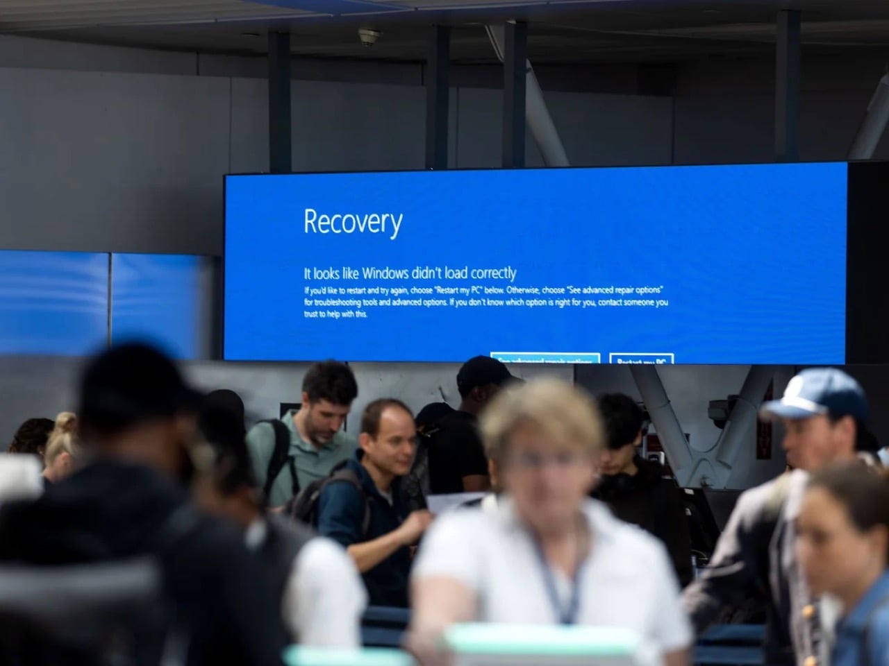
2024 CrowdStrike Outage
The OS that holds civilization together
Windows runs somewhere between 72 and 73 percent of the world’s desktops, and while that’s an impressive monopoly, it completely ignores the critical systems where Windows is actually even more prevalent and essential. Hospital admission systems, ATM networks, military command infrastructure, government offices, court systems, school networks, and banking operations across virtually every country on earth run on Windows. These institutions did not choose Windows out of preference; they are locked in through decades of infrastructure investment, software dependencies, and training costs that make switching systemically impractical at scale. The July 2024 CrowdStrike incident put a specific number on what this dependency looks like under pressure: one faulty content update to a single Windows security tool simultaneously bricked approximately 8.5 million machines, grounded over 8,500 flights globally, knocked hospital systems offline across multiple countries, and disabled 911 call centers across several US states. One third-party software layer, one bad update, and the operational skeleton of modern civic life visibly buckled.
That is the platform Microsoft has been treating as a vehicle for AI feature experiments. Recall, the AI tool Microsoft attempted to ship as part of Windows 11, worked by screenshotting the user’s screen every few seconds and storing those images locally to build a searchable timeline of everything they had ever done on the machine. Security researchers flagged it almost immediately as a catastrophic privacy liability: a permanent, silent, queryable record of every document, message, and webpage the screen had ever displayed. Microsoft paused the rollout after a fierce public backlash, but the revealing fact is that Recall cleared internal review in the first place. The teams approving that feature were not thinking about hospital clerks processing patient records, lawyers working with privileged communications, or government employees handling sensitive data. They were building a keynote demo.
The market is responding accordingly
Microsoft ended official Windows 10 support in October 2025, cutting off security patches for what was still the most widely used version of the OS. Months of upgrade campaigns, notification banners, and every available form of institutional pressure followed. The result: as of December 2025, Windows 10 sits at 44.68% market share and actually gained users after support ended, while Windows 11 dropped from 55.18% in October to 50.73% in December, shedding over four percentage points in two months while the officially dead OS clawed back ground. People are choosing to run a security-vulnerable, unsupported operating system rather than upgrade to the one Microsoft actively maintains, and that is not technophobia or inertia. It is a calculated judgment, made by millions of users independently, that the known risks of the old version beat the unknown risks of moving to the new one.
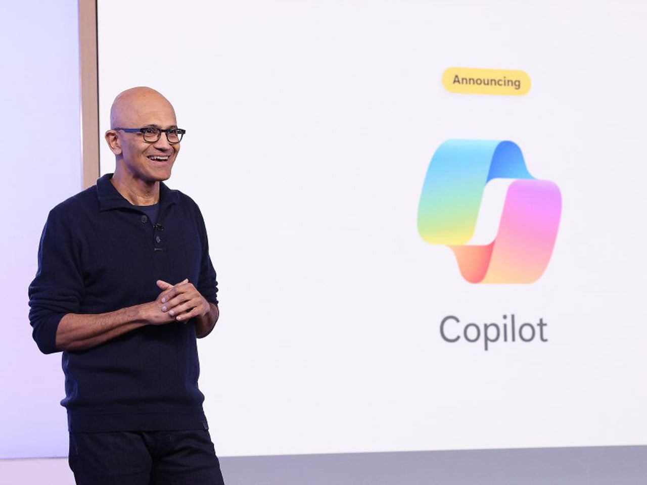
The TPM 2.0 hardware requirement blocked installation on millions of perfectly functional machines with no meaningful performance justification for everyday users, which meant the upgrade conversation started with resentment before it ever got to features. First-boot setup funnels new users toward a Microsoft account, with the offline bypass buried past the point where most non-technical people will ever find it. OneDrive integration sits deep enough in the OS that users regularly discover their Desktop files have been syncing to the cloud without understanding when or how they agreed to that. A fresh Windows 11 install in 2026 ships with TikTok, Instagram, Disney+, and a collection of Microsoft’s own unfinished apps pre-pinned to the Start menu, none of them arriving with any user consent. Copilot, which no consumer demand survey had identified as a priority, now appears in the OS sidebar, the taskbar, and since 2024, as a dedicated hardware key on new laptops, occupying real estate where a key with actual utility used to live.
Running alongside all of that is a separate update quality crisis that has been building its own track record. A January 2026 security update caused boot failures on certain Windows 11 machines, with Microsoft eventually tracing the issue to a botched December 2025 update that had left affected devices in what they diplomatically described as an “improper state.” An October 2025 security update broke VPN networking for enterprise users running OpenVPN and Cisco Secure Client, a bug that carried through the December patch cycle without a clean resolution. Security updates, the category Microsoft explicitly tells users they cannot afford to skip, became a threat to system stability in their own right. When the patch and the problem are indistinguishable from each other, the trust issue has moved well past inconvenience.
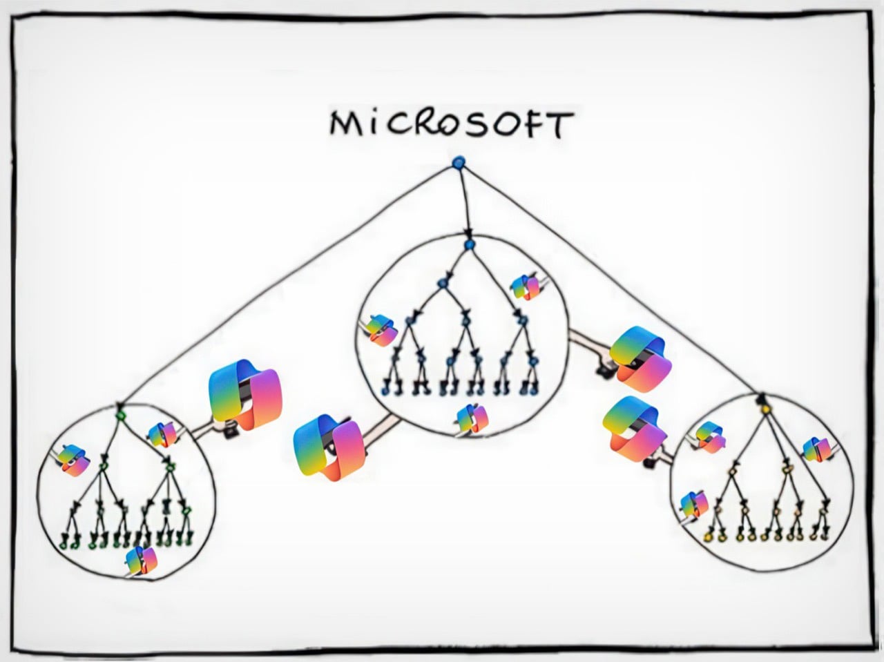
A modified version of a comic by Manu Cornet
Nadella is a great CEO. Just not for desktop operating systems.
Satya Nadella took Microsoft’s stock from roughly $35 in 2014 to over $400 at its peak, killed the Nokia disaster before it could fully metastasize, repositioned the entire company around cloud infrastructure, and placed an early bet on OpenAI when AI was still considered expensive academic theater. Azure’s consistent 30%-plus year-over-year growth commands complete executive attention and pulls the best engineering talent in the building toward it like gravity. By any honest standard corporate metric, Nadella’s Microsoft is a legitimate turnaround story, and the shareholder returns are not fabricated. But Nadella is a cloud and enterprise person at his core, and consumer Windows is a mature product in a saturated market, which in corporate strategy language translates cleanly to “managed asset.” The product that generates excitement gets the architects and the product visionaries; the one that just needs to keep working gets whoever is left after that allocation is done.
Paul Thurrott, who has covered Microsoft longer than most of the current Windows team has worked there, documented what that organizational reality looks like in practice. He wrote that Microsoft “relegated Windows to a backwater world led by B-teamers as the brightest minds at the company moved onto more lucrative career opportunities in Azure and AI.” That is an organizational autopsy, not editorial frustration, and it explains the product trajectory better than any feature changelog can. The talent followed the money and the excitement, and what remained shipped a redesigned Start menu nobody requested, a Copilot key nobody asked for, and a feature that the security community identified as dangerous within hours of its public announcement. The B-team does not ship bad decisions out of malice; they ship them because nobody senior enough to stop them is paying attention.
This pattern has a name
Nadella did not invent this behavioral tendency; it recurs reliably enough across modern tech to qualify as its own CEO archetype. Elon Musk built Tesla into the most culturally significant car company on earth, then spent the better part of two years fixated on Twitter, rebranding it to X, eliminating roughly 80% of staff, and torching advertiser relationships that took years to build, while Tesla’s stock dropped roughly 40% in the first quarter of 2025 alone. Now, he’s discontinued two Tesla models permanently while focusing efforts on an extremely polarizing AI chatbot. Mark Zuckerberg committed somewhere between $40 and $50 billion to the metaverse between 2021 and 2023, a virtual world that peaked at approximately 300,000 daily active users on Meta Horizon Worlds, before quietly pivoting to AI and becoming a public figure most associated with jiu-jitsu tournaments. The pattern is consistent enough to have a shape: a CEO builds something genuinely dominant, gets pulled toward the next big technological narrative, and hands the original product to the maintenance crew while energy and capital chase the new story. The difference with Nadella is the scale of what he handed off.
What separates his case from Musk and Zuckerberg is that he did not get distracted from Windows. He consciously stripped it for parts. Azure and AI received the budget, the senior talent pipeline, and the executive attention. Windows received the downstream output of that redistribution: mandatory AI integrations nobody requested, hardware specifications designed around Microsoft’s AI keynote roadmap rather than user needs, and a product direction driven more by investor narrative than by any user research that has ever been made public. The ordinary people buying $400 laptops are absorbing the cost of that sacrifice. The shareholders benefiting from Azure’s quarterly growth numbers are not.
Enshittification, documented
Cory Doctorow’s enshittification framework describes a platform lifecycle: start good for users, degrade toward serving business partners, then degrade further to extract maximum value for shareholders at everyone else’s expense. Windows 11 maps cleanly onto the third stage. The Start menu was rebuilt from scratch for the Windows 11 launch, stripping out Live Tiles that users had configured over years and replacing them with a static grid that is less functional and harder to customize, with no usability gain justifying the regression. Drag-and-drop onto taskbar applications was removed entirely at launch and only partially restored after months of sustained community pressure. Windows 11 originally shipped without the ability to right-click the taskbar to open Task Manager, a function that had existed since Windows NT 4.0 in 1996, and whose removal was not a redesign decision so much as evidence that nobody tested the product against the habits of actual users.
Control Panel, introduced in 1985, and the modern Settings app, first introduced in 2012 with Windows 8, still coexist in parallel inside Windows 11 in 2026. Basic system configuration requires jumping between both because neither is complete on its own, and the logic governing which settings live in which interface has never been consistently explained or resolved. Thirteen years of two competing tools sharing the same OS, and Microsoft never cared enough about the end-user experience to finish the job. This is not a legacy oversight or a technical debt problem that nobody knows how to solve. It is a choice, visible in its incompleteness, that reveals how little Windows product ownership has mattered to anyone with the authority to demand better.
Where this leaves ordinary people
Windows remains the most practical OS for most consumers, and that matters because it means there is no clean exit for the people being failed by it. MacOS is polished and stable but paternalistic by design: Apple creates deliberate friction around installing software from outside its ecosystem, the interface carries a genuine learning curve for anyone transitioning from Windows, and a MacBook Air M4 starts at $1,099 against a capable Windows laptop at around $400. Sure you can buy the $599 MacBook Neo too, but it’s genuinely less of a laptop and more of a netbook. The price difference between a regular MacBook and a similarly spec’d Windows laptop is not marginal in most of the world, particularly in the markets where Windows adoption is highest. Linux is genuinely improving year over year and deserves acknowledgment for it, but recommending Ubuntu to a non-technical family member invites more trouble than relief. The alternatives exist, but they serve a different user than the one who has to ask for a laptop recommendation.
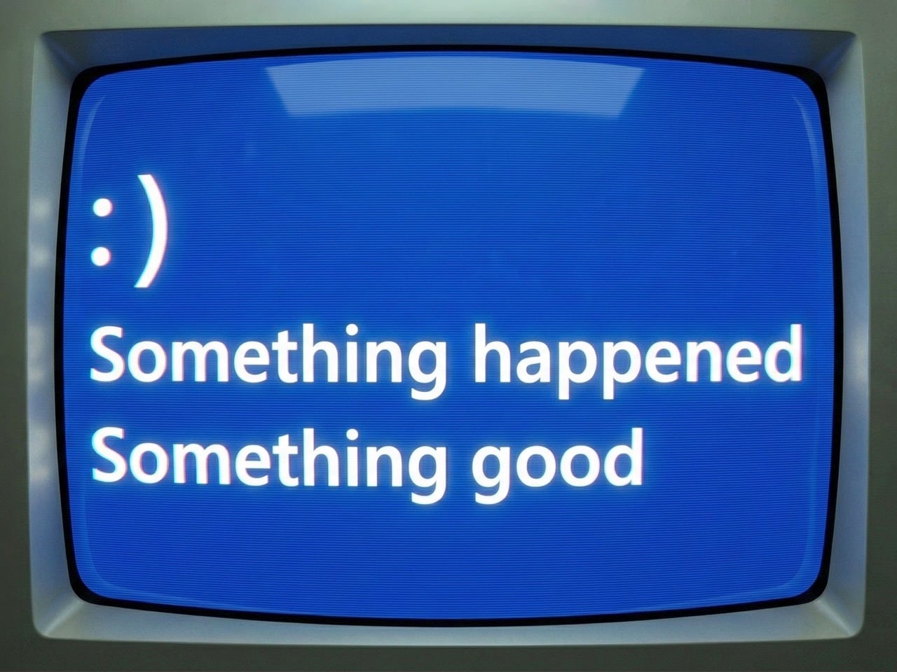
A regular person can still buy an affordable Windows machine, install whatever software they want, run games across a hardware range that nothing else matches, plug in any peripheral without a compatibility interrogation, and operate without being treated as a security risk for opening a file from outside a curated store. Microsoft is eroding that value proposition methodically, one forced integration at a time, but the erosion has not yet reached full collapse. As of early 2026, reporting suggests Microsoft is pulling back from the AI-everywhere approach in Windows and refocusing on core stability, with Paul Thurrott describing the shift as “something happened,” which from a journalist who has spent years documenting Windows’ decline with the exhausted precision of someone watching a building settle incorrectly reads as cautious acknowledgment rather than optimism. Whether that represents genuine reprioritization or noise management ahead of a Windows 12 announcement nobody has officially confirmed is the question worth watching.
Rebuilding trust after Recall, after a year of destabilizing updates, after years of treating the world’s most consequential operating system as a demo environment for products the market never asked for, takes considerably longer than a few stable patches and a tonal reset in engineering blog posts. The millions of people still on Windows 10, knowingly running an unsupported OS past its expiration date, made a rational call: the known risks of yesterday’s software beat the unpredictable risks of an OS whose roadmap is driven by whatever Microsoft needs to show investors next quarter. That is not the normal frustration cycle where users grumble and eventually upgrade. It is a trust deficit built through years of consistent bad decisions, and a few good patch cycles will not close it. The easiest tech recommendation in the world has become a pause, and the people responsible for that pause are too deep in Azure dashboards to understand what it actually costs.
The post Microsoft Broke the Only Thing That Actually Mattered first appeared on Yanko Design.