The audio world has always had a bit of a hoarding problem. Amplifiers, preamps, turntables, towers, subwoofers, cables that cost more than a weekend trip. The traditional hi-fi setup has never been known for its minimalism. It’s a rabbit hole, and a beautiful one at that, but a rabbit hole nonetheless. So when a 43-year-old Danish speaker company decides to put everything into a single box and call it done, it’s worth paying attention. That’s exactly what DALI did with the Vega, and I’ll say upfront: I didn’t expect to be as interested in it as I am.
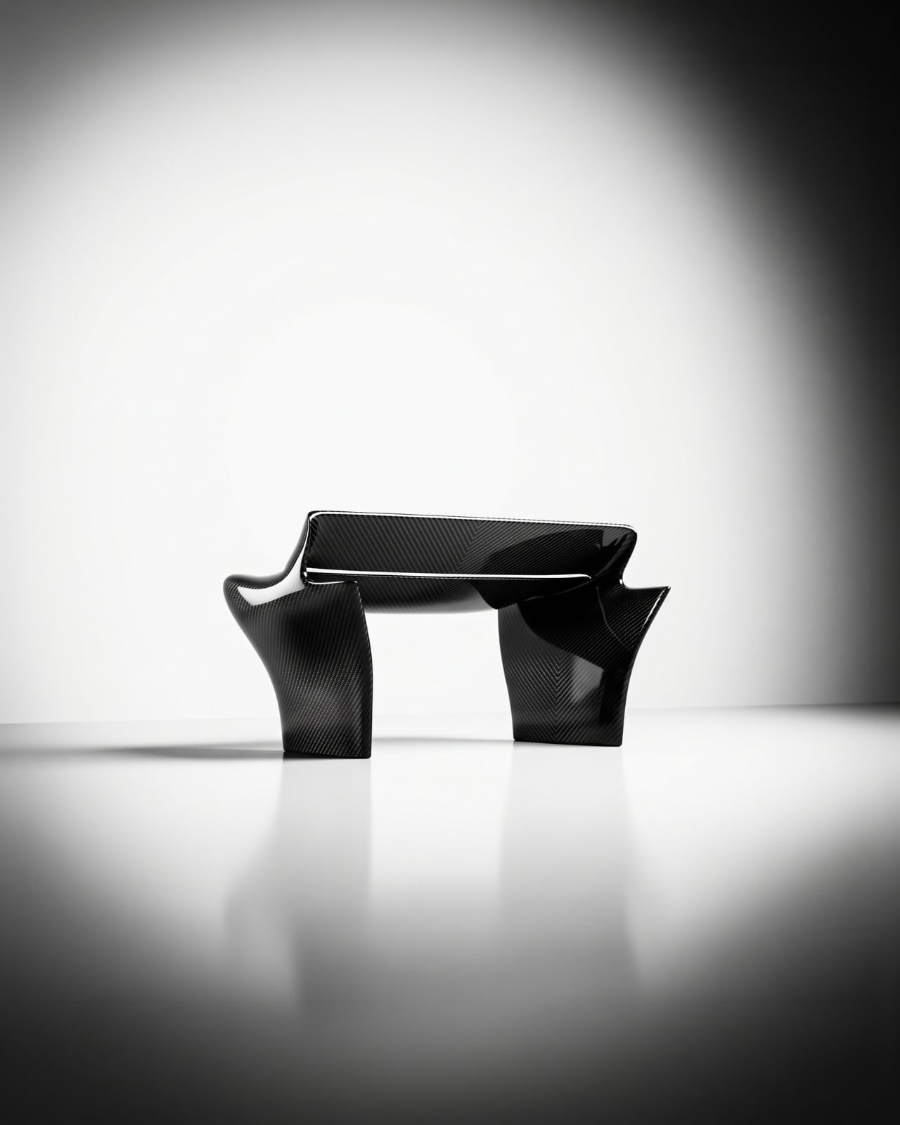
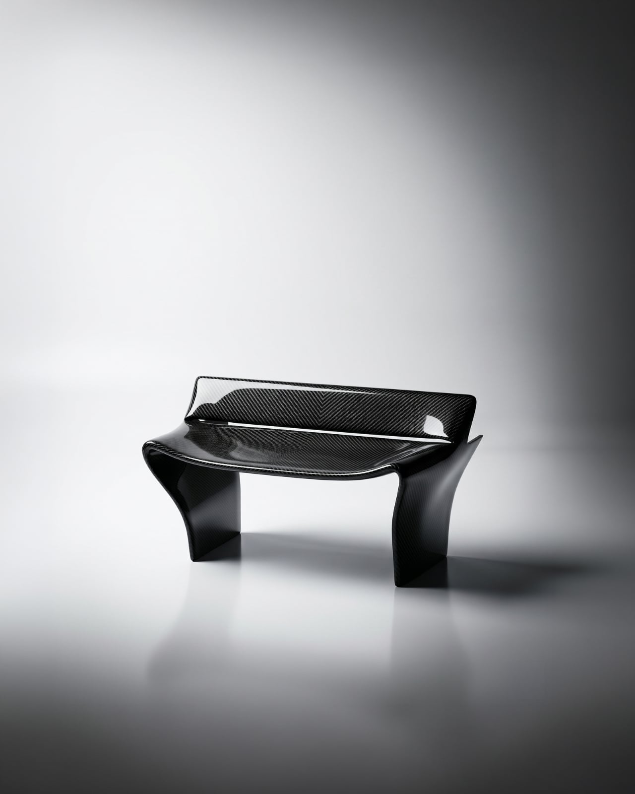
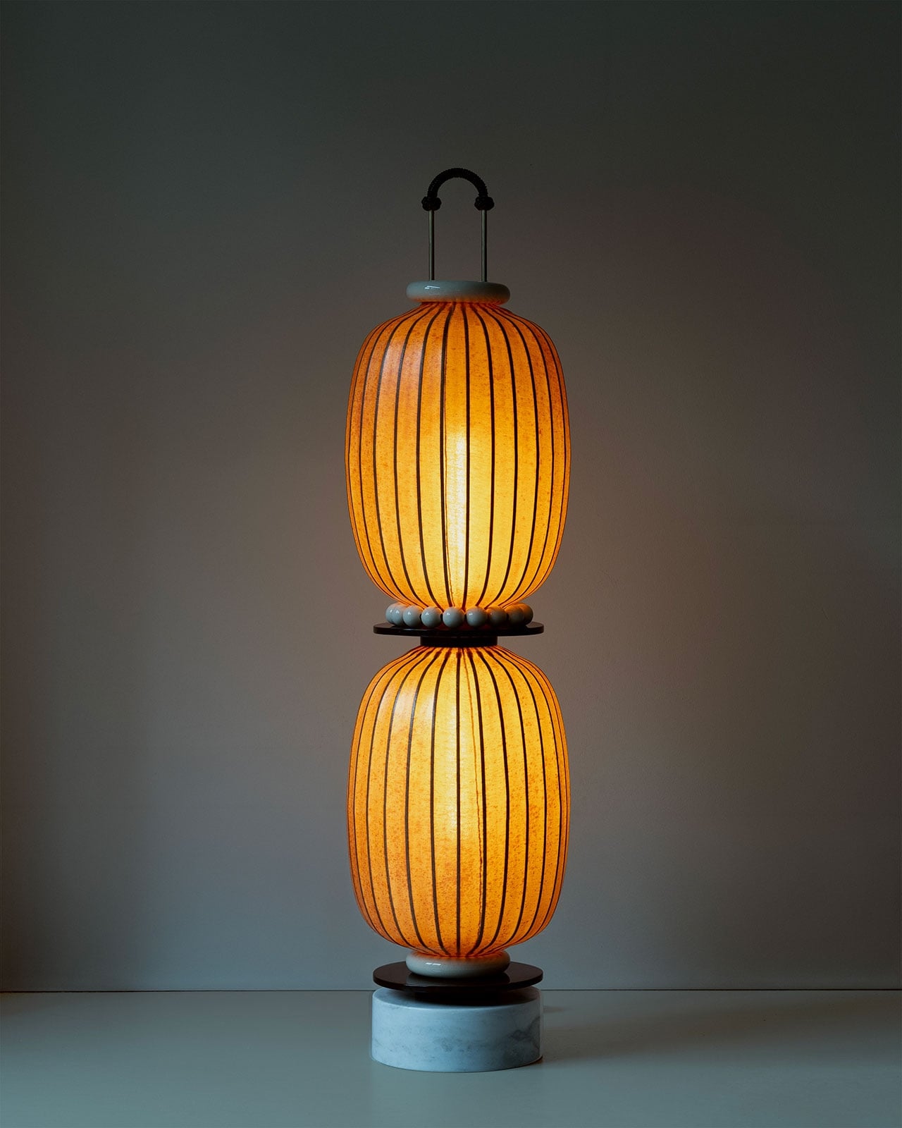
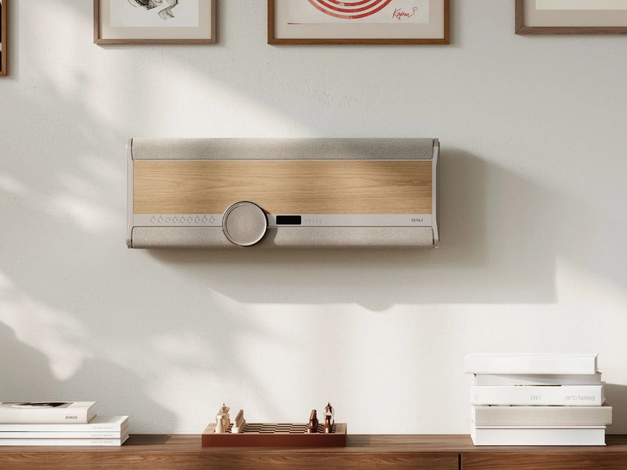
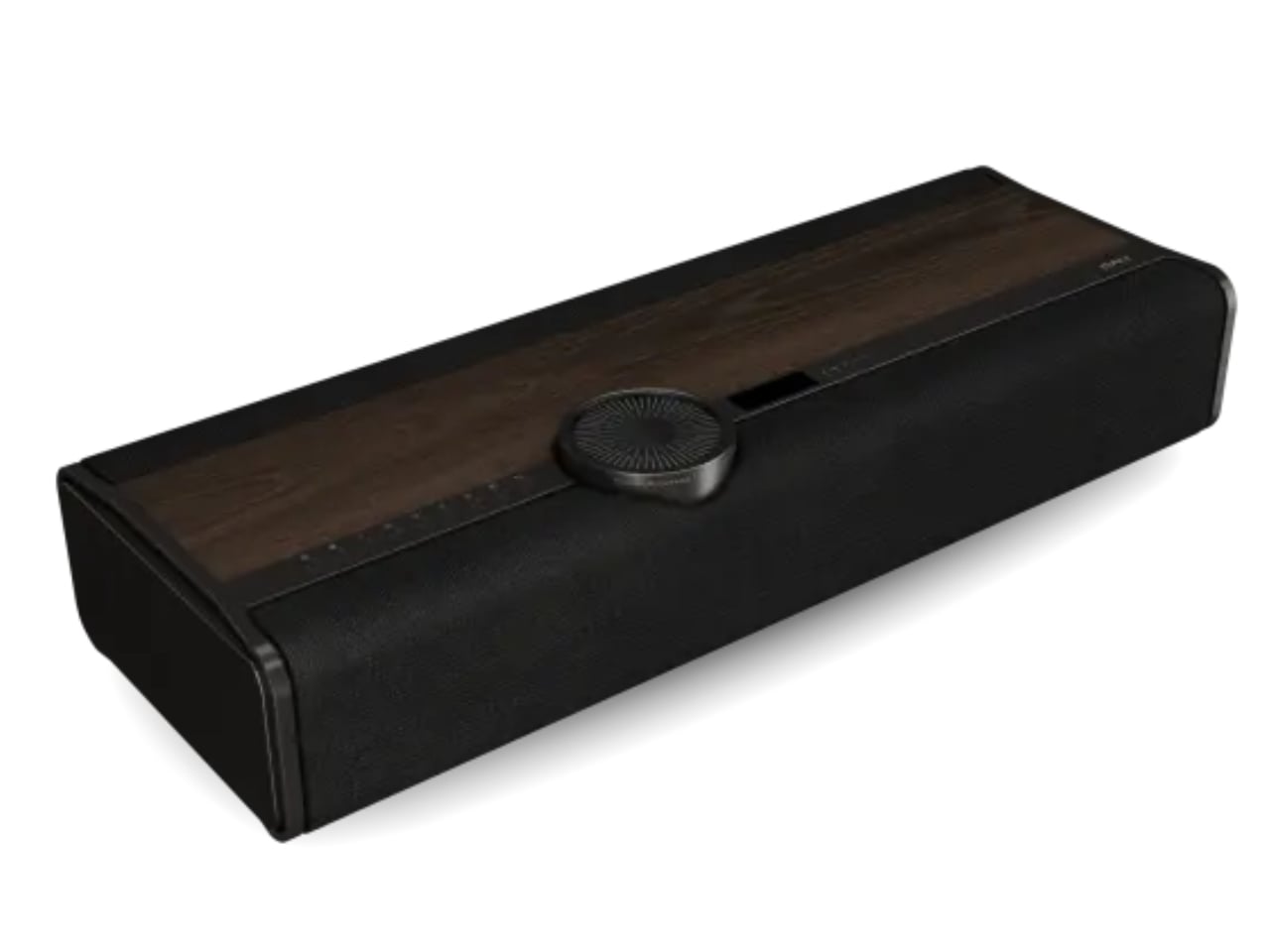
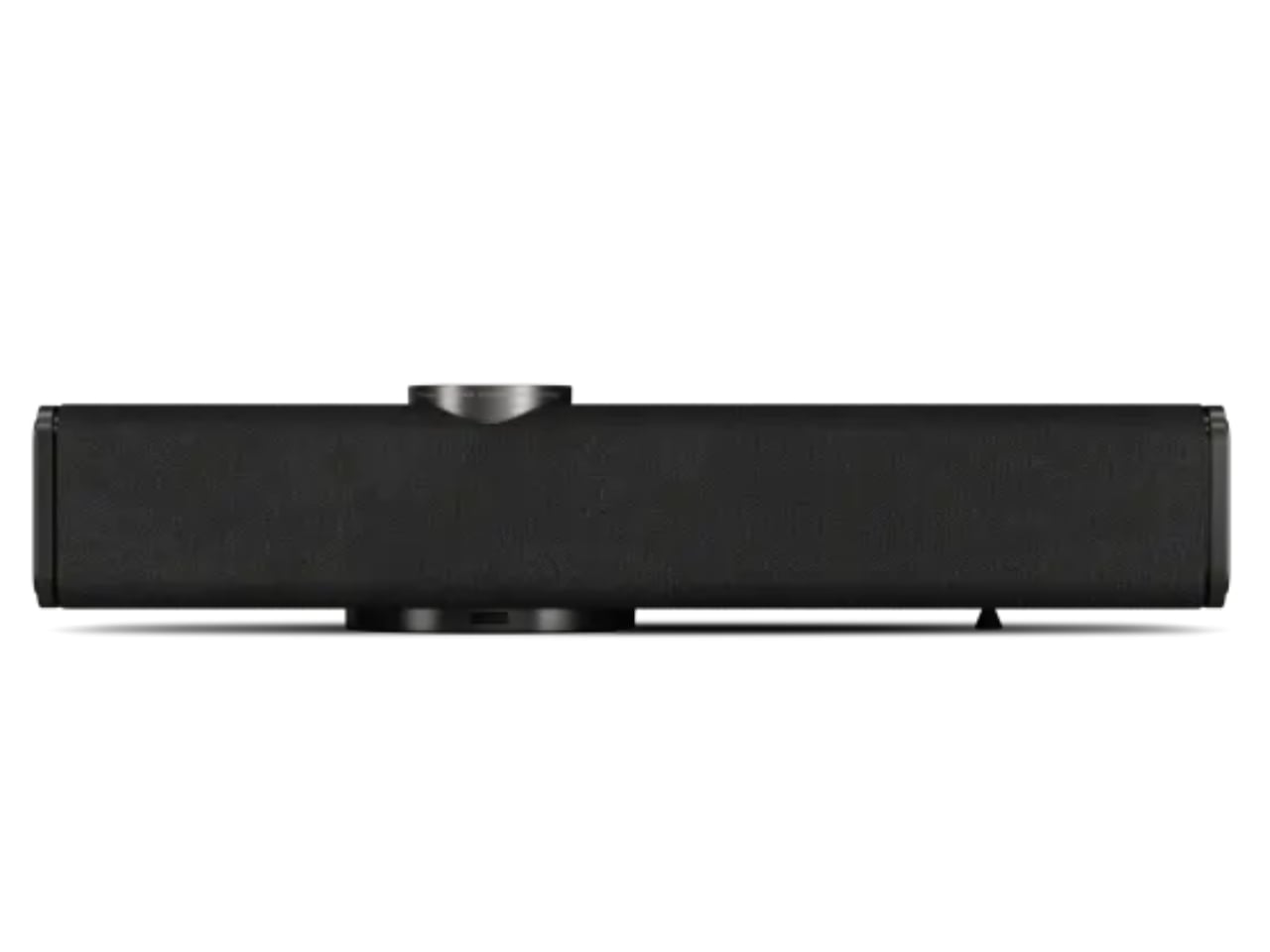
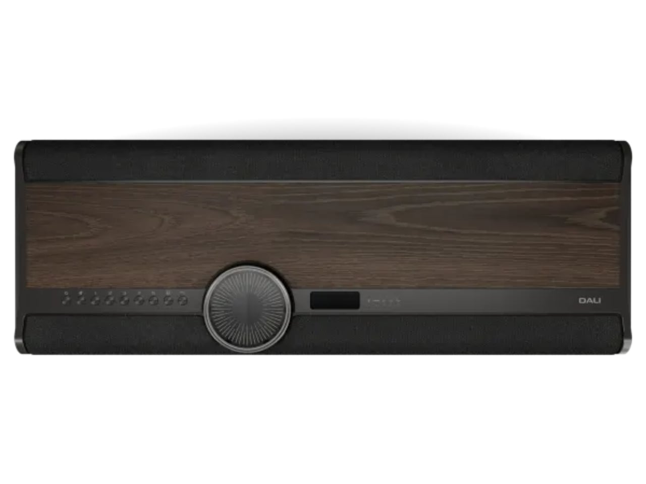
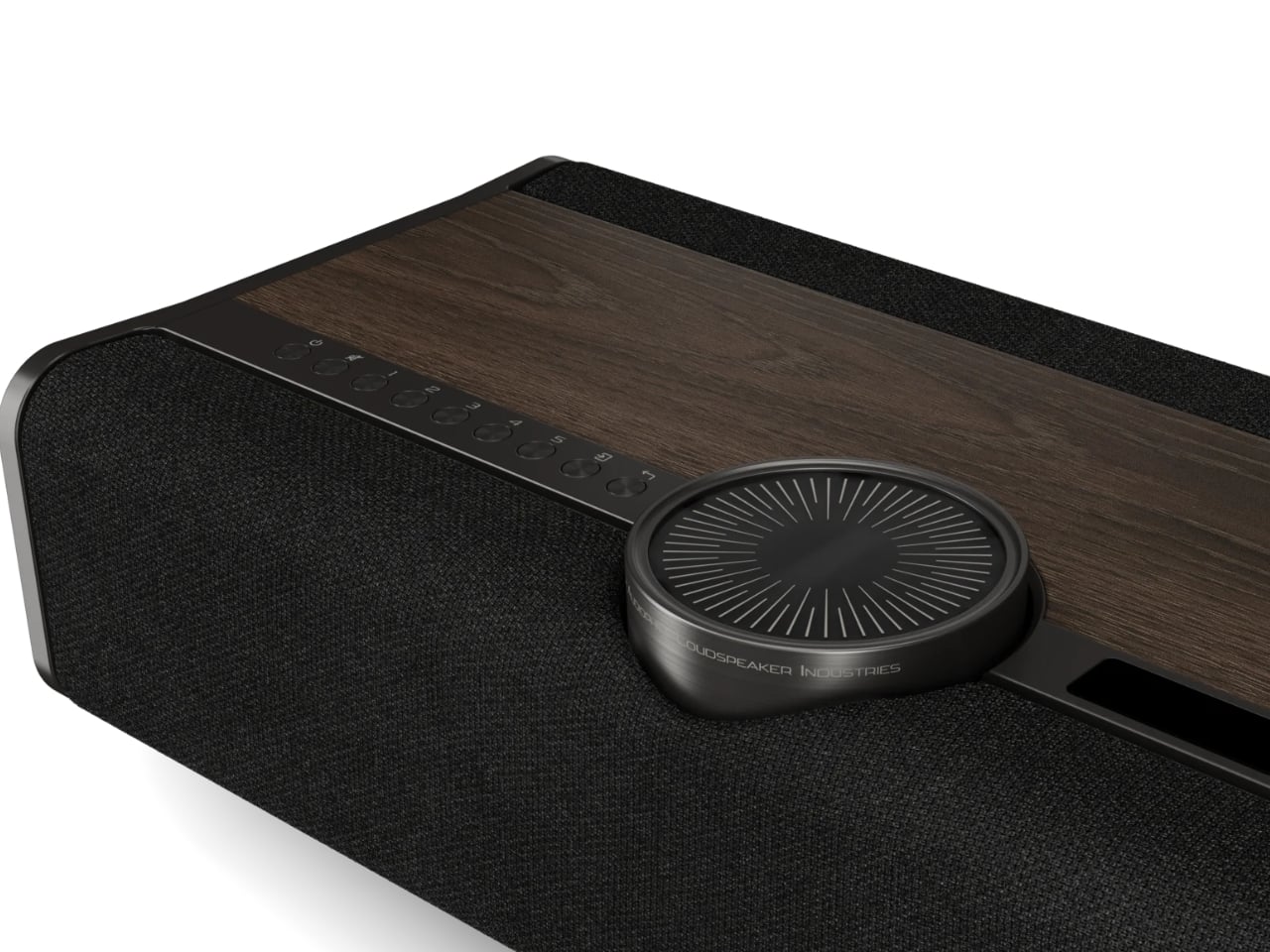
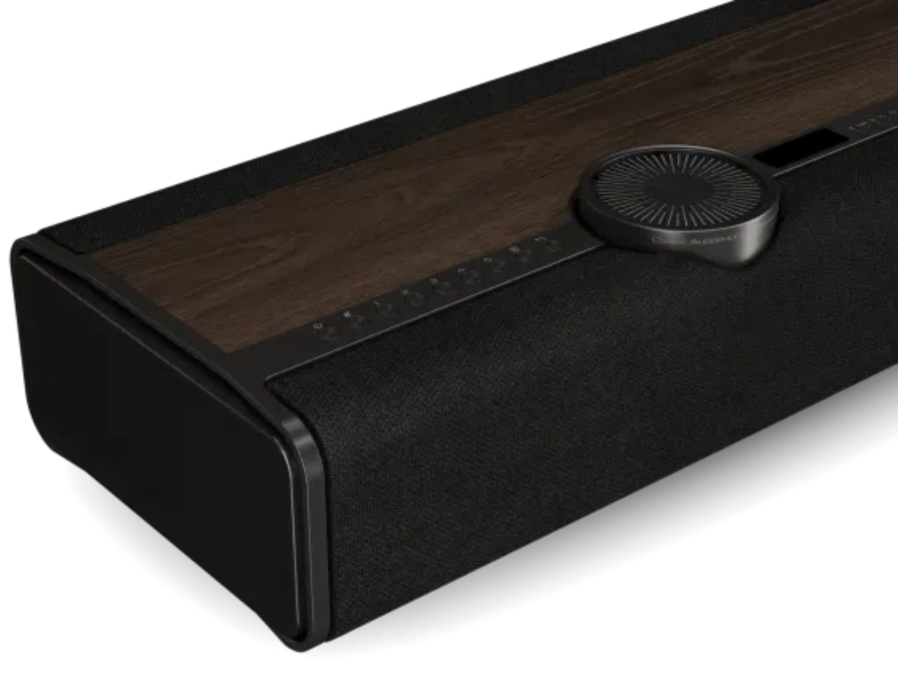
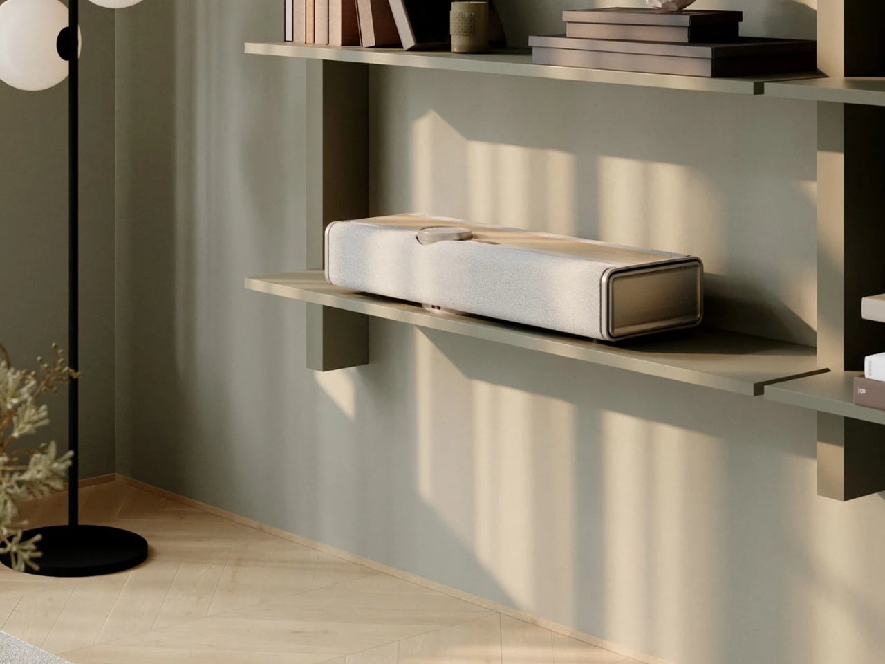
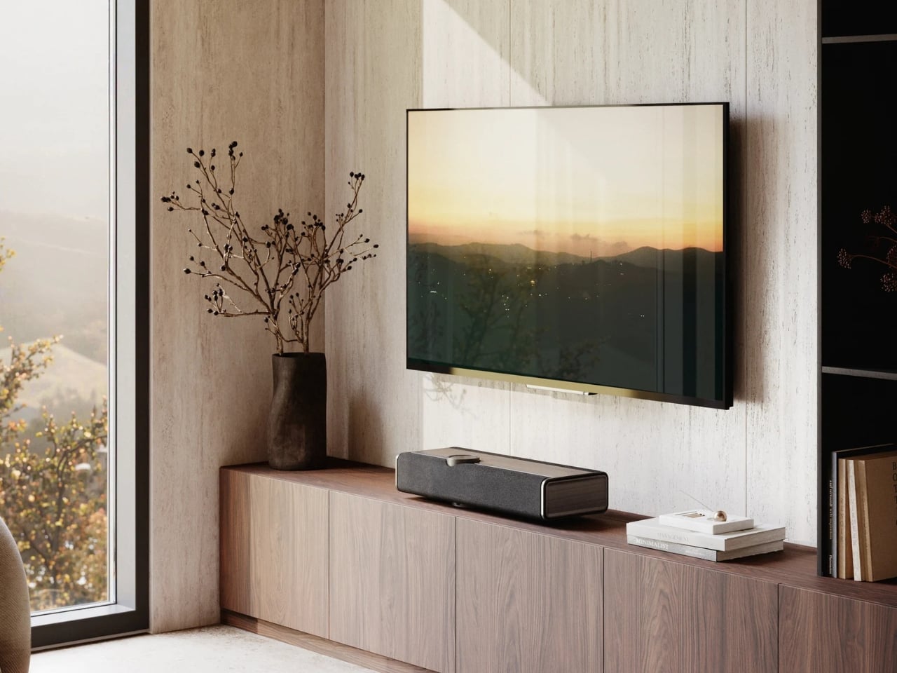
The Vega is an all-in-one wireless sound system built from the ground up. Drivers, amplification, DSP control, all of it developed in-house. The result is a single unit that sits in your room like a piece of furniture and quietly does the work of an entire rack of equipment. It packs 10 drivers into its slim 683mm-wide enclosure, including ultra-light 25mm soft dome tweeters and bass-midrange drivers arranged back-to-back to minimize cabinet resonance. Total amplification lands at 400 watts across eight channels. For a single speaker, those are serious numbers.
Designer: DALI Speakers

What makes the Vega interesting beyond the specs is how it actually approaches the problem of sound in a room. DALI developed a proprietary technology called Adaptive Stereo Enhancement (ASE), which creates a wide soundstage from a single unit in real time. It’s not a gimmick simulation of stereo. It’s an adaptive system that reads the incoming signal and responds accordingly, without introducing the artificial artifacts that can make these kinds of technologies feel forced. Whether it fully delivers on that promise is something we’ll have to wait until it reaches more listening rooms to confirm, but the approach itself is genuinely thoughtful.
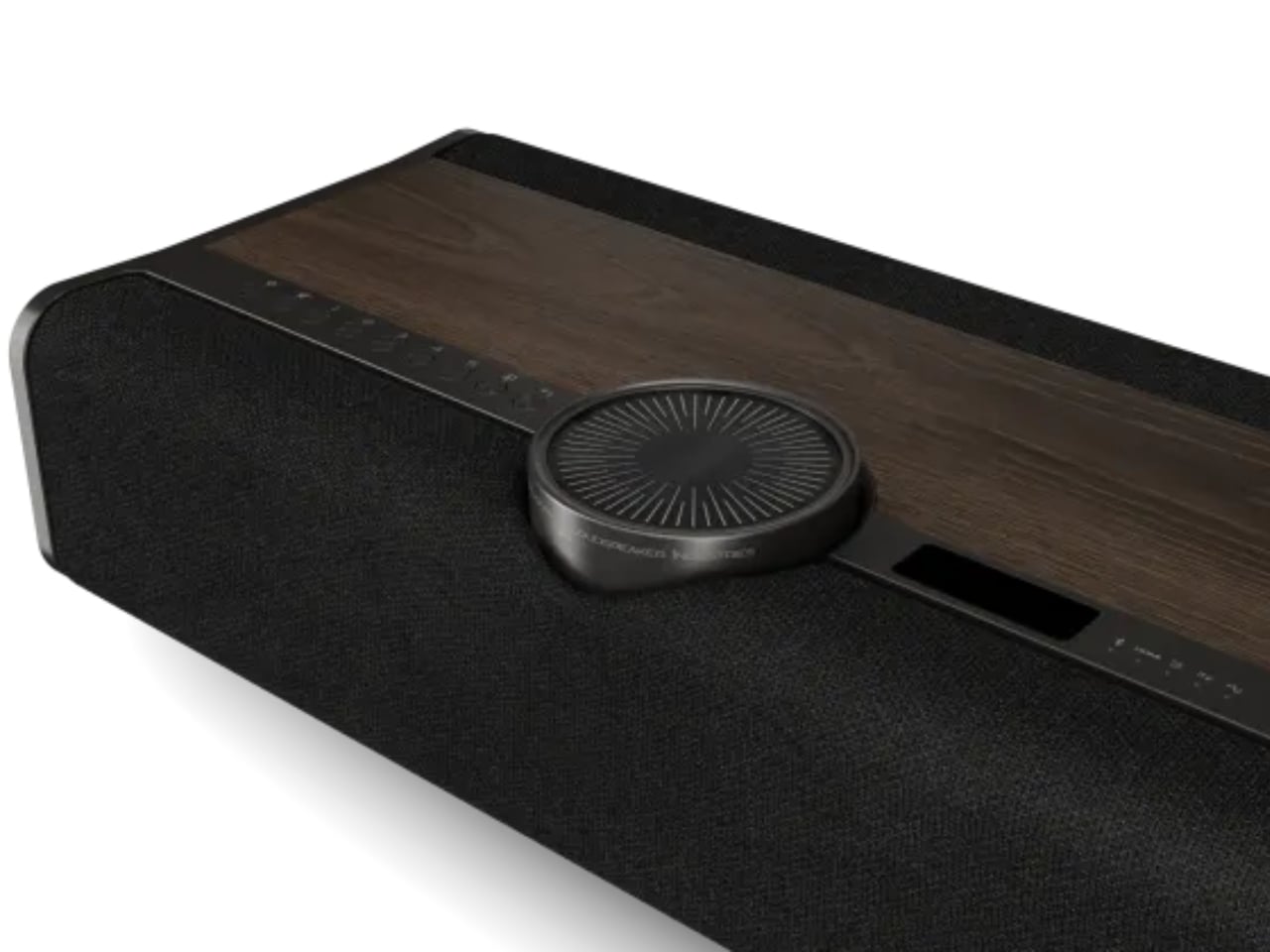
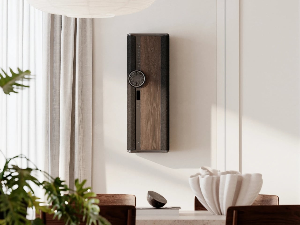
Then there’s the Adaptive Orientation Adjustment (AOA), which automatically optimizes the speaker’s output based on how you’ve placed it. Standing upright on a shelf, mounted flat against a wall in landscape, hung vertically in portrait. The Vega adjusts in real time for each scenario. It even includes an OLED display that rotates with the unit’s orientation. That’s the kind of considered detail that separates a product designed by people who actually care from one that was designed by committee to hit a price point.
And speaking of price points: $4,500 USD is not a casual purchase. I won’t pretend otherwise. But when you start comparing it to the cost of assembling a proper separates setup at equivalent quality, the math starts to look different. A decent amplifier, a quality streamer, a pair of speakers at this level, the cables to connect them all. It adds up fast. The Vega consolidates all of that into one device, one box, one cable to a power outlet.
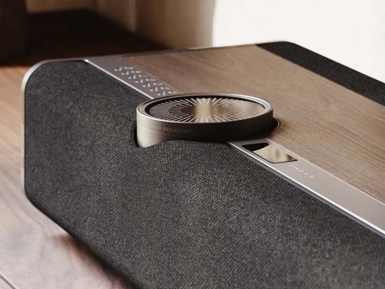
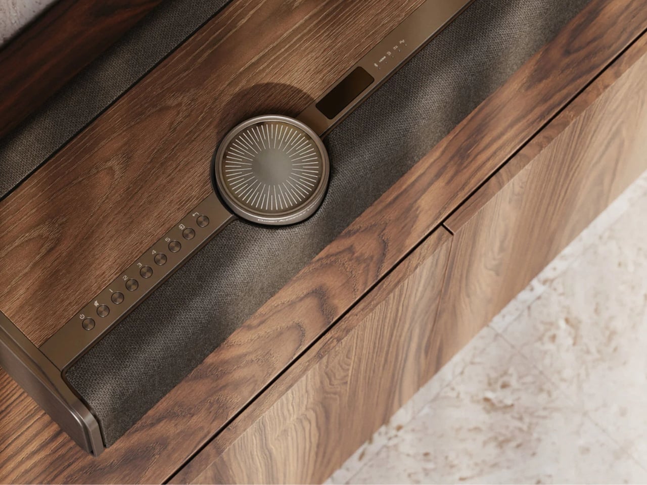
Aesthetically, DALI made choices I genuinely respect. Real wood veneer in Dark Oak or Natural Oak, anodized aluminium details, custom woven fabric. It looks more like something you’d find in a well-appointed Scandinavian living room than a piece of audio equipment. The volume wheel alone is its own small obsession: glass, acrylic, and anodized aluminium riding on an aerospace-grade ball-bearing mechanism. That’s not a specification; that’s a tactile experience someone designed on purpose.
Connectivity is thorough without being overwhelming. BluOS handles streaming and multi-room audio. HDMI, optical, analogue, USB audio, and Bluetooth cover wired sources. Spotify Connect, Tidal Connect, and Apple AirPlay 2 round out the wireless side. You can plug in a turntable or connect a TV, and the Vega handles both within the same system.
The Vega launches in select markets in September 2026, with broader availability following in October and November. Whether the hi-fi world embraces it or resists it on principle is a conversation that will be had loudly in forums and listening rooms for months. But the idea at its core, that great sound shouldn’t require great complexity, is one that’s long overdue for a proper answer. DALI’s version of that answer is elegant, ambitious, and a little bit expensive. Most good answers are.

The post One Speaker, 10 Drivers, 400 Watts: DALI’s Vega Changes the Game first appeared on Yanko Design.