If you grew up watching old movies or flipping through your parents’ architecture magazines from the 70s, you probably remember the conversation pit. That sunken, circular seating area built into the floor, ringed with cushions, usually occupied by someone in a turtleneck holding a glass of wine. It felt like the most optimistic design idea of its era: a room within a room, purpose-built for the act of simply talking to each other. Then open-plan living came along and flattened everything, and the pit more or less disappeared.
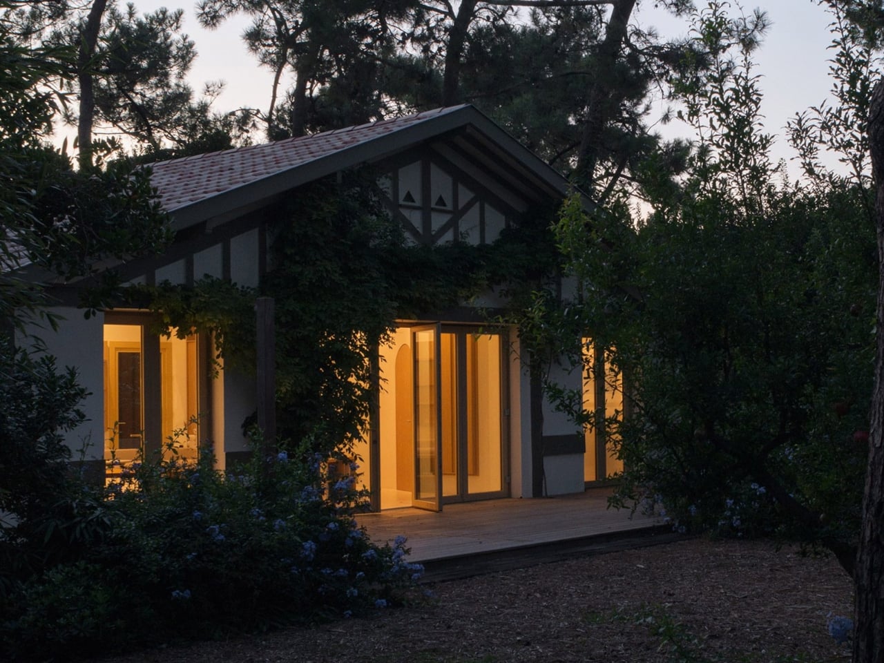
Studio Razavi just brought it back, and they did it in about the best possible setting you could imagine. The Paris, London, and New York-based firm recently completed Seaside House, a renovation of a 1930s coastal cabin at the tip of Cap Ferret, a narrow peninsula near Bordeaux, France. The structure sits nestled among towering pine trees, which is already a lot for any building to live up to. But the interior is where things get quietly radical.
Designer: Studio Razavi
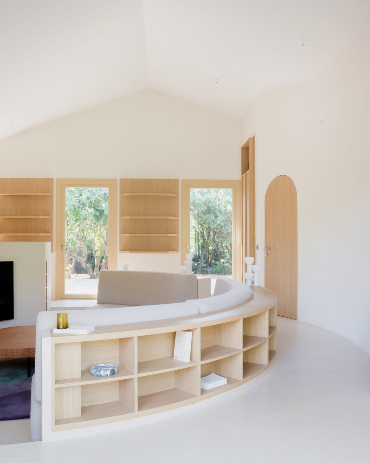
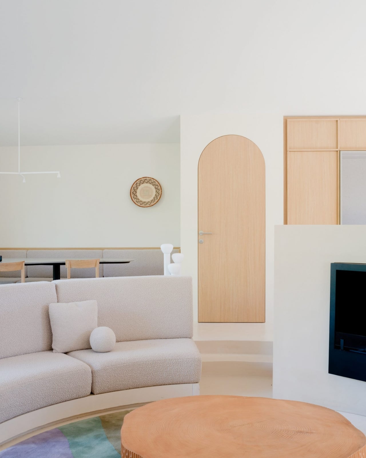
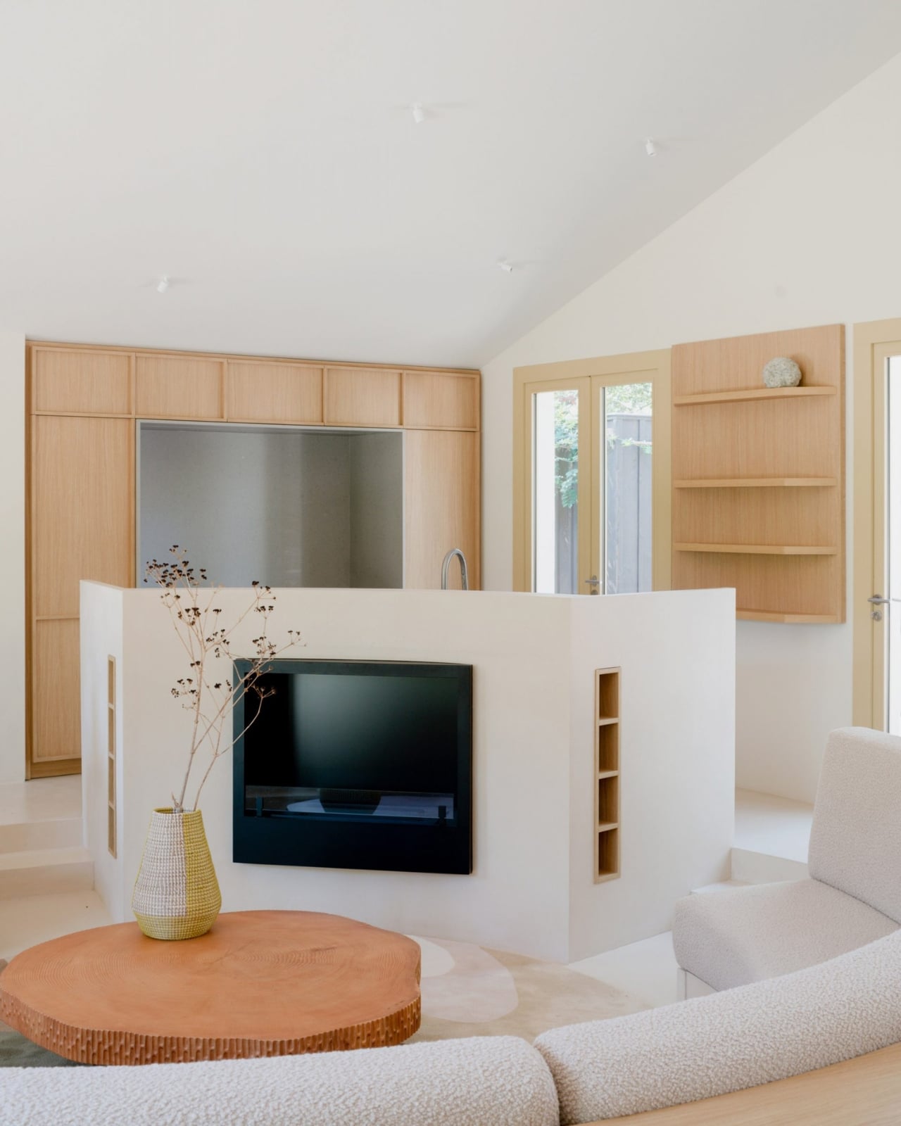
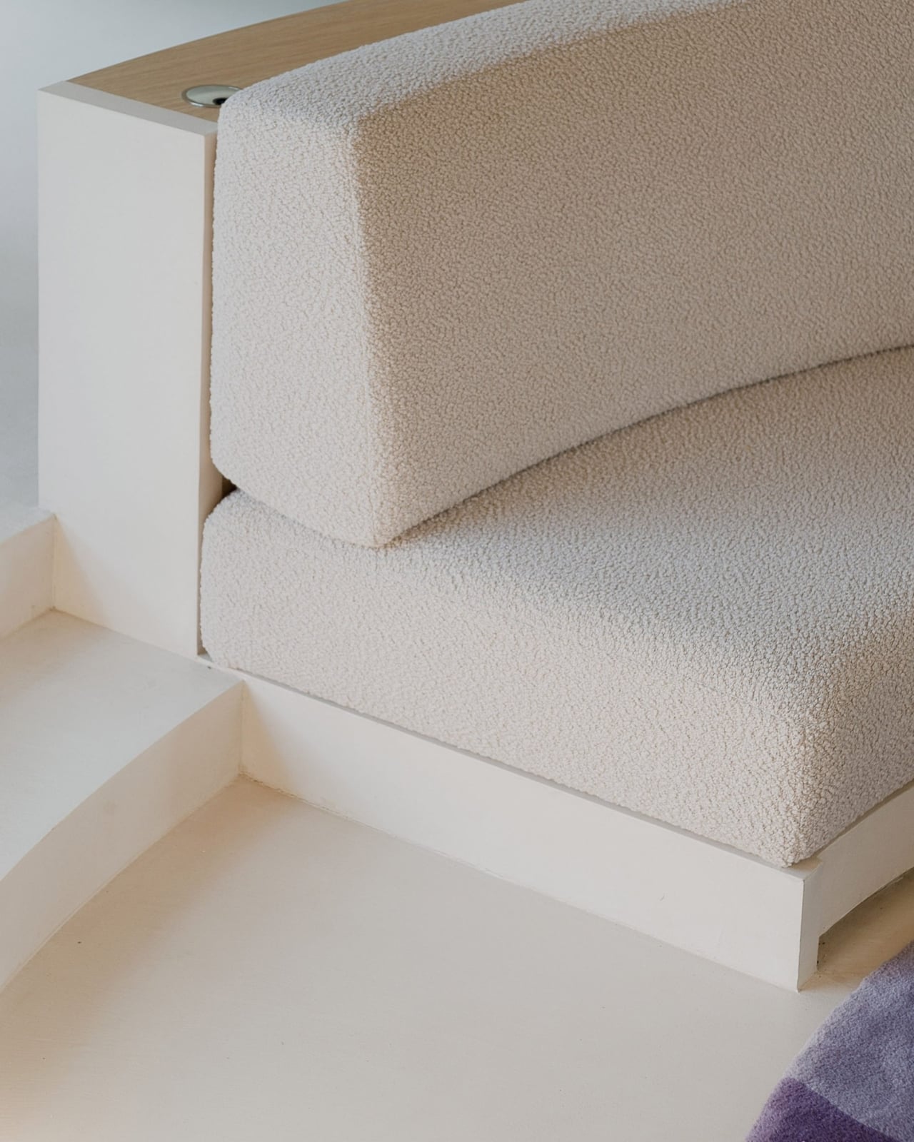
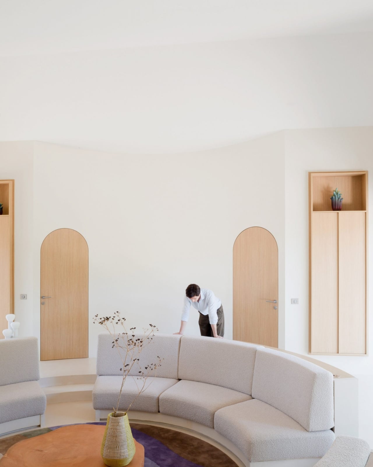
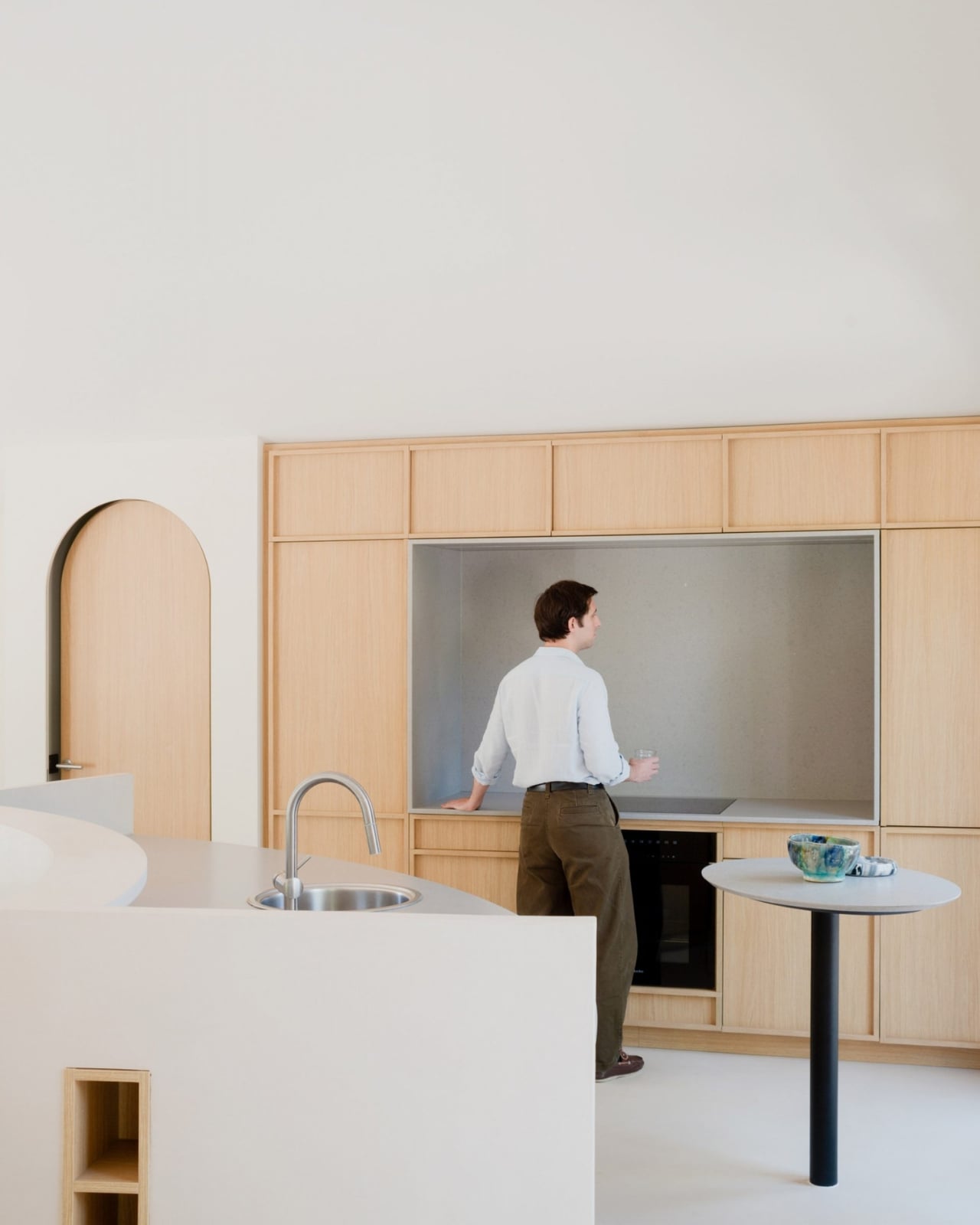
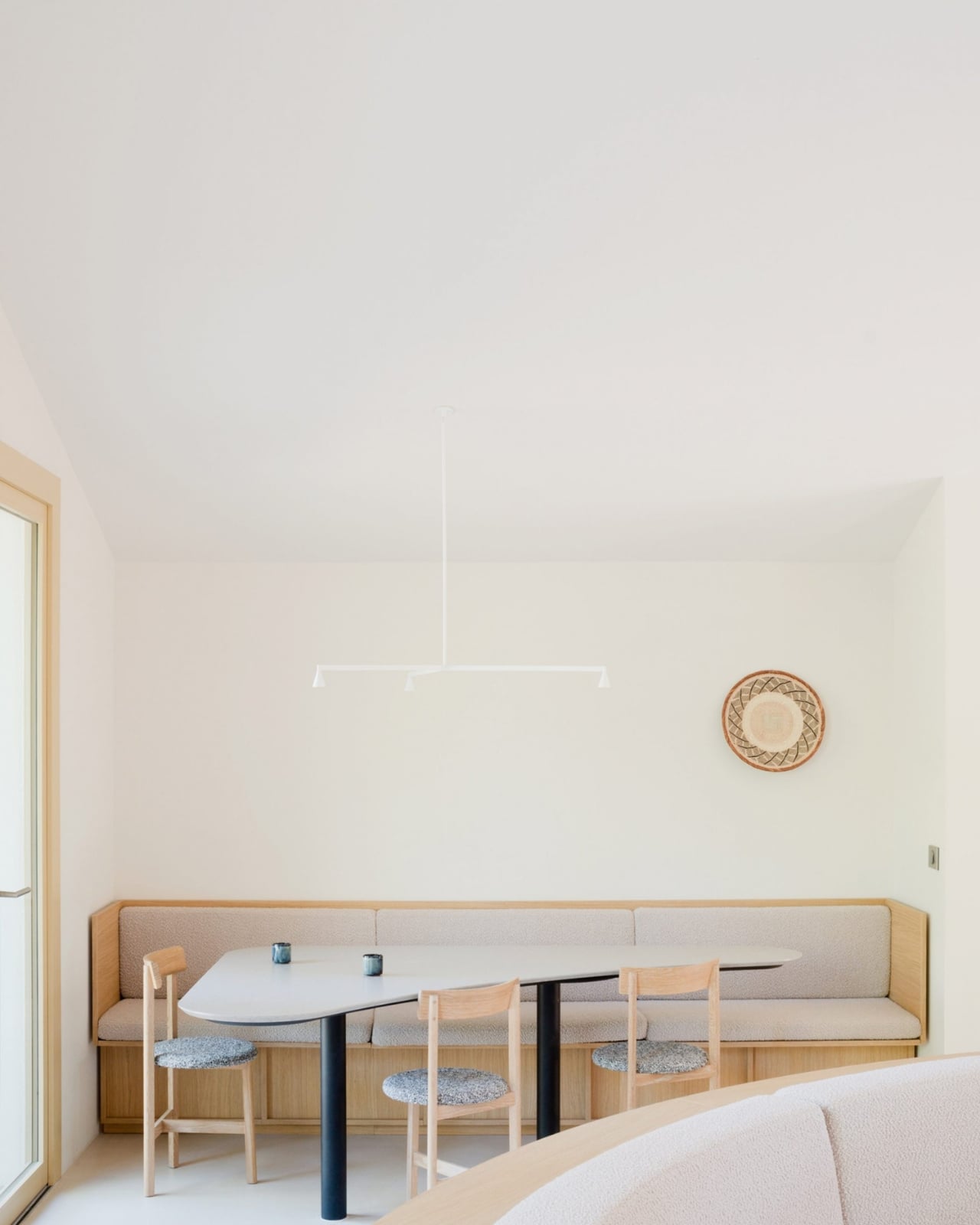
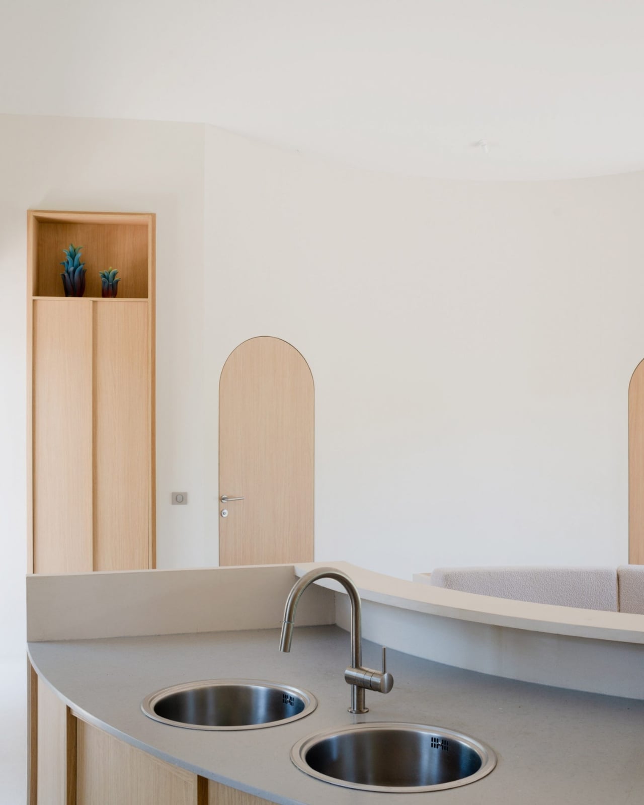
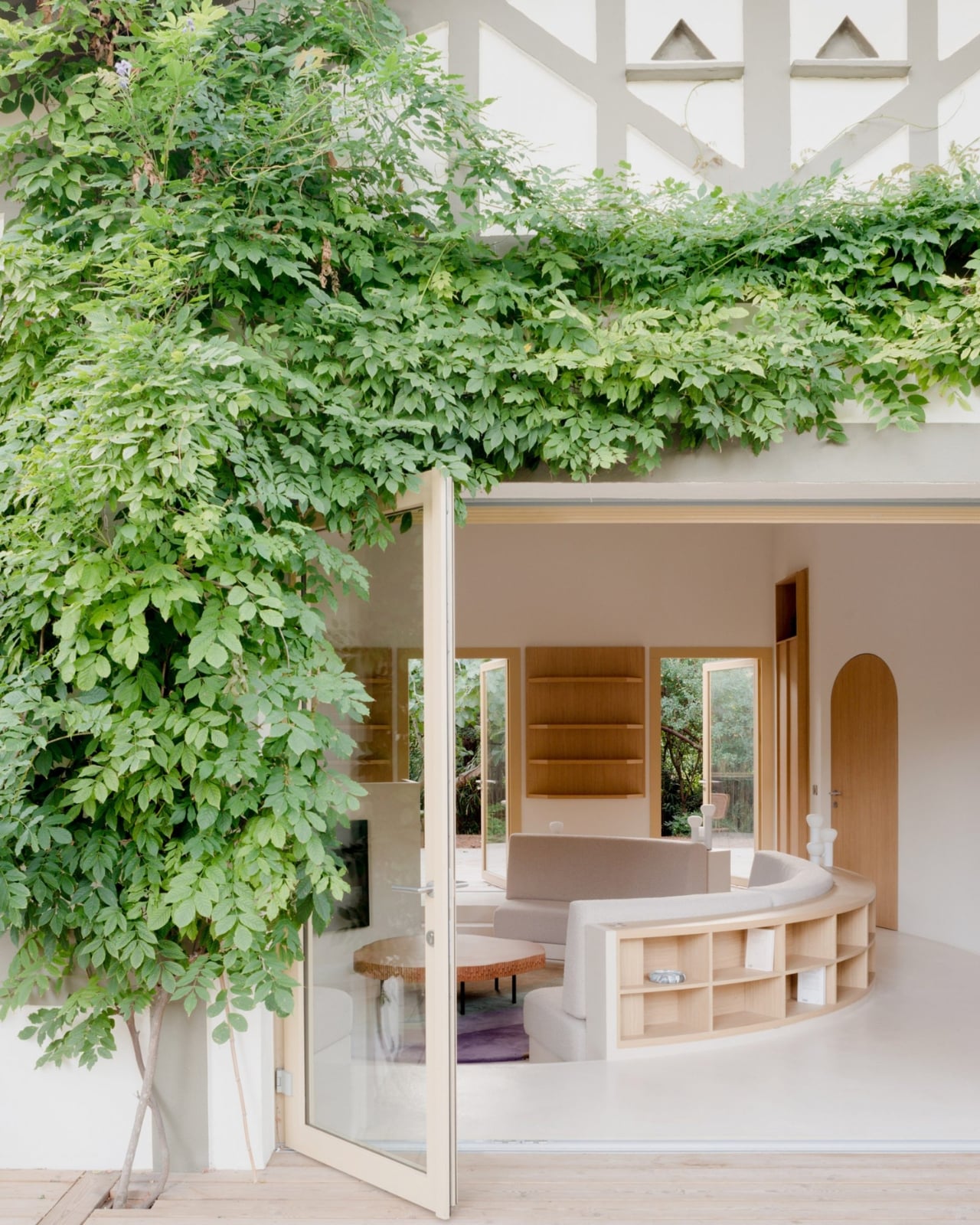
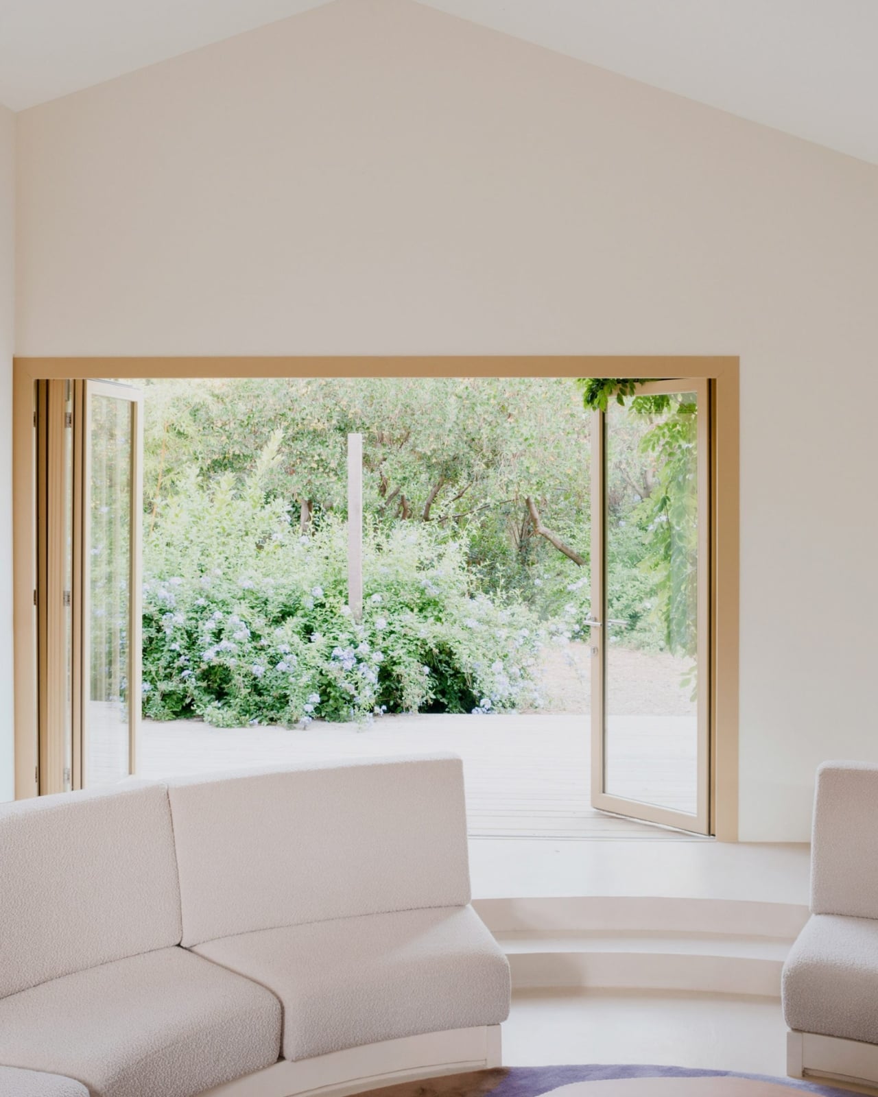
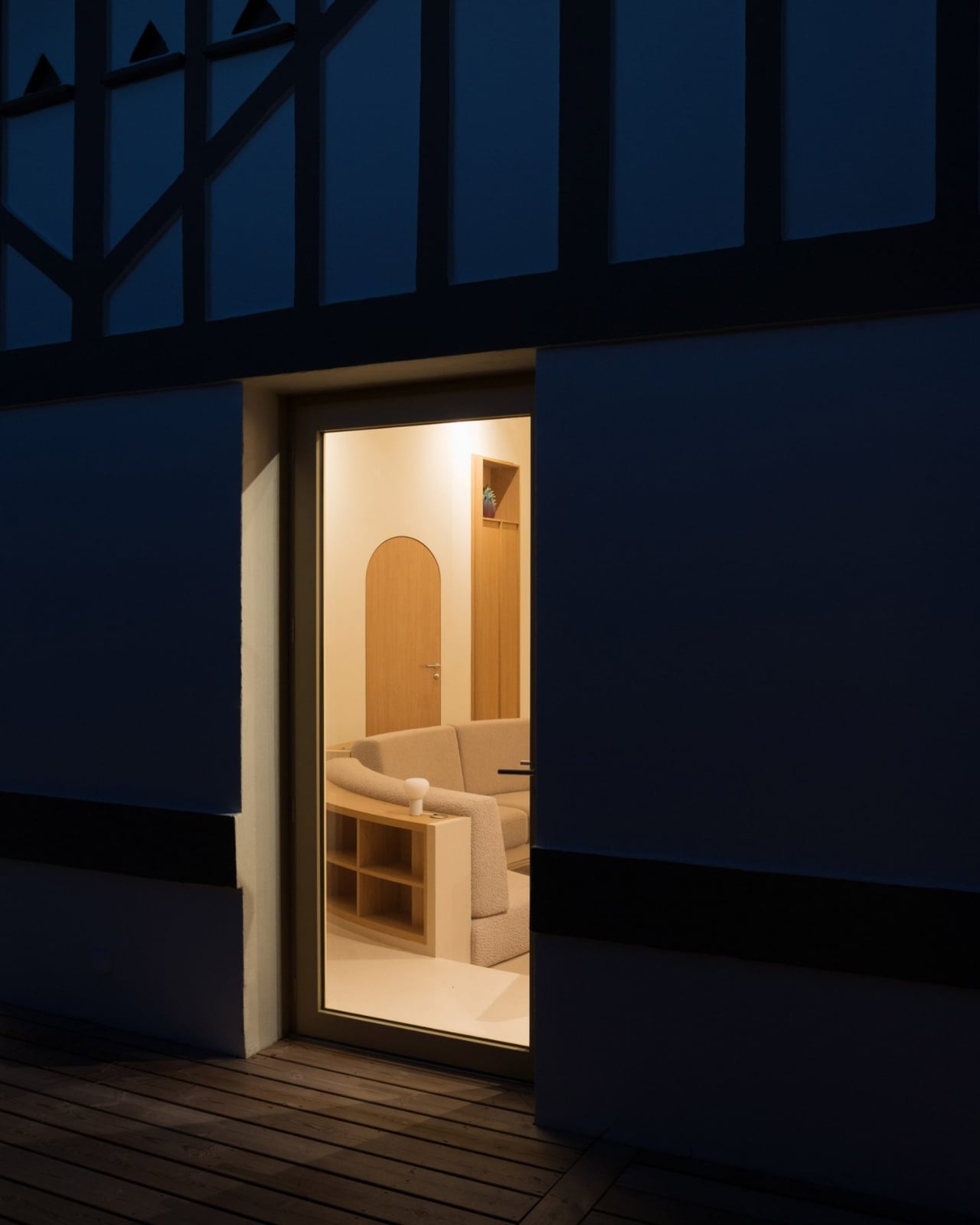
All of the cabin’s original partition walls were stripped out entirely, leaving just the building’s envelope standing. In the center of what became one long, open living space, the architects placed a circle. A sunken circular living room, specifically, with a low perimeter wall that integrates the kitchen sink and storage on one side, and steps leading down into the seating area on the other. Two decked terraces bookend the space, one on each facade of the house.
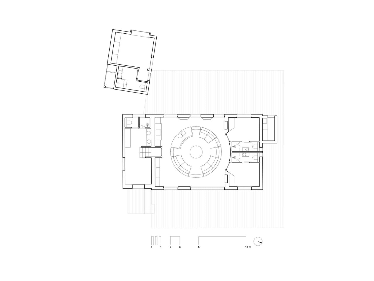
Project architects Guillen Berniolles and Michele Sacchi described it as a direct response to the local lifestyle around Cap Ferret, where people are constantly moving between indoors and outdoors. “The local lifestyle revolves around constantly moving in and out of houses, which led us to opt for a centrally sunken living room that creates a circulation flow all around,” they told Dezeen. The pit, in other words, isn’t just decorative. It gives the house its entire traffic pattern.
That reasoning matters because it pushes back against the way we usually justify bold design choices. We tend to dress them up in language about “flow” and “intention,” which often means nothing. Here, the logic is actually grounded in how real people use a real place. You come in from the terrace, the circle pulls you in, and then you drift out the other side. It’s a house that choreographs you without you noticing, and that kind of invisible architecture is genuinely hard to pull off.
The material choices are just as considered. Solid wood furniture and veneer are used throughout as a nod to the surrounding Landes forest, which is not only France’s largest but also Europe’s most extensive man-made forest. That context matters. A coastal house in Cap Ferret sits at the intersection of sea and forest, and the design doesn’t pretend otherwise. It leans into both, which gives the whole renovation a rootedness you don’t always see in coastal homes.
A separate guest annexe, clad in dark timber, sits to the west of the main cabin, blending quietly into the tree trunks around it. It’s the kind of restrained detail that separates a thoughtful renovation from a merely stylish one.
The conversation pit feels timely for a reason that goes beyond nostalgia. We spend so much time designing spaces for productivity, for content, for function, that a space designed specifically for conversation feels almost radical now. A sunken circle in a beach house that says, essentially, sit here and talk to each other, is a quiet but pointed statement. I don’t think it’s a coincidence that it lands now.
Studio Razavi has always been good at finding the architectural move that feels both inevitable and completely unexpected once you see it. Seaside House is that in full. The shell stayed. Everything else became about the circle at the center of it, and somehow, that’s more than enough.
The post A 1930s French Cabin Brought Back the Pit, and It’s the Best Part first appeared on Yanko Design.