The Biggest Lord of the Rings LEGO Set Ever Just Dropped

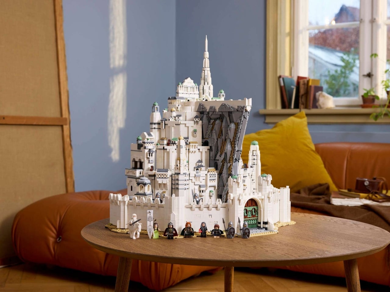
I’ve been a LEGO adult fan long enough to know that the announcement of a new flagship set usually lands with a mix of excitement and skepticism. Is it actually as good as it looks? Is the price justified? Will it sit beautifully on a shelf or just collect dust after a frustrating build? With the newly revealed LEGO Icons 11377, The Lord of the Rings: Minas Tirith, I think most of those questions answer themselves. And as a big Lord of the Rings fan, this has got me over the moon.

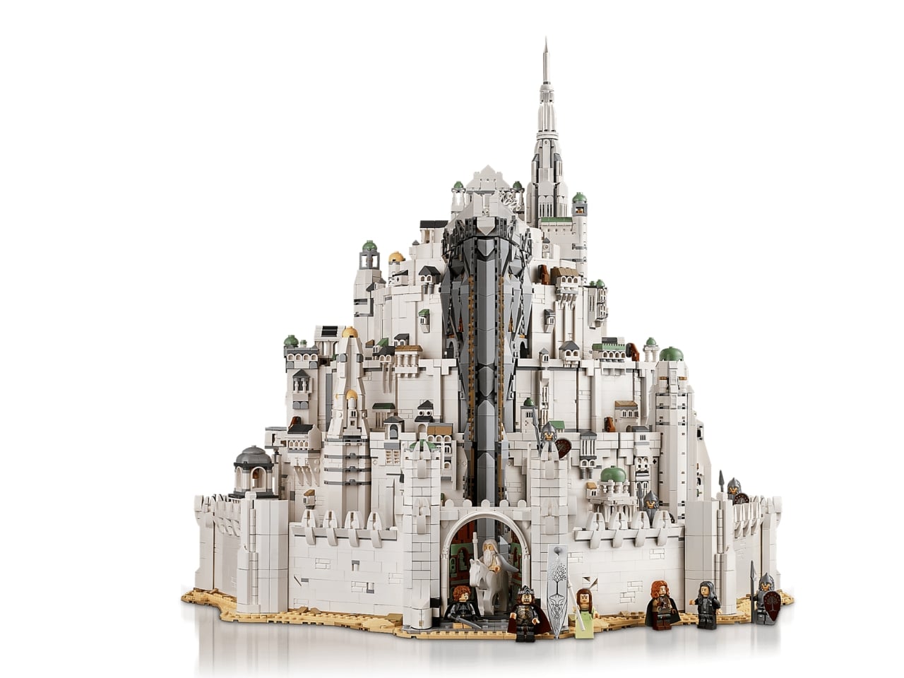
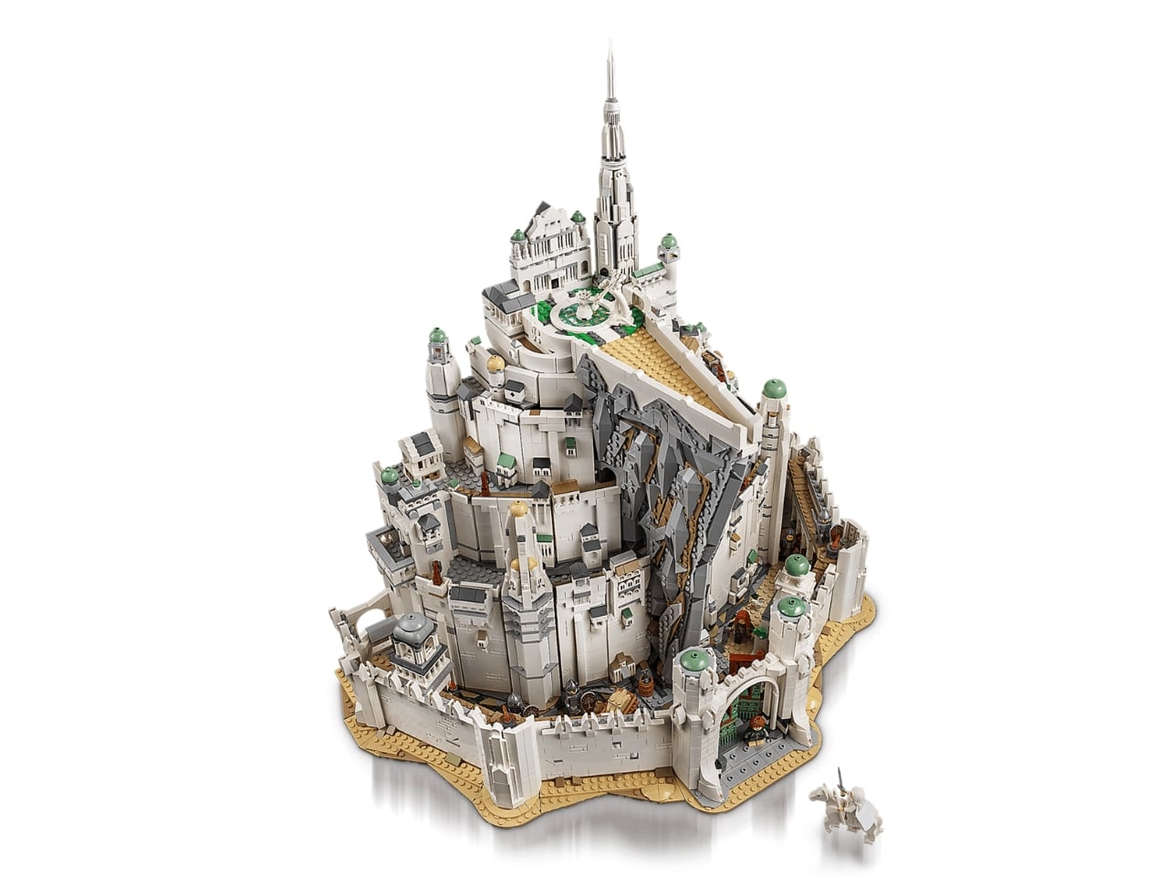
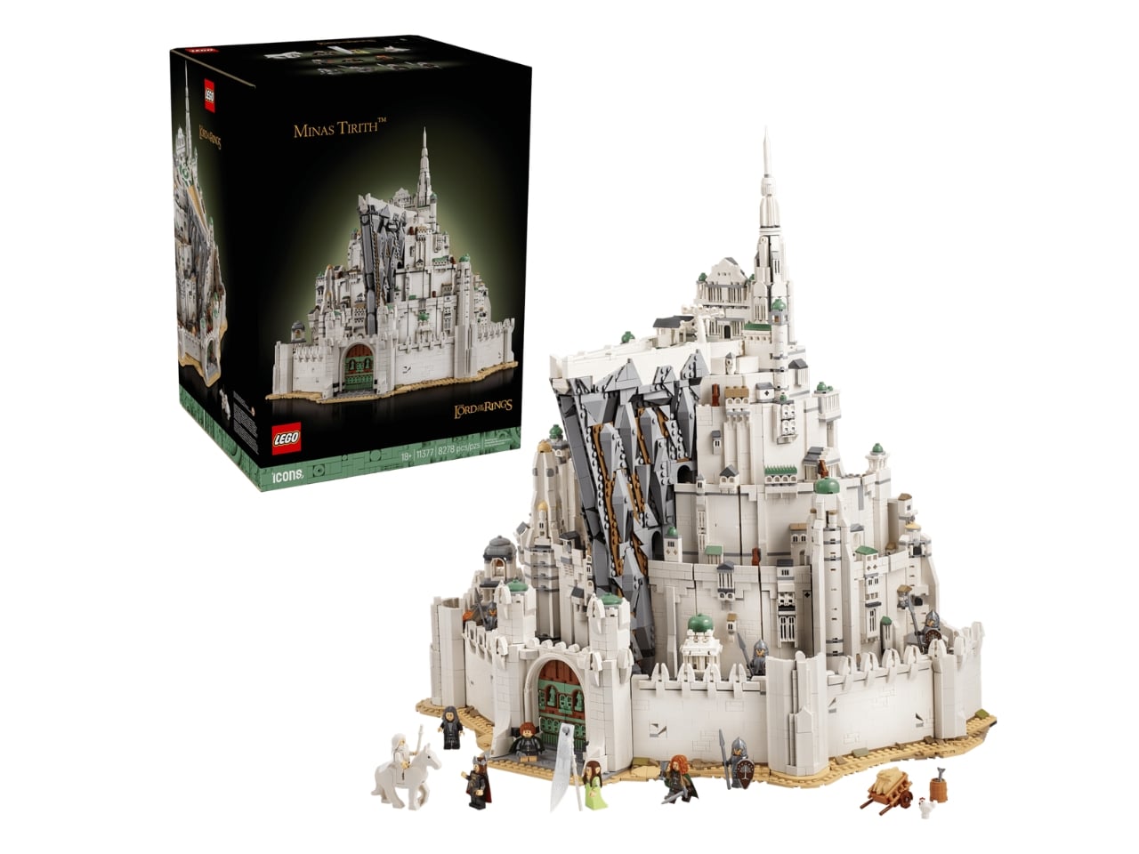
Let me set the scene. LEGO has been revisiting Middle-earth for a few years now, giving us stunning sets like Rivendell and Bag End. But Gondor, the seat of kings, the White City with its seven tiered levels built into the slopes of Mount Mindolluin, has been conspicuously absent. Fans noticed. They talked about it constantly. And now, LEGO has delivered not just a Gondor set, but the biggest Lord of the Rings set ever made, clocking in at 8,278 pieces.

Designer: LEGO
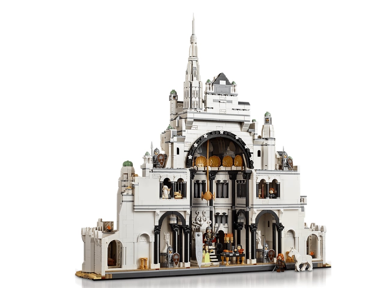
That number matters, but not just as a flex. It represents the sheer architectural complexity that Minas Tirith demands. The city isn’t a simple castle or a cozy hobbit hole. It’s a vertical metropolis layered with history and cinematic weight. To do it justice in brick form requires ambition, and LEGO clearly brought it.
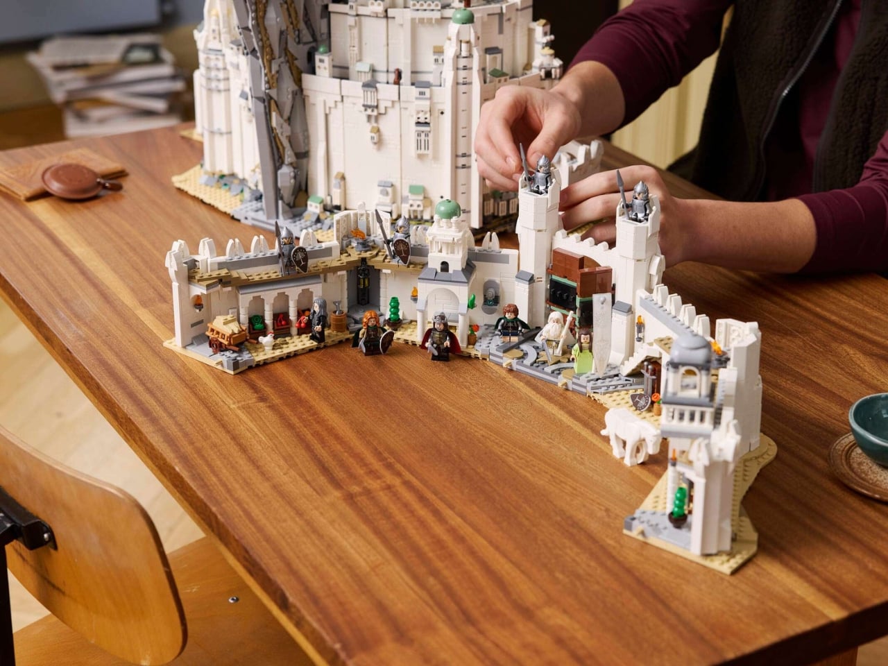
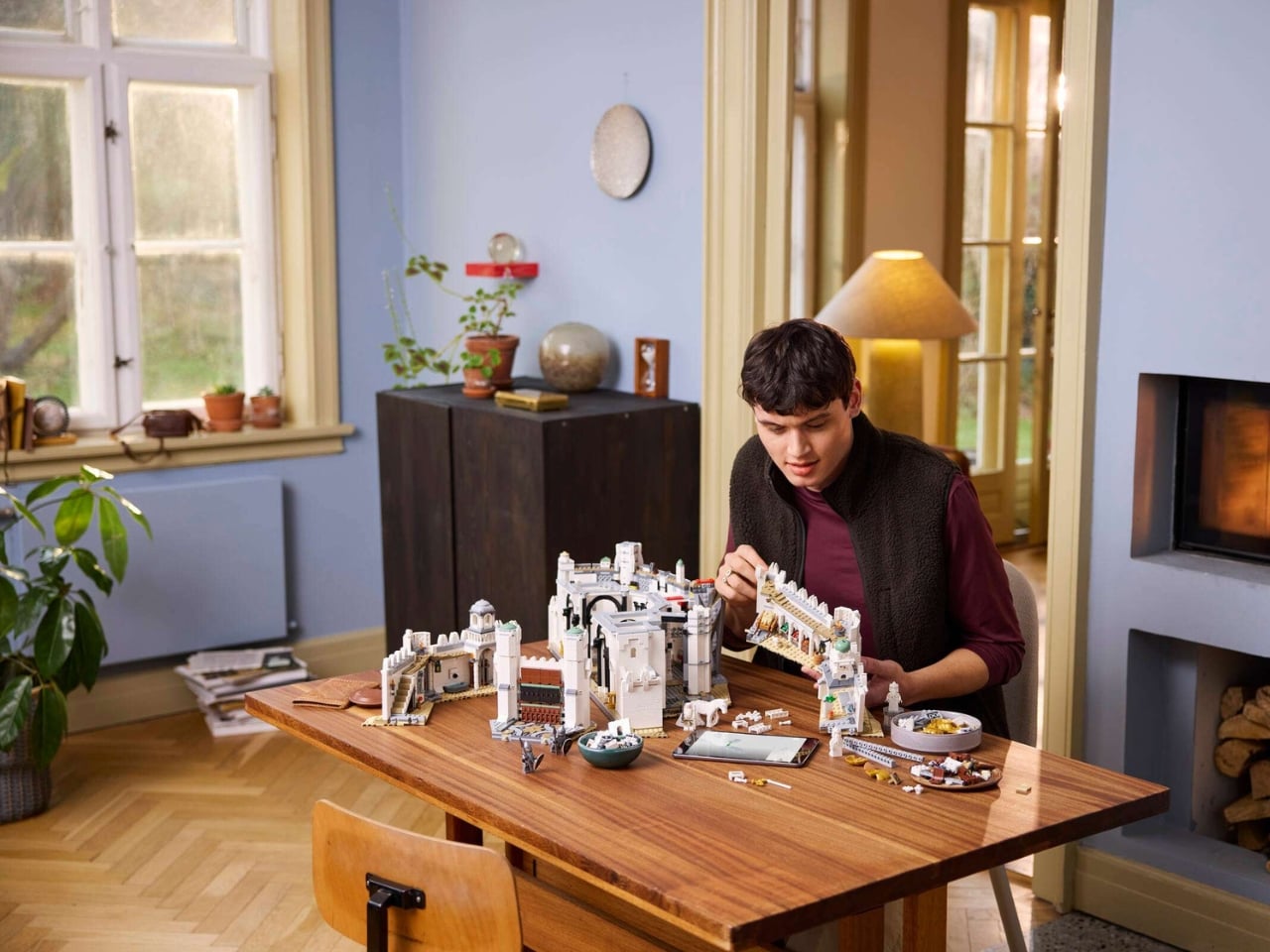
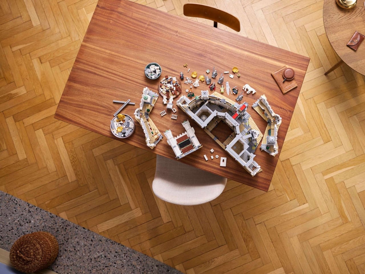
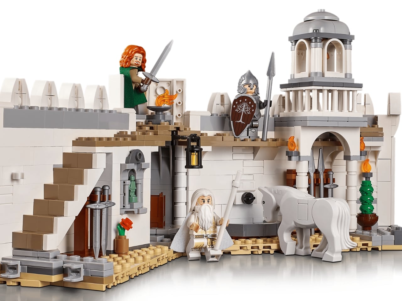
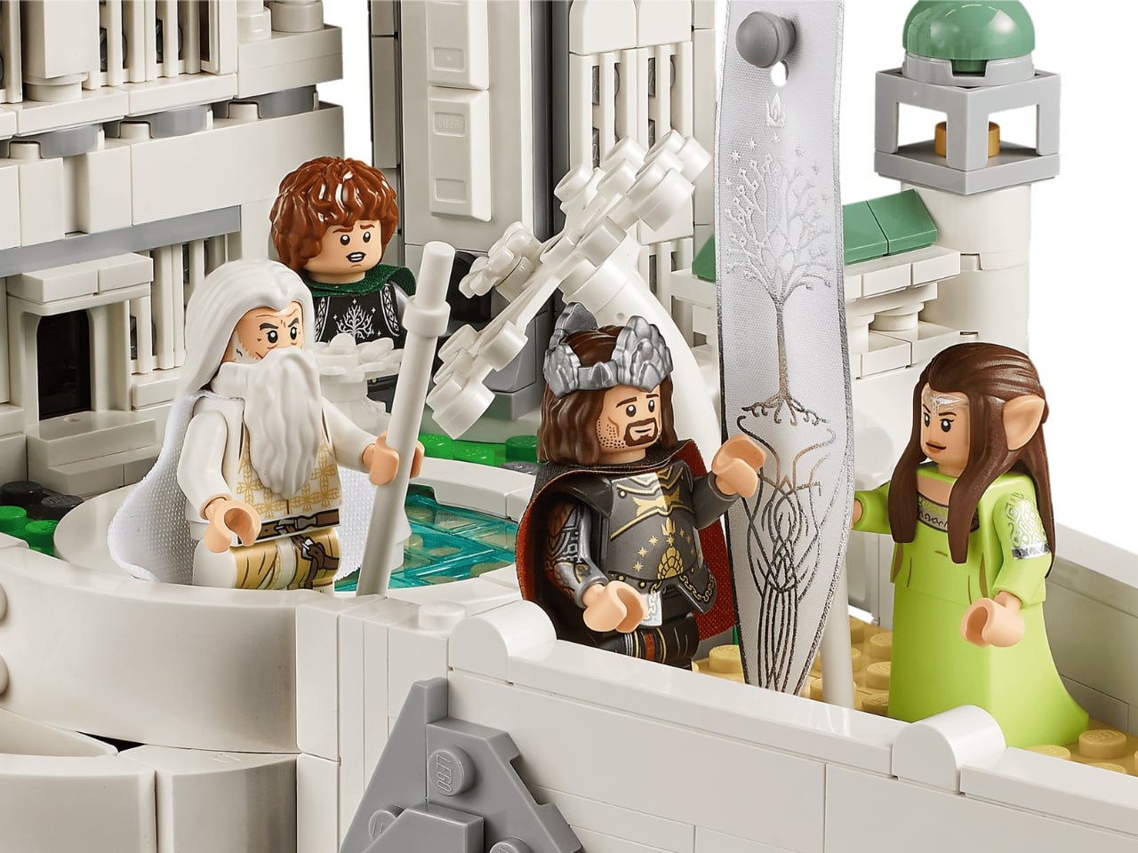
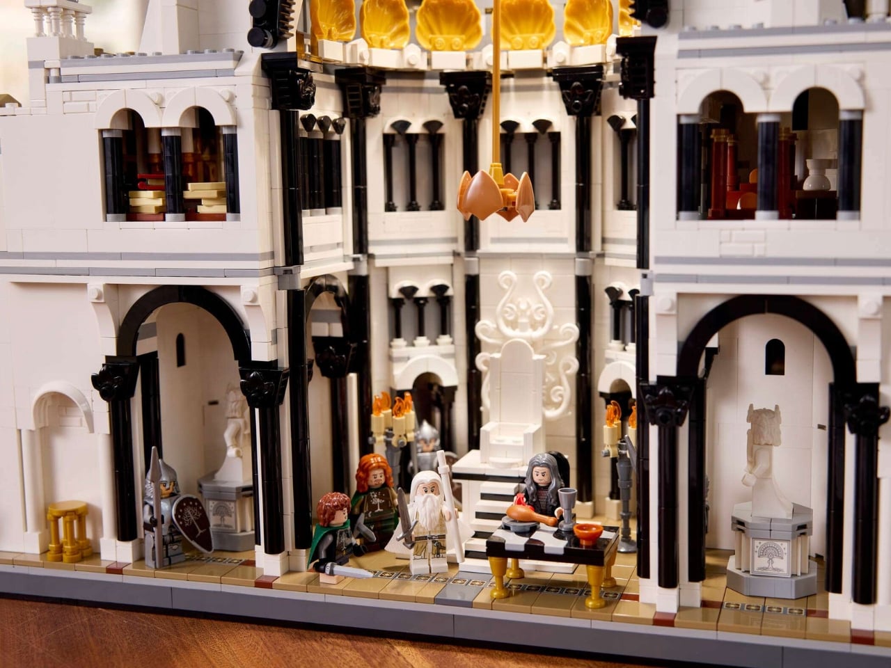
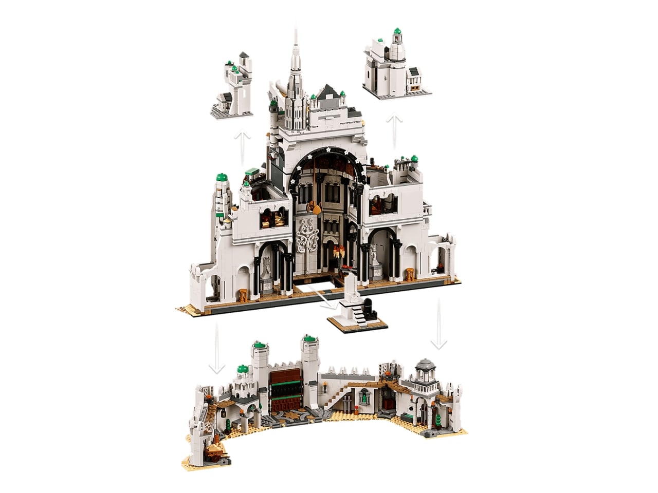
The design approach is where this set separates itself from anything in the LEGO LOTR lineup before it. It’s a hybrid-scale model, meaning the exterior reads as a gorgeous microscale city with all seven rings of the White City rendered in sweeping, detailed stonework, while the interior opens up to minifigure scale, complete with the grand throne room of the citadel. That’s not a gimmick. That’s genuinely clever design thinking that solves a real creative problem: how do you capture both the epic scale of the city and the human drama that happens inside it? Apparently, you do both at once.
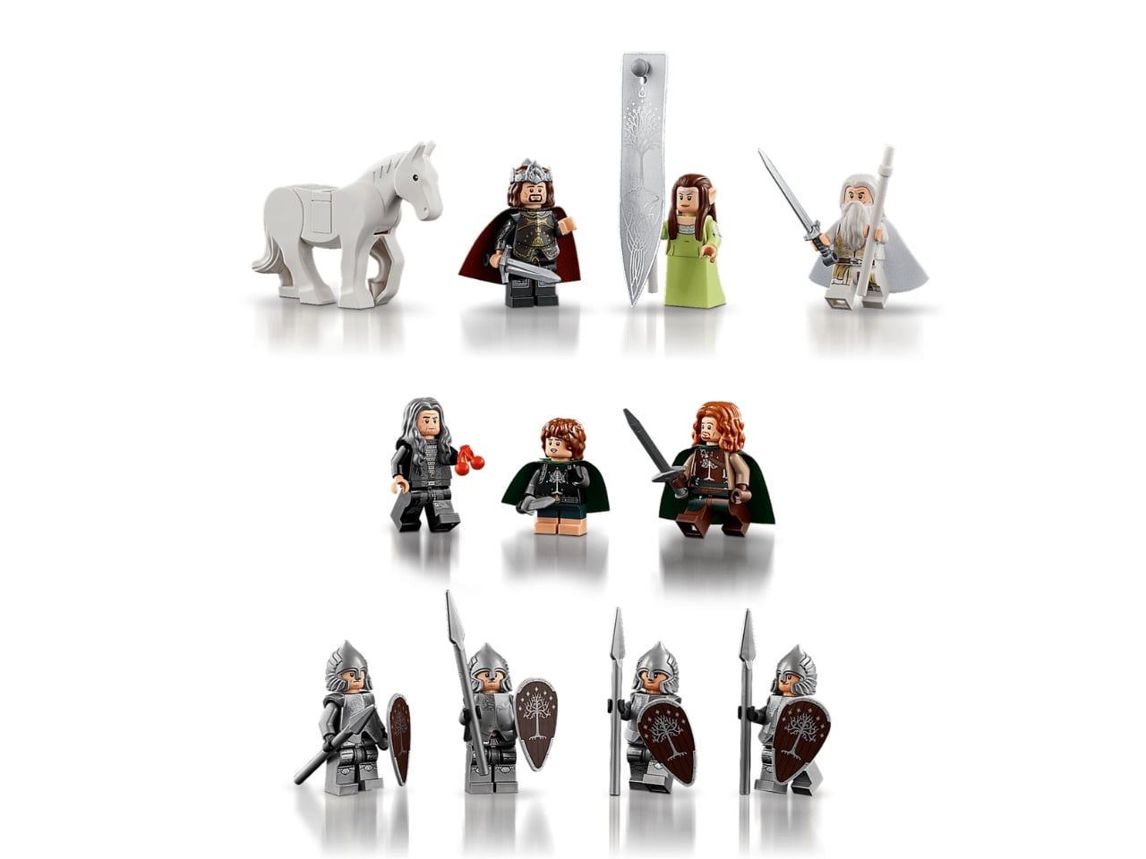
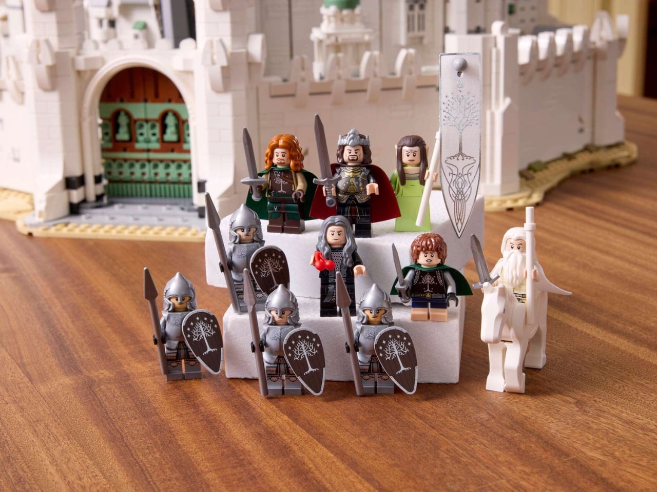
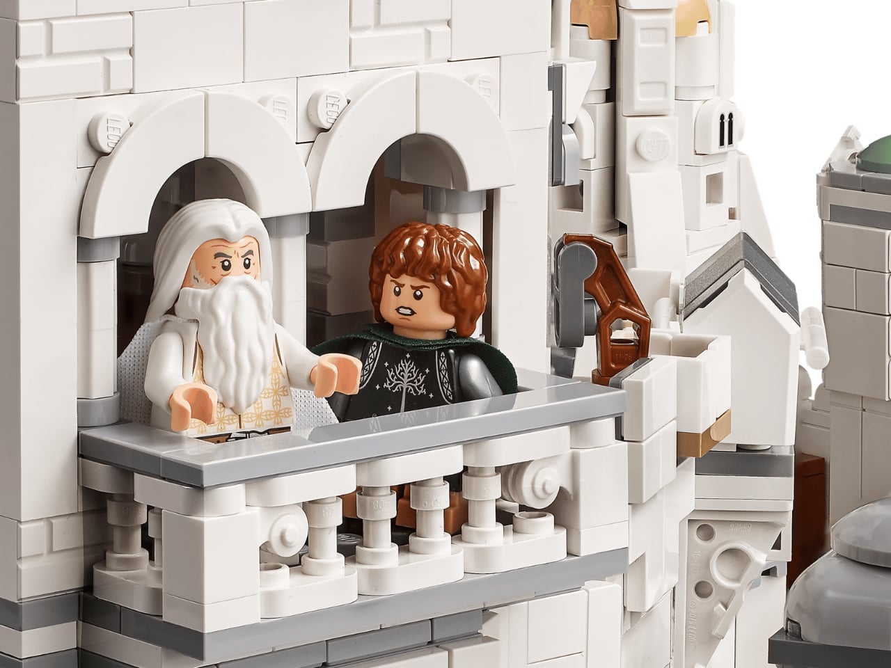
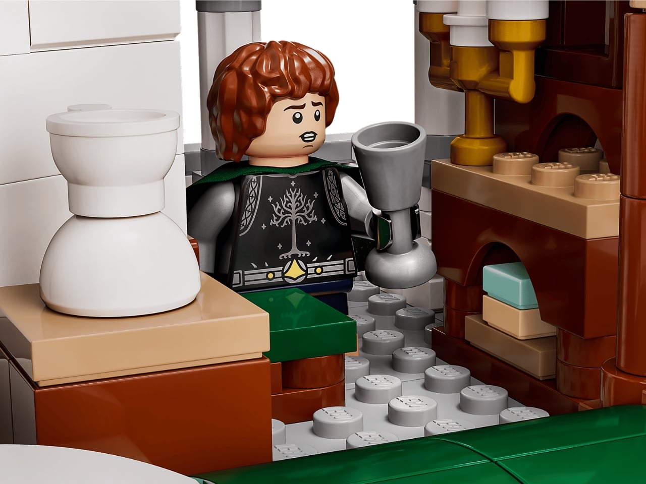
The minifigure lineup is also worth talking about. LEGO fans have had Frodo, Gandalf, and assorted Fellowship members for years. But characters tied specifically to Gondor, like Denethor, Faramir, and the Soldiers of Gondor, are appearing in LEGO form for the very first time. For collectors, that alone justifies serious attention. Aragorn as King Elessar, Arwen, Pippin, and even Shadowfax round out a roster that feels like a genuine celebration of the films’ later chapters rather than a rehash of the same familiar faces.
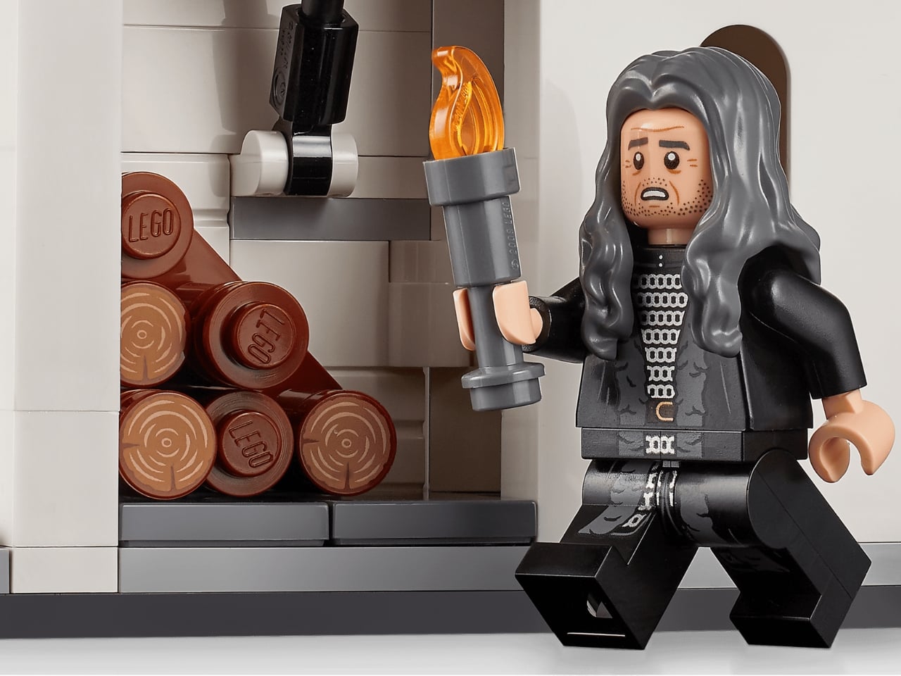
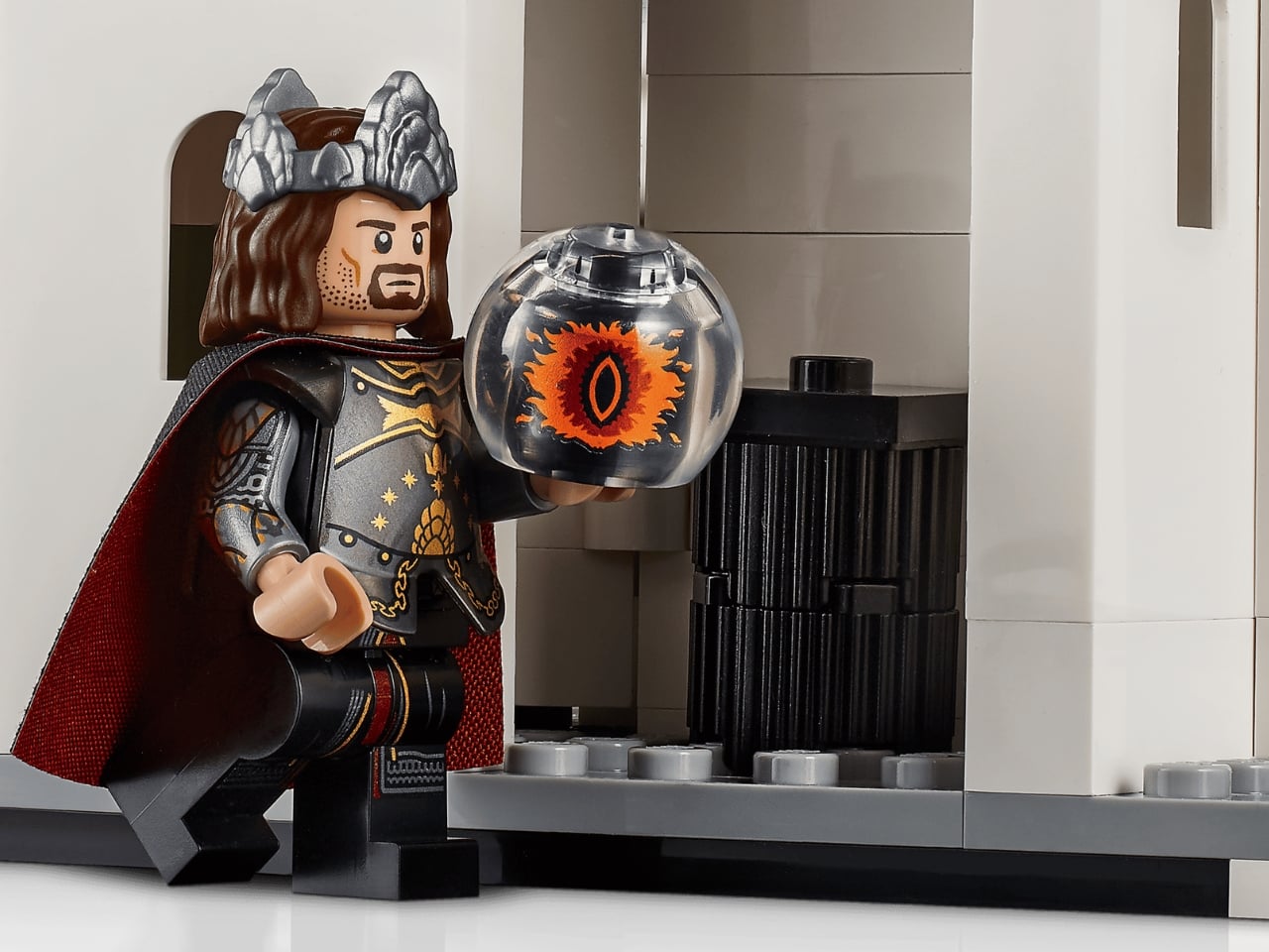
The no-sticker policy is a small detail that makes a big difference. Every decorated element on this set is printed. If you’ve ever wrestled with a sticker sheet at the end of a long build only to apply it slightly crooked and spend the next three years quietly furious about it, you’ll understand why this matters. It signals that LEGO treated this as a premium release, not just another box on the shelf.
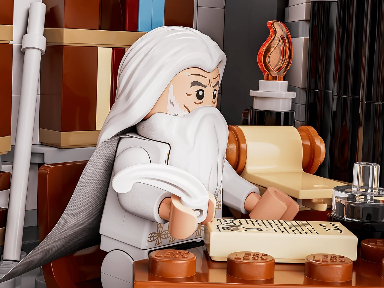
At $649.99, this is clearly not an impulse buy. It’s a considered purchase, the kind you plan for and look forward to. But when you break it down to roughly 7.8 cents per piece for a set of this complexity and cultural weight, the value argument holds up better than you’d expect. It’s also the sort of build that rewards patience, with the LEGO Builder app offering 3D rotation, zoom, and step-by-step digital instructions to make the process feel guided rather than overwhelming.
LEGO Insiders get early access on June 1, 2026, with general availability following on June 4. Early buyers will also receive the exclusive Grond GWP, the massive battering ram from the Battle of Pelennor Fields, while supplies last. That’s a thoughtful bonus that adds real narrative context to the display.
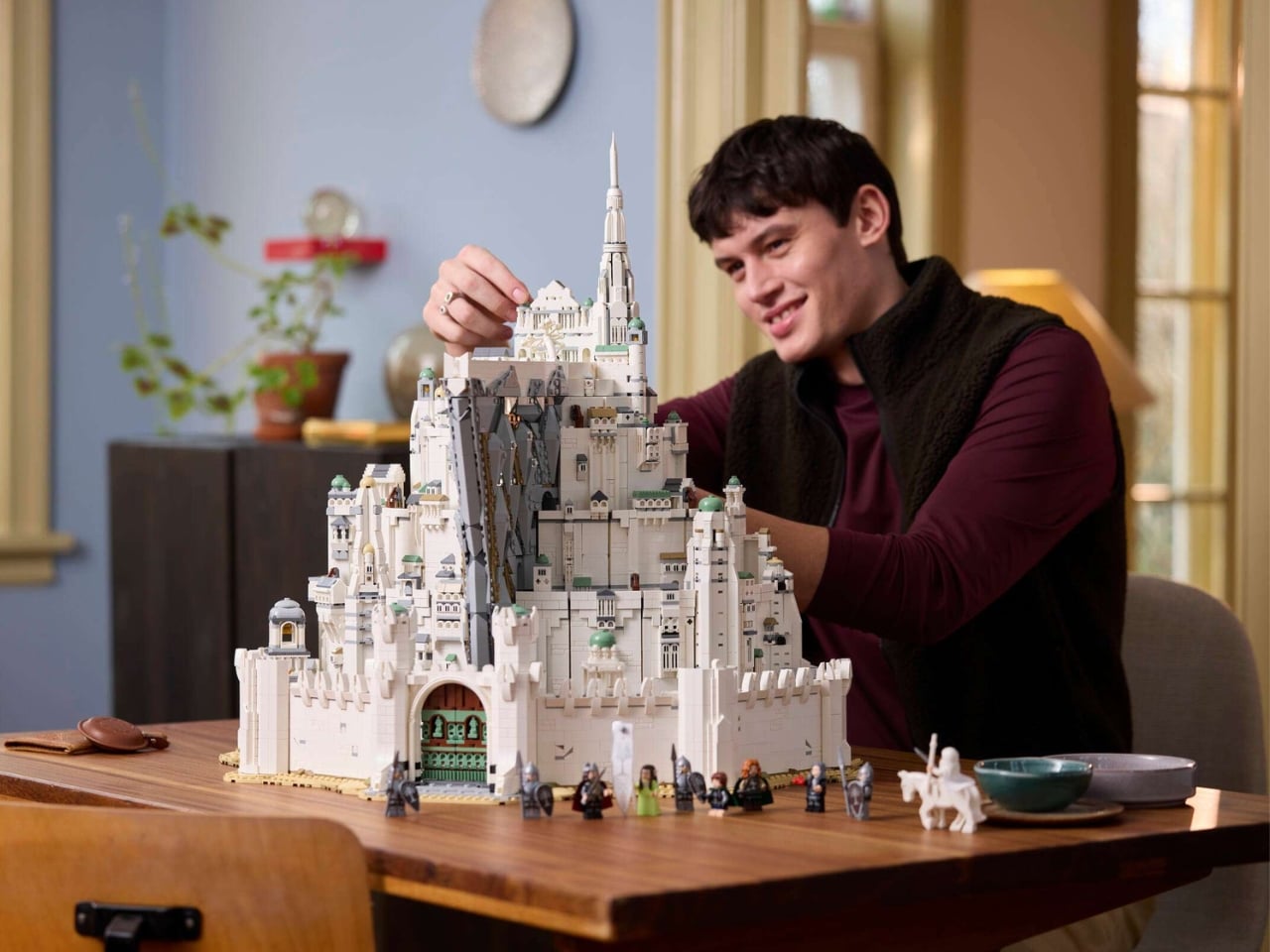
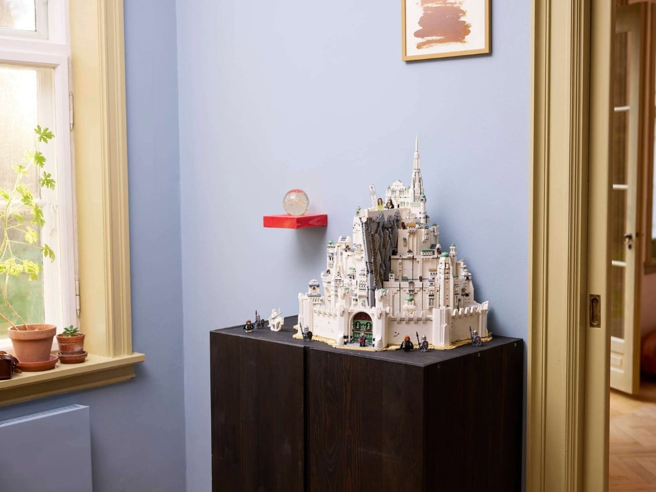
Minas Tirith has always been one of cinema’s most iconic pieces of production design. The fact that you can now own a version of it, built brick by brick with your own hands and displayed at nearly 24 inches tall, feels like the kind of thing that would have seemed impossible not long ago. LEGO made it real, and it looks like they did it right.
The post The Biggest Lord of the Rings LEGO Set Ever Just Dropped first appeared on Yanko Design.
PLANK Made a Folding Chair You’d Never Want to Put Away

Folding chairs have a reputation problem. For most of us, they conjure up images of bare banquet halls, plastic legs scraping across gymnasium floors, or that wobbly stack in the back of a relative’s garage. They are furniture by necessity, not by choice. So when a design studio manages to make one that you’d genuinely want to keep out in your living room, it’s worth paying attention.

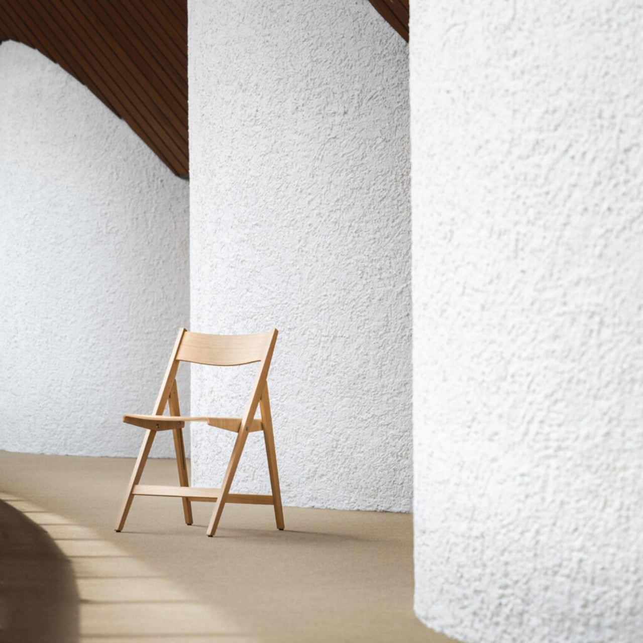
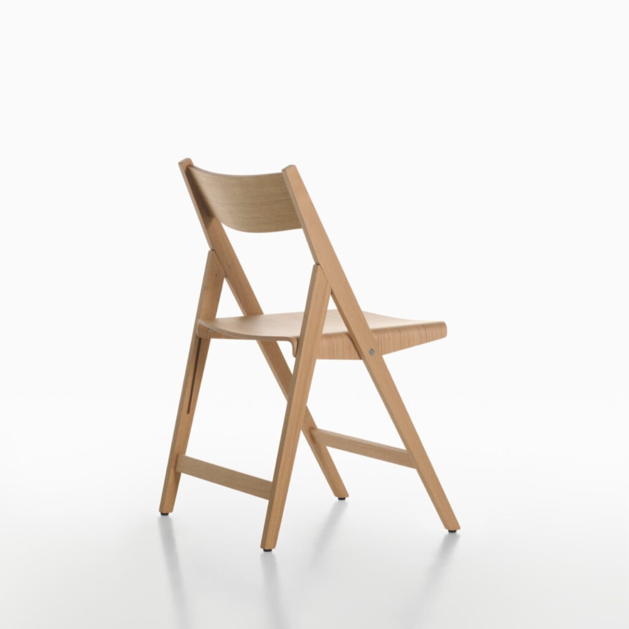
That’s exactly what PLANK and designers Matteo Thun and Benedetto Fasciana have done with the Theo folding chair, quietly one of the most interesting pieces to come out of Salone del Mobile Milano 2026 this past April. Not because it does something shocking or avant-garde, but because it does something much harder: it makes the utilitarian feel considered.

Designers: Matteo Thun and Benedetto Fasciana for PLANK

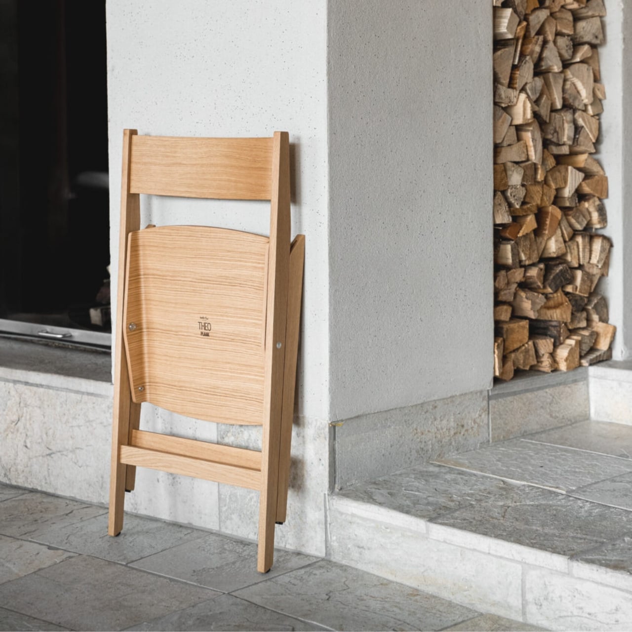
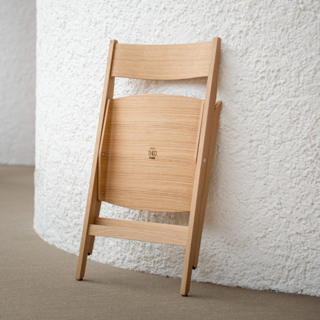
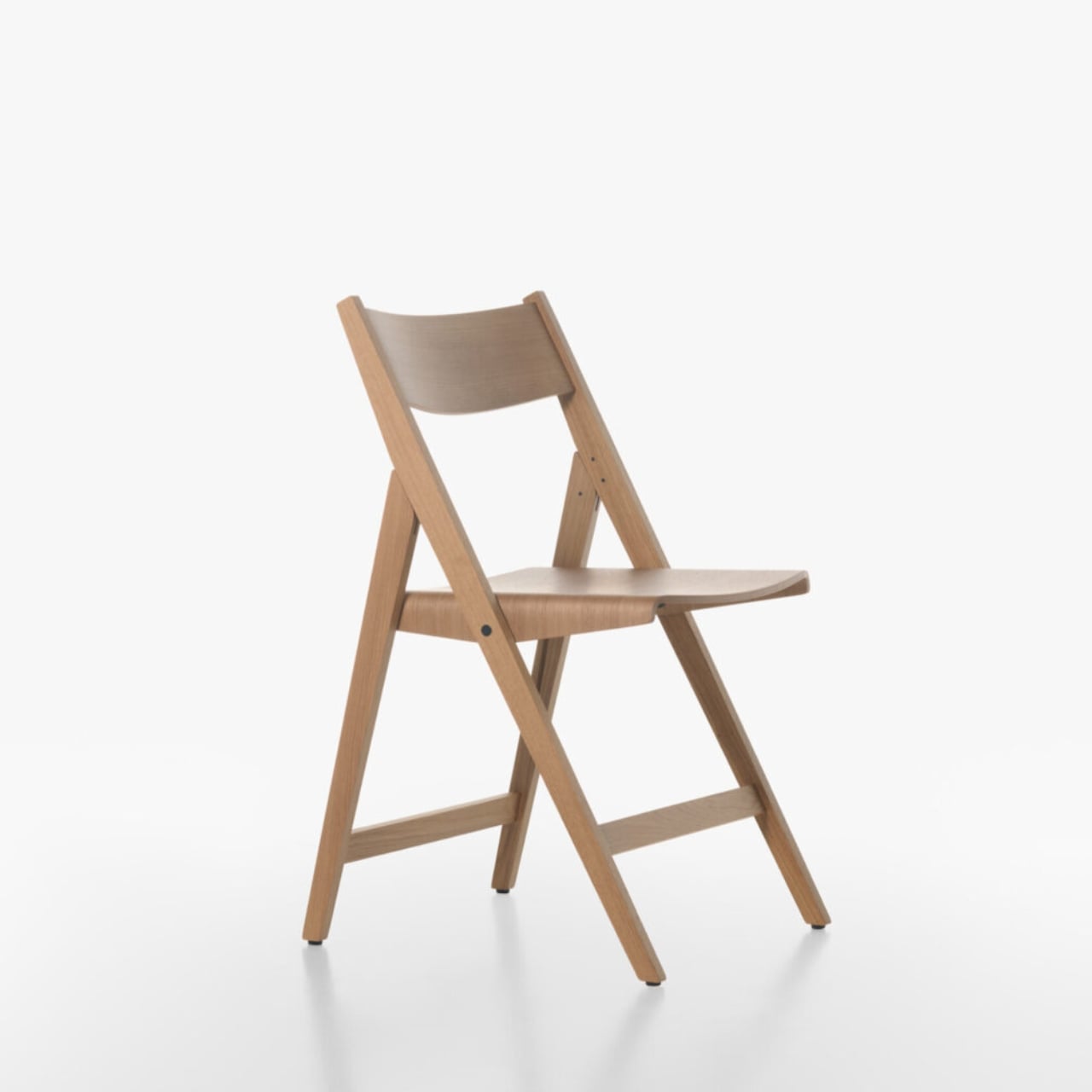
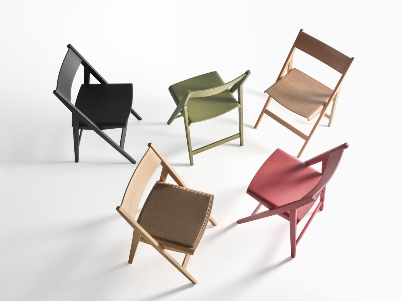
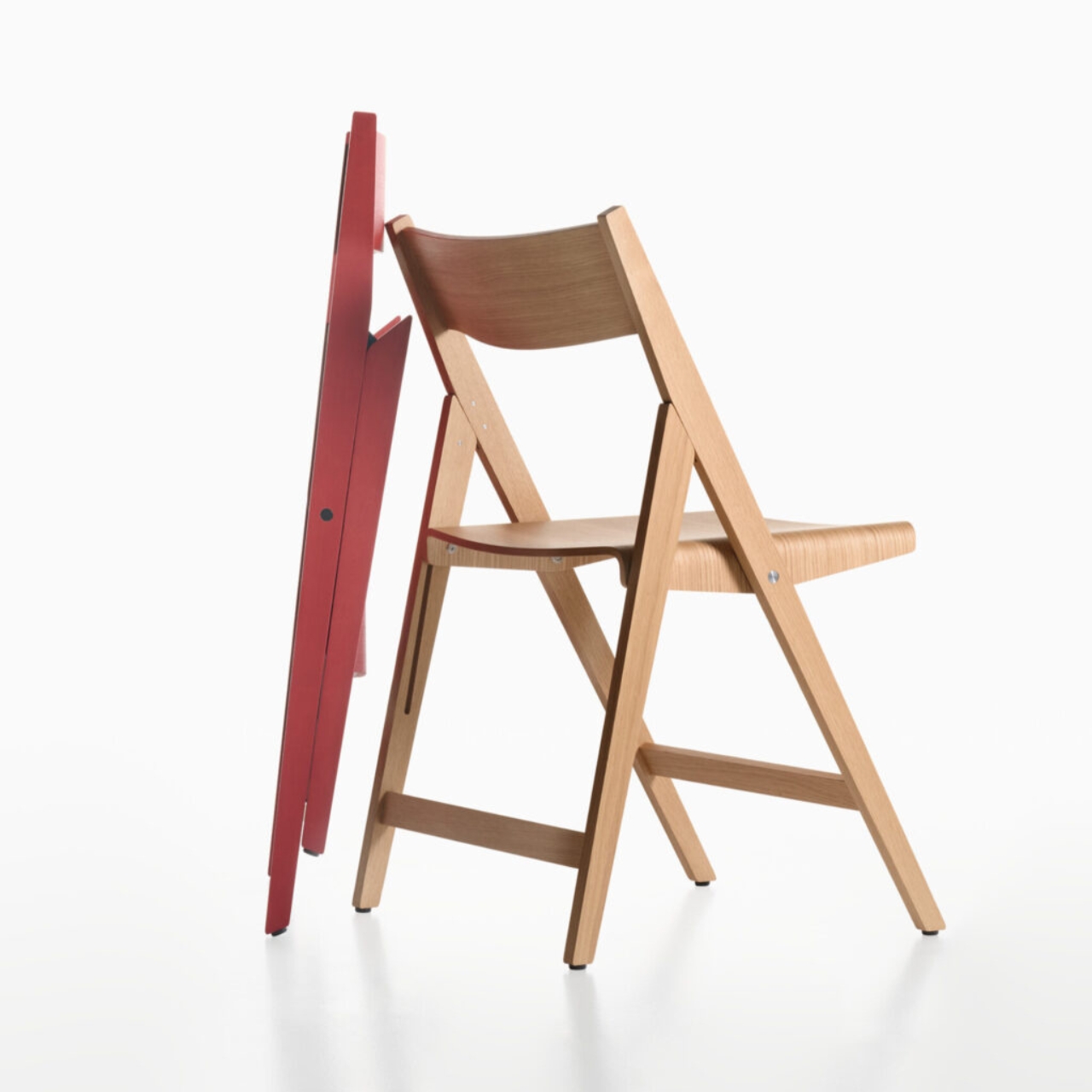
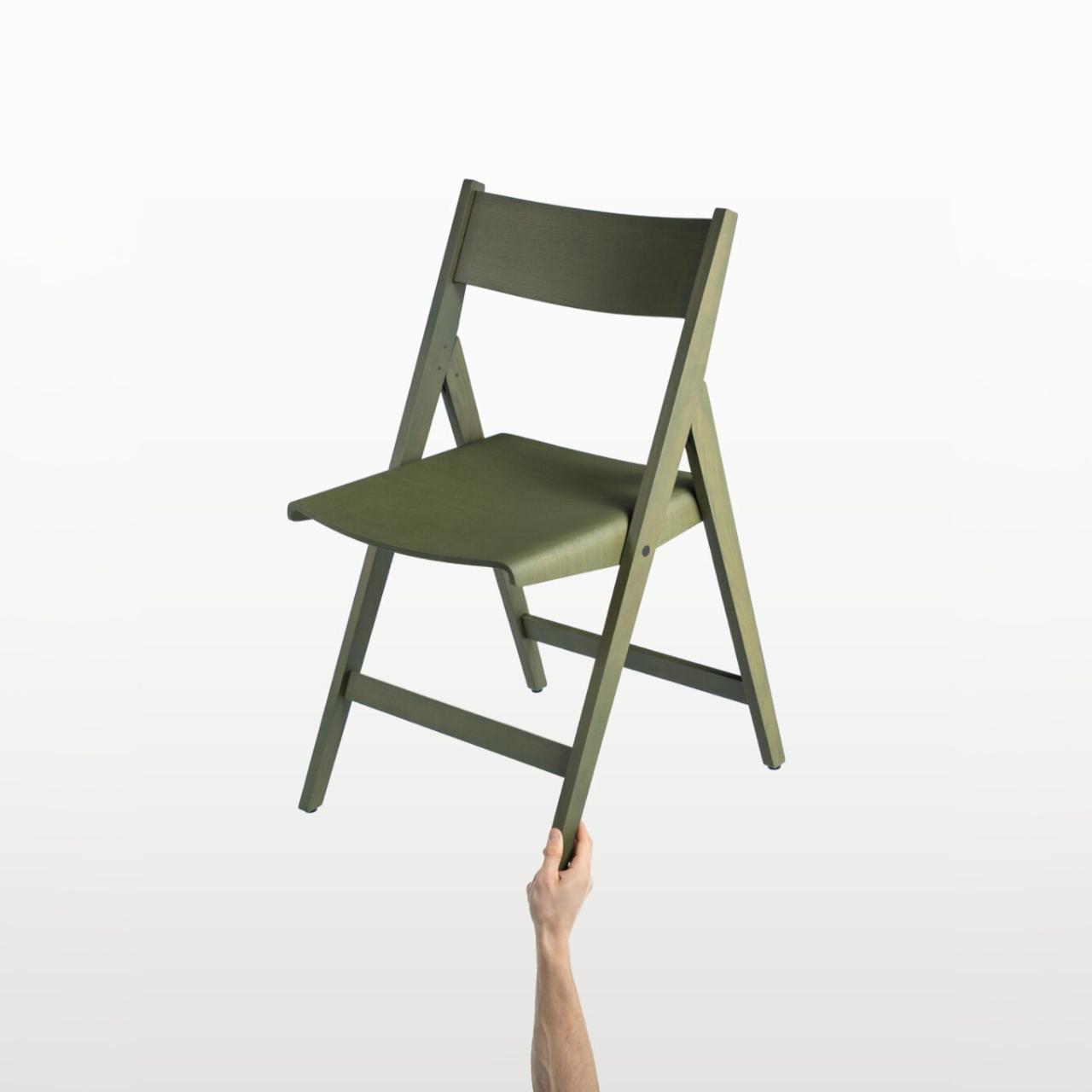
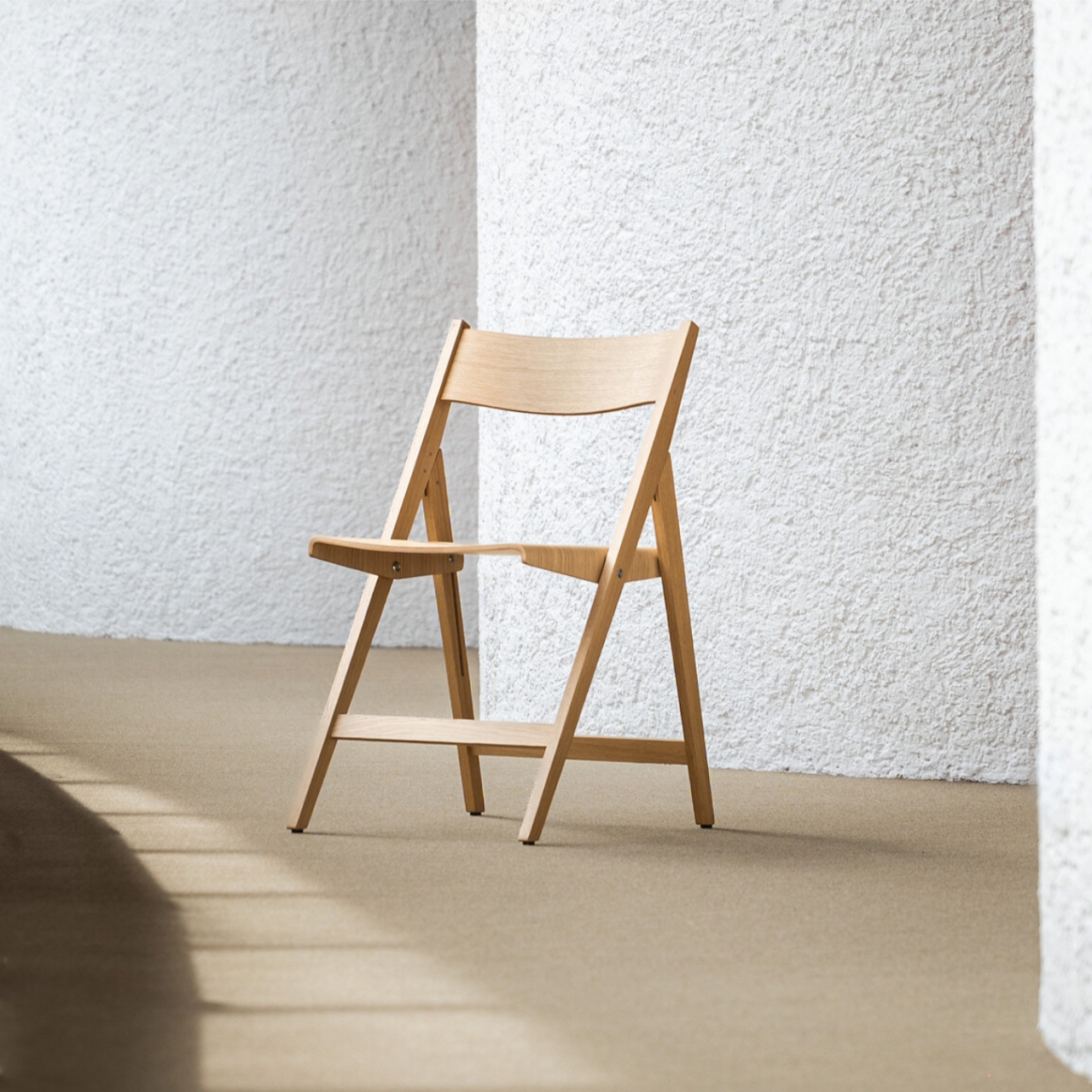
PLANK has been at this since 1953, and that legacy shows in how Theo is built. The frame is solid oak, which already puts it in a different category from the folding chairs most of us know. The seat and backrest are made from molded plywood, shaped with a gentle curve that reads as both ergonomic and graceful. The folding mechanism uses natural or black oxidized stainless steel, and it integrates into the structure so cleanly that you almost forget it’s a functional joint and not just a detail. The chair opens and closes without any of the awkward fuss you’d expect. It simply works, and it looks good doing it.

I’ve always believed that the real test of a design isn’t how it performs in ideal conditions but how well it disappears into a life that isn’t perfectly curated. Most furniture is designed with a room in mind. Theo was designed with reality in mind. It’s built for contract spaces, meaning restaurants, event venues, conference rooms, places where chairs get used hard and stored constantly. But the visual language doesn’t give that away. If you didn’t know, you’d assume it was a permanent resident of whatever room it happened to be in.

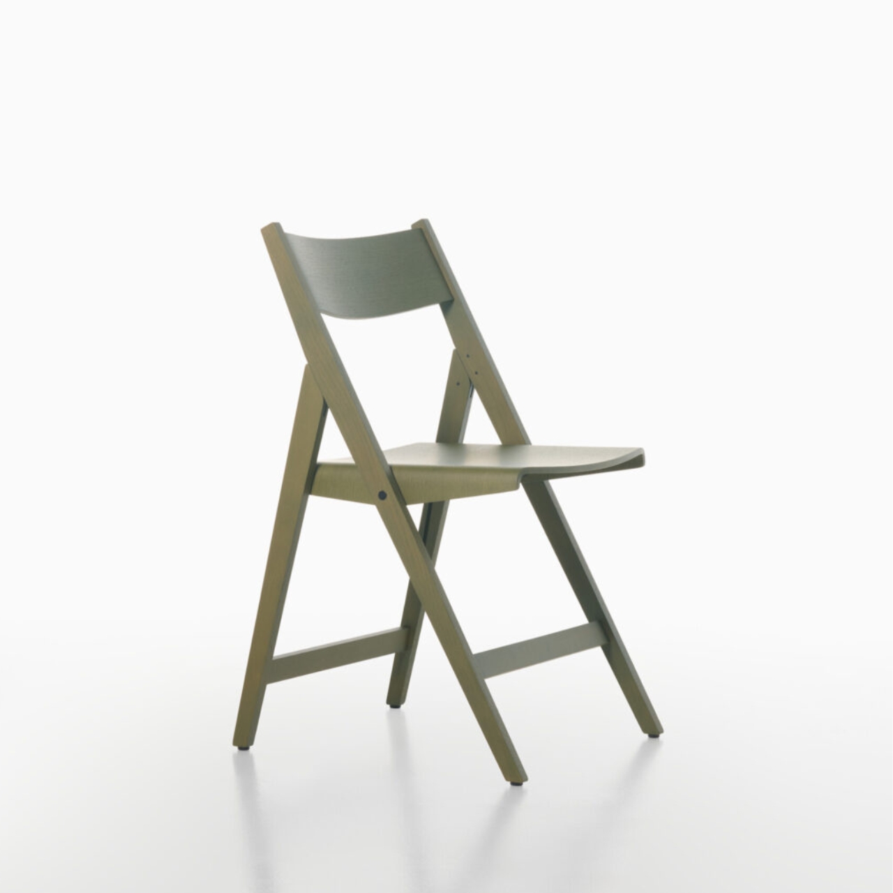
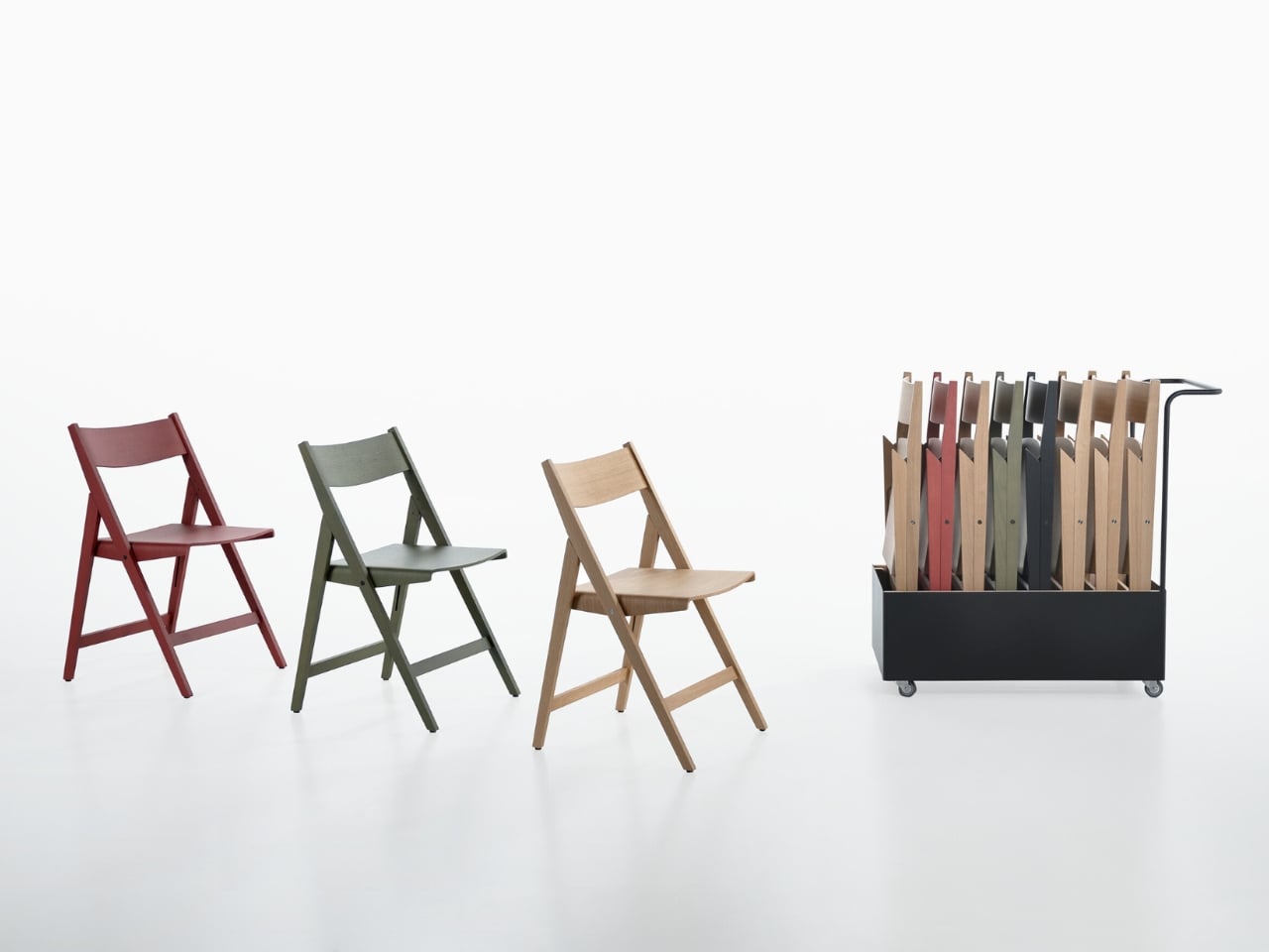
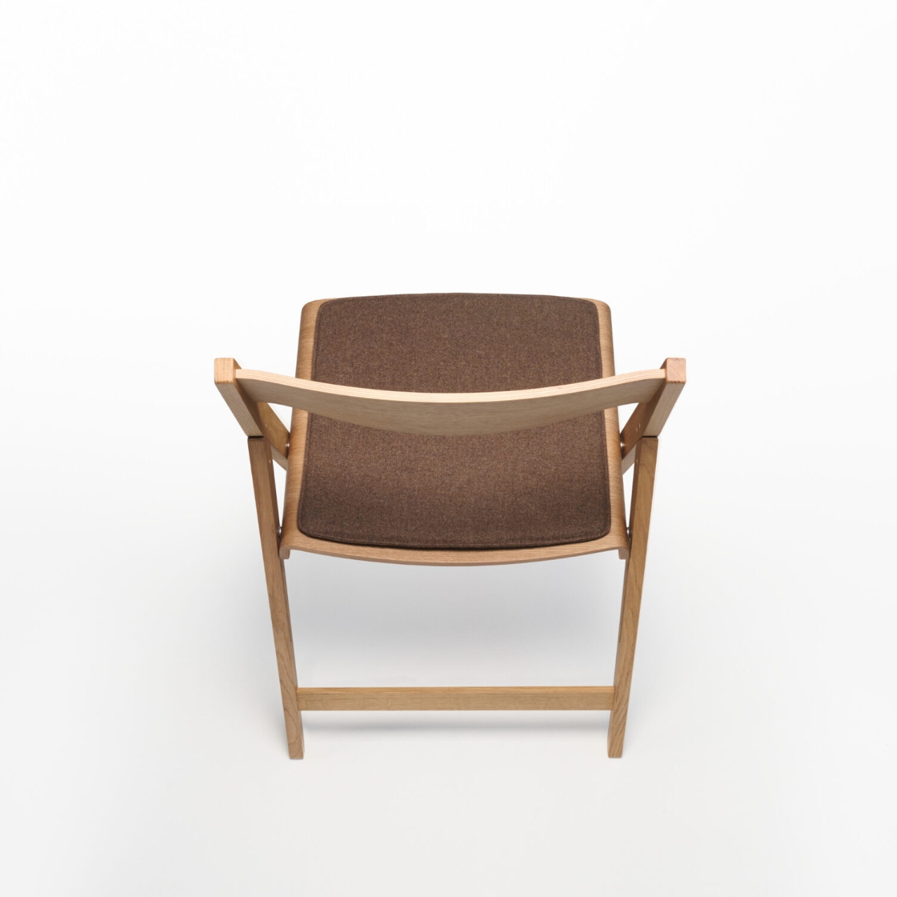
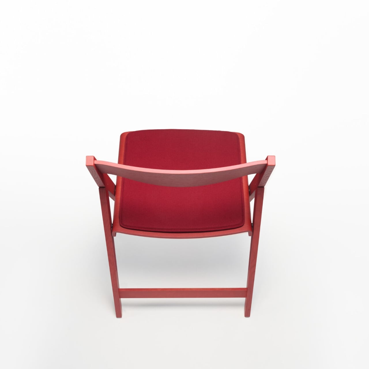
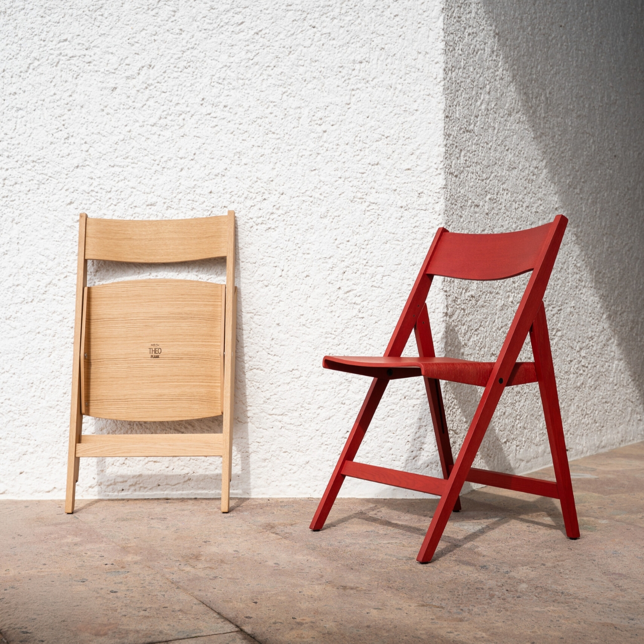
The finish options only add to that versatility. You can get Theo in natural or stained oak veneer, or in a matte open-pore lacquer in Walnut, Brown Red, Olive Green, or Black. Each feels deliberate rather than decorative. The seat cushion options go even further: a 100% wool Moessmer Dolo Loden fabric in four colors, or Dani Florida leather in 96 colors. That last number sounds excessive until you realize it’s actually kind of brilliant. It’s the difference between a chair that fits into a space and one that was made for it.

There’s also a companion Transport Trolley that was developed alongside Theo, designed to stack and move up to eight chairs at once. It’s a practical addition that rounds out the system nicely, especially for the hospitality and event sectors where Theo will likely see the most use. But even outside those contexts, the Trolley signals something important about how PLANK approaches design: everything has to work together, not just look good in isolation.

Matteo Thun is no stranger to pieces that carry a quiet authority. He’s had a long career built on the idea that good design should be sustainable, functional, and beautiful in equal measure, and Theo reflects all three. The fact that PLANK uses solid wood and always-recyclable materials isn’t incidental. It’s the whole point. Longevity is designed in from the start, not marketed as an afterthought.

What makes Theo genuinely compelling is how little it asks of you. It doesn’t demand a particular aesthetic or a specially styled room. It doesn’t need to be the centerpiece. It can be stacked in a closet and brought out for dinner parties, or it can live at the head of a table year-round, and it holds up either way. That’s a rare quality in furniture, and it’s even rarer in a folding chair.

The best designs tend to solve problems you didn’t realize had elegant solutions. Theo is a folding chair that looks like it was never trying to be anything else, and that, more than any other detail, is the thing that makes it worth talking about.

The post PLANK Made a Folding Chair You’d Never Want to Put Away first appeared on Yanko Design.
A Pencil Sharpener Inspired This Brilliant Camping Cutlery Tool

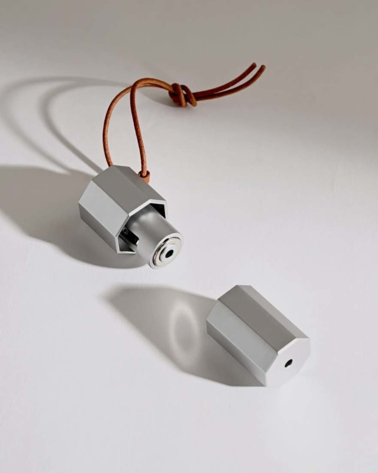
There are probably times when you’re in desperate need of chopsticks when you’re camping out or somewhere where you don’t have access to it. Well apparently now you’ll be able to make your own, as long as there are pieces of wood around you. I’ve seen a lot of clever camping gear over the years, but the Chopsticks Maker by Mario Tsai stopped me mid-scroll in a way most design objects don’t. It’s such a simple idea that you almost feel embarrassed for not thinking of it yourself.

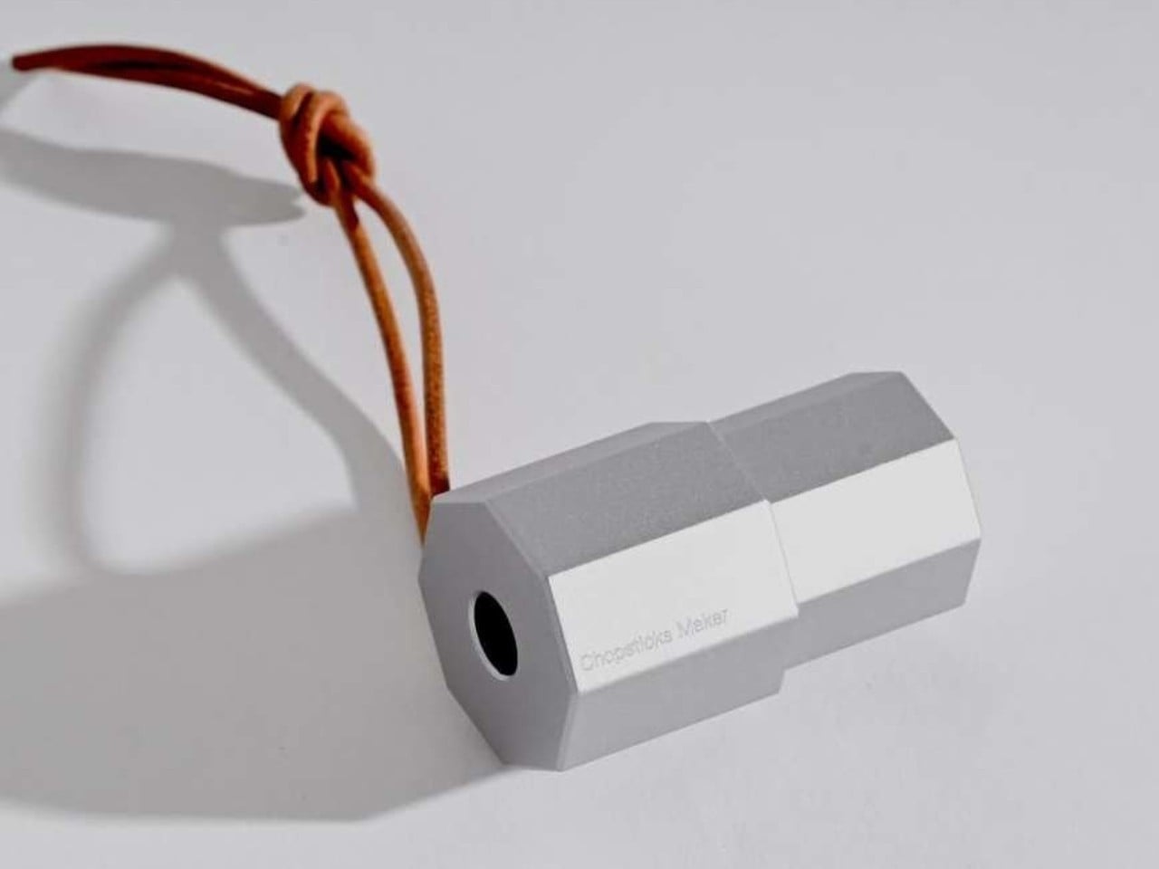
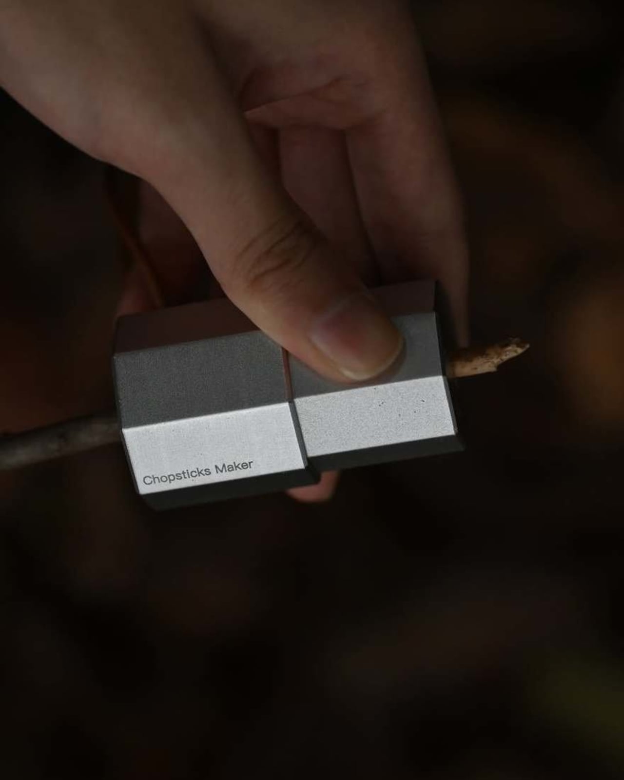
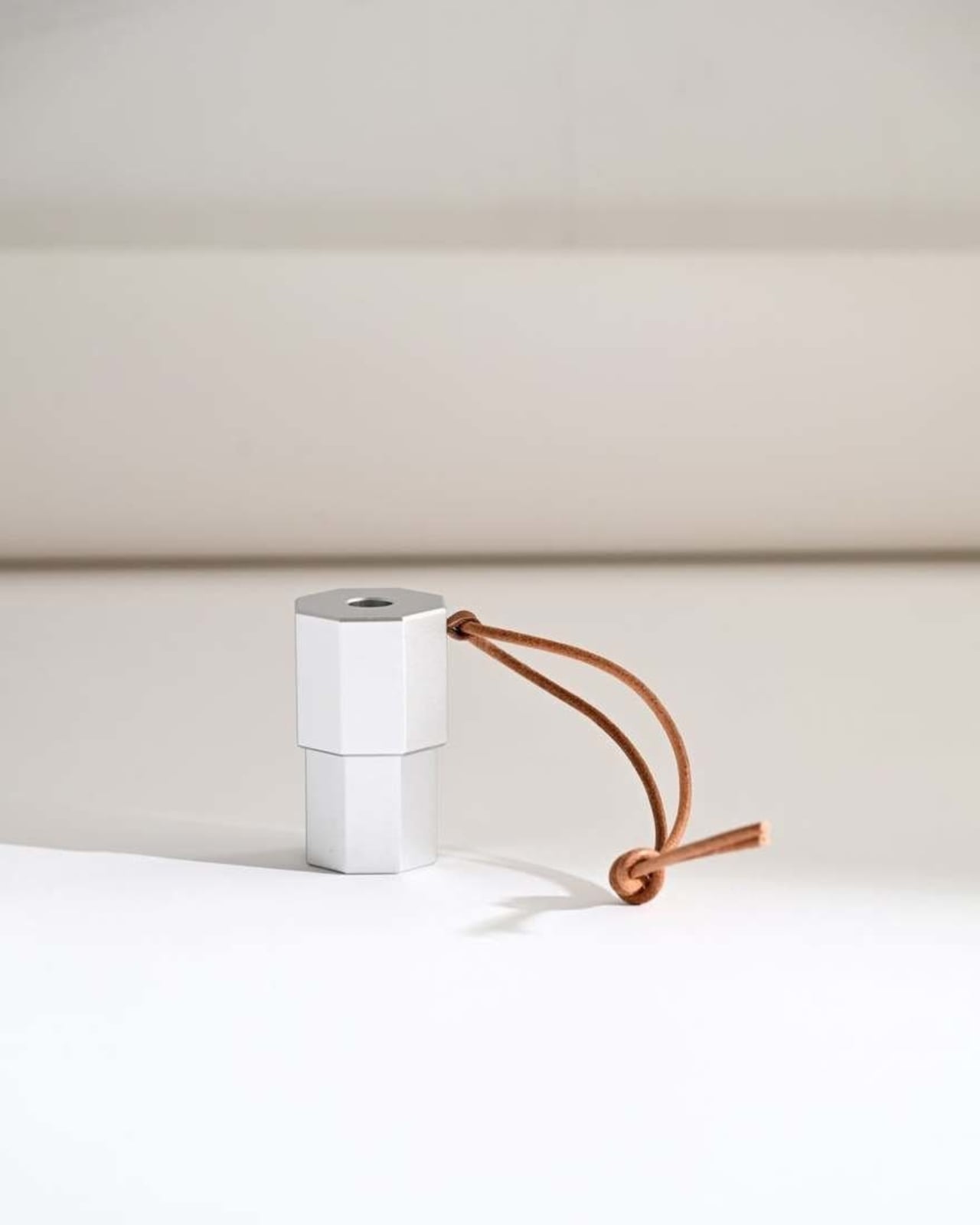
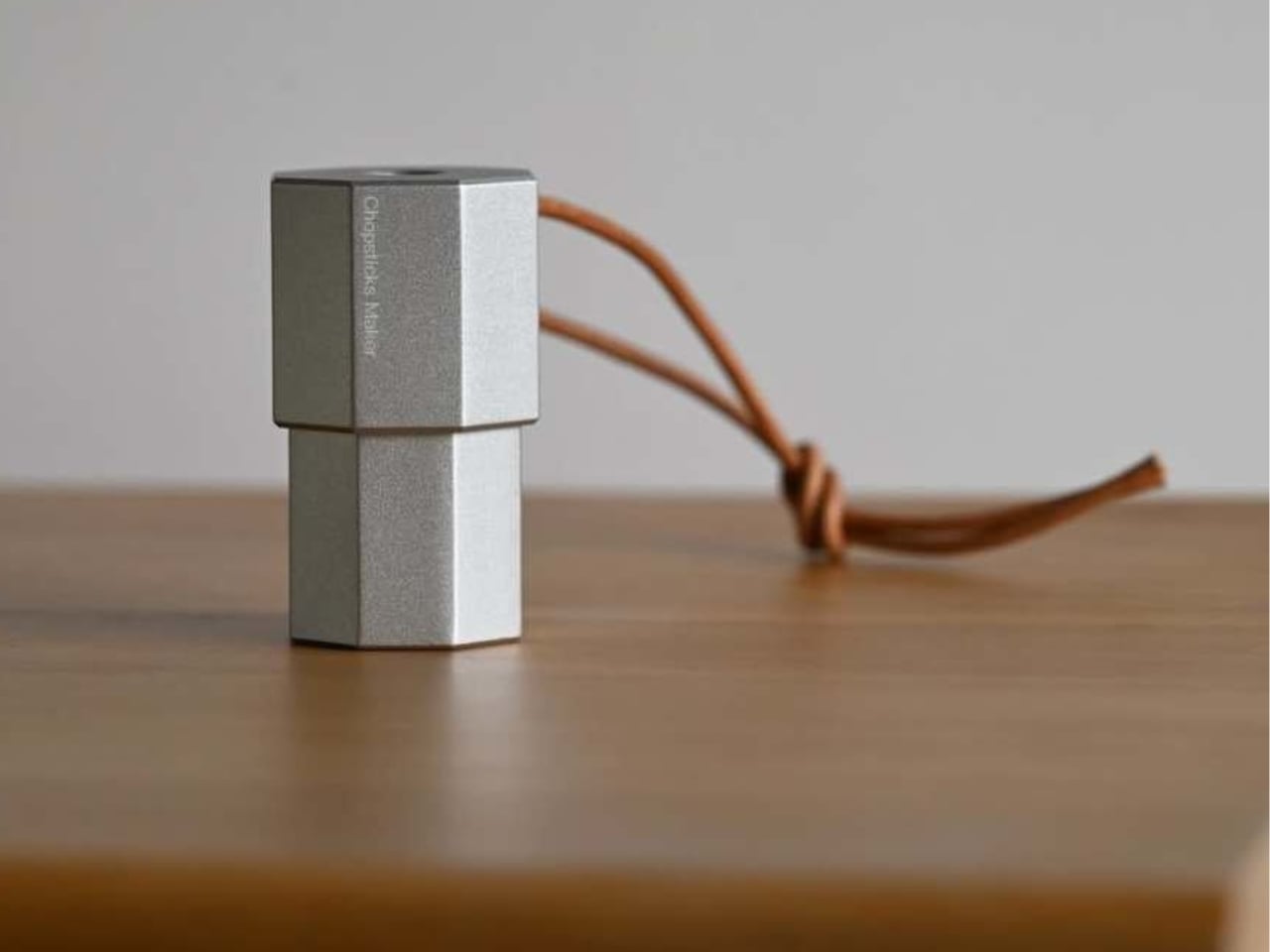
The concept is exactly what it sounds like. The Chopsticks Maker is a miniature portable tool that lets you carve chopsticks out of twigs found at a campsite. You feed a stick into the device, turn it, and out comes a pair of chopsticks, shaped and ready to use. You eat your meal, leave the utensils on the ground, and they biodegrade. No waste, no washing up, no plastic rattling around at the bottom of your pack. Just a tiny tool, the forest floor, and dinner.

Designer: Mario Tsai

What makes the design particularly satisfying is where Tsai found his inspiration. The Chopsticks Maker is a direct reinterpretation of the humble pencil sharpener. That’s a beautiful design move. The pencil sharpener is one of those objects so ordinary it’s practically invisible, and yet its mechanics are perfectly suited to transforming a raw stick into something shaped and functional. Tsai took that overlooked tool and asked what else it could do. The answer turned out to be surprisingly elegant.

Tsai is a Shanghai-based industrial designer known for work that tends to be thoughtful rather than flashy. The Chopsticks Maker was presented at Milan Design Week 2026, where it appeared as part of a broader project exploring chopsticks as cultural objects. The project borrowed its guiding philosophy from the old proverb: give a man a fish and you feed him for a day, teach a man to fish and you feed him for a lifetime. The Chopsticks Maker reframes that idea around something as basic as cutlery. You don’t need to pack utensils. You just need to know how to make them.

That principle, self-reliance through tools rather than stuff, is quietly radical in a market flooded with gear that promises to solve every outdoor problem by adding more weight to your bag. The best camping products I’ve come across are the ones that give you a skill or a method, not just a gadget. The Chopsticks Maker fits that description well. It’s lightweight, it requires nothing except whatever the ground around you offers, and the byproduct, the wood shavings, can even double as kindling for starting a fire. Someone spotted that in the comments when the project was shared online, and it’s the kind of observation that makes a well-considered object feel even more complete.

I’ll admit there’s a practical question hanging over it. Not every campsite offers the right kind of wood. Hardwood twigs will produce sturdier chopsticks; softer, pithy stems might not hold up mid-meal. And chopsticks do require some coordination. I can imagine plenty of people trying this out for the first time around a campfire and spending more time chasing noodles than eating them. But that’s also kind of the point, isn’t it? Part of what makes outdoor cooking memorable is the improvisation, the slight inconvenience, the small triumph of a meal made with whatever you had on hand.

The Chopsticks Maker doesn’t pretend to replace your fork. It offers a different relationship with the tools you eat with, one that’s rooted in resourcefulness rather than convenience. And at a moment when the outdoor industry keeps defaulting to titanium and synthetic and ultra-engineered everything, a device that points you back toward a tree branch feels like a genuine statement.

It also says something interesting about design itself. The best ideas don’t always come from inventing something new. Sometimes they come from looking at an object that’s been sitting on your desk since primary school and asking what it might become. Mario Tsai looked at a pencil sharpener and saw cutlery. That’s the kind of thinking that tends to produce work worth paying attention to.

The post A Pencil Sharpener Inspired This Brilliant Camping Cutlery Tool first appeared on Yanko Design.
MIT Turned 12 Labubu Heads Into a Robot and It’s Watching You

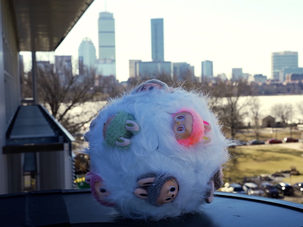
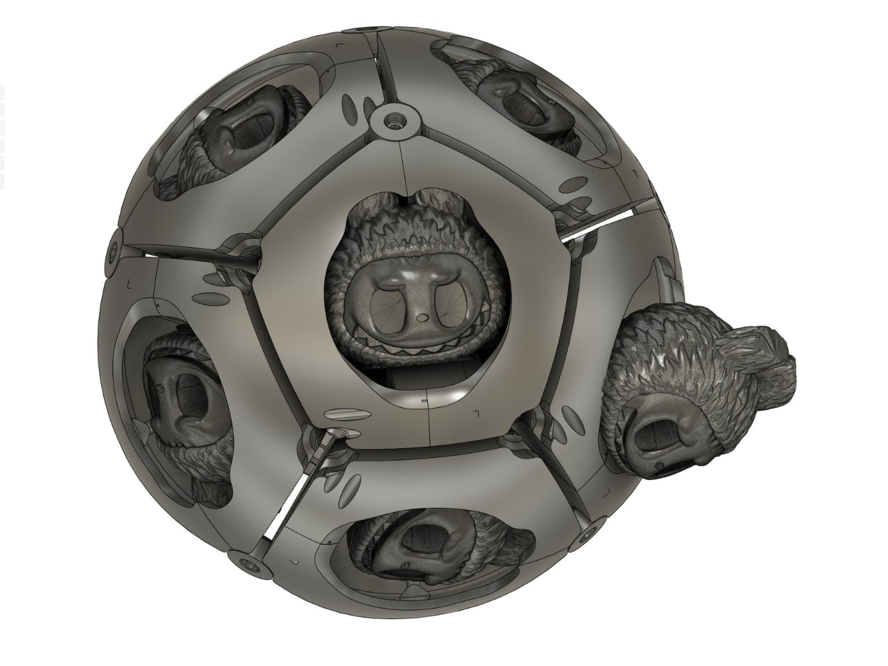
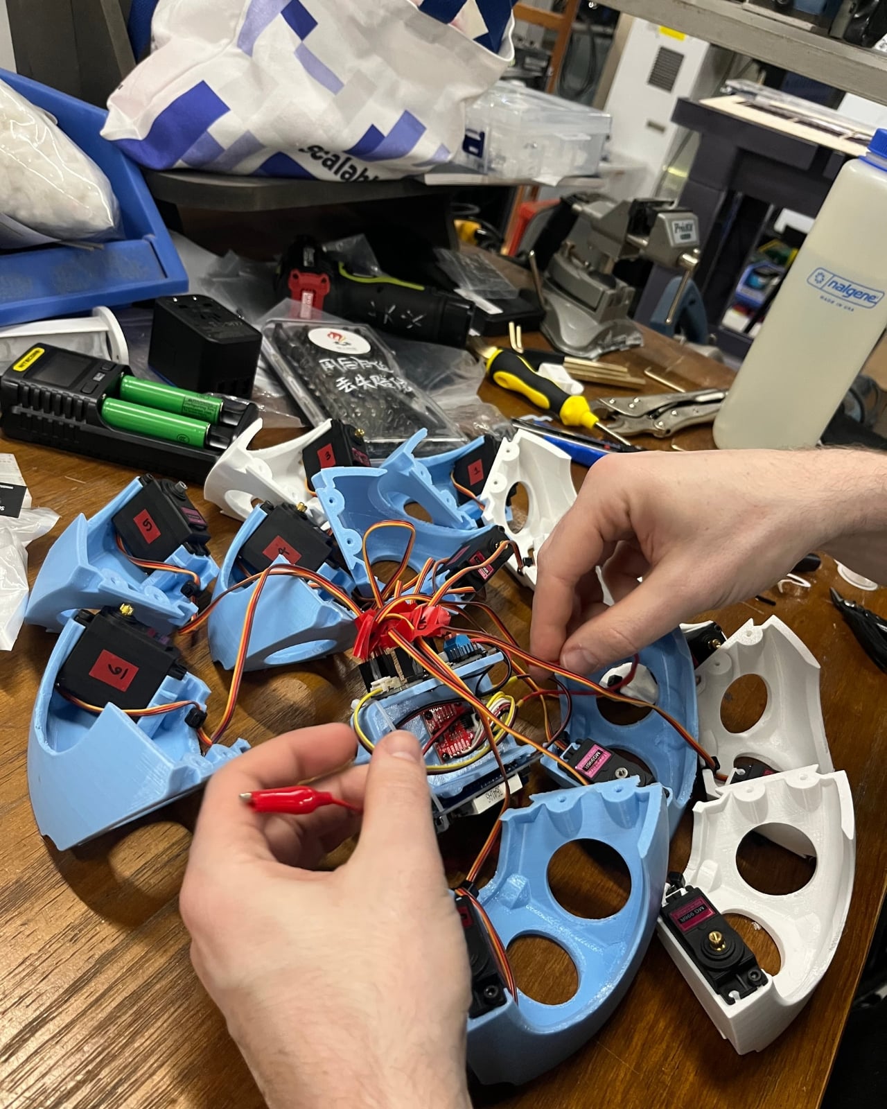
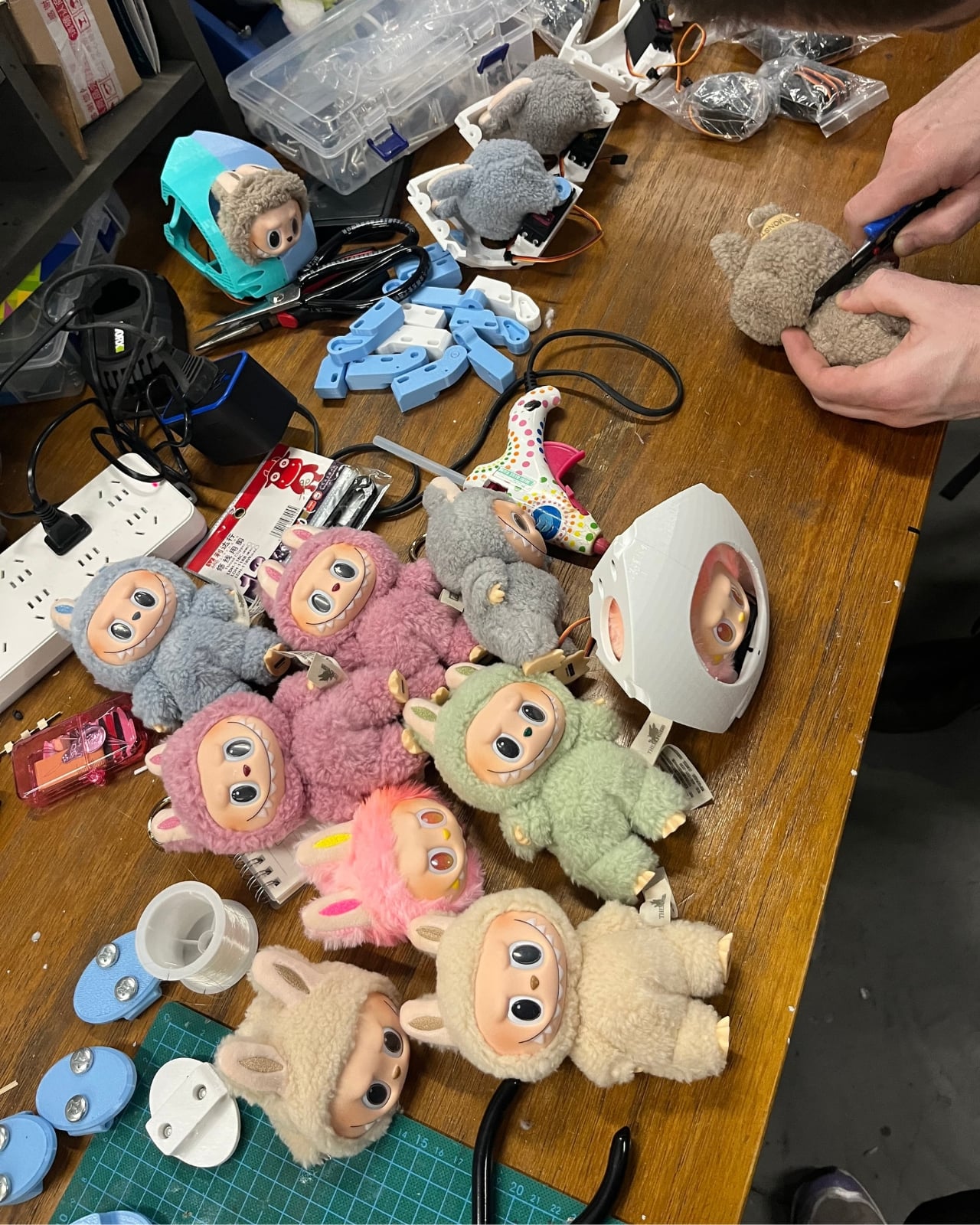
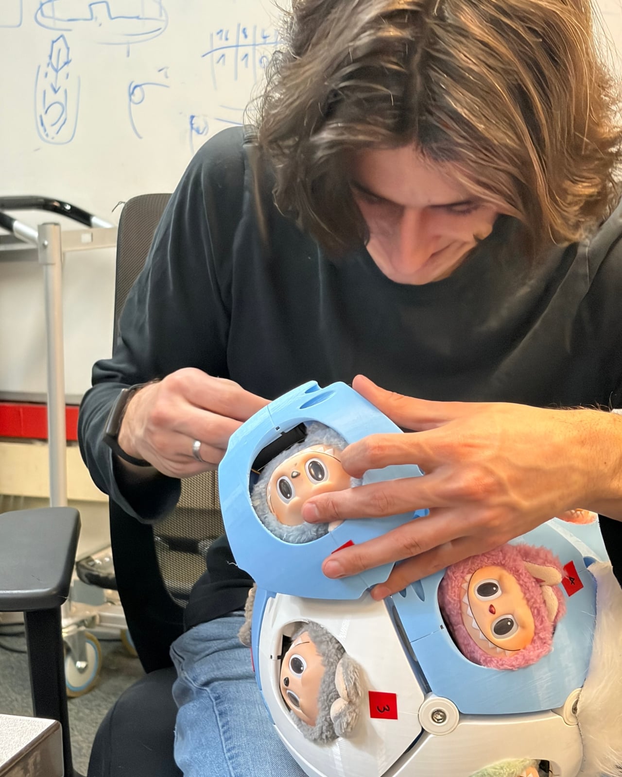
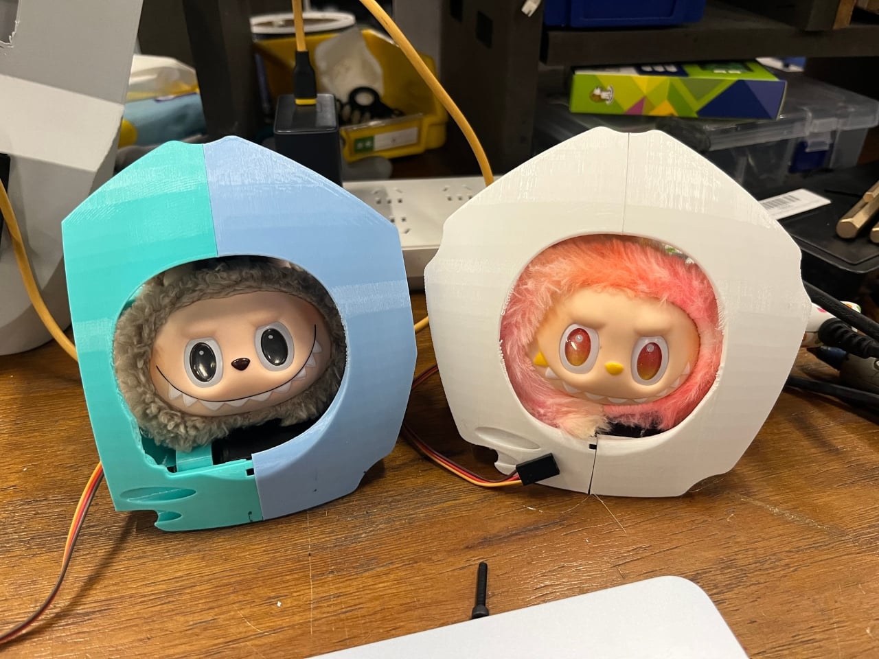
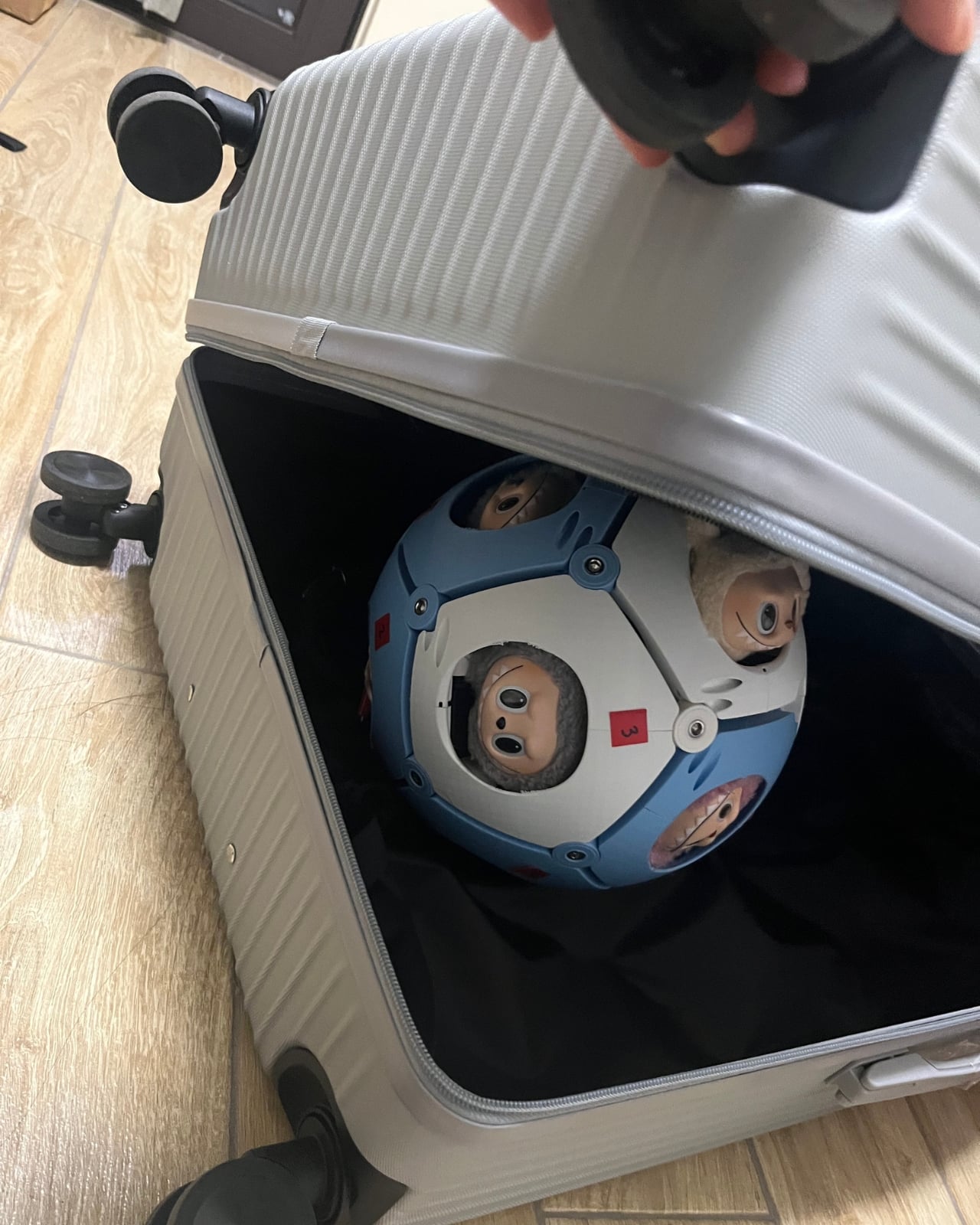
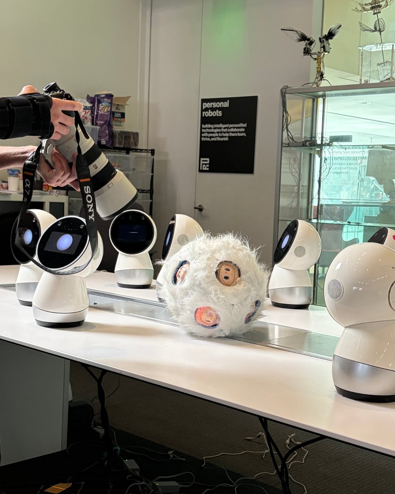
Nobody told MIT grad students to build a rolling sphere covered in twelve Labubu faces. They did it anyway, and now the rest of us have to sit with that. The project is called Labububot, and it comes from three graduate students at the MIT Media Lab: Miranda Li from the Personal Robots group, and Jake Read and Dimitar Dimitrov from the What’s Taking Form group. Together, they took the internet’s favorite ugly-cute collectible, multiplied it by twelve, and fused everything into a single spherical body that rolls around following people through hallways. The official description calls it “one of the rarest monsters on Earth,” and that phrasing alone tells you everything about the tone the team was going for.

The design is not subtle. Twelve identical Labubu faces stare outward from every angle simultaneously. When the thing moves, it does so with that particular brand of slow, deliberate motion that robots somehow always use when they want to feel unsettling. The MIT team leans into every bit of that discomfort, which is exactly what separates Labububot from most social robotics research you’ll come across.

Design: MIT Media Lab

Social robots usually chase approachability. They get rounded edges, pastel palettes, and soft digital expressions designed to lower your guard on contact. The whole field runs on the logic that comfort builds connection, and most research in this space reinforces that assumption without questioning it much. Labububot rejects that premise entirely. It is meant to provoke a reaction before it earns one, and the reaction it tends to get first is somewhere between amusement and mild dread. That’s a deliberately chosen emotional space, and it works.

The Labubu connection makes this sharper than it might otherwise be. The original toy built its following on a very specific kind of ugly-cute tension. It’s not conventionally adorable. It has sharp teeth, wide eyes, and a design that sits right at the border of charming and unsettling. That’s precisely why it resonated. The blind-box format added a layer of collector obsession on top, and after BLACKPINK’s Lisa was seen collecting them, the whole thing escalated into cultural phenomenon territory fast. The fact that it already carried that complicated emotional charge before MIT ever touched it makes the robot version feel like the natural next step, even if nobody saw it coming.

Scaling that same energy up to twelve faces on a rolling robot body is not an accident. The MIT team is clearly aware of what they’re working with. The official framing pitches Labububot as a “playful critique of social robots” and poses a question worth taking seriously: what do the monsters we make reveal about the monsters we are? For a project built around a pop culture collectible, that’s a surprisingly direct line of inquiry. It doesn’t answer the question so much as roll it directly toward you and wait.

The timing adds another dimension. Labubu started as a toy, became a fashion accessory, turned into a resale market, and has now arrived at experimental robotics research inside one of the most prestigious institutions on the planet. That arc is completely absurd and also perfectly logical if you’ve been watching how internet culture compresses timelines. Trends don’t climb ladders sequentially anymore. They collide with things that have no business intersecting, and occasionally the collision produces something genuinely interesting. The path from blind-box collectible to MIT thesis statement is ridiculous, and also makes complete sense.

Labububot will make its public debut this summer as a Grand Challenge finalist at the 2026 International Conference on Social Robotics in London. Moving from the controlled environment of an MIT hallway to a public conference floor is a meaningful shift. Real audiences bring expectations about what robots should look and feel like, and a twelve-faced Labubu sphere is going to challenge most of those expectations immediately.

Some people will read it as satire. Some will find it genuinely unnerving. A few will want to know if they can buy one. I’m not entirely outside that last group, which tells me the project landed exactly where it was supposed to. Labububot doesn’t ask you to like it. It just follows you down the hall until you decide how you feel.

The post MIT Turned 12 Labubu Heads Into a Robot and It’s Watching You first appeared on Yanko Design.
Alberto Essesi Just Designed the Lamp That Celebrates Mistakes

If you’ve ever assembled furniture, built a shelf, or wired anything with your own two hands, you know the feeling. You step back, you look at your work, and then you see it. That one thing. The screw facing the wrong way. The panel installed backwards. The “how did I miss that?” moment that you either have to fix or quietly learn to live with. Alberto Essesi, an L.A.-based industrial designer, decided to immortalize exactly that feeling, and then turned it into a lamp.

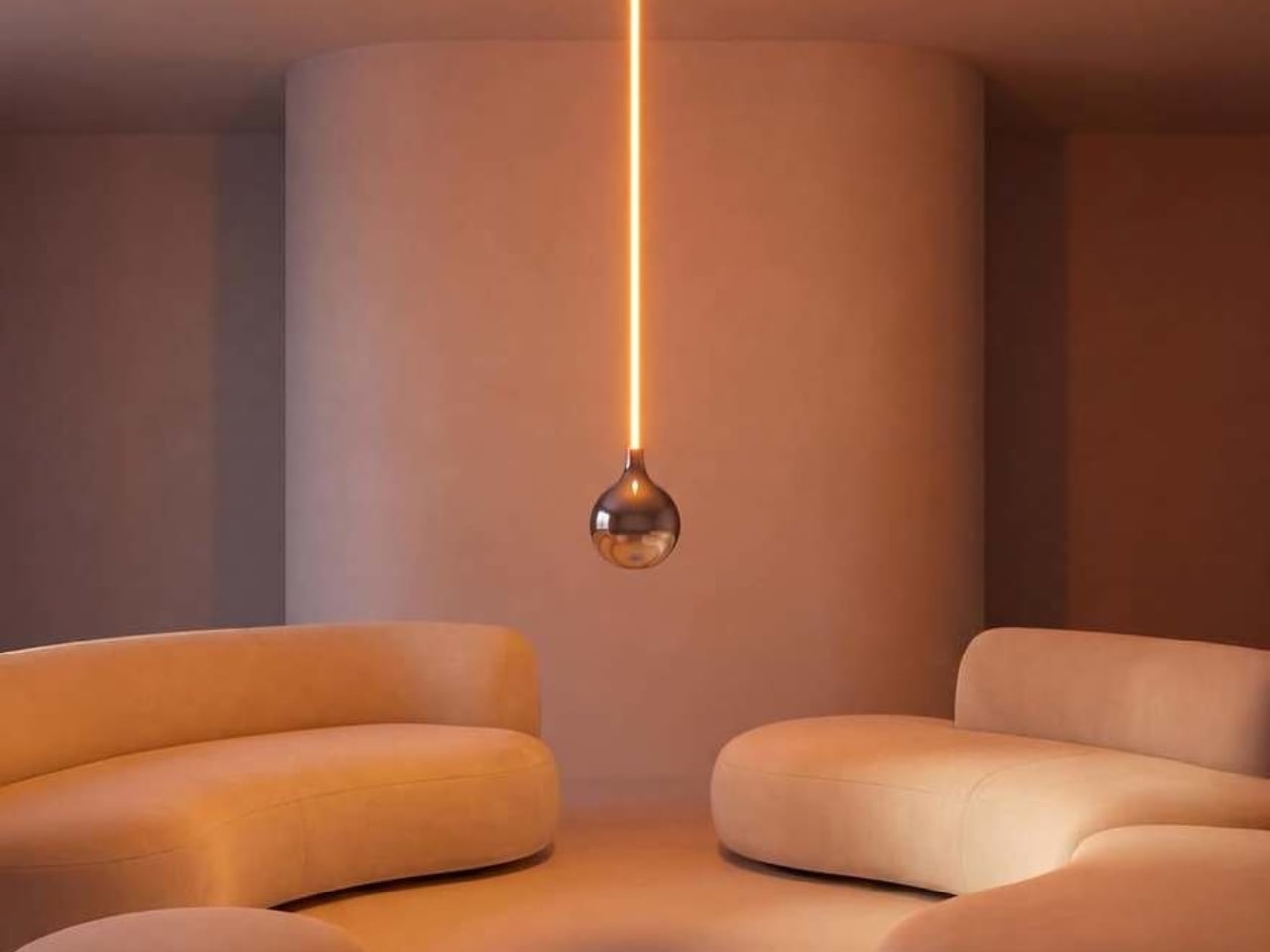
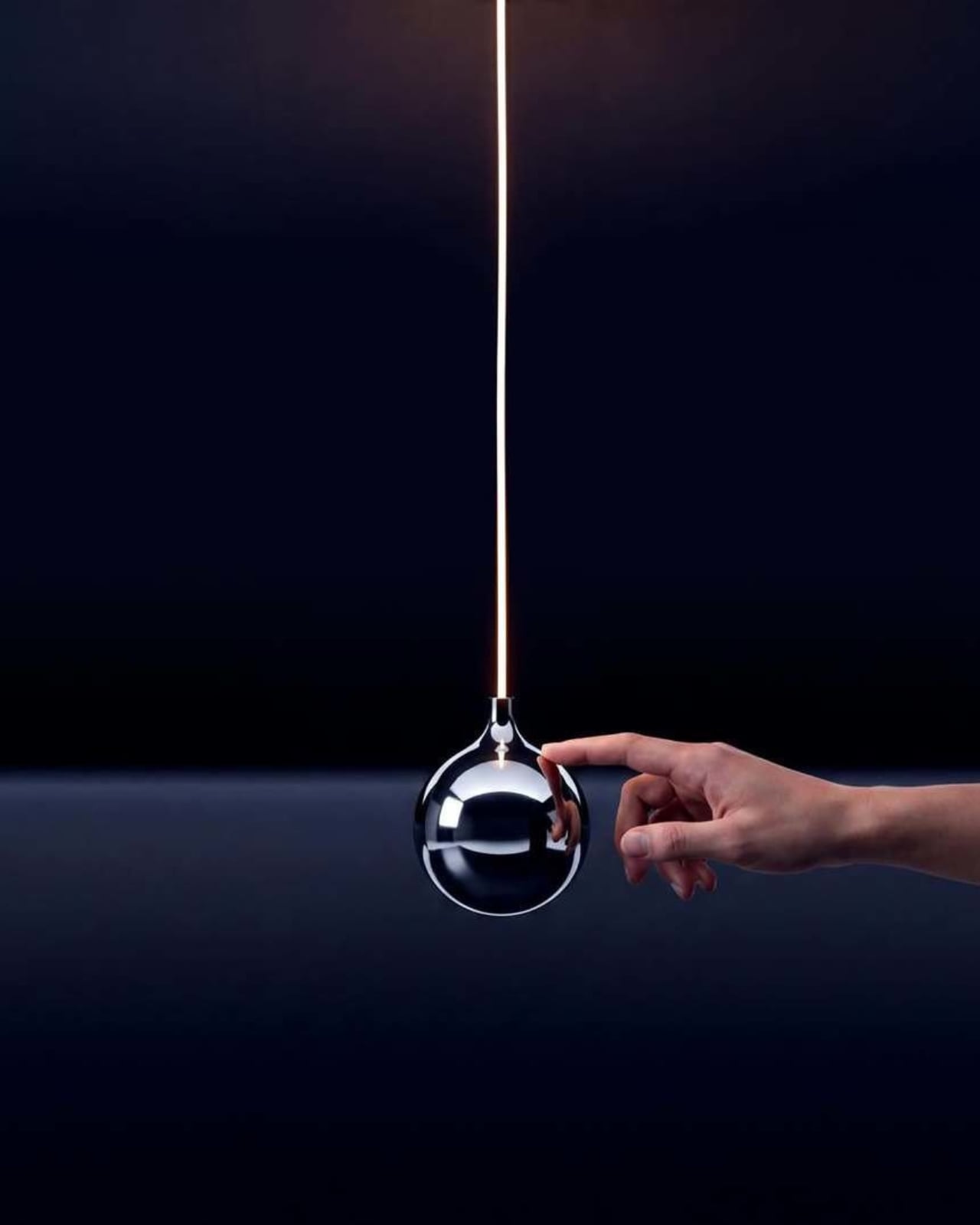
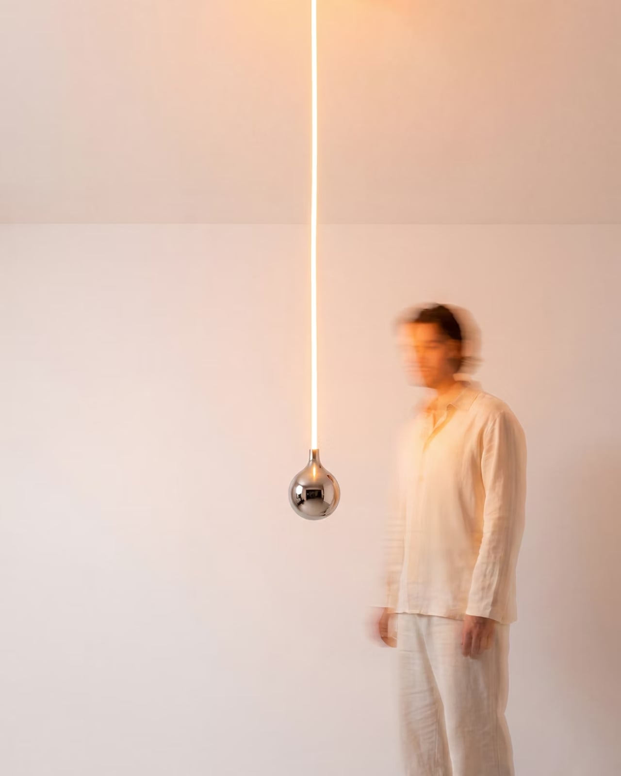
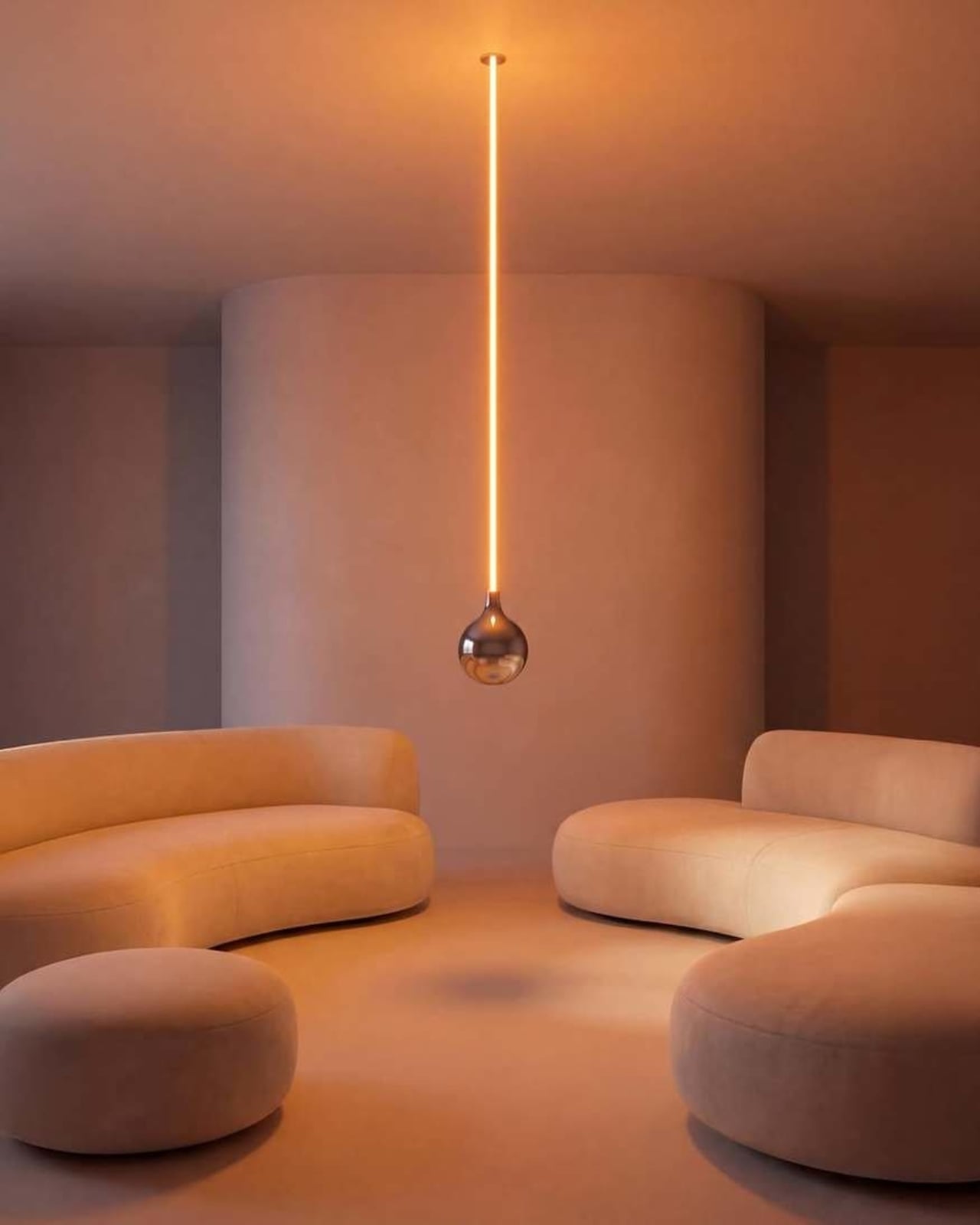
The Oops lamp is precisely what it sounds like. A hanging fixture that, at first glance, looks like something went sideways during installation. The design inverts the expected, which is Essesi’s own phrasing, and it delivers on that premise with clean, understated confidence. It doesn’t shout. It doesn’t over-explain itself. It just makes you look twice, register the joke, and then probably smile.

Designer: Alberto Essesi

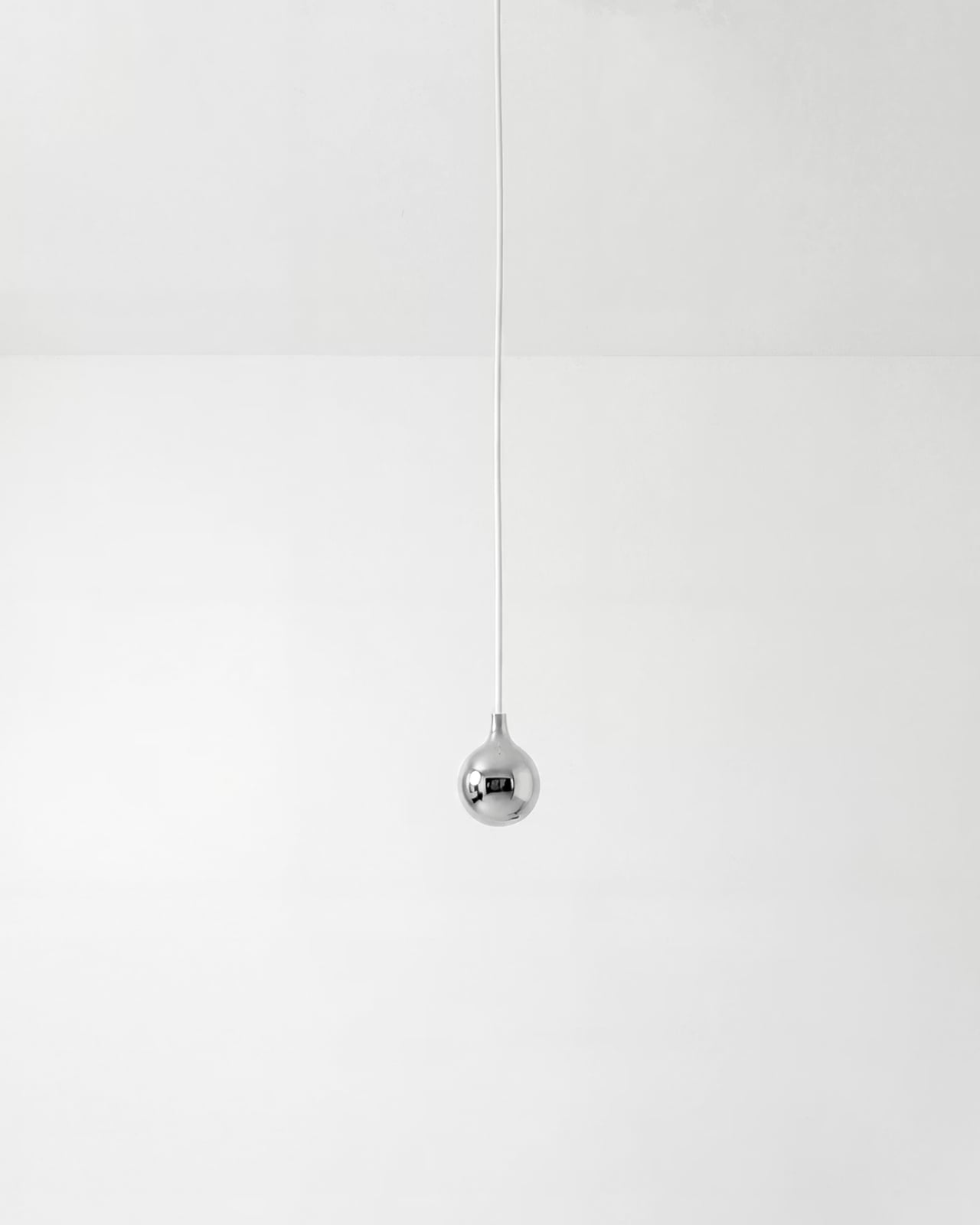
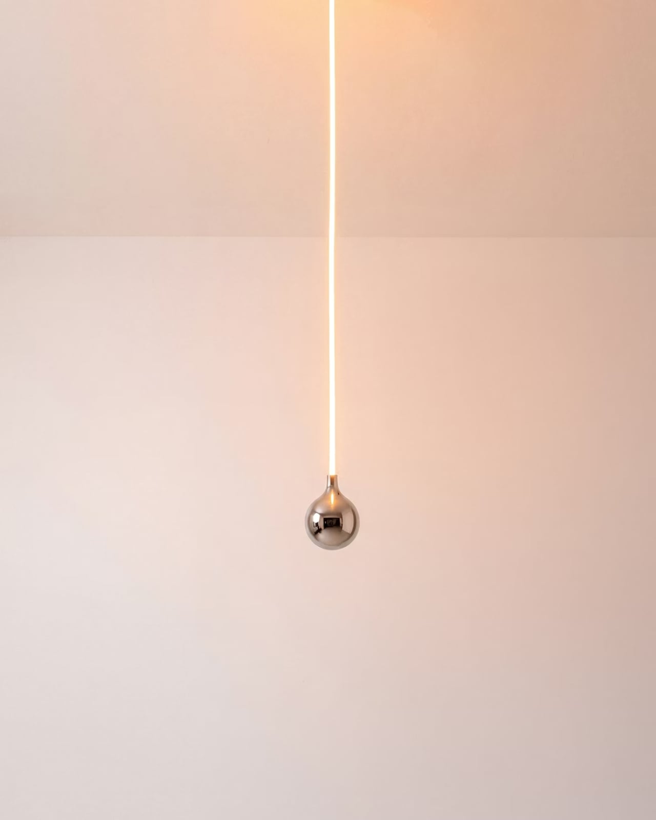
Look at it long enough and the concept becomes delightfully clear. A slender, glowing rod descends from a ceiling mount, warm light running its full length like a lit fuse. At the very bottom sits a polished chrome globe, round and reflective, the universal shape of a light bulb. Except the globe isn’t glowing. The rod is. The light is coming from exactly where you wouldn’t expect it, and the bulb, the part that’s supposed to be the whole point, is just sitting there at the bottom looking beautiful and slightly confused. That’s the joke. That’s also, somehow, the most elegant part of the entire object.

The chrome finish on the globe isn’t incidental. It picks up the amber warmth of the glowing rod above it and bounces it softly into the room, so the globe contributes light without technically being a light source. It’s a small design decision that could have easily been an afterthought, but it ends up being one of the most considered details in the whole piece. The lamp works as a room object even before you process the humor in it.

Essesi has said this idea has been rattling around in his head for years. “This has been an idea I’ve had for a few years and always laugh when I think about it,” he shared when unveiling the design. That kind of creative patience is rare, and it shows in the final execution. The Oops lamp doesn’t feel rushed or gimmicky. It feels like exactly the right amount of thought went into it, no more, no less. Sometimes a concept just needs time to ripen before it’s ready to exist in the world.

Design humor is genuinely hard to pull off. Most attempts either try too hard or land too soft. The joke gets buried under layers of irony, or it gets explained to death until any charm it originally had is long gone. The Oops lamp sidesteps all of that. The humor is baked into the form itself. You don’t need a placard or a press release to get it. You just get it. That’s the mark of a strong design concept: the idea communicates itself without any assistance.

Essesi didn’t reach for something ornate or architecturally complex to subvert. He took the most ordinary object and made one small, deliberate deviation from it. That restraint is what makes the whole thing work. The joke only lands because the rest of the design plays it completely straight. The rod is precise. The globe is perfectly spherical. The ceiling mount is minimal and clean. Every element is serious, which makes the absurdity of the overall form land even harder.

A large version has also been added to the mix, which tells me Essesi is taking this seriously as a product concept and not just a portfolio piece. No production plans have been officially confirmed yet, but that feels like a matter of when rather than if. A design this instantly readable and this universally relatable has a built-in audience. People are genuinely tired of objects that require context. They want things that communicate the moment they enter a room.

That’s the real conversation the Oops lamp is opening. It’s a small but clear reminder that good design doesn’t have to be earnest all the time. It can have a point of view. It can be a little funny. A lamp named Oops, made by a designer who let the idea sit for years until it was truly ready, might be the most quietly optimistic object to come out of this year.

The post Alberto Essesi Just Designed the Lamp That Celebrates Mistakes first appeared on Yanko Design.
Hario’s V60 Gets Its First Real Upgrade in 20 Years for $23

The original Hario V60 is the kind of object that earns its own mythology. Released in 2004, it became the face of the third-wave coffee movement: a simple cone of heat-resistant glass (or ceramic, or plastic, depending on how serious you are) that turned the morning cup into a ritual of patience and precision. Baristas loved it. Coffee nerds obsessed over it. And somewhere along the way, it became as recognizable as a kitchen object can get without appearing on a museum shelf.

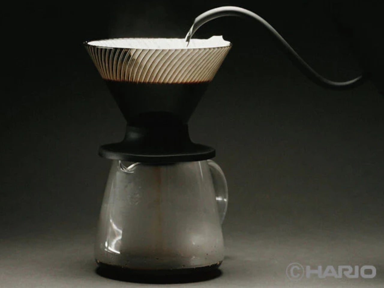
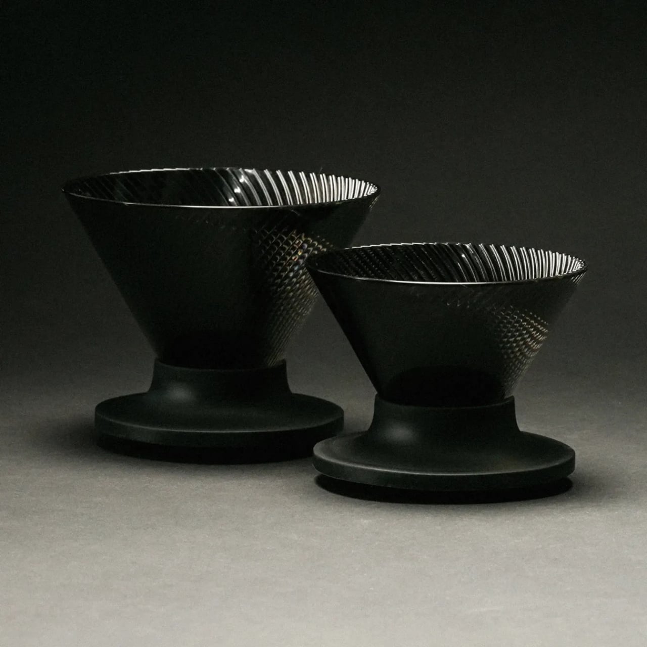
That legacy makes the V60 Dripper NEO an interesting proposition. Hario could have left well enough alone. Instead, they spent two years quietly engineering a redesign that touches the one part of the V60 nobody talks about but everyone deals with: the ribs.

Designer: Hario

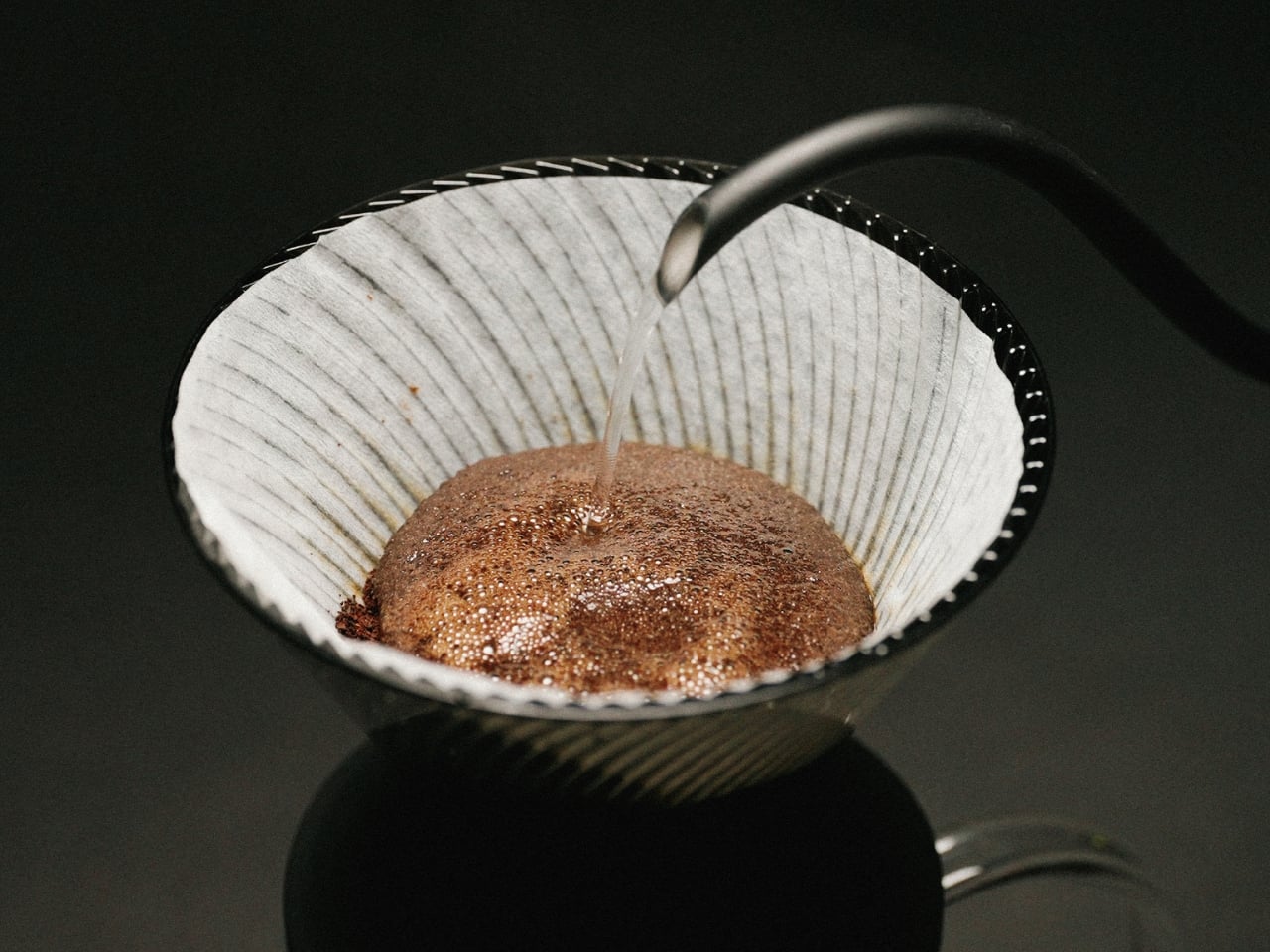
The original V60’s spiral ribs are the reason it works the way it does. They create space between the paper filter and the cone wall, allowing air to escape as water flows through. The result is a controlled extraction, but one that demands attention. Get your grind wrong, pour too fast, let your focus wander, and the brew either stalls or races past the point of no return. The V60 has always been a beautiful, slightly unforgiving thing.

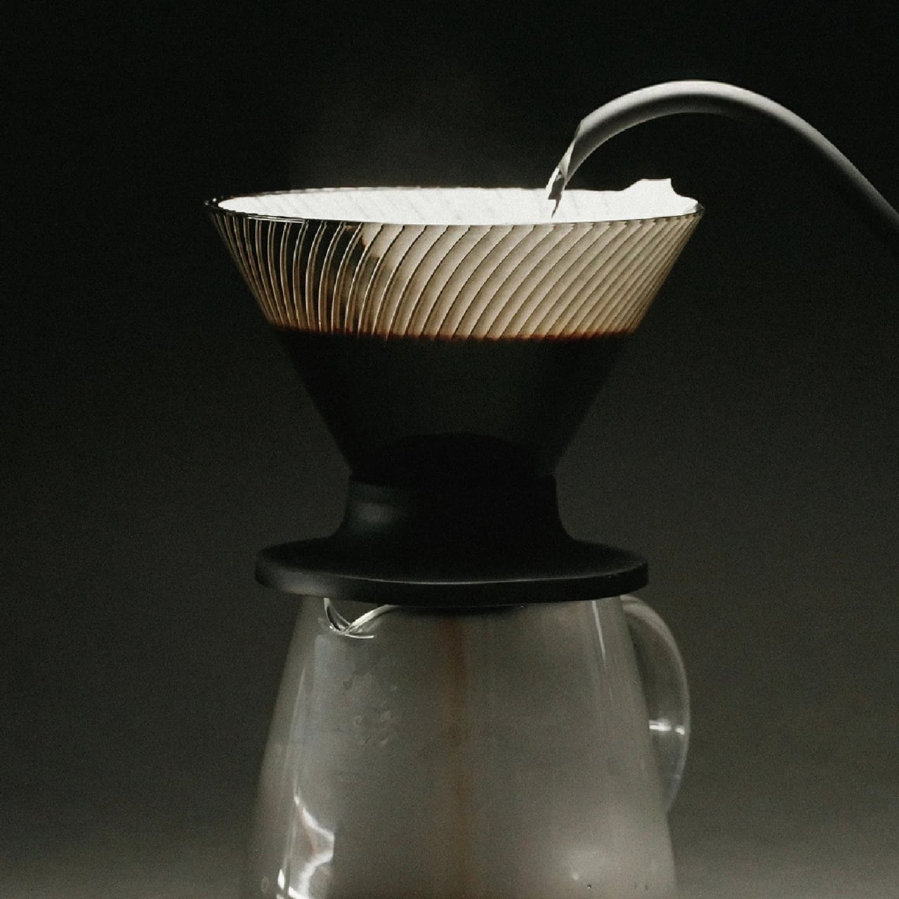
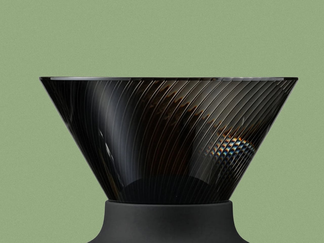
The NEO changes that equation with a genuinely clever structural update. Instead of a single spiral rib pattern, it introduces 72 ultra-fine vertical ribs along the upper walls of the cone, which then converge into 9 deeper ribs near the base. This dual-zone design guides water evenly down the entire wall before accelerating it through the outlet. The effect is a faster, more uniform extraction that minimizes bitterness from water lingering too long in contact with the grounds. The cup you get out the other end is cleaner, sweeter, and more vibrant, with a balanced acidity that doesn’t tip into sourness.

Two years of testing went into getting this right. Hario’s engineers ran exhaustive trials on rib counts, angles, and flow dynamics before landing on this configuration. The fact that they filed a utility model patent on the structure suggests they believe it is genuinely novel, not just cosmetically different.

The material choice is also worth noting. The NEO is made from Tritan resin, a lightweight, high-clarity plastic that handles heat retention better than standard plastic alternatives. It keeps the brewing temperature more stable from the first pour to the last, which matters more than people think. Temperature consistency is one of those variables that separates a good cup from a great one, and the NEO addresses it without requiring you to do anything differently.

For anyone already embedded in the V60 ecosystem, the compatibility factor is a quiet win. The NEO works with all existing V60 switch bases, so you don’t have to rebuild your setup from scratch. It comes in two sizes, both made in Japan, and retails for around $23.50, which is an accessible price point for a piece of equipment that functions this thoughtfully.

Not everyone is convinced, though. Since hitting the market, the NEO has sparked a genuinely divided response from the coffee community. Users describe the brew as cleaner and more tea-like, which sounds appealing until you realize that some people loved the original V60 precisely for its acidic punch and intensity. One Reddit user put it plainly: the NEO presents coffee “differently,” not necessarily better. For experienced brewers who spent years dialing in their pour technique to coax specific flavors from the classic cone, the NEO’s smoother, more forgiving nature feels less like an upgrade and more like a personality change. That’s a fair criticism. Hario didn’t make a bad V60. They made a different one, and that distinction is exactly what has the coffee internet divided.

Pour-over coffee has always had a slight gatekeeping problem. The ritual appeals to people who love it precisely because it requires care, but that same learning curve turns off anyone who just wants a good cup without turning their kitchen into a science experiment. The V60 NEO doesn’t eliminate that ritual. It just makes the margin for error a little more forgiving, which means more people get to enjoy the result without years of practice behind them.

The original V60 deserved its legacy. The NEO earns its own, just a slightly different one.

The post Hario’s V60 Gets Its First Real Upgrade in 20 Years for $23 first appeared on Yanko Design.
What Happens When You Let 90 Kids Design a Birdhouse

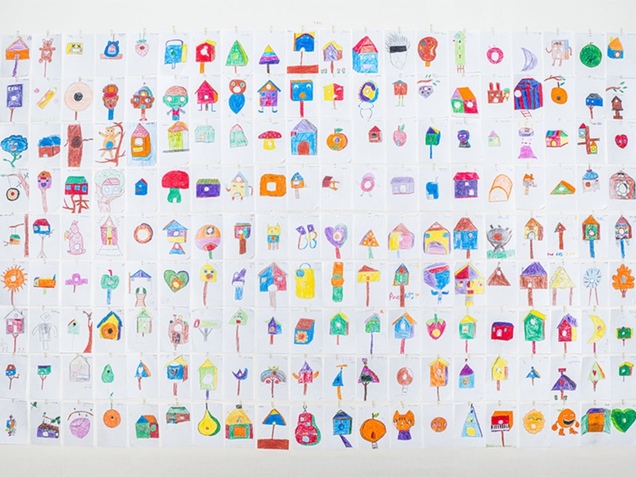
Most of us have a pretty fixed idea of what a birdhouse looks like. A small wooden box, a round hole, maybe a little perch. It’s one of those objects so familiar it barely registers anymore. Designer Taekhan Yun decided to blow that idea up entirely, and he handed the job over to the last people anyone in the design industry would think to consult: ninety children in Siem Reap, Cambodia.

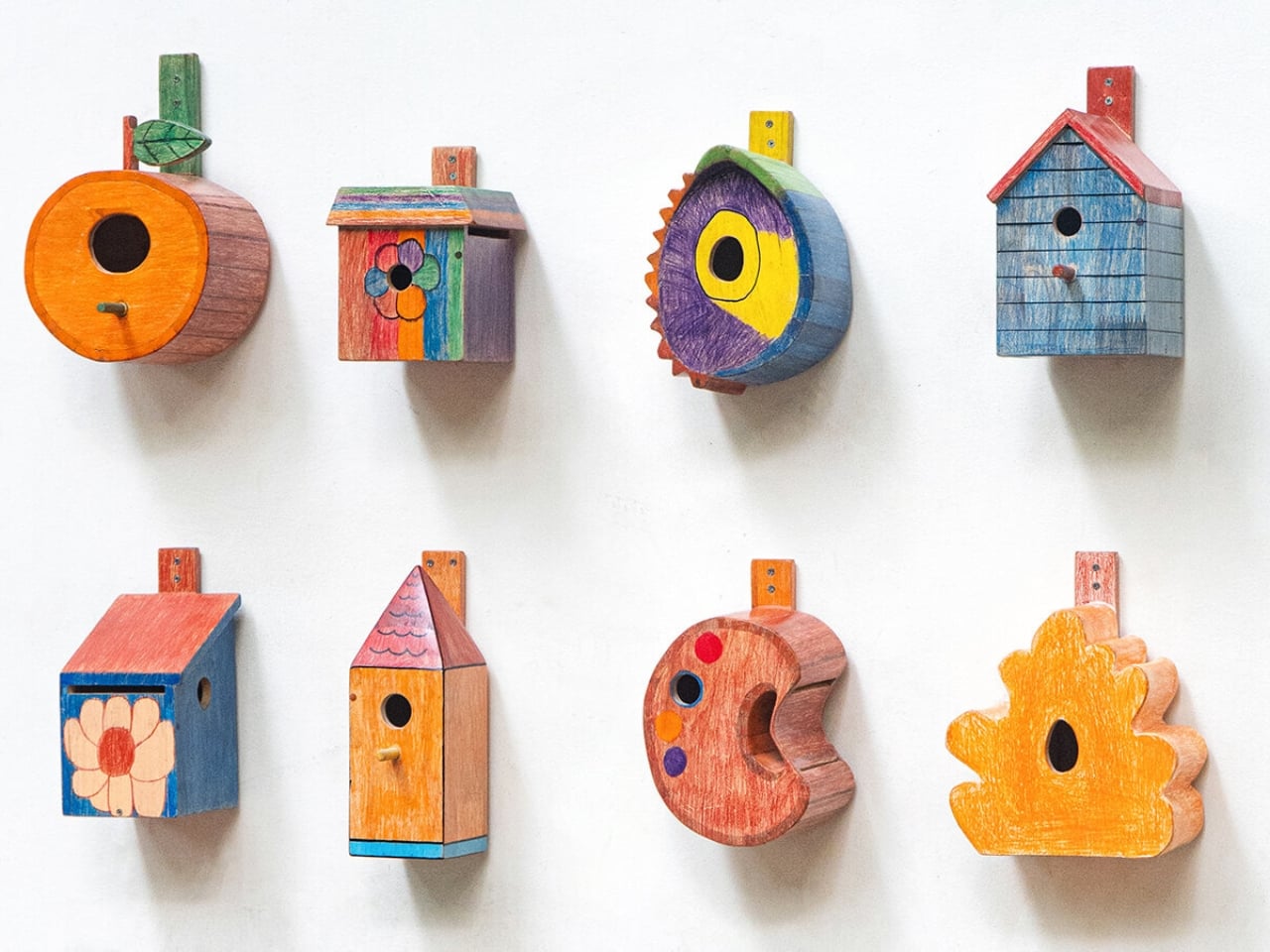
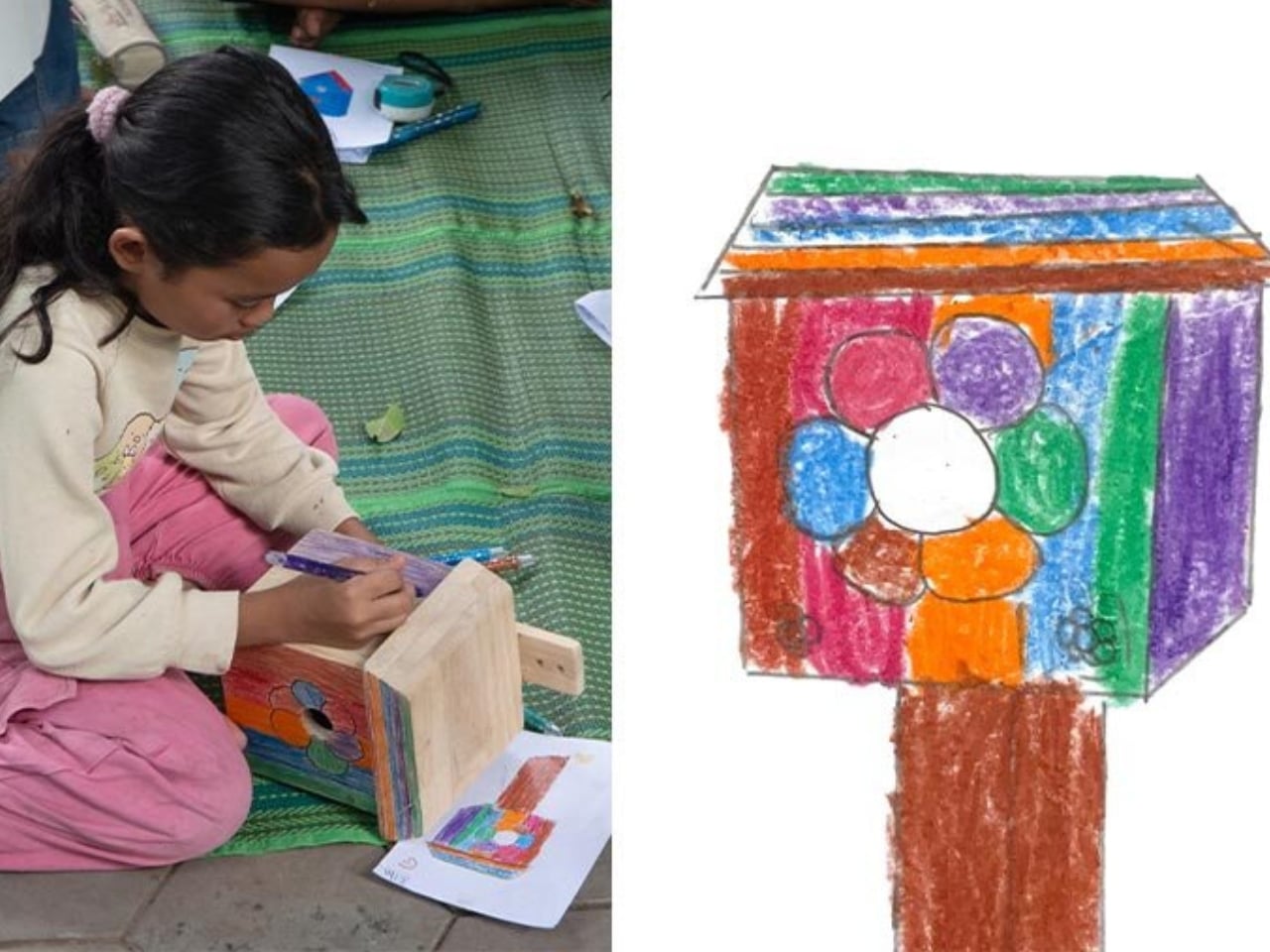
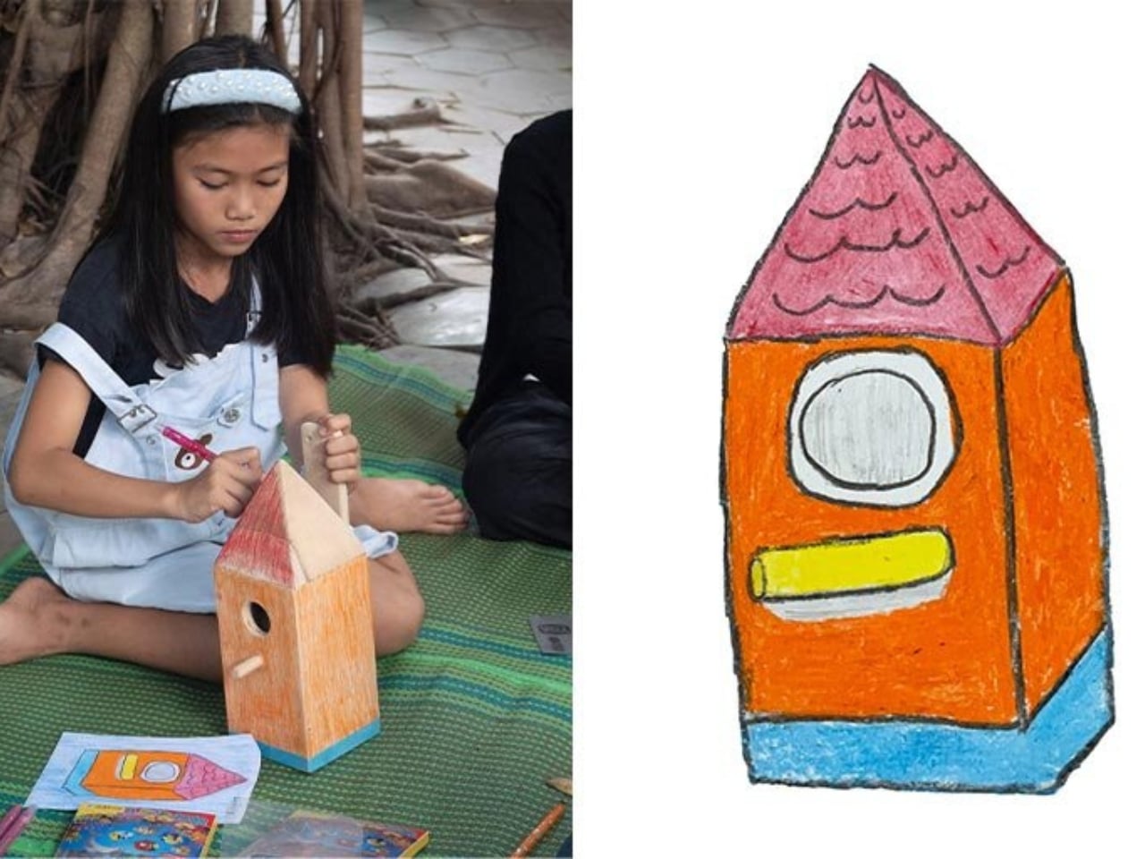
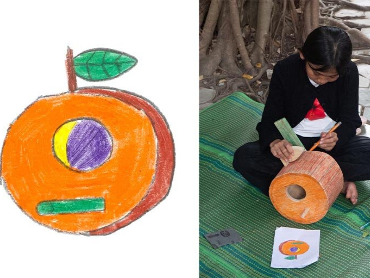
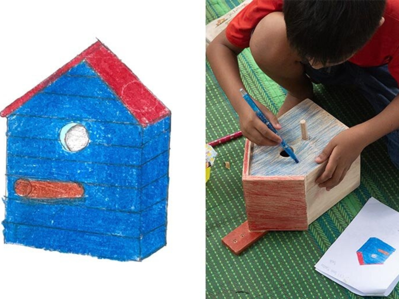
The project is called “Birdhouse by Kids,” and it is exactly what it sounds like, though the execution is far more considered than the name lets on. Yun, a Korean designer currently based in Cambodia, started the process by introducing the children to local bird species and basic birdhouse typologies. Not to teach them the “right” answer, but to give them just enough context before letting them loose with pencils and paper. The drawings that came out of that session were, predictably, wonderfully unruly. Rooftops that curve like waves, doors shaped more like portals, proportions that make zero structural sense and all the visual sense in the world.

Designer: Taekhan Yun

What Yun did next is the part that elevates this from a cute community project to something genuinely worth talking about. He didn’t correct the drawings. He translated them. There’s a massive difference between those two things, and most professional designers, trained to optimize and problem-solve, would have instinctively done the former. Yun chose the harder path, which was to honor the original intention of each design while figuring out how to make it stand upright, hold together, and actually function as a home for a bird.

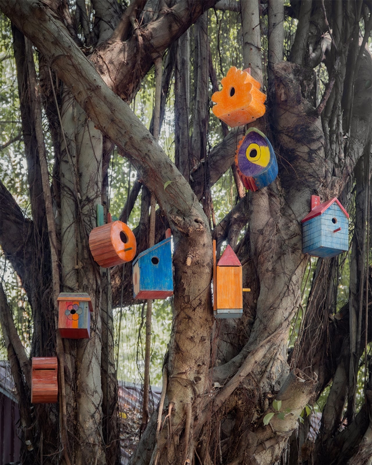
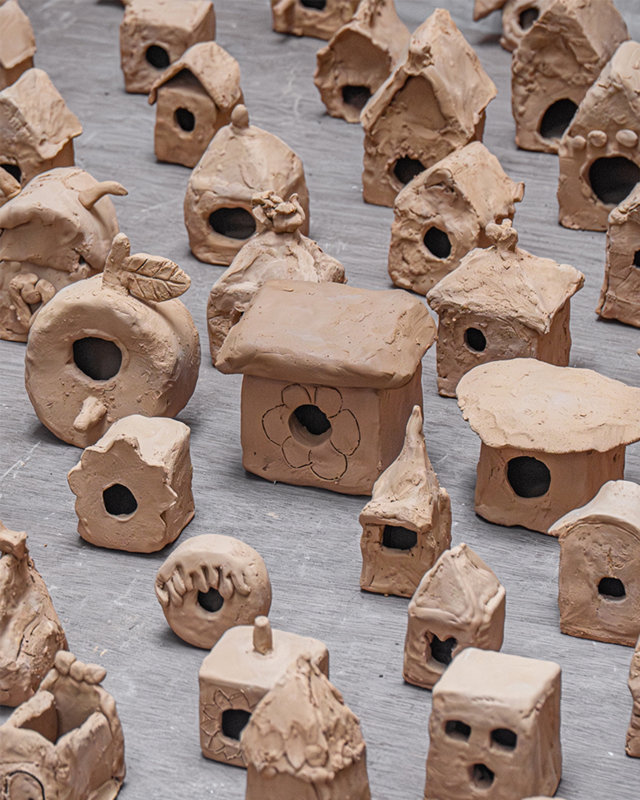
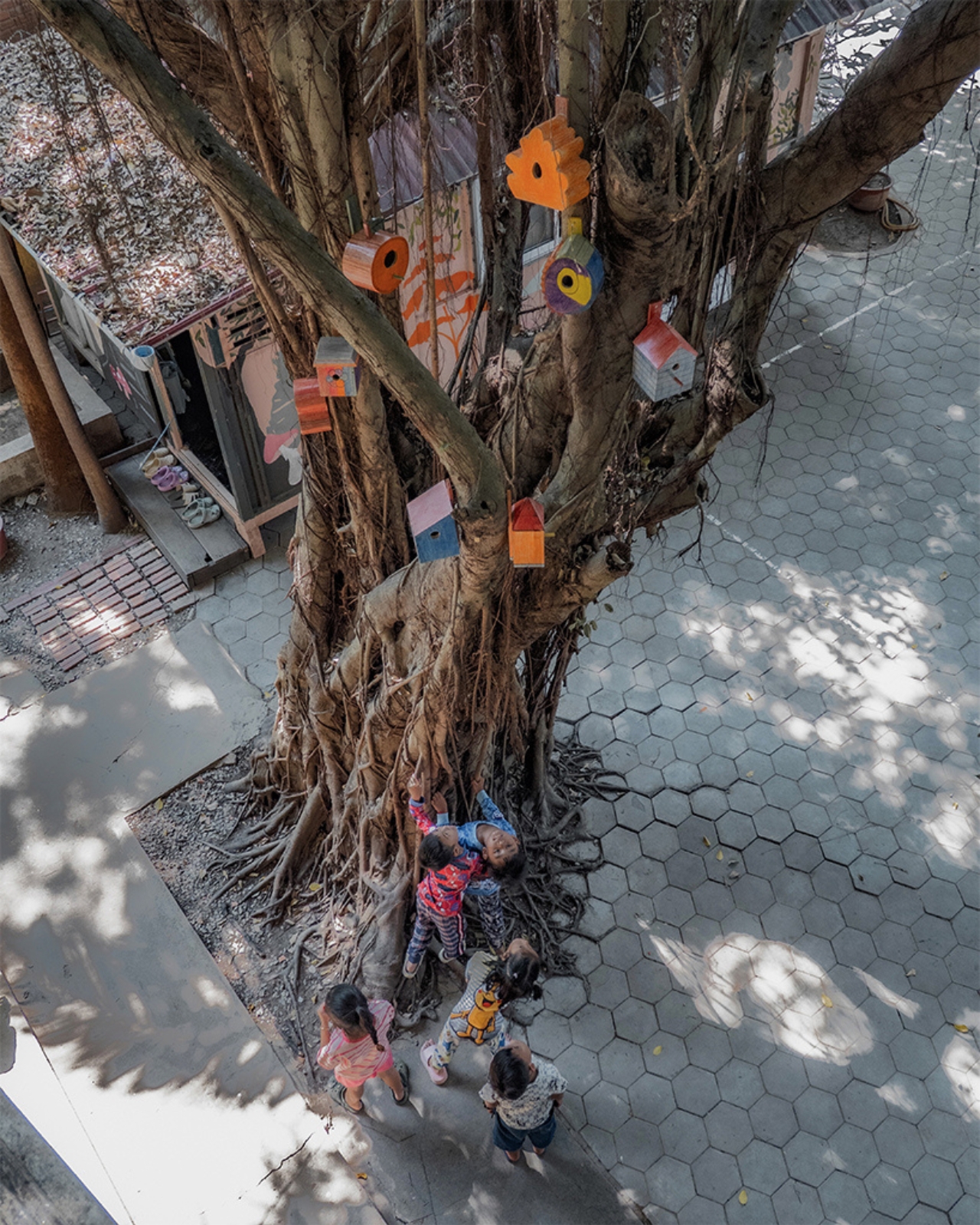
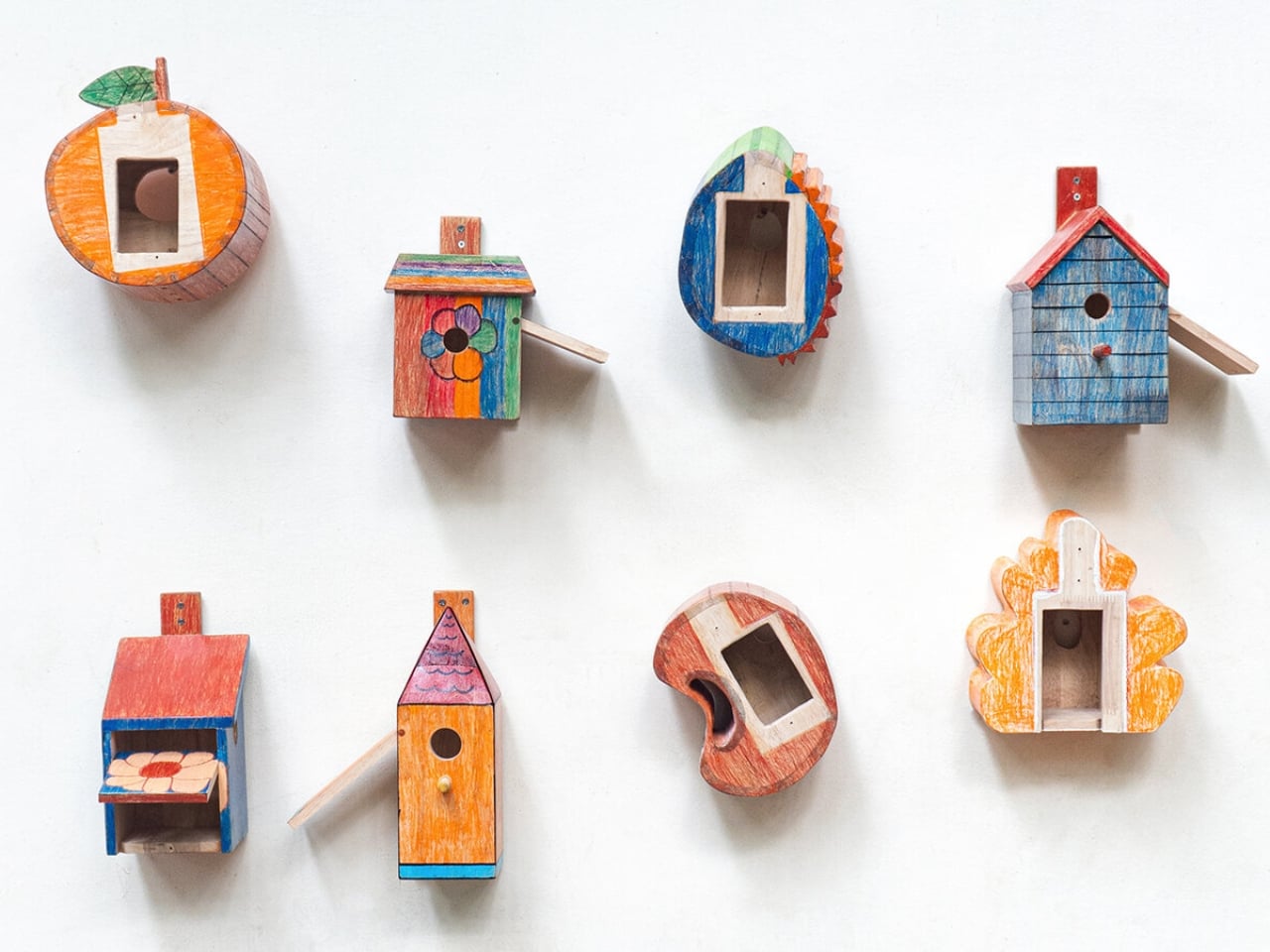
The children then made clay prototypes of their own designs, turning two-dimensional sketches into three-dimensional objects with their own hands. Eight of those designs were ultimately selected and built into full-scale birdhouses, with the children participating in the finishing process alongside Yun. The completed birdhouses now live at the school, sitting in the kind of spaces where children play and gather, and they look like nothing you’ve ever seen in a garden center or a hardware store. They look like imagination made solid, which, technically, is exactly what they are.

I keep thinking about how rarely the design world genuinely invites this kind of collaboration. There’s plenty of design “for” children, but design “by” children is a different conversation altogether. Yun has been exploring this territory for a while now. His earlier project, “Chair for Kids,” followed a similar participatory model, where children at the English School of Siem Reap drew their own chair designs, measured their bodies, and helped build the final pieces. His philosophy seems rooted in the idea that design is not just a skill for making objects but a way of thinking, and that children, unburdened by convention, are actually very good at it.

The birdhouse project also does something quietly radical in terms of concept. It shifts the design brief away from humans entirely. The end user isn’t a child or an adult. It’s a bird. Yun has described this as moving from human-centered design toward designing for other species, using children’s perspectives as the starting point. That framing might sound academic, but the result is tangible and a little poetic: a group of kids in Cambodia drawing houses for birds, without a single preconception about what a birdhouse is “supposed” to look like.

Good design often works this way. It finds a new angle by removing the assumptions. Yun removed two at once: the assumption that designers must be trained professionals, and the assumption that form should follow function in the most literal, efficient way possible. The forms these kids invented follow something else, something closer to feeling or instinct, and the objects are richer for it. They are also, somehow, more honest.

We talk a lot about innovation in design, about breaking from convention and thinking outside the box. It turns out one very reliable way to do that is to ask someone who has never been in the box to begin with.

The post What Happens When You Let 90 Kids Design a Birdhouse first appeared on Yanko Design.
The Roomba Guy Just Built a Robot Pet You Might Actually Love

If you’ve ever watched your Roomba bump helplessly into a chair leg for the third time and thought, “I deserve better from my robots,” you’re not alone. And apparently, neither did Colin Angle. The co-founder of iRobot, the man who essentially put a hockey puck-shaped vacuum in millions of homes, left the company in 2024 with a new question rattling around in his head: what if a robot could actually feel like it cares about you? The answer is the Familiar, the first prototype from his new startup, Familiar Machines & Magic. And it is not your average robot.

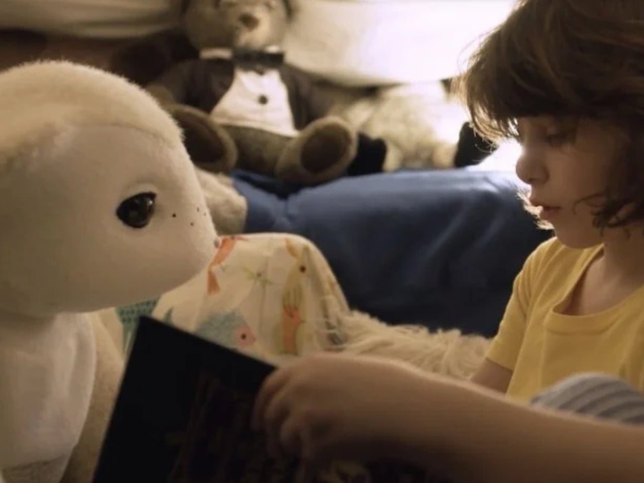
Picture a creature somewhere between a soft-eared dog and a round, slightly abstract bear. It has four legs, huge paws, and doe eyes that make it immediately charming in a way that no Roomba ever attempted to be. It’s furry, expressive, and was designed with the help of former Disney Imagineers, which explains why it looks like it belongs in an animated feature rather than a tech showcase. The Familiar has 23 degrees of freedom, meaning it can wiggle its ears, tilt its head, and wag a small nub of a tail with the kind of fluidity that feels less mechanical and more… alive. Its coat is touch-sensitive, built specifically to encourage physical interaction between you and it.

Designer: Familiar Machines & Magic

It also doesn’t talk. That detail feels deliberate and, to me, very smart. Voice assistants have trained us to think of robots as tools we command. The Familiar is going for something completely different. It’s designed to read your tone of voice, your body language, your overall energy, and respond accordingly. Angle calls it “Consumer Physical AI,” and while the label sounds like something off a product white paper, the idea behind it is genuinely compelling.

The name itself is worth noting. A “familiar” in folklore refers to the supernatural animal companion of a witch or magical figure, a creature bonded to a person not through ownership but through genuine connection. Angle’s team chose that name deliberately, and I think it sets the tone for what they’re trying to build. The goal isn’t to sell you a novelty gadget. It’s to create a new kind of relationship between humans and machines, one built on trust, attentiveness, and something approaching care.

Now, I’ll be upfront: I have feelings about this. Part of me finds it genuinely beautiful as a design concept. The Familiar was clearly approached the way good industrial design should be, with deep thought about how an object makes you feel, not just what it does. The choice to make it animal-like rather than humanoid is interesting, too. There’s far less of the uncanny valley unease that tends to follow humanoid robots around, and more of the universal warmth that most people already extend toward animals.

But another part of me wonders about the emotional stakes here. We’re already watching people form attachments to AI chatbots. A touch-sensitive, furry, expressive robot that mirrors your emotional state is a much more potent version of that. Angle has said he wants it to feel like the machine actually cares about him. That’s a lovely vision. It’s also a design brief that puts enormous responsibility on the creators to get it right, because the flip side of emotional bonding is emotional dependence.

Still, I’d be lying if I said the Familiar didn’t make me curious in the best possible way. The prototype images are almost disarmingly sweet. It looks like something you’d want sitting on the couch next to you while you read, or settled quietly in the corner while you work. If any robot was ever designed to move through your life rather than just function within it, this might be it.

The Familiar is still in the prototype stage, with no confirmed price or release date. But as debut concepts go, it’s a strong one. Whether or not it ever makes it into our homes, it raises questions about what we actually want from the machines we live with. And those questions feel well overdue.

The post The Roomba Guy Just Built a Robot Pet You Might Actually Love first appeared on Yanko Design.
UNO and Vrbo Are Renting Vacation Homes for $4 a Night

Brand collaborations are everywhere these days, but every once in a while, one lands so perfectly that you have to stop and appreciate the logic behind it. The UNO x Vrbo partnership is exactly that kind of collab. Not because it’s flashy or trying to be something it’s not, but because it genuinely makes sense.

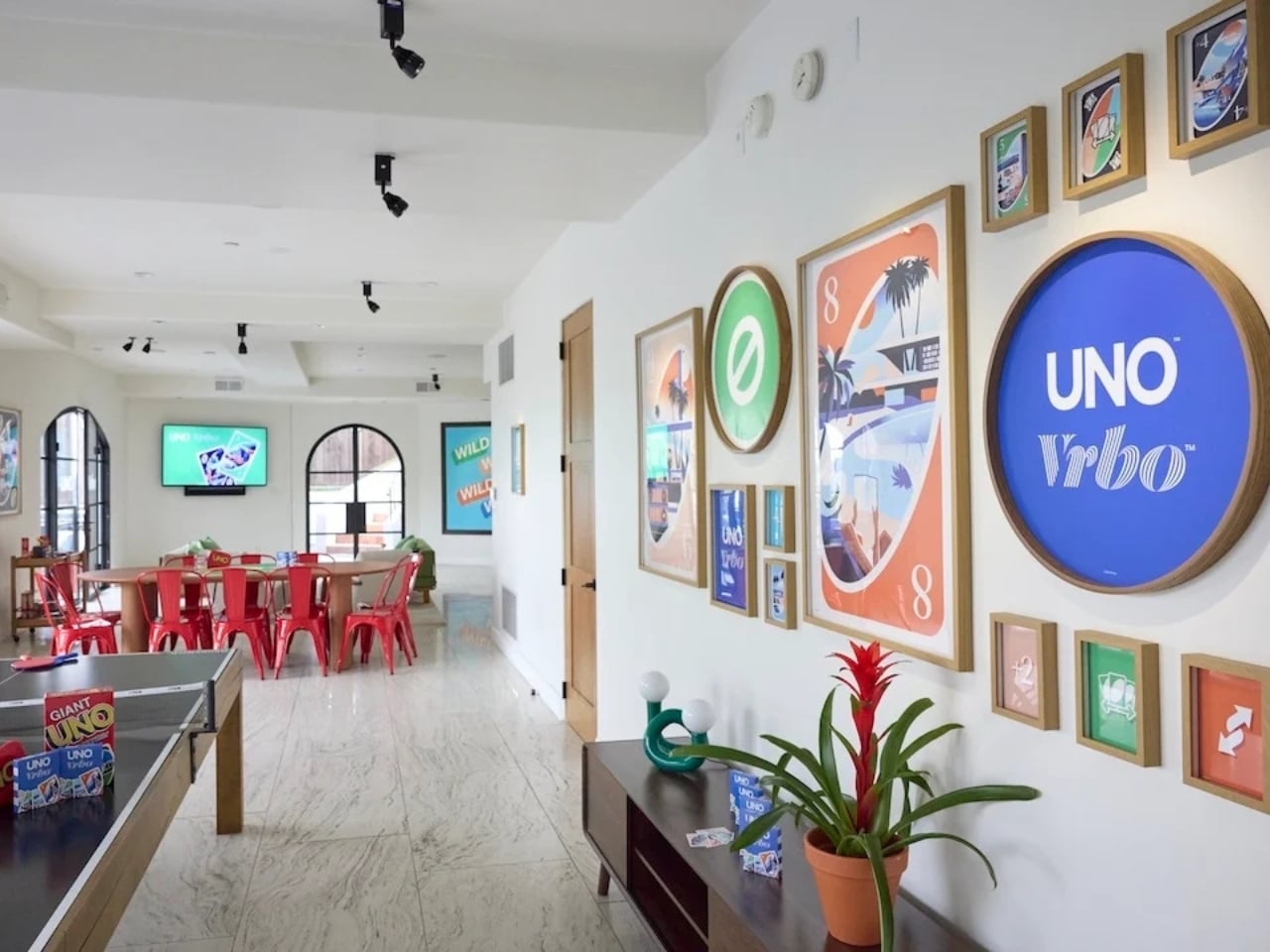
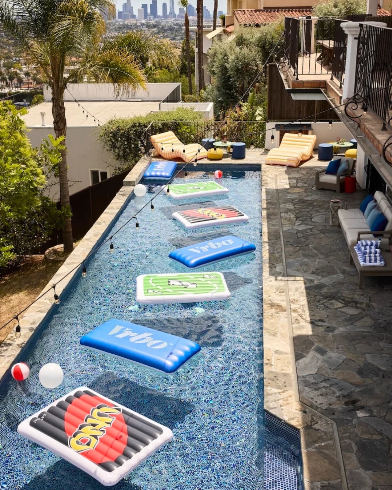
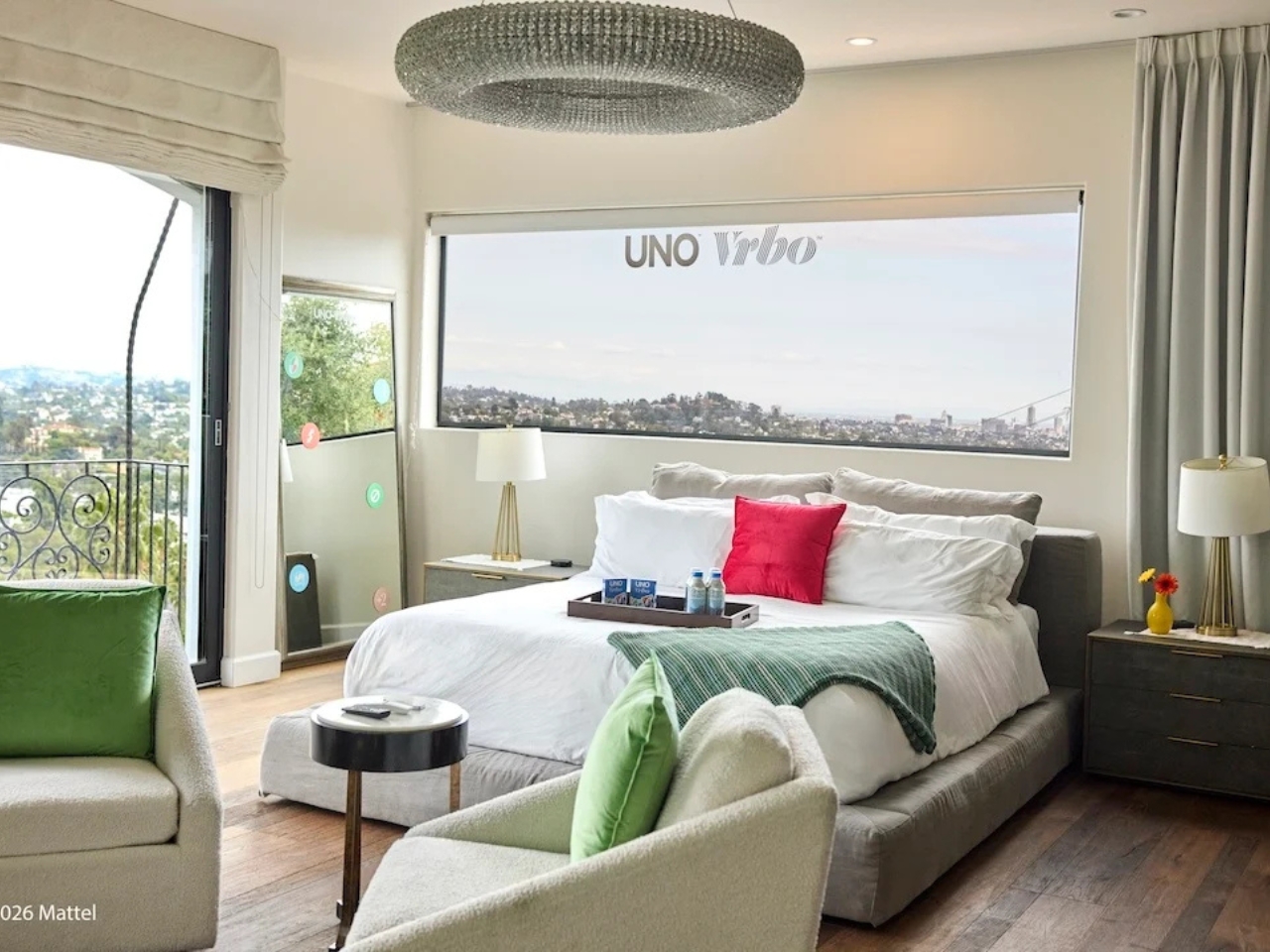
Starting May 15, Mattel and Vrbo are opening bookings for six limited-time vacation home stays built entirely around the spirit of game night. Six properties across the U.S., two tiers of experience, and one very clever price point: $4 per night. That last part is a deliberate nod to UNO’s iconic Draw 4 card (which can make or break relationships), and it’s the kind of detail that makes you smile whether you’re a brand person or not.

Designers: UNO x Vrbo

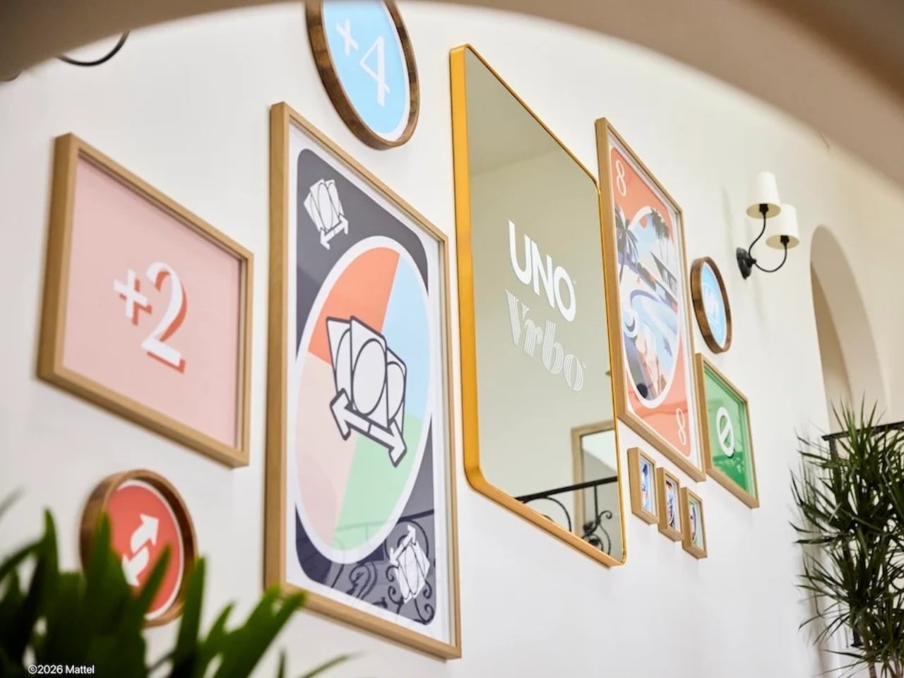
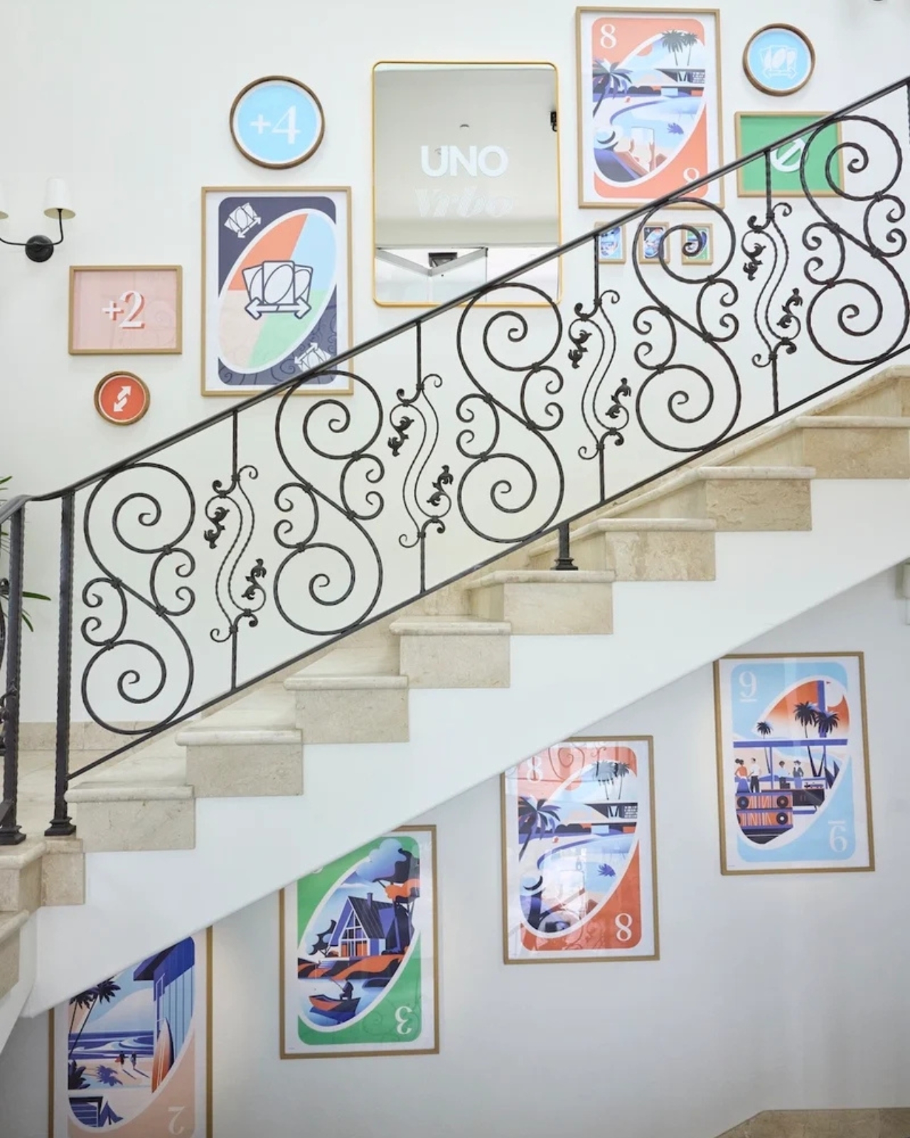
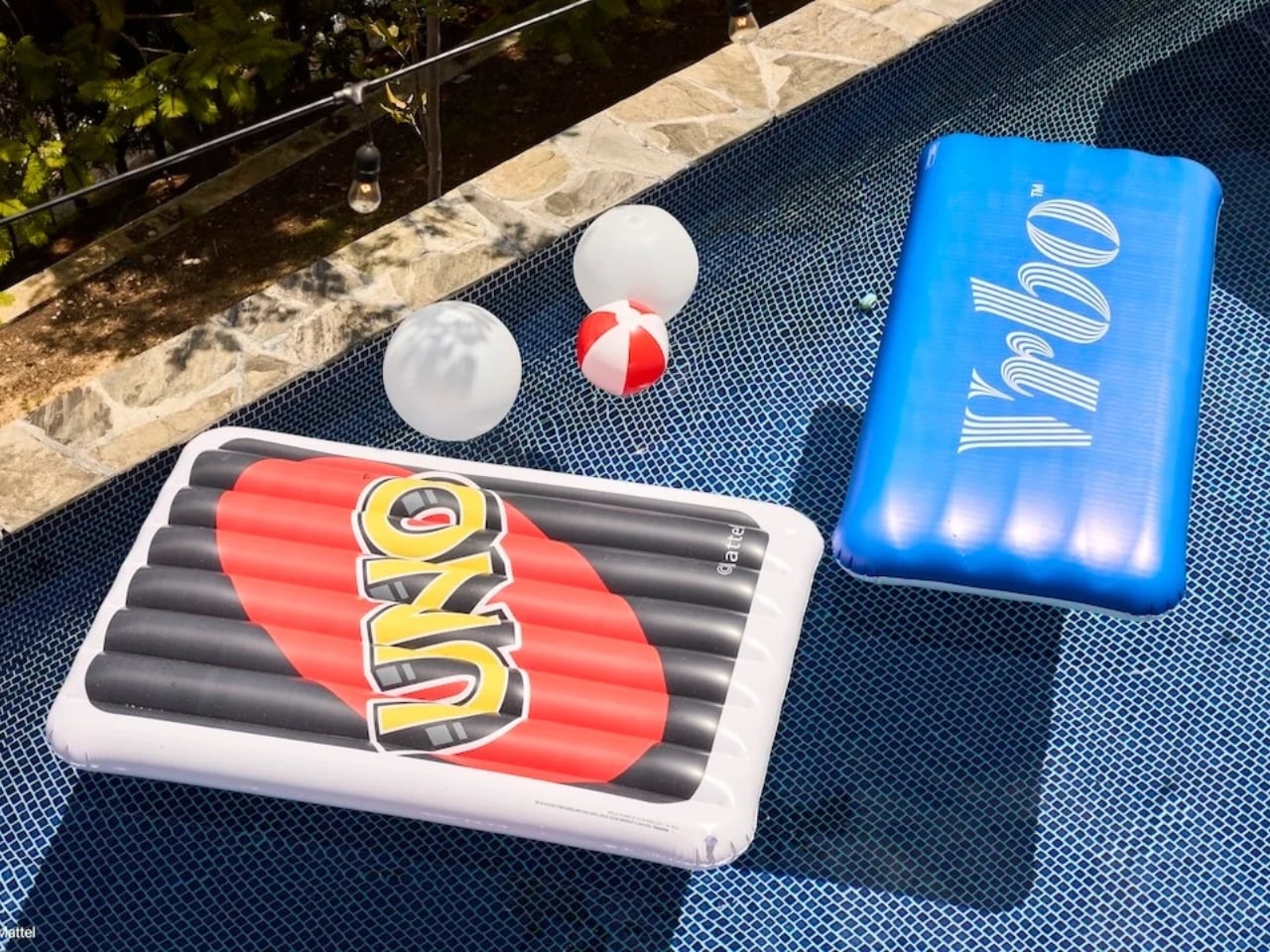
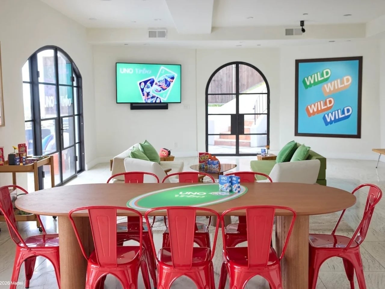
The stays are divided into two experiences. At the top end sit the two “Wild Card” homes, located in the Hollywood Hills and Texas Hill Country. These are the full production: UNO-themed décor, organized game nights, and an in-home dining experience. They’re designed for groups of up to 10 guests who want the whole immersive package, the kind of weekend that’s more curated getaway than casual vacation. Then there are the four “Play It Your Way” stays in Winter Park, Colorado; Palm Desert, California; Panama City Beach, Florida; and Atlanta, Georgia. These are a little more relaxed, but still come with a co-branded UNO x Vrbo Welcome Kit, a game room, and either a pool or hot tub. Essentially, they’re the version for people who want the fun without the fuss. All six properties are bookable for one three-night stay, Friday to Monday, on a first-come, first-served basis. Bookings open May 15 at 1 PM ET. I’ll be honest: at $4 a night, they are going to go fast.

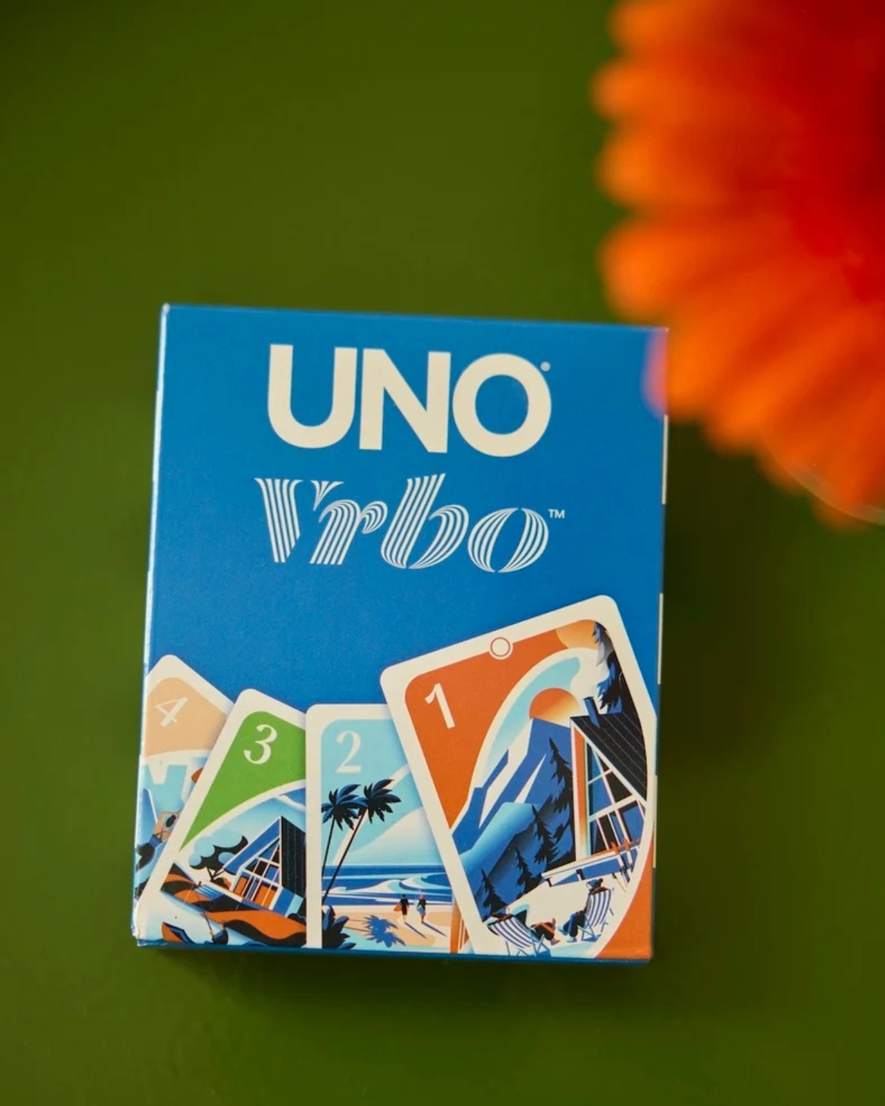
What makes this collaboration genuinely interesting, beyond the price tag, is the attention that went into the actual product. A custom UNO deck was commissioned for this collab, illustrated by Pietari Posti, with artwork inspired by travel destinations and vacation themes. It also comes with an exclusive rule called the “Vacation Rental Swap,” which lets players swap hands with anyone at the table. It’s a small thing, but it shows that the two brands weren’t just slapping logos on a vacation home and calling it a day. They put real creative thought into what the collaboration could actually feel like to experience.

That’s the part that tends to separate a genuinely good brand collab from a lazy one. Anyone can license a logo and stick it on merchandise. Fewer brands take the time to ask what the experience should feel like from the inside, and build something around that answer. UNO, at its core, is a game about chaos and connection. You play it with people you like and you inevitably end up yelling at them. It’s social in the most fundamental way. Vrbo, meanwhile, is about giving groups a private space to actually be together without the interruptions of a hotel. Put those two things in the same room and you get something that doesn’t need to be explained.

It also helps that this collab is part of a growing relationship between Mattel and Expedia Group, Vrbo’s parent company. Mattel already appeared in an Expedia Super Bowl commercial earlier this year through the Barbie universe. So this isn’t a one-off stunt; it reads more like two brands actively figuring out how to build something together over time. For anyone who grew up playing UNO at a kitchen table, there’s an undeniable nostalgia pull here. But the campaign doesn’t lean into nostalgia as a crutch. It uses the game’s identity as a starting point and builds forward from it, which is ultimately why it works. The best collaborations don’t just remind you of something you loved. They give you a new reason to love it again.

The post UNO and Vrbo Are Renting Vacation Homes for $4 a Night first appeared on Yanko Design.
Burning Man 2026 Built a 300-Ring Light Tower You Have to Earn

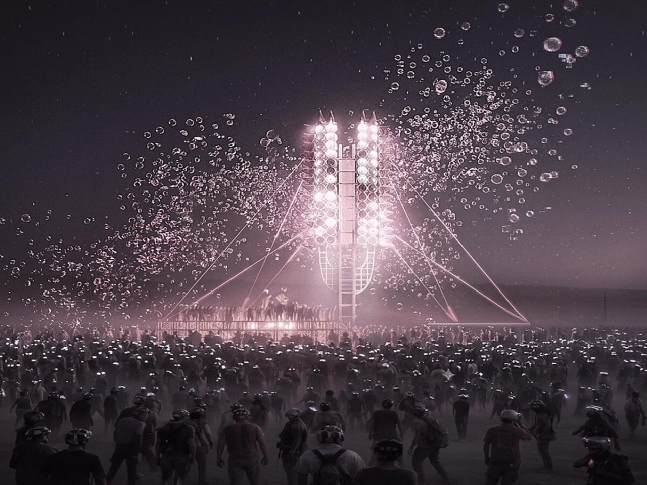
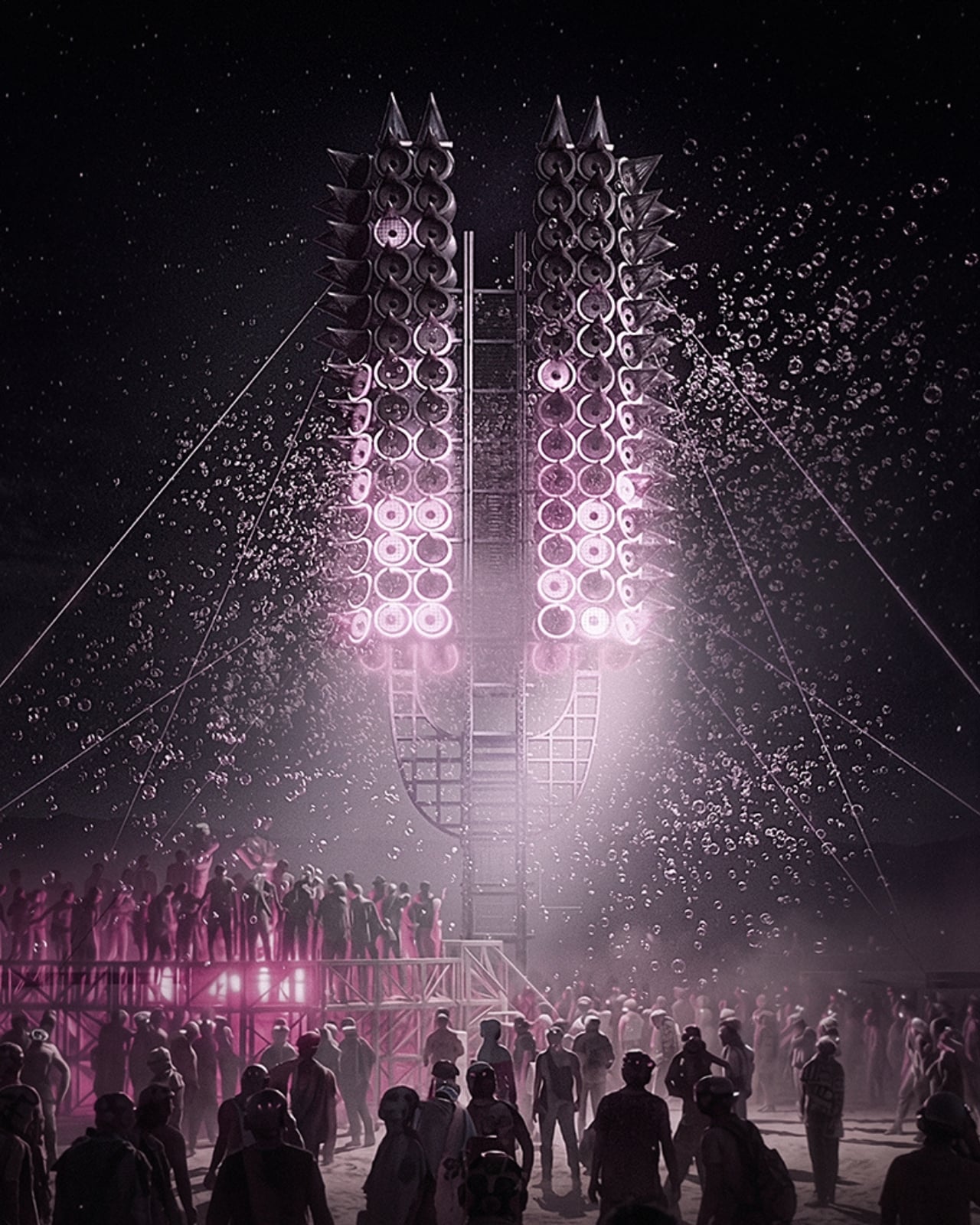
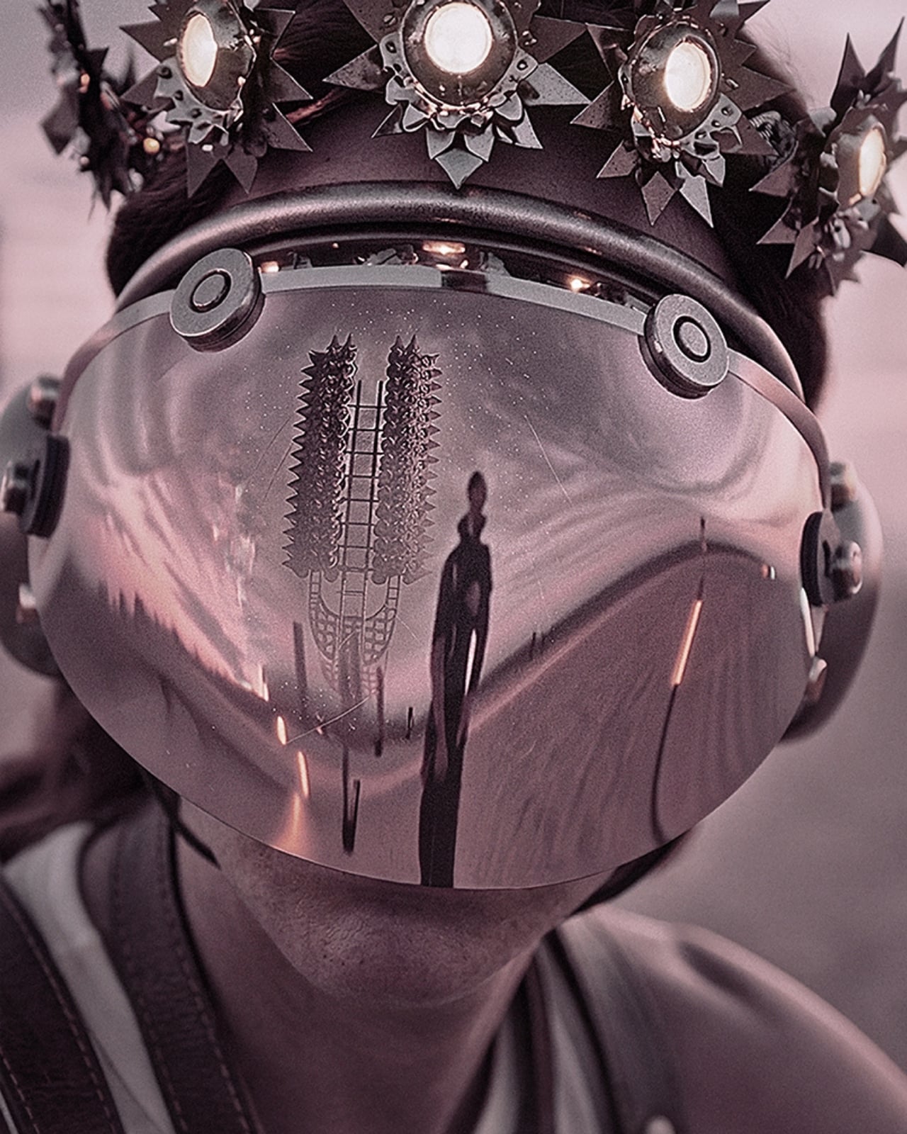
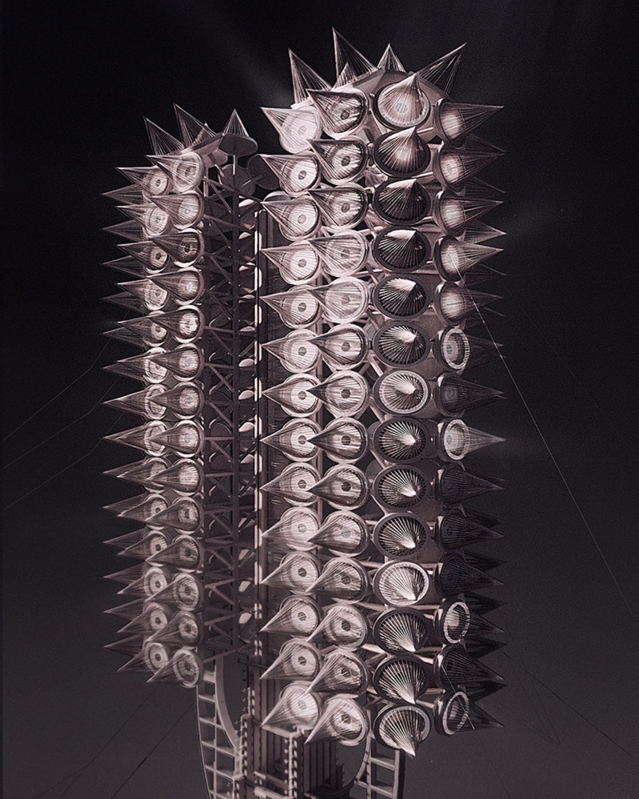
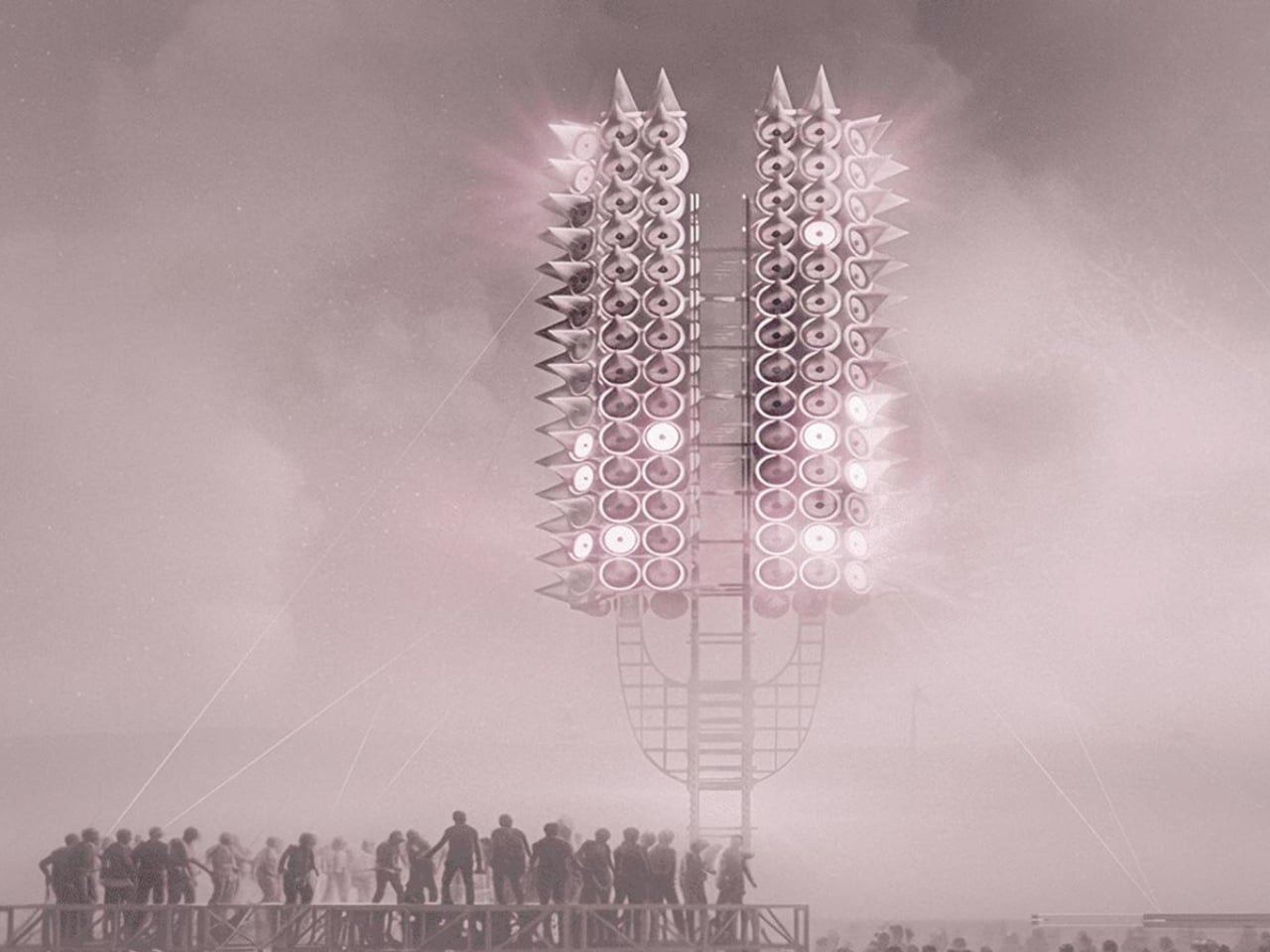
One person shouting into an empty desert doesn’t build much of anything. But what happens when thousands of voices gather around a 12-meter tower made of 300 programmable rings of light, and the structure itself begins to respond? That’s the premise behind Axis Mundi: Resonant Spire, Sergei Konchekov’s installation selected for the 2026 Burning Man Honoraria program, and it might be the most genuinely interesting piece of architecture to emerge this year. Not because it’s the biggest or the most technically complex, but because it actually has something to say.

The concept is both technically precise and philosophically loaded. Konchekov built the tower to translate human voice into a vertical system of light and sound. Speak toward it, and the rings light up. Walk away, and the activation fades. The structure doesn’t generate its own spectacle. It borrows yours. Which sounds like a gimmick when you type it out flat like that, but when you sit with it, it starts to feel like one of those rare design ideas that actually earns its concept.

Designer: Sergei Konchekov

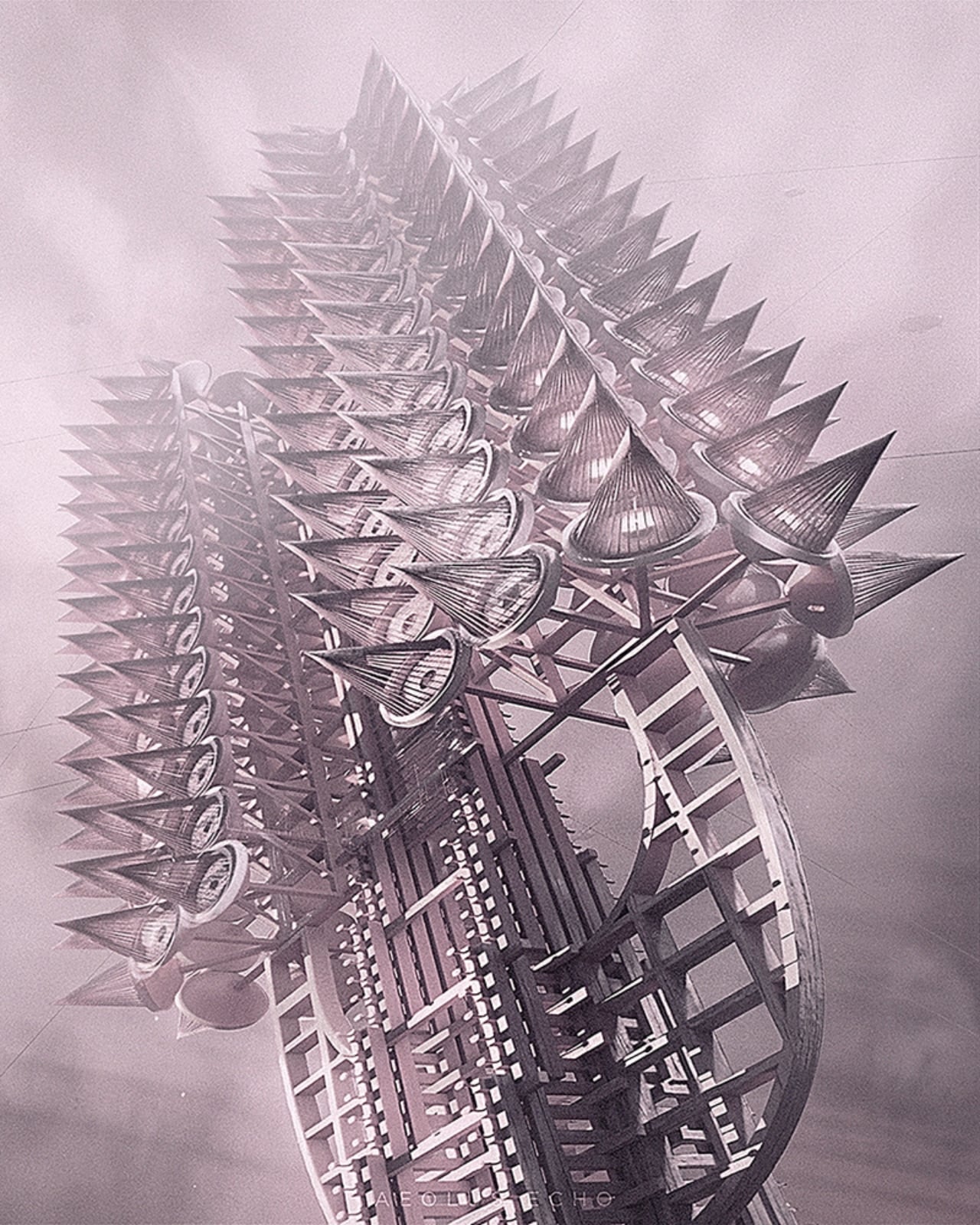
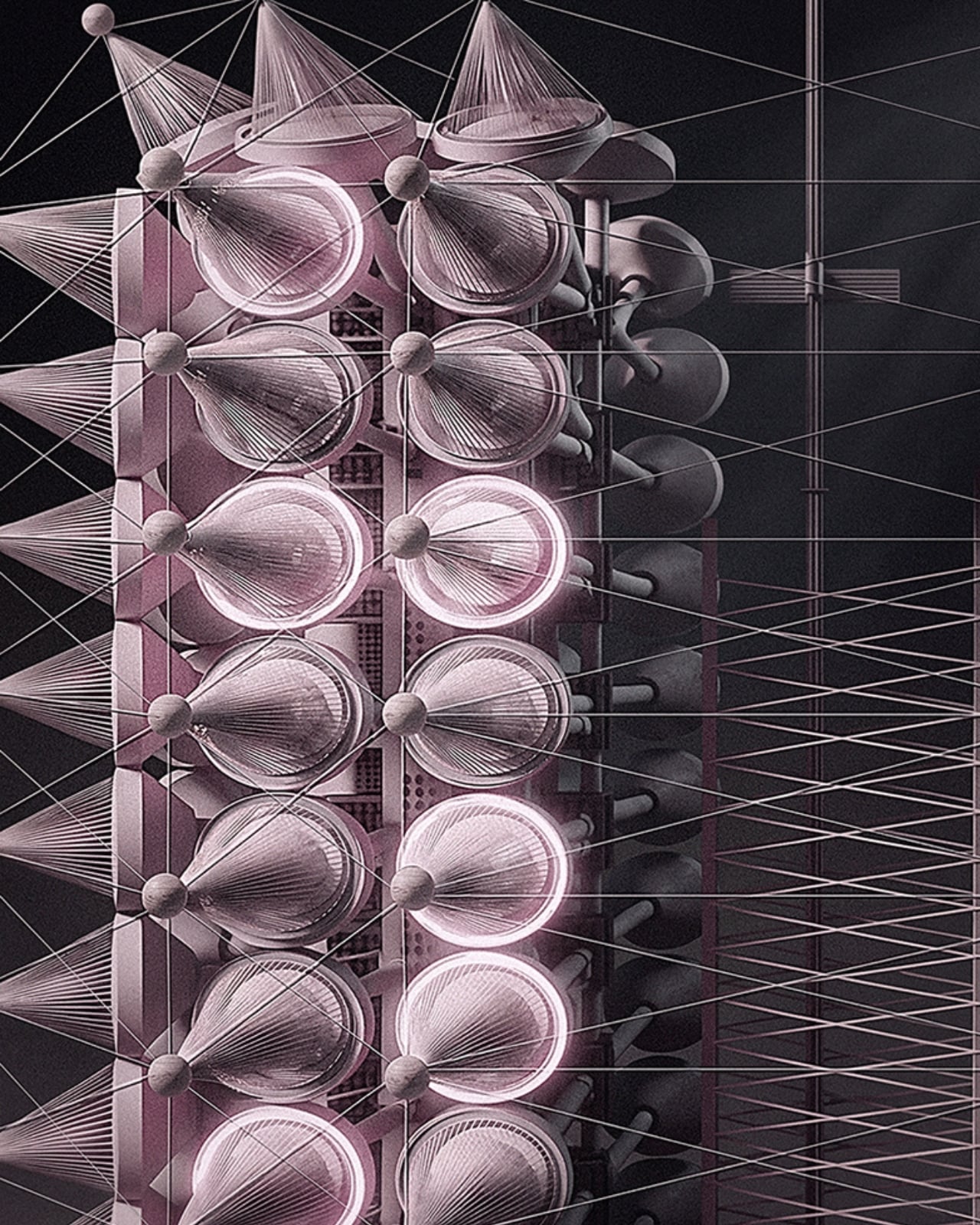
What makes it more than just an interactive light show is the accumulation logic built into its architecture. The 300 rings function as a kind of vertical archive. Lower rings hold stabilized states built up over time, while the upper rings stay live and reactive to current input. So the tower, in a real and structural sense, carries memory. What a crowd did an hour ago is still visible at the base, while what’s happening right now lives near the top. Light doesn’t disappear here. It accumulates. Time, quite literally, becomes physical form.

Konchekov developed the project through a methodology he calls COLLIZIUM, which frames architectural form through conflict-based computational processes and collective social input. That might sound like a design school thesis, but the output is something more immediate and tactile than the language around it suggests. The architecture doesn’t exist independently of its participants. It is generated through them. Without the crowd, there is no form. Burning Man’s own listings describe it as “neither monument nor machine, but a living signal,” and that description genuinely holds.

The broader conversation Konchekov is entering with this work feels particularly timely. Digital communication is at an all-time volume and an all-time low for meaning. We post, we broadcast, we react, and somehow the cumulative noise produces very little that resembles actual connection. Resonant Spire offers a different model: collective input that actually converges, that creates something legible and shared and visible. A crowd becomes a coherent structure only because they showed up together. That is not a small idea dressed in a large installation.

It’s also worth noting that Burning Man is arguably the right venue for this, not just for the obvious reasons of scale and spectacle, but because the event itself is predicated on temporary community. The playa is a place where the usual rules about permanence and individual credit get set aside. A tower that only works when people gather around it and offer their voices is not a metaphor at Burning Man. It’s just a description of what’s happening there already. Konchekov is, in some ways, building architecture that matches the culture it inhabits.

The visual language of the spire draws from ancient and spiritual references, the axis mundi being a cosmological concept found across many cultures, a central pillar connecting earth and sky. Konchekov takes that idea and routes it through a live data feed. The cone-stacked structure rises with phased waves of light traveling upward, in the project’s own words, “like a visible breath.” It is striking, undeniably, but the aesthetic isn’t really the point. The refusal to be passive is. Most architecture asks you to look at it. This one asks you to mean something together before it shows you what you’ve made.

The post Burning Man 2026 Built a 300-Ring Light Tower You Have to Earn first appeared on Yanko Design.