DJI Avata 360 Brings 8K FPV to 360 Flight
DJI Avata 360 combines 8K 360 video, FPV flight, and smart safety features in one compact drone built for immersive aerial creativity.
Your desk has too much stuff on it. A mini PC sits next to a USB hub, which sits next to a wireless charging pad, which sits next to a dock that barely has enough ports anyway. You bought each piece to solve a specific problem, and together they created a new one: a workspace that looks like a Best Buy exploded across your desktop. Cable management becomes a part-time job. Every device needs its own power brick, its own real estate, its own moment of your attention when something inevitably stops working.
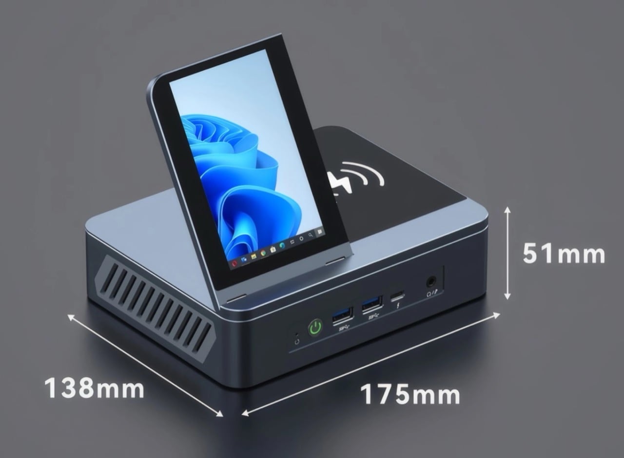
ViewDock Gen2 collapses that entire ecosystem into a single 175mm aluminum block. The Hong Kong-based team designed a vertical mini PC that integrates a 4.5-inch adjustable display, 15W Qi wireless charging, and a full 12-port I/O layout into a form factor that weighs 2.3 pounds and takes up less desk space than a coffee mug. Inside, AMD Ryzen processors from the 6000, 7000, and 8000 series (including options like the 6900HX, 7735H, 7640H, 7840H, 7940H, and 8845H) handle everything from productivity to light gaming, with boost speeds reaching up to 4.9GHz. ViewDock hasn’t published which specific processor ships with each configuration, and performance gaps exist between these chips, so you’ll want to confirm your exact SKU before backing. Dual M.2 slots support up to 4TB of combined storage, and units start at a discounted $639 during the Kickstarter campaign.
Designer: ViewDock
Click Here to Buy Now: $639 $1079 (41% off) Hurry! Only 185 units left.
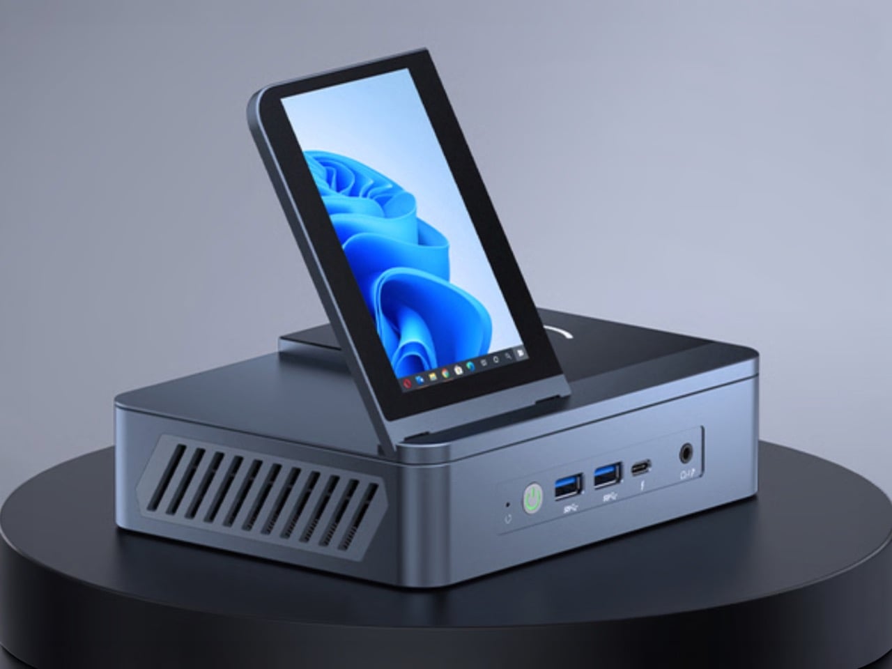
The hinged 4.5-inch display on top of the chassis deserves its own paragraph because it represents a genuine design fork in how you interact with a desktop computer. Most secondary displays are external accessories you buy separately, mount awkwardly, and power independently. ViewDock built one directly into the machine and made it adjustable through 90 degrees, so you can angle it toward your eyeline or fold it flat when you don’t need it. The panel outputs at 480 x 854 pixels, which sounds low until you remember this is a dashboard, not a workstation monitor. You’re using it for system stats, chat windows, calendars, or media previews while your main displays handle the heavy lifting. The screen powers on and off automatically with the system, syncs without configuration, and eliminates yet another cable from your setup. It’s a small decision that compounds across daily use.

The aluminum alloy chassis does more than look good, though it does look good. Most mini PCs default to plastic because it’s cheap and easy to mold, and most mini PCs run hot because plastic doesn’t dissipate heat well and manufacturers cheap out on cooling. ViewDock went the opposite direction. The precision-machined aluminum body acts as a passive heatsink, pulling warmth away from internal components and spreading it across a larger surface area. Inside, a 4000 RPM fan with a vapor chamber design moves air through optimized vents on all sides, keeping the CPU between 30 and 45 degrees Celsius even under sustained workloads. That thermal engineering is the reason the G2 can pack this much performance into a 51mm-tall enclosure without throttling or sounding like a jet engine. You don’t see it, but you benefit from it every time the system stays quiet during a render or stays stable during an overnight compile.

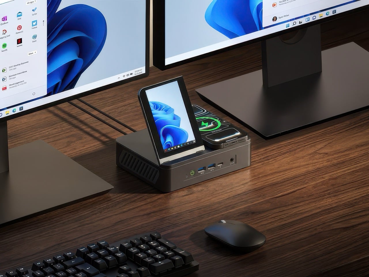
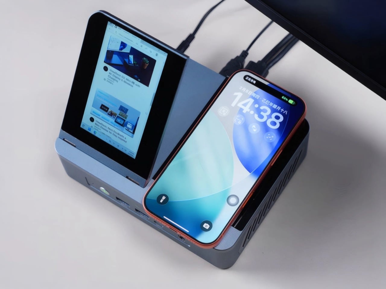
The I/O layout splits across front and rear panels, and ViewDock clearly thought about which ports you reach for often versus which ones you set and forget. The front gives you two USB-A 3.0 ports, one USB-C, a 3.5mm audio jack, and a power button. The rear houses the 40Gbps USB4 Type-C port, HDMI 2.1, DisplayPort 1.4, two more USB-A ports, dual 2.5G Ethernet jacks, and the DC power input. All video outputs support 4K at 120Hz, and you can drive three external monitors simultaneously while using the built-in display as a fourth screen. That’s a legitimate triple-monitor workstation powered by something you can fit in a backpack. The wireless charging pad on top supports the universal Qi standard at 15W, so any compatible phone or earbuds drops onto the surface and charges without fumbling for a cable.

ViewDock also built the G2 to be user-upgradeable, which is increasingly rare in this product category. The chassis opens to reveal two DDR5 SODIMM slots that accept up to 64GB of RAM at 4800MHz or 5600MHz, and two M.2 2280 slots that support SATA3, PCIe 3.0/4.0, and NVMe protocols. Each SSD slot can take a 2TB drive, giving you 4TB of total storage if you max it out. That kind of expandability extends the useful life of the machine well beyond its initial configuration, which matters when you’re spending $600 to $1,200 on a desktop system. WiFi 6 and Bluetooth 5.2 come standard, and the unit ships with a Windows 10/11 trial pre-installed, though it’s fully Linux-compatible if you’d rather run Ubuntu.
The G2 launched on Kickstarter in March 2026 with four main configurations. The Creative Edition starts at $639 with base specs, while the 16GB RAM with 512GB storage model sits at $889. Step up to 16GB with 1TB storage for $999, or go all the way to 32GB with 1TB for $1,229. Those prices represent 40 to 50 percent discounts off projected retail, which is typical for crowdfunding campaigns. ViewDock plans to ship all units in August 2026, with expected delivery in September. Shipping costs vary by region, starting at $20 for Asia and scaling up to $50 for three-unit orders to the US or Canada. The team successfully delivered their first-generation ViewDock docking station to backers last year, which gives this campaign more credibility than most hardware Kickstarters manage on day one.
Click Here to Buy Now: $639 $1079 (41% off) Hurry! Only 185 units left.
The post This All-In-One Ryzen MiniPC Packs 12 Ports, 4.5-Inch Display, and 15W Wireless Charging first appeared on Yanko Design.
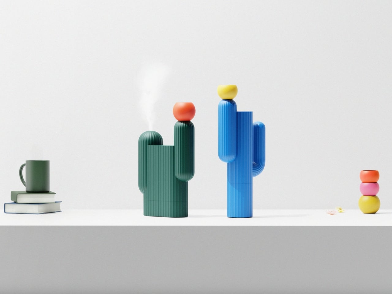
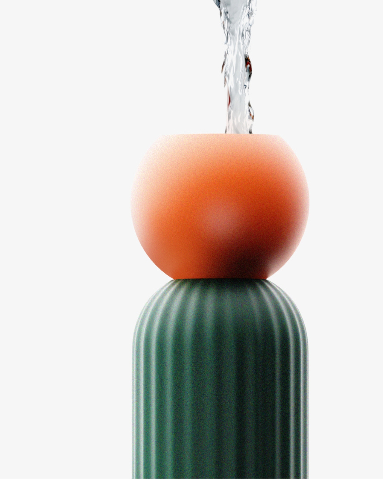
A cactus is probably the last plant you’d associate with moisture. It’s the plant we give to people who forget to water things, the desk companion for the chronically overcommitted. It survives precisely because it hoards water while everything around it is parched. So when designer Ho Joong Lee decided to build a humidifier concept shaped like one, that irony wasn’t incidental. It was the entire premise.
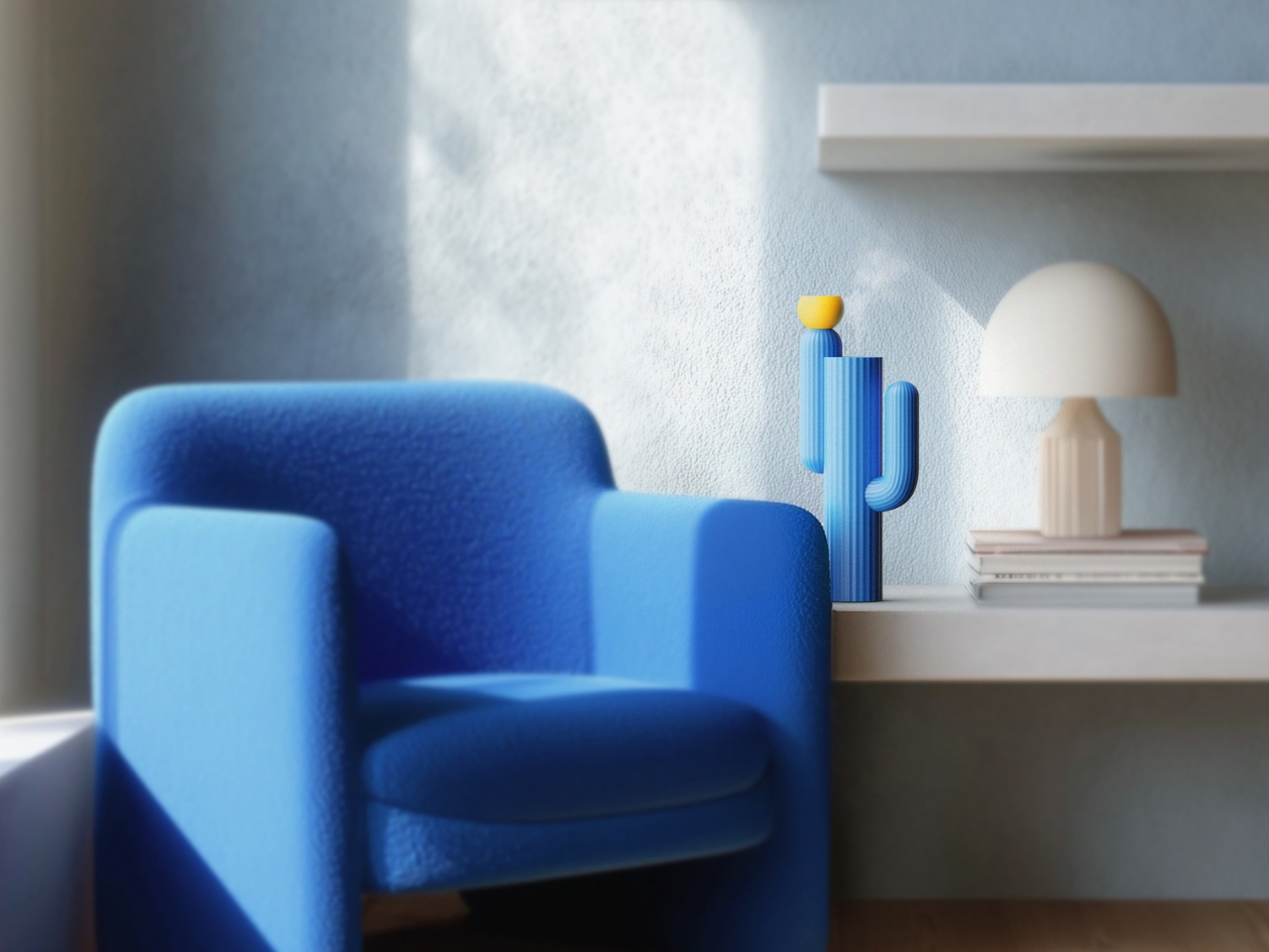
Cabu is a cactus-shaped humidifier concept, but calling it just a humidifier is the kind of reductive description that does it no favors. It’s more accurate to call it a character. A small, solid, ribbed little being that sits quietly on your desk or windowsill, releasing moisture into dry indoor air without demanding too much attention from the room. It occupies space the way a good piece of ceramic does: you notice it, it makes you feel something, and then it just gets on with its job. That quiet self-sufficiency is very cactus-like, actually.
Designer: Ho joong Lee


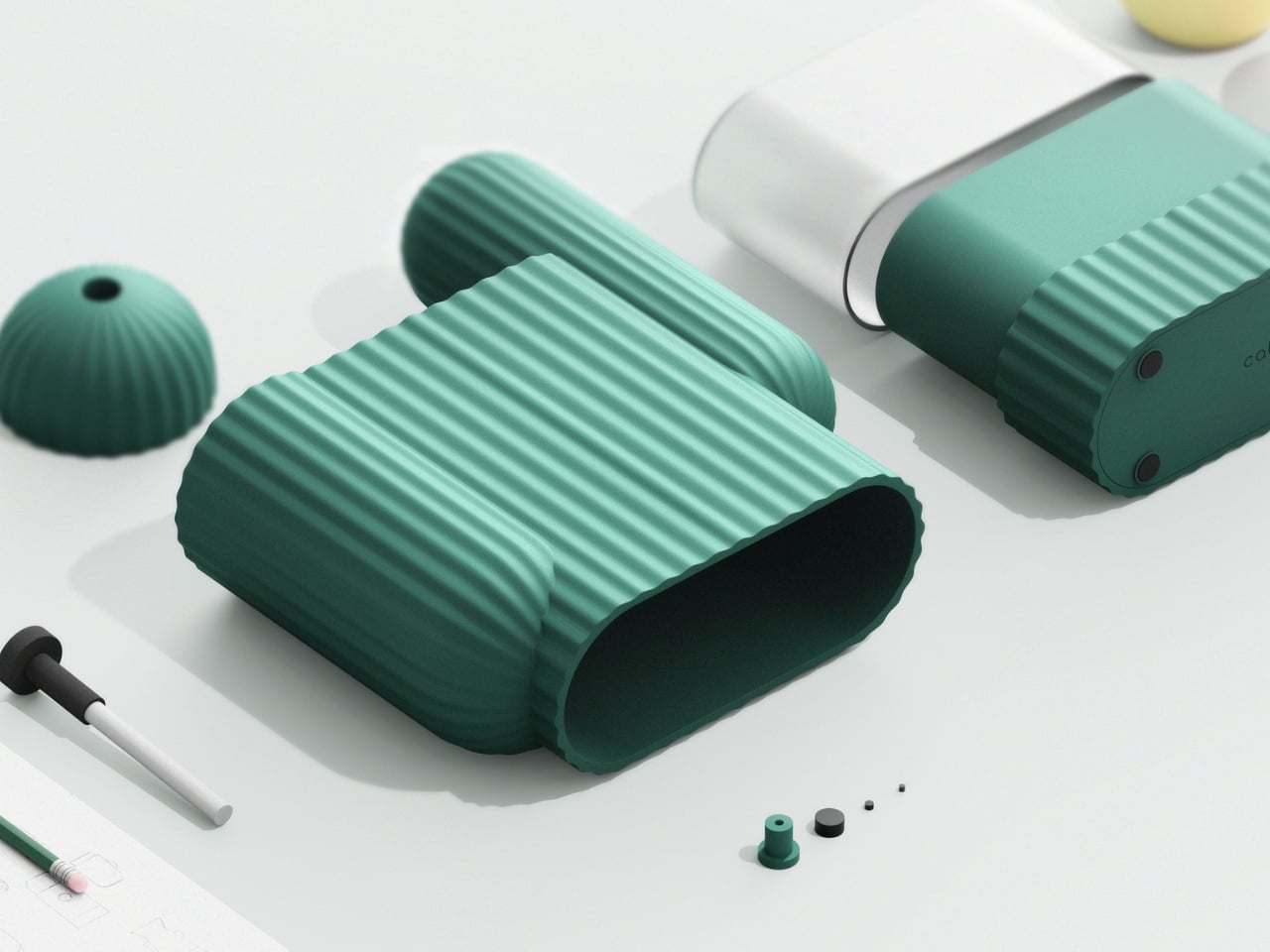
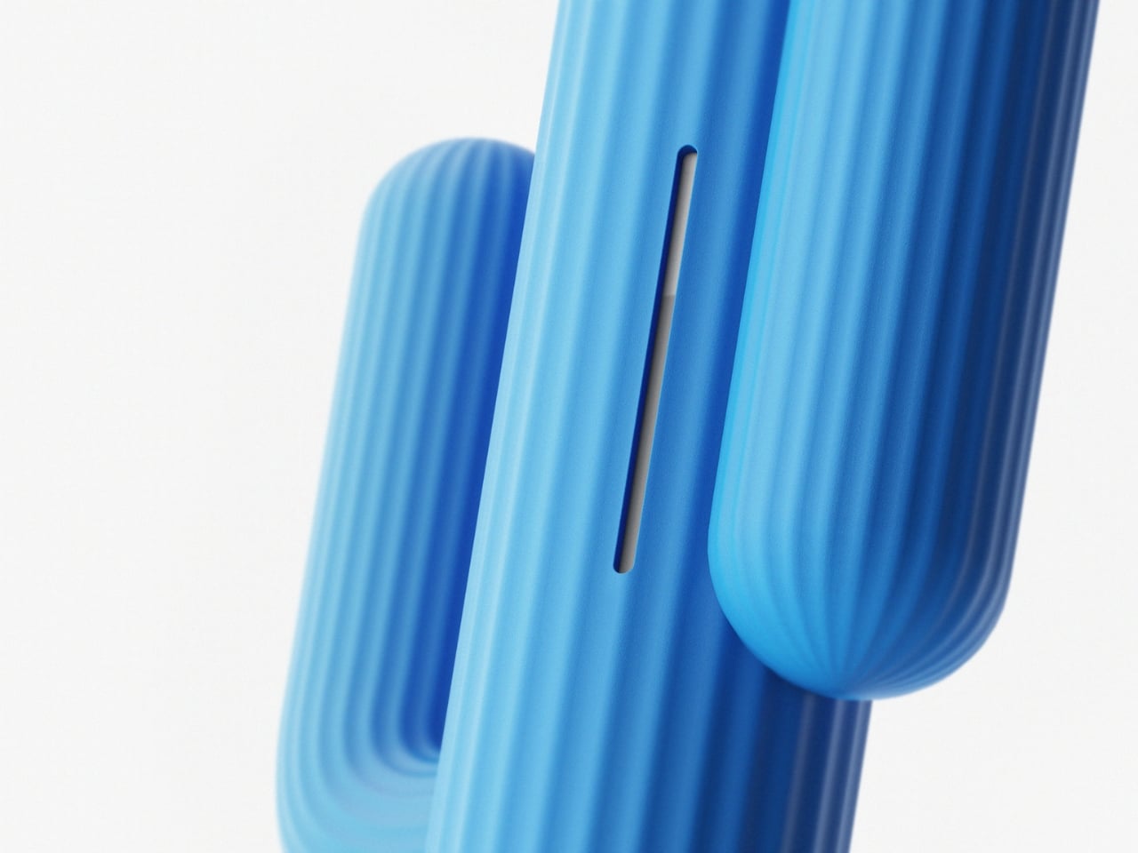
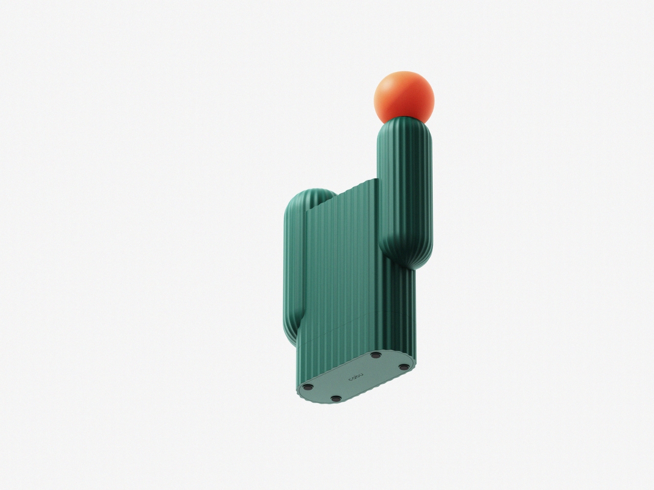
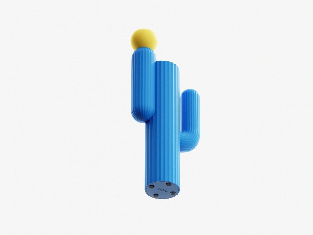
The design reads immediately as playful, but it holds up to closer inspection. The torso comes in two colors: a deep forest green and a vibrant cobalt blue. Both are rich, saturated tones that don’t feel trend-chasing. They feel considered. The rounded, ridged texture of the body mimics the natural ribbing of a real cactus without tipping into novelty gift shop territory, which is a harder balance to strike than it sounds. Too literal and it becomes a costume. Too abstract and the metaphor dissolves. Lee found the middle ground cleanly.
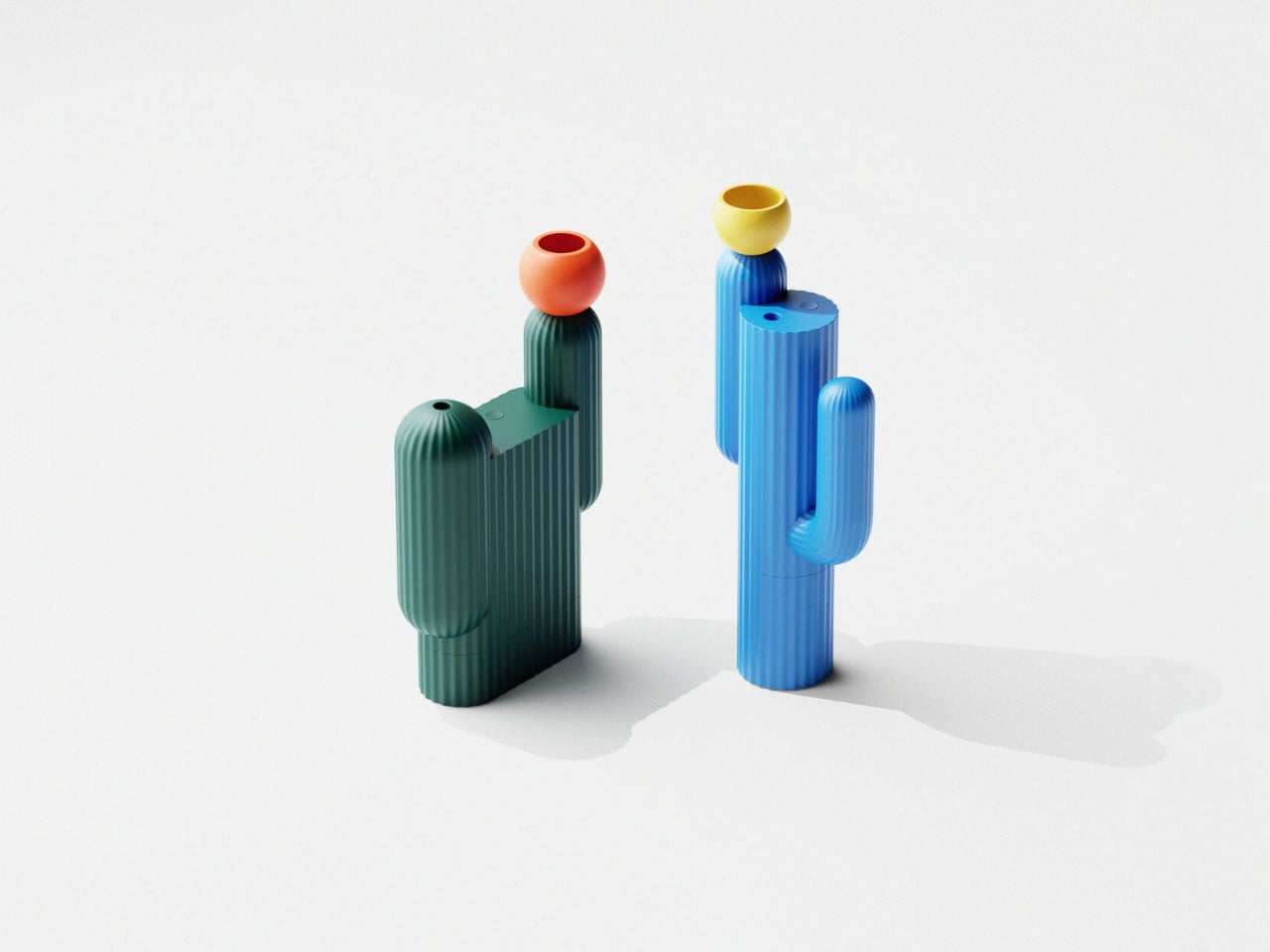
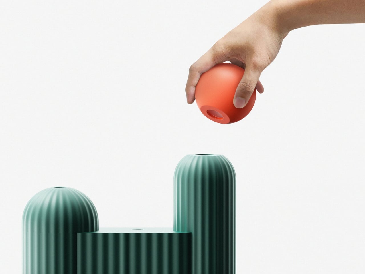
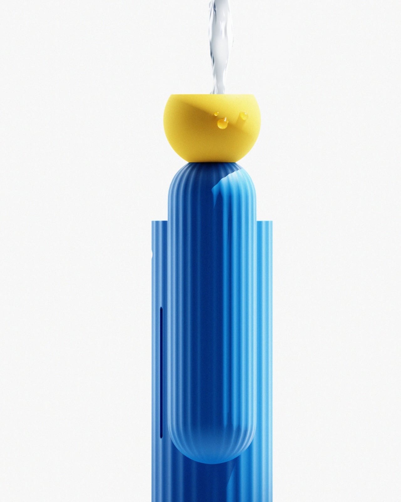
The flower perched at the crown is where Cabu gets genuinely fun. That small spherical object isn’t just a decorative flourish. It’s the water inlet. You lift it off, pour water in, and set it back. The refilling gesture maps directly onto the idea of watering a plant, which means the most utilitarian part of using a humidifier becomes a small, satisfying ritual. The flower comes in three colors (yellow, orange, and pink) and snaps into place via a magnetic structure that holds without fuss. You can swap colors based on your mood, the season, or how your space is dressed that day. It’s a tiny customization feature, but it adds personality in a way that matters.
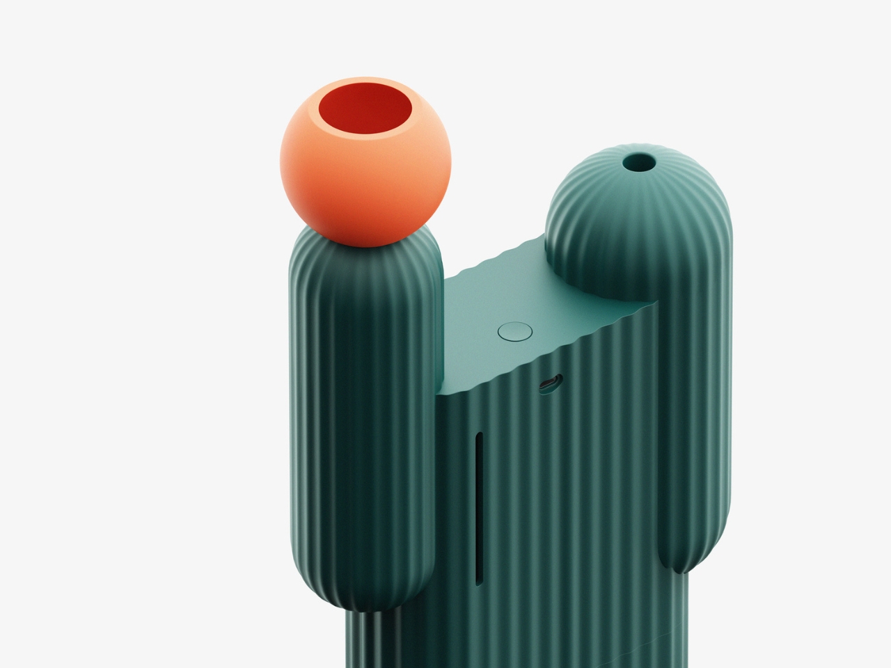
On the practical side, the concept specifies USB-C charging and a water level indicator on the back. Neither is revolutionary, but both are handled thoughtfully. The USB-C detail is a small but real quality-of-life decision that shows Lee was thinking about how people actually use things, not just how the object photographs. The water indicator keeps things straightforward: a visible window on the back tells you what you need to know without extra steps. No blinking LEDs, no accompanying app, no setup ritual. You just look.
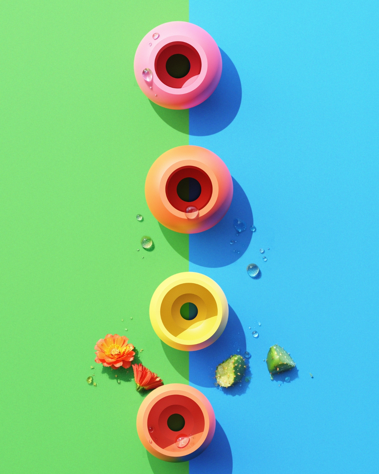
The color pairings across the concept also deserve a mention. The cobalt blue body paired with a yellow flower carries an almost graphic, retro-poster energy. The deep green with orange reads more earthy and organic, like something you’d find in the corner of a well-curated studio. The point is that neither combination feels accidental. Both read as deliberate aesthetic decisions rather than colorway options to fill out a spec sheet. That level of care signals a designer thinking about how an object coexists with a real space over time.
What Cabu ultimately argues is that home objects don’t have to choose between being useful and being beautiful, and more importantly, they don’t have to be emotionally inert. The cactus carries real symbolic weight. It is resilience distilled into a shape. Using that symbol to combat the dryness of modern indoor spaces is the kind of concept that could easily tip into being overwrought. Here, it doesn’t. The execution is restrained enough that the idea communicates without needing to be explained.
That’s usually the mark of design thinking that’s actually working. The concept doesn’t need a label explaining its meaning. It just holds its own. Whether Cabu ever makes it to production, the conversation it starts about how everyday appliances can carry emotional weight is already worth having.

The post A Cactus Humidifier That’s Also a Design Object first appeared on Yanko Design.

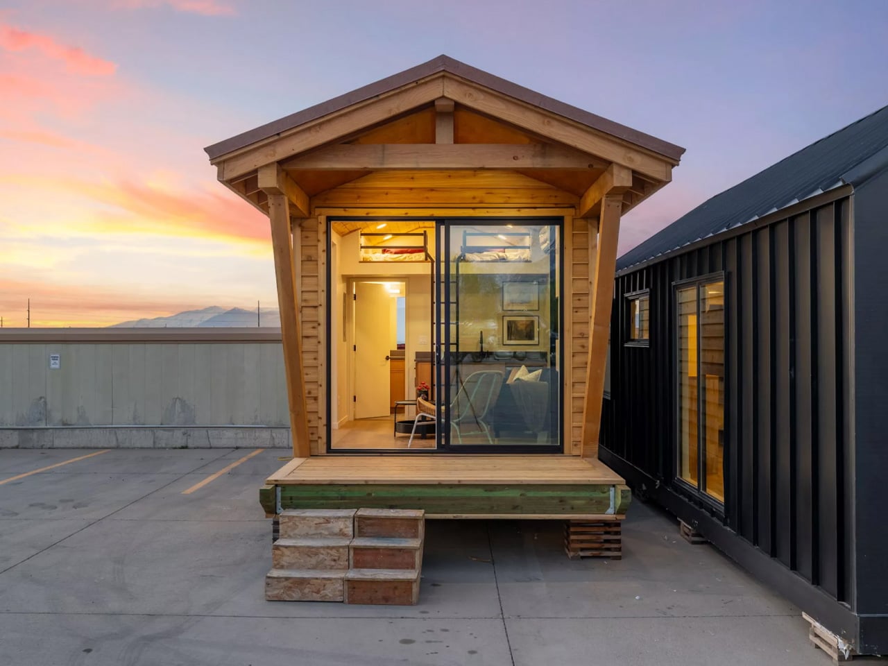
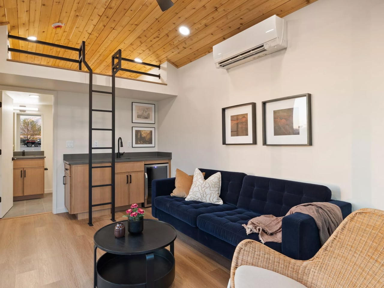
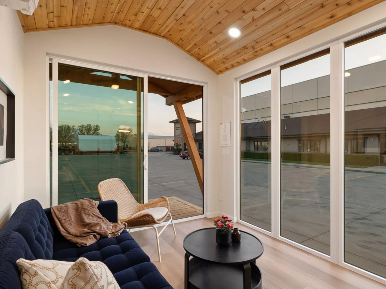
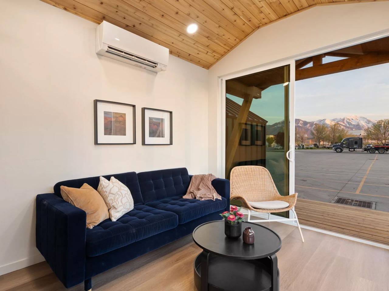
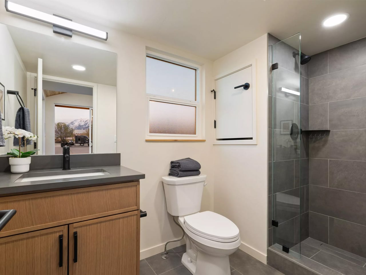
Two hundred square feet sounds like a limitation until you actually see what Irontown Modular did with it. The Sledhaus 200, the latest park model from the Utah-based builder, arrives as a compact, considered cabin that strips the idea of home back to what actually matters.
At just 10 feet wide and 20 feet long, the Sledhaus 200 packs a lofted bedroom, an optional bathroom, a galley kitchen, a living and lounge area, and a front covered porch into its 200 square feet of living space. On paper, that sounds like a tight squeeze. In practice, the design tells a different story. Big windows flood the interior with natural light, warm wood tones wrap the walls with a sense of groundedness, and a vaulted ceiling does the heavy lifting, making the space breathe in a way you wouldn’t expect from something this small.
Designer: Irontown Modular
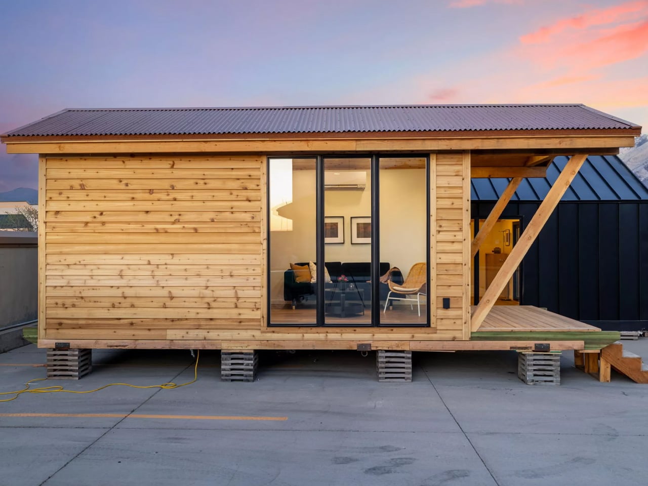
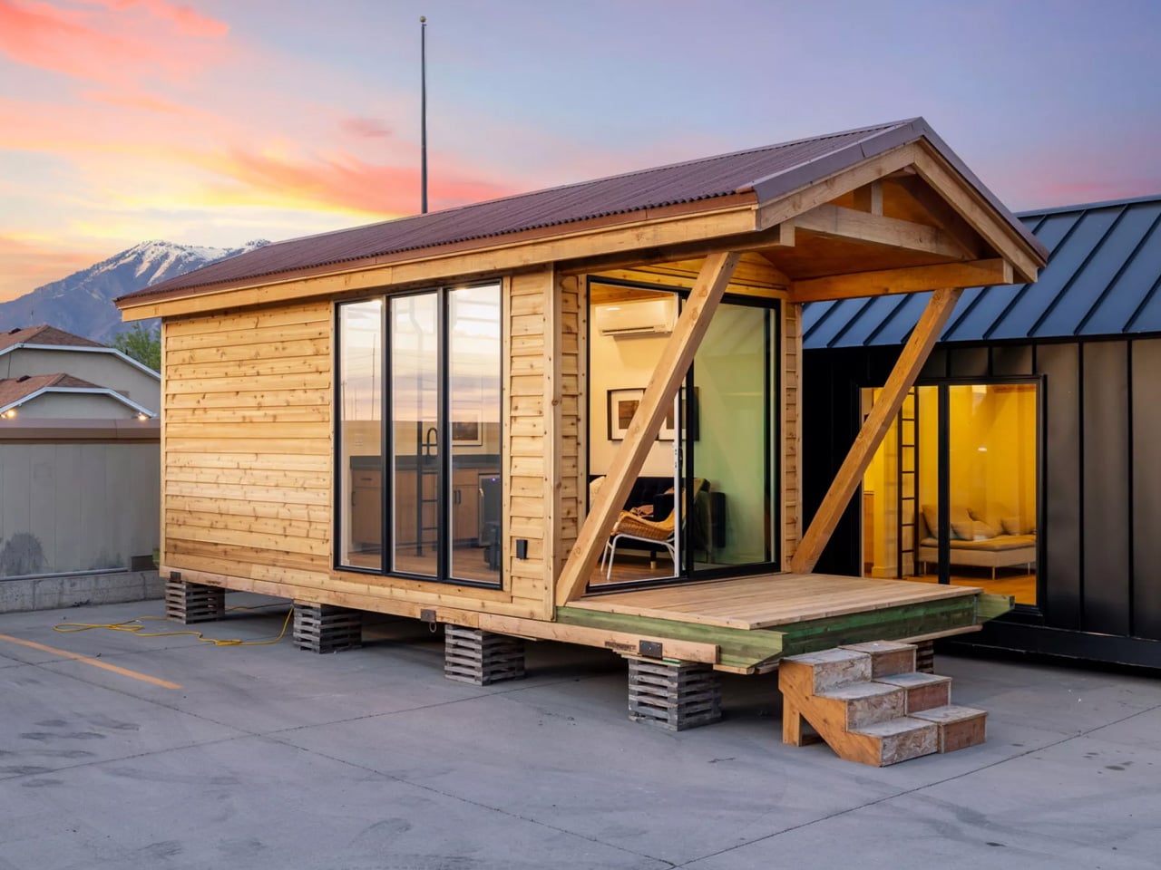
Irontown Modular describes the Sledhaus 200 as built for “simplicity, style, and serious charm,” and that language isn’t just marketing. The cabin sits within the brand’s Sledhaus line, a series of recreational property-focused designs built for people who want a real retreat, not a compromise. It can be placed directly on a trailer chassis for mobile flexibility or installed as an ADU (accessory dwelling unit) on a fixed foundation, making it one of the more versatile entries in Irontown’s growing catalog.
The use cases are where the Sledhaus 200 gets genuinely interesting. Irontown positions it as the ideal backyard guest suite, a weekend mountain getaway, or even a full-time tiny home for those willing to go all-in on a downsized life. It can be dropped on gravel or fully hooked up to water, electricity, and sewage, giving owners real flexibility in how they choose to use it. For property owners in the American West, particularly, where land is abundant but building costs are not, this is a sensible and stylish answer to a growing need.
Pricing starts at $49,600, making the Sledhaus 200 one of the more accessible entries in the modular park home space. A ready-to-ship model is also currently available at $117,000, which does not include transport or taxes. Irontown ships across Arizona, California, Colorado, Idaho, Montana, Nevada, Oregon, Utah, and Wyoming. In a market crowded with tiny homes that try too hard, the Sledhaus 200 earns its place by doing the opposite, trusting the architecture, keeping the details honest, and letting the space speak for itself.


The post Irontown Modular Built a Tiny Cabin With Vaulted Ceilings & Warm Wood Walls for Under $50K first appeared on Yanko Design.
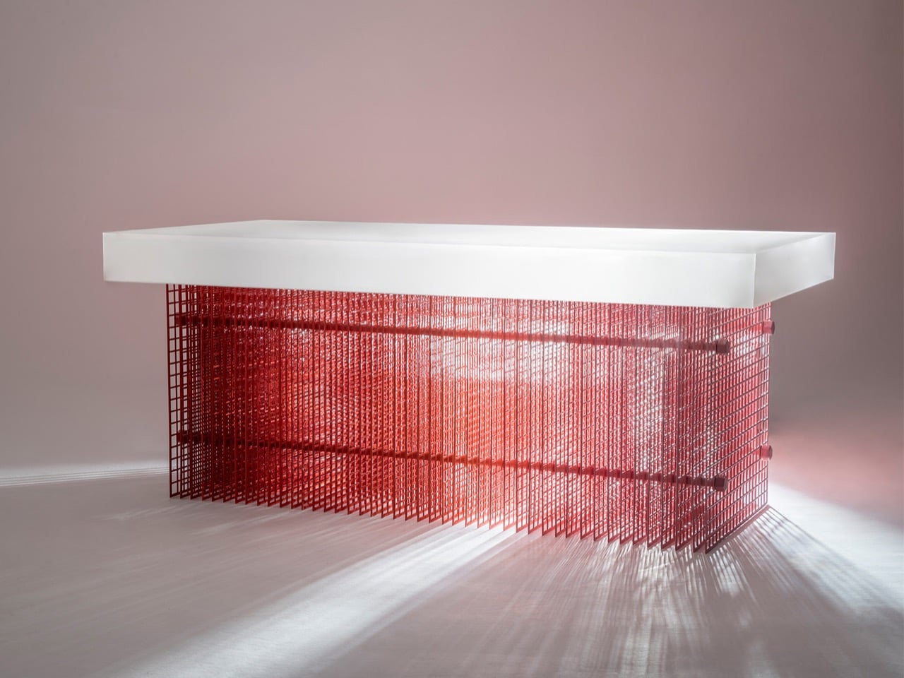
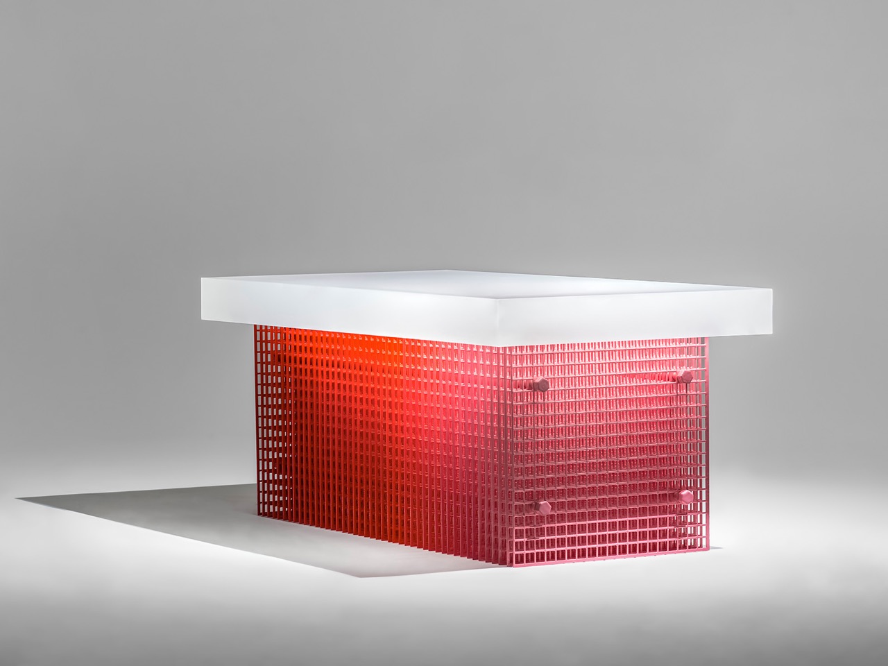
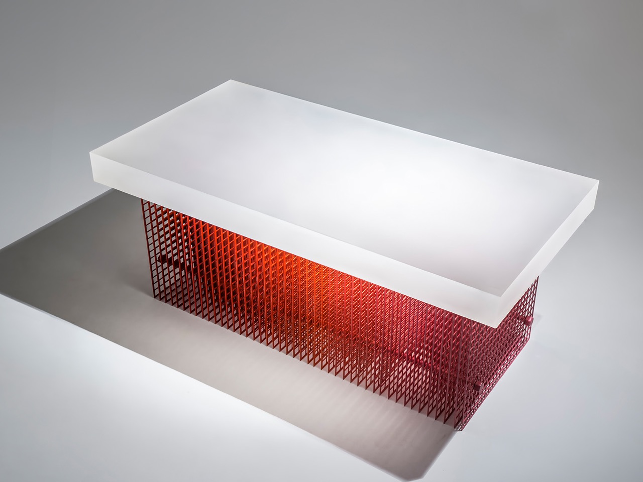
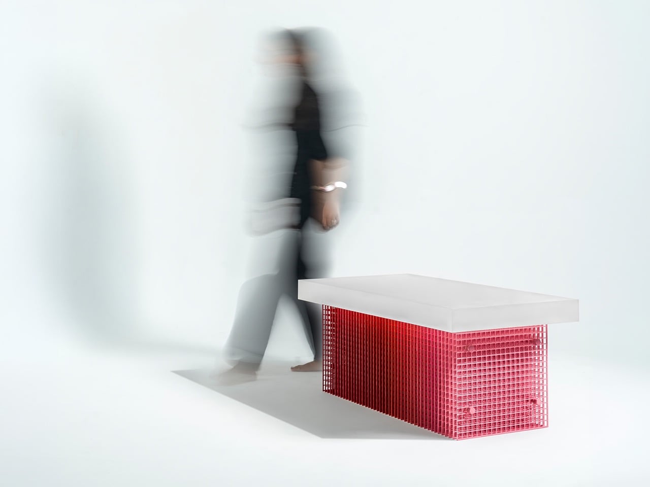
Dhruv Agarwwal’s Blur coffee table is named for what it does to your eyes. The base is a structure of layered steel mesh, each plane sitting close enough to the next that their overlapping grids produce a moire effect across the surface, a shifting, shimmering interference pattern that changes character with every degree of movement from the viewer. The red Meena enamel coating, applied by hand by artisans in Moradabad, intensifies the effect: the slight inconsistencies of hand-application mean the color itself is uneven, denser in some areas, thinner in others, feeding directly into the optical noise.
Above the mesh base floats a frosted acrylic tabletop, thick and rectangular, diffusing rather than reflecting light. The pairing of the two materials produces a coherent visual argument: both surfaces refuse to be fully legible. One shimmers and shifts; the other glows and obscures. Together they make a table that rewards extended looking in a way that polished stone or clear glass simply cannot.
Designer: Dhruv Agarwwal
Meena enamel is a craft with serious heritage. Originating in Rajasthan and practiced extensively across Moradabad, it involves fusing powdered glass onto metal at high temperatures, a process that demands precision and repetition and produces a surface that no two artisans will render identically. Agarwwal worked with local craftspeople to develop a thicker enamel coat than the technique typically yields, which is a meaningful technical decision because thickness changes how the enamel interacts with light, giving it volume and depth rather than lying flat against the wire. On a steel mesh substrate, that depth becomes optical complexity. The wire catches the enamel unevenly, creating micro-variations across thousands of small cells, and those variations are exactly what makes the moire pattern feel alive rather than mechanical.
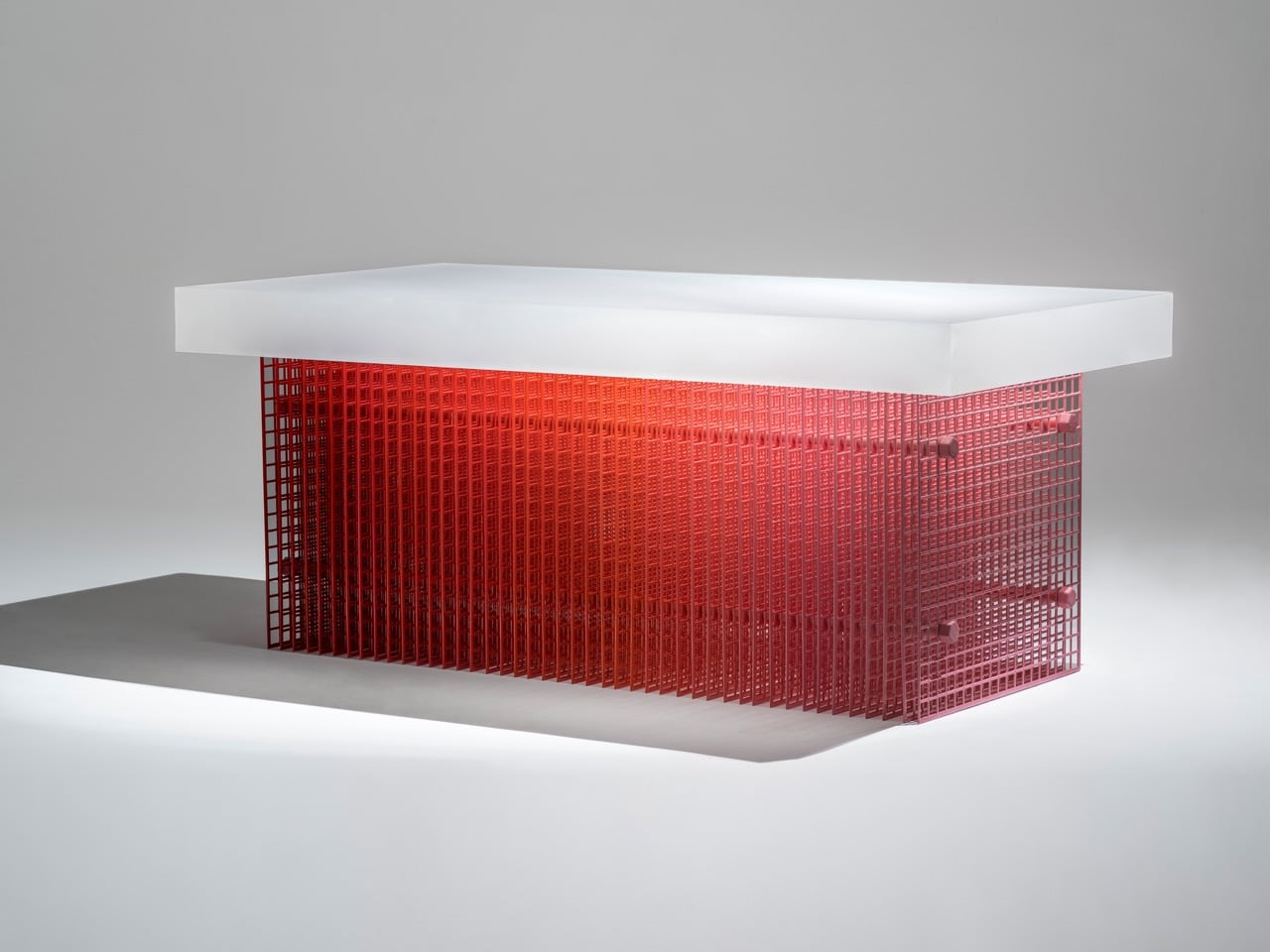
The Moire effect emerges when two or more repetitive patterns overlap at a slight offset or angle, producing a third, emergent pattern at a much larger scale. It is the same phenomenon that makes a window screen look striped when photographed, or causes two chain-link fences to generate waves when viewed at an angle. In Blur, the layered mesh panels are the mechanism, and the enamel coating is the amplifier. At 112 x 56 x 45 cm, the table is coffee table scale, low and rectangular, which means the base sits in the viewer’s sightline rather than below it. You look across the mesh, not down at it, which is precisely the angle at which moire interference is most pronounced.
What separates Blur from the broad category of studio furniture that deploys traditional craft as surface-level ornamentation is that the Meena enamel technique is load-bearing to the concept, not decorative dressing applied after the fact. The irregularity is the point. A machine-applied coating would produce a uniform surface, and a uniform surface would kill the moire entirely, flattening the mesh into something predictable and inert. Agarwwal needed the hand, the slight inconsistency, the human error baked into a centuries-old process, to make the optical effect function. The craft and the perceptual phenomenon are causally linked, not just thematically paired, and that is a genuinely uncommon design position to arrive at and execute convincingly at furniture scale.
The post Dhruv Agarwwal’s Blur Coffee Table Turns an Optical Illusion Into Furniture first appeared on Yanko Design.
Verizon will waive late fees and offer flexible payment arrangements for workers affected by the partial government shutdown. The carrier has made similar offers in the past, like during the COVID-19 pandemic when it gave customers extra mobile data at no additional cost.
The Department of Homeland Security has been hit the hardest by the partial shutdown, but Verizon's offer covers any federal worker who's able to offer employment verification. Verizon says employees can call 1-800-Verizon (1-800-922-0204) to get their late fees waived and set up a payment plan.
The partial government shutdown started in February after Congress failed to pass a new DHS funding bill. The lack of funding has not affected all of DHS' sprawling organizations equally, however. While the Transportation Security Administration is no longer able to pay its employees — leading to significant delays in airport security lines over the last week — both Immigration and Customs Enforcement and Customs and Border Protection have been spared thanks to a separate funding pool established by a previous bill.
Lawmakers continued inability to fund DHS also happens to hinge on both agencies. Democratic senators and congresspeople are demanding ICE agents wear body cams and remove masks before making arrests, among other restrictions, and refusing to fund DHS until those restrictions are worked into the bill. Both Republicans and Democrats have also separately proposed funding the entire department except for ICE and CBP, but while that bill passed in the Senate, it hasn't been taken up in the House.
This article originally appeared on Engadget at https://www.engadget.com/mobile/verizon-waives-late-fees-for-federal-workers-affected-by-partial-dhs-shutdown-221814382.html?src=rss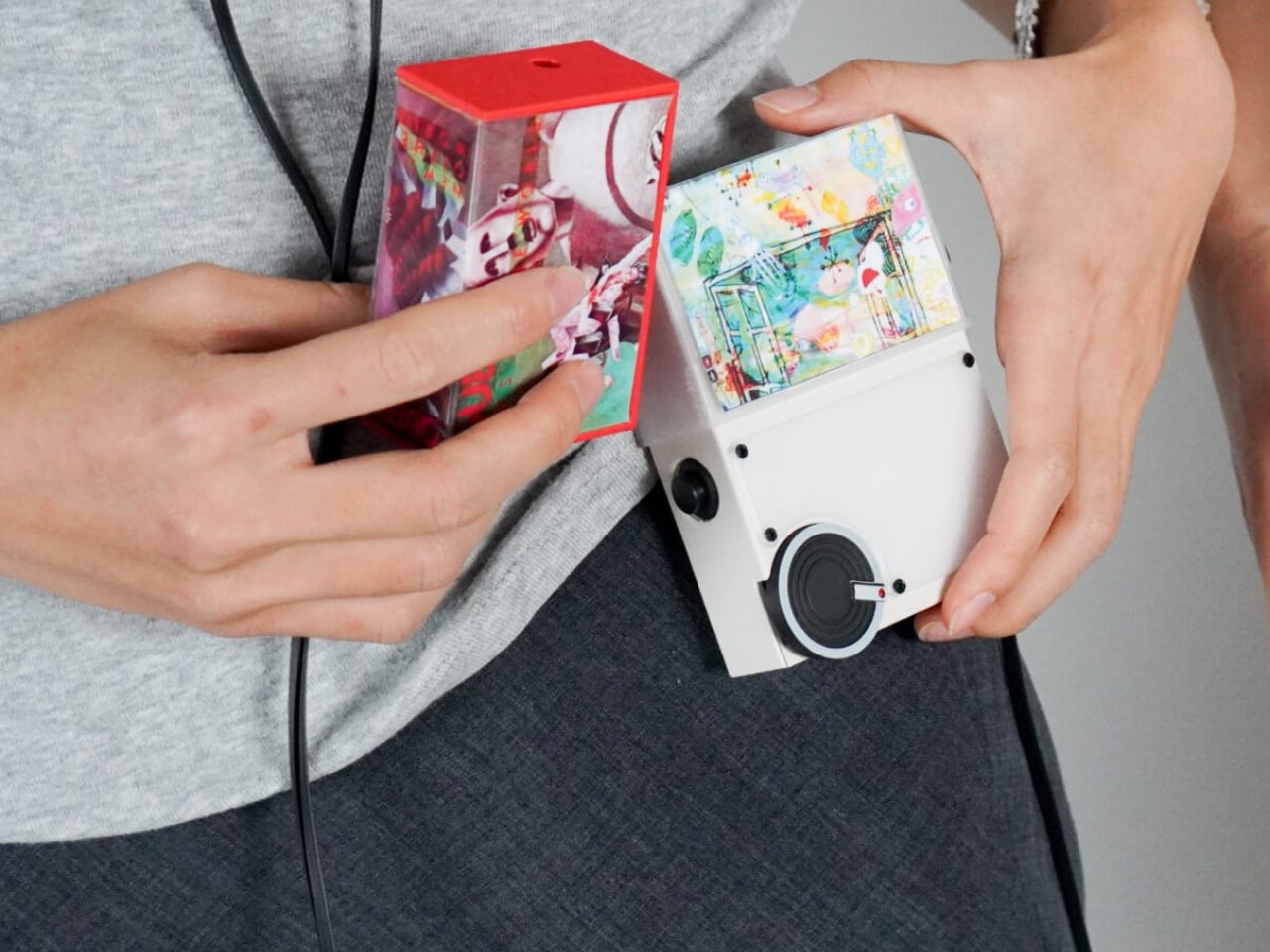
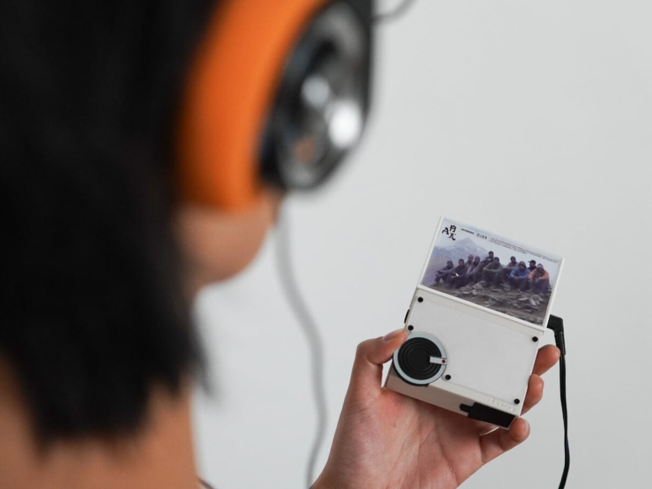
At some point, music stopped being an event and became wallpaper. You don’t really choose what plays anymore. A playlist starts, an algorithm decides what comes next, and before you know it, three hours have passed and you couldn’t name a single song. We used to sit with albums. We used to commit to them. That shift in how we listen is so gradual, so seamless, that most of us didn’t even notice it happening.
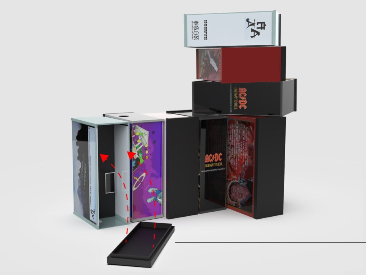
Arindam Kalita noticed. The multidisciplinary industrial designer, based in New York City and currently studying at Parsons School of Design, is betting that plenty of us miss that older, more intentional way of engaging with music. His project, called Analog, is a transparent CD player, and it is one of the more quietly compelling design statements to emerge from the current wave of nostalgia around physical media.
Designer: Arindam Kalita

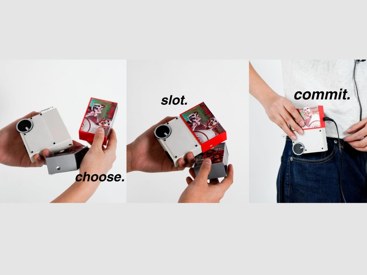
The premise is almost aggressively simple. Analog has a power button and a volume knob. That’s it. No screen, no algorithm, no shuffle function, no “Up Next” queue pulling you in six directions. You put in a CD and you listen to it. The whole thing. In order. The way the artist intended. Kalita describes it as a “distraction-free music listening device designed to restore intention and commitment to the act of listening,” and that framing matters because it isn’t merely a product description. It is a design philosophy made physical.
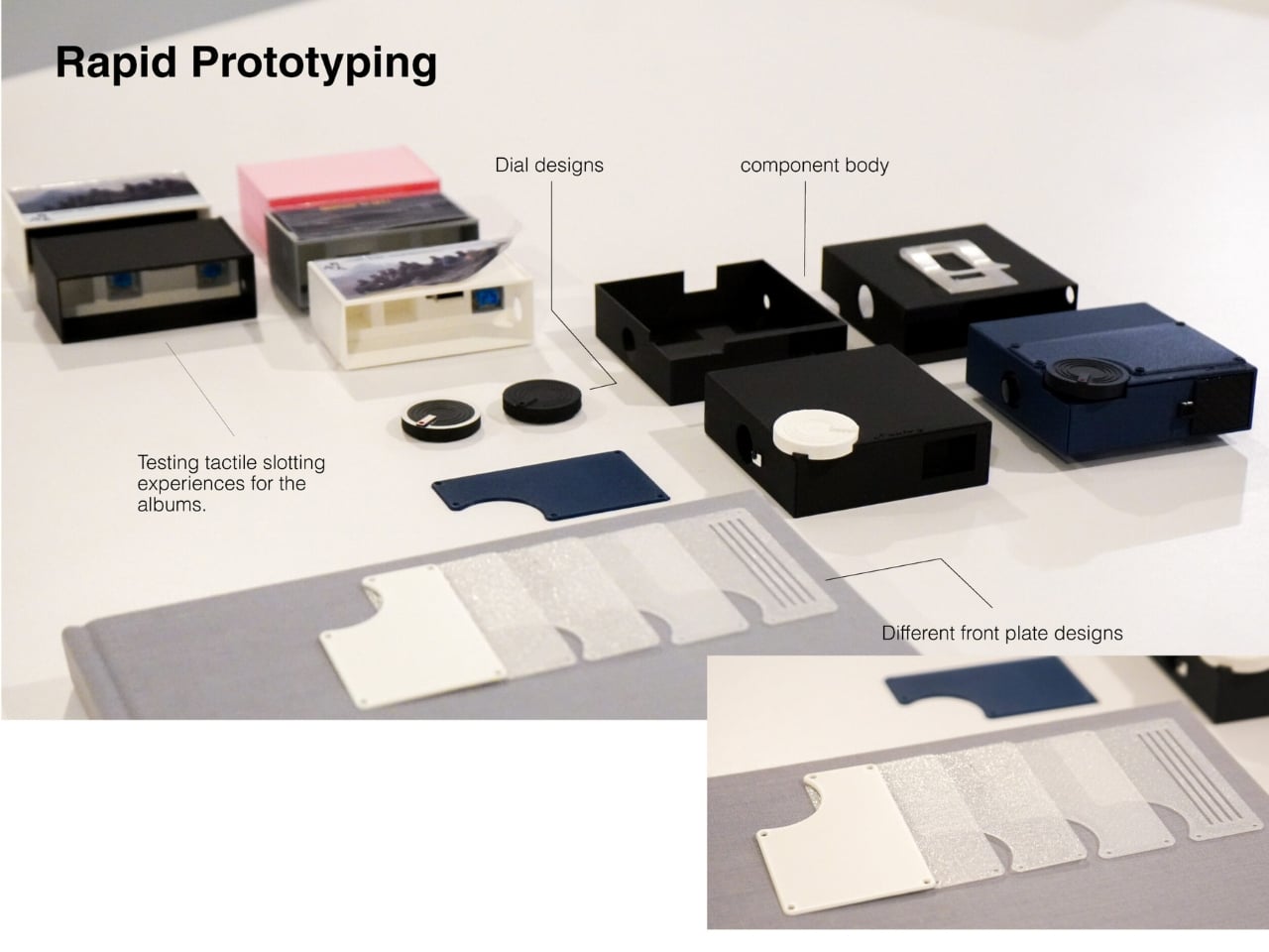
The transparency is what makes Analog visually arresting. The casing is clear, which means you can watch the disc spin, follow the mechanics working in real time, and see the whole process of recorded sound become something tangible. Kalita calls it “a sculptural window into your sound,” and that description earns itself. You watch the CD move and you’re suddenly reminded that music is a material thing, that it exists somewhere beyond a server farm. That reminder turns out to be surprisingly moving. It’s the kind of design detail that rewards you for paying attention.
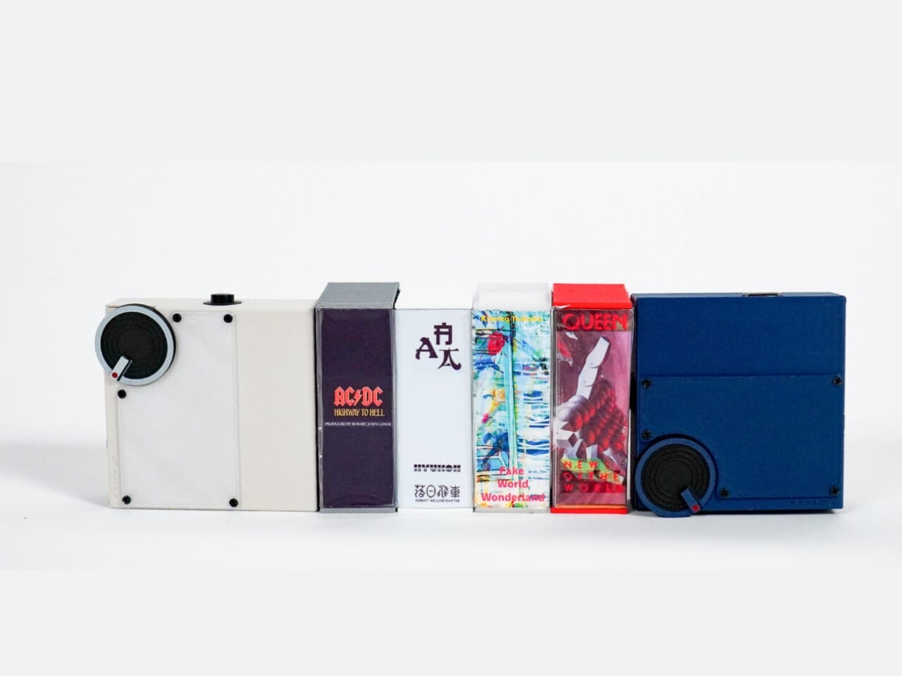
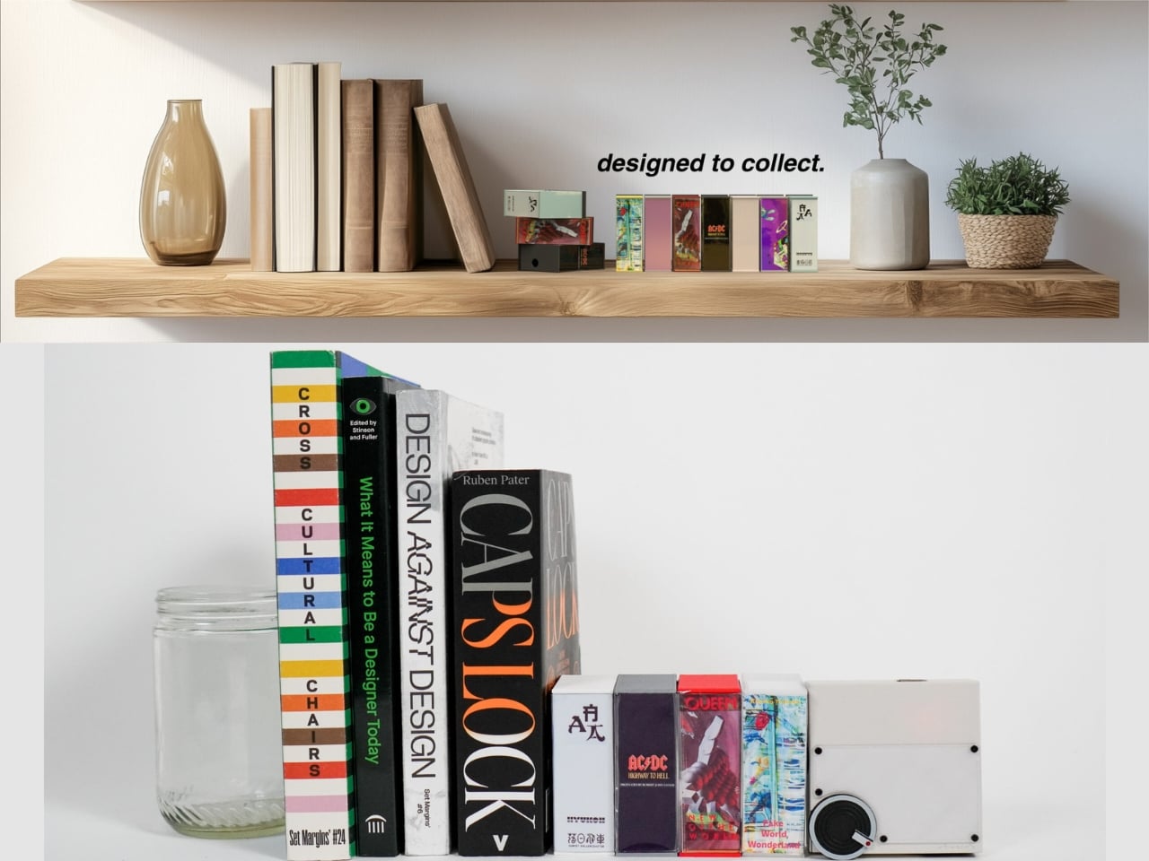
The timing of this project feels deliberate. The vinyl revival has been going strong for years, and CDs are quietly following a similar arc. Sales have been steadily climbing, thrift store bins are getting picked over with real intention, and people are rediscovering what it feels like to have a physical relationship with music they love. Analog fits right into that conversation, but it isn’t trying to be retro for the sake of aesthetics. The design is clean and modern, and the transparency gives the whole thing a contemporary, almost scientific quality that keeps it from sliding into nostalgia bait.
The more interesting argument Analog makes is about constraint. Most of us have a streaming library that is effectively infinite, and that abundance, paradoxically, makes both choosing and listening more passive. When you only have the album you put in, you pay attention differently. You stop skipping. You let the slow tracks breathe. You remember that albums have pacing and arc, and that the track you used to fast-forward through is actually one of the best ones. You start actually listening instead of just having music on. Kalita’s design is making a case through form alone that fewer options can create a richer experience.
Kalita believes that humans connect to objects and experiences through tangibility and sight, placing designers in a position of great power and responsibility. Analog is a direct expression of that. It asks you to see your music, to physically interact with it, to be present for it. That feels almost radical in 2026, and I think that’s precisely the intention.
Whether or not Analog ever goes to market is, in a way, beside the point. The best concept design doesn’t just propose a product. It poses a question. What do we actually want from music? Convenience or connection? Background noise or something you can recall the next day? I know my answer, and I suspect if a lot of people stopped to think about it, they’d know theirs too.

The post The ‘Transparent CD Player’ That Makes Streaming Feel Lazy first appeared on Yanko Design.
A hacking group called Handala has gained access to FBI Director Kash Patel's email account, Reuters reports. The group published content from Patel's email on their website as proof, including photos of Patel "sniffing and smoking cigars" and "making a face while taking a picture of himself in the mirror with a large bottle of rum."
TechCrunch was able to independently confirm that at least some of the emails Handala stole were from Patel's account by checking information used by mail delivery systems that’s stored in an email's header. Several stolen emails included a cryptographic signature that linked them to Patel's account. The FBI has also separately confirmed that the Director's account was hacked. "The FBI is aware of malicious actors targeting Director Patel's personal email information, and we have taken all necessary steps to mitigate potential risks associated with this activity," the Bureau told TechCrunch. "The information in question is historical in nature and involves no government information."
The FBI is offering up to $10 million in rewards for more information about the hackers who targeted Patel's account. Handala presents as a pro-Palestinian hacking group online, but is believed to be one of several aliases used by cyberintelligence units working for the Iranian government, Reuters writes. Groups affiliated with Iran have targeted officials in the US before. In August 2024, the FBI shared that a separate group, APT42, was trying to gain access to both the Trump and Harris campaigns. Three men associated with APT42 were later charged that September.
Handala has appeared to become more active during the current conflict between the US, Israel and Iran. According to Reuters, the group claimed to be behind a cyber attack on Stryker, a medical devices company, earlier in March. Handala also said it accessed and published personal data from Lockheed Martin employees stationed in the Middle East.
This article originally appeared on Engadget at https://www.engadget.com/cybersecurity/kash-patels-personal-email-account-was-accessed-by-hackers-linked-to-iran-212618474.html?src=rssElon Musk and Mark Zuckerberg have a complicated history. In 2023, the two vowed to fight each other in a cage match that never happened. But by early 2025, when both were cozying up to the newly-elected President Donald Trump, they were apparently on more friendly terms.
In February of that year, Zuckerberg texted Musk approvingly about his work with the now-defunct Department of Government Efficiency (DOGE). "Looks like DOGE is making progress," the Meta CEO texted. "I've got our teams on alert to take down content doxxing or threatening the people on your team. Let me know if there's anything else I can do to help."
The texts, which were published Friday in court documents as part of Musk's lawsuit against Sam Altman and OpenAI, are dated February 3, 2025. That's just a few weeks after Zuckerberg announced Meta's pivot away from content moderation in favor of "free expression." It's also the same day that a US Attorney said he would protect DOGE employees from "disgruntled" critics.
Musk responded to Zuckerberg's message with a heart and followed up with an unrelated topic: OpenAI. He asked Zuckerberg if he was "open to the idea of bidding on the OpenAI IP with me and some others." Zuckerberg asked to "discuss it live" and Musk said he would call the next day. Previous documents disclosed in the case show that Musk had invited Zuckerberg to help him buy OpenAI, though he never officially signed on to the bid.
In a separate filing also made public Friday, Musk's lawyers argued that his exchanges with the Meta CEO ought to be excluded from the lawsuit. "Musk’s personal relationships and communications – including with other high-profile individuals – are also tangential and prejudicial," they wrote. "Defendants included in their exhibit list for trial, for example, several private exchanges between Musk and Mark Zuckerberg discussing Musk’s political activity and this lawsuit. Those recent communications have nothing to do with Musk’s claims and are nothing more than Defendants’ attempt to stoke negative sentiments toward Musk because of his association with Zuckerberg."
A Meta spokesperson declined to comment.
In the same filing, Musk's lawyers also take issue with Altman's lawyers asking about Musk's alleged ketamine use and his attendance at Burning Man. A transcript from a video deposition with Musk indicated he was asked if had taken "rhino ket" at Burning Man in 2017. Musk said no, according to the transcript.
"Any implication that music festivals or drugs have any relevance to this case is outlandish, and how Musk spends his free time is equally irrelevant," his lawyers wrote. A judge ruled earlier this month that OpenAI's lawyers would be permitted to ask "limited" questions about Burning Man, but not ketamine.
This article originally appeared on Engadget at https://www.engadget.com/big-tech/mark-zuckerberg-offered-to-help-elon-musk-with-doge-in-2025-211737138.html?src=rss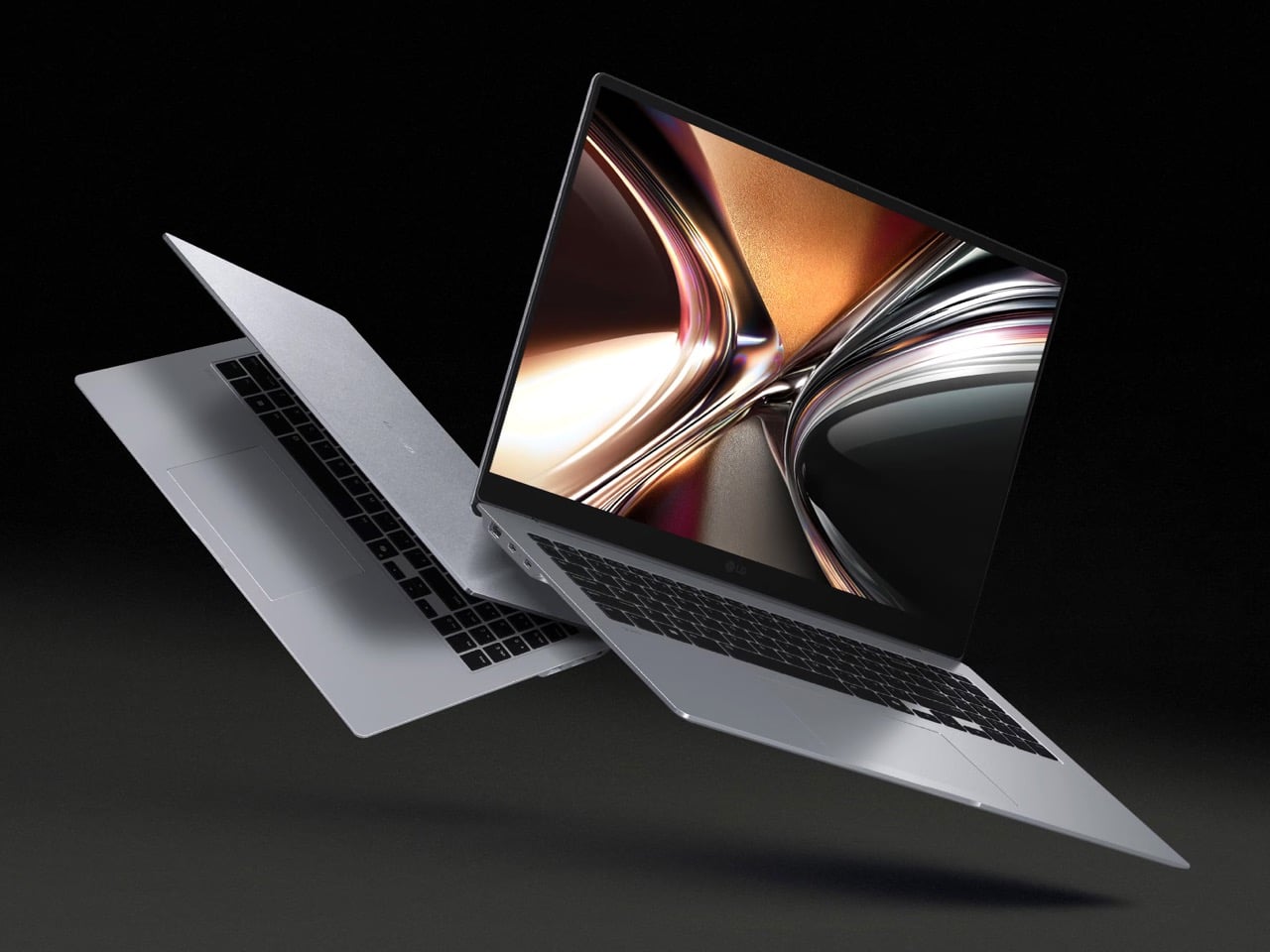
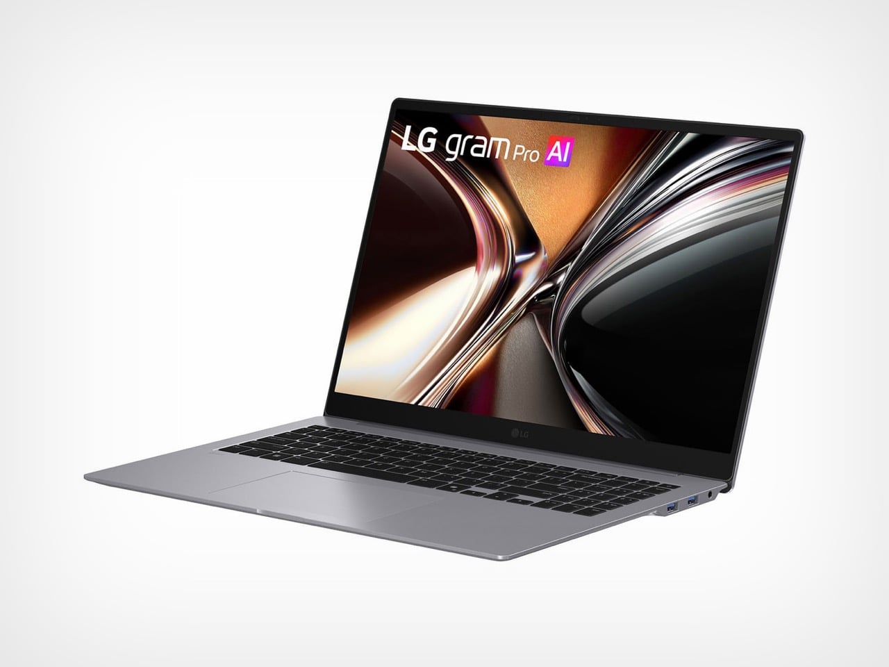
Every laptop manufacturer promises lighter builds, but most of them cheat. They shrink the battery, strip out ports, swap metal for plastic, or just make the screen smaller and call it progress. Real weight reduction without compromise requires inventing something new at the molecular level, which is exactly what LG did. The company spent the last year developing Aerominum, an in-house engineered alloy designed to be simultaneously lighter and stronger than the magnesium chassis that defined the gram line for a decade. The result is a 16-inch laptop with a 120Hz OLED display that weighs under 1.2 kilograms, a figure that sounds like a typo until you actually pick one up.
LG introduced three new gram models this week, all built on the Aerominum chassis: a 14-inch variant with Intel Panther Lake, a 17-inch with 32GB of RAM and an optional NVIDIA RTX 5050 GPU, and the headliner gram Pro 16. The Pro 16 pairs its sub-1.2kg weight with a 2,880 x 1,800 OLED panel running at 120Hz, powered by Intel’s latest Core Ultra processors. LG claims the new alloy meets military-grade durability standards while delivering scratch resistance that previous gram models couldn’t match. If the engineering holds up under real-world use, this could finally be the laptop that breaks the portability ceiling for 16-inch displays.
Designer: LG
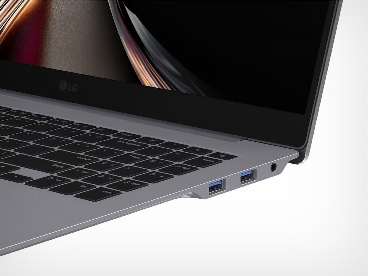
Aerominum replaces the magnesium alloy LG has used across the gram lineup since 2015, when the series first launched internationally. The new material uses what LG calls an “aeroplate structure,” a term that suggests internal geometry optimization rather than just a change in chemical composition. The company also applies a refined atelier brushing technique to the surface, delivering a metallic finish that looks premium without adding the typical weight penalty of anodized aluminum. The scratch resistance claim addresses one of the most consistent criticisms leveled at ultralight laptops over the years: magnesium chassis tend to show wear quickly, and previous gram models were no exception. Whether Aerominum actually solves that problem will depend on how it holds up after six months in a backpack, but the intent is clear.
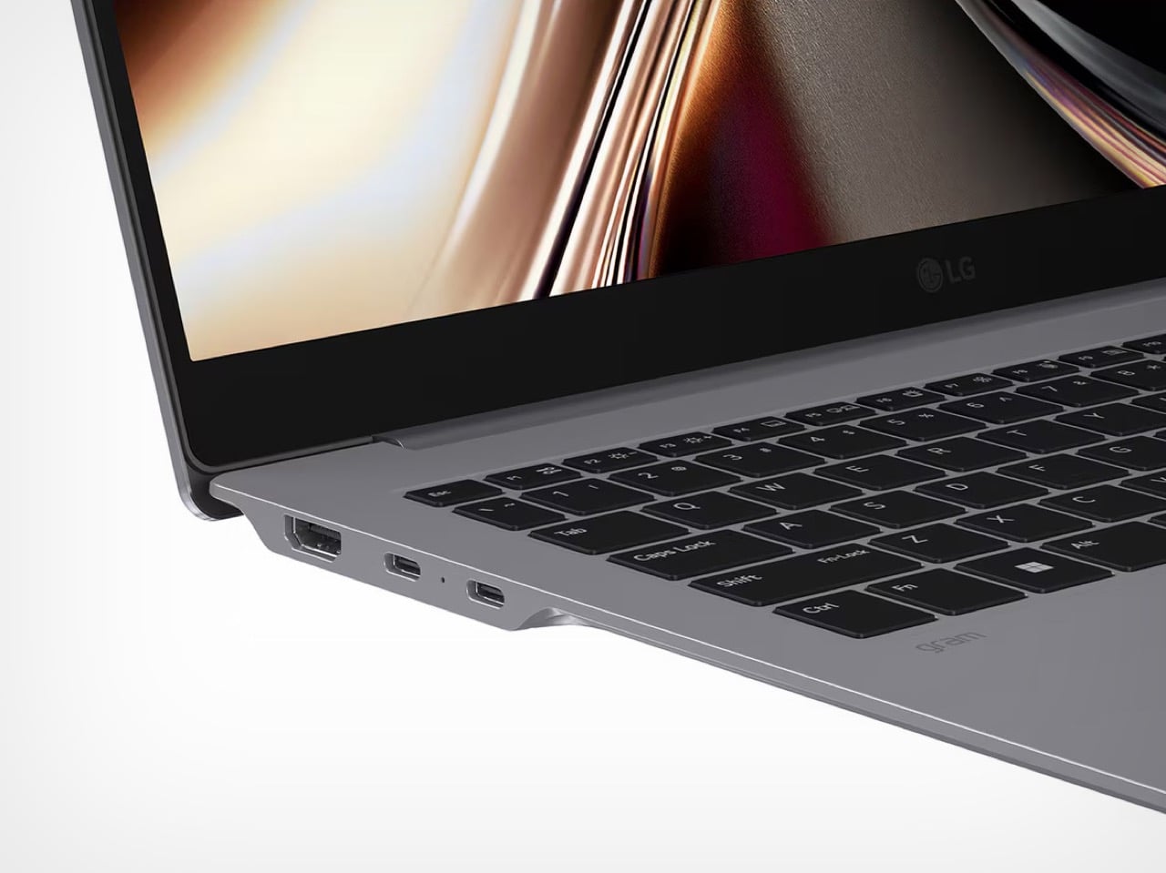
The gram Pro 16 carries a 2,880 x 1,800 OLED display with a 120Hz refresh rate, a resolution LG markets as WQXGA+. The OLED panel is the differentiator here. LG’s 17-inch model uses an IPS display, which keeps costs down but sacrifices contrast and color depth. The Pro 16 gets the premium screen treatment, and pairing that with a 120Hz refresh rate makes it viable for light creative work and high-refresh browsing without needing discrete graphics. Intel’s Core Ultra processors handle the computing side, though LG hasn’t disclosed specific SKUs yet. The company does confirm support for both on-device AI (via LG’s gram chat powered by EXAONE 3.5 sLLM) and Microsoft Copilot+ PC functionality, which requires certain minimum performance thresholds that narrow down the chip options.
Weighing under 1.2 kilograms puts the gram Pro 16 in the same weight class as most 13-inch ultrabooks, which is absurd for a machine with a 16-inch OLED display. For context, Apple’s 13-inch MacBook Air with M3 weighs 1.24 kg. The Dell XPS 16 sits closer to 2.1 kg, and even Lenovo’s ThinkPad X1 Carbon (a 14-inch machine) weighs 1.19 kg. LG has been chasing this kind of weight advantage since the gram line launched over a decade ago, and Aerominum is the material innovation that finally closed the gap.

The gram Pro 16 will compete directly with premium Windows ultrabooks from Dell, Lenovo, and ASUS, all of which have been adding OLED options to their flagship models over the past two years. LG’s advantage is weight. The weakness, historically, has been GPU performance and pricing. The Pro 16 skips discrete graphics entirely, which will limit its appeal to anyone doing serious video editing or 3D work. Pricing hasn’t been announced yet, but previous gram Pro models launched at premium price points that undercut Apple while overshooting most Windows competitors. If LG can keep the Pro 16 under $2,000, it becomes a legitimate alternative to the MacBook Pro 16. If it creeps past that threshold, the weight advantage starts to feel like an expensive novelty.
The post LG Just Invented a New Metal to Build the Lightest 16-Inch OLED Laptop of 2026 first appeared on Yanko Design.