We just reinvented Phablets: Huawei’s Wide-body Pura X View feels oddly nostalgic to the touch

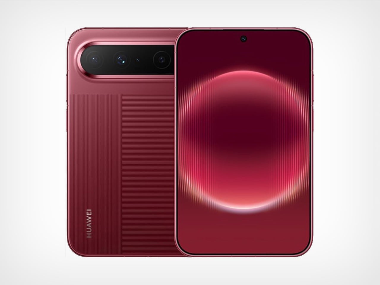
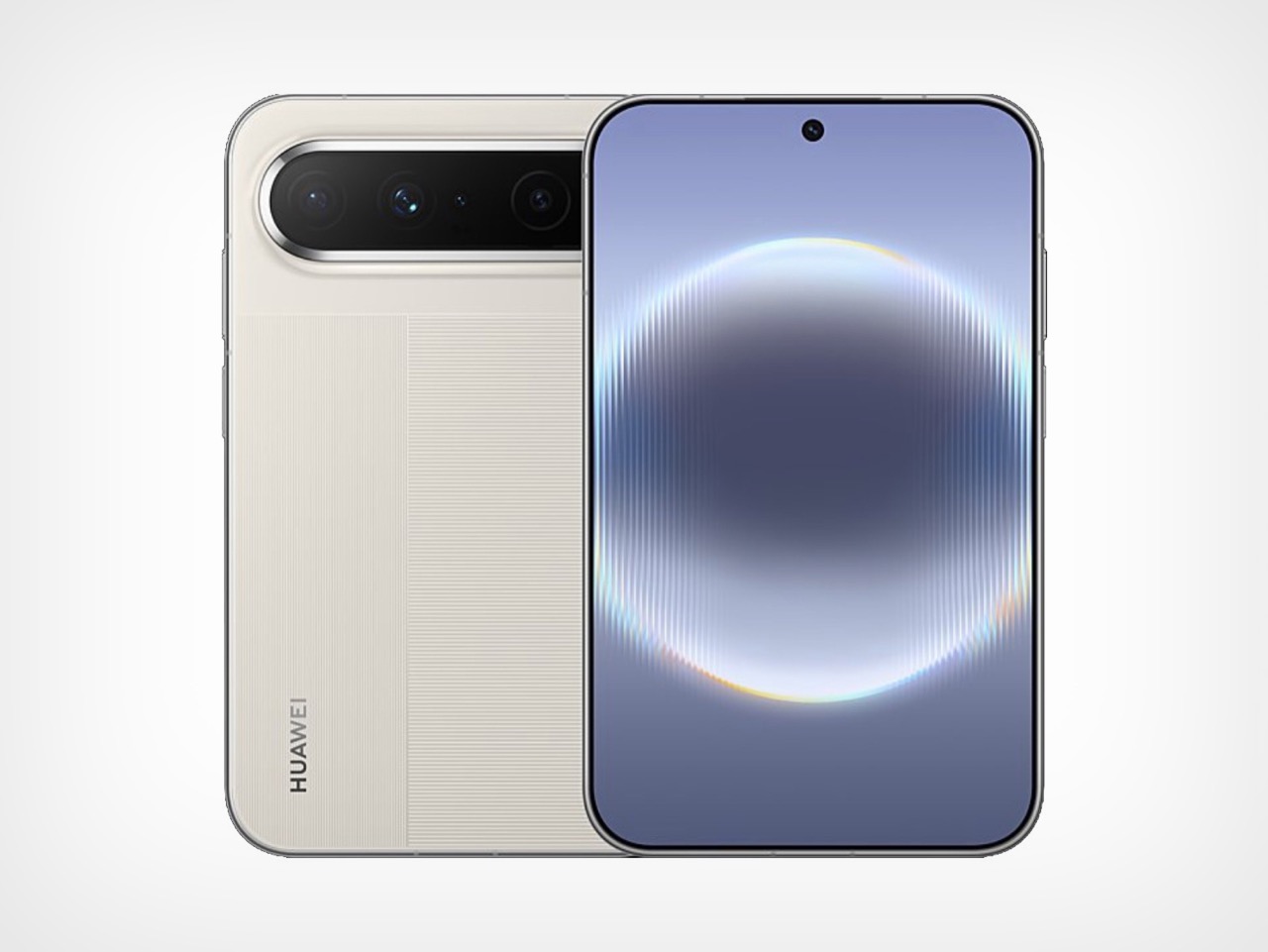
Seventy percent of Samsung’s record 1.44 million Galaxy Z8 series pre-orders went to the wide 4:3 model over the traditional tall one, a number that makes product planners cancel their afternoon meetings. Huawei saw it coming. The Pura X View, launched in China on August 20, is a slab phone with a 16:9.5 screen, no hinge, 6.68mm of thickness, and a 7,000mAh battery packed into 201 grams. Run the panel geometry and the body lands near 144 by 86mm, which is essentially the 2011 Galaxy Note’s 146.9 by 83mm with fifteen years of thinning applied on top. The first phablet just came back, and it skipped the hinge entirely.

Huawei shipped its first 16:10 phone in March 2025, roughly seventeen months before Samsung’s wide Fold 8 and eighteen before Apple’s expected iPhone Ultra. That head start counts for plenty editorially and almost nothing commercially, because the Pura X View runs HarmonyOS 7 without Google services and has no confirmed launch outside China. The width also brings a problem nobody involved has solved yet. Fold 8 reviewers keep flagging that one-handed typing on a wide cover screen demands a thumb stretch most people just do not have. Huawei is asking you to live inside that stretch full time, with no fold to escape into.

Designer: Huawei

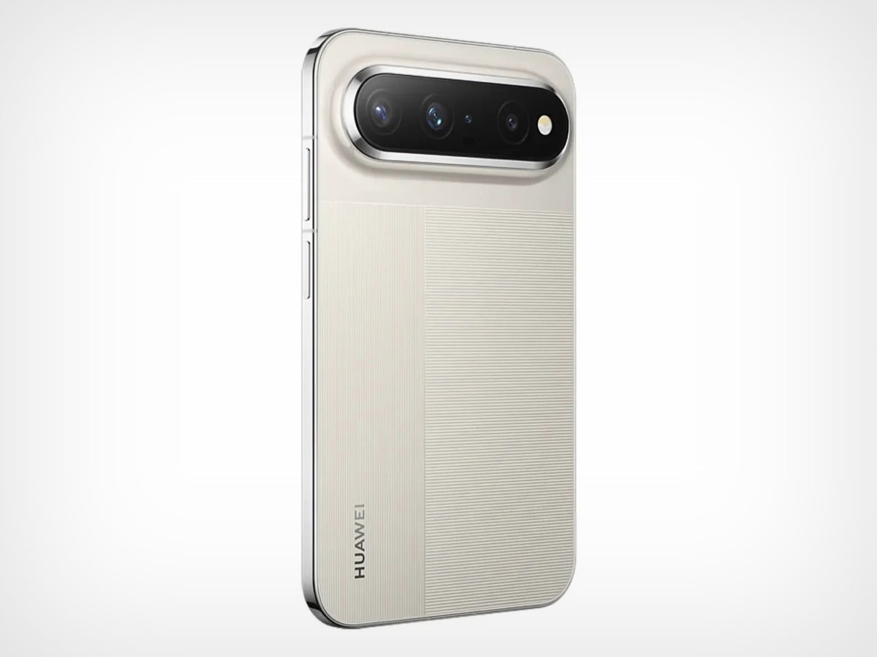
I keep coming back to the battery number because it should not work the way it does. Cramming 7,000mAh into a 6.68mm body usually means a phone that feels like a coaster, but Huawei leaned on the extra width instead of stacking cells vertically, and the reported silicon-carbon anode chemistry lets the pack sit flatter than lithium-ion ever could. The screen-to-body math backs it up too, a claimed 96.1 percent with bezels measured at a uniform 1.05mm on all four sides, which is tighter framing than most flagships bother chasing. Around back, Huawei kept the pill-shaped camera bar and striped texture from the Pura X Max, so this reads as a family member rather than a one-off experiment.

The historical parallel only gets stranger the closer you look at it. Samsung built the Galaxy Note on a 16:10 panel in 2011 specifically because it read and wrote better than 16:9, and that logic held until the LG G6 and Galaxy S8 dragged the entire industry toward 18:9 in 2017. At the start of that year, over 95 percent of phones sold still ran 16:9. Within about eighteen months it had nearly vanished, replaced by taller and taller screens that eventually made “phablet” sound like a word from a dead language. At 1.68:1, the Pura X View is actually squatter than any of those old 16:9 phones, closer in spirit to the doomed Dell Streak than to the Note it resembles in the hand.

None of this makes the Pura X View an easy recommendation, and I would rather say that upfront than let the nostalgia do all the talking. Pricing remains unconfirmed, early Chinese estimates swing wildly between 4,499 and 7,500 yuan, and Huawei has a recent history of catching real backlash over Pura pricing. There is also no path to a Google-services version, which locks most of the world out regardless of cost. What the Pura X View does prove is that the tall screen was never physics, just a decade of consensus that Samsung and Apple are now both quietly abandoning. We covered the Pura X Max when it doubled down on this same wide logic inside a folding body, and the View feels like Huawei betting the shape works even better without the crease.

The post We just reinvented Phablets: Huawei’s Wide-body Pura X View feels oddly nostalgic to the touch first appeared on Yanko Design.

Dyson’s $499 Camera Toothbrush Is So Advanced, They Had To Redesign The Toothpaste For It

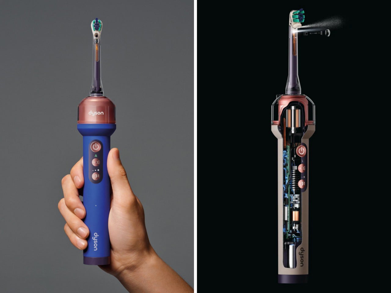
Dyson’s new $499 CameraJet hides a 1mm camera under the brush head, reading 28 images a second, and within 100 milliseconds of spotting a gap between your teeth it fires a cone of mouthrinse straight into it. That single lens is why Dyson also had to formulate its own non-foaming toothpaste, because bubbles blind a camera. It is also why the 12.5ml tank runs a diaphragm pump and pressure chamber, so the jet still fires when you tilt the handle sideways to reach your back molars. One optical decision rewrote the rest of the product. That cascade is the actual story here, and it is a lovely bit of design logic.

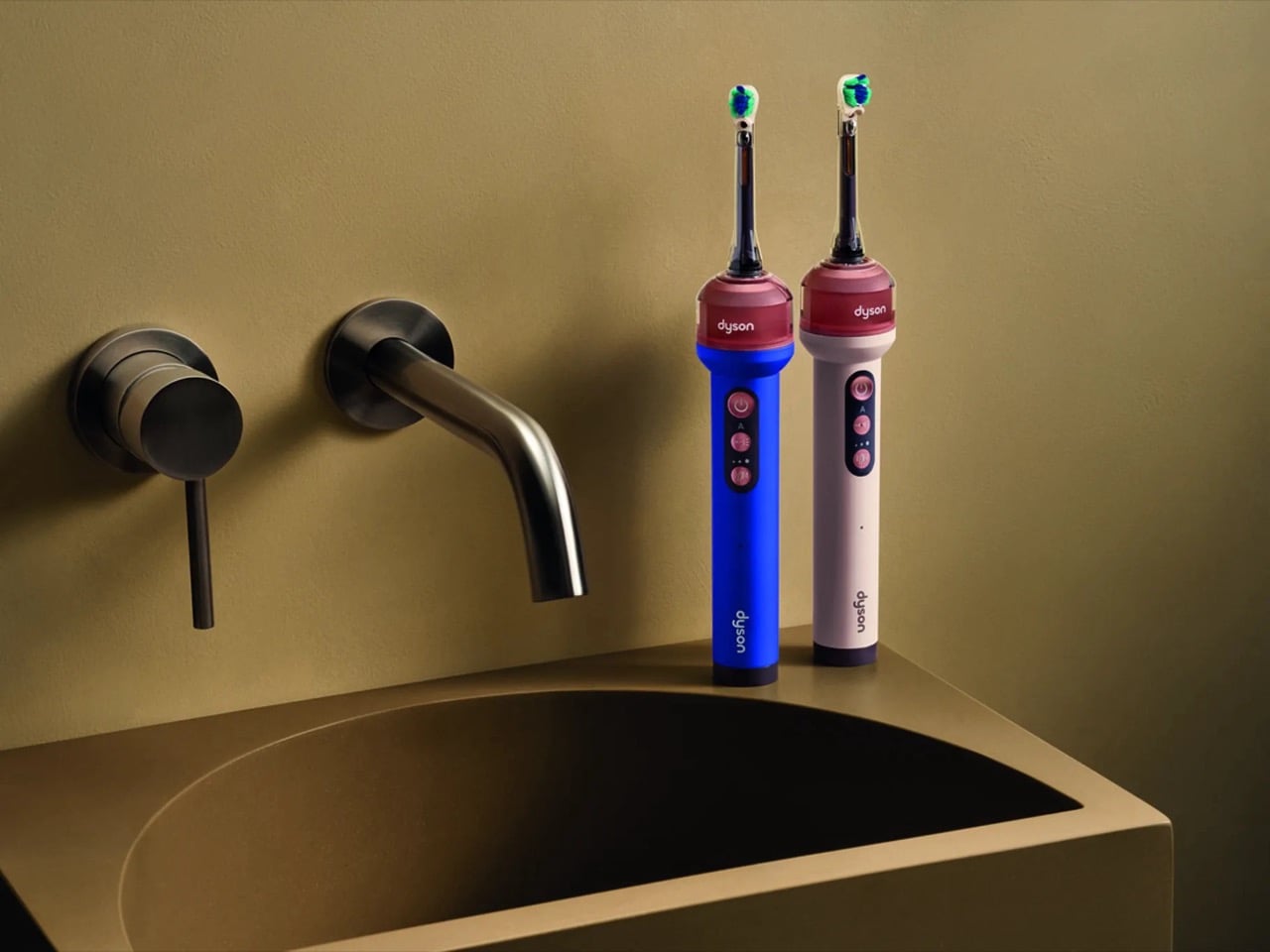
James Dyson unveiled it in Paris this morning, capping six years of work, 661 engineers and 38 patents. The vision system is called Gap Optical Targeting, trained on 470,000 dental images and running 16 million lines of code, all so a toothbrush can find the spaces nine in ten of us never floss. It ships today at $499, or £419.99 in the UK, in Ceramic Ultra Blue and Ceramic Pink. You also get a dock that refills the tank in three seconds and RFID brush heads that count their own cleans. Every one of those parts exists because somebody decided the brush should be able to see.

Designer: Dyson

The jet took years of refinement on its own, because the shape of the water matters as much as the camera aiming it. Traditional water flossers use what Dyson calls a needle jet, a narrow, piercing stream that punches through a plaque deposit without actually lifting it away. Dyson’s engineers went hunting for a shape that would sweep plaque off the tooth instead of tunneling through it, and landed on a broad conical spray fired at lower pressure. To test that idea without running a clinical trial every time they tweaked the nozzle, Dyson spent five years building its own synthetic plaque with the National University of Singapore’s Faculty of Dentistry. That is the unglamorous groundwork that never makes the keynote slide but decides whether the whole idea holds up.

None of that fluid engineering matters if the tank runs dry the moment you tilt your head back, which is the next problem the camera created. Conventional reservoirs use a straw-in-a-cup setup that draws air and loses pressure on an angle, fine for a kitchen gadget, useless inside a mouth that never sits still. Dyson’s fix is the anti-gravity tank, built around a pump that adjusts as you move so the jet fires whether the brush is upright, angled, or flat against a back molar. The brush head carries its own logic too, firmer bristles inside for stains, softer ones outside for the gumline, contoured to actually hug a tooth rather than sit flat against it. Even the sonic oscillation varies its angle mid-stroke so bristles do not stall in the tighter corners.

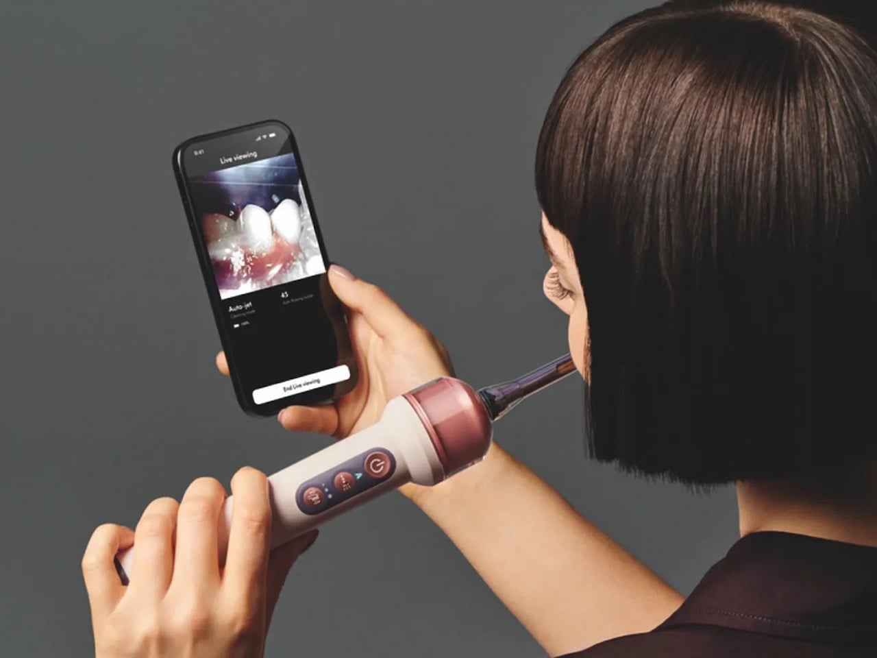
The camera does double duty as a diagnostic tool, streaming live through the MyDyson app so the brush briefly becomes a tiny endoscope. Dyson says nothing is recorded or stored, on the device or in the cloud, and a light on the handle shows when the lens is active. Cameras inside toothbrushes are not new. A Chicago dentist named Craig Kohler built one back in 2016 called the Prophix, a video-streaming brush that let people watch their own mouths on an iPhone in real time. It never went mainstream, and its own website still reads coming soon, a decade on. What Dyson brings that Prophix never had is the industrial muscle to turn that footage into an automated response, steering a jet instead of just showing a picture.

Dyson CameraJet in situ imagery, JPEG, PSD

Dyson has spent decades arguing that the dirt you cannot see is the dirt worth engineering around, first in carpets, then in bathroom air, now in the gap between your incisors. The CameraJet is that philosophy at its smallest scale yet, a lens standing in for the clear bin that made a bagless vacuum’s dust visible for the first time. What makes it worth writing about as design, rather than just as gadgetry, is how completely one sensor reorganized everything around it, the chemistry of the paste, the physics of the pump, the shape of the bristle. That is a rare thing to see fully worked through in an object that costs less than a laptop. Whether $499 buys cleaner teeth is a question for your dentist in six months. Whether it buys a masterclass in constraint driven design is not really a question at all.

The post Dyson’s $499 Camera Toothbrush Is So Advanced, They Had To Redesign The Toothpaste For It first appeared on Yanko Design.

xTool O1 Omni UV Printer Prints on Wood, Metal, Glass, and Your T-Shirts, All From One Desktop Machine

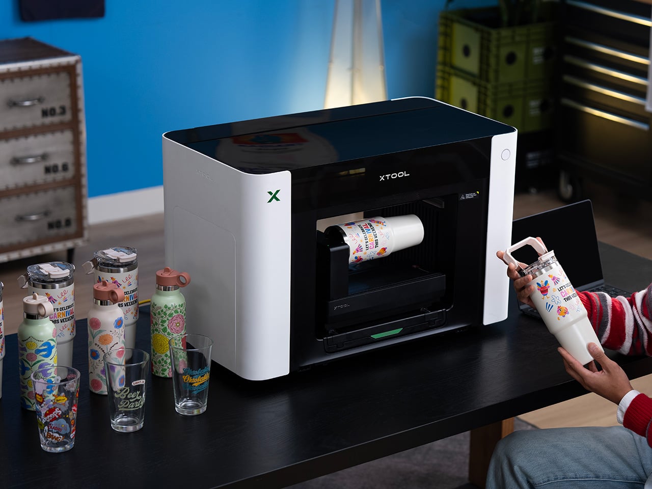
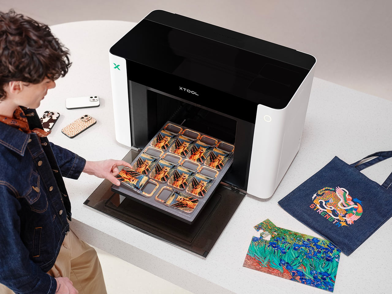
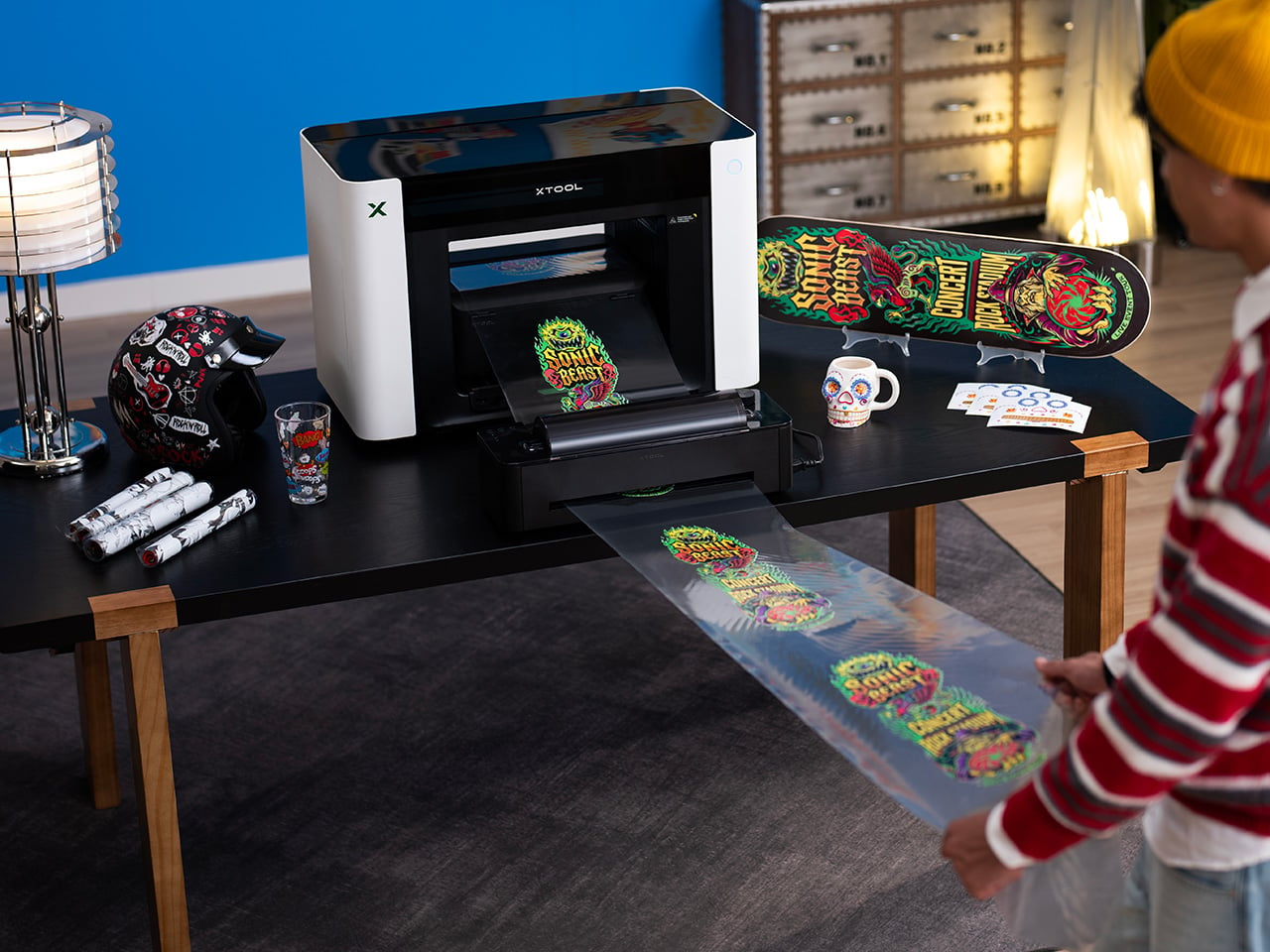
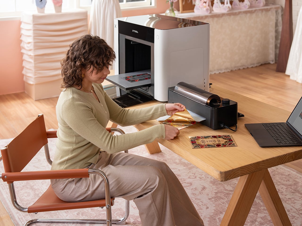
When a desktop printer moves 6,000 units and clears $20 million in revenue on day one, something is clearly going on beyond the usual pre-launch hype cycle. The xTool O1 Omni Printer is a 4-in-1 desktop system merging UV, DTG, DTF, and UV DTF printing in one modular machine, a combination that previously required four separate devices and considerable floor space. For years, creators have been burdened by fragmented workflows, forced to buy separate, single-purpose machines for rigid substrates and textiles. Desktop UV printing has been one of the more notable maker-market stories of 2026, and the O1 is making a clear bid for category leadership. The central design proposition is capability consolidation, and day-one sales suggest it landed with the right people.

Units have already begun shipping, turning pre-order momentum into machines arriving at actual studios and workshops. On August 27, the first offline debut of the O1 Embroidery happened at the Next Level Conference x xTool SMB Summit, where live demos will give attendees their first hands-on encounter with the platform’s textile and dimensional output. That event was a deliberate venue choice: the Summit brings together the small business creative community the O1 is built for, and debuting the embroidery capability there sends a clear signal about where xTool sees the product’s core application. Three editions run from $1,899 for the Single UV configuration to $2,999 for the full UV + Fabric hybrid. The modular dual-printhead system is the engineering decision that holds the entire consolidation promise together.

Designer: XTOOL

Click Here to Buy Now: $1899 $2499 ($600 off). Hurry, deal ends in 48-hours!

The dual-printhead architecture is what separates the O1 from every desktop printer in its class, operating more like a configurable platform than a fixed device. Users can run dual UV printheads for layered effects and accelerated throughput, or swap in a fabric printhead to shift between hard goods and garment workflows on the same machine. UV output covers wood, acrylic, glass, and metal with raised 3D texture effects up to 7mm deep, supported by a 2,000-plus texture library. The fabric side handles DTG and DTF workflows, including on curved and irregular surfaces, with an OEKO-TEX certified system that survives 50-plus washes without fading. A Rotary Attachment extends the platform to cylindrical objects like tumblers, with Automated 3D Modeling covering 90% of mainstream shapes for a 1:1 design preview before printing.

Positioning accuracy is delivered by xTool’s Pixel-Scan Vision System, combining Line Laser Altimetry and CIS Scanning. A Laser-Guided Auto-Focus detects each object’s highest point before printing, eliminating printhead collisions on uneven surfaces. Unlike traditional distorted fish-eye cameras, the 1:1 Distortion-Free CIS Scanning offers close-range, high-definition scans with zero dead zones, powering a jigless “Drop & Print” workflow that removes alignment jigs from the equation, which is a more meaningful time-saver than it sounds in an actual production environment. xTool Studio’s AI Contour Recognition instantly identifies irregular shapes to fill designs perfectly while automatically avoiding holes like camera cutouts. The Laser + UV Seamless Workflow lets users laser-cut a workpiece and move it to the O1, where the software automatically recognizes and aligns the print with zero manual recalibration.

Three editions cover the full range from single-mode UV to full hybrid, priced between $1,899 and $2,999, with each tier differentiated by workflow rather than arbitrary specs. The entry-level UV Edition at $1,899 targets rigid material personalization across wood, acrylic, glass, and metal. The Dual-Head UV Edition at $2,899 adds fluorescent neon inks for blacklight effects and specialized soft and hard white inks for materials like leather. The UV + Fabric Edition at $2,999 is the full cross-category hybrid, covering both hard goods and garment workflows through the OEKO-TEX certified fabric system. All three share the Pixel-Scan Vision System and xTool Studio, keeping the intelligence layer consistent across the lineup.

UV printing at the studio scale has historically required dedicated ventilation and careful ink handling, which kept the workflow inside commercial print shops. The O1 uses GREENGUARD-certified, non-reprotoxic inks and an advanced built-in air filtration system to eliminate odors in home studios. SmartCycle 2.0 automates routine care to prevent clogging, offering 14-day vacation-ready support that lets users step away with confidence and return to a machine that is ready to run. The Dual-Head UV Edition adds specialized flexible white inks, expanding the material list to leather goods and flexible substrates. Taken together, these decisions position the O1 as a machine built to live in a real creative workspace, not parked in the back corner of a commercial print shop.

The O1 Embroidery made its first public hands-on appearance at the Next Level Conference x xTool SMB Summit on August 27, putting the platform’s most dimensional textile output in front of the small business creators it is built for. Desktop UV printing has heated up considerably in 2026, with machines like the eufyMake E1 generating real market attention, and the O1 is making a clear bid for the consolidation position in that category. The 6,000-unit, $20 million day-one performance signals the market was ready for this hardware category long before the product arrived. Explore the full xTool O1 Omni Printer lineup and configure your edition at xTool’s website.

Click Here to Buy Now: $1899 $2499 ($600 off). Hurry, deal ends in 48-hours!

The post xTool O1 Omni UV Printer Prints on Wood, Metal, Glass, and Your T-Shirts, All From One Desktop Machine first appeared on Yanko Design.

MB&F’s Alien-Inspired Desk Clock Ships as 222 Loose Parts You Assemble Yourself Over 10 Hours

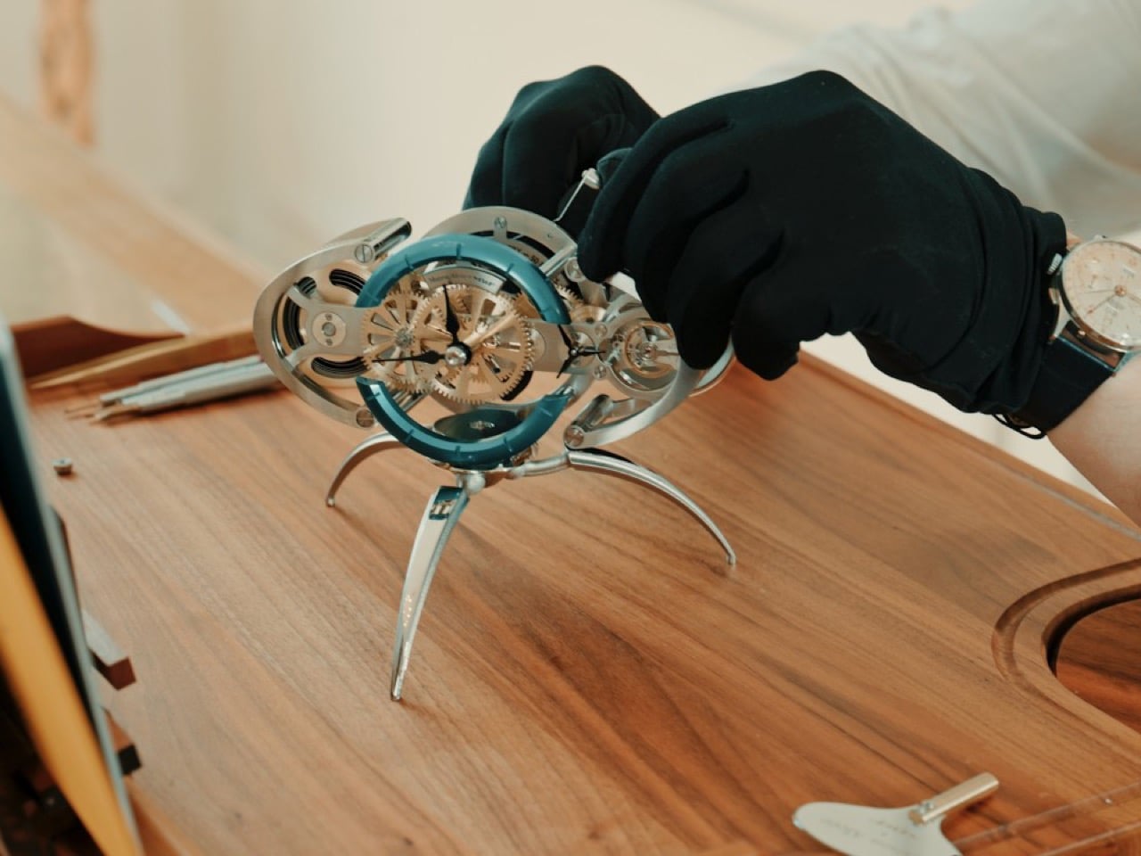
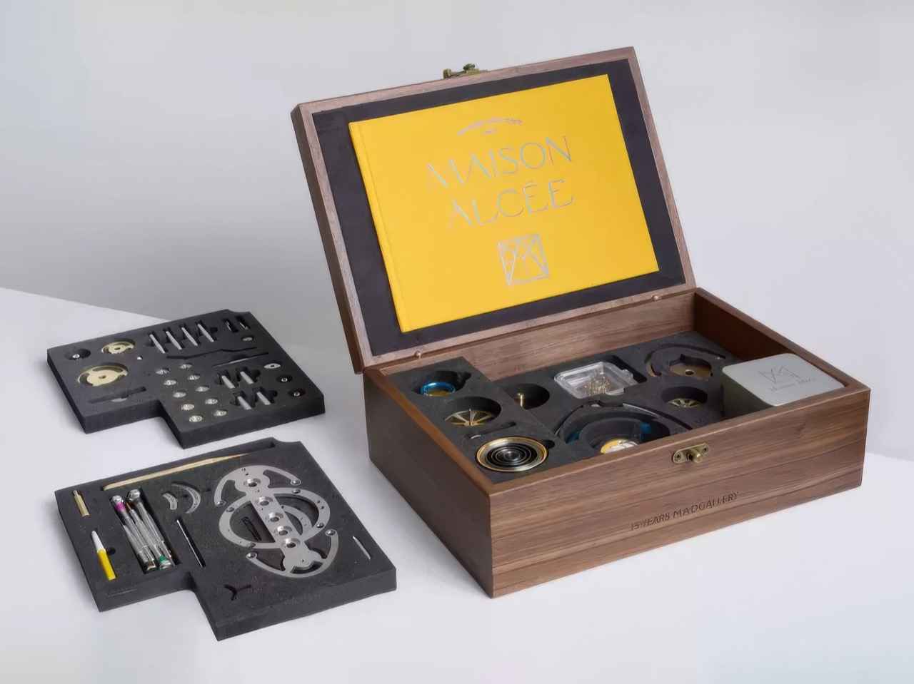
There is a term in behavioral economics called the IKEA effect, which says we value things more when we build them ourselves. It explains why you defend that wobbly BILLY bookcase like it’s family. MB&F and French clockmaker Maison Alcée have taken that idea, put it in a suit, and charged CHF 12,000 for it. Their new desk clock arrives at your door as 222 loose components in a wooden box, along with a set of watchmaking tools and a 250-page book. You are the assembly line, and the clock does not tell time until you make it.

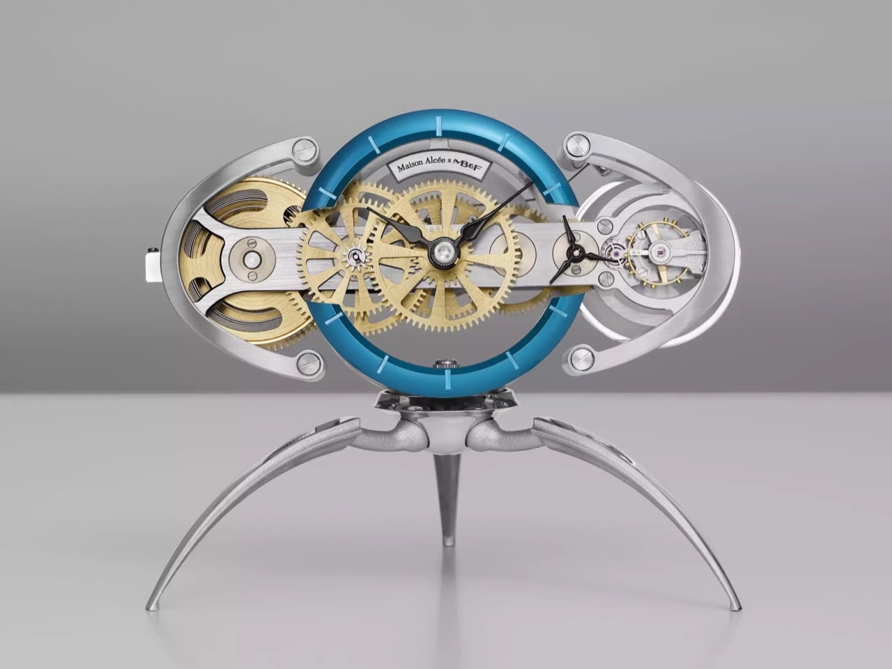
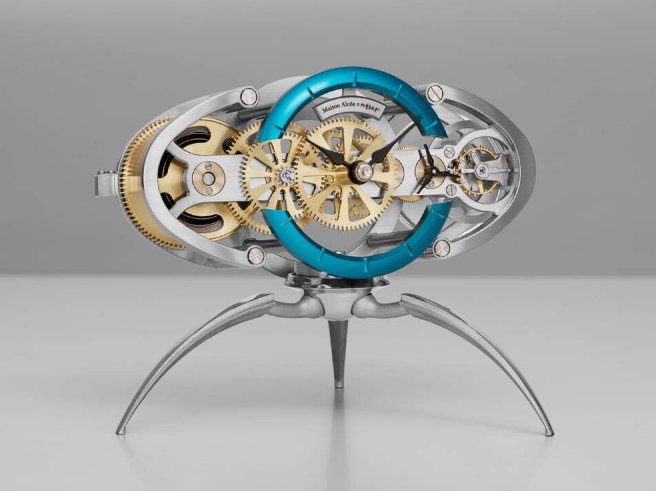
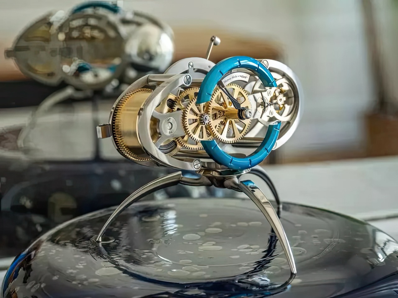
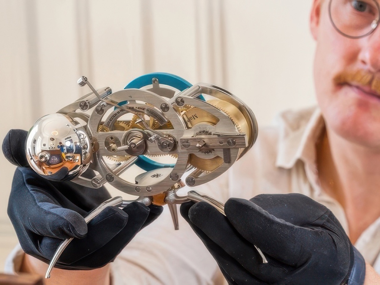
It’s called the Nostromo, and it looks like a chrome beetle crouching on your desk. Maximilian Maertens, MB&F’s creative designer and Max Büsser’s anointed successor, designed it to celebrate 15 years of the M.A.D.Gallery. Maison Alcée manufactures the parts in the French and Swiss Jura, then hands the fun part to you. Roughly ten hours of tweezer work stand between the box and a running mechanical clock with a 14-day power reserve and a switchable hour chime. Only the regulating organ arrives pre-built, because some things are best left to people who do this for a living. Fifty pieces exist.

Designer: Maximilian Maertens for MB&F, crafted by Maison Alcée

The body is a symmetrical steel ovoid, two brushed arcs meeting top and bottom, wrapped around brass wheels and a saturated peacock blue dial ring floating dead center. That silhouette reads as carapace rather than xenomorph, closer to a scarab than anything H.R. Giger ever airbrushed. Every ounce of creature in this object lives in the three tapered legs below, which sweep outward in compound curves and end in points. Maertens had to leave the movement architecture assemblable by amateurs, so the sculpture went where the freedom was.

That movement comes from the Persée, Maison Alcée’s first clock, launched in 2022 and built on wristwatch architecture scaled up to desk size. Maertens turned the whole thing on its side, angled the display upward for easier reading, and split the Persée’s continuous dial ring into segments so the gear train shows through the gaps. The finished clock rotates on its feet, which sounds like a gimmick until you remember three-point support never rocks on an uneven desk. Black hands replace the originals for contrast against all that brass. The changes are small in engineering terms and enormous in posture.

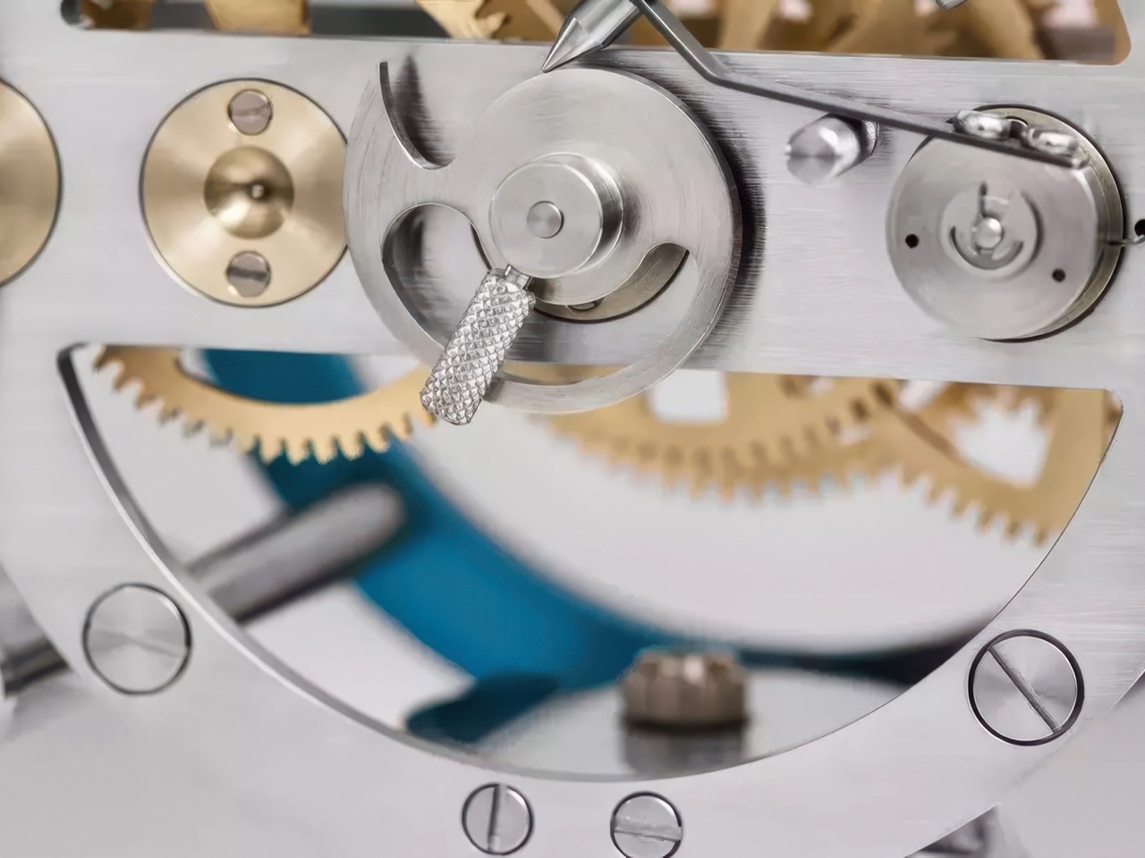
Slotted screws sit visible across every plate, the steel is brushed instead of polished, and the brass wheels carry plain spokes with no anglage anywhere. That reads as a deliberate call rather than a cost saving, because every one of those surfaces will be handled by someone in cotton gloves who has never held tweezers. Maison Alcée even had its screwdriver blades made in a copper-beryllium alloy, softening them specifically to reduce the risk of scratching your own clock. The kit includes seventeen tools, several adapted for beginners. The pedagogy runs all the way down to the hardware.

Ridley Scott borrowed the name Nostromo from a Joseph Conrad novel, and Ron Cobb designed the ship as a grimy commercial tugboat crewed by people arguing about bonuses. Giger got the monster and the derelict. Most of us have merged the two in memory, which is why the word now sounds biomechanical. Maertens, a self-declared Giger obsessive, has effectively put Cobb’s name on a Giger-adjacent body, and I doubt anyone at MB&F loses sleep over it. The brand has been mining outer space since HM1 in 2007.

CHF 12,000 ($14,840 USD) excluding VAT, sold through the M.A.D.Galleries in Geneva and Dubai and MB&F LABs worldwide, with deliveries landing October to November. A base Persée runs closer to EUR 5,500 ($6,379 USD), so the premium buys the Maertens design and the 50-piece cap rather than more mechanism. Here’s the catch, though. A company whose entire philosophy is teaching horology through your own hands has capped this particular lesson at fifty units for fifty eager students. The clock is wonderful. The classroom is very small.

The post MB&F’s Alien-Inspired Desk Clock Ships as 222 Loose Parts You Assemble Yourself Over 10 Hours first appeared on Yanko Design.

3 Japanese Stationery Designs So Good You’ll Actually Enjoy Going Back to Your Desk

Late August has a particular texture. The mornings cool by a degree, the light shifts without announcing itself, and the desk that went mostly untouched all summer starts to look like a place worth returning to. Japanese stationery has always understood this moment. The objects it produces are not exciting in the way a gadget is. They are exciting in the way a good chair is — once you find the right one, everything before it starts to feel like a placeholder.

The three picks here share a quality that is easy to recognize once you know to look for it. Each attends to the part of the tool that most manufacturers have already decided is resolved. A pair of scissors built with the precision of a professional instrument. A stapler that removes the staple from the concept of stapling. A notebook that asks nothing of you beyond showing up. Together, they change what returning to a desk in late summer actually feels like.

1. Stellar Edge Scissors

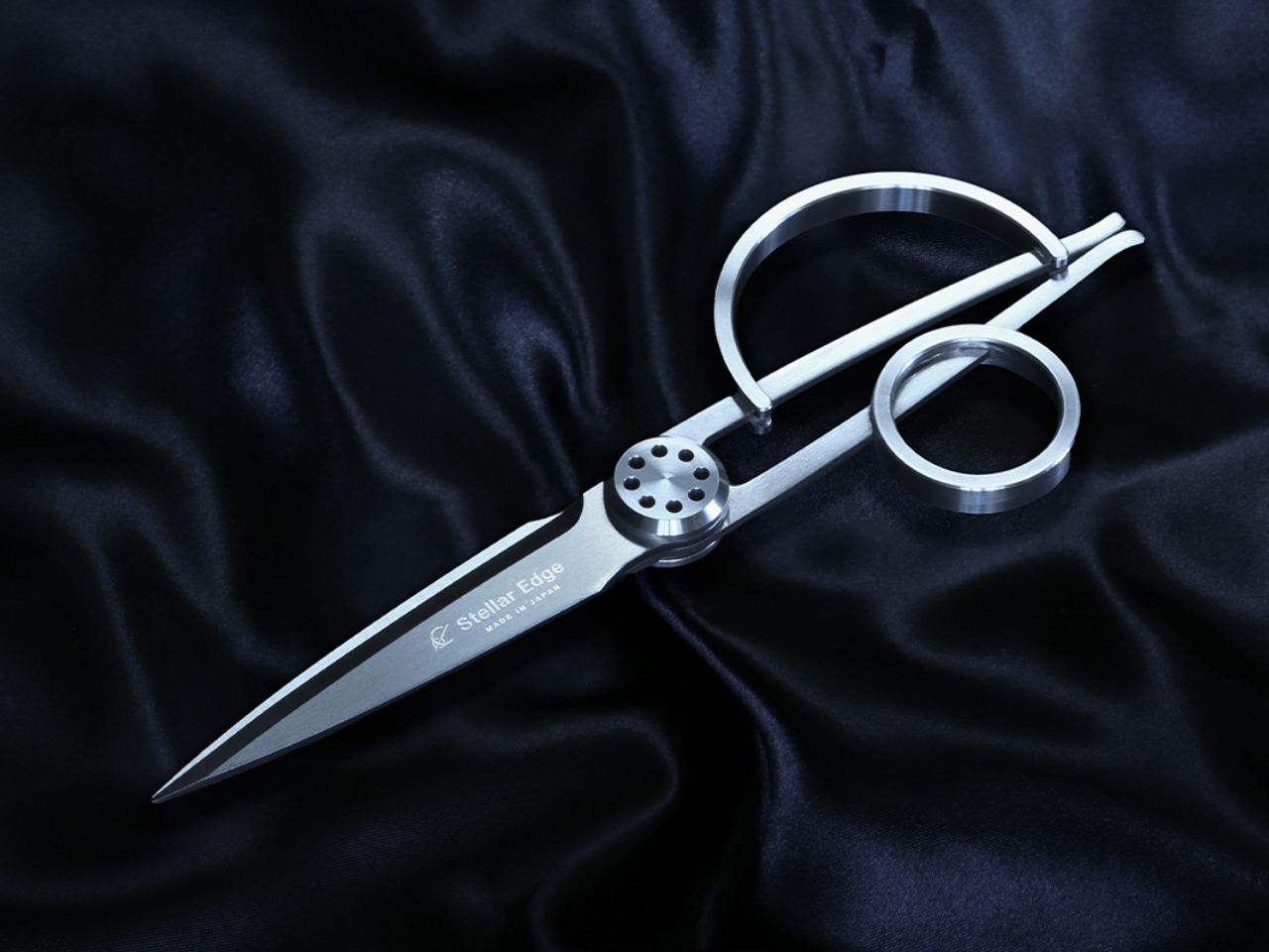
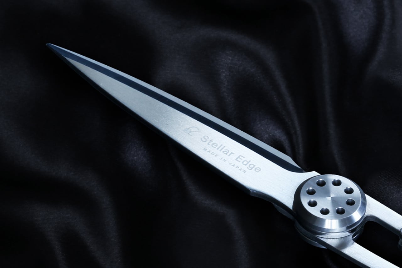
Most scissors are bought once and forgotten. The Stellar Edge Scissors, crafted from Japanese stainless steel, propose a different relationship with the category. Seamless, polished handles and a weight distribution that shifts the blade toward the hand make cutting feel less like holding something and more like extending your reach across the page. Every angle in the design is considered. The result is a pair of scissors that earns a permanent place on the desk rather than disappearing into a drawer the week they arrive.

Each snip registers with the kind of clean resistance that confirms the blade is doing exactly what it was built for. The polished finish elevates the tactile experience without making the scissors feel fragile or precious. Extended cutting sessions don’t build the fatigue that cheaper alternatives accumulate across an afternoon, and the grip sits naturally regardless of hand size with no adjustment required. For anyone who works with paper regularly, these are the scissors that make the pair you owned before feel like it was never really doing the job.

What we like

  • Japanese stainless steel construction holds its edge through sustained use rather than dulling after a few weeks of regular cutting
  • The seamless, polished handles and considered weight distribution make these genuinely display-worthy objects on a desk surface

What we dislike

  • The precision manufacturing and material quality place these at a higher price point than most people are used to spending on scissors
  • No rubber grip inserts means those who prefer a softer handle feel on longer cutting sessions will notice the absence

2. PaperLock Stapler

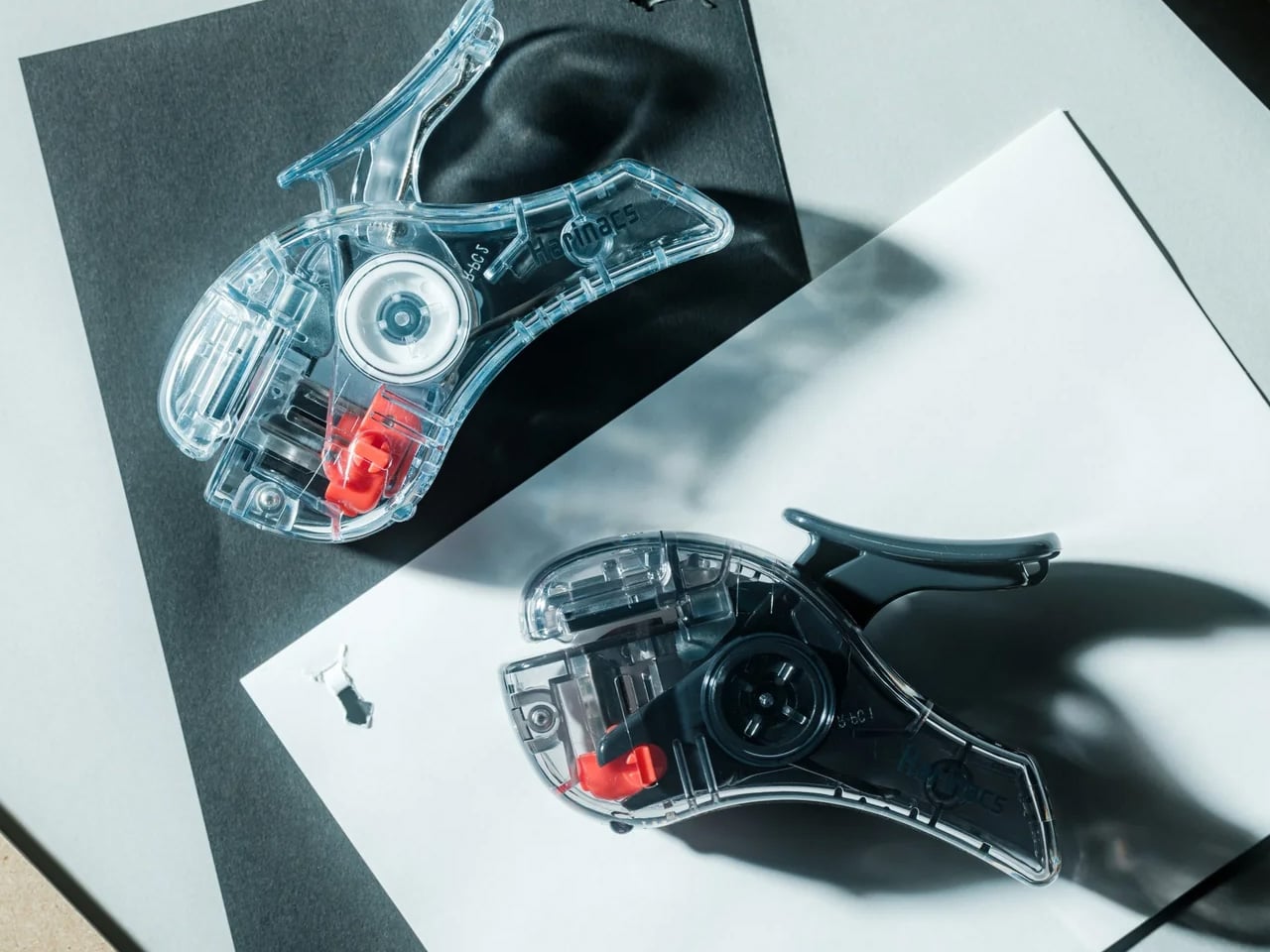
The mechanism behind PaperLock is simple in the way good design is simple. Press the lever and a small cutting element punches through the stack, folding the paper back through itself to create an interlocked join. No metal passes through the page. No staple is added. The paper becomes its own fastener, which means nothing catches against other sheets in a stack, nothing needs removing before a document reaches the recycling bin, and nothing can run out at the moment you most need it to work.

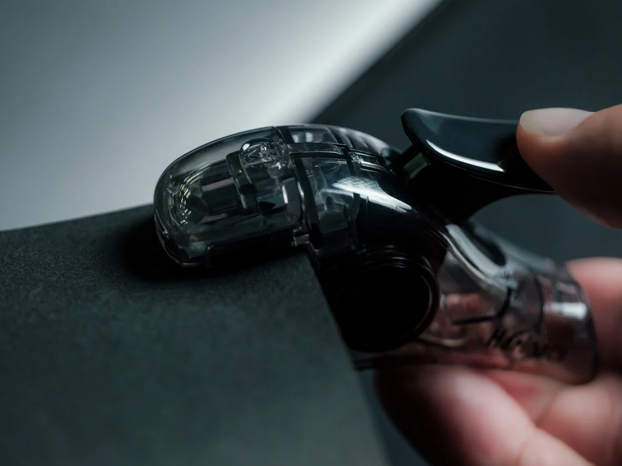
Most desk tools keep their mechanisms out of sight, usually because there is nothing worth showing. PaperLock does the opposite. The transparent body puts the internal parts on full display, and pressing the lever becomes something closer to watching a small machine operate than completing a piece of office admin. A viewing window shows exactly where the join will land before you commit, a corner guide keeps placement consistent across an entire stack, and the lever works pressed against a surface or squeezed in the palm with no adjustment required between the two.

Click Here to Buy Now: $35.00

What we like

  • The staple-free mechanism cuts and interlocks the paper itself, leaving nothing to load, manage, or run out of at an inconvenient moment
  • The transparent body puts the internal mechanism in full view with every press, turning a routine desk task into something worth watching

What we dislike

  • Five-sheet capacity handles everyday stacks cleanly, but anything thicker requires a different tool, which limits its range for larger document sets
  • Separating paper-locked sheets without tearing requires more care than pulling a metal staple free, which matters when a binding error needs to be corrected quickly

3. Stalogy Editor’s Series 365 Days Notebook A6

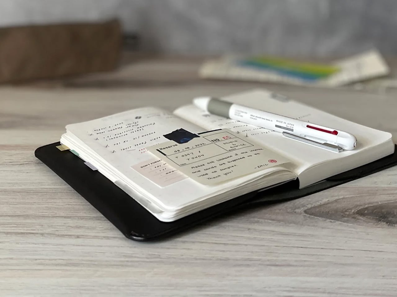
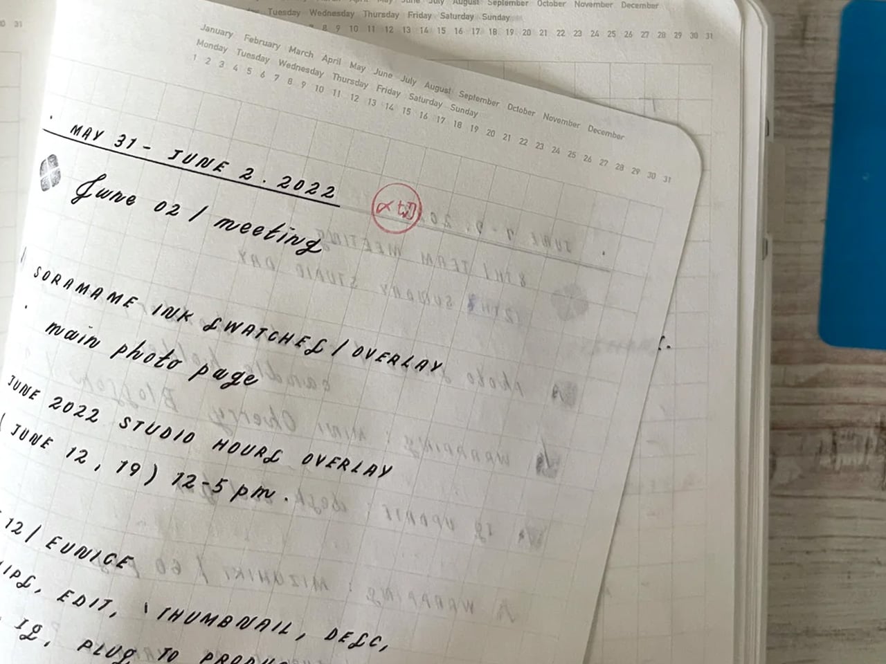
The Stalogy Editor’s Series 365 Days Notebook carries no branding on its exterior. That is a design decision, not an economy. Inside, 368 pages of cream-toned dot grid paper sit light enough that the notebook never feels precious, yet substantial enough to hold a full year of daily writing without any sense of running out. At A6, it fits a coat pocket without folding. The dot grid recedes under handwriting without disappearing, present enough to keep lines honest across a full page of notes.

Nothing about the Stalogy insists on a particular way of working. There are no monthly spreads pre-printed inside, no prompts in the margins, no year assigned to the cover before you open it. Bullet journaling, daily planning, freeform writing, and quick sketches all sit comfortably within its pages without any of those uses feeling like a compromise. Most stationery at this level quietly pushes a method. The Stalogy provides the space and steps aside, which turns out to be the more useful and respectful approach any notebook can take toward the person using it.

What we like

  • The bare cover carries no visual identity, making it entirely the user’s object from the moment it is opened rather than the manufacturer’s
  • 368 pages at A6 gives a full year of writing without adding meaningful bulk to a coat pocket or daily carry

What we dislike

  • Date and time markings are printed at a small scale, making them difficult to read in low light or at a glance during a busy session
  • Heavier fountain pen inks will ghost through the thin paper, which limits compatibility for dedicated nib users

The Right Objects Make Coming Back Feel Like a Choice

There is a version of returning to a desk in late August that feels like a small defeat. The difference between that version and the other one is almost always the objects on the desk. When the scissors cut cleanly and feel right in the hand, when the stapler is always ready without refills to think about, when the notebook asks nothing beyond showing up, the desk becomes a different kind of place. The tools stop being obstacles and start being part of the reason to sit down.

These three earn their place not because they are impressive to look at but because they are right to use. The Stellar Edge Scissors bring precision to a category most people never think to question. The PaperLock removes a material from a process that never needed it. The Stalogy removes every obstacle between writing and the page. None of them asks for your attention. That absence of noise is the design principle Japan has been working toward for the better part of a century, and it is why coming back to the desk in September can feel entirely different from the September before.

The post 3 Japanese Stationery Designs So Good You’ll Actually Enjoy Going Back to Your Desk first appeared on Yanko Design.

This Startup Says Your House Should Be the Robot, Not ‘Have’ a Robot

Most of the AI money right now is betting on robots. Hundreds of embodied-AI startups and their backers are convinced that a bipedal machine will eventually become the household’s operating system, rolling from room to room and handling everything. Endong Zhang, the founder and CEO of LiveLarge Home Inc., thinks that’s the wrong frame, and he’s pretty candid about it.

A robot, he points out, has limited battery life, limited field of view, and can only be in one place at any given moment, which makes it a fairly weak candidate for running a multi-room household with several people in it. His counterproposal is that the building itself is the smarter infrastructure bet, and he’s building a company around exactly that.

Click Here to Know More

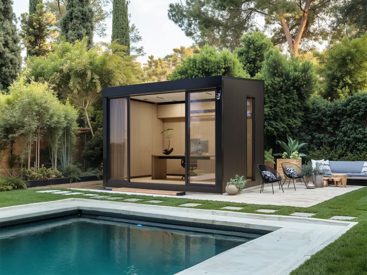
The company Zhang founded in 2023 spent its first few years looking more like a serious California construction operation than a tech startup, delivering more than 20 accessory dwelling units (ADU) and residential projects across the Bay Area and Los Angeles.

Endong Zhang – Founder and CEO, LiveLarge Home

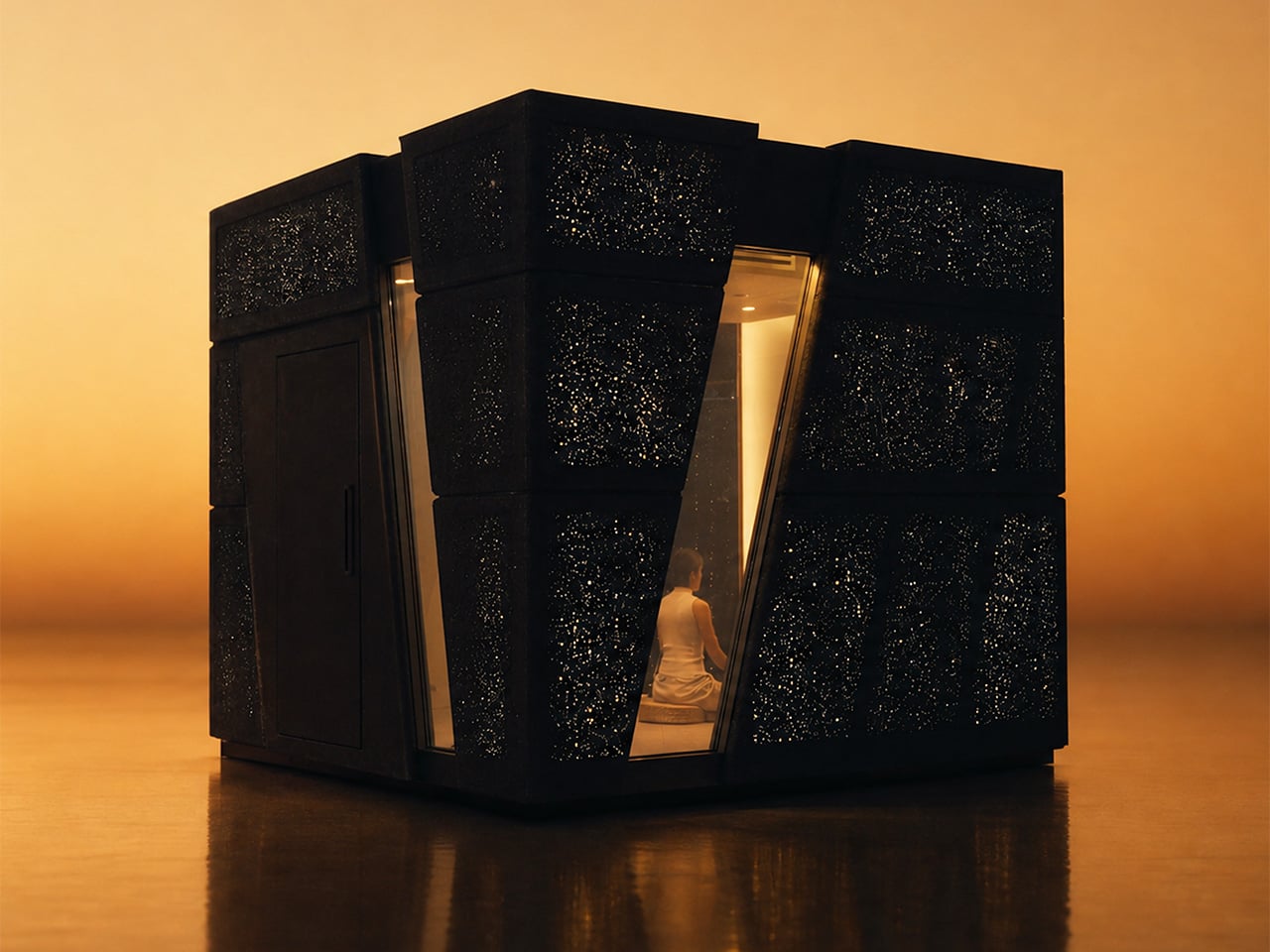
In July 2026, LiveLarge revealed the Flagship L-Space, a standalone AI-native room environment and the clearest physical statement of Zhang’s thesis so far. Light, sound, air, privacy glass, and a voice assistant called Lila are coordinated as one system rather than a pile of separate apps, organized around three modes: Focus, Reset, and Passion.

Space AI: the invisible housekeeper

The conceptual core of Space AI is a deceptively simple question: can AI give every household some version of what a housekeeper provides? Zhang keeps returning to the housekeeper image because it captures something the smart home industry never quite cracked. A housekeeper reads the room, observes what’s needed, and acts without being told every small step. A traditional smart home, by contrast, receives a command or follows a fixed rule, and it doesn’t understand the situation, decide what should be done, or make a plan. “Without a human housekeeper,” Zhang says, “the home itself has to listen, observe, understand, decide and act.” That’s the jump LiveLarge is trying to make. LLMs, multimodal models, and a maturing robotics ecosystem are what make the timing feel genuinely different now rather than aspirationally so.

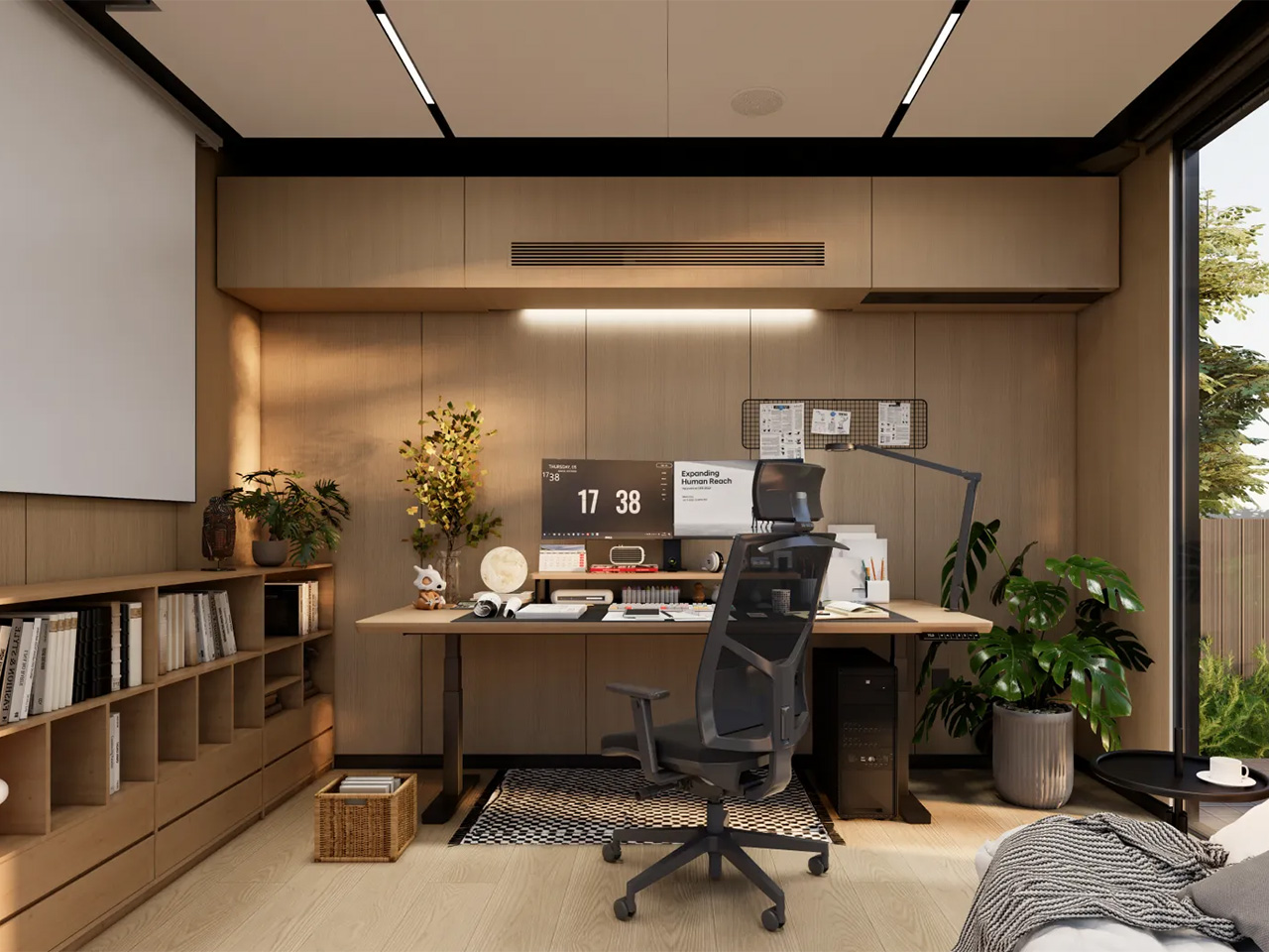
The room integrates a 5.1 surround sound system, adaptive lighting, fresh-air circulation, a 4K short-throw projector, and privacy glass into a single coordinated environment, all orchestrated by an AI assistant called Lila. The three modes, Focus, Reset, and Passion, were shaped directly by early users rather than invented in a whiteboard session. “People do not really want smarter devices,” Zhang told us. “They want to focus better, relax, recover, or spend time on something they care about.”

LiveLarge makes some deliberate engineering choices when it comes to privacy, with pretty straightforward reasoning: a room that watches, listens, and learns is exactly the kind of product that erodes trust the moment something leaks. The first rule is to do as much computation locally as possible, and L-Space uses an NVIDIA Jetson Orin as its local AI computer, with a large part of the sensing, data processing, storage, and inference happening inside the product. Sensitive information, including conversations, biometric signals, and usage data, can stay local.

The system uses voiceprints to recognize regular users, each user has a separate history and profile, and User A cannot access User B’s conversations or usage records. The full permission system is still in development, but the architecture already accounts for different access levels across family members, guests, and service providers. Zhang’s framing is tidy: “Personalization only makes sense within the permission given by the user.”

The Flagship L-Space is what Zhang calls a “concept car,” and the analogy holds up across more dimensions than the marketing might suggest. The Standard and Flagship models share the same core Space AI platform, but the key addition in the Flagship is vision: locally processed computer vision that lets Lila recognize individual users, read gestures, and actually observe what’s happening in the room rather than waiting to be addressed.

Vision is, in Zhang’s view, one of the most important sensors for a future AI-native home, and once AI can actually see a space, many services that are difficult today become possible. He’s testing facial identification and gesture control as more natural interaction layers on top of voice, and all of it runs on-device because visual data inside a home should never casually leave the building. “The engineering question is simple,” he says. “If AI can really understand a room, what useful services can it provide to the people inside it?”

The biggest lesson in getting from concept car to delivered product is that a lab demo and a product are different engineering objects. In the lab, every cable, firmware version, network condition, and room setup is controlled. A delivered L-Space has to survive shipping, installation, startup, software updates, and daily use. The customer also needs to set it up quickly, understand how to use it, and trust that the basic functions will keep working over time.

At current production volumes, many subsystems still use consumer-grade components, and the challenge of packing computing, storage, networking, IoT control, audio, projection, sensors, and actuators into a compact structure without compromising acoustics or airflow is, as Zhang puts it, closer to vehicle electronics than construction. “A feature is not finished when it works once,” he told us. “It is finished when it works repeatedly in the customer’s space.”

Technology is reshaping architecture and interior design

What the home looks like ten years from now, in Zhang’s telling, reads more like a tech product manifesto than an architecture brief. The house becomes a device in the same way a phone or laptop is a device: one integrated hardware and software system where every new appliance, robot, or sensor plugs into a shared runtime rather than living as yet another isolated smart product.

He also believes the intelligence shouldn’t stay tied to any specific building. “If you move, the home model, preferences and memory should move with you,” he says. “The new house becomes the new body, but the agent continues.” For designers, he sees a real reskilling moment coming, one where sensor placement, robot clearances, and interaction architecture start sitting alongside floor plans and material palettes as standard deliverables.

LiveLarge’s roadmap for the second half of 2026 includes bringing Space AI into ADU and broader residential products, which means the concept car phase has a fairly clear expiry date. You can see what the company is building at livelargetech.com.

Click Here to Know More

The post This Startup Says Your House Should Be the Robot, Not ‘Have’ a Robot first appeared on Yanko Design.

5 Best Home Office Gadgets for Remote Workers in 2026 That Actually Justify Every Dollar

Your laptop has two USB-C ports. Your desk needs dual monitors, wired internet, an external drive, a charger, and somewhere to plug in your SD card. So you have a dongle for the monitors, a second dongle for Ethernet, a third one that lives in your bag and migrates to the wrong bag constantly, and a power brick sitting on the floor because there is nowhere else for it to go. The setup works. It looks like a tech garage sale.

These five products fix that. Not by adding more stuff to your desk, but by replacing the specific things that cost you time and attention every single workday. Each one earns its footprint with a clear answer to a real problem. The HubKey handles your dongle situation and your physical controls. The OrigamiSwift handles your mouse. The Logitech MX Brio Ultra handles your camera. The Rocketbook handles your notes. The Rolling Clock handles your time zones.

1. HubKey Gen2

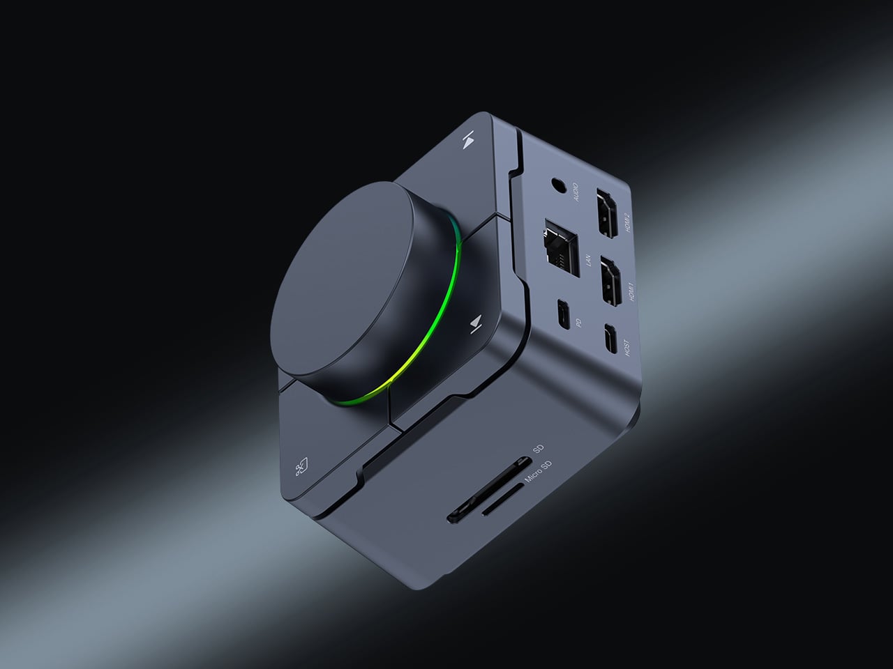
Count the adapters on your desk right now. There is a display dongle, a USB-A hub, an Ethernet adapter, and a charging brick that has lived on the floor for six months. The HubKey Gen2 replaces all of it with one cable back to your laptop. Dual 4K 60Hz HDMI outputs, 100W PD charging, 2.5 Gbps Ethernet, 10 Gbps data, SD and TF slots, and a 3.5mm jack — simultaneously, without throttling. Most hubs make you choose between charging and full performance. The HubKey does not.

What actually separates it is the top panel. Four shortcut keys and a central knob handle volume, mute, screen lock, and screenshots without touching your keyboard. It runs plug-and-play on Windows, macOS, Linux, and Steam Deck out of the box, with an optional driver that unlocks 170 preset combinations and a fully custom mode when you want it. Simple and immediate on day one. Deeper when you need it.

What we like:

  • Dual 4K 60Hz from a single cable to your laptop is the feature that ends the one-monitor compromise for anyone who has been putting off a second display.
  • The physical knob and shortcut keys turn volume adjustment and screen privacy into a hand gesture instead of a keyboard hunt. Once you have a physical mute button, software mute buttons feel like a step backward.

What we dislike:

  • The shortcut customization is deep enough to be worth exploring and slightly too deep to set up quickly. Budget 20 minutes before your first real workday with it.

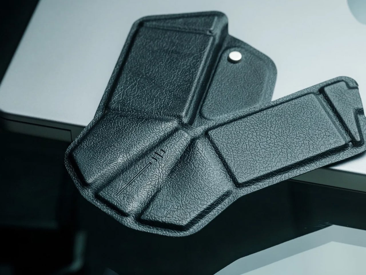
2. OrigamiSwift Folding Mouse

If you travel with a laptop, you own two mice. The real one on your home desk. And the compact, slightly uncomfortable one in your bag that you use everywhere else and quietly resent by 2 pm. The OrigamiSwift folds flat to 4.5mm, which is thin enough to slip between notebook pages without leaving a visible bump. It unfolds in under half a second into a full-sized ergonomic shape that sits naturally in your hand. At 40 grams, it weighs less than your wallet.

The tracking precision has nothing to do with its size. The Bluetooth connection is reliable. The fold mechanism feels deliberate rather than fragile, which matters because it is the interaction you repeat every time you sit down. At $85, it costs less than most dedicated desktop mice and does something none of them can: it works equally well in your carry-on and at your home desk without asking you to choose between comfort and portability. The folding mouse has been a category of compromises for years. This one is not.

Click Here to Buy Now: $85.00

What we like:

  • The ergonomic angle on deployment feels solid and settled, not provisional. It does not flex or wobble under a firm grip the way folding products tend to when they meet any real resistance.
  • The sub-half-second flip is the kind of interaction that registers the first time and then disappears into muscle memory by day three.

What we dislike:

  • The 40-gram weight takes a few days to stop noticing if you are coming from a heavier desktop mouse. It is not uncomfortable, just different, and your hand knows it before your brain stops caring.
  • Bluetooth only means no wired fallback, which matters on the rare occasion your connection cuts out mid-deadline.

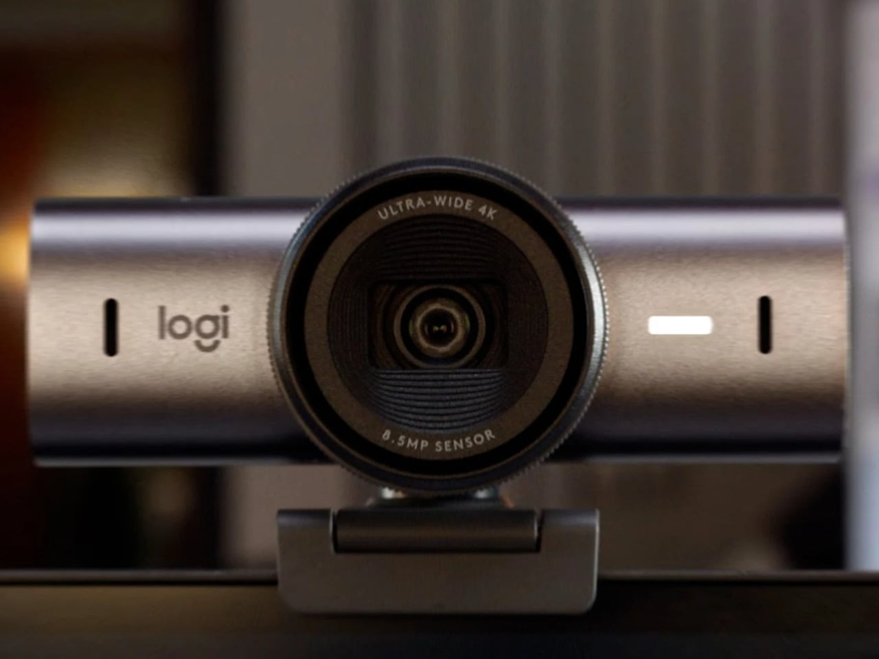
3. Logitech MX Brio Ultra

At some point this year, you saw your own face in the corner of a video call, and it looked like you were dialing in from a parking structure. Flat, gray, slightly soft around the edges. That is your built-in laptop webcam doing its best with a sensor roughly the size of a fingernail. The Logitech MX Brio Ultra runs a 4K sensor with AI-powered auto-framing, and the gap between what it produces and what your laptop camera produces is not subtle. It is the difference between looking like you prepared for the call and looking like you rolled in from the hallway.

Logitech is the default answer for a reason. The MX Brio Ultra is what Wirecutter recommends, what the r/homeoffice community lands on after every comparison thread, and what most people in a serious remote setup are already running. The AI framing tracks you as you move and keeps the shot composed without any input from you. At $200, it sits at the top of the mainstream webcam market, and it earns that position by being the camera you set up once, forget about, and still look good on every call six months later. No fiddling with tracking zones, no hour in settings. It works the way a Logitech product always works: immediately and without drama.

What we like:

  • 4K output with AI auto-framing is the combination that covers every remote work scenario, from a one-on-one call to a presentation with 50 people watching your frame.
  • The setup experience is genuinely plug-and-play. If you have spent time configuring other AI webcams before a call, the MX Brio Ultra will feel like a relief.

What we dislike:

  • At $200, it is the most expensive item on this list, and the price is harder to justify if your calls are mostly audio-only or your desk faces a window with no lighting control.
  • The design is competent rather than interesting. It sits on your monitor and disappears, which is fine, but it does not add anything to how your desk looks the way some of the other picks here do.

4. Rocketbook Reusable Sticky Notes

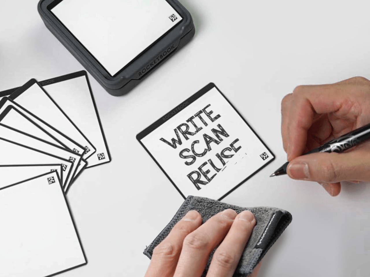
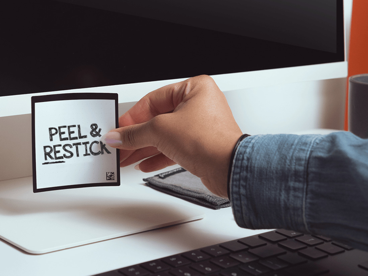
You have a stack of Post-its on your desk right now that you bought six months ago, used about a third of, and will eventually throw away when they stop sticking. Then you will buy another stack. Then another. The Rocketbook Reusable Sticky Notes break that cycle by doing something Post-its never could: you wipe them clean with a damp cloth and start over. Same note. Indefinitely.

The material feels like real paper, which matters more than it sounds. Other reusable note products go rigid and plastic and remind you every time you pick one up that you are using something weird. The Rocketbook version is thin and flexible, and the writing experience with a Pilot FriXion pen is close enough to a regular sticky note that the novelty wears off quickly and the habit takes over. The adhesive strip rinses clean and resticks the same way, so the note goes back on the monitor, the cabinet, or the edge of your desk exactly where you left it. The Rocketbook app photographs each note, transcribes your handwriting, and sends it to whatever cloud storage you already use, which means the thought is archived before you wipe the surface. You get the speed of analog and the permanence of digital without running an AI meeting bot or opening another productivity app.

What we like:

  • The paper-like feel is the detail that makes this a daily habit rather than a novelty. It does not feel like writing on a whiteboard, and that distinction is what separates it from every competing reusable note product.
  • The app’s automatic transcription and cloud sync mean wiping the note clean is not losing the note. That confidence changes how freely you actually use them.

What we dislike:

  • You are locked into Pilot FriXion pens, full stop. Your favorite pen does not work here, and if Pilot ever discontinues the FriXion line, the notes become decorative squares.
  • The wipe-to-erase process requires a damp cloth nearby, which is one more thing your desk needs to accommodate. In a dry climate or a cold office, the cloth dries out faster than you expect.

5. Rolling World Clock

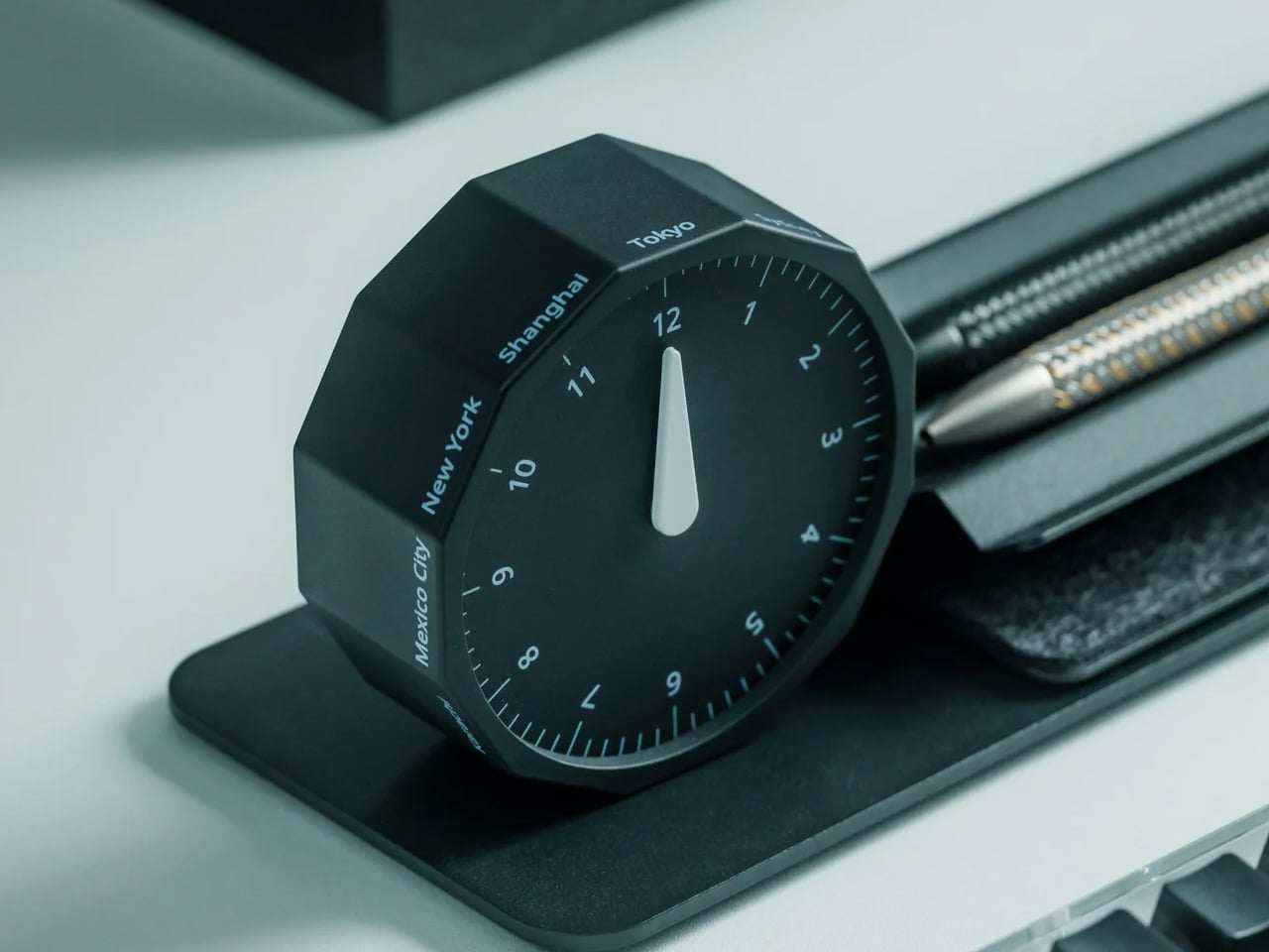
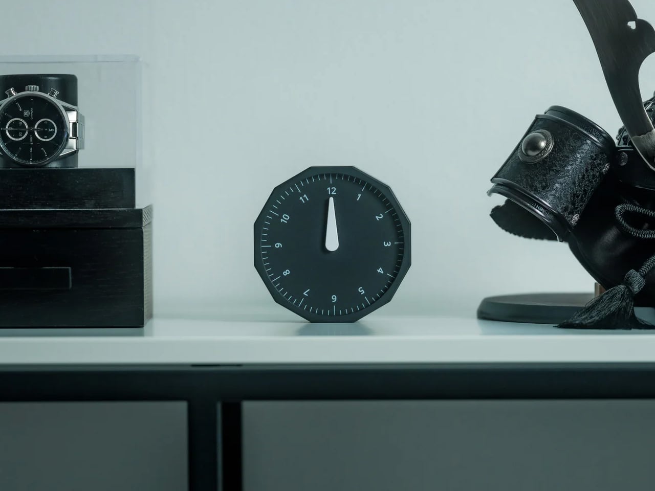
Before every Slack message you send to someone on another continent, you do the math in your head. Or you switch tabs. Or you pull up a world clock widget and then forget what you were doing before you opened it. The Rolling World Clock removes that entirely. It sits on your desk and shows you the time in every zone you track, physically, without touching a screen. You glance at it the way you glance at your coffee cup. No context switch, no arithmetic, no interruption.

At $49, this is the least expensive thing on this list and the one with the fastest daily return. The rolling display mechanism is considered, the design language sits cleanly next to other deliberate desk objects, and a physical clock requires no charge, no connection, and no subscription to do its job. That combination is rarer than it should be in 2026. The only maintenance it asks for is a manual adjustment twice a year for daylight saving time, which you were going to forget anyway, but at least now you have something specific to blame.

Click Here to Buy Now: $49.00

What we like:

  • The physical format makes world time a peripheral-vision experience rather than an active one. You absorb the information without choosing to look for it, which is how a good desk tool should work.
  • It reads as chosen rather than defaulted to, and that changes how the rest of your desk looks by association.

What we dislike:

  • Manual daylight saving adjustment is a real inconvenience that arrives twice a year and catches you off guard both times. A clock that is an hour off is worse than no clock.
  • Works best when you are tracking two or three time zones. If your work spans more than that, a digital solution handles the volume more honestly.

Five Products. One Decision Each.

Most home offices are assembled rather than designed. You know this because you built yours one order at a time, and the result is a surface full of things that coexist without quite agreeing. These five products are not a redecoration. They are five specific decisions: what your desk connects to and how you control it, how your mouse travels, how you look on a call, where your thoughts actually go, and how you read time without leaving a screen.

Together they cost less than most standing desks and do considerably more. The HubKey alone replaces a pile of adapters and adds physical controls your keyboard never had. The Logitech MX Brio Ultra makes your next video call the last time anyone asks if your connection is bad. The OrigamiSwift, the Rocketbook, and the Rolling Clock handle the small frictions that accumulate across a full workday without ever announcing themselves. That is what justifying every dollar actually looks like. Of everything on this list, the OrigamiSwift is the one I reach for first every single morning — not because it is the most impressive spec on paper, but because it removed a daily annoyance I had accepted as permanent. Turns out the right mouse for your desk and your bag was always the same mouse; it just needed someone to fold it properly.

The post 5 Best Home Office Gadgets for Remote Workers in 2026 That Actually Justify Every Dollar first appeared on Yanko Design.

Apple TV 4K Is Coming September 9, With a Gemini-Powered Siri You Can Actually Talk To

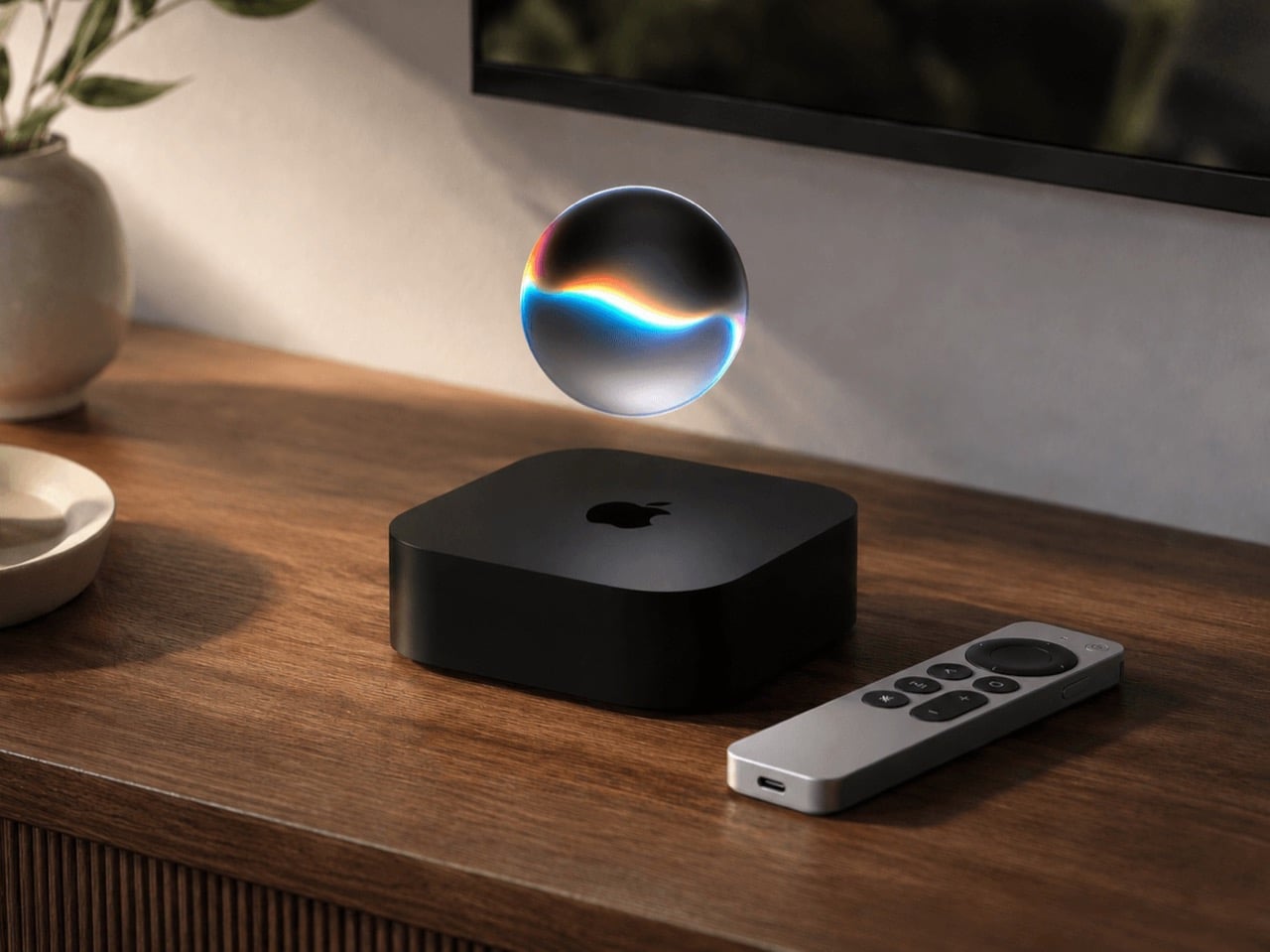
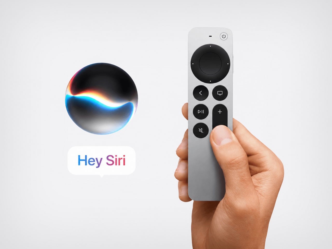
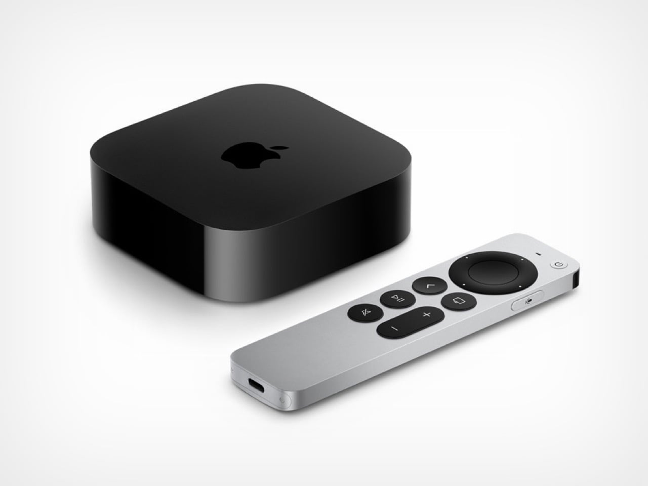
Apple’s next Apple TV 4K is expected on September 9, and the headline feature is a Siri you can hold a conversation with. Siri AI runs on a custom 1.2 trillion parameter Google Gemini model inside Apple’s Private Cloud Compute, which Apple reportedly pays Google around a billion dollars a year to license. It should reach the public with tvOS 27 in mid September, most likely around Monday the 14th. Leaked code in the macOS 26.7 release candidate lists an unreleased controller as ATVRemote1,5. Four years after the last box shipped, the living room finally gets the good Siri, and the remote gets demoted.

The current model has been on sale since November 2022 with an A15 Bionic chip, making it the longest running Apple TV between updates. Apple raised its price anyway in June, from $129 to $199 for the Wi-Fi version and $149 to $249 with Ethernet, blaming the memory chip shortage. The new box is rumored to carry an A17 Pro chip or newer, 8GB of RAM, and Apple’s N1 wireless chip for Wi-Fi 7, Bluetooth 6, and Thread. Apple has confirmed exactly none of it. My interest is in the stick, because a conversational assistant changes what a remote is even for.

Designer: Apple

The Siri Remote has always been the awkward part of this product. The 2015 glass touchpad version was famously easy to hold upside down. The 2021 aluminum redesign fixed orientation with a circular clickpad and a jog ring, but it stayed thin, cold, and easy to lose in a couch. Nobody expects ATVRemote1,5 to look radically different, although one can hope. The rumor mill’s best guess is a second generation Ultra Wideband chip for Precision Finding, which is a nice way of saying Apple is finally building a remote finder into the remote instead of asking you to turn your house upside down, or worse, strap a clunky AirTag to it.

Siri AI’s 1.2 trillion parameter Gemini model dwarfs the roughly 150 billion parameter models Apple’s own Foundation Models run on, and Google built it specifically to handle summarizing and multi step planning, the tasks Siri has failed at for over a decade. Apple’s answer to the privacy question is architectural rather than rhetorical: queries route through Private Cloud Compute, Apple’s own server silicon, so the assistant is Google’s brain wearing Apple’s skin. Whether Apple TV gets the full version or a scaled down version tied to on device processing is still unconfirmed.

None of this works without new silicon, which is presumably why Apple TV and HomePod mini were left out of the WWDC keynote entirely despite tvOS 27 shipping Apple Intelligence frameworks in its beta code. Current Apple TV and HomePod hardware simply cannot run it. That is also the best explanation for why Apple hiked the price of four year old hardware by 54 percent in June rather than discounting it toward obsolescence. The company was buying time, not margin.

What I find genuinely interesting is the inversion. For a decade, the remote was the product’s weak point and the box quietly did fine. Now the box is getting the transplant everyone wanted, and the remote becomes almost optional, a fallback for when you would rather not talk to your television. If Apple pulls off a Siri that understands “put on the thing with the guy from that show” without three follow up questions, the aluminum wand in your couch cushions finally gets to retire.

The post Apple TV 4K Is Coming September 9, With a Gemini-Powered Siri You Can Actually Talk To first appeared on Yanko Design.

5 Steel Furniture Designs That Look Nothing Like Steel Furniture

For years, steel furniture carried a predictable identity, purely functional and unapologetically utilitarian. It belonged to offices, factories, and workshops, valued more for endurance than aesthetics. That perception has quietly transformed. Steel now commands attention in refined living spaces, boutique hotels, and architect-designed homes.

Designers are reshaping steel’s image, balancing raw structural honesty with elegance, craftsmanship, and emotion. Let’s understand why steel furniture is not just chosen for durability, but for character, for its ability to anchor a space while making a distinct visual and artistic statement.

1. The Elegance of Slim Steel Profiles

Steel’s defining advantage lies in its exceptional structural strength, allowing designers to create remarkably slender forms without compromising stability. Where wood often demands thickness for support, steel can bear substantial weight through refined, delicate frames. The result is furniture that appears lighter, sharper, and visually precise.

This slimness transforms how a space feels. Thin steel legs, narrow frames, and minimal lines reduce visual heaviness, making rooms appear more open and breathable. In compact urban interiors, especially, steel furniture introduces a sense of airiness and subtle sophistication. Pieces seem to float rather than occupy, delivering both physical durability and a sensitive, almost effortless aesthetic presence.
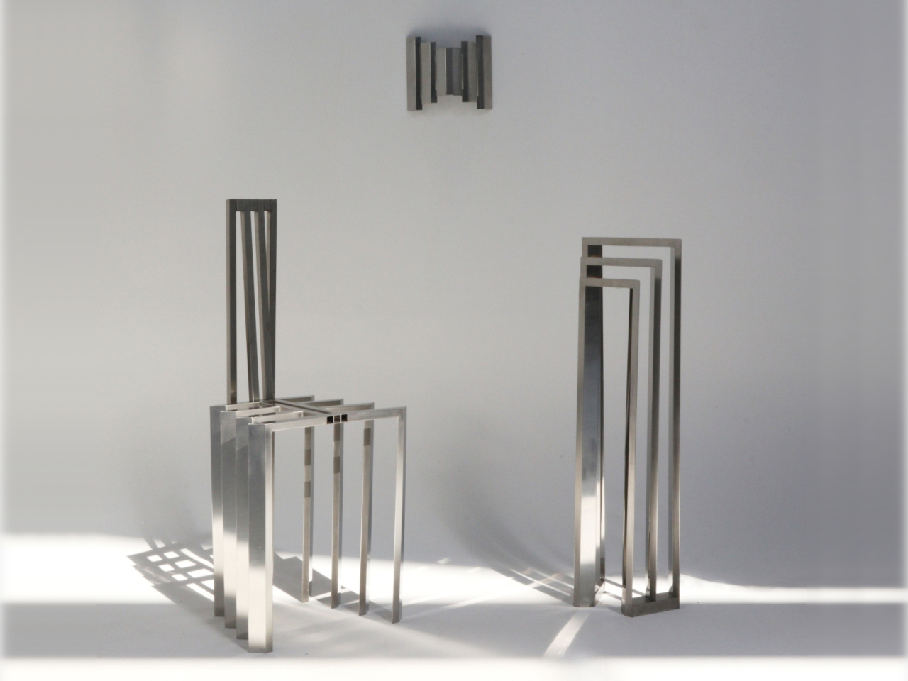
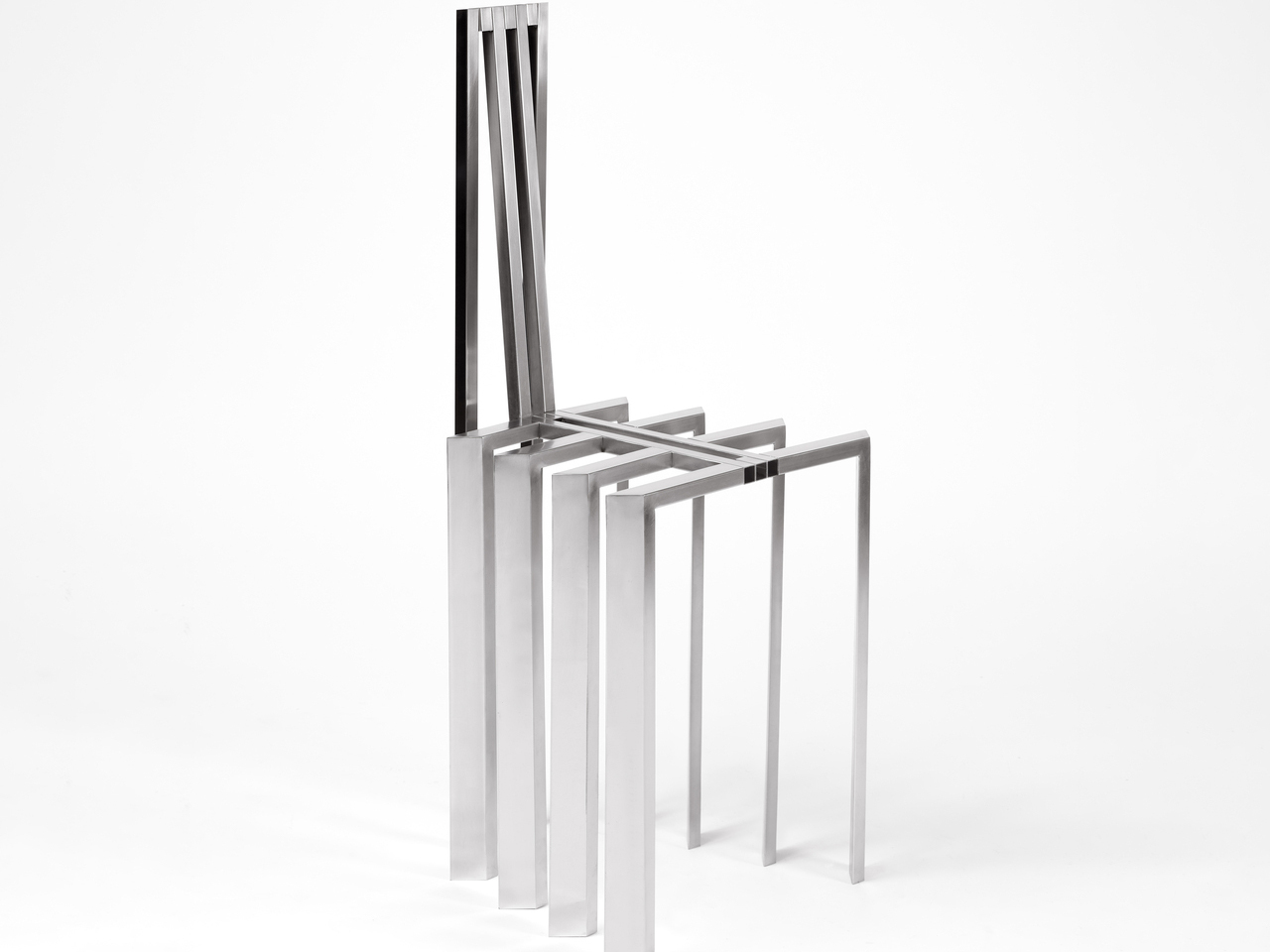
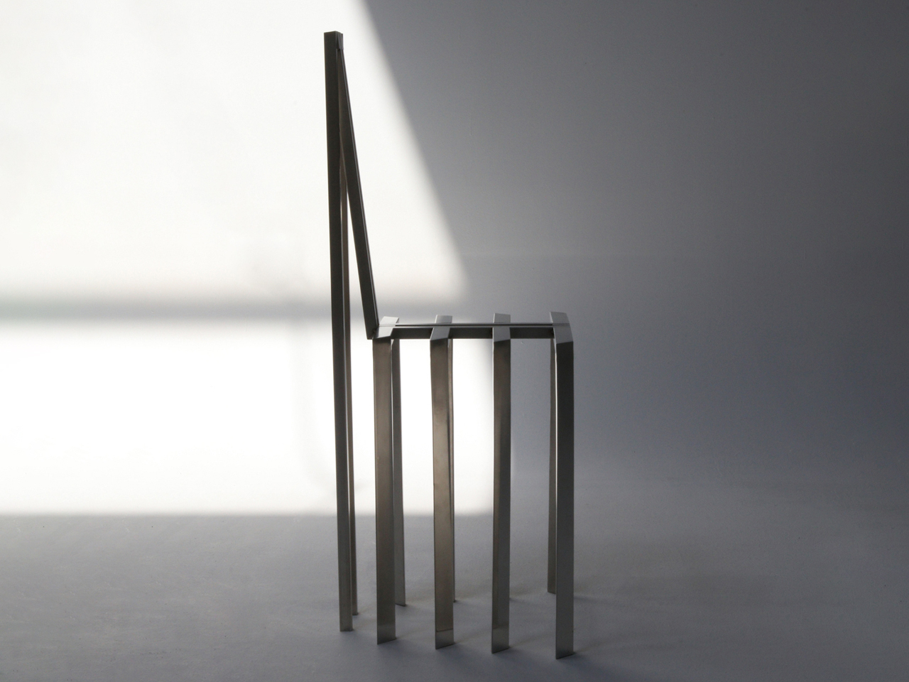
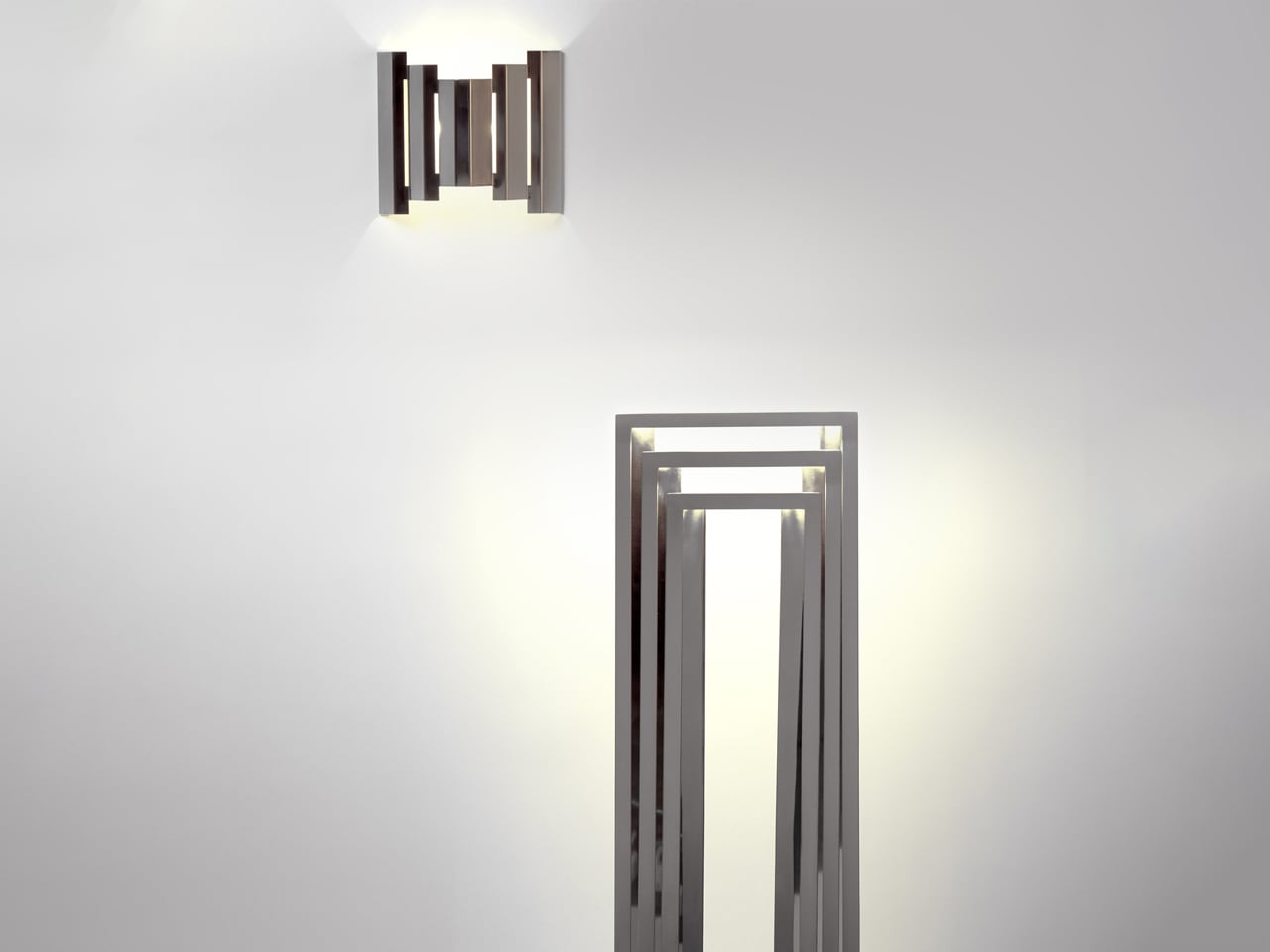
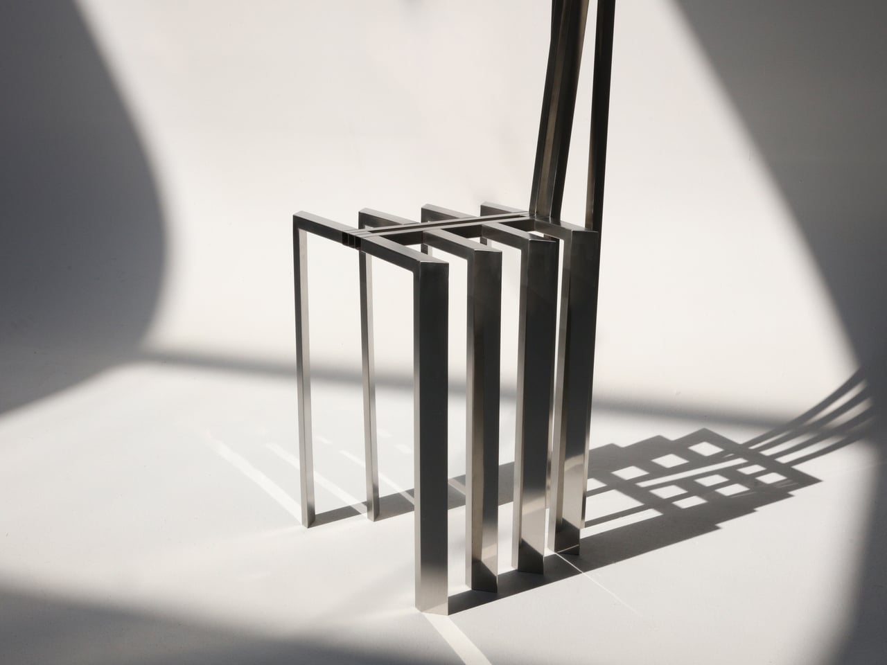
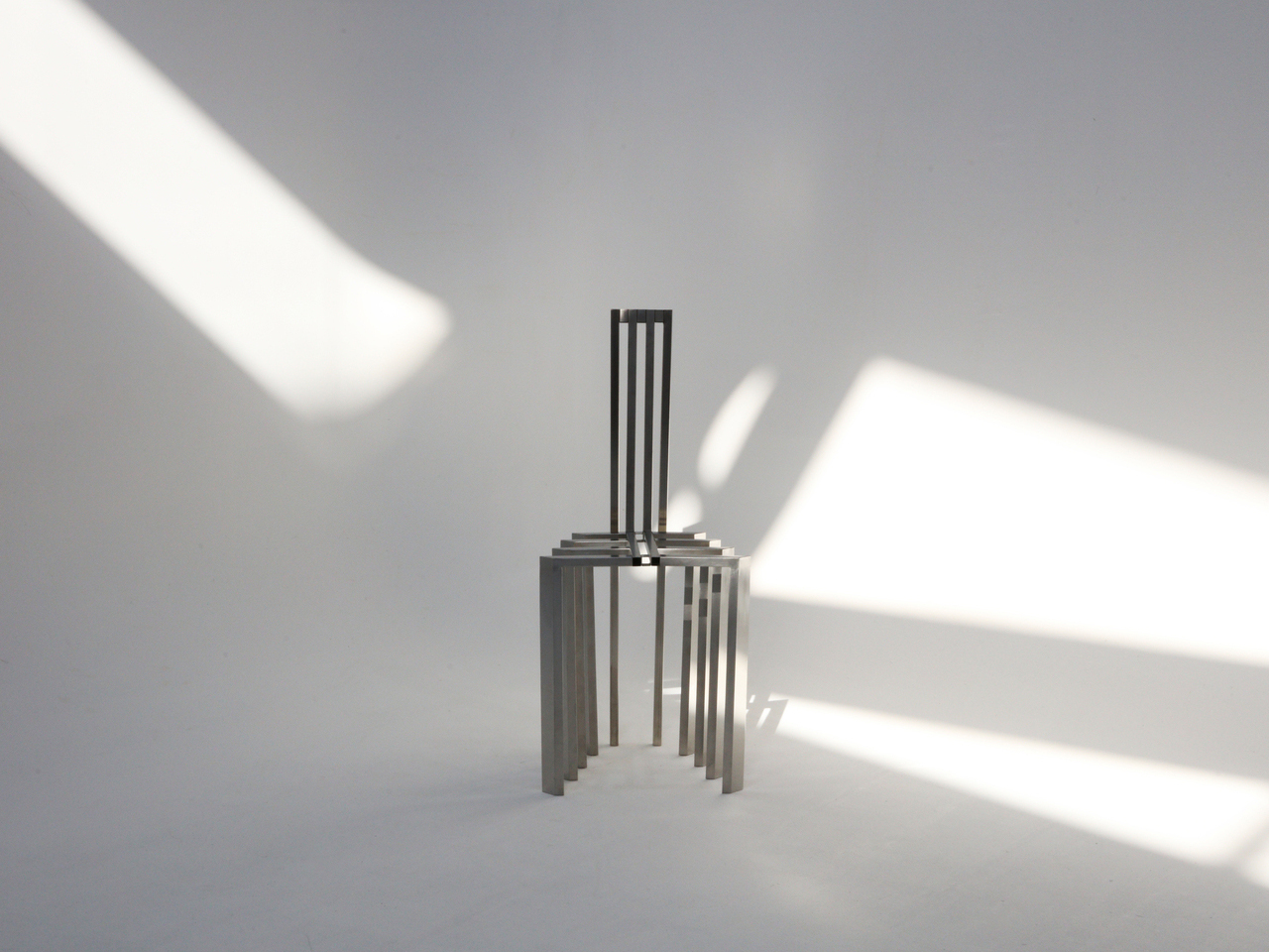
Jiyun Lee’s Foln series consists of three stainless steel pieces: the Linear Chair, a floor lamp and a wall lamp, each constructed from precisely folded metal lines. Defined by slender proportions and a vertical emphasis, the designs read as lightweight frameworks rather than solid volumes. The Linear Chair is composed of repeated uprights and crossbars that form both seat and backrest, creating a clear geometric rhythm while maintaining structural integrity. Its polished steel surface enhances the clarity of each line, allowing the form to stand out without added ornamentation.
The floor and wall lamps translate the same linear language into lighting. Nested metal frames guide illumination so that it moves between bars before spilling onto adjacent surfaces. Instead of concealing the structure, the design highlights it, allowing light to interact directly with the steel geometry. Firm, minimal and sharply defined, each piece prioritises architectural presence and material clarity, positioning the collection closer to sculptural, collectible furniture than conventional everyday seating or task lighting.

2. Cool Steel Meets Warm Texture

Steel inevitably carries a sensory contradiction. Cool to the touch and visually crisp, it has long been associated with hardness and emotional distance. Its surface reflects light with precision, yet rarely conveys the immediate warmth of wood or fabric.

Contemporary design reframes this tension as an opportunity rather than a flaw. By pairing steel with tactile, human-centered materials like supple leather, textured wool, or natural timber, designers create a layered sensory experience. The contrast softens steel’s severity while amplifying its elegance. What emerges is a balanced dialogue between strength and comfort, where the metal’s cool composure enhances, rather than diminishes, the inviting warmth of the surrounding elements.
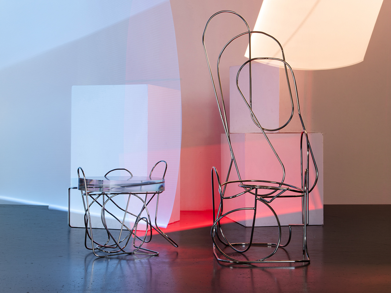
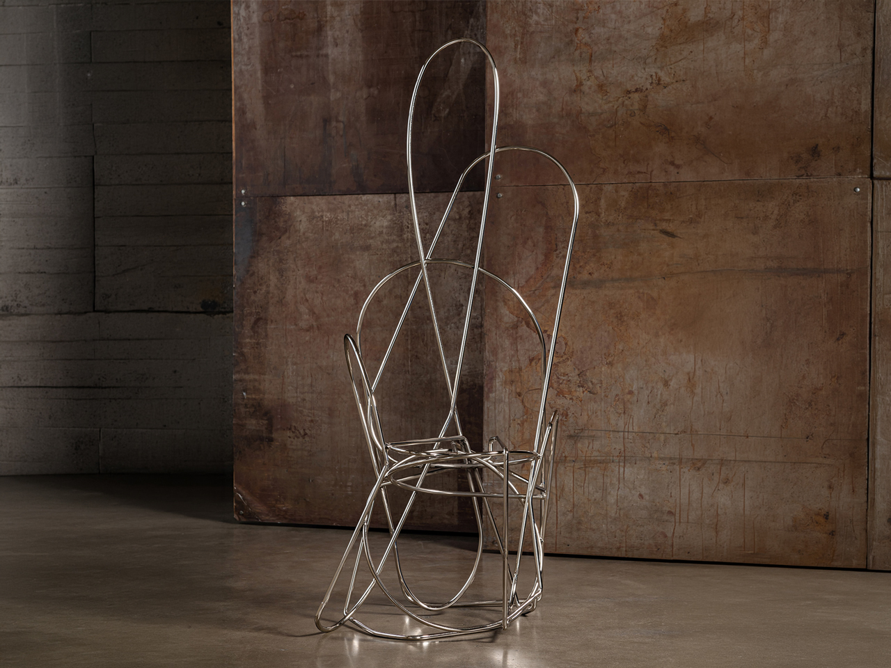
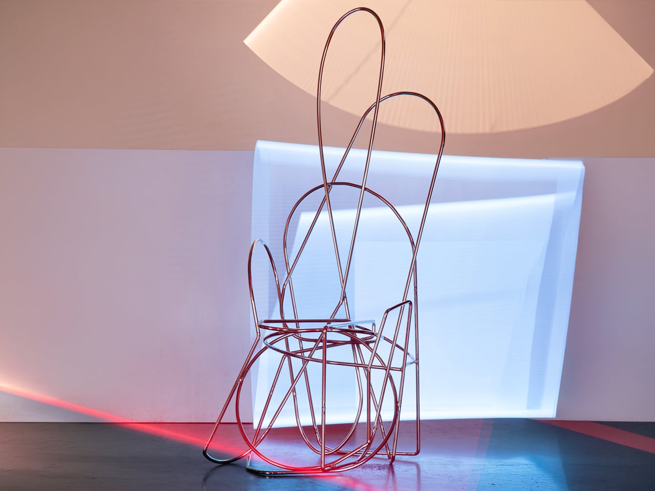
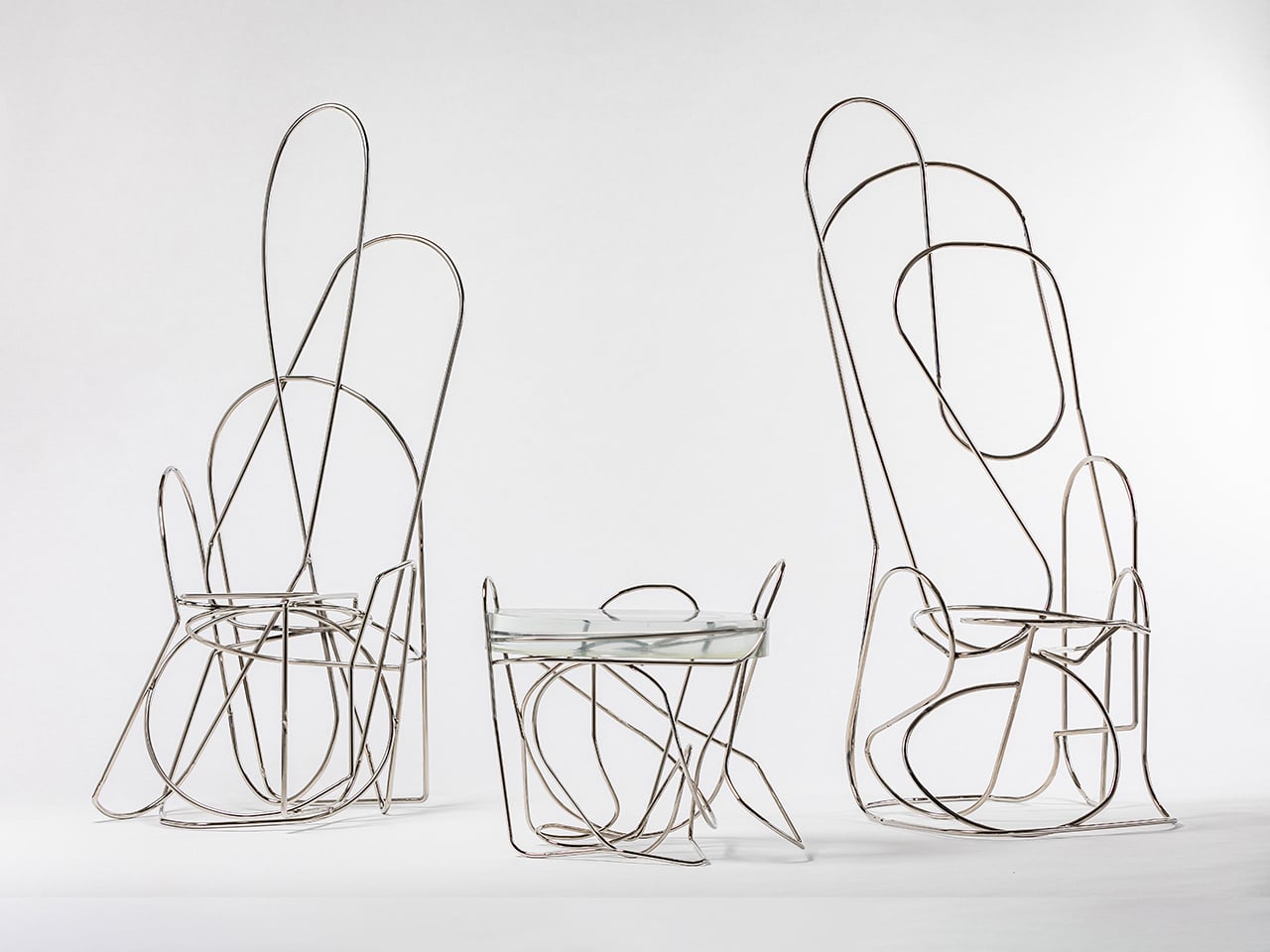
The Doodle collection by Another Human, led by Leah Ring, is a bold exploration of sculptural steel furniture. At its core are nickel-plated steel rods, meticulously hand-bent into looping, spontaneous forms that resemble freehand sketches translated into space. Each curve is shaped and welded with precision, resulting in fluid frameworks that feel dynamic and expressive rather than rigid or industrial. Subtle variations ensure that every piece remains one of a kind, reinforcing the handcrafted integrity of the metalwork.
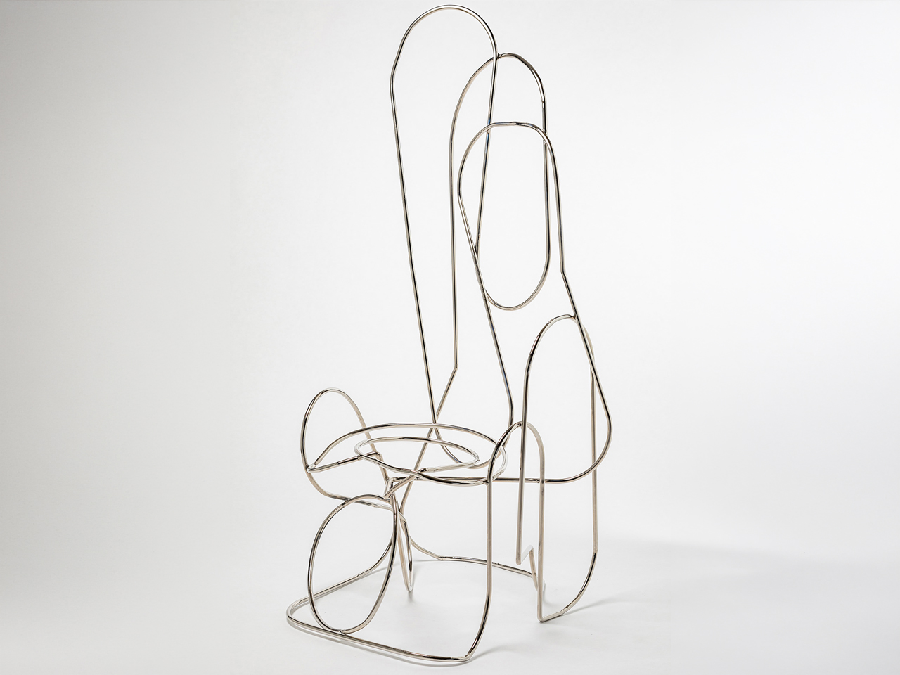
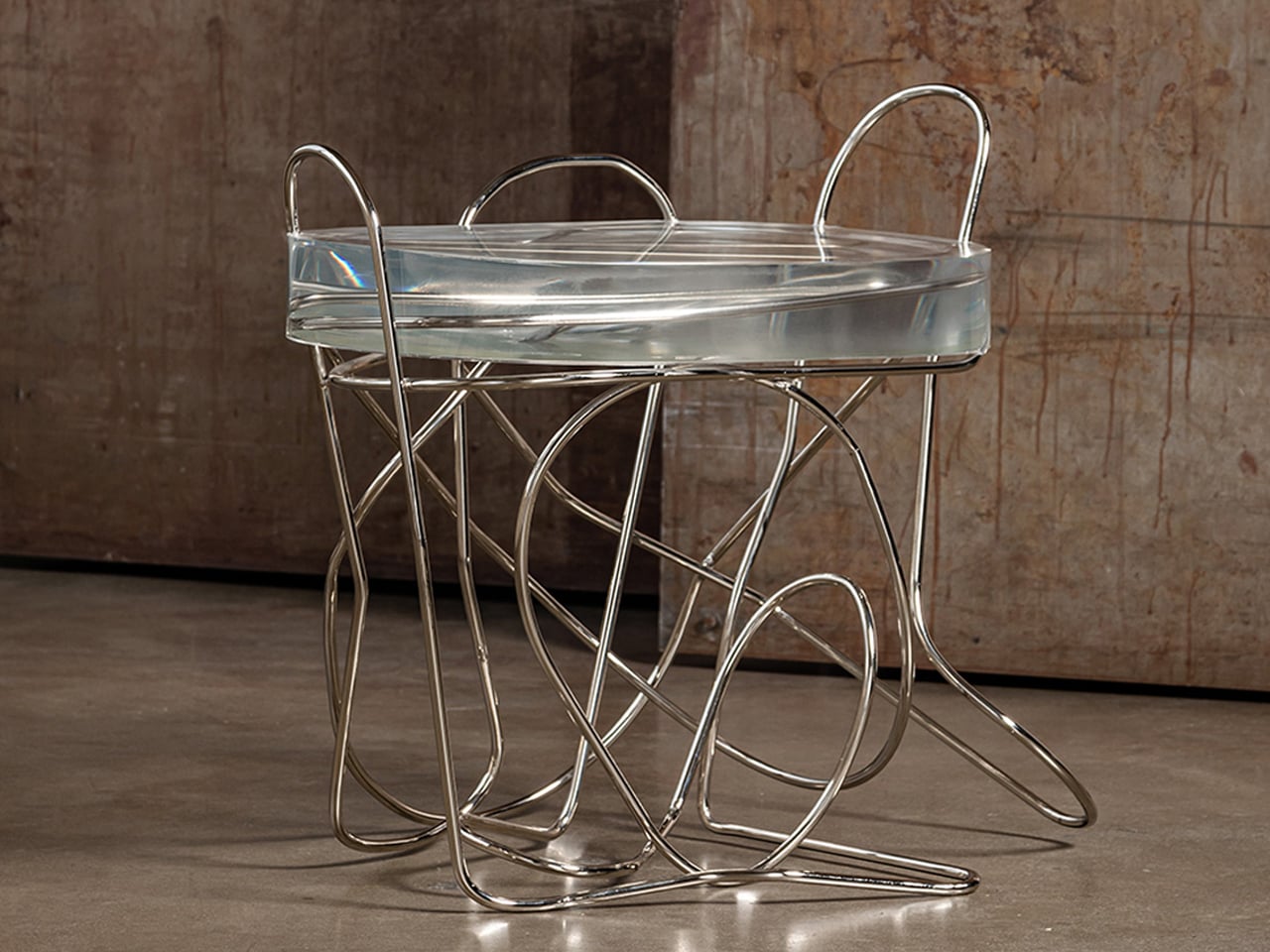
The table and chairs appear almost gravity-defying, as though drawn in mid-air, yet the welded steel armature provides structural stability and durability. The polished nickel surface reflects light across the sweeping lines, amplifying the sense of movement within the design. By leaving the steel exposed and unapologetically visible, the collection celebrates material honesty, transforming utilitarian furniture into striking, sculptural statements defined entirely by the strength and rhythm of metal.

3. Sustainability and Steel’s Immortal Lifecycle

Steel presents an intriguing environmental paradox. Its production demands significant energy, yet its long-term sustainability lies in unmatched circularity. Unlike many materials that degrade with reuse, steel can be recycled repeatedly without losing strength or quality, preserving both performance and value.

In an era dominated by fast furniture and disposable design, steel stands as a deliberate counterpoint. A steel chair is rarely a temporary purchase; it is an investment in longevity. Its durability reduces replacement cycles, waste, and resource consumption over time. Beyond physical resilience, steel embodies a mindset shift from short-term convenience to enduring responsibility and conscious ownership.
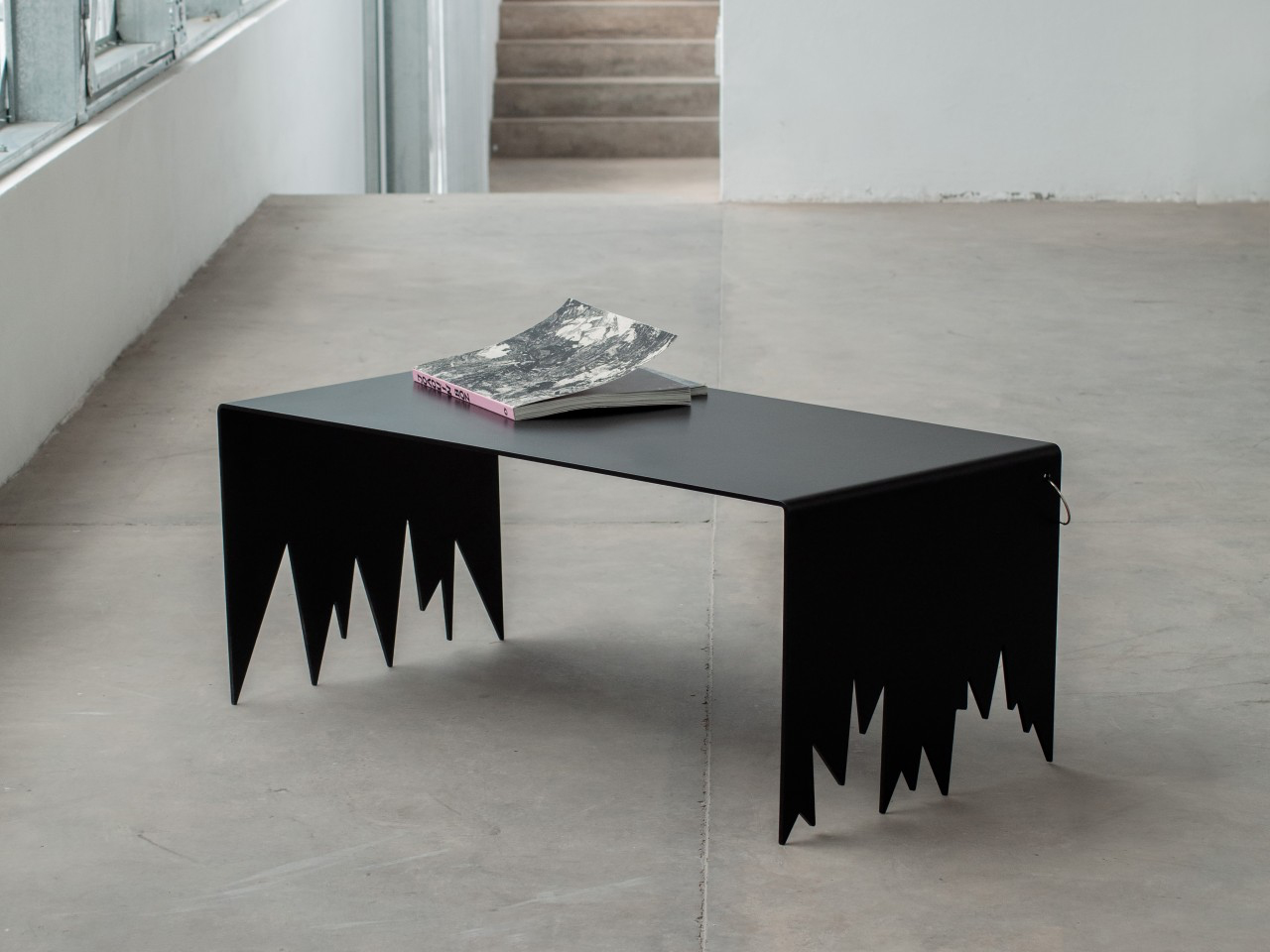
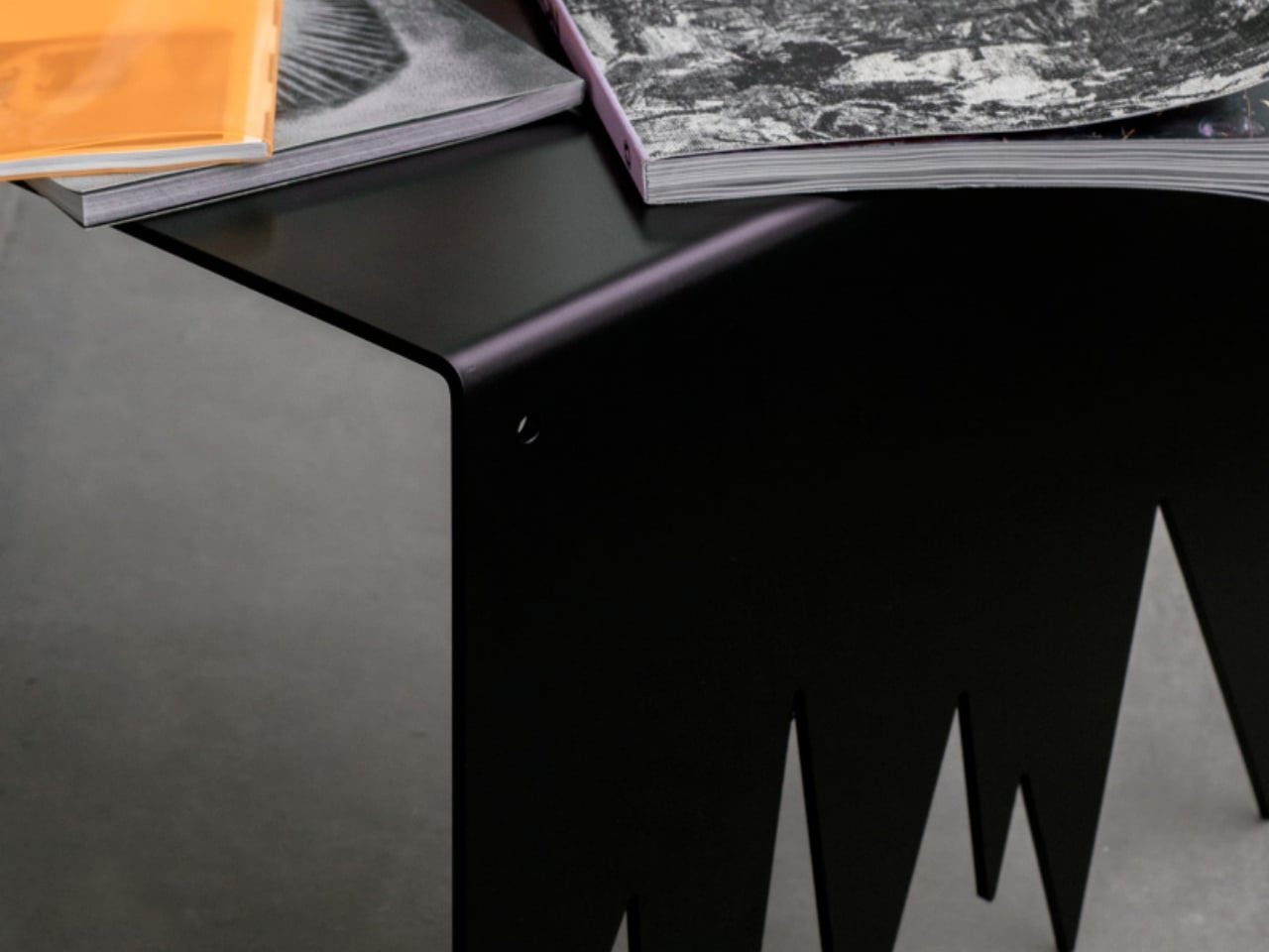
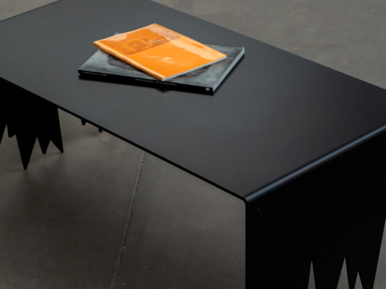
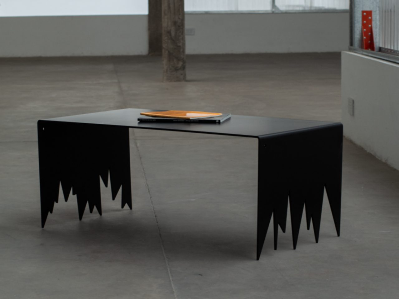
The Sharp coffee table stands as a commanding study in steel and geometry. Constructed entirely from industrial-grade steel and finished in deep black, the table is defined by its stark lines and uncompromising angles. Its surface appears clean and restrained, yet the structure beneath introduces a deliberate sense of tension. Narrow planes intersect with precision, forming a composition that feels architectural rather than decorative. The table does not rely on embellishment; instead, its impact comes from proportion, silhouette and the confident use of raw material.
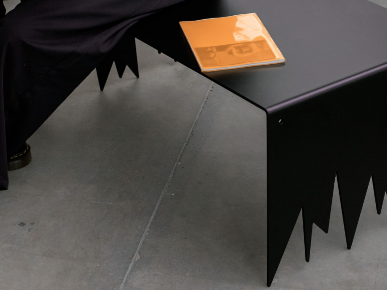
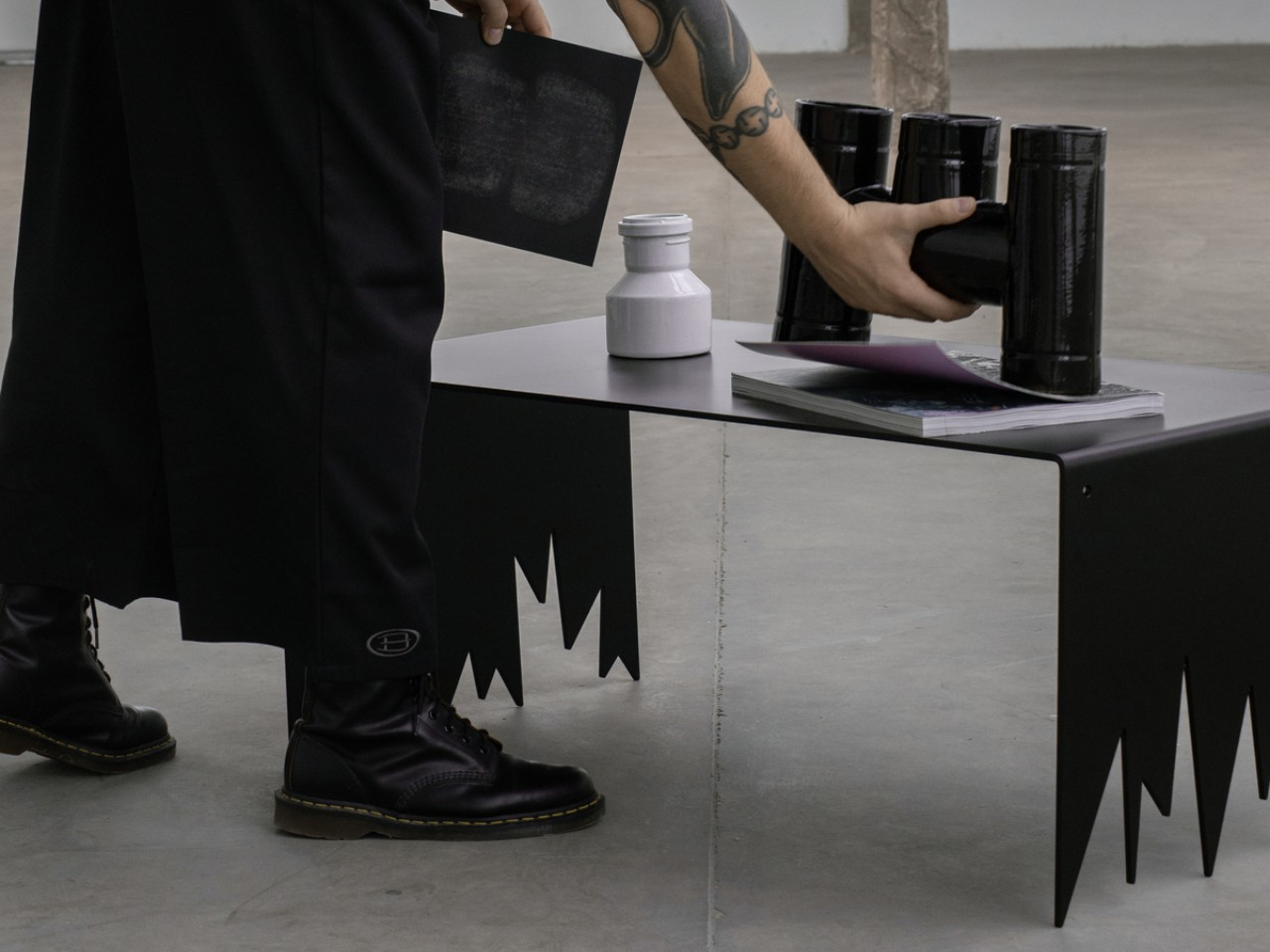
What sets the Sharp table apart are its jagged, tooth-like legs, which give the piece an imposing and almost sculptural presence. Despite their aggressive appearance, these sharply pointed supports provide remarkable stability, demonstrating careful engineering and balance. The black finish enhances the monolithic quality of the steel, amplifying its visual weight while maintaining a refined edge. Handcrafted and subtly unique in form, the table transforms steel into a bold centrepiece that redefines the expectations of a contemporary coffee table.

4. Designed to Last, Designed to Age

Steel carries a unique duality in the way it ages. On one hand, precision finishes like powder coating offer remarkable resistance to scratches, corrosion, and fading, preserving a crisp, immaculate appearance for years. The surface remains controlled, consistent, almost untouched by daily life.

On the other hand, raw or waxed steel embraces change. It records fingerprints, subtle oxidation, and the gentle evidence of use. What might once be seen as imperfection becomes narrative. The material evolves with its environment, gaining depth and individuality. This contrast allows steel furniture to satisfy the desire for flawless permanence and the appreciation of character shaped by time.
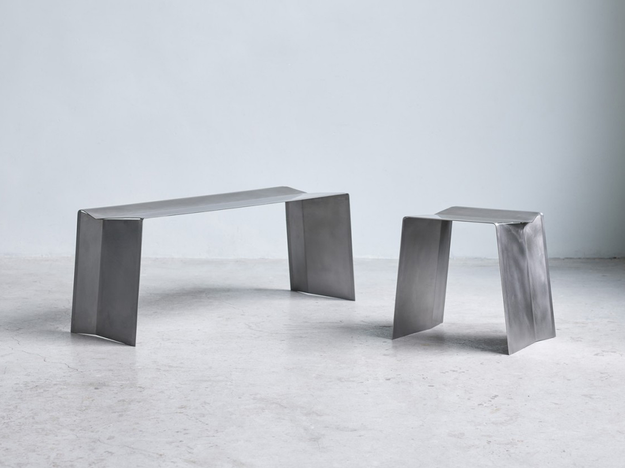
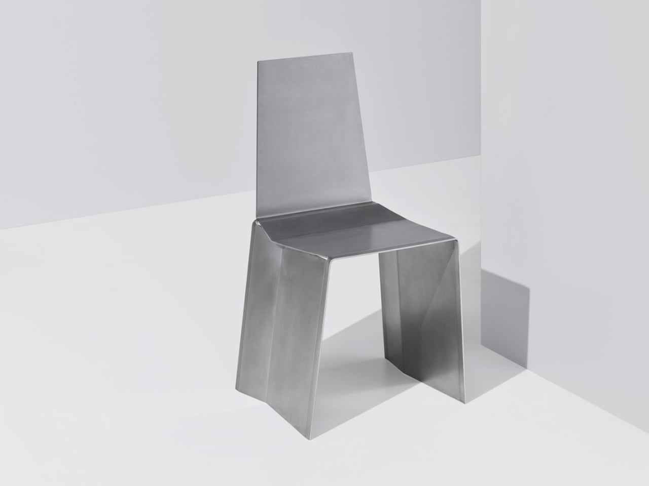
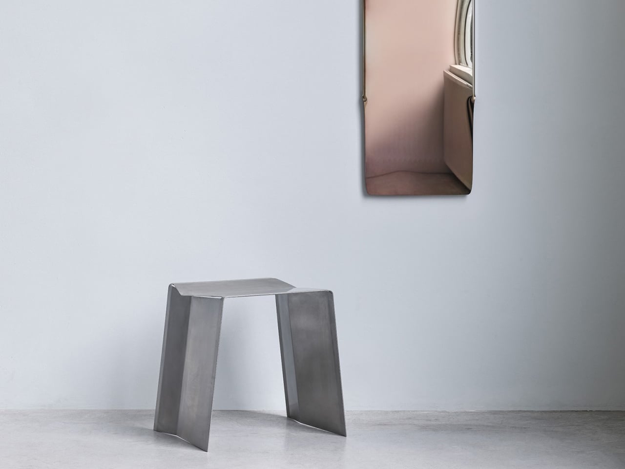
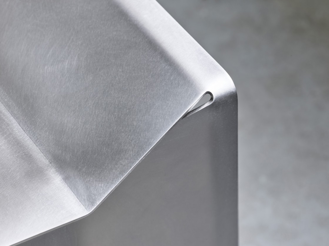
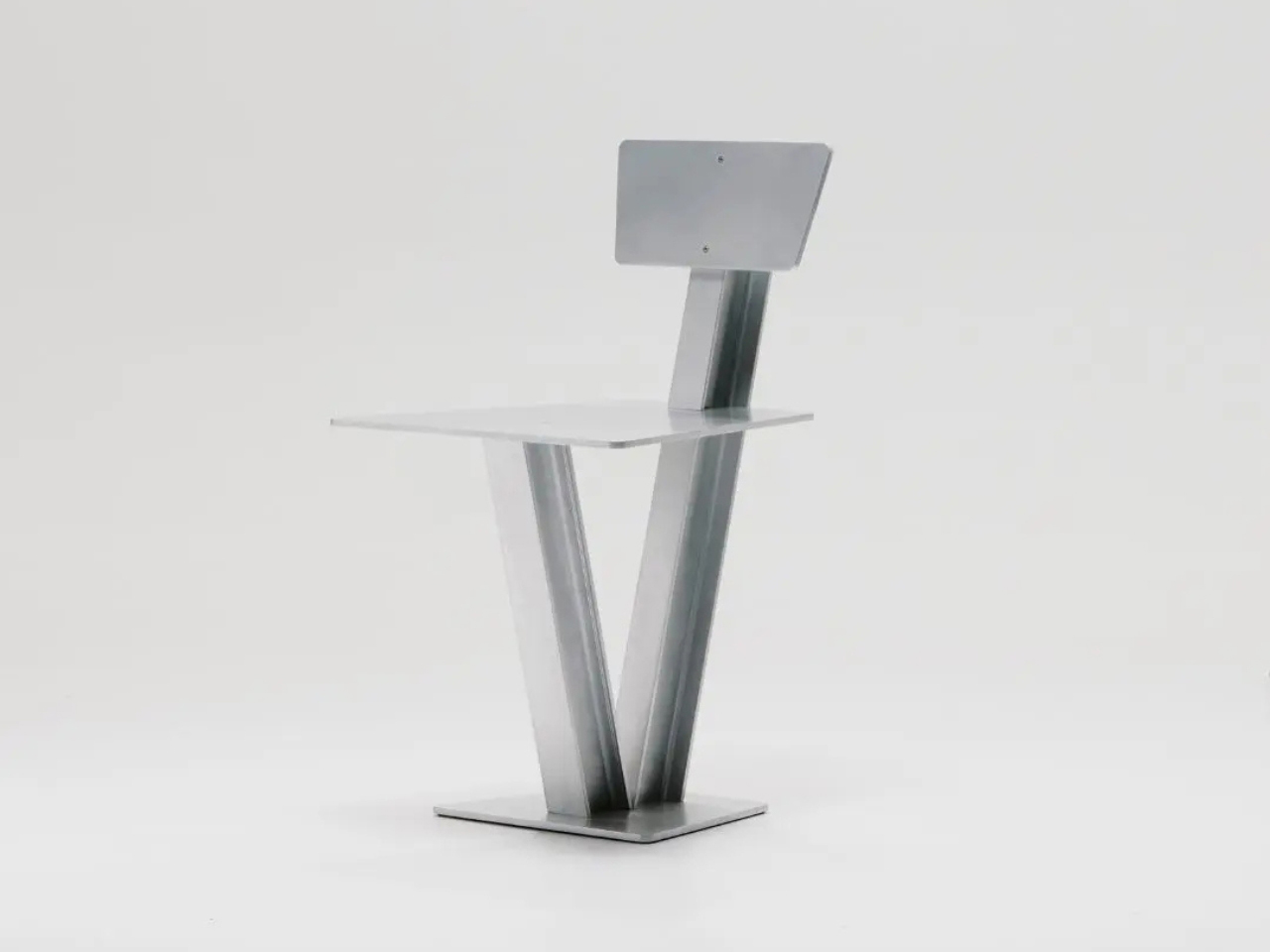
Camber is formed from a single sheet of stainless steel, precisely cut and bent to create a seamless seat and support structure. Rather than assembling multiple components, the design relies on strategic angular cuts at the fold points, allowing the metal to bend downward into stable legs. This method produces a continuous form with clean, uninterrupted lines. The geometry feels deliberate and architectural, giving the bench or stool a restrained yet confident presence. Every curve and edge emerges directly from the original sheet, reinforcing the clarity of its construction.
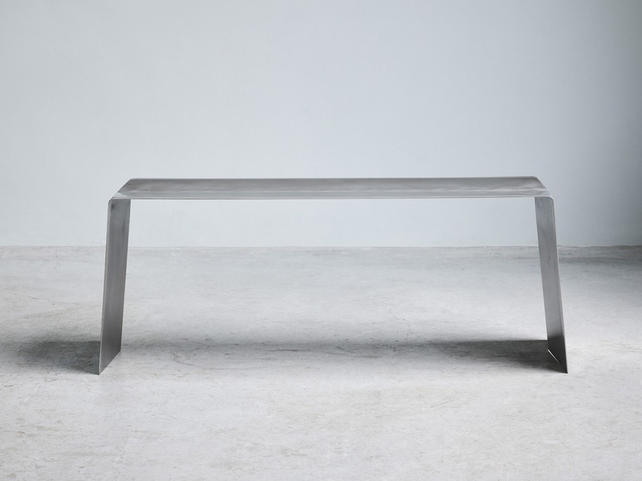
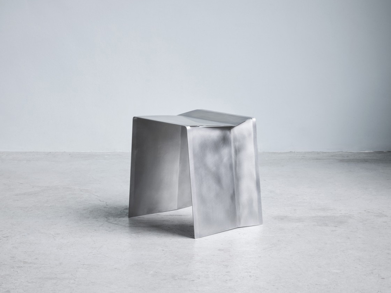
The surface is carefully sanded to achieve a soft, matte reflectivity that enhances the steel’s natural character without the need for additional coatings. Subtle light play across the planes highlights the crisp folds and sharp contours. Durable and resilient, the stainless-steel body ensures longevity while maintaining a minimal aesthetic. Camber’s strength lies in its simplicity, transforming a single industrial sheet into a refined, sculptural seating piece defined by precision and material honesty.

5. Adaptability and Modular Intelligence

Steel’s strength is not only about load-bearing capacity but also about flexibility in design. Its precision fabrication allows components to be cut, bent, welded, and reconfigured with remarkable accuracy. This makes steel inherently suited for modular systems, adjustable structures, and multifunctional furniture that evolves with changing needs.

In contemporary interiors where space must work harder, steel enables intelligent adaptability. Shelving expands, partitions shift, tables extend, and frames support interchangeable elements. The material’s dimensional stability ensures that moving parts remain aligned and reliable over time.
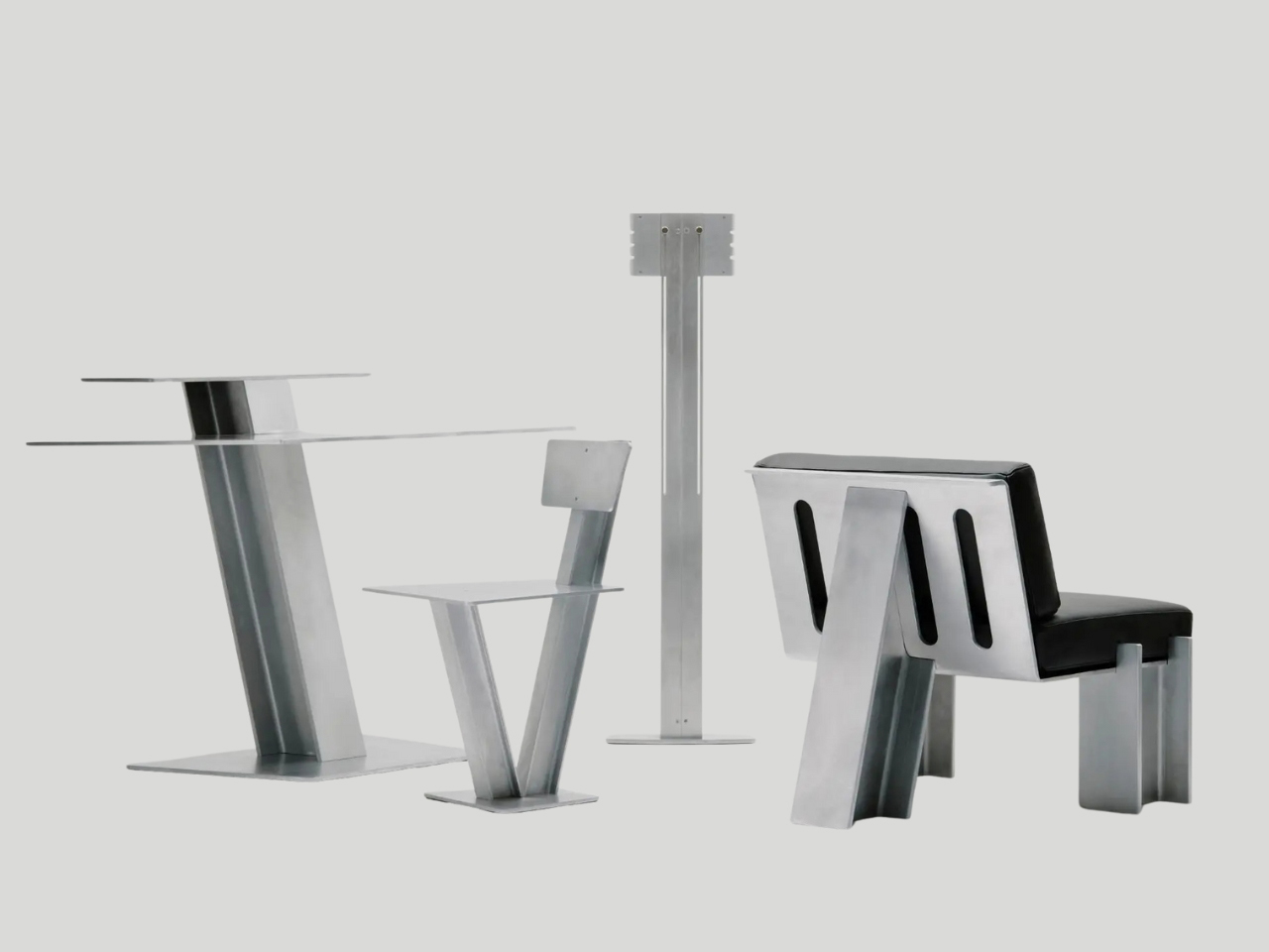
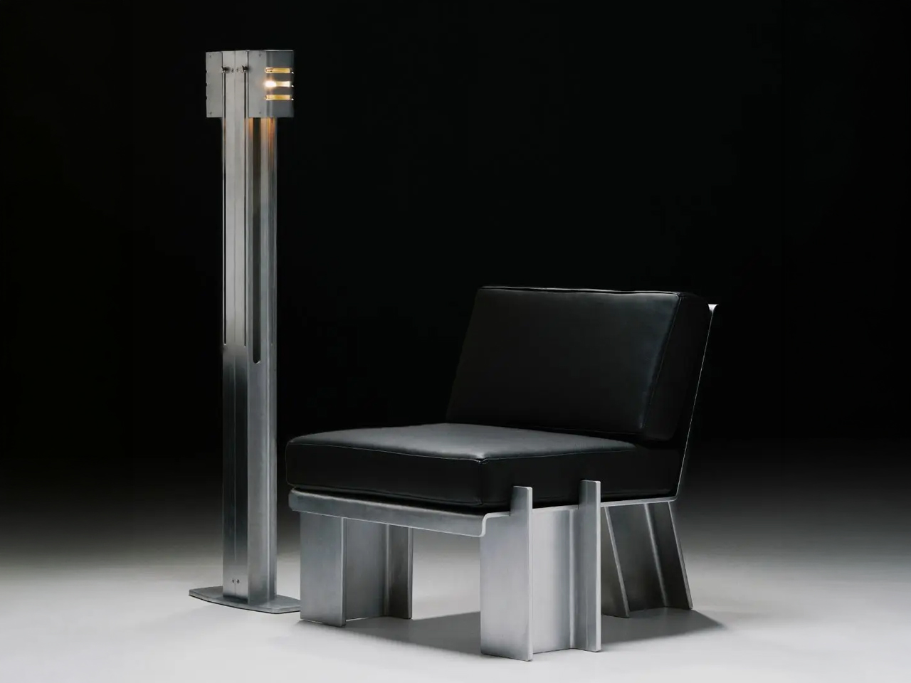
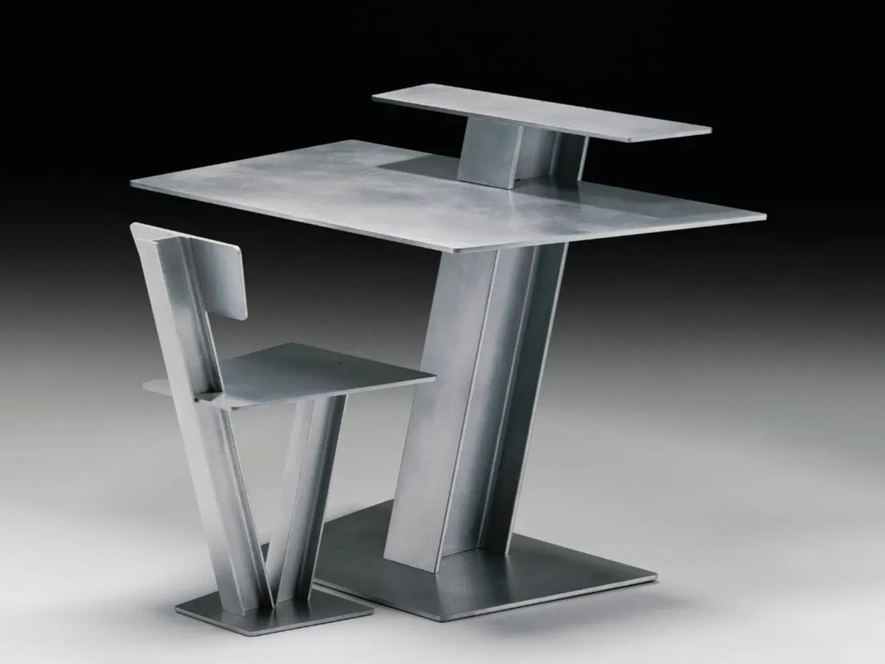
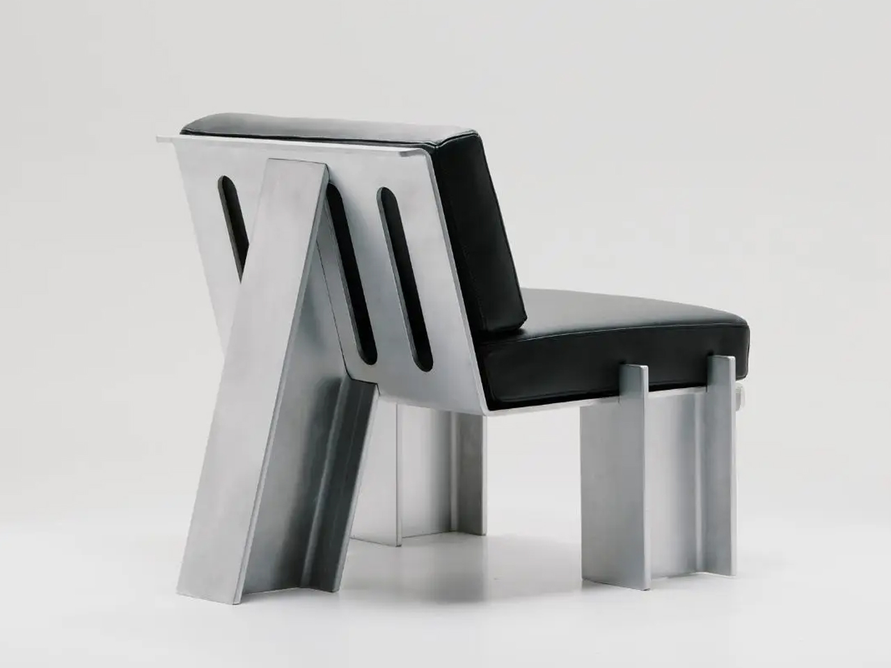
The Beams collection by Marquel Williams reimagines modular steel furniture through the disciplined use of a single structural element: the I-beam. Typically concealed within architecture, this industrial component becomes the visible backbone of chairs, desks, lounge seating and lighting. Each piece is constructed from standardised steel beams combined with metal sheets and leather upholstery, forming a cohesive system rooted in repetition and variation. By committing to one modular profile, the collection achieves structural clarity while allowing each design to express a distinct function and proportion.
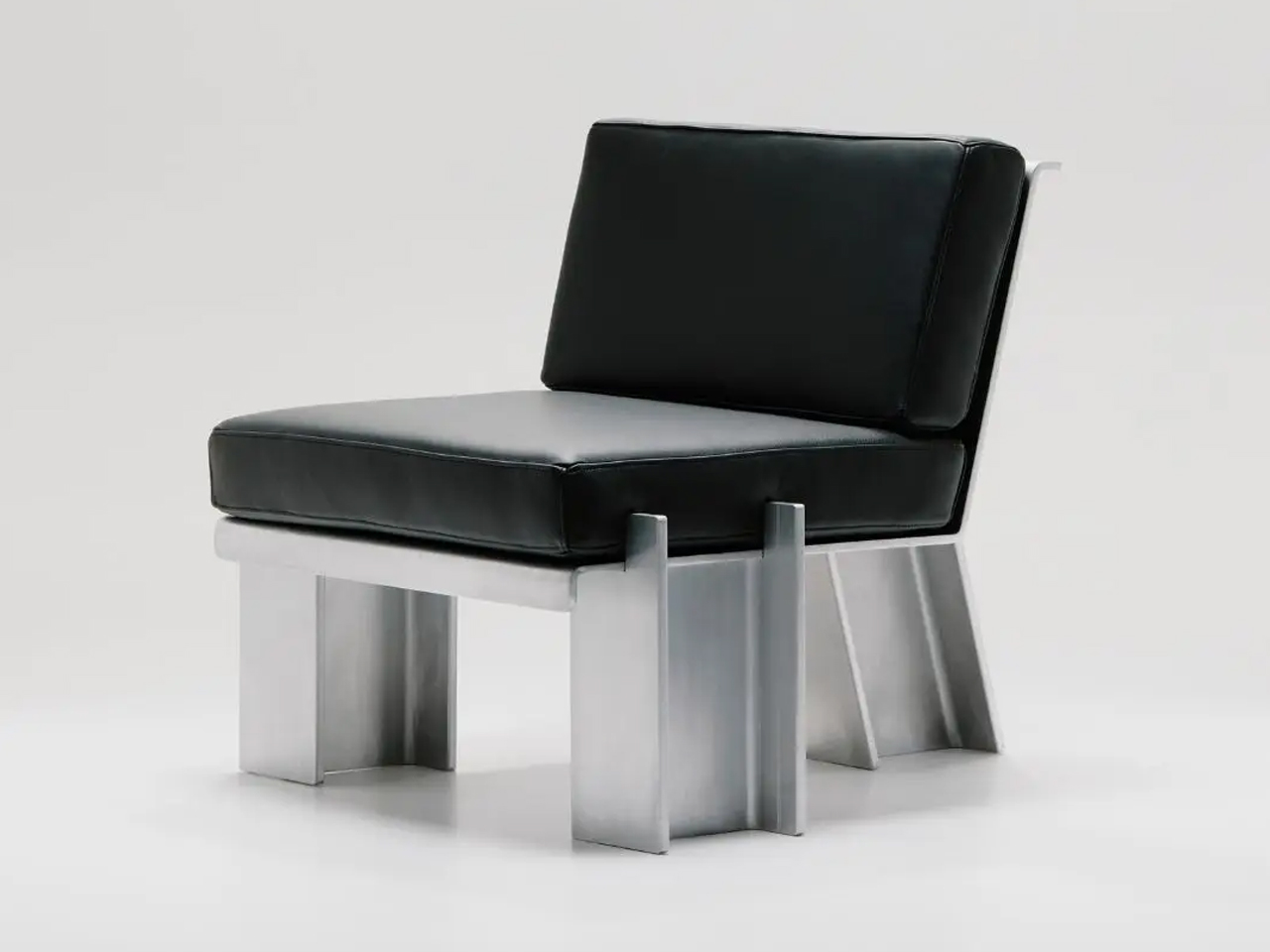
The Beam Chair emphasises sharp geometry and exposed steel, while the Chaise Longue introduces upholstered surfaces that soften the framework without concealing it. The Floor Lamp integrates adjustable shades within the beam’s linear body, even incorporating the electrical cord into the visible structure. Handcrafted in limited quantities by Caliper, the series balances industrial rawness with refined fabrication. Through modular repetition, the I-beam shifts from hidden support to expressive design language, defining a bold and unified steel furniture system.

Steel furniture captures the balance between resilience and refinement. No longer confined to pure function, it now expresses elegance, versatility, and tactile awareness. By uniting structural strength with nuanced design, steel moves beyond its industrial past. It demonstrates that durability and sensitivity can coexist, shaping interiors that feel grounded, expressive, and timeless.

The post 5 Steel Furniture Designs That Look Nothing Like Steel Furniture first appeared on Yanko Design.


Urwerk Built a Hand-Carved Pocket Watch That Tracks Time for 1,000 Years

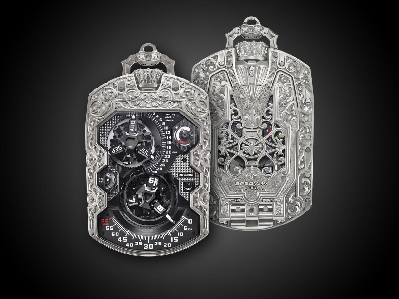
Florian Güllert spends most of his working life engraving shotguns. His bench sits in Klagenfurt, in Carinthia, an Austrian province with zero watchmaking history and a four-century run of decorating hunting weapons. Urwerk handed him a raw titanium blank and asked him to bury the most sci-fi pocket watch ever built under Baroque ornament. He said yes, spent roughly 500 hours over three months, and produced the UR-1001 Amadeus, a piece unique that looks like a cathedral swallowed a computer. Gun engraving exists because a tool meant to outlive its owner gets decorated, which turns out to be this watch’s entire argument.
The Amadeus measures 106 by 62 by 23mm and shows satellite hours, retrograde minutes, an annual calendar, day and night, and a 39-hour power reserve on the front. The hinged caseback adds an oil-change indicator that turns red through years four and five, a counter tracking 100 years of running time, and a linear scale that climbs to 1,000. Güllert laser-cut the contours before touching it by hand, since titanium galls and work-hardens under a graver in ways precious metal does not. Every engraved surface stops at the sapphire. Inside, Urwerk’s matte black instrument panel carries on as though the ornament never happened.

Designers: Martin Frei and Florian Güllert for Urwerk

Titanium punishes a graver the way a stubborn hinge punishes a screwdriver, so Güllert’s first move was unfamiliar territory for a man used to steel. He rough-cut the relief with a laser, then went back in by hand with pneumatic chisels and files, balancing thick strokes against thin ones until the pattern read as depth rather than line. Backgrounds got textured, dotted, satin-brushed, or left matte depending on how he wanted light to catch each panel. Every edge was filed and rebalanced until the boundary between case and decoration effectively disappeared. That is a genuinely different skill set than cutting a scroll into a shotgun receiver, and it shows in how uneven the difficulty was across the piece.

The flanks and bezel run pure Baroque, scrolling acanthus leaves that could sit on an 18th century snuffbox. The caseback centerpiece is something else entirely, a quatrefoil rose-window panel with cusped Gothic arches framing the movement aperture, and the winding crown at 12 has been carved into an actual fluted coronet. Baroque excess on the outside, ecclesiastical stonework on the back, industrial sans-serif labeling the instruments inside. Three separate design languages sharing one case, none of them arguing with the others.

Three-armed satellite hours hand off to a retrograde minute display, three running-seconds hands split a minute into 20-second stretches, and a satellite annual calendar runs on three Maltese crosses riding a 93-tooth date wheel. Flip the watch over and the oil-change dial, calibrated for five-year service intervals, feeds a counter that advances in five-year steps toward a full century. Every hundred years, that counter sends a pulse to a linear scale on the caseback graduated all the way to 1,000. Yes, this pocket watch has a mechanical millennium indicator, and yes, it is exactly as absurd and wonderful as it sounds.

The UR-1001 has been Urwerk’s flagship strange object since 2011, when eight AlTiN-cased examples sold out at CHF 340,000 each, a number early buyers reportedly called cheap for what it did. We covered Urwerk’s other engraved oddities before, including the UR-210 Amadeus that first paired Güllert with the brand back in 2017, and the ambition here is visibly larger. Urwerk has not disclosed a price for this one, which tracks for a commissioned piece unique. Felix Baumgartner named it for Mozart, calling the composer a brilliant madman, and says he wanted a case as daring as the mechanics inside it.

Here is the part nobody selling this watch will say out loud. The 100-year and 1,000-year counters only advance while the movement is actually running, and a piece unique this expensive tends to spend its life in a safe rather than a pocket. Baumgartner’s own language calls the eventual buyer a custodian rather than an owner, which is a lovely way of admitting the millennium scale may never move past zero. A gunsmith spent 500 hours making sure it would look magnificent the whole time it doesn’t.

The post Urwerk Built a Hand-Carved Pocket Watch That Tracks Time for 1,000 Years first appeared on Yanko Design.