Someone Built a Clock With 60 Water Pumps and Zero Regrets

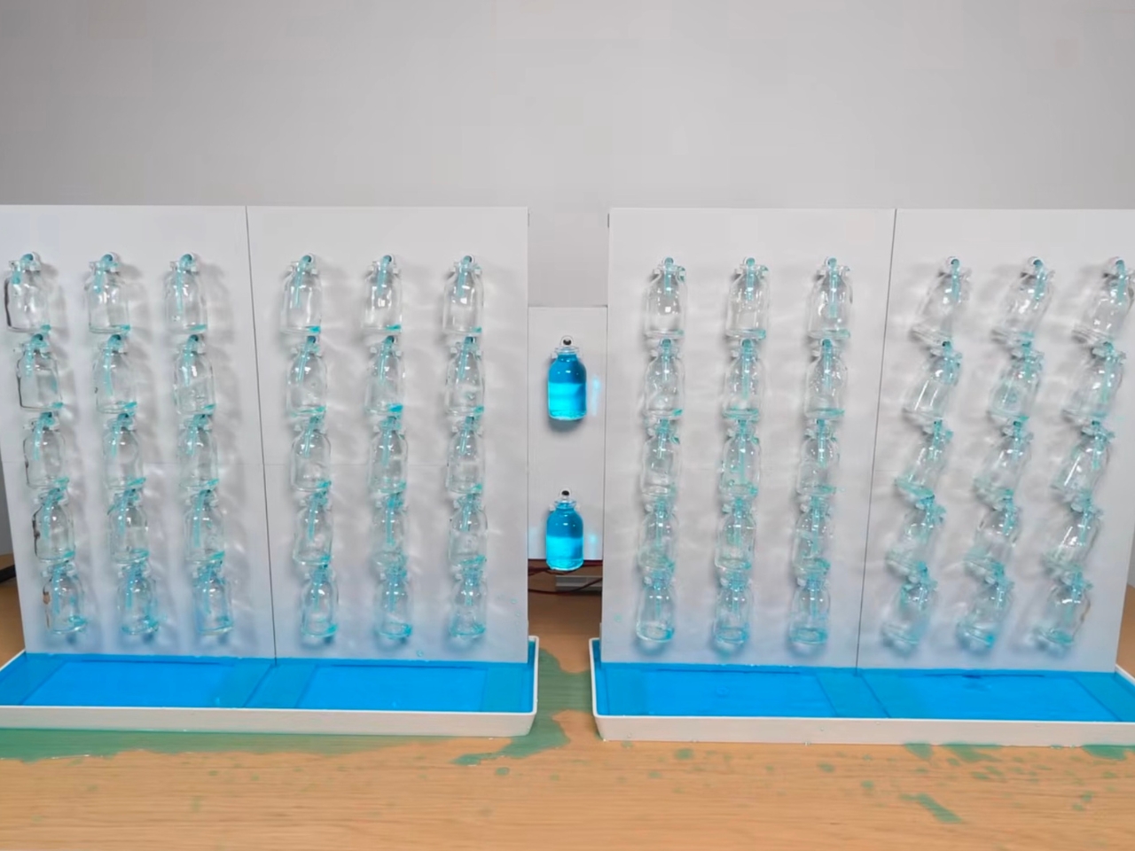
When I first saw the Water Tower Clock by Strange Inventions, I genuinely had to watch it twice. Not because I didn’t understand it, but because I couldn’t quite believe that someone looked at a pile of 10-cent glass bottles and thought: yes, this is how I’m going to display the time.

The concept is deceptively simple. Each digit on the clock is made up of a fifteen-segment display, except instead of LEDs, each segment is a small glass bottle. When a bottle is filled with dyed water, the segment is active. Empty it, and it disappears. Put enough bottles together in the right configuration and you get numbers. Numbers that tell you it’s 4:37 in the afternoon, rendered entirely in colored water. It’s the kind of idea that sounds ridiculous until you see it running, and then it seems almost obvious.

Designer: Strange Inventions
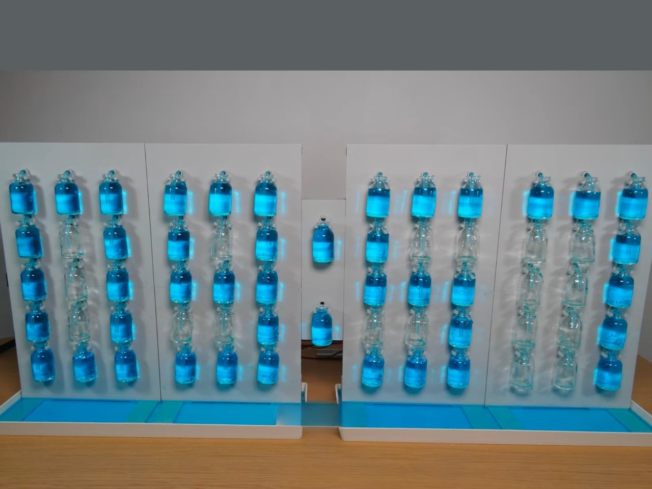
I love this for a lot of reasons, but the biggest one is that Strange Inventions didn’t try to make something efficient. He made something worth looking at. That’s a design philosophy I respect more than I can easily put into words. There’s an entire industry dedicated to optimizing displays, making them thinner, brighter, more power-efficient. And then someone comes along and asks, what if we pumped water into tiny bottles instead? And somehow, it works.
Behind the scenes, the build is genuinely complex. The clock uses 60 pumps in total, a stepper-driven peristaltic pump paired with membrane-pump boosters, to route dyed water into the precise bottles needed for each digit. The water isn’t doing any actual timekeeping here. It’s purely the display medium. The electronics handle the time; the water handles the theater.
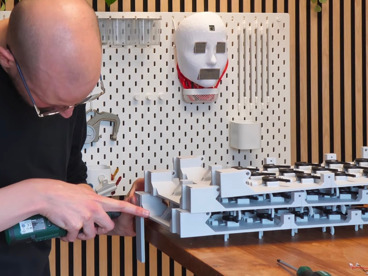
The mechanism for emptying the bottles is particularly clever. Rather than individually draining each one with a separate pump, Strange Inventions engineered a servo-driven linkage that flips all nine bottles in a single digit at once. It’s one motion, one satisfying dump, and the digit resets. Getting that 3D-printed mechanism to work took significant troubleshooting, but watching the finished result operate, you’d never guess it was anything other than effortless.
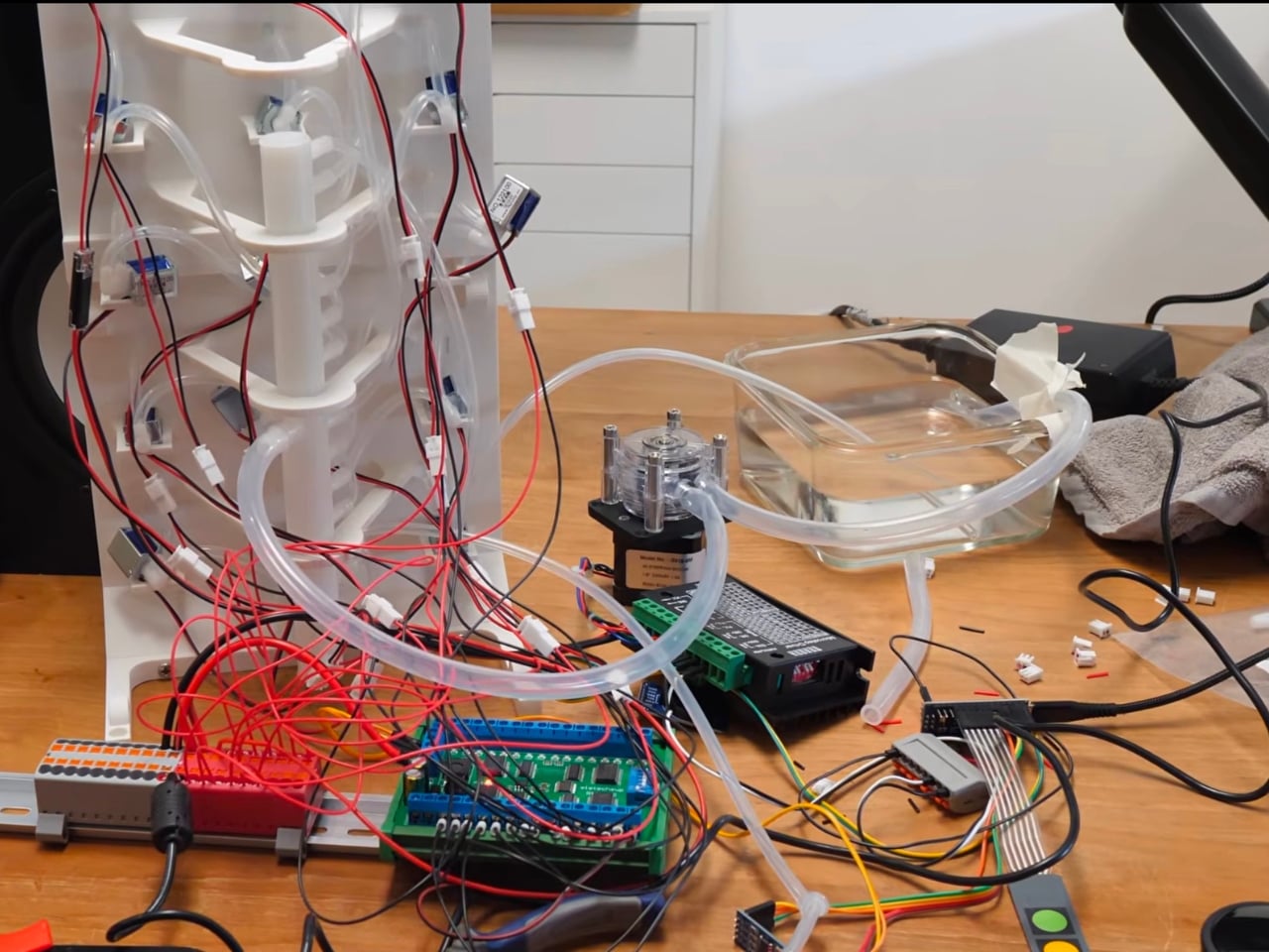
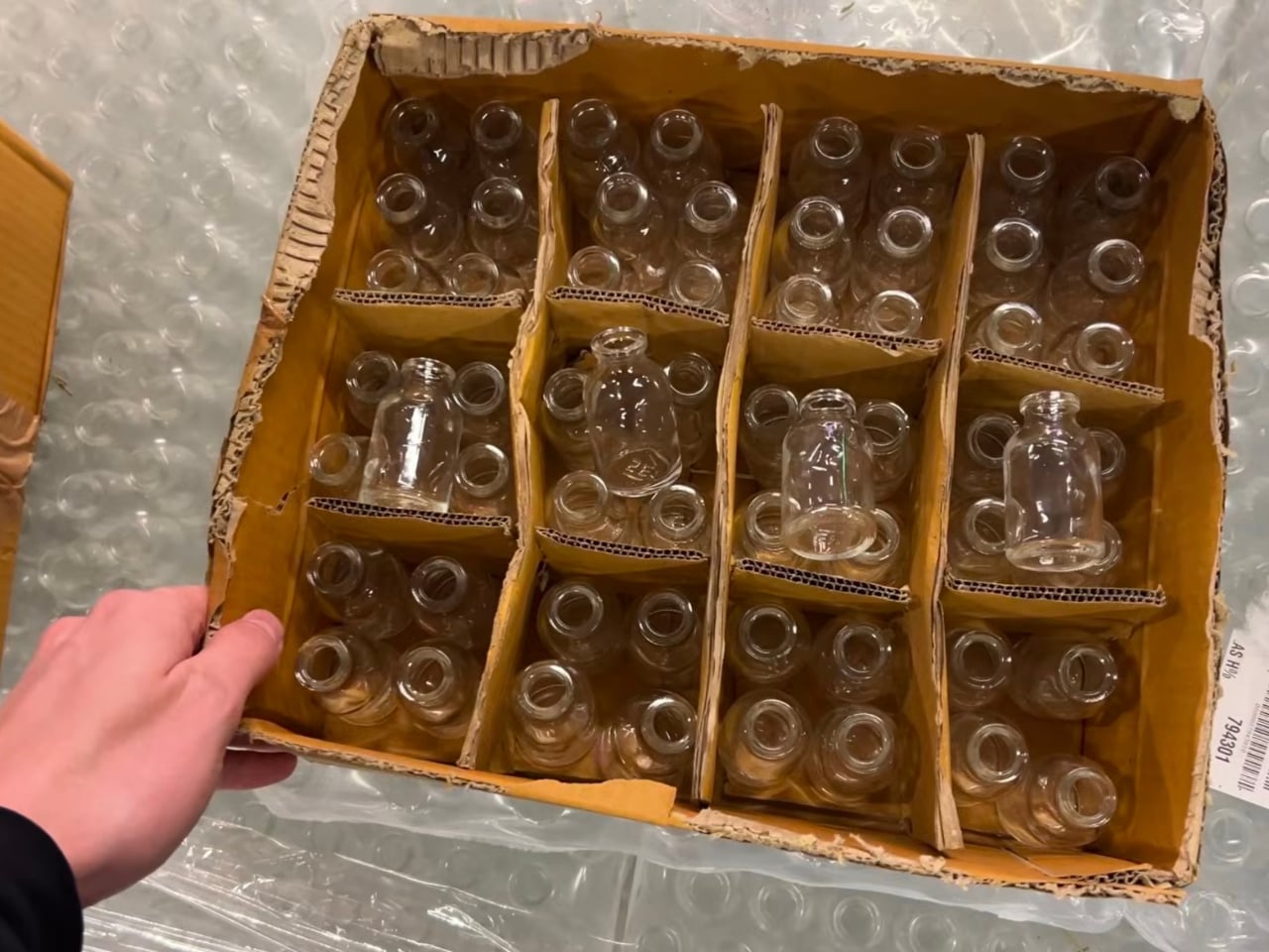
The tiny bottles, by the way, were found in a random shop for 10 cents apiece. Sounds affordable, right? Until you scale it up to a full clock and the total project cost lands somewhere around $580. That gap between cheap materials and expensive obsession is actually one of my favorite things about independent makers. The individual components are humble. The vision is not.
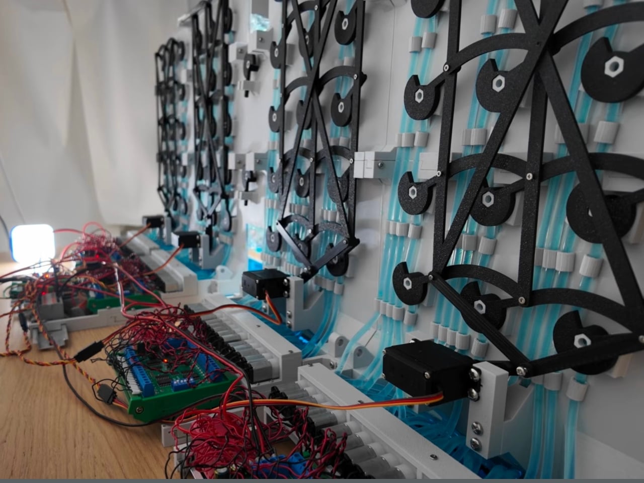
Visually, the Water Tower Clock sits in a category I struggle to name. It’s not exactly art, though it absolutely qualifies. It’s not just a gadget, though it functions as one. It has the patience of a kinetic sculpture and the practicality of something that actually tells you what time it is. The dyed water catching the light, the slow fill of each segment, the deliberate dump when a digit changes: all of it has a rhythm that most digital objects simply don’t have.
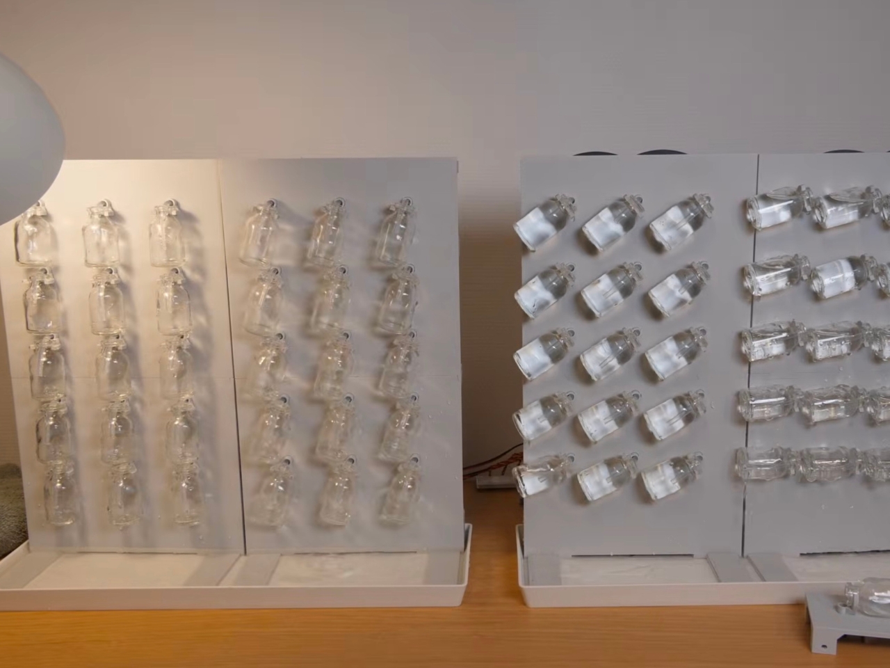
I think what makes projects like this matter to the broader design conversation is that they challenge our assumptions about what a display should look like. We’ve become so accustomed to LEDs and screens that we’ve stopped asking whether there might be a more interesting material to work with. Strange Inventions answered that question with dyed water and glass bottles from a random shop, and the result is one of the more memorable pieces of functional design I’ve come across this year.
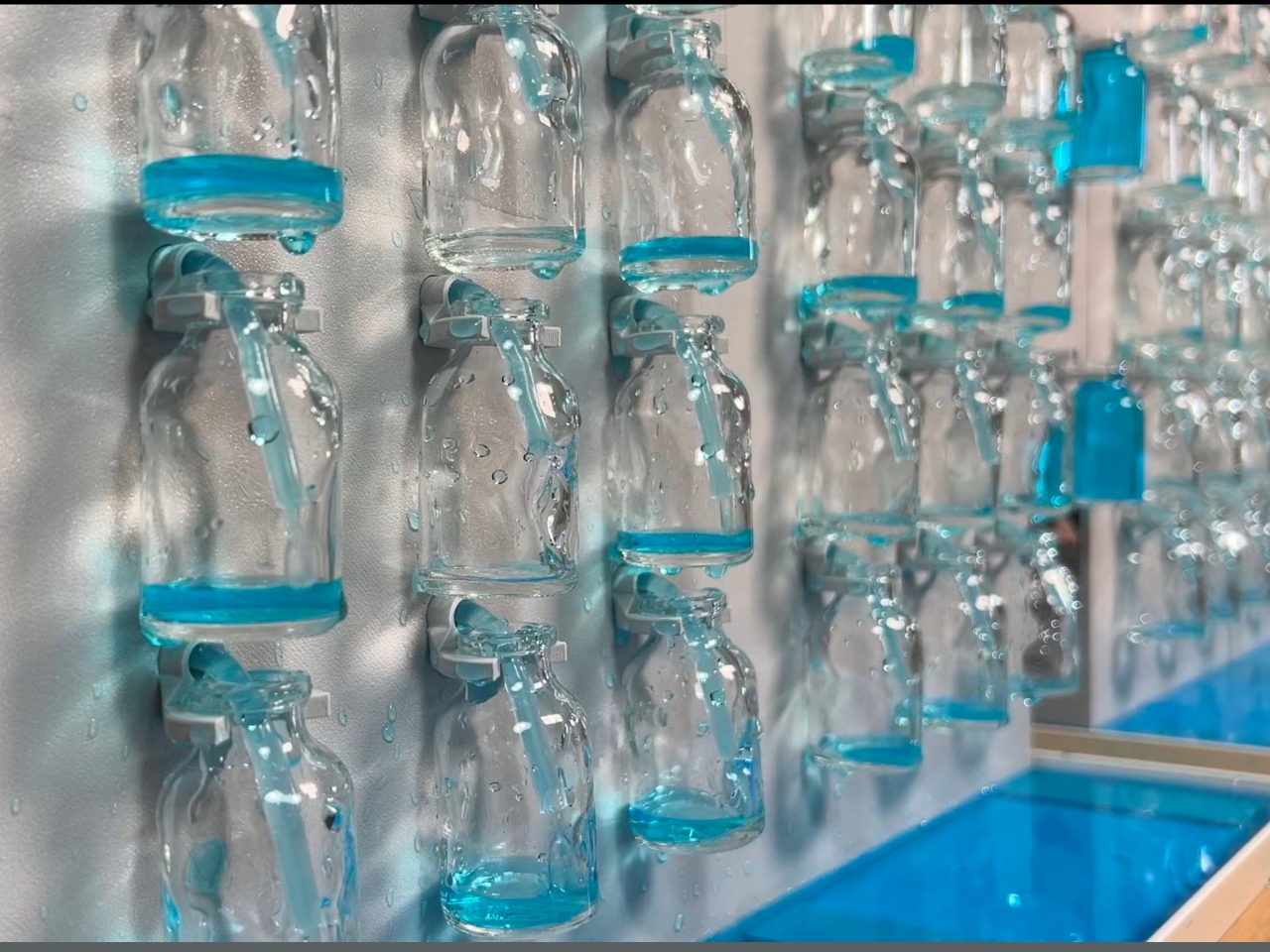
It’s also, for what it’s worth, completely impractical in the best possible way. The water will need maintenance, the pumps add complexity, and the whole thing would be thoroughly confused by a power outage. None of that matters. The point isn’t that this is the future of clock displays. The point is that it makes you feel something when you look at it, which is more than most technology ever manages to do. Strange Inventions earns the name.
The post Someone Built a Clock With 60 Water Pumps and Zero Regrets first appeared on Yanko Design.
Japan Just Built a Pokémon Footbath and It’s Genuinely Moving

When you hear “Pokémon footbath,” your brain probably goes one of two places: either immediate delight or mild confusion. Both reactions are fair. But when you actually see what just opened in the small coastal town of Wakura Onsen in Nanao City, Japan, the response tends to land somewhere more unexpected than either. It lands in quiet, genuine warmth.

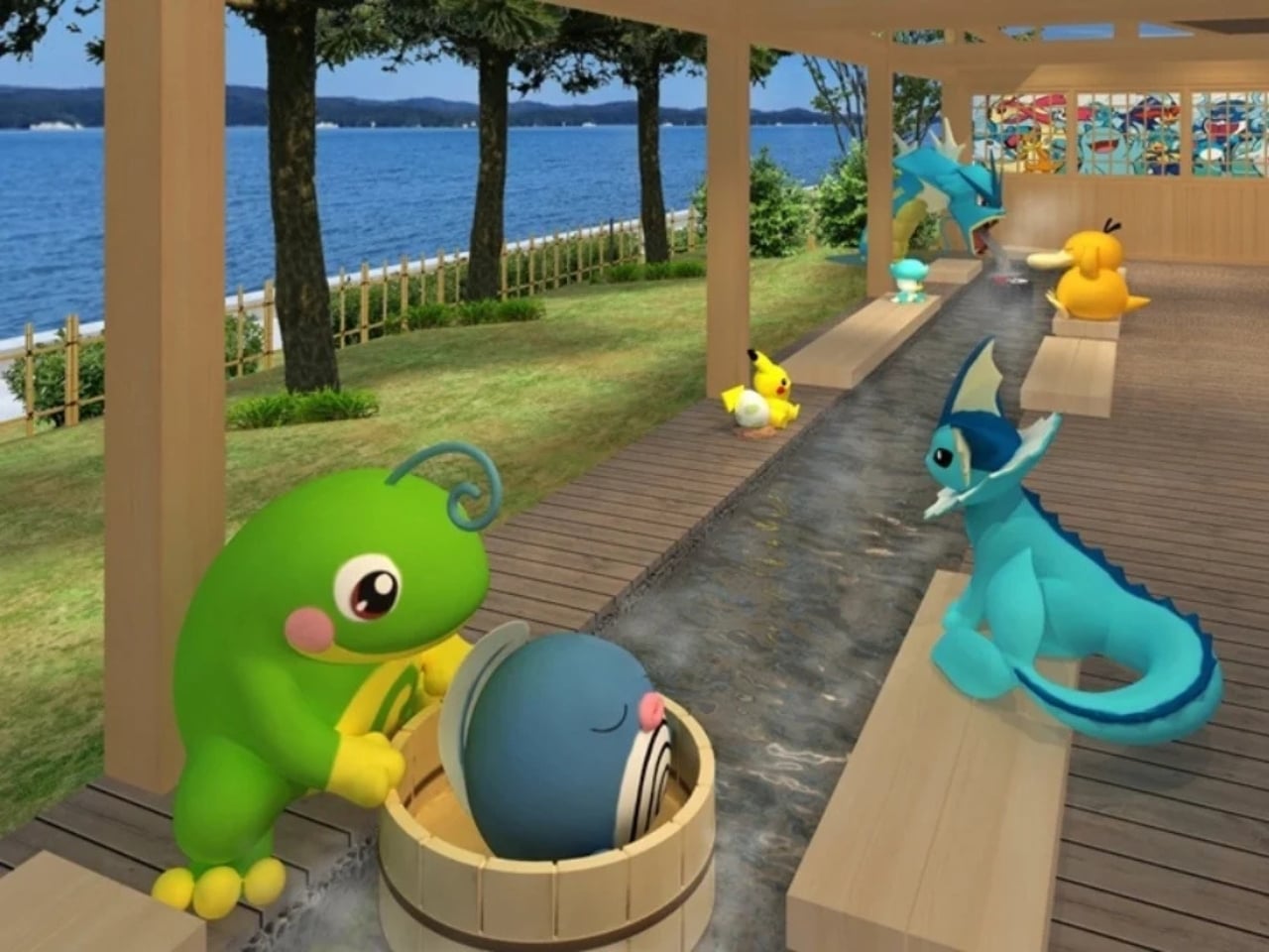
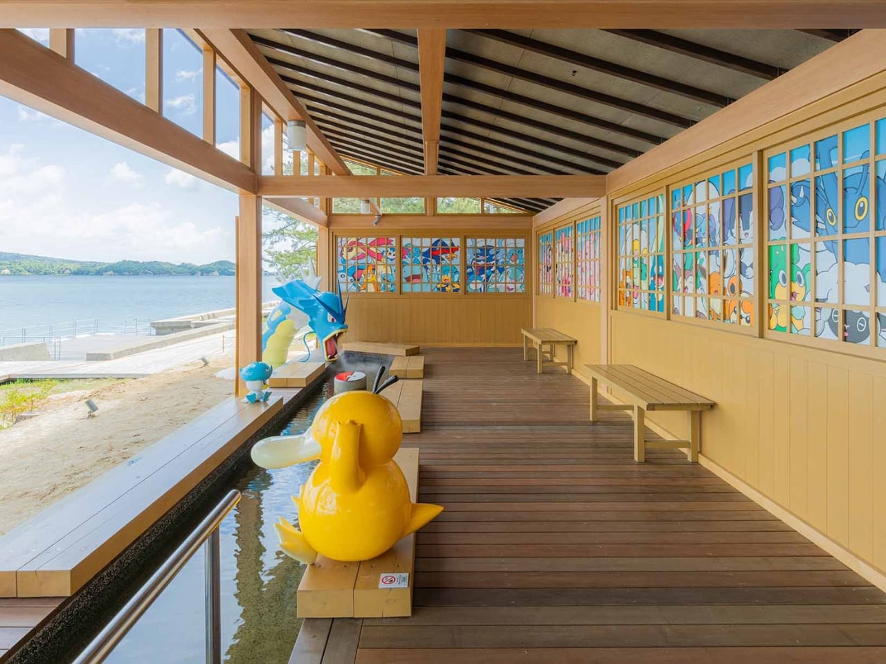
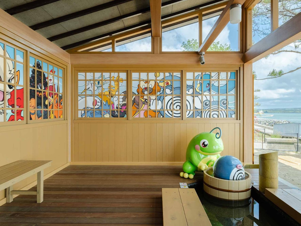
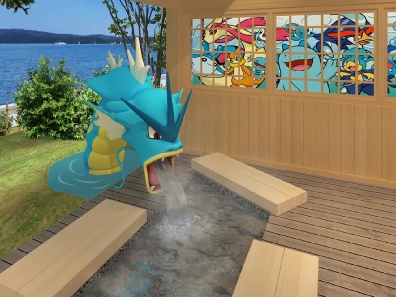
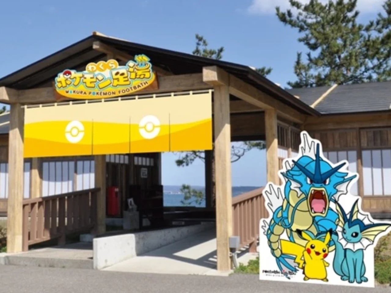
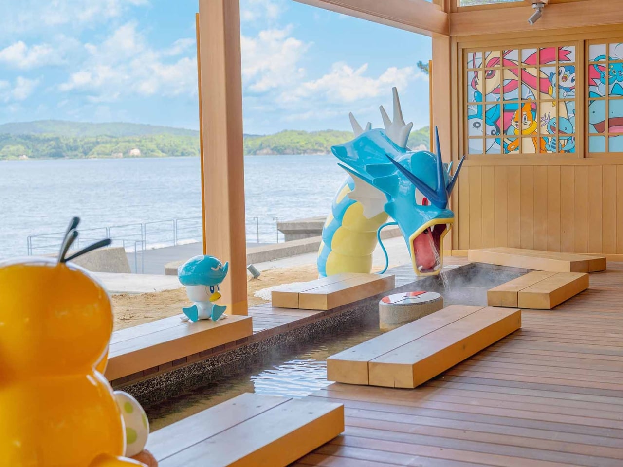
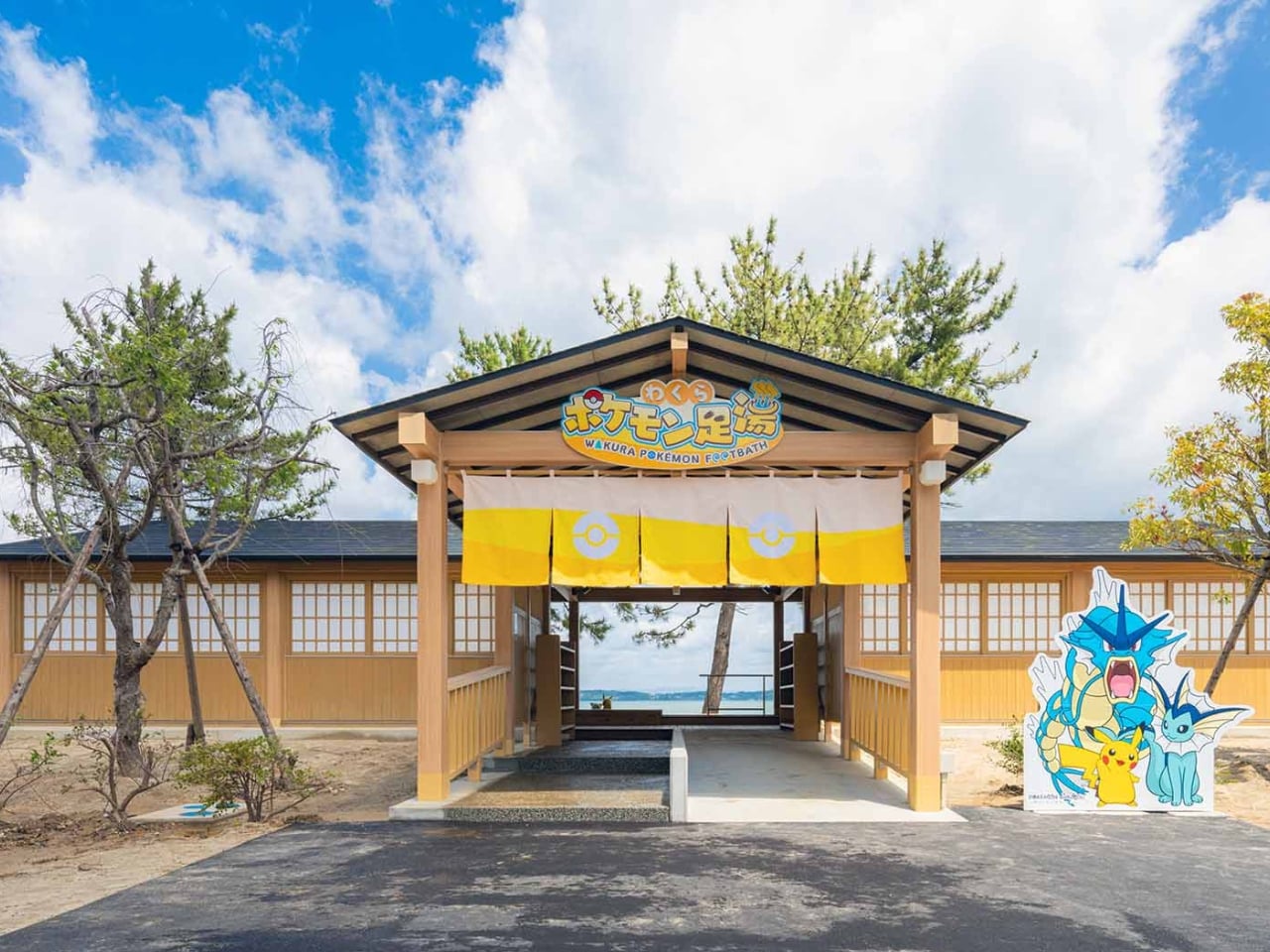
The Wakura Pokémon Footbath officially opened on May 12 inside Yuttari Park in Ishikawa Prefecture, and it is exactly what it sounds like: a public footbath surrounded by beloved Water-type Pokémon. Gyarados towers over the soaking pool, appearing to blast water in with its Hydro Pump. Psyduck perches nearby, looking stressed as always. Vaporeon, Pikachu, Poliwag, Poliwhirl, and Quaxly are scattered throughout the wooden structure, each one in character, each one impossibly charming. The facility is free to use and open daily from 7 AM to 7 PM, though it may close depending on weather conditions.

Designer: Wakura Onsen

From a pure design standpoint, it works. The Pokémon figures feel integrated into the space rather than slapped onto it as an afterthought. The Gyarados placement especially is clever: positioning a creature historically associated with destruction as the one filling a community wellness space with warm water is a quietly subversive design choice. It takes a familiar icon and gives it a new job, and the whole thing is better for it. Good character-led design usually does this. It finds the emotional logic of the IP and builds something genuinely functional around it, instead of just stamping a logo on a wall and calling it a day. The wooden structure keeping everything together also helps ground the Pokémon elements in something tactile and traditionally Japanese, which keeps it from reading as pure merchandise and more as a genuine place to be.

But the design story here is only part of the picture. What elevates the Wakura Pokémon Footbath beyond a cute novelty is the context surrounding it. Wakura Onsen is still recovering from the 2024 Noto Peninsula earthquake, which caused major damage to local tourism infrastructure. The footbath was renovated and developed through a collaboration between Nanao City and the Pokémon With You Foundation, an organization that has long used Pokémon’s reach to support communities facing hardship. Local officials are hoping the new attraction will draw visitors back to a region that urgently needs them. On opening day, a dedication ceremony was held, and children from a local nursery school were among the first to try it out.

That detail matters. It reframes the entire project. A giant Gyarados shooting water into a hot spring pool is fun in isolation. A giant Gyarados shooting water into a hot spring pool in a community rebuilding after a disaster, inaugurated by children experiencing something joyful, is a different kind of story. It is design as care. It is pop culture as infrastructure.

I think we underestimate how much deliberate playfulness can do for a place in recovery. A footbath is not a hospital. It is not a new road or a rebuilt building. But public spaces designed to give people a reason to show up, to sit down, to stay a while, do real work. They signal that a place is worth visiting again. That it has something to offer. That life, in some form, is continuing. And sometimes the difference between a place that comes back and one that does not comes down to whether people believe it is worth returning to.

The footbath also ties into the newly installed Pokémon manhole covers placed around Nanao City, part of Japan’s Pokéfuta initiative, which uses collectible Pokémon-themed covers to encourage visitors to explore lesser-known regions. It is a broader ecosystem of soft infrastructure pointing in the same direction: come here, look around, stay awhile.

Wakura Onsen may not be the first destination that comes to mind for a travel itinerary. But a free footbath where a reformed Gyarados keeps your feet warm while Psyduck quietly spirals next to you? That is a genuinely compelling reason to make the trip. And right now, Nanao City could use a few more of those.

The post Japan Just Built a Pokémon Footbath and It’s Genuinely Moving first appeared on Yanko Design.

This Sculptural Glass Object Makes Flowers Feel Like a Van Gogh Painting

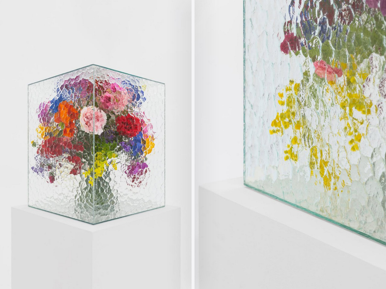
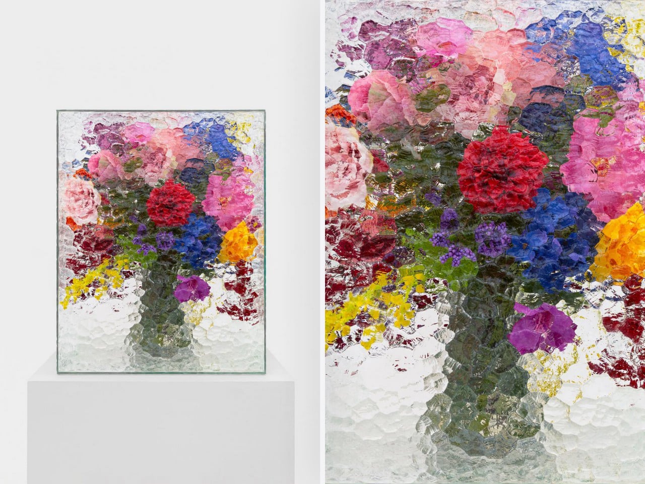
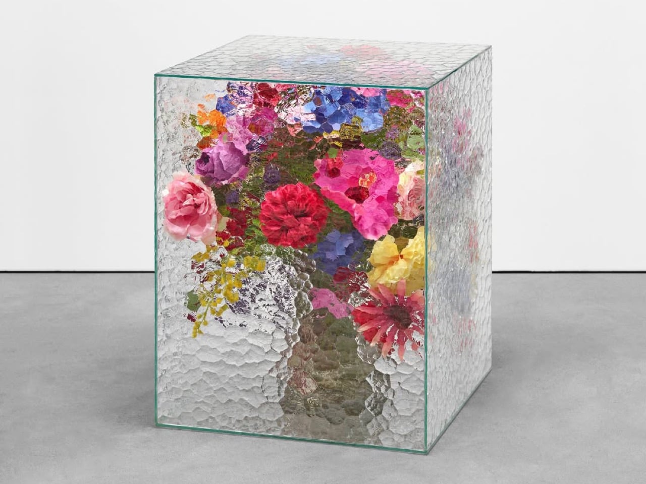
There is something instantly familiar about patterned glass. We have seen it in old windows, cabinet doors, bathroom partitions, and quiet corners of homes where privacy and light needed to exist together. It is a material that usually stays in the background, doing its job quietly. With Violet Frosted, designer Marius Boekhorst brings that overlooked material forward and turns it into something sculptural, expressive, and quietly poetic.

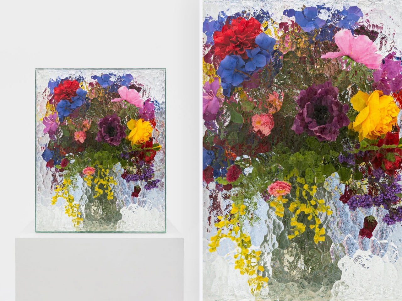
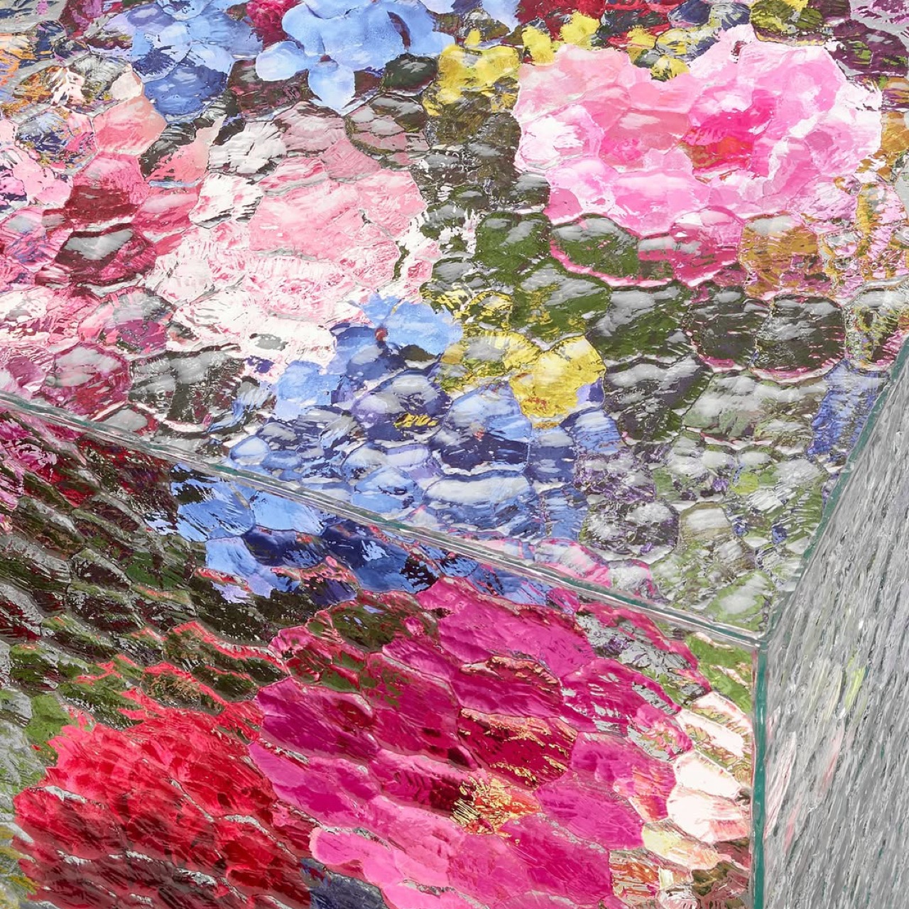
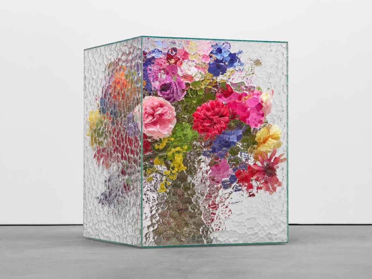
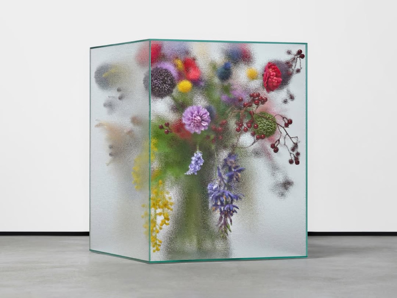
At its heart, Violet Frosted is a geometric glass object that plays with flowers, light, color, and texture. What makes it interesting is the way it changes how we see what is placed behind it. The frosted, patterned glass softens the flowers, turning bright petals and stems into blurred fields of color. A flower becomes a shadow, a brushstroke, a violet glow, or a faded green line depending on where you stand.

Designer: Marius Boekhorst

That is where the charm of the piece begins. Instead of presenting flowers directly, Violet Frosted filters them. It creates a gentle distance between the viewer and the arrangement. That distance makes you look closer. It asks you to slow down and notice how color shifts through glass, how a shape becomes unclear, and how something ordinary can feel painterly when it is partly hidden.

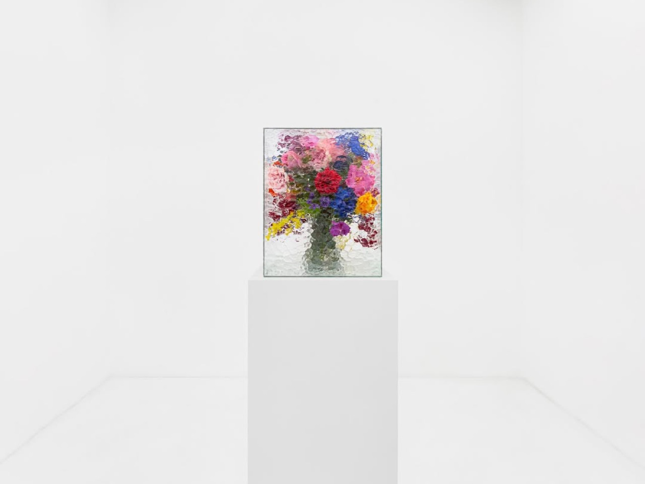
In many ways, Violet Frosted feels like a still life painting brought into the real world. Traditional still lifes capture flowers in one fixed composition, frozen in paint and time. This piece lets the still life move. The flowers change as they bloom and fade. The light changes throughout the day. The view changes as you move around it. From one angle, the arrangement may feel bold and graphic. From another, it becomes soft, quiet, and almost dreamlike.

The design feels especially beautiful because it does not try too hard. It avoids excess decoration. The form is clean and almost architectural, while the patterned glass gives it warmth and character. It feels contemporary without losing the memory of where the material comes from. That balance between old and new gives the piece its quiet confidence.

Violet Frosted also carries a museum-like feeling, though it never feels precious or untouchable. It brings the mood of a gallery into everyday space. A table, shelf, or windowsill suddenly feels more considered. A simple floral arrangement becomes an experience. You are looking at flowers through atmosphere, texture, and light.

Violet Frosted reminds us that design does not need to shout to stay with us. Sometimes, the most memorable objects are the ones that shift how we see familiar things. By turning patterned glass into a living frame, Marius Boekhorst creates a piece that sits between a vase, a sculpture, and a painting. It is functional, emotional, and deeply visual. It holds flowers, and it holds a moment.

The post This Sculptural Glass Object Makes Flowers Feel Like a Van Gogh Painting first appeared on Yanko Design.

UNO and Vrbo Are Renting Vacation Homes for $4 a Night

Brand collaborations are everywhere these days, but every once in a while, one lands so perfectly that you have to stop and appreciate the logic behind it. The UNO x Vrbo partnership is exactly that kind of collab. Not because it’s flashy or trying to be something it’s not, but because it genuinely makes sense.

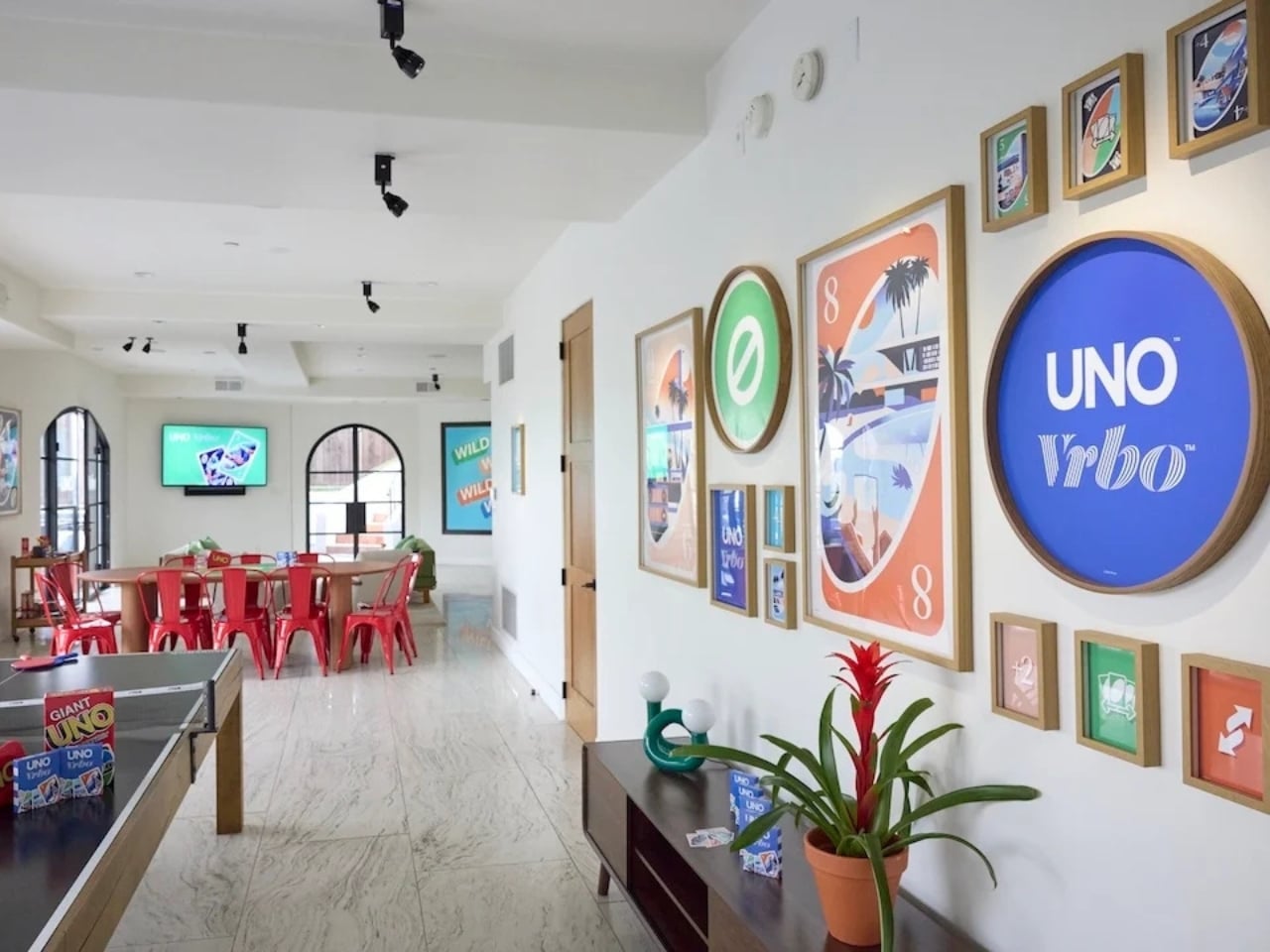
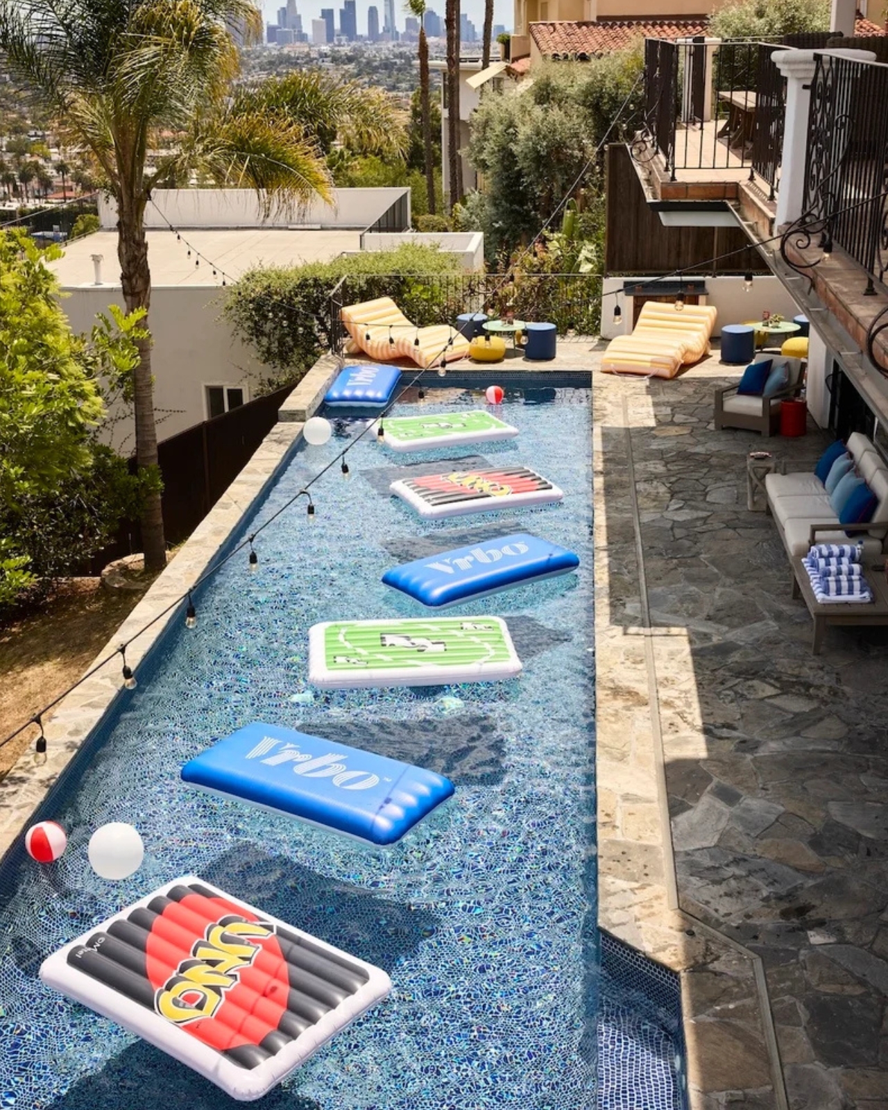
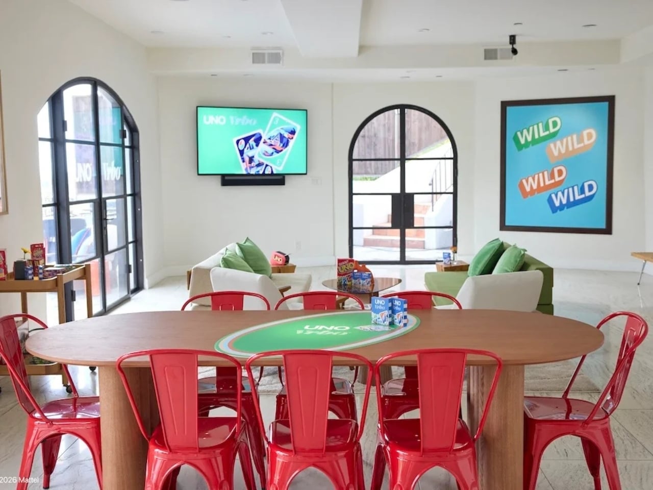
Starting May 15, Mattel and Vrbo are opening bookings for six limited-time vacation home stays built entirely around the spirit of game night. Six properties across the U.S., two tiers of experience, and one very clever price point: $4 per night. That last part is a deliberate nod to UNO’s iconic Draw 4 card (which can make or break relationships), and it’s the kind of detail that makes you smile whether you’re a brand person or not.

Designers: UNO x Vrbo

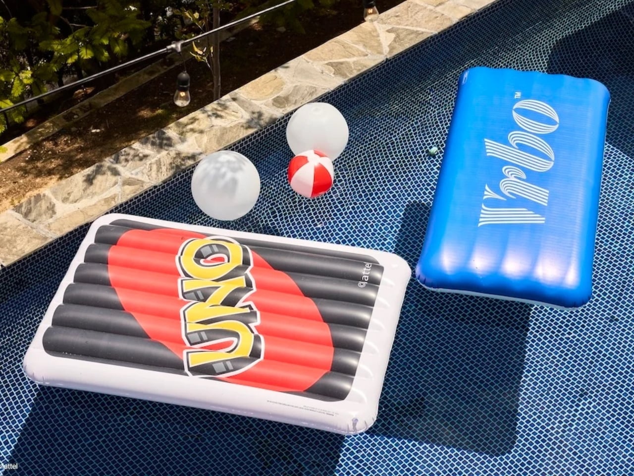
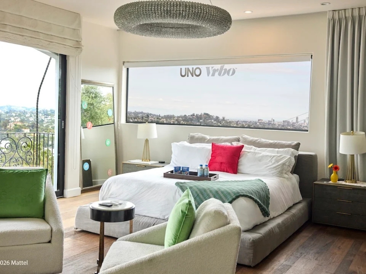
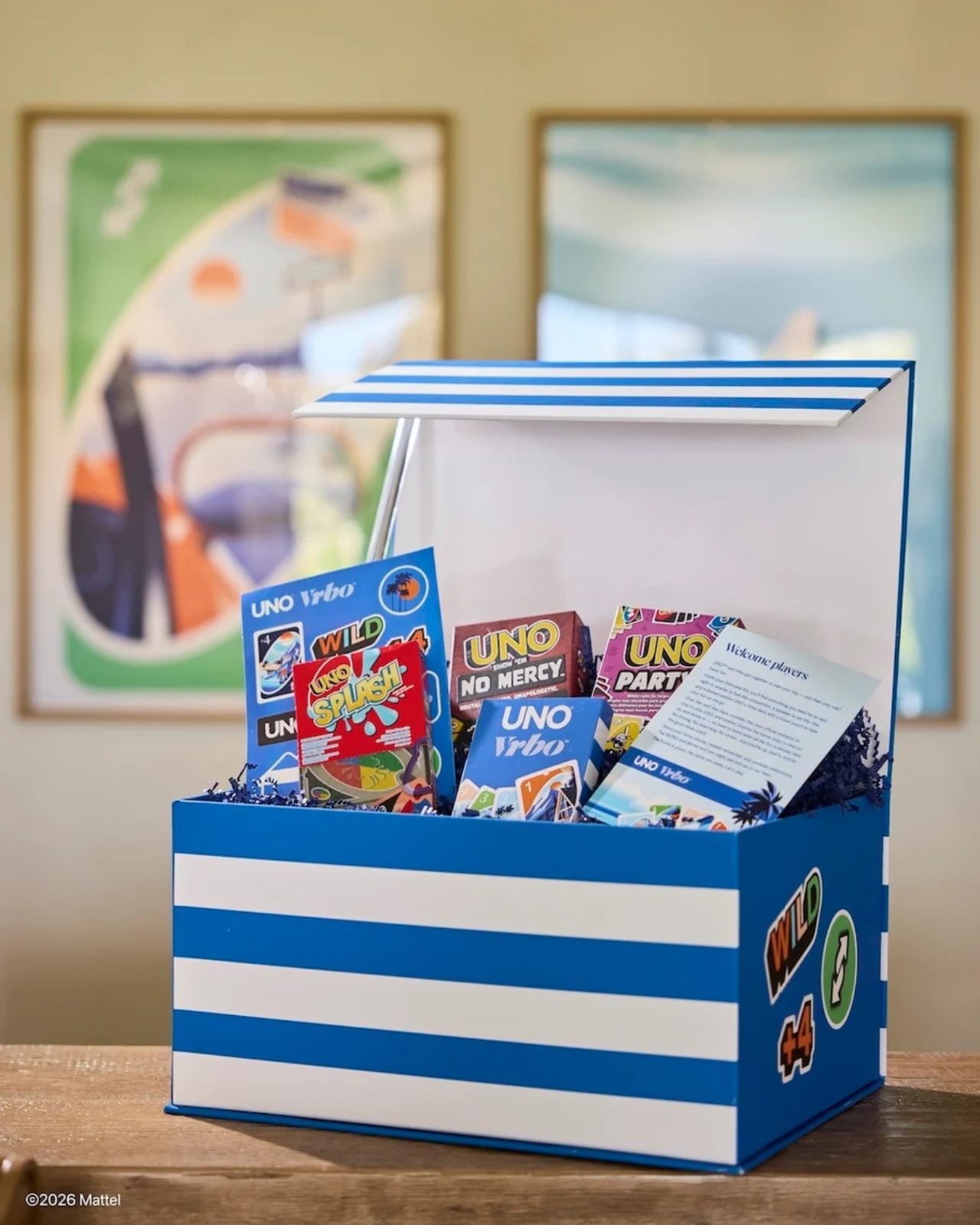
The stays are divided into two experiences. At the top end sit the two “Wild Card” homes, located in the Hollywood Hills and Texas Hill Country. These are the full production: UNO-themed décor, organized game nights, and an in-home dining experience. They’re designed for groups of up to 10 guests who want the whole immersive package, the kind of weekend that’s more curated getaway than casual vacation. Then there are the four “Play It Your Way” stays in Winter Park, Colorado; Palm Desert, California; Panama City Beach, Florida; and Atlanta, Georgia. These are a little more relaxed, but still come with a co-branded UNO x Vrbo Welcome Kit, a game room, and either a pool or hot tub. Essentially, they’re the version for people who want the fun without the fuss. All six properties are bookable for one three-night stay, Friday to Monday, on a first-come, first-served basis. Bookings open May 15 at 1 PM ET. I’ll be honest: at $4 a night, they are going to go fast.

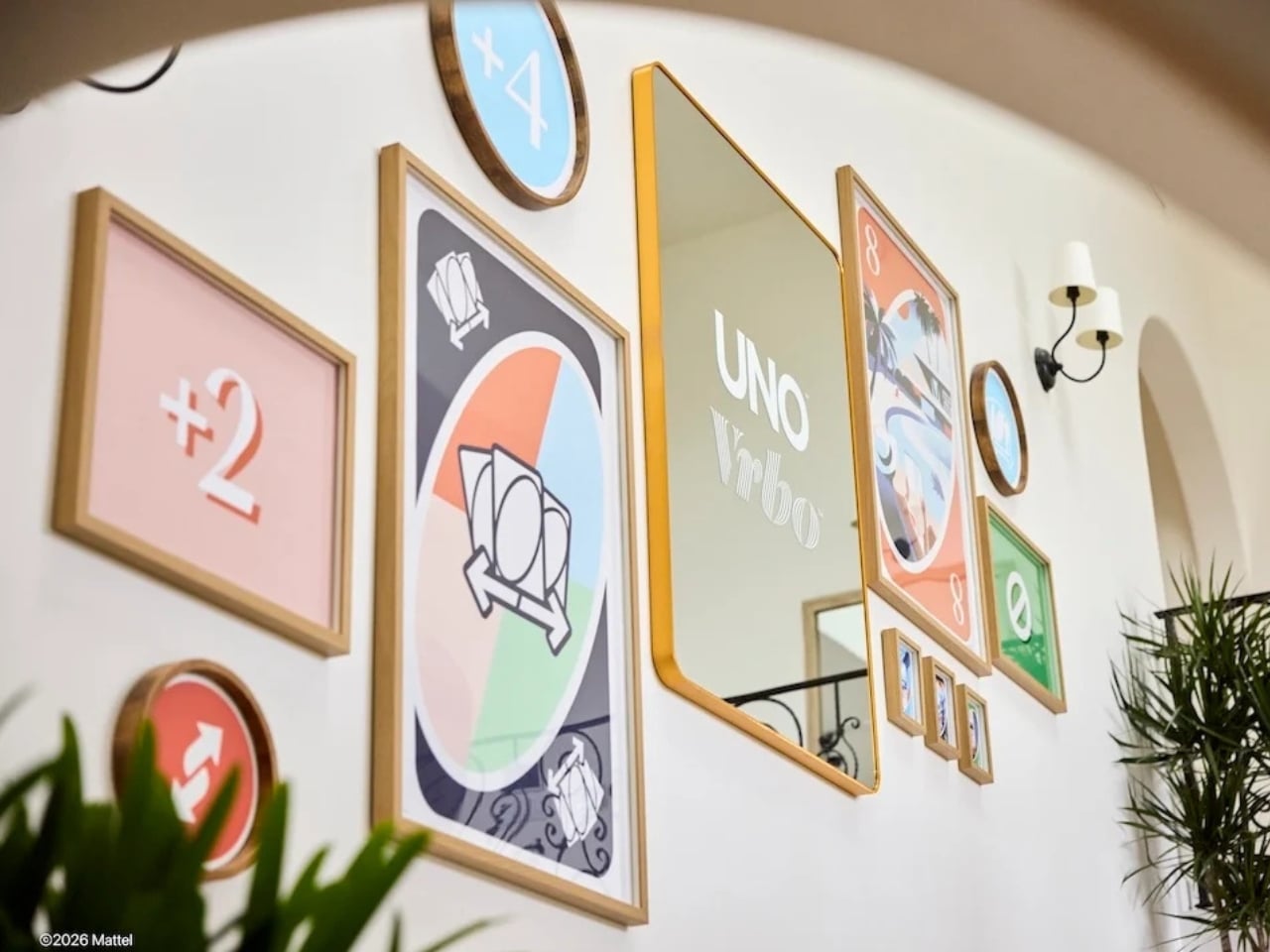
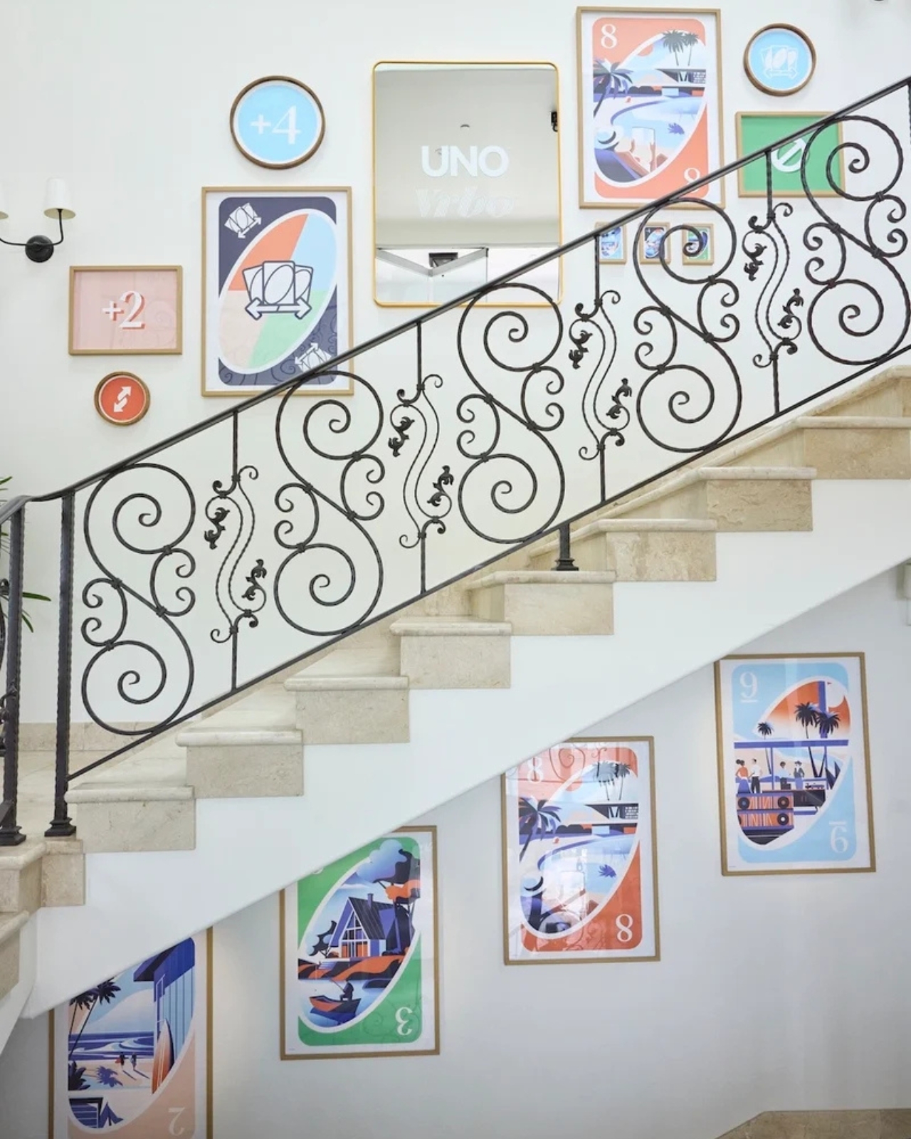
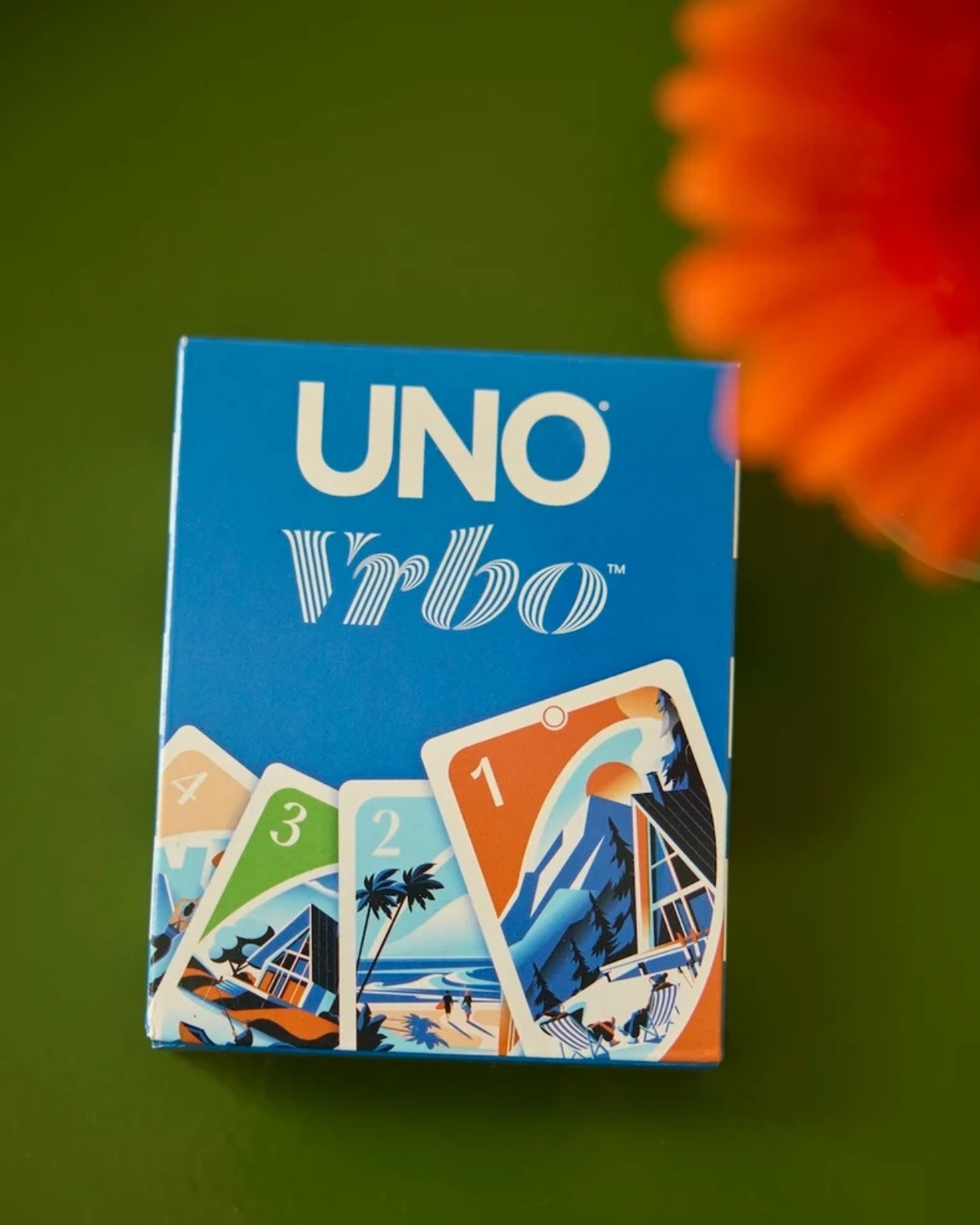
What makes this collaboration genuinely interesting, beyond the price tag, is the attention that went into the actual product. A custom UNO deck was commissioned for this collab, illustrated by Pietari Posti, with artwork inspired by travel destinations and vacation themes. It also comes with an exclusive rule called the “Vacation Rental Swap,” which lets players swap hands with anyone at the table. It’s a small thing, but it shows that the two brands weren’t just slapping logos on a vacation home and calling it a day. They put real creative thought into what the collaboration could actually feel like to experience.

That’s the part that tends to separate a genuinely good brand collab from a lazy one. Anyone can license a logo and stick it on merchandise. Fewer brands take the time to ask what the experience should feel like from the inside, and build something around that answer. UNO, at its core, is a game about chaos and connection. You play it with people you like and you inevitably end up yelling at them. It’s social in the most fundamental way. Vrbo, meanwhile, is about giving groups a private space to actually be together without the interruptions of a hotel. Put those two things in the same room and you get something that doesn’t need to be explained.

It also helps that this collab is part of a growing relationship between Mattel and Expedia Group, Vrbo’s parent company. Mattel already appeared in an Expedia Super Bowl commercial earlier this year through the Barbie universe. So this isn’t a one-off stunt; it reads more like two brands actively figuring out how to build something together over time. For anyone who grew up playing UNO at a kitchen table, there’s an undeniable nostalgia pull here. But the campaign doesn’t lean into nostalgia as a crutch. It uses the game’s identity as a starting point and builds forward from it, which is ultimately why it works. The best collaborations don’t just remind you of something you loved. They give you a new reason to love it again.

The post UNO and Vrbo Are Renting Vacation Homes for $4 a Night first appeared on Yanko Design.

Bose Just Revived Its Lifestyle Speaker for $299, Minus the Wires

For most people, getting serious audio at home eventually turns into a tradeoff. Multi-speaker surround setups demand wiring, dedicated gear, and more floor space than a typical room can spare. Smart speakers simplified things, but the best-sounding options tend to carry steep price tags, and the more affordable ones rarely fill a room with the kind of sound that actually does the music justice. That gap has stayed stubbornly open.

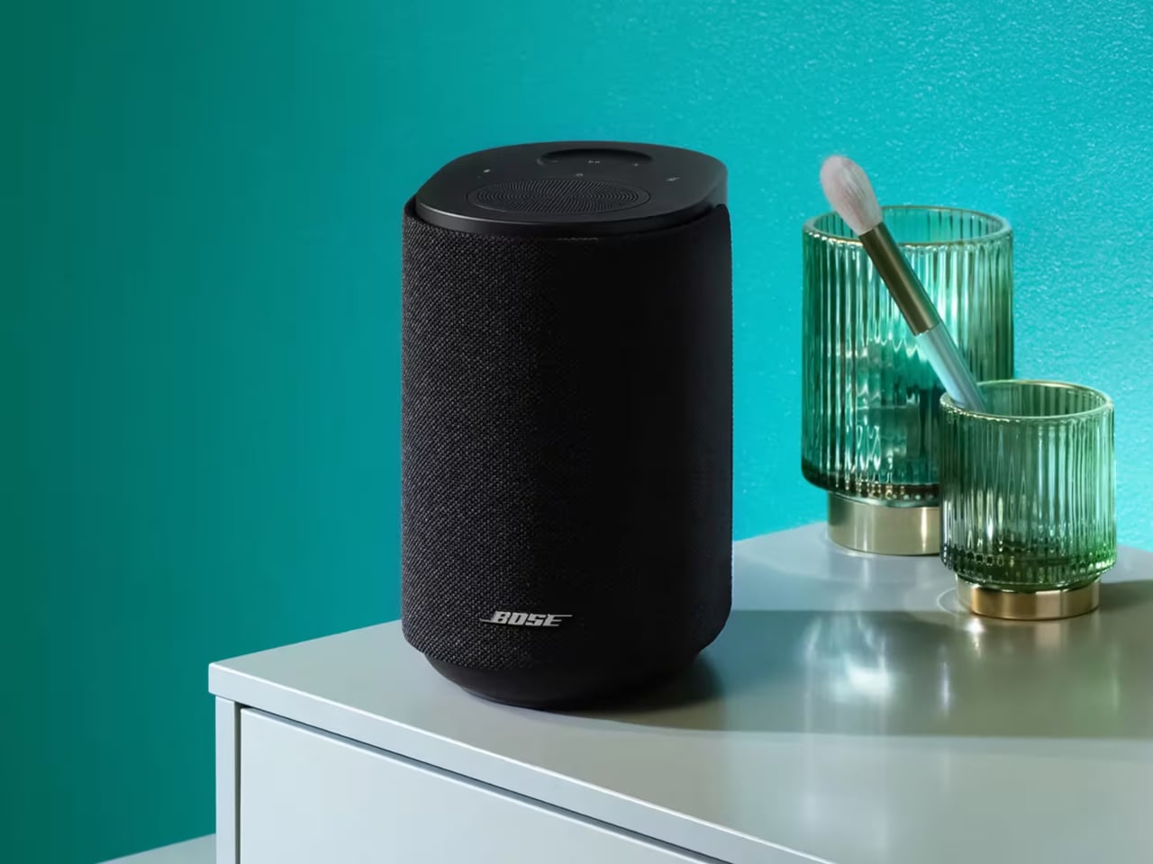
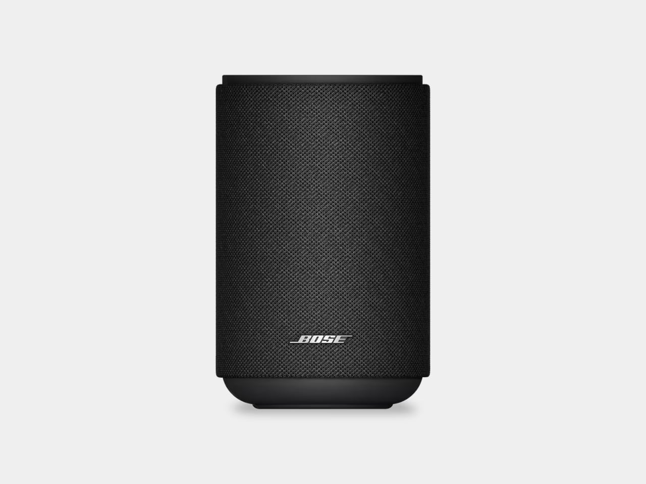
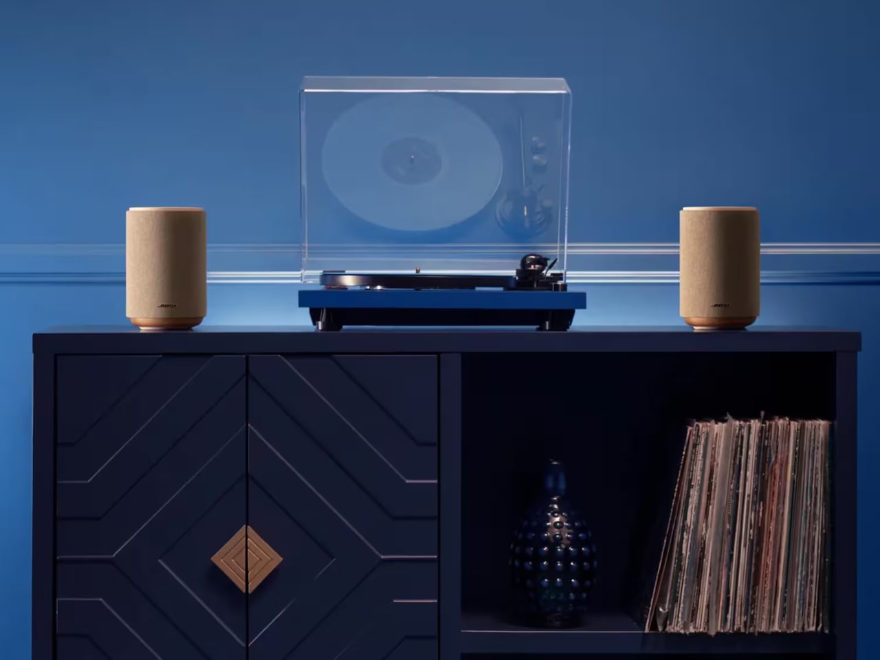
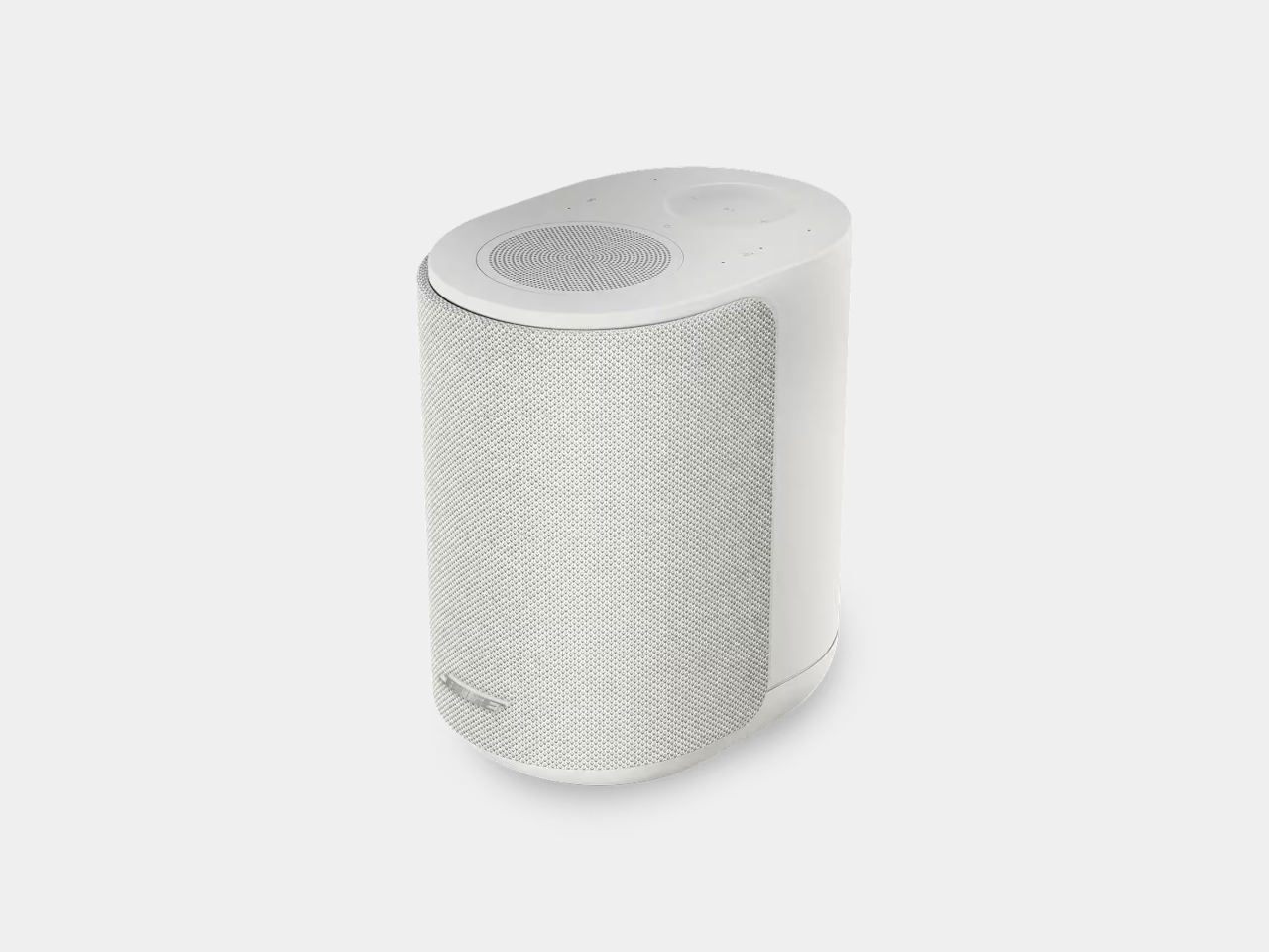
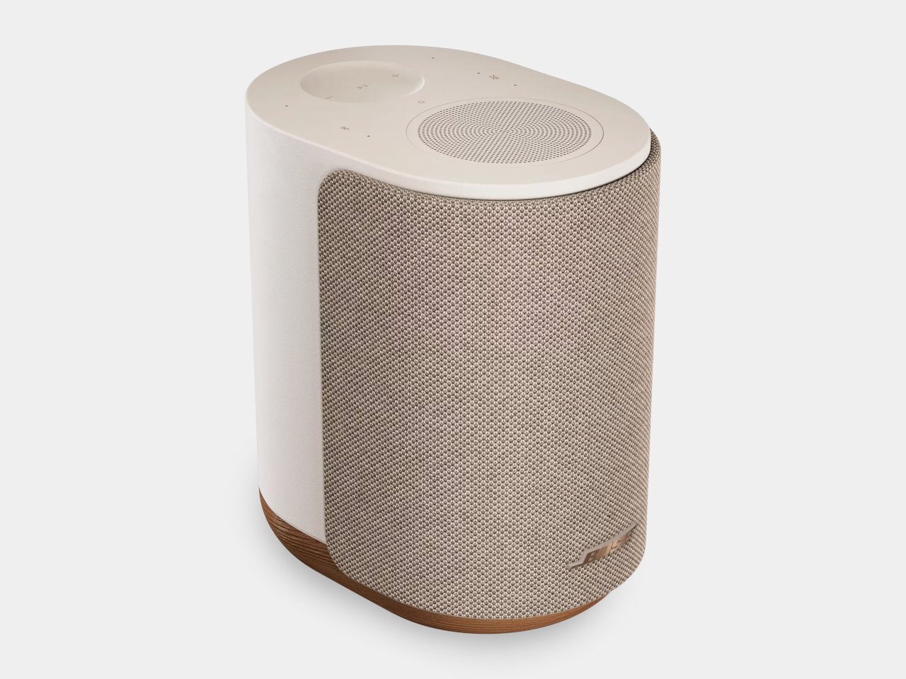
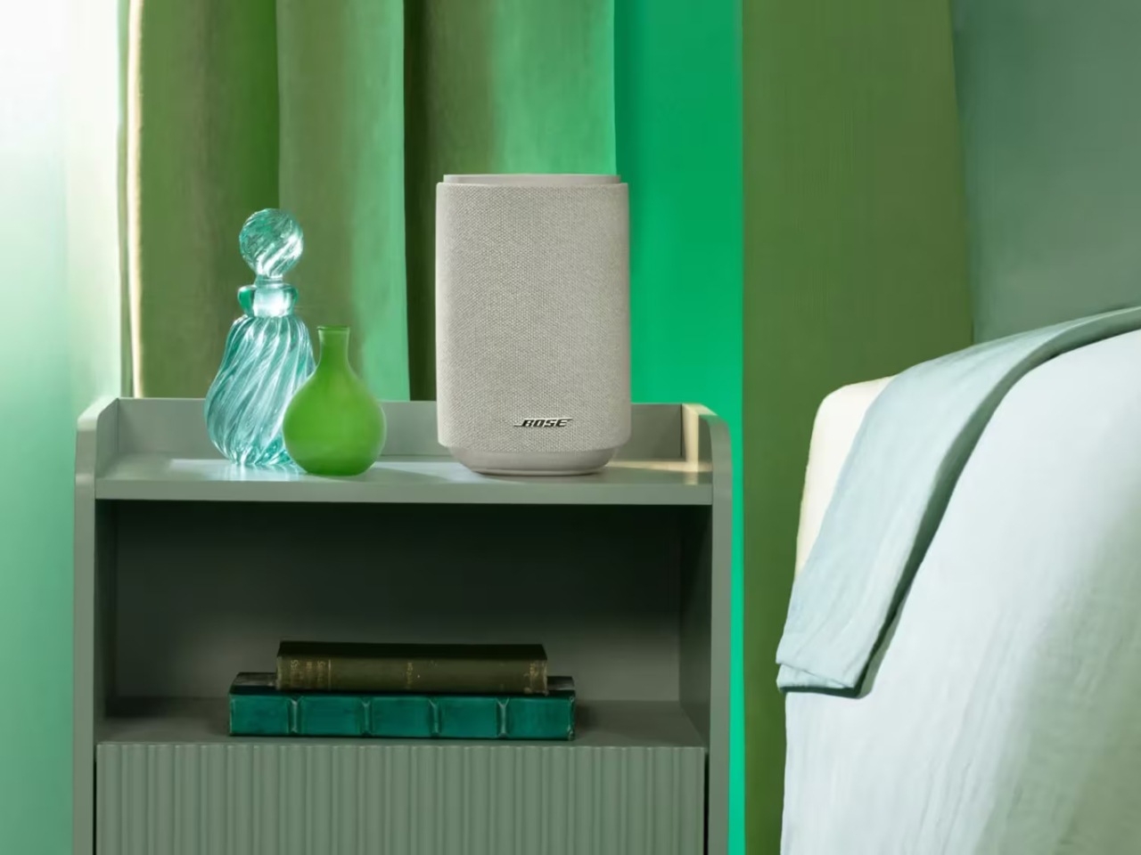
Bose thinks it has the answer, and it’s reviving a celebrated name to prove it. The Lifestyle brand, first introduced in 1990 and discontinued in 2022, is back with a collection that treats audio quality and refined design as inseparable. Leading that return is the Lifestyle Ultra Speaker, a compact wireless unit wrapped in knit fabric that sits unobtrusively on any shelf while delivering sound that’s anything but understated.

Designer: Bose

The secret to that sound lies in the speaker’s three-driver configuration. Two front-facing drivers handle the direct output, while a third fires upward, bouncing sound off the ceiling to create a sense of height and space that a single forward-pointing speaker simply can’t achieve. Bose calls this TrueSpatial Technology, and it works alongside CleanBass, which uses QuietPort acoustics to produce bass that’s deep, controlled, and free of distortion.

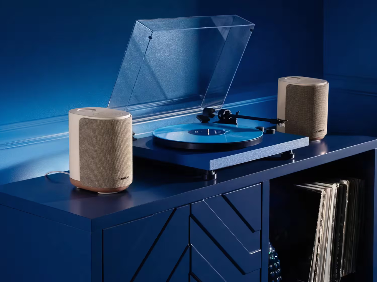
That flexibility extends to how the speaker fits into different setups. On its own, it works as a capable standalone smart speaker. Pair two of them together, and you’ve got a genuine stereo setup. Add the Lifestyle Ultra Soundbar and Lifestyle Ultra Subwoofer, also part of the new collection, and it takes on rear-channel duties in what becomes a full 7.1.4 surround system, no wires snaking across the floor required.

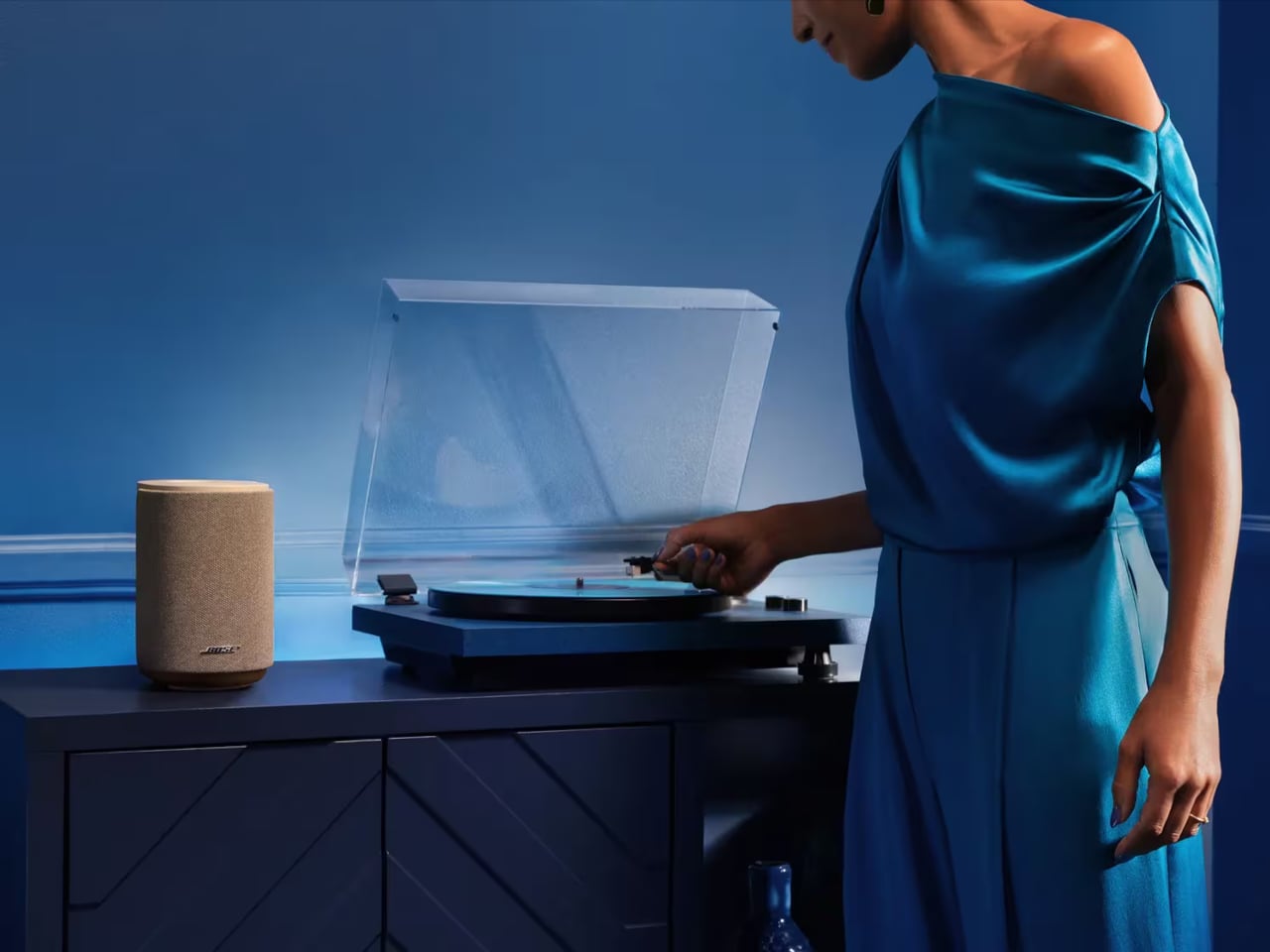
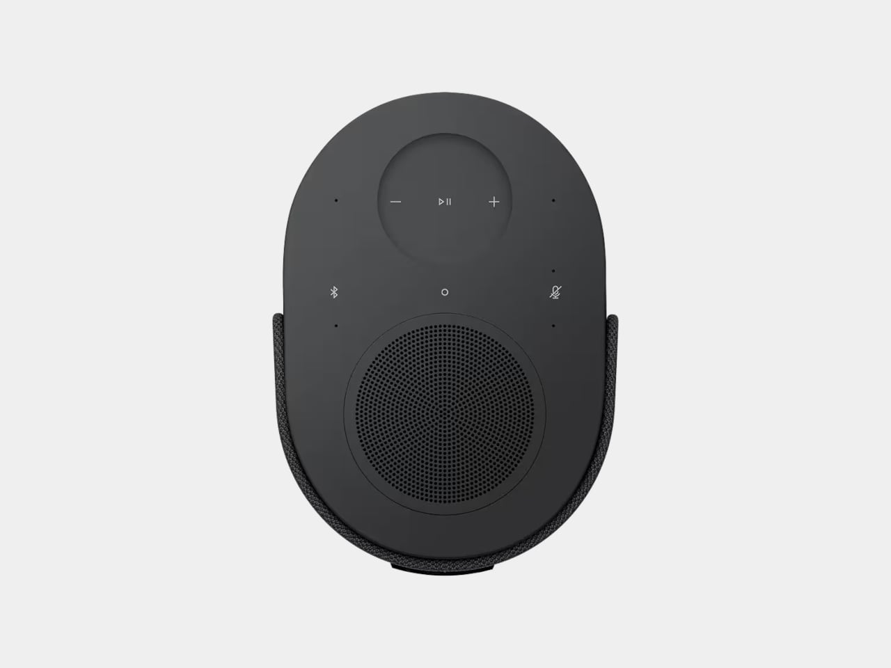
Getting music onto it isn’t complicated. The speaker supports Apple AirPlay 2, Google Cast, and Spotify Connect, so you can stick with whatever app you already use without adapting to a proprietary system. Bluetooth 5.3 is also on board, and a 3.5mm aux input handles wired sources like a turntable. Alexa+ serves as the built-in voice assistant, with on-device touch controls and a radial volume slider for quick adjustments.

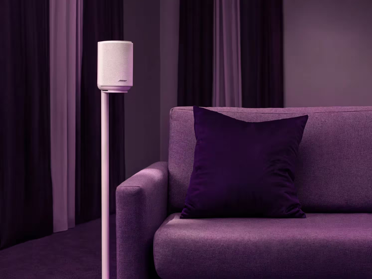
One of the more practical touches is CustomTune, a calibration feature that uses your phone’s microphone to listen to the acoustics of whichever room the speaker is in. It accounts for furniture placement and room size, automatically adjusting the output without requiring any manual tweaking on your end. For even more placement options, an optional wall bracket priced at $69 and a floor stand at $149 are both available separately.

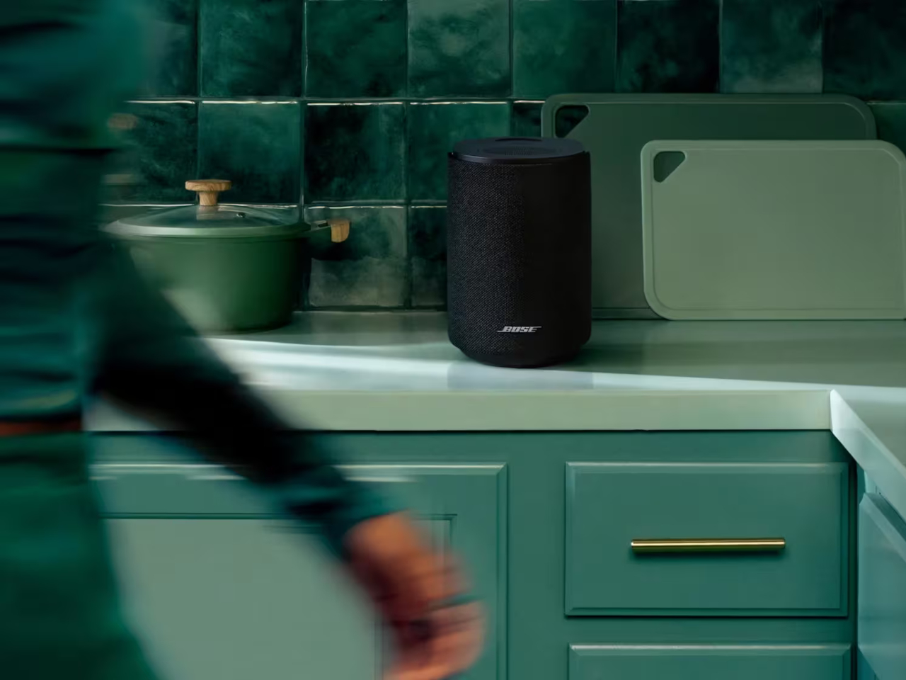
The Lifestyle Ultra Speaker starts at $299 in Black or White Smoke, with the limited-edition Driftwood Sand colorway priced at $349. The full Lifestyle Collection, including the Ultra Soundbar at $1,099 and Ultra Subwoofer at $899, is available to preorder now and ships on May 15. It can start small on a single shelf and gradually take over your entire home audio setup without ever looking like it doesn’t belong.

The post Bose Just Revived Its Lifestyle Speaker for $299, Minus the Wires first appeared on Yanko Design.
This Tiny Sunrise Alarm Clock Replaced My Phone, My Lamp, and My White Noise Machine

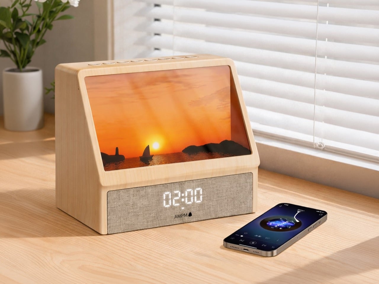
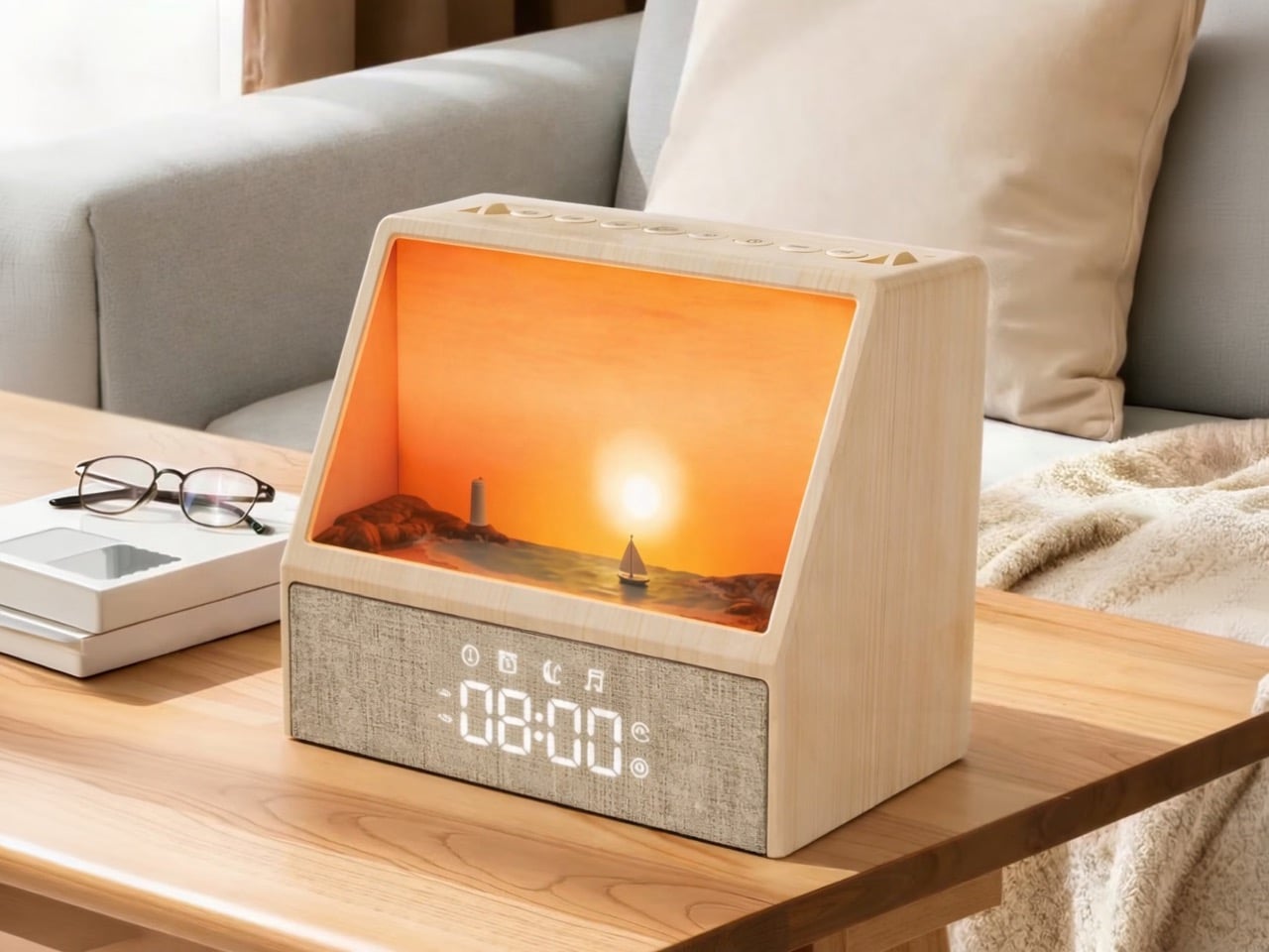
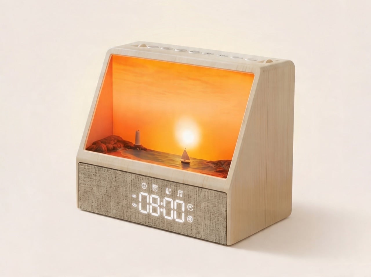
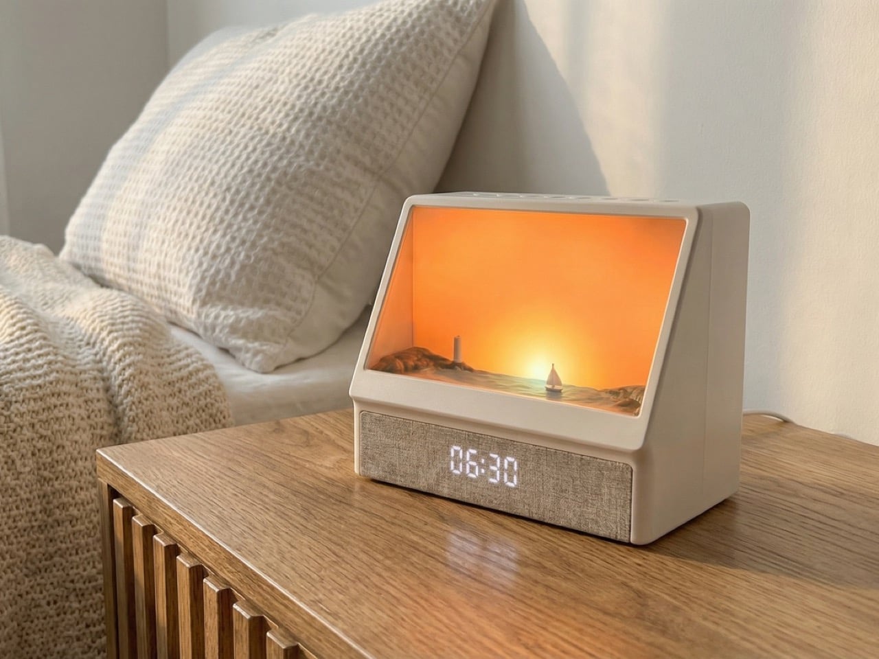
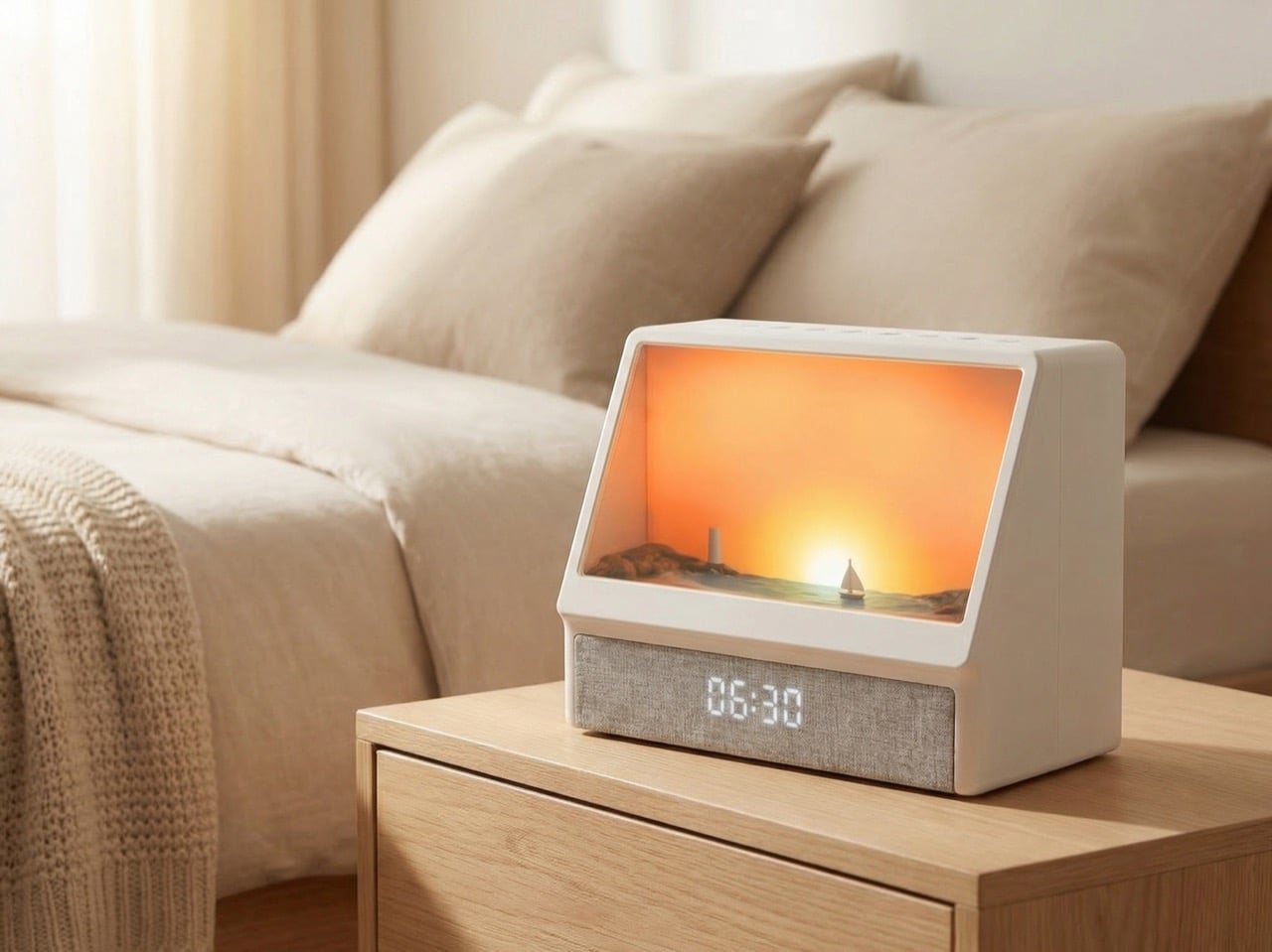
Imagine a small coastal diorama sitting on your nightstand, a sculpted seascape of rocky shores and a lone sailboat frozen in miniature, and then imagine it coming to life every morning as warm amber light builds from nothing inside it, flooding the scene like a real sun cresting the horizon. That single image is enough to explain why the sunrise alarm clock category has been waiting for something like the SOLUME Sunrise Wake Light for a long time. The science behind it has been settled for decades: circadian rhythm research consistently shows that graduated light exposure at dawn regulates cortisol and melatonin in a way that leaves you alert without the cortisol spike of an acoustic alarm, the kind evolution wired us to associate with immediate physical threat. SOLUME takes that research and builds a product around it that you actually want on your nightstand.

The enclosure uses a wood-grain finish with a wedge-shaped profile, housing that sculpted coastal scene behind an angled opening that glows through warm amber and orange during the sunrise sequence. A fabric-wrapped base below carries a clean LED clock display, a Bluetooth speaker, and controls for 12 built-in nature sounds and programmable sunset timers at 45 or 90 minutes, handling both ends of the sleep equation in a single object. Designed in the United States and grounded in over 35 years of phototherapy research, the SOLUME packages serious sleep science into something that reads, at a glance, more like a piece of tabletop art than a wellness gadget. The Philips Wake-Up Light held this category for two decades on function alone; SOLUME is making the same argument with considerably better aesthetics.

Designer: Solume

Traditional sunrise clocks solve the light therapy problem with a bare bulb behind a diffuser panel, which works but leaves nothing interesting to look at during the wind-down phase. SOLUME’s sculpted seascape gives the light somewhere to live, so as the sunset timer counts down in the evening, the amber glow retreating across those miniature rock formations actually mimics the quality of late golden-hour light in a way a flat panel never could. It turns a passive light source into something with depth, shadow, and a bit of theatre, which matters more than it sounds when you’re staring at it from a pillow for 45 minutes waiting to fall asleep.

Pairing your phone over Bluetooth means your usual sleep playlist or podcast winds down alongside the fading light, both cues working together rather than competing. The 12 built-in nature sounds cover the expected ground, rain, ocean, forest, and serve well enough for nights when reaching for your phone feels like too much friction. The fabric grille housing the speaker also does quiet acoustic work, softening the clock display’s LED glow so it reads cleanly without punching through a dark room at 3am.

Most sleep gadgets optimize for one end of the night or the other, a sunrise clock wakes you up, a sound machine helps you fall asleep, and never quite reckon with the fact that these are two halves of the same problem. SOLUME treats the full cycle as a single design brief, which is the right call, and the hardware reflects that clarity. The Classic and Pro versions sit at $68 and $75 respectively, with the Pro adding a handful of premium features for the small premium. For a device that credibly replaces your alarm clock, your bedside lamp, and your white noise machine simultaneously, that math works out fairly cleanly.

The post This Tiny Sunrise Alarm Clock Replaced My Phone, My Lamp, and My White Noise Machine first appeared on Yanko Design.
Stop Buying a Separate RV Heater. This 16,000 BTU RV Air Conditioner Does Both

There’s a moment every RV owner knows: you’ve been hiking all day in 95-degree heat, you’re covered in dust and questionable decisions, and you open the door to your trailer expecting relief. Instead, you get a wall of stagnant air that somehow feels hotter than outside. Your rooftop AC has been running for three hours and achieved exactly nothing. The problem isn’t usually the BTU rating on paper. Most 13,500 or 15,000 BTU units can theoretically cool the space. The problem is airflow distribution, compressor efficiency under load, and the reality that your RV is essentially a greenhouse on wheels with minimal insulation and windows everywhere. By the time cooled air reaches the back bedroom, it’s already been defeated by physics.

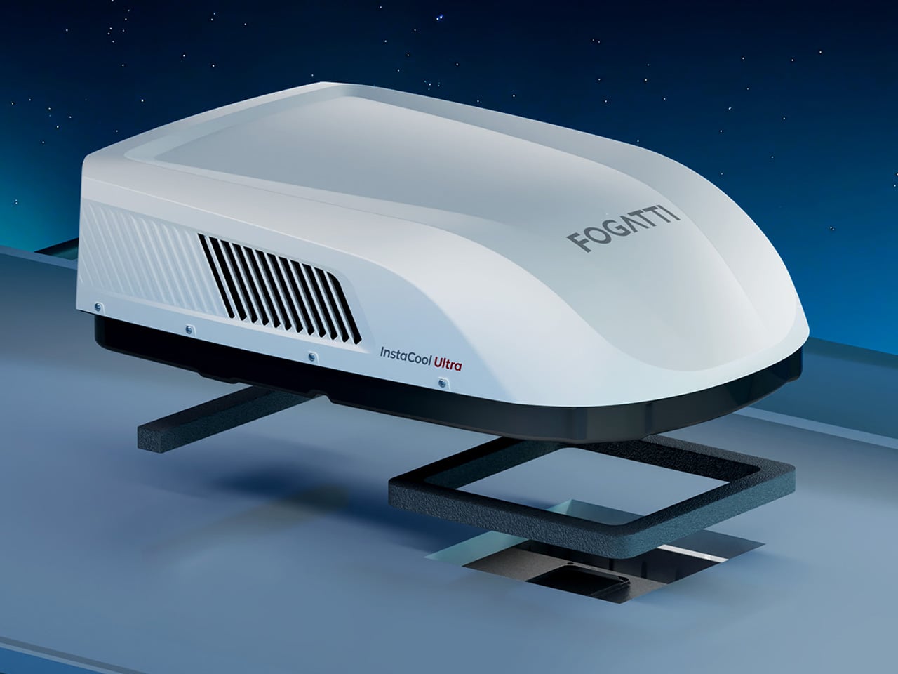
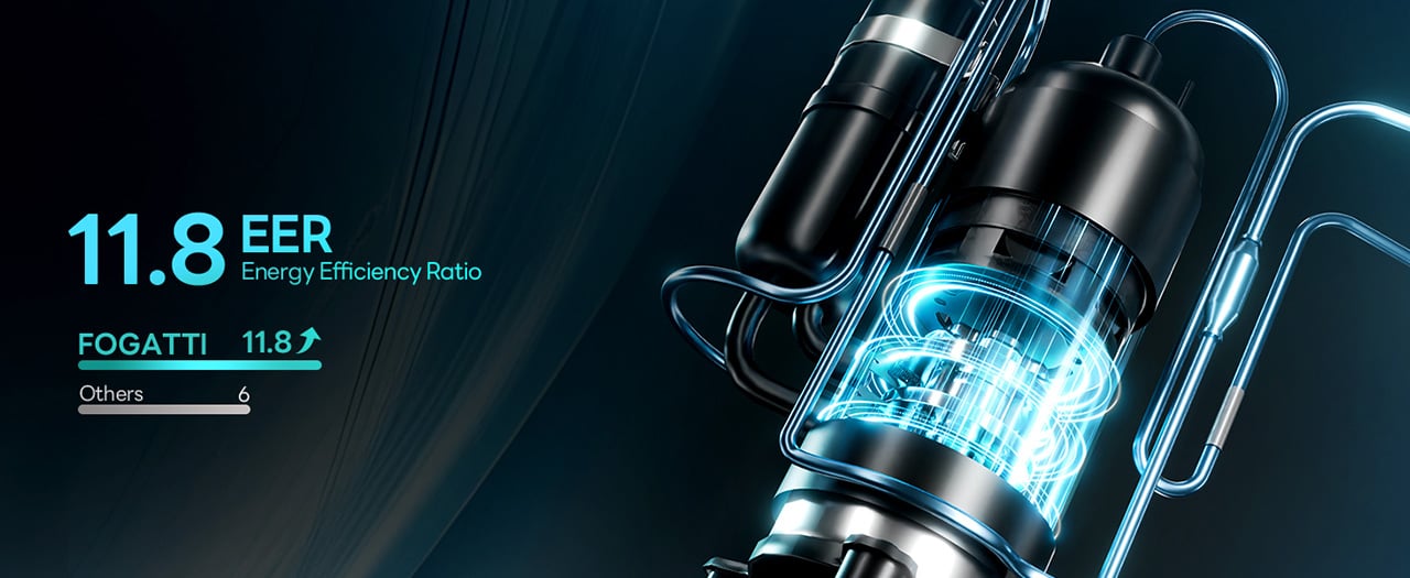
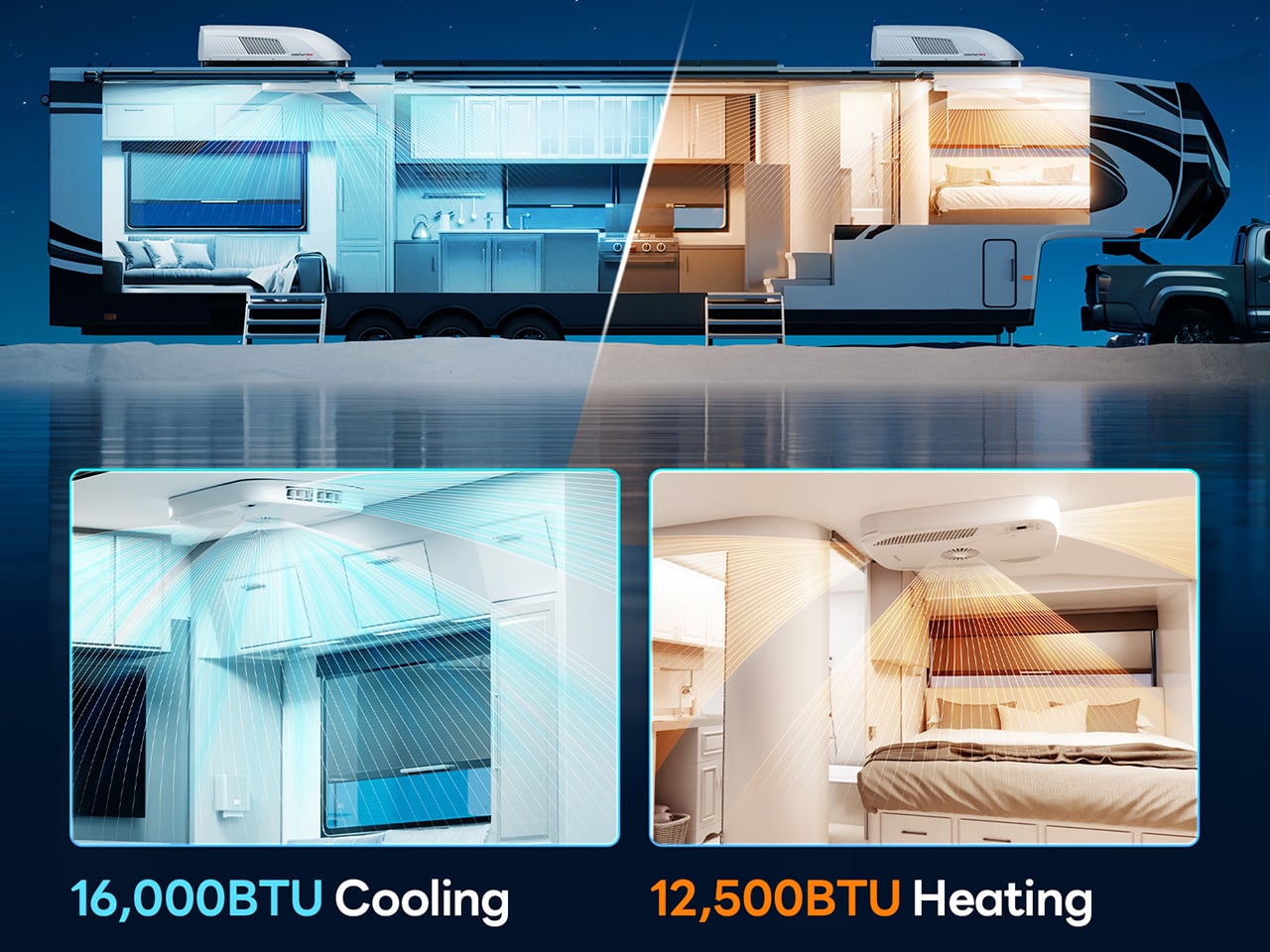
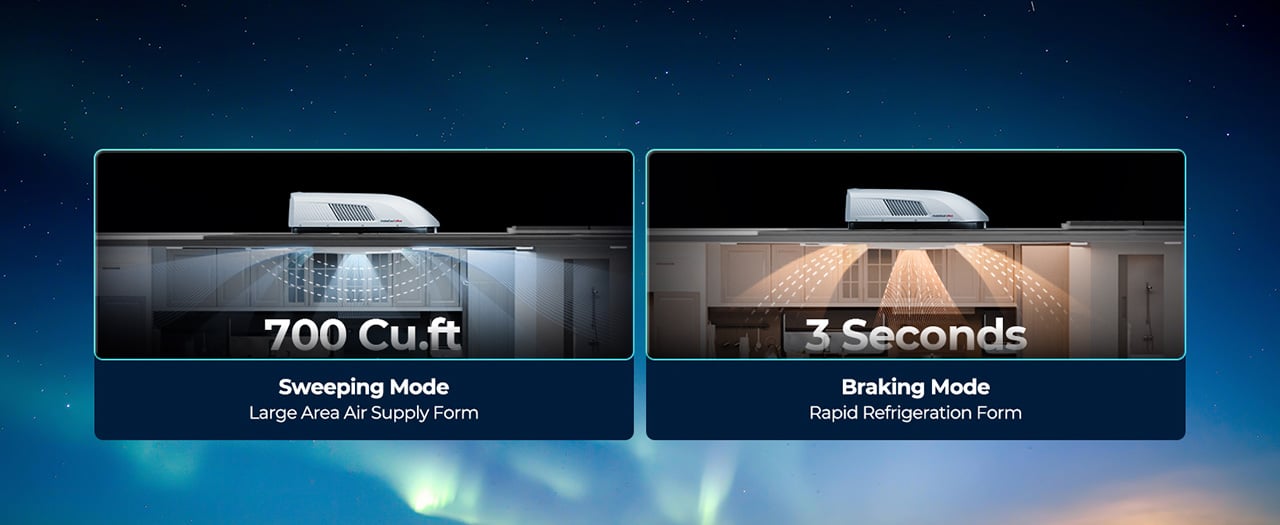
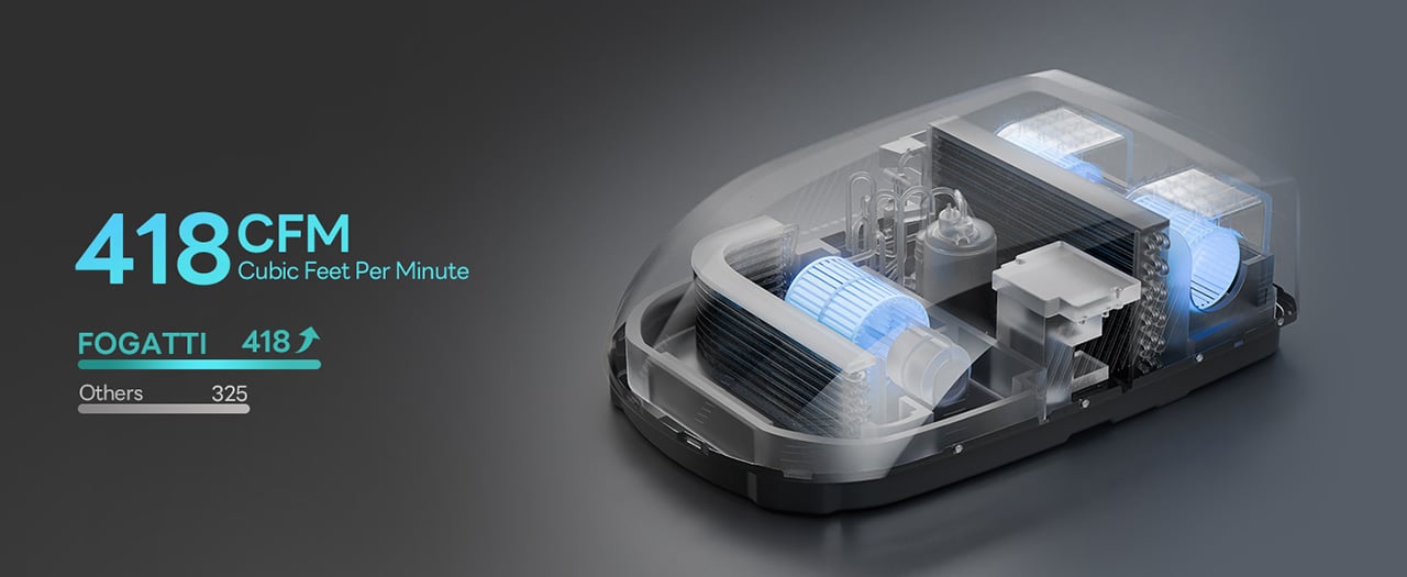
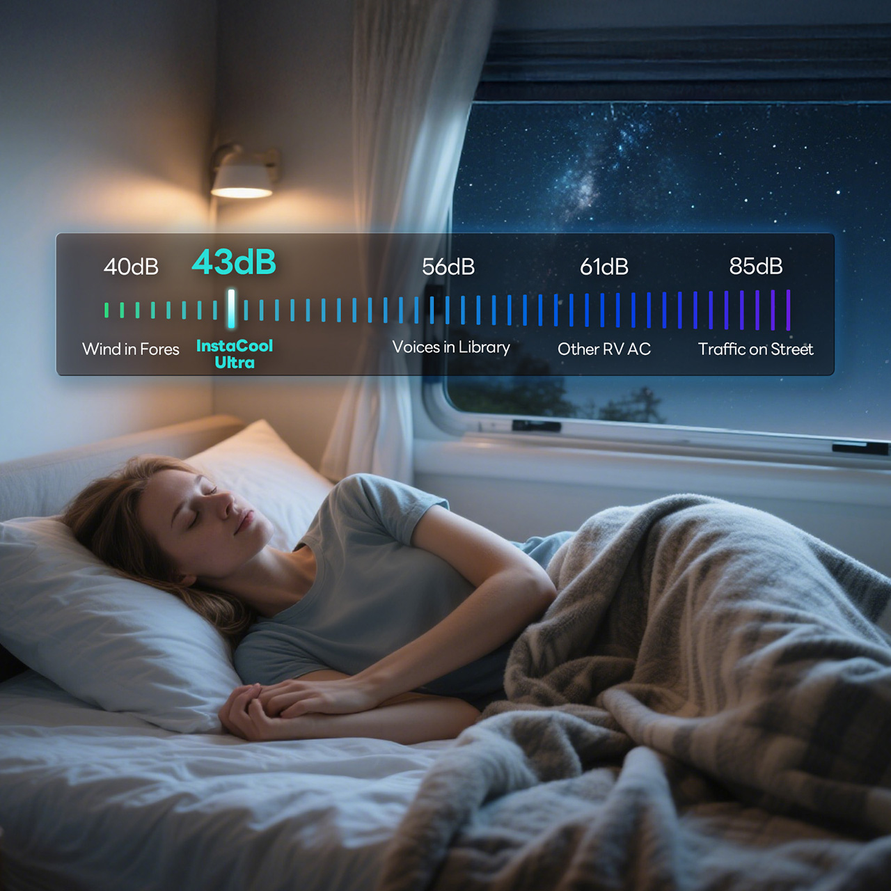
FOGATTI’s InstaCool Ultra approaches this with 418 CFM of airflow pushed through dual synchronous motors that sweep 85 degrees, creating whole-RV coverage in roughly 4 minutes according to the company. The 16,000 BTU cooling capacity targets spaces up to 600 square feet, which translates to RVs up to 36 feet long. The unit doubles as a heat pump delivering 12,500 BTU of warmth, giving it legitimate four-season capability without installing separate heating hardware. Heat pumps move thermal energy rather than creating it, which makes them roughly 3-4 times more efficient than resistance heating. The 9.2cc high-displacement compressor achieves an 11.8 EER rating (the Department of Energy considers anything above 10.7 high efficiency), operates at 43 decibels, and fits standard 14.25-inch roof openings without modification. At $1,399 (down from $1,759), it undercuts premium units while outspeccing budget alternatives.

Designer: FOGATTI

Click Here to Buy Now: $1299.99 $1759.99 ($460 off). Hurry, deal ends in 48-hours! Website Link Here.

The heat pump architecture sits at the center of what makes this unit different from the Coleman-Mach and Dometic systems that dominate most RV roofs. Traditional RV climate control treats heating and cooling as separate problems requiring separate solutions. The InstaCool Ultra runs a reversible refrigerant cycle, which means the same compressor and heat exchanger hardware that cools in July also heats in October. The system operates across an ambient temperature range from 23°F to 115°F, covering most of the continental United States outside of genuine Arctic expeditions or desert extremes that would make you question your life choices anyway.

The airflow system uses dual synchronous motors driving three fans to push 418 CFM through the cabin. For context, most 15,000 BTU RV air conditioners move 325-350 CFM. The extra volume comes from the triple-fan configuration rather than just running the motors harder, which keeps noise down while increasing air circulation. The motors drive an 85-degree sweep mechanism that oscillates the airflow rather than blasting it straight down in a single column. You can also lock the vents in place for targeted cooling when you want maximum airflow in one zone.

The reversible heat pump system automatically switches between cooling and heating modes, using compressor-based thermal transfer rather than combustion-based heating. Five segments run during milder conditions or when you’re just maintaining temperature overnight. This variable output prevents the temperature swings you get with single-stage systems that either blast full power or shut off entirely. The heat pump delivers 12,500 BTU of heating capacity, which sounds less impressive than the 16,000 BTU cooling until you account for the efficiency difference. A heat pump operating at a 3.4 coefficient of performance moves 3.4 watts of thermal energy for every watt of electricity consumed. Resistance heaters convert electricity to heat at a 1:1 ratio.

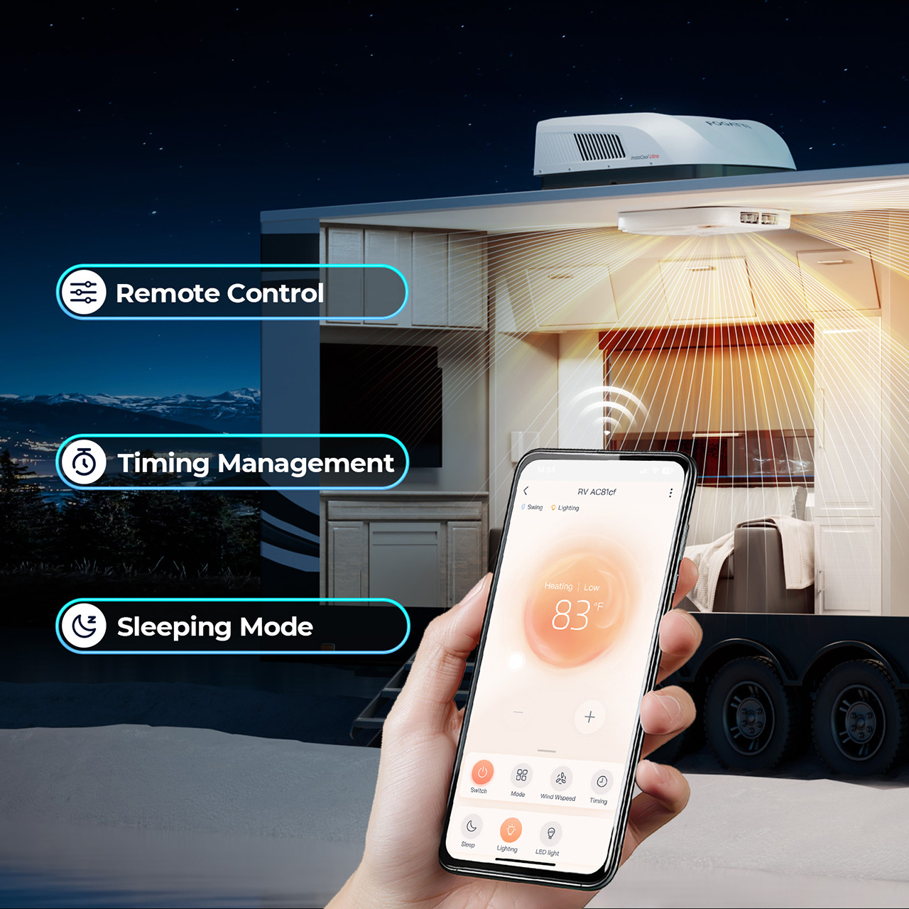
The control ecosystem offers three entry points: a physical remote, a touchscreen ADB panel mounted inside the RV, and a WiFi-connected smartphone app. The app lets you pre-cool or pre-heat the RV before you return from a day hike, which sounds like a luxury feature until you experience stepping into a 72°F trailer after spending six hours in the sun at Arches National Park.

The physical installation targets the standard 14.25-inch by 14.25-inch roof cutout that Coleman, Dometic, and Furrion units use, which means most RVers can swap this in as a direct replacement without modifying the roof structure. The streamlined profile measures 12.2 inches tall, which keeps it in low-profile territory. For comparison, the Dometic Brisk II sits around 14 inches tall, and the Coleman-Mach 15 runs closer to 13.5 inches. Those couple of inches determine whether you clear that 13-foot bridge on the backroad to your favorite dispersed campsite.

The 43-decibel noise rating puts this in the quiet category for RV air conditioners. Coleman-Mach units typically run 65-72 decibels. Dometic’s quieter models hit 50-59 decibels. The InstaCool Ultra’s 43-decibel claim would make it one of the quietest rooftop units available, though that figure likely represents the lowest speed setting rather than full-power operation.

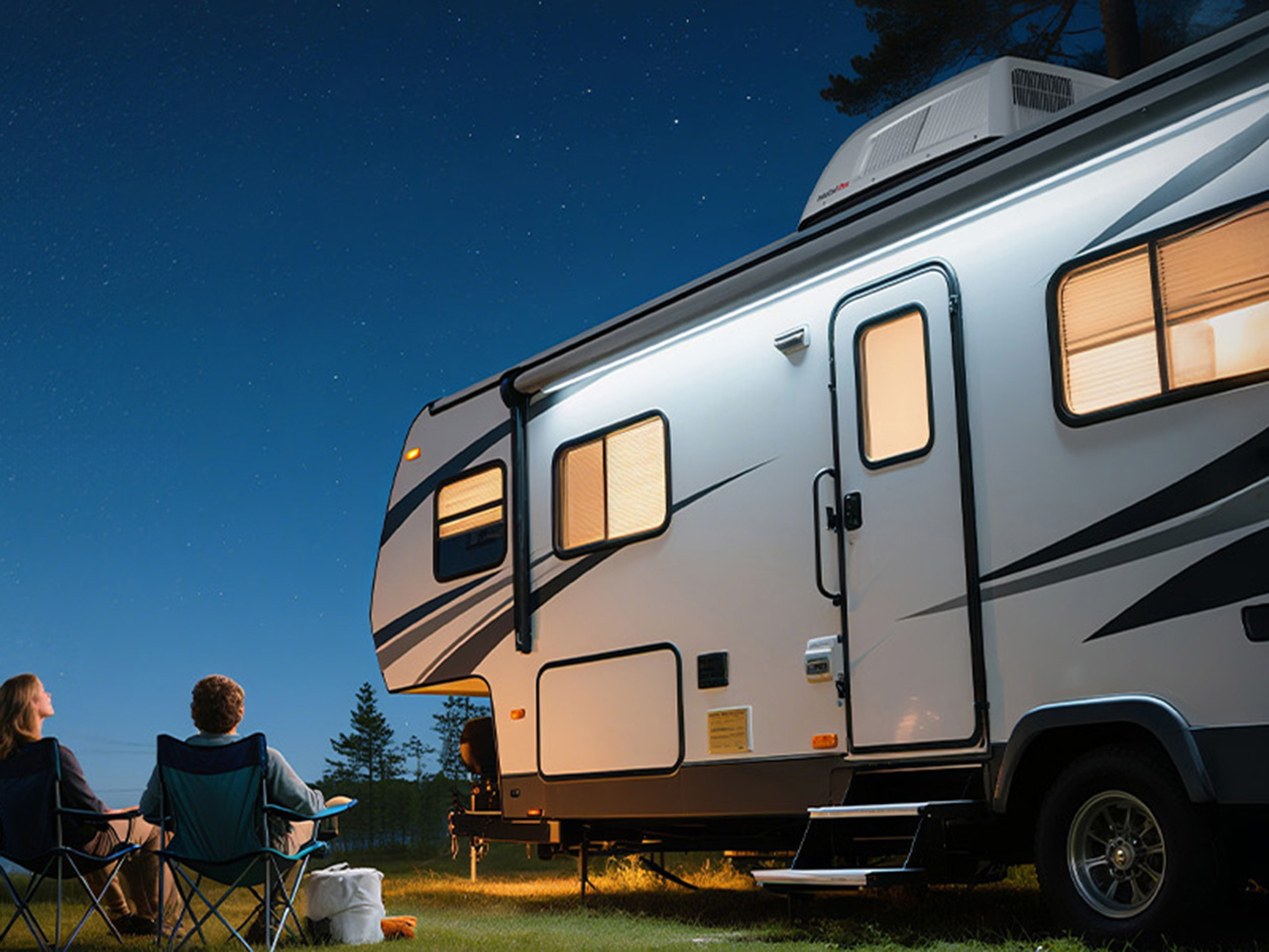
The InstaCool Ultra ships for $1,399, down from the original $1,759 price point. That positions it between budget-tier units from Advent or RecPro (which run $700-900) and premium models from Dometic’s FreshJet or GE’s Profile series (which approach $1,400-1,600). The unit currently ships in white, fitting standard non-ducted installations. What you’re really buying here is year-round climate control without installing two separate systems or draining your battery bank every time the temperature drops. Heat pump, real airflow, quiet operation, and an efficiency rating that lets you boondock longer. For RVers chasing fall colors in the Rockies or spring wildflowers in the desert, that combination finally exists at a price that doesn’t require financing.

Click Here to Buy Now: $1299.99 $1759.99 ($460 off). Hurry, deal ends in 48-hours! Website Link Here.

The post Stop Buying a Separate RV Heater. This 16,000 BTU RV Air Conditioner Does Both first appeared on Yanko Design.
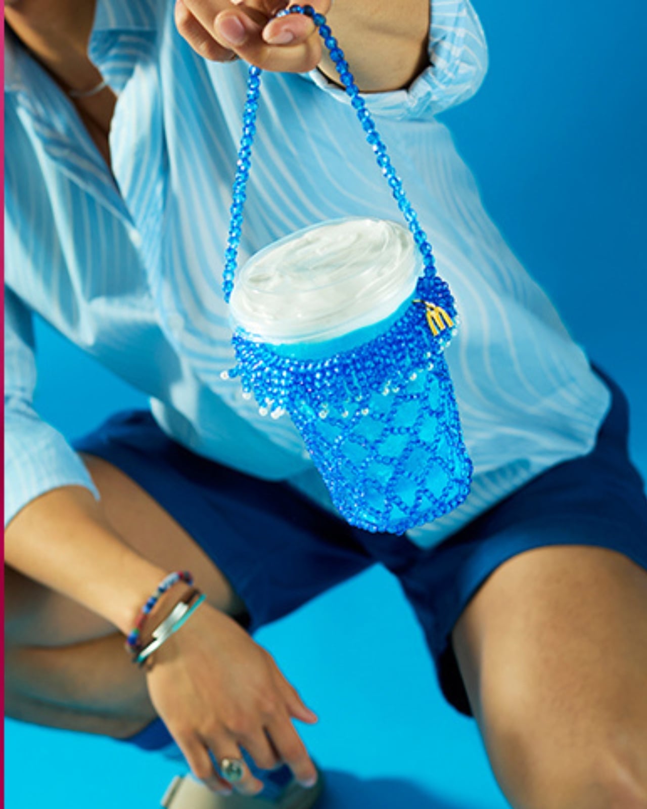
McDonald’s New Drinks Come With a $58 Fashion Accessory

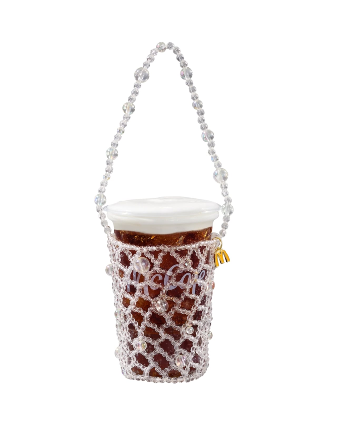
Fast food collaborations have a way of catching me off guard at this point. I’ve accepted that pretty much any brand can team up with pretty much any designer, and the result will land somewhere between genuinely inspired and deeply confusing. But when McDonald’s announced a partnership with New York-based designer Susan Alexandra to launch a collection of hand-beaded drink carriers, I had to stop scrolling.

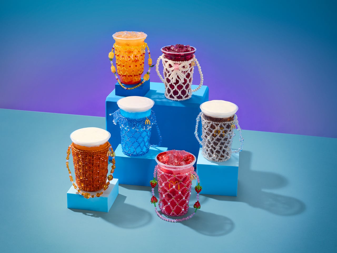
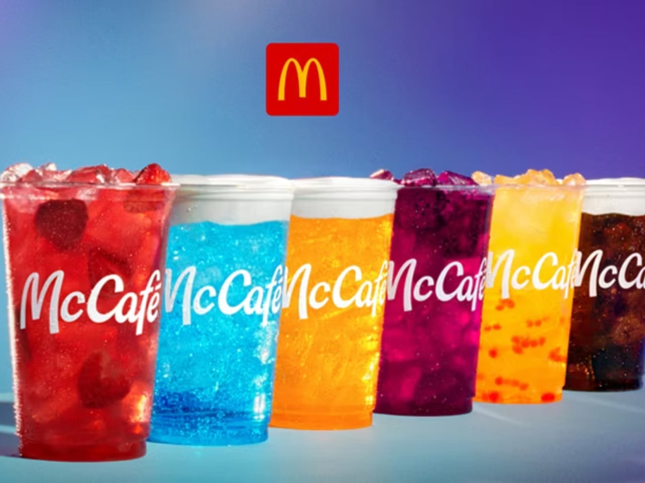
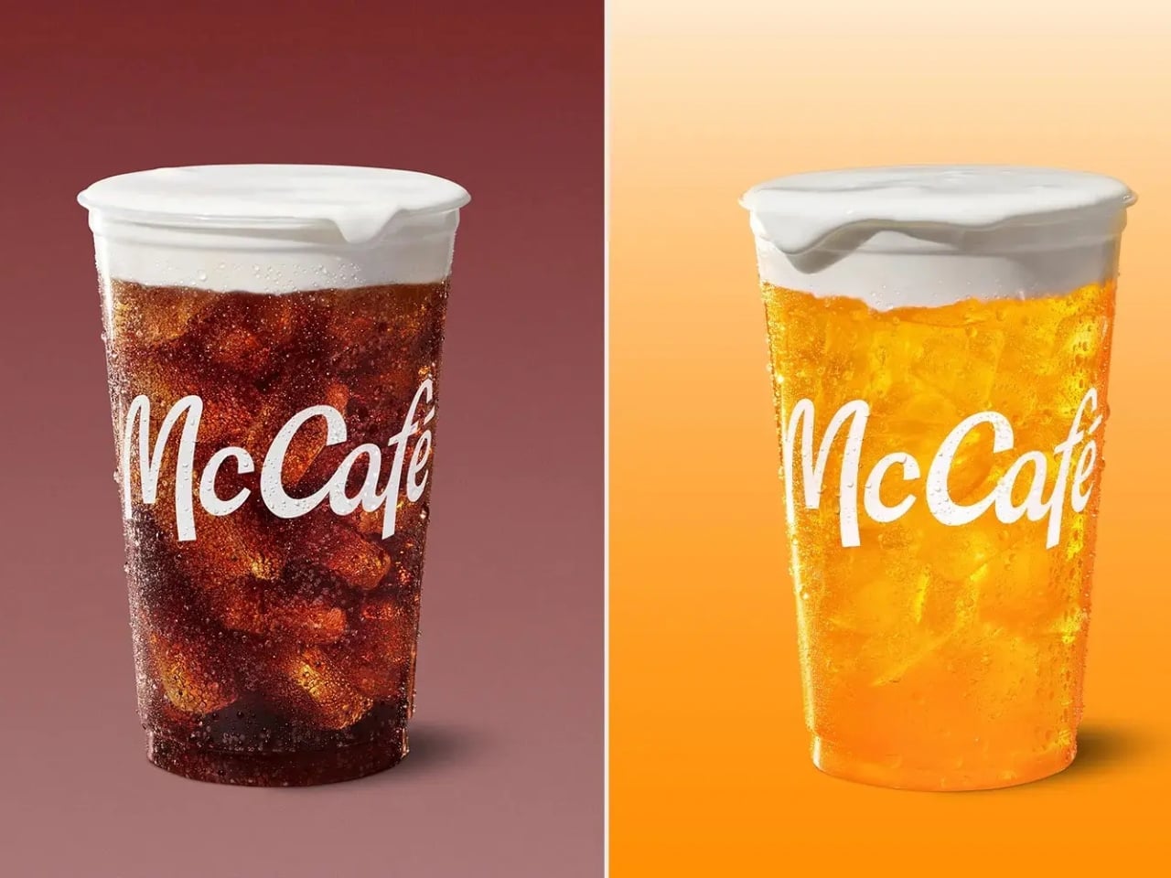
The timing is intentional. McDonald’s is rolling out its first-ever lineup of Refreshers and crafted sodas starting May 6, six new drinks that range from a Mango Pineapple Refresher to a Dirty Dr Pepper, each with a personality loud enough to inspire its own aesthetic. Think freeze-dried fruit, popping boba, cold foam. The drinks are clearly built for a generation that treats a beverage order as a mood, not just a thirst solution. And Susan Alexandra, who has spent years turning beaded bags and accessories into cult objects, is exactly the right collaborator for that energy.

Designer: McDonalds x Susan Alexandra

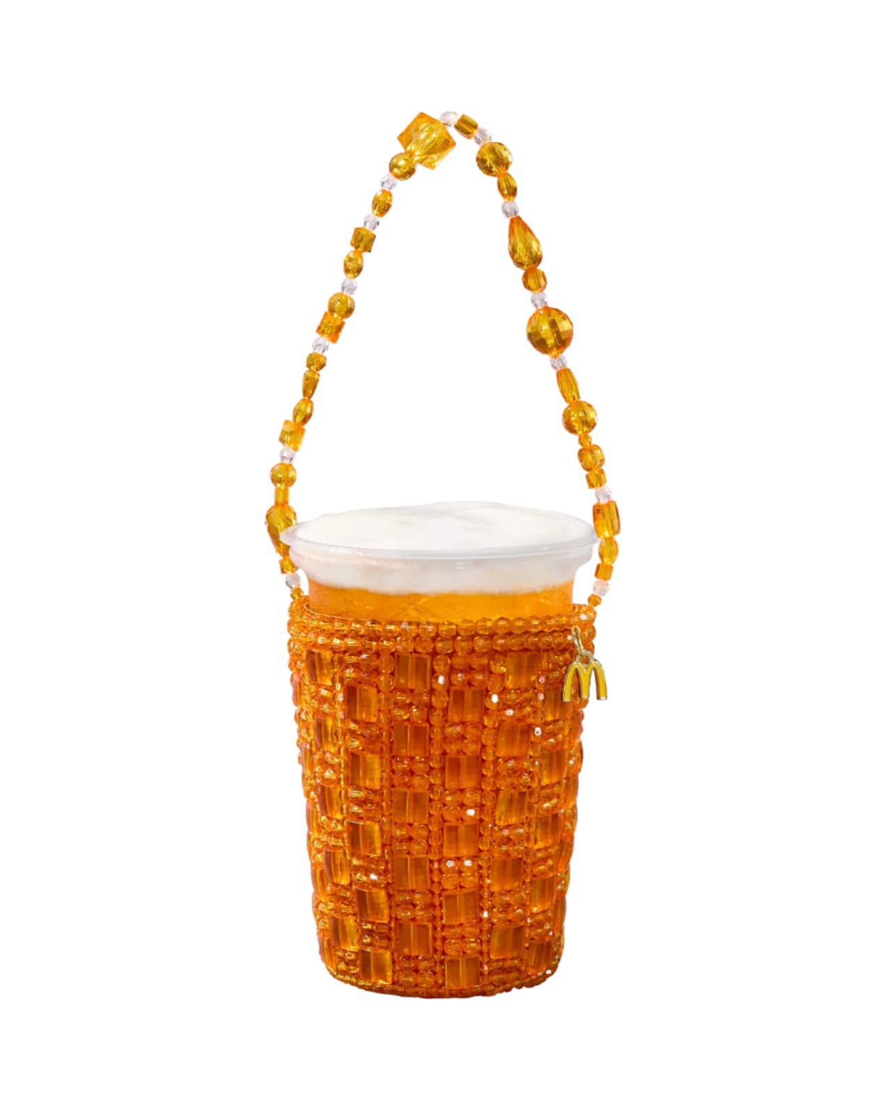
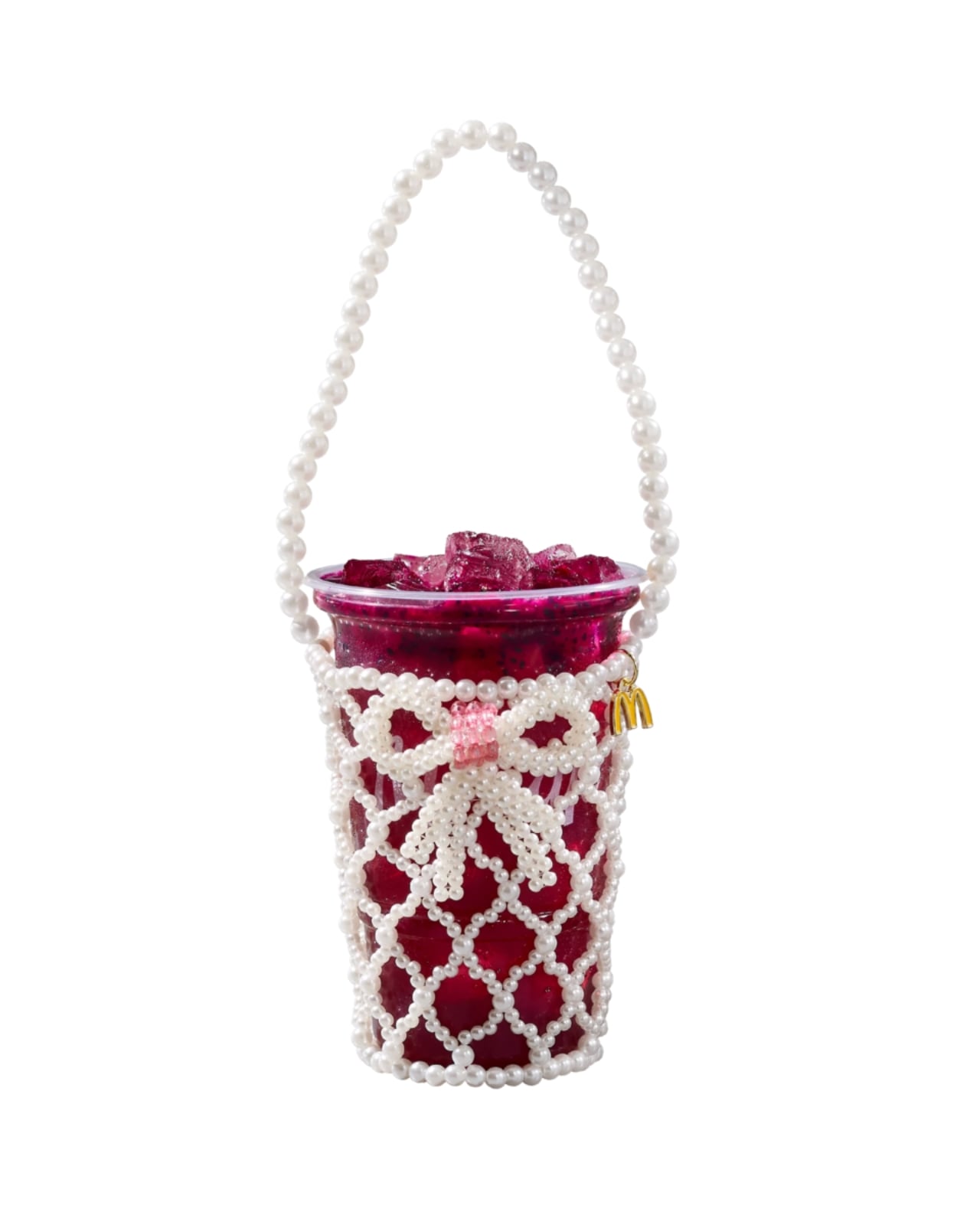
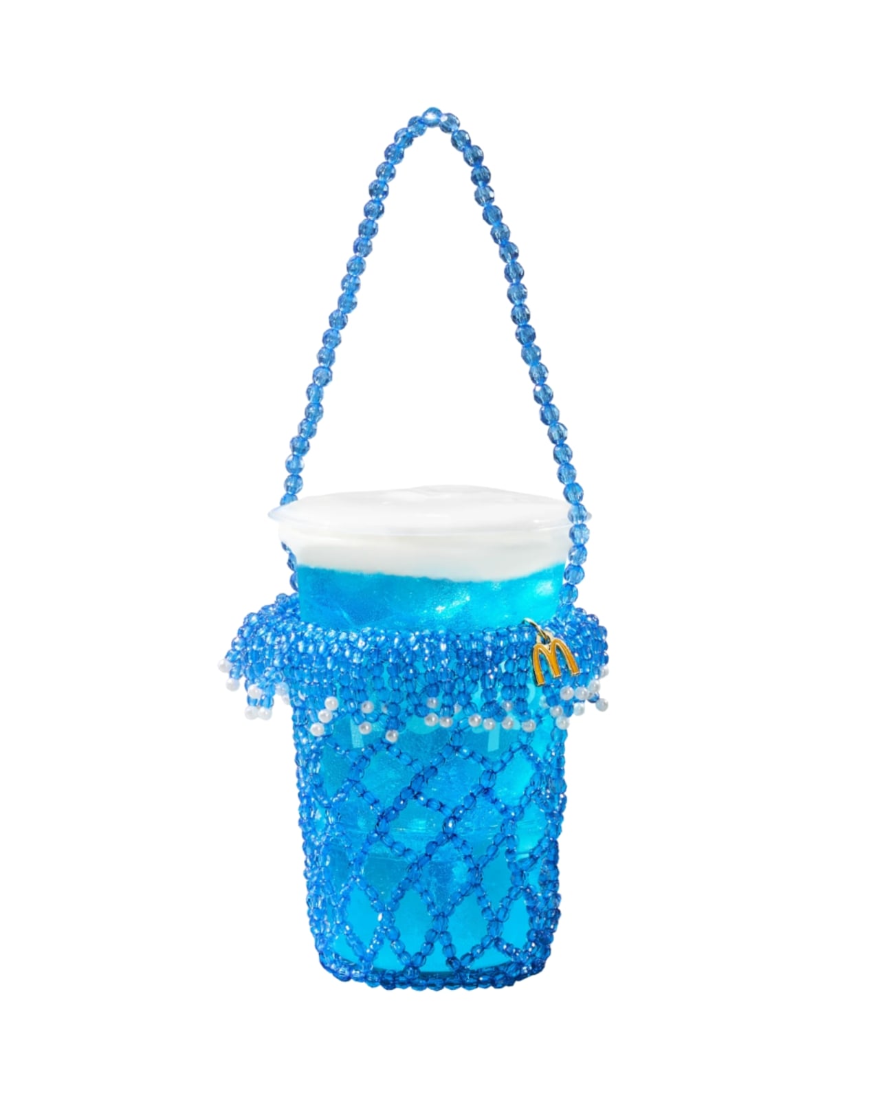
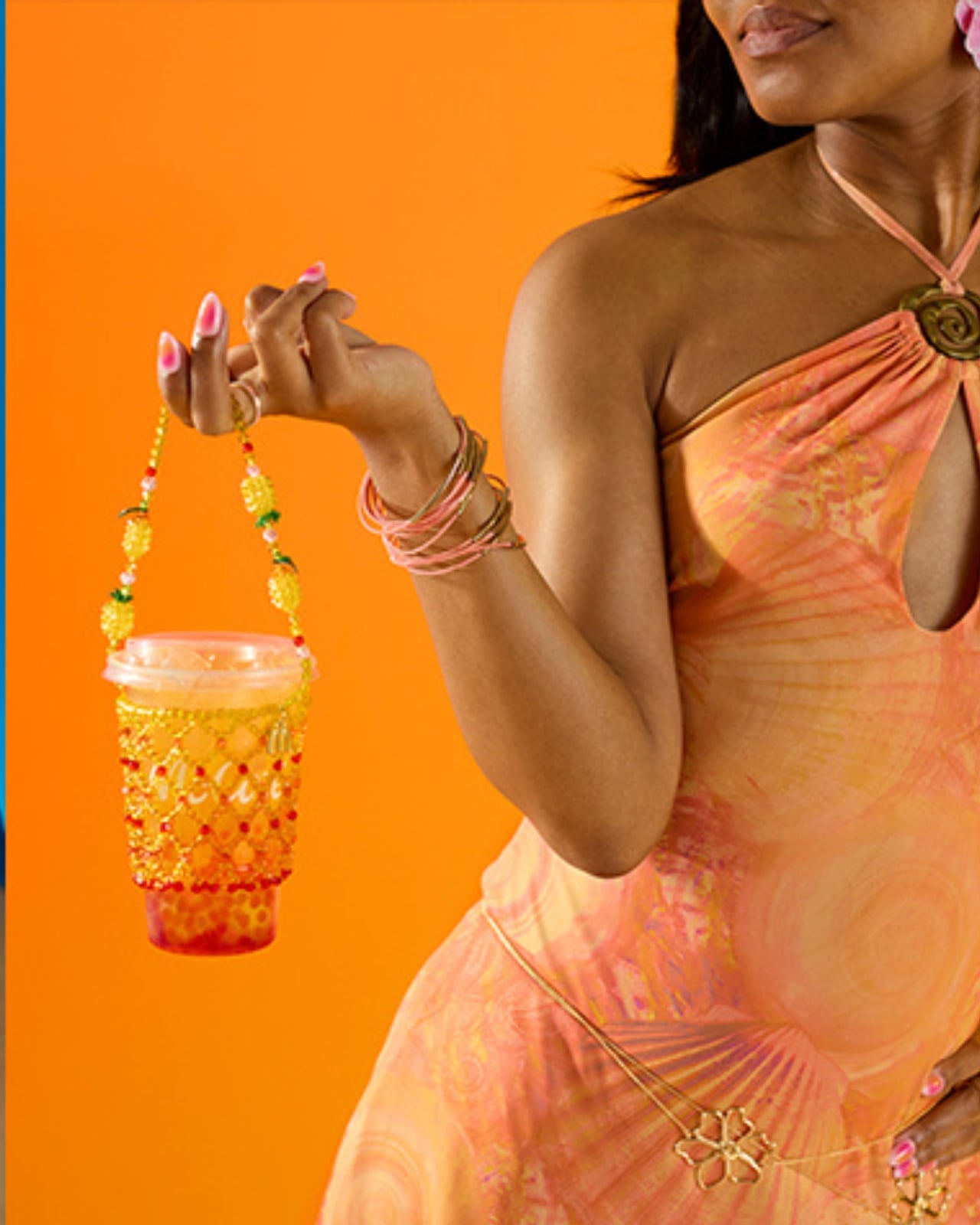
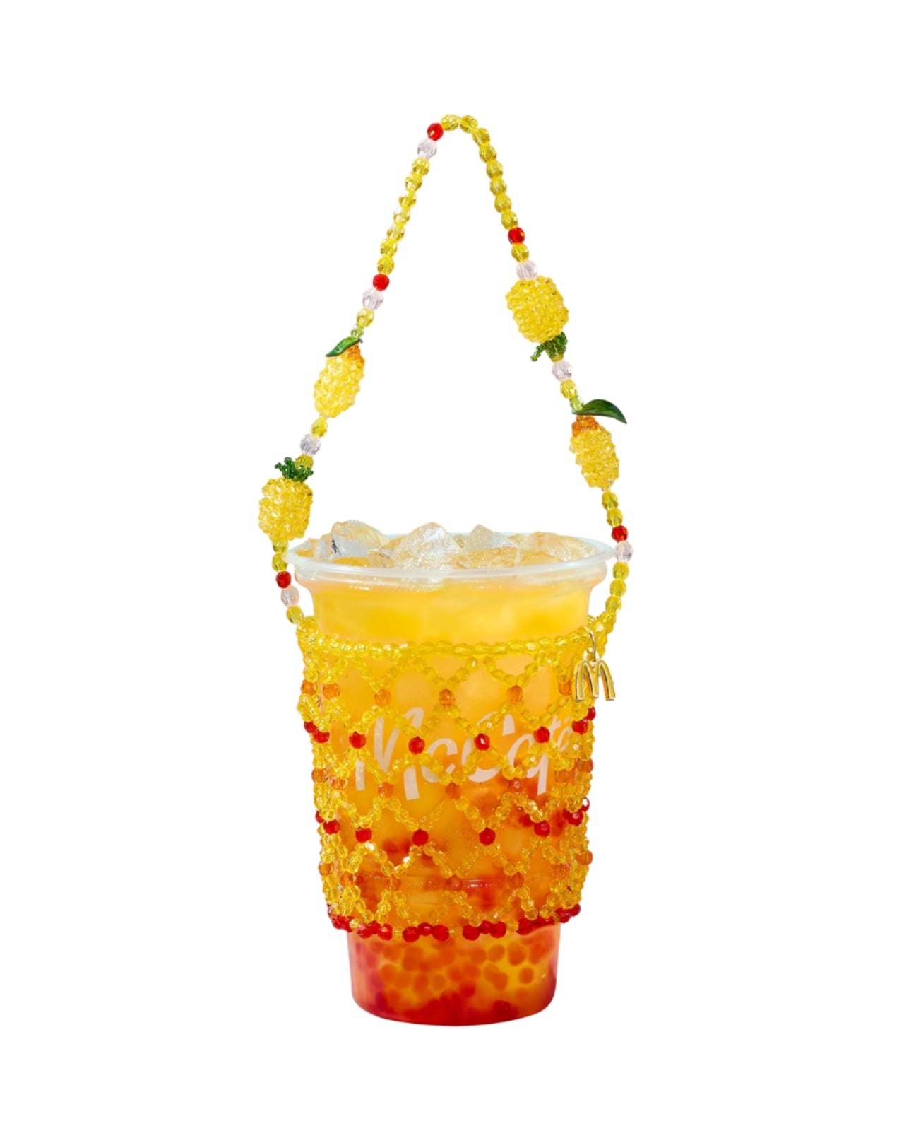
The collection includes six hand-beaded carriers, one for each new drink. Each design pulls color and texture directly from its corresponding flavor. The Strawberry Watermelon Refresher carrier is red and pink, soft and berry-bright. The Blackberry Passion Fruit version leans into dainty white beads. The Mango Pineapple has tropical warmth written all over it. These are not subtle pieces. They are made to be seen, and that is the entire point.

Susan Alexandra’s work has always operated in that specific visual register where maximalism meets handcraft. Her bags are the kind of thing you notice from across a room, the kind of accessories that start conversations. Matching that energy to a McDonald’s cup feels odd on paper, but when you actually look at the carriers, the logic holds. The drinks are colorful, slightly chaotic, and unapologetically fun. The accessories match.

Prices range from $48 to $58 depending on the design, which I know will prompt some eye-rolling. It’s a drink carrier. For McDonald’s. But that framing also misses the point. Susan Alexandra pieces are collectibles, objects that people hold onto not because they are practical but because they carry a specific cultural moment with them. A $48 beaded carrier that references a fast food soda is not a purely functional purchase. It is a souvenir. A more interesting souvenir, I’d argue, than most things that get sold under a collab banner.

The carriers are sold exclusively on SusanAlexandra.com starting May 6, in limited quantities. Each one also comes with a $10 McDonald’s Arch Card, which is a small but genuinely clever touch. The idea is that you buy the carrier, then go get the drink it was made for. As brand strategy goes, it’s actually pretty smart. It ties the accessory back to the experience rather than letting it float into the abstract realm of limited edition merch.

What makes this collaboration land is that it doesn’t feel like a desperation move from either side. McDonald’s is genuinely expanding its beverage program in a significant way, and it needs the launch to feel like a cultural moment rather than just a menu update. Susan Alexandra brings a specific visual language and a loyal customer base that overlaps with exactly the kind of person who cares about aesthetics down to what’s in their cup holder. The match is less random than it first appears, and the choice of collaborator signals how seriously McDonald’s is taking this particular moment.

I’m not saying everyone needs a hand-beaded carrier for their Sprite Berry Blast. But I do think there’s real craft in how this collaboration was conceived. The carriers are not just branded merchandise. They are wearable interpretations of a drink, which is a genuinely strange and interesting design brief that Susan Alexandra executed with her signature commitment to color and detail. Fast food has been flirting with fashion for a while now. This is one of the better executions I’ve seen, and I’ll be curious whether any of the six designs sell out before you even finish reading this.

The post McDonald’s New Drinks Come With a $58 Fashion Accessory first appeared on Yanko Design.
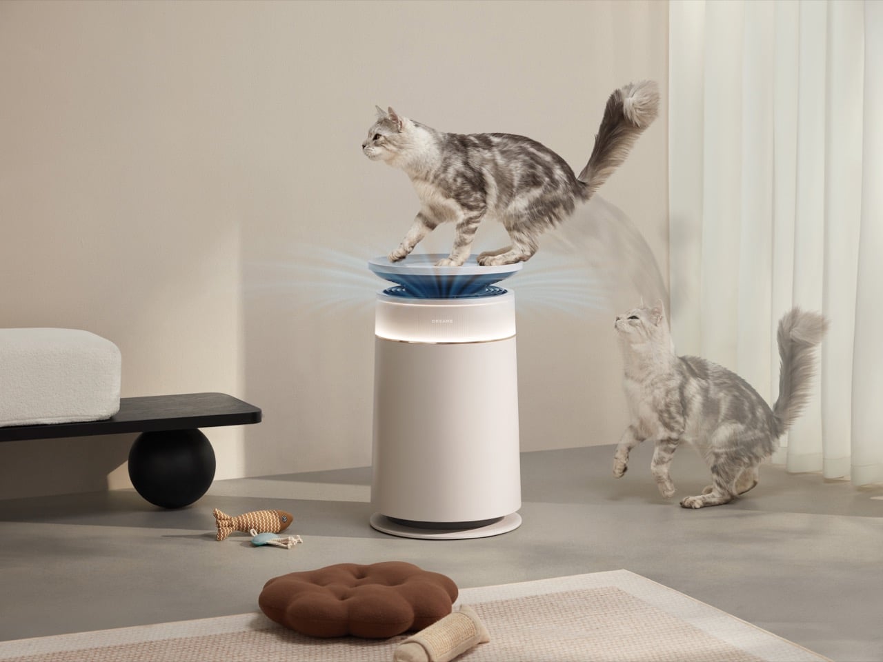
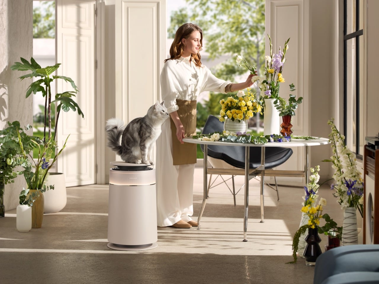
Dreame’s Pet-Friendly Air Purifier Collects Fur Before It Clogs Your Filters

Dreame started building vacuum cleaners in 2017. They built motors that spun faster than anyone else’s, wrote algorithms that mapped rooms more efficiently than the competition, and developed bionic robotic arms that could reach where other robot vacuums couldn’t. Nine years later, they’re launching rocket cars at events in San Francisco, announcing electric SUV lineups, teasing smartphones, and showing off water purifiers alongside lawn mowers. If that trajectory feels chaotic, you’re reading it right. What holds it together is the motor technology, the same engineering philosophy that made their vacuums compelling now applied to air purification, personal care devices, and apparently vehicular propulsion systems.

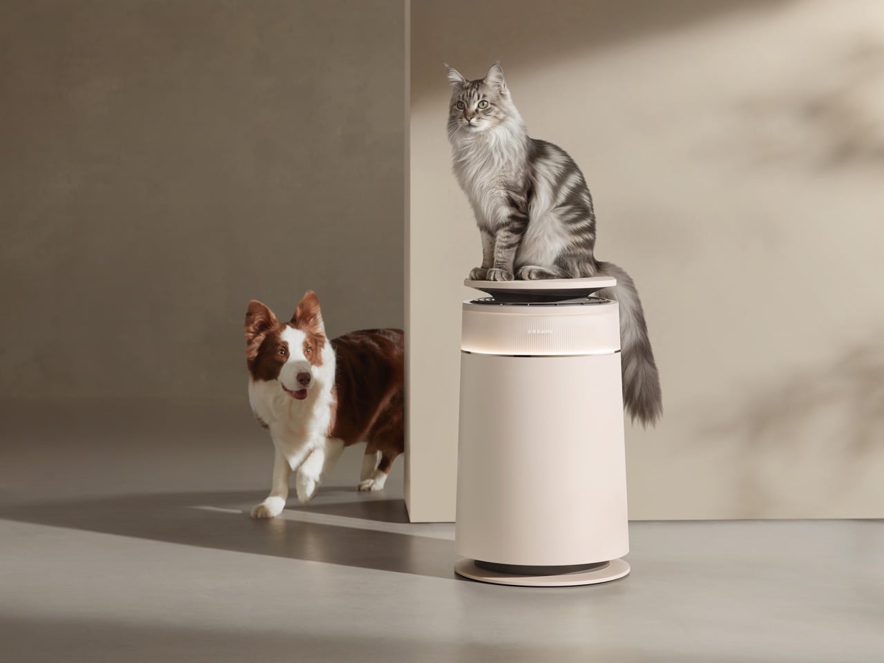
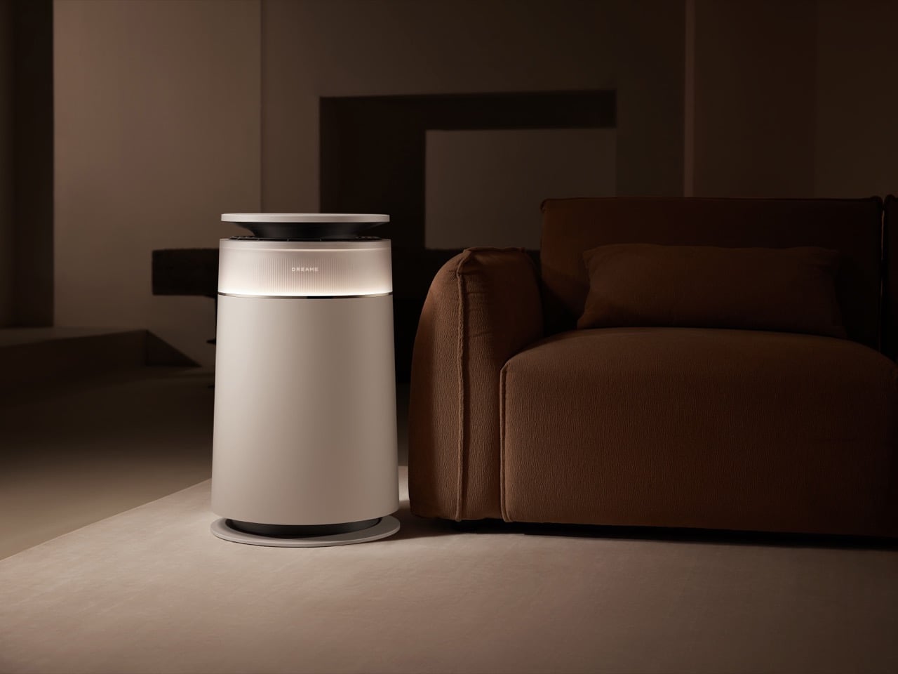
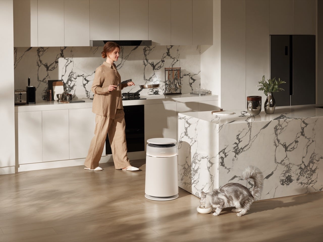
The FP10 air purifier sits somewhere in the middle of this expansion spree, and it’s the first place the company has applied robot vacuum thinking to stationary air cleaning. The core concept borrows directly from their floor-cleaning playbook: a self-cleaning roller brush that actively separates debris instead of waiting for a clogged filter to choke performance. For pet owners who’ve watched traditional purifiers lose suction as fur accumulates on intake grilles, that’s a genuinely useful pivot. The question worth asking is whether Dreame’s computational approach to home appliances translates as well to air purification as it did to floor cleaning.

Designer: Dreame

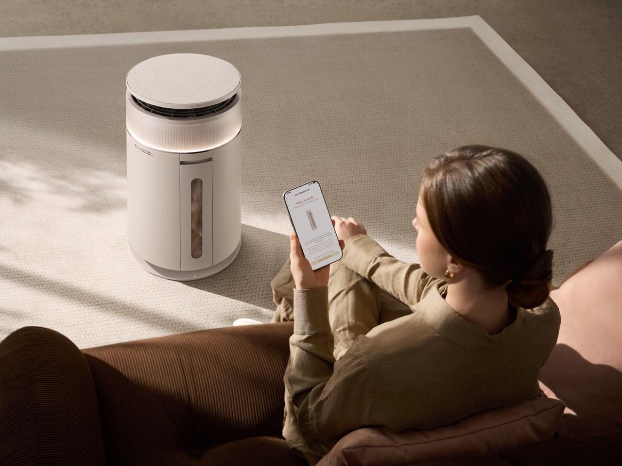
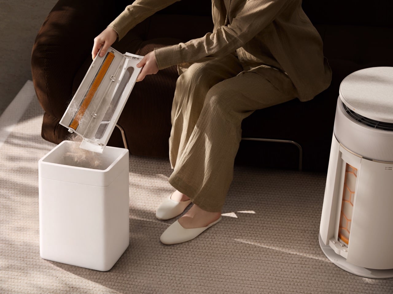
The roller mechanism operates on two axes, rotating 360 degrees to strip hair and particles from incoming air before they reach the primary filter. A dual-powered system keeps both the roller and filter moving independently, compressing debris into a sealed 460ml collection bin that you empty like you would a vacuum canister. Dreame claims a 99.5 percent hair collection rate based on lab testing with two cats in a 30-square-meter chamber over seven days, which sounds optimistic until you consider that the alternative in most purifiers is zero percent because the hair never makes it past the intake grille in the first place.

What makes this approach legitimately different is the elimination of primary filter maintenance. Traditional purifiers with washable pre-filters require you to pull them out, rinse them, dry them completely, and reinstall them every few weeks if you have shedding pets. Miss a cleaning cycle and airflow degrades fast. The FP10 handles that process autonomously, triggered either by a preset schedule or in response to air quality readings. The machine runs a self-cleaning cycle, the roller dumps collected debris into the bin, and airflow stays consistent without your involvement. Dreame calls this their Filter Maintenance 4.0 era, positioning it as an evolution beyond mesh filters that need constant washing and felt filters that burn through replacement costs.

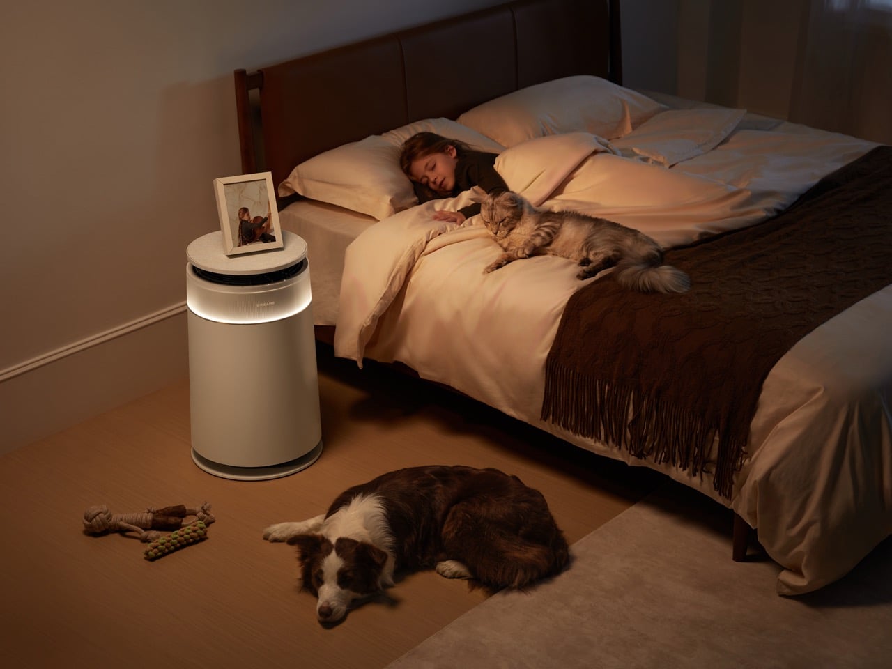
The air purification stack itself follows convention: HEPA H13 media rated for 99.97 percent filtration of particles down to 0.3 microns, backed by what Dreame calls a CataFresh odor removal system combining 2.5 times more activated carbon than their previous flagship with a metal catalyst layer that chemically decomposes odor molecules rather than just adsorbing them. The unit pushes 350 cubic meters per hour in standard configuration, operates between 32 and 62 decibels depending on mode, and includes the expected smart home integration through the Dreamehome app with Google Assistant and Alexa support.

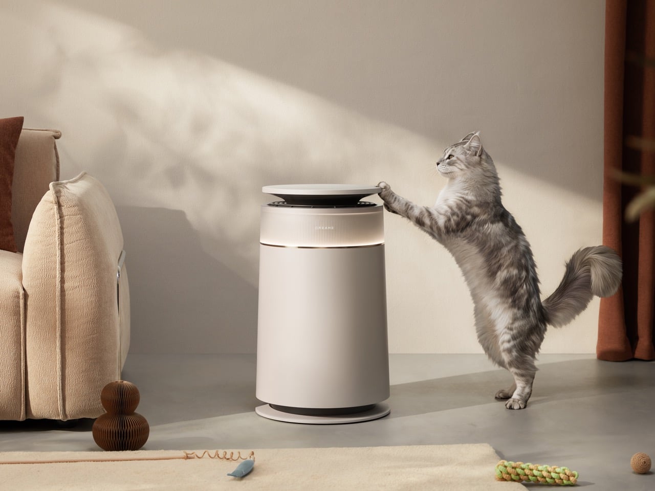
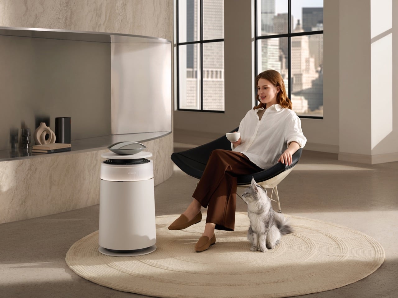
The pet-specific features extend beyond hair collection. An optional weighing tray sits on top of the unit, tracking weight and activity patterns for multiple pets through the Dreamehome app. When a pet steps onto the tray in Pet Mode, the purifier gradually reduces airflow to avoid startling them. It’s the kind of thoughtful detail that suggests someone on the team actually lives with skittish cats.

The FP10 ships in early May. Pricing hasn’t been announced for most markets yet, but it’s positioned as a premium pet-focused purifier competing against dedicated units from brands that have been in this space far longer. What Dreame brings to the fight is proven self-cleaning technology and a willingness to treat air purifiers as active systems rather than passive filters. For households where pet hair has become the limiting factor in purifier performance, that mechanical preprocessing layer might justify the premium over simpler designs that just throw bigger HEPA filters at the problem.

The post Dreame’s Pet-Friendly Air Purifier Collects Fur Before It Clogs Your Filters first appeared on Yanko Design.
KitKat’s New Wrapper Actually Kills Your Phone Signal Completely

We’re already a third into 2026, and one “trend” that seems to be sticking is that this is the year when people intentionally go offline or analog to take a break from our increasingly digital lives. Hobbies like journaling, knitting, scrapbooking, baking, and board games have become a regular part of people’s personal schedules. More often than not, when we do these things, we keep our phones, or at least the internet, away. Some, though, may need more “drastic” measures just to make their phones quiet for a few hours every day.

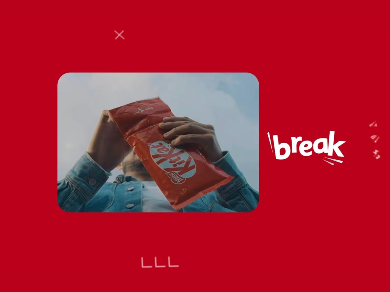
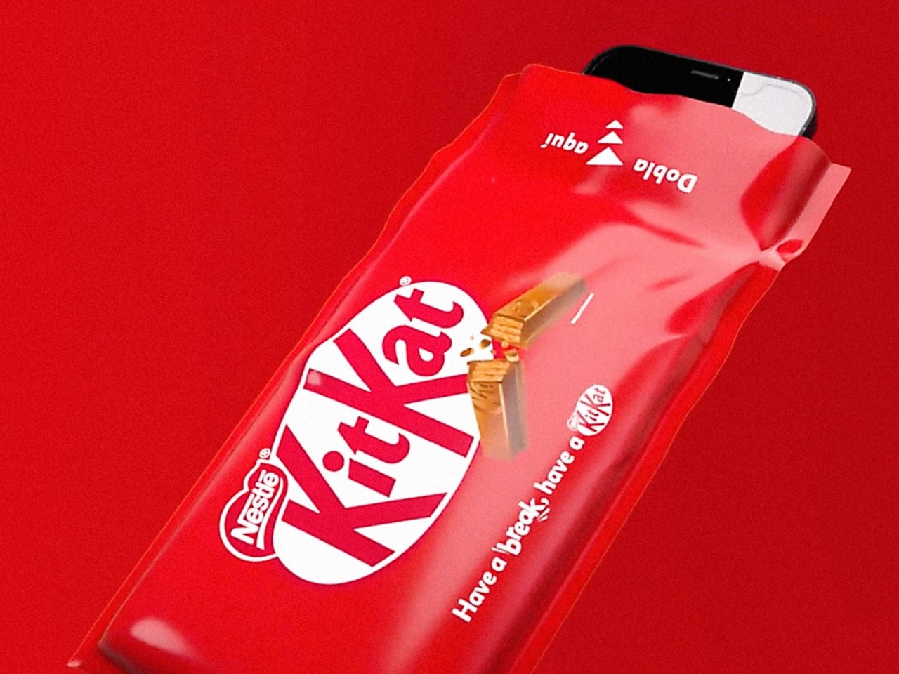
KitKat Panama, in collaboration with creative agency Ogilvy Colombia, is taking the brand’s iconic “Take a Break” slogan to a whole new level with a special concept called Break Mode. Instead of people just eating a KitKat as a way to take a break, they turned the chocolate’s packaging into an actual Faraday cage. Basically, once you put your phone into the empty packaging, all signals (calls, 4G/5G connectivity, Bluetooth, and GPS) are entirely and effectively blocked, turning your world offline and analog, at least until you take your phone out again.
Designer: KitKat Panama

How they did it was by adding multiple layers to the special packaging. The copper layer is the primary conductive material, while the polyester layers give it structural integrity. The polypropylene outer coating provides durability and everyday usability, while the precision-engineered sealing mechanism ensures that your signals are truly blocked.
This kind of technology was once reserved for medical labs and data centers but can now be found in this iconic red KitKat package (well, at least if you’re in Panama). There’s also a sustainability angle to it, as the packaging’s materials have an approximate one-year lifespan and can eventually be separated for responsible recycling.

The ritual that KitKat envisions is quite intentional: unwrap your KitKat fingers, slide your phone into the empty packaging, and fully immerse yourself in the moment. Your digital world goes quiet, and your break truly begins. It feels almost ceremonial in the best way. Kim Waigel, Marketing Director for Nestlé in Central America, summed it up well: “Break Mode goes beyond simply saying ‘Take a Break’; it empowers individuals with the physical tool to genuinely achieve it.”

The concept was introduced at some of Panama’s most high-traffic venues, including a major technology expo, a concert event, and even a university campus, bringing the experience directly to the people who arguably need a digital detox the most.

Now, before you start planning your offline hours around a KitKat wrapper, it’s worth noting that Break Mode’s commercial viability is still under evaluation. So it isn’t something you can grab off a shelf at your nearest convenience store, at least not yet. But honestly, the fact that this concept even exists feels like a sign of the times. In an era where we’ve normalized doom-scrolling and round-the-clock connectivity, simply putting your phone away has become a radical act. And leave it to a chocolate brand to make that feel like something worth celebrating.

Whether or not Break Mode ever makes it to mass market, it’s already doing its job, sparking a conversation about what it truly means to take a break in 2026. Because sometimes, the most powerful thing you can do for yourself isn’t downloading another wellness app. It’s slipping your phone into a KitKat wrapper and letting the silence do the rest.

The post KitKat’s New Wrapper Actually Kills Your Phone Signal Completely first appeared on Yanko Design.