Starbucks x Traveler’s Company Made a Collab Worth Flying to Tokyo For

As a stationery fiend, I always look forward to the second half of the year because most brands announce their lineups for the next year. I also look forward to the collaborations they create with other related (and sometimes completely unrelated) companies, the kind that make me want to support either brand, depending on how I’ll be able to get my hands on the often limited-edition products.

Some collaborations exist purely for hype. They look good in a press release, generate the right amount of social media noise, and then quietly disappear from shelves and memory. The new Starbucks Reserve Roastery Tokyo x Traveler’s Company collection is not that. It’s the kind of collab that makes sense on paper, and even more sense when you actually hold the pieces in your hands.

Designer: Starbucks x Traveler’s Company

For those not already deep in the cult of Traveler’s Company, let me make the introduction. Founded in Tokyo, Traveler’s Company makes handcrafted leather notebooks and stationery that have earned a devoted following among journalers, designers, travelers, and the kind of people who still believe that writing by hand is an act worth protecting. Their flagship Traveler’s Notebook has become iconic in its own quiet way, a slim leather cover held together by an elastic band, designed to age beautifully and accumulate memories over time. It’s the opposite of disposable. Their annual theme for 2026 is fittingly called “Spirit,” inspired by the excitement of when a journey begins and the pleasure of setting off somewhere completely new.

Then there’s the Starbucks Reserve Roastery Tokyo. Tucked into the leafy streets of Nakameguro, it isn’t your average Starbucks. It’s a flagship experience space housed in a building by renowned architect Kengo Kuma, where the coffee is treated more like a craft than a morning routine. Both brands are, at their core, about the experience of being fully present in a moment. So the partnership makes complete sense.

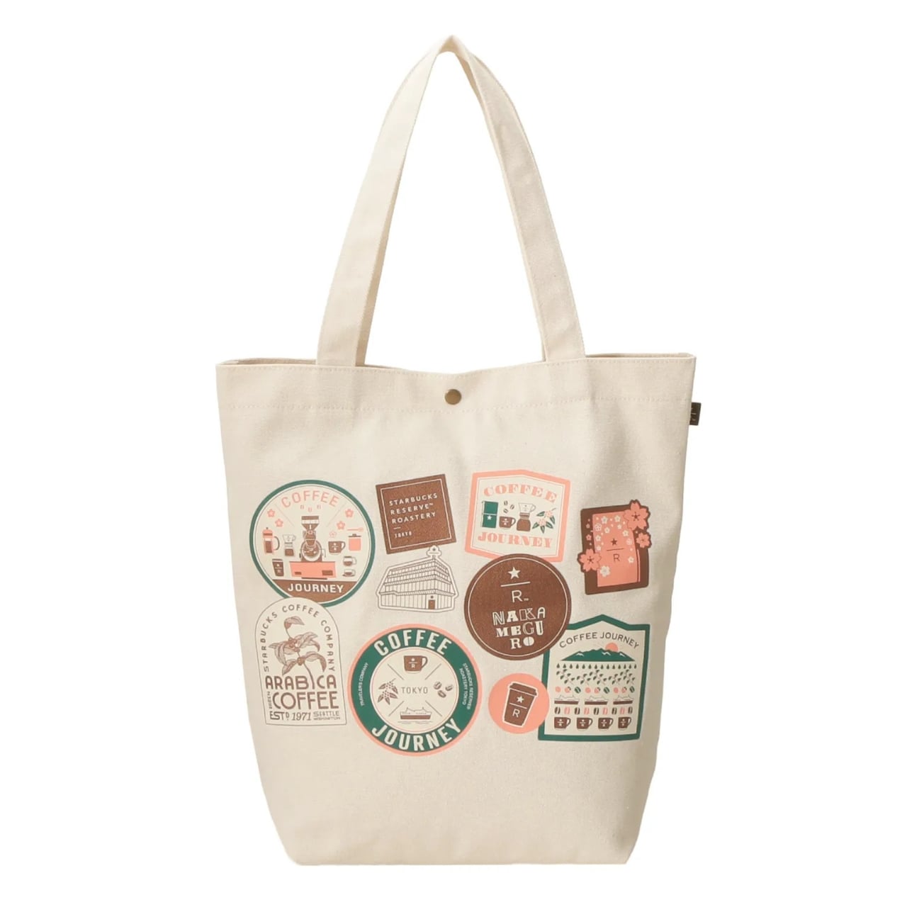
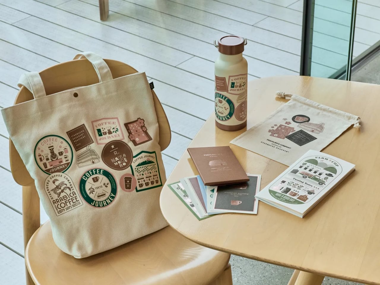
The 2026 collection arrives with a handful of pieces that feel considered rather than rushed. The canvas tote bag is the showstopper. Designed to mimic the look of a well-traveled suitcase covered in destination stickers, with Roastery Tokyo and Nakameguro as the featured stops, it carries the whole spirit of the collab on its exterior. Inside, there’s a pocket sized specifically to hold a Traveler’s Notebook, plus room for a tumbler or bottle and the rest of your everyday essentials. At 5,000 yen, it’s the kind of bag you’d actually reach for daily without feeling like a walking advertisement. It just looks like you’ve been somewhere interesting.

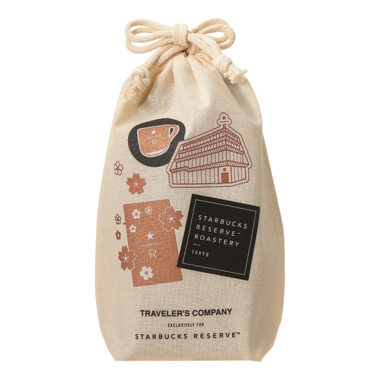
The cotton drawstring bag at 1,800 yen is smaller in scale but just as thoughtful. Designed to hold a bag of coffee beans, it sounds specific until you realize how often people buy coffee as a souvenir and then have absolutely nothing appropriate to carry it home in. It also doubles as an inner bag organizer, which is the kind of practical thinking that elevates a piece from cute to genuinely useful.

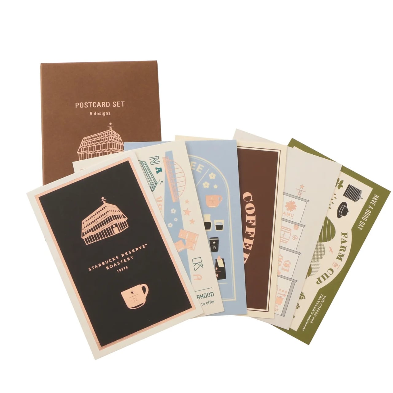
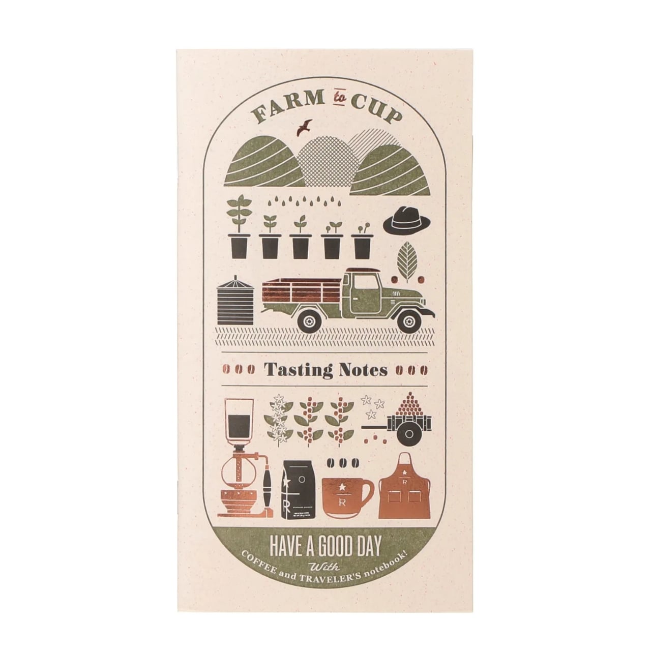
The postcard set is a quiet standout. Six cards featuring original Traveler’s Company illustrations of Roastery Tokyo icons, each printed on a different textured paper. In a moment when even birthday greetings arrive as voice memos, sending something handwritten on paper that was clearly chosen with care feels like a small, intentional act. The collection also includes a notebook set complete with a matching pen, pen loop, and zipper case, the kind of cohesive little kit that looks like it belongs in the bag of someone who has their life meaningfully together.

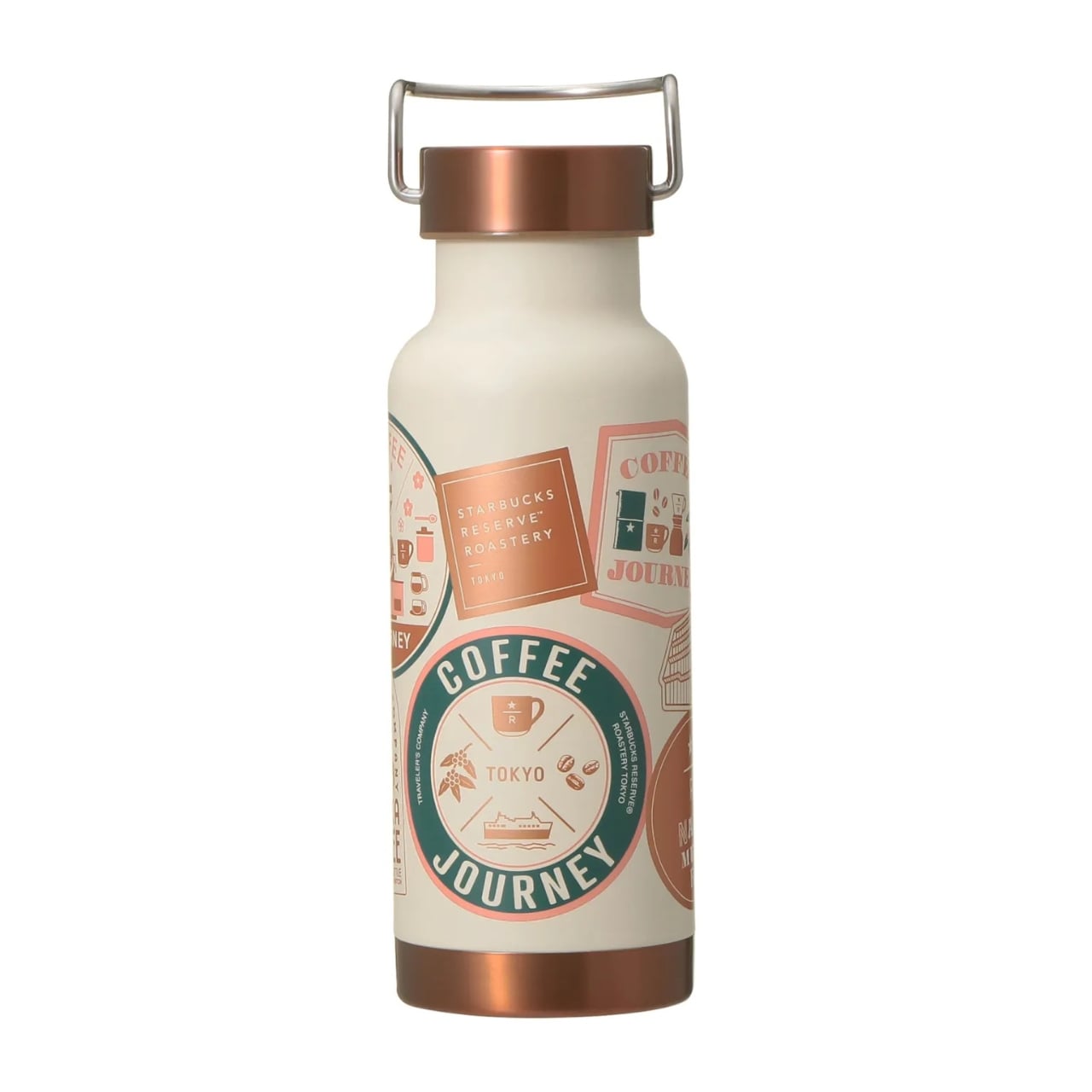
What makes this collaboration feel different from the average branded merchandise drop is that both parties seem to genuinely understand what the other is about. Traveler’s Company didn’t just place a Starbucks logo on a notebook. The design language is rooted in travel, in coffee as ritual, in the beauty of slow and deliberate moments. Every piece in the collection tells the same story without having to say it outright.

The collection is exclusive to the Starbucks Reserve Roastery Tokyo in Nakameguro, which makes it inherently precious for anyone outside of Japan. The fact that resellers have already picked it up on platforms like Etsy says everything about the demand. For those who can make the trip, the Nakameguro store is worth visiting on its own. That you can leave with a limited-edition collab bag full of coffee and a new notebook is simply a bonus. Some things are made to be used, loved, and carried forward. This collection is exactly that kind of thing.

The post Starbucks x Traveler’s Company Made a Collab Worth Flying to Tokyo For first appeared on Yanko Design.

This Transparent Box Opener Handles Tape & Tags Without You Ever Putting The Package Down

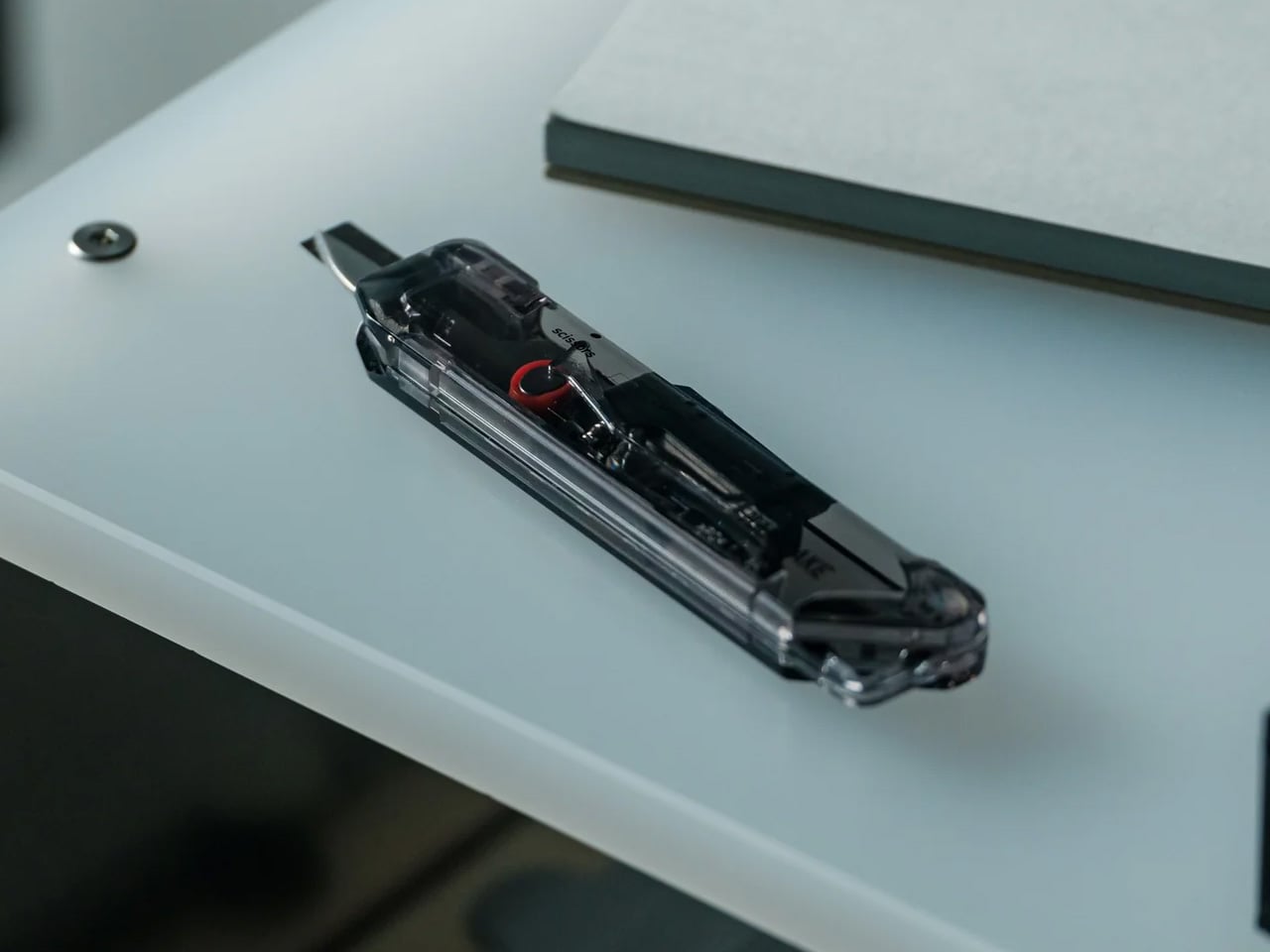
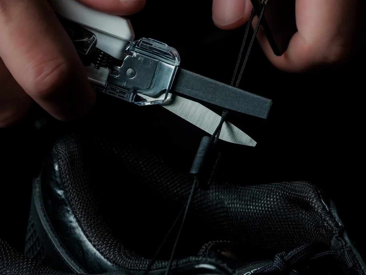
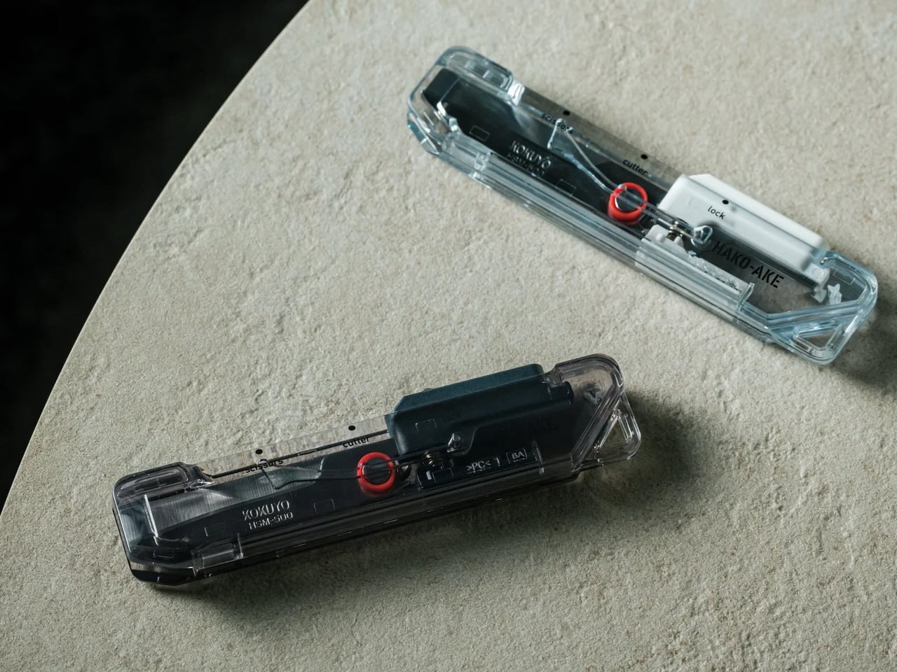
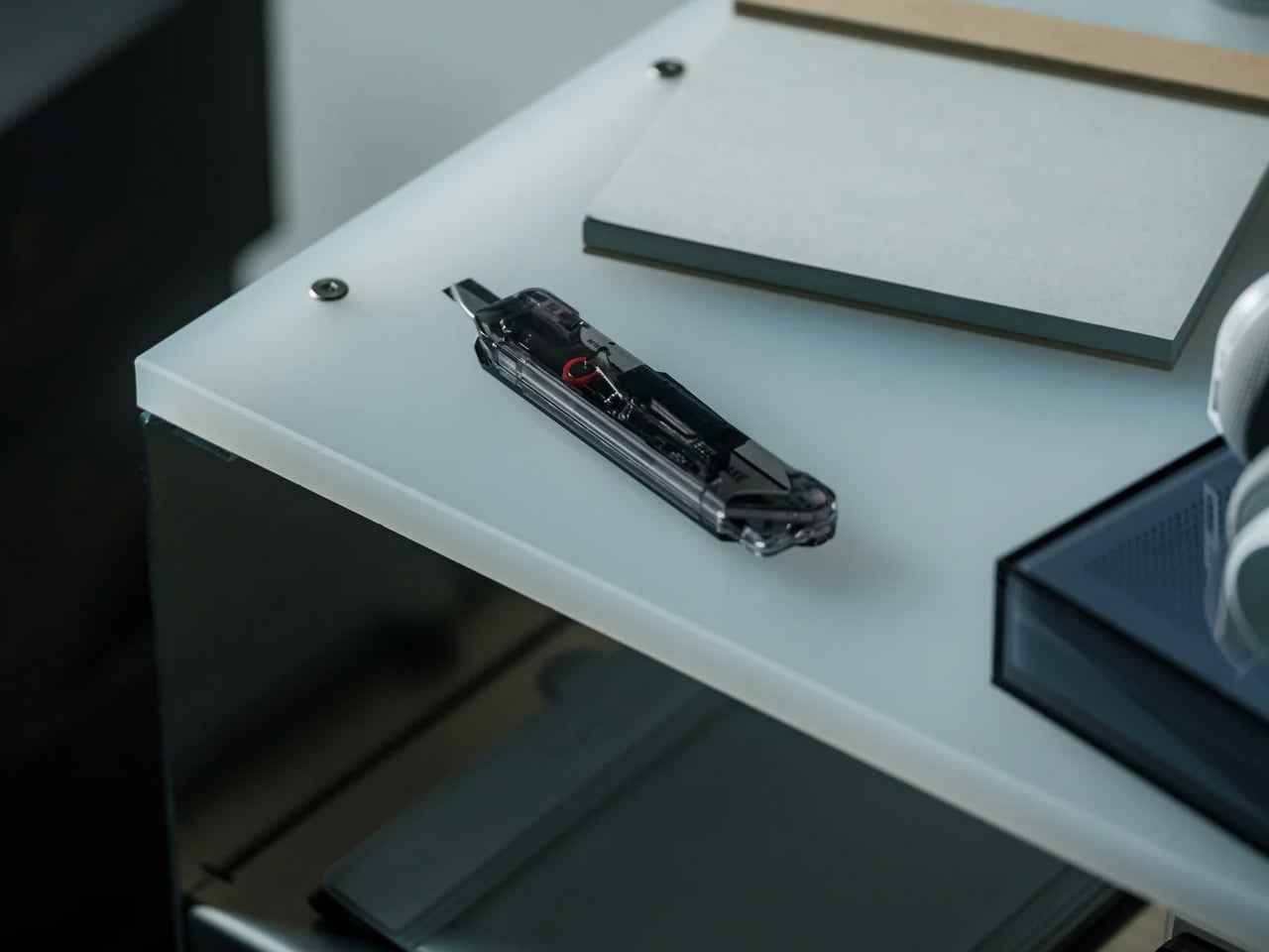
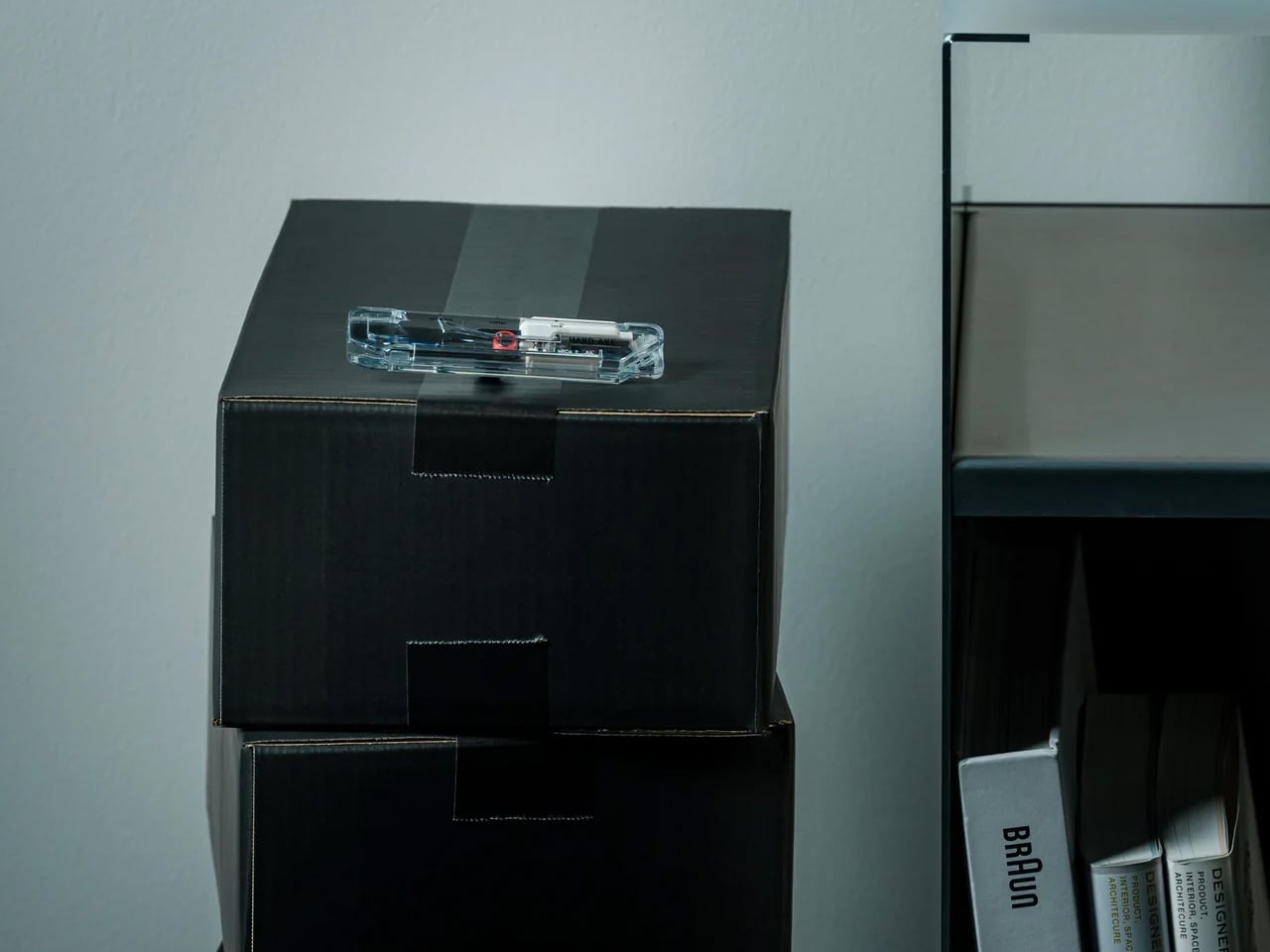
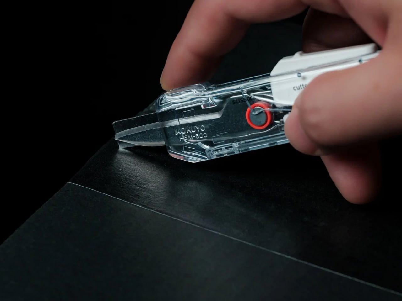
Most box cutters do one thing and leave the scissors somewhere else. The ritual of tearing into a delivery becomes a hunt for a second tool, or a decision to use the first one for everything and hope it does not cut too deep. The ClearSlide Box Opener removes that problem. A blade and scissors in a single compact body, it handles packaging tape and tags in one uninterrupted motion, without putting the package down.

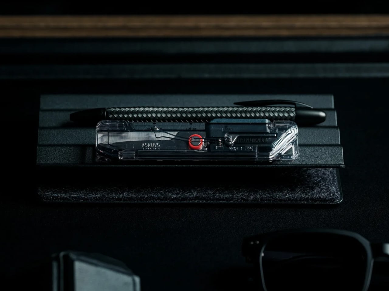
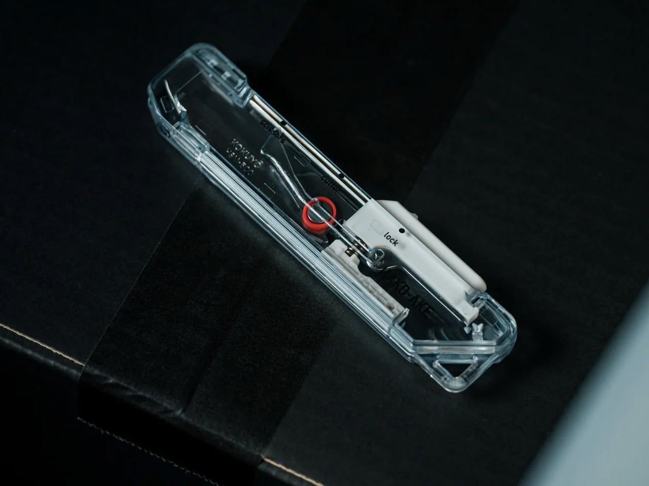
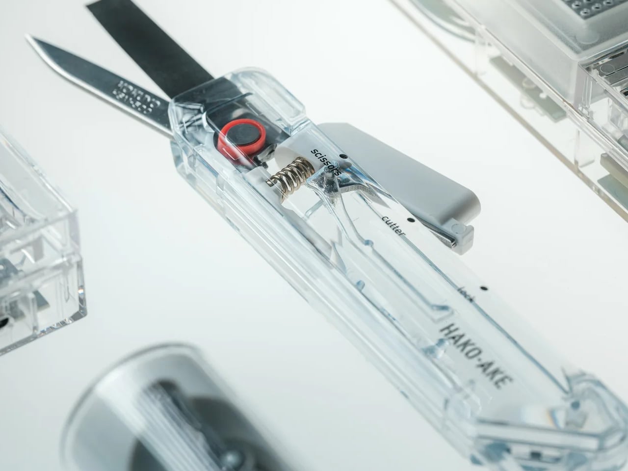
What makes it worth keeping on the desk is the mechanism. A sliding thumb control moves between lock, cutter, and scissors without requiring both hands; each position locks in before releasing cleanly. The blade extends just 0.12 inches, enough to slice through tape without reaching the contents inside. The transparent body shows the internal mechanism’s shift with every adjustment, turning a utility object into something that actually earns its spot next to the keyboard.

Click Here to Buy Now: $30.00

One Tool, Two Functions

Box cutters and scissors solve the same last step in two different ways. The ClearSlide puts both into a single form factor small enough for a pocket. The sliding mechanism moves through three positions: lock, cutter, and scissors, each one clicking into place before releasing with a clean spring action. That kind of tactile confirmation in something this compact is not common. It changes how deliberate the tool feels in use and removes the uncertainty from every position change.

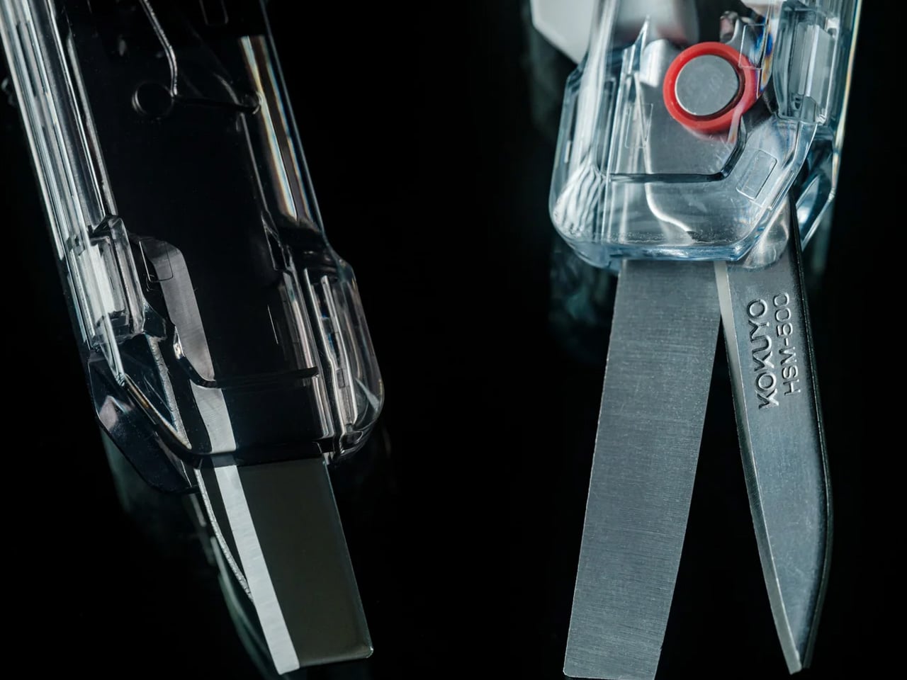
The blade extension is limited to 0.12 inches, which sounds like a constraint until you consider what it actually prevents. Most damaged deliveries come from a blade that cuts too deep on the first pass. At this depth, the cutter handles tape without reaching the contents underneath, which is the only job it needs to do. The scissors handle the rest: tags, inner packaging, anything that a blade would otherwise make worse rather than better.

Transparent by Design

Most tools hide their engineering inside an opaque body. The ClearSlide does the opposite. The transparent shell makes the internal sliding mechanism visible with every position change, so you can see the active mode before making the cut. It is a functional decision dressed as an aesthetic one, or an aesthetic one that happens to be functional. The result is a tool that communicates clearly and carries a retro-tech character most utility objects never bother developing.

Compact enough for a pocket, fitted with a built-in strap hole for clipping onto a bag, and retractable for safe carry, the ClearSlide is designed to stay within reach. The frustration of opening packages is rarely about the cutting itself. It is about the pause before it: the drawer search, the tool switch, the moment where the delivery wins. This closes that gap. One tool, one pocket, one motion from the moment it arrives at the door.

What We Like

  • Blade-and-scissors combination: replaces two tools with one slim body that handles packaging tape and tags in a single session, without switching grip or setting the package down
  • Single-hand operation: the thumb-controlled slider moves between lock, cutter, and scissors with one hand, leaving the other free to hold whatever is being opened
  • Controlled 0.12-inch blade depth: cuts through tape cleanly while staying clear of the contents underneath, solving the most common frustration of opening deliveries with a standard blade
  • Visible internal mechanism: the transparent body lets you confirm the active mode before every cut, and gives the tool a distinct retro-tech character that sets it apart from every other cutter in a drawer

What We Dislike

  • Blade replaceability: the product does not specify whether the cutter blade is replaceable, which matters for anyone opening packages regularly and expecting long-term performance from a $30 tool
  • Limited color range: Clear, White, and Smoke Black are clean choices, but the transparent body has the visual potential to carry a wider palette than three colorways currently allow

The Tool That Ends the Two-Step

The ClearSlide Box Opener was built around a problem most people have learned to live with rather than solve. Two functions in one tool, controlled by a single thumb, with a blade depth engineered to protect what matters. For something that lives on a desk or clips onto a bag, that level of considered detail at $30 makes it difficult to justify keeping a box cutter and scissors as two separate jobs.

If the current setup involves reaching for one tool and then switching to another halfway through, that is the exact friction this replaces. Pick it up in Clear, White, or Smoke Black. Let the next delivery be the last time the packaging feels harder to deal with than whatever is inside it, and let the scissors that used to live in the desk drawer finally earn a proper rest.

The post This Transparent Box Opener Handles Tape & Tags Without You Ever Putting The Package Down first appeared on Yanko Design.

This Pen Case and Desk Stand Are the Same Object, and It’s Magnetic

The pen case is one of those objects that nobody seems to have genuinely rethought. The standard design is a zippered pouch: pens go in, pens pile up, you dig through until you find the right one, and then you close it again. That sequence repeats itself a dozen times a day, and most of the friction happens in that brief moment between needing a pen and actually having it in hand.

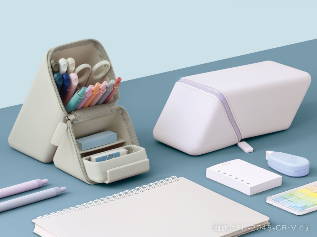
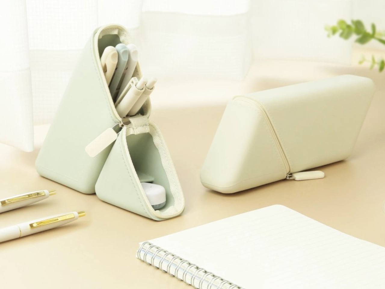
Sonic, a Japanese stationery manufacturer, focused specifically on that moment. Their Kakusta Portable Pen Holder is a silicone case that converts into an upright pen stand with a single unzip and fold. The idea isn’t just about carrying pens more conveniently; it’s about changing how you interact with them once you sit down to work, which is a different design problem entirely from making a better pouch.

Designer: Sonic

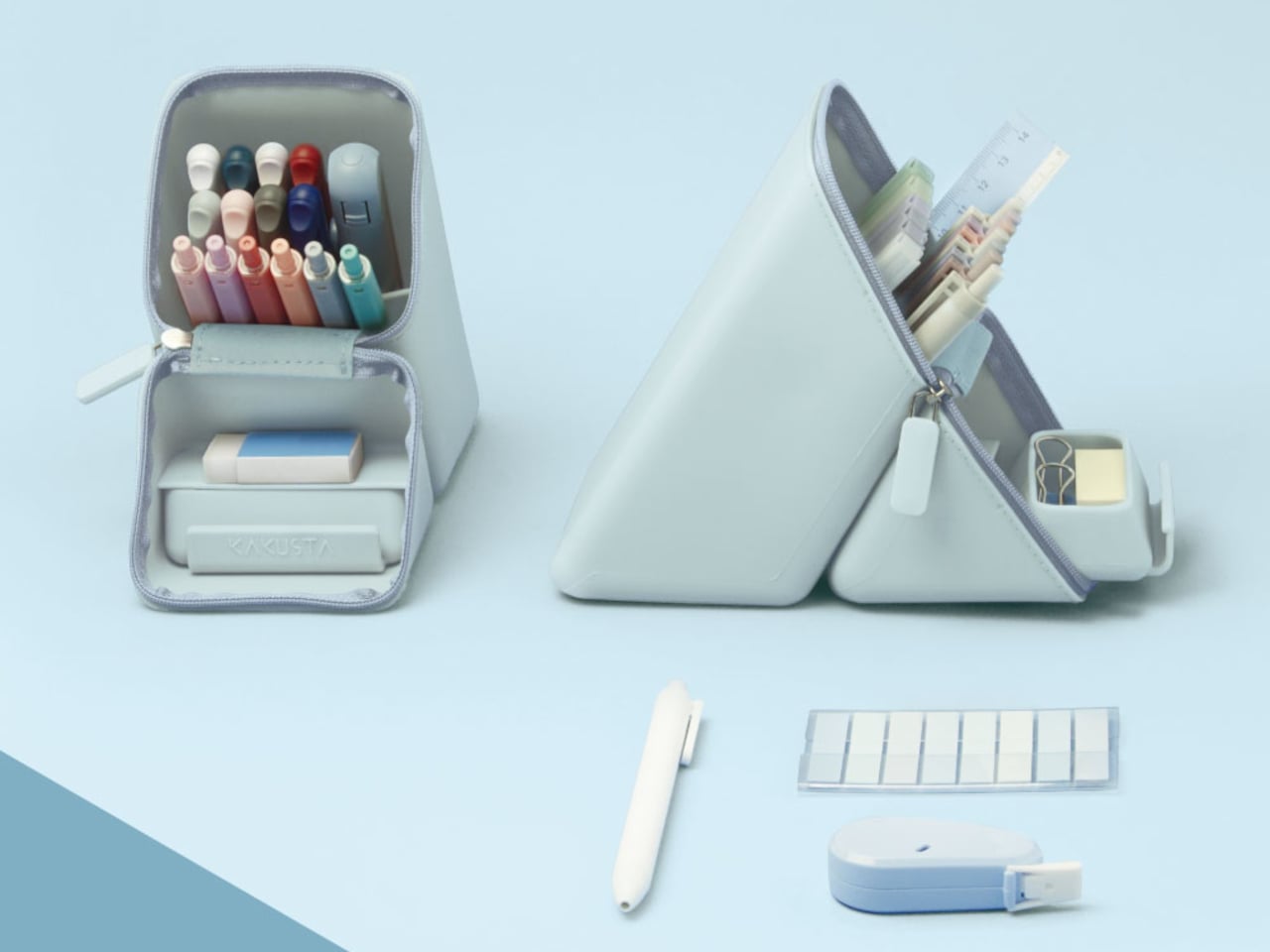
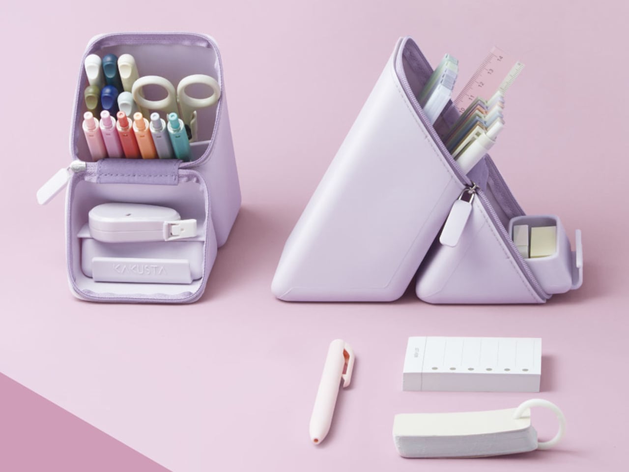
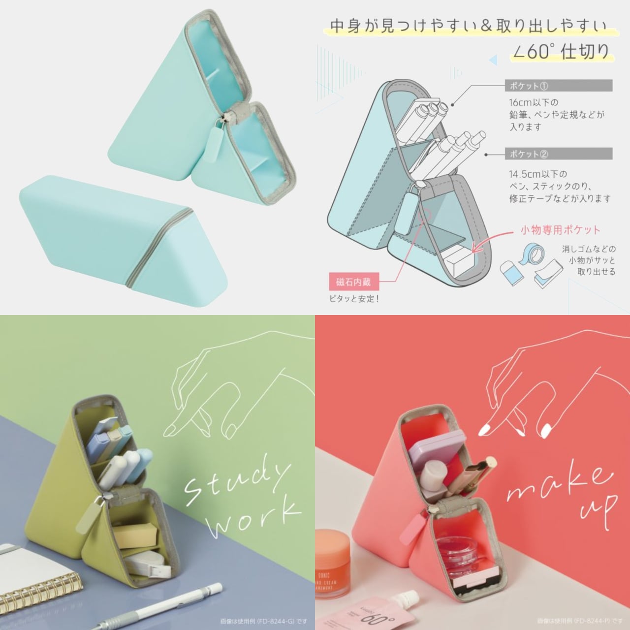
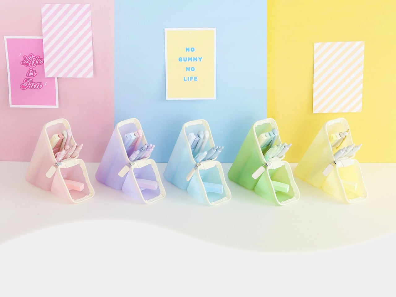
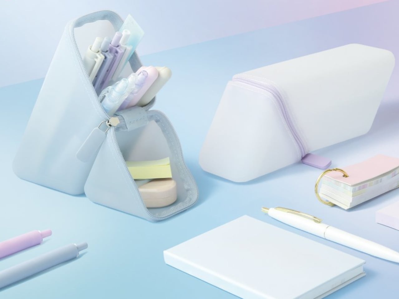
The transformation is central to the whole concept. When closed, the Kakusta is a flat, parallelogram-shaped case that fits easily in a bag pocket. Unzip it, fold the lid back, and it forms a triangular stand held in position by built-in magnets. Nothing needs to be assembled, no extra base is required, and there’s nothing to lose. The carrying case and the desktop holder are the same object.

The interior follows the same logic. The 60-degree angled dividers run across the base of the stand, keeping each pen tilted and visible rather than lying flat against the others. In a conventional pen pouch, finding a specific pen means pulling out several to get to it. The angled dividers let you see everything at a glance, a small improvement that adds up over a full working day.

The silicone body is flexible enough to accommodate pens of varying sizes and soft enough to compress in a bag without warping. The triangular form is stable by geometry, and the magnets keep the folded lid from springing back while you’re working. A matte surface treatment on the exterior resists dust and fingerprints, which matters for something that moves between a bag and a desk multiple times daily.

The magnets also allow the standing Kakusta to attach to metal surfaces, which is a small but genuinely useful detail. A student moving between classrooms can stick it to a locker door; someone working in an office can place it against a filing cabinet when desk space is limited. It’s the kind of secondary function that doesn’t announce itself in the pitch but gets used regularly once you notice it.

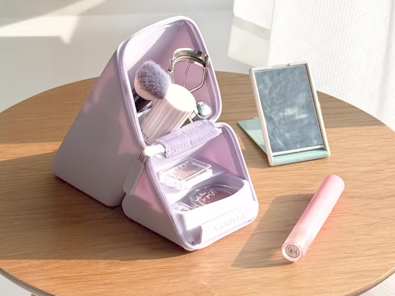
The case is compact enough to fit in a bag pocket without taking space meant for something else. Color options are restrained enough to sit on any desk without looking out of place. The palette leans toward the kind of tones that blend into a workspace rather than call attention to themselves. Kakusta is versatile enough to be used for other things, like holding makeup, proving that good design allows objects to extend beyond their initial purpose.

The post This Pen Case and Desk Stand Are the Same Object, and It’s Magnetic first appeared on Yanko Design.

This Stabilo Table Lamp puts the ‘Light’ in Highlighter!

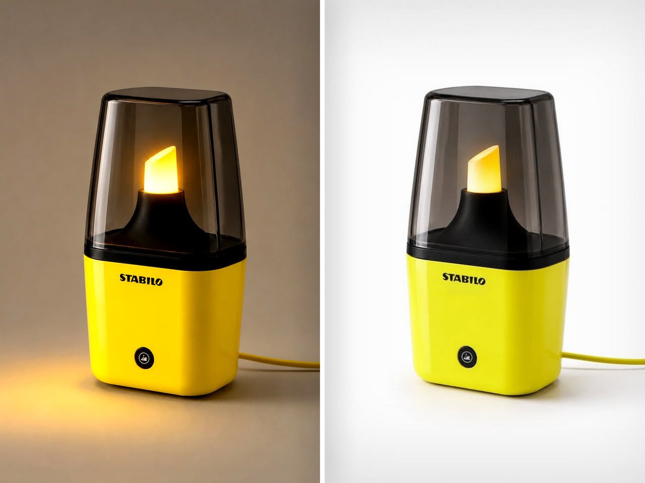
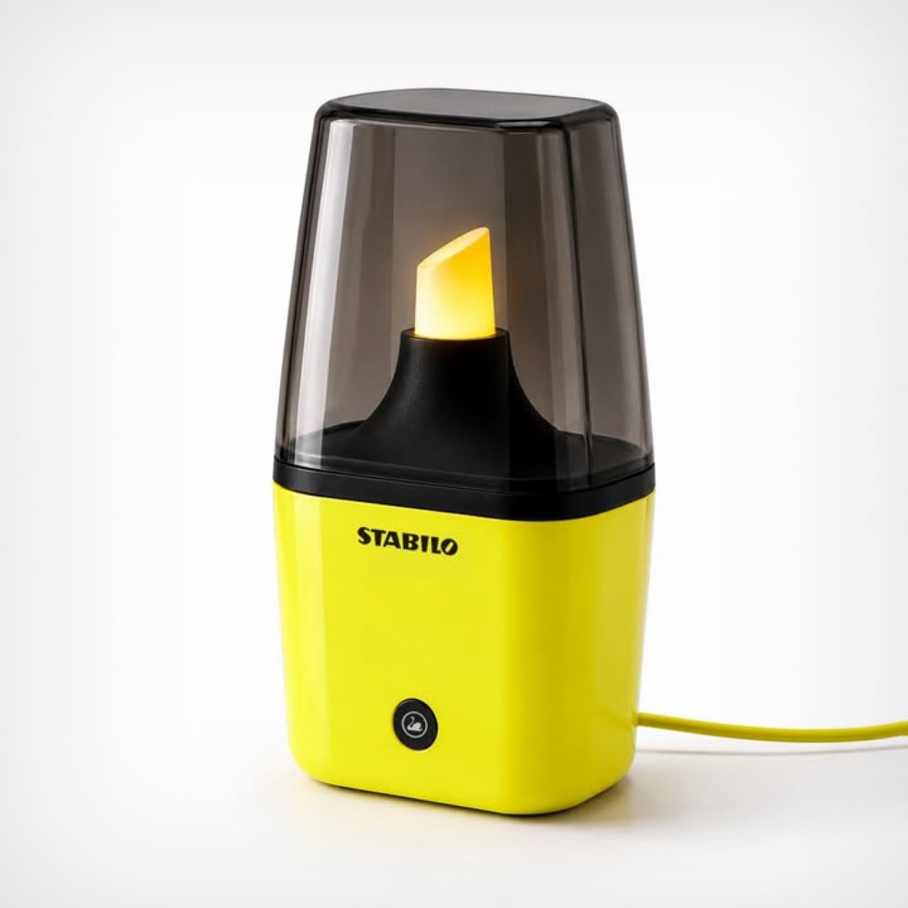
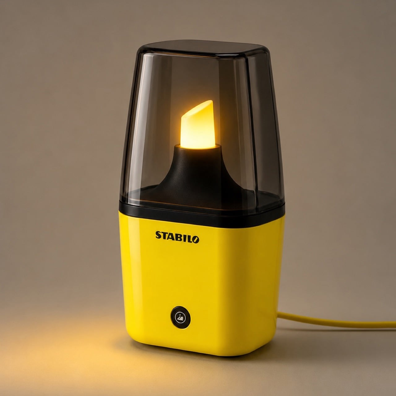
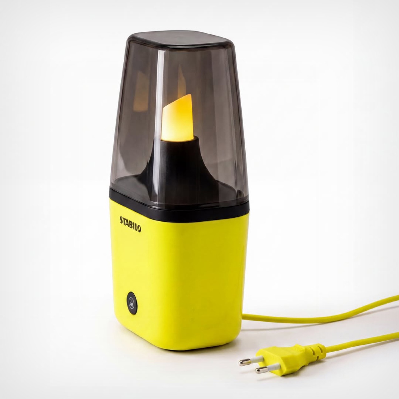
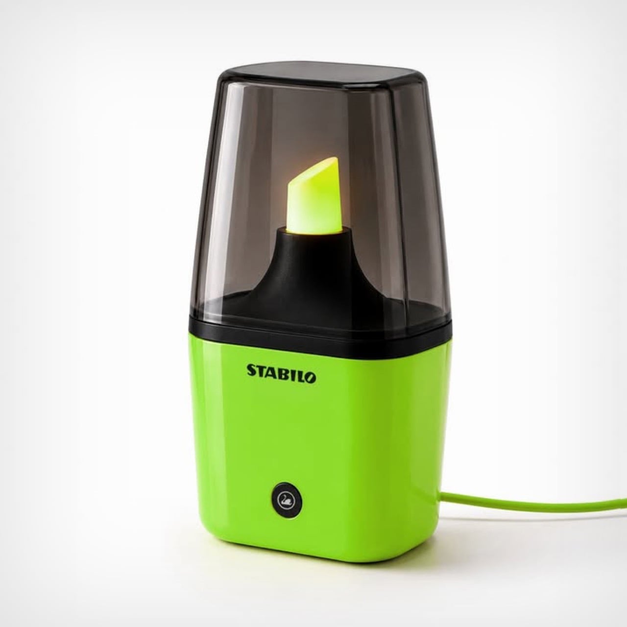
Creatives see the world very differently from how the rest of us do. Someone sees a binder clip, a creative sees a miniature handbag, someone sees a fork, a creative holds the fork close to their eyes to simulate being in a prison cell. Someone sees a highlighter as a piece of stationery used to make text prominent, Jane Morelli saw the ‘light’ in highlighter, turning it into a tabletop lamp every stationery nerd will absolutely love.

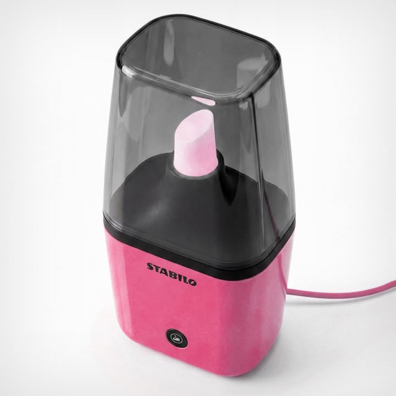
Modeled on the iconic Stabilo highlighter, Morelli’s Stabilo Lamp is an unofficial tabletop lamp that turns the fluorescent tip of a highlighter into a literal light source. Designed to be roughly a foot tall, the lamp comes with a cord – plug it in, switch it on, and the tip glows in its signature color. Morelli’s designed the lamp in 3 common colors for now, neon yellow, pink, and green. I say unofficial because this is purely fan-made visual punnery – but Stabilo did comment on Morelli’s post, marveling at her idea.

Designer: Emanuele Jane Morelli

The lamp is witty, fun, and caters to a highly specific niche. Not everyone wants to celebrate stationery in such a literal way, but for the people who do, this is an absolute win. The lamp is modeled on the short Stabilo highlighters, the proportions have been adjusted to ensure the base doesn’t overpower the actual light source – something that bright is sure to command one’s attention, but it mustn’t steal it. The showstopper is the nib, a cloudy, translucent element with a powerful light source underneath that causes it to glow once switched on. A tinted ‘lampshade’ in the form of a highlighter cover sits on top, acting as a visual and physical barrier from the light source.

The lamp’s pretty tiny, as is its light source. Don’t expect it to produce enough light to let you read a book. Its sole job is to emit a warm, diffused glow akin to a lava lamp, setting the mood with a nerdy panache that only will appeal to stationery lovers and people with a quirky personality. You won’t see this in an edition of Architecture Digest, or an eclectic Airbnb. Then again, to be honest, you won’t see this anywhere because Morelli’s work is currently just a concept.

However, with enough attention, Morelli could totally build a working prototype and take this to production. Stabilo definitely loved the idea, and this isn’t the first time we’ve seen designers garner attention on their work on social media and get enough validation to turn them into real products. David Delahunty’s work is a brilliant example of how creative thinking and visual puns can turn into real merch and a genuine business. Morelli, if you’re reading this, I’d suggest busting out your 3D printer, heading down to Home Depot or the like, and putting together a prototype!

The post This Stabilo Table Lamp puts the ‘Light’ in Highlighter! first appeared on Yanko Design.

The $20 Pen That Makes a Very Loud Case for Minimalism

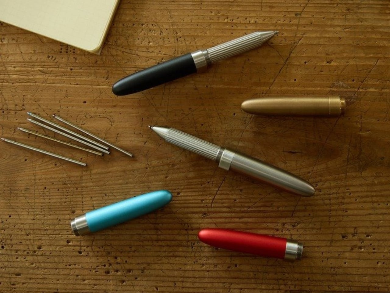
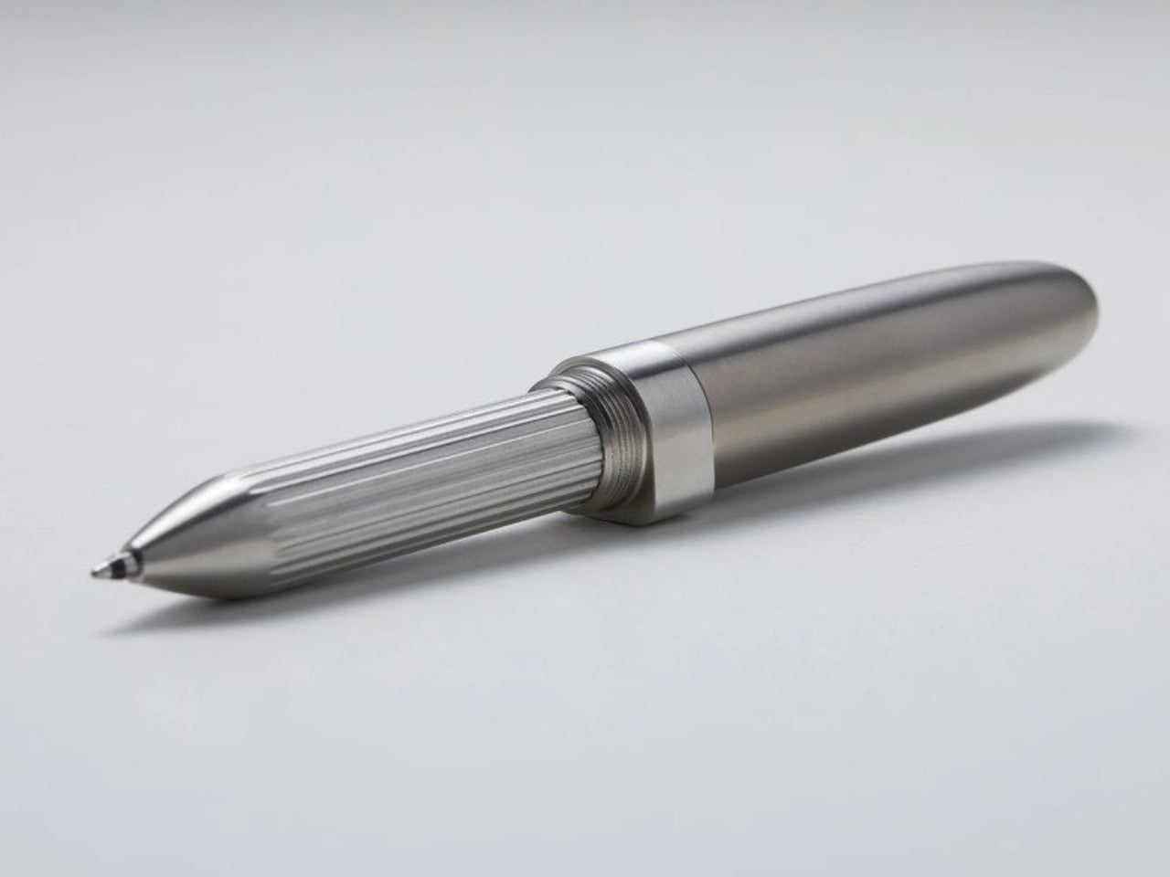
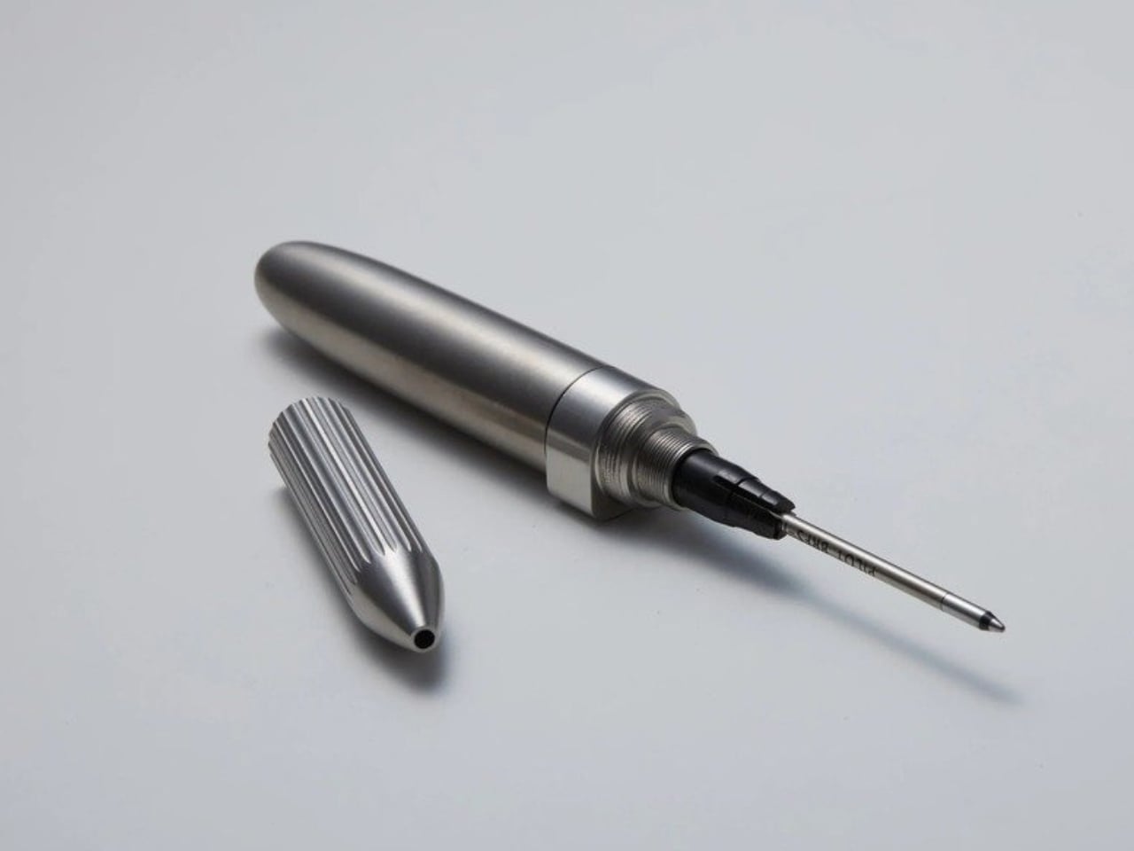
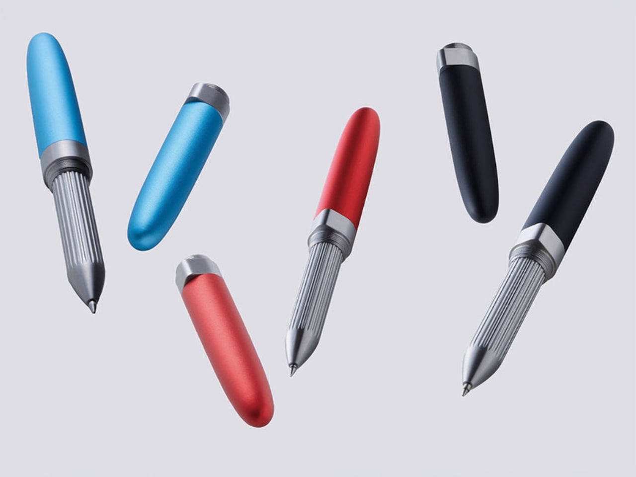
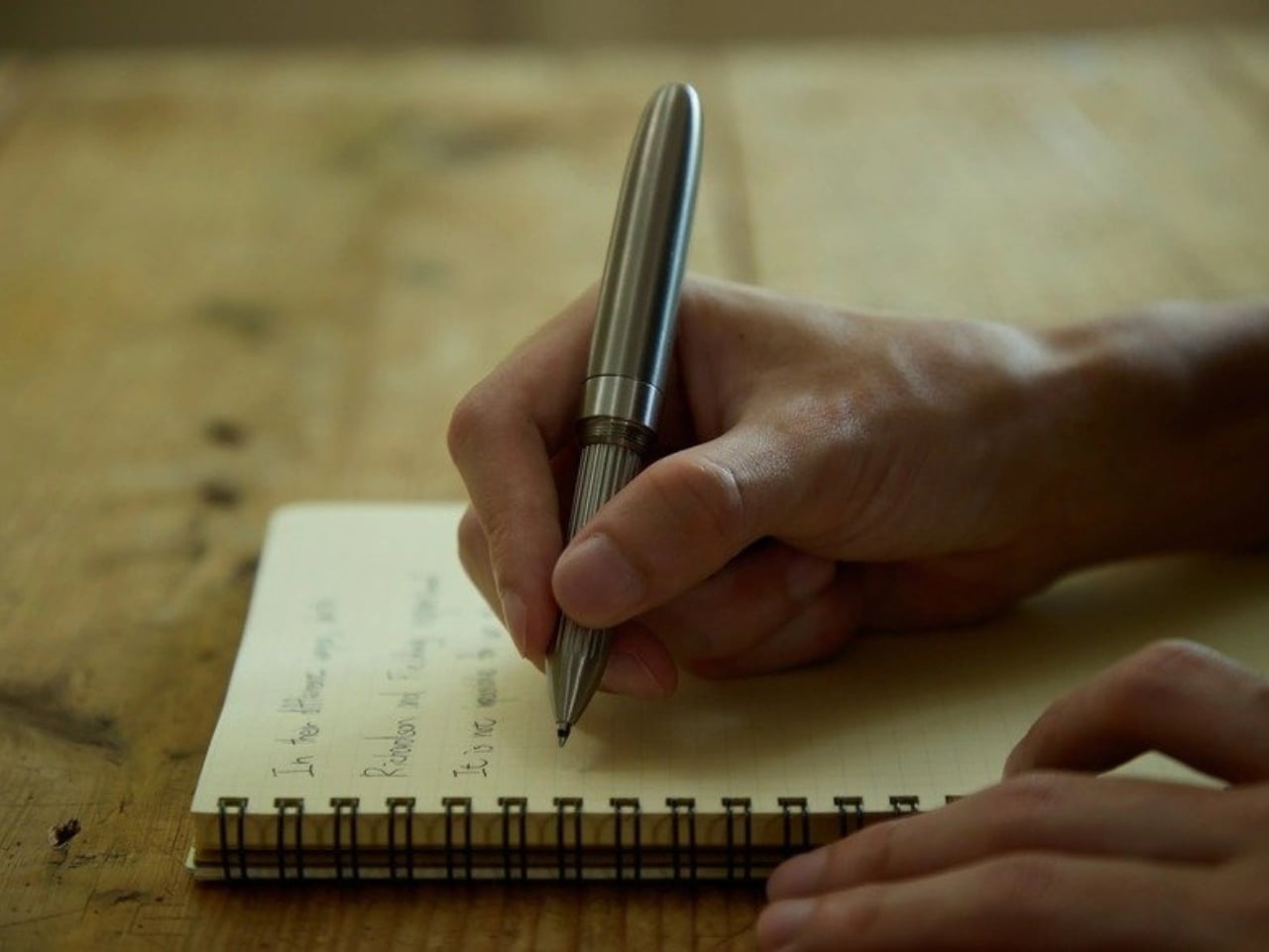
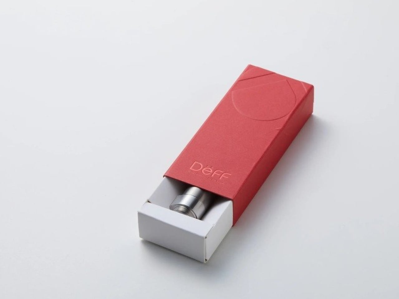
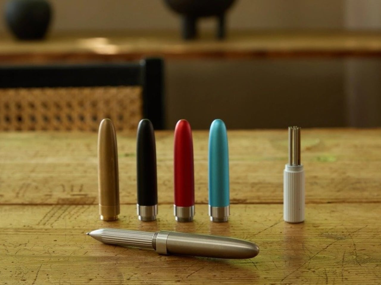
At 75mm, DeFF’s Refill Pen Jacket Extra Short is roughly the length of a thumb. Closed up, it sits in your palm like a pocket-sized secret. Open it, cap flipped to the back end, and it extends to 125mm, long enough to write comfortably, short enough to forget you’re carrying it. That particular trick, the transformation from almost-nothing to just-enough, is the whole point.

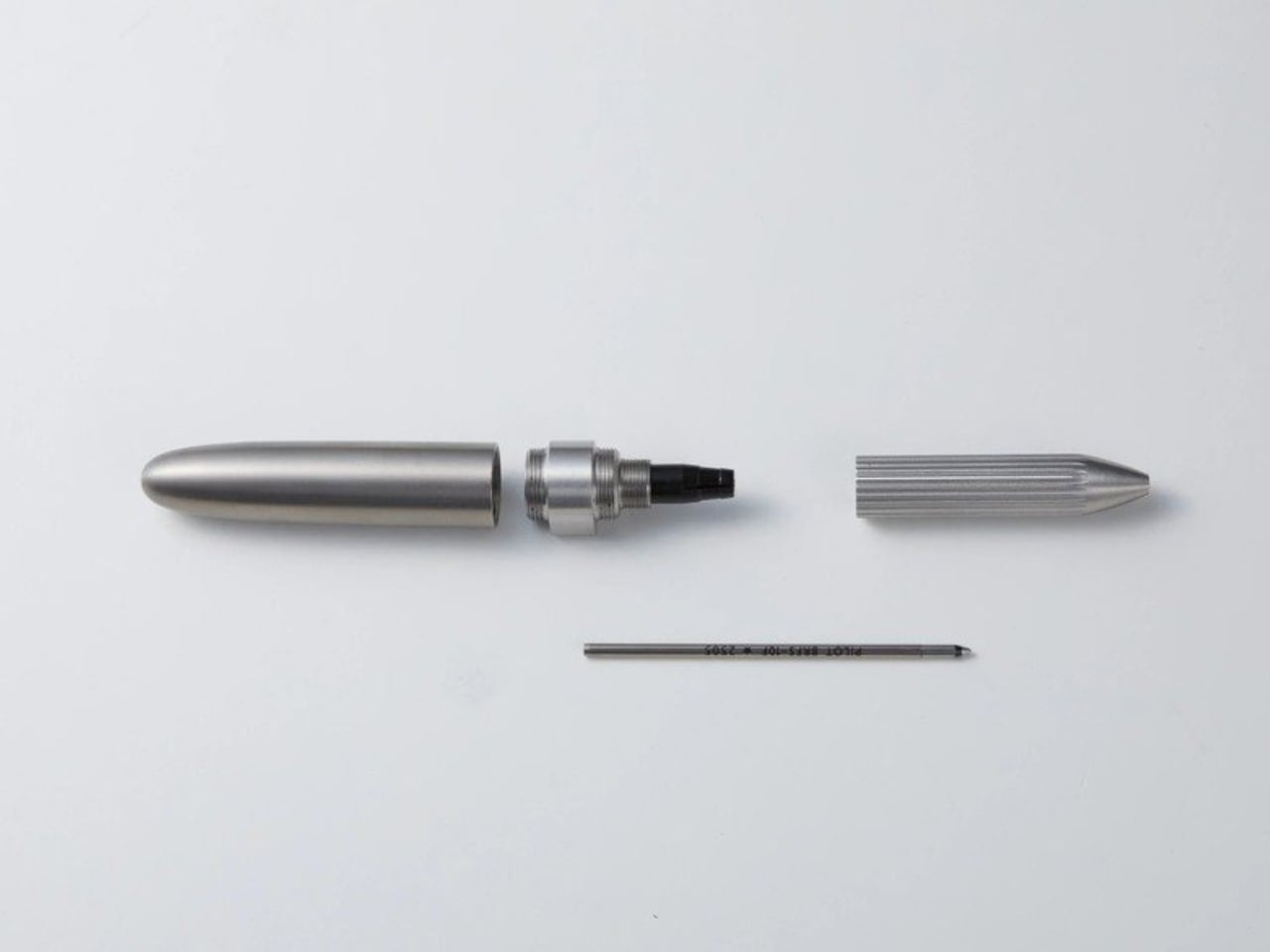
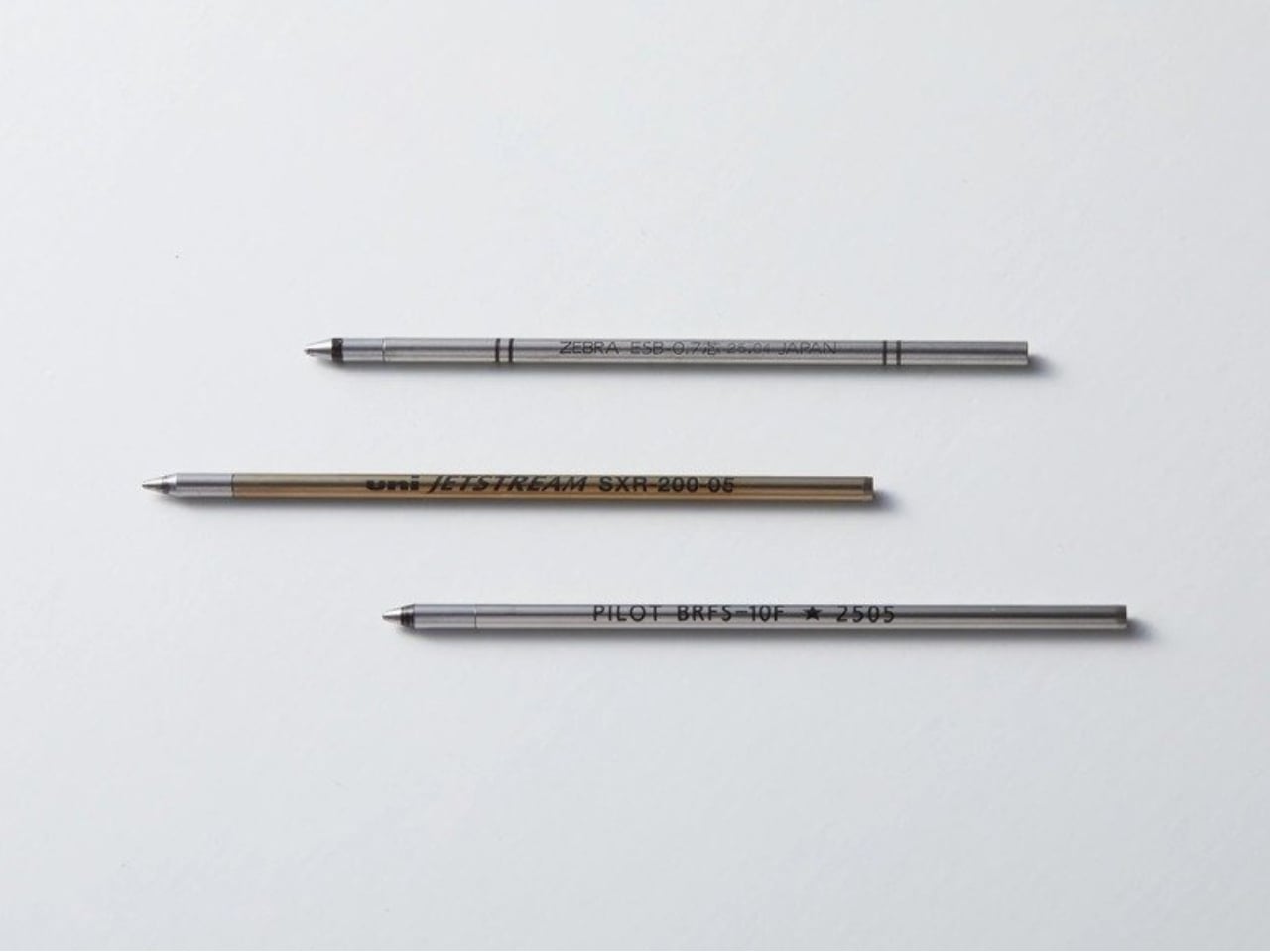
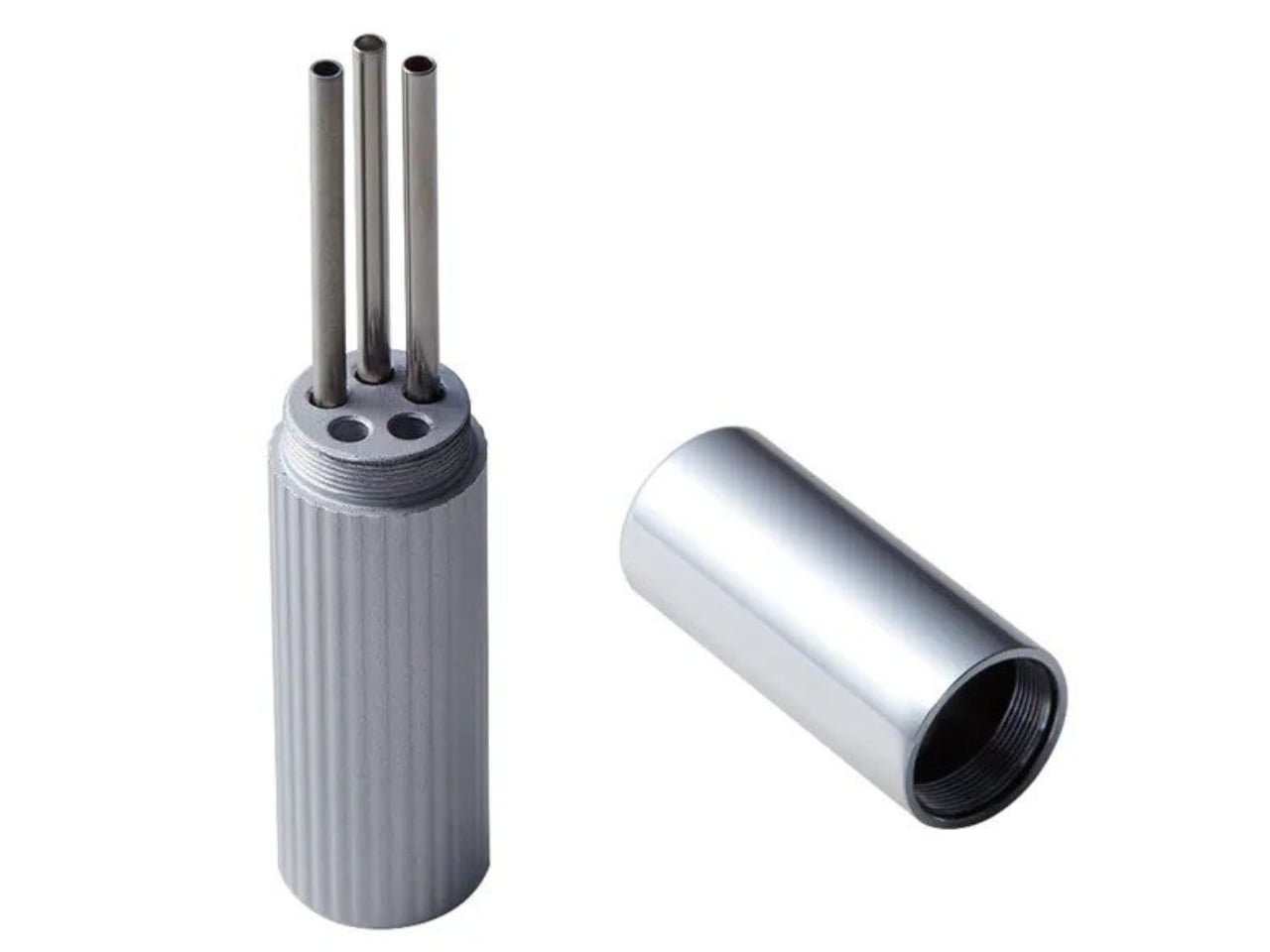
DeFF is a Japanese design firm that has been quietly building a reputation around the idea that the tools you carry every day deserve more thought. The Refill Pen Jacket concept is clever at its core: rather than designing a pen from scratch, they designed a jacket, a precision-crafted body that wraps around whatever standard refill you already love. You’re not locked into DeFF’s ink. You’re not buying a disposable. The jacket works with D1 (ISO) and 4C (JIS) standard refills, covering a staggering range of off-the-shelf options. You bring the ink. They bring the experience.

Designer: DeFF

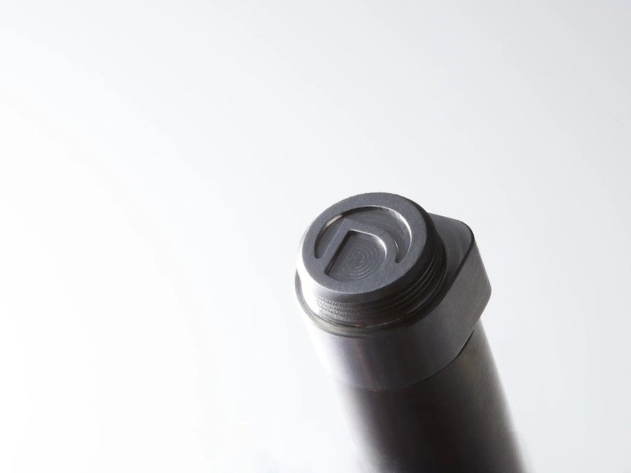
The Extra Short version takes that idea and compresses it further, prioritizing portability without sacrificing the writing feel. And it works. Knurled grip, balanced weight, magnetic cap snap, a collet structure that holds your refill without any modification needed. All of it feels deliberate rather than decorative. It doesn’t feel like a product that was engineered and then handed off to a designer to make pretty. It feels like it went the other direction entirely.

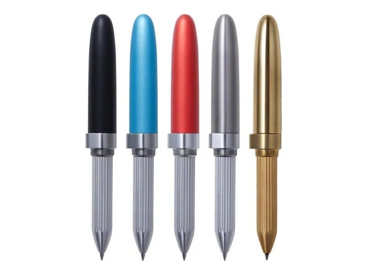
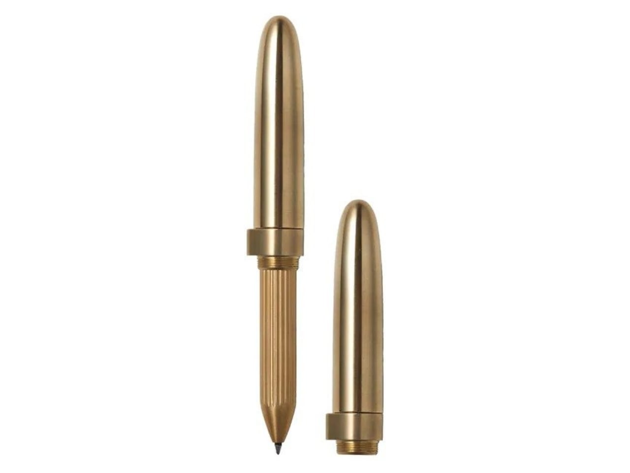
Materials matter here in a real way. DeFF offers the Extra Short in aluminum (jet black, aquamarine blue, and ruby red), brass, titanium gray, natural wood including ebony, and carbon fiber. Each one wears differently, weights differently, and will age differently. The brass version is the most compelling to me personally. It will patina. It will develop character. You’ll use it for years and it won’t look the same as the day you bought it, which is either a selling point or a dealbreaker depending on who you are. I happen to think it’s a selling point.

Pricing starts at $19.99 for the aluminum model, which makes this genuinely accessible. The more premium finishes push the price higher, but the entry point is honest. And it’s worth noting that the Refill Pen Jacket Extra Short won the iF Design Award 2026, one of the most recognized design prizes in the world. That context matters. It’s not a novelty or a clever gimmick. It was evaluated alongside global competition and came out on top. For a pen that fits in the breast pocket of your shirt, that’s a significant thing to carry around.

The engraving option is worth a mention too. Custom engraving turns this from a premium daily carry into a gift that actually lands. Not a generic gift, either. Giving someone a beautifully made writing instrument personalized with their name or a date is a completely different category of thoughtful, and it’s the kind of thing people keep in a drawer for years before deciding it’s too good not to use every day.

There’s a larger conversation embedded in a product like this. We spend a lot of time talking about sustainability in broad strokes, in systems and policies, but very little time thinking about how individual design choices contribute to the same goal. A pen jacket, by definition, asks you to stop throwing away the whole thing when the ink runs out. The object stays. Only the cartridge changes. That’s a small shift in behavior, but it’s also a shift in how you relate to the things you carry. You’re not using it up. You’re carrying it forward.

For anyone who writes by hand regularly, whether you’re a journaler, a designer who sketches on paper, or just someone who prefers the feel of pen over stylus, the Extra Short is the kind of object that rewards attention. It doesn’t announce itself. It doesn’t need to. It isn’t trying to be the loudest thing in the room. It’s just trying to be the one you always reach for.

The post The $20 Pen That Makes a Very Loud Case for Minimalism first appeared on Yanko Design.

Field Notes Just Made Notebooks That Look Good Enough to Eat

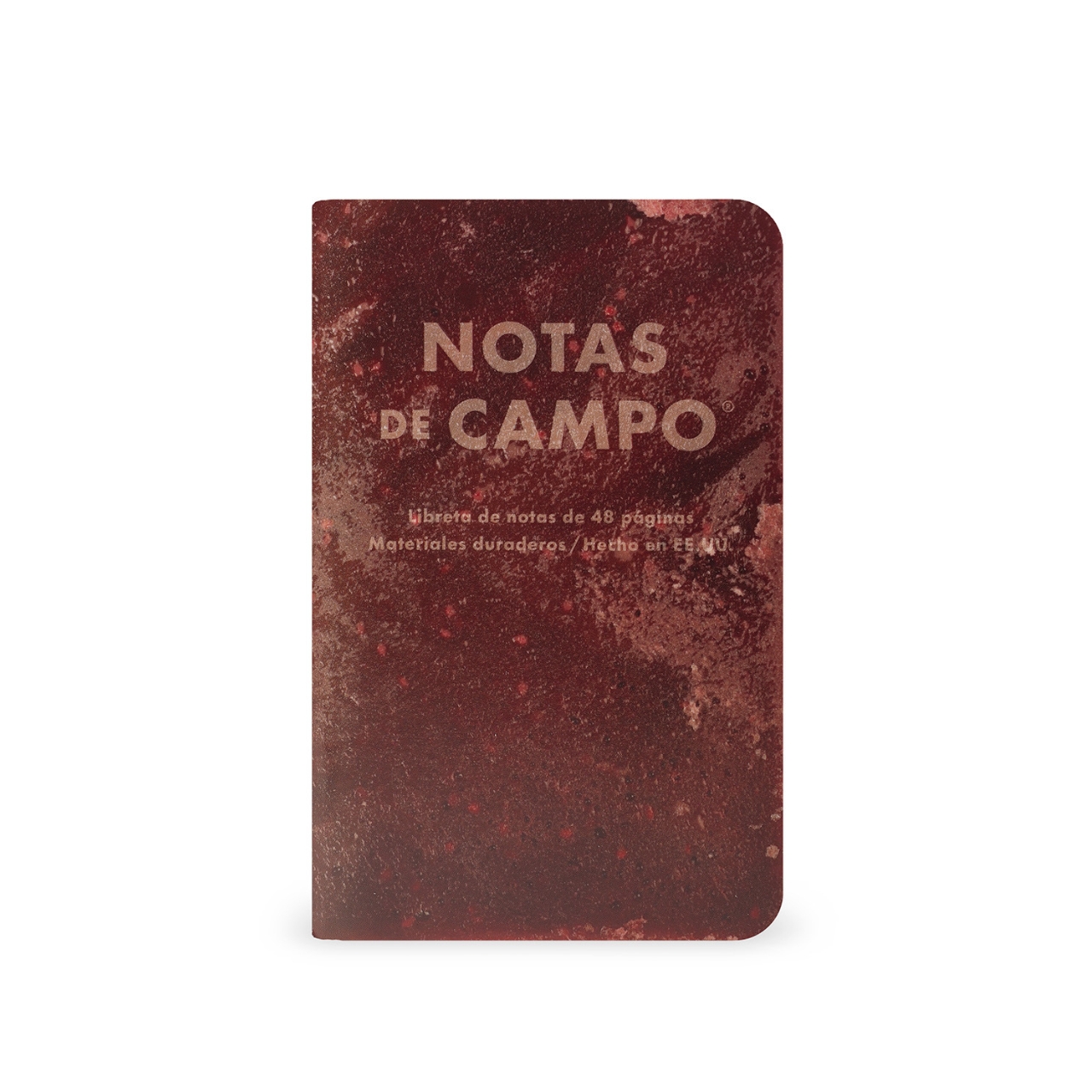
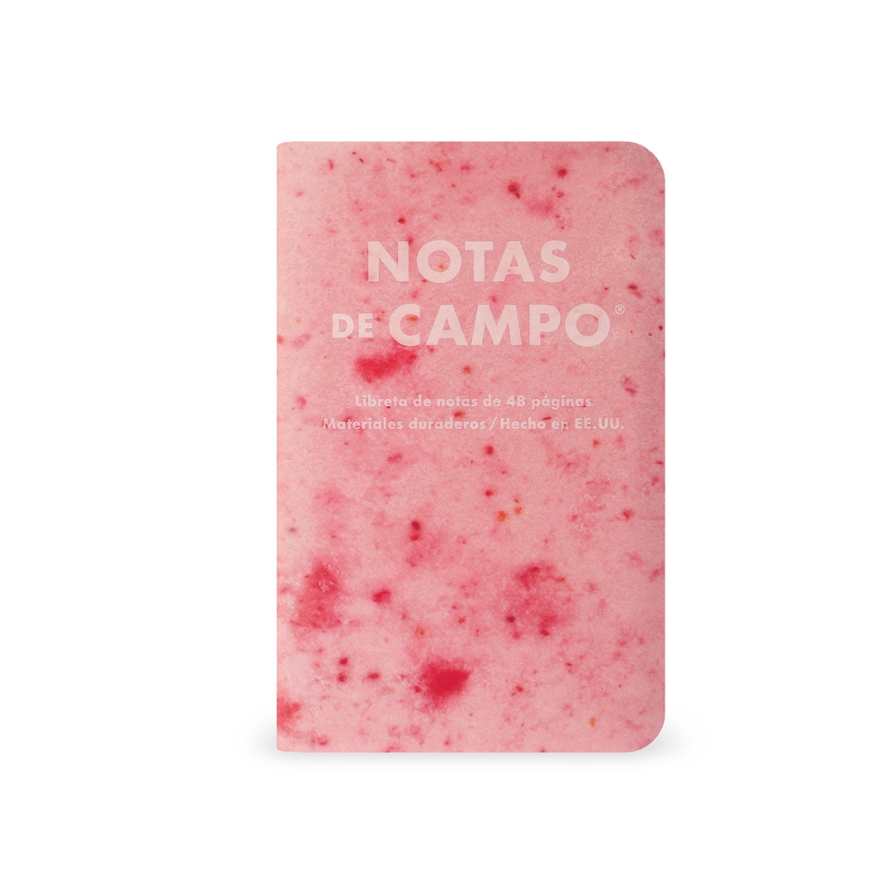
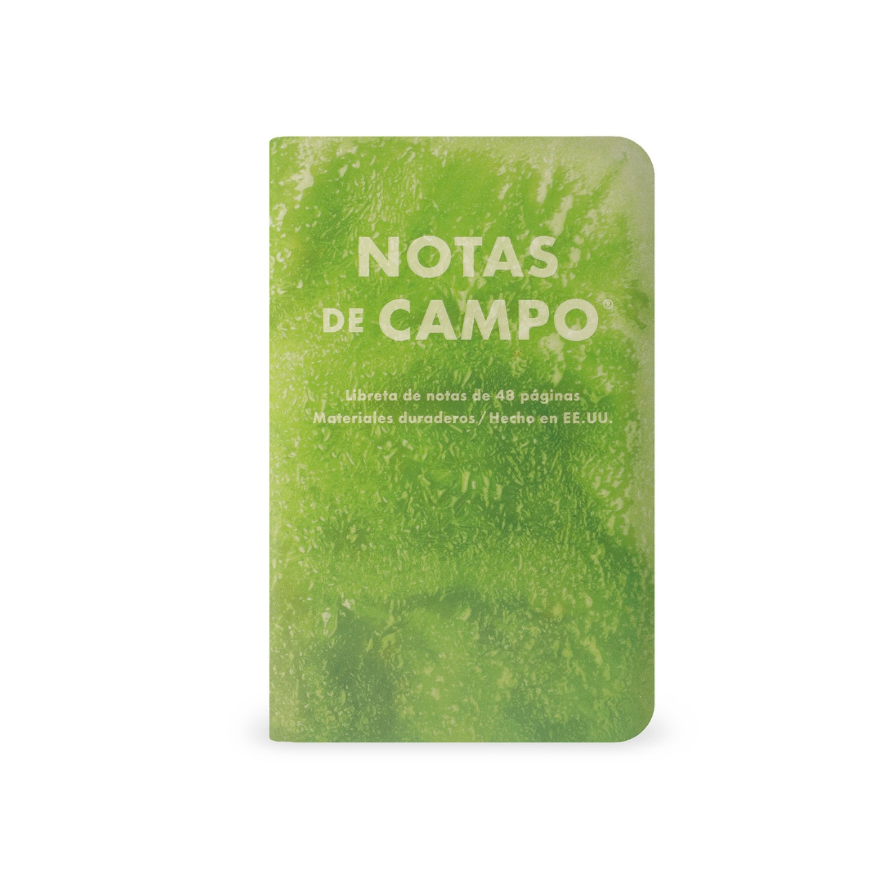
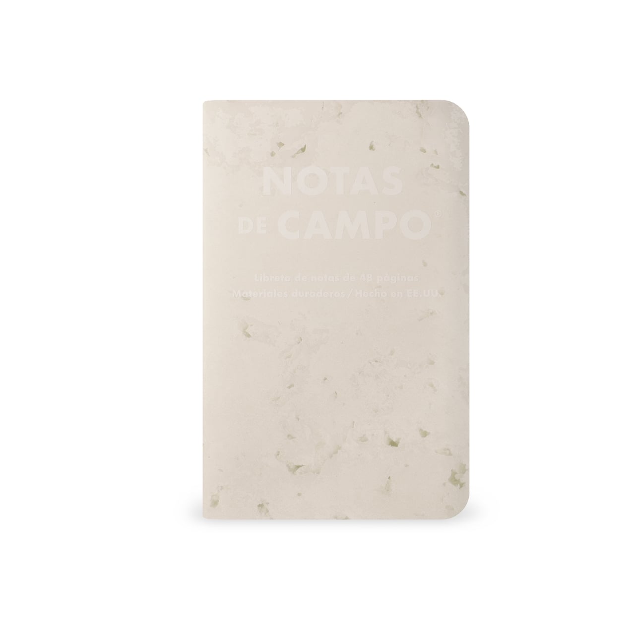
One thing that I’ve always shared when I do my journaling workshops is that this hobby is something that involves a lot of our senses: sight, sound, touch, sometimes even smell (if you have materials that have fragrance). The only one missing, really, is taste, since you probably don’t eat any of your journaling materials. This latest collection from stationery brand Field Notes is probably the closest we’ll get to tasting our notebooks, as they seem to be pretty and cool enough to eat.

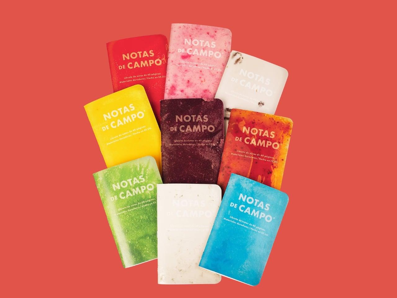
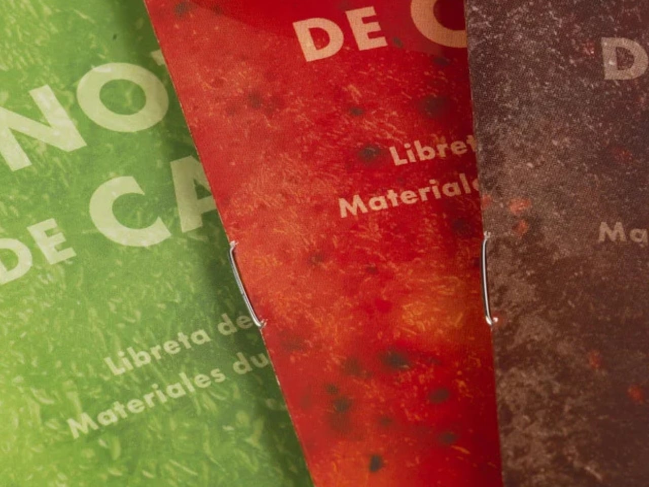
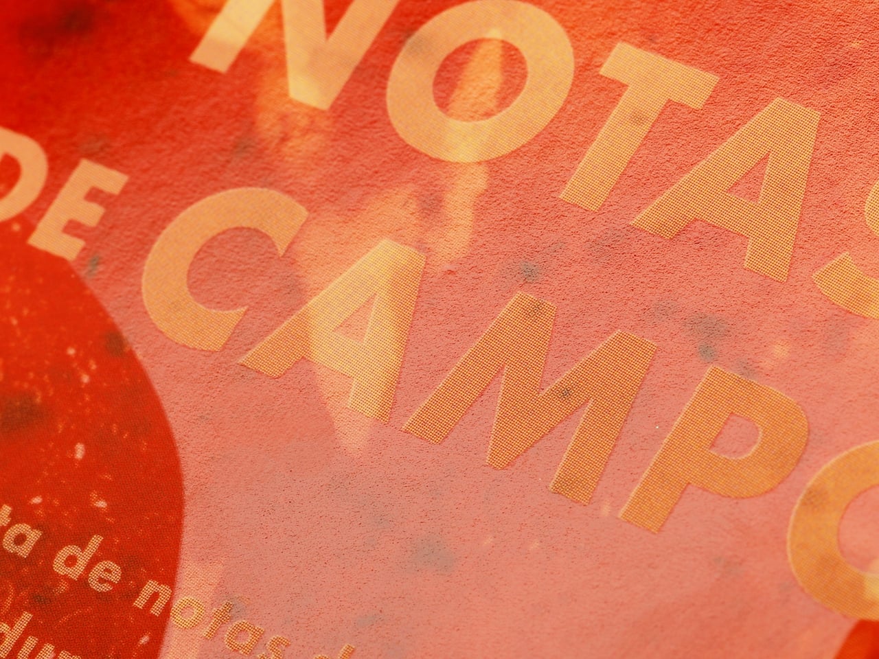
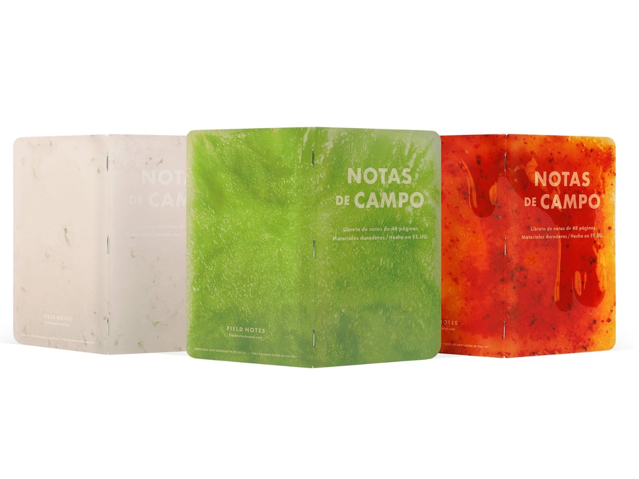
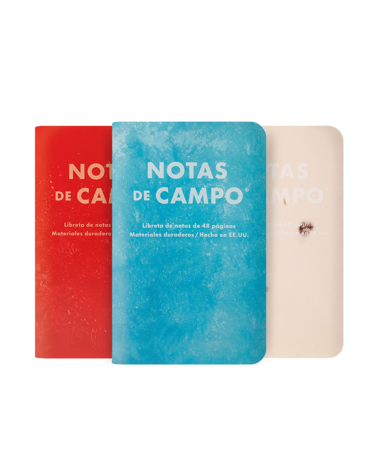
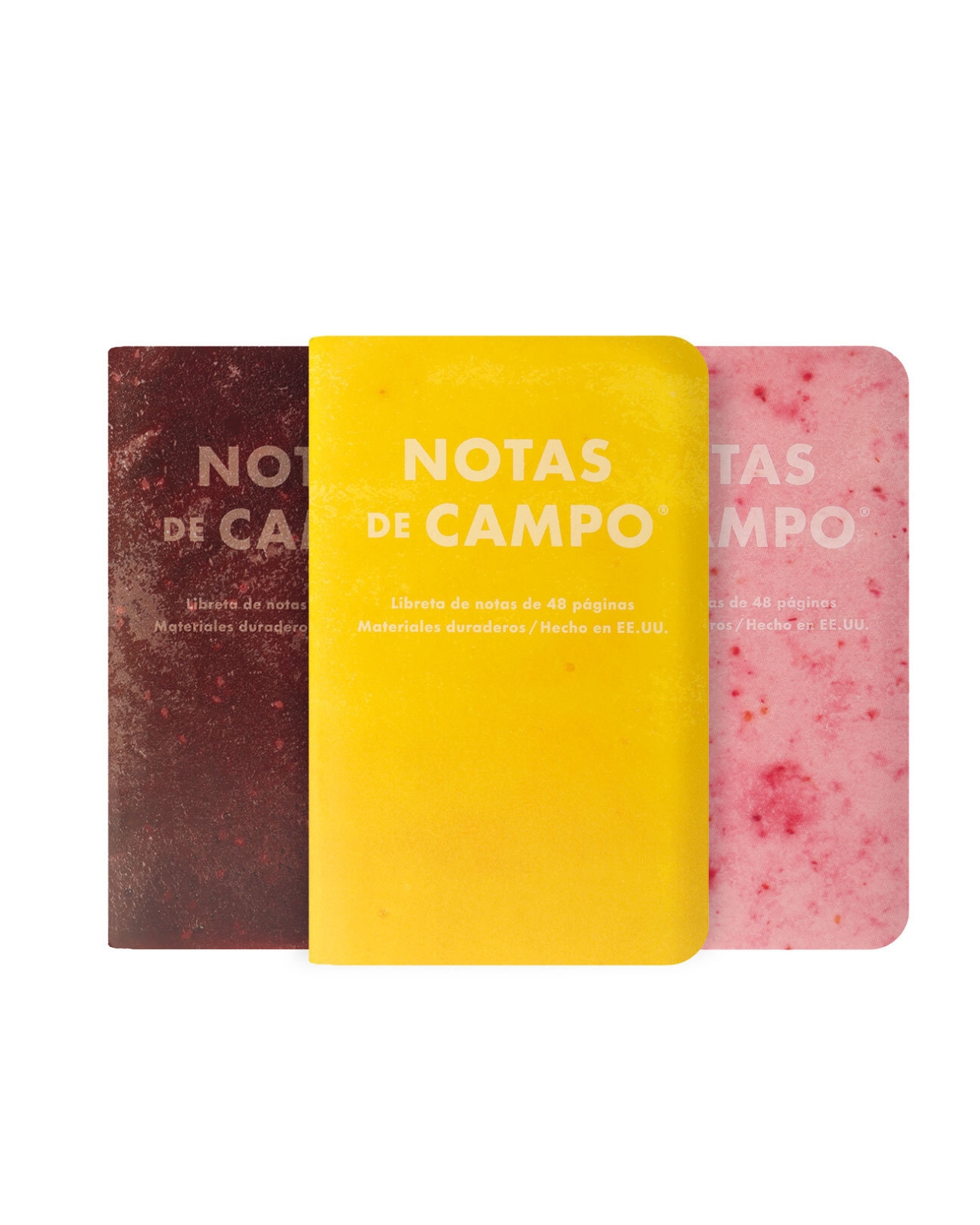
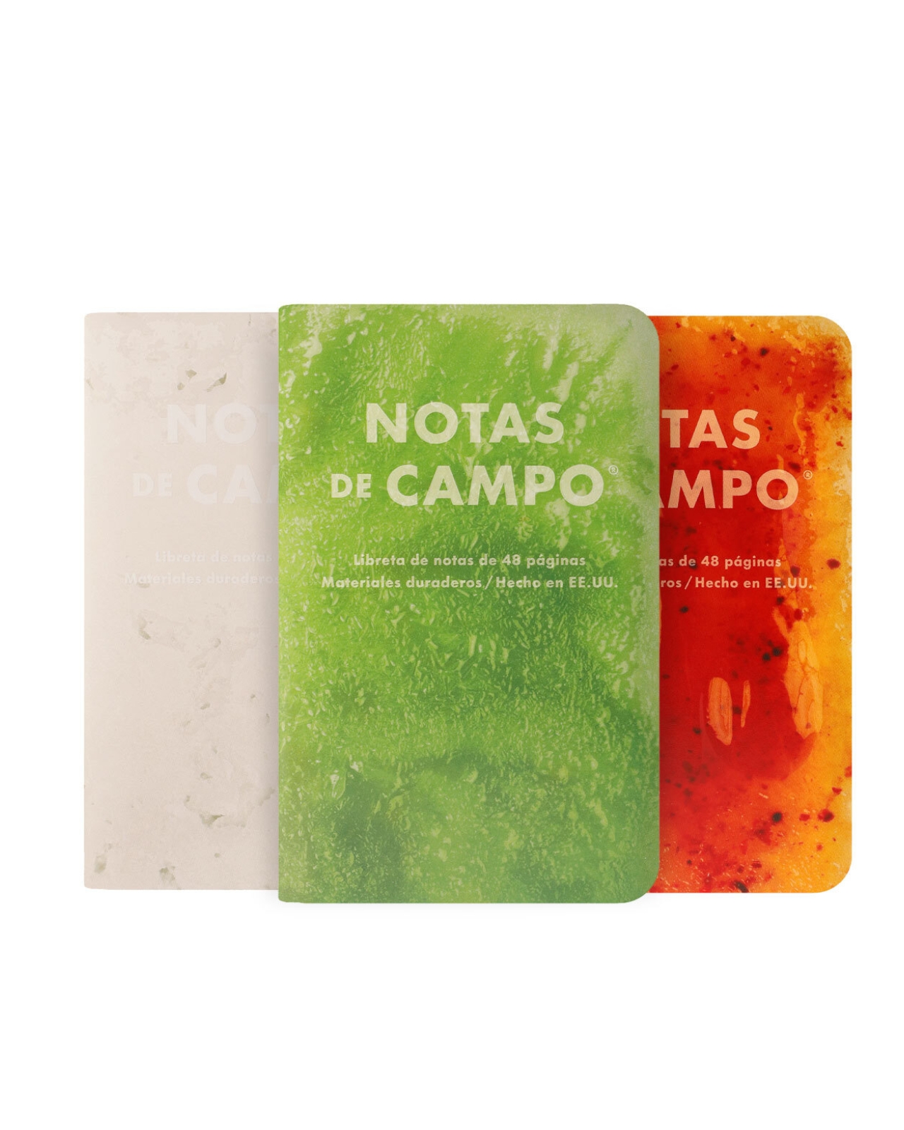
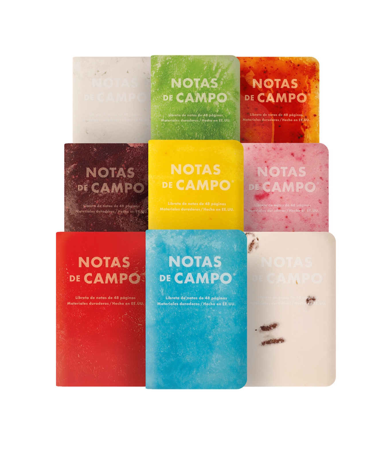
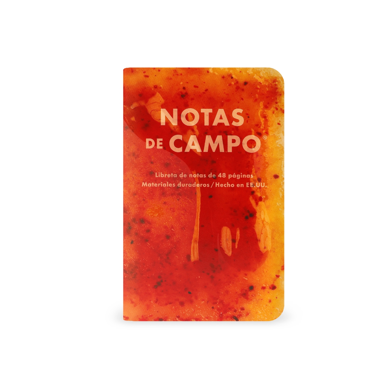
Their 71st Quarterly Limited Edition for Summer 2026 is actually inspired by the iconic frozen fruit treats from Mexico called paletas. Each of the notebooks in the collection is designed to not just look but also feel like one of those popsicle flavors, in one of their most visually playful releases to date. Too bad they’re not actually edible, although you probably can slurp on a frozen treat while you’re using one of these pretty notebooks.

Designer: Field Notes

More than just a cool aesthetic, the brand really looked into the history of the paletas, telling the story of how this beloved frozen treat came to be. These frozen treats are actually made from real fruit and fresh ingredients, created by brothers Ignacio and Luis Alcázar and their cousin Agustín Andrade. They’ve become not just a tasty tradition but a cultural landmark, from their small town of Tocumbo, Michoacán, to Mexico City, and eventually reaching the U.S.

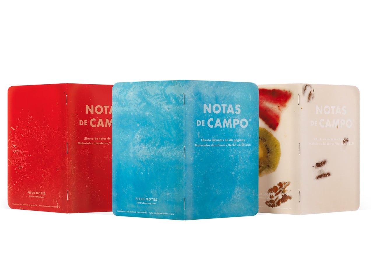
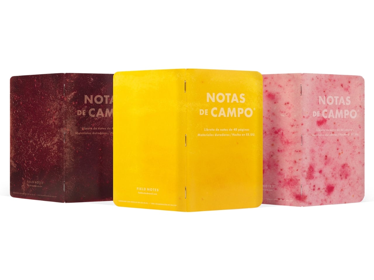
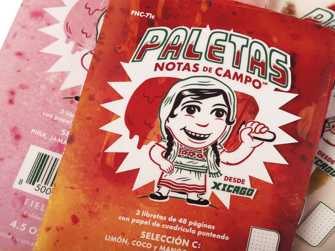
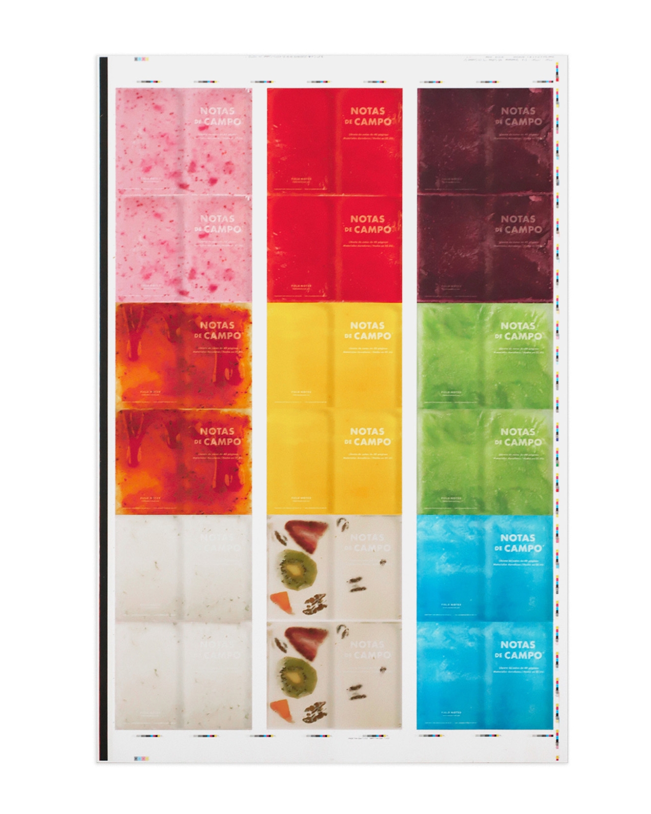
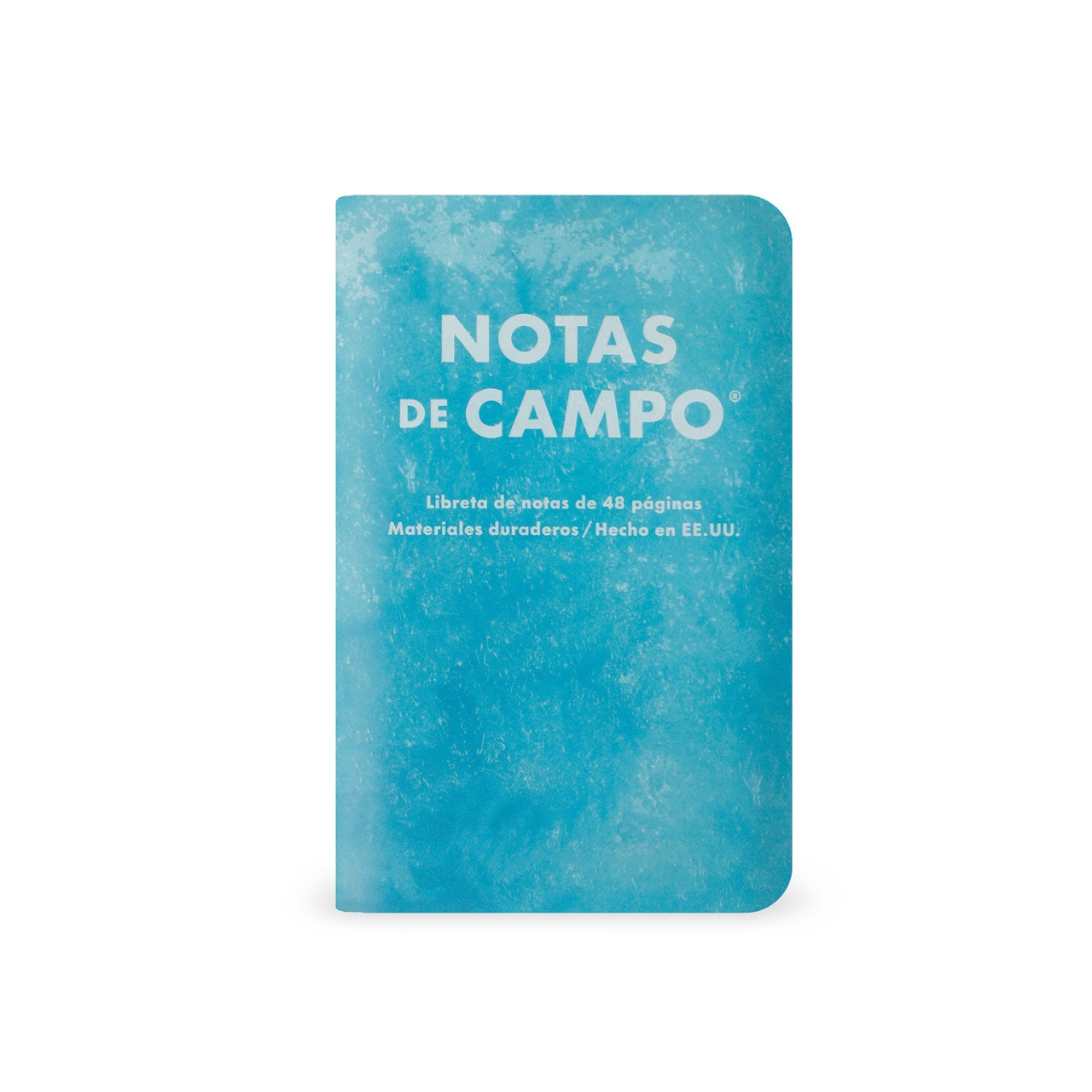
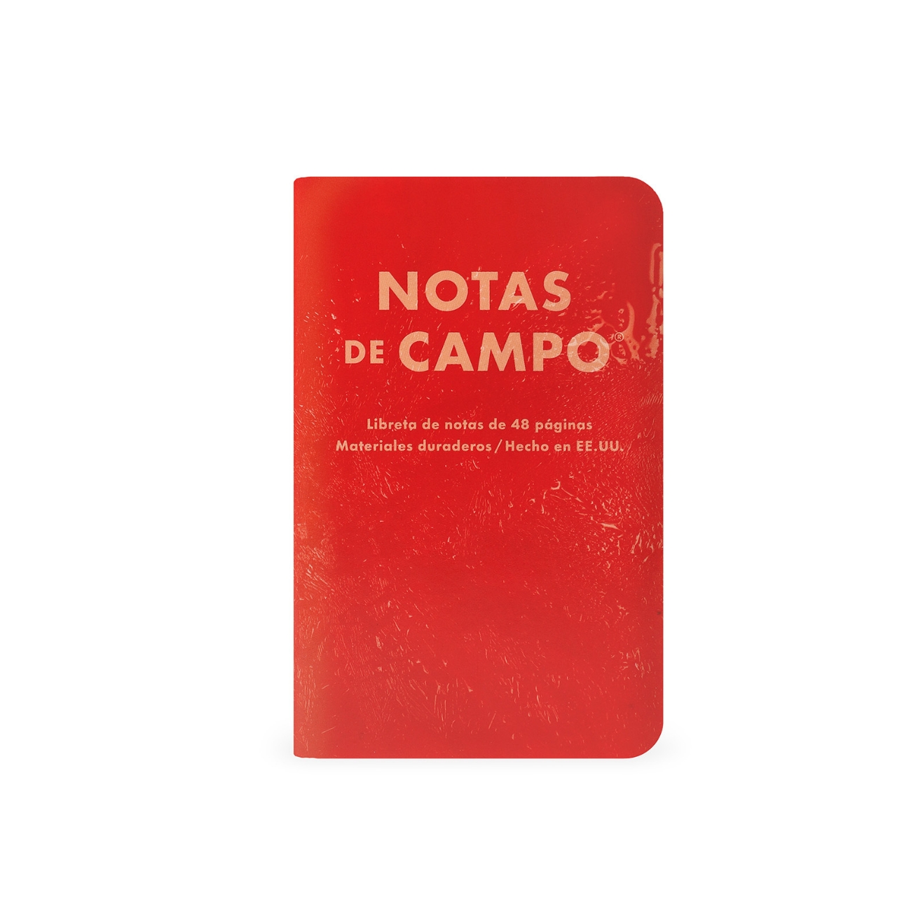
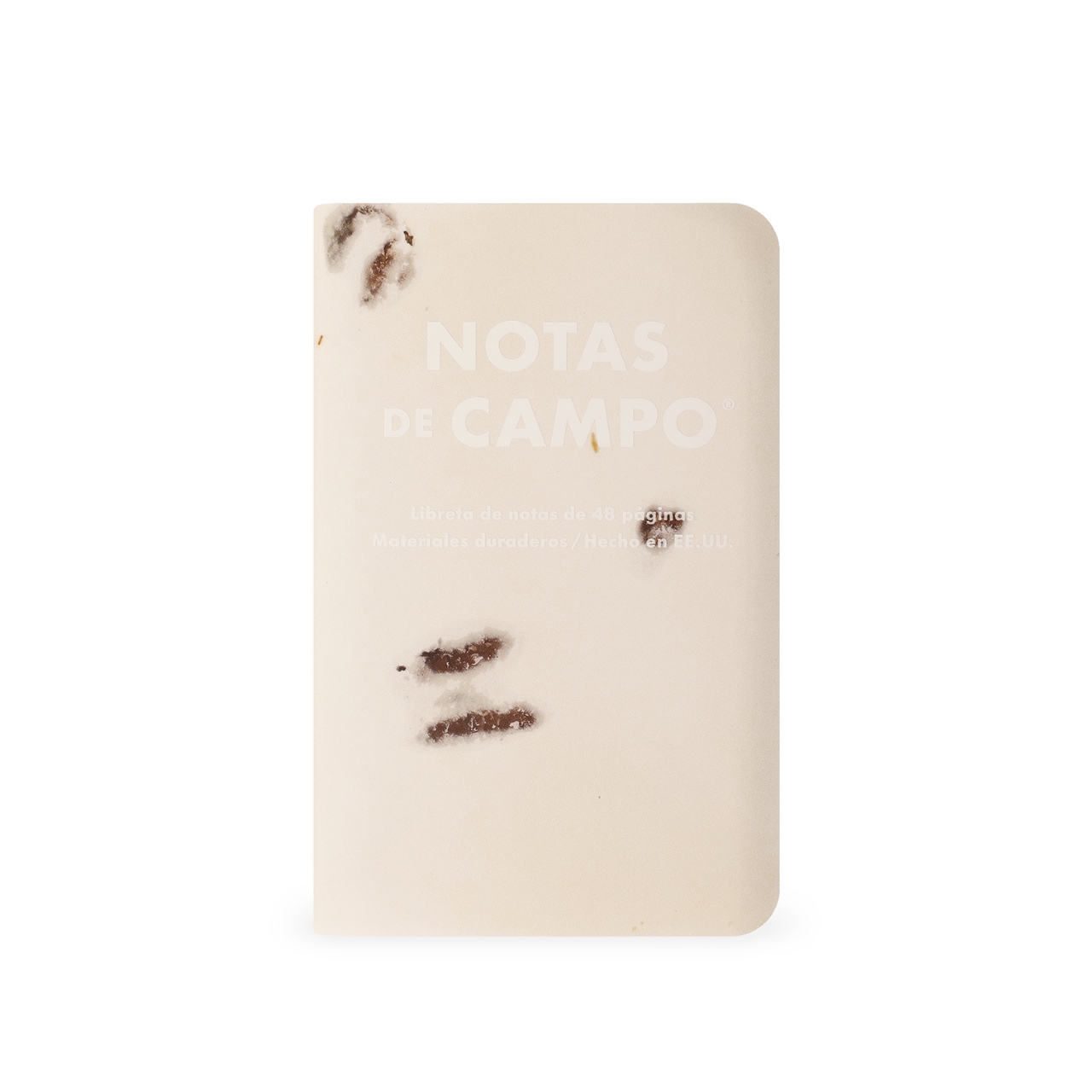
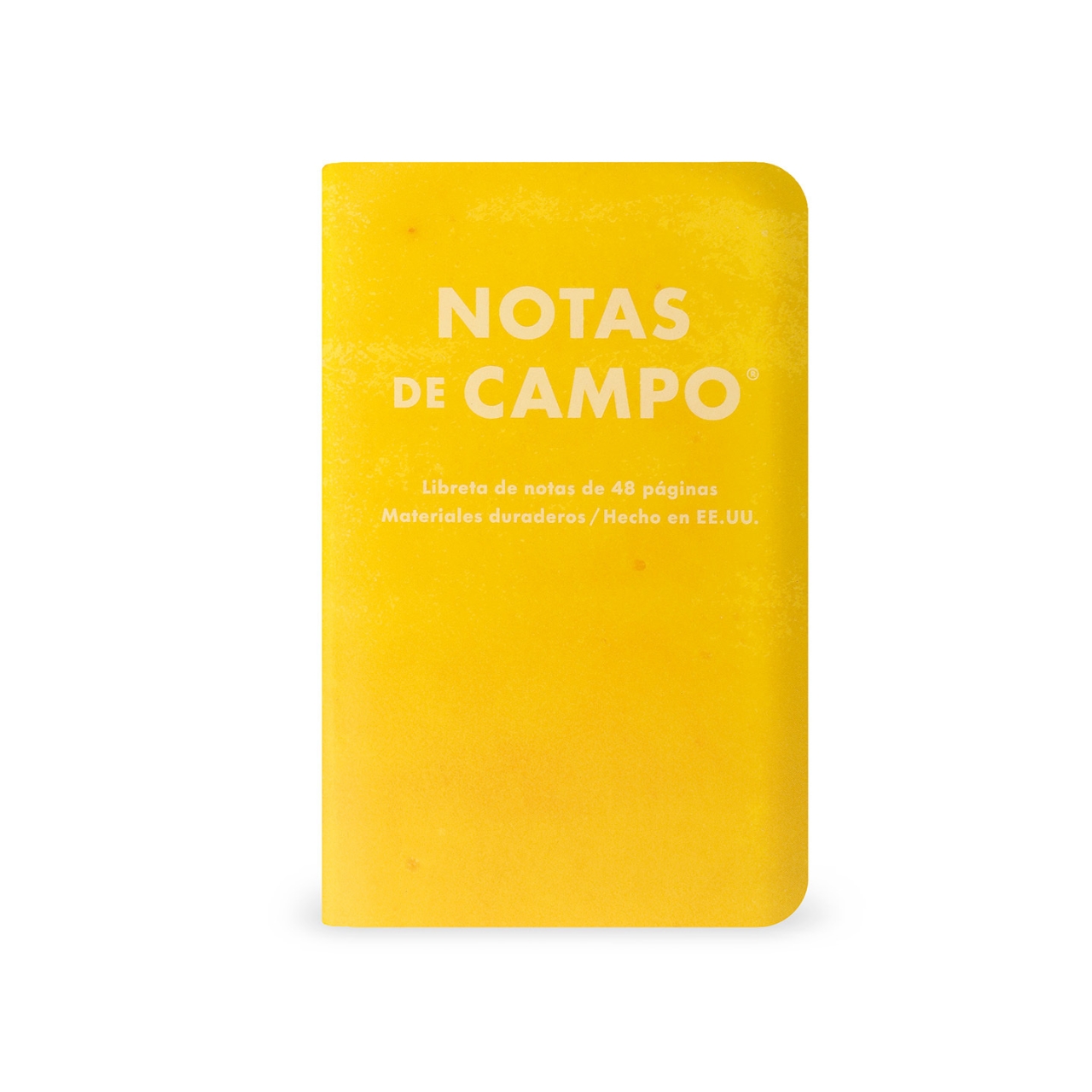
Each of the Field Notes notebooks (or, rather, Notas de Campo) has a combination of shiny gloss and frosty matte varnish, which gives them a texture that feels like you’re actually holding a paleta. There are nine “flavors,” each representing a specific paleta with its own color and personality, sold in three packs of three. Pack A has Chicle (Blue), Sandía (Red), and Queso Crema (White); Pack B has Piña (Yellow), Jamaica (Garnet), and Fresas con Crema (Pink); and Pack C has Limón (Green), Coco (White), and Mango con Chamoy (Red/Orange).

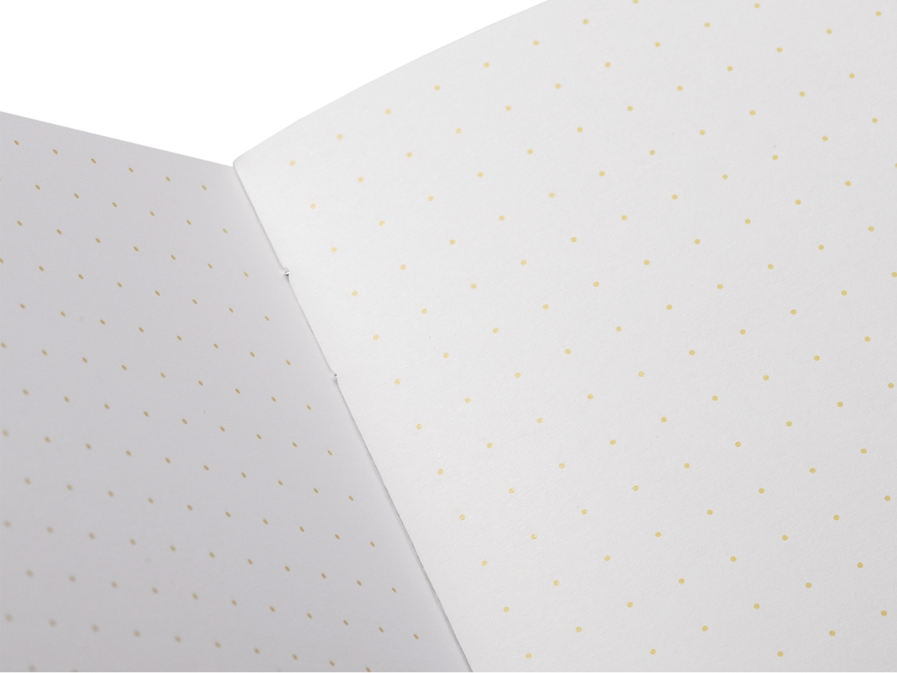
Inside, you get 48 pages of cream-colored dot-grid paper that you can use for note-taking, sketching, journaling, planning, or whatever it is you use notebooks for these days. Printing for this collection uses soy-based inks, which is perfect for sustainability-minded stationery lovers. There is a backing card illustration created by artist Atlan Arceo-Witzl, adding an artisan, handcrafted quality to the collection.

Each pack is priced at $14.95, making it easy to pick up just one flavor trio or go all in and collect all three. For subscribers, Field Notes sweetens the deal even further: you’ll receive the full set of all nine flavors, free U.S. shipping, 10% off on the site, and the special 2026 subscriber box beautifully designed by artist Jennifer Farrell of Starshaped Press. And if you want to display your paleta love on the wall, there are only 100 of the limited-edition Paletas Press Sheets available, showing all nine flavors together in one vibrant, poster-worthy print.

Whether you’re a longtime Field Notes collector, a journaling enthusiast, or simply someone who appreciates beautiful and thoughtfully designed objects, the Paletas edition is genuinely hard to resist. There’s something really special about a notebook that not only gives you a wonderful writing experience but also makes you smile just by looking at it, or, in this case, almost makes you want to take a bite.

And circling back to what I always say in my workshops: journaling is a deeply sensory experience. The Paletas collection somehow manages to hit almost all of them: the vivid, fruit-inspired colors that delight your eyes, the gloss-and-matte texture that begs to be touched, and the crisp sound of the pages as you turn them. The only sense still left out is taste, but that’s what an actual paleta in your other hand is for. Go grab yourself a pack and maybe a mango con chamoy while you’re at it.

The post Field Notes Just Made Notebooks That Look Good Enough to Eat first appeared on Yanko Design.

The 7 Best Japanese Stationery Picks Of July

Japanese stationery has a reputation that precedes it, and it is earned. The paper is smoother, the mechanisms are more considered, and the objects themselves carry a material honesty that most Western equivalents don’t bother with. Japan has spent long enough treating stationery as a design discipline to have produced things that function noticeably better than what fills most pencil cases. The difference doesn’t announce itself loudly. You notice it the first time you sit down to write.

These seven picks are unique, intentional, and design-forward. Some cost less than a lunch. One requires a short search to track down. All of them share the quality that makes Japanese stationery worth paying attention to: a specific problem solved with enough elegance that the solution becomes the whole point of the object.

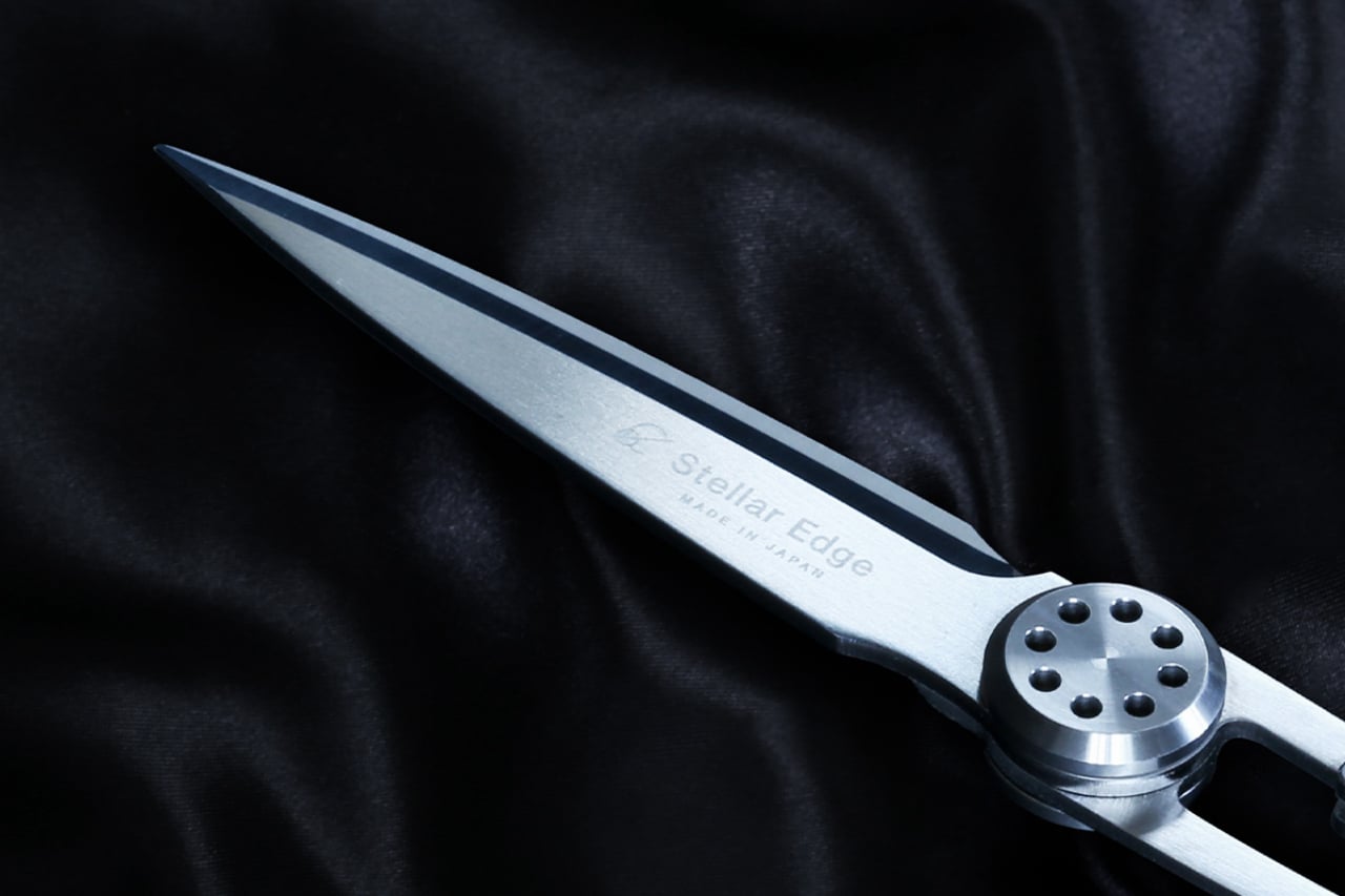
1. Stellar Edge Scissors
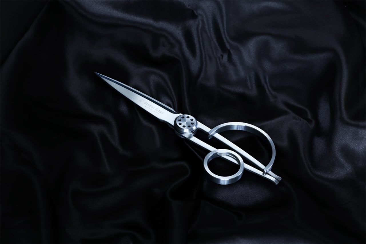
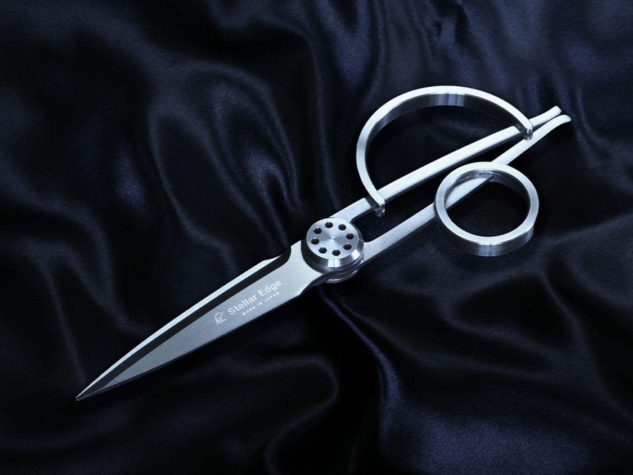
Scissors belong in a category of tools that most people replace when they break rather than choose with intention. The Stellar Edge Scissors suggest a different approach. Crafted from Japanese stainless steel, they arrive with gleaming, seamless handles and a weight distribution that makes the blade feel like an extension of the hand rather than something being held onto. Every curve and angle is deliberately considered. The result is a pair of scissors that earns a place on the desk rather than disappearing into a drawer.

Each snip registers cleanly, with the kind of resistance that confirms the blade is doing exactly what it was made to do. The polished finish across the handle elevates the tactile experience without making the scissors feel precious or fragile. Ergonomics were clearly a priority in the development: the grip sits naturally regardless of hand size, and extended cutting sessions don’t accumulate the fatigue that cheaper alternatives build across an afternoon. These are scissors for people who appreciate what happens when form and function are treated as the same brief.

What we like

  • Japanese stainless steel construction holds its sharpness across sustained use rather than dulling after a few weeks
  • The seamless handle design and polished finish make these genuinely display-worthy on a desk

What we dislike

  • The premium material and manufacturing precision place these at a higher price point than standard scissors
  • The minimalist form prioritizes aesthetics, so there are no rubber grip inserts for those who prefer a softer handle feel

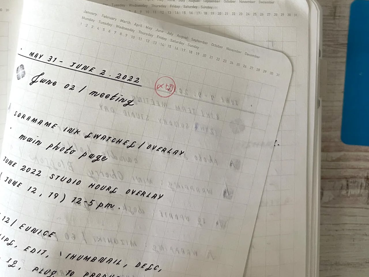
2. Stalogy Editor’s Series 365-day Notebook (A6)
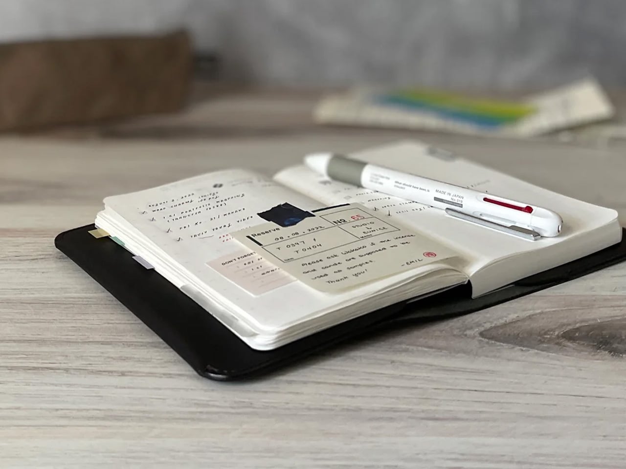
Stalogy’s 365 Days Notebook manages something most pocket notebooks don’t: 368 pages of ultra-thin paper in an A6 form factor that still fits in a coat pocket without bulging. Each page carries minimal printed detail, with dates, days, a faint grid, and time indicators that function as suggestions rather than structure. The paper itself is a genuine pleasure to write on, recalling Hobonichi’s Tomoe River stock in the way ink glides across the page without feathering or bleed-through.

What separates the 365 Days from most planners is what it refuses to do. It doesn’t impose a structure on your day or assume how your hours should be divided. Bullet journaling, daily planning, freeform sketching, and straight note-taking all work comfortably within its pages, and none of them feel like compromises. Most stationery at this level quietly pushes a method. Stalogy provides the space and steps aside, which turns out to be the more useful approach.

What we like

  • Thin paper keeps 368 pages genuinely pocketable without adding bulk to a coat or bag
  • Minimal page markings give it equal footing for structured planning and open-ended creative work

What we dislike

  • Date and time markings are printed very small, making them difficult to read in low light
  • Heavy fountain pen inks will ghost through the thin paper, limiting compatibility for serious pen users

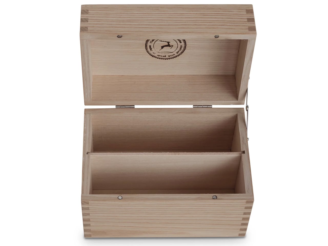
3. Classiky Chestnut Postcard Case
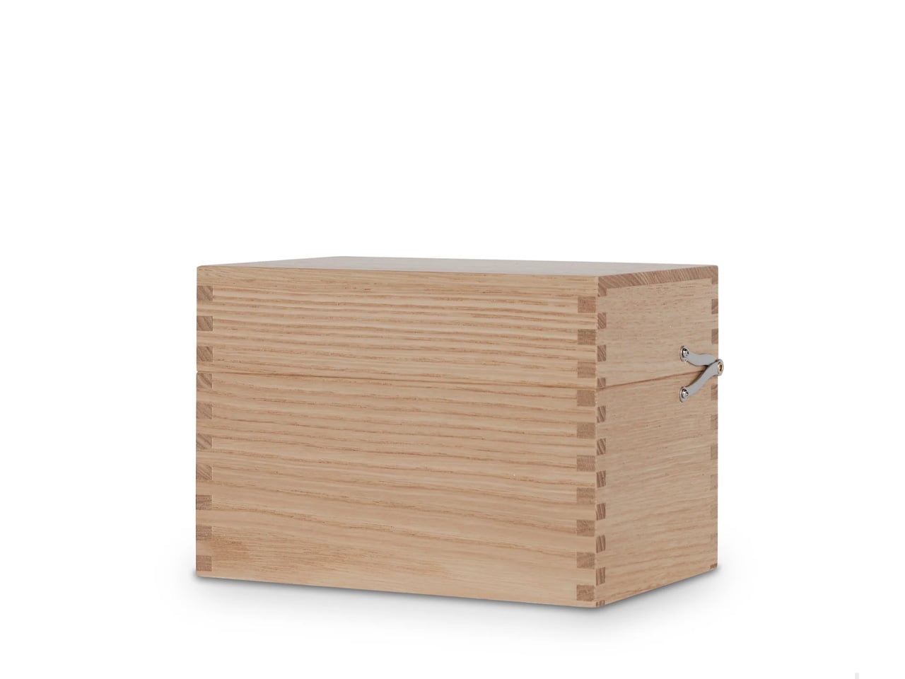
Classiky’s Chestnut Postcard Case takes its design cues from the wooden boxes Japanese craftsmen have long used to house precious ceramics. Varnished Japanese chestnut wood gives it a warmth and grain depth that plastic or metal storage simply cannot reach, and the proportions at 17.6 x 11.6 x 12.4 cm are calibrated precisely for standard postcards. Two removable separators sit inside, and a magnetic closure shuts with the kind of clean, weighted precision that makes opening and closing the thing quietly satisfying.

What makes it worth the attention is its relationship with time. Chestnut doesn’t fade with handling — it deepens, growing richer in tone the more it’s used, which means the case becomes more beautiful the longer it stays in rotation. The removable separators allow the internal configuration to shift as a collection grows or changes. For collectors, letter writers, or anyone who treats a postcard as a physical artifact worth keeping, this turns an act of storage into something closer to curation.

What we like

  • Varnished Japanese chestnut deepens in tone over years of handling rather than wearing down
  • Removable separators allow flexible internal configuration as collections grow or change

What we dislike

  • Dimensions are postcard-specific, so larger formats like A5 prints won’t fit
  • The material quality and craftsmanship place it at a premium that makes it a harder sell for casual buyers

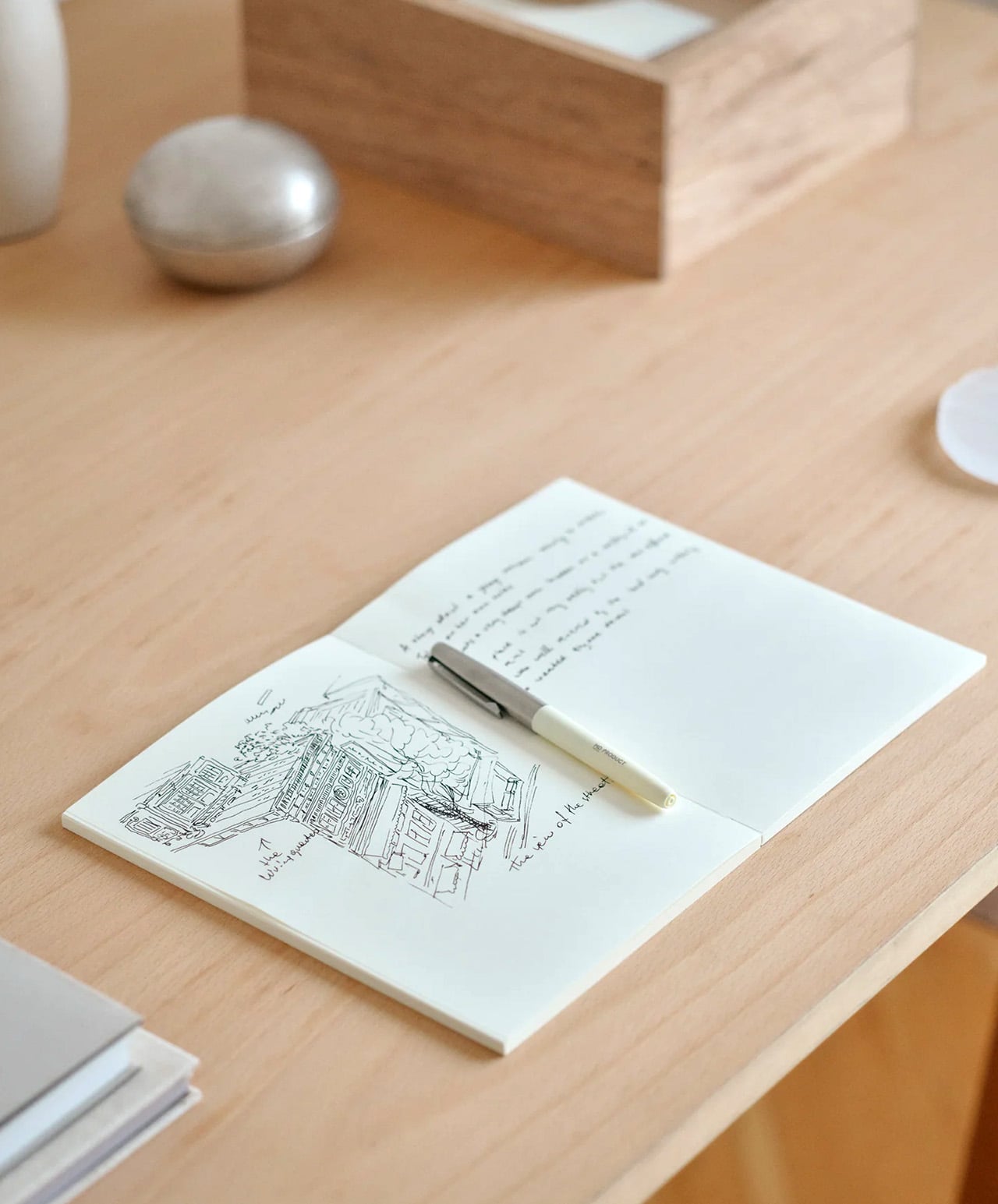
4. Midori MD Notebook A5
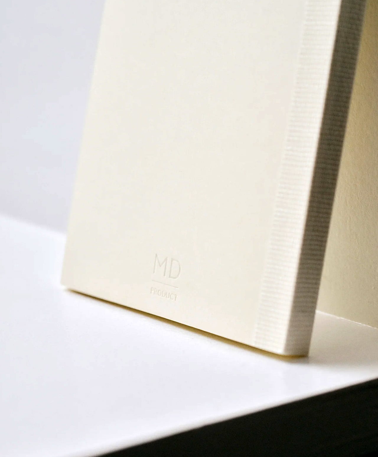
Midori developed MD Paper specifically for this notebook, and the difference is apparent within a few lines. Fountain pen ink sits on the surface without feathering into the fibers. Gel pens don’t bleed through to the reverse. Fine-liners retain their edge rather than spreading at the tip. The same paper runs across the cover, endpapers, and text pages, creating a material consistency that most notebooks don’t consider worth pursuing. Thread binding holds the quires together and allows the book to open completely flat from the first page to the last, with no resistance pulling the spread closed.

The exterior wraps in glassine paper, a translucent sheet that protects the cover and references the packaging of older books without being precious about it. Index stickers come included for navigation, and a silk ribbon bookmark sits at the spine with a color that varies by notebook type. Available in blank, lined, grid, and dot grid in A5, it is made in Japan and sold directly through md-product.com. Once you write in one, returning to a generic notebook starts to feel like a visible compromise rather than a neutral choice.

What we like

  • MD Paper handles fountain pen ink and gel pens without feathering or bleed-through, which changes the writing experience measurably
  • Thread binding allows the notebook to open 180 degrees flat, removing the resistance that glue-bound notebooks create mid-spread

What we dislike

  • The cream-toned paper suits most writing but won’t work for illustrators who need a bright white surface for accurate color work
  • The glassine cover wrapper is more delicate than synthetic covers and shows handling wear with heavy daily use

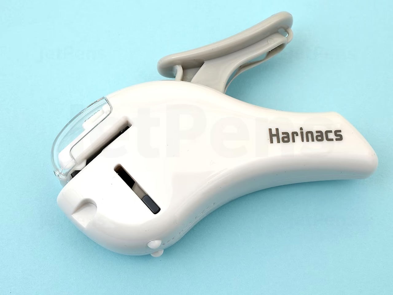
5. Kokuyo Harinacs Press
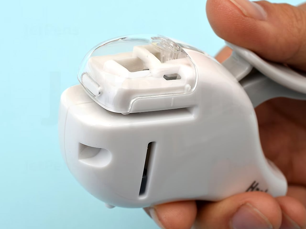
Staplers exist because paper needs to stay together, not because metal staples are the best way to achieve it. The Kokuyo Harinacs Press removes the staple entirely. A press-lock mechanism cuts a small tab directly from the sheets being bound, folds it through a matching slit, and locks the pages together without puncturing them with metal. Up to five sheets bind cleanly. The binding area stays flat so pages stack without a raised lump, and no staple removal is needed when the paper reaches a recycling bin at the end of its life.

Kokuyo has been making office products in Japan since 1905, and the Harinacs reflects the company’s long habit of questioning what the category accepts as fixed. The staple has existed long enough that challenging it feels strange, which is exactly why this product lands as well as it does. The body is compact at 34 by 95 by 85 millimeters, sits upright on a desk, and works without refills of any kind. Bindings are reversible by rubbing the lock area with a firm object.

What we like

  • The press-lock mechanism requires no consumables, so the stapler functions indefinitely without replacement staples
  • Binding is reversible using any firm object, allowing pages to separate cleanly without tearing

What we dislike

  • The five-sheet maximum limits its use for thicker documents, making it a companion tool rather than a primary binding solution
  • Very thin or coated paper may not lock as securely as standard copy-weight sheets

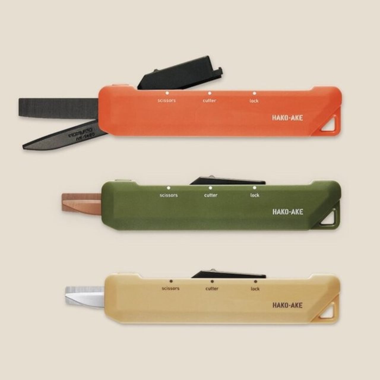
6. Kokuyo Hakoake Two-Way Cutter and Mini Scissors
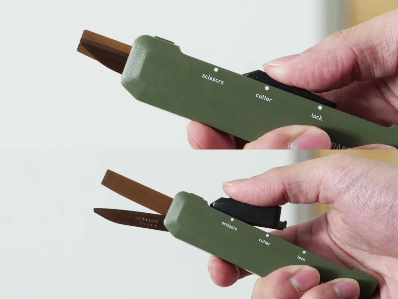
Kokuyo made one decision with the Hakoake that makes the whole product work: the switch between cutter and scissors happens with a single squeeze and slide, one hand, no covers or attachments to manage. The 3mm cutter blade is short enough to open packing tape cleanly without threatening the contents inside. Scissors mode engages by sliding the mechanism forward, and a built-in guide aligns the cut so the action is accurate without requiring careful positioning. It fits in a pencil pouch, clips to a lanyard via a strap hole, and disappears into a bag the way a good tool should.

Compact tools that try to do too many things usually fail at each of them. The Hakoake works because it only commits to two, and the two it chose are the ones that come up in the same moment. Opening a package almost always means also needing to cut a tag or trim a plastic band nearby. Having both in one slim object, without compromise to either mode, is the kind of product outcome that requires genuine engineering attention.

What we like

  • The one-handed sliding switch between cutter and scissors is fast enough to use in the same motion as reaching for the tool
  • The compact form and strap hole make this genuinely portable in a way that full-size scissors are not

What we dislike

  • The 3mm blade is purposely short, so it is not suited to cutting through thicker materials or multiple layers at once
  • The slim form factor means grip depth is minimal, which may feel less secure during heavier cutting tasks

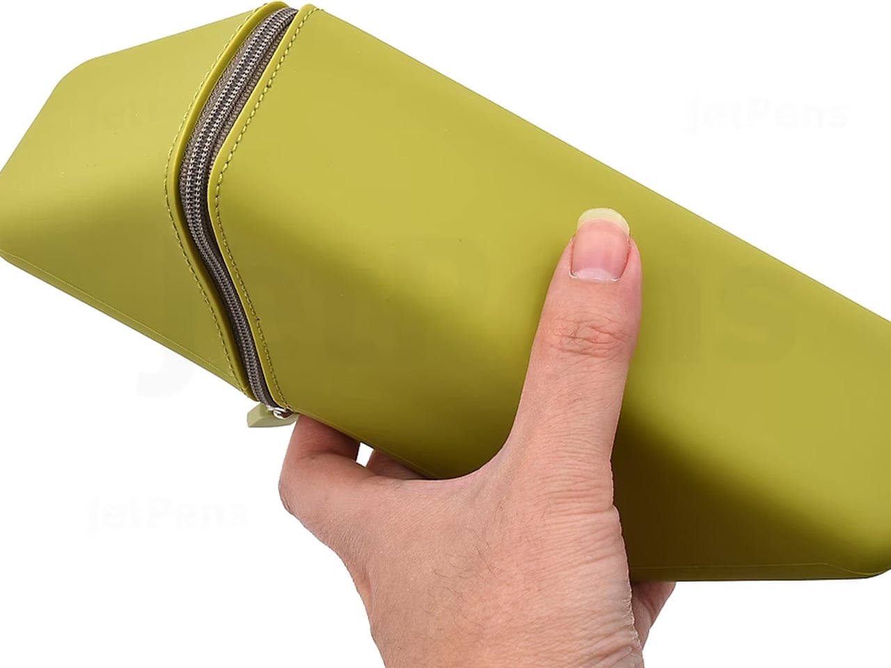
7. Sonic Kakusta
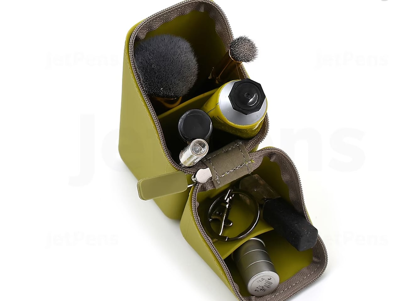
The Sonic Kakusta spends most of its life looking like a soft pen case. Unfold it and it becomes a triangular desk stand that props pens at a 60-degree angle, steep enough to display pen tops for quick identification, shallow enough that pulling one out doesn’t send the rest toppling. A built-in divider splits the interior into two sections, a second divider in the lid creates a small shelf for erasers and sticky notes, and strong magnets hold the folded shape in place so the stand doesn’t quietly collapse between uses.

The angle is the detail that earns it a second look, but the real argument is the one object doing two jobs cleanly. For anyone moving between a home desk, an office, and a library table, the Kakusta removes the logic of carrying both a pen case and a desk cup. Most products that try to collapse two functions into one end up feeling like a halfhearted version of each. This one doesn’t, and the soft exterior keeps the whole thing light enough that the trade-off barely registers until you’re already at your desk with your pens on display.

What we like

  • Strong magnets hold the stand shape reliably, even on surfaces that aren’t perfectly level
  • The lid divider doubles as a small shelf for erasers and sticky notes, a detail most pen cases overlook

What we dislike

  • Soft material offers limited protection against crushing inside an overpacked bag
  • The triangular footprint takes up more space than a flat pouch, which matters in tighter carries

This Is What a Well-Made Desk Looks Like

The objects that last on a desk tend to be the ones that earn their place through daily use rather than first impression. Each of these seven earns it the same way: by attending to the part of the tool that most manufacturers treat as already resolved. The paper that accepts ink without spreading. The clip that silences itself. The stapler that eliminates its own raw material. Every one of those decisions took longer than the obvious alternative would have.

A desk set up with tools this considered starts to function differently. Not because the objects are precious, but because they remove the small frictions that accumulate across a working day. Reaching for a pen that is always where it should be, writing on paper that responds the way paper should, cutting with scissors that feel like they were made for a specific hand. July is a reasonable time to replace what is merely functional with what is actually well made.

The post The 7 Best Japanese Stationery Picks Of July first appeared on Yanko Design.
This $21 Magnetic Clipboard Fixes 3 Things Every Clipboard Gets Wrong

The clipboard hasn’t changed much since it arrived on desks and workbenches over a century ago. It’s still a flat backing board with a spring clip at the top, reliable enough for what it does, but never quite solving the small annoyances that anyone who uses one regularly has quietly accepted. Papers flap in the wind, finished pages dangle awkwardly, and there’s never a convenient surface to mount them on.

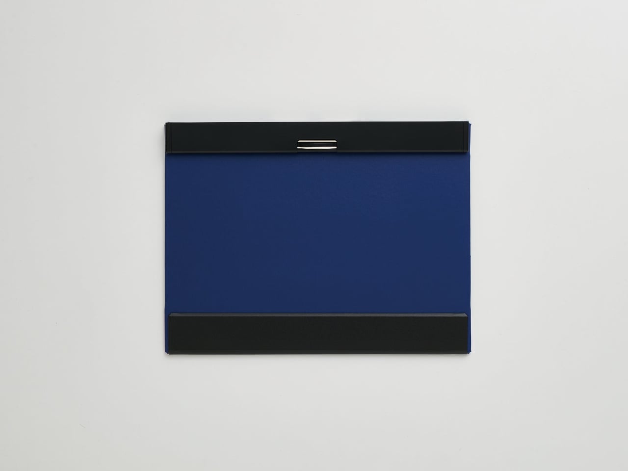
Japanese stationery brand King Jim took those frustrations seriously with the MagFlap, a clipboard that rethinks the form through a series of small magnetic additions that end up changing how the whole thing works. It doesn’t look dramatically different from the outside, but the moment you start using it for anything beyond signing a single sheet, the thoughtfulness behind each feature becomes clear pretty quickly.

Designer: King Jim

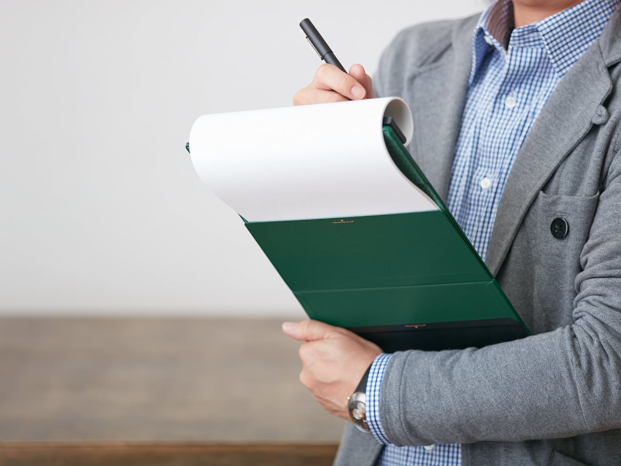
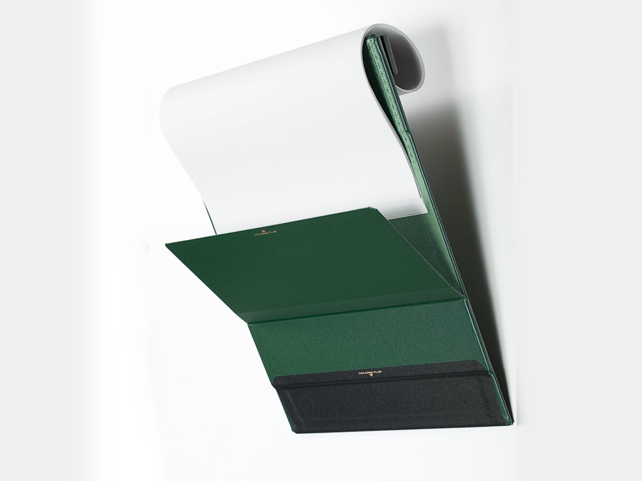
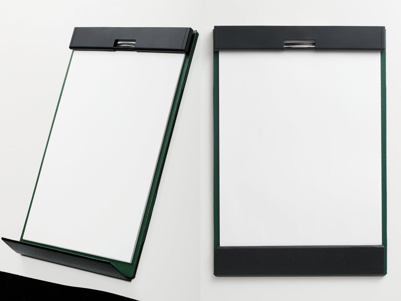
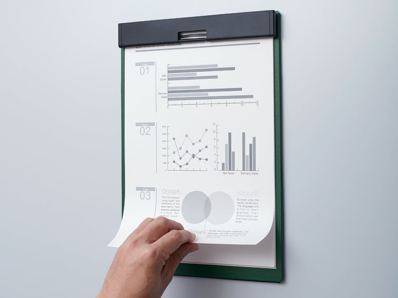
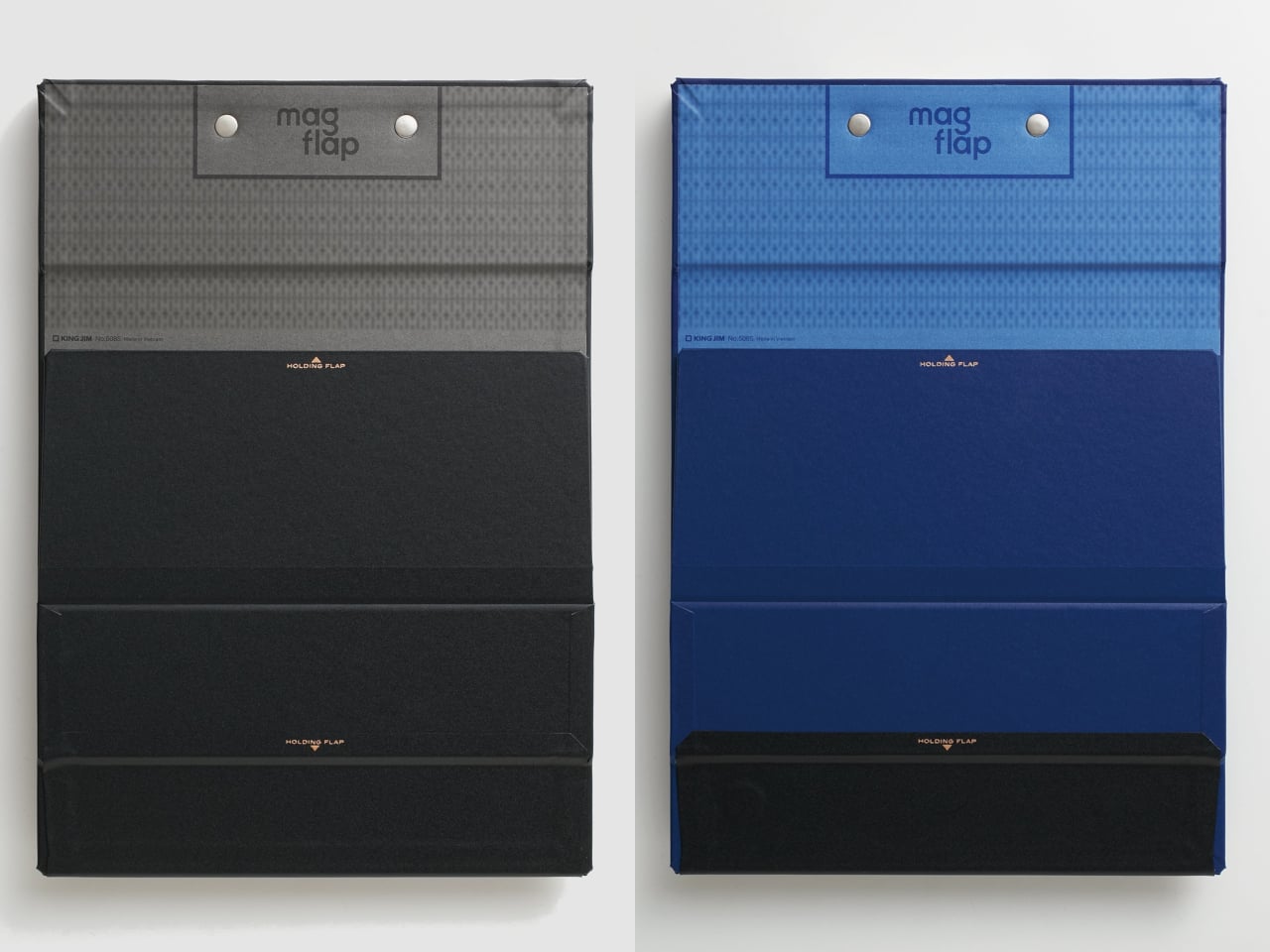
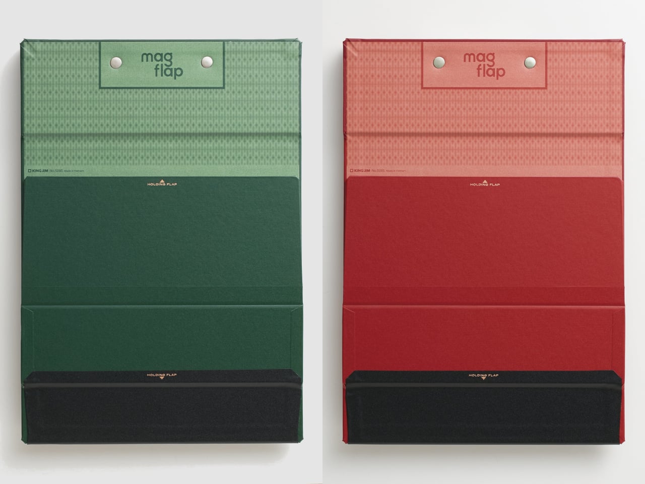
The most visible improvement is at the bottom, where a magnetic flap closes over the lower edges of the papers. On a regular clipboard, any wind or movement is enough to send pages flapping and bending corners. The front flap locks everything flat against the board and protects the surface from the kind of gradual damage that most clipboard users have simply accepted as unavoidable.

The second magnetic flap is on the back and solves a different but equally familiar problem. Reviewing multiple pages usually means dealing with finished sheets flopping back over the clip or dangling in the way. With the MagFlap, completed pages curl over the top and get held securely against the back of the board by a magnetic flap, keeping the working surface clear at all times.

The full-width metal clip at the top is another departure from the norm. Most clipboards grip only the center of a page’s edge, leaving corners free to curl and crumple. The MagFlap’s clip spans the entire width, keeping everything flat. And since the body itself is magnetic, it attaches directly to steel surfaces, turning a filing cabinet, a locker, or a refrigerator into an instant mounting point.

Put those three features together, and the MagFlap starts to make a lot more sense for anyone who regularly deals with paperwork away from a desk. Nurses moving between wards, field inspectors filling out reports outdoors, or students working through multi-page readings all get a clipboard that doesn’t just grip paper from the top, but actually manages the reality of it moving around.

The clipboard comes in three sizes: A4 vertical, A4 horizontal, and A3 horizontal. All are covered in a PP film-applied polypropylene shell and hold up to 30 sheets of standard copy paper. The profile stays slim at 0.7 inches thick, and the board is rigid enough to grip at a single corner without flexing, which makes one-handed use genuinely practical rather than just technically possible.

A position guideline printed on the board helps with paper alignment, a small but useful detail when you’re handling a high volume of pages. Available in blue, red, green, and black, the MagFlap retails for $20.99. It’s not the cheapest option on a stationery shelf, but what it fixes is real, and the three solutions it offers are hard to find anywhere else in a single product.

The post This $21 Magnetic Clipboard Fixes 3 Things Every Clipboard Gets Wrong first appeared on Yanko Design.
This Titanium Calligraphy Pen Trades Tactical Utility for Softer, More Expressive Brush Strokes

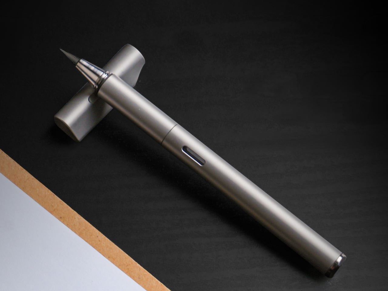
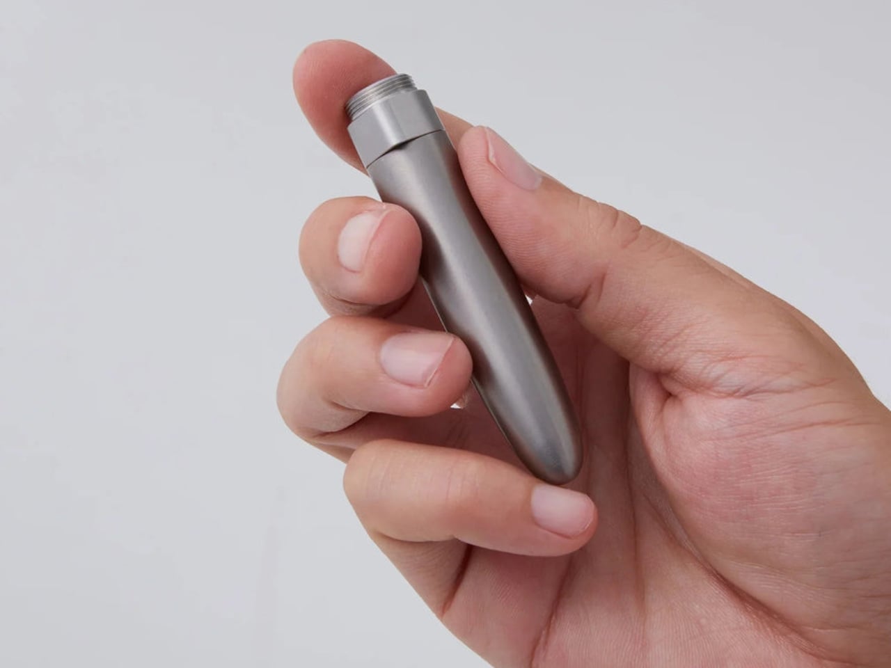
Titanium is a material with a very specific reputation. It belongs to the world of rugged efficiency, survival gear, and precision engineering, usually chosen for objects that need to endure pressure, impact, and time with very little fuss. Brush pens come from an almost opposite design language, one shaped by softness, gesture, and line variation, where the slightest change in pressure can transform a word or sketch into something more personal. In most cases, these two worlds stay far apart, one built around resilience, the other around responsiveness.

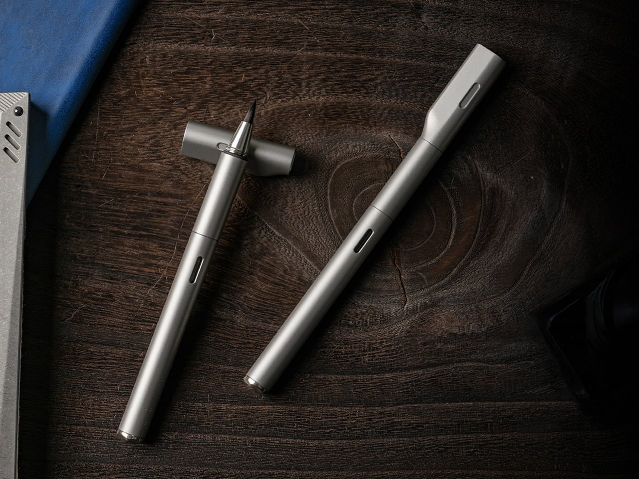
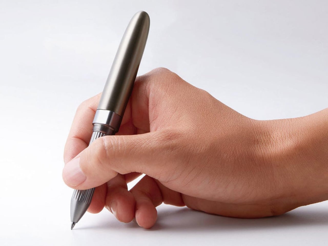
STILL brings them together with surprising clarity. The pen pairs a machined Grade 5 titanium body with a flexible nylon brush tip that shifts from fine hairlines to bold strokes depending on how it meets the page. That contrast gives STILL its identity. It feels grounded and permanent in the hand, yet expressive in motion, creating a writing instrument that carries the discipline of industrial design into the more fluid world of journaling, sketching, and everyday handwriting.

Designer: EYEQ

Click Here to Buy Now: $69 $105 (35% off). Hurry, only a few left! Raised over $82,000.

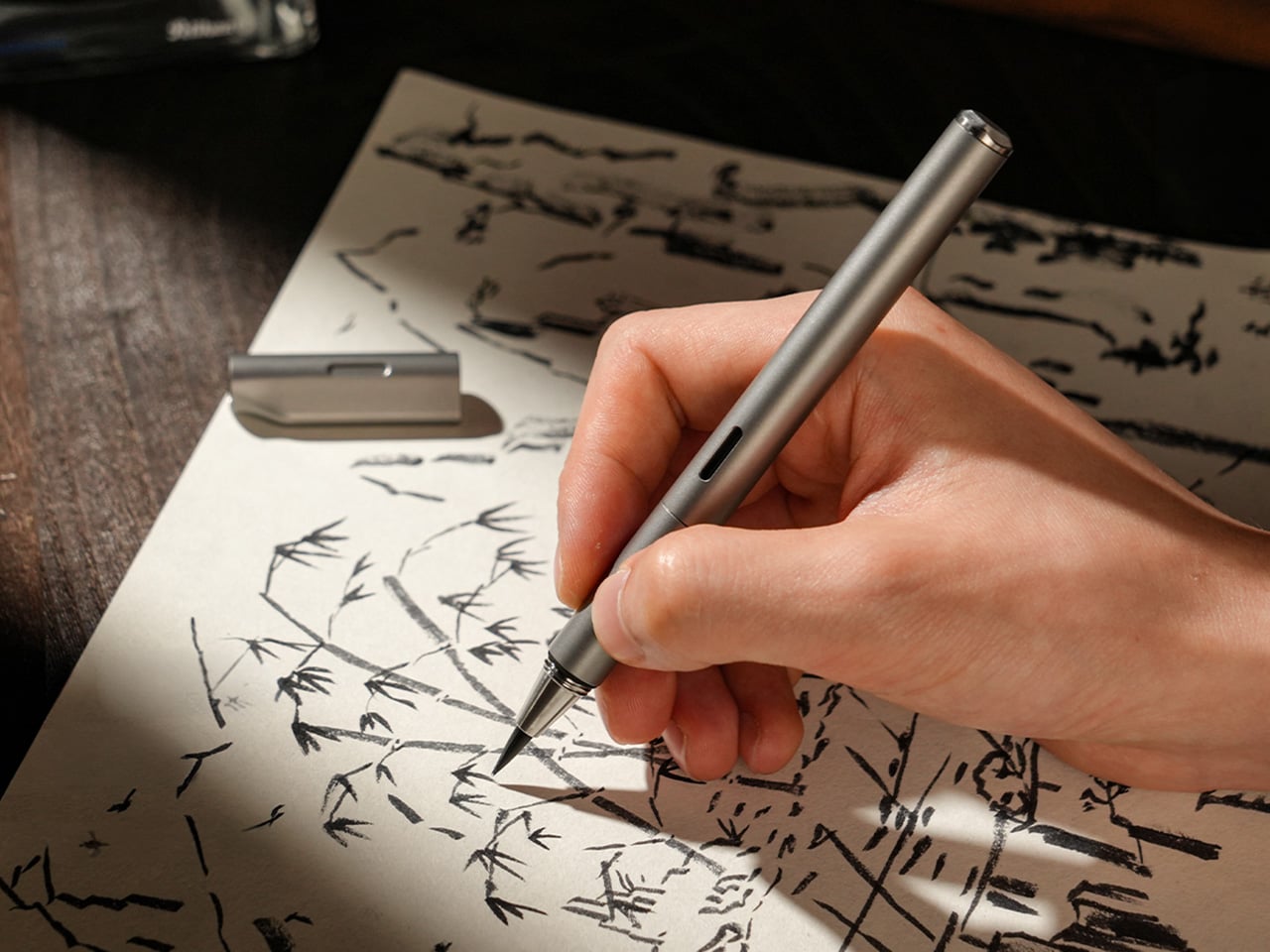
Unlike traditional fountain pen nibs that deliver a consistent line, STILL’s nylon brush tip responds directly to pressure. A light touch produces a 0.3mm hairline suitable for small details or delicate script. Medium pressure yields roughly 1.2mm, the kind of natural width most people instinctively use for everyday writing. Firm pressure opens the tip to 3mm, creating bold strokes for emphasis, headers, or expressive flourishes. Everything in between happens without conscious effort, turning line variation into a natural outcome of the writing process rather than a technical skill. If you’ve used an Apple Pencil on an iPad, you probably know exactly how much more expressive a brush pen is compared to a fineliner or a fountain pen.

That responsiveness makes STILL approachable in a way traditional brush pens often are not. Calligraphy brushes demand control, practice, and an understanding of stroke order to produce convincing results. STILL removes most of that learning curve. The nylon material is elastic enough to flex predictably but structured enough to return to shape immediately. It follows the movement of your hand rather than fighting it, which means you can pick it up and start writing without needing to adjust your grip, angle, or technique. The result is a pen that feels easy to use while delivering visual results typically reserved for more specialized instruments.

The titanium body is not decorative. Grade 5 titanium, also called Ti-6Al-4V, is a high-strength alloy used in aerospace, medical implants, and high-performance hardware. It offers an exceptional strength-to-weight ratio, corrosion resistance, and a surface hardness that resists scratching and wear over years of handling. At 30 grams, STILL sits in a comfortable middle ground between lightweight portability and the kind of heft that gives feedback in the hand. The balance point falls naturally near the grip section, which prevents fatigue during longer writing sessions and keeps the pen stable during more deliberate strokes.

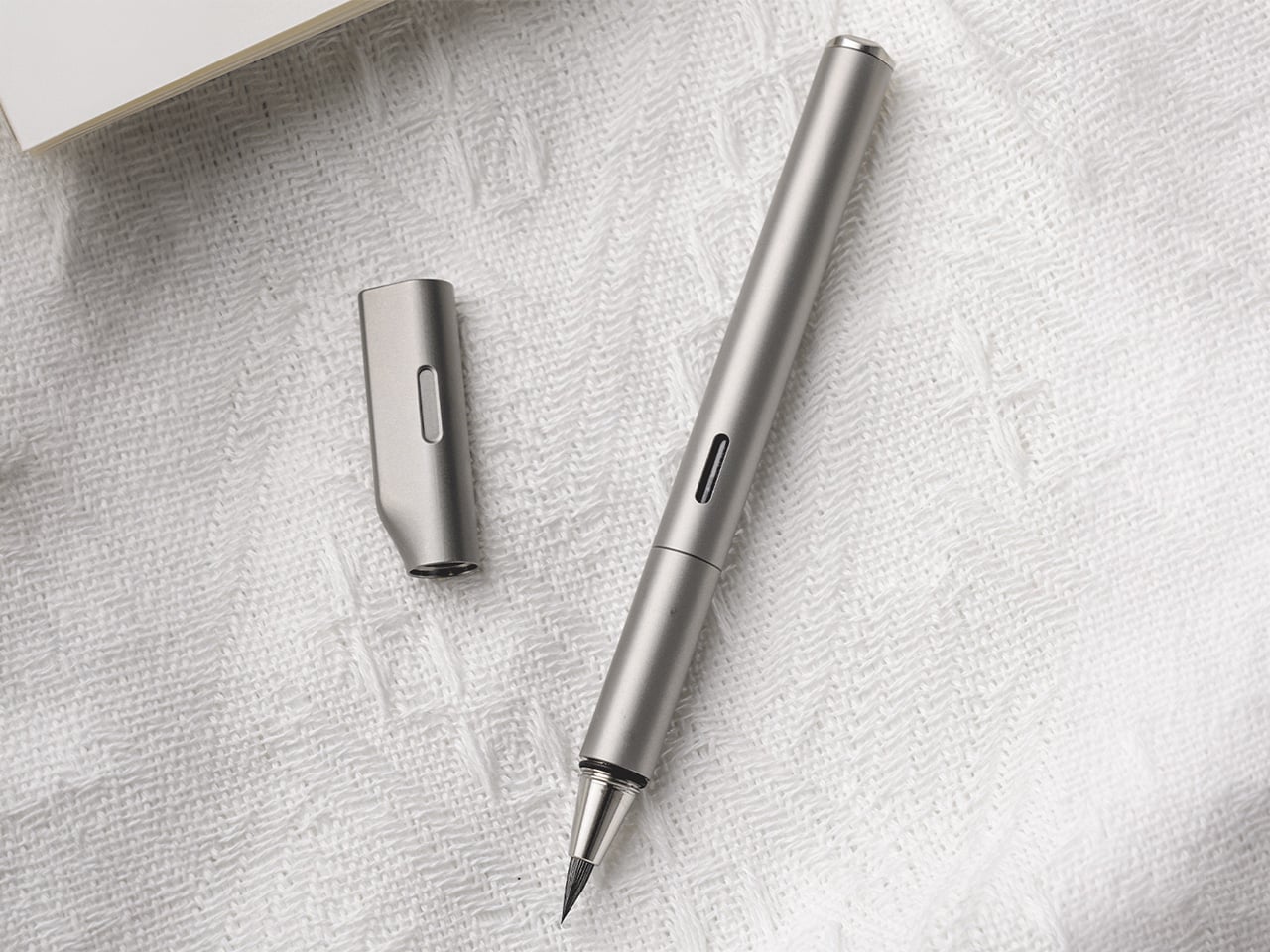
Every component is CNC-machined from solid material, which eliminates the weak points that come from glued assemblies or plastic internals. The barrel threads are cut with micron-level precision, producing a smooth, wobble-free connection between the cap and body. That precision is not just tactile theater. It ensures that the cap seals tightly around the nib, preventing air from drying out the brush tip between uses. The barrel surface is left smooth rather than aggressively textured, allowing the hand to find its own natural grip position without being forced into a predetermined hold.

The cap does more than protect the nib. Its flat top allows the pen to stand upright on a desk, turning it into a visible, accessible object rather than something that rolls into corners or gets buried in a drawer. The teardrop cross-section solves another common desk annoyance by preventing the pen from rolling when placed horizontally. A small groove machined into the side of the cap, measuring roughly 1cm by 2mm, acts as an integrated pen rest. You can set the barrel into that groove mid-writing, suspending the nib above the surface so ink does not transfer to the table. The cap also features precision threading and an internal gasket that creates an airtight seal, keeping the brush tip moist and ready even after weeks of non-use.

The pen accepts both ink cartridges and a refillable converter, giving it flexibility across different use cases. Cartridges are faster and cleaner for travel or environments where refilling from a bottle is impractical. The converter opens access to bottled fountain pen inks, which vastly expands color options and allows for more control over ink properties like flow, saturation, and drying time. A small transparent window in the barrel displays the current ink level, removing the guesswork about when a refill is needed. That window aligns perfectly with the groove in the cap when the pen is closed, creating a visual detail that signals the care taken with tolerances and alignment throughout the design.

The anti-roll geometry and smooth barrel work together to create a pen that adapts to multiple grip styles. You can hold it like a conventional fountain pen with a tripod grip near the section, or angle it more steeply like a traditional brush, resting the barrel closer to the web between thumb and forefinger. Both positions feel natural because the cylindrical form and 10.2mm diameter provide enough surface area to stabilize without crowding the hand. The absence of aggressive knurling or molded grip zones means the pen does not dictate how it should be held, which becomes important during longer sessions where hand position tends to shift.

STILL is designed for people who write because they want to, not because they have to. It suits journaling, daily note-taking, sketching, and any situation where the act of putting pen to paper carries some intention beyond pure information capture. The brush tip makes it a strong choice for hand lettering, planner decoration, or adding visual variety to written work without requiring calligraphy skills. It works equally well for designers, students, thinkers, and anyone building a habit around analog productivity. The titanium construction and sealed cap make it practical enough for daily pocket carry, while the expressive nib keeps it interesting enough to reach for regularly.

STILL is available in six anodized finishes: Quiet Titanium, Midnight Black, Ink Blue, Horizon Blue, Moss Green, and Mist Purple. Optional leather sleeves in British Tan or Black, made from full-grain leather with soft lining, provide additional protection and a more refined carry profile. Pricing and availability details can be found on the product page.

Click Here to Buy Now: $69 $105 (35% off). Hurry, only a few left! Raised over $82,000.

The post This Titanium Calligraphy Pen Trades Tactical Utility for Softer, More Expressive Brush Strokes first appeared on Yanko Design.
Blackwing’s $400 Crate Is Every Writer’s Dream Gift Set

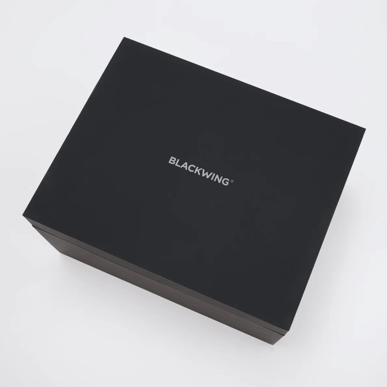
Pencils don’t usually make people emotional. But Blackwing pencils have always been a little different. The brand, which revived the legendary Blackwing 602 after its original discontinuation in 1998, has spent years building something that goes beyond the pencil itself. It’s a whole philosophy about the act of writing by hand. And with the new Blackwing Crate Gift Set, priced at $400, they’ve essentially packaged that philosophy into a matte black box and sent it out into the world.

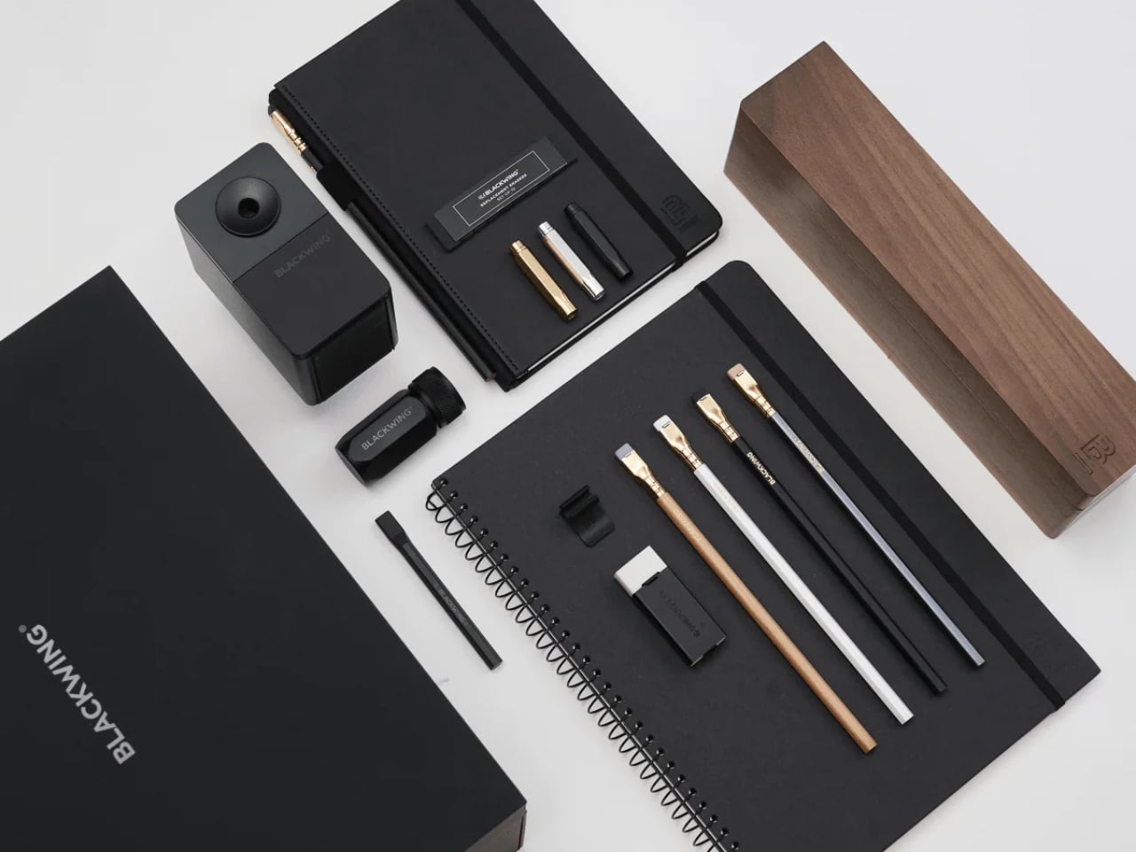
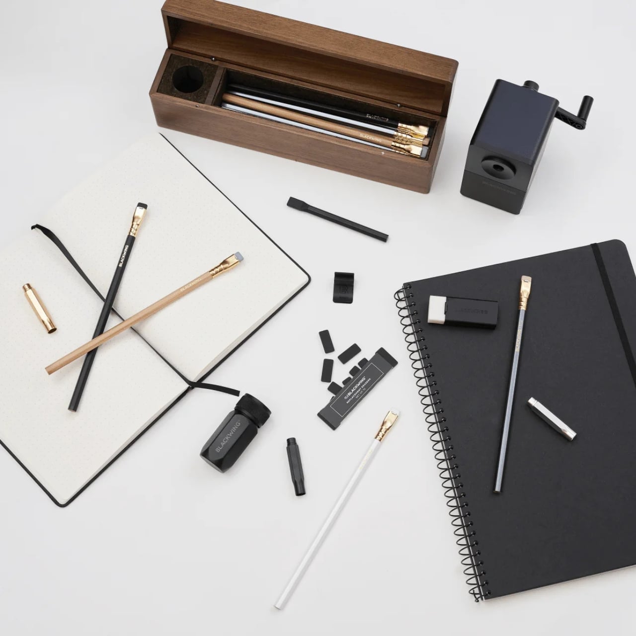
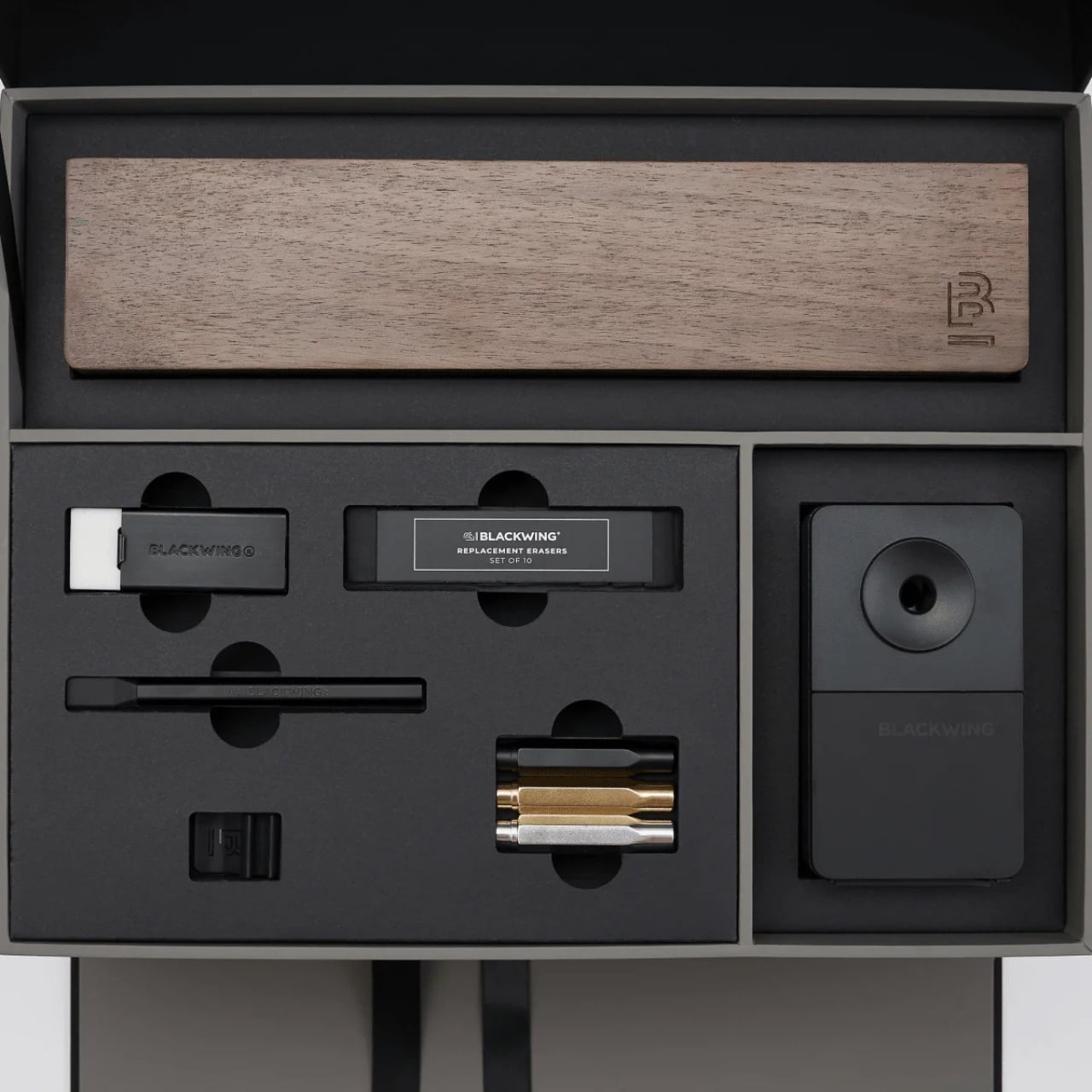
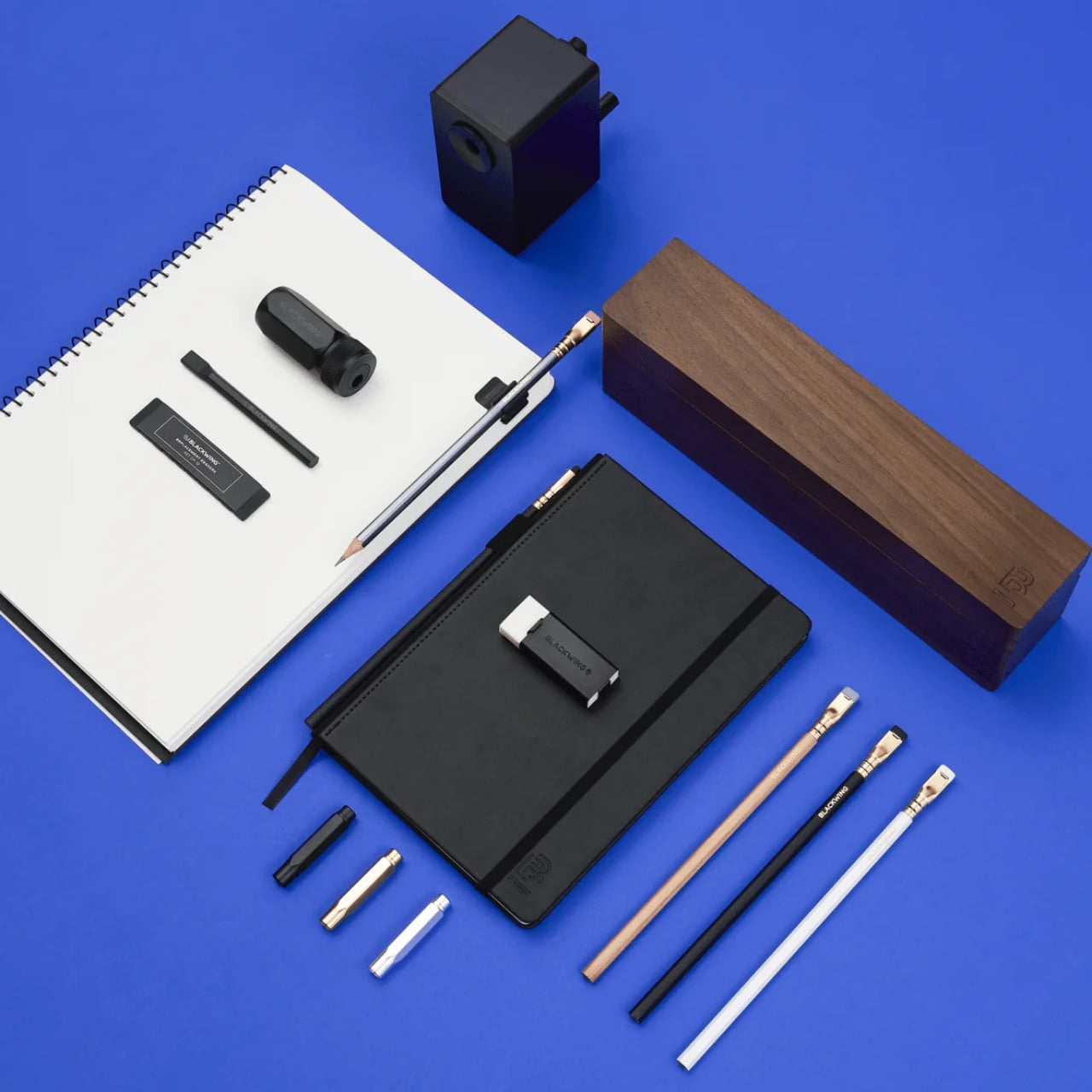
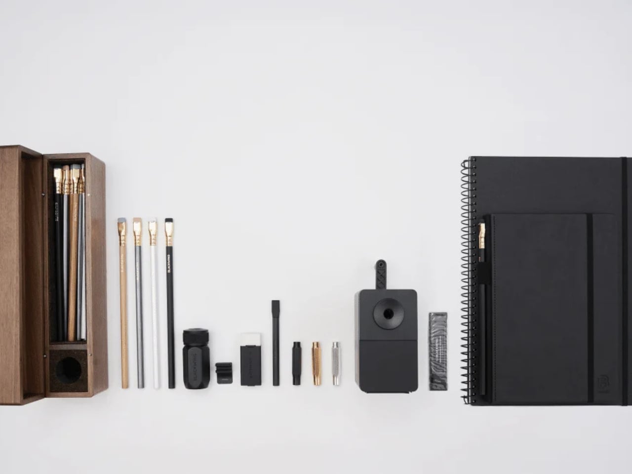
Let’s talk about what’s inside, because it’s genuinely a lot. The Crate includes 24 Blackwing pencils housed inside a walnut gift box, a One-Step Long Point Sharpener, a desktop sharpener, replacement erasers, a handheld eraser, three point guards, a pencil extender, a notebook clip, a Medium Slate Notebook in dot-grid, and an A4 spiral notebook in blank. If you’ve ever casually shopped the Blackwing site and found yourself adding one thing after another to your cart, this is essentially that cart, but curated and given a walnut home.

Designer: Blackwing

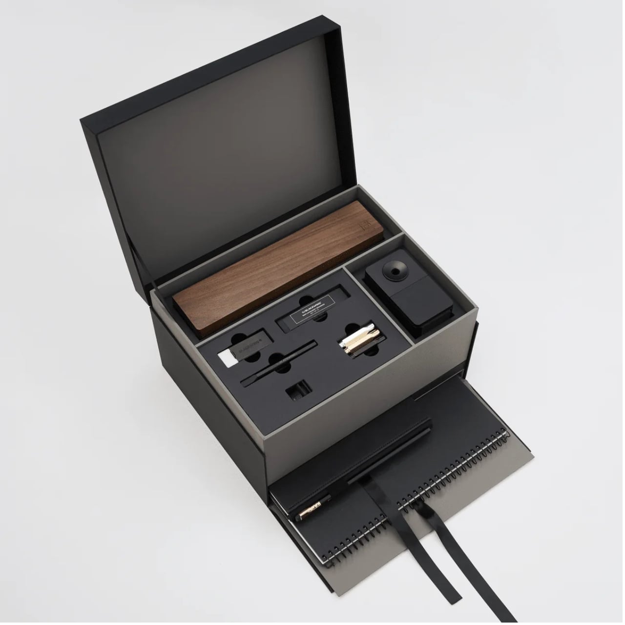
The walnut box alone is something worth pausing on. It has a cork-lined interior and a satisfying magnetic closure. It’s the kind of object you want to leave on your desk not because it needs to be there, but because it makes the desk look like it belongs to someone who takes their work seriously.
Blackwing’s four core pencils are all represented here: the 602, the firm-graphite original that built the brand’s reputation and was beloved by creatives from John Steinbeck to Stephen Sondheim; the Matte, which shares the same soft and expressive formula as the very first Blackwing; the Pearl, with its smooth and balanced Japanese graphite; and the Natural, a stripped-back version with an uncoated cedar body for a rawer, more honest feel. Each one writes differently. That variety isn’t just a marketing point. It means the set can genuinely work for a writer, an artist, a student, or someone who just wants their notes to feel a little more intentional.

I’ll admit there’s a case to be made that $400 is a lot for what is, technically, a pencil set. But I think that argument misses the point of what Blackwing has always been doing. These aren’t pencils in the same way a yellow No. 2 is a pencil. The brand occupies the same space as a well-made fountain pen or a leather-bound notebook: objects that are ordinary in function but considered in execution. When you buy something from Blackwing, you’re buying into a certain idea of how writing should feel, and the Crate makes that idea as complete and giftable as it’s ever been.

The packaging itself shows thought. The outer box is matte black with the Blackwing name in white. Clean, confident, minimal. It doesn’t shout. It doesn’t need to. The layered reveal inside, with a pull-out drawer for the notebooks, feels like the kind of unboxing experience that design enthusiasts and stationery lovers will genuinely appreciate. Gift sets at this price point need to justify themselves beyond just the contents, and the presentation here does a lot of that work.

What makes the Crate feel special rather than just expensive is how it covers every phase of the writing process. You have your pencils, your sharpeners for both at-desk and on-the-go use, your erasers, protection for your pencil tips when they’re not in use, and actual notebooks to write in. Nothing feels like filler. Everything has a job.

If you’re shopping for someone who already loves Blackwing, this is a clear yes. If you’re introducing someone to the brand for the first time and want to do it properly, this is also the move. And if you’ve been slowly accumulating Blackwing products one purchase at a time and wondering when you’ll finally have it all, the Crate is the answer to that question in one very satisfying delivery. The Blackwing Crate Gift Set is available now at blackwing602.com for $400.

The post Blackwing’s $400 Crate Is Every Writer’s Dream Gift Set first appeared on Yanko Design.