A Reading Light That Actually Clips to Your Hair, Not Your Book

Any bookworm worth their salt has experienced reading a book under the covers with a flashlight after their parents said it was time for lights out. When we got older and no longer had to follow a bedtime, we switched to bedside lamps or clip-on reading lights. Those two options, however, come with their own set of problems. A bedside lamp isn’t always the most comfortable option, especially when you need to change positions while lying down. A clip-on light, meanwhile, adds extra weight to the book, and you may have to keep adjusting it as you read.

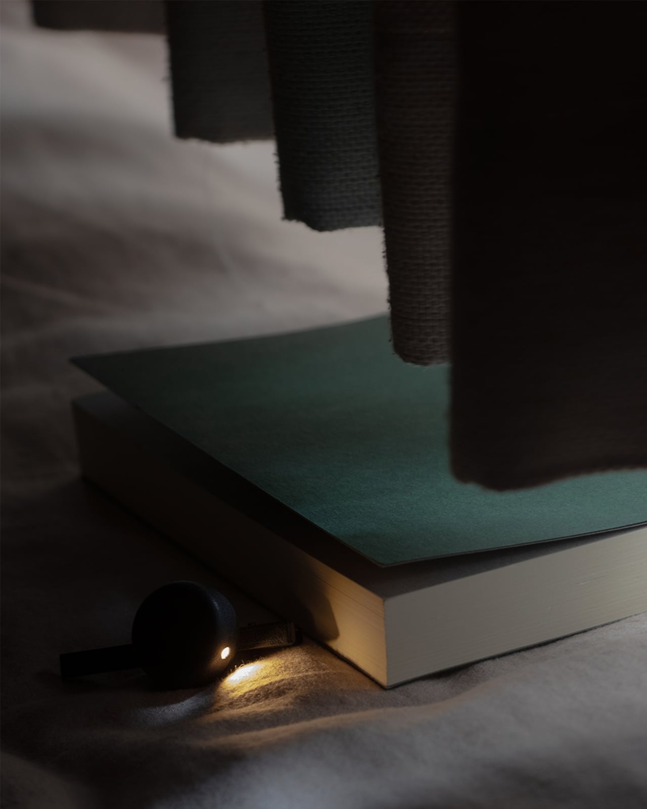
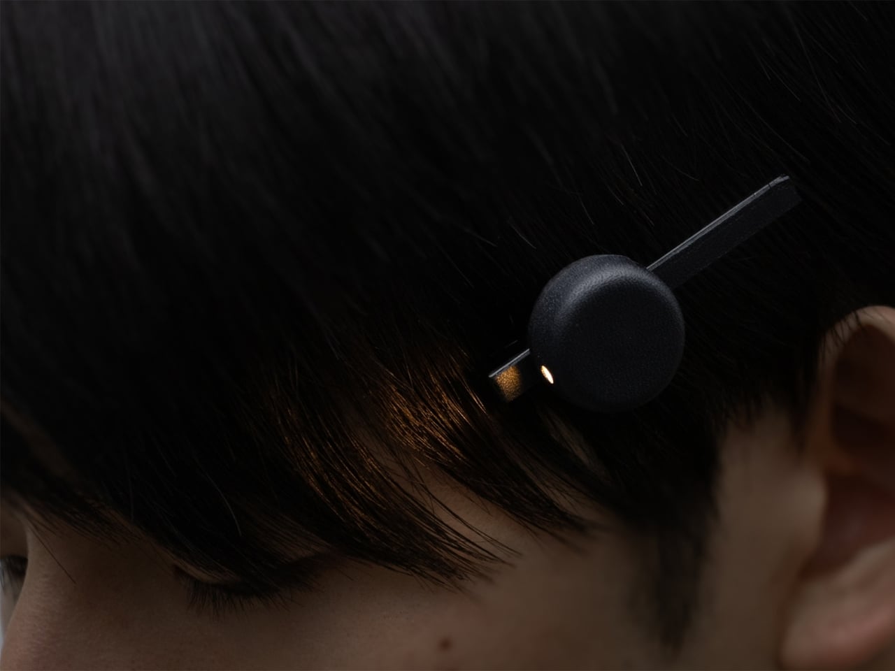
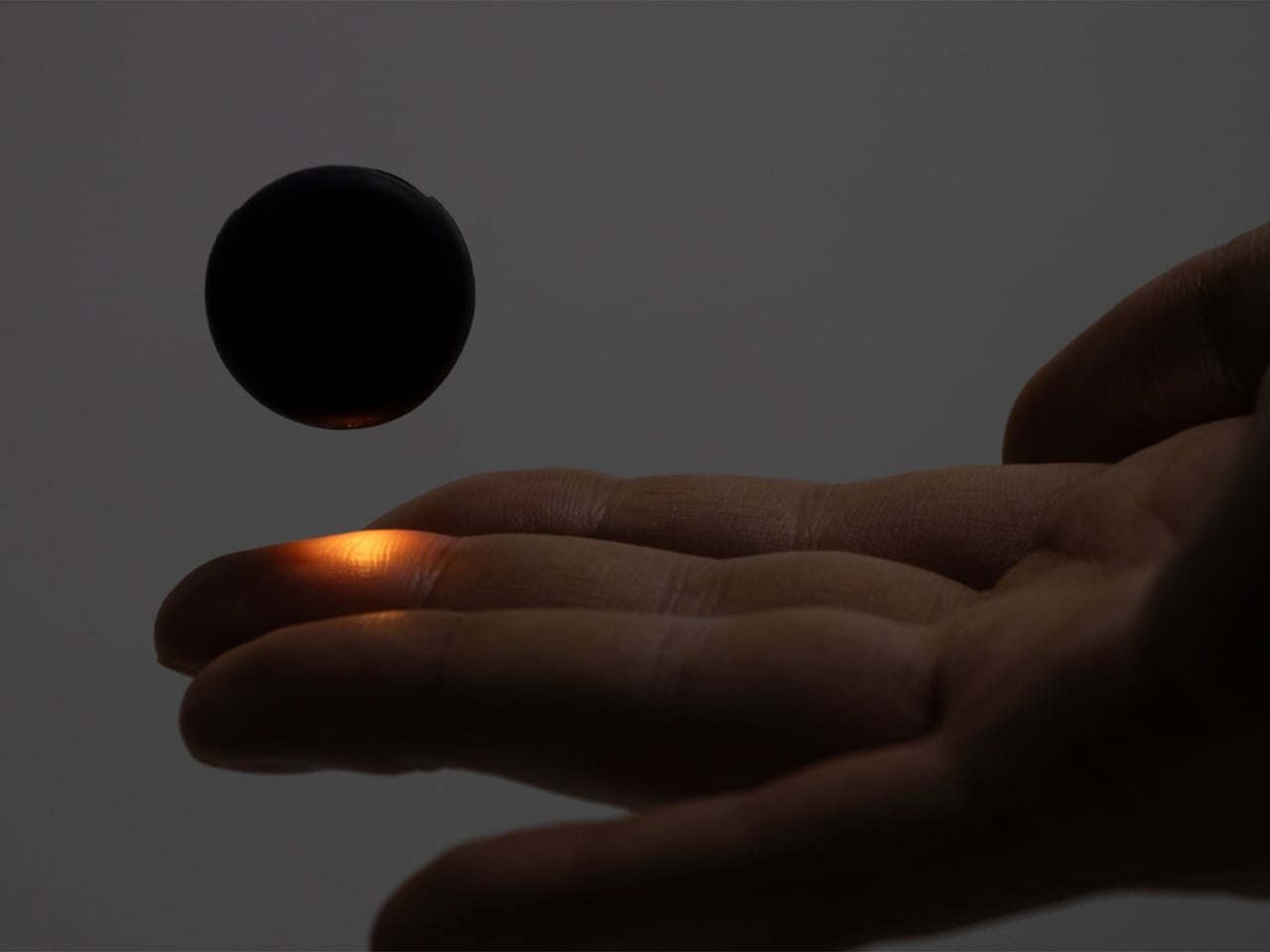
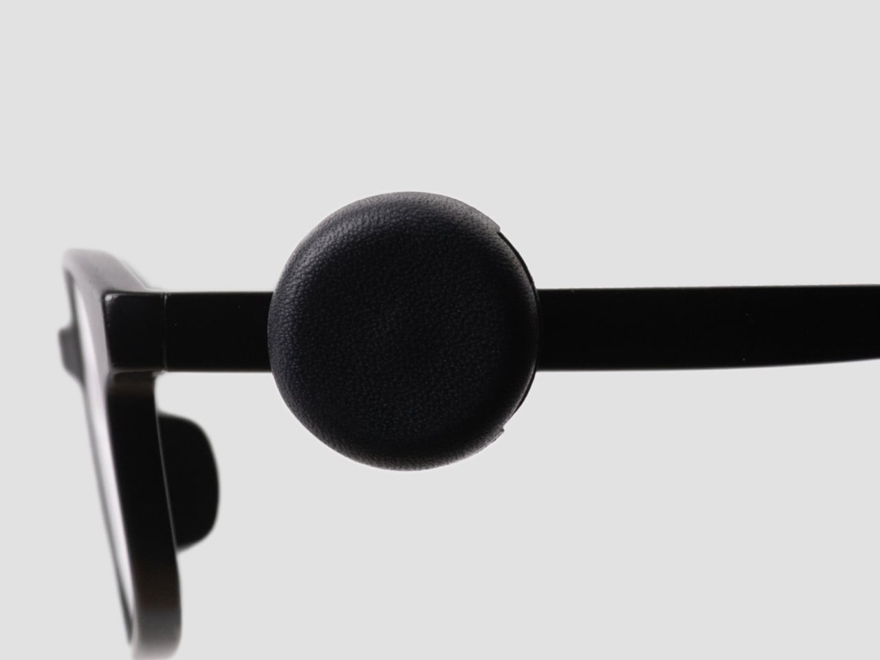
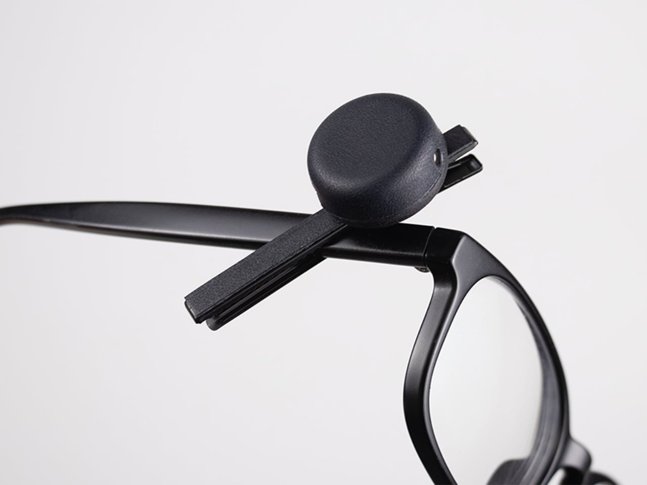
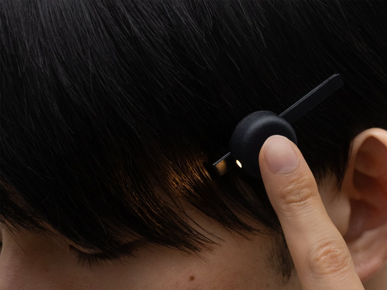
This is the problem that Ryo Matsuoka seeks to solve with the concept for the Wearable Reading Light. As the name implies, it’s a light that you actually wear, so it moves with you as you read while lying in bed. The small light attaches magnetically to a clip worn in your hair. It can also attach directly to eyeglass frames made of magnetic metal, though not to every pair of reading glasses. You can angle the light toward your book while reading with the room lights off before going to sleep.

Designer: Ryo Matsuoka
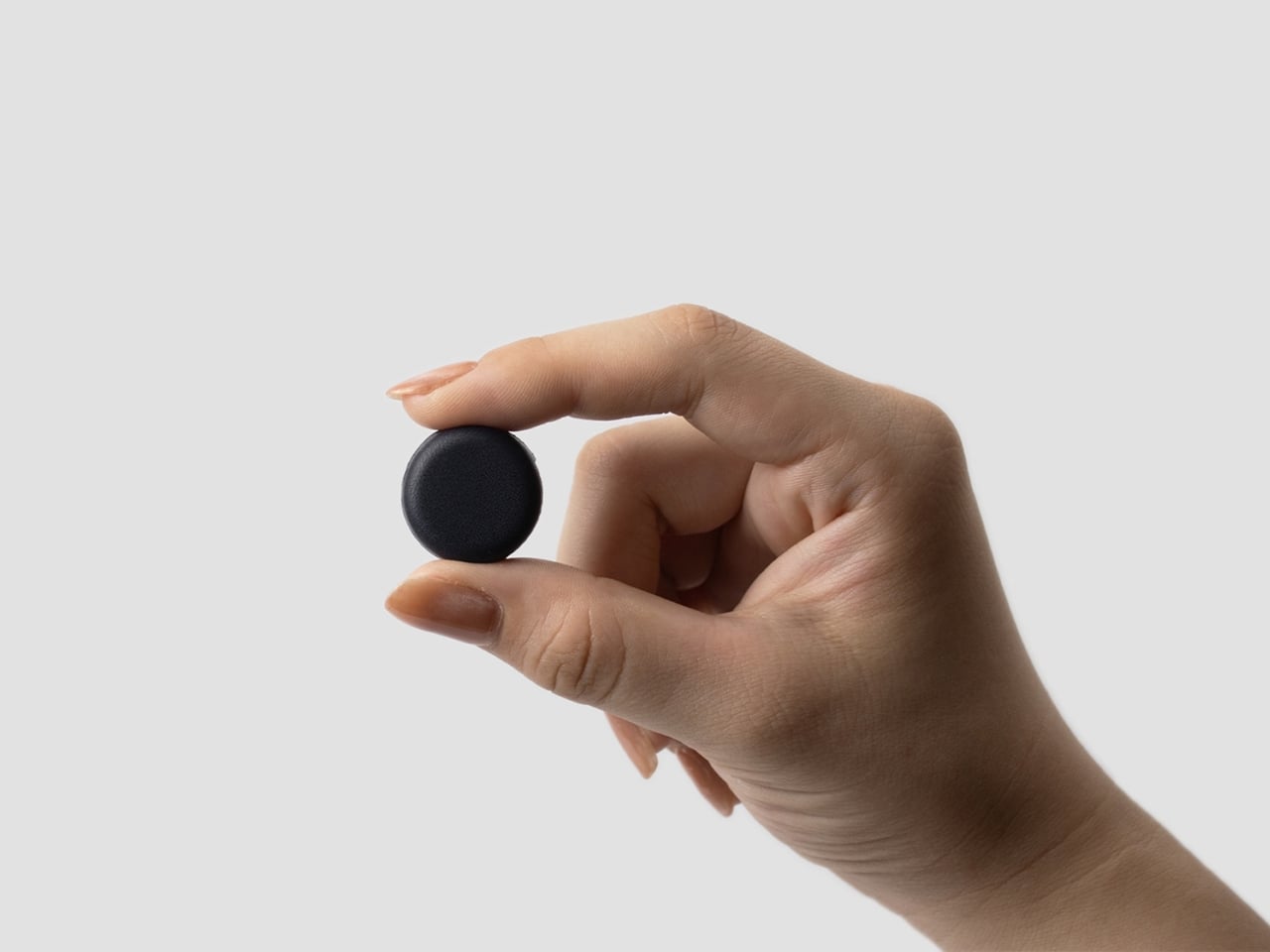
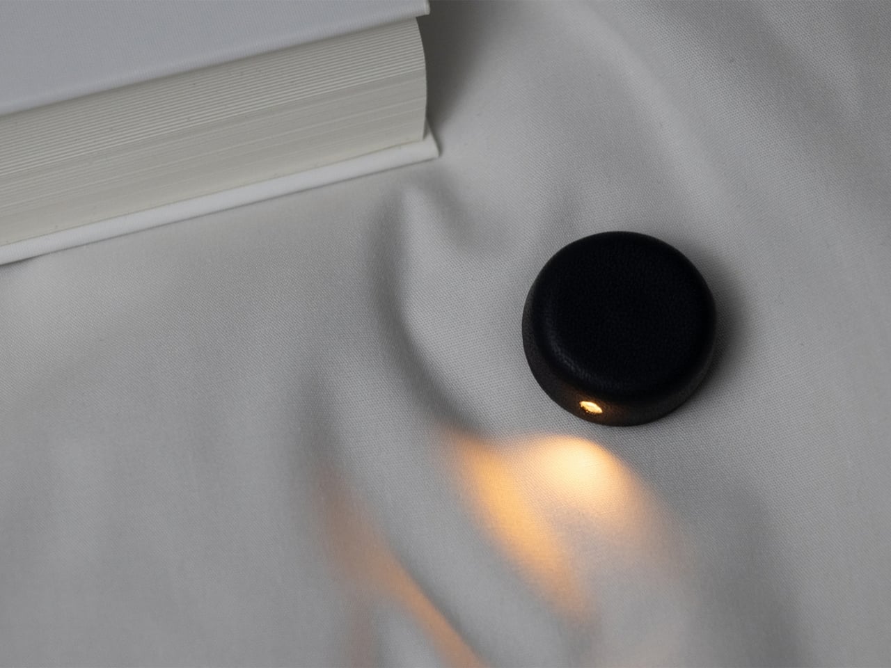
The light has a wet-formed leather exterior, with three-dimensional shaping that gives it a smooth, rounded form. It doesn’t really look like your typical reading light; it’s designed to look more like a small accessory. The light unit measures 24 × 24 × 12 mm (about 0.94 × 0.94 × 0.47 inches) and weighs only 4.5 g (about 0.16 ounces), so it adds very little weight to what you’re wearing. Its compact shape also keeps it from looking like a headlamp when it’s clipped into your hair.

The indigo-dyed wood is another detail worth noticing. Together with the leather, it gives the device a more crafted appearance than you might expect from a small electronic gadget. Matsuoka has kept the technology out of sight beneath the leather, leaving the exterior clean and simple. In the photos, you mostly see a dark, rounded form and the small opening where the light shines through.
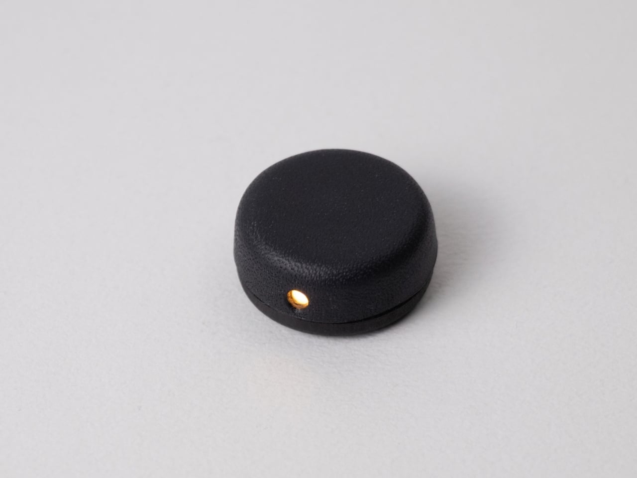
You can adjust the brightness across three levels, since the amount of light you want may depend on your surroundings or personal preference. There’s a hidden button to switch the light on, while a touch sensor controls the dimming. Those controls matter for something this small: you can make adjustments without adding a prominent switch to the design. The magnetic connection also lets you change the light’s angle, so you’re not stuck with one position if you shift around in bed.

It uses a replaceable coin battery, such as a CR1632, rather than a built-in rechargeable one. That means you won’t have to stop reading to charge it, provided you have a spare battery on hand. Matsuoka chose this approach with long-term use in mind: when the battery runs out, you can replace it instead of retiring the whole light because its rechargeable battery has degraded. The leather and wood were selected with that same idea in mind, as materials the designer expects to age well over time.
There’s also a dedicated storage case made from the same wet-formed leather and wood. It holds both the light and the clip, giving these tiny pieces a place to go when you’re done reading. That’s a practical touch for an object small enough to disappear among the things on a nightstand or at the bottom of a bag. It also makes the light feel like a complete design rather than just a clever attachment.

What makes the Wearable Reading Light interesting isn’t simply that it’s small. It’s that Matsuoka has moved the light away from the book altogether. You can hold a paperback without a clip tugging on its cover, and the light can stay with you when you change positions. For anyone who likes to end the day with a few pages in bed, that could make a familiar routine a little more comfortable. The concept doesn’t promise to replace every bedside lamp, but it offers an alternative for readers who have never quite found the right place to put one.
The post A Reading Light That Actually Clips to Your Hair, Not Your Book first appeared on Yanko Design.
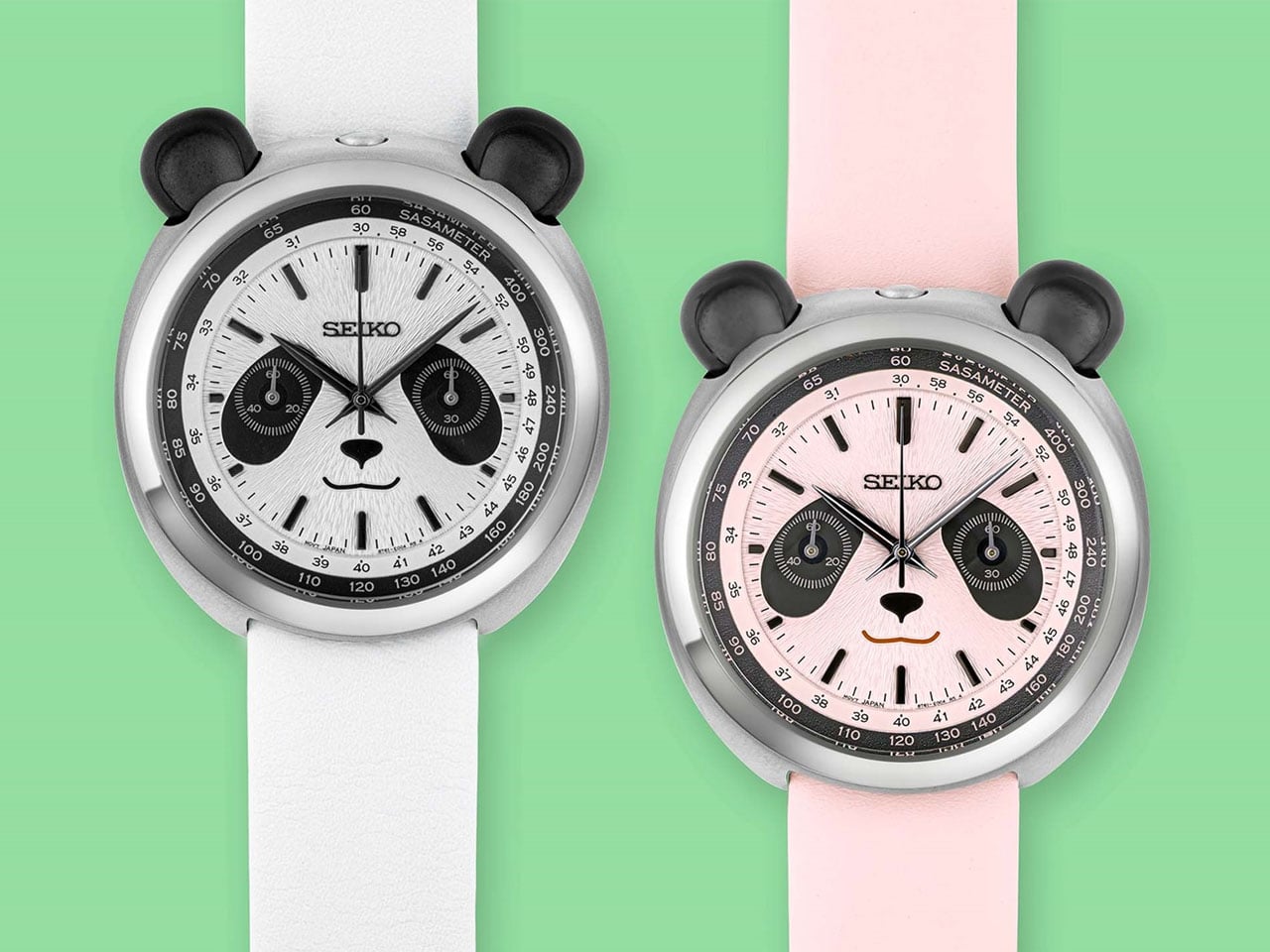
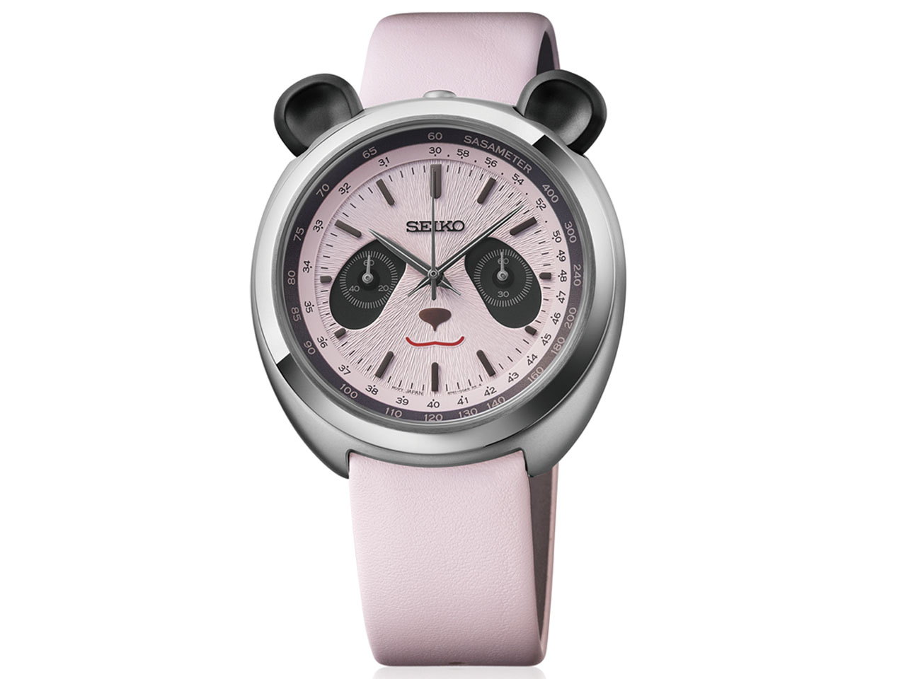
Seiko’s New Panda Chronograph gives your wrist a playful personality without sacrificing function

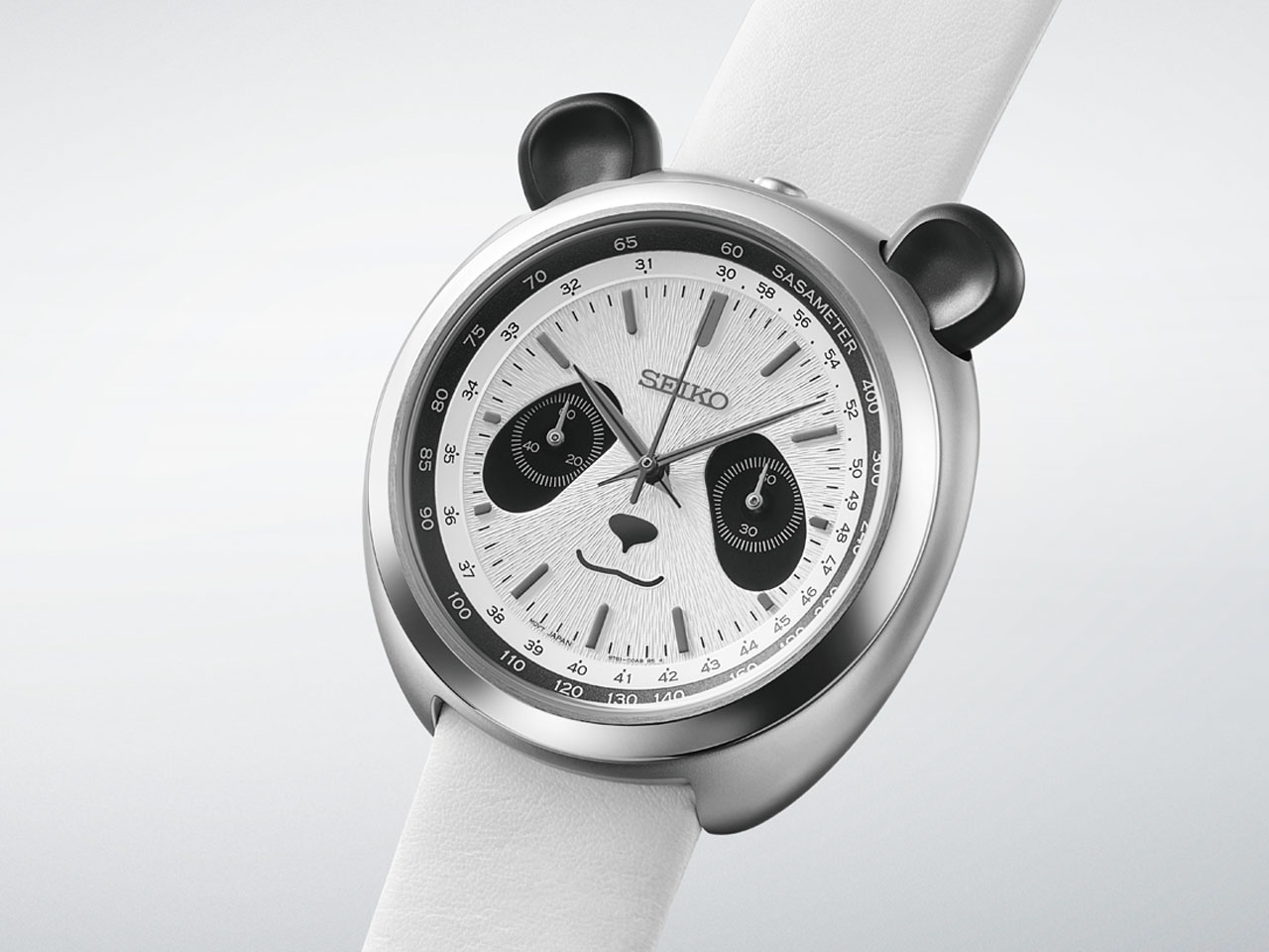
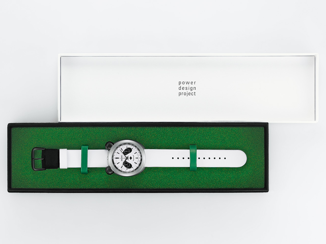
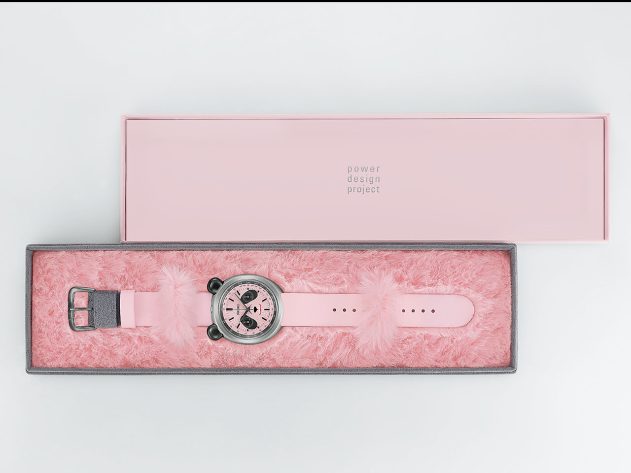
There are plenty of watches that get called “panda” because of their black-and-white dials. Seiko decided to take that nickname a little more literally, creating the Power Design Project Panda Chronograph. The timepiece is a playful mechanical-looking chronograph that actually puts a panda’s face on the dial, which is quite fun, to be honest.

The idea first appeared as a concept at Seiko’s Incredibly Specialized Watch Exhibition in 2024. Designer Kiyotaka Sakai wondered what a chronograph would look like if the word “panda” wasn’t just a collector’s nickname. The production versions – HHK001P and HHK002P – stay remarkably close to that original thought. The watch is designed to make you smile, but it still has the proportions, finishing and functionality of a proper Seiko chronograph.

Designer: Seiko

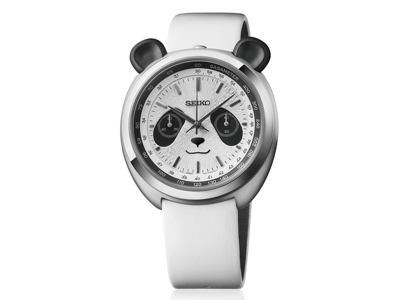
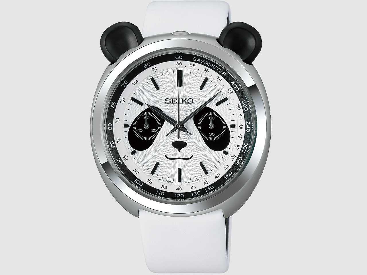
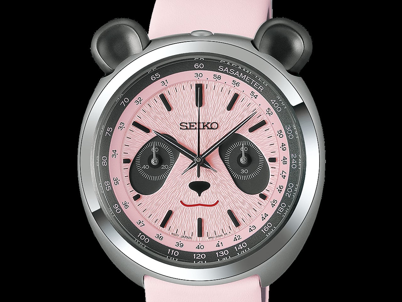
The first thing you notice is the face, where black subdials naturally become the panda’s eye patches, while a small nose and curved mouth sit below them. The two chronograph pushers rise above the case like ears, giving the watch an expression that is surprisingly easy to read. It sounds like a gimmick on paper, but the proportions make it work.

Seiko has carried the theme into details that are easier to miss. The dial has a radial texture intended to resemble panda fur, while the hour and minute hands take inspiration from bamboo leaves. The tachymeter scale around the edge gets a suitably playful name: “SASAMETER,” from sasa, the Japanese word for bamboo. It remains a functional tachymeter, with Seiko noting that it could theoretically measure a panda running at around 30 km/h.

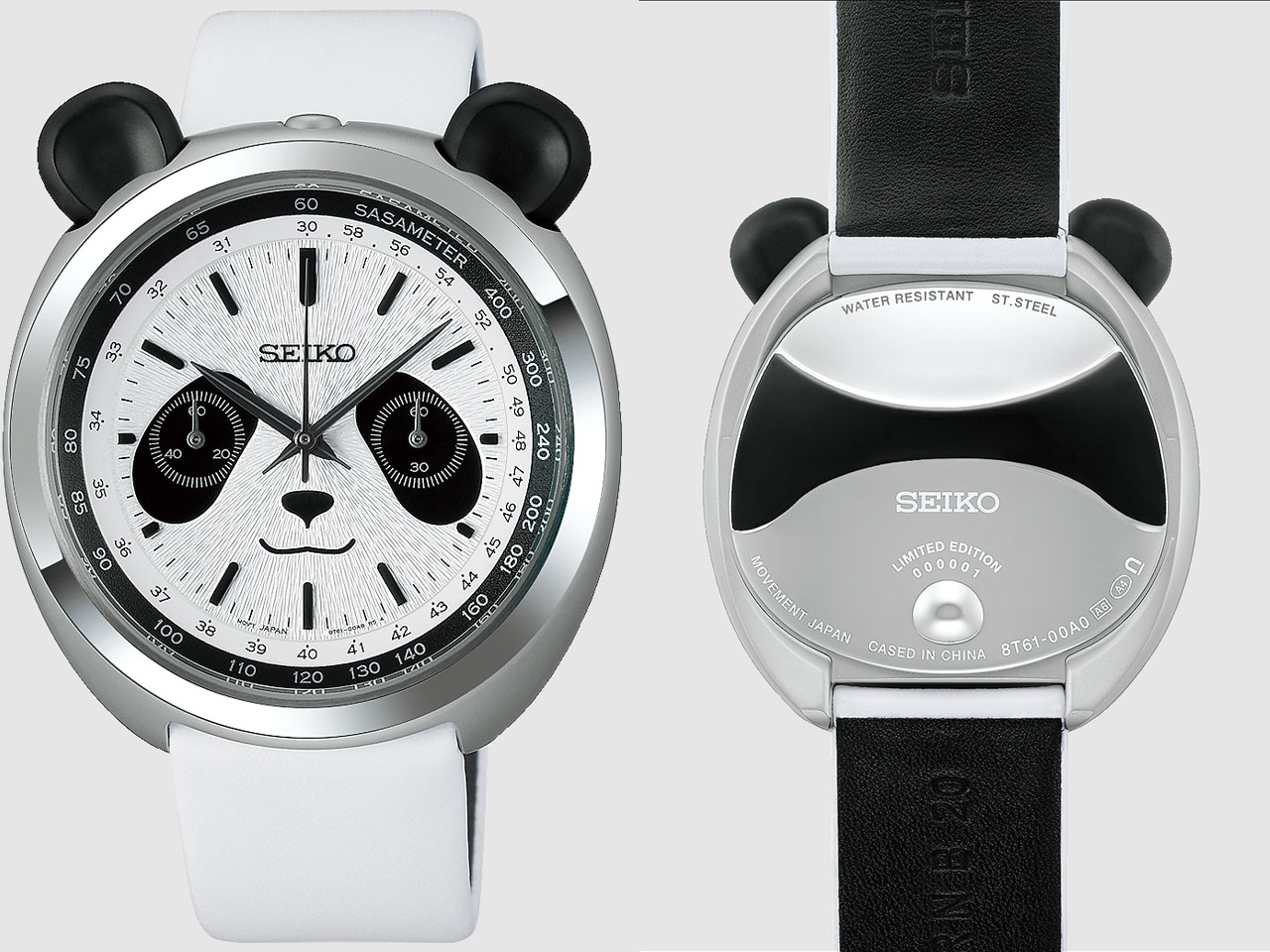
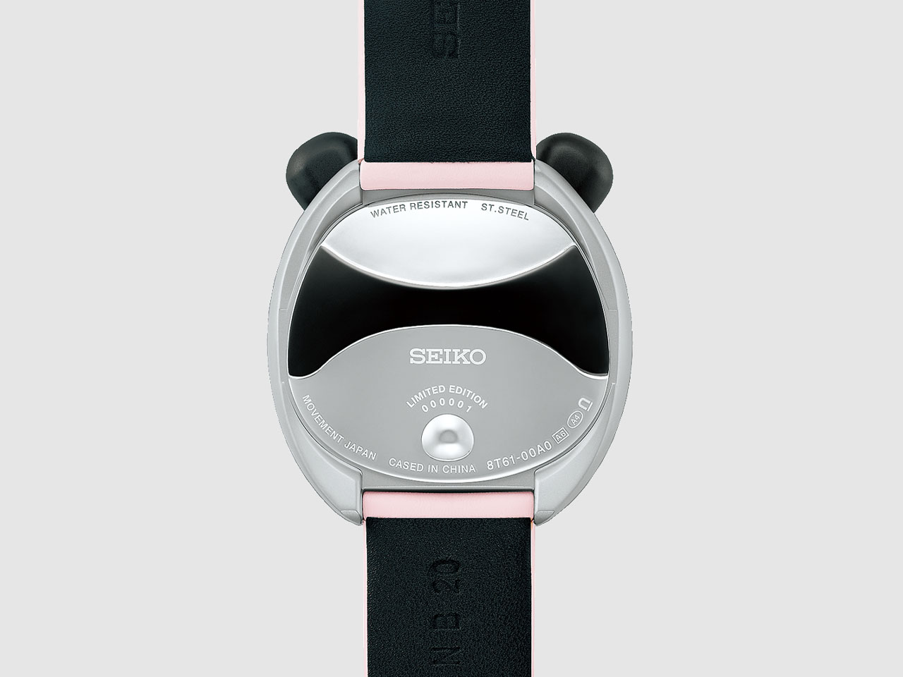
The 43mm stainless-steel case is 14.6mm thick and uses hidden lugs, which help keep its footprint from feeling quite as large as those numbers suggest. The recessed crown sits between the ear-like pushers, while the caseback continues the joke with a rounded profile and a small three-dimensional tail.

Underneath, there is no complicated mechanical movement trying to compete with the design. Seiko uses its quartz Caliber 8T61, which provides hours, minutes, central chronograph seconds and a 60-minute counter with 1/5-second measurement. It is rated to an accuracy of ±15 seconds per month and offers 30-meter water resistance.

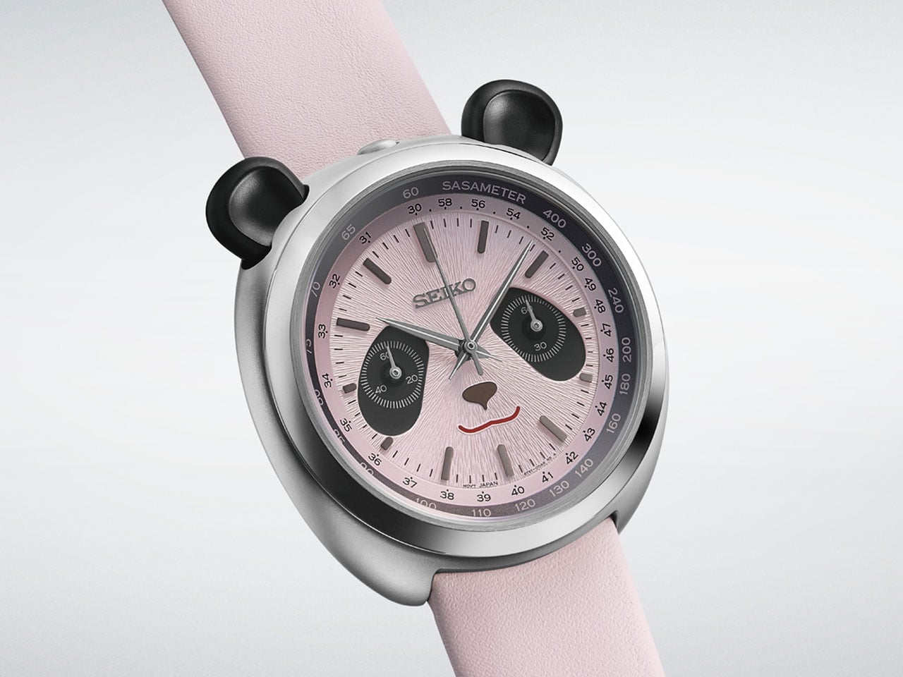
The watch comes on a cowhide leather strap with suede-like sections. This is a cute attempt to bring the panda theme into something you actually feel when wearing it. Out of the two versions, the HHK001P is the familiar black-and-white panda, limited to 3,000 pieces. The HHK002P swaps the usual colors for pink and gray, inspired by the appearance of newborn pandas, which are born with pink skin before developing their characteristic black-and-white fur. That version is limited to 2,000 pieces. Both watches are priced at $540 and are scheduled for release in November 2026.

The post Seiko’s New Panda Chronograph gives your wrist a playful personality without sacrificing function first appeared on Yanko Design.
This $59 Cork Wallet Makes Your Overstuffed Bifold Look Embarrassing

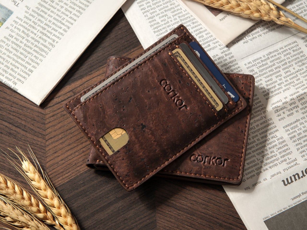
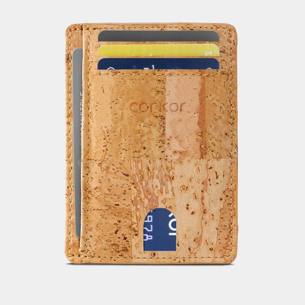
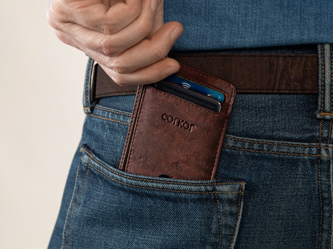
Most wallets don’t start out bulky. They get there one receipt, spare card, and folded bill at a time, until slipping one into a front pocket feels like packing a book. Corkor’s slim card holder asks you to carry less, then makes that decision feel less austere with a cork exterior. Its appeal lies in the material as well as its size.

Cork is something you pull from a bottle or pin notes into, not what you reach for when paying for coffee. Here, its irregular grain gives the wallet character without needing decorative hardware or branding. Stitched edges and stacked pockets keep the shape familiar, but the surface feels different from the smooth leather and synthetic finishes that dominate everyday carry.

Designer: Corkor

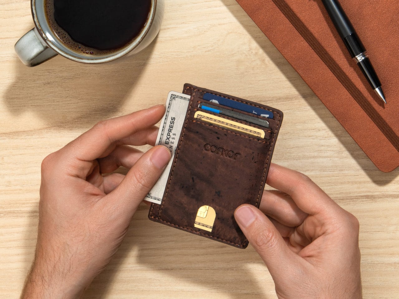
The layout keeps your most-used cards in three slots, with an ID window and two compartments for folded bills. A small opening on the front helps you nudge a card upward rather than digging at its edge. Keep only the cards you actually use, though, because squeezing too many into those pockets would inevitably change how slim the wallet feels in your pocket.

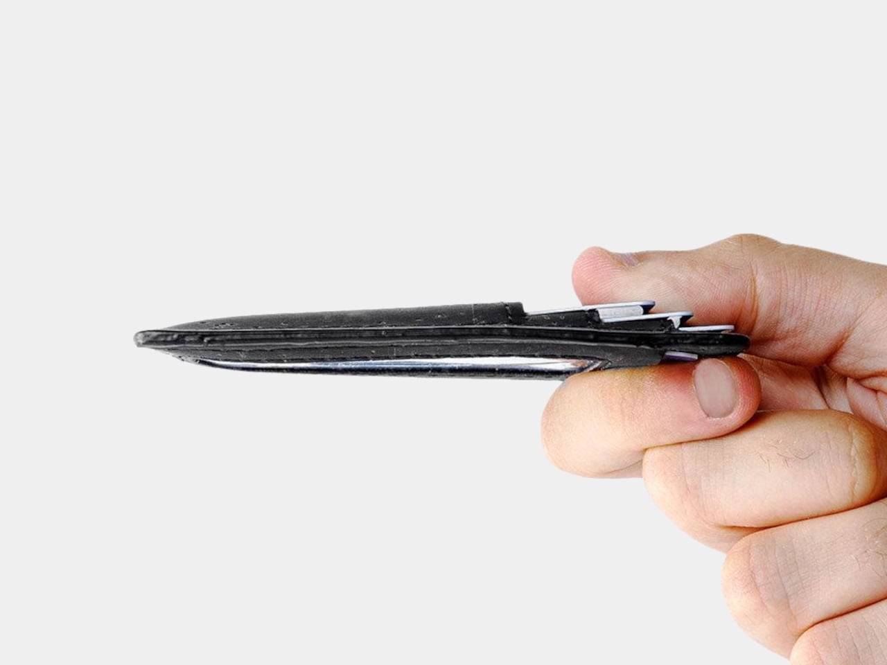
At 4.3 inches tall, 3.2 inches wide, and 0.4 inches thick when empty, the holder takes up less room than a traditional bifold. It weighs just 0.70 ounces before you add anything. You can leave home with a payment card, an ID, and a little cash without carrying a stack of compartments you’ll never open during a long, busy day away from home.

Cork has a purpose beyond its unusual appearance. The thin, pliable material lets the holder bend gently instead of feeling like a rigid little case, and Corkor describes it as water-repellent and easy to clean. For someone who wants an animal-free alternative to leather, that makes the material choice part of the daily experience rather than a claim printed on a label.

The cork comes from Portugal, where Corkor also makes the holder in-house. That doesn’t mean a wallet can settle every question about sustainability, but it does give this one a clear material identity. Corkor says its packaging is recyclable or compostable, and the card holder is certified vegan. Those details matter most when they’re paired with something you actually want to keep using.

Of course, minimalism has limits. There’s no coin pocket, and those folded bills won’t be as quick to sort through as cash in a full-size wallet. RFID-blocking construction is included to help protect compatible cards from skimming, but it won’t prevent other kinds of theft. This is a holder for an edited pocket, not a place to stash whatever the day hands you.

Corkor prices the holder at $59, which might seem steep for something designed to carry so little. That small footprint is precisely the point. The soft, mottled cork makes a familiar stack of slots feel unexpectedly personal, while the slim layout encourages you to leave the clutter behind. Once you’ve pared things down, that front pocket might finally have room for more than your wallet.

The post This $59 Cork Wallet Makes Your Overstuffed Bifold Look Embarrassing first appeared on Yanko Design.
Bloom Built a Cat Tower Around the Cat You Haven’t Got Yet

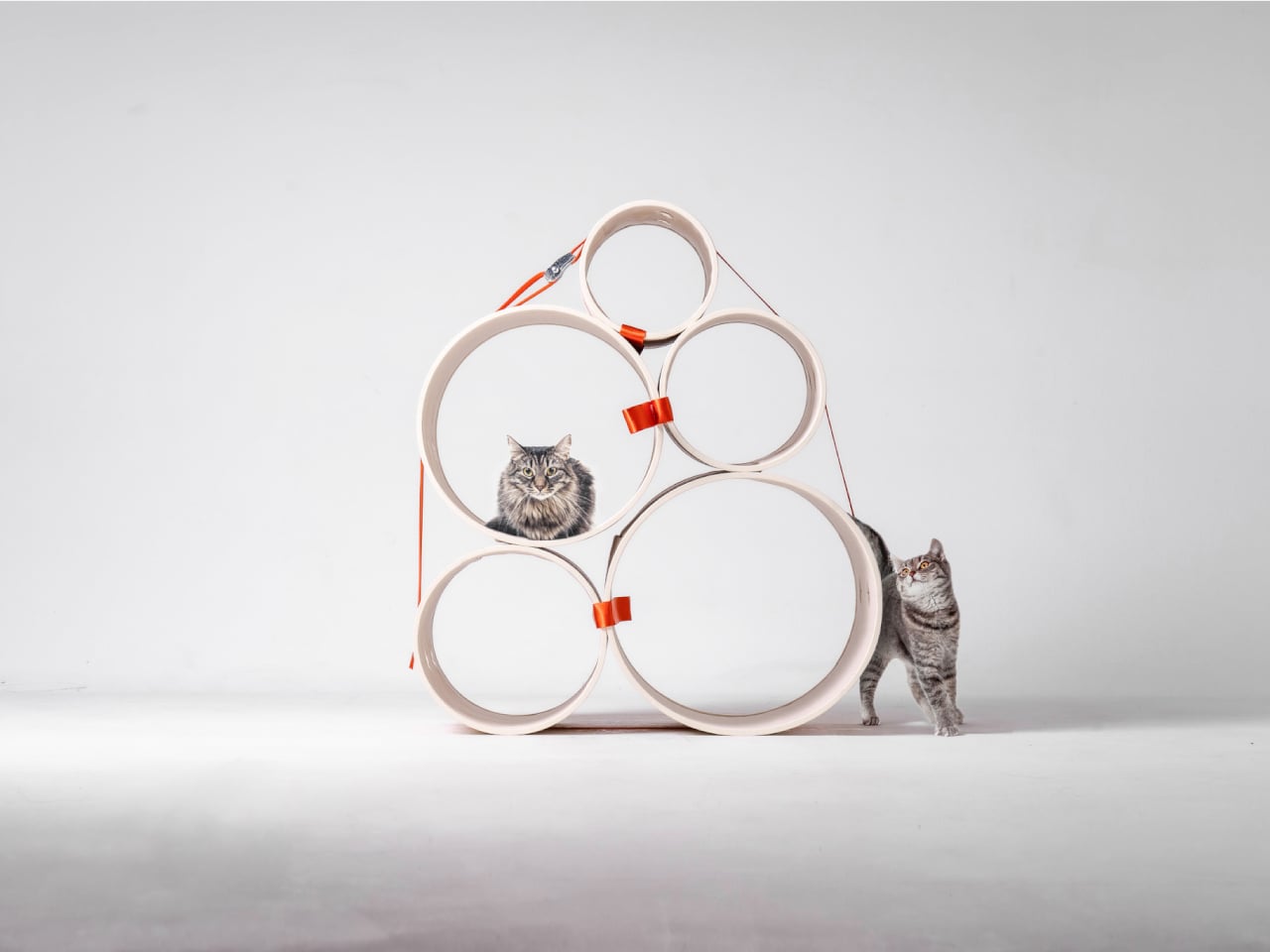
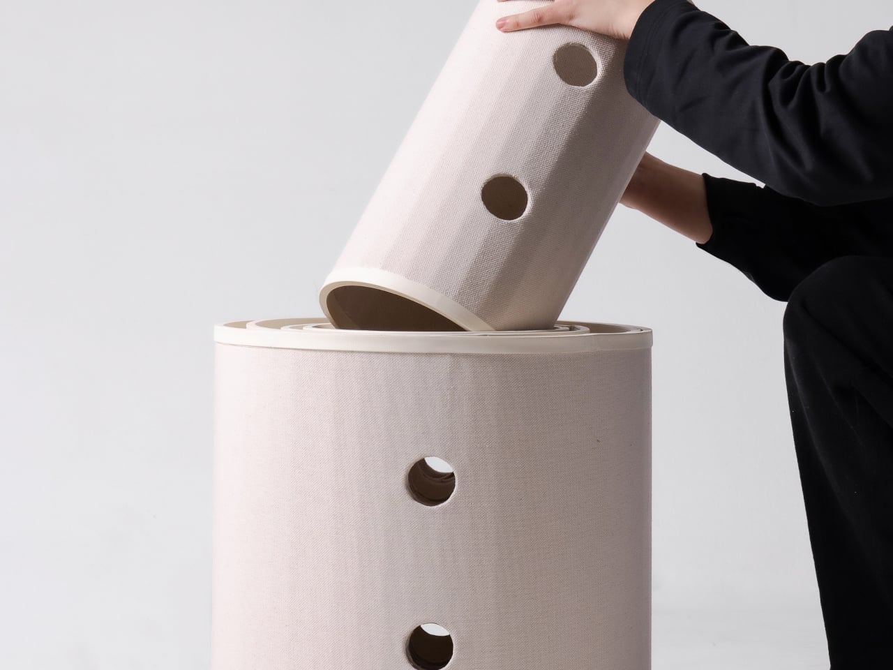
A kitten might be happy with a hideaway, but give it a few months and that same nook starts looking cramped. Add another cat, and a single perch becomes contested territory. Bloom takes that problem literally, building a cat tower from separate cylindrical modules that can be arranged as its occupants grow. It starts small instead of demanding space for a feline family.

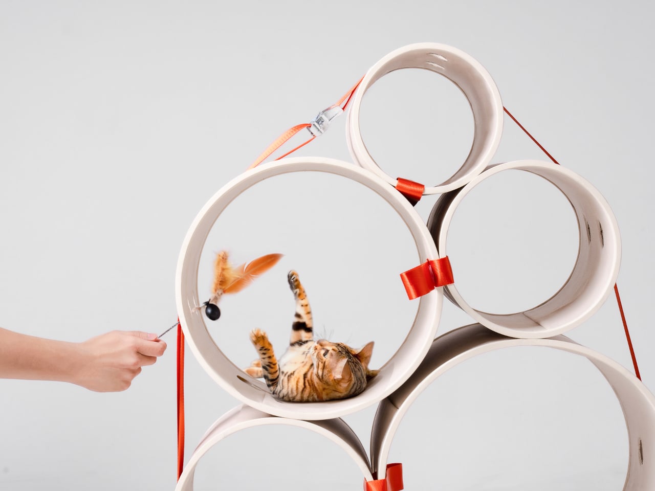
Most cat towers arrive as a collection of platforms, posts, and houses, whether your cat needs all of them or not. Their bulk can make a living room feel as if it has been furnished around the pet. Bloom swaps that predetermined silhouette for a cluster of open tubes, each one a place to curl up, climb through, or watch the room.

Designers: Joonseo Choi, Taewoon Kang

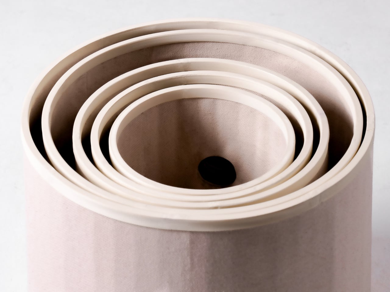
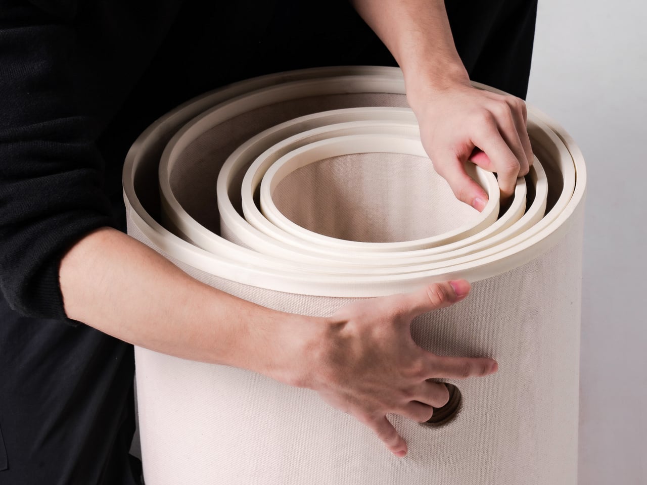
Those cylinders come in several diameters, so arranging them feels closer to stacking play objects than assembling pet furniture. A smaller cat can settle into a tighter opening, while a larger one has room to stretch out in a wider tube. The circles also give Bloom its character: soft, repeating forms that can take different shapes instead of committing your room to one tower.

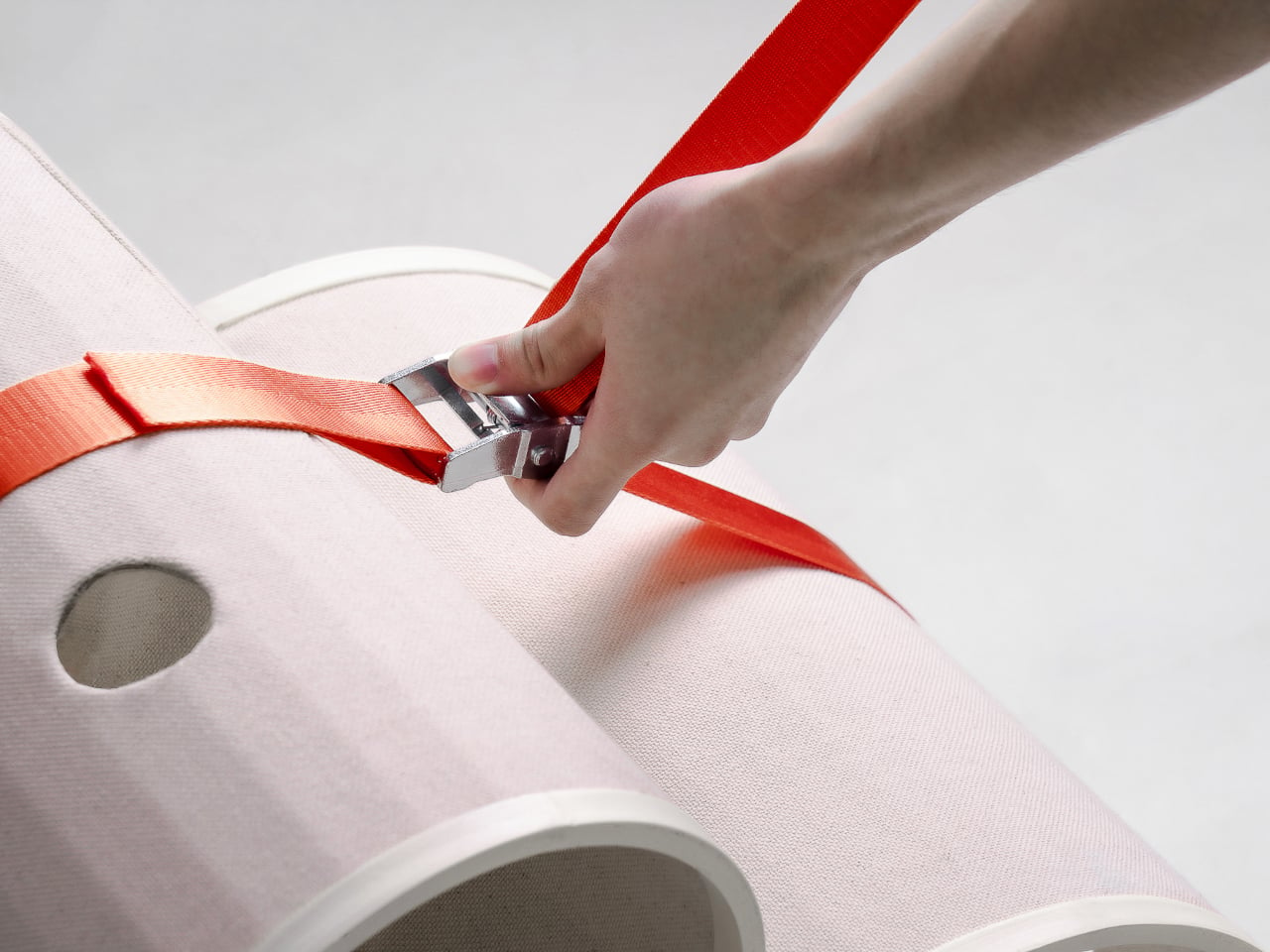
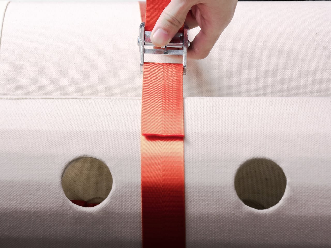
Of course, loose tubes wouldn’t make much of a cat tower once the occupants started leaping about. Bloom uses orange straps to hold the modules together, with hook-and-loop fastening that makes them easier to attach and detach. The straps add a punch of color to the pale cylinders, but their important job is letting you change the arrangement without committing to a rebuild.

You might begin with two tubes near the sofa, then add another when your kitten starts climbing above everybody’s heads. If a second cat joins the household, a wider cluster could give each animal somewhere to pause without fighting over the same opening. The exact layout can follow the cats, rather than asking them to adapt to whatever configuration came in a box.

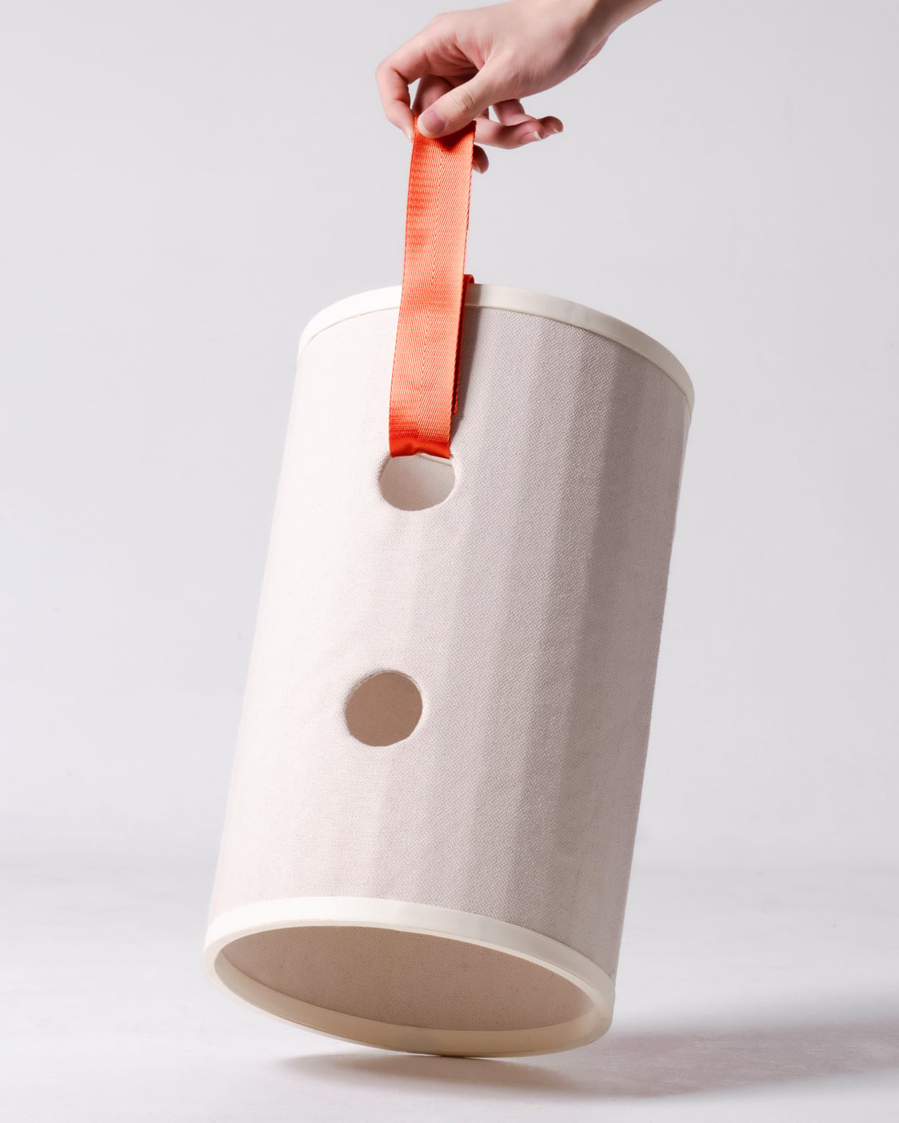
The holes along the sides serve another purpose beyond giving the straps somewhere to attach. Slide a toy toward one, and a cat tucked inside has something to investigate, while you get a way to join the game without reaching into the tube. It’s a detail, but it turns the enclosed space into somewhere for interaction rather than just another hiding place.

There are still questions a concept can’t answer. A tall arrangement would need to stay steady under a cat’s weight, especially if one launches itself at an upper opening. Bloom doesn’t specify load limits or explain how every possible configuration would be supported, so that flexibility shouldn’t be mistaken for unlimited stacking. For now, its flexibility remains an intriguing, unproven design proposition.

Still, Bloom understands something about cats that a fixed tower often misses: the creature you bring home won’t always be small, and it might not always be alone. Its tubes can be rearranged as that story changes, while its openings leave room for curiosity. The furniture doesn’t need to grow overnight; it can take shape alongside the animals that claim it.

The post Bloom Built a Cat Tower Around the Cat You Haven’t Got Yet first appeared on Yanko Design.