The World Cup is officially over and some people are still having a well-documented hangover from the 39-day football tournament. While Argentina failed to win their fourth star, the GOAT Lionel Messi did manage to break several records in the 2026 edition after winning the 2022 crown. What makes this all the more memorable is that it is probably the 39-year-old’s swan song from representing his country after a tumultuous and memorable stint for the national team.
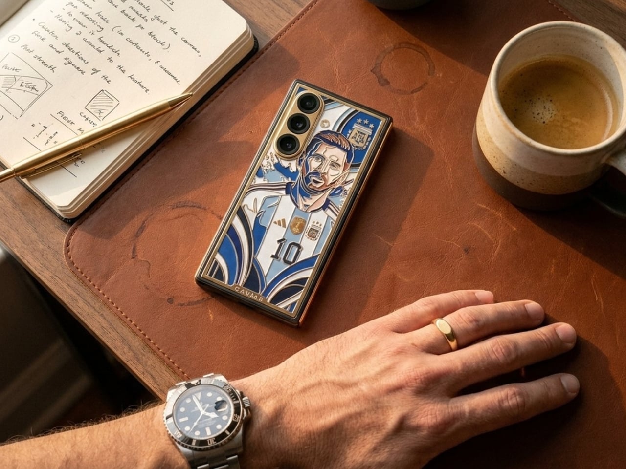
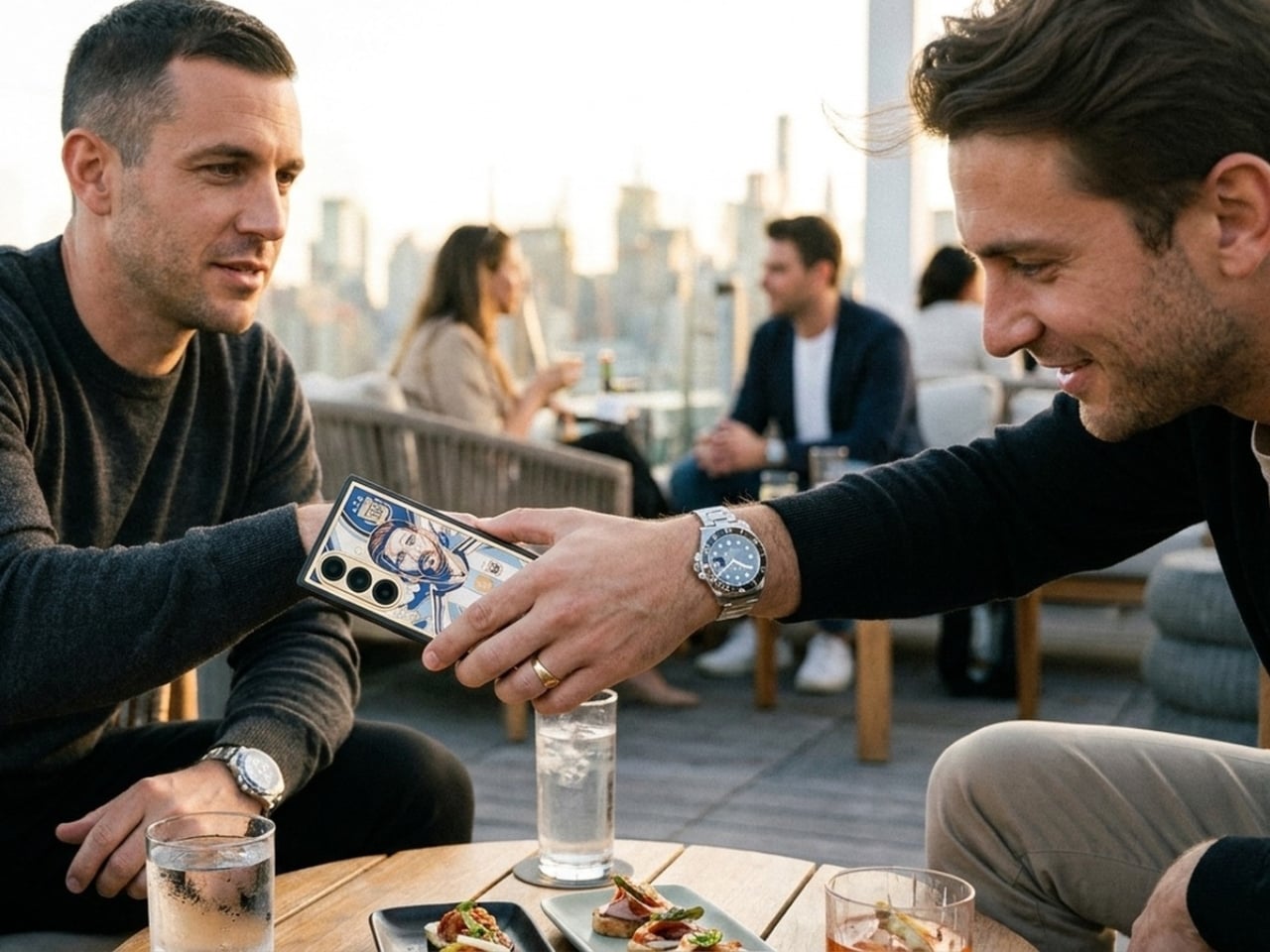
If you want to have something to keep your memories of Messi in an Argentina jersey alive and you have $13k lying around, this special edition Samsung Galaxy Z Fold 8 Ultra from Caviar is something for you. Aside from the exquisite design that comes with the phone, the device was listed and shown on the Caviar website nearly a week before Samsung officially unveiled their new device, so that means some of the features were “accidentally” leaked through the images on the product page.
Designer: Caviar
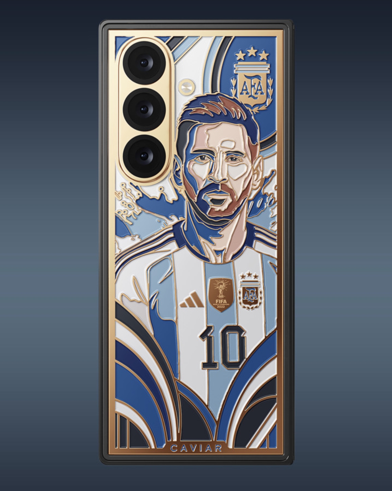
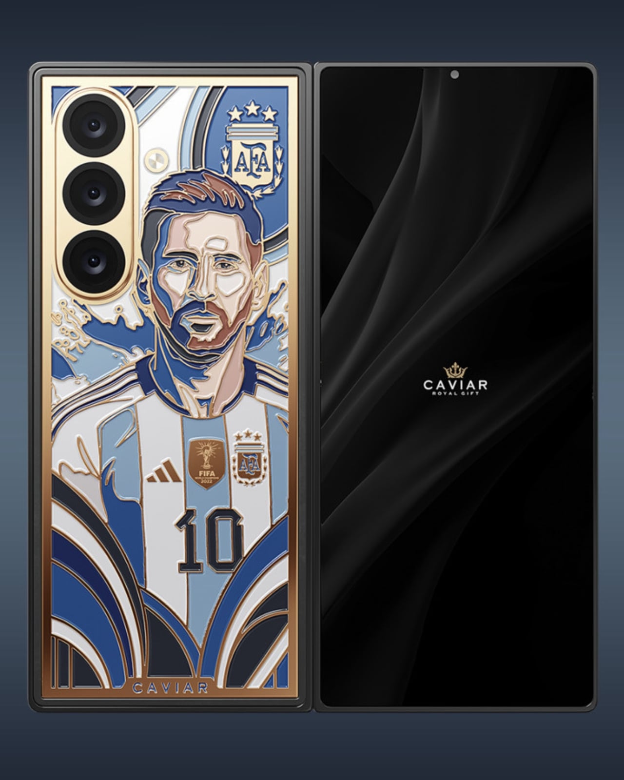
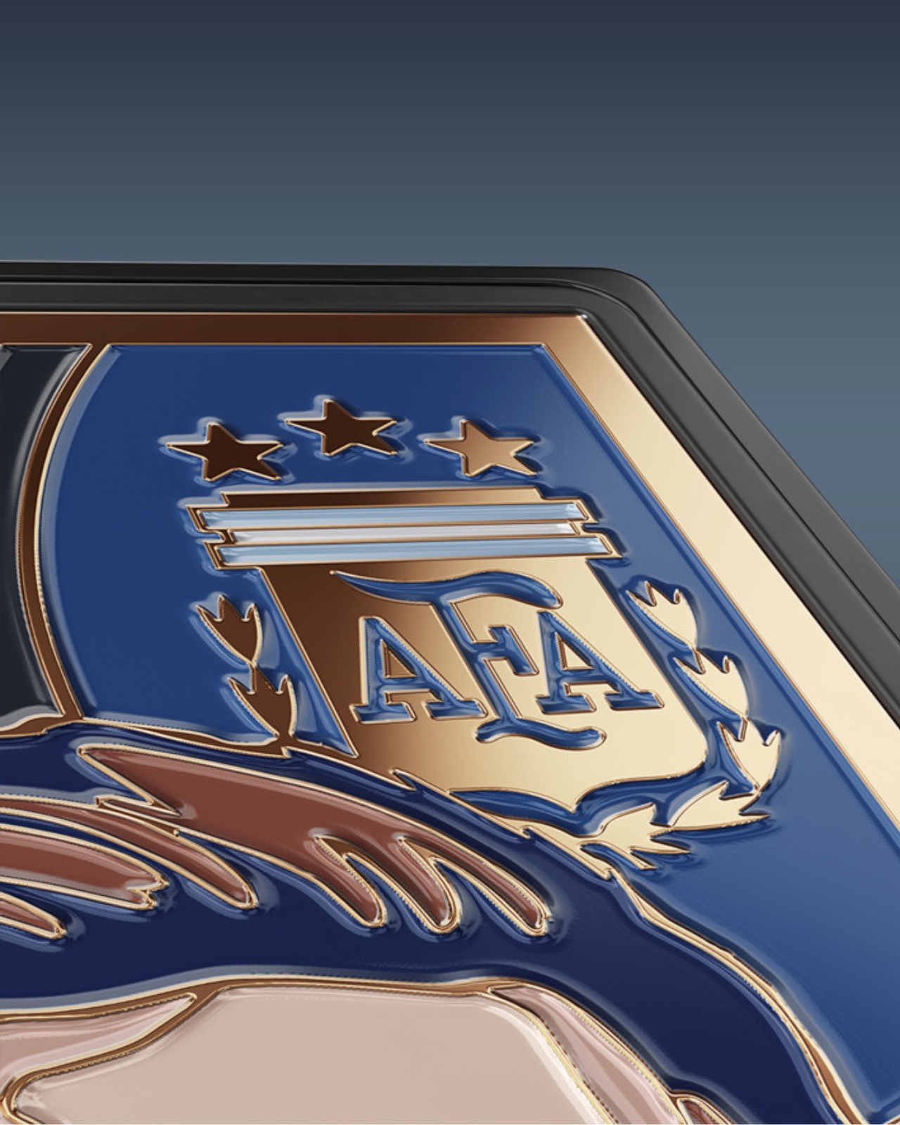
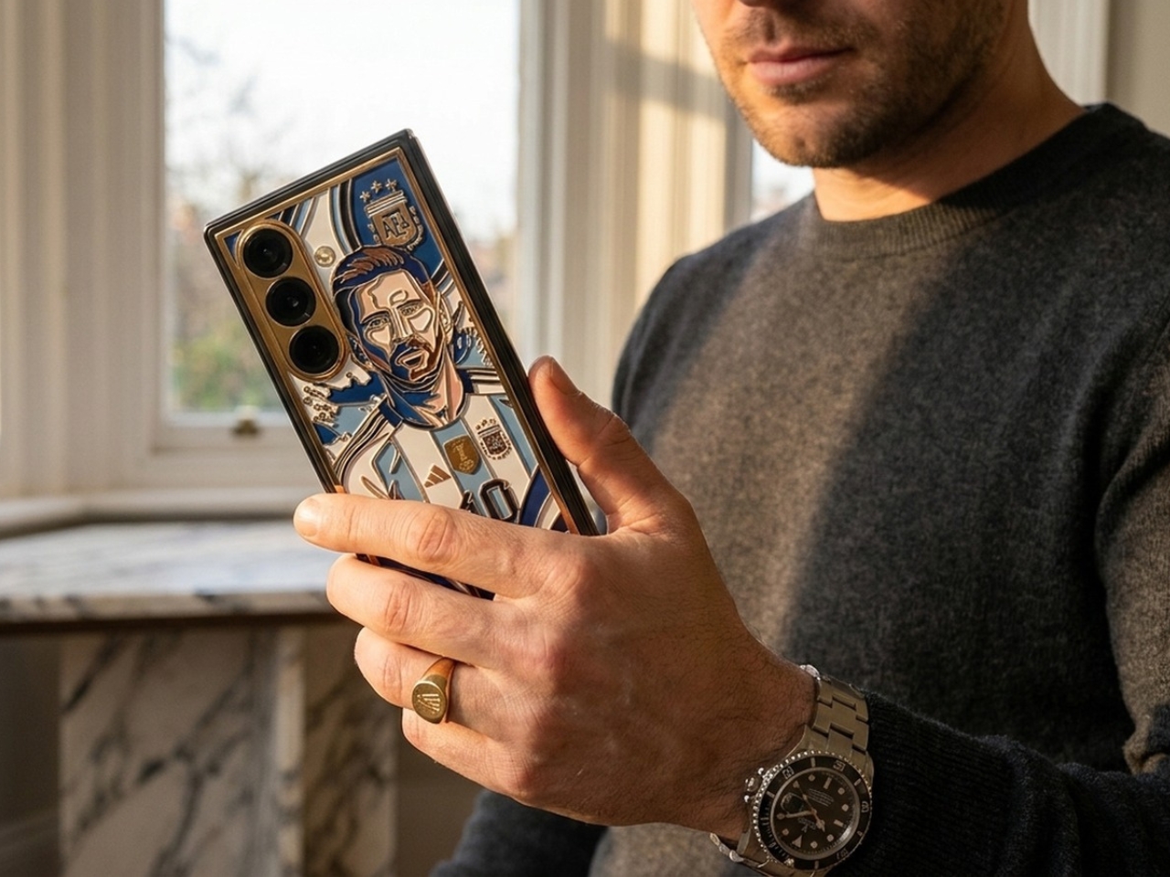
Leaks aside, if you’re a true football and Messi fan, you probably wouldn’t notice that, as you’ll be focused on how beautiful the luxury custom phone looks. Messi’s likeness in an Argentina jersey is handcrafted onto the phone using the intricate, centuries-old technique of cloisonné enamel, rendered in the traditional blue-and-white colors of the Albiceleste. Elements like the frame, key contours, Messi’s iconic number 10 jersey, national symbols, and framing details are highlighted with 24k gold.
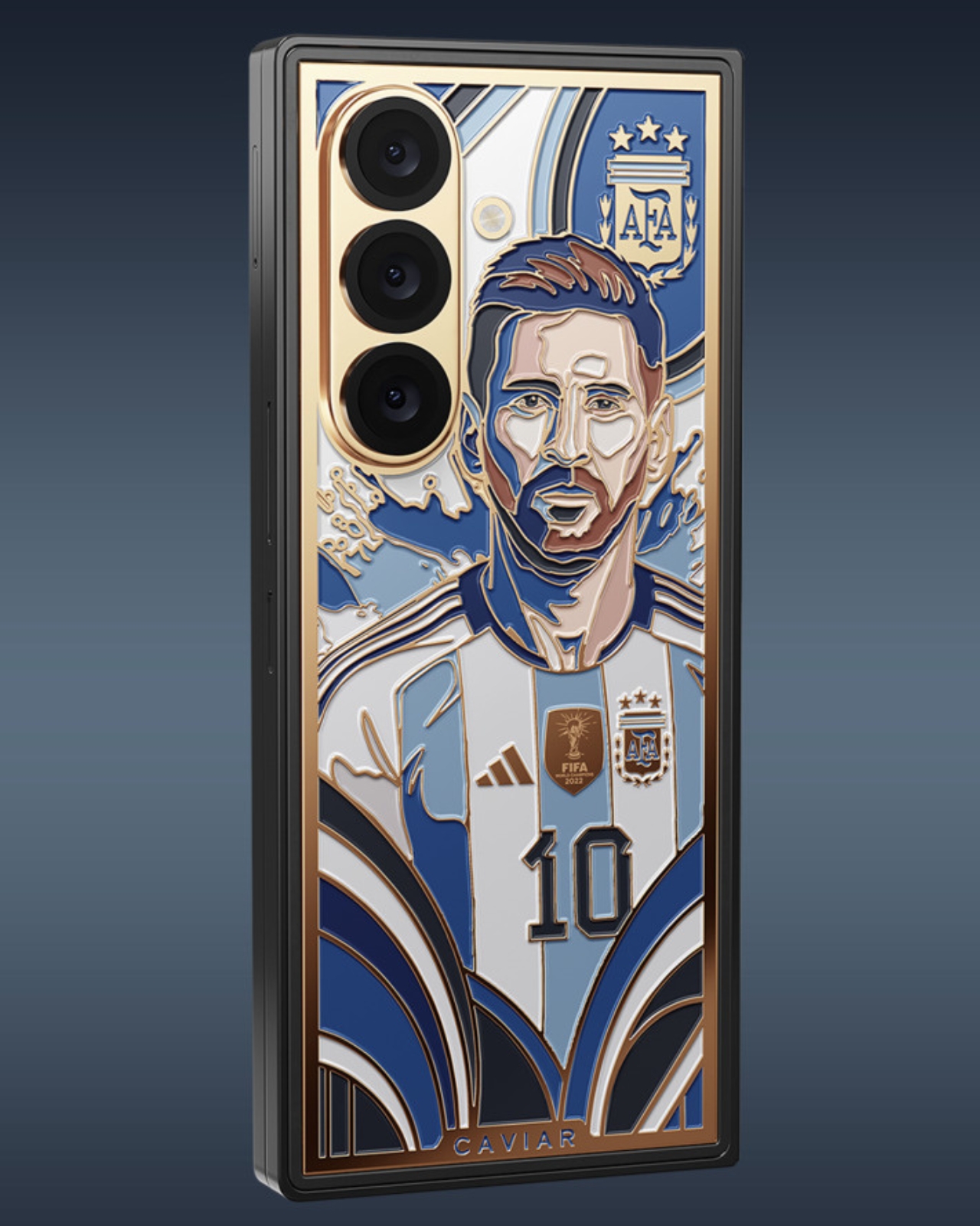
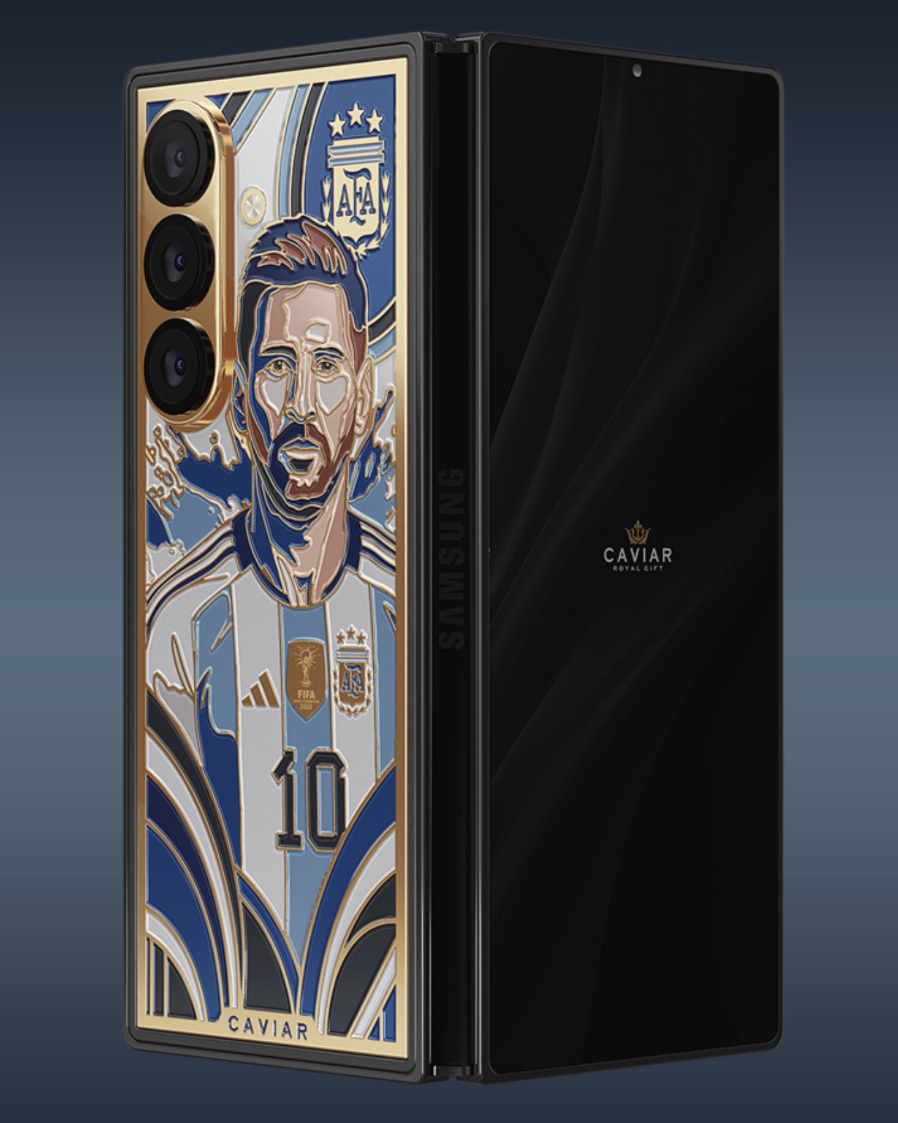
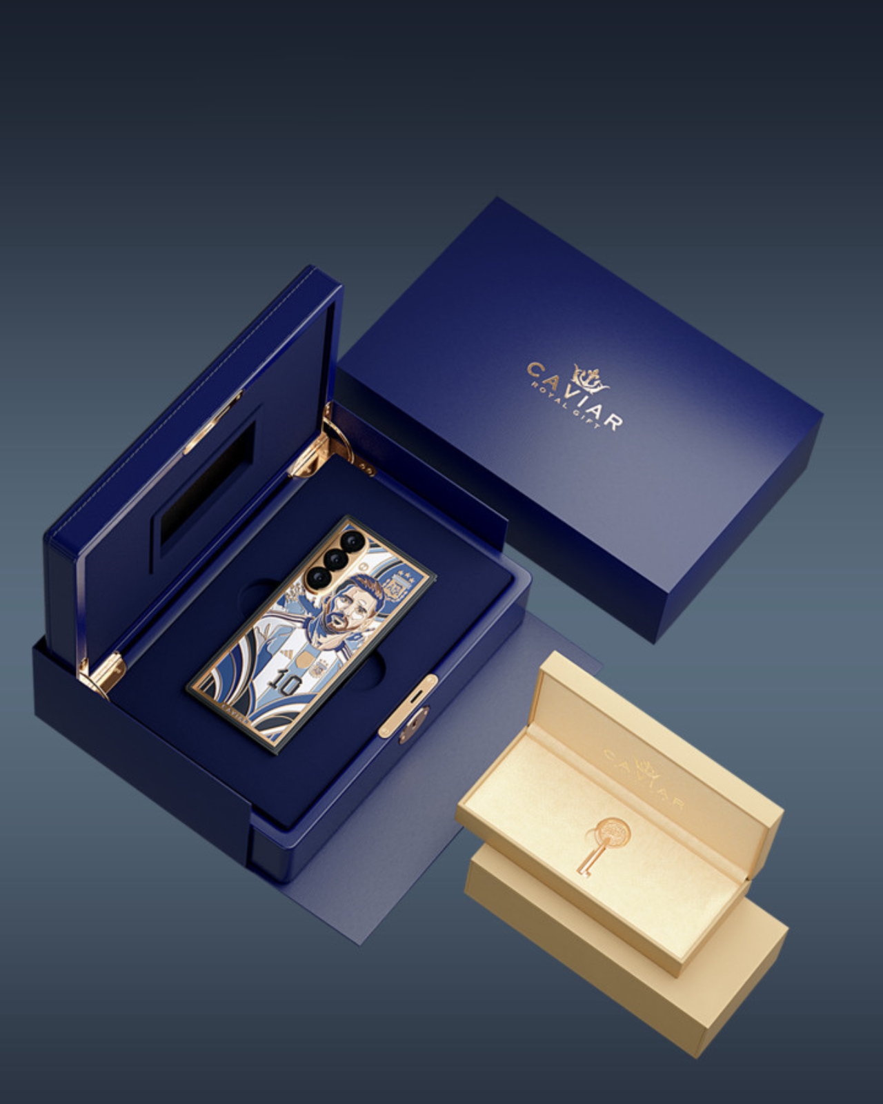
To make it even more official looking, you get official badges like the FIFA badge for Argentina’s 2022 World Cup-winning run, the Adidas logo, and the official national crest. It also comes with custom packaging, as it is encased in a royal blue custom box with 24-karat gold plating and a signature Caviar Key. Of course, with all these details, you can’t expect this to be cheap. The $13,130 price tag is 5x the expected price tag of the yet-to-be-officially-announced Galaxy Z Fold 8 Ultra. And even if you have $13k to spend, there will only be 19 pieces available, so you’ll have to be early to shell out that money.
What’s particularly impressive is that Caviar didn’t just slap Messi’s face on a phone and call it a day. The luxury atelier has built a reputation for transforming high-end devices into genuine works of art, and this piece is no exception. The cloisonné enamel technique used here is the same method found in fine jewelry and ancient decorative arts. It involves painstakingly separating colored enamels using thin metal wires before firing them at high temperatures. The result is a vivid, jewel-like finish that no digital print or laser engraving could ever replicate. Holding this phone feels less like holding a gadget and more like cradling a piece of history in the palm of your hand.

That sense of history is exactly what makes this edition so compelling. Messi’s journey with the Argentine national team has been nothing short of a rollercoaster, from heartbreaking World Cup final losses to the ultimate redemption in Qatar in 2022. Watching him grace the global stage one final time in 2026 was an emotional farewell that millions felt deeply. This phone captures that entire arc: the number 10, the Albiceleste colors, the World Cup crest, all immortalized in gold and enamel.
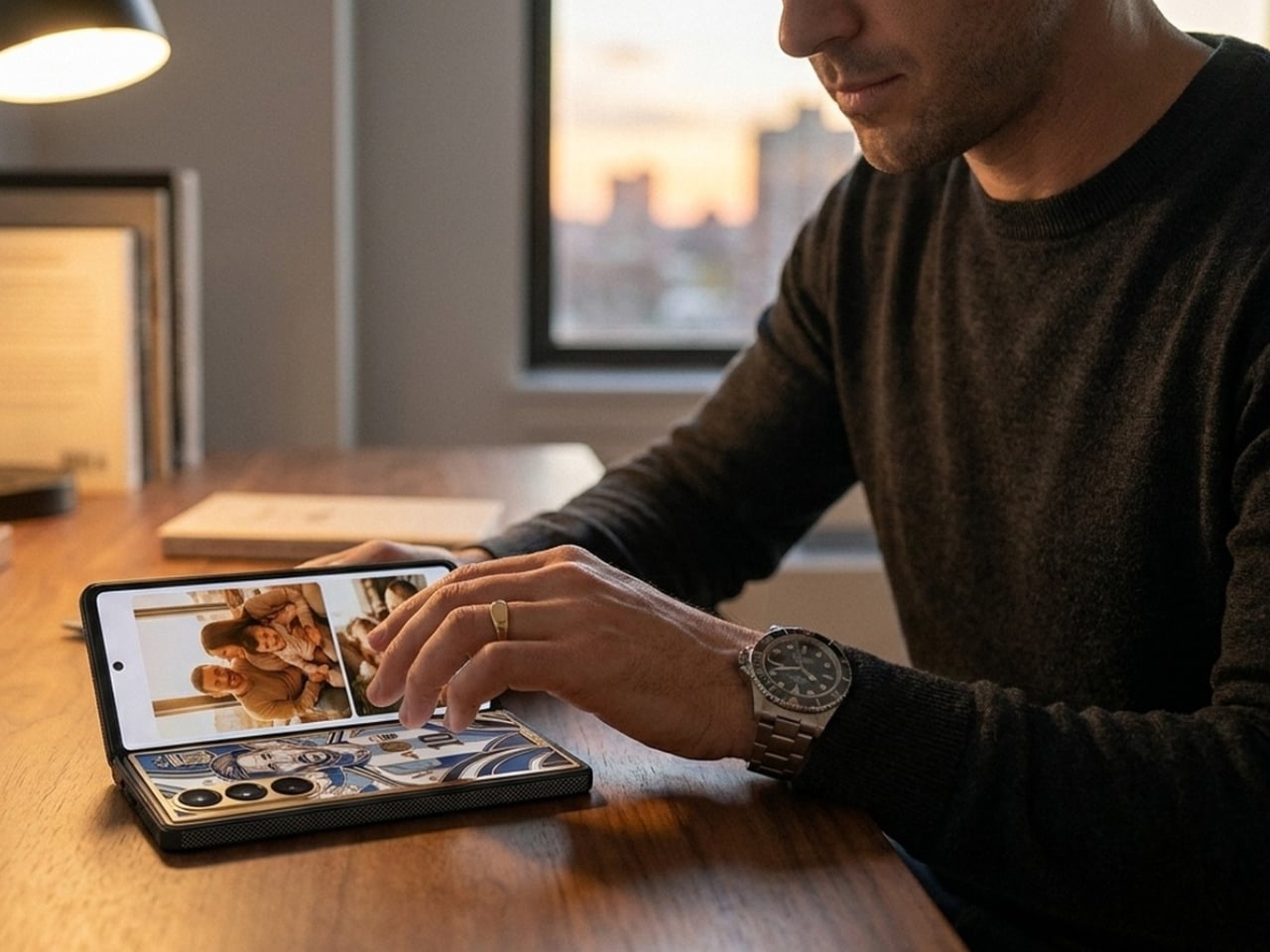
For collectors, the rarity factor alone is enough to justify the price. Only 19 units will ever be made, which means this phone will likely appreciate in value over time. Think of it less as buying a smartphone and more as acquiring a limited-edition sculpture that also happens to fold in half. And with storage options ranging from 256GB up to 1TB, the Samsung Z Fold 8 Ultra underneath the artistry is still a powerhouse device worth using, if you can bring yourself to take it out of the box.
Whether you’re a die-hard Messi fan, a tech enthusiast with a taste for the extraordinary, or a collector hunting for the next great statement piece, the Caviar Lionel Messi Samsung Z-Fold8 Ultra checks every box. It is, quite literally, 24-karat iconic.
The post This $13,130 Samsung Galaxy Z Fold 8 Ultra Has Messi in 24K Gold first appeared on Yanko Design.