Back in 2014, Sony shipped a small piece of plastic that clipped a phone onto a PS4 controller. It was limited to certain Xperia handsets, relied on Remote Play at a point when Remote Play was barely holding itself together over most home Wi-Fi networks, and it quietly disappeared without much fanfare. The idea of physically fusing your smartphone with your PlayStation controller got filed away as one of those concepts that sounded reasonable on paper and fell apart in practice. Sony moved on, and for a decade, so did everyone else.
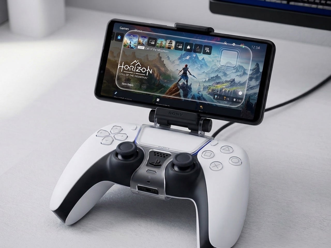
A patent circulating this week suggests the concept never fully left. Sony’s new filing describes a smartphone mounted directly onto a DualSense controller, with the phone functioning as a live secondary input device. Its touchscreen, motion sensors, and hardware would all be available to developers as genuine control surfaces, feeding into the game in real time rather than simply mirroring it. That positions this as a meaningfully different idea from Remote Play, from the PS Portal, and from anything Sony has formally put in front of PlayStation players before.
Designer: Sony
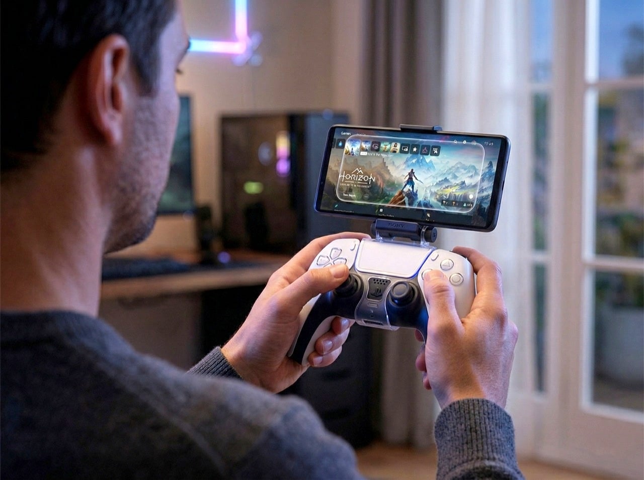
The PS Portal, Sony’s dedicated remote play device launched in late 2023, is essentially a DualSense controller sliced in half with an 8-inch 1080p LCD placed in the middle. It streams games from your PS5 over Wi-Fi and does nothing else. You don’t own a PS5 running at home, the Portal becomes a paperweight. The patented phone mount concept flips that logic. Your smartphone becomes an extension of the controller’s input vocabulary, giving developers access to touch zones, gyroscope data, and potentially camera input without Sony needing to manufacture, stock, and sell another dedicated piece of hardware. Third-party phone mounts already exist for the DualSense and sell for as little as the equivalent of $10, so the mechanical attachment problem is solved. What Sony would be adding is first-party integration at the software and developer level, where the phone is recognized as part of the control scheme and games are built around it.
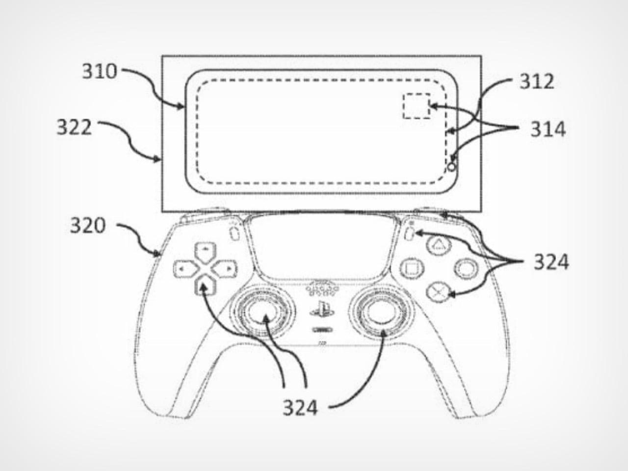
Patent Drawing from Sony’s filing
The market conditions in 2026 are dramatically different from the failed 2014 attempt. Fibre internet is widespread, Remote Play latency has improved significantly, and players already treat their phones as natural extensions of their gaming sessions. Controllers with phone clips are common enough in mobile gaming circles that the form factor no longer reads as awkward or experimental. Sony’s job would be convincing developers to design around a hybrid input model, which is a softer sell than asking players to spend $200 on dedicated streaming hardware with a narrow use case.
Sony patents ideas constantly, and most of them never see retail shelves. This particular concept feels more grounded than some of the company’s weirder filings because the infrastructure already exists, consumer behavior supports it, and the barrier to entry is lower than building new hardware from scratch. Whether it ships is still a gamble, but the logic behind it holds together better than it did a decade ago.
The post Sony’s Latest PlayStation Patent Turns a DualSense and Your Phone Into One Gaming Controller first appeared on Yanko Design.