Sabine Marcelis Built Coachella’s Best Spot Out of Thin Air

Every April, Coachella does that thing where it reminds you it’s not just a music festival. It’s a full-sensory exercise in spectacle, one that has always treated its art program with just as much ambition as its headliner lineup. This year, Dutch designer Sabine Marcelis is the one making that case loudest, with an installation called Maze that has, by most accounts, become one of the most talked-about spots on the entire festival grounds.

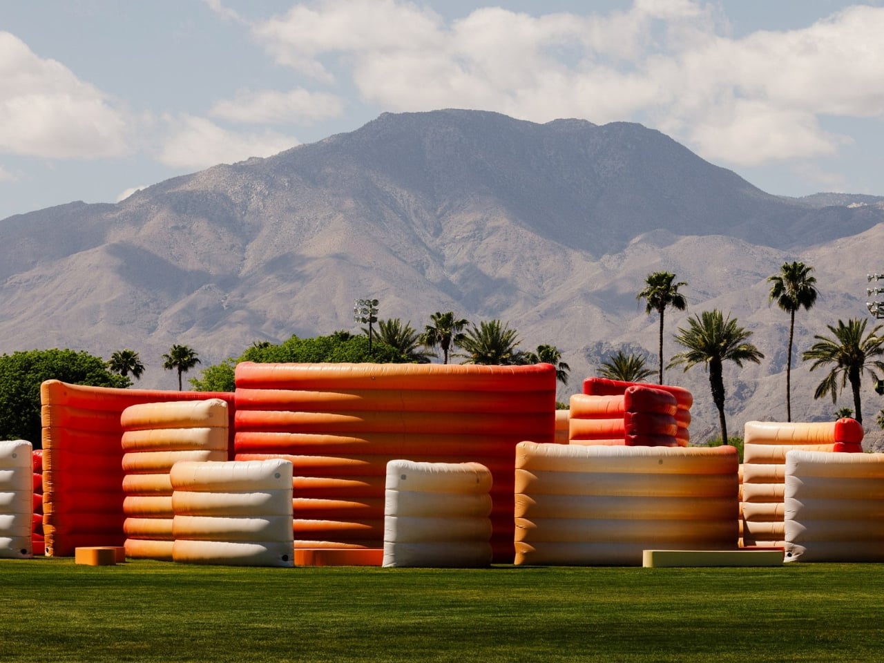
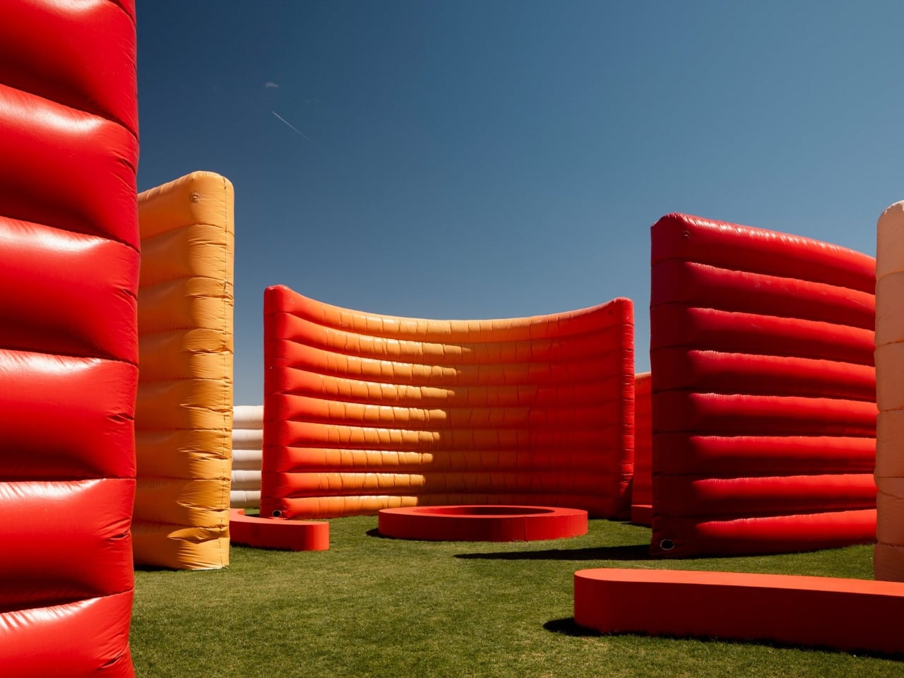
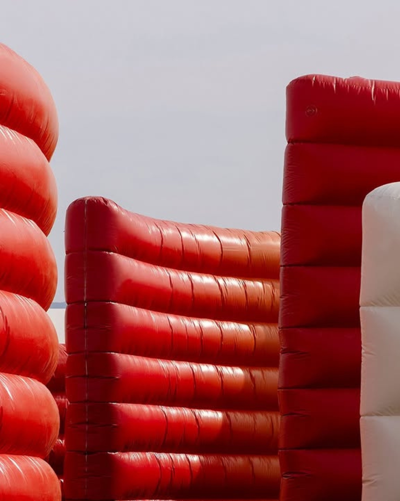
Maze is exactly what it sounds like, and also nothing like what you’d expect. Built from curved, inflated PVC walls that rise at varying heights, the structure winds across the Coachella grounds as a walkable labyrinth, one that feels less like an obstacle course and more like stepping into a fever dream of color and calm. The walls shift in a gradient from pale yellow at the outer edges to a deep, saturated red at the core, mimicking the warm, layered tones of a desert sunset. It’s the kind of color palette that looks deliberately, almost suspiciously perfect, and yet it doesn’t feel forced. It feels inevitable.

Designer: Sabine Marcelis
That’s what Marcelis does. The Rotterdam-based designer has built a body of work around the idea that light and material don’t just coexist. They perform together. Her practice leans into pure geometric forms and refined material investigations, always pushing manufacturing processes toward something surprising and sensory. At Coachella, that philosophy scales up beautifully. What could have been a gimmicky, oversized balloon art moment instead reads as something genuinely thoughtful: a structure designed to slow people down in a place that rarely stops moving.
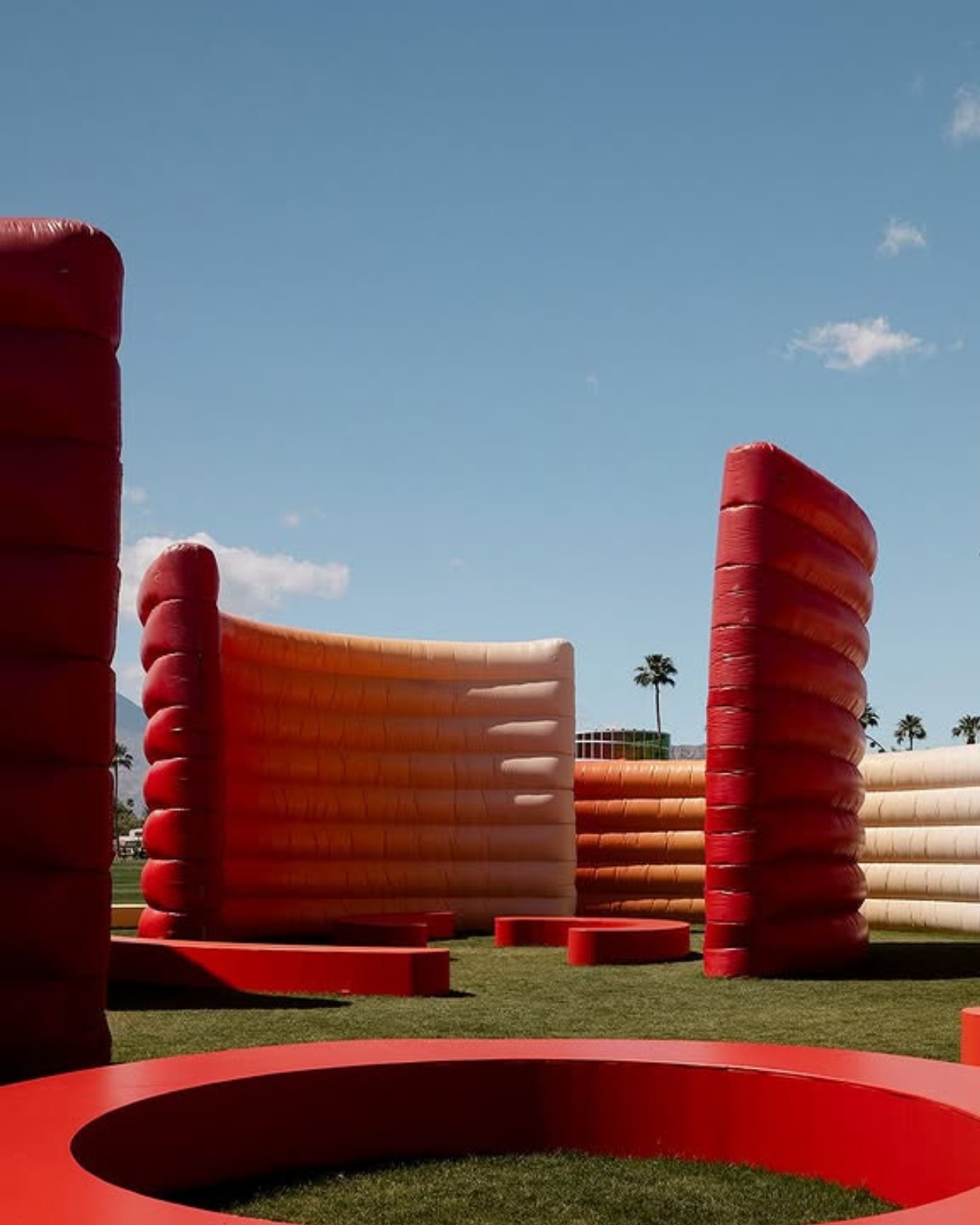
And that’s the part that gets me. Coachella is famously relentless. Stages overlap, schedules are brutal, and the heat does not negotiate. Maze was built with that reality in mind. The inflated walls create shaded pockets, filtering both light and sound from the surrounding chaos. Seating runs along the outer edges, giving visitors actual places to stop and breathe. Clearings open up toward the stages, framing views of performances from inside the structure, so you never entirely lose the festival. You just get to experience it at a different speed.
Inspired by the natural contours of the Coachella Valley, the design has a landscape quality to it that reads as more than an aesthetic reference. The curved forms echo the rolling terrain of the desert, and the color gradient mirrors the sky at the specific hours when the California desert looks like it was art-directed by someone very talented. Marcelis didn’t try to compete with the landscape. She translated it. At night, the whole thing transforms. The PVC walls glow from within, turning the maze into an illuminated field of warm color that sits somewhere between architectural installation and light sculpture. If the daytime version is about refuge, the nighttime version is pure atmosphere. It hits differently against the dark, and I mean that in the best way.
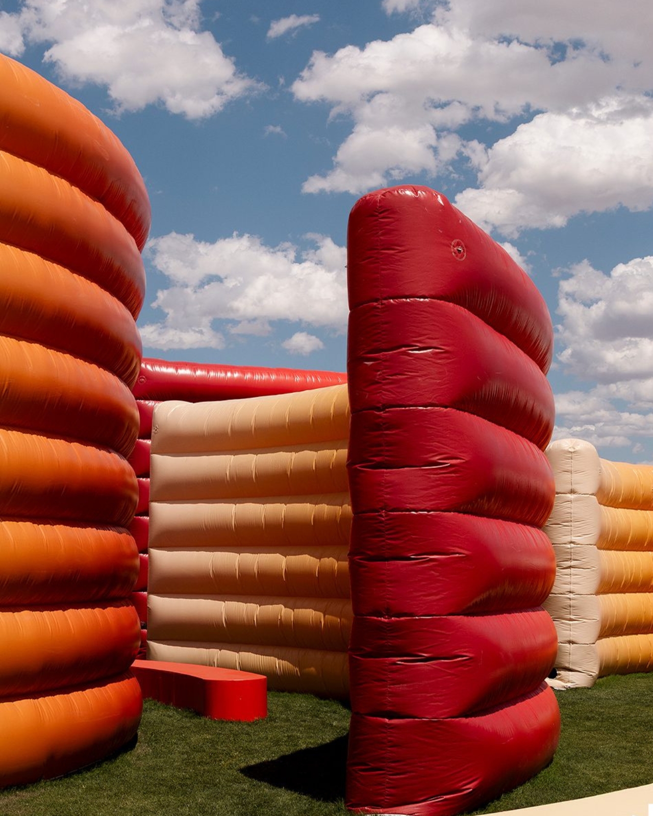
I’ll be honest. I’ve watched the Coachella art program grow more ambitious over the years, and my reaction to any given installation tends to hover somewhere between “impressive” and “Instagram bait.” Maze clears that bar and then some. It works because it has an actual point of view. Marcelis built something that functions, that shelters, that engages the senses, and that happens to be visually stunning. That’s a harder balance to strike than it looks.
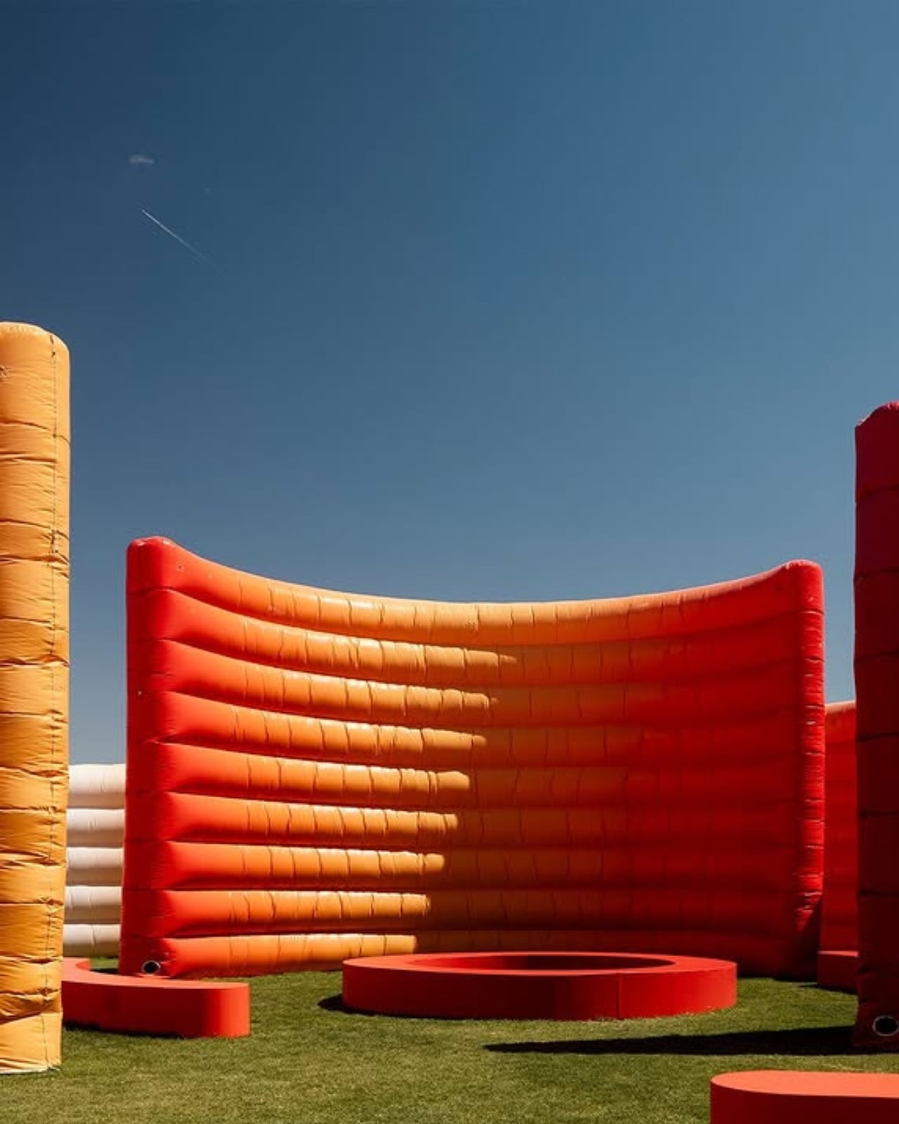
The installation was curated by Public Art Company, and it’s part of a broader 2026 art program that continues to push Coachella’s visual ambitions. But Maze stands out not because it’s the biggest or the flashiest. It stands out because it treats the people walking through it as the point, not the backdrop. That’s good design. And at a festival where you’re constantly being asked to witness things, it’s genuinely refreshing to walk into something that simply asks you to sit down and stay a while.
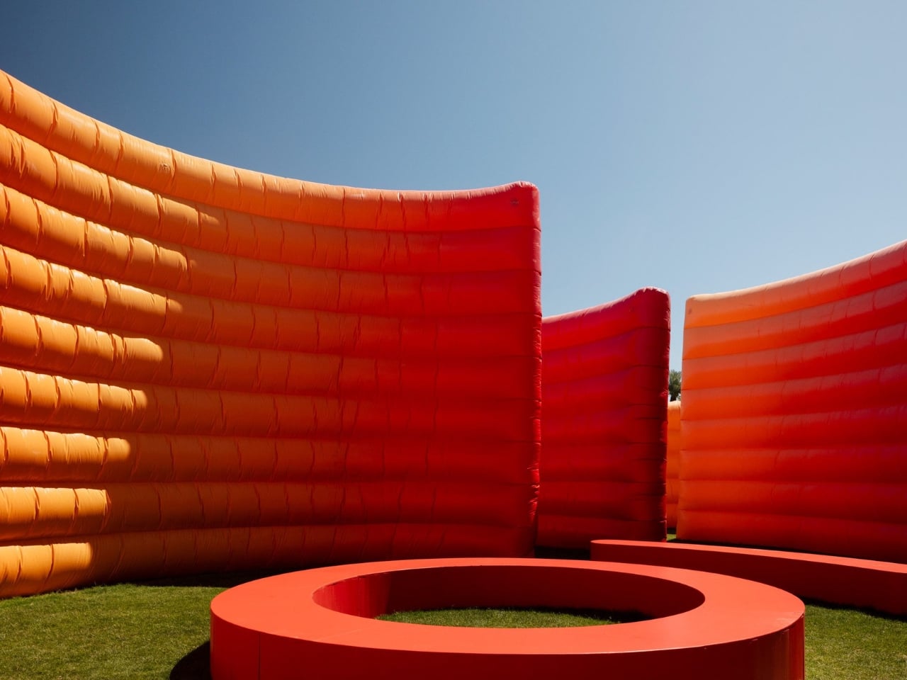
The post Sabine Marcelis Built Coachella’s Best Spot Out of Thin Air first appeared on Yanko Design.
Sabine Marcelis Built Coachella’s Best Spot Out of Thin Air

Every April, Coachella does that thing where it reminds you it’s not just a music festival. It’s a full-sensory exercise in spectacle, one that has always treated its art program with just as much ambition as its headliner lineup. This year, Dutch designer Sabine Marcelis is the one making that case loudest, with an installation called Maze that has, by most accounts, become one of the most talked-about spots on the entire festival grounds.

Maze is exactly what it sounds like, and also nothing like what you’d expect. Built from curved, inflated PVC walls that rise at varying heights, the structure winds across the Coachella grounds as a walkable labyrinth, one that feels less like an obstacle course and more like stepping into a fever dream of color and calm. The walls shift in a gradient from pale yellow at the outer edges to a deep, saturated red at the core, mimicking the warm, layered tones of a desert sunset. It’s the kind of color palette that looks deliberately, almost suspiciously perfect, and yet it doesn’t feel forced. It feels inevitable.

Designer: Sabine Marcelis

That’s what Marcelis does. The Rotterdam-based designer has built a body of work around the idea that light and material don’t just coexist. They perform together. Her practice leans into pure geometric forms and refined material investigations, always pushing manufacturing processes toward something surprising and sensory. At Coachella, that philosophy scales up beautifully. What could have been a gimmicky, oversized balloon art moment instead reads as something genuinely thoughtful: a structure designed to slow people down in a place that rarely stops moving.

And that’s the part that gets me. Coachella is famously relentless. Stages overlap, schedules are brutal, and the heat does not negotiate. Maze was built with that reality in mind. The inflated walls create shaded pockets, filtering both light and sound from the surrounding chaos. Seating runs along the outer edges, giving visitors actual places to stop and breathe. Clearings open up toward the stages, framing views of performances from inside the structure, so you never entirely lose the festival. You just get to experience it at a different speed.

Inspired by the natural contours of the Coachella Valley, the design has a landscape quality to it that reads as more than an aesthetic reference. The curved forms echo the rolling terrain of the desert, and the color gradient mirrors the sky at the specific hours when the California desert looks like it was art-directed by someone very talented. Marcelis didn’t try to compete with the landscape. She translated it. At night, the whole thing transforms. The PVC walls glow from within, turning the maze into an illuminated field of warm color that sits somewhere between architectural installation and light sculpture. If the daytime version is about refuge, the nighttime version is pure atmosphere. It hits differently against the dark, and I mean that in the best way.

I’ll be honest. I’ve watched the Coachella art program grow more ambitious over the years, and my reaction to any given installation tends to hover somewhere between “impressive” and “Instagram bait.” Maze clears that bar and then some. It works because it has an actual point of view. Marcelis built something that functions, that shelters, that engages the senses, and that happens to be visually stunning. That’s a harder balance to strike than it looks.

The installation was curated by Public Art Company, and it’s part of a broader 2026 art program that continues to push Coachella’s visual ambitions. But Maze stands out not because it’s the biggest or the flashiest. It stands out because it treats the people walking through it as the point, not the backdrop. That’s good design. And at a festival where you’re constantly being asked to witness things, it’s genuinely refreshing to walk into something that simply asks you to sit down and stay a while.

The post Sabine Marcelis Built Coachella’s Best Spot Out of Thin Air first appeared on Yanko Design.
Disney and NatGeo Built Billboards That Bees Can Actually Live In

Most billboards are built to be noticed and then forgotten. You see them, you process whatever they’re selling, and then they fade into the visual noise of the street. So when a campaign comes along that flips that formula entirely, it genuinely stops you in your tracks.

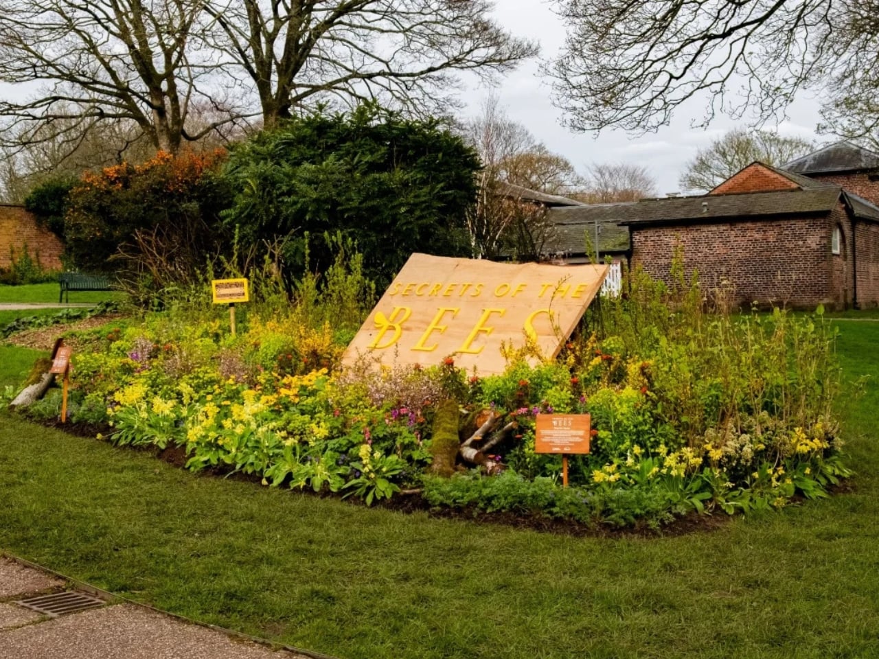
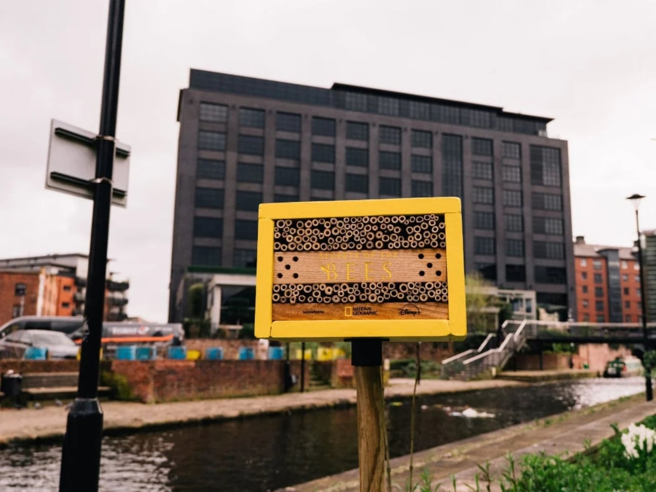
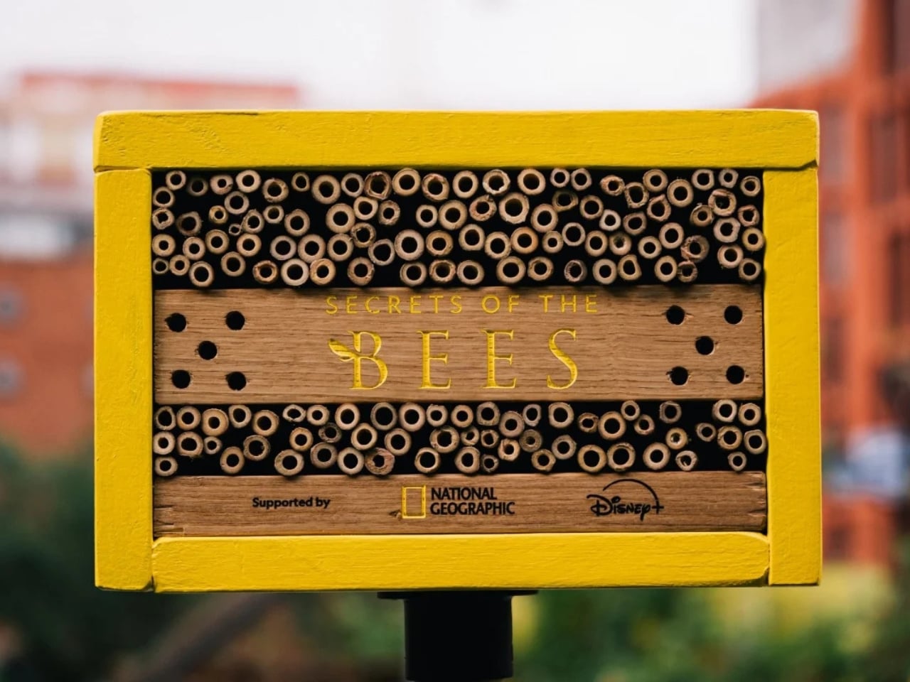
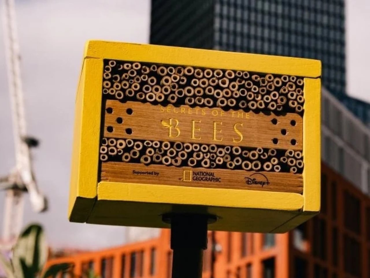
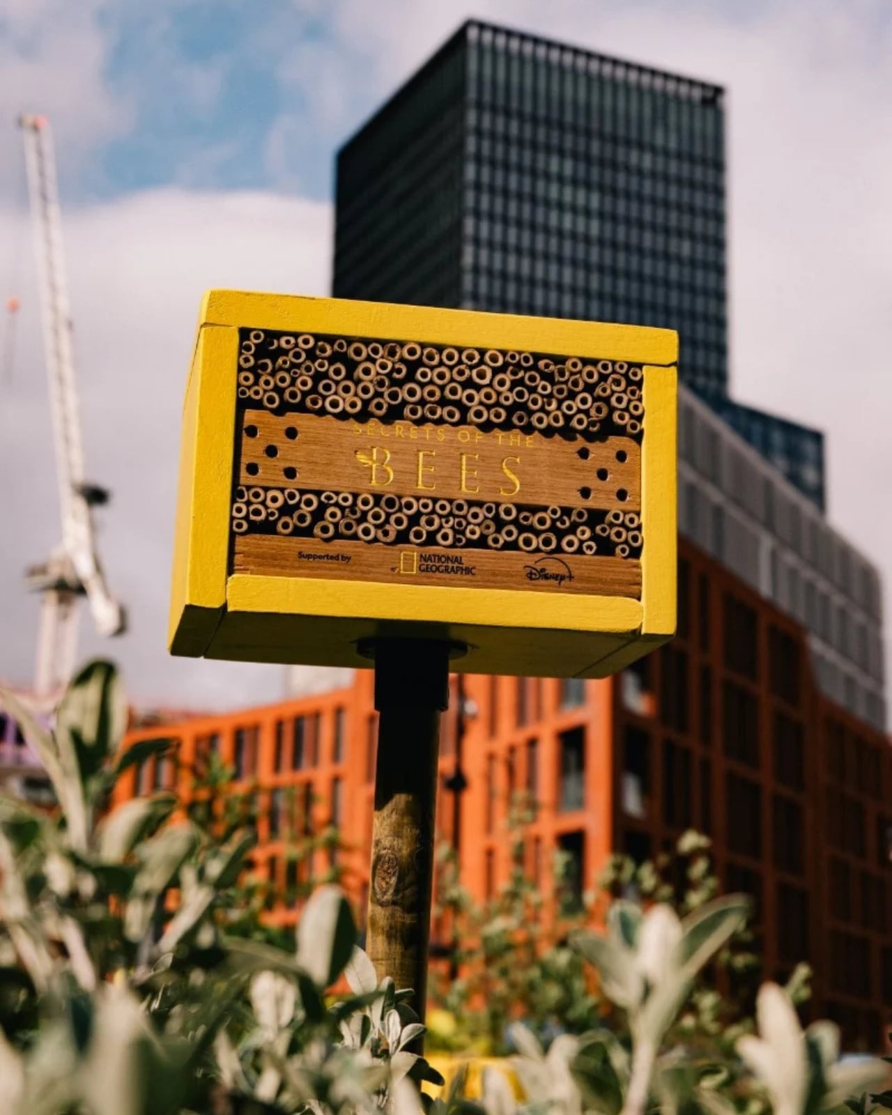
That’s exactly what’s happening in Manchester right now, where Disney and National Geographic, working with creative agency Meanwhile, have installed a series of billboards designed to do more than advertise. The structures, which the team calls “bloomboards,” are fitted with built-in cavities, textured surfaces, and planting elements that turn them into functioning habitats for bees. Not a two-week stunt. Not a PR photo op. Permanent installations, built from sustainably sourced cedar that had already been felled, placed across parks and public spaces throughout the city.

Designer: Meanwhile for Disney and National Geographic

The campaign ties to the launch of National Geographic’s Secrets of the Bees, a documentary series presented by explorer Bertie Gregory and executive produced by James Cameron. The series was filmed over several years using specialized cameras to capture bee behavior at a level of detail most of us have never seen. Entomologist Dr. Samuel Ramsey provided scientific input throughout. It’s streaming now on Disney+ and Hulu, and from a content standpoint alone, it sounds like essential viewing.

But the billboard work is where this becomes interesting as a piece of design thinking, not just marketing. Rather than placing a nature image on a billboard and calling it Earth Month, Meanwhile built the message into the medium. The physical structure becomes an argument for the cause. The billboard doesn’t just tell you bees matter; it gives them somewhere to live. Mini bee hotels have also been placed at several locations across Manchester, including Chorlton Water Park, Wythenshawe Park, Fletcher Moss Botanical Garden, and the Northern Quarter. Like the bloomboards, these aren’t decorative gestures. They’re functional, permanent additions to the urban landscape, and that distinction matters when the campaign is rooted in conservation.

Rachel Miles, creative director at Meanwhile, put it simply: “Our ambition is to encourage people to plant their own mix of shrubs and perennials to support bee populations and create a positive impact.” Michael Tsim, also a creative director at the agency, was just as direct: “Not just a two week campaign, but something they actually benefit from, permanently.”

That word, permanently, is doing a lot of heavy lifting here. Environmental advertising has a long history of looking good while changing nothing. Companies run campaigns during Earth Month and then quietly move on. What makes this campaign feel different is that the outcomes are baked into the design itself. The bees don’t need to watch the documentary to benefit. The habitat exists regardless of whether anyone scans a QR code or downloads an app.

It also speaks to a broader shift in how thoughtful brands are approaching cause-driven work. The bar for audiences has risen sharply. People can spot the difference between a brand that has added a green ribbon to its logo and one that has committed real resources to a problem. Embedding a working habitat into an advertising structure is a tangible commitment, and one you can’t undo when April ends.

For anyone who follows design, this campaign is a reminder that the best work often finds its power in constraints. A billboard is a flat surface with a job to do. Meanwhile used that constraint not as a limitation but as a starting point, and the result is something genuinely unusual. Form serves function, function serves form, and both serve something beyond the campaign itself. Whether or not you plan to watch Secrets of the Bees (though I’d argue you should), the billboard project stands on its own as a piece of design worth paying attention to. It’s an example of what happens when a brief asks for more than attention and a creative team decides to take that seriously.

The post Disney and NatGeo Built Billboards That Bees Can Actually Live In first appeared on Yanko Design.

These Steel Chairs Are Too Big to Sit In: Walk Through Them Instead

Most public art earns its place on a pedestal and stays there. It asks you to look, maybe photograph it, and walk away. The relationship between viewer and work rarely extends beyond that brief transaction. That’s been the convention for a long time, but there’s a growing push for installations that don’t just occupy public space but actually do something within it.

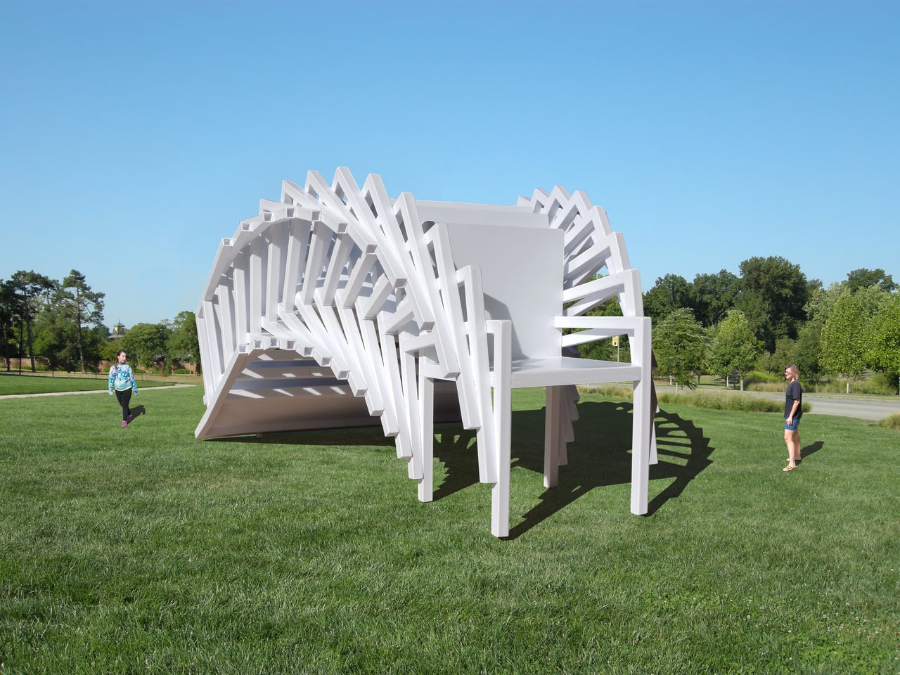
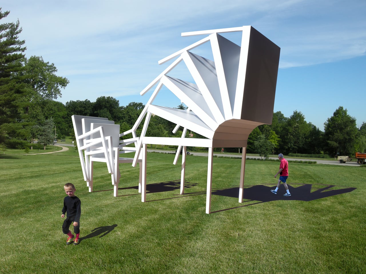
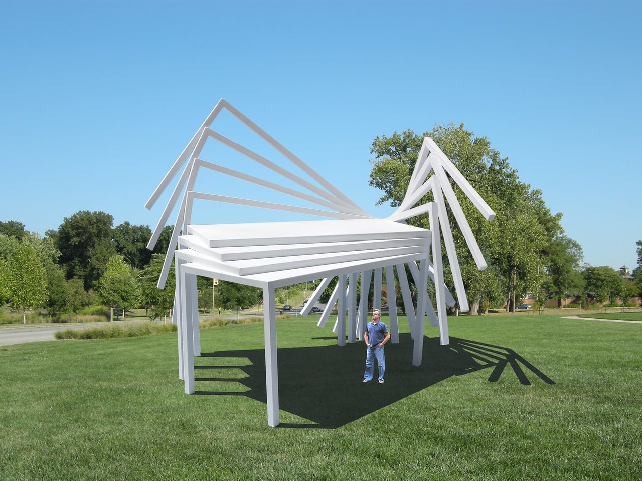
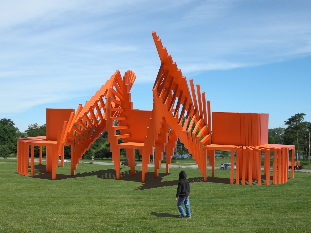
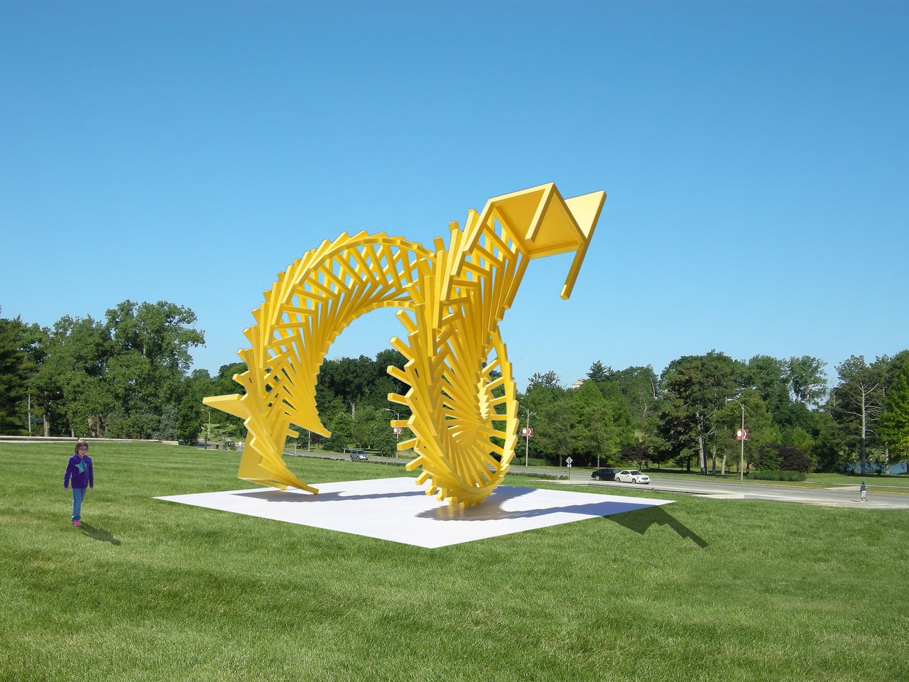
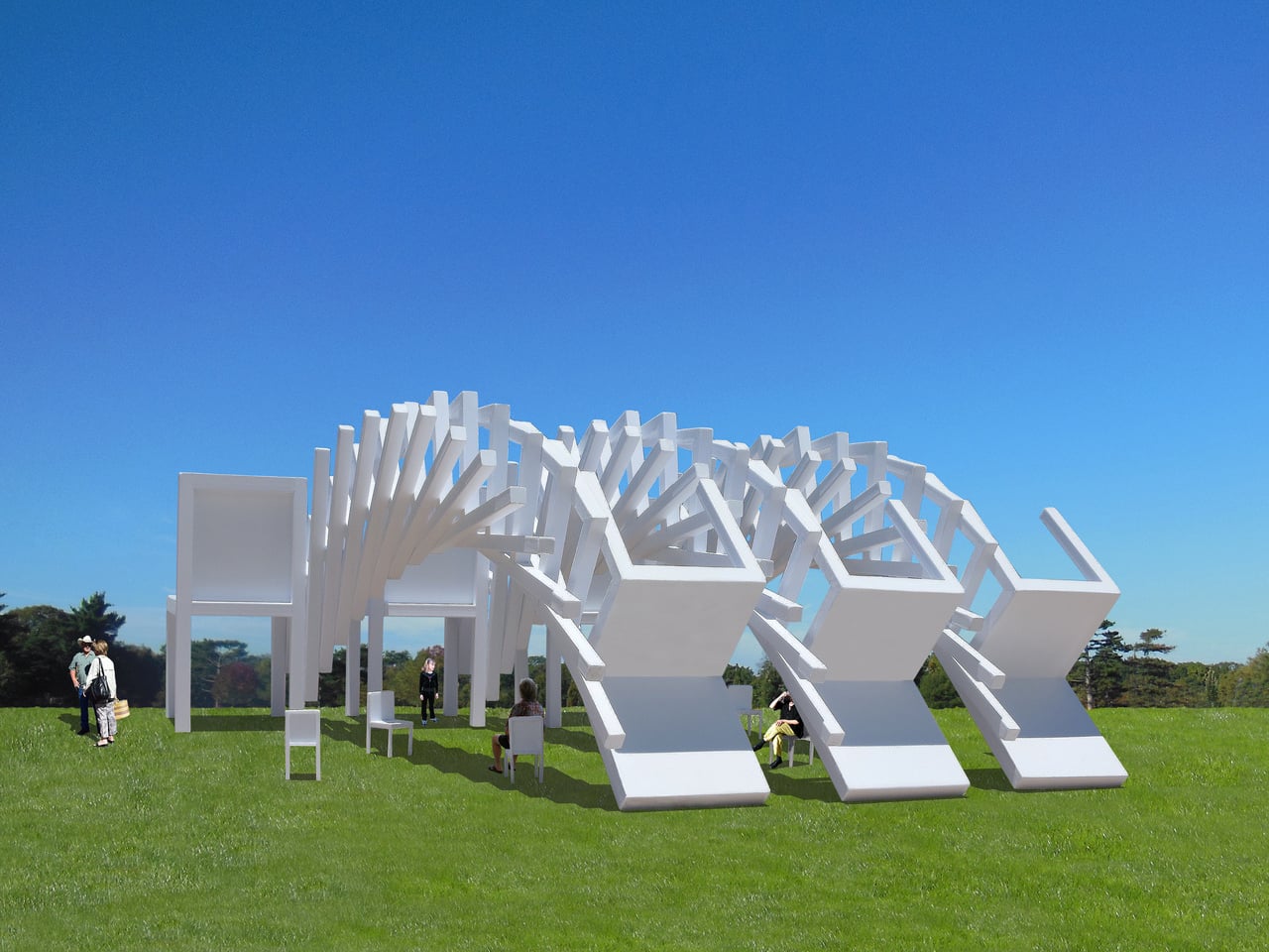
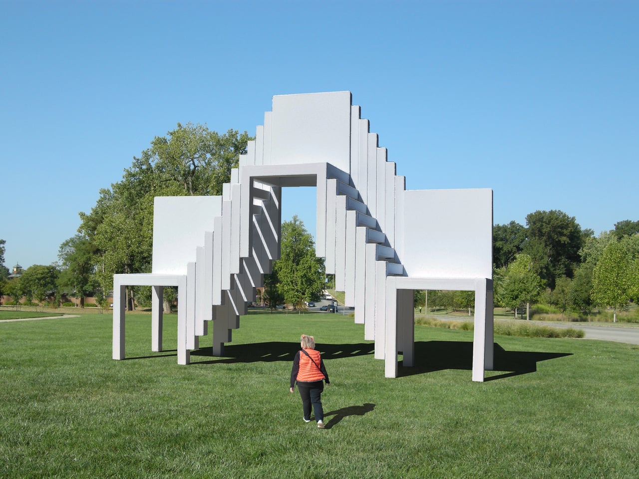
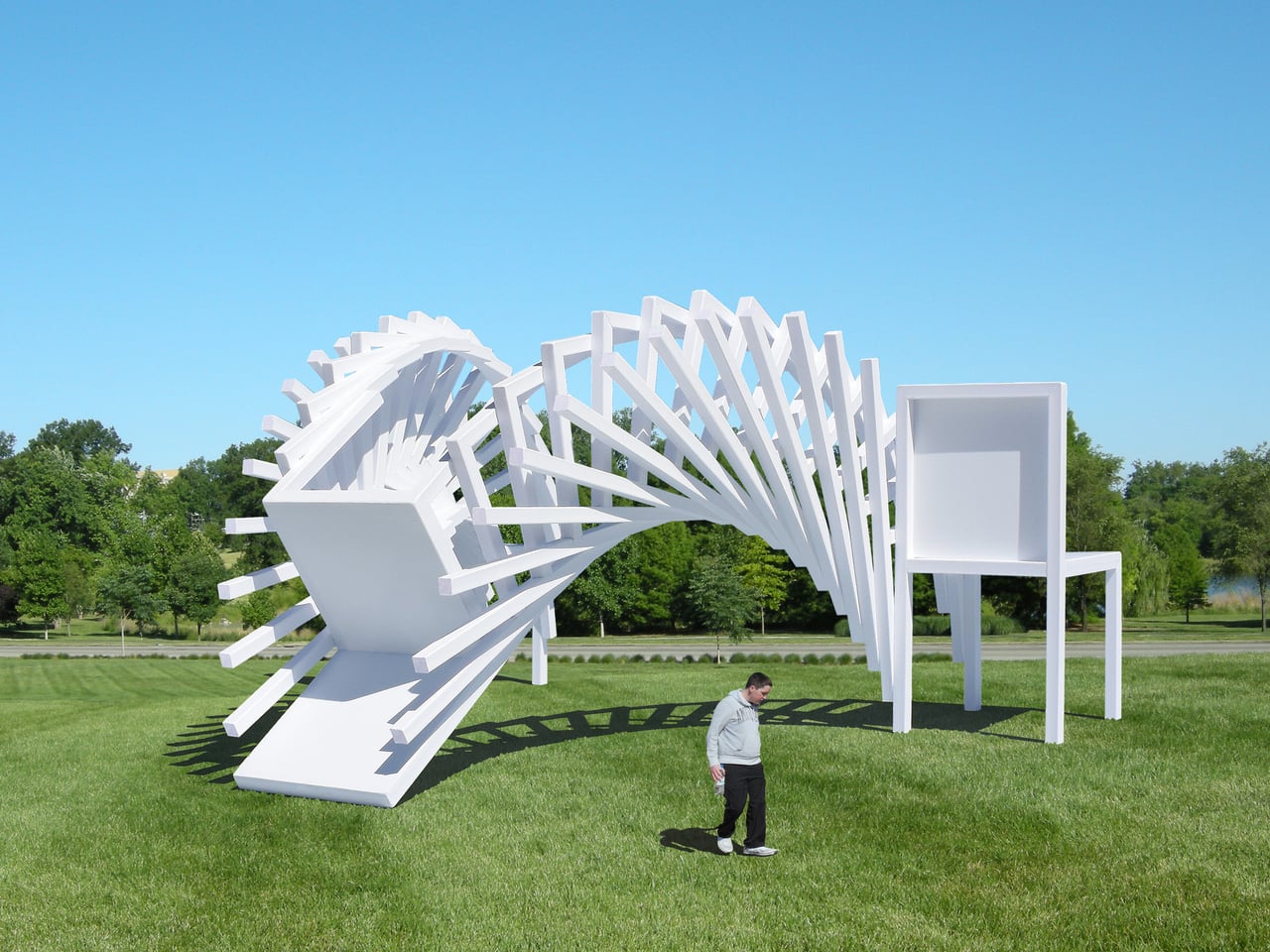
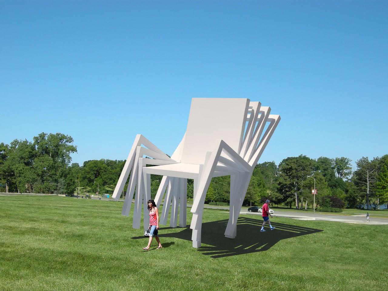
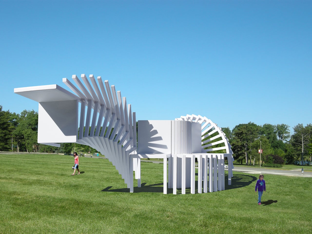
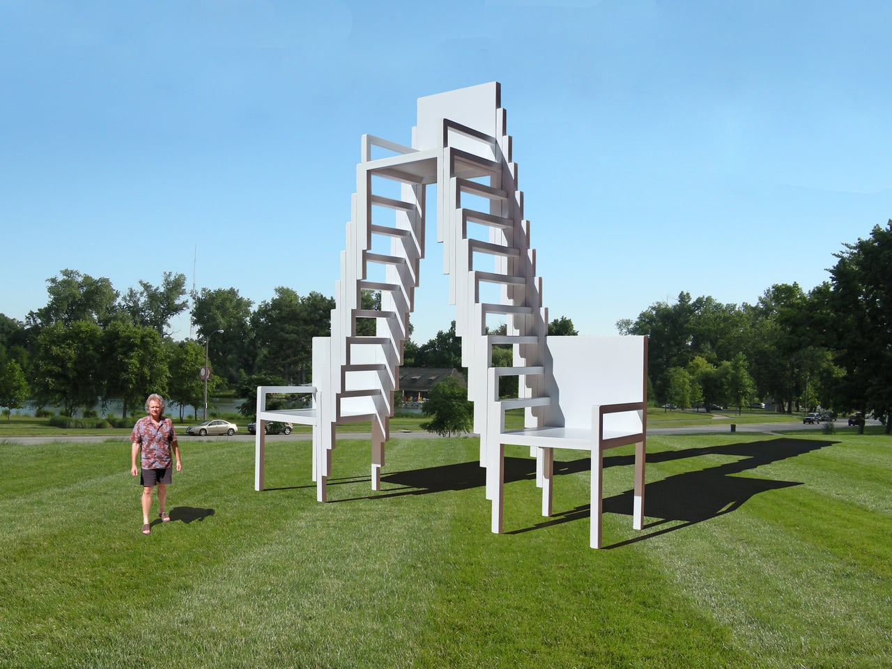
Michael Jantzen has been exploring that tension for years. His Moving Furniture series applies a simple idea to ordinary chairs and tables: take each object’s form and repeat it in progressive intervals as if capturing it mid-movement, then connect those moments into a single piece. The result is something you can still sit in or set a drink on, even if it no longer looks quite built for that.

Designer: Michael Jantzen

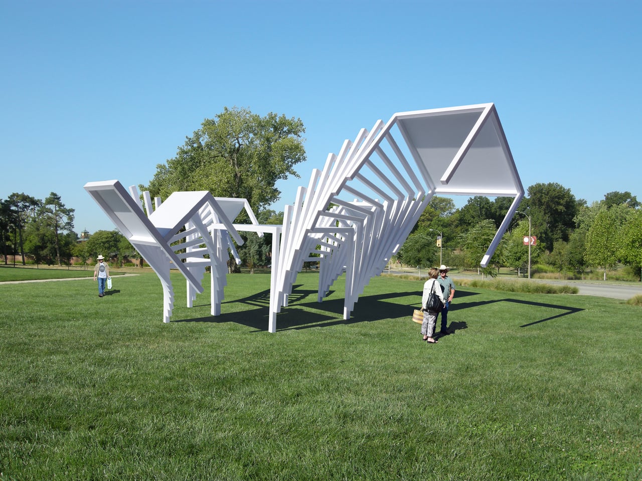
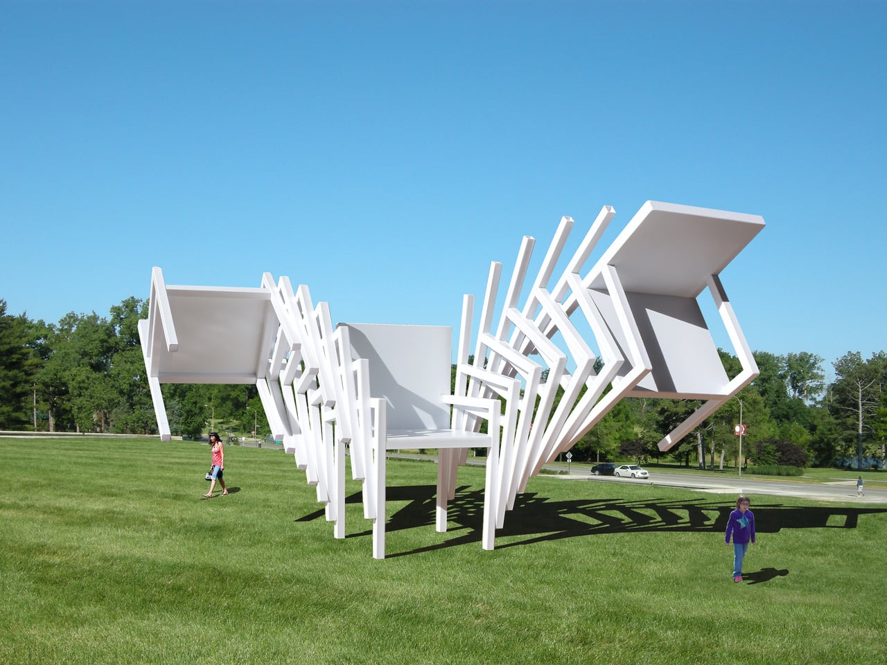
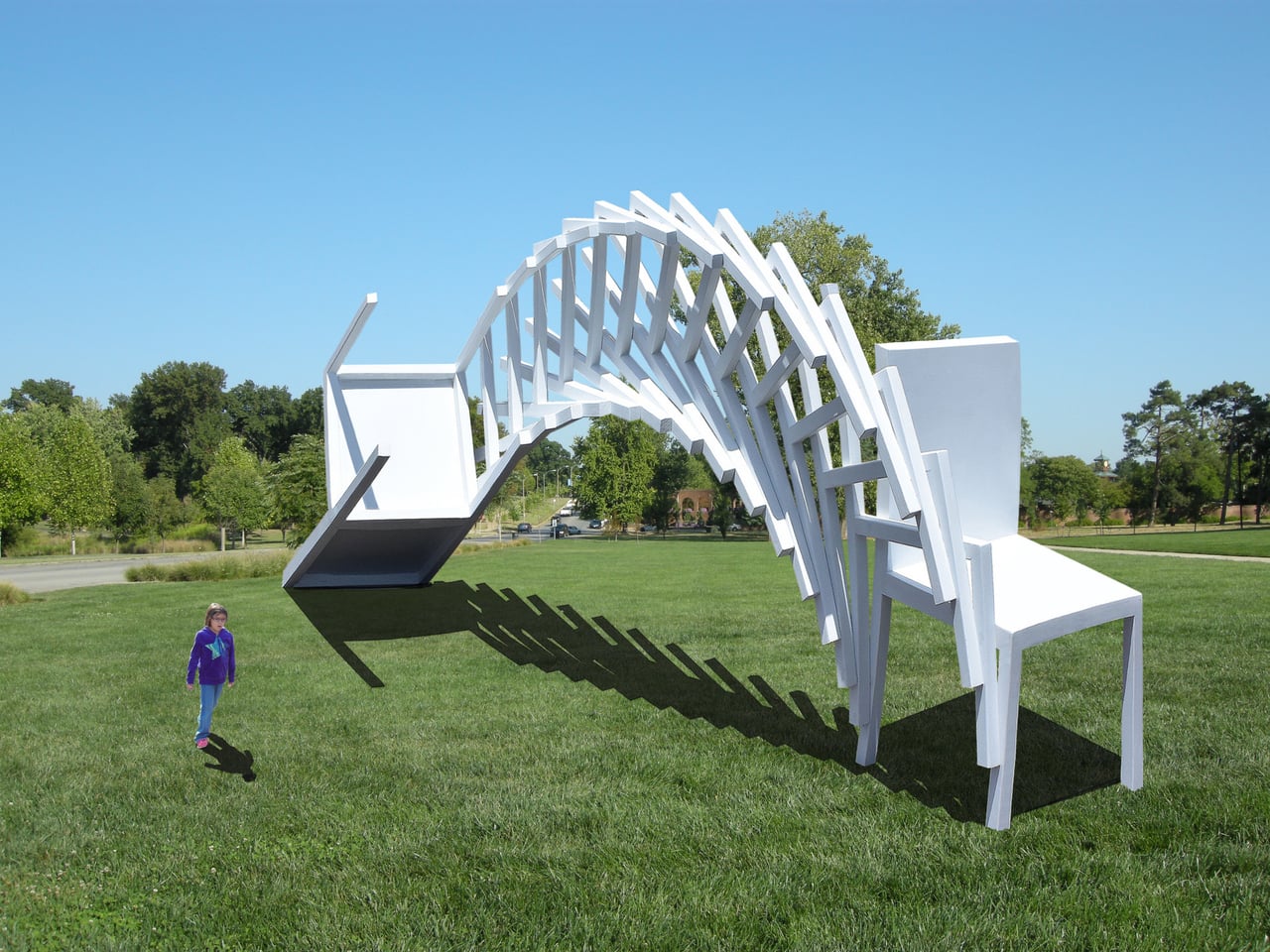
Monumental Moving Furniture takes that same concept into architectural territory. Built from painted steel, the series consists of abstracted chair and table forms, each generated by moving the original object through space and time and locking its path into a chain of connected segments. At this scale, what started as a reference to everyday objects feels closer to a building than a piece of furniture.

The method behind each piece is consistent. A chair or table is set in motion through space and time, with each interval frozen and joined to the next. Some pieces move only part of the original form; others shift the whole thing. The result is a structure that stops belonging to any single discipline and starts reading as furniture, sculpture, and architecture at once.

Despite being too large to sit in, these sculptures aren’t purely decorative. Each is large enough to walk under and through, giving it a practical function as a pavilion and shelter. That’s not something most public art can claim. Instead of asking people to observe from a polite distance, these structures pull you in, turning a passive encounter into something more physical and immediate.

The series covers both chair forms and table forms, each treated with the same sequential abstraction. Individual pieces have also been grouped into configurations that suggest more complex structures, as if each were a building block for something larger. Painted in vivid, solid colors like white, orange, and yellow, each structure commands attention from a distance and rewards a closer look once you’re standing beneath it.

Public spaces deserve more than objects to look at. They deserve things to experience. Monumental Moving Furniture earns its place on both counts, offering structures large enough to shelter visitors while giving them something genuinely puzzling to engage with. These forms don’t demand reverence. They invite curiosity, exploration, and the kind of slow, circling attention that good public space has always been designed to encourage.

The post These Steel Chairs Are Too Big to Sit In: Walk Through Them Instead first appeared on Yanko Design.

This Burning Man Temple Blooms for One Night, Then Burns Forever

Every year, Burning Man erects a temple on the playa, and every year, it burns. That ritual of building and releasing has been part of the festival’s identity for over two decades, and yet each new design still manages to find a fresh way to make the whole thing hit differently. The 2026 edition, called the Temple of the Moon, might be the most quietly devastating one yet.

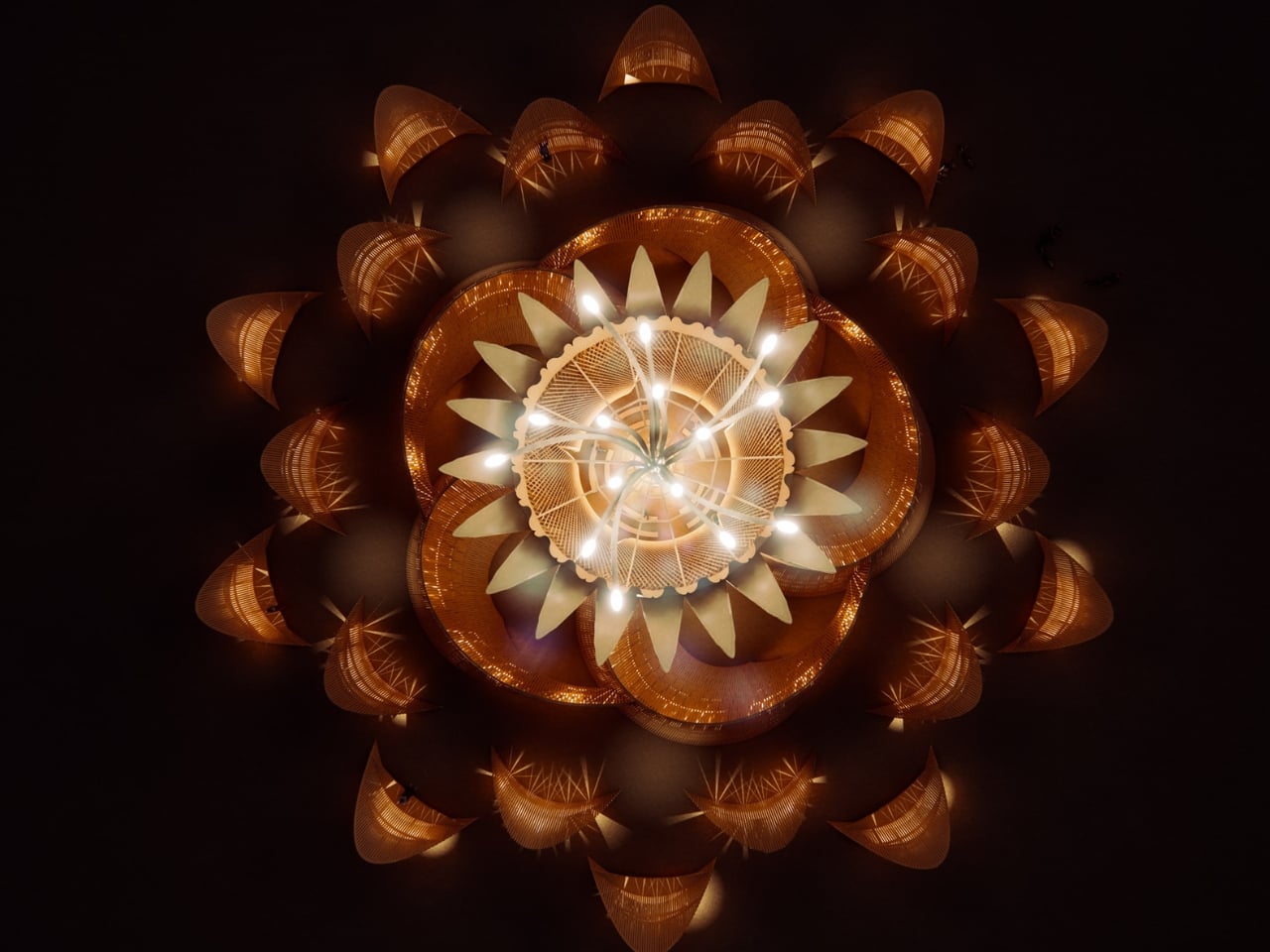
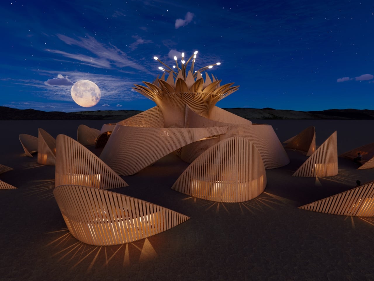
Designed by artist James Gwertzman, the structure takes its inspiration from the epiphyllum oxypetalum, better known as the Queen of the Night, a cactus flower that blooms exactly once a year, only at night, releasing its fragrance before wilting by morning. It’s the kind of plant that demands you pay attention, because if you’re not watching, you’ll miss it entirely. As a metaphor for grief, for presence, for what it means to witness something you know won’t last, it’s almost uncomfortably perfect.

Designer: James Gwertzman

Gwertzman came to this design through a deeply personal place. He spent years walking alongside a friend as she lost her partner to pancreatic cancer, learning what it means to simply be present in someone else’s pain without trying to fix it. Before all of this, he was trained in theater as a set and lighting designer, then spent decades in the video game industry building interactive worlds. Now he’s building something you can actually stand inside, and then watch burn.

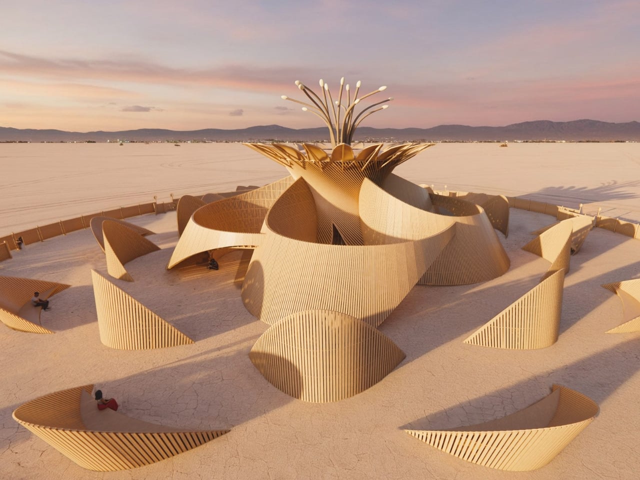
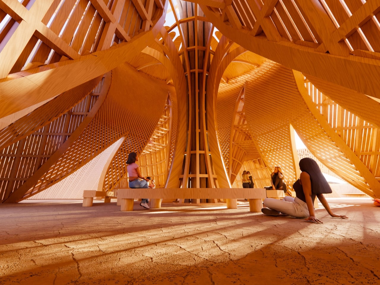
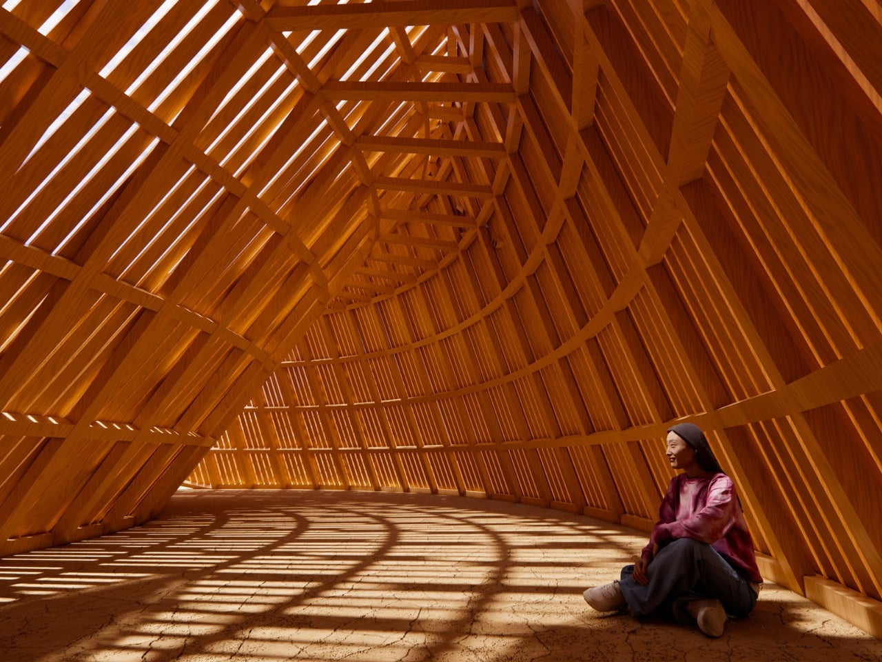
The architectural approach is where things get genuinely fascinating from a design perspective. Gwertzman and his team used a parametric design method, essentially algorithmic generation, to create complex organic curves out of straight pieces of timber. It’s the kind of technical problem-solving that sounds counterintuitive: using math to fake nature. But the result, at least from the renderings, is stunning. From above, the structure looks like a fully bloomed flower, with slatted wooden petals radiating outward from a central chamber.

The center of the temple is built around a hyperboloid structure, a column that flares outward at the top, edged with sharp petals and light-topped wooden pieces that echo the look of a flower’s stamen. Fan-like wooden forms provide shelter and mark the entryways into the mostly enclosed inner space. The renderings feel alive in a way that strictly geometric architecture rarely does, and I think that has everything to do with the fact that the form was borrowed from something real.

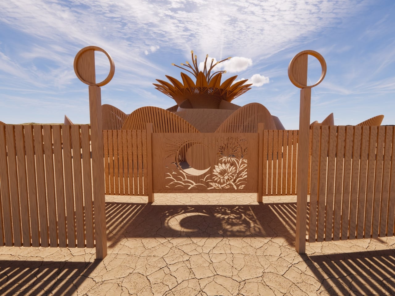
What I find most considered about this design is that it doesn’t try to be monumental in the traditional sense. Yes, it’s large, and yes, it will be visible from a distance across the Black Rock Desert. But the experience is designed to be intimate, with petal-like seating areas and an approach path built as a journey rather than a straight line toward the entrance. Eight gateways mark the perimeter fence, each one corresponding to a phase of the moon. The fence panels will feature CNC-cut designs submitted by the community around moon and flower motifs, making the very border of the temple a kind of collective artwork.

That detail matters more than it might seem. Burning Man’s Temple has always been a communal space, a place where people leave names, photos, and notes for loved ones who have died. But designing the threshold of that space to carry the marks of many hands is a meaningful gesture. It says the temple doesn’t belong only to the artist. It belongs to whoever needs it.

The whole structure is scheduled to burn on September 6th, 2026. Everything about it, from the flower that wilts at dawn to the lunar cycle that keeps starting over, points toward that moment. The 2026 Burning Man theme is “Axis Mundi,” meaning the center of the world. It’s a heavy framework to design inside of, but the Temple of the Moon seems to hold it without strain. It’s not trying to be the center of everything. It’s trying to be a place where you can stand still for a moment, feel the weight of what you’re carrying, and let it go.

The post This Burning Man Temple Blooms for One Night, Then Burns Forever first appeared on Yanko Design.
Two Artists Wrapped a Farm Greenhouse in a Giant Quilt

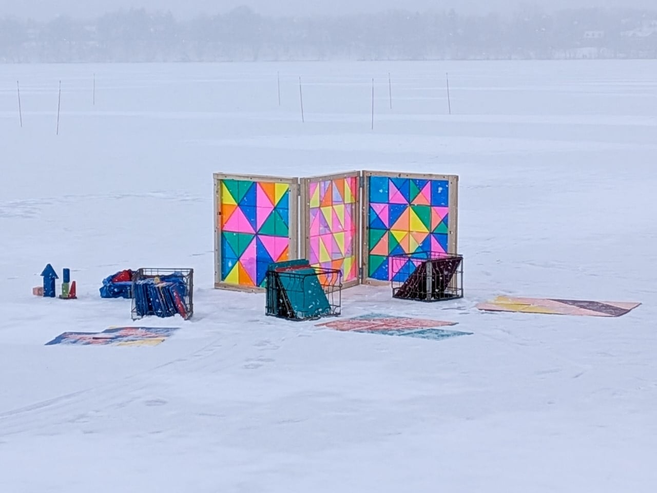
Every winter, Minneapolis does something the rest of the country quietly envies. Instead of hibernating indoors until spring shows up, the city drags its creativity out onto the frozen surface of Lake Harriet and builds a village. Not a regular village, though. An art village, made up of artist-built structures, performances, and interactive installations that take over the ice for four consecutive weekends. That’s the spirit behind Art Shanty Projects, now celebrating its 20th anniversary season, and it gets better with every passing year.

For 2026, one installation has been making the rounds online for all the right reasons. Artists Emily Quandahl and Madeline Cochran were commissioned to create a structure of their own, and what they came up with is genuinely one of the most charming things you’ll see all year. They called it the Quilt Shanty, and the name does exactly what it says.

Designers: Emily Quandahl and Madeline Cochran

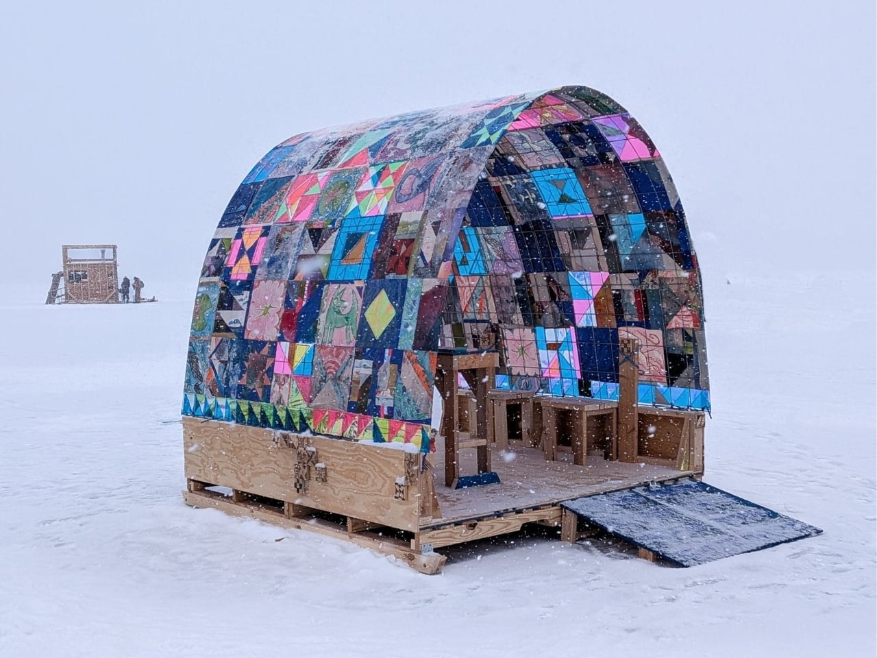
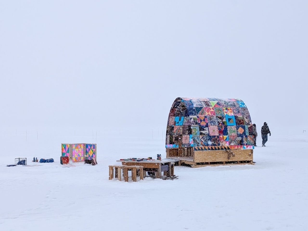
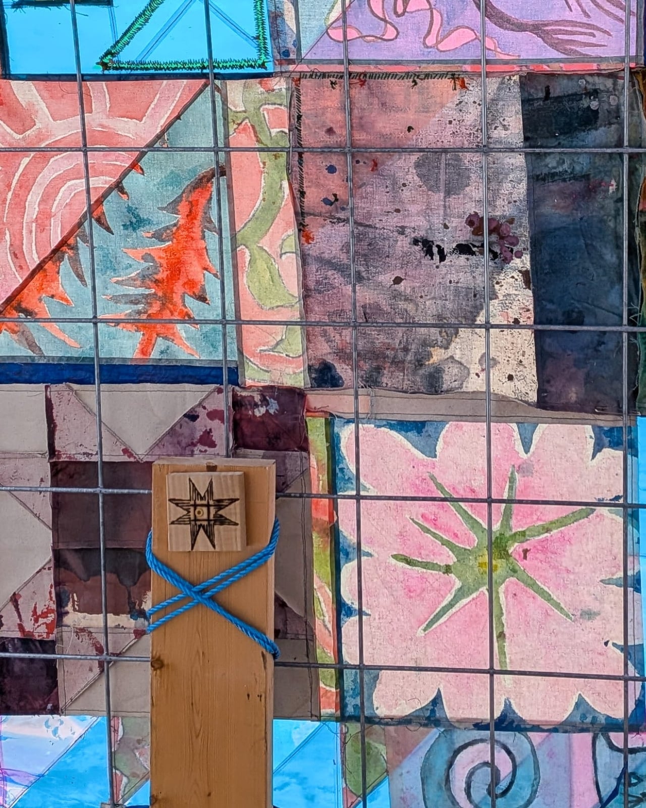
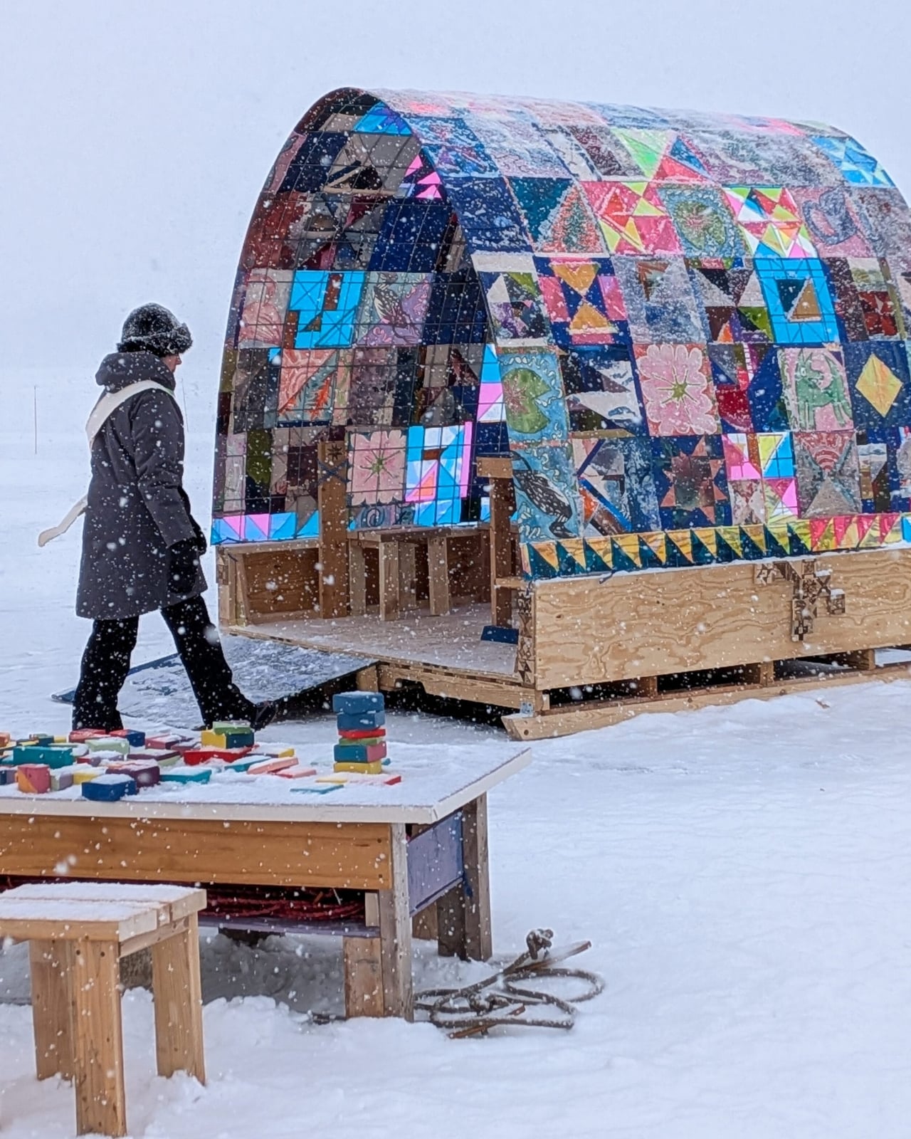
The structure is a hoop house, the kind you’d typically find on a farm protecting crops from the cold, wrapped entirely in a patchwork quilt. Big, bold, colorful squares stretch across the curved surface of the frame, sitting right there on the frozen lake like someone dragged their grandmother’s most treasured blanket outside and built a room around it.

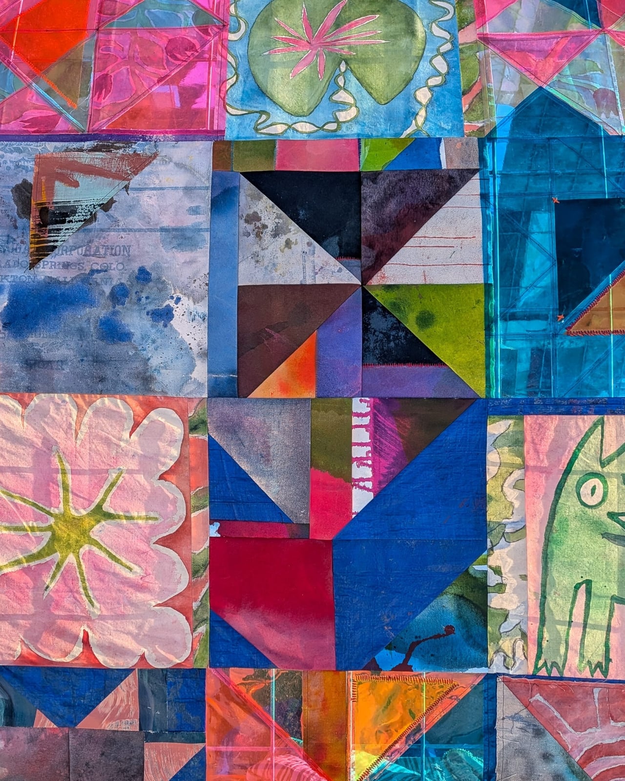
The concept is rooted in the tradition of barn quilts, those large painted quilt-pattern squares that farmers in rural America hang on the sides of their barns. Quandahl and Cochran took that idea and made it three-dimensional and tactile. The quilt itself measures 9 feet by 16 feet and is made from quilt squares that Quandahl designed and constructed by hand, pulling materials from her own studio: leftover painting scraps, drop cloth, and colored vinyl. Cochran contributed illustrated muslin pieces featuring folk-style drawings, as well as wood-burned quilt tiles that add another layer of texture and craft to the whole thing.

What makes it stand out beyond its visuals is the way it pulls people in. The installation is interactive. Visitors can sit inside, pick up quilt-square puzzle pieces, and assemble their own designs. Cochran designed the wood-burned puzzle pieces, and Quandahl created a colored vinyl trifold key to help guide the activity. It’s the kind of participatory experience that makes you slow down and actually engage, rather than just snap a photo and move on, though you will absolutely want to snap a photo.

The two artists bring complementary practices to the table. Quandahl works primarily in painting, while Cochran takes a multimedia approach that frequently incorporates textiles and weaving. Their collaboration feels natural because of that balance, one thinking in structure and surface, the other in fiber and folk tradition. Together, they’ve created something that doesn’t feel like a design project as much as it feels like an invitation.

There’s also something quietly meaningful in the choice of a hoop house as the base form. Hoop houses are agricultural structures, tied to growing seasons and the cycle of land. By covering one in a quilt and placing it on a frozen lake in the middle of winter, Quandahl and Cochran are drawing a line between rest and care, between the quiet dormancy of cold months and the warmth of human hands making things. The installation celebrates rural craft traditions like quilting, embroidery, woodcarving, and wood burning, while highlighting the seasonal cycles of rest and care when the land is quiet. These are old skills finding renewed appreciation in contemporary art and design circles, and seeing them applied to a public installation on a frozen lake feels exactly right.

This is exactly the kind of project that reminds you why public art matters. It doesn’t ask anything complicated of you. It just shows up on a frozen lake, colorful and open, and invites you to come inside. That accessibility, that warmth in the middle of all that ice, is no accident. It’s the whole point. If you haven’t heard of Art Shanty Projects before now, consider this your introduction. And if you’re anywhere near Minneapolis this winter, there’s a patchwork hoop house on Lake Harriet waiting for you.

The post Two Artists Wrapped a Farm Greenhouse in a Giant Quilt first appeared on Yanko Design.
A Wind-Powered Sculpture Is Lighting Up Tanzania’s Plains

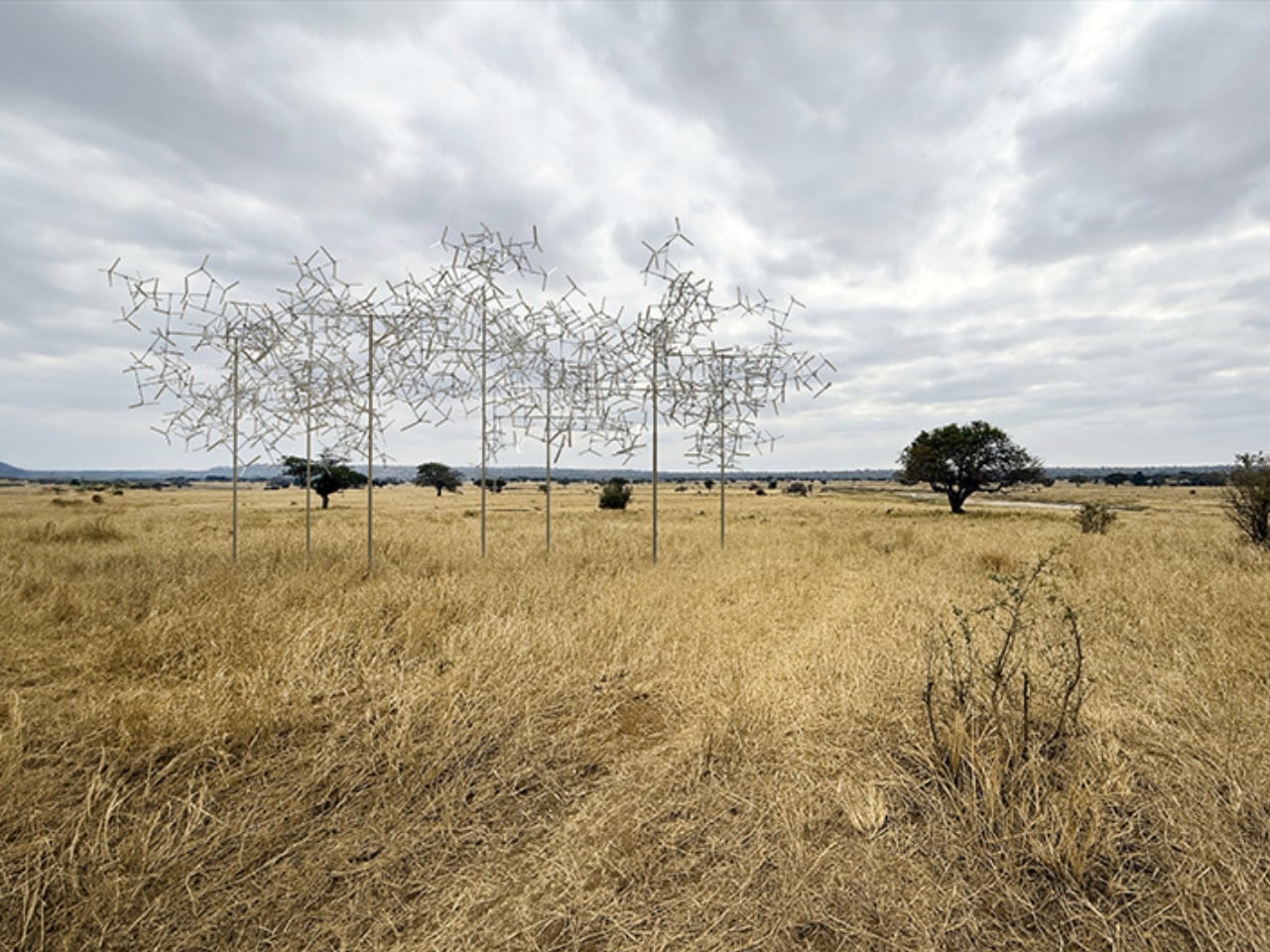
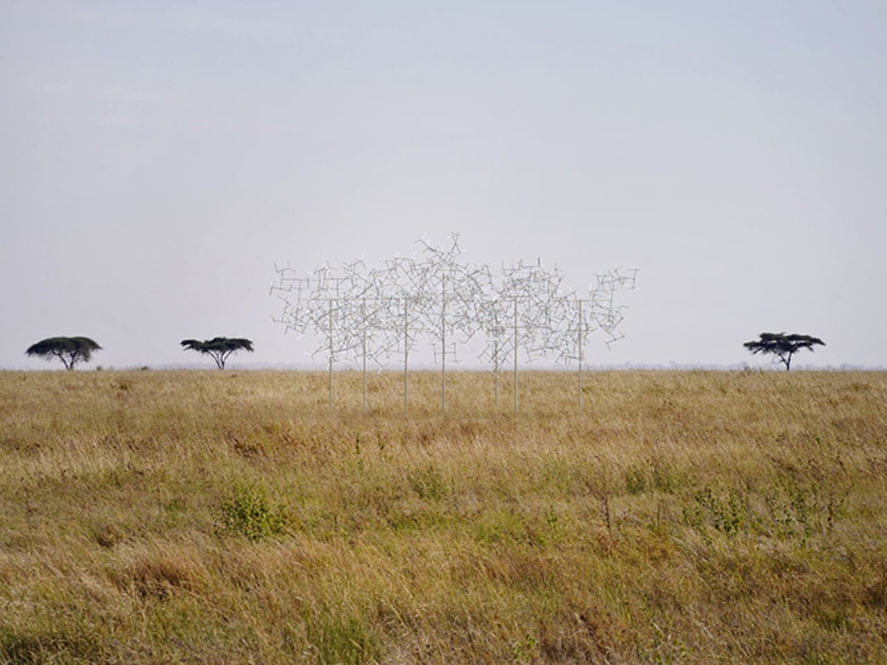
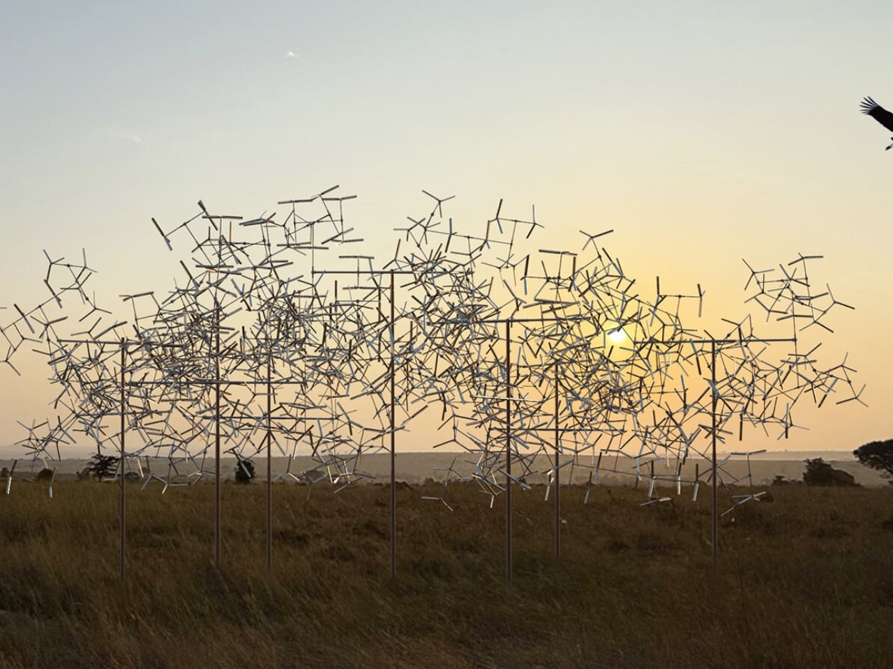
There’s something almost unsettling about a structure that appears to breathe. Not in a horror movie kind of way, but in that quiet, mesmerizing way that makes you stop, squint, and wonder if what you’re seeing is really happening. That’s exactly what Vincent Leroy’s Fractal Swarm does to people. It sits in the vast openness of the Tanzanian plains, and it moves. Not because of motors or hidden mechanisms, but because of the wind.

Leroy is a Paris-based French artist who grew up in rural Normandy tinkering with whatever he could get his hands on. That early habit of experimenting turned into a full-blown obsession with movement, which led him to study industrial design at the Ecole Nationale Supérieure de Création Industrielle in Paris. By the time he graduated, he was already making kinetic work that galleries wanted to show. Since then, he has built a practice that sits comfortably between sculpture, installation art, and something that doesn’t quite have a name yet. His work has appeared everywhere from Parisian museums to Zanzibar’s shoreline, and the thread that runs through all of it is the same: movement as a material, not just as an effect.

Designer: Vincent Leroy

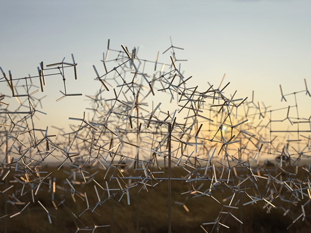
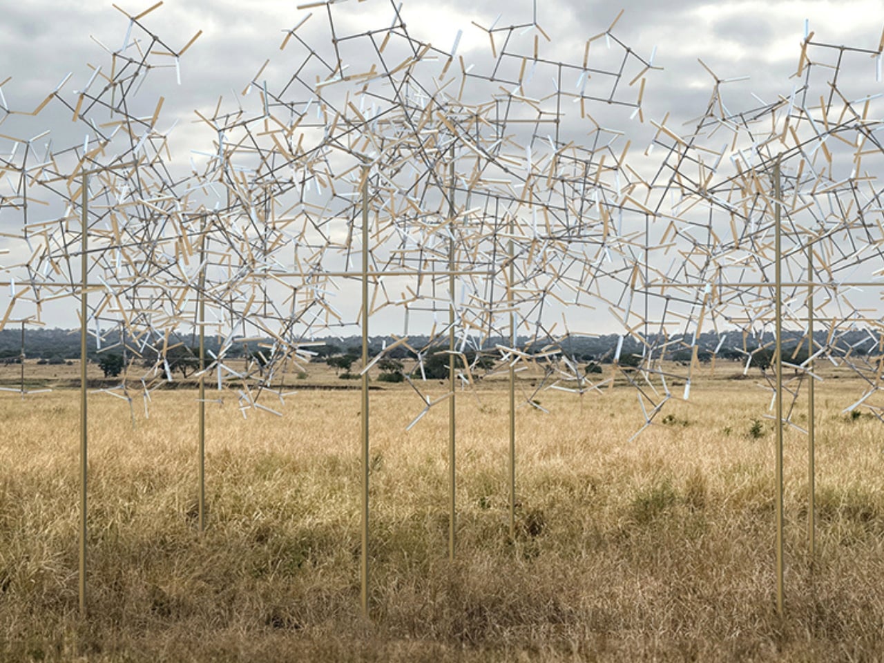
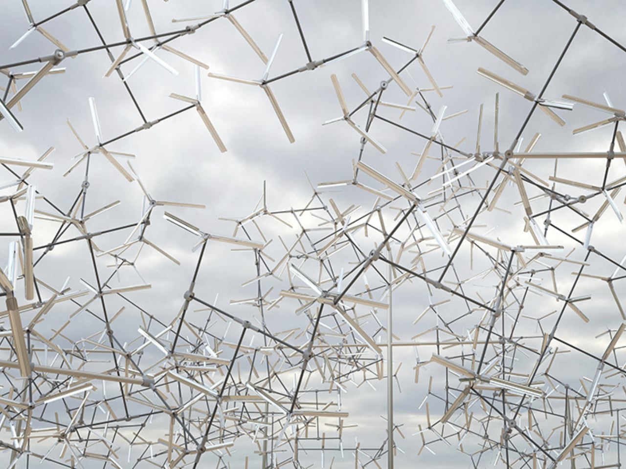
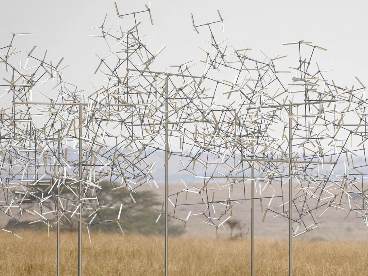
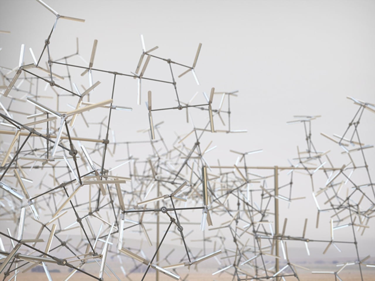
Fractal Swarm is his latest statement on that idea, and it might be the most ambitious one yet. The installation is built around the logic of fractal geometry, which is the kind of math that describes the way nature repeats itself at different scales. Think of the branching pattern of a tree, or the way a fern unfolds, or the texture of a coastline seen from above. Nature uses this structure constantly, and Leroy decided to make it visible in a landscape where that pattern is already everywhere.

The Tanzanian plains during the dry season are stripped down to essentials. Acacia trees stand with bare, branching silhouettes against the sky. The ground breaks into fragmented, textured patches of arid vegetation. Leroy’s installation mirrors all of that. Its branching configuration echoes the acacia silhouettes so closely that from a distance, it reads more like something that grew there than something that was built. That’s the point. Rather than imposing itself on the landscape, Fractal Swarm extends it.

What makes it come alive, literally, are the mirrored fins embedded within the structure’s modules. Thin and precisely placed, these fins catch and refract the intense light of the plains as they move. The wind sets everything in motion, and the fins respond by scattering light in constantly shifting patterns across the ground and the air around them. The result is something that changes every second depending on where you’re standing, what direction the wind is coming from, and what time of day it is. No two moments of looking at it are the same.

This is what Leroy keeps coming back to in his practice: the idea that slowing down and watching something move can completely change how you see it. His work tries to reveal the gaps that usually go unnoticed in today’s frenetic race for speed and performance. Fractal Swarm does that on a grand scale. It puts you in front of something enormous and quietly says: stand here. Watch this. Let the wind do something beautiful.

It’s also worth noting that Leroy isn’t new to working with wind in dramatic outdoor settings. His Drifting Cloud installation on Zanzibar’s east coast used rotating canvas discs that interacted directly with the shoreline’s breeze. Fractal Swarm takes that same sensibility deeper into the continent and scales it up into something more structural and mathematically precise.

What’s quietly radical about all of this is that Leroy uses some of the most rigorous abstract math available (fractal geometry) and turns it into something you feel before you think about it. You don’t need to understand the Mandelbrot set to be moved by Fractal Swarm. You just need to stand near it when the wind picks up and watch the plains light up like they’re waking. That’s the kind of art that sticks with you long after you’ve walked away.

The post A Wind-Powered Sculpture Is Lighting Up Tanzania’s Plains first appeared on Yanko Design.
When the Forest Sings Back: Human Perches in Quebec

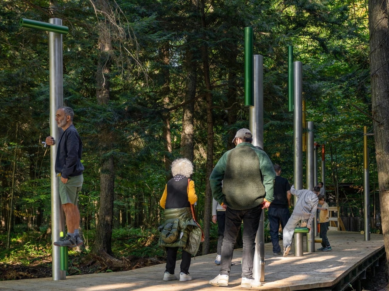
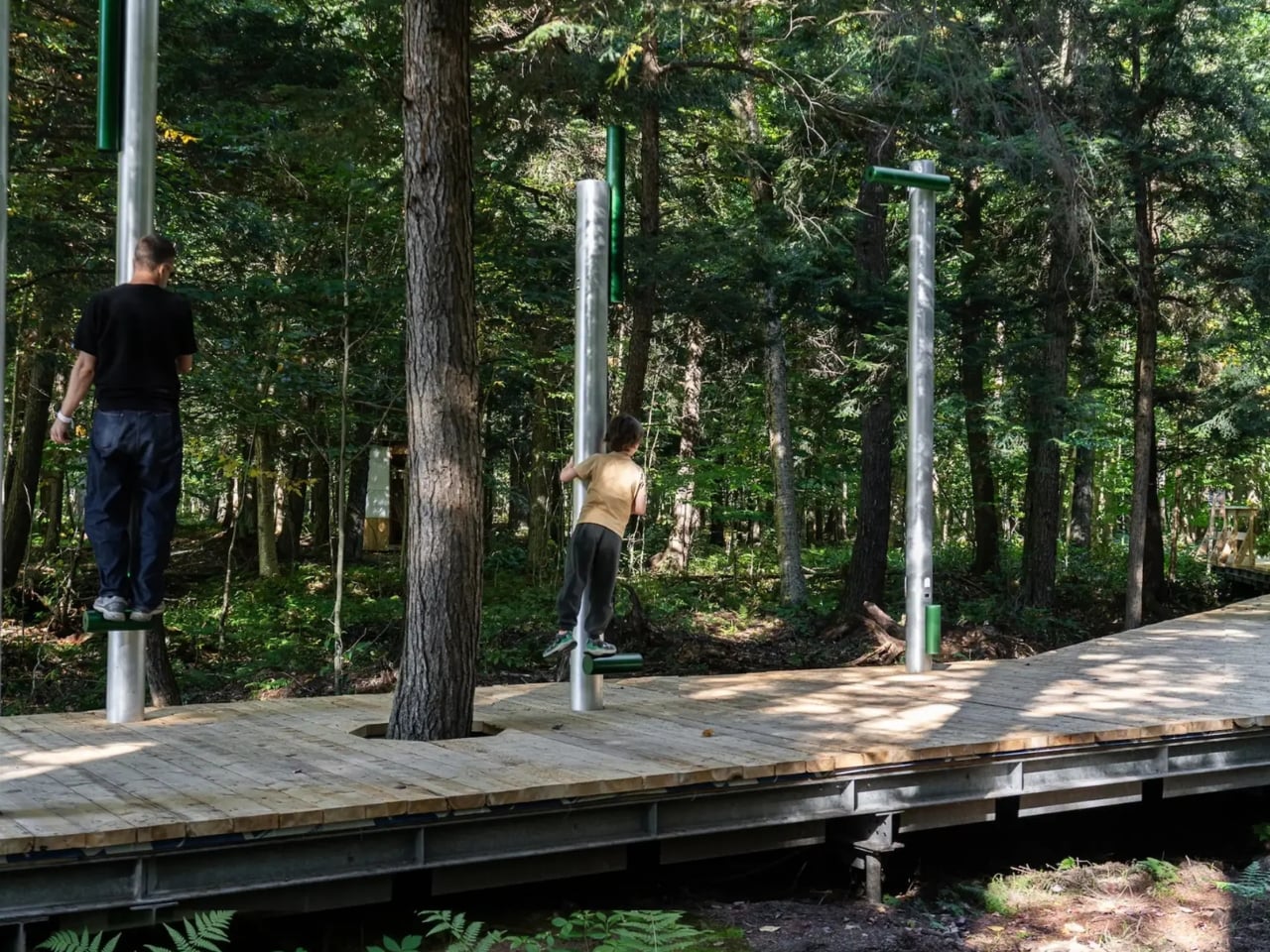
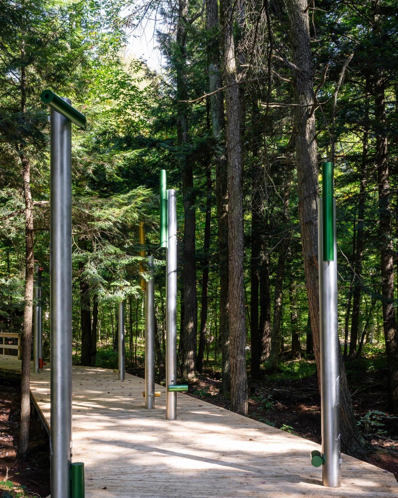
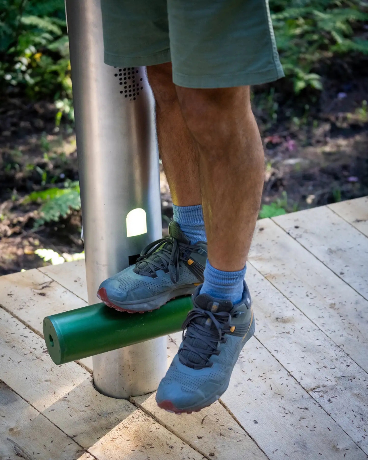
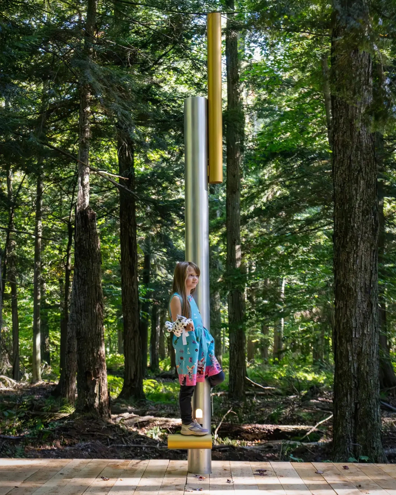
Picture yourself standing on a small platform in the middle of a Quebec forest, balancing on what feels like an oversized bird perch. The moment your weight settles, something magical happens. A bird call rings out, blending seamlessly into an ethereal soundtrack that seems to rise from the forest itself. Welcome to Human Perches, the latest installation from Montreal design studio Daily tous les jours that’s making us rethink how we experience nature.

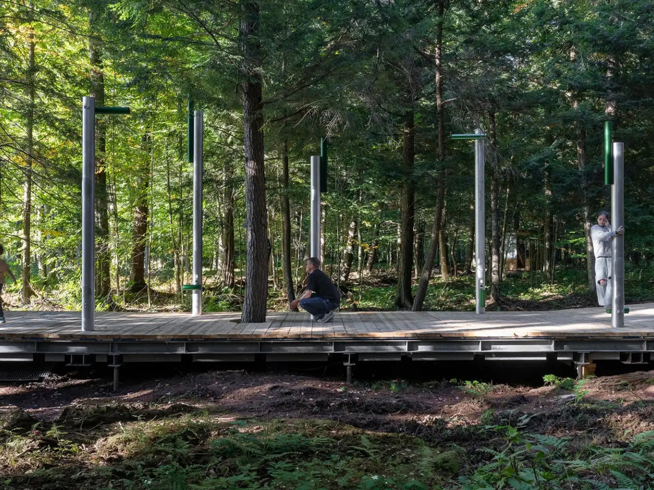
Located at Chouette à voir!, a bird of prey sanctuary in St-Jude, Quebec, this permanent installation transforms a 55-meter elevated boardwalk into an interactive musical journey through the seasons. Ten aluminum perching stations punctuate the path, each one waiting for a human visitor to activate its hidden soundscape. The design is brilliantly simple: step onto a green perch, and you become part of the forest’s symphony.

Designer: Daily tous les jours

What makes this project so captivating is how it flips our usual relationship with wildlife. We’re used to being the noisy intruders, the reason birds fall silent when we approach. Here, we become the activators of sound. When humans aren’t present, the artwork stays quiet, mirroring the behavior of the sanctuary’s winged residents. It’s a poetic reversal that makes you acutely aware of your presence in the ecosystem.

The experience unfolds like a sonic story as you move along the boardwalk. Each perch represents a different season, with soundscapes that capture winter’s vigilance, spring’s courtship, summer’s protection, and autumn’s migration. The genius lies in the layering. Juno Award-winning composer Keiko Devaux crafted an evolving dialogue between abstract base compositions and actual bird calls from local species. Sometimes the bird voices appear as themselves. Other times, they’re transformed into ethereal textures or rhythmic elements that pulse beneath the surface.

Daily tous les jours, led by co-founders Mouna Andraos and Melissa Mongiat, has spent fifteen years creating participatory urban experiences, from musical swings to interactive light installations. But Human Perches marks a shift in their practice. Instead of focusing purely on human-to-human connection, they’re exploring the delicate interfaces between species. It’s part of a broader investigation into how sound vibrations can stimulate growth and communication within ecosystems, a thread that runs through their concurrent Forest Mixer project on Hornby Island as well.

The physical design is minimal but thoughtful. The aluminum perches create a striking contrast against the organic textures of the red cedar and spruce boardwalk, highlighting the intentionality of human presence in wild spaces. Each station includes sensors that detect when someone steps up, triggering both a soft light and the corresponding bird call. The act of perching itself becomes meaningful. You’re balancing, aware of your body, suspended between the marsh below and the forest canopy above. It demands a different kind of attention than simply walking through.

There’s an educational dimension here too. The sanctuary is home to various bird species, including vulnerable ones, and the installation serves as both attraction and conservation tool. “Conservation efforts to preserve our precious wildlife also involve education and enchantment,” Andraos explains. The project received significant support from Quebec’s Ministry of Culture and Communications, reflecting recognition that these kinds of immersive cultural experiences can reach audiences in unexpected ways.

What resonates most about Human Perches is how it heightens awareness without being preachy. You’re not being lectured about biodiversity or habitat loss. Instead, you’re invited to listen differently, to tune into layers of sound you might have walked past before. After experiencing the installation, visitors report hearing the forest with new ears, imagining the hidden life thrumming all around them even after they’ve left the perches behind.

In our increasingly screen-saturated world, projects like this offer something rare: a reason to be fully present in a physical space, to engage your whole body in the act of listening. It’s technology in service of slowness, design that creates space for wonder rather than distraction. The forest has always been singing. Daily tous les jours just gave us a way to finally hear it.

The post When the Forest Sings Back: Human Perches in Quebec first appeared on Yanko Design.
A Living Sphere: Japan’s Self-Contained Food Ecosystem Points to Urban Agriculture’s Future

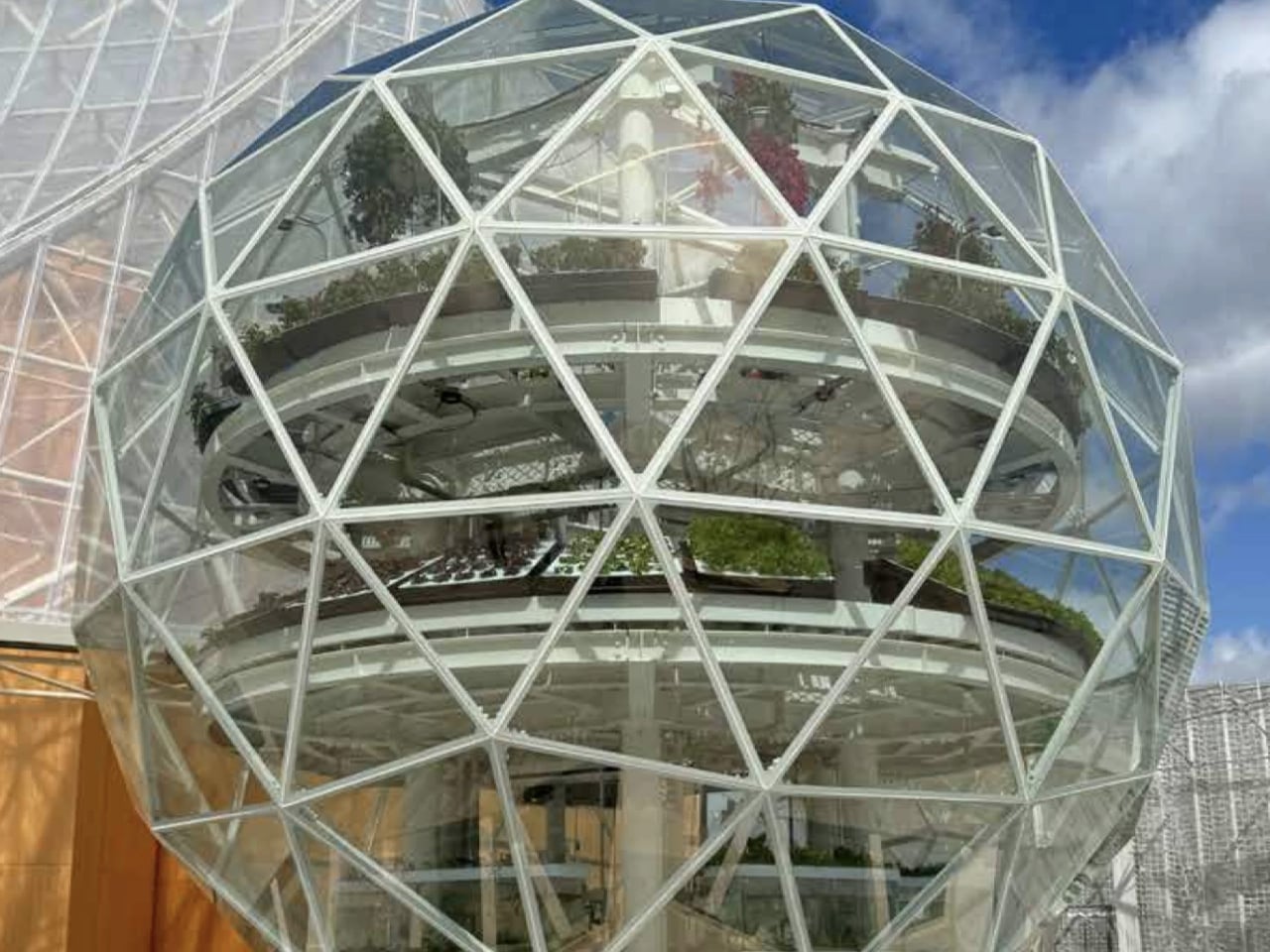
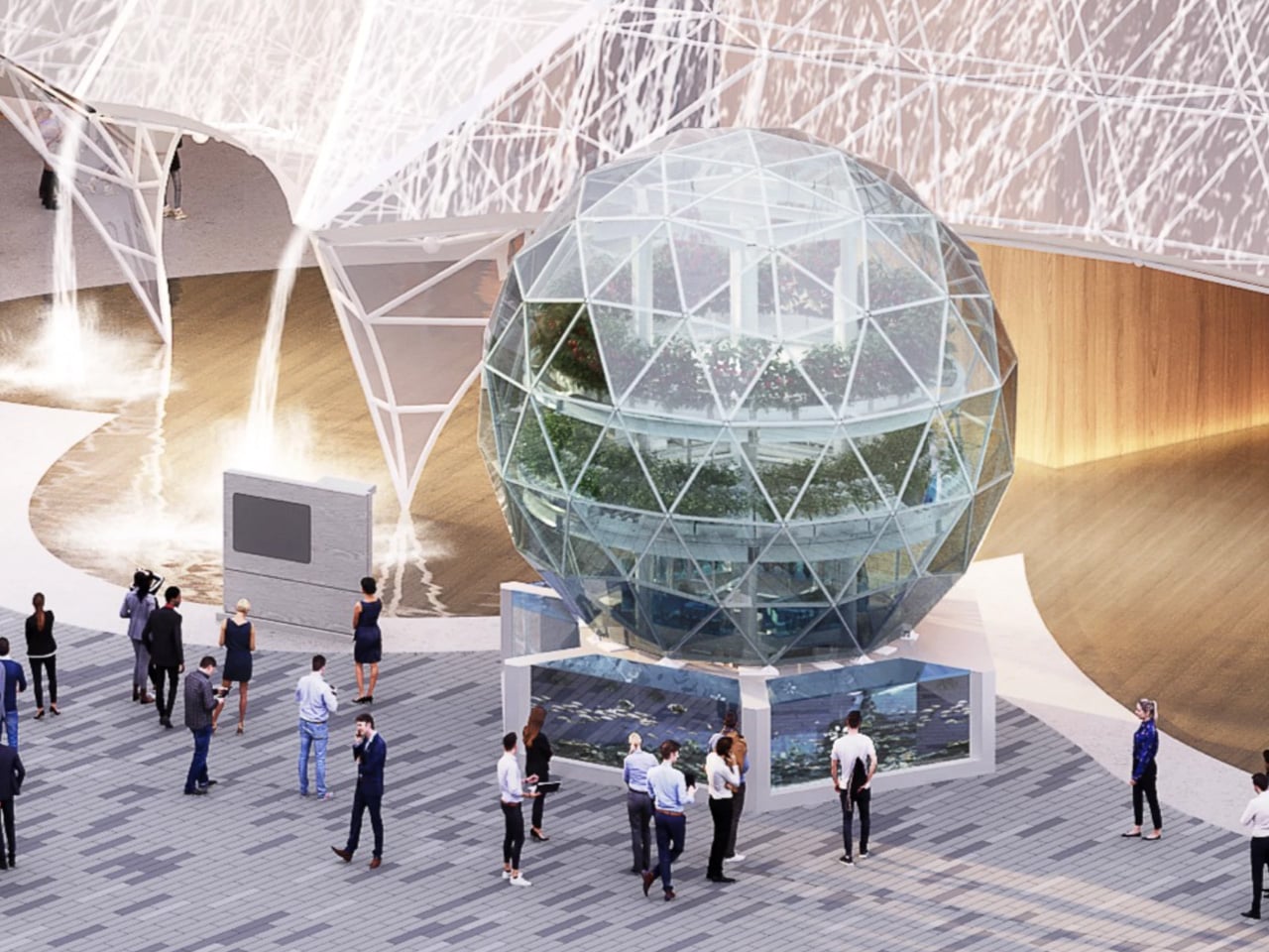
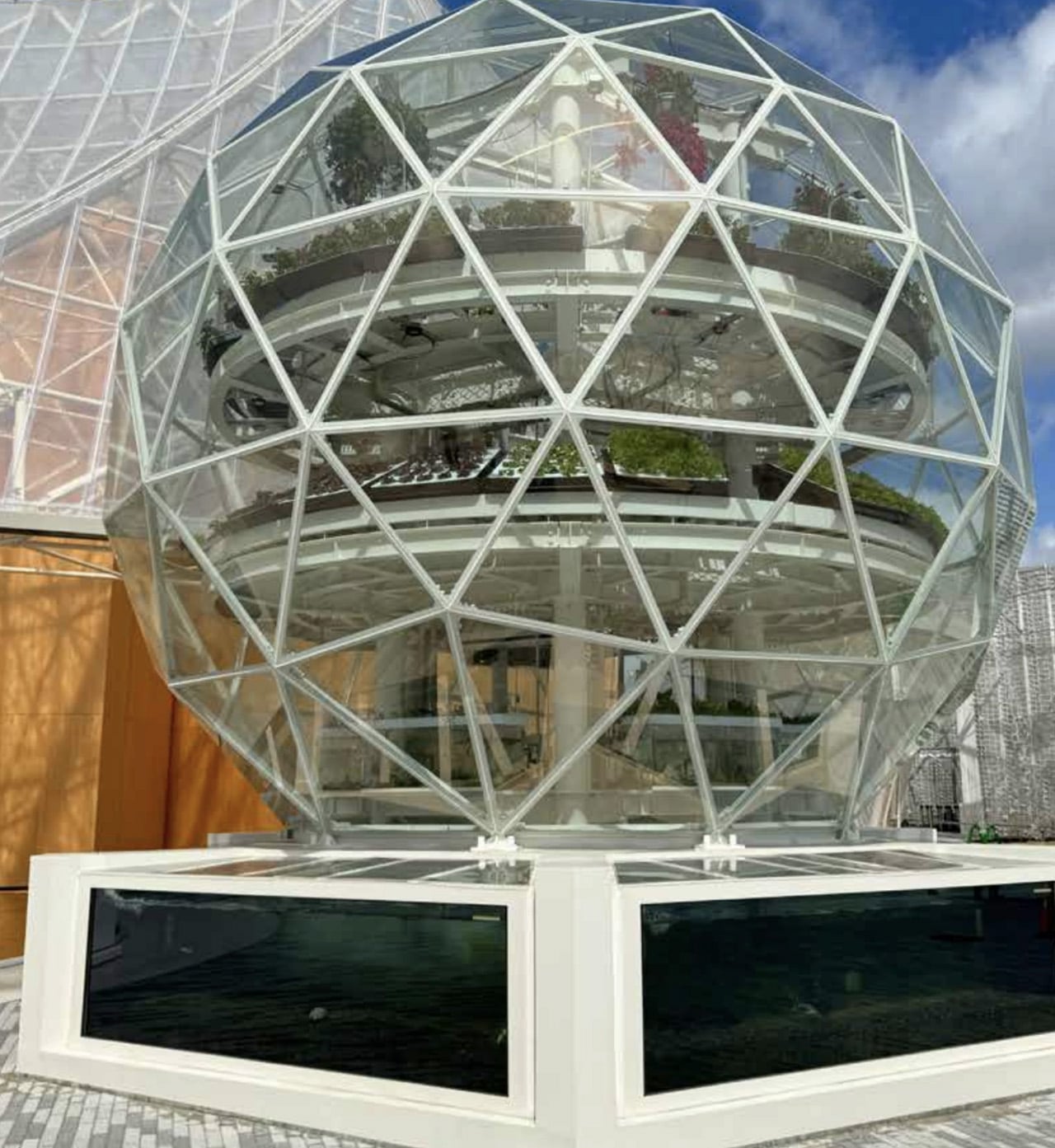
Perched at the Osaka Health Pavilion during Expo 2025, a translucent dome hums with life. Inside, tomatoes ripen above brackish water while pufferfish swim below, their waste feeding the plants that clean their home. This is “Inochi no Izumi,” or “Source of Life,” a 21-foot-high sphere that reimagines how cities might feed themselves. The dome’s genius lies in its vertical arrangement. Four water compartments form the base: seawater, brackish water, and two freshwater tanks. Each supports aquatic species matched to its salinity, from marine groupers to freshwater sturgeon. Above each tank rises a corresponding tier of hydroponic crops, creating four parallel ecosystems stacked inside a single structure.

The nutrient cycle starts underwater. Fish excrete ammonia-rich waste that specialized microbes convert into nitrites, then nitrates. Pumps lift this nutrient-loaded water to feed the plants directly overhead. As roots absorb nitrogen compounds, they return purified water to the tanks below. Nothing leaves the system. Nature’s wetland cycling becomes an engine for food production. The broader the range of compatible species, the more resilient and self-sufficient the ecosystem becomes. That diversity mirrors natural systems but remains optimized for human consumption.

Designer: VikingDome, Osaka Metropolitan University’s Plant Factory R&D Center & Tokyo University of Marine Science & Technology

Each layer hosts plants suited to its water source. Salt-tolerant halophytes like sea asparagus and sea purslane grow above the seawater tank housing red seabream and black porgy. Sea grapes flourish in the saltwater itself. Move up a tier, and semi-tolerant tomatoes thrive on brackish water where Japanese pufferfish and ornamental carp glide. The freshwater zones support functional vegetables—nutrient-dense herbs and lettuces—while edible flowers, including nasturtium and marigold crown the top tier, their beds rotating via built-in motors to optimize light exposure.

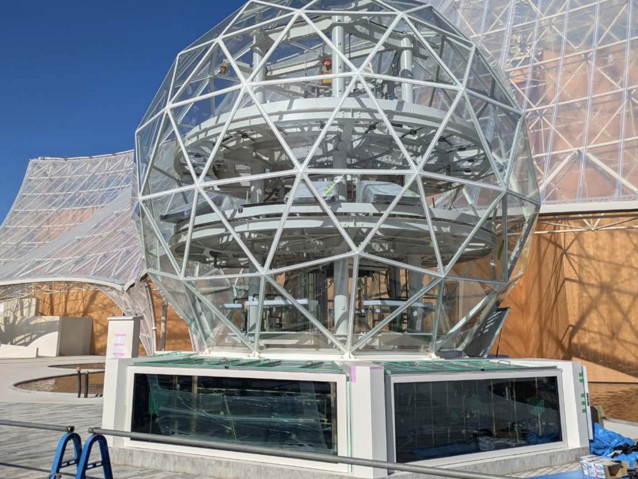
The dome’s outer skin consists of transparent ETFE panels stretched across 245 steel structural bars connected by 76 joints. This geodesic framework, built using VikingDome’s T-STAR system, covers 1,378 square feet while weighing just over two tons. The entire structure arrived at Yumeshima Island on three pallets. Its design maximizes sunlight penetration while maintaining stable internal temperatures, creating a microclimate where multiple growing zones coexist.

Developed with Osaka Metropolitan University’s Plant Factory R&D Center and Tokyo University of Marine Science and Technology, this system demonstrates agricultural biodiversity at work. The practical applications extend beyond exhibition. Dense urban centers with limited ground space could host these modular systems on rooftops or in narrow lots. Land-poor regions where traditional farming struggles could gain food independence. Disaster-prone areas might deploy closed-loop domes for decentralized production unaffected by soil contamination or water scarcity.

What makes Source of Life compelling isn’t revolutionary technology. The core principle—aquaponics—has existed for decades. Rather, it’s the elegant integration of ecological understanding with space-efficient design. Commercial agriculture often chases yield through inputs: fertilizers, pesticides, energy. This dome inverts that logic, asking what happens when we design with nature’s cycles instead of against them. As cities grow and climate pressures mount, feeding urban populations sustainably demands fresh thinking. This geodesic greenhouse suggests one path forward: upward, inward, and circular.
The post A Living Sphere: Japan’s Self-Contained Food Ecosystem Points to Urban Agriculture’s Future first appeared on Yanko Design.