ASUS Zenbook DUO (2026) Review: One Laptop, Two Screens, All Business

PROS:


  • Beautiful, nearly identical 14-inch 144Hz 3K OLED screens

  • Narrower hinge creates a more immersive visual experience

  • Ceraluminum design adds visual and tactile character

  • Powerful Intel Panther Lake performance and impressive battery life

CONS:


  • Quite pricey

  • No built-in card reader

  • RAM is soldered

RATINGS:

AESTHETICS
ERGONOMICS
PERFORMANCE
SUSTAINABILITY / REPAIRABILITY
VALUE FOR MONEY

EDITOR'S QUOTE:

The ASUS Zenbook DUO (UX8407) earns its premium with two stunning co-equal OLED screens, a sleeker hinge, and Intel Panther Lake performance built for serious work on the go.
award-icon

For a time, it seemed that foldable and rollable screens would be the future of laptops, just as they are positioned to be where smartphones are going. That was until people realized that what may be good for handheld devices might not work for 14-inch slabs with keyboards. Foldable laptops might still have their day, but they are too impractical and costly for now.

ASUS has chosen to instead design and deliver a solution for today’s needs and problems. Rather than a screen that folds just to save space, the Zenbook DUO has opted to expand the user’s workspace instead, bringing the productivity advantages of dual-monitor setups from desktops to laptops. This year’s ASUS Zenbook DUO (UX8407) does more than just upgrade the spec sheet. It is also adding a touch of style and elegance that makes a power user tool feel more considered.

Designer: ASUS

Aesthetics

The 2026 ASUS Zenbook DUO (UX8407) is quite stunning in almost any form, whether it’s closed shut, opened like a laptop, or especially when it’s wide open. The lid cover exudes not only minimalism but also character, with a reflective “ASUS ZENBOOK” logo engraved against the Elephant Gray “Ceraluminum” surface, creating a simple yet eye-catching visual and material contrast.

That Ceraluminum is, of course, ASUS’s latest material innovation that uses a special oxidation process to give aluminum some ceramic-like properties, particularly durability and higher resistance to scratches. The end result is a material that isn’t just nice to look at but also pleasing to touch, giving the lid a texture that almost feels like stone or, well, ceramic. There is also a certain visual “roughness” to the Ceraluminum surface, setting it apart from the brushed metal or anodized appearances of its peers.

Of course, the real show happens when you open the laptop and lift the keyboard away, revealing two gorgeous 14-inch screens connected together by a hinge, no messy or awkward cables. For this iteration, ASUS poured its efforts into making that connection look even more seamless, not only by shrinking the bezels between the displays but also by developing a new “hideaway” hinge that narrows the gap from 25.31mm down to 7.6mm. Make no mistake, there’s still a very obvious separation between the two, but it is now less jarring, making it feel like you’re working with a screen that just happened to be split into two, rather than two screens stitched together.

With the detachable Bluetooth keyboard resting on the second screen or when it’s closed, the Zenbook DUO (2026) looks almost like a normal laptop. You have a few (literally) ports on either side along with some air vents, and a wide-long grille at the bottom above the built-in kickstand. Your only clue that this isn’t a normal laptop is when you accidentally close the laptop lid without the keyboard attached, creating a very noticeable gap that, unfortunately, would also be an open invitation for small items to come in and scratch the screens.

Ergonomics

At 1.65kg (3.64lbs) with the Bluetooth keyboard attached, the ASUS Zenbook DUO (UX8407) isn’t exactly lightweight compared to other 14-inch laptops in the market, at least the non-gaming kind. That said, it’s not exactly on the heavier side either, especially when you consider that you’re carrying two 14-inch screens, not to mention a 99Wh battery, in a single bundle. In that context, it’s actually amazing how much ASUS was able to reduce the heft without cutting corners.

That said, having two connected displays brings its own ergonomics puzzle, something that ASUS seems to have finally solved almost to perfection. You have no less than 5 ways to use the laptop, from a normal laptop to two screens vertically stacked to the side-by-side “desktop mode”. While the hinge does most of the hard work, the built-in kickstand literally carries the burden, supporting that full weight (minus the keyboard) on its own.

The new kickstand is stronger, sturdier, and stiffer, providing confidence it won’t just suddenly close down. It can open to a maximum of 90 degrees, which is the angle you’ll need for desktop mode. That said, it also means that you only have possible angle for the displays in that mode, unless you have a separate stand to prop it up, which kind of defeats the purpose of having a built-in kickstand.

One thing to note in desktop mode is that you will naturally be sacrificing one side of ports. Thankfully, you can turn the Zenbook DUO (2026) which ever side up, whether you need an extra HDMI and headphone jack, or an extra USB-A port. Thankfully, both Thunderbolt 4 ports are equal in capabilities, so you don’t have to make a sacrifice on that end.

If there’s one thing I found a bit cumbersome in the Zenbook DUO’s design is that the power button sits so flushed against the frame. On the one hand, that means it won’t snag with anything in your bag, nor will it get triggered accidentally. On the other hand, it also makes it harder to locate it without looking or fumbling with your finger sliding across the edge repeatedly.

Performance

The ASUS Zenbook DUO (UX8407) is one of the early laptops to embrace Intel’s new Panther Lake chips, specifically the Intel Core Ultra 3 series. The dual-screen laptops comes in two options, one with an Intel Core Ultra 7 355 and the Intel Core Ultra X9 388H. In terms of CPU alone, these already represent a huge leap not just in performance but also in power efficiency, but the latter configuration pulls an even bigger feat.

The review unit we received comes with an Intel Arc B390 GPU based the latest 3rd-gen Intel Xe graphics. Forget what memories you might have had of integrated Intel graphics, because we’re entering an era where you can actually play games with decent settings on it. Of course, your mileage may vary and benchmarks can only provide some general idea, but that all these specs mean is that the ASUS Zenbook DUO (2026) is built for serious productivity and creative work.

It is, after all, designed for heavy-duty computer users ranging from knowledge workers to creators who need to bring the productivity they enjoy on the desktop to wherever they go. Productivity suites, video editors, graphics programs, 3D modelers, and even games won’t make this flexible laptop break a sweat. And yes, that includes some AI shenanigans, thanks to an upgraded NPU as well.

Of course, this also means that it has enough muscle to support running two screens which, by default, is set to extended (versus mirroring each other). The beauty is that these two screens are nearly identical not just in size but also in capabilities, where other dual-screen laptops skimp on the second screen more often than not. We’re talking two 14-inch 3K (2880×1800) 144Hz Lumina Pro OLED displays. Both support touch and, more importantly, both support the ASUS Pen stylus.

In reality, there are very slight differences between the two screens in terms of full color gamut and maximum brightness, but you won’t notice it too much unless you are actively looking for it. In practice, most people will keep content they’re working on in one of two screens anyway, leaving the other as an auxiliary for references or controls.

The latter is actually an interesting aspect of this dual-screen laptop, making the Zenbook DUO feel almost futuristic. While it does have a detachable keyboard, there might be times when you want to have more direct access to the lower touch screen without having to switch back and forth with the Bluetooth keyboard at the side. With a six-finger gesture, you can summon a half-height virtual keyboard, a half-height virtual keyboard with a virtual trackpad to the right, or a full-screen keyboard with a large trackpad below it, pretty much like the virtual equivalent of the physical keyboard.

Additionally, you can have other virtual knobs and sliders above the keyboard or as floating windows, thanks to ASUS’s Dial & Control app. These controls, which also include a numpad and an area for writing with a pen, can change depending on what app is currently in focus. With a browser window, it can have a button for a new tab or a dial for zooming in and out. Or it could be a knob for volume and a slider for screen brightness.

As for the detachable keyboard, it magnetically snaps into place, with retracting pogo pins creating a more stable connection than Bluetooth, though that is the only way to use it when it’s detached. That said, there are no notches or protrusions along the edges of the keyboard, so prying it away from that strong magnetic hold can take a bit of work. The keyboard charges when it’s lying on the laptop, but it can also be charged separately via USB-C. Key travel is decent, but the keys themselves feel a bit squishy. The large trackpad is sensitive, but the hydrophobic coating gives it too much resistance when gliding your finger across it.

The combination of the more power-smart Intel Panther Lake processor and the 99Wh battery tucked inside gives the ASUS Zenbook DUO (UX8407) quite a long uptime, even with both screens enabled. Even a battery of benchmarks and hours of typing and browsing has left a good 12% of battery left, rounding up to a little over 15 hours of use, just a little below ASUS’s advertised 18 hours (with two screens). The included 100W USB-C charging brick helps mitigate the battery loss, and the fact that you can easily use power banks to top up on the go makes the battery narrative even more compelling.

Sustainability

ASUS didn’t use to speak much about the sustainability of its laptops, but that has changed in recent years. The invention of Ceraluminum adds another level to that story, though a bit indirectly. In a nutshell, the material is meant to increase the durability and longevity of the product by protecting it from small accidents. Whether the ZenBook DUO uses sustainable materials, or at least what percentage of it does, isn’t public information.

That longevity, however, is also affected by how much you can upgrade or even repair the laptop. Given how unconventional its design is, it’s really no surprise that there isn’t much here in the way of upgrade options. You do have easy access to the SSD underneath the kickstand. The Zenbook DUO (2026) can support up to 2TB with a full-sized M.2 SSD. The 32GB RAM, however, is soldered down.

Value

The ASUS Zenbook DUO (UX8407) is a laptop on a mission. It is, in a nutshell, designed for people who thrive and need multi-tasking capabilities that they could only enjoy while chained to their desk (or awkwardly carrying a portable monitor). That actually covers a wide range of professions and industries, including creators, designers, office workers, executives, and, yes, gamers. In that sense, there can probably be no better tool for them than this.

In both performance and flexibility, the 2026 Zenbook DUO offers users the power they need, as they need it. Cramped for space on a plane? Just use it as a single-screen laptop, and no one will be the wiser. Need to collaborate with a team? Lay it out flat on the desk to give everyone the same perspective. Need to reference documents as you write? The book-like desktop mode has you covered.

That said, it’s definitely far from perfect. For a laptop aimed at creatives and professionals, the absence of a built-in SD card reader seems pretty odd. And then there’s the $2,699.99 price for the configuration that has the impressive Intel Arc graphics. That puts it way above most 14-inch ultra-thin laptops and in the range of gaming laptops. But then again, none of those have two 14-inch screens, either.

Verdict

Laptops with foldable screens admittedly look fancy and impressive. The big OEMs, including ASUS, are still playing around to find the formula that will finally make it feel more than just a fancy and expensive experiment. In the meantime, however, people need to get work done, and when it comes to that, nothing really beats using more than two screens.

You could always carry a portable screen along with your laptop, which is awkward, cumbersome, and inefficient, or you could grab the ASUS Zenbook DUO (UX8407). With an improved hinge, beautiful co-equal 14-inch displays, and an Intel Panther Lake processor that can handle almost anything you throw at it, the dual-screen laptop lets you choose the way you want or need to work. And it looks stylish to boot in any form, making sure you’ll be the envy of everyone in the coffee shop.

The post ASUS Zenbook DUO (2026) Review: One Laptop, Two Screens, All Business first appeared on Yanko Design.

vivo X300 Ultra Review: Putting the Camera at the Center of Everything

PROS:


  • Excellent photography performance even without accessory

  • Modular photography ecosystem with extenders, grips, and cages

  • Simple yet stylish design

  • Flagship performance now avialabe globally


CONS:


  • Quite heavy for one-handed use

  • Premium pricing might only appeal to mobile shutterbugs


RATINGS:

AESTHETICS
ERGONOMICS
PERFORMANCE
SUSTAINABILITY / REPAIRABILITY
VALUE FOR MONEY

EDITOR'S QUOTE:

The vivo X300 Ultra is a camera platform that happens to run Android, built for people who shoot with purpose and want their phone to keep up.

The premium smartphone market has gotten very good at producing flagships that look and feel essentially identical. Brighter displays, larger sensors, and faster chips are standard expectations now, and while the results are impressive, they rarely feel purpose-built for a specific kind of user. The phones that genuinely stand out tend to commit to a clear identity and organize everything, from hardware to aesthetics, around it.

The vivo X300 Ultra is making its global debut right now, the first time vivo’s top-tier X Series flagship has launched outside of China. It arrives with a clear, photography-first premise built around the ZEISS Master Lenses Collection, offering professional creators unprecedented creative freedom through pioneering telephoto solutions, three prime-equivalent focal lengths, and a modular telephoto system that turns the phone into something closer to a portable camera platform than a smartphone that happens to have good cameras.

Designer: vivo

Aesthetics

The X300 Ultra doesn’t hide what it’s about. The rear is dominated by a large circular camera module, a bold black disc rimmed in polished metal with ZEISS T* branding at the center. It’s a confident, unapologetic choice that reads as a statement of intent rather than a feature shoehorned into standard smartphone form. The module doesn’t merely support the design; it is the design.

Our review unit is the white colorway, and it’s a particularly considered finish. The back panel has a subtle, almost etched texture beneath the surface, giving it more depth than you’d expect from a white phone. The polished frame and classic split design, inspired by the hues of unprocessed film, create a striking visual contrast while maintaining a slim, premium presence without relying on glossy flash or loud visual contrast.

The camera-inspired detailing rewards a closer look. The device features a metal “biscuit-style” camera bump with a knurled texture and engraved lettering on the sidewall of the camera bump, adding a precision-tool quality you feel the moment you hold it. These aren’t details that show up in a spec sheet, but they make a real difference in how the phone feels to own and carry every day.

The front takes a different approach entirely. The 6.82-inch 2.5D flat screen sits behind slim, even bezels with a small centered punch-hole for the 50MP front camera, and the whole face feels clean and uncomplicated. That contrast with the expressive rear works in the phone’s favor, keeping the display experience neutral and focused while the camera side carries all the personality.

Ergonomics

The first thing you notice when picking up the vivo X300 Ultra is the weight. At 237g, the white model is among the heaviest flagship phones currently on the market, and the substantial camera module adds to that presence both physically and psychologically. The Unibody 3D Glass Fiber Design of the Black edition results in a lighter 232g, but regardless of colorway, the flat-sided metal frame distributes the weight well, making the phone feel grounded and deliberate rather than awkwardly front-heavy.

One-handed use is possible, but not the most comfortable for extended periods, which is expected for a device of this size. The flat sides help with grip, giving you a firm hold, and the 8.49mm slim profile feels justified by the optical hardware packed inside. It’s a noticeable phone in the pocket, though that’s really true of any flagship with serious camera ambitions.

The ergonomics shift noticeably when the telephoto extenders enter the picture. The protective case becomes a functional necessity, as the lens mount system requires it to interface with the accessories. Once a telephoto extender is attached, the modular grip moves from optional to practically essential, providing the stability and comfort that the added length and weight demand.

Performance

At the core lies the Snapdragon 8 Elite Gen 5, paired with vivo’s own Pro Imaging Chip VS1+ and up to 16GB of RAM with up to 1TB of storage. Day-to-day performance is exactly what you’d expect from a 2026 flagship: fast, fluid, and unfazed by demanding tasks. OriginOS 6, based on Android 16, keeps things running smoothly with an Origin Smooth Engine that keeps the interface feeling responsive even after extended sessions.

The display is a 6.82-inch 8T LTPO panel running at 3,168 x 1,440 with a 144Hz adaptive refresh rate. It’s bright enough to review shots comfortably outdoors, with 4,500 nits of local peak brightness and certifications for Dolby Vision, HDR10+, and Netflix HDR. As a viewfinder for the camera system, it performs its job well, delivering accurate colors that reflect what the camera is actually capturing.

Battery life is solid for a phone with this level of imaging ambition. The 6,600mAh BlueVolt Battery supports 100W wired FlashCharge and 40W wireless charging, making it easy to top up quickly between shoots. Bypass charging with smart temperature control also keeps heat in check during longer sessions, which matters when you’re shooting all day.

The camera system is, of course, where the X300 Ultra makes its most interesting argument. Rather than organizing three cameras as “main, ultrawide, and telephoto,” vivo builds them around three prime-equivalent focal lengths, each treated as a dedicated imaging tool. The 35mm ZEISS Documentary Camera, equipped with a Sony LYTIA 901 sensor at a 1/1.12-inch sensor size and 200MP direct output, is the natural storytelling lens with a field of view close to the human eye. It’s ideal for portraits, street photography, and everyday moments, particularly in low light, where it delivers sharp, naturally detailed results.

Color Profile: Authentic

Color Profile: Vivid

Portrait Mode

Macro Mode

The 85mm ZEISS Gimbal-Grade APO Telephoto Camera is arguably the most technically ambitious of the three. Its 200MP sensor captures extraordinary detail even at high zoom levels, meeting ZEISS APO standards for optical precision. With 3-degree gimbal-level OIS and 60fps AF tracking in Snapshot mode, it handles fast-moving subjects with a composure that most telephoto cameras on phones can’t manage. Concerts, wildlife, and sports are where this lens makes the clearest case for itself, letting you track and capture decisive moments with confidence.

Telephoto Lens (No Mode)

Telephoto Lens (Pro Sports Mode)

Telephoto Lens (Pro Sports Mode)

Ultra-wide

The 14mm ZEISS Ultra Wide-Angle Camera rounds things out at 50MP, with a large aperture that makes it more capable than the typical ultrawide found on most flagships. It isn’t an afterthought; vivo positions it as a main-camera-grade lens designed for natural landscapes and broader compositional work, and that ambition shows in the results.

Main

Telephoto Camera (No Lens Extender)

The telephoto extenders add another layer to the whole system. The 200mm equivalent vivo ZEISS Telephoto Extender Gen 2 connects to the phone via the case’s lens mount and delivers optical-grade output at a focal length that no internal module can match, all at a more manageable 153g, refined down from 210g in the previous generation. The 400mm equivalent Telephoto Extender Gen 2 Ultra takes things further still, built on a Kepler-inspired optical design with 15 high-transmittance glass elements and support for 200MP optical output. Both extenders support gimbal-grade OIS and up to 60fps AF tracking, and together they extend the X300 Ultra’s imaging range into territory that genuinely blurs the boundary between smartphone and dedicated camera.

200 mm ZEISS Telephoto Extender Gen 2

400 mm ZEISS Telephoto Extender Gen 2 Ultra

Sustainability

The X300 Ultra is built to last, and that conviction shows in the hardware choices. Armor Glass protects the exterior, and the phone carries both IP68 and IP69 dust and water resistance ratings, covering both prolonged submersion and high-pressure water exposure. These are meaningful standards for a device that’s meant to travel and shoot in varied conditions.

The strongest sustainability argument, though, is software longevity. vivo is committing to five years of OS upgrades and seven years of security maintenance, a support window that puts the X300 Ultra ahead of most Android flagships and signals genuine confidence in its long-term relevance. For a phone at this price point, that kind of assurance matters, extending the useful life of the device considerably.

Like most sealed flagship phones, however, the X300 Ultra isn’t particularly repair-friendly, and vivo doesn’t make any specific claims about recycled or sustainable materials in this build. That’s a common gap across the ultra-premium phone category, and the long support window and durable construction go some way toward compensating for it.

Value

The X300 Ultra sits squarely in the ultra-premium flagship tier, and it makes no attempt to be a broadly accessible phone. It’s a specialized, photography-first device with a modular accessory system, three prime-equivalent focal lengths, and a build quality that communicates its ambitions at every turn. The starting price in China begins at CNY 6,999, roughly in line with other high-end imaging flagships globally, though global pricing hasn’t been officially confirmed at the time of this review.

For the right buyer, that price feels well-matched to what the phone actually delivers. Photographers and creators who think in focal lengths, who want to shoot 200MP RAW files on a 35mm lens, track birds or performers at 85mm, and then extend to 200mm or 400mm with an optically serious external lens, will find it harder to justify a more generalist flagship. The X300 Ultra covers a lot of creative ground that most phones simply can’t.

That said, buyers looking for the lightest or simplest ultra-premium smartphone, something to carry easily through a full day without thinking twice about it, may find the X300 Ultra’s weight and accessory ecosystem a bit more demanding than they bargained for. It’s a phone that asks for a certain kind of engagement, and it rewards that engagement handsomely.

Verdict

The vivo X300 Ultra is one of the most coherent camera-first flagships to arrive in years. The design, the optics, the telephoto ecosystem, and the software are all pulling in the same direction, creating a product that knows its audience and delivers on their priorities with real conviction. The 237g weight and accessory dependency aren’t oversights; they’re the cost of a system this capable, and for the right user, that’s a perfectly reasonable trade.

What makes it genuinely memorable, though, isn’t any single spec. It’s the feeling that the whole thing was designed by people who actually think about photography, not just camera marketing. The focal lengths are deliberate, the extenders are optically serious, and the hardware detailing reinforces the idea that this is a tool as much as it is a phone. For anyone who shoots with intent, that kind of commitment is exactly what a flagship should offer.

The post vivo X300 Ultra Review: Putting the Camera at the Center of Everything first appeared on Yanko Design.

ZimaBoard 2 Review: The Home Server You Don’t Have to Hide Anymore

PROS:


  • Unusually sleek, well-finished aluminum design for a board-style server

  • Effectively silent passive cooling for always-on use

  • 60W adapter (with multiple plug types) provides sufficient 12V/5A power

  • Intuitive ZimaOS web interface, easy to set up without Linux experience

  • PCIe 3.0 x4 slot allows meaningful expansion


CONS:


  • Not suited for heavy compute or multi-VM workloads

  • Onboard eMMC is slow for sustained data storage

  • Memory tops out at 16 GB

RATINGS:

AESTHETICS
ERGONOMICS
PERFORMANCE
SUSTAINABILITY / REPAIRABILITY
VALUE FOR MONEY

EDITOR'S QUOTE:

The ZimaBoard 2 offers a compact, always-on server that earns its place on the shelf both functionally and aesthetically.

award-icon

Home servers and NAS boxes have long had a visibility problem, and not in the marketing sense. Most are bulky, noisy, and purely functional, which means they usually end up tucked behind desks or buried in closets. The compact options that do exist often sacrifice connectivity, storage support, or OS flexibility, making them useful only on paper rather than in the kind of sustained, always-on role they’re meant to fill.

ZimaBoard 2 from IceWhale is trying to change that. It’s a compact x86 home server built around an industrial aluminum chassis, with enough connectivity and software flexibility to serve as a NAS, media server, smart home hub, or private cloud device. Available in two configurations starting from $279, it sits comfortably between a hobbyist board computer and a proper home server, and that positioning is genuinely worth exploring.

Designer: IceWhale

Aesthetics

Most board-style computers aren’t particularly elegant things. They’re open PCBs with exposed components and color-coded connectors, designed for function over form. ZimaBoard 2 is a notable exception. It comes housed in an all-aluminum enclosure with a clean silver finish and vertical cooling fins running along its length, giving it an almost architectural character that’s genuinely unusual for hardware in this category.

The ribbed fin pattern isn’t purely decorative. It acts as a passive heatsink, keeping things cool while also giving the device a more resolved visual quality than the typical bare-PCB look. It’s compact enough to hold in one hand, and in a workspace context, it reads less like raw server hardware and more like a deliberate industrial object that wouldn’t look out of place on a well-specced desk.

What also sets it apart from other board computers is how the I/O is handled at a design level. The ports are grouped cleanly along one edge, with the dual Ethernet jacks, USB ports, and Mini DisplayPort sitting in a tidy, intentional cluster rather than scattered wherever there was board space. That considered layout keeps the device looking organized even when several cables are plugged in at once.

Ergonomics

Setting up ZimaBoard 2 is refreshingly straightforward for a device in this category. The web-based interface felt clean, well-organized, and intuitive enough that getting started didn’t require much Linux familiarity. ZimaOS comes pre-installed with a browser-based dashboard that handles storage configuration, app deployment, and network settings through a familiar, point-and-click experience. Getting a NAS or media server up takes minutes, not hours.

The board is compact and light enough to tuck almost anywhere. It ships with a 60 W power adapter that comes with interchangeable plug adapters, which is a thoughtful detail for anyone working across different countries or regions. ZimaBoard 2 is designed around passive cooling, so in everyday use, it stays effectively silent, even with the optional mini cooling fan, which matters considerably when the device is meant to operate around the clock.

One practical setup step worth noting is that the onboard eMMC storage is best treated as a system layer rather than a long-term data destination. After initial setup, moving files and apps to the SATA-connected drives is the smarter workflow, since attached storage is faster and better suited to the sustained read and write activity a home server handles daily. It’s a minor but worthwhile habit to build in early.

Performance

Under the aluminum shell sits an Intel N150 processor, a quad-core chip running up to 3.6 GHz with a 6 MB cache and a 10 W TDP. It’s not the most powerful chip in this size class, but it’s the right pick for a device designed to run continuously at low power. For home server tasks, including NAS, media streaming, and containerized workloads, it handles things with comfortable ease.

On the storage side, two SATA 3.0 ports come with integrated power support, making it straightforward to connect a pair of full-size NAS drives without extra adapters. Running two 3.5-inch drives caused no issues, and the 12V, 5A supply proved sufficient in testing to handle the board and drives comfortably. That power budget is a meaningful detail, since not every compact server can make the same claim confidently.

Thermals are worth touching on separately. The N150 runs warm under sustained loads, but for NAS-oriented use, there’s a simple tuning option: disabling Turbo Boost in the BIOS noticeably reduces operating temperatures. The trade-off is a clock speed ceiling of around 1 GHz, but for straightforward file serving, that’s more than sufficient, and the lower heat output makes for a much more comfortable long-term operating condition.

Beyond the hardware, ZimaOS adds real depth to the experience. Its app store advertises 800+ one-click apps, including Plex, Jellyfin, Nextcloud, and Home Assistant. The higher 1664 configuration’s 16 GB of LPDDR5 RAM also helps when running virtual machines or heavier container setups. ZimaOS also supports Intel Quick Sync for hardware-accelerated transcoding, which helps reduce CPU load in supported Plex and Jellyfin setups.

Sustainability

The all-aluminum enclosure makes a strong durability argument. Aluminum doesn’t flex, doesn’t yellow, and holds up well over years of continuous operation, which matters a great deal for hardware that never really gets switched off. The thermal design relies primarily on passive conduction through the chassis, keeping internal component complexity low and reducing the number of parts that could wear out over time.

Software longevity is another angle worth considering. Because ZimaBoard 2 runs on x86 architecture, it’s compatible with a wide range of operating systems, meaning the hardware doesn’t become obsolete when a software stack changes or no longer fits your needs. If ZimaOS evolves or you outgrow it, you can simply install something else. That kind of platform openness is a practical form of sustainability that closed appliances rarely offer.

Value

ZimaBoard 2 sits at a price point that demands a bit of context. The base 832 configuration starts at $279, with the 1664 variant at $349. Those figures feel steep when compared to bare-board computers, but the comparison isn’t really fair. What you’re getting is a fully enclosed x86 server module with dual 2.5 GbE networking, dual powered SATA bays, a PCIe 3.0 expansion slot, and ZimaOS pre-installed.

Compact mini PCs at a similar price usually offer stronger raw performance but fewer server-specific ports and no expansion path. Dedicated NAS boxes tend to be locked into proprietary software. ZimaBoard 2 is more flexible than either. Native SATA, dual 2.5 GbE, and a PCIe slot on a single platform is an uncommon combination at this price, and that’s where the value case starts to feel convincing.

The PCIe 3.0 x4 slot adds a dimension of future-proofing that sealed appliances can’t match. You can plug in a 10 GbE network card, an NVMe adapter, a GPU for AI workloads, or an HBA for expanding storage capacity. That expandability means you’re not locked into what the board offers at purchase, which in practical terms allows the device to grow alongside your needs rather than becoming a bottleneck.

It’s fair to say that buyers focused purely on maximum compute per dollar will find stronger options elsewhere. But for those building a quiet, flexible, always-on home server that’s actually pleasant to live with, ZimaBoard 2 feels well-judged. The design, connectivity, software experience, and room to grow all reinforce each other in a way that makes the price feel more grounded the longer you use it.

Verdict

ZimaBoard 2 makes a strong case for what compact home server hardware can look like when design is treated as part of the brief. It’s quiet, well-built, and easier to set up than most things in this category. Running as a NAS, a smart home hub, a media server, or all three at once, it handles each task without calling attention to itself, which is exactly what good infrastructure does.

The platform’s real strength is how many things it can become. Add a pair of NAS drives, and you’ve got a whisper-quiet personal cloud. Plug something into the PCIe slot, and the possibilities multiply further. It isn’t built for users chasing peak benchmarks, but for those who want a compact, always-on server that earns its place on the shelf both functionally and aesthetically, it’s a genuinely well-considered piece of hardware.

The post ZimaBoard 2 Review: The Home Server You Don’t Have to Hide Anymore first appeared on Yanko Design.

POCO X8 Pro Iron Man Review: Hero-Level Performance for only $399

PROS:


  • Tasteful and elegant Iron Man-themed design

  • Surprisingly powerful for its class and price tier

  • Large 6,500mAh battery with 100W HyperCharge

  • Bright and vivid 6.59-inch 1.5K 120Hz AMOLED display

CONS:


  • Inconsistent thermal management

  • Basic 8MP ultra-wide and no telephoto camera

  • No wireless charging

RATINGS:

AESTHETICS
ERGONOMICS
PERFORMANCE
SUSTAINABILITY / REPAIRABILITY
VALUE FOR MONEY

EDITOR'S QUOTE:

Just like Tony Stark, the POCO X8 Pro Iron Man Edition is classy, powerful, and pushes the boundaries of what you can achieve with less.

Interests and fandoms number in the hundreds, and when you take into account the number of smartphone brands and models, it’s statistically impossible for manufacturers to cater to everyone’s tastes. That’s why when smartphone makers come out with devices especially designed to appeal to fans of certain characters or brands, there’s no small amount of excitement over a collab that finally feels like rewarding their brand loyalty. After all, you won’t need to dress your phone up in a thick case just to show off your style.

For the second time, POCO is releasing an Iron Man-themed version of one of its flagships, the POCO X8 Pro. While last year’s POCO X7 Pro Iron Man edition brought the flashy, head-turning red and gold motif that has become synonymous with the superhero, the latest iteration brings maturity and elegance while still maintaining that hi-tech character. Best of all, it’s still a device that Tony Stark himself would probably give his seal of approval. Read on to find out why.

Designer: POCO

Aesthetics

Tony Stark is more than just Iron Man, symbolized by the heroic and explosive colors of red and gold. As the famous movie quote goes, he’s also a genius, billionaire, and philanthropist (let’s ignore that other part of that phrase for now). The POCO X8 Pro Iron Man Edition seems to represent that other side of the coin, displaying an often-forgotten aspect of Tony Stark’s identity, without losing what makes Iron Man Iron Man: the fearless and relentless drive to push boundaries.

This year’s color scheme revolves around a black and gold combination, which rarely makes an appearance in both comics and film, that carries a sense of class and style befitting one of the richest people in the Marvel universe. The phone itself embraces the modern design language of sides sandwiched by a flat screen and a flat back panel. There’s almost an Art Deco vibe to the aesthetic, a design language that is immediately associated with opulence and luxury.

Of course, the most attention-grabbing part of the POCO X8 Pro Iron Man Edition’s design is its rear. The back panel has a matte black surface with holographic gold accents detailing a circuit diagram of Iron Man’s armor. Smack in the middle is a full-body armor decal of the titular superhero, complete with his name in case you couldn’t identify him from appearance alone. The decal has a glossy material that contrasts with the smooth matte texture of the rest of the phone’s back.

Unlike other smartphones of this era, the POCO X8 Pro’s two cameras stand on their own, with the lenses also accented with a gold ring. These cameras have a special power, displaying different RGB colors depending on the situation and enhancing that sci-fi aesthetic. The LED flash stands beside them, positioned in such a way that it is reminiscent of the Arc Reactor in the center of Iron Man’s chest. In reality, the flash is actually off-center, though the design easily fools the eye into believing that’s not the case.

Special mention needs to be made to the packaging for this year’s Iron Man edition. Though not as elaborate as the realme 15 Pro Game of Thrones Edition, the POCO X8 Pro Iron Man edition comes in a box that instantly identifies the theme of its contents. Specifically, it emulates Iron Man’s armor in the form of a briefcase, yet another nod to the comics, and comes with a MARVEL-branded SIM ejector pin and a red charging cable with Tony Stark’s signature on it.

Ergonomics

At only 201.47g and with a 6.59-inch screen, the POCO X8 Pro Iron Man Edition is surprisingly light and comfortable to hold in the hand, despite the large 6,500mAh battery sitting inside. The 8.38mm chamfered edges add to the grip without biting into your skin, which would normally result in a confident and secure hold, if not for the rather slippery matte surface of both the aluminum frame and most of the phone’s back.

Almost ironically, the glossy Iron Man decal in the middle adds a bit of stickiness to prevent slipping. Thankfully, it isn’t much of a smudge magnet, so you can rest your fingers on it without much worry. If you’re still unsure, however, the POCO X8 Pro Iron Man Edition comes with a matching protective case that doesn’t add much bulk or heft to the phone. Given how the case is designed like Iron Man’s torso, it’s almost like literally putting armor on your phone.

Sadly, there is no such relief for the under-screen fingerprint sensor, which is positioned quite close to the lower edge of the phone. This might require shifting your hand down a bit to unlock the phone with one hand, which carries the risk of the phone slipping from your grasp. Fortunately, the sensor is accurate enough to allow you to partially place your thumb above the ring indicator to successfully unlock it.

Performance

An Iron Man-themed smartphone that only looks good on the outside but falls flat on its face in actual use would be a terrible insult to the tech genius that is Tony Stark. Thankfully, that isn’t the case, and the POCO X8 Pro performs as you would expect from a superhero-branded piece of technology. Running on a MediaTek Dimensity 8500 Ultra with 12GB of RAM and 512GB of storage, the POCO X8 Pro has enough muscle to help you triumph over life’s daily battles.

The user interface is fluid and responsive, and there are no issues with multitasking and switching between running apps. Gaming is also no problem, though with some caveats. This is definitely no Pro Max, but the POCO X8 Pro can definitely handle titles like Genshin Impact or Warframe, even at high settings. It does get warm quickly, and it doesn’t cool down as fast, but it never gets unbearably hot. You’ll have to play around to find the sweet spot between performance and comfort, especially with POCO WildBoost Optimization and Game Turbo feature at play. Pun totally intended.

The POCO X8 Pro Iron Man Edition’s bright and vivid 6.59-inch screen perfectly complements the phone’s power. With a 1.5K resolution of 2756×1268 pixels and a 120Hz refresh rate, the screen delivers sharp and crisp visuals whether you’re gaming or binging videos. One detail worth noting, however, is the curved corners of the screen, which could make some parts of a game’s interface difficult to access with a simple tap.

While the POCO X8 Pro checks a lot of boxes in terms of performance, its photography game leaves a bit to be desired. Make no mistake, the 50MP Sony IMX882 main camera takes great photos, especially with its 6P f/1.5 lens. Colors are rich, and details are accurate, whether in perfect lighting conditions, overcast skies, or at night. The camera app lets you pick between 26mm or everyone’s favorite 35mm as the default focal distance, as well as offering pro controls that will delight more seasoned shutterbugs.

The 8MP f/2.2 ultra-wide camera, however, is a bit of a let-down in this day and age. It’s serviceable, yes, but nothing to write home about if you’re trying to survey the site for a new Avengers tower. There is no telephoto camera either, which truly earmarks the phone for the mid-tier segment. The front 20MP camera maxes out at 1080p 60fps, so your superhero conferences will be pretty basic.

The large 6,500mAh battery provides enough juice for the Poco X8 Pro Iron Man Edition to last the whole day with still plenty to spare before you need to plug it in. With 100W HyperCharge technology, it takes less than 50 minutes to get it from empty to fully charged for battle. The catch is that, like any other proprietary charging technology, you’ll need the official POCO/Xiaomi charger and cables to pull off this feat.

Sustainability

POCO doesn’t say a lot about the materials it uses for its phone, especially special editions like this Iron Man-themed POCO X8 Pro. The focus, instead, is on reliability, durability, and longevity. With IP68 dust and water-resistance, the phone can survive more than a few mishaps. Corning Gorilla Glass 7i protects the screen, the most critical part of the phone that’s always exposed to danger, from scratches and cracks, at least under normal circumstances.

Beyond the physical device itself, the POCO X8 Pro is also being promised six years of security updates, though major Android updates are limited to four years. Given how it’s running HyperOS 3 based on Android 16 out of the box, this theoretically guarantees it will remain fresh until Android 20. This is a major improvement to Xiaomi’s product family, which includes Redmi and POCO, though it remains to be seen how well it will be able to keep its promises.

Value

Overall, the POCO X8 Pro Iron Man Edition is a beautiful smartphone, inside and out. It is surprisingly powerful and capable for what is labeled as a mid-tier phone, especially when you consider the $399 price tag. And if you’re an Iron Man or Marvel fan, this combination of impressive performance and elegant fan service is definitely a tempting option for an everyday partner.

It is by no means perfect, as can be seen in its camera selection or inconsistent thermals, but it gets the job done without much fuss. Even the vanilla POCO X8 Pro makes for an excellent choice, especially as the Pro Max offers only a few advantages, like processor and battery size, but with a $130 premium. The lines between smartphone tiers continue to blur, and the Poco X8 Pro Iron Man Edition is testament to that.

Verdict

Iron Man stands out among superheroes because, like Batman, his strength lies not in any supernatural power or even his exorbitant wealth (though that definitely helps). His power is in pushing himself, his mind, and his technology beyond the limits to achieve victory. That’s the association that POCO is trying to push with the X8 Pro Iron Man Edition, and it works!

More than just the tasteful and elegant design, the POCO X8 Pro Iron Man Edition also embodies one of Tony Stark’s less-cited traits: his practicality. He doesn’t always aim for the most advanced and most expensive technologies but uses what’s available and pushes them to the limit to achieve amazing feats without too much cost. Just like the POCO X8 Pro Iron Man Edition, a mid-range phone that punches above its weight.

The post POCO X8 Pro Iron Man Review: Hero-Level Performance for only $399 first appeared on Yanko Design.

2026 Chevrolet Corvette Stingray Z51 Review: The Interior Finally Matches the Supercar

PROS:


  • Interior redesign finally matches the supercar exterior

  • Triple-display cockpit reduces eyes-off-road time effectively

  • Roswell Green Metallic shifts color dramatically in sunlight

  • Z51 delivers 495 hp with Brembo brakes under $97K

  • Knurled metal switches resist the era of touchscreen fatigue

CONS:


  • Seat heating and ventilation buried in touchscreen submenus

  • Z51's summer-only tires make this a seasonal commitment

RATINGS:

AESTHETICS
ERGONOMICS
PERFORMANCE
SUSTAINABILITY / REPAIRABILITY
VALUE FOR MONEY

EDITOR'S QUOTE:

The interior finally speaks the same language as the sheet metal.
award-icon

The 2026 Stingray 2LT with the Z51 Performance Package is not a car that asks you to evaluate its horsepower first. It asks you to sit inside and look around. That shift in priority, from powertrain to interior architecture, is the single most important thing Chevrolet has done to the C8 platform since moving the engine behind the driver six years ago.

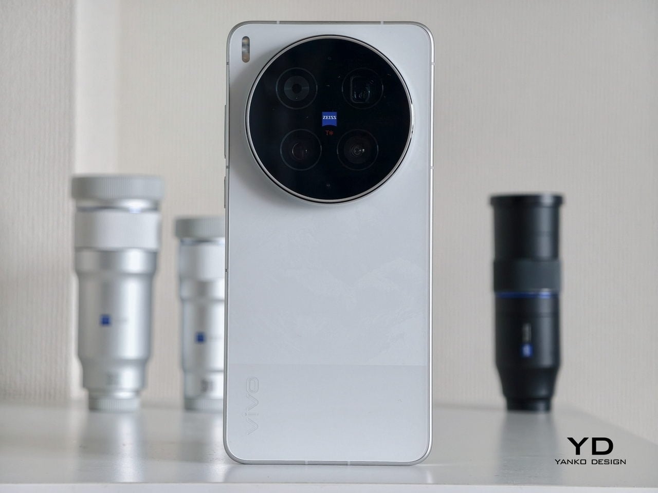
Wrapped in a light-reactive finish called Roswell Green Metallic and rebuilt from the console outward, the 2026 Stingray is the first version of this car where the design language inside matches the sculptural ambition of the body. Everything before this was a supercar exterior with a parts-bin cockpit. That tension is finally resolved.

I’ve spent a week with the 2LT Z51 in Roswell Green, and the design overhaul changes the way you think about this car before you ever turn it on. What follows is a design-first breakdown of everything Chevrolet changed, everything that works, and where the compromises still live.

The ergonomic pivot: interior architecture rebuilt from the H-point up

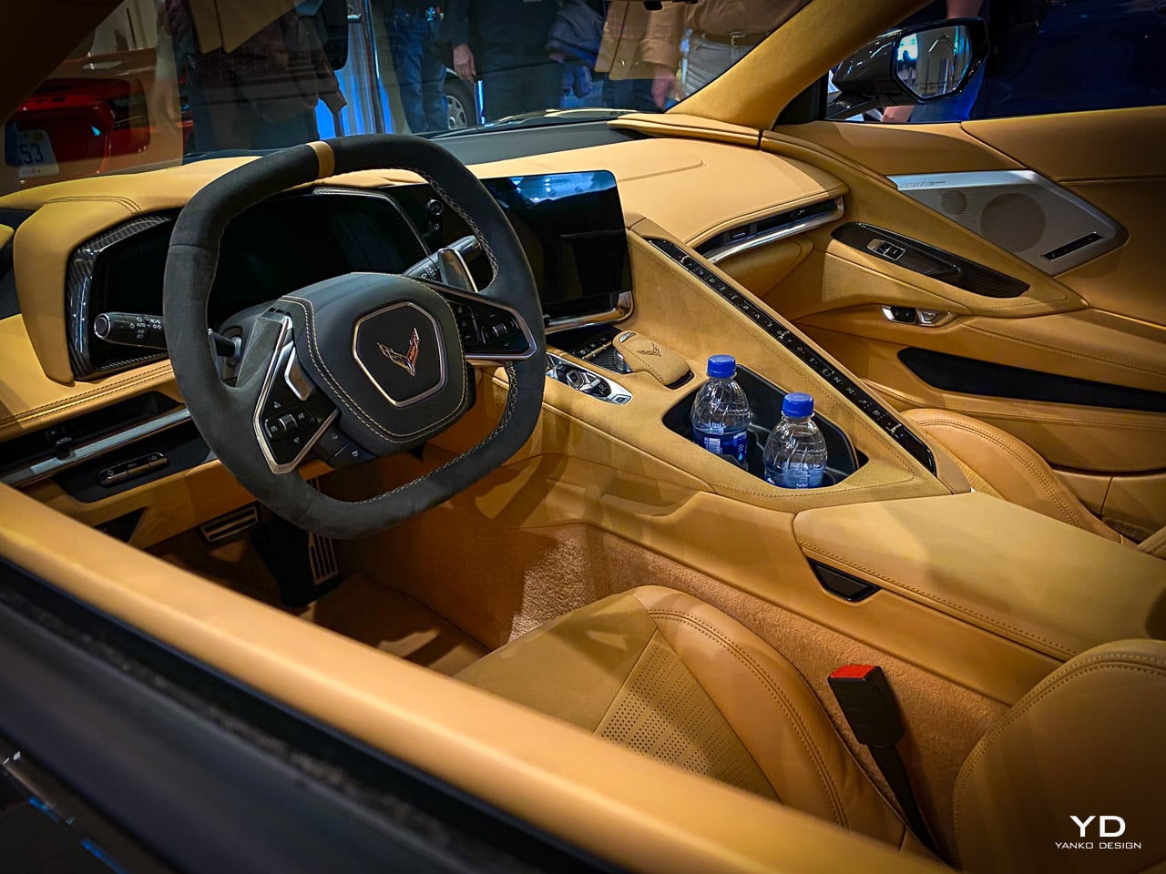
The original C8 interior committed a fundamental spatial error. A tall center divider ran vertically between the two seats, housing climate controls, drive mode selectors, and a stack of physical buttons. The industry called it “the wall.” The design problem wasn’t the buttons themselves. It was the raised horizon line of that divider, which created a psychological barrier between driver and passenger. The cabin felt partitioned. The passenger sat in an adjacent room.

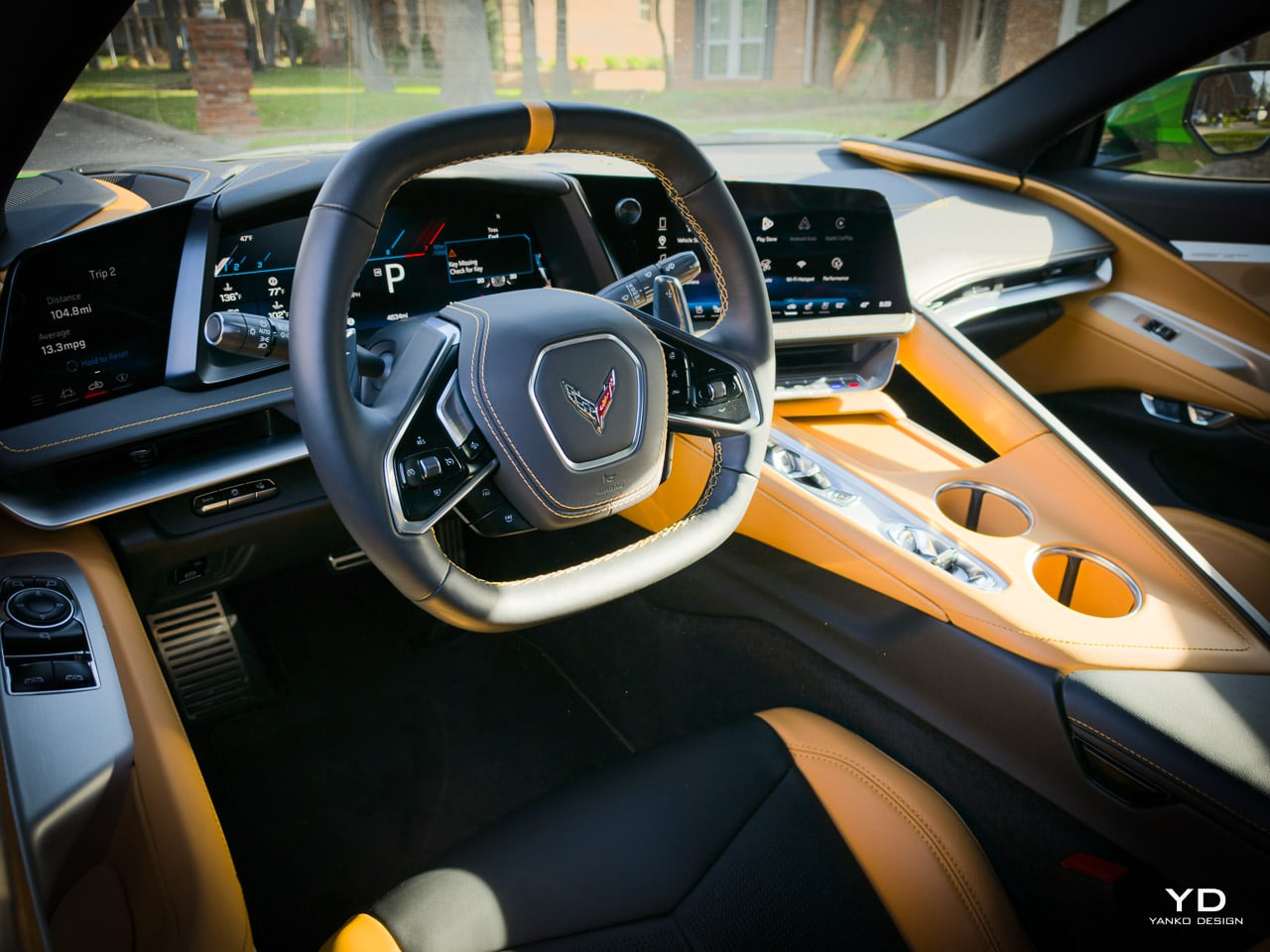
For 2026, Chevrolet dropped the entire center console structure. The lowered console horizon transforms the spatial relationship between the two occupants. Where the old layout isolated the passenger behind a vertical slab of controls, the new architecture invites them into the driver’s visual field. The experience shifts from “isolated” to “inclusive” without sacrificing any of the cockpit’s driver-centric focus.

Beneath the 12.7-inch center touchscreen, a slim bezel strip houses the primary HVAC controls: temperature, fan speed, and airflow direction. Below that, a row of knurled metal switches handles drive mode selection and volume. Each switch has a machined, cylindrical profile with a grip pattern you can find by touch alone. In an era of touchscreen fatigue, where even luxury brands have moved every interaction to a flat pane of glass, these physical controls are a premium tactile counterpoint to the triple-screen digital environment surrounding them.

The trade-off lives in the seats. Seat heating and ventilation controls have migrated entirely into the 12.7-inch touchscreen, buried inside a climate submenu. Removing the physical buttons cleaned the console’s visual horizon, but it added a tap-and-swipe sequence to what used to be a single button press. For a car that generates lateral forces strong enough to require a grab handle, asking the driver to navigate a digital menu for seat heat is a design compromise worth scrutinizing. The aesthetic gain is real. The ergonomic cost is measurable.

The old vertical divider left no room for a passenger grab handle. Its replacement, a minimalist, leather-wrapped grab handle, arcs across the lower console in a single fluid line. It’s a small element with outsized presence. Call it a functional sculpture: structurally necessary for a car that generates 1.0g lateral forces, refined enough that it reads as intentional design rather than an engineering afterthought. The leather wrap matches the door panel stitching. The mounting points disappear into the console geometry.

The lowered console transforms the spatial experience immediately. Where the old layout created the sensation of sitting inside a divided cockpit, the 2026 interior opens the sightline across the full width of the cabin. The claustrophobia factor drops measurably. The seating position remains laid back, almost Formula 1 in its recline, and that posture helps mitigate the limited headroom that taller drivers will still negotiate with.

The knurled switches feel substantial under the fingers: machined, weighted, precise. They resist the smudging that plagues the touchscreen surfaces around them. Some shared switchgear with lower Chevrolet models (the Trax uses identical pieces) undercuts the premium feel in spots, but the overall material quality reads as considered rather than cost-cut. The grab handle sits exactly where your hand reaches during hard cornering, low enough to brace against without blocking the console’s visual flow.

The triple-display UX: how three screens reduce cognitive load

Three screens sounds like excess. In practice, the 2026 Corvette’s display layout solves a problem that single-screen and dual-screen cockpits create: cognitive competition. When navigation, telemetry, media, and vehicle status all fight for space on one display, the driver’s eyes travel further and stay away from the road longer.

Chevrolet’s solution distributes information across three screens based on cognitive priority. The 14-inch Driver Information Center sits directly ahead, dedicated to speed, gear position, and essential driving data. It stays visually silent during normal driving, using high-contrast graphics that communicate without demanding attention. Navigation lives here only when active, taking over the full display with clean vector mapping.

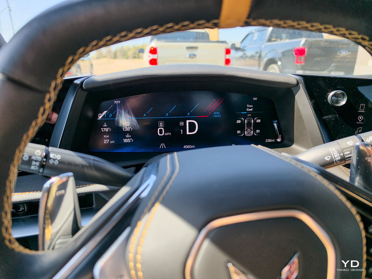
The 12.7-inch center touchscreen handles media, climate, and vehicle settings. It’s the interactive screen, the one you touch. The larger, tactile volume knob sits at its base with an illuminated ring that glows in the ambient cabin color you’ve selected. In a cockpit full of digital surfaces, this single analog control becomes the functional focal point: a physical anchor in a digital environment.

The 6.6-inch display to the left of the steering wheel is the most interesting piece of the system. Think of it not as an auxiliary screen, but as a Driver Command Satellite: a dedicated tactical window for trip telemetry, HUD adjustments, PTM Pro controls, and the Performance Data Recorder’s coaching overlays. Positioned in the driver’s peripheral sightline, it reinforces the cockpit hierarchy rather than diluting it toward the passenger. By offloading this data to its own surface, the driver cluster stays uncluttered. The driver never looks away from the road to check performance metrics; a glance left handles everything.

The underlying software runs on a Google-native operating system with full voice integration. The practical effect is a natural-language interface that handles navigation, media, and communication through conversational input. “Navigate to the nearest charging station” works. So does “play the playlist from this morning.” The voice layer reduces cognitive load during spirited driving, when your hands need to stay on the wheel and your eyes need to stay through the windshield. Over-the-air updates mean the system improves after you’ve taken delivery, which is a first for any Corvette.

The infotainment system responds quickly to both touch and voice. The Google voice integration handles navigation and media commands without noticeable lag, and the natural-language processing accepts conversational input without requiring exact phrasing. The triple-display layout reduces eyes-off-road time in practice: the driver cluster handles speed and navigation, the center screen handles media and climate, and the left-side Command Satellite handles performance data. Each screen has a dedicated cognitive role, and after a few days behind the wheel, the layout becomes intuitive rather than overwhelming. The one usability complaint: some switchgear on the steering wheel is shared directly with lower Chevrolet models. The function is fine. The perceived material gap is not.

The Roswell Green narrative: pigment behavior on compound surfaces

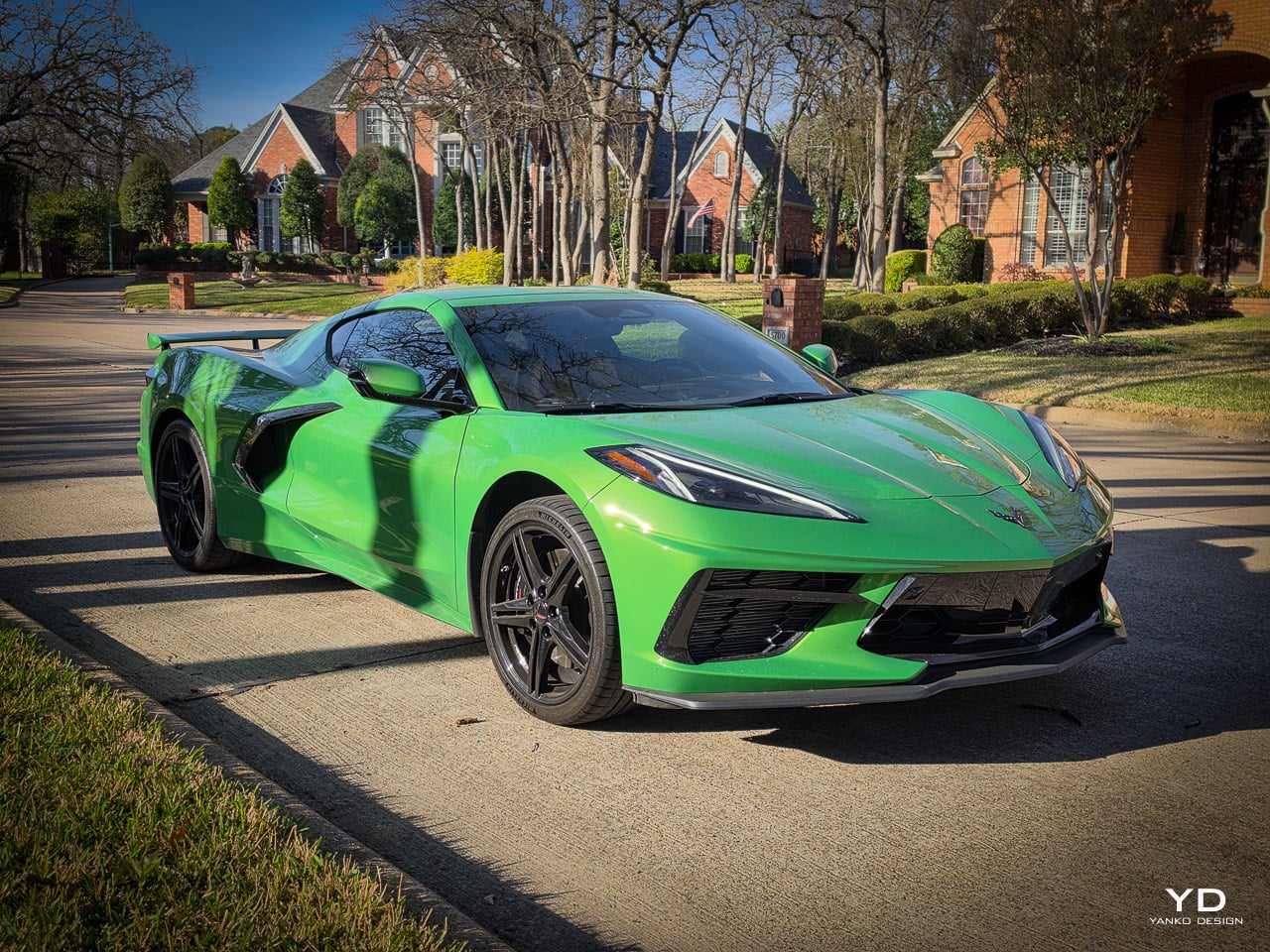
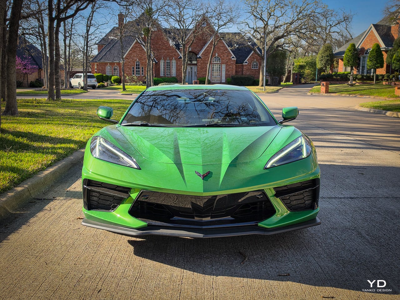
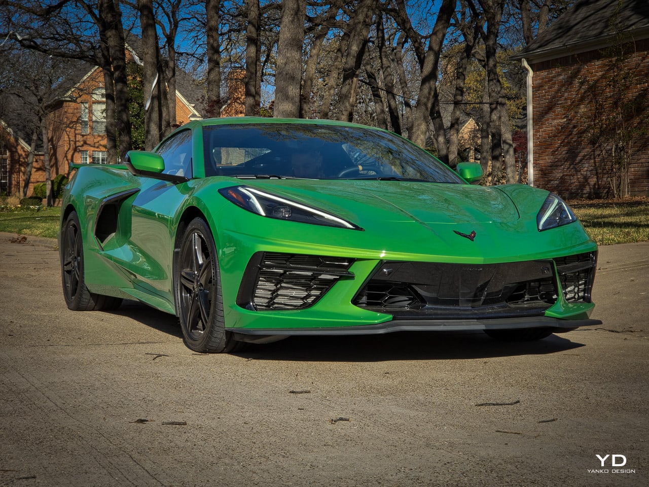
Chevrolet doesn’t call Roswell Green Metallic a color. The more accurate description is a living finish, a light-reactive surface that changes identity depending on the light source hitting it. Tagged with color code G4Z and priced at $500, it’s only the second green ever offered on the C8 platform. The name references Roswell, New Mexico. Chevrolet has not confirmed the alien mythology connection, but the association is unmistakable.

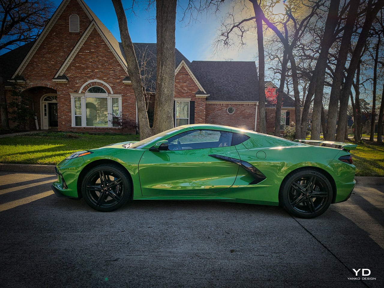
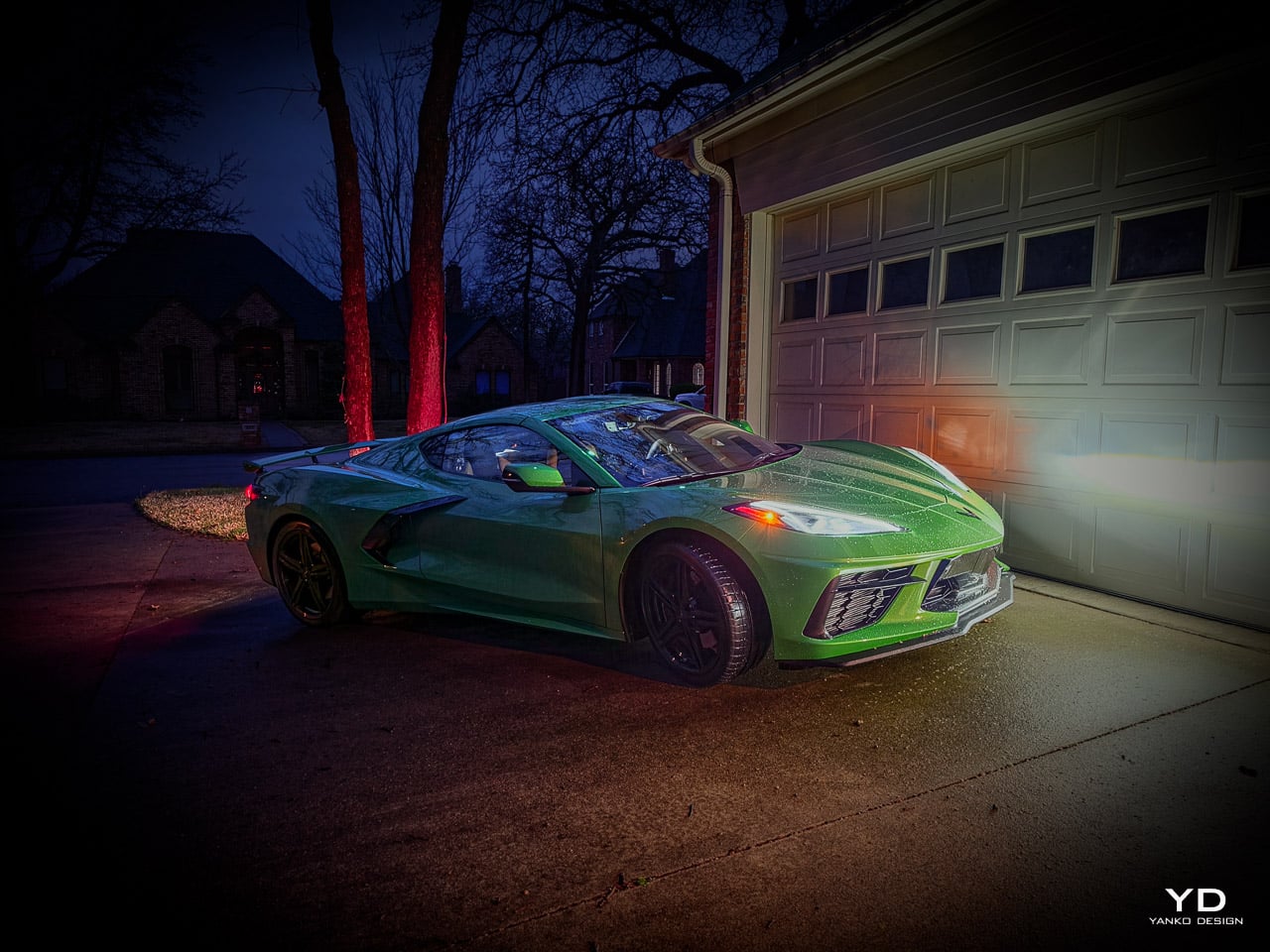
In low ambient light, overcast conditions, or the shade of a parking structure, the panels read as shadowed emerald: deep, weighted, almost black-green with a dense metallic flake structure visible only at close range. The color feels heavy. It pulls the eye into the surface rather than bouncing off it.

Under direct UV, the transformation is dramatic. The same panels shift toward electric chartreuse on the car’s sharpest creases: the angular fender peaks, the leading edge of the rear haunches, the Z51 spoiler’s trailing lip. The metallic particles in the paint align differently at steep surface angles, concentrating reflected light into narrow bands of bright, almost acidic green. The effect is architectural. The body’s compound curves and crease lines become legible in a way that neutral finishes suppress.

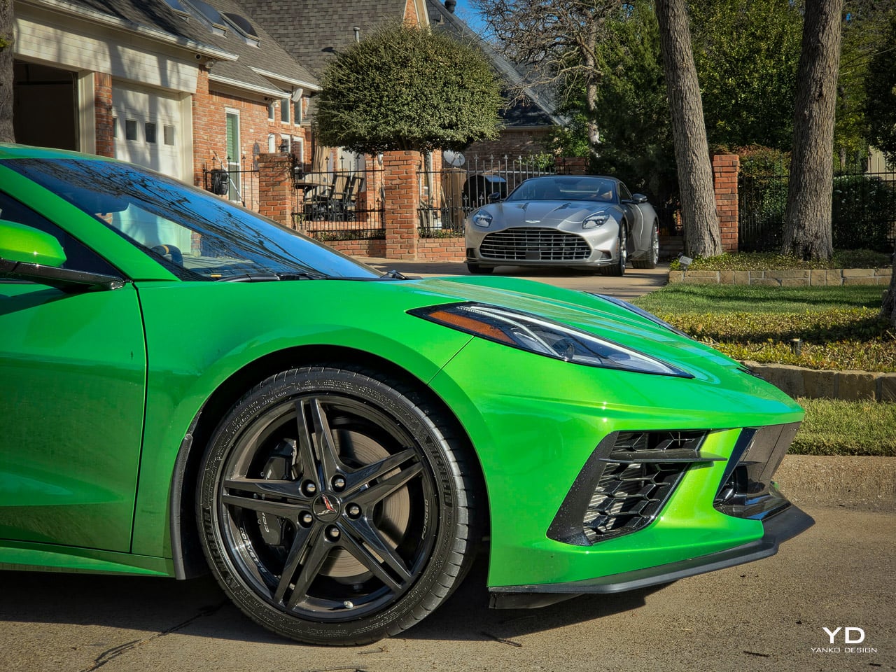
The material contrast system around the body is equally considered. Carbon Flash accents (the standard dark carbon-fiber-look trim on mirrors, splitter edges, and roof panel surround) provide the necessary technical coldness to balance the organic warmth of the green. Standard Pearl Nickel forged-aluminum wheels (19-inch front, 20-inch rear, five-split-spoke) add a silver-cool metallic counterpoint on the base configuration; this test car wears the optional 5-Spoke Black-Painted Forged Aluminum Wheels ($995), which darken the stance and sharpen the contrast against the green. Without these neutral anchors, the green would risk reading as aftermarket. With them, the palette holds together: organic hue, technical trim, metallic ground.

The recommended interior pairing is Very Dark Atmosphere with Natural Tan accents, a deep chocolate brown Napa leather with warm tonal stitching. Emma Mikalauskas, Lead CMF Creative Designer for Chevrolet performance vehicles, describes it as “luxurious and grounded.” Against Roswell Green on the exterior, this combination reads more like a European GT than an American muscle car. Jet Black works too, but it lets the exterior do all the talking. The brown creates a conversation between inside and outside.

Roswell Green demands to be seen in person. In press photos, it reads as a saturated forest green that could go either way. On the street, the metallic flake structure transforms it into something far more complex. Under overcast skies, the panels pull toward a deep, almost industrial green that draws comparisons to heavy machinery. Some onlookers will see John Deere. Others will see wealth. Under direct sun, the color detonates: the metallic particles concentrate on the body’s crease lines and shift toward a bright, acidic chartreuse that photographs entirely differently from the shaded panels ten inches away. The color is polarizing by design. It rewards direct sunlight and punishes flat lighting. Over a full day of driving, the car changes identity three or four times depending on the angle of the light source.

Functional art: the Z51 as aesthetic and performance system

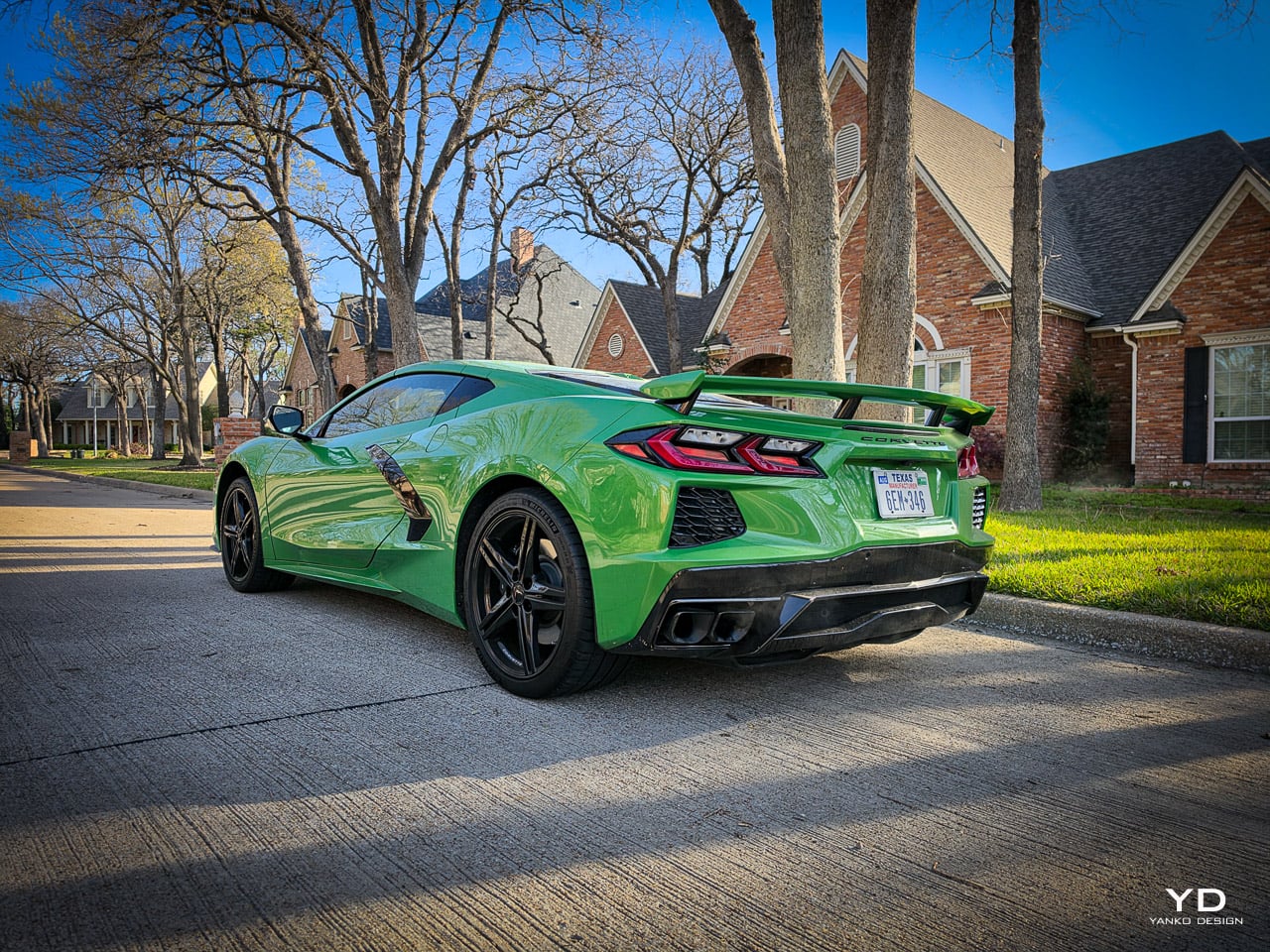
The Z51 Performance Package on the Stingray Coupe adds track hardware that reshapes how the car looks and how it drives. On the design side, the transformation starts at the rear.

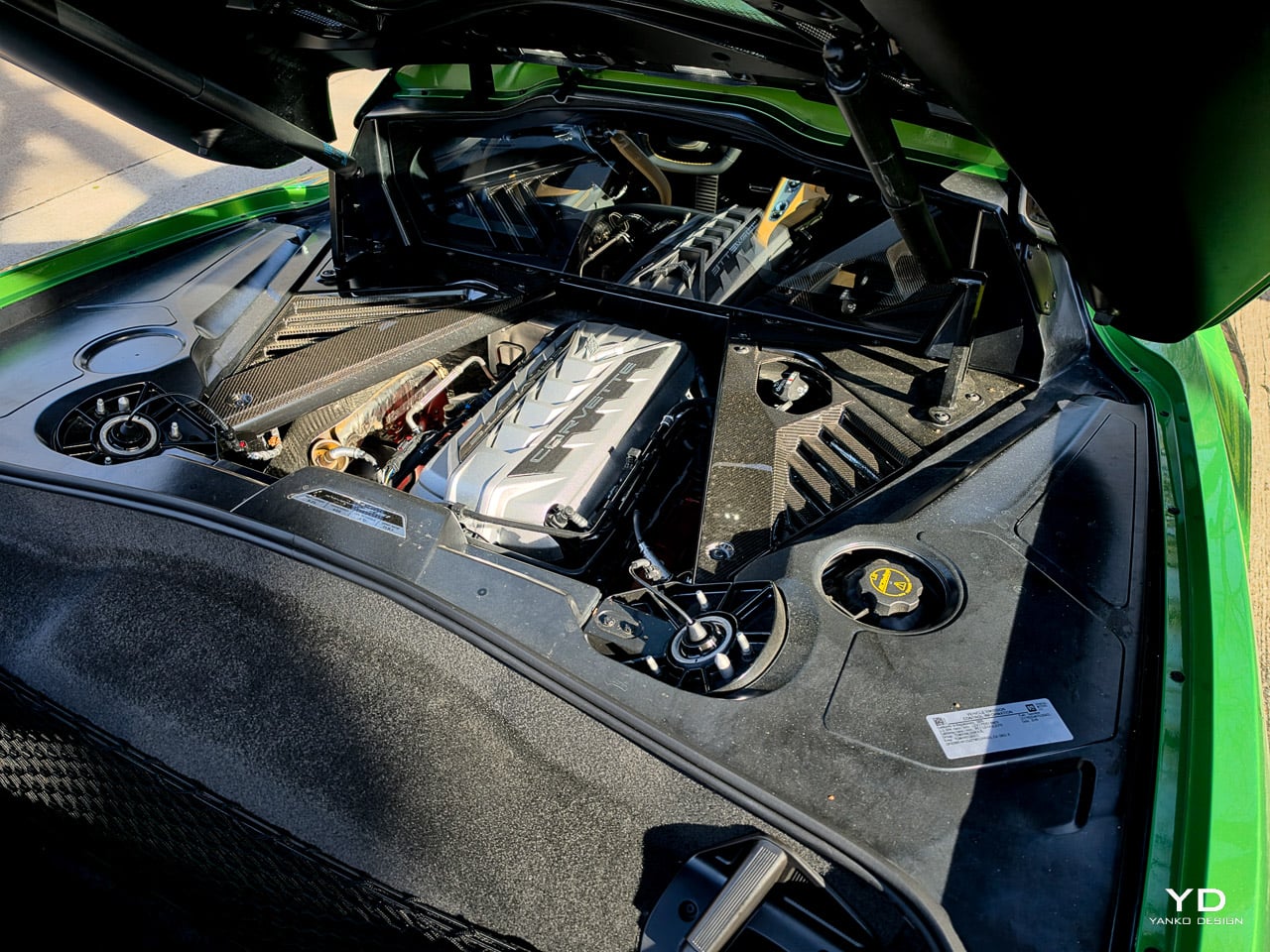
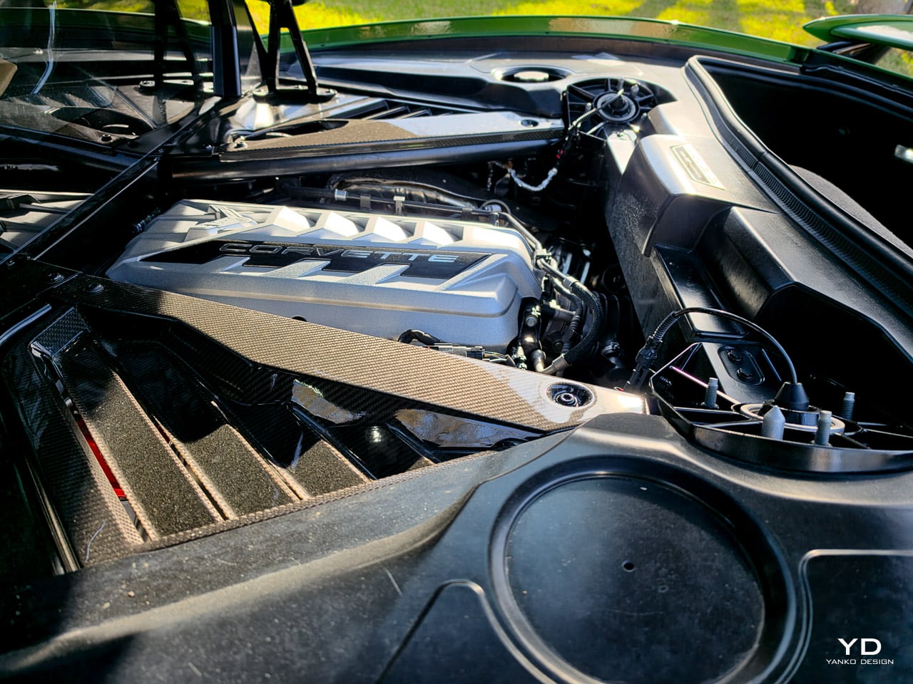
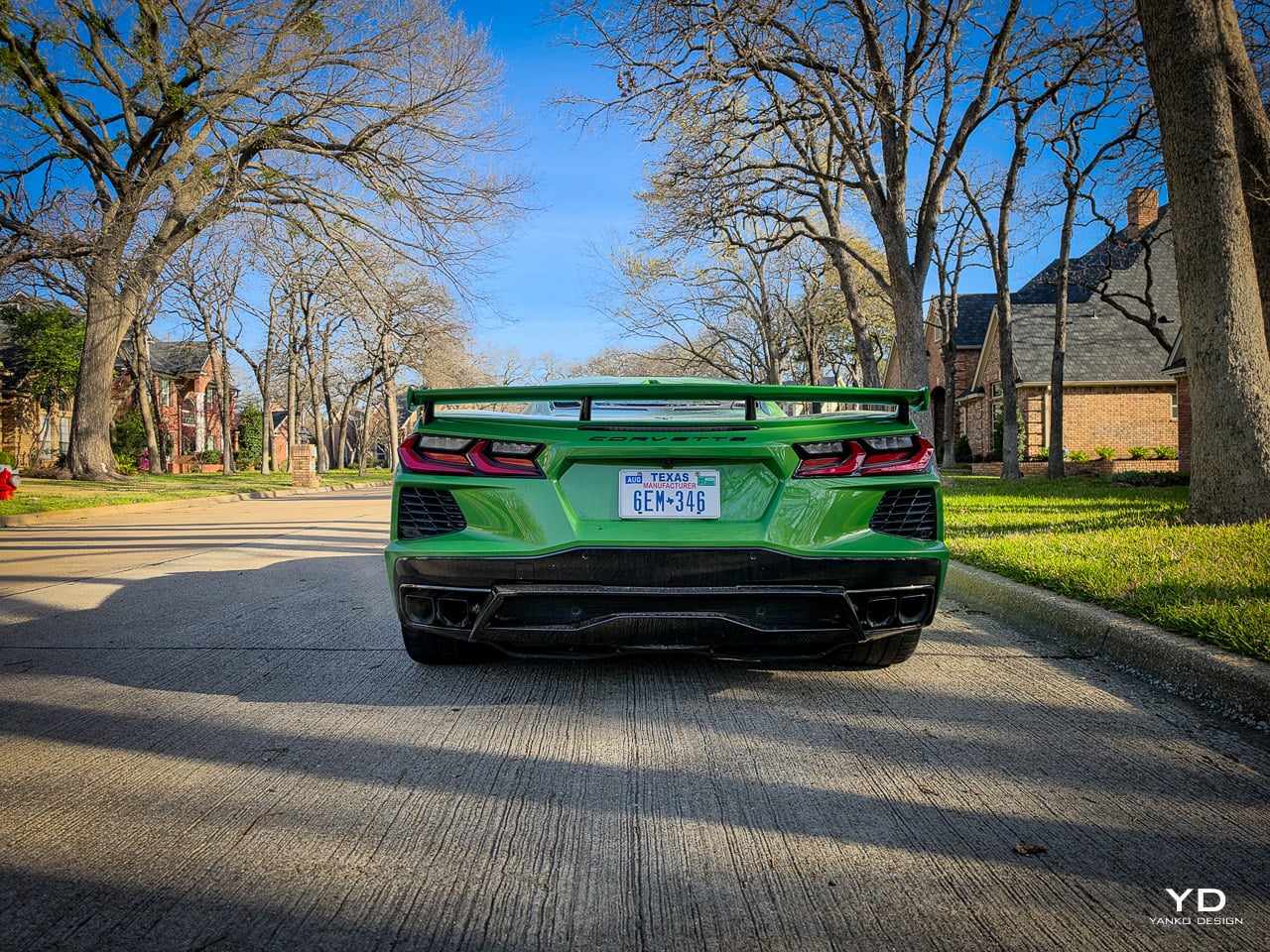
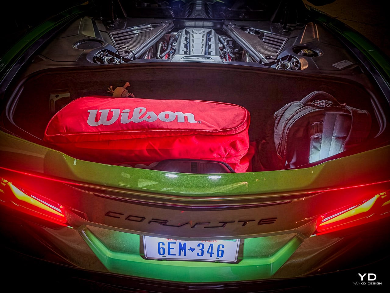
The Stingray Coupe’s transparent rear hatch offers a curated view of the 6.2-liter LT2 V8, framing the engine behind glass like a piece of industrial art in a mechanical gallery. The intake manifold, the valve covers, the wiring harness: all visible through a panel that treats the powertrain as an exhibit rather than hiding it beneath painted bodywork. On the Z51, the engine cover carries a performance exhaust badge and sits lower in the frame, emphasizing the width of the rear track. The power source is visible, accessible, displayed. You don’t just hear 495 horsepower. You see where it comes from.

The Z51-specific front splitter and rear spoiler function as visual bookends that resolve the aggressive mid-engine wedge shape. The C8’s silhouette pushes mass rearward: the long hood carries only a frunk, while the truncated tail packs engine, transmission, and cooling. Without the Z51’s aero elements, the profile can feel rear-heavy. The splitter’s forward extension and the spoiler’s horizontal plane create a visual bracket, stabilizing the proportions by defining the car’s front and rear boundaries with equal authority. The aero works at speed. It also works standing still.

Michelin Pilot Sport 4S tires in staggered widths (245mm front, 305mm rear) fill the wheel arches completely. The Brembo brake calipers sit visible behind the spokes. Heavy-duty cooling ducts in the lower fascia add functional apertures that darken the nose. Every Z51 addition serves a performance purpose. Every addition also modifies the car’s visual stance. That dual function, where engineering and aesthetics solve the same problem from different directions, is what makes the Z51 more than an options checkbox.

The performance numbers live in the specs appendix above, but one figure deserves context here: 2.9 seconds to 60 mph (Chevrolet’s claim; Car and Driver independently measured 2.8). That’s mechanical violence. It’s the number that justifies wrapping this car in a color as aggressive as Roswell Green, because a finish this confrontational needs a powertrain that backs it up. The Z51’s performance exhaust, Brembo brakes, electronic limited-slip differential, and heavy-duty cooling system aren’t just track hardware. They’re the kinetic proof behind the visual promise.

New for 2026, PTM Pro (Performance Traction Management Pro) pairs with the Z51 to complete the performance-as-art thesis. This mode strips nearly all electronic intervention while the car’s sensor array continues feeding real-time 3D drift graphics to the cockpit displays: tire smoke rendered on screen, tread marks traced in real time, the car’s dynamic state visualized as a live digital sculpture. It’s track software that treats driving data as content, not just telemetry. Everything the body’s creases and aero elements suggest about speed, the Z51 and PTM Pro deliver at the pedal and on the screen.

Driving the design: modes, data recording, and the new PTM Pro

The Driver Mode Selector offers five presets plus two custom profiles, and each one changes how the car’s design elements communicate with the driver. Tour softens everything for daily use: the suspension absorbs, the exhaust quiets, the steering lightens. It’s the mode where the interior’s new comfort-focused design language makes the most sense. Sport tightens the chassis and opens the exhaust note. Track removes the filters entirely, maximizing chassis and powertrain response. Weather dials back throttle and traction for slippery conditions. MyMode lets you build a personal blend. Z Mode, accessed via a dedicated steering wheel button, stores a quick-access performance profile independently.

The available Magnetic Selective Ride Control 4.0 uses a suspension fluid embedded with metallic particles. An electromagnetic field realigns those particles in milliseconds to change the fluid’s viscosity, adjusting damping rates faster than any conventional mechanical system. It’s the engineering behind the car’s dual character: grand touring compliance in Tour, track-ready stiffness in Track, from the same hardware.

The Performance Data Recorder (PDR) has been completely reimagined for 2026. Previous versions required a laptop for video analysis. The new PDR is built directly into the vehicle’s screens. It records high-definition video of your driving sessions with telemetry overlays (speed, g-forces, lap times), provides automated coaching tips, and includes a side-by-side video comparison feature for lap analysis. You never leave the car’s infotainment system. Standard on 2LT and 3LT.

Performance Traction Management (PTM) now includes PTM Pro, a new mode that fully disables traction and stability control for advanced track driving. A dedicated hardware switch beneath the Driver Command Satellite display (left of the steering wheel) provides one-touch access. The system generates real-time 3D graphics showing the car in dynamic drift states with tire smoke and tread marks rendered on screen. It’s a track tool wrapped in a visual interface that treats the data as content, not just numbers.

The drive modes transform the car’s character beyond what the spec sheet communicates. In Tour, the Magnetic Ride suspension absorbs road imperfections with a compliance that feels closer to a grand tourer than a mid-engine sports car. Speed bumps taken at normal speeds register as soft thumps, not impacts. The exhaust drops to a murmur. The steering lightens to the point where parking becomes effortless.

Switch to Sport, and the chassis tightens perceptibly within the first quarter mile. The exhaust opens into a mid-range bark that fills the cabin without overwhelming conversation. Track mode removes every remaining filter: the dampers stiffen until expansion joints announce themselves through the seat bolsters, and the throttle response sharpens to a hair trigger.

The difference between Tour and Track in Magnetic Ride is not subtle. It is one of the most dramatic suspension transformations available in any production car at this price. The PDR interface, built directly into the vehicle screens, is functional and responsive for track use: lap overlays, telemetry readouts, and coaching tips all run without leaving the infotainment system. PTM Pro, accessed via the dedicated hardware switch beneath the Command Satellite, disables electronic intervention entirely while leaving ABS active. It is a track-only tool that requires confidence, clear sightlines, and a willingness to accept the consequences of full driver authority.

Five colorways as interior identities

The five new 2026 interior colorways aren’t palette options. They’re identity statements built around different driver archetypes.

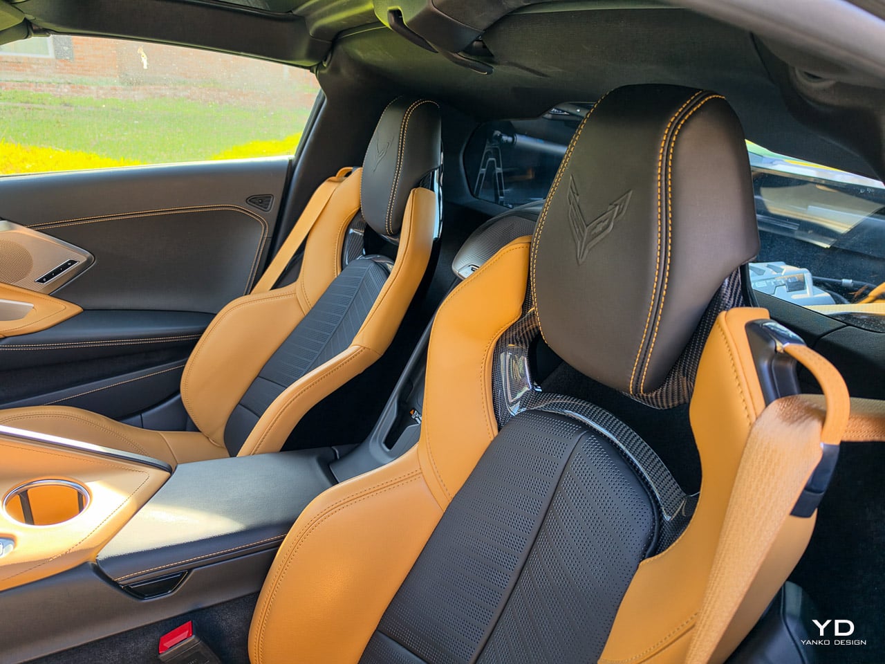
Asymmetrical Adrenaline Red places the signature Corvette red only in the driver’s zone: seat bolsters, door panel insert, steering wheel accent. The passenger side stays neutral. The result is a deliberate visual asymmetry that draws attention to the driver’s seat as the cockpit’s center of gravity. The available Driver Competition / Passenger GT2 seat configuration pairs a deep-bolstered Competition Sport seat on the driver’s side with a comfort-oriented GT2 on the passenger side. Asymmetric color. Asymmetric seating. The interior reflects who controls the car.

Cool Gray with Habanero accents is the most design-forward option. Monochrome cool grays provide a clean, tech-inflected base. Bright orange Habanero appears only in precise locations: stitching lines, seatbelt webbing, small trim inserts. The effect is closer to consumer product design than traditional automotive interiors. Chevrolet’s CMF team cites “subtle futurism” as the reference point.

Jet Black suede with customizable accent stitching (Adrenaline Red, Competition Yellow, or Santorini Blue) strips the cabin to its most elemental state. Brandon Lynum, Corvette CMF Design Lead, calls it “the ultimate expression of competition driving.” The sueded microfiber on high-touch surfaces creates grip. The monochrome palette eliminates visual noise. It’s the interior equivalent of a blacked-out watch dial.

Very Dark Atmosphere with Natural Tan is the grand touring interior: deep chocolate brown Napa leather with warm stitching that reads European rather than American. This is the colorway that makes the most sense with Roswell Green on the outside.

Santorini Blue is the extrovert’s choice: a vivid electric blue across major surfaces. Loud, confident, and intentionally polarizing.

The seat architecture underneath these colorways runs four deep. GT1 (Mulan leather, standard on 1LT/2LT) is built for daily comfort. GT2 (carbon-fiber seatback halo, Napa leather, standard on 3LT) reduces mass while increasing structural rigidity. Competition Sport (Napa with performance textile) adds deep bolsters for lateral grip. The asymmetric Driver Competition / Passenger GT2 pairing, exclusive to Asymmetrical Adrenaline Red, puts a locked-in sport seat where you need it and a comfort seat where you don’t.

Living with 182 inches of mid-engine sports car

The Stingray measures 182.3 inches long, shorter than a Toyota Camry. But the wide sills, the low roofline, and the mid-engine packaging create a specific set of daily considerations that the spec sheet can’t communicate.

The squared-off steering wheel remains divisive. Chevrolet has committed to the flat-bottom, flat-top shape since the C8’s introduction, and it serves a functional purpose in a cockpit this tight: easier ingress and egress, and a clearer view of the 14-inch driver cluster. But the flat sections still interrupt the natural hand-over-hand rotation at low speeds.

Rear visibility without the camera systems is poor. The engine cover, the high rear deck, and the low seating position combine to create significant blind spots. The 2LT’s Rear Camera Mirror and HD Curb View Camera aren’t luxury additions. They’re close to necessities. Rear Cross Traffic Alert and Side Blind Zone Alert (both standard on 2LT) fill the gaps.

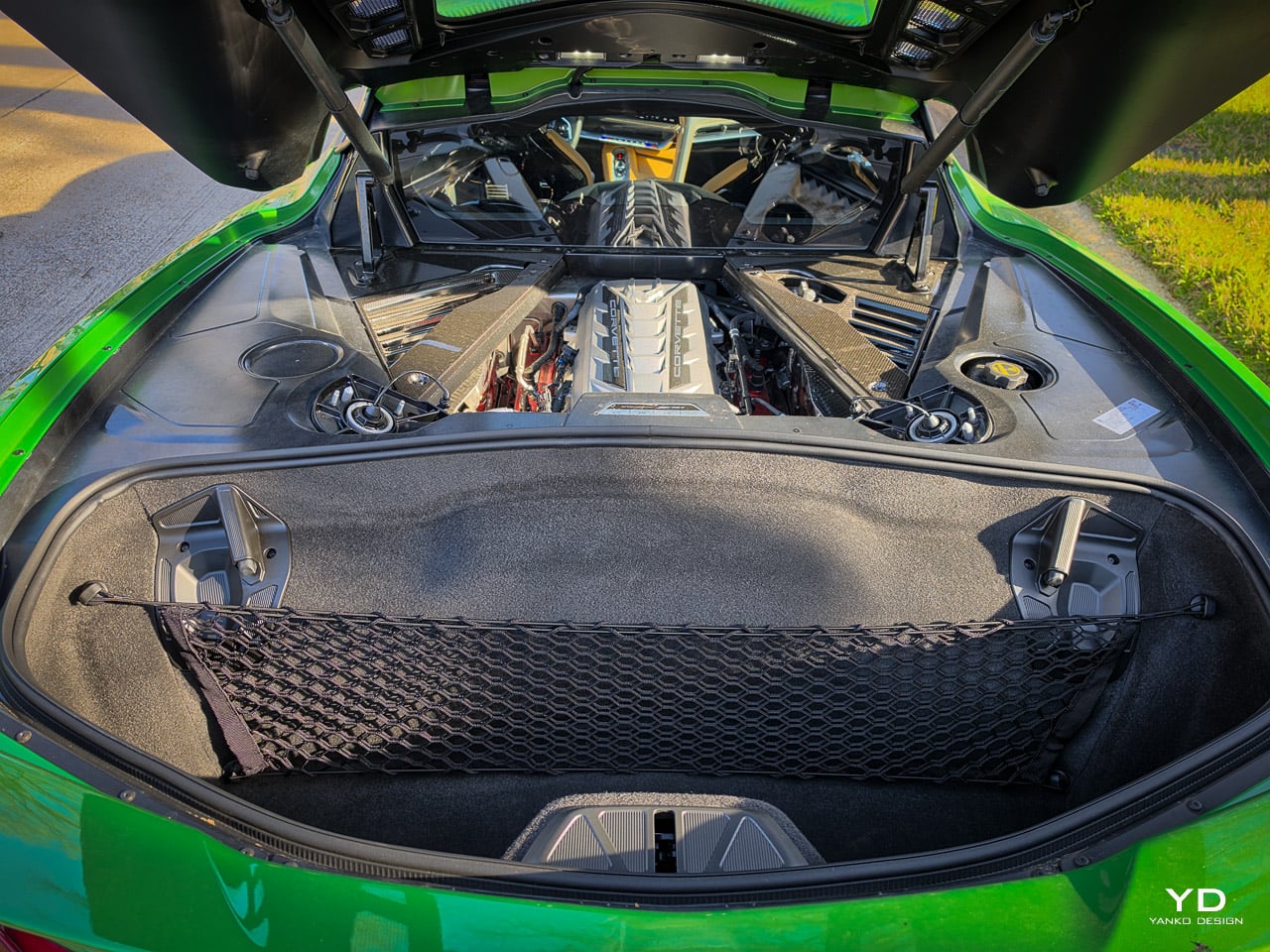
The frunk and rear cargo area combine for 12.6 cubic feet of storage. Enough for soft bags, groceries, or a weekend carry-on. The coupe features a removable Targa roof panel that stows in the rear cargo area, though it cuts into luggage space. Getting in and out requires a practiced motion: swing, drop, pivot. The wide sills don’t forgive hesitation.

Fuel economy sits at EPA-estimated 16 city, 25 highway, 19 combined MPG on premium unleaded from an 18.5-gallon tank. That’s roughly 460 miles of highway range. Not exceptional for a daily driver, but rational for a naturally aspirated V8 producing nearly 500 horsepower.

The convertible option adds a power-retractable hardtop that raises or lowers in 16 seconds at speeds up to 30 mph. If the Targa panel stowage bothers you, the convertible solves that problem at the cost of roughly 100 additional pounds.

Getting in and out requires a practiced sequence: step over the wide sill, drop into the seat, pivot your legs under the steering wheel. It becomes automatic within a day, but the wide sills never forgive hesitation or tight parking spaces. The squared-off steering wheel helps with ingress, providing clearance that a round wheel would not. At low speeds, the flat sections still interrupt the natural hand-over-hand rotation during tight turns.

The visibility systems earn their keep in real traffic. The Rear Camera Mirror eliminates the blind spot created by the engine cover and high rear deck. The HD Curb View Camera proves essential in every parking structure. Without these systems, the car would be difficult to live with in dense urban driving.

Cargo is more usable than the spec sheet suggests. The frunk holds a small carry-on or two bags of groceries. The rear trunk fits soft bags, hardware store supplies, and bulky gear that would not fit in most two-seat sports cars. With the Targa roof panel stowed, rear trunk space shrinks, but the total package is more practical than any mid-engine competitor.

Highway cruising in Tour mode with the Bose Performance Series system is remarkably civilized. Road noise is present but not intrusive. The 14-speaker system delivers clean audio at moderate volumes, though the V8 soundtrack tends to make the stereo irrelevant. Real-world fuel economy in mixed driving settles around 17 to 18 MPG, close to the EPA combined rating of 19.

The pricing equation: what $96,795 actually buys

The 2LT base starts at $79,095 including destination. But base MSRP is not the number anyone drives off the lot with. This car, the Hero Spec 2LT with every design-critical option checked, stickers at $96,795 per the verified window sticker. The gap between base and as-tested is $17,700 in factory and dealer-installed options that define the visual and dynamic identity of this build. The complete options list and published prices:

  • Z51 Performance Package (RPO Z51): $6,345
  • Front Lift with Memory (RPO E60): $2,595
  • Z51 Suspension w/ Magnetic Selective Ride Control 4.0: $1,895
  • GT2 Bucket Seats: $1,695
  • Coupe Engine Appearance Pkg: $1,695 (carbon fiber trim closeouts, engine lighting, specification plaque)
  • 5-Spoke Black-Painted Forged Aluminum Wheels (dealer installed): $995
  • 2-Tone Seats: $595
  • Roswell Green Metallic (G4Z): $500
  • Engine Cover in Sterling Silver: $495
  • Tan Seat Belt: $395
  • Exhaust Tips, Black: $495

That accounts for every line item on the window sticker: $77,100 base vehicle + $17,700 options + $1,995 destination = $96,795. Every option on the Hero Spec changes how the car looks, drives, or both. The Z51 reshapes the aero and unlocks 495 hp. Magnetic Ride transforms the chassis character between Tour and Track. The front lift with memory saves the splitter on every driveway and parking ramp. The Coupe Engine Appearance Package dresses up the visible powertrain through the rear glass with carbon fiber trim closeouts, LED engine lighting, and a specification plaque. Roswell Green makes the bodywork legible. Strip any one and the design argument weakens.

The 2LT is where the value argument gets sharp. Over the base 1LT, you gain the Head-Up Display, the 14-speaker Bose Performance Series system (up from 10 speakers), heated and ventilated seats with power lumbar and wing adjustment, the Performance Data Recorder, the HD Curb View Camera, Rear Cross Traffic Alert, Side Blind Zone Alert, and a heated steering wheel. Every one of those features changes how the car feels to drive and live with daily. The 1LT is a capable sports car. The 2LT is a capable sports car that treats you like you paid for one.

The 3LT adds further material upgrades: 14 interior color options, custom leather-wrapped instrument panel and door panels, sueded microfiber upper interior trim, and the GT2 seats with Napa leather. Those are material and craftsmanship upgrades. Important if you care about what your hands touch every time you reach for the wheel. Less critical if your priority is extracting lap times.

At $96,795 as tested, the Hero Spec competes in serious sports car territory, and the competitive frame shifts. The now-discontinued Porsche 718 Cayman GTS 4.0 ($103,300 MSRP, 394 hp) sits above this price point but delivers about 100 fewer horsepower and a less dramatic design statement. The 2LT Z51 in Roswell Green occupies a rare position: genuinely exotic design and mid-engine performance from a manufacturer that still builds its own naturally aspirated V8.

The 2LT is the right trim for most buyers who intend to drive the car rather than display it. The 1LT saves money but surrenders the Head-Up Display, the 14-speaker Bose system, and the visibility systems that make the car livable daily. The 3LT adds material refinement (Napa leather, sueded microfiber, GT2 seats) that matters if tactile quality is a priority, but it does not change the driving experience.

At $96,795 as tested, the Hero Spec sits in Porsche 718 Cayman GTS 4.0 territory. The Porsche started at $103,300 (394 hp) before its February 2026 discontinuation but delivers about 100 fewer horsepower and a less dramatic design statement. The Lotus Emira ($112,900, 400 hp) occupies the same mid-engine conversation but with less interior refinement and a smaller dealer network. Nothing in this price range matches the Corvette’s combination of power, daily usability, and visual presence.

The aggressive American wedge vs. the conservative minimalist

Place a 2026 Corvette Stingray next to a Porsche 718 Cayman and you’re looking at two fundamentally different design philosophies occupying the same market.

The Cayman is a conservative minimalist. Its surfaces are smooth, its transitions are gradual, its proportions are resolved through subtraction. Nothing on the body calls attention to itself. The design communicates competence through restraint. It’s elegant. It’s also, after a decade, concluded: Porsche discontinued the 718 in February 2026.

The Corvette is an aggressive American wedge. Every surface has a purpose, and that purpose is visible. The crease lines announce structural intent. The vents aren’t decorative. The mid-engine packaging creates a silhouette that looks fast at rest because the proportions aren’t balanced in the traditional sense. They’re weighted, biased, kinetic. Roswell Green amplifies every one of those characteristics by making the surfaces legible in ways that flatter colors cannot.

For five years, the Corvette’s exterior made a promise that the interior couldn’t keep. The sculpted, angular body said supercar. The button-walled cockpit said parts-bin. For 2026, the interior finally speaks the same language as the sheet metal: intentional, layered, considered. The knurled switches echo the machined precision of the engine’s internals. The triple-display architecture matches the visual complexity of the body’s crease network. The leather-wrapped grab handle mirrors the flowing lines of the exterior’s haunch.

The Porsche 718 Cayman still does more with less. That’s its design thesis. The 2026 Corvette Stingray 2LT Z51 in Roswell Green Metallic does more with more, and for the first time, the “more” is coherent. The engineering caught the design world’s attention in 2020. The design finally deserves the same scrutiny.

The 2026 Corvette Stingray 2LT Z51 in Roswell Green Metallic is the first version of this car where the design ambition matches the engineering reality from every angle. The exterior has always made the argument. The interior, for five years, undermined it. That tension is resolved.

What surprised me most was not the speed (which is violent and immediate) but the interior’s spatial transformation. The lowered console, the three-screen architecture, the knurled switches: these are design decisions that change how the cabin feels, not just how it looks. The car reads as intentional in a way the 2020 through 2025 models never achieved.

What I would change: the seat heating and ventilation controls belong on physical switches, not buried in a touchscreen submenu. The squared-off steering wheel remains an acquired taste at low speeds. And the summer-only Pilot Sport 4S tires on the Z51 package make this a seasonal commitment in any climate with real winters.

This car is for the buyer who treats design language as a performance metric. If the way a cabin is constructed matters as much as the way a chassis corners, the 2026 Stingray finally delivers both.

Who is this for

Best for: Buyers who care about design language as much as horsepower. If you cross-shop European GTs and want mid-engine performance without the mid-engine price of a Porsche or McLaren, the 2LT Z51 delivers both the visual identity and the driving capability.

Also good for: Design-conscious drivers upgrading from a muscle car or sport sedan who want something sculptural, not just fast. The interior overhaul makes the C8 livable in ways the 2020 through 2025 models weren’t.

Skip it if: You want minimalist interior design (the now-discontinued Cayman was your car), you need all-weather daily capability (the Z51’s summer-only Pilot Sport 4S tires are a seasonal commitment), or you’re waiting for the hybrid E-Ray.

How I tested

Tested over a week period in mixed conditions: urban commuting, highway cruising, and spirited driving on secondary roads. Approximately 400 miles covered. Weather conditions ranged from clear skies to overcast. Evaluations included ride quality across all drive modes (Tour, Sport, Track), daily usability (ingress and egress, cargo loading, visibility systems), interior ergonomics, infotainment responsiveness, Bose audio quality, and real-world fuel economy tracking. No formal track testing was conducted for this review. All performance figures cited are manufacturer claims unless otherwise noted.

Frequently asked questions

How much horsepower does the 2026 Corvette Z51 have?

The Z51 Performance Package includes a performance exhaust that raises output to 495 horsepower and 470 lb-ft of torque, up from the standard 490 hp and 465 lb-ft.

What changed in the 2026 Corvette interior?

Chevrolet removed the center button divider, lowered the console horizon, and added a three-screen layout (12.7-inch center, 14-inch driver cluster, 6.6-inch Driver Command Satellite). Five new interior colorways, a leather-wrapped grab handle, knurled metal control switches, ambient lighting, and a relocated wireless charger complete the redesign. Google Built-in and over-the-air updates are now standard.

What is Roswell Green Metallic?

A light-reactive exterior finish (color code G4Z) named after Roswell, New Mexico. It shifts from shadowed emerald in low light to electric chartreuse on the car’s sharpest creases under direct sunlight. It’s the second green ever offered on the C8, costs $500, and is available across all Corvette models.

How fast is the 2026 Corvette Stingray with Z51?

0 to 60 mph in 2.9 seconds (Car and Driver independently measured 2.8). Quarter mile in 11.2 seconds. Top track speed of 184 mph, per the original GM spokesperson confirmation and Car and Driver test data. Chevrolet’s current marketing page advertises 194 mph without distinguishing between trims; the Z51’s shorter final drive ratio trades top speed for quicker acceleration.

What is the fuel economy of the 2026 Corvette Stingray?

EPA-estimated 16 city, 25 highway, 19 combined MPG on premium unleaded. The fuel tank holds 18.5 gallons, giving roughly 460 miles of highway range.

How much does the 2026 Corvette Stingray cost?

The 2LT starts at $79,095 including destination. The verified window sticker for our tester totals $96,795: $77,100 base + $17,700 in options + $1,995 destination. Key options include the Z51 Performance Package ($6,345), Front Lift with Memory ($2,595), Magnetic Ride 4.0 ($1,895), GT2 Bucket Seats ($1,695), Coupe Engine Appearance Pkg ($1,695), and Roswell Green Metallic ($500).

What seats are available on the 2026 Corvette Stingray?

Four configurations: GT1 (Mulan leather, standard on 1LT/2LT), GT2 (carbon-fiber seatback halo, Napa leather, standard on 3LT), Competition Sport (Napa leather with performance textile), and a unique asymmetric Driver Competition/Passenger GT2 pairing available with the Asymmetrical Adrenaline Red interior.

Is the 2026 Corvette Stingray available as a convertible?

Yes. The convertible features a power-retractable hardtop that raises or lowers in 16 seconds at speeds up to 30 mph. The coupe features a removable Targa roof panel.

What is PTM Pro on the 2026 Corvette?

A new Performance Traction Management mode that fully disables traction and stability control for advanced track driving. A dedicated hardware switch provides one-touch access beneath the Driver Command Satellite display (left of the steering wheel).

The post 2026 Chevrolet Corvette Stingray Z51 Review: The Interior Finally Matches the Supercar first appeared on Yanko Design.

Xiaomi Pad 8 Review: The $310 Tablet That Feels More Expensive

PROS:


  • Bright and smooth 11.2-inch display

  • Solid accessory ecosystem

  • Long battery life

CONS:


  • No microSD card slot

  • No official IP rating

RATINGS:

AESTHETICS
ERGONOMICS
PERFORMANCE
SUSTAINABILITY / REPAIRABILITY
VALUE FOR MONEY

EDITOR'S QUOTE:

Xiaomi Pad 8 gives you a premium tablet experience without the premium price tag. If entertainment and everyday use are your priorities, this is one of the smartest buys in the mid-range.

Xiaomi Pad 8 is built for casual buyers who want a fast, good-looking tablet without paying flagship prices. It keeps the familiar Pad design, but pairs it with a sharp 11.2-inch 3.2K class 144 Hz display, strong quad speakers, and a noticeably more powerful Snapdragon 8s Gen 4 chipset. The result is a device that feels premium for streaming, browsing, and gaming, even if it is not trying to reinvent what a Xiaomi tablet looks like.

What matters is how complete the package feels in daily use. HyperOS 3 keeps the interface smooth and adds useful multitasking tools like split screen and desktop mode for light productivity. Xiaomi also supports the tablet with practical accessories, including two keyboard options, a cover that doubles as a stand, and the Focus Pen Pro for notes and sketches. If you want one tablet that can handle entertainment and occasional work, Pad 8 is designed to fit that role.

Designer: Xiaomi

Aesthetics

From the outside, the Xiaomi Pad 8 looks almost identical to its predecessor, the Xiaomi Pad 7. The design follows a flat edge language with soft rounded corners that soften the overall silhouette and keep it friendly in the hand. The rear panel is simple and uncluttered, with a single camera island and a centered Xiaomi logo that does not shout for attention. This minimal approach gives the Pad 8 a calm and almost understated personality that feels more premium than its price suggests.

The camera module itself is neatly integrated into the back design. It sits in a small rectangular island that reads more like a design accent than a visual interruption. Edges transition smoothly between the back and the frame, so the tablet looks like a single continuous piece rather than a stack of separate parts. Xiaomi offers the Pad 8 in three colors, Pine Green, Blue, and Gray, and all of these variants are tuned to look subtle and refined rather than loud. All of these add up to a device that feels stylish enough for a café table or a meeting room, without ever looking like a toy or a purely budget gadget.

Ergonomics

While the design focuses on clean lines and visual calm, the build of the Xiaomi Pad 8 focuses on comfort and practicality. Pad 8 measures 241.2 x 173.4 x 5.8 mm and weighs either 485g or 494g, depending on the variant, which makes it slightly slimmer and lighter than Xiaomi Pad 7. The difference on paper may look small, yet in the hand it translates into a tablet that feels more refined and easier to hold for long stretches. For casual users who spend evenings streaming or reading, this gentle reduction in bulk becomes a quiet but meaningful upgrade.

The metal frame feels sturdy in the hand and gives the tablet a reassuring sense of solidity. Button placement feels thoughtful as well, with the power and volume keys sitting where your fingers naturally land when you hold the tablet. You do not have to stretch awkwardly to adjust volume during a show, which keeps the experience relaxed and natural. The stereo speakers are positioned so that your hands are less likely to block them when you grip the device in landscape, which helps maintain clear sound without forcing you to change how you hold the tablet.

Performance

The display remains largely unchanged from Pad 7. You get an 11.2-inch IPS panel with a sharp 3.2K class resolution and a very fast 144 Hz refresh rate. Brightness peaks around 800 nits, which is strong for an LCD in this range and helps keep the screen readable near windows or outdoors on bright days. It supports DCI P3, HDR10, HDR10+, HDR Vivid, and Dolby Vision, so movies and shows benefit from richer colors and better contrast when the content is mastered for it.

Like most tablets with a glossy front glass, the Pad 8 screen is fairly reflective, so you will notice glare near bright windows or under strong indoor lighting. It is not worse than what you will see on most competing tablets. Xiaomi will also offer a Pad 8 Matte Glass version globally, and that option should be the better pick if reflections annoy you.

Audio quality keeps pace with the visuals. The Pad 8 uses a four-speaker setup that creates a satisfying level of volume and a well-balanced soundstage. Voices stay clear in dialogue-heavy scenes, while music and effects have enough presence to make games and films feel more immersive. This means you can comfortably watch or play without always reaching for headphones.

The biggest upgrade comes from the chipset. Xiaomi Pad 8 runs on the Snapdragon 8s Gen 4 processor, and the GPU delivers plenty of power for modern titles and smooth animations across the interface. Even when you play graphically demanding games for long sessions, the device does not stutter, and it keeps its temperature under control, so performance remains stable, and the tablet stays comfortable to hold.

That performance is backed by a straightforward set of memory and storage options. You can choose between 8 GB and 128 GB, 8 GB and 256 GB, or 12 GB and 256 GB. The 8 GB model uses LPDDR5X memory, while the 12 GB model steps up to LPDDR5T, and storage is either 128 GB UFS 3.1 or 256 GB UFS 4.1, depending on the version you choose. There is no microSD card slot, so it is worth picking the capacity you will be happy with long term. The USB-C port also supports display output, so you can connect Pad 8 to an external monitor when you need a bigger screen for work or entertainment.

Xiaomi Pad 8 runs HyperOS 3 based on Android 16, and it feels quick and modern. The interface is clean, and it makes the large screen feel purposeful rather than like a stretched phone layout. It stays out of your way and keeps everyday tasks feeling smooth.

It supports split-screen multitasking, including a vertical split view that makes better use of the display. Xiaomi also keeps its desktop mode here, letting you open up to four floating, flexible windows at once for light productivity. This is handy when you want to browse, chat, and reference a document without constantly switching apps.

If you already own a Xiaomi phone, the ecosystem integration works very well. You can transfer calls and files between your phone and tablet seamlessly, and you can even mirror your phone screen directly on the Pad 8. For users who live in the Xiaomi ecosystem, this kind of connected experience makes the tablet feel like a natural extension of your phone rather than a separate device.

Cameras are not a headline feature on most tablets, and Xiaomi Pad 8 follows that familiar pattern. You get a 13 MP rear camera and an 8 MP front camera, which is enough for scanning documents, grabbing reference photos, and handling video calls without fuss. Image quality is best in good light, but for casual use, it is perfectly serviceable and convenient.

Battery size sees a modest upgrade, now with a 9200 mAh cell instead of the 8850 mAh unit in Pad 7, and it matches the capacity of the more expensive Pad 8 Pro. In real use, that means a full day of mixed activity is easy to achieve, even if you spend several hours streaming video and browsing. Light users who mostly read, check email, and watch a bit of content in the evening can often stretch the tablet across multiple days between charges.

Charging speed is unchanged from Pad 7 at 45W, so you still get reasonably quick top-ups when you plug in. Pad 8 now also supports 25W reverse charging, which lets you use the tablet as a power source for other devices when needed. This is especially handy for phones, earbuds, or accessories that are running low, and it adds a practical bonus to that large battery that casual users will appreciate on trips or long days out.

Xiaomi offers a solid accessory lineup for Pad 8, including the Xiaomi Pad 8 and Pad 8 Pro Focus Keyboard, the standard Keyboard, the Cover, and the Xiaomi Focus Pen Pro. Both keyboards are comfortable to type on, and the cover doubles as a stand for easy viewing. If you are coming from Pad 7, most of these accessories will feel familiar, since the Focus Keyboard, Keyboard, and Cover are largely unchanged from the previous generation.

The most interesting addition is the Xiaomi Focus Pen Pro. It goes button-free for a cleaner, simpler feel, and it adds pressure sensitivity with haptic feedback for more natural writing and sketching. Even if you are not an artist, pressure sensitivity makes note-taking feel smoother and more expressive than a basic stylus. You can squeeze to open a choice of three apps. In the drawing app, you can slide your finger through the Pen to change the brush size. It will take some time to get used to, and the sensitivity and responsiveness can be improved.

Sustainability

Xiaomi makes a solid commitment to longevity with Pad 8. The tablet is promised 4 years of OS updates and 6 years of security patches, which helps it stay secure and usable for much longer than many budget and mid-range Android tablets. For casual buyers, that means you can treat it as a long-term device rather than something you will quickly need to replace.

On the hardware side, the build feels solid and reassuring in the hand, but there is no official IP rating for dust or water resistance, so you still need to be careful around spills and rough environments. A decent case and perhaps a screen protector are sensible additions if you plan to carry it everywhere. In short, the software support looks built to last, the chassis feels robust, and the overall physical durability will still depend on how well you protect it.

Value

Xiaomi Pad 8 offers strong everyday value for casual buyers, with a sharp 11.2-inch 3.2K class 144 Hz display, quad speakers, Snapdragon 8s Gen 4 performance, and a large 9200 mAh battery. In China, pricing starts at CNY 2,199 for the 8 GB and 128 GB models, commonly quoted as about $310, with higher tiers at CNY 2,499, about $350, and CNY 2,799, about $390. US and EU pricing will differ, but the message is clear. Xiaomi is aiming for premium specs without a premium price.

The compromises are straightforward. There is no microSD card slot on the Pad 8, so you need to choose your storage tier carefully from the start. There is also no fingerprint sensor on Pad 8, so you need the Pad 8 Pro if you want that convenience. The standard screen is also reflective unless you opt for the Matte Glass version. If those points do not bother you, Pad 8 lands in a very appealing sweet spot for streaming, browsing, and gaming.

Verdict

Xiaomi Pad 8 is an easy tablet to like because it focuses on the basics and executes them well. The display is sharp and fluid, the speakers are loud and balanced, and performance stays stable even during longer gaming sessions. It also feels solid in the hand, and the slimmer, lighter body makes it comfortable for long reading or streaming sessions.

The downsides are straightforward, with no fingerprint sensor, no microSD card slot, and a glossy screen that can show reflections unless you choose the Matte Glass version. On the plus side, Xiaomi’s accessory lineup gives you room to grow, whether you want a keyboard setup for light work or a pressure-sensitive pen for note-taking. The overall package lands as a strong value, especially if your tablet time revolves around entertainment with occasional productivity.

The post Xiaomi Pad 8 Review: The $310 Tablet That Feels More Expensive first appeared on Yanko Design.

Xiaomi 17 Review: The Compact Flagship With a 6330mAh Battery

PROS:


  • Compact flagship design

  • Bright 6.3-inch LTPO AMOLED display

  • Strong all-around camera system

  • Excellent battery capacity for its size

CONS:


  • Global version gets a smaller battery than the Chinese version

  • Haptic rattles a little in some apps and games

  • Camera is a slight step down compared to the Ultra, especially the telephoto

RATINGS:

AESTHETICS
ERGONOMICS
PERFORMANCE
SUSTAINABILITY / REPAIRABILITY
VALUE FOR MONEY

EDITOR'S QUOTE:

The Xiaomi 17 gets a lot right by knowing exactly what it wants to be.

The Xiaomi 17 is a rare thing in 2026. It is a genuinely compact Android flagship that still throws around huge‑phone specs. You get a 6.3‑inch LTPO AMOLED display, a Snapdragon 8 Elite Gen 5 chipset, a Leica‑branded triple camera, and a battery that is bigger than many tablets at up to 7000 mAh in the Chinese version and 6330mAh in the global version.

Unlike its louder siblings, the Xiaomi 17 Pro, 17 Pro Max, or 17 Ultra, the standard Xiaomi 17 skips the rear secondary screen and wild camera modules. That makes it the most understated member of the family, but also the one that will fit most hands and pockets, while still behaving like a no‑compromise flagship.

Designer: Xiaomi

Aesthetics

The Xiaomi 17 is the quietest looking member of the 17 family, yet it still feels unmistakably premium. Xiaomi leans into clean lines and soft geometry rather than aggressive angles, which gives the phone a calm, almost minimalist presence. The side frame is color-matched to the back, so the whole device reads as a single block, which gives it an almost monolith-like feel in the hand and on the desk. From the back, the design is deliberately restrained and avoids the visual noise you see on many flagships today.

The camera island is compact and neatly integrated, without the oversized rings or dramatic steps used on some rivals and on Xiaomi’s own Pro and Ultra models. The color-matched square camera bump has a reflective finish and houses three cameras and an LED flash, each framed by its own ring.

The Xiaomi logo is treated almost like a subtle cutout in the glass, using the same base color as the back but with a glossy finish, so it only really pops when light hits it at the right angle. Matte glass finishes soften reflections across the rest of the panel and help the phone catch light in a more diffuse, satin way rather than a mirror-like glare.

Color choices reinforce this subtle aesthetic. Global versions come in black, blue, pink, and green, which gives a mix of classic and slightly playful options without drifting into toy-like territory.

Overall, the Xiaomi 17’s aesthetic is about understatement and quiet confidence. It looks like a high-end object, but it doesn’t shout about it or demand attention. If you are tired of oversized camera bump theatrics or overly glossy finishes, this is a design that blends into your everyday environment in a very good way.

Ergonomics

The Xiaomi 17 sits in a sweet spot at about 151.1 × 71.8 × 8.1 mm and 191 g, which makes it noticeably more compact than the typical 6.7‑inch flagship while still feeling dense and substantial. In daily use, that translates into easier one‑hand reach, less finger gymnastics for the notification shade, and a more secure grip when you are walking or commuting.

Corner radius and gently curved edges help the phone nestle into the palm without sharp pressure points, so the 191 g weight feels planted rather than fatiguing. The matte glass back adds a touch of grip compared with glossy finishes, and the relatively modest camera bump means the phone rocks less on a table when you tap the upper corners.

The fingerprint scanner is positioned well enough that you can unlock the phone and continue using it in one smooth motion, which adds to the sense that the Xiaomi 17 was designed around everyday comfort rather than just visual appeal. At the same time, its compact proportions are what really make the phone stand out. It is easier to live with than most modern flagships, especially for users who still value one-handed usability.

Performance

The Xiaomi 17 features a 6.3-inch LTPO AMOLED panel that runs at up to 120 Hz. Resolution is around 2656 × 1220, which Xiaomi positions as a 1.5K-class display. That gives a high pixel density without the power draw of a full 4K panel. According to Xiaomi, it can reach around 3500 nits of peak brightness.

The display looks vibrant and gets bright enough to stay comfortable in most lighting conditions. Dual speakers deliver clear sound with enough volume for videos, games, and casual listening. The only drawback is the haptic feedback, which feels a little too strong and gives the phone a faint rattling sensation that I found slightly distracting during longer sessions.

Under the hood, the Xiaomi 17 debuts Qualcomm’s Snapdragon 8 Elite Gen 5 chipset in Xiaomi’s flagship line. Configurations start at 12 GB of LPDDR5X RAM with 256 GB of UFS 4.1 storage and go up to 16 GB of RAM and 512 GB of storage for the global version.

On the software side, the phone ships with HyperOS 3 based on Android 16. HyperOS is Xiaomi’s unified platform that aims to tie together phones, tablets, TVs, smart home devices, and even vehicles under a single ecosystem. The Xiaomi 17 benefits from this through features like cross-device clipboard, multi-screen collaboration, and tighter integration with Xiaomi’s smart home products.

Xiaomi continues its partnership with Leica on the Xiaomi 17. The base model gets a triple rear camera setup, with all three modules using 50 MP sensors. The main camera is a 50 MP wide unit at about 23 mm equivalent, with an f/1.7 aperture, optical image stabilization, and a relatively large sensor around the 1/1.3 inch class. This is the primary workhorse for most shots, combining high resolution with good light-gathering ability. The telephoto camera is a 50 MP module around 60 mm equivalent with an f/2.0 aperture, OIS, and roughly 2.6× optical zoom. Xiaomi advertises close focus capability down to around 10 cm, which lets this lens double as a pseudo macro option.

The third camera is a 50 MP ultrawide unit at about 17 mm equivalent with an f/2.4 aperture and around a 102 degree field of view. This keeps detail relatively high for landscape and architecture shots compared to the 8 MP or 12 MP ultrawides found on many mid-range phones.

On the front, there is a 50 MP selfie camera with an f/2.2 lens around 21 mm equivalent and phase detect autofocus. That autofocus support is still not universal on front cameras, so it is a noteworthy inclusion for vloggers and selfie-heavy users.

Video capture on the rear camera supports up to 8K at 30 fps and 4K at up to 60 fps, with HDR10 plus and 10-bit recording modes including Dolby Vision and log profiles. Slow motion options go up to very high frame rates at 1080p and even 720p, assisted by gyro-based electronic stabilization.

For global markets, the Xiaomi 17 packs a 6330 mAh battery, which is roughly 10 percent smaller than the 7000 mAh pack in the Chinese version. Even so, it is still impressive to see such a large battery in a compact body, and that capacity can translate to multi-day light use or very comfortable single-day heavy use. The Xiaomi 17 supports 100 W wired charging, 50 W wireless charging, and 22.5 W reverse wireless charging.

Sustainability

The Xiaomi 17 does not make sustainability a headline feature, but it does include a few things that matter for long-term ownership. It carries an IP68 rating, meaning it is dust-tight and water-resistant for immersion in up to 1.5 meters of water for 30 minutes. The display is also protected by Xiaomi Shield Glass, which should add another layer of durability against everyday wear. That kind of protection helps the phone better survive spills, rain, and minor accidents, which can reduce the risk of early replacement.

Xiaomi also promises five major Android upgrades and six years of security patches for the Xiaomi 17, which gives it a solid software support window for an Android flagship. That should help the device stay secure and usable for longer, even if Xiaomi still does not push sustainability as strongly as some rivals through repairability programs or detailed environmental claims.

Value

The Xiaomi 17 starts at €999 for the 12GB/256GB configuration, which works out to roughly $1,080 at current exchange rates. For that money, you are getting a compact flagship with a 6.3-inch LTPO AMOLED display, a Snapdragon 8 Elite Gen 5 chip, a Leica-tuned triple camera system, and a battery that is unusually large for a phone of this size.

What makes the Xiaomi 17 feel competitive is how complete the package is. The hardware feels premium, the charging speeds are still among the best in the class, and Xiaomi’s promise of 5 major Android upgrades and 6 years of security patches adds more long-term value than older Xiaomi flagships offered. It is an expensive phone, but it still makes a strong case for buyers who want top-tier specs in a smaller body without stepping into Ultra-level pricing.

Verdict

The Xiaomi 17 gets a lot right by knowing exactly what it wants to be. Instead of chasing gimmicks or trying to outdo its siblings with louder hardware, it focuses on delivering a compact flagship experience that still feels complete. The understated design, comfortable in-hand feel, strong display, capable Leica camera system, and unusually large battery all come together in a package that feels thoughtfully balanced rather than compromised.

It is not perfect. The haptics can feel a little too aggressive, and at €999, it is clearly a premium purchase rather than an easy impulse buy. Still, the Xiaomi 17 makes a convincing case for itself by offering top-tier performance, long software support, and excellent battery life in a size that is becoming increasingly rare. For anyone who wants a flagship Android phone without moving up to a much larger Pro, Max, or Ultra device, the Xiaomi 17 is one of the most appealing options in its class.

The post Xiaomi 17 Review: The Compact Flagship With a 6330mAh Battery first appeared on Yanko Design.

Oppo Find N6 Review: The Best Foldable Phone Right Now

PROS:


  • Excellent multitasking experience

  • Nearly invisible and undetectable crease

  • Slim and light form factor for a book-style foldable

  • Powerful performance

CONS:


  • Camera system is good for a foldable, but not truly flagship-level

RATINGS:

AESTHETICS
ERGONOMICS
PERFORMANCE
SUSTAINABILITY / REPAIRABILITY
VALUE FOR MONEY

EDITOR'S QUOTE:

The OPPO Find N6 is one of the few foldables that trades novelty for genuine polish, delivering a device that feels as complete as it does considered.

The Oppo Find N6 arrives at a moment when foldables can no longer rely on novelty alone to justify their place in the premium market. Buyers now expect these devices to feel as polished and dependable as any top-tier flagship, while still delivering the sense of occasion that only a folding design can offer. That is what makes the Find N6 so interesting, because it is not simply trying to look futuristic. It is trying to feel complete.

That question lands differently for me because the Oppo Find N5 has been my daily driver for most of the time since its launch. Living with that phone has given me a clear sense of what Oppo already does exceptionally well in this category, from hardware refinement to the balance between portability and immersion. It also means I came to the Find N6 with real expectations rather than fresh curiosity alone. More than anything, I wanted to see whether Oppo had merely polished an already strong formula or taken a meaningful step forward.

Designer: OPPO

Aesthetics

The Oppo Find N6 does not stray far from the design language established by the Find N5, but it feels like a more polished and disciplined evolution of that formula. The overall look is largely unchanged, yet the Find N6 comes across as more minimalistic and more refined, with a cleaner visual identity that feels calmer and more mature. Rather than chasing a dramatic redesign, Oppo has focused on tightening the details, and that gives the phone a stronger sense of cohesion.

The biggest improvement is in the rear camera treatment. The refined Cosmos Ring camera deco looks more elegant and less ornamental, while the individual camera elements feel more integrated into the overall composition instead of standing apart from it. This makes the back of the phone look tidier and more resolved, which suits the Find N6’s more minimal direction. It still has the visual presence expected of a flagship foldable, but it carries that presence with greater restraint.

What also stands out is Oppo’s color choice. For the first time on one of its foldables, the company is offering a much bolder orange finish, which Oppo calls Blossom Orange, alongside a more classic Stellar Titanium, and the timing does not feel accidental. Ever since the iPhone 17 Pro series introduced orange into the flagship conversation, it feels like other brands have been quick to follow Apple’s lead, and the Find N6 is part of that wave. Even so, the orange works well here, giving the phone more personality, while the gray remains the safer and more traditional option.

Ergonomics

The generous screen real estate of a foldable usually comes with familiar compromises. Thickness, weight, and the crease are often treated as the unavoidable price of admission. The Oppo Find N6, however, feels designed to challenge that assumption in a way that is noticeable the moment you pick it up.

At 8.3 mm when folded and 225 g, the Find N6 feels surprisingly close to a premium flagship bar phone in everyday use. It does not come across as awkwardly bulky or excessively heavy, which makes it more approachable than many devices in this category. That balance matters over time, whether you are using it one-handed, slipping it into a pocket, or simply carrying it through a long day.

That does not mean the form factor is free of trade-offs. If I rest some of the phone’s weight on my pinky, the lower edge can still dig in a bit, especially when the device is open. It is less noticeable than on the Find N5, but not completely gone.

Perhaps the most impressive detail, though, is the crease, or more precisely, how little of it remains. I have never been particularly bothered by creases on foldables, and I was already satisfied with the subtle crease on the Find N5. Even so, the Find N6 feels like a meaningful refinement rather than a minor iteration.

Visually, the crease is practically nonexistent in normal use and only becomes noticeable if the screen is off and viewed from a very specific angle. More impressive still, it also feels nearly absent under the finger when swiping across the display. Our fingertips are quick to pick up even slight ridges or shallow dents, which makes the Find N6’s smooth, uninterrupted surface especially impressive in daily use.

That sense of appreciation only grows once you look at how Oppo arrived at this result. The company refined the hinge architecture itself and paired it with state-of-the-art 3D scanning and 3D printing technologies, a combination that helps explain why the Find N6 feels so polished in the hand.

That same attention extends to the physical controls. In place of the OnePlus-style alert slider on the upper left, Oppo now uses the customizable Snap Key, first introduced on the Find X9 series and now positioned on the upper right side. It can be mapped to quick actions such as launching the camera, turning on the flashlight, starting a voice memo, or opening translation, giving it a broader role than the slider it replaces.

Just below sit the fingerprint reader and volume rocker, both placed lower than they were on the Find N5. That may sound like a minor adjustment, but it makes the controls easier to reach and better aligned with the way the phone naturally rests in the hand. It is a subtle refinement, though one that proves genuinely useful in everyday use.

Performance

With foldables, the screens have to justify the form factor. The Find N6 uses a 6.62-inch cover display and an 8.12-inch inner screen, both with 120Hz LTPO panels. That is the expected hardware at this level, so the more interesting part is how Oppo tries to improve the experience around visibility, comfort, and immersion.

According to Oppo, both displays can reach 1,800 nits in outdoor use, with peak HDR brightness topping out at 3,600 nits on the cover screen and 2,500 nits on the inner panel. In practice, both displays are bright enough to remain comfortably usable even under harsh sunlight. They also support Dolby Vision and HDR Vivid, and content looks rich and vibrant across both panels.

The Find N6 is powered by Qualcomm’s Snapdragon 8 Elite, and it has no trouble keeping up with the kind of multitasking a foldable encourages. Apps open quickly, navigation feels immediate, and even with several windows open at once, the phone stayed smooth and responsive. I also edited a short video on the device, specifically an unboxing of the Find N6 and AI Pen Kit, and the experience was smooth and free of noticeable stutter.

That matters because a device like this only really makes sense if it can handle more than the usual phone workload without feeling strained. Oppo’s software does a good job of making that extra screen space feel useful. Free-Flow Window lets you open up to four apps at once in floating windows, and in practice, it feels less fiddly than it sounds.

Boundless View adds even more flexibility, and the gestures linking the two work naturally enough that moving between layouts never feels like a chore. Resizing windows, shifting focus, and juggling multiple apps all feel smooth and seamless, which makes the Find N6 genuinely effective as a productivity device rather than just a phone with a bigger screen.

Even under sustained use, the phone remained smooth and reasonably controlled, and I also did not notice any stutter while playing Genshin Impact. Gaming feels more like a bonus here than the main point of the device, but the large inner display still gives it a more immersive, almost tablet-like feel than a standard phone can offer.

That same focus on utility extends to the AI Pen Kit, which is one of the more interesting hardware additions. The Oppo AI Pen supports 4,096 levels of pressure sensitivity and works on both the inner and outer displays, which makes the Find N6 more versatile for note-taking, annotation, and quick sketching. Because it connects over Bluetooth, the pen can also double as a remote shutter for both photos and video, which adds a genuinely useful layer of flexibility.

Oppo has also handled the practical side fairly well. The dedicated case gives the pen a proper place to live and keeps it charged through reverse wireless charging from the phone itself. That kind of integration is important because accessories like this are only useful if they are easy to carry and ready when you need them.

The software support around the pen is also fairly thoughtful. Quick Note lets you start writing quickly, a double press switches between writing and erasing, and global annotation makes it possible to mark up content across the interface and export it as an image or PDF afterward. There are also a few more specialized tools, including handwriting optimization, a handwriting calculator, and a Laser Pointer mode for presentations. Not all of these will be essential, but together they make the pen feel more genuinely useful than most stylus add-ons tend to.

Camera

The camera system performs well by foldable standards, but it is not on the level of the best camera-focused flagships. In practice, it feels closer to a solid upper mid-range setup, which is respectable enough for a device like this.

The rear camera system includes a 200MP main camera with a 21mm-equivalent focal length, a 1/1.56-inch ISOCELL HP5 sensor, an f/1.8 aperture, and OIS, a 50MP telephoto at 70mm equivalent with an ISOCELL JN5 sensor, an f/2.7 aperture, and OIS, and a 50MP ultra-wide at 15mm equivalent with another ISOCELL JN5 sensor, an f/2.0 aperture, and autofocus.

In daylight, the Find N6 delivers good detail, pleasing dynamic range, and generally accurate color, even if images tend to run slightly bright. The telephoto and ultra-wide are serviceable, while low light is where the limitations become more obvious, especially when there is movement in the scene.

XPan Mode

Oppo does at least include a healthy set of features, including log video recording and XPan mode. There are also two 20MP selfie cameras, one on the outer display and one on the inner screen, though they feel more useful for video calls than for anything else. Video is also fairly capable, with all three rear cameras supporting up to 4K 60fps Dolby Vision HDR, while the main camera can go up to 4K 120fps Dolby Vision.

Battery and charging

The Find N6 packs a 6,000mAh battery, and in practice, it delivers strong battery life. Unless you are using the camera heavily, it can easily last a full day and more, which is a very good result for a foldable with two high-refresh-rate displays.

Charging is strong as well. The phone supports 80W wired and 50W wireless charging, which makes it easier to top up quickly when needed. That only adds to the sense that the Find N6 is easier to live with day to day than many foldables.

Sustainability

For a foldable, the Find N6 makes a fairly strong durability case. It carries IP56, IP58, and IP59 ratings, and Oppo also points to stronger materials and a more robust hinge design as part of the broader durability story. More importantly, it feels reassuringly solid in hand, which goes a long way in making the device seem built to last.

That is matched by fairly solid long-term support. The phone is TÜV Rheinland certified for one million folding cycles and has minimized crease performance after 600,000 folds, while Oppo promises five years of Android updates and six years of security patches. That may not fully define sustainability, but it does give the Find N6 a more convincing case for longevity.

Value

At a starting price of around $1,440 for 12 GB/256GB configuration ($1,580 for 16 GB/512GB and $1,730 for 16 GB/1TB), the Find N6 is firmly in premium territory, but it also makes one of the strongest value cases in the foldable market. The design is slim and polished, the crease is impressively well controlled, battery life is strong, and the multitasking experience makes the larger display feel genuinely useful. More importantly, it feels like a foldable that gets the fundamentals right rather than relying on novelty alone.

The price is still high, and the camera system does not quite match the best camera-focused flagships, so there are limits to how broadly its value can be argued. But within the foldable category, the Find N6 feels unusually complete and easier to justify than many of its rivals if you already know this is the form factor you want.

Conclusion

After spending time with the Find N6, I came away feeling that Oppo has done more than just refine the formula. This is one of the few foldables that feels designed around everyday use rather than the novelty of unfolding into a larger screen. The ergonomics are better than expected, the crease is remarkably well controlled, battery life is strong, and the software makes the larger display feel genuinely useful.

It is still an expensive device, and the camera system does not quite reach the level of the best camera-focused flagships. Even so, the more I used the Find N6, the more complete it felt. There is a level of polish here that remains rare in this category, and it makes a very strong case for itself as one of the best all-around foldables available right now.

The post Oppo Find N6 Review: The Best Foldable Phone Right Now first appeared on Yanko Design.

Honor MagicPad4 Review: The World’s Thinnest Tablet Nails Portability and Performance

PROS:


  • Excellent portability

  • Immersive content-consuming experience

  • Great battery life

  • Powerful performance

CONS:


  • No microSD card slot

  • No IP rating

  • Underwhelming software support period

RATINGS:

AESTHETICS
ERGONOMICS
PERFORMANCE
SUSTAINABILITY / REPAIRABILITY
VALUE FOR MONEY

EDITOR'S QUOTE:

The Honor MagicPad4 nails extreme portability with a gorgeous OLED screen, strong performance, and a surprisingly complete productivity toolkit that makes it feel like a real work-capable tablet.

Honor is pitching the MagicPad4 as a tablet that can travel like a notebook and work like a small laptop, without dragging you into the usual compromises. The headline numbers are bold. 4.8mm thin and about 450g, paired with a 12.3-inch OLED panel that runs up to 165Hz and hits a claimed 2400 nits peak brightness in HDR. 

Under that sleek shell, HONOR is also treating this as a proper flagship. You get Snapdragon 8 Gen 5, Wi-Fi 7, a 10,100mAh typical battery with 66W wired charging, and a cooling system designed to keep performance consistent under load. With the headline specs out of the way, let’s get into what the MagicPad4 is actually like to live with.

Designer: Honor

Aesthetics

The MagicPad 4 looks like it was designed with a single obsession. Make the body feel impossibly slim, then let the display do the talking. Its design language is clean, modern, and very display-forward, and it feels intentionally restrained in the best way. Instead of chasing flashy accents, the tablet leans into a minimalist, yet elegant look that quietly simmers.

Flip it over, and the styling stays just as composed. On the back, the MagicPad 4 features a square camera bump in the upper left corner, while the HONOR logo sits centered for a balanced, gallery-like finish. Color options are simple and confident, with Gray and White both pairing naturally with the tablet’s understated aesthetic.

Ergonomics

In hand, the MagicPad4’s defining ergonomic feature is slimness and weight, or the lack of it. The MagicPad 3 was already ahead of the pack on portability, listed at 5.79mm and about 595g, but the MagicPad4 still makes a meaningful leap at just 4.8mm thin and about 450g. The screen is slightly smaller this time around, dropping from 13.3 inches on the MagicPad 3 to 12.3 inches here, yet the reduction in thickness and weight is still impressive, even with that display size change in mind.

On paper, those numbers can sound like a modest revision. In use, they show up as less hand fatigue and less hesitation to pick it up for quick reading, quick edits, or a short sketching session. To underline how light it is for its size, HONOR even notes that the 12.3-inch MagicPad4 is lighter than an 11-inch iPad Air at around 462g, which is a helpful reality check for just how portable it feels.

Attach the optional keyboard, and that light, sheet-like feeling largely stays intact. That is when it becomes obvious the MagicPad4 is meant to be used as a full kit. HONOR’s three-piece mobile office set, meaning tablet plus keyboard plus stylus, comes in at about 852g, which is still easy to treat as a grab-and-go setup.

Typing feels surprisingly firm, but the slim keyboard has shallower key travel, so long sessions are a bit less comfortable than on a thicker, more laptop-like keyboard. Still, it is a tradeoff I am willing to take for how portable the whole setup is. Typing on your lap is doable, but the keyboard does not feel as planted as a laptop or a more rigid keyboard setup, so it can wobble a bit when you shift around.

Where the keyboard design really helps is flexibility. You fold the top half of the back cover to prop the tablet up, and it gives you a wide range of display tilt angles. It is the kind of flexibility you end up using constantly, especially on the go, when you are stuck working with whatever table and chair height you find.

Performance

Performance starts with the panel, because it sets the tone for everything you do on the tablet. There was a lot of backlash when HONOR switched from OLED to IPS LCD on the MagicPad 3, so bringing OLED back on the MagicPad4 feels like a direct response to what people actually wanted. Here, you get a 12.3-inch OLED with a 3000 x 1920 resolution and up to a 165Hz refresh rate, framed by a 4mm ultra-narrow bezel and a 93% screen-to-body ratio that makes the front feel almost all screen.

In use, the MagicPad4 feels smooth when you scroll, sharp when you read, and fluid when you bounce between apps. The high refresh rate is not something you consciously track all the time, but it helps everything look a bit more stable and refined, especially when you are moving quickly through feeds, documents, and multi-app workflows. It also supports 1.07 billion colors and a claimed 2400 nits peak brightness for HDR and strong light scenarios, which is a strong fit for both entertainment and everyday browsing.

Just like its flagship smartphones, HONOR treats eye comfort as part of the performance story, not a footnote. The MagicPad4 is TÜV Rheinland flicker-free and low blue light certified, and it stacks 5280Hz PWM dimming with Chip-Level AI Defocus Display and DOT Eye Comfort Technology. None of this is medical, but it is the kind of feature set that matters if you read, write, and edit for hours, because it gives you a concrete way to talk about comfort over long sessions.

The display performance also matters for pen input, and the MagicPad4 is compatible with the HONOR Magic-Pencil 3. For note-taking and sketching, it makes the tablet feel more like a digital notebook than just a consumption screen, and it is the accessory that turns that big OLED into something you can actually work on, not just look at.

HONOR pairs the display with an eight-speaker setup featuring HONOR Spatial Audio. It sounds excellent overall, with a wide soundstage and solid clarity. Dialogue comes through cleanly, and music has enough separation that it does not blur into a flat wall of sound, though bass is a bit limited, as you would expect from a tablet this slim.

Combined with the 93% screen-to-body ratio and those slim bezels, the MagicPad4 can feel genuinely immersive for movies and video. It is the kind of tablet that makes you want to watch one more episode, because the screen and speakers work together in a way that feels closer to a tiny home theater than a typical mobile device.

Under the hood, it runs on Snapdragon 8 Gen 5, which gives it the headroom to stay responsive when you start stacking tasks, juggling multiple apps, or pushing more demanding games and creative workloads. Configurations include 12GB RAM with 256GB storage, or 16GB RAM with 512GB storage.

The MagicPad4 runs MagicOS 10 based on Android 16, and a lot of its performance feel comes from the PC-style features and multitasking tools built into the software. For instance, the moment you attach the keyboard, the system prompts you to switch into PC Mode, which immediately reframes the tablet as more of a small desktop than a giant phone.

With PC Mode on, you can open up to four floating windows at once. You can resize them, move them around freely, and set up your own layout depending on what you are doing, like notes on one side, a browser on the other, and a couple of smaller apps layered in. It is a simple feature, but it makes multitasking feel natural on a 12.3-inch screen. On top of that, HONOR bundles a full suite of AI features, so the tablet is not just fast, it is clearly designed to help you get through work faster too.

The cameras are not the reason you buy the MagicPad 4, but they are perfectly fine for what a tablet usually gets used for. You get a 13MP autofocus rear camera for quick document scans and occasional shots, plus a 9MP fixed-focus front camera that is mainly for video calls, and both are serviceable without being a main selling point.

Sustainability

HONOR does not lean heavily on sustainability messaging for the MagicPad4. What it emphasizes instead is structural durability. The MagicPad4 uses aerospace-grade special fiber as part of its body, which HONOR says reduces weight while increasing stiffness by 30%.

There is also a practical durability caveat. There is no IP rating mentioned, so I would be careful around water and treat it like a device that is not meant to handle spills. Software support matters for longevity, too, and HONOR’s promise of three years of major OS updates and three years of security updates is far from class-leading, so it is worth factoring in if you plan to keep the tablet for the long haul.

Value

Value is where the MagicPad4 starts to make a lot of sense, because HONOR is not pricing it like a niche luxury tablet. In the U.K., the 12GB plus 256GB model is £599.99 (about $760 USD), and the 16GB plus 512GB version is £699.99 (about $890 USD). Accessories are priced separately, with the HONOR MagicPad4 Smart Keyboard listed at £140.98 and the Magic-Pencil 3 at £30, which is worth factoring in if you plan to use it as more than a media tablet.

What makes this feel like great value is the overall hardware and feature mix. You are getting a flagship Snapdragon chip, a 12.3-inch 165Hz OLED, a sleek form factor, and a software experience that leans into PC-style multitasking. At these prices, the MagicPad4 makes the most sense for people who will actually use that work-capable tablet angle, not just the big-screen entertainment side.

Verdict

The HONOR MagicPad4 nails the parts of tablet life that actually matter day to day. It is exceptionally portable, the 12.3-inch 165Hz OLED is excellent for reading and media, and the eight-speaker setup helps it feel more immersive than most thin tablets. With the keyboard attached, PC Mode and floating windows make it feel closer to a small laptop than a typical Android tablet.

The compromises are more about the physical keyboard experience and long-term ownership than the software itself. The keyboard is convenient and flexible, but the shallow key travel and slightly wobbly lap use remind you that it is still a tablet-first setup. Honor also does not say much about sustainability, and the promised two major OS updates and four years of security patches are not class-leading, so it is worth weighing if you plan to keep the tablet for many years.

The post Honor MagicPad4 Review: The World’s Thinnest Tablet Nails Portability and Performance first appeared on Yanko Design.

Redmi Buds 8 Pro Review: This €69.90 Earbud Punches Way Above Its Weight

PROS:


  • Clear and balanced sound with rich bass

  • Strong ANC performance for the price

  • Comfortable, stable fit in the ears

  • Responsive touch controls with the slide for volume

CONS:


  • Not integrated with Google Find My Device

RATINGS:

AESTHETICS
ERGONOMICS
PERFORMANCE
SUSTAINABILITY / REPAIRABILITY
VALUE FOR MONEY

EDITOR'S QUOTE:

At this price, the combination of triple drivers, solid ANC, and excellent fit makes the Redmi Buds 8 Pro hard to beat.

Redmi Buds 8 Pro arrives as Redmi’s more ambitious take on everyday wireless earbuds. They aim to combine punchy sound, serious noise cancellation, and gaming-friendly latency in a package that still feels relatively affordable. This is not a basic budget pair built only for casual background listening, and it clearly wants to feel like a step up the moment you start using it.

What makes them interesting is how they chase premium style features without making the experience feel intimidating. The triple driver setup is the headline, but the real promise is a well-rounded daily companion that can handle commuting, workouts, and long listening sessions with minimal fuss. At 399 CNY in China, the value story is hard to ignore, and the key question is whether the real-world experience matches that strong first impression.

Designer: Xiaomi

Aesthetics

Redmi Buds 8 Pro follows a familiar stem style layout, but the visual language leans clean and modern rather than flashy. The earbuds have smooth, flowing lines, with a compact in-ear body that blends into a slim, rounded stem. Most of the earbud surface is finished in a soft matte texture that hides fingerprints and keeps the look understated. On the outside-facing side of each stem, Redmi adds a shiny strip that catches the light, with a small Redmi logo at the bottom as a neat visual anchor. This contrast between matte and gloss gives the buds a touch of sophistication while still keeping them low-key.

The charging case continues that restrained approach with a compact, pebble-like shape that slips easily into a pocket or bag. Its semi-matte shell feels smooth and resists smudges, while a subtle Redmi logo and “triple driver sound” text on the back quietly nod to the hardware inside. On the front, a slim bar of LEDs offers at a glance battery and pairing information but remains discreet when off, so the case still looks clean.

Color options and small accents may vary by region, yet the overall design clearly targets a wide audience. These are earbuds you can wear at the office, on public transport, or at the gym without drawing much attention. If you like bold, statement-making designs, they may feel a bit too reserved, but if you prefer tech that looks tidy and well finished, Redmi Buds 8 Pro sit in a very comfortable sweet spot.

Ergonomics

While the design focuses on clean lines and visual calm, the build of Redmi Buds 8 Pro focuses on comfort and practicality. Each earbud weighs about five point three grams, which helps them feel light enough for long listening sessions without that dragging sensation some heavier buds can cause. Of course, fit and comfort are different from person to person, but Redmi Buds 8 Pro fit my ears very well and never felt like they were about to fall out.

The medium-sized silicone tips come preinstalled, and Redmi also includes small and large tips in the box so you can fine-tune the seal. I usually go with medium-sized tips and sometimes switch to small tips on certain earbuds, but with Redmi Buds 8 Pro, the medium size worked best for me. Some earbuds struggle to stay put even when I am not moving or talking, yet here I had no problem with fit or comfort, even when I talked, ate, did yoga, or went for a jog with the earbuds in.

The charging case weighs about 47 grams, which keeps the full kit small and light enough to disappear into a jeans pocket or a slim sling bag. The rounded shape and smooth finish make it easy to grip and open, and the lid snaps shut with a reassuring click. Magnets inside guide the earbuds into place so they line up with the charging contacts without much effort. In everyday use, that means you can carry the case all day and quickly pop the buds in or out whenever you need them, without really noticing the extra bulk.

Performance

Redmi Buds 8 Pro pack impressive specifications for their price range, and the audio hardware is the main reason why. They use a coaxial triple driver configuration that combines an 11 mm driver with a titanium diaphragm and twin 6.7 mm PZT ceramic tweeters. In listening, the sound comes across as clear and nicely balanced, with bass that feels full and satisfying without overpowering vocals or detail.

Redmi Buds 8 Pro carry Hi-Res Audio Wireless certification and support codecs such as LDAC, but in day-to-day use, the bigger story is simply that the tuning feels well judged. Dolby Audio and Xiaomi Dimensional Audio are also supported, giving you extra options to change the sense of space and presentation, especially for movies and shows.

Active Noise Cancellation works great overall, especially considering the price. It does not completely block out train noise or airplane engine rumble, but it comes close, which makes music and podcasts easier to enjoy at lower volumes. With higher-pitched sounds like a baby crying, it still does not fully cancel everything out, yet it reduces the sharpness enough that you are less likely to get distracted from what you are doing.

One comfort note is heat. I felt the earbuds get slightly warm at first when ANC was on, but it did not seem to build up over time. It is also possible I simply got used to the sensation after wearing them for a while, so I would not call it a major issue, but it is worth mentioning if you are sensitive to heat on hot days.

Battery life is solid on paper and practical in daily use. Each earbud houses a 54 mAh battery, with rated playback of up to about eight hours on a single charge when ANC is off. Turn ANC on and use higher volumes, and actual listening time will drop somewhat, which is typical for this type of product, while the 480 mAh charging case extends total listening time up to roughly 33 hours across multiple top-ups.  

Touch controls on the stems worked great in my use, and the biggest usability upgrade is that volume control is supported via sliding on the stem. The controls support single tap, double tap, triple tap, press and hold, and swipe, which gives you a lot of flexibility without needing to reach for your phone. You can customize these gestures in the Xiaomi Earbuds app, so the controls can match your habits instead of forcing you into a fixed layout.

The app also gives you practical sound tuning options without making things feel overly technical. You can pick from preset audio profiles like Balanced sound, Enhanced bass, Enhanced treble, and Enhanced voice, depending on what you are listening to. If you want more control, there is also a custom EQ option that lets you adjust eight separate bands, with each slider running from plus six to minus six, so you can fine-tune the sound without guessing too much.

Sustainability

For a product category like true wireless earbuds, sustainability is rarely a strong point, and Redmi Buds 8 Pro are no exception. The compact, sealed design means the internal batteries are not user-replaceable, so once overall battery health drops, most people will end up replacing the whole set rather than repairing it. That pattern is common across almost all TWS earbuds today, but it still makes this a product that is easier to discard than to keep alive for many years.

The IP54 rating does offer a small positive by protecting against dust and splashes, which can reduce early failures from sweat, light rain, or accidental spills. One small feature that nudges in a better direction is the “find your earphones” function, which lets you play a tone from the left, right, or both earbuds via the app to help you track them down when they go missing. It is not a full integration with Google Find My Device, yet anything that helps you avoid losing a bud and replacing the whole set still counts as a quiet step toward better longevity.

Value

Redmi Buds 8 Pro is priced at 69.90 Euros, which works out to roughly $83. That puts them in the affordable end of the true wireless market. They still cost more than the absolute cheapest buds, but remain very accessible for anyone looking to step up from basic or bundled earphones.

From a value perspective, they make the most sense if you care about sound quality and noise cancellation more than simply paying the lowest possible price. Cheaper options can handle calls and casual listening, but usually lack the triple driver setup, stronger ANC, and more polished overall experience you get here. For many buyers, Redmi Buds 8 Pro will feel like a worthwhile upgrade that adds clear benefits without demanding a luxury-level budget.

Verdict

Redmi Buds 8 Pro is an easy recommendation if you want strong everyday performance without paying flagship prices. The triple driver setup delivers clear, balanced sound with bass that feels full but controlled, and the ANC is effective enough to make commutes and busy spaces noticeably calmer. Touch controls are reliable, and the volume slide gesture is a genuinely useful upgrade that makes daily listening feel smoother.

They are not perfect, with ANC that cannot fully erase the loudest train or plane noise and weaker results on some high-pitched sounds, plus the usual sealed battery limitations for sustainability. Still, the fit was excellent in my ears, the case is easy to carry, and the “find your earphones” tone feature helps prevent frustrating losses. If you care most about sound quality, noise cancelling, and a polished experience at a very competitive price, Redmi Buds 8 Pro hit a sweet spot.

The post Redmi Buds 8 Pro Review: This €69.90 Earbud Punches Way Above Its Weight first appeared on Yanko Design.