Irontown Modular Built a Tiny Cabin With Vaulted Ceilings & Warm Wood Walls for Under $50K

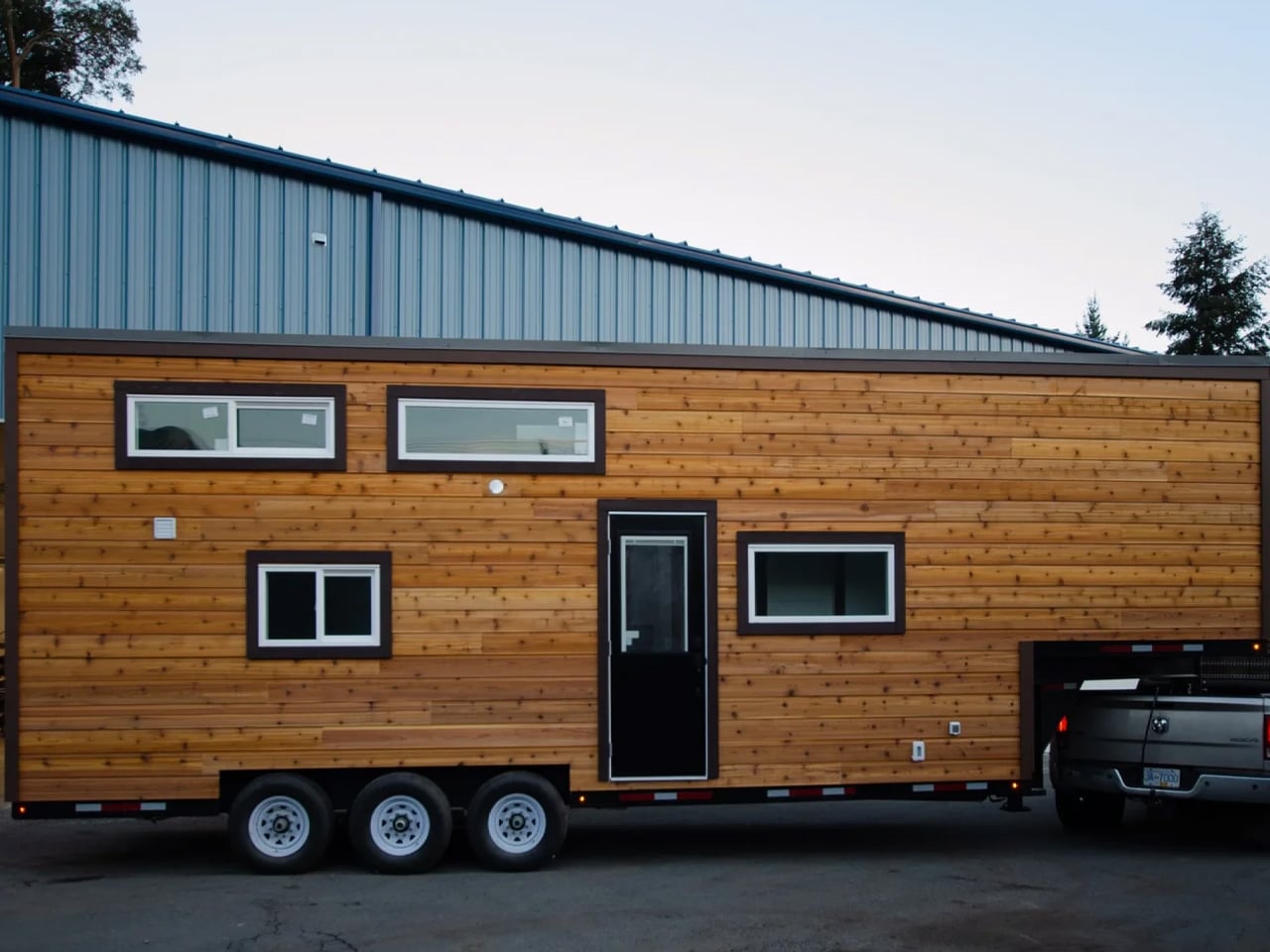
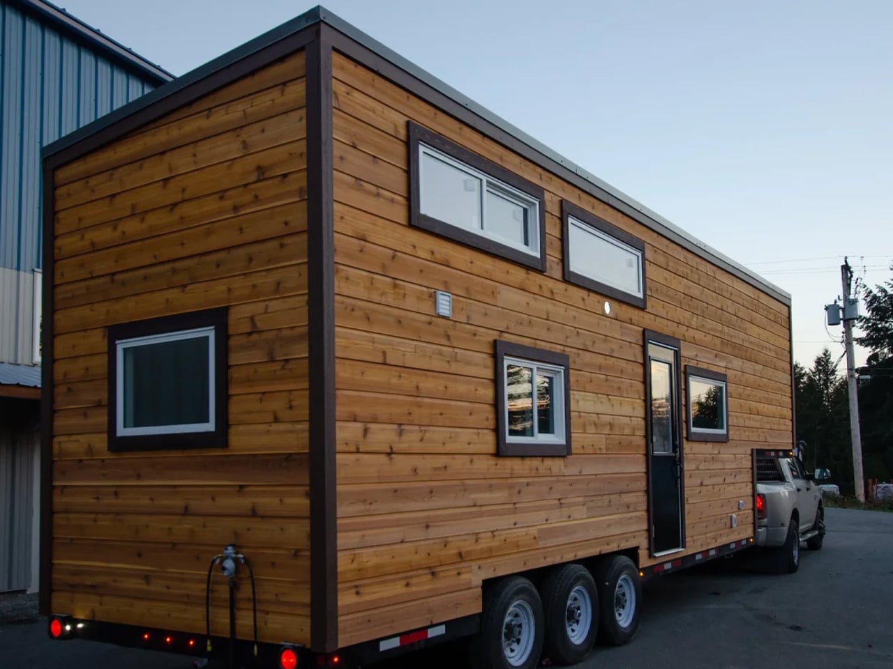
Two hundred square feet sounds like a limitation until you actually see what Irontown Modular did with it. The Sledhaus 200, the latest park model from the Utah-based builder, arrives as a compact, considered cabin that strips the idea of home back to what actually matters.

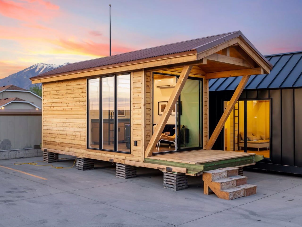
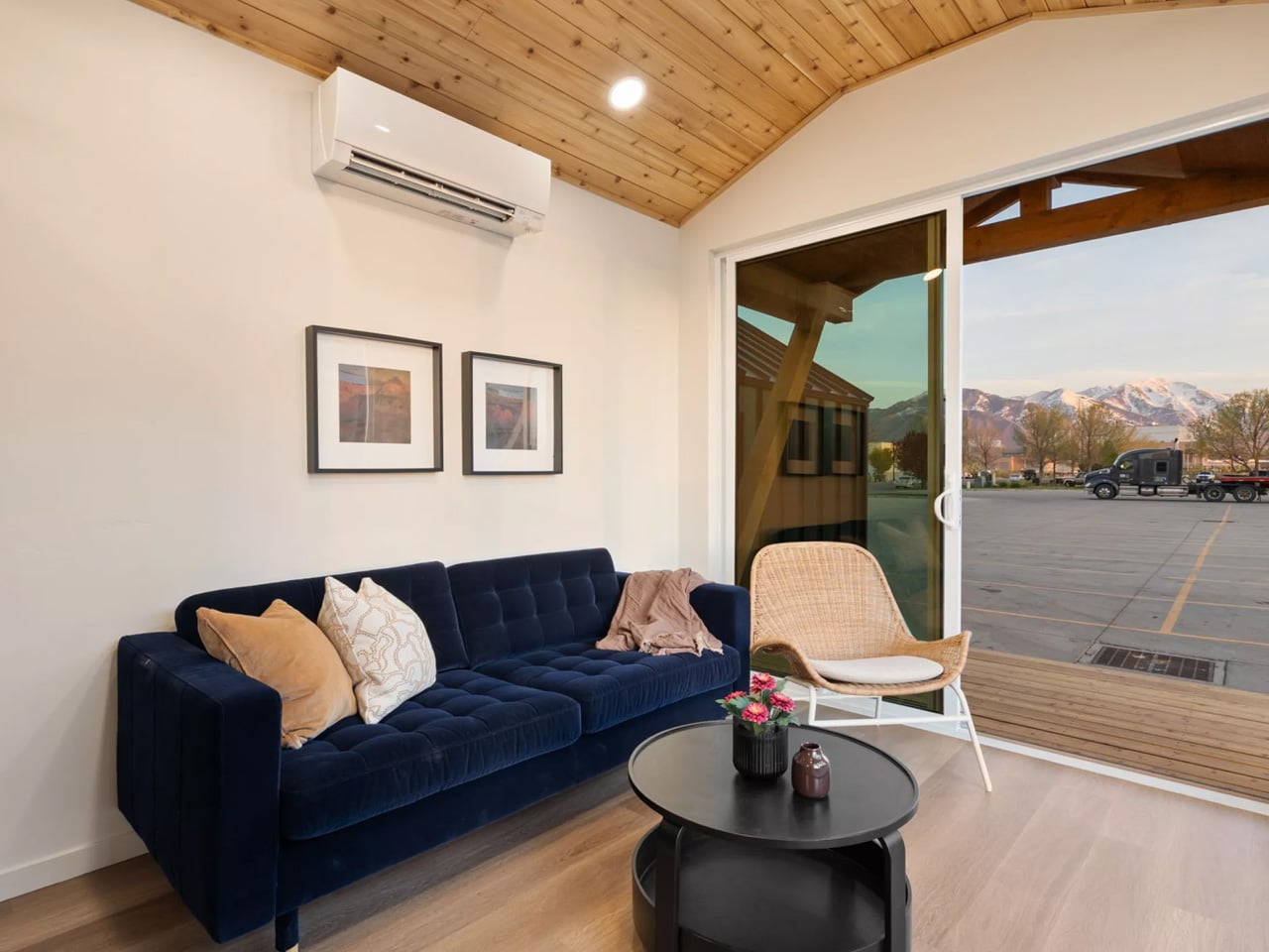
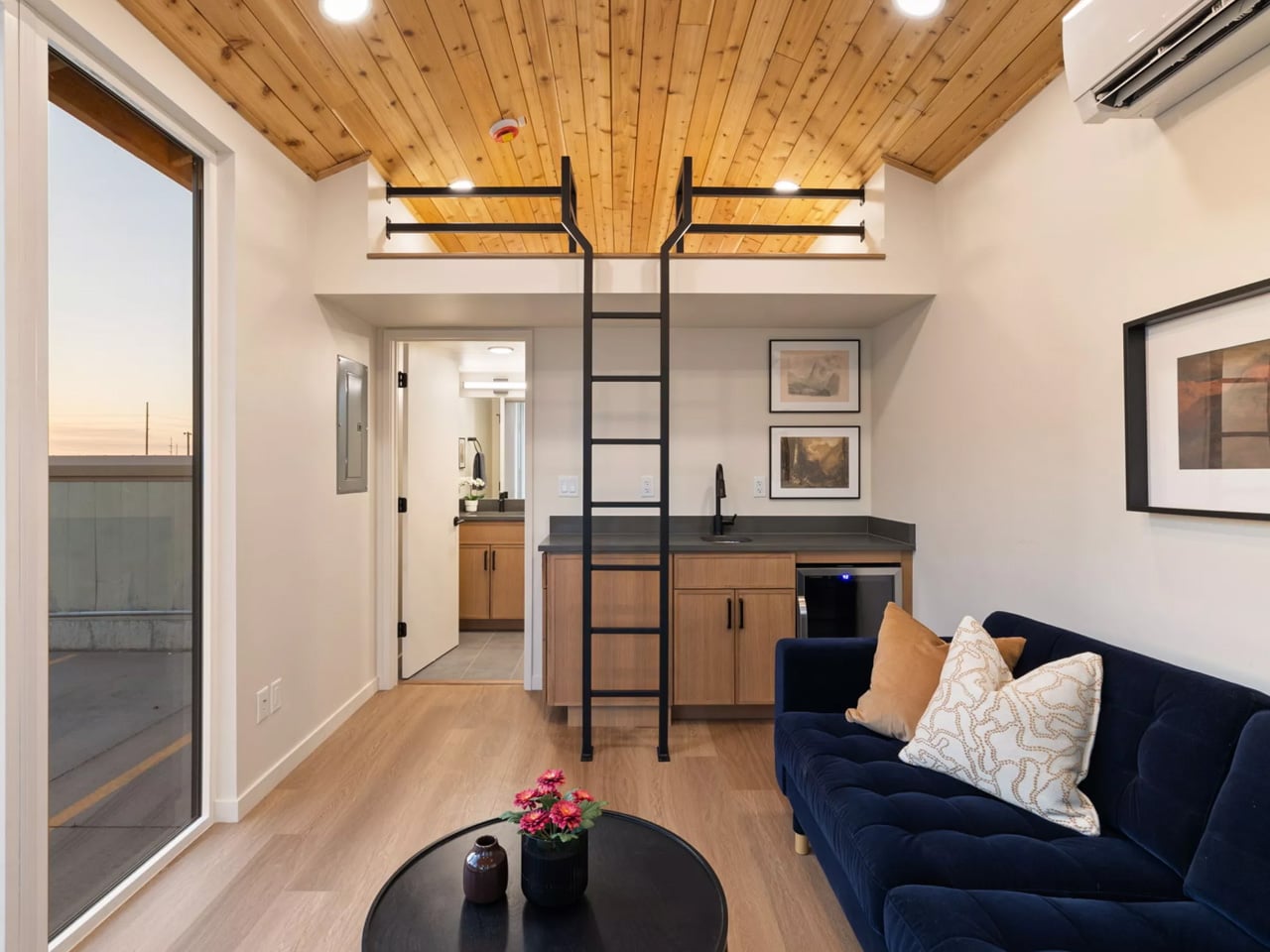
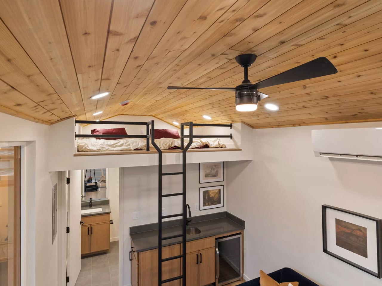
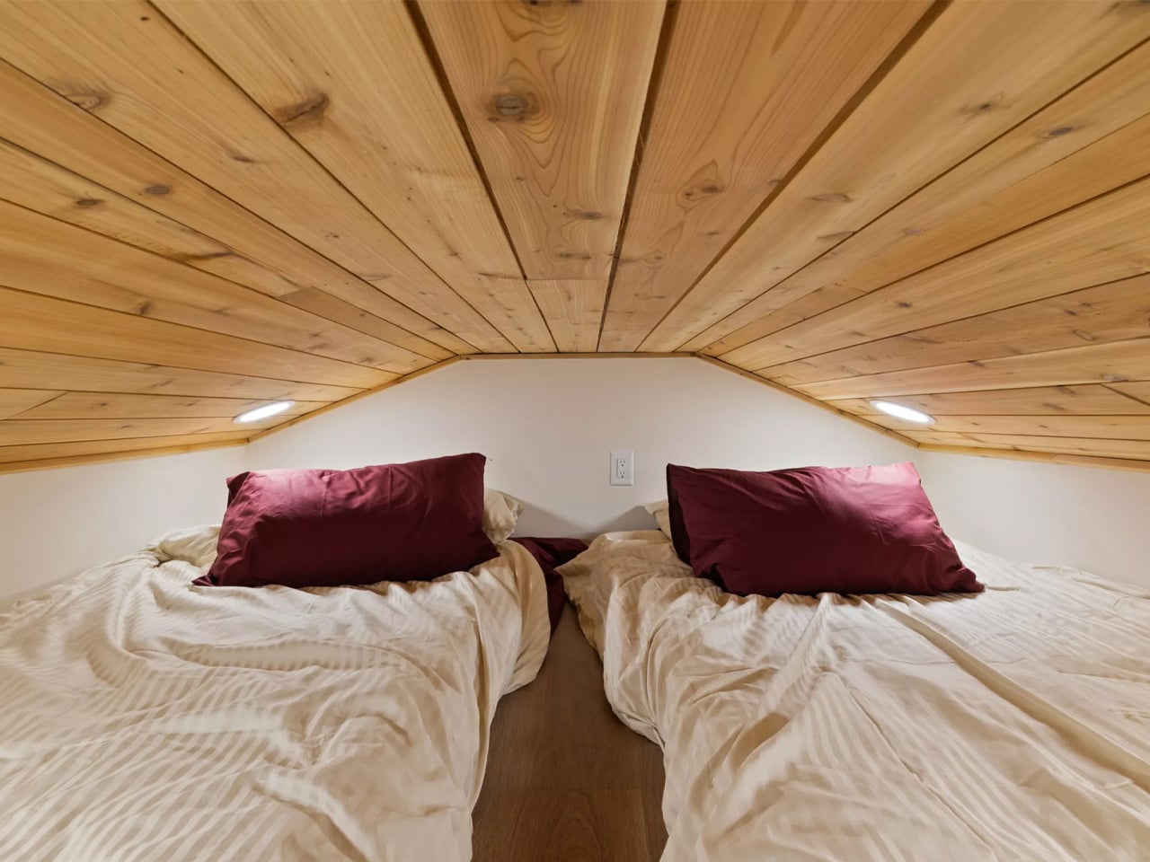
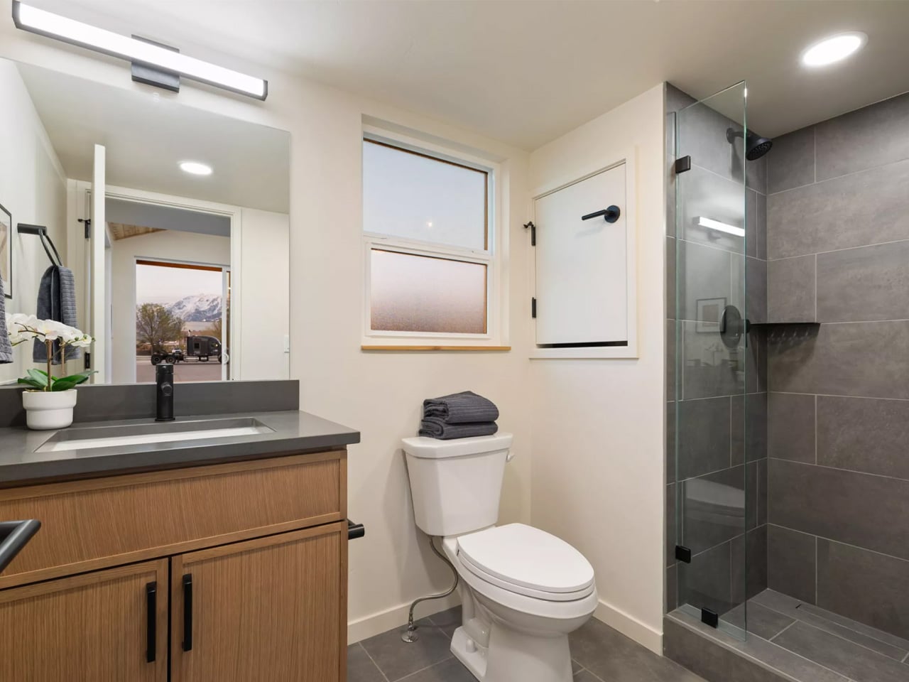
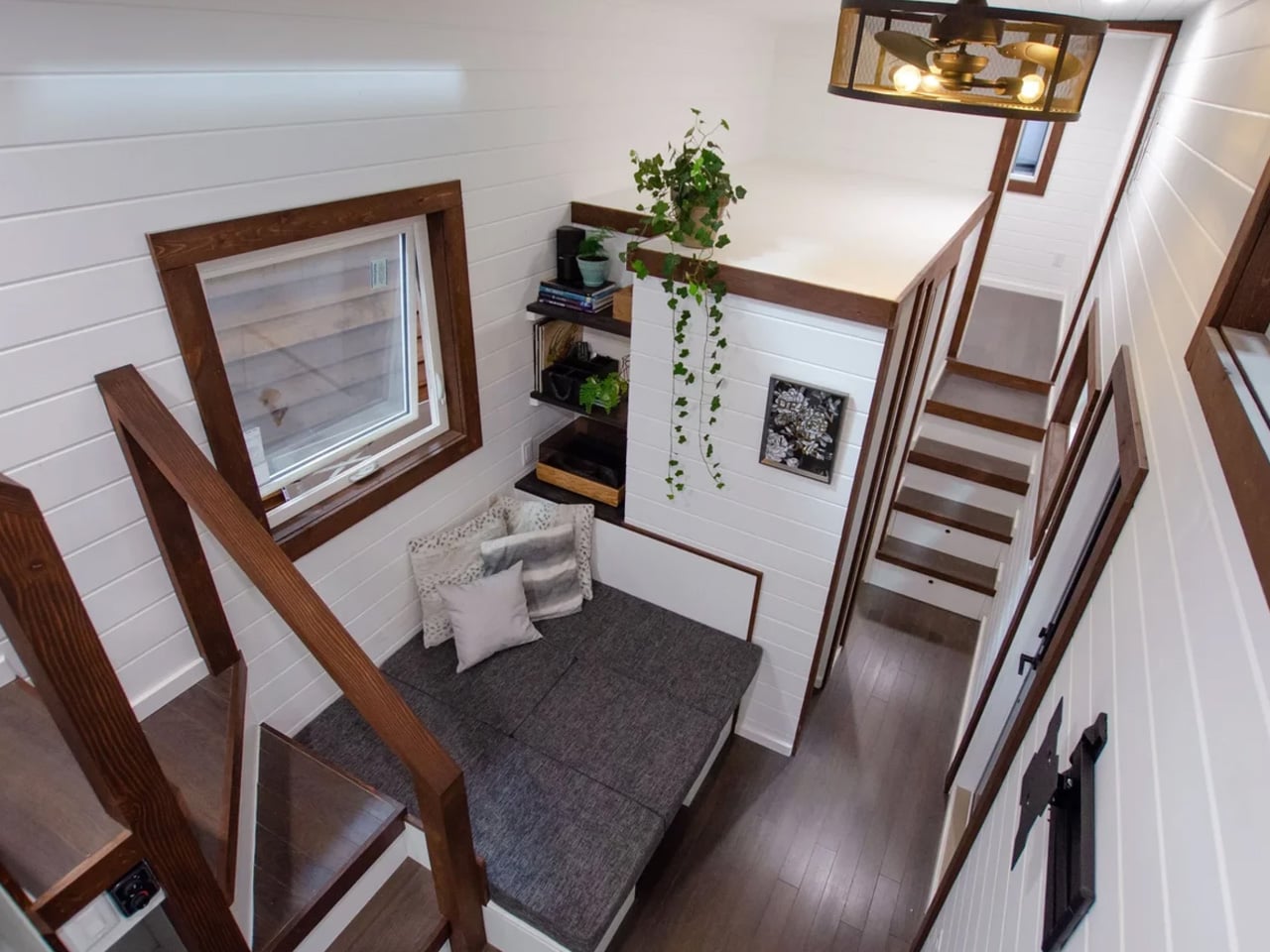
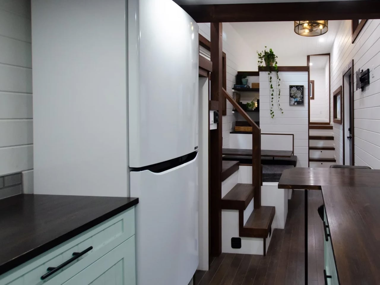
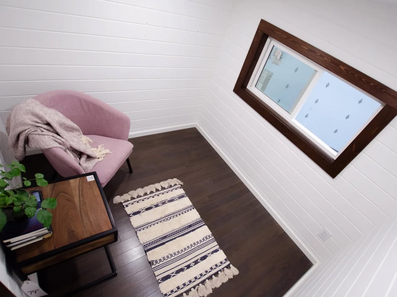
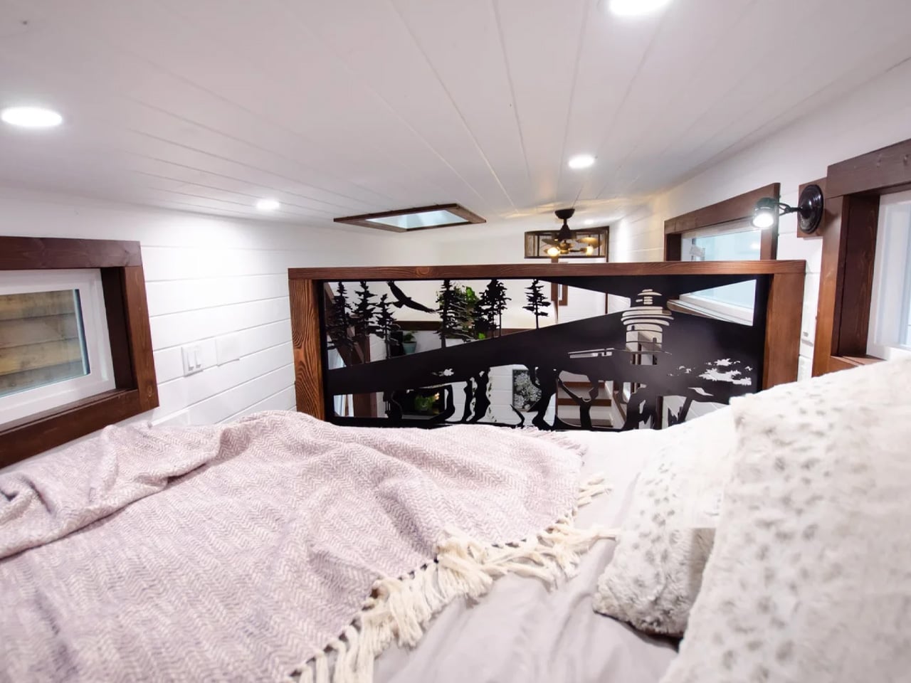
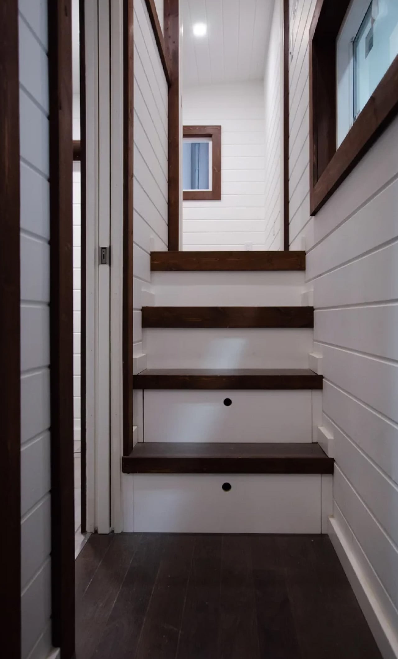
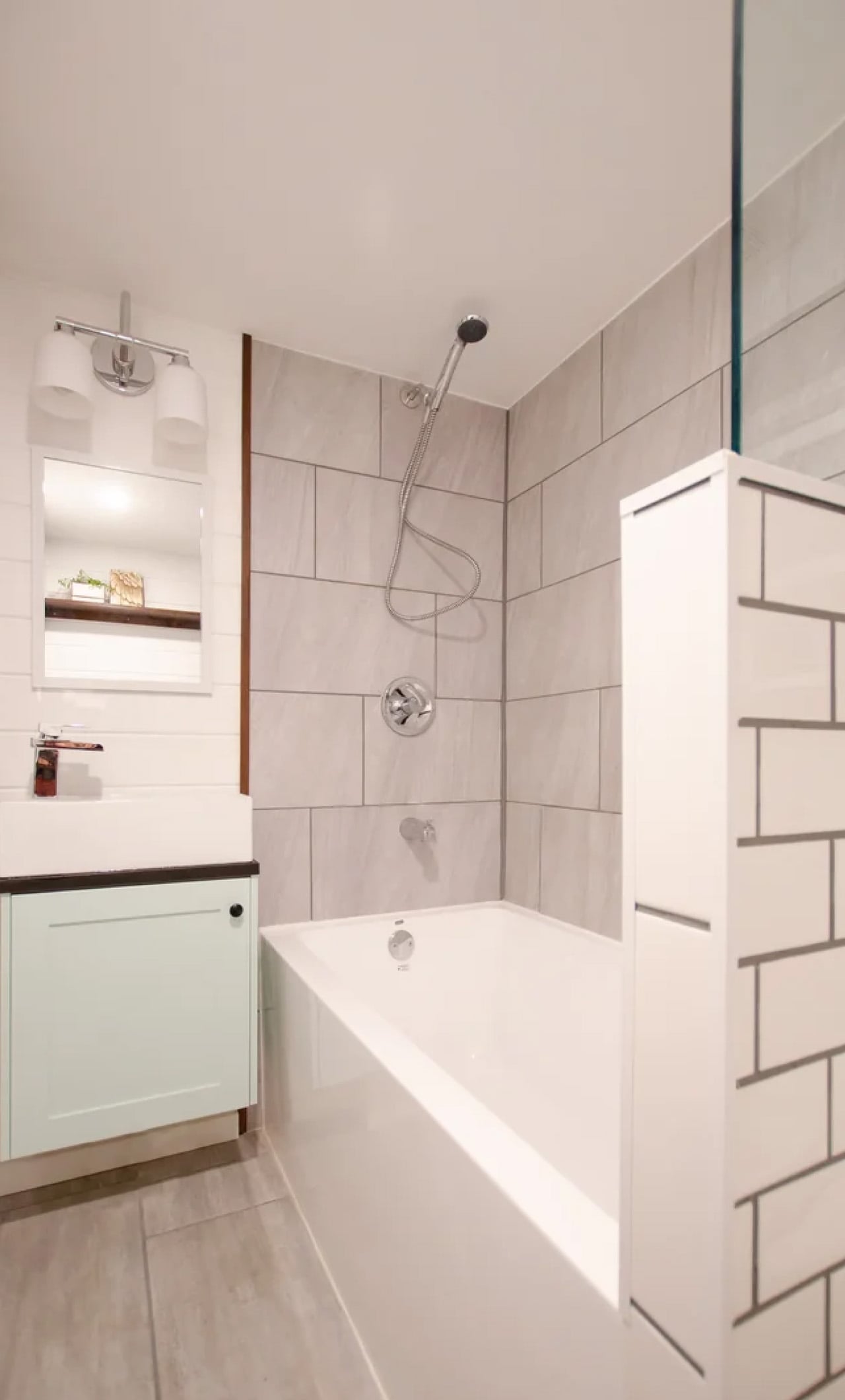
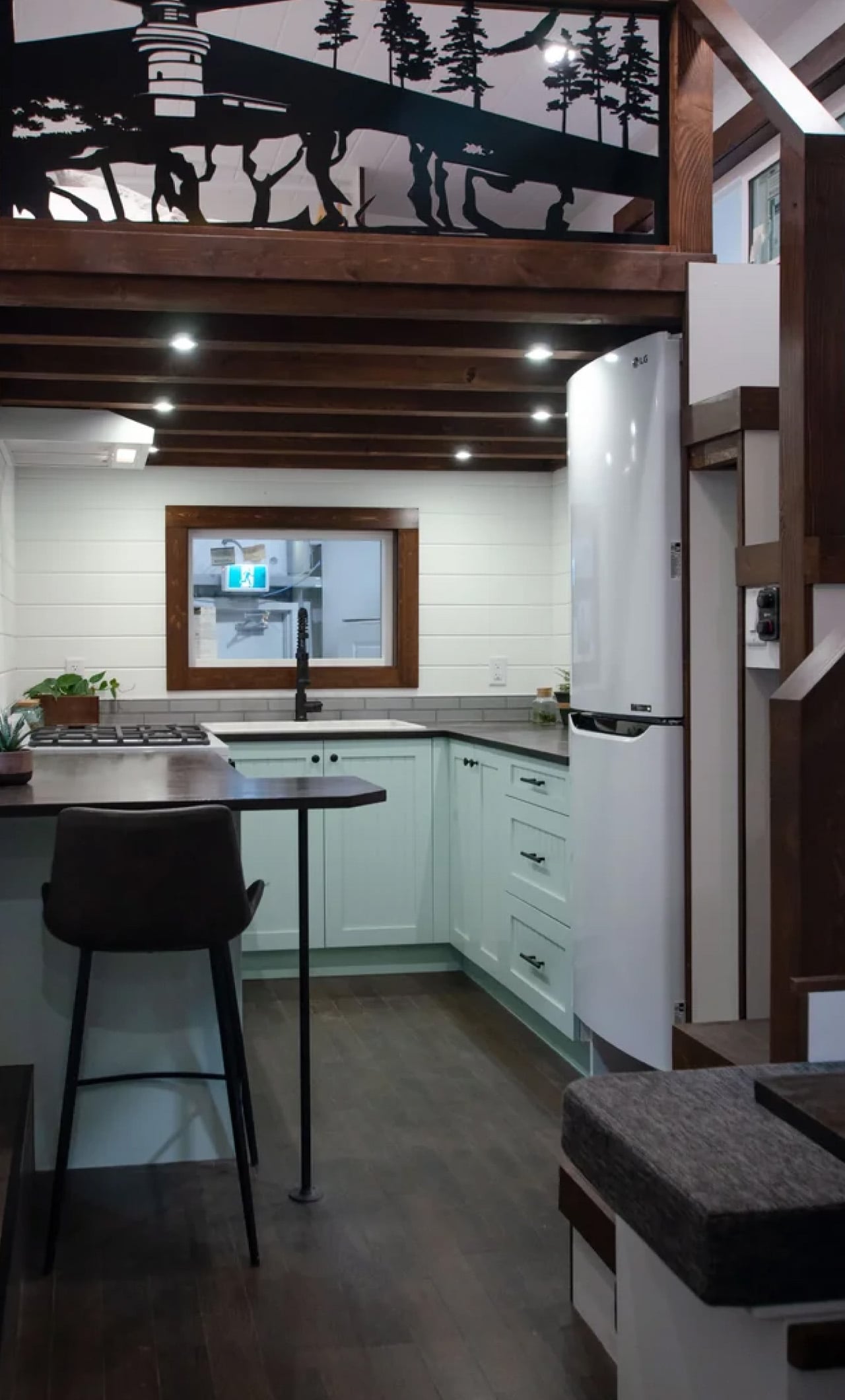
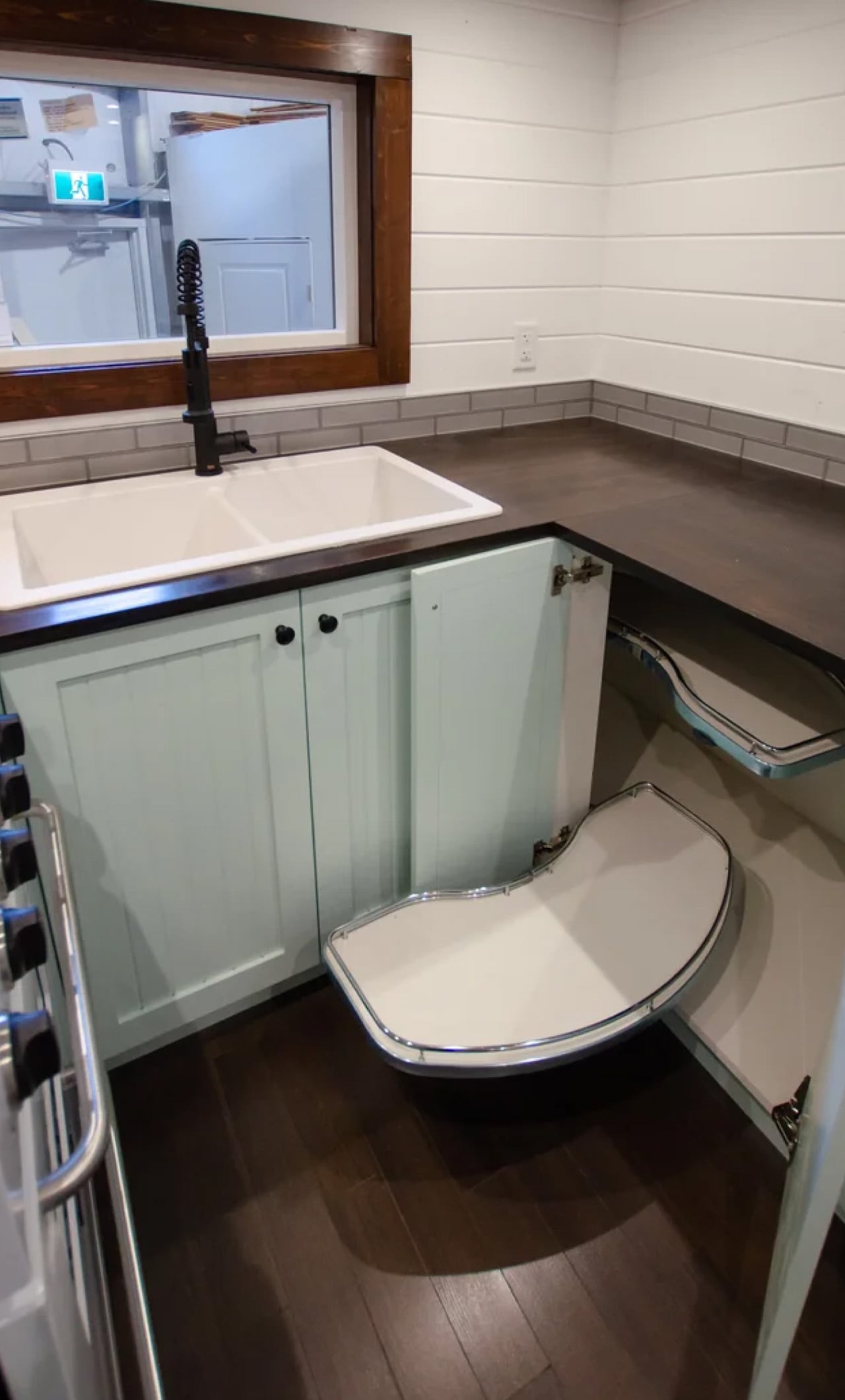
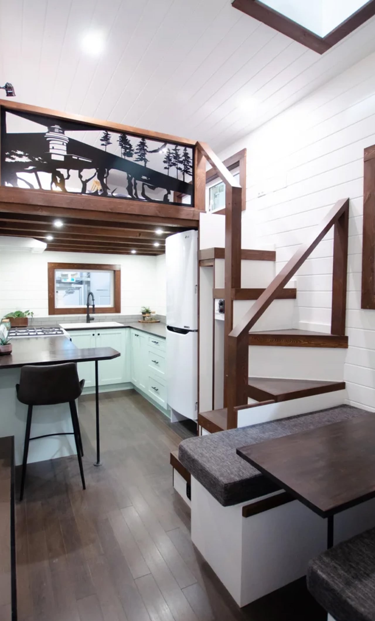
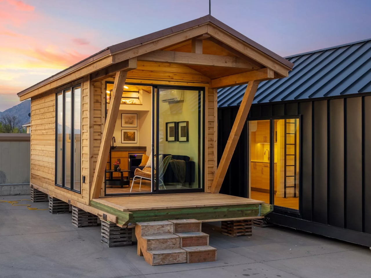
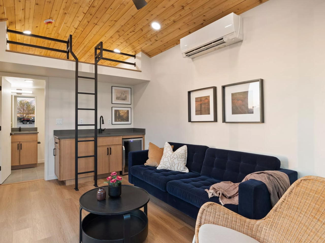
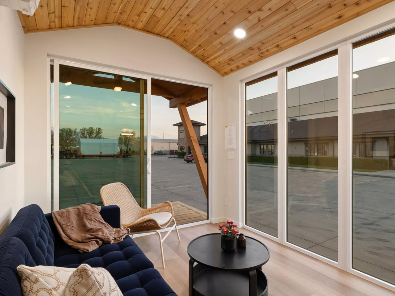
At just 10 feet wide and 20 feet long, the Sledhaus 200 packs a lofted bedroom, an optional bathroom, a galley kitchen, a living and lounge area, and a front covered porch into its 200 square feet of living space. On paper, that sounds like a tight squeeze. In practice, the design tells a different story. Big windows flood the interior with natural light, warm wood tones wrap the walls with a sense of groundedness, and a vaulted ceiling does the heavy lifting, making the space breathe in a way you wouldn’t expect from something this small.

Designer: Irontown Modular
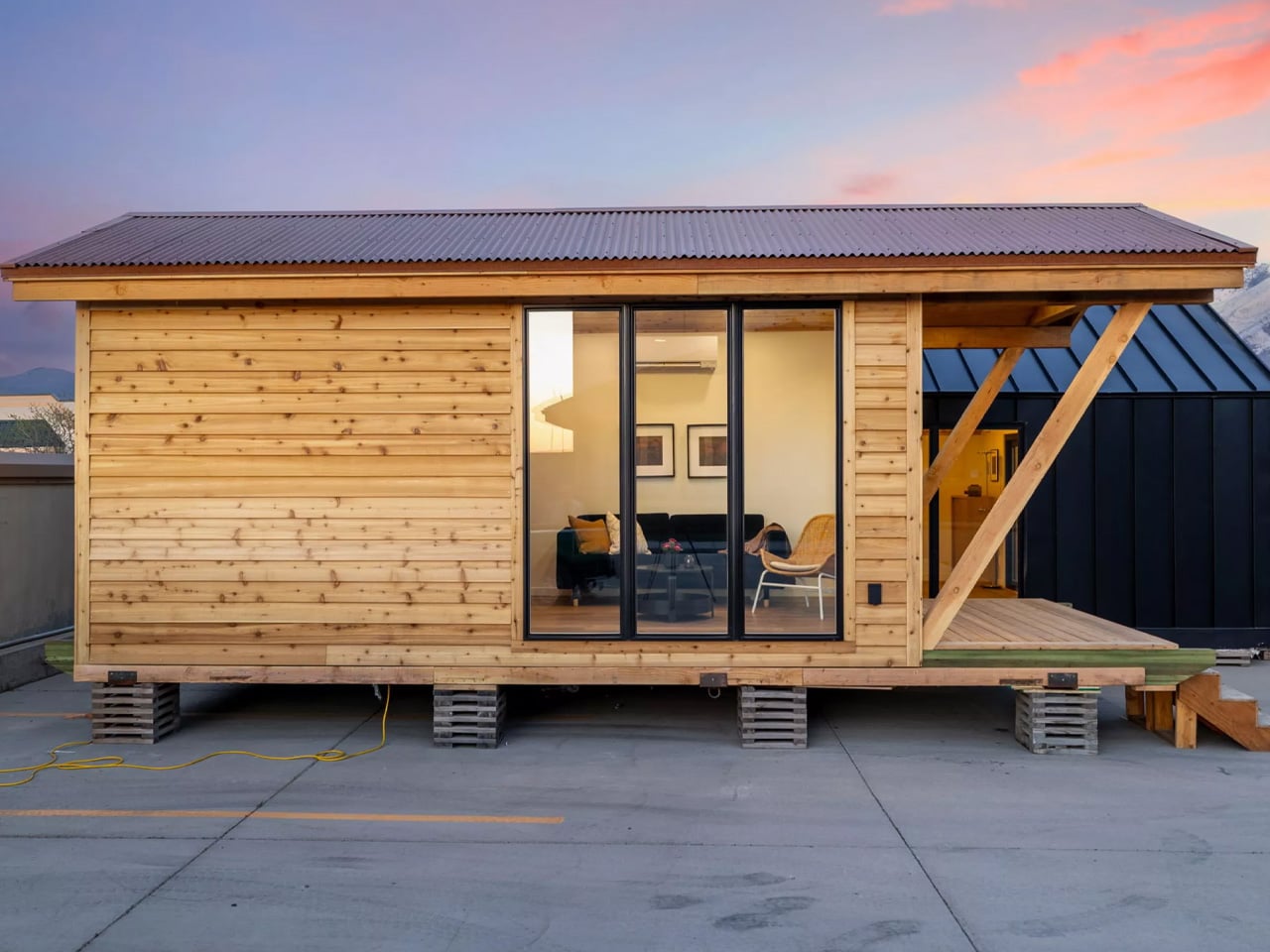
Irontown Modular describes the Sledhaus 200 as built for “simplicity, style, and serious charm,” and that language isn’t just marketing. The cabin sits within the brand’s Sledhaus line, a series of recreational property-focused designs built for people who want a real retreat, not a compromise. It can be placed directly on a trailer chassis for mobile flexibility or installed as an ADU (accessory dwelling unit) on a fixed foundation, making it one of the more versatile entries in Irontown’s growing catalog.

The use cases are where the Sledhaus 200 gets genuinely interesting. Irontown positions it as the ideal backyard guest suite, a weekend mountain getaway, or even a full-time tiny home for those willing to go all-in on a downsized life. It can be dropped on gravel or fully hooked up to water, electricity, and sewage, giving owners real flexibility in how they choose to use it. For property owners in the American West, particularly, where land is abundant but building costs are not, this is a sensible and stylish answer to a growing need.
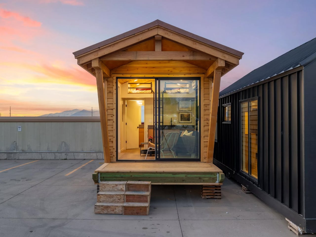
Pricing starts at $49,600, making the Sledhaus 200 one of the more accessible entries in the modular park home space. A ready-to-ship model is also currently available at $117,000, which does not include transport or taxes. Irontown ships across Arizona, California, Colorado, Idaho, Montana, Nevada, Oregon, Utah, and Wyoming. In a market crowded with tiny homes that try too hard, the Sledhaus 200 earns its place by doing the opposite, trusting the architecture, keeping the details honest, and letting the space speak for itself.
The post Irontown Modular Built a Tiny Cabin With Vaulted Ceilings & Warm Wood Walls for Under $50K first appeared on Yanko Design.
This Finnish Professor Built His Family Home From Old Tires and Fishing Nets

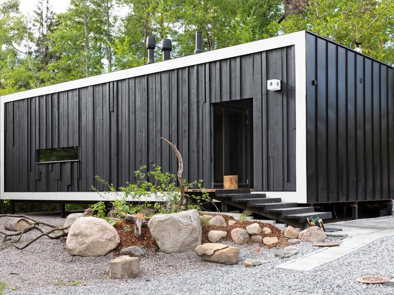
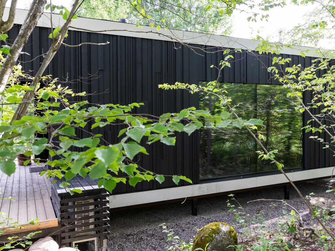
Most architects study sustainable housing. Matti Kuittinen actually lives in it. The Aalto University professor and architect didn’t just design the Tiny House Shadow as a thought experiment. He built it in Lohja, Finland, about 40 miles from Helsinki, moved his family in, and made it his primary residence. The result is one of the most provocative arguments for a different kind of future that architecture has produced in years.

The numbers are the opening statement. At just 365 square feet, Shadow is built from 56% recycled or reused materials: old fishing nets for flooring, scrap steel for the frame, recycled car tires for the roof, upcycled windows and doors, and insulation made from recycled glassware. What isn’t salvaged is responsibly sourced, including fossil-free steel. The house uses 85% fewer resources than a conventional home, 43% less land, and delivers a 53% smaller carbon footprint per resident. For Kuittinen, these aren’t talking points. They’re proof of concept. “We have a limited carbon budget,” he has said. “Construction must learn to stay within it.”

Designer: Matt Kuittinen

The name comes from Jun’ichirō Tanizaki’s 1930s essay In Praise of Shadows, in which the Japanese writer reflected on the quiet beauty of darkness and restraint. The metaphor tracks. Shadow is literally built from what the linear economy discarded, a home made from the world’s leftovers, dressed in matte black, standing still and serious against the Finnish landscape. The exterior reads as avant-garde. The interior is equally deliberate.

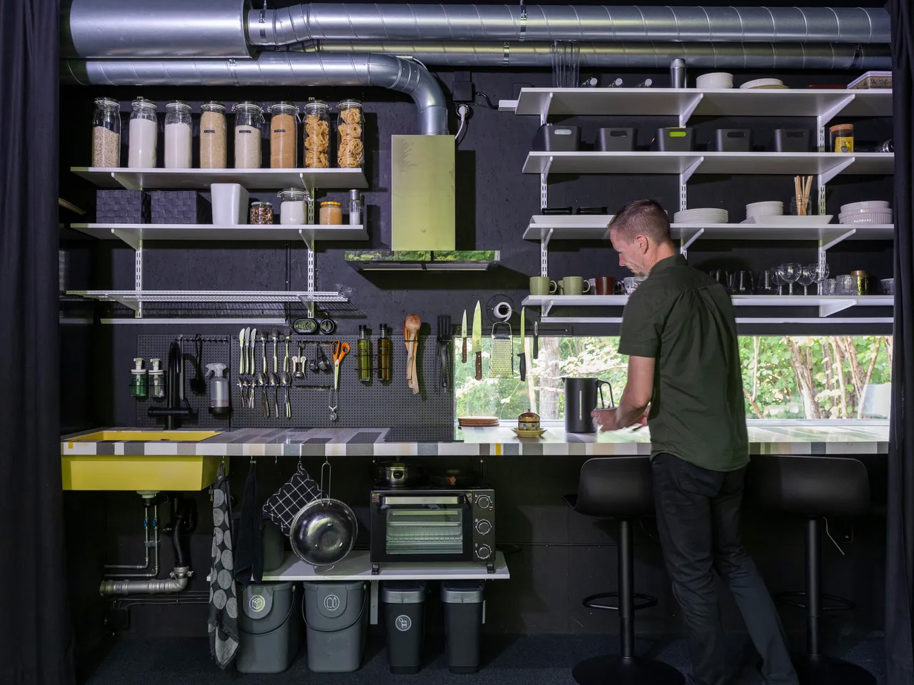
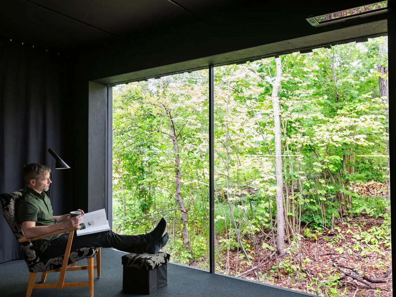
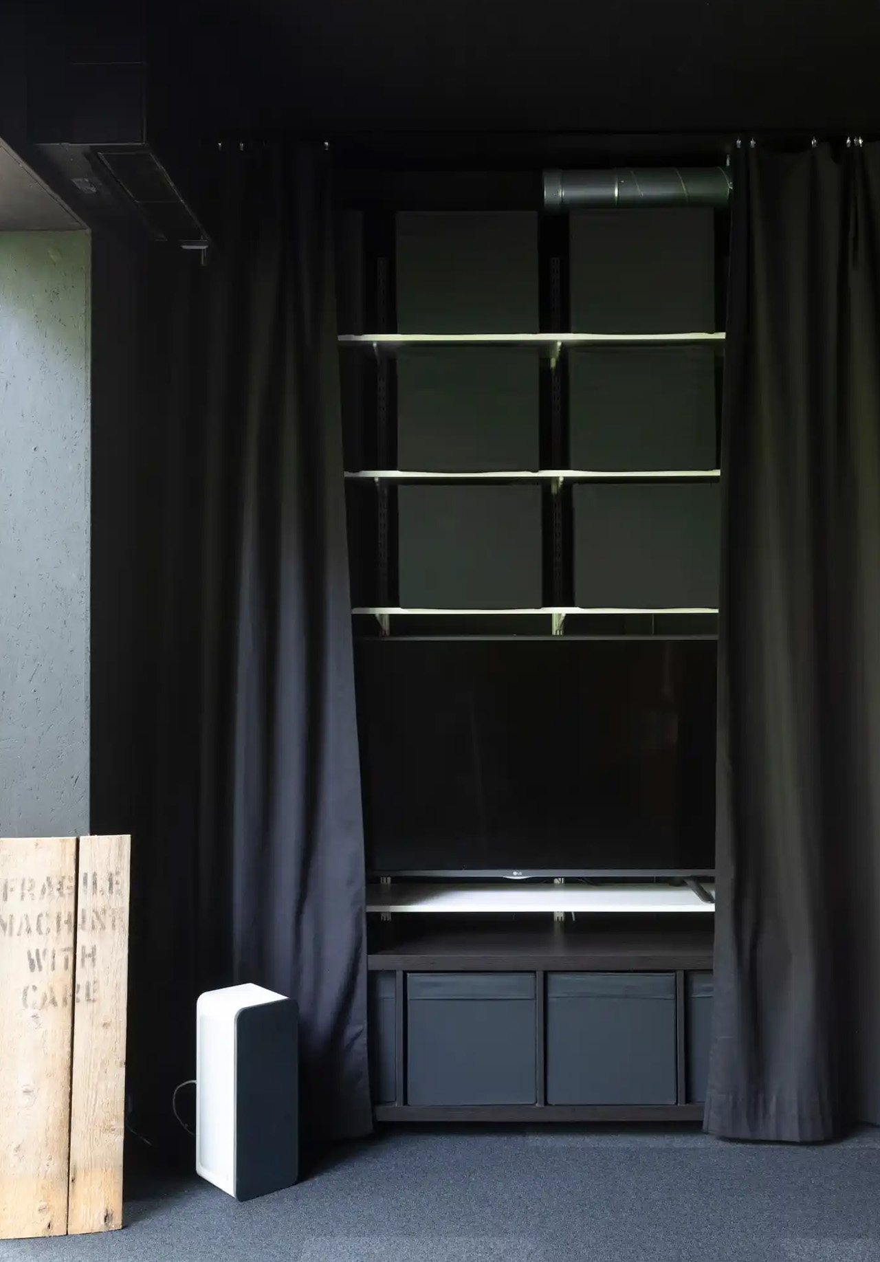
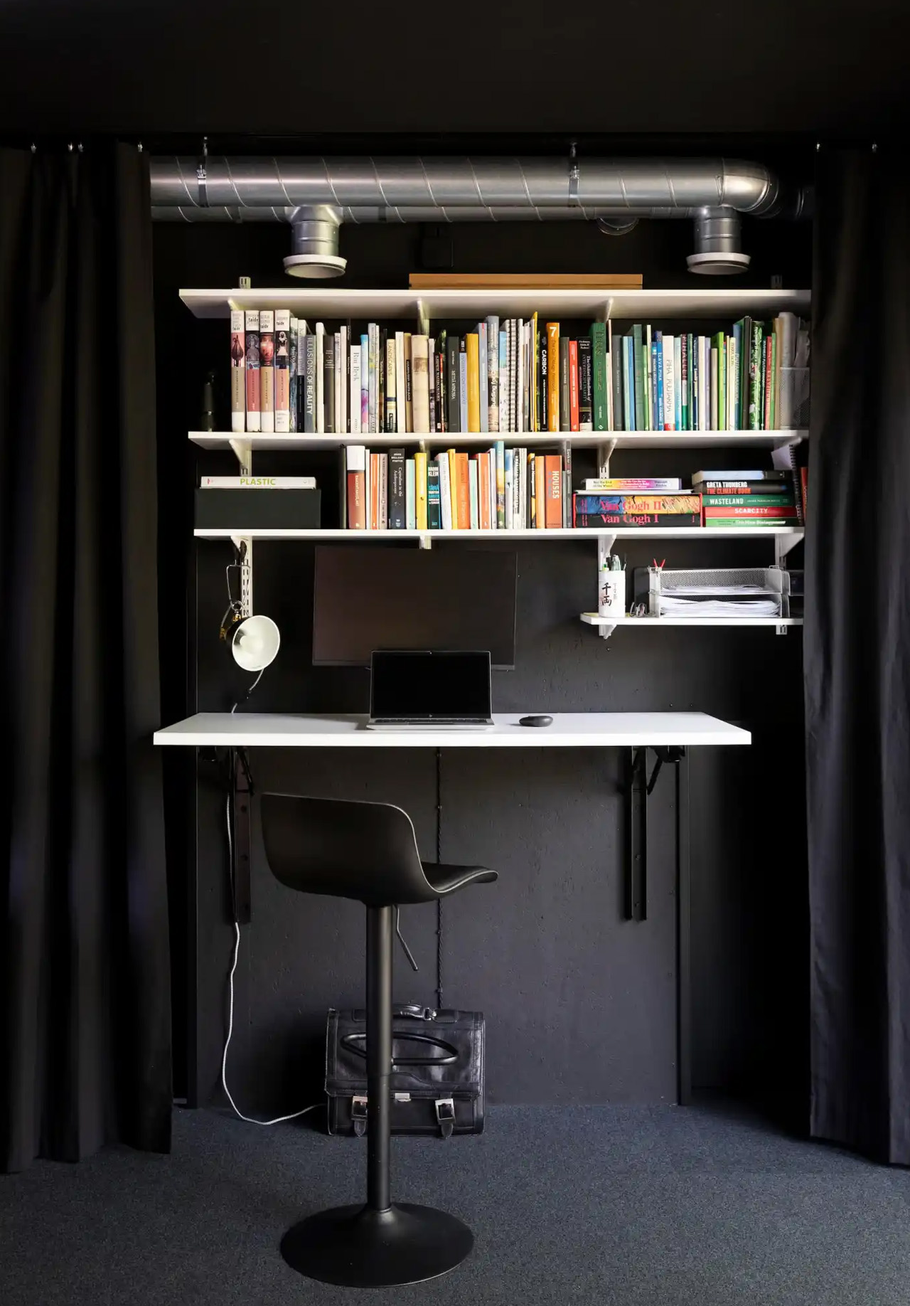
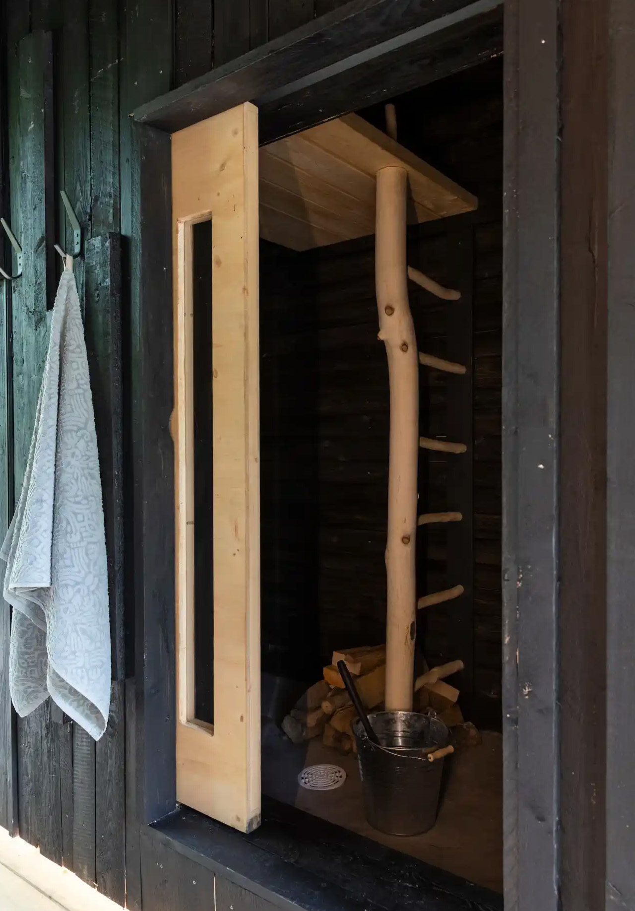
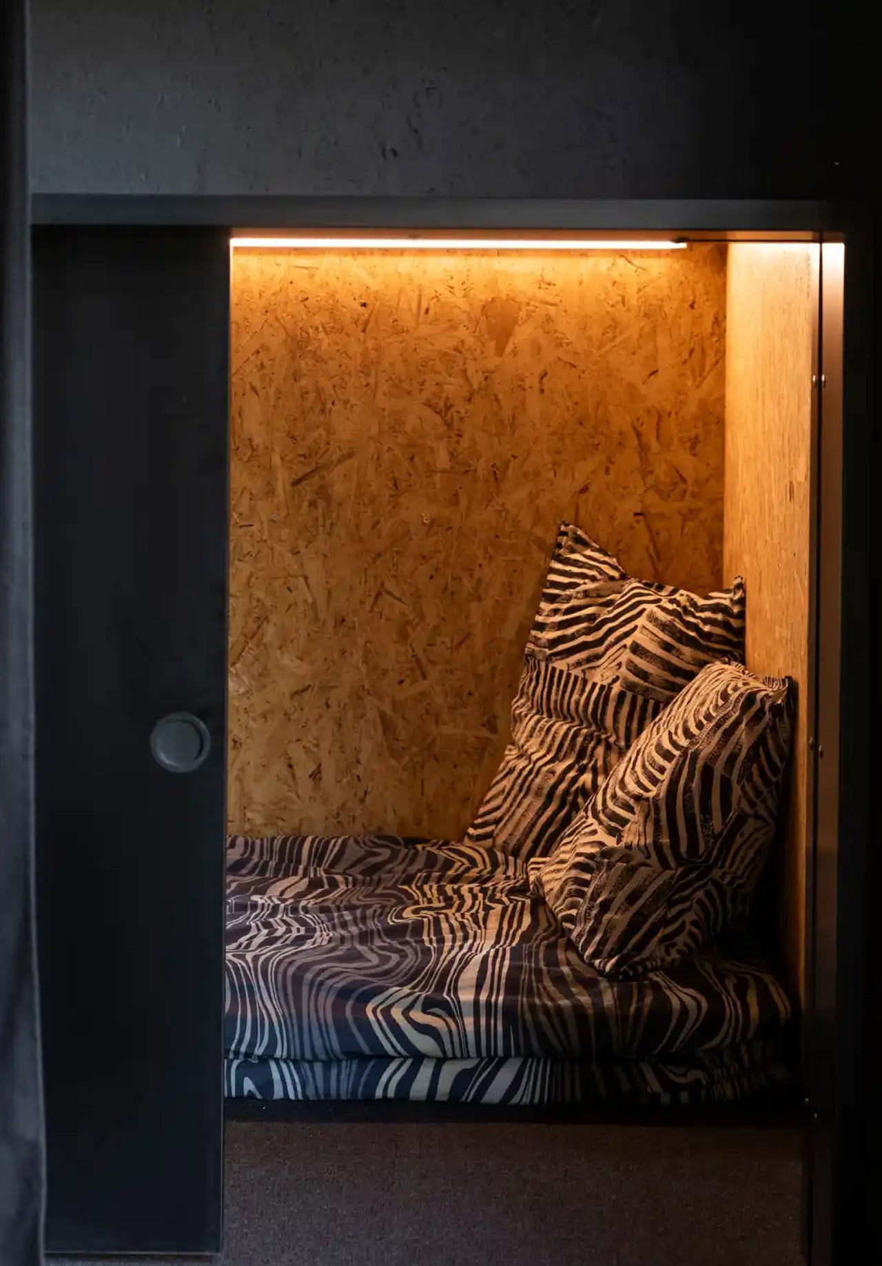
Inside, minimalism operates as a lifestyle logic, not just an aesthetic. The main living area transforms between working, dining, and sleeping through heavy black curtains that divide the space without walls. Sleeping pods take cues from Japanese capsule hotels and stack vertically to save floor space. The kitchen runs on open shelving instead of cabinets. There’s a full bathroom and, true to form, a 22-square-foot wood-fired sauna. Every square foot earns its place. Construction took four months; the full project, from first drawing to moving in, took one year.

Shadow has since been exhibited at construction fairs as a working prototype and featured in Aalto University’s Designs for a Cooler Planet exhibition. Kuittinen is clear that the project is bigger than one house. “Shadow proves that recycled and low-emission materials can work at scale,” he says. “This isn’t just about one house. It’s about changing the whole mindset of construction.” In 365 square feet, he’s making a very large point.

The post This Finnish Professor Built His Family Home From Old Tires and Fishing Nets first appeared on Yanko Design.
This Red House Buried in a Czech Forest Is the Opposite of Every Forest Home You’ve Ever Seen

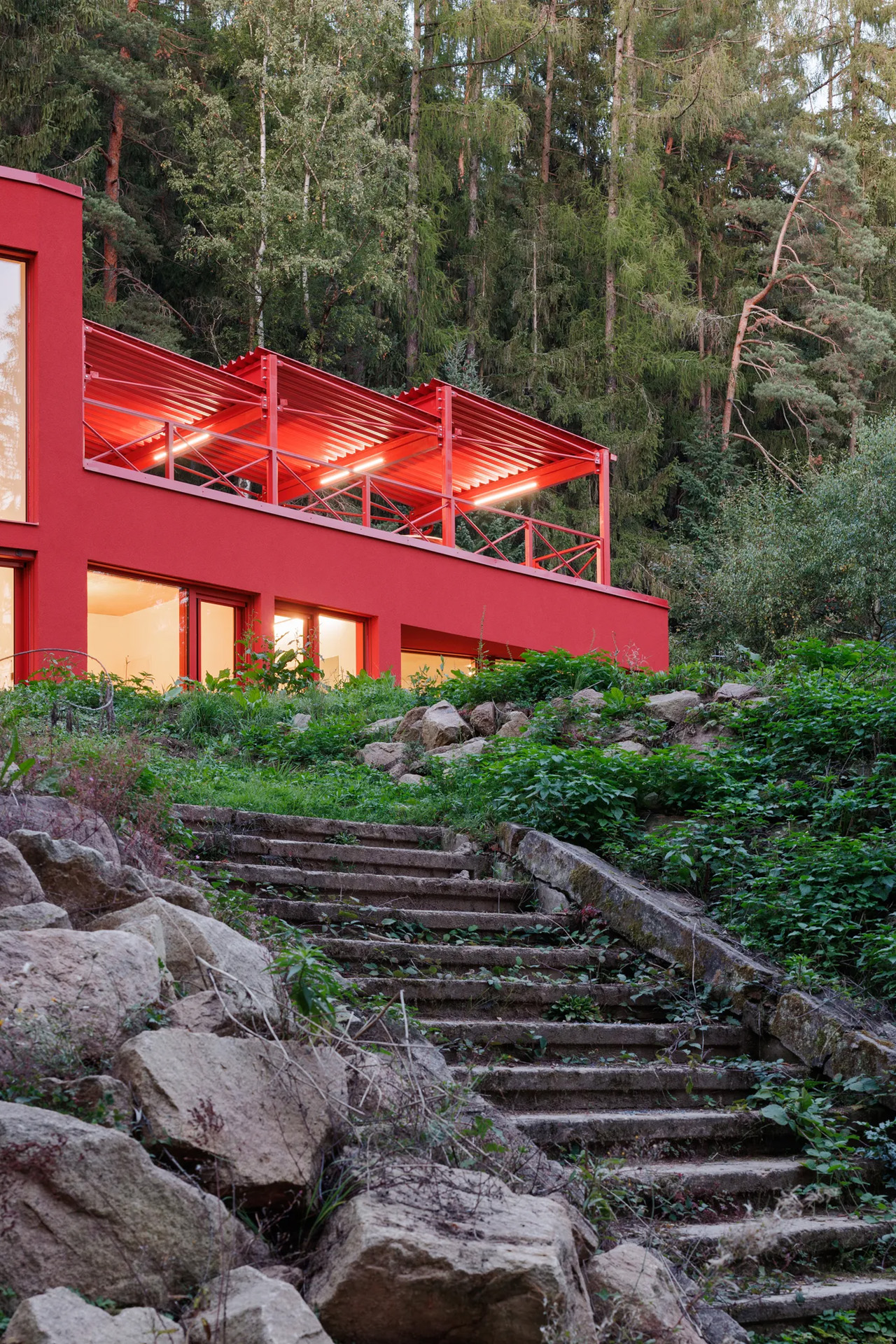
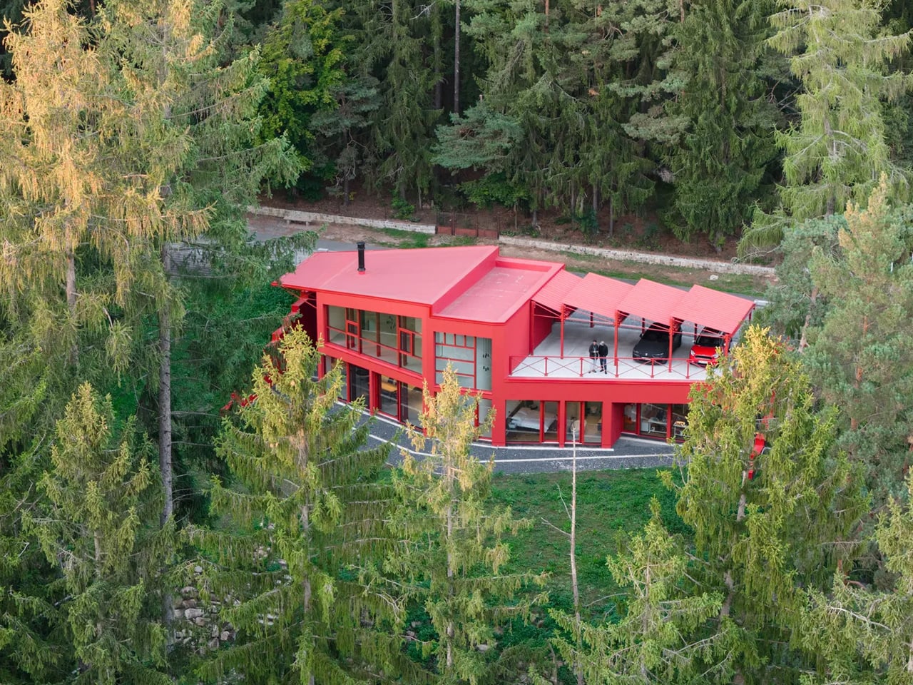
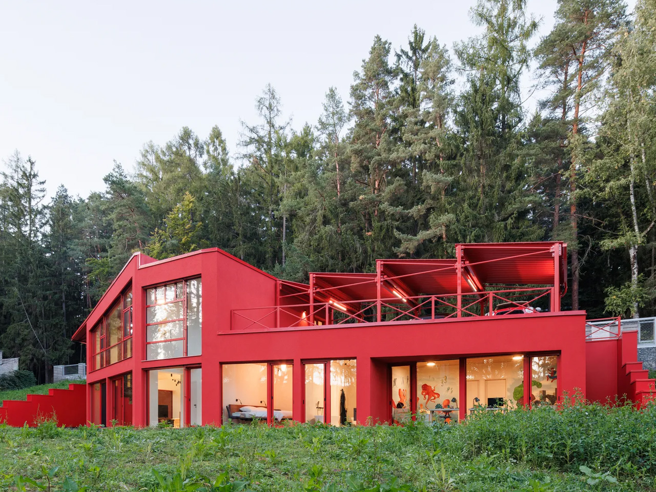
Deep in the spruce forests of Jevany, a municipality of barely 800 people in the Czech Republic’s Central Bohemian Region, a flash of cherry red cuts through the trees. This is Villa Jevany, a new residence by local studio Architektura, and it has absolutely no interest in blending in. Where most forest homes default to timber, stone, and muted tones, Architektura went the other way entirely, dressing the structure in saturated red steel and calling it exactly what it is: a deliberate, uncompromising act of contrast.

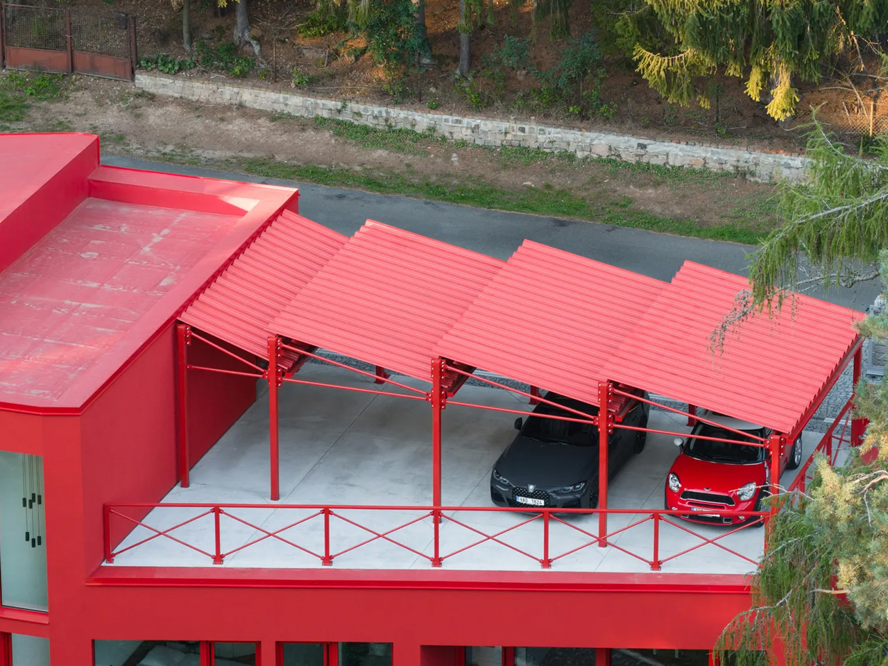
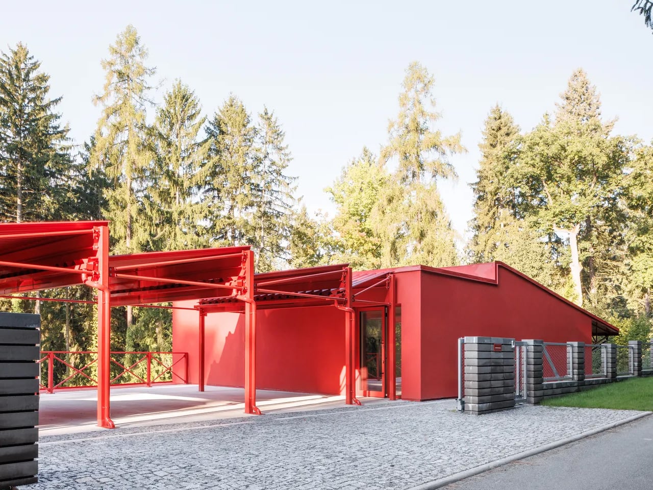
The site itself set the terms. The plot spans a generous 3,027 square meters on a steep southern slope, inhabited by deer, birds, and mature trees that tower up to ten meters above the building level. Architektura responded by carving the villa into the hillside rather than placing it on top, creating a structure the studio describes as an “organism” embedded in the earth. The red steel skeleton, visible in the sawtooth carport roof from the moment of arrival, signals that this is industrial thinking applied to domestic life, and it doesn’t apologize for it.

Designer: Architektura

The colour choice is rooted in theory as much as instinct. Architektura used green and red as complementary colors, a logic borrowed from the colour wheel and, more pointedly, from abstract art. The irregularly divided glazing across the façade draws a quiet reference to Mondrian, the rhythmic geometry of the windows creating a visual tension against the organic verticality of the trees behind them. From the road, the house reads almost like a painting hung in the forest. From the inside, the forest becomes the painting.

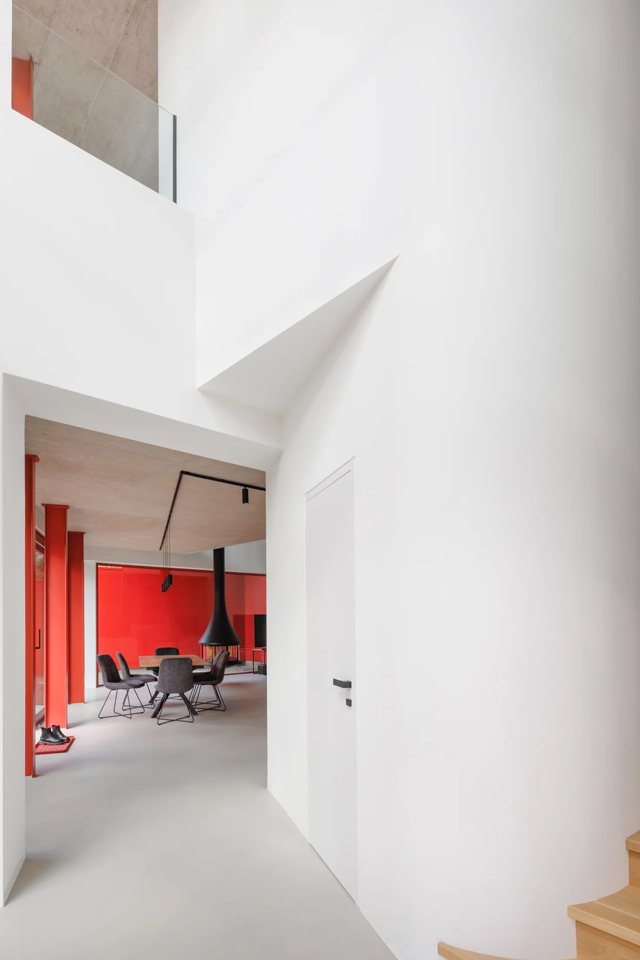
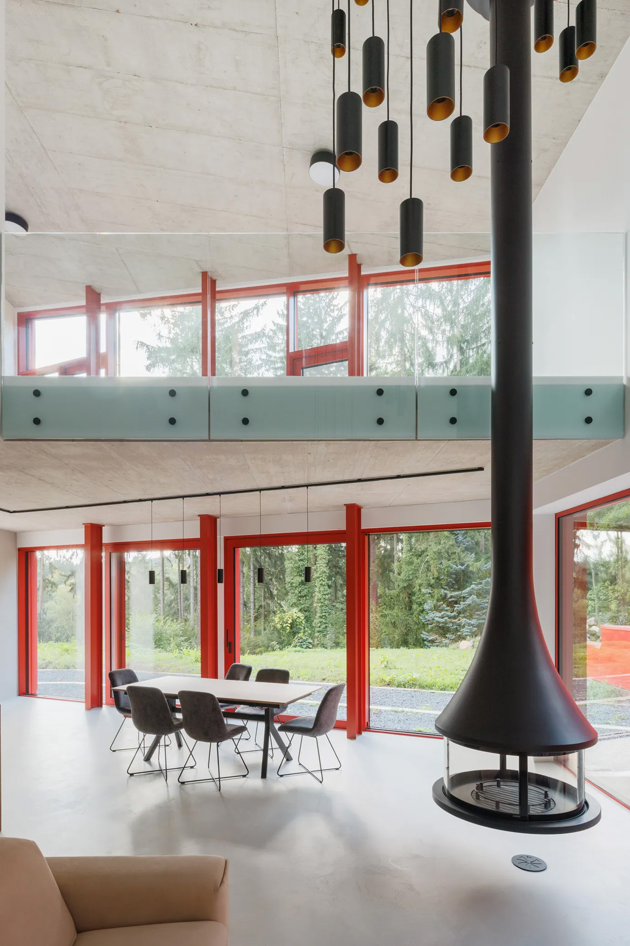
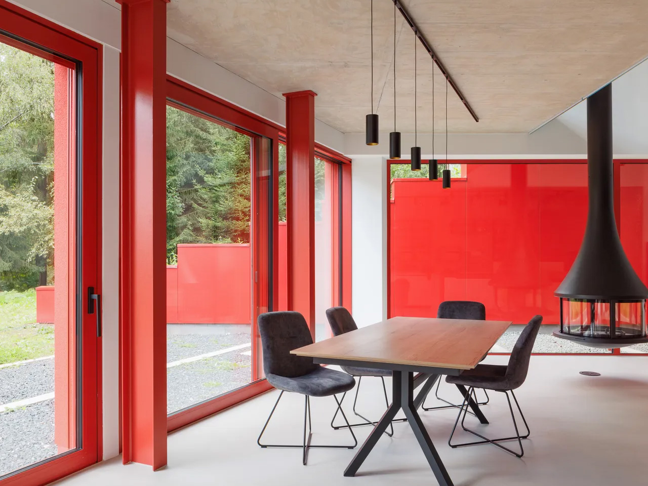
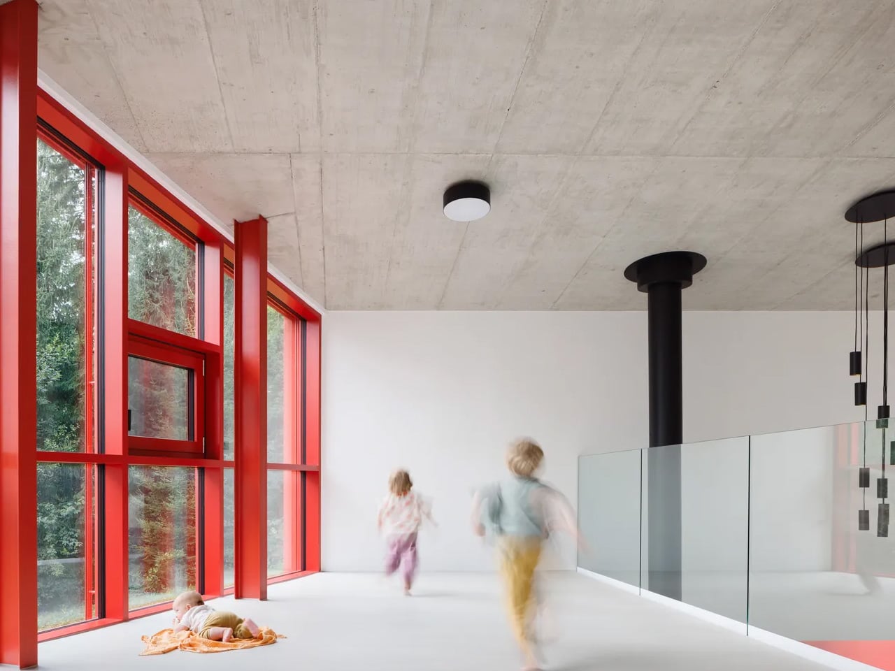
Internally, the layout unfolds across five distinct levels. The entrance opens into a hall with a 3.5-meter ceiling height, where a curved wall guides visitors into the main living space, or what the architects call the “day zone.” Here, industrial red steel windows frame the surrounding green; white walls meet black details; reddish stone counters anchor the kitchen alongside a floating steel fireplace. It’s a space of deliberate contrasts, domestic in function and raw in feeling.

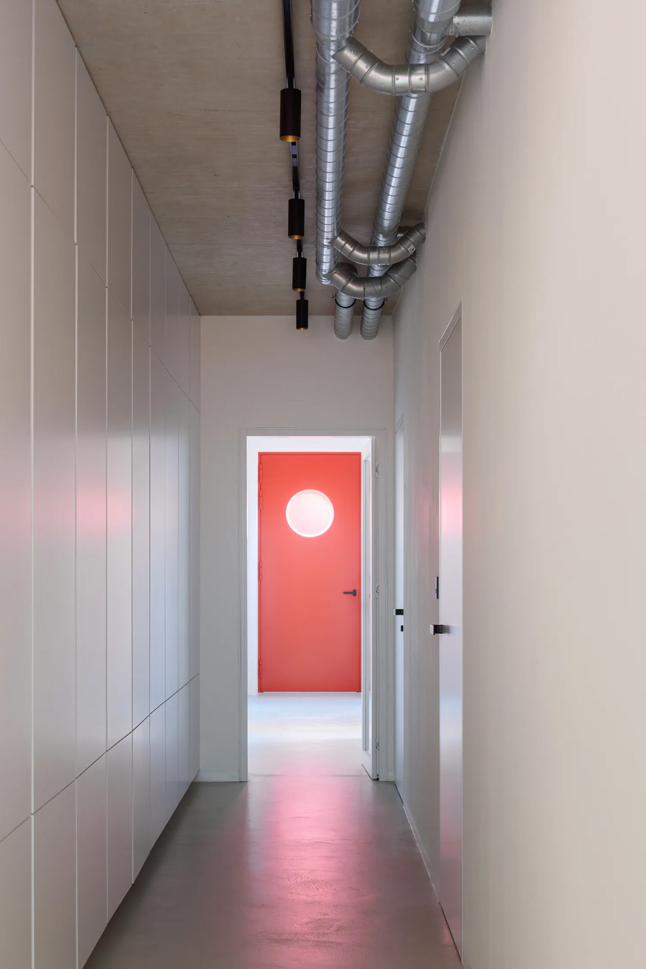
The private quarters, reached through a long corridor lined with minimalist white cabinetry, are stripped of excess. The parents’ suite and children’s rooms are quiet and restrained, a counterpoint to the drama of the exterior. Terraces and balconies extend the living area into the canopy itself, turning the house into what Architektura intended all along: not just a place to live, but a place to look.

The post This Red House Buried in a Czech Forest Is the Opposite of Every Forest Home You’ve Ever Seen first appeared on Yanko Design.
The Philosopher Wanted Silence. The Artist Built on Water.

In 1914, Ludwig Wittgenstein did something that, depending on your perspective, was either the most logical or the most eccentric thing a Cambridge-trained philosopher could do. He left England behind and built a tiny wooden cabin on the steep shoreline of Lake Eidsvatnet in Skjolden, Norway. The only way to reach it was by boat, or by walking across ice in winter. His mentor Bertrand Russell reportedly told him it would be lonely. Wittgenstein replied that he “prostituted his mind talking to intelligent people.” The anecdote is funny, but the philosophy behind it was completely serious.

What Wittgenstein found in that remote hut was the particular kind of quiet that forces real confrontation with your own thoughts. He was productive there in ways he couldn’t replicate anywhere else, later writing to a colleague that he “couldn’t imagine working anywhere as he did there,” and that the place had “a quiet seriousness” he found nowhere else. Some of his foundational thinking for Tractatus Logico-Philosophicus took shape in that small space, part of it on a boat his friend David Pinsent sailed across the Sognefjord. A philosopher doing his deepest work on open water, surrounded by mountains. That image stays with you.

Designer: Dionisio González

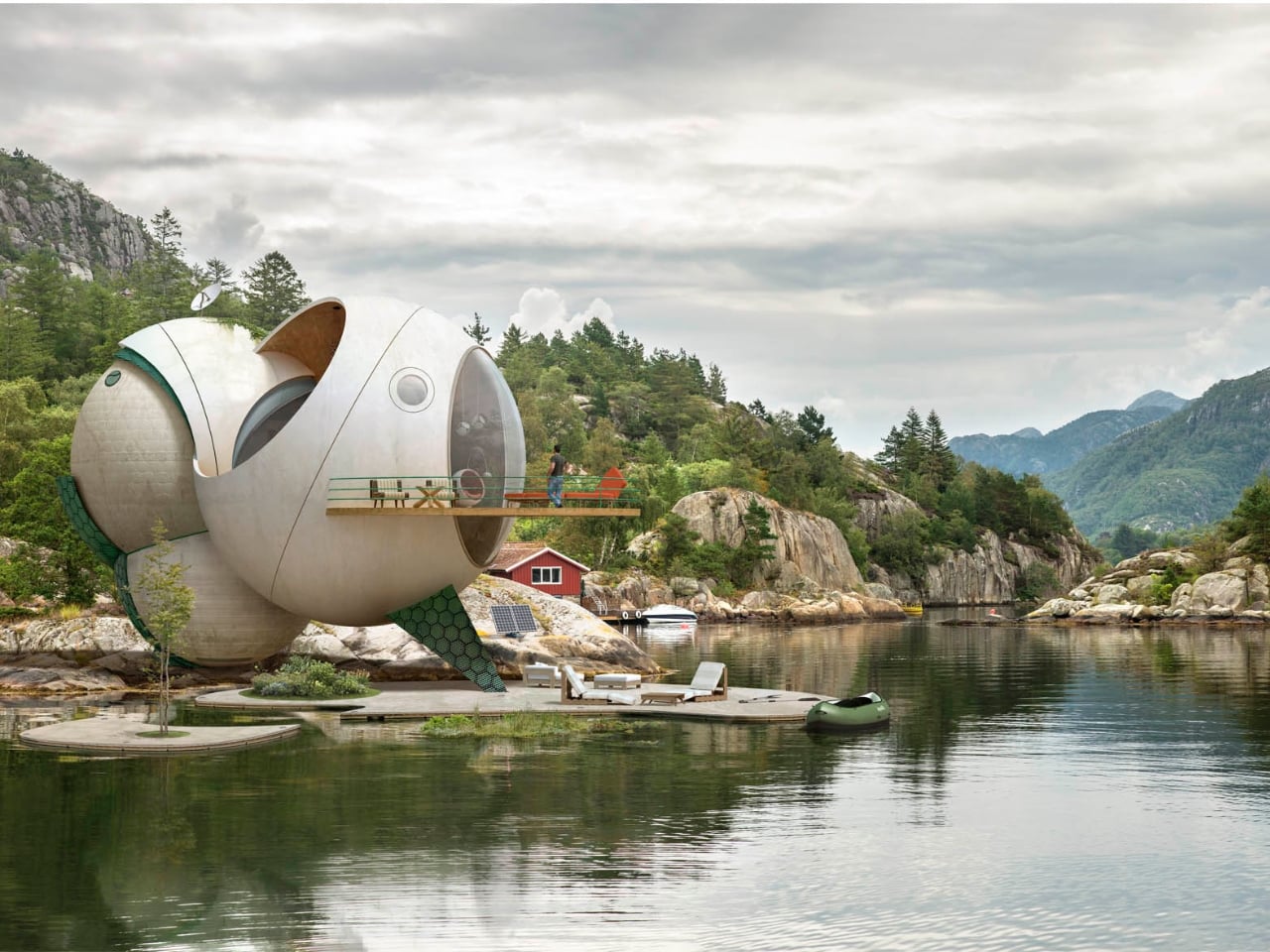
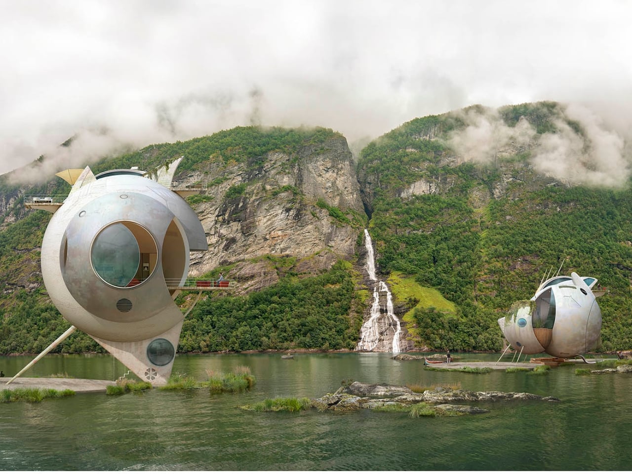
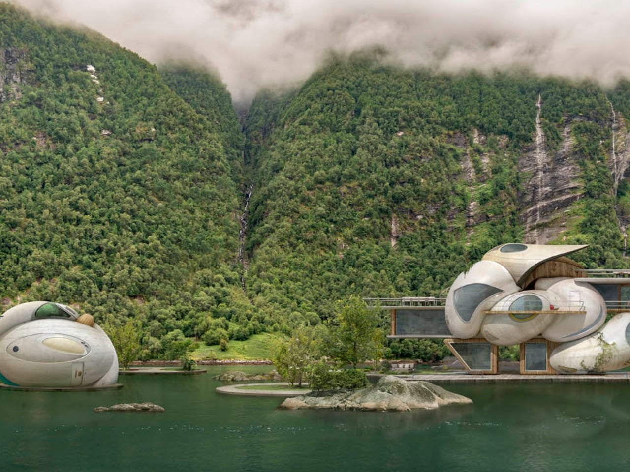
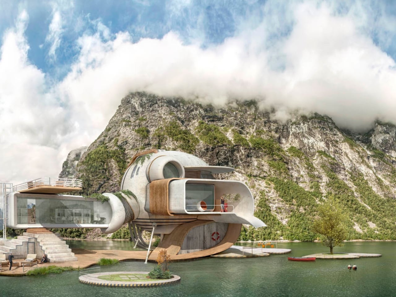
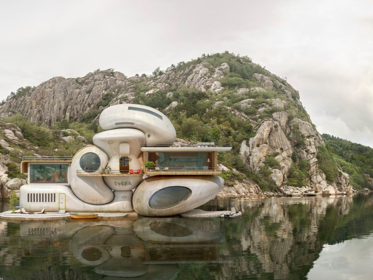
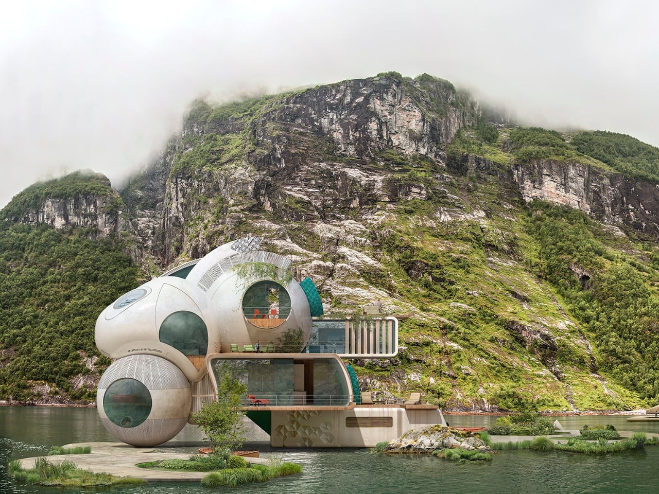
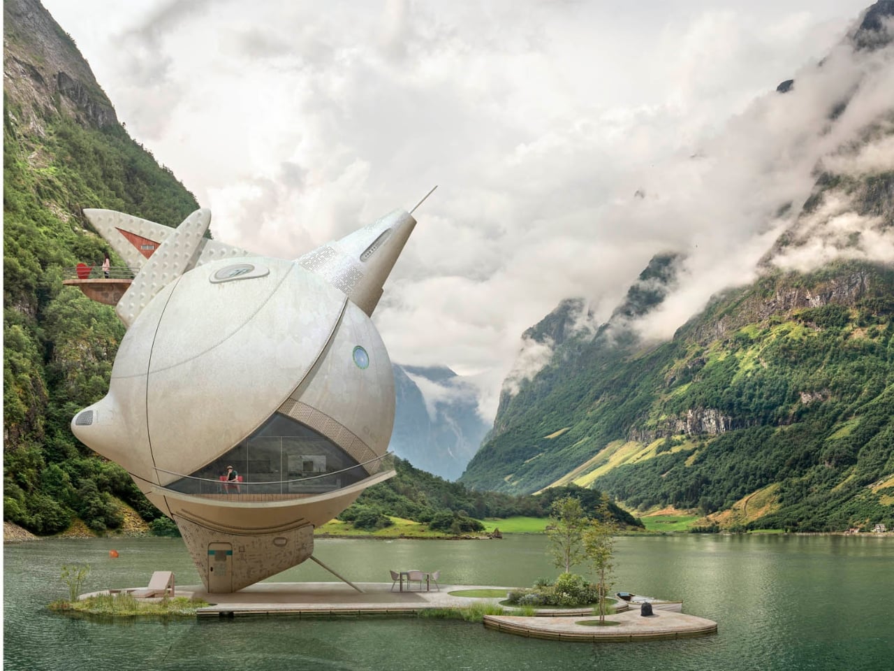
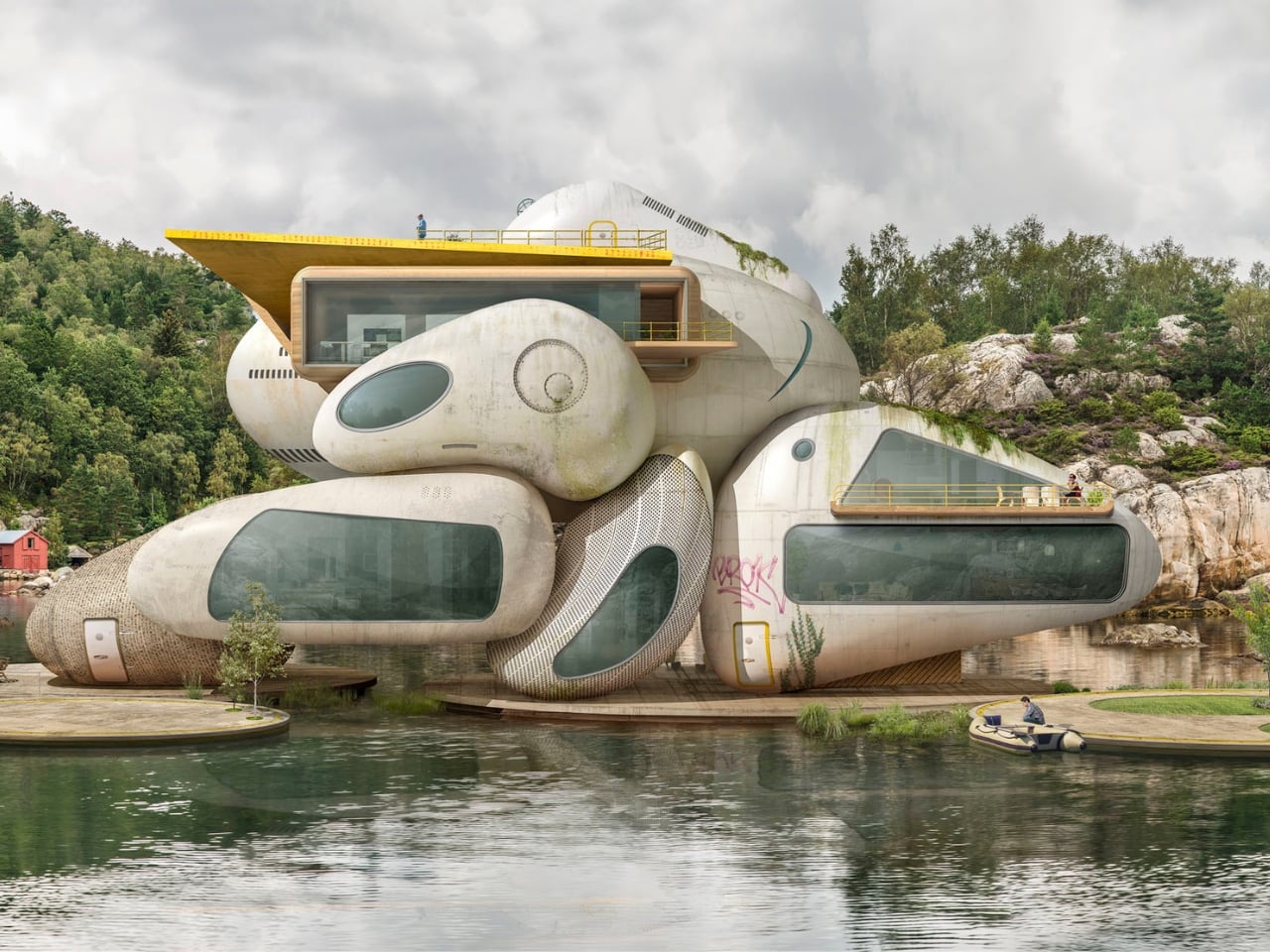
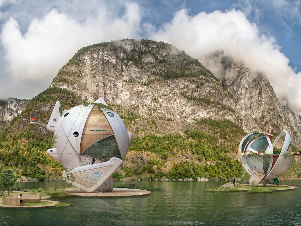
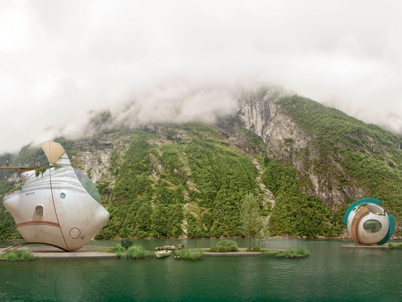
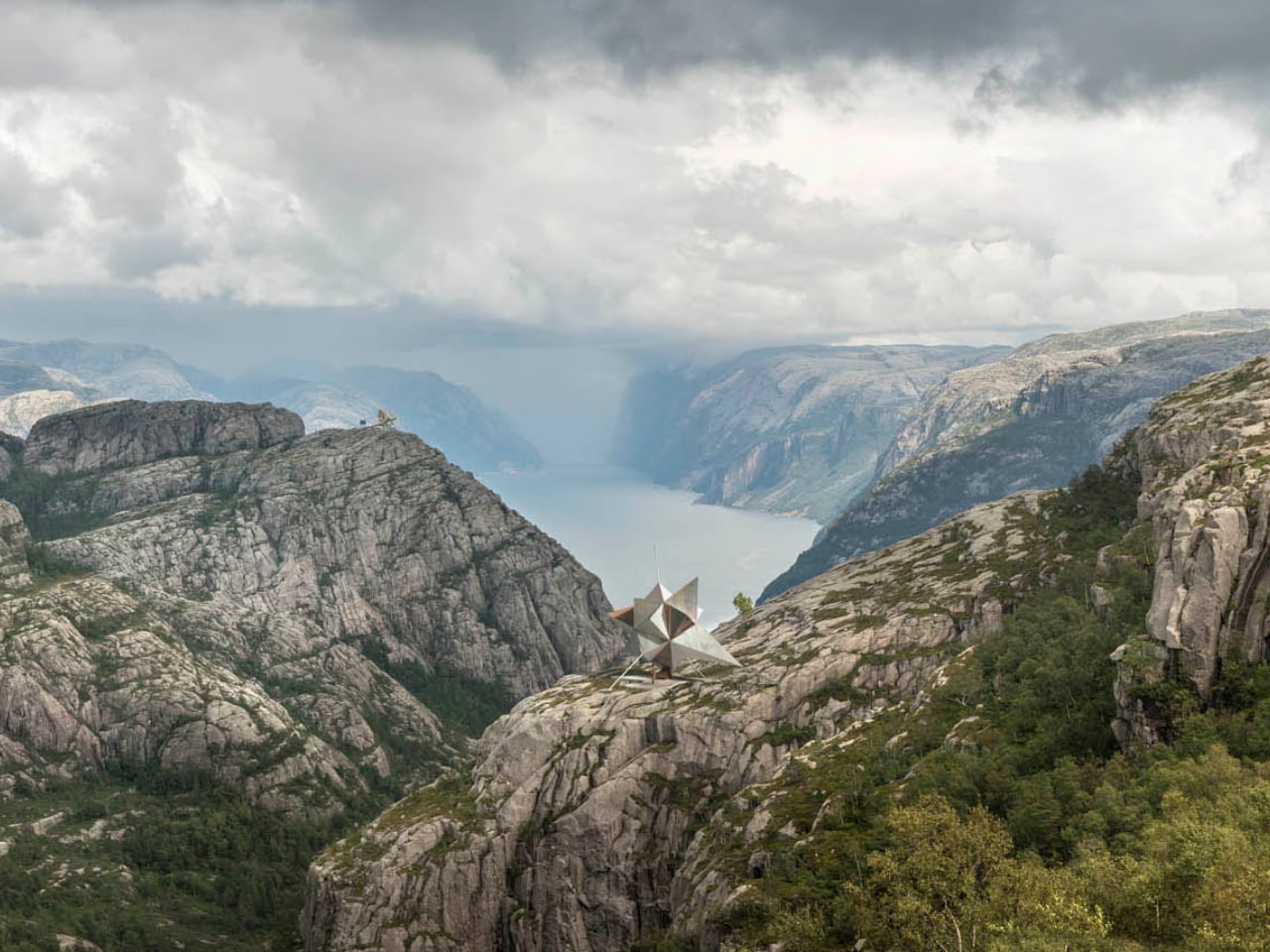
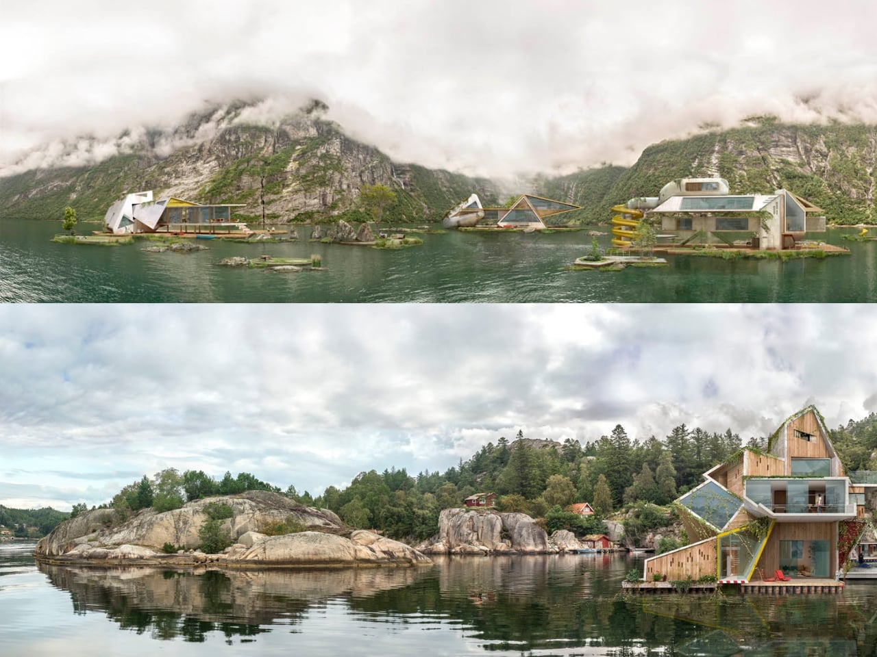
Spanish artist Dionisio González clearly felt it too. His series, Wittgenstein’s Cabin, takes that founding image as both premise and provocation. González works across photography, digital manipulation, and what you might call architectural fiction, and his practice has long focused on reimagining how people live in extreme or overlooked conditions. For this project, he envisioned a cluster of amphibious dwellings set directly on the Norwegian fjords, floating on artificial islands against the same vast and indifferent landscape that Wittgenstein once sought out. They are not proposals for construction. They are something closer to visual arguments.

The structures themselves are striking. Made primarily of weathered metal, they feel industrial and oddly organic at the same time. Each one has its own distinct form, but they share a visual family resemblance, like siblings built from the same strange blueprint. They sit on the water in ways that feel simultaneously precarious and deliberate. González has spoken about being drawn to “the confrontation, the frontality” of Wittgenstein’s original cabin with the fjord. For Wittgenstein, the water wasn’t backdrop. It was the actual condition of his solitude. González takes that thought and makes it architectural.

The project keeps pulling me back to one of the more persistent tensions in design conversation: the relationship between isolation and creative thought. The idea that you need to escape in order to think clearly is ancient, but it feels newly charged when genuine silence has become a luxury most people can’t really access. González frames philosophy itself as an “amphibian endeavour,” something that lives between the stable and the fluid, the settled and the speculative. His floating cabins give that metaphor a shape and a weight. They’re not quite houses. They’re more like habitable hypotheses.

None of these structures are intended to be built, and I think that’s precisely where their power lies. Architectural fiction as a practice asks you to sit with ideas rather than just objects. It creates room to think seriously about how we want to inhabit the world, even when the answer falls outside what’s commercially or technically possible. González’s designs carry a visual seriousness that separates them from pure fantasy, a quality that makes them feel genuinely worth spending time with.

Wittgenstein wanted to disappear from the world in order to think more clearly inside it. González takes that same instinct and places it on open water, wrapped in oxidized metal, asking what solitude actually looks like when landscape isn’t just a setting but a condition of being. The answer he offers is beautiful and strange, which feels entirely fitting for a project named after one of the twentieth century’s most beautiful and strange minds.

The post The Philosopher Wanted Silence. The Artist Built on Water. first appeared on Yanko Design.
A Restaurant in China Where Wood Behaves Like a Forest

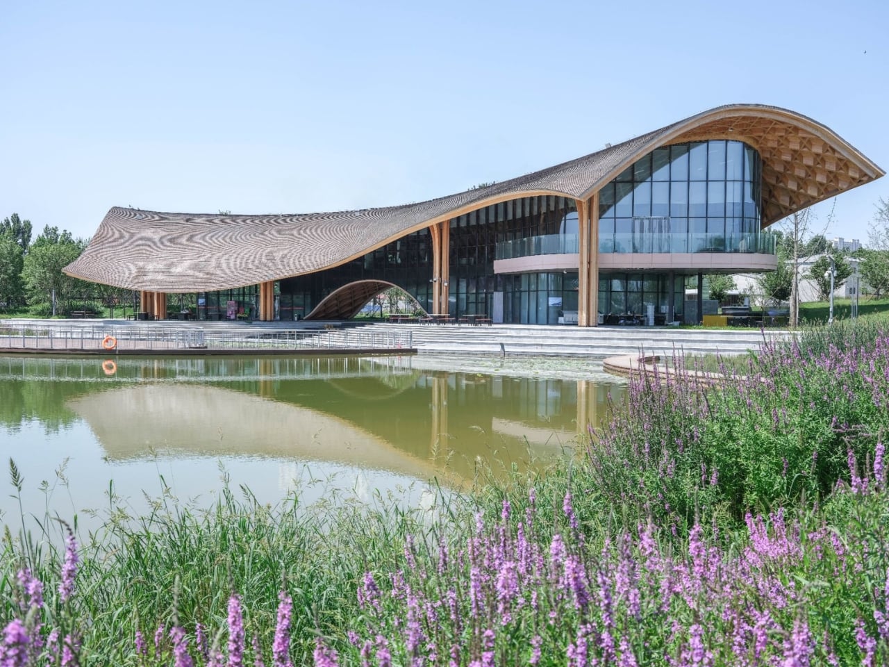
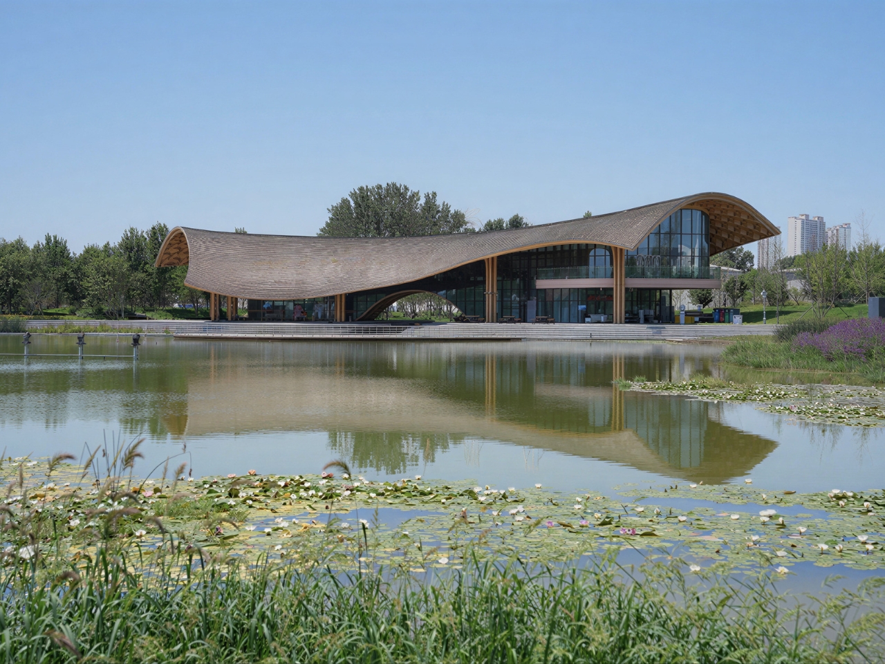
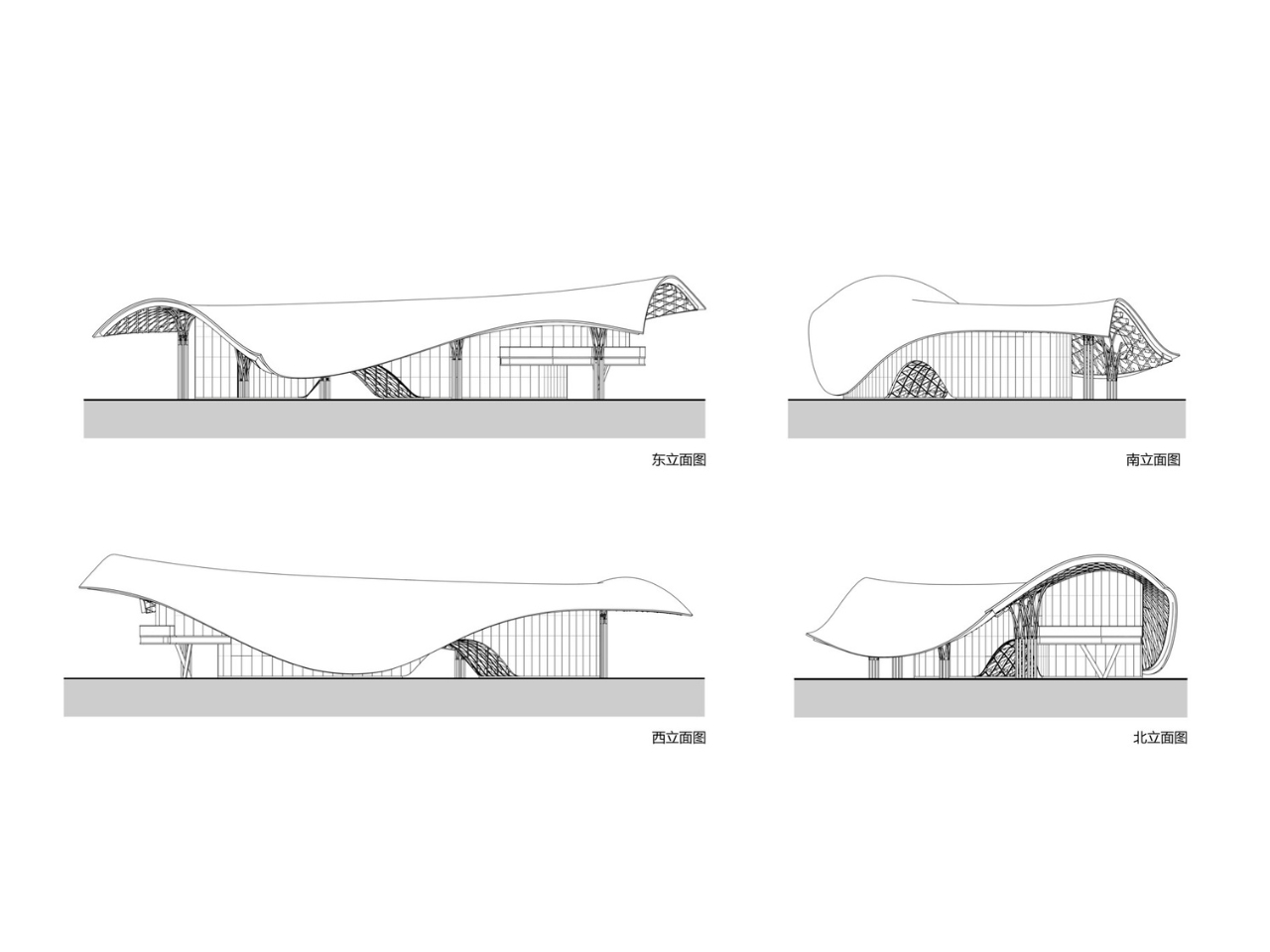
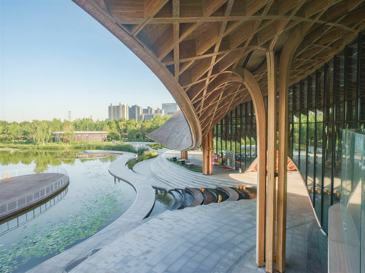
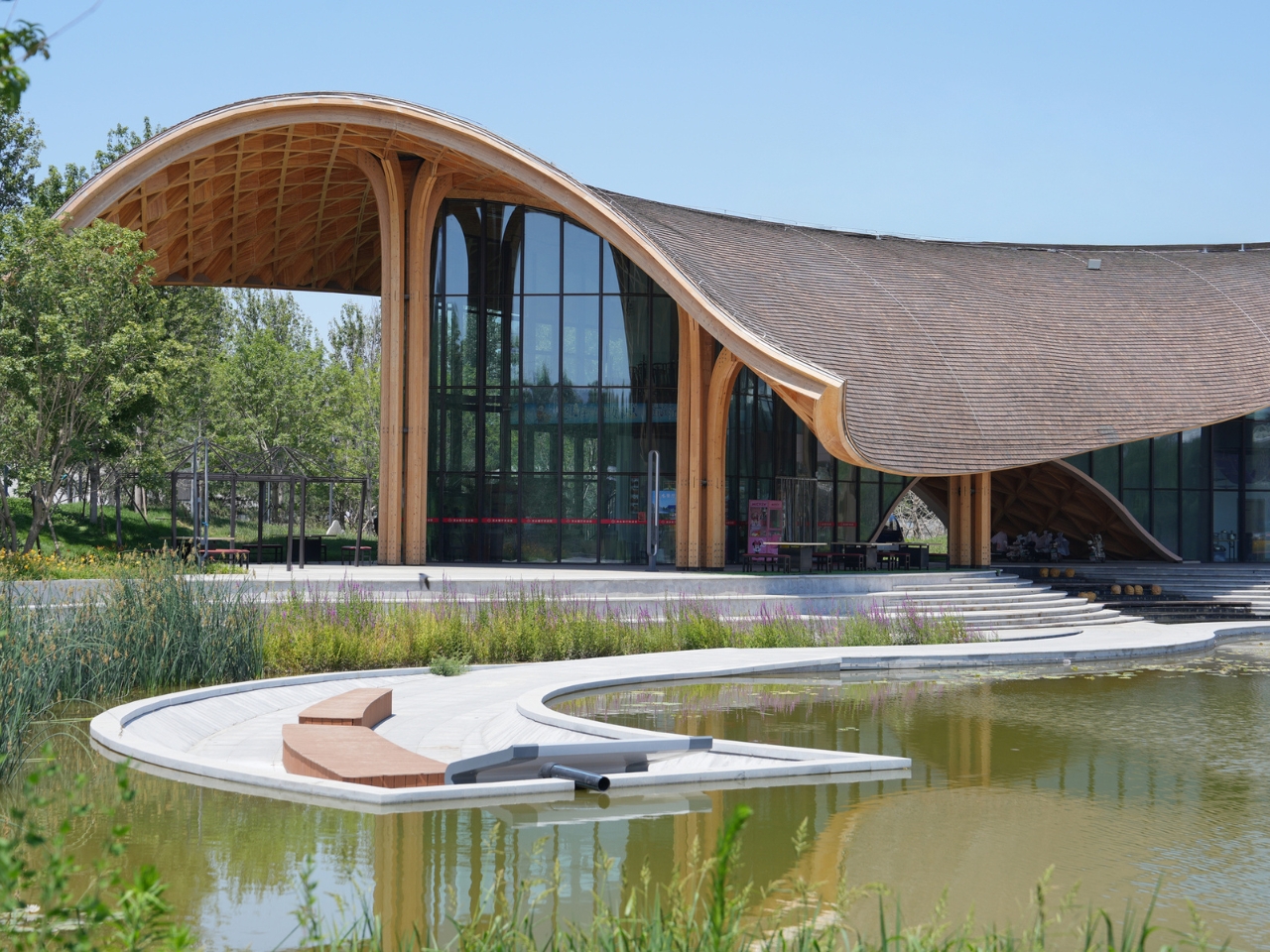
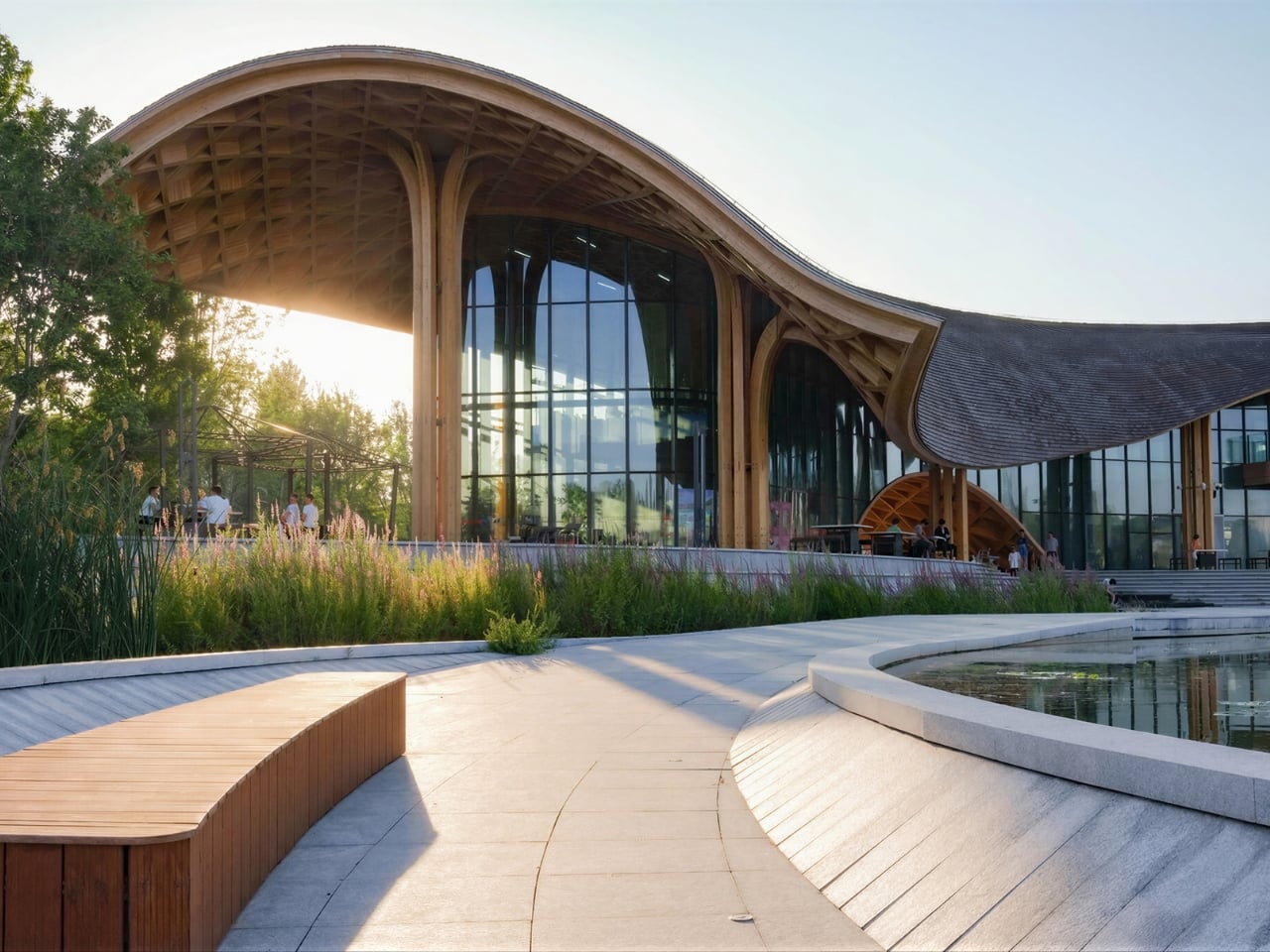
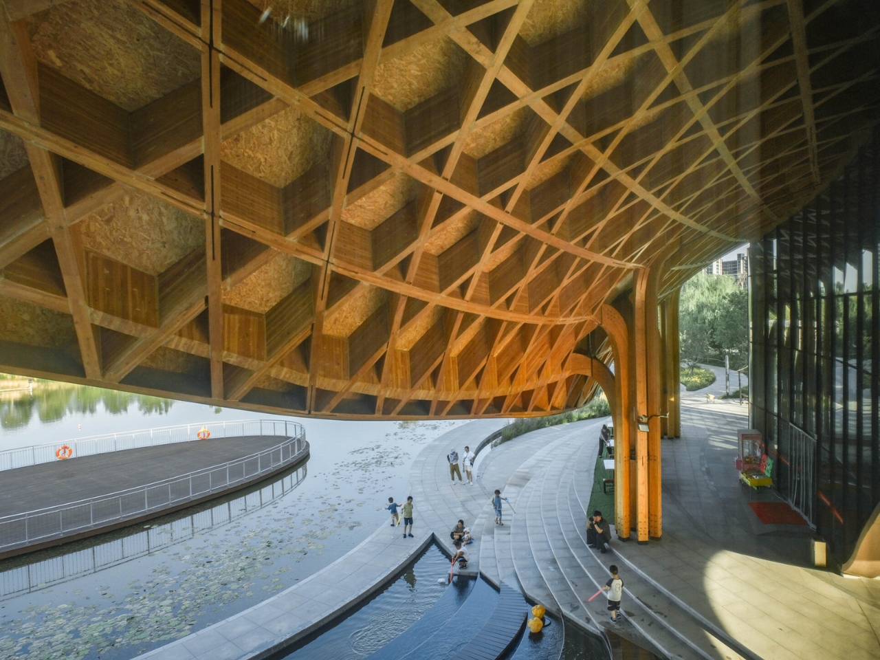
The first thing you notice about the Lakeside Restaurant at Silk Road Friendship Park in Dingzhou, China, is that the building doesn’t announce itself. It doesn’t shout or compete. It simply arrives at the water’s edge like it’s always been there, wooden columns branching upward like trees that never needed permission to grow.

Completed in 2025 by THAD SUP Atelier, the restaurant sits within a cultural park in Hebei Province, a place layered with historical significance tied to Silk Road trade routes. The building spans 2,400 square meters and was designed by principal architects Song Yehao and Chen Xiaojuan. But the numbers don’t explain why this project feels so quietly extraordinary. The design does.

Designer: THAD SUP Atelier (photos by Xiaoqing Guan, Xinxhing Chen)

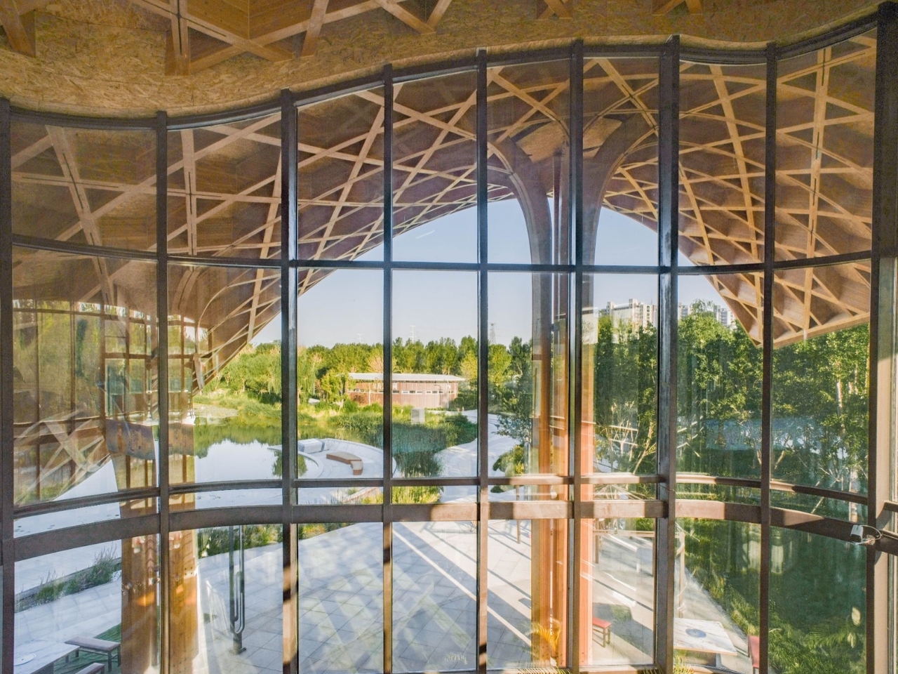
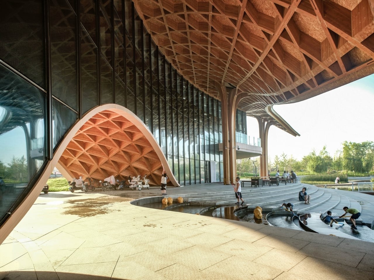
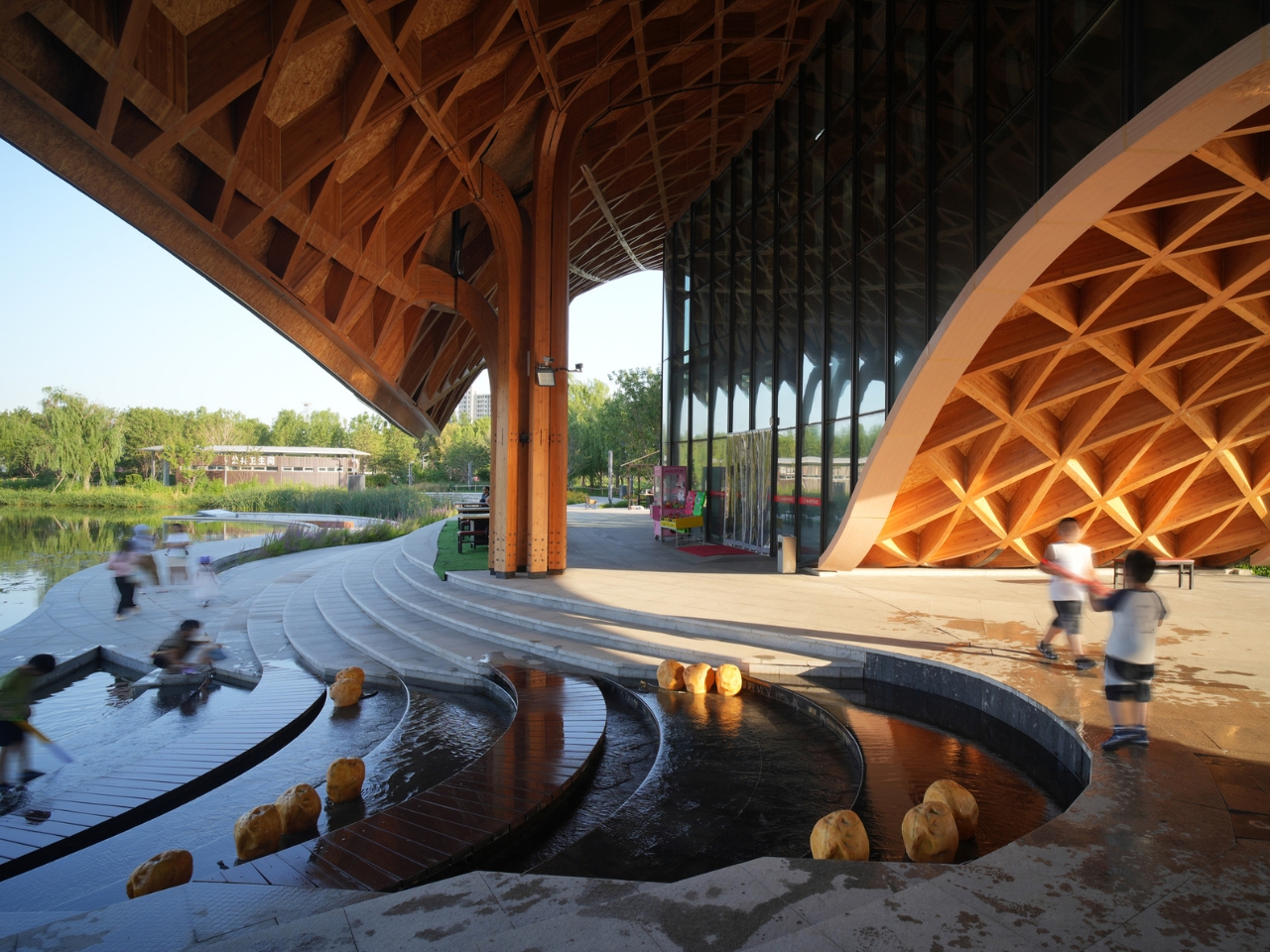
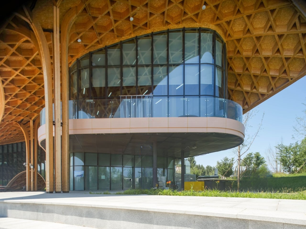
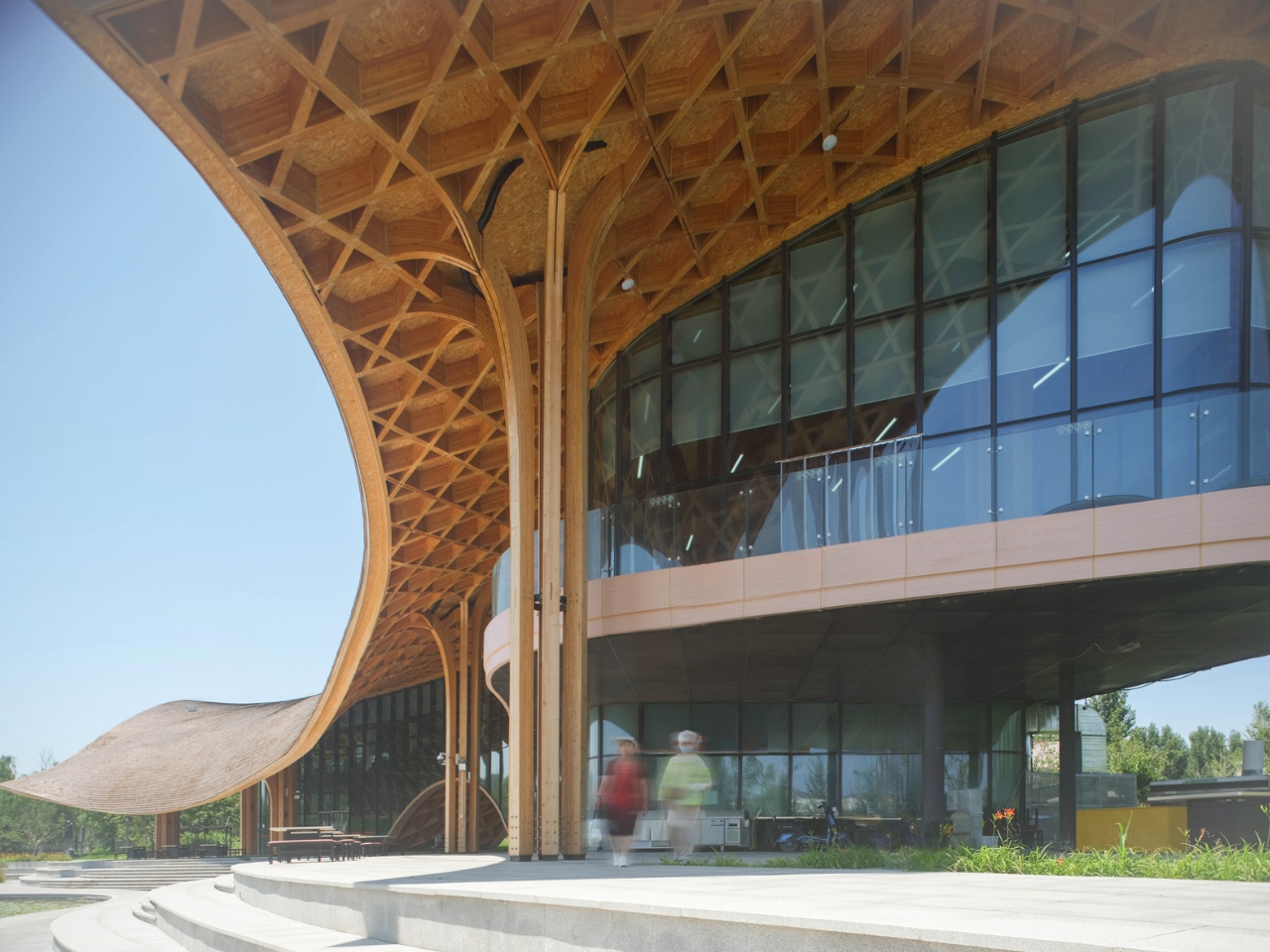
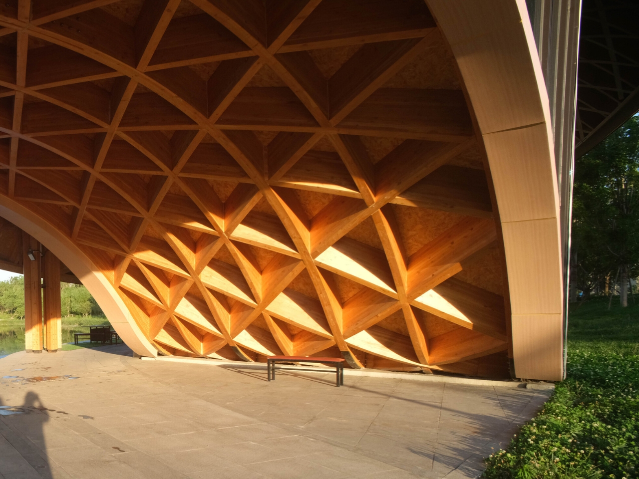
The central concept is deceptively simple: the building takes its visual language from the forest canopy above and the lake below. Blossoming wooden columns rise from the ground and fan out to meet a flowing roof structure, all designed as one integrated system. The result looks less like constructed architecture and more like something that grew out of the ground and arched over the water because it felt like the right thing to do.

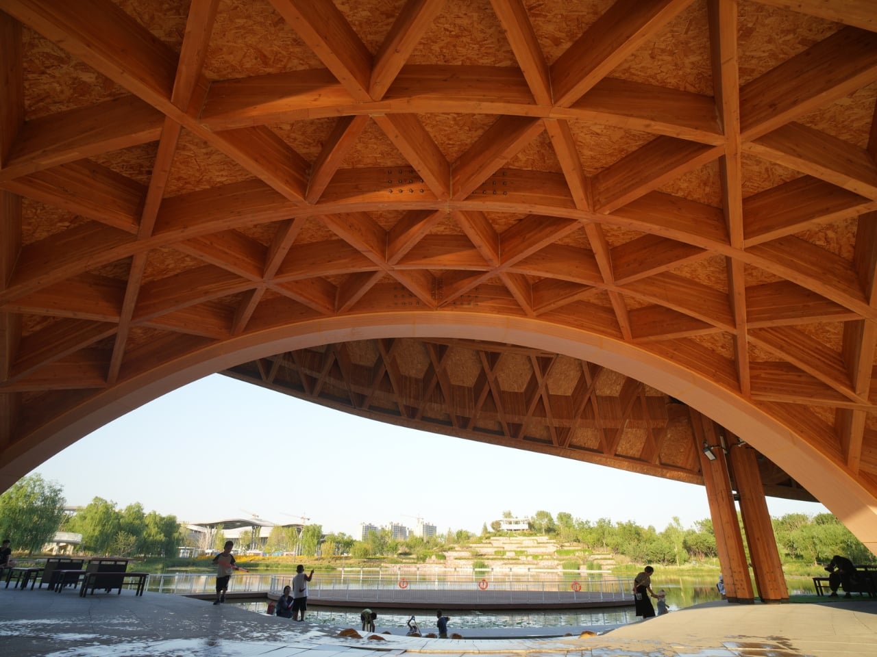
What makes this possible, practically speaking, is the fusion of digital fabrication and traditional woodworking. The team used modern glued laminated timber and relied on digital industrial prefabrication for precise form control, while simultaneously optimizing each wooden component’s dimensions through digital tools to preserve the handcrafted quality you can feel at eye level. The idea that a process this technically demanding could produce something this warm and tactile is one of the better arguments for what design technology can actually do when it’s used thoughtfully rather than just to show off.

Functionally, the layout is equally deliberate. The building slopes gently from south to north along the shoreline. The west facade, facing the main park road, is relatively closed, concealing the kitchen and back-of-house areas from view. But that restraint on the west side is there for a reason: it channels visitors toward a central arch opening on the ground floor. You pass through it, and suddenly you’re standing at the water’s edge. The progression is intentional, moving from arrival to view to lingering, and it works the way good spatial storytelling always does.

Three sides of the building open toward the lake, and the overhanging roof creates layered corridor spaces that shift and change as you move through them. During the day, the wooden structure casts shadows across the glass curtain wall, projecting a forest canopy effect that bleeds into the interior. At night, when the interior lights come on, the boundary between inside and outside softens, and the full curve of the wooden structure becomes luminous. It’s the kind of building that earns a second visit just to see it at different hours.

The choice of wood throughout isn’t arbitrary or just aesthetic. Wood is warm where glass is cold, organic where steel is industrial, and in a restaurant, those qualities matter in ways that aren’t always consciously named. Diners feel the difference even if they can’t articulate it. The building creates an environment that is simultaneously impressive and approachable, which is a difficult balance to strike and one that a lot of high-design spaces fail to achieve.

THAD SUP Atelier has built a reputation for projects that sit thoughtfully within their landscape, and this one continues that thread. The Silk Road Friendship Park is a place carrying weight and cultural meaning. Dropping a flashy, look-at-me building into that context would have been easy. Instead, the team chose restraint, materiality, and sequence. The restaurant doesn’t dominate the park. It listens to it.

Architecture that knows when to stay quiet tends to be the kind that stays with you. This is one of those buildings. Not because it announces itself, but because the moment you move through it toward the lake and look back at the way light plays through those wooden branches, you understand exactly what it was trying to say.

The post A Restaurant in China Where Wood Behaves Like a Forest first appeared on Yanko Design.
The Brazilian House That Turns a Hillside Into a Feature

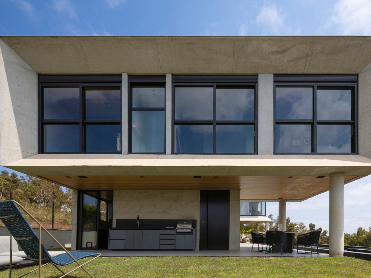
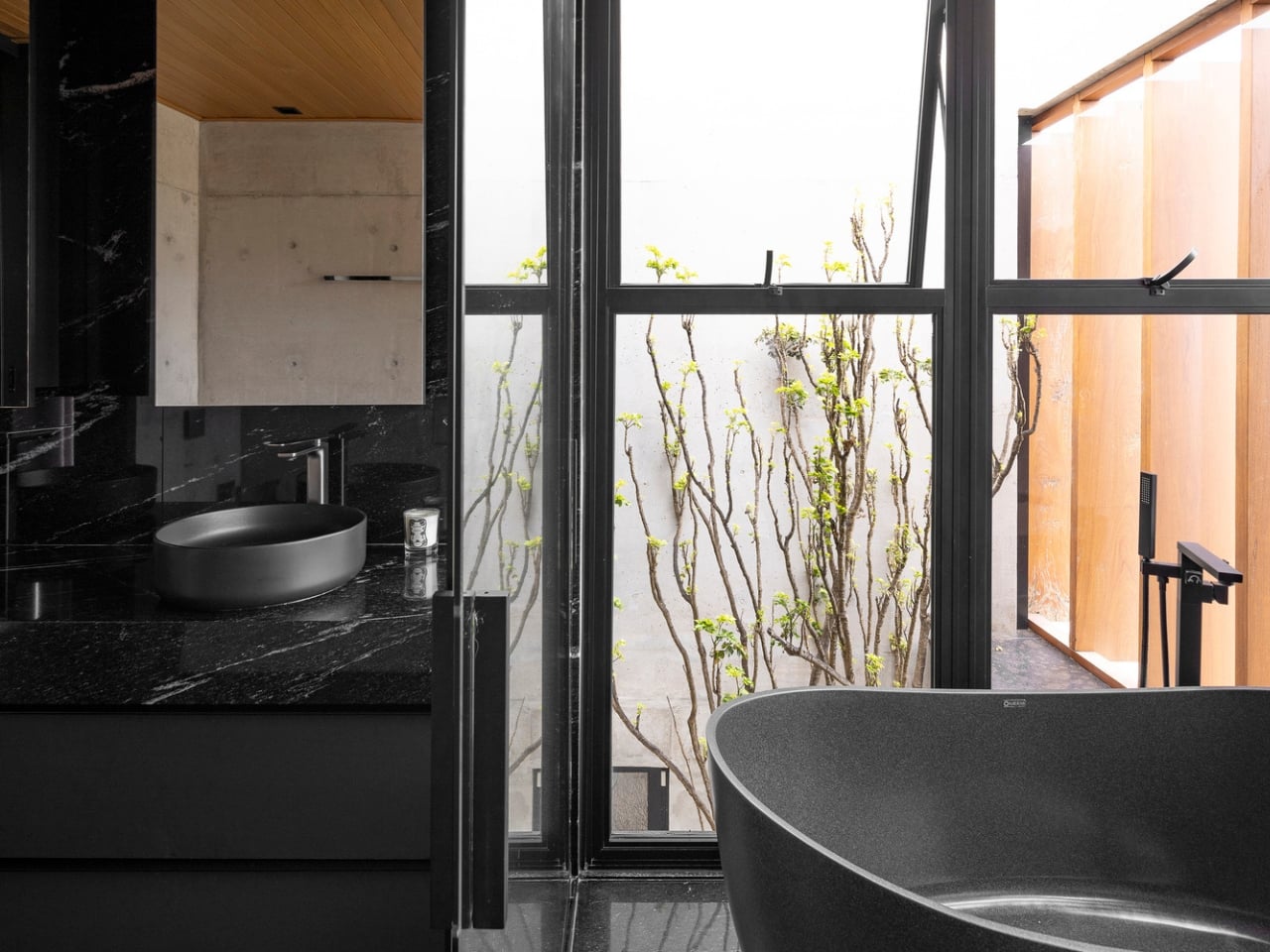
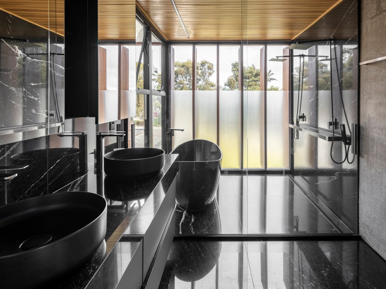
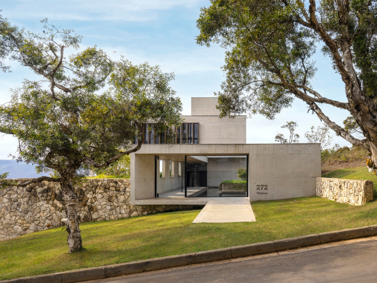
Most architects, when faced with a steeply sloping lot, treat the terrain like a problem to solve. Something to flatten, fill, or work around. Frederico Bicalho Arquitetura did the opposite with GM House, a private residence tucked into the Condomínio Serra dos Manacás in Minas Gerais, Brazil. They treated the hillside not as an obstacle but as the entire point. The result is a home that feels like it was always meant to be here, even though the site itself is anything but straightforward.

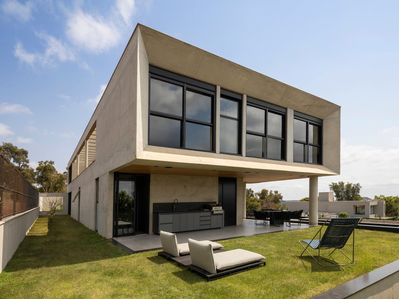
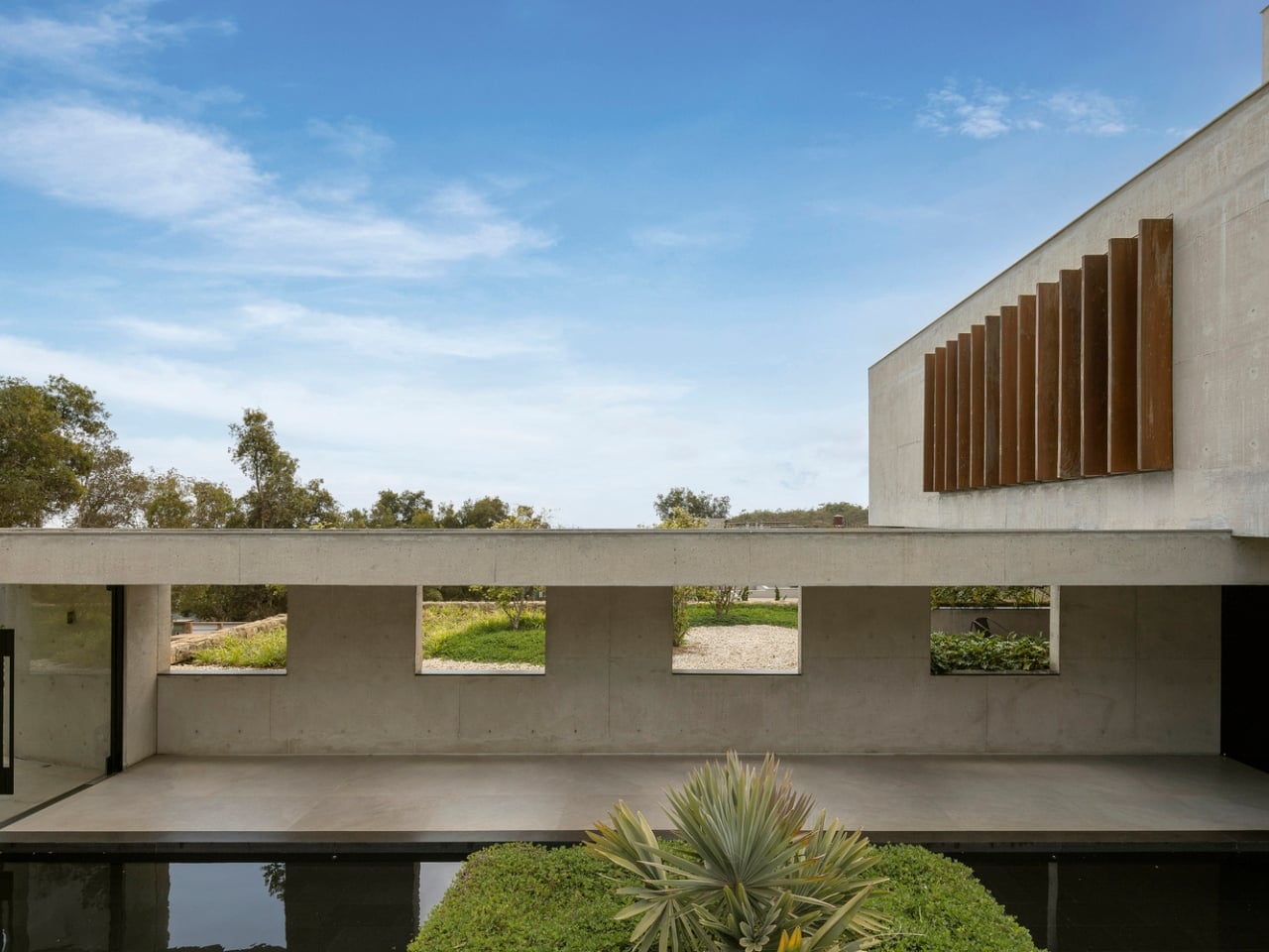
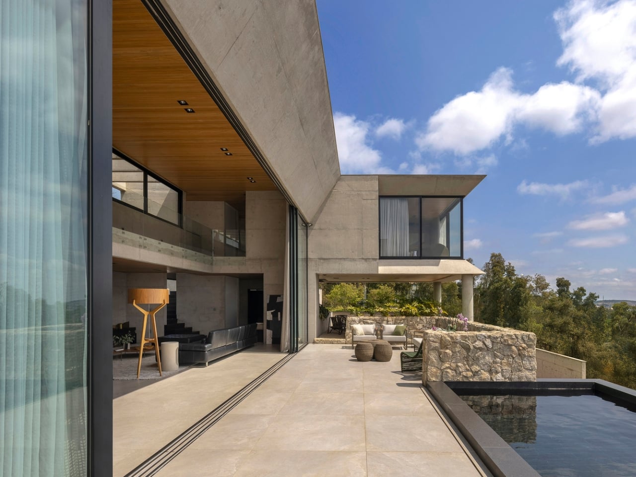
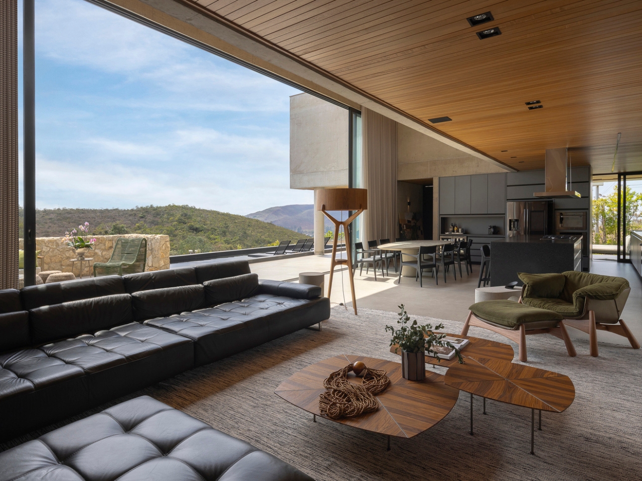
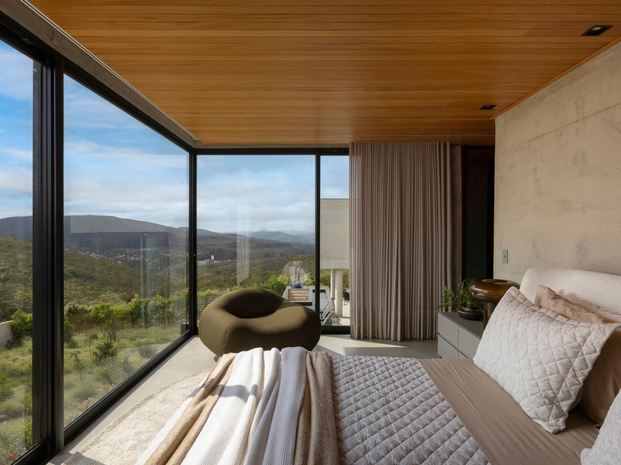
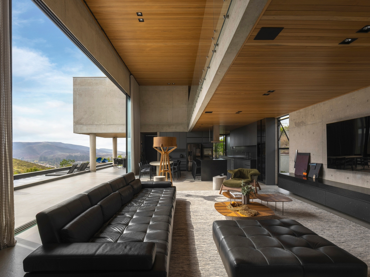
The design follows a longitudinal layout, which makes complete sense once you understand what the architects were trying to accomplish. By stretching the house along the slope rather than fighting it, the building naturally orients itself toward the mountain views in the valley below. Privacy from neighboring constructions is built right into the plan, not bolted on as an afterthought. The higher terrain works as a natural back wall, shielding the house from the afternoon western sun and any visual intrusion from that side. Meanwhile, the valley-facing side opens up completely, taking advantage of the best light and natural cross-ventilation. It’s the kind of thinking that’s so logical it almost seems obvious, until you realize how rarely anyone actually does it.

Designer: Frederico Bicalho Arquitetura (photos by Jomar Bragança)

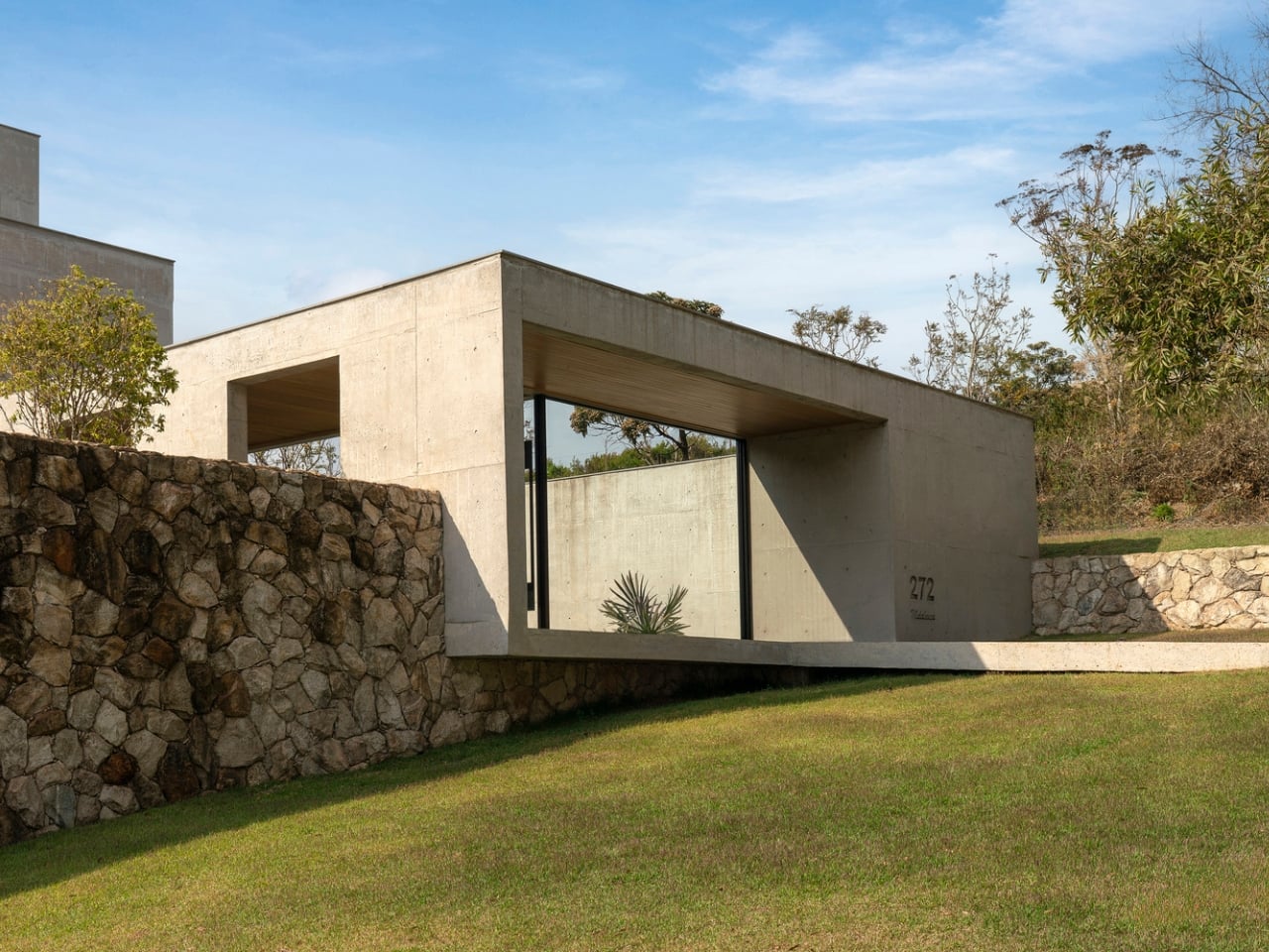
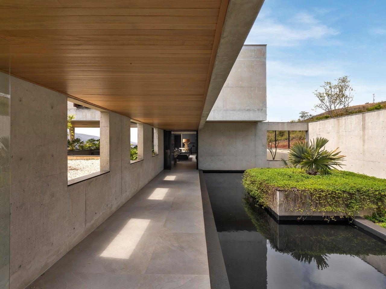
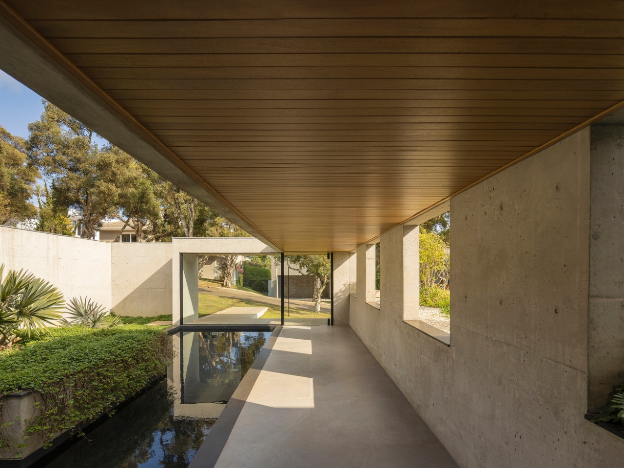
You arrive at GM House via a path that runs directly over a reflecting pool. That’s a genuinely theatrical choice, and one that immediately signals how much this project cares about sequence and experience. Walking toward your own front door over a body of water sets a tone. It slows you down. It makes you look. And it tells you, before you’ve even stepped inside, that this is a house designed with intention.

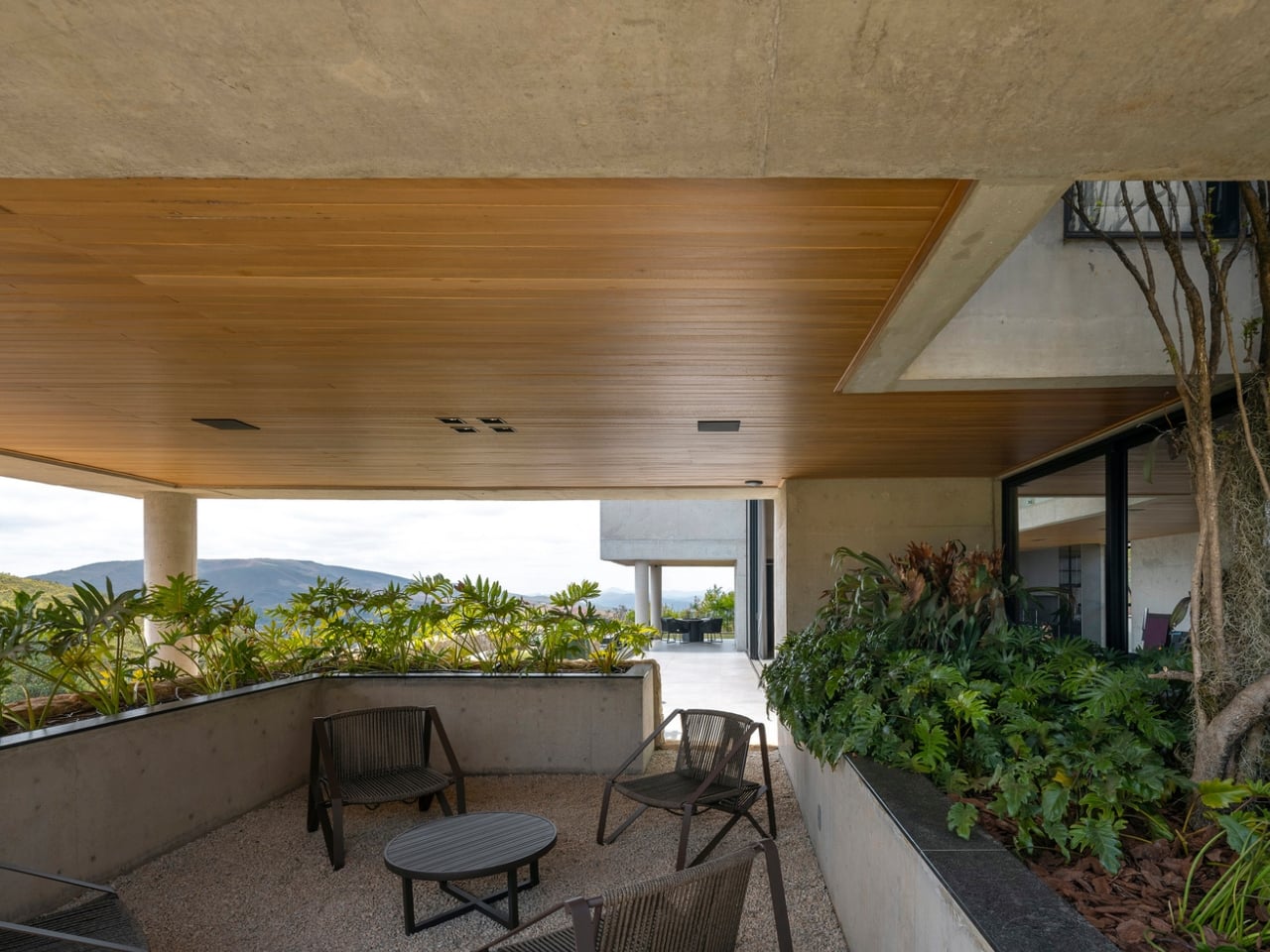
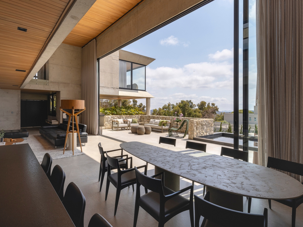
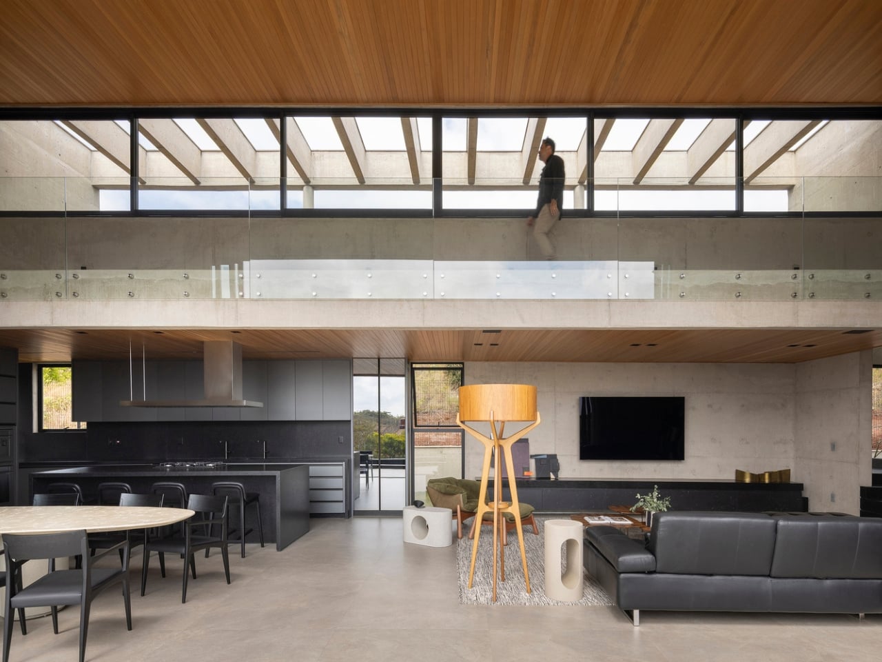
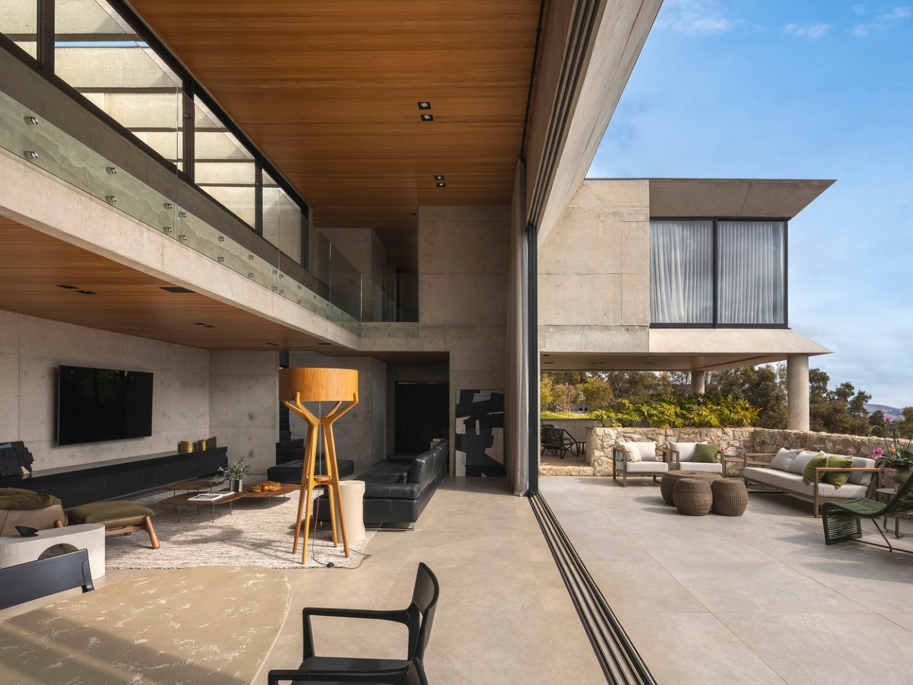
Once you’re in, the layout works in levels. The social areas sit on an intermediate floor, connecting directly to a covered veranda and the pool through large expanses of glass. The interior and exterior don’t just coexist here, they blur into each other. On the upper floor, the bedrooms are arranged in two separate blocks linked by a walkway, every single one of them oriented toward the horizon. Waking up to a mountain view is not incidental in this house. It’s the whole brief.

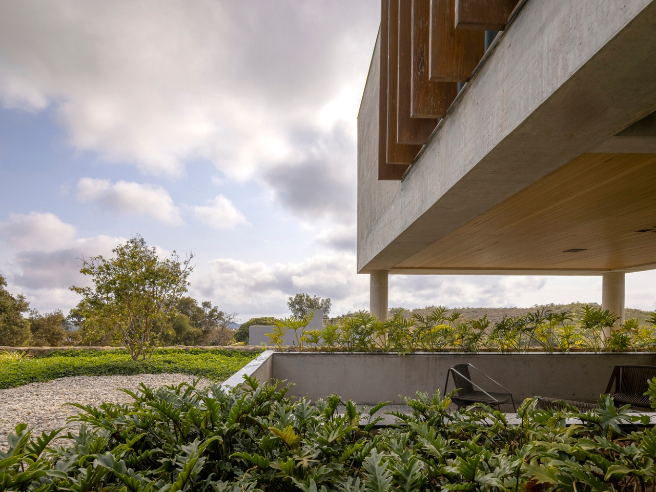
The material palette is deliberately restrained and, I’d argue, quite brave for a private home. Exposed concrete is the primary element throughout, chosen for its texture and durability against the bright red earth that’s characteristic of this part of Brazil. Concrete has a complicated reputation in residential design. It tends to read as cold or institutional when it’s done without care. Here, it reads as something else entirely. The rawness of the material feels honest in this landscape. It doesn’t try to mimic anything softer or warmer. It trusts itself.

That confidence is really what defines this project. Frederico Bicalho Arquitetura didn’t reach for novelty or spectacle. They made a series of clear decisions rooted in climate, topography, and the experience of moving through a space. The reflecting pool at the entrance. The closed upper back wall. The glass-opened lower front. The walkway connecting the bedroom blocks. Each move is precise and purposeful, and the cumulative effect is a house that feels simultaneously monumental and quietly livable.

I keep returning to the photographs by Jomar Bragança, because they do something that’s surprisingly hard to do with architecture photography: they make you feel the site. You understand the slope, the heat, the red earth, the valley stretching out below. The light in these images isn’t just flattering, it’s narrative. You get a real sense of why this house sits exactly where it does and why it faces exactly the way it faces.

Brazilian contemporary architecture has been having a genuine moment internationally, and projects like GM House make it easy to understand why. It’s not about following a global trend or speaking a universal modernist language. It’s about reading a specific piece of land and responding to it with clarity and confidence. That’s harder than it looks. And when it’s done right, it’s very hard to look away.

The post The Brazilian House That Turns a Hillside Into a Feature first appeared on Yanko Design.
Mud, Microbes, and the 46 m² Lab the Amazon Needed

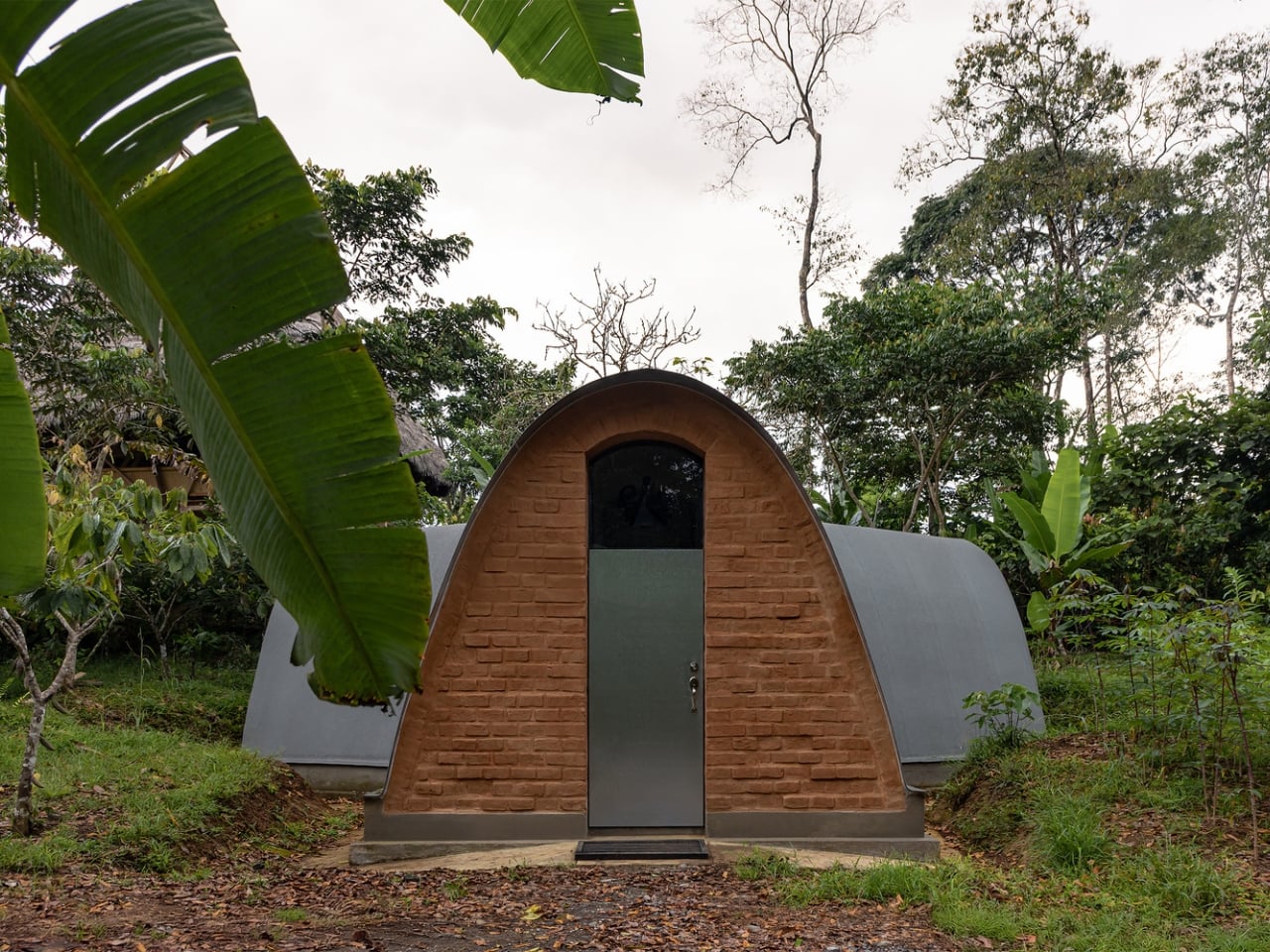
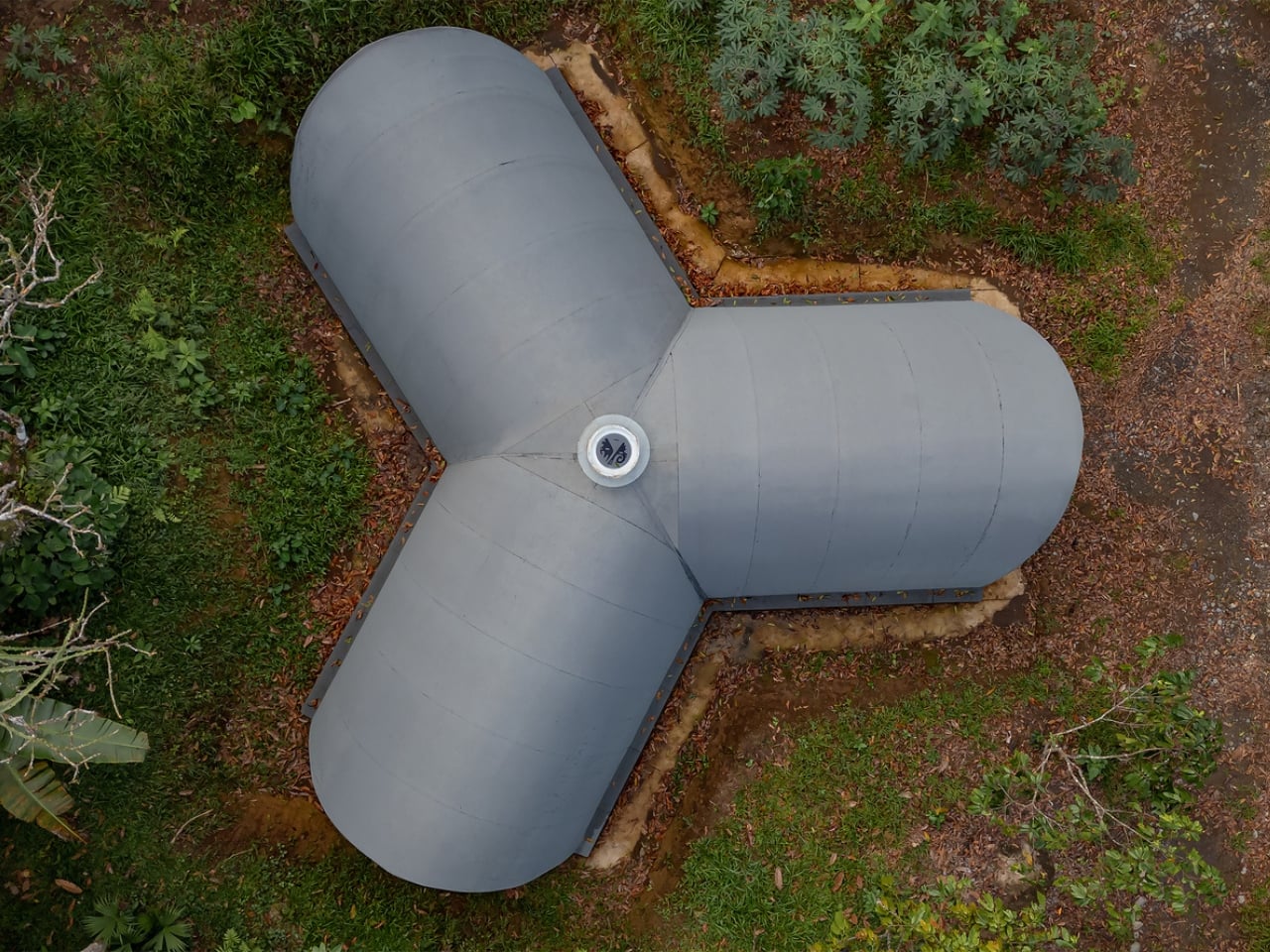
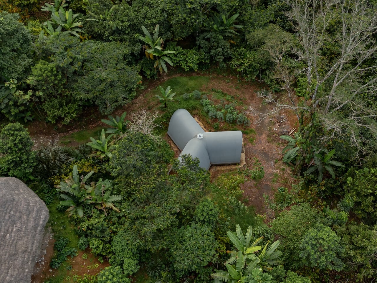
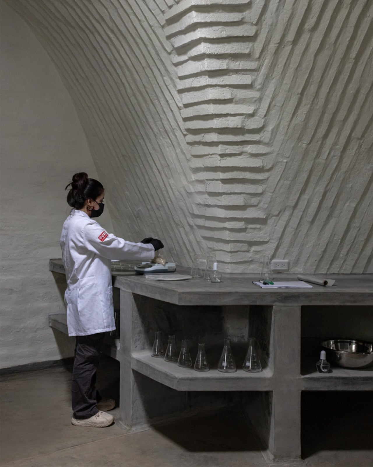
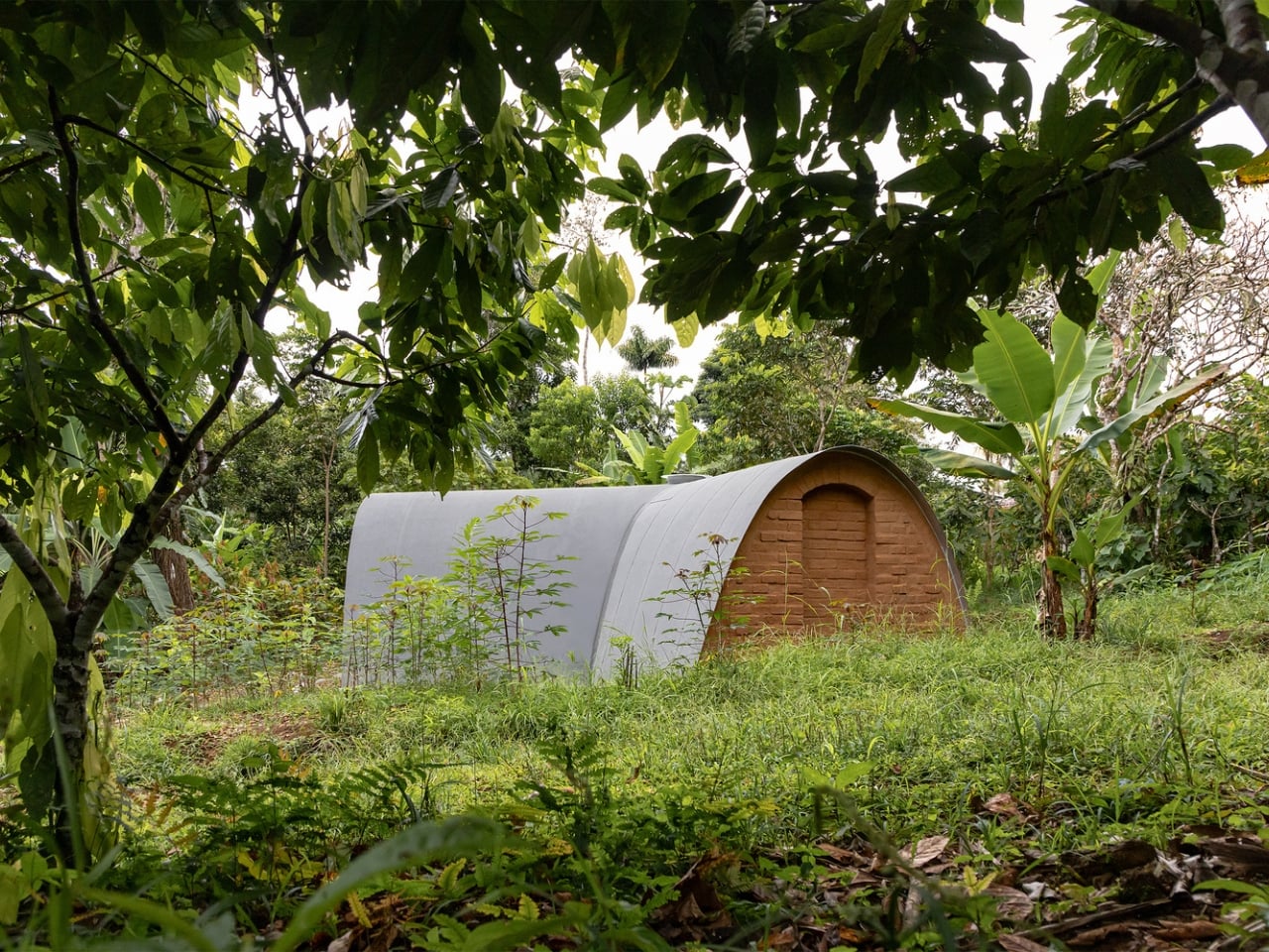
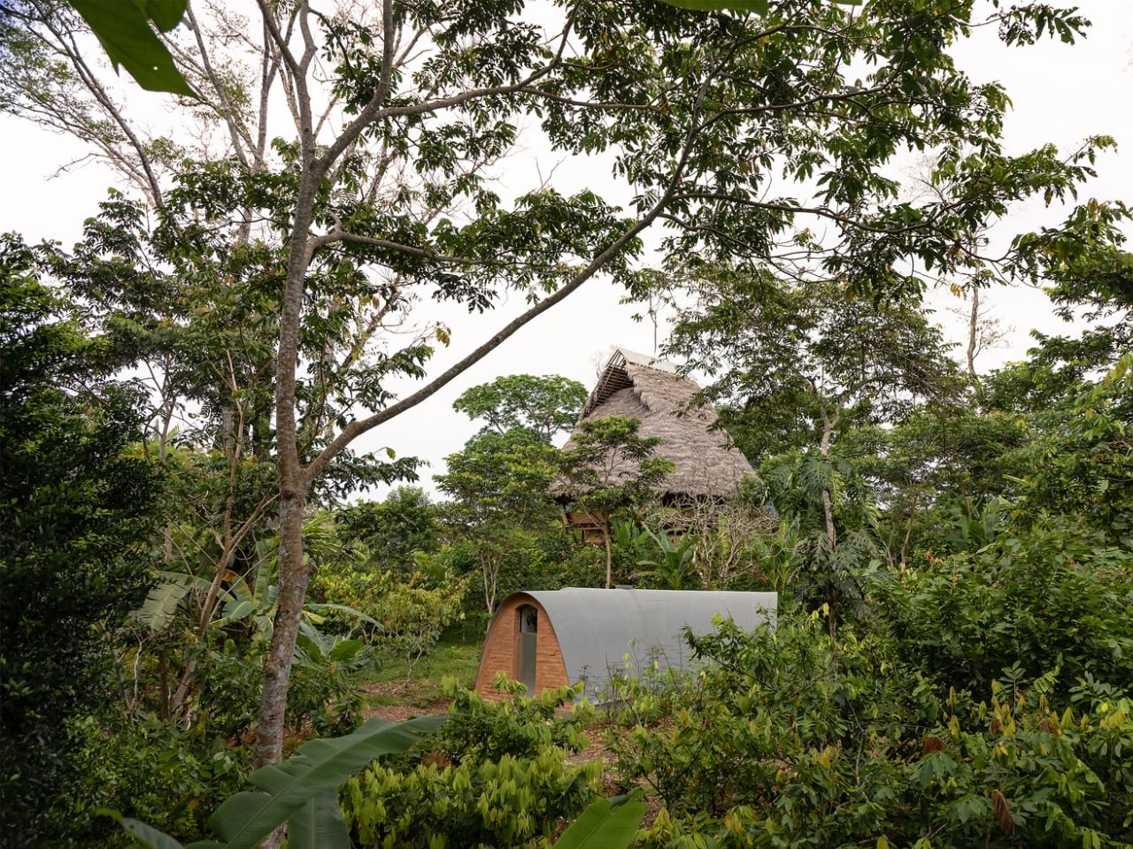
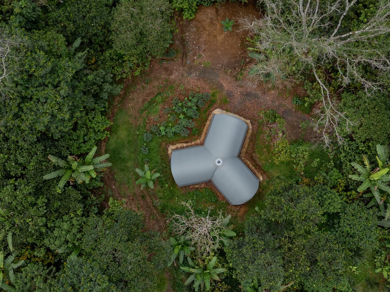
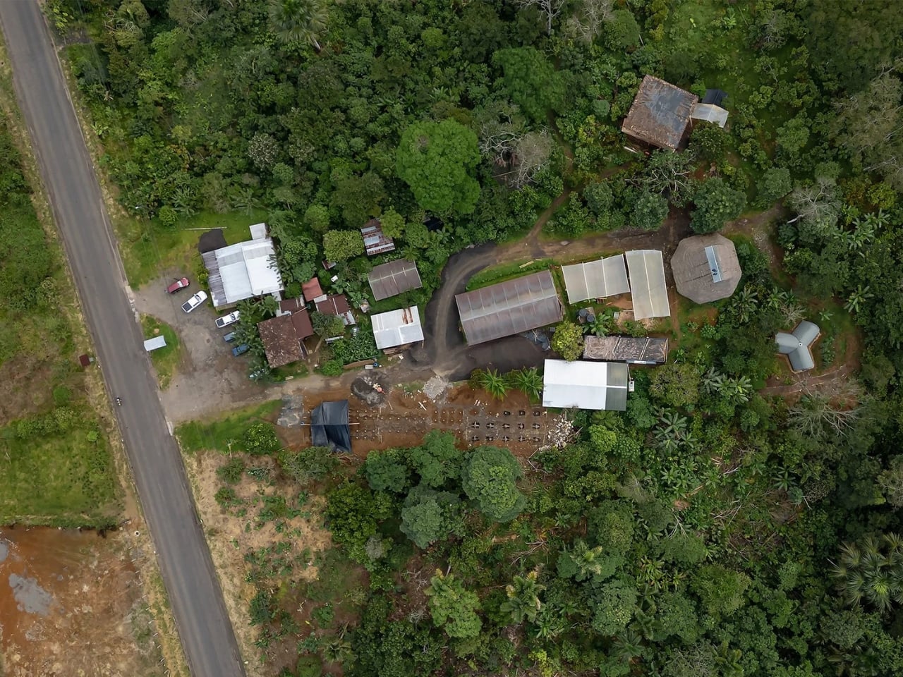
Most of us picture a laboratory as a sleek, sterile box of steel and glass perched on a university campus or inside some tech park. The Witoca Laboratory in Ecuador is none of those things. Built from adobe, shaped like a three-pointed star, and sitting quietly inside the buffer zone of the Sumaco Biosphere Reserve in the Ecuadorian Amazon, it looks less like a lab and more like something that grew out of the ground. Which, in a way, it did.

The building was designed by Ecuadorian studio Al Borde Arquitectos and completed in February 2025 in Huaticocha, a remote community in the Provincia de Orellana. At just 46 square metres (about 495 square feet), it is compact to the point of being almost modest. But modesty is somewhat deceptive here, because the thinking behind it is anything but small.

Designer: Al Borde

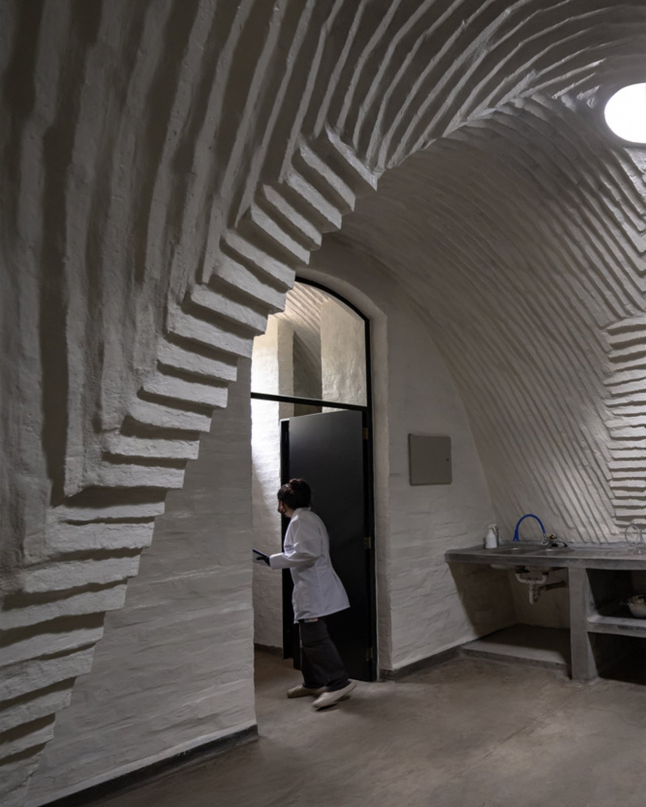
The Witoca community, which gives the lab its name, has been working to protect the Amazon’s coffee and cocoa farming from pests. Rather than reaching for chemical pesticides, they have gone in the opposite direction, cultivating antagonistic microorganisms that naturally discourage pest damage. The lab is where that cultivation happens. It is a biosecure environment, meaning it is fully sealed to prevent contamination, and every design decision feeds into that purpose, from its vaulted adobe walls to its airtight interior.

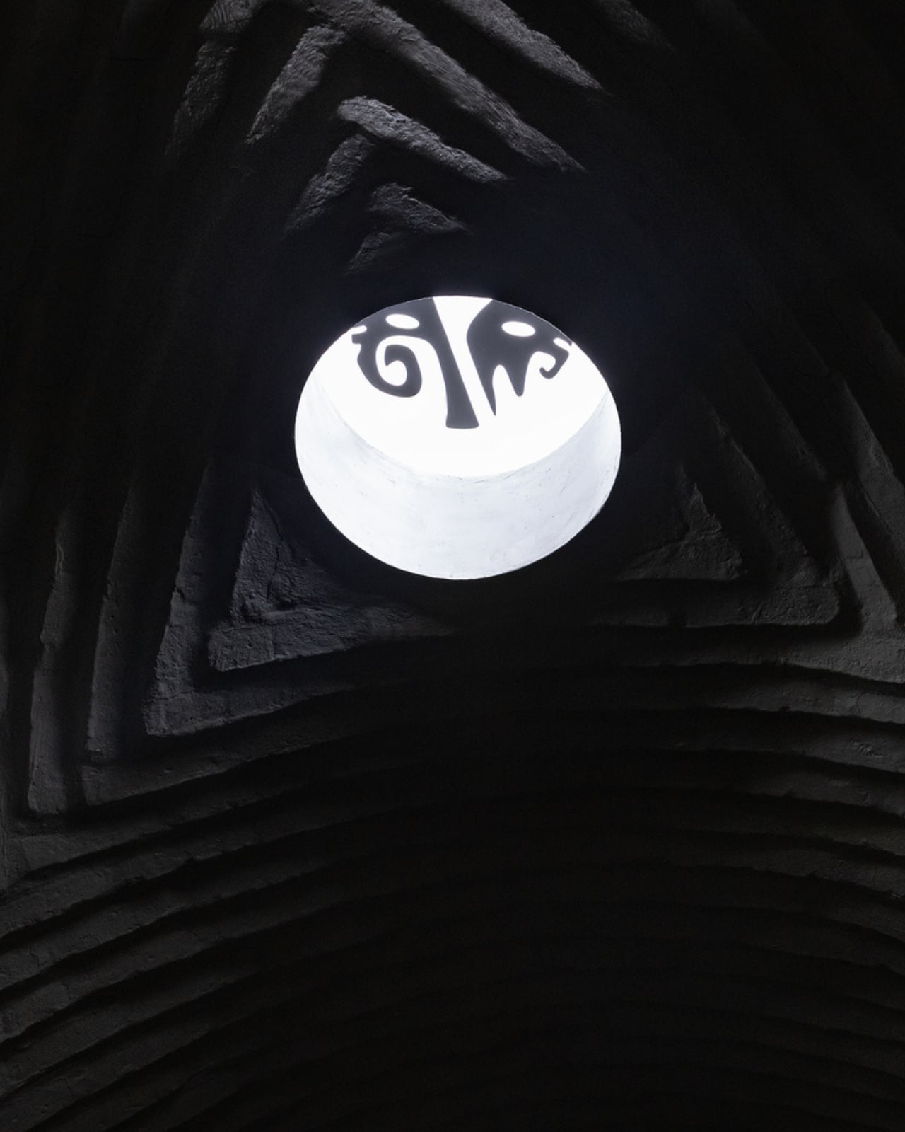
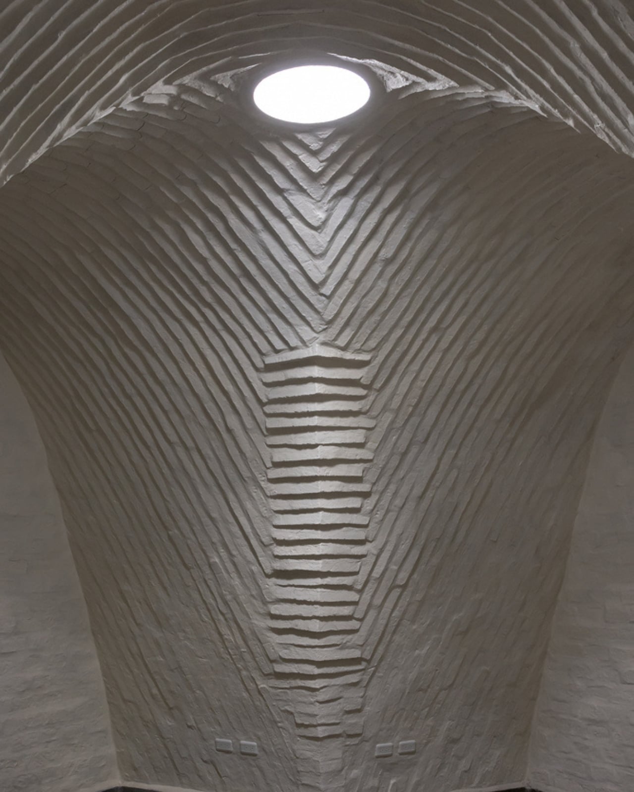
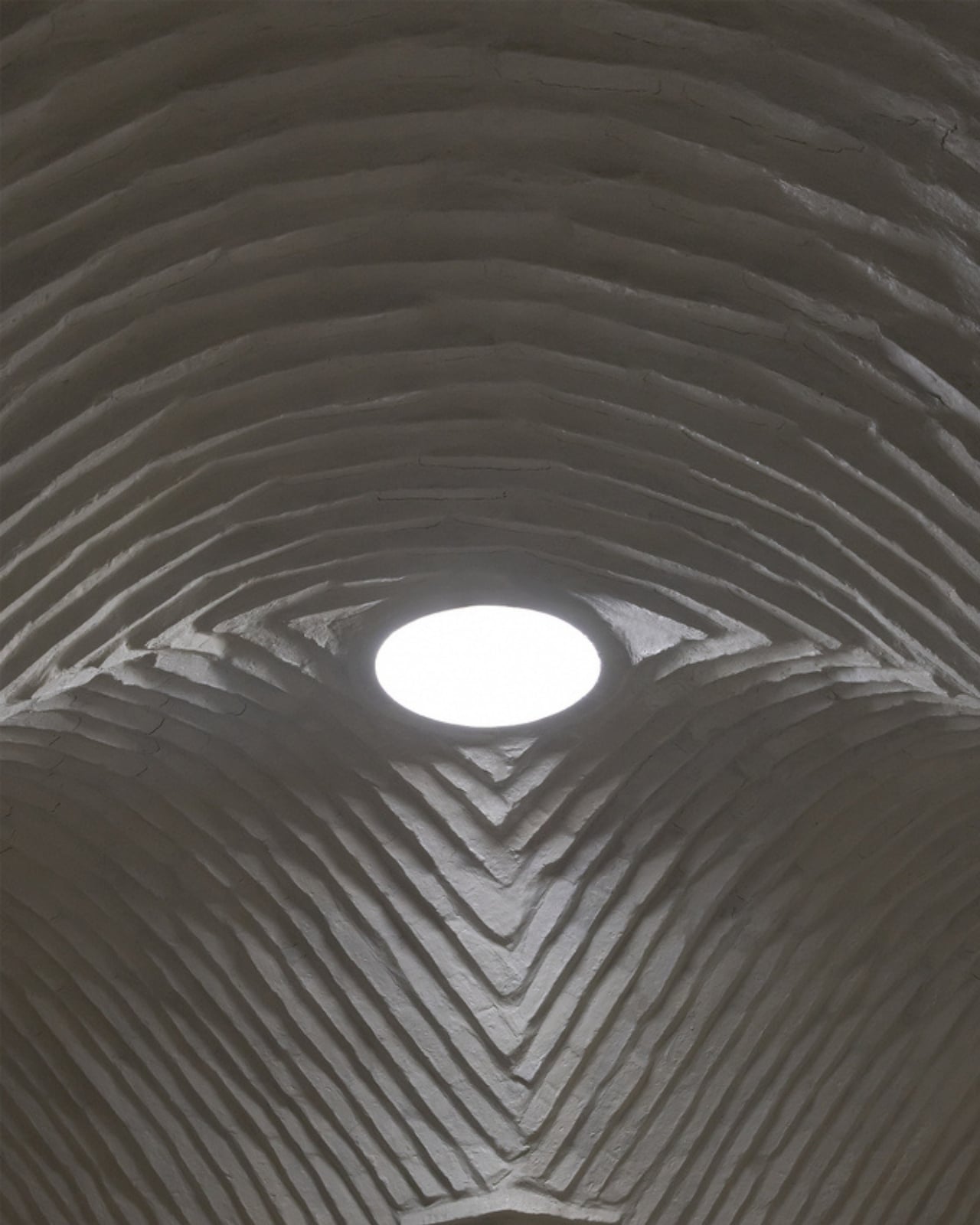
Adobe is not a material most people associate with scientific research, and I think that contrast is exactly what makes this project so compelling. Al Borde chose to work with local soil, using a vaulted construction technique built without formwork, developed in collaboration with structural engineer Patricio Cevallos of the Red PROTERRA network. The vault system draws on techniques rooted in Bolivian adobe construction, adapted here to meet the specific technical demands of a biosecure facility. It is a genuinely rare thing to see ancient building logic serving a cutting-edge scientific function, and Al Borde pulls it off without making either element feel like a compromise.

The Y-shaped plan is another smart move. Each arm of the structure radiates outward from a central point, giving the building a form that feels both purposeful and organic, like something that belongs in the landscape rather than imposed on it. That relationship to place is one of the things Al Borde is consistently good at, and Witoca Lab is a strong example of their approach to what architecture can actually do for a community.

And that community dimension is hard to overstate. The lab is not a vanity project or a showpiece for outside visitors. It exists because the Witoca people needed a way to take a more active, autonomous role in protecting their land and their livelihoods. The project was commissioned by Witoca and supported by CEFA Ecuador, the Italian-Ecuadorian Fund for Sustainable Development, and the Alstom Foundation. That kind of multi-layer collaboration is often messy in practice, but the result here suggests it worked.

There is a broader conversation in architecture right now about what “sustainable” really means, and too often it gets reduced to solar panels and LEED certifications. Witoca Lab asks a different and, I’d argue, more honest question: what does it mean to build something that is genuinely of its place, for the people who live there, using what the land provides? Not every project needs to be on the cover of a design magazine to matter. But Witoca Lab deserves to be.

We spend a lot of time celebrating architecture that is visually dramatic or technically ambitious, and rightly so. But the work that tends to stay with me is the kind where the building quietly solves a real problem for a real community, and where the form and the function feel like they arrived at the same answer at the same time. Witoca Lab is that kind of work. It is made of mud. It is full of microbes. And it might be one of the most intelligent buildings completed this year.

The post Mud, Microbes, and the 46 m² Lab the Amazon Needed first appeared on Yanko Design.
Rewild Homes Built a Tiny House That Actually Works for a Growing Family

The idea that tiny living demands sacrifice is one that the Starling quietly dismantles. Built by Rewild Homes out of Nanaimo on Vancouver Island, British Columbia, this 33-foot gooseneck tiny house was conceived with a growing family at the center of every decision. It doesn’t ask you to lower your expectations; it just reshapes what a home can look like.

At 33 feet long and 8’6″ wide, the Starling rides on a triple-axle gooseneck trailer. That raised front section is more than a structural choice; it’s what gives the layout its most valuable asset: real spatial separation. The exterior wears natural wood cladding under a metal roof, calm and considered against the Pacific Northwest landscape. It’s a home that looks like it belongs wherever it lands.

Designer: Rewild Homes

Inside, the convertible dining area sets the tone immediately. The banquette bench folds flat into a third sleeping space when needed, and every seat sits above a well of hidden storage. A built-in nook with deep shelving tucks behind one side, and an entry closet keeps the threshold from becoming a dumping ground. These are the kinds of details that don’t photograph dramatically but earn their place every single day.

The kitchen takes up a full U-shape anchored by dark wood countertops and a breakfast bar. A 24-inch four-burner propane range, a high-efficiency fridge with a bottom freezer, a double sink, and pull-out cabinetry keep things fully functional without tipping into visual noise. It doesn’t feel like a workaround. It feels like a kitchen that simply chose to be somewhere smaller.

A staircase leads up to the master loft, a proper bedroom with a double bed and a built-in closet rather than a ladder-accessed sleeping shelf. On the main floor, a second enclosed room offers a flex space that shifts with the family: a kid’s room, a studio, a home office, whatever the season calls for. The bathroom includes a full soaking tub, a rare and quietly luxurious feature in a home this size.

Running along the loft staircase is a custom aluminum railing commissioned from Wroughtenart, a local Vancouver Island artist. It functions as a guardrail and doubles as the home’s most expressive design moment, the kind of detail that separates a well-built tiny house from a truly considered one. The Starling doesn’t shrink your life. It edits it.

The post Rewild Homes Built a Tiny House That Actually Works for a Growing Family first appeared on Yanko Design.
Researchers turned Sawdust Waste and Watermelon Seeds into Recyclable Fire-resistant Panels

Every sawmill in the world produces it. Every furniture factory, every timber yard, every construction site that cuts wood leaves behind a pile of the stuff, and globally that adds up to hundreds of millions of tonnes of sawdust every year. Most of it gets burned for energy, which is a reasonable enough fate except that burning it releases back into the atmosphere all the carbon the tree spent decades pulling out of the air. It is a material that manages to be simultaneously everywhere and underused, treated as a combustion problem when it is, by the structural logic of its wood fibers, one of the more cooperative raw materials on earth. Firestarter cubes are made from it. Pykrete, the wood pulp and ice composite once proposed as an aircraft carrier hull material, relied on it.

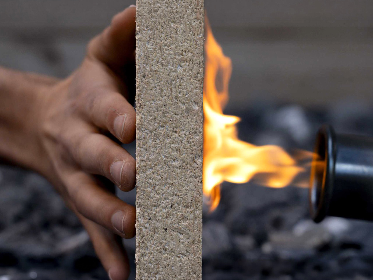
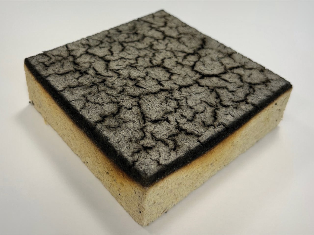
Researchers at ETH Zurich and Empa have now given sawdust another role entirely. Doctoral researcher Ronny Kürsteiner spent his thesis developing a process to bind sawdust particles with struvite, a colorless crystalline mineral composed of ammonium magnesium phosphate, using an enzyme derived from watermelon seeds to control how the crystals grow into the sawdust matrix. What comes out of the mold, after two days of cold-pressing and room-temperature drying, is a composite panel stronger in compression than spruce timber, capable of resisting a direct flame for more than three times as long as untreated wood, and fully recyclable at the end of its service life.

Designer: ETH Zurich

Struvite’s fire-retardant properties have been known for a while; the problem was always crystallization behavior. Conventional precipitation methods produce small, disorganized crystallites that can’t grip wood particles, which is why earlier attempts at this kind of composite fell apart mechanically. The watermelon seed enzyme controls nucleation, producing large interlocking crystals that physically fill the voids between sawdust particles. The binder content sits at 40% by weight. Panels are cold-pressed for two days and dried at room temperature, with no elevated curing conditions required.

When heat reaches struvite, it decomposes and releases water vapor and ammonia, drawing energy from the surrounding environment. The non-combustible gases displace oxygen, starving the fire and accelerating surface charring; that char layer slows access to unburnt material underneath. Cone calorimeter tests clocked untreated spruce igniting at 15 seconds; the struvite composite takes 45 to 51 seconds. Initial projections put it in the same fire protection class as cement-bonded particleboard, the current default for interior partition applications, though full-scale tests are still pending. Grind the panels at end of life, heat them just above 100 degrees Celsius to release ammonia, and the components separate cleanly for reuse or redirect as phosphorus fertilizer.

The post Researchers turned Sawdust Waste and Watermelon Seeds into Recyclable Fire-resistant Panels first appeared on Yanko Design.
This walkable steel sculpture turns geometric chaos into an experience

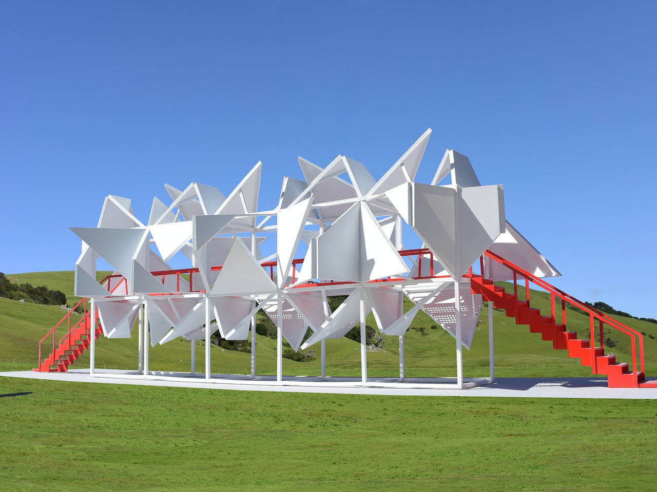
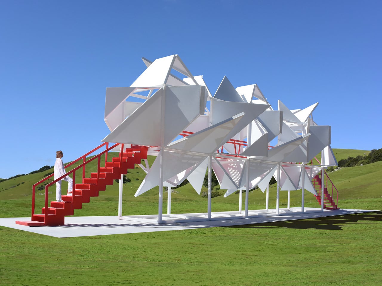
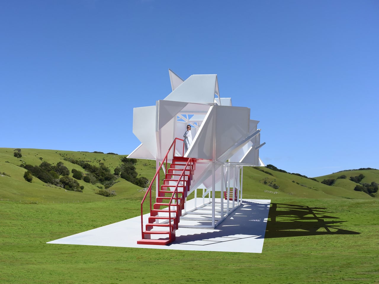
Most public sculptures are meant to be looked at from the outside. You walk past, glance up, maybe take a photo, and move on. The relationship between the object and the person stops at the surface. Five Fragmented Cubes, a large-scale interactive sculpture made of painted steel, refuses that arrangement entirely: it was built specifically to be entered, climbed, and walked through, so that the thing you came to look at ends up surrounding you on all sides.
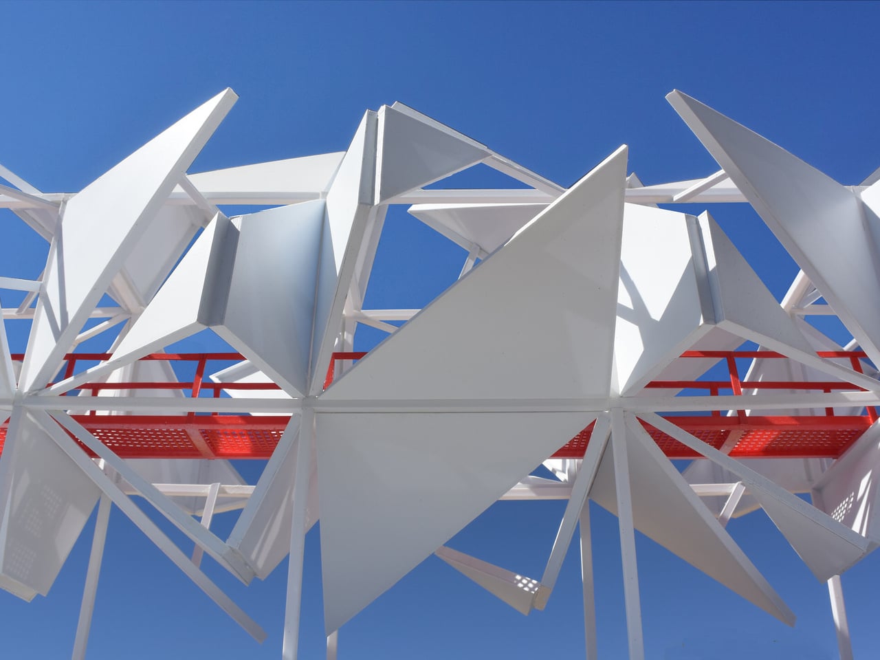
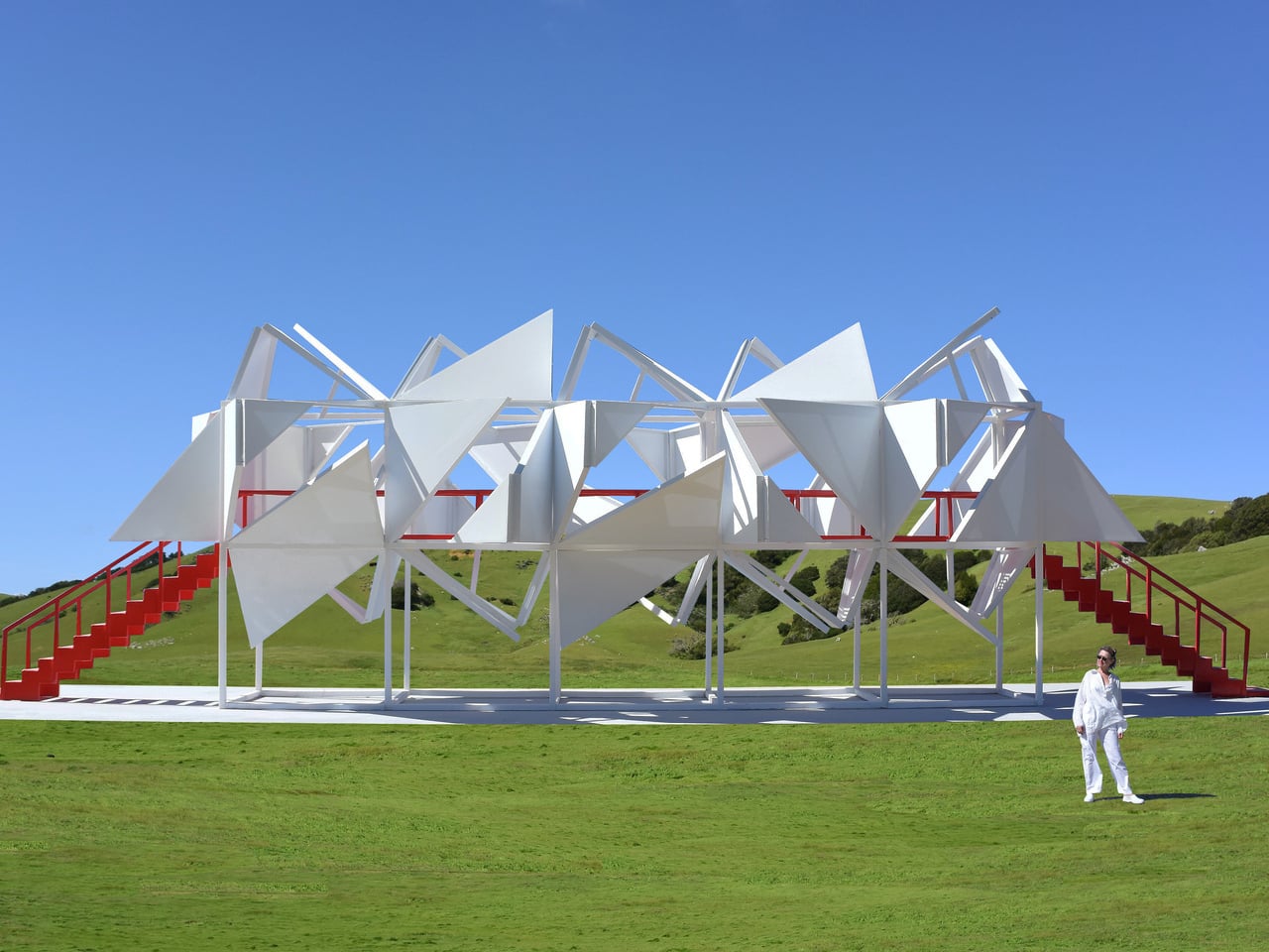
The structure consists of 10 cube frames arranged in two stacked tiers on a concrete base, with five cubes forming the lower support grid and five more sitting on top. The upper tier is where the visual action happens. Each face of those top cubes is clad with painted steel panels, and each panel face is divided into two triangles. One of those triangles is subdivided again and folded inward, while both are folded outward from the face of the cube frame and locked in place, projecting into space at fixed angles.

Designer: Michael Jantzen

What keeps the whole thing from feeling mechanical or predictable is one deliberate decision: the orientation of every triangle has been rotated randomly relative to its cube face. There is no repeating pattern, no symmetrical rhythm across the surface. Up close, the geometry is legible; from a distance, the cumulative effect reads as dense, spiky, and almost organic. The same steel panels and the same folding logic appear across every face, yet the result looks nothing like a system built from identical parts.

That tension between the simple and the complex is the actual subject of the sculpture. The designer frames it as an exploration of how identical, interconnecting, repeating parts can generate extreme perceived complexity, drawing a comparison to objects in nature, where elaborate forms frequently emerge from a limited set of rules applied at scale. Whether the built result actually produces that sense of discovery depends entirely on where you are standing.

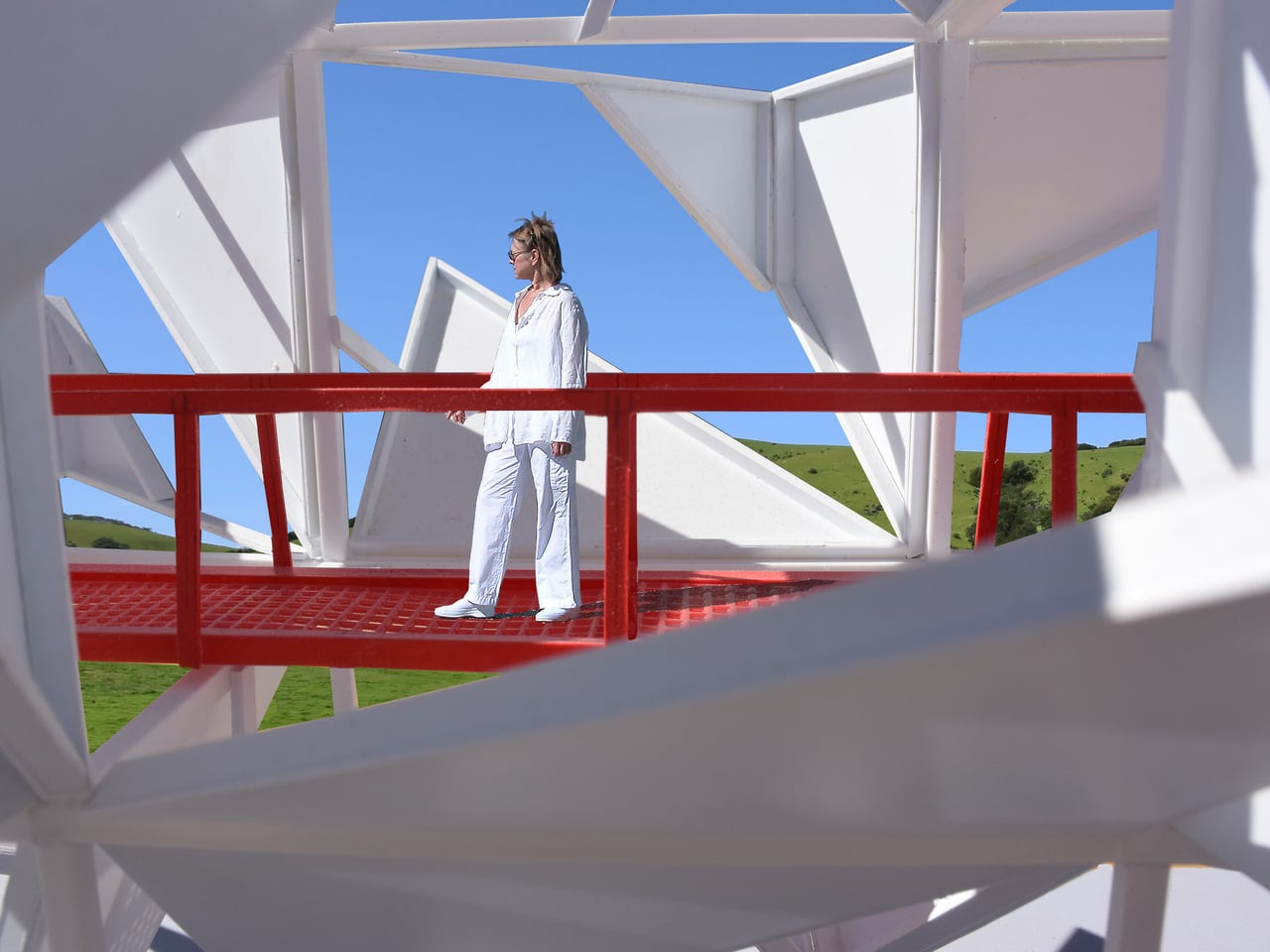
Two red staircases, one at each end of the structure, lead up to a mid-level catwalk with red perforated steel grating underfoot and tubular red railings. The red is not subtle. Against the all-white panels and columns, it functions less as a safety feature and more as a graphic element, separating the structure’s circulation path from its expressive surface. Inside, the folded panels create a partially enclosed space, with light cutting through the gaps between triangles at angles that shift as you move.

The pastoral setting, open green hills, and clear sky make the white-and-red contrast sharper still. A sculpture this geometrically dense, placed in an undisturbed landscape, is a deliberate provocation, and it earns visual authority because of it. The mesmerizing structure does make one wonder whether the interior experience, walking the catwalk surrounded by folded steel at close range, delivers the complexity it promises from a distance, or does the chaos quietly resolve once you are standing inside it?

The post This walkable steel sculpture turns geometric chaos into an experience first appeared on Yanko Design.