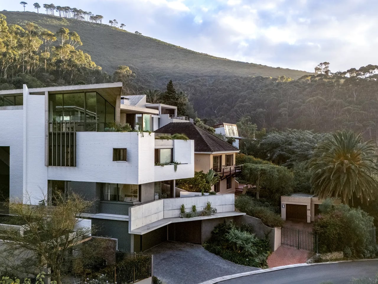
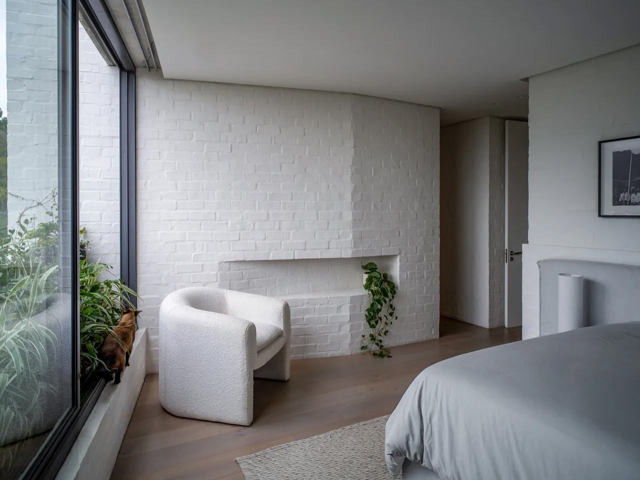
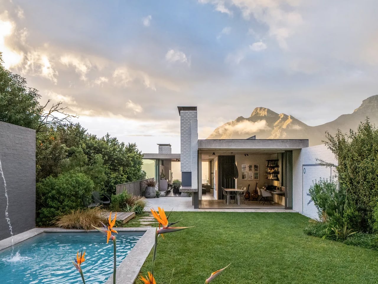
When Mark Bullivant, principal at South African architecture studio SAOTA, came across a steep, impossibly narrow plot in Cape Town’s Tamboerskloof neighborhood, most architects would have walked away. He bought it. The result is Kenmore — a personal home that quietly dismantles every assumption about what a tight site can hold.
The numbers tell their own story. The plot stretches 58 meters long but only 14 meters wide, with the interior reaching a maximum width of just 7.44 meters. An existing structure occupied the land when Bullivant acquired it, but it was dark, fragmented, and unwieldy — torn down to make room for something entirely more considered. What replaced it sits on the hillside like a long, quiet exhale: terraces extending outward, oversized windows framing the landscape, a home that reads less like a building and more like a vantage point.
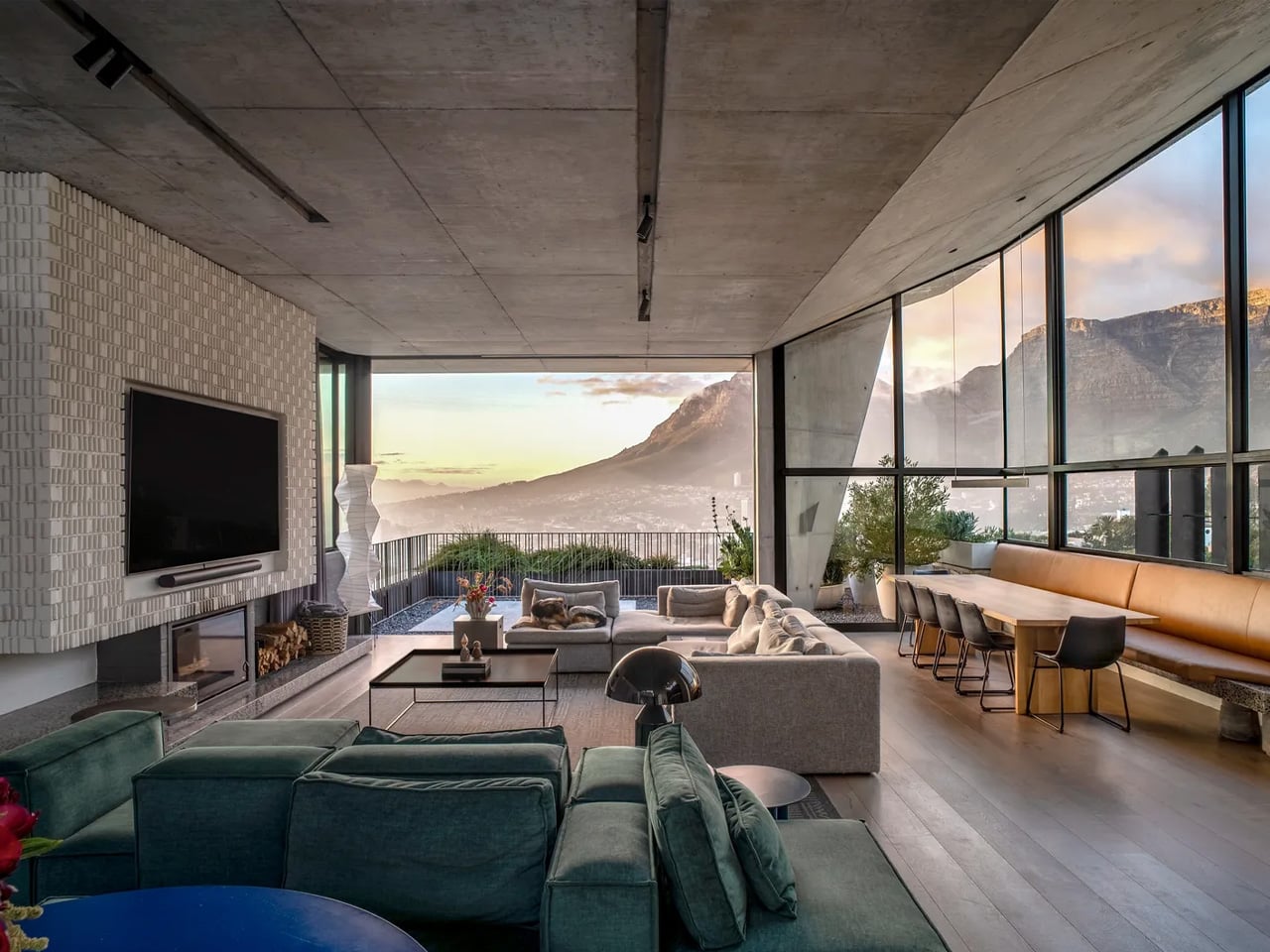
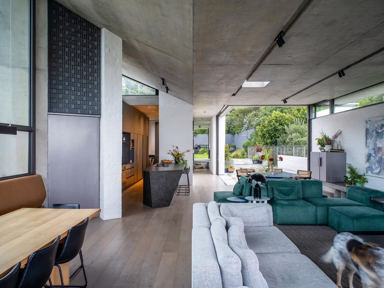
That framing was intentional. The most compelling views fall on the short sides of the property — east toward Table Mountain and west toward Signal Hill and the national park behind it. The architecture is organized entirely around those two axes, turning the site’s constraints into its greatest asset. Rather than fighting the narrow footprint, the design leans into it — producing a continuous, open living space that flows visually from front to back, resisting the fragmentation that plagued the original structure.
The decision to elevate the primary living level to the top of the house was driven by more than views. Placing it there allowed the home to connect directly to the landscape of Signal Hill and maximize sunlight — a critical move given the site’s limited northern exposure. It also made room for a meaningful garden, something Bullivant had set as a core ambition from the very beginning. What could have been a rooftop afterthought becomes, instead, a living threshold between architecture and the mountain that cradles it.
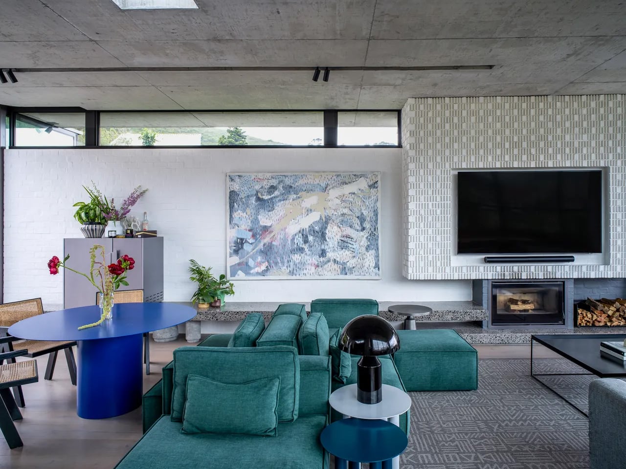
Spanning three levels with five bedrooms, the home never feels like a corridor with rooms attached. Bullivant was deliberate about that. He has never been drawn to living environments defined by a sequence of small, closed-off rooms — and the constraints of the site only pushed that instinct further. The communal spaces are fluid and generous, a pointed rebuttal to the idea that a narrow house must feel narrow.
Kenmore is, in many ways, SAOTA’s philosophy made domestic. The firm has built its reputation on reading a site’s limitations as a design mandate rather than a compromise. Bullivant just happened to live that philosophy out this time — quite literally. The house doesn’t just sit within its difficult terrain. It belongs to it.
When Mark Bullivant, principal at South African architecture studio SAOTA, came across a steep, impossibly narrow plot in Cape Town’s Tamboerskloof neighborhood, most architects would have walked away. He bought it. The result is Kenmore — a personal home that quietly dismantles every assumption about what a tight site can hold.
The numbers tell their own story. The plot stretches 58 meters long but only 14 meters wide, with the interior reaching a maximum width of just 7.44 meters. An existing structure occupied the land when Bullivant acquired it, but it was dark, fragmented, and unwieldy — torn down to make room for something entirely more considered. What replaced it sits on the hillside like a long, quiet exhale: terraces extending outward, oversized windows framing the landscape, a home that reads less like a building and more like a vantage point.
That framing was intentional. The most compelling views fall on the short sides of the property — east toward Table Mountain and west toward Signal Hill and the national park behind it. The architecture is organized entirely around those two axes, turning the site’s constraints into its greatest asset. Rather than fighting the narrow footprint, the design leans into it — producing a continuous, open living space that flows visually from front to back, resisting the fragmentation that plagued the original structure.
The decision to elevate the primary living level to the top of the house was driven by more than views. Placing it there allowed the home to connect directly to the landscape of Signal Hill and maximize sunlight — a critical move given the site’s limited northern exposure. It also made room for a meaningful garden, something Bullivant had set as a core ambition from the very beginning. What could have been a rooftop afterthought becomes, instead, a living threshold between architecture and the mountain that cradles it.
Spanning three levels with five bedrooms, the home never feels like a corridor with rooms attached. Bullivant was deliberate about that. He has never been drawn to living environments defined by a sequence of small, closed-off rooms — and the constraints of the site only pushed that instinct further. The communal spaces are fluid and generous, a pointed rebuttal to the idea that a narrow house must feel narrow.
Kenmore is, in many ways, SAOTA’s philosophy made domestic. The firm has built its reputation on reading a site’s limitations as a design mandate rather than a compromise. Bullivant just happened to live that philosophy out this time — quite literally. The house doesn’t just sit within its difficult terrain. It belongs to it.
The architectural world is shifting toward materials that feel grounded, honest, and deeply connected to the earth. Instead of relying on high-energy industrial products, designers and homeowners are embracing approaches that honor the planet’s natural tectonics. In this movement toward true sustainability, rammed earth has re-emerged as a powerful, modern choice for those seeking beauty, integrity, and a low-carbon footprint.
Its tactile layers and sculptural warmth create spaces that feel rooted, calm, and inherently biophilic. Rammed earth offers durability, thermal comfort, and long-term value, transforming simple structures into timeless experiences and reflecting the five pillars driving its revival.
1. Low-Carbon Construction
Rammed earth stands out as a low-carbon building method because its main ingredient, subsoil, is often sourced directly from the construction site or nearby. This drastically cuts transportation emissions. Unlike concrete or brick, rammed earth requires no firing, kilns, or intensive chemical processes. Its formation relies on simple mechanical compaction and moisture, keeping the embodied energy among the lowest of any mainstream wall system.
This approach makes each project inherently more responsible and materially honest. By using local resources and eliminating energy-heavy manufacturing, rammed earth aligns with global decarbonization goals. It has become a preferred choice among forward-thinking firms committed to sustainable, large-scale performance.
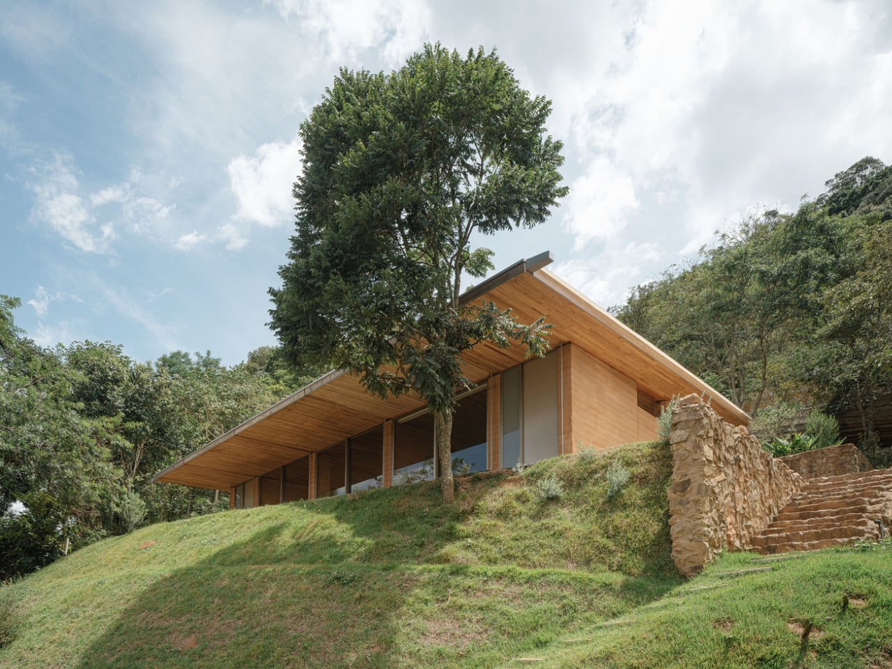
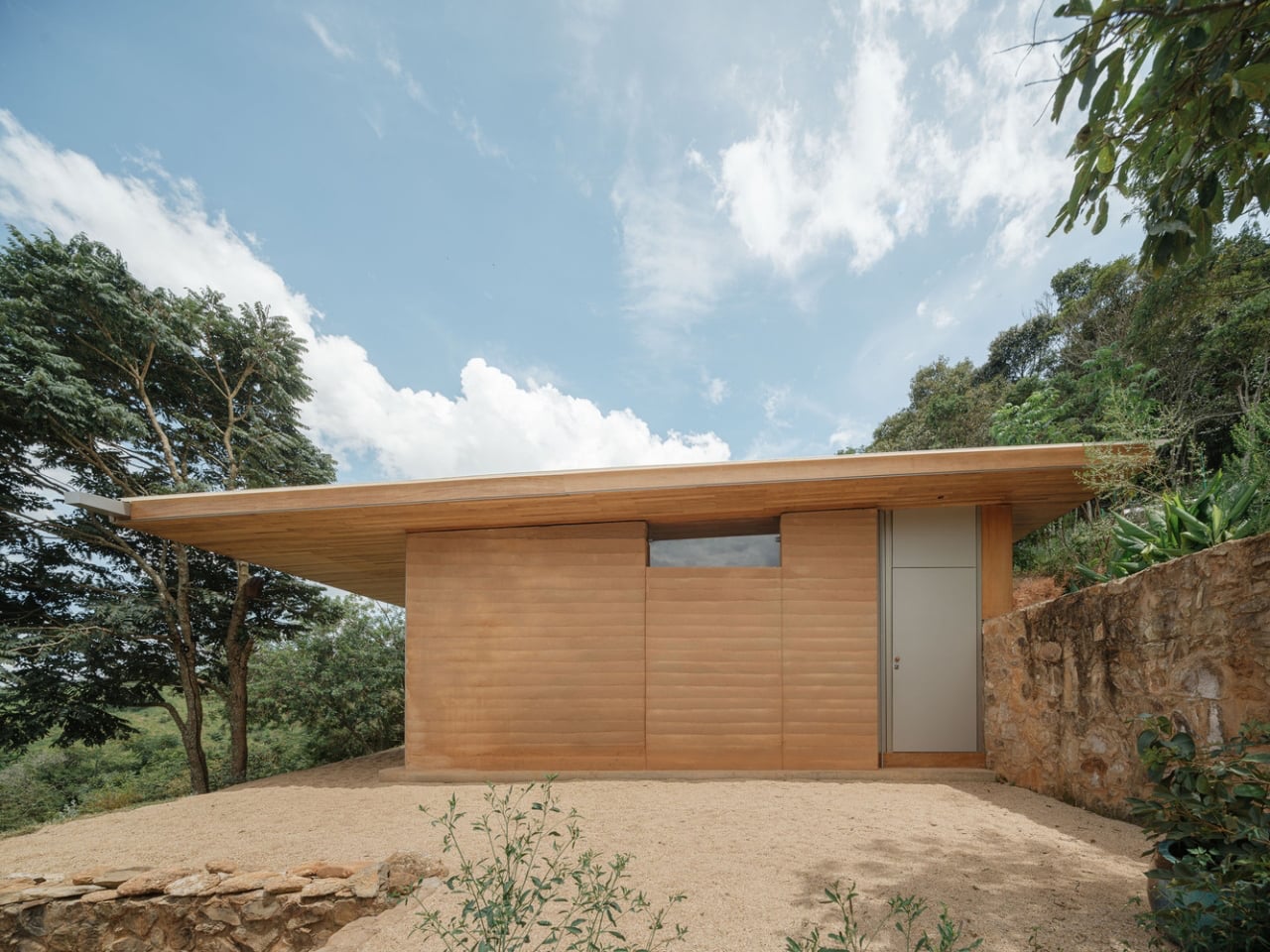
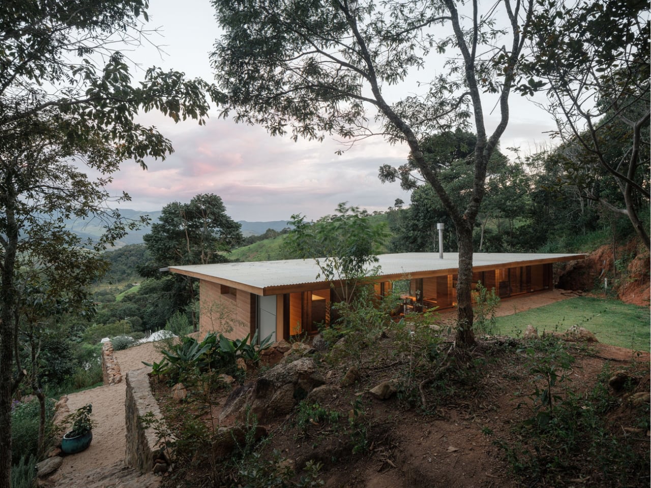
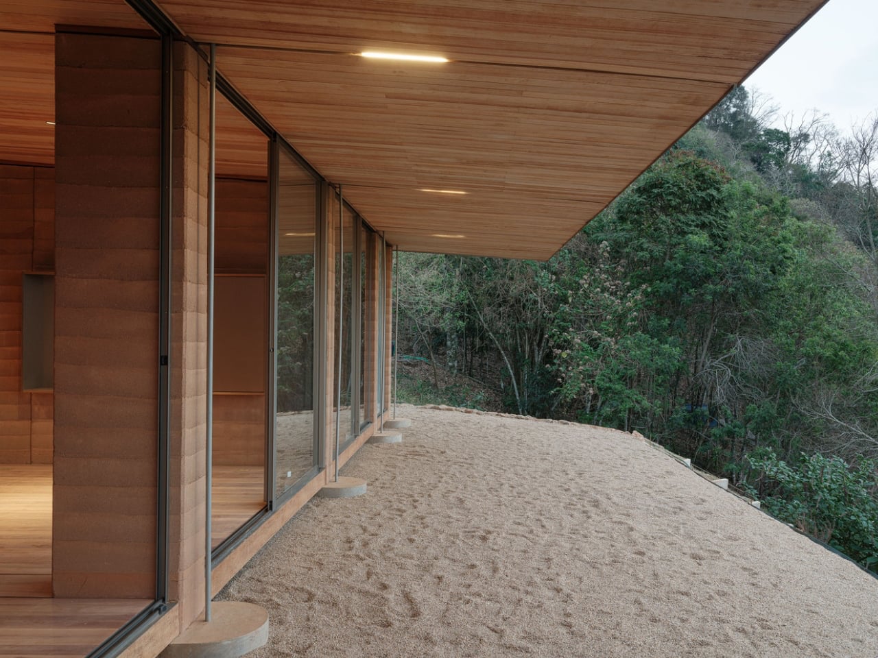
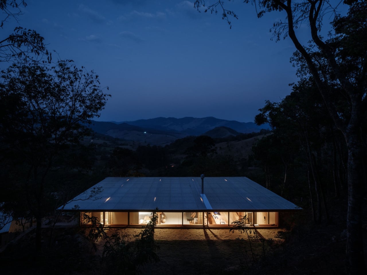
Arquipélago Arquitetos’ Piracaia Eco-Village in rural São Paulo exemplifies sustainable home design, using rammed earth construction to create affordable, eco-friendly residences. Located in the village of Piracaia, the development currently includes three homes ranging from a 538-square-foot studio to a 1,245-square-foot two-bedroom unit. Each home features rammed-earth walls formed from local soil, providing structural strength and natural insulation. A modular design allows the system to be easily replicated or scaled, offering flexibility and efficiency.
Large clerestory windows bring in natural light while preserving privacy, and the aluminium roofs are designed to harvest rainwater for everyday use. Wood panels and steel tie rods ensure stability and structural integrity. Initiated by a resident who sought a deeper connection to nature and community, the project stands as a model for sustainable rural living—embracing local resources, traditional techniques, and modern architectural thinking to shape a more conscious way of life.
2. Honors Raw Materiality
Rammed earth’s signature beauty lies in its dramatic, layered texture, which is an architectural reflection of geological time. Each compacted lift reveals natural striations shaped by the soil’s mineral makeup, giving every wall a distinct, site-specific identity. This visual honesty creates an immediate sense of grounding, making the material feel ancient and deeply contemporary.
In double-height spaces, these walls do more than define boundaries as they hold light, absorb warmth, and shift subtly throughout the day. The result is an atmosphere that feels calm, elemental, and immersive. The wall becomes an artwork in itself, guiding the mood, rhythm, and spatial flow of the entire home.
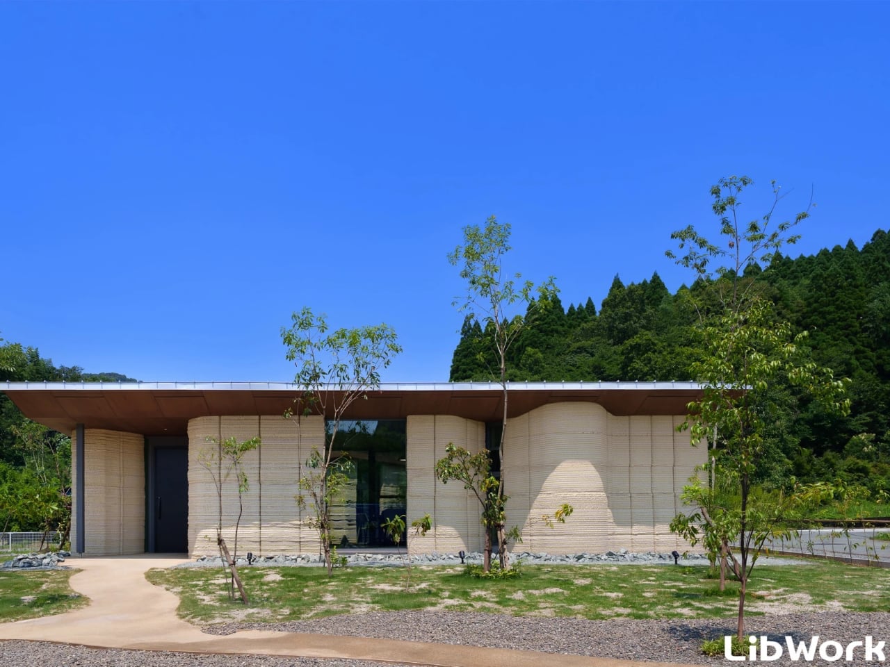
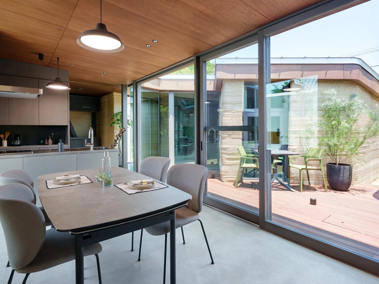
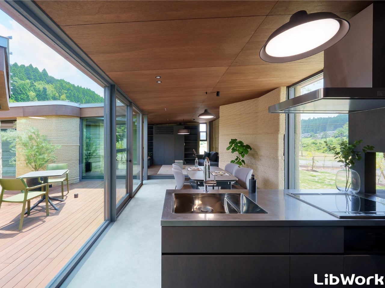
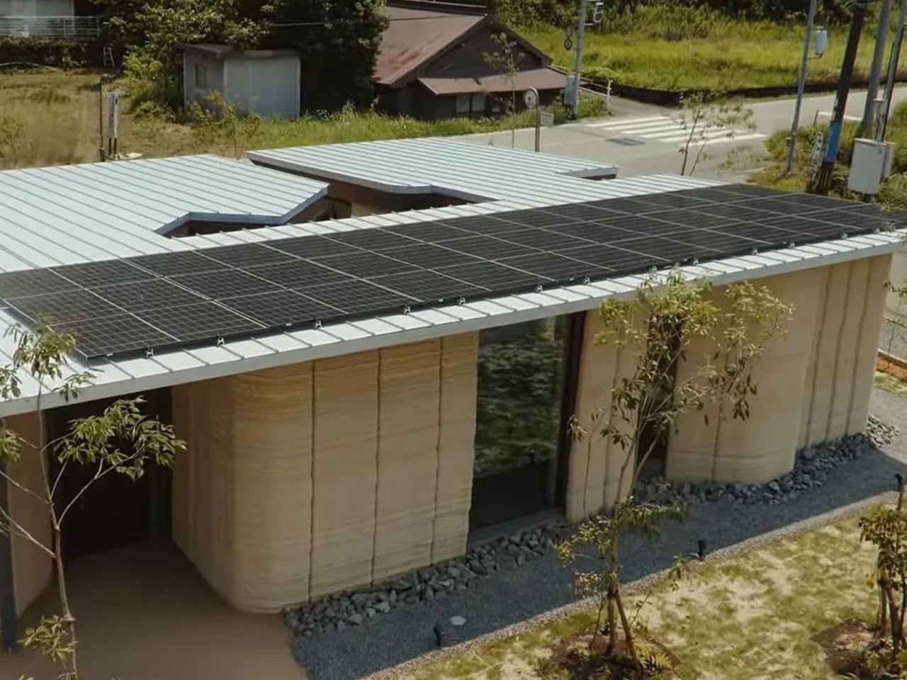
Japanese architecture studio Lib Work has introduced the Lib Earth House Model B, a 1,076-square-foot home made primarily from 3D-printed soil. Located in Yamaga, Kumamoto Prefecture, and developed with Arup and WASP, this project represents a significant departure from traditional concrete construction. The single-story structure features gently curved walls and a ribbed exterior texture, showcasing the potential of combining ancient materials with advanced printing technology. Constructed from a mix of soil, sand, slaked lime, and natural fibres, the home cuts typical construction emissions by more than half while promoting durability and thermal performance.
Inside, the design balances minimalism and warmth, with natural light accentuating the earth walls’ varied textures. Embedded sensors monitor moisture and structural performance discreetly, improving long-term sustainability. The flat roof accommodates future solar or water systems, highlighting a practical integration of eco-friendly features.
3. Natural Temperature Control
Rammed earth excels in passive design because of its dense, high–high-thermal-mass composition. These walls act as natural thermal batteries, absorbing heat throughout the day and releasing it slowly at night. This steady modulation of indoor temperatures reduces sharp fluctuations and minimizes dependence on mechanical heating or cooling systems. For homeowners and designers, this means long-term savings and an impressive ROI on energy infrastructure.
Beyond performance, the material elevates the visual and spatial experience. Its ability to regulate climate naturally eliminates the need for excessive mechanical fixtures, creating cleaner lines and a more intentional aesthetic. Rammed earth becomes both structure and climate strategy in one.
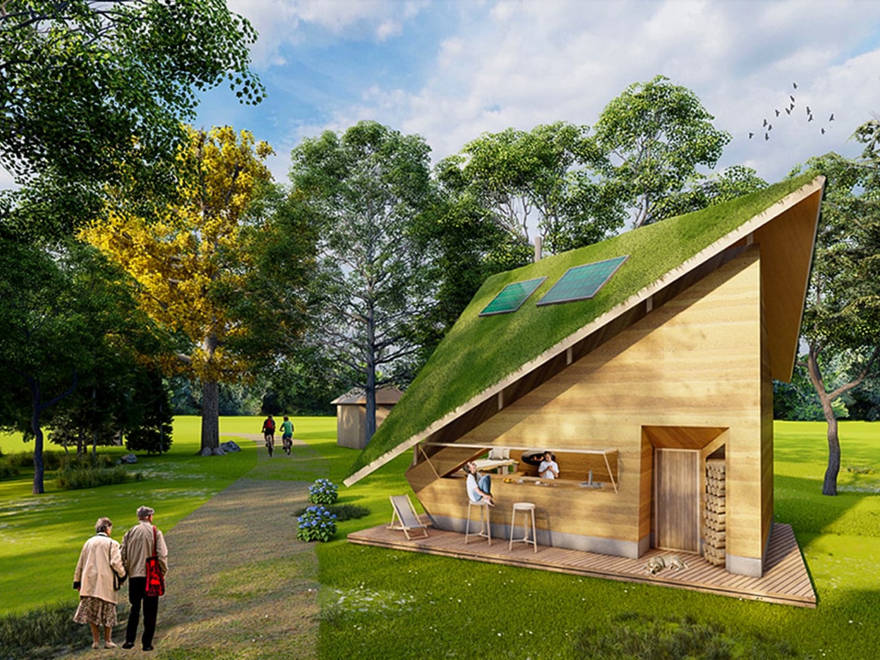
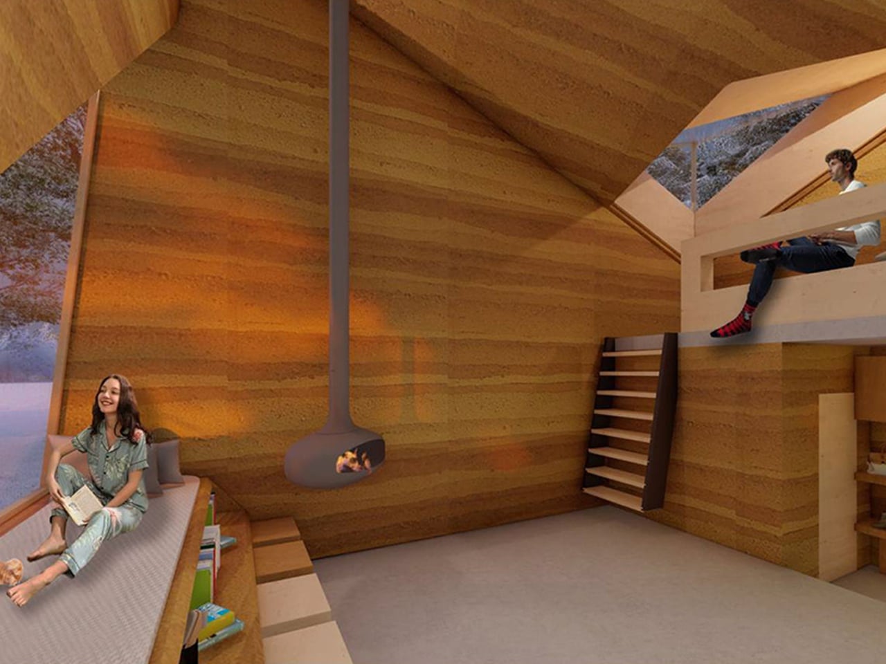
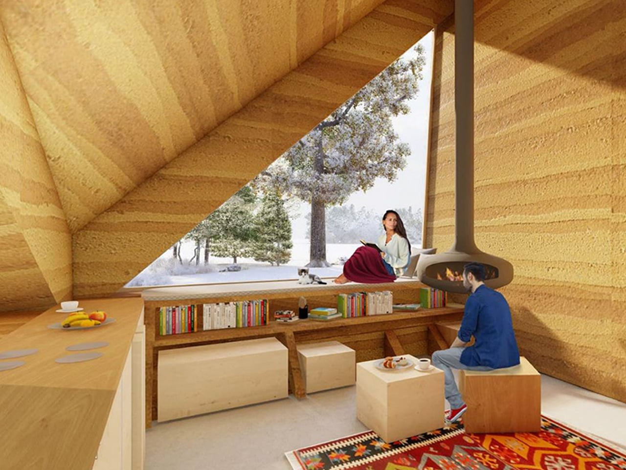
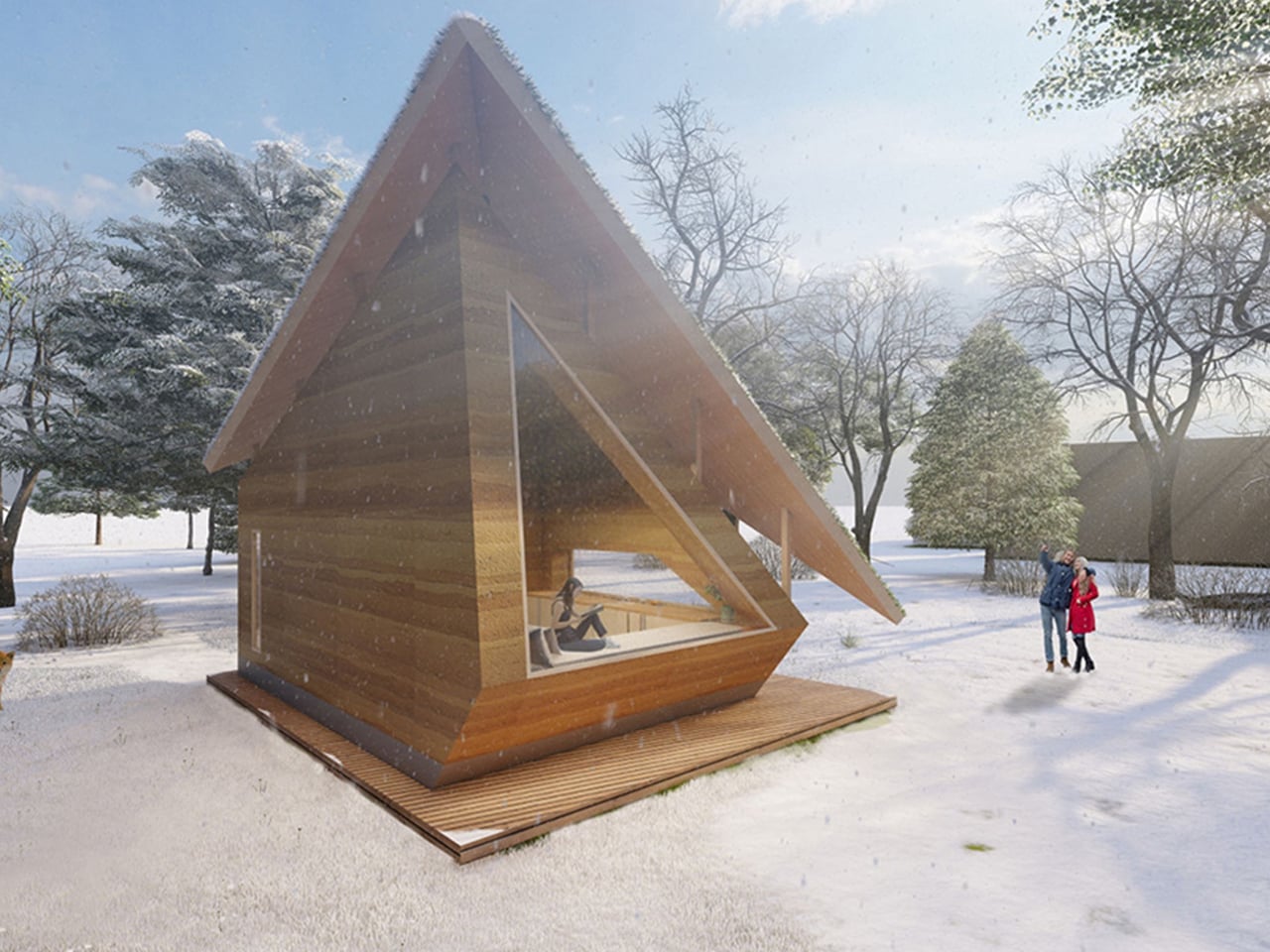
The Rammed Earth House in Slovenia reimagines the early 20th-century farmhouse by combining ancient building methods with modern solar technology. Designed by architects Merve Nur Başer, Aslı Erdem, and Fatma Zeyneb Önsiper, the tiny home uses rammed earth, a sustainable technique dating back thousands of years – along with a concrete foundation and timber framework. Inspired by Slovenian architect Oton Jugovec’s floating roof, the house also features an extended green roof to protect the structure from erosion caused by Dobrava’s varied climate of rain, snow, and humidity.
Oriented to optimise passive heating and cooling, the Rammed Earth House is carefully positioned to capture winter sunlight and block summer heat. Strategically placed windows enhance natural ventilation throughout the year, while the roof supports solar panels, a rainwater harvesting system, and an integrated septic tank. The interior layout further improves efficiency, with fewer windows on the north side to minimize heat loss and more on the west to capture warmth when needed.
4. Built for Centuries
Modern rammed earth, lightly stabilized with cement, delivers exceptional compressive strength and long-term durability. Its dense composition makes it naturally fire-resistant, pest-resistant, and remarkably stable across changing climates. History reinforces this reliability with rammed-earth structures around the world having survived for centuries, proving the material’s endurance far beyond typical contemporary systems.
For homeowners, this resilience translates directly into value. The walls demand minimal upkeep and offer a long structural lifespan, financially sound over decades. Their inherent thickness also enhances acoustic comfort, reducing noise transfer and improving the quality of everyday living within the home.
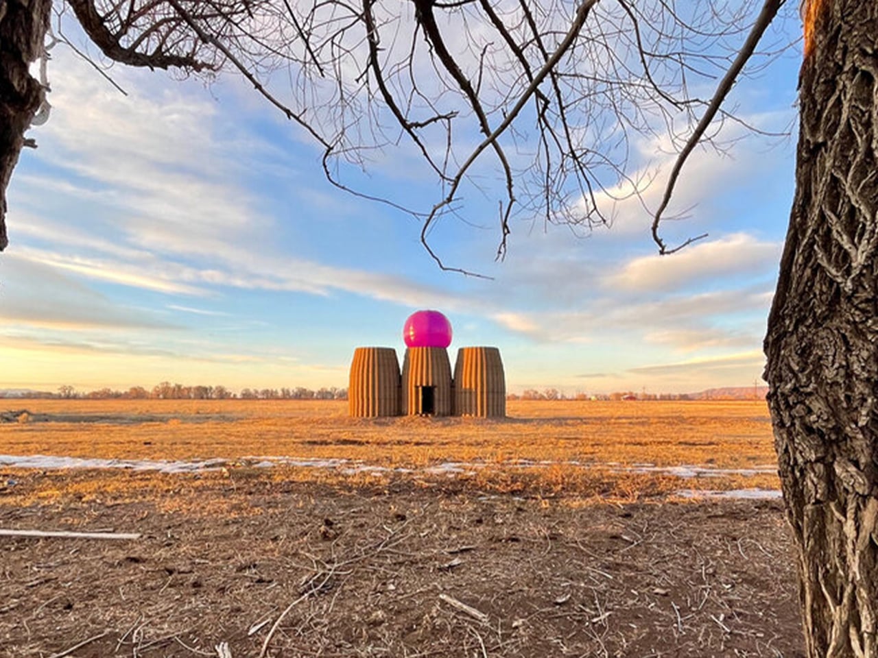
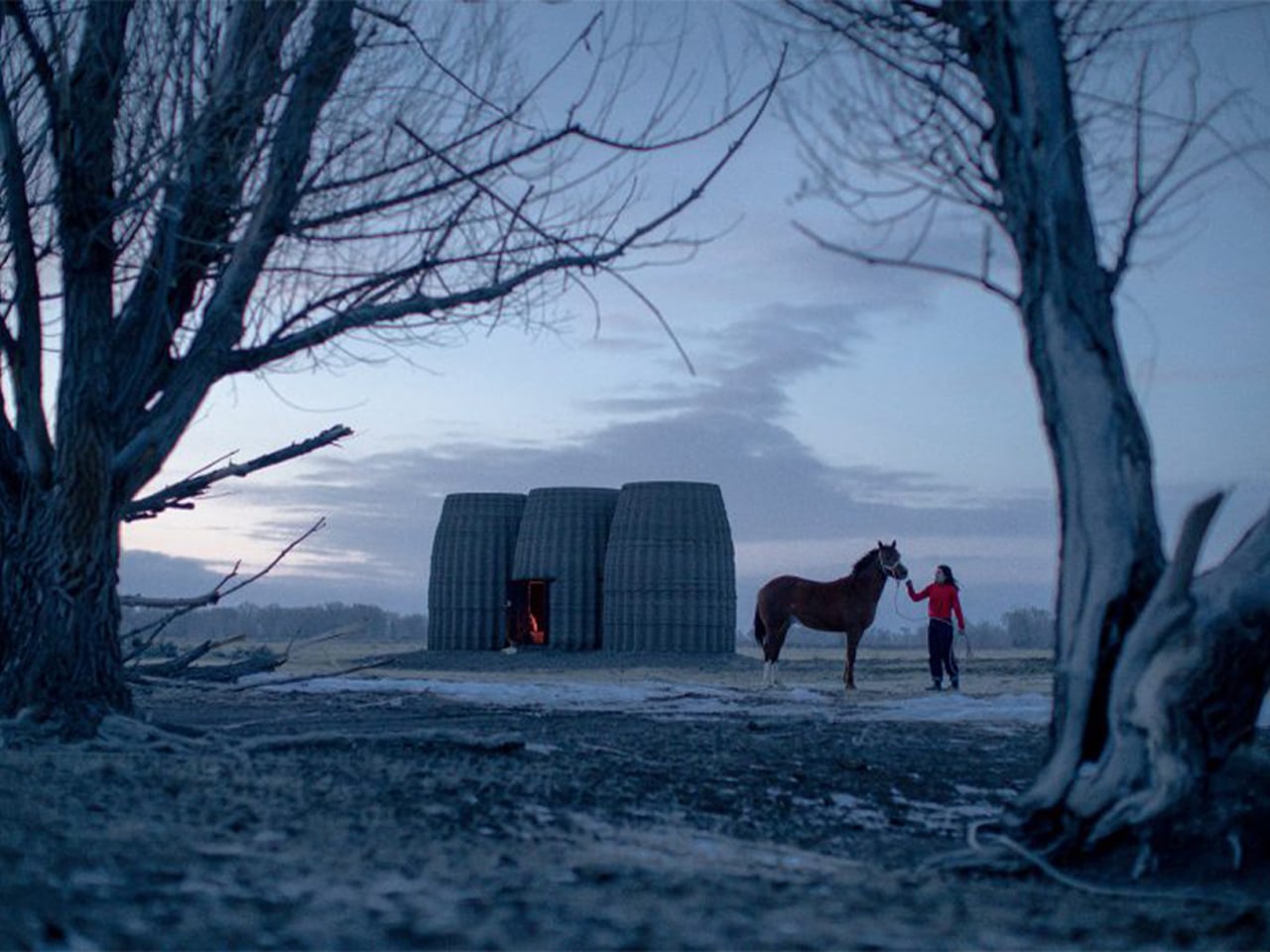
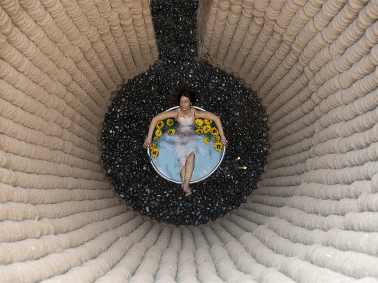
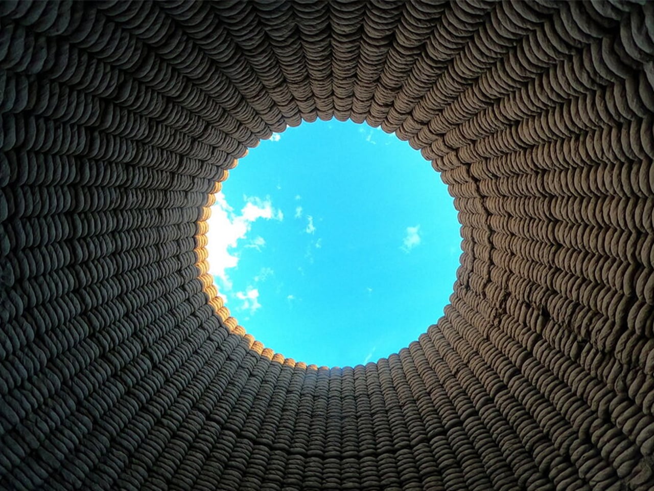
Casa Covida is a modern reinterpretation of ancient building methods that merges traditional materials like mud, clay, and straw with advanced 3D-printing technology. Developed by Emerging Objects, the project showcases how earth-based architecture, used by nearly 30% of the global population, can be revived for contemporary living. Built in Colorado’s San Luis Valley using a SCARA robotic printer, the structure is made from an adobe blend and features three interconnected zones: a central space with a hearth, a sleeping area furnished with reclaimed beetle kill pine, and a bathing zone with a river-stone-embedded tub. An inflatable cactus-inspired roof adds weather protection and visual intrigue.
Designed for two people, Casa Covida acts as a prototype to explore how ancient techniques can coexist with digital fabrication. The 3D-printed walls, custom earthen cookware, and natural insulation demonstrate how sustainability and innovation can shape the future of housing.
5. Celebrates Nature-Rooted Architecture
Rammed earth grounds a home not just physically but culturally, drawing directly from the soil that defines its region. By using material sourced from the site itself, the architecture gains a deep sense of place and authenticity. This alignment with biophilic design principles creates a natural, instinctive connection between occupant and landscape, allowing the structure to feel both contextual and emotionally reassuring.
The experience is more than visual as it is tactile and psychological. The walls embody local history, climate, and geology, offering a timeless identity that outlasts design trends. In this way, rammed earth supports well-being while honoring the land it stands on.
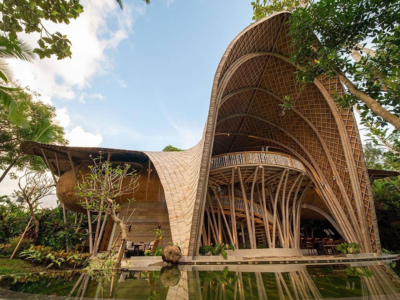
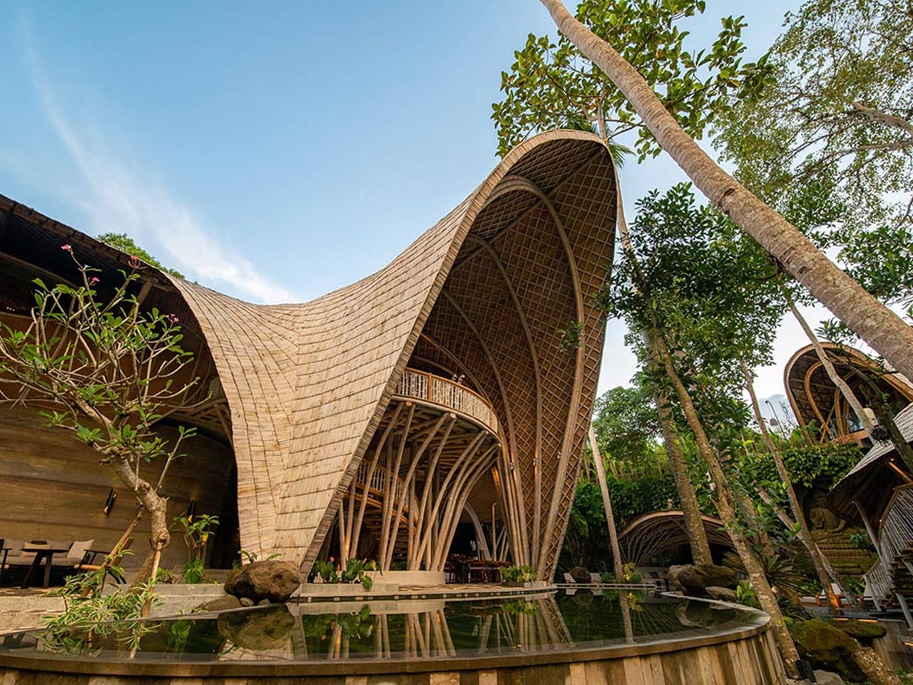
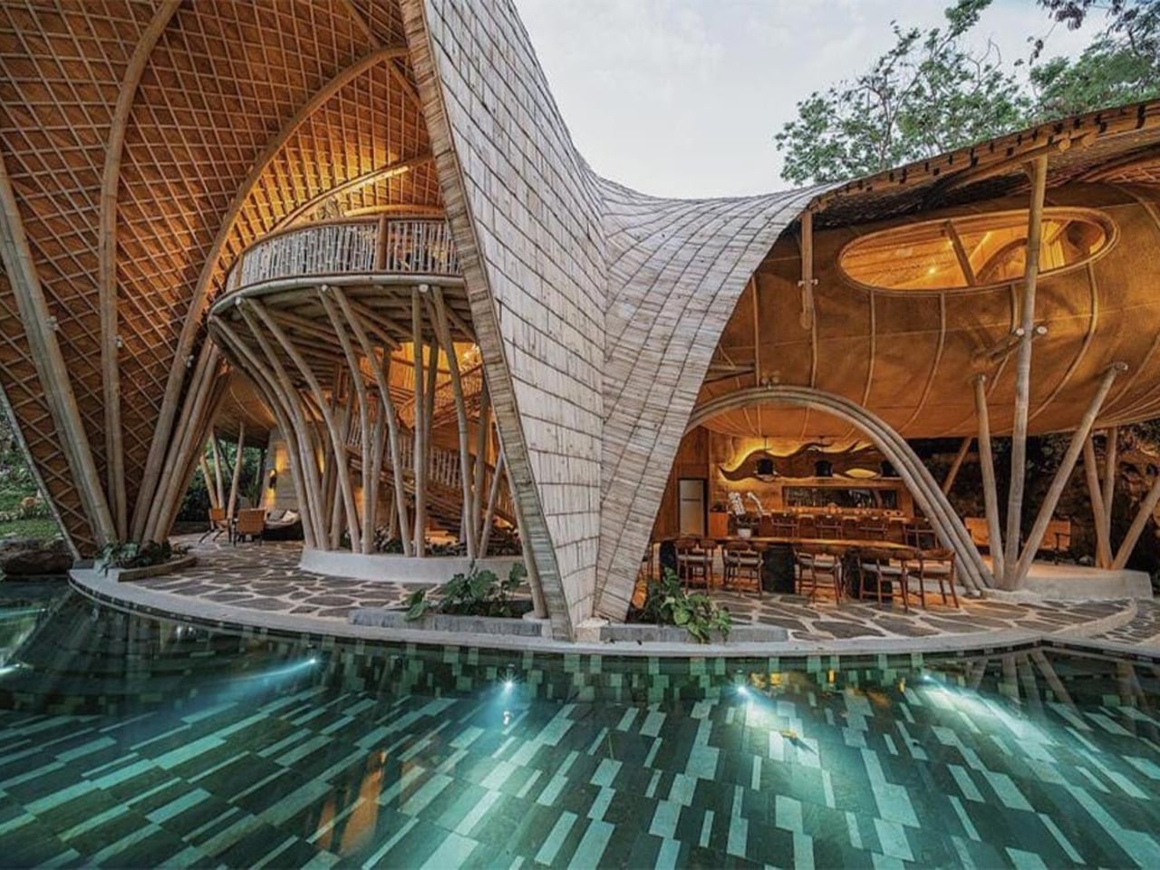
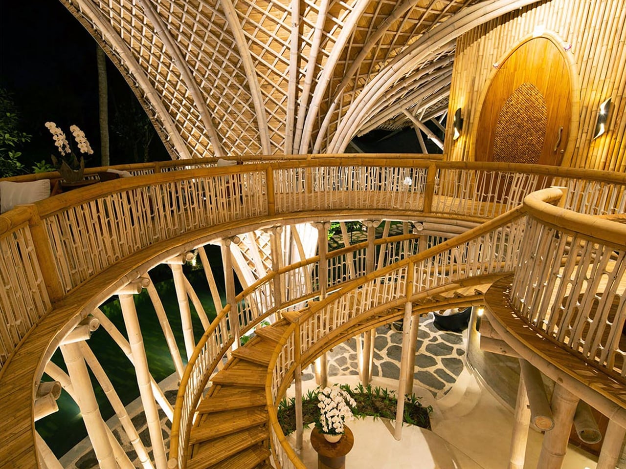
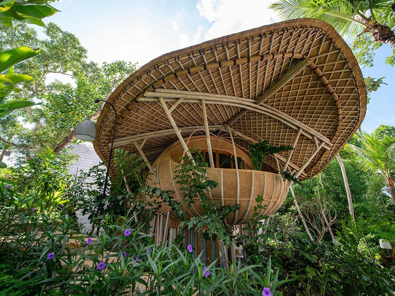
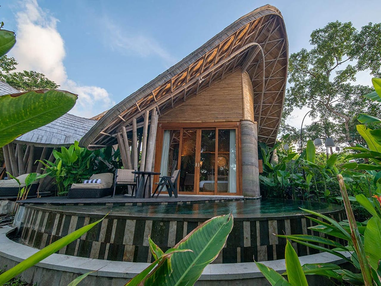
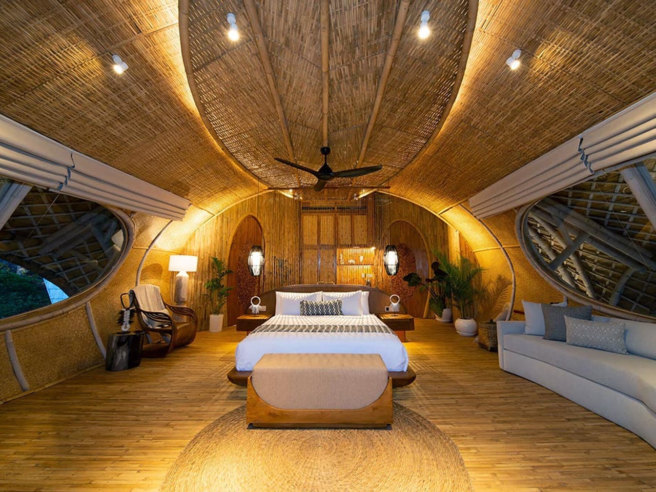
Contrary to the belief that sustainability requires sacrificing comfort, Ulaman Eco-Retreat Resort in Bali demonstrates that ecological responsibility can coexist with luxury. Designed by Inspiral Architects, this carbon-neutral resort is constructed primarily from bamboo and rammed earth, locally sourced materials that significantly reduce environmental impact.
Situated in Kaba-Kaba village, the resort showcases the structural and aesthetic potential of sustainable materials. Rammed earth, used for the ground-level walls, offers a low-emission alternative to concrete, while the curvilinear bamboo roofing blends cultural authenticity with structural beauty. Powered by hydroelectric energy from a nearby river, the resort includes a cliffside yoga studio and a meandering pool designed to reflect natural surroundings.
Rammed earth’s resurgence is not a design fad but a meaningful answer to today’s calls for beauty, sustainability, and lasting value. By choosing this ancient yet future-ready material, homeowners invest in sustainable luxury that elevates both life and environment. Its layered, monolithic presence creates a sanctuary that endures quietly elegantly, deeply responsible, and profoundly connected to the earth it rises from.
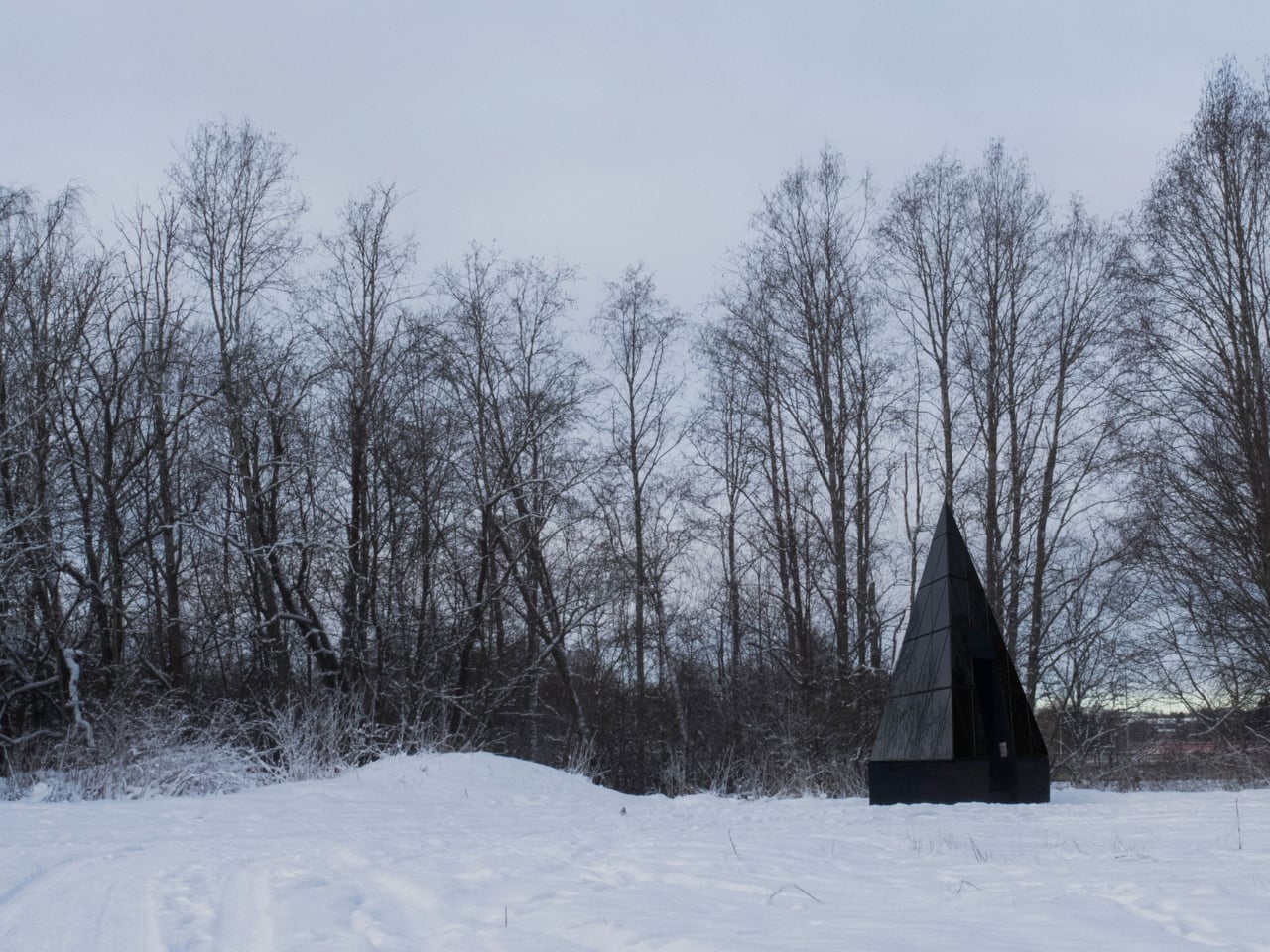
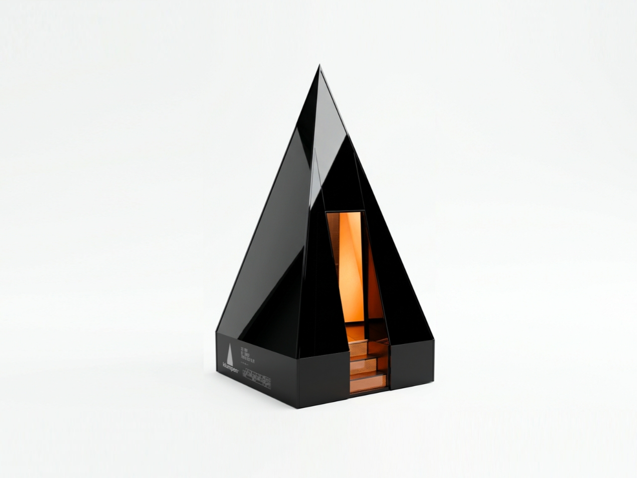
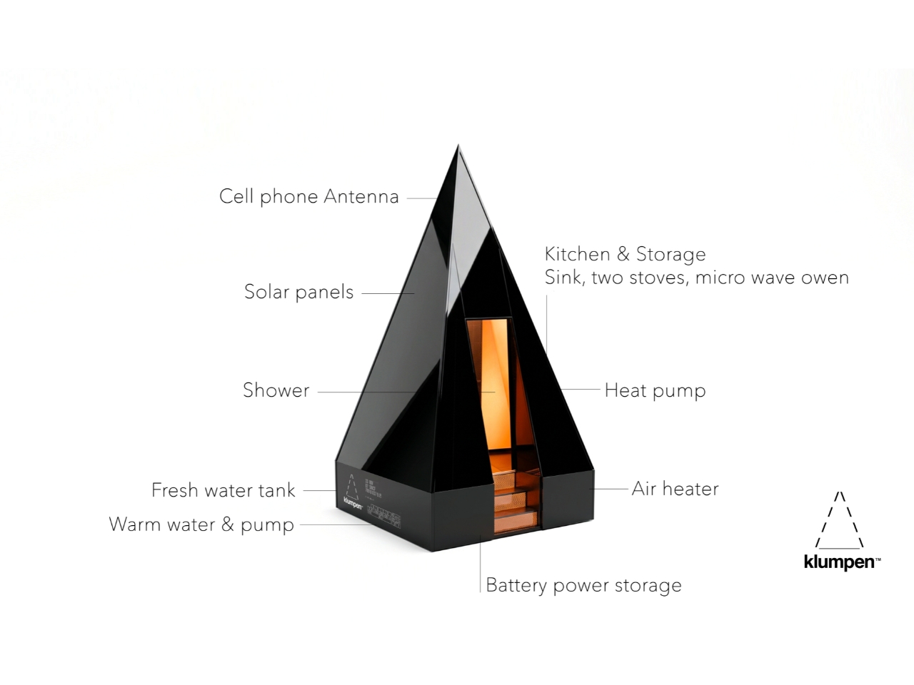
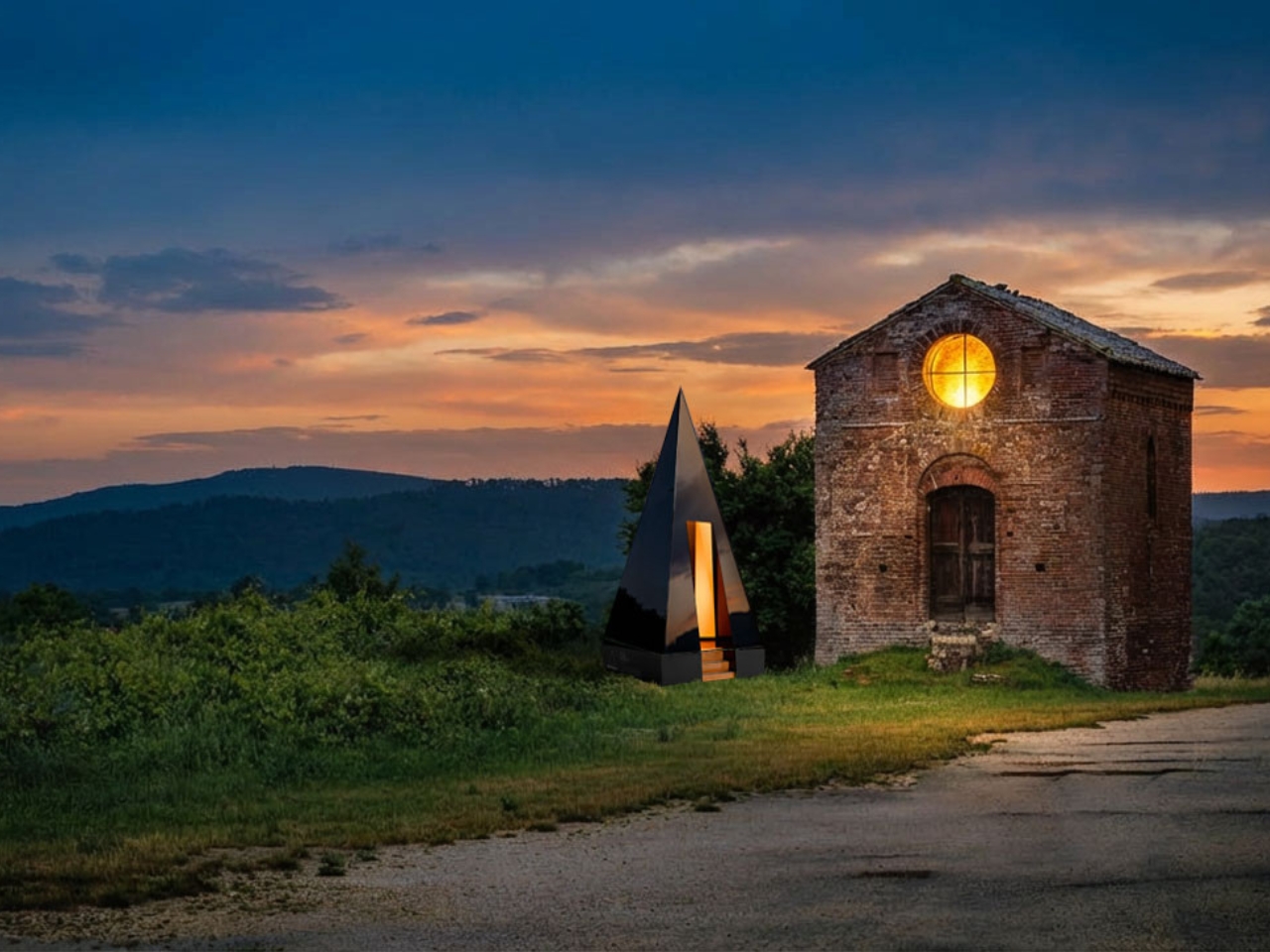
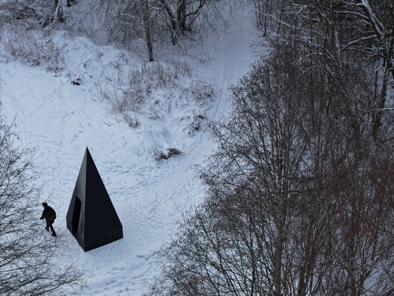
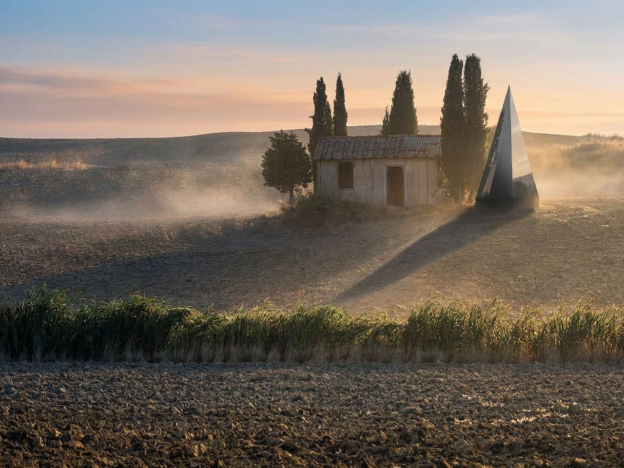
The first time I saw a photo of Klumpen, I thought someone had dropped a monolith into the Arctic tundra. A matte black pyramid, impossibly sharp against the snow, with a sliver of warm amber light cutting through its entrance. It looks like a prop from a science fiction film. But it is very much real, very much functional, and it is arriving very soon.
Klumpen is the work of Himmelsfahrtskommando, a Swedish architectural duo that includes designer Hannah Mazetti, with a studio name that roughly translates to “suicide mission” in German. Whether that is a philosophical statement or a dark joke about building in the Nordic winter, I am genuinely not sure. What I do know is that the thing they have built is one of the more quietly radical design objects I have come across in years. It asks a deceptively simple question: what if you did not need permission to be somewhere?
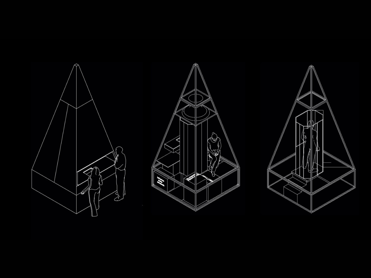
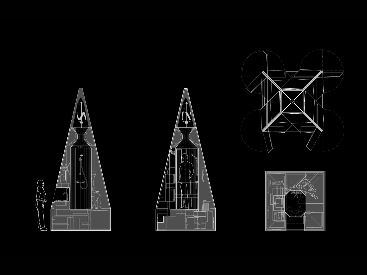
At just 7 square metres, Klumpen is technically a utility structure. But calling it that feels like calling the iPhone a phone. Inside this factory-built pyramid is a complete off-grid living infrastructure: a photovoltaic solar array running at 450 to 600 volts DC, a 7.5 kWh battery for storage, an air-to-water heat pump, a closed-loop greywater recycling system, satellite broadband, a shower, a lavatory, and a kitchen with two stoves, a sink, and a microwave. The pyramid shape, for the record, is not an aesthetic choice. The designers say it is simply the most efficient envelope for the specific stack of systems inside. Form follows function, very literally.
The prototype has already been tested through a real Arctic winter in northern Sweden, which tells you something important about how seriously they are taking this. It is one thing to announce a sleek off-grid concept on a design blog. It is another to actually freeze-test it in the dark of a Scandinavian January. The first production batch ships in September 2026, with a target retail price of $35,000.
That price will draw raised eyebrows, and fair enough. $35,000 is not nothing. But compare it to the cost of running utility lines to a remote plot of land, the legal labyrinth of planning permissions, the months of plumber schedules and contractor delays, and suddenly a plug-and-play pyramid starts to look like a reasonable proposition. You set it down on flat ground. You press ON. No permits. No plumbers. No waiting at the utility company. That is genuinely the promise.
I keep thinking about what that actually means for people. We have become so accustomed to depending on invisible infrastructures that we rarely stop to notice the stranglehold they have on where and how we can live. Want to build a simple structure on a piece of land you own? Prepare for months of negotiations with people who have never seen the land. Klumpen is not a protest against that system, exactly. It is something quieter. An elegant sidestep.
The designers frame this in terms of ownership and autonomy, drawing a line from ancient democracies, where property meant political voice, to a present where most people in the industrialised world either rent or carry mortgages on homes they will spend decades paying off. The argument is a little romantic, but it does not feel wrong. The degree to which we have outsourced control of our most basic needs, from electricity and water to warmth and connectivity, to external systems we cannot touch or meaningfully influence is worth taking seriously.
Is Klumpen going to solve the housing crisis? No. But the most interesting design objects rarely solve the biggest problems outright. What they do is shift the way people think about what is possible. A 7-square-metre pyramid that makes you genuinely independent of the grid, dropped in a meadow or on a hillside or beside a frozen lake in northern Sweden, does exactly that. It reframes a shed as a statement. The first batch launches in September. I would not be surprised if the waitlist fills fast.
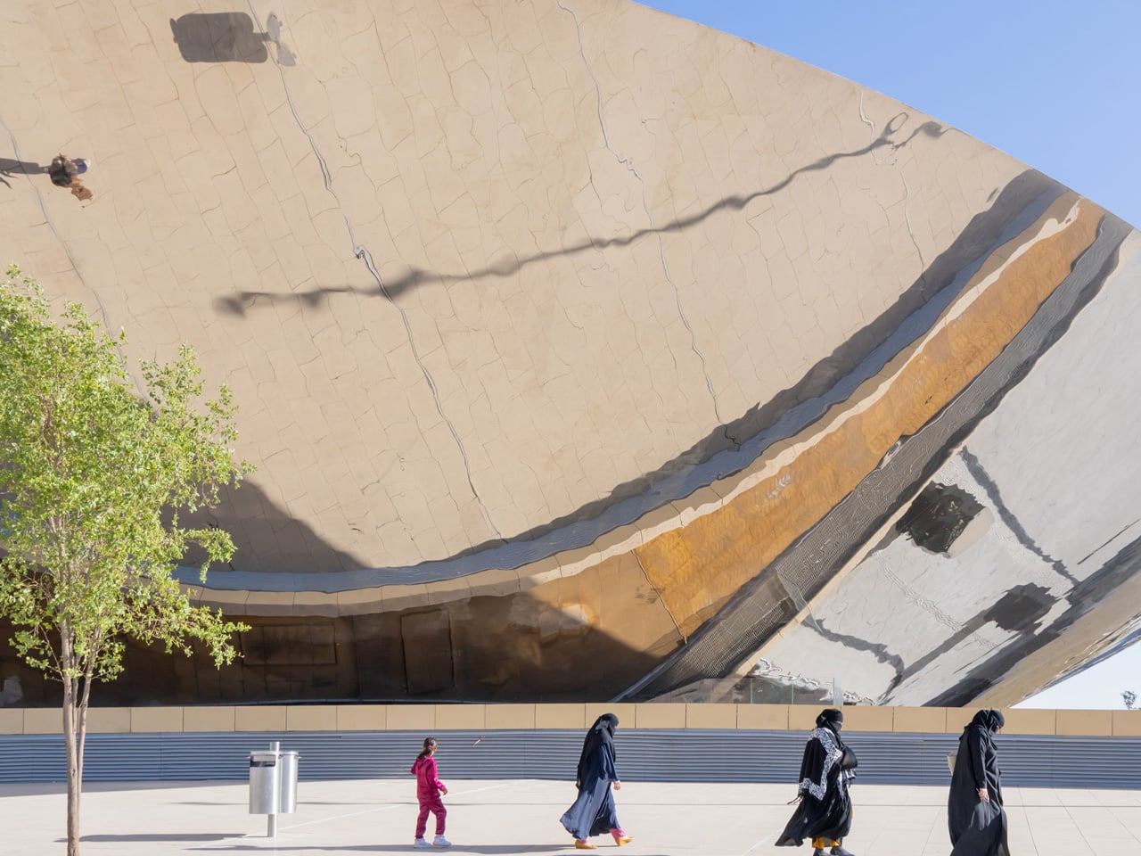
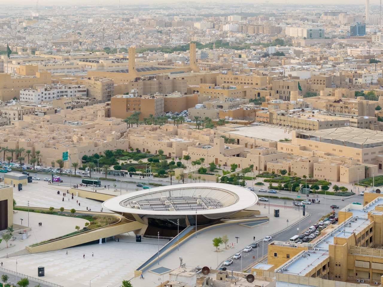
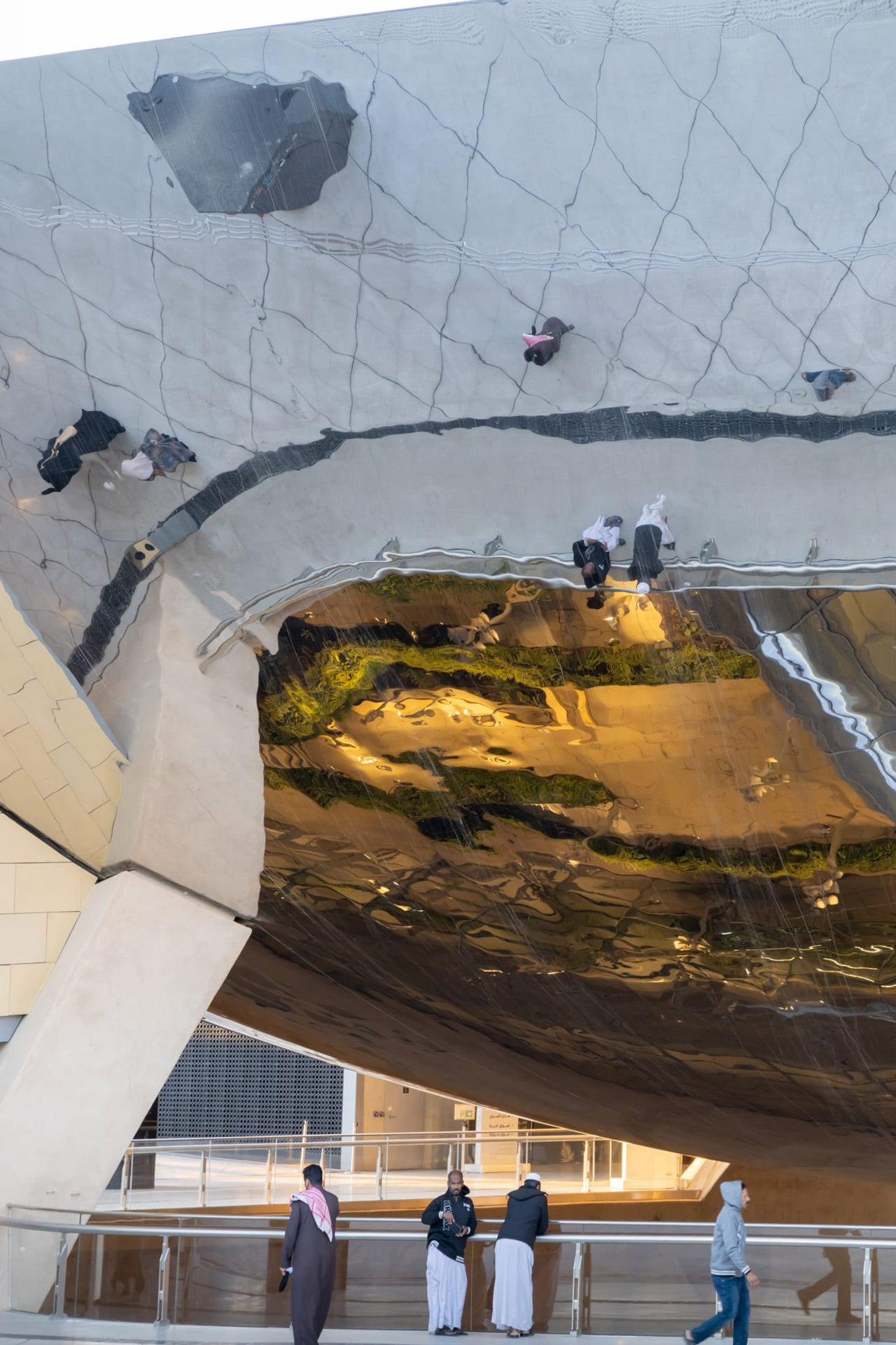
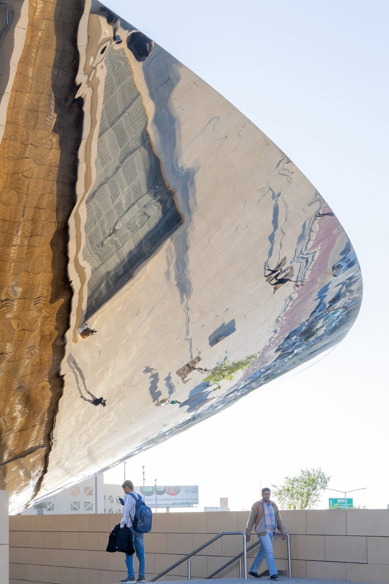
There is a moment, the architects at Snøhetta will tell you, when you step off the train at Qasr AlHokm and look up, and the entire city of Riyadh looks back at you. That is not a metaphor. It is exactly what happens beneath the station’s sweeping, mirror-polished stainless steel canopy, where a 360-degree reflection of the surrounding cityscape floats above commuters like a living panorama. It is disorienting in the best possible way, and entirely intentional.
Completed in 2025, the Qasr AlHokm Metro Station is one of four primary hubs within Riyadh’s expansive new metro network, a system now carrying up to 3.6 million passengers daily since it entered full operation in January 2025. The station sits in the heart of the historic Al Qiri district, adjacent to an Eid prayer field and a mosque, and within walking distance of the old palace grounds, a location that demanded both architectural sensitivity and civic ambition.
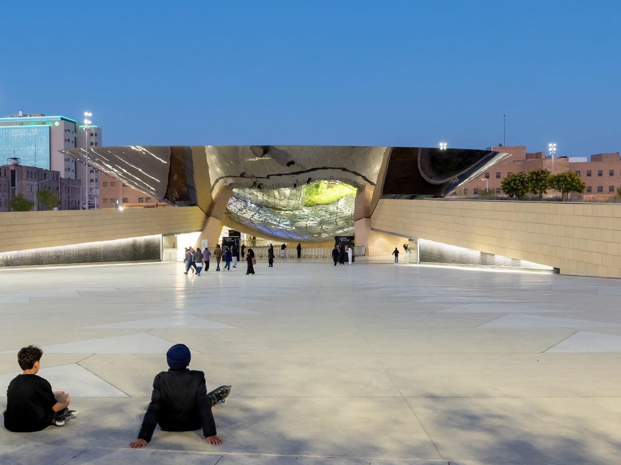
Snøhetta, working in collaboration with One Works and Cremonesi Workshop (Crew), first won the competition brief in 2012. The central concept remained remarkably consistent from that early vision: a transit station designed as an open urban plaza, where the threshold between city and subway is dissolved rather than defined. The bowl-shaped canopy, its underside ground to a flawless mirror finish, acts as what the team describes as an urban periscope. From above ground, the city is reflected downward into the station. From below, the underground world is projected back out. “Likewise, if you’re coming from the city, you look up into the canopy, and it mirrors everything that happens below,” explained Snøhetta partner Robert Greenwood.
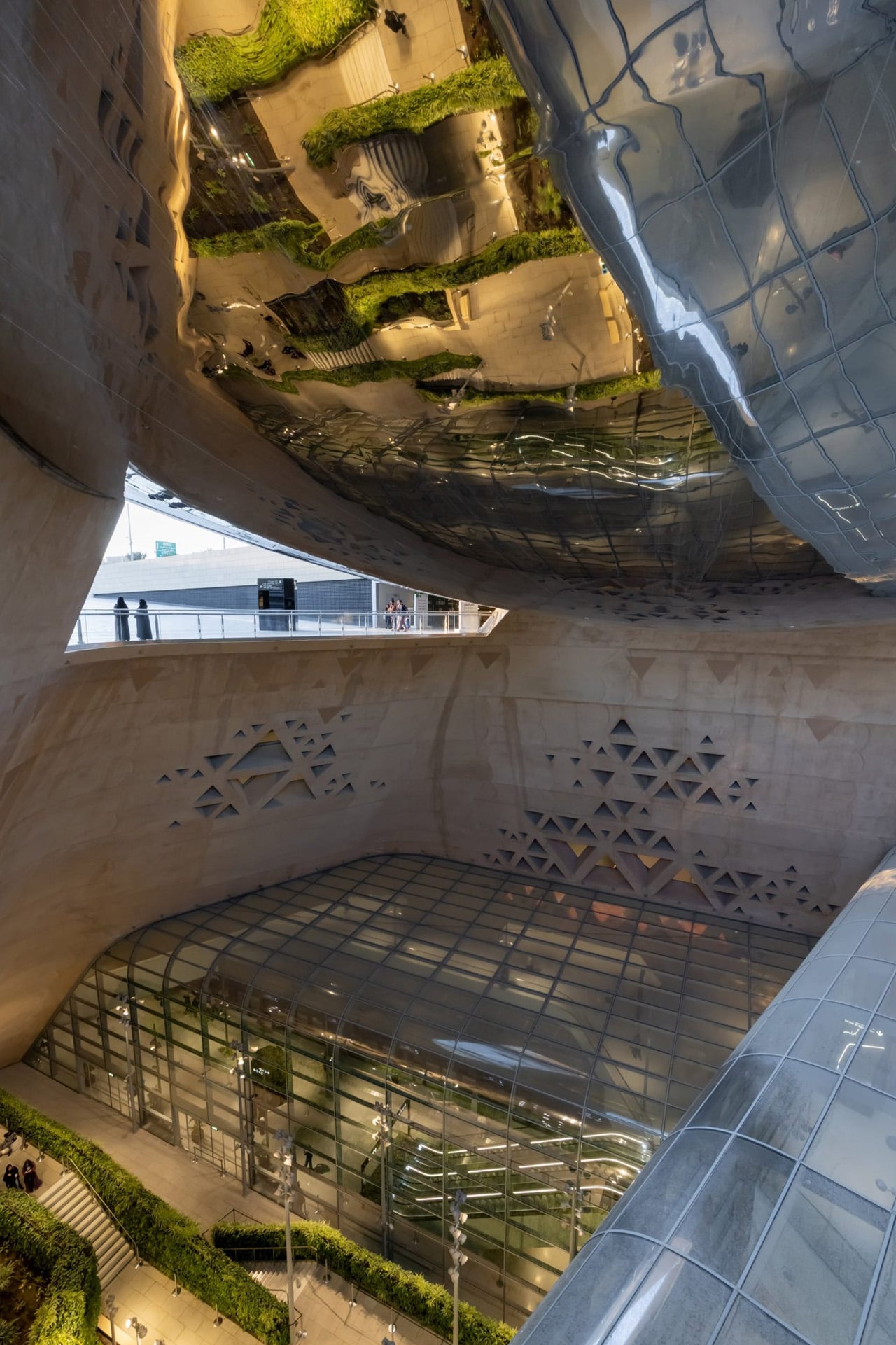
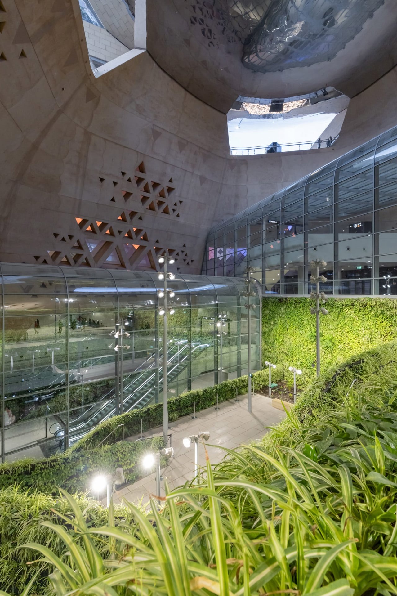
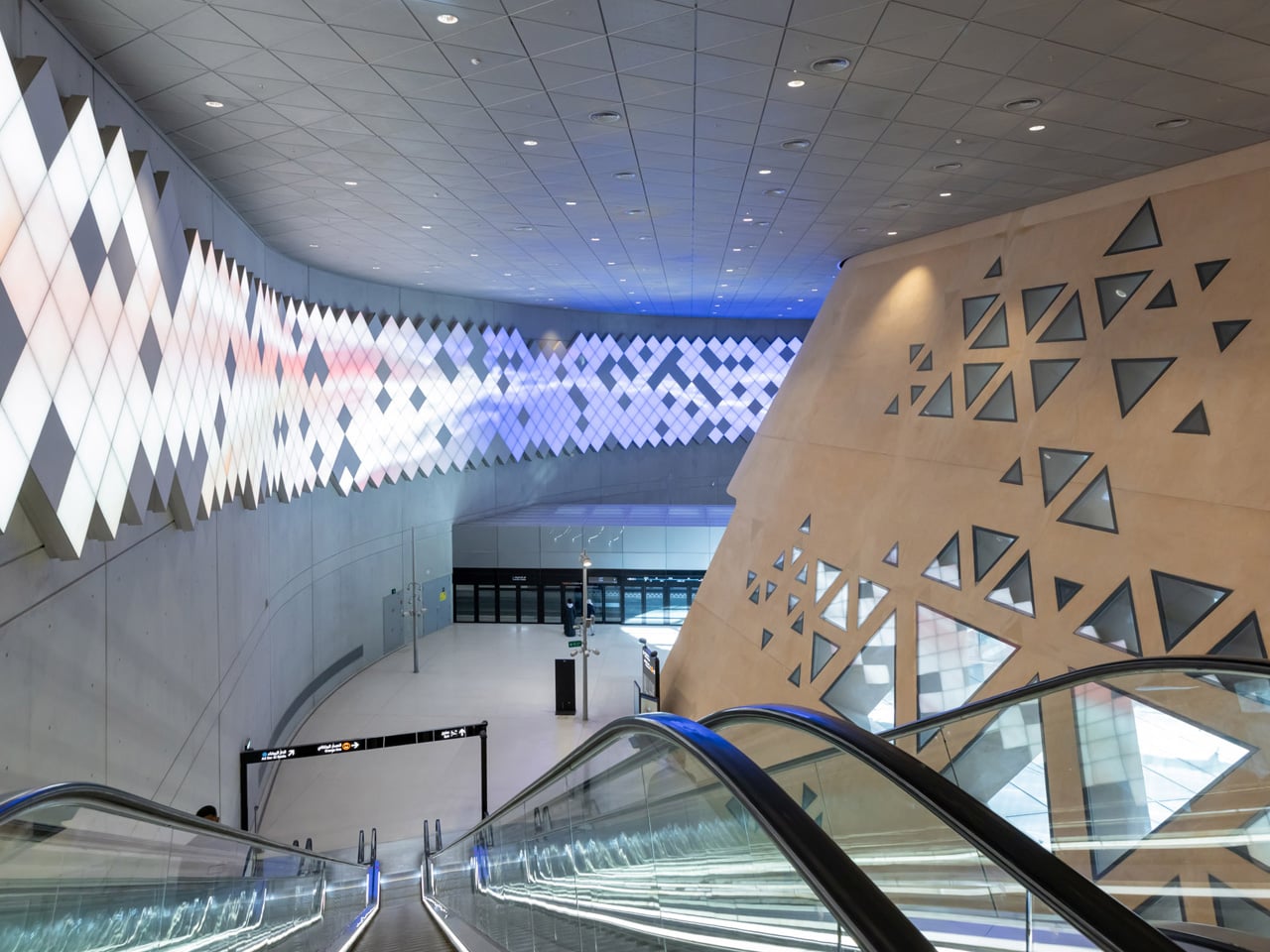
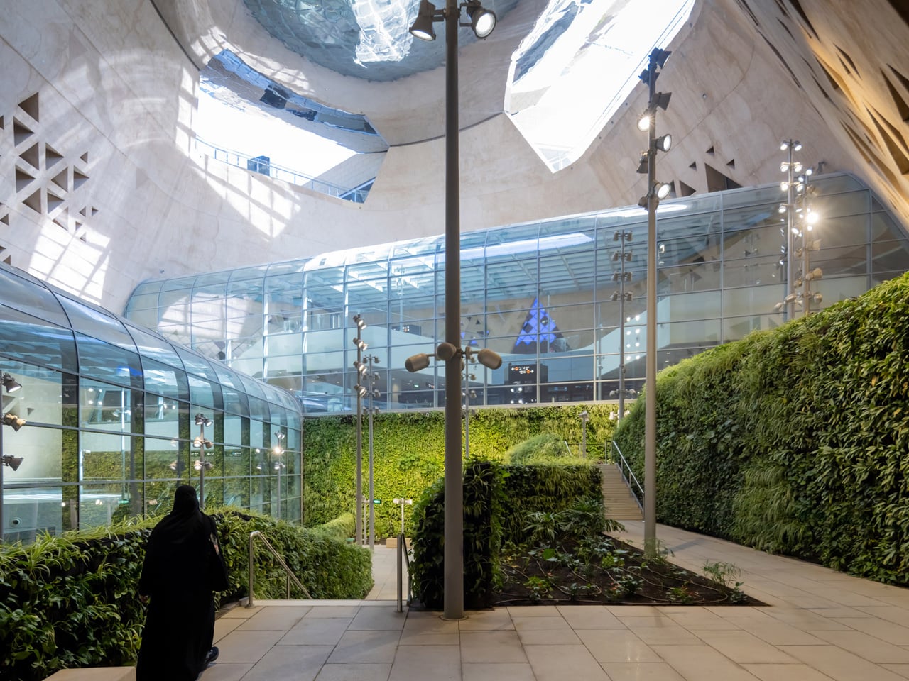
Sloped terrazzo floors draw visitors naturally under the canopy and into the station’s layered interior. There, a truncated cone-shaped atrium wall, its surface perforated by triangular openings drawn from the regional Najdi architectural tradition, encloses one of the station’s most unexpected gestures: a lush underground garden. In a city defined by heat and aridity, this green pocket offers genuine respite. Indigenous tree planting, natural ventilation, and photovoltaic panels complete a sustainability framework that goes well beyond a token gesture.
The building has not gone unrecognized. In November 2025, the Prix Versailles, presented under the patronage of UNESCO and the International Chamber of Commerce, named Qasr AlHokm one of the seven most beautiful train stations in the world, placing it alongside some of global architecture’s most celebrated transit spaces. What Snøhetta has built here is more than a station. It is a civic room, a place where infrastructure earns the right to be called architecture.
Most conversations about Big Tech and sustainability follow a familiar script: a company announces a carbon pledge, releases an environmental report full of impressive-sounding numbers, and everyone moves on. What rarely gets discussed is the messy, unglamorous reality sitting right at the center of it all: the data server room. That’s exactly where two design students decided to start, and the result is one of the most visually striking workplace concepts I’ve seen in years.
Lia Hur and Michell Hur, both from the Savannah College of Art and Design, began with a straightforward question: what do you do with all the heat that data servers constantly produce? The answer they arrived at wasn’t purely mechanical. It was spatial, experiential, and genuinely beautiful. Their Google Sustainable Headquarters concept won two awards at the European Product Design Award 2025, covering both Architectural and Building Design and Interior Design categories, and it’s easy to see why.
Designeres: Lia Hur, Michell Hur
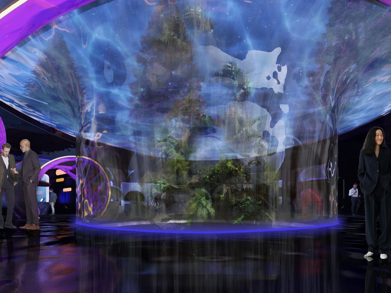
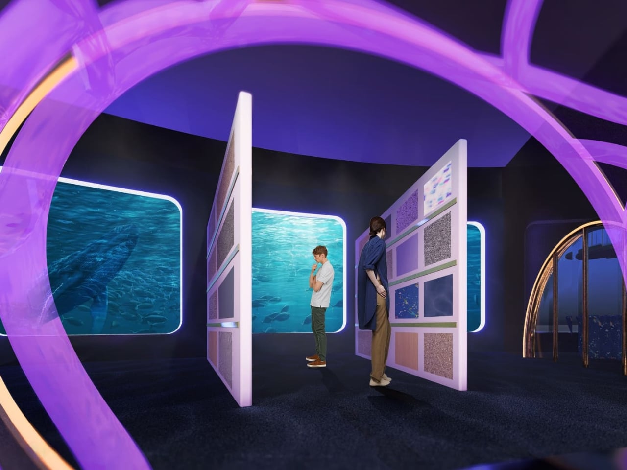
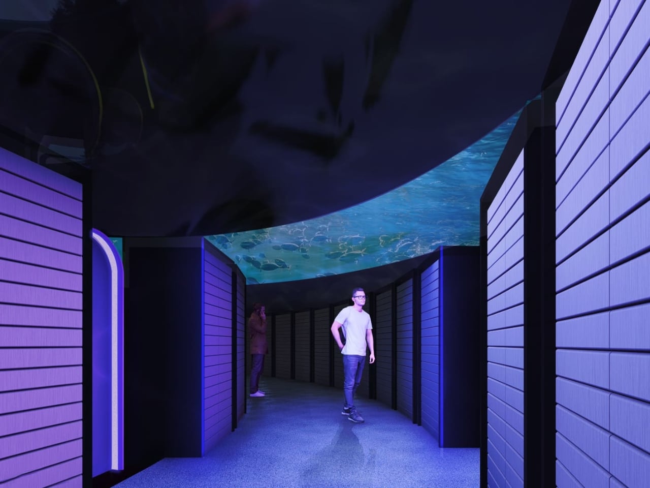
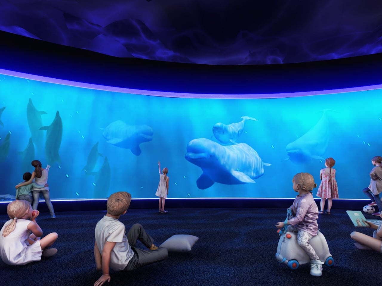
The first thing that strikes you when you look at the concept renderings is the ocean. Not metaphorically. The entire design language of the building is built around the visual world of the deep sea. Curved panoramic screens wrap around rooms showing beluga whales gliding through blue water. Children sit on the floor of an immersive theater-like space, completely surrounded by marine life projected at scale. In the server corridor, where rack upon rack of hardware lines both sides of a narrow hallway, the ceiling opens up into a curved screen of swimming fish, as if the infrastructure beneath the ocean surface and the ocean itself had somehow merged into a single space.
It’s an unexpected choice, and it works precisely because it’s unexpected. Data centers and ocean imagery have no obvious connection, until you start thinking about cooling systems, water usage, and the thermal logic that governs how these buildings function. The Hurs don’t explain the metaphor didactically. They just build the world and let you inhabit it.
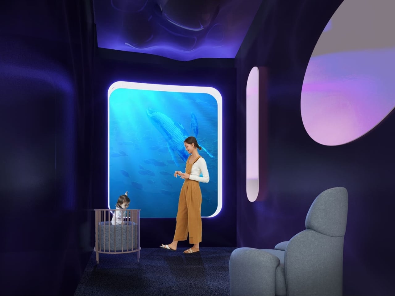
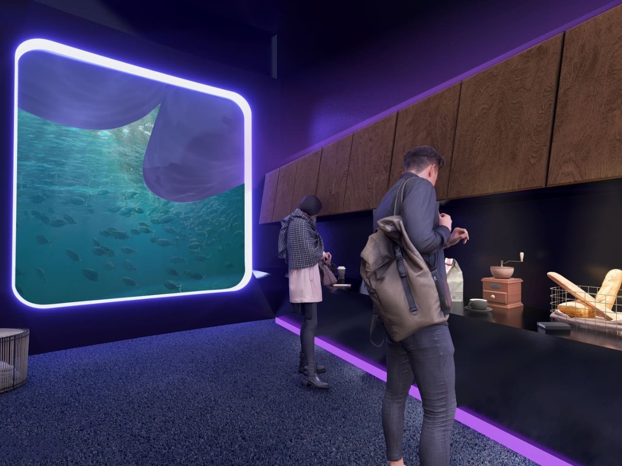
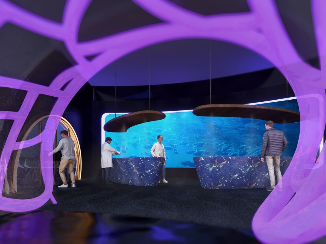
The interior language carries this through every zone of the building. The reception lobby, viewed through an oversized organic lattice structure that reads like coral or a cross-section of a neural network, features terrazzo-style desks in deep ocean blue and warm wooden disc pendants floating overhead. A café break area has a single rounded square window framing an underwater manta ray, glowing white against dark walls. A mother’s room has the same window format, this time showing a humpback whale drifting slowly past, turning what could have been a purely functional space into something quietly meditative.
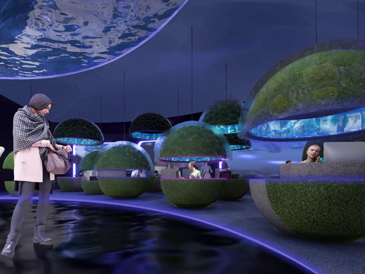
The workspace pods are where the concept gets most sculptural. Spherical forms covered in live moss float through an open floor plan, each one glowing from a lit band around its middle, like a planet seen from space. Workers tuck themselves inside. The ceiling above them ripples with projected water. It feels less like an office and more like an ecosystem you happen to work inside.
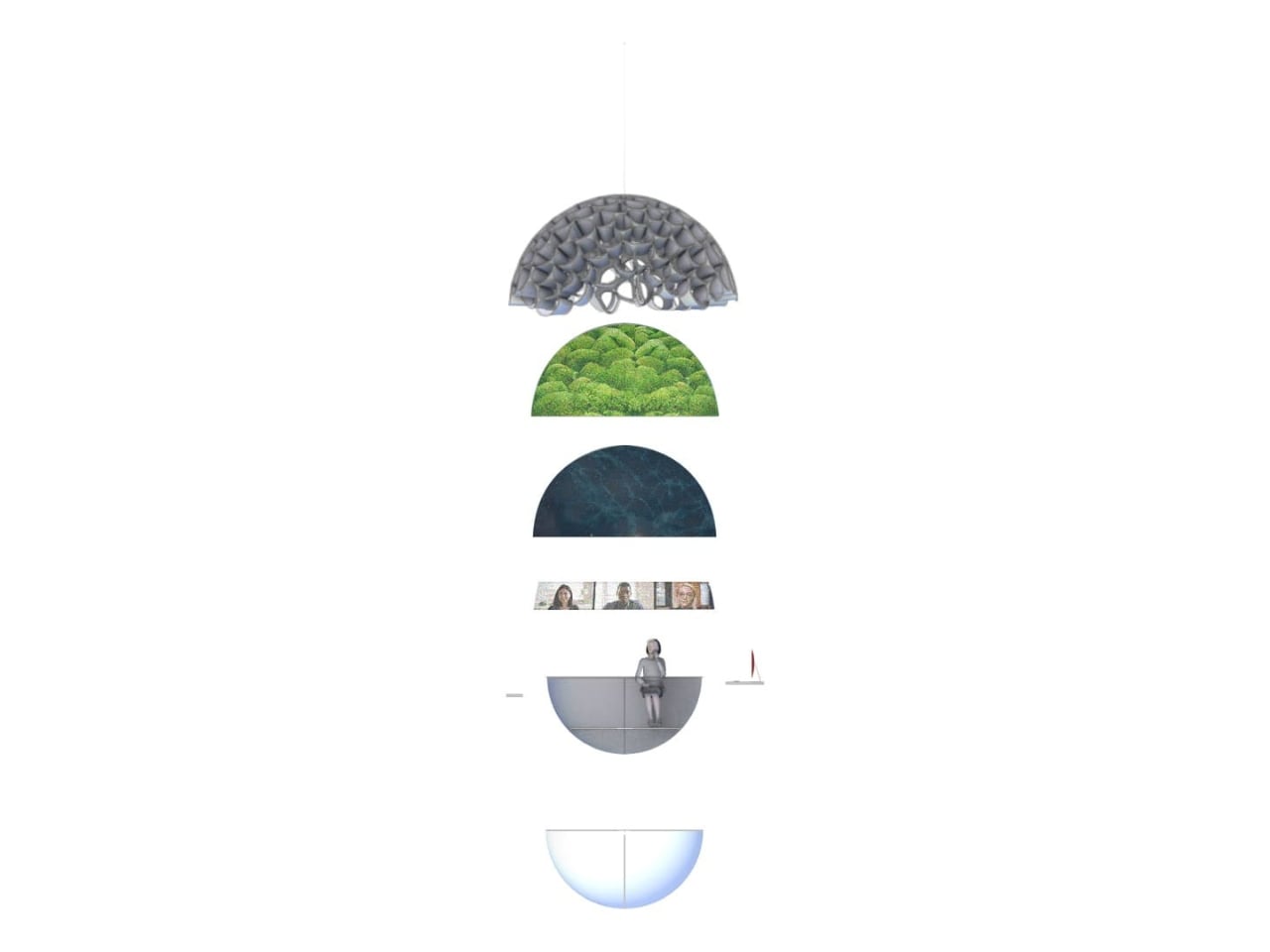
What I find most compelling is the section diagram the designers included. Stripped down to its basic geometry, the building reads as a stacked series of layers: a textured structural dome at the top, a living green layer beneath it, a dark water layer below that, and then human occupation at the base. It’s a quietly radical idea. The building isn’t sustainable because it has a green roof or offsets its emissions. It’s sustainable because it’s organized around natural systems at a structural level, with heat, water, and living material all functioning together as a closed loop.
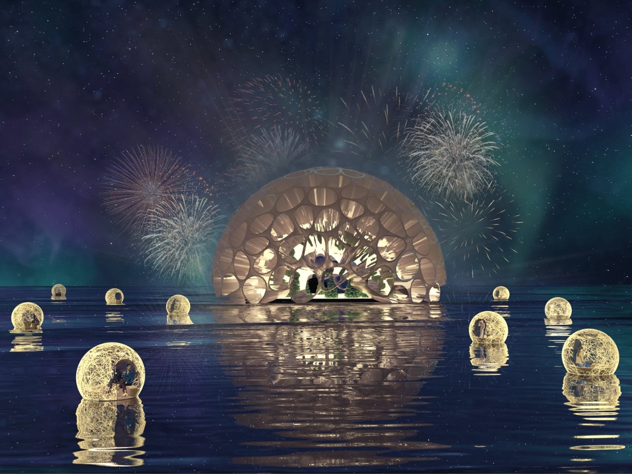
The exterior pulls all of it together. A large dome structure sits directly on water, its skin formed from interlocking bubble-like cells that glow from within. Smaller spherical pods float on the surface around it. Looking at it under a sky of northern lights, it reads more like a research station on another planet than a corporate headquarters.
That’s not a criticism. It’s a sign that Lia and Michell Hur weren’t trying to design a building that looks sustainable. They were trying to design one that makes you feel what sustainability could actually mean, and that’s a much harder thing to do. They pulled it off.
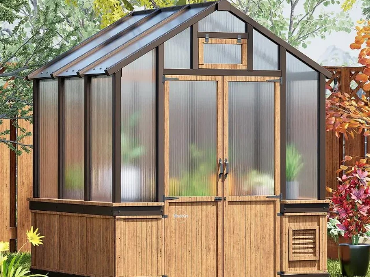
Every gardener knows the frustration. A late frost wipes out seedlings. An unpredictable cold snap cuts the season short. A small yard leaves little room to work with. For most backyard growers, these aren’t occasional setbacks. They’re the norm. The Miracle-Gro® Wood Greenhouse, now available through ShelterLogic, is designed specifically to change that reality.
ShelterLogic isn’t new to outdoor structures. With more than 70 years of experience, the company has built a portfolio of trusted brands including ShelterLogic, SOJAG, Arrow Storage Products, and Quik Shade, along with a reputation for outdoor products that are built to last. Their licensed collaboration with Scotts Miracle-Gro brings that same commitment to the gardening space, pairing a name synonymous with plant care with structures built around durability and smart design.
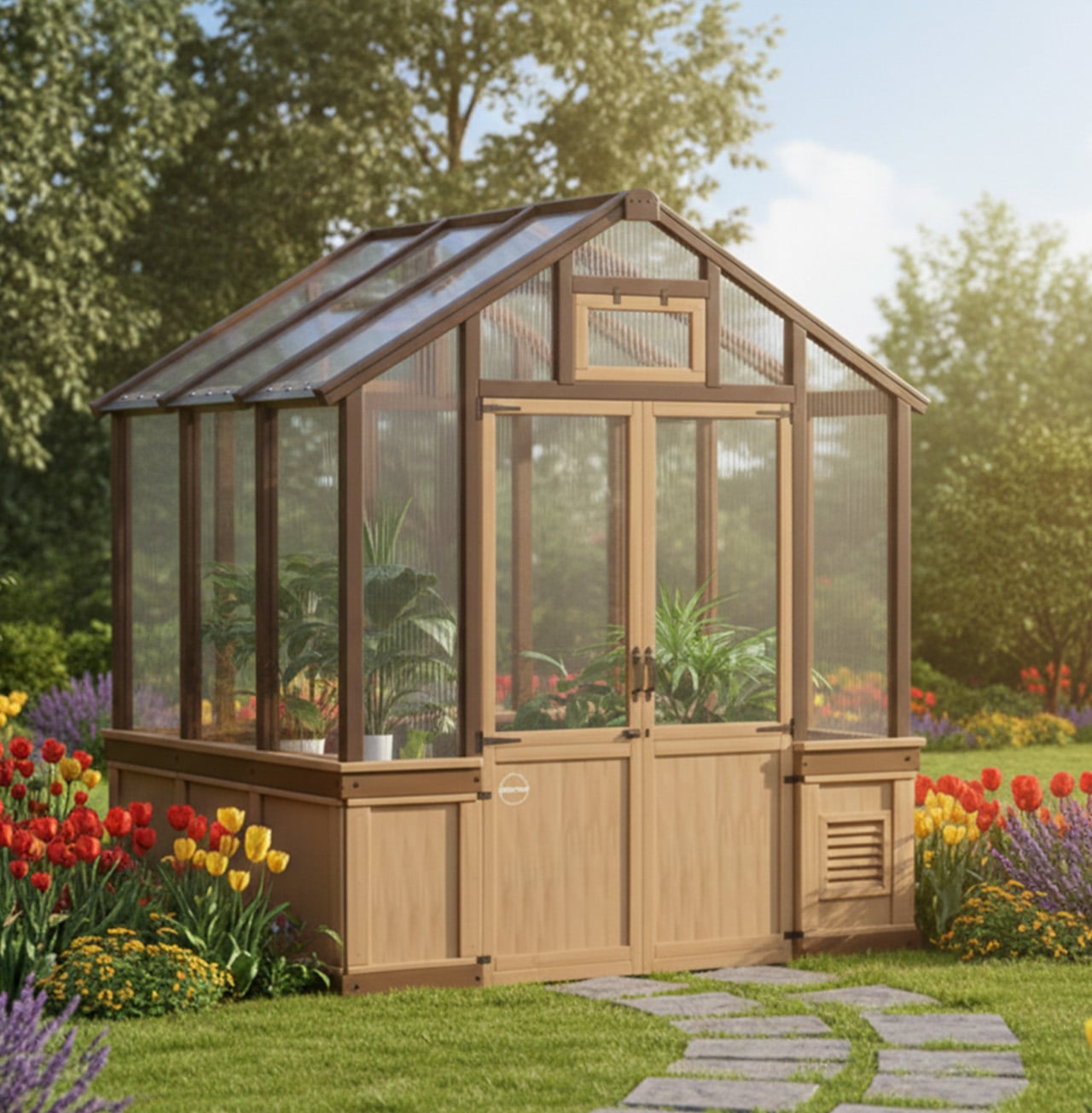
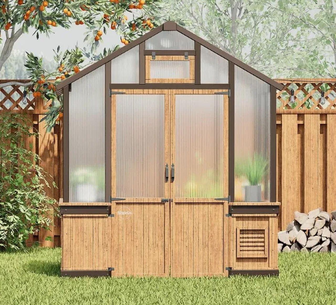
The greenhouse is constructed from Chinese Fir sourced from FSC-certified lumber, giving it a warm, natural aesthetic that sits comfortably in almost any backyard setting. It doesn’t look like an afterthought. It looks like it belongs. The wood frame is sturdy, responsibly sourced, and ready for outdoor conditions, making it exactly what you’d want from a structure designed to live outside year-round.
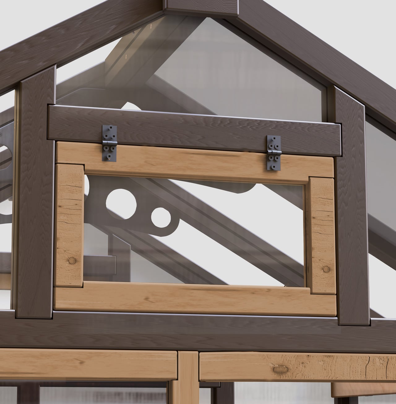
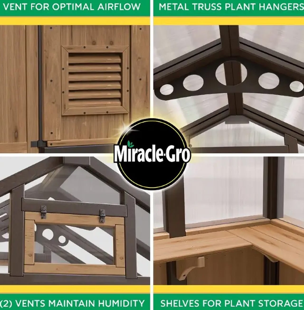
Where this greenhouse really earns its place is in how it handles climate. Rather than standard single-wall panels, it uses double-wall polycarbonate windows that offer stronger insulation and improved UV protection. Plants stay warmer in cooler months and are better shielded during intense sun. Ventilation is equally well thought out, with two manual roof vents, an EZ-open gable vent, and a powder-coated metal wall vent working together to regulate temperature and keep air circulating consistently.
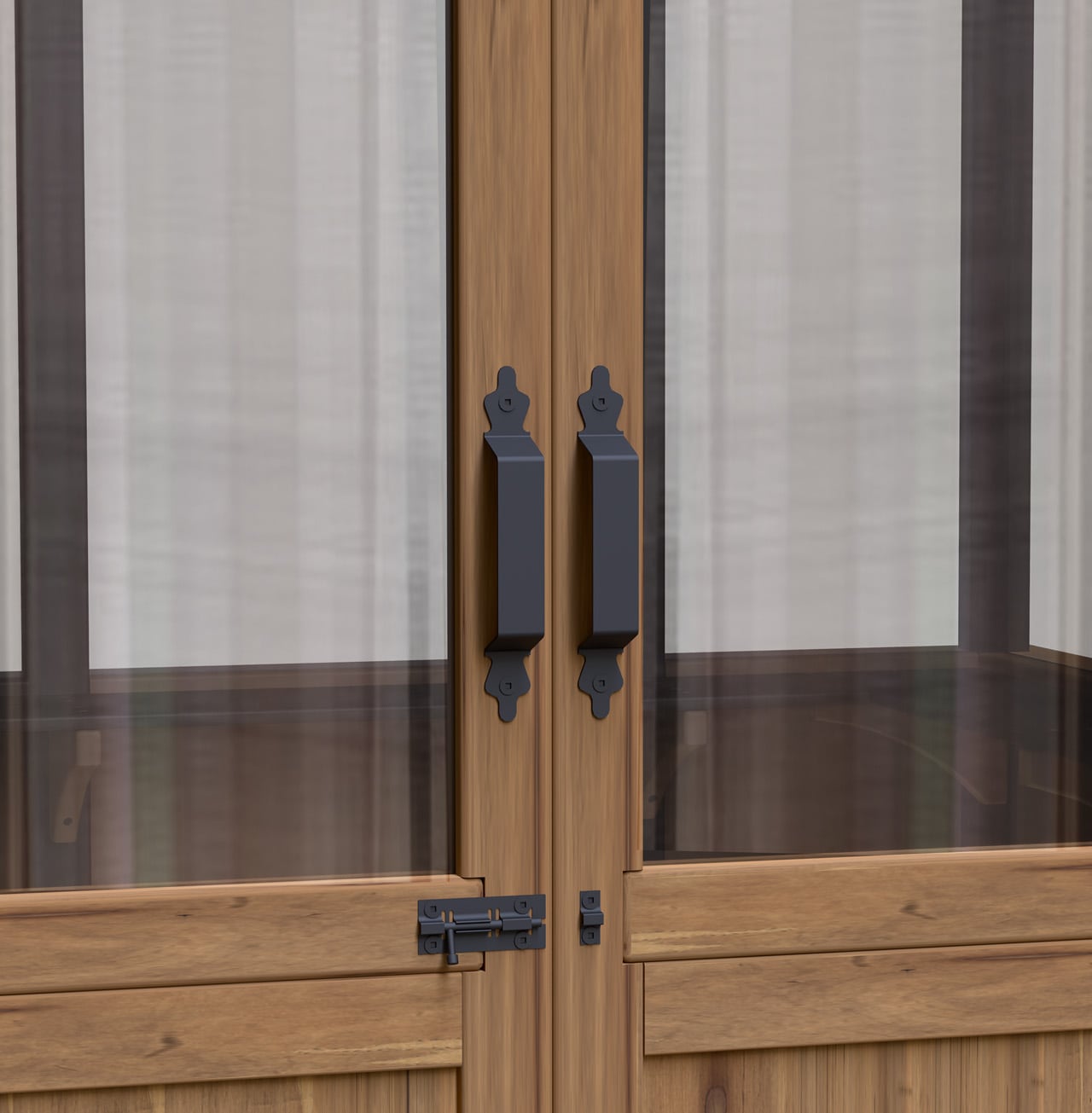
Inside, the layout prioritizes productivity. Lower interior shelving runs throughout the structure, while two metal truss plant hangers open up vertical growing options. A wide 48-inch entry door makes moving tools, pots, and plants in and out easy without the usual awkward maneuvering. At 6 ft x 7 ft x 8.5 ft, the footprint is compact enough for suburban yards without sacrificing usable space.
Setup, often the most dreaded part of any greenhouse purchase, is designed with the same practicality. Preassembled panels, pre-stained wood components, and included ground stakes mean less time wrestling with instructions and more time planting. For beginner greenhouse owners, backyard vegetable growers, and DIY enthusiasts alike, the Miracle-Gro® Wood Greenhouse offers a protected, productive growing environment that extends what’s possible in a backyard garden, regardless of what the weather decides to do.
A bookstore should do more than sell books. At its best, it alters how you perceive the act of reading, the space around you, and the relationship between the two. The five bookstores in this list abandon conventional retail interiors entirely. They borrow from astronomy, geology, wetland ecology, and mountain landscapes to create spaces where the architecture becomes as absorbing as anything on the shelves. These are rooms that make you forget walls exist.
What connects them is a shared refusal to treat books as products needing display. Instead, each project treats the book as a spatial protagonist, something that informs the shape of ceilings, the curve of shelves, and the way light enters a room. From a portal to deep space in Jiangsu to a mountaintop perch above a river canyon, these bookstores prove that the most effective retail design does not sell to visitors. It transports them.
1. X+Living Bookstore
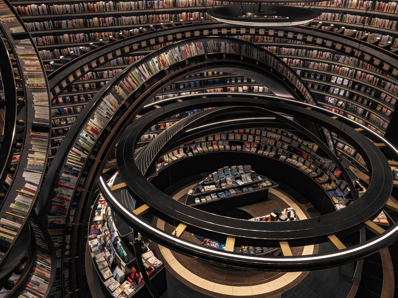
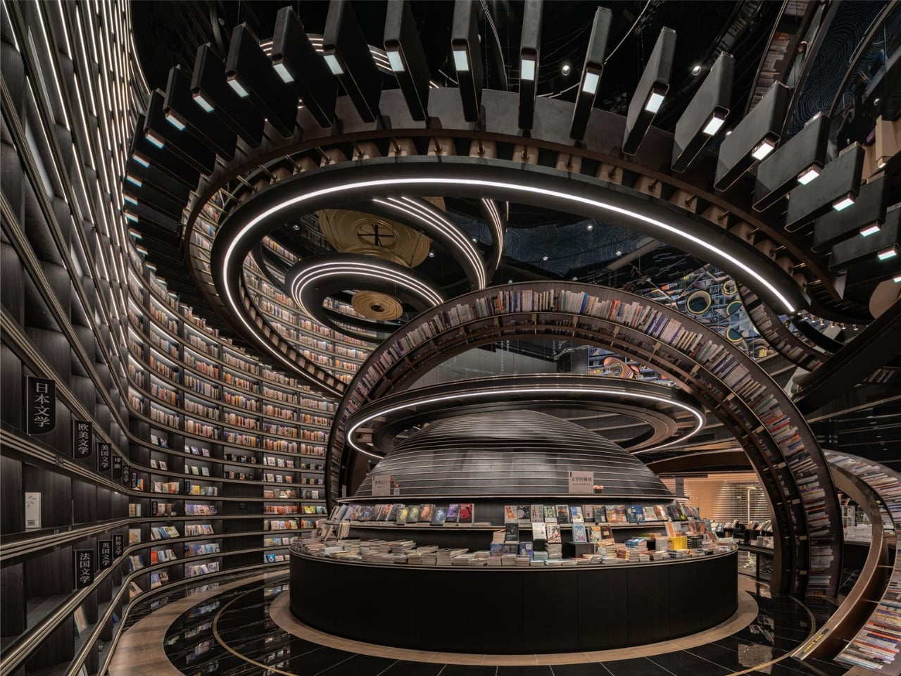
Located in Jiangsu Province and completed in 2023, this bookstore by Li Xiang of X+Living studio is the furthest thing from a cozy reading nook. The space is built around massive three-dimensional structures that resemble astronomical instruments, concentric rings, and geometric forms inspired by celestial mechanics, reimagined as bookshelves and display zones. Books sit on these structures in positions that seem to defy gravity, creating the sensation of browsing a library adrift somewhere in deep space. The project won the 2025 Platinum A’ Design Award in Interior Space and Exhibition Design, which signals how far the concept pushes beyond conventional bookstore interiors.
The spatial ambition is the story here. Most bookstore designers work with shelving grids and lighting schemes. X+Living built a set piece. The concentric ring structures occupy the room not as furniture but as architecture within architecture, turning navigation into an experience of orbiting through layers of books arranged on curving, tilted surfaces. The scale of the installation relative to the room makes it impossible to separate the act of browsing from the act of inhabiting the space. Visitors are not walking through a store. They are moving through a constructed universe that happens to contain books.
What we like
The astronomical instrument forms function as both structural shelving and immersive scenography, collapsing the boundary between retail and installation art.
The Platinum A’ Design Award validates a level of spatial ambition that most bookstore designs never attempt, let alone execute at this scale.
What we dislike
The dramatic structures may prioritize visual spectacle over browsing comfort, making it difficult to linger and read in a space designed to overwhelm.
Wayfinding through concentric, gravity-defying shelving is disorienting by design, which can frustrate visitors looking for specific titles rather than an experience.
2. Toyou Bookstore
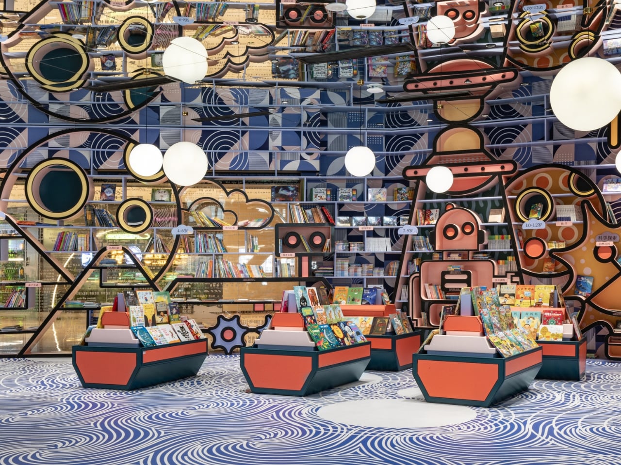
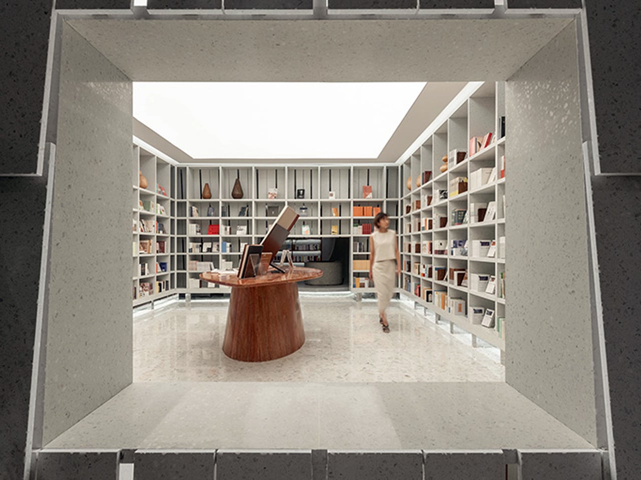
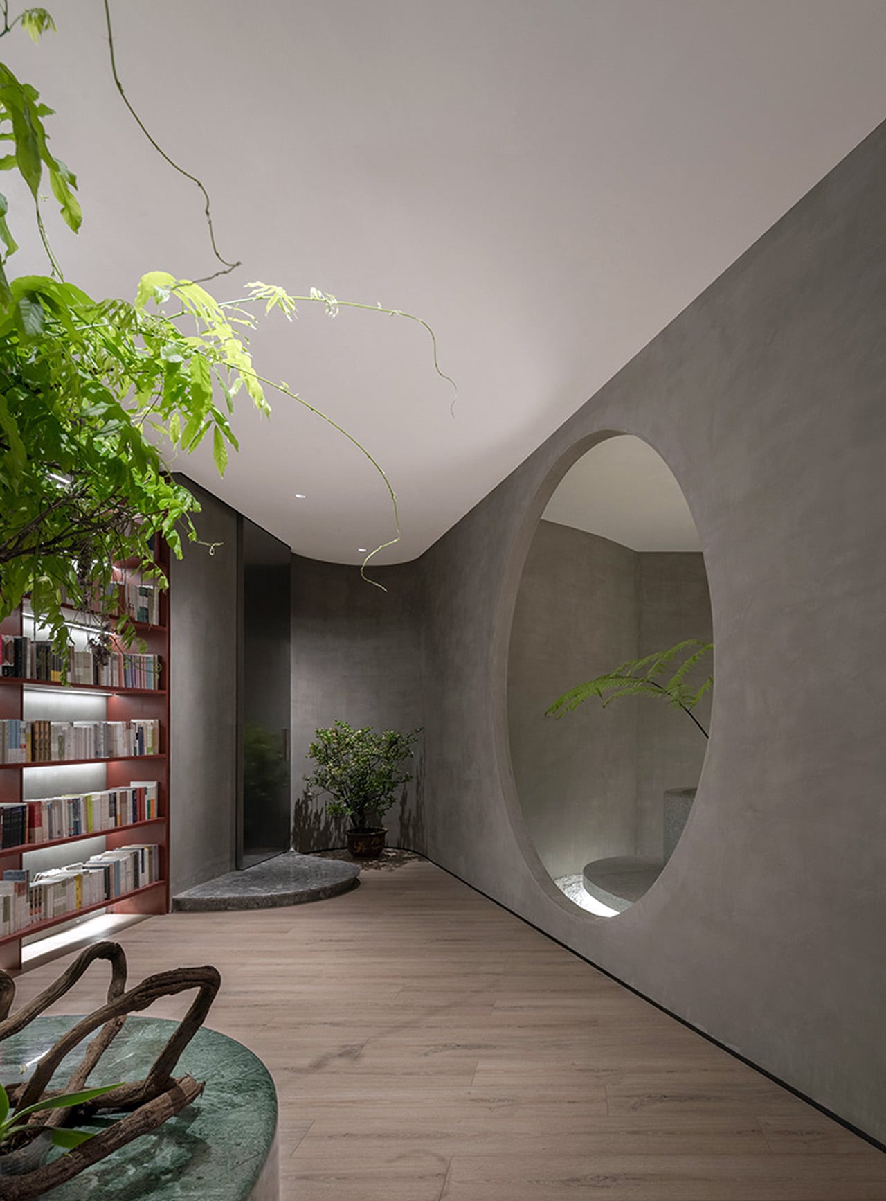
Wutopia Lab designed Toyou bookstore inside a red-brick building by Jean Nouvel in Shanghai’s Huangpu district, using traditional Chinese garden techniques as spatial logic rather than decoration. The interior is organized around two abstract mountains, “Big You” and “Little You,” which form interlocking cave-like spaces out of burgundy perforated aluminum panels and white artificial stone. The “Little You” mountain greets visitors at the entrance as a glowing white bookshelf, while the larger “Big You” mountain houses the main reading and living areas behind layers of bookshelves that create new views at every turn.
The garden-design principle at work here is “a view at every step,” and the architects execute it with the kind of precision that makes each transition between spaces feel composed rather than accidental. A circular “secret place” sits between the two mountains as a private reading zone, while hidden metaphors (a well, a dripping spring) reference classical Chinese poetry. Lead architect Yu Ting has described the bookstore as a tool for understanding Shanghai itself, a miniature cultural complex that accepts readers and non-readers alike. The result is a space that feels ancient and contemporary at once, where cave walls are made of perforated aluminum and mountain peaks are bookshelves.
What we like
The garden-design approach creates a sequence of spatial discoveries that rewards slow movement and repeated visits rather than efficient browsing.
Wutopia Lab’s decision to house the bookstore inside a Jean Nouvel building creates a layered dialogue between two architectural languages.
What we dislike
The cave-like enclosures and perforated panels limit natural light penetration, which could make extended reading sessions uncomfortable without careful artificial lighting.
The density of metaphor (mountains, wells, springs, caves) risks reading as overwrought to visitors unfamiliar with Chinese garden-design traditions.
3. Xixi Goldmye Bookstore
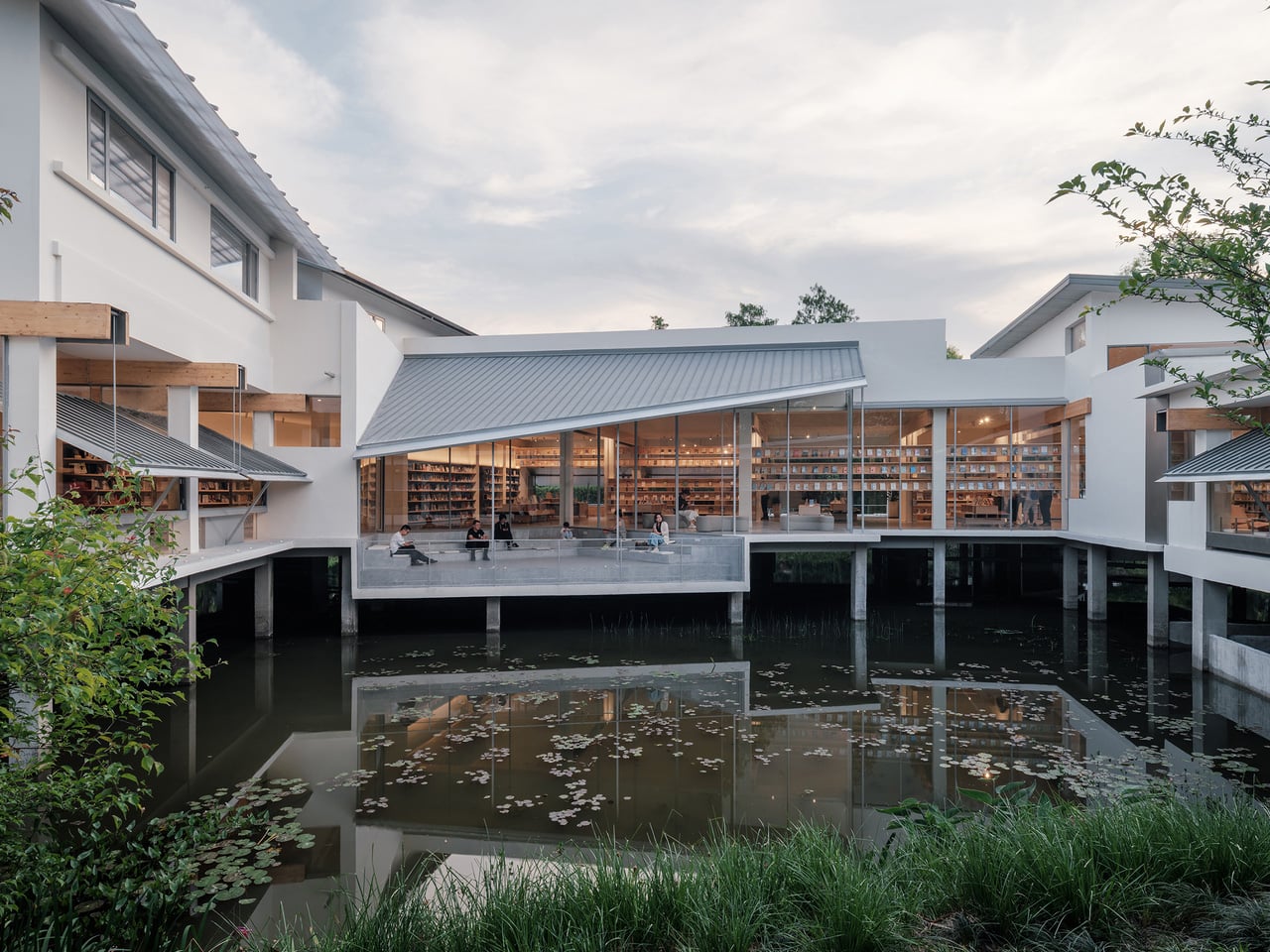
What started as a forgotten 20-year-old office building in Hangzhou’s wetlands is now one of the most compelling adaptive-reuse bookstores in China. Atelier Wen’Arch stripped the structure to its bare concrete columns, dismantled the existing roof and wall systems completely, and rebuilt an 880-square-meter space that opens generously to the surrounding Xixi National Wetland Park. The U-shaped building, once closed off and disconnected from its natural setting, was completed in April 2025 as a structure that treats the wetland landscape as its primary interior surface.
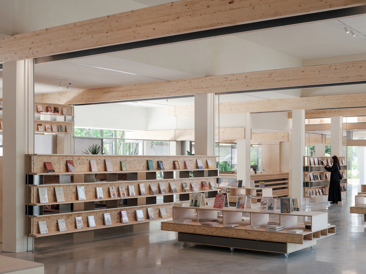
The defining feature is a system of laminated pine timber “book beams” that intersect with the original concrete columns and extend outward in measured cantilevers. These double-beam elements integrate lighting and air conditioning return channels between each timber pair, turning mechanical infrastructure into an architectural rhythm that runs through the entire interior. The beams frame views of the wetland, so the surrounding nature becomes a living artwork visible from every reading position. The structural intervention aligns with the original building grid while introducing warmth and human scale to what was once sterile office space. It is renovation as reinterpretation, where the old bones inform a new spatial logic.
What we like
The “book beam” system transforms structural engineering into the primary design language, making infrastructure legible and beautiful rather than hidden.
Opening the formerly closed U-shaped plan to the wetland park turns the surrounding landscape into the bookstore’s most powerful design element.
What we dislike
Wetland-adjacent construction faces ongoing humidity and moisture challenges that will test the longevity of the laminated pine timber beams.
The remote wetland location, while scenic, limits foot traffic compared to urban bookstores, raising questions about long-term commercial viability.
4. Xinglong Lake Citic Bookstore
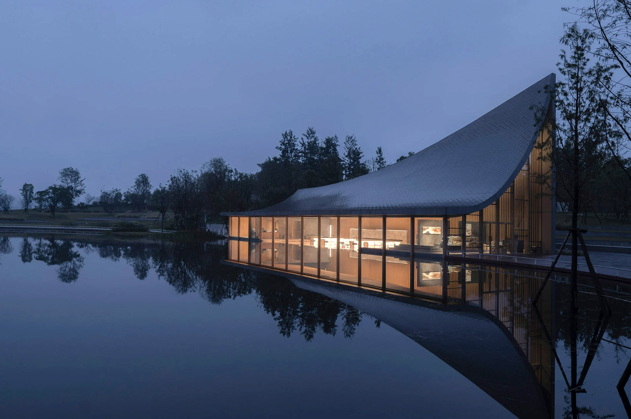
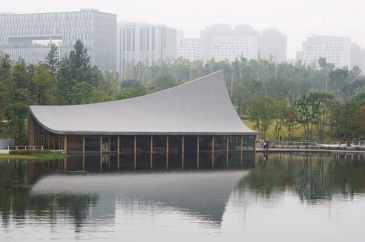
MUDA Architects designed this waterfront bookstore around a single image: a book falling from the sky. The rectangular structure sits at the edge of Xinglong Lake in south Chengdu, and its swooping roof extends for 3 meters with both ends elevated at different heights (16 meters at the southwest, 7.5 meters at the northeast). The curve mimics a nearby grass slope, creating a continuous visual line between the built form and the landscape. Massive windows extend below the waterline, merging the reading interior with the surface of the lake.
The roof is the architectural argument. Its curved surface reinterprets the pitched roof of traditional Chengdu vernacular architecture while functioning as a structural analog for the pages of an open book. The asymmetric elevation creates interior volumes that shift dramatically from one end to the other, high and cathedral-like at the southwest, compressed and intimate at the northeast. That gradient gives each section of the bookstore a different spatial character without partition walls. The underwater windows are the most disorienting detail: readers seated near the water level see the lake from inside it rather than above, which dissolves the expected boundary between interior and landscape in a way that no amount of floor-to-ceiling glazing can replicate.
What we like
The asymmetric roof creates a gradient of spatial experiences within a single open interior, from expansive to intimate, without any walls.
Below-waterline windows dissolve the boundary between the reading space and the lake, producing a perspective that no conventional glazing strategy can achieve.
What we dislike
The roof’s dramatic curvature dominates the structure so completely that the bookstore’s identity is inseparable from a single architectural gesture, leaving little room for the interior to develop its own language.
Waterfront and below-waterline glazing demand constant maintenance and waterproofing attention that will compound as the building ages.
5. Nujiang Grand Canyon Bookstore
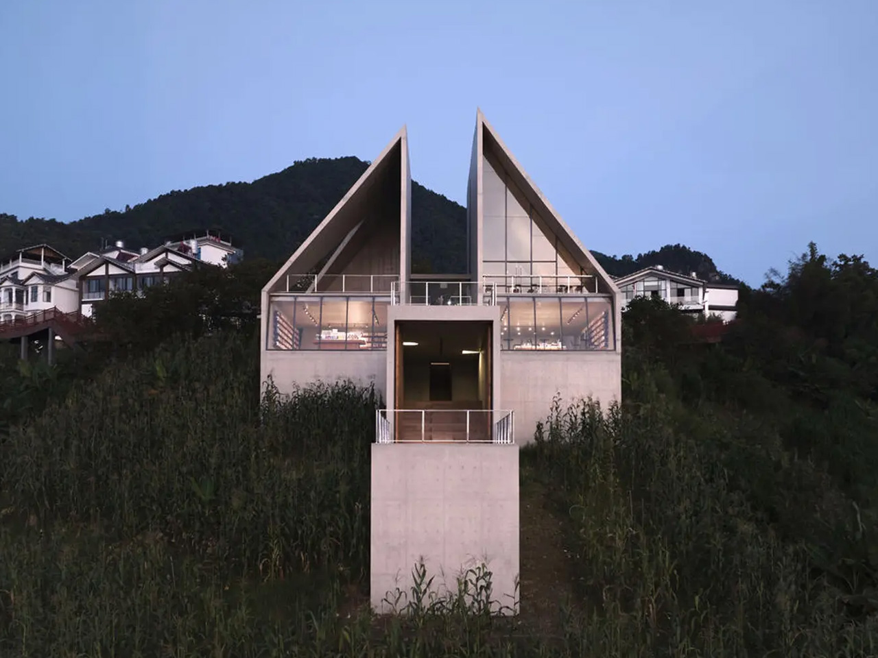
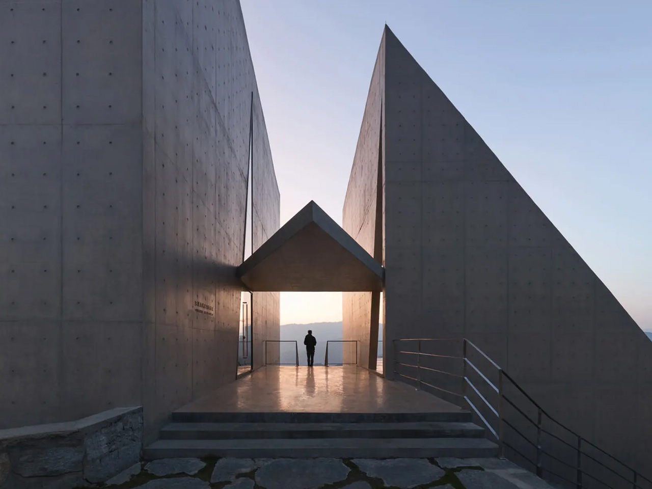
Perched on top of the Gaoligong Mountains in Yangpo Village, the Nujiang Grand Canyon Bookstore is built to feel like it belongs to the terrain rather than sitting on it. The structure extends outward from the mountainside like a sharp arrow, a form that references the Lisu people’s historical connection to crossbows. Reinforced concrete and locally sourced materials anchor the building to the slope while keeping its environmental impact low, and wall openings frame specific views of the Nujiang River and surrounding peaks.
The architectural intelligence is in how the building negotiates the slope. Rather than flattening the site or building a conventional foundation, the structure adapts its footprint to the mountain’s gradient, creating a subtle sense of elevation that rises with the terrain. The framed canyon views through the wall openings function as curated compositions rather than generic panoramas, each one selecting a specific relationship between river, peak, and sky. The combination of contemporary concrete construction and local material traditions creates an object that reads as both modern and rooted, a building that could not exist anywhere else. For a bookstore, that site-specificity is the rarest quality of all: a space where the location is not a backdrop but the reason the architecture exists.
What we like
The arrow-like form references Lisu cultural heritage in a structural gesture rather than a decorative motif, embedding local identity into the building’s shape.
Framed wall openings curate specific canyon views as compositions, turning the landscape into a series of deliberate artworks rather than a passive backdrop.
What we dislike
The remote mountaintop location, while spectacular, creates significant accessibility challenges for visitors without private transport.
Reinforced concrete construction on a steep mountain slope carries long-term structural monitoring requirements that increase maintenance complexity.
When The Room Is The Story
These five bookstores share one conviction: that the space around a book matters as much as the words inside it. A celestial instrument in Jiangsu, a pair of abstract mountains in Shanghai, timber beams framing a wetland in Hangzhou, a roof shaped like a falling book in Chengdu, and an arrow launched from a mountaintop above the Nujiang River. None of these projects treats architecture as a container. Each one treats it as content.
The best bookstores have always understood that reading is a spatial act. Where the body sits, what the eyes see between paragraphs, how light changes across an afternoon, these conditions shape the experience of a book as much as the typography on the page. These five take that understanding and build entire worlds around it. Walk into any of them, and the building becomes the first chapter.
Most university research facilities share a certain visual language. You know the one: utilitarian, slightly apologetic in appearance, the kind of building that exists to check boxes and contain equipment rather than inspire the people who work inside it. The University of Toronto’s Koffler Scientific Reserve is not that building.
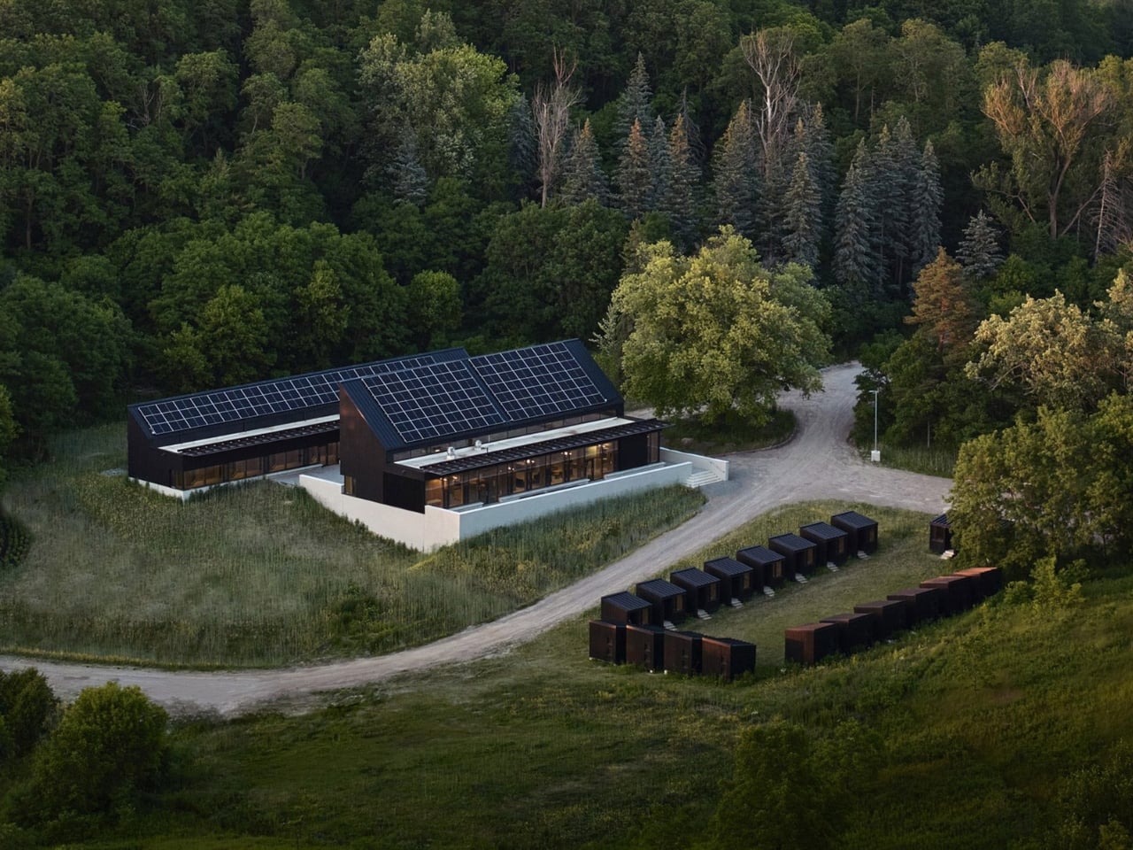
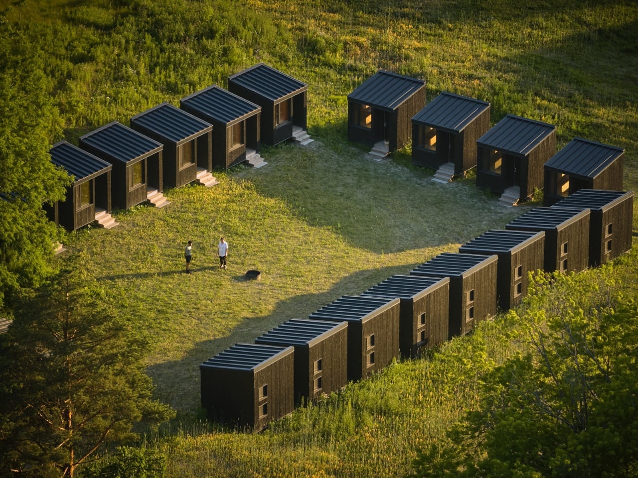
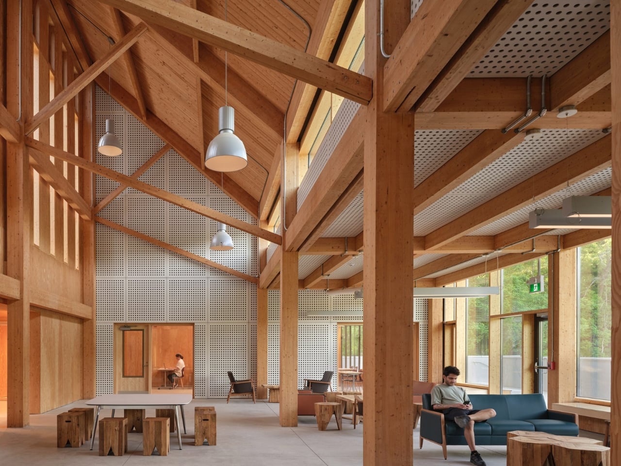
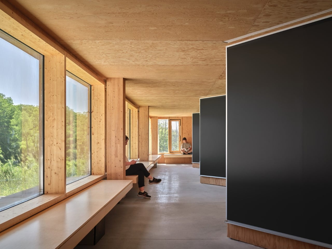
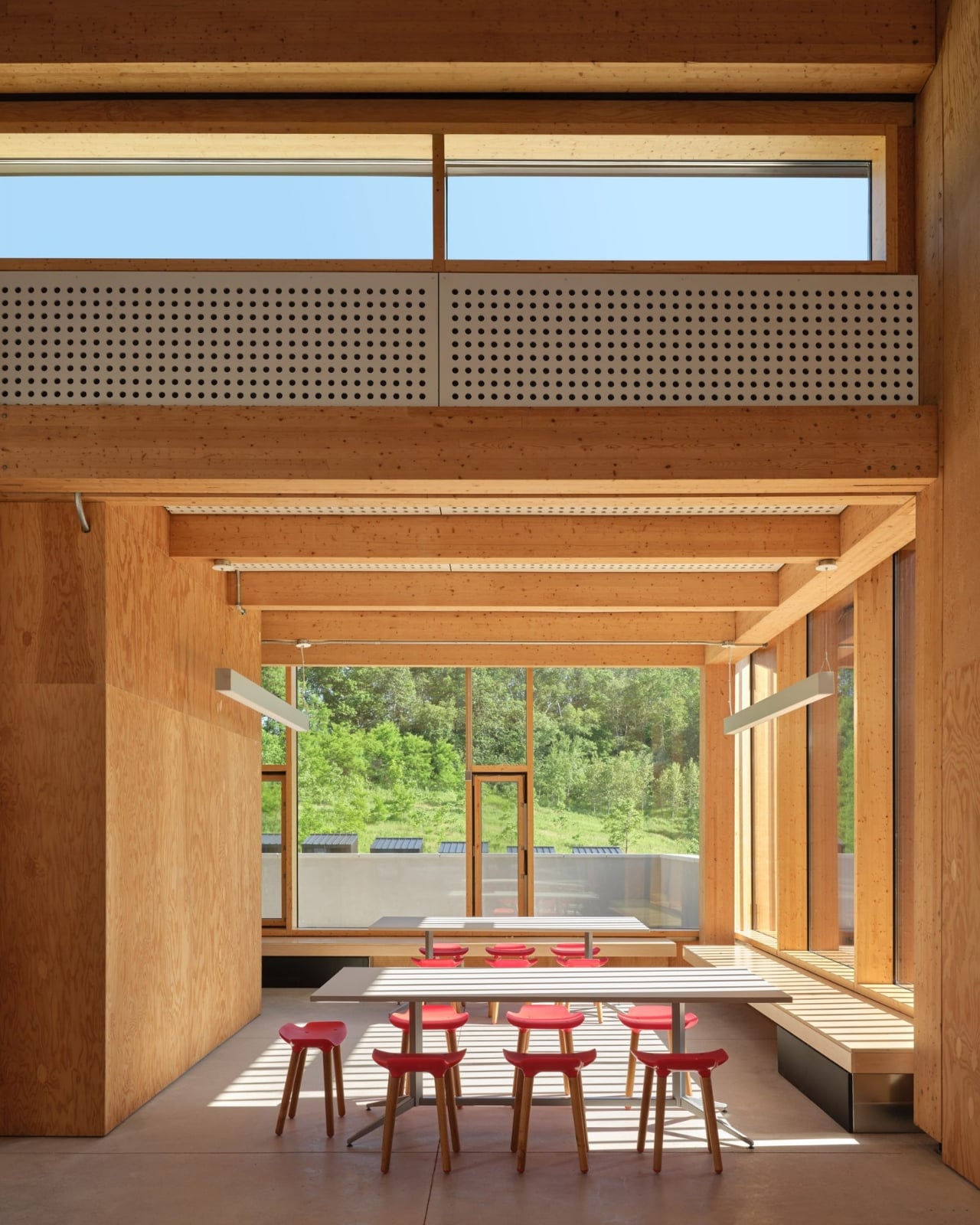
Completed in May 2025 and designed by Toronto-based Montgomery Sisam Architects, the 2,680-square-metre facility sits on 350 hectares in the Oak Ridges Moraine in King Township, Ontario, about an hour north of the city. It serves as a research and teaching base for ecology and environmental biology students and faculty, combining dormitory space, a dining hall, a classroom, and a common room into a single, beautifully considered structure. On paper, that sounds modest. In execution, it’s one of the more thoughtful buildings to come out of Canada recently.
What makes the Koffler Reserve stand out is how deliberate its design philosophy is. Principal Robert Davies put it plainly: “Researchers there study the smallest changes in organisms to understand systems at a global scale, and that relationship between the micro and the macro became the lens through which we evaluated every design decision.” That’s not just a nice quote for a press release. You can actually feel that thinking in the architecture.
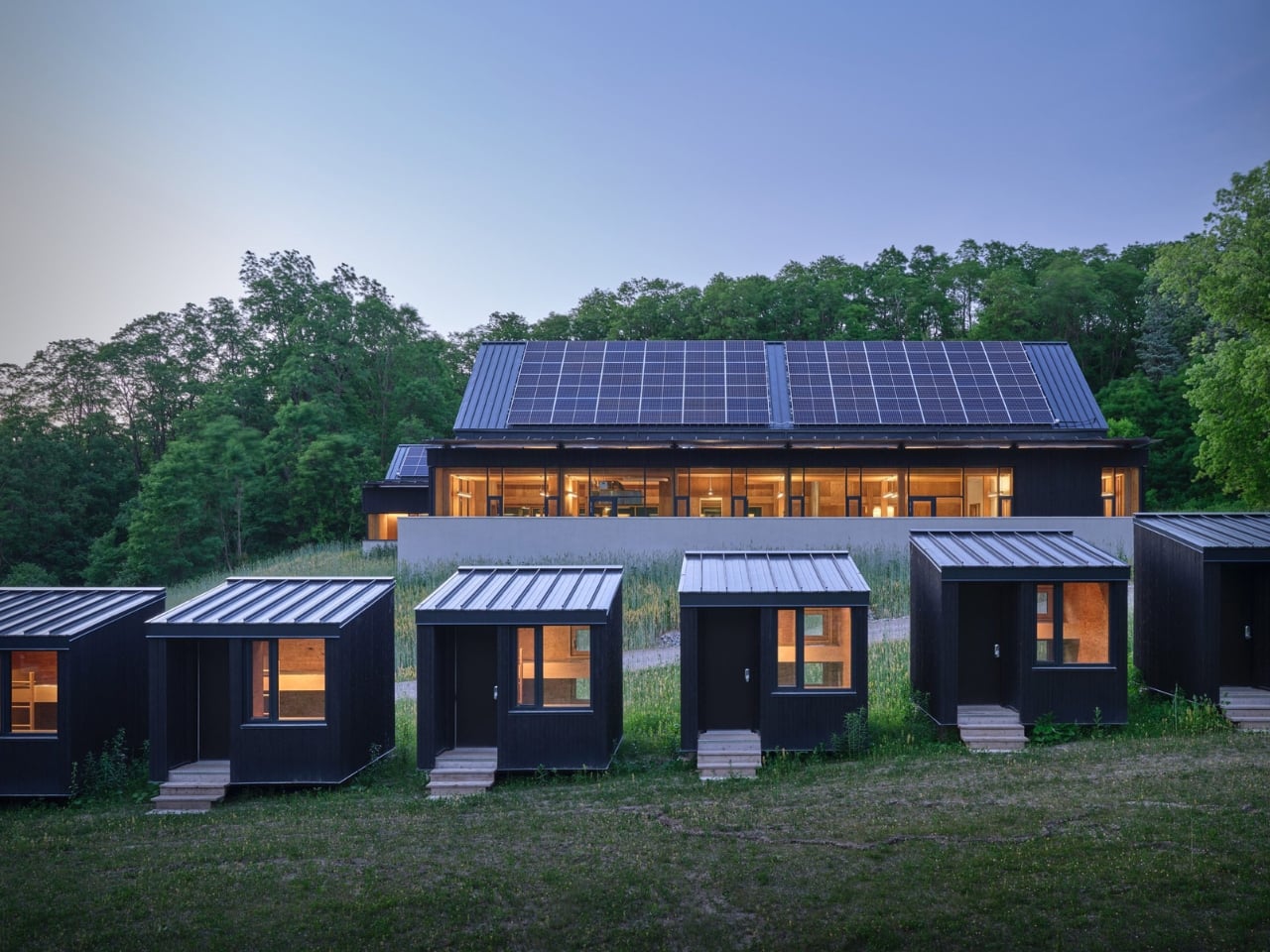
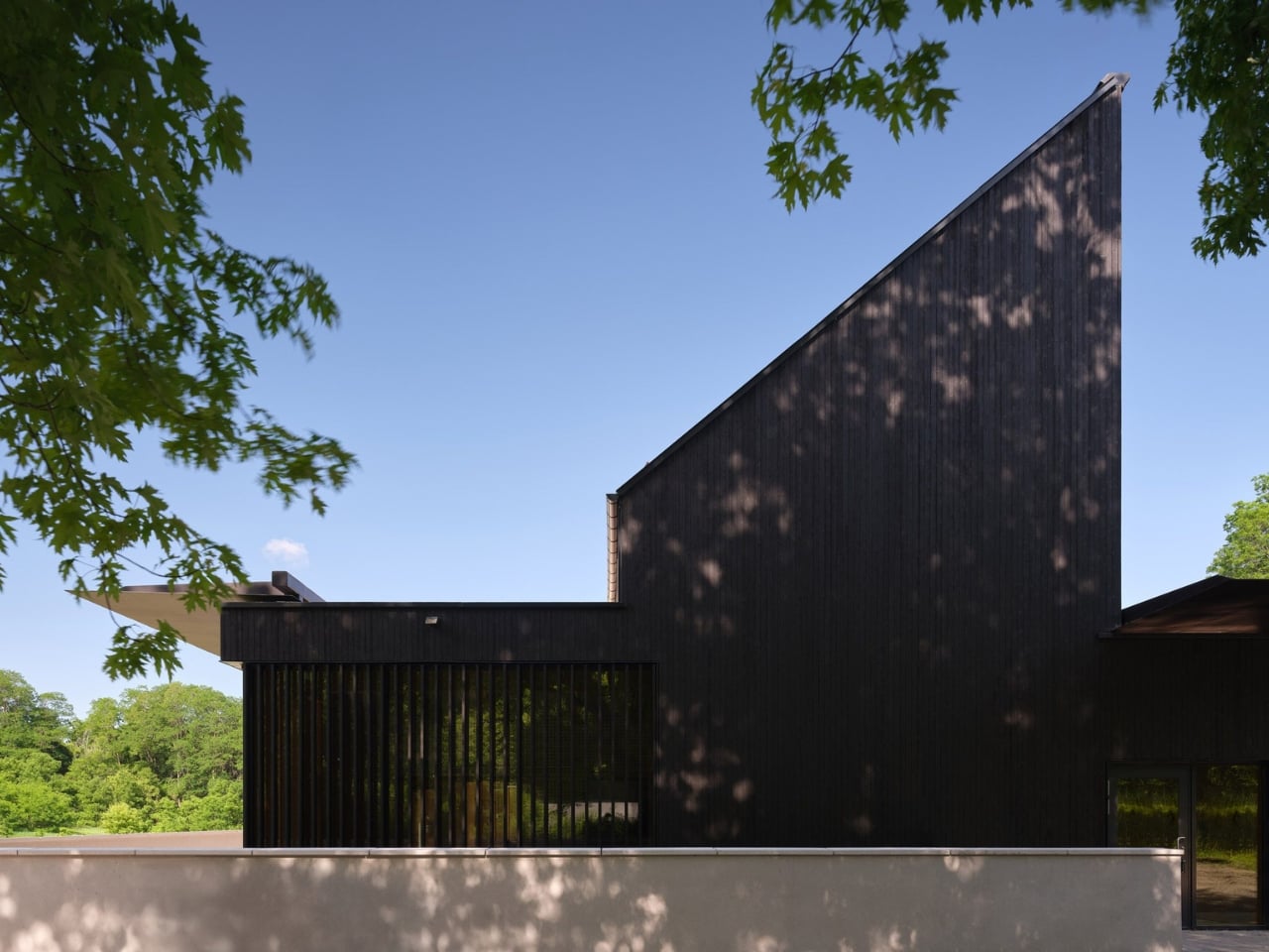
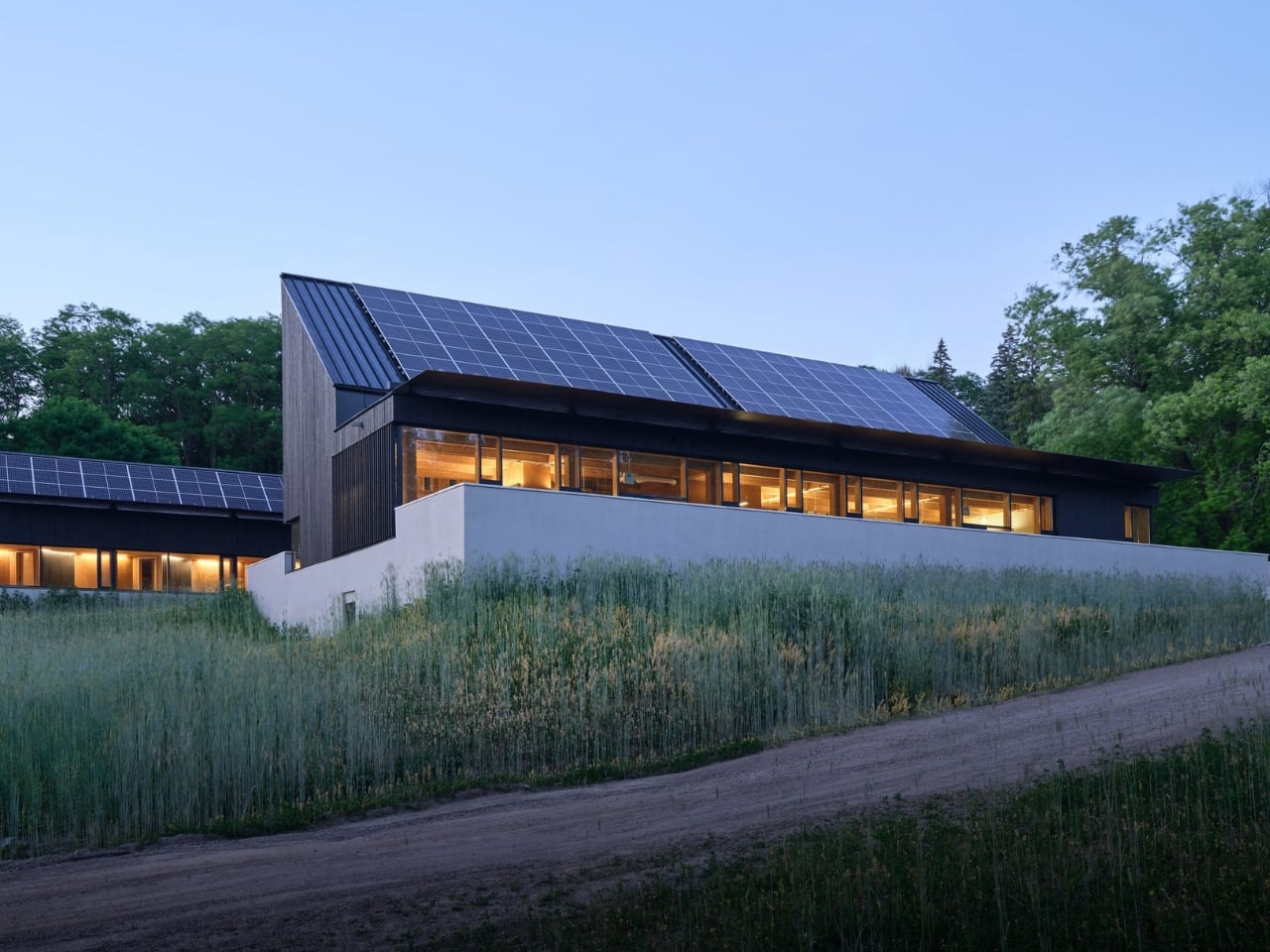
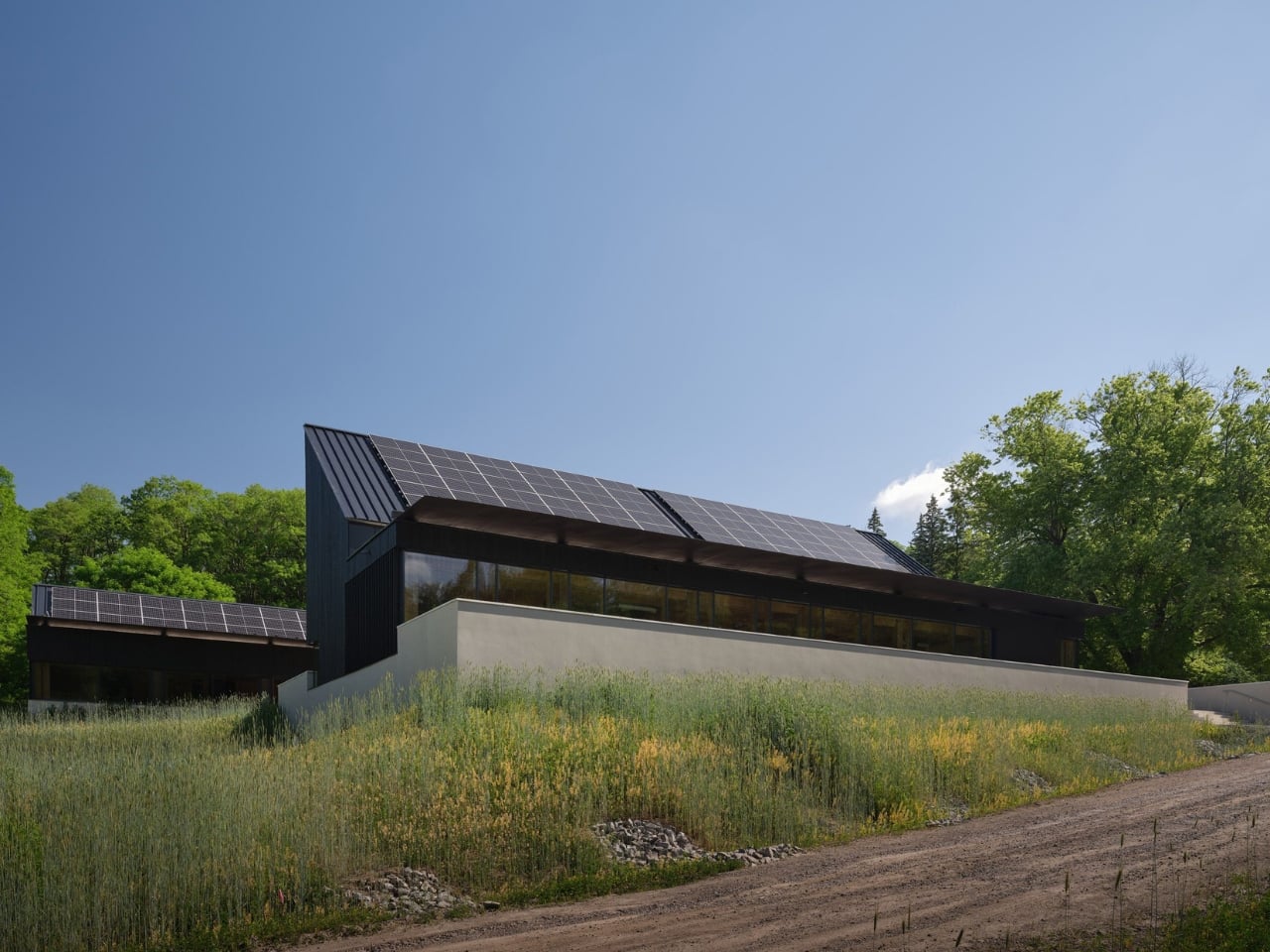
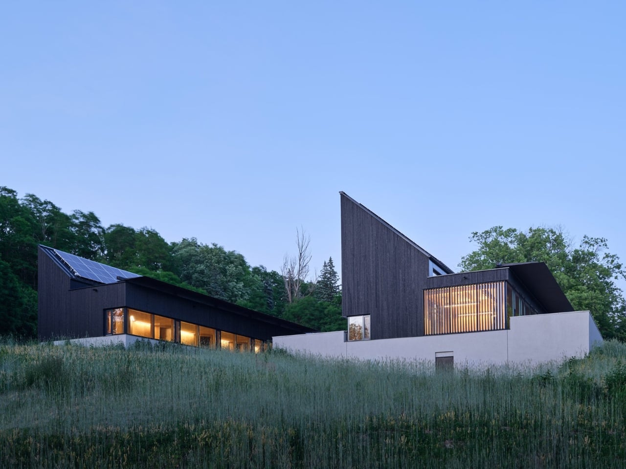
The building’s two prominent shed roofs, for instance, aren’t purely aesthetic choices. They’re angled precisely to optimize solar panel placement based on the site’s latitude, which in turn informed the entire formal expression of the structure. The flat roof and sunshade over the common room’s pitched elevation are carefully positioned to welcome the warming winter sun while blocking the uncomfortable heat of summer rays. Every element earns its place, and that’s exactly the kind of intentional design thinking that makes a building worth talking about.
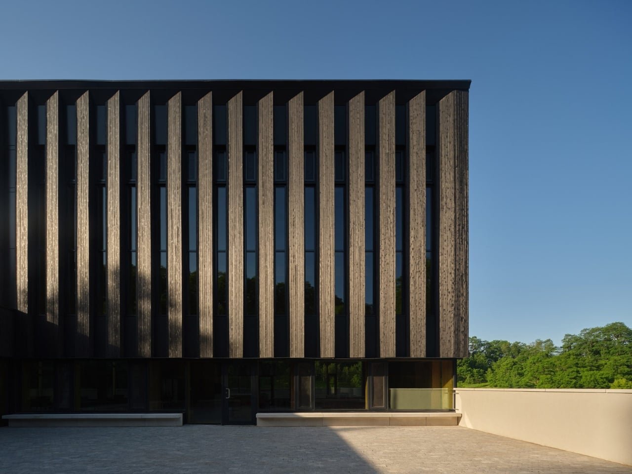
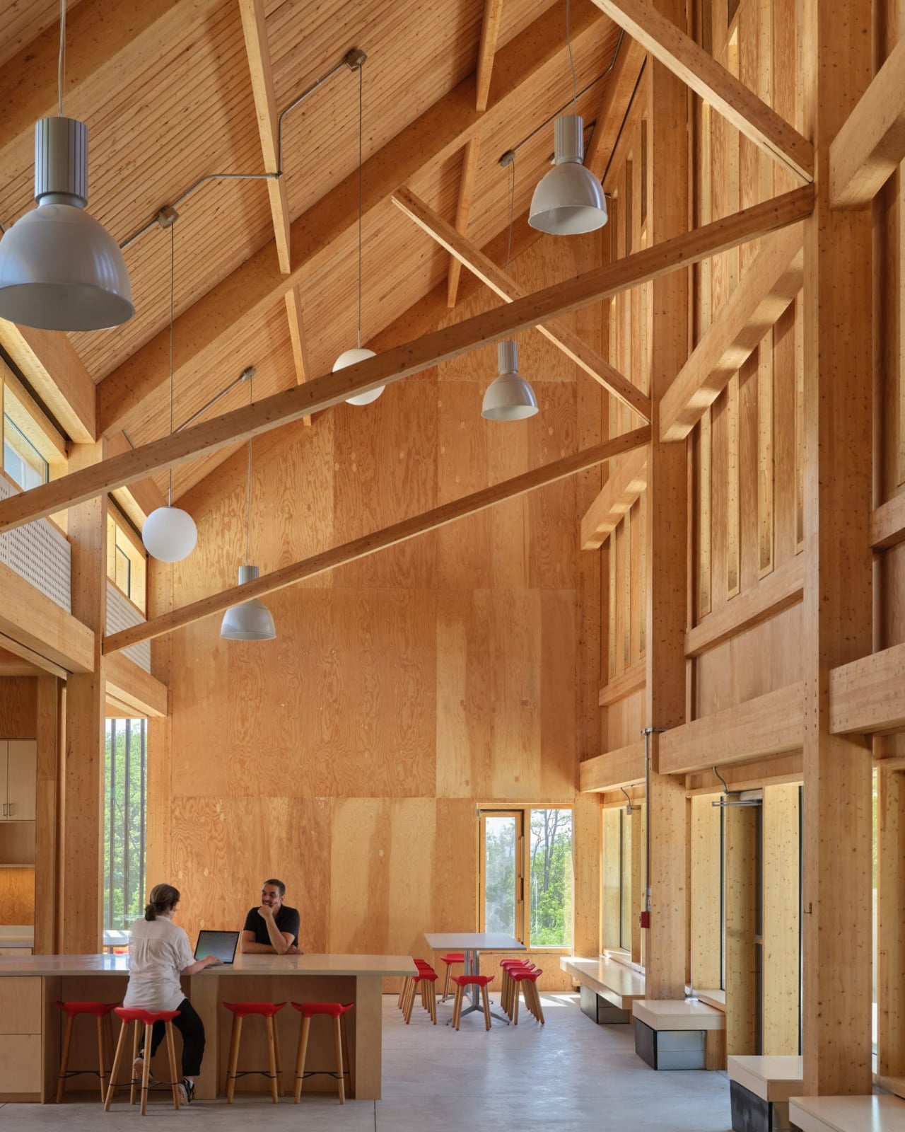
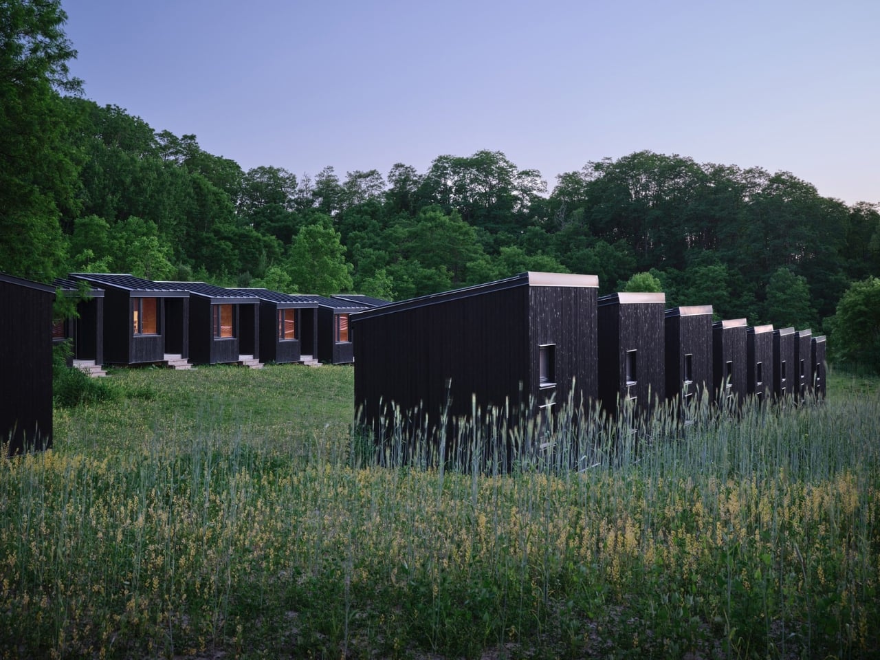
The material choices reinforce this sensibility. The structure is a hybrid of mass timber and conventional light-frame wood construction, using glulam columns and beams with a tongue-and-groove roof. The exterior is clad in shou sugi ban wood, the Japanese technique of partially charring wood to increase its water-resistance and durability. It’s a material that ages honestly and fits the agrarian character of the site, which started life as a series of agricultural plots, became an equestrian centre in the 1950s, and was donated to the university by philanthropists Murray and Marvelle Koffler in 1995. The building knows where it is, and that’s a quality that is rarer than it should be.
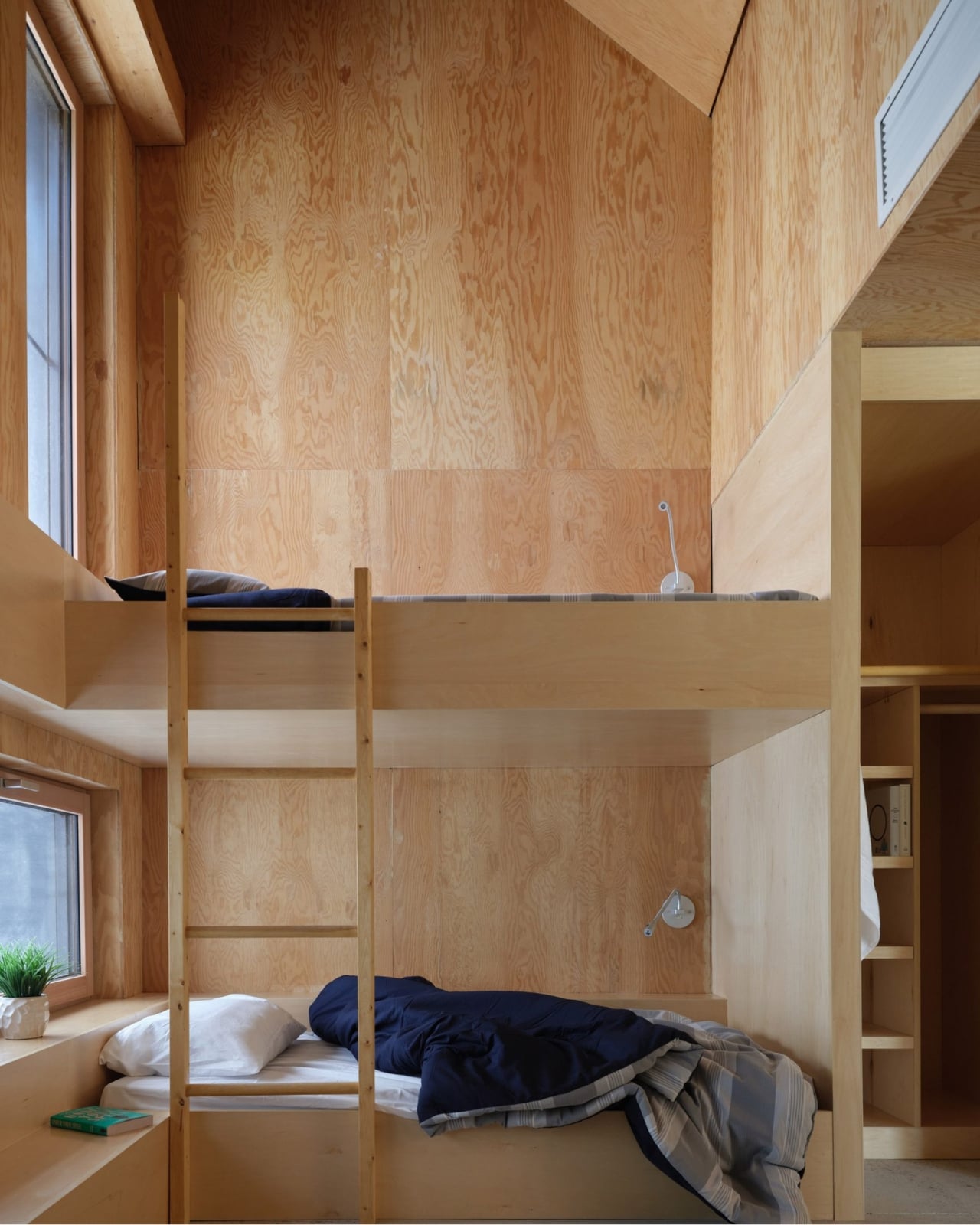
The Reserve’s C-shaped main building houses 20 students, while a cluster of 20 separate bunkies accommodates up to 40 more. The shared amenities, including the kitchen, bathrooms, and living spaces, are deliberately oversized to support larger summer populations and to encourage the kind of informal gathering that actually makes collaborative research work. The design is thinking about people, not just program. That distinction matters more than most architects will admit.
Below grade, a ground source heat pump circulates fluid through deep underground pipes to warm the building in winter and cool it in summer. Paired with the solar panels and passive design strategies, the project is working toward net-zero carbon and energy goals. I’ll be honest: sustainability claims in architecture have become so reflexive and routine that they’ve started to lose meaning. But at Koffler, the sustainable systems are so deeply woven into the structure’s formal logic that they feel like genuine convictions rather than marketing additions.
The Reserve sits within a landscape of wetlands, forests, and grasslands that scientists there study every single day. The building respects that by not trying to compete with it. It settles into the site rather than announcing itself, which takes real confidence for an architect to pull off. Confidence, and a genuine understanding of why the building exists in the first place. It would be easy to overlook this project because it doesn’t carry the dramatic scale or cultural visibility of a museum or a concert hall. But the Koffler Scientific Reserve is the kind of work that quietly raises the bar for what institutional architecture can be, and it deserves attention for exactly that reason.
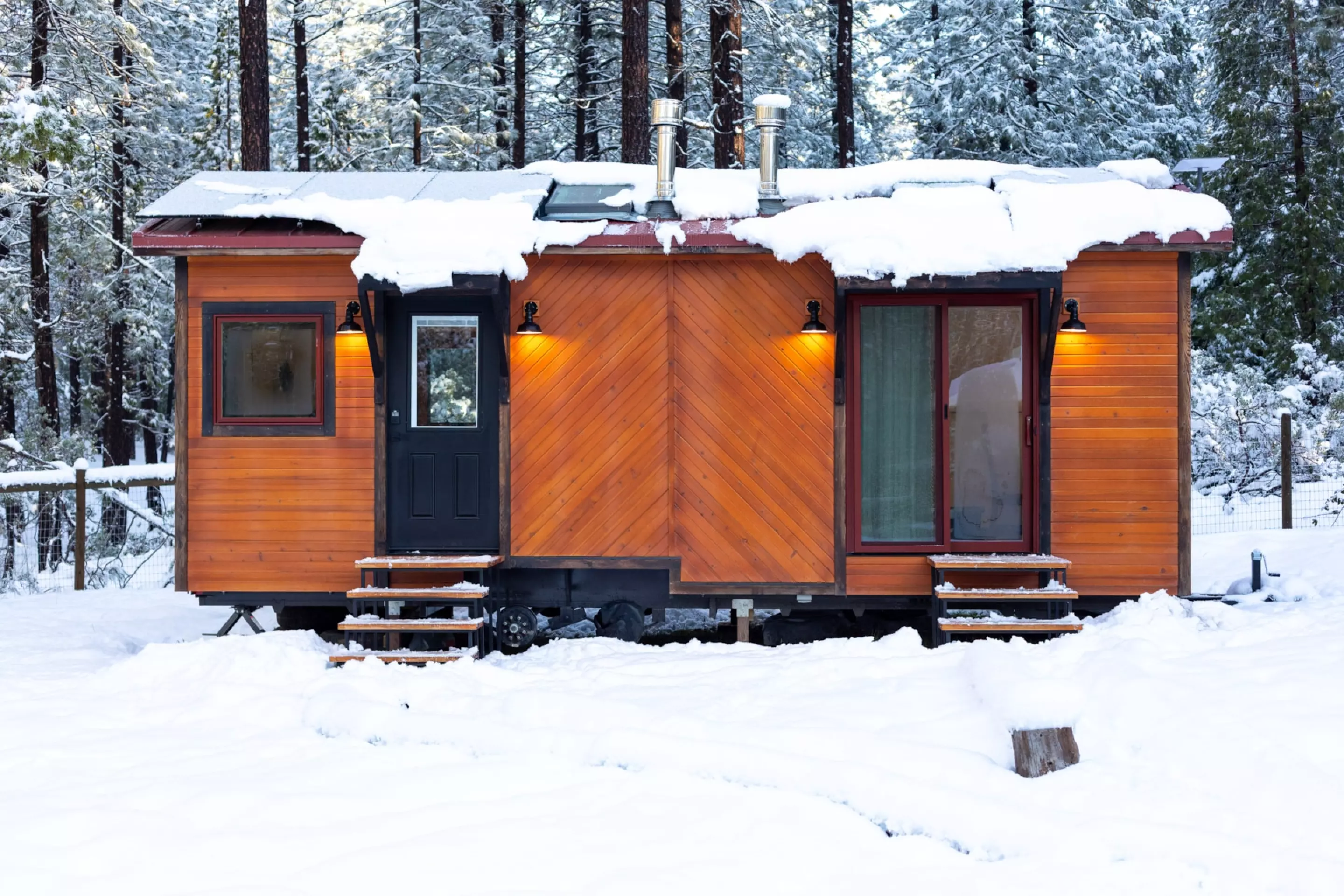
Remote work has reshaped how people think about office space, and Sol Tiny’s latest build takes that rethinking to its logical extreme. The Off-Grid Luxury Mobile Double Office is a trailer-based unit that packs two fully independent workspaces and a sleeping area into a 26-ft (7.9-m) frame, all while running entirely on solar power.
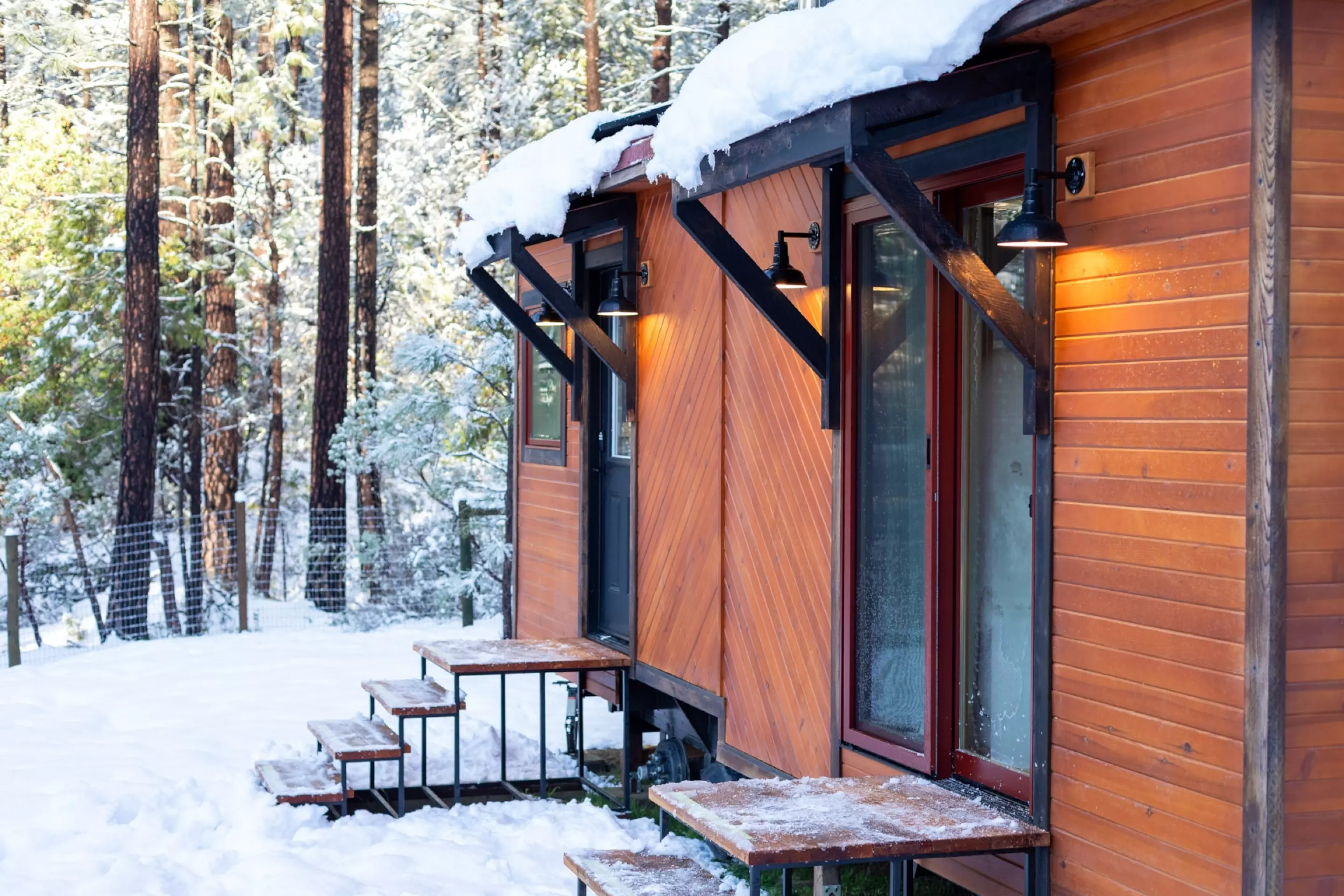
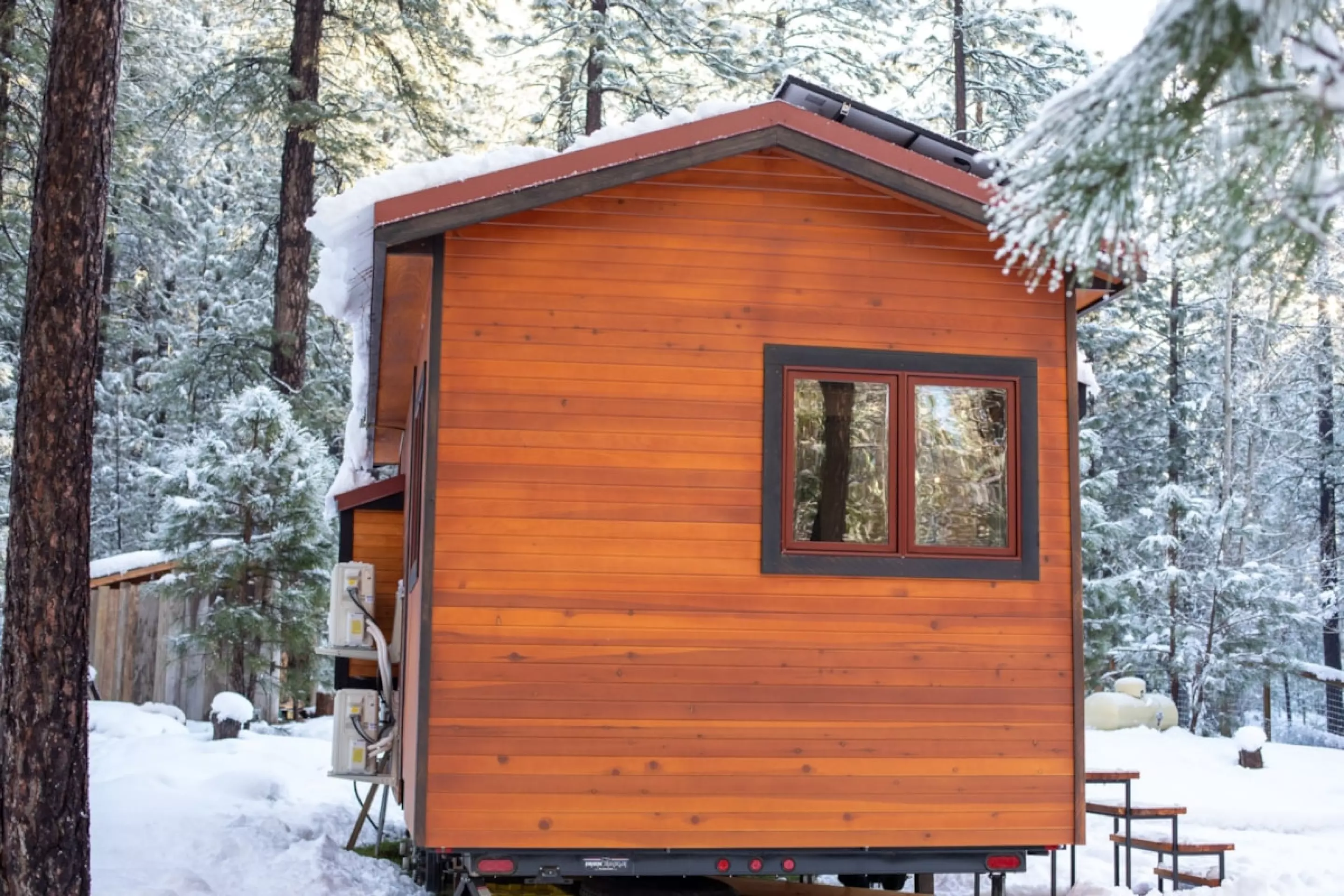
Built on a double-axle trailer, the unit spans 10 ft (3 m) wide, broader than a standard tow, which means it requires a permit for road transport. The wheels have been removed in the current listing photos, but can be reattached for relocation. On the outside, the office is clad in cedar with a standing seam metal roof, giving it a clean, modern appearance that wouldn’t look out of place next to a residential property.
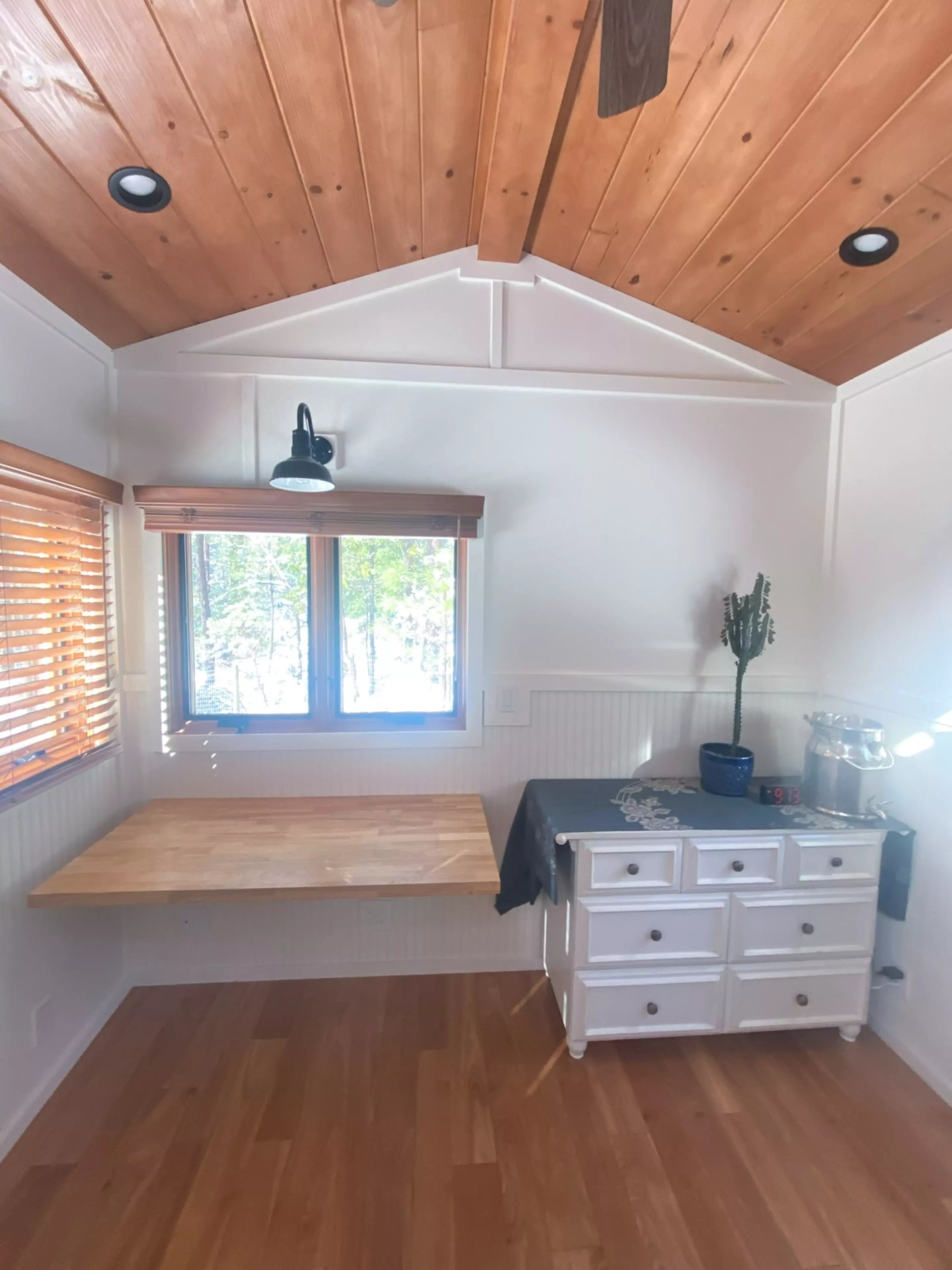
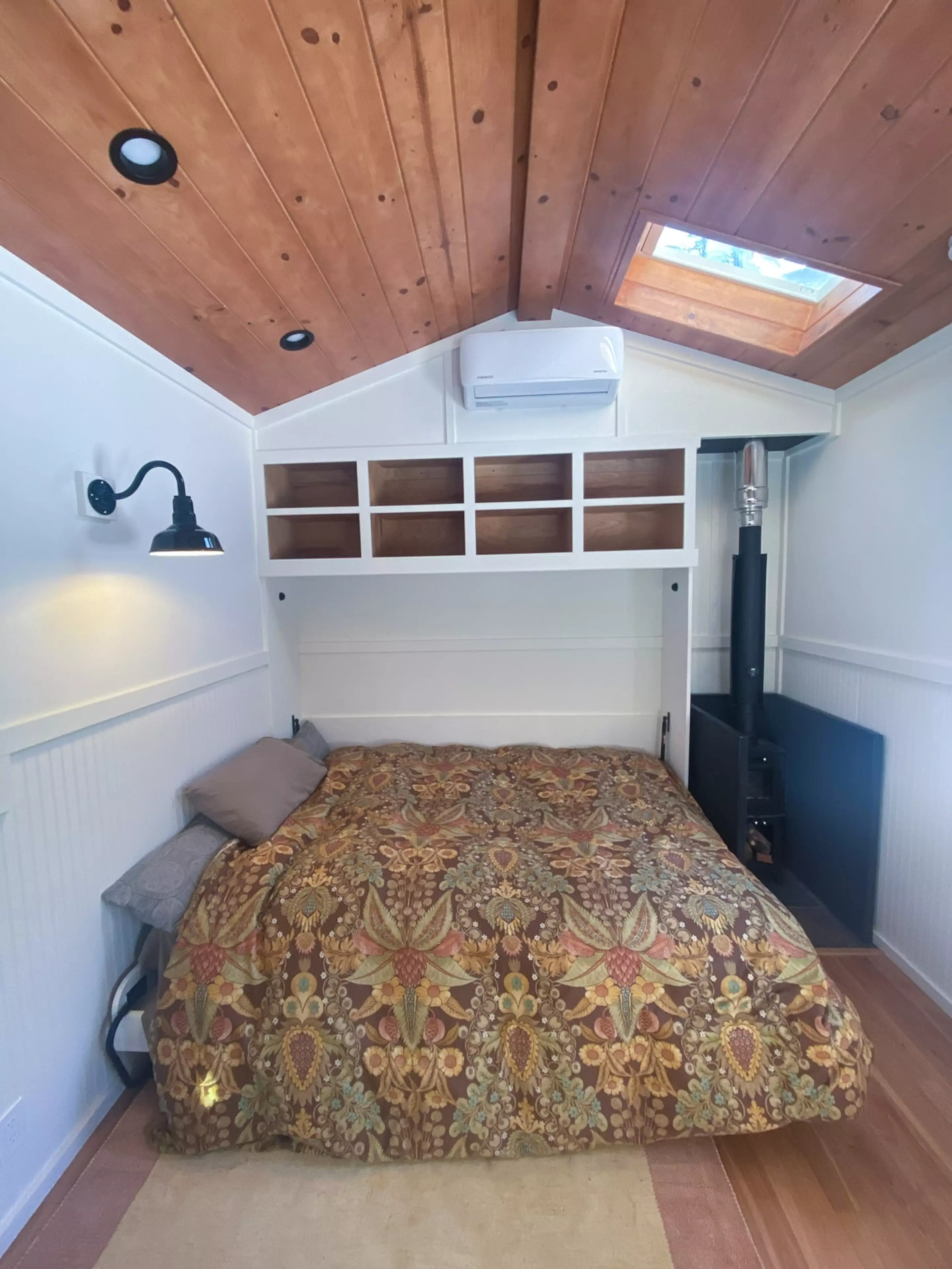
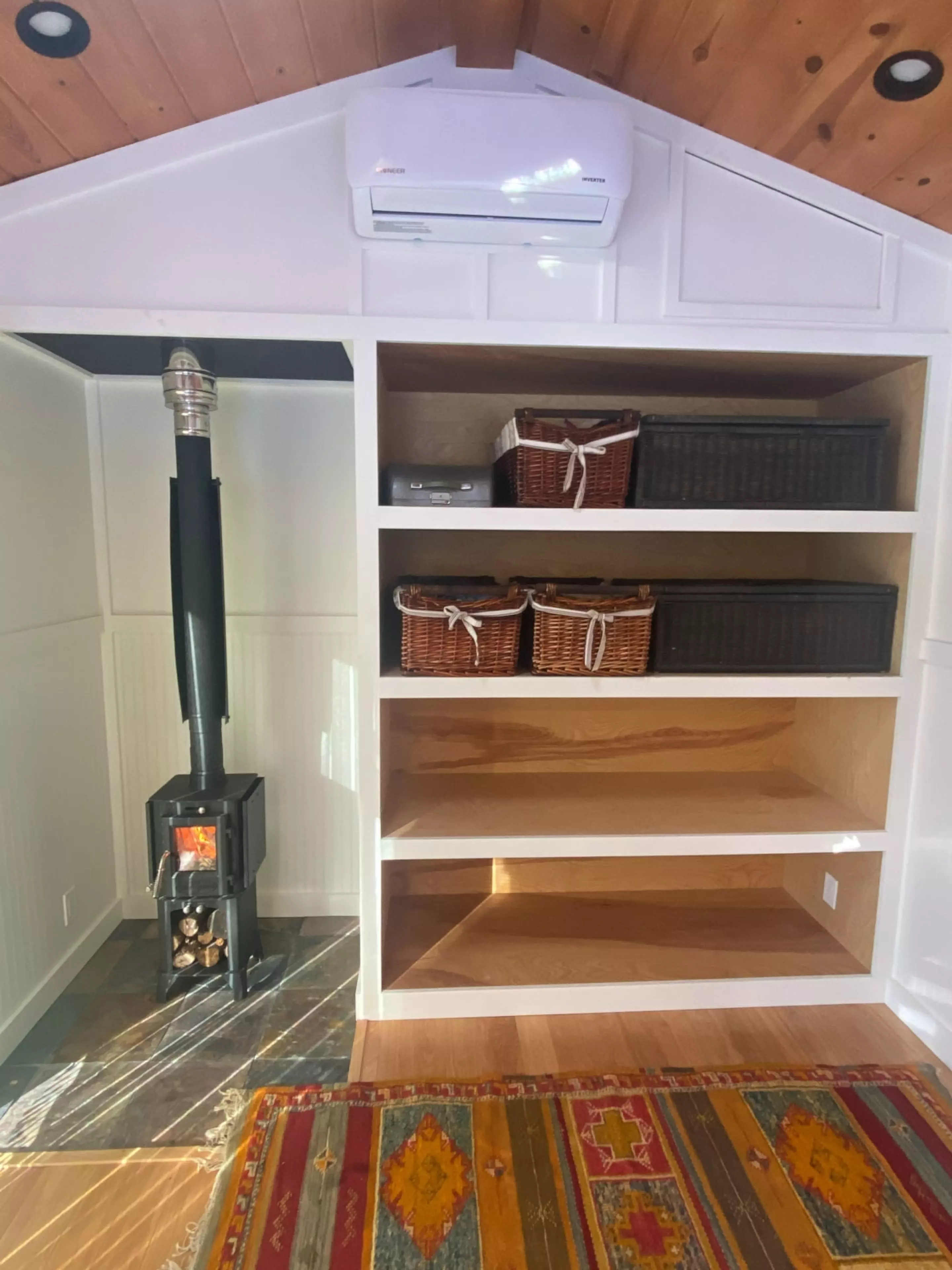
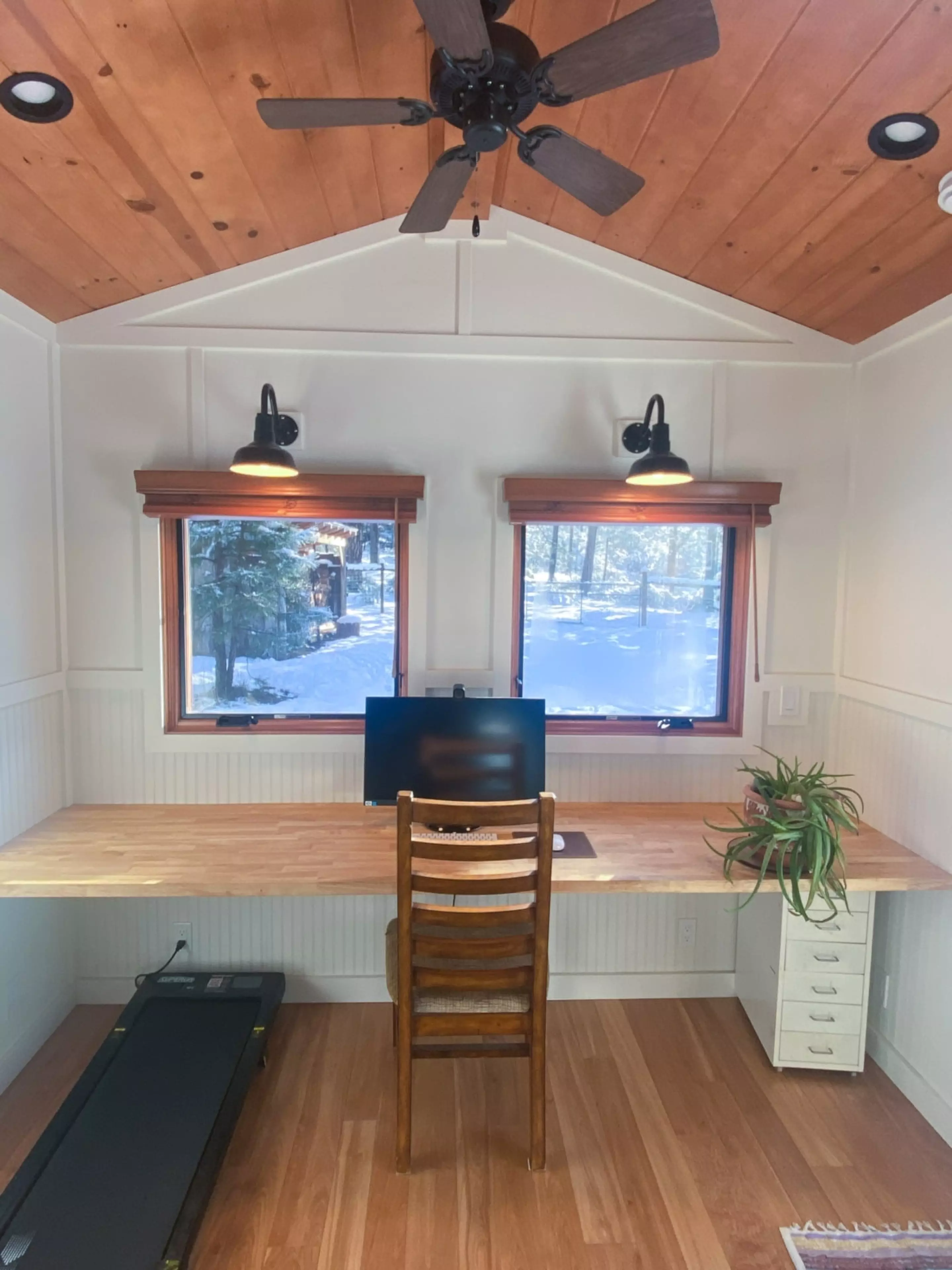
Inside, the layout is split into two distinct rooms, both finished in board-and-batten paneling with generous glazing and skylights that keep the interiors bright. The larger of the two workspaces is accessed through a single door and includes a desk, bookshelves, a small wood-burning stove, and a mini-split air-conditioning system. It also features a queen-sized Murphy bed that folds down from the wall, making it possible to stay overnight after a long work session without heading back to the main house.
The smaller workspace, entered through double glass doors, mirrors much of the same setup with its own desk, bookshelves, stove, and climate control. It trades the sleeping option for a more compact footprint, and there’s even room for an optional treadmill for those who like to move while they work. Neither space includes a bathroom, so the unit is best suited for use alongside an existing home or building with access to those facilities.
Power comes from eight 420-W solar panels mounted on the roof, backed by a battery system that keeps things running off-grid. There’s also the option to plug into the electrical grid when needed. For connectivity, a Starlink system handles high-speed internet, which makes the office functional in remote locations where traditional broadband isn’t available.
The Off-Grid Luxury Mobile Double Office is currently listed for sale at $98,000, not including delivery, and is located in Nevada City, California. For anyone looking to add a dedicated work setup to their property without the commitment of a permanent structure, Sol Tiny’s dual-office concept offers a flexible alternative that can, quite literally, be moved whenever plans change.