Apple’s iOS 27 Beta 5 introduces a variety of updates aimed at improving both functionality and design. From visually appealing app icon redesigns to practical system enhancements, this release focuses on refining your overall experience. Below, we explore the most notable changes and their implications for users in a new video from iReviews. Redesigned […]
Apple has officially rolled out iOS 27 Beta 5, bringing a host of updates, refinements and fixes aimed at enhancing the overall user experience. This release is part of Apple’s continuous effort to fine-tune its software ecosystem, with simultaneous updates also available for iPadOS, macOS, tvOS, watchOS, VisionOS and HomePod OS. Below is a detailed […]
Somewhere in your house right now, there is a perfectly good iPad/Android Pad doing absolutely nothing. Maybe it is the one you replaced two years ago when the new model came out, or the one your kid borrowed and never gave back, now sitting on a nightstand charging for no reason. It has a great screen, solid processing power, and more capability than most factory-installed car infotainment systems from the last decade. The problem was never the tablet. The problem was always that nobody made a convincing way to put it in a car and have it behave like an actual car display, CarPlay and all. HERMIX NANO is a credit-card-thin wireless bridge device that finally does exactly that.
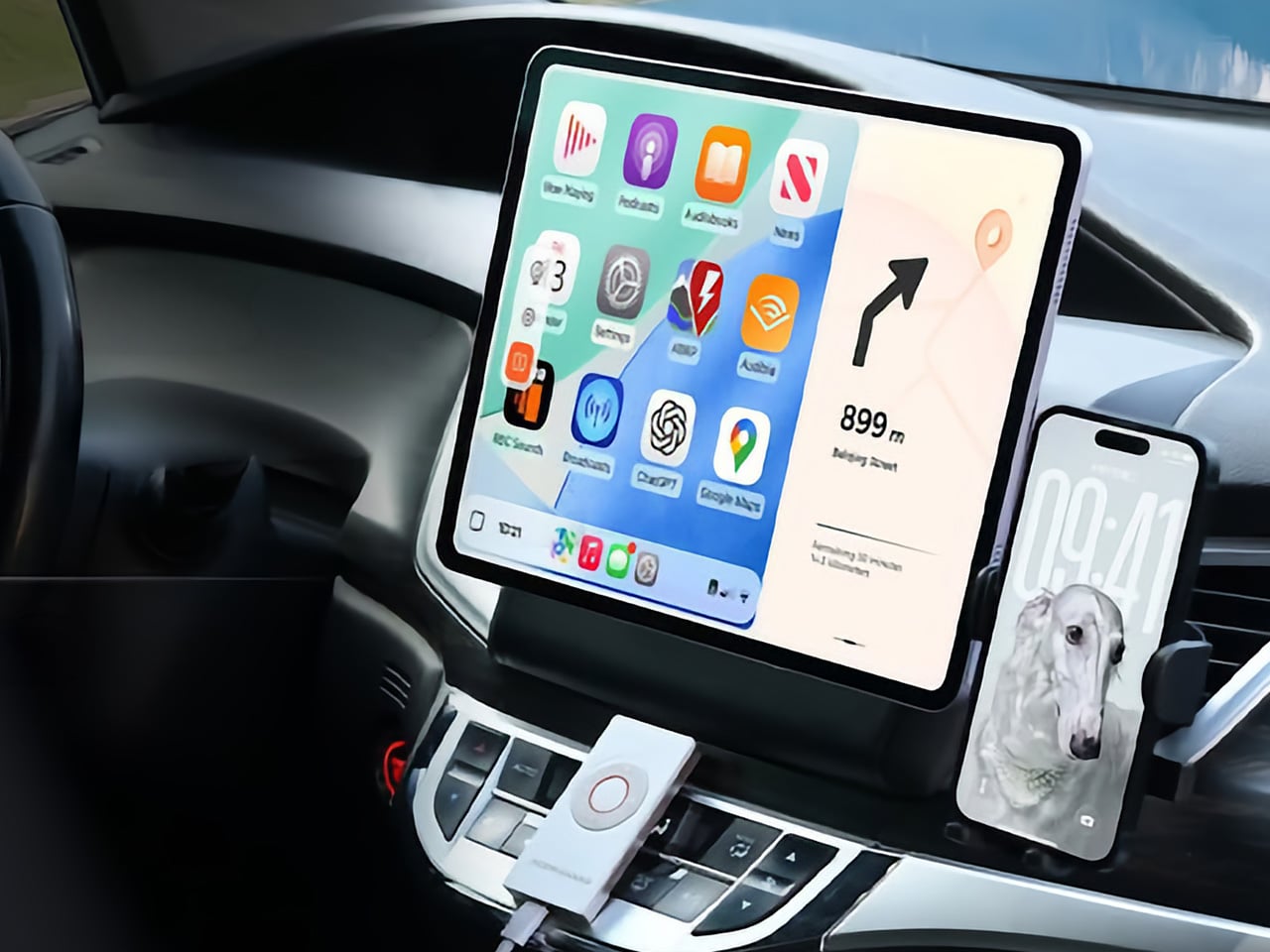
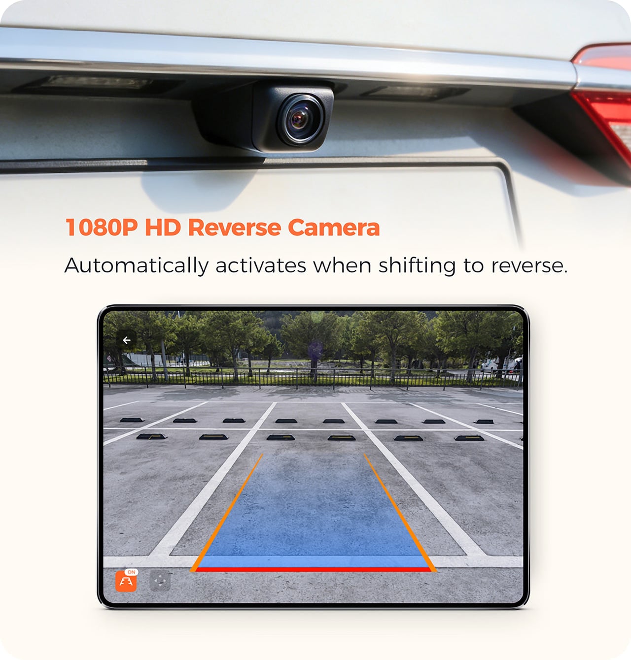
Roughly the shape and size of an iPod Classic, the HERMIX NANO is a compact wireless hub that sits in your car, pairs to your phone, and turns your mounted tablet or phone into a fully functional smart car infotainment display. It supports wireless CarPlay for iPhone and wireless Android Auto for Android, designed for vehicles without a built-in display, or for drivers tired of slow and outdated factory systems. Plug in the included 1080p backup camera and the tablet automatically switches to a reverse view the moment you shift into reverse, no manual tapping required. Who knew that a $74 device could transform your existing car and tablet into a new car experience that you’d otherwise pay tens of thousands of dollars for.
Mounting an old tablet PC to your dashboard and opening Google Maps already works, technically. But a tablet stuck in a car still behaves like an iPad or Android Pad, which means you are dealing with a regular tablet interface, regular apps, regular notifications, and a screen layout that was never designed around driving. HERMIX NANO changes the operating system experience entirely by turning that tablet into a proper CarPlay or Android Auto display, with the simplified app grid, large touch targets, voice-first controls, and glanceable navigation layout people already know from newer cars. That shift is the whole point. Instead of juggling a tablet UI meant for the couch, you get a driving interface built around quick inputs, cleaner menus, easier media control, and maps that make sense when your eyes need to get back on the road in about half a second.
Setup involves installing the device, connecting the power, and downloading the HERMIX NANO app, and the whole process requires no tools, no rewiring, and no dashboard modification of any kind. You power on the HERMIX NANO, find it in the app, connect via Bluetooth, pair your phone, and you are done. After that first pairing, the connection happens automatically every time you get in the car. iPhone users get wireless CarPlay with Siri, navigation, music, calls, and every app Apple has approved for CarPlay, while Android users get wireless Android Auto with Google Assistant, Google Maps, Waze, Spotify, and the rest. Whether you are on Android or iOS, the Hermix Nano app is available free on Google Play and the App Store, and unlocks all features immediately.
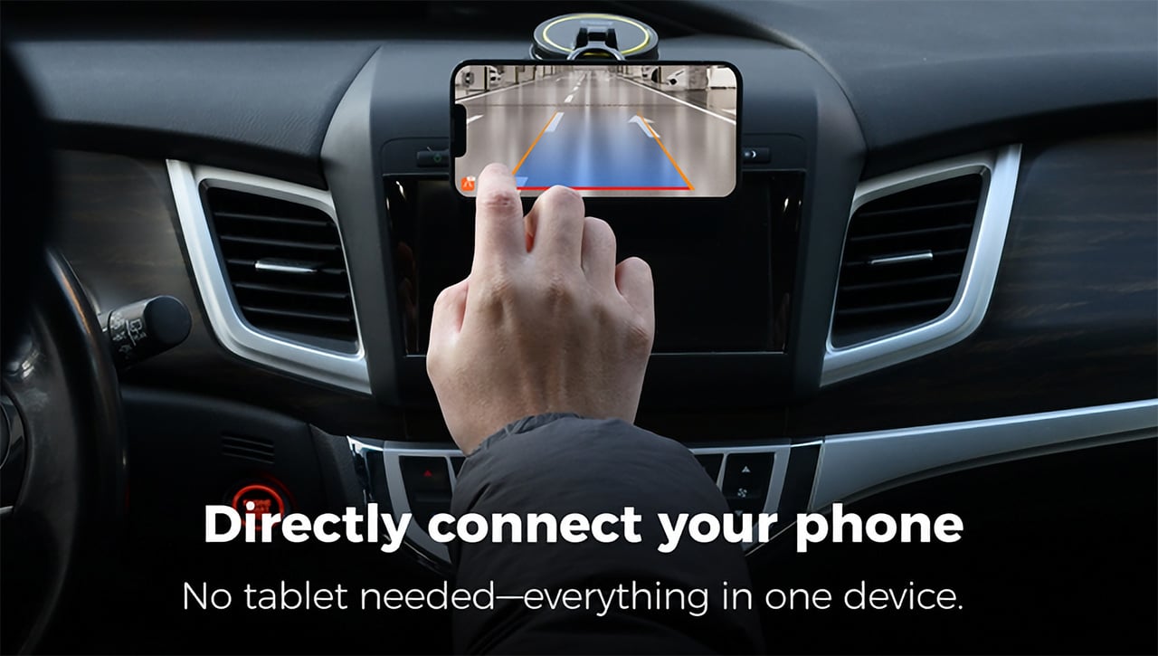
The HERMIX NANO also packs a 1080p HD backup camera that mounts to the rear of your car – the moment you shift into reverse, HERMIX NANO automatically wakes the camera up, with no manual operation needed, instantly turning the tablet into an HD large-screen rearview mirror that gives a clear view of every blind spot (again, something your existing iPad or Android Pad wouldn’t do). A backup camera that routes to a full tablet screen is a meaningfully better experience than one squeezed onto the three-inch display of a typical aftermarket head unit. Shift back out of reverse and the infotainment interface returns immediately, with no settings menu and no manual switching. The result is a clearer view of blind spots and greater confidence when parking. For anyone navigating tight urban lots daily, this alone is a compelling reason to pay attention.
On the tablet version of the HERMIX NANO app, a dedicated split-screen feature unlocks a more flexible display experience, with multiple customizable modes including HUD Mode. HUD mode gives a simplified navigation view for distraction-free driving, Mini Map mode delivers a real-time compact navigation display, and Family Album mode showcases selected photos and videos for a personalized in-car screen experience. The HERMIX NANO features five customizable physical buttons on the device body, allowing you to personalize controls based on your driving habits. Easily access frequently used functions such as volume adjustment, track switching, phone calls, and map launch. A long press of the “OK” button allows manual rear camera activation, providing safer and more convenient control while driving.That last one is genuinely useful if you want to check what is behind you while parallel parking without actually putting the car in reverse. The display also auto-rotates based on how the device is mounted, whether portrait or landscape, adapting instantly with no manual setup required.
For global compatibility, the system supports left-hand drive and right-hand drive modes, letting users switch the UI layout according to their vehicle setup for optimal visibility and comfort. The HERMIX NANO interface automatically switches between Light and Dark Mode according to surrounding brightness, providing optimal visibility and a comfortable viewing experience during both daytime and nighttime driving.Firmware updates push wirelessly through the app, meaning the device can improve over time without any physical servicing. By combining automotive-grade hardware, seamless wireless connectivity, and deeply integrated software, HERMIX built a compact smart hub that transforms devices people already own into a complete in-car smart experience. The obvious audience is anyone driving a vehicle more than five years old, but it is equally relevant for drivers whose factory systems simply never matched the software quality of modern CarPlay and Android Auto.
The HERMIX NANO is priced at $99 retail, with early pricing at $74 for a single kit that includes the device, a 1080p HD rearview camera, a USB-Type C cable, a Type C-to-C cable, and a user manual. A two-pack runs $138 and a three-pack $178 at early pricing, and a tablet car holder add-on is available separately for $9. Shipping is estimated to begin in October 2026, covering the US, Canada, the EU, the UK, Australia, Japan, South Korea, Singapore, and most other major markets. The Hermix Nano app is already live and free on both the App Store and Google Play.
Sony has a pattern with these limited edition consoles now. Announce a big first party or Marvel game, dress up a PS5 to match, sell it alongside a matching controller. Ghost of Yotei got the black and gold treatment last time around, and it was fine, if a little safe. Wolverine is where that formula gets an upgrade.
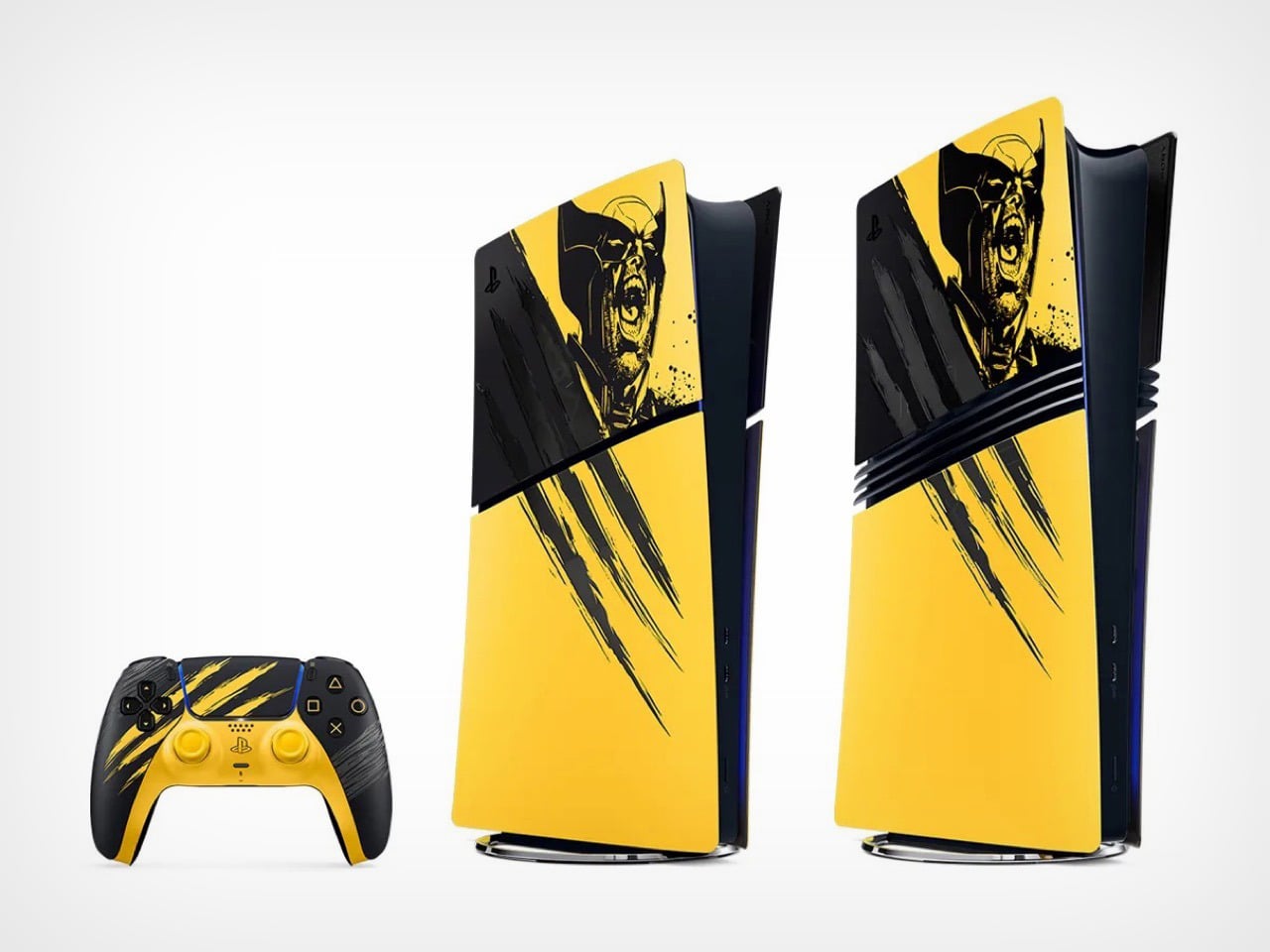
This time Sony gave us two console designs instead of one. Battle Yellow is unapologetic, claw gouges and a screaming Wolverine face on a bright yellow panel. Adamantium is the plot twist, the same claw motif but stripped down to brushed metal that looks closer to a premium appliance than a video game tie in. Two designs, two totally different personalities, and somehow neither one feels like the compromise pick.
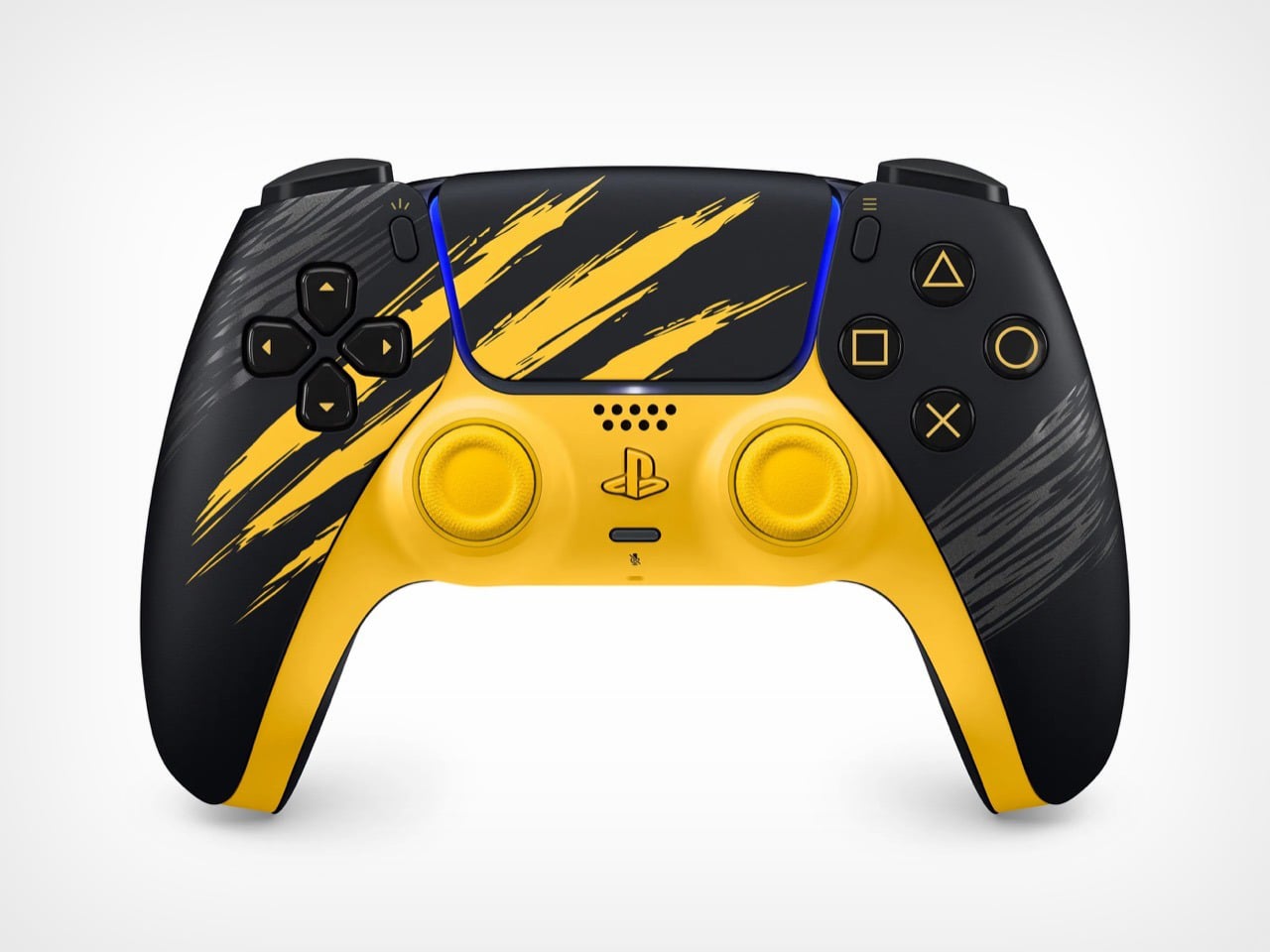
Battle Yellow is the flagship of the two, sold as a full PS5 Digital Edition bundle for $649.99 with a matching DualSense controller and a code for the game. The artwork comes from Jock, the Scottish comic artist who worked on Wolverine’s key art, and you can actually tell. The claw slashes and the inked portrait have that loose, hand drawn energy comics get right and games usually flatten out. It is a rare case of licensed hardware art that does not look like clip art stapled onto a console.
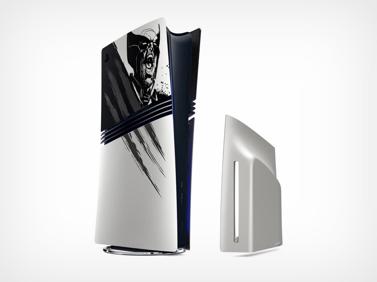
Adamantium skips the yellow entirely and goes for brushed silver, but only as a console cover for PS5 Pro owners plus a standalone controller, no full bundle here. That is honestly the smarter buy for anyone who wants the Wolverine tie in without turning their entertainment center into a comic shop display. Same claw details, completely different mood. It reads expensive in a way the yellow version was never trying to.Adamantium skips the yellow entirely and goes for brushed silver, but only as a console cover for PS5 Pro owners plus a standalone controller, no full bundle here. That is honestly the smarter buy for anyone who wants the Wolverine tie in without turning their entertainment center into a comic shop display. Same claw details, completely different mood. It reads expensive in a way the yellow version was never trying to.
Here is where it gets less fun. This entire lineup drops during Sony’s second PS5 price hike in under a year, with the standard console now sitting a hundred dollars above where it started. So a $649.99 bundle for a digital only console, no disc drive option at all, lands at a moment when PS5 pricing is already a sore subject for a lot of players. The comments under every Wolverine reveal video prove that. People are annoyed about the missing disc drive way more than they are annoyed about yellow paint.
I get why Sony leans into these drops even now, maybe especially now. A great design distracts from a rough price conversation better than any spec sheet does, and Jock’s artwork is genuinely good enough to pull that off. But good design and good timing are not the same thing, and this lineup is proof you can nail one without fully nailing the other.
Sony has a pattern with these limited edition consoles now. Announce a big first party or Marvel game, dress up a PS5 to match, sell it alongside a matching controller. Ghost of Yotei got the black and gold treatment last time around, and it was fine, if a little safe. Wolverine is where that formula gets an upgrade.
This time Sony gave us two console designs instead of one. Battle Yellow is unapologetic, claw gouges and a screaming Wolverine face on a bright yellow panel. Adamantium is the plot twist, the same claw motif but stripped down to brushed metal that looks closer to a premium appliance than a video game tie in. Two designs, two totally different personalities, and somehow neither one feels like the compromise pick.
Battle Yellow is the flagship of the two, sold as a full PS5 Digital Edition bundle for $649.99 with a matching DualSense controller and a code for the game. The artwork comes from Jock, the Scottish comic artist who worked on Wolverine’s key art, and you can actually tell. The claw slashes and the inked portrait have that loose, hand drawn energy comics get right and games usually flatten out. It is a rare case of licensed hardware art that does not look like clip art stapled onto a console.
Adamantium skips the yellow entirely and goes for brushed silver, but only as a console cover for PS5 Pro owners plus a standalone controller, no full bundle here. That is honestly the smarter buy for anyone who wants the Wolverine tie in without turning their entertainment center into a comic shop display. Same claw details, completely different mood. It reads expensive in a way the yellow version was never trying to.Adamantium skips the yellow entirely and goes for brushed silver, but only as a console cover for PS5 Pro owners plus a standalone controller, no full bundle here. That is honestly the smarter buy for anyone who wants the Wolverine tie in without turning their entertainment center into a comic shop display. Same claw details, completely different mood. It reads expensive in a way the yellow version was never trying to.
Here is where it gets less fun. This entire lineup drops during Sony’s second PS5 price hike in under a year, with the standard console now sitting a hundred dollars above where it started. So a $649.99 bundle for a digital only console, no disc drive option at all, lands at a moment when PS5 pricing is already a sore subject for a lot of players. The comments under every Wolverine reveal video prove that. People are annoyed about the missing disc drive way more than they are annoyed about yellow paint.
I get why Sony leans into these drops even now, maybe especially now. A great design distracts from a rough price conversation better than any spec sheet does, and Jock’s artwork is genuinely good enough to pull that off. But good design and good timing are not the same thing, and this lineup is proof you can nail one without fully nailing the other.
The business card holder is one of those objects the design world quietly decided was finished. A flat rectangle of leather or metal, room enough for thirty cards, something to close it. The category works. Nobody expected it to raise a new question about what it is actually for.
The Oblica, handmade in Kyoto by Sudaku – a workshop with experience in the kind of precision pattern construction most leathermakers route around – starts from a different premise.
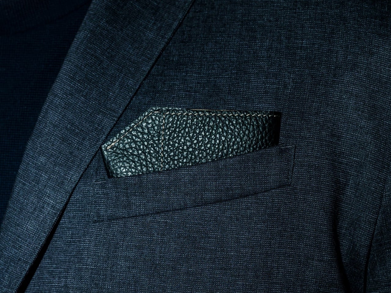
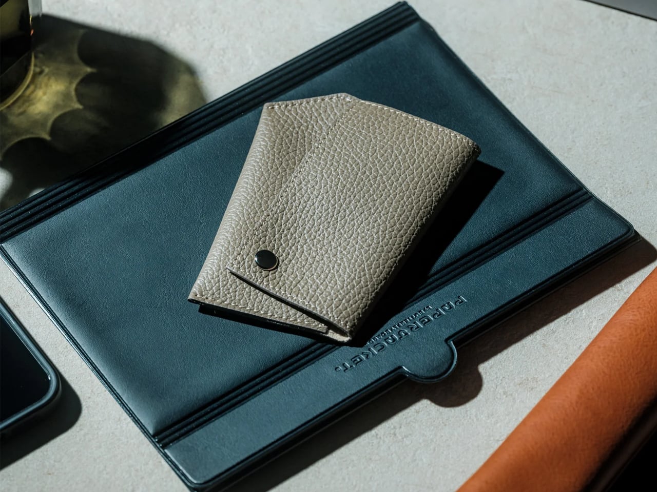
At rest in the breast pocket of a blazer, it shows nothing but a single diagonal edge of Italian leather above the pocket line. No hardware visible. No snap exposed. The silhouette reads, convincingly, as a folded pocket square. That is not an incidental resemblance. It is what the object was built to be.
Getting there required solving a problem that most card holders don’t have. Rectangle-based designs absorb variation without consequence – a few millimeters off in any direction and the object still functions. The Oblica’s diagonal cannot absorb variation. The same millimeter that determines whether the form reads correctly as a pocket square profile also determines whether the internal tiers present cards legibly, whether the snap closes where it should, and whether the finished object measures exactly 5mm thick. Every part of that system affects every other part. Getting them to solve each other, rather than compete, required adjusting the pattern, the proportions, the card tier geometry, and the snap placement in concert – which is precisely the kind of construction complexity Sudaku was built to handle.
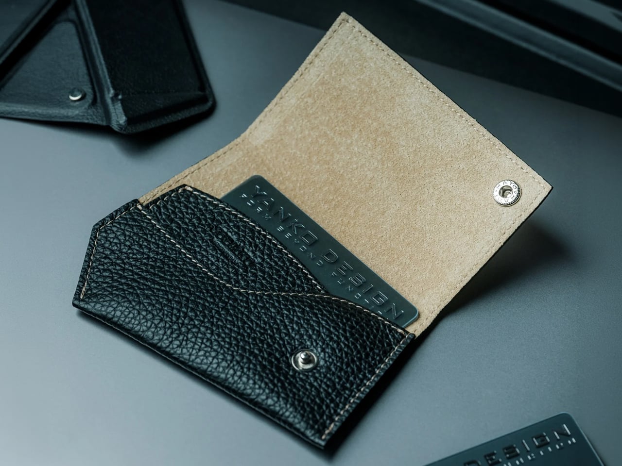
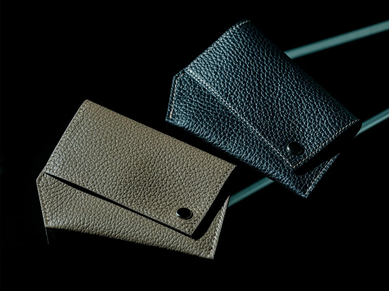
The exterior is Italian leather. The interior is Japanese pig suede, chosen for its texture rather than its appearance – it protects card edges from the friction of daily use without adding anything to the 5mm profile. Both materials are doing specific work.
Sudaku describes the intent plainly: “The craftsmanship isn’t there to make Oblica feel handmade. It’s there to make an unconventional idea feel completely natural.”
The distinction matters. Most objects in this category use craft as a quality signal – stitching you can see, grain you can name. The Oblica uses it differently. The Kyoto construction is what allows a diagonal silhouette to function correctly, which is a different kind of argument for handwork than visible stitching, and a more demanding one.
Open it, and the internal logic makes immediate sense. Two staggered diagonal tiers expose the top edge of every card at once. With more than thirty cards in the holder, every one is visible and selectable before you reach for it. The moment of presenting a card is the moment the whole object exists to support. What had quietly completed the jacket a moment before opens to reveal the card inside, already organized, already ready.
The Italian leather develops a patina over years of regular use. Not surface damage – genuine character. The edges deepen, the surface softens in the places it’s handled most, and the specific wear pattern of how you reach for it becomes part of the object. The cards inside will change considerably more often than the leather that holds them.
At $160, the Oblica sits well above the practical end of the category — what the Oblica offers that neither end of the market does is a design argument: a specific reason the object is the shape it is, made in this city, from these two materials, in this workshop. That argument is legible in the finished object in a way that most card holders at any price cannot manage. Five units are currently available through YD Select.
The Case for the Breast Pocket
The trouser pocket was always the obvious place for a business card holder, which is probably why every card holder ended up there. The Oblica makes the case that the breast pocket was always the more considered answer – and that a diagonal edge above the pocket line, reading as a pocket square until it needs to be something else, was always the more resolved solution. That it took three months of iterative construction work in Kyoto to arrive at something that looks this inevitable is not a surprise. It is the kind of result that follows from treating a finished problem as an unfinished one.
Most benches exist to give you somewhere to sit and catch your breath. They are humble, taken-for-granted objects, placed at intervals on a trail to mark the rhythm of a hike, to offer a moment of stillness in an otherwise demanding landscape. Nobody really thinks about them. And that’s exactly the kind of object Italian designer Francesco Faccin loves to rethink.
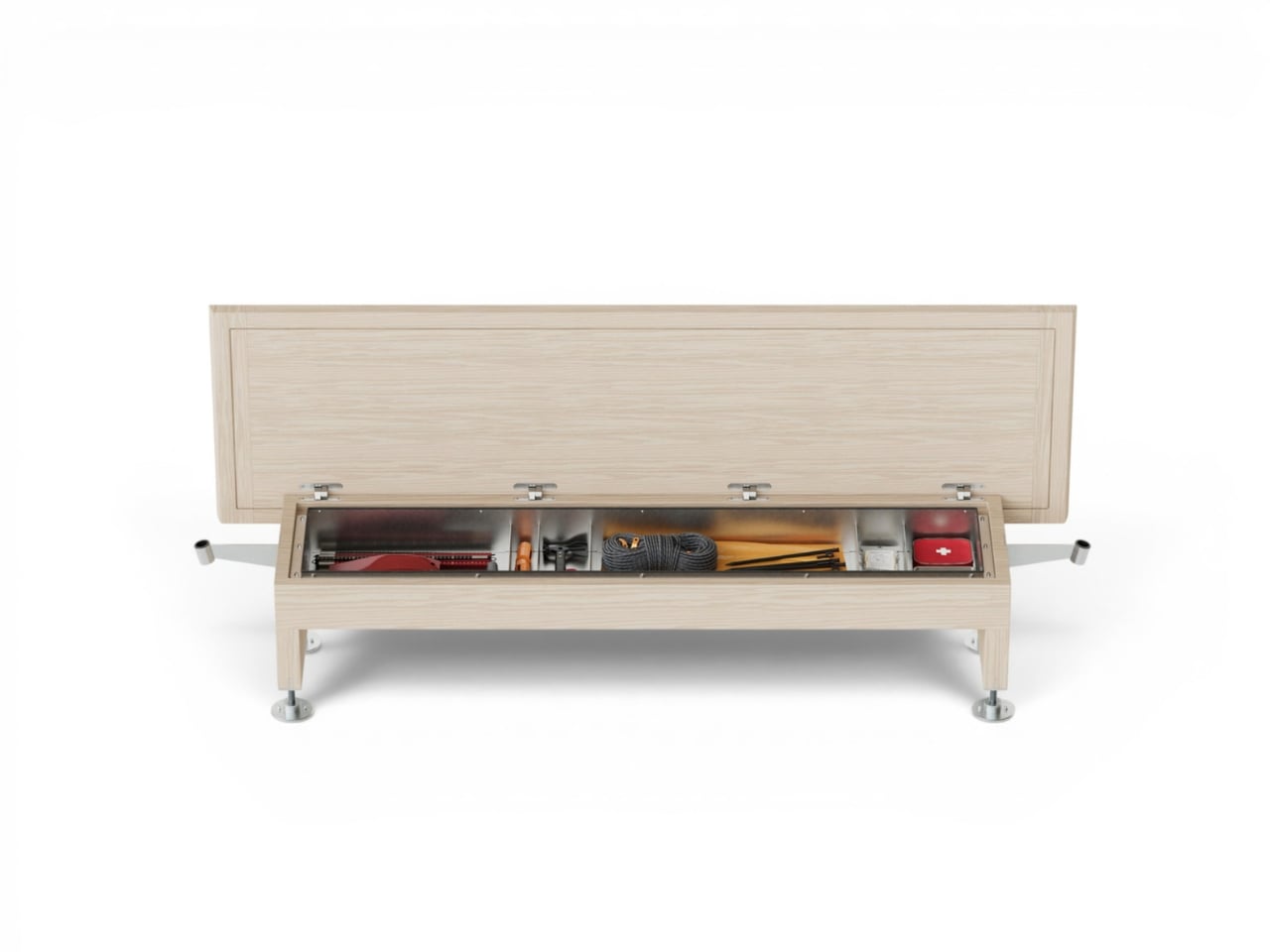
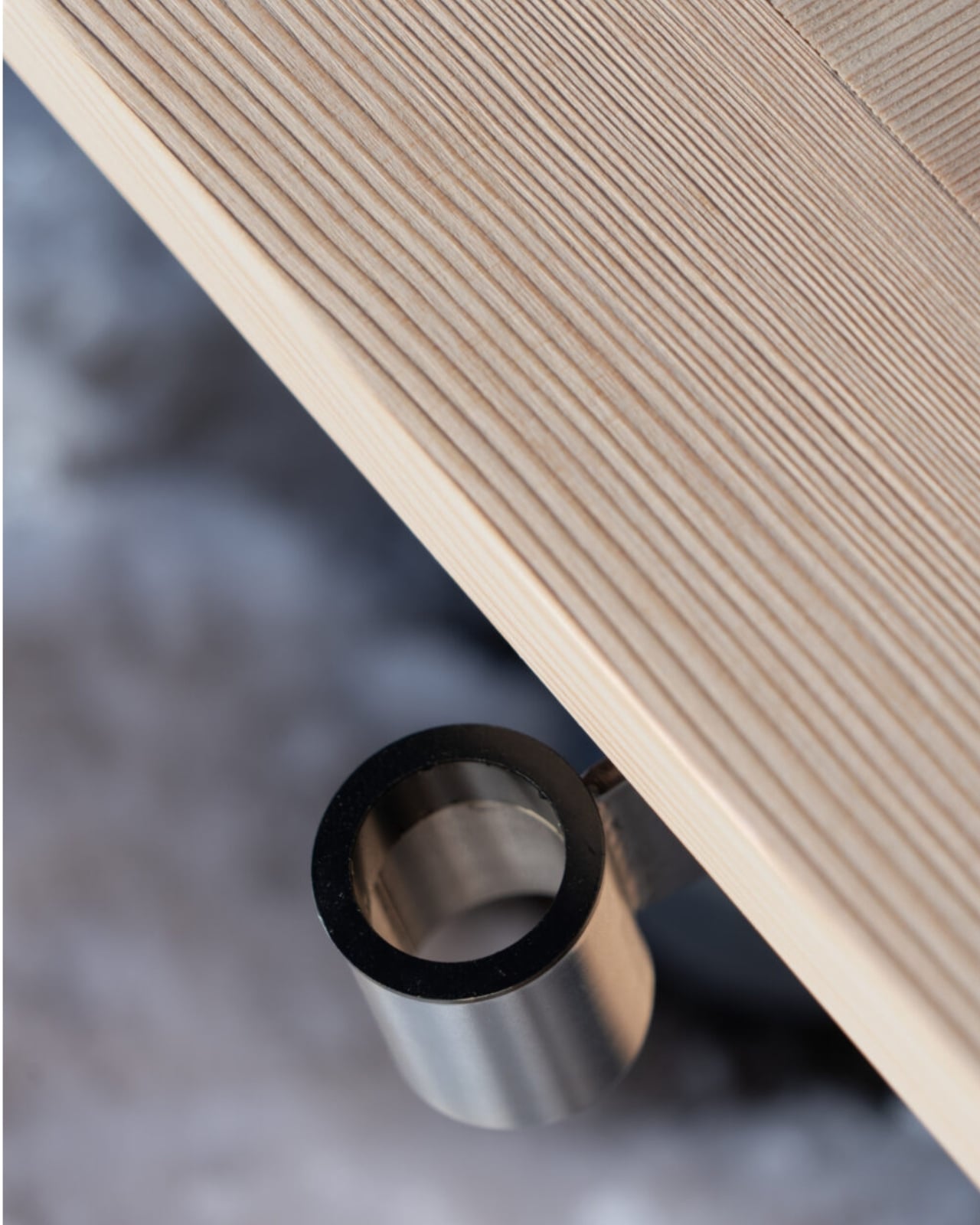
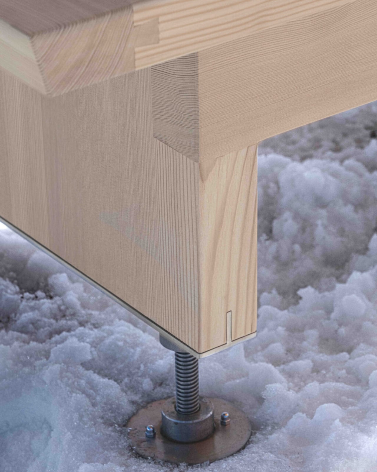
Pancalpina is Faccin’s latest project, commissioned by Trentino Sviluppo for the alpine landscape of Trentino in northeastern Italy. From the outside, it reads as a traditional wooden bench, crafted from solid larch with stainless steel components that can handle whatever the mountains throw at it. Sit on it, take in the view, rest your legs. Nothing unusual. But hidden inside the bench’s belly is a complete survival kit: thermal blankets, a shovel, a torch, and a tent that deploys using the bench’s own structure as its frame.
This is not a product born from a design brief looking for novelty. It’s a response to a real and recurring problem in alpine environments: people caught off guard by sudden weather changes, injuries, or simple miscalculation of distance and daylight. Faccin’s answer isn’t to build more formal infrastructure, which would disrupt the wild, sparsely touched nature of the terrain. Instead, he embedded emergency capacity into an object that already belongs there.
The philosophy behind Pancalpina is important to understand because it’s what separates it from a clever gadget. The alpine environment, as Faccin has noted, is one of the few remaining areas of genuinely wild nature in Europe. Refuges, bivouacs, and trail markers already exist as artificial landmarks in these spaces, helping hikers orient themselves and find safety. Pancalpina slips into that existing language. It doesn’t announce itself as a technological intervention. It just looks like a bench.
And yet the moment you need it, the object transforms. The tent isn’t designed for a comfortable night out. It’s designed for the specific, unglamorous situation of waiting for rescue or riding out a night of rain or sudden snowfall when you have no other option. Faccin is precise about this distinction: Pancalpina is not a bivouac for extended stays. It’s a minimal shelter, built for survival in the time between crisis and help arriving.
That restraint is actually the most interesting design decision here. A lesser designer might have overcomplicated the solution, packed the bench with sensors and GPS alerts and solar charging panels. Faccin kept it elemental. Wood, steel, blankets, a shovel, a tent. Materials and tools that don’t require a signal to function, because when you actually need them, there might not be one.
Faccin himself trained under Enzo Mari, one of Italy’s most rigorous design thinkers, and that influence shows in how he approaches objects with genuine seriousness of purpose. His work has been recognised with a Compasso d’Oro honourable mention, and he teaches product design at the Free University of Bolzano, which puts him, fittingly, right at the edge of alpine territory. He’s not designing Pancalpina from a studio purely for aesthetic effect. He’s designing it because he understands that environment.
What strikes me about this project is how it reframes the idea of public infrastructure. We tend to think of safety in the mountains as a function of signage, emergency apps, or rescue services. Pancalpina asks: what if the bench itself carried some of that responsibility? Not in a dramatic or high-tech way, but quietly, modestly, in the way that good design tends to do its best work.
The name, too, is worth noting. Panca is Italian for bench, and alpina for alpine. It’s compound, direct, and a little poetic. The kind of name that feels inevitable once you hear it. If Pancalpina ever moves beyond prototype to wider installation across Italian alpine trails, it would represent one of the more genuinely thoughtful examples of public design in recent memory. Not because it’s revolutionary, but because it understood exactly what it needed to be, and nothing more.
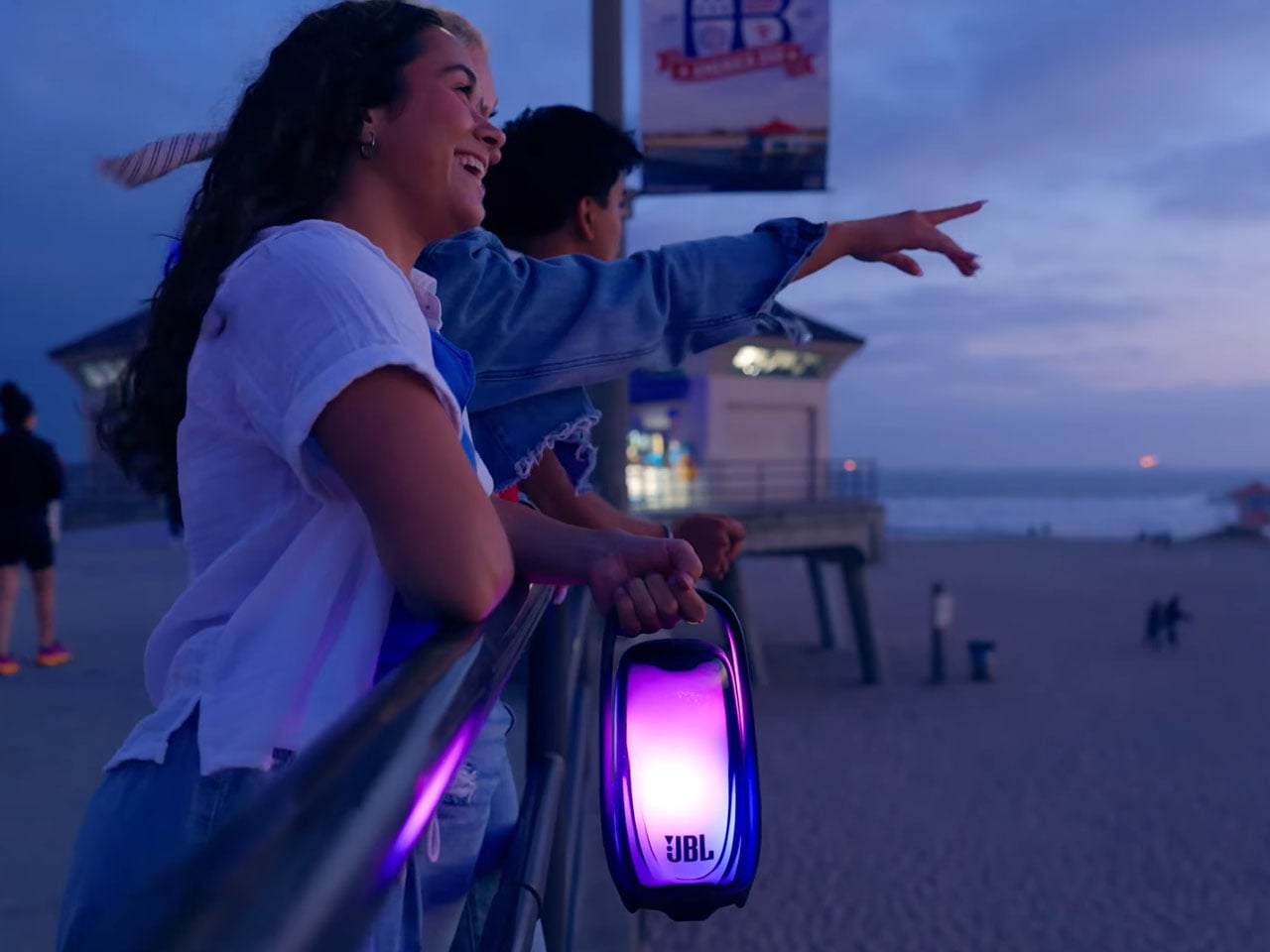
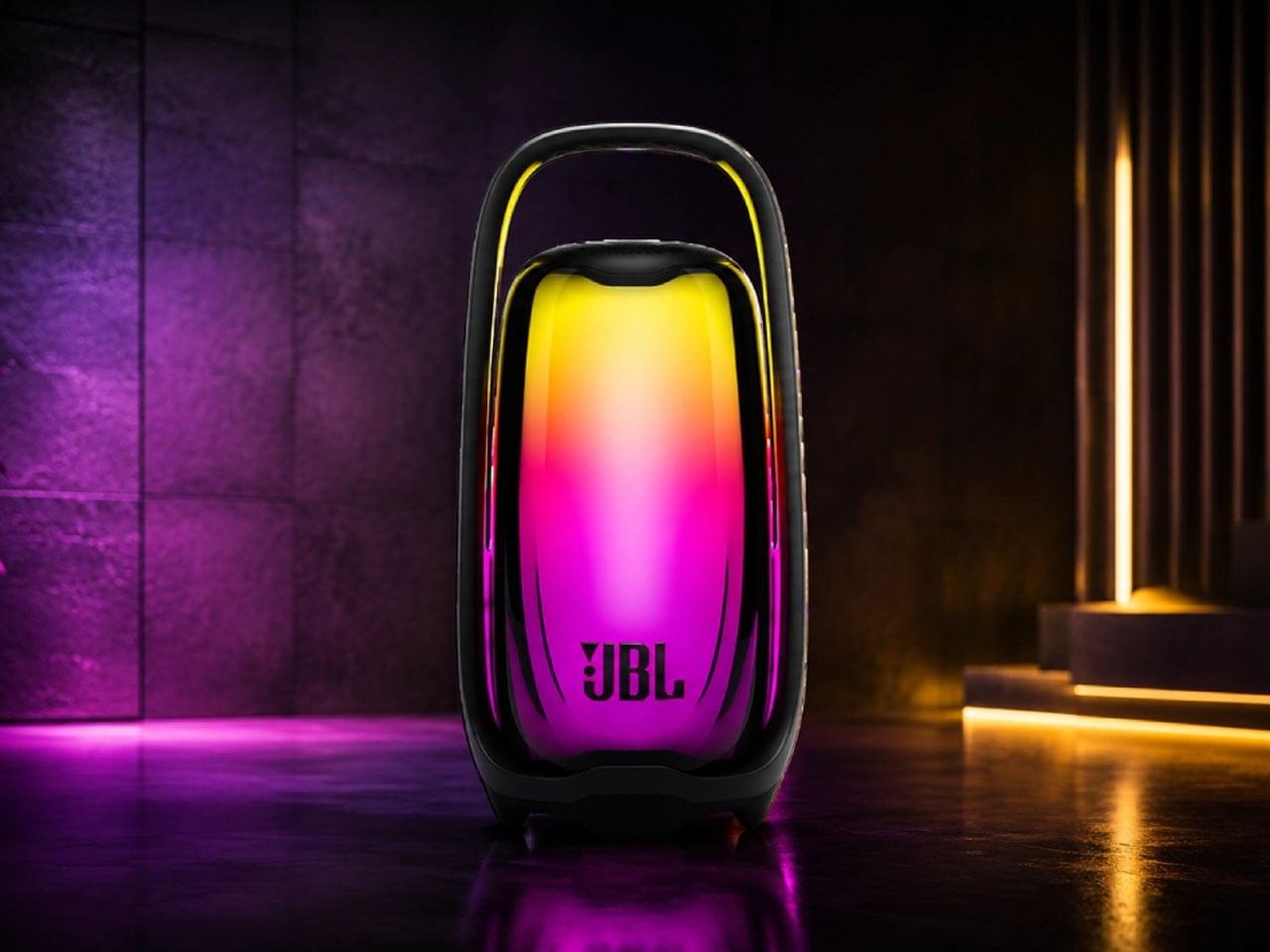
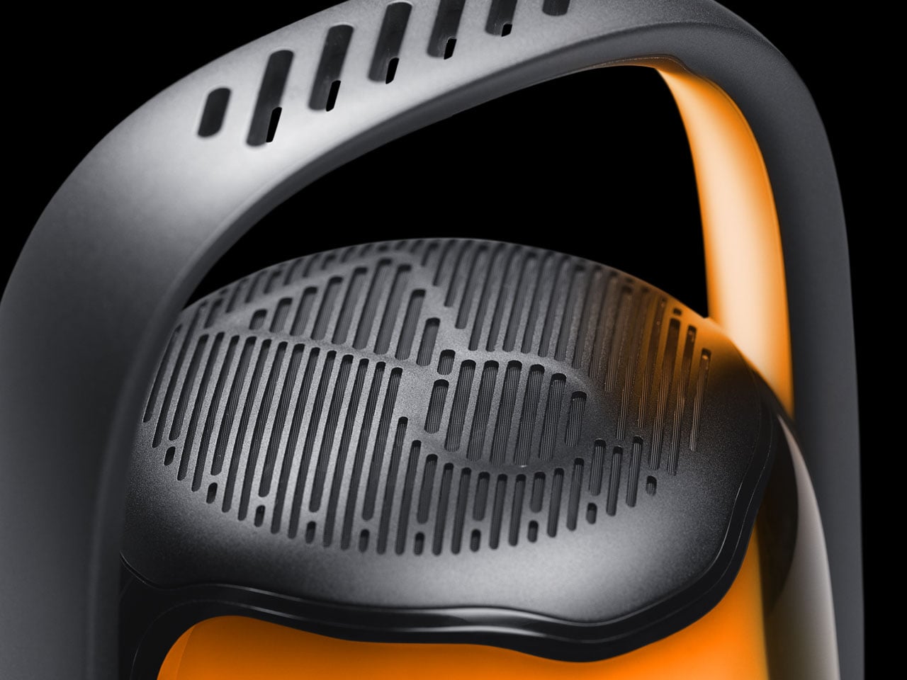
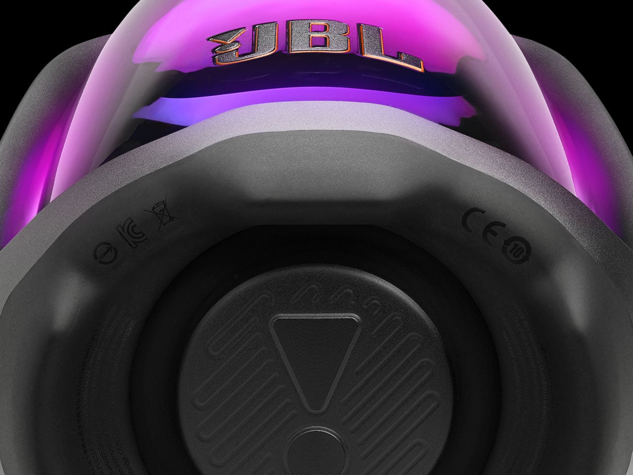
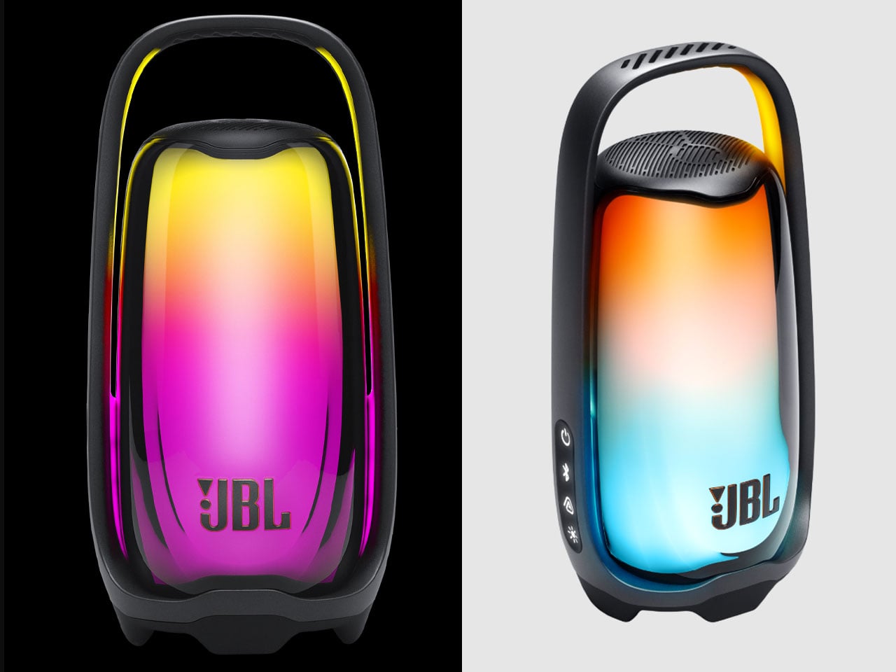
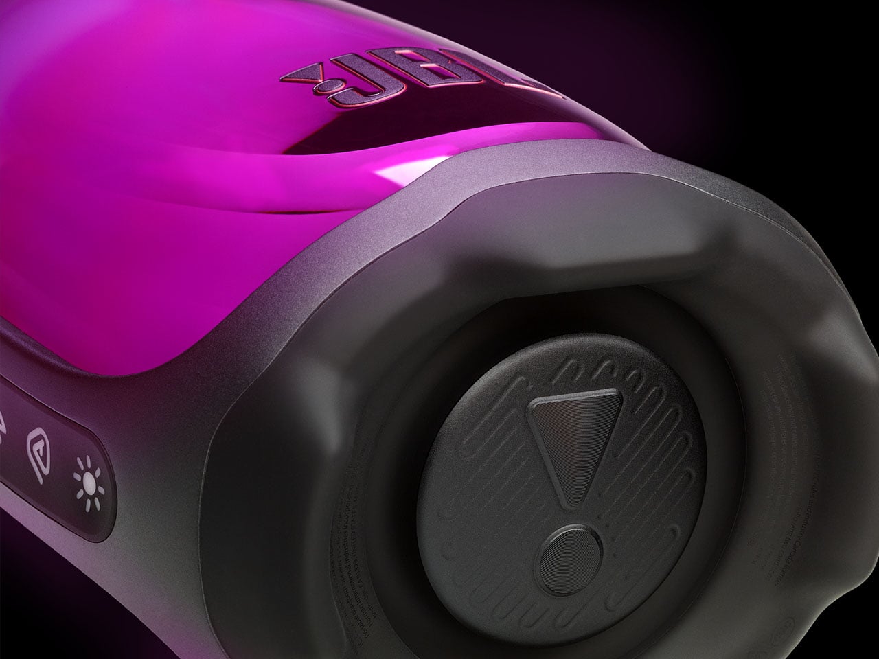
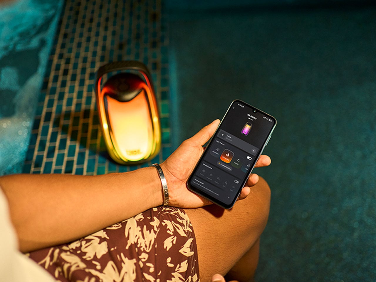
A Bluetooth speaker usually asks you to choose between sound and atmosphere. JBL’s new Pulse 6 is designed to make that choice feel unnecessary. Wrapped in a transparent cylindrical body, it turns music into a moving field of light, while a newly illuminated handle adds another glowing element to the object.
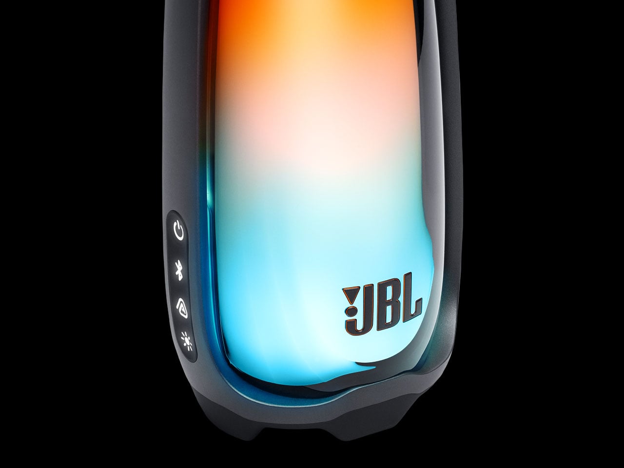
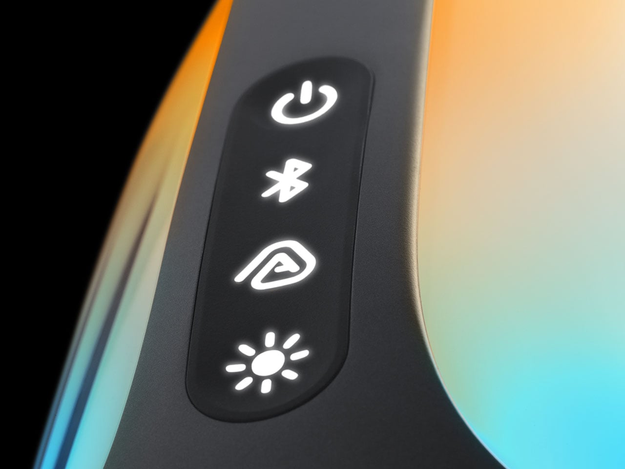
Launched today, the Pulse 6 portable speaker builds on JBL’s signature see-through aesthetic, surrounding its audio hardware with a 360-degree lighting system that responds to whatever is playing. Sixteen lighting patterns are available through the JBL One app, where the visual experience can be adjusted alongside basic EQ controls. When the music stops, the speaker can still remain a focal point of the room. A double-tap activates its ambient light, while the volume control doubles as a convenience to adjust brightness.
That idea of the speaker as an environmental object extends into Sunset Mode. Rather than simply switching off, the Pulse 6 can gradually fade its illumination and stop playback after a timer of up to 60 minutes, making it particularly suited to winding down at night. There is substance beneath all that glow. The 40W system combines a 30W RMS woofer with a 10W RMS tweeter, covering a 42Hz–20kHz frequency range. JBL’s AI Sound Boost continuously analyzes the audio and adjusts the output to help keep distortion under control as the volume climbs. For wired listening, a built-in DAC enables lossless audio through USB-C when connected to a Mac or Windows PC.
The wireless side is equally current, with Bluetooth 6.0 and support for SBC, AAC, and LC3 codecs. Auracast allows compatible JBL speakers to be connected for a larger synchronized listening setup, turning several individual glowing objects into one shared light-and-sound environment. Despite its sculptural appearance, the Pulse 6 is meant to leave the living room. The IP68 rating makes it dustproof and capable of surviving submersion in water, while the 34Wh battery delivers up to 12 hours of playback. Playtime Boost can extend that by another two hours, although USB-C charging at 15W takes around 4.5 hours for a full recharge. At 1.49kg and 131.7 x 264.1 x 106.4mm, it remains portable enough to carry from one setting to another.
JBL is initially launching the Pulse 6 in China for 2,499 yuan (roughly $370), with availability expected to expand gradually to other regions. The dual functionality and the striking aesthetics have sold me on the portable speaker, as it stands out from any other option on the market.