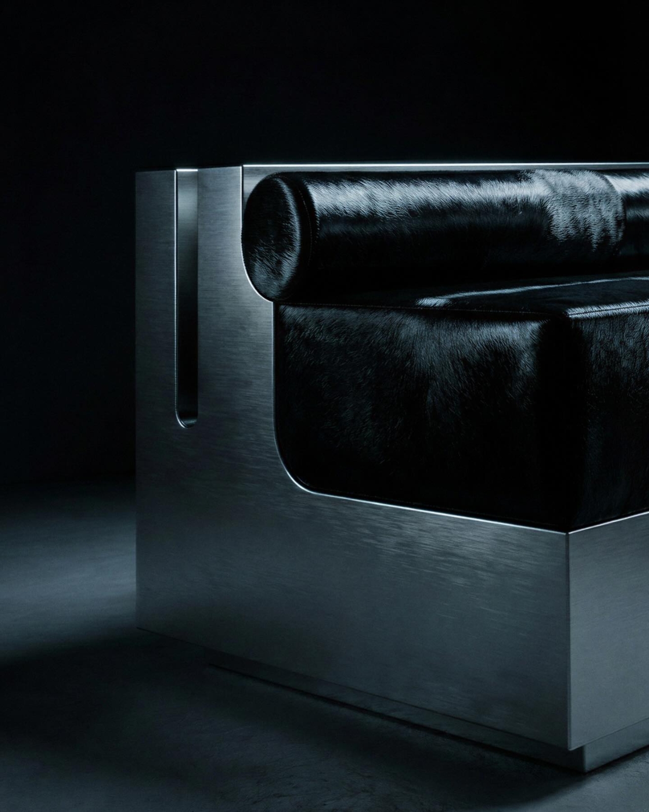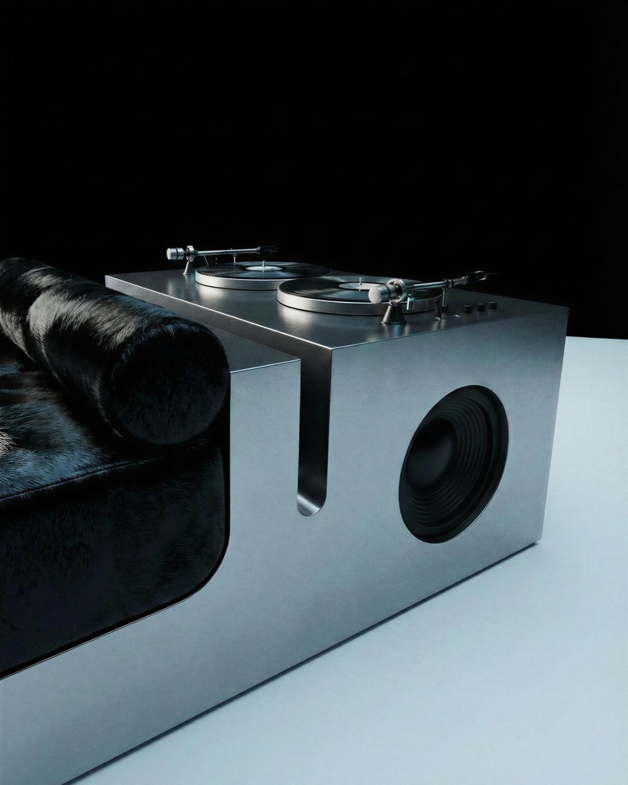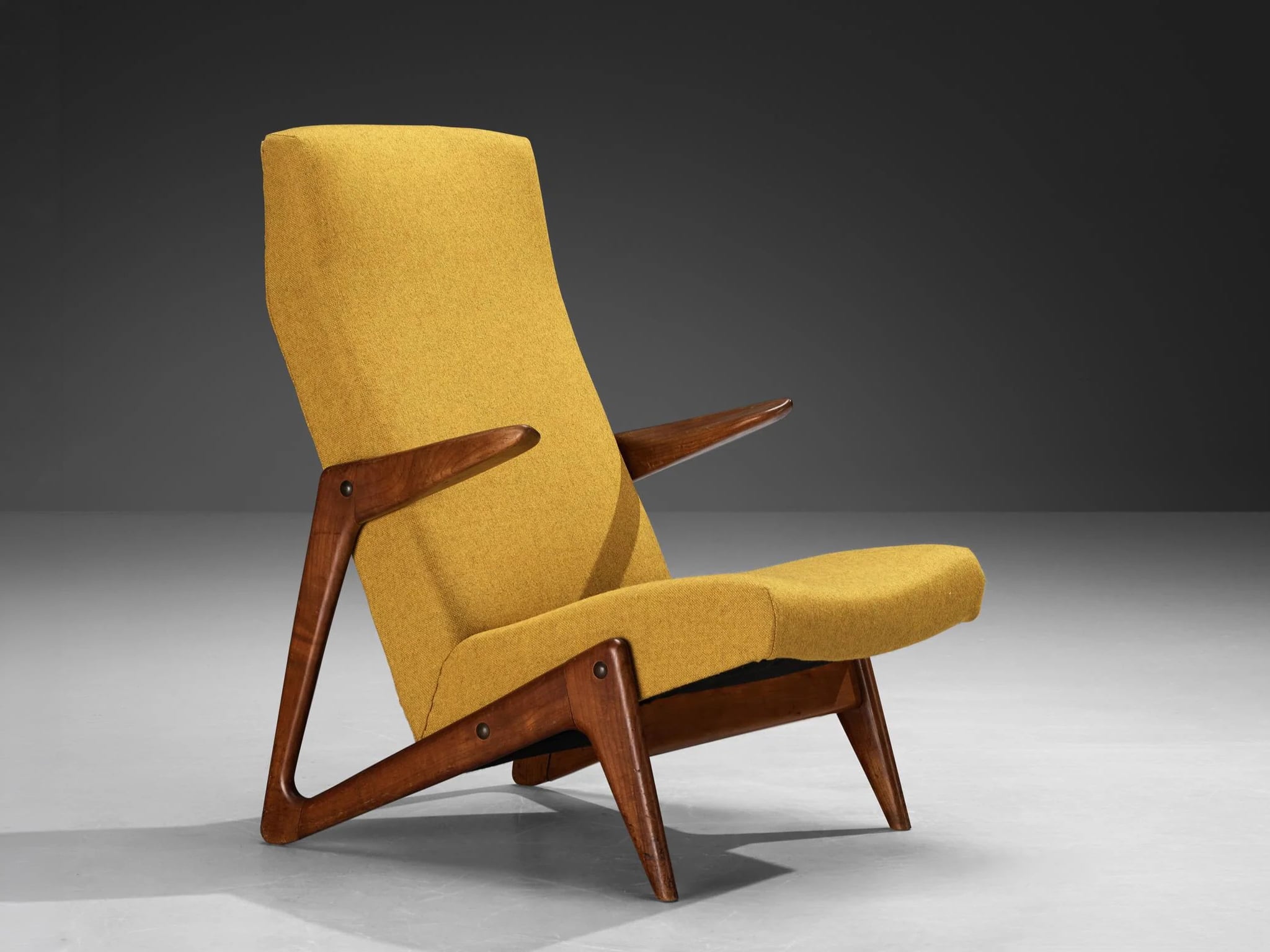
Image credit: Armani Casa
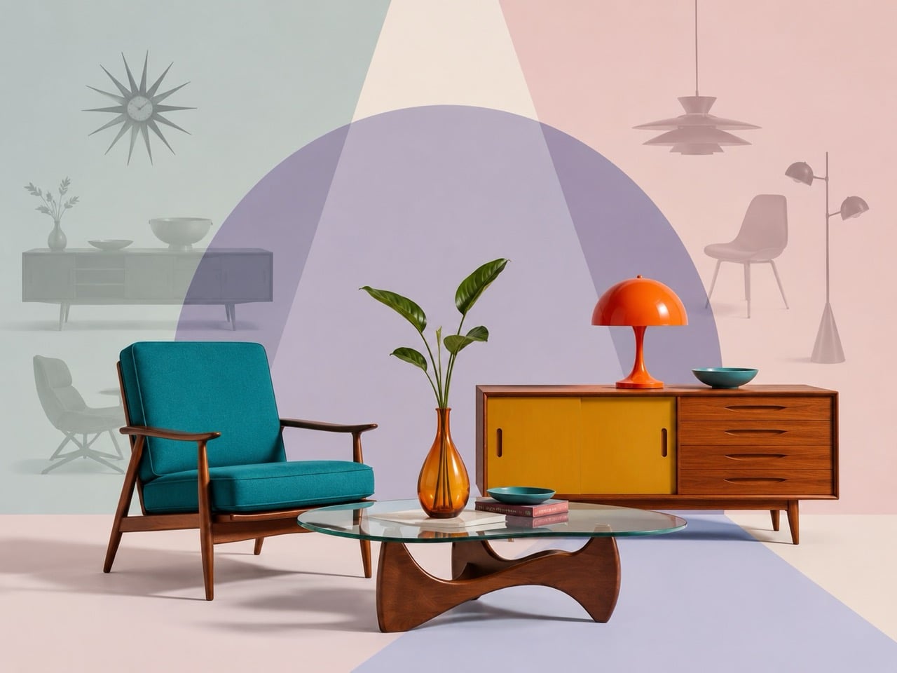
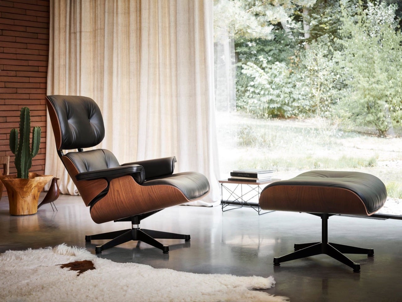
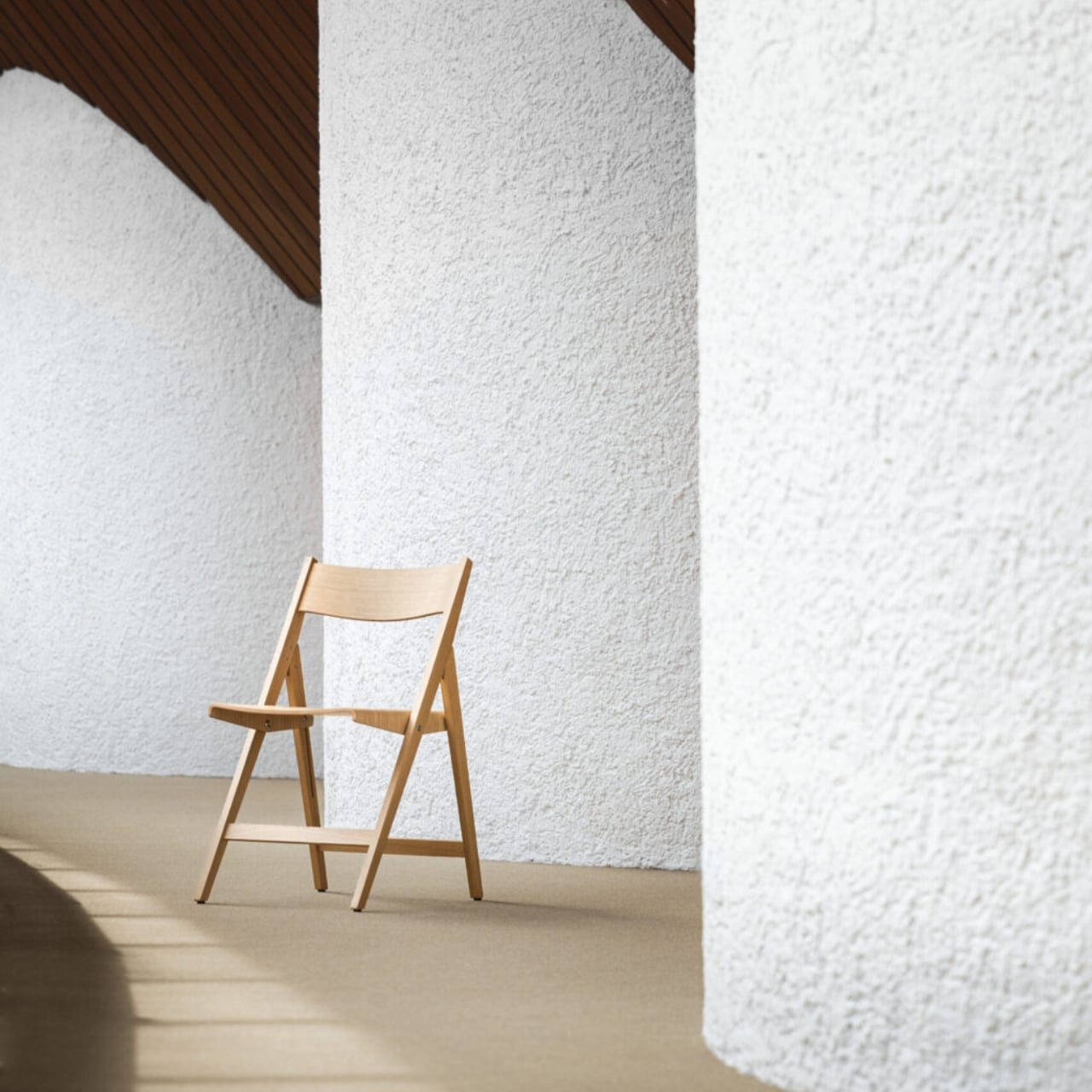
After years dominated by pale oak, soft minimalism, and rounded silhouettes, Salone del Mobile 2026 signaled a clear shift toward richer and more expressive interiors. Held at Milan’s Rho Fiera fairgrounds from April 21 to April 26, 2026, the exhibition integrated Art Deco-inspired details such as chevrons, polished brass, chrome finishes, fan-shaped arches, and jewel-toned velvet upholstery, bringing glamour and structure back into contemporary furniture design.
Across Milan Design Week 2026, designers moved toward layered materials, geometric forms, and statement-making interiors. Instead of feeling nostalgic, the aesthetic appeared refined and updated for modern living. The resurgence also aligns with broader trend forecasts. Pinterest Predicts 2026 identified neo deco as one of the year’s defining interior styles, which is a cleaner, moodier reinterpretation of 1920s luxury.
Throughout Salone del Mobile 2026, recurring Deco-inspired forms and materials across installations and showroom launches pointed to a wider and more intentional design shift, reinforcing the growing influence of Art Deco furniture 2026 trends.
This shift is best understood by tracing how Neo Deco diverges from its historical origin.
What Is the Difference Between Original Art Deco and Neo Deco?
While both styles celebrate glamor and craftsmanship, Neo Deco reinterprets classic Art Deco for a more modern and livable aesthetic.
Characteristics of Original Art Deco
- Strong geometric symmetry
- Chevron patterns and fan-shaped arches
- Heavy ornamentation and layered detailing
- Glossy lacquer, marble, and polished brass
- Bold jewel tones and dramatic interiors
- Structured and formal furniture silhouettes
Characteristics of Neo Deco
- Softer and more sculptural forms
- Cleaner layouts with less visual excess
- Refined brass and chrome accents
- Selective use of velvet, marble, and glossy finishes
- Open and contemporary interiors
- Balanced mix of luxury and minimalism
Seen throughout Salone del Mobile 2026, neo deco keeps the elegance of classic Art Deco furniture but simplifies it for contemporary living. Additionally, Neo Deco keeps the glamour of classic Art Deco furniture while adapting it to modern interiors that prioritize comfort, simplicity, and sculptural design. This theoretical shift becomes most visible when translated into contemporary objects and reissued icons. Take a look at our pick of the top 7 Neo Deco pieces from Salone del Mobile Milan Design Week 2026.
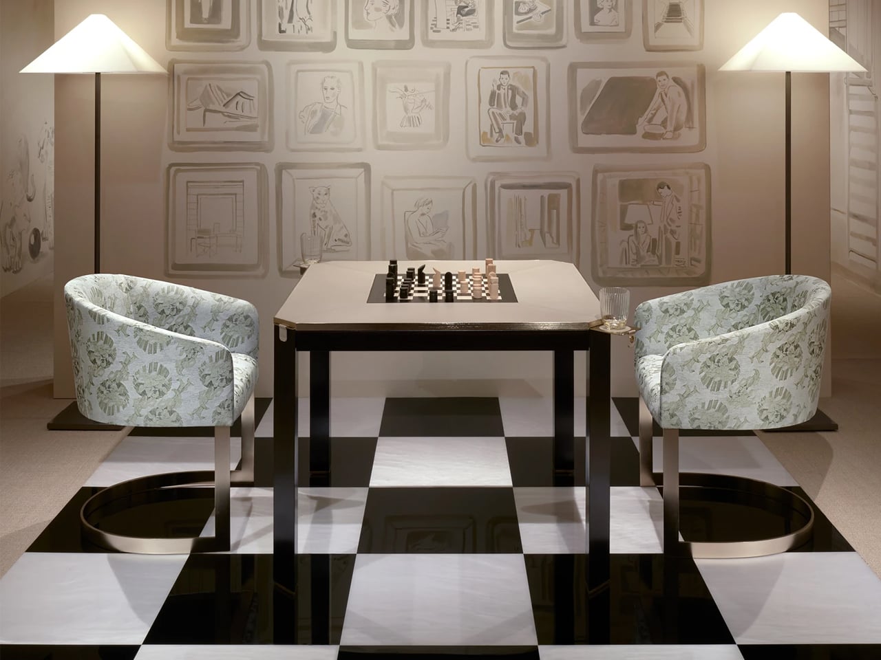
1. Borgonuovo’s games table by Armani Casa
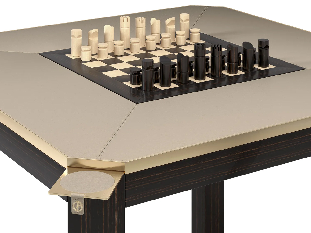
Image credit: Armani Casa
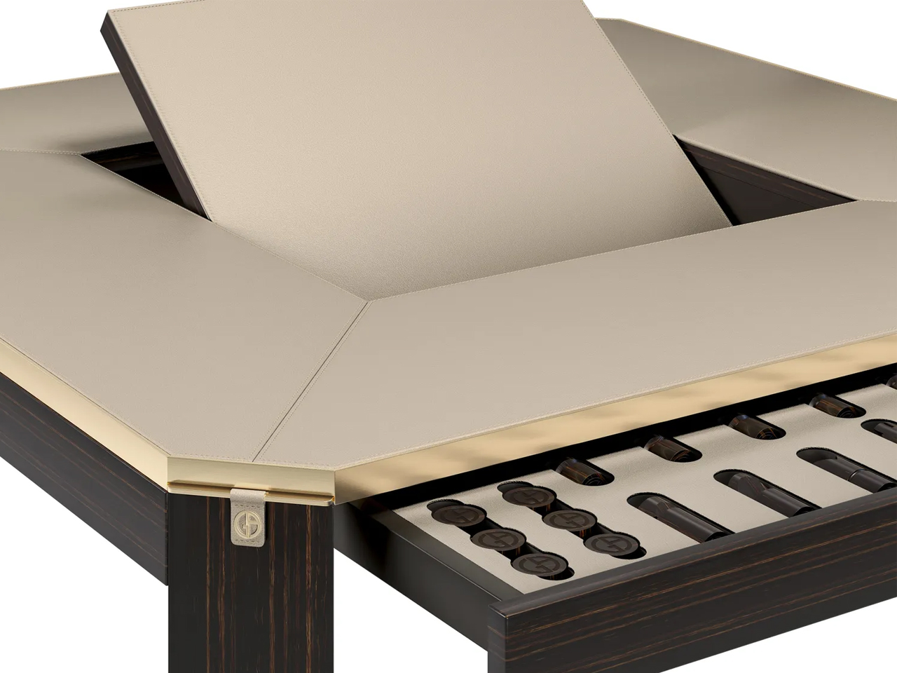
Image credit: Armani Casa
The Borgonuovo’s games table blends understated luxury with meticulous craftsmanship through a refined neo-deco design language. Crafted from ebony wood and topped with taupe leather, the piece conceals a rotating chess-and-checkers surface in ebony and maple wood. Satin-finished brass accents, sculptural triangular legs, discreet pull-out cup holders, and hidden storage drawers introduce geometric elegance and multifunctional sophistication without overwhelming the design.
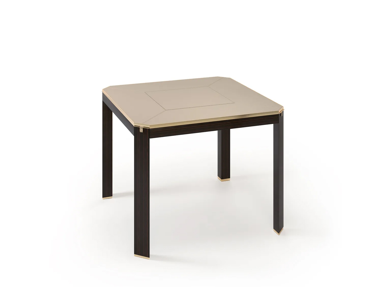
Image credit: Armani Casa
Named after the Milan street once home to Giorgio Armani, the table reflects the restrained yet luxurious aesthetic of Armani Casa. Its clean forms and rich material palette also reference the timeless influence of Jean-Michel Frank, whose minimalist approach to luxury continues to shape the brand’s furniture and interior collections.
2. Delfi Madia Cabinet by Promemoria
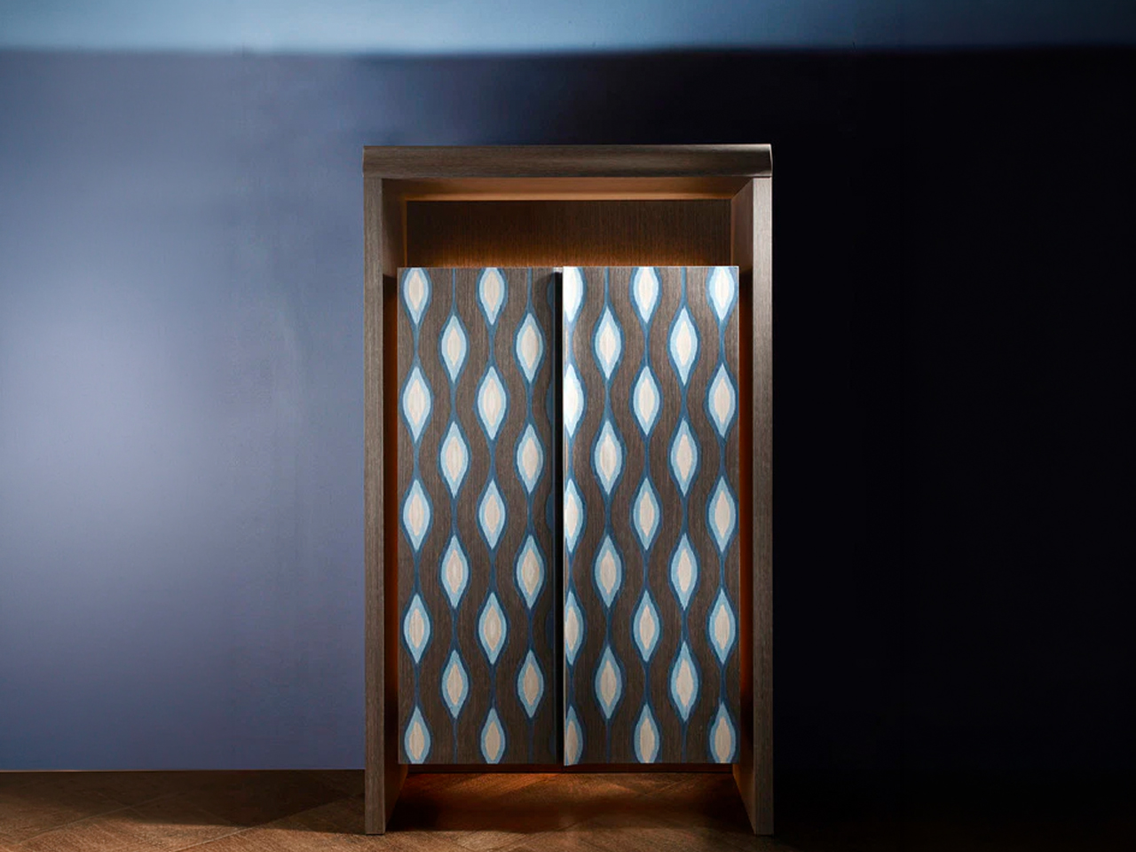
Image Credit: Promemoria
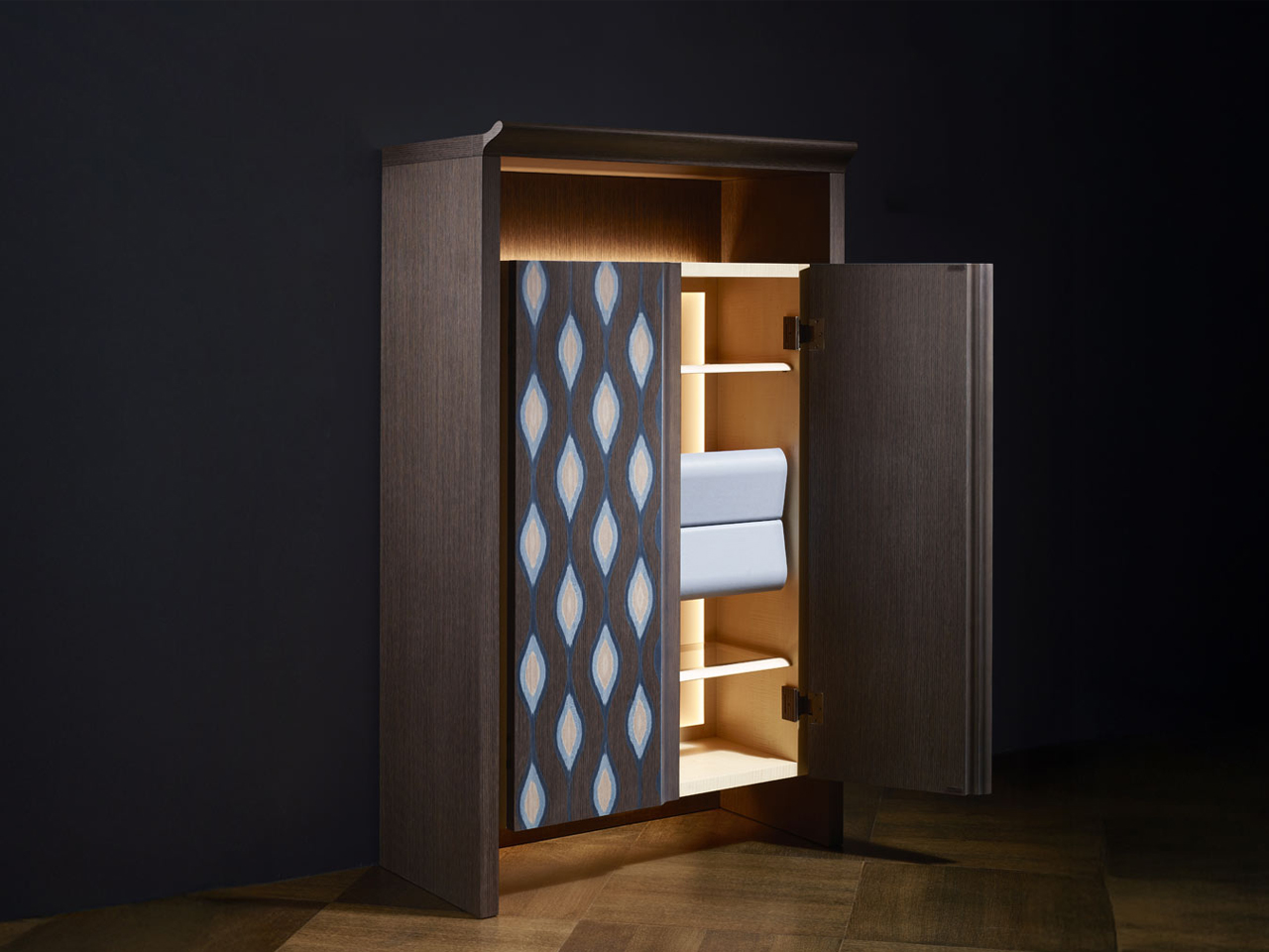
Image Credit: Promemoria
The Delfi Madia Cabinet by Promemoria expresses a refined neo deco aesthetic through its architectural proportions, geometric detailing and restrained use of ornamentation. Unlike traditional Art Deco, which often emphasized dramatic symmetry and lavish decoration, this contemporary interpretation feels quieter and more sculptural. Defined by a solid wood frame and a recessed central groove that creates a strong vertical axis, the cabinet balances precision with softness, while subtle perimeter lighting enhances its sculptural presence with a warm ambient glow.
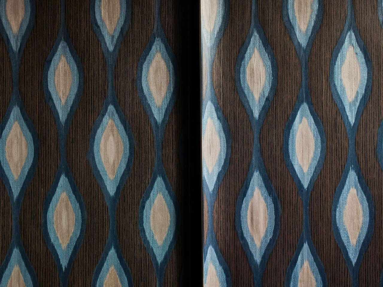
Image Credit: Promemoria
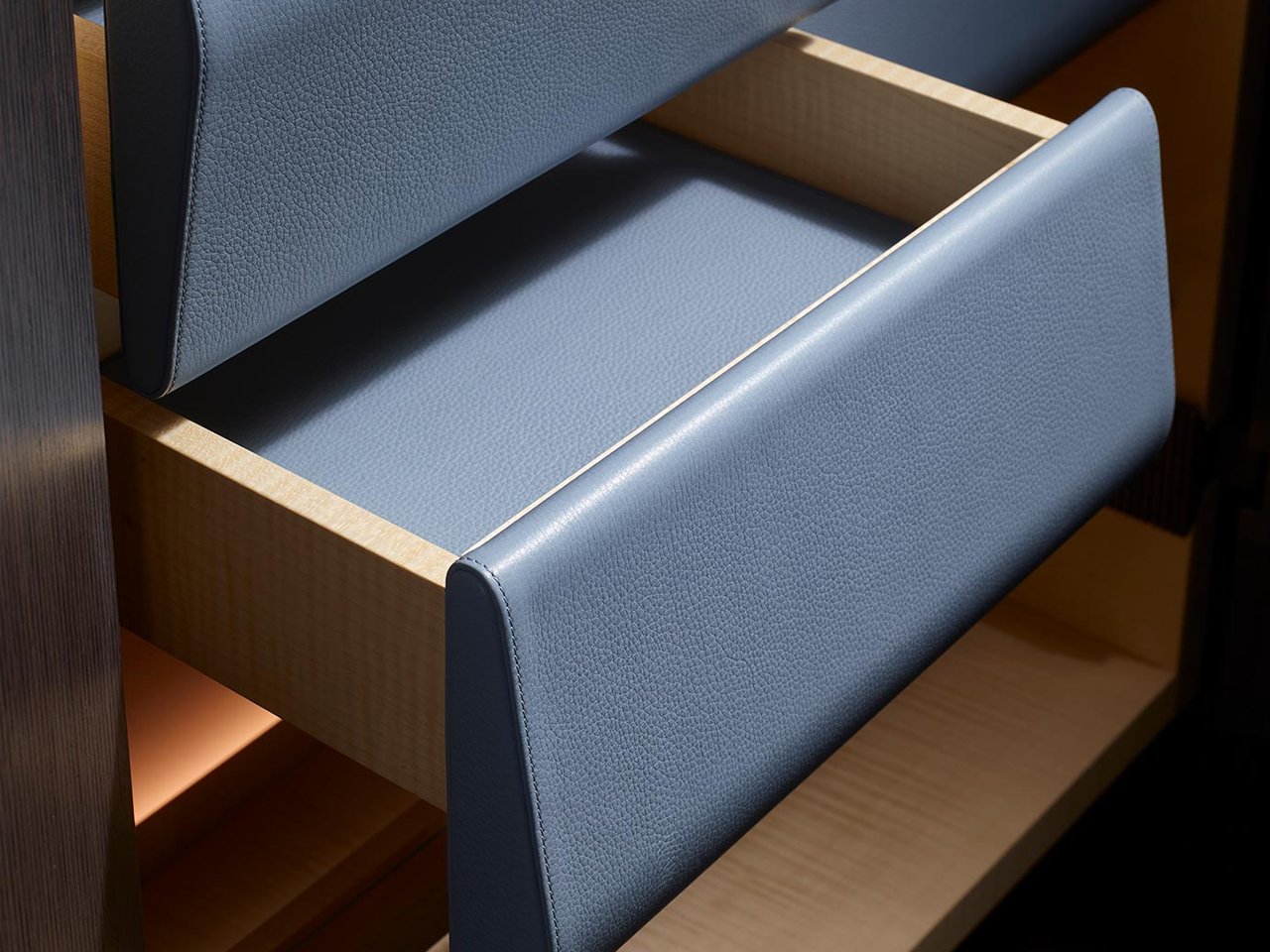
Image Credit: Promemoria
The cabinet doors become the focal point of the design, featuring layered wood veneers and repetitive patterns in varying tones that create a delicate three-dimensional effect. This interplay of geometry, texture, and craftsmanship recalls classic Deco influences but reworks them in a cleaner and more contemporary way. Functional yet expressive, the piece can shift from kitchen storage to an intimate bar setting.
3. ‘Pigreco’ Chair by Tobia Scarpa, Reissued by Tacchini
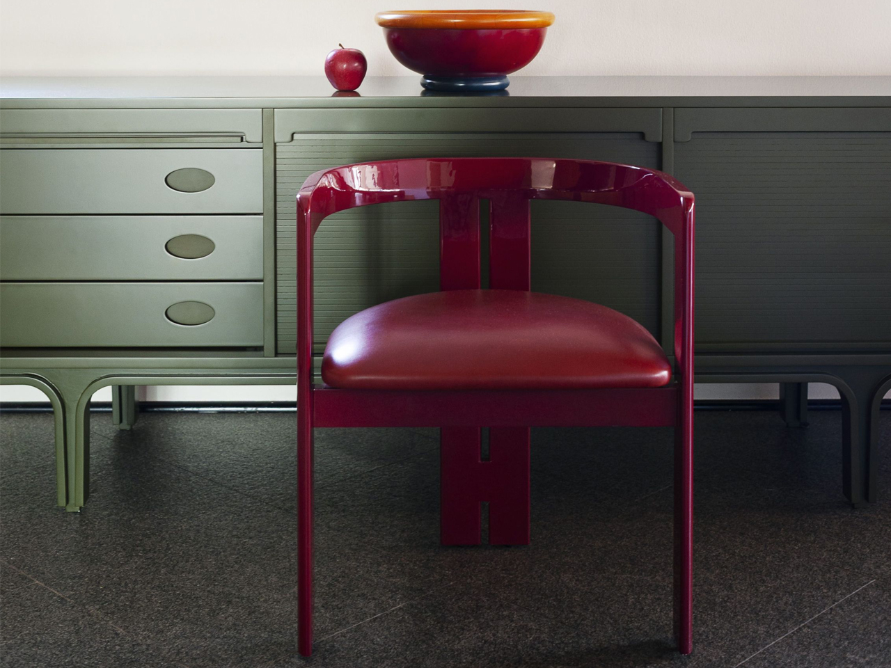
Image credit: Tacchini
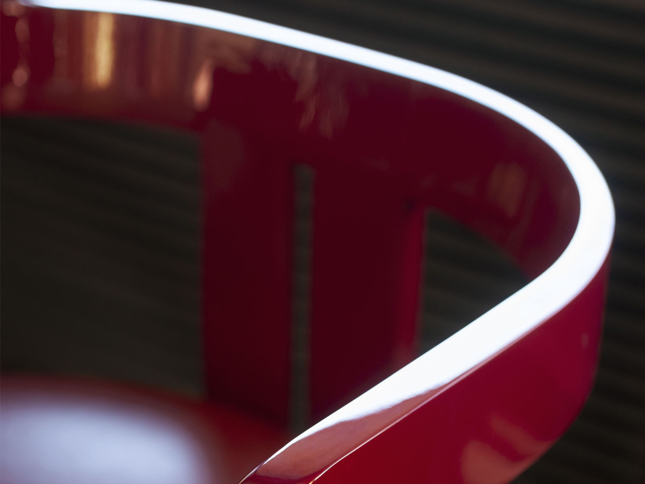
Image credit: Tacchini
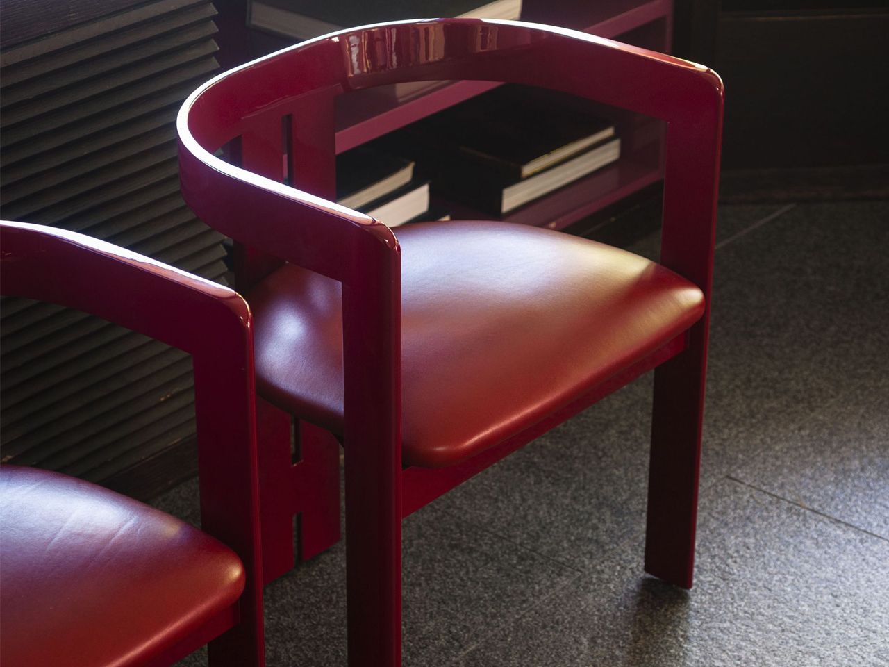
Image credit: Tacchini
The ‘Pigreco’ chair by Tobia Scarpa for Tacchini reinterprets neo deco through a refined balance of gloss, geometry, and sculptural elegance. Echoing the glamour of classic Art Deco furniture, the design pairs soft upholstery with lacquered structural elements that wrap around the chair like a polished architectural frame.
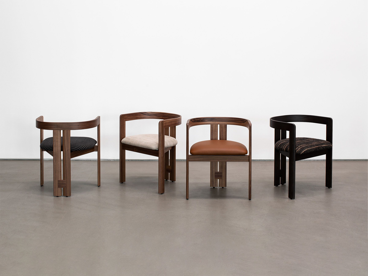
Image credit: Tacchini
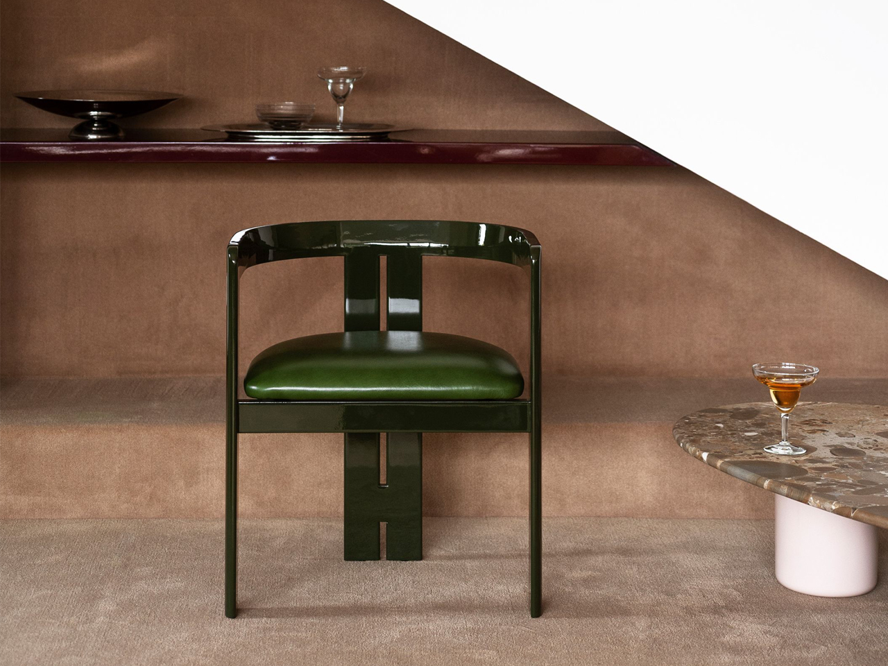
Image credit: Tacchini
The reflective surfaces introduce depth and luminosity, transforming lacquer from a simple finish into a defining visual feature. Instead of embracing the excess of traditional Deco interiors, Pigreco adopts a more restrained and contemporary approach. Its silhouette moves fluidly between curves and sharp lines, while the careful balance of solids and voids gives the chair a sense of rhythm and precision.
4. The Elie Saab x Impatia Pool Table
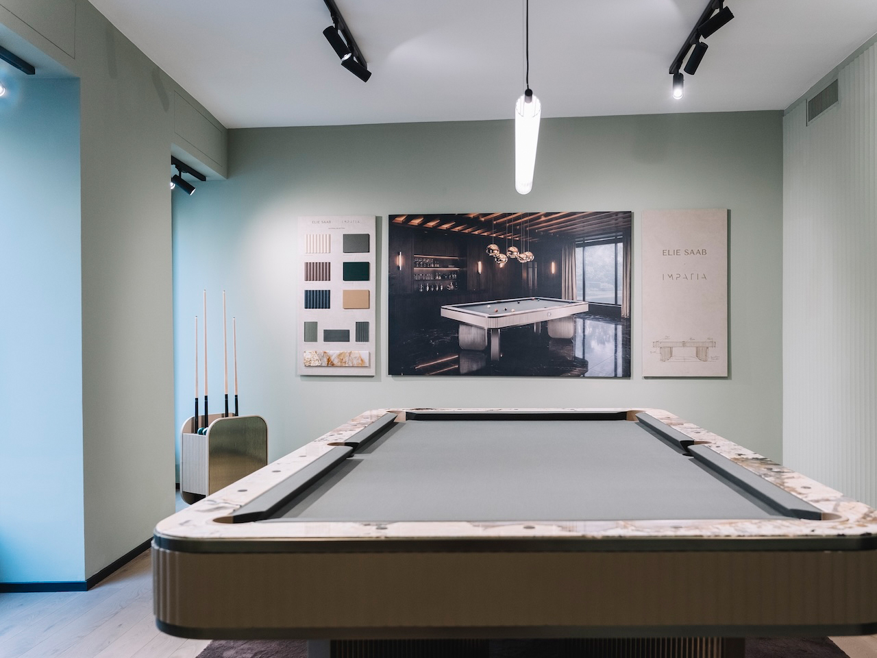
Image Credit: Elie Saab
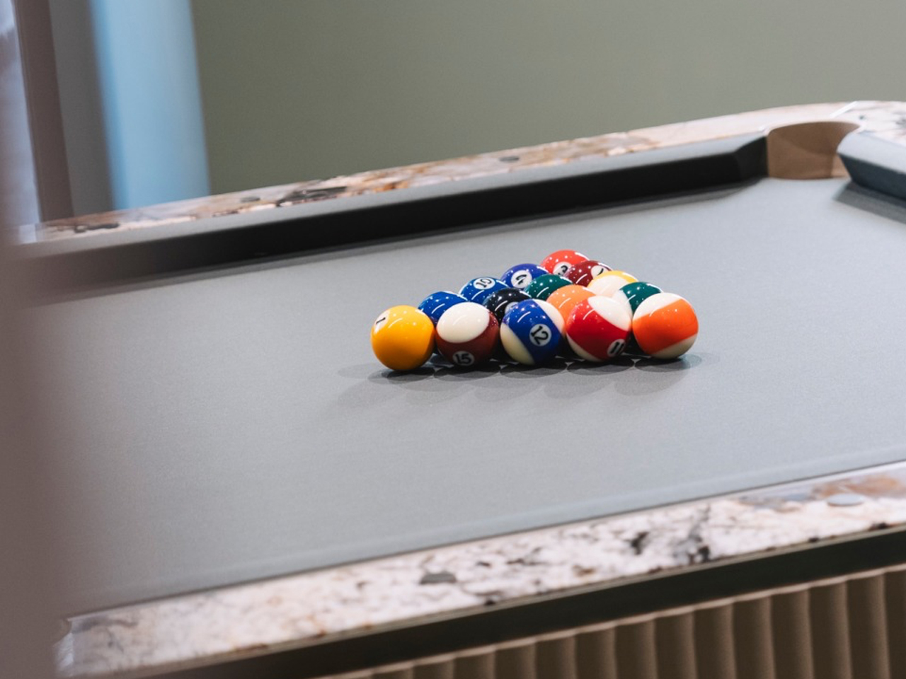
Image Credit: Elie Saab
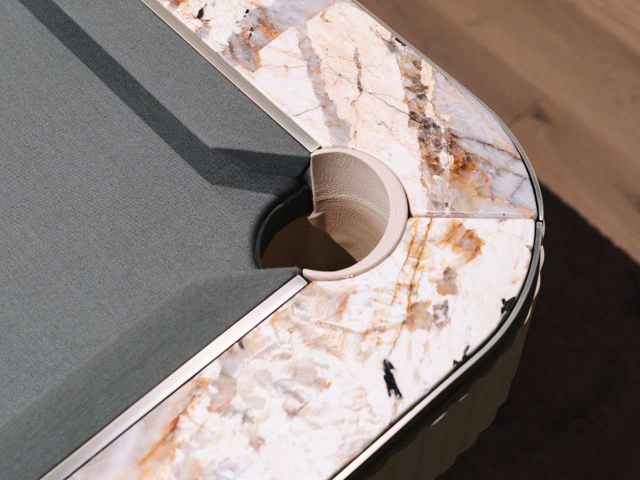
Image Credit: Elie Saab
The billiards table by Elie Saab in collaboration with Impatia transforms a traditional game table into a striking expression of neo-deco design. This functional furniture piece interprets the Neo Deco style through sculptural geometry, luxurious materials, and refined detailing. Transparent glass elements lighten the structure visually, while a concealed slate core preserves performance.
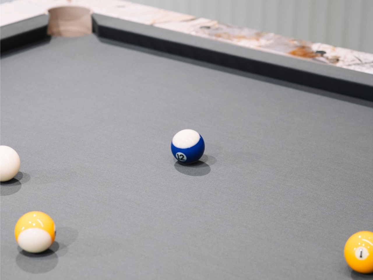
Image Credit: Elie Saab
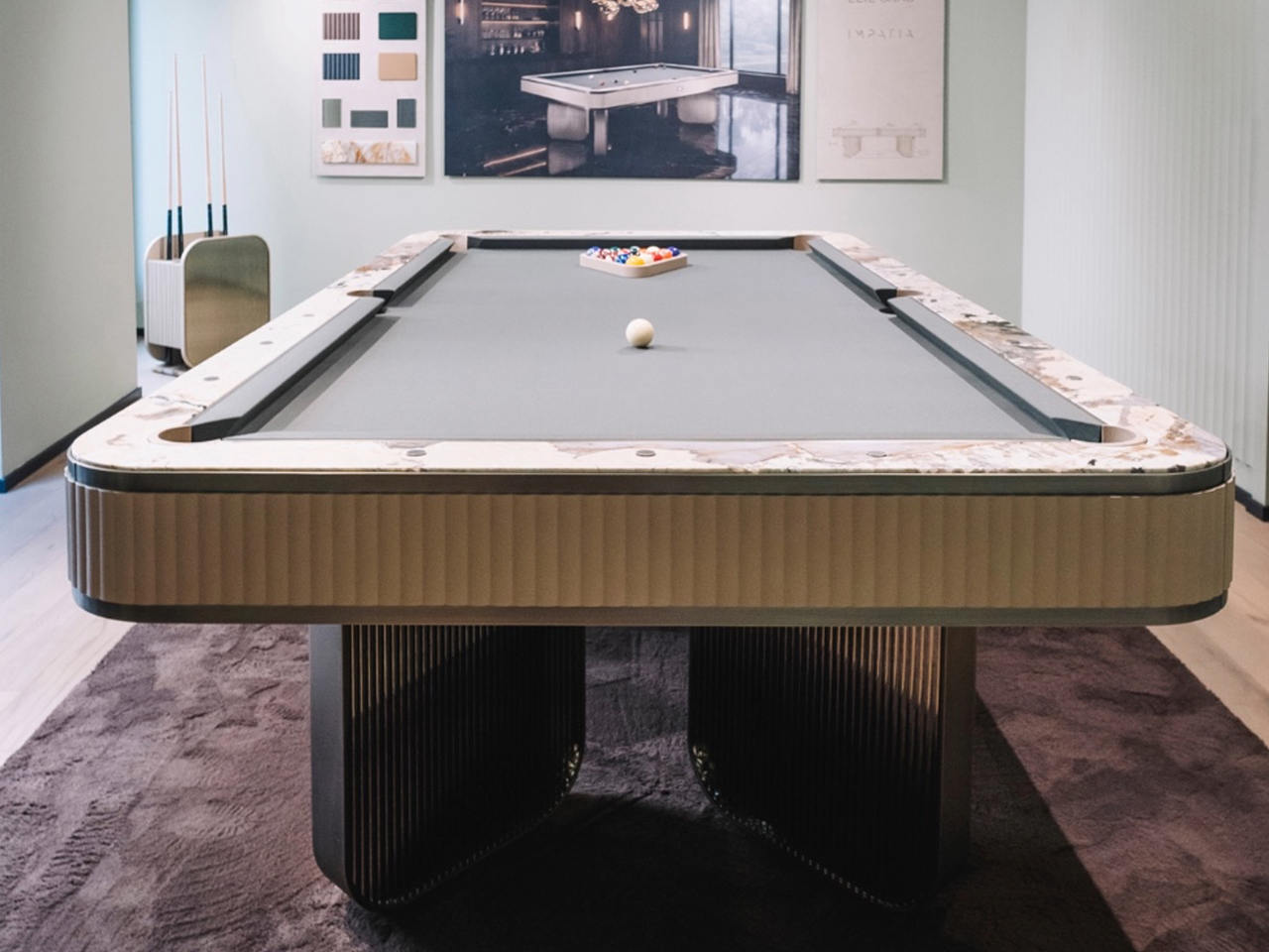
Image Credit: Elie Saab
Its Deco influence appears through layered material contrasts and architectural rhythm. A dark bronze metal frame provides structure, while ribbed glass panels reference geometric repetition. Beige leather edging softens the composition, while Patagonia marble rail tops introduce crystalline textures.
5. Louis Vuitton Omega Table (Reissue)
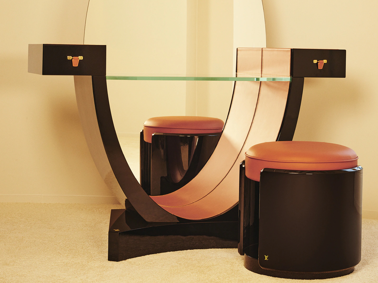
Image Credit: Louis Vuitton
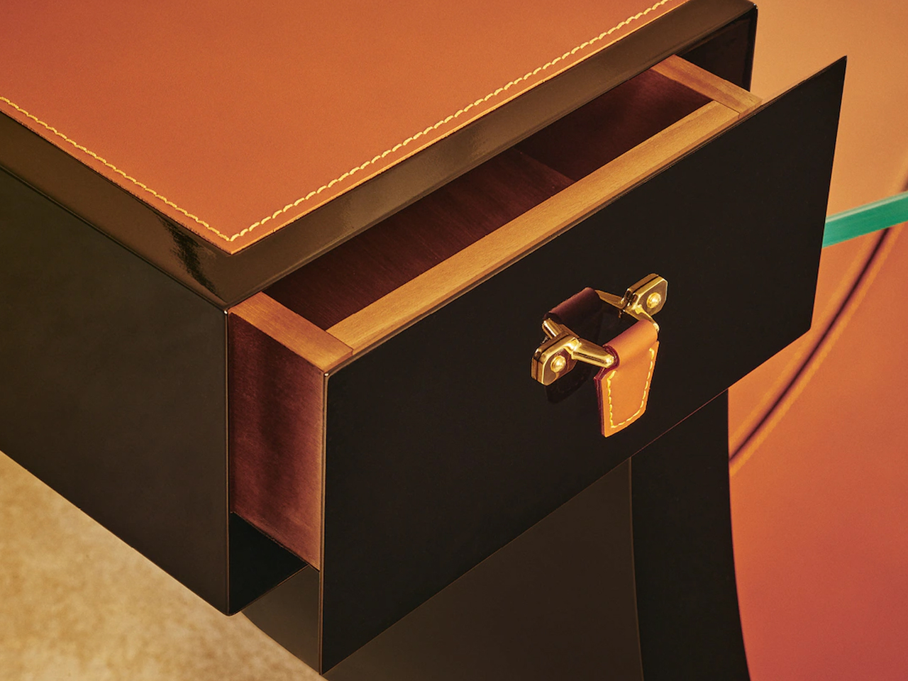
Image Credit: Louis Vuitton
Louis Vuitton returned to Milan Design Week 2026 with a refined presentation of Objets Nomades, staged as a dialogue between archival design and contemporary craftsmanship. The showcase revisited early Art Deco furniture principles, not as nostalgia, but as a structural language rooted in proportion, geometry, and material clarity.
Image Credit: Louis Vuitton
A key highlight was the reissued Omega Table, originally designed by Pierre Legrain in 1921. Its distinctive curved profile remained intact, maintaining the tension between fluid line and architectural discipline that defined the original composition. Recrafted in lacquered wood and Nomade leather, the surface finish deepens its visual continuity, allowing the form to read as a piece of furniture alongside a sculptural object. The result preserves its historical identity while aligning it with a more contemporary sensibility of refined restraint and material precision.
6. Diamond Chocolate sideboard by Boca Do Lobo
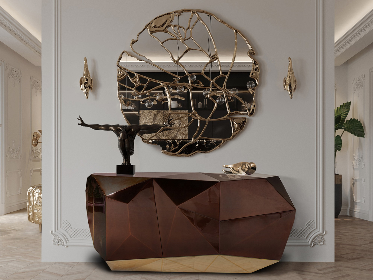
Image Credit: Boca do Lobo
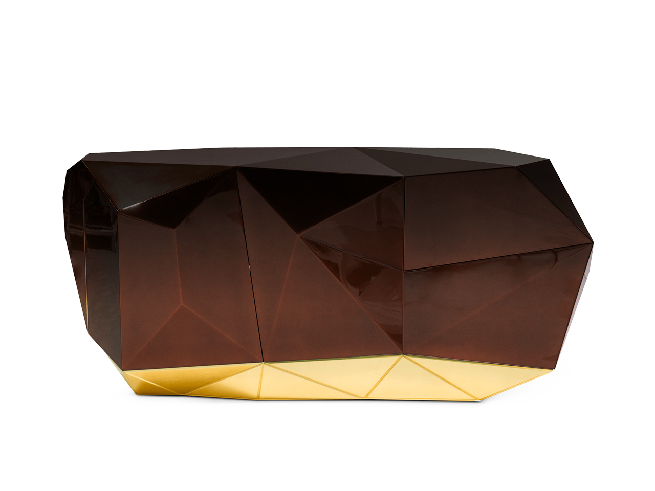
Image Credit: Boca do Lobo
The Diamond sideboard distils neo deco into a precise study of form, where geometry replaces ornament as the primary visual language. The design steps beyond decorative layering and is built around faceted surfaces that break light and shadow into controlled shifts across the object’s volume.
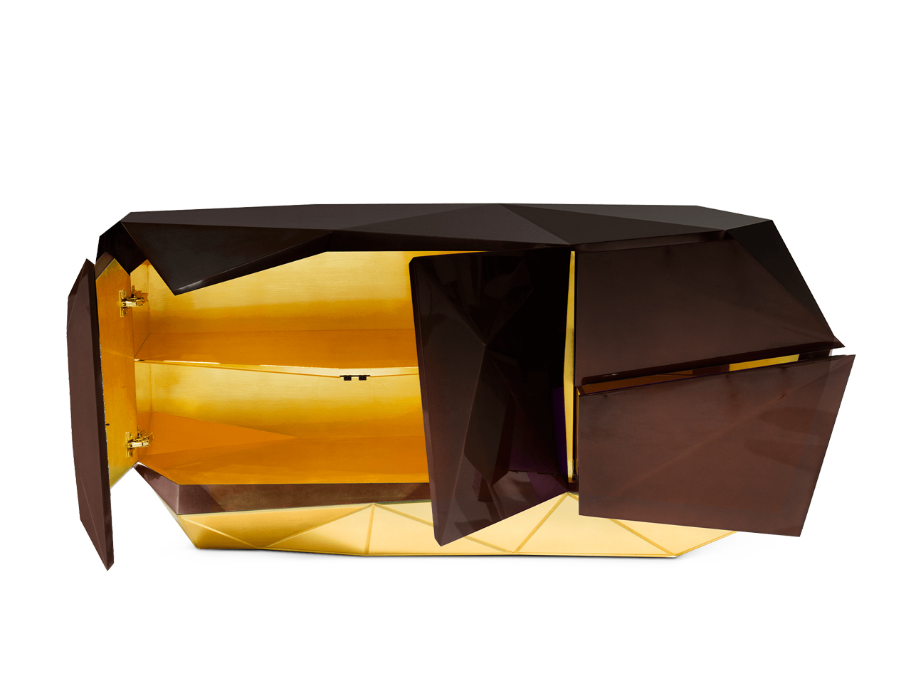
Image Credit: Boca do Lobo
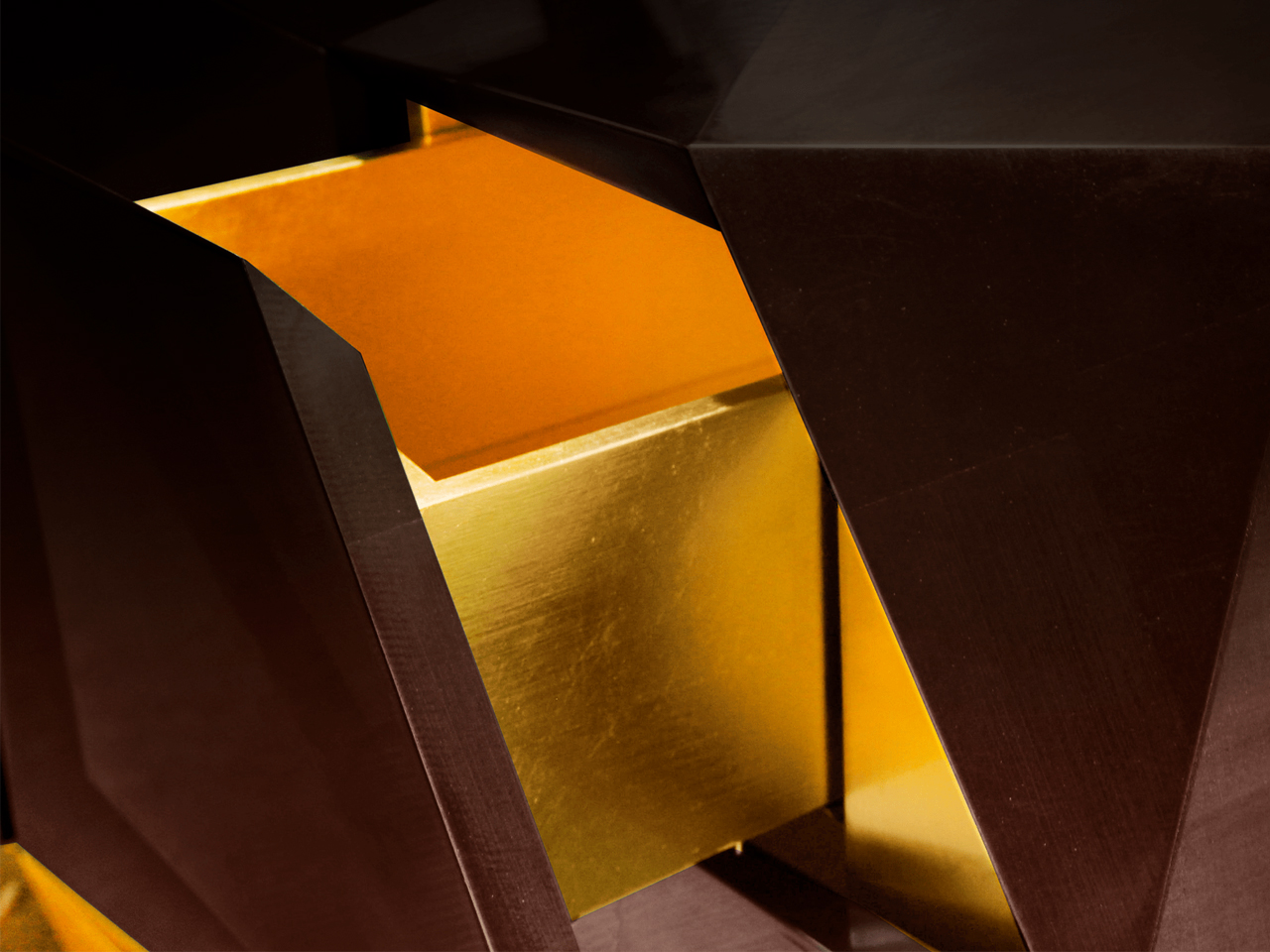
Image Credit: Boca do Lobo
Its high-gloss exterior intensifies this effect, creating a reflective depth that changes with viewing angle and ambient light. The deep chocolate palette anchors the piece, introducing warmth and visual weight against its angular composition. Beneath its sculptural exterior, the craftsmanship remains tightly controlled, positioning the sideboard not as a decorative object, but as a structured, collectible form defined by clarity, precision, and material intensity.
7. Beacon Bar Cabinet by Ralph Lauren
Image Credit: Ralph Lauren Home
Image Credit: Ralph Lauren Home
The Beacon bar cabinet by Ralph Lauren Home operates at the intersection of architectural discipline and decorative refinement, expressed through a grounded yet sculptural oak structure within a Neo Deco sensibility. Its form is defined by strong vertical and horizontal logic, where proportion becomes the primary expressive tool rather than surface detailing.
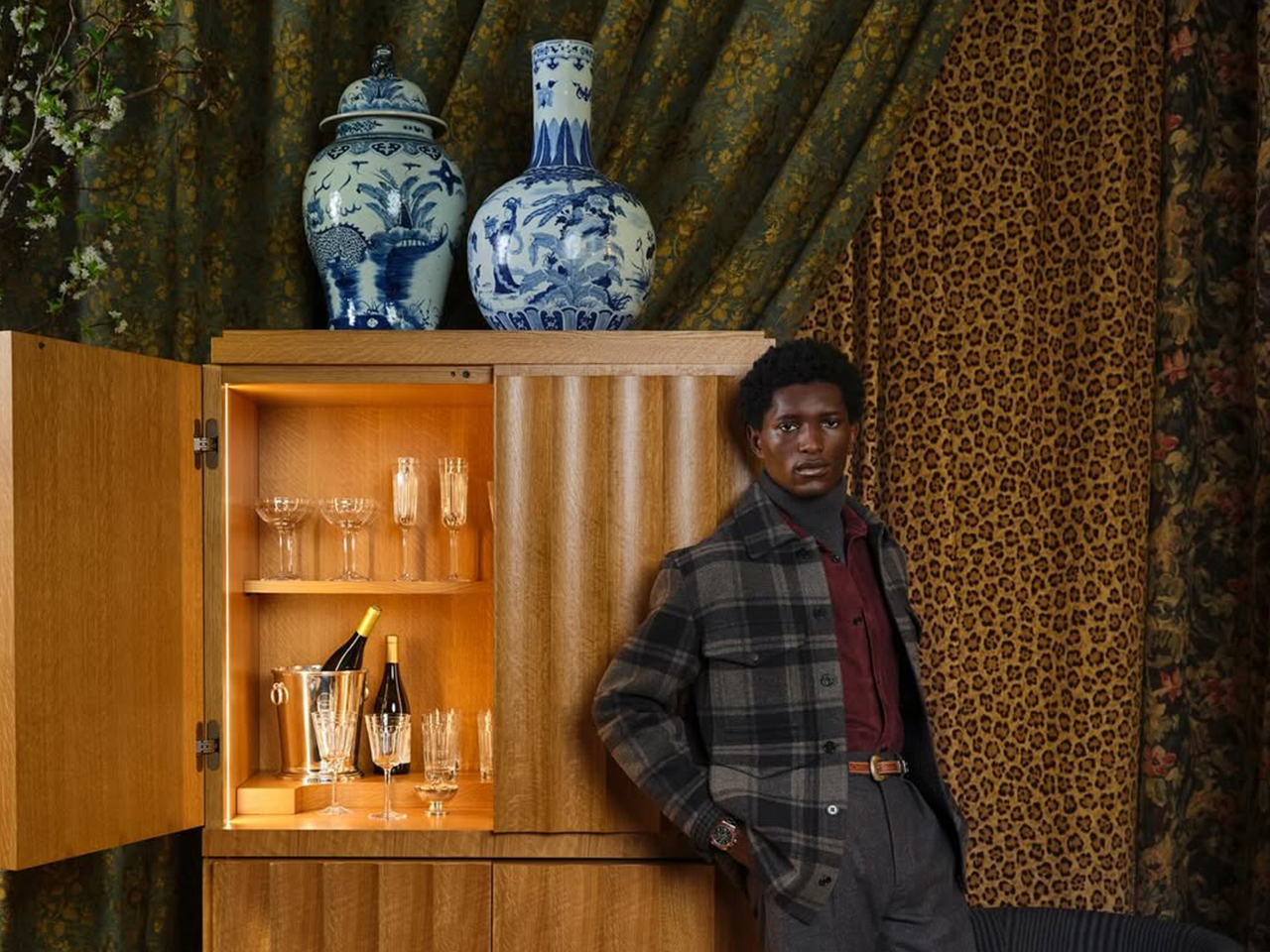
Image Credit: Ralph Lauren Home
Behind its restrained exterior lies a carefully orchestrated system of concealed storage and engineered joinery, allowing functionality to disappear seamlessly into form. Subtle Deco influence appears through controlled symmetry and measured rhythm in its construction. The warmth of oak introduces a tactile counterbalance to its structural clarity, resulting in a piece that feels substantial and understated, anchored in material honesty and architectural calm.
Beyond individual objects, Neo Deco is also defined through its material language
Decoding Neo Deco Interiors Through Materiality
A return defined by materiality
Fluted wood, lacquer, burl veneer, brushed brass, and velvet have returned together within the neo deco revival. Their resurgence is driven by materiality itself and how surfaces hold light, absorb shadow, and create depth through texture rather than decoration.
Fluted wood creates rhythm through light
Fluted wood introduces quiet repetition and structure. Its grooves shift with light and shadow, giving surfaces a subtle architectural rhythm without visual heaviness.
Lacquer sharpens reflection and clarity
Lacquer brings a smooth, reflective finish that heightens colour and edge definition. It adds precision and a controlled luminosity to otherwise solid forms.
Burl veneer adds natural irregularity
Burl veneer introduces organic movement through its unpredictable grain. It softens geometry with a layered, expressive surface that feels distinctly unique.
Brushed brass introduces warmth and restraint
Brushed brass offers a muted metallic glow that grounds compositions. Its softened sheen balances richer materials without overpowering them.
Velvet brings depth and tactility
Velvet enriches interiors with softness, density, and colour saturation. It absorbs light, adding warmth and a more intimate spatial quality.
Why did they return together
In neo deco, these materials work through contrast via matte and gloss, soft and structured, natural and refined characteristics.
What Pinterest Predicts 2026 Actually Signals About Neo Deco
Pinterest search patterns show Neo Deco as a move toward complete spatial moods and not just isolated décor trends. Users are gravitating toward sculptural silhouettes, arched forms, and layered material compositions, suggesting interiors are now being imagined as unified architectural statements. This directly aligns with Milan Design Week 2026, where geometry, brass, lacquer, and Deco references appeared as part of the structure and not just surface styling.
To understand why this shift is happening now, it must be placed within the wider fatigue of minimalism-led interiors
Why Neo Deco Emerges After a Decade of Minimalism?
The rise of Neo Deco follows clear fatigue with Scandi-led minimalism. After years of soft oak, muted tones, and rounded neutrality, interiors have reached a point of visual saturation. Since 2024, designers have been signaling a shift toward more defined, expressive environments, marking a recalibration toward structure, contrast, and material presence.
Taken together, these signals point to a deeper change in how interiors are being conceived. What many interpretations miss is that Neo Deco is not a surface trend but is structural. The emphasis has moved from finishes and colour palettes to silhouette, proportion, and joinery. Furniture now operates as spatial architecture, shaping rhythm and atmosphere within a room. The logic is simple but decisive: the shift is no longer about what you apply to a space, but how the space is formed.
As a result, Neo Deco is not a revival of ornament but is a return to structure, where form itself becomes the new language of luxury.
The post Art Deco Furniture Is Back – and Salone 2026 Made It Official first appeared on Yanko Design.