Decathlon Tiny Homes Unveils New Chapter: A Storage-First Approach to Downsized Living

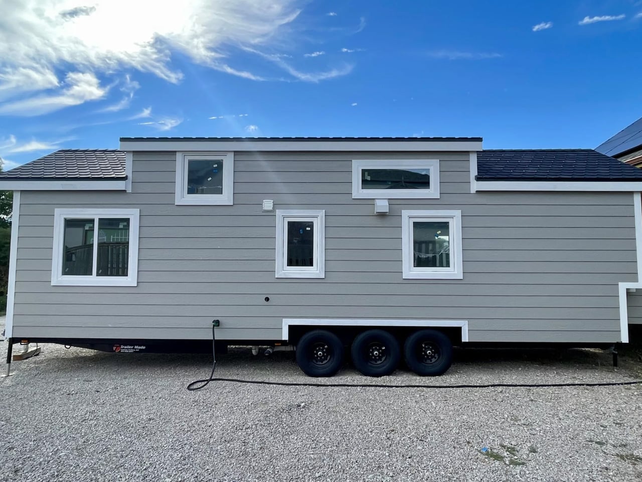
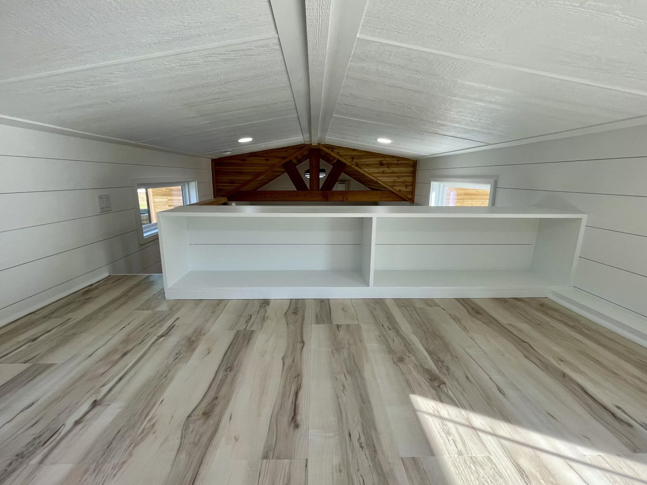
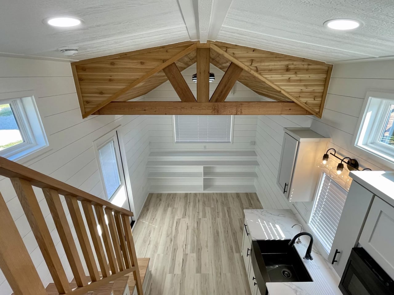
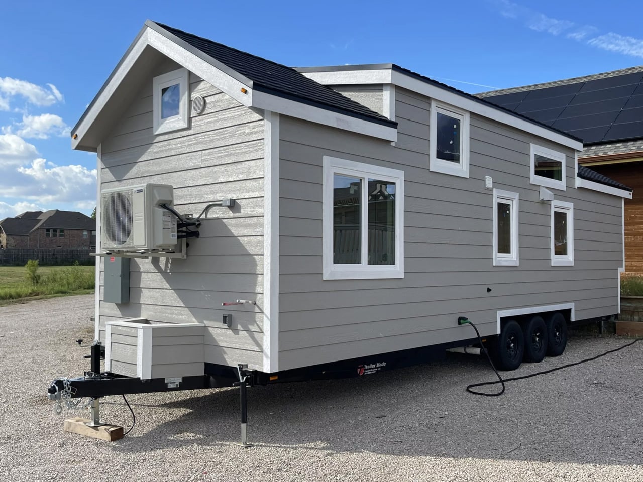
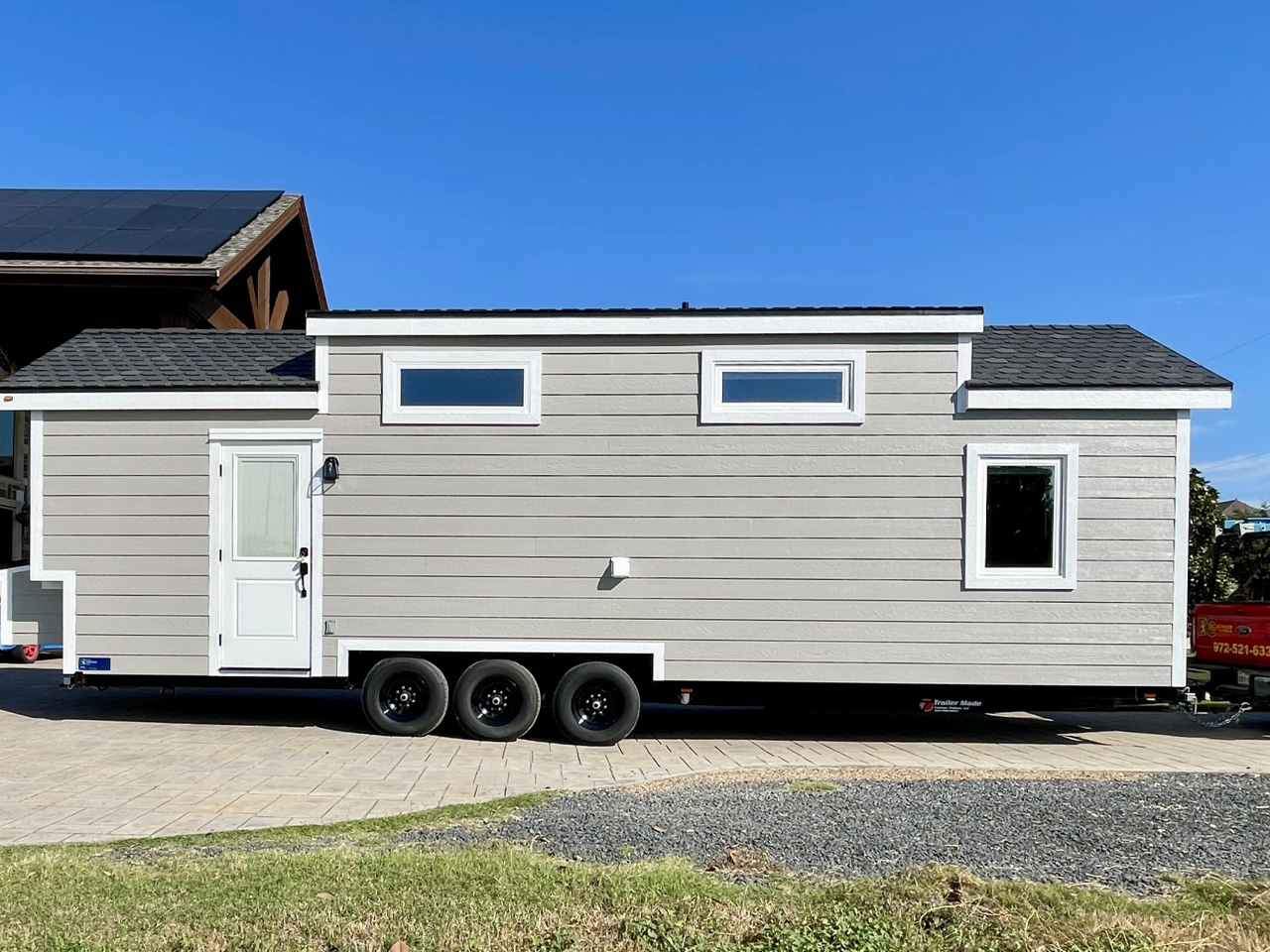
Decathlon Tiny Homes has released its latest model, the New Chapter, marking a thoughtful evolution in the company’s approach to compact living. This 32-foot tiny house represents the builder’s first 10-foot-wide Poseidon model, offering a more spacious interior than the standard 8.5-foot width common in the industry. The home sits on a triple-axle trailer, making it suitable for relocation while maintaining enough heft to accommodate a more substantial interior layout. That extra width translates to tangible benefits for those considering full-time tiny house living, a lifestyle choice that often requires careful consideration of practical needs.

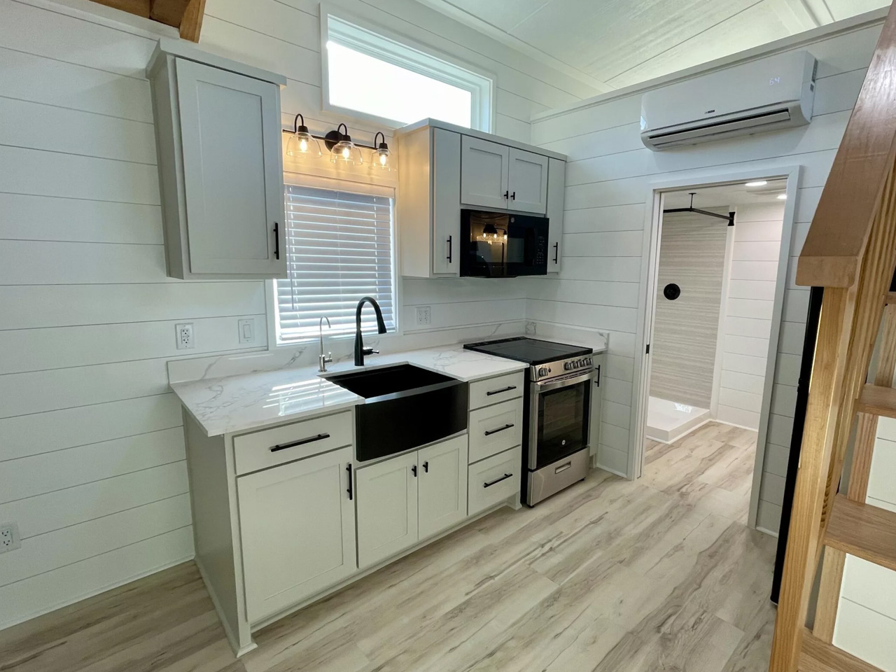
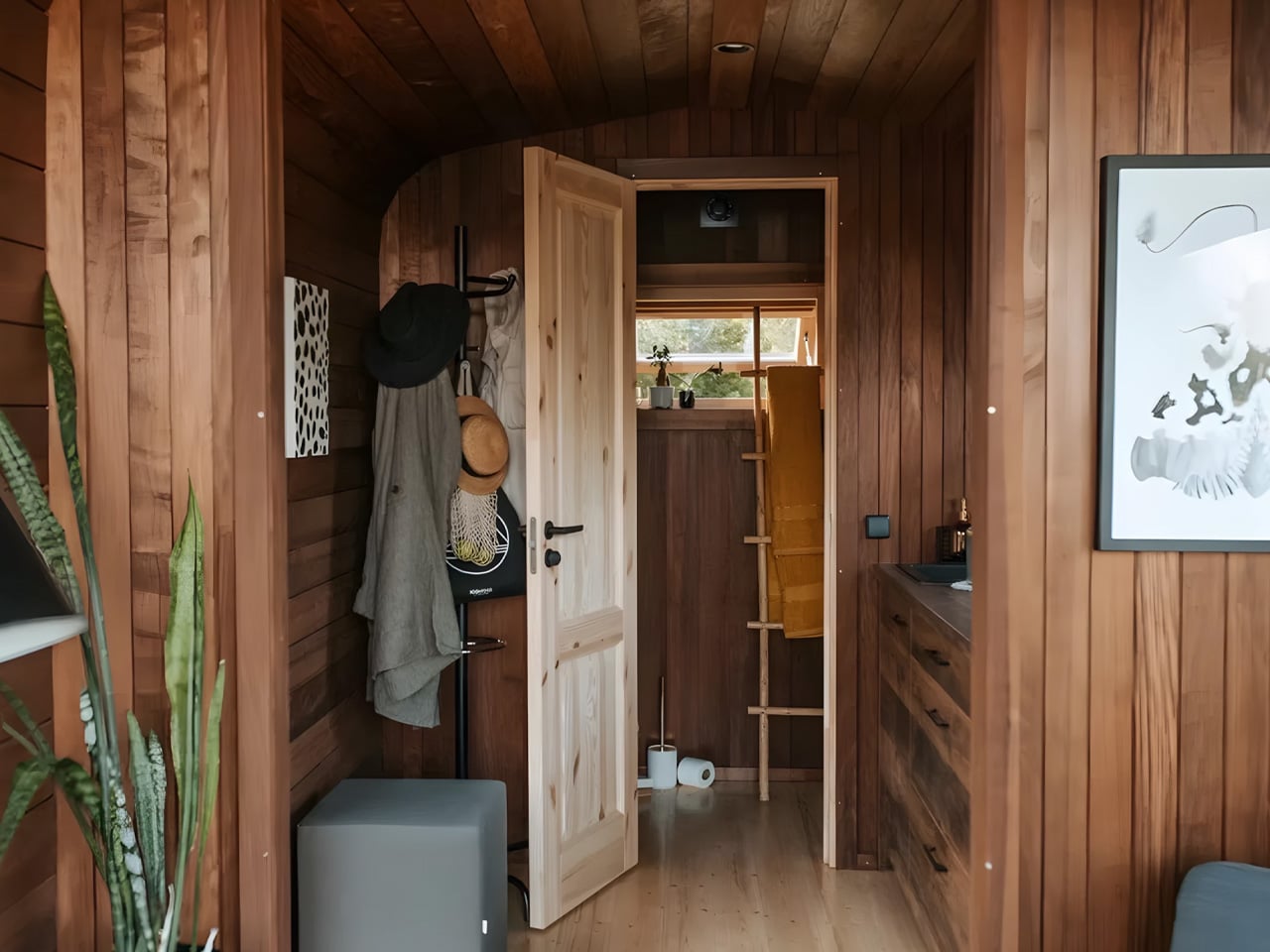
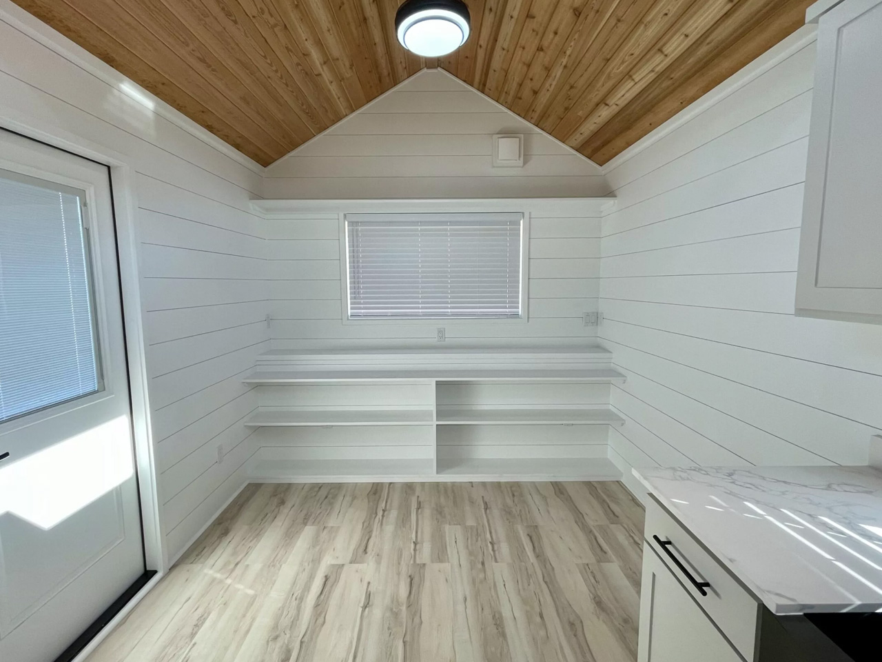
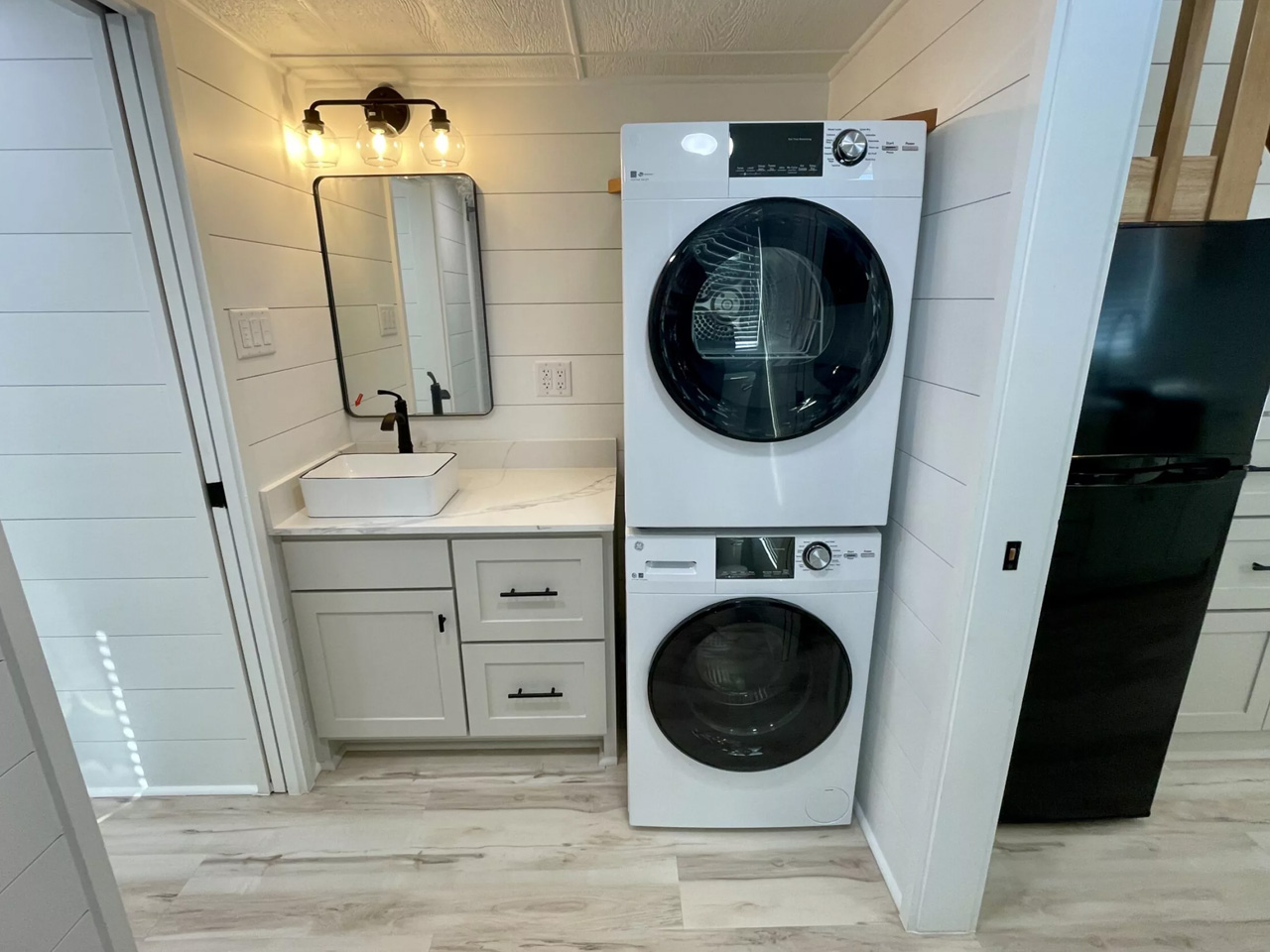
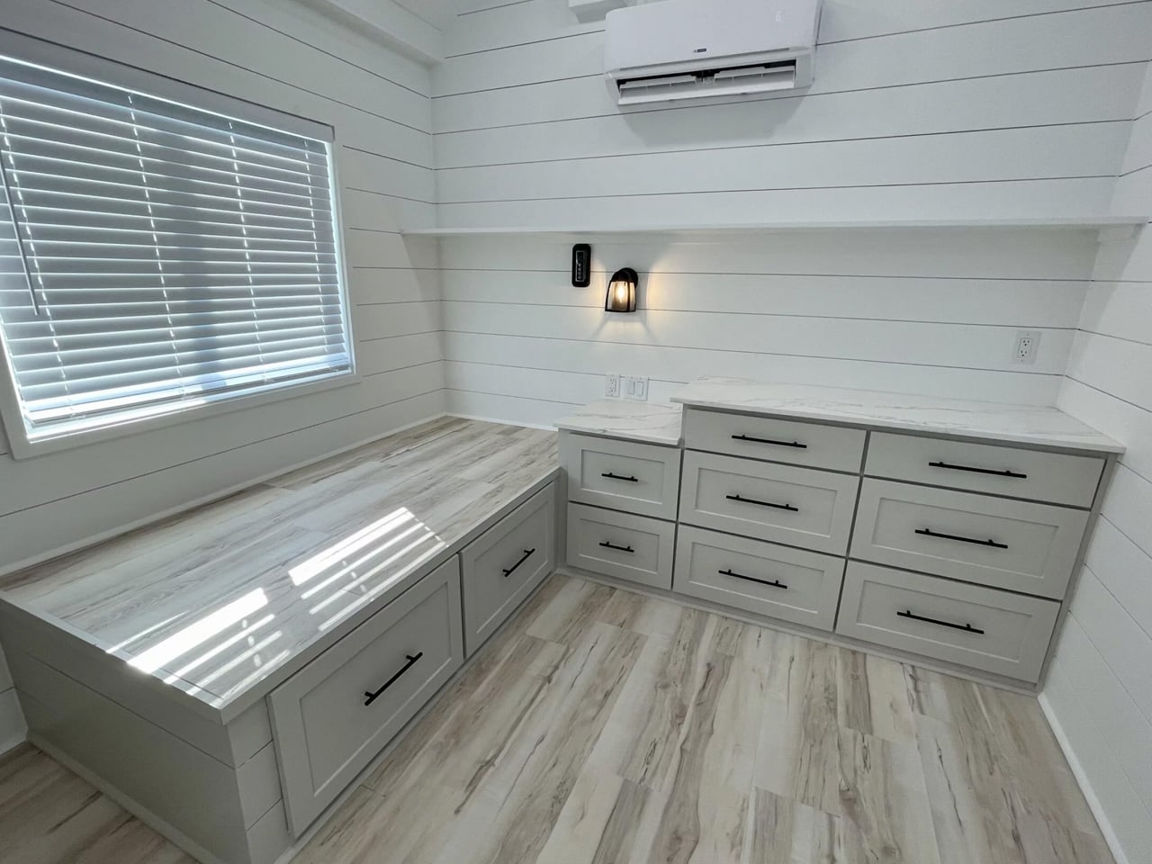
Storage takes center stage in this design, and for good reason. The builders identified a consistent pain point among tiny house dwellers: finding adequate space for belongings without cluttering living areas. The New Chapter tackles this challenge head-on with integrated storage solutions woven throughout the floor plan. Cabinets, closets, and clever built-ins appear in every room, transforming what could feel cramped into something surprisingly functional. This isn’t just about hiding things away. The storage design reflects an understanding that people living in tiny homes still need to own winter coats, kitchen equipment, and the everyday items that make a house feel like home.

Designer: Decathlon Tiny Homes

The layout includes two bedrooms, an open-concept living area, a full kitchen, and a bathroom. This configuration appeals to couples, small families, or individuals who need a dedicated workspace alongside their sleeping quarters. The open living space prevents the home from feeling like a series of disconnected boxes, while the two separate bedrooms offer privacy that single-loft designs cannot match. Design quality extends beyond the floor plan itself. The New Chapter features high-end finishes that elevate it beyond basic tiny house construction. These durable materials suggest the builders designed this home for long-term occupancy rather than weekend getaways, with an exterior that combines sleek lines with practical considerations for weather resistance and road travel.

The first New Chapter was delivered to The Birds Nest in Cumby, Texas, marking an important milestone for this expanded Poseidon model. The delivery process demonstrated how the 10-foot width, while more substantial than traditional tiny homes, still allows for practical transportation on standard highways. This width represents a sweet spot that many buyers find appealing, offering significantly more interior volume without crossing into oversize load territory that would require special permits and escort vehicles in most states.

This release reflects larger shifts in the tiny house movement that have been building for years. Early adopters often prioritized mobility and minimalism above all else, sometimes treating discomfort as a badge of honor. Today’s buyers want those benefits without sacrificing everyday convenience. They expect proper storage, quality materials, and layouts that accommodate real life rather than idealized versions of simplicity. The New Chapter’s proportional rooms feel less squeezed than narrower models, making it easier for residents to arrange furniture, move through spaces comfortably, and simply exist without constantly negotiating tight corners and awkward angles.

Decathlon Tiny Homes continues expanding its portfolio with models like the New Chapter, responding to feedback from actual tiny house residents rather than romanticized notions of what tiny living should be. The emphasis on storage throughout this design suggests the company is listening to those who have made the leap to downsized living and discovered what truly matters in a compact home. This balance between idealism and practicality might be exactly what the tiny house movement needs to grow beyond a niche market and into a legitimate housing option for more people.

The post Decathlon Tiny Homes Unveils New Chapter: A Storage-First Approach to Downsized Living first appeared on Yanko Design.

This $19,750 Mobile Office Lets You Work From Your Backyard—Or Anywhere Else

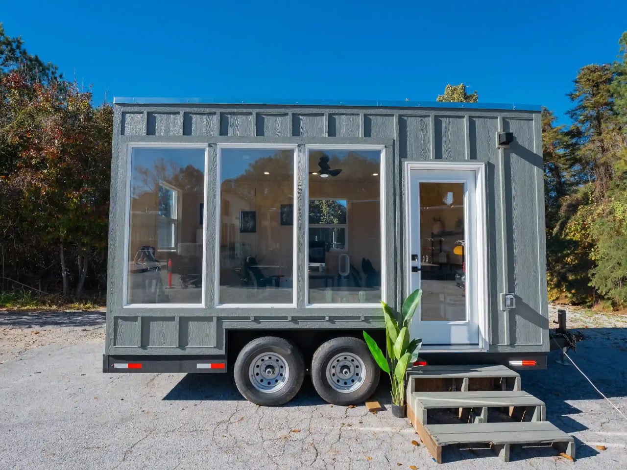
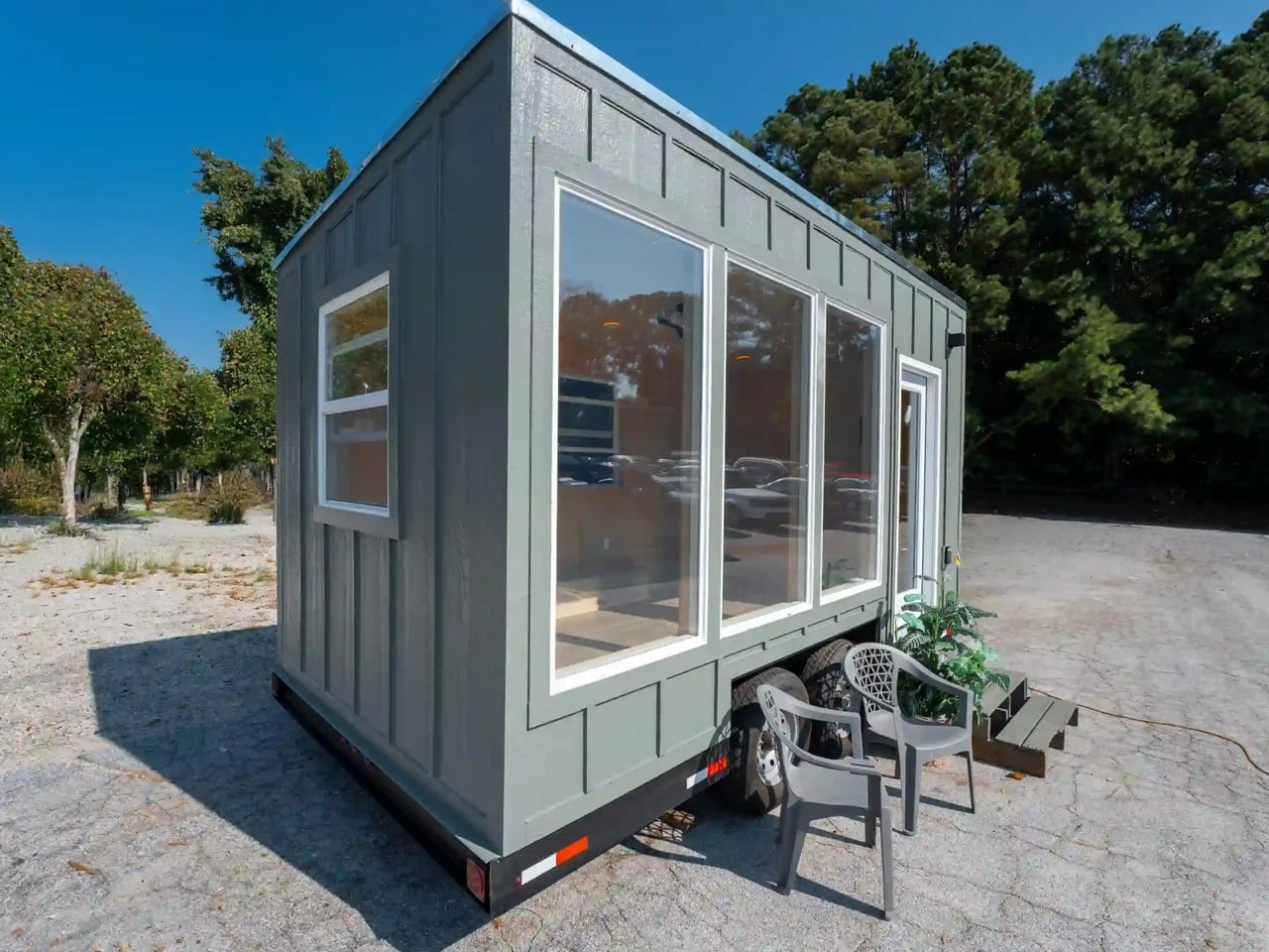
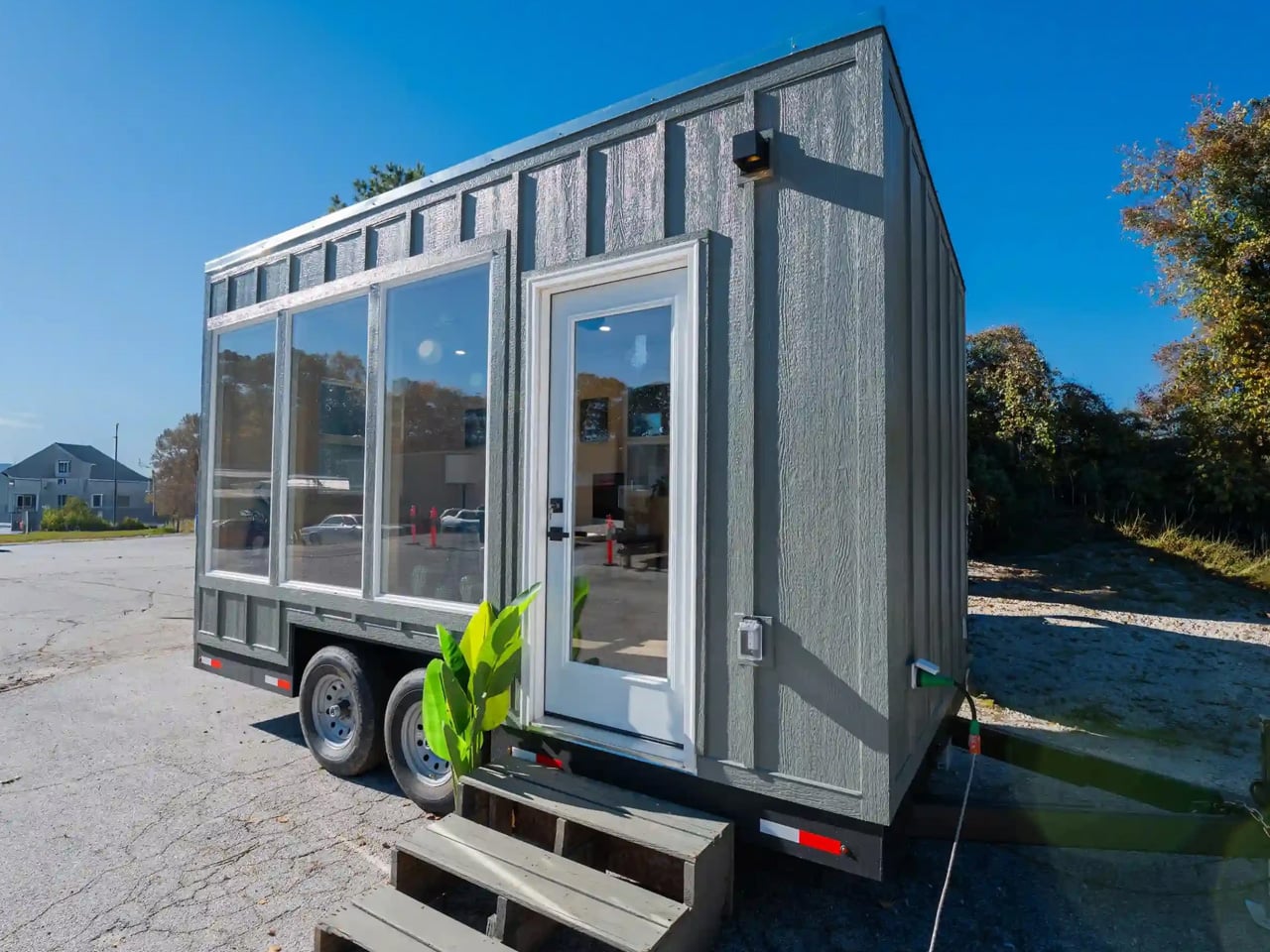
Remote work has transformed how we think about our professional spaces, and Dragon Tiny Homes is taking that concept to its logical extreme. Their latest creation is a mobile office that ditches the spare bedroom setup for something far more intriguing: a dedicated workspace you can park in your backyard or tow to wherever inspiration strikes.

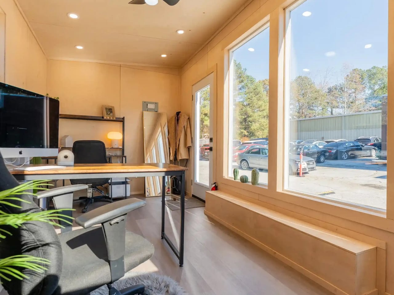
Measuring just 16 feet in length and sitting on a double-axle trailer, this compact structure takes cues from the company’s earlier Aria 20 model. At 135 square feet, it’s decidedly petite, even by tiny house standards. That modest footprint translates to relatively easy towing, making it genuinely portable rather than just theoretically mobile. The exterior combines engineered wood cladding with floor-to-ceiling glazing that would feel excessive in a residential setting but makes perfect sense here. Privacy concerns take a backseat to the benefits of natural light and visual connection to the outdoors. Anyone who’s spent hours in a windowless home office will immediately grasp the appeal. That single-glazed door opens to an interior that prioritizes function over square footage.

Designer: Dragon Tiny Homes

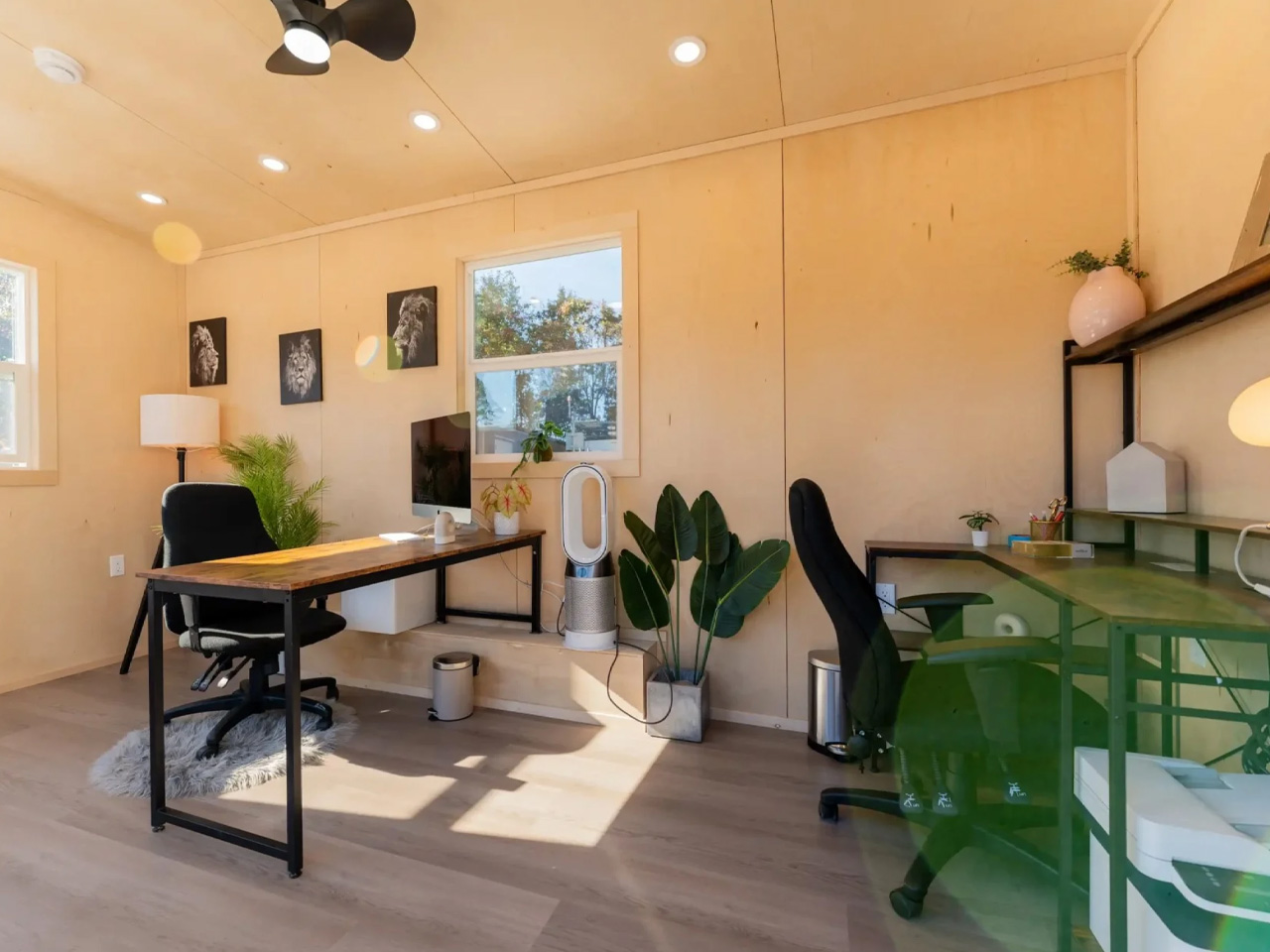
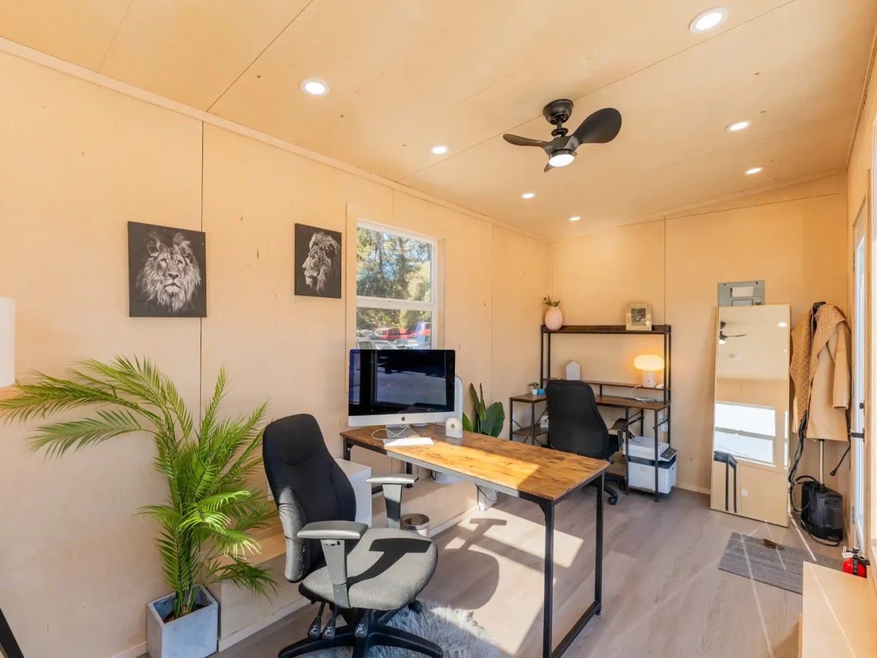
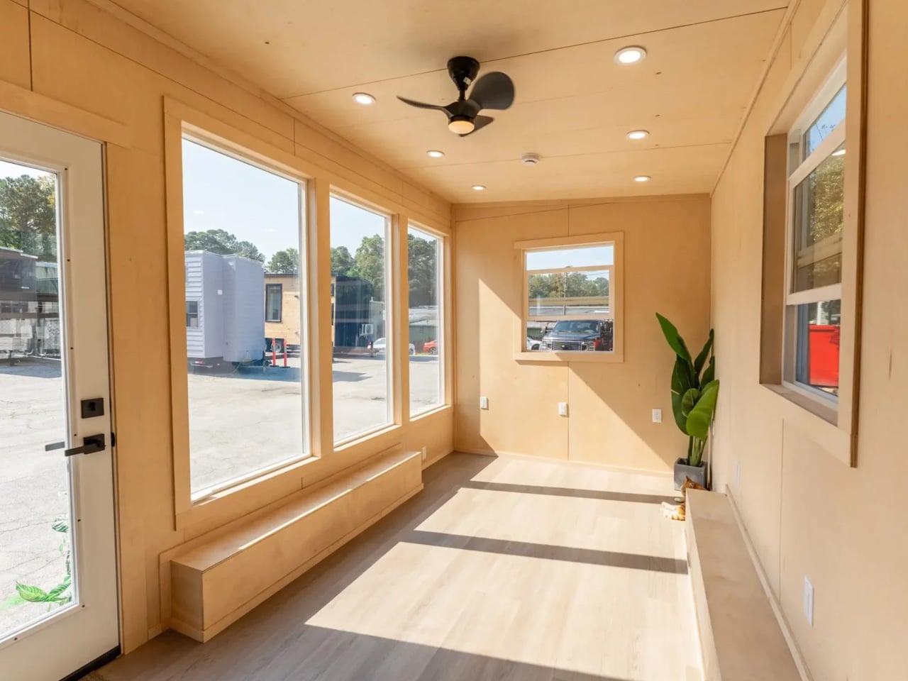
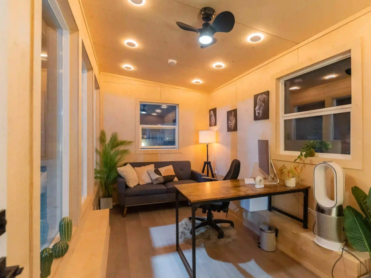
Inside, the plywood-finished space accommodates two desk stations, a storage unit, and a sofa for those moments when you need to step away from the screen. A ceiling fan handles air circulation. The single-room layout means zero wasted space on hallways or room divisions. Everything exists in one open area that feels more spacious than the numbers suggest, largely thanks to those generous windows. The setup shown in promotional images looks perfectly livable as a workspace, though potential buyers should clarify what’s actually included in the purchase price. That sleek iMac visible in the photos almost certainly isn’t part of the deal, and the furniture inclusion remains ambiguous.

One notable omission is a bathroom. For those envisioning this as a backyard office steps from the main house, that’s a non-issue. You simply use your existing facilities. The choice also keeps costs down by eliminating plumbing complexities. Those planning to take their office truly remote might view this differently, though the tradeoff makes sense given the price point.

Speaking of cost, Dragon Tiny Homes has positioned this office at a remarkably accessible $19,750 starting price. That’s a fraction of what most home renovation projects run, and potentially cheaper than renting commercial office space over just a few years. The company offers configuration options for buyers who need specific features, including a full off-grid setup for those seeking workspace away from traditional utilities and everyday interruptions.

The appeal here extends beyond pure functionality. Something is refreshing about physically separating work from living space, even if that separation is just a few dozen feet. No more trying to maintain professional composure on video calls while family members pass behind you. No dining table scattered with laptops and papers. Just a dedicated structure that exists solely for getting things done, whether that’s in your backyard or parked beside a mountain lake three states away.

The post This $19,750 Mobile Office Lets You Work From Your Backyard—Or Anywhere Else first appeared on Yanko Design.

This Curved-Light Overhaul Rewrites How a Taiwanese Apartment Breathes and Feels

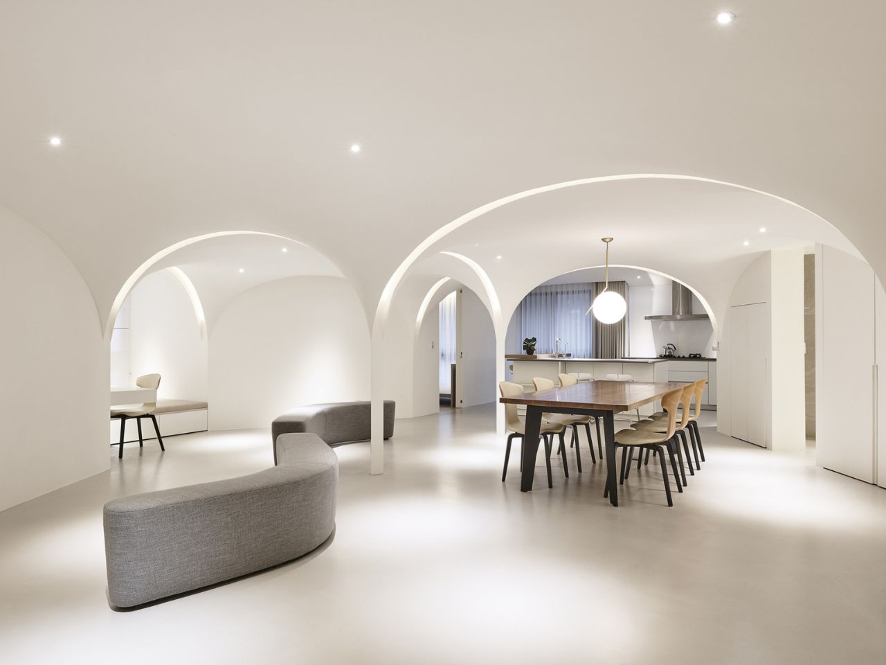
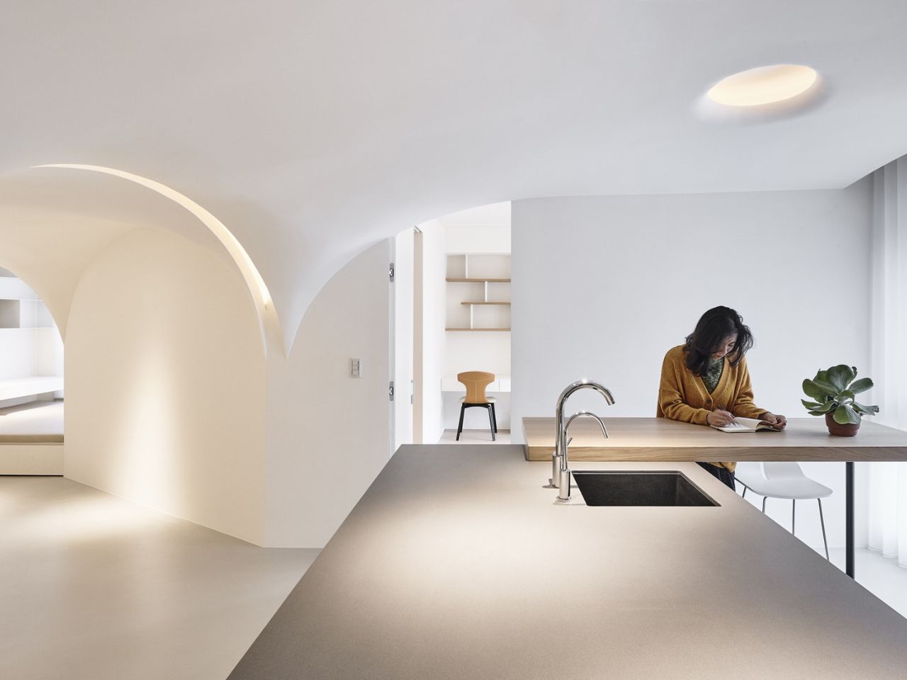
In the dense fabric of Taichung City, where many apartments follow a predictable rhythm of boxed rooms and tight circulation, one home has been quietly re-scripted into something far more uplifting. Very Studio | Che Wang Architects took a standard Taiwanese unit – one that had long conformed to the typical formula of interior-facing public spaces – and reimagined it as a sanctuary of white light, flowing curves, and subtle sensory cues. The transformation is not dramatic in gesture, but in ethos. The designers approached the project as an opportunity to create a gentler way of inhabiting space.

Before renovation, the apartment suffered from a condition that many urban Taiwanese homes share: the living and dining spaces sat deep in the centre, encircled by rooms that blocked natural light and ventilation. Only one opening on the south side offered sunlight, creating an uneven distribution of brightness and a general feeling of being enclosed. The home wasn’t dysfunctional, but it lacked the openness and warmth that contemporary living often requires.

Designer: Very Studio | Che Wang Architects

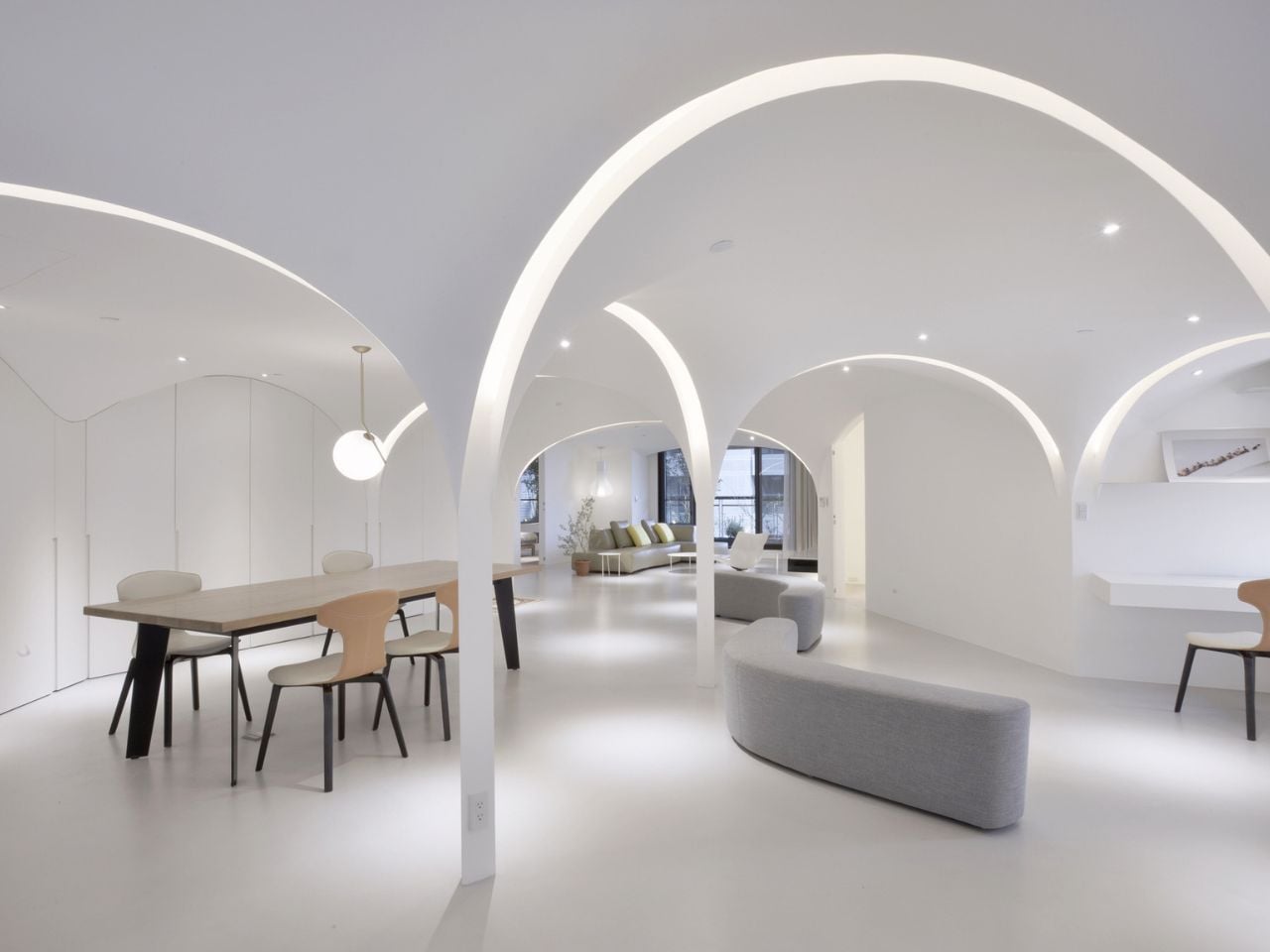
The architects began by overturning the logic that kept the apartment so compartmentalised. Instead of adhering to a rectilinear grid, they introduced a pentagon-shaped spatial order—an entirely new geometry that subtly reshaped the experience of moving through the home. By replacing rigid corners with angled walls, they created sightlines that extend rather than stop, and movement paths that feel organic instead of imposed. Light, travelling across these oblique surfaces, gains softness; shadows no longer cut sharply but instead drift gradually, as if sliding across curved paper.

This new spatial framework allowed the team to reorganise the shared spaces more effectively. By opening up the north, west, and south sides, the apartment no longer depends on a single window for illumination. Sunlight now enters from multiple directions, diffusing evenly through the white interior. Air moves more naturally, creating a cross-ventilation pattern that makes the home feel physically lighter and far more comfortable. What used to be the darkest portion of the unit is now the most breathable—an airy core shaped by light rather than walls.

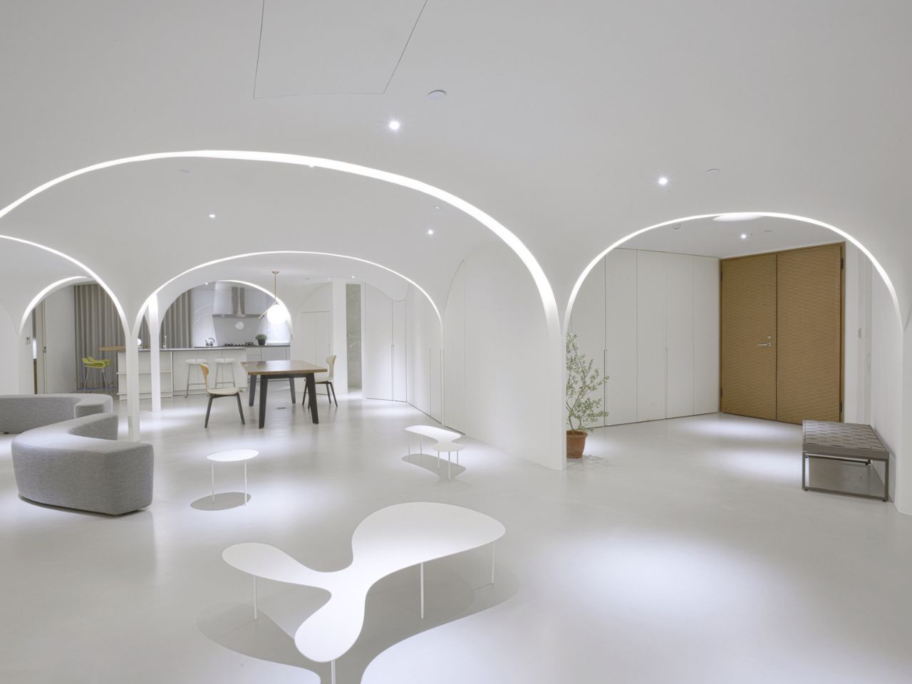
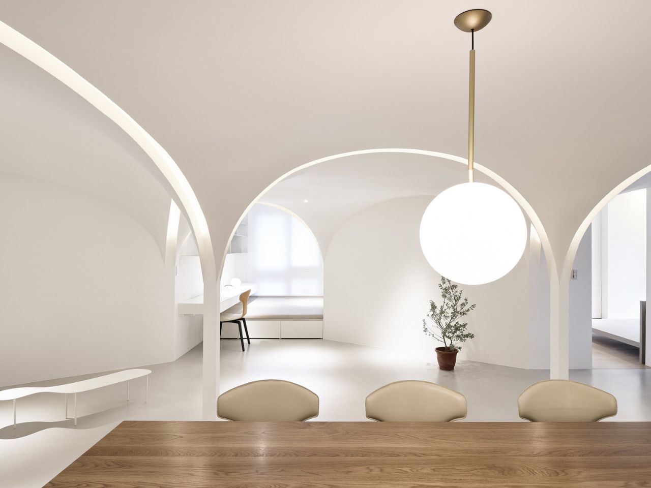
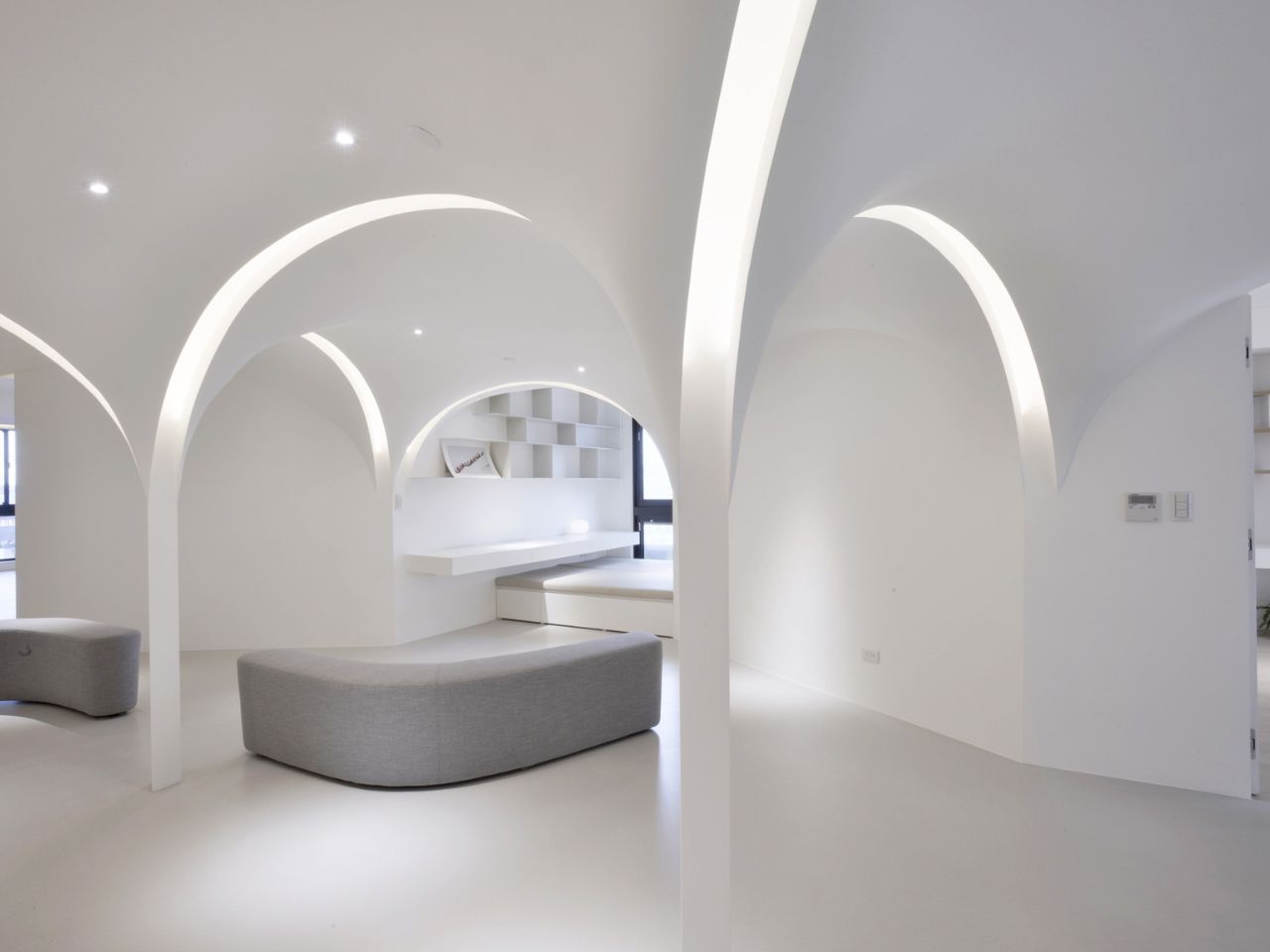
A particularly thoughtful move was the architects’ decision to use sound as a spatial differentiator. Instead of carving the open area into smaller segments, they gave each pentagonal zone a dome-shaped ceiling. These domes alter acoustics subtly: a soft concentration of sound in one zone hints at gathering space; a more diffused quality in another suggests circulation or transition. This sensory layering allows the home to maintain openness while still creating distinct functional pockets. Lighting concealed around the curves of each dome adds a floating glow that enhances this sense of layered depth.

The result is a home that feels both minimal and richly atmospheric. Arches lead sunlight inward; curves erase the harshness of structural edges; air movement becomes part of the spatial choreography. Nothing is loud, yet everything is intentional. The apartment no longer behaves like a series of rooms; it behaves like an environment.

What this project ultimately demonstrates is the power of reframing the basics. With a few bold shifts in geometry and a heightened sensitivity to light, air, and sound, even an unremarkable apartment can become an unexpectedly serene refuge. Good design doesn’t always announce itself; sometimes it simply makes living feel quieter, clearer, and more considered.

The post This Curved-Light Overhaul Rewrites How a Taiwanese Apartment Breathes and Feels first appeared on Yanko Design.

MVRDV’s Spherical Grand Ballroom Redefines Mixed-Use Architecture in Tirana

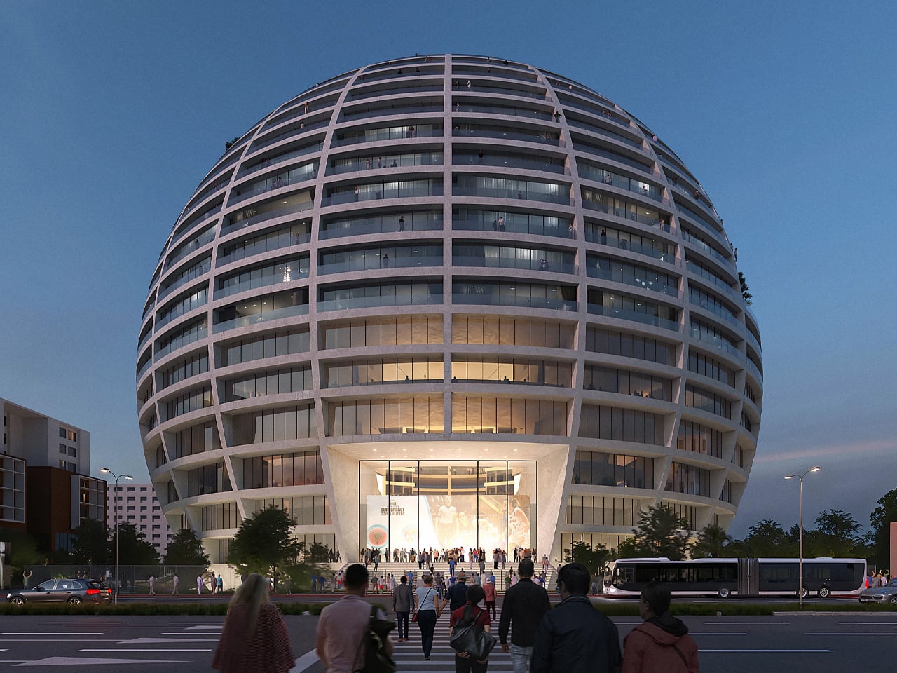
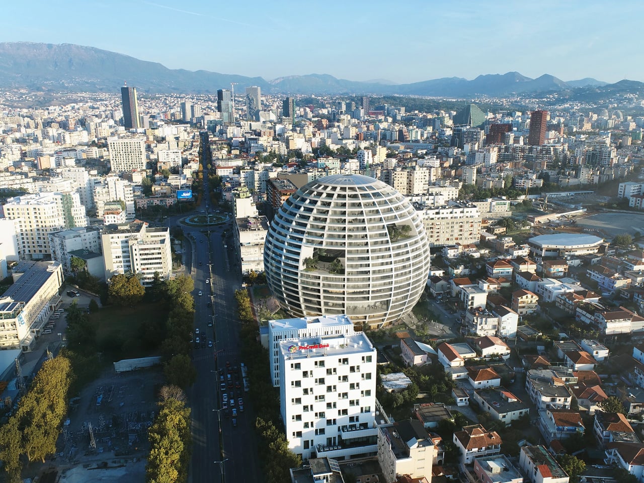
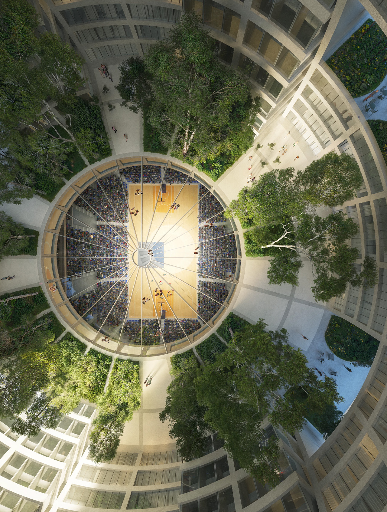
A luminous sphere is rising in Tirana, Albania, and it’s set to become one of Europe’s most audacious architectural statements. MVRDV, the Dutch architecture firm known for pushing boundaries, has won the international competition to reimagine the site of the old Asllan Rusi Sports Palace with The Grand Ballroom—a 100-meter-diameter orb that defies conventional building typologies.

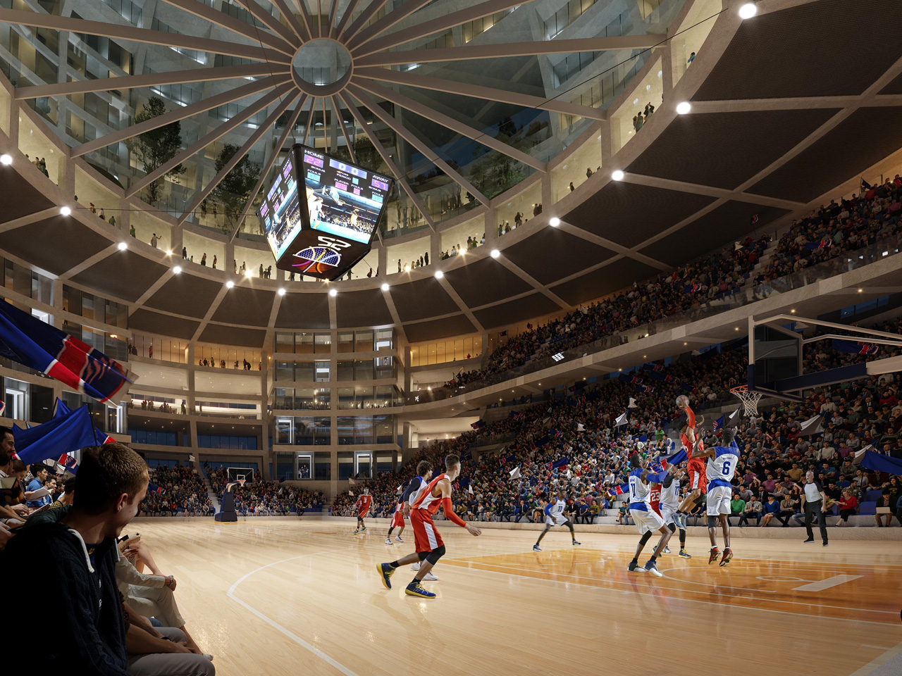
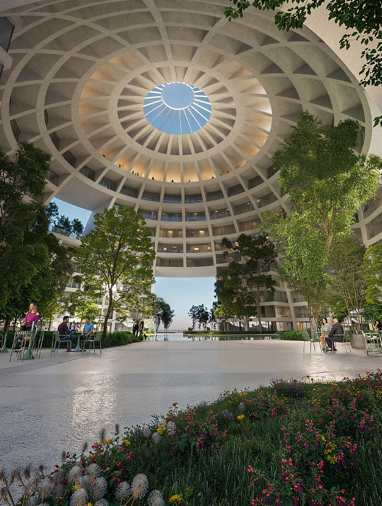
The project merges seemingly incompatible programs into a single sculptural form. A 6,000-seat arena for basketball and volleyball sits at the heart of the structure, surrounded by hotel rooms, residential apartments, restaurants, and public spaces. Where most architects would separate these functions into distinct volumes, MVRDV stacks them vertically within the spherical envelope, creating a building that reads as both monument and machine for urban living.

Designer: MVRDV

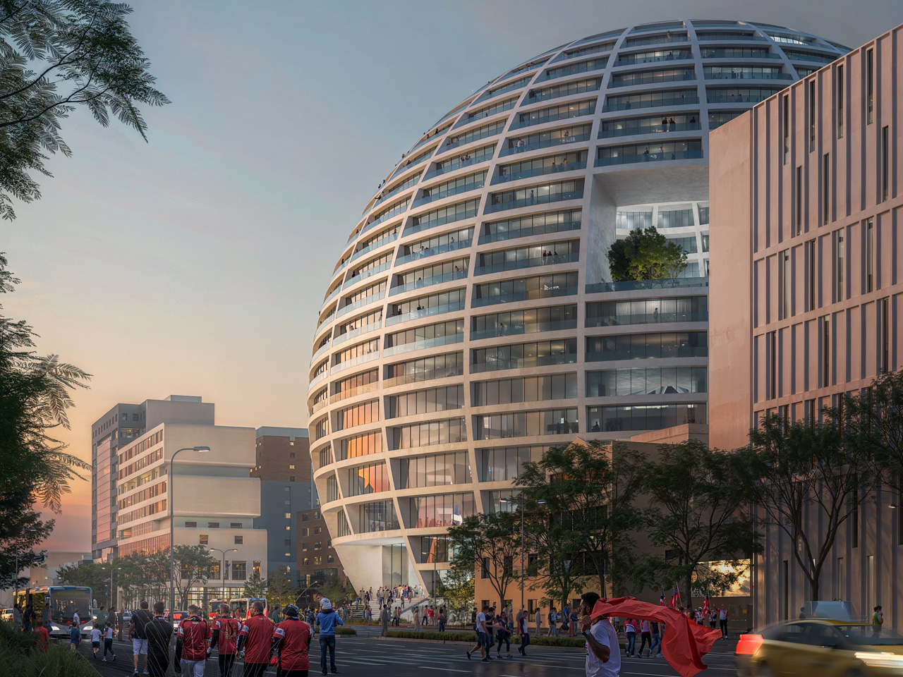
The organizational strategy reveals a sophisticated understanding of public and private gradients. At ground level, where the sphere meets the earth, it creates an impression in the landscape, carving out a lower floor that welcomes visitors into the building’s most accessible spaces. From there, the programming ascends in horizontal layers, transitioning from communal arena spaces through semi-public hotel facilities to private residential units at the upper reaches. This vertical choreography ensures each function occupies its optimal position within the geometric constraints of the sphere.

The exterior treatment showcases MVRDV’s characteristic attention to facade articulation. A gridded skin of vertical and horizontal structural elements wraps the entire volume, creating rhythmic openings that modulate light and views while maintaining the sphere’s overall coherence. These apertures serve dual purposes: they provide necessary transparency for the various programs while reinforcing the geometric purity of the form through their careful distribution across the surface.

The Grand Ballroom arrives at a moment when Tirana is actively reshaping its architectural identity. The capital city has emerged as a laboratory for contemporary design in recent years, attracting international architects to contribute bold proposals. MVRDV’s sphere positions itself as a civic anchor, a building scaled to read from across the city while engaging pedestrians at street level through its distinctive ground-level imprint.

The technical ambition matches the formal boldness. Engineering a sphere of this scale requires sophisticated structural solutions, particularly when accommodating the varied spatial demands of arena seating, hotel rooms, and residential layouts within a continuous curved envelope. The gridded facade likely performs structural duties alongside its aesthetic function, distributing loads across the entire surface. This project represents a departure from the fragmented, multi-building approach that typically defines mixed-use developments. Rather than clustering separate towers around a shared plaza, MVRDV consolidates everything into a singular object. The sphere becomes a self-contained urban district, a building that functions as both landmark and neighborhood. It’s architecture as spectacle, certainly, but spectacle in service of density and programmatic diversity. The Grand Ballroom positions MVRDV within a lineage of architects willing to embrace geometric extremes. It stands as proof that even the most fundamental shape—the sphere—still holds potential for radical reinvention in contemporary practice.

The post MVRDV’s Spherical Grand Ballroom Redefines Mixed-Use Architecture in Tirana first appeared on Yanko Design.

This Swedish Tiny Cabin Starts At $16,600 & Brings Rustic Scandinavian Living Within Reach

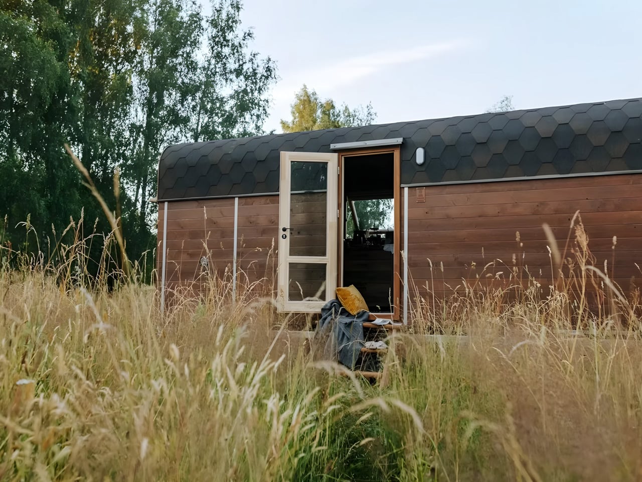
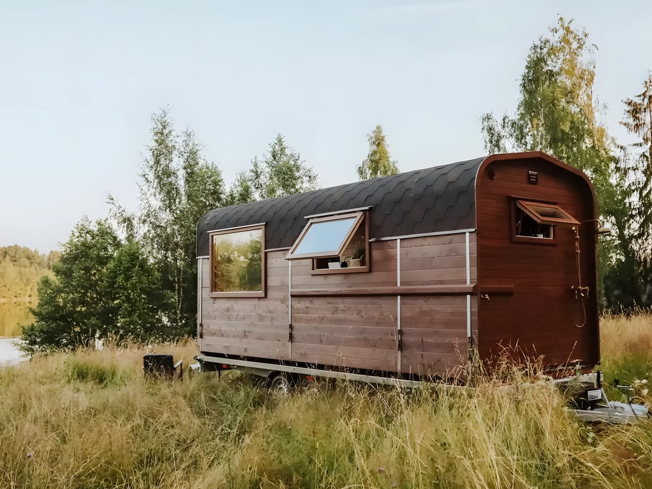
Sweden’s Vagabond Haven has crafted something special with the Nature Pod, a compact tiny house that proves you don’t need a massive budget to embrace small-space living. Starting at just €14,380 (roughly US$16,600), this charming cabin-inspired dwelling delivers rustic aesthetics without the premium price tag typically attached to custom tiny homes. The Nature Pod feels like a breath of fresh air in a market where prices keep climbing, offering an accessible entry point for anyone curious about downsizing. Large windows flood the interior with natural light, creating an open atmosphere that makes the compact footprint feel intentional rather than restrictive.

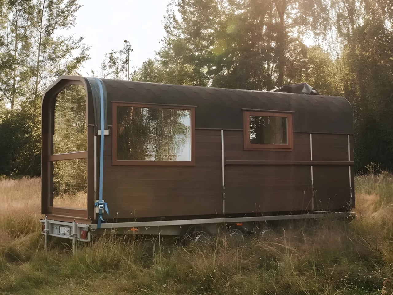
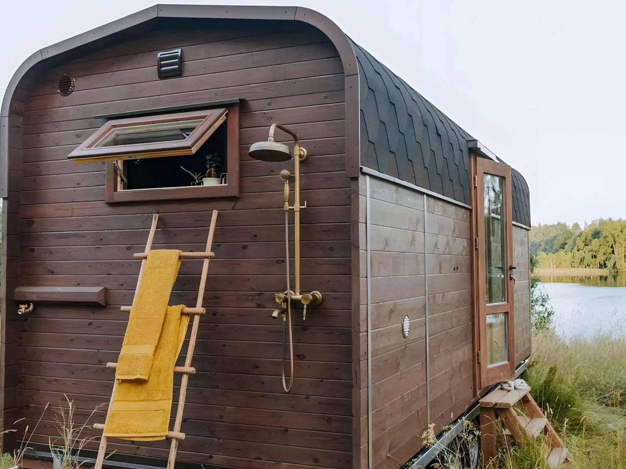
Measuring a modest 6 meters in length, the Nature Pod sits comfortably on a double-axle trailer, making it perfectly sized for European roads and regulations. What really sets this tiny house apart is its innovative construction method. Vagabond Haven eliminated traditional timber framing, replacing it with four inner-wall segments that support the outer walls built from 45-mm-thick ThermoWood. This streamlined approach reduces both material costs and assembly time while keeping the overall weight manageable. The engineered wood cladding and fiberglass roof shingles add durability without unnecessary expense, and buyers can even opt for an outdoor shower attachment for those warm summer evenings.

Design: Vagabond Haven

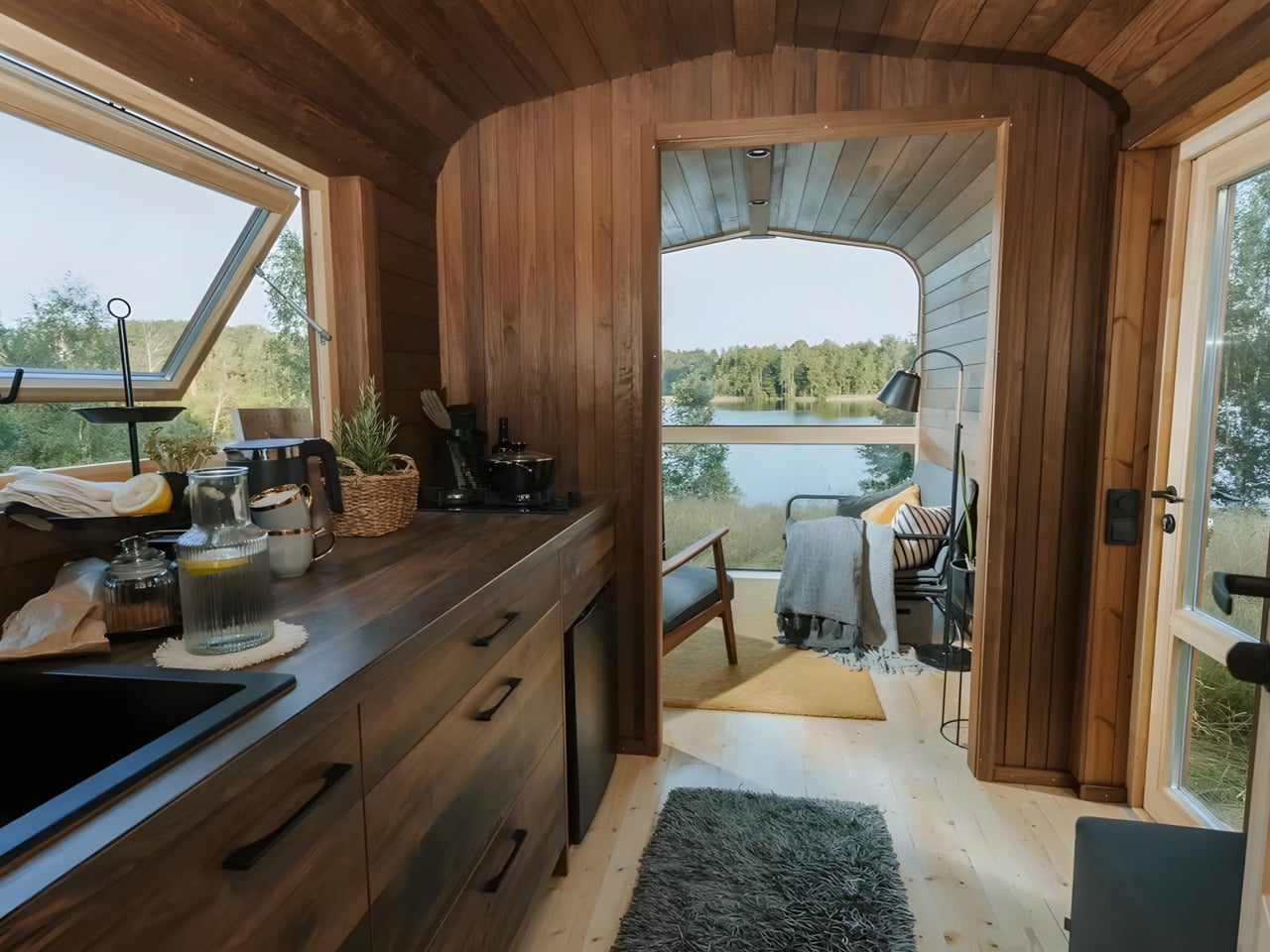
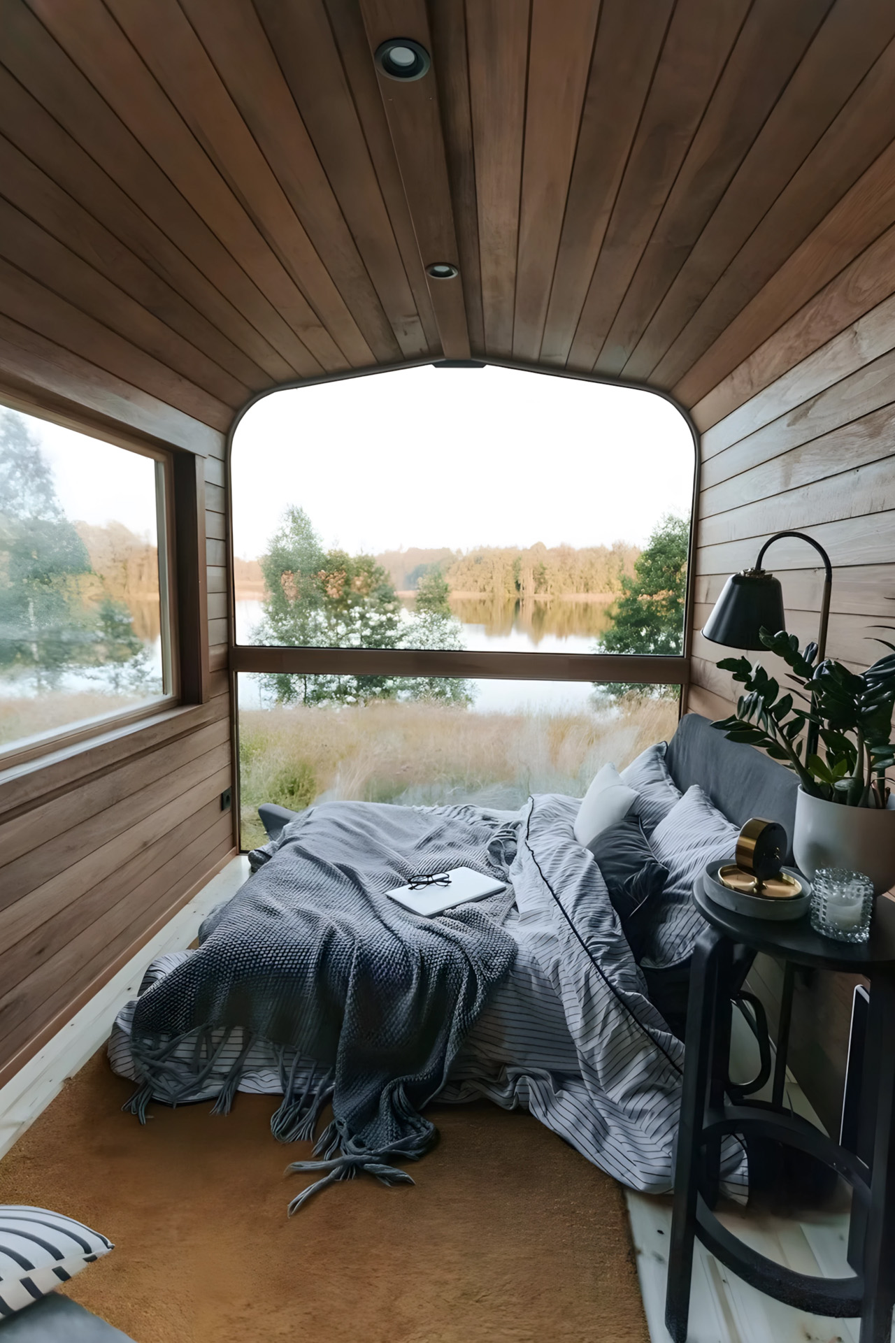
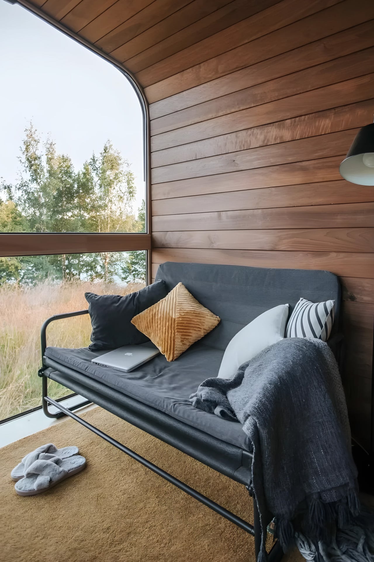
Inside, the wood-finished interior radiates warmth and invites relaxation. The living room and bedroom occupy the rear section, anchored by a stunning floor-to-ceiling window that frames the outdoors like living artwork. A sofa bed provides sleeping space for two, with enough room for additional seating during waking hours. The layout feels intuitive, with the bedroom positioned to capture the best views while maintaining privacy from the rest of the home. Everything about this space encourages you to slow down and appreciate your surroundings.

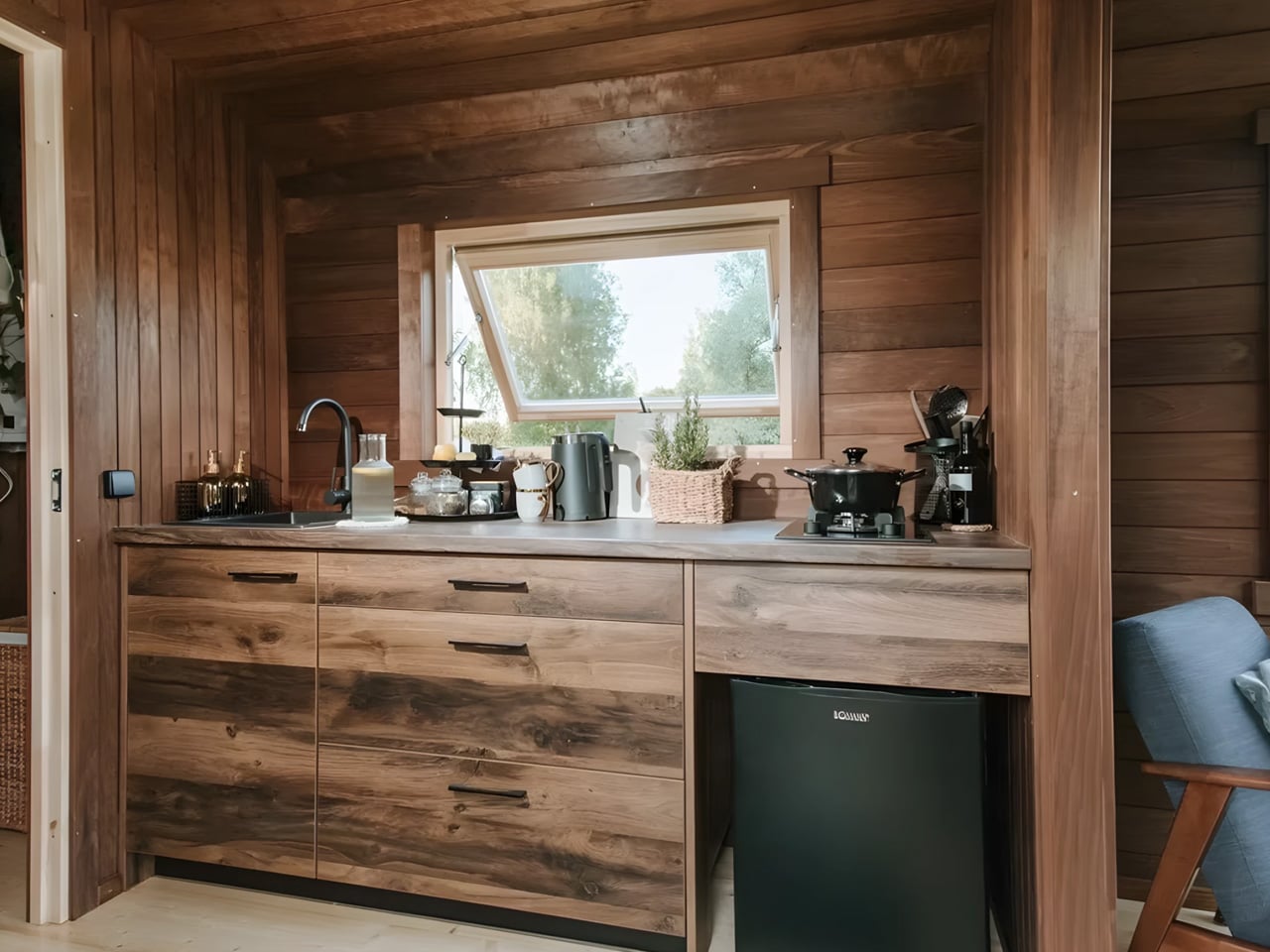
The kitchen occupies a central position and embraces minimalism out of necessity. A small fridge, sink, and two-burner propane cooktop handle essential meal preparation, while cabinetry provides storage for dishes and pantry items. Space remains for either a wardrobe or a wood-burning stove, letting owners customize based on their priorities and climate needs. The propane cooktop offers flexibility for off-grid living situations where electrical connections aren’t available. At the front of the home, the bathroom keeps things simple and functional with a toilet, sink, and shower—all the necessities without excess. The straightforward design makes cleaning easy and maintenance minimal.

Vagabond Haven includes ventilation and electrical installation in the base price, though the starting cost excludes furniture. The real customization potential emerges through the extensive options list. Buyers can choose between mounting the home on a trailer for mobility or placing it on simple foundations for a permanent installation. Off-grid enthusiasts can add solar panels and battery systems to achieve complete energy independence, though these upgrades will substantially increase the final price. The flexibility here means you can start basic and add features as your budget allows.

The Nature Pod represents a refreshing approach to tiny house design. It strips away unnecessary complexity while preserving the essential elements that make small-space living appealing. The rustic aesthetic feels genuine rather than manufactured, and the Scandinavian influence brings a sense of calm simplicity to every detail. For those ready to downsize without compromising on style or comfort, this compact cabin offers a genuinely accessible way into the tiny house movement.

The post This Swedish Tiny Cabin Starts At $16,600 & Brings Rustic Scandinavian Living Within Reach first appeared on Yanko Design.

5 Architect-Designed Homes That Disappear Into the Landscape

The concept of home is evolving, shifting from mere shelter to spaces that genuinely nurture our well-being. This means creating a harmonious connection with nature by designing homes that don’t just occupy land, but feel like an extension of it. Achieving this requires thoughtful choices in design and materials, starting with a deep understanding of the very ground on which the home will rise.

This approach goes beyond mere aesthetics. Homes that integrate seamlessly with nature are naturally more energy-efficient, healthier, and more serene. By harnessing natural light, enhancing ventilation, and selecting materials with minimal environmental impact, we can create spaces that are visually captivating and also supportive of the planet and our personal well-being.

1. The Art of Site-Specific Design

Before a single line is drawn, one must first understand the site. The architect walks the land at different times of day, noting where the sun rises and sets and feeling the direction of evening breezes. They observe how rainwater flows, where mature trees stand, and the natural contours of the terrain. Each detail informs the design, ensuring the home responds to its surroundings rather than resists them.

A house created with this awareness naturally harmonizes with the environment. It reduces reliance on artificial heating and cooling while preserving the land’s inherent beauty, resulting in a dwelling that feels both enduring and alive.
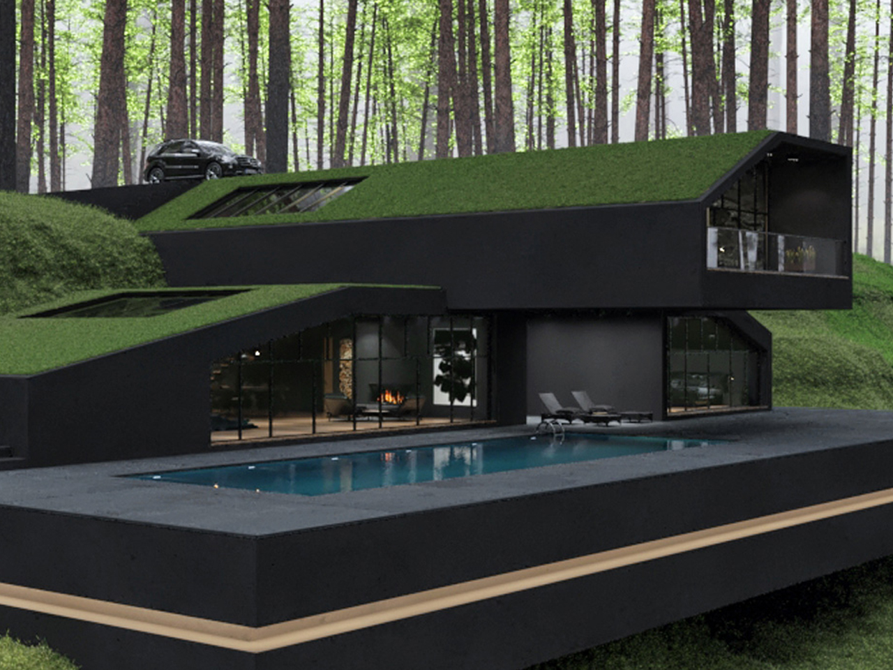
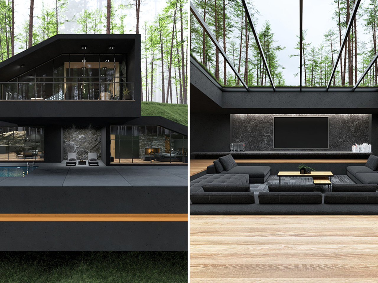
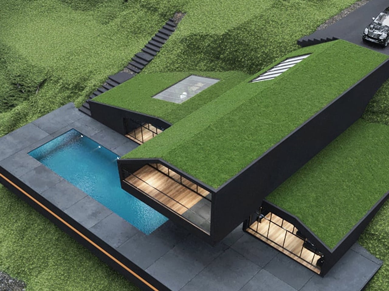
In the hills of Harriman State Park, New York, the Black Villa was designed as a striking, contemporary-style hobbit hole. Its most notable feature is a lush, grass-covered roof that integrates the home with its natural surroundings. Green roofs have steadily gained popularity over the past decade for their environmental and economic benefits. They provide natural insulation, reducing energy consumption and keeping rooftop temperatures 30–40°F cooler than conventional rooftops. The Black Villa further enhances efficiency through skylights and floor-to-ceiling windows, while also mitigating stormwater runoff, which is a feature especially useful in areas with poor drainage.
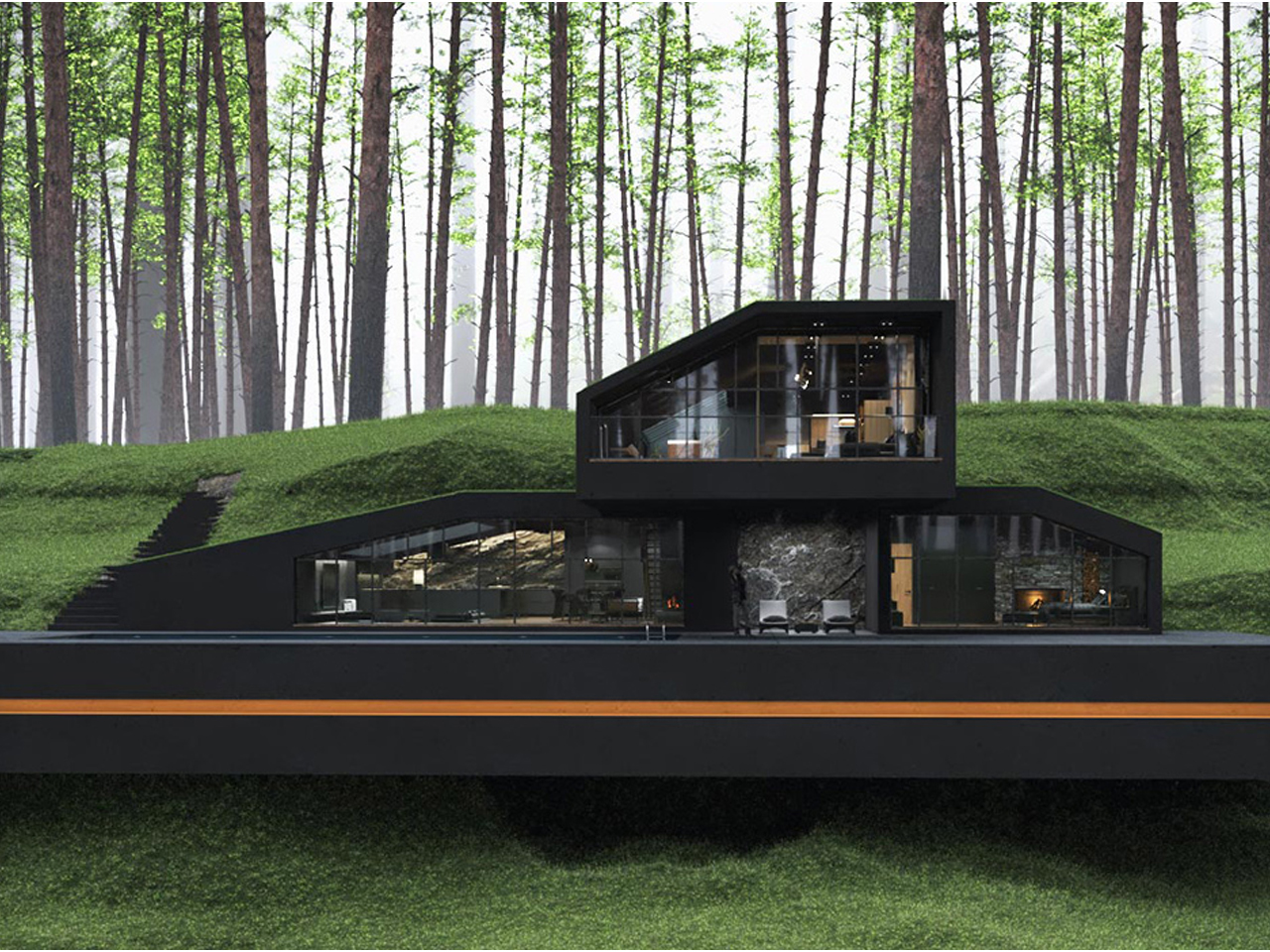
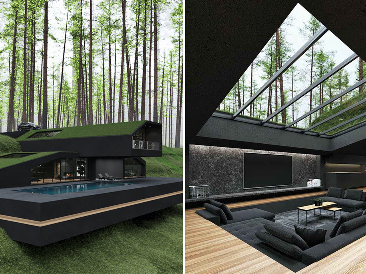
Despite its impressive design, situating the Black Villa within a national park raises questions about sustainability. Construction inevitably disrupts the existing landscape, making the eco-friendly elements feel partly aesthetic rather than fully functional. While the project may inspire interest in green roof architecture, its energy-efficient features appear more as part of the home’s visual appeal than as a model of practical environmental stewardship.

2. Rooted in Natural Materials

Material choice plays a pivotal role in shaping a home. Architects focus on what is locally available and has a low environmental impact. Wood, stone, and bamboo are not only beautiful but also often renewable and sustainably sourced. Traditional materials like rammed earth and clay plaster are experiencing a resurgence, valued for their natural insulation, breathability, and enduring appeal.

These materials do more than form walls as they give a home character, texture, and a unique story. By connecting the building to its environment, they create spaces that feel alive, timeless, and deeply rooted in the land they inhabit.
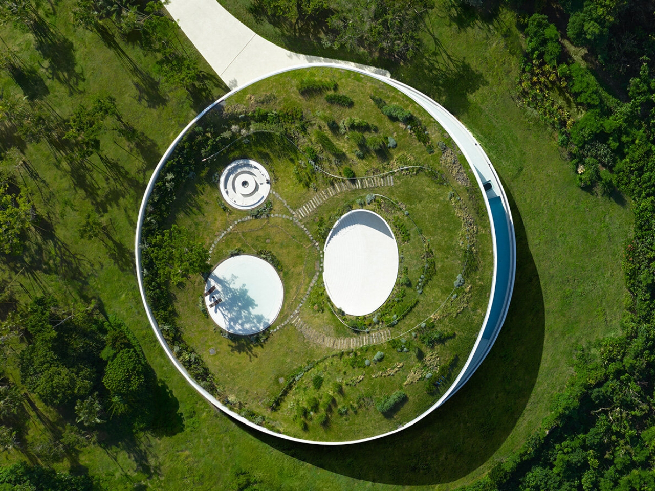
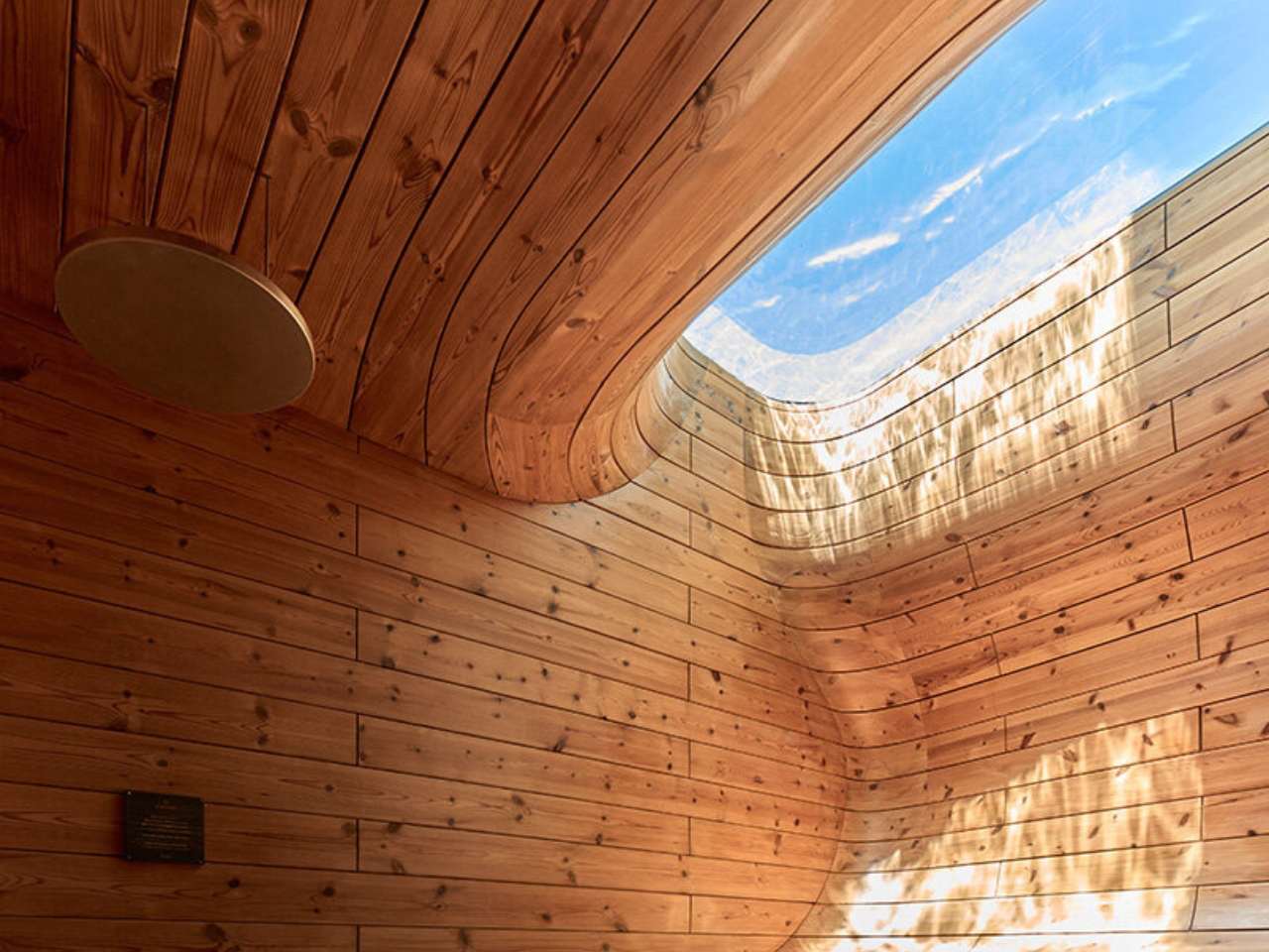
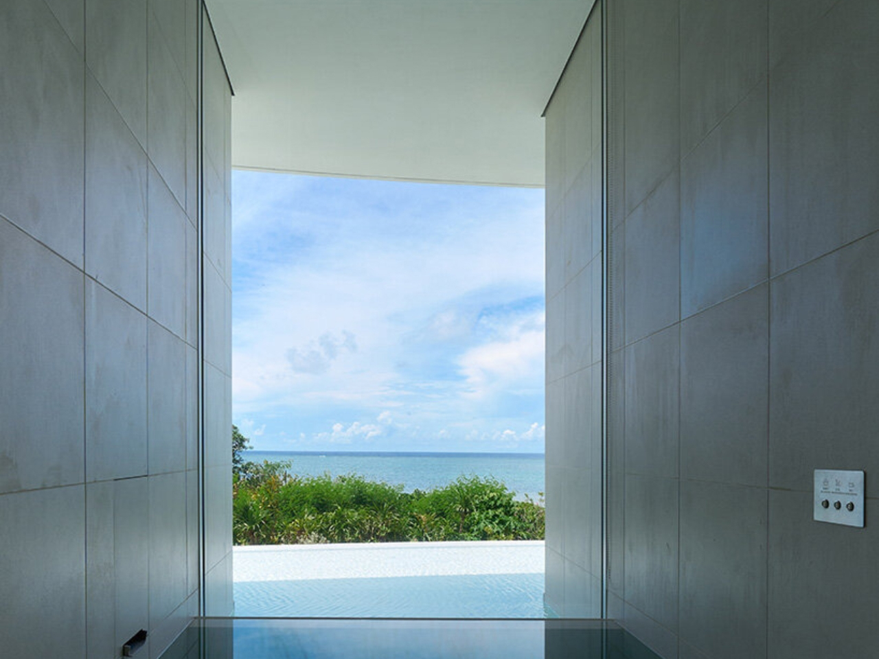
EARTH villa, designed by internationally acclaimed architect Sou Fujimoto for NOT A HOTEL, transforms the idea of a vacation home into a seamless blend of sustainability, futuristic design, and natural beauty. Located on Ishigaki Island in Okinawa Prefecture, Japan, the villa sits within a natural preserve, offering panoramic ocean views and lush greenery. Its bold circular layout encloses a private courtyard, while curved glass walls maximize natural light and sightlines, creating effortless indoor-outdoor transitions. The living green roof, covered with native grasses, provides insulation, reduces rainwater runoff, and supports local wildlife, making the villa eco-conscious and visually striking.
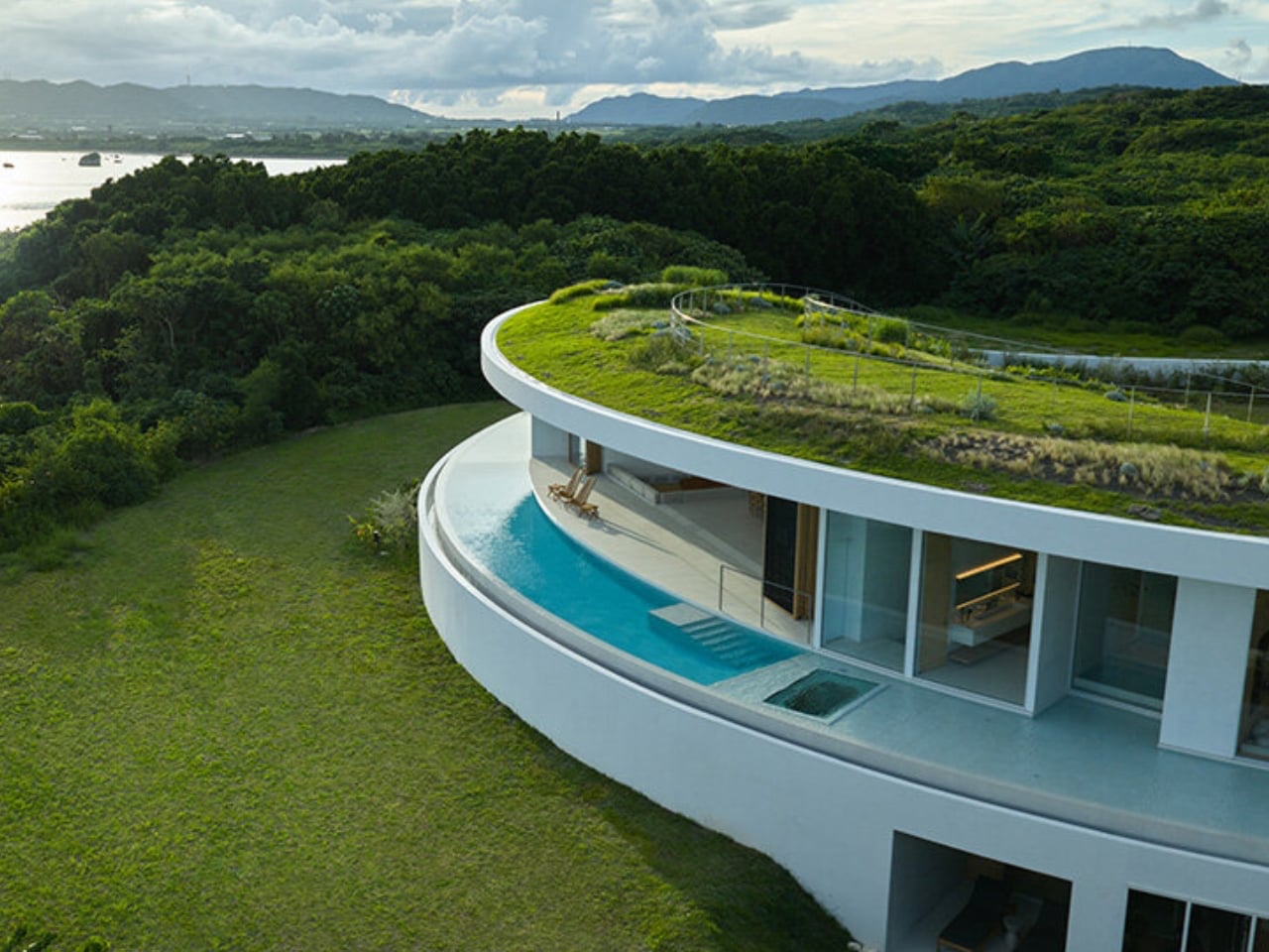
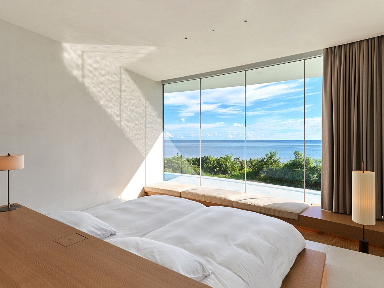
Inside, minimalist interiors with natural wood accents and earth tones create warmth and tranquility. Sustainable systems, including passive ventilation, solar panels, and rainwater harvesting, reduce environmental impact. EARTH offers luxury, flexibility, and hotel-level services, allowing guests to immerse themselves in nature while enjoying comfort and environmental stewardship at its finest.

3. Harness Light and Air

Sunlight and fresh air are among the most sustainable and beautiful elements a home can embrace. Architects design spaces to maximize natural light, reducing reliance on artificial lighting while enhancing the interior ambiance. Large windows oriented toward the sun (south-facing in the Northern Hemisphere) capture winter warmth, creating naturally cozy spaces.

Thoughtful placement of windows and doors encourages cross-ventilation, allowing cool breezes to flow through the home. This reduces the need for mechanical cooling on many days. By prioritizing light and air, a house becomes more energy-efficient, comfortable, and in harmony with its environment.
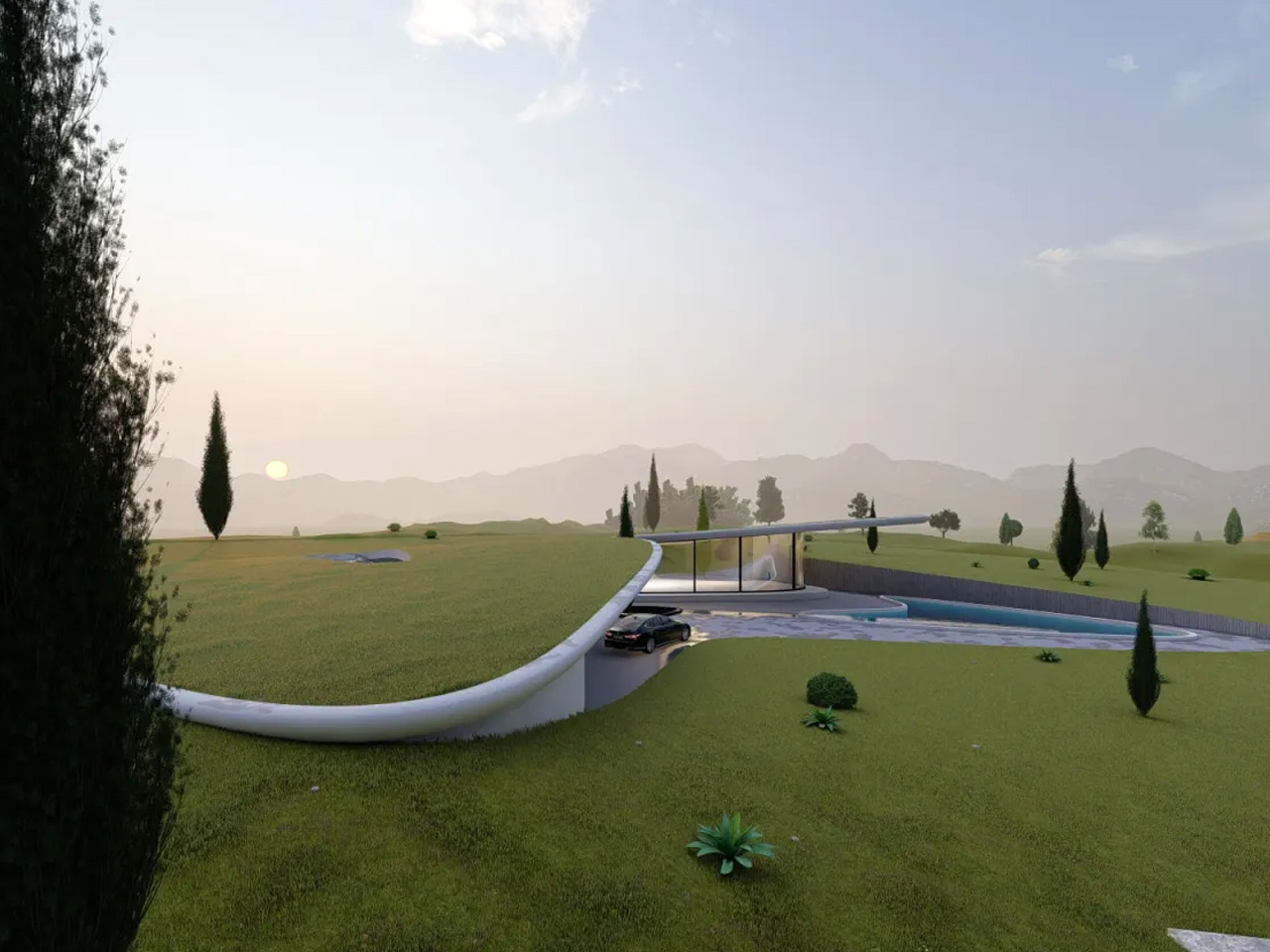
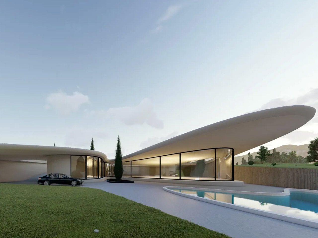
Nestled in the rolling hills of Nashtarood, House Under the Hill is an architectural marvel that blends seamlessly with its landscape. Much of the home is tucked beneath a living roof, echoing the surrounding terrain and allowing the structure to almost disappear into its site. Fluid forms, gentle curves, and careful play of light and shadow reveal the dwelling subtly, while broad glass panels frame views of the pool and greenery, merging interior and exterior. The palette of concrete, wood, and glass creates modern elegance, and open, flowing spaces connect the kitchen, dining, and lounge areas. Bedrooms and bathrooms are oriented for privacy, natural light, and tranquility, enhancing a sense of retreat.
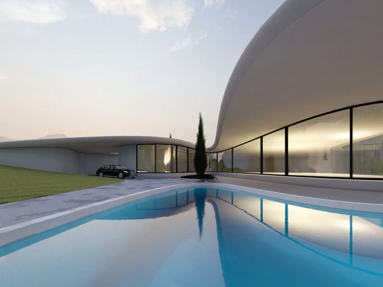
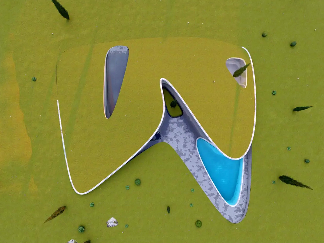
The green roof provides insulation, reduces environmental impact, and harmonizes the home with its surroundings. Outdoor terraces and pool areas offer year-round comfort, while integrated storage, durable materials, and soft, responsive lighting enhance functionality. House Under the Hill embodies a modern approach to living that belongs to the earth, offering a protective, nurturing, and adaptable sanctuary.

4. Integrate the Indoors and Outdoors

A home should feel connected to the natural world rather than isolated from it. Architects often use large glass sliding doors to merge indoor and outdoor spaces, allowing light and views to flow freely. Patios, decks, and other outdoor living areas are designed for easy access from main living zones, encouraging a fluid relationship with nature.

Thoughtful landscaping with native plants further blurs the boundary between house and environment. These spaces offer quiet retreats and areas for social gatherings, creating a home that celebrates the outdoors while remaining comfortable, functional, and deeply in tune with its surroundings.
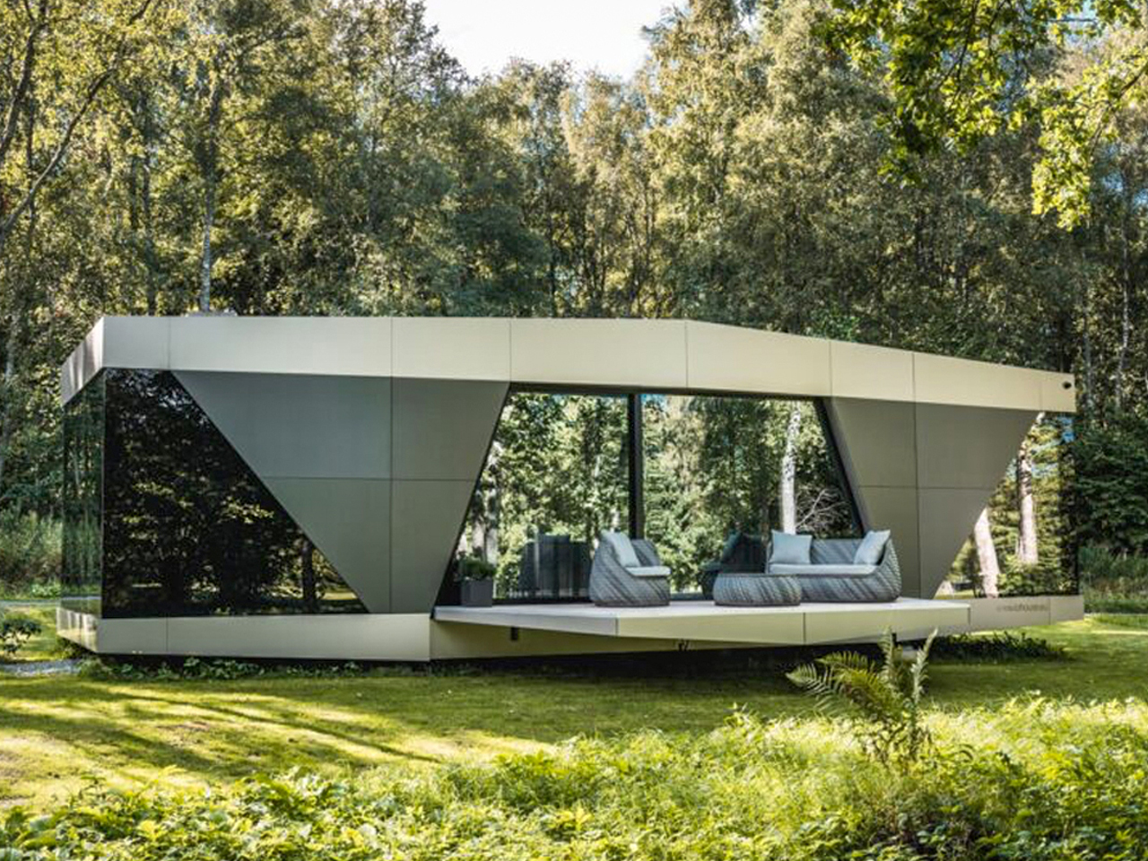
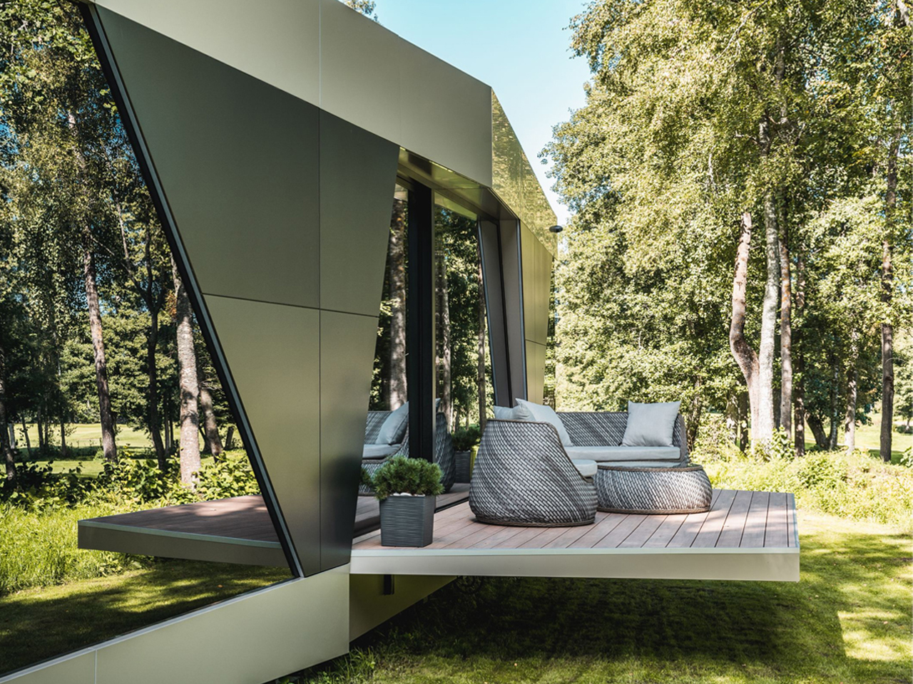
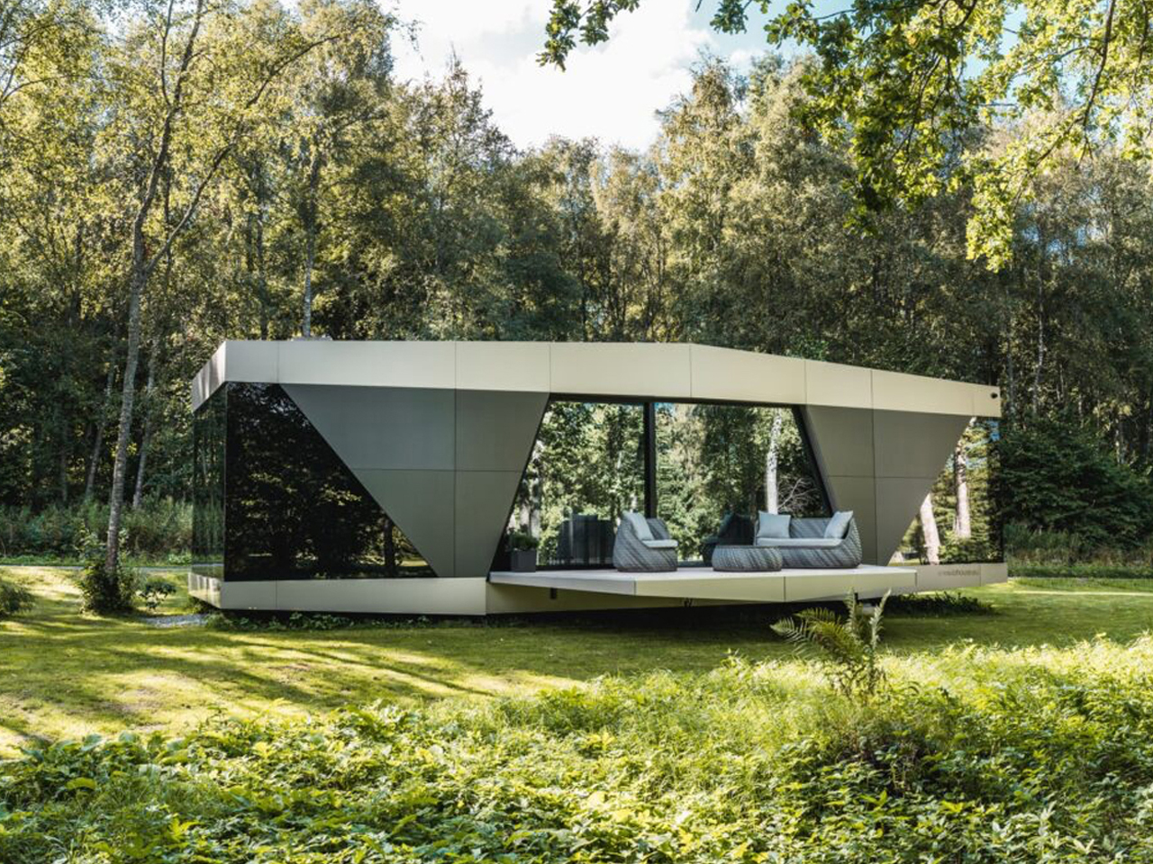
The Space is a sustainable smart home where fully autonomous utilities combine advanced technology with modern comfort. Developed by Stockholm-based iOhouse, it functions entirely off the grid, with water, electricity, heating, and Wi-Fi all controlled through a smartphone. Solar panels and a 220V generator supply power, while an air heat pump and integrated climate controls maintain year-round comfort. A built-in water and sewer system ensures clean water and plumbing wherever the home is placed. The exterior features a sleek, futuristic design with industrial-tech elements, complemented by floor-to-ceiling windows that connect the interior with nature.
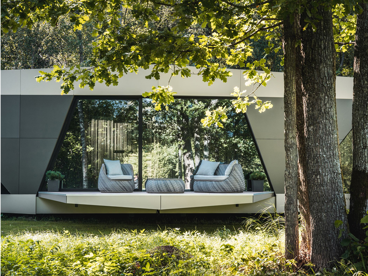
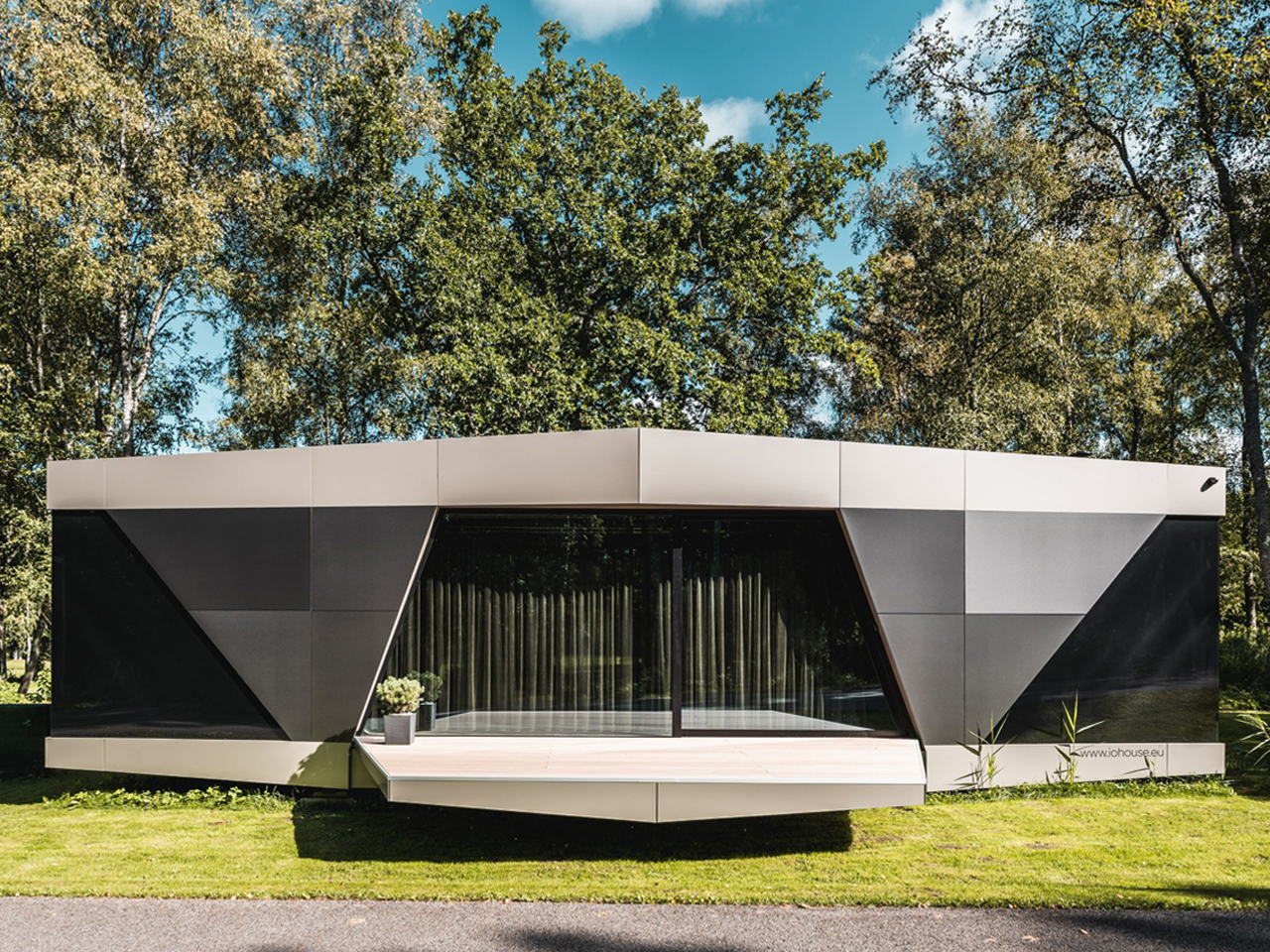
Inside, an open-floor layout with natural wood floors and muted gray tones creates a warm, inviting atmosphere. Every detail, right from fixtures and fittings to room shapes, has been carefully designed for comfort and aesthetics. With its smart systems and autonomous utilities, The Space allows residents to live freely, sustainably, and harmoniously with the environment.

5. Water Management and Conservation

A sustainable home carefully considers how it manages water. Beyond conserving tap water, it works with the rain that falls on the property. Rainwater harvesting systems can collect and store water for irrigation and other non-potable uses, reducing reliance on municipal supply.

Landscaping with rain gardens and using permeable paving allows stormwater to be absorbed naturally, preventing soil erosion and replenishing groundwater. By thoughtfully managing water on-site, a home supports the local ecosystem, minimizes environmental impact, and demonstrates how small, intentional steps can create meaningful, lasting benefits for both the property and the surrounding landscape.
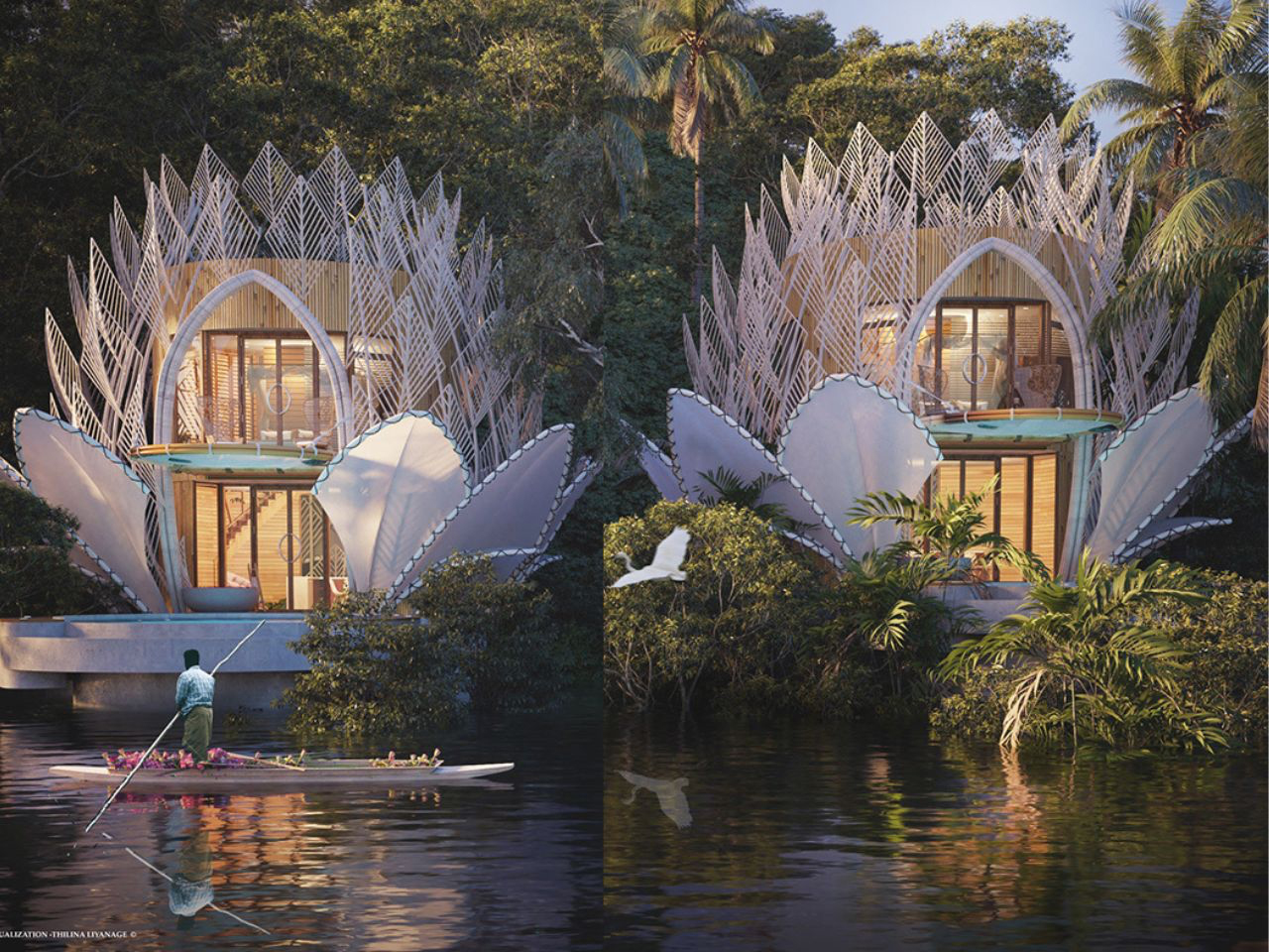
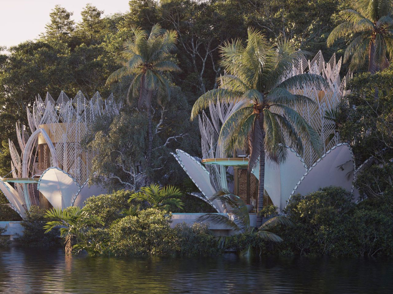
Nestled in the tropics where lush forest meets a serene lake, the Blue Water Lily Villa is a fairytale-like architectural masterpiece. Inspired by biomimicry, its design mirrors the delicate elegance of a water lily while remaining practical and sustainable. Comprising two two-story structures with direct lake access, the villas appear to float on the water’s edge. Petal-like forms rise gracefully from the landscape, creating layers that unfold like a blooming lily. The lower level features an open-plan living and dining area that flows seamlessly toward a small pool, framed by the lake and surrounding greenery.
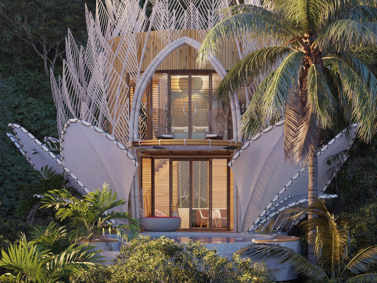
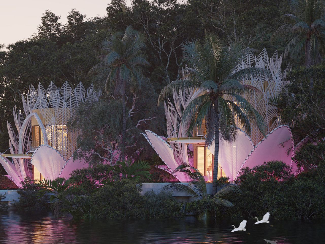
Upstairs, cozy bedrooms open onto cantilevered seating, offering elevated views of the natural surroundings. Prefabricated metal elements and locally sourced bamboo form delicate, translucent “petals,” blending aesthetics with sustainability. At night, soft pink uplights illuminate the fabric-covered petals, transforming the villa into a glowing, magical water lily, harmonizing architecture, nature, and modern comfort.

Creating a home in harmony with nature is a journey of intention and care. It moves beyond shelter to craft a sanctuary that nurtures its inhabitants and the environment. By thoughtfully choosing materials and design, the home listens to the land, embraces its rhythms, and stands as a lasting testament to mindful and sustainable living.

The post 5 Architect-Designed Homes That Disappear Into the Landscape first appeared on Yanko Design.
This Floating Plaza in the Amazon Is Climate Architecture at Work

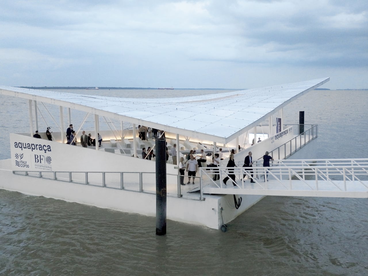
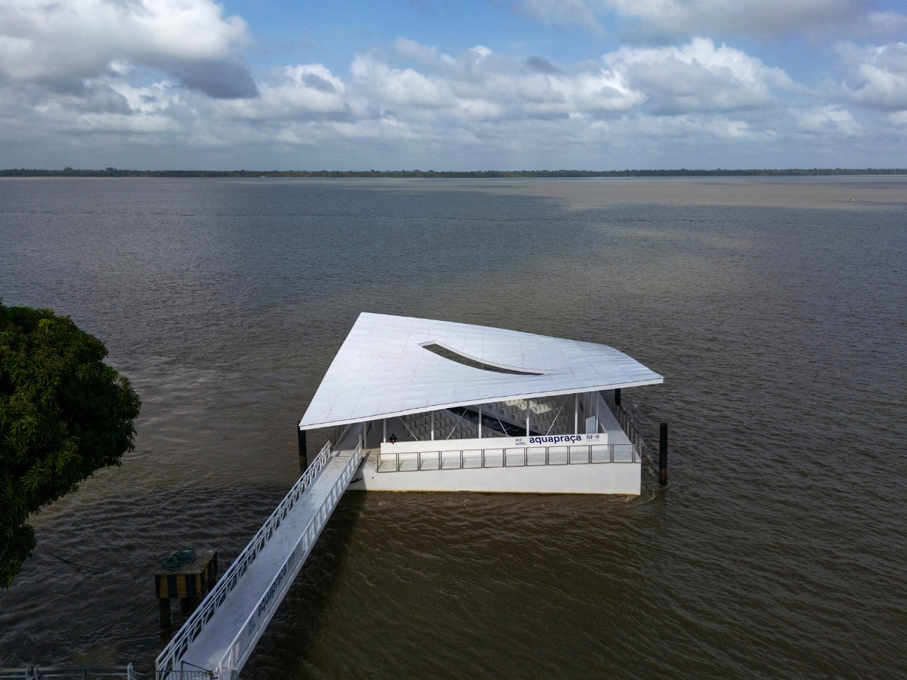
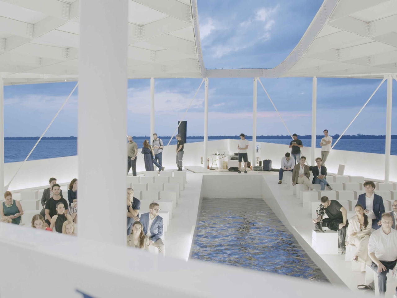
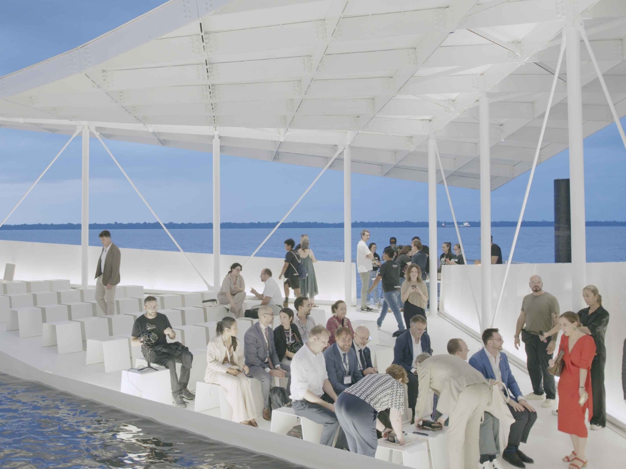
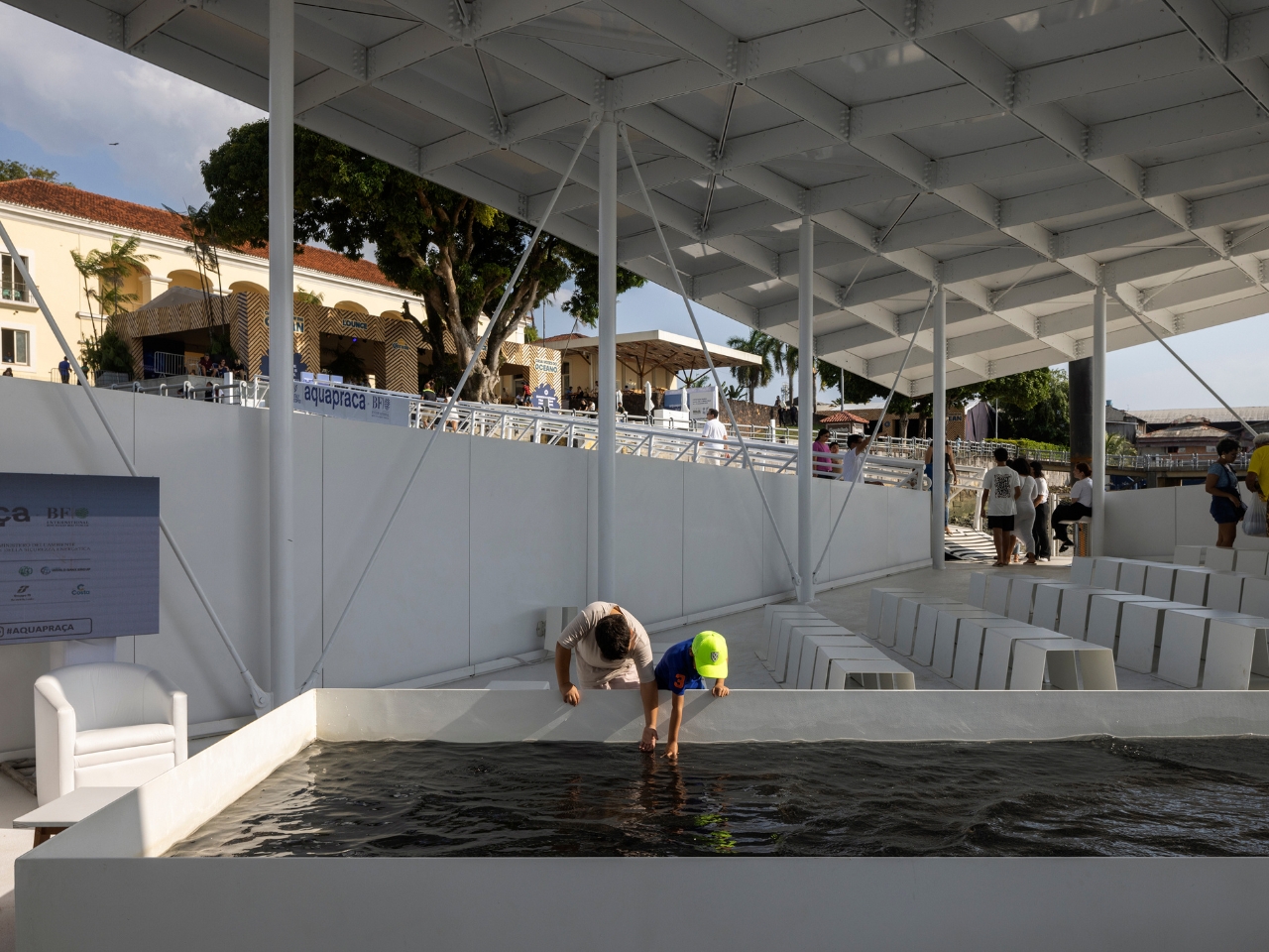
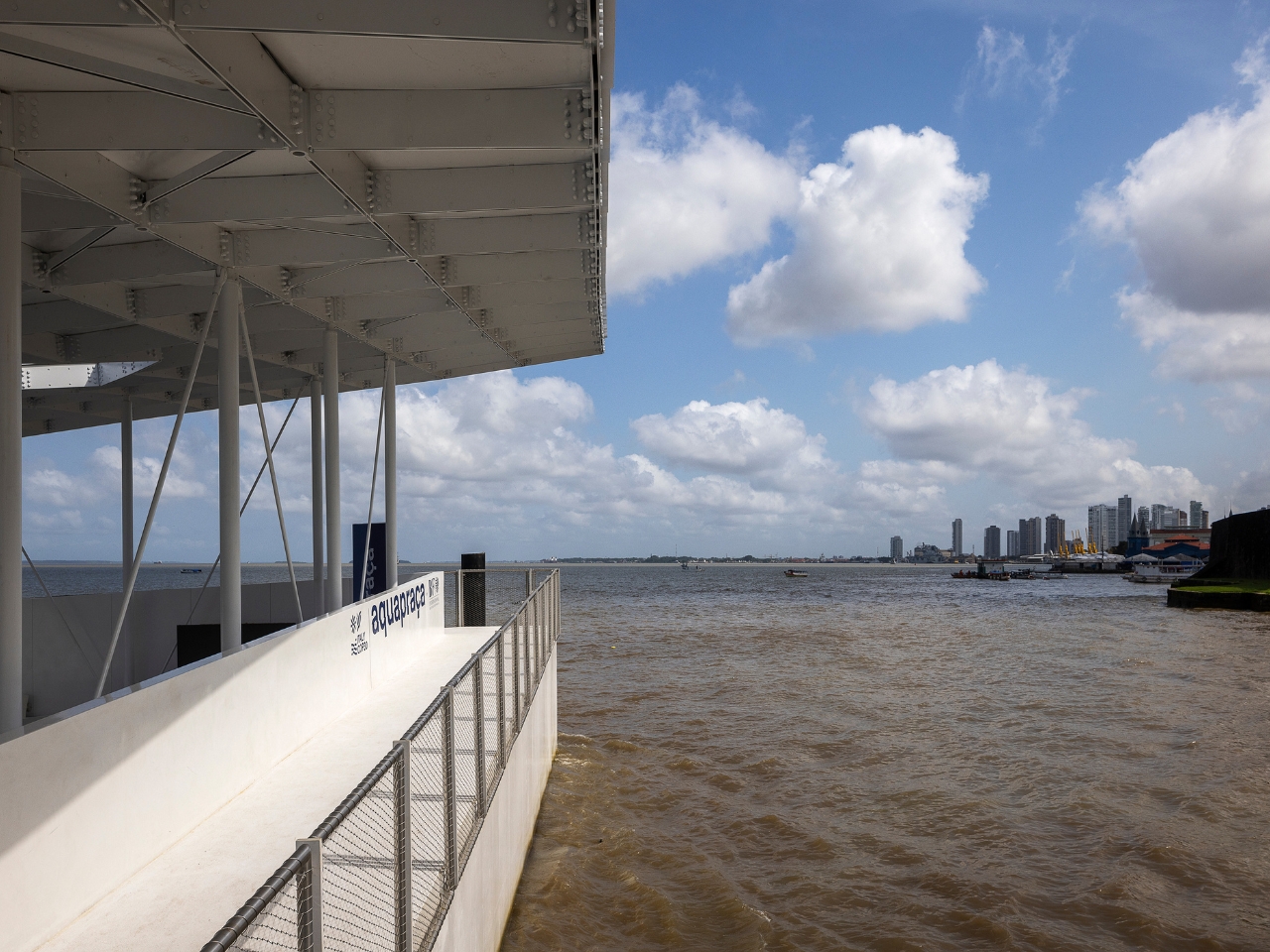
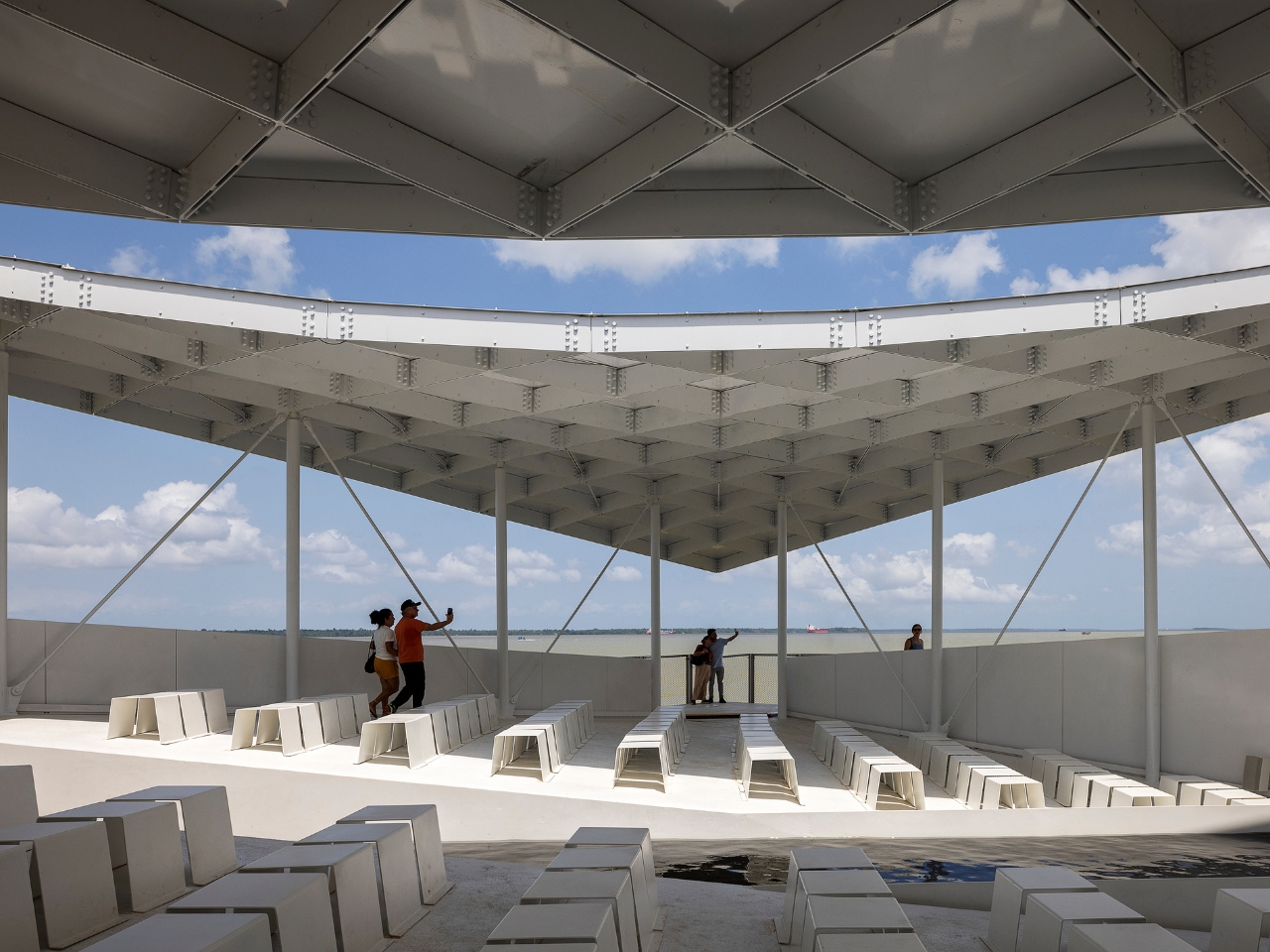
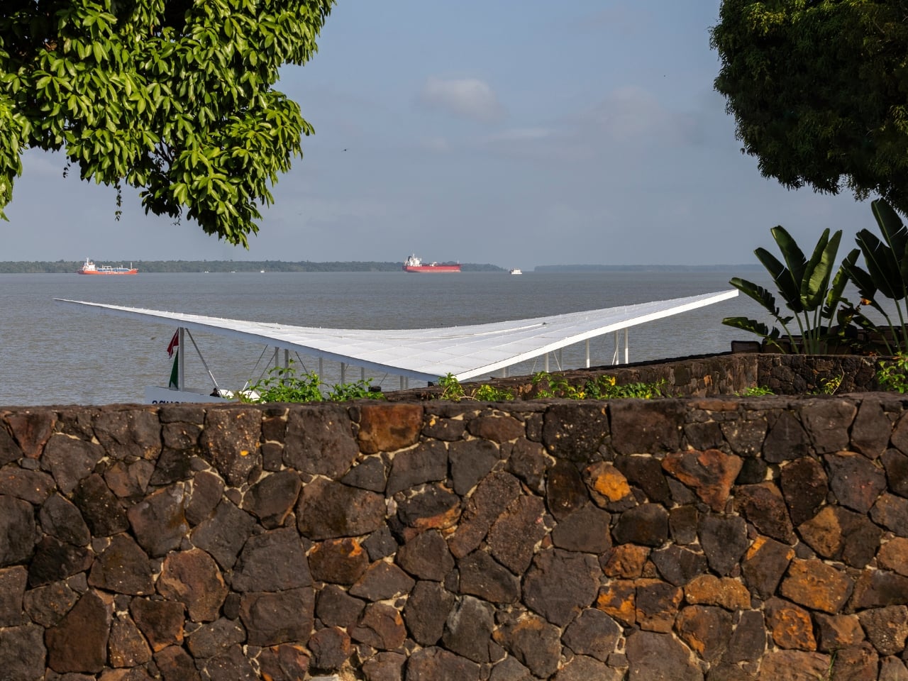
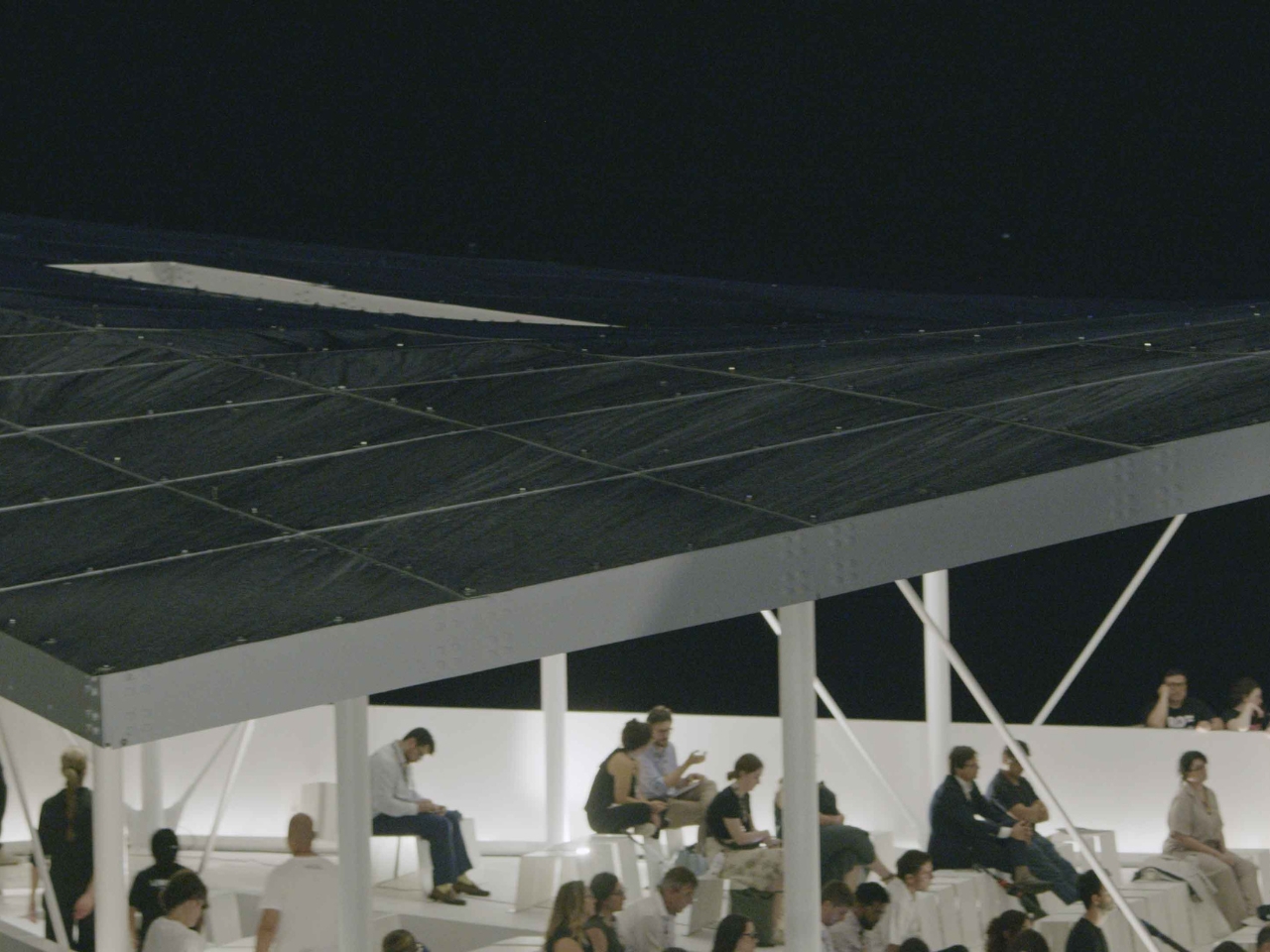
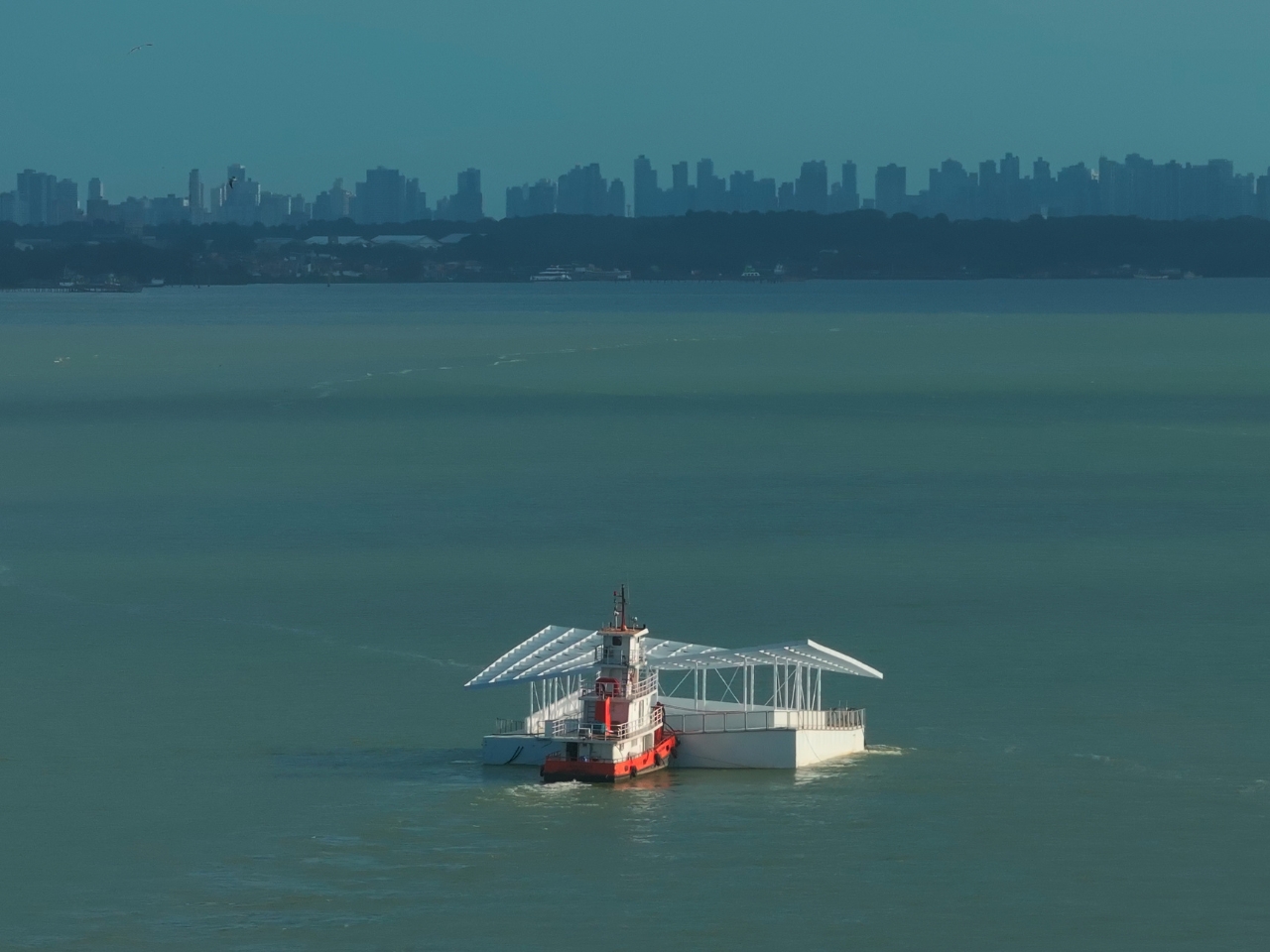
Imagine a public square that literally rises and falls with the tide. That’s exactly what AquaPraça does, and it just made its grand debut at the UN Climate Change Conference COP30 in Belém, Brazil. This isn’t your typical architectural showpiece that exists only to look impressive at a summit. This 400-square-meter floating platform is designed to stay right where it is, becoming a permanent cultural hub in the heart of the Amazon.

Designed by CRA-Carlo Ratti Associati and Höweler + Yoon, AquaPraça represents something genuinely clever in how we think about building in a world where water levels are no longer predictable. Moored on Guajará Bay within the Amazon River system, the structure uses Archimedes’ principle (yes, that ancient Greek buoyancy thing you learned in school) to naturally adapt to an environment where tides can shift up to four meters daily. The platform simply floats along with the water, letting visitors experience the natural rhythm of the river at eye level.

Designer: CRA-Carlo Ratti Associati and Höweler + Yoon

Carlo Ratti, who’s a professor at MIT and curated the Venice Architecture Biennale 2025, explains the project’s deeper philosophy by referencing iconic architect Aldo Rossi. Where Rossi looked to the past to prove architecture could still enrich Venice’s skyline in 1980, AquaPraça looks to the future by exploring how we can build with nature instead of fighting against it. It’s a subtle but important shift in thinking.

The project’s journey is almost as interesting as the structure itself. It was first unveiled in Venice this past September during the Architecture Biennale in a simplified form, then traveled to Belém where it now serves as part of Italy’s pavilion at COP30. After the conference wraps up, Italy will donate the platform to Brazil, where it will function as a community space for ongoing conversations about climate, culture, and creative industries.

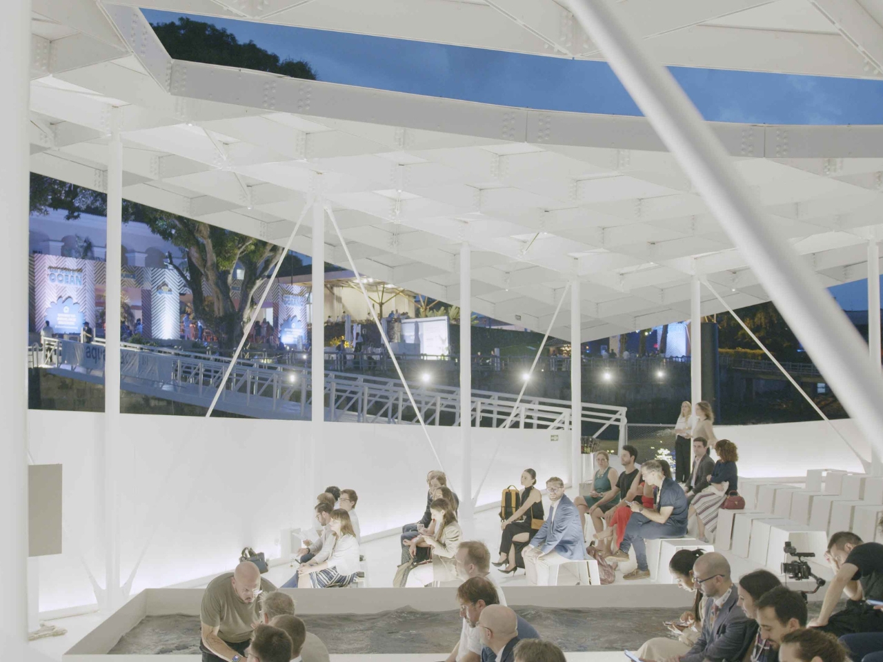
What makes AquaPraça particularly compelling is how it turns climate change from an abstract concept into something you can physically experience. The sloping surfaces and shifting levels respond to the water in real time, creating what Eric Höweler calls “a delicate equilibrium.” His collaborator J. Meejin Yoon points out that it’s both a literal and figurative platform for understanding sea level rise and its impacts on coastal communities worldwide.

The location couldn’t be more symbolic. Belém sits at the meeting point of the Amazon River system and the Atlantic Ocean, where freshwater and saltwater converge to create a powerful estuarine ecosystem. It’s the perfect setting for a structure designed to demonstrate adaptive architecture. The bay itself reveals its underwater landscape daily as tides recede, offering a constant reminder of nature’s cycles and changes.

Getting this thing built was no small feat. Italian construction company Cimolai completed the entire project in just five months, handling structural design, construction, and certification while integrating complex architectural and engineering requirements. That’s remarkably fast for a floating structure that needs to be both functional and safe in such a dynamic environment.

The project came together through an impressive international coalition, including Italy’s Ministry of Foreign Affairs, the Ministry of Environment and Energy Security, and support from organizations like Bloomberg Philanthropies, Costa Crociere, ENEL, and others. It’s the kind of collaboration that shows what’s possible when governments, private companies, and cultural institutions actually work together on climate solutions.

Italian Foreign Minister Antonio Tajani described AquaPraça as a floating Italian square that evokes Venice while standing as a symbol of friendship between Italy and Brazil. But more than diplomatic niceties, it represents something tangible: the idea that architecture can be circular, with multiple lives and purposes over time. From Venice to Belém, and now as permanent infrastructure, the platform embodies continual reuse and reinvention.

For anyone interested in how design can respond to climate challenges without sacrificing beauty or function, AquaPraça offers a compelling model. It’s not just sitting there looking pretty (though it does that too). It’s hosting symposia, cultural programs, and serious discussions about climate policy, all while literally moving with the water that surrounds it. That’s architecture that doesn’t just talk about adaptation but actually demonstrates it, day after day, tide after tide.

The post This Floating Plaza in the Amazon Is Climate Architecture at Work first appeared on Yanko Design.
This Hollywood Hills House Channels Medieval Castles with a Modern Industrial Twist

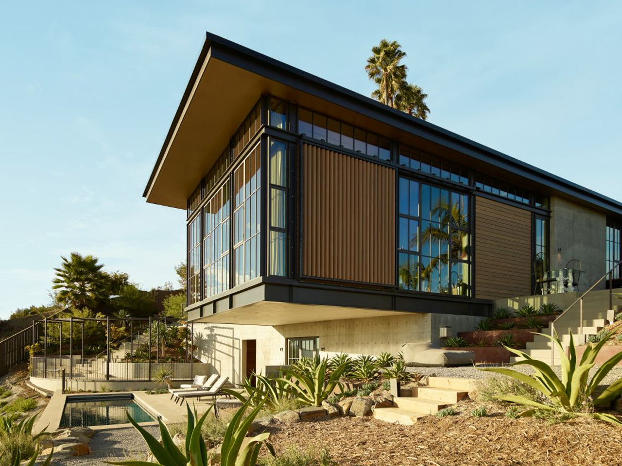
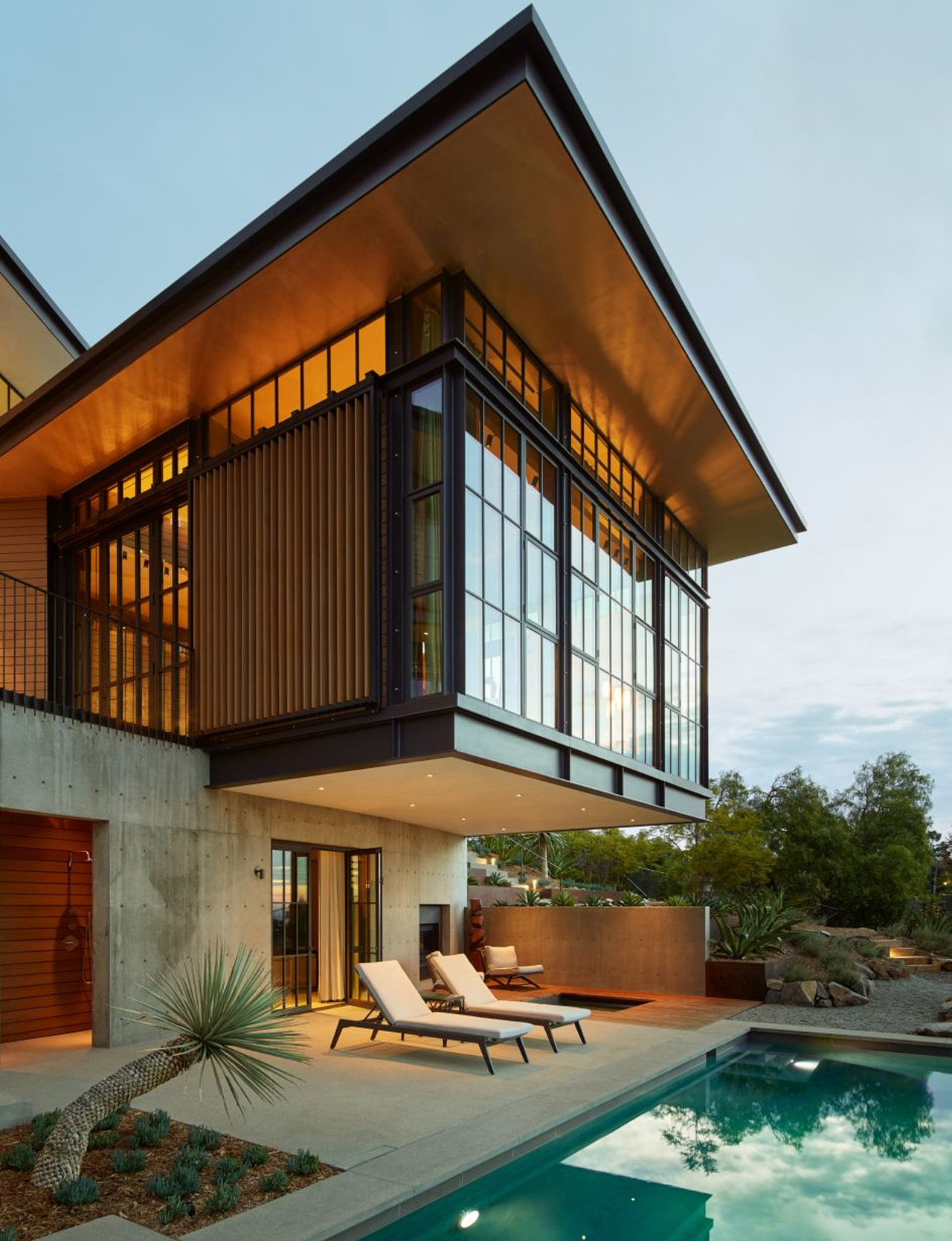
Perched atop a challenging 45-percent slope in the Hollywood Hills, this striking residence by Kristen Becker of Mutuus Studio reimagines what luxury living can look like within a modest footprint. Completed in 2016, the house was commissioned by an actor-director couple who wanted their Los Angeles home to feel as intimate and carefully curated as their New York City penthouse loft. The steep, oak-dotted hillside presented serious design challenges, but Becker transformed these constraints into architectural opportunities that give the home its distinctive character.

Becker drew inspiration from the clients’ travels through Ireland and their fascination with European castles, creating a sequence of spaces that unfold with theatrical drama. Visitors enter through a wooden, steel, and concrete bridge that spans a secret garden before arriving at an imposing bronze door. The garden connects to a courtyard where sunlight filters through floor-to-ceiling windows into the bathroom below, evoking the atmospheric quality of ancient fortresses. Medieval castles and industrial buildings both influenced the aesthetic, resulting in a design that feels simultaneously raw and refined.

Designer: Kristen Becker of Mutuus Studio

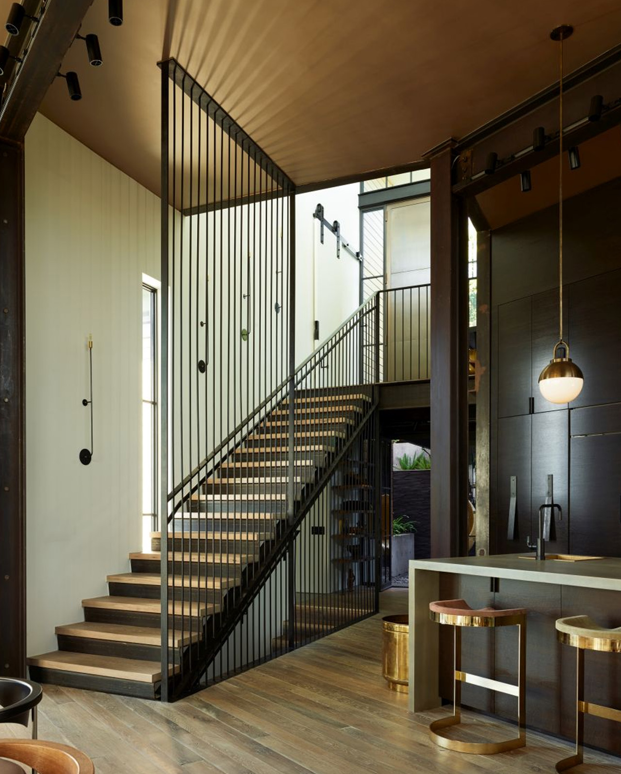
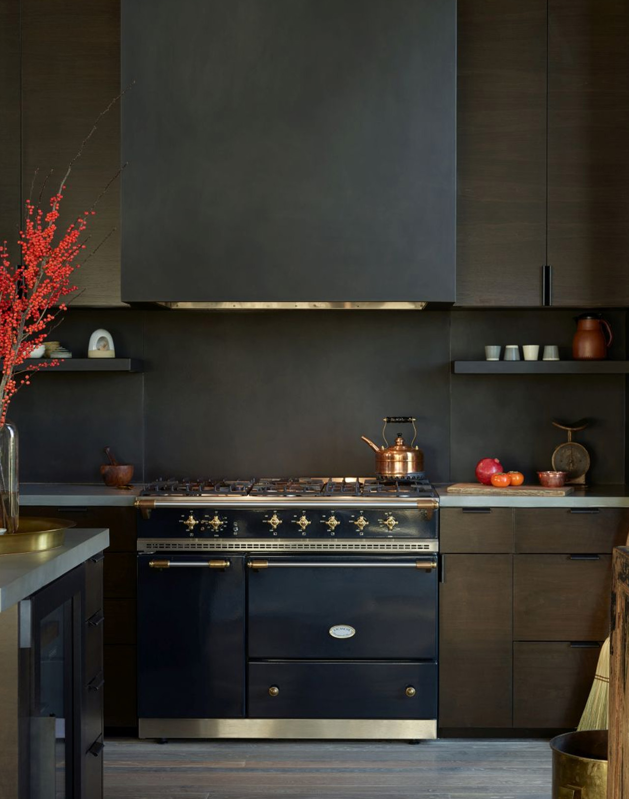
The multi-storey structure steps down the hillside rather than fighting against it, allowing each level to capture different views of the surrounding landscape dotted with shrubs, cacti, and mature oak trees. Natural light floods the interiors through expansive glazing, while a garage-style door in the main living area lifts upward to dissolve the boundary between inside and out. This connection to the terrace extends the living space and takes full advantage of California’s temperate climate. The steel and concrete structure provides the industrial backbone that supports the home’s open, flowing layout.

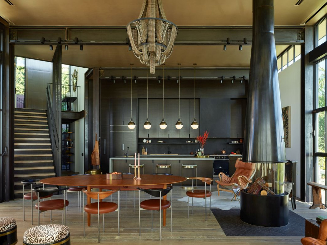
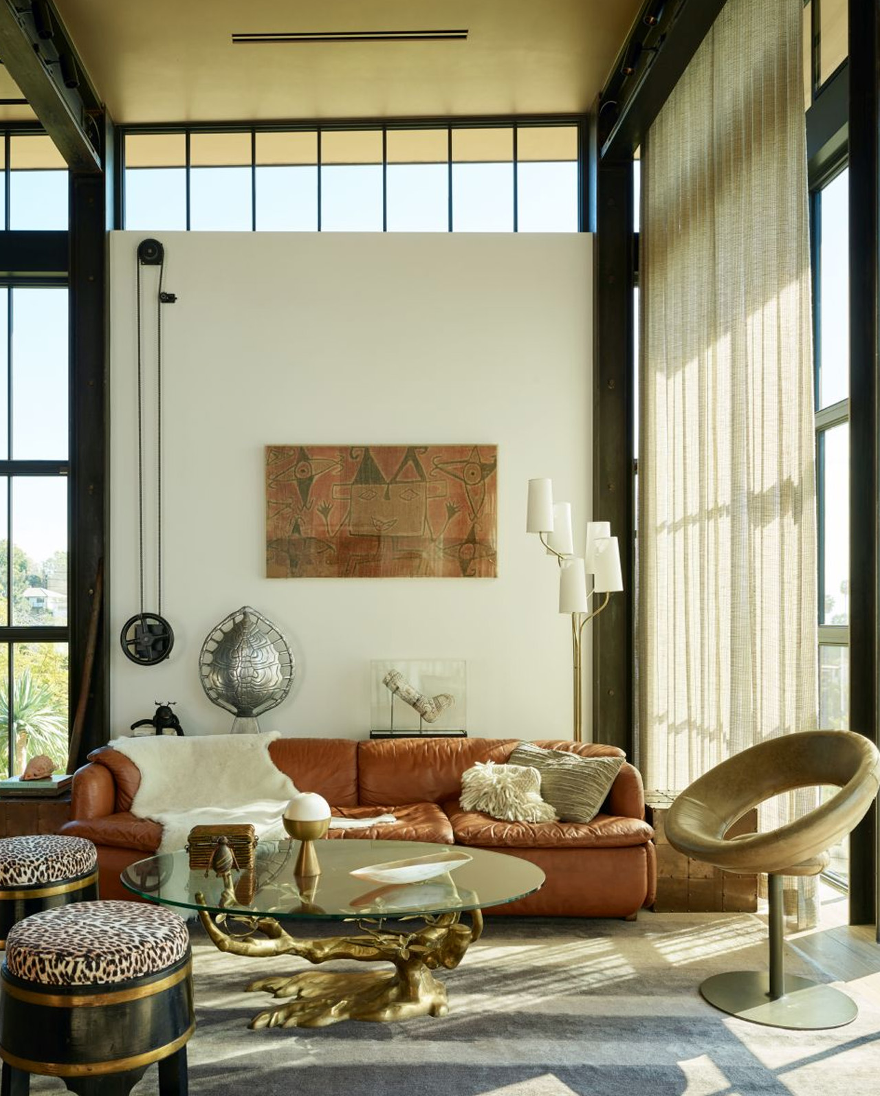
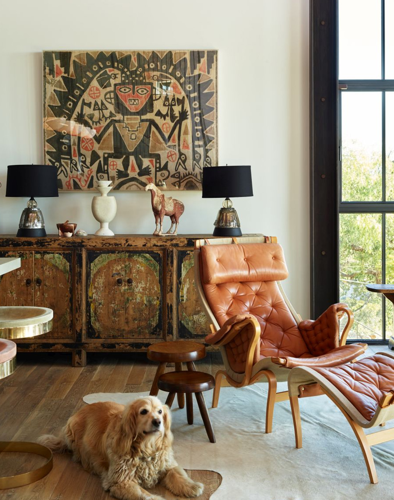
Interior design played an equally important role in the project, with Becker collaborating closely with the clients on furnishings that reflect their globetrotting lifestyle and eclectic taste. The living room showcases caramel leather sofas alongside leopard-print stools and a bronze and glass coffee table by Willy Daro. African artwork hangs near pieces from Brian Henson’s childhood collection. The dining area features a Finn Juhl teak table surrounded by Peter Moos chairs, all illuminated by a custom Facaro bicycle chain chandelier that adds unexpected whimsy.

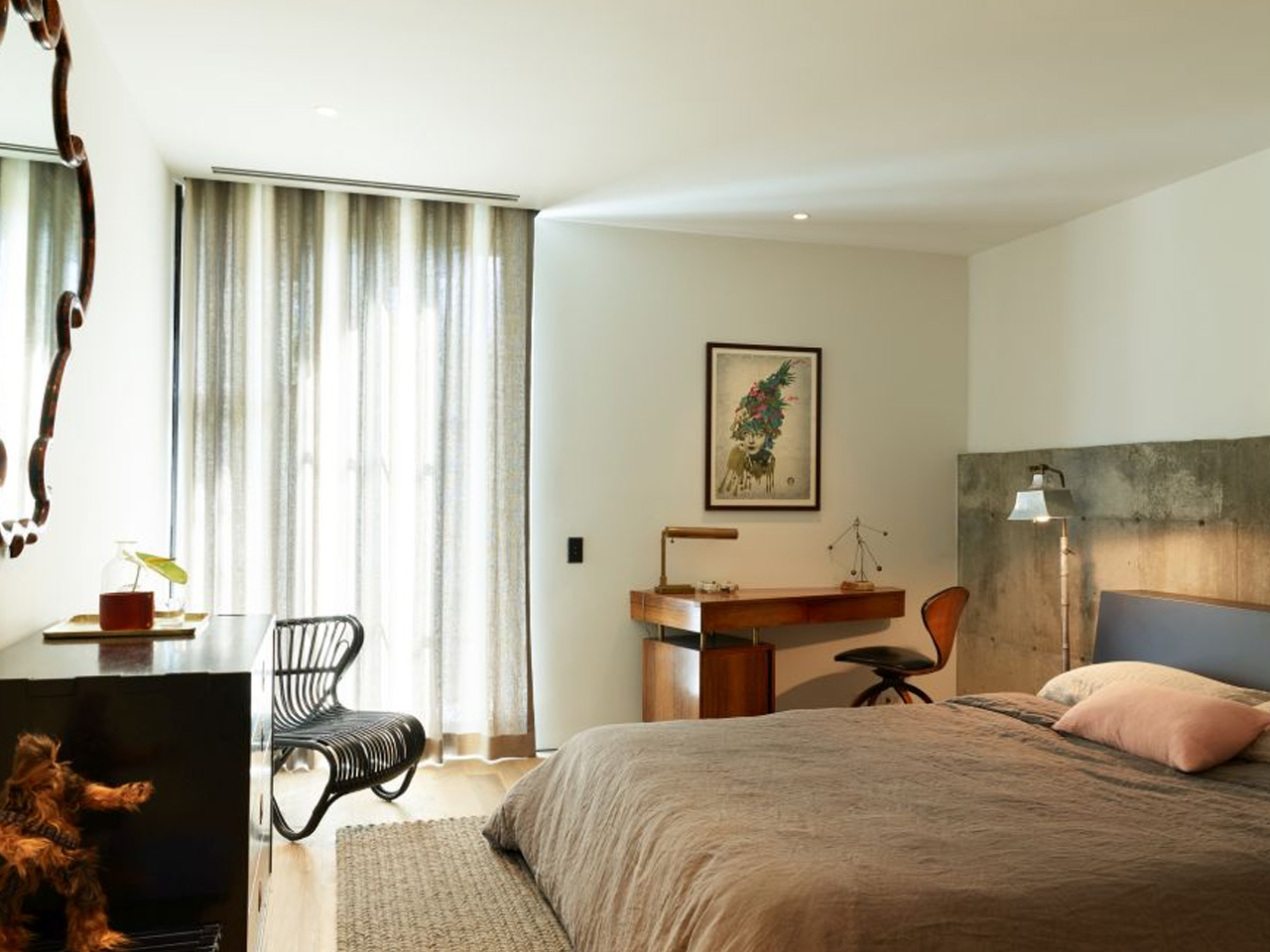
Throughout the home, vintage pieces from different eras and continents sit comfortably together. Ricardo Fasanello’s Anel chair shares space with Bruno Mathsson’s Pernilla Lounge Chair, antique Chinese sideboards, vintage Japanese benches, and a Norman Cherner swivel chair from the 1960s. An Arc dome pendant by Allied Maker illuminates a vintage Warren Bacon saddle stool. Every element received thoughtful consideration, with the design team and owners collaborating to ensure each piece contributed to a seamless experience of place.

The Hollywood Hills House stands as proof that luxury and modesty can coexist. Becker’s background in dance informed the seamless flow through the rooms, where movement feels intuitive and natural. The residence delivers a sophisticated California lifestyle while maintaining efficiency in both space and resources. Photography by Kevin Scott captures how this modern castle commands its hilltop position, offering a fresh interpretation of the iconic Case Study Houses while establishing its own contemporary presence in the Los Angeles architectural landscape.

The post This Hollywood Hills House Channels Medieval Castles with a Modern Industrial Twist first appeared on Yanko Design.
This Opera House Design Has No Back and You Can Walk on the Roof

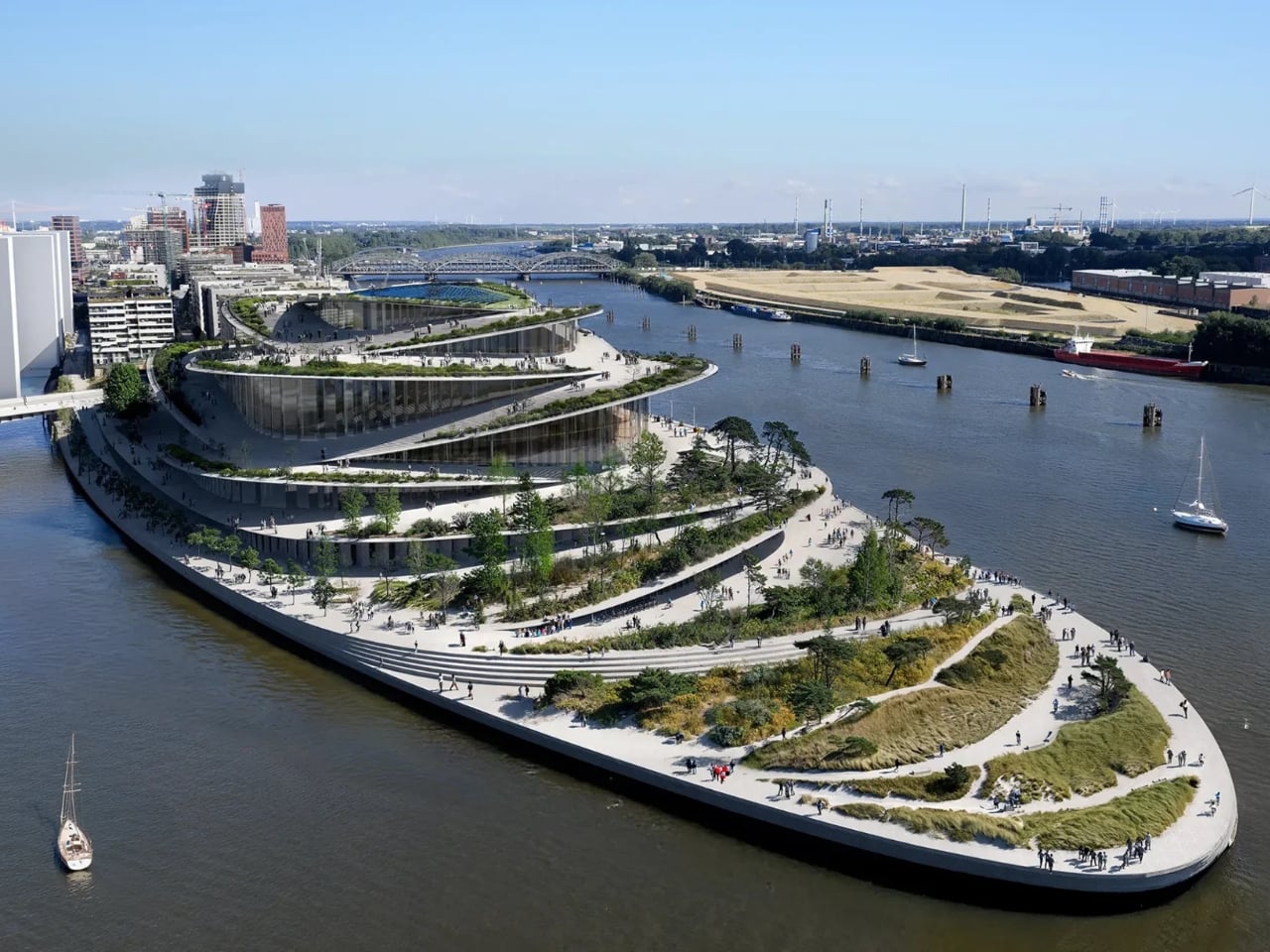
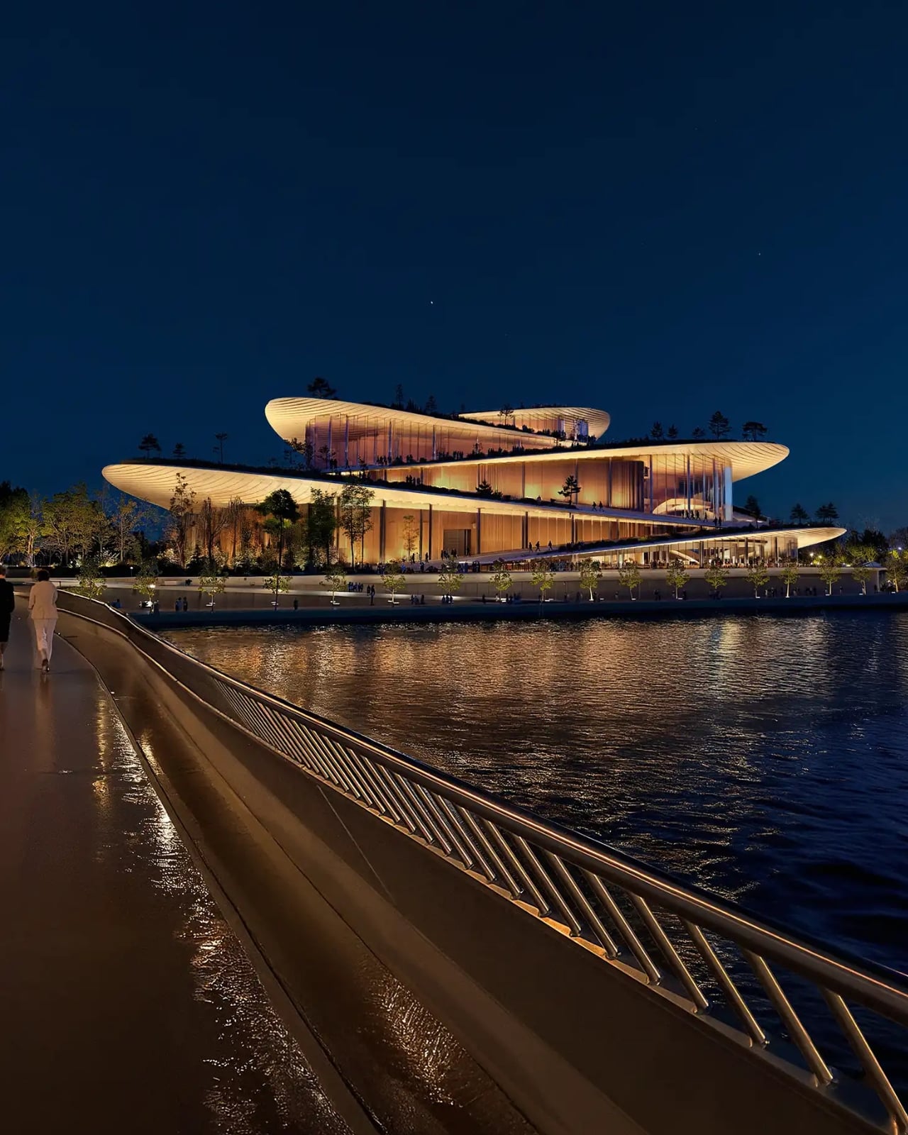
Picture an opera house that doesn’t just sit on its waterfront site but flows across it like sound waves spreading through the air. That’s exactly what Bjarke Ingels Group has cooked up for Hamburg’s new State Opera, and honestly, it’s one of those designs that makes you rethink what a cultural building can be in the 21st century.

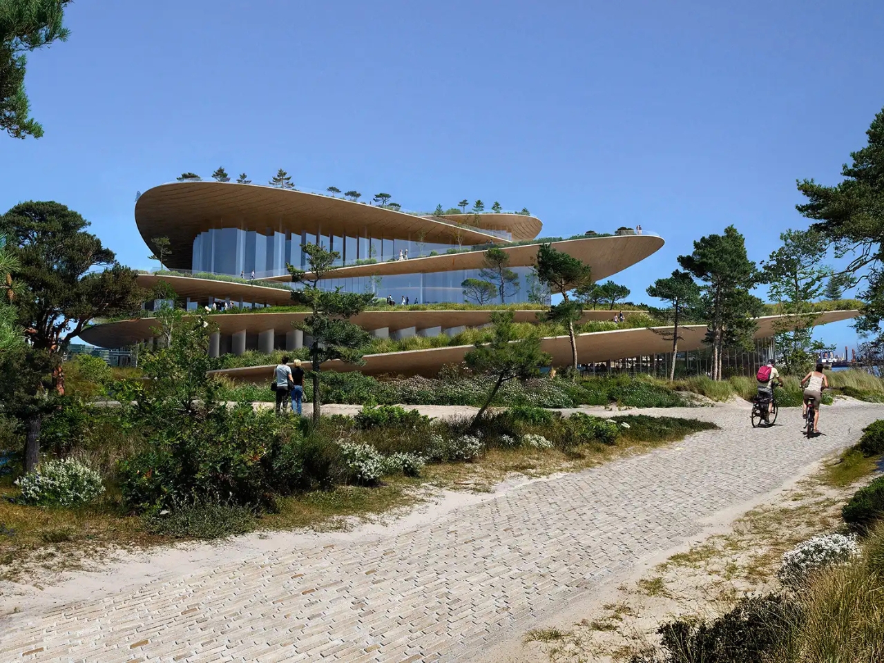
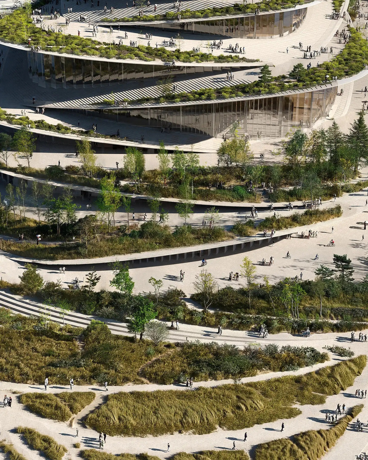
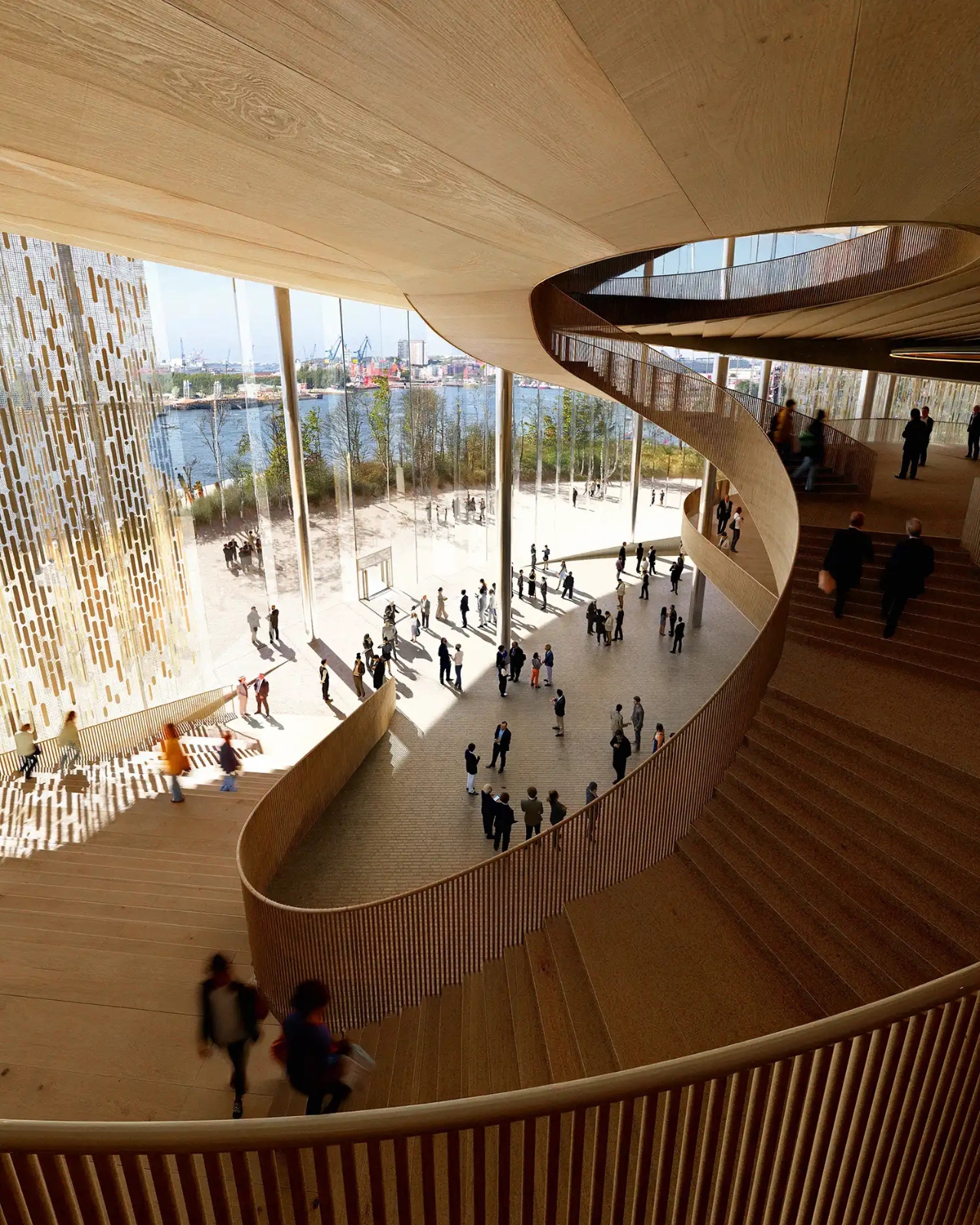
The Danish architecture firm just won an international competition to replace Hamburg’s aging 1950s opera house with something that feels less like a fortress of high culture and more like an urban living room. Located on the Baakenhöft peninsula in HafenCity, right where the city meets the water, the new building reads as a landscape of concentric terraces that ripple outward from the central performance hall. Ingels himself describes it as terraces “emanating like soundwaves,” which is pretty poetic for a guy known for turning ideas into buildable reality.

Designer: BIG – Bjarke Ingels Group

What makes this project so interesting is how it completely ditches the traditional opera house playbook. You know the type: imposing facades, grand staircases that separate the cultured elite from everyone else, buildings that basically scream “not for you” to anyone walking by. BIG’s approach flips that script entirely. The 450,000-square-foot building is designed as what they call “a public building within a park,” where the roofscape is fully walkable and the structure has no defined back side.

Think about that for a second. An opera house with no rear elevation. Instead of creating a building that sits apart from its surroundings, the design treats the entire structure as an extension of HafenCity’s public realm. The terraced exterior becomes a landscaped garden that rises to meet the main volume, creating what amounts to a human-made topography where people can hang out, walk their dogs, or just watch the sunset over the harbor regardless of whether they have tickets to La Bohème that evening.

This democratization of space isn’t just good PR. It represents a fundamental shift in how we think about cultural institutions and their relationship to the communities they serve. Opera houses have historically been exclusive spaces, both architecturally and culturally. By making the building itself permeable and accessible, BIG is suggesting that even if you’re not an opera fan, this building still belongs to you. It’s your park, your gathering space, your piece of waterfront.

The design also responds smartly to its context. Hamburg’s existing opera house served the city well for decades, but it reflects a different era’s ideas about urban culture and public space. The new location in HafenCity, a rapidly developing waterfront district that’s become one of Europe’s largest urban regeneration projects, demanded something that could anchor a neighborhood still finding its identity. Rather than plopping down a monument, BIG created something that extends and enhances the existing urban fabric.

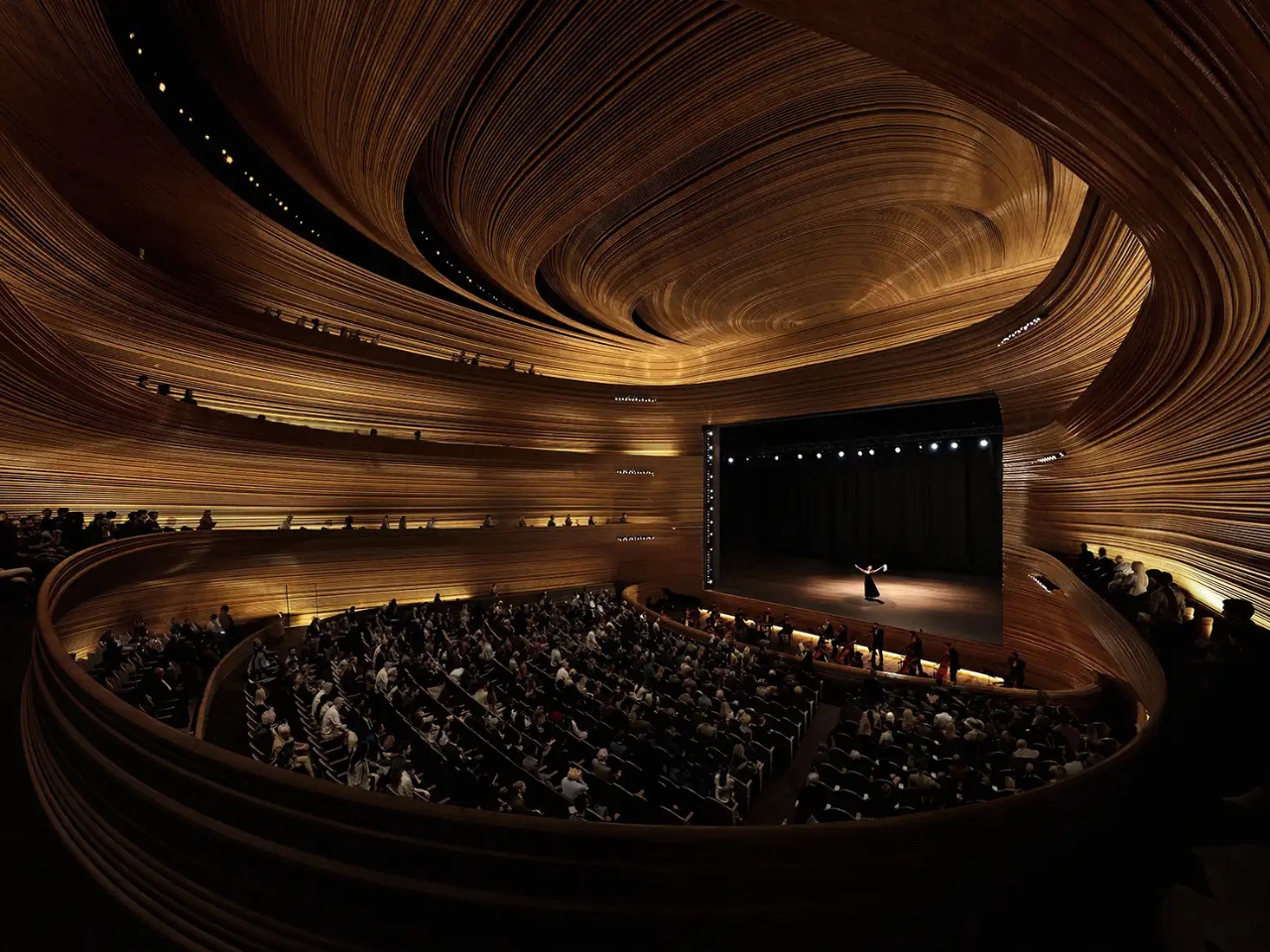
From a technical standpoint, the rippling terrace concept isn’t just aesthetically pleasing. It creates multiple entry points and circulation paths, distributes the building’s mass in a way that feels less imposing, and provides outdoor social spaces at various levels. The design incorporates advanced acoustic engineering to ensure world-class sound inside while maintaining that crucial connection to the outside world.

There’s also something refreshingly playful about the whole concept. Comparing the terraces to sound waves or ripples on water isn’t just architectural marketing speak. It creates a visual metaphor that helps people understand what the building is trying to do before they ever step inside. The opera makes sound, sound travels in waves, and those waves become the literal form of the building. It’s the kind of concept-driven design that Ingels has become famous for, where big ideas translate into built form in ways that feel both intellectually satisfying and just plain cool to look at.

Will this design single-handedly make opera accessible to the masses? Probably not. But it removes at least one barrier by creating a building that invites you in rather than keeping you out. And in a world where cultural institutions are constantly wrestling with questions of relevance and accessibility, that architectural gesture matters. Hamburg’s getting more than a new opera house. It’s getting a new kind of public space that just happens to have a world-class performance hall at its center.

The post This Opera House Design Has No Back and You Can Walk on the Roof first appeared on Yanko Design.
This 690 Sq.Ft. Bus Station Cuts Carbon Emissions by 70% Using Recycled Steel

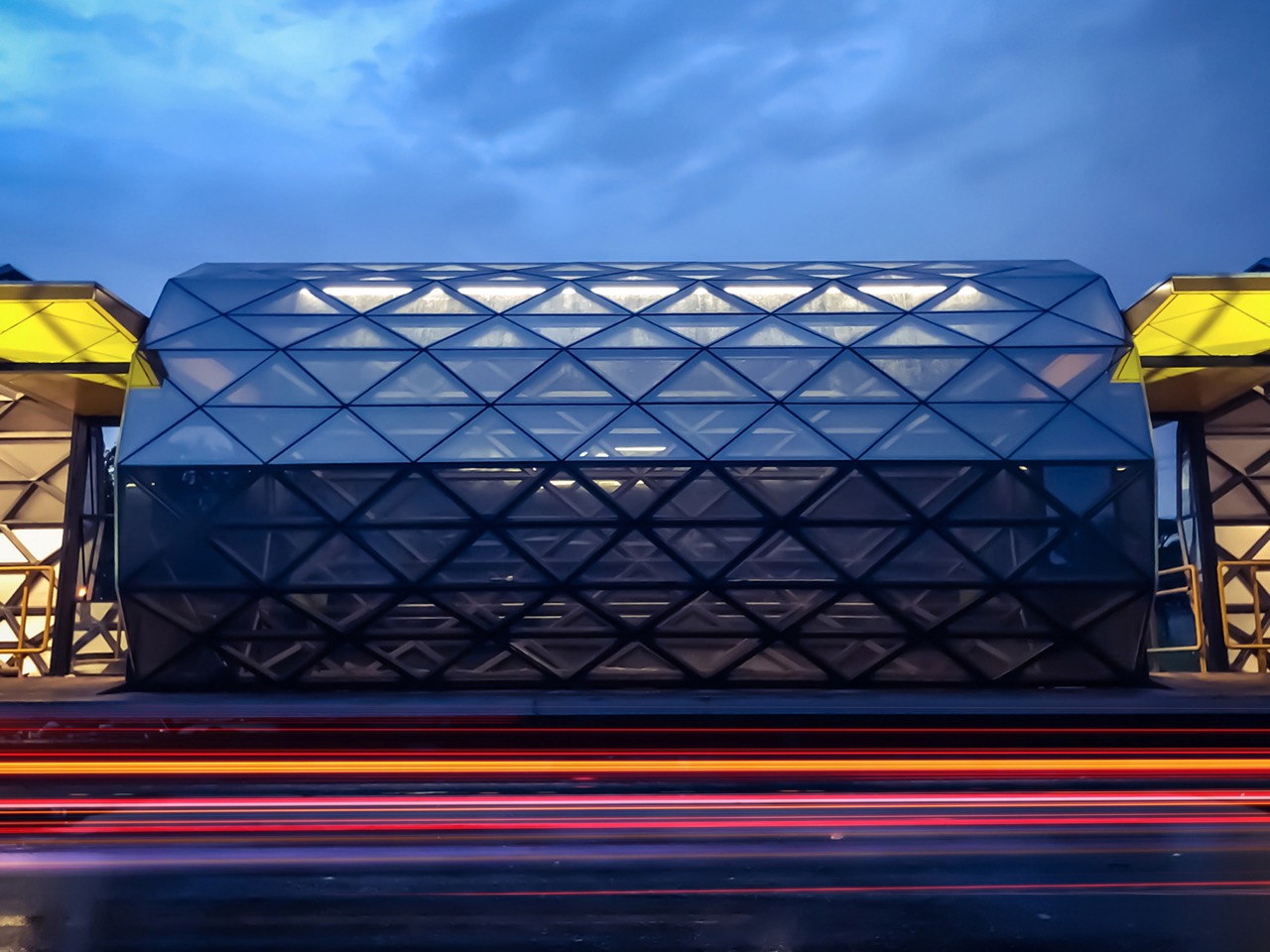
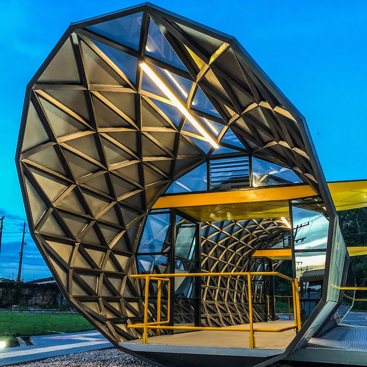
Waiting for a bus shouldn’t feel like purgatory, but in the intense heat and frequent downpours of Brazil’s Amazon region, it often does. Fernando Andrade understood this intimately when he began designing the Amazon Bus Station in Belém, a project born not from architectural ego but from genuine public consultation with the people who would actually use it. They asked for four things: protection from the weather, environmental comfort, durability, and reasonable cost. What they got exceeded every expectation: a soaring, sculptural shelter that treats public transit users as deserving of the same design attention typically reserved for museums and corporate headquarters.

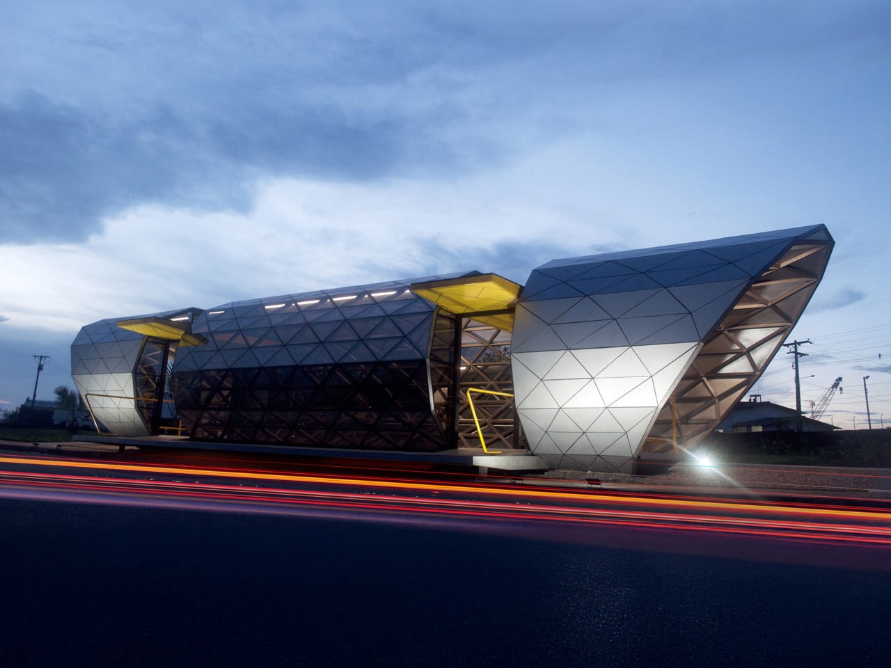
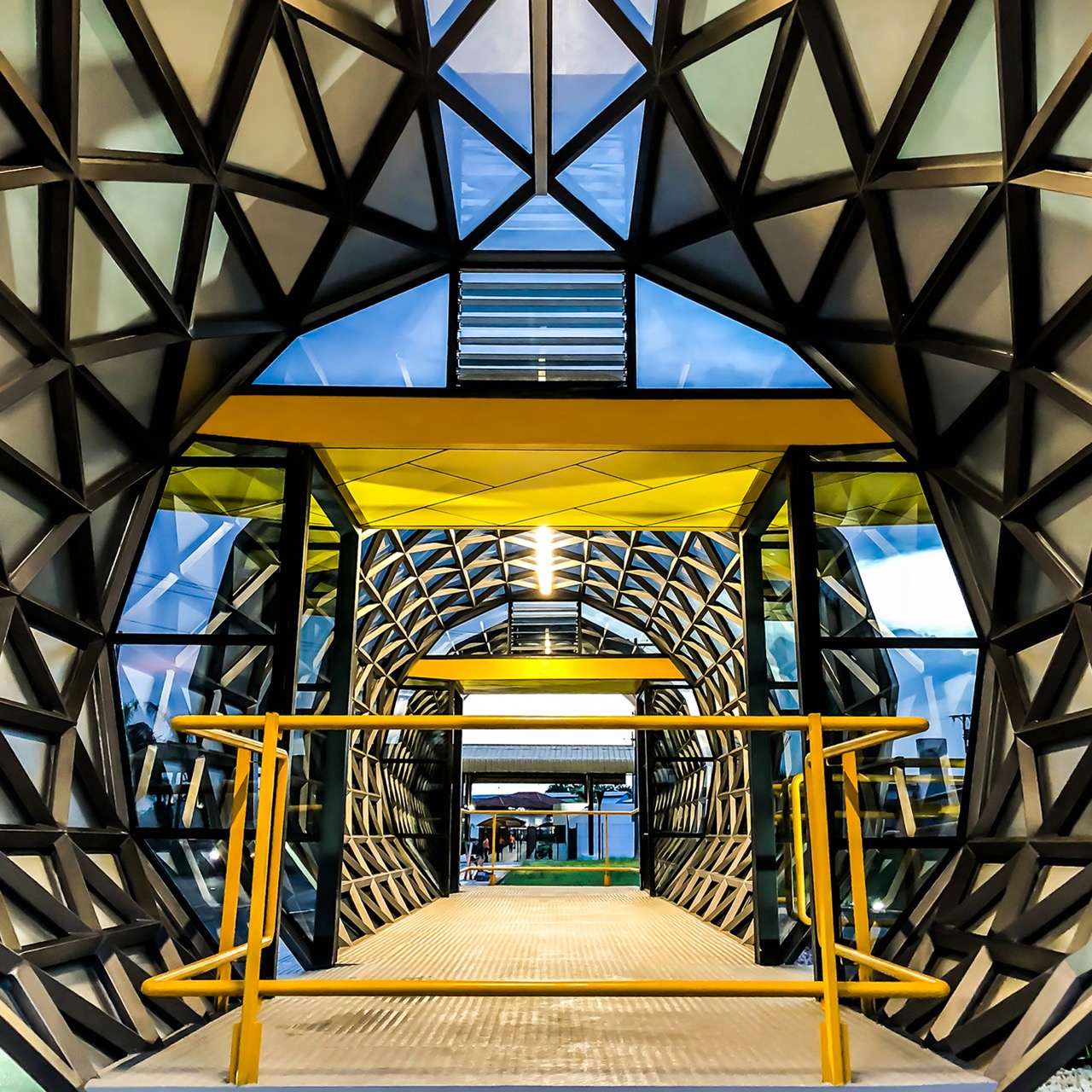
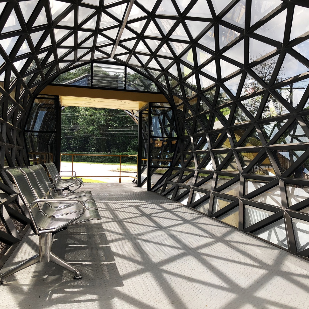
The 16-meter structure, completed in February 2024, wraps passengers in a protective envelope of triangulated steel and reflective glass, its organic curves creating an embracing interior space that feels both sheltering and expansive. Yellow accessibility ramps guide users through a barrier-free environment where natural ventilation, achieved through traditional Amazonian roof fins, keeps air moving without mechanical systems. Shadows from the geometric framework dance across metal benches as daylight filters through the glass skin, creating an ever-changing interior atmosphere that connects occupants to the rhythms of weather and time. The design accommodates everyone, including those with mobility challenges, while pushing what architectural beauty can achieve in public infrastructure.

Designer:

The structural approach here is basically what happens when parametric design actually solves problems instead of just generating Instagram bait. The whole thing is built from 600mm triangular modules, each assembled from 75x3mm quadrangular steel tubes. That triangulation distributes loads efficiently enough that the entire 16-meter span rests on just four support points, which means minimal ground disruption and maximum flexibility for street-level circulation. And they used recycled steel throughout, dropping carbon emissions by 70% compared to conventional construction methods. The numbers matter because this approach could scale. Belém gets this one station, but the fabrication methodology, the material choices, the whole industrial-to-site assembly process translates to other locations dealing with similar climate challenges and budget constraints.
The 8mm laminated glass blocks 99.8% of direct solar radiation, which in equatorial conditions isn’t a nice-to-have feature, it’s the difference between a functional space and a greenhouse. But the clever bit is those ventilation fins at the roof ridge. They’re angled glass louvers that let hot air escape while keeping rain out, basically a stack effect ventilator with zero moving parts and zero maintenance requirements beyond occasional cleaning. No motors failing, no electronics corroding in humidity, no ongoing energy costs. Just heated air rising and escaping through geometry that works with local wind patterns. It’s the kind of solution that feels obvious in hindsight but requires serious environmental modeling to get right.

Nine months from concept to completion, with fabrication happening in a controlled industrial environment using local shipbuilders who know how to work with complex curves and weather-resistant assemblies. They pre-built the structure in three major sections, transported them to site, and only finished the connection joints on location. That level of prefabrication ensures tolerances stay tight and quality control doesn’t depend on field conditions, which matters when you’re dealing with structural silicone joints and precise glass panel alignments. The client, Centro Integrado de Inclusão e Reabilitação, specializes in accessibility infrastructure, so the barrier-free circulation wasn’t an afterthought added to satisfy code. It shaped the entire spatial concept from the beginning.

The real test of any transit infrastructure is whether it changes behavior. A better bus station doesn’t just shelter existing riders, it potentially converts people who currently drive because the bus experience feels too degrading or uncomfortable. Belém’s new station won’t single-handedly transform modal split numbers, but it signals that public transit users deserve environments worth occupying. These details accumulate into an experience that respects users enough to think through their actual needs rather than just checking regulatory boxes. That respect, rendered in recycled steel and high-performance glass, might be the most radical thing about the whole project.

The post This 690 Sq.Ft. Bus Station Cuts Carbon Emissions by 70% Using Recycled Steel first appeared on Yanko Design.