
Gmail verification program lets political campaigns escape its spam filter
Gmail verification program lets political campaigns escape its spam filter.

Every broke gym rat has done this at some point. You run out of dumbbells, you eyeball two water jugs, you duct tape a broom handle across them, and suddenly you have a homemade kettlebell that looks like a science fair project gone wrong. It works, technically, but it also looks like something you’d hide before your date comes over. Purra just looked at that entire genre of improvised home gym equipment and decided to make it official, good looking, and branded. The result is a plastic handle that clips onto a pair of their mineral water bottles and turns them into an actual kettlebell, weight marking and all.
Designed as a marketing stunt tied to Purra’s presence at HYROX Bangkok, the handle snaps over two 1.5 liter bottles to hit exactly 3 kilograms, which is either a happy coincidence or someone in R&D did their homework. The dome is molded in the same powder blue as Purra’s label, debossed with the brand name, and shaped with the same scalloped horns you’d find on a competition kettlebell. Nothing about it screams cheap giveaway. It screams someone in the marketing department actually asked an industrial designer for help instead of ordering branded tote bags like everyone else.
Designer: Purra (Singha Corporation)
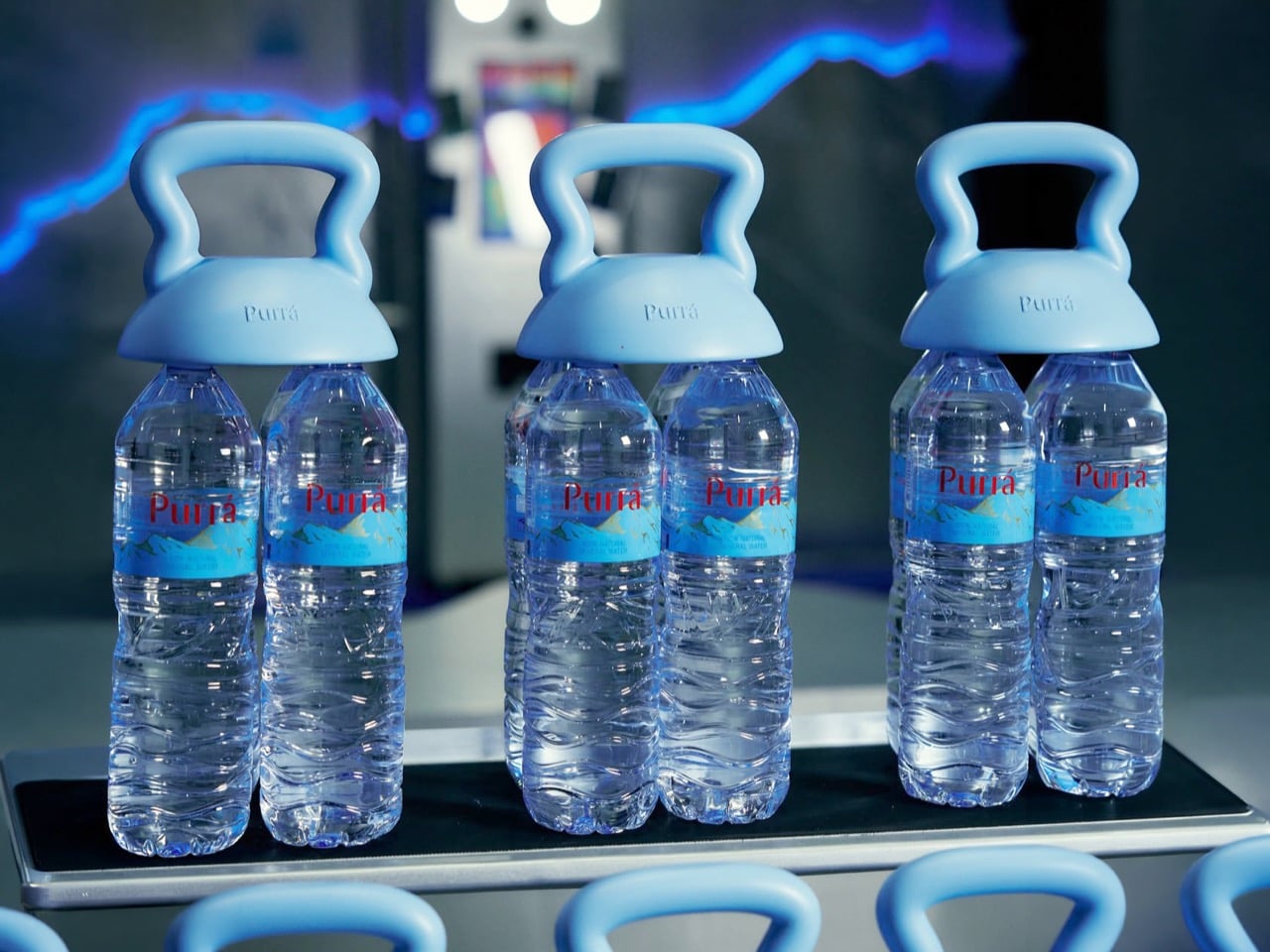
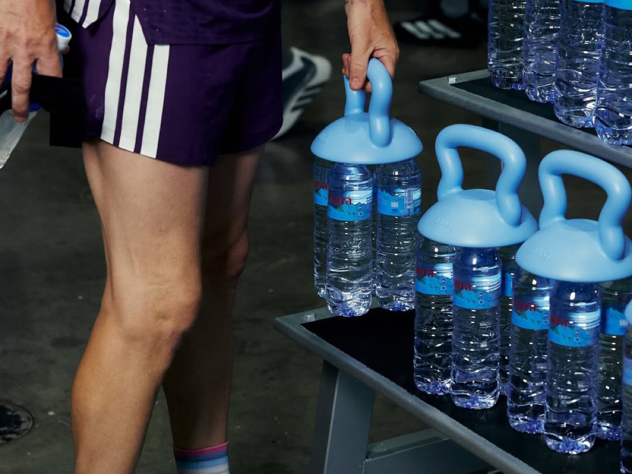
I have made my own version of this exact object during the pandemic, so I have some opinions on how well the real thing pulls it off. The horn spacing on the handle matches a proper competition kettlebell almost to the millimeter, wide enough for a two handed swing without your knuckles clipping the bottle caps. That is the detail that separates a design object from a novelty prop. A lot of branded merch gets the silhouette right and ignores the ergonomics entirely, and you end up with something that photographs well and hurts your wrist on rep three.

Two 1.5 liter bottles of water land you at 3 kilograms on the nose, and the handle stamps that number right into the plastic like it wants to be taken seriously as an actual training tool. Most branded merch settles for looking the part. This one does the arithmetic and shows its work, which is a small thing but it’s the kind of small thing that tells you someone cared past the pitch deck.


Purra is Singha’s mineral water brand, sourced from nearly 1,000 feet underground in Sing Buri, and the kind of company that already runs annual designer bottle collaborations, so a marketing play like this isn’t a stretch for them creatively. HYROX is arguably the best possible stage for it, since the format runs on eight fixed equipment stations and the kettlebell is one of them, so a water brand showing up with literal kettlebell bottles is closer to a punchline than a pitch.


Whether this thing gets mass produced or stays a one-off activation prop is unclear, and honestly that’s fine. Not every good idea needs a retail SKU to justify existing. Sometimes the point is just proving the trick works, and this one does. I won’t be surprised if we start seeing 3D builds on online platforms for people to print on their own!
The post This Clip On Handle Turns Any Water Bottle Pack Into A Kettlebell first appeared on Yanko Design.

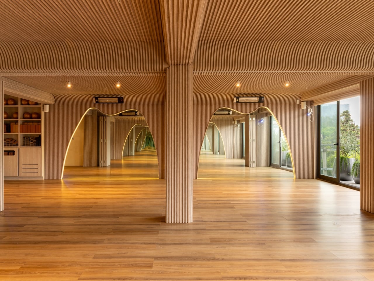
Mexico City doesn’t ease you into anything. It greets you loud, full, and relentless, a metropolis of over 20 million people spread across nearly 2,000 neighborhoods. So when a studio in the upscale Las Lomas neighborhood sets out to create a space for stillness, the design question isn’t just aesthetic. It’s almost philosophical: how do you convince a body that’s been absorbing the city’s noise to finally let go?
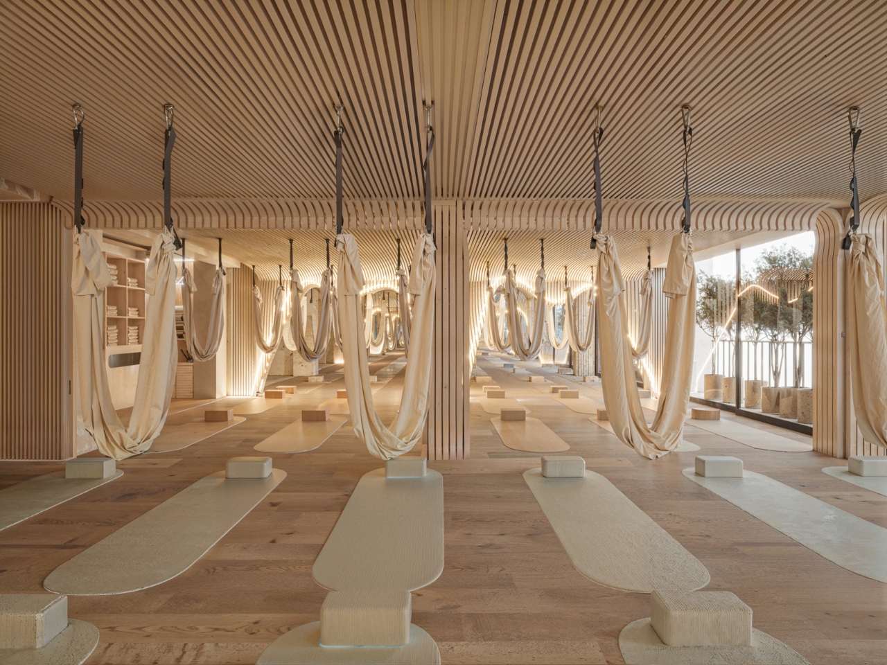
Talo Atelier’s answer is Align Studio, a 2,150-square-foot Pilates and yoga sanctuary, and the first thing you notice is that the architecture refuses to let a single surface go unaddressed. Light-oak tambour paneling covers every wall and then keeps going, curving continuously onto the ceiling without interruption. No hard corner, no visual break, no moment where one surface hands off to the next. The effect is subtle but immediate: the geometry of the room stops registering as a box and starts reading as something closer to a shell. Your shoulders drop before you’ve even unrolled a mat.
Designer: Talo Atelier
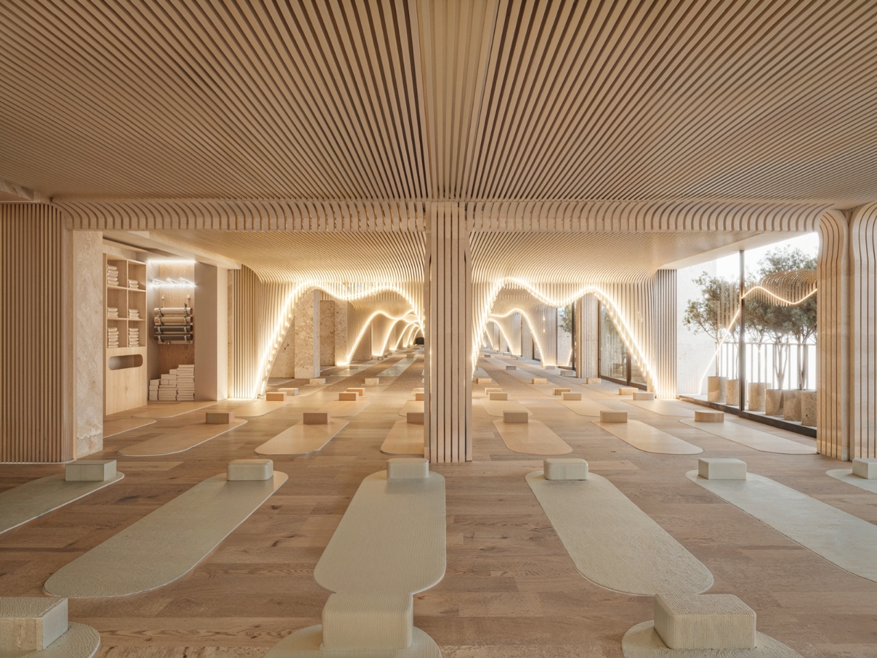
The arched openings cut into those tambour walls are where the design earns its most dramatic moment. They’re not standard doorways. They’re wave-shaped, organic cutouts that swell and dip like a drawn breath, each one edged in a thin line of warm LED light that traces the curve. Stand in the main studio and look toward the mirrors, and the arches repeat into the reflection endlessly, a tunnel of warm wood and glowing curves that makes the 2,150 square feet feel simultaneously intimate and infinite. It’s a genuinely beautiful spatial trick, and it works because the proportions are exactly right.
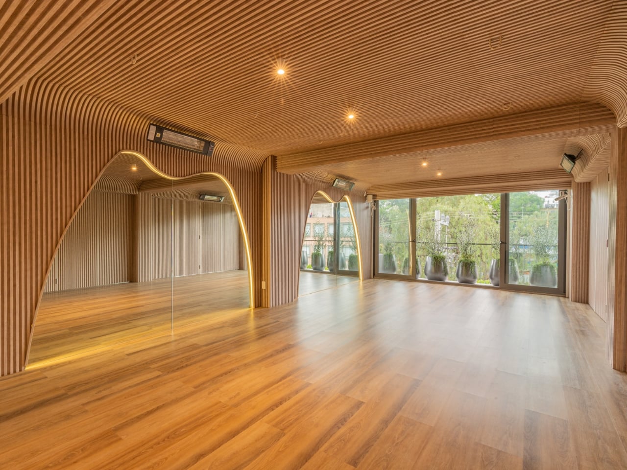
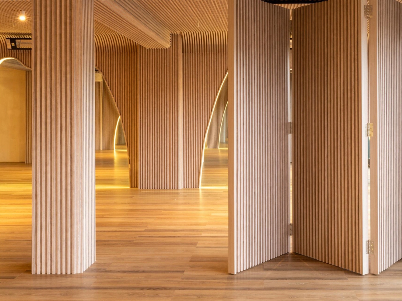
The flexibility of the space is built directly into those tambour walls, which also function as folding partitions. Panels pivot to open the studios into a single connected floor, or close to create separate rooms for different class formats. That kind of multifunctional thinking usually involves some visual compromise, a seam that doesn’t quite disappear, a hinge that catches the eye. Here it’s seamless. The studio can reconfigure itself and you’d never know it wasn’t always that way.
Inside the practice spaces, the material palette stays rigorously honest. Oak floors, natural linen aerial hammocks, yoga mats with soft rounded edges in undyed tones, small concrete props. Nothing competes with anything else. The hammocks, in particular, read almost like an extension of the architecture rather than equipment added after the fact, their organic drape rhyming with the curved arches above them. It’s the kind of considered detail that’s easy to miss but hard to unfeel.
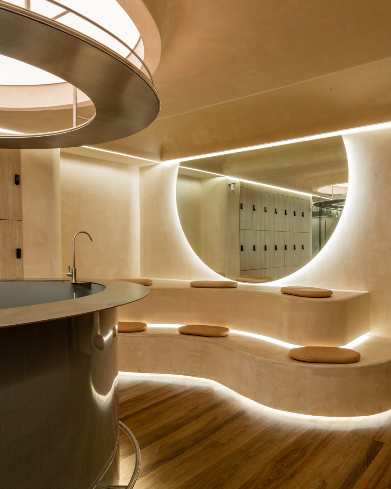
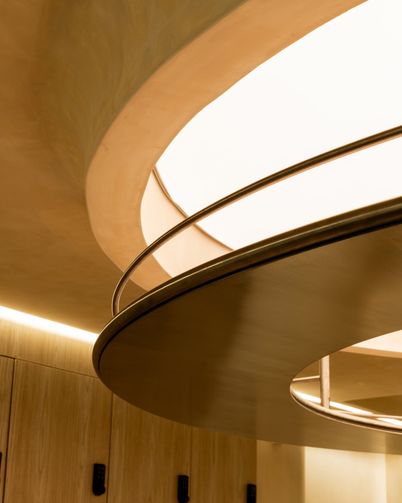
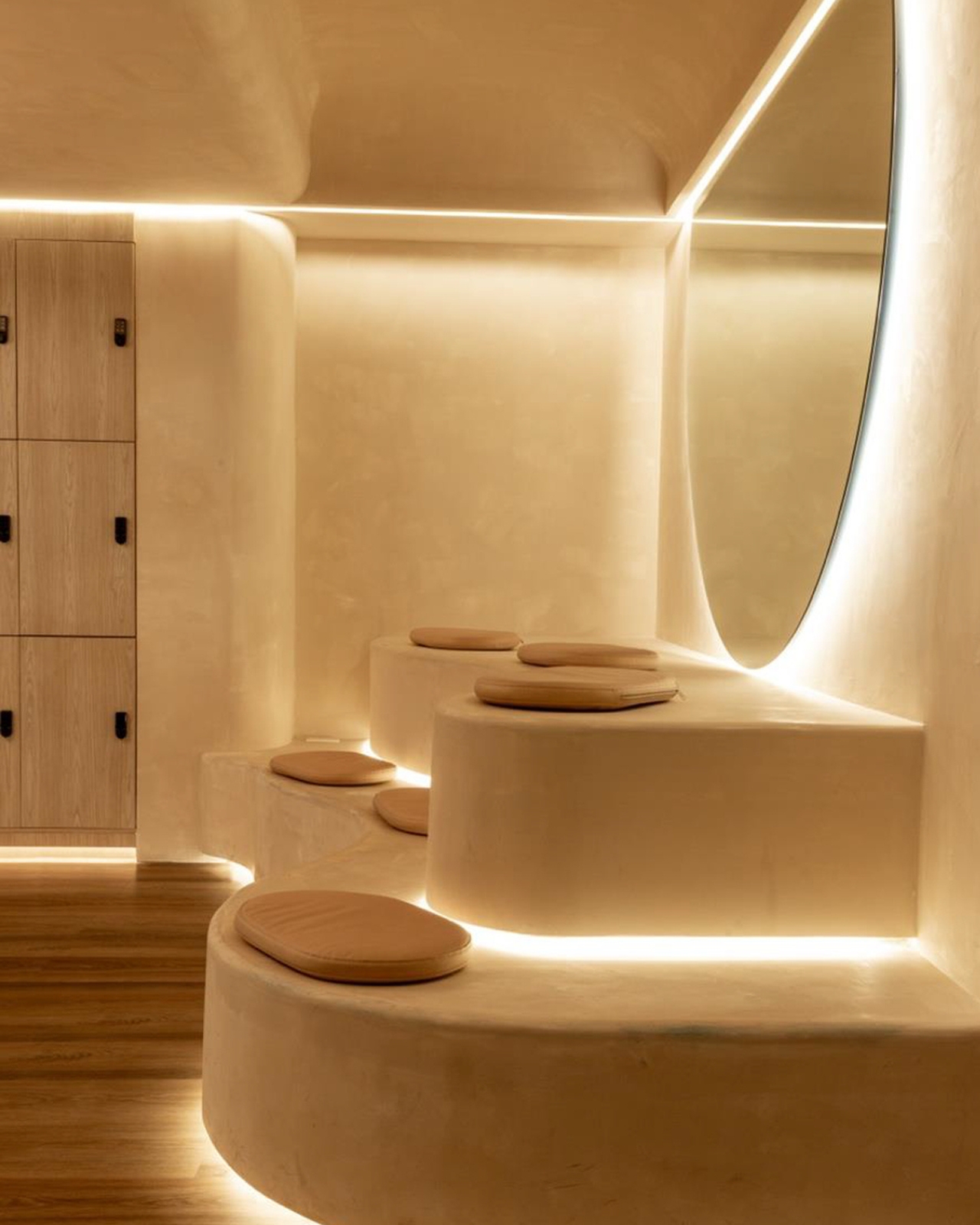
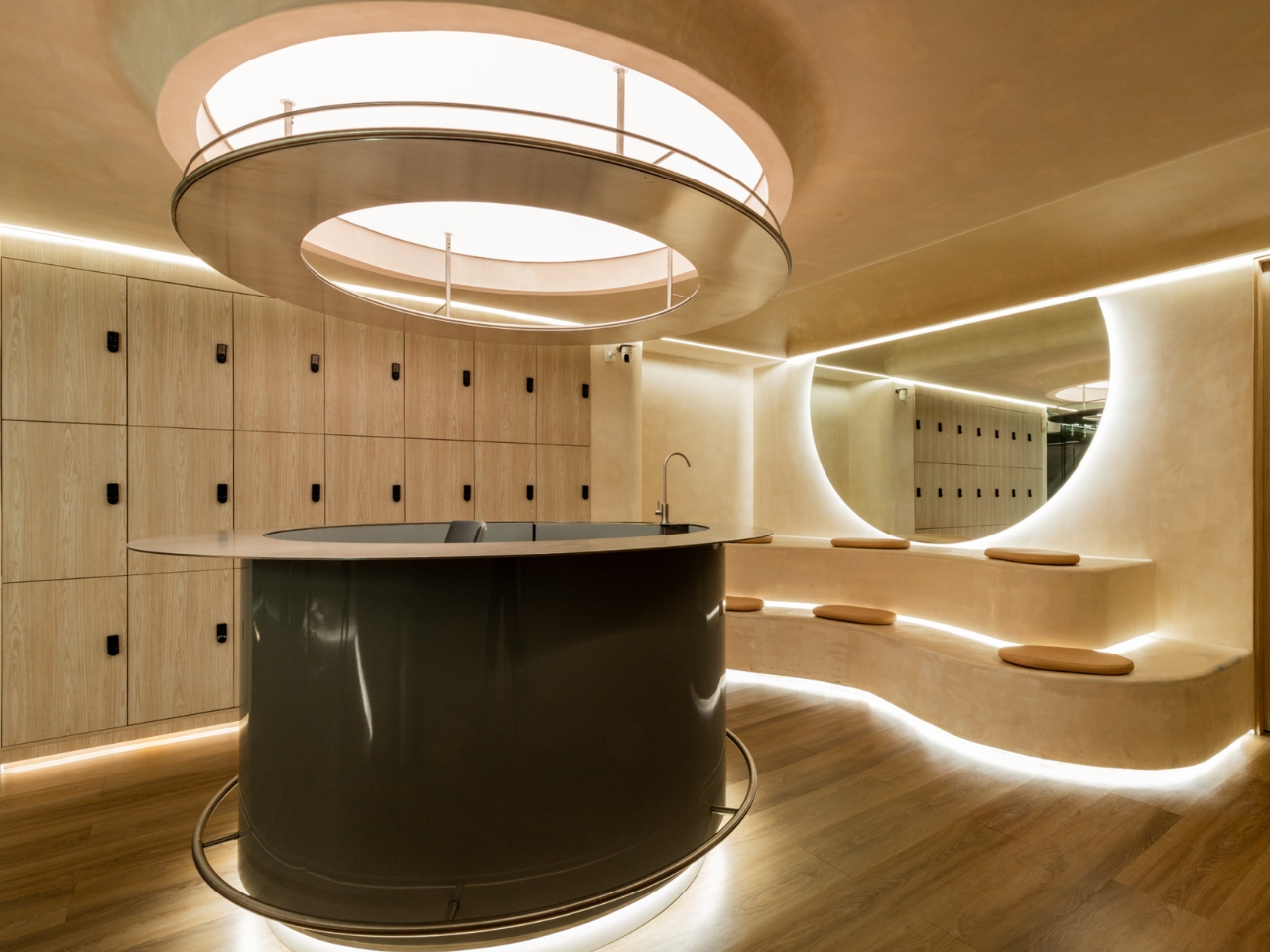
The changing rooms are where the design shifts register, and I find them just as interesting as the studios. A large circular skylight punches through the ceiling in concentric oval rings, dropping natural light onto a deep olive-green cylindrical reception desk below. It’s the one moment of tonal contrast in the entire space, and it lands perfectly because of how restrained everything around it is. The curved plaster bench running along one wall, backlit at the base, is topped with small round cushions in warm clay. A circular mirror with a soft halo of light hangs opposite. The whole room feels like a decompression chamber between the city and the mat, which is exactly the point.
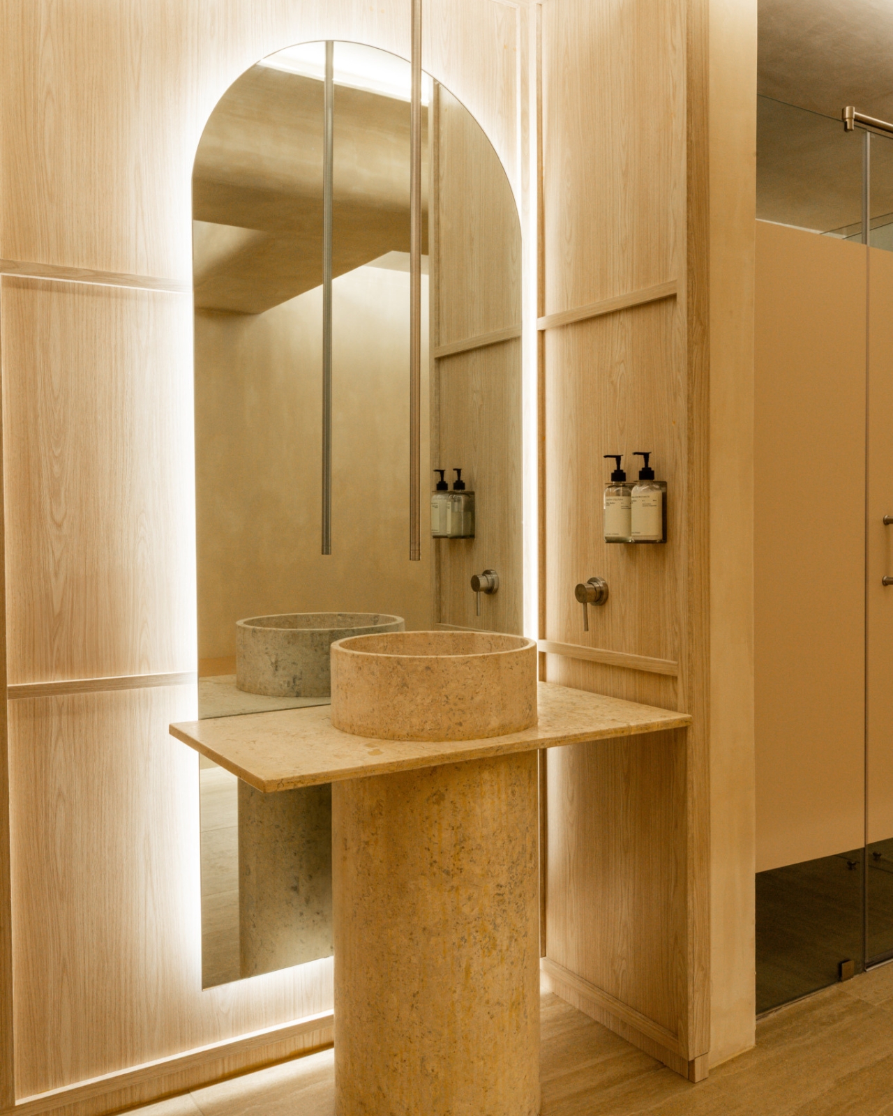
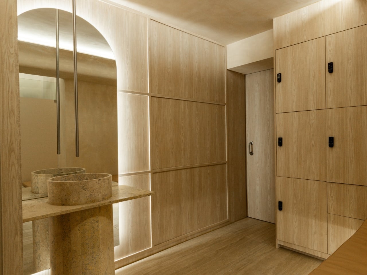
Even the bathrooms carry the idea through. Travertine vessel sinks sit atop stone pedestals, framed by arched backlit mirrors set into the oak paneling. The warm, sandy tones of the stone pull from the same palette as the studios, so the experience of the building never fractures. You don’t feel like you’ve stepped into a different space when you walk from the practice room to the locker area to the bathroom. The material story is continuous, and that continuity is doing a lot of the emotional work.
Wellness spaces are tricky to get right. Most err on either end of a familiar spectrum: clinical whiteness that feels more like a hospital than a sanctuary, or over-styled maximalism that prioritizes the Instagram moment over actual calm. Align Studio sits confidently outside both. Talo Atelier built a space where the architecture does the transitional work so the person inside it doesn’t have to. At 2,150 square feet, that’s no small thing.
The post Inside Mexico City’s Most Quietly Radical Wellness Studio first appeared on Yanko Design.


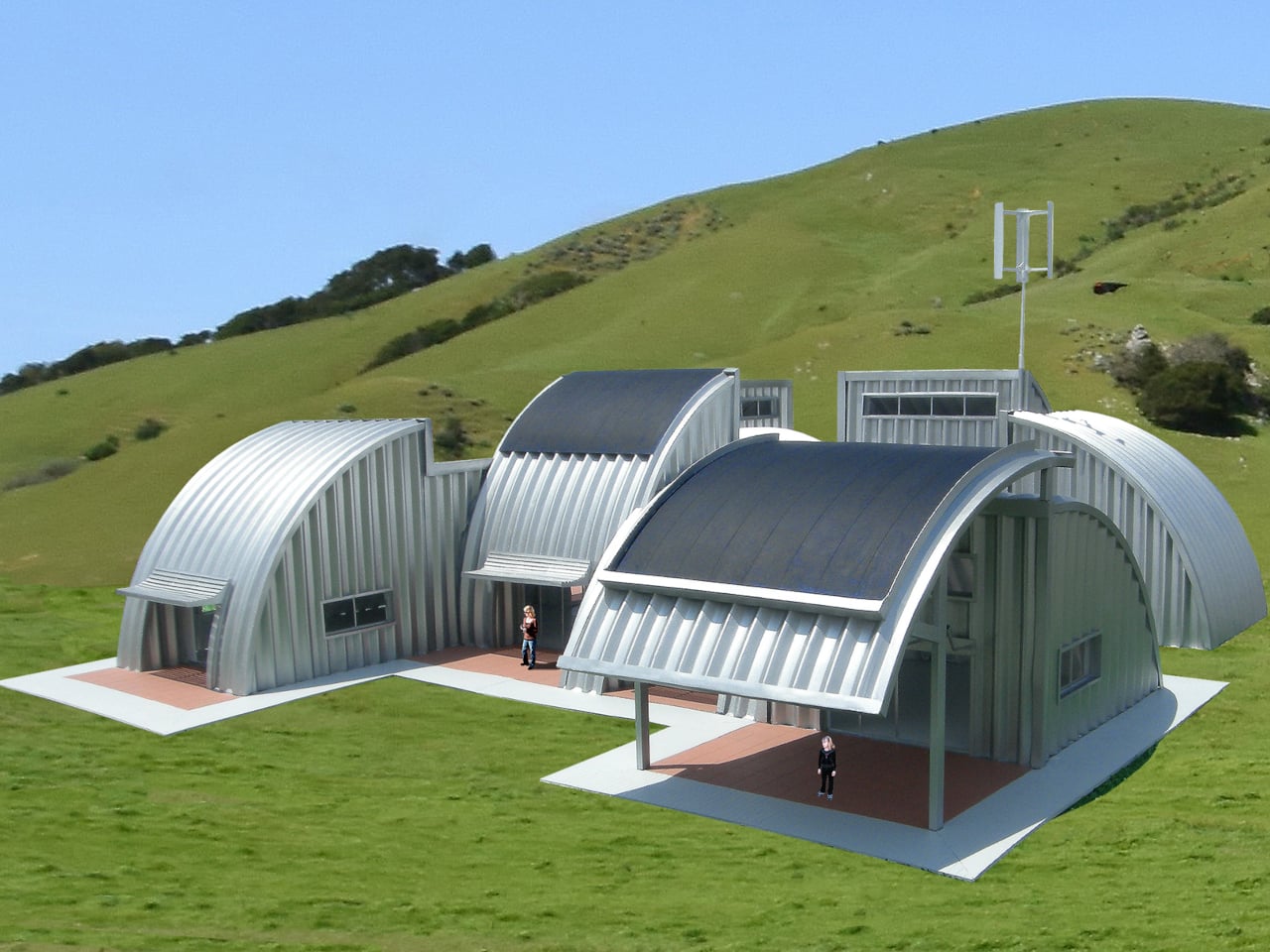
The search for affordable, sustainable housing tends to produce two kinds of proposals. The first involves entirely new materials, new manufacturing processes, and supply chains that don’t yet exist at useful scale. The second starts with what’s already available and asks a different question of it. The latter approach is rarer, and when it works, it tends to produce something far more buildable than even the most elegant custom solution.
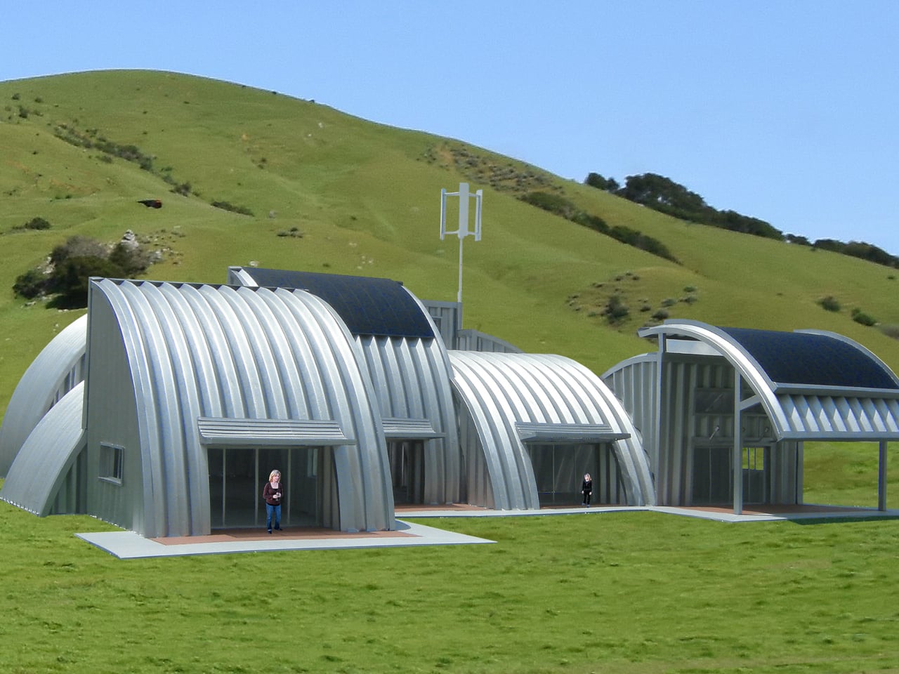
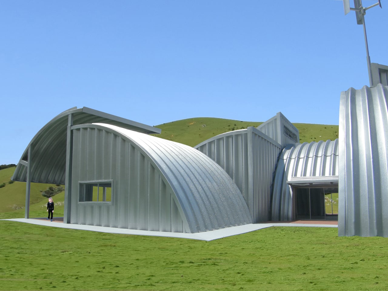
The Homestead House belongs to that second category. This conceptual design takes the prefabricated steel arch building system ordinarily found on agricultural properties, and reorganizes it into a modular, off-grid residential structure. The system is already commercially available, already engineered for structural strength, and already fire-resistant. The concept doesn’t ask for anything to be invented; it simply redirects what already exists.
Designer: Michael Jantzen
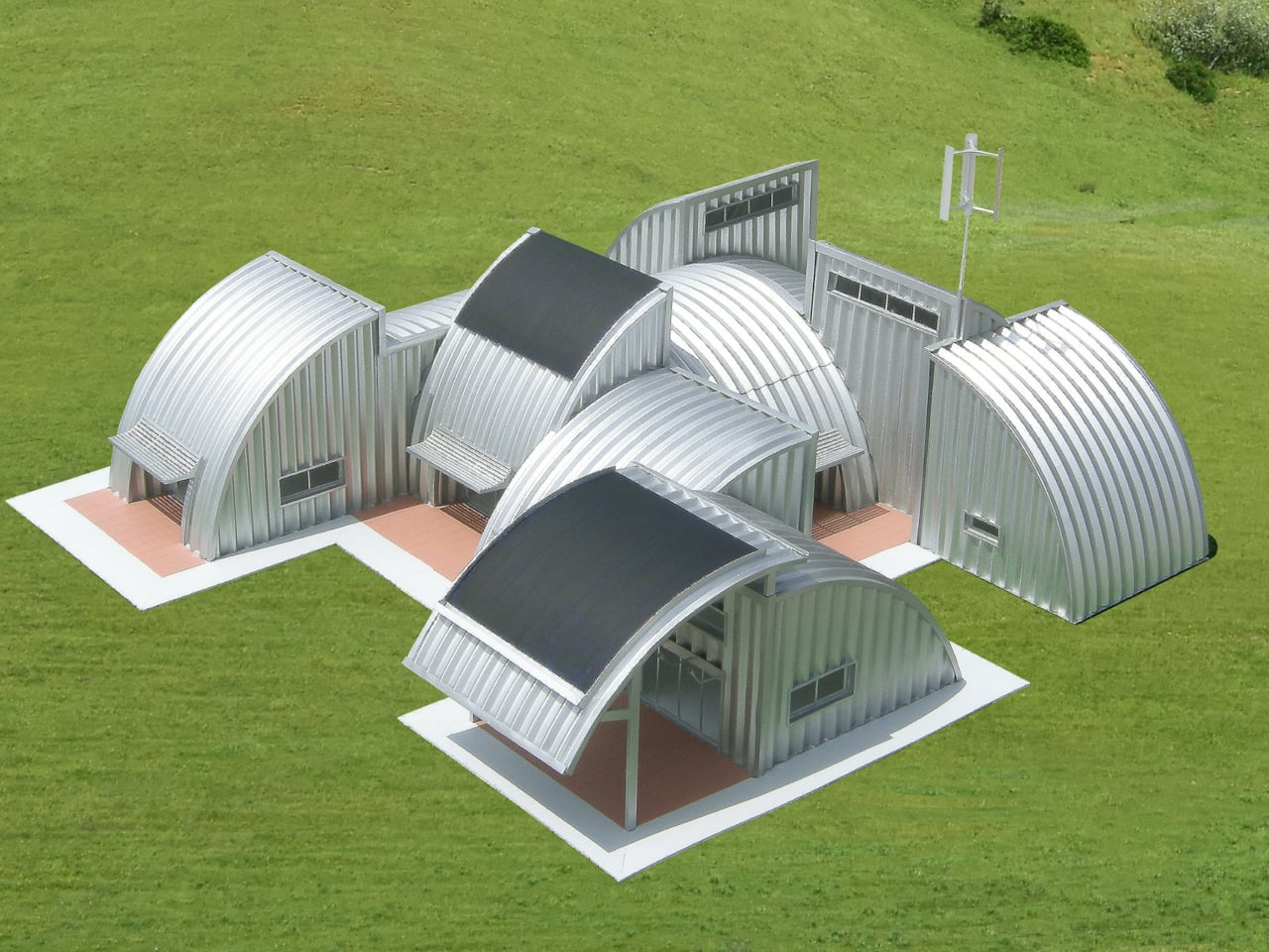
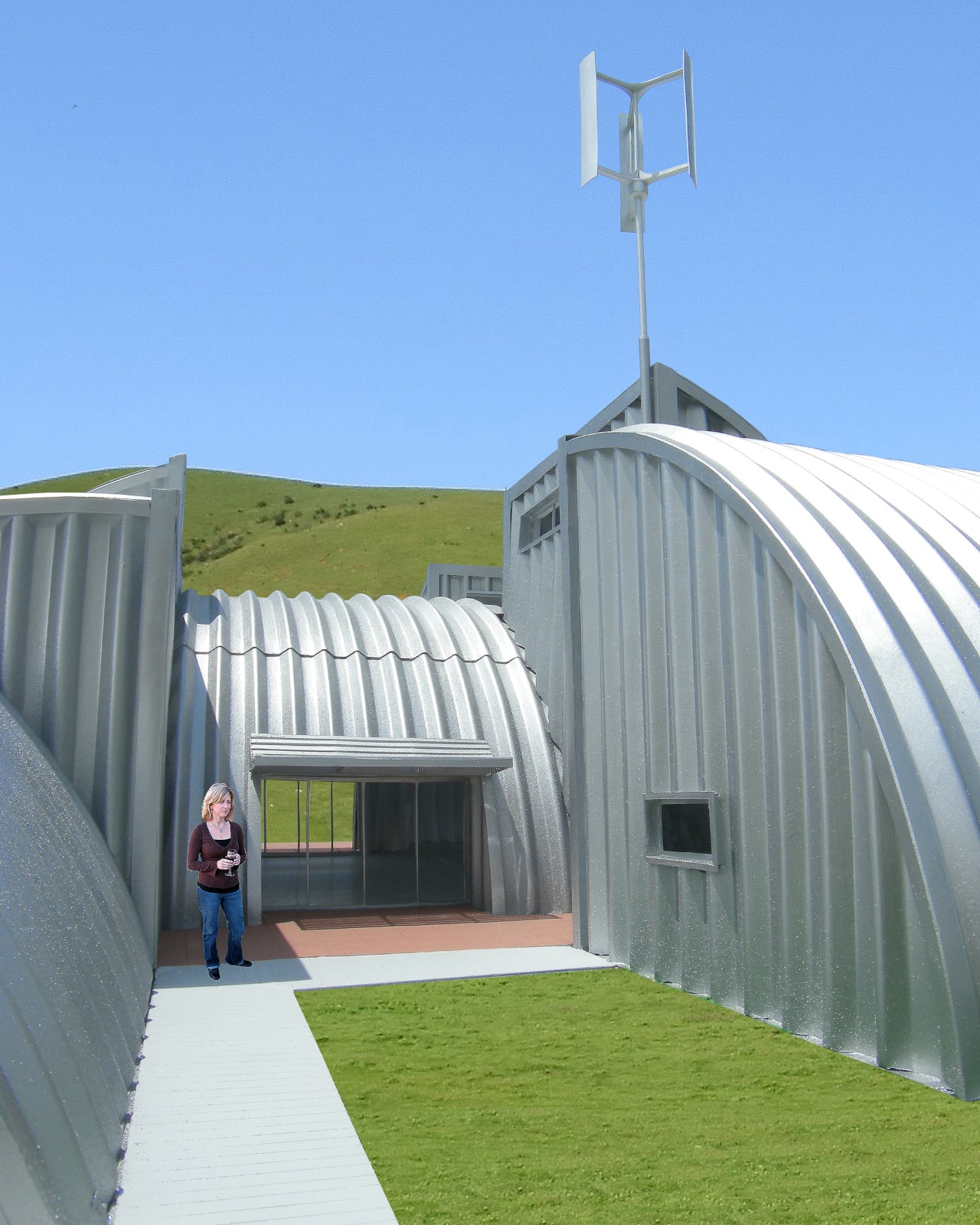
The arches and straight panels are formed from thin, recyclable steel sheets that bolt together with simple tools, requiring no skilled labor and no secondary support structure. The resulting shell is extremely strong despite using very little material. More usefully, it comes apart the same way it goes together. A structure built this way can be fully disassembled and reassembled somewhere else for an entirely different purpose, which makes the material itself far more durable in the life-of-a-building sense than most conventional construction.
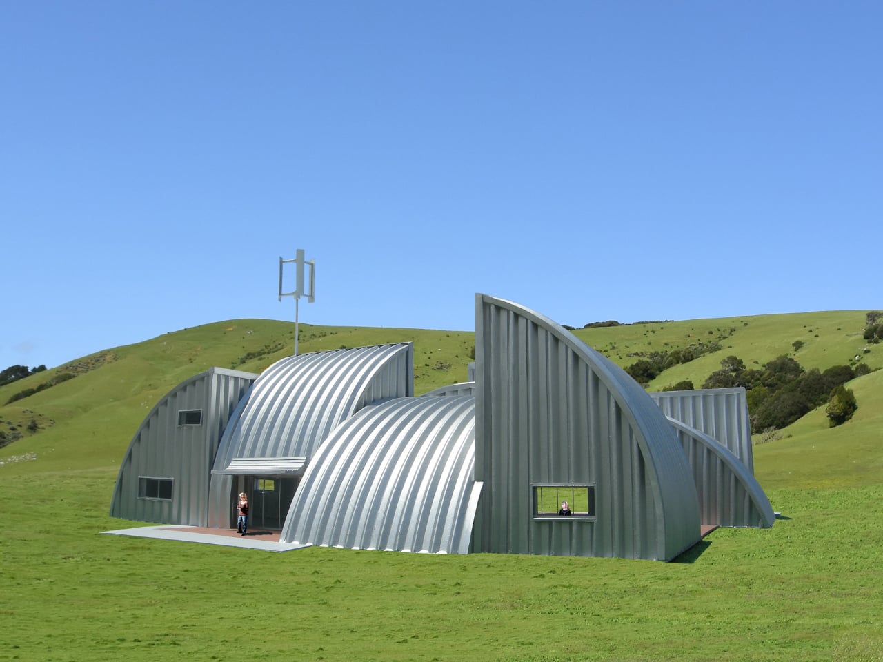
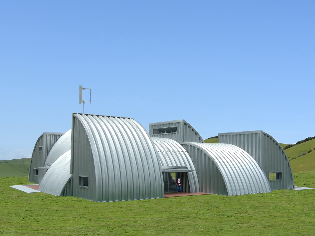
Modularity is central to how the Homestead House adapts over time. The individual arched modules cluster in different configurations to suit different needs, and the footprint isn’t fixed at the time of construction. A household that grows doesn’t have to move; rooms can be added one module or even one arch at a time. The structure can equally be reduced if circumstances change, making it genuinely responsive to the way life actually shifts over the years.
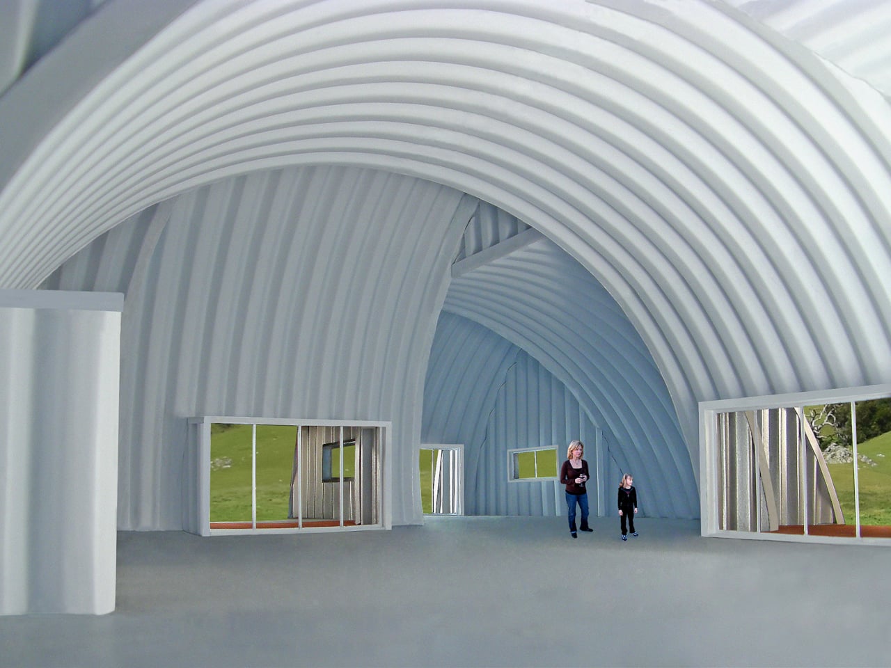
Insulating the steel shell involves erecting a second, lighter-gauge structure inside the outer one and blowing cellulose insulation, made from recycled newspaper, between the two layers to whatever depth the climate demands. The thickness is entirely adjustable, which means the same structural system works for a mild coastal site and an exposed inland location where winters are more severe. It’s a low-tech solution that works with the building’s logic rather than against it.
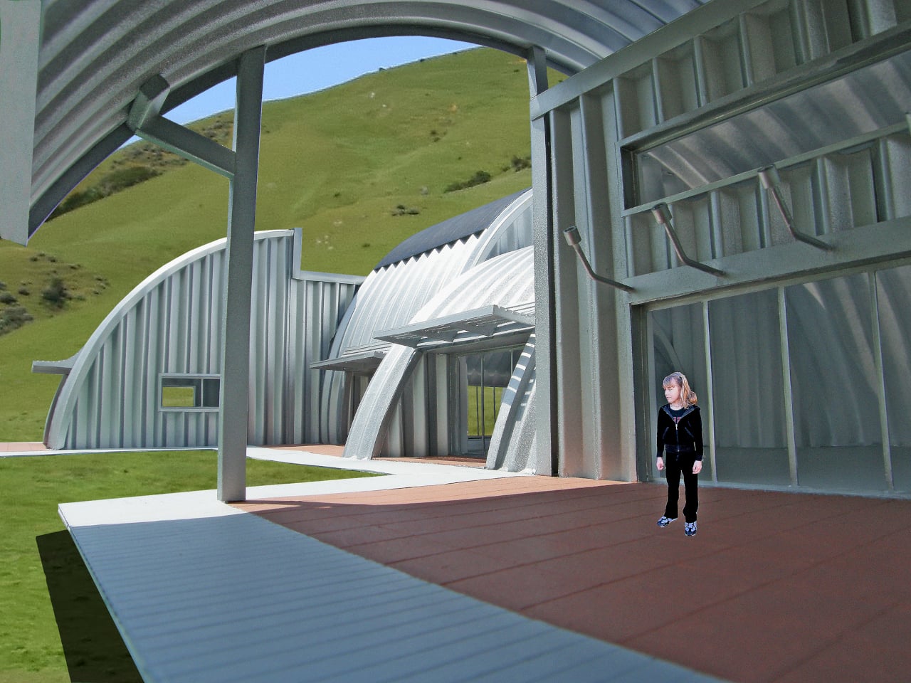
The concept is designed to operate completely off the standard utility grid. Electricity comes from photovoltaic cells and a vertical-axis wind turbine. Passive solar design handles heating and cooling, domestic water is solar-heated, and rainwater collected from the roof arches feeds above- or below-ground storage. More advanced options, including solar- and wind-powered hydrogen production, are also part of the broader energy framework the concept envisions.
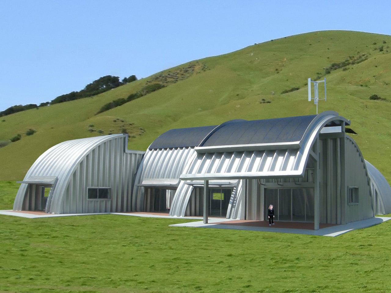
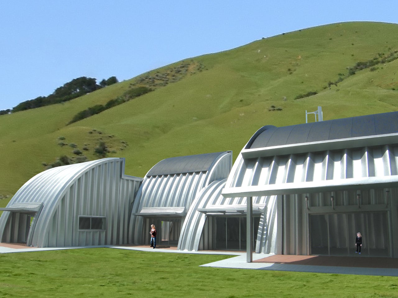
What holds the design together philosophically is the idea that a new manufacturing facility isn’t required to produce affordable, sustainable housing. The arch building system already exists, already has infrastructure behind it, and already serves an industry that needs strong, low-cost structures assembled quickly. Borrowing that system for a different purpose avoids the resource cost of starting from scratch, which is one of the less-discussed obstacles in alternative construction.
The Homestead House raises practical questions that most sustainable housing proposals never have to answer. It doesn’t ask for new materials, new tools, or new supply chains. It asks instead what happens when you apply a different kind of imagination to what’s already sitting in a farm equipment catalog.
The post Someone Designed an Off-Grid Modular Home From a Farm Equipment Catalog first appeared on Yanko Design.