AULUMU Expands Samsung Fold 8 Accessory Line
AULUMU introduces its ultra-slim aramid fiber case for Samsung Fold 8 and Fold 8 Ultra with premium materials, magnetic support, and cooling technology.

The Samsung Galaxy Z Fold 8 represents a significant step forward in foldable smartphone technology, offering a refined design and enhanced functionality. With its wider cover display and landscape-oriented inner screen, it caters to both productivity and entertainment needs. However, understanding the available discounts, trade-in offers, and customization options is crucial to making an informed […]
The post What to Know Before Buying the Samsung Galaxy Z Fold 8 appeared first on Geeky Gadgets.
The future keeps finding new ways to make water feel precious. Some of it goes to lawns, some to laundry, some to the AI data center working overtime to generate recipes for vegan, gluten-free, keto brownies made without chocolate. So when a shirt shows up claiming 30 days of wear without a wash cycle, the concept lands with a mix of curiosity, skepticism, and a weird amount of relevance. That curiosity is reasonable. The skepticism, depending on how you feel about a decade of textile engineering research, may not hold up.
HercLéon offers the HercShirt V5.0 in three versions. The Budget model stays smell-free for 3+ days, the Standard version stretches that to 14+ days, and the Max model is the one built for 30+ days between washes. The difference comes down to how many odor-fighting elements are woven into the fabric. Budget uses one, Standard uses four, and Max uses all seven. According to the brand, that seven element system includes copper, silver, zinc, gold, volcanic ash, and two proprietary ingredients, all embedded directly into the shirt rather than applied as a surface treatment.
Designer: Wen Muenyi / HercLéon America
Click Here to Buy Now: $39 $49 (20% off). Hurry, only 21/100 left! Raised over $246,000.
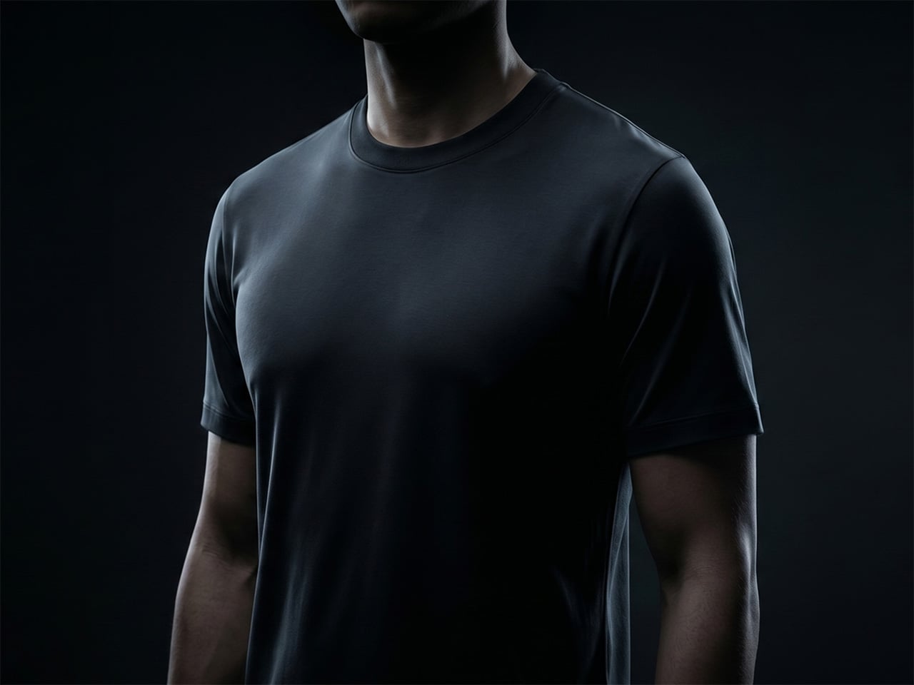
Copper is the shirt’s frontline defense, targeting the bacteria responsible for the locker-room smell that ruins gym gear by day two, with natural antimicrobial properties that have been recognized for centuries and are currently deployed on hospital surfaces to reduce microbial load. Silver handles a second class of odor-causing microbes, and its use in medical dressings and performance textiles makes its role here read as engineering rather than marketing. Zinc addresses the sharper, sulfurous compounds produced during heavy sweating, and because it is gentle on skin and widely used in skincare products, it adds another layer of protection without compromising comfort. Gold supports the performance of the other active elements, helping the smell-control system work together more effectively, and because it is highly stable, it helps the fabric maintain consistent performance across many washes. Volcanic ash absorbs moisture and environmental odors before they settle into the fabric, functioning as a porous internal sponge that traps what it catches until washing can clear it out. The final two elements stay off the published ingredient list, a reasonable call from a brand that has spent years narrowing this formula down to something that works.

Pack one shirt for a week-long trip instead of seven, and you begin to understand what HercLéon is selling, because the whole point of a trip is to have less on your plate, not to check a bag, wait at baggage claim, fight for trunk space, or spend vacation time looking for laundry. The V5.0 is built to hold up from a morning gym session to dinner at eight without a change, covering the kind of full-day travel that defeats most performance shirts by mid-afternoon. Shirt odor itself comes from seven distinct chemical processes, not one, which is why most fabrics may accidentally help with one or two types while the HercShirt was built to address all seven. Off-grid users, healthcare workers, and new parents with no bandwidth for weekly wash cycles all figure into HercLéon’s intended audience, and none of those use cases require a stretch of imagination to map. The shirt’s proposition is fundamentally about reclaiming time and space, two things that clothing has rarely been designed to address this deliberately.

Most performance shirts earn their odor-control claims through surface treatments, finishes applied at production that fade with every wash, while the HercShirt’s active elements are woven in and designed to perform like new for years. That construction choice means the odor control does not follow the same fade curve that makes most performance gear feel ordinary by its tenth wash. Most tees die in the wash rather than from wear, and because the HercShirt is washed far less frequently, it skips the cycle that degrades fabric, with one shirt reportedly outliving roughly seven ordinary tees. The brand estimates the V5.0 goes through around five times fewer wash cycles than a conventional tee across its lifespan, which reframes the premium price as a replacement-cycle calculation rather than a fashion expense. Less washing also means less water, less detergent, and less energy use, which quietly loops back to the resource anxiety the shirt was practically designed to exist inside.

The HercShirt V5.0 is available in three configurations, letting you choose how long you want to go between washes. The entry-level Budget model costs $39 and uses one active element for over three days of wear. For $69, the Standard version steps up to four elements, pushing the wear time to two weeks or more. The top-tier Max model, priced at $79, includes all seven elements and delivers on the full 30-day promise. All versions are designed to be smell-free from the start, with the only difference being their endurance.

Sizing is offered from Small to 4XL for men and Small to 2XL for women. The shirt is currently available in a matte, deep ink black, though a charcoal gray color has also been unlocked, with navy blue, maroon, and forest green planned as future options. For those looking for a more personalized fit, a set of three custom-tailored shirts is available for $399. HercLéon ships internationally to the US, Europe, Japan, and India, among other regions. While delivery for the V5.0 is estimated for November 2026, earlier generations of the HercShirt are currently available for purchase on the company’s website.
Click Here to Buy Now: $39 $49 (20% off). Hurry, only 21/100 left! Raised over $246,000.
The post This $79 “No-Laundry” Shirt stays fresh for 30 days without washing, thanks to its engineered fabric first appeared on Yanko Design.
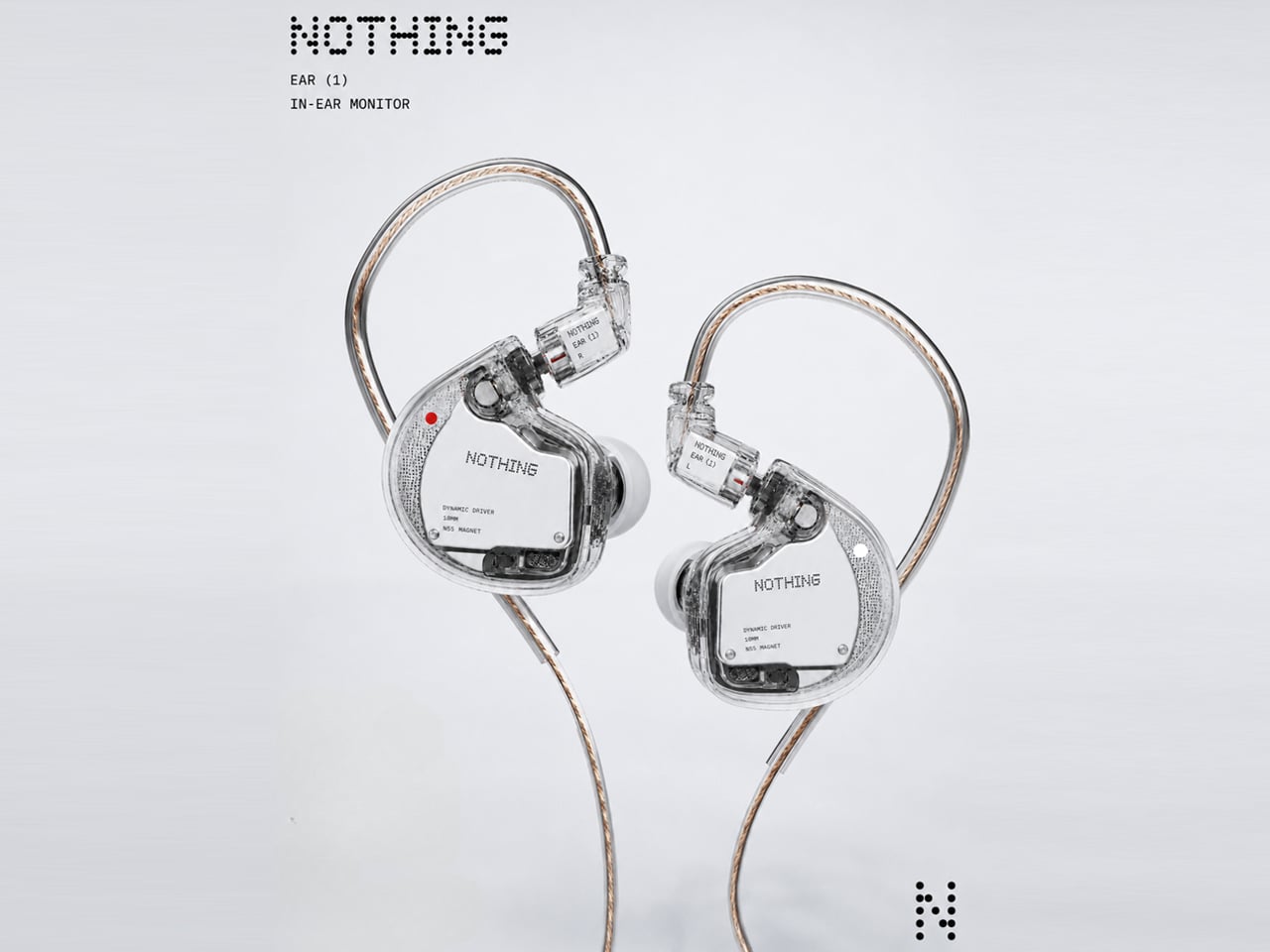
Music lovers are gradually developing a deeper appreciation for in-ear monitors (IEMs) as they explore the world of personal audio. The Chi-Fi market, in particular, has grown into a crowded space filled with brands such as Moondrop, Truthear, Simgot, Kiwi Ears, ThieAudio, and FiiO. At the same time, established names including Sennheiser, Final Audio, Campfire Audio, Meze Audio, and Audio-Technica continue to attract listeners looking for detailed and analytical sound.
One thing I’ve noticed while following the IEM space is how often these products embrace transparent or semi-transparent shell designs. There is something visually appealing about being able to see the components inside, while the distinctive form immediately sets IEMs apart from the everyday wireless earbuds most people use. This design language also happens to align closely with Nothing’s visual identity, making the idea of a Nothing-branded IEM feel like a natural extension of the company’s existing audio lineup.
Designer: Nothing Community
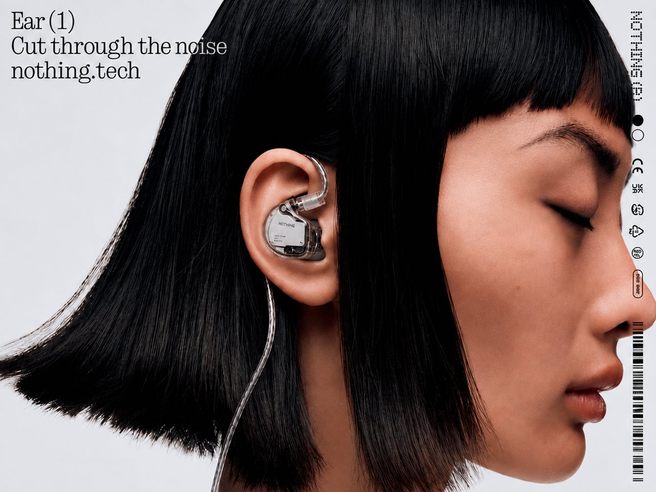
The concept in question comes from the Nothing Community, where a member shared renders imagining what an IEM designed by Nothing could look like. The idea explores a familiar IEM silhouette, but reinterprets it through the brand’s signature transparent aesthetic and restrained use of color. It is not a radical departure from the designs already seen across the IEM market, but the Nothing treatment gives the concept a distinct character that would likely appeal to fans of the brand.
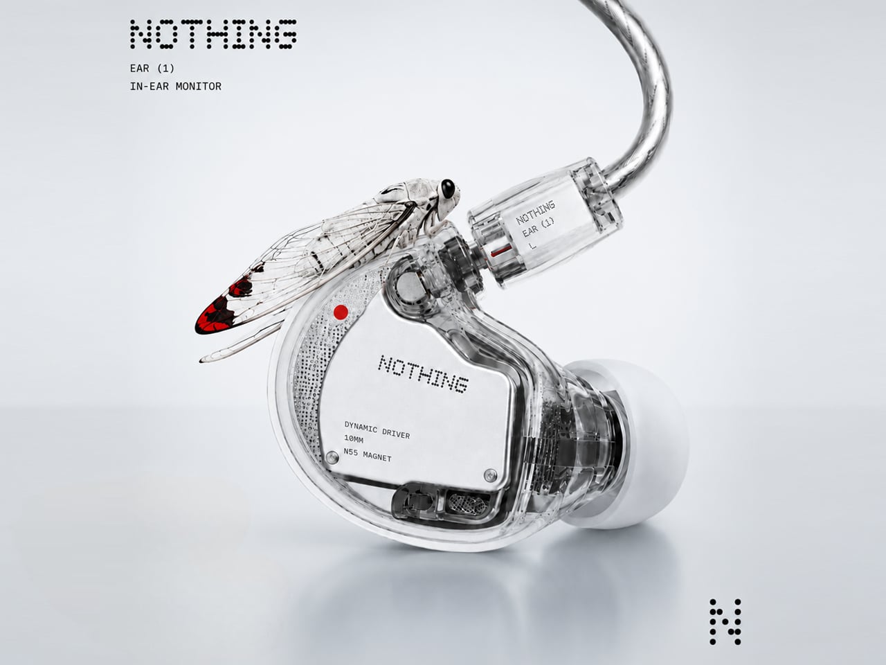
The renders bring to mind the visual language of Nothing’s earlier audio products, particularly the transparent approach associated with the Ear (1). Instead of hiding the internal components behind an opaque shell, the concept makes them part of the visual experience. A transparent finish could also work particularly well with an IEM, where the intricate internal arrangement is often part of what makes these products interesting to audio enthusiasts.
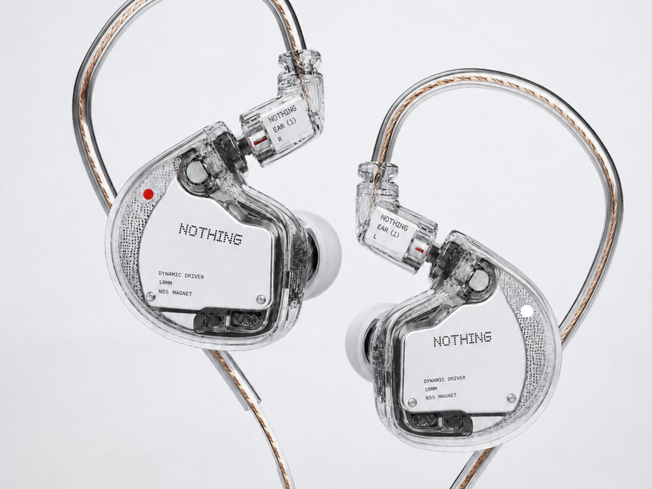
The community response suggests that the concept has some room for further exploration. One commenter specifically expressed interest in seeing a black and transparent version, while another asked what specifications people would want from such a product. Those reactions highlight an interesting possibility: a Nothing IEM could potentially bridge the gap between the company’s design-focused consumer electronics and the increasingly popular world of enthusiast audio.
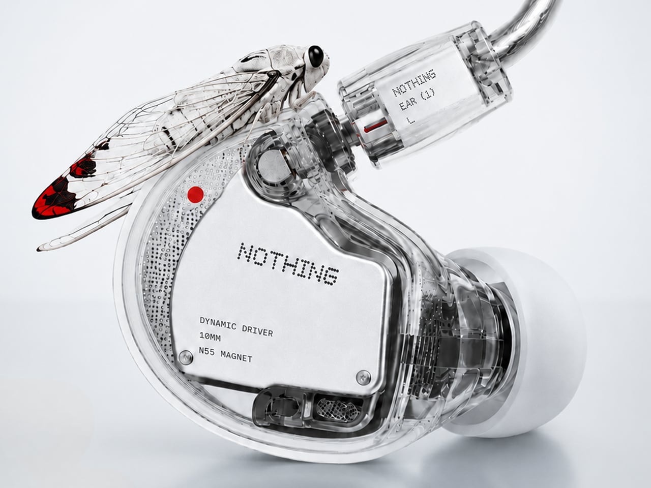
For now, this remains a community-created concept rather than an official Nothing product. Still, it is an intriguing exercise in imagining how the company’s transparent design philosophy could translate into a more enthusiast-oriented audio product. With Nothing already established in the personal audio space, the idea of a dedicated wired IEM does not feel entirely out of place.
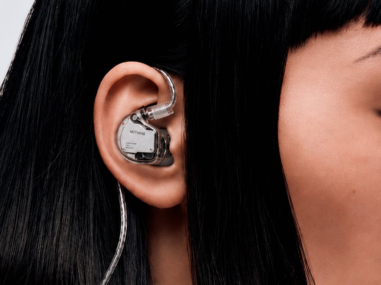
The post What If Nothing Made an IEM for Audiophiles? This Community Concept Imagines One first appeared on Yanko Design.


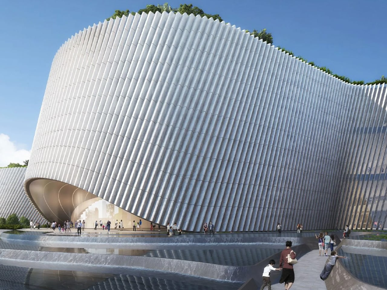
It took six years from competition win to opening day, but the Shenzhen Natural History Museum was always going to be worth the wait. Designed by the 3XN, B+H Architects, and Zhubo Design consortium, the 105,300-square-metre building opened to the public on July 28, 2026, beside Yanzi Lake in the city’s Pingshan District. It is the largest natural history museum in South China and one of the most architecturally ambitious public buildings completed anywhere in the world this year.
The design has a name, “Delta,” and it earns it. Rather than arriving as a monument on a plinth, the building rises from its river-delta setting as a continuous terrain of sloping roofs, planted terraces, and granite-clad surfaces that seem to have been worn into shape by water and time. The façade reads like a cliff face, its carved openings hinting at the galleries within. From a distance, the silhouette folds into the surrounding hills as naturally as it folds into the brief.
Designer: 3XN, B+H Architects & Zhubo Design


Kim Herforth Nielsen, founder of 3XN, framed the ambition plainly: “Nothing in nature is square. Nature is amorphous, dynamic, and always in formation. From the beginning, the ambition was to create not a building, but a piece of landscape that had always been there.” That idea holds all the way to completion. Internally, five cone-shaped volumes organize the museum’s principal exhibition halls, and moving between them feels less like navigating a floor plan and more like moving through a cave system, with atria, terraces, and framed views appearing and dissolving as you go.
Across eight themed exhibition halls, visitors trace 4.6 billion years of Earth’s history, from the origins of the universe through to the specific ecosystems of southern China. Exhibition designers Atelier Brückner and Museum Studio worked alongside the architects to integrate specimens, large-scale installations, and cinematic media with the curved cone geometries, turning the galleries into environments rather than rooms.


The roof is as considered as anything inside. B+H, who served as lead consultant, executive architect, and landscape architect, designed a walkable park that extends the surrounding ground plane up and over the building, connecting the museum to Yanzi Lake and the region’s wider network of rivers and wetlands. Viewing terraces, planted thematic zones, and gathering spaces make it a civic destination in its own right, one that functions on a Tuesday morning just as well as a Saturday afternoon.
The museum is part of Shenzhen’s “Ten Cultural Facilities of the New Era,” a city-wide infrastructure investment that has quietly been reshaping one of the world’s most dynamic urban environments. The Natural History Museum is the most visually compelling of the lot, and the one most likely to be remembered.

The post This New Museum in Shenzhen Looks Like a Piece of Landscape That Was Always There first appeared on Yanko Design.

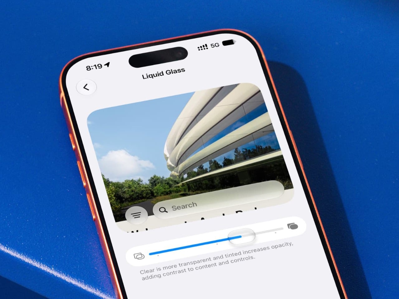
If Liquid Glass is the face of iOS 27, the intensity slider is the part that decides whether that face is wearing reading glasses. Apple never showed it during WWDC 2026, even though it may be the most visually crucial control in the entire redesign. This one setting lets users adjust the strength of the transparency effect system-wide, which means it directly shapes readability, contrast, depth, and the overall vibe of Apple’s biggest interface experiment in years.
That makes its quiet arrival in the public beta feel kind of wild. Apple presented Liquid Glass as a confident design statement, but the slider reveals something more interesting, a design system with a built-in self-correction mechanism. Suddenly the story is not only about what Apple announced on stage. It is about what Apple had to add once the software met real screens, real eyes, and real people who do not want their Control Center looking like a soap bubble.
Designer: Apple

Six weeks separate the WWDC 2026 keynote from iOS 27 Public Beta 2, and in software terms, that is enough time for a lot to shift. Public Beta 1 landed July 13 with the slider and a Siri AI rollout to general users. Beta 2 followed on July 22 with speed improvements, a Screen Time overhaul, and more. Together they paint a picture of iOS 27 that looks noticeably different from what Apple demoed at Apple Park in June.
App icons have been getting the same quiet treatment. Beta builds are shipping with re-layered icons that carry more visual depth than what showed up on stage, tweaking how the foreground and background elements of each icon interact with the glass effect behind them. It reads as subtle in a screenshot and feels significant once you are actually navigating the phone. The whole system carries a different visual weight than the keynote suggested.
Apple built Siri AI on Google’s Gemini, and that partnership is the backbone of the biggest headline in iOS 27. The revamped assistant can hold context across apps, answer open-ended questions, and dig into your emails, messages, and photos to surface relevant information, putting it in genuine competition with ChatGPT and other conversational AI tools for the first time. What the keynote mostly skipped was how that Gemini handoff surfaces visually inside Siri’s UI, what the latency actually feels like, and how different it is from the ChatGPT integration Apple shipped in iOS 18.
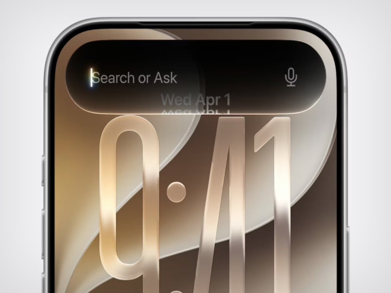
Thirty percent faster app launches, 80% faster AirDrop, 70% faster Photos capture loading. Apple is putting some big performance numbers on the table, benchmarked against an iPhone 11 Pro Max running iOS 26.4.2, which is more specific than the usual “up to” framing with nothing behind it. Whether those gains hold on newer hardware in real daily use is still something beta testers are working out.
macOS 27 Golden Gate is running the same play in parallel, bringing Liquid Glass refinements to the desktop and putting Siri AI inside Spotlight. It also becomes the first macOS to fully drop Intel support and retire Rosetta 2, which is its own headline for a different day. For anyone designing or building for Apple platforms, September is the target, when the stable release lands alongside the iPhone 18 lineup. The betas are the closest thing to a final spec sheet right now, which makes that quiet little slider a pretty loud signal about where Liquid Glass is actually headed.
The post WWDC 2026, Six Weeks Later: What Actually Shipped first appeared on Yanko Design.

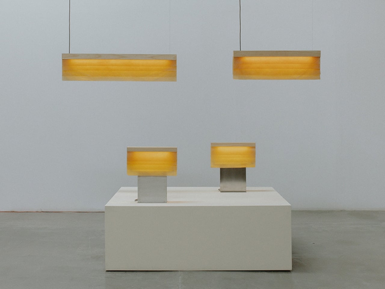
If you’ve never thought about bacteria as a design material before, Cenit might be the thing that changes that for you. The latest lighting collection from the collaboration between biotechnology company Polybion and Mexico-based design studio Natural Urbano is doing something genuinely different from what most lighting brands are doing right now, and it’s worth paying attention to.
To understand Cenit, you have to know a little about what came before it. Lapso was their first major collaboration: a sculptural pendant lamp handcrafted from five sheets of cultivated bacterial cellulose, a translucent, flexible material called Celium that Polybion grows using bacteria. Not synthetically manufactured. Not extracted from a forest. Grown, from bacteria, using agricultural waste. Lapso was already a bold statement when it debuted at the London Design Festival in 2025. Each lamp came with a certificate of authenticity and a two-month production lead time, because you can’t rush biology.
Designers: Polybion x Natural Urbano
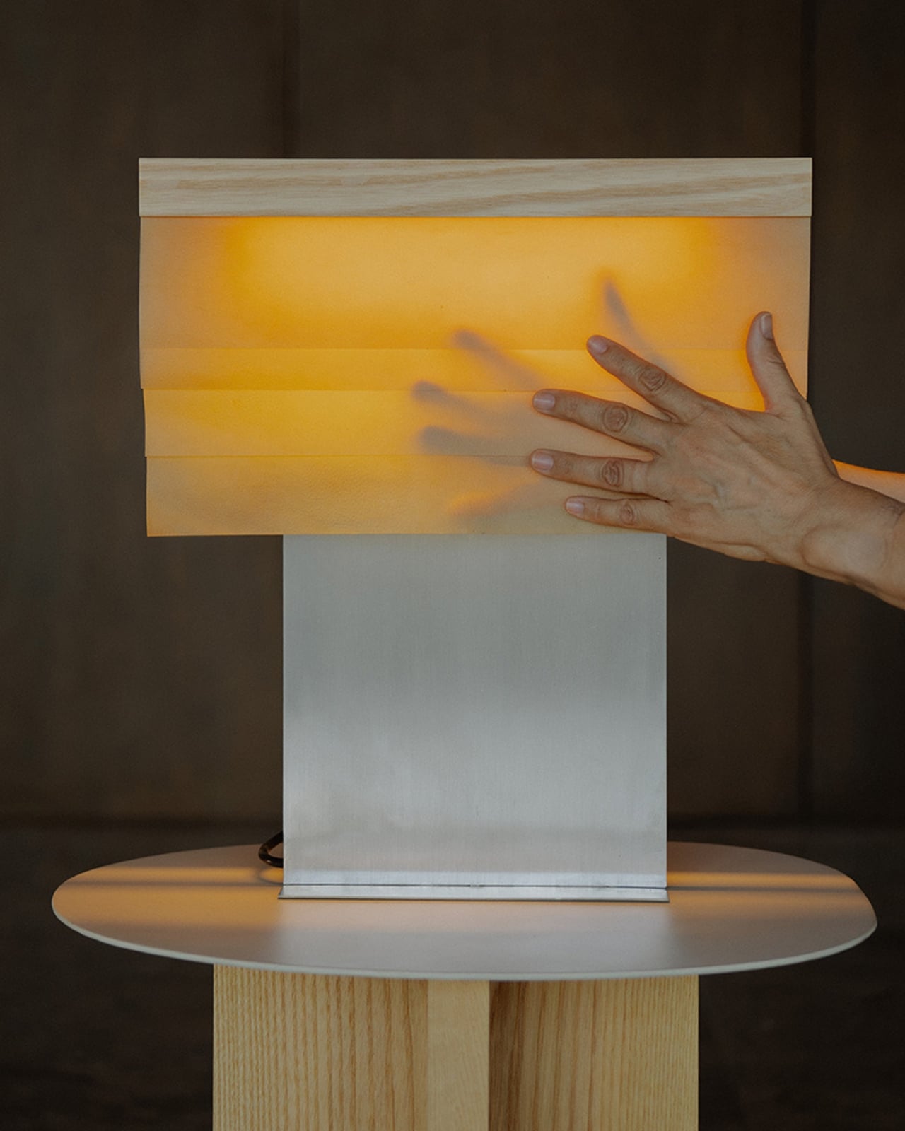
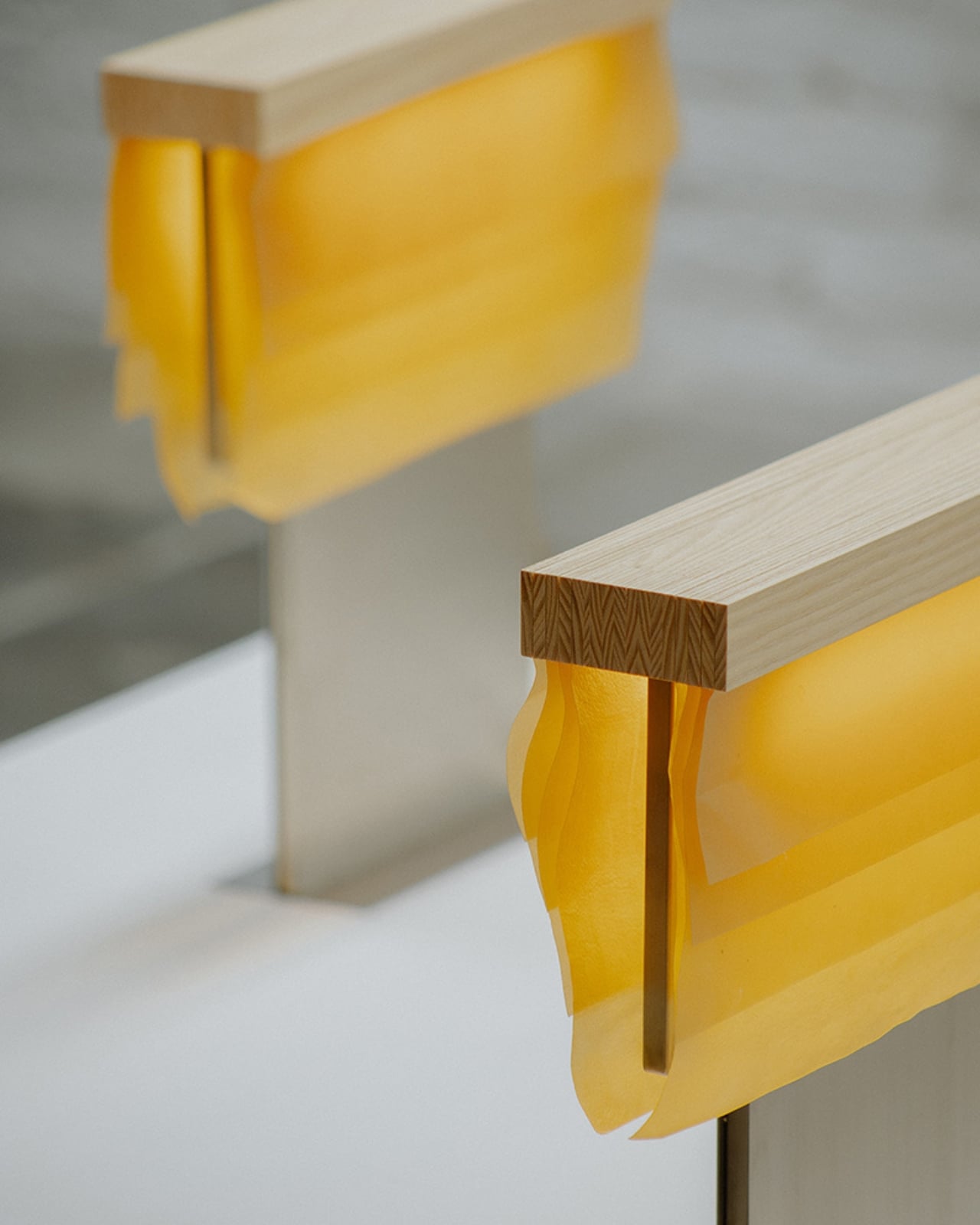
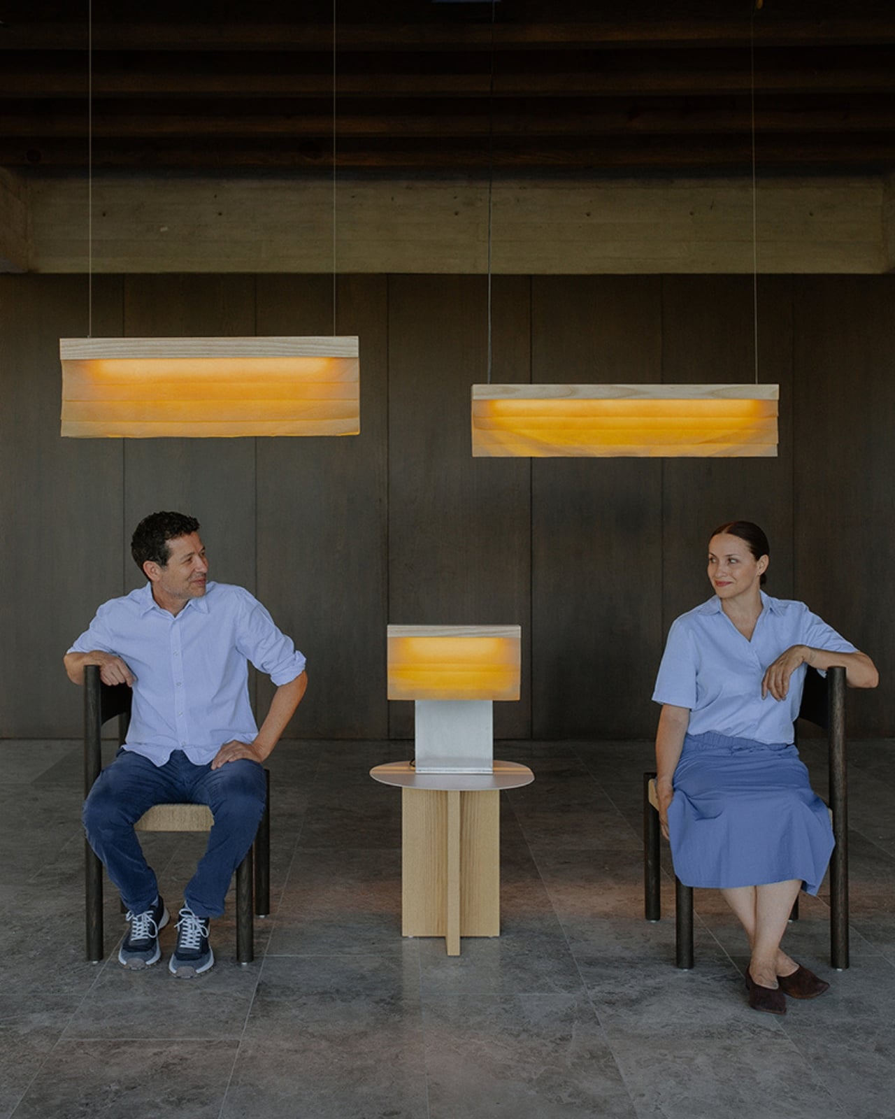
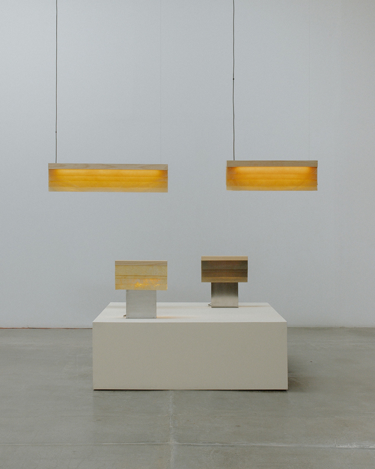
Cenit follows that same philosophy but takes it further. For the first time, the duo has combined Celium with natural ash wood and stainless steel, bringing the material into a more structured, versatile family of lighting objects. The collection comes in both pendant and table formats, which is a smart move that Lapso didn’t make. Lapso was undeniably sculptural, a piece you’d plan a room around. Cenit feels like it wants to live with you in your home across different spaces and moods, without demanding all the attention in the room.
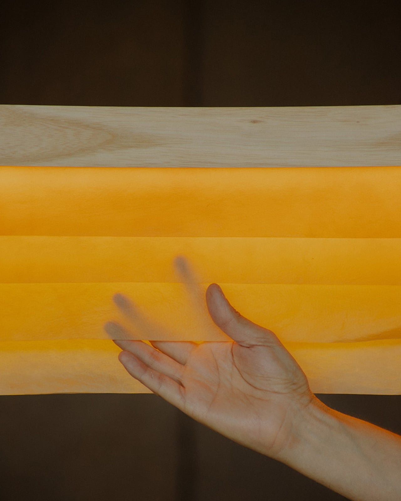
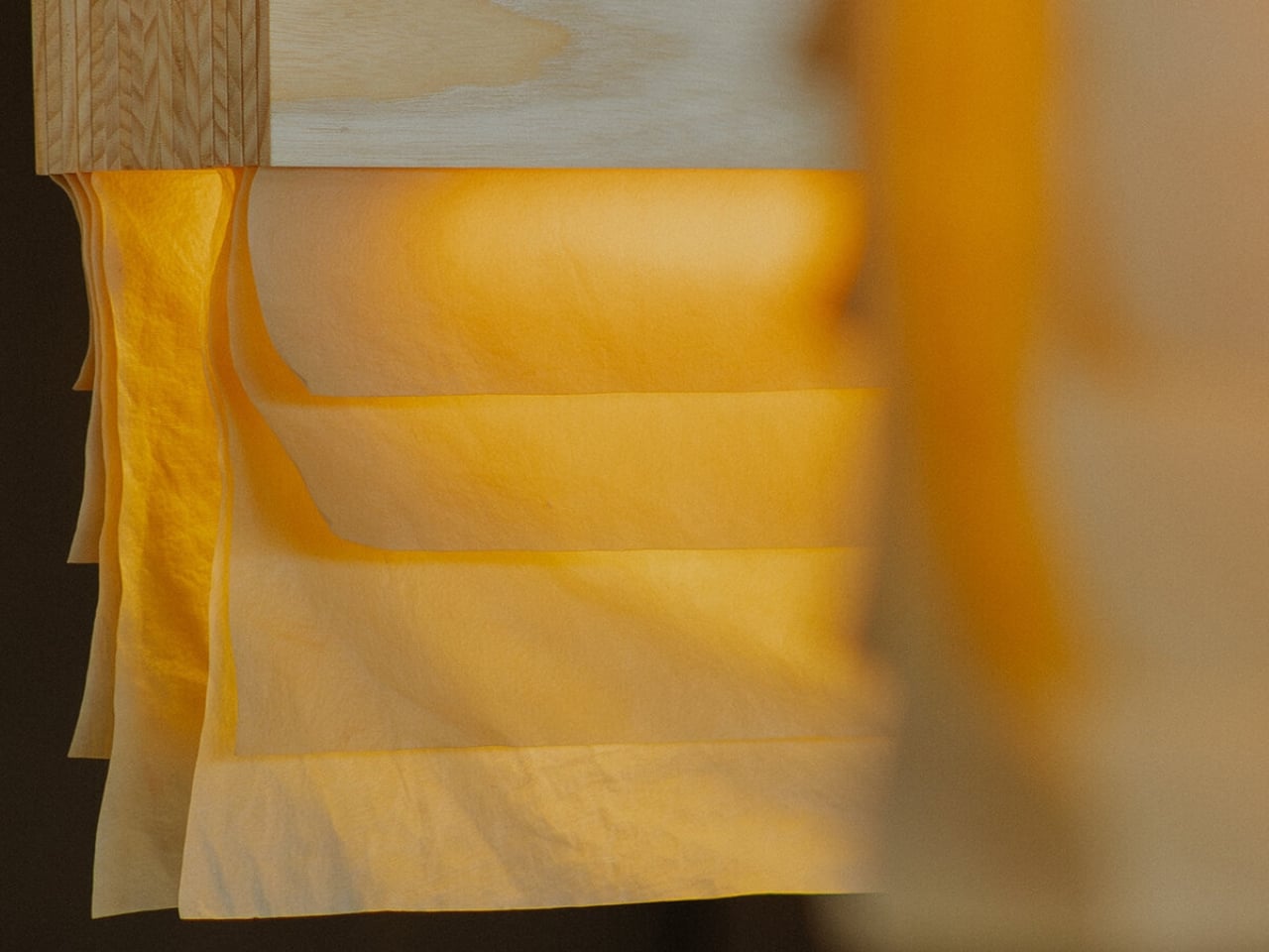
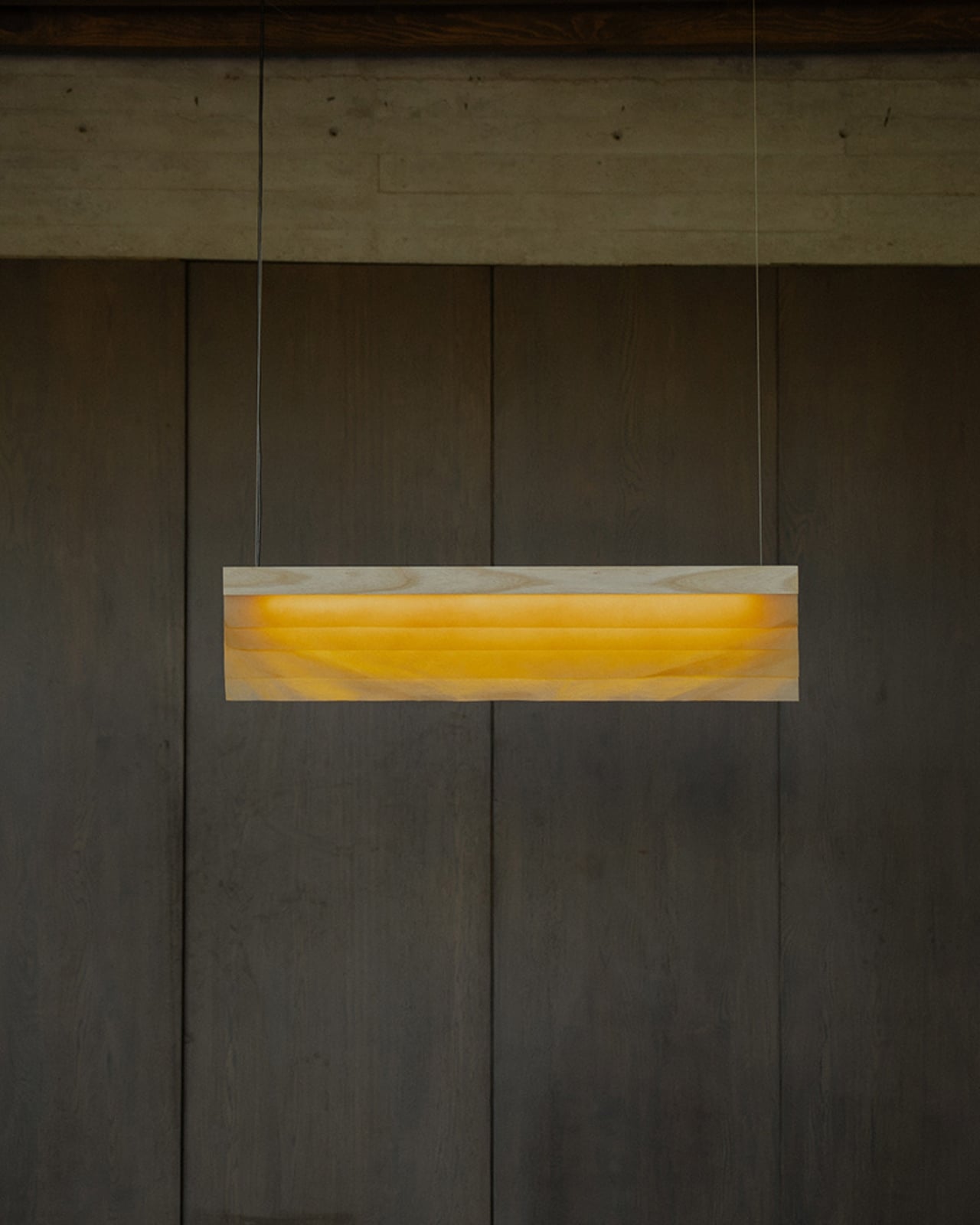
The specific variant used here is Celium Manto, layered in a way that calls to mind the gradients of a horizon. The collection’s name, Cenit, means zenith in Spanish, the highest point in the sky, and the visual reference lands. When light passes through the layered cellulose, it does something that no synthetic material can fully replicate. It glows with an organic warmth, the kind you usually only get from paper or natural stone, but lighter and more alive-feeling.
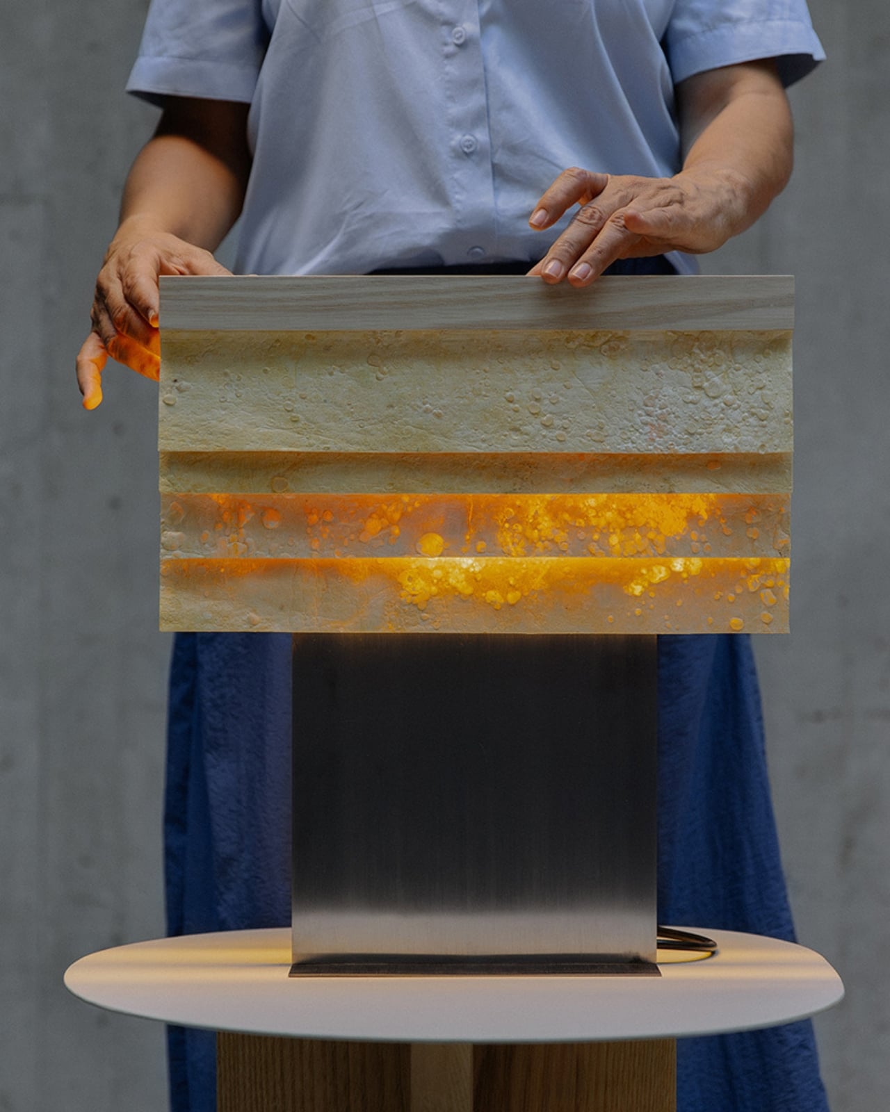
A lot of sustainable design still requires us to compromise somewhere. Rougher edges. Less refined finishes. A feeling that the eco-credentials come at the cost of beauty. Cenit does not ask that of you. The combination of ash and Celium Manto is genuinely beautiful, in a way that’s considered and deliberate rather than rustic or raw. The stainless steel elements give it structure without weight. The ash brings warmth without heaviness. And the cellulose does what it always does in Polybion’s hands: it makes you stop and look.
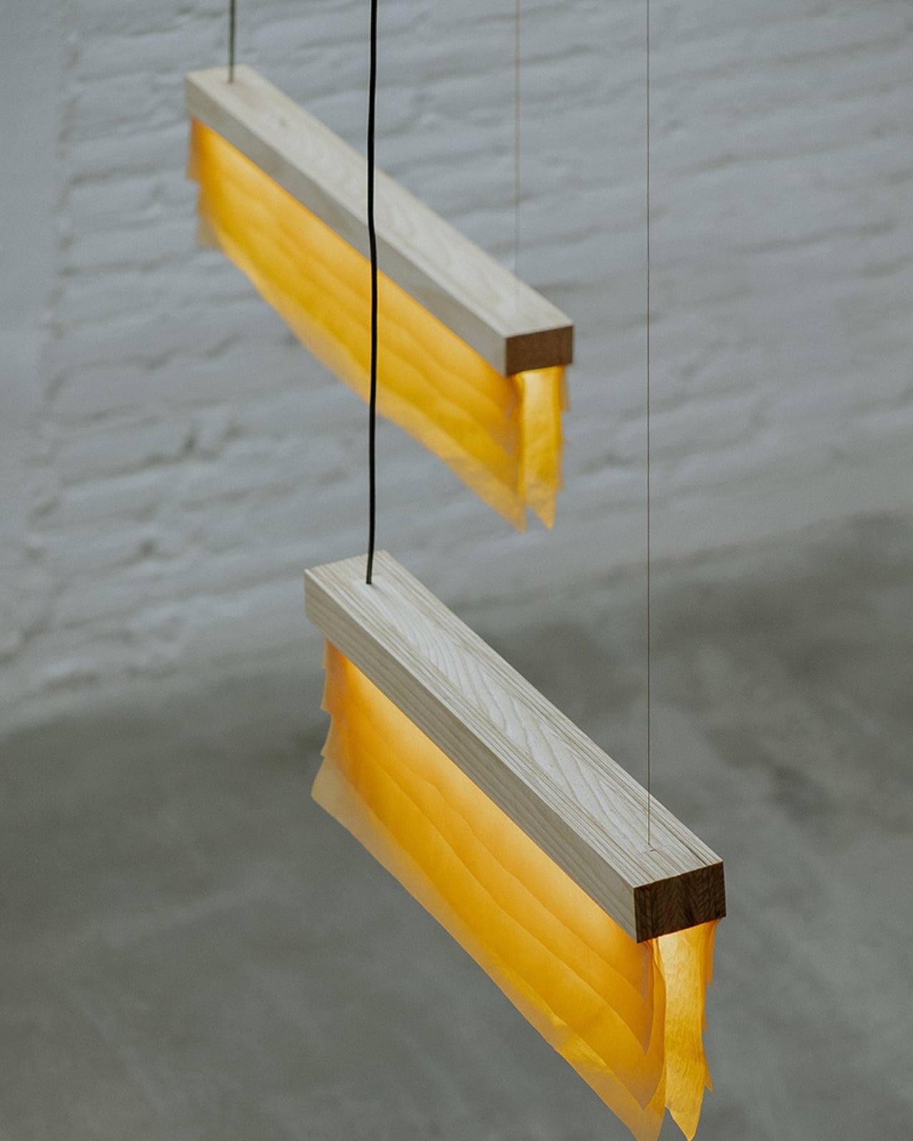
Beyond the material, what makes this collaboration particularly interesting is where it’s coming from. Natural Urbano, founded by Sebastián Beltrán and Lorena Márquez, and Polybion, based in Guanajuato, are actively positioning Mexico as a place where design and biotechnology meet at a serious, global level. That’s not a small thing. The conversation about sustainable and biofabricated design has historically centered on European studios and Scandinavian minimalism. Watching a Mexican collaboration work at this level, with this degree of craft and material innovation, feels significant.
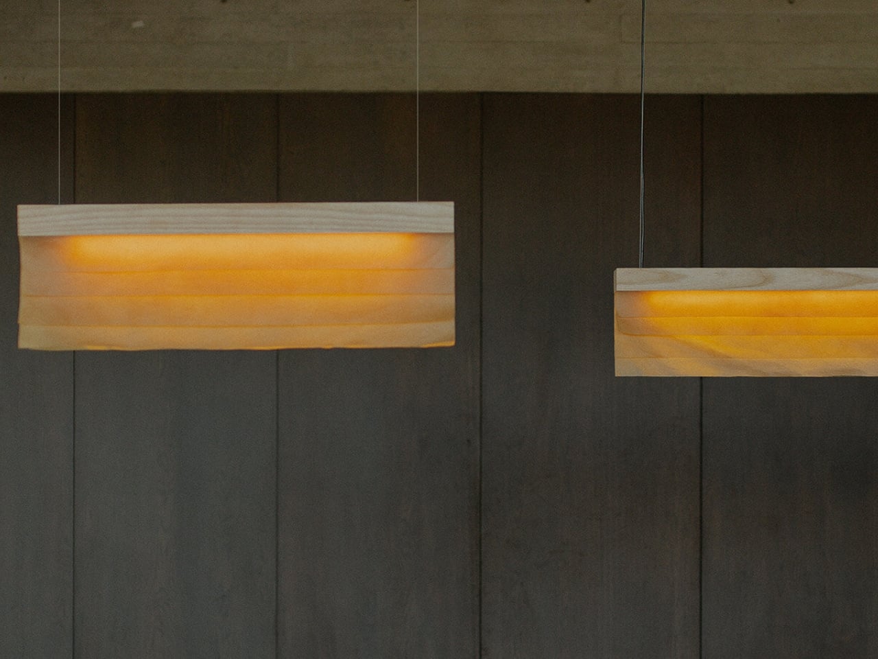
The pendant and table formats in Cenit also suggest that Polybion and Natural Urbano are thinking about a longer game. Moving from a collectible sculptural piece like Lapso into a more scalable, multi-format collection points to the kind of ambition that doesn’t just want to make a beautiful object. It wants to change what beautiful objects are made from, and it’s doing that without sacrificing the craft or the story behind the material.
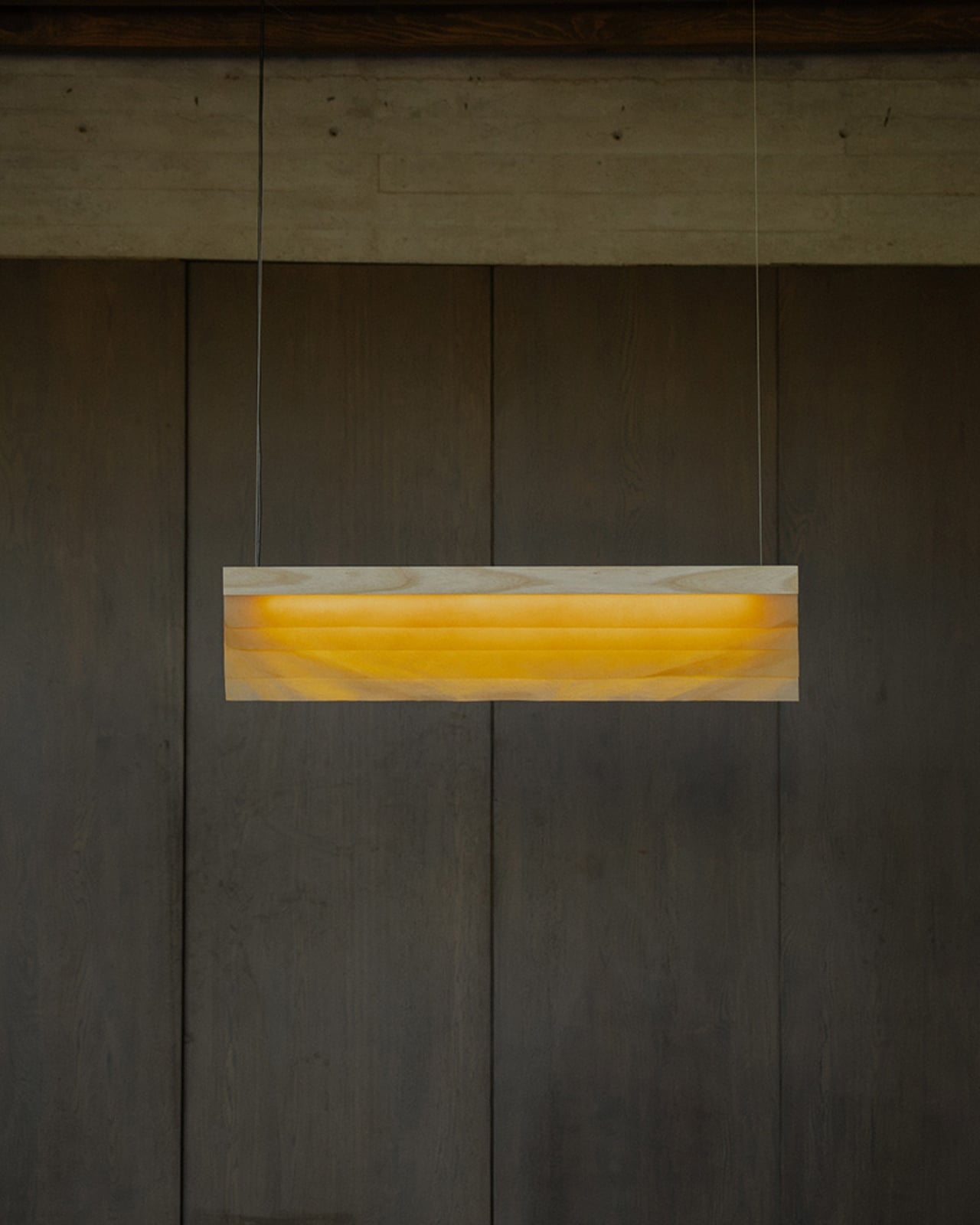
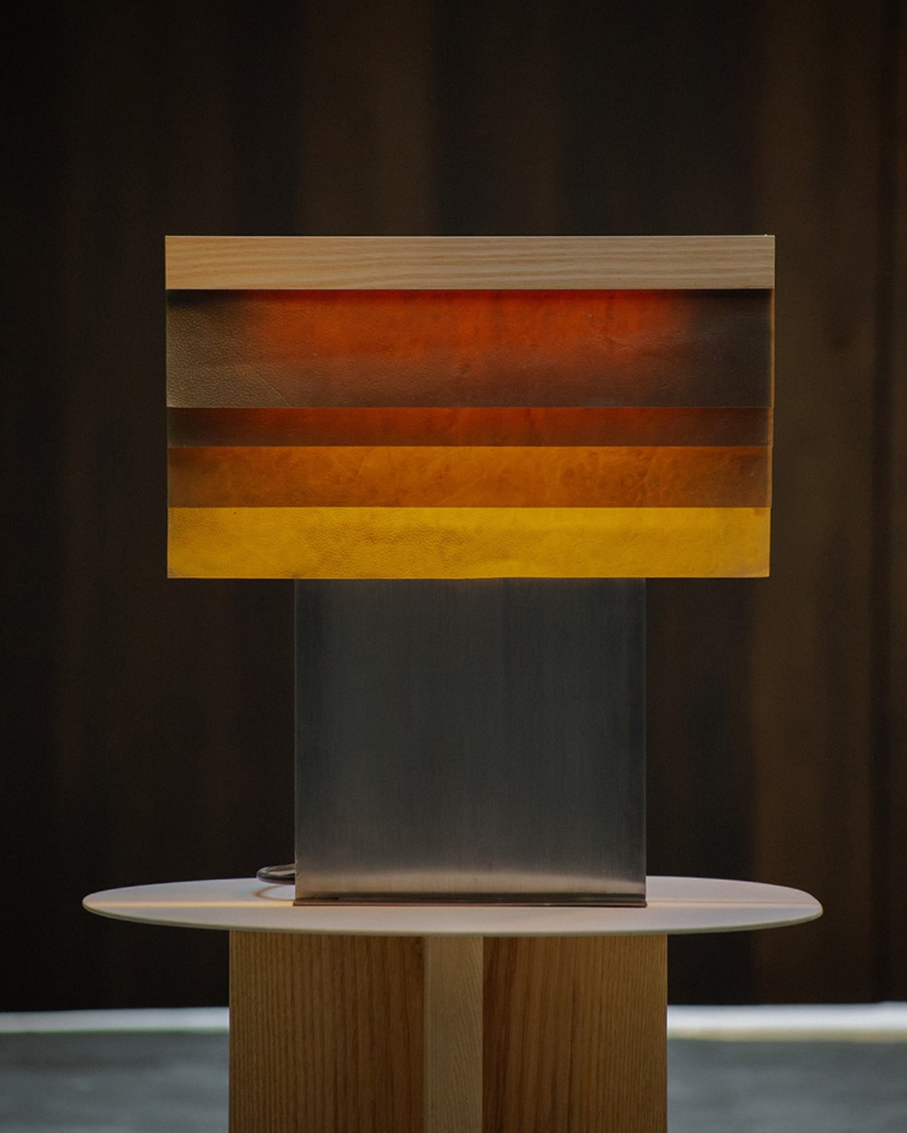
Biofabricated materials are still a niche, but collections like Cenit make the niche feel a lot less obscure. When something looks this considered and lives this comfortably in a real interior, it becomes a lot easier to imagine a future where Celium shows up in more homes, more spaces, more everyday things. Cenit is the kind of work that makes you want to ask more questions about what your objects are made of, and that, as far as I’m concerned, is exactly what good design is supposed to do.
The post Meet The Lamp That’s Actually Grown, Not Made first appeared on Yanko Design.