This $249 Phone Becomes a Game Console With One $29 Snap-On Tile

Feature phones have been having something of a quiet comeback, driven largely by people who are tired of the attention-capturing machinery baked into modern smartphones. Most of what’s on the market offers a stripped-back feature set with very little room to grow. Calls, texts, maybe a basic camera, and that’s about where the conversation ends, which hasn’t exactly made the category feel like an exciting place to be.

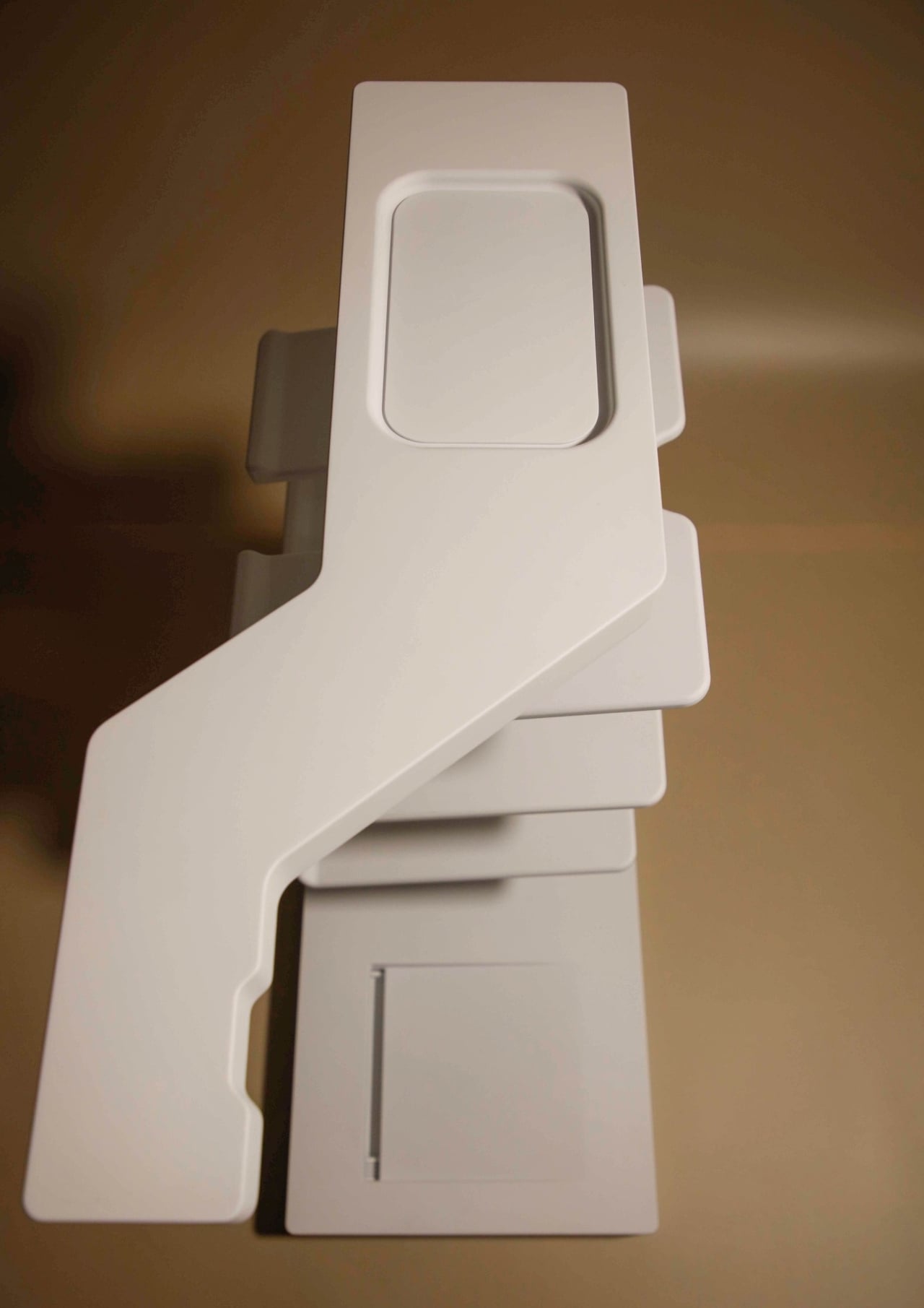
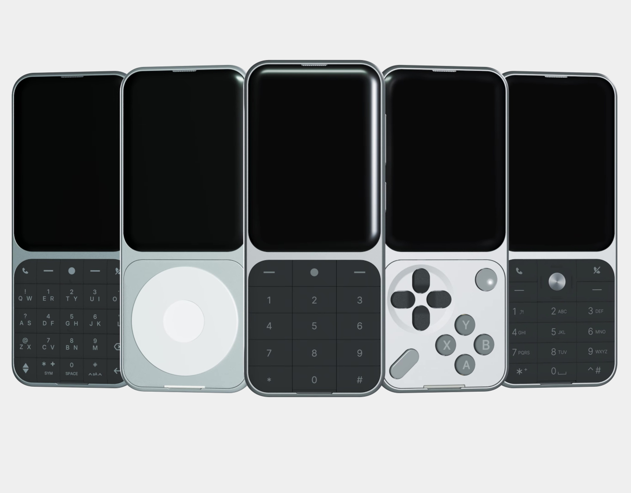
The Sidephone SP-01 has been quietly building a different kind of case for itself since its debut in 2025, not by piling features onto a simple phone but by letting users choose what kind of phone they want through a swappable modular keypad system. The Mini Controller Keypad is the fourth tile to join that family, and it’s the most unexpected one yet.

Designer: Sidephone

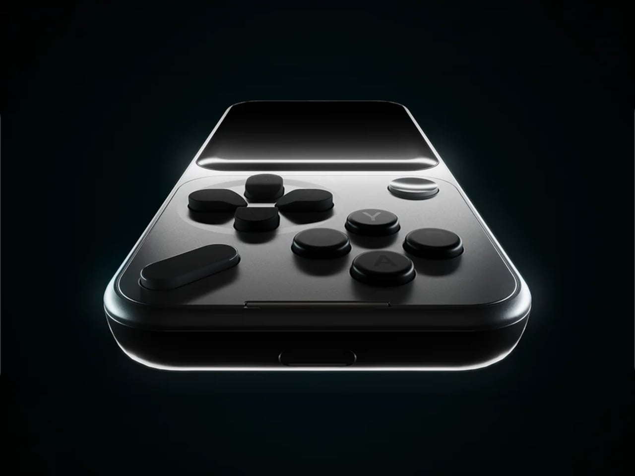
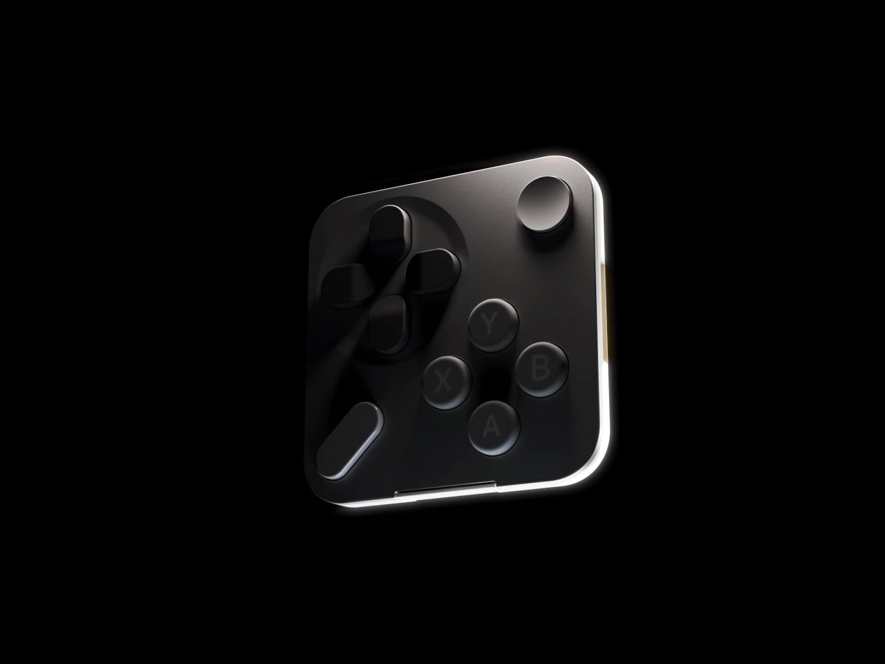
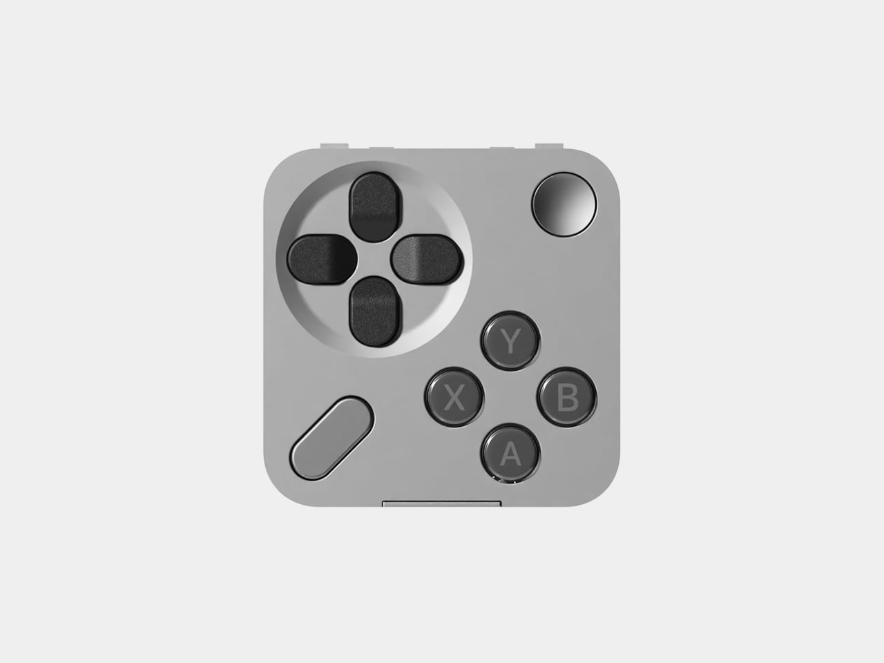
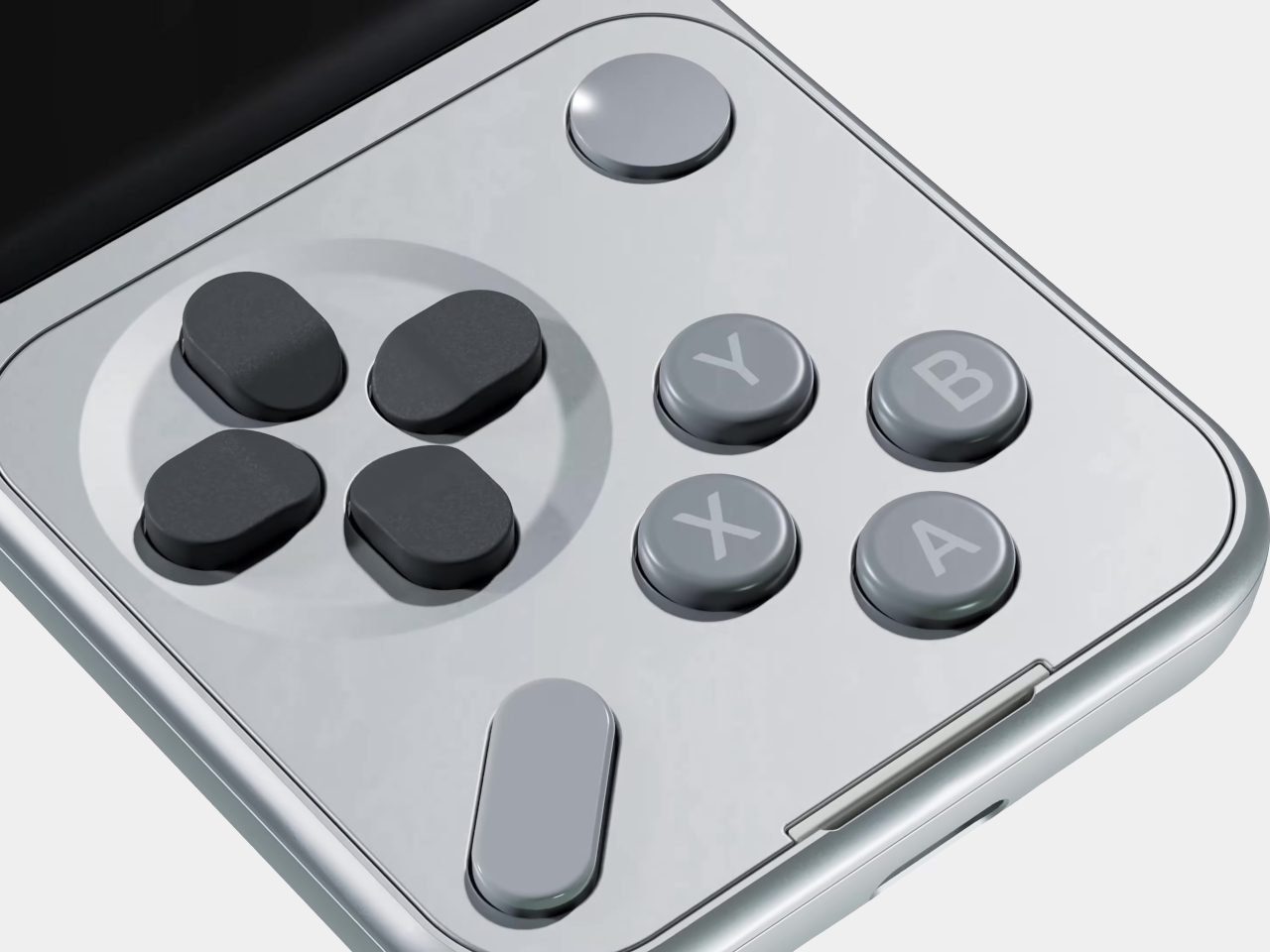
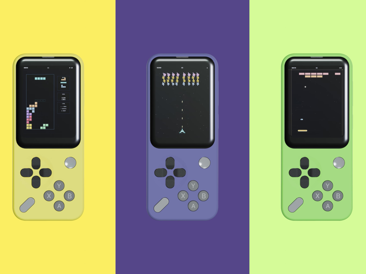
Unlike the T9 pad used for texting or the Sundial’s iPod-wheel-style controls for music, the Mini Controller brings a game controller layout to the front of the phone. It carries a D-pad, A, X, Y, and B action buttons, plus Start and Select, all of which will feel immediately familiar to anyone who has ever held a handheld gaming device. The keypad sells separately for $29, the same price as the other add-on tiles.

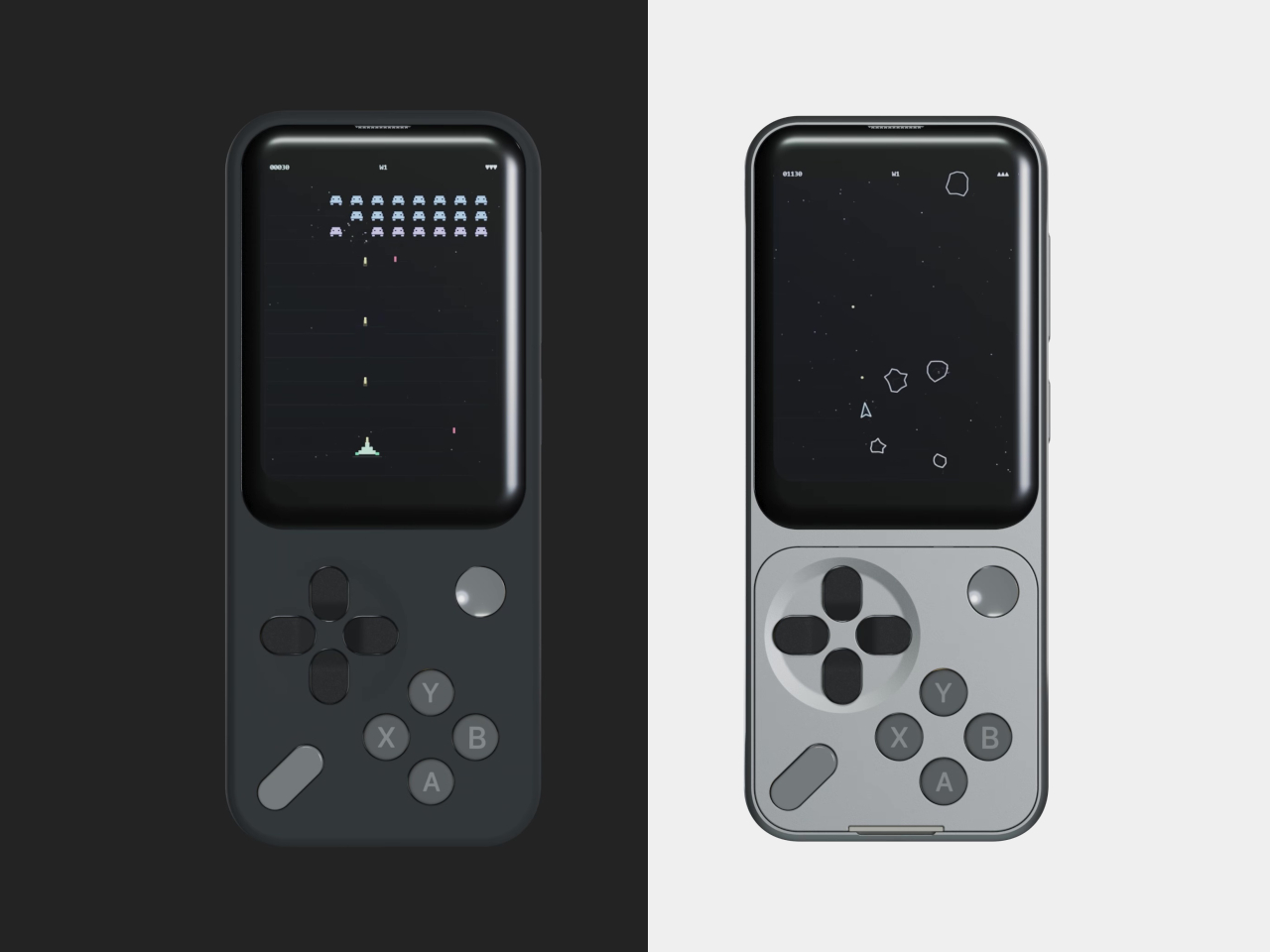
To go with the hardware, Sidephone has developed two mini games that ship alongside the keypad: Mini Asteroids and Mini Blocks. They’re clearly starter content rather than the main event, but they establish that this isn’t just a novelty tile. The company has plans to open a community development environment so that third-party developers can build their own games and apps for the platform, which is when things will likely get more interesting.

What Sidephone has been sketching out goes considerably further. GBA and arcade emulator support has been floated as a longer-term possibility, alongside universal smart remote functionality. If even a portion of that lands, the Mini Controller starts looking like less of a playful add-on and more of a meaningful expansion of what a deliberately simple phone can do on an idle evening.

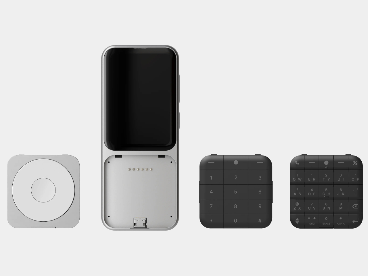
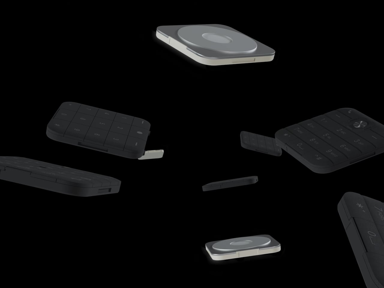
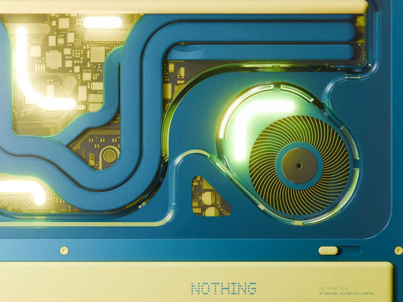
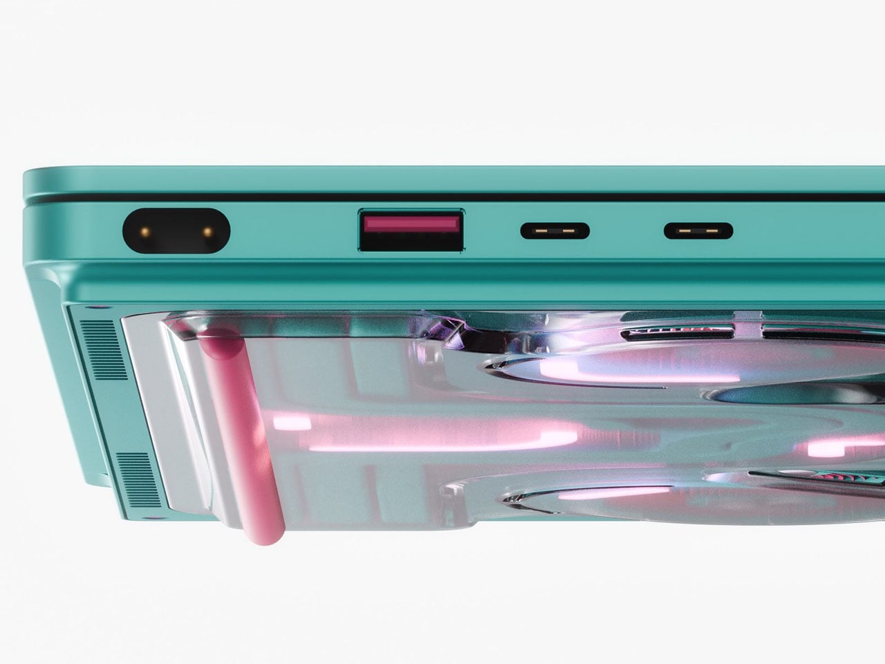
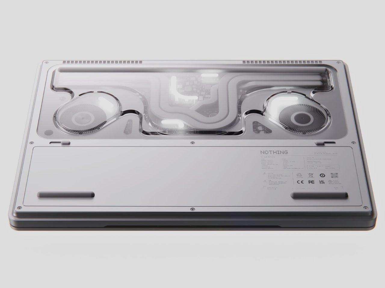
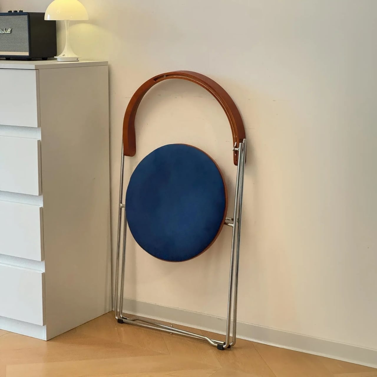
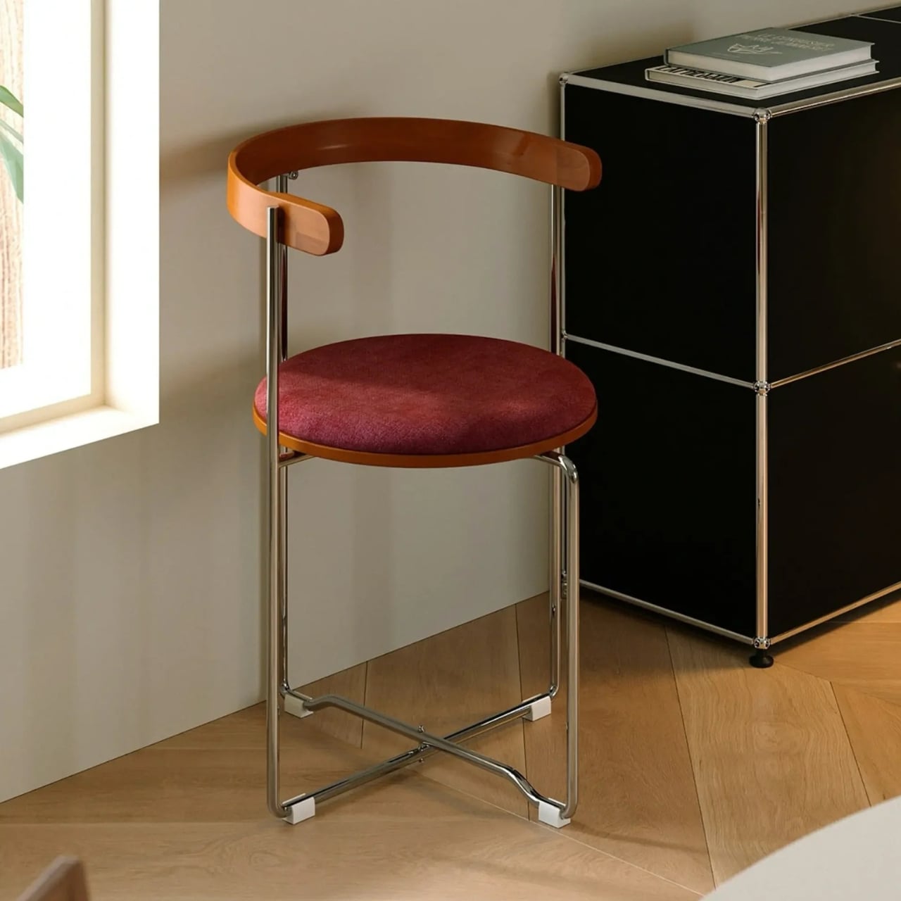
The whole system rests on the premise that a feature phone doesn’t have to be a featureless object. The SP-01 runs a custom Android-based OS, carries a 2.8-inch touchscreen and a 12 MP camera, and supports essential apps without dragging in the full weight of a smartphone’s notification ecosystem. The swappable keypad system, which uses pogo-pin connectors and magnets to click tiles into place, is what allows the device to shift personalities without requiring a hardware upgrade.

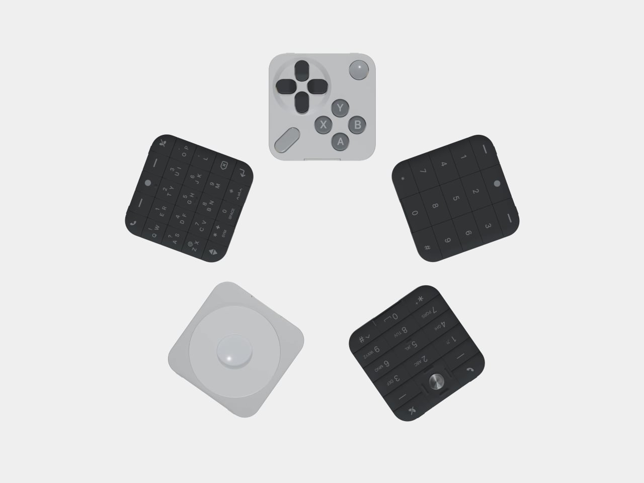
The Mini Controller sits alongside a growing family of tiles that now spans T9 dialing, compact QWERTY typing, scroll-wheel media control, and controller-style gaming. What started as a phone built around the premise of doing less has turned into a modular platform that keeps finding new things to do, each one contained in a $29 tile that snaps onto the same core hardware.

The post This $249 Phone Becomes a Game Console With One $29 Snap-On Tile first appeared on Yanko Design.

This Concept Organizes the First 30 Seconds of Coming Home in the Rain

Home entryway products have a coverage problem. A shoe rack deals with footwear, but not the umbrella. An umbrella stand handles the wet item but does nothing for the dripping floor around it. A small tray catches keys but not the daily chaos that accompanies them. The pieces exist, but they don’t form a coherent system, and the result tends to be a doorway that feels permanently unsettled.

ENTRY is a concept that answers that scatter with one vertical object. It integrates umbrella guidance, water collection, elevated footwear storage, and a top catch-all surface into a single threshold form, described by its designer as something that organizes the first 30 seconds of coming home. Rather than treating the entrance as a storage corner, it reframes that space as a managed wet-dry transition between outside conditions and domestic calm.

Designer: Zhenhua Chen

The design gives the wet umbrella a precise position rather than a vague area to lean against. A vertical spine with controlled side geometry holds the umbrella in a defined relationship to the base, reducing the casual lean that scatters water across walls and floors. It’s structural thinking that locates the wet object deliberately, so that whatever drips off it goes where the design expects it to go.

Below the umbrella position, a concealed, removable tray collects water at the base. Rather than allowing drips to pool on the floor or soak into a mat, the design makes water collection part of the object’s own structure. The tray pulls out when it needs emptying, keeping the maintenance cycle as minimal as the design premise itself. Water arrives with the umbrella, gets directed downward, gets caught, and gets removed.

Footwear gets lifted off the floor onto dedicated raised platforms rather than accumulating at the base of the door in the usual loose arrangement. The difference between floor-level disorder and a designated surface is partly visual but also functional: the floor around the entrance stays clear, and the entryway retains the quality of a space someone has thought about rather than one that simply absorbed what was dropped into it.

The top surface is a flat catch-all tray for keys, cards, and anything else that comes in at the end of the day. Placing that surface on the same object as the umbrella and shoes means the coming-home ritual resolves at a single point. You don’t split between the entryway table, the kitchen counter, and the shoe mat; everything lands together, and the entrance stays coherent rather than scattered.

The design doesn’t try to decorate the problem. It reframes the entryway as a piece of domestic infrastructure, a small managed object whose job is to absorb the friction of arriving rather than add to it. ENTRY currently exists as a concept prototype that confirms scale, spatial arrangement, and visual language. Drainage performance and load testing are identified as the next steps before the design moves further forward.

The post This Concept Organizes the First 30 Seconds of Coming Home in the Rain first appeared on Yanko Design.

Nothing Book laptop concept let’s you be more expressive with a slender secondary screen on the lid

Nothing has revived and redefined the see-through design aesthetics that blew up in the late 1990s and early 2000s. That era was highlighted by colorful polycarbonate plastic material for translucent casings for the futuristic, fun vibe. Carl Pie took the bold step and weaved his brand’s design philosophy around clean minimalism and see-through designs in colorless aesthetics.

Over the years, Nothing’s products have inspired countless designs and concepts for good reason. Battery banks, headphones, turntables, vacuum cleaners, and whatnot. So how could we not bet against a Nothing-themed laptop tailored for gamers and creators?

Designer: Nikita Bukoros Design

The designer wants to grow on the idea of a Nothing laptop that Carl hinted at years earlier when the brand was taking its baby steps. The highly anticipated gadget never came to fruition thus far, and left Nothing fans yearning for one. Nikita wants to give the fans another reason to keep believing and perhaps subtly remind Carl of the prospect. He calls it the Nothing Book, and his idea is to reveal the complexity underneath, much like a see-through gaming PC case that reveals the innards in their glory. Everything from the inner architecture, dynamic cooling system boards, to the other components is layered in a hypnotic composition.

The designer labels the performance laptop as an industrial art piece, more than a high-end consumer electronics gadget. I totally agree with the emotion, as the PC, when flipped over, reveals all the inner electronics. One unique element that defines this laptop is the secondary screen on the lid of the machine. This external display breaks the monotony of the machines we are accustomed to, as you can show off any messages, symbols, emojis, or other elements in the classic Nothing font. To spice things up, Nikita goes beyond the monochrome color scheme and offers the concept laptop in peppy options. You can have it in hot red, cool green, subtle pink, or magnetic teal hues as well.

Going with the modern design aesthetics of the creator-focused laptop, the accompanying charging dock is purpose-built to flaunt the attractive make of the machine. When docked in, the cool charging animation is displayed on the secondary screen. At the end of the day, the laptop has to be highly practical, hence, it comes with the customary HDMI, USB-C, USB, and wired charging port.

Whether Nothing will release a laptop anytime soon is anybody’s guess, but one thing is for sure: the brand needs to look at it very seriously. The design aesthetics of the modern-day laptops are quite muted and predictable, and this concept gives fans one more reason to believe.

The post Nothing Book laptop concept let’s you be more expressive with a slender secondary screen on the lid first appeared on Yanko Design.

A Folding Chair Designed to Stay Out, Not Hide Away

I have a complicated relationship with folding chairs. Not a hostile one, just complicated. They are one of those objects that exist in a permanent state of apology: useful when you need them, embarrassing when you don’t, and almost always the first thing you hide before company arrives. The folding chair has never quite managed to transcend its reputation as a placeholder for “real” furniture, and for decades, most designers haven’t really bothered trying. That’s what made the Kael Walnut Folding Chair by Esspur stop me mid-scroll.

It doesn’t announce itself as a folding chair. If you saw it sitting in someone’s dining room, you’d probably assume it was a permanent fixture, a considered purchase, a statement piece. The seat and curved backrest are solid walnut, warm in tone and shaped to suggest permanence rather than portability. The frame is polished stainless steel, slim and structured without feeling cold or industrial. Taken together, the chair reads more like something you’d find in a well-edited boutique hotel lobby than something you’d unfold for a dinner party and tuck back behind a door before your guests could notice. The proportions are right. The materials are at least photographically convincing. And the overall silhouette holds a kind of quiet confidence that most folding chairs never come close to.

Designer: Esspur

The design carries echoes of mid-century classics, and those references don’t feel like a stretch. There’s a rotational elegance to how the chair collapses that feels deliberate, almost theatrical, as if the whole point of the folding mechanism is to be watched. That’s not a common quality in budget-adjacent furniture. Most folding chairs fold in the most graceless way possible, a series of clicks and reversals that feel like you’re solving a problem rather than using a product. The Kael seems to understand that the fold is part of the design, not an afterthought.

Esspur is a brand with virtually no history and no disclosed location, and their online presence raises more questions than it answers. The product description calls the seat and backrest solid wood in one place, then references veneer craftsmanship in the fine print. I think that’s worth sitting with for a moment. We live in an era of very convincing product photography, and the gap between how something looks on a screen and how it feels in your hands has never been wider. The walnut might be veneer rather than solid. The steel might feel lighter than it looks. These are legitimate concerns, and if you’re the kind of person who expects heirloom-grade furniture, this probably isn’t it. Shopping from an unknown brand with no verifiable track record is always a calculated risk.

But here’s the thing I keep turning over: the idea itself is nearly flawless. Whatever the material quality ends up being, someone thought carefully about the problem of the folding chair and came up with a solution that doesn’t feel like a compromise. The design respects the object. It doesn’t try to disguise the fact that it folds; the mechanism is visible, structural, part of the aesthetic. But it also doesn’t apologize for it. That’s a harder line to walk than it looks.

For anyone living in a city apartment, a studio, or a home where space is a constant negotiation, the Kael makes a quiet argument: good design shouldn’t require a permanent footprint. The best extra chair is one you’d want to leave out even when you don’t need it. Most folding chairs fail that test spectacularly. This one, at least in concept, passes with something to spare.

Whether Esspur refines the build quality over time or quietly disappears from the internet, the design itself has already done something useful. It’s asked the right question: what if the folding chair wasn’t the awkward option, but the intentional one? It’s a question the furniture industry hasn’t had much urgency to answer. Maybe now it does.

The post A Folding Chair Designed to Stay Out, Not Hide Away first appeared on Yanko Design.

Why the Samsung Galaxy Z Fold 8 Wide is a Massive Surprise

Why the Samsung Galaxy Z Fold 8 Wide is a Massive Surprise Comparison of the Galaxy Z Fold 8 Wide and Galaxy Z Fold 8 Ultra designs.

Samsung continues to lead the charge in foldable smartphone innovation with the Galaxy Z Fold 8 Wide and Galaxy Z Fold 8 Ultra. These two models represent a bold step forward, offering innovative advancements in display technology, design, and performance. By providing distinct options tailored to different user preferences, Samsung ensures that whether you value […]

The post Why the Samsung Galaxy Z Fold 8 Wide is a Massive Surprise appeared first on Geeky Gadgets.

Posted in Uncategorized