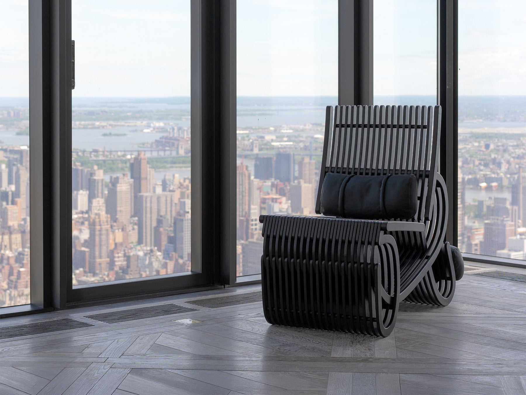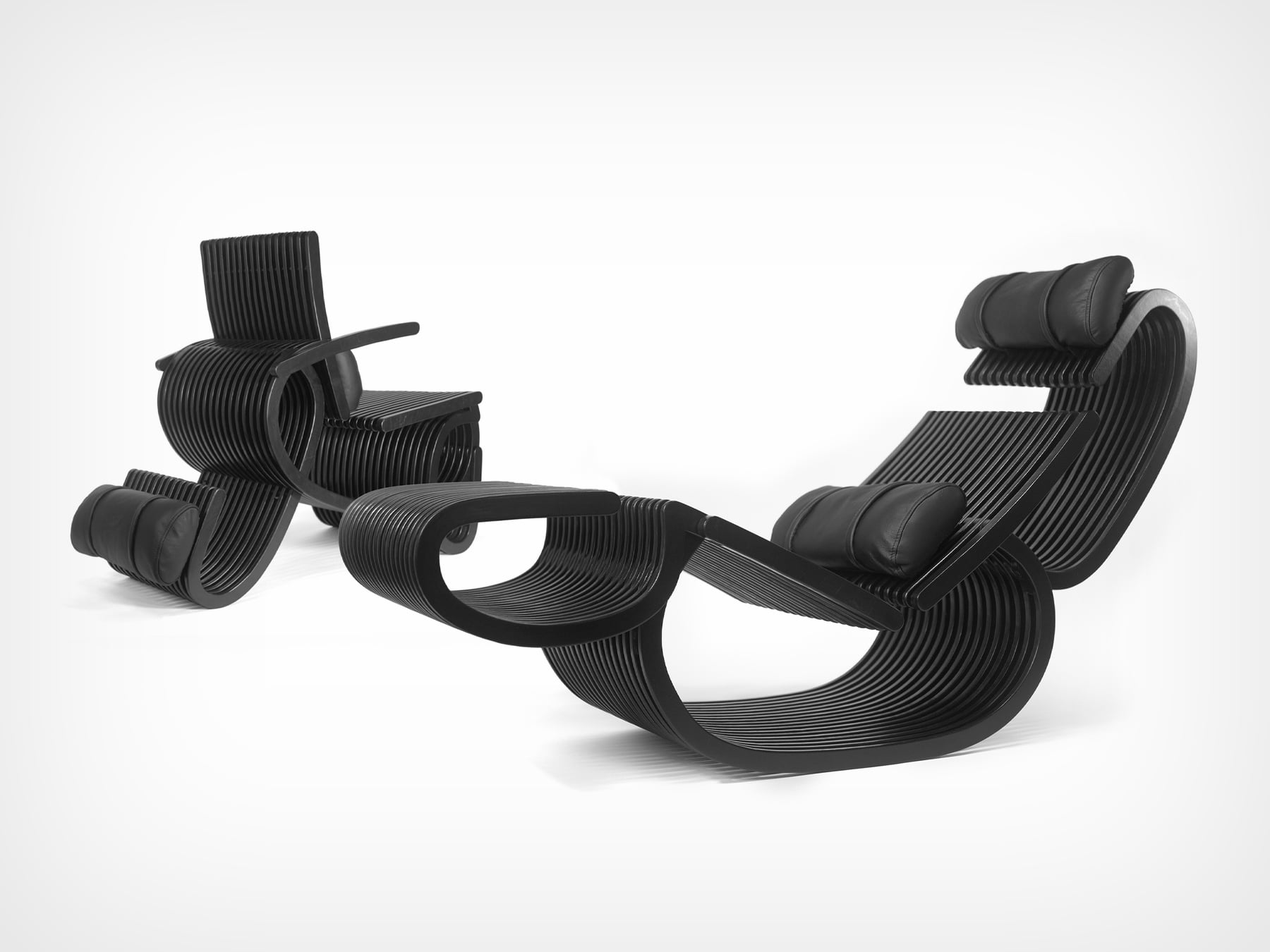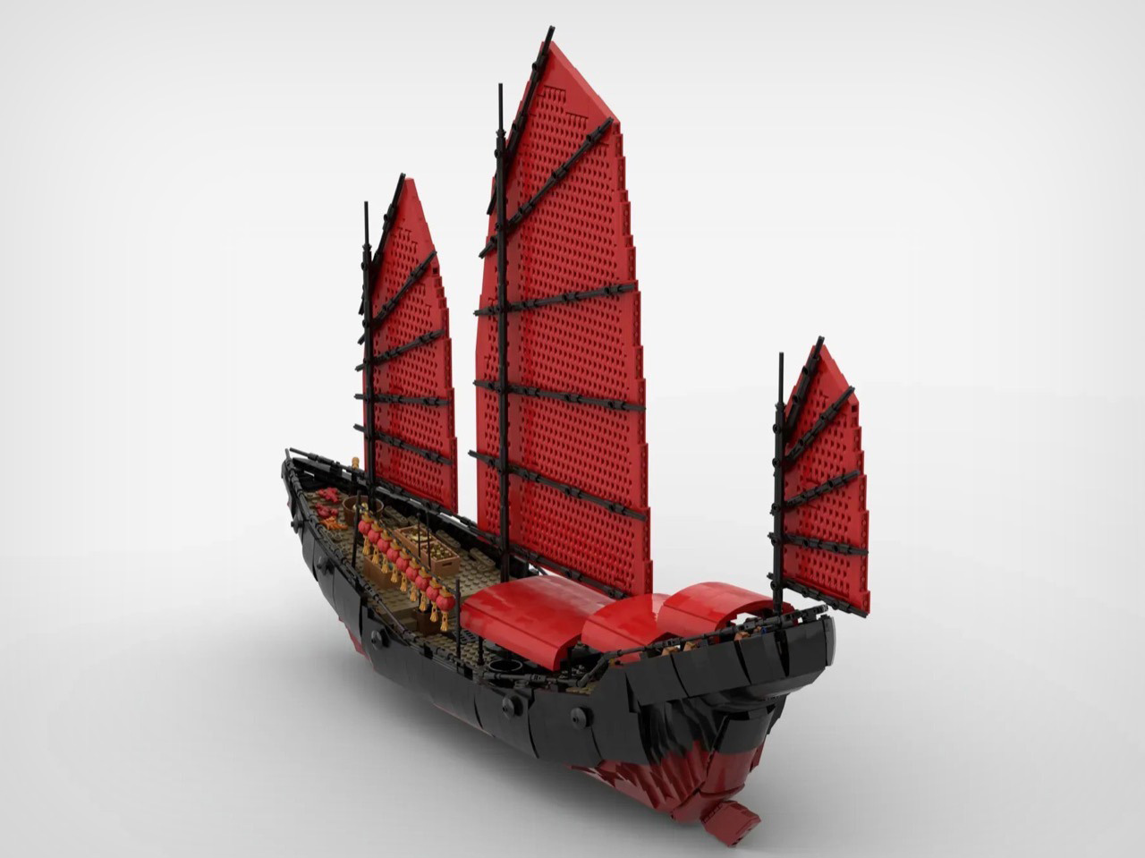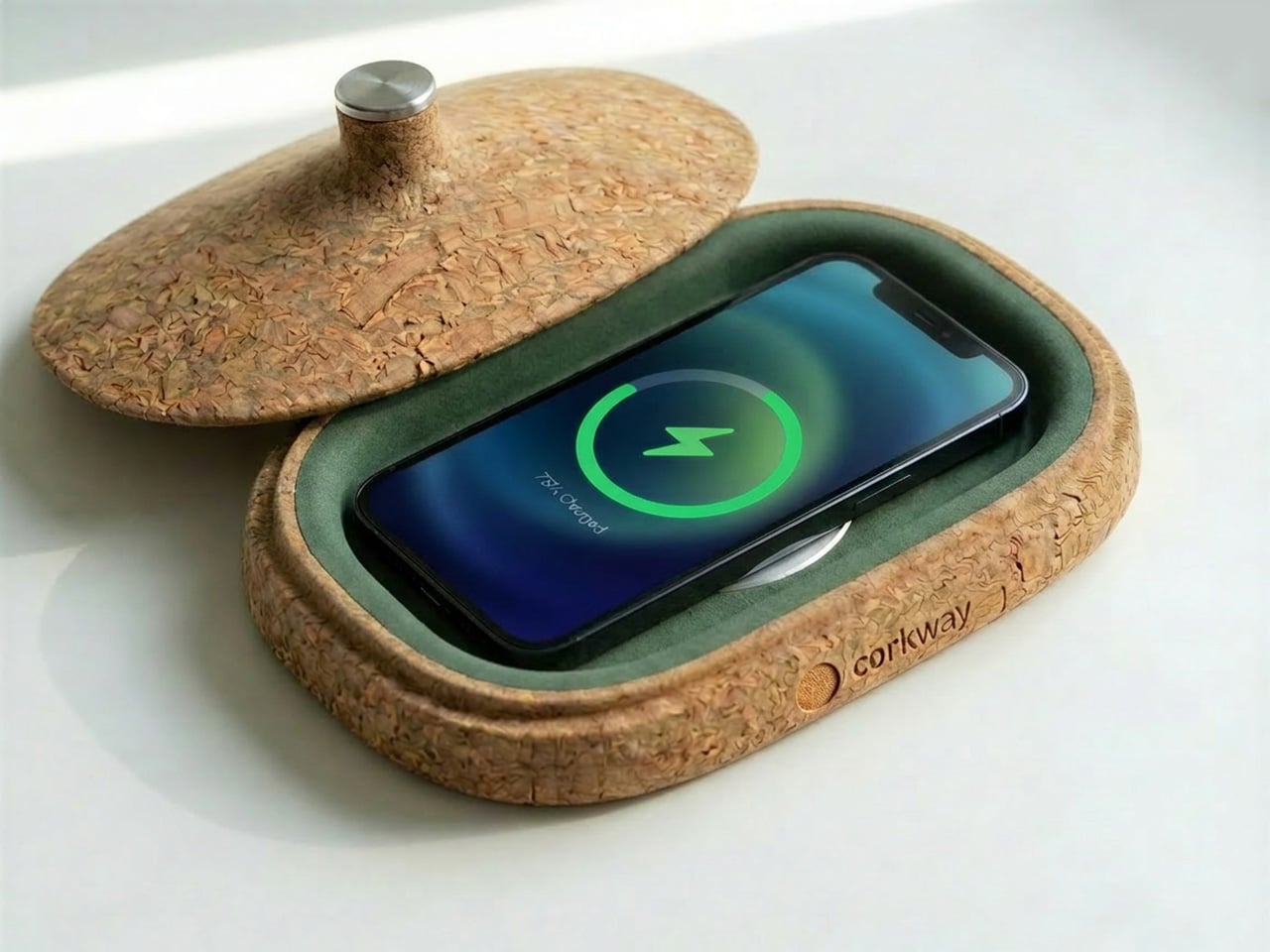
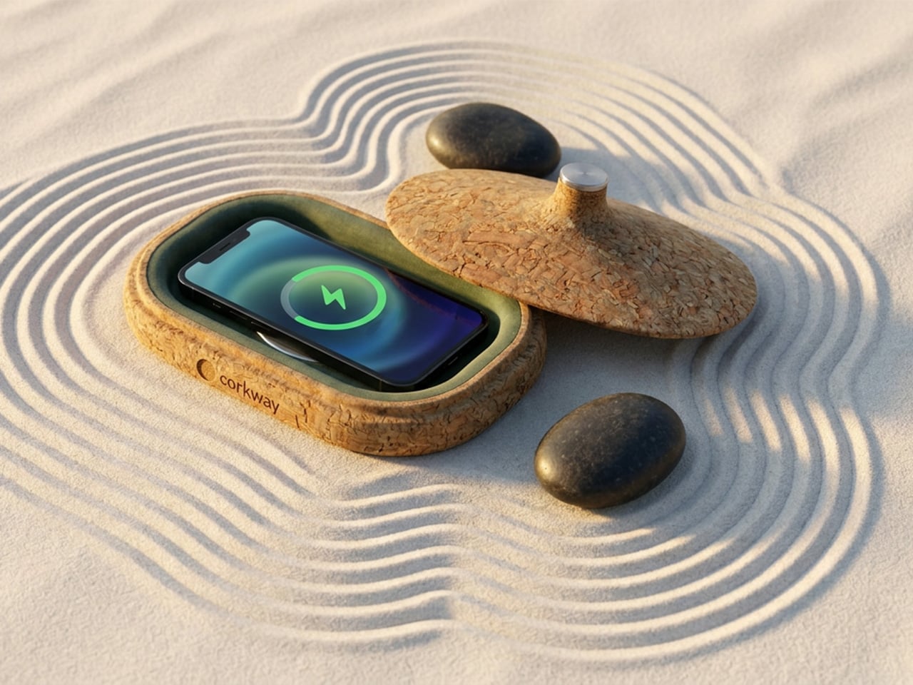
Cork has spent decades being underestimated. Wine stoppers, bulletin boards, yoga mats, the occasional floor tile. Somewhere along the way, a material with genuinely remarkable engineering properties got slotted into the background of everyday objects.
That changed when designers started paying attention to cork’s unique properties: it absorbs sound, repels moisture, insulates against heat, compresses without cracking, and comes from a tree that absorbs more carbon than it releases. The story of cork is really a story of a material waiting for the right question to be asked of it.
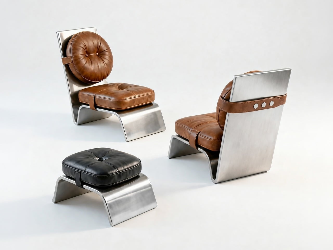
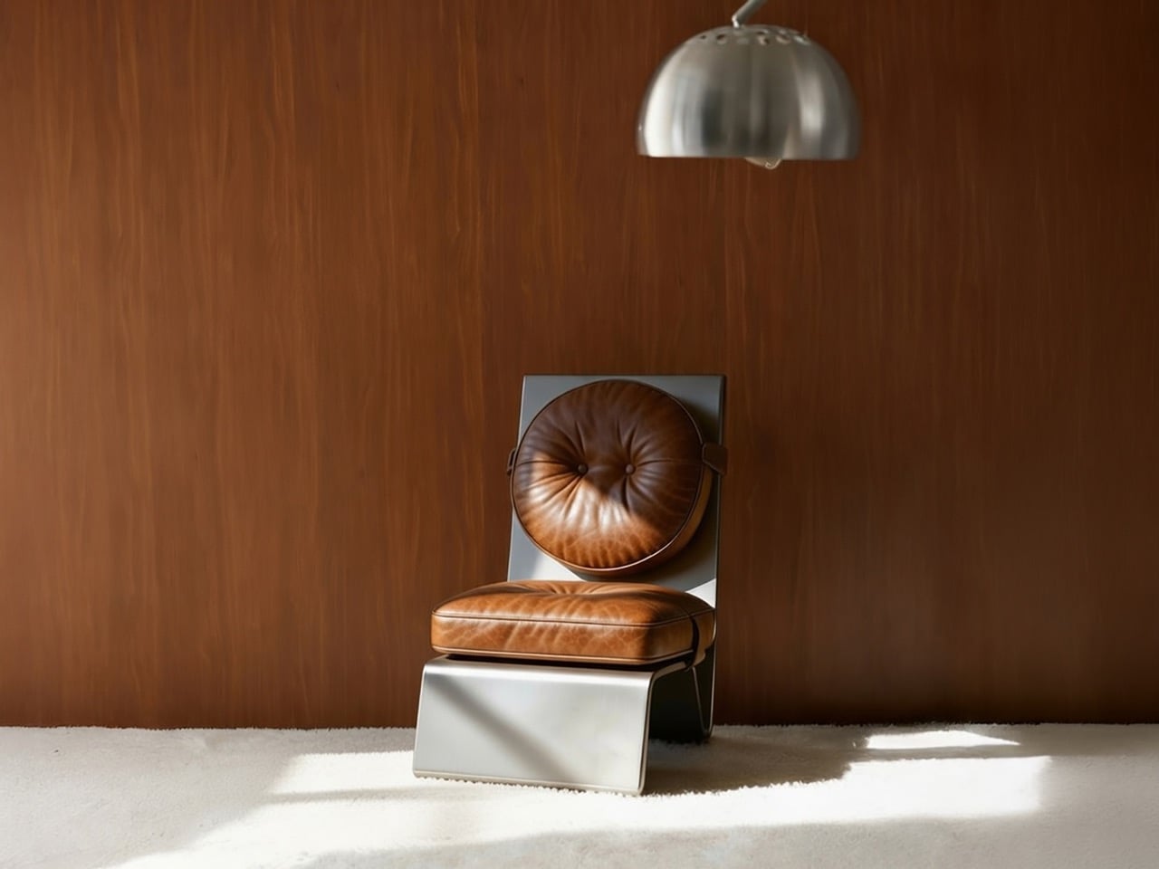
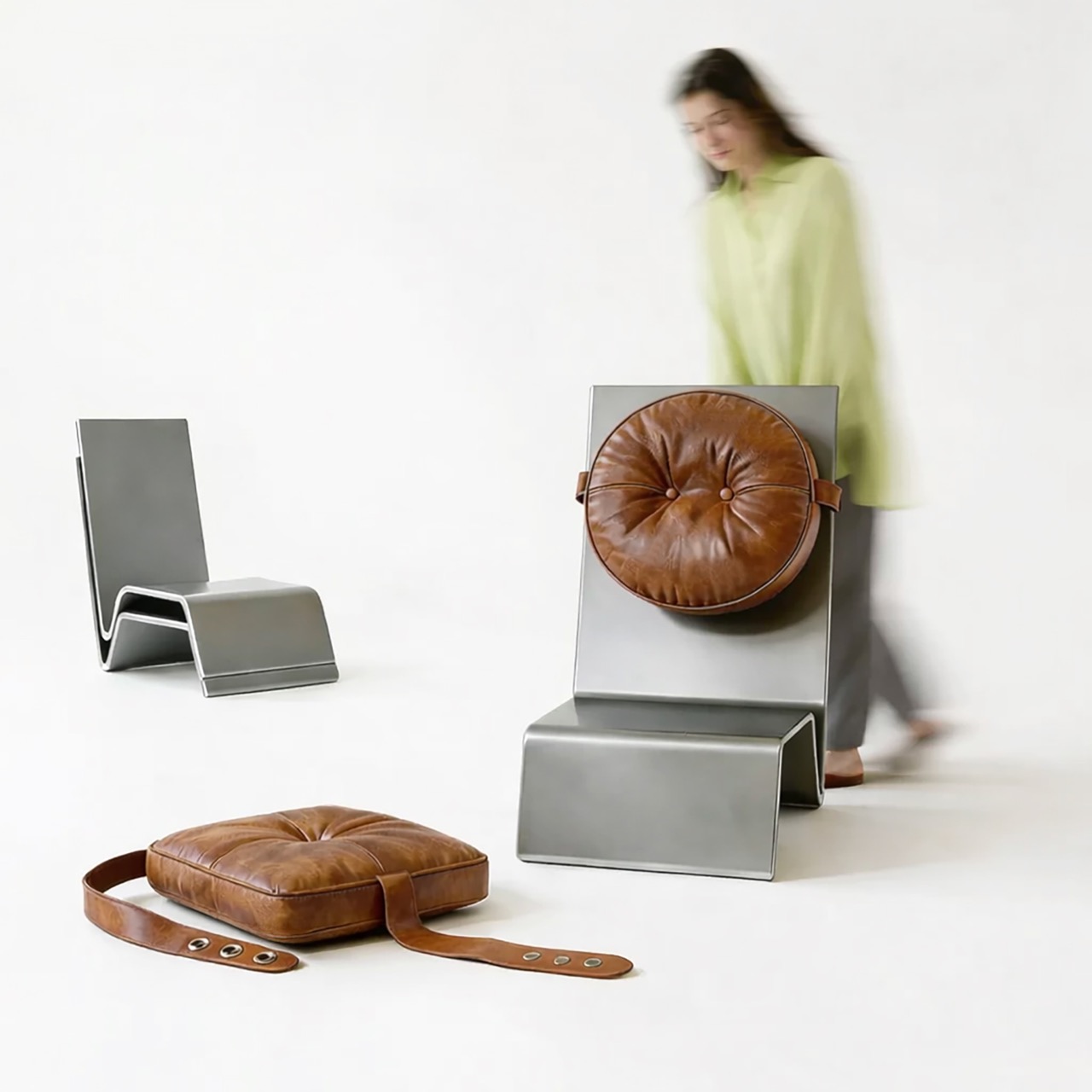
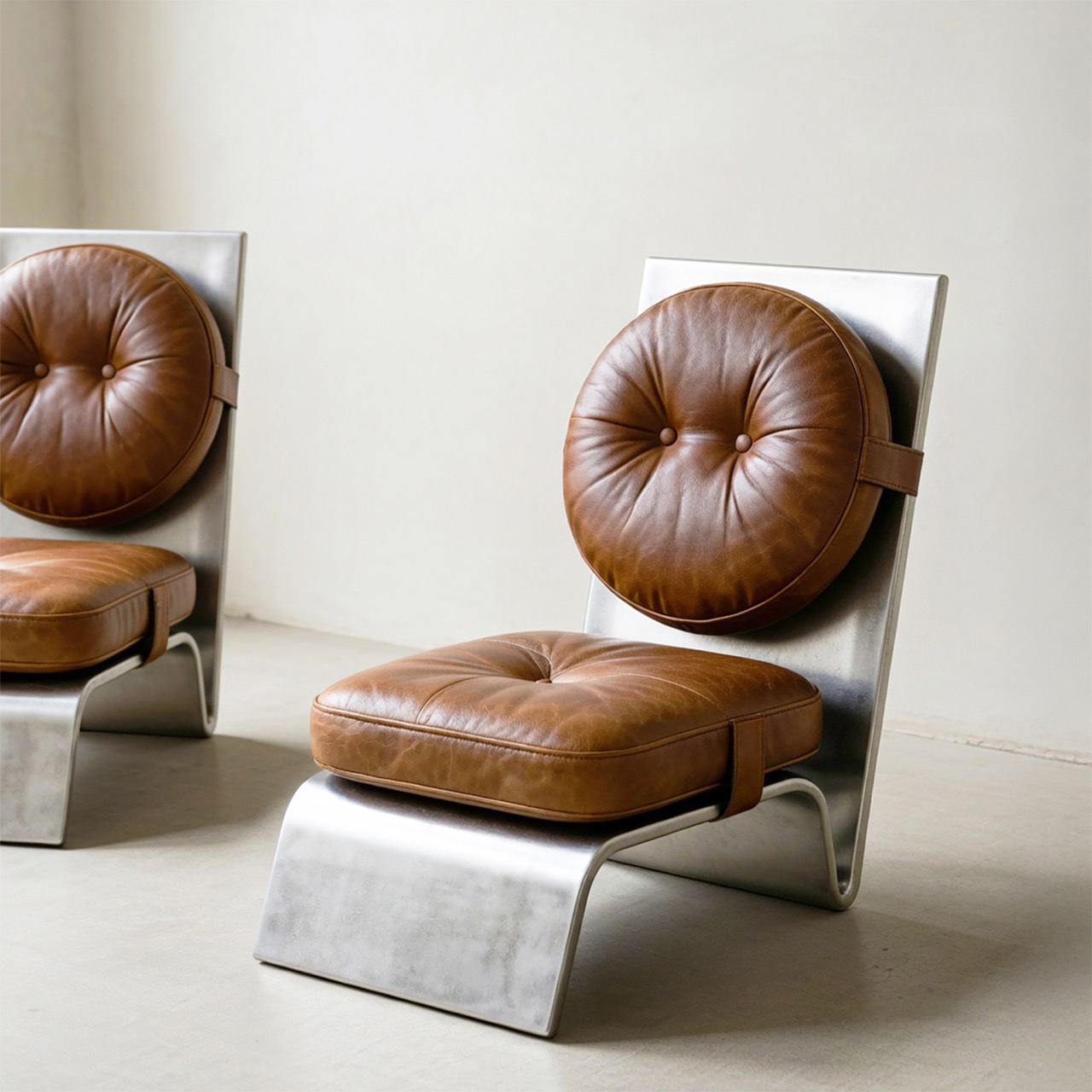
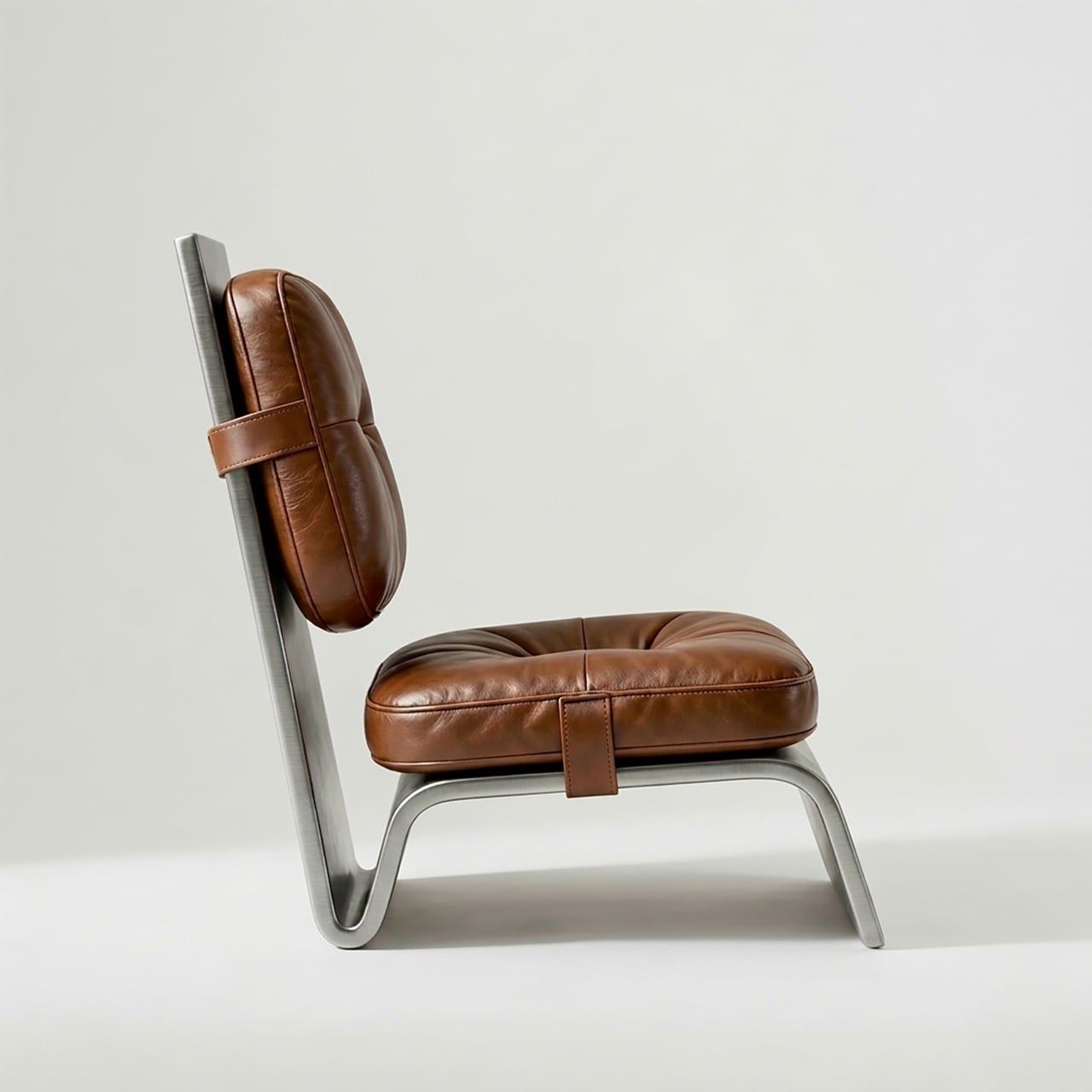
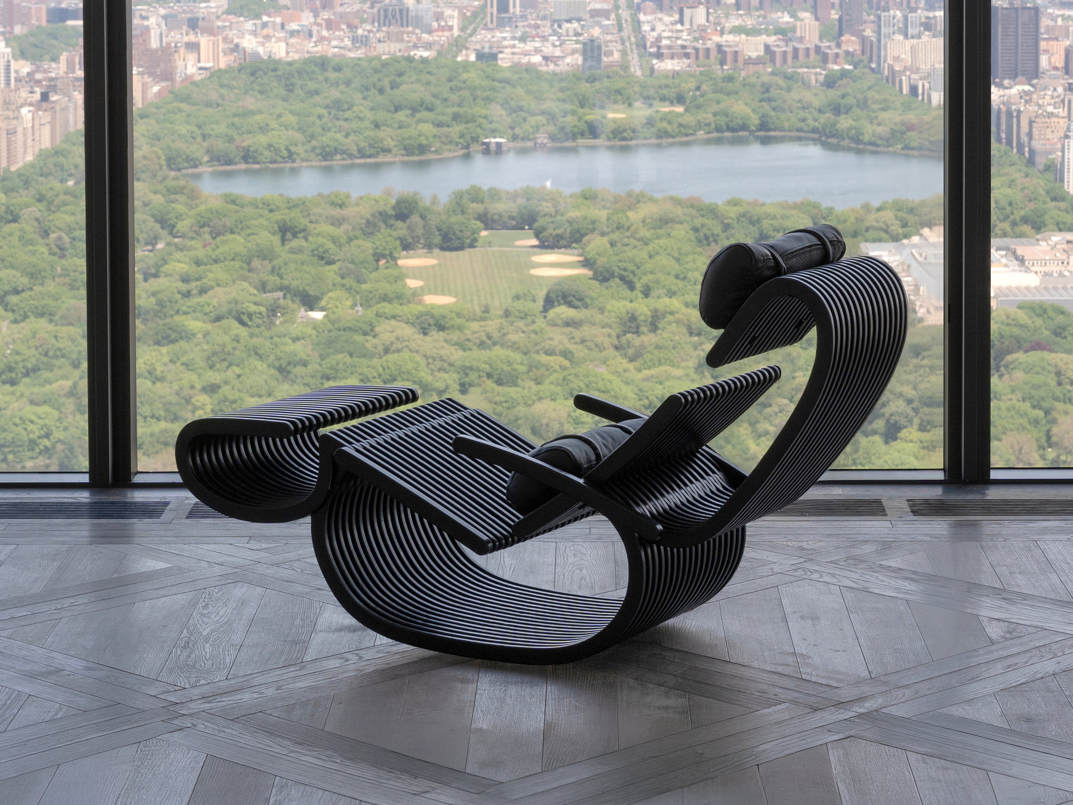
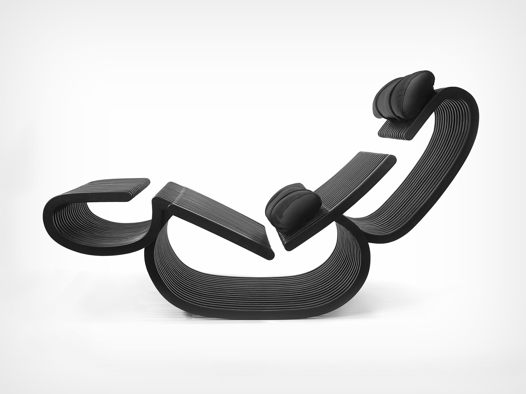
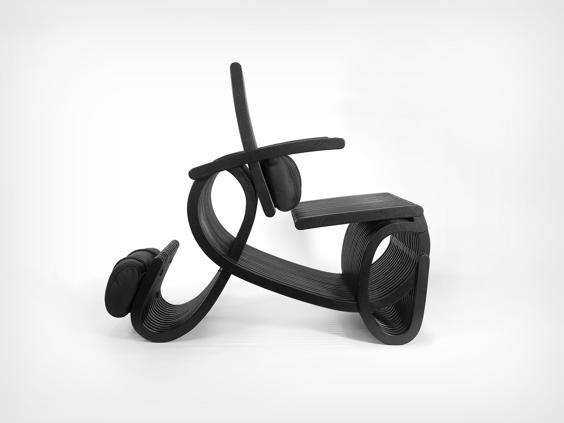
Vizcom and Corkway are asking that question now. Their Cork Design Challenge invites designers worldwide to reimagine cork in the spaces where people live, gather, and work, from home interiors to public installations to office environments. The brief is intentionally wide, letting designers push the boundaries of the material: from wall coverings, ergonomic objects, acoustic installations, to even sculptural décor. What makes the challenge compelling is that the top three designs get physically manufactured, CNC-milled from cork blocks in Portugal, and shipped to the winners. Submissions are open through June 8, 2026.
Click Here to Submit Now: Hurry, last date to enter is June 8, 2026.
The Brief

Vizcom and Corkway have structured the challenge around three spatial contexts: home, public, and office — each offering a different lens on how cork can enhance our everyday lives.
Designers are invited to think about how cork can enhance the comfort, experience, or functionality of a home? Could it redefine public installations or elevate office spaces?
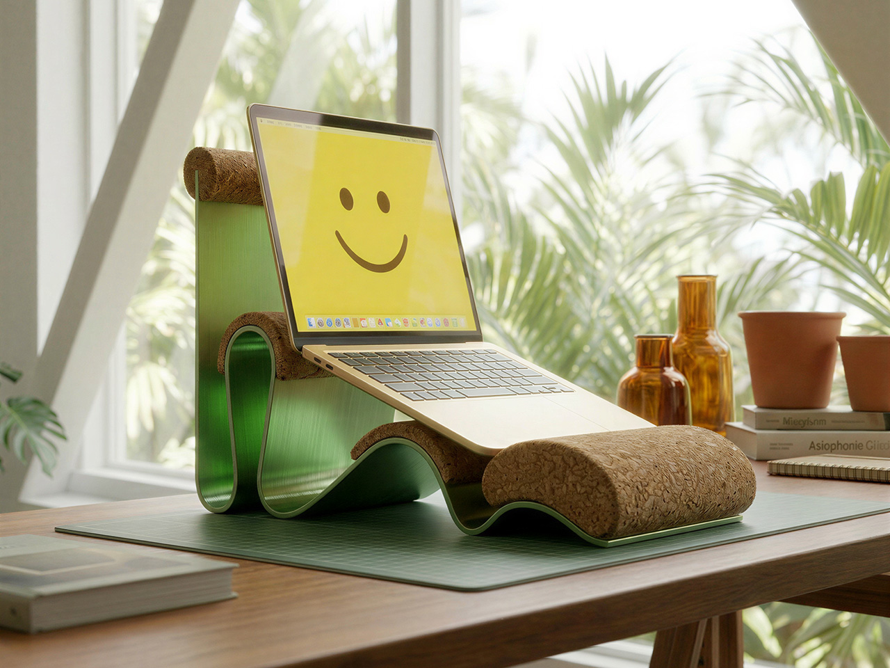
At home, the intent is to push cork into décor and wall treatments that reframe how the material reads in a living space.
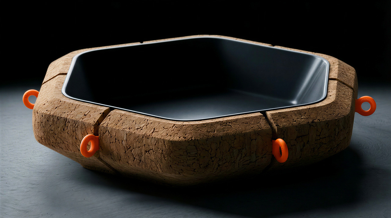
In public environments, the scope opens to installations, wayfinding systems, and seating concepts that could meaningfully transform communal areas.
Office applications lean into cork’s acoustic and tactile properties, where sound-absorbing partitions, ergonomic desk objects, and creative meeting environments are all fair game.
The Constraints
Creativity comes from constraints and these are the non-negotiables participants must keep in mind while they design:
- Your design must be able to be CNC milled
- Painted cork designs must be RAL colors
- Must be at least 70% cork
- Supplementary material can only be metal or plastic
- Objects must be no larger than 890 (L) x 590 (W) x 180 (H) mm in total volume
The Submission
All entries must be designed in Vizcom: from early sketches through to final renders — and include a 3D model generated using Vizcom’s Make 3D tool as part of the submission.
All submissions must include:
- Project name and description
- Project inspiration
- Vizcom project file link
- Main hero image
- Five final design images
- One optional animation file
The best part: the winning concepts are made real. Corkway, the manufacturing partner behind the challenge will CNC-mill the top three designs from cork blocks at their production facility in Portugal and ship the finished objects to the winners. The challenge highlights the workflow from sketch to render, to real.
How To Participate
- Log in or create a free account at vizcom.com
- Access the Vizcom Template file from the Learn section
- Design your concept within Vizcom, ensuring your project meets the production constraints outlined in the challenge guide
- Generate a 3D model in Vizcom and set your project file to “Anyone with link” sharing
Submit your final entry at the challenge page before June 8 at 11:59 PM EST, including your project file link, hero image, five final design images, and a written project description and inspiration
Competition Dates
May 25, 2026 – Prompt released at 9:00 AM EST
June 8, 2026 – Submission deadline at 11:59 PM EST
June 16, 2026 – Top 30 announced
June 23, 2026 – Top 3 announced
Month of July – Production begins with Corkway
Judging Criteria
Entries will be evaluated by a panel of industry designers across five criteria:
- Creativity and Originality (30%) – How well the design explores cork’s texture, flexibility, acoustic properties, and sustainability in meaningful ways
- Design Quality and Spatial Experience (25%) – How well the concept integrates into a space, enhancing atmosphere, usability, and visual appeal
- Feasibility and Material Understanding (20%) – Demonstrated understanding of cork as a material, including its strengths, limitations, and manufacturing possibilities
- Process and Use of Vizcom (15%) – How ideas were explored, iterated, and developed using the platform
- Alignment with Brief (10%) – How clearly the design connects to home, public, or office contexts while enhancing comfort, functionality, or experience
What You Can Win

- Your design, manufactured – in collaboration with Corkway, the top 3 winning designs will be CNC-milled and shipped to the winners
- Featured story – winning designs will be showcased across Vizcom’s site, social channels, and newsletter
- Vizcom Pro licenses – each winner receives 3 months of Vizcom’s Pro plan, free
Challenge Resources
Need feedback before you submit? Vizcom and Corkway are hosting two open office hours (May 28 at 12PM ET and June 5 at 10AM ET) — and keeping a #cork-challenge Discord channel open throughout the competition for material questions, design advice, and production guidance.
Join the Challenge
If you’re a designer who’s ever wanted to see your idea made real, this is your chance. Design in Vizcom and submit your work by June 8 at 11:59PM for a chance to see it come to life.
How will you imagine cork in spaces we live, gather, and work?
Click Here to Submit Now: Hurry, last date to enter is June 8, 2026.
The post Vizcom x Corkway Launch a ‘Cork Design Challenge’ With Winning Designs Getting Industrial Production first appeared on Yanko Design.