The Seoul Robot & AI Museum is the definitive parametric architecture reference of 2026, and it’s easy to understand why the design world keeps returning to it. Every few years, a building comes along that doesn’t just represent a movement; it is the argument. RAIM is that building right now, and the reason has less to do with how it looks and more to do with how it got made.
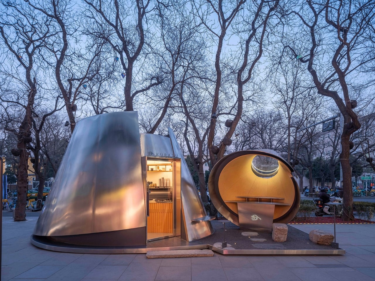
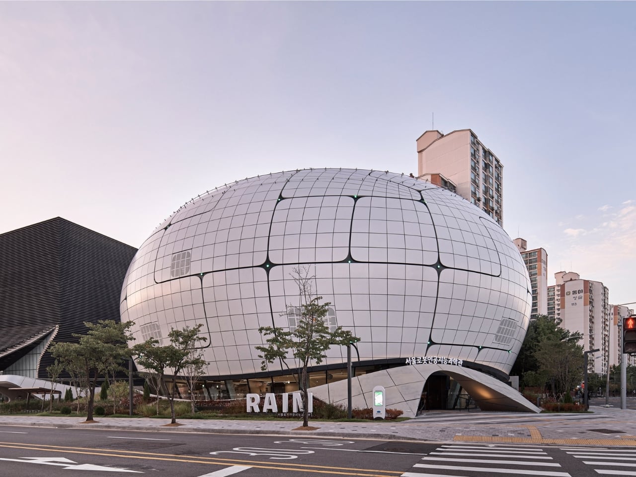
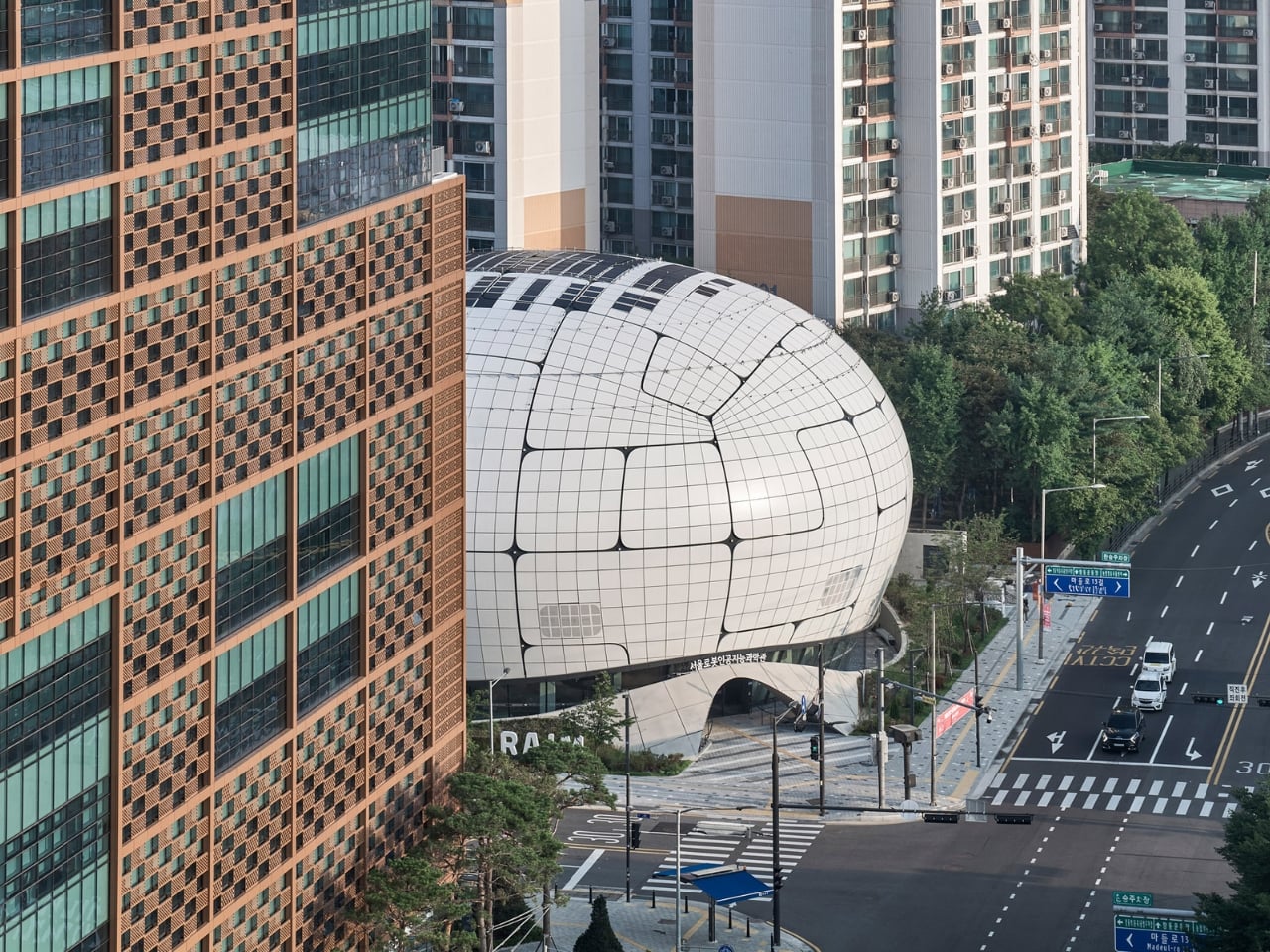
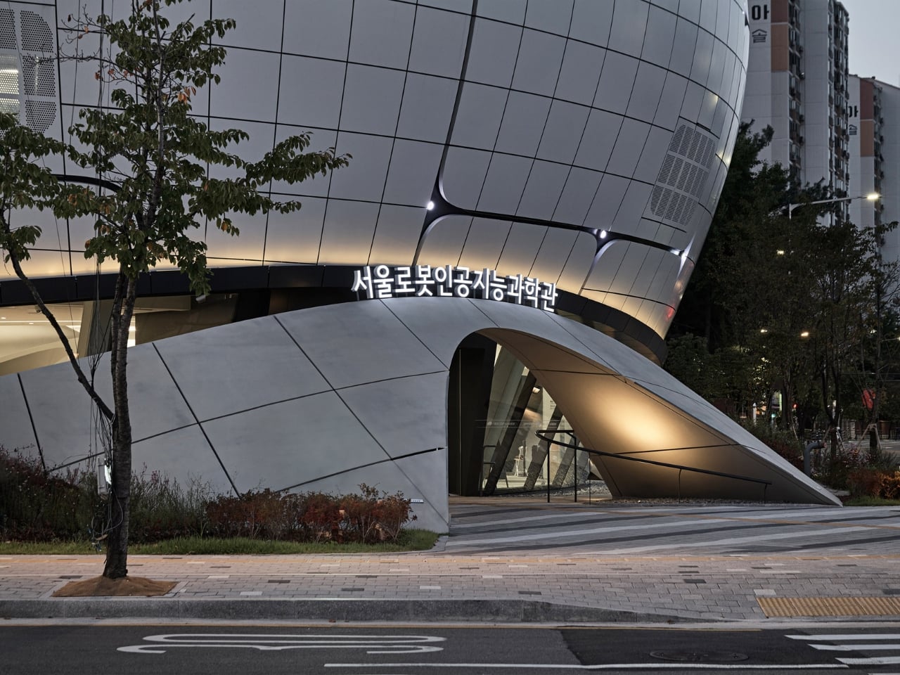
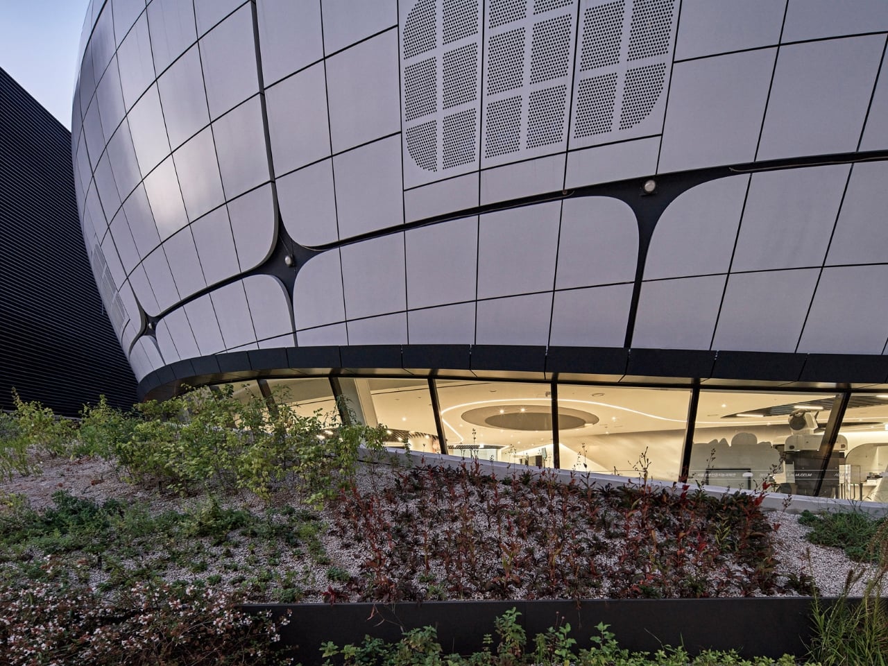
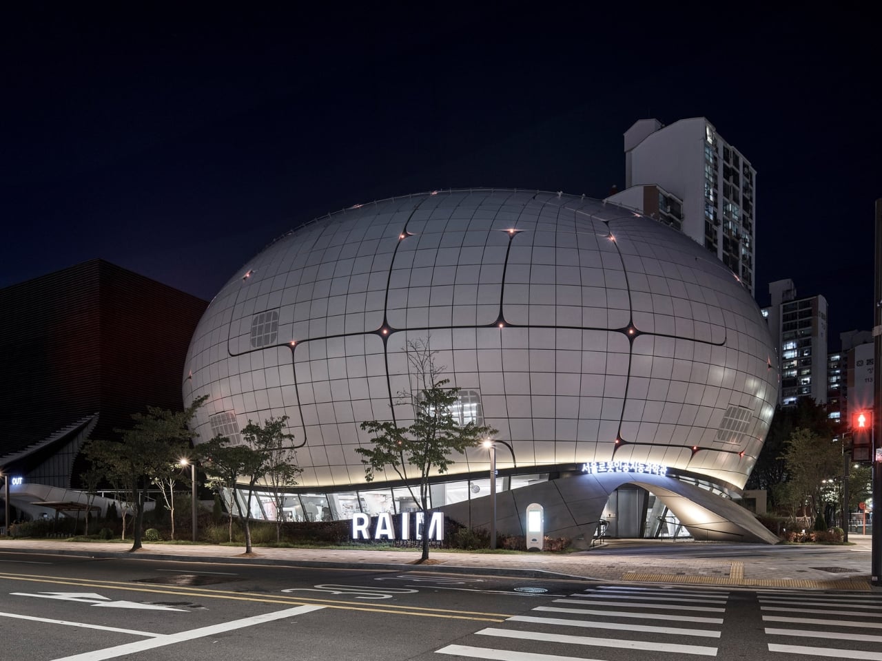
Opened in 2024 in the Chang-dong district of northeast Seoul, the museum was designed by Turkish studio Melike Altınışık Architects. From the street, it reads like something that landed rather than was built: a spherical, mirror-finish shell that catches the sky and refuses to look like any cultural institution you’ve encountered before. The facade is wrapped in 3,422 double-curved metal panels, each one a unique geometry, each one positioned according to a structural logic you can actually read from the outside. The gridded surface pattern isn’t decorative. It follows the structural steel grid concealed behind it, making the building’s skeleton visible through its skin. That level of architectural honesty is rarer than it should be.
Designer: Melike Altınışık Architects

The geometry didn’t come from sketching. Melike Altınışık and her team scripted the form parametrically, then reverse-engineered the entire envelope to make it buildable. That second part is where most parametric ambitions historically die. Double-curved panelization at this scale is the kind of thing that gets value-engineered into something flatter and sadder during construction documentation. But Melike Altınışık Architects designed specifically for fabrication from the start, using a methodology called DFMA (Design for Manufacture and Assembly), which meant the form and the production method evolved together rather than fighting each other.
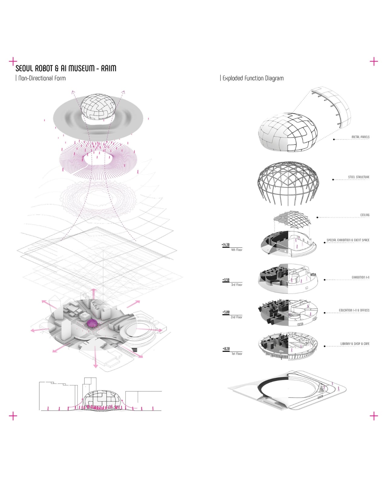
The fabrication pipeline is where the story gets genuinely interesting. The panels were cut using laser CNC machines and welded using industrial robots. On-site, 3D scanning ensured alignment that human measurement couldn’t consistently achieve at that tolerance. What this unlocks, practically, is that double-curved metal panelization stops being a budget line reserved for landmark commissions and becomes something mid-scale cultural buildings can actually afford. Robot welding doesn’t get tired. It doesn’t accumulate small errors across 3,422 repetitions. The precision holds, and holding precision across a spherical envelope is a very different proposition from getting it right once.
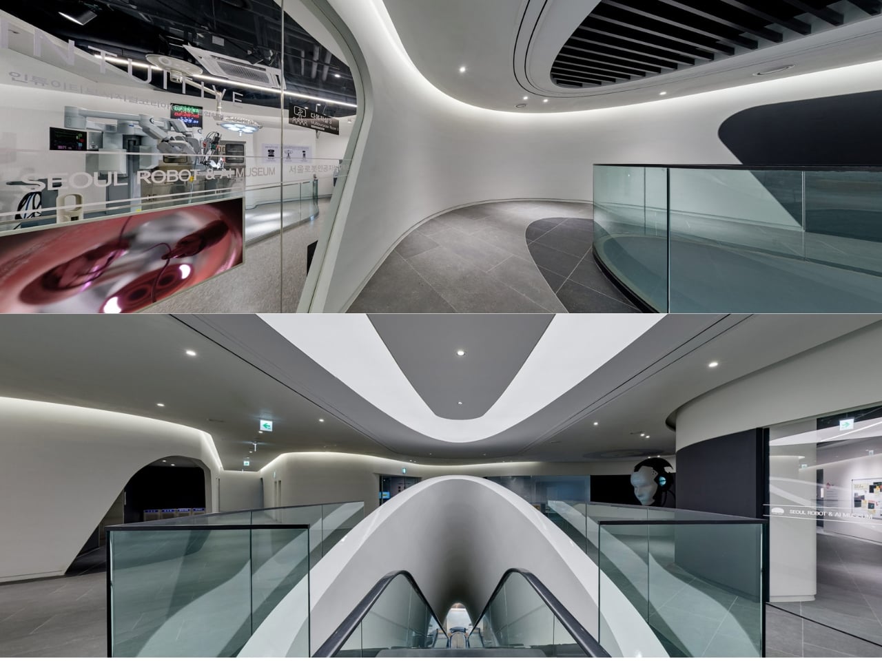
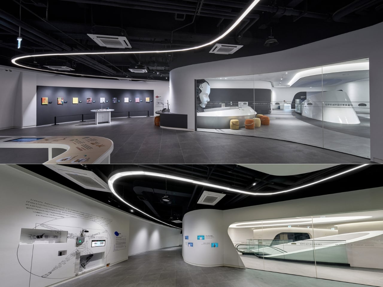
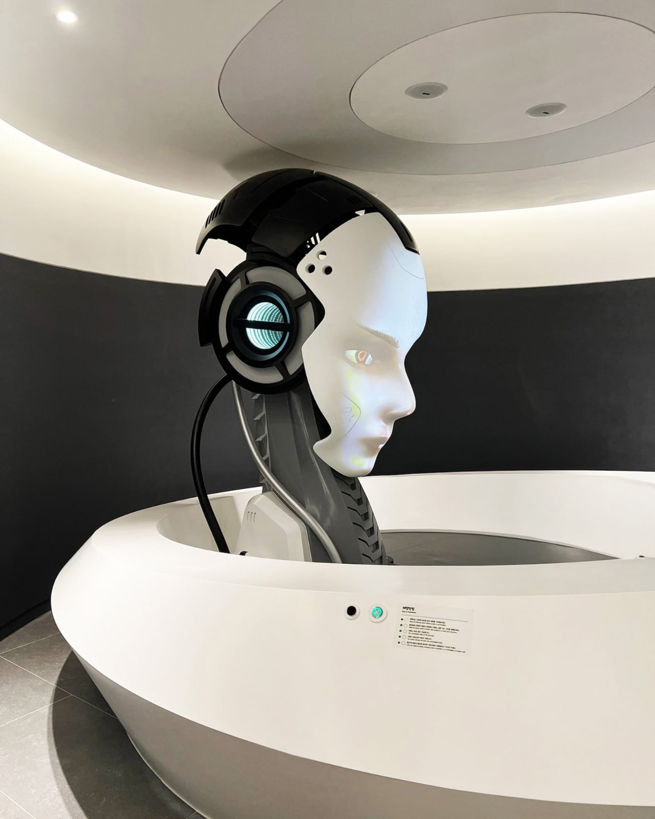
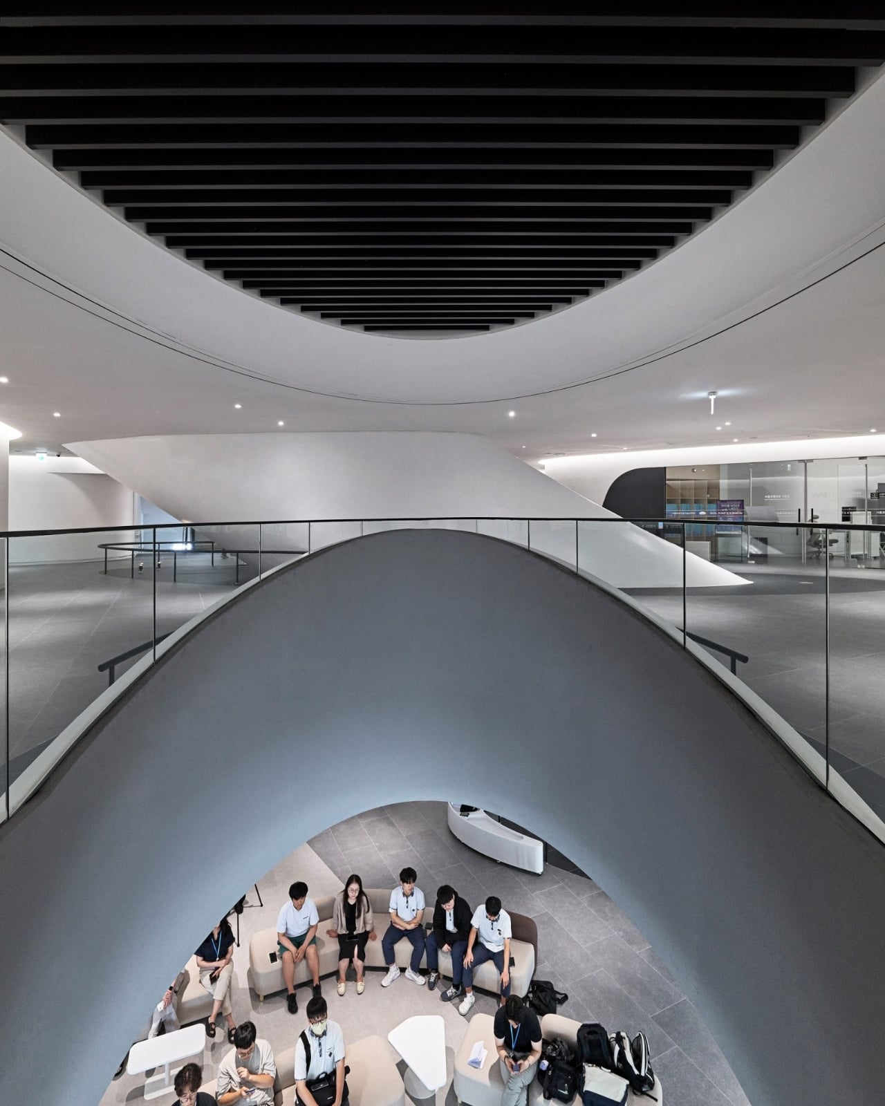
Now layer in the subject matter of the museum itself. RAIM is dedicated to robotics and artificial intelligence. Its permanent exhibitions trace the evolution of AI from predictive fraud detection systems to generative models. Robots greet visitors at the entrance. The interior reads like a spaceship, with a vertical exhibition tunnel at the building’s center blurring the boundary between the physical and the technological. So when you consider that robots also assembled the facade above your head, the recursion is almost too neat. Architect Altınışık framed it clearly: the architecture is “both shelter and pedagogy.” The building doesn’t just house the argument. It makes it.
Parametric facades are having a genuine cultural moment in 2026, and it’s not limited to the usual European flagships. Studios in South Korea and India are pushing computational design into more projects, and the international awards circuit is beginning to reflect that geographic shift. The conversation has moved from “can parametric architecture actually be built?” to “what does it cost, and who controls the pipeline?” RAIM answers both questions at once, which is probably why it’s the reference point of record for this particular moment.
That shift is worth paying attention to. For decades, the most ambitious architectural geometries required either enormous budgets or a willingness to absorb serious construction risk. Robotic fabrication and CNC manufacturing are quietly changing that calculus. In Altınışık’s own words, “the division between design and construction is becoming obsolete. The parametric model becomes not just a design tool but a construction platform.” The next wave of museums and civic buildings won’t choose simpler geometry because they have to. They’ll choose the complex version because their fabricators can deliver it, and because, as RAIM proves, the building becomes a more interesting object for it. Seoul’s robot museum was built by robots. The next one might be anywhere.
The post The Robots That Built Seoul’s Robot Museum first appeared on Yanko Design.