5 Containers, a Sauna, and a Rooftop Deck in Rural Vermont

The Vermont Villa by Backcountry Containers is the kind of build that makes you reconsider everything you thought you knew about shipping container homes. Not because it’s shocking, but because it’s genuinely, quietly good.

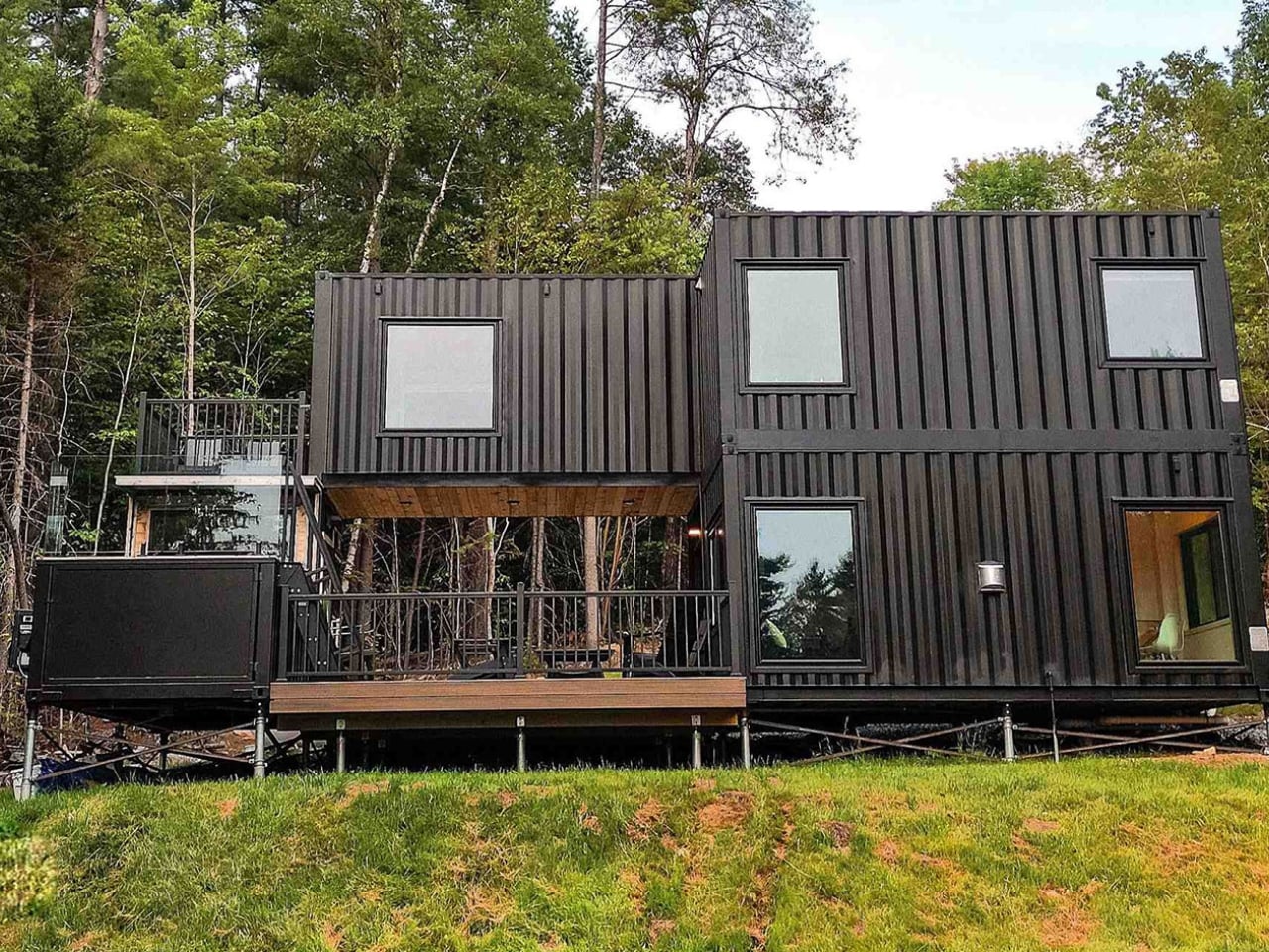
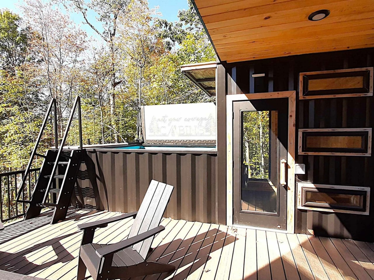
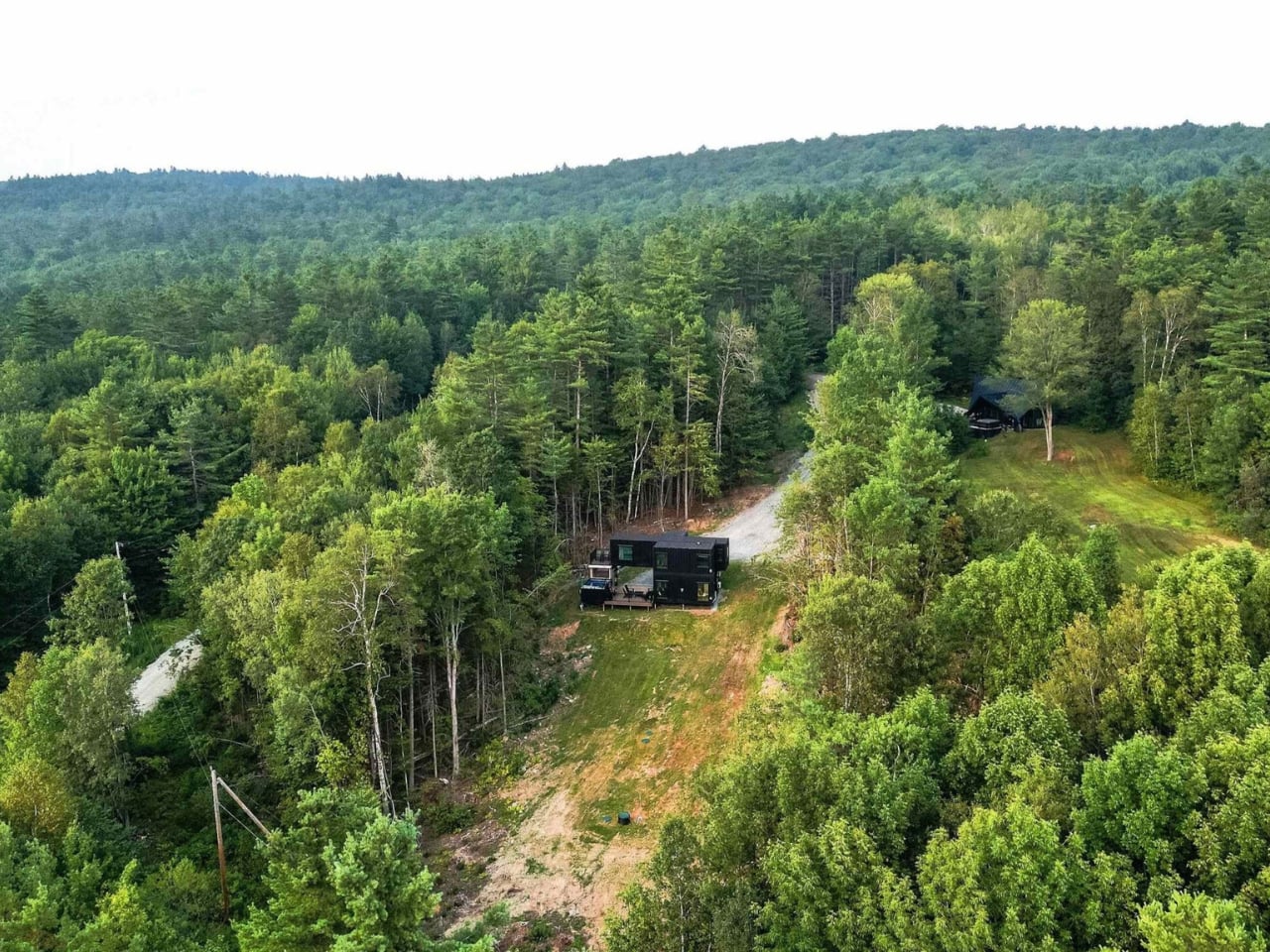
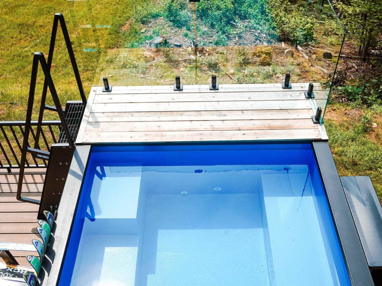
The running joke about container homes has always been that they’re either a clever budget hack or an architect’s ego project that ends up costing twice as much as a conventional house anyway. The Vermont Villa doesn’t entirely escape that conversation, but it does manage to sit on the more convincing side of it. Backcountry Containers, a family-owned U.S. builder, stacked and arranged five shipping containers (three 20-foot units, one 40-foot, and a custom 20-foot SaunaPlunge container) into a two-story, three-bedroom, two-bath home that sits quietly in rural Vermont and looks like it genuinely belongs there.

Designer: Backcountry Containers

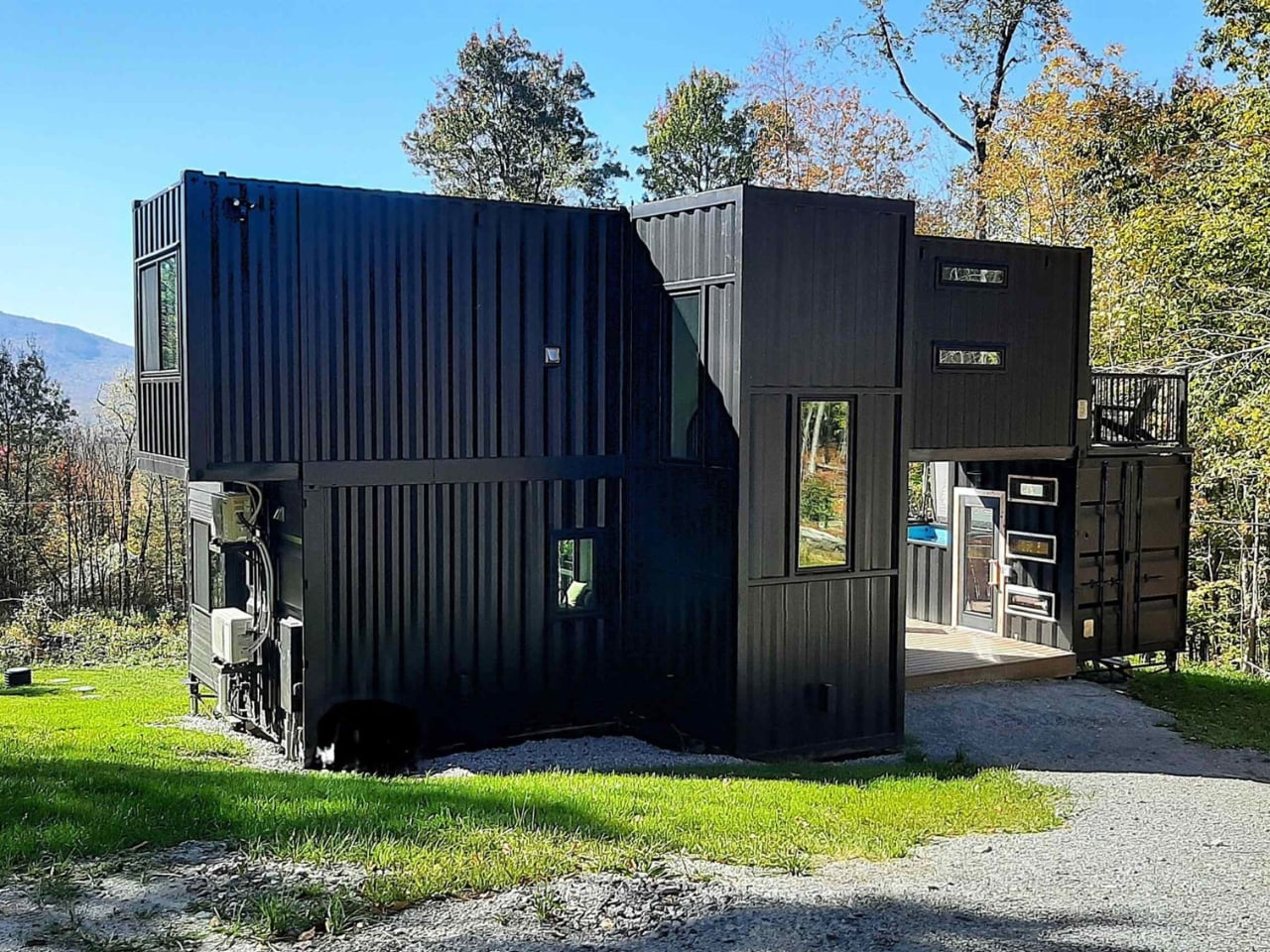
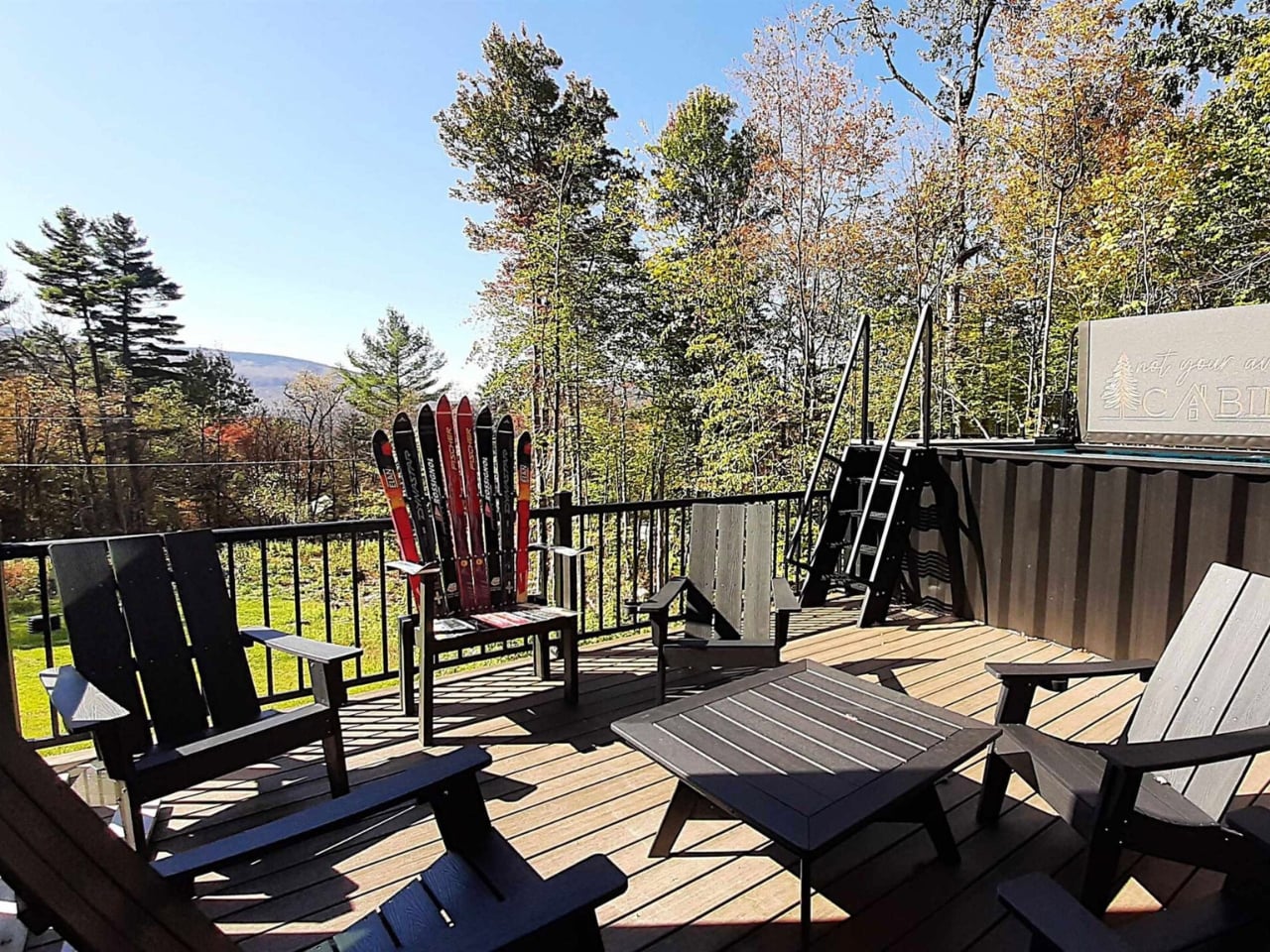
All five containers are painted a uniform matte black, which sounds like it could go very wrong in the middle of the New England countryside, but it actually works. The arrangement is staggered rather than just linear, creating terrace spaces on multiple levels. Against trees and open sky, the structure reads as intentional rather than industrial. The heavy modification helps too: the containers have been cut up and fitted with windows and doors that give the home a proper architectural language, rather than looking like boxes with holes punched in them.

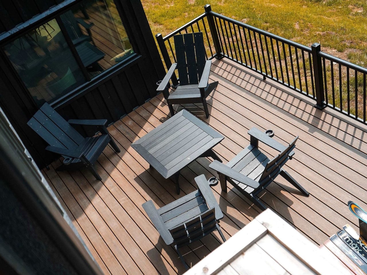
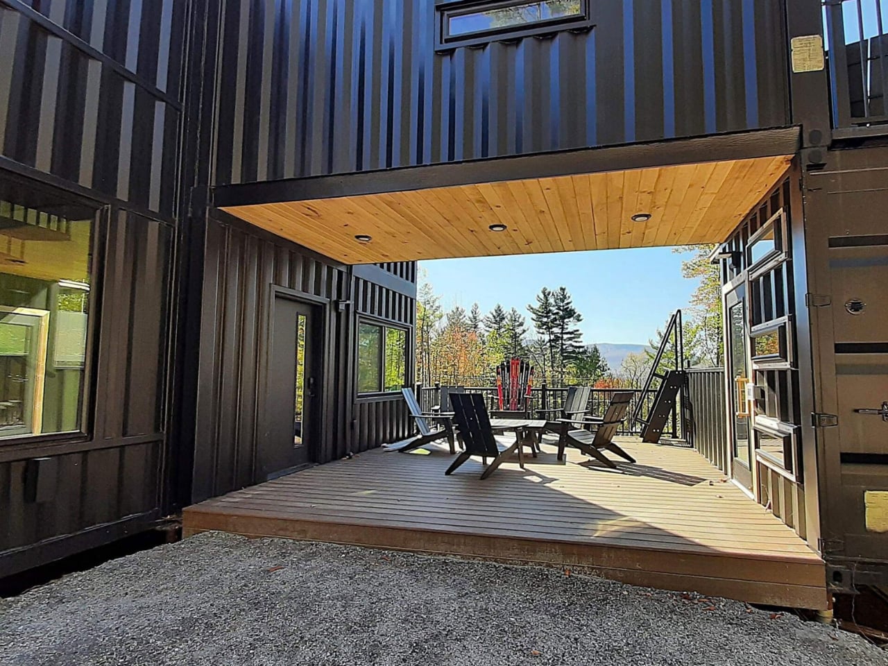
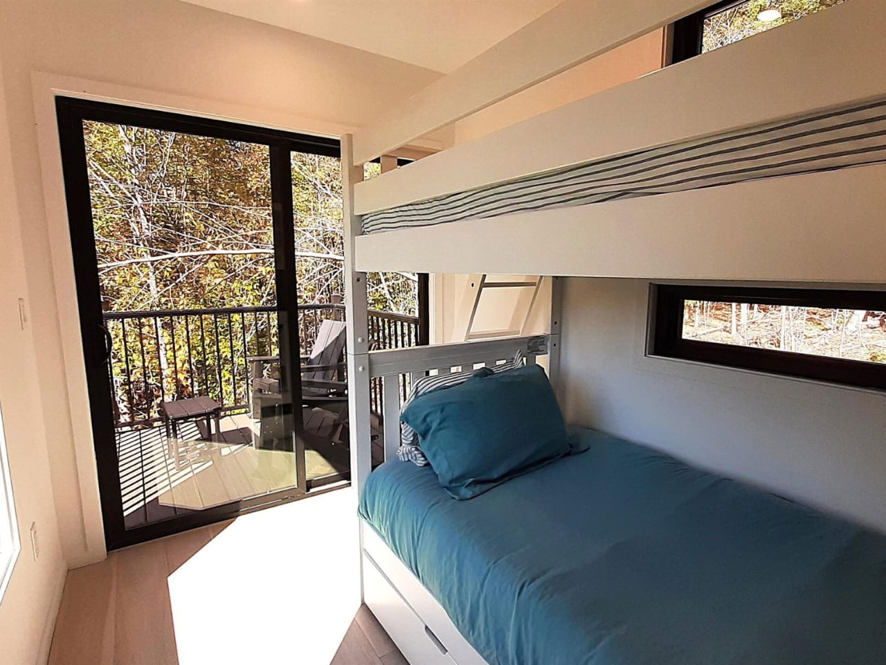
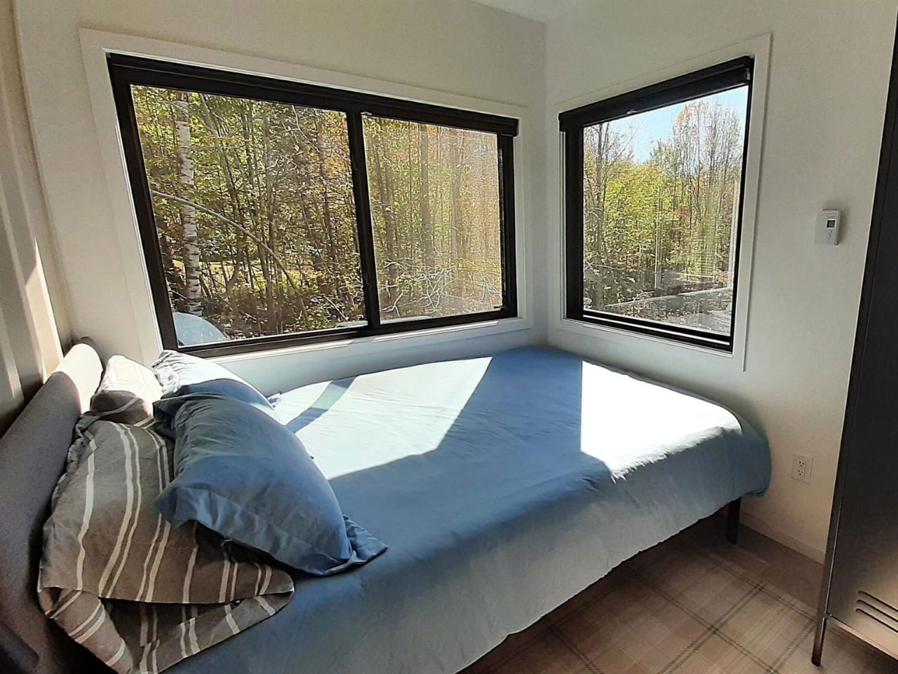
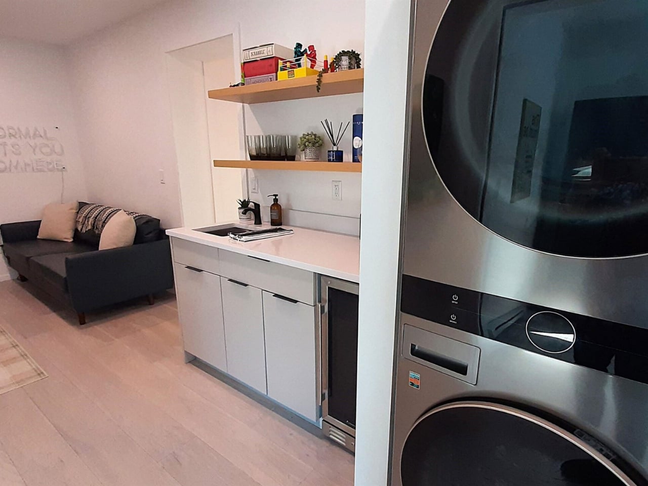
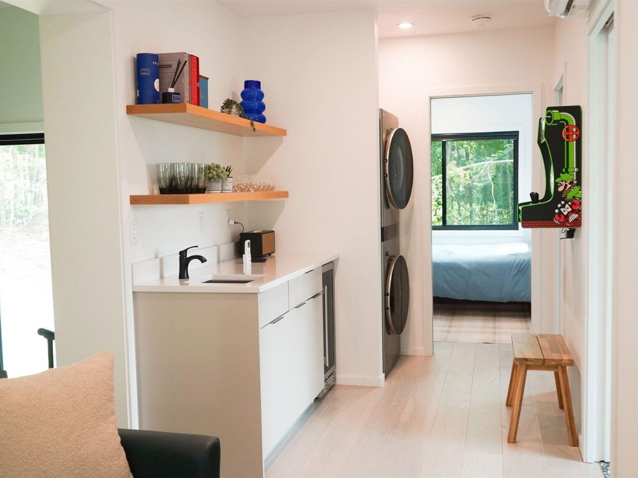
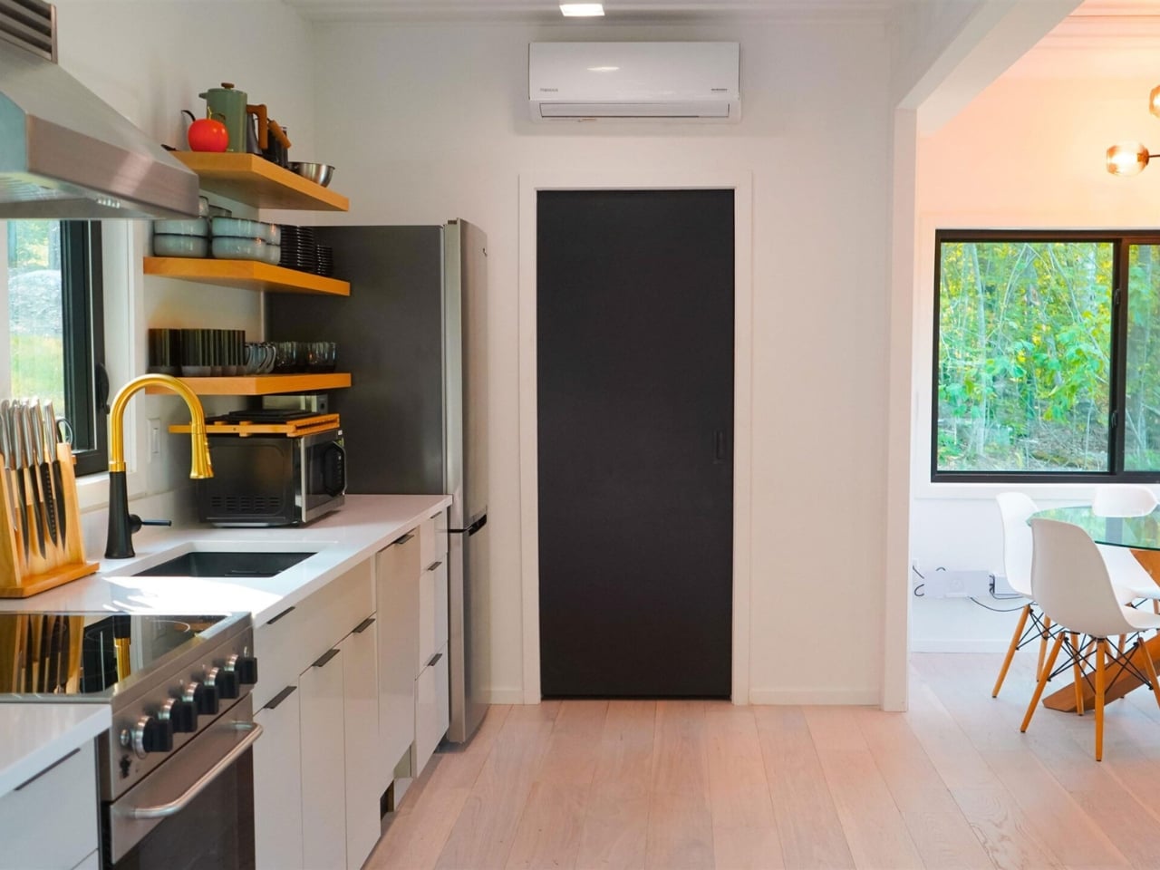
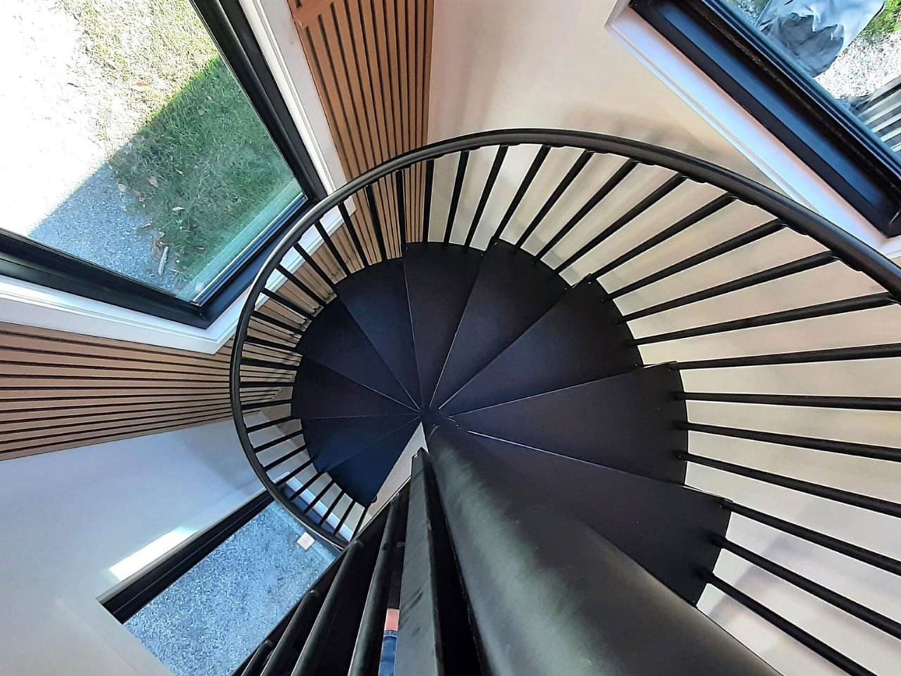
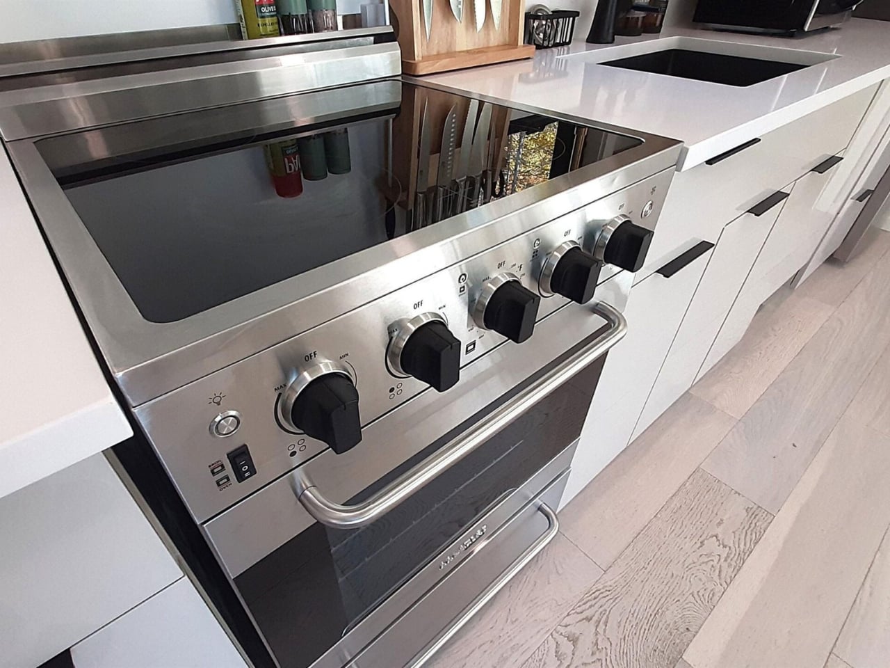
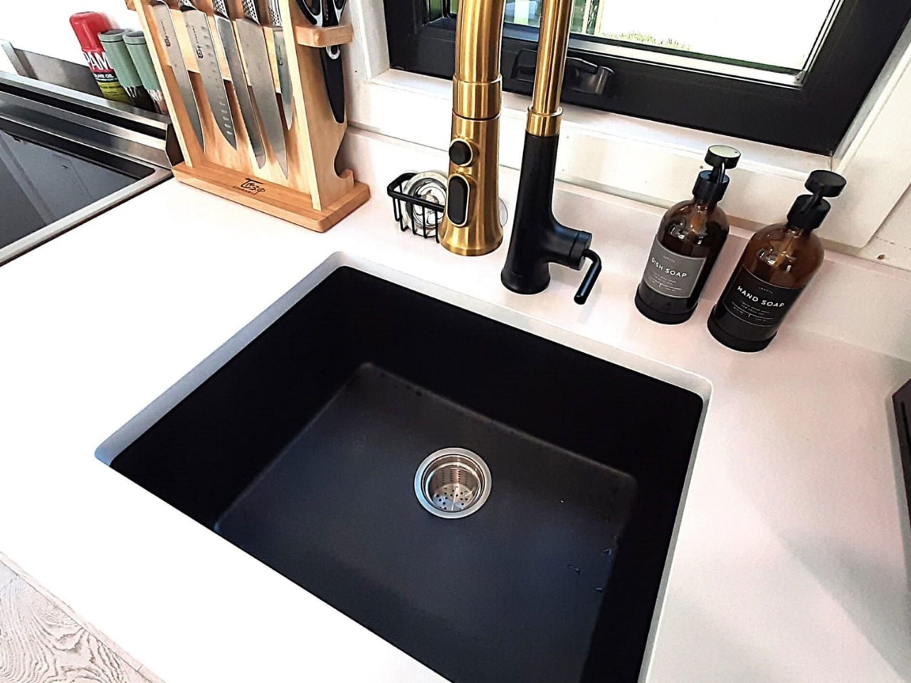
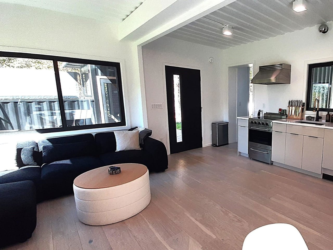
Inside, the layout includes a full kitchen, a wet bar, two separate living areas, and a spiral staircase connecting the two floors. Natural light is the real hero of the interior. Container homes are often criticized for feeling like dim metal tubes, and Backcountry Containers clearly took that criticism to heart. The windows throughout are generous, and the open-plan approach keeps the space from feeling like you’re living inside cargo. The bedrooms and bathrooms are described as “well-appointed,” which is the kind of language designers use when the finishes are actually nice and they’d rather undersell than overpromise.

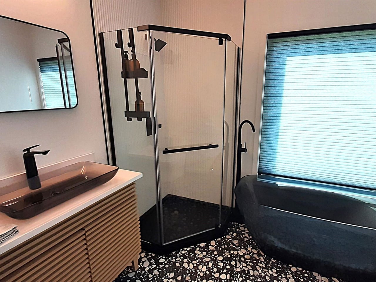
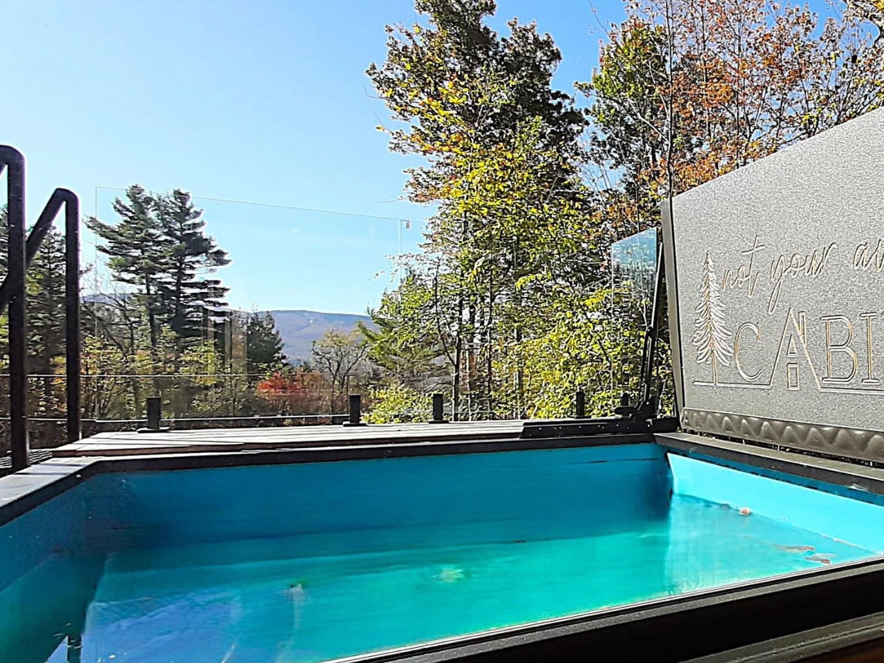
The outdoor situation is where things get genuinely interesting. Two decks, one at ground level and one on the rooftop, anchor the exterior. The views from a rooftop in that corner of the country, at almost any time of year, tend to be worth the climb. But the real conversation piece is the SaunaPlunge container: a custom 20-foot unit that combines a sauna with a three-in-one plunge pool. Cold plunging has had its cultural moment over the past few years, and integrating it directly into the home’s architecture rather than dropping a freestanding tub somewhere near the back porch feels like a legitimately smart call. It treats wellness as infrastructure, not decoration.

Container architecture has been having a sustained moment for over a decade now, and the discourse around it tends to oscillate between two poles. Either it’s framed as some radical act of sustainability (which it is, somewhat, though the modifications and insulation required complicate that story), or it gets dismissed as a design trend that doesn’t actually solve any real housing problem. Both critiques have merit. The Vermont Villa isn’t pretending to fix affordable housing. It’s a well-designed, custom-built home that happens to be made from repurposed industrial materials, and it makes no apology for that.

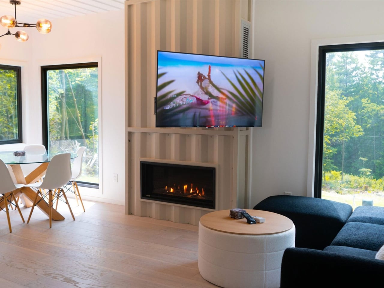
Backcountry Containers has been building container homes for over a decade, with features on HGTV and the DIY Network to show for it. Every project is handled by their in-house team, from design and metal fabrication to carpentry and plumbing. They know how to deliver a project that doesn’t look like a prototype or a mood board come halfway to life. The Vermont Villa is a finished home with a pool, a sauna, a rooftop deck, and enough interior square footage to feel genuinely livable for a family. That’s the benchmark container homes have been reaching toward for years, and this one clears it comfortably.

The question I keep coming back to isn’t whether container homes are worth it. It’s whether a build like this starts to shift what we consider normal. The Vermont Villa makes a decent case that it should.

The post 5 Containers, a Sauna, and a Rooftop Deck in Rural Vermont first appeared on Yanko Design.

The Leather Vessels at Milan 2026 That Feel Like They’re Breathing

When I first came across Talia Luvaton’s work, I genuinely paused. Not because it was unexpected to see leather used in design, but because nothing about these pieces looked like leather was supposed to look. The forms were full, curved, almost muscular, more closely related to the human body than to anything you’d find in a saddle shop or a fashion house. They looked, oddly, like they were breathing.

Luvaton is a Tel Aviv-based designer and leather craft artist, and her work is rooted in what she describes as a material-driven approach, which basically means the leather tells her where to go as much as she tells it. She works exclusively with sustainable vegetable-tanned leather, shaped by hand using wet-forming techniques and custom molds. The process involves pressure, moisture, and time, three variables that make each piece genuinely impossible to replicate exactly. That’s not a marketing claim. It’s a physical fact of the material.

Designer: Talia Luvaton

Her newest project, TRACE, makes its world debut at Milan Design Week 2026, opening April 20, and it might be the most personal thing she has made so far. It began with observational drawings of the human body. Fluid, organic shapes. Lines extracted from those drawings were then translated into three-dimensional form, the leather holding onto the gesture of the body the way a cast holds the memory of what shaped it. The pieces balance tension and softness in a way that feels almost contradictory, rigid enough to hold their form, yielding enough to feel warm.

I think that tension is entirely the point. Leather, as a material, carries its own contradictions. It’s strong but supple, ancient but endlessly contemporary. Luvaton leans into all of it, refusing to let the material play just one role. TRACE reads as sculpture, as vessel, as portrait. There’s no single correct way to categorize it, and that’s not a flaw. That’s the work.

What makes Luvaton’s practice feel particularly resonant right now is how personal the foundation of it is. Both of her parents are jewelers. Her grandfather was a shoemaker, and although she never met him, she still works with some of his original tools today. That detail gets me every time. To hold a tool that someone else held, someone whose hands shaped the same kind of material, is a profound form of continuity. The making is inherited. The language of craft passes down not just through instruction but through objects, through the weight of a tool in your hand.

This depth of lineage shows up across the broader body of work she’ll present in Milan. Alongside TRACE, visitors will see TOHA, her first vessel collection; SLICE; REBLOOM; and HEALED, a series of tattooed vessels created in collaboration with professional tattoo artists who work directly onto the leather surface using electric needles. Tattooed leather vessels. The idea feels both completely logical and completely radical, and that combination is exactly the kind of design thinking worth paying attention to.

For those of us who follow craft and design closely, Luvaton’s presence at Milan feels significant for reasons beyond the work itself. This is her first time at the event, and she’s arriving not with a polished commercial line but with a practice, a set of values, and a very specific way of understanding what a material can do. At a moment when the design conversation is increasingly dominated by AI-generated forms and rapid prototyping, there’s real weight in watching someone slow everything down, put their hands in wet leather, and wait for it to tell them something.

TRACE, as a title, does exactly what it promises. It traces movement back to its origin. It traces craft back through a family. It traces the line between the body and the object, and asks you to reconsider where one ends and the other begins. That’s the kind of design work that stays with you long after you’ve left the room.

The post The Leather Vessels at Milan 2026 That Feel Like They’re Breathing first appeared on Yanko Design.

Gadhouse’s $99 Miko Is the Cassette Player the Revival Needed

Cassette tapes are having a moment, and that moment is refusing to end. According to Billboard, cassette sales have grown more than 440% over the past decade, and in the first quarter of 2025 alone they more than doubled, hitting numbers not seen in 20 years. This isn’t a blip or a quirky indie niche. It’s a full-on cultural movement, and whether you’re old enough to remember rewinding a tape with a pencil or you’ve been hunting down limited editions on Bandcamp, you’ve probably felt its pull.

Gadhouse, the audio lifestyle brand behind some genuinely good-looking retro-inspired gear, clearly felt it too. The result is Miko, their first cassette player, and it arrives looking like it has a point to make. The design alone earns attention. Gadhouse drew heavily from the 1985 to 1995 era, a decade widely considered the peak of expressive, personality-driven consumer electronics. Miko carries that DNA through a translucent front cover that lets you watch the cassette move, an aluminum logo detail, and a compact form factor that sits satisfyingly in the hand.

Designer: Gadhouse

It comes in two colorways, Smoke and Mint, and both feel deliberately considered rather than arbitrarily chosen. The Mint version especially hits that sweet spot between vintage and current that a lot of retro-inspired products spend significant design budgets trying and failing to achieve.

Beyond the looks, Gadhouse made a smart decision not to stop at aesthetics. The Miko runs on Bluetooth 5.3, which means you can pair it with wireless headphones and walk out the door untethered. There is also a 3.5mm stereo output for those who prefer a wired setup or own a vintage pair they’re not ready to part with. Both options coexist without one feeling like an afterthought, and that kind of functional honesty is rarer than it should be in products that trade so heavily on nostalgia.

The five-button control system handles play, fast-forward, rewind, stop, and record. That last button deserves its own moment. Miko includes a built-in directional microphone, which means you can record directly onto cassette. Voice notes, song ideas, a mix tape for someone you want to impress, or a playlist you’ve actually curated rather than algorithmically generated. The format shifts from relic to creative tool pretty quickly once you remember that capability is built right in. Gadhouse has also announced plans to release their own line of blank cassette tapes and accessories later this year, which suggests they’re approaching this as a longer-term ecosystem rather than a one-and-done launch.

At 192 grams, Miko is light enough to drop into a bag without thinking twice. It runs on AA batteries and accepts USB-C power input, including directly from an iPhone, which is exactly the kind of considered detail that signals a team that actually thought about how people use things in the real world. The campaign imagery reinforces the tone they’re going for: youthful, a little editorial, tactile. It reads less like a tech launch and more like a lifestyle statement, which, for this kind of product, is probably the right call.

The cassette revival isn’t going anywhere because it was never purely about audio quality. It’s about ownership, tactility, and a kind of deliberate listening that streaming has made increasingly rare. When you play a cassette, you commit to it. You flip it, you fast-forward past songs you skipped last time, you sit with the imperfections. Holding a tape, choosing it, pressing play. That sequence means something to people. That’s not nostalgia talking, that’s human behavior. Miko seems to understand this, and it packages that understanding into something that actually functions well in 2026, without trying to be a museum piece or a tech gimmick.

The Gadhouse Miko Cassette Player is priced at $99/£59.99 and available now from the Gadhouse website and global partners, with major retailers including Amazon, HMV, Currys, Tesco, and John Lewis expected to follow. Starting April 30th, it can be bundled with Gadhouse’s Wesley Retro Headphones for $149/£109. For anyone already deep into the format or simply cassette-curious, this might be the most considered entry point on the market right now.

The post Gadhouse’s $99 Miko Is the Cassette Player the Revival Needed first appeared on Yanko Design.

Vancouver’s First Supertall Was Inspired by the Ocean Floor

Vancouver has always had good bones. The mountains, the water, the way the city sits between them like it was planned by someone with an eye for drama. But for all its natural beauty, its skyline has played it relatively safe. That’s about to change, and the agent of disruption is, of all things, a sea sponge.

Henriquez Partners Architects, a local Vancouver studio, has unveiled designs for 595 West Georgia Street, a 1,033-foot tower that will become the city’s first-ever supertall skyscraper. To earn that designation, a building has to exceed 984 feet, which puts 595 West Georgia just barely in that club and makes it a landmark before a single floor has been built. It’s the centerpiece of a larger trio called Georgia & Abbott, developed by Holborn Group, but this one is clearly the main event.

Designer: Henriquez Partners Architects

The design draws from the glass sea sponge reefs, specifically hexactinellids, found off the coast of British Columbia. These aren’t the bath sponges you’re picturing. They’re ancient, rare, deep-sea organisms with a crystalline skeletal structure that is simultaneously porous and structurally formidable. Henriquez Partners didn’t just borrow the idea aesthetically; they borrowed it structurally. The building is wrapped in a steel exoskeleton clad in white Glass Fibre Reinforced Polymer panelling, with highly translucent spans of glass filling the rest. That external framework carries the structural loads, which means fewer internal columns, more open floor plates, and a surface that looks woven and textured rather than sealed and flat.

That last distinction matters more than it sounds. Glass-box towers have dominated skylines for decades, and while some are genuinely beautiful, most are just reflective. They bounce light around and blend into each other. 595 West Georgia is going for something different: depth. The lattice of the exoskeleton creates shadows and layers depending on where you’re standing and what time of day it is. It moves, visually, in a way that most modern towers simply don’t, which makes looking at it feel more like watching a living surface than a fixed object.

Henriquez Partners described the design as telling “a story that is unique to British Columbia.” That kind of regional specificity is increasingly rare in architecture, where global firms often produce work that could exist in Dubai just as easily as Dallas. The fact that this building could only make sense in Vancouver, because the glass sponge is native to BC’s coastal waters, gives it a conceptual integrity that goes beyond branding. It’s a building that knows where it lives.

The program is equally considered. 595 West Georgia will function as a hotel tower, with conference facilities, a rooftop restaurant, and a publicly accessible observation deck at the top that will be free for Vancouverites to visit. That detail alone shifts the building’s relationship to the city. A supertall designed to be shared with the public rather than sealed off for guests feels like a genuine gesture, and it suggests that the architects and developer thought about this tower as part of the city’s fabric, not just its skyline profile.

The whole project sits at a compelling intersection of ideas. It’s biomimicry applied at an urban scale, which is a growing conversation in both design and engineering. It’s also a statement about what cities are willing to reach for, literally and figuratively. Vancouver has been measured about its height limits for years, and for good reason. The city’s low-rise character has long been part of its identity. Greenlighting a supertall signals that the city is ready to stretch those boundaries, and having one that can argue its design philosophy this clearly makes that shift feel earned.

Whether 595 West Georgia turns out to be as striking in person as the renderings suggest is something only construction can answer. But the foundational idea, that the most interesting path forward might look like something pulled from the ocean floor, is exactly the kind of thinking that makes architecture worth paying attention to right now. Not every city gets to say its most ambitious tower was modeled after an organism that’s been living quietly underwater for centuries. Vancouver gets to say that.

The post Vancouver’s First Supertall Was Inspired by the Ocean Floor first appeared on Yanko Design.

Disney and NatGeo Built Billboards That Bees Can Actually Live In

Most billboards are built to be noticed and then forgotten. You see them, you process whatever they’re selling, and then they fade into the visual noise of the street. So when a campaign comes along that flips that formula entirely, it genuinely stops you in your tracks.

That’s exactly what’s happening in Manchester right now, where Disney and National Geographic, working with creative agency Meanwhile, have installed a series of billboards designed to do more than advertise. The structures, which the team calls “bloomboards,” are fitted with built-in cavities, textured surfaces, and planting elements that turn them into functioning habitats for bees. Not a two-week stunt. Not a PR photo op. Permanent installations, built from sustainably sourced cedar that had already been felled, placed across parks and public spaces throughout the city.

Designer: Meanwhile for Disney and National Geographic

The campaign ties to the launch of National Geographic’s Secrets of the Bees, a documentary series presented by explorer Bertie Gregory and executive produced by James Cameron. The series was filmed over several years using specialized cameras to capture bee behavior at a level of detail most of us have never seen. Entomologist Dr. Samuel Ramsey provided scientific input throughout. It’s streaming now on Disney+ and Hulu, and from a content standpoint alone, it sounds like essential viewing.

But the billboard work is where this becomes interesting as a piece of design thinking, not just marketing. Rather than placing a nature image on a billboard and calling it Earth Month, Meanwhile built the message into the medium. The physical structure becomes an argument for the cause. The billboard doesn’t just tell you bees matter; it gives them somewhere to live. Mini bee hotels have also been placed at several locations across Manchester, including Chorlton Water Park, Wythenshawe Park, Fletcher Moss Botanical Garden, and the Northern Quarter. Like the bloomboards, these aren’t decorative gestures. They’re functional, permanent additions to the urban landscape, and that distinction matters when the campaign is rooted in conservation.

Rachel Miles, creative director at Meanwhile, put it simply: “Our ambition is to encourage people to plant their own mix of shrubs and perennials to support bee populations and create a positive impact.” Michael Tsim, also a creative director at the agency, was just as direct: “Not just a two week campaign, but something they actually benefit from, permanently.”

That word, permanently, is doing a lot of heavy lifting here. Environmental advertising has a long history of looking good while changing nothing. Companies run campaigns during Earth Month and then quietly move on. What makes this campaign feel different is that the outcomes are baked into the design itself. The bees don’t need to watch the documentary to benefit. The habitat exists regardless of whether anyone scans a QR code or downloads an app.

It also speaks to a broader shift in how thoughtful brands are approaching cause-driven work. The bar for audiences has risen sharply. People can spot the difference between a brand that has added a green ribbon to its logo and one that has committed real resources to a problem. Embedding a working habitat into an advertising structure is a tangible commitment, and one you can’t undo when April ends.

For anyone who follows design, this campaign is a reminder that the best work often finds its power in constraints. A billboard is a flat surface with a job to do. Meanwhile used that constraint not as a limitation but as a starting point, and the result is something genuinely unusual. Form serves function, function serves form, and both serve something beyond the campaign itself. Whether or not you plan to watch Secrets of the Bees (though I’d argue you should), the billboard project stands on its own as a piece of design worth paying attention to. It’s an example of what happens when a brief asks for more than attention and a creative team decides to take that seriously.

The post Disney and NatGeo Built Billboards That Bees Can Actually Live In first appeared on Yanko Design.

The Kids’ Phone With No Screen, No Apps, and Only $100

The moment you see the Tin Can, you know exactly what it is and also what it isn’t. It’s a landline phone, complete with a handheld receiver and a curly cord, designed to sit on a countertop or mount on a wall. It isn’t a smartphone. It isn’t a tablet. It doesn’t have a screen. And that’s entirely the point.

Tin Can is the brainchild of three Seattle-based dads: Chet Kittleson, Max Blumen, and Graeme Davies, who created it after hitting the same wall millions of parents run into. Their kids were at that in-between age, old enough to want independence and social connection, but too young to be handed a device with unrestricted internet access. The options available were either too much or not enough. As the founders put it: “Everything out there felt like a compromise, too much tech, too much access, or just another screen to manage.” So they built something else entirely.

Designers: Chet Kittleson, Max Blumen, and Graeme Davies

The Tin Can works through Wi-Fi but without any browsing capability, social media, or texting. Children can only call and receive calls from a parent-approved list of contacts, managed through a companion app that only parents can access. Quiet hours and Do Not Disturb can be scheduled. Voicemails are supported. That’s it. That’s the whole phone. And it turns out, that’s more than enough.

From a design standpoint, the product is refreshingly considered. The cylindrical Tin Can model has a playful, almost cartoonish quality that looks deliberate rather than dated. Its colorful palette, with names like “Answer Me Aquamarine,” signals that this wasn’t designed to collect dust in a hallway. The other model, the Flashback, leans harder into nostalgia, styled after the wall-mounted phones of the 1980s and connecting via ethernet cable rather than Wi-Fi. Both feel like products made by people who actually thought about what a child’s first phone should feel like, not just what it should do.

I’ll be honest, my initial reaction to this was mild skepticism. We’ve seen “screen-free” devices for kids before, and they tend to be clunky, joyless compromises that kids tolerate for about two weeks before losing interest. Tin Can feels genuinely different. Part of that is the design, which doesn’t try to mimic a smartphone and fail. It commits fully to being a phone, a beautiful, strange little object that sits in your home and rings. Part of it is the clarity of the concept. The product makes no attempt to sneak in “just a little” content or add a casual app or two for good measure. That restraint is its biggest strength.

The market response has been telling. Since launching, Tin Can has reached users in all 50 US states and across Canada, raised $3.5 million in funding, and sold through its first batches fast enough to crash at Christmas. The founders have described the reception as overwhelming, and it’s not hard to see why. Parents have been waiting for exactly this, a middle ground between total dependence on mom’s phone and a fully connected smartphone, and no one had bothered to build it yet.

What also makes Tin Can compelling is that it re-centers something communication technologies quietly stripped away: the social ritual of calling someone. You pick up the receiver, you dial, you wait, and you talk. No typing, no video filters, no leaving someone on read. It’s a more focused, more present kind of connection, and kids who grow up with it might just develop a better instinct for actual conversation.

The Luddite movement has spent years arguing that smartphones reached kids too early and too fast. Tin Can doesn’t join that argument. It sidesteps it entirely by offering something genuinely useful, beautifully designed, and completely free of the features that make smartphones so hard to put down. Whether you call it nostalgia or just good design thinking, the result is the same: a phone worth answering.

The post The Kids’ Phone With No Screen, No Apps, and Only $100 first appeared on Yanko Design.

The World’s First T-Rex Leather Handbag Will Cost You $663,000

Did you ever think to yourself, what if I had a bag made from an extinct million-year-old animal? I mean, people do have bags made from cows, sheep, goats, and even crocodiles, snakes, and lizards. So why not have something from a really exotic animal that doesn’t exist anymore?

Well, apparently there are people, specifically those from techwear label Enfin Levé, who did think of that and have now come up with the world’s first ever T-Rex Leather™ 
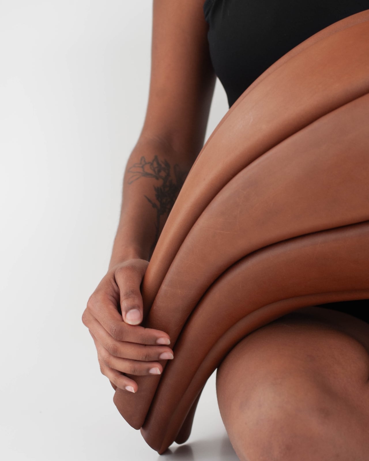
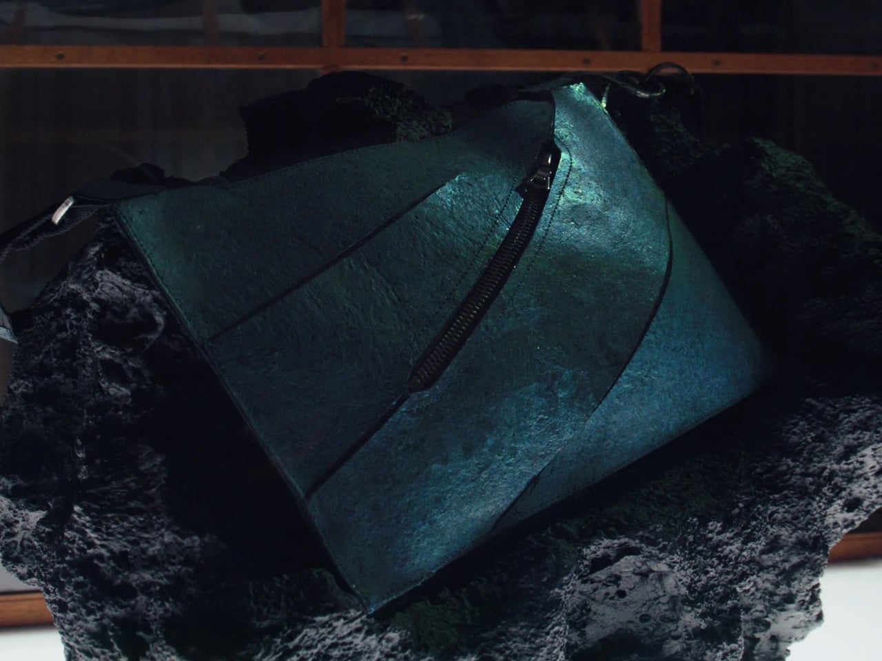
Handbag. And obviously, this time around, no actual animals were harmed in making this one-of-a-kind luxury handbag.
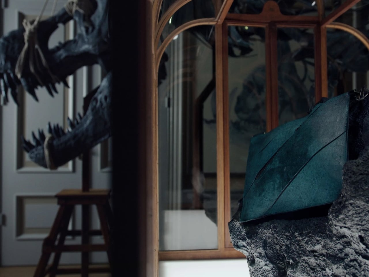
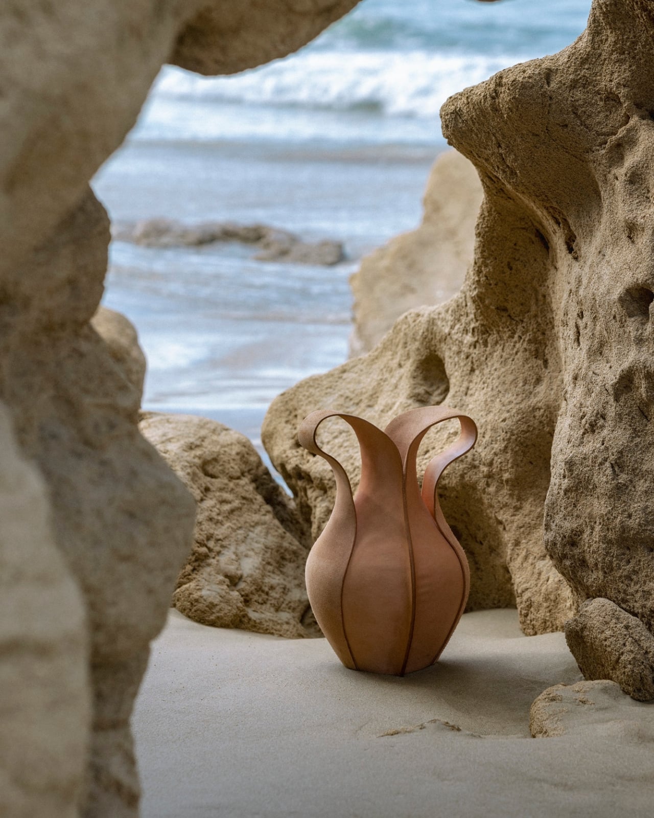
Designer: Enfin Levé

What they used to actually make the bag is lab-grown material that scientists engineered using reconstructed dinosaur collagen. They reconstructed collagen sequences from 66-million-year-old T.Rex fossils that were eventually turned into real leather and now into a luxury handbag that collectors (with money) will probably rush to add to their cabinet (and maybe not actually use). Design-wise, the bag has a sleek and angular silhouette in a striking deep teal color. There are even three decorative incisions in the design that look like dinosaur scratch marks, to add a bit of “realism” to the bag. There is also a DNA helix-styled hardware connecting the strap to the bag.

Now, what makes this more than just a wild concept is actually what went into the leather itself. The T-Rex Leather™ isn’t some glorified synthetic material trying to pass as the real thing. It was developed by three collaborators: creative agency VML, genomic engineering company The Organoid Company, and biotech pioneer Lab-Grown Leather Ltd., and the result is a material that is apparently structurally identical to traditional leather. It’s durable, biodegradable, repairable, and fully traceable. So not only are you carrying something from 66 million years ago, but you’re also carrying something that is arguably better for the planet than your average luxury leather good. No animal slaughter, no deforestation, no heavy-chemical tanning process involved. In a weird twist of fate, the most ancient leather is also the most future-forward.

Enfin Levé’s founder and lead designer, Michal Hadas, put it perfectly when he said the goal was never to force the material into “familiar codes of luxury.” Instead, he let the T-Rex leather speak for itself, figuring out where it resists, how it holds tension, and letting all of that shape the final design. Which honestly? That kind of design philosophy is exactly why this bag feels so different from anything else out there.

The bag is currently on display at the Art Zoo Museum in Amsterdam and is displayed alongside a colossal life-size T. Rex skeleton cast from the Naturalis Biodiversity Center in Leiden, Netherlands. It will be there until May 11, in case you’re in town. But in case you thought there would be a slew of people carrying the T-Rex bag around, there is actually only one that exists in the world. It will be auctioned off to the highest bidder with the bid starting at around $663,000.

As for whether T-Rex leather will ever make it to the mass market, don’t hold your breath just yet, but don’t completely give up hope either. The plan is to eventually make the material available to luxury brands, starting with high-end accessories before expanding into other industries like automotive. So who knows, a T-Rex leather interior in your next car might not be as far-fetched as it sounds. For now though, this bag belongs to the world of the rare and extraordinary, right where it should be. Whether you’re a serious collector, a fashion obsessive, or someone who just really, really loves dinosaurs, there’s no denying that the Enfin Levé T-Rex Leather Handbag is genuinely unlike anything that has ever existed before. And at $663,000, well, some things truly are one of a kind.

The post The World’s First T-Rex Leather Handbag Will Cost You $663,000 first appeared on Yanko Design.

km5’s Neon Yellow CD Player Just Made the Circuit Board the Star

Most brands spend their entire design budget hiding what’s inside a product. km5, the Tokyo audio label that’s been quietly rewriting how people think about CD players, just did the opposite. Their latest drop, released through bPr BEAMS, puts the circuit boards, the laser mechanism, the wiring, all of it, front and center. And it looks extraordinary.

The collection introduces three new color variations: the Cp1 in Neon Yellow, the Cp2 in Clear, and the Hp1 headphones in Clear. Available starting April 1st as an exclusive pre-sale at select bPr BEAMS stores and the km5 online shop, these aren’t just color refreshes. They’re a statement about what audio design can actually look like when a brand commits to a philosophy all the way through.

Designer: km5 and bpr beams

km5’s original aesthetic has always been rooted in rigorous minimalism, the idea that a CD player should be as easy to look at as anything else in a considered space. Their Cp1 was designed like an instant photo frame, built to display the album jacket as art. Their Cp2 had the silhouette of a slim hardback, something you’d be comfortable leaving on a shelf. The Hp1 headphones weighed just 103 grams and arrived with a polished stainless steel band that belonged in a gallery as much as on a commute. The design language has always been controlled, quiet, deliberate.

This new drop takes that same discipline and applies it to a completely different tension. The concept km5 describes as pursuing a contrast between “transparent” and “neon,” a play between the mechanical cool of visible engineering and the almost aggressive energy of neon light. It’s a bold shift in mood that somehow still feels entirely on-brand.

The Cp1 in Neon Yellow is the most immediately striking. The entire frame is cast in that charged, electric green-yellow, and when you look at it, you can see every component underneath lit by the color of the shell itself. It doesn’t look like a product. It looks like something you’d find in a design museum sandwiched between an Olivetti typewriter and an early Apple prototype. The edges illuminate in a way that makes it feel alive, like it’s doing something even when it’s sitting still.

The Cp2 Clear is the one I keep coming back to, though. It’s been a long time coming, because fans of the CP series have been wanting a transparent version of the speaker-equipped Cp2 since the model launched. Now that it exists, it earns every bit of the wait. The internal structure, the laser mechanism, the circuit boards, the speaker grille, all of it sits behind the clear shell in a way that reads more like an exploded technical drawing than a consumer product. It’s serious, it’s cool, and it’s genuinely beautiful in a way that no amount of matte white plastic could replicate.

The Hp1 Clear follows the same logic. The housing is stripped back to transparent, the internals are exposed, and then the lime yellow ear pads arrive as the whole color story’s punctuation mark. It’s a contrast that shouldn’t work as well as it does. The clear mechanical housing next to those soft, textured yellow cushions is the kind of pairing that reads as both street-ready and gallery-worthy at the same time. Techwear people are going to love this. Interior people are going to love this. That’s a rare overlap.

The thing km5 keeps getting right, and this drop confirms it again, is that they understand what the people who buy beautiful objects are actually buying. It’s not just function. It’s not even just aesthetics. It’s the feeling that the people who made the thing cared. That they thought about it all the way down to the part you’d normally never see. Making the inside visible is, in some ways, the ultimate expression of that care. You have nothing to hide when everything you make is worth looking at.

The post km5’s Neon Yellow CD Player Just Made the Circuit Board the Star first appeared on Yanko Design.

LEGO Finally Gives Tintin’s Moon Rocket Its Brick-Built Moment

The moon landing happened in 1969. Tintin got there in 1954. That’s the kind of detail that makes you stop, reconsider, and immediately want to tell someone about it. Hergé, the Belgian cartoonist behind The Adventures of Tintin, published Destination Moon and its sequel Explorers on the Moon in the early 1950s, a good fifteen years before Neil Armstrong ever set foot on the lunar surface. What makes that even more remarkable is how seriously Hergé took the science behind it. He corresponded with space experts, commissioned a physical rocket model to verify its accuracy, and drew every last detail with a level of rigor that would feel at home in an aerospace manual. The rocket he designed, that now-iconic red-and-white checkered tower, wasn’t just a narrative prop. It was a genuine vision of what a moon mission could look like, built from the best technical knowledge available at the time.

And now LEGO has turned it into 1,283 bricks. The LEGO Ideas Tintin Moon Rocket (Set #21367) is available now, priced at $159.99, and it is exactly as satisfying as you’d want it to be. Standing at 49cm tall with the red-and-white checkered pattern faithfully recreated in brick form, it works beautifully as a display piece, which is clearly the whole point. This is part of LEGO’s Ideas line, designed for adults 18 and up, and it carries that same particular energy as the Botanical Collection or the vintage typewriter set: you build it once, and then it earns a permanent spot on your shelf.

Designer: LEGO

The set includes six figures, Tintin, Captain Haddock, Professor Calculus, the twin detectives Thomson and Thompson, all in detailed space suits with helmets and oxygen tanks, plus Snowy. There’s also a removable panel on the nose cone that opens to reveal a miniature control room inside. That’s the kind of considered detail that makes a $159 price tag feel reasonable rather than indulgent.

But the more interesting story is really about the design of the rocket itself. The checkered pattern on Hergé’s original wasn’t just a visual choice. It was a functional one. The two-tone design was rooted in actual aerospace practice, used to track a rocket’s roll and rotation during launch. Hergé based the rocket’s overall silhouette on the German V-2, the most advanced rocket technology the world had seen at that point, developed under Wernher von Braun’s direction during World War II. The full-circle irony is that von Braun, the man whose V-2 work first inspired Hergé’s fictional rocket, later became NASA’s chief rocket architect and was instrumental in developing the Saturn V that carried Apollo 11 to the actual Moon. Fiction and history were chasing each other the whole time, and somehow Tintin was always a step ahead.

This is also the first LEGO Tintin set ever made, which, given how culturally massive the franchise is, feels like it took longer than it should have. Over two dozen albums, translations into dozens of languages, a presence spanning continents and generations. The set started as a fan submission from Portuguese designer Alexis Dos Santos, known online as Tkel86, who put it through the LEGO Ideas community voting process before it reached full production. That origin story is fitting. Tintin has always been driven by devotion rather than obligation.

The LEGO Ideas line has a reliable instinct for picking the right icons, and the Tintin Moon Rocket belongs here. It works on multiple levels at once: a display piece that’s genuinely beautiful, a nostalgic touchstone for anyone who grew up with the comics, and a design artifact with a richer backstory than most people expect. The checkered pattern that looks so striking on a shelf today is the same pattern that was quietly grounded in real rocket science more than seventy years ago. For anyone who appreciates when design, history, and storytelling land in the same object, this one is absolutely worth your attention.

The post LEGO Finally Gives Tintin’s Moon Rocket Its Brick-Built Moment first appeared on Yanko Design.