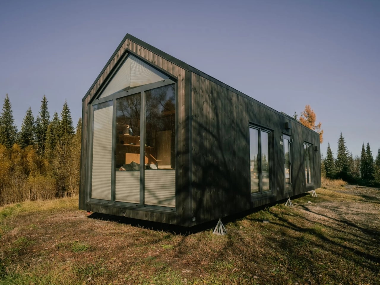
There’s a particular kind of restraint that’s genuinely hard to pull off in architecture. Anyone can build something that commands attention. Far fewer can build something that quietly earns it. The Solem Forest House in Oslo, Norway, designed by MORFEUS arkitekter, belongs firmly in the second category, and it’s the kind of project that stops you mid-scroll and makes you think about what good design actually is.
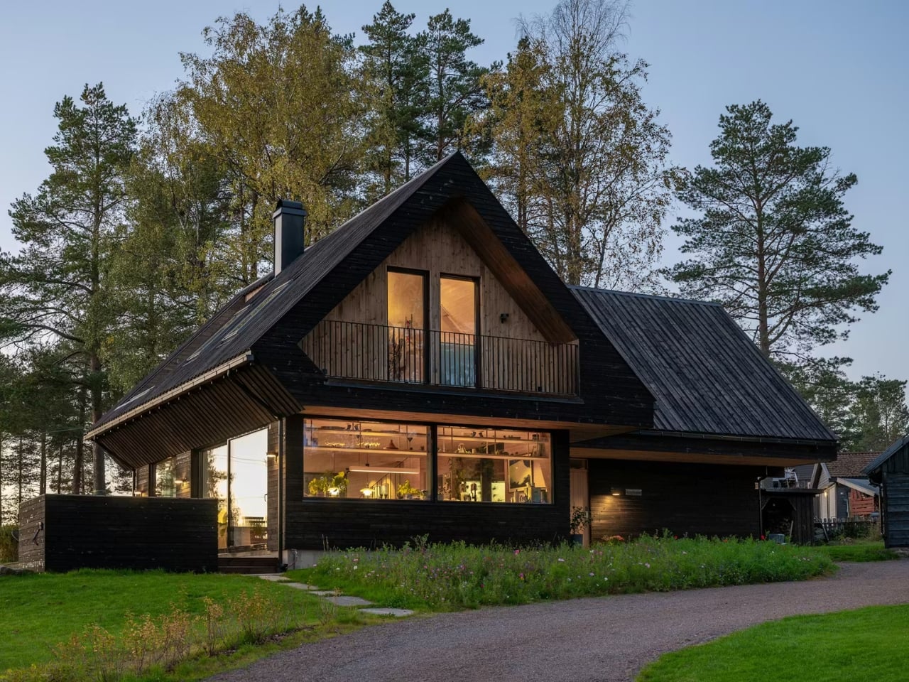
The house sits on a gently sloping ridge just east of Maridalsvannet, Oslo’s main water supply, in a small residential area surrounded by tall pine trees and deep forest. It’s not a massive project. At 170 square meters, it’s modest by most standards. But what MORFEUS arkitekter did with that footprint, and more importantly, what they chose not to do, is what makes it worth talking about.
Designer: Morfeus Arkitekter
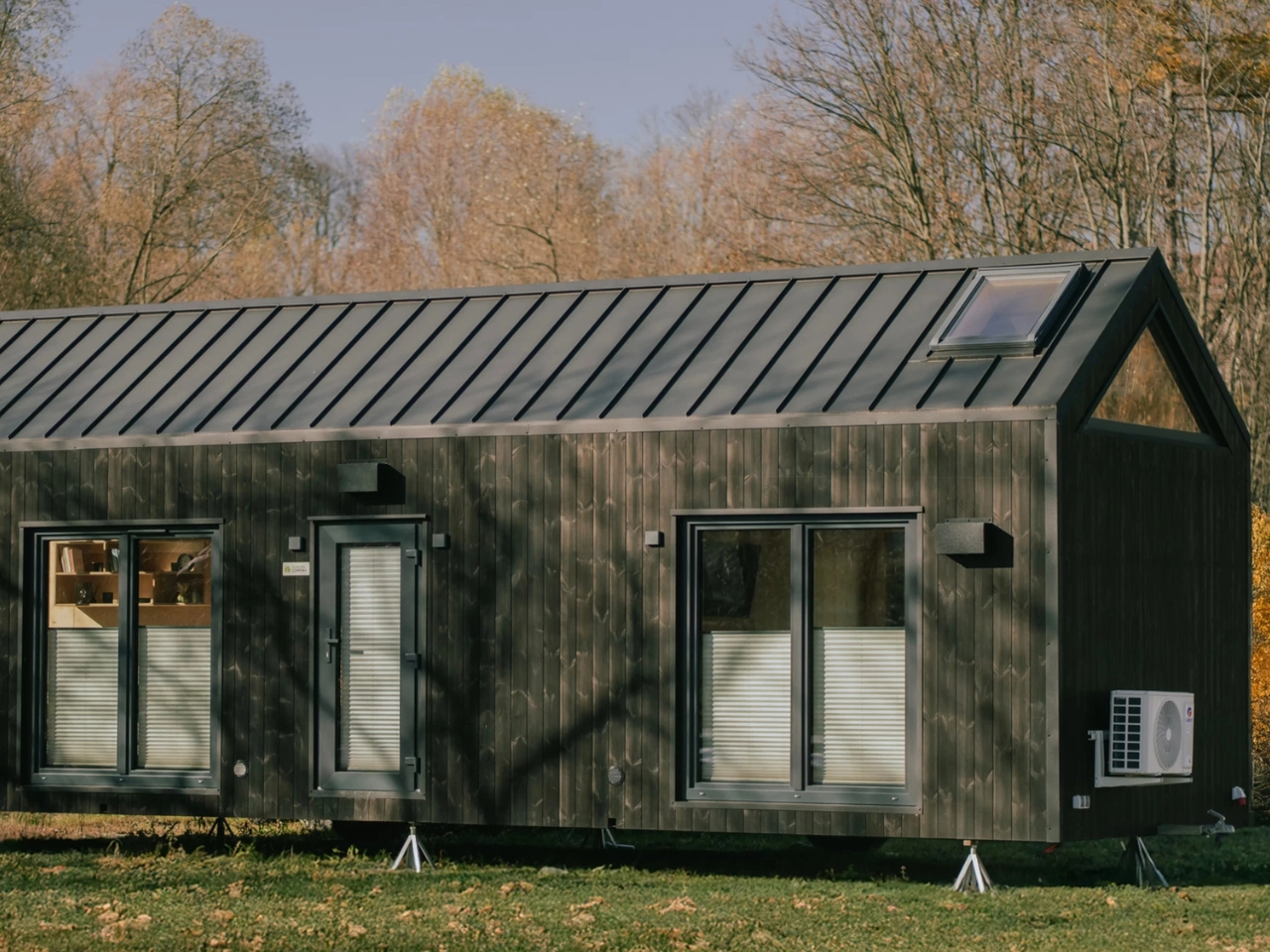
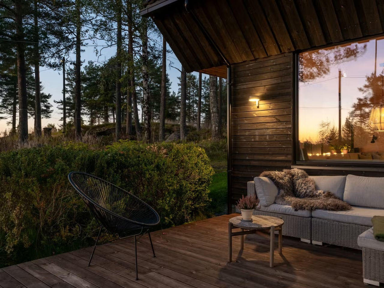
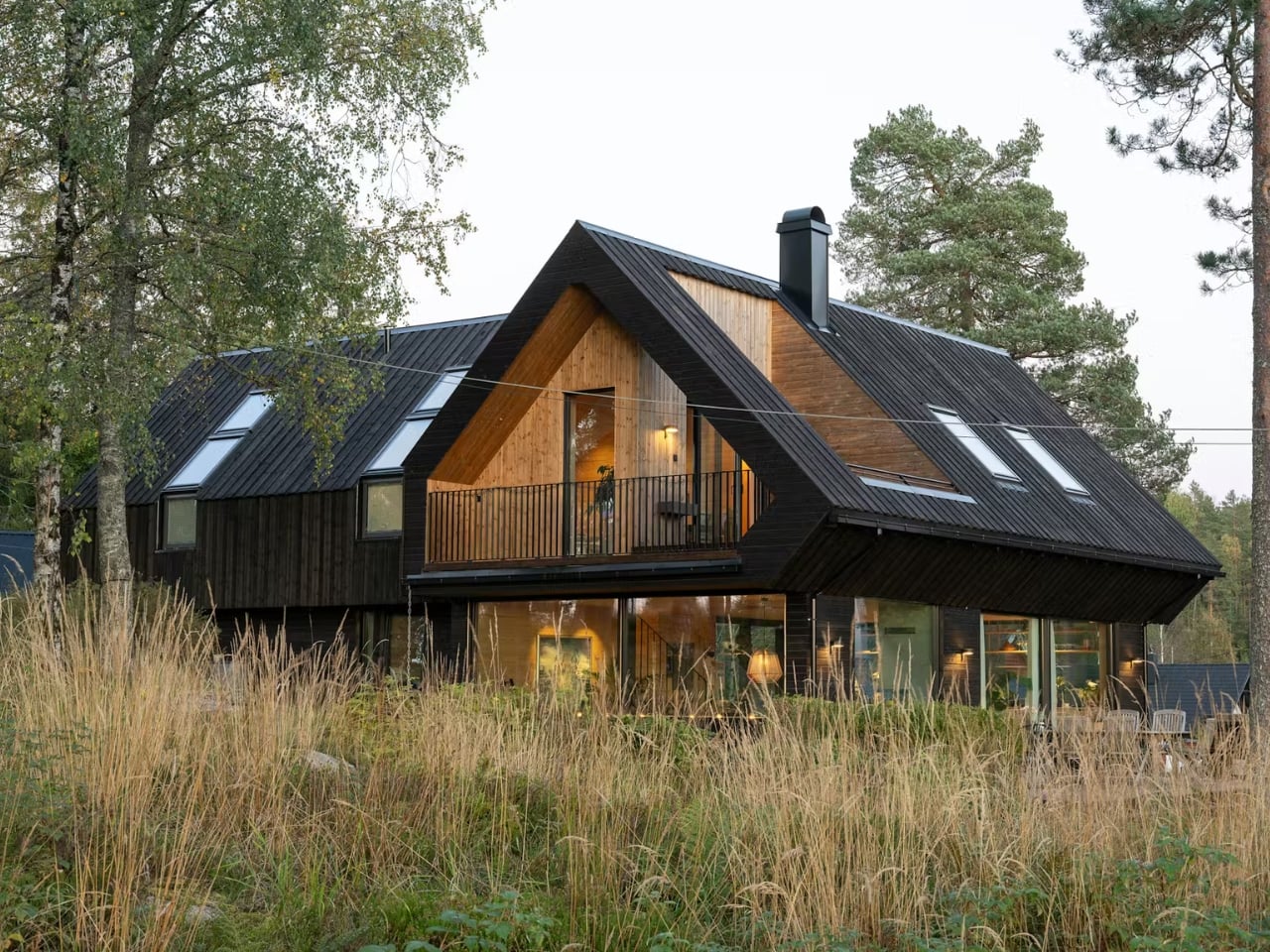
The most striking feature from the outside is the dark vertical timber cladding. It’s the kind of exterior that reads as almost austere in photographs until you place it in context. Against the trunks of surrounding pine trees, it doesn’t contrast. It converses. The dark tones echo the bark, the vertical lines mirror the trees, and the result is a home that feels like it grew out of the ridge rather than landed on it. Dwell described it as “a continuation of the forest rather than an imposition on it,” which isn’t just poetic writing. It’s an accurate description of the design intent made physical.
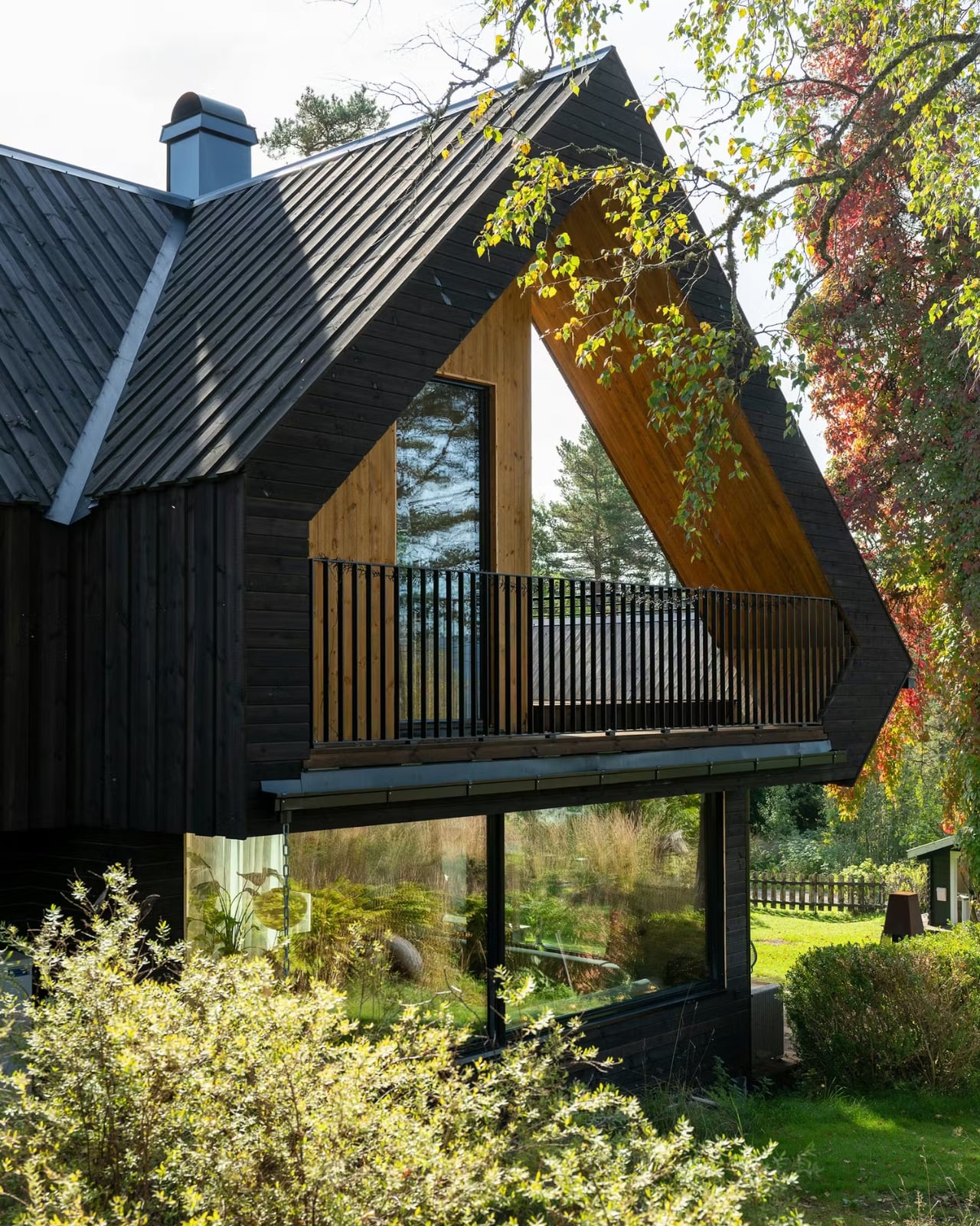
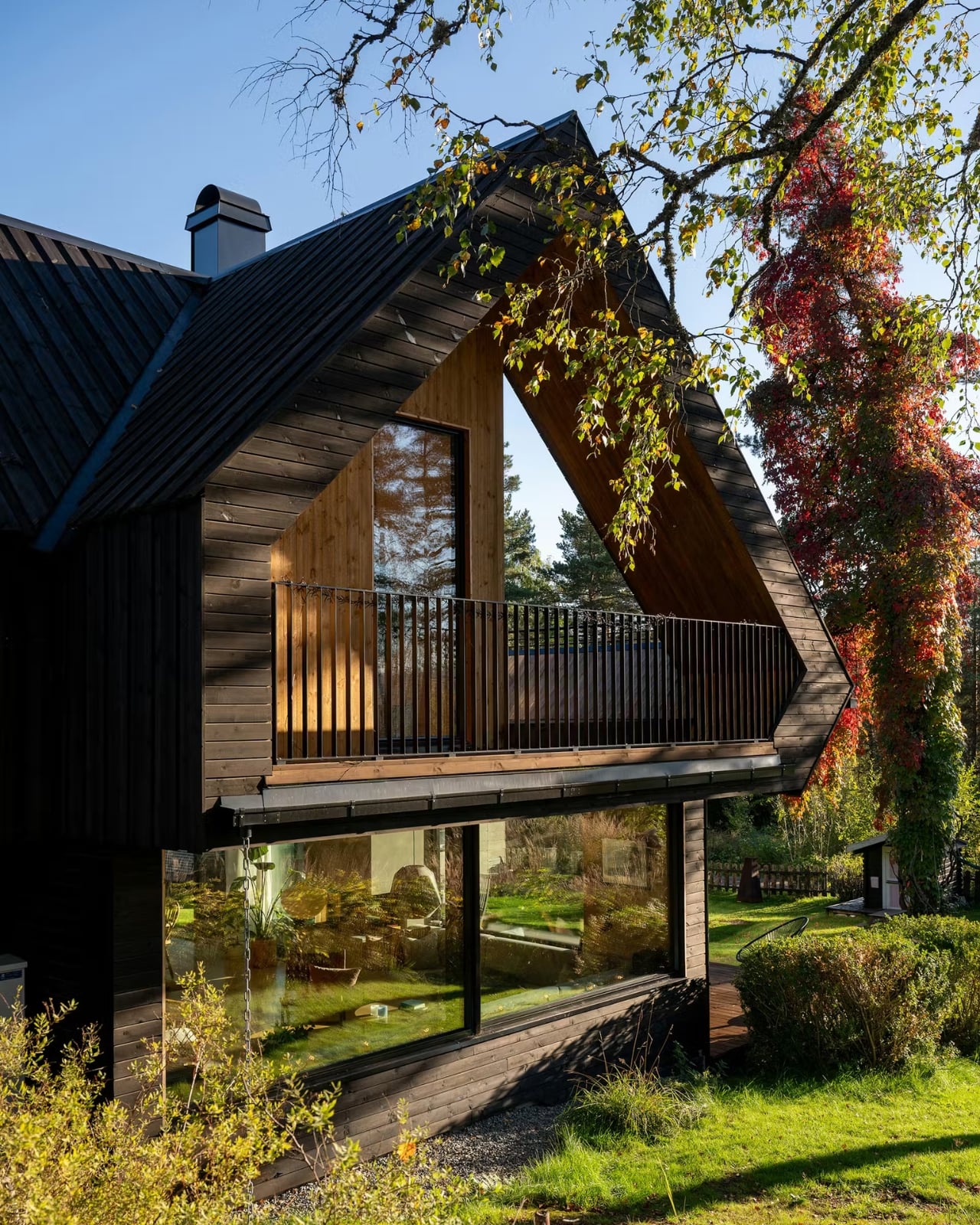
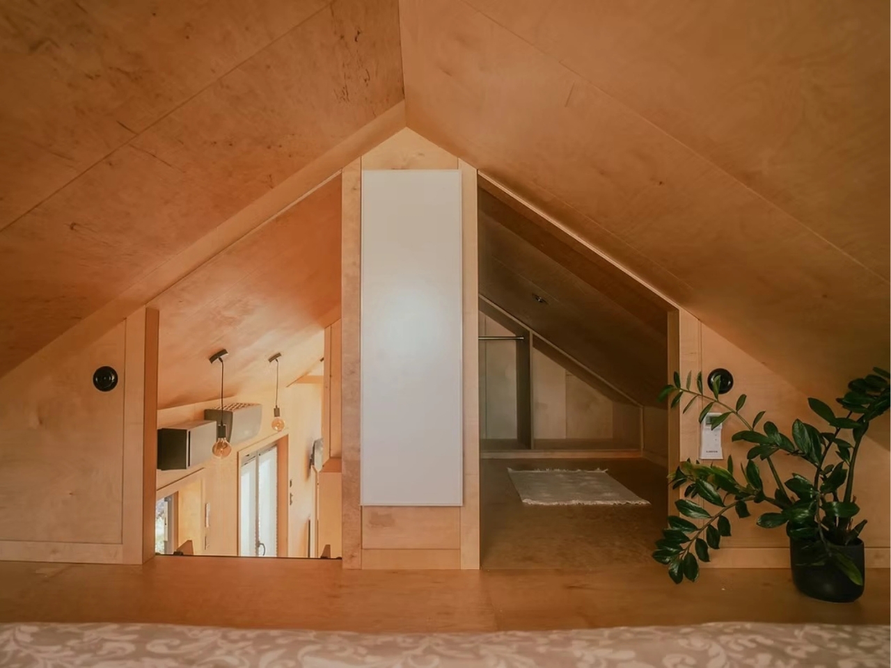
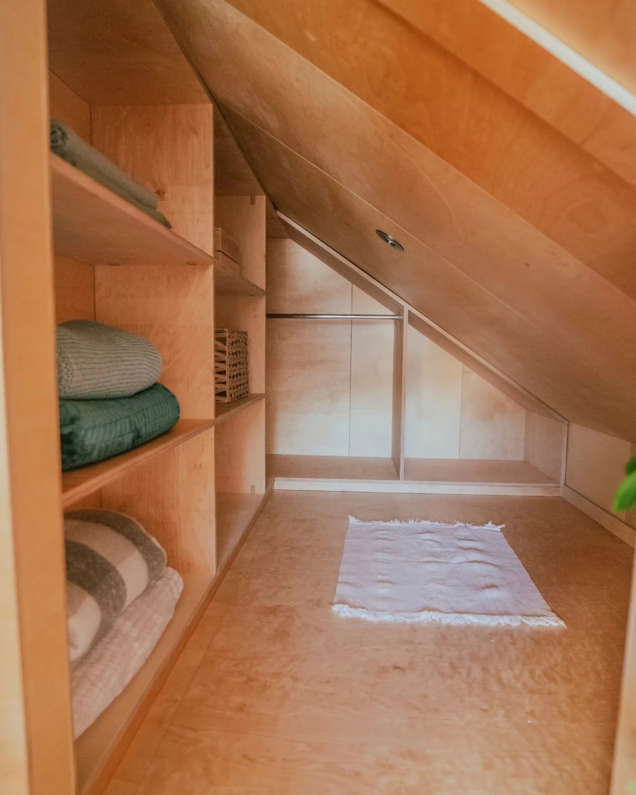
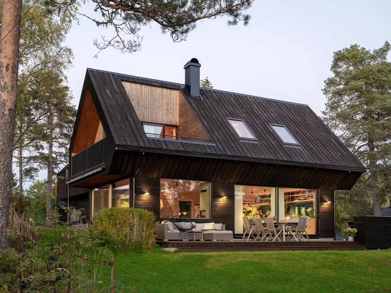
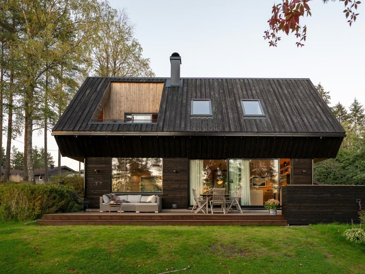
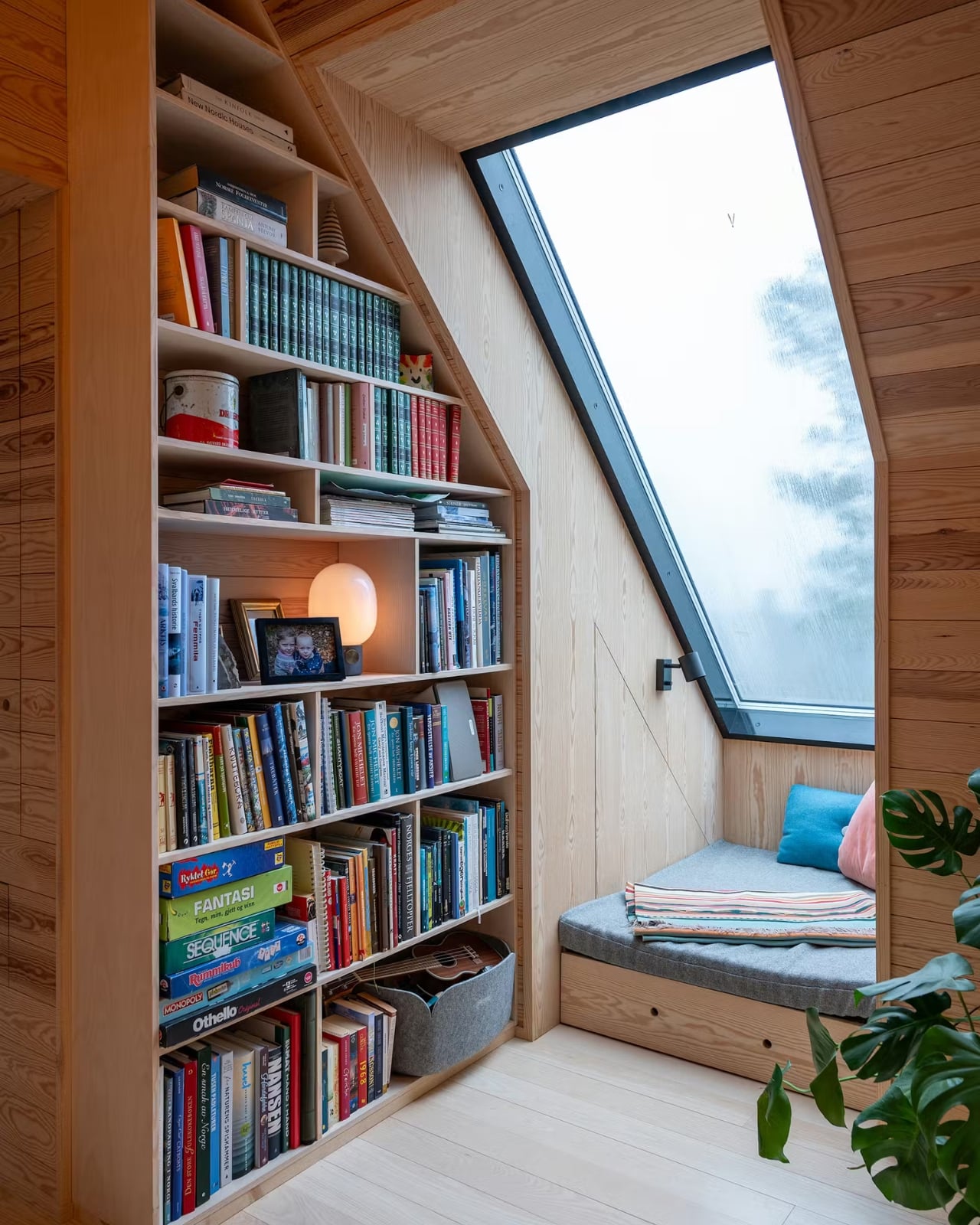
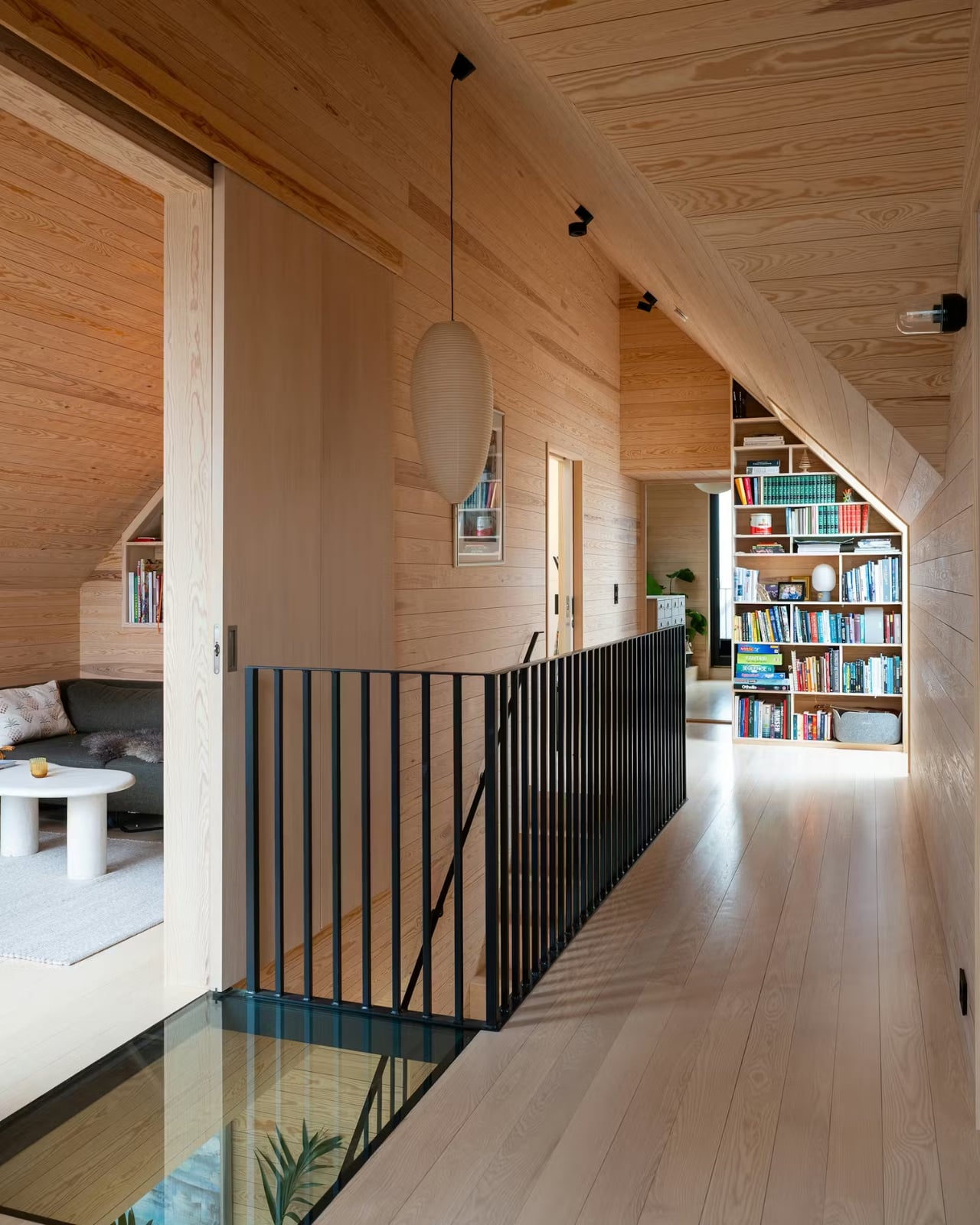
The roof is another story entirely. A large cross-gabled form defines the home’s architectural identity, and it does something genuinely clever: the second floor is partially embedded within the roof volume. What that means in practice is that you get rooms with character, with angles and nooks and a sense of shelter that flat-ceilinged spaces simply can’t replicate. The title of the Dwell feature on the project is “The Roof at This Norwegian Retreat Holds a Surprisingly Roomy Second Level,” and that element of surprise is very much the point. From the outside, the home reads compact and contained. Inside, the geometry works entirely in your favor.
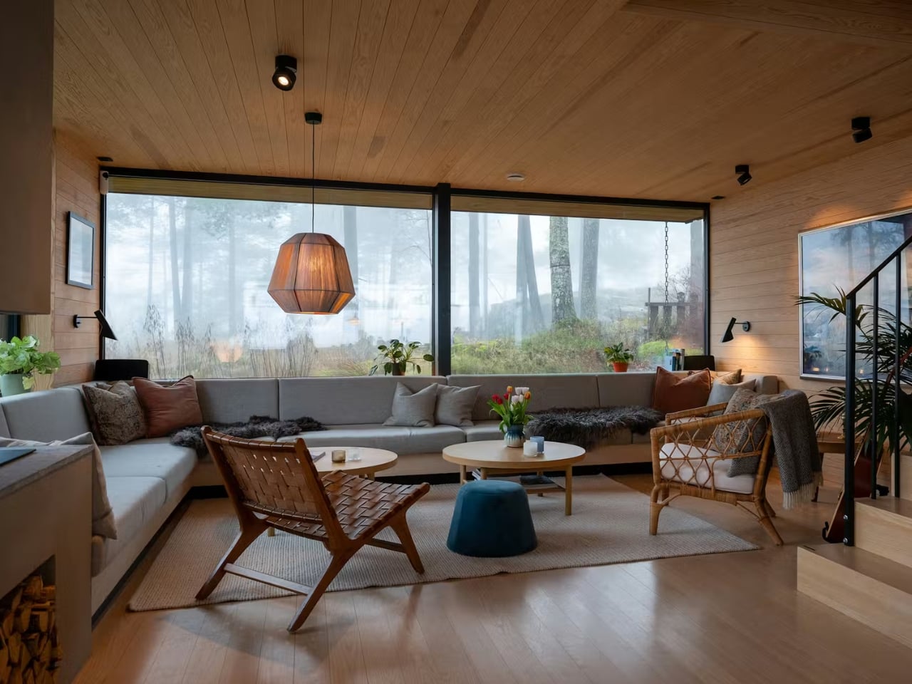
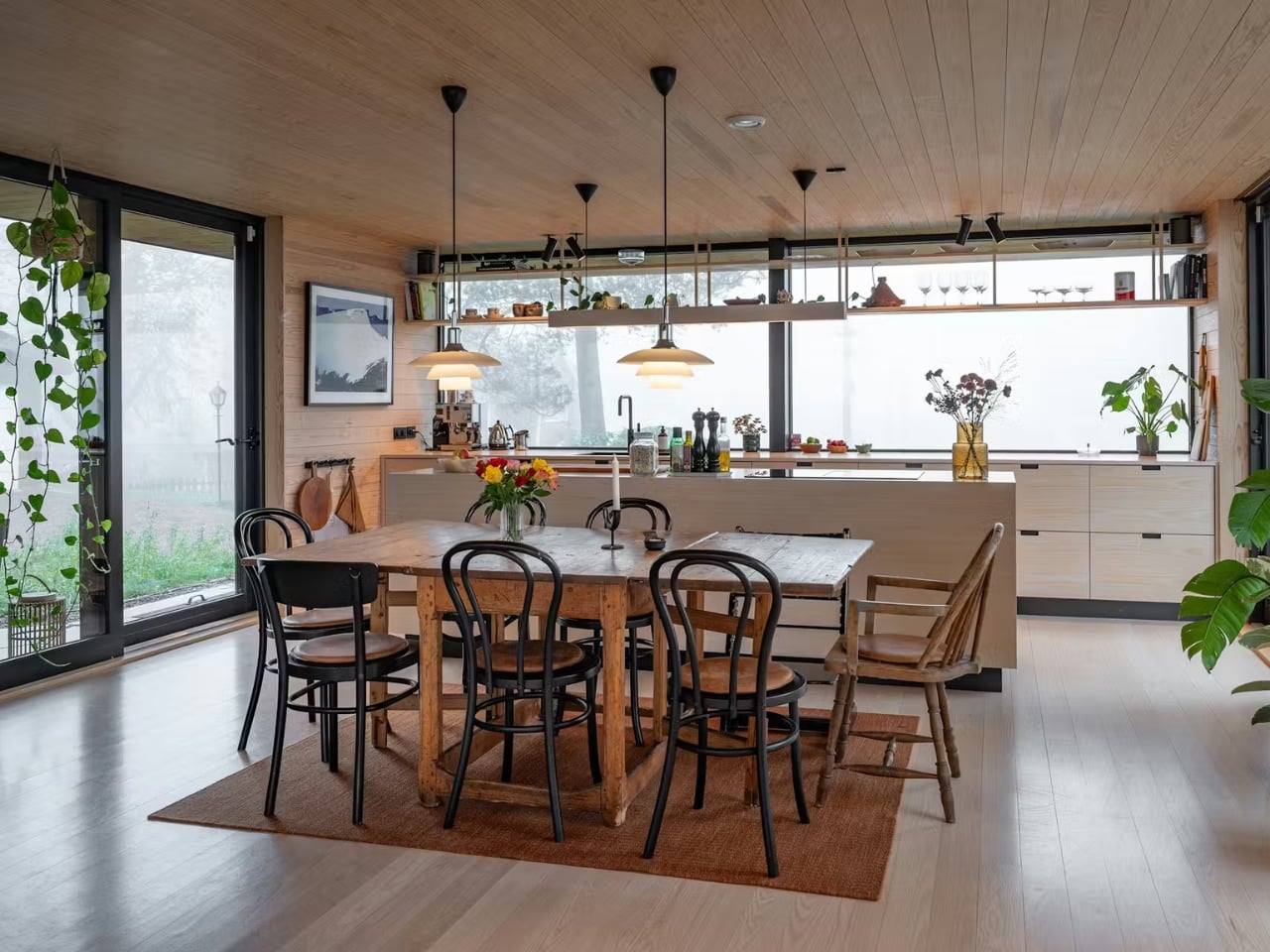
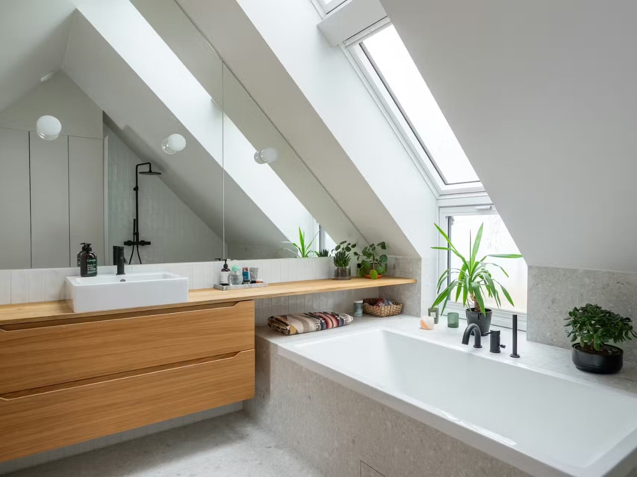
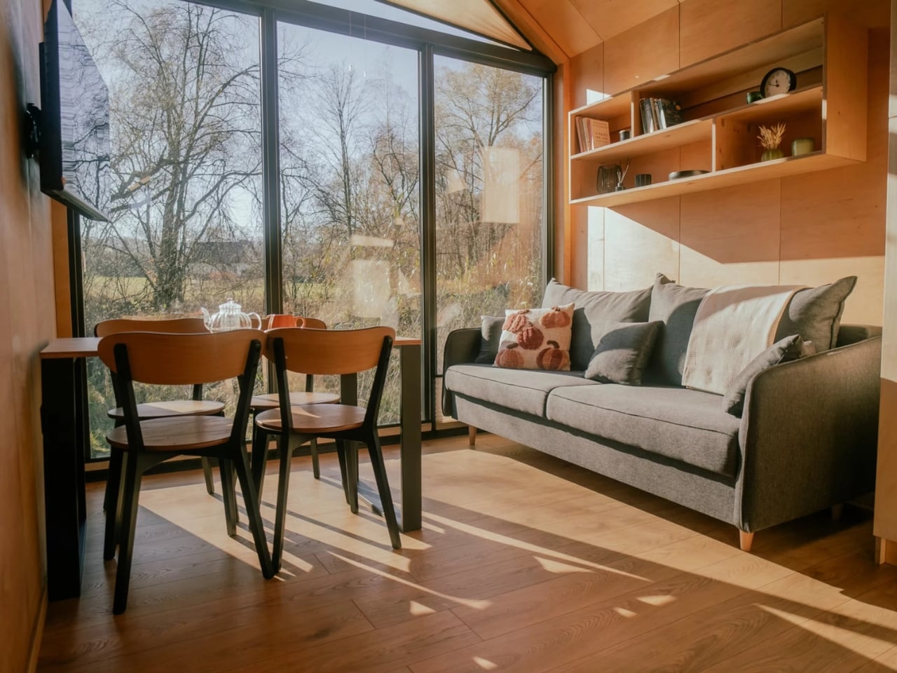
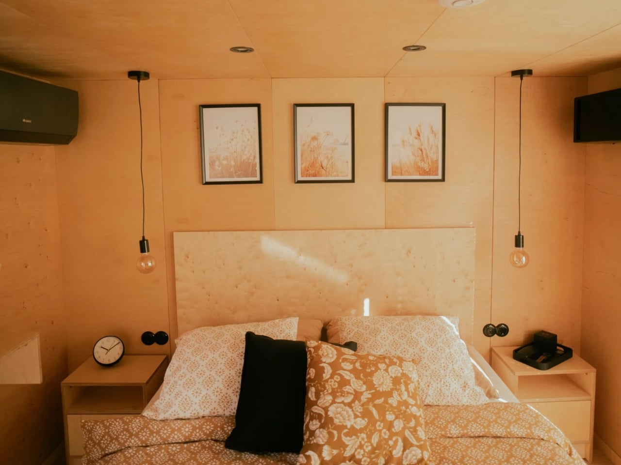
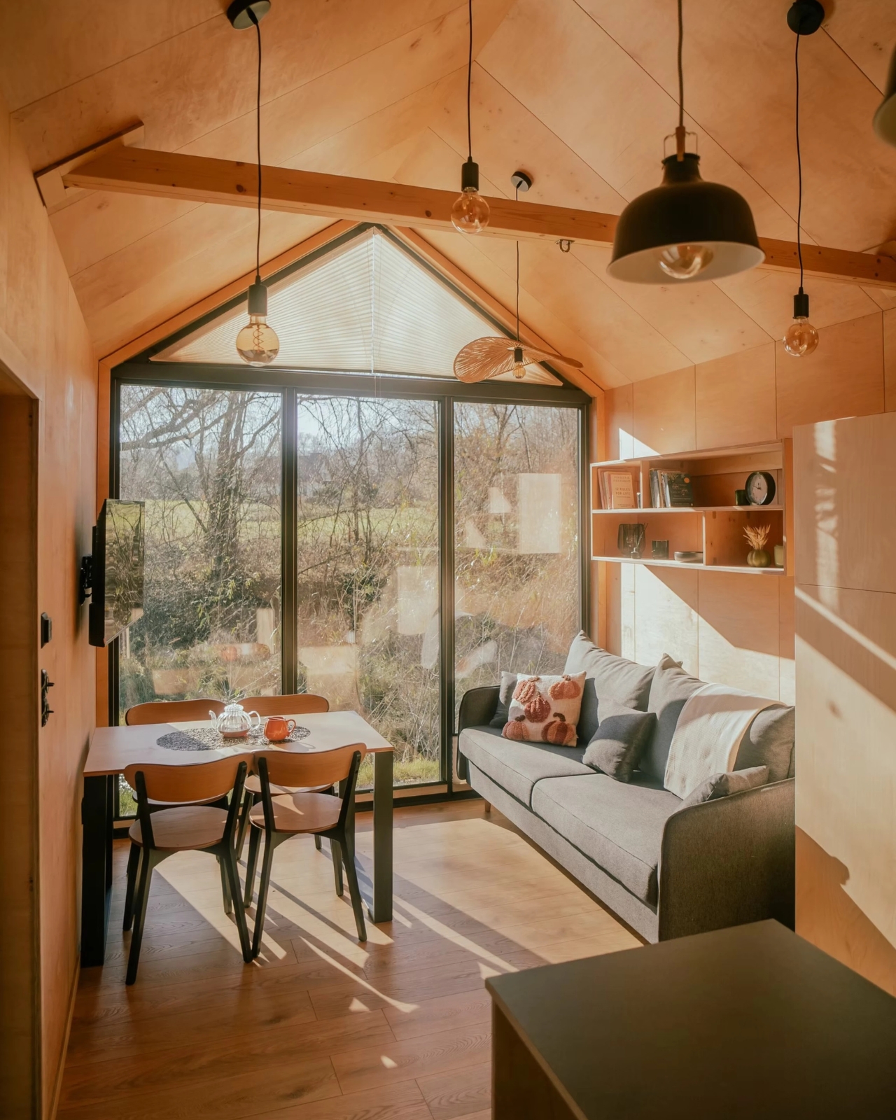
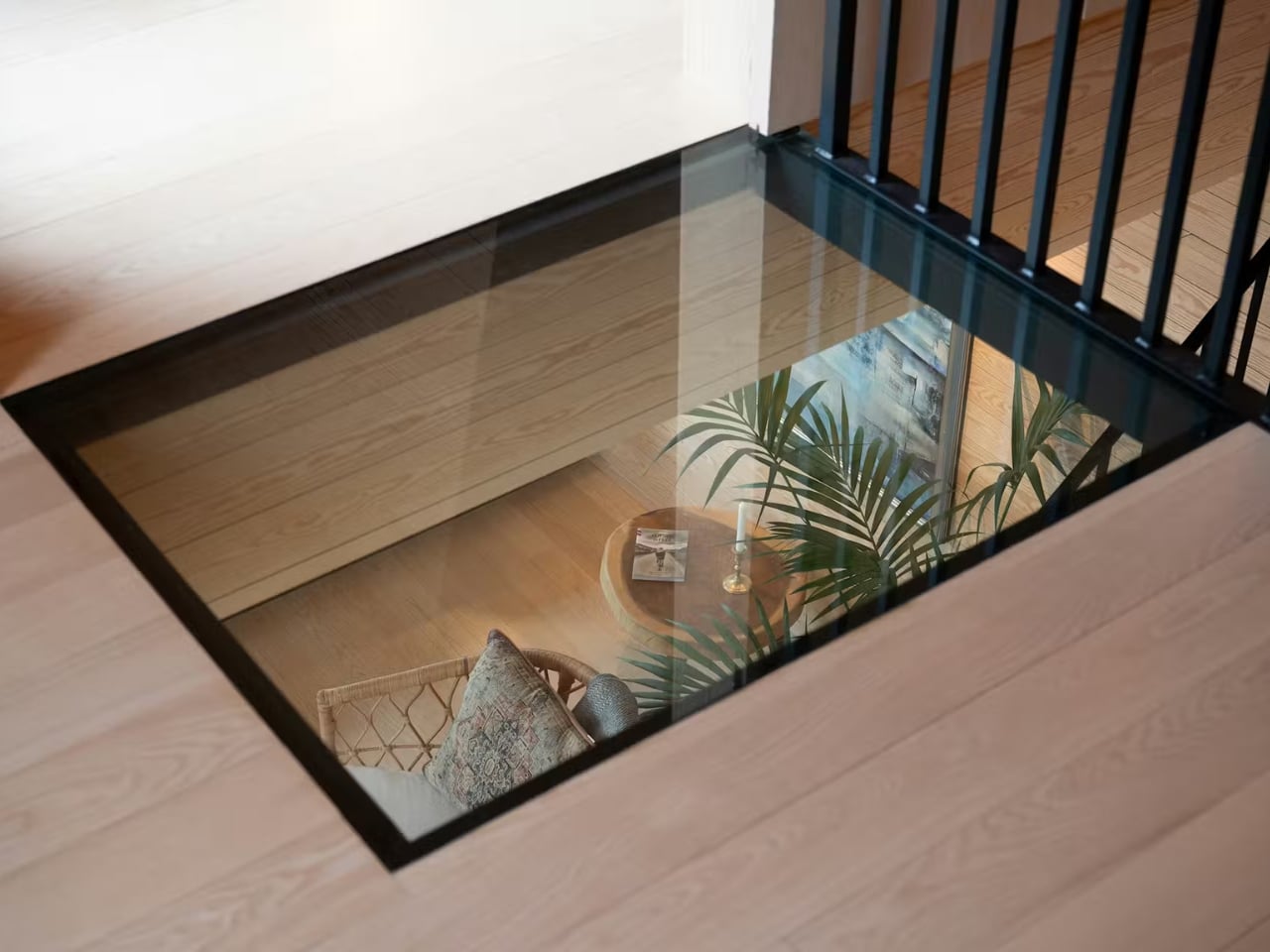
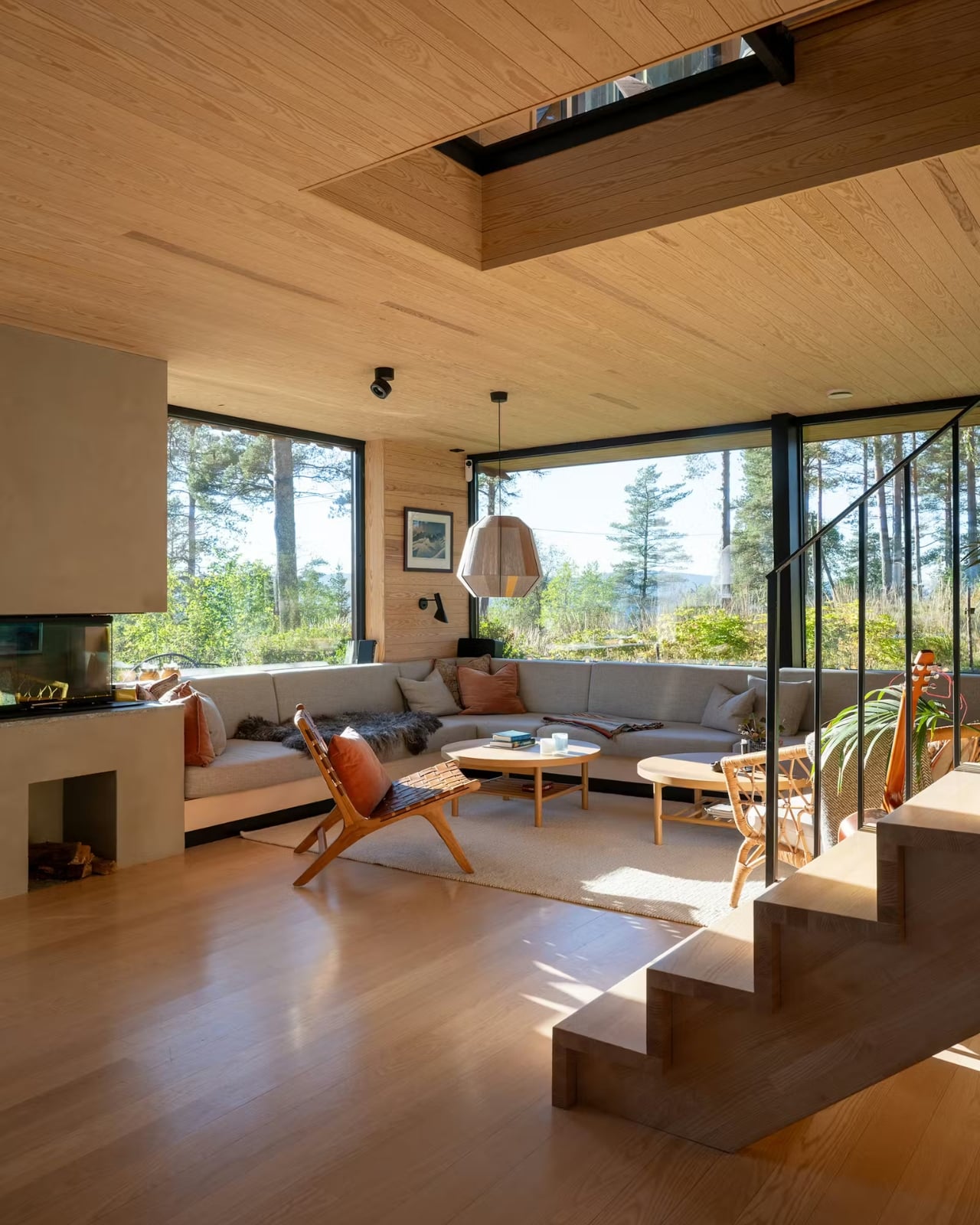
That interior warmth carries through in the materials. Solid wood finishes, a fireplace anchoring the living room, large picture windows framing forest views, custom bookshelves tucked along the upper hallway. There’s even a glass floor detail that lets light and sightlines move through the structure in ways that feel both unexpected and completely natural at once. These are the kinds of details that age beautifully and that no amount of trend-chasing can replicate.
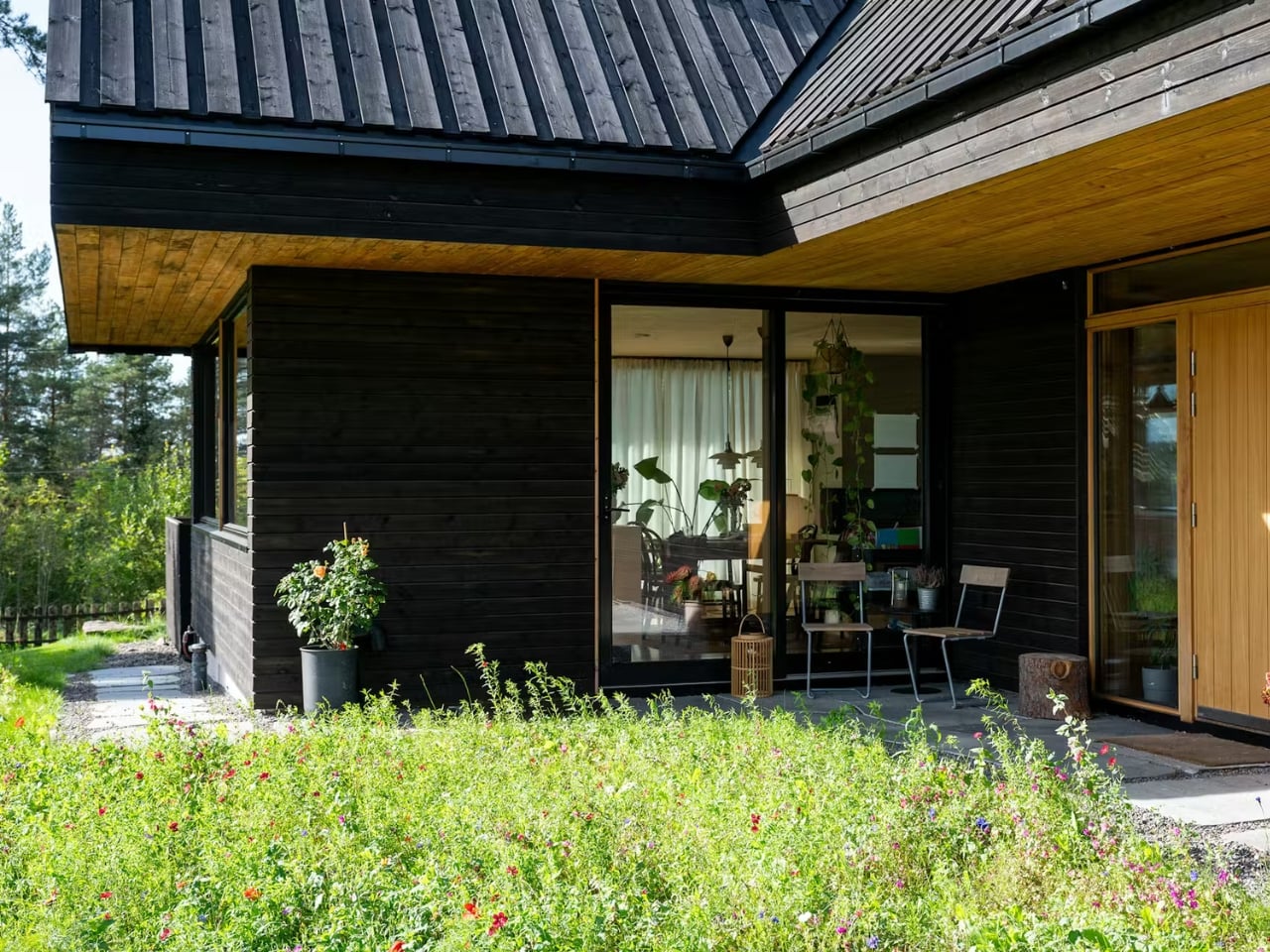
What I find most compelling about the project, though, is what happened before a single new board was nailed. The original structure on the site dated back to 1946, and rather than tear everything out, MORFEUS arkitekter worked with the existing foundation walls. The site’s natural profile, the topsoil, the exposed rock, and the existing trees and undergrowth were all largely preserved. Every external surface is permeable, and rainwater infiltrates locally, keeping the water cycle intact in an area that sits within Oslo’s strictly regulated water supply catchment zone.
That level of site sensitivity isn’t just admirable from an environmental standpoint. It changes how the architecture feels. A home that respects what was already there carries a different kind of weight than one that simply imposes its will on a plot of land. There’s humility in it, and that humility reads through the final result.
MORFEUS arkitekter, founded in Oslo by architects Caroline Støvring and Cecilie Wille, has built a reputation on exactly this kind of approach: intuition balanced with rationality, traditional Scandinavian craft paired with contemporary methods, and a consistent commitment to letting the site lead. Their work has earned multiple architecture prizes over two decades, including the Nordnorsk Architecture Prize and an Oslo City Architecture Prize nomination. But what stays with you after looking through the Solem Forest House isn’t the awards. It’s the feeling that the building belongs exactly where it is, and that someone spent a long time making sure it did.
The post This Dark Timber House Disappears Into a Norwegian Forest first appeared on Yanko Design.

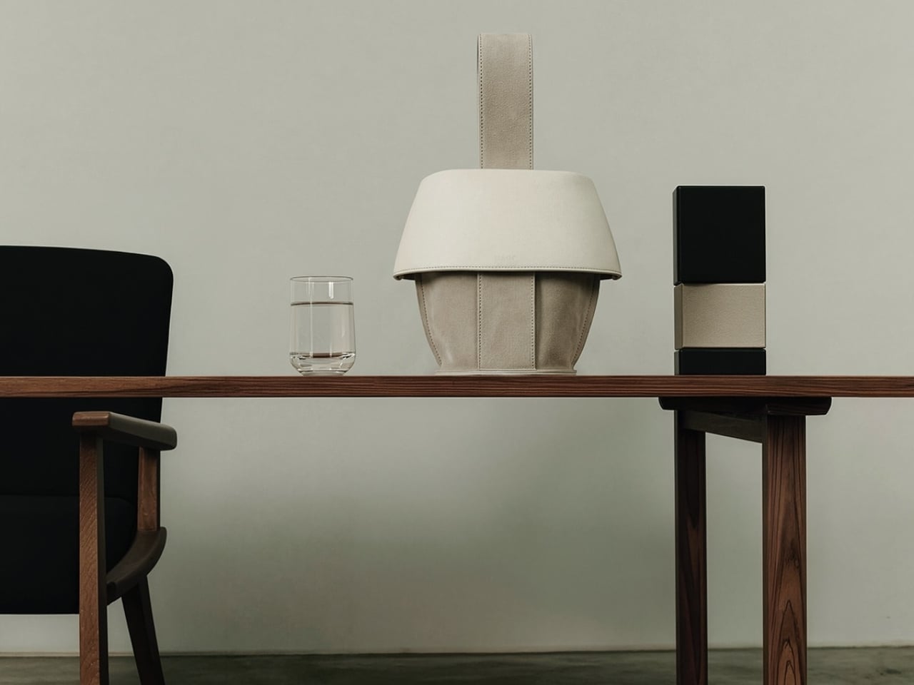
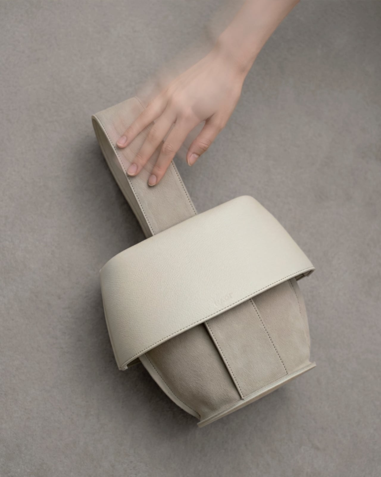
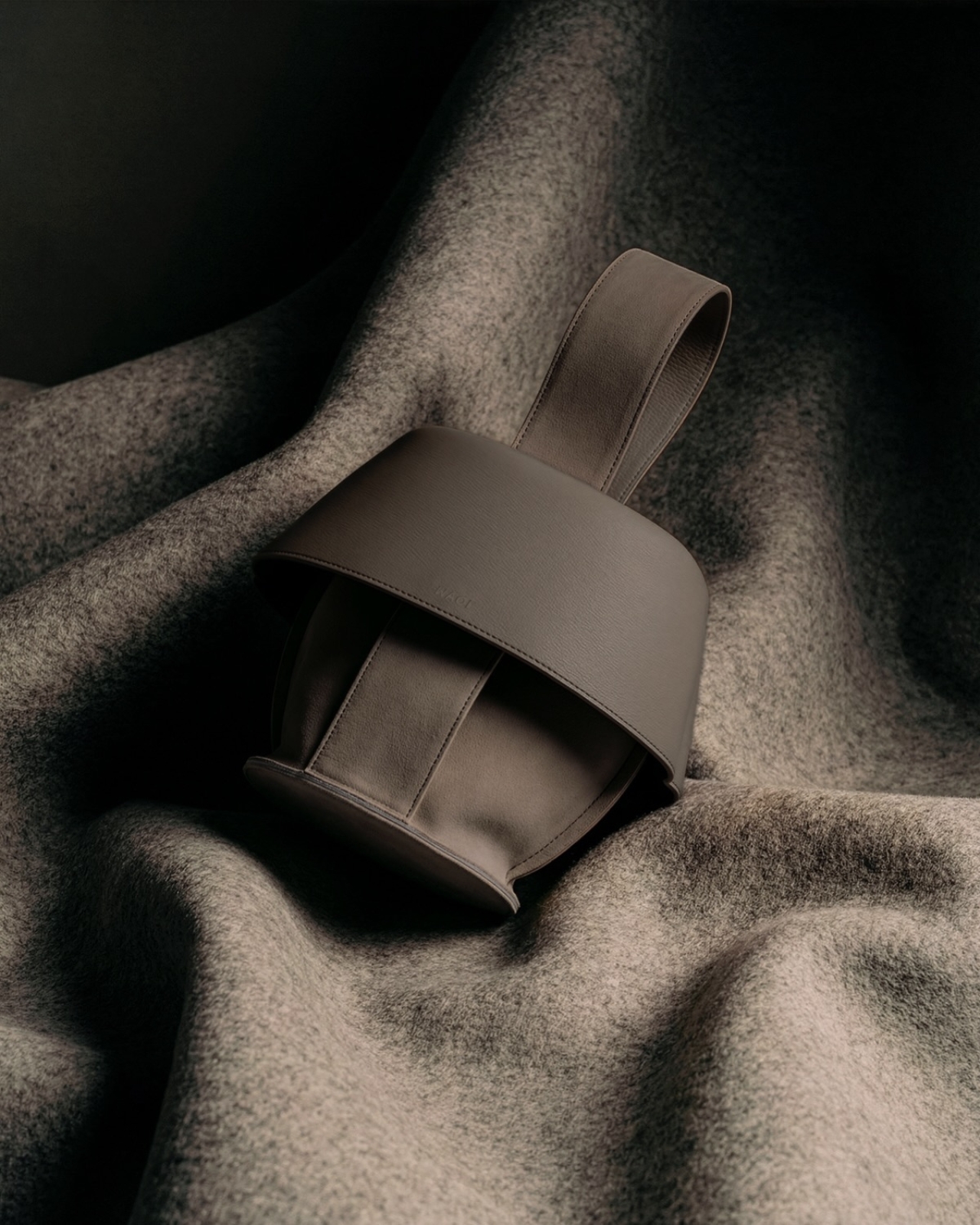
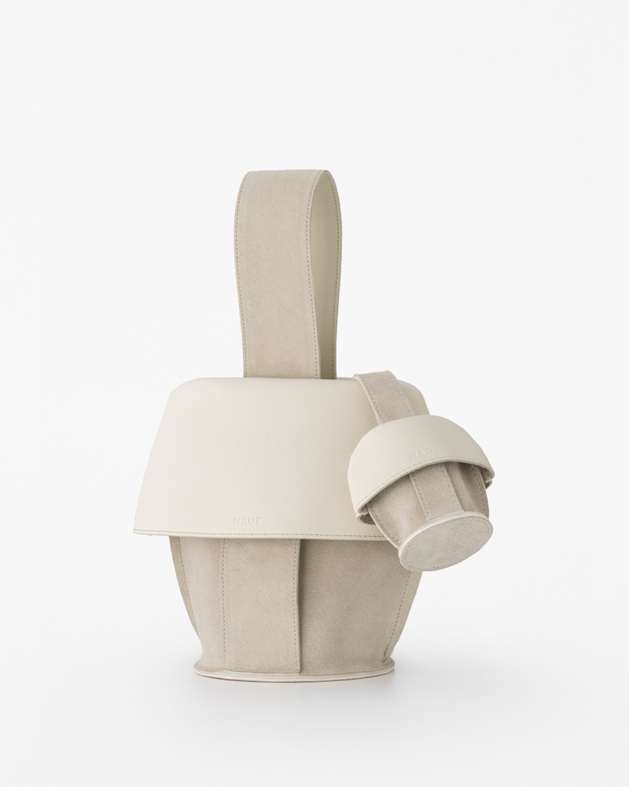
 Macro Method Tote. While the main selling point of this bag is that it can carry your tumbler, it’s built to carry much more than just a water container. Think of it as a home for pretty much everything else you need to get through your day. The way it’s designed means it can match any lifestyle, whether you’re heading to the office, the gym, or just running your errands.