An Artist Carved His Dead Oak Into Records That Play Bird Songs

One thing that the world has been learning the past few years is that people deal with grief differently. That’s why we can never judge how people react to death of loved ones, beloved pets, other living creatures, and even life changes. Artists and creative people in particular sometimes have profound ways of honoring whatever it is that they have lost.

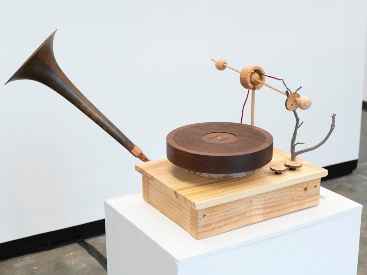
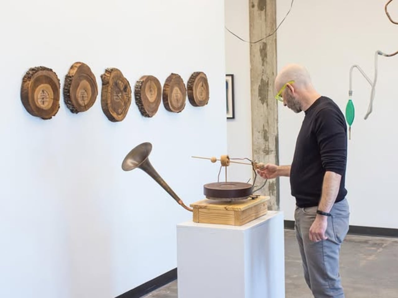
When a 65-year-old oak tree in Steve Parker’s front yard died from a fungal disease called oak wilt, he wanted to create a tribute to this tree that served as a refuge for migratory birds in their area. What he created was a sound sculpture, a record player that could play actual discs with bird songs, a fitting honor to the life and legacy of the tree.

Designer: Steve Parker

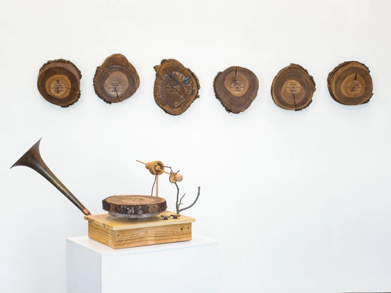
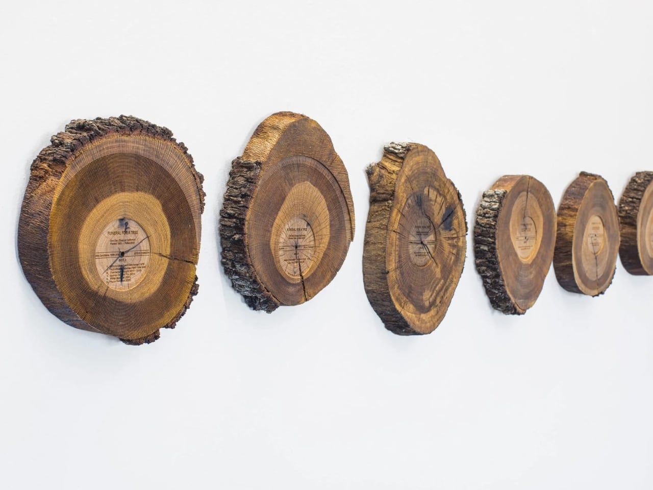
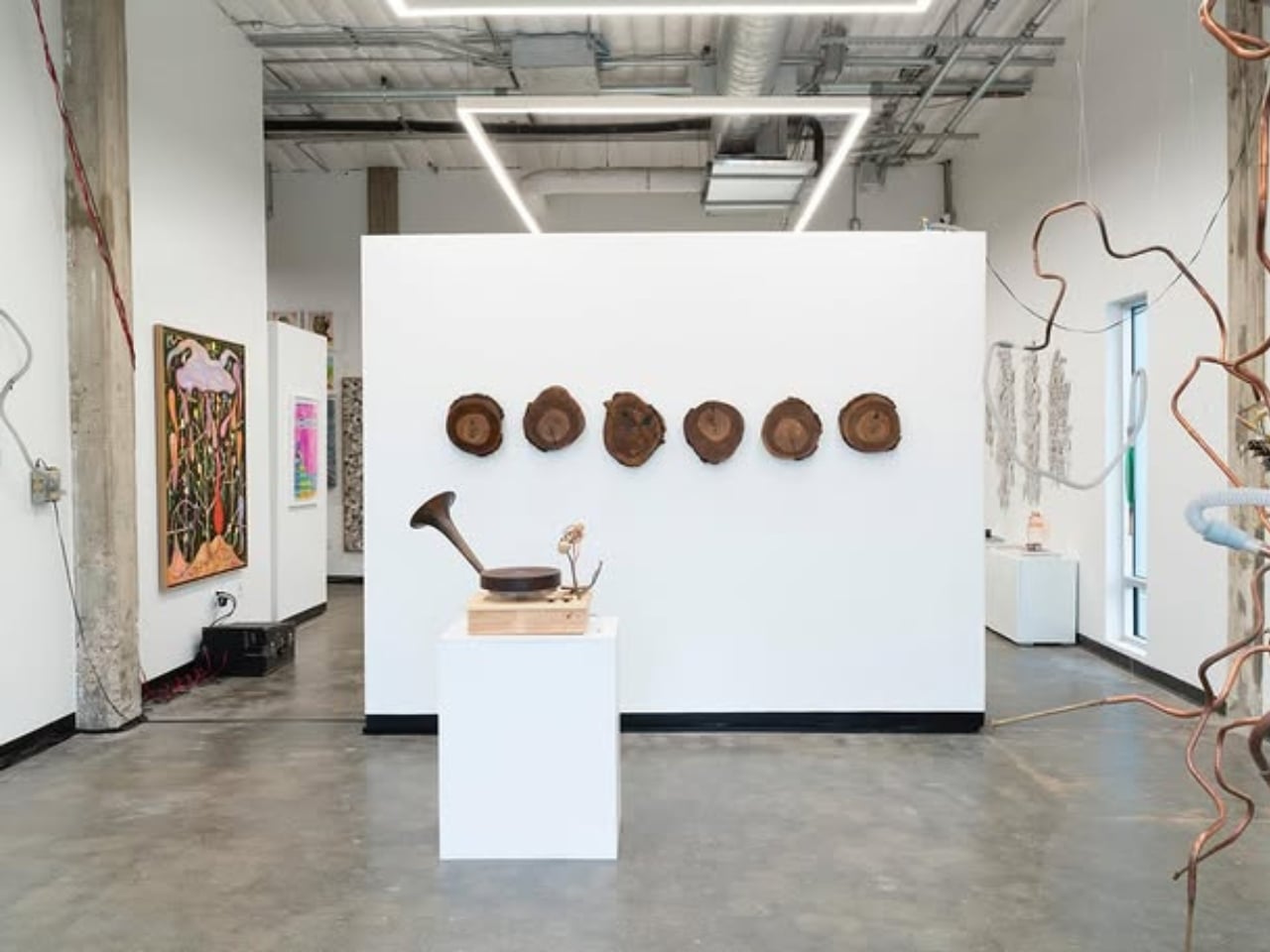
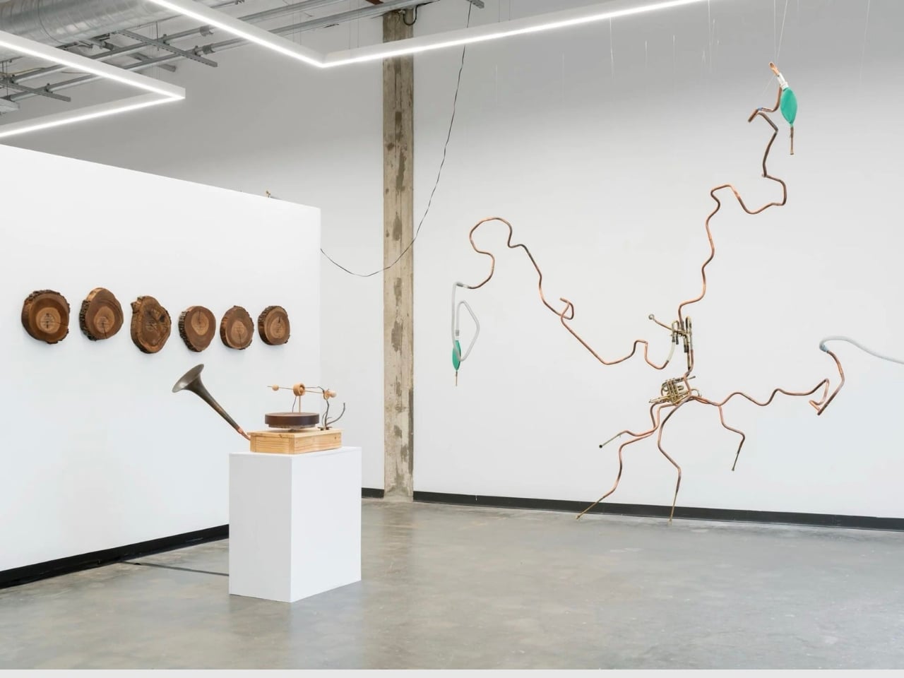
Parker cut the trunk of the diseased tree into “wood cookies” or cross-sectional slices. He then carved grooves directly into the discs to create playable records. He then built a victrola or record player that is specifically designed to play the wooden records. This player is placed on a pedestal and the round tree slices are displayed on the walls behind it.

What plays on the wooden records is equally special. He etched the songs of migratory birds that once nested in the oak tree. You hear a scratchy, wooden sound which actually reminds you of that branch that would hit the side of an old farm house, which can be nostalgic or creepy depending on your experience of it.

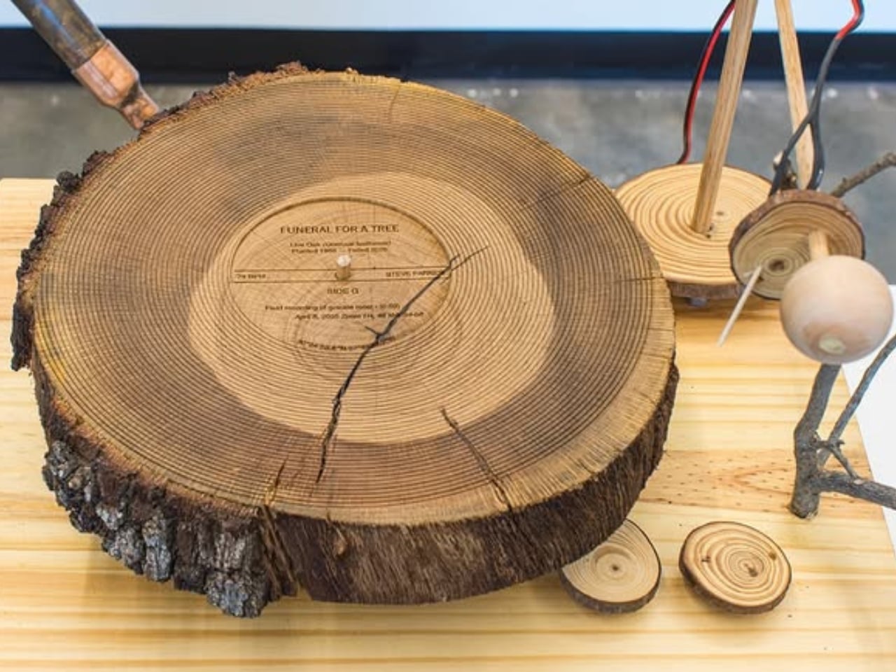
Creating these wooden records wasn’t easy. Live oak is notoriously difficult to work with because it cracks as it dries, and many woodworkers avoid it entirely. But Parker saw those imperfections as part of the piece’s authenticity. Those cracks and warps in the sound aren’t flaws, they’re features that honor the tree’s natural character even in death.

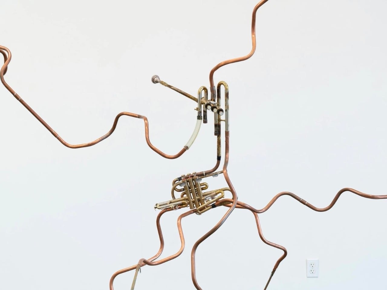
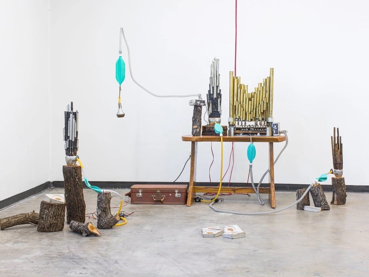
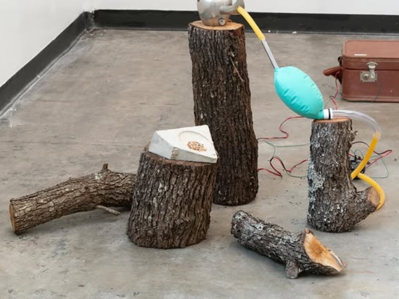
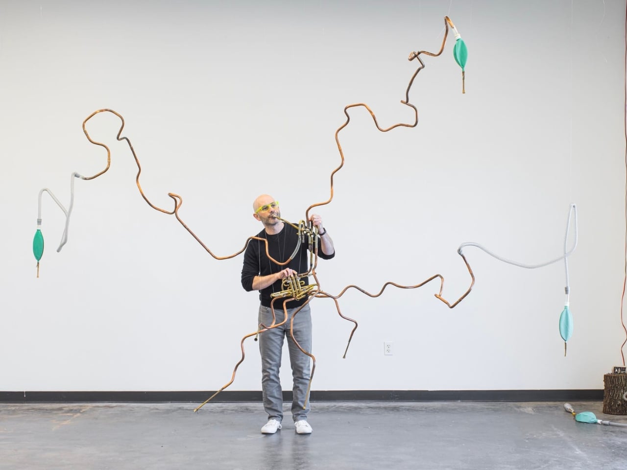
But the wooden records are only part of “Funeral for a Tree.” Parker also created a companion sculpture called “Sheng Shrine”: a plant-like, valve-driven instrument built from salvaged brass valves from euphoniums and trumpets, copper tubing, and breathing bags. What makes this piece particularly moving is what animates it: CPAP machines and ventilators, the same medical equipment used to help people breathe when they’re ill.

These breathing machines give life to discarded Chinese shengs (mouth organs). The sheng is traditionally associated with the phoenix, and the word itself means life, voice, and sound in Mandarin. Parker collaborated with sheng virtuoso Jipo Yang, who interpreted the bird calls and performed short compositions around them. The sounds you hear include the clicks of tiny relays, the grunts of air pumps that almost sound like snores, and the wheezing as air pushes through the reeds. It’s mechanical yet deeply emotional.

There’s another layer to this work that makes it even more poignant. Parker realized that his grief for the tree echoed the loss of his father to cancer. Both were slow, inevitable declines where care could not prevent loss. When his father was really sick, Parker’s family monitored his breathing to assess his comfort and sense where his body was going. Those CPAP machines and ventilators in “Sheng Shrine” carry those memories. They’re devices associated with life support, transformed into instruments that give breath to dead instruments playing songs for a dead tree.

What makes “Funeral for a Tree” so powerful is that it’s not Steve Parker performing a requiem for the tree. It’s the tree performing its own memorial service. The wood itself becomes the instrument, the bird songs it once sheltered become the music, and the breath that once rustled through its leaves is replaced by mechanical breathing that keeps the dirge alive.

In transforming something most people would haul away as waste into a functioning musical instrument, Parker reminds us that grief doesn’t have to be silent or passive. Sometimes the most profound way to honor a loss is to let it speak for itself, to give it voice and breath and let it tell its own story. In doing so, he’s created something that transcends the personal: a meditation on memory, loss, and the ways we try to hold onto what’s gone.

The post An Artist Carved His Dead Oak Into Records That Play Bird Songs first appeared on Yanko Design.

This Pencil Sharpener Spins Like a Top and It’s Pure Genius

You know that moment when you find a perfectly ordinary object that someone has completely reimagined? That’s exactly what happened when I stumbled across Ferfereh, a pencil sharpener designed by Maryam Fallah that’s basically a spinning top in disguise. And honestly, it’s the kind of design that makes you wonder why no one thought of this before.

Let’s be real for a second. Pencil sharpeners are usually the most boring things on your desk. They sit there, doing their one job, looking completely utilitarian and forgettable. But Fallah decided to flip that script entirely. What if your pencil sharpener could also be a desk toy? What if the simple act of sharpening your pencil could bring a little joy to your workspace?

Designer: Maryam Fallah

The design itself is pretty striking. Picture a spinning top with those gorgeous, swooping curves that make you want to reach out and give it a whirl. The body comes in eye-catching color combinations like a deep blue that fades into vibrant orange, or sleek all-black and white versions. It’s the kind of object that doesn’t hide in your desk drawer but sits proudly on display, adding a pop of personality to your space.

But here’s where it gets really interesting. This wasn’t just a “wouldn’t it be cool if” kind of concept. Fallah spent six months developing this as a student project at Haute École Arc in Switzerland, studying industrial design engineering. And the process? It’s honestly fascinating. She explored tons of different shapes, from what looks like traditional spinning tops to more abstract forms, even some that resembled swans and other playful figures. The sketches show just how many directions this could have gone.

The final design landed on that iconic top shape for good reason. It had to work as both a functional pencil sharpener and an actual spinning toy. That meant getting the engineering just right. The sharpener is made of two main pieces that screw together, with a reservoir inside to catch all those pencil shavings. Simple enough, right? But the tricky part was making sure it could actually spin properly.

Through 3D printing prototypes and testing, Fallah discovered that the weight of the metal sharpening mechanism and its position affected how well the top would rotate. The pencil and sharpener weren’t symmetrically placed inside, which threw off the balance. Even the slope and overall shape had a major impact on performance. So she dove into actual engineering equations used for spinning tops to optimize the design. After multiple rounds of prototypes, she landed on a form that spins beautifully.

What I love about this project is how it challenges our assumptions about everyday objects. We’ve been conditioned to think that tools should look like tools, that function and fun are separate categories. But why? Your desk is your creative space, your thinking zone. Why shouldn’t the objects on it spark a little delight?

There’s something refreshing about seeing a designer take a mundane object seriously enough to give it this much attention. The photos show Ferfereh sitting on a clean, modern desk next to notebooks and glasses, looking completely at home. You can imagine giving it a spin while you’re thinking through a problem or just taking a mental break. It transforms a routine task into a moment of play.

This kind of thoughtful design speaks to a larger trend we’re seeing in contemporary product design. People want objects that do more than just function. They want things that feel good to use, that have personality, that make their spaces more interesting. Ferfereh delivers on all fronts. It sharpens your pencils effectively while also serving as a kinetic desk sculpture that invites interaction. Whether you’re a designer, a student, someone who still loves the analog pleasure of writing with actual pencils, or just a person who appreciates clever design, Ferfereh hits that sweet spot. It’s practical without being boring, playful without sacrificing function, and beautiful enough to make you rethink what a simple desk accessory can be.

The post This Pencil Sharpener Spins Like a Top and It’s Pure Genius first appeared on Yanko Design.

Airline Meal Trays Are Broken: This Korean Design Fixes Them

There’s something deeply satisfying about opening a Korean meal to find those little side dishes, each in their own small bowl, arranged just so. The banchan tradition turns eating into a kind of visual feast before you even take a bite. Now, imagine bringing that same thoughtful, modular approach to one of the most notoriously cramped dining experiences: airplane meals.

That’s exactly what BKID co has done with their System Tray design, and honestly, it’s one of those ideas that makes you wonder why we didn’t think of this sooner. The project takes the organizational genius behind Korean side dish service and reimagines it for the narrow, tray-table constrained world of in-flight dining.

Designer: BKID co

Anyone who’s flown recently knows the struggle. You get your meal tray, and it’s this precarious balancing act of overlapping plastic containers, a wobbly cup threatening to spill, and utensils that somehow always end up on the floor. There’s no elegance to it, no sense that anyone actually thought about the experience beyond “how do we get food from point A to point B?” The System Tray flips that script entirely. Drawing inspiration from traditional Korean wooden trays that hold multiple small dishes, the design creates a modular system where individual plates nest together like a puzzle. Each piece has those beautiful organic, flowing shapes that lock into each other or fit perfectly within the main tray. It’s functional geometry that doesn’t look robotic or cold.

What makes this particularly clever is how it addresses real constraints. Airlines aren’t going to adopt anything that doesn’t meet strict safety standards or adds significant weight. So BKID co worked with lightweight materials like durable plastics and lightweight ceramics, keeping things practical while maintaining that elevated aesthetic. The pieces can stack when not in use, which means they take up less storage space in the galley. For airlines constantly trying to maximize every square inch of cabin space, that’s a huge selling point.

But let’s talk about the visual appeal, because this is where the design really shines. The color palette is subtle and sophisticated: soft creams, muted blues, warm beiges, and earthy browns. These aren’t the harsh primary colors or industrial grays we’re used to seeing on planes. The shapes themselves are organic and almost playful, with curved edges that interlock in unexpected ways. Laid out, they look more like modern art than airline serviceware.

There’s something almost meditative about the way the pieces fit together. You can configure them in different arrangements depending on the meal, whether it’s a full dinner service with multiple courses or a lighter snack. That flexibility is key because not every flight or passenger needs the same setup. The modular approach means the system can adapt rather than forcing one rigid solution.

This design also taps into a broader trend we’re seeing in travel and hospitality: the push to make utilitarian experiences feel special. We’ve watched airport lounges transform into design showcases. We’ve seen hotel rooms become Instagram-worthy destinations. Even train stations are getting architectural makeovers. Why should airplane meals be any different? The banchan tradition isn’t just about having multiple dishes. It’s about balance, variety, and presentation. It turns a meal into something communal and considered, where each element has its place and purpose. That philosophy translates surprisingly well to the challenge of airline food service, where space is limited but the desire for a pleasant dining experience remains.

What BKID co has created here isn’t just a better tray. It’s a rethinking of how we approach one of travel’s most mundane moments. It suggests that even in a space as constrained as an airplane cabin, there’s room for thoughtfulness and beauty. The design proves that solving practical problems doesn’t mean sacrificing aesthetics.

Will we see these trays on flights anytime soon? That’s the real question. Airlines move slowly, and switching out serviceware across an entire fleet isn’t a small undertaking. But as more carriers compete on experience rather than just price, innovations like this become more attractive. Passengers increasingly expect more, even in economy. A meal served on a thoughtfully designed tray system could become a differentiator.

For now, the System Tray stands as a brilliant example of cross-cultural design thinking, where a traditional dining practice inspires a modern solution to a very contemporary problem. It reminds us that good design often comes from looking at how people have solved similar challenges in different contexts, then adapting those insights with fresh eyes.

The post Airline Meal Trays Are Broken: This Korean Design Fixes Them first appeared on Yanko Design.

This Modular Webcam Lets You Physically Disconnect for Privacy

You know that little piece of tape covering your laptop camera? Or that awkward moment when you frantically check if your microphone is really muted before talking about your coworker? We’ve all been there. The problem is that webcams have become permanent fixtures in our lives, but trusting whether they’re actually off means squinting at tiny icons buried in software menus. Designer Bhavesh Sharma thinks there’s a better way, and honestly, it’s kind of brilliant.

NODE is a conceptual modular webcam system that tackles privacy by making it physical instead of digital. The core idea is refreshingly simple: if you want your camera or microphone truly off, you just remove it. Like, actually detach it from the device. No more wondering if that green light really means what you think it means.

Designer: Bhavesh Sharma

The system centers around a clean, minimal camera module that attaches to a shared backplate along with other components. Think of it like building blocks for your workspace. Need just a camera for quick video calls? Done. Want to add a microphone module for podcasting? Snap it on. Curious about that optional screen module? Add it to the mix. The beauty is that you’re not locked into one bulky all-in-one device that does everything poorly.

Here’s where it gets really interesting. Each module connects magnetically with pogo-pin contacts, so everything feels seamless and looks clean. But when you pop a module off the backplate, it’s completely disconnected from power and data. Not “software off” or “privacy mode enabled.” Actually off. Privacy becomes something you can feel in your hands rather than a setting you hope is working correctly.

That optional screen module deserves its own moment. Instead of cramming in yet another interface demanding your attention, it acts as what Sharma calls a “confidence display.” It surfaces only the essentials: camera status, microphone status, whether you’re recording, upcoming meetings, weather, select notifications. The whole point is to read it at a glance without pulling your focus from your actual work. In a world where every device screams for attention, this kind of restraint feels almost radical.

The design language communicates all of this beautifully. NODE keeps a restrained rectangular geometry that blends into your workspace rather than trying to be the star of your desk setup. The backplate uses smooth matte plastic as a neutral foundation, while the modules themselves feature a subtly textured matte finish. That contrast isn’t just aesthetic; it helps you visually and tactilely understand what’s fixed and what’s removable. The system comes in black as the default, with blue, orange, and white options if you want a bit more personality.

Setup is mercifully simple. Everything runs through a single USB-C connection, so you’re not drowning in cables. The magnetic alignment means modules snap into place without fussing, and the whole thing just works.

Now, let’s be clear about what NODE isn’t trying to do. This isn’t about revolutionizing image quality or replacing all your software controls. Sharma isn’t promising the crispest 4K video or AI-powered background removal. Instead, NODE focuses on something we’ve lost in our rush toward smarter, more connected devices: trust, awareness, and physical agency.

We’ve become so accustomed to abstract digital interfaces that we’ve forgotten how reassuring it is to actually control something with our hands. To see a component sitting on your desk and know, without doubt, that it’s not active. To build a workspace setup that matches how you actually work instead of adapting to what some company decided you need.

NODE is still a concept, which means you can’t buy it yet. But as a design exploration, it asks important questions about how we interact with the technology that’s constantly watching and listening. In a landscape where privacy feels increasingly theoretical, NODE offers something wonderfully tangible. It suggests that maybe the solution to our complicated relationship with always-on devices isn’t more software or better encryption. Maybe it’s just letting us unplug the parts we’re not using.

The post This Modular Webcam Lets You Physically Disconnect for Privacy first appeared on Yanko Design.

Students Just Built a Pavilion That Robots Can Rebuild Forever

Here’s what I love about architecture that makes you stop and think: it’s not just about creating beautiful spaces anymore. It’s about imagining how we can build better, smarter, and in ways that don’t treat our planet like a disposable resource. That’s exactly what’s happening with Arkhive, a fascinating timber pavilion that’s part building project, part robotic experiment, and entirely rethinking how we approach construction.

Picture this: a wooden structure that looks like it could be straight out of a sci-fi movie, assembled entirely by industrial robotic arms with precision that human hands simply can’t match. But here’s the kicker. This isn’t just another flashy tech demo. Arkhive was created by students from University College London’s Design for Manufacture program, and it’s tackling one of construction’s biggest problems: waste.

Designers: Design for Manufacture, Bartlett School of Architecture, University College London

Think about how we typically build things. We design them, construct them, use them for a while, and then when we’re done, we tear them down and haul the debris to a landfill. It’s a pretty wasteful cycle when you actually stop to consider it. Arkhive flips that script entirely. Every single component of this pavilion can be taken apart and reassembled into completely different configurations without losing any material. It’s like architectural Lego blocks, but way more sophisticated.

The magic happens through something called reversible joinery. Instead of nails, screws, or adhesives that permanently bind materials together, these connections can be undone and redone as many times as needed. The timber components fit together in a modular system that prioritizes adaptability over permanence. So when the structure has served its purpose in one location or configuration, it doesn’t become yesterday’s trash. It becomes tomorrow’s building material for something entirely new.

What really sets this project apart is the marriage of sustainable design thinking with cutting-edge robotics. UCL recently invested over £400,000 in developing robotics facilities specifically focused on low-carbon construction materials and innovative building practices. The Arkhive project is part of this larger movement where architecture schools aren’t just teaching students to draw pretty buildings. They’re teaching them to wrestle with real-world problems using technology that’s reshaping entire industries.

The pavilion itself was installed at St Andrews Botanic Garden in Scotland during summer 2025, where it served as a venue for public events. Imagine attending a lecture or community gathering inside a space that represents a fundamentally different approach to building. It’s not just a conversation starter; it’s a working prototype of what circular construction could look like at scale.

This kind of project matters because it addresses something crucial in our current moment. The construction industry is responsible for a massive chunk of global carbon emissions and waste production. If we’re serious about tackling climate change and resource depletion, we need to completely reimagine how we build. Not just what we build with, but how we think about the entire lifecycle of structures.

The students behind Arkhive aren’t just learning architectural theory in classrooms. They’re getting hands-on experience with industrial robotic systems, working through the messy reality of taking ambitious ideas from concept to full-scale construction. That’s the kind of education that actually prepares people to transform industries rather than just perpetuate existing practices.

What excites me most about projects like this is how they make sustainable construction feel less like sacrifice and more like innovation. We’re not talking about settling for less sophisticated buildings in the name of sustainability. We’re talking about using advanced technology to create structures that are more adaptable, more efficient, and ultimately more intelligent than what we’ve been building for centuries. The future Arkhive points toward is one where buildings aren’t static monuments but dynamic systems that can evolve alongside our changing needs.

The post Students Just Built a Pavilion That Robots Can Rebuild Forever first appeared on Yanko Design.

This Art Deco Watch Looks Like a City on Your Wrist

You know that feeling when you spot something so unexpected it makes you stop mid-scroll? That’s exactly what happened when I saw MB&F’s latest creation. The HM11 Art Deco doesn’t just tell time, it looks like someone shrunk an entire 1930s metropolis and strapped it to your wrist. And honestly, I’m here for it.

Let’s talk about what makes this thing so wild. MB&F introduced their HM11 series back in 2023 with the Architect edition, which already pushed boundaries with its architectural inspiration. But the new Art Deco versions, released in 2025, take that concept and run it through a time machine straight to the Jazz Age. Instead of the organic, humanist forms of the original, these new editions embrace the geometric vocabulary of 1930s design, complete with vertical lines, stepped profiles, and those signature sunburst graphics that defined the era.

Designer: MB&F

The case itself is a masterclass in three-dimensional thinking. Picture this: a central atrium surrounded by four peripheral pods, each covered with its own sapphire crystal window. The whole thing sits under a double-domed sapphire roof that creates this incredible play of light and shadow. It’s like looking down at a miniature cityscape from above, which is exactly what MB&F intended. The titanium construction keeps it surprisingly wearable at 42mm wide, though at 23mm tall, this isn’t exactly a watch that’s going to slip under your shirt cuff.

What really gets me excited are the details. MB&F released two versions, and each one has its own personality. The blue dial version features 3N yellow-gold-toned bridges that catch the light beautifully, while the green edition goes for 5N rose-gold-toned bridges. The display markers aren’t your typical hour indexes either. They’re laser-cut with a circular grain finish that echoes Art Deco’s obsession with geometric patterns. And those hands? They’re white gold skeletons with transparent red enamel inserts that create this stunning stained-glass effect when light passes through.

Here’s where things get really interesting from a mechanical standpoint. The movement inside is a fully in-house creation that’s basically a three-dimensional sculpture. It features a flying tourbillon (that’s the fancy spinning cage that helps with accuracy) and uses bevel gears to distribute the mechanics throughout those four pods. The power reserve clocks in at 96 hours, which means you can take it off Friday night and it’ll still be running Monday morning.

But my favorite quirk? You don’t wind this watch with a crown. Instead, you wind it by rotating the entire case clockwise. It’s such a tactile, engaging way to interact with your timepiece, and it completely fits the architectural theme. You’re literally turning a building to power it up. The straps deserve a mention too. The blue version comes on a white lizard leather strap, while the green gets a beige lizard strap, both with titanium folding buckles. They’re textured and refined, adding another layer of 1930s luxury to the whole package.

Now, let’s address the elephant in the room: the price. At CHF 198,000 (or about EUR 215,000), this is firmly in “if you have to ask” territory. But for that price, you’re getting one of only 10 pieces per color. Twenty watches total for MB&F’s 20th anniversary. This is wearable art that happens to tell time, not just another luxury watch.

What makes the HM11 Art Deco so compelling is how it refuses to play by conventional rules. In a world where most high-end watches still look fundamentally like, well, watches, MB&F went ahead and created something that challenges every assumption about what can sit on your wrist. It’s bold without being gaudy, complex without being cluttered, and somehow manages to be both a tribute to 1930s design and utterly futuristic at the same time.

Whether you’re into horology, design history, or just appreciate objects that make you think differently about everyday things, the HM11 Art Deco is worth paying attention to. It’s the kind of piece that sparks conversations and makes people question what’s possible. And in a market saturated with safe choices and heritage reruns, that’s pretty refreshing.

The post This Art Deco Watch Looks Like a City on Your Wrist first appeared on Yanko Design.

Barbie’s Autistic Doll Is a Design Masterclass in Inclusion

Sometimes the smallest design details can make the biggest statement. Mattel just dropped its first autistic Barbie, and honestly? It’s one of those moments that makes you realize how much power thoughtful design really has. This isn’t just about adding another doll to the lineup. It’s about fundamentally rethinking what representation looks like in the toy aisle and getting every tiny detail right.

The doll, which joins Barbie’s Fashionistas collection, took over 18 months to develop in partnership with the Autistic Self Advocacy Network, and you can tell. Every single design choice was intentional, from the way the doll’s eyes gaze slightly to the side (reflecting how some autistic people may avoid direct eye contact) to the articulated elbows and wrists that allow for stimming, hand flapping, and other movements that help some autistic individuals process sensory information or express excitement.

Designer: Mattel

Let’s talk about those accessories, because this is where Mattel really showed up. The doll comes with noise-canceling headphones in bright pink, a finger clip fidget spinner that actually spins, and a tablet displaying augmentative and alternative communication apps. These aren’t random props thrown in for fun. They’re tools that many autistic people rely on every day to navigate a world that isn’t always designed with their sensory needs in mind.

Even the clothing got the thoughtful treatment. The doll wears a loose-fitting purple pinstripe dress with short sleeves and a carefully designed skirt that reduces fabric-to-skin contact, paired with flat purple shoes. For anyone who’s experienced sensory sensitivities, this detail hits differently. It’s a recognition that comfort isn’t one-size-fits-all, and that design should accommodate different ways of experiencing the world.

Jamie Cygielman, Mattel’s Global Head of Dolls, explained that Barbie has always tried to reflect the world kids see and the possibilities they imagine. Working with the Autistic Self Advocacy Network helped expand what inclusion actually looks like beyond the usual box-checking exercise. This wasn’t about designing for autistic kids. It was about designing with the autistic community, and that distinction matters enormously.

What makes this launch even more significant is that it joins other inclusive Barbie dolls representing people with Type 1 diabetes, Down syndrome, and blindness. The Fashionistas collection now spans more than 175 diverse looks, body types, and representations of various medical conditions, proving that Mattel is committed to this beyond a one-off PR moment.

The response from the autistic community has been powerful. The executive director of the Autistic Self Advocacy Network emphasized how important it is for young autistic people to see authentic, joyful representations of themselves, and that’s exactly what this doll delivers. It’s not about making autism look cute or palatable. It’s about validation and visibility. Of course, there’s been some pushback along with the support, because internet, but the overwhelming sentiment seems to be one of appreciation for getting these details right. Research shows that representation in toys genuinely matters for how kids develop their sense of self and understand the world around them. When a child sees themselves reflected in their playthings, it sends a message that they belong, that their experience is valid, that they’re part of the story too.

Mattel is also donating more than 1,000 autistic Barbie dolls to pediatric hospitals that provide specialized services for children on the autism spectrum, which extends the impact beyond retail shelves and into spaces where kids might need that representation most. What strikes me about this whole launch is how it demonstrates that inclusive design doesn’t have to mean bland or boring. This doll is stylish, colorful, and fun while still being authentic. The pink accessories, the purple dress, the overall aesthetic is pure Barbie while the functionality and thoughtfulness honor the autistic experience. That balance is hard to achieve, but Mattel and ASAN nailed it.

The autistic Barbie is available now on Mattel Shop and at major retailers. Whether you’re a collector, a parent, or someone who appreciates good design that pushes culture forward, this one’s worth paying attention to. It’s proof that when brands take the time to listen, collaborate with communities, and sweat the details, they can create something that’s both culturally significant and genuinely delightful. And in a world that still has so much work to do around accessibility and inclusion, that feels like the kind of progress worth celebrating.

The post Barbie’s Autistic Doll Is a Design Masterclass in Inclusion first appeared on Yanko Design.

China Just Built a Rest Stop That Belongs in a Sci-Fi Movie

Sometimes the best architecture doesn’t shout for attention. It simply invites you to pause, breathe, and take in everything around you. That’s exactly what HCCH Studio accomplished with Resting Loop With Views, a captivating concrete pavilion perched on Mount Luofu in Huizhou, China.

Picture this: you’re cycling up a winding mountain road, legs burning, and suddenly you spot what looks like a futuristic donut hovering above the landscape. This isn’t some sci-fi movie set. It’s a real place designed for real people who need a moment to catch their breath and soak in the scenery.

Designer: HCCH Studio

The pavilion sits on a platform wedged between a highway and a river, on a spot that used to be nothing more than an awkward parking area at a sharp curve. But HCCH Studio saw potential where others saw leftover space. They transformed this in-between zone into something genuinely special, a place where function and beauty loop together in the most literal sense.

The structure itself is a continuous concrete ring, textured to mimic bamboo, that creates this mesmerizing circular journey. You enter, follow the curved path upward, and eventually circle back to where you started. But you’re not the same person who walked in. Because along the way, strategically placed oval openings frame the mountain ranges and river below like living paintings.

What makes this design so clever is how it treats views as an experience rather than a backdrop. The openings aren’t random. They’re carefully positioned to guide your eyes toward specific landscape features, turning the act of looking into something almost choreographed. Stand here and you see the river. Move there and suddenly mountains fill your vision. It’s architecture that understands how we actually experience places.

The concrete surface, with its bamboo-inspired texture, gives the structure an organic quality that helps it feel less like an alien spaceship and more like it grew from the mountain itself. At night, warm lighting glows through those oval openings, transforming the pavilion into a lantern floating in the darkness. It becomes a beacon for travelers on the winding road, marking rest, refreshment, and respite.

Inside, the design eliminates traditional furniture by integrating seating directly into the looped form. You can sit, lean, or stand wherever feels right. There’s no prescribed way to use the space. It adapts to you rather than forcing you to adapt to it. This flexibility makes it feel welcoming rather than imposing, a place that serves cyclists, hikers, and curious visitors equally well.

What strikes me most about Resting Loop With Views is how it redefines what a rest stop can be. We’re so used to utilitarian spaces that exist purely for function. But this pavilion proves that even simple, practical structures can spark wonder and delight. It respects both the landscape and the people moving through it, creating a moment of connection between the two.

The project serves as a cafe and viewing platform for cycling enthusiasts, but it transcends that basic purpose. It’s a space that makes you want to linger, to look, to really see the place you’re in. In our rush-through world, that feels almost radical.

HCCH Studio crafted something that feels both timeless and futuristic, grounded and otherworldly. The continuous loop becomes a metaphor for the journey itself, there’s no real beginning or end, just movement and moments of stillness punctuated by stunning views.

Architecture like this reminds us that good design doesn’t need to be complicated or expensive to make an impact. It just needs to understand people and place deeply enough to bring them together in meaningful ways. Resting Loop With Views does exactly that, one curved concrete section and one carefully framed vista at a time.

The post China Just Built a Rest Stop That Belongs in a Sci-Fi Movie first appeared on Yanko Design.

This Steel Loop Took 9 Years to Finally Flow in Ljubljana

Sometimes the best things in life are worth waiting for, and in Ljubljana’s case, that meant nine years. The Water Sculpture LJ just opened in the heart of Slovenia’s capital, and honestly, it’s the kind of public art that makes you stop scrolling and actually want to see it in person.

The project was realized nine years after winning a public design competition, which gives you some perspective on how long it takes to turn a brilliant idea into something real and tangible in the middle of a bustling city. Architects Mojca Kocbek and Primož Boršič from M.KOCBEK architects and P PLUS arhitekti respectively won that competition back in 2016, and now, finally, their vision is something you can walk around, touch, and experience.

Designers: M.KOCBEK architects and P PLUS arhitekti

The sculpture itself is basically a continuous loop made from stainless steel. Think of it like a ribbon that’s been carefully twisted and bent into this organic, flowing shape. It creates a small urban “platform” whose continuous, rounded form establishes a separate, almost intimate space amid the city’s bustle. In a dense urban environment where everything feels fast and crowded, this piece carves out a little breathing room. A place where you can sit, walk through, or just pause for a minute.

What makes it really special is how it interacts with its surroundings. The architects chose stainless steel deliberately because of how it behaves in different conditions. The continuous, rounded form establishes a separate, almost intimate space amid the city’s bustle, but it’s also constantly changing based on what’s happening around it. When it’s sunny, the sculpture becomes almost mirror-like, reflecting the buildings and people passing by. On a cloudy day, it might blend into the gray sky a bit more, creating this subtle presence that feels almost meditative.

The designers weren’t just thinking about creating something pretty to look at from a distance. This is interactive public art in the truest sense. You’re meant to engage with it, whether that means walking through the loops, sitting on parts of it, or just getting close enough to see your reflection distorted in the polished steel. It’s functional and beautiful at the same time, which is harder to pull off than you might think.

What I love about projects like this is how they transform public space into something memorable. Ljubljana already has a reputation for being one of Europe’s more charming, walkable capitals, and adding thoughtful contemporary art like this just reinforces that identity. It’s not trying to shock you or make some grand statement. Instead, it’s offering a moment of calm and reflection in a busy city center. The fact that it took nine years to complete speaks to the complexity of public art projects. There’s the design phase, sure, but then you’ve got approvals, funding, engineering challenges, and coordinating with city infrastructure. Every delay probably felt frustrating for the architects, but looking at the finished piece, you can see why it was worth the wait.

If you’re planning a trip to Ljubljana or you’re already there, this is definitely worth adding to your list. It’s the kind of thing that photographs well but is genuinely better in person. You’ll want to see how the steel catches the light at different times of day, how it frames views of the surrounding architecture, and how other people interact with it. Public art is always more interesting when it’s not just a static object but something that becomes part of the daily rhythm of a place.

And for anyone working on their own creative projects, whether it’s design, architecture, or something else entirely, this sculpture is a good reminder that great work takes time. Nine years might seem like forever, but when you create something that will be part of a city’s landscape for decades to come, patience is part of the process.

The post This Steel Loop Took 9 Years to Finally Flow in Ljubljana first appeared on Yanko Design.

This Umbrella Stand Disappears When You Don’t Need It

You know that metal umbrella stand gathering dust in your entryway? The one that’s been repurposed into a catch-all for tennis rackets, dog leashes, and that broken tripod you keep meaning to fix? Yeah, that one. Designer Aishwarya Ajith looked at this universal furniture problem and asked a brilliantly simple question: why do we need a permanent umbrella stand when rain is seasonal?

Enter Coilo, an umbrella stand that challenges everything we assume about furniture. It’s not a traditional stand at all. Instead, it’s a rollable mat that transforms into a temporary umbrella holder only when you actually need it. When the skies clear and your umbrellas are tucked away, Coilo returns to its flat form, practically disappearing from your space entirely.

Designer: Aishwarya Ajith

The concept is rooted in what Ajith calls “situational furniture,” objects that exist only when needed and remain visually unobtrusive the rest of the time. It’s a refreshingly honest approach to design that acknowledges how we actually live rather than clinging to outdated notions of what furniture should be.

The inspiration came from observing life in compact spaces, particularly in Indian hostels and shared dormitories where every square foot matters. In these environments, people routinely lay out mats on the floor for group discussions and social gatherings. During monsoon season, wet umbrellas demand immediate attention, dripping all over entryways and creating puddles. But once the rain passes, that urgency evaporates. So why should the solution take up permanent real estate?

Coilo’s design is deceptively simple yet remarkably clever. The mat is crafted from flexible, water-resistant EVA foam that can be rolled into a cylindrical form. Thanks to a simple joint system, the coiled structure achieves surprising stability without requiring complex mechanisms or hardware. Supporting flaps button together in a distinctive pattern that gives the stand character and allows it to accommodate umbrellas of varying heights.

The base plate deserves special mention. It’s made from terracotta clay, a material choice that’s both practical and thoughtful. Terracotta is naturally absorbent, wicking away moisture from wet umbrellas rather than letting it pool on your floor. It’s the kind of detail that reveals genuine problem-solving rather than purely aesthetic decision-making.

What makes Coilo particularly fascinating is how it fits into broader conversations about sustainable design and conscious consumption. We’re living in an era where urban apartments are shrinking, minimalism is trending, and people are questioning whether they really need all the stuff previous generations accumulated. Coilo doesn’t just save space; it challenges the assumption that furniture must be static and permanent.

This philosophy resonates especially with younger generations navigating shared living situations, frequent moves, and smaller living quarters. Students in dormitories, young professionals in co-living spaces, and anyone dealing with limited square footage will immediately grasp Coilo’s appeal. It’s furniture that adapts to your life rather than demanding you adapt to it. The visual design also breaks from traditional umbrella stand aesthetics. Those buttoned flaps create a sculptural quality that makes Coilo a conversation piece when deployed. It looks intentional and interesting rather than purely utilitarian. When rolled flat, it could easily pass as a decorative floor mat or yoga mat, maintaining a presence without announcing itself as single-purpose furniture.

Ajith’s exploration opens up fascinating possibilities for the future of home furnishings. What else could transform and disappear? Could we design coffee tables that fold into wall art? Dining chairs that become storage? Desks that morph into room dividers? Coilo represents more than just a clever umbrella solution. It’s a prototype for how we might rethink everyday objects in an age where flexibility, adaptability, and space efficiency matter more than ever.

The post This Umbrella Stand Disappears When You Don’t Need It first appeared on Yanko Design.