This Smart Griddle Just Combined 4 Breakfast Gadgets Into One Device

Look, we need to talk about kitchen appliances. If you’re anything like me, you’ve got a toaster shoved in one corner, a waffle maker collecting dust in a cabinet, and maybe a sandwich press you haven’t seen since 2019. The countertop real estate struggle is real, and it’s a problem that designer Nikhil Thomas Zachariah just solved with BrioChef.

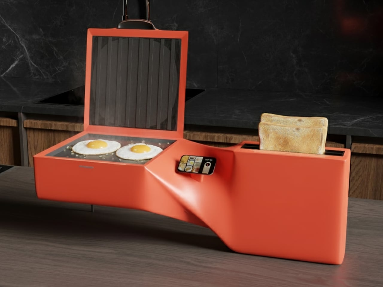
Picture this: one sleek appliance that houses a griddle, sandwich maker, toaster, and waffle iron all in one sculptural package. Yeah, you read that right. Four appliances, one footprint, and honestly, it looks like something that wandered off the set of a sci-fi movie and decided to make you breakfast instead.

Designer: Nikhil Thomas Zachariah

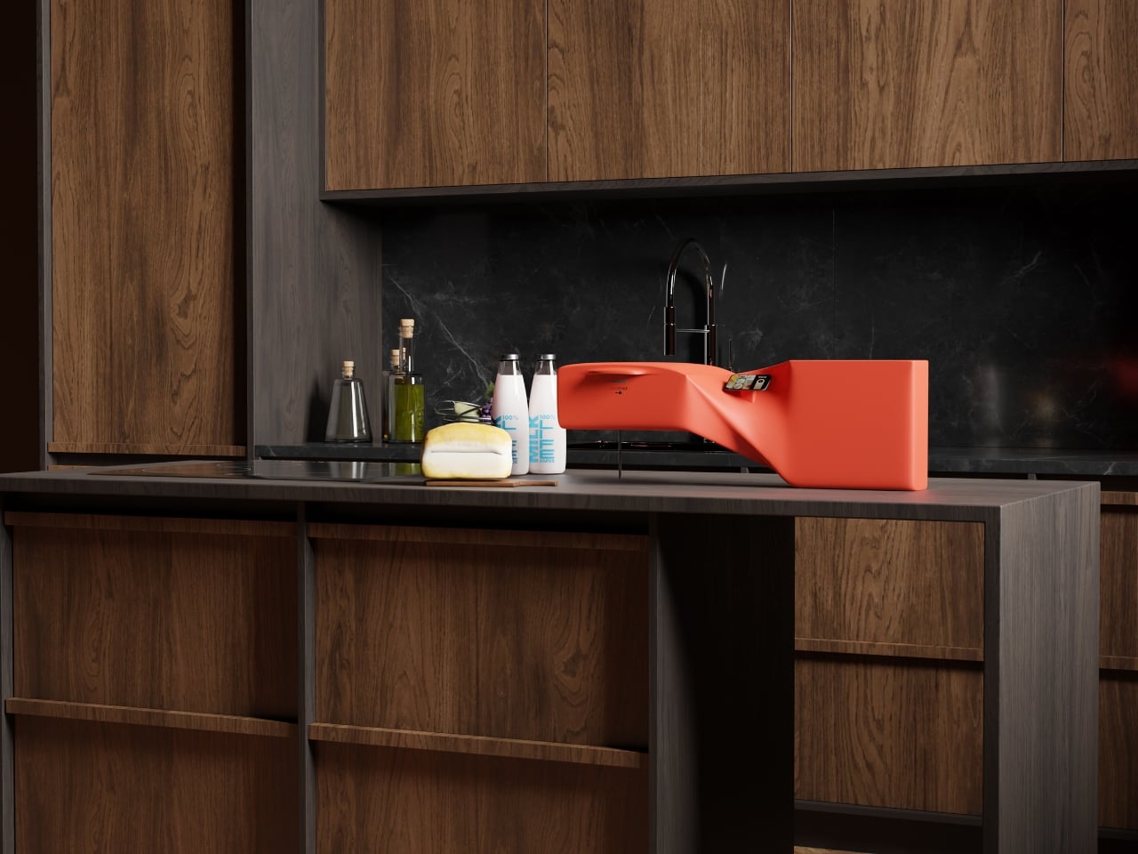
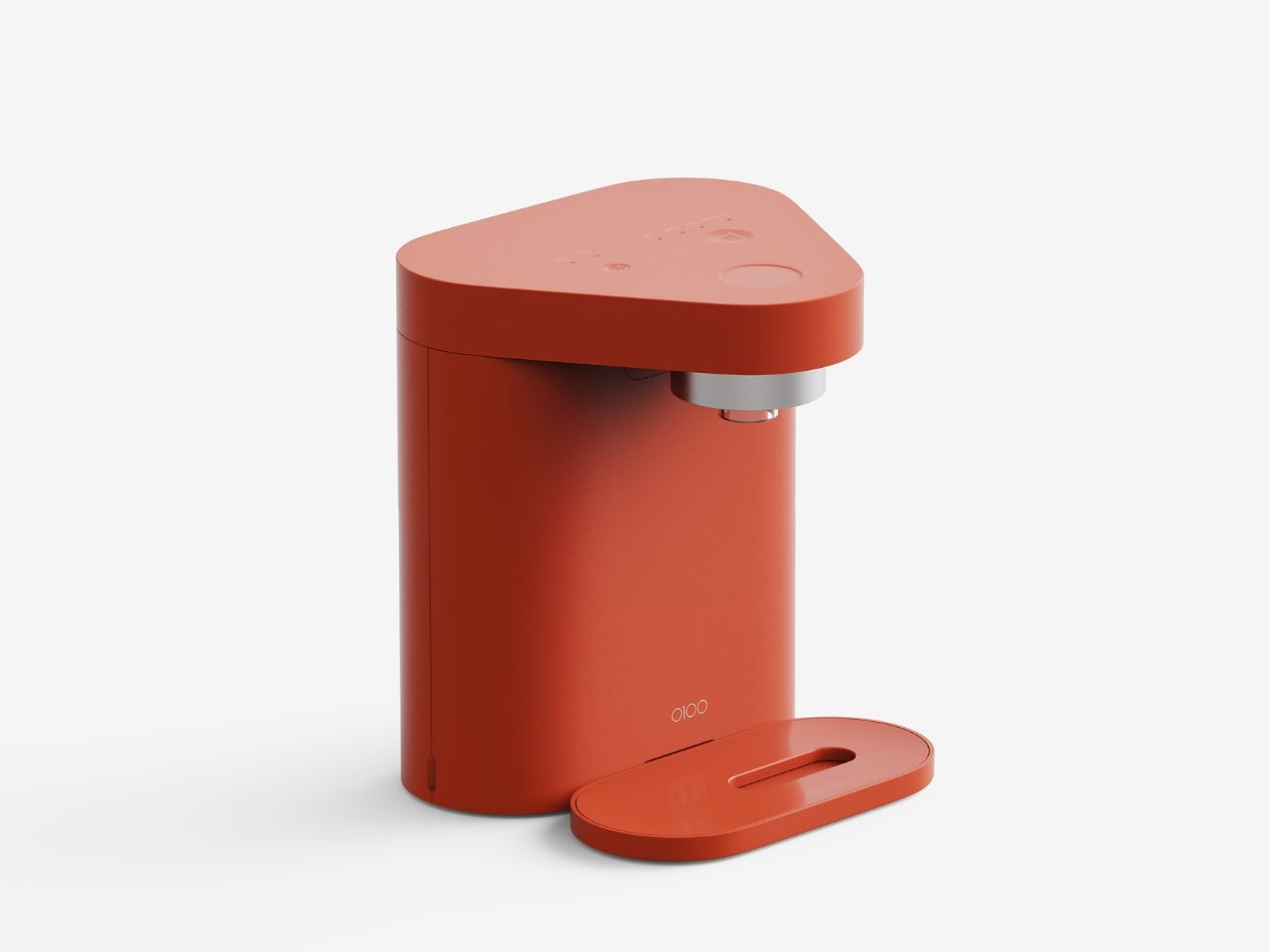
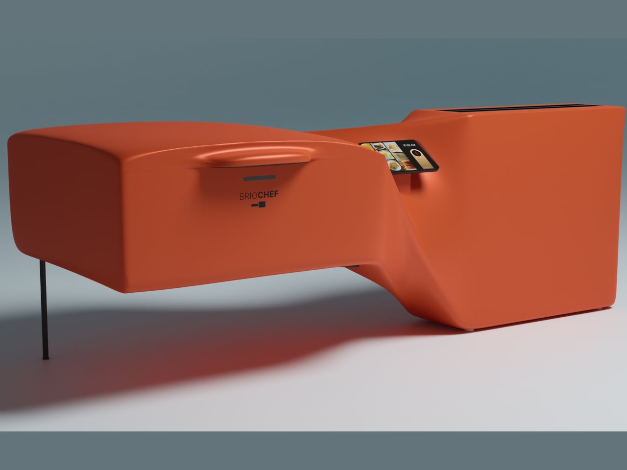
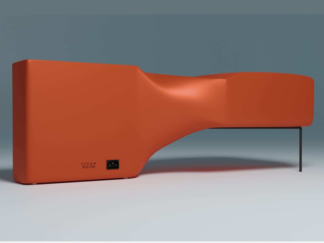
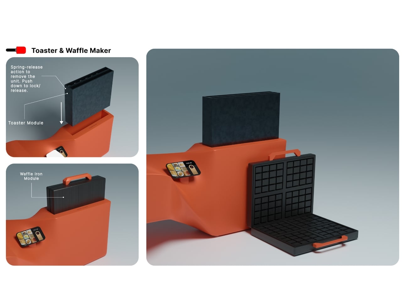
The design itself is striking. That bold coral-orange body with black cooking surfaces isn’t trying to blend into your kitchen. It wants to be seen, and frankly, it’s earned the right. The form flows in this organic, almost architectural way, with a raised section on the left housing the griddle and sandwich maker, while the right side keeps the toaster and waffle maker ready for action. It’s like someone finally asked, “What if kitchen appliances were actually cool?”

But here’s where BrioChef goes from “pretty cool” to “okay, I’m interested.” Everything is modular. Those cooking surfaces? They pop out with spring-release mechanisms, making cleanup actually manageable instead of that weird scrubbing dance we all do with traditional appliances. The griddle has removable bars that flip between flat griddle mode and sandwich press grooves. The toaster and waffle modules lift right out. All of it is food-grade material that you can clean with whatever you already have under your sink.

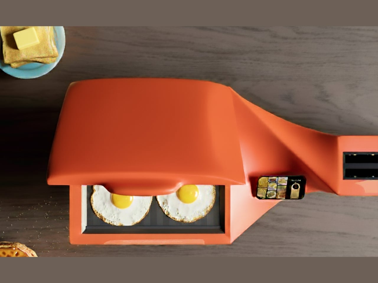
The touch display embedded in the surface is another smart move. It’s not just a timer and temperature control (though it does that). It actually walks you through recipes step by step. So if you’ve never made a proper Belgian waffle or you’re not sure how long to press a panini, the appliance literally guides you. It’s like having a patient friend who actually knows how to cook standing in your kitchen at 7 AM, except this friend doesn’t judge you for making a grilled cheese for dinner.

Let’s talk about real-world usage because that’s what matters. Morning rush? Throw eggs on the griddle while your bread toasts. Lazy Sunday? Waffles on one side, bacon on the griddle. Late-night munchies? Grilled cheese in minutes. The versatility here isn’t just a nice feature but the entire point. You’re not just consolidating appliances; you’re opening up possibilities because everything is actually accessible and ready to go.

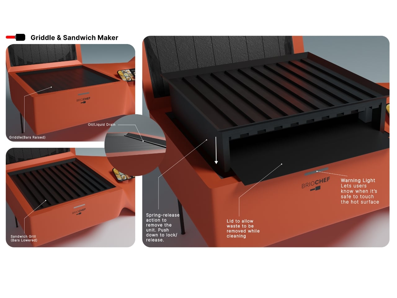
The thoughtful details pile up when you look closer. There’s an oil and liquid drain built into the griddle section because of course there is. Warning lights tell you when surfaces are hot so you don’t learn that lesson the hard way. The lid design on the griddle and sandwich maker allows waste to be removed while cleaning, which sounds small until you’ve tried to clean out a traditional sandwich press and wanted to throw the whole thing away.

From a design perspective, BrioChef does something that kitchen appliances rarely achieve: it makes you reconsider what’s possible in the space. We’ve been trained to accept that kitchen gadgets are clunky, single-purpose items that we hide away. This challenges that assumption entirely. Why shouldn’t an appliance be modular, beautiful, and smart all at once? The compact footprint means this could work in a tiny studio apartment, a college dorm, or a sprawling kitchen where you just want less clutter. It’s democratizing in that way, meeting people where they actually live and cook rather than assuming everyone has unlimited cabinet space.

Is BrioChef going to revolutionize your entire life? Probably not. But it might revolutionize your morning routine, your countertop organization, and your willingness to actually make breakfast instead of grabbing whatever on your way out the door. And honestly, in a world where most kitchen gadgets are forgettable at best, creating something that’s genuinely useful, thoughtfully designed, and kind of gorgeous? That’s worth paying attention to. Sometimes good design is about solving problems we didn’t even realize we’d been tolerating. BrioChef makes a compelling case that the four-appliance breakfast setup was one of those problems all along.

The post This Smart Griddle Just Combined 4 Breakfast Gadgets Into One Device first appeared on Yanko Design.

RC Outdoor Supply Made a Sacoche Bag for Actual Hiking

You know that feeling when you’re torn between bringing your sleek crossbody for a coffee run and a clunky backpack for a day hike? RC Outdoor Supply just solved that dilemma with their Trail Sacoche Bag, and honestly, it’s about time someone did.

For those not in the sacoche know, these compact bags have been having a major moment in streetwear circles. Originally a French term for a simple shoulder bag, the sacoche has become the go-to for minimalists who refuse to lug around more bag than they need. But here’s the thing: most sacoches are designed for urban jungles, not actual ones. RC Outdoor Supply flipped the script by taking this city slicker silhouette and giving it proper trail credentials.

Designer: RC Outdoor Supply ca

The Trail Sacoche hits that sweet spot of being compact without feeling restrictive. Made from durable nylon ripstop (the same stuff that keeps parachutes intact, no big deal), this bag laughs in the face of branches, rocks, and whatever else nature throws at it. The dimensions are clever too. At 11.5 by 8 inches when fully opened and 6.5 by 8 inches when folded, it’s like getting two bags in one depending on how much stuff you’re hauling around.

What really sets this apart from your average crossbody is the thoughtful pocket situation. There are two exterior cargo pockets on the front for quick-grab items (phone, trail snacks, that chapstick you’re always losing), plus a mesh pocket on the back that’s perfect for things you want visible but secure. The top closure uses bungee cording, which might sound casual but is actually genius for uneven terrain where you need flexibility and security at the same time. Inside, there’s a key ring because nobody wants to dig through their entire bag to find their car keys after a long hike. It’s these tiny details that show RC Outdoor Supply actually tested this thing in the wild rather than just sketching pretty pictures in a studio.

The brand, founded in California, has a specific philosophy: create clothing and gear that transitions seamlessly from the trail to the city. With the Trail Sacoche, they’ve nailed that brief. The bag comes in three colorways that work equally well on a mountain trail or a city street: Lichen (a muted green-gray), Saffron (a warm golden yellow that adds a pop without screaming for attention), and classic Black. Priced at $62, it sits in that reasonable middle ground where you’re not wincing at checkout but you’re also getting quality materials and construction. In a market flooded with either cheap fast-fashion bags or designer pieces that cost more than a weekend trip, this feels refreshingly honest.

What’s interesting is how this bag represents a larger shift in outdoor gear design. For years, the outdoor industry was stuck in a rut of aggressively technical-looking gear that screamed “I own expensive hiking equipment!” Now brands like RC Outdoor Supply are proving you can make functional gear that doesn’t look like it belongs exclusively on a summit attempt. The sacoche format itself is proof of this evolution, borrowing from fashion while adding legitimate outdoor functionality.

The versatility is the real selling point. Morning farmers market? Trail Sacoche. Afternoon hike? Same bag. Evening concert? Still works. This is exactly the kind of multifunctional design that makes sense for how people actually live, especially if you’re someone who refuses to be boxed into either “outdoorsy person” or “city person” categories. If there’s a critique, it’s that at this size, you’re definitely packing light. This isn’t replacing your daypack for serious hikes. But for short trails, urban exploring, travel, or just running around town with more style than a tote bag offers, it hits perfectly.

RC Outdoor Supply might not have the name recognition of legacy outdoor brands yet, but pieces like the Trail Sacoche Bag show they understand something crucial: the best gear works everywhere, looks good doing it, and doesn’t require a manual to figure out. Sometimes innovation isn’t about adding more features. It’s about doing something simple, exceptionally well.

The post RC Outdoor Supply Made a Sacoche Bag for Actual Hiking first appeared on Yanko Design.

The World’s Smallest Full-Size Umbrella Has an OLED Screen

Look, I’ve broken my fair share of umbrellas. That satisfying snap when a gust of wind hits you at just the wrong angle, the metal rib poking through fabric like a broken bone, the awkward dance of trying to fold the thing back into submission. We’ve all been there. So when I first saw the Ori umbrella, my immediate thought was: wait, where’s the rest of it?

This sleek little cylinder looks more like a fancy pen or a futuristic flashlight than an umbrella. And that’s entirely the point. Ori just announced what they’re calling the world’s first frameless umbrella, and honestly, it’s one of those “why didn’t anyone think of this sooner” moments that makes you question everything.

Designer: Modestas Balcytis

The magic is in the origami. Founded by MIT engineers and origami specialists, Ori uses a patented folding technique based on the Miura fold, which is the same kind of engineering NASA uses for deployable spacecraft structures. Instead of the traditional setup of metal ribs covered in fabric, the canopy itself becomes the structure. No ribs. No fabric stretched over a frame. No failure points waiting to betray you on a windy Tuesday.

When folded, this thing measures just 3.5 by 23 centimeters. That’s genuinely pocket sized, and I’m not talking about cargo pants pockets either. It compresses a full one meter canopy into something smaller than most water bottles. The canopy unfolds with what they call “1-degree of freedom motion,” which is engineering speak for “it opens with one smooth movement and doesn’t fight you.”

But here’s where Ori gets really interesting. They didn’t just reinvent the umbrella’s mechanics. They added an OLED display right into the handle. This isn’t some gimmicky addition either. The display shows you real time air quality data through something called AirSense, measuring particles and UV levels right where you’re standing. There’s MoodShift, which adapts the display visuals based on weather and your preference. You can customize the display themes, and everything operates with a simple tap to open or close.

The design itself is gorgeous. Available in iPhone grade aluminum housing with finishes in silver, rose gold, and sky blue, it genuinely looks like something Apple would make if they decided to tackle rain gear. The comparison to Dyson and Apple isn’t just marketing speak. Founder and CEO Modestas Balcytis explicitly said that’s the goal: to become the premium design brand in a category that hasn’t seen real innovation in 170 years.

And he’s not wrong about that timeline. The basic umbrella design has remained essentially unchanged since the mid 1800s. Sure, we’ve gotten automatic open buttons and wind resistant frames, but the fundamental architecture of fabric on metal ribs hasn’t budged. Meanwhile, we’ve completely reinvented phones, watches, even how we vacuum our floors. The umbrella just sat there, breaking in the same predictable ways, generation after generation.

The umbrella market is massive too. We’re talking $7.4 billion annually, with 1.2 billion units sold every year. Yet there’s no iconic umbrella brand. No household name that owns the category. It’s a completely fragmented market of cheap airport kiosk purchases and forgotten drugstore impulse buys. Ori sees that gap and wants to fill it with something people actually want to own and show off.

At $249.99, this isn’t an impulse purchase. But neither was the first Dyson vacuum or the original iPhone. Premium pricing positions this as an investment piece, something that should last years instead of months. With four patents filed covering everything from the folding architecture to the locking system and smart core, Ori has built serious intellectual property around this design.

The first Founder Edition units are expected to ship globally in 2026. Whether Ori succeeds in becoming the Dyson of umbrellas remains to be seen, but they’ve definitely created something worth paying attention to. Sometimes the most innovative products come from rethinking the everyday objects we’ve stopped questioning. And honestly? I’m ready to see umbrellas get the glow up they deserve.

The post The World’s Smallest Full-Size Umbrella Has an OLED Screen first appeared on Yanko Design.

This Lamp Blooms Like a Peacock’s Tail and It’s Mesmerizing

There’s something almost magical about watching a peacock unfurl its tail feathers. That moment of transformation, when something compact suddenly explodes into an elaborate fan of color and pattern, never gets old. Dutch designer Jelmer Nijp must have felt the same way because he decided to bottle that exact feeling into a lamp, and the result is nothing short of captivating.

Meet Pavo, a lighting design that’s part industrial fixture, part nature-inspired sculpture. The name itself is a nod to its inspiration. Pavo means peacock in Spanish (and Latin, for that matter), and once you see it in action, you’ll understand why Nijp couldn’t have called it anything else. This isn’t your typical table lamp that just sits there looking pretty. Pavo actually moves, transforms, and reveals itself in a way that makes you stop and stare.

Designer: Jelmer Nijp

The design is deceptively simple at first glance. When closed, Pavo looks like a sleek metal tube, the kind of minimalist object that wouldn’t look out of place in a modern apartment or design studio. But here’s where it gets interesting. That tube retracts, and as it does, a pleated shade unfurls like a fan, spreading outward in a graceful, almost organic motion. Light radiates from the center of this fan, creating a soft glow that highlights the geometric pleats and folds of the shade. It’s the kind of moment that makes you want to show everyone in the room, “Look at this! Did you see that?”

What makes Pavo special is how it bridges two worlds that don’t always play well together. On one hand, you’ve got this very industrial aesthetic with clean metal lines and mechanical movement. On the other, there’s this undeniable connection to nature, to the beauty and drama of a peacock’s display. Nijp manages to merge these seemingly opposite ideas into something that feels both sleek and alive, modern yet timeless.

The movement itself deserves special attention because it’s not just a gimmick. The way the shade unfolds is smooth and deliberate, mimicking the natural grace of an actual peacock. It’s unexpected in the best possible way. You don’t often encounter furniture or lighting that has this kind of kinetic quality, especially not executed with such elegance. This is design that understands the power of transformation and uses it to create a genuine emotional response.

Nijp is a 2025 graduate of the Design Academy Eindhoven, one of those prestigious schools that consistently churns out designers who aren’t afraid to experiment and push boundaries. His approach is hands-on and experimental, using the process of making itself as a way to explore materials and forms. You can see that philosophy at work in Pavo. This isn’t a lamp that was designed purely on a computer and then manufactured. It has the feel of something that was worked out through trial and error, through actually building and testing until the mechanics and aesthetics came together just right.

The lamp was showcased at Dutch Design Week 2025, where it attracted plenty of attention among a sea of innovative projects. And it’s easy to see why. In a design landscape that often leans heavily into either pure functionality or pure aesthetics, Pavo manages to be both functional and beautiful while also being genuinely delightful. It’s a light source, yes, but it’s also a conversation piece, a kinetic sculpture, and a little moment of wonder in your living space.

What Pavo represents is a growing trend in contemporary design where the line between art and utility becomes increasingly blurred. Designers like Nijp are asking why everyday objects can’t be more engaging, more interactive, more memorable. Why should a lamp just be a lamp when it could also be an experience? There’s something refreshing about a piece that demands your attention, that makes you think differently about what design can be. Pavo is a reminder that good design doesn’t have to choose between form and function, between nature and industry, between stillness and movement. Sometimes, the best design happens when you bring all these elements together and let them play off each other in unexpected ways.

The post This Lamp Blooms Like a Peacock’s Tail and It’s Mesmerizing first appeared on Yanko Design.

Seoul’s ‘Wild Nature’ Just Inspired the Furniture Everyone Wants

There’s something quietly rebellious about seeing delicate leather straps wrapped around cold, hard steel. It’s unexpected, a bit contradictory, and exactly what makes Nara Lee’s Pul collection so captivating. The Paris-based architect just unveiled this sculptural furniture series at The Sun Room exhibition in Seoul, and it’s turning heads for all the right reasons.

What strikes you first about these pieces isn’t just their minimalist beauty, but the story they tell about urban nature. Lee drew inspiration from what she calls Seoul’s “wild nature,” those moments when the organic world refuses to be contained by concrete and glass. Think weeds breaking through sidewalk cracks, vines climbing up apartment buildings, or wildflowers blooming in forgotten corners. It’s nature being stubborn and beautiful in places it technically shouldn’t exist.

Designer: Nara Lee

The Pul collection channels this tension between the rigid and the organic through its material choices. Stainless steel provides the structure, all clean geometric lines and industrial precision. But then there are those leather ties that seem to hold everything together, adding warmth and tactility to pieces that could have been austere. The chairs are particularly striking, with backs that bend backwards in ways that feel both sculptural and functional.

What Lee has done here is create furniture that lives in the space between art object and everyday utility. These aren’t pieces that disappear into a room. They command attention, make statements, and start conversations. Yet they’re still fundamentally chairs, tables, and functional objects meant to be used rather than just admired from a distance.

The process behind the collection is just as interesting as the finished products. Lee combines industrial metalworking with traditional hand-crafted techniques, bringing together two worlds that don’t usually share space. The stainless steel gets precision-cut and welded using modern manufacturing methods, while the leather components require old-school craftsmanship and careful hand-stitching. It’s this marriage of high-tech and handmade that gives each piece its unique character.

There’s also something to be said about Lee’s choice to debut this collection in Seoul rather than in Paris, where she’s based. It feels intentional, like coming full circle with inspiration. The city that sparked the concept gets to see its wild nature reflected back through these striking furniture pieces. It’s a love letter to Seoul’s particular brand of urban beauty, where modernity and nature negotiate their coexistence daily.

The sculptural quality of the Pul collection places it firmly in that growing category of design that refuses to pick a lane between art and function. These are pieces that would look equally at home in a contemporary art gallery or a stylishly minimalist living room. That versatility is part of their appeal. They’re conversation starters that also happen to be incredibly practical. What makes this collection feel particularly relevant right now is its exploration of contrast. We’re living in an era obsessed with binaries and either-or thinking, but Lee’s work suggests there’s beauty in bringing opposites together. Hard and soft, industrial and organic, precise and imperfect. The Pul collection doesn’t try to reconcile these differences so much as celebrate them.

For anyone interested in where contemporary design is heading, the Pul collection offers some compelling hints. There’s a growing appetite for pieces that tell stories, that reference their cultural contexts, and that don’t sacrifice artistic vision for mass appeal. Lee’s work checks all those boxes while still maintaining a clean, approachable aesthetic that doesn’t require a degree in design theory to appreciate.

The leather straps aren’t just decorative elements or structural necessities. They’re the collection’s way of softening steel’s edge, of adding human warmth to industrial coolness. They represent the hand-crafted in conversation with the machine-made, the traditional meeting the contemporary. In a world increasingly dominated by algorithmic precision and mass production, there’s something refreshing about furniture that proudly shows the marks of human touch alongside industrial fabrication.

Nara Lee’s Pul collection proves that furniture can be more than just functional objects. It can be commentary, poetry, and practical seating all at once. And sometimes, the most interesting design happens when you let contradictions coexist rather than trying to resolve them.

The post Seoul’s ‘Wild Nature’ Just Inspired the Furniture Everyone Wants first appeared on Yanko Design.

This $48 Pizza Axe Just Made Every Round Cutter Obsolete

Let’s be honest, pizza night deserves more than a sad plastic rolling cutter from the back of your drawer. The Pizza Axe transforms an everyday task into something that feels like you’re about to raid a feast hall instead of just dividing up your Friday night pepperoni pie.

This isn’t some gimmicky kitchen gadget destined for the donation pile next year. The Pizza Axe is a legitimate tool crafted with stainless steel and pine wood that handles actual slicing while looking ridiculously cool on your counter. At $48, it’s positioned somewhere between impulse buy and considered investment, which honestly feels about right for something that makes you feel like a Norse warrior every time you want a slice.

Designer: Marcellin

What makes pizza axes appealing goes beyond their obvious visual punch. They tap into our collective fascination with medieval aesthetics while solving a real problem: traditional pizza cutters often struggle with thick crusts or heavily topped pies. An axe-style blade brings more leverage and cutting power to the table, literally. The design typically features a sharp stainless steel blade attached to a wooden handle, creating enough heft to slice through even the most ambitious deep-dish creations.

The Pizza Axe comes with a sheath for storage, which is both practical and slightly absurd in the best way. There’s something inherently funny about sheathing your pizza cutter like it’s a weapon, but it also keeps the blade protected and your fingers safe when rummaging through kitchen drawers. This attention to detail suggests the makers understand their audience: people who appreciate functionality but also want their tools to spark joy, or at least conversation.

What’s particularly clever about the pizza axe trend is how it transforms a mundane kitchen task into performance art. Serving pizza becomes an event, not just dinner logistics. When you pull out an axe to slice your pizza, people notice. It’s the kind of thing that makes your dinner party memorable without requiring you to actually learn how to juggle flaming batons or whatever else people do for attention these days.

The broader pizza axe market has exploded with Viking-themed options featuring intricate engravings, skull designs, and runic symbols. These handcrafted versions can run anywhere from $30 to over $100 depending on materials and customization. The Uncrate version keeps things relatively straightforward, focusing on clean design without excessive ornamentation, which makes it more versatile for various kitchen aesthetics.

Beyond pizza, these tools work surprisingly well for other kitchen tasks. Need to portion a large sheet cake? Chop fresh herbs? Divide up a flatbread? The axe design handles it. Some users report success using them for trimming dough or even as a conversation piece when they’re not actively slicing. The pine wood handle offers comfortable grip and visual warmth that balances the industrial edge of the steel blade.

There’s also something satisfying about owning tools that feel substantial. We’re surrounded by flimsy plastic implements that bend and break after a few uses. The Pizza Axe presents an alternative philosophy: buy something well-made that performs its job and looks good doing it. It’s part of a larger movement toward thoughtful kitchen tools that prioritize both form and function rather than treating them as competing priorities.

Of course, the Pizza Axe isn’t for everyone. Minimalists might find it excessive. People with small kitchens might lack the drawer space for another specialized tool. And if you’re someone who orders delivery exclusively, owning an elaborate pizza cutting implement might feel aspirational in the wrong way. But for people who love cooking, entertaining, or just appreciate objects with personality, it hits a sweet spot between practical and playful.

Ultimately, the Pizza Axe succeeds because it understands that everyday objects don’t have to be boring. Why settle for adequate when you can have something that makes you smile every time you use it? In a world of beige appliances and forgettable utensils, sometimes you need something that reminds you that even routine tasks can have a little drama. And if that drama happens to involve wielding an axe over a margherita, well, that’s just good living.

The post This $48 Pizza Axe Just Made Every Round Cutter Obsolete first appeared on Yanko Design.

This Tiny Water Purifier Rethinks Design for Small Spaces

There’s something refreshing about design concepts that actually understand how we live. The SAI Lite water purifier from Superset Design is one of those rare concepts that doesn’t just look good in renderings but actually makes sense for real kitchens. Especially if that kitchen happens to be, like mine, not exactly spacious and can be cluttered at times.

The name SAI comes from the Korean word for “narrow space,” which tells you everything you need to know about the design philosophy here. This concept is the successor to the original SAI Pro, and the team took an already compact design and stripped it down even further to its absolute essentials.

Designer: Superset Design

Create your own Aesthetic Render: Download KeyShot Studio Right Now!

What caught my eye first is that distinctive rounded triangular shape. It’s not just designers being quirky for the sake of it. That form comes directly from the internal layout of two filters and a control module arranged in the most spatially efficient way possible. The footprint literally doesn’t get any bigger than the diameter of those two filters, which means you’re not sacrificing counter space for empty air.

Here’s where the thinking gets really smart. Instead of designing a water purifier that can accommodate every possible container you might own, the team at Superset Design asked a better question: what do people actually use in small apartments and single-person households? Spoiler alert, it’s not giant stockpots and mixing bowls. It’s cups, tumblers, small pots, and maybe a water bottle. So that’s exactly what this concept was designed around.

This is the kind of practical thinking we need more of in product design. Too often, appliances are built for some idealized version of how we’re supposed to live rather than how we actually do. SAI Lite flips that script. The height is calibrated for the vessels you’ll realistically fill every day, creating proportions that feel balanced and purposeful rather than arbitrarily compact.

The interface concept deserves attention too. On the top surface, you’ll find three main controls: a filter replacement reset button, a water capacity control, and the dispensing button. But instead of cluttering the surface with every possible setting, the designers proposed something called Progressive Disclosure. Functions you only need during initial setup or rarely touch are tucked away behind a long press or an extra interaction layer. The result is a control surface that looks clean and feels immediately intuitive when you’re just trying to fill your morning coffee cup.

This approach to interface design is something we see in good software all the time but rarely in physical products. It respects the fact that most of the time, you want to do one simple thing: get water. Everything else can wait in the background until you actually need it. The aesthetic is minimalist without being cold. That terracotta orange finish gives it personality and warmth, and the smooth, rounded edges make it feel approachable rather than intimidating. It’s the kind of object that could sit comfortably next to your other kitchen essentials without screaming for attention, yet it’s distinctive enough that you’d probably want to keep it visible rather than hidden away.

Looking at the concept renderings, you can see how efficiently everything is packed. The two cylindrical filters sit side by side with the control module, all contained within that triangular envelope. There’s no wasted space, but it also doesn’t feel cramped or difficult to access when you need to change filters. What makes SAI Lite compelling as a design concept isn’t just that it’s small. Plenty of products are small. What makes it work is that every decision, from the shape to the height to the button layout, stems from a clear understanding of the actual problem it’s solving. This is design that respects your space, your daily habits, and your time.

There’s something genuinely appealing about seeing designers propose objects that know exactly what they are and do that one thing exceptionally well. SAI Lite isn’t trying to be everything to everyone. It’s conceived for modern living spaces where every inch counts and simplicity isn’t just aesthetic, it’s essential. Whether this concept makes it to production or not, it’s the kind of thoughtful design thinking that pushes the industry forward. It challenges manufacturers to reconsider who they’re actually designing for and what those people truly need in their daily lives.

The post This Tiny Water Purifier Rethinks Design for Small Spaces first appeared on Yanko Design.

MITO Just Built an Air Purifier That Drives Itself to Dirty Air

If you’ve ever felt frustrated by your air purifier sitting uselessly in the corner while your bedroom air gets stale, you’re not alone. Traditional air purifiers have a fundamental flaw: they camp out in one spot and hope for the best. But what if your air purifier could actually move to where the problem is? That’s exactly what MITO does, and it’s kind of brilliant.

Created by designers Yukang Seo, Kyuil Baek, Hakyoun Kim, and Semi Oh, MITO reimagines air purification as a living ecosystem rather than a static appliance. The name itself comes from mitochondria, those tiny powerhouses inside our cells that keep everything running. Just like its biological namesake, MITO acts as the energetic core of your home’s air quality, sensing changes and responding in real time.

Designers: Yukang Seo, Kyuil Baek, Hakyoun Kim, Semi Oh

Create your own Aesthetic Render: Download KeyShot Studio Right Now!

Here’s how it works: MITO consists of two components that communicate with each other. The Sensor Cells are compact air quality monitors you place in different rooms throughout your home. They’re constantly measuring CO₂, particulate matter, and volatile organic compounds. When the air quality drops below your set threshold, these little devices light up with red LEDs and display clear graphics telling you exactly what needs to happen. High CO₂? Time to open a window. Too much dust or VOCs? The purifier is on its way.

That purifier is the Core Cell, an AI-powered autonomous unit that literally drives itself around your home. Using LiDAR mapping, cliff sensors, and object recognition cameras, it navigates between rooms like a very sophisticated Roomba, except instead of cleaning your floors, it’s cleaning your air. When a Sensor Cell detects pollution in the bedroom, the Core Cell charts a course and heads there to handle intensive purification.

What makes MITO genuinely innovative is that it doesn’t pretend full automation is the answer. The designers recognized something most smart home products ignore: sometimes you actually need to open a window. No amount of fancy filtration can replace fresh air when CO₂ levels climb too high. So instead of promising to do everything for you, MITO creates what the designers call a “hybrid air ecosystem.” It tells you when manual ventilation is necessary, then steps in to purify once you’ve done your part.

The design philosophy draws inspiration from 1960s Japanese Metabolist architecture, which viewed cities as living organisms that grow and transform with their environment. It’s a fitting reference for a product that literally adapts to your living space. The Core Cell even has magnetically attached housing panels you can swap out, letting it visually adapt to different rooms like an organism changing its outer layer.

Aesthetically, MITO looks nothing like the clunky white boxes or fake wood grain towers cluttering most homes. The Core Cell has a sleek, organic form with ribbed side panels where air flows in and a circular top vent where purified air flows out. The Sensor Cells are compact, rounded rectangles with LED-lit displays that show everything from the time to cute house icons when ventilation is needed. When air quality is good, they quietly display a clock face and blend into your space like minimalist decor.

The system learns as it operates, building an understanding of your home’s airflow patterns and pollution habits. Maybe your kitchen always needs attention after dinner, or perhaps your home office gets stuffy by mid-afternoon. MITO picks up on these patterns and optimizes its route accordingly. It’s this combination of learning, reacting, and growing together with your habits that the designers built into the brand’s core values.

In multi-room scenarios, MITO really shows its intelligence. With three rooms on one floor, it uses data from multiple Sensor Cells to prioritize which space needs attention most urgently. While one room ventilates naturally through an open window, MITO might be intensively purifying another room’s air, all while the third Sensor Cell continues monitoring and waiting its turn.

It’s refreshing to see a product that doesn’t oversell the magic of automation. MITO acknowledges that smart homes still need smart humans. By clearly communicating what it can and can’t do, and by working in partnership with simple human actions like opening windows, MITO offers something that feels more realistic and ultimately more useful than products promising to handle everything invisibly. Sometimes the best technology isn’t the kind that does everything for you, but the kind that works with you, breathing and adapting like a living thing in your home.

The post MITO Just Built an Air Purifier That Drives Itself to Dirty Air first appeared on Yanko Design.

Rebug: The Toy That’s Getting Kids Off Screens and Into Bugs

Remember when catching fireflies in a jar was peak childhood entertainment? Yeah, me neither, because apparently we’re all too busy doom-scrolling. But here’s the thing: a group of designers just created something that might actually get today’s kids to put down their tablets and start chasing butterflies instead. And honestly? It’s kind of brilliant.

Meet Rebug, an urban insect adventure brand that’s basically the lovechild of Pokemon Go and a nature documentary. Created by designers Jihyun Back, Yewon Lee, Wonjae Kim, and Seoyeon Hur, this isn’t your grandmother’s butterfly net situation. It’s a whole ecosystem of beautifully designed products that make bug hunting feel less like a science project and more like the coolest treasure hunt ever.

Designers: Jihyun Back, Yewon Lee, Wonjae Kim, Seoyeon Hur

Create your own Aesthetic Render: Download KeyShot Studio Right Now!

The backstory here is actually pretty important. We’re living through what experts are calling “nature-deficit disorder,” which sounds made up but is very real. Studies show that kids who spend time outside are happier, more focused, and way less anxious than their indoor counterparts. But between screens and city living, most children today are more likely to recognize a YouTube logo than a dragonfly. The research is genuinely alarming: kids in urban areas with frequent smartphone use are significantly less likely to do things like bird watching or insect catching. Which, you know, makes sense when you think about it. Why chase bugs when you can watch someone else do it on TikTok?

But Rebug flips the script. Instead of fighting against technology or pretending cities don’t exist, it works with both. The product line is this gorgeous collection of bug-catching tools in these dreamy pastels and neon brights that look more like designer home accessories than kids’ toys. There’s a translucent pink funnel catcher, a sky-blue observation dome that works like a tiny insect hotel, and my personal favorite: the Ripple Sparkle.

This thing is genuinely clever. It’s a device that attracts dragonflies by mimicking water ripples with a rotating metal plate. Dragonflies are naturally drawn to polarized light on water, so this gadget basically speaks their language. No chemicals, no tricks, just pure science-based attraction. The insects come to investigate, kids get to observe them up close, and then everyone goes their separate ways unharmed. It’s like speed dating for nature education.

What really gets me about Rebug is how it bridges the digital and physical worlds without being preachy about it. The brand includes this whole archiving system with colorful record cards and an app interface where kids can document their finds. Instead of just telling children to “go outside and play,” it gives them a mission. How many insects did you meet today? Where did you find that beetle? The app turns each discovery into a collectible moment, which, let’s be real, is exactly how kids’ brains work these days.

The visual design is also doing the most in the best way. The branding uses this electric yellow, hot pink, and bright blue color palette that feels more streetwear than science kit. The graphics pull from three sources: actual insect shapes, children’s scribbles, and digital glitch effects. That last one is particularly smart because it literally visualizes the brand’s whole mission of shifting kids from digital errors to natural wonders. It’s the kind of layered design thinking that makes you go “oh, they really thought about this.”

And here’s what makes this feel so timely: Rebug proves that urban spaces aren’t nature deserts. You don’t need to drive to a national park to find wildlife. There are ecosystems thriving on your sidewalk, in your local playground, in that patch of grass between buildings. Research shows that urban families often don’t realize these opportunities exist or don’t see meaningful ways to interact with city nature. Rebug hands them the tools, literally and figuratively, to start looking differently at their environment.

Could a beautifully designed bug kit actually combat screen addiction and nature disconnect? Probably not single-handedly. But it’s a start, and more importantly, it’s a conversation starter about what childhood exploration can look like in 2025. Plus, those product photos are absolutely gorgeous, which never hurts when you’re trying to convince people to try something new. Sometimes the best design solutions don’t reinvent the wheel. They just make you excited to get off the couch.

The post Rebug: The Toy That’s Getting Kids Off Screens and Into Bugs first appeared on Yanko Design.

Hand-Stitched $2,300 Sneakers With Only 2 Pairs in the World

Let’s talk about what happens when ancient Japanese craftsmanship collides with one of the most elusive sneakers in the game. The result? A pair of shoes that costs more than most people’s monthly rent, and somehow, that price tag makes total sense.

New Balance Japan just announced a collaboration with Sashiko Gals that’s turning heads for all the right reasons. They’ve taken the legendary 1300JP and transformed it into something that exists somewhere between footwear and functional art. And before you dismiss this as another overpriced sneaker collab, hear me out, because this one’s different.

Designers: Sashiko Gals and New Balance

For those not deep in sneaker lore, the New Balance 1300JP is basically the Bigfoot of running shoes. Originally released in the 1980s, it only drops once every five years in Japan, making it the kind of shoe that serious collectors set calendar reminders for. It’s got that classic grey suede aesthetic and Made in USA quality that sneakerheads obsess over.

Enter Sashiko Gals, a community of Japanese artisans who are keeping the centuries-old tradition of sashiko embroidery alive by dragging it, stitch by careful stitch, into contemporary culture. Sashiko is that traditional Japanese hand-stitching technique where artisans use running stitches to create intricate patterns on fabric, typically indigo-dyed. It’s slow work. Meticulous work. The kind of craft that makes you appreciate the human hands behind every detail.

What these artisans did to the 1300JP is nothing short of remarkable. They covered the entire upper with hand-made sashiko patches, stitching them with white, orange, and indigo-blue thread. The decorative patterns create this visually rich tapestry that screams Japanese heritage while somehow still respecting the sneaker’s classic silhouette. And because these artisans apparently don’t believe in half-measures, they even stitched the running patterns onto the ends of the laces. Every. Single. Detail. Matters. The collaboration also includes a Made in USA varsity jacket that gets the same treatment, blending American sports heritage with Japanese craftsmanship in a way that shouldn’t work but absolutely does.

Now, about that price tag. The sneakers clock in at 363,000 yen, which translates to roughly $2,330 USD. The jackets? Try 990,000 yen, or about $6,300 USD. Yeah, you read that right. These numbers are stratospheric. But here’s where things get interesting. New Balance and Sashiko Gals are only making two pairs of the 1300JP and four jackets (one in each size from small to extra-large). They’ll drop via a charity-based lottery at the New Balance Harajuku flagship on December 12th, and here’s the kicker: every single yen from the sales goes to MOONSHOT Co., LTD., an organization dedicated to developing future sashiko artisans and funding the launch of something called the SASHIKO WORLD CHAMPIONSHIP.

This is what makes this collaboration actually matter. It’s not just two brands cashing in on hype. It’s a genuine effort to preserve and promote a traditional art form that’s at risk of fading away in our mass-production world. The Sashiko Gals are literally expanding the possibilities of their craft, proving that ancient techniques can still resonate in our modern, sneaker-obsessed culture. The “Crafted for the Future” partnership name suddenly makes sense. This isn’t about churning out product. It’s about creating a sustainable model where traditional craftsmanship can thrive, where artisans have platforms to showcase their work, where slow fashion and meticulous detail aren’t just marketing buzzwords but actual values worth paying for.

Will most of us ever own these sneakers? Probably not. Only two pairs exist, and the lottery system means even having the money isn’t enough. But that’s kind of the point. This collaboration is proving that sneakers can be more than just footwear or even fashion. They can be vessels for cultural preservation, fundraising tools, and tiny rebellions against our disposable culture. We’re living in an age where fast fashion dominates and sneaker collaborations drop every other week so the Sashiko Gals x New Balance 1300JP stands out by doing the exact opposite. It’s slow. It’s expensive. It’s impossibly rare. And somehow, that makes it one of the most exciting sneaker releases of the year.

The post Hand-Stitched $2,300 Sneakers With Only 2 Pairs in the World first appeared on Yanko Design.