The RIMOWA Design Prize doesn’t always produce furniture, and that’s precisely why I pay attention to it every year. The luggage brand’s annual student design competition has a way of surfacing ideas that sit at the uncomfortable, exciting edge of what design can actually do for people, and the 2026 winner is probably the best example of that yet.
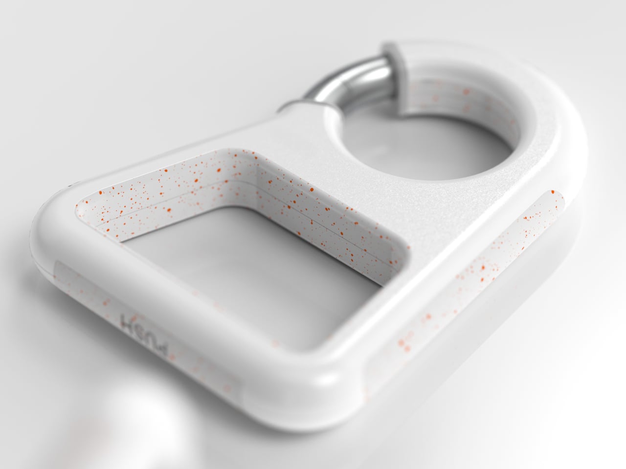
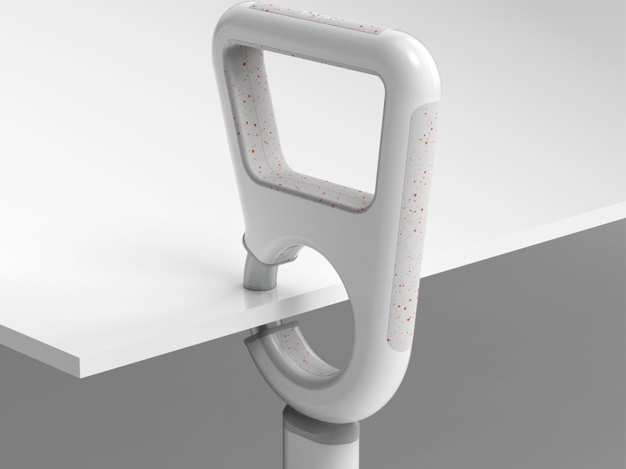
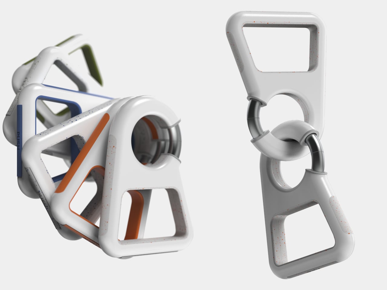
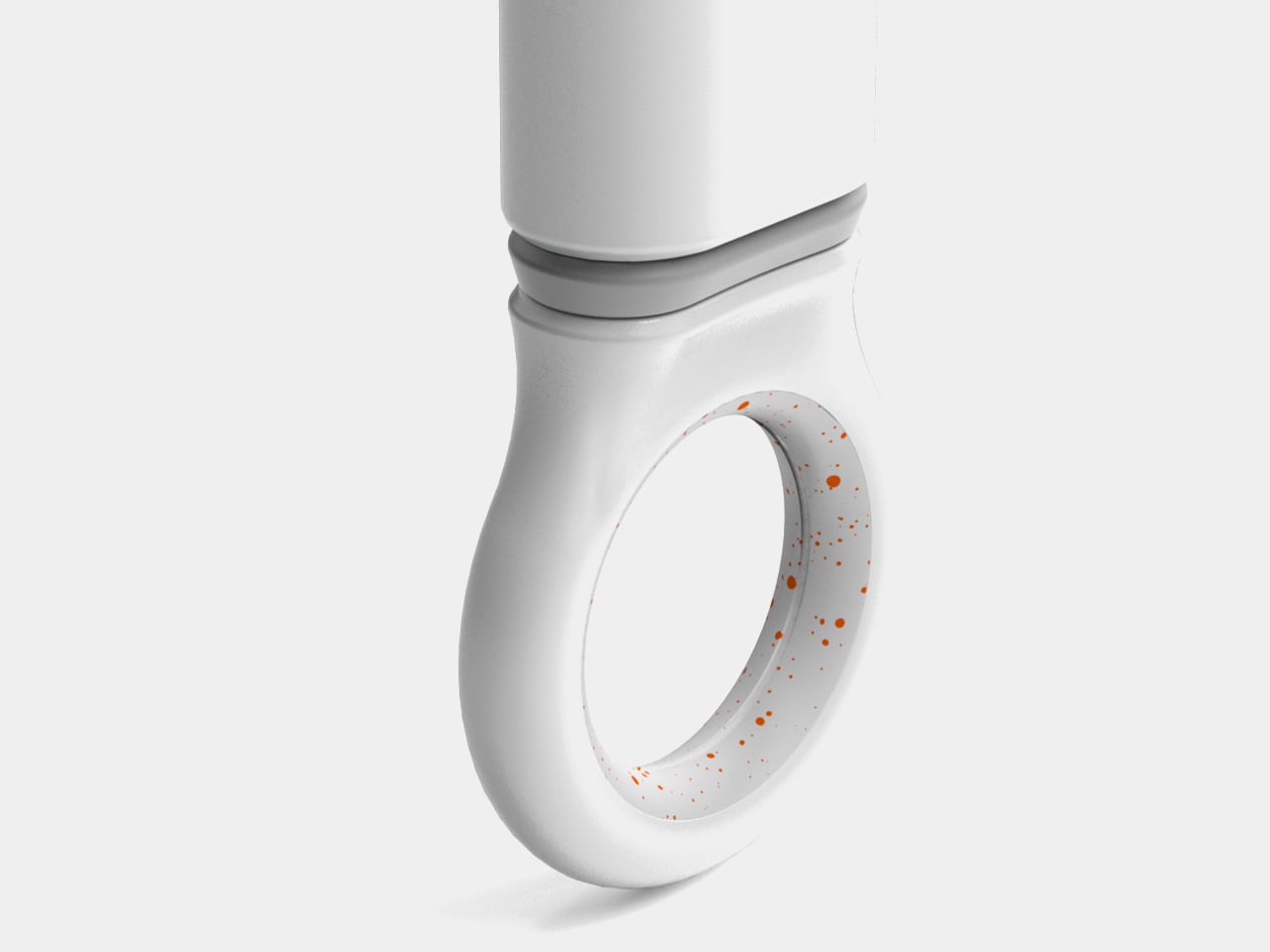
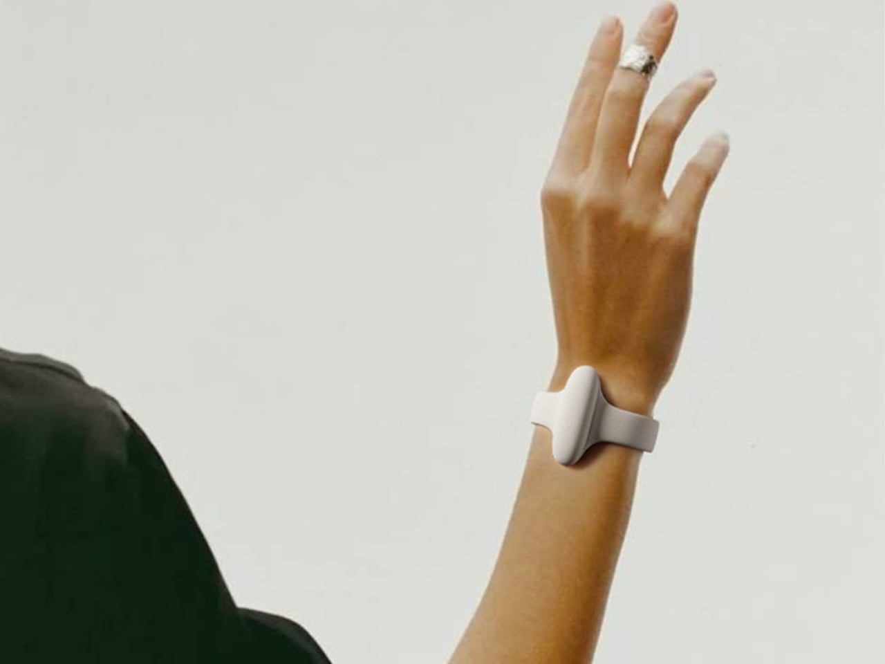
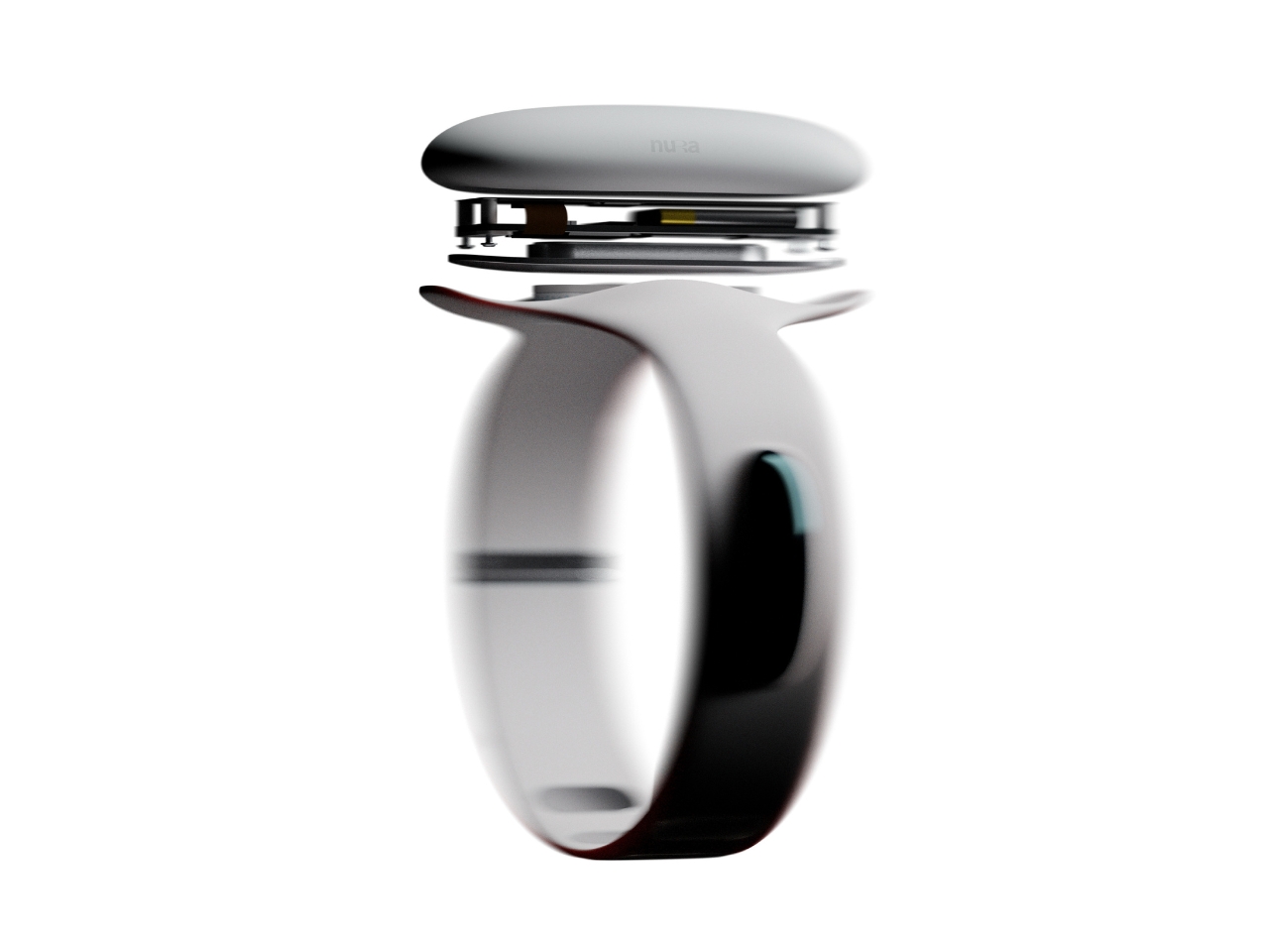
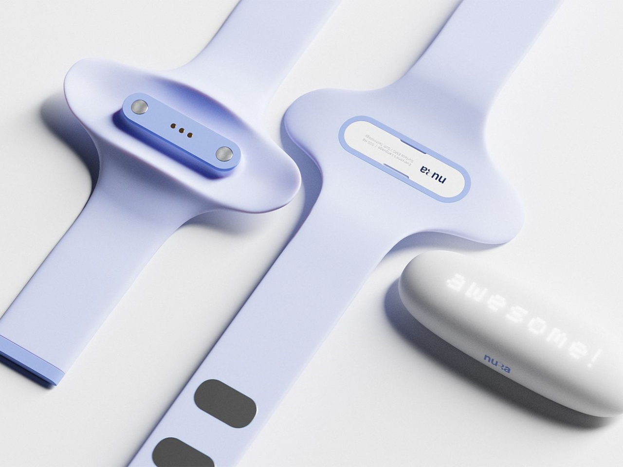
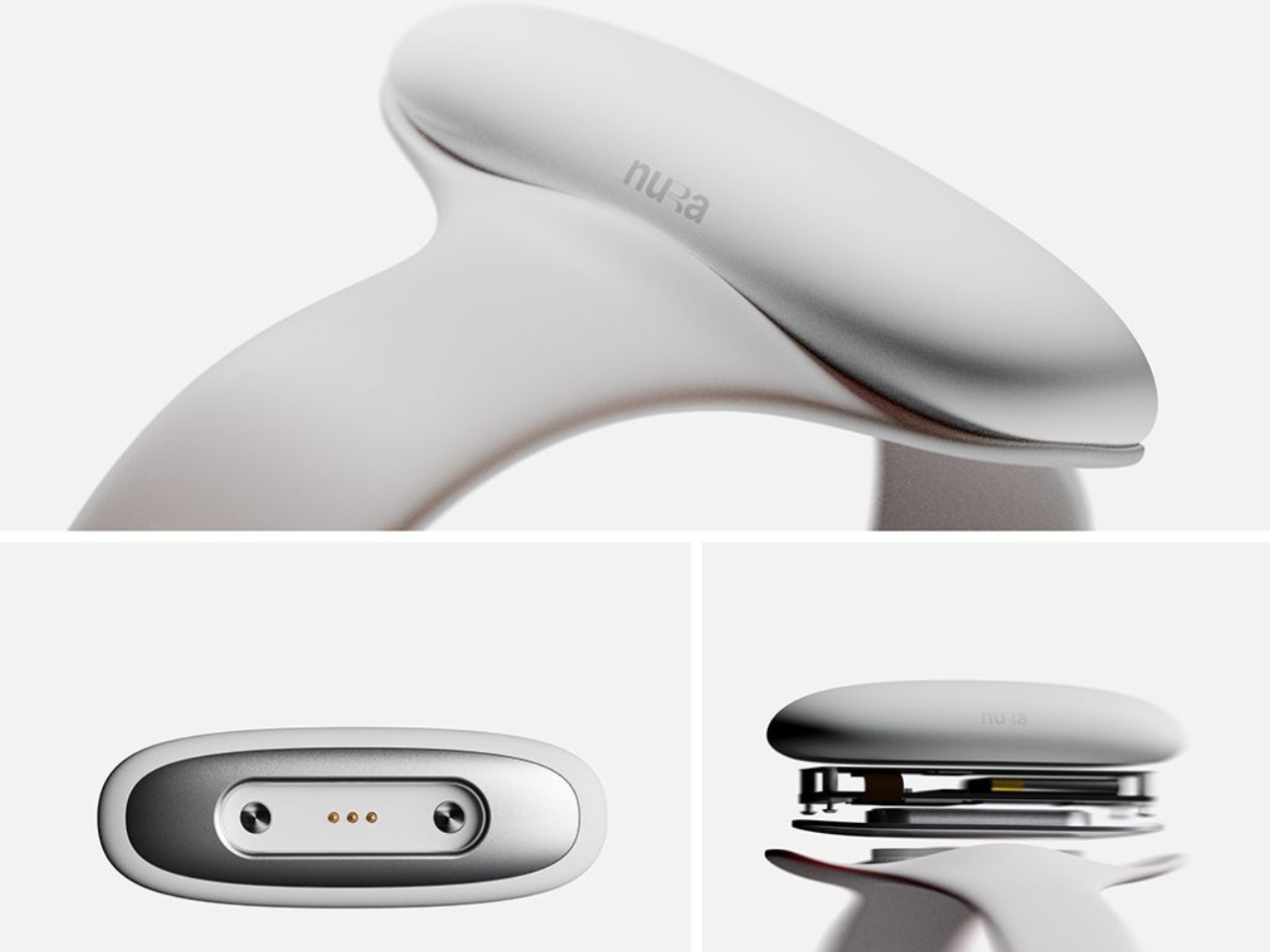
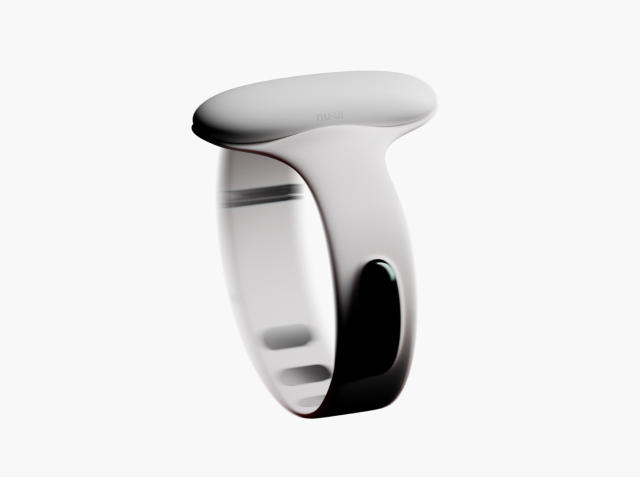
Samuel Nagel and Paul Feiler, two students from Hochschule für Gestaltung Schwäbisch Gmünd, took home the fourth edition of the prize with NURA: a bracelet that uses EMG (electromyography) sensors to capture muscle signals in the forearm and translate sign language into audible speech in real time. It works the other way around too, converting spoken language into visible text for deaf users. The whole thing sits on your wrist, shaped by the silhouette of a manta ray, and it looks less like a medical device and more like the kind of accessory you’d spot on someone at a gallery opening.
Designers: Samuel Nagel and Paul Feiler
That last detail is actually the point, and I think it’s worth dwelling on. Assistive technology has a long and unfortunate history of making the people who need it feel conspicuous. Hearing aids, for decades, were designed to be invisible precisely because visibility carried stigma. The unspoken message was that needing help was something to hide. NURA takes a completely different position. It’s designed to be seen, worn with pride, styled rather than concealed. The gesture feels radical even though, rationally, it shouldn’t have to be.
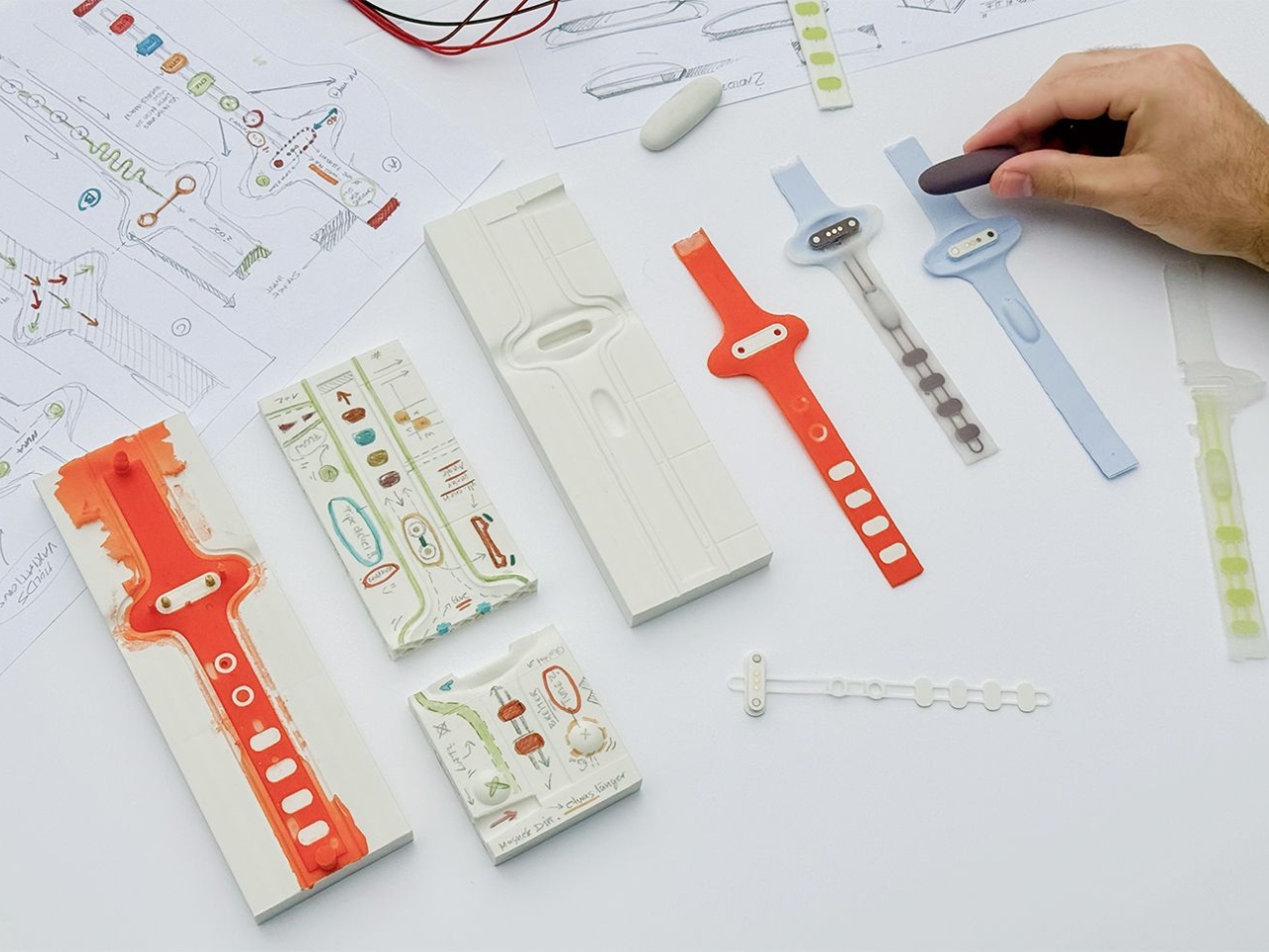
The technology behind it is genuinely clever. EMG sensors are nothing new as a concept, but applying them to sign language translation in a form this compact and wearable is a meaningful design leap. The bracelet reads the electrical signals produced by muscle contractions in the forearm as the wearer signs, processes them, and produces speech output. The reverse channel picks up spoken language and renders it as text. Two-way, seamless, real-time. For anyone who has ever watched a deaf person navigate a conversation without an interpreter present, or felt the awkward pause that comes from communication breaking down mid-exchange, the implications of that are enormous.
I keep thinking about how many interactions become effortless with something like this on your wrist. Ordering at a counter. Talking to a doctor. A spontaneous conversation with a stranger on the street. These are moments that require logistics for deaf users in a way most hearing people never have to consider, and NURA collapses that distance without asking anyone to compromise.
The manta ray inspiration is a quiet masterstroke, too. It gives the object a reference point that feels alive and organic rather than mechanical or clinical. The form has been rendered in clean, sculptural white, with the kind of restraint you’d expect from a German design school sensibility. It doesn’t scream technology. It just sits there looking elegant, doing something extraordinary underneath.
Will NURA make it into production? That’s the question that always hovers over student prize winners, and it’s an honest one. The gap between a beautifully executed concept and a market-ready product is wide, and the challenges of real-world EMG accuracy across different body types and signing styles are not trivial. But I don’t think that’s entirely the point. The RIMOWA Prize exists, among other things, to expand the imagination of what design is for, to signal to the industry what problems are worth solving and what solving them beautifully might look like.
On that count, Nagel and Feiler have done something genuinely important. They’ve argued, through the language of form, that accessibility and desirability don’t have to be in opposition. That a wearable designed for a deaf person can be something a hearing person might be jealous of. That the most human design isn’t the kind that fixes a flaw and hides it, but the kind that celebrates capability and brings people closer together. The bracelet is beautiful. The idea behind it is even more so.
The post RIMOWA’s 2026 Prize Went to a Bracelet That Speaks Sign Language first appeared on Yanko Design.