PROS:
- Excellent multitasking experience
- Nearly invisible and undetectable crease
- Slim and light form factor for a book-style foldable
- Powerful performance
CONS:
- Camera system is good for a foldable, but not truly flagship-level
RATINGS:
SUSTAINABILITY / REPAIRABILITY
EDITOR'S QUOTE:
The OPPO Find N6 is one of the few foldables that trades novelty for genuine polish, delivering a device that feels as complete as it does considered.
The Oppo Find N6 arrives at a moment when foldables can no longer rely on novelty alone to justify their place in the premium market. Buyers now expect these devices to feel as polished and dependable as any top-tier flagship, while still delivering the sense of occasion that only a folding design can offer. That is what makes the Find N6 so interesting, because it is not simply trying to look futuristic. It is trying to feel complete.
That question lands differently for me because the Oppo Find N5 has been my daily driver for most of the time since its launch. Living with that phone has given me a clear sense of what Oppo already does exceptionally well in this category, from hardware refinement to the balance between portability and immersion. It also means I came to the Find N6 with real expectations rather than fresh curiosity alone. More than anything, I wanted to see whether Oppo had merely polished an already strong formula or taken a meaningful step forward.
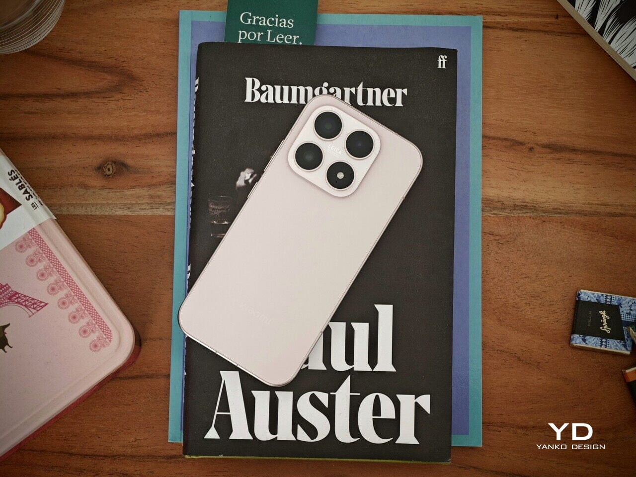
Designer: OPPO
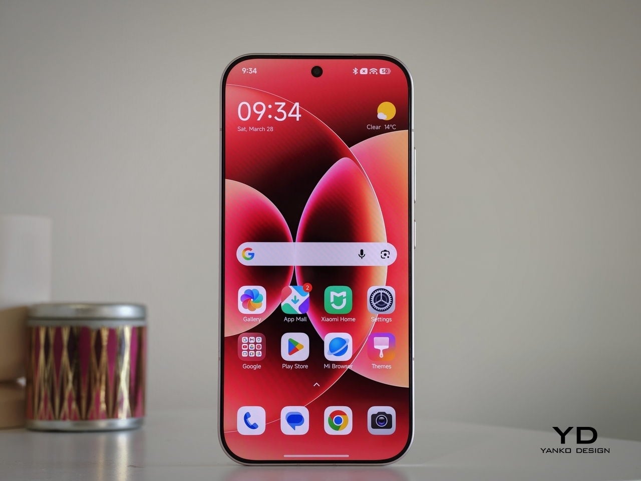
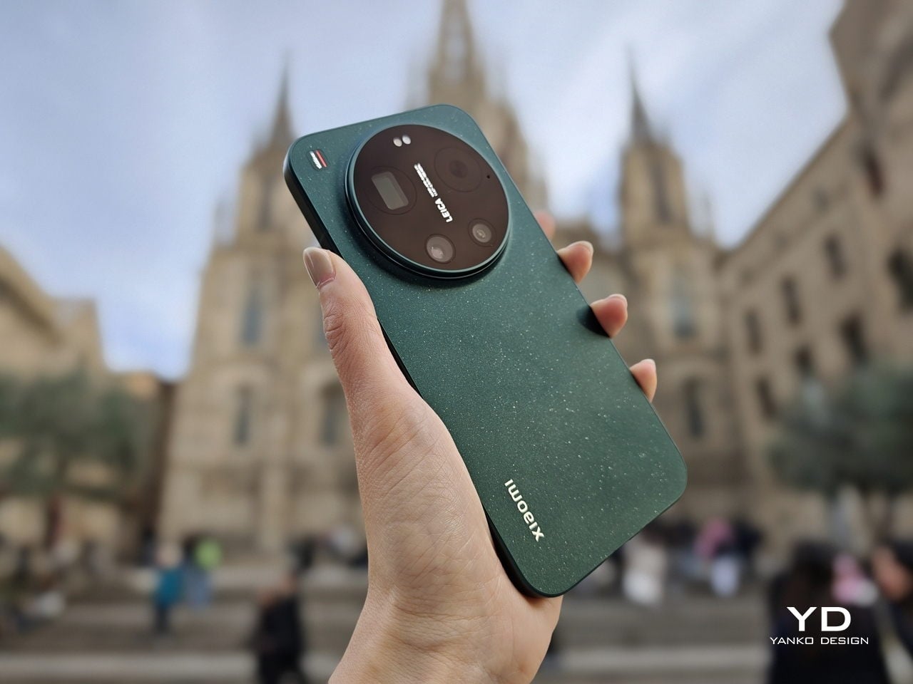
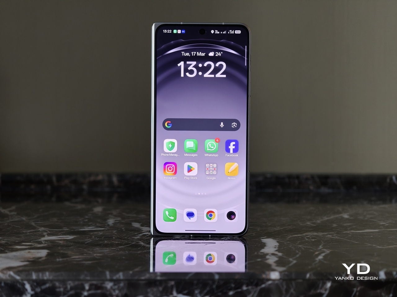
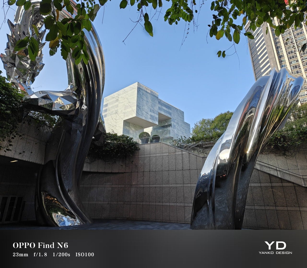
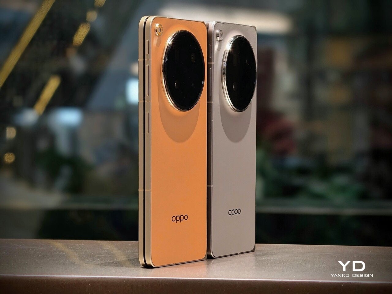
Aesthetics
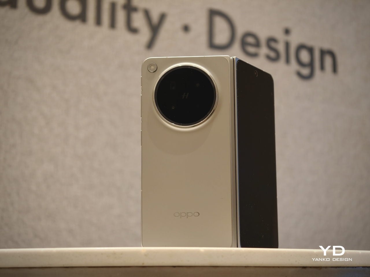
The Oppo Find N6 does not stray far from the design language established by the Find N5, but it feels like a more polished and disciplined evolution of that formula. The overall look is largely unchanged, yet the Find N6 comes across as more minimalistic and more refined, with a cleaner visual identity that feels calmer and more mature. Rather than chasing a dramatic redesign, Oppo has focused on tightening the details, and that gives the phone a stronger sense of cohesion.
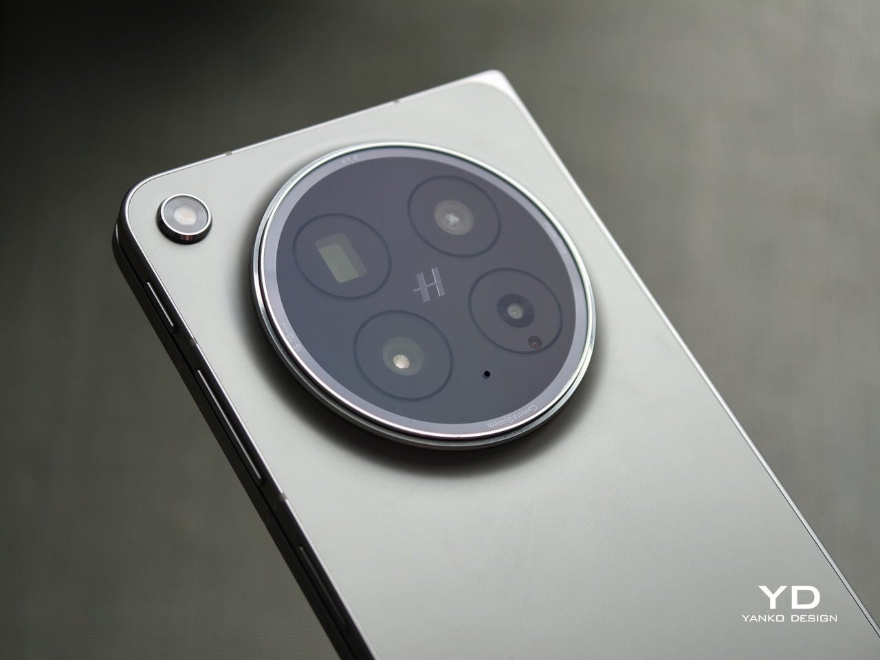
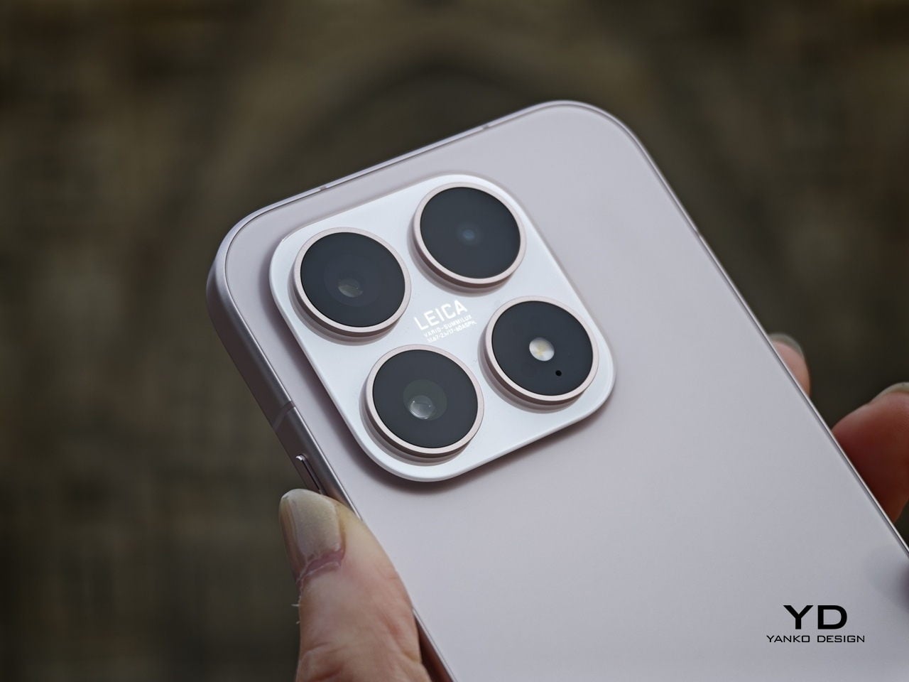
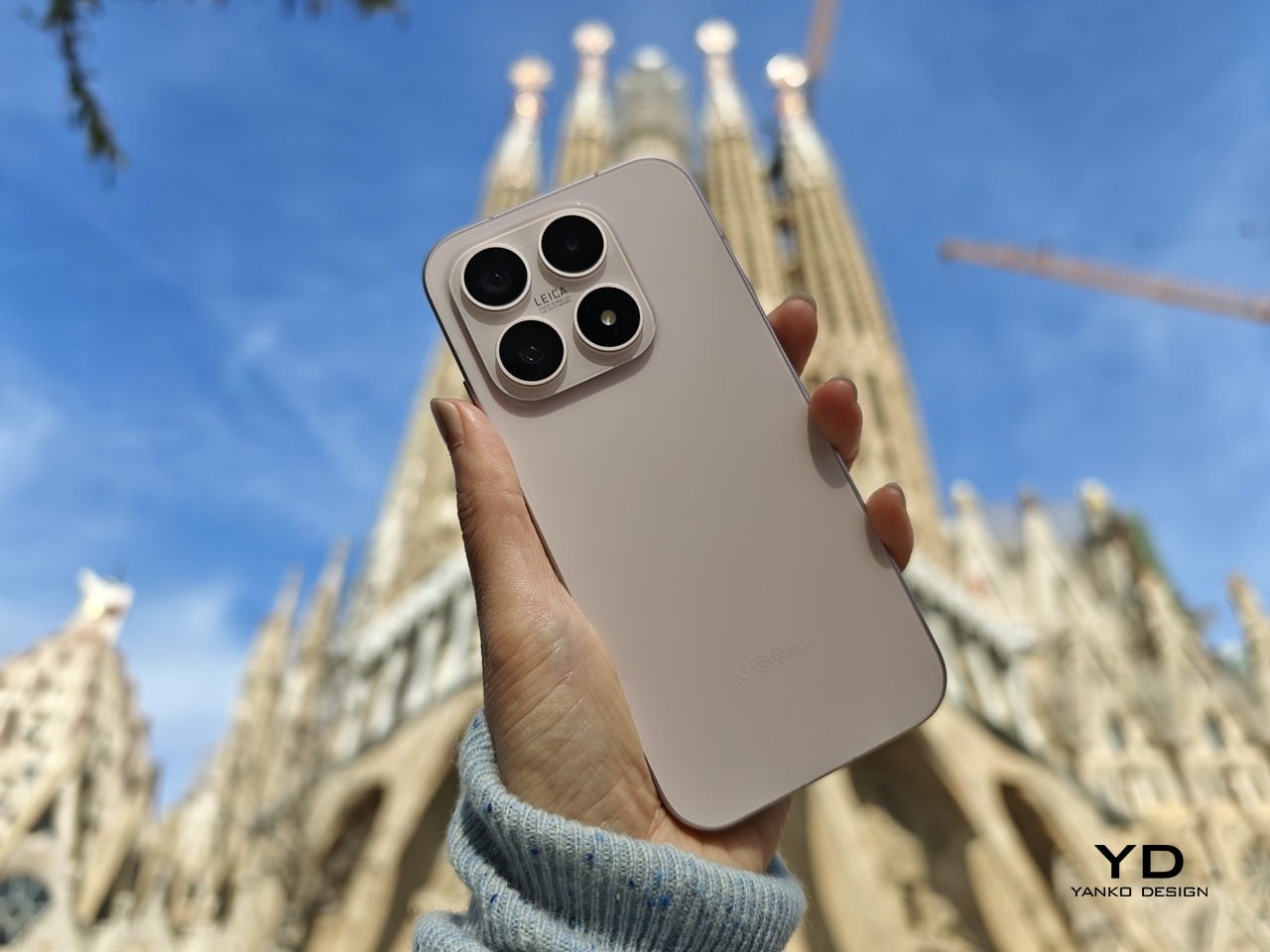
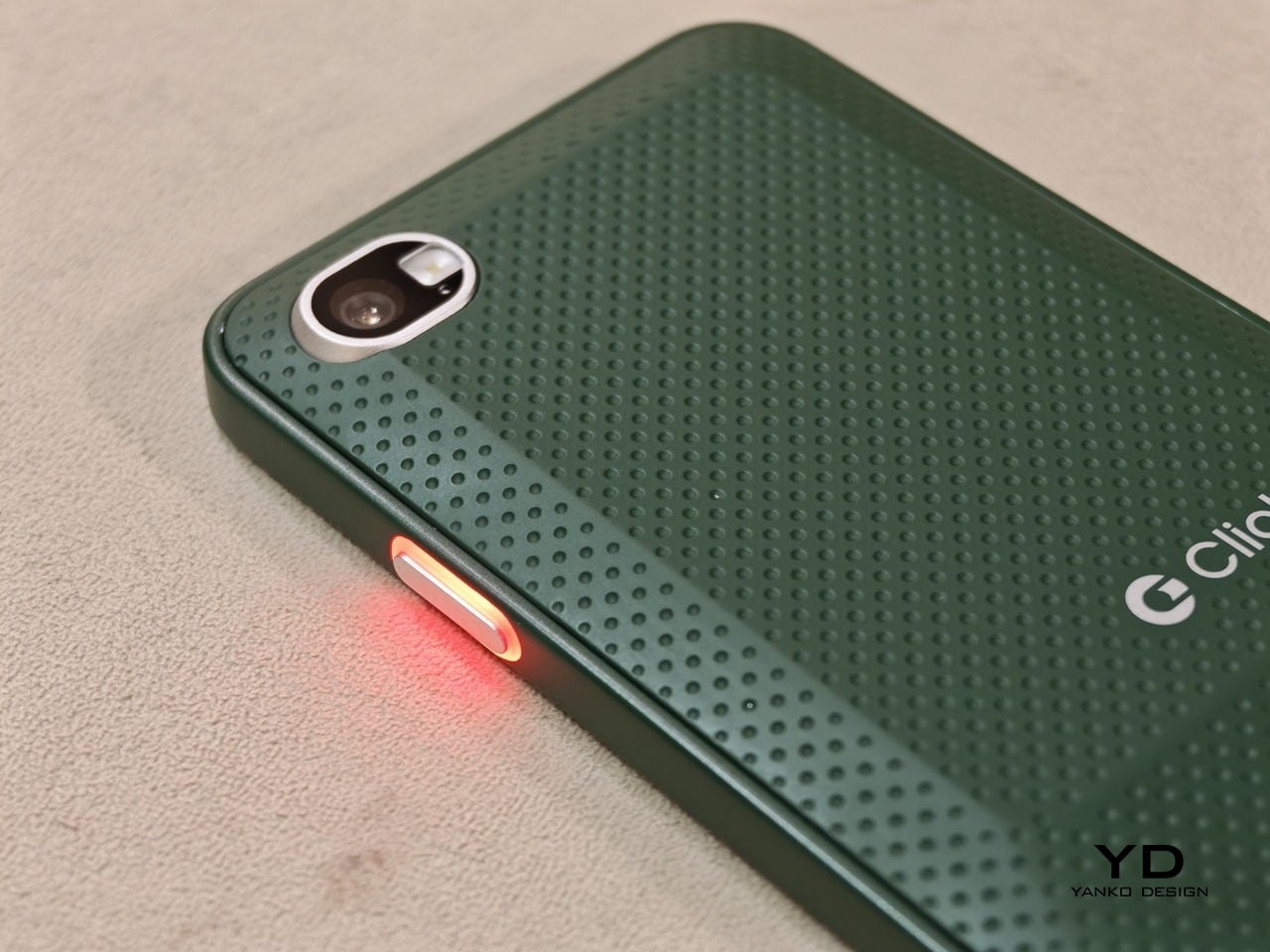
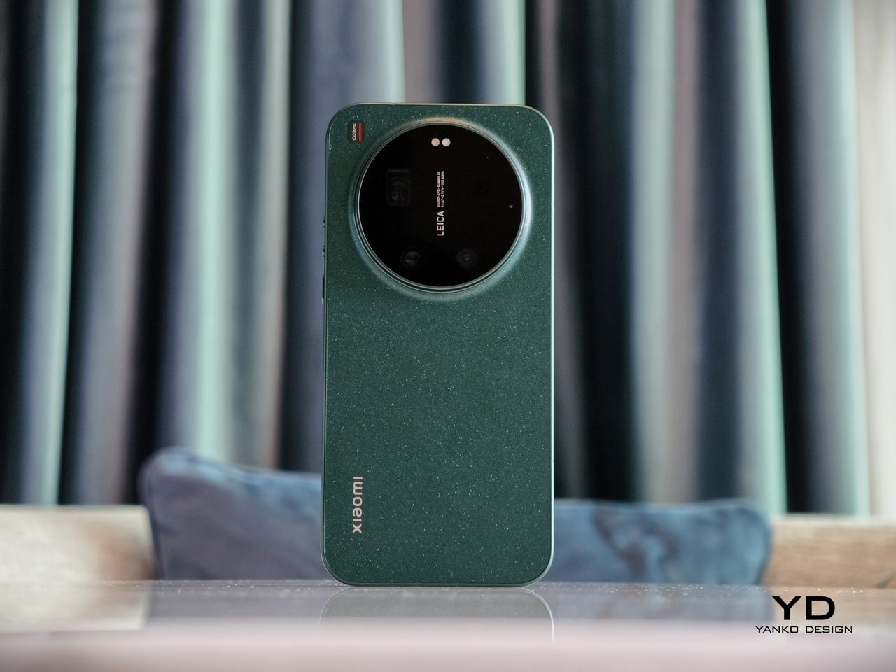
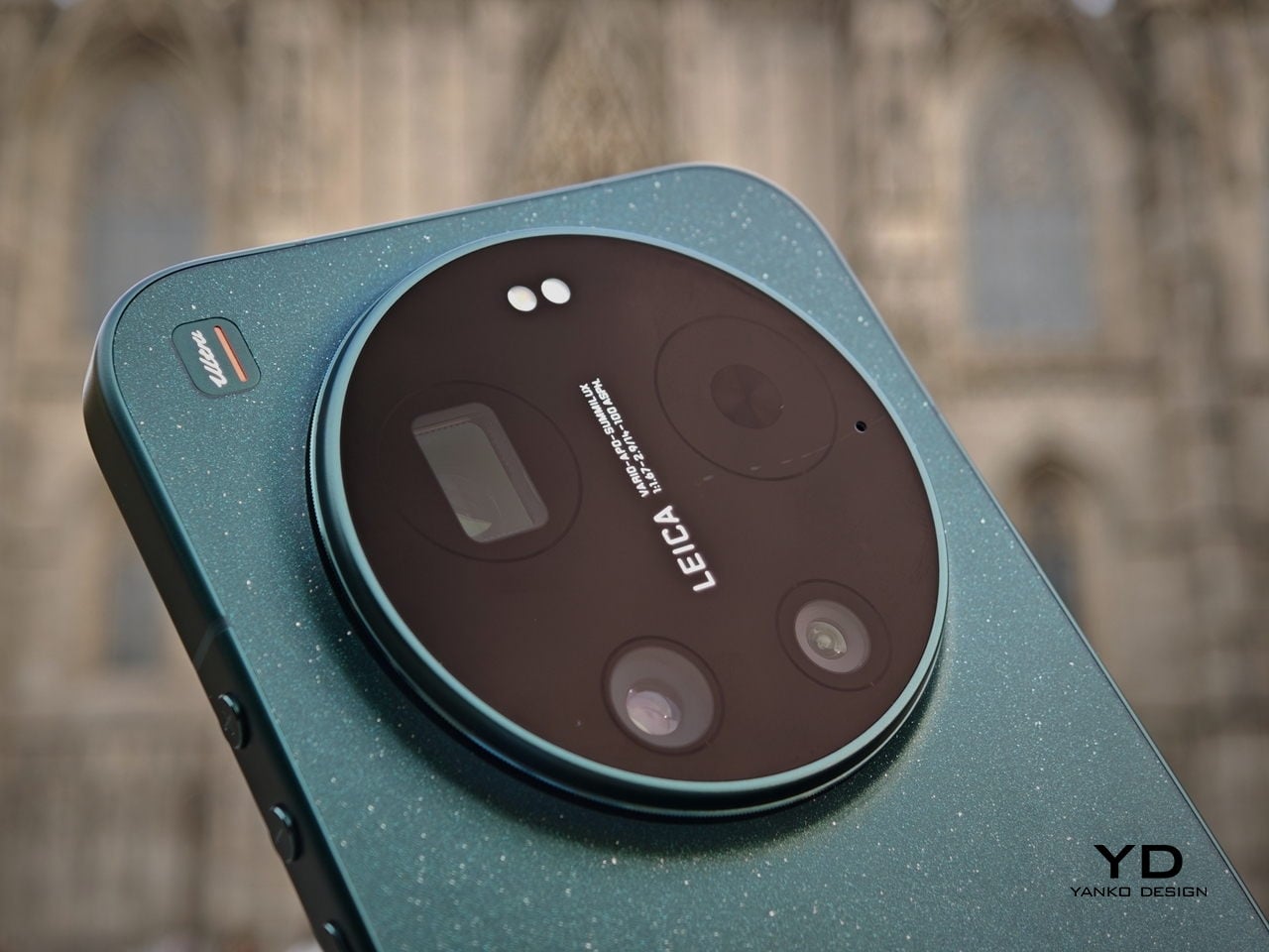
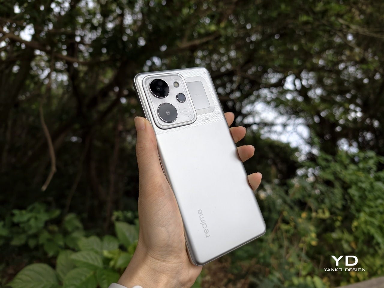
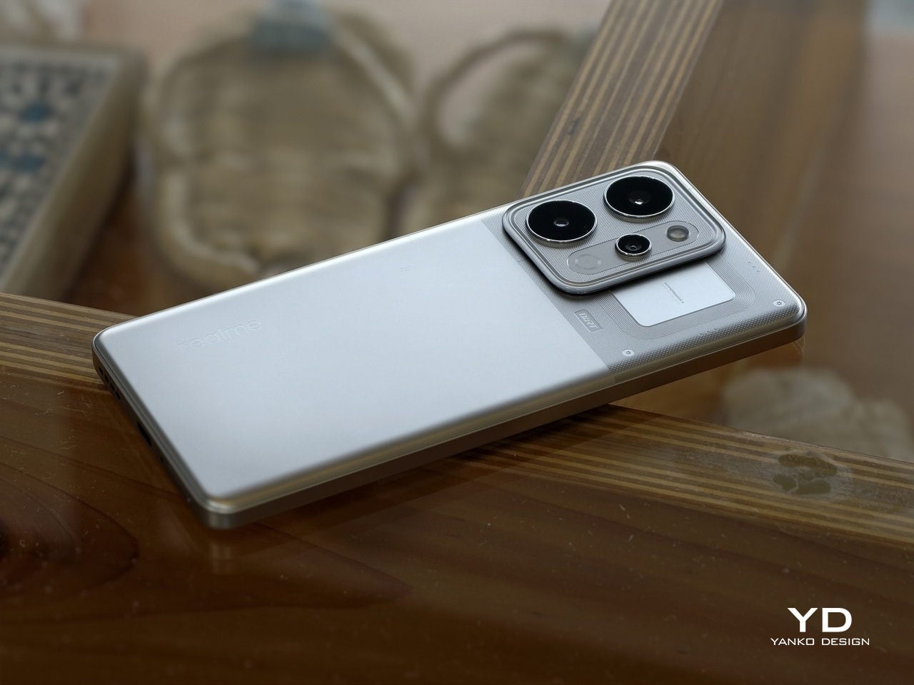
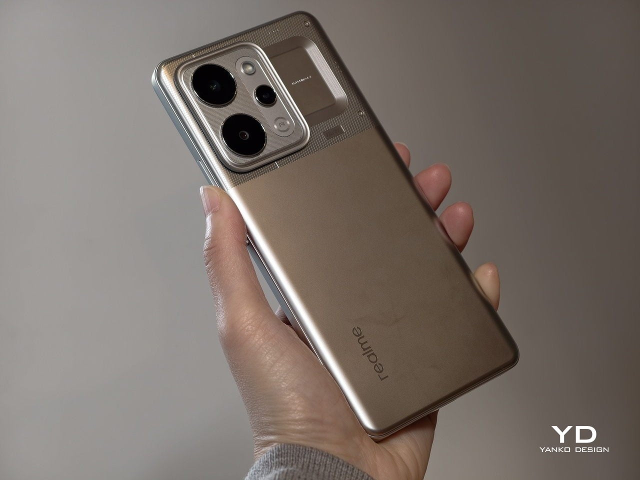
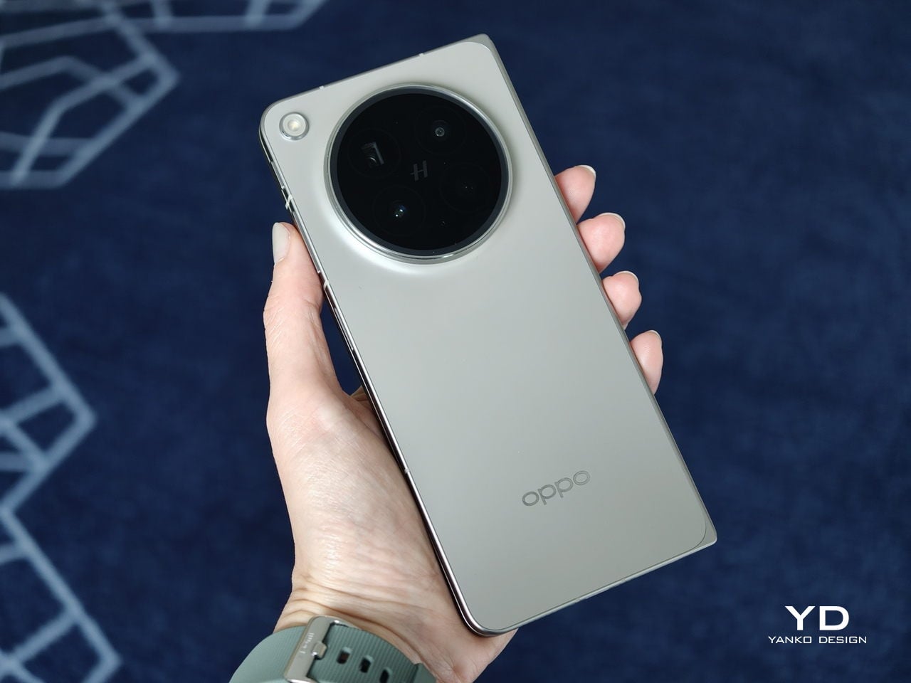
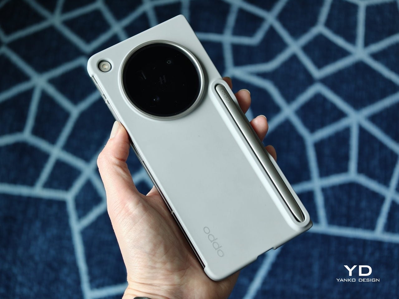
The biggest improvement is in the rear camera treatment. The refined Cosmos Ring camera deco looks more elegant and less ornamental, while the individual camera elements feel more integrated into the overall composition instead of standing apart from it. This makes the back of the phone look tidier and more resolved, which suits the Find N6’s more minimal direction. It still has the visual presence expected of a flagship foldable, but it carries that presence with greater restraint.
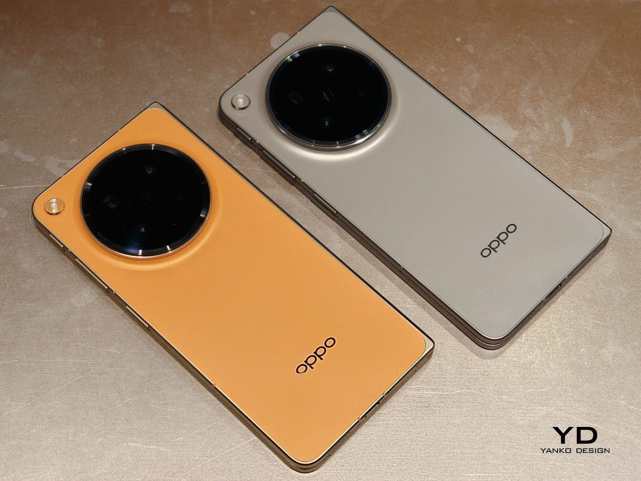
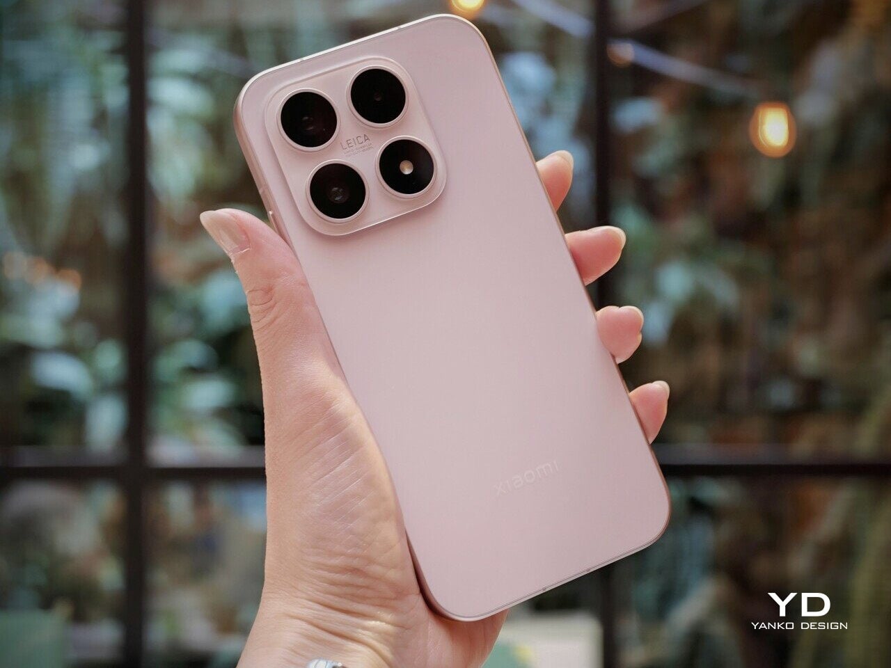
What also stands out is Oppo’s color choice. For the first time on one of its foldables, the company is offering a much bolder orange finish, which Oppo calls Blossom Orange, alongside a more classic Stellar Titanium, and the timing does not feel accidental. Ever since the iPhone 17 Pro series introduced orange into the flagship conversation, it feels like other brands have been quick to follow Apple’s lead, and the Find N6 is part of that wave. Even so, the orange works well here, giving the phone more personality, while the gray remains the safer and more traditional option.
Ergonomics
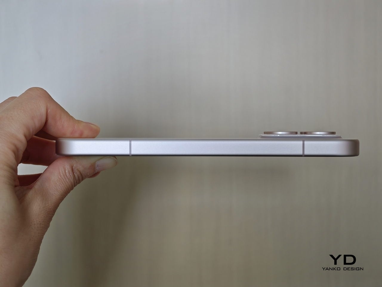
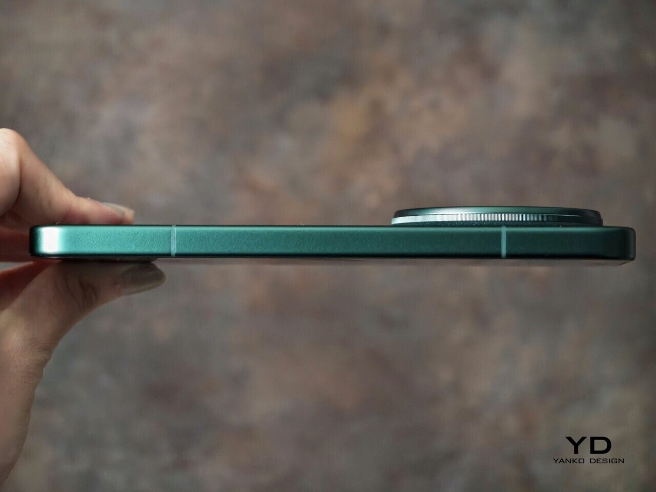
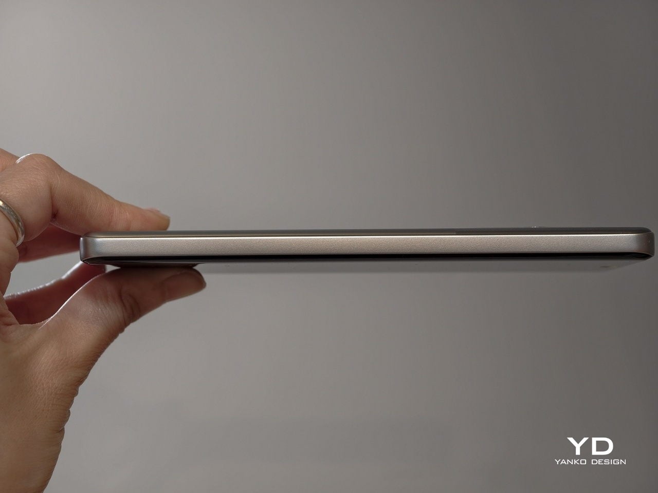
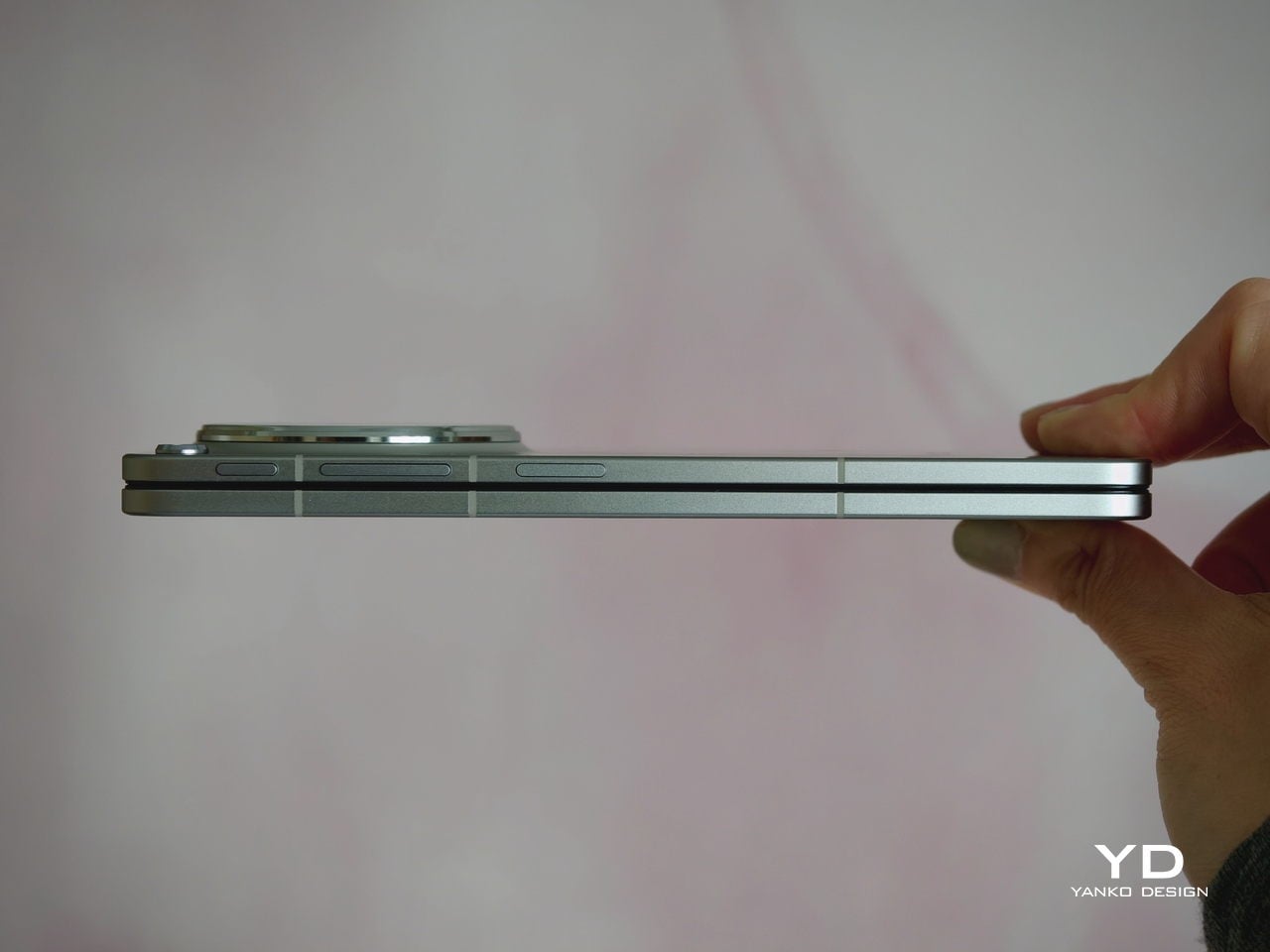
The generous screen real estate of a foldable usually comes with familiar compromises. Thickness, weight, and the crease are often treated as the unavoidable price of admission. The Oppo Find N6, however, feels designed to challenge that assumption in a way that is noticeable the moment you pick it up.
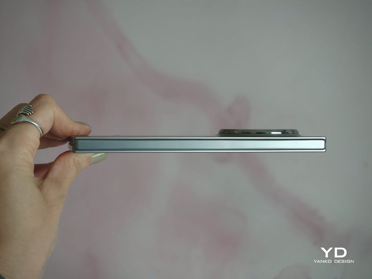
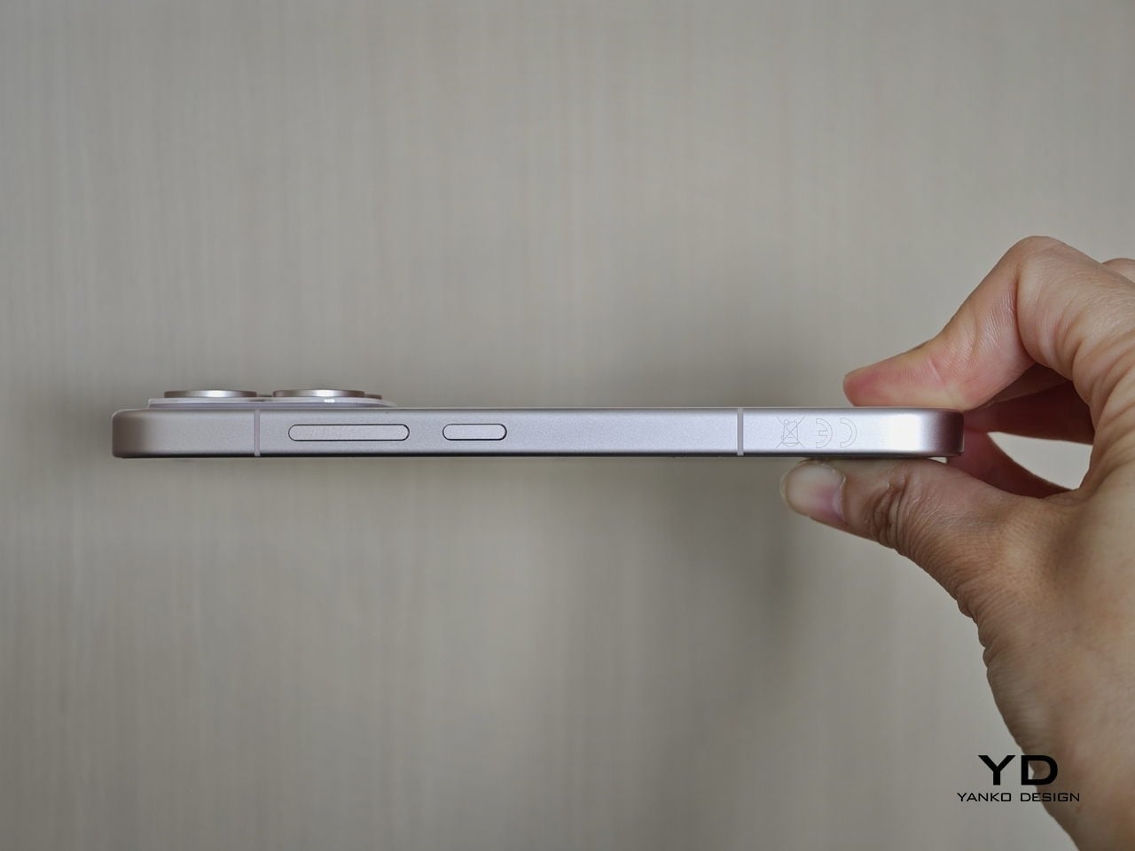
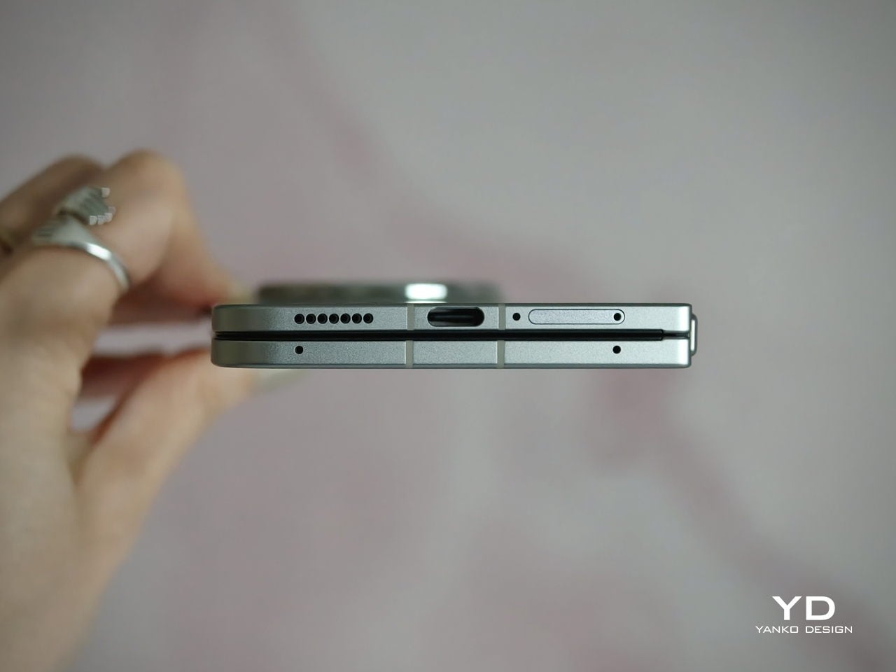
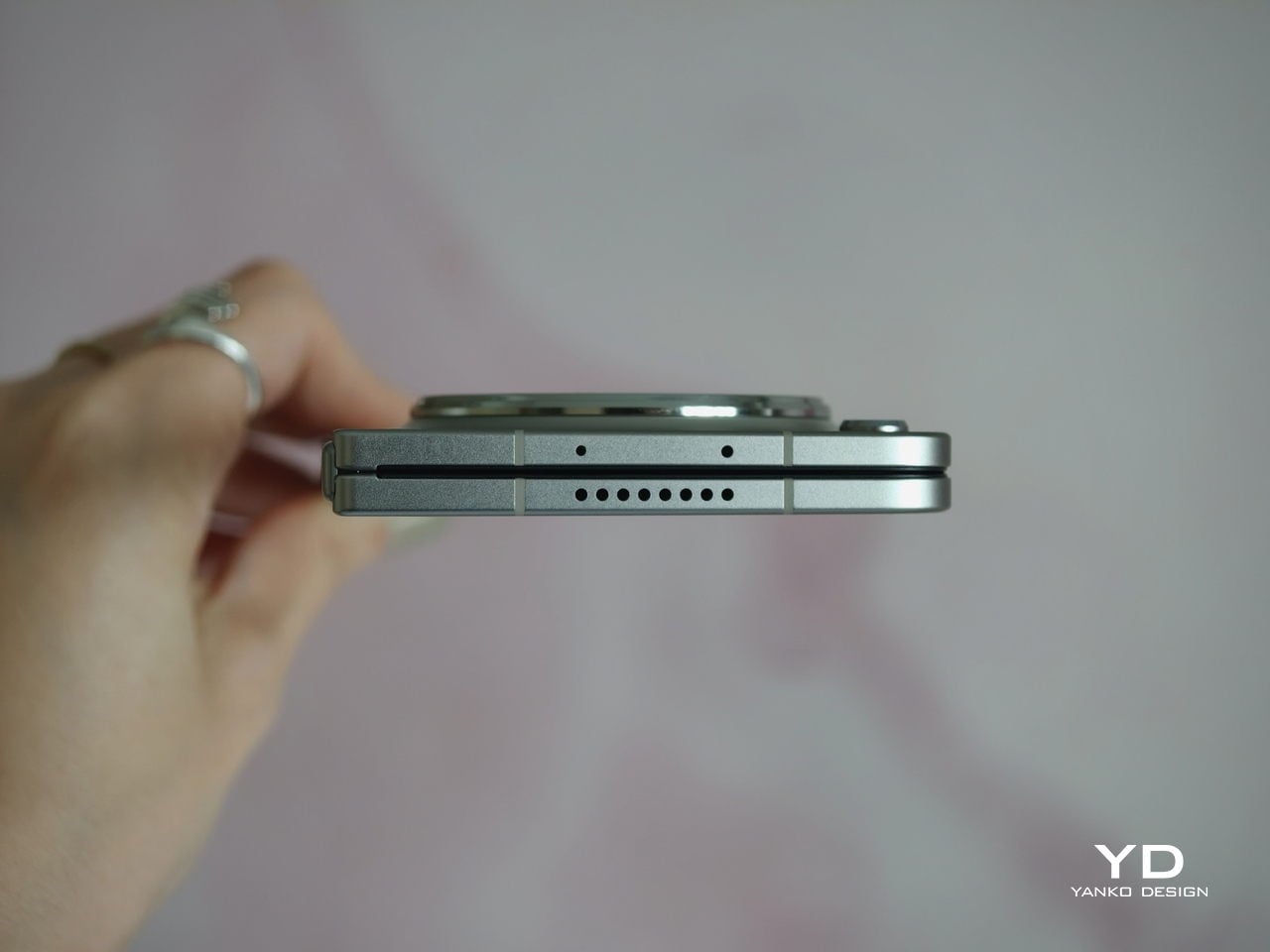
At 8.3 mm when folded and 225 g, the Find N6 feels surprisingly close to a premium flagship bar phone in everyday use. It does not come across as awkwardly bulky or excessively heavy, which makes it more approachable than many devices in this category. That balance matters over time, whether you are using it one-handed, slipping it into a pocket, or simply carrying it through a long day.
That does not mean the form factor is free of trade-offs. If I rest some of the phone’s weight on my pinky, the lower edge can still dig in a bit, especially when the device is open. It is less noticeable than on the Find N5, but not completely gone.
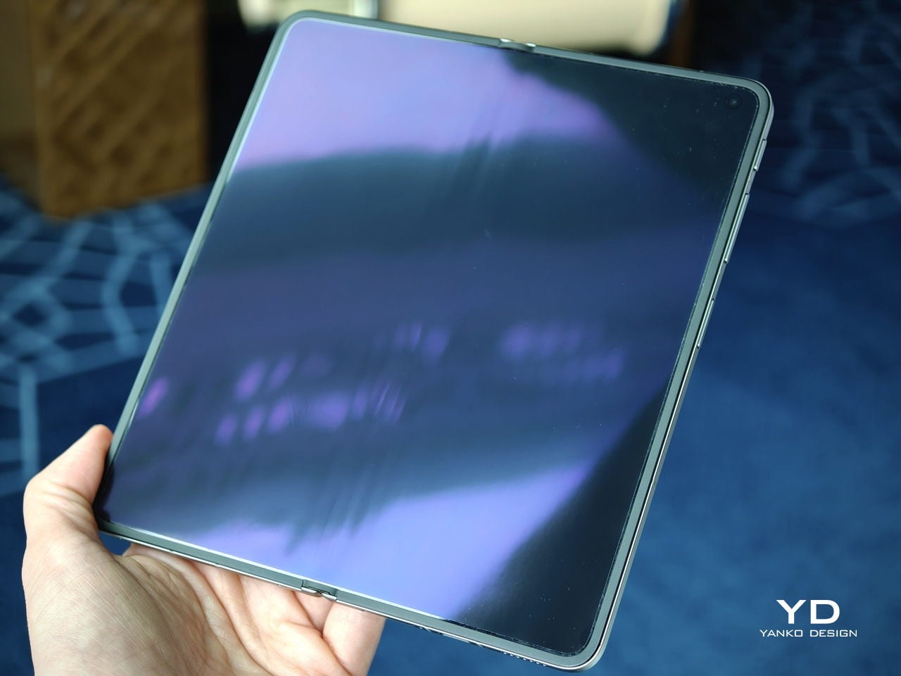
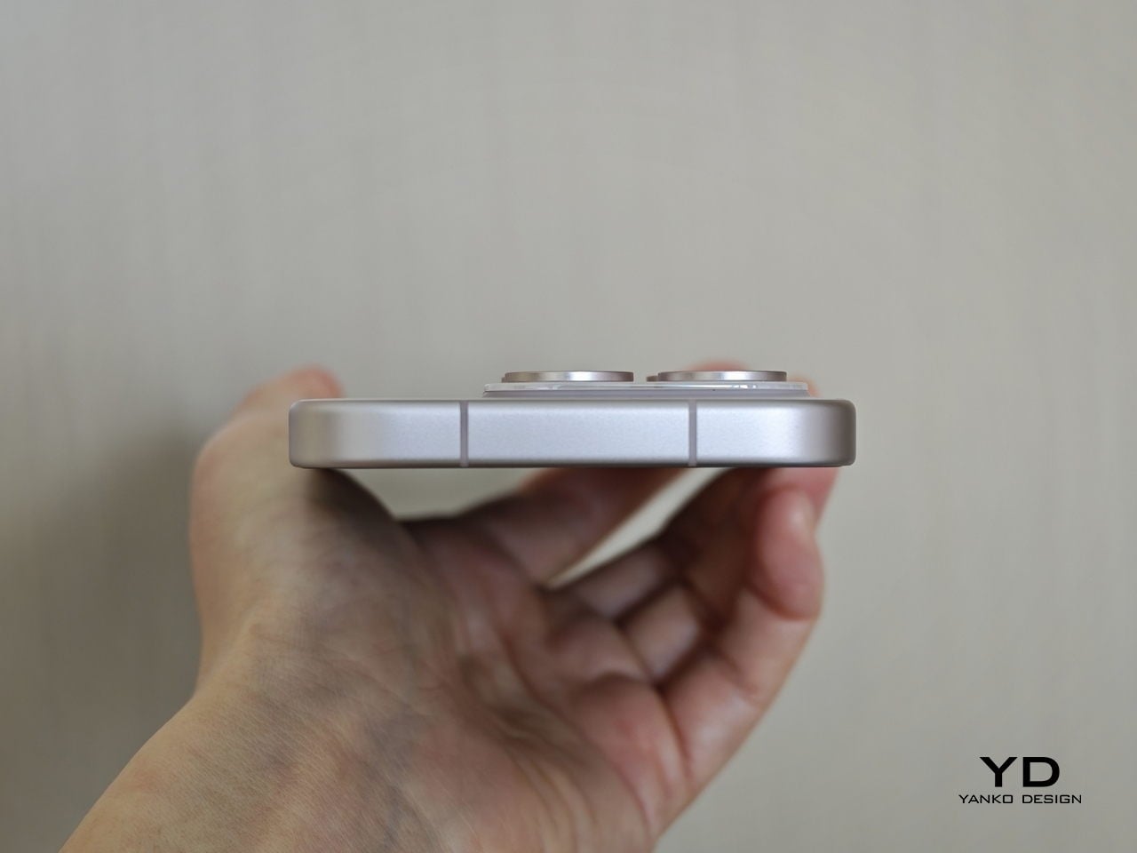
Perhaps the most impressive detail, though, is the crease, or more precisely, how little of it remains. I have never been particularly bothered by creases on foldables, and I was already satisfied with the subtle crease on the Find N5. Even so, the Find N6 feels like a meaningful refinement rather than a minor iteration.
Visually, the crease is practically nonexistent in normal use and only becomes noticeable if the screen is off and viewed from a very specific angle. More impressive still, it also feels nearly absent under the finger when swiping across the display. Our fingertips are quick to pick up even slight ridges or shallow dents, which makes the Find N6’s smooth, uninterrupted surface especially impressive in daily use.
That sense of appreciation only grows once you look at how Oppo arrived at this result. The company refined the hinge architecture itself and paired it with state-of-the-art 3D scanning and 3D printing technologies, a combination that helps explain why the Find N6 feels so polished in the hand.
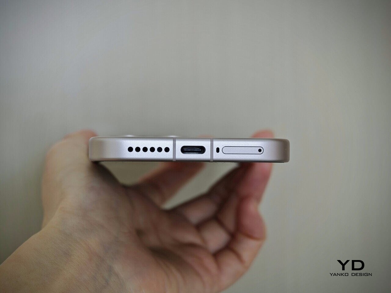
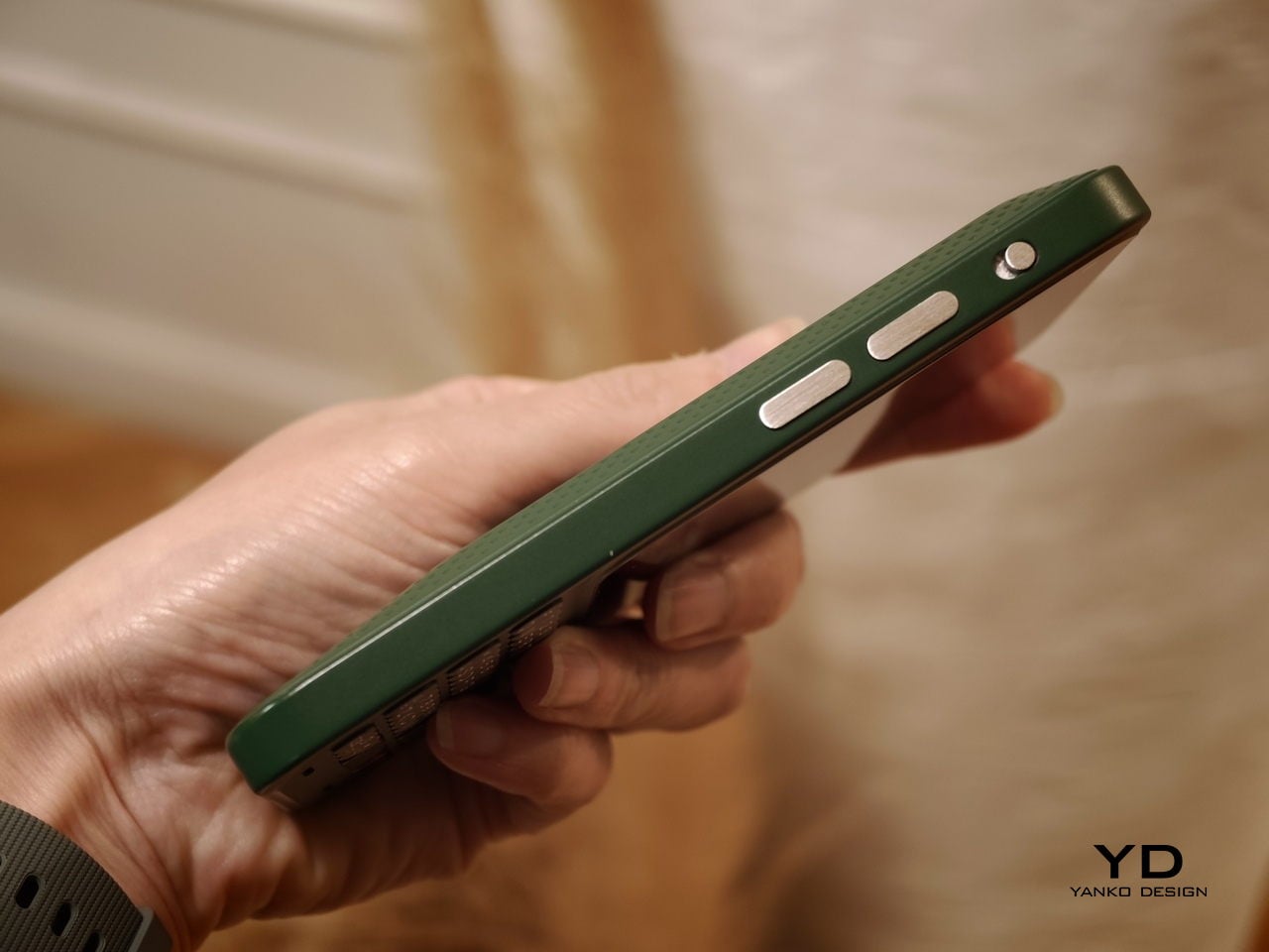
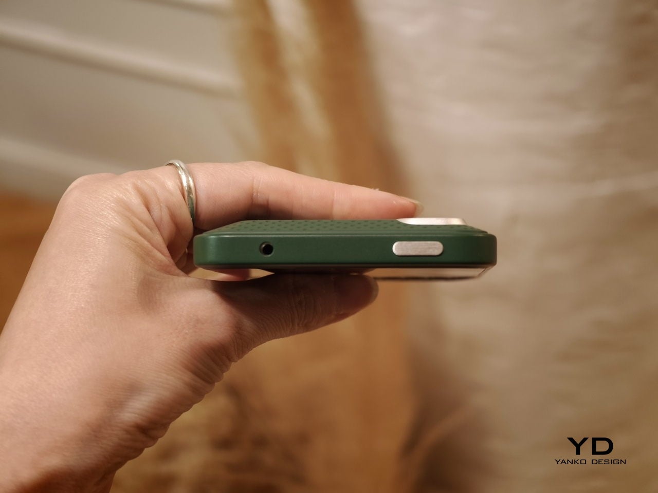
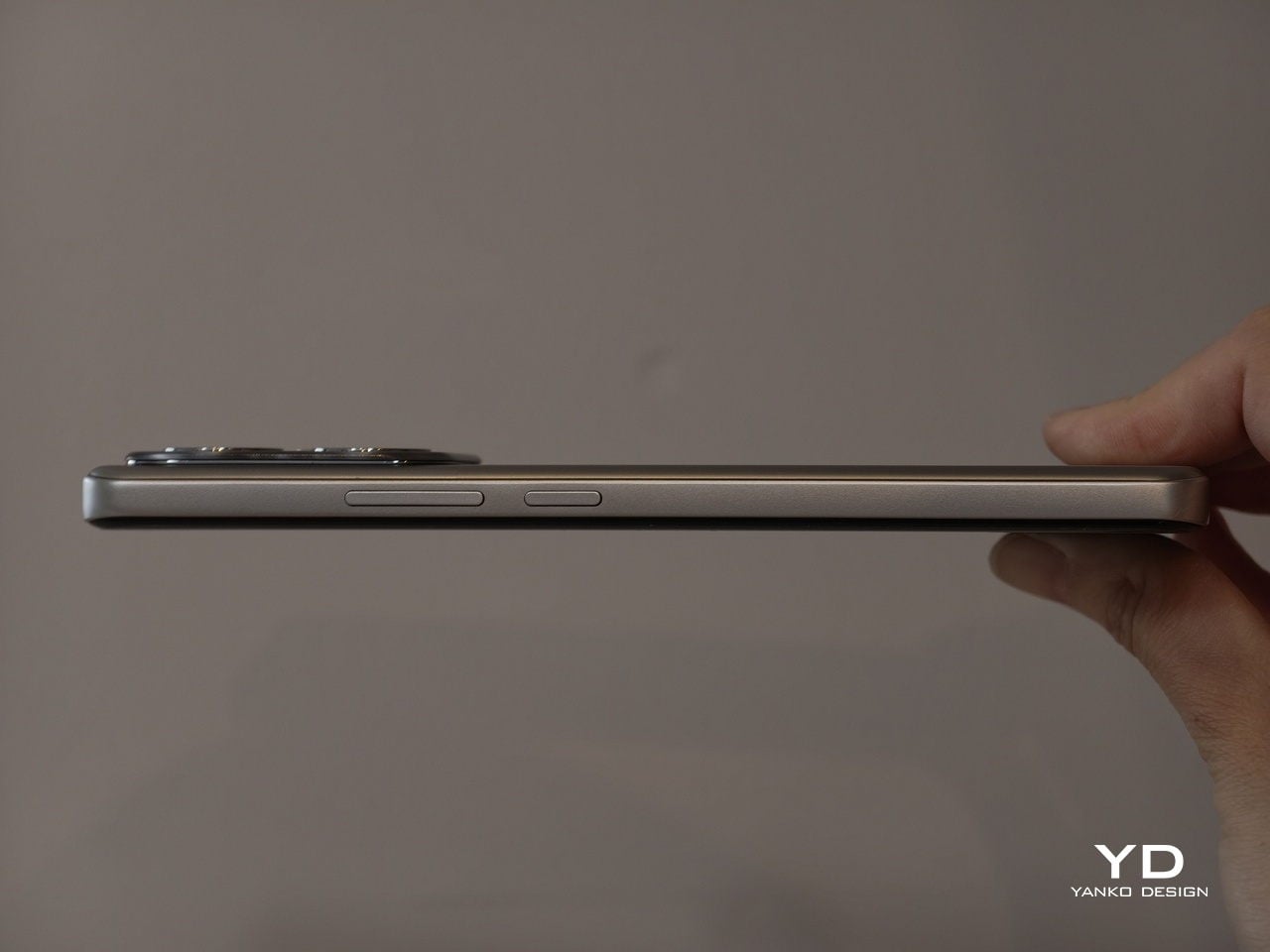
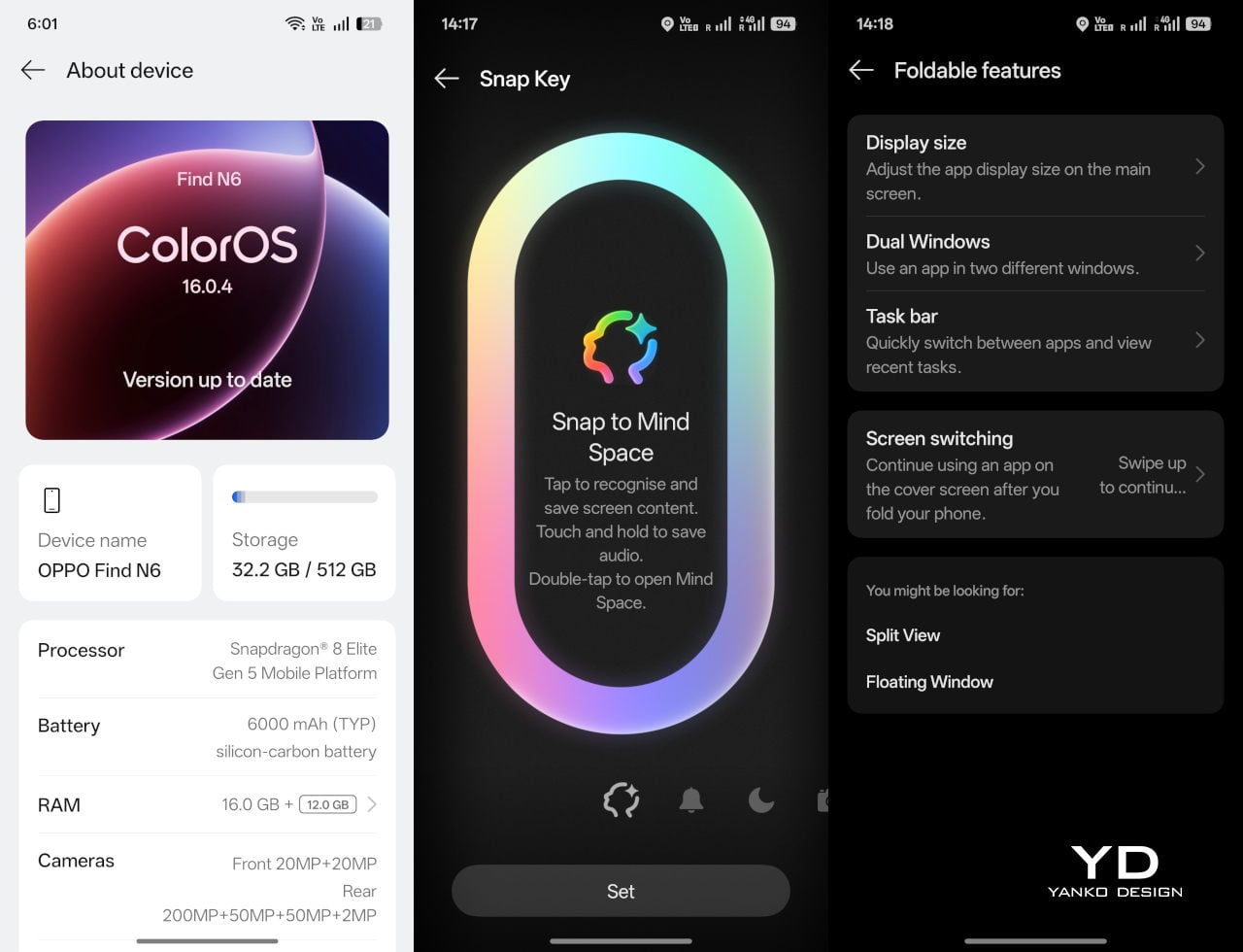
That same attention extends to the physical controls. In place of the OnePlus-style alert slider on the upper left, Oppo now uses the customizable Snap Key, first introduced on the Find X9 series and now positioned on the upper right side. It can be mapped to quick actions such as launching the camera, turning on the flashlight, starting a voice memo, or opening translation, giving it a broader role than the slider it replaces.
Just below sit the fingerprint reader and volume rocker, both placed lower than they were on the Find N5. That may sound like a minor adjustment, but it makes the controls easier to reach and better aligned with the way the phone naturally rests in the hand. It is a subtle refinement, though one that proves genuinely useful in everyday use.
Performance
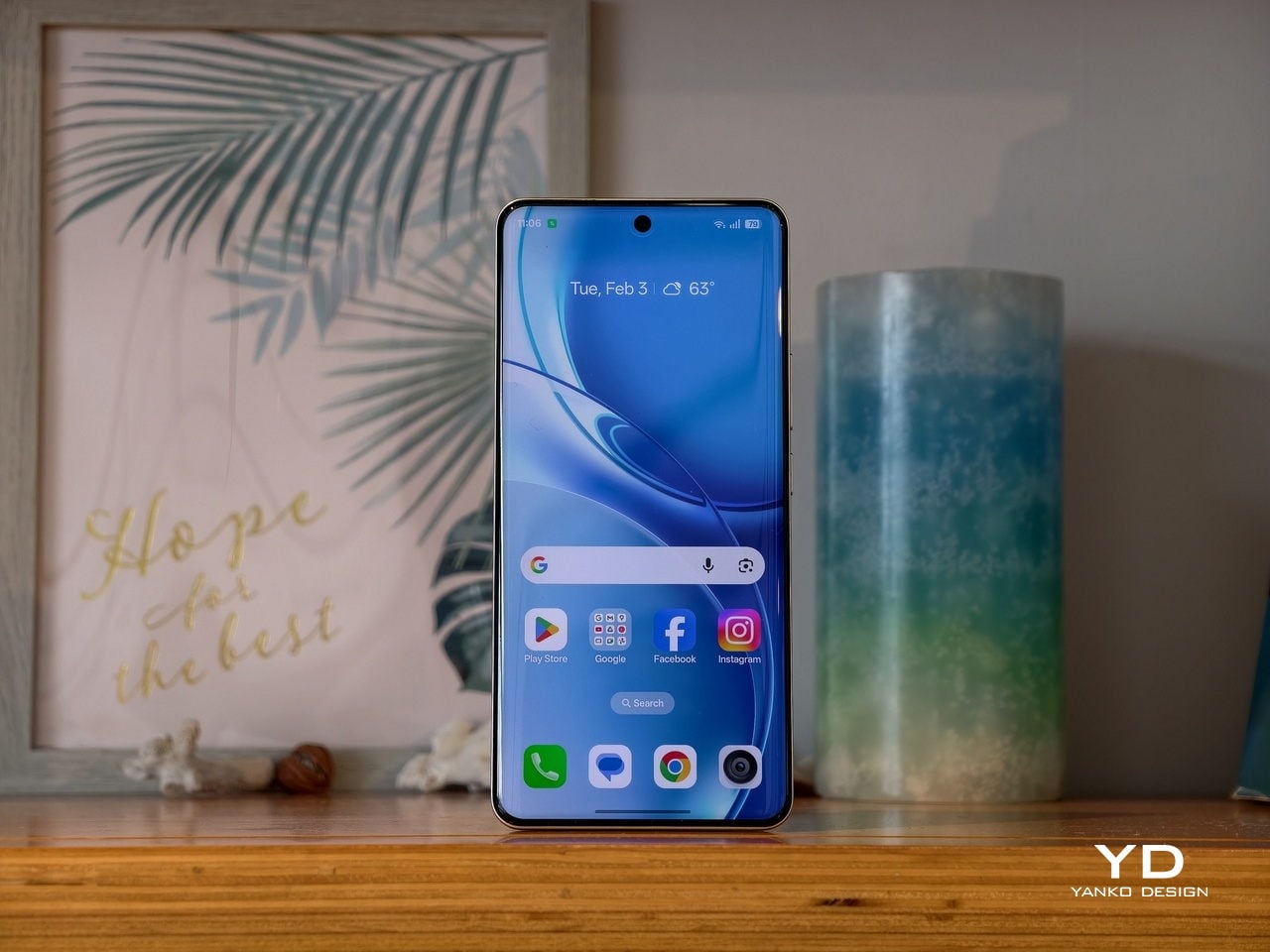
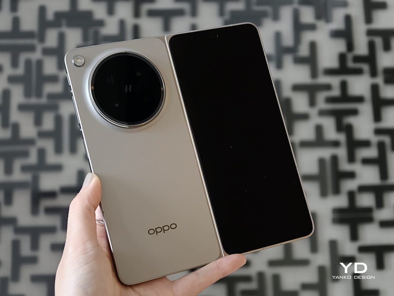
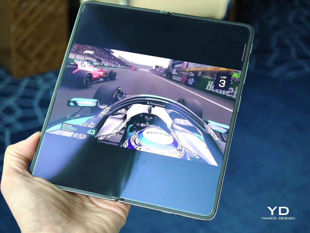
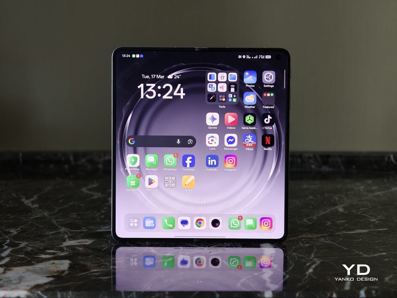
With foldables, the screens have to justify the form factor. The Find N6 uses a 6.62-inch cover display and an 8.12-inch inner screen, both with 120Hz LTPO panels. That is the expected hardware at this level, so the more interesting part is how Oppo tries to improve the experience around visibility, comfort, and immersion.
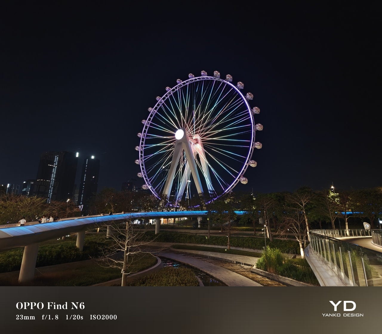
According to Oppo, both displays can reach 1,800 nits in outdoor use, with peak HDR brightness topping out at 3,600 nits on the cover screen and 2,500 nits on the inner panel. In practice, both displays are bright enough to remain comfortably usable even under harsh sunlight. They also support Dolby Vision and HDR Vivid, and content looks rich and vibrant across both panels.
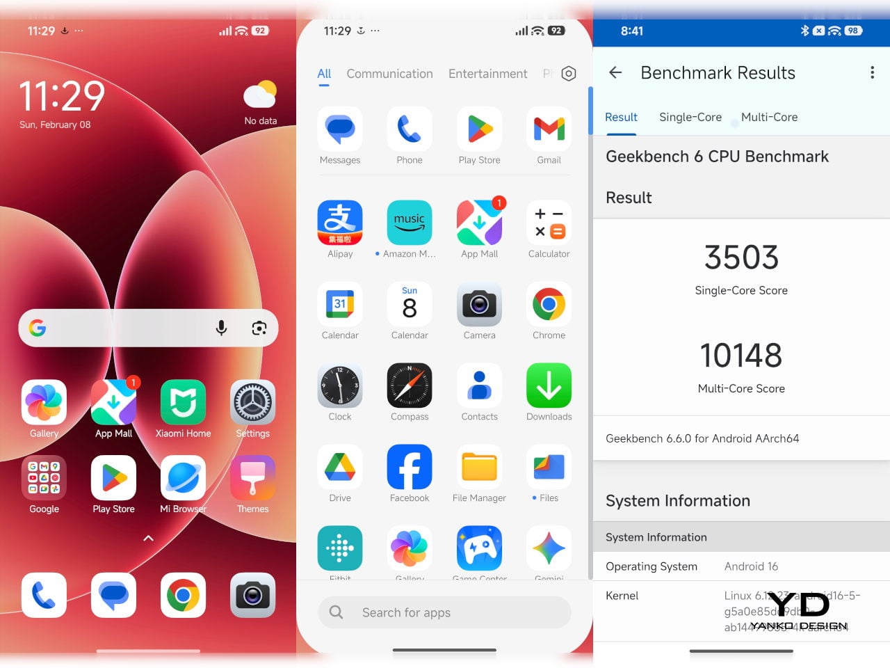
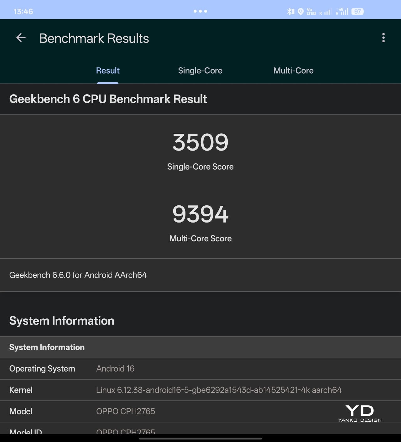
The Find N6 is powered by Qualcomm’s Snapdragon 8 Elite, and it has no trouble keeping up with the kind of multitasking a foldable encourages. Apps open quickly, navigation feels immediate, and even with several windows open at once, the phone stayed smooth and responsive. I also edited a short video on the device, specifically an unboxing of the Find N6 and AI Pen Kit, and the experience was smooth and free of noticeable stutter.
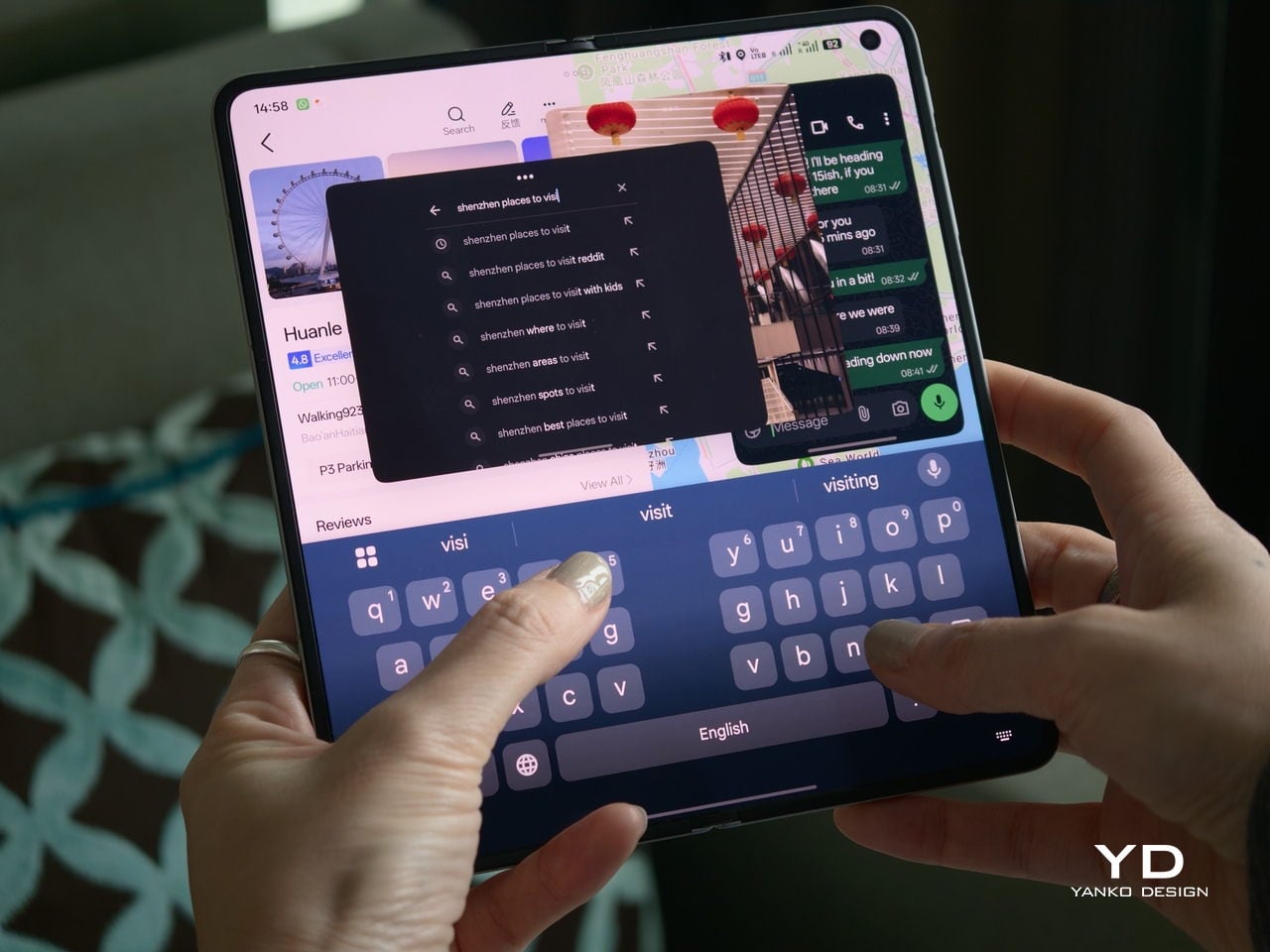
That matters because a device like this only really makes sense if it can handle more than the usual phone workload without feeling strained. Oppo’s software does a good job of making that extra screen space feel useful. Free-Flow Window lets you open up to four apps at once in floating windows, and in practice, it feels less fiddly than it sounds.
Boundless View adds even more flexibility, and the gestures linking the two work naturally enough that moving between layouts never feels like a chore. Resizing windows, shifting focus, and juggling multiple apps all feel smooth and seamless, which makes the Find N6 genuinely effective as a productivity device rather than just a phone with a bigger screen.
Even under sustained use, the phone remained smooth and reasonably controlled, and I also did not notice any stutter while playing Genshin Impact. Gaming feels more like a bonus here than the main point of the device, but the large inner display still gives it a more immersive, almost tablet-like feel than a standard phone can offer.
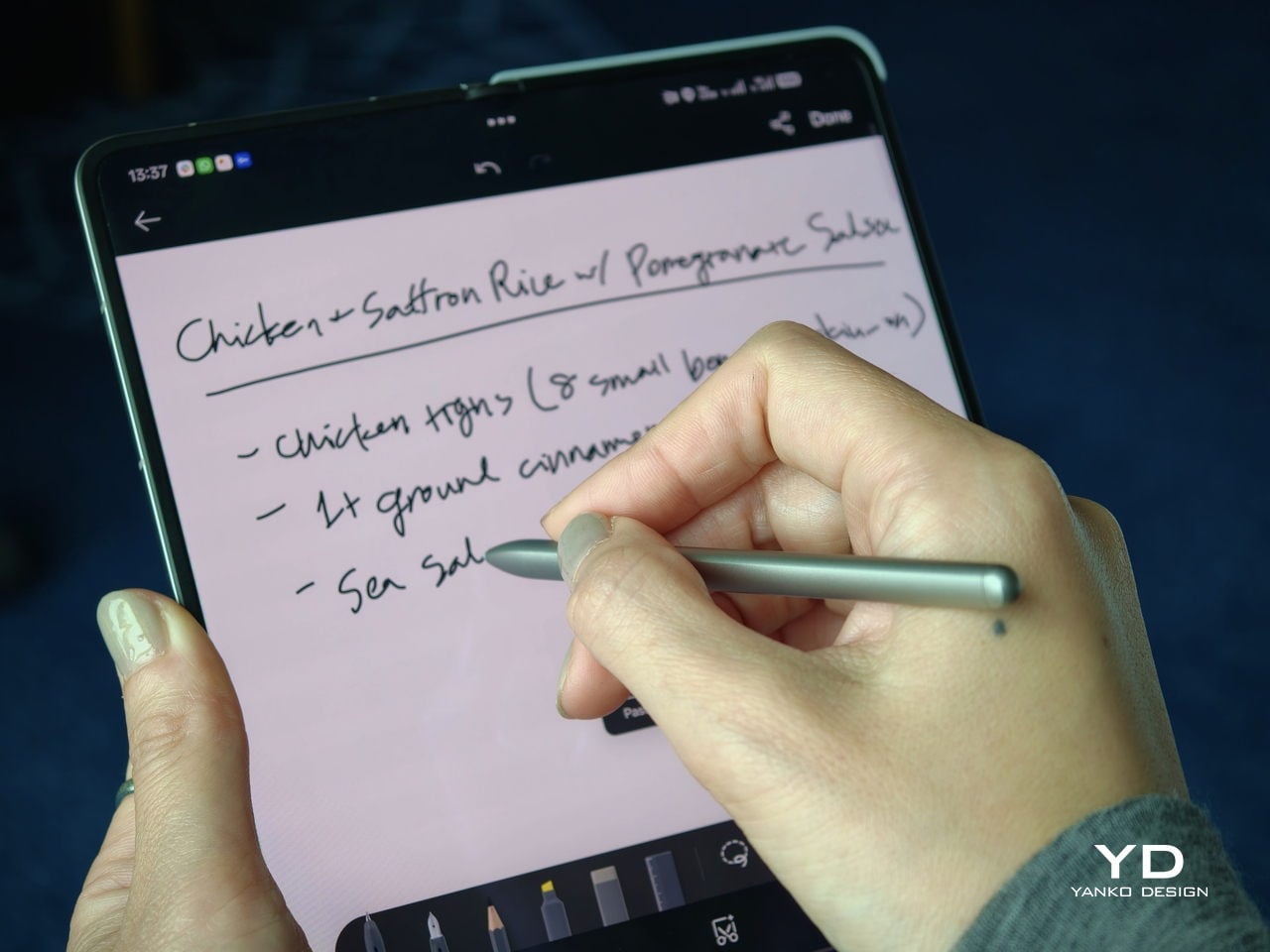
That same focus on utility extends to the AI Pen Kit, which is one of the more interesting hardware additions. The Oppo AI Pen supports 4,096 levels of pressure sensitivity and works on both the inner and outer displays, which makes the Find N6 more versatile for note-taking, annotation, and quick sketching. Because it connects over Bluetooth, the pen can also double as a remote shutter for both photos and video, which adds a genuinely useful layer of flexibility.
Oppo has also handled the practical side fairly well. The dedicated case gives the pen a proper place to live and keeps it charged through reverse wireless charging from the phone itself. That kind of integration is important because accessories like this are only useful if they are easy to carry and ready when you need them.
The software support around the pen is also fairly thoughtful. Quick Note lets you start writing quickly, a double press switches between writing and erasing, and global annotation makes it possible to mark up content across the interface and export it as an image or PDF afterward. There are also a few more specialized tools, including handwriting optimization, a handwriting calculator, and a Laser Pointer mode for presentations. Not all of these will be essential, but together they make the pen feel more genuinely useful than most stylus add-ons tend to.
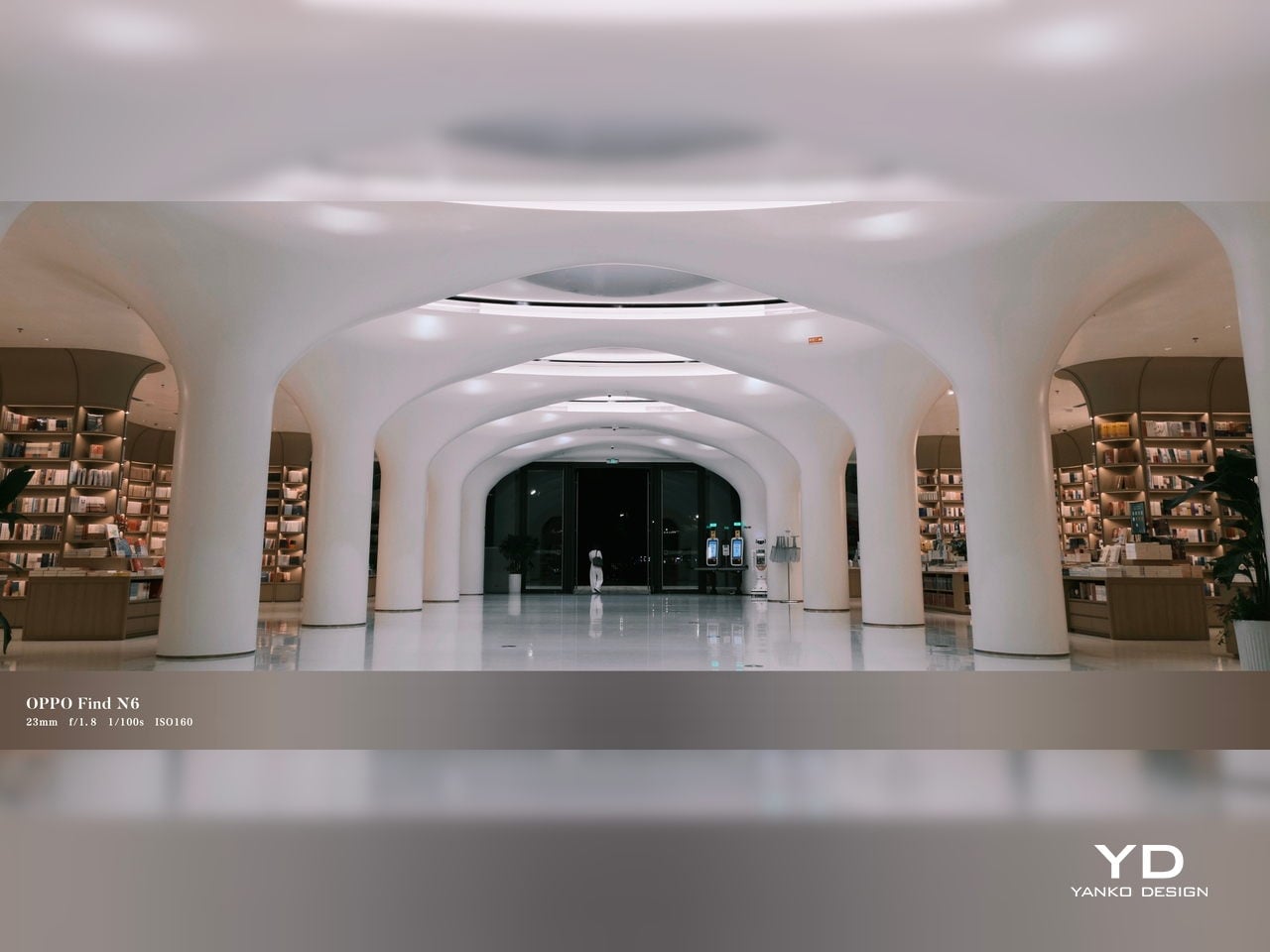
Camera
The camera system performs well by foldable standards, but it is not on the level of the best camera-focused flagships. In practice, it feels closer to a solid upper mid-range setup, which is respectable enough for a device like this.

The rear camera system includes a 200MP main camera with a 21mm-equivalent focal length, a 1/1.56-inch ISOCELL HP5 sensor, an f/1.8 aperture, and OIS, a 50MP telephoto at 70mm equivalent with an ISOCELL JN5 sensor, an f/2.7 aperture, and OIS, and a 50MP ultra-wide at 15mm equivalent with another ISOCELL JN5 sensor, an f/2.0 aperture, and autofocus.
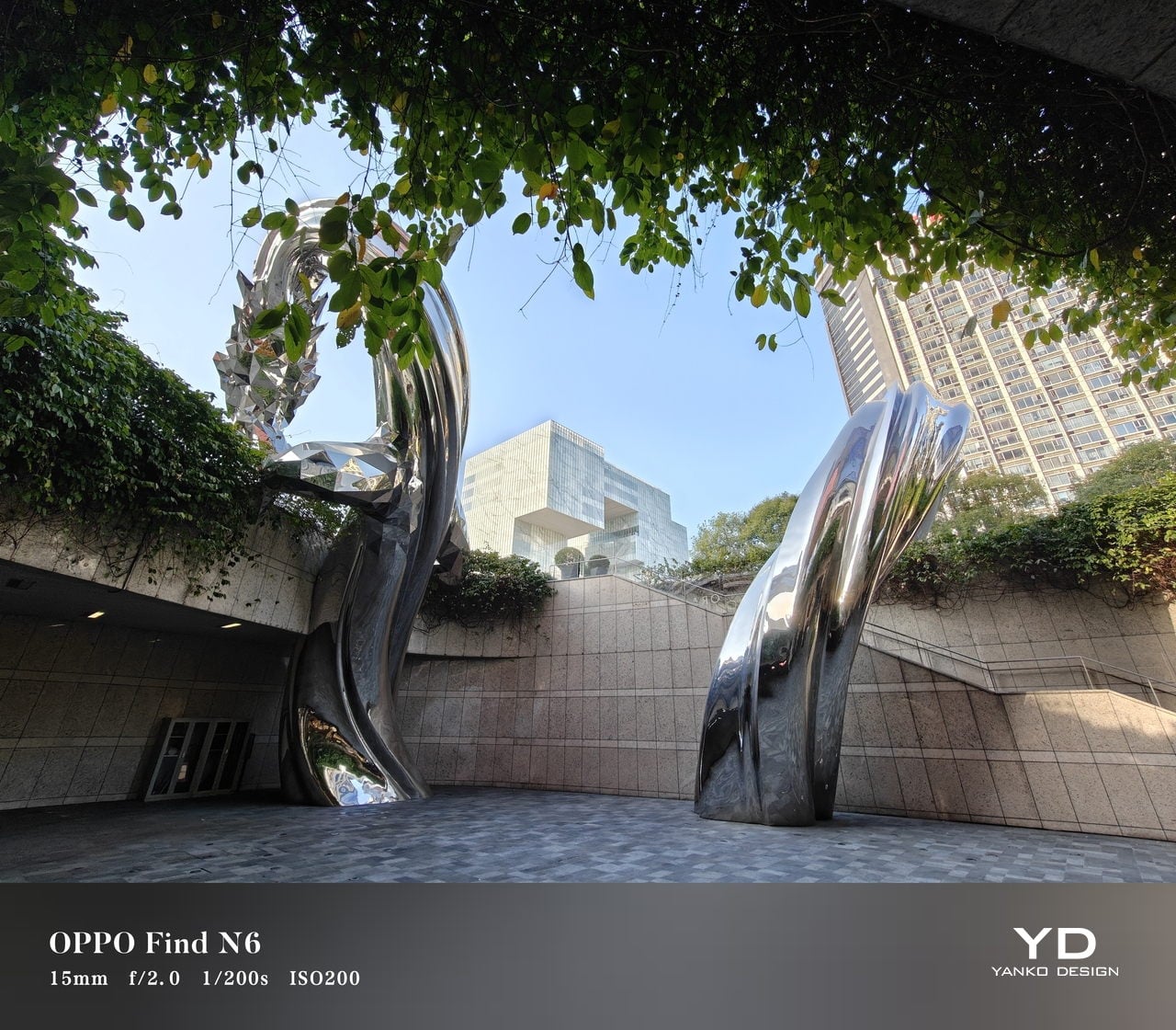
In daylight, the Find N6 delivers good detail, pleasing dynamic range, and generally accurate color, even if images tend to run slightly bright. The telephoto and ultra-wide are serviceable, while low light is where the limitations become more obvious, especially when there is movement in the scene.
XPan Mode
Oppo does at least include a healthy set of features, including log video recording and XPan mode. There are also two 20MP selfie cameras, one on the outer display and one on the inner screen, though they feel more useful for video calls than for anything else. Video is also fairly capable, with all three rear cameras supporting up to 4K 60fps Dolby Vision HDR, while the main camera can go up to 4K 120fps Dolby Vision.


Battery and charging
The Find N6 packs a 6,000mAh battery, and in practice, it delivers strong battery life. Unless you are using the camera heavily, it can easily last a full day and more, which is a very good result for a foldable with two high-refresh-rate displays.
Charging is strong as well. The phone supports 80W wired and 50W wireless charging, which makes it easier to top up quickly when needed. That only adds to the sense that the Find N6 is easier to live with day to day than many foldables.
Sustainability
For a foldable, the Find N6 makes a fairly strong durability case. It carries IP56, IP58, and IP59 ratings, and Oppo also points to stronger materials and a more robust hinge design as part of the broader durability story. More importantly, it feels reassuringly solid in hand, which goes a long way in making the device seem built to last.
That is matched by fairly solid long-term support. The phone is TÜV Rheinland certified for one million folding cycles and has minimized crease performance after 600,000 folds, while Oppo promises five years of Android updates and six years of security patches. That may not fully define sustainability, but it does give the Find N6 a more convincing case for longevity.
Value
At a starting price of around $1,440 for 12 GB/256GB configuration ($1,580 for 16 GB/512GB and $1,730 for 16 GB/1TB), the Find N6 is firmly in premium territory, but it also makes one of the strongest value cases in the foldable market. The design is slim and polished, the crease is impressively well controlled, battery life is strong, and the multitasking experience makes the larger display feel genuinely useful. More importantly, it feels like a foldable that gets the fundamentals right rather than relying on novelty alone.
The price is still high, and the camera system does not quite match the best camera-focused flagships, so there are limits to how broadly its value can be argued. But within the foldable category, the Find N6 feels unusually complete and easier to justify than many of its rivals if you already know this is the form factor you want.
Conclusion
After spending time with the Find N6, I came away feeling that Oppo has done more than just refine the formula. This is one of the few foldables that feels designed around everyday use rather than the novelty of unfolding into a larger screen. The ergonomics are better than expected, the crease is remarkably well controlled, battery life is strong, and the software makes the larger display feel genuinely useful.
It is still an expensive device, and the camera system does not quite reach the level of the best camera-focused flagships. Even so, the more I used the Find N6, the more complete it felt. There is a level of polish here that remains rare in this category, and it makes a very strong case for itself as one of the best all-around foldables available right now.
The post Oppo Find N6 Review: The Best Foldable Phone Right Now first appeared on Yanko Design.