Xiaomi 18 Fold Hands-On: Got Here Before Apple, Can It Beat Samsung?

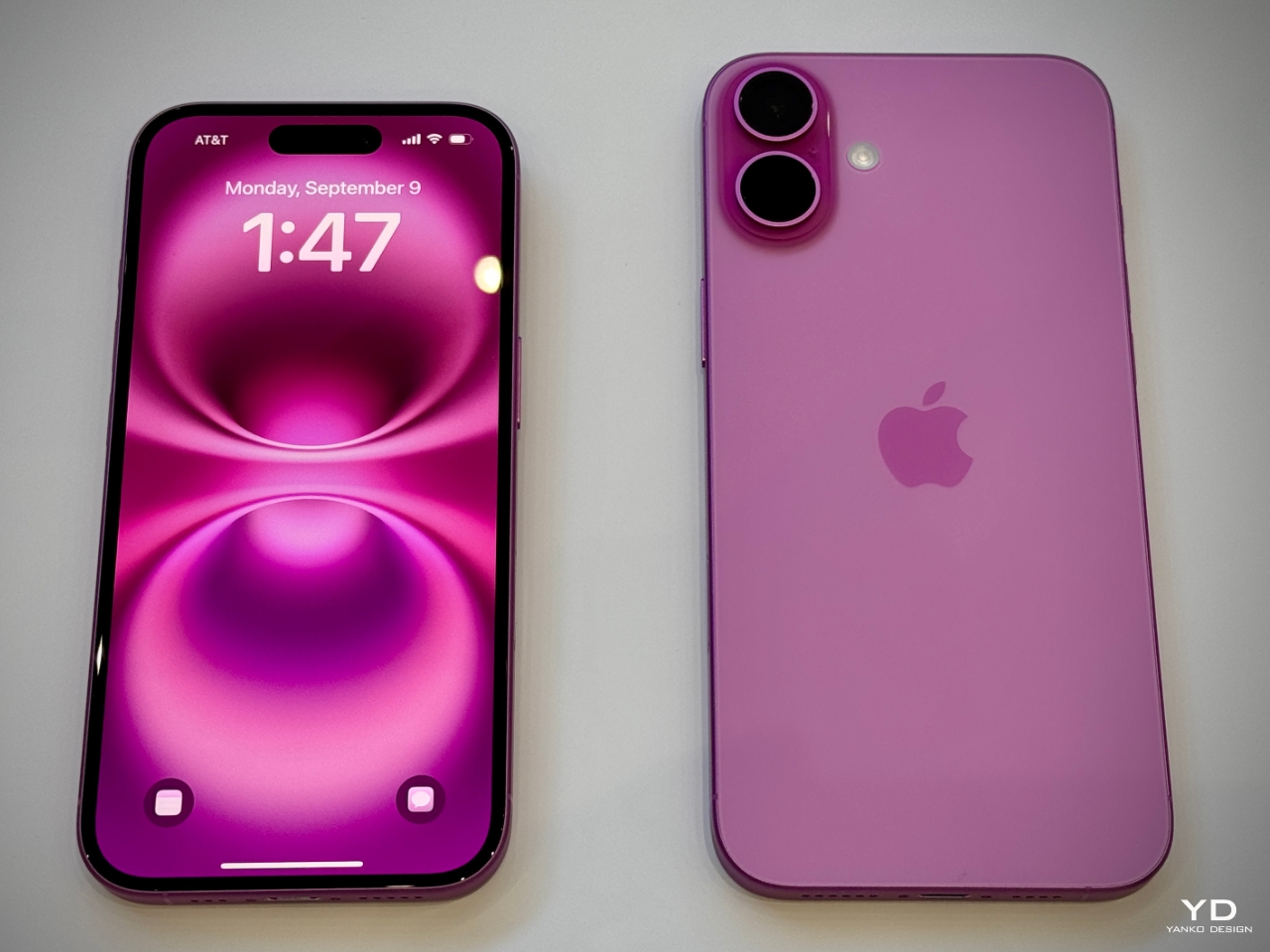
Xiaomi has chosen an interesting moment to return to foldables. The company has not released a book-style foldable since the Mix Fold 4, which launched in 2024, and now it is back with the Xiaomi 18 Fold just as compact foldables are starting to get more attention. Samsung has also added a foldable in this compact format to its lineup, and Apple is widely expected to unveil its first foldable iPhone at its September 9 event with a similar form factor in mind.

That puts the Xiaomi 18 Fold in an interesting spot. It is not just Xiaomi coming back to foldables after a break. It is also arriving just as this smaller book-style format looks like it could become the next big thing.

Designer: Xiaomi

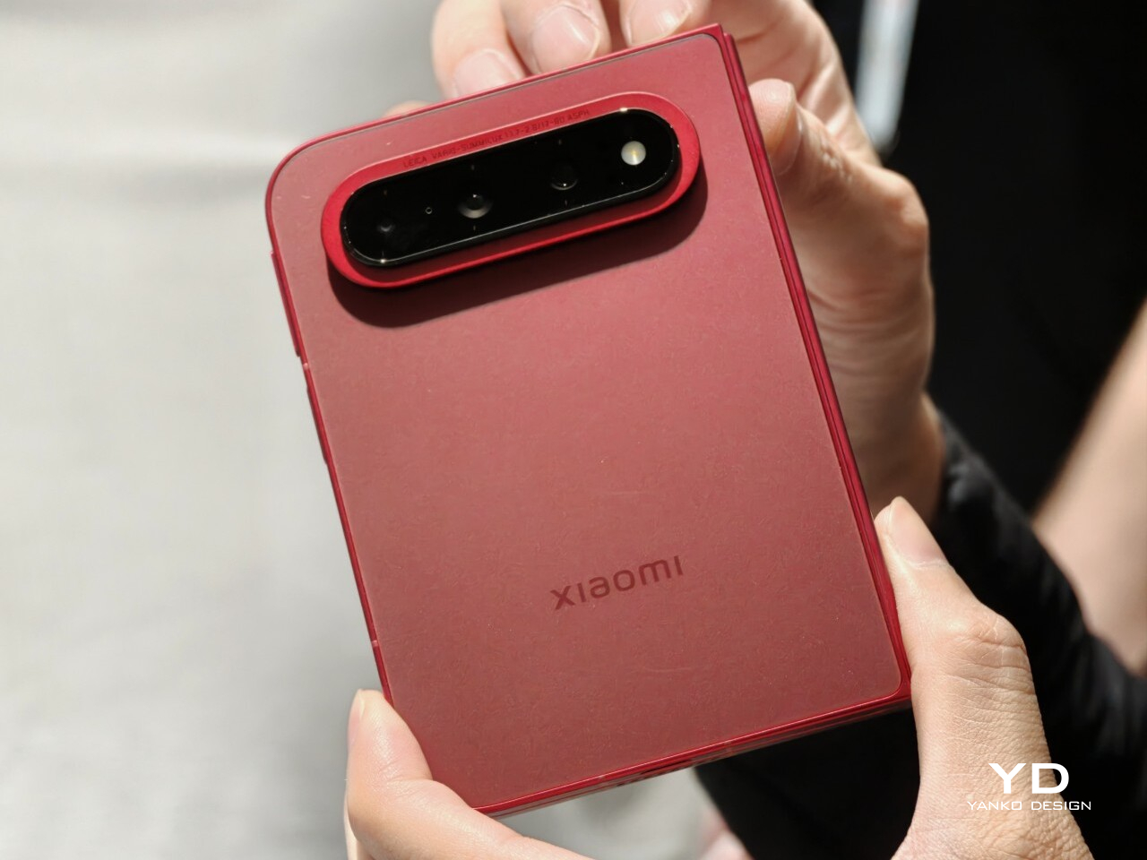
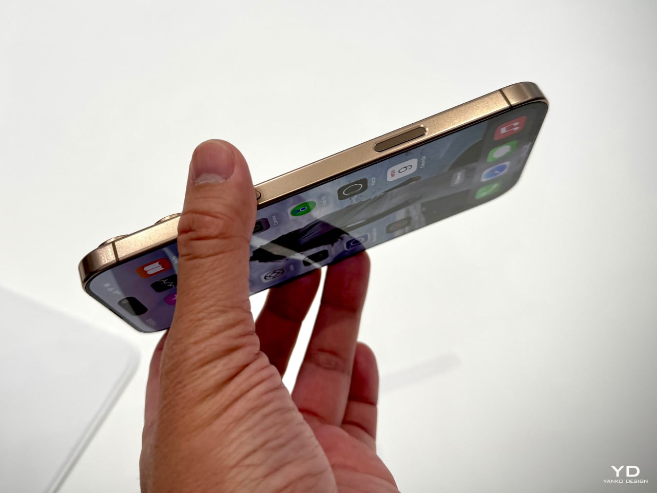
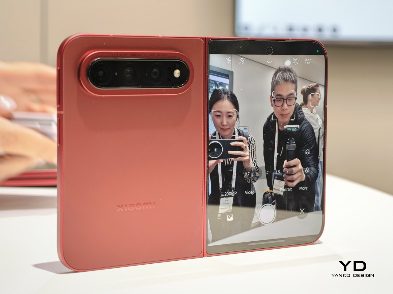
Xiaomi is positioning the 18 Fold as its first mid-size flagship foldable. It weighs 7.73 ounces (219g), measures 0.42 inches thick when folded (10.68mm), and opens out to just 0.20 inches thick (5.02mm), with a folded footprint of 4.64 x 3.29 inches (117.8 x 83.6mm). In person, it feels thin, though not unusually thin by the standards of today’s premium foldables. More importantly, it feels expensive in a good way. The matte texture on the back and frame gives it a softer, understated finish, while the rounded corners and flat frame help the phone look clean and modern.

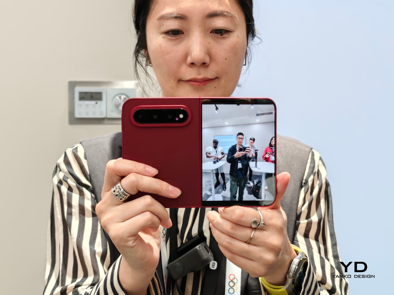
The unit I handled was the deep red version, and it is a bold color in person. It stands out more than the usual black or silver foldable palette without feeling too loud. It also happens to echo the deep red finish rumored for Apple’s first foldable, which makes the comparison hard to miss. The 18 Fold comes in Black, White, Red, and a Ceramic Version.

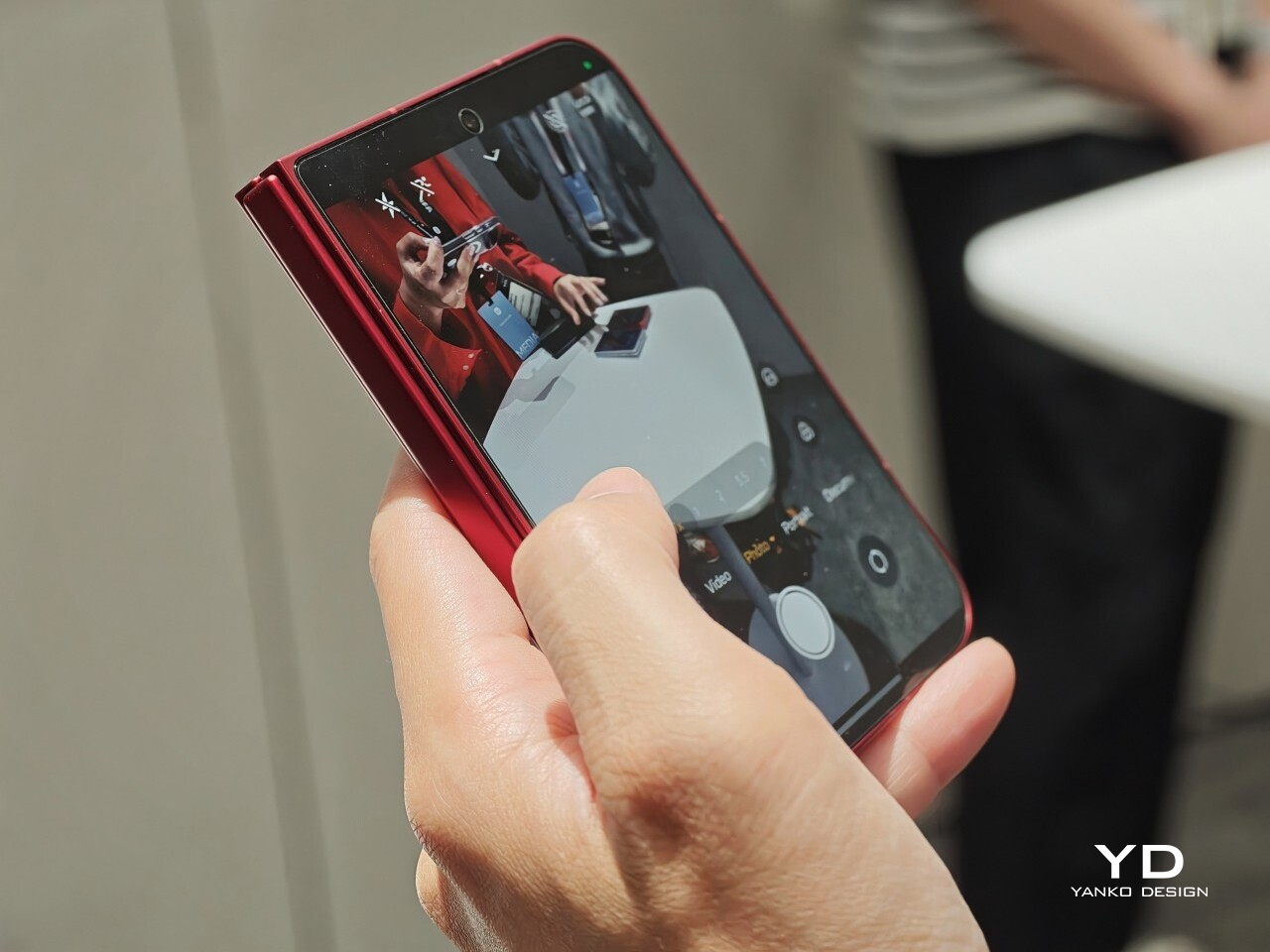
In practice, though, this is still a two-handed phone whether it is folded or unfolded. Even closed, the body is compact in one sense but still broad enough that I did not think of it as something built for easy one-handed use. That is not really a criticism. It just comes with the territory.

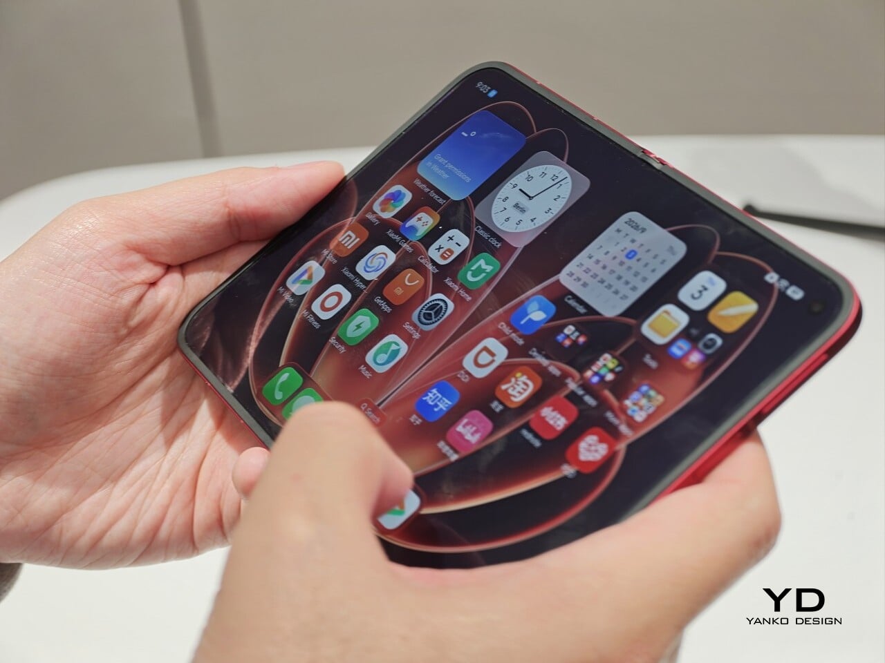
The outer display is a 5.38-inch panel, while the inside opens up to a 7.58-inch main screen. Xiaomi says both displays share the same aspect ratio, which is meant to make the transition from one to the other feel more natural. I could not fully judge how well that works in daily use from a short demo, but one benefit stood out right away. Video felt more immersive than on squarer foldables because there was less black bar space above and below the image.

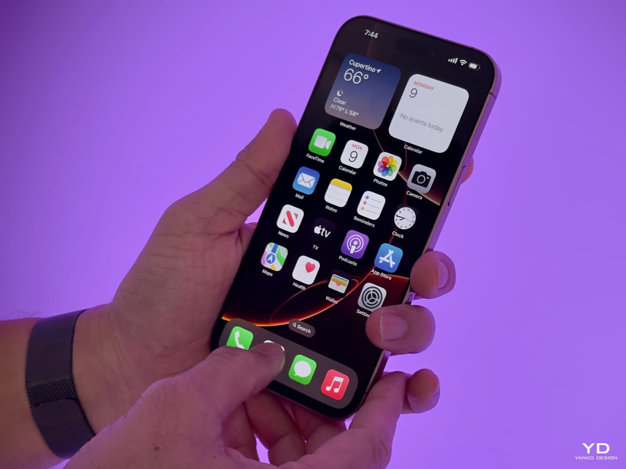
The software also looked well suited to the shape. Animations felt smooth in my brief demo, and I did see split-screen and floating window support in action. The unfolded UI felt more like a small tablet than a stretched phone, which is what you want on a device like this. Xiaomi has also placed one speaker on the top edge and another on the bottom edge on the opposite side, which should help give the phone a more balanced stereo effect when it is open.

The hinge left a good first impression too. I cannot really say whether it felt especially firm or especially smooth, because my time with the device was limited, but it did feel sturdy. The crease was handled well too. Looking straight at the display, I only really noticed it from certain angles rather than all the time. More importantly, I could barely feel it when running a finger across the center, which was better than I expected.

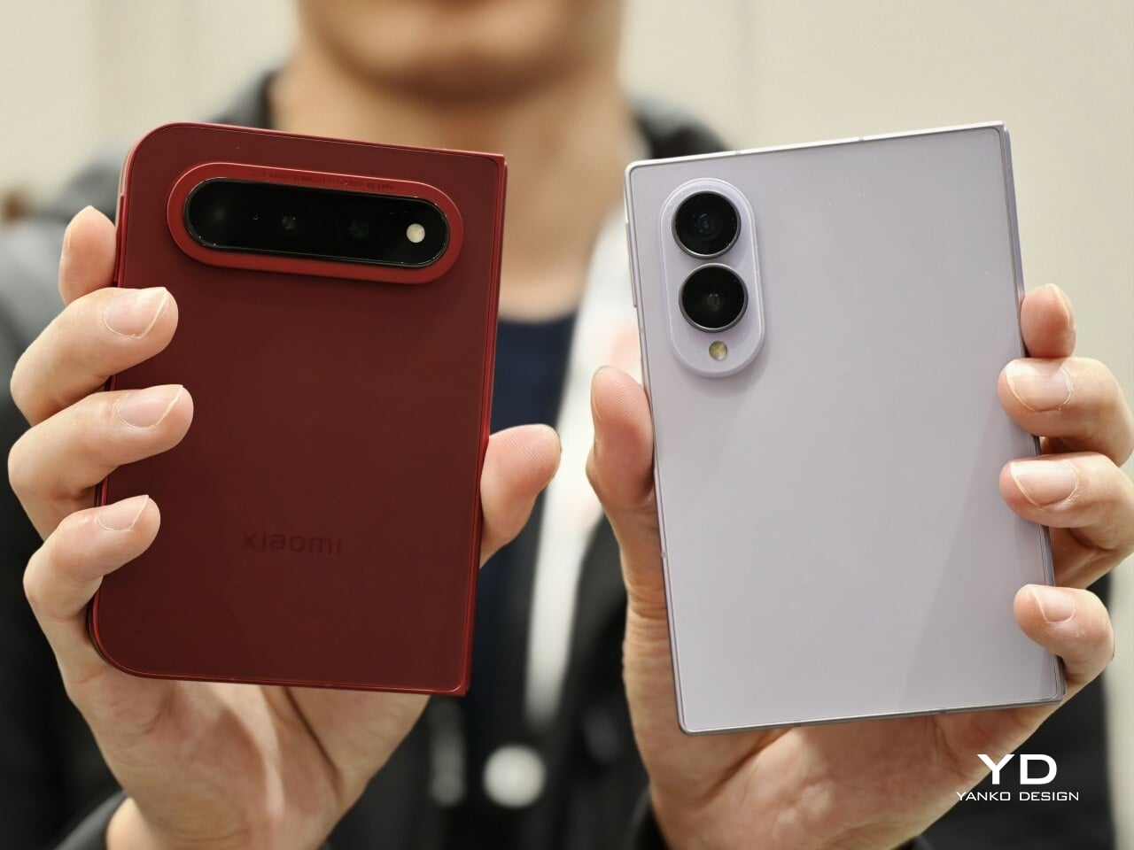
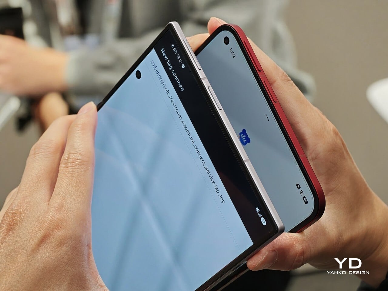
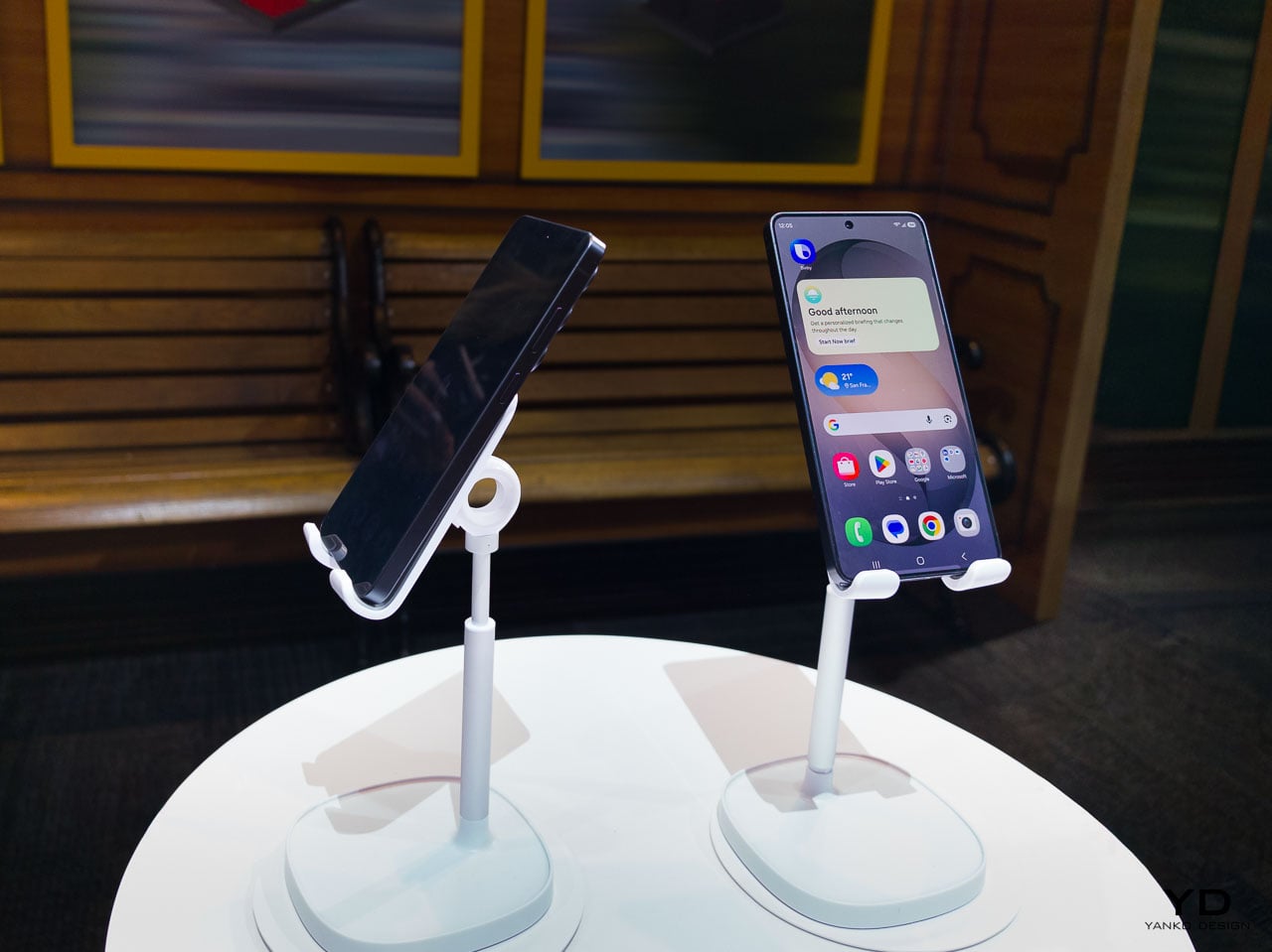
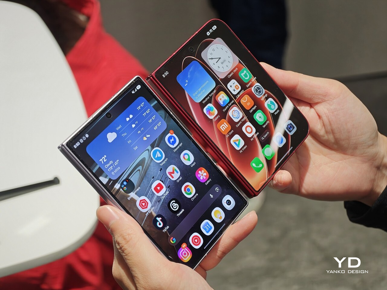
Left: Xiaomi 18 Fold, Right: Galaxy Z Fold 8

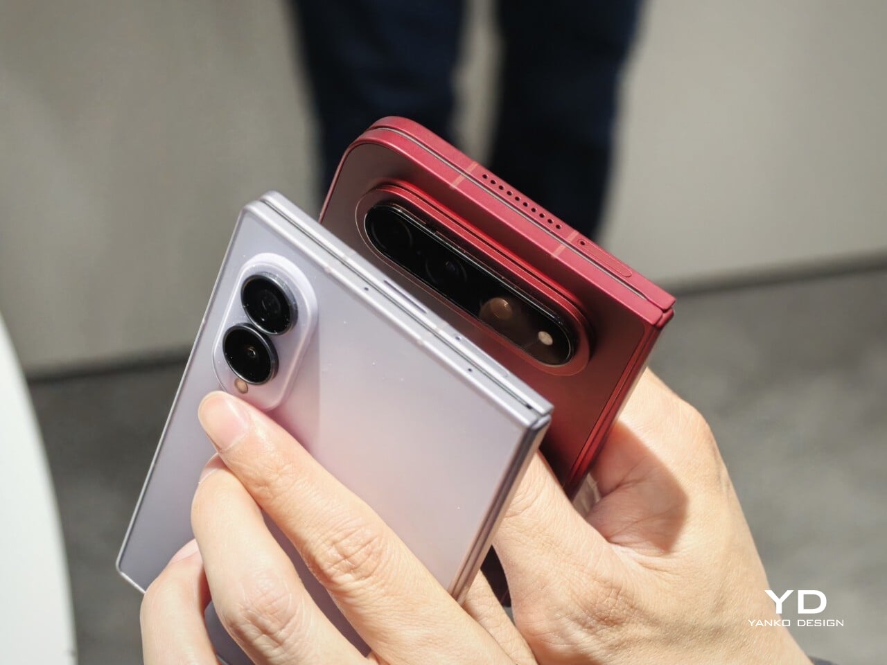
Left: Galaxy Z Fold 8, Right: Xiaomi 18 Fold

Left: Galaxy Z Fold 8, Right: Xiaomi 18 Fold

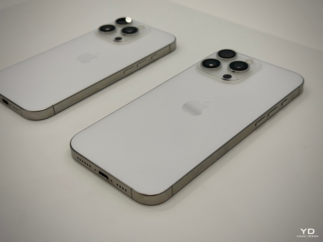
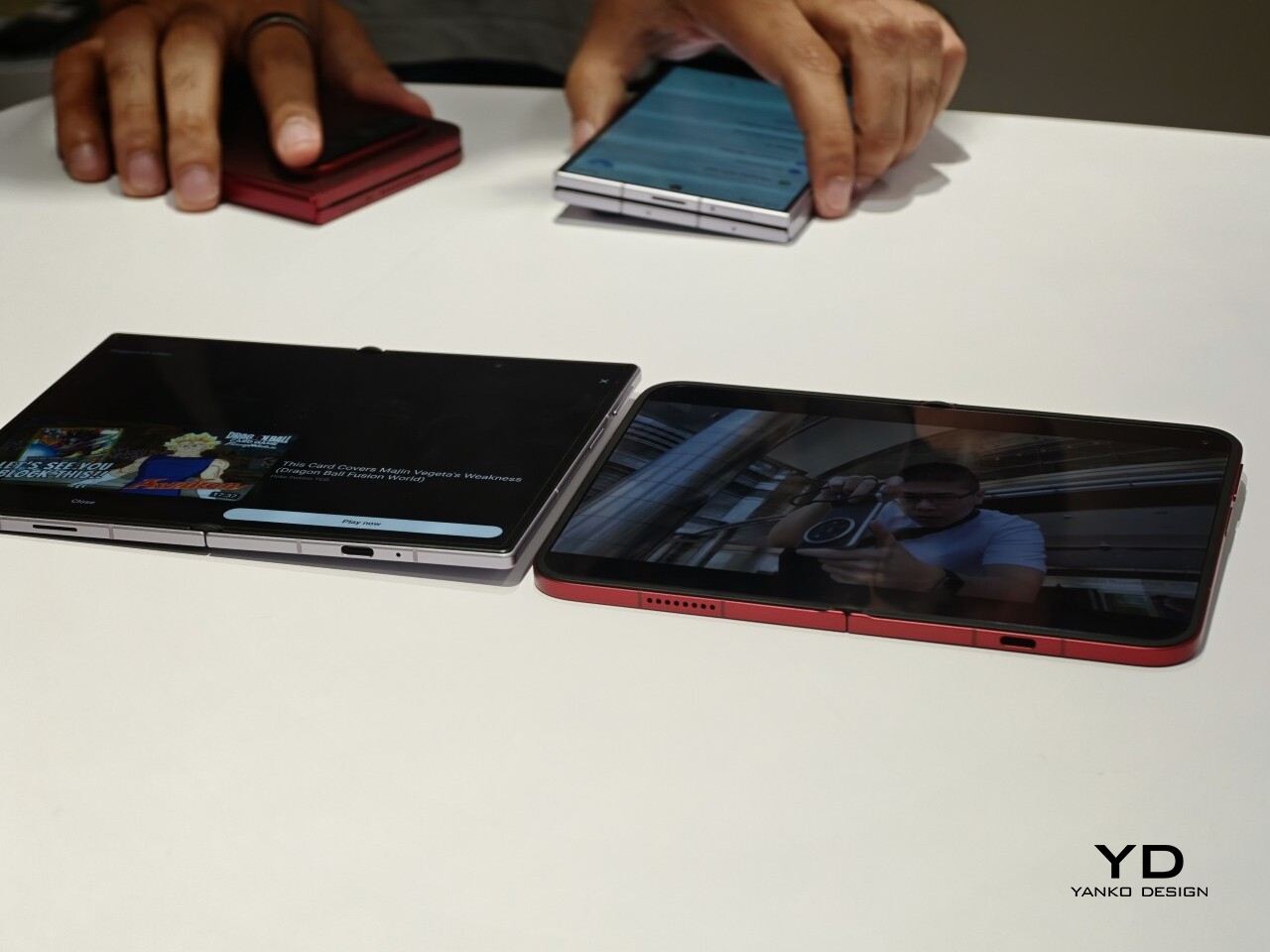
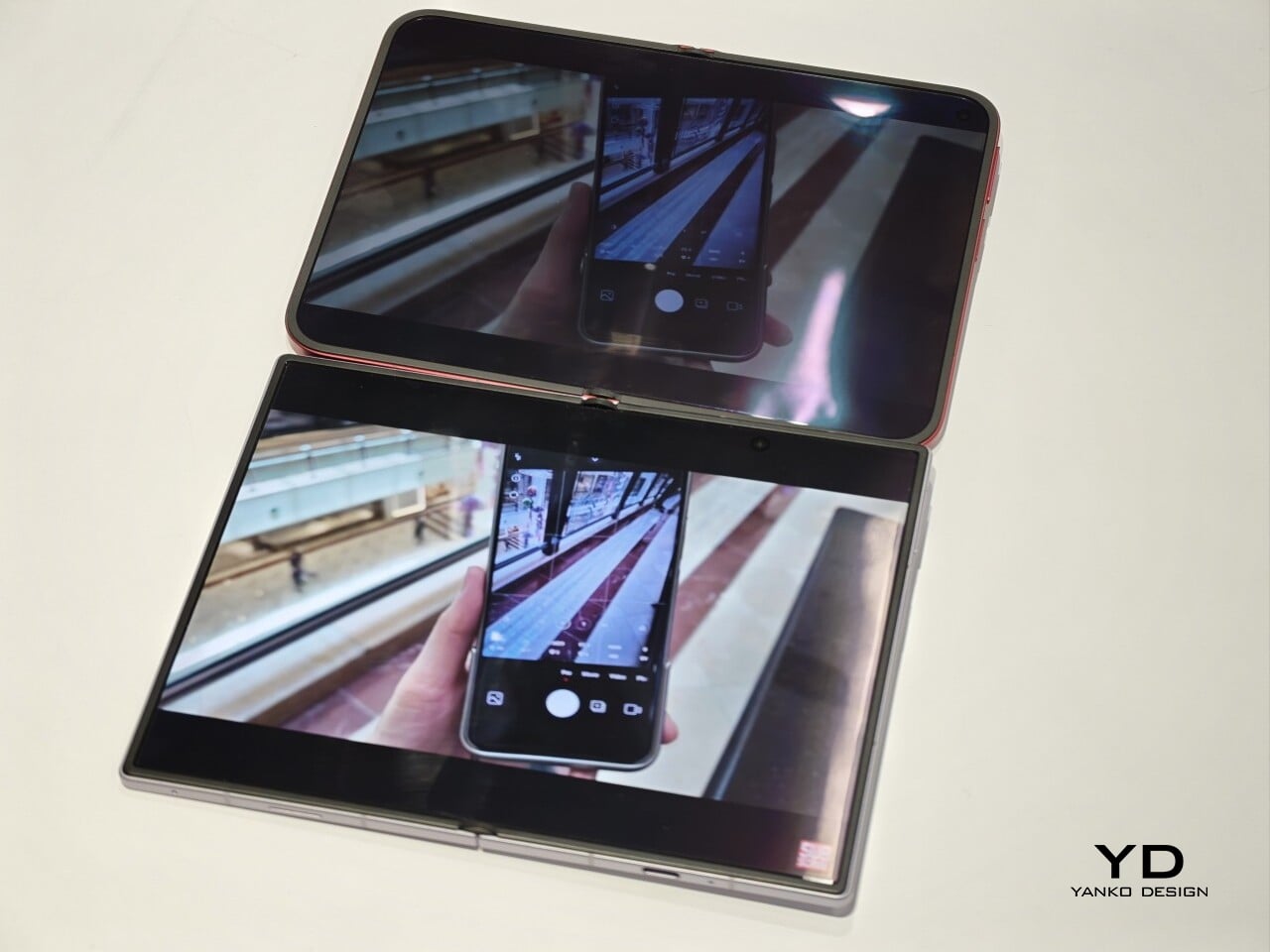
I also compared the Xiaomi 18 Fold side by side with Samsung’s Galaxy Z Fold 8. Samsung’s device measures 4.88 x 3.22 x 0.38 inches when folded (123.9 x 81.9 x 9.7mm), 6.35 x 4.88 x 0.18 inches when unfolded (161.4 x 123.9 x 4.5cm), and weighs 7.09 ounces (201g), so it is a little lighter and a bit thinner than Xiaomi’s foldable in some areas. But the difference was not just about dimensions. Samsung’s inner screen was noticeably brighter to my eyes. At the same time, the Xiaomi 18 Fold had one practical advantage that stood out immediately. When placed on a desk, it did not wobble, while the Samsung did.

Left: Galaxy Z Fold 8, Right: Xiaomi 18 Fold

Left: Galaxy Z Fold 8, Right: Xiaomi 18 Fold

Top: Xiaomi 18 Fold, Bottom: Galaxy Z Fold 8

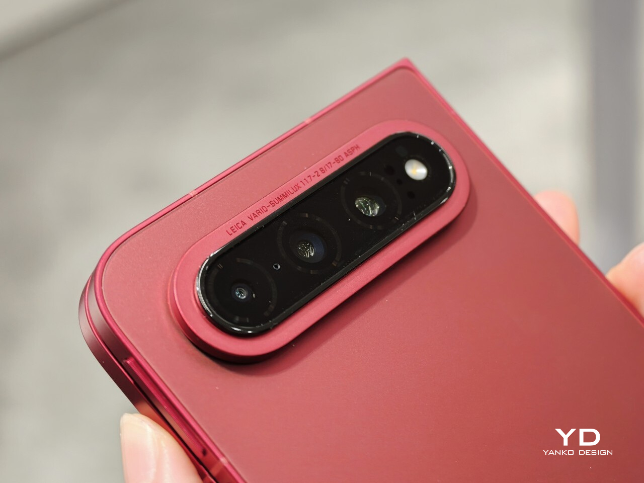
The biggest surprise for me was the camera. Xiaomi is using a 200MP Leica triple-camera system, led by a 200MP main camera and backed by a 50MP Leica periscope telephoto with an 80mm equivalent focal length. In my short time with the phone, the telephoto camera was the part that stuck with me most. I tried zoom, and the 3.5x telephoto setup immediately felt like one of the most interesting parts of the device. Stability also felt good even at higher magnification, which made the zoom feel more usable, not just more dramatic. The camera bump also did not seem overly large, and its oval-shaped, two-step raised design gives it some presence without taking over the whole back.

My time with the Xiaomi 18 Fold was brief, and this hands-on really only scratched the surface. Even so, the phone already feels like a polished return to book-style foldables. Pricing starts at RMB 10,999, or roughly $1,640, for the 12GB/256GB model, and Xiaomi said it will be available in China only for now.

The post Xiaomi 18 Fold Hands-On: Got Here Before Apple, Can It Beat Samsung? first appeared on Yanko Design.

Honor Robot Phone Hands-on: Bold Phone With A Moving Camera Few Can Buy

After many teasers and demos, the Honor Robot Phone has finally and officially launched in China. It is also staying exclusive to the Chinese market for now, with Honor not planning an international release at this stage. That alone will make it a frustratingly out-of-reach device for many, because this is one of the rare smartphones that feels genuinely different at first glance.

Part of the reason the launch has drawn so much interest is that Honor first revealed the Robot Phone at MWC earlier this year, where it quickly became one of the event’s biggest conversation pieces. Even in a show packed with concept hardware and camera claims, this was the device that made people stop, stare, and ask how it actually worked. Now that it has moved from trade show reveal to commercial launch, the Robot Phone still feels just as unusual.

Designer: HONOR

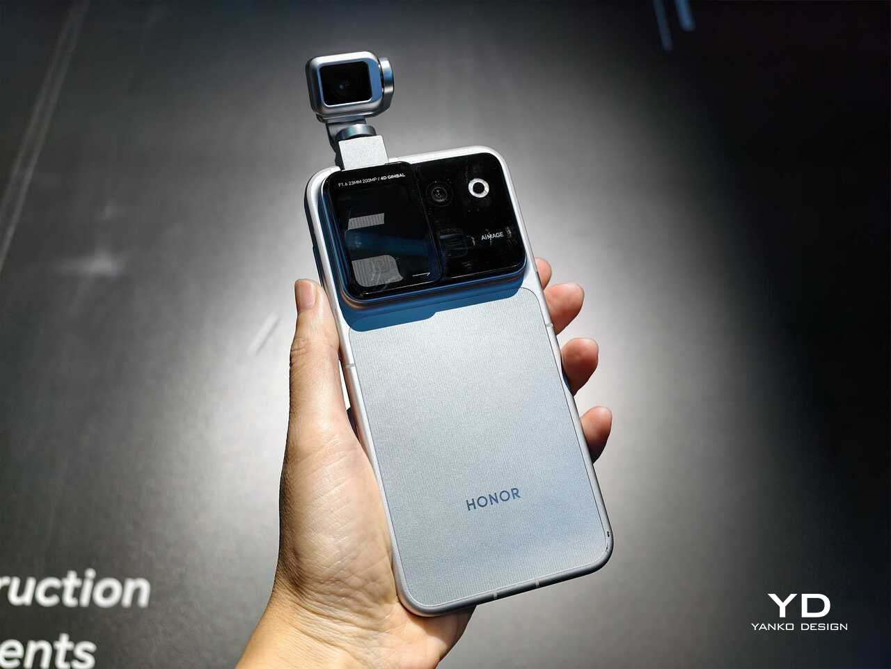
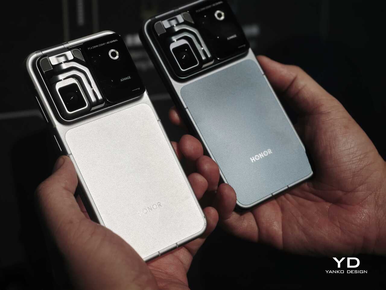
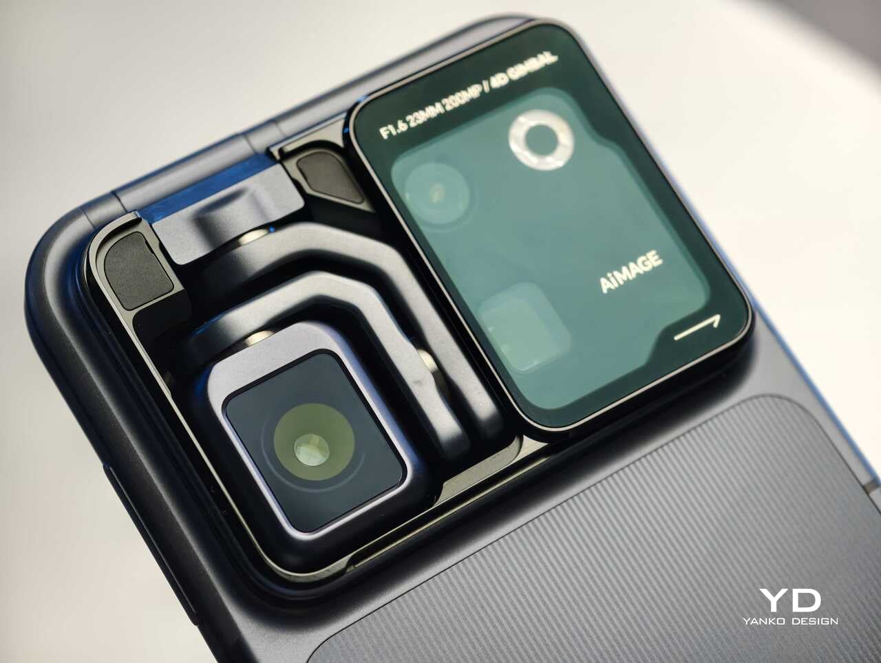
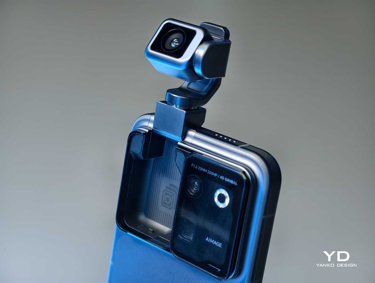
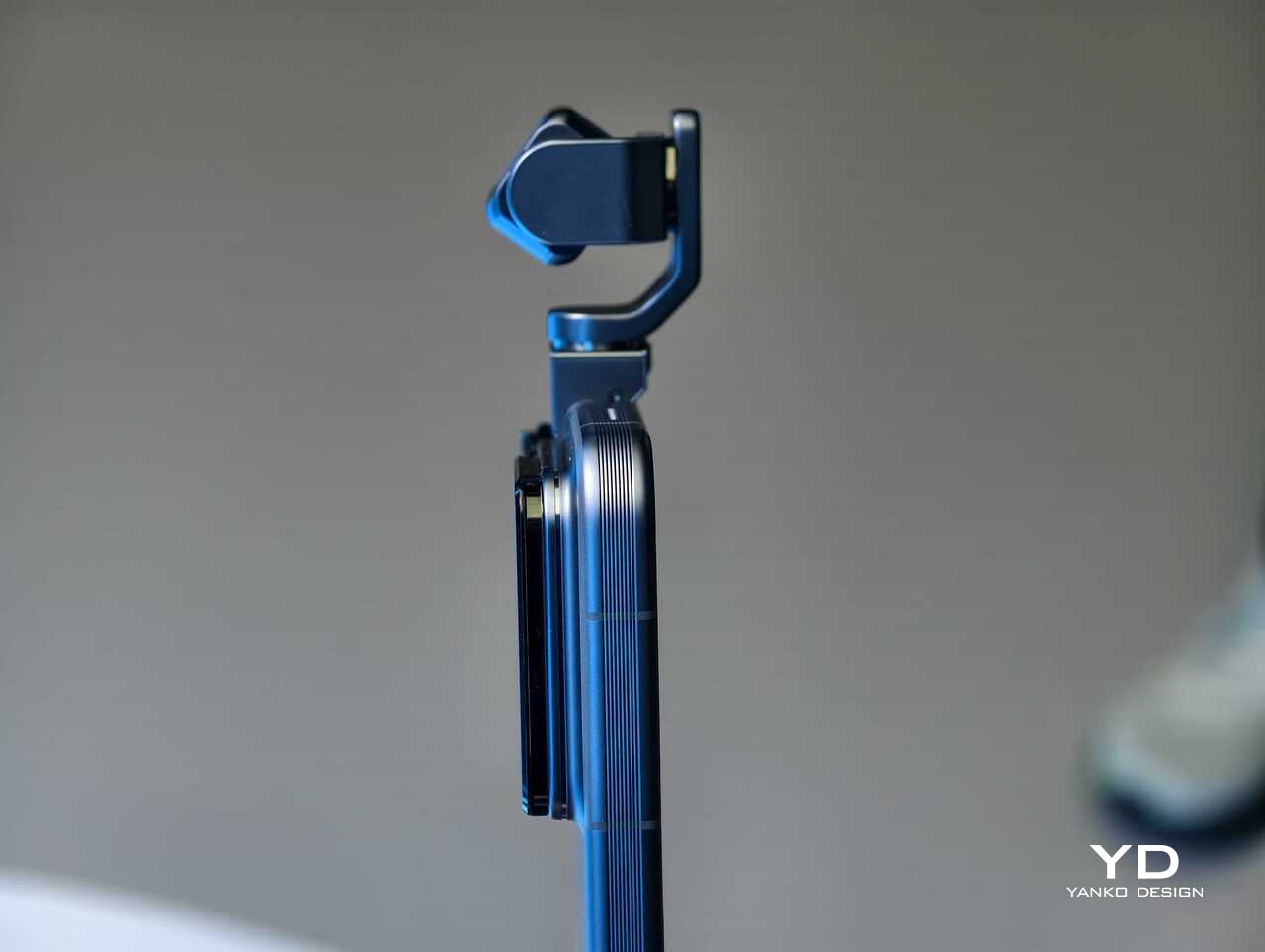
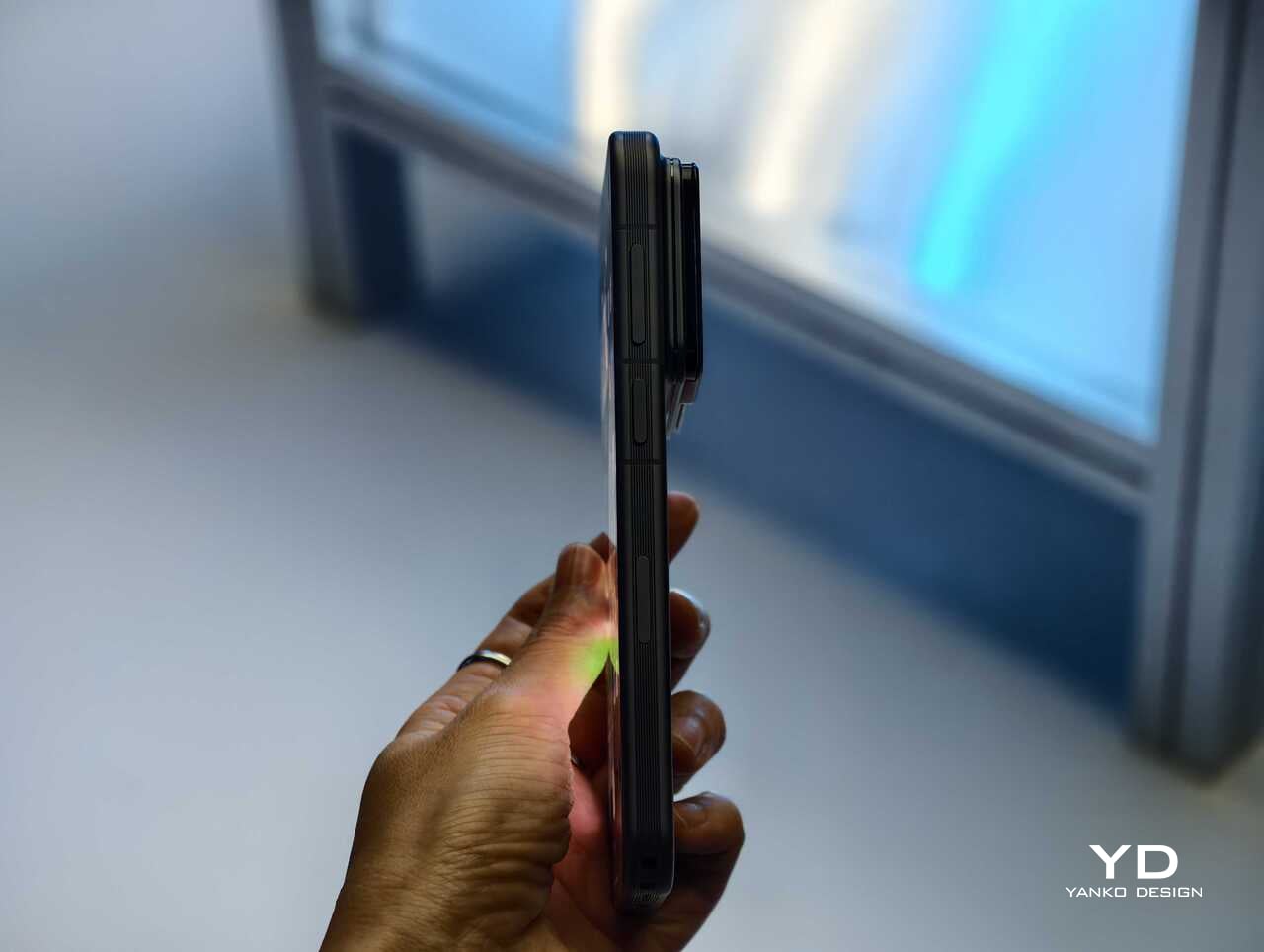
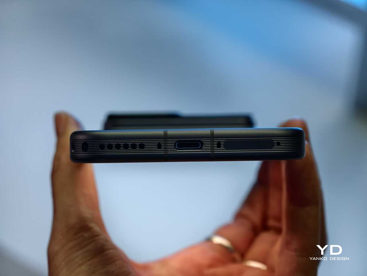
Rather than chasing attention with another familiar camera bump or an incremental spec upgrade, Honor has built a robotic gimbal directly into the phone itself. The result is a camera system that can physically move, track, tilt, and stabilize in ways a conventional flagship simply cannot. After spending time with the device, it is clear the Robot Phone is not just trying to be another premium handset with a long feature list. It is trying to pitch a new idea for what a creator-focused smartphone can be.

The big story is movement, not just megapixels

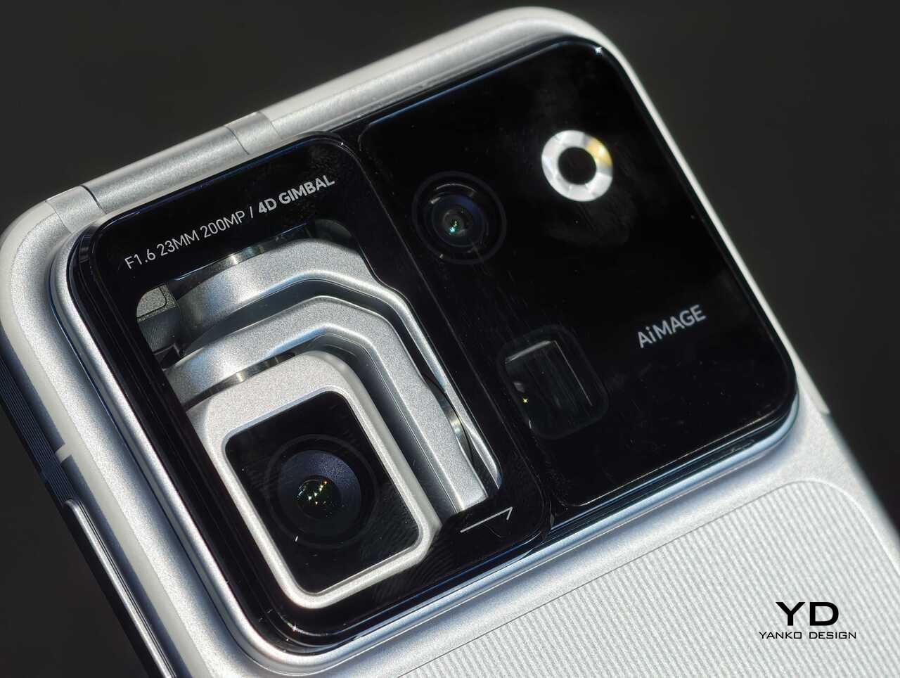
The core pitch behind the Honor Robot Phone is easy to understand once you see it in person. Honor has integrated what it calls a 4DoF Titanium Agile Gimbal into the phone, effectively turning the camera into an active moving system rather than a static sensor setup. The company says the module is 65 percent smaller than traditional gimbal solutions while also offering a 200 percent increase in structural strength, allowing it to fit inside a premium smartphone body without turning the device into a bulky experiment.

That change in hardware philosophy is what makes the Robot Phone immediately stand out. In practice, the moving camera module is meant to deliver smoother stabilization and more dynamic motion than a normal smartphone can manage on its own. Honor is also building in multiple movement modes, including Tilt Lock, First Person View, FPV Vertical, and AI SpinShot, all of which are designed to make mobile footage look more deliberate and more cinematic.

Honor is aiming this squarely at creators

The second half of the launch story is imaging. Honor says the Robot Phone is the first major product from its Cinematic Imaging Partnership with ARRI, bringing selected elements of ARRI Image Science and professional cinema workflow ideas into a smartphone. That includes ARRI LogC3 recording in ARRI CINEMA mode on the main gimbal camera, alongside ARRI Wide Gamut 3 and ARRI Looks.

On paper, the camera hardware is also extremely ambitious. The rear setup pairs a 200MP Agile Gimbal Main Camera with a 1/1.28-inch sensor and F1.6 aperture with a 200MP periscope telephoto camera using a 1/1.4-inch sensor and 2.7x optical zoom. A 50MP ultra-wide camera completes the setup. Honor is also claiming AI noise reduction improvements, up to 14 stops of dynamic range, and a video pipeline designed to preserve more usable information for post-production.

That is a lot of technical language, but the broader message is straightforward. Honor does not want the Robot Phone to be seen as a novelty. It wants this to be taken seriously as a compact filmmaking and creator tool.

Hands-on: The Honor Robot Phone feels different right away

The most striking thing about the Robot Phone in person is that its main feature is visible. So many smartphone launches revolve around internal improvements that are difficult to appreciate without extensive testing. Here, the big idea is immediately obvious. The camera module moves. It tracks. It gives the phone a sense of physical intention that most handsets simply do not have.

That makes the Robot Phone more memorable than most new flagships before you even get into image quality. Instead of relying entirely on software stabilization and fixed hardware, Honor is trying to introduce actual camera movement into the smartphone experience. In a short hands-on session, that makes the device feel less like a standard phone with a flashy camera and more like a compact production tool that happens to fit in your pocket.

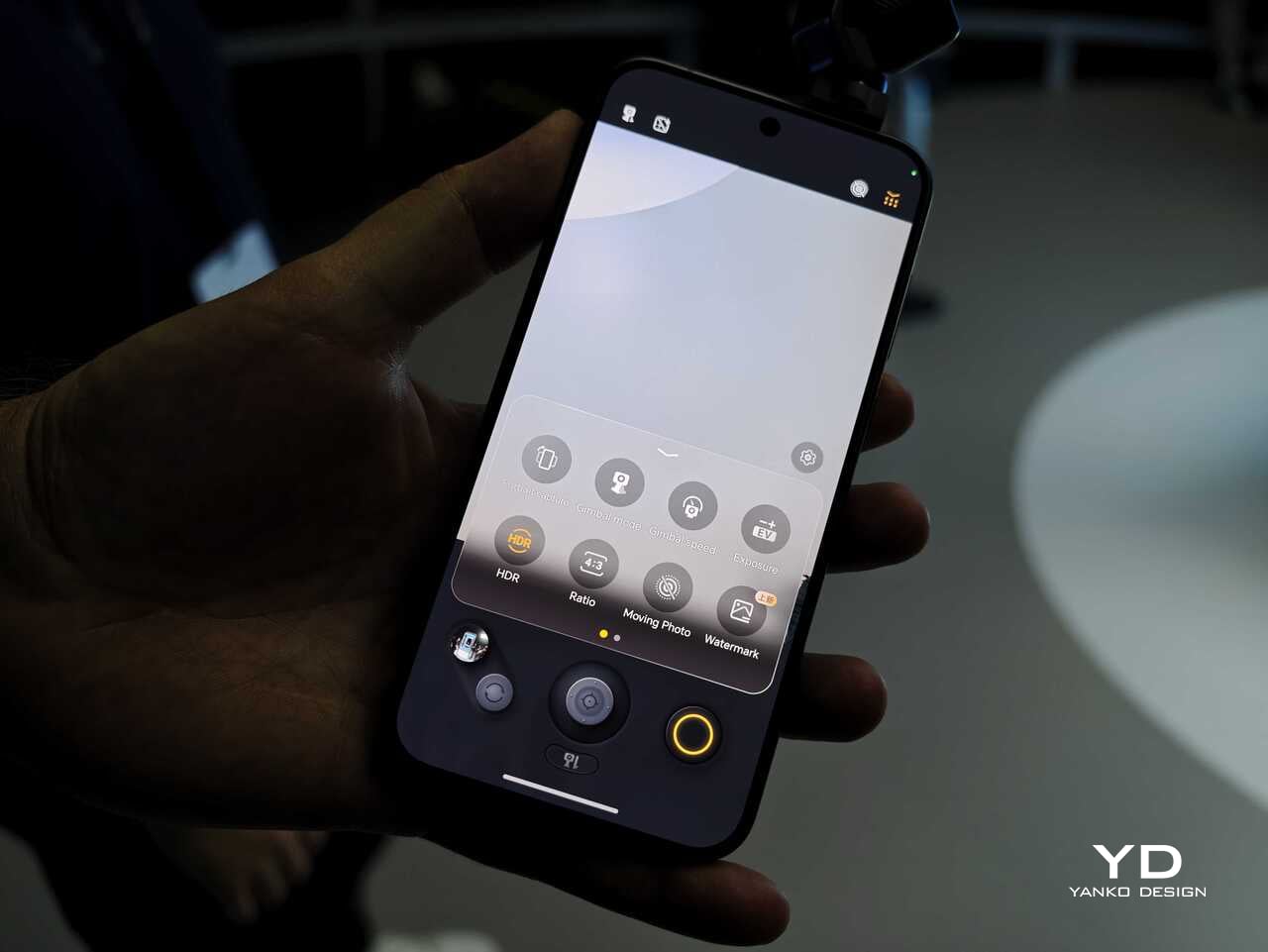
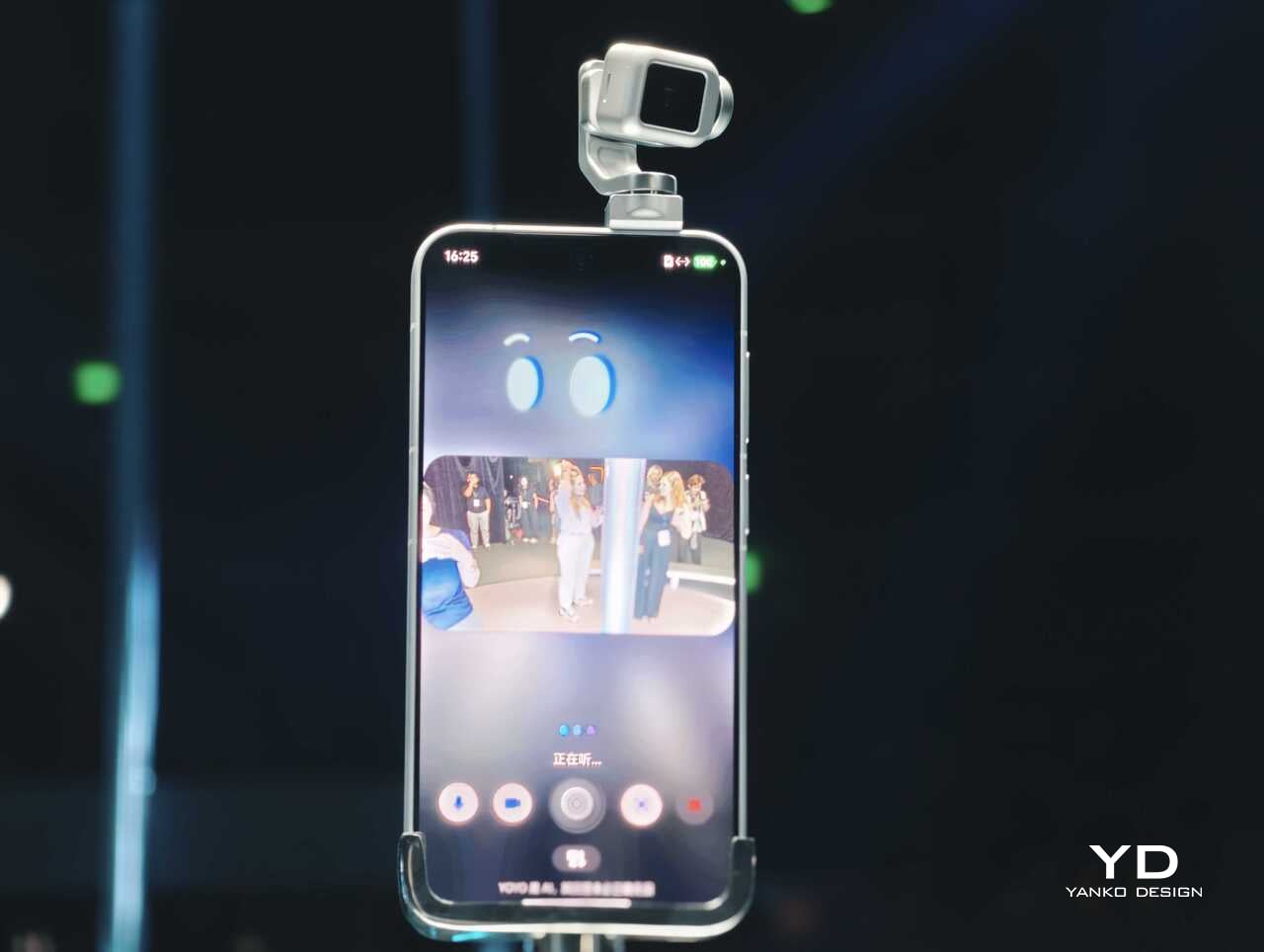
The tracking and movement features are also easier to appreciate in person than they are on a spec sheet. AI Live-Tracking, gesture controls, and voice-directed movement all sound abstract on paper. Once you see the phone physically following a subject or repositioning itself, the concept becomes much easier to understand. Whether that turns into something essential in everyday use is a bigger question, but as a first impression, the idea lands more convincingly than I expected.

Using the on-screen virtual joystick, I was able to adjust the gimbal with surprising precision. The interface crams in a lot of features, so it does take some time to learn. Even so, the gimbal feels very responsive, which helps the controls feel more intuitive once you settle in.

There is still a full flagship wrapped around the concept

Outside the headline camera hardware, Honor is still treating the Robot Phone like a proper premium device. It is powered by the Snapdragon 8 Elite Gen 5, backed by a custom cooling system that is meant to keep performance stable during longer recording sessions. There is also a 7060mAh silicon-carbon battery, with support for 120W wired charging and 50W wireless charging.

The rest of the hardware sounds suitably high-end too. Honor is using an all-metal unibody design paired with a 6.31-inch LTPO OLED display, an adaptive 1 to 120Hz refresh rate, and a claimed peak brightness of 6800 nits. On paper at least, this is not a concept phone built around one attention-grabbing trick. Honor is trying to package an experimental camera idea inside a full flagship experience.

China-only for now, and that is a shame

For now, the Honor Robot Phone is launching only in China, where it might be staying indefinitely. Honor is not planning to release the device outside China at this stage, which means this unusually creator-focused phone is set to remain a domestic-market curiosity rather than a broader global play.

That is disappointing, because the Robot Phone feels like exactly the kind of launch the smartphone market needs more of. It may not be for everyone, and there are obvious questions about durability, long-term usefulness, and whether creators will trust a built-in robotic camera system over dedicated gear. Even so, it is difficult to dismiss because the concept is so easy to understand once you see it in action.

Early thoughts

After a brief hands-on, my early take is that the Honor Robot Phone feels niche but genuinely fresh. The robotic gimbal is not just a visual gimmick for launch-day headlines. It changes the way the device presents itself, and potentially the way some people shoot with it. Whether that translates into a truly great camera phone will need more time to answer, but as a statement of intent, Honor has made one of the boldest smartphone moves of the year.

The bigger frustration is that, for now, it is a bold move that most of the world will only be able to watch from a distance. First teased at MWC earlier this year and now officially on sale in China, the Robot Phone is not about to become the next mainstream global flagship. Still, even as a limited-market release, it stands out as one of the most unusual and ambitious smartphones to arrive this year.

The post Honor Robot Phone Hands-on: Bold Phone With A Moving Camera Few Can Buy first appeared on Yanko Design.

Carriers Want This BlackBerry-Style Phone – I Tried It at MWC

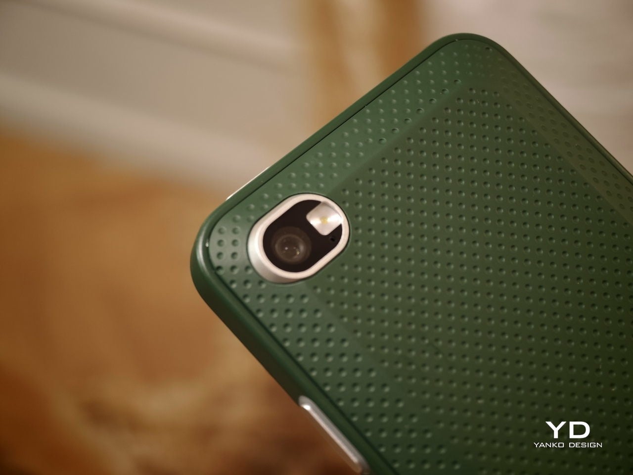
When Clicks unveiled the Clicks Communicator at CES 2026, the device immediately stood out in a sea of look-alike smartphones. It pairs a physical QWERTY keyboard with a communication-first philosophy that feels intentionally different from the current slab phone crowd. Clicks also shared several specifications at the time, yet it did not confirm exactly when the phone would launch.

At a Mobile World Congress (MWC) off-site event in Barcelona, Clicks offered a clearer update on where the Communicator stands today. The company used the event to signal that the project is progressing beyond the early reveal phase. It positioned the Communicator as moving steadily toward launch.

Designer: Clicks

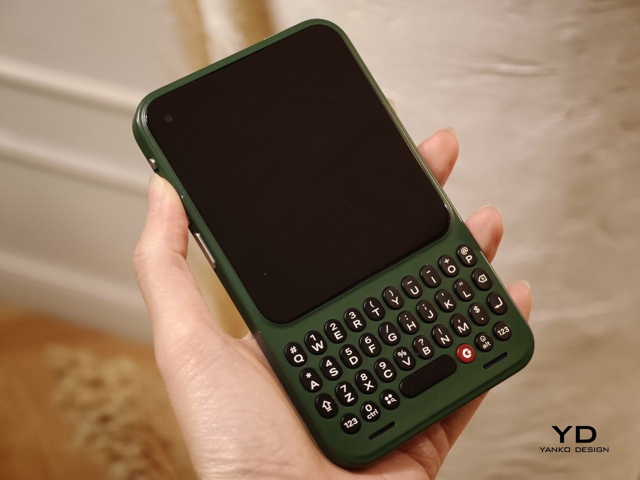
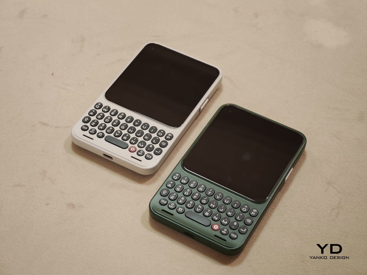
Clicks showcased the Communicator to media and potential partners, and I had the opportunity to briefly go hands-on with the device. The unit on display was still a mockup rather than a final production model. Even so, it offered a useful glimpse at how the hardware direction is taking shape.

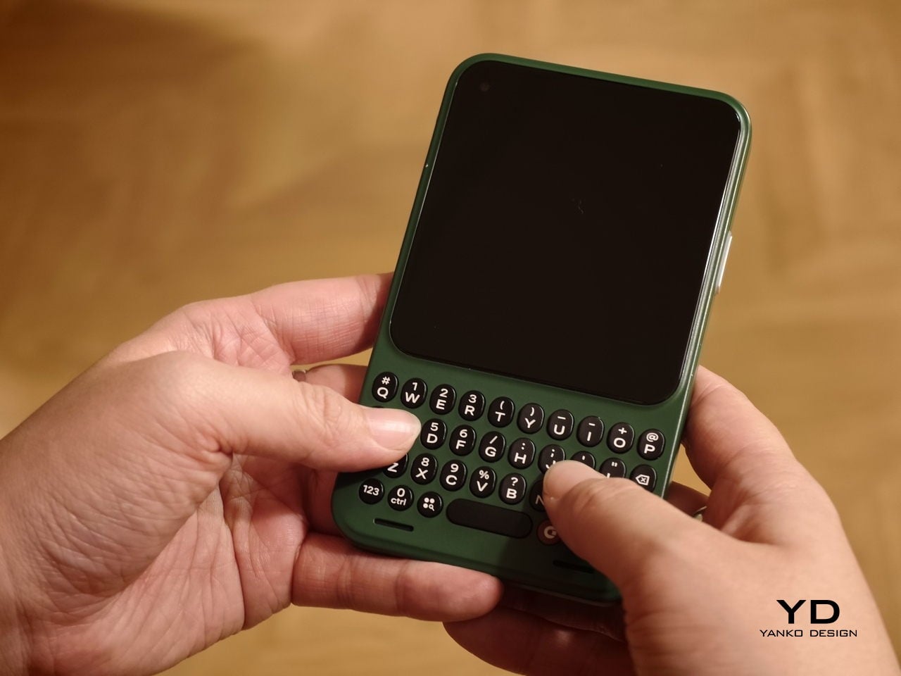
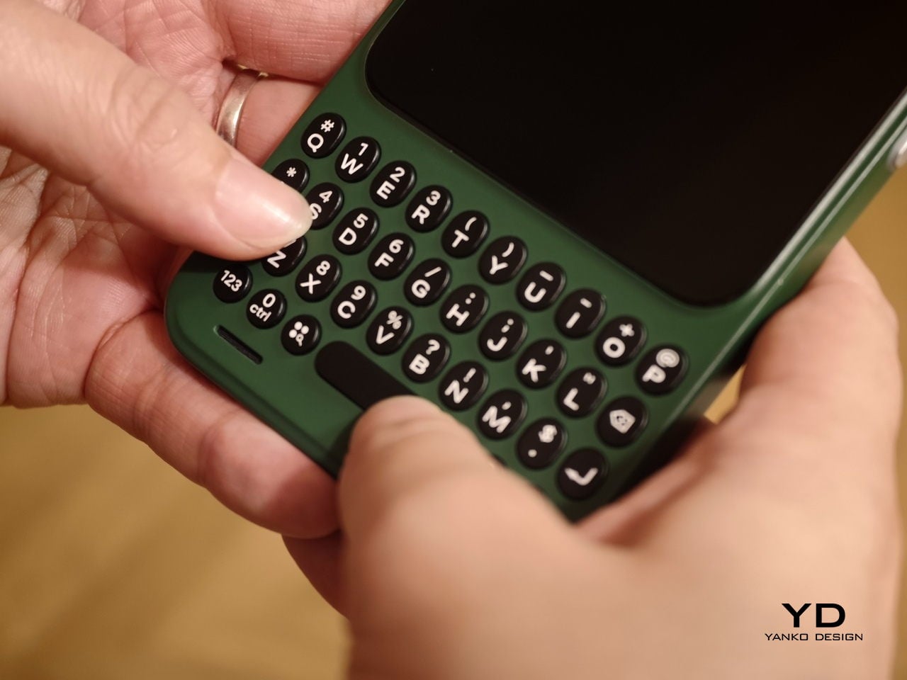
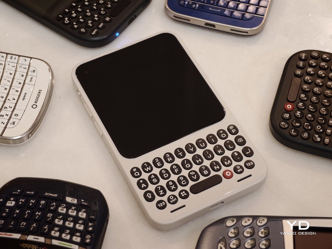
In hand, the Communicator feels nice and compact, and it sits comfortably in the palm. The balance feels considered, and the overall shape makes it easy to grip without feeling slippery or awkward. Typing also felt comfortable during my short time with it, which is the “make or break” moment for any keyboard phone.

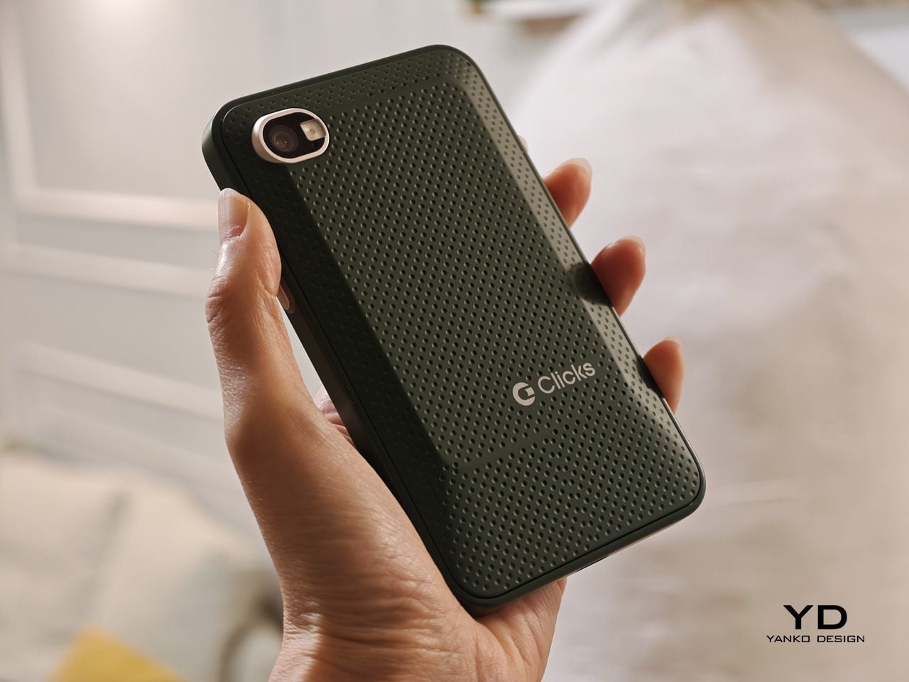
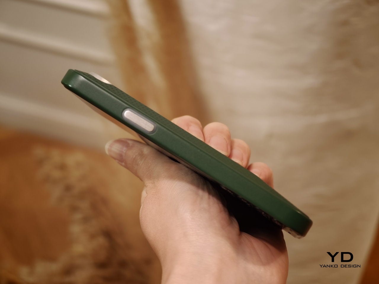
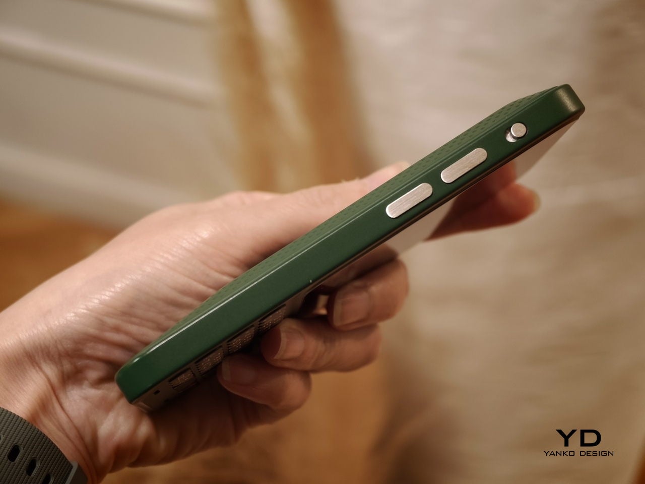
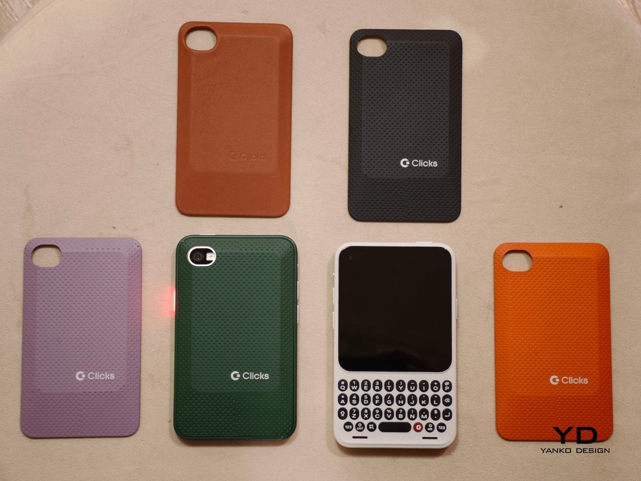
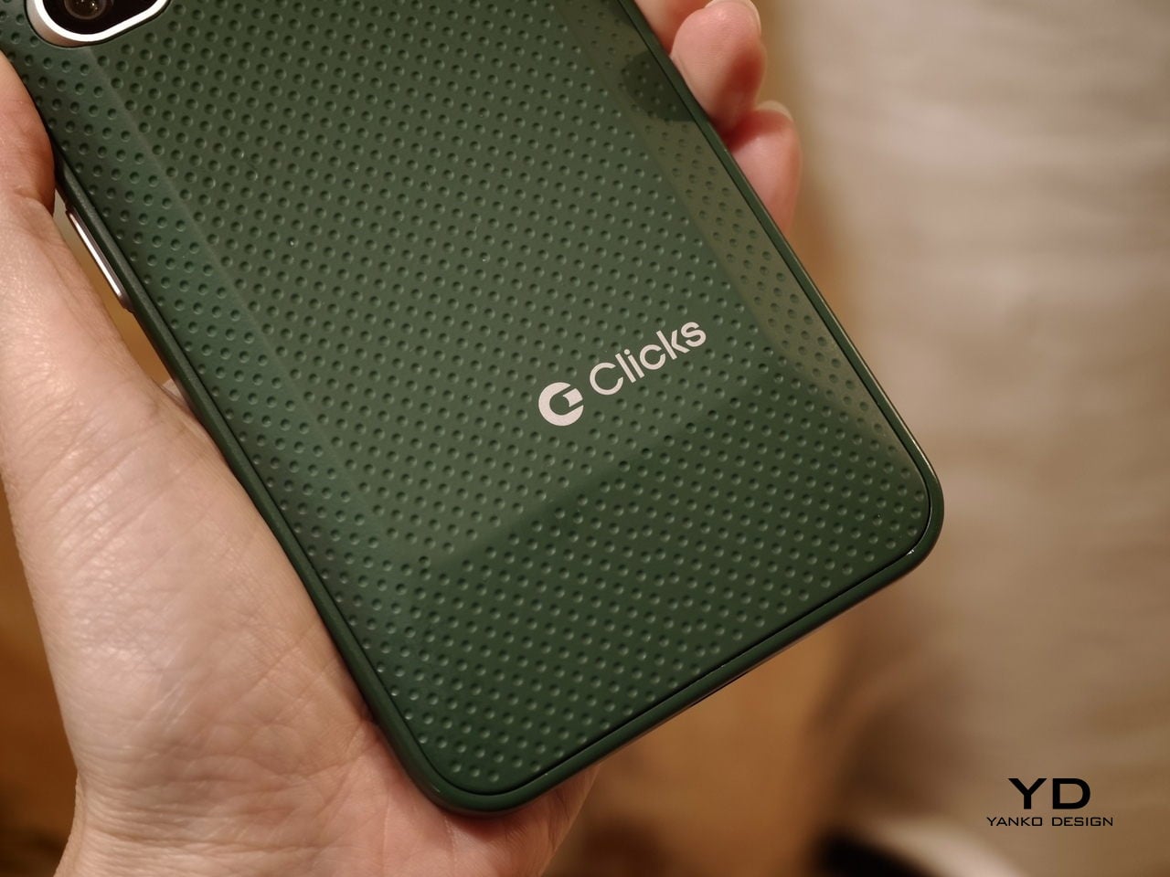
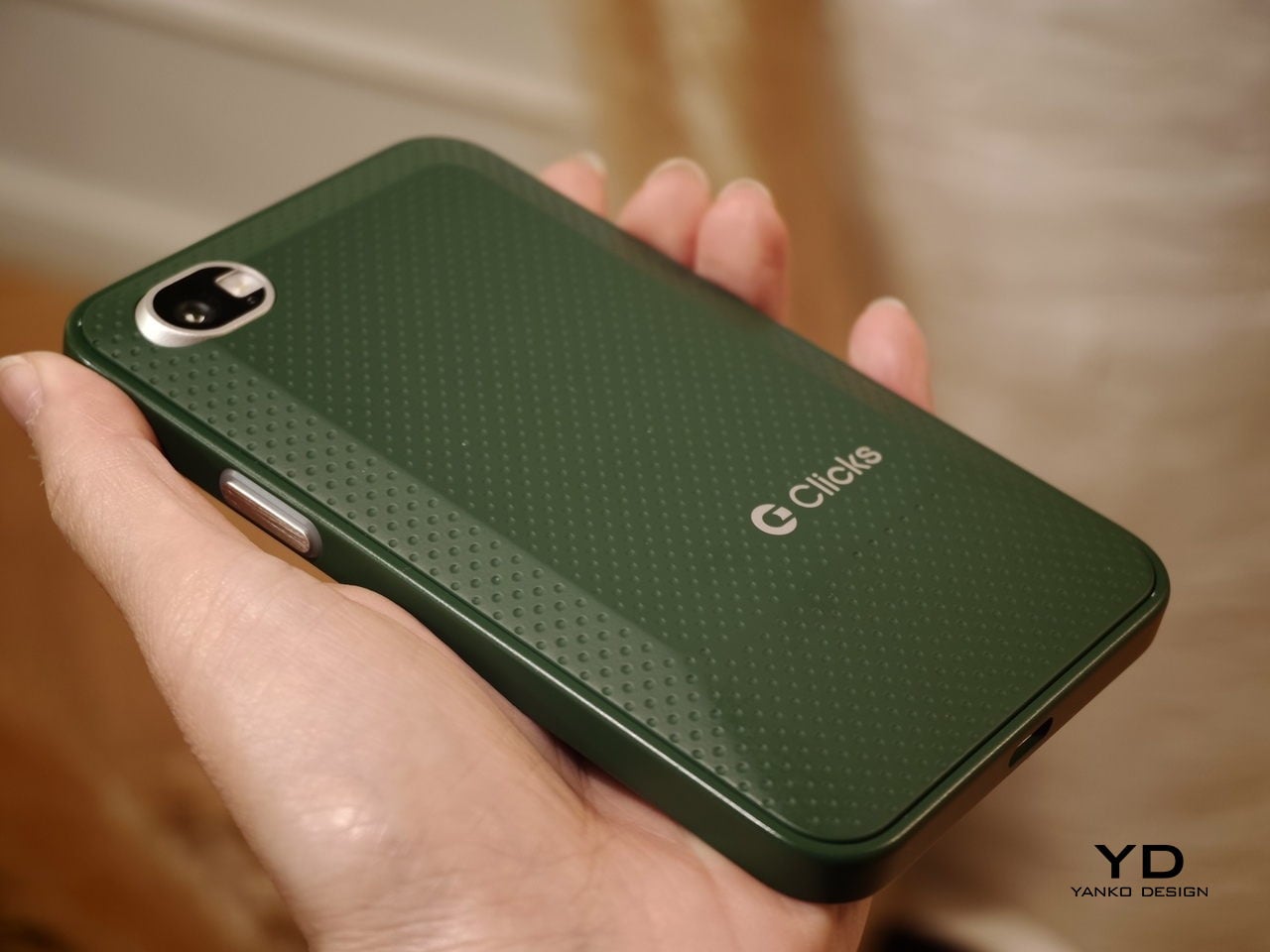
The build felt solid, even in mockup form. One of the most interesting design touches is a magnetic, swappable back panel that snaps on with a confident fit. That modular detail gives the phone a more personal, tool-like vibe, and it suggests Clicks is thinking about long-term ownership rather than quick upgrades.

According to Adrian Li, founder and CEO of Clicks, the Communicator has generated significant interest from the industry over the past few months. Li said the company has been approached by several mobile carriers as well as major retailers that are interested in bringing the device to market. For a young hardware company entering the competitive smartphone space, that attention could be critical.

Carrier partnerships in particular could play a decisive role in the Communicator’s success. While some niche smartphones rely primarily on direct online sales, carrier support can expand a device’s reach through retail stores and bundled service plans. Li noted that Clicks is currently in discussions with potential carrier partners as it explores different distribution strategies for the phone.

Although the prototype shown at MWC was not yet fully functional, the hardware design already reflects the Communicator’s core idea of efficient communication. The device features a compact 4-inch class AMOLED display positioned above a physical backlit QWERTY keyboard. The keyboard is designed to deliver tactile feedback for fast, accurate typing, and it also supports gesture controls for scrolling and navigation.

Under the hood, the Communicator is powered by MediaTek’s Dimensity 8300 processor and runs Android 16. That combination should provide access to the full Android app ecosystem while keeping the experience centered on messaging and productivity. The phone is expected to ship with 256GB of internal storage and support microSD expansion of up to 2TB, which is increasingly rare in modern smartphones.

The rest of the hardware stays firmly in modern smartphone territory. The Communicator includes a 50 MP rear camera with optical image stabilization, plus a 24 MP front camera for video calls and selfies. A 4,000 mAh silicon carbon battery powers the device, with support for USB-C charging and Qi2 wireless charging.

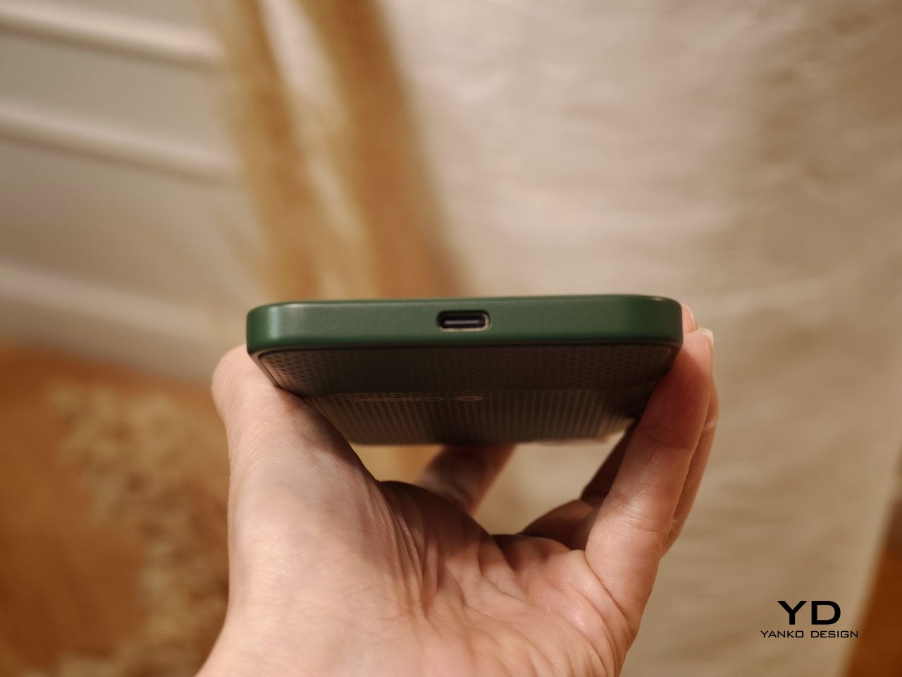
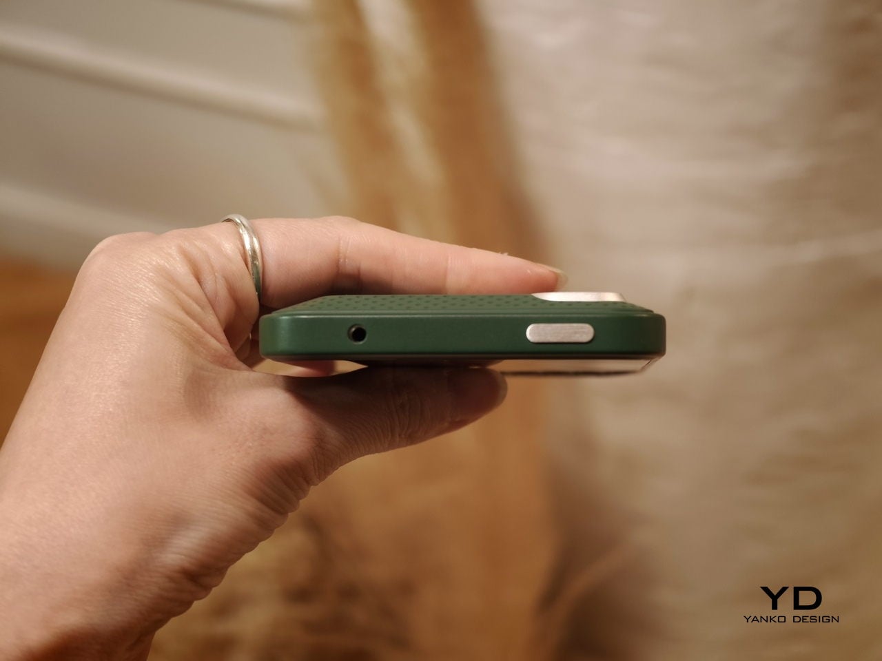
Connectivity options include 5G, Wi Fi 6, Bluetooth, and NFC. A combination of nano SIM and eSIM support gives users flexibility when choosing carriers. The Communicator also retains a 3.5mm headphone jack, which will matter to power users and anyone who still prefers wired audio.

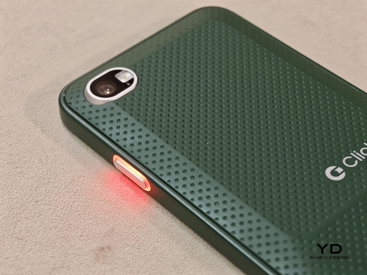
Clicks is building several software features around the phone’s communication first pitch. The device includes a Message Hub that aggregates conversations from multiple messaging platforms into a single interface, which should reduce app hopping. A customizable notification light known as the Signal LED can display different colors depending on which contact or app is reaching out.

Despite its productivity focus, the Communicator is not meant to be a limited-function device. Clicks positions it as either a primary smartphone for users who prioritize messaging or a secondary device that complements a larger entertainment-focused phone. That flexibility could be a key part of its appeal, especially for people who want a more focused tool without giving up modern apps.

As for when the Communicator will reach consumers, Clicks says more information is coming soon. According to the company, the official launch date will be revealed in roughly two months. Until then, the Communicator remains in the promising middle ground between concept and product.

For now, the Communicator blends nostalgia with modern smartphone capabilities in a way that feels deliberate rather than gimmicky. The compact in-hand feel, comfortable typing, and sturdy build are encouraging signs, even if this was not yet a final unit. If carrier and retail interest continues to build, Clicks may be on track to ship a device that serves people who still value fast typing and focused communication in an increasingly distraction-heavy mobile world.

The post Carriers Want This BlackBerry-Style Phone – I Tried It at MWC first appeared on Yanko Design.

Samsung Galaxy S26 Ultra: The Screen Only You Can See

There’s a persistent assumption in consumer electronics that meaningful progress requires visible transformation. A radically different silhouette, a feature so obvious it photographs well from across a room, something that immediately signals newness. Samsung’s Galaxy S26 Ultra challenges that assumption with something more interesting: a collection of refinements so carefully layered that the cumulative effect only reveals itself through sustained daily use.

The Ultra hasn’t been redesigned. It’s been recalibrated. And the distinction matters more than it might seem at first glance.

What Samsung has done with the S26 Ultra is treat the flagship phone as an ergonomic system rather than a feature delivery vehicle. Every change, from the slimmed-down profile to the pixel-level privacy controls, connects back to how the device behaves in your hand, in your pocket, in your line of sight. It’s the kind of design work that doesn’t announce itself on a spec sheet but becomes impossible to ignore after 48 hours of use.

The thinnest Ultra Samsung has ever built

At 7.9mm, the S26 Ultra is the slimmest flagship Samsung has produced. That number doesn’t exist in isolation. It’s the result of internal architecture decisions that ripple outward into how the phone actually feels during a full day of use.
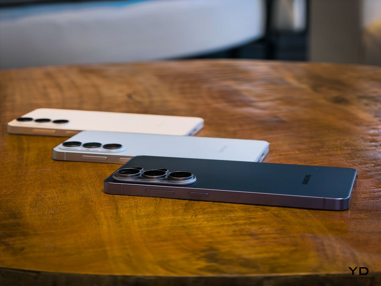
Pick it up and the first thing you register isn’t thinness as a visual quality. It’s grip confidence. The reduced profile means your fingers wrap slightly further around the frame, creating a more secure hold that you notice most during one-handed texting or scrolling through a feed while standing on a train. Samsung hasn’t just shaved material away. The engineering team has redistributed internal volume, moving the redesigned vapor chamber and battery architecture into a layout that achieves the thinner profile without the hollow, fragile sensation that plagued earlier slim-phone experiments from other manufacturers.

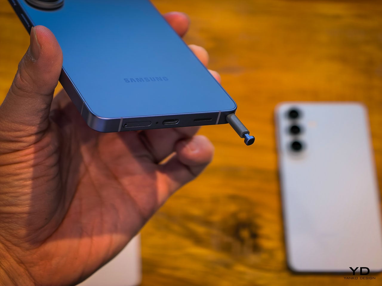
This generation marks a notable material shift. Samsung moved from titanium on the S25 Ultra to armor aluminum on the S26 Ultra, and it’s the strongest aluminum alloy Samsung has ever produced for a phone frame. That decision contributes directly to the sensation of structural seriousness. There’s a density to the frame that communicates durability without adding bulk. When you set the phone down on a hard surface, it lands with a satisfying weight that feels proportional to the screen size. Gorilla Armor 2 on the front continues Samsung’s partnership with Corning, and while scratch resistance is hard to evaluate in a hands-on window, the glass has a slightly different optical quality compared to last generation. Colors appear to sit closer to the surface.
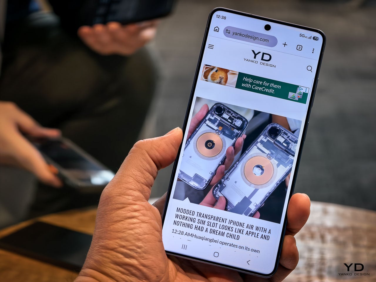
Cobalt Violet and the case for restrained color

Samsung’s hero color for the S26 Ultra is Cobalt Violet, and it’s genuinely well considered. This isn’t the saturated purple that consumer electronics brands typically reach for when they want to signal personality. It’s muted, almost mineral, closer to what you’d expect from anodized titanium that’s been treated with a violet oxide layer than anything you’d find in a paint swatch.
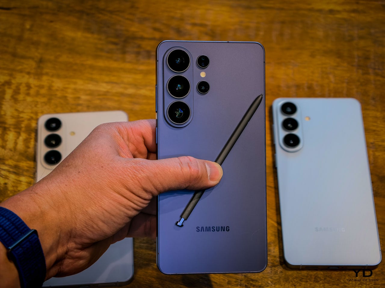
The color shifts meaningfully under different lighting conditions. Warm indoor light pulls it toward a dusty mauve. Direct sunlight brings out a cooler, more metallic character. It’s the kind of finish that photographs differently every time, which is exactly what a design-conscious audience will appreciate.
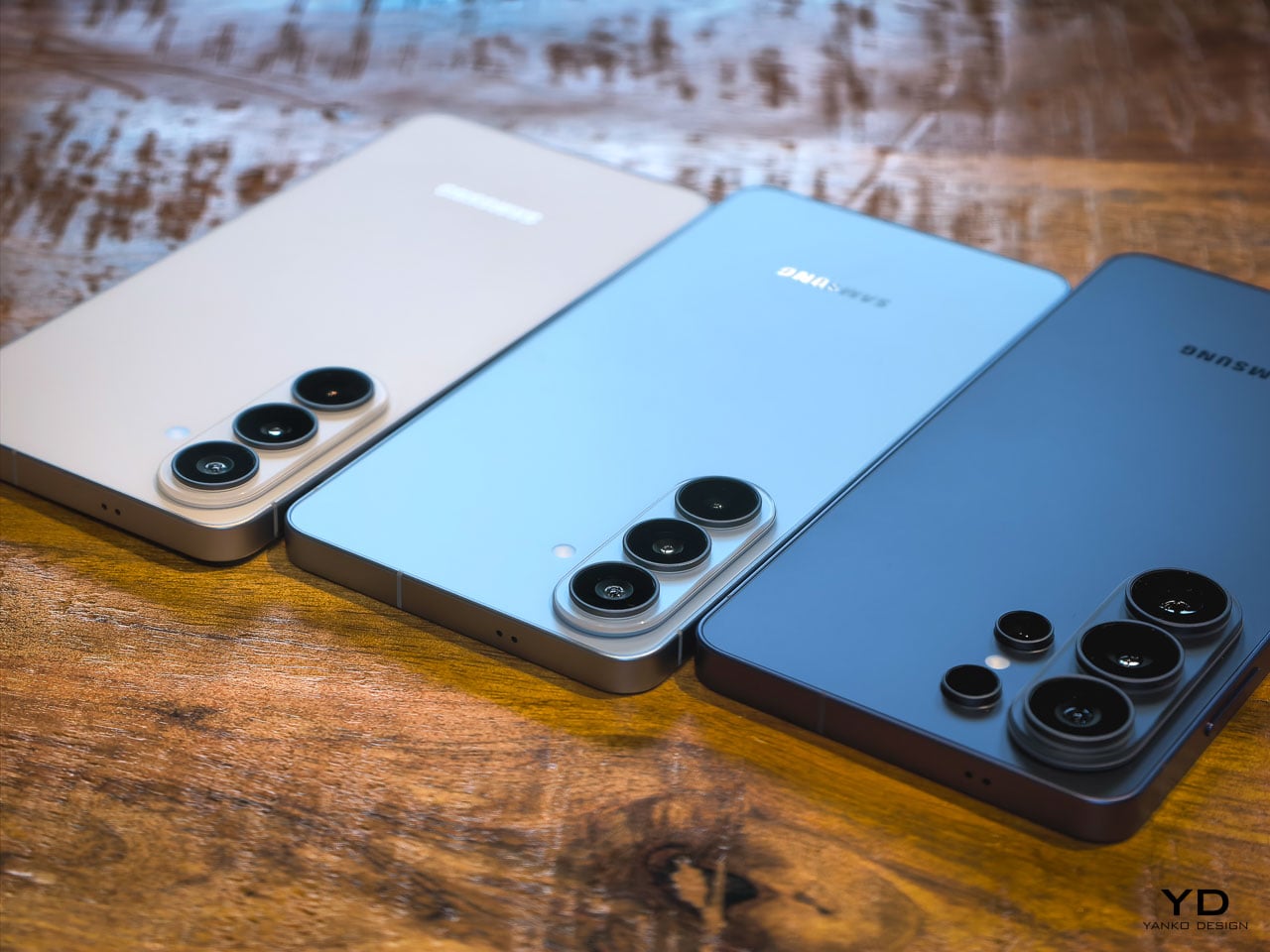
White, Sky Blue, and Black round out the options, but Cobalt Violet is doing the heavy conceptual lifting here. It signals that Samsung’s color team is thinking about surface treatment as material expression rather than trend chasing. When you pair it with the unified design language that now runs across the entire S26 family (the Ultra, the Plus, and the standard model all share proportional relationships and material cues), it becomes clear that Samsung is building a product design system rather than just iterating on individual devices.
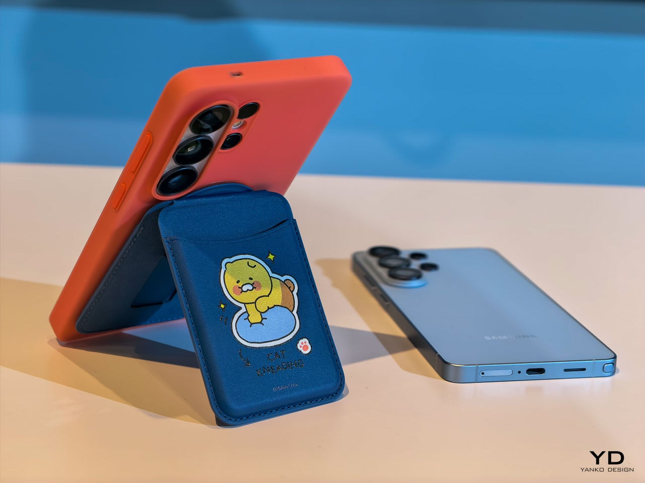
The introduction of a magnetic case ecosystem is worth noting in this context. Samsung deliberately kept magnets out of the devices themselves, routing all magnetic compatibility through the case layer instead. That’s a conscious trade-off: it preserves the slim profile and weight targets that the engineering team fought for while still enabling MagSafe-style accessory attachment. Whether that ecosystem develops into something as robust as Apple’s approach remains an open question, but the architectural intent is clear. Samsung wants the accessory conversation without the hardware penalty.

Privacy Display: solving a problem at the pixel level

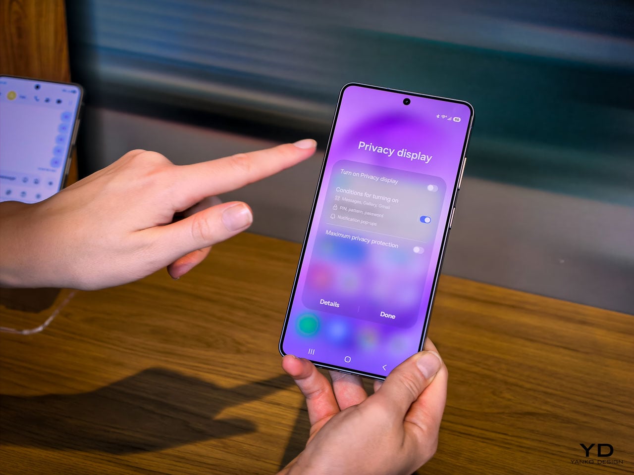
The feature that warrants the most design analysis on the S26 Ultra is the Privacy Display, and it’s exclusive to this model. Samsung calls it the world’s first mobile implementation, and they spent five years developing it.
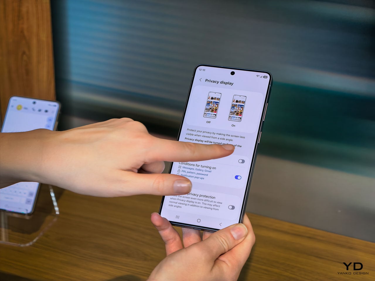
Here’s what it does: at the pixel level, the display can restrict the viewing angle so that someone standing beside you or slightly behind you sees a darkened, unreadable screen while your direct line of sight remains completely unaffected. The restriction works in both portrait and landscape orientations, which matters if you’re watching a video sideways or scrolling in landscape mode on a plane. It’s not a screen filter. It’s not software dimming. It’s the panel itself behaving differently based on the angle of emitted light.
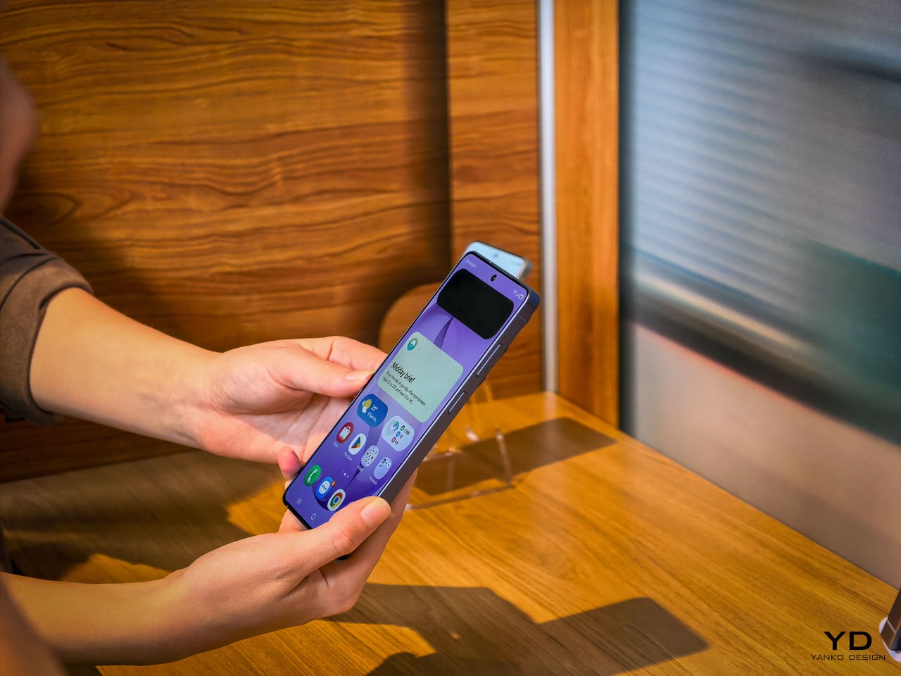
The customization layer is where this gets genuinely interesting from a UX perspective. You can configure Privacy Display on a per-app basis. Banking and messaging apps stay private by default, while maps or music playback remain fully visible. Selective notification privacy means incoming alerts can be restricted to your viewing angle without blanking the entire display. Password protection adds another layer for sensitive use cases.

This is a fundamentally different approach to screen privacy than anything the market currently offers. The existing solutions are adhesive film overlays or software-based brightness manipulation, both of which degrade the visual experience for the primary user. Samsung’s implementation doesn’t compromise display quality at your natural viewing angle. The 10-bit panel still renders its full billion-color range. Pro Scaler still does its work. You’re not trading visual fidelity for privacy, and that’s a meaningful engineering achievement.
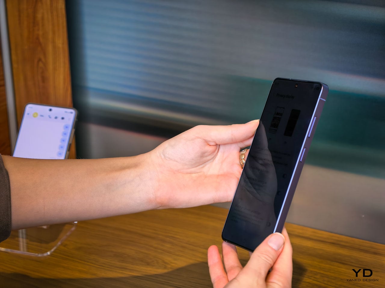
Activation is deliberately frictionless. A double-click on the side key toggles Privacy Display on or off instantly. Samsung has also integrated it into the Routines system, so you can set geolocation triggers: the display automatically activates privacy mode when you arrive at a coffee shop, an airport, or your office, and deactivates when you’re home. It’s the kind of contextual intelligence that makes the feature feel native to how people actually move through their day rather than something you have to remember to toggle.

The battery story is actually a pleasant surprise. Samsung confirmed that Privacy Display doesn’t drain additional power, and if anything, it can improve battery life since the feature restricts light output to a narrower viewing cone rather than broadcasting at full brightness in all directions. The hardware operates independently of any network connection since the privacy logic lives entirely within the display itself, not in cloud processing or software overlays. That independence means the feature works identically in airplane mode, in a dead zone, or on a fully connected 5G network.

For daily ergonomics, this matters in ways that aren’t immediately obvious. Think about every time you’ve tilted your phone away from a seatmate on an airplane, or cupped your hand around the screen while typing a password in a coffee shop. Those micro-adjustments are unconscious ergonomic compromises. Privacy Display eliminates them entirely. You hold the phone naturally, at whatever angle feels comfortable, and the technology handles the rest. Over a full day, the absence of those small physical accommodations adds up to a more relaxed relationship with the device.

Camera: precision over reinvention

The camera system on the S26 Ultra follows the same philosophy that runs through the rest of the device. No dramatic sensor swaps or wild new focal lengths. Instead, Samsung has focused on the optical and computational areas that affect the most common shooting scenarios.

The ultra-wide lens now captures 47% more light than the S25 Ultra’s equivalent. That’s a significant improvement for the lens that most people use in tight indoor spaces, group shots, and architectural photography. More light means faster shutter speeds in marginal conditions, which translates to less motion blur and more consistent detail in the frame edges where ultra-wide lenses typically struggle.
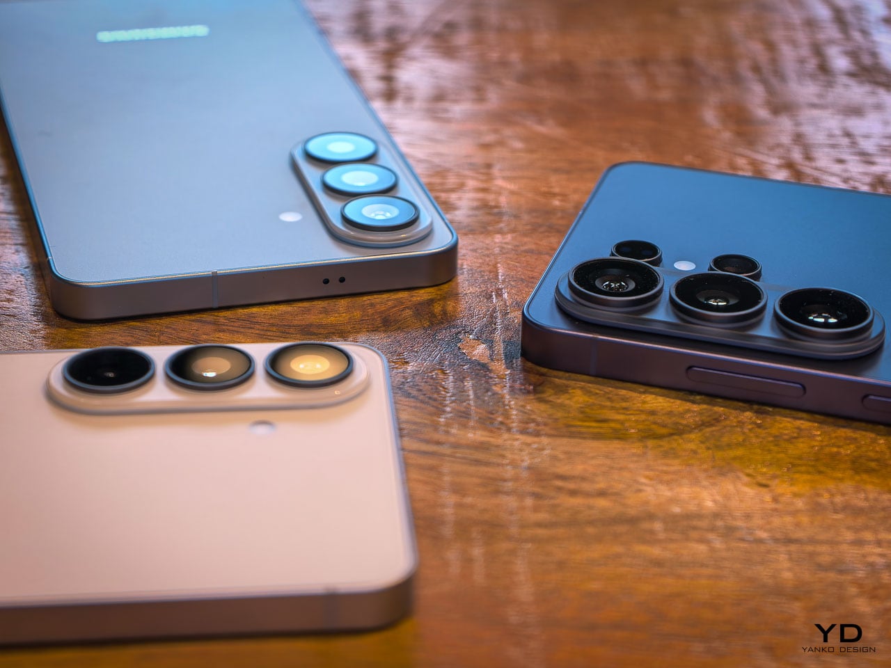
The front camera tells a similar story of targeted improvement. At 50MP with a 37% brightness increase and an 85-degree field of view, Samsung has addressed the three most common complaints about flagship selfie cameras: resolution in challenging light, dynamic range when the subject is backlit, and the inability to fit a full group without awkward arm extensions. The addition of AI ISP processing to the front camera is notable because it means computational photography features that were previously reserved for rear cameras now apply to video calls and social content.

Enhanced Nightography takes a physics-based approach to video noise reduction this year, recognizing that each lens produces different noise patterns and applying pre-trained filters calibrated to the specific optical characteristics of each camera module. The result is cleaner low-light video across all rear lenses, not just the primary sensor.
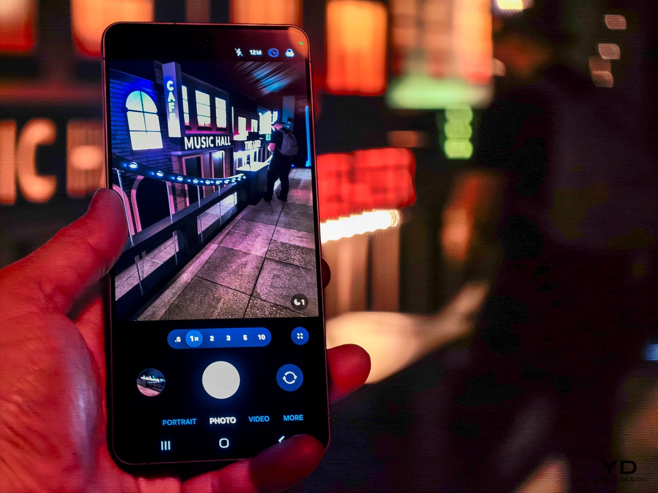
Video capabilities push further into professional territory with the Advanced Pro Video Codec, an Ultra exclusive that enables 8K recording at 30 frames per second. The 4K auto-framing feature uses AI to track and recompose subjects during recording, which is genuinely useful for solo content creators who can’t operate a camera and perform at the same time. SuperSteady stabilization now uses real-time gyro and accelerometer data to deliver a full 360-degree horizon lock during recording. Samsung describes it as having a gimbal in your pocket, and while that’s marketing shorthand, the underlying sensor fusion approach is legitimate stabilization engineering.
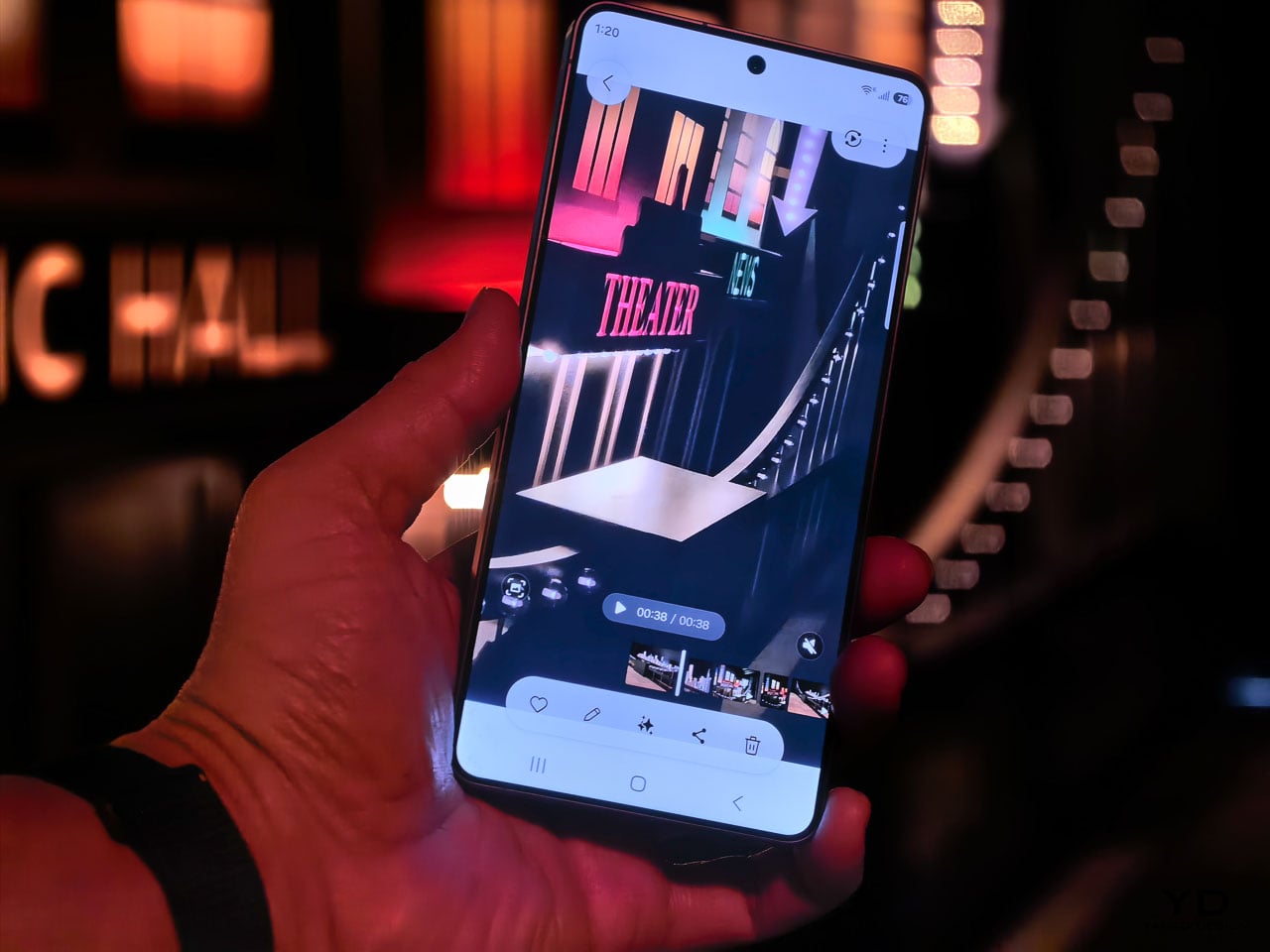
Audio Eraser now extends to third-party apps, but with an important clarification: it affects playback consumption only. You can toggle it from the quick panel to clean up background noise while watching content on Instagram, TikTok, YouTube, or Netflix. It won’t modify the actual recording or file in those apps. Document Scanner is another quiet addition built directly into the camera viewfinder. It automatically detects documents, removes fingers, moiré patterns, shadows, and creases, then outputs clean multi-page PDFs. It’s the kind of feature that eliminates a dedicated scanning app from your phone entirely.

These aren’t headline-grabbing camera changes. They’re the kind of improvements that reduce the number of shots you delete and increase the number you actually share. For daily use, that ratio matters more than any single spec number.

Galaxy AI and the agentic phone

The software story on the S26 series might be the most ambitious part of this generation, and it’s easy to overlook when the hardware changes are this well executed. Samsung has organized its AI features into three categories: agentic AI that takes action on your behalf, personal AI tailored to your habits, and adaptive AI that anticipates what you need before you ask.
NowWatch, built natively into the Samsung keyboard, reads your conversation context and suggests relevant actions in real time. Mention a dinner plan in a text thread and it can create a calendar event, pull location details, or share a contact card without you ever leaving the messaging app. NowBrief now connects directly to your notification stream, pulling event information from messages and alerts even when those events were never added to your calendar. These features work together to reduce the friction between a conversation and the action it implies.

Agentic actions go further. You can book an Uber ride through a natural language voice command, and Samsung has signaled plans to expand this capability to delivery services like DoorDash and Instacart. Circle to Search now supports multi-object recognition, so you can circle an entire outfit in a photo and search for each piece simultaneously. The AI can even let you virtually try items on, which blurs the line between search and shopping in a way that feels genuinely new.

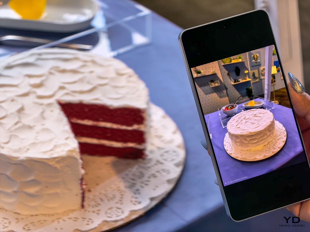
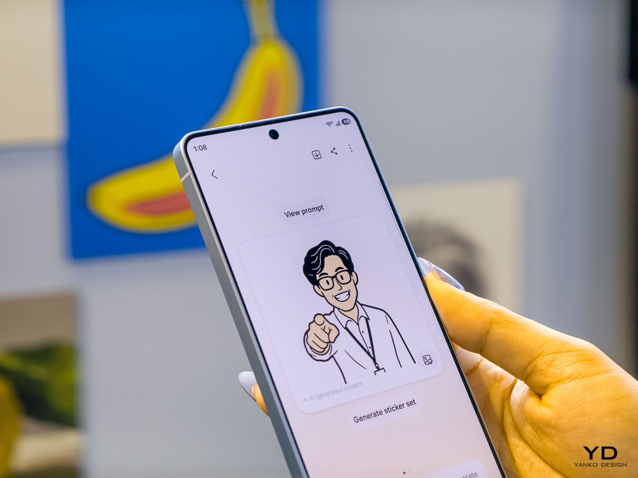
Photo Assist introduces natural language editing: tell the device to remove an object, change a background, or adjust a specific element, and the on-device AI processes the request. Multimodal editing takes this further by letting you reference other images in your gallery as part of the prompt. Ask it to composite a specific shirt onto your photo and it pulls from an existing gallery image to build the result. Creative Studio consolidates all AI creation tools into a single Edge panel location with guided workflows for stickers, greeting cards, invitations, and contact cards.
Bixby’s LLM upgrade positions it as a device-native companion that understands your phone’s settings, can explain features, and execute quick actions across the interface. During initial setup, users choose between Bixby, Gemini, and now Perplexity as their default AI agent. Perplexity can be summoned with a dedicated “Hey Plex” wake phrase or by pressing and holding the side button, and it’s embedded across Samsung Notes, Clock, Gallery, Reminder, Calendar, and select third-party apps. Samsung cited internal data showing nearly 8 in 10 users already rely on more than two types of AI agents depending on the task, which explains why the company is opening its AI layer to multiple providers rather than locking users into a single assistant. It’s a notable acknowledgment that different users want different AI philosophies guiding their daily experience. Bixby LLM also extends across Samsung’s ecosystem to TVs, watches, and other connected devices, creating a persistent assistant layer that follows you between screens.

Screenshot organization automatically categorizes captures into eight groups (coupons, events, shopping, and five others), which is a small productivity feature individually but represents Samsung’s bet that the phone should handle organizational work you currently do manually.

Call screening and scam protection

Two security-focused AI features deserve separate attention. Call Screening lets the AI answer incoming calls on your behalf, transcribe the conversation in real time, and deliver a summary of who called and why. The transcripts are searchable afterward, so you can retrieve information from screened calls even if you never picked up. That’s a meaningful shift in how missed calls work.

Scam Detection runs a separate AI analysis on active conversations, flagging suspected scams based on blacklisted numbers and suspicious language patterns. It’s a defensive layer that works alongside Samsung’s existing security stack, and it addresses a growing problem that traditional spam filters can’t solve on their own.

Performance architecture and charging

The Snapdragon 8 Elite Gen 5 inside the S26 Ultra represents the second generation of Samsung’s deepened co-engineering relationship with Qualcomm. Rather than simply dropping in the latest available silicon, Samsung’s hardware team has worked with Qualcomm on customizations specific to the Ultra’s thermal and power delivery profile. The NPU sees the largest year-over-year performance gains in the entire chipset, a direct response to the processing demands of on-device AI features that now run simultaneously across camera, language understanding, and system automation tasks.
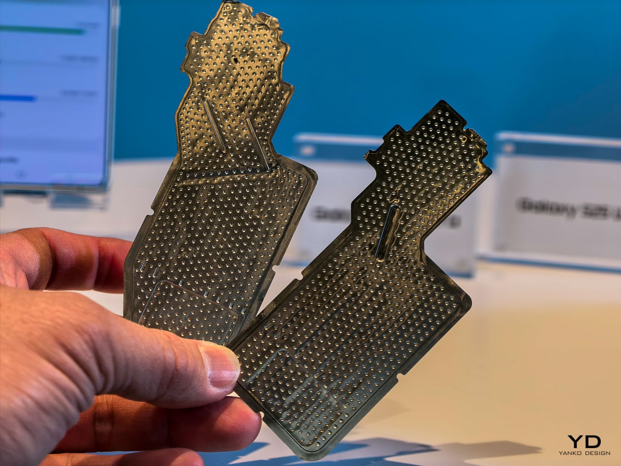
The redesigned vapor chamber cooling system is the physical expression of this partnership, and it deserves closer attention than the briefing materials gave it. Samsung confirmed the vapor chamber has been redesigned for better thermal management and sustained performance, but the engineering context tells a more interesting story than that summary suggests.

Achieving a more efficient cooling solution inside a body that’s simultaneously gotten thinner is a genuine packaging challenge. The vapor chamber in a smartphone works by spreading heat away from the processor through a sealed chamber containing a small amount of liquid that evaporates near the heat source and condenses at cooler areas, distributing thermal energy across a wider surface. Redesigning that system for the S26 Ultra’s slimmer 7.9mm chassis means Samsung’s thermal engineers had to rethink the chamber’s geometry, likely optimizing the internal wick structure and vapor flow paths to maintain or improve heat dissipation within tighter vertical constraints.
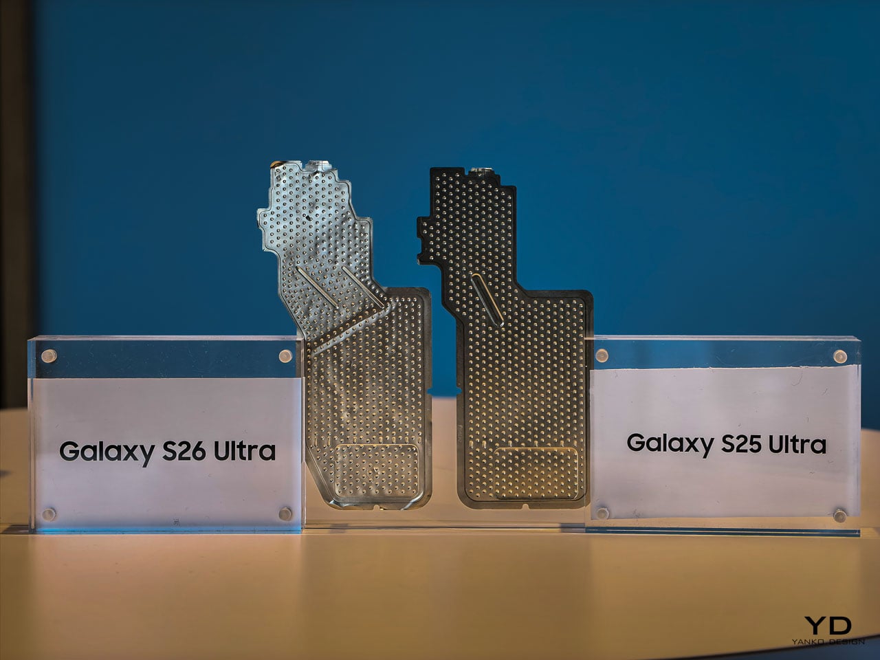
During hands-on time, the phone stayed comfortable to hold through extended camera sessions and quick multitasking demos. Whether the redesigned vapor chamber translates to measurably less thermal buildup than previous Ultra models will require longer, controlled testing. What we can say from the event floor: the S26 Ultra didn’t get noticeably warm in situations where earlier models would have started heating up. That’s promising, but the real thermal story will come from sustained workloads over days, not demo stations.

What’s particularly interesting from a design perspective is how this thermal architecture enables the rest of the S26 Ultra’s ambitions. The thinner profile, the sustained display brightness for Privacy Display, the 8K video recording, the larger NPU workloads for on-device AI processing: all of these features generate heat, and all of them depend on the vapor chamber doing its job silently and invisibly. It’s the kind of engineering that never gets mentioned in a product keynote but makes every other headline feature possible.
Charging speeds have stepped up to 60W wired, delivering 0 to 75% in 30 minutes. Wireless charging sits at 25W. Neither number leads the Android market, but Samsung’s approach here prioritizes battery longevity over charging speed records. It’s a mature engineering decision that aligns with the phone’s overall philosophy: optimize for sustained daily performance rather than benchmark peaks.

Sustainability as a material design decision

Ten recycled materials appear in the S26 Ultra’s construction, and Samsung is positioning this as a design choice rather than a compliance checkbox. When a manufacturer integrates recycled content at this scale in a premium device, the engineering challenge isn’t sourcing the materials. It’s maintaining the tactile and structural qualities that justify a $1,299.99 price point.
The armor aluminum frame, for instance, needs to feel exactly as dense and rigid as virgin material. The recycled content in the internal structural components can’t introduce resonance or flex that would change the acoustic signature of the haptic engine. These are the invisible constraints that make sustainability in premium electronics genuinely difficult, and getting them right while simultaneously achieving the thinnest Ultra profile is a real engineering accomplishment.

What this means for the flagship category

The Samsung Galaxy S26 Ultra makes a compelling argument that the most impactful smartphone upgrades aren’t the ones you see in a keynote highlight reel. They’re the ones you feel after a week of putting the phone in your pocket, holding it during calls, reading on it in a crowded subway car, and editing photos before posting them.
Privacy Display alone changes your physical relationship with the device by removing unconscious posture adjustments you didn’t realize you were making. The thinner profile improves grip confidence in a way that reduces the frequency of readjustment micro-movements. Pro Scaler makes screen content feel more present and dimensionally accurate, which reduces eye strain during extended reading sessions. Better low-light camera performance means fewer retakes and less time fussing with settings.

None of these improvements would trend on social media. All of them compound into a measurably better experience across a typical day. That’s the thesis Samsung is presenting with the S26 Ultra, and based on hands-on time, it’s a convincing one.

Pre-orders open February 25 at $1,299.99, with availability starting March 1. The Cobalt Violet colorway is the one to see in person before deciding.

The post Samsung Galaxy S26 Ultra: The Screen Only You Can See first appeared on Yanko Design.
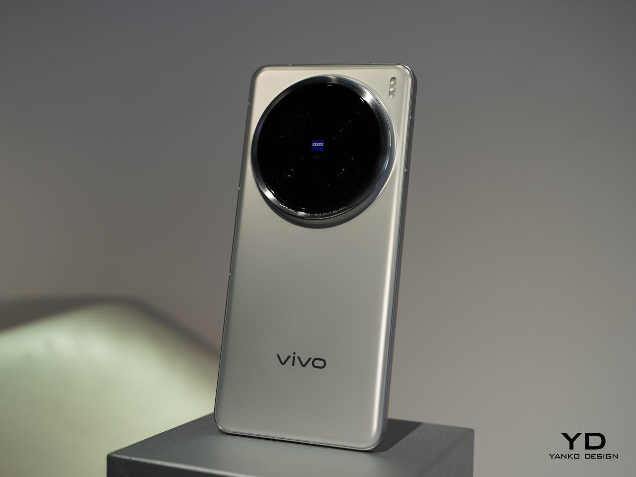
vivo X200 Series Hands-On: For Concerts and Nature Adventures

Smartphones have pretty much become more than just communication tools, at least in the traditional sense. We still use it to connect with others, especially via the Internet, but we do so more through images and multimedia, whether they’re the ones we capture ourselves or generated by an app. Cameras and AI have become the focal points of these devices today, no pun intended, and vivo is pressing three new smartphones under its X200 series, all equipped with the latest and greatest innovations promising the ultimate user experience.

Designer: vivo

Design: Nature-inspired, Classic Looks

If you simply compared them with the X100 phones at the start of the year, you might walk away disappointed. That said, the vivo X200 opted to ignore flashy novelties that wear off in a few weeks, preferring designs that stand the test of time. And what better way to embrace evergreen designs than taking a page from the most evergreen design of all: nature.

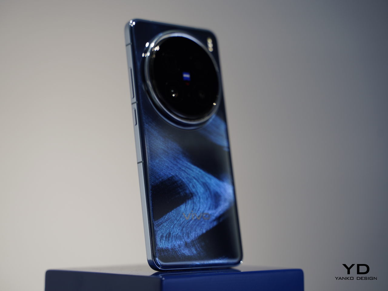
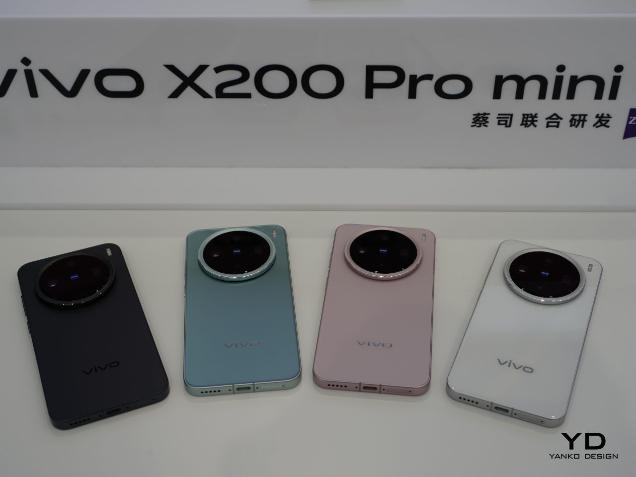
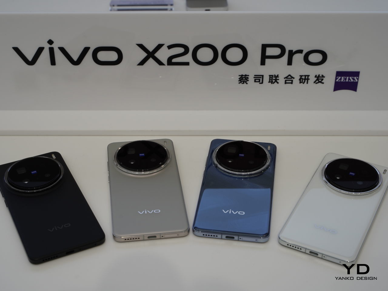
The vivo X200 Pro’s new Sapphire Blue colorway, for example, has patterns that seem to recreate the enchanting ocean waves on the back of your phone. The vivo X200 Pro mini’s Light Pink, on the other hand, is a nod to the romantic colors of cherry blossoms. Whichever color you pick, you will have a stylish and elegant phone in your hand.

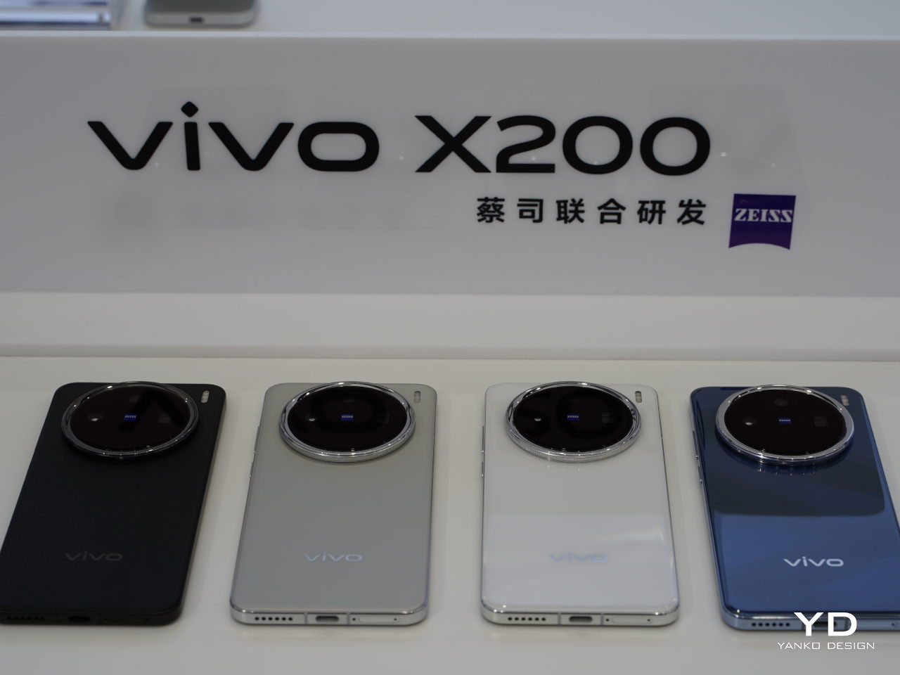
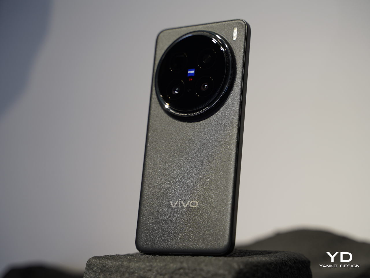
The vivo X200 Pro mini adopts the current design trends with its flat 6.31-inch screen and flat edges, giving it a more modern personality. In contrast, the vivo X200 and X200 Pro stick to tradition with a “Quad Curved Screen” and gentle slopes on all sides and corners. All models of the X200 series are enhanced with ZEISS Natural Color, expanding the collaboration between brands beyond cameras.

Power: New Ways to Communicate

The vivo X200 series is powered by the newly-baked MediaTek Dimensity 9400 processor, the chipmaker’s first 3nm process, to deliver unmatched power and power efficiency. While that already translates to a huge performance boost, most users will probably be interested in how it greatly improves AI performance across the board, from the usual photography touch-ups to popular applications like AI note-taking and, of course, Circle to Search.

Completely new to the X200 series is a kilometer-level network-free communication technology, a product of its close collaboration with MediaTek. This would allow long-distance communication via Bluetooth even when cellular networks are unavailable but without relying on satellite technology. Sending text messages, making voice calls, or even broadcasting SOS signals in extreme environments like mountains and forests are critical features that will make outdoor adventures safer and more enjoyable using these phones.

Cameras: Zooming to the Scene

Of course, photography is a major piece of the X200 series formula, and it’s where vivo flexes its muscle the most. On the vivo X200 Pro, the roster is led by a Sony LYT-818, a 1/1.28-inch sensor that, paired with an f/1.57 aperture lens, is advertised to rival even larger 1-inch sensors. Together with the custom V3+ Imaging Chip, the X200 Pro is promised to deliver not only captivating still photos but also cinematic videos.

Portrait mode, 35mm

Portrait mode, 50mm

Portrait mode, 85mm

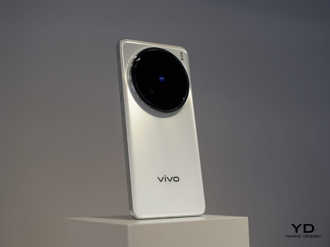
The real star of the show, however, is probably the 200MP ZEISS APO Telephoto camera, capable of up to 100x zoom, making short work of capturing live events like concerts. In addition to 85mm HD portraits, this camera is also capable of the new 135mm portrait focal length as well. A Telephoto Macro feature with a magnification ratio of 20x for stunning closeups of nature.

Macro, 3.5x (85mm)

Macro, 7.4x (170mm)

All in all, the vivo X200 series delivers quite a potent package that tries to serve the sub-$800 market. With impressive photography capabilities, innovative features, and a classic, nature-inspired design, vivo is aiming to strike a chord with an audience that loves living in the moment, whether it’s in concerts, live events, a nature trek, or an outdoor adventure.

The post vivo X200 Series Hands-On: For Concerts and Nature Adventures first appeared on Yanko Design.
2024 Cadillac Lyriq Review

PROS:


  • Premium feel

  • Excellent ride quality

  • Distinctive look

CONS:


  • Premium pricing

  • Disappointing seats

  • Distinctive look

RATINGS:

AESTHETICS
ERGONOMICS
PERFORMANCE
VALUE FOR MONEY

EDITOR'S QUOTE:

The Lyriq stands out in many ways, not the least of which for its unconventional shape and tangible air of refinement about it.

While the fates are falling most strongly against sedans as people trend towards SUVs, station wagons aren’t exactly finding any more favor in the American market. Only a choice few remain available for purchase, stalwarts from Subaru and Volvo appealing to a buyer with a greater desire for practicality than concerns about what’s trendy.

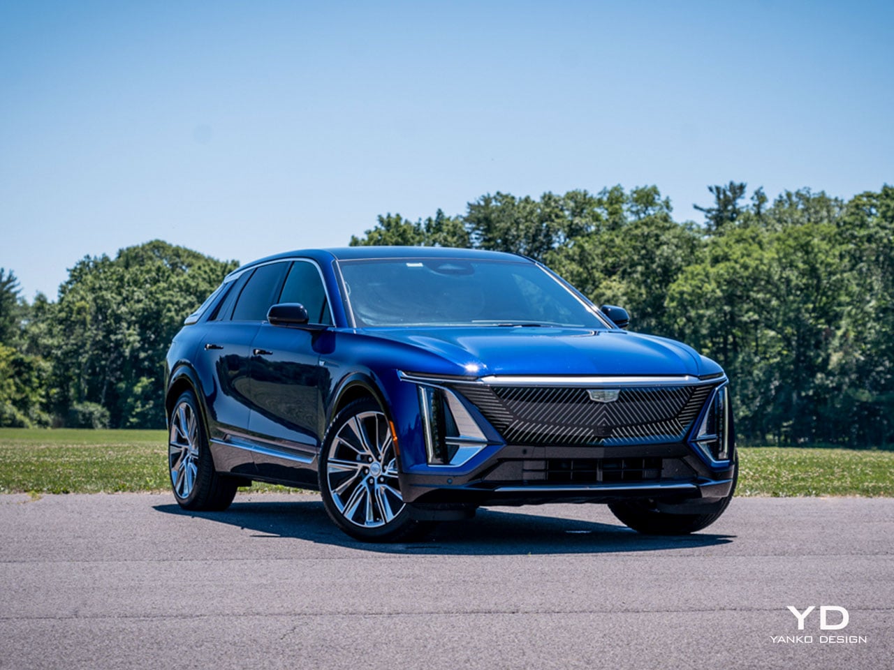
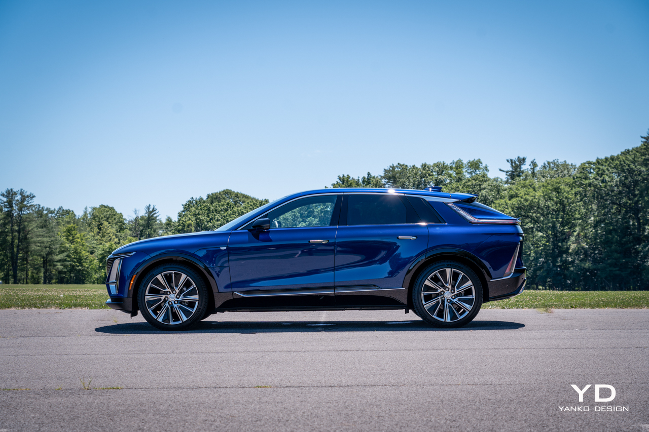
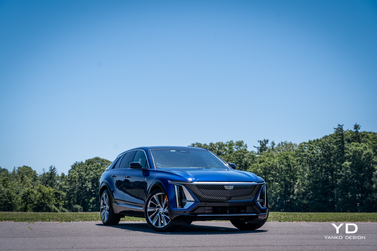
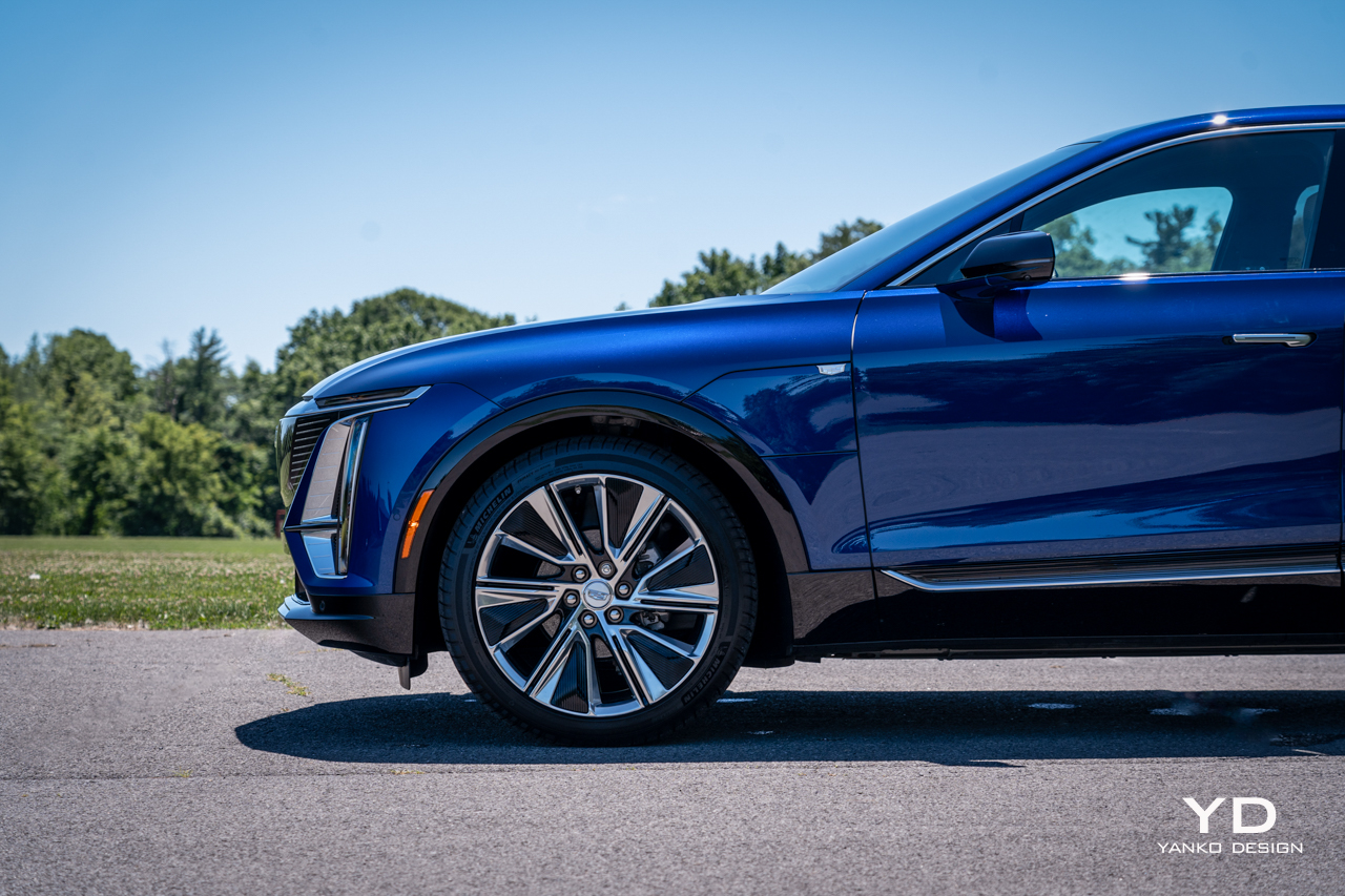
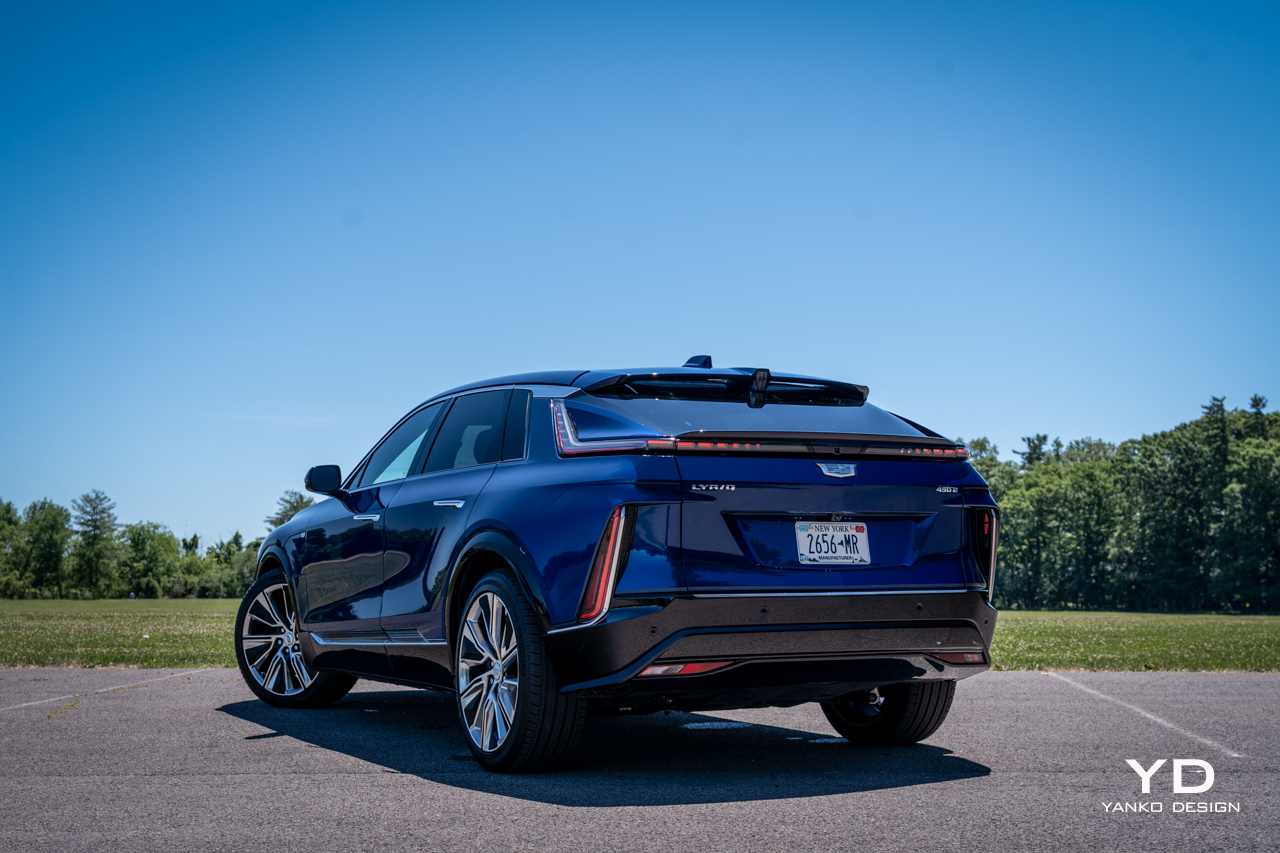
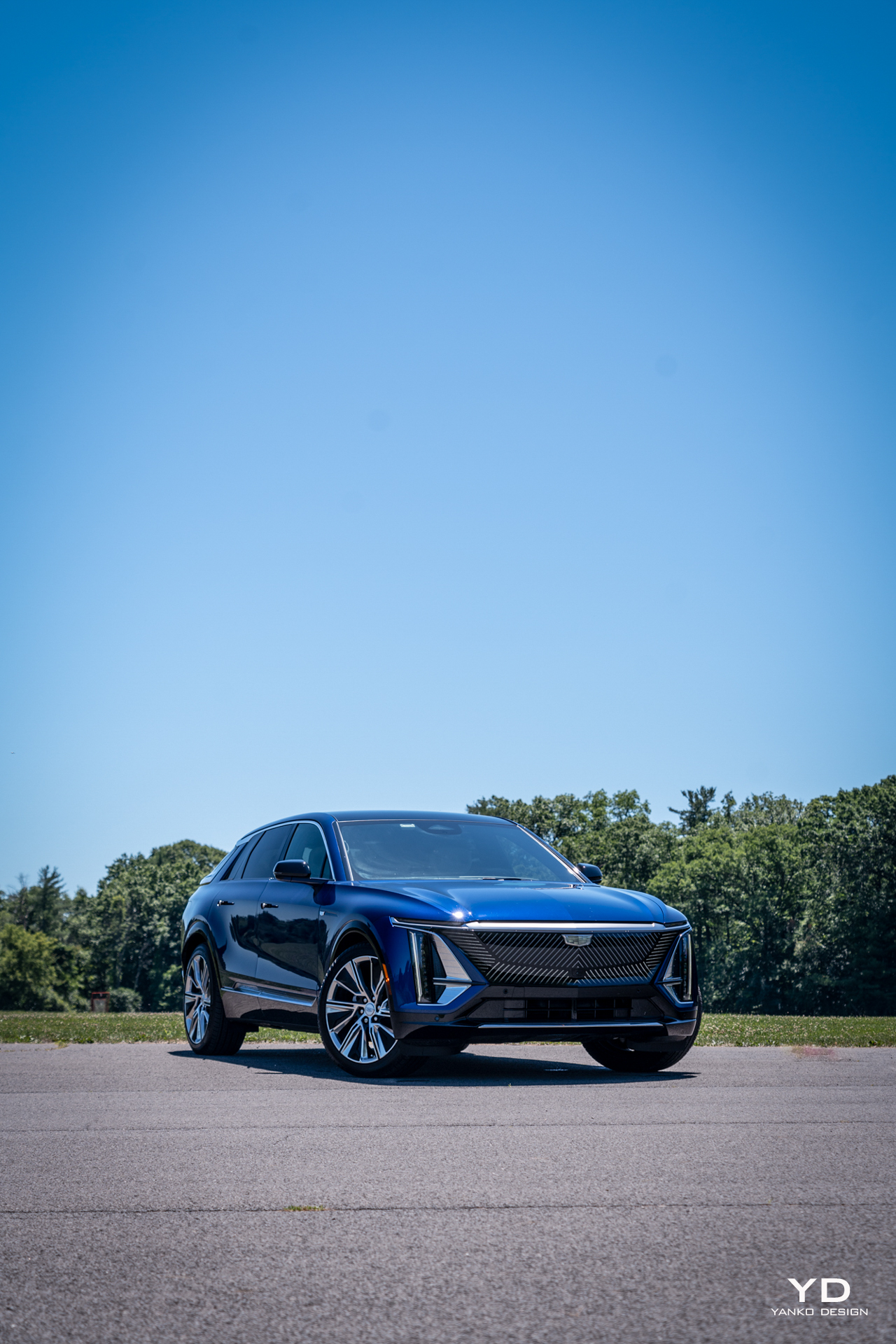
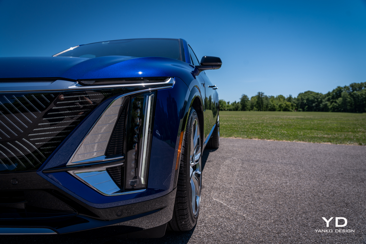
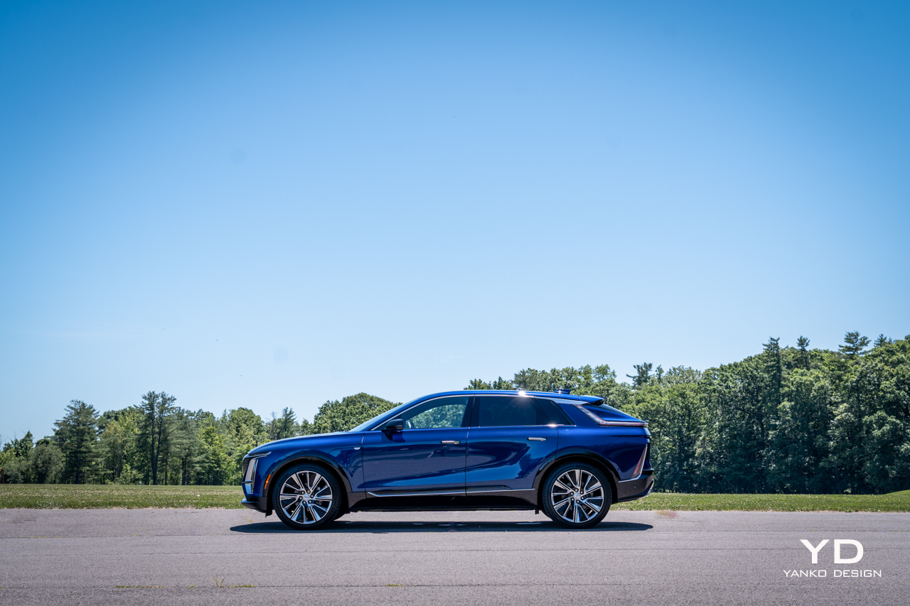
But what’s this from Cadillac? Check the paperwork: The Lyriq is officially listed as an SUV, but ever so slightly lifted proportions can’t hide the fact that this is very much a wagon. And what a wagon at that. Measuring nearly 200 inches long, it has an impressive presence for a design that’s, well, different from anything else on the road.

This is the closest thing Cadillac has to a halo car right now, a statement of intent for the brand’s electrified future. It’s riddled with creative and charming touches and has some serious luxury chops. But does it have the character and the performance to live up to that first impression?

Design

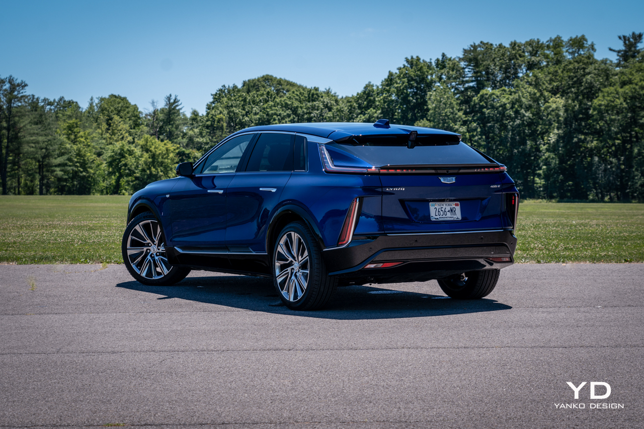
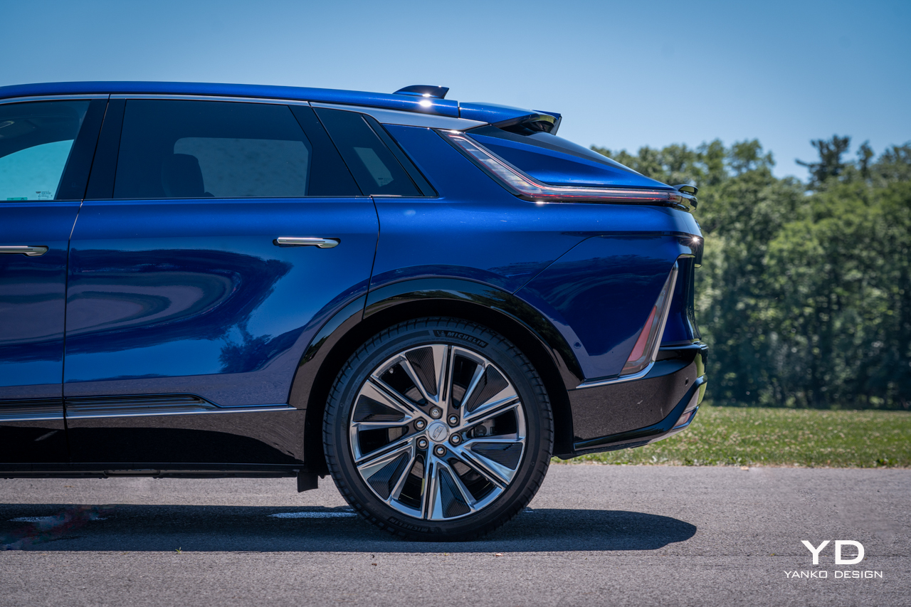
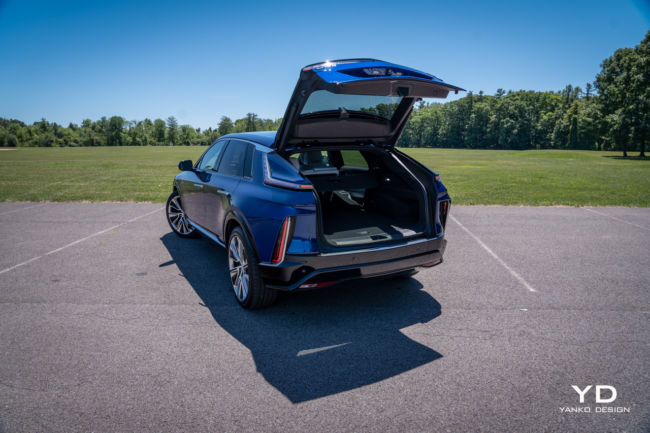
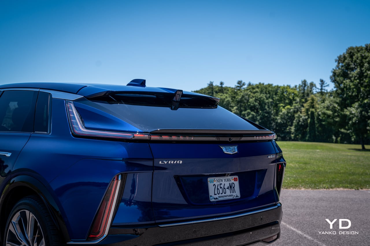
Lyriq is a beautiful name for a car with a shape that is a bit awkward, to put it kindly. Other, less flattering folks would call it ugly. I love a good wagon and have proudly owned them myself, but the somewhat bulbous shape out back of Cadillac’s big EV is just a little ungainly to my eye.

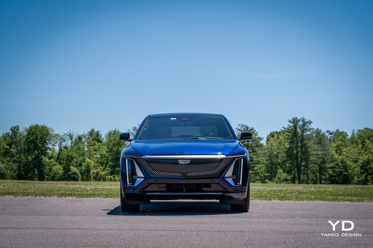
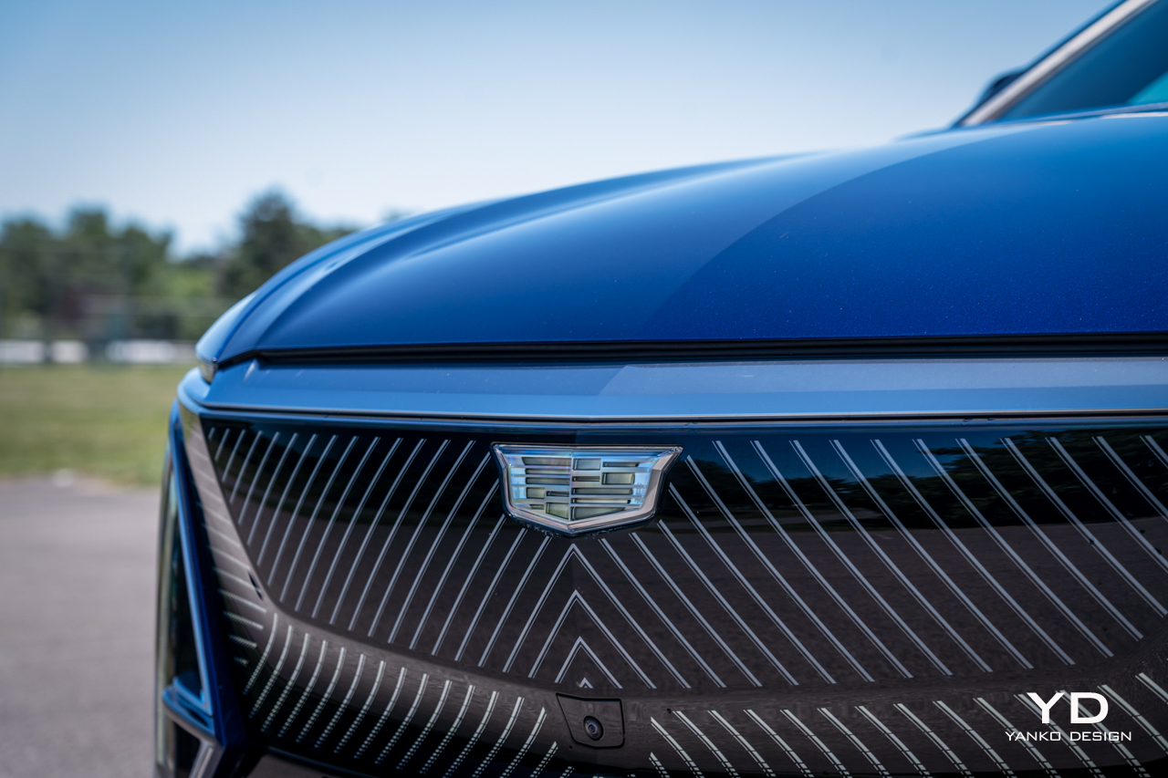
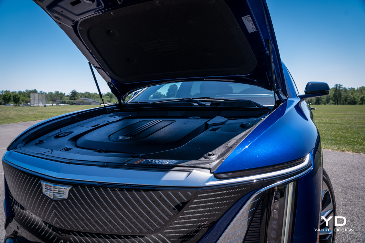
But look beyond the silhouette and you’ll discover endless design touches that conspire to perhaps make the car a bit busy, but interesting. The striking geometric pattern on the grille, framed by chrome-rimmed vertical lighting elements, provide a distinctive look from the front.

That’s echoed at the rear, with vertical strakes of red lighting marking the left and right extents of the rear bumper. A narrow band of illumination bisects the tailgate as well, forming the high beltline and abrupt posterior that defines the shape of the Lyriq.

It’s a distinctive car to say the least. Owners will surely be spotting new touches every time they approach the Lyriq for months after buying, and that’s a rarity these days.

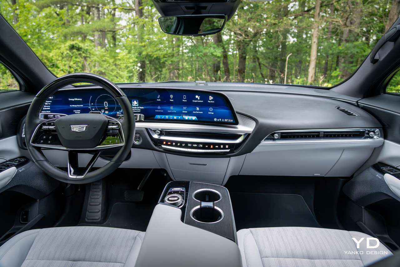
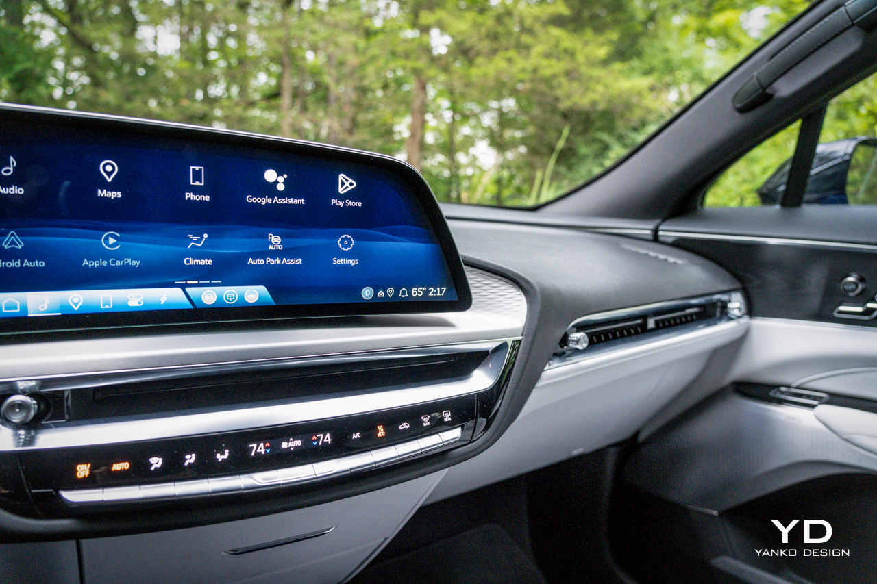
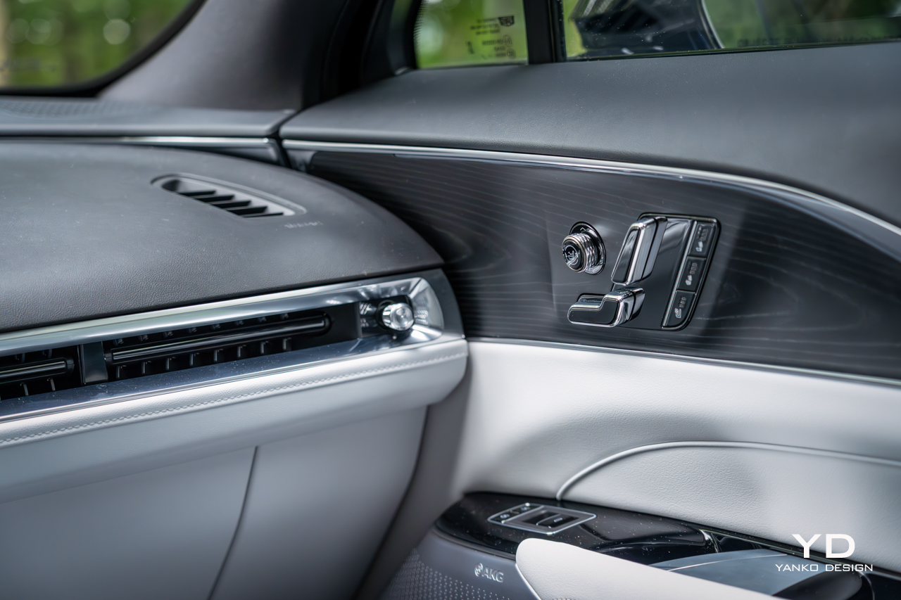
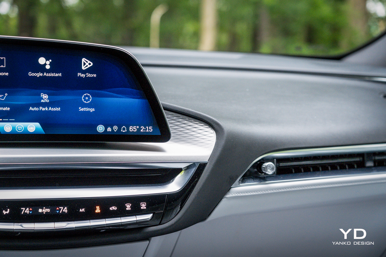
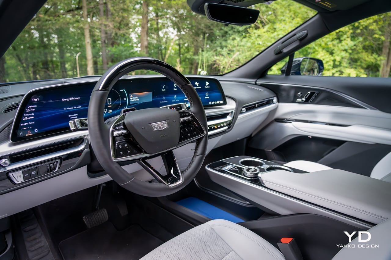
If anything the Lyriq’s interior is even more full of intriguing touches, making it feel a bit busy but, again, far from boring. The low dashboard is a mish-mash of sweeping, interlocking profiles, shapes, and textures. The subtle waffle texturing behind the floating display is a lovely, modern touch, but it’s a shame the bulk of the dashboard is covered with black vinyl imprinted with a dated-looking fake leather texture.

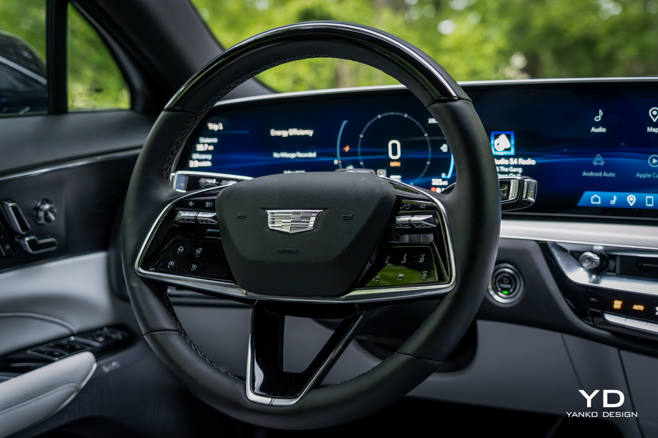
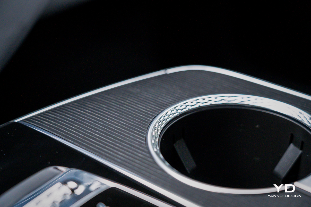
That floating display measures a massive 33 inches wide. It gives an overall look and feel similar to what BMW is doing these days in vehicles like the iX. The roller-style volume knob in the center console is also BMW-like, as is the eight-way rotary controller just behind it. All very iDrive-like, but Cadillac goes a step further by making not only the right side of the display capacitive touch, but the left side as well. Just like on a Lucid, you can touch the left of the gauge cluster to adjust lighting or view trip information.

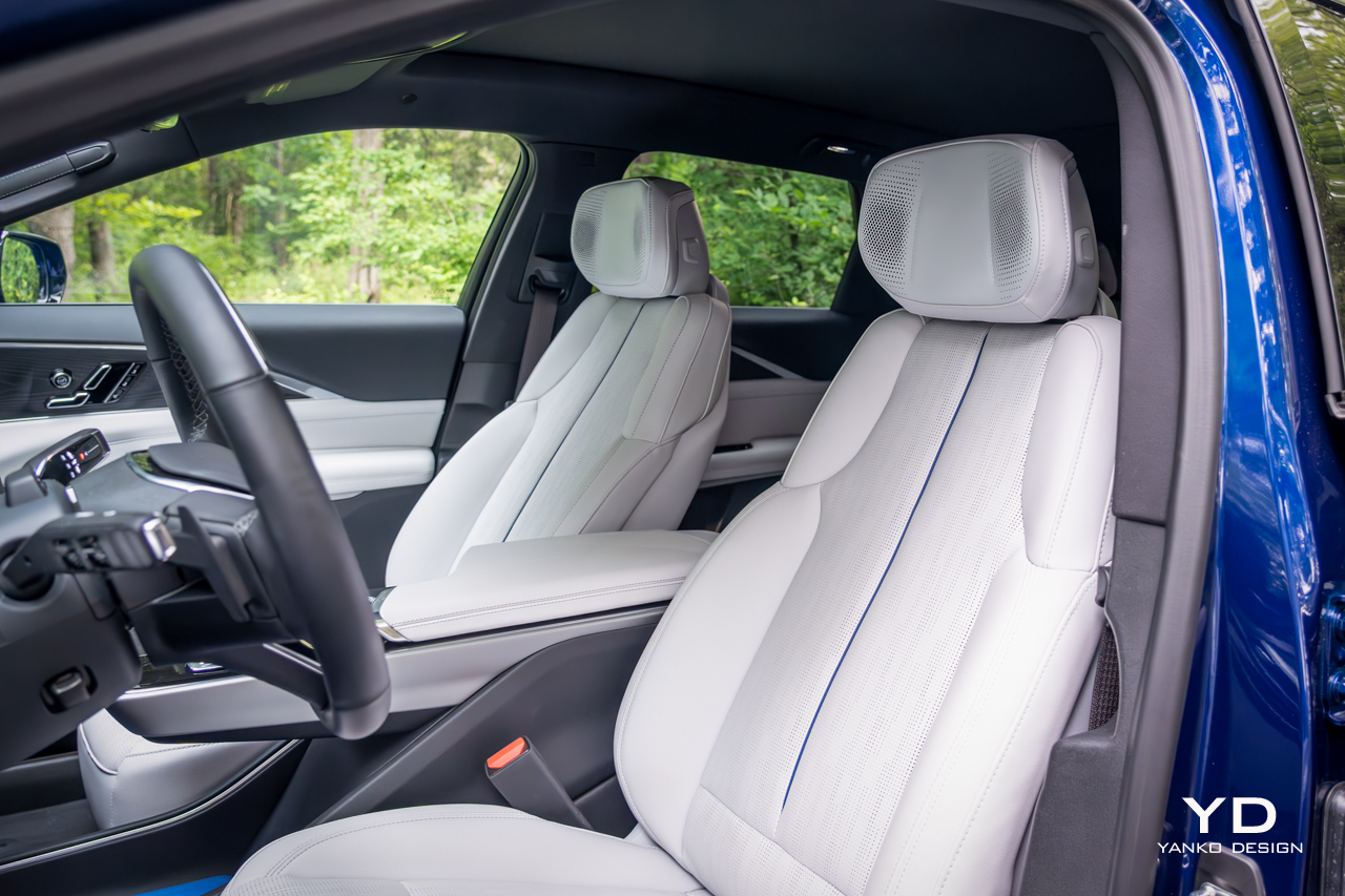
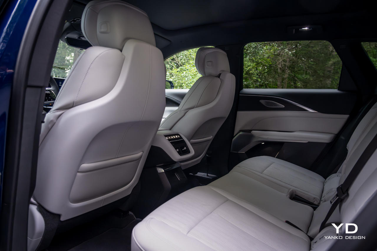
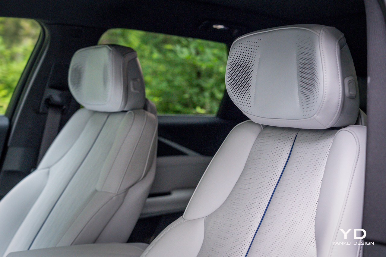
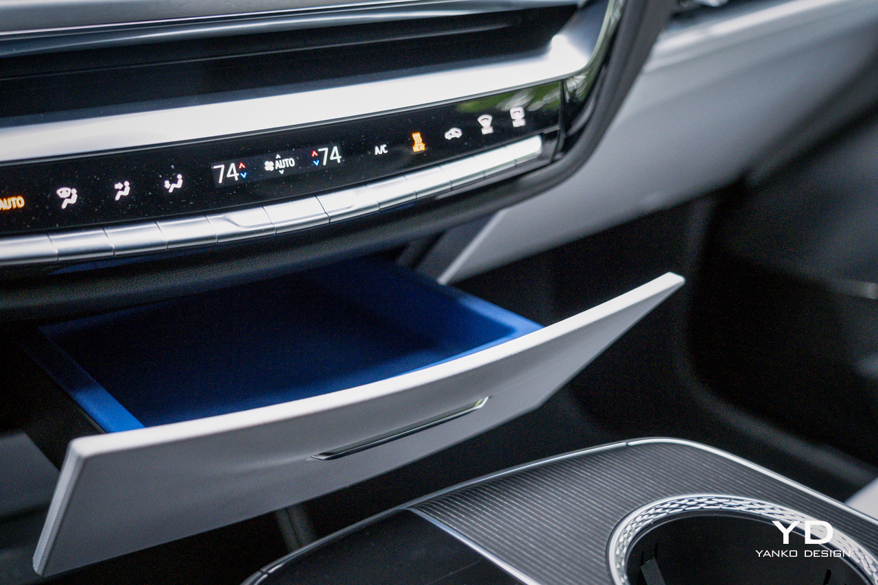
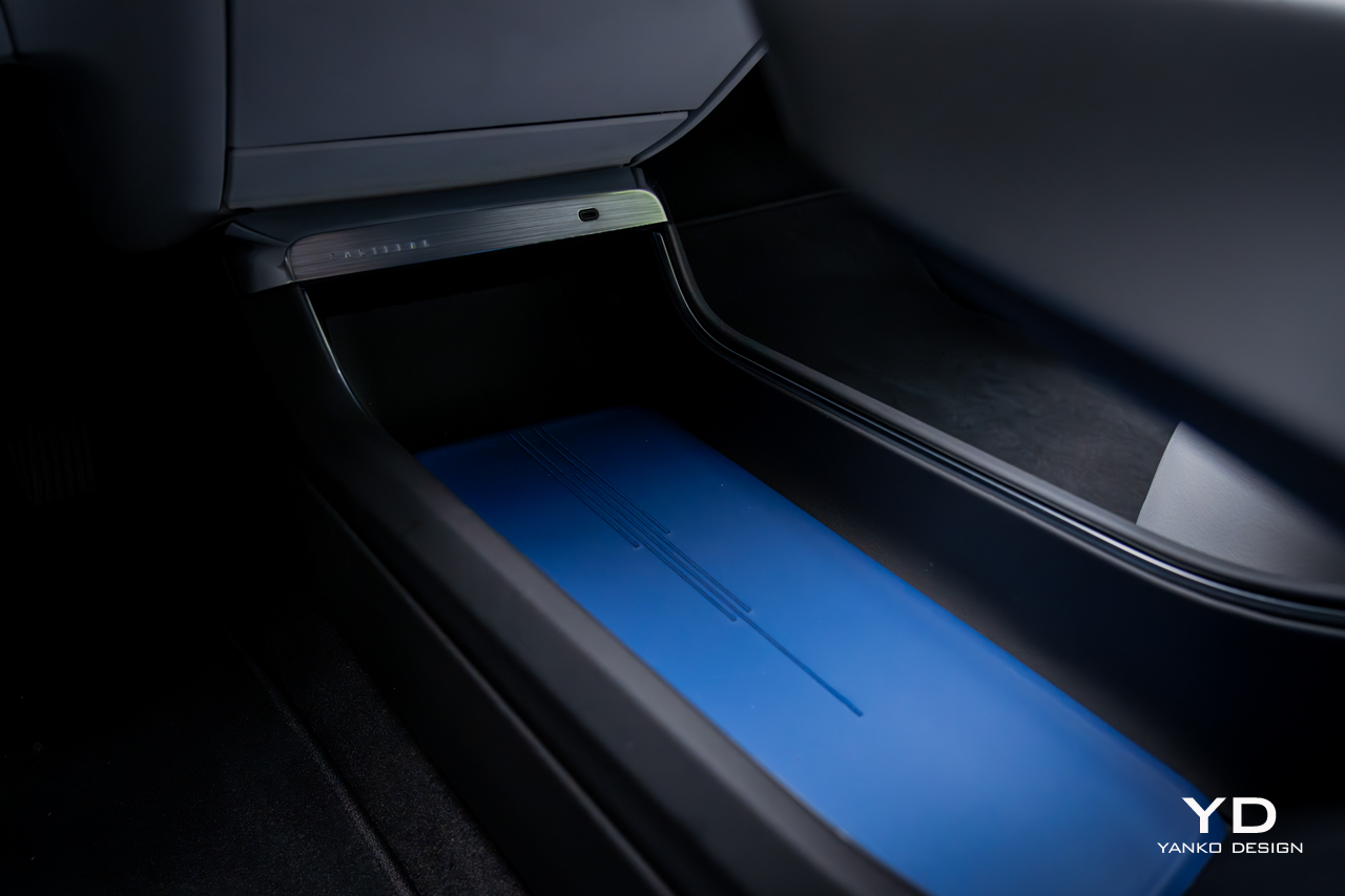
There are plenty of storage areas for front passengers, including a wide bin in the center of the car with a striking blue strip of leather that matches the piping on the stark, white seats. Those seats look pillowy and enveloping, but in practice, they’re a bit flat, and their adjustability is surprisingly limited. They do offer both heating and ventilation, plus massage, but it’s about the weakest massage I’ve ever sampled.

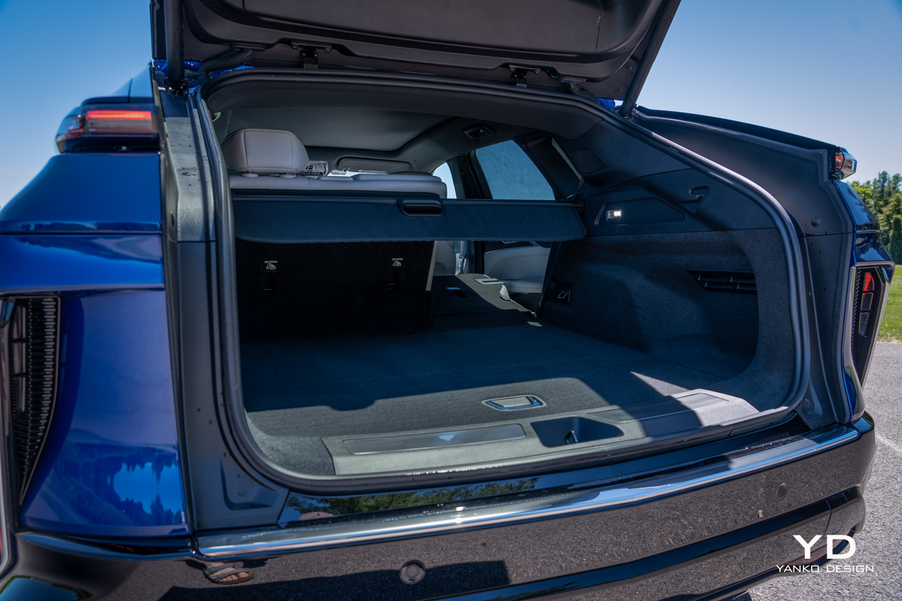
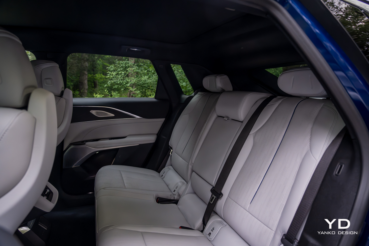
Rear seating is generous for three across, and the flat floor means everyone will have plenty of legroom. Headroom, though, is surprisingly limited, given the shape of these cars. A pair of USB-C ports back there keep small devices charged, while a three-prong outlet is there for bigger ones. Up front, another pair of USB-C connectors offer juice, plus a wireless charging slot.

Cabin Tech

The software controlling that sweeping display is based on Android Automotive. Sign in with your Google account (assuming you have one) and you have instant access to contacts, addresses, and whatever else you’ve entrusted to Alphabet.

You’re just a few taps away from installing most major media apps, including Spotify and YouTube Music, or you can use Android Auto or Apple CarPlay wirelessly from your phone.

All that media plays through a 19-speaker AKG sound system, which even puts speakers in the headrest, a bit of a rarity these days. The system is nicely balanced, offering all the power and bass anyone could want but, more importantly, crisp and clear sound with great separation. It’s standard on the Luxury 2 trim of the Lyriq and above.

The most impressive technology, though, comes in the form of Cadillac’s Super Cruise. The system just gets better and better every time I sample it. Initially restricted only to divided highways, Cadillac has started allowing it on more secondary roads.

Super Cruise offers true, hands-off driver assistance, steering itself and even automatically passing other cars on the highway. I was surprised to be able to let the car steer even on two-lane rural roads. It was perfectly smooth and easy there, just like it is on the highway.

The system relies on an infrared camera integrated into the steering column, so it’s always watching you to ensure you’re watching the road. But that’s a small price to pay for being able to sit back and relax and let the car handle most of the driving. It’s light-years beyond Tesla’s supposed Full Self Driving. You’ll again have to buy at least the Luxury 2 package to get it, starting at $66,990, but between that and the AKG sound system, it’s a worthy splurge.

While Super Cruise is the hallmark driver assistance feature, the Lyriq offers plenty of other safety features, including old-school adaptive cruise control with lane-keep assist, automatic emergency braking, and a surround-view camera. It also features other niceties from General Motors selection of safety features, like Teen Driver Mode, allowing you to set things like maximum speeds and volumes for specific driver profiles.

The Drive

A system like Super Cruise just makes long road trips all the more appealing, and for an EV, the Lyriq is reasonably well-equipped on that front. It’s officially EPA-rated for 314 miles on a charge of its 102-kilowatt-hour battery pack. In my testing around town and on the highway, I did slightly worse: 2.7 miles per kilowatt hour for a theoretical maximum range of 275 miles.

That electricity is consumed by a single, 340-horsepower motor driving the rear wheels, providing 325 pound-feet of torque. But, those wanting more can step up to a dual-motor, all-wheel drive Lyriq making 500 hp and 450 ft-lbs of torque from a pair of motors.

That’s a lot of power, but then this is a lot of car. The Lyriq weighs roughly 5,500 pounds, or nearly as much as an Escalade, and so it’s not exactly a rocket ship with the single-motor configuration. Still, put it into Sport mode (a task that sadly requires reaching up and scrolling through the touchscreen), and it does accelerate aggressively.

The steering is nicely sharp and responsive, which I appreciate. Still, despite Cadillac’s lineage of stellar V-badged driver’s machines, the Lyric is meant more for comfy cruising, and that it does with great aplomb.

Despite the 20-inch wheels wrapped in low-profile tires, ride quality is very good. It hoovered up broken asphalt without issue, feeling poised and pliant in all conditions. Opt for the all-wheel drive version and it should be a stellar winter machine too — assuming you outfit it with a proper set of winter tires.

When it comes to brake regeneration, always a hot topic among EVs, the Lyric’s default regen level is reasonably aggressive, but far from what I’d consider a true one-pedal mode. If you want something closer to that, you need to squeeze the lone paddle on the left behind the steering wheel. At that point the Lyriq will promptly bring itself to a stop. It’s better than nothing, but I’d prefer the option for a proper one-pedal mode.

Pricing and Options

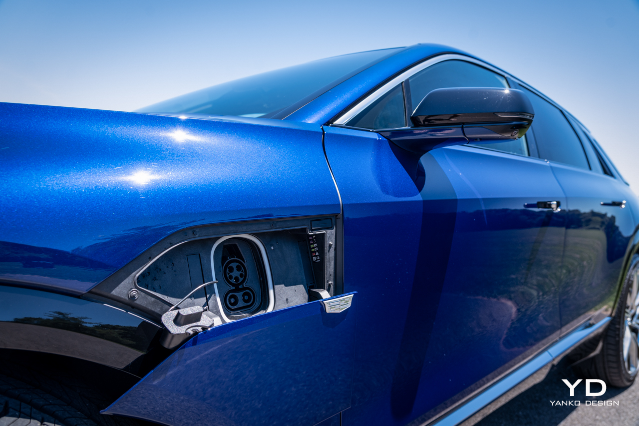
The Cadillac Lyriq starts at $58,590 for a base, Tech trim model with rear-wheel drive. The car you see purchased here was the top Luxury trim, Luxury 3, outfitted with a few options, including $1,480 for a 19.2 kW charging module and $625 for the Opulent Blue metallic paint.

Add on the $1,395 destination charge, and the total vehicle price is $72,695.

That makes it a premium option in an increasingly packed luxury electric SUV market. But the Lyriq stands out in many ways, not the least of which for its unconventional shape and tangible air of refinement about it. It’s lovely to drive, and thanks to Super Cruise, it’s even better to be driven, regardless of which seat you occupy.

The post 2024 Cadillac Lyriq Review first appeared on Yanko Design.
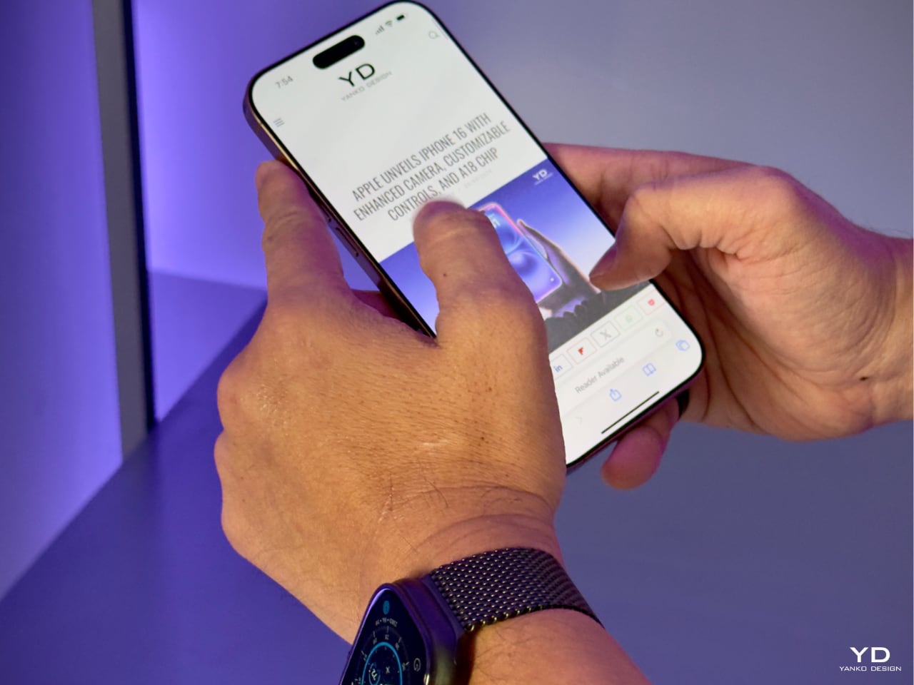
iPhone 16: Is it Worth the Upgrade? Here’s What You Need to Know

Apple’s latest iPhones are here: the iPhone 16, iPhone 16 Pro, and iPhone 16 Pro Max. With each release, many iPhone owners face the question of whether it’s worth upgrading. These new models bring changes in design, performance, and features, but the decision to upgrade depends on what you’re looking for in a smartphone. Let’s break down what each model offers and whether it’s a meaningful upgrade for you.

Designer: Apple

iPhone 16: The Standard Upgrade

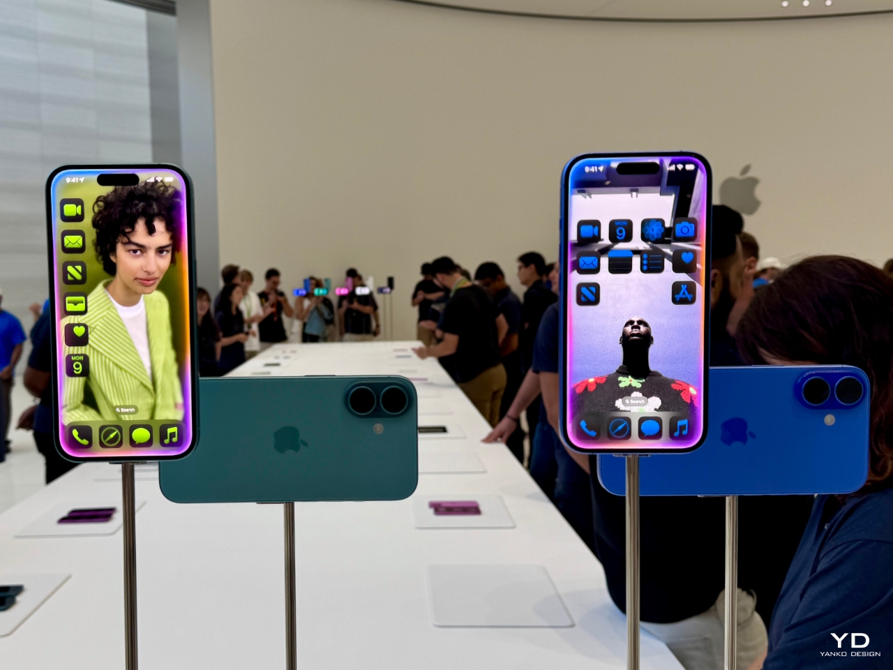
The iPhone 16 sticks to Apple’s familiar formula but includes significant updates. The design remains the same as the iPhone 15, with a 6.1-inch display, Dynamic Island, and a range of new color options, including ultramarine and teal. The Ceramic Shield is now tougher, making it more durable than before, which is great for those who want a more resilient phone.

Apple iPhone 16

One of the most noticeable additions is the Camera Control button, which gives you easier access to the camera’s functions. This feature lets you tweak settings like zoom and exposure with a simple touch. The 48MP main camera remains, but the Ultra Wide lens is now more powerful, offering improved macro shots and better low-light performance.

Apple iPhone 16

For those who use their iPhone for everyday tasks—like texting, taking photos, and browsing—the iPhone 16 offers solid improvements but nothing groundbreaking. The A18 chip provides faster performance and efficiency, giving you slightly better battery life than older models. Still, if you’re coming from an iPhone 14 or 15, the jump in features might not be enough to justify the upgrade unless you care about the latest camera and design tweaks.

iPhone 16 Pro: Bigger Display, More Power

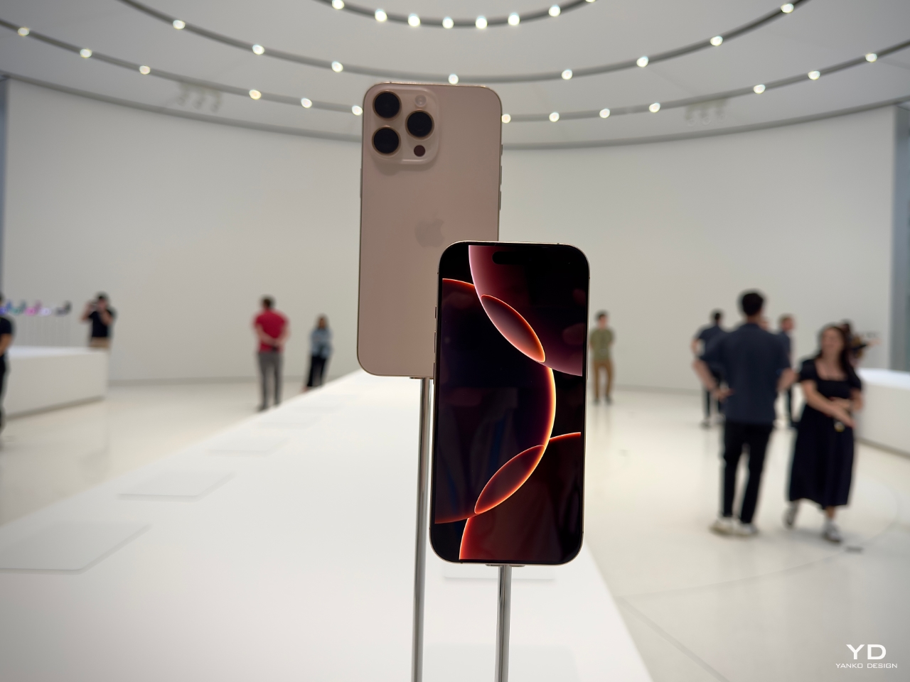
The iPhone 16 Pro is a more compelling option if you’re looking for more advanced features. This model sees an increase in display size, now 6.3 inches, and offers a design that pushes the boundaries of screen space with its thinner borders. The titanium frame makes the phone lighter and more durable, while the larger screen and Always-On Display ensure a better viewing experience.

Apple iPhone 16 Pro

One key difference with the Pro model is the performance. Powered by the new A18 Pro chip, the iPhone 16 Pro brings faster processing and improved efficiency. Whether you’re a power user who switches between apps or someone who enjoys gaming on their phone, the performance boost will be noticeable. This chip also enables high-end camera features, like the ability to shoot 4K video at 120 frames per second.

The camera system is a major selling point for photographers and content creators. The 48MP main sensor works with a new 48MP Ultra-Wide lens and a 5x optical zoom Telephoto lens, offering far more versatility in your photos. The Pro models also come with enhanced software, allowing users to adjust video playback speed after recording and capturing spatial photos and videos compatible with Apple’s Vision Pro headset.

The iPhone 16 Pro’s battery life is another highlight. Apple claims it will last much longer, which can make a difference for those who spend a lot of time on their phones during the day. If battery life, performance, and a more advanced camera are what you’re after, the iPhone 16 Pro could be worth the upgrade. But if you’re coming from the iPhone 15 Pro, these enhancements might not feel dramatic enough to switch immediately.

iPhone 16 Pro Max: The Full Experience

The iPhone 16 Pro Max is the largest and most expensive option in the lineup, with a 6.9-inch display. Like the iPhone 16 Pro, it features the new A18 Pro chip, which improves performance and power efficiency. The Pro Max also benefits from a bigger battery, offering the best battery life of any iPhone. This could be a crucial feature for those who need their phone to last throughout the day without recharging.

iPhone 16 Pro and Pro Max

The camera system is identical to the iPhone 16 Pro, with a 48MP main lens, 48MP Ultra Wide lens, and 5x optical zoom Telephoto lens. The Camera Control button gives you quick access to settings, while the new spatial video and photo features allow for immersive, 3D-like content creation. If you’re already a fan of Apple’s Pro Max series, the iPhone 16 Pro Max builds on what you love with a bigger screen, longer battery life, and even more camera options.

Apple iPhone 16 Pro Max Camera Control

However, if you don’t regularly use your phone for photography, gaming, or other heavy-duty tasks, the Pro Max’s price tag may not be justified. It’s designed for users who want the biggest and best of everything, but the size and cost might be overkill for casual users.

Should You Upgrade?

Whether you should upgrade to the iPhone 16, iPhone 16 Pro, or iPhone 16 Pro Max depends on your current use and what you value most in a smartphone.

Apple iPhone 16 Pro

  • If you’re using an iPhone 13 or older, upgrading to any model in the iPhone 16 series will give you substantial benefits. You’ll notice a significant improvement in speed, camera quality, and battery life. The design changes and software features like Camera Control will also enhance your daily use.
  • The decision is more complex if you’re using an iPhone 14 or 15. The iPhone 16 brings useful upgrades, but they might not feel revolutionary. If you prioritize camera performance or want the latest AI-driven features like Visual Intelligence, the iPhone 16 or 16 Pro might be worth it. However, if you’re content with your current phone, you could comfortably wait another year for more significant changes.
  • For Pro and Pro Max users: If you’ve already invested in a recent Pro model, the iPhone 16 Pro and Pro Max will feel familiar. The enhancements are valuable, especially for users who depend on their phones for photography, video, and gaming. But unless you need the latest camera features or the longest battery life, it may not be worth the immediate switch.

The iPhone 16, iPhone 16 Pro and iPhone 16 Pro Max offer a range of upgrades, but whether they’re worth the investment depends on your personal needs. If you’re using an older iPhone, these models will deliver significant improvements across the board. For those with newer models, the decision comes down to how much you value incremental updates in performance, battery life, and camera functionality. Ultimately, all three models are powerful devices, but the leap forward might not be enough to compel everyone to upgrade immediately.

The post iPhone 16: Is it Worth the Upgrade? Here’s What You Need to Know first appeared on Yanko Design.
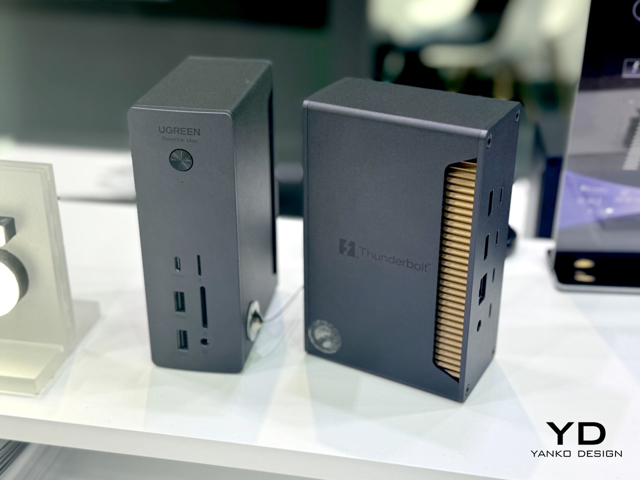
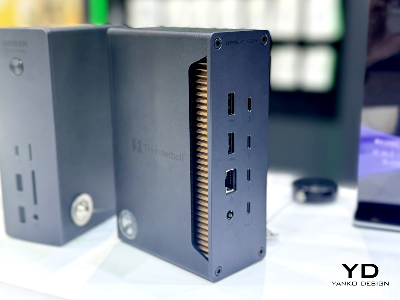
UGREEN’s 13-in-1 Thunderbolt 5 Docking Station is an absolute productivity beast: Hands-On at IFA 2024

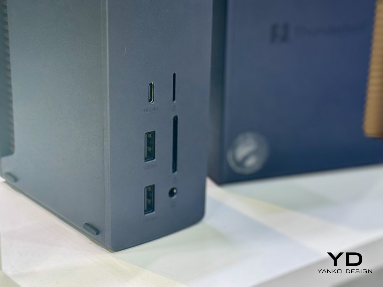
Standing amidst its new NAS system, and all its award-winning chargers and power-banks at the UGREEN Booth at IFA 2024 was this one monolithic device that UGREEN’s rep told me was their next piece of product innovation. The new Revodok Thunderbolt 5 Docking Station is an ambitious piece of hardware boasting a staggering 120 Gbit/s bandwidth, as many as 13 ports, and the ability to support a single 8K display or dual 4K displays. If you’re tired of waiting for files to transfer or struggling with multi-display setups, this dock promises to take care of it all, especially with Thunderbolt 5’s massive 80Gbps speed boost—three times faster than Thunderbolt 4. Its Bandwidth Boost Mode dynamically adjusts the data flow, making sure nothing bottlenecks, even under heavy load. For power users handling 8K video editing or complex workflows, this feature offers serious appeal. The best part? It’s a compact, vertical number that seriously cuts clutter on your desk, giving you a minimal workplace that’s maximal on productivity and output.

Designer: UGREEN

The Revodok is loaded with as many as 13 ports, making it a versatile hub for just about any setup. Whether you need USB-C, USB-A, HDMI, DisplayPort, Ethernet, or even an SD card reader, it’s all there. The dock supports 8K displays at 60Hz and dual 4K setups, catering perfectly to those who thrive on multi-screen environments. Add in 10 Gbps USB 4 support for newer laptops, and you’ve got a future-proof workstation companion. If reliable internet is a priority, the 2.5G Ethernet port ensures stable, high-speed connectivity. Plus, it offers 85W Power Delivery, which can charge demanding devices like laptops, so your desk stays tidy without extra charging bricks cluttering things up.

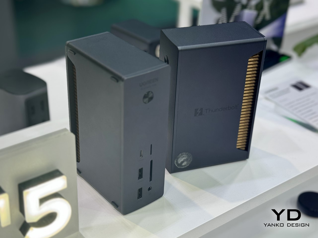
Despite all the power it packs, the Revodok’s compact design won’t dominate your workspace. Its clean, modern look fits in seamlessly, and it’s portable enough to take with you if your office setup tends to move. Besides, those visible heat-sink fins do tend to give the device a rather cool, almost amphibian aesthetic. Durability and build quality remain key, as UGREEN has a strong track record in this department.

While pricing and exact availability remain under wraps, you can expect the Revodok to hit the high-end market when it arrives later in 2024 or early 2025. It’s aimed at users who are ready for the next generation of connectivity, and it promises to deliver on all fronts. If you’re looking for speed, versatility, and reliability, this dock might be the upgrade you’ve been waiting for—plus, it’s bound to make your desk look a bit more impressive.

The post UGREEN’s 13-in-1 Thunderbolt 5 Docking Station is an absolute productivity beast: Hands-On at IFA 2024 first appeared on Yanko Design.
Self-Sustainable Hydroponic Garden Autonomously Grows Microgreen Superfoods in 7 Days: Minigro at IFA 2024

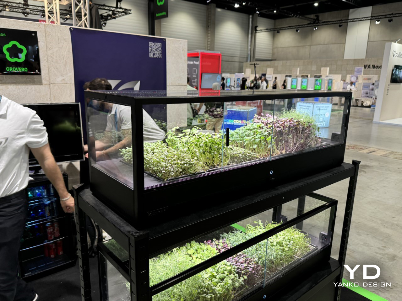
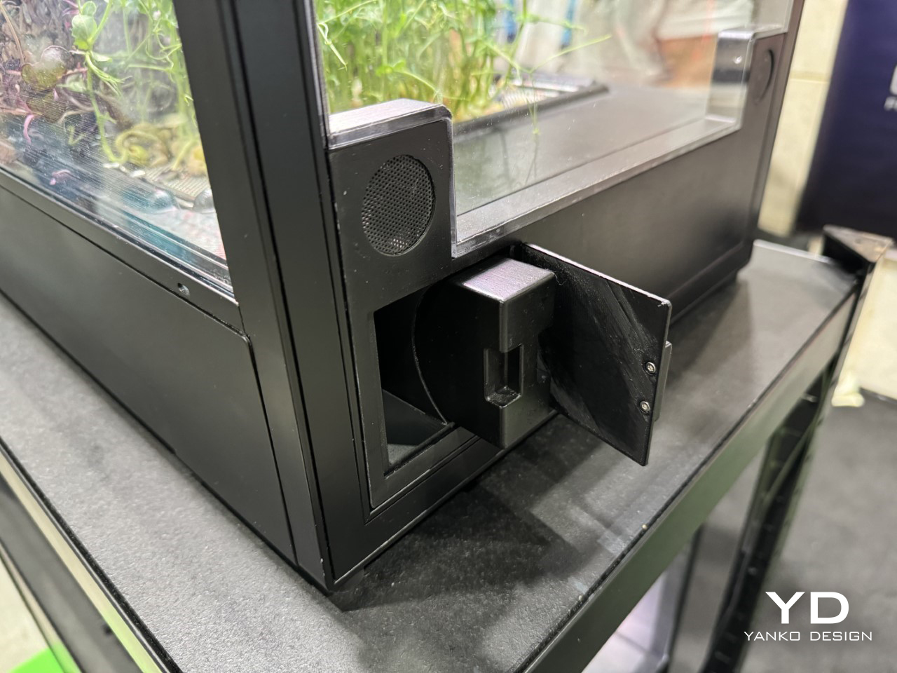
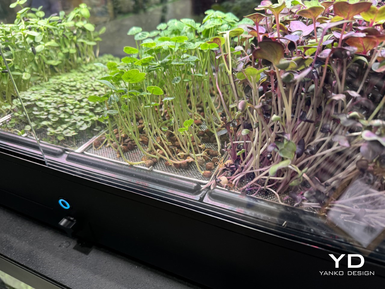
IFA 2024, Berlin’s iconic tech showcase, has always been the stage for revolutionary gadgets that make daily life easier. And this year, one of the standout contenders in the Sustainability category is the Minigro, a fully automated microgreens growing system from the folks at Grovero. About the size of an aquarium, this device promises to take the hassle out of gardening entirely, offering you fresh microgreens in just seven days without lifting a finger—almost.

What makes the Minigro so impressive is its level of autonomy – perfect for people with a less-than-green thumb. This compact, sleek device handles every part of the growing process: from regulating water levels to adjusting nutrient supply, controlling light exposure, and even managing the microclimate. You could literally walk away after setup, and the Minigro would do all the heavy lifting—turning you into an urban farmer without the muddy boots.

Designer: Grovero

A Completely Automated Green Thumb

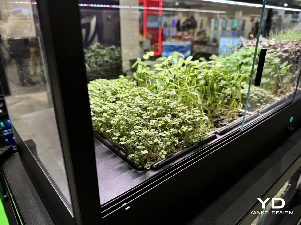
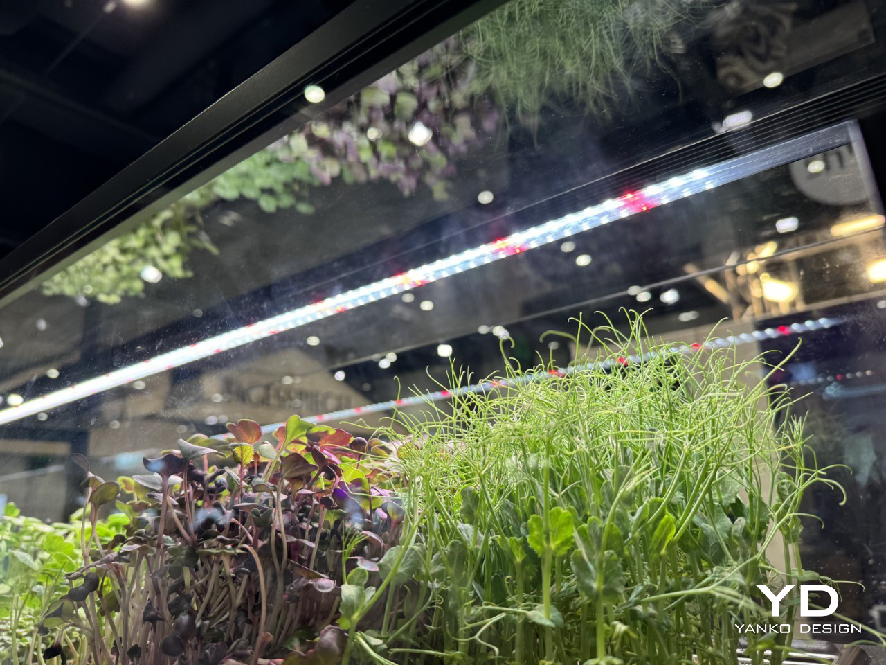
The Minigro’s all-in-one solution is driven by an array of advanced sensors and automation. These sensors monitor every detail of the plant’s growing environment, ensuring optimal conditions for your microgreens. Whether it’s temperature, humidity, or lighting, the device adjusts in real time to create the perfect microclimate, so your plants don’t just survive—they thrive.

One particularly clever feature is the sensor-driven LED lighting system. If your Minigro is positioned near a window with natural light, the LEDs dim or brighten accordingly. The system takes into account how much sunlight your greens are getting and adjusts the artificial light to make sure it’s always just right. Basically, your Minigro’s lighting system won’t waste energy if the sun is doing its job.

Foolproof Microclimate Control

Another neat trick? The Minigro knows when you’ve left a window open. Now, normally, an open window could throw off the delicate climate needed for growing microgreens. But Minigro’s sensors detect drafts or temperature shifts caused by open windows, sending you an alert through its accompanying app. This ensures that you’re not accidentally compromising your little green oasis while you air out the room.

The convenience extends beyond just growing. You’ll also get app notifications for any manual tasks—like replenishing nutrients or cleaning the tank. But don’t worry, it’s not like you’re going to have to tend to it daily. These tasks are infrequent and take minimal effort, especially when compared to traditional gardening methods that require constant attention, weeding, and watering.

Your Role: Pretty Minimal, Honestly

With the Minigro doing 99% of the work, your involvement is minimal. Through the app, you’ll receive reminders about the few maintenance tasks—adding nutrients or cleaning the water tank. And that’s pretty much it. As for the tank cleaning, it’s designed to be quick and easy, meaning you won’t be hunched over for hours scrubbing soil off your hands.

You can also monitor the growing process via the app, which shows real-time data on the health and progress of your microgreens. It feels almost like a virtual pet simulator—except you’re rewarded with actual food instead of digital coins. Plus, there’s something deeply satisfying about opening the app and seeing your greens flourishing, knowing that you did next to nothing to make it happen.

Fresh Greens, All Year Round

So why microgreens? They’re nutrient-packed, versatile, and ready to harvest in just seven days. Whether you’re topping off a salad or blending them into smoothies, fresh microgreens offer a punch of flavor and health benefits. The Minigro makes it possible to grow these tiny greens even in the dead of winter, when outdoor gardening isn’t an option.

The device’s compact size also makes it ideal for apartment dwellers or those with limited kitchen counter space. In fact, it’s exactly the same size as your IKEA shelf, making it a perfect fit for most homes. You don’t need a sprawling backyard to enjoy homegrown food. The Minigro turns your countertop into a micro-farm, producing fresh, organic greens year-round, regardless of season or space.

The Minigro is the perfect blend of technology and nature, and it’s designed for those who want the benefits of home-grown food without any of the stress. By automating every aspect of the growing process, it lets you bypass the learning curve of traditional gardening and jump straight to the rewards.

The device is ideal for anyone who loves the idea of gardening but can’t be bothered to maintain it. In a world where everyone seems pressed for time, having fresh greens grown automatically is about as futuristic as it gets. Plus, with the Minigro managing light, climate, and nutrients, you might even feel a little smug every time you see your flourishing greens—especially knowing you barely lifted a finger.

The post Self-Sustainable Hydroponic Garden Autonomously Grows Microgreen Superfoods in 7 Days: Minigro at IFA 2024 first appeared on Yanko Design.
JMGO’s N1S Ultimate Could Make Your TV Obsolete: The Future of Home Projection at IFA 2024

At IFA 2024, it became clearer than ever: traditional TVs might be yesterday’s news. As home theaters evolve, the focus is shifting from bulky flat screens to sleek, powerful projectors that deliver a true cinematic experience right in your living room. The days of settling for a fixed screen size, limited by where you can hang a TV, are being replaced by projectors that offer flexibility, portability, and, thanks to innovations like 4K laser technology, image quality that rivals—and in some cases surpasses—what any high-end TV can deliver.

Projectors have come a long way from the dim, pixelated displays many still associate with them. Today’s models, especially those from companies like JMGO, are becoming the go-to choice for those looking to upgrade their home entertainment setups. Whether you’re a movie buff, gamer, or just someone who wants a more immersive experience, projectors have quickly gained ground. They offer more screen for your buck, and when it comes to high-definition, they’re not cutting any corners.

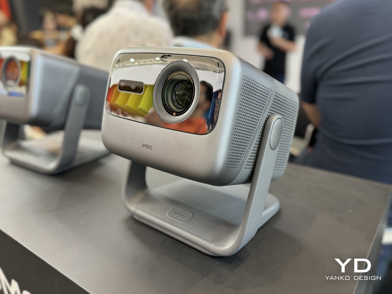
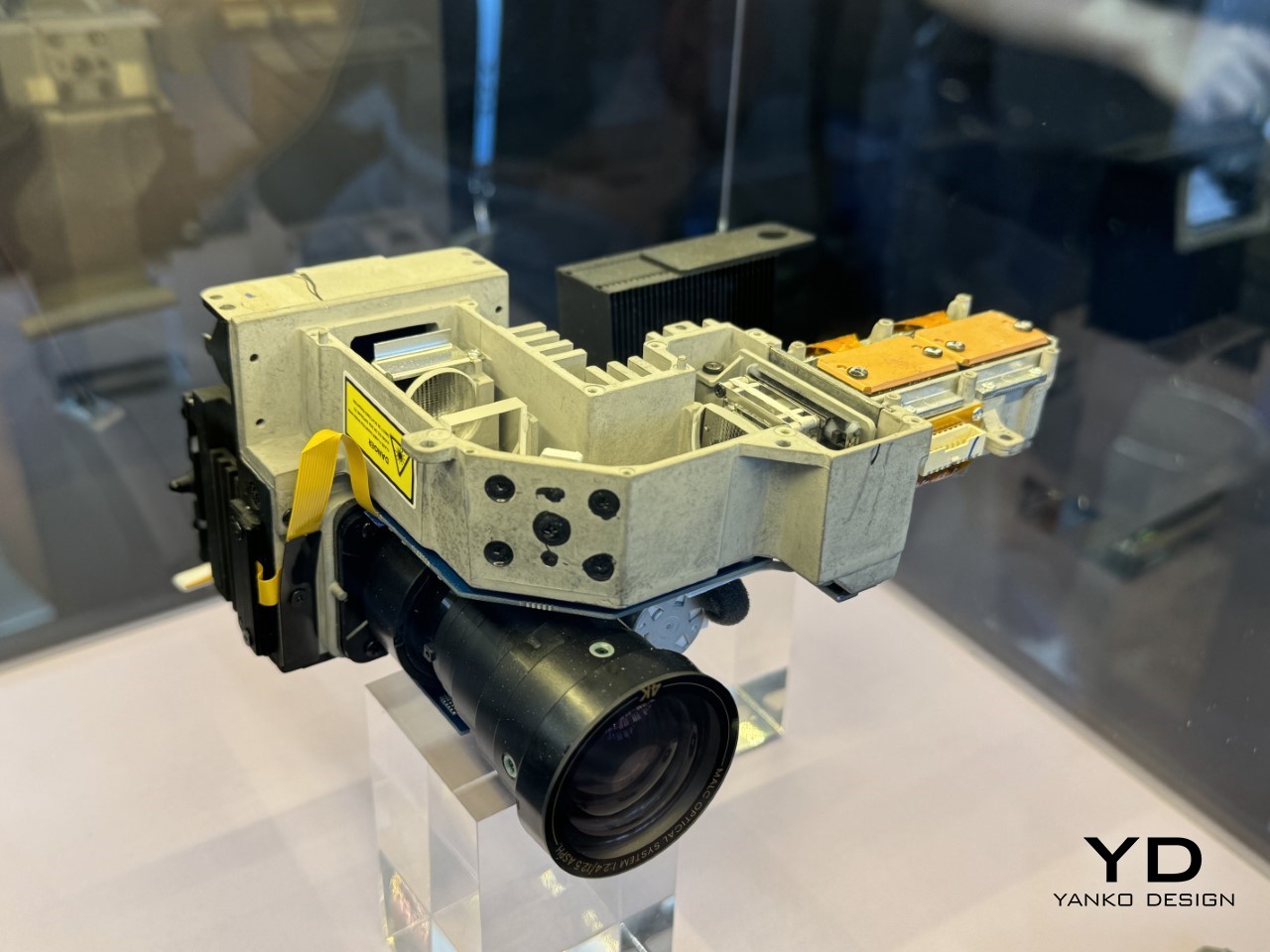
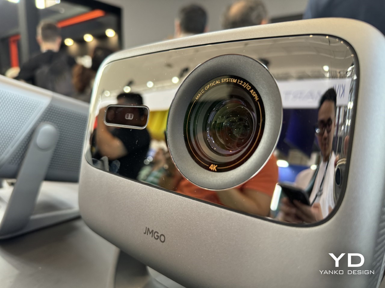
That was the vibe at IFA 2024 when JMGO introduced the N1S Ultimate 4K and N1S Pro 4K projectors—both packed with features designed to take advantage of this projector renaissance. Powered by their patented MALC™ 2.0 Triple Laser Optics technology, these devices prove that projectors aren’t just an alternative to TVs anymore—they might just be the future of home entertainment.

Designer: JMGO

A Deep Dive into MALC™ 2.0 Technology

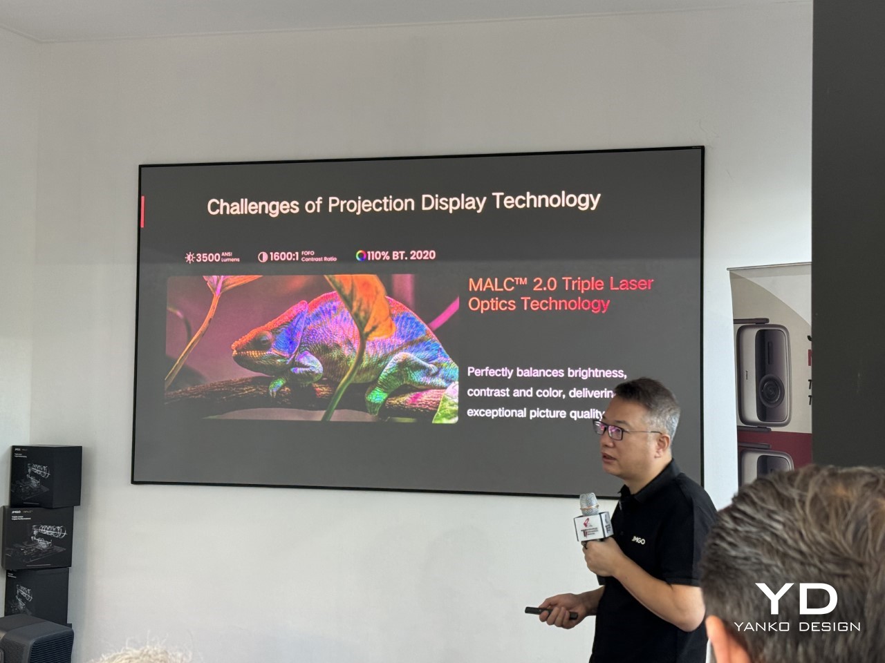
One of the key highlights of the N1S Ultimate is JMGO’s proprietary MALC™ (Multi-Layer Adaptive Laser Control) 2.0 Triple Laser Optics. According to JMGO, the typical trade-off in laser projection—where increasing brightness tends to compromise color accuracy and contrast—has been successfully tackled through MALC 2.0. This system delivers exceptional brightness without sacrificing visual quality, offering users a seamless experience.

The N1S Ultimate 4K projector is capable of producing a whopping 3500 ANSI lumens, which ensures vivid picture quality even in environments with high ambient light. Coupled with a 1600:1 contrast ratio and 110% BT.2020 color coverage, the N1S Ultimate is designed to deliver stunning visuals that don’t lose their luster in less-than-ideal lighting conditions. With an ∆E (Delta E) of less than 1, the color accuracy is spot-on, ensuring faithful reproduction of even the most subtle shades. This combination of brightness, contrast, and color precision makes the N1S Ultimate ideal for both daytime viewing and cinematic experiences.

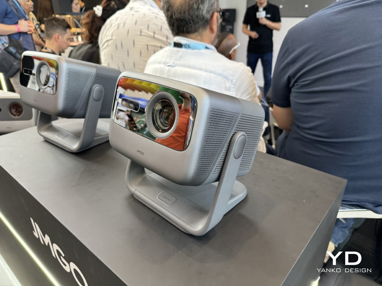
The JMGO N1S Pro (left) versus JMGO N1S Ultimate (right)

N1S Ultimate vs. N1S Pro: What Sets Them Apart?

While both the N1S Ultimate and N1S Pro share JMGO’s MALC™ 2.0 technology, there are notable differences between the two models that will help users decide which one fits their needs better. The N1S Pro, positioned as a more budget-friendly option, offers 2400 ANSI lumens, compared to the 3500 lumens of the Ultimate. This difference in brightness may be a key factor for users who need a projector for bright rooms or daytime use.

However, both projectors maintain the same level of contrast (1600:1) and color performance, which speaks volumes about JMGO’s commitment to delivering a high-quality experience across their product range. Whether you choose the Pro or the Ultimate, you’ll get stunning visuals with a ∆E of less than 1 and 110% BT.2020 color accuracy, which ensures rich, lifelike images.

Versatility in Every Direction: The Iconic Gimbal

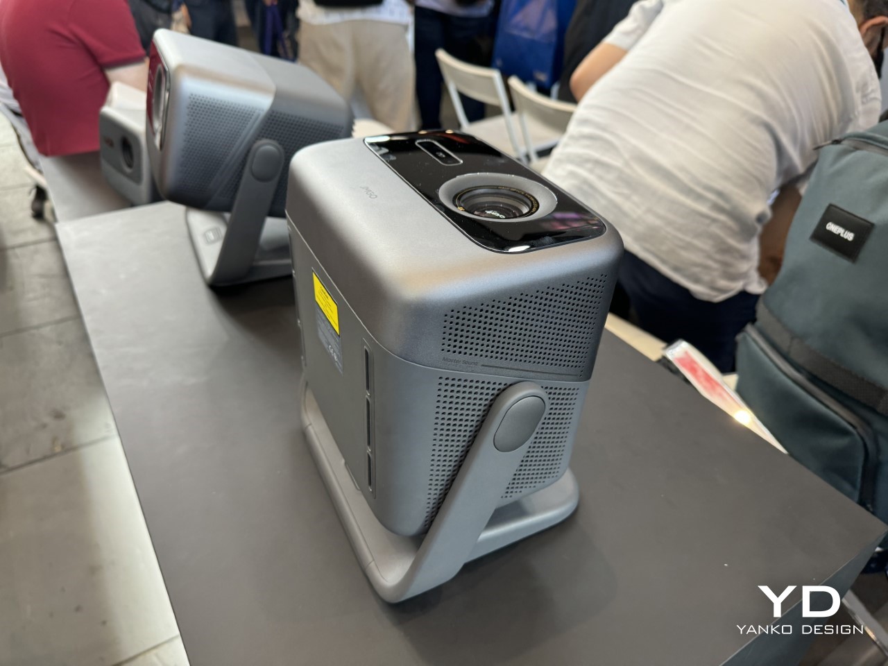
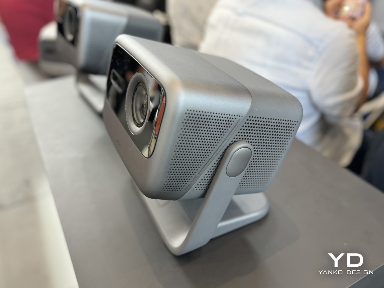
One feature that sets the JMGO N1S series apart is its integrated gimbal design, first introduced in 2022. This allows the projectors to pan 360 degrees and tilt 135 degrees, making it incredibly easy to adjust the projection angle. Whether you want to project on the ceiling for a laid-back movie night or angle it toward a wall to create an impromptu gaming setup, the gimbal provides exceptional flexibility.

This design also adds a futuristic touch to the device, setting it apart from conventional projectors that require cumbersome setups or fixed installations. JMGO’s emphasis on creating a portable and versatile entertainment device shines through in the N1S Ultimate, positioning it as an ideal choice for users who value both style and functionality.

A New Kind of Home Entertainment Ecosystem

Beyond the hardware, JMGO has integrated Google TV into both models, providing access to a wide range of streaming services, including certified options like Netflix. This makes the N1S projectors a true all-in-one entertainment solution—no external streaming devices are needed. Whether you’re watching a movie, streaming a TV series, or projecting a home video, everything is seamlessly managed from the projector itself.

Pricing and Availability

Both the N1S Ultimate and N1S Pro are now available on Amazon in the U.S. and across Europe, including Germany, France, Italy, and Spain. The N1S Ultimate 4K is priced at $2,799 in the U.S. and €2,999 in Europe, while the N1S Pro 4K comes in at $1,999 or €2,299, offering a more affordable option for those who don’t require the full brightness of the Ultimate.
The post JMGO’s N1S Ultimate Could Make Your TV Obsolete: The Future of Home Projection at IFA 2024 first appeared on Yanko Design.