7 Best Underrated Travel Gadgets That Fit in Your Carry-On and Solve 90% of Travel Headaches

Travel today feels more accessible than ever, but seasoned explorers know the headaches that still linger. Gaps in language can make even a simple conversation with a local shopkeeper feel like a monumental task. The promise of hotel Wi-Fi often gives way to the reality of a frustratingly slow connection, leaving you cut off when you need it most. Beyond connectivity, there is the constant, low-level anxiety that comes with protecting your belongings: the fear of a misplaced bag, a lost key, or the vulnerability of your precious digital files while on the move.

Fortunately, the coming years are poised to deliver a wave of practical, underrated solutions to these exact problems. A new generation of technology is rapidly neutralizing these pain points and putting the focus back on the adventure itself. Breakthroughs in real-time translation, personal networking, and ultra-secure luggage locks are changing the game. Combined with intelligent tracking tags and robust portable storage for your photos and files, these innovations promise to transform how we move, connect, and keep our holidays on track. Here’s a list of 7 essentials you absolutely need to add to your travel collection for business trips, holidays and the years ahead!

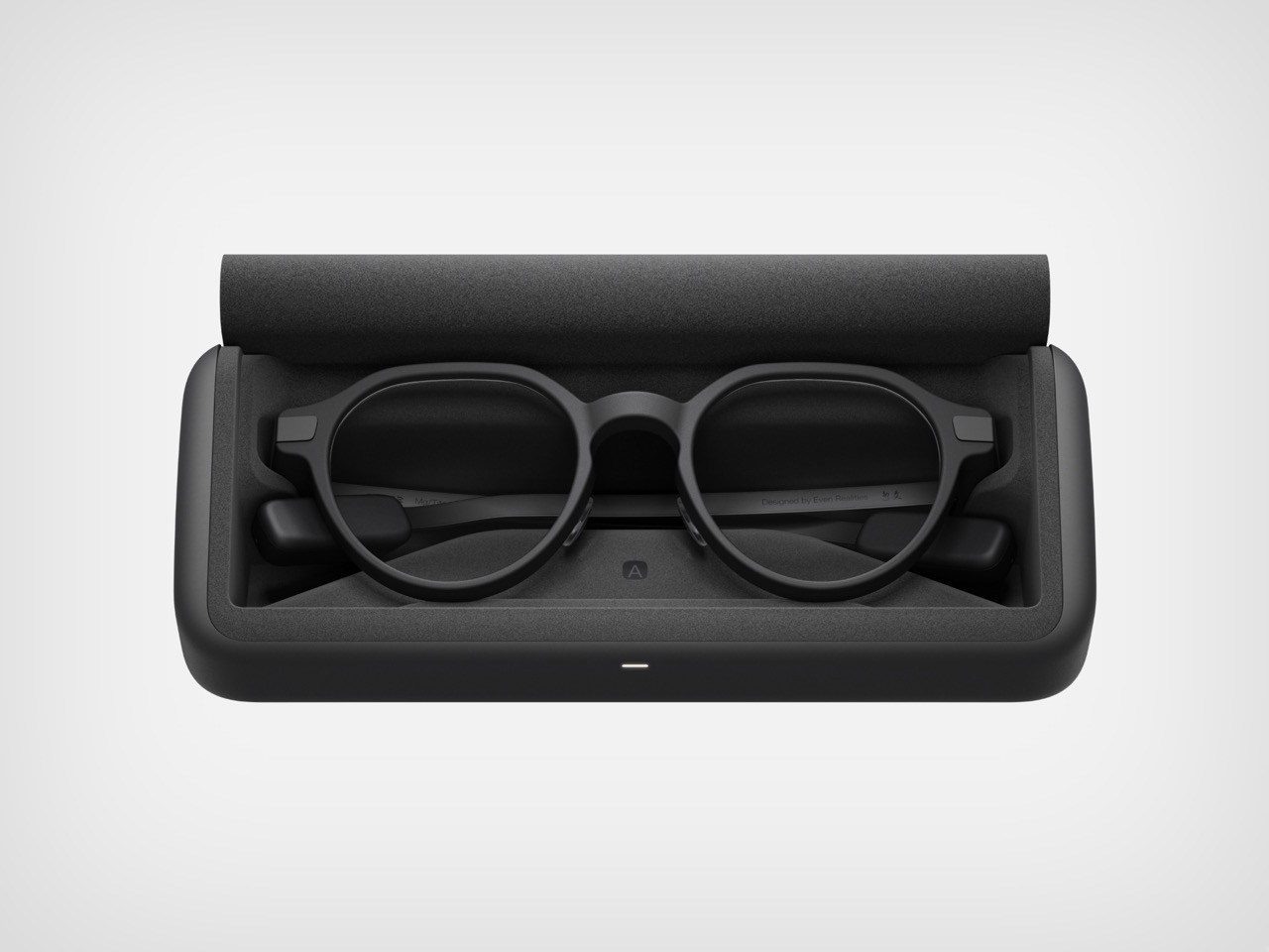
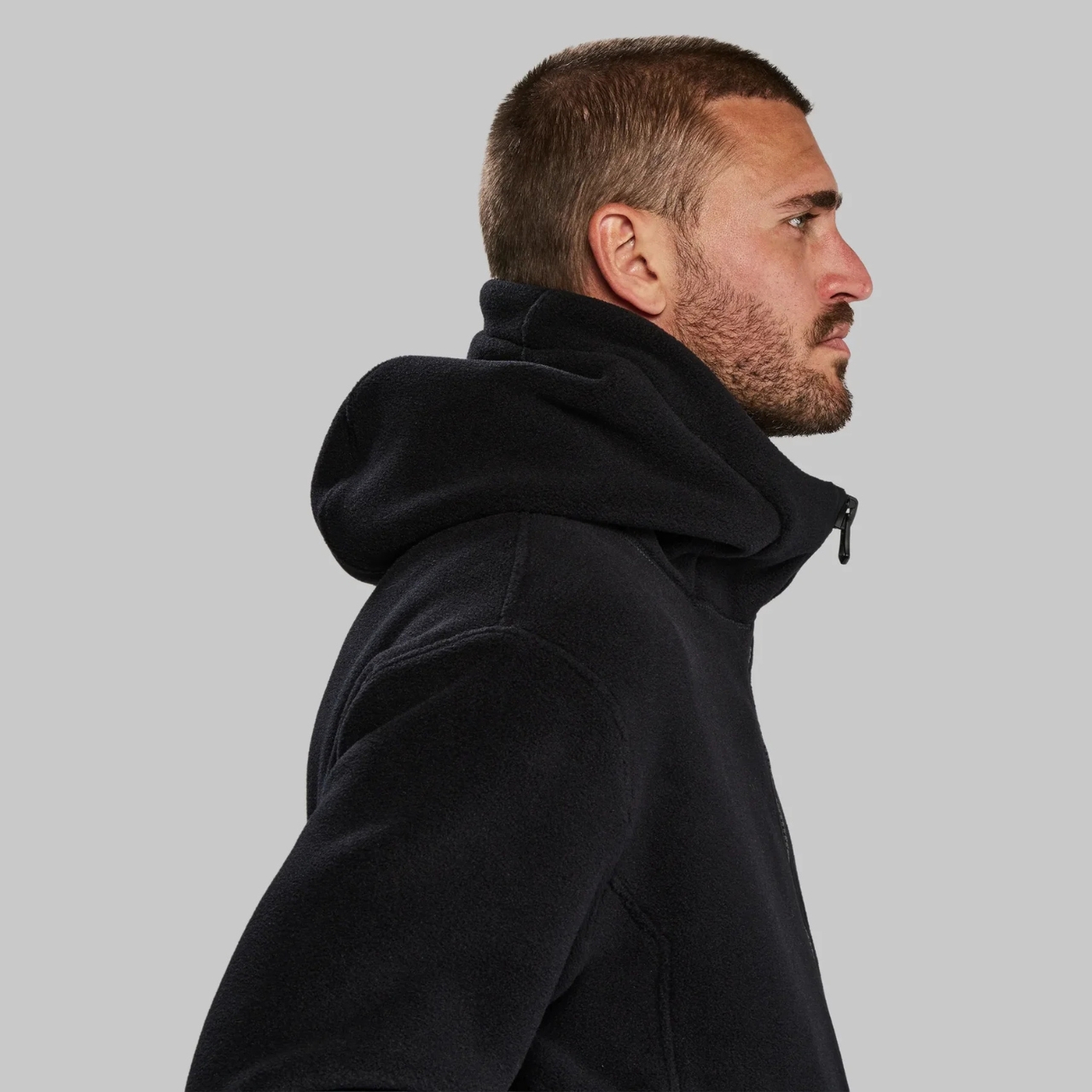
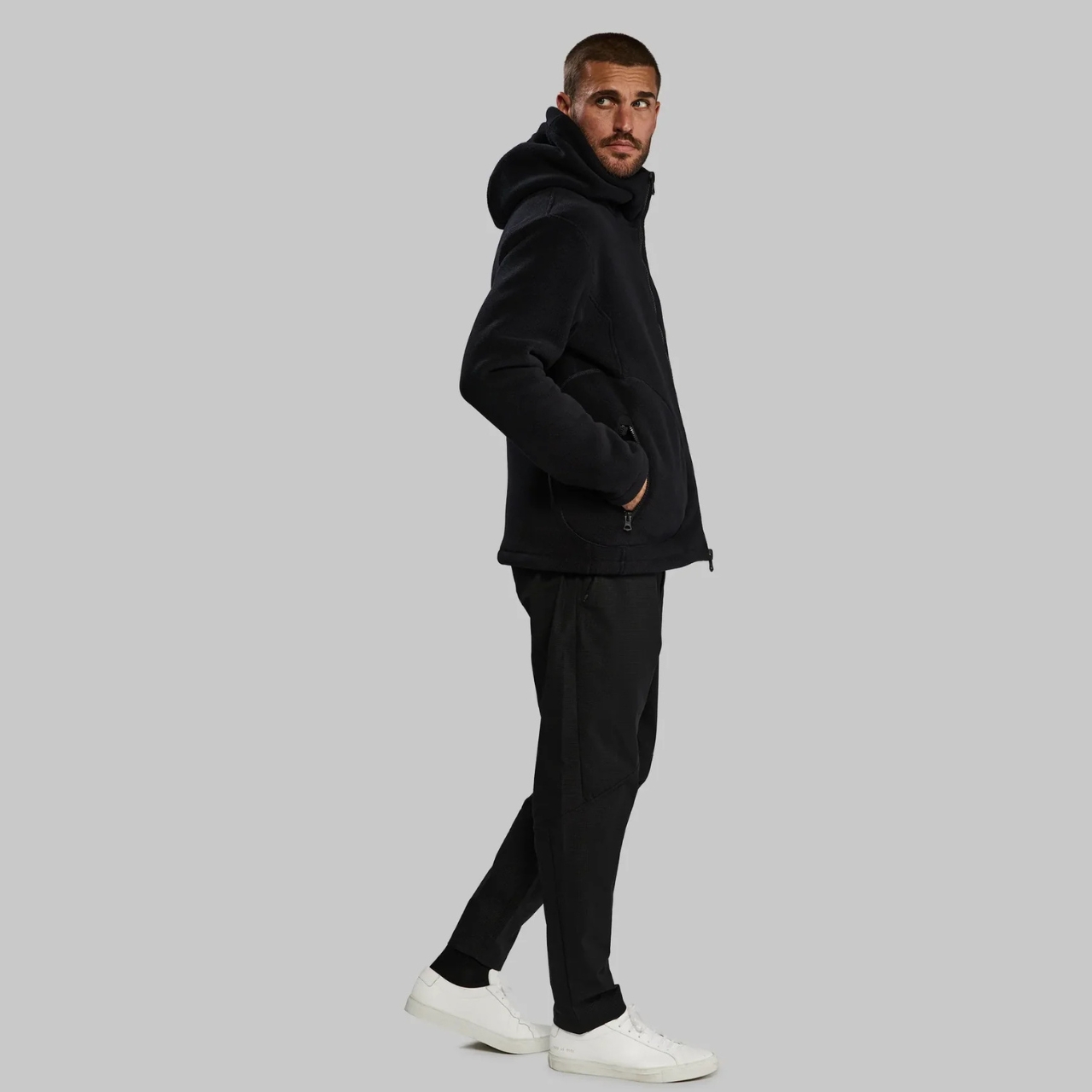
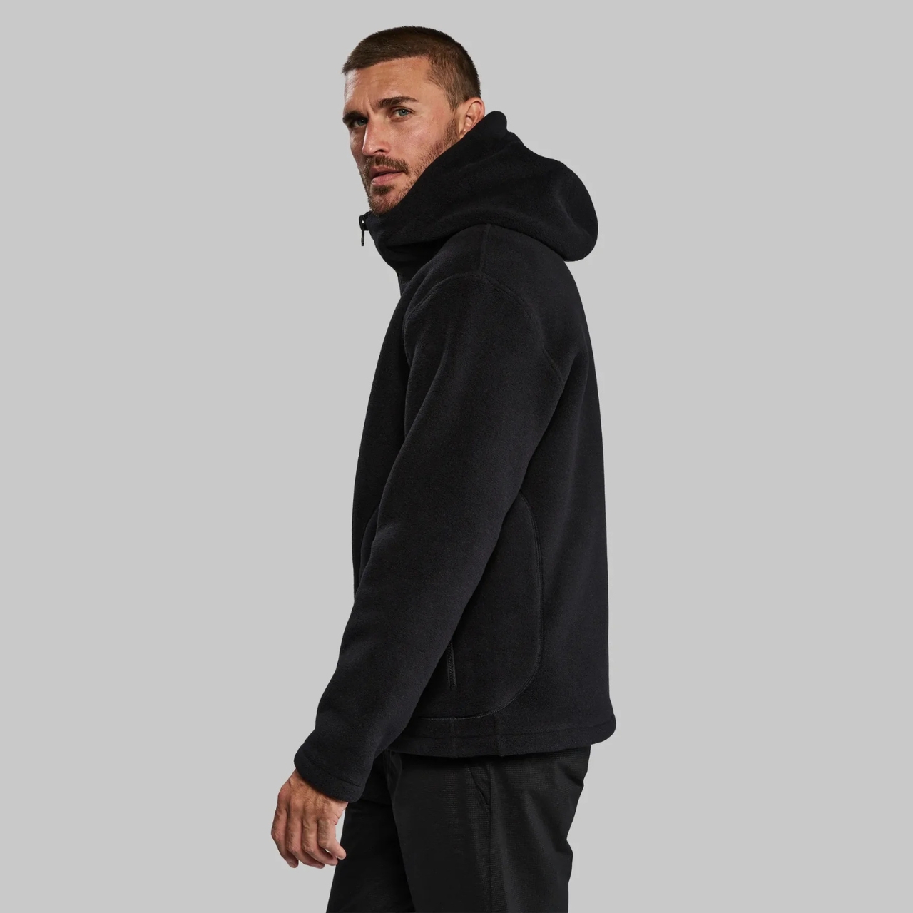
Timekettle W4 AI Interpreter Earbuds – For Seamless Multi-Lingual Conversations, From Boardrooms to Bistros

Whether you are navigating a crucial business negotiation in Tokyo or simply trying to order the best local dish in a small Italian village, the biggest barrier to a truly authentic experience is often language. Clunky smartphone apps are slow and awkward, and the nuance of conversation gets lost in translation. The Timekettle W4 AI Interpreter Earbuds are designed to erase that friction. These are far more than just audio devices; they are a sophisticated, real-time translation system packed into a stylish, portable design. By simply sharing an earbud with your client, a new acquaintance, or a shopkeeper, you can engage in a natural, two-way conversation as if you both speak the same language.

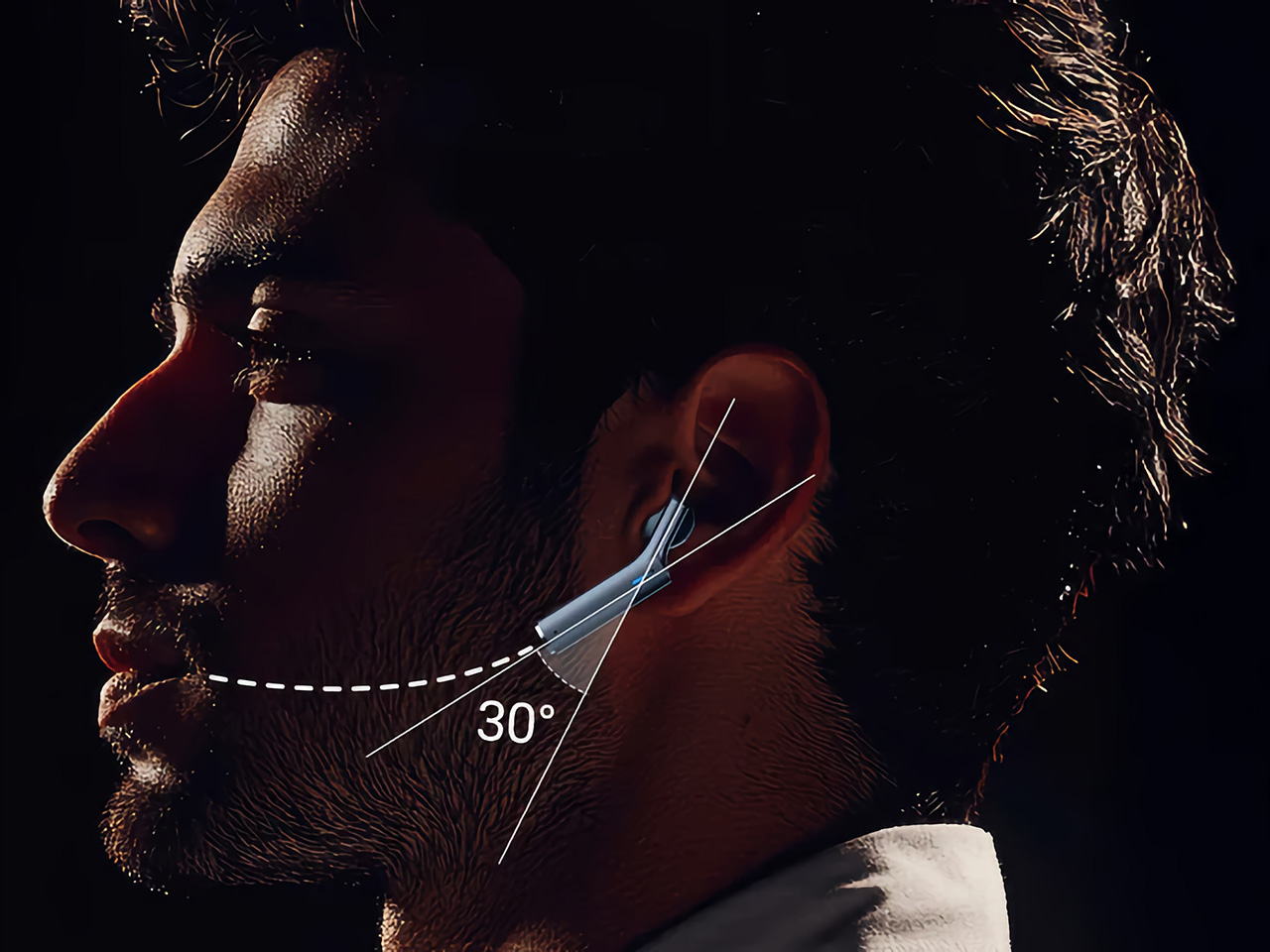
The magic behind the W4 lies in its cutting-edge technology. The earbuds use a unique Bone-voiceprint sensor that picks up your speech through vibrations, effectively cutting out distracting background noise, whether you’re in a busy conference hall or a bustling street market. This ensures crystal-clear voice capture for Timekettle’s Babel OS translation engine, which delivers an impressive 98% accuracy with a nearly invisible 0.2-second lag time across 43 languages and 96 accents. With up to four hours of continuous translation on a single charge and a charging case that extends that to ten hours, the W4 is built to handle a full day of business meetings or immersive city exploration.

Why We Recommend It

The Timekettle W4 is a game-changer because it moves beyond clunky apps and restores the human element to cross-cultural communication. For the leisure traveler, it unlocks a deeper, more immersive experience, allowing for genuine connections with locals that would otherwise be impossible. For the professional, it fosters the clarity and personal rapport critical for building international business relationships. This device empowers you to step into any foreign environment with the confidence that you will not just be heard, but truly understood, turning potential moments of confusion into opportunities for connection.

Click Here to Buy Now: $331.55 $349 ($17.45 off). Hurry, deal ends in 48-hours!

ASUS RT-BE58 Go WiFi 7 Travel Router – Your Personal Network, Anywhere in the World

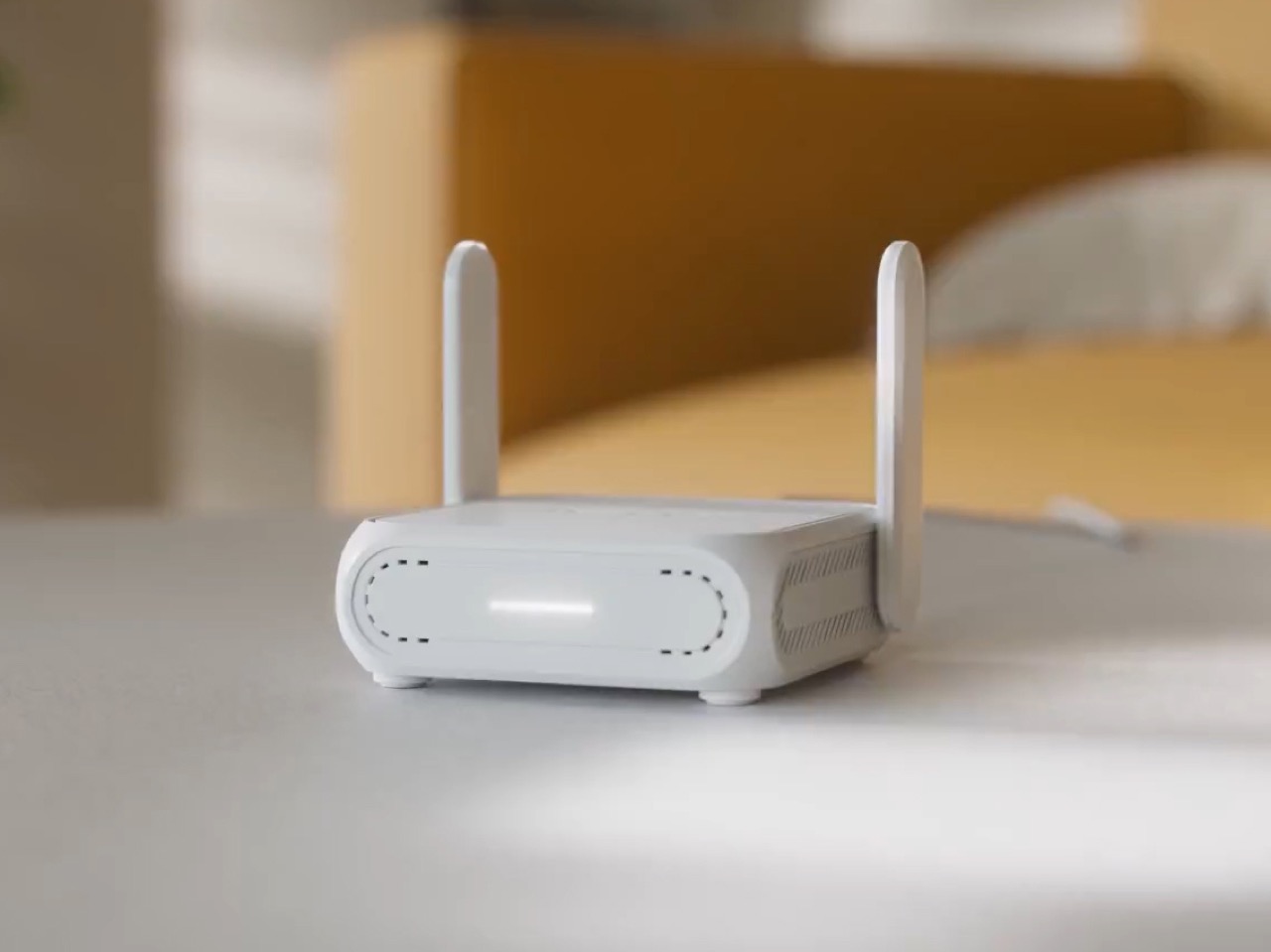
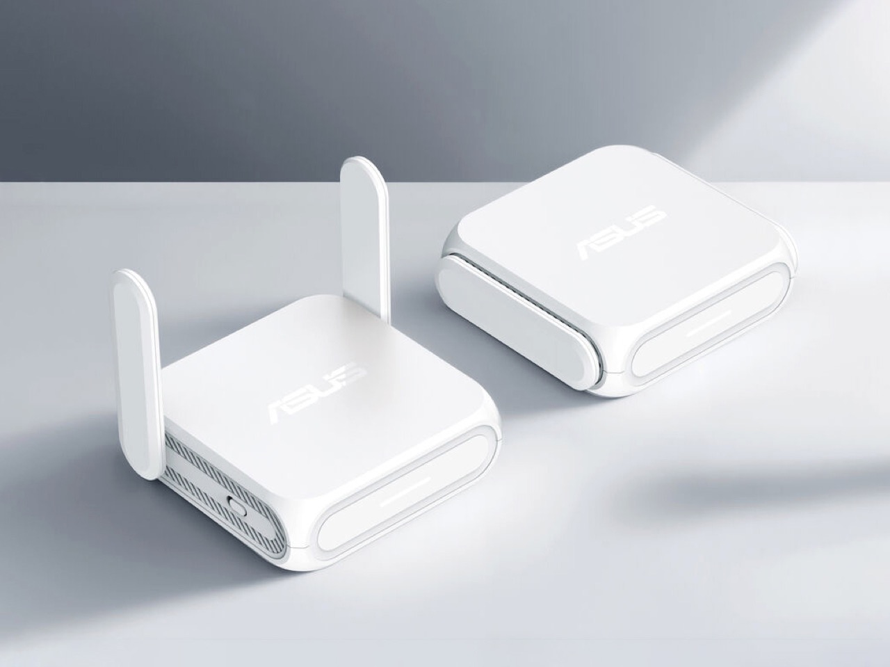
Hotel Wi-Fi is notoriously unreliable, and public networks come with security concerns that can jeopardize sensitive work files or personal information. Remote workers trying to join a critical video call from a cafe or leisure travelers attempting to stream a show from their Airbnb often find themselves at the mercy of sluggish, unstable connections. The ASUS RT-BE58 Go WiFi 7 Travel Router eliminates that frustration by putting you in control of your own network, no matter where you are. This compact device harnesses the power of WiFi 7 technology, delivering speeds up to 3600 Mbps through dual-band connectivity (688 Mbps on 2.4 GHz and 2882 Mbps on 5 GHz) with Multi-Link Operation (MLO) that intelligently combines bands for buffer-free performance. Whether you are working from a hotel lobby or streaming a movie on a long-haul flight with in-flight Wi-Fi, the RT-BE58 Go ensures a fast, stable connection.

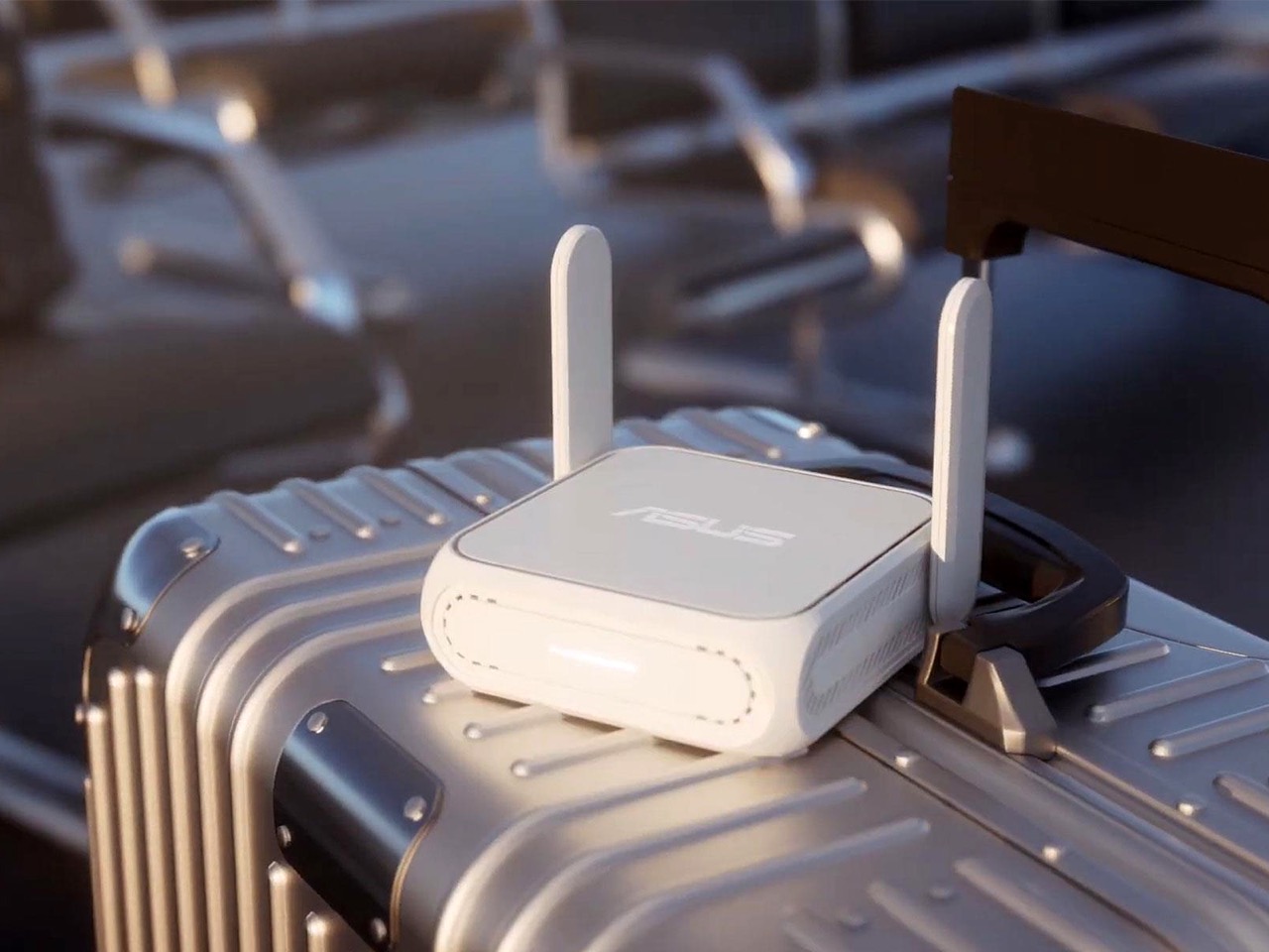
The router’s secret sauce lies in its tri-mode connectivity that adapts to your environment. In Public WiFi Mode (WISP), it transforms a weak hotel or airport network into your own secure hotspot. The 4G/5G mobile tethering feature allows you to share your smartphone’s data connection with all your devices, turning your phone into a powerful internet source without draining its battery. With comprehensive VPN support for up to 30 service providers and commercial-grade AiProtection security running 24/7, your data stays encrypted and safe from prying eyes. The device is powered by a 2.0 GHz quad-core processor, features a 2.5 Gbps WAN port and a 1 Gbps LAN port, and runs on USB-C power delivery, making it as portable as it is powerful.

Why We Recommend It

The ASUS RT-BE58 Go is a must-have because it solves one of travel’s most persistent problems: unpredictable connectivity. For business travelers, this device means you can confidently take video calls, access cloud files, and collaborate in real time without worrying about dropped connections or security breaches. For vacationers, it transforms frustrating hotel Wi-Fi into a robust network capable of supporting multiple devices simultaneously, perfect for families streaming different shows or staying connected on social media. By giving you control over your internet experience, the RT-BE58 Go removes a major source of travel stress and ensures that whether you are closing a deal or simply relaxing, your connection is always dependable.

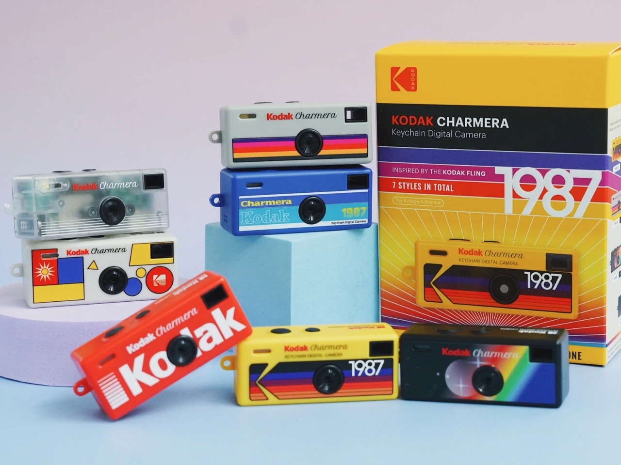
Kodak Charmera Keychain Digital Camera – Nostalgic Memories In A Pocket-Sized Package

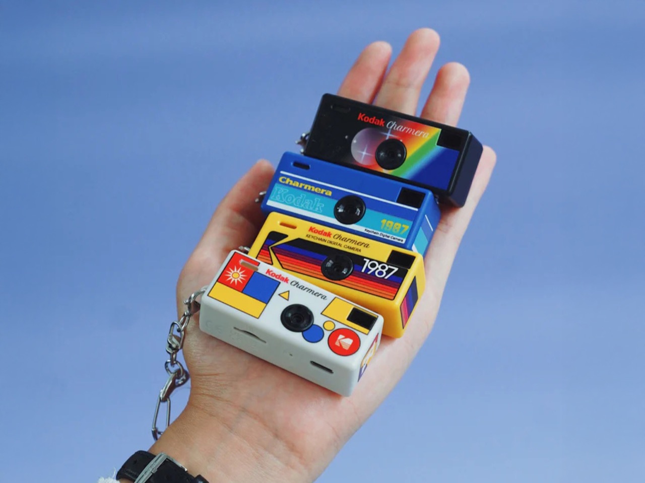
Smartphones have made photography incredibly convenient, but they have also made it predictable. Every shot looks clinical, over-processed, and somehow the same. There is something missing: the raw, unfiltered spontaneity that defined the analog era, when photos captured moments rather than curated Instagram feeds. The Kodak Charmera Keychain Digital Camera taps into that nostalgia while solving a modern problem, offering a tiny, pocket-friendly alternative to bulky cameras and sterile smartphone snaps. At just 58mm wide and weighing barely over an ounce, this miniature device clips onto your keychain, backpack, or belt loop, ensuring you always have a camera ready to capture life’s unscripted moments without the temptation to overthink the shot.

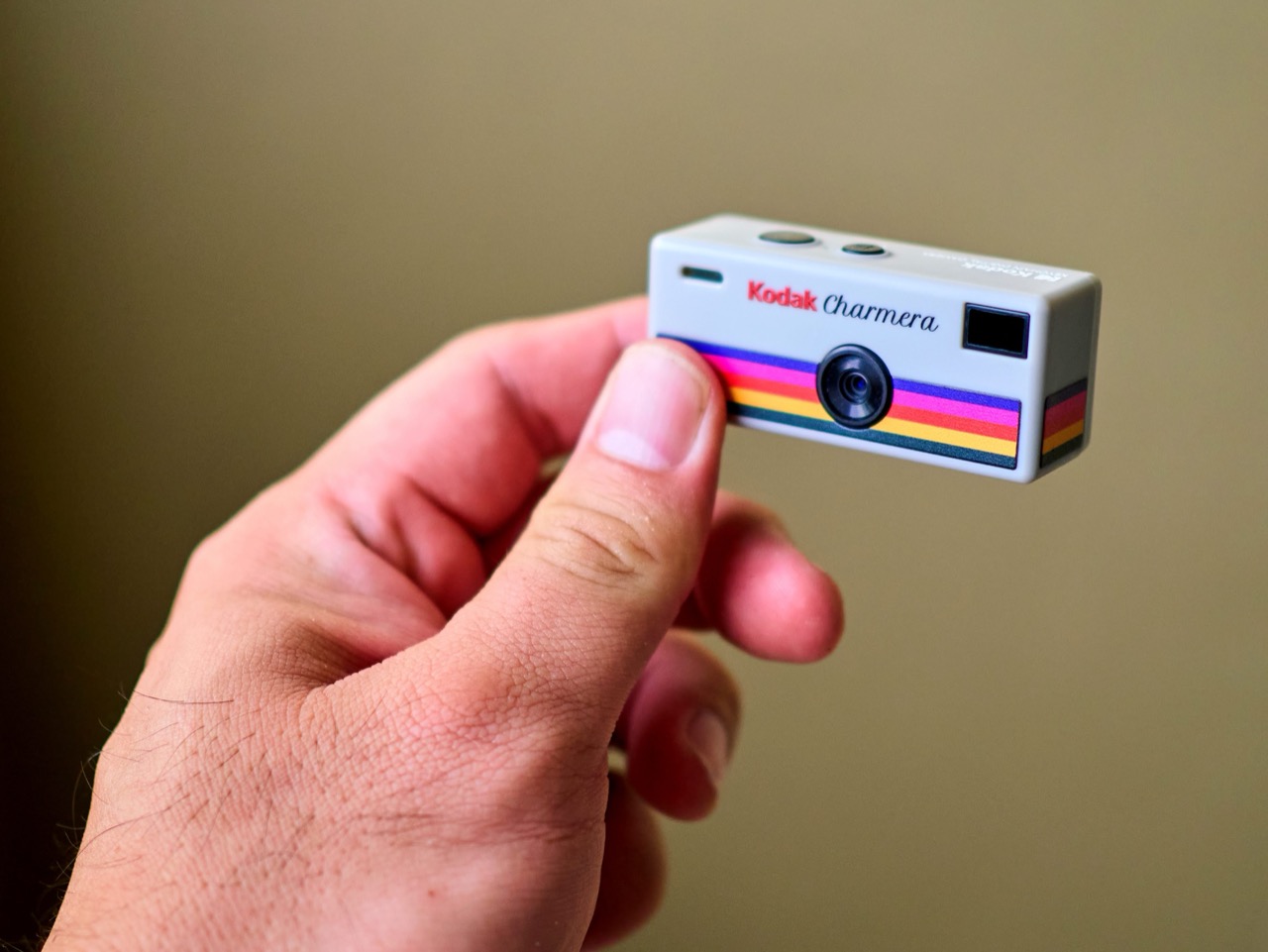
The Charmera packs surprising capability into its diminutive frame. It features a 1/4-inch CMOS sensor, a 35mm F2.4 lens, and shoots 1.6-megapixel photos at 1440 x 1080 resolution, along with video recording at 30 fps. What truly sets it apart are the built-in retro filters and vintage Kodak-branded frames that add an instant film-like aesthetic to your images, complete with a date stamp feature for that authentic throwback vibe. The camera supports micro SD cards up to 128GB and transfers media via USB-C, making it simple to move your captures to your phone or computer. Sold in blind box packaging with seven unique vintage designs (plus a rare transparent “secret edition”), the Charmera adds an element of collectible fun that makes it feel more like a lifestyle accessory than just another gadget.

Why We Recommend It

The Kodak Charmera is a breath of fresh air in an age of over-engineered AI-powered photography. It reintroduces the joy of spontaneous, imperfect snapshots that feel genuine and lived-in, rather than sterile or staged. For travelers, it is the perfect companion for quick candid shots at a bustling market, a sunset on the beach, or a quirky street scene, moments that deserve to be captured but not obsessed over. Its ultra-portable design means you will actually carry it everywhere, unlike a bulky DSLR or mirrorless camera that stays in the hotel. The Charmera is not about replacing your phone; it is about reclaiming the fun and unpredictability of photography, turning every outing into an opportunity to rediscover what it felt like to shoot without filters, apps, or second-guessing.

Loop Gear SK05Pro MAO Flat LED Flashlight – Light, Power, and Portability in One EDC Tool

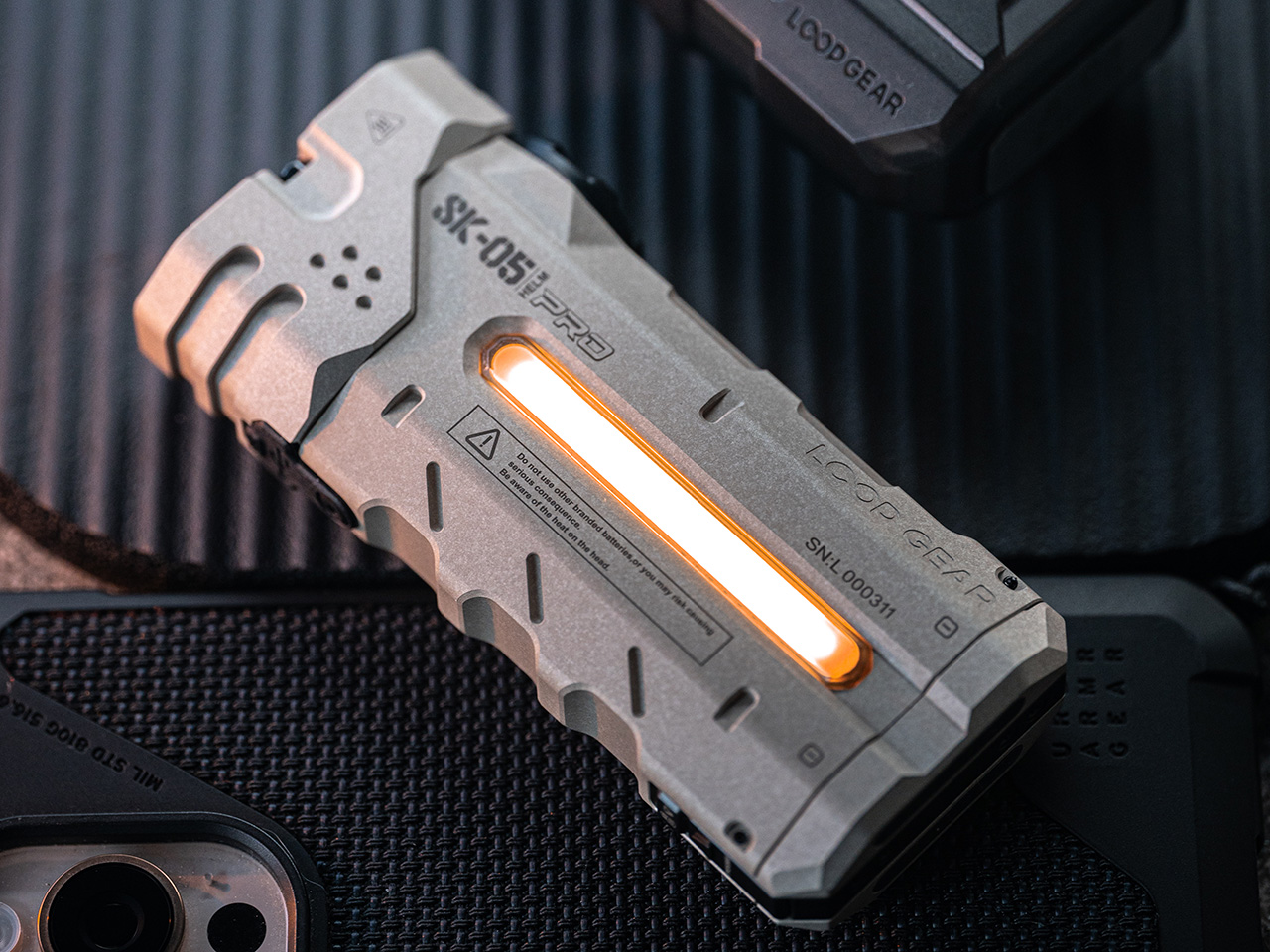
Fumbling with a dead phone battery in a foreign city or navigating a poorly lit alley to your accommodation are situations most travelers would rather avoid. Power outages at remote Airbnbs, unexpected night hikes, or simply finding your way through an unfamiliar train station at 3 a.m. can all be solved by having a reliable light source. The Loop Gear SK05Pro MAO goes far beyond a typical flashlight by functioning as a multi-tool designed specifically for modern travelers who need power, versatility, and durability in one compact package. This palm-sized device delivers an astonishing 4,360 lumens of brightness with a beam range of 405 meters, featuring a combination of one SFT25 spot LED (1,300 lumens) and three SST25 flood LEDs (3,060 lumens) that offer unmatched illumination in a body small enough to slip into a coat pocket or clip onto your backpack.

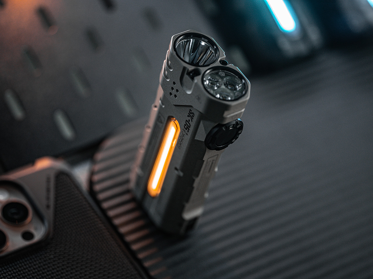
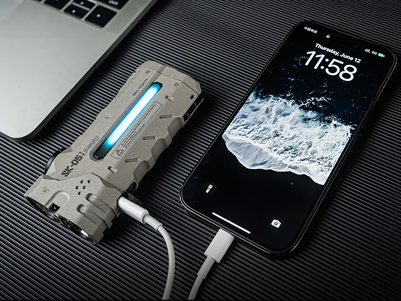
What sets the SK05Pro MAO apart is its dual functionality as an 8,000mAh power bank with 20W fast-charging capability via USB-C, meaning you can charge your phone, camera, or other devices on the go while still having over 20 days of flashlight runtime. The device features three distinct lighting modes (floodlight, spotlight, and an RGB sidelight with seven modes including camp lighting, emergency beacon, and mood lighting), giving you adaptability for every scenario from reading a map to signaling for help. With dual rechargeable 18650 batteries that are easily replaceable, IP68 waterproof rating for submersion up to one meter, a magnetic tail for hands-free use, and a durable MAO (Micro-Arc Oxidation) finish that resists scratches and corrosion, this flashlight is built to handle whatever your journey throws at it.

Why We Recommend It

The Loop Gear SK05Pro MAO is essential because it eliminates two of travel’s most common anxieties: running out of battery and being caught in the dark without proper lighting. For adventure travelers exploring caves, hiking at dawn, or camping in remote areas, the 4,360-lumen output and versatile lighting modes provide professional-grade illumination. For urban travelers, the power bank feature is a lifesaver when your phone is dying and you need to navigate, translate, or contact someone. The compact, durable design means you will actually carry it, and the 20-day runtime ensures it will be ready when you need it most. This is not just a flashlight; it is a safety net, a power source, and a problem-solver wrapped into one remarkably practical device.

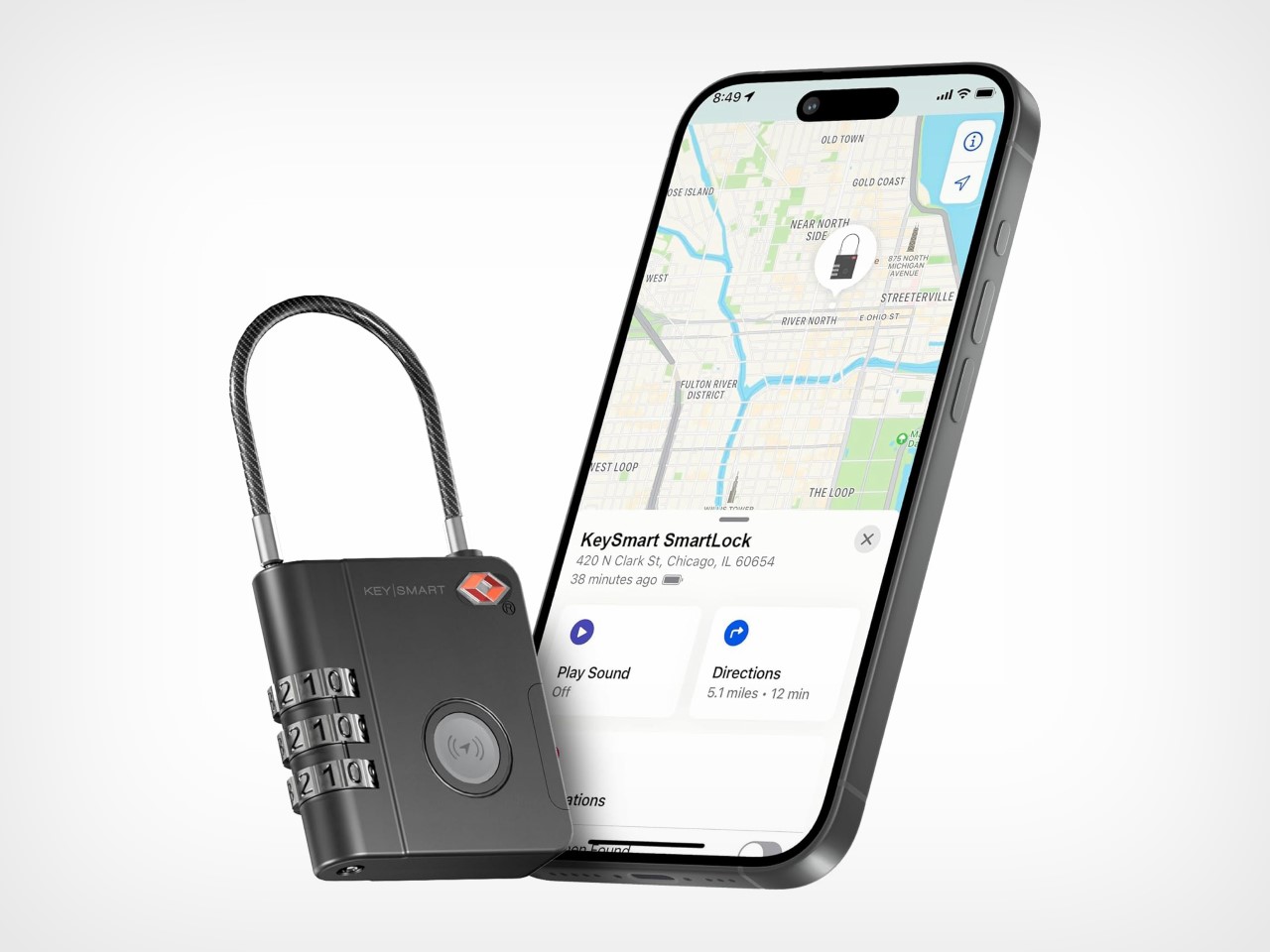
KeySmart SmartLock – The TSA-Approved Lock That Lets You Track Your Luggage

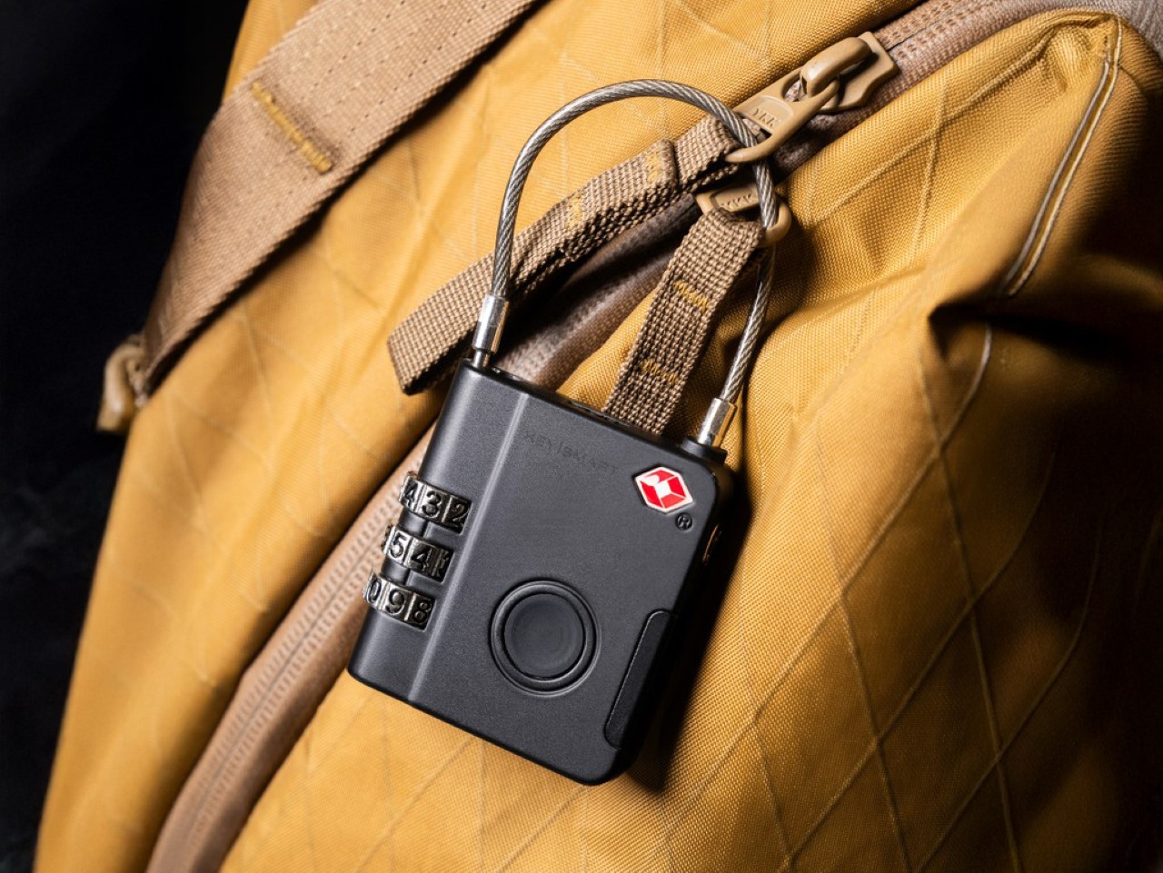
Few travel nightmares rival the sinking feeling of watching luggage carousel after luggage carousel spin endlessly without your bag appearing. Lost luggage is not just an inconvenience; it can derail an entire trip, leaving you without essentials, important documents, or sentimental items. Traditional luggage locks only address theft, not the far more common problem of misplaced or misrouted bags. The KeySmart SmartLock solves both issues by combining a TSA-compliant combination lock with built-in Apple Find My tracking technology, creating the world’s first trackable luggage lock. This means you can secure your bag from tampering while simultaneously knowing exactly where it is at all times, whether it is sitting in a baggage claim office halfway around the world or mistakenly loaded onto the wrong flight.

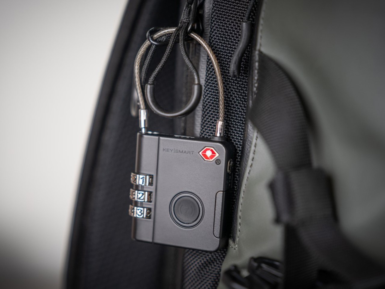
The SmartLock operates as a standard three-digit combination lock, but its real power lies in the integrated Find My chip that taps into Apple’s vast global network of over a billion devices to pinpoint your bag’s location with remarkable accuracy. The device features a 76 dB alarm that can be triggered remotely via the Find My app, making it easy to identify your bag on a crowded carousel or alert you if someone tries to walk off with it. With a replaceable CR1632 coin cell battery lasting up to four months under typical use, the lock continues to function manually even if the battery dies, ensuring you are never locked out. The ruggedized plastic construction is built to withstand the rough handling of airport baggage systems, and at just a fraction of the size of bulky AirTags or separate tracking devices, it adds virtually no weight or bulk to your luggage.

Why We Recommend It

The KeySmart SmartLock is a must-have because it addresses one of travel’s most pervasive anxieties with elegant simplicity. Airlines mishandle millions of bags annually, and the stress of not knowing where your belongings are can overshadow an entire trip. This lock gives you real-time visibility and control, allowing you to track your bag from check-in to baggage claim and even alert airport staff to its precise location if it goes missing. For frequent flyers, the peace of mind alone justifies the investment. Beyond tracking, the TSA compliance means security can inspect your bag without damaging the lock, and the audible alarm adds an extra layer of theft deterrence. This is not just a lock; it is a complete luggage security and tracking system that transforms how you protect and monitor your belongings while traveling.

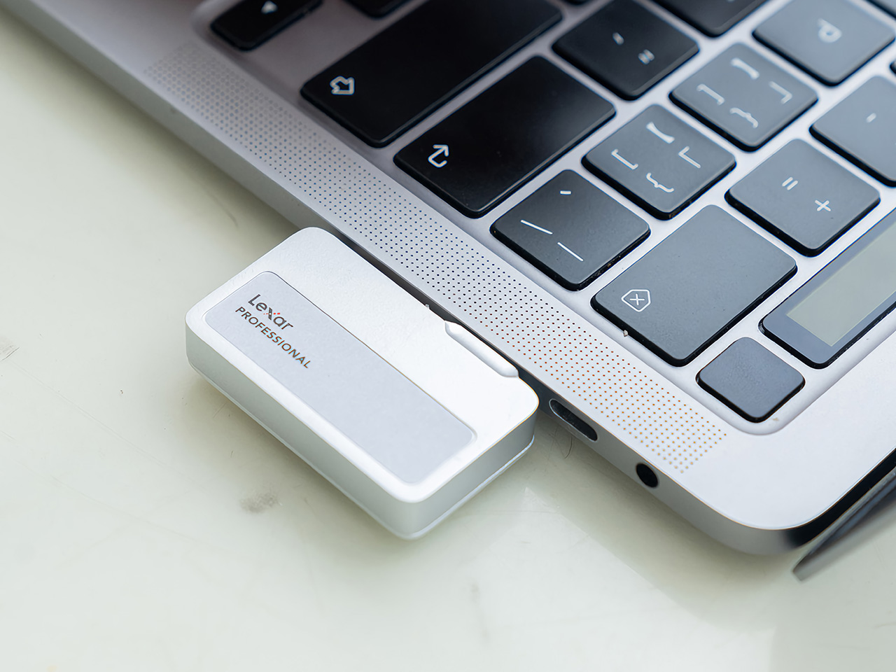
Lexar 2TB Professional Go Portable SSD – Never Pay For iCloud Photo Storage Again

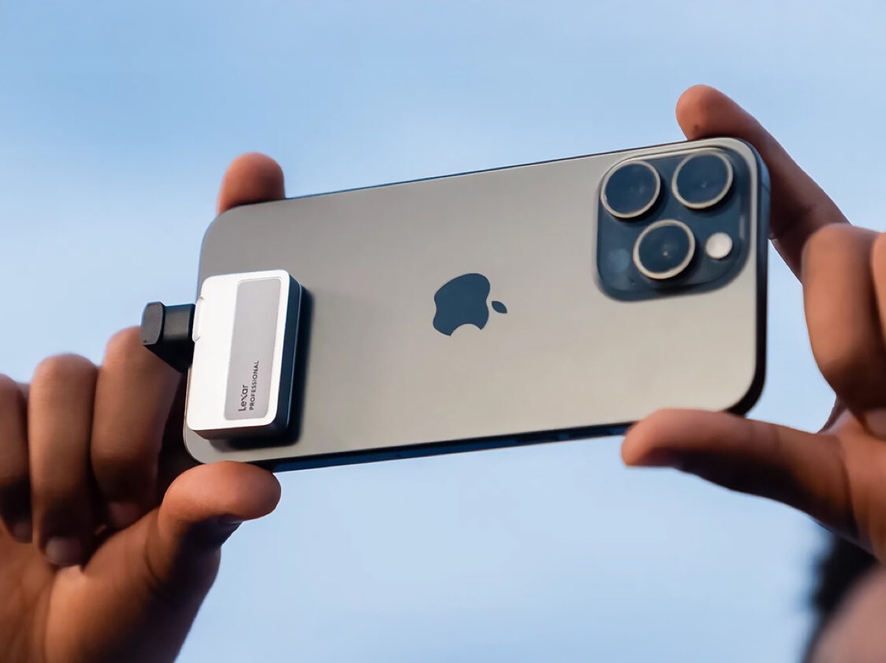
Running out of storage space mid-trip is a uniquely modern form of panic. Whether you are capturing sunset photos in Santorini, recording family moments at a reunion, or simply need to free up space for that crucial restaurant recommendation app, smartphone storage fills up fast and cloud storage often fails you when internet is spotty or expensive. The anxiety of choosing which precious memories to delete just to take one more photo is something no traveler should experience. The Lexar 2TB Professional Go Portable SSD eliminates this dilemma by offering massive local storage in a device smaller than your thumb. At just 1.71 x 0.98 x 0.32 inches and weighing only 13 grams, this drive plugs directly into any USB-C device without cables, instantly giving you up to 2TB of additional space that feels practically weightless in your pocket.

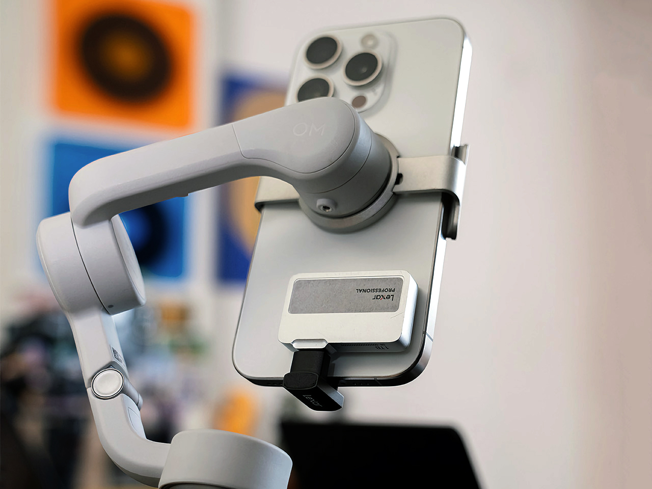
The magic lies in its simplicity and speed. With read speeds up to 1050MB/s and write speeds up to 1000MB/s via USB 3.2 Gen 2, transferring hundreds of photos or hours of video takes minutes, not hours. The plug-and-play design means no fumbling with adapters or cables, just plug it directly into your phone, tablet, or laptop and start backing up immediately. The drive is built for travel with IP65 dust and water resistance, 1-meter drop protection, and an included silicone protective case to handle the inevitable bumps and spills of life on the road. For those who need expanded connectivity, Lexar also offers a version with an integrated 4-port USB-C hub, but for most travelers, the standalone SSD provides all the storage security they need without the complexity.

Why We Recommend It

The Lexar Professional Go is essential because it gives you complete control over your digital memories without relying on cloud services or worrying about storage limits. For families traveling together, it means everyone can contribute photos and videos to a shared library without filling up individual phones. For solo travelers, it provides peace of mind knowing that every sunset, street scene, and spontaneous moment is safely backed up locally. The cable-free design ensures you will actually use it, unlike bulky drives that stay buried in your luggage, and the 2TB capacity means you can go months without worrying about running out of space. This device transforms travel photography from a constrained, anxiety-inducing experience into the free-flowing creative process it should be, all while keeping your precious memories secure and accessible wherever you are.
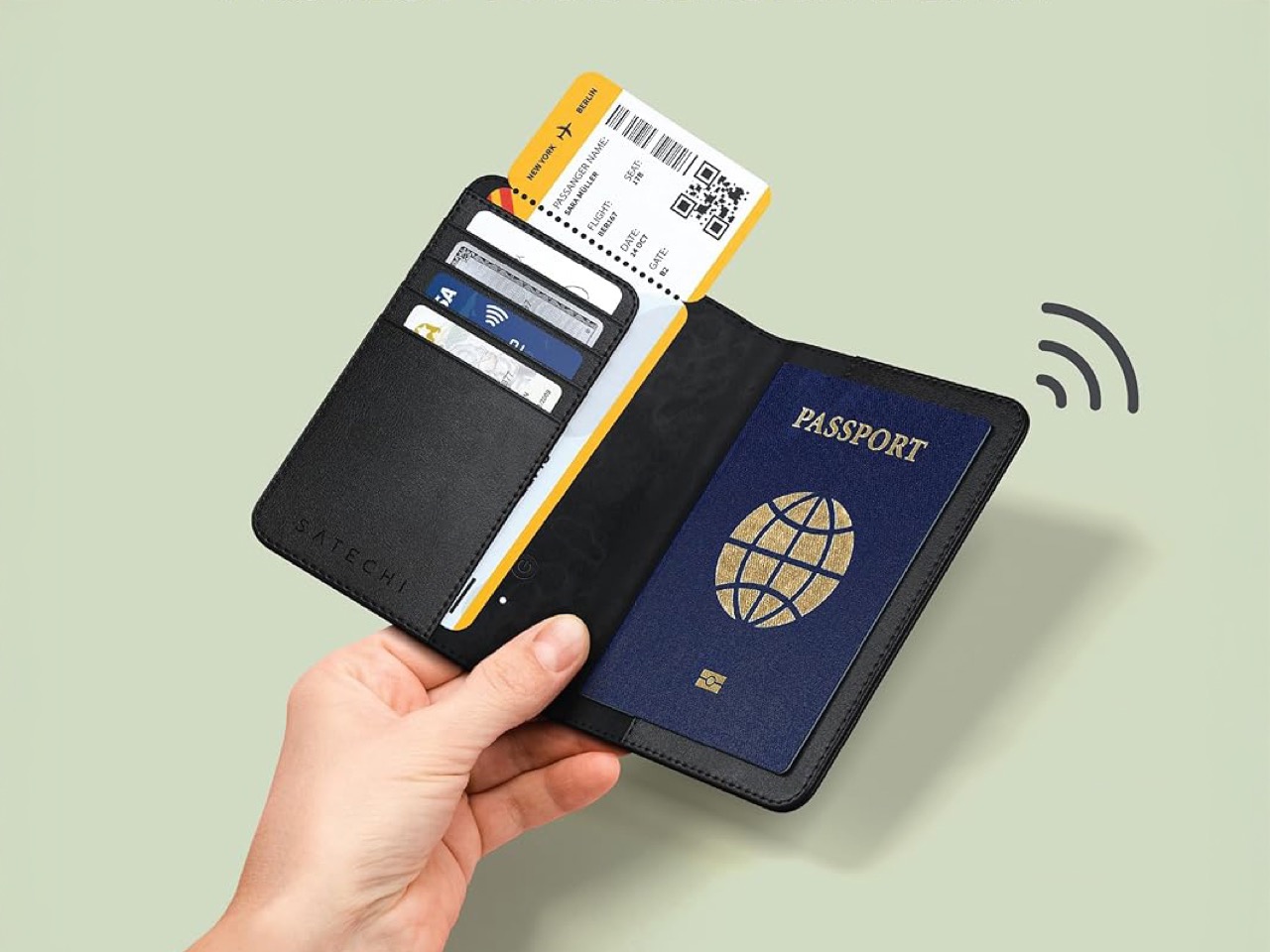
Satechi Vegan-Leather FindAll™ Passport Cover – Your Passport Just Got GPS Tracking Powers

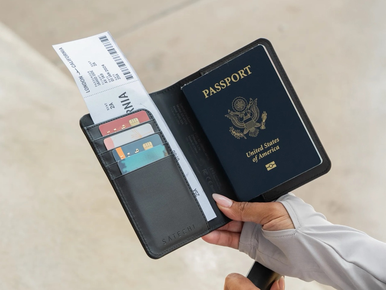
Travel documents have a habit of disappearing at the worst possible moments. You fumble through your bag at airport security, dig through coat pockets at passport control, or panic when you cannot remember if you left your passport in the hotel safe or the seat-back pocket on the plane. Beyond the stress of misplacing documents, there is the very real threat of digital pickpocketing through RFID skimming, where thieves wirelessly steal credit card and passport information simply by standing near you. The Satechi Vegan-Leather FindAll™ Passport Cover addresses both problems by combining elegant organization with cutting-edge tracking technology and security features. This bifold passport holder transforms the chaotic experience of managing travel documents into something streamlined and stress-free, with dedicated slots for your passport, boarding pass, and up to four cards, all wrapped in premium vegan leather that looks and feels like the real thing.

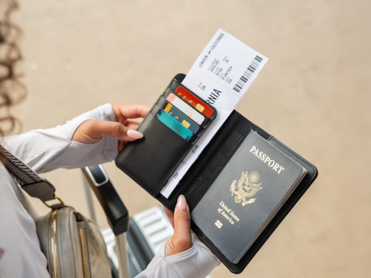
The FindAll technology integrated into the cover connects via Bluetooth 5.2 to Apple’s Find My network, allowing you to locate your passport through the app with audible alerts reaching 90 dB and step-by-step directions to its exact location. You will receive notifications if you accidentally leave it behind at a restaurant, taxi, or hotel room. The built-in 150mAh rechargeable lithium battery charges wirelessly on any Qi, Qi2, or MagSafe charger, lasting up to five months between charges with normal use. RFID-blocking technology protects your sensitive passport and credit card information from electronic theft, giving you peace of mind in crowded airports and tourist areas. Weighing just 3.7 ounces, the cover adds minimal bulk while dramatically upgrading how you carry and protect your most important travel documents.

Why We Recommend It

The Satechi FindAll Passport Cover is indispensable because it solves the organizational chaos that plagues international travel. For frequent flyers, having all your essential documents consolidated in one trackable, RFID-protected holder means faster security lines, smoother immigration checkpoints, and zero anxiety about where your passport is. The Find My integration provides a safety net that traditional passport holders cannot offer, immediately locating misplaced documents before they turn into lost ones. For occasional travelers, the elegant design and practical organization elevate the travel experience from stressful document-juggling to confident, prepared efficiency.

The post 7 Best Underrated Travel Gadgets That Fit in Your Carry-On and Solve 90% of Travel Headaches first appeared on Yanko Design.

Even Realities G2 Just Solved the Biggest Problem With Smart Glasses… Using A Ring

Even Realities launched their first smart glasses last year with a pitch that felt almost countercultural: what if your eyewear didn’t record everything around you, didn’t pipe audio into your ears, and didn’t make everyone nearby wonder if you were filming them? Instead of packing their frames with cameras and speakers, they focused on a single function: a clean, effective heads-up display. The G1 glasses were a minimalist take on wearables, offering monochrome green text in your line of sight for notifications and AI assistance, all without the privacy concerns of outward-facing cameras. This focused approach found its niche, landing the G1 in 350 luxury eyewear shops globally and proving there’s a real appetite for smart glasses that prioritize subtlety and practical assistance.

The G2 glasses themselves improve on last year’s G1 in predictable but welcome ways. Bigger display, better optics, lighter frame, longer battery life. They still avoid cameras and speakers entirely, sticking with Even’s “Quiet Tech” philosophy of providing information without creating privacy concerns. But pair them with the new R1 ring and you get something more interesting than incremental hardware improvements. The ring lets you control the glasses with thumb gestures against your index finger, turning navigation into something closer to using a trackpad than fumbling with voice commands or head taps. Whether that’s actually more natural in practice than the alternatives depends partly on how well the gesture recognition works and partly on whether you’re the kind of person who wants to wear a ring in the first place.

Designer: Even Realities

The display improvements are significant enough to matter in daily use. Even calls their new system HAO 2.0, which stands for Holistic Adaptive Optics, and the practical result is that information appears in layers rather than as flat text plastered across your vision. Quick notifications and AI prompts sit closer in your field of view, while longer content like navigation directions or notes recede slightly into the background. It’s still monochrome green, the same matrix-style aesthetic from the G1, but sharper and easier to read in motion or bright light. The frame itself weighs just 36 grams and carries an IP67 rating for water and dust resistance, so you can wear them in the rain without worrying about killing a $599 investment. Battery life stretches past two days now, and the prescription range goes from -12 to +12, covering most people who need corrective lenses.

What made the G1 frustrating for some users was the interaction model. You could talk to the glasses, but that meant either looking weird in public or finding a quiet spot. You could tap the touch-sensitive nubs on the temples, but they were finicky and required you to constantly reach up to your face. While the G2 improves the reliability of those touchpads significantly, Even Realities’ R1 smart ring practically revolutionizes how you interact with the smart display. Worn on your index finger, the ring lets you swipe up and down with your thumb or tap to select options, essentially turning your hand into a trackpad for your face. The ring is made from zirconia ceramic and stainless steel, costs $249 separately, and connects to the glasses through what Even calls their TriSync ecosystem, linking the glasses, ring, and phone into one synchronized unit.

The gesture controls take some getting used to, based on early reviews. Accidental swipes are common at first, and the learning curve means you might fumble through menus for the first few days. But when it works smoothly, navigating with the ring is more subtle than any of the alternatives. You can check a notification, dismiss it, and move on without anyone noticing you’ve interacted with your glasses at all. That subtlety matters more than it sounds like it would, especially if you’re using features like the built-in teleprompter for presentations or the real-time translation during conversations. The glasses still support the old interaction methods too, so you’re not locked into one way of controlling them.

The AI side of things has been upgraded as well, with Even introducing what they call the Conversate assistant. It handles the usual smart glasses tasks like showing notifications, reading messages, and providing contextual information, but it’s designed to be less intrusive about it. You talk to it and get text responses on the display rather than audio, which keeps conversations private and avoids the awkwardness of having your glasses talk back to you in a quiet room. The system pulls from your phone’s connectivity, so there’s no separate data plan or complex setup required. The AI integration feels thoughtful rather than forced, providing information when you need it without constantly demanding attention.

One detail worth noting: the R1 ring is not compatible with the original G1 glasses. If you bought the first generation and want the ring’s functionality, you’ll need to upgrade to the G2 entirely. Even is offering a launch promotion where buying the G2 gets you the ring and other accessories at 50 percent off, which brings the combined price to $724 instead of $848. For context, Meta’s Ray-Ban smart glasses with their Neural Band controller and full-color display cost $799, though those come with cameras and all the privacy considerations that entails. The G2 and R1 combo sits in an interesting middle ground, offering more focused functionality at a similar price point.

The combination of display-only glasses and a gesture-controlled ring represents a particular vision of what smart eyewear could be. It’s not trying to replace your phone or capture every moment of your life. Instead, it extends your phone’s functionality into your field of view while giving you a discreet way to interact with that information. For people who give frequent presentations, the teleprompter feature alone could justify the cost. For travelers, having real-time translation floating in your vision during conversations is genuinely useful. And for anyone tired of constantly pulling out their phone to check notifications, the G2 offers a less disruptive alternative. Even Realities is refining an approach that feels increasingly relevant as smart glasses move from novelty to practical tool, and the G2 with R1 suggests they’re learning the right lessons from their first attempt.

The post Even Realities G2 Just Solved the Biggest Problem With Smart Glasses… Using A Ring first appeared on Yanko Design.

From Multi-Story to Single-Level: Häuslein’s New Eire Targets Guest Accommodation Market

Australian tiny house manufacturer Häuslein Tiny House Co has just launched its newest model, the Eire, marking a significant departure from its traditional multi-story designs. The new Häuslein Eire tiny house has been crafted with inspiration from Ireland (homeland of Scott, who designs all our tiny houses!), bringing a distinctly fresh aesthetic to the company’s established lineup.

Designer: Häuslein Tiny House Co.

Design Philosophy Rooted in Natural Light

The Eire represents a bold shift toward single-level living, featuring a single-story layout that puts the focus firmly on daylight through panoramic glazing that maximizes natural light and connection to the outdoors. This design philosophy prioritizes openness and connectivity with nature, a hallmark that sets it apart from the company’s traditionally compact, multi-level offerings.

Crafted with spacious design, vast windows, and an all-new colour palette, the Eire brings a fresh, elegant look to our tiny house range, while maintaining the same high standard in design and finish that Häuslein customers have come to expect.


Strategic Market Positioning

Unlike Häuslein’s larger family-oriented models, the Eire targets a specific niche in the tiny house market. The first layout is primarily designed for guest accommodation, though the company has indicated that a possible second layout for long-term living will also be developed with customer interest.

The company has identified two primary use cases for the Eire. For Airbnb guests, the tiny house lends itself well to guest accommodation as a simpler, more cost-effective Airbnb tiny house with everything 1-2 guests may need for a very enjoyable stay. For property owners seeking extra accommodation, the Eire has been specifically designed for 1-2 family members or friends to have a very enjoyable stay on your property with their own kitchen, loft bedroom, toilet, and shower, and chill out space.

At an Introductory Special price starting at $135,080 (inc GST), the Eire positions itself as one of Häuslein’s more accessible options, making quality tiny house living available to a broader market segment. This pricing strategy reflects the model’s streamlined design and targeted functionality.

The Eire represents Häuslein’s evolution toward more specialized, purpose-built designs that address specific market needs while maintaining their commitment to quality craftsmanship. With its Irish-inspired aesthetic and focus on natural light, the Eire offers a compelling option for those seeking elegant guest accommodation or compact living solutions without compromising on design excellence.

The post From Multi-Story to Single-Level: Häuslein’s New Eire Targets Guest Accommodation Market first appeared on Yanko Design.

The next macOS update can turn your screen into a ring light

Sometimes, the best features in a new operating system aren't the flashy ones that get broadcast during a keynote. They're subtle improvements that naturally fit into how you use your device and just make the experience better. One of those appears to be coming in the next macOS update. The dev beta of Tahoe 26.2 includes a feature that essentially lets your computer screen function as a ring light during a video call.

It's called Edge Light and it illuminates a rectangular band around the edge of the screen. Apple's Neural Engine will also position the light based on where it detects your face in the video frame. There are some controls for making the light warmer or cooler, and it can be set to turn on automatically once the brightness in your environment dims. Edge Light doesn't cover the top menu bar, and it will also move out of the way if the cursor hovers over it so that you can still use your laptop normally while on a call. 

Edge Light will only be available on MacBooks from after 2024 that are running on Apple's Silicon. It may not be a true replacement for a ring light, but it's probably a step up from opening a bunch of blank Google Docs to try and illuminate yourself for a last-minute meeting.

This article originally appeared on Engadget at https://www.engadget.com/computing/the-next-macos-update-can-turn-your-screen-into-a-ring-light-234410504.html?src=rss

Vollebak’s Densest Fleece Yet: 539g Military Hoodie From the Abyss

You know those people who claim their jacket is “military-grade” because it has a lot of pockets? Yeah, forget them. The Vollebak Deep Sea Diver Hoodie actually is military-grade, and not in the marketing nonsense way. This thing was built using the same technology that keeps British Special Forces alive when they’re dealing with subzero water temperatures. Let that sink in for a second. We’re talking about gear designed for people whose job description includes “don’t die in the freezing ocean.”

The star of the show here is the material itself. At 539 grams per square meter, this is officially the densest fleece Vollebak has ever made. To put that in perspective, most hoodies you’re wearing right now probably clock in somewhere between 200 and 300 grams per square meter. This is nearly double that weight, which translates to an insane amount of trapped heat without turning you into a walking sauna. The fabric is Polartec Power Stretch, a blend of 91% polyester and 9% elastane, and it’s the same stuff used in drysuit insulation layers that divers wear beneath their wetsuits.

Designer: Vollebak

What makes this material genuinely impressive is how it manages to be thick without being stupid. We’ve all owned those chunky fleeces that keep you warm but make you feel like the Michelin Man, right? This one has four-way stretch built into its DNA, meaning it bends, stretches, and rebounds in literally any direction you move. You get the warmth of something designed to survive the North Sea, but you can still, you know, move your arms and actually do things.

The technical specs read like something out of a performance gear catalog. The fleece breathes, wicks moisture away from your skin, dries fast, and resists odors. But here’s the kicker: it stays warm even when damp. That’s not a feature most regular hoodies can claim. Most cotton-blend sweatshirts turn into sad, soggy heat vampires the second they get wet. This one was literally designed for an environment where staying dry isn’t always an option, so it keeps insulating even when conditions aren’t perfect.

Every detail on this hoodie serves a purpose beyond looking cool (though it does look pretty cool). The double-lined snorkel hood creates what Vollebak calls a “microclimate” around your head. It’s basically a cocoon of trapped warmth that seals out wind and cold. The egg-shaped pockets aren’t just a design quirk; they’re cover-stitched onto the shell for durability and positioned to keep your hands warm without adding bulk. There’s a two-way front zip with moleskin and faux-suede tape where the zipper meets your chin, because metal on skin when it’s freezing outside is nobody’s idea of a good time.

The construction is equally obsessive. Flatlock seams ensure the whole thing holds together under stress while giving you total freedom of movement. There’s a woven back yoke with a faux-suede hanger loop, because even extreme performance gear needs somewhere to hang. At 1,200 grams total, it’s got serious heft without feeling unwieldy, and it’s all constructed in Portugal using manufacturing standards that would make your average fast-fashion brand break out in hives.

The origin story here matters. This fleece technology wasn’t developed in some boardroom brainstorming session about “outdoor lifestyle vibes.” It was engineered for military divers working in some of the harshest conditions on Earth. The North Sea doesn’t care about your brand positioning. It’s cold, it’s brutal, and survival gear either works or it doesn’t. Vollebak took that proven technology and adapted it for civilian life, which is a much better approach than designing something that looks tactical but performs like garbage.

At $795, this isn’t an impulse purchase. But when you break down what you’re actually getting, the price starts making sense. This is legitimately Special Forces-grade insulation technology, the densest fleece the brand has ever produced, and construction quality that’s built to last years, not seasons. You’re not paying for a logo or hype; you’re paying for materials and engineering that were literally tested in life-or-death scenarios.

For anyone into design, tech, or just genuinely well-made things, the Deep Sea Diver Hoodie represents something rare: a product where the performance actually backs up the story. It’s a bridge between underwater survival technology and everyday wear, and it does both without compromise.

The post Vollebak’s Densest Fleece Yet: 539g Military Hoodie From the Abyss first appeared on Yanko Design.

IBM announces Nighthawk and Loon quantum chips

IBM has introduced two different quantum chips that it believes could help demonstrate "quantum advantage," or the ability for a quantum computer to solve a problem faster than a classical computer, by the end of 2026. The new chips, Nighthawk and Loon, should help do that by taking different approaches to connecting qubits in a quantum computer, producing fewer errors and supporting more complex computations.

Of the two new chips, IBM Quantum Nighthawk is the one the company believes it can iterate on to produce quantum advantage. By the end of 2025, the version of Nighthawk IBM will provide to its partners will have "120 qubits linked together with 218 next-generation tunable couplers" arranged in a square lattice to connect with their neighbors. IBM claims this will allow Nighthawk to "execute circuits with 30 percent more complexity" while maintaining lower error rates. It'll also let it handle more demanding computational problems "that require up to 5,000 two-qubit gates," the company says.

A silver, rectangular Quantum Loon chip.
The IBM Quantum Loon chip.
IBM

IBM Quantum Loon is the more experimental of the two chips, connecting qubits not just horizontally on the chip, but vertically, too, New Scientist writes. Whichever chip proves to be more useful, the added connectivity options allows for fewer errors and more complex computations, which could lead to new real-world applications for quantum computers.

To pair with its new chips, IBM says it's also contributing to a new community-led quantum advantage tracker backed by Algorithmiq, researchers from the Flatiron Institute and BlueQubit. The tracker "supports three experiments for quantum advantage across observable estimation, variational problems, and problems with efficient classical verification," IBM says, and the company has invited the wider research community to contribute to it.

As New Scientist notes, IBM's approach is different from competitors like Google because it's focused on connecting qubits together in smaller groups. Google introduced its Willow chip in 2024 as being theoretically capable of demonstrating quantum advantage. A year later in 2025, the company announced its "Quantum Echoes" algorithm for Willow, "the first-ever verifiable quantum advantage running the out-of-order time correlator (OTOC) algorithm."

This article originally appeared on Engadget at https://www.engadget.com/science/ibm-announces-nighthawk-and-loon-quantum-chips-213603769.html?src=rss

Insta360 Just Brought Back Polaroid Printing, And It Mounts to Your Action Cam

Any tech nerd can look at an action camera and know what it’s for. And then look at an instant camera and know that its use case, audience, and environment are completely different. There’s really no need for an action camera while taking group photos in front of the Eiffel Tower, and you never use an instant camera to capture your POV while dirt biking. Insta360 basically decided to change that.

Their latest Videography Bundle for the Ace Pro 2 features a variety of accessories, one of them being a snap-on printer that turns the action cam into a wide-angle Polaroid of sorts. Take a photo, select it, and print it out. Insta360 believes a camera is a camera is a camera, you don’t need three devices to do the same job. The Videography Bundle proves that. Heck, what’s next, a webcam attachment for the Ace Pro 2?

Designer: Insta360

The Pocket Printer is the accessory getting most of the attention, and for good reason. It’s a compact wireless module that connects to the Ace Pro 2 via Bluetooth and physically mounts to the camera using the new Xplorer Grip Pro. The quick-release system on the grip’s base lets you snap the printer on and off, so you’re not permanently committed to carrying extra bulk when you just want a lightweight action cam. When attached, the whole setup looks like someone strapped a chunky instant camera to a grip handle, which is essentially what it is, except this instant camera can also shoot 8K video and survive conditions that would destroy a vintage Polaroid.

The printer uses Zink technology, the same zero-ink printing process found in portable printers from Canon and Fujifilm. Prints come out at roughly 2×3 inches, dry to the touch, smudge-resistant, and durable enough to toss in a bag without worrying about them getting ruined. The paper itself contains dye crystals that activate when heat is applied, so there’s no ink cartridge to replace or messy film packs to load in the dark. You just buy Zink paper refills when you run out, pop them in, and keep printing. It’s a recurring cost similar to Instax film, but the prints themselves are more practical for everyday handling.

What makes this more interesting than just “action cam plus printer” is that Insta360 clearly designed the experience around actual photographic flexibility. The Ace Pro 2 captures 48MP stills and 8K video using a Leica co-engineered sensor, so the image quality you’re working with is leagues beyond what a traditional instant camera can produce. You can shoot a whole sequence, review the images on the camera’s flip screen, edit or crop if needed, and then choose which ones deserve to become physical prints. That selective printing capability is the key difference between this and a true Polaroid experience, where every shutter press costs you a piece of film whether the shot worked or not.

The $600 Videography Bundle includes more than just the printer. You get the Ace Pro 2 body, the Xplorer Grip Pro, the Pocket Printer, a flip screen hood for outdoor visibility, and a leather case that gives the whole setup a vintage aesthetic. Insta360 also launched the bundle alongside three new Leica co-engineered lenses and various ND filters, expanding the camera’s capabilities for serious videography work. The bundle is clearly trying to position the Ace Pro 2 as more than just an action cam, it’s a hybrid content creation tool that can handle extreme sports footage, casual street photography, and instant social prints from the same device.

Practicality questions remain. The Ace Pro 2 is waterproof and built for harsh conditions, but the printer module is likely only splash-resistant at best. That means you probably shouldn’t take it on a whitewater rafting trip while attached, though the camera itself would handle it fine. Battery life is another consideration, the printer has its own power supply and charges via USB-C, but adding another device to your charging routine might be annoying for people who value simplicity. The grip and printer combo also adds noticeable weight and bulk, transforming a pocketable action cam into something closer to a small handheld camcorder.

But maybe that’s the point. Insta360 isn’t trying to make the perfect streamlined action camera, they’re trying to make one camera that can adapt to wildly different shooting scenarios without requiring you to own separate devices. The cynic might say this is just accessory upselling, and sure, that’s part of it. But there’s something genuinely novel about a camera ecosystem that can switch from recording mountain bike footage to printing birthday party snapshots without even changing the core device. Whether people actually want that level of versatility in a single piece of hardware is a different question, but Insta360 is betting that at least some users would rather carry one adaptable camera than juggle multiple specialized ones. The Videography Bundle suggests they’re willing to push that concept pretty far, and the printer attachment is just the beginning of what could become a much weirder, more interesting product category.

The post Insta360 Just Brought Back Polaroid Printing, And It Mounts to Your Action Cam first appeared on Yanko Design.

The Rogue Prince of Persia hits Switch and Switch 2 on December 16

The Rogue Prince of Persia is coming to Switch and Switch 2 consoles on December 16. The game was in early access for around a year before being officially released for PC and consoles back in August.

This version has been "optimized for handheld and hybrid play" and includes all content from the original release. That means players will be able access a wide variety of biomes, weapons and secrets.

This is a unique take on the Prince of Persia franchise, bringing parkour-style movement and combat to the roguelike genre. It's a fun and frenetic experience that calls to mind another sidescrolling roguelike, Dead Cells. This game was actually co-developed by Evil Empire, the company behind Dead Cells.

This is a digital release, but collectors have something to look forward to. The Rogue Prince of Persia is getting a deluxe physical release on April 10 for Switch, Switch 2 and PS5.

This physical version ships with a game key card, a double-sided poster and a set of cards depicting scenes from the game. When flipped, the cards join together to make up a portion of the title's world map. Incidentally, there's no physical version coming for Xbox Series X/S, despite already being available to download.

This article originally appeared on Engadget at https://www.engadget.com/gaming/nintendo/the-rogue-prince-of-persia-hits-switch-and-switch-2-on-december-16-194828522.html?src=rss

PS Plus Game Catalog additions for November include GTA 5, Pacific Drive and Still Wakes the Deep

Sony has revealed the list of November additions to its PlayStation Plus Game Catalog for those on the Extra and Premium tiers of the subscription service. It’s a pretty darn good slate of games this time around, headlined by the return of the PS4 and PS5 versions of Grand Theft Auto V to the service.

It’s at least the third time GTA V has been part of the Game Catalog — it was in the lineup twice last year. Developer Rockstar Games, which is currently facing accusations of union busting, is set to release Grand Theft Auto VI in November 2026. If you have yet to play GTA V or haven’t dipped in since the PS3/Xbox 360 era, this could be a decent way for you to pass some time until the next entry arrives.

Pacific Drive (PS5) joined the Game Pass library when it hit Xbox last month and it’s headed to Sony’s subscription service as well. This is a nifty looking run-based survival game that sees you driving around a post-apocalyptic version of the Pacific Northwest in search of parts to upgrade your station wagon.

Still Wakes the Deep (PS5), a narrative horror game from Dear Esther studio The Chinese Room, is also coming to the PS Plus catalog this month. It pits you against terrifying creatures while you’re trapped on an oil rig in the North Sea. Engadget senior editor Jessica Conditt called this one a “modern horror classic.”

The tremendously silly and rude Thank Goodness You’re Here!, tactical multiplayer shooter Insurgency: Sandstorm and racing games Monster Jam Showdown and MotoGP 25 will be available to PS Plus Extra and Premium subscribers on both PS4 and PS5 later this month. First-person puzzle game The Talos Principle II will only be on PS5.

PS Plus Premium members get one extra game this month. An emulated version of PS2 game Tomb Raider: Anniversary will be playable on PS4 and PS5 for the first time.

All of these will join the PS Plus Game Catalog on November 18. In the meantime, all PS Plus members can claim the monthly games for November, which are Stray, EA Sports WRC 24 and Totally Accurate Battle Simulator. You have until December 1 to add those to your backlog library.

This article originally appeared on Engadget at https://www.engadget.com/gaming/playstation/ps-plus-game-catalog-additions-for-november-include-gta-5-pacific-drive-and-still-wakes-the-deep-194029093.html?src=rss

Audi R26 Concept: Radical Minimalism Rewrites F1 Design

Photo: Audi

How Audi’s Formula 1 entry rewrites the visual rules of motorsport

On November 12, 2025, Audi unveiled the R26 Concept at its Brand Experience Center in Munich. I was there, and the first thing that strikes you when you see the car in person is how clean it looks compared to every other F1 car. Where competitors plaster every surface with sponsor logos and complex graphics, Audi went the opposite direction: radical minimalism driven by four design principles that treat the race car as architecture.

The R26 sat under bright reveal lighting at the Brand Experience Center, and the titanium finish showed its full reflective quality – a light, warm silver with subtle gold undertones. Move around the car, and you see how metallic finishes shift depending on viewing angle and light direction. That dynamic quality is something photos struggle to capture.

This isn’t a livery. It’s a visual system.

First Impressions: Seeing the R26 in Person

The R26 Concept sits on a raised platform at the Brand Experience Center, and from the moment you walk in, you understand what Audi means by “clarity.” The car reads as a single sculptural object. Your eye doesn’t jump between different graphic elements or sponsor logos fighting for attention. Instead, you follow the car’s form.

The red rings dominate immediately. Against the titanium and carbon, the red pops in a way that silver rings never could. Standing about 10 feet from the car, the rings are the first thing you see. Move closer, and the geometric cuts become visible. Move to the side, and you see how those cuts follow the sidepod’s compound curve.

The carbon fiber is particularly striking in person. It’s not painted black. It’s actual woven carbon, clear-coated to bring out the texture. Under the reveal lighting, you can see the individual weave pattern. It creates this organic texture against the precision geometry of the titanium panels. The contrast between smooth metal and textured carbon adds depth that flat paint never could.

The proportions feel different from current F1 cars. The R26 looks smaller, more compact, almost delicate. The narrow track width and reduced wheelbase make it look more like a classic Grand Prix car than a modern F1 machine. The minimalist graphics amplify this effect. Without visual clutter, the car’s actual shape becomes the dominant element.

Walking around the car, the geometric cuts reveal their logic. Each cut aligns with a structural element or airflow path. On the front wing, the titanium and carbon transition follows the wing’s compound curve. On the sidepods, the geometric division marks the break between the upper and lower airflow paths. These aren’t arbitrary design choices. They’re the car’s engineering made visible.

The Four Principles: Clear, Technical, Intelligent, Emotional

Audi’s design team built the R26 around four foundational principles: Clear, Technical, Intelligent, and Emotional. Each principle shapes specific design decisions.

Clear means eliminating visual noise. The R26 uses minimalist graphic surfaces with precise geometric cuts that follow the car’s structural lines rather than fight them. Where most F1 liveries wrap graphics over complex 3D surfaces, Audi’s design integrates with those surfaces. The result: a car that reads as a single visual object rather than a collection of stickers.

Technical drives the material expression. Exposed carbon fiber, metallic titanium, functional air intakes: every surface communicates its engineering purpose. The design doesn’t hide the technology; it celebrates it through selective color application and geometric clarity.

Intelligent governs the systematic application of design elements. The geometric cuts aren’t random. They map to structural stress points, airflow paths, and regulatory panel divisions. Audi’s designers worked directly with the engineering team to map every cut to the car’s invisible architecture: stress points where forces concentrate, airflow boundaries where high and low-pressure zones meet, load paths where structural members transfer energy. The visual geometry reflects forces you can’t see but that define how the car works. Function dictates form, but beauty emerges from the constraint.

Emotional brings the selective use of Audi red. While the base palette stays monochromatic (titanium and carbon black), red appears at key moments to create visual punctuation. The red rings replace Audi’s traditional silver exclusively for F1, marking a historic brand departure.

Color as Communication: The Three-Color System

Audi developed an entirely new color palette for F1, and each color has specific purpose:

Titanium: The Foundation

Titanium is Audi’s new performance color, first introduced on September’s Concept C. It’s a warm metallic that reads differently depending on light conditions. In bright sun, it appears almost white with a subtle gold undertone. In shadow or under track lighting, it shifts to a deeper, cooler gray with bronze highlights.

Photo: Audi

The Concept C introduced titanium as part of Audi’s production car transformation. The R26 adapts that same color for a radically different purpose. Where Concept C uses titanium to signal elegance and precision in a road car, the R26 deploys it for instant recognition and competitive differentiation in racing. Same color, different mission. The R26 doesn’t copy Concept C. It translates Concept C’s design language into motorsport clarity.

The warmth differentiates it from traditional racing silvers. Where chrome and aluminum feel cold and industrial, titanium conveys technical sophistication with organic warmth. It’s the color of aerospace-grade materials, of precision engineering, of expensive watches.

Titanium also solves a practical problem: visibility. On modern F1 broadcasts with complex camera angles and varying light conditions, many cars become visually similar. Titanium’s warmth and unique reflective properties create immediate visual differentiation.

Carbon Black: The Contrast

Carbon black isn’t paint. It’s exposed carbon fiber, finished to showcase the material’s woven structure. The decision to leave carbon exposed rather than painted communicates technical transparency.

Carbon black creates depth through texture. Where titanium reflects light, carbon absorbs it. The contrast between the two materials creates visual drama without graphics. The eye follows the transition between reflective and absorptive surfaces, mapping the car’s complex 3D geometry.

The exposed carbon also references Audi’s motorsport heritage. The Auto Union Silver Arrows pioneered lightweight construction in the 1930s. The R18 e-tron quattro showcased carbon monocoque technology at Le Mans. Exposed carbon fiber connects past to present through material honesty.

Audi Red: The Punctuation

Audi red exists nowhere else in the brand’s history. Created specifically for F1, it’s a pure, saturated red without orange or blue undertones. Think Rosso Corsa (Ferrari’s racing red) but slightly cooler in temperature.

Red appears selectively. It doesn’t flood the car. Instead, it marks specific moments: the halo structure, certain wing elements, brake cooling ducts. Each red application draws the eye to a functional element. Red becomes a visual guide to the car’s critical systems.

The red rings replace Audi’s silver rings exclusively for F1. Four red rings against titanium and carbon create instant recognition. From any angle, any distance, you know it’s Audi. The red rings also solve the challenge of brand visibility on a minimalist design. Without busy graphics, the rings need to work harder. Red makes them unmissable.

Geometric Language: Precision Cuts and Surface Integration

The R26’s most striking design element is its geometric surface treatment. Rather than applying graphics to the car’s complex 3D forms, Audi’s designers created precise cuts that follow the car’s structural geometry.

Think of it as subtractive design. Instead of adding visual elements, they’re revealing underlying structure through selective color application. A titanium surface might have a carbon black geometric cut that follows the bodywork’s compound curve. The cut isn’t arbitrary. It maps to an internal structural member, an airflow path, or a regulatory panel division.

This approach requires understanding the car’s architecture at a deep level. The design team worked directly with engineers to map stress points, airflow boundaries, and load paths. The visual geometry reflects the invisible forces acting on the car.

The geometric cuts also solve a challenge unique to F1: active aerodynamics. The 2026 regulations allow adjustable front and rear wings. The R26’s design maintains visual consistency whether wings are deployed or stowed. The geometric language works in multiple configurations because it follows the car’s core structure rather than any single aerodynamic state.

Proportion and Geometry: Working with the 2026 Regulations

The 2026 regulations give Audi’s designers opportunities unavailable with current F1 cars. The new cars are smaller (3.40m wheelbase vs. 3.60m), narrower (190cm vs. 200cm), and lighter (768kg vs. 798kg).

The 2026 regulations also mandate a fundamental powertrain shift: 50% electric power. The MGU-K (electric motor-generator unit) delivers 350kW, roughly matching the combustion engine’s output. This massive increase in electrical power (tripled from current regulations) changes the car’s architecture. The battery, inverter, and MGU-K create new packaging challenges and cooling requirements that directly influence the car’s geometry and surface design.

These reductions change the car’s proportions dramatically. Current F1 cars look big and planted, almost heavy. The 2026 cars will look nimble, almost delicate by comparison. The reduced wheelbase creates a more aggressive front-to-rear ratio. The narrower track width emphasizes vertical elements like the halo and rear wing.

Audi’s design amplifies these proportional shifts. The minimalist graphics make the car look even smaller because there’s no visual clutter to fill space. The geometric cuts emphasize the car’s length and narrowness. The selective red draws the eye vertically, accentuating height.

The overall impression is of lightness and precision: a car pared to its essential elements.

Material Expression: Texture and Finish

Beyond color, the R26 communicates through texture and finish. Audi specifies different surface treatments for different materials:

Titanium surfaces: Semi-gloss finish that balances reflection with depth. Too glossy and the car becomes a mirror, washing out detail. Too matte and the color loses its metallic character. The semi-gloss finish maintains the warm metallic read while preserving surface detail.

Carbon fiber surfaces: Clear-coated to reveal the woven structure but finished smooth for aerodynamic efficiency. The weave pattern creates visual texture without adding surface roughness. Under bright light, the carbon weave becomes visible, adding organic pattern to the geometric precision.

Red also needs high gloss for color saturation. Matte red looks dull and heavy.

These finish differences create a hierarchy of visual attention. Your eye goes to high-gloss red first, then semi-gloss titanium, then matte carbon. The finish strategy guides how you read the car’s form.

Typography and Graphics: When Less Is More

The R26 Concept preview shows minimal typography and graphics. The Audi wordmark appears clean and geometric, likely in a custom typeface that references the geometric cut language. Numbers use a technical, precision-cut style similar to engineering drawings.

Sponsor logos will be present on the final race car but in reduced size and selective placement. Audi’s partnership strategy emphasizes quality over quantity, which extends to livery design. Fewer, larger sponsor placements rather than dozens of small logos fighting for attention.

The lack of visual clutter makes individual elements more impactful. When everything screams, nothing stands out. The R26’s restraint makes each element meaningful.

Beyond the Car: A Complete Visual System

Audi’s design extends beyond the R26 to every touchpoint:

Team clothing (designed with adidas) uses the same geometric cuts, the same three-color palette, the same material contrasts. Driver suits feature titanium and carbon panels with red accents. Engineer shirts use geometric patterns derived from the car’s surface cuts.

Motorhome design applies architectural clarity. Clean white surfaces, geometric titanium accents, selective red details. The hospitality space feels like a contemporary art gallery, not a racing paddock.

Pit garage aesthetics showcase technical precision. Carbon fiber workstations, titanium tool holders, red accent lighting. Every element reinforces the four design principles.

Fan engagement zones reflect the design language through environmental graphics, wayfinding, and spatial organization. The geometric cuts become architectural elements. The three-color palette defines zones and circulation paths.

Digital fan zones and merchandise: The design system extends to Audi’s F1 app, website, and official merchandise. The same geometric patterns, the same three-color palette, the same material language. A fan buying an official team shirt gets the same design experience as someone walking through the paddock.

This comprehensive visual system creates a unified brand experience. Every interaction with Audi F1 reinforces the same design principles, the same aesthetic values, the same material language.

Designing for a New Audience

Audi’s design choices target F1’s demographic shift. The sport has gained 120 million female fans in five years. 44% of on-site visitors are now under 35. This younger, more diverse audience values aesthetics, sustainability, and brand authenticity differently than traditional F1 fans.

The R26’s minimalism appeals to design-conscious audiences who appreciate restraint over excess. The sustainable fuel mandate (part of the 2026 regulations) and 50% electric power align with younger fans’ environmental concerns. The red rings and titanium palette create a visual identity that works across digital platforms where younger audiences engage with F1 content.

Formula 1’s growth among younger demographics isn’t accidental. It’s driven by new media formats, design-forward teams, and visual storytelling that emphasizes aesthetics alongside performance. The R26 positions Audi at the center of this shift.

Design Heritage: From Silver to Red

Audi’s motorsport design history provides context for the R26:

The Auto Union Silver Arrows (1934-1939) pioneered the mid-engine layout, creating an entirely new racing silhouette. They emphasized technical innovation through streamlined bodywork that showcased mechanical complexity.

The Audi quattro (1981-1984) made four-wheel drive visible through aggressive fender flares and functional air intakes. The design communicated the revolutionary drivetrain through proportional shifts.

The Audi R8 LMP (2000-2002) introduced TFSI technology with clean, efficient aerodynamics. The design emphasized airflow management through sculpted surfaces and functional openings.

The R18 e-tron quattro (2012-2014) showcased hybrid technology through distinctive LED lighting and exposed mechanical elements. The design made electrical systems visible for the first time.

The RS Q e-tron (2024) brought electric drive to Dakar with brutal, geometric bodywork that emphasized structure over surface. The design celebrated the mechanical complexity of the electric drivetrain.

The R26 continues this heritage of technical transparency and innovative thinking, but adds a new layer: systematic minimalism. Previous Audi race cars showcased technology through addition: more details, more elements, more visual complexity. The R26 showcases technology through subtraction, revealing essential form through reductive design.

Comparison: How the R26 Differs from Current F1 Design

Current F1 liveries follow predictable patterns:

Busy graphics: Most cars use complex swooshes, gradients, patterns, and layered sponsor logos. Visual complexity becomes visual noise.

Arbitrary color placement: Colors often appear without structural logic, applied to maximize sponsor visibility rather than enhance form.

Surface-level design: Graphics sit on top of the car’s form rather than integrate with it. The 3D complexity of an F1 car gets flattened by 2D graphics.

Brand consistency over innovation: Most teams maintain similar liveries year after year, changing colors but maintaining the same basic approach.

The R26 rejects all these conventions:

Minimalist graphics: Visual restraint creates clarity and impact.

Structural color logic: Color placement maps to the car’s engineering, not sponsor requirements.

Integrated design: Graphics follow and reveal the car’s 3D form rather than covering it.

Visual innovation: The R26 establishes a new aesthetic language for Audi’s F1 era.

The closest comparison might be McLaren’s occasional minimalist liveries or the simple elegance of classic Grand Prix cars from the 1960s. But the R26’s geometric precision and material-driven approach creates something new.

Why Minimalism Works: Function, Not Just Form

The R26’s minimalism isn’t purely aesthetic. It solves practical problems:

Sponsor visibility: Fewer, larger sponsor placements get more attention than dozens of small logos competing for space. The minimalist surfaces make each sponsor location more valuable and more visible on television broadcasts.

Instant identification: Racing fans need to identify cars during chaotic race starts, high-speed overtakes, and wet conditions where spray obscures details. The R26’s distinctive proportions, unique color palette, and bold red rings create instant recognition from any angle, any distance, any lighting condition.

Television clarity: Modern F1 broadcasts use complex camera angles, onboard shots, and aerial views where busy liveries become visual noise. The R26’s geometric clarity reads clearly in every camera position.

Adaptability: The minimalist approach allows the design to work across different configurations (active aero positions) and different lighting conditions (day races, night races, variable weather) without losing visual coherence.

Minimalism becomes a competitive advantage because it makes the brand more visible, not less.

The November R26 Concept preview shows design direction, not final specification. Between now and the January 2026 car reveal, Audi’s design and engineering teams are working through an iterative refinement process:

Color specification: Testing titanium samples under different light sources (daylight, track lighting, television lighting) to finalize the exact metallic formula. Calibrating the red hue for maximum saturation and visibility. Optimizing the carbon fiber clear-coat finish for texture visibility while maintaining aerodynamic smoothness.

Geometric precision: Using CAD models and full-scale mockups to refine the exact placement of every geometric cut. Each cut must align with structural boundaries, airflow paths, or regulatory panel divisions. The design team validates that cuts maintain visual coherence in all wing configurations (active aero deployed and stowed).

Typography: Finalizing the custom typeface design that references the geometric cut language. Testing number legibility at racing speeds and various camera angles. Ensuring consistency across physical car graphics and digital brand materials.

Sponsor integration: Working with partners bp, Revolut, and adidas to position their logos within the minimalist design without disrupting visual flow. Fewer, larger placements that respect the geometric language and three-color palette.

Material transitions: Engineering the physical junctions where titanium panels meet carbon fiber surfaces. Ensuring smooth transitions that don’t create aerodynamic disturbances. Detailing how red elements integrate structurally with the base colors (painted panels vs. vinyl applications).

This refinement process involves constant collaboration between designers in Munich, engineers in Neuburg and Hinwil, and aerodynamicists validating every change in CFD simulations and wind tunnel testing.

The January reveal will show these refinements applied to a competition-ready car. Testing in Barcelona (January 26-30) and Bahrain (February 11-13, 18-20) will reveal how the design works in real racing conditions under television cameras and against competitor liveries. The March 8 Melbourne debut will show the R26 under lights, in competition, against nine other designs.

Strategic Investment: Qatar Backs the Vision

The R26’s bold design vision is backed by equally bold strategic moves. In November 2024, Audi announced that Qatar’s sovereign wealth fund, the Qatar Investment Authority (QIA), acquired a significant minority stake in Sauber Holding AG. This partnership provides financial strength and long-term commitment to the F1 project.

The QIA investment signals confidence in Audi’s approach: minimalist design, technical innovation, and audience transformation. Qatar’s backing allows Audi to execute its vision without compromise, funding the three-location operation, the extensive testing program, and the comprehensive visual system rollout.

Design as Competitive Advantage

“We want to have the most striking car on the grid,” says Massimo Frascella, and the R26’s design might deliver exactly that.

In modern F1, with cars so aerodynamically similar, visual differentiation matters. Fans need to identify cars instantly during chaotic race starts, high-speed overtakes, wet conditions. Television directors need cars that read clearly on screen. Sponsors want immediate brand visibility.

The R26’s minimalism creates instant recognition. The unique proportions, the distinctive color palette, the red rings: you can identify an Audi from any angle, any distance, any lighting condition.

The design also communicates brand values: precision, technical sophistication, innovative thinking. Where other teams shout, Audi whispers. The confidence to do less when everyone else does more.

And that confidence comes from century of motorsport success: 13 Le Mans victories, multiple DTM championships, Dakar Rally wins. Audi earned the right to take design risks.

115 days until the R26 races in Melbourne. 115 days until we see if minimalism can win in motorsport’s most complex, most visible, most competitive arena.

The post Audi R26 Concept: Radical Minimalism Rewrites F1 Design first appeared on Yanko Design.