The first permanent Pokémon theme park opens in February 2026

PokéPark Kanto, the first permanent Pokémon theme park, will open its doors on February 5, 2026. Previous Pokémon parks and attractions existed in the past, but they were only open for a limited time. PokéPark Kanto will be located inside the Yomiuriland amusement park in Tokyo, Japan and will require an add-on pass to enter. Visitors will have to go through a “Pokémon Research Lab” building, which serves as the gateway to the park’s two sections: Pokémon Forest and Sedge Town

The Pokémon Forest is exactly what it sounds like. It’s a stretch of land with hills, paths with tall grass, rocky trails and tunnels where visitors will see Pokémon in their natural habitats. The Pokémon statues are posed to show that they’re engaging in various activities, such as battling or playing with friends.

Meanwhile, Sedge Town is the town center where visitors will find the Pokémon Center and Poké Mart, which sounds like a place where they can buy some refreshments. In addition to the main attractions, PokéPark Kanto will feature Pika Pika Paradise, a ride featuring over 30 electric-type Pokémon. There’s also Vee Vee Voyage, a carousel featuring carriages pulled by Ponyta and Rapidash, as well as balloons where visitors can ride with Eevee.

We’ve yet to see actual photos of the park, but the trailer below will give you a glimpse of what you can expect.

This article originally appeared on Engadget at https://www.engadget.com/gaming/nintendo/the-first-permanent-pokemon-theme-park-opens-in-february-2026-012228856.html?src=rss

ZHA’s Dramatic Canyon-Cut Tower Tops Out In Shenzhen’s Cultural District

The latest Zaha Hadid Architects project to rise in Shenzhen looks like it belongs in another world entirely. The Yidan Center, which just topped out this month, cuts a dramatic figure against the city skyline with its rippled, canyon-like form that seems to defy conventional building logic.

This isn’t just another flashy tower, though. The 165,815-square-meter complex will serve as headquarters for the Yidan Prize and the Chen Yidan Foundation, both the brainchild of Tencent co-founder Dr. Charles Chen Yidan. The building sits at the heart of Shenzhen’s emerging cultural district, right next to the new Qianhai Museum, positioning itself as a serious player in the city’s cultural landscape.

Designer: Zaha Hadid Architects

Nature Meets Architecture

What makes this building truly striking is the massive outdoor void carved right through its center. ZHA calls it a “canyon,” and the comparison isn’t hyperbole. The architects drew inspiration from the natural valleys and gorges that crisscross the region, creating a central space that feels both dramatic and purposeful. Terraces and balconies wrap around this central void, turning what could have been a simple courtyard into something far more dynamic.

The idea is to get people moving between levels, encouraging the kind of spontaneous encounters that spark collaboration. It’s a bold move that transforms circulation into an architectural event. The building’s skin tells its own story through layers of external louvers that create deep shadows and changing patterns throughout the day. These aren’t just for show – they block harsh sunlight while preserving views out to Qianhai Bay, a practical solution wrapped in compelling form.

Green Ambitions

For all its sculptural drama, the Yidan Center takes sustainability seriously. The project targets China’s top-tier three-star green building certification plus LEED Gold, no small feat for a building this complex. The design incorporates hybrid ventilation systems and smart glazing to handle Shenzhen’s notoriously humid climate without relying entirely on mechanical systems. Principal Patrik Schumacher and Project Director Manuela Gatto led a team that had to balance the building’s artistic ambitions with its practical requirements.

The result feels both otherworldly and grounded in real-world constraints. The building’s mission centers on education and innovation, housing research facilities and exhibition spaces that will support the foundation’s work in educational reform. Visitors will enter through landscaped gardens that slope down to the canyon floor, where a large skylight floods the interior with natural light. The lower levels will house YiPai, a community-focused learning initiative designed to welcome people of all ages. It’s an ambitious social program that uses architecture as a catalyst for broader educational goals.

The post ZHA’s Dramatic Canyon-Cut Tower Tops Out In Shenzhen’s Cultural District first appeared on Yanko Design.

Elden Ring Nightreign’s DLC is The Forsaken Hollows, out December 3

Elden Ring Nightreign, the co-op survival take on FromSoftware's massively successful open-world single-player game, is getting a DLC at the end of this year. The Forsaken Hollows launches on December 4, 2025. This DLC is the first big content update for the spinoff, although Nightreign did receive previous updates to add improved tuning for the two-player and solo-player experiences, as well introducing an even-more-punishing Deep of Night mode. 

The trailer shows exactly the grim, macabre setting and inventive-looking boss designs that we've come to expect from FromSoft. The Forsaken Hollows will add two more character classes for players to choose from. The book-wielding Scholar is an arcane magic user who "gains incredible advantages through battlefield observation." This seems like a good choice for the tactically-minded players, while the new Undertaker class favors faith and strength builds. There will also be a new region to explore and two new bosses.

We learned yesterday that DLC was in the works for Nightreign thanks to a mention during the earnings report from parent company Kadokawa, but it seemed the new content might not be ready until early 2026. Hopefully today's announcement will calm the players who have been review-bombing the game on Steam due to the lack of information about updates.

This article originally appeared on Engadget at https://www.engadget.com/gaming/elden-ring-nightreigns-dlc-is-the-forsaken-hollows-out-december-3-233113937.html?src=rss

Bamford Mayfair 2.0: Playful Modularity Meets Swiss Precision

Bamford Watch Department has built its reputation on one compelling principle: watches should reflect personal style, not just manufacturer decisions. Since launching in 2014, the British brand has made waves by customizing luxury timepieces for clients who wanted something beyond off-the-shelf offerings. Now, with the Mayfair 2.0 chronograph, Bamford shifts from customization service to original design house, and the result challenges conventional thinking about what affordable innovation can deliver.

Designer: Bamford

The Mayfair 2.0 promises a blend of playful modularity and serious functionality, wrapped in a package that costs £495 (approximately $652 USD). That price point positions it squarely in entry-level mechanical territory, except this isn’t a mechanical watch. It’s a quartz chronograph with a split-second complication, housed in a modular bioceramic and titanium case that transforms into eight distinct watches. The question isn’t whether Bamford can deliver customization at this price. The question is whether the watch industry is ready for this level of user-controlled design flexibility.

Visual Impact and Modularity: Eight Watches in One

The Mayfair 2.0’s core proposition sounds almost too good: four interchangeable bioceramic outer casings slip over a titanium inner case, paired with two strap options per set, creating eight distinct color and style combinations. The modular system works through a simple black button release mechanism that pops the bioceramic shell off the titanium core in seconds.

Each colorway tells a different story. The Green set delivers pure sports energy with its forest green dial, vibrant yellow and black chevron NATO-style strap, and matching green bioceramic case. The white chronograph subdials pop against the saturated green, creating the kind of legibility you want when timing laps or tracking intervals. This combination screams weekend adventure, outdoor activity, casual confidence.

The Blue set  shifts the mood entirely. The bright blue bioceramic case paired with the same yellow-black chevron strap creates a nautical aesthetic that feels both playful and purposeful. On the wrist, the 40mm case diameter shows its versatility. It’s substantial enough to make a statement but restrained enough for everyday wear under a shirt cuff. Bamford also offers White and Pink sets, expanding the personality range from patriotic (white case with red-blue straps) to bold fashion statement (pink everything).

The genius here isn’t just the variety. It’s the experiential element. Switching cases and straps takes seconds, but it fundamentally changes how the watch feels on your wrist and how it presents to the world. You’re not buying a watch. You’re buying eight different expressions of time.

It’s soft to the touch and more resistant to surface scratches than plastic, though not as impact-durable as metal casings. The signature black button that secures each casing adds a functional design detail that becomes part of the watch’s visual identity.

Core Construction and Engineering: Titanium Meets Bioceramic

Beneath the colorful bioceramic exterior lives a Grade 5 titanium inner case that handles the serious engineering work. This dual-case architecture solves multiple design challenges simultaneously. Titanium provides structural integrity, water resistance, and long-term durability while keeping weight minimal. The bioceramic outer shells deliver aesthetic flexibility without compromising the core construction. The dimensions hit that sweet spot of modern versatility: 40mm diameter, 13.8mm case height. That height includes the domed crystal, so the watch wears thinner than the number suggests. More importantly, the 40mm diameter works across different wrist sizes. It’s large enough to carry visual presence but compact enough that smaller wrists won’t feel overwhelmed.

100-meter water resistance might not sound impressive until you consider the modular design. Maintaining waterproof integrity with removable outer casings requires precision engineering of the sealing system. Bamford clearly prioritized real-world usability over maximum depth rating. This watch can handle rain, swimming, and daily wear without anxiety. The bioceramic choice connects Bamford to broader industry trends. Swatch popularized bioceramic through high-profile collaborations (notably the Omega MoonSwatch series), proving the material could deliver luxury aesthetics at accessible prices. Bamford takes this concept further by making bioceramic the customization vehicle itself. Where Swatch used bioceramic for one-off collaborations, Bamford built an entire user-driven ecosystem around it.

Design Detailing and Dial Play: Color Harmony Meets Functionality

The dial layout reveals Bamford’s attention to both aesthetics and chronograph functionality. Each colorway maintains dial color harmony between the outer casing, subdial accents, and strap patterns. The green set pairs its forest green dial with white subdials and yellow strap accents. The blue set echoes the case color throughout the watch face. This isn’t accidental. Bamford understood that modular design only works if each configuration feels intentionally designed, not randomly assembled.

The chronograph layout packs genuine utility into the 40mm canvas. At 12 o’clock sits a 1/10-second counter that converts into a 10-hour totalizer, an unusual complication that gives the dial asymmetric visual interest while serving split-second timing needs. The 30-minute totalizer at 3 o’clock features color segments matching the four casing options, creating a subtle design link between form and function. Small seconds live at 6 o’clock, balanced by the date window at 4:30.

A tachymeter scale wraps the rehaut (the angled ring between dial and crystal), offering speed calculation capabilities that most owners will never use but enthusiasts absolutely appreciate. Lume-treated hands and markers ensure nighttime legibility, a detail that separates serious tool watches from pure fashion pieces.

These details accentuate both fun and utility. The colorful 30-minute totalizer adds playfulness. The tachymeter scale and 1/10-second precision add legitimacy. The combination suggests Bamford designed for watch enthusiasts who don’t take themselves too seriously but still care about proper horology.

The Movement: Swiss Quartz Meets Split-Second Complication

Inside beats a Swiss Ronda caliber 3540.D quartz movement with split-second chronograph functionality. This is where Bamford made its most controversial and arguably most intelligent decision. In an industry that worships mechanical movements, choosing quartz feels almost heretical. But this specific quartz movement delivers a complication rarely found under $1,000: split-second chronograph timing. Split-second chronographs can time two events simultaneously, with one hand stopping while the other continues running. In mechanical watches, this complication typically adds thousands to the price due to engineering complexity. The Ronda 3540.D delivers this functionality with quartz accuracy (typically within 10 seconds per year) and minimal maintenance requirements.

Bamford balances serious horology and accessibility by choosing precision over prestige. The watch community might debate the quartz versus mechanical merit, but the functional reality favors quartz at this price point. You get better accuracy, split-second complications, and zero maintenance for years. The titanium and bioceramic case construction absorbs the cost savings from the movement choice, delivering material quality where it impacts daily wear experience.

Wearability and User Experience: Lightweight Comfort, Everyday Ruggedness

The strap system offers two distinct wearing experiences. The rubber strap (available in black or white) delivers traditional sports watch comfort with easy cleaning and water resistance. The woven recycled plastic strap with chevron pattern (shown in both images) brings texture and visual interest while advancing Bamford’s sustainability positioning. That chevron pattern isn’t just decoration. The high-contrast yellow and black (or other color combinations depending on set) creates visual energy that complements the colorful bioceramic cases.

The weave provides breathability and flexibility while the recycled plastic construction checks environmental consciousness boxes without sacrificing durability. Both strap options use pin-buckle closures instead of deployant clasps, keeping the design straightforward and the cost controlled. Pin buckles are more time-consuming to fasten but they’re infinitely adjustable and nearly indestructible. The combined weight of titanium case and bioceramic shell keeps the watch surprisingly light on the wrist.

This isn’t a timepiece you notice after the first hour. It’s comfortable enough for all-day wear, rugged enough for weekend adventures, and modular enough to match different contexts throughout the week.

Packaging and Value Proposition: Full Set Access

Bamford delivers the complete modularity experience in the box: four bioceramic outer casings, two strap options per set, and the titanium core chronograph. That’s eight distinct watch configurations before you consider mixing and matching across sets. Want the green case with the white strap? Done. Blue case with pink strap? Your call. At £495 (approximately $652 USD), the Mayfair 2.0 undercuts traditional entry-level Swiss chronographs by hundreds of dollars while offering Swiss movement provenance and split-second functionality.

The value calculation extends beyond initial purchase price. One Mayfair 2.0 set provides the variety of eight watches, eliminating the collector impulse to buy multiple timepieces for different occasions. The bioceramic and titanium construction suggests durability that justifies the investment. The Swiss quartz movement means minimal servicing costs for years. Compared to similar modular systems (rare in watchmaking) or entry-level chronographs (common but usually singular in design), the Mayfair 2.0 occupies unique territory. It’s not the cheapest chronograph you can buy. It’s potentially the most versatile chronograph you can buy at this price.

Big Picture: Design Significance and Industry Implications

Bamford’s playful modularity philosophy could influence how the industry thinks about personalization at accessible price points. Luxury watch brands have long offered customization through special orders and limited editions, but these options typically add cost and require commitment to a single configuration. Bamford flips this model by building flexibility into the core product architecture. This approach democratizes creative ownership in watch fashion.

You’re not selecting from manufacturer-determined options and living with that choice forever. You’re actively participating in the design process every time you swap a case or strap. The watch becomes a creative tool for self-expression rather than a static accessory.

The broader implications for sustainable materials in consumer design run deeper than the recycled plastic straps. Bioceramic production requires less energy than traditional metal case manufacturing. The modular system extends product lifespan by preventing boredom-driven replacement purchases. One watch doing the work of eight watches reduces overall consumption.

If Bamford’s experiment succeeds, expect competitors to explore similar modular architectures across product categories. The challenge will be replicating the thoughtful execution. Modularity only works when each configuration feels intentionally designed rather than randomly assembled, and when the swapping mechanism is genuinely convenient rather than technically possible.

The post Bamford Mayfair 2.0: Playful Modularity Meets Swiss Precision first appeared on Yanko Design.

Sony made an official 240Hz PlayStation monitor with a built-in DualSense charging hook

Sony had some new hardware to reveal during its State of Play Japan showcase on Tuesday. Along with a refreshed Japanese-only PS5 Digital Edition, the company unveiled an official PlayStation monitor that you can also hook your PC up to. It’s a 27-inch QHD display with a 240Hz refresh rate and support for HDR and variable refresh rate. However, the refresh rate is limited to 120Hz when you’re playing PS5 games.

What’s more, the monitor has a charging hook. It folds down from the rear of the display and you can place your DualSense controller on it, so you’re ready to play whenever the mood strikes. The monitor will be available in the US and Japan sometime next year. Sony hasn’t revealed how much it will cost.

The monitor follows the Pulse Elevate portable desktop speakers that Sony announced back in September. These will work with PC, Mac, PlayStation 5 and PlayStation Portal and are set to arrive in 2026 as well.

The new hardware seems to be part of the company’s push to become more of a player in PC gaming. For instance, the company recently made it possible to pair a DualSense controller with more than one device at a time, making it easier to switch the connection from a PS5 to a PC and vice-versa.

This article originally appeared on Engadget at https://www.engadget.com/gaming/playstation/sony-made-an-official-240hz-playstation-monitor-with-a-built-in-dualsense-charging-hook-230659339.html?src=rss

Kengo Kuma’s Wave-Inspired Tower Rises in Busan

There’s something mesmerizing about watching waves crash against a harbor, the way they ripple and fold into themselves with an effortless rhythm. Japanese architect Kengo Kuma must have spent some time observing this when designing the Busan Lotte Tower, because he’s managed to bottle that exact energy and stack it into the sky.

Rising from the former City Hall site in South Korea’s bustling coastal city, this skyscraper isn’t your typical glass-and-steel rectangle reaching skyward. Instead, Kengo Kuma and Associates have created something that feels alive, like the building itself is caught in a gentle oceanic current.

Designer: Kengo Kuma and Associates

The tower’s design captures the wake patterns left by ships moving through Busan’s busy harbor. Think about those moments when you watch a boat glide through calm water, leaving behind those beautiful, undulating trails. That’s exactly what Kuma’s team translated into architecture. The facade features horizontal bands that ripple across the exterior, creating a continuous line that wraps around the entire structure.

What makes this approach so clever is how it blurs the usual architectural boundaries. The glass shifts seamlessly from transparent to gently tinted, mirroring the changing colors of Busan’s coastal sky throughout the day. It’s not trying to dominate the landscape but rather reflect and celebrate it. This is pure Kuma, who’s known for his philosophy of creating buildings that harmonize with their surroundings rather than fight against them. The structure itself is conceived as a stack of curved transparent volumes, each layer subtly offset to suggest motion. This creates an interplay of concave and convex surfaces that echo, you guessed it, more waves. It’s architecture as poetry, where form doesn’t just follow function but captures feeling.

At ground level, the experience shifts. Those curved glass volumes frame glimpses of the activity happening inside, connecting the rhythm of urban life with the broader cadence of the harbor nearby. It’s like the building is breathing with the city, offering passersby windows into the life happening within while simultaneously pulling in the energy of the port. When evening arrives, the tower transforms again. Soft interior lighting brings those horizontal lines into subtle relief, creating the impression of an illuminated current rising through the building. Imagine standing at the waterfront at dusk, watching this glowing structure that looks less like a conventional skyscraper and more like captured light moving upward through water.

The project, which began construction in August 2023 under Lotte Construction with structural engineering by Arup and CNP, is expected to complete by 2028. It’s been ongoing under Kuma’s direction, and if you’re familiar with his body of work, this fits perfectly into his architectural language. This is the same designer who gave us Tokyo’s Olympic Stadium and the Nagasaki Prefectural Art Museum, projects that similarly prioritize integration with their contexts over architectural ego.

What sets Kuma apart in contemporary architecture is his resistance to creating monuments to himself. While many starchitects chase dramatic, instantly recognizable signatures, Kuma seems more interested in creating buildings that feel inevitable in their settings, as if they grew there naturally. The Busan Lotte Tower embodies this approach perfectly. It’s bold without being brash, distinctive without being disconnected from its environment.

For a city like Busan, which lives and breathes its maritime identity, having a landmark that doesn’t just acknowledge but celebrates that connection feels right. The tower doesn’t sit on the harbor pretending to be anywhere else. Instead, it amplifies what makes Busan special, turning the patterns of ships and waves into something permanent yet fluid. This project shows us what happens when an architect truly listens to a place. The result isn’t just another tall building competing for attention in an increasingly crowded skyline. It’s a vertical landscape that captures the essence of where land meets sea, where urban energy meets ocean rhythm, where glass and steel somehow manage to feel as natural as water itself.

The post Kengo Kuma’s Wave-Inspired Tower Rises in Busan first appeared on Yanko Design.

Threads is adding features for creators to promote their podcasts

Threads is working on new features that could make the text-based social network a bit more audio-friendly. Starting today, Threads is rolling out some new features for sharing podcasts and podcast episodes. Creators have the option to add the link to their show to their bio page; after that, their posts with show and episode links will appear with an audio preview. Non-hosts will also start to see the new previews when they post links to their favorite shows.  

For starters, the rollout is only supporting Spotify shows. Connor Hayes, who heads up Threads and also posted about the new feature, said in a reply to another user that Apple Podcasts will also eventually receive support. The previews are going live today and will become available to all users over the coming weeks.

In theory, this feature could help attract new listeners. However, Threads doesn't have a strong success rate when it comes to its users clicking on links. It should be interesting to see if the audiovisual addition makes it any more appealing for people to visit podcast pages.

This article originally appeared on Engadget at https://www.engadget.com/threads-is-adding-features-for-creators-to-promote-their-podcasts-215711793.html?src=rss

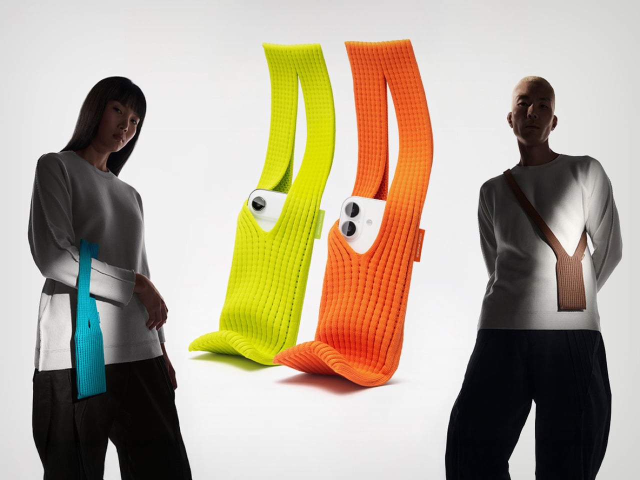
Apple iPhone Pocket is the most absurdly Apple-ish way to carry your smartphone with you.

Years after giving Steve Jobs his iconic turtleneck, Issey Miyake returns to give the iPhones their own turtleneck too. Dubbed the iPhone Pocket, these haute handbags are designed for one thing and one thing only, your iPhone. The bags are created using a special 3D-knitted construction that’s developed by the Japanese fashion house, and come in 8 colors. They’re single-sized, which means you can pretty much fit any iPhone in, from the ultra-thin iPhone Air to the large iPhone 17 Pro Max, or even the tiny iPhone 13 Mini. Could you also put an Android smartphone in? Yes, but Steve Jobs will tut-tut at you in your dreams for the rest of your life.

Don’t expect these luxurious phone-holsters to be cheap. They’re a limited-edition item that Apple will sell at just 10 select stores across the globe, with the short-strap versions selling for $149.95 and the larger strapped variant for $229.95.

Designer: Issey Miyake

Is the iPhone Pocket practical? No. Is it classy? Yes. If you’re the kind to splurge on a $19 Apple-branded polishing cloth, or a fancy Hermes strap for your watch, then the iPhone Pocket won’t feel like such a pricey buy. The single-piece 3D-knitted ‘gizmo-garment’ is surely a marvel. It doesn’t have any parts stitched together, it’s singular from start to end, and the weave itself is something that Issey Miyake’s done extensive R&D on.

The result is a yarn that protects the iPhone with its padded weave, while letting you easily ‘wear’ your smartphone around your neck, on the side, or across your body. You could loop it around a bag too, this thing is probably one of the rare Apple products that doesn’t need a user manual… Apart from probably washing instructions. I’d probably keep it away from the rain, food, beverages, or anything too damaging. Sunlight may fade the color, so air-drying indoors is the only sensible option, if this thing gets wet. Don’t even think of chucking this thing in the washing machine, by the way. Or Issey Miyake will cry from heaven.

The iPhone Pocket’s design is sort of open to user interpretation and expression. Put any phone in and it’ll fit. Slide the phone completely if you want to conceal it, or have just the tip jutting out if you want to sneakily film people around you, or if you want to stare at the top of your screen for notifications. The expandable design also lets you add other stuff… maybe a lip balm, your AirPods, or one of these ultra-slim MagSafe power banks.

The post Apple iPhone Pocket is the most absurdly Apple-ish way to carry your smartphone with you. first appeared on Yanko Design.

Italjet Roadster 400 is a fighter-jet-inspired scooter all set to redefine urban mobility

When a manufacturer known for daring scooters introduces a new model, you know it’s going to catch your eye. That’s exactly the case with the Italjet Roadster 400, a fresh unveiling from the Bologna-based brand that blends bold styling and serious components. The Roadster 400 is more than a typical urban runabout; it’s a scooter with ambition and personality.

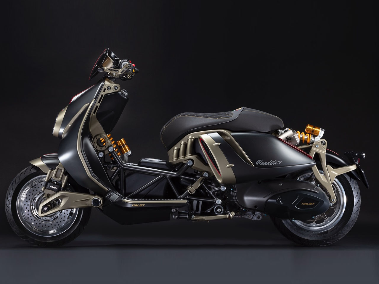
Italjet has framed this model as “more than just a scooter,” as they call it “Art in Motion.” Designed with inspiration from classic silhouettes of the past and fighter jets alike, the Roadster 400 makes a striking statement at first glance. The sweeping lines and sculpted side pods serve as functional cooling ducts that channel air to twin radiators. All these details reinforce the premium feel of the two-wheeler that looks a cross between The Jetsons and the Cyberpunk world.

Designer: Italjet

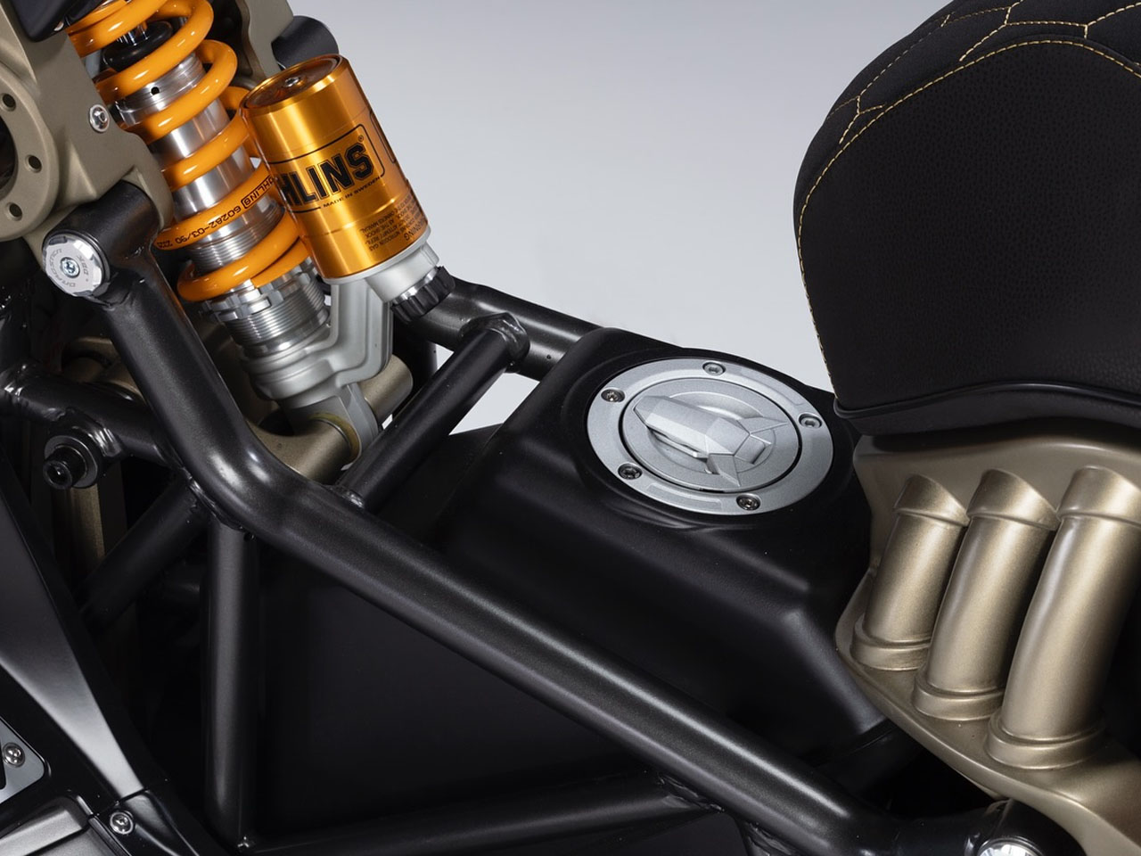
Underneath its dramatic bodywork lies a trellis frame and a host of high-spec mechanicals. Italjet’s new Dynamic Linkage Articulated Steering (DLAS) replaces the single-arm front end used on the previous Dragster model, and brings more structural precision and visual identity to the front end. The suspension and braking package is equally noteworthy: Öhlins shock absorbers, twin Akrapovič mufflers emerging from the rear, and chunky brake discs behind billet aluminium spoked wheels.

Performance credentials are solid as well. The Roadster 400 features a 394 cc liquid-cooled single-cylinder engine that produces 41.5 horsepower and 30 lb-ft of torque, positioning it squarely in the “maxi-scooter” category rather than entry-level commuter territory. That said, Italjet has yet to reveal the full specs, such as final weight, belt vs chain drive, or the exact dimensions of the two-wheeler.

From a styling perspective, the Roadster 400 exudes an Italian flair, with matte black and bronze paint finishes, multi-textured seat upholstery, red accents, and CNC-machined lever guards featuring integrated LED turn signals, all of which speak to the attention to detail. The side pods (resembling turbine intakes) highlight the aviation inspiration and offer real function, not just flair.

From a utilitarian perspective, the Roadster 400 sits at an interesting intersection. It offers the convenience and lighter licensing benefit of a scooter, yet brings near-motorcycle performance and visual swagger. For buyers who care as much about style and mechanics as they do about practicality, it looks compelling. That said, as with any high-spec model, the trade-offs may lie in maintenance costs, parts availability (especially outside Europe), and service network. The full urban practicality, such as storage and comfort for two, has yet to be detailed by the company.

On the commercial side, Italjet plans to launch the Roadster 400 globally in September 2026 with a price estimate of €7,500 (approximately US$8,650) for markets that pay VAT. The positioning suggests Italjet sees this as a premium offering rather than a budget city scooter. The ride stands out because it doesn’t settle for being anonymous. It channels heritage design, aviation cues, and top-tier components into a scooter form that demands attention. For those seeking something beyond the ordinary commuter ride, this model is worth tracking closely.

The post Italjet Roadster 400 is a fighter-jet-inspired scooter all set to redefine urban mobility first appeared on Yanko Design.

Nintendo and Lego tease a Legend of Zelda: Ocarina of Time set

Lego has a long history of geek and gaming crossovers. We've seen recent sets for Star Wars and Star Trek, while past collaborations include everything from Super Mario Bros. to Minecraft. The latest blocky tie-in is a classic: The Legend of Zelda: Ocarina of Time, as teased on social network X by Nintendo of America with the caption “Do you realize who you’re dealing with?”

The short video clip recreates a scene from the game, with a minifig of Link armed with his Hylian shield and Master Sword beside a tiny floating Navi fairy. (Presumably Lego Navi will not interrupt you with "Hey! Listen!" every five minutes, but maybe the company is striving for total accuracy.) A blurry Zelda minifig stands behind them, and the heroes stare upward at the looming shadow of what must be a Ganon character. Whether the villain is a minifig of his own or a larger-than-life constructed model remains to be seen. The set won't be released until 2026, but most likely either Lego or Nintendo will reveal more details ahead of the launch date. 

This isn't the first time Hyrule is getting the Lego treatment. The brands' debut Legend of Zelda collab was a set of the Great Deku Tree that came out last year, and it could be built as either the wise arboreal being from Ocarina of Time or from Breath of the Wild.

This article originally appeared on Engadget at https://www.engadget.com/entertainment/nintendo-and-lego-tease-a-legend-of-zelda-ocarina-of-time-set-201500150.html?src=rss