
Summer Games Done Quick returns this July, schedule out now
Who's up for a Jak & Daxter / Half-Life hybrid?

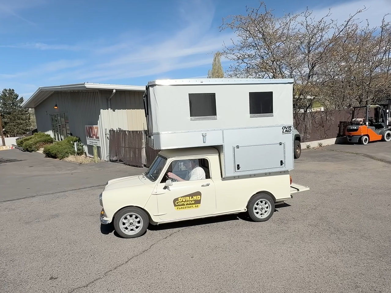
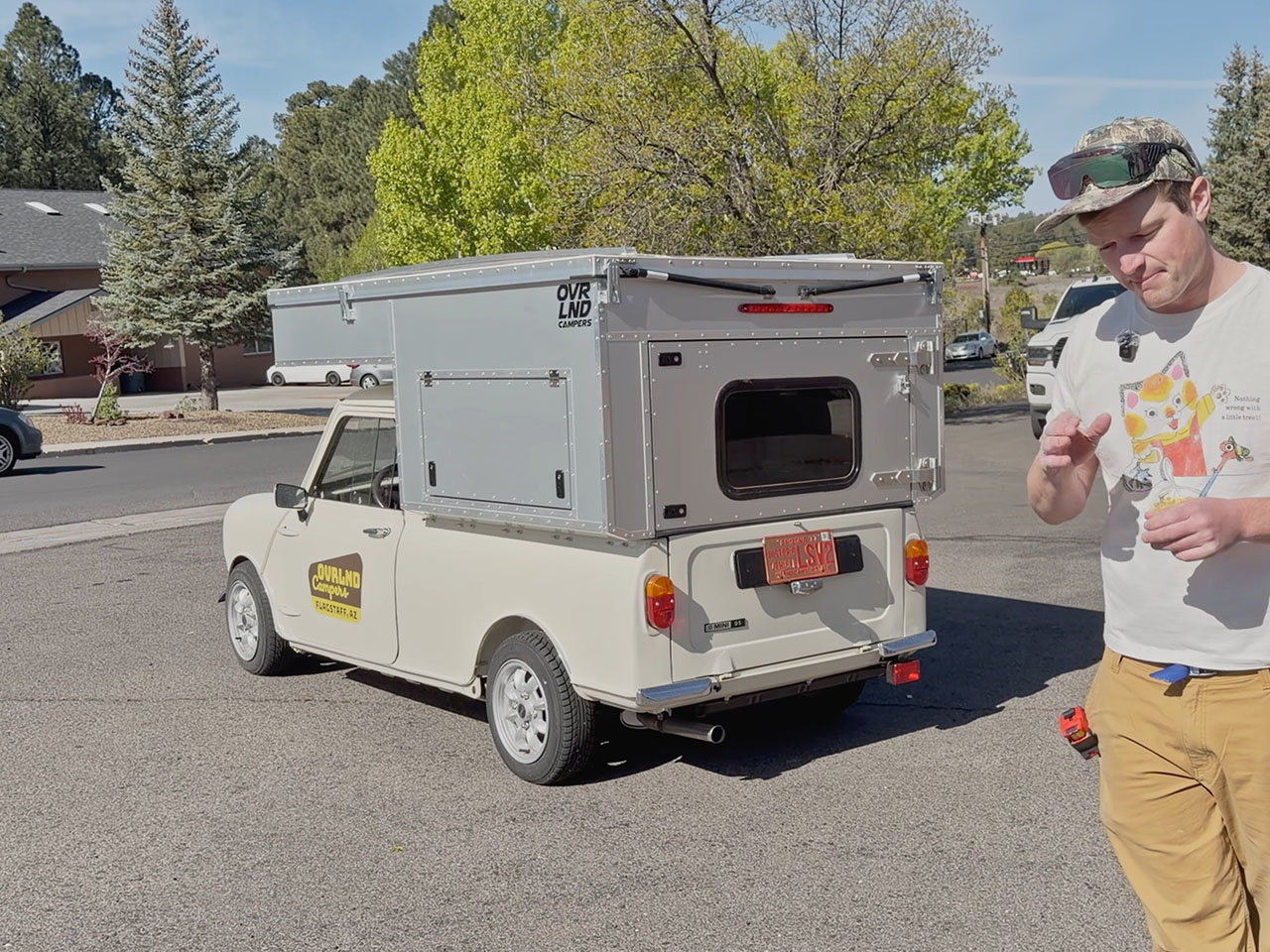
Ovrland Campers may have dropped vowels from its name for clipped branding, but it does not drop a spec when it comes to creating pick-up campers. The Flagstaff, scenic mountain city in Northern Arizona, based builder has a keen eye for detail, an example of which can be seen in the introductory video of the Mini Pop-up Camper, added above. In the video, Ovrlnd founder Jay Wellman can be seen elaborately (using a tape measure) detailing every single aspect of the company’s new build, which is an inspiration of its all-time favorite camper models, but is scaled down to the size of a retired 1980 Mini 95.
The Mini 95 was brought off an auction for $22,000. Now it forms the foundation of the new customized pick-up camper. The new version is a Mini-based customization of the Ovrland Chubby, a camper that protrudes slightly outside of the truck bed on the sides to create little additional living space inside.
Designer: Ovrlnd Campers

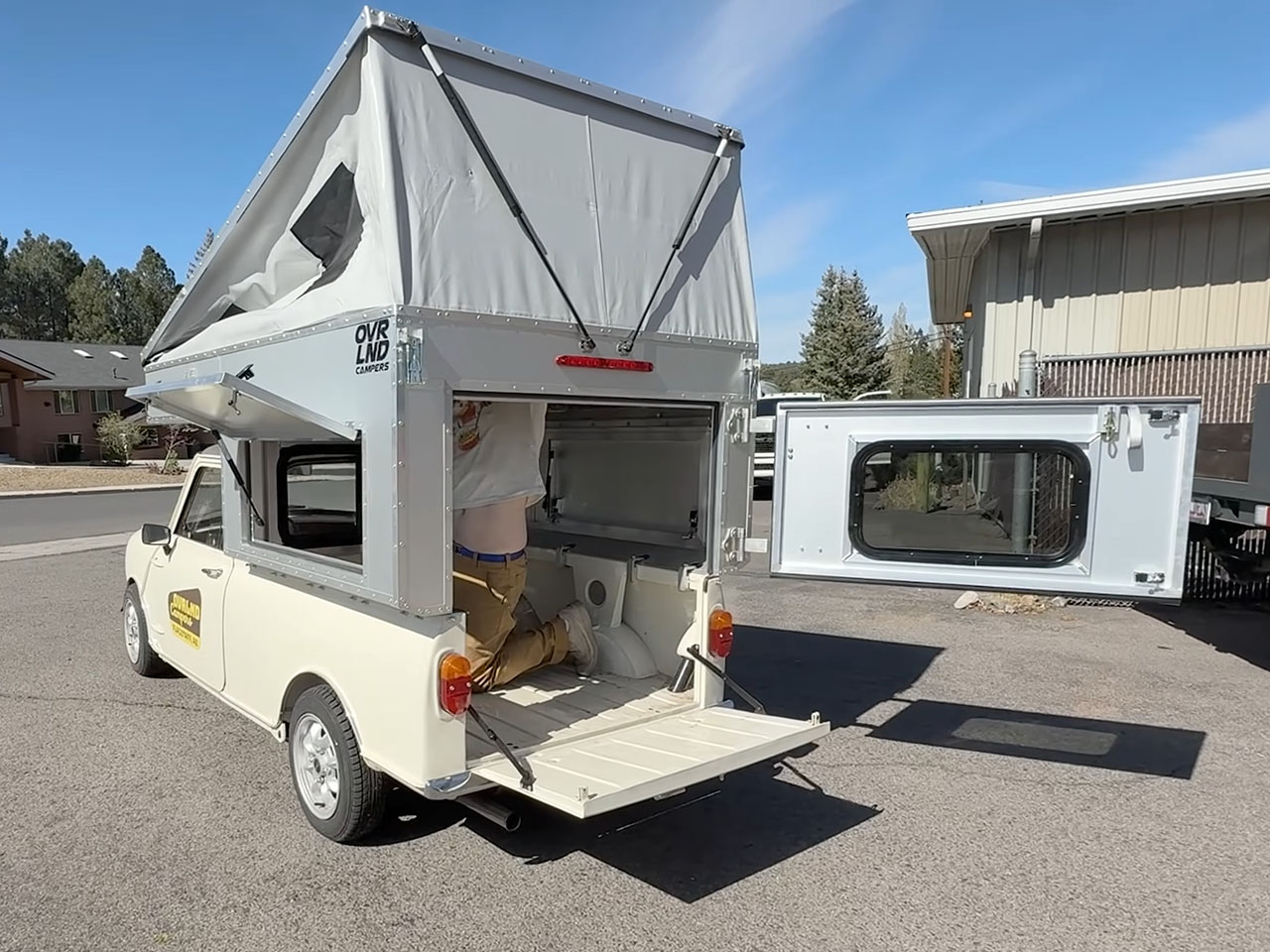
Even though Ovrlnd has interesting truck camper options that fit snugly within the truck bed, they specifically chose the Chubby styling for the new pick-up camper so that the little space inside the Mini 95 bed can be better utilized. Rest is pretty much the same convenience and structural assurance that you get with each full pop-up camper shell that Ovrlnd builds. It is lightweight to radically reduce drag and maximize payload of one of the smallest pick-up trucks on the market.
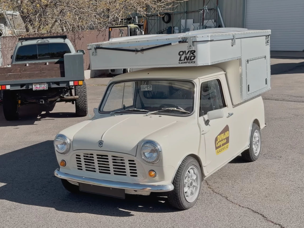
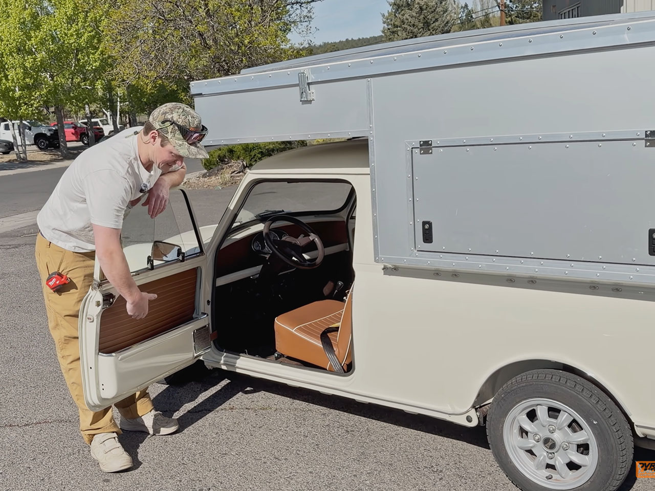
Small pick-up trucks are not a rarity, but their build and consumption are pretty localized. Japan would be a good example of such consumption, but out in the US, of course, getting hands on one of these is really a task. The Mini 95 here gets its name from its gross weight of 0.95 tons. It has a payload capacity of about 550 lbs and was incredibly popular between 1965 and 1985, Ovrlnd founder informs.
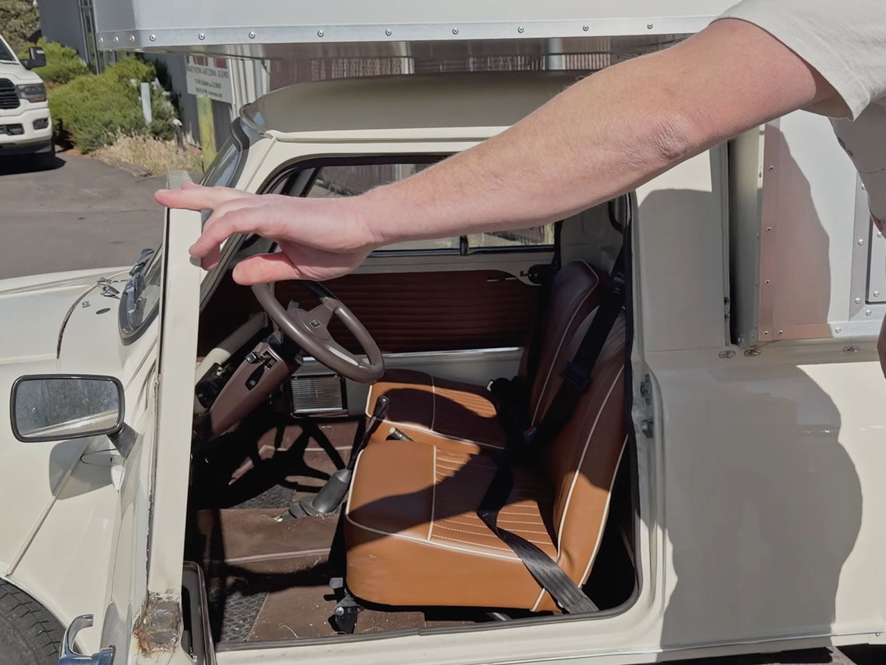
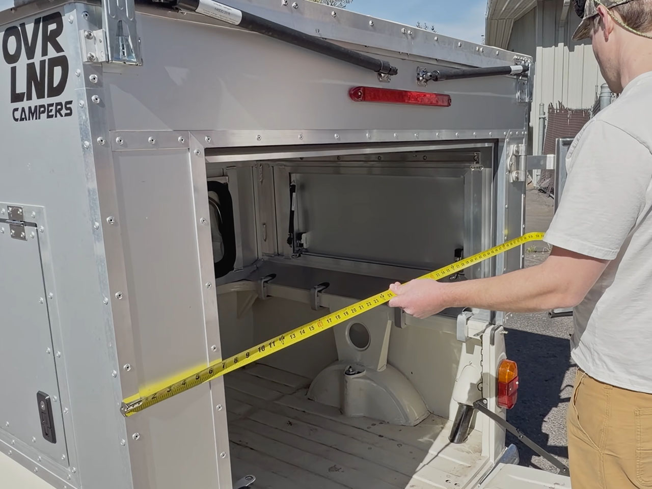
The Chubby-style layout of the camper atop the Mini 95 provides a double bed width of 55 inches side to side. The pick-up bed ideally measures about 43 inches wide from rail to rail, so the additional 10 inches or so comes at a premium for living inside. The space is spacious enough for sleeping two people, and can pop up to create over 6 feet of head height from the front to back. When you slide out the bed from its platform, obviously, the head height is compromised, but with the windows on both sides, you are not cramped for room at any time.
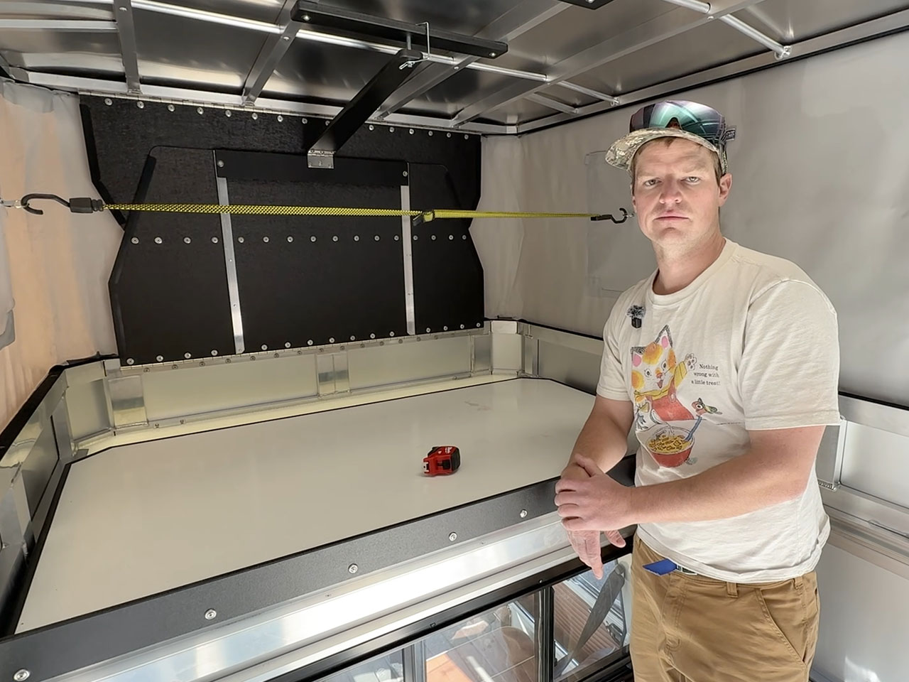
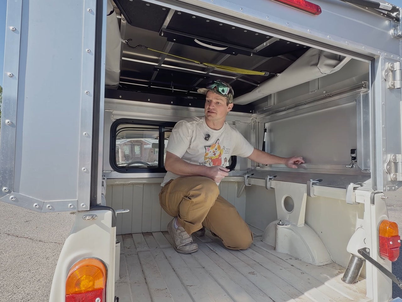
Ovrlnd says the Mini Pick-up Camper has built weight of about 280 lb. With two people onboard, you are almost surpassing the payload capacity of the Mini 95. But if you’re solo, the company has fitted the aluminum roof with a bike rack to carry your ride along. Interestingly, this would be the only pop-up camper on the market where you can mount and dismount the cargo from the roof without a ladder or climbing onto the tailgate. That should give you an idea of how compact the entire creation is!
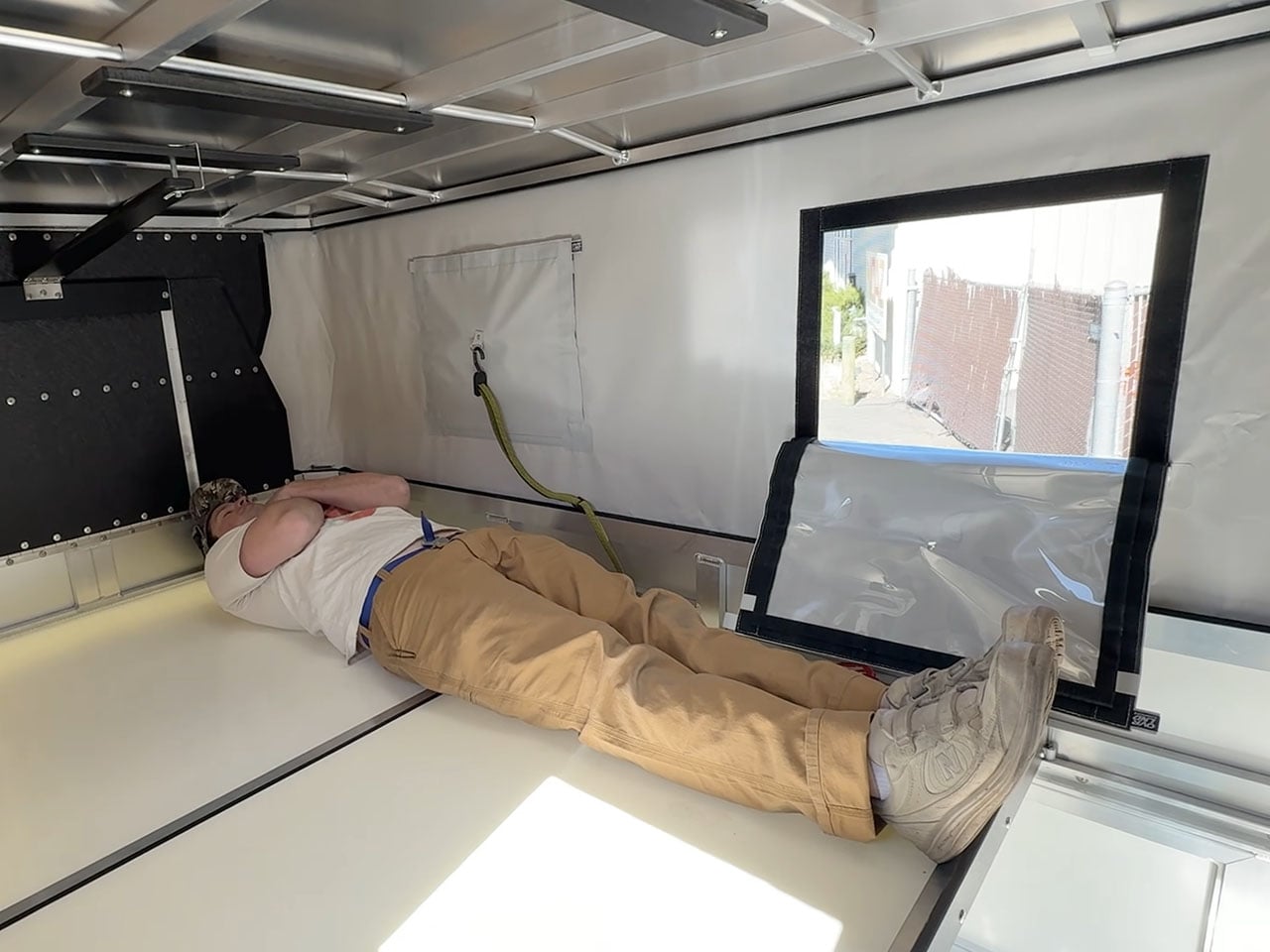

The post Ovrlnd’s new pop-up camper turns 1980s Mini truck into two-person adventure home first appeared on Yanko Design.

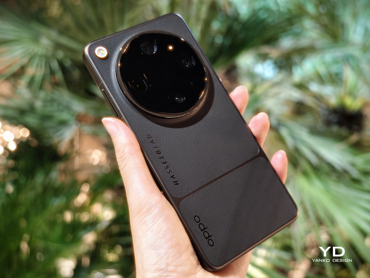
The OPPO Find X9 Ultra is a true flagship with a clear camera-first identity, but what makes it stand out is how little it sacrifices elsewhere. OPPO has built this phone around photography, yet the rest of the package feels just as considered. The design is distinctive, the battery is huge, the performance is top-tier, and the software experience is polished enough to make the Find X9 Ultra feel like a genuine all-rounder rather than a specialist device.
Many camera-focused phones excel in one area while asking users to accept compromises in others, but the Find X9 Ultra aims to do more than that. It wants to be one of the best camera phones on the market while still delivering the kind of complete flagship experience people expect at this level. And for the most part, it succeeds. The OPPO Find X9 Ultra is not just a phone for photography enthusiasts. It is a premium smartphone that happens to put photography first, without forgetting everything else that makes a flagship great.
Designer: OPPO
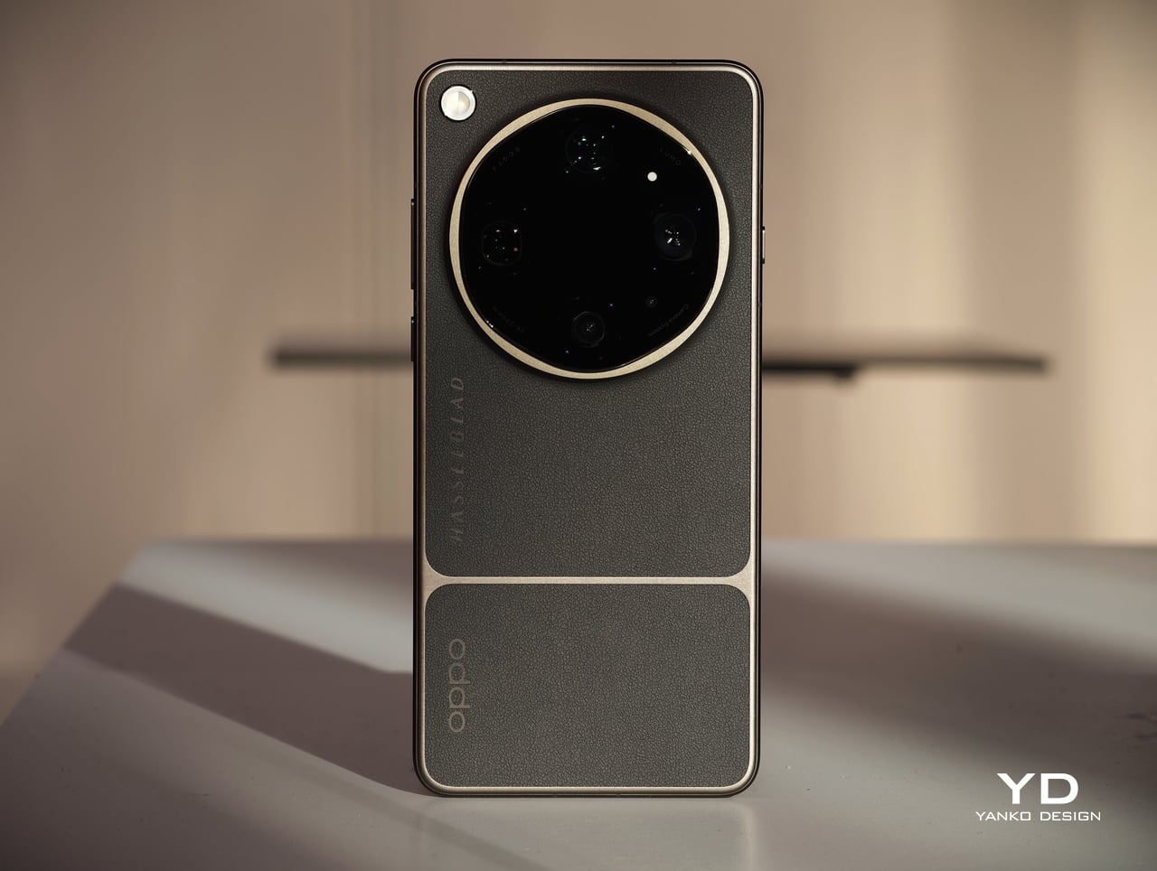
The OPPO Find X9 Ultra makes a strong first impression, shaped by two clearly distinct colorways that carry different design languages. Rather than simply offering the same phone in different shades, OPPO gives the device two visual personalities. One leans into classic camera-inspired warmth and tactile richness, while the other takes on a sharper, more expressive character.
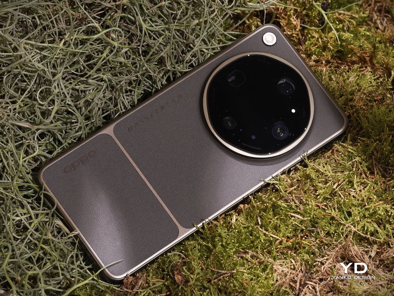
That broader design story is rooted in photography. Tundra Umber is the more classic of the two, drawing inspiration from the Hasselblad X2D 100C Earth Explorer Edition while refining the camera-led design language OPPO established with its Ultra series. Its finely textured, eco-friendly vegan leather back is divided into broad vertical panels, giving it a structured, almost camera-body-like feel. A deep bronze-toned matte surround traces those panel divisions and the oversized circular camera housing before continuing into the side frame, helping the whole design feel cohesive.
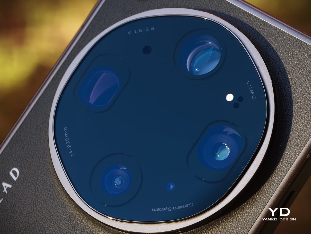
The camera influence is visible throughout, from the horizontally aligned OPPO and Hasselblad logos to the orange detailing around the camera ring and Quick Button, both nods to Hasselblad’s iconic orange dot. Tundra Umber feels warm, tactile, and understated, with a sense of luxury rooted more in texture and material depth than in visual flash. Canyon Orange takes the opposite approach. Its aircraft-grade fiber back is finished with a sculpted pattern inspired by canyon formations, adding movement and depth to the surface.
Taken together, the two finishes make the Find X9 Ultra feel more thoughtfully designed than most ultra-premium smartphones. Instead of relying on superficial color variation, OPPO uses material, texture, and framing details to create two genuinely different expressions of the same flagship. That gives the device more character, and more importantly, gives buyers a real choice in how they want that character to be expressed.
The OPPO Find X9 Ultra is unmistakably a large flagship. Measuring 163.16 × 76.97 mm and weighing 236 grams in Tundra Amber or 235 grams in Canyon Orange, it is a phone that feels substantial from the moment you pick it up. The two finishes also differ slightly in thickness, with Tundra Amber at 9.10 mm and Canyon Orange at 8.65 mm, giving each version a subtly different physical character.
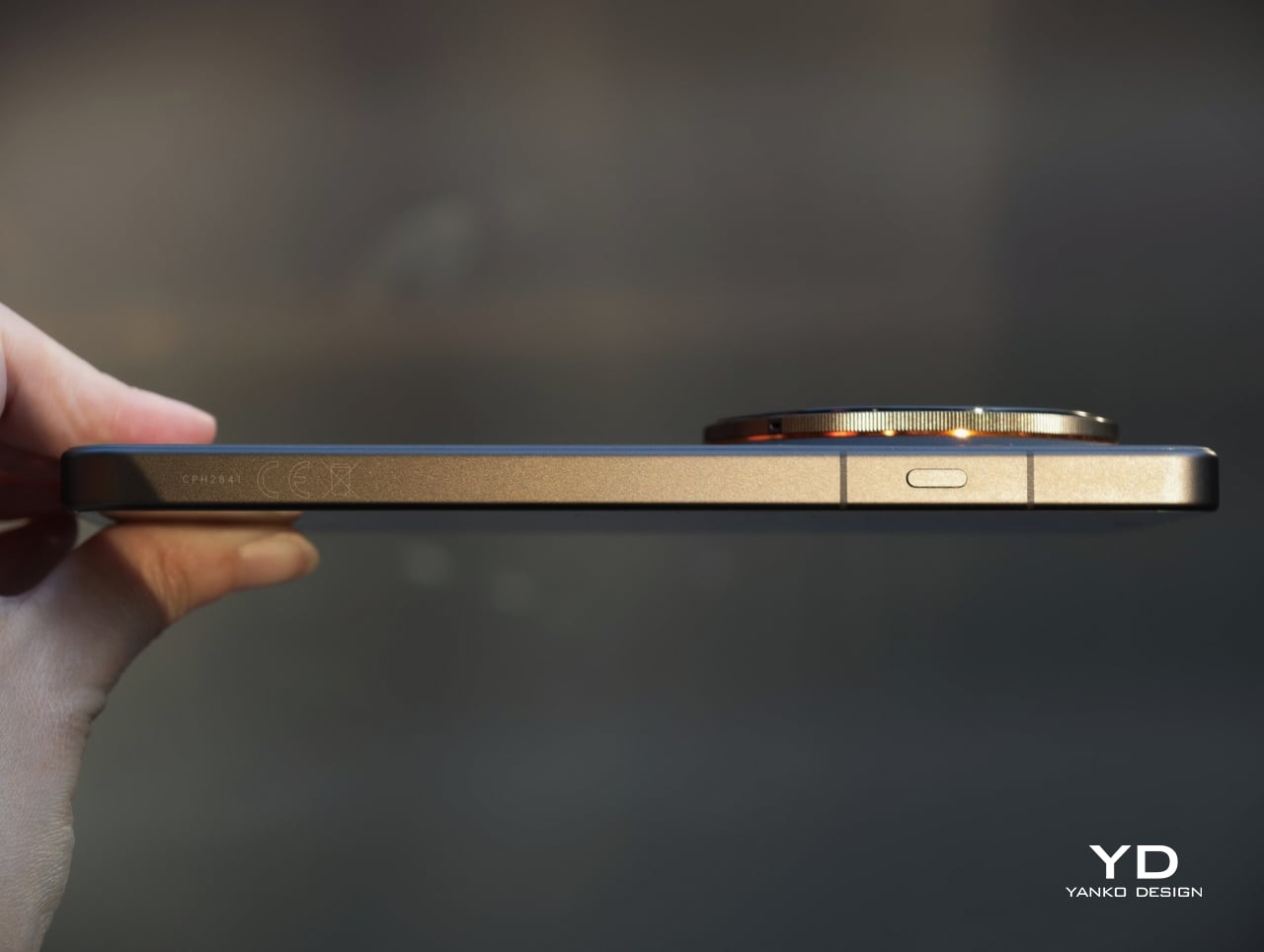
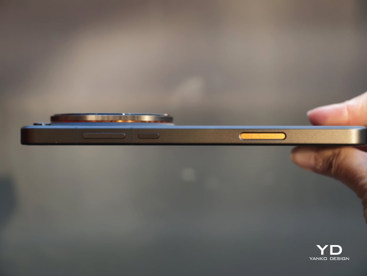
Even so, the difference between the two finishes is worth noting, as it subtly changes how the phone feels in daily use. Tundra Amber is both slightly thicker and slightly heavier, and its eco-friendly vegan leather back gives it the more tactile and forgiving grip of the two. Despite the large camera housing, both versions feel balanced rather than top-heavy, and the oversized module can even serve as a natural resting point for the index finger during use.
The OPPO Find X9 Ultra brings the kind of hardware expected of a true flagship, but what matters most is how that translates into everyday use. For most people, performance is not about benchmark numbers. It is about whether a phone feels fast, fluid, and dependable, and the Find X9 Ultra appears built with very few compromises.
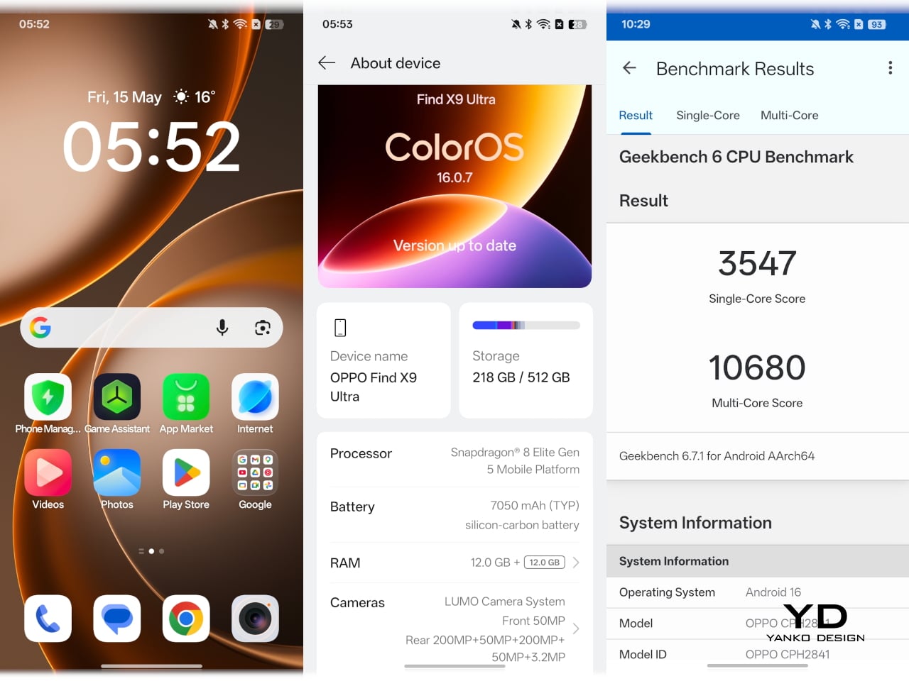
Powered by Qualcomm’s Snapdragon 8 Elite Gen 5, it ranks among the fastest Android phones of its generation. That means quick app launches, smooth multitasking, fast photo processing, and strong gaming performance, all delivered with the kind of effortless responsiveness buyers expect at this level. Offered in 12GB + 512GB and China-only 16GB + 1TB configurations, it also has the memory and storage headroom to remain smooth over time while supporting its demanding camera system without strain.
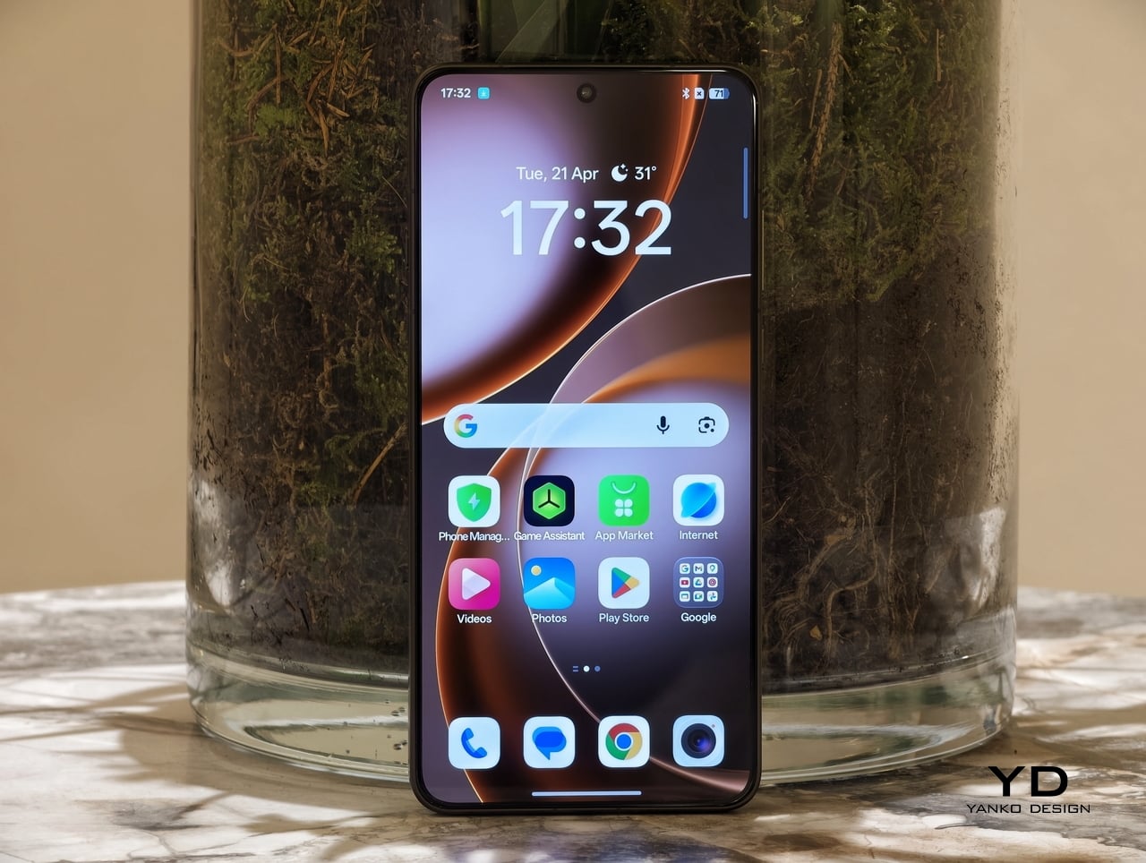
The Find X9 Ultra’s 6.82-inch AMOLED display is every bit as flagship as the rest of the hardware. With a sharp 3168 x 1440 resolution, a 120Hz LTPO refresh rate, and peak brightness of up to 2500 nits, it feels bright, crisp, and fluid in daily use. Whether you are scrolling, watching a video, or reviewing photos, it delivers the kind of polished visual experience you would expect from a phone in this class.
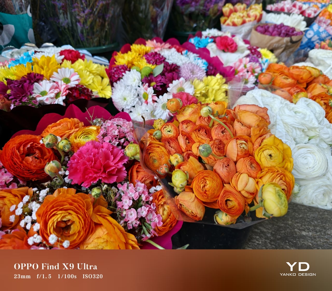

Portrait Mode
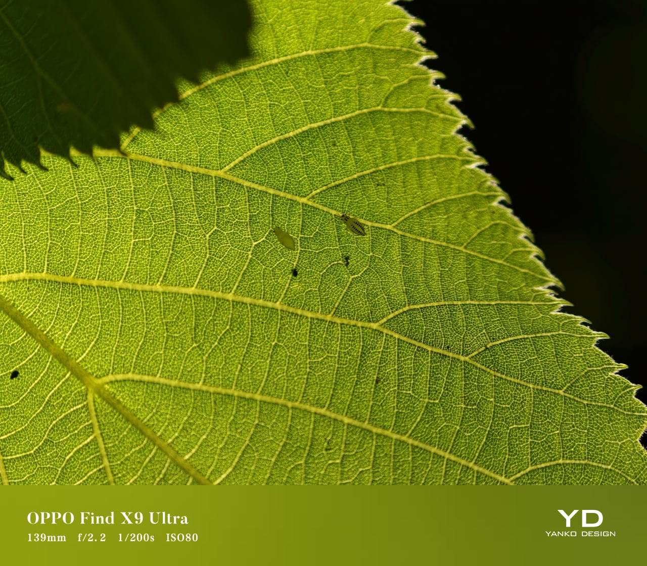
Macro Mode
The camera system, developed in continued partnership with Hasselblad, is where the Find X9 Ultra becomes genuinely distinctive. OPPO has upgraded the entire imaging setup and expanded it into what it now calls a penta-camera system. The rear array includes a 200MP main camera, a 200MP telephoto camera with 3x optical zoom, a 50MP periscope telephoto with 10x optical zoom, a 50MP ultra-wide camera, and a dedicated white balance sensor.

Ultrawide

Main, 1x
The 200MP main camera, built around a 1/1.2-inch Sony LYT-901 sensor with an f/1.5 aperture and OIS, produces images that are crisp, detailed, and rich in dynamic range, with color reproduction that remains pleasingly natural. The 200MP 3x telephoto camera is just as impressive. Using a large 1/1.28-inch OmniVision OV52A sensor with an f/2.2 aperture and OIS, it delivers similarly detailed results with strong dynamic range and balanced color.

Telephoto, 3x

Telephoto, 10x
The 50MP 10x periscope telephoto is the most technically fascinating part of the setup. Long-range zoom in a smartphone is always constrained by space, and OPPO addresses that challenge with its Quintuple Prism Reflection Periscope Structure, which bends light five times before it reaches the sensor. The result is serious optical reach within the tight confines of a smartphone body, making it one of the device’s most ambitious engineering features. Crucially, it is not just impressive in theory. It also captures excellent 10x shots, giving the Find X9 Ultra a level of versatility that few flagships can match.
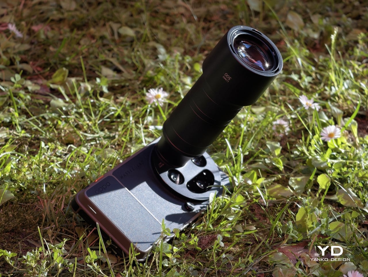

300mm, Teleconverter
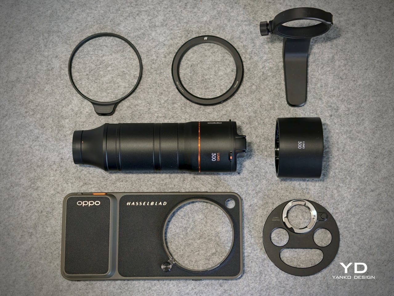
OPPO also offers an optional Hasselblad Earth Explorer Kit, which includes a Bluetooth camera grip case and a dedicated lens mount. Its standout feature is a 300mm lens attachment that extends the system to 13x optical zoom and up to 200x hybrid zoom. The setup is undeniably bulky, but in situations where extra reach really matters, whether for sports, concerts, detailed architectural photography, or other distant subjects, it can be genuinely worthwhile. Results at the optical end are impressive, while pushing further into hybrid zoom brings the familiar decline in image quality.

13x, Normal

13x, With Teleconverter
The 50MP front-facing camera also performs well, capturing detailed selfies with natural-looking skin tones. The 50MP ultra-wide camera is useful and generally capable, but it is the least convincing part of the rear setup, with images that can look a little softer than those from the main and telephoto cameras.

200x, Normal

200x, With Teleconverter
That flexibility extends beyond the hardware. Portrait mode offers seven focal lengths ranging from 1x to 10x, giving users far more freedom in how they frame subjects than most phones allow. More importantly, the Find X9 Ultra generally processes images with a natural touch, avoiding some of the heavy-handed contrast and tone shaping that still affect many smartphone cameras. For those who want an even more photography-focused look, Master Mode uses a different imaging pipeline that steps away from the aggressive tone mapping common to traditional smartphone processing.
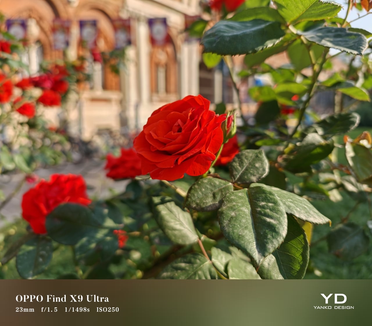
Normal
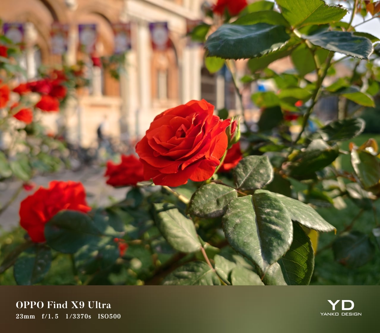
Hasselblad Master Mode
OPPO also equips the Find X9 Ultra with a very capable video system. All cameras support recording at up to 4K 60fps with Dolby Vision, while the main and 3x telephoto cameras can go as high as 4K 120fps or 8K 30fps. Video quality is generally very good, with strong detail, solid stabilization, and an overall polished look. For users who want a more advanced workflow, Pro mode includes Log recording and support for importing custom LUTs, making the phone more flexible for grading and post-production.
That said, the experience is not flawless. Panning at 3x zoom or beyond can sometimes introduce a touch of jitter, and transitions between lenses could be smoother. These are relatively minor complaints in the context of such a flexible video system, but they are worth noting all the same.
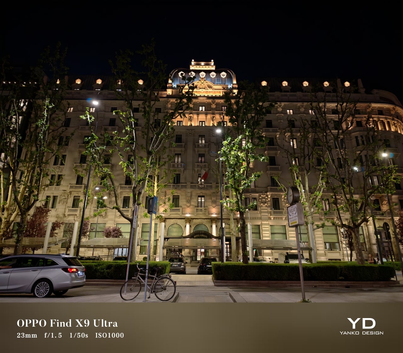
Main, 1x, Night Mode

Telephoto, 3x, Night Mode

Telephoto, 10x, Night Mode
Battery life may be just as important to mainstream buyers as the camera system, and the Find X9 Ultra looks especially strong on that front. It comes with a massive 7050mAh silicon-carbon battery, a capacity that should comfortably support heavy use without the low-battery anxiety that still shadows some premium phones.
Charging is impressive too. With OPPO’s proprietary charger, the Find X9 Ultra supports 100W wired and 50W wireless charging, while USB-PD support allows for up to 55W wired charging with compatible third-party adapters. Reverse wired and reverse wireless charging are both available as well, rounding out a battery setup that feels as flexible as it is powerful.

Sustainability in a premium smartphone should be approached from multiple angles, and in the case of the Find X9 Ultra, durability is clearly where OPPO has placed the greatest emphasis. That does not tell the whole sustainability story, but it does give the phone a solid foundation in the areas that most directly affect long-term ownership. In practical terms, OPPO seems more focused on helping the device last longer than on building a broader environmental narrative around it.
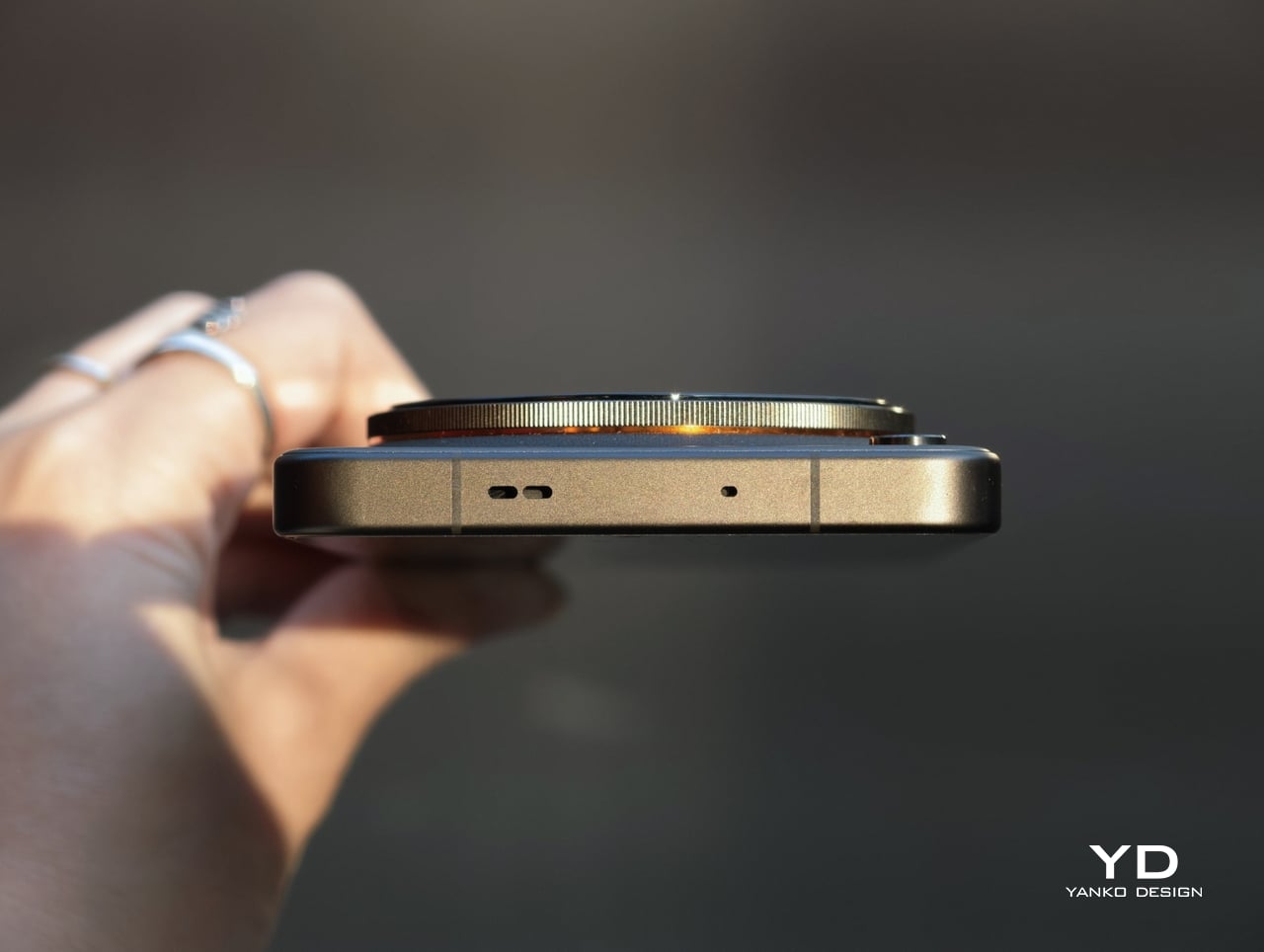
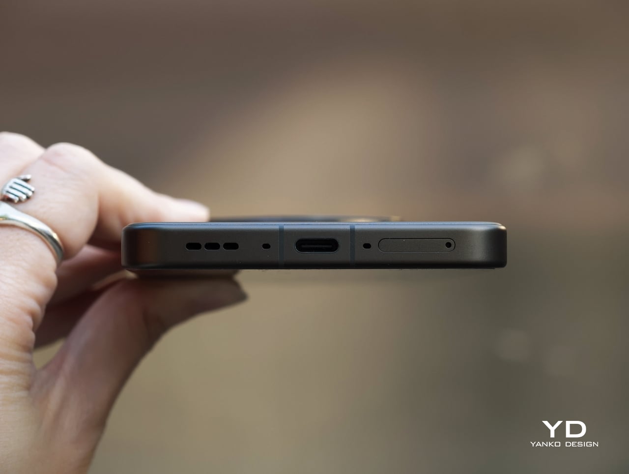
It carries IP66, IP68, and IP69 ratings for dust and water resistance, uses Corning Gorilla Glass Victus 2 on the front, and has earned an SGS Premium Performance 5-Star drop-resistance certification. OPPO also backs the phone with five major OS updates and six years of security patches, which strengthens the case for keeping the device longer rather than replacing it early. At the same time, OPPO says far less about the broader environmental side of sustainability, so the Find X9 Ultra feels more convincing as a durable long-term device than as a flagship making a wider green statement.
The Find X9 Ultra is priced like a true flagship, and in global markets, it leaves no doubt about that. The 12GB + 512GB version comes in at €1,699.99, or roughly $1,940, while the same configuration in China is priced at CNY 7,999, or about $1,180. That makes the global version undeniably expensive, while the China pricing feels strikingly aggressive by comparison.
What makes the phone interesting is that even at its global price, it still has a real value argument. The camera system is among the very best available today, the battery is exceptionally large for a premium flagship, the design feels distinctive, and the software experience is smooth and pleasant to live with. It is not cheap by any measure, but it does feel like a phone that gives you something memorable in return.
The catch is that this value depends on how much you care about what OPPO is doing differently. If photography, endurance, and design identity sit high on your list, the Find X9 Ultra feels easier to justify. If not, it becomes harder to ignore just how expensive the global model really is.
The OPPO Find X9 Ultra stands out by knowing exactly what it wants to be. It is a camera-first flagship with one of the best imaging systems available today, backed by excellent battery life, polished software, and a design that feels more distinctive than most ultra-premium rivals.
There are still compromises. The ultra-wide camera is not quite on the same level as the rest of the setup; some video behavior could be smoother, and the global price is undeniably steep. Even so, for buyers who value photography and want a flagship with real personality, the Find X9 Ultra is one of the most compelling choices on the market.
The post OPPO Find X9 Ultra Review: An Exceptional Camera Phone That Gets Everything Else Right Too first appeared on Yanko Design.

Most medical devices evolve quietly over decades. Surgical tools get sharper, imaging machines get faster, drug delivery systems get smarter. But the orthopedic cast has remained stubbornly unchanged for most of its existence. Plaster, fiberglass, a messy application process, and six to eight weeks of itching, sweating, and avoiding puddles. For something that millions of people wear every year, it has always felt like a design problem nobody wanted to solve.
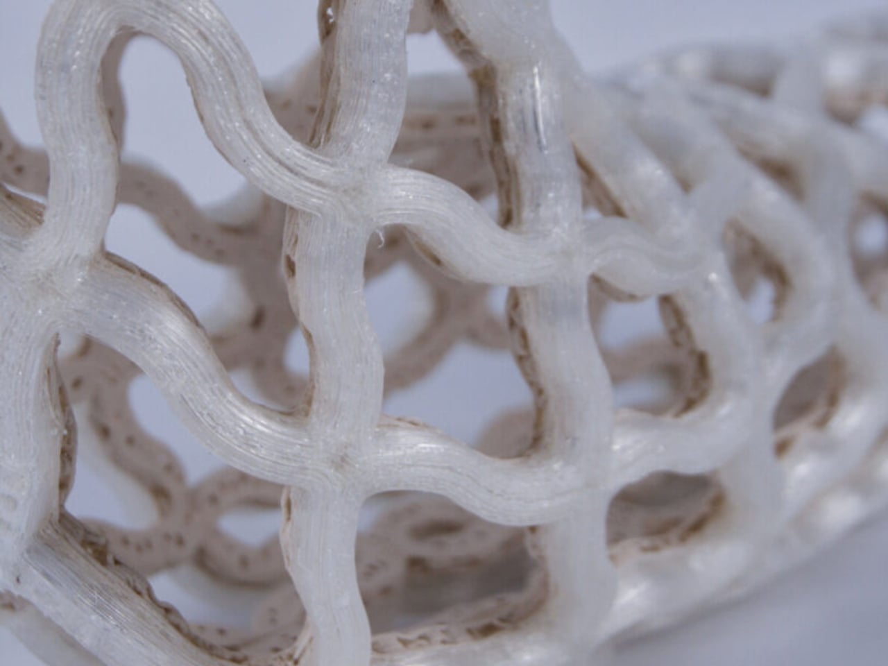
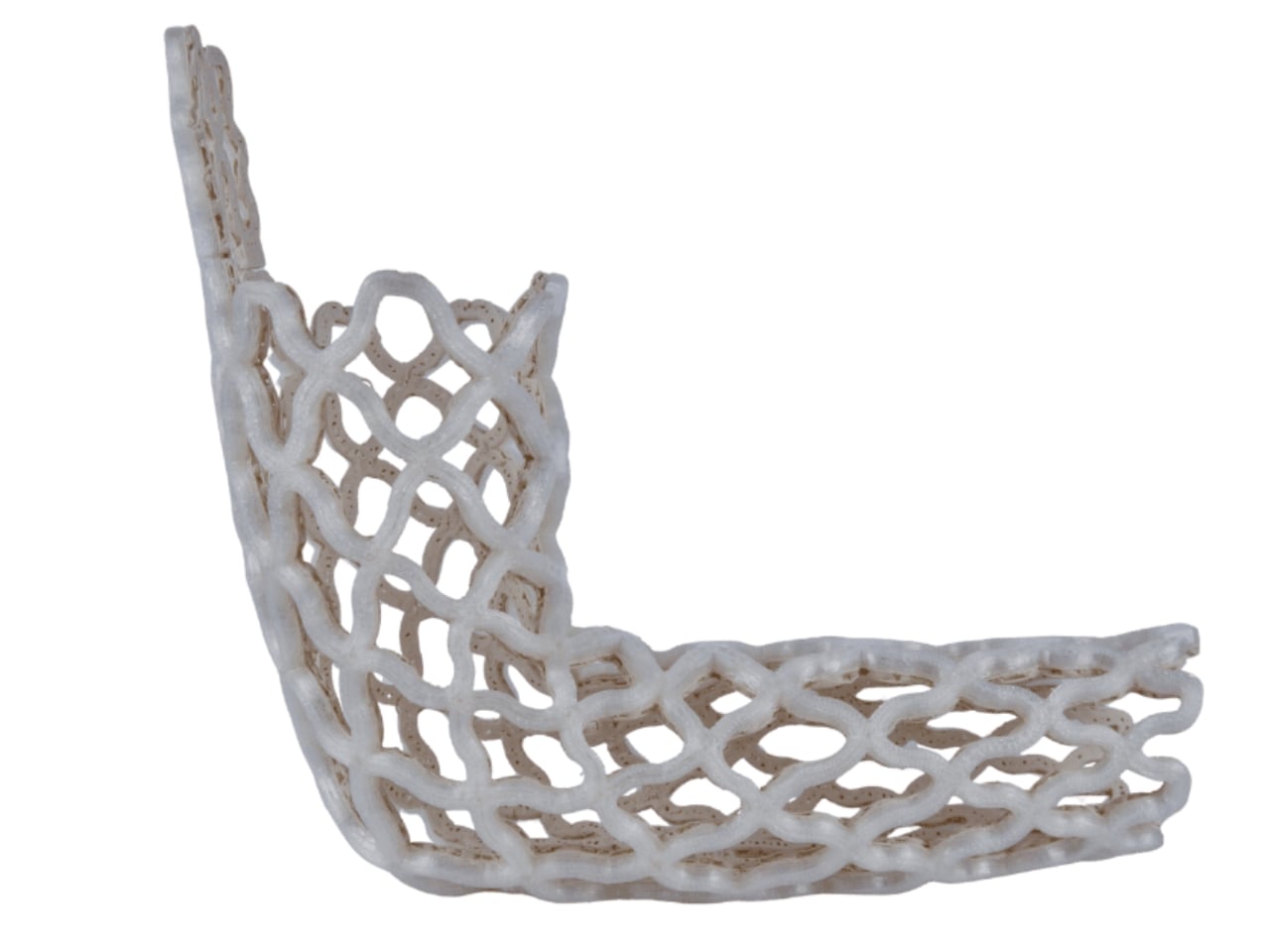
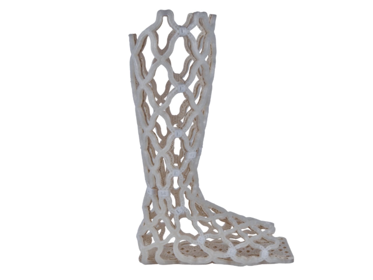
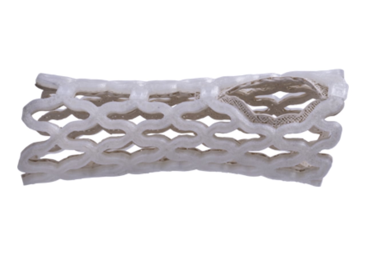
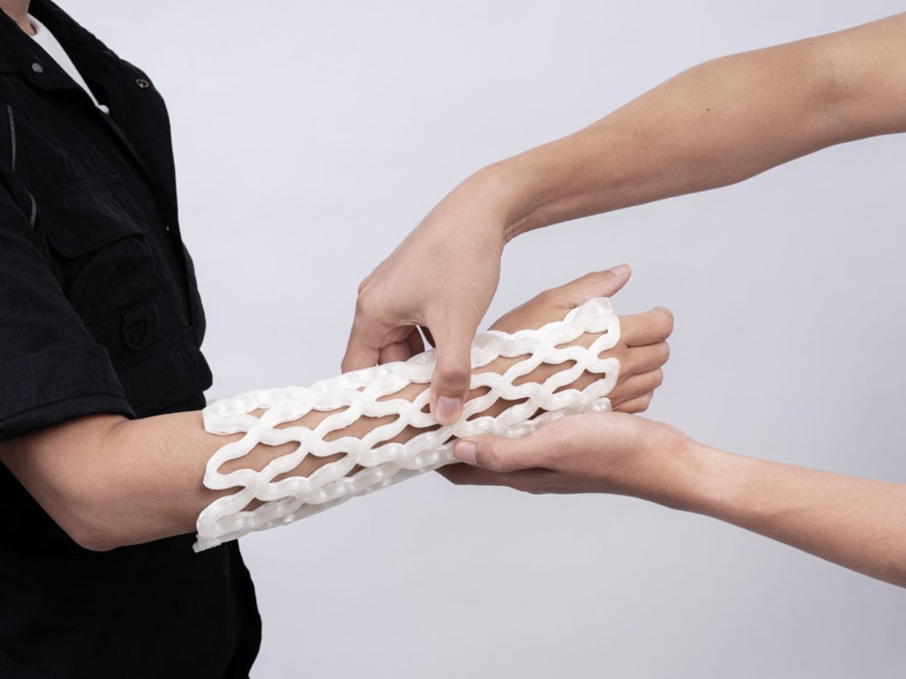
Castomize, a startup out of Singapore, decided to solve it. Their cast, TessaCast, uses what the company calls 4D printing. The terminology is worth pausing on, because it’s easy to assume it’s just marketing language. It isn’t. The fourth dimension here is time. The cast is 3D printed in advance from smart thermoplastic materials, but the real transformation happens at the clinic, when heat is applied. Once warmed, the rigid lattice shell becomes pliable. A clinician wraps it around the patient’s wrist, forearm, elbow, or ankle, clips it into position, and lets it cool. As it hardens, it conforms to the exact shape of that particular limb.
Designer: Castomize
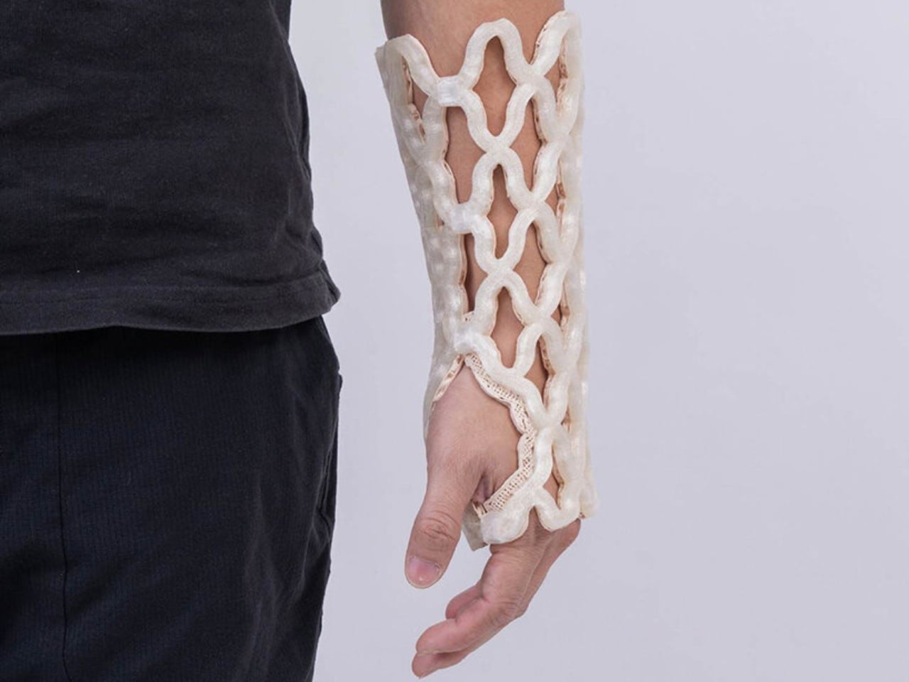
No 3D scan. No casting tape. No plaster dust. The removal process is just as elegant. A simple pin releases the buckles, and the cast slides off. No cast saw, which anyone who has had one used near their skin can tell you is not a small thing. The anxiety of that vibrating blade hovering millimeters from your arm is its own minor trauma, even when you know it won’t cut skin.
Castomize’s design brief reads almost deceptively simple: a cast should hold the body securely while allowing skin to breathe, water to pass through, and clinicians to make adjustments without destroying the device. That sounds obvious when you read it out loud. And yet, until now, no cast on the market had actually delivered on all three at once.
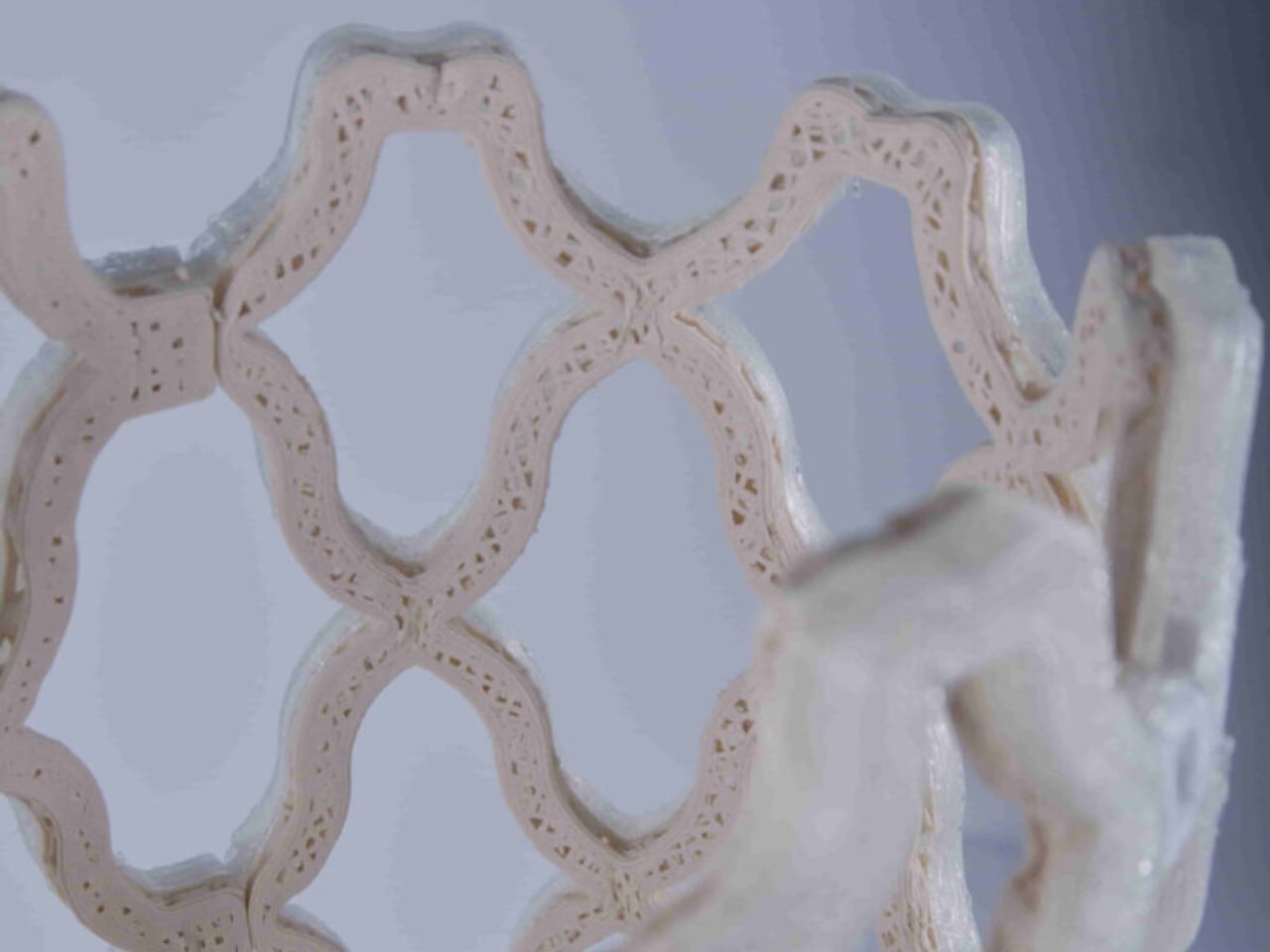
The open lattice structure of TessaCast allows air to circulate continuously against the skin, addressing the itching and sweating that make the traditional cast experience so miserable for patients. It is also fully waterproof. Not water-resistant, waterproof. The team at Castomize notes that it can even be worn while swimming, though they sensibly leave specific medical guidance to clinicians. For anyone who has wrapped a limb in a plastic bag before a shower for weeks on end, this is not a minor feature.
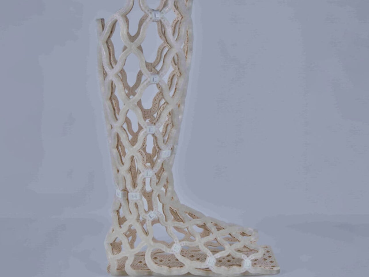
One detail I keep returning to is how this design manages to skip the expensive, time-consuming step of individual 3D scanning. Competitors in the printed cast space often require a custom scan per patient, which raises both cost and complexity. Castomize uses pre-made standard sizes for adults and children that become personalized through the heating and molding process. It’s a smarter workflow, one that clinics can adopt without rebuilding their entire process from scratch.
The startup originated as a student project at the Singapore University of Technology and Design in 2017, which makes its trajectory fairly remarkable. Eleora Teo, Abel Teo, and Johannes Sunarko launched it as a proper company in 2022, and TessaCast reached the market in 2025. It currently holds regulatory approval in Singapore, Australia, South Korea, and Taiwan, with FDA and CE mark applications in progress.
The cost picture is nuanced. TessaCast costs about 30 to 50 percent more to manufacture than a traditional fiberglass cast. But one hospital trial in Singapore recorded average savings of 25 percent overall, because the cast can be reheated and adjusted as the patient heals rather than replaced. Fewer return visits, less material waste, and fewer complications from casts applied too tightly or too loosely all contribute.
The traditional casting process involves ten separate steps and multiple materials, and errors during application can lead to pressure injuries. That’s a significant design failure dressed up as standard practice for a very long time. Castomize has looked at all of it and built something better. The orthopedic cast has been waiting for this moment for a very long time.
The post A 4D-Printed Cast You Can Actually Shower In first appeared on Yanko Design.