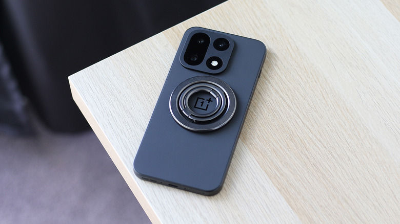
2 ways Android users can take advantage of Apple’s MagSafe accessories
MagSafe is a feature unique to iPhones, but Android users have a couple of options if they want to use MagSafe accessories and chargers.

The home office has been redesigned more times than anyone can count. Most of those attempts involve cable management trays and monitor arms that take an afternoon to install. The things that actually change how a day feels are quieter. A mouse that folds flat. A notebook with two E Ink screens side by side. A hub that replaces a desk full of adapters with a single cube. Five picks that earn their space without demanding much in return.
Each one on this list addresses a different part of the setup. Some resolve problems you have been quietly working around for years. Others make the workspace feel chosen rather than accumulated over time. None of them require a weekend to justify. What they share is a clarity of purpose that is rare enough in 2026 to be worth pointing out. These are the five gadgets that belong on a home office desk this September.

Most portable mice compromise somewhere obvious. They are too small for real use or too light to feel properly controlled on a fast-moving screen. The OrigamiSwift, designed by Horace Lam, starts from a different premise entirely. It folds completely flat to 4.5mm when you are done and opens back into a full-size mouse without ceremony. At 40 grams, it disappears into any bag without taking up a thought or asking for a dedicated pouch.
Soft-click buttons keep video calls quiet, and the Bluetooth connection removes one more dongle from the port situation entirely. The USB-C rechargeable battery lasts up to three months on a single charge, which removes the low-battery anxiety that follows most wireless mice around. For anyone splitting time between a home desk and a coffee shop or hotel room, the OrigamiSwift collapses the gap between travel gear and desktop gear into one object that handles both without being a specialist at either.


Every E Ink device on the market solves roughly the same problem and leaves the same one untouched. One screen means you are either reading or writing, never both at once, and that single limitation has defined the category for years. The Inkleaf, designed by Kameron Yu, treats that as the actual problem worth solving. It opens to two full 10.3-inch Carta E Ink panels side by side, letting you keep source material visible while your notes build on the other screen.
Priced at around $450, it ships with a pressure-sensitive stylus, a USB-C cable, and no subscription fees tied to reading your own files. For researchers and writers who have been running a tablet beside a separate notebook for years, this is the more honest version of that setup. The paper-like display reduces eye strain across long sessions, and keeping reference material on screen without switching tabs removes the small interruptions that erode focus before you notice they are happening.
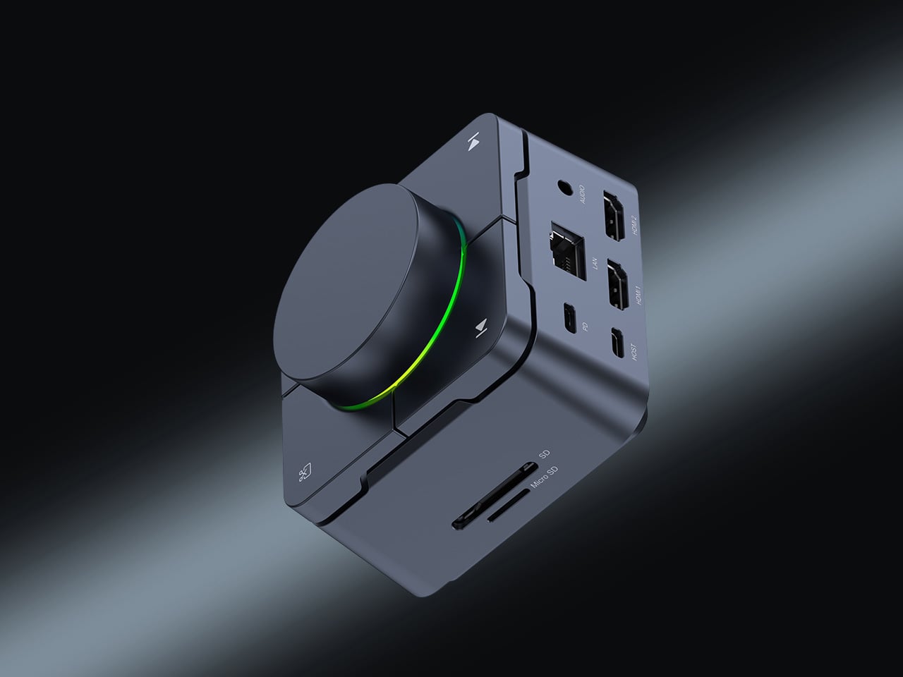

Modern laptops arrive with two USB-C ports and the expectation that you will figure out the rest. The HubKey Gen2 figures it out instead. It is an 11-in-1 USB-C hub and hardware control surface built into a single compact cube that sits beside your machine without demanding its own footprint. One cable handles display output, storage, network, charging, and peripherals at the same time. The design principle is one cable in and everything out, and it holds.
Four physical shortcut keys and a central knob sit on top of the cube. A built-in driver unlocks five preset systems with 170 fixed key combinations, plus a sixth mode where you assign shortcuts, macros, and sequences to suit your own workflow. When plugged in, a settings interface opens automatically. It includes dual 4K display output. For anyone tired of volume controls buried in software menus, this returns them to where they belong: within arm’s reach on the desk.
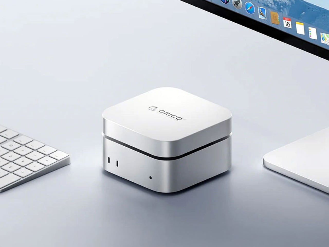
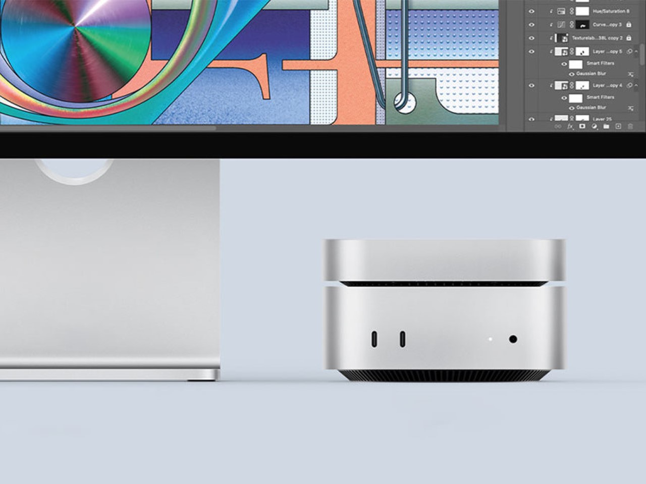
The base M4 Mac Mini ships with 256GB of storage, a number that starts feeling small the moment you put the machine to real work. The Orico MiniMate SSD is built to resolve that quietly. Its brushed aluminum casing mirrors the Mac Mini’s own footprint closely enough that the two sit together without the drive reading as an afterthought. The USB-C interface supports 40 Gbps transfer speeds, which keeps the external storage from becoming the slowest thing in the workflow.
Most external drives solve a storage problem while creating an aesthetic one. A cable snakes across the desk, the enclosure doesn’t match anything around it, and the setup that looked considered suddenly looks assembled. The MiniMate avoids that by treating the desk as the brief. For a Mac Mini setup built around clean lines and minimal clutter, it adds the storage the base model should have shipped with, at a price that makes the upgrade feel overdue rather than extravagant.


Most desk speakers are designed to disappear, which is a strange goal for something you look at every day. The Side A Cassette Speaker builds from the opposite direction. The visual language of a cassette tape is right there in the form, and it does not attempt to blend into the background. For a home office that appears on video calls, that kind of presence does quiet work that people in the meeting register before they notice the audio quality.
Slide it into its clear case, and the speaker becomes a stand as well as protection, turning the object into a display piece rather than something to tuck behind a monitor. The sub-$50 price makes it an easy desk addition without needing a budget argument. Whether you are winding down after a long day of calls or just need the afternoon to feel less like working inside a filing cabinet, the Side A earns its spot on both counts without much deliberation.
A home office should feel assembled with intention rather than accumulated over time. Each of these five objects earns its spot by doing something specific well. The OrigamiSwift handles the mouse without the usual compromises. The Inkleaf addresses the read-and-write gap that has defined the E Ink category for years. The HubKey consolidates connectivity into one object. The MiniMate closes the storage gap. The Side A makes the desk feel deliberately chosen.
None of these are purchases you forget about in two weeks. They are the kind that quietly shift the texture of a workday without announcing the change. A desk built around objects chosen deliberately tends to outperform one assembled from whatever was available at the time. These five are worth choosing carefully, and the shared quality across all of them is that they make their part of the setup feel settled rather than provisional.
The post The 5 Best Home Office Gadgets of September 2026 first appeared on Yanko Design.


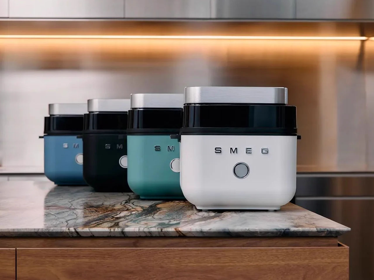
Smeg gave us a first glimpse of its maiden air fryer with its own built-in streamer at Milan Design Week earlier this year. The colorful new appliance was nothing more than a concept back then, with no information whatsoever on whether it would become real. The scenario now stands changed. Smeg officially announces the availability of the new air fryer in four colors to choose from.
This is the first dedicated air fryer from Smeg, which follows the company’s inclusion of air frying technology in ovens before this. The product range is new, but familiar design language with vibrant color options and a matte body makes the appliance recognizable in the crowd.
Designer: Smeg
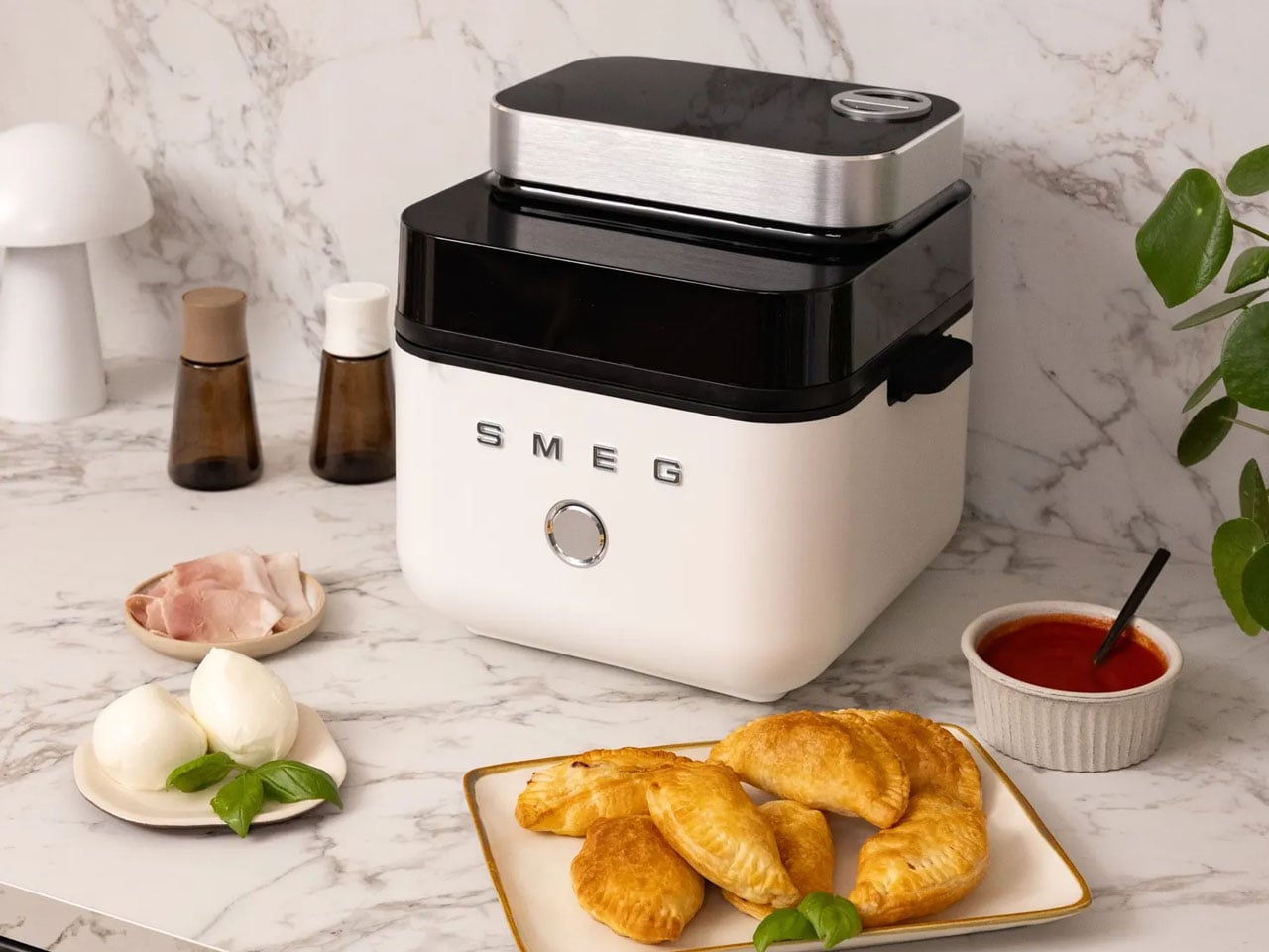

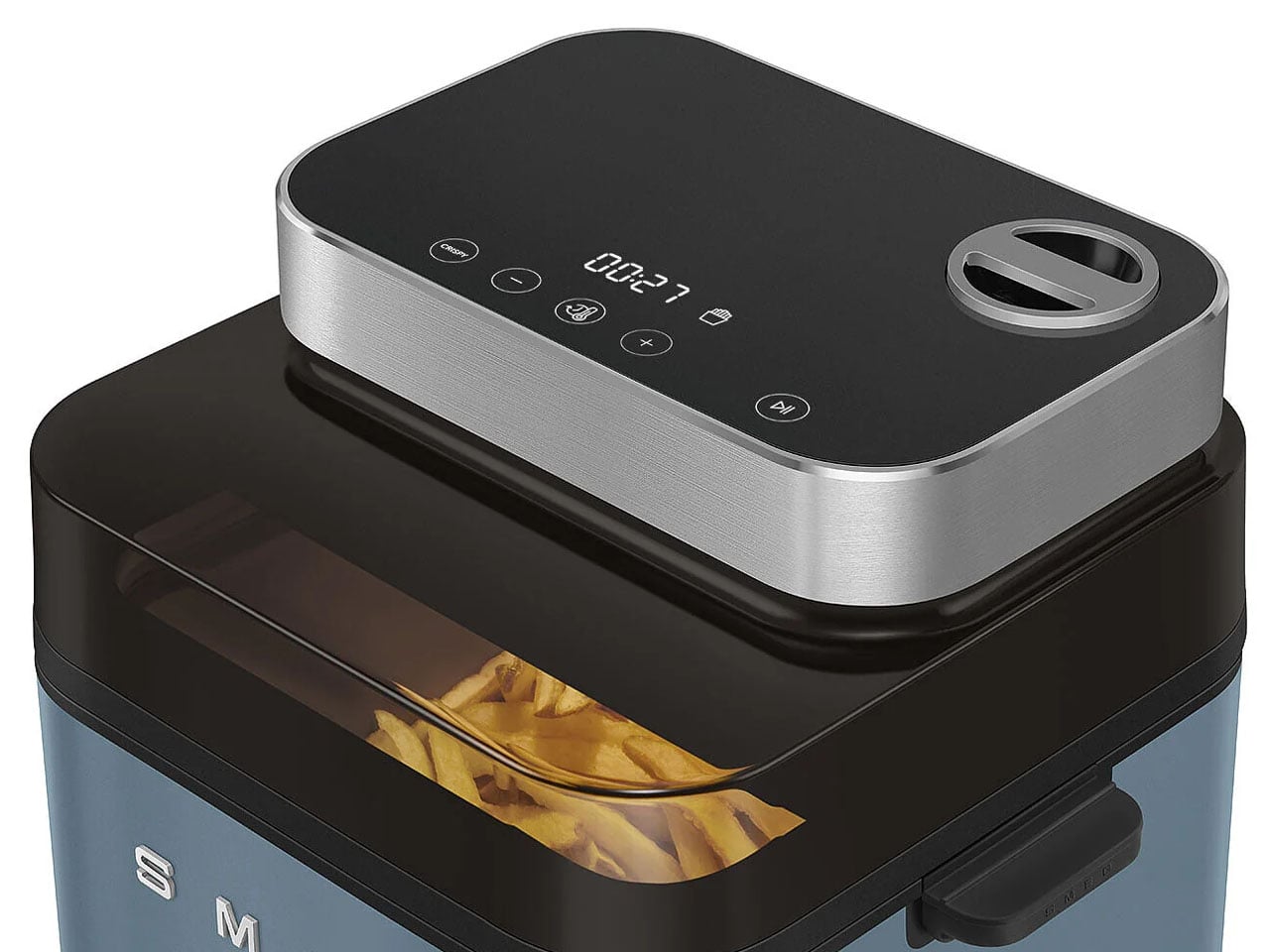
Smeg calls it the AFC01 Dual Flavor Air Fryer and distinguishes itself from the others on the market with its large 7.3-litre capacity and multiple presets and modes to cook with. It comes with two cooking modes to choose between: Crispy and Juicy+Crispy. As the names suggest, in Crispy mode, the air fryer cooks food evenly to get a crispy crust and golden-brown color, which is recommended by Smeg for breaded meals, snacks, and vegetables.


The Juicy+Crispy cooking mode, on the other hand, can provide foods with a crispy exterior and juicy center. This is possible with the Smeg Dual Flavor Air Fryer since it combines hot air circulation with the fryer’s own internal steaming system, so the food retains its flavorful moistness inside while forming a crisp crust on the outside. For the steam feature, Smeg has built a water cartridge that you can pull out and fill up. It is located at the top of the fryer. Once you choose the setting, the steam is deployed into the basket, providing it with moisture that helps make breads fluffy and wedges crispy outside and juicy inside. Both the Crispy and Juicy+Crispy modes can work in manual or in any of the seven pre-set controls. The fryer consumes little to no oil in the process.
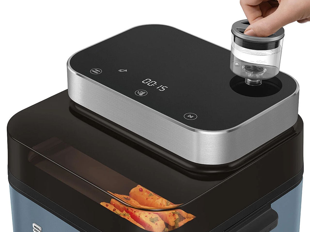

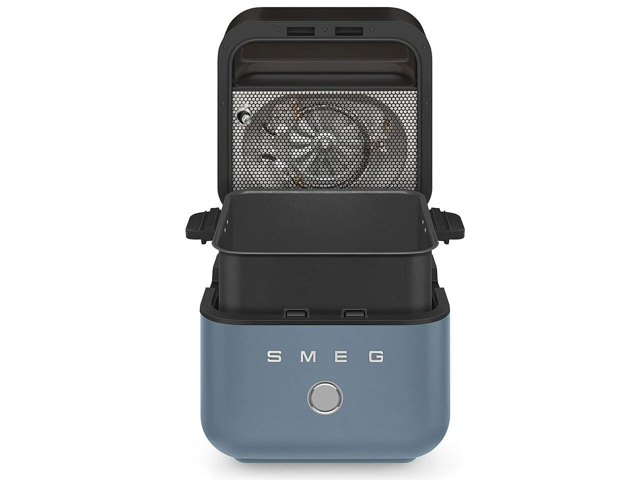
Interestingly, the new Smeg air fryer operates differently from the run-of-the-mill air fryers out there. It features a flip-open top that operates at the touch of a button on the control panel, which is a touchscreen display located at the top of the air fryer. When you press the button, the top lid flips open to reveal the frying basket inside.
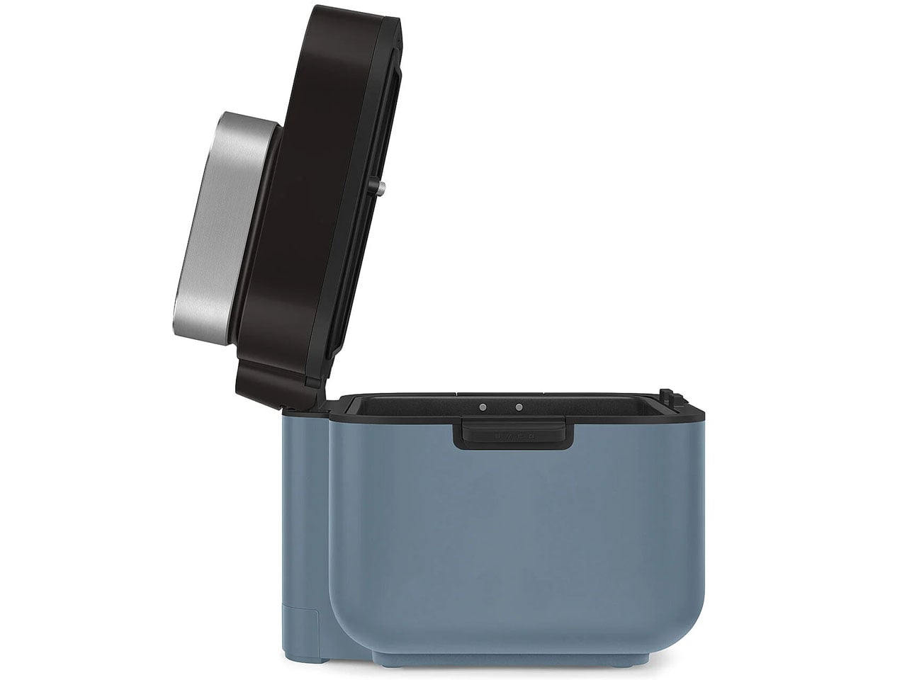

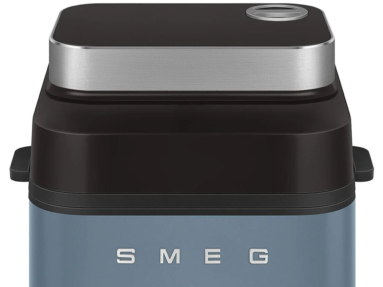
It is easy to remove the basket using its silicone handles for cleaning. The basket itself is made from non-stick ceramic coating, making it dishwasher-safe. The top of the fryer has a large viewing window to keep a real-time check on your food’s progress while it cooks crisp or juicy inside. If you’re interested in this new take on the air fryer by Smeg, you can get it for £199.95 (approximately $270) now in black, white, storm blue, or emerald green colors.


The post Smeg’s first air fryer with built-in steamer is available now in four gorgeous colors first appeared on Yanko Design.
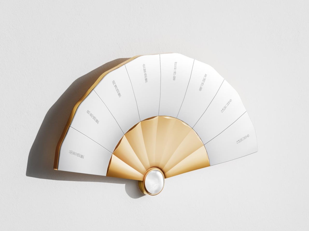
A folding fan used to say something about the person holding it, signaling taste and refinement long before anyone cared about voice assistants or smart lighting. The Fanora Control Terminal borrows that exact silhouette and turns it into a wall-mounted switch panel, proving a home automation interface doesn’t have to look like it was designed by an engineer who’s never held a fan in their life.
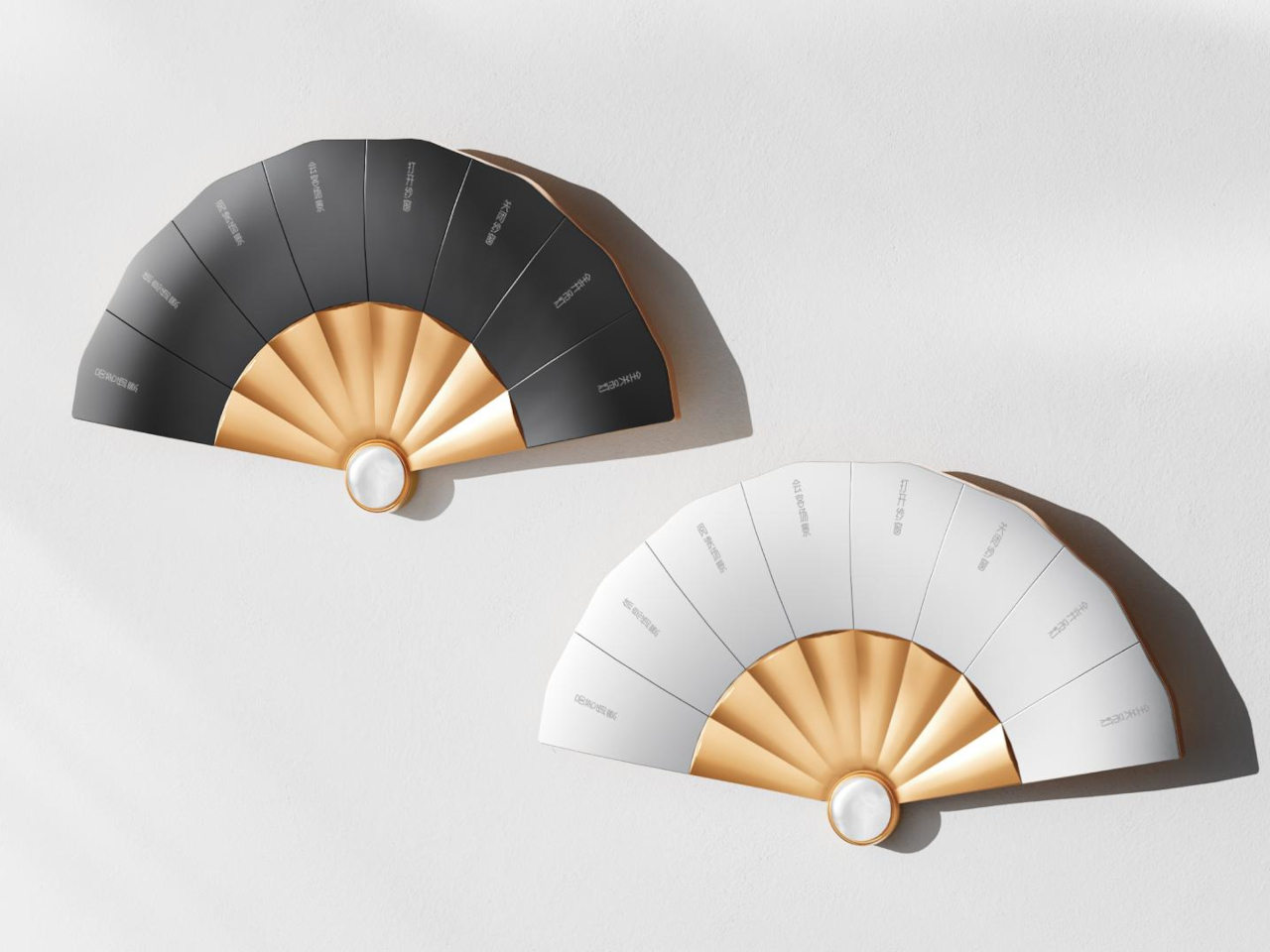
Eight mechanical buttons fan out from a central hinge point, each one following the natural arc a real folding fan would take when opened halfway. That shape isn’t decorative shorthand either. It’s the whole control surface, built from aluminum and finished with a jade centerpiece that used to signal scholarly status in Chinese tradition and now doubles as a working sensor housing.
Designer: HDL Automation
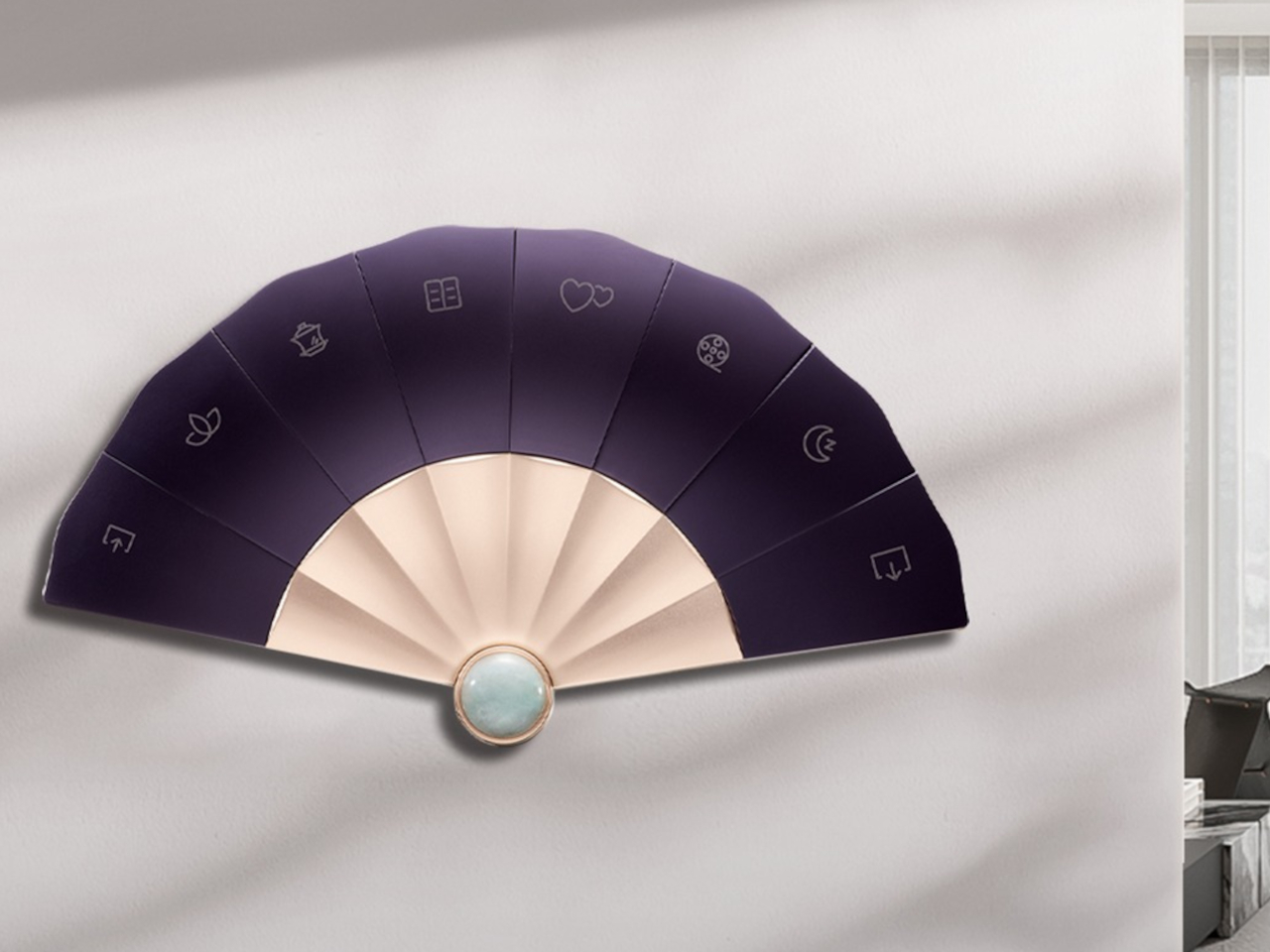
The panel’s main body is machined from 6063 aluminum alloy, then sandblasted and anodized to get that matte, slightly warm finish instead of the glossy plastic most switch panels settle for. Each of the eight buttons goes through CNC processing, with a curvature shaped around how a fingertip actually presses rather than how a mold happens to come out, and a fine sand texture that keeps fingerprints from building up over months of daily use.
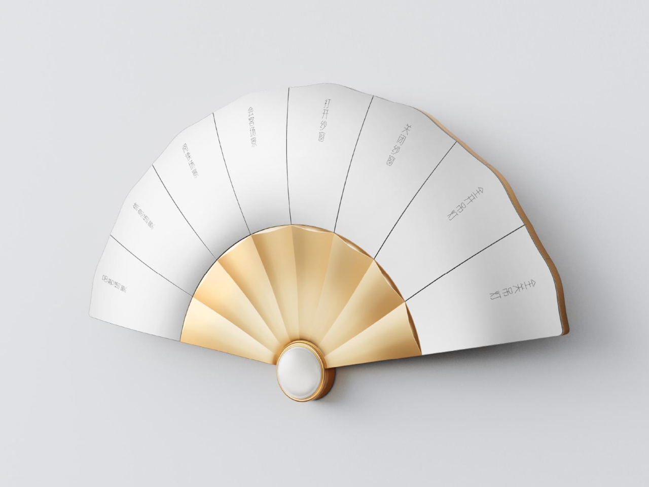
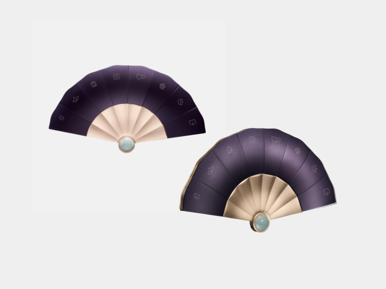
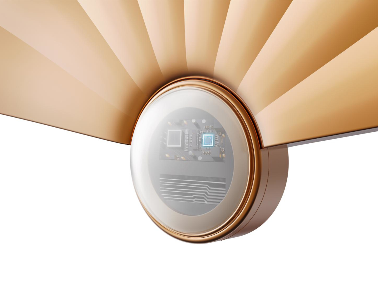
That centerpiece pendant is carved from natural Hetian jade, a material historically prized in Chinese craftsmanship, polished by hand rather than mass-produced. It sits at the base of the fan where the ribs converge, doing double duty as both the visual anchor and the housing for the temperature and motion sensors underneath. A jade certificate ships in the box, treating the stone as a verified material rather than a cosmetic add-on.
Motion detection lives inside that jade pendant, waking the panel’s touch display the moment someone walks close enough to reach for it, instead of leaving a screen lit and idle all day. A built-in temperature sensor reads the room and feeds that data straight into scene and automation logic, so a preset for movie night or afternoon reading can react to the actual conditions in the room rather than a fixed schedule.
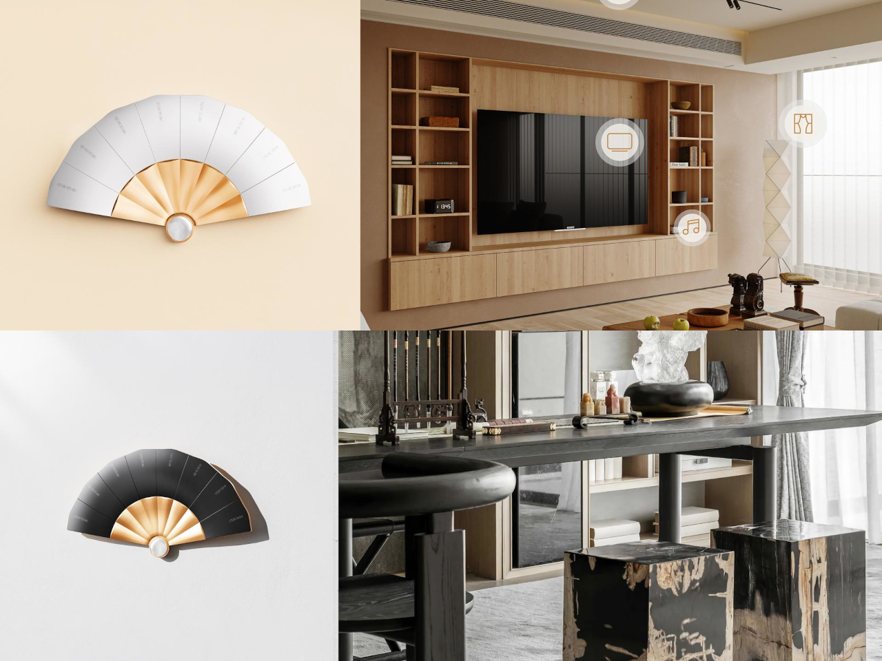
Each button supports laser engraving with custom text, meaning a household can label its own shortcuts instead of memorizing generic switch numbers. One button might trigger a reading nook’s lighting, another could dim everything down for a film, and a third could raise the curtains, all without opening an app or hunting through menus. The panel handles curtains, music, and broadcast scenes across a room without breaking that same physical interaction.
Unlike a fixed switch plate, Fanora can sit flush against a wall or rest on a desk as a standalone display, a flexibility built into its wiring rather than bolted on as an afterthought. That range means the same object can function as a hallway light switch in one home and a bedside control surface in another, without needing a separate model for each context.
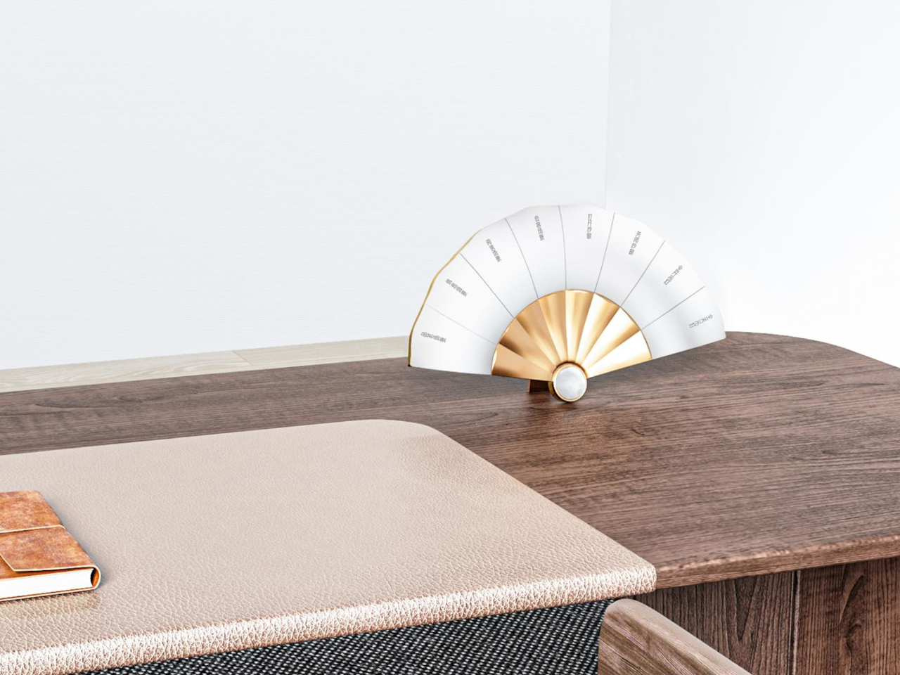
Customization extends to the jade pendant’s shape itself, letting a household choose a silhouette that fits their own taste rather than accepting one fixed design across every unit sold. That level of personalization treats the panel less like static hardware and more like a piece of furniture chosen for a specific room, which explains why a folding fan turned out to be the right shape for a light switch after all.
The post Smart Home Panels Look Like Tech, Fanora Looks Like Fine Craft first appeared on Yanko Design.

Some phone collaborations slap a logo on a box and call it a day. This one goes further, treating a smartphone like a prop pulled straight from the wizarding world rather than a branded accessory bolted onto existing hardware. The realme 16 Pro Harry Potter Edition rebuilds its entire back panel around Hogwarts iconography, then wraps the whole package in a trunk replica that plays the role of Harry’s own school luggage.
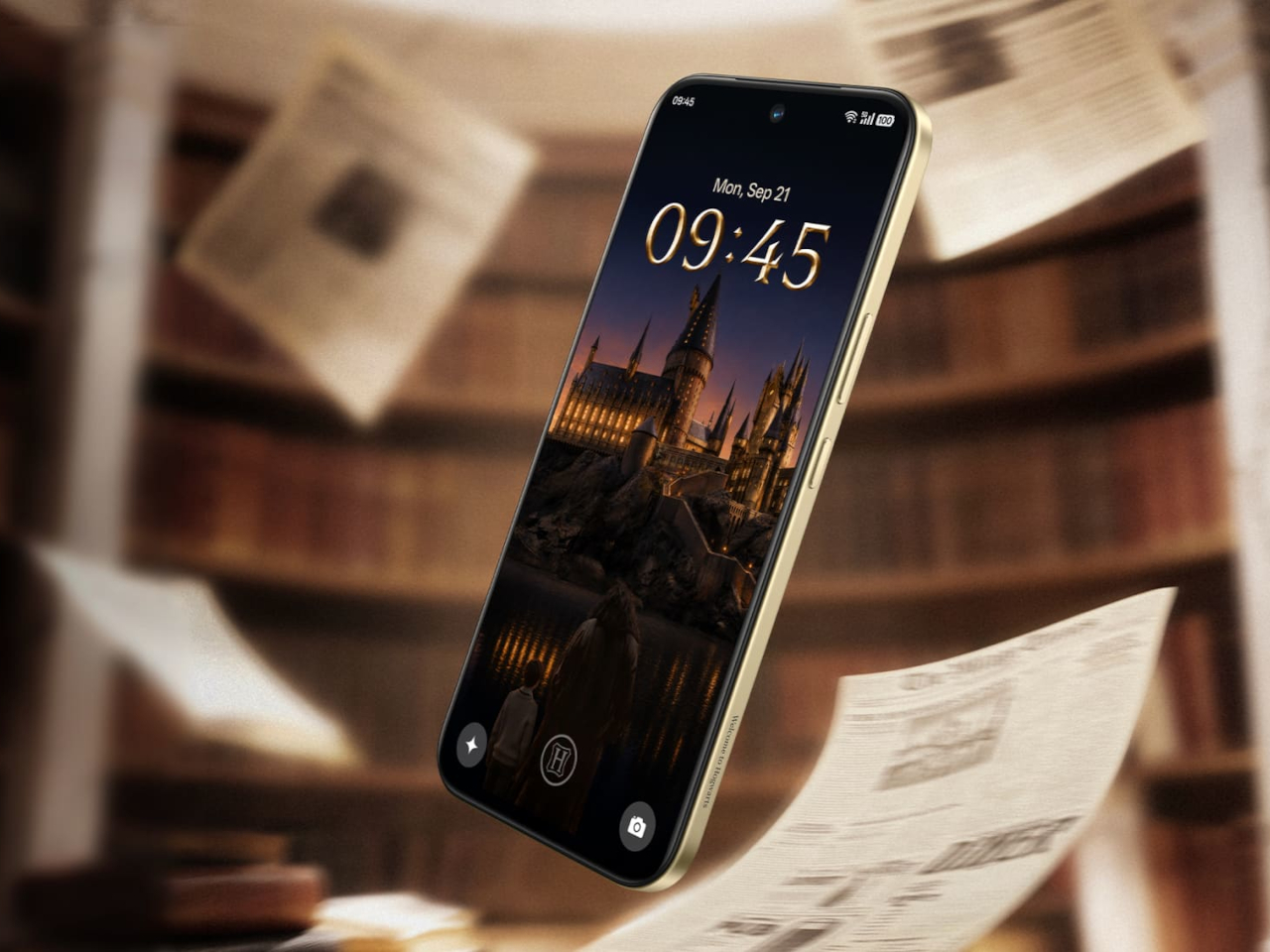
Underneath the theming sits the same hardware found in the standard realme 16 Pro: a Dimensity 7300 Max chipset, a 144Hz AMOLED display rated at 6,500 nits of peak brightness, and a 7,000mAh battery supporting 80W wired charging along with bypass and reverse charging. None of that changes here. What changes is how all of it gets dressed up, and that’s where the real story starts.
Designer: realme
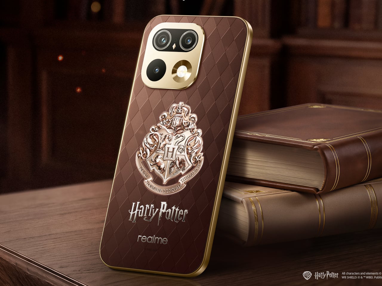
Flip the phone over, and the design leans on texture before it leans on imagery. A brown, leather-textured back panel carries an Argyle pattern lifted from the Wizard’s Chess scene, giving the surface a woven, tactile quality instead of a flat printed graphic. The Hogwarts Crests sit subtly at the center, small enough to reward a second look rather than shouting for attention from across a room.
The camera module gets its own quiet reinterpretation. Built on the standard 16 Pro’s Metal Mirror Camera Deco, the ring here is reshaped to resemble Hedwig’s eyes, turning a purely functional component into a character reference without needing an explicit illustration to sell the idea. It’s a detail that rewards fans who know the franchise while staying subtle enough not to alienate anyone who doesn’t.
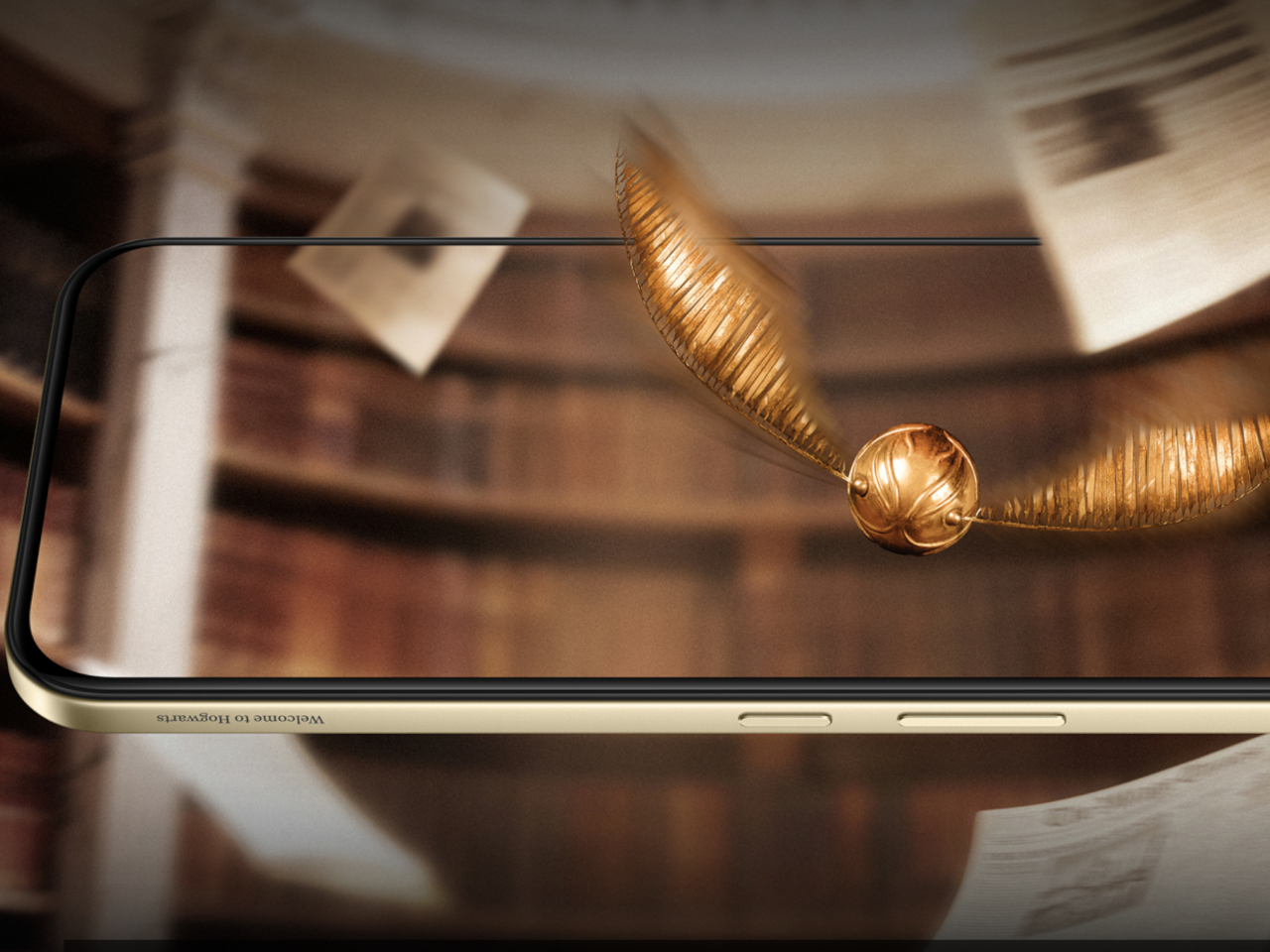
The metallic mid-frame carries a laser-engraved “Welcome to Hogwarts” slogan, placed where a hand would naturally wrap around the device during a call or a photo. That kind of detail only reveals itself through use, not through a glance at a product photo, which fits the restrained tone running through the rest of the design.
Nothing about the theming interferes with how the phone actually functions day to day. The engraving, the crest, the camera ring reshape, all of it layers onto hardware that still charges fast and still displays at a brightness most phones can’t match outdoors. The fantasy stays skin-deep in the best possible way, present without slowing anything down.
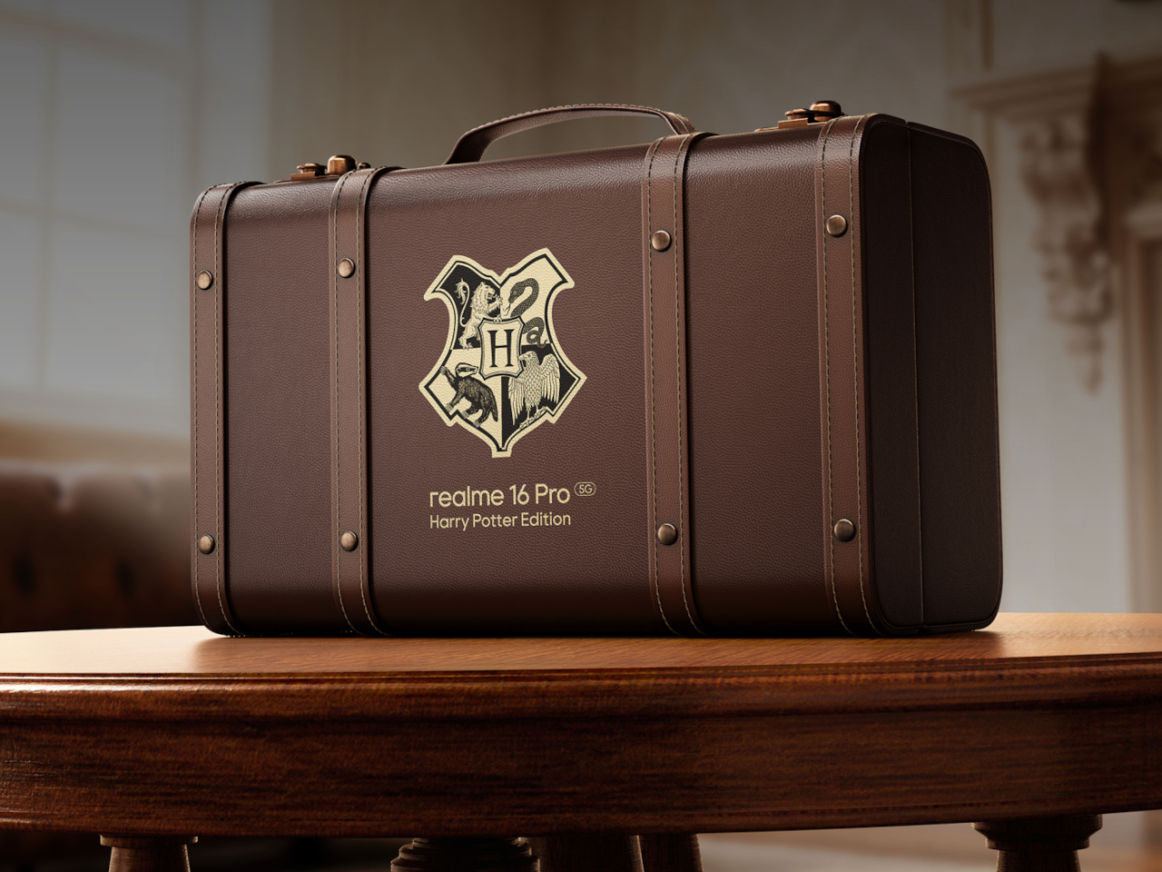
The packaging might be the boldest swing in the whole release. Instead of a standard retail box, this edition ships in a school-style trunk built as a 1:1 replica of Harry’s own luggage, the kind of object that turns unboxing into a small ceremony rather than a chore done over a kitchen counter. Only 5,000 units exist worldwide, immediately treating the box as collectible.

Open it, and the trunk holds a Hogwarts Welcome Pack rather than plastic filler. An acceptance letter and train ticket recreate the moment of becoming a first-year student, while house-crest bookmarks let a fan pick their allegiance and character postcards recreate Harry, Hermione, and Ron’s first steps into the castle. A logo-embossed phone case and a phone pin round out a set built for shelf display as much as daily use.
None of these objects function as phone accessories in the traditional sense. The bookmarks and postcards exist purely as collectible ephemera, while the case is the one item pulling double duty as protection and display piece. That split matters because it treats the box as a keepsake first, with the phone itself as the technological anchor holding the theme together.
That approach reflects a broader shift in how phone makers court younger buyers who grew up with the franchise rather than discovering it as adults. Pairing a genuinely capable mid-range chipset and fast charging with a story-driven unboxing experience gives this edition a reason to exist beyond a seasonal marketing push, aimed at a generation that treats favorite franchises as identity rather than nostalgia.
The post realme Built a Harry Potter Phone That Ships Inside Harry’s Own Trunk first appeared on Yanko Design.
Some phone collaborations slap a logo on a box and call it a day. This one goes further, treating a smartphone like a prop pulled straight from the wizarding world rather than a branded accessory bolted onto existing hardware. The realme 16 Pro Harry Potter Edition rebuilds its entire back panel around Hogwarts iconography, then wraps the whole package in a trunk replica that plays the role of Harry’s own school luggage.
Underneath the theming sits the same hardware found in the standard realme 16 Pro: a Dimensity 7300 Max chipset, a 144Hz AMOLED display rated at 6,500 nits of peak brightness, and a 7,000mAh battery supporting 80W wired charging along with bypass and reverse charging. None of that changes here. What changes is how all of it gets dressed up, and that’s where the real story starts.
Designer: realme
Flip the phone over, and the design leans on texture before it leans on imagery. A brown, leather-textured back panel carries an Argyle pattern lifted from the Wizard’s Chess scene, giving the surface a woven, tactile quality instead of a flat printed graphic. The Hogwarts Crests sit subtly at the center, small enough to reward a second look rather than shouting for attention from across a room.
The camera module gets its own quiet reinterpretation. Built on the standard 16 Pro’s Metal Mirror Camera Deco, the ring here is reshaped to resemble Hedwig’s eyes, turning a purely functional component into a character reference without needing an explicit illustration to sell the idea. It’s a detail that rewards fans who know the franchise while staying subtle enough not to alienate anyone who doesn’t.
The metallic mid-frame carries a laser-engraved “Welcome to Hogwarts” slogan, placed where a hand would naturally wrap around the device during a call or a photo. That kind of detail only reveals itself through use, not through a glance at a product photo, which fits the restrained tone running through the rest of the design.
Nothing about the theming interferes with how the phone actually functions day to day. The engraving, the crest, the camera ring reshape, all of it layers onto hardware that still charges fast and still displays at a brightness most phones can’t match outdoors. The fantasy stays skin-deep in the best possible way, present without slowing anything down.
The packaging might be the boldest swing in the whole release. Instead of a standard retail box, this edition ships in a school-style trunk built as a 1:1 replica of Harry’s own luggage, the kind of object that turns unboxing into a small ceremony rather than a chore done over a kitchen counter. Only 5,000 units exist worldwide, immediately treating the box as collectible.
Open it, and the trunk holds a Hogwarts Welcome Pack rather than plastic filler. An acceptance letter and train ticket recreate the moment of becoming a first-year student, while house-crest bookmarks let a fan pick their allegiance and character postcards recreate Harry, Hermione, and Ron’s first steps into the castle. A logo-embossed phone case and a phone pin round out a set built for shelf display as much as daily use.
None of these objects function as phone accessories in the traditional sense. The bookmarks and postcards exist purely as collectible ephemera, while the case is the one item pulling double duty as protection and display piece. That split matters because it treats the box as a keepsake first, with the phone itself as the technological anchor holding the theme together.
That approach reflects a broader shift in how phone makers court younger buyers who grew up with the franchise rather than discovering it as adults. Pairing a genuinely capable mid-range chipset and fast charging with a story-driven unboxing experience gives this edition a reason to exist beyond a seasonal marketing push, aimed at a generation that treats favorite franchises as identity rather than nostalgia.
The post realme Built a Harry Potter Phone That Ships Inside Harry’s Own Trunk first appeared on Yanko Design.