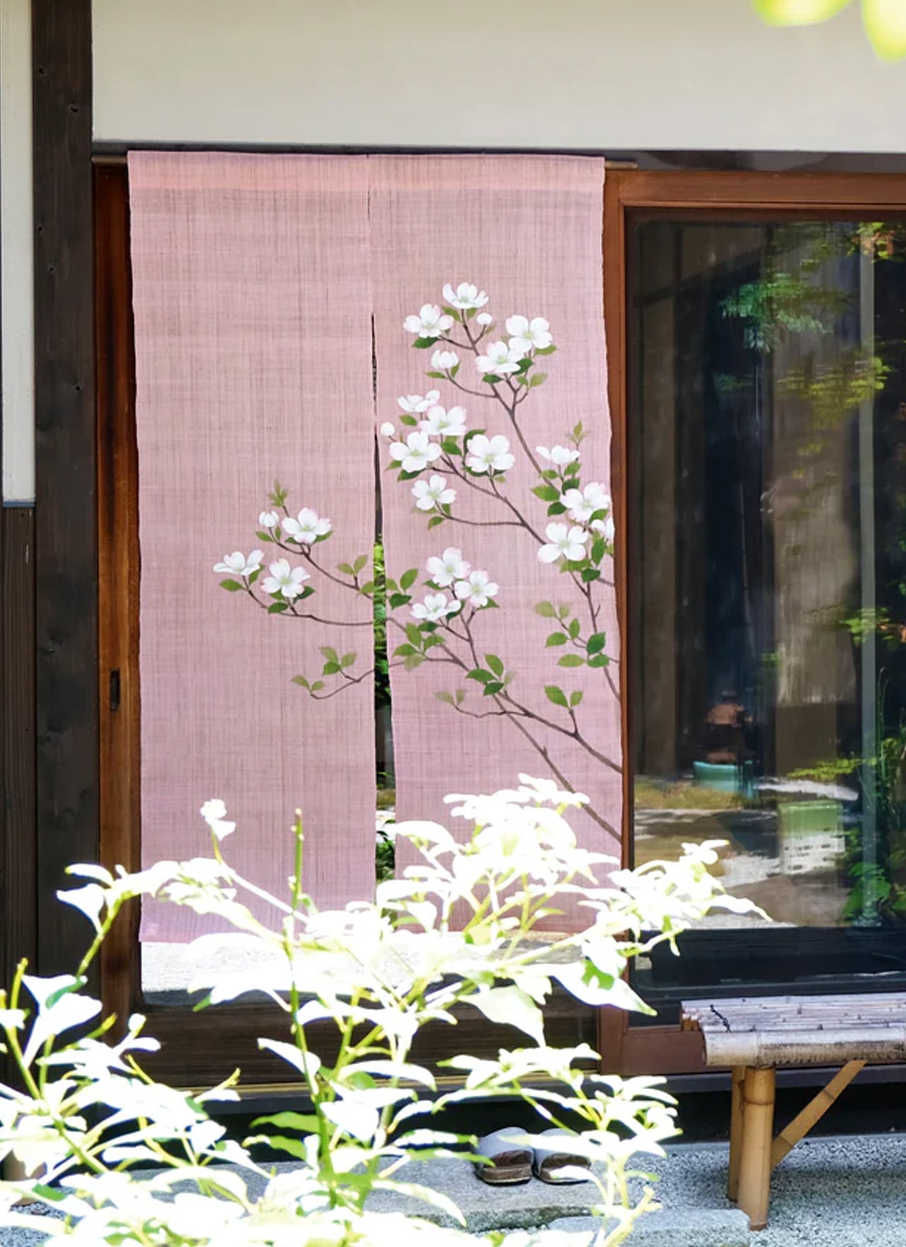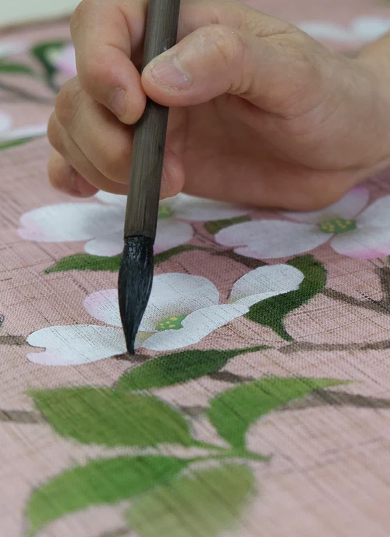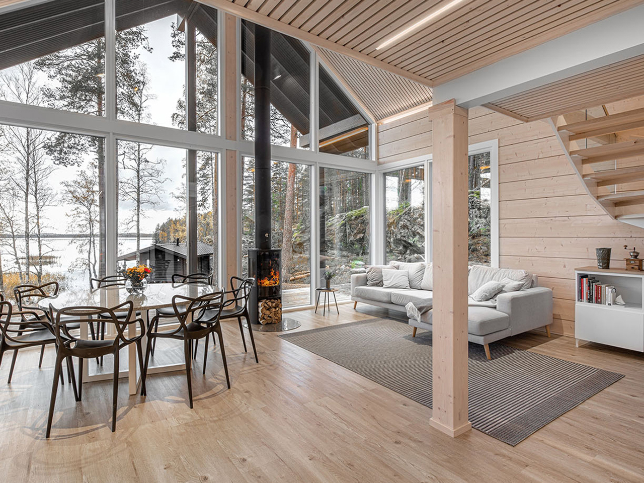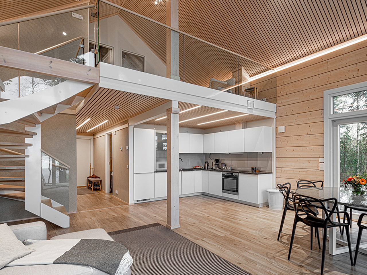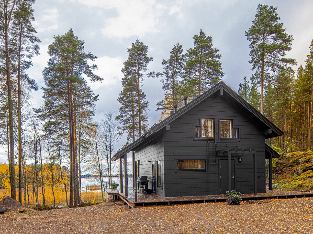
The architectural world is shifting toward materials that feel grounded, honest, and deeply connected to the earth. Instead of relying on high-energy industrial products, designers and homeowners are embracing approaches that honor the planet’s natural tectonics. In this movement toward true sustainability, rammed earth has re-emerged as a powerful, modern choice for those seeking beauty, integrity, and a low-carbon footprint.
Its tactile layers and sculptural warmth create spaces that feel rooted, calm, and inherently biophilic. Rammed earth offers durability, thermal comfort, and long-term value, transforming simple structures into timeless experiences and reflecting the five pillars driving its revival.
1. Low-Carbon Construction
Rammed earth stands out as a low-carbon building method because its main ingredient, subsoil, is often sourced directly from the construction site or nearby. This drastically cuts transportation emissions. Unlike concrete or brick, rammed earth requires no firing, kilns, or intensive chemical processes. Its formation relies on simple mechanical compaction and moisture, keeping the embodied energy among the lowest of any mainstream wall system.
This approach makes each project inherently more responsible and materially honest. By using local resources and eliminating energy-heavy manufacturing, rammed earth aligns with global decarbonization goals. It has become a preferred choice among forward-thinking firms committed to sustainable, large-scale performance.
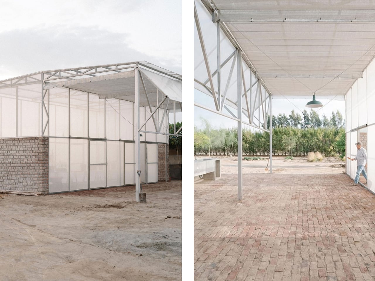
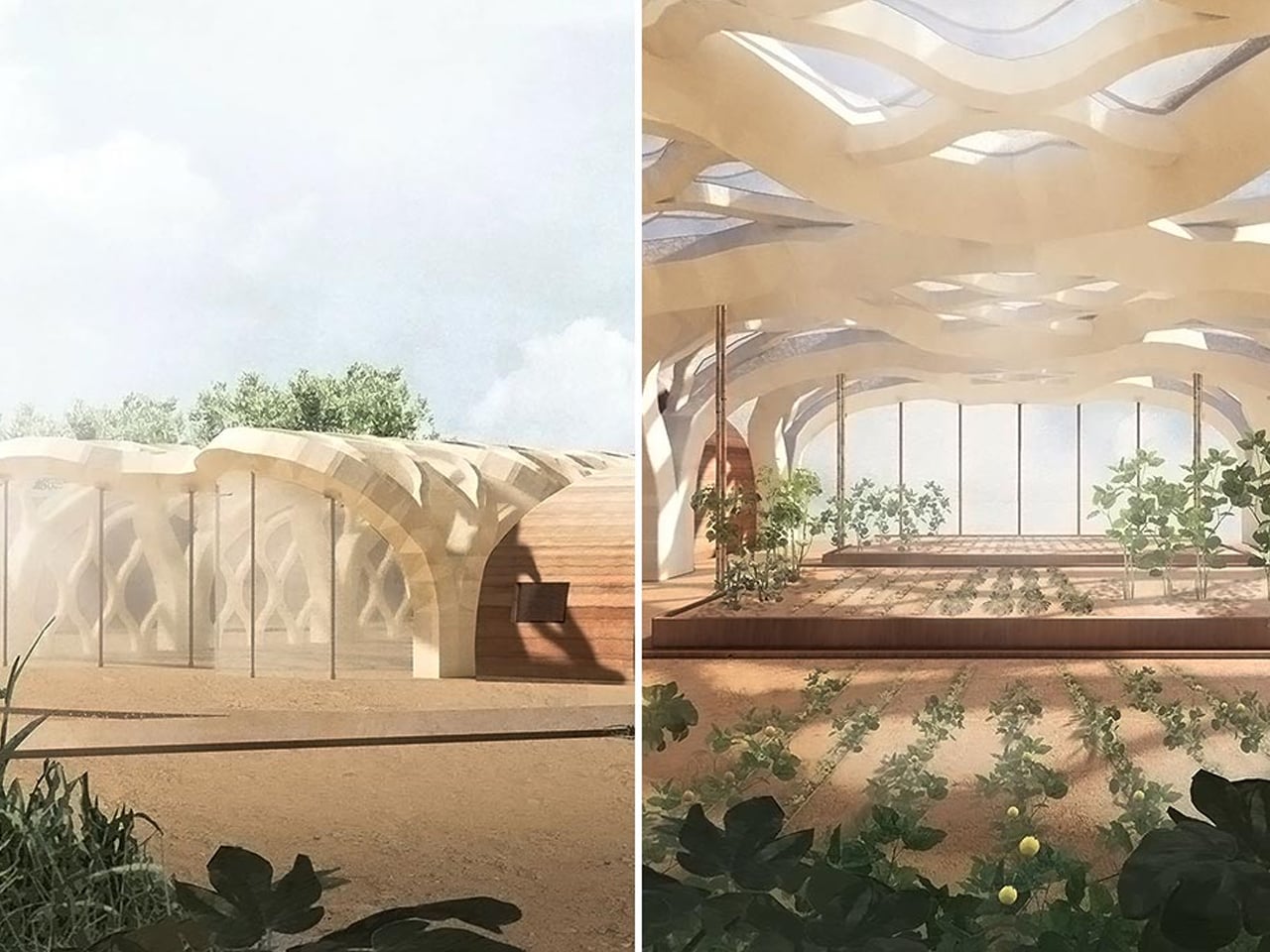
Arquipélago Arquitetos’ Piracaia Eco-Village in rural São Paulo exemplifies sustainable home design, using rammed earth construction to create affordable, eco-friendly residences. Located in the village of Piracaia, the development currently includes three homes ranging from a 538-square-foot studio to a 1,245-square-foot two-bedroom unit. Each home features rammed-earth walls formed from local soil, providing structural strength and natural insulation. A modular design allows the system to be easily replicated or scaled, offering flexibility and efficiency.
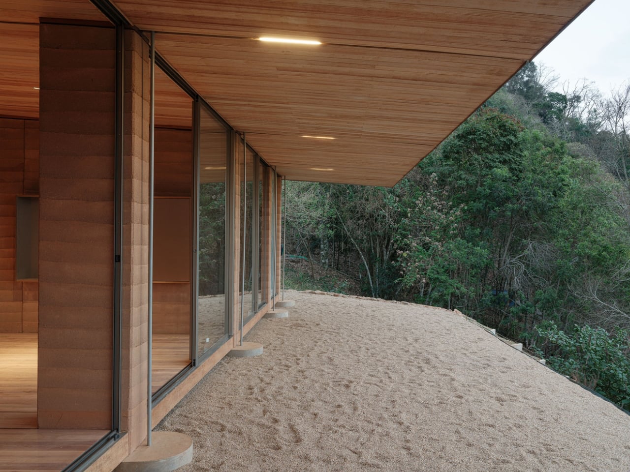
Large clerestory windows bring in natural light while preserving privacy, and the aluminium roofs are designed to harvest rainwater for everyday use. Wood panels and steel tie rods ensure stability and structural integrity. Initiated by a resident who sought a deeper connection to nature and community, the project stands as a model for sustainable rural living—embracing local resources, traditional techniques, and modern architectural thinking to shape a more conscious way of life.
2. Honors Raw Materiality
Rammed earth’s signature beauty lies in its dramatic, layered texture, which is an architectural reflection of geological time. Each compacted lift reveals natural striations shaped by the soil’s mineral makeup, giving every wall a distinct, site-specific identity. This visual honesty creates an immediate sense of grounding, making the material feel ancient and deeply contemporary.
In double-height spaces, these walls do more than define boundaries as they hold light, absorb warmth, and shift subtly throughout the day. The result is an atmosphere that feels calm, elemental, and immersive. The wall becomes an artwork in itself, guiding the mood, rhythm, and spatial flow of the entire home.
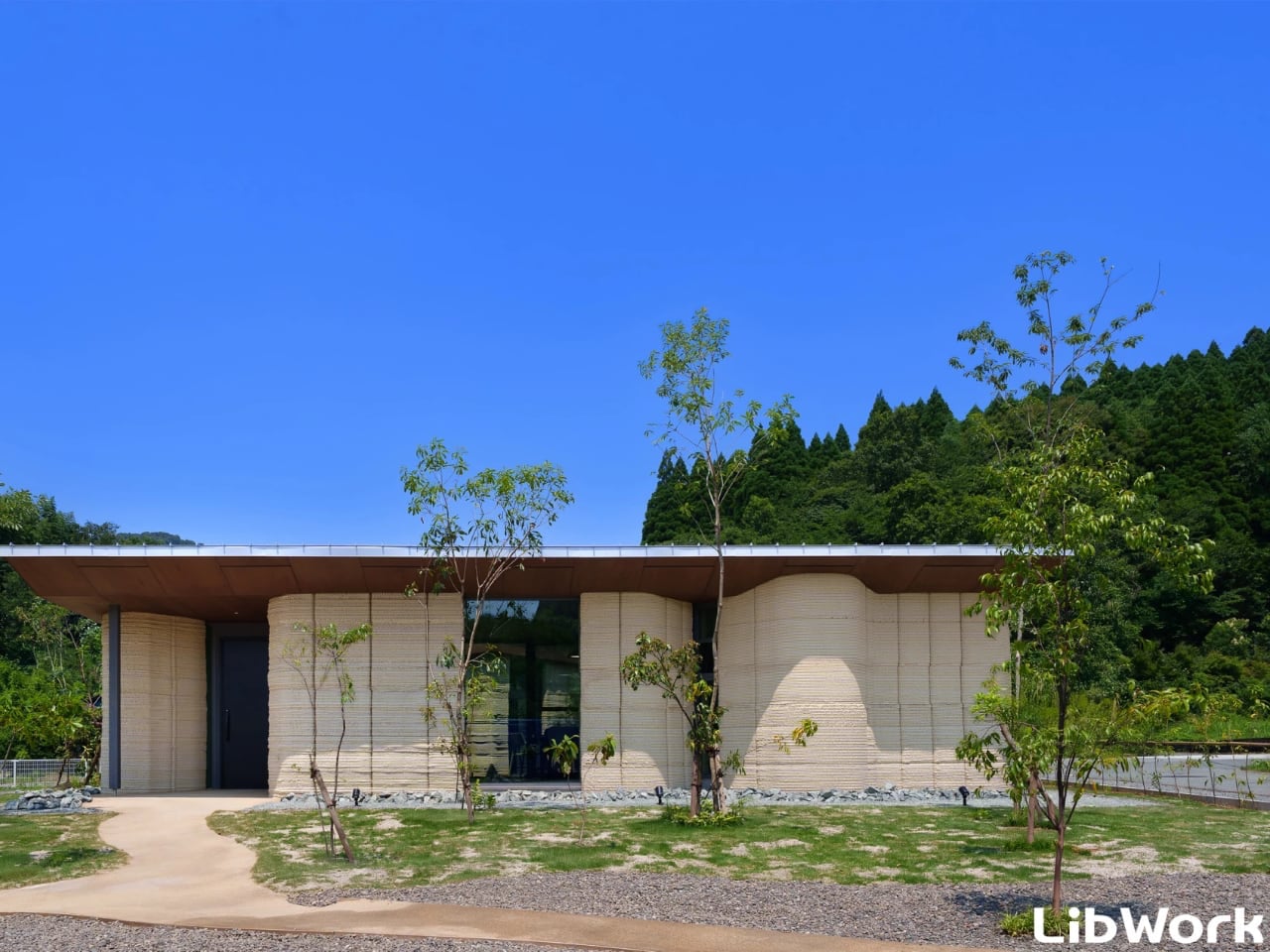
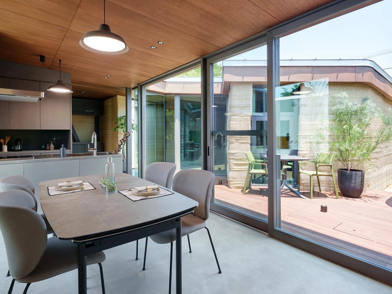
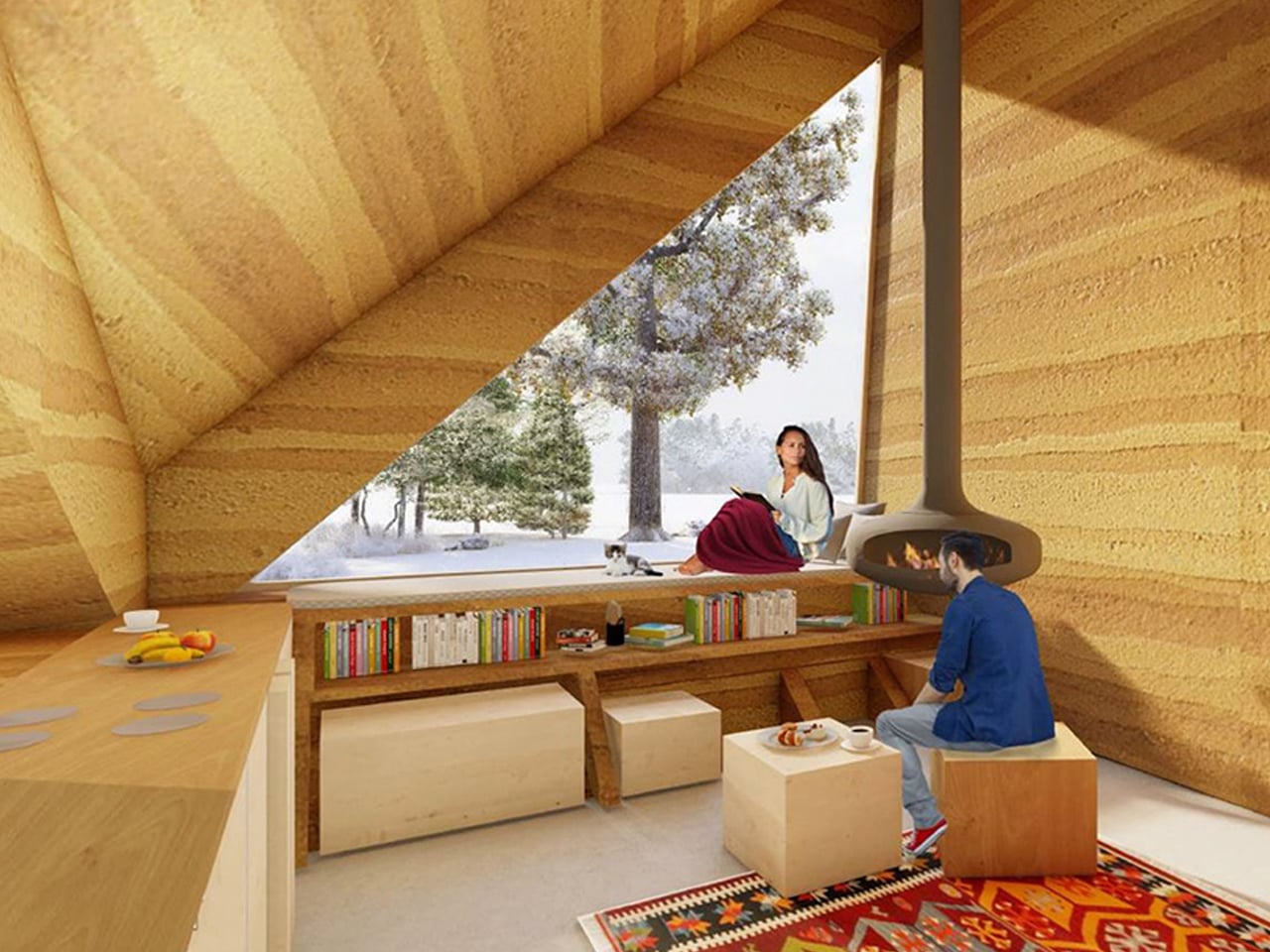
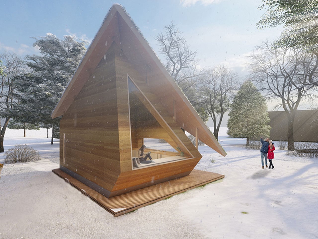
Japanese architecture studio Lib Work has introduced the Lib Earth House Model B, a 1,076-square-foot home made primarily from 3D-printed soil. Located in Yamaga, Kumamoto Prefecture, and developed with Arup and WASP, this project represents a significant departure from traditional concrete construction. The single-story structure features gently curved walls and a ribbed exterior texture, showcasing the potential of combining ancient materials with advanced printing technology. Constructed from a mix of soil, sand, slaked lime, and natural fibres, the home cuts typical construction emissions by more than half while promoting durability and thermal performance.
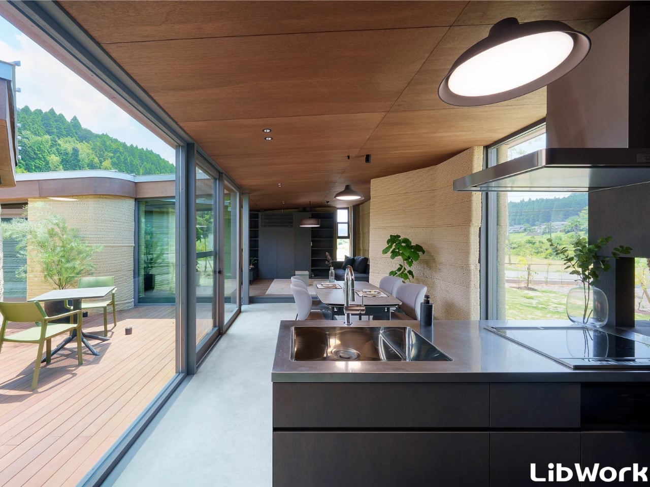
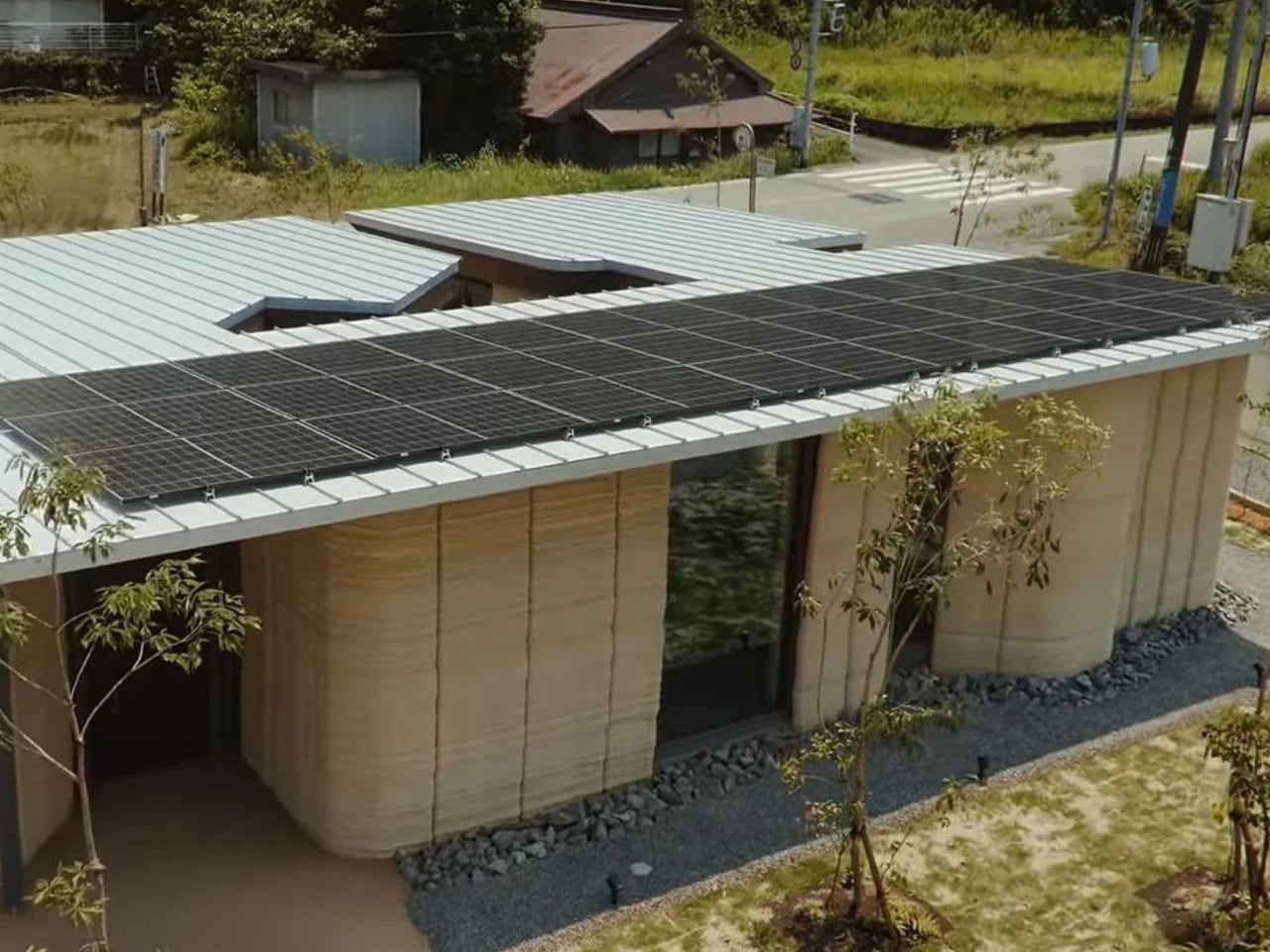
Inside, the design balances minimalism and warmth, with natural light accentuating the earth walls’ varied textures. Embedded sensors monitor moisture and structural performance discreetly, improving long-term sustainability. The flat roof accommodates future solar or water systems, highlighting a practical integration of eco-friendly features.
3. Natural Temperature Control
Rammed earth excels in passive design because of its dense, high–high-thermal-mass composition. These walls act as natural thermal batteries, absorbing heat throughout the day and releasing it slowly at night. This steady modulation of indoor temperatures reduces sharp fluctuations and minimizes dependence on mechanical heating or cooling systems. For homeowners and designers, this means long-term savings and an impressive ROI on energy infrastructure.
Beyond performance, the material elevates the visual and spatial experience. Its ability to regulate climate naturally eliminates the need for excessive mechanical fixtures, creating cleaner lines and a more intentional aesthetic. Rammed earth becomes both structure and climate strategy in one.
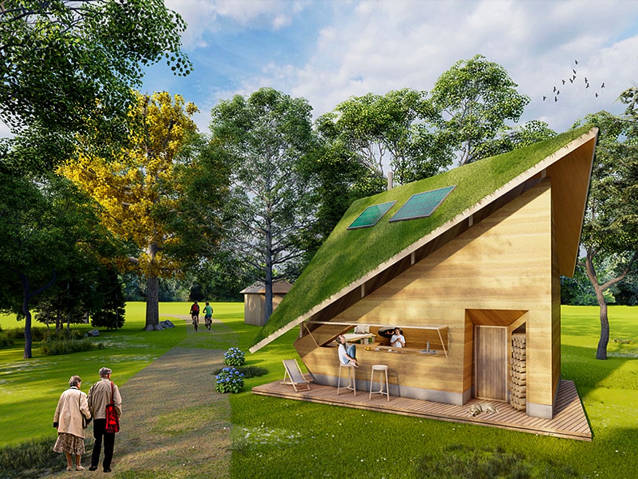
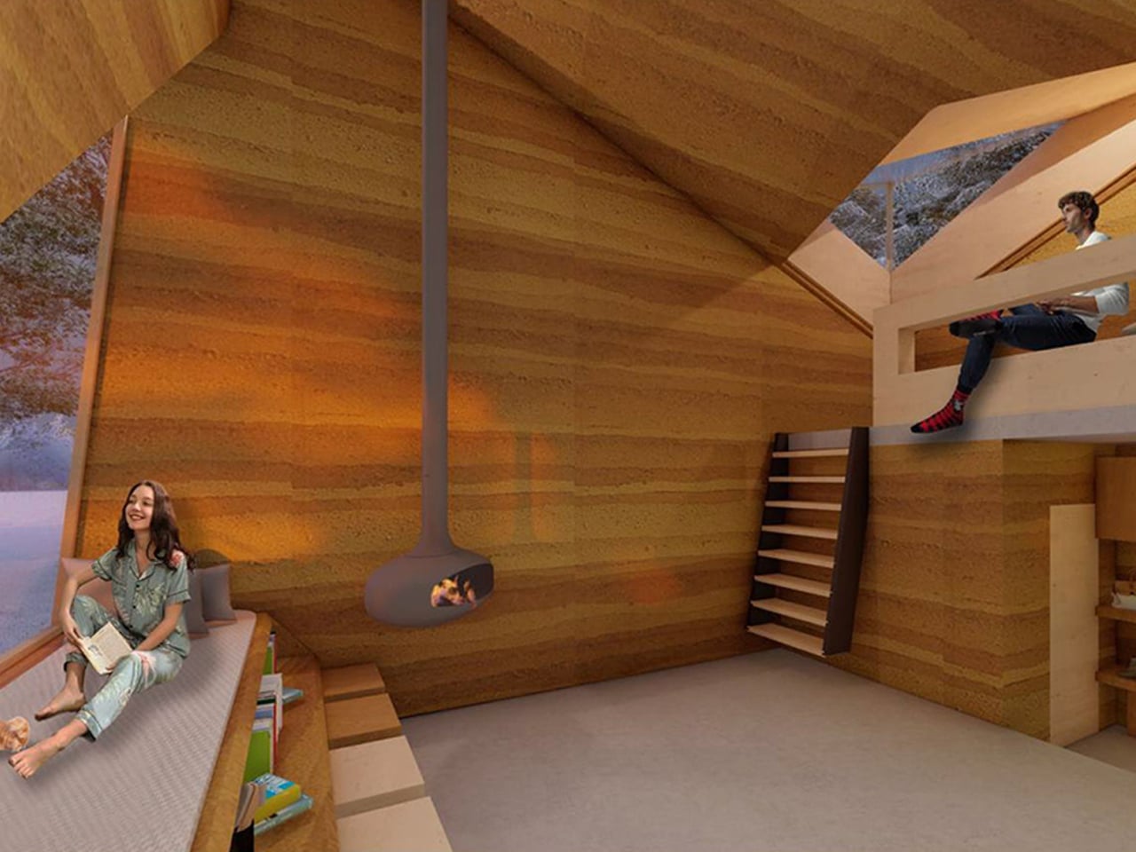
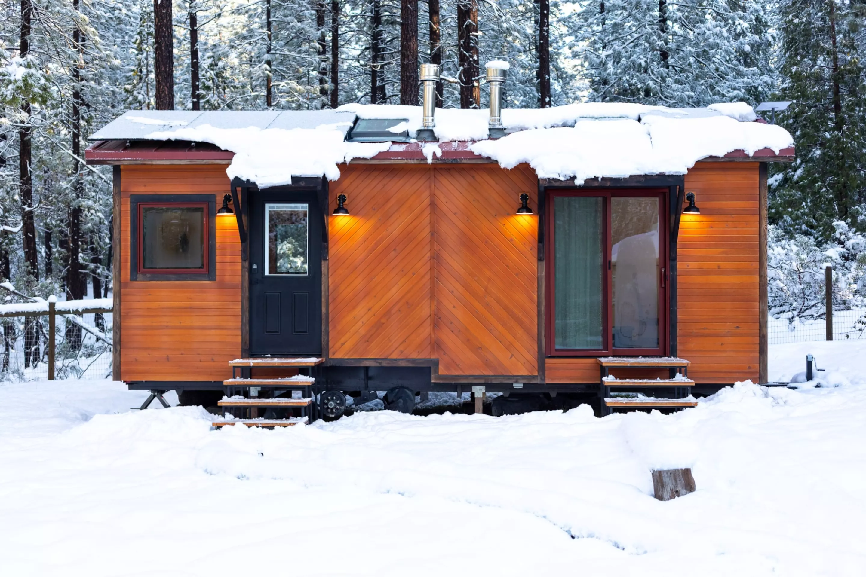
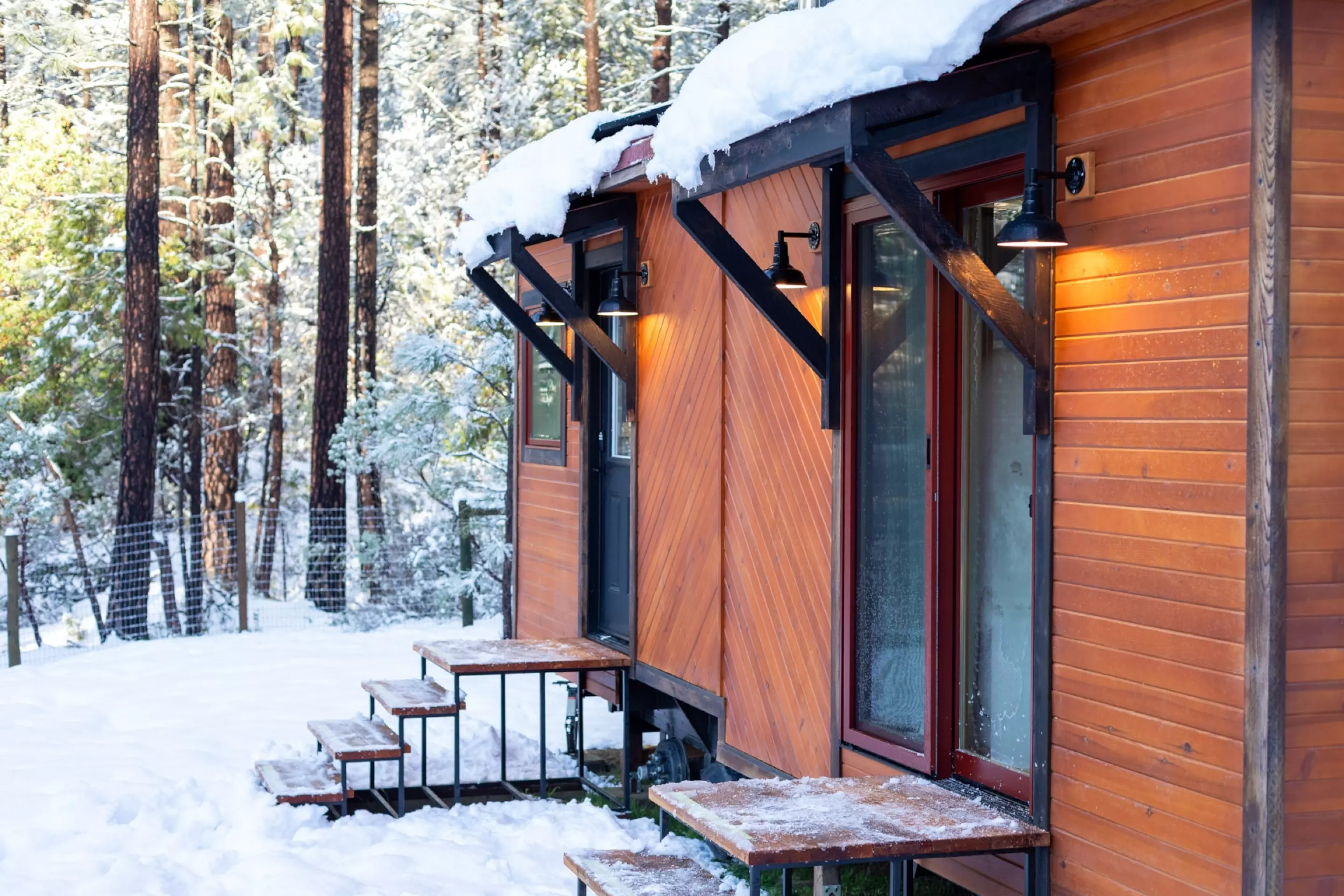
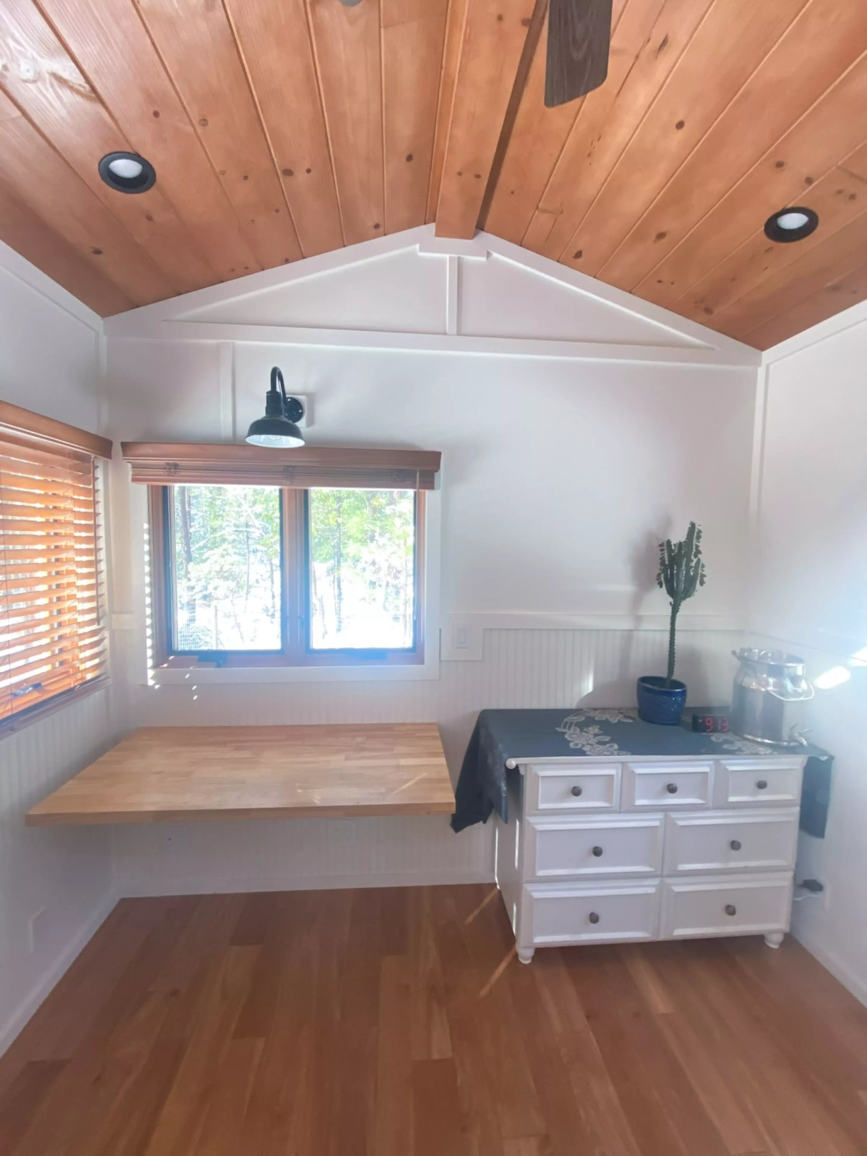
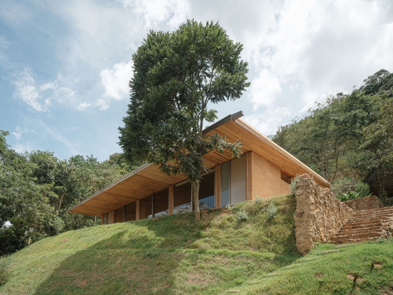
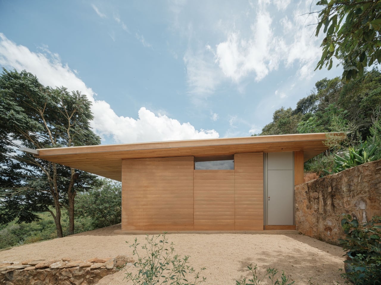
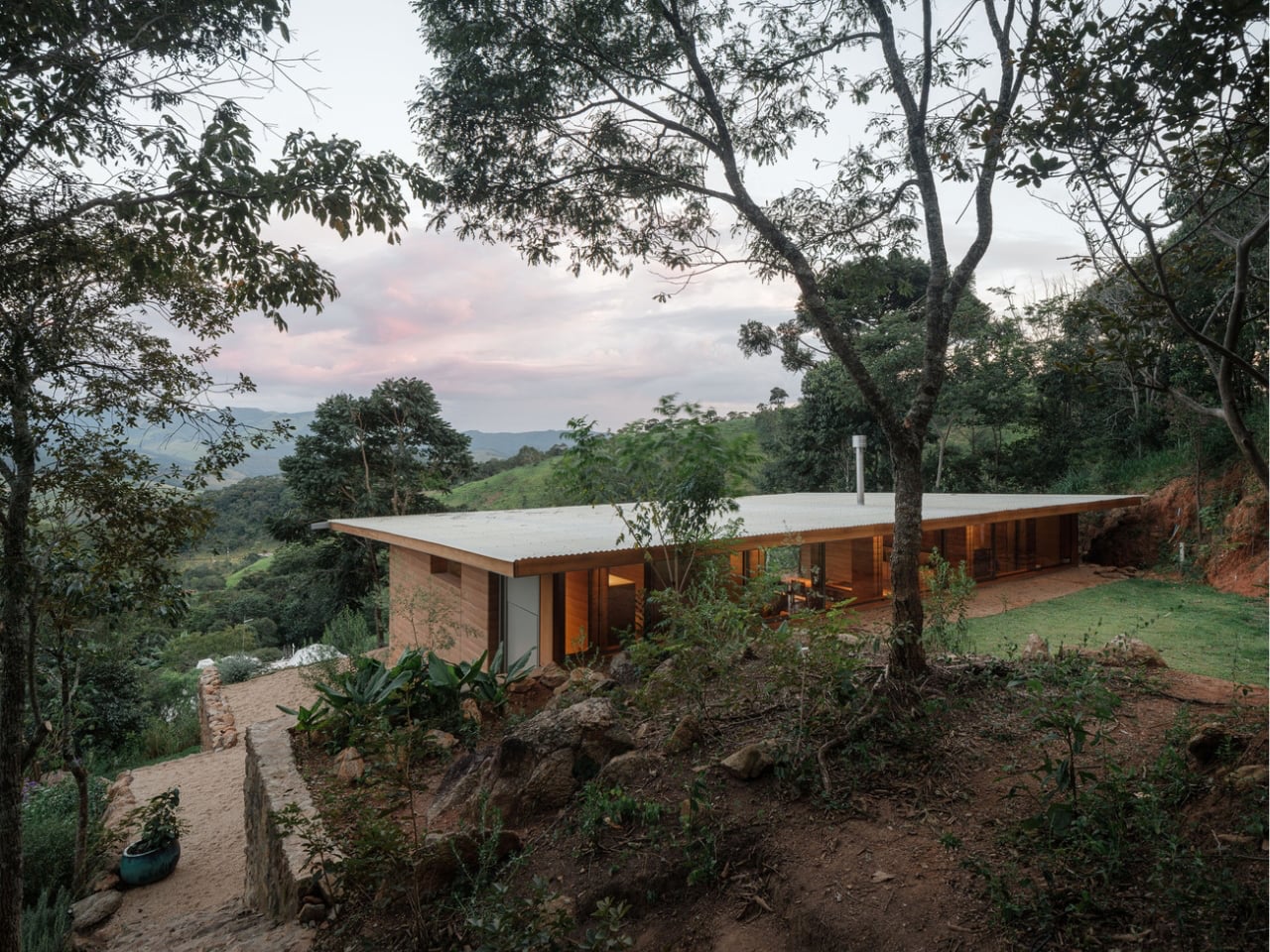
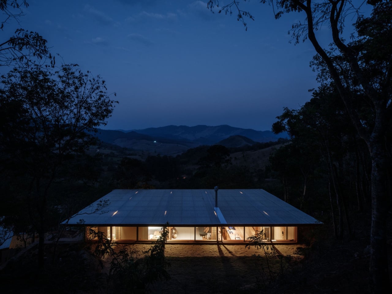
The Rammed Earth House in Slovenia reimagines the early 20th-century farmhouse by combining ancient building methods with modern solar technology. Designed by architects Merve Nur Başer, Aslı Erdem, and Fatma Zeyneb Önsiper, the tiny home uses rammed earth, a sustainable technique dating back thousands of years – along with a concrete foundation and timber framework. Inspired by Slovenian architect Oton Jugovec’s floating roof, the house also features an extended green roof to protect the structure from erosion caused by Dobrava’s varied climate of rain, snow, and humidity.
Oriented to optimise passive heating and cooling, the Rammed Earth House is carefully positioned to capture winter sunlight and block summer heat. Strategically placed windows enhance natural ventilation throughout the year, while the roof supports solar panels, a rainwater harvesting system, and an integrated septic tank. The interior layout further improves efficiency, with fewer windows on the north side to minimize heat loss and more on the west to capture warmth when needed.
4. Built for Centuries
Modern rammed earth, lightly stabilized with cement, delivers exceptional compressive strength and long-term durability. Its dense composition makes it naturally fire-resistant, pest-resistant, and remarkably stable across changing climates. History reinforces this reliability with rammed-earth structures around the world having survived for centuries, proving the material’s endurance far beyond typical contemporary systems.
For homeowners, this resilience translates directly into value. The walls demand minimal upkeep and offer a long structural lifespan, financially sound over decades. Their inherent thickness also enhances acoustic comfort, reducing noise transfer and improving the quality of everyday living within the home.
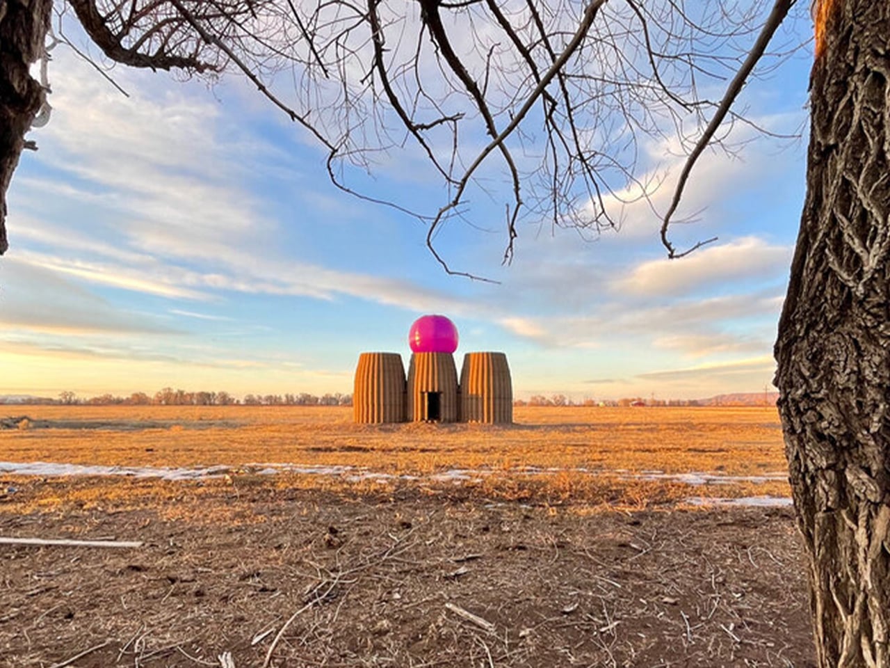
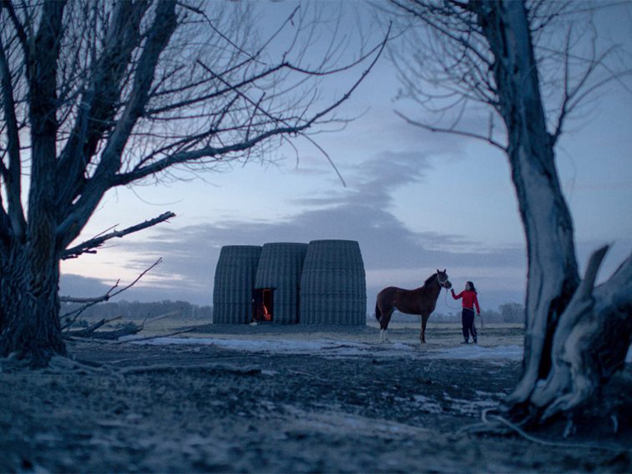
Casa Covida is a modern reinterpretation of ancient building methods that merges traditional materials like mud, clay, and straw with advanced 3D-printing technology. Developed by Emerging Objects, the project showcases how earth-based architecture, used by nearly 30% of the global population, can be revived for contemporary living. Built in Colorado’s San Luis Valley using a SCARA robotic printer, the structure is made from an adobe blend and features three interconnected zones: a central space with a hearth, a sleeping area furnished with reclaimed beetle kill pine, and a bathing zone with a river-stone-embedded tub. An inflatable cactus-inspired roof adds weather protection and visual intrigue.
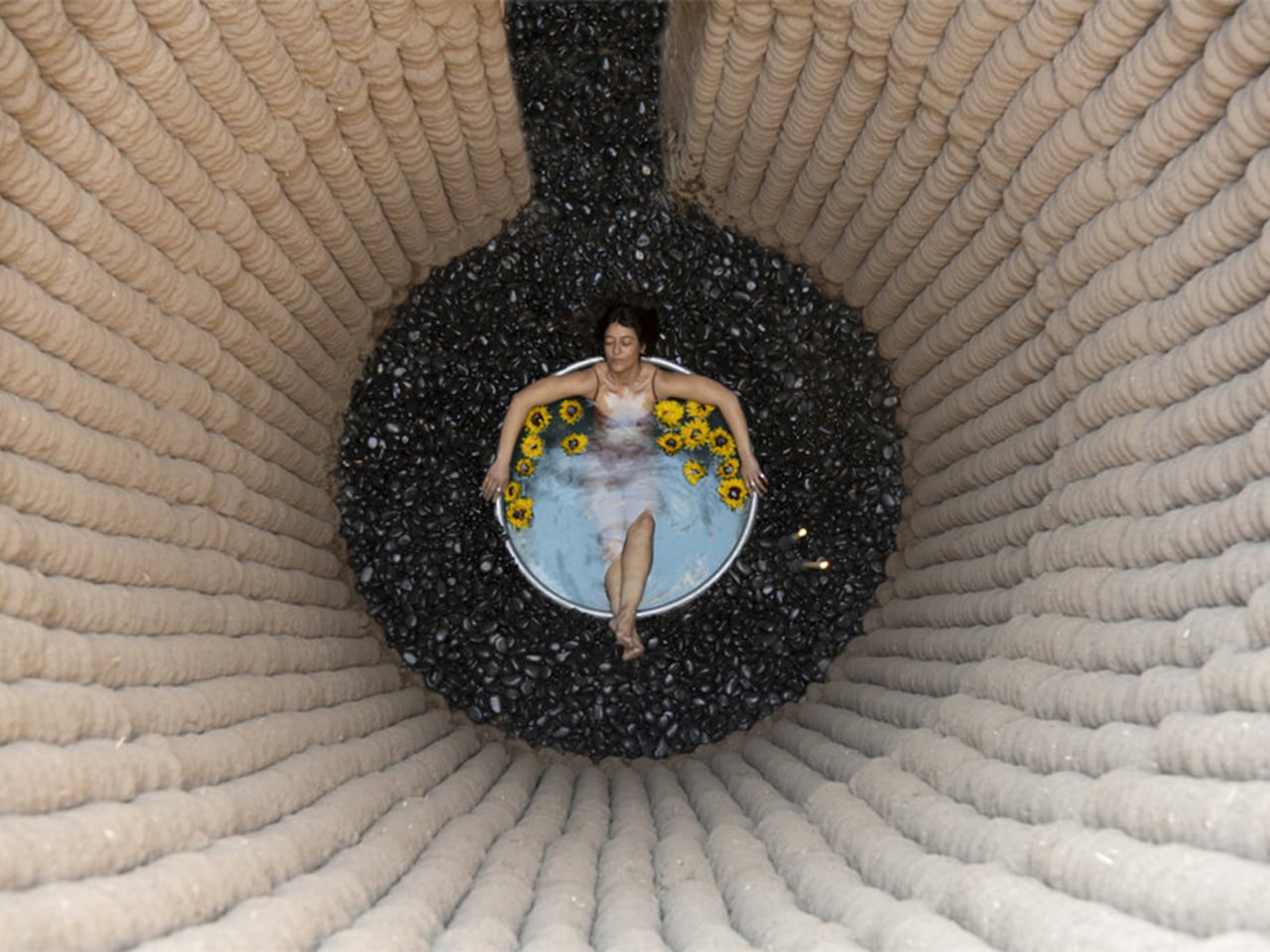
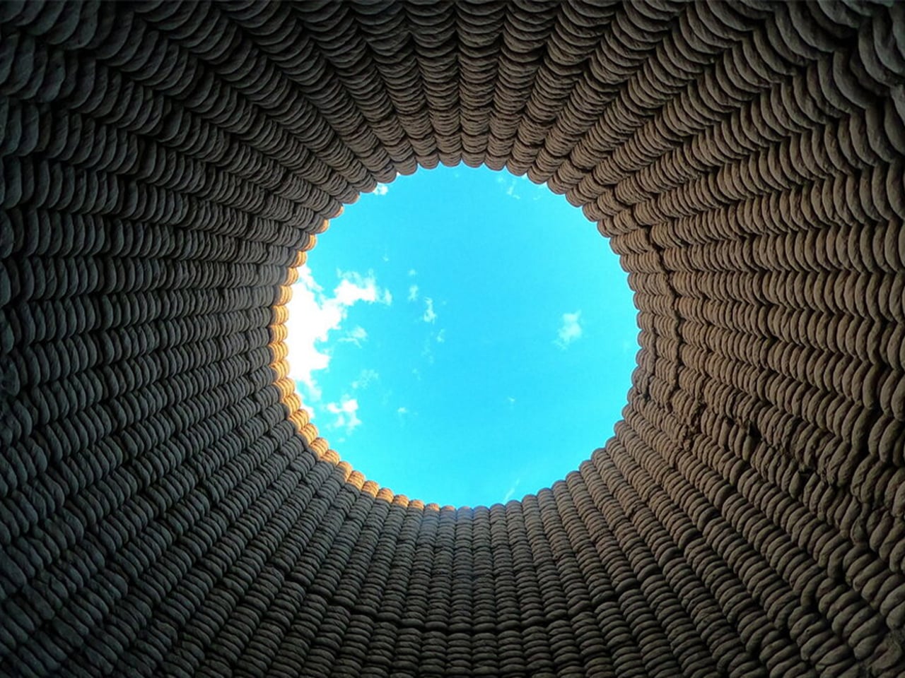

Designed for two people, Casa Covida acts as a prototype to explore how ancient techniques can coexist with digital fabrication. The 3D-printed walls, custom earthen cookware, and natural insulation demonstrate how sustainability and innovation can shape the future of housing.
5. Celebrates Nature-Rooted Architecture
Rammed earth grounds a home not just physically but culturally, drawing directly from the soil that defines its region. By using material sourced from the site itself, the architecture gains a deep sense of place and authenticity. This alignment with biophilic design principles creates a natural, instinctive connection between occupant and landscape, allowing the structure to feel both contextual and emotionally reassuring.
The experience is more than visual as it is tactile and psychological. The walls embody local history, climate, and geology, offering a timeless identity that outlasts design trends. In this way, rammed earth supports well-being while honoring the land it stands on.
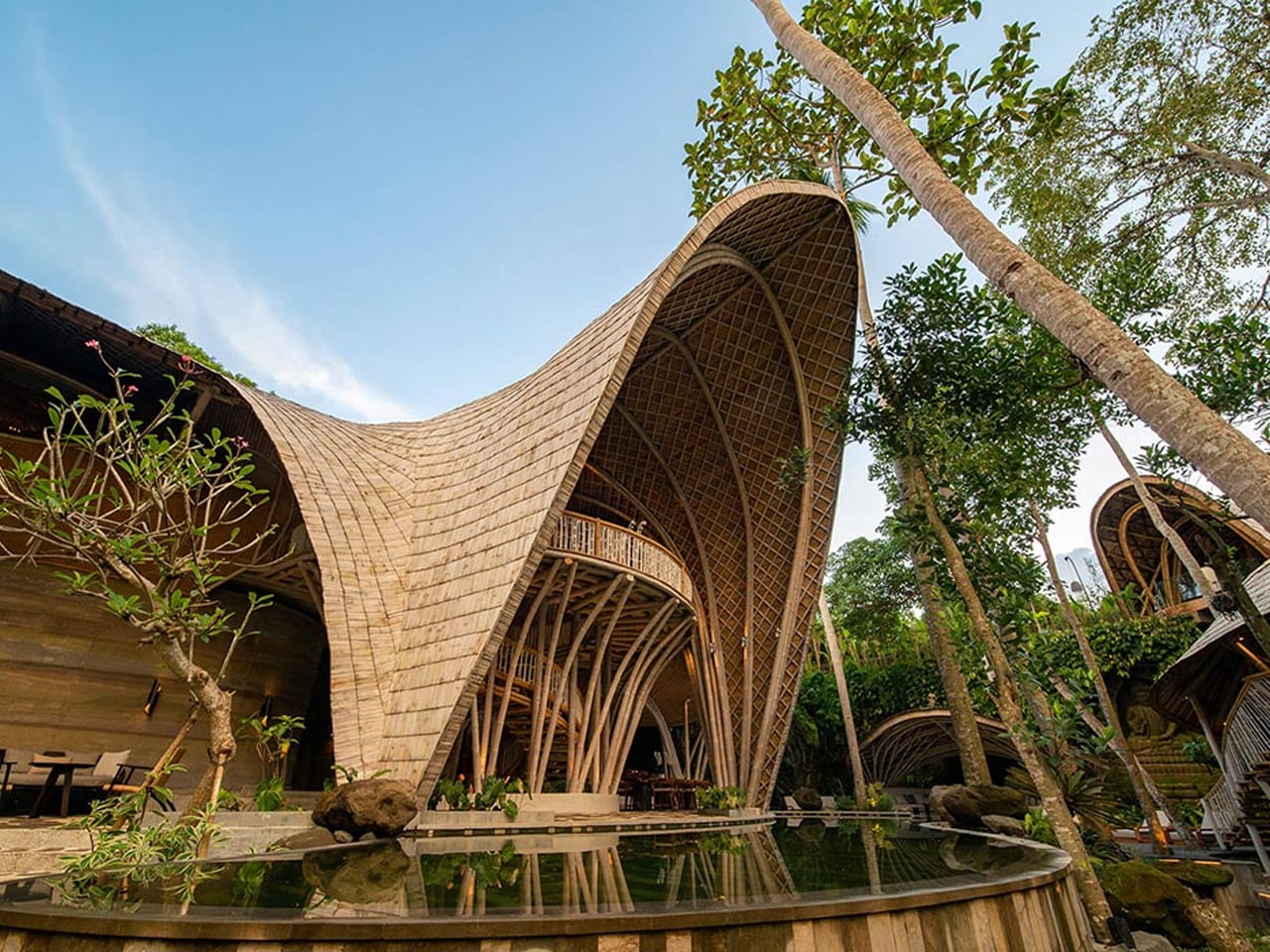
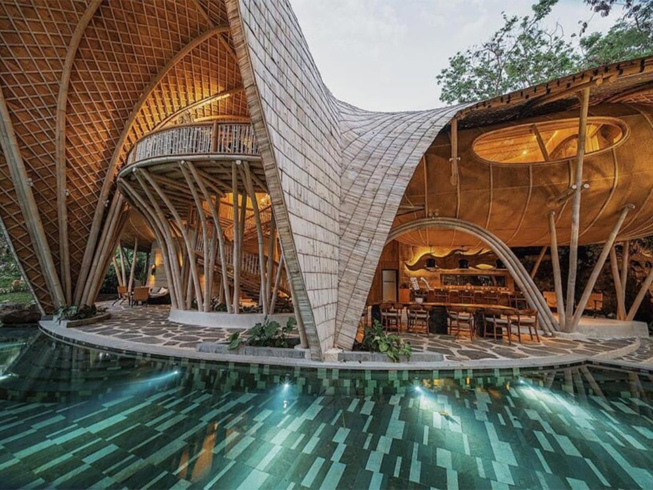
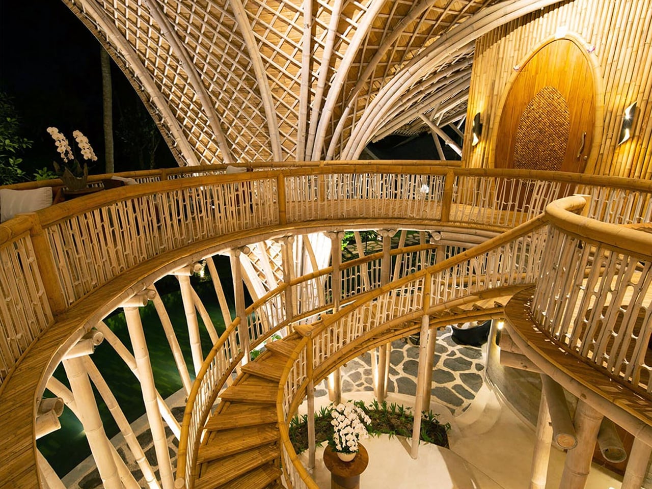
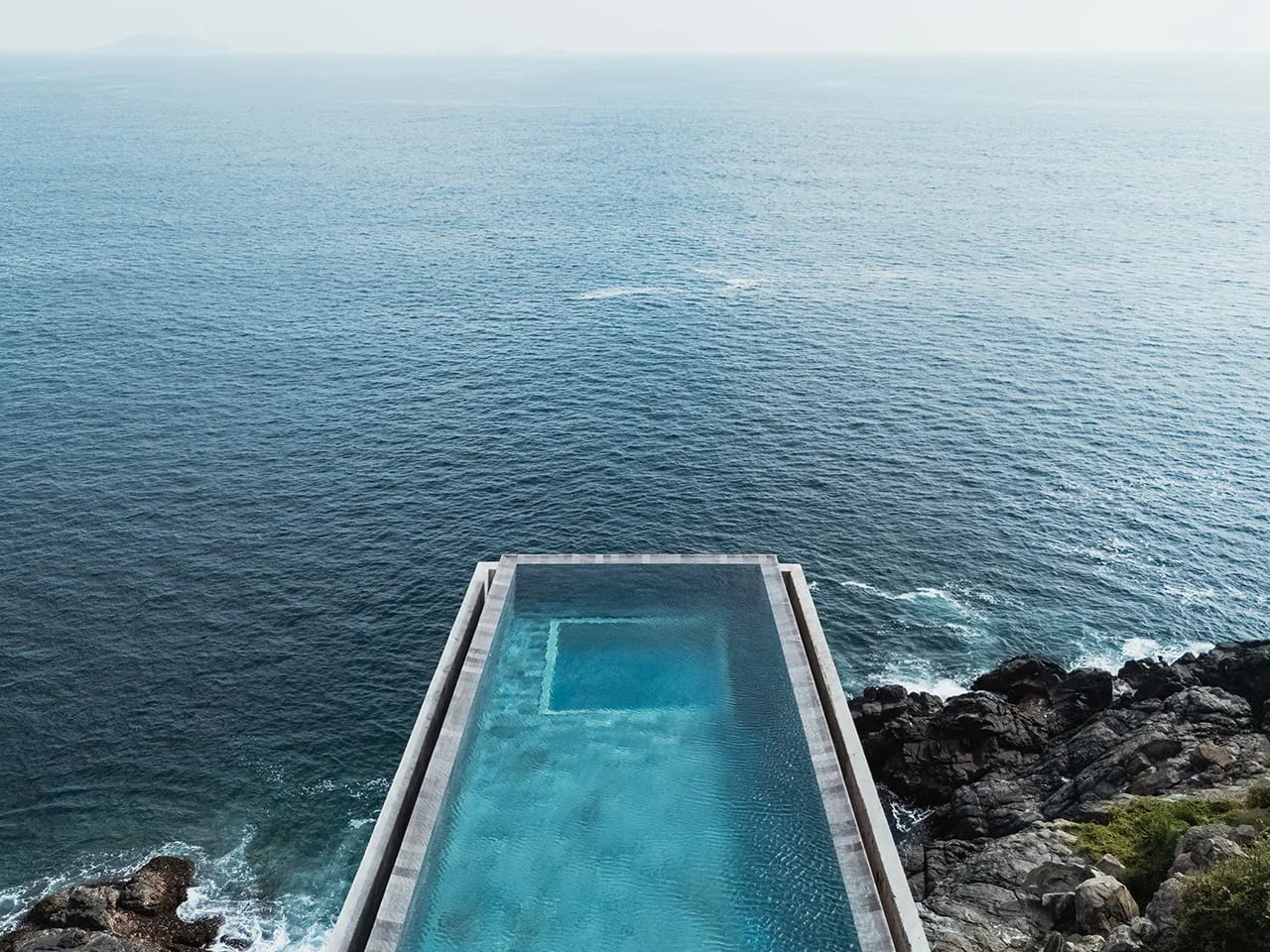
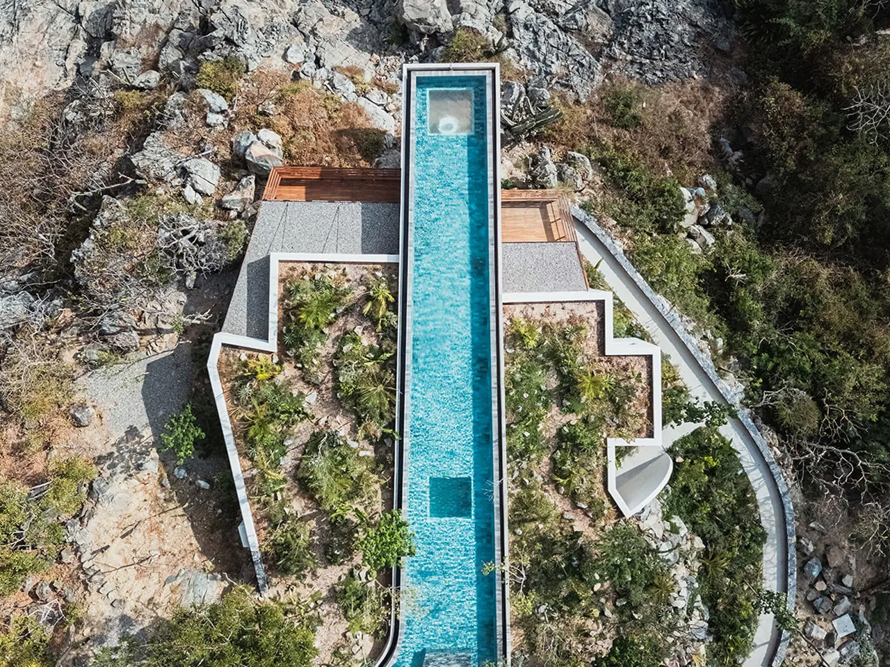
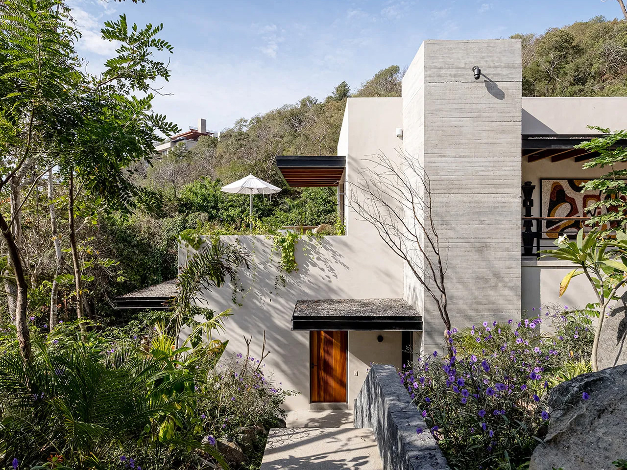
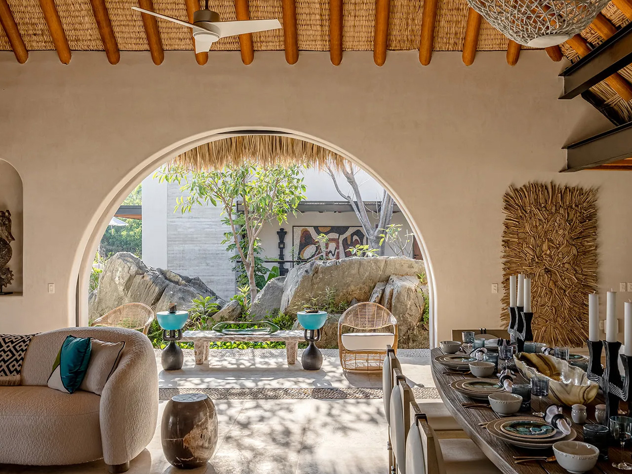
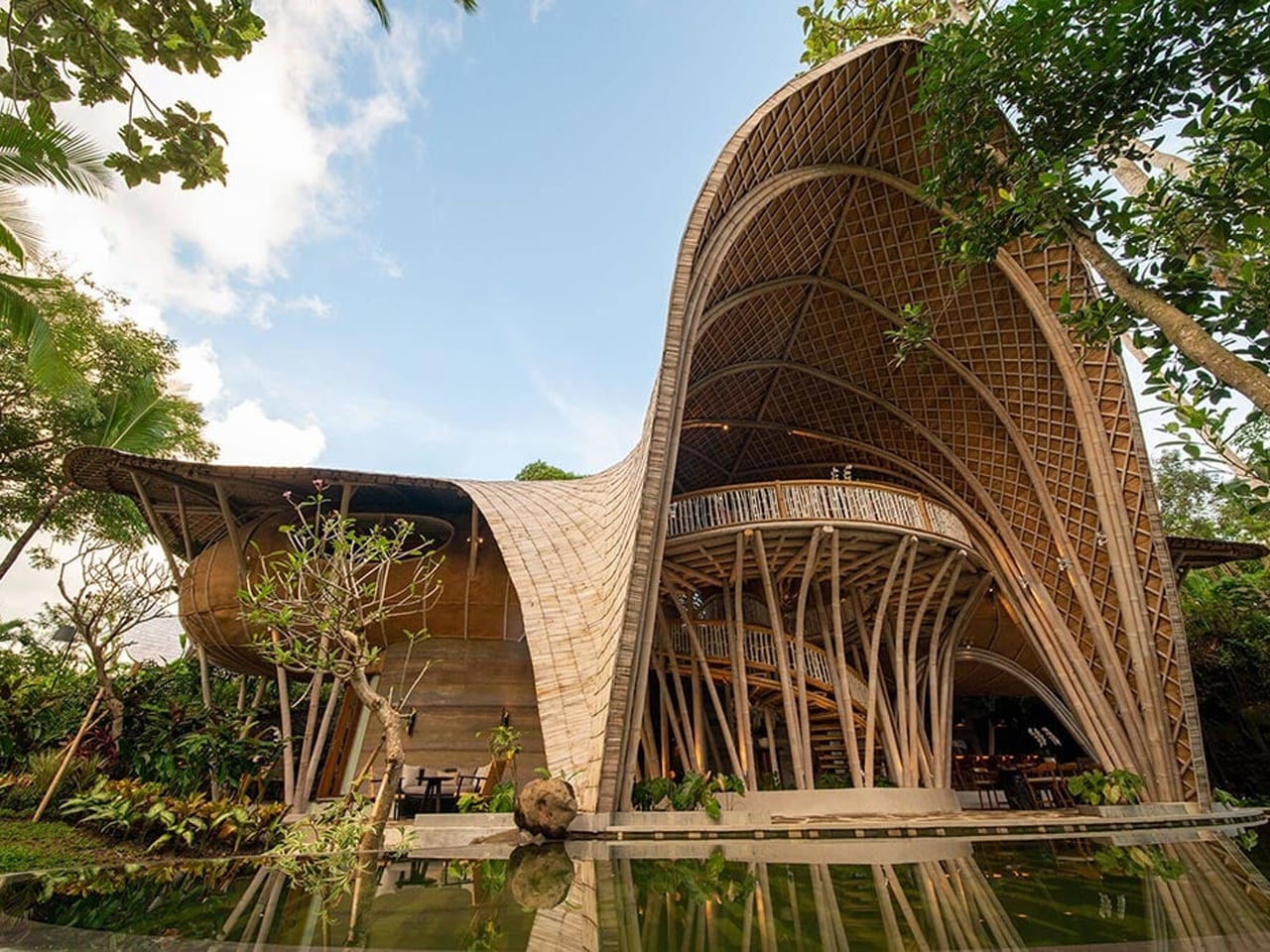
Contrary to the belief that sustainability requires sacrificing comfort, Ulaman Eco-Retreat Resort in Bali demonstrates that ecological responsibility can coexist with luxury. Designed by Inspiral Architects, this carbon-neutral resort is constructed primarily from bamboo and rammed earth, locally sourced materials that significantly reduce environmental impact.
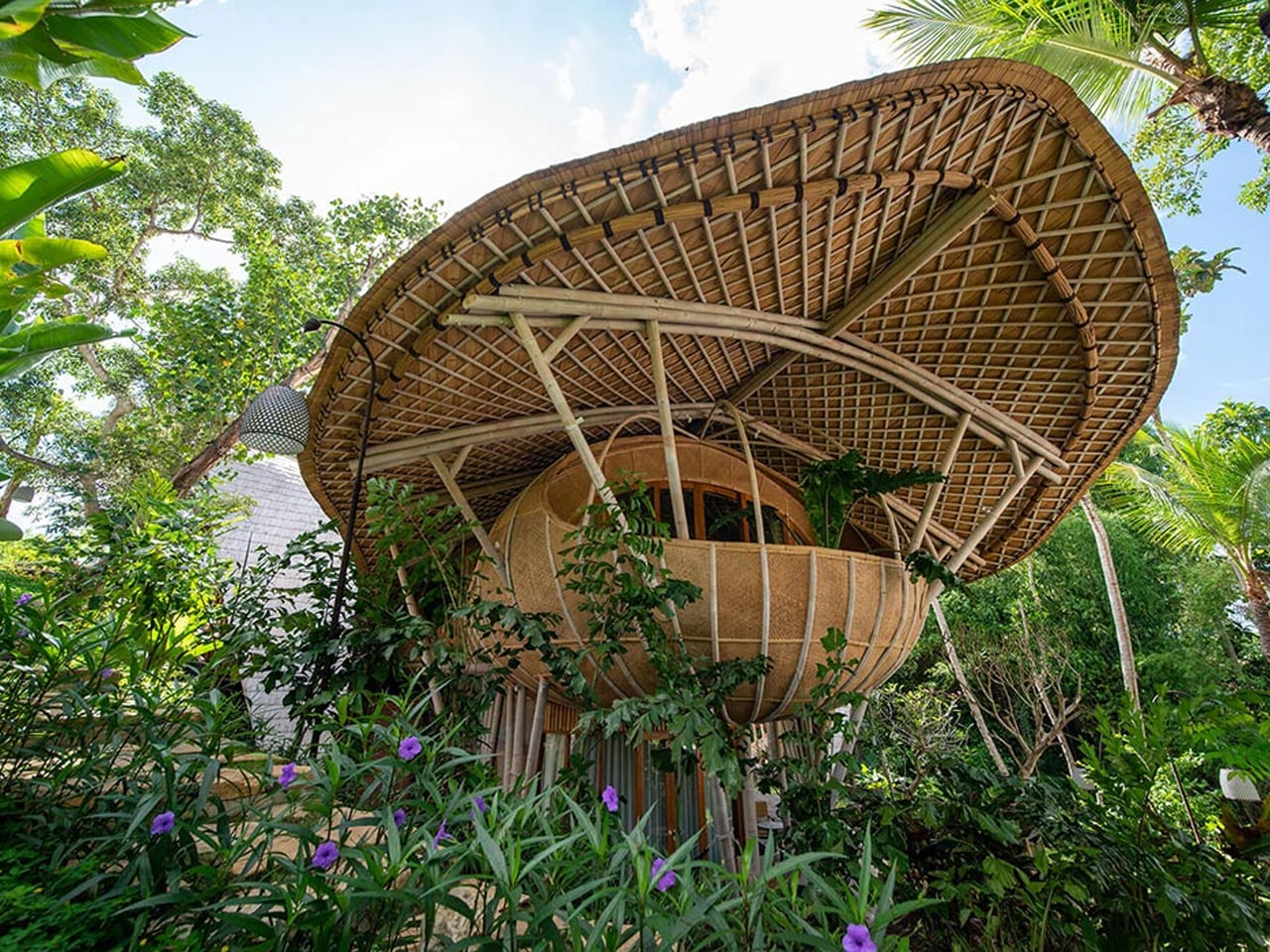
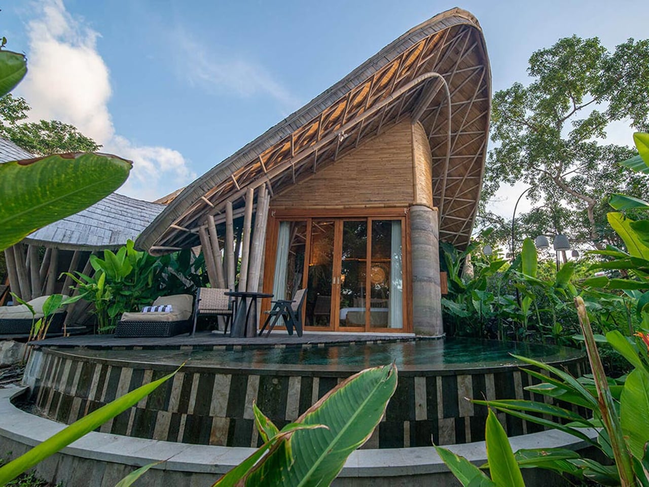
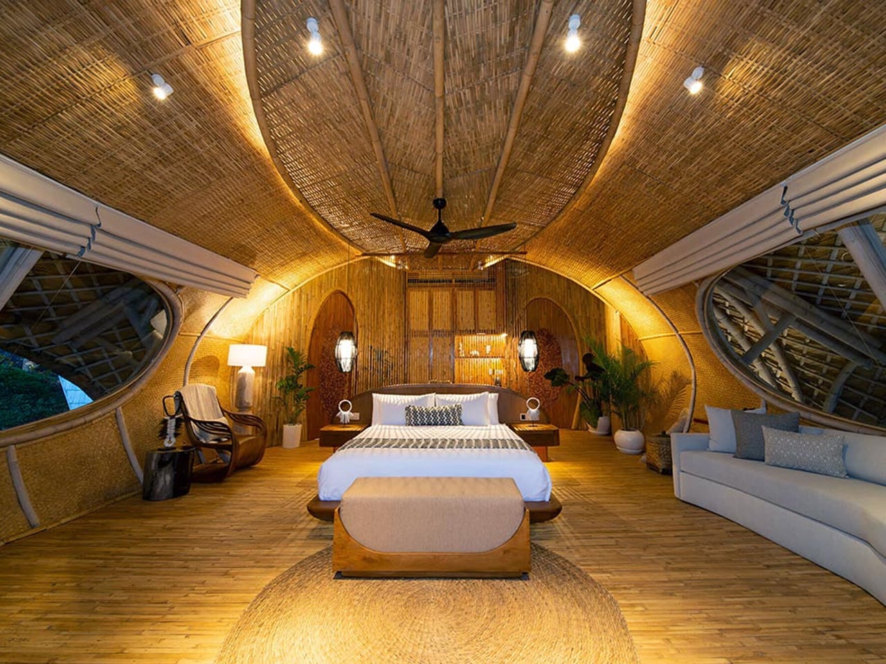
Situated in Kaba-Kaba village, the resort showcases the structural and aesthetic potential of sustainable materials. Rammed earth, used for the ground-level walls, offers a low-emission alternative to concrete, while the curvilinear bamboo roofing blends cultural authenticity with structural beauty. Powered by hydroelectric energy from a nearby river, the resort includes a cliffside yoga studio and a meandering pool designed to reflect natural surroundings.
Rammed earth’s resurgence is not a design fad but a meaningful answer to today’s calls for beauty, sustainability, and lasting value. By choosing this ancient yet future-ready material, homeowners invest in sustainable luxury that elevates both life and environment. Its layered, monolithic presence creates a sanctuary that endures quietly elegantly, deeply responsible, and profoundly connected to the earth it rises from.
The post 5 Rammed Earth Homes in 2026 That Make Concrete Walls Look Outdated first appeared on Yanko Design.