Forget the Steam Deck, This Custom-Built Handheld Runs a Full Linux Desktop in Your Palms

Before the iPhone arrived in 2007 and quietly buried the category, handheld PCs were shaping up to be something genuinely exciting. Devices like the Sony Vaio UX and OQO Model 2 promised a full desktop OS in your jacket pocket, and for a brief window, that felt like the obvious future of personal computing. Smartphones won that argument decisively, and the handheld PC faded into a footnote. A YouTuber who goes by Wisce decided that footnote deserved a second chapter, and built one himself from scratch.

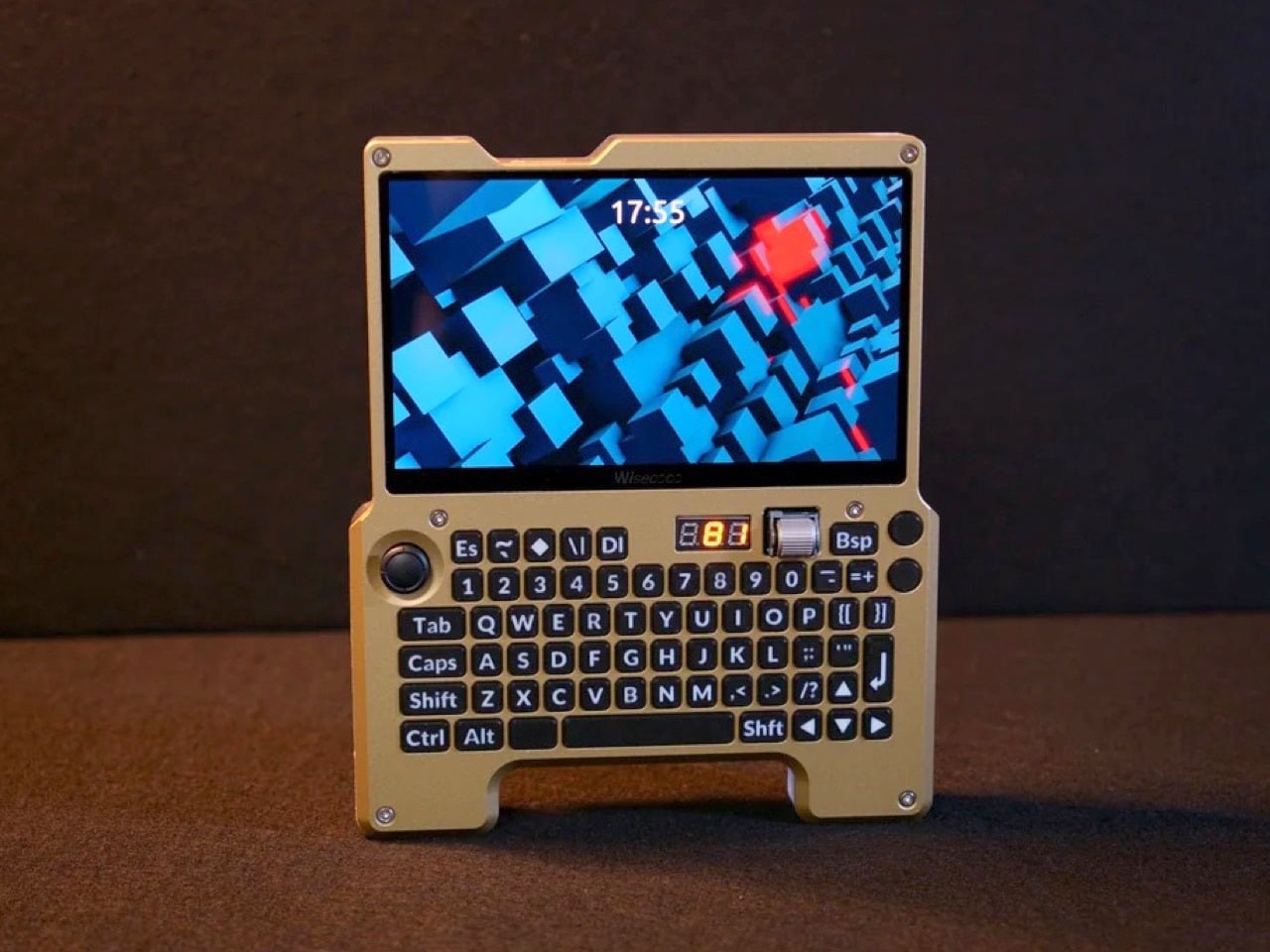
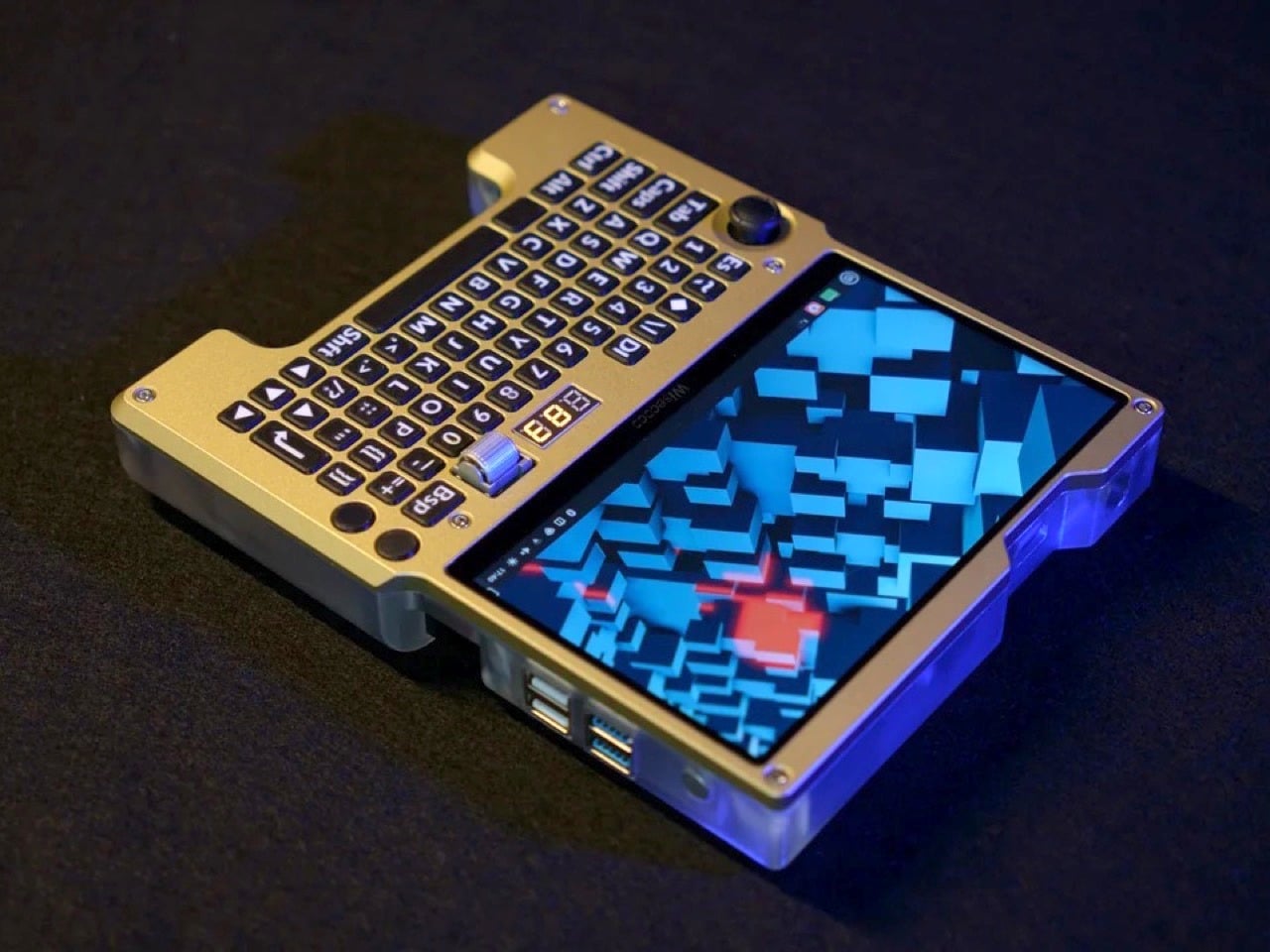
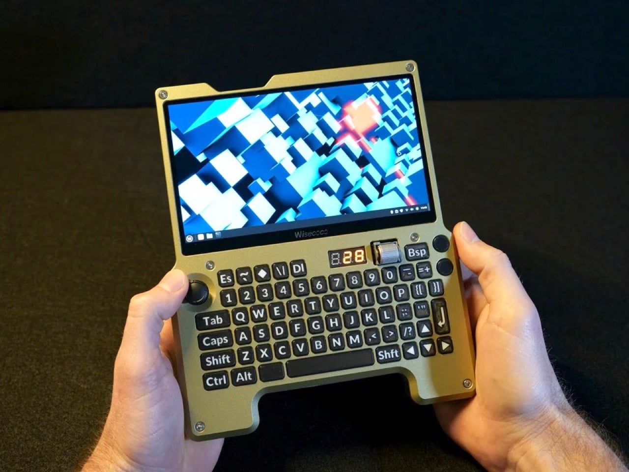
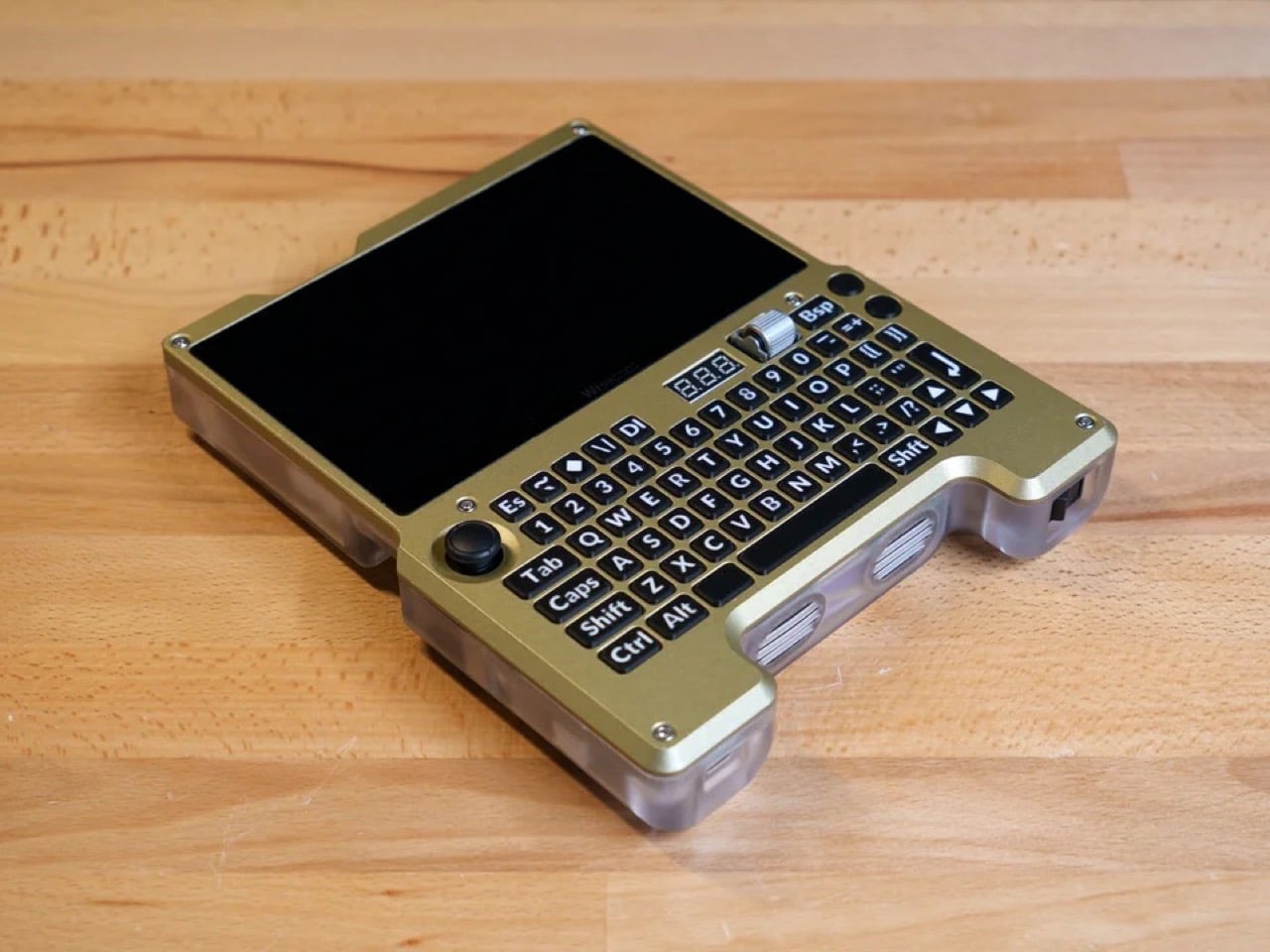
The result is a fully custom x86 handheld computer built around the LattePanda Mu single-board computer, running Linux Mint on a 7-inch 1920×1080 120Hz display. It has a full QWERTY ortholinear thumb keyboard with custom-printed keycaps, a Joy-Con thumbstick repurposed as a mouse, a horizontal scroll wheel, four USB ports, a full-size HDMI output, USB-C charging, and a 4,500mAh battery pack with a three-digit readout that tells you exactly how much juice is left. Every single component was designed, sourced, or fabricated by hand.

Designer: Wisce

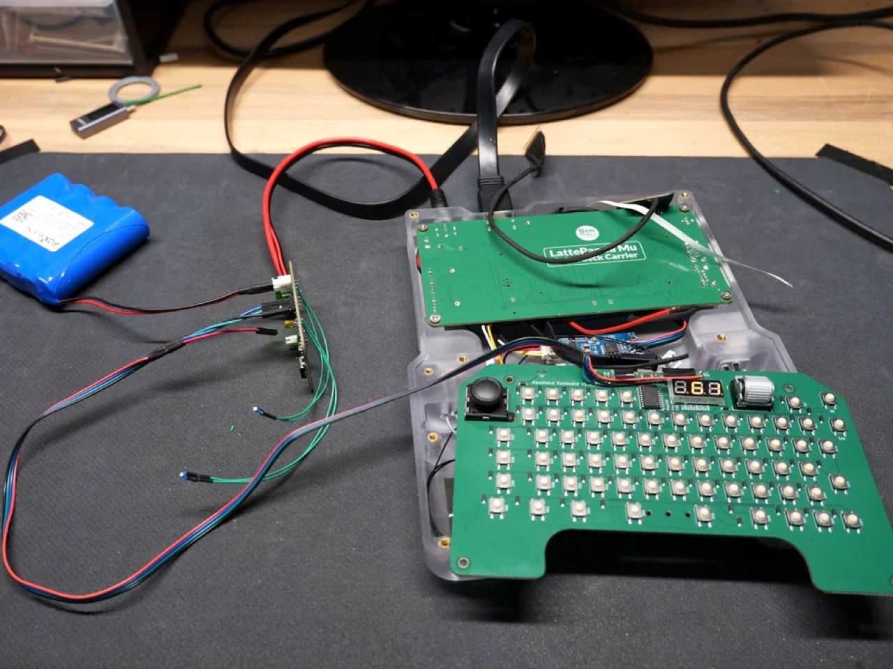
The LattePanda Mu is an x86 SBC that outperforms even the Raspberry Pi 5 by a notable margin, and Wisce built a custom carrier board for it rather than using an off-the-shelf solution. That board delivers four full-size USB ports, a full-size HDMI port, M.2 SSD and Wi-Fi slots, and internal USB connectors for the keyboard and audio subsystem. A 1TB SSD and a budget Wi-Fi card complete the internals. The operating system is Linux Mint, chosen partly on merit and partly because Wisce’s previous builds attracted considerable audience displeasure when they shipped with Windows 11. Linux also strips out the background process bloat that Windows tends to accumulate, giving the Mu’s x86 architecture more room to breathe.

The display decision alone took multiple iterations to land. Wisce initially planned to use a 1024×600 60Hz panel from DF Robot, the parent company behind the LattePanda line, but rejected it for its low resolution, large bezel, and limited refresh rate. The replacement is a 1920×1080 120Hz eDP panel with a much thinner bezel, connected directly to the Mu’s native eDP output via a custom PCB that reroutes a pin mismatch between the two connectors. That kind of problem-solving shows up everywhere in this build: when a straightforward solution didn’t exist, Wisce designed one.

The keyboard runs on a custom PCB with an RP2040 microcontroller integrated directly into the board, bypassing the need for a separate Arduino or Pi Pico. The switches are surface-mount tactile types rated for around two million presses, sized small enough to fit a full QWERTY layout without sacrificing the thumb-typing ergonomics the ortholinear arrangement was chosen to support. Keycaps were modeled in Fusion 360 and printed on an FDM machine using a 0.2mm nozzle and multi-material filament to get legible, sharp legends on each key. The Joy-Con thumbstick on the left handles cursor movement via a QMK profile that maps it as a mouse, and the horizontal rotary encoder scroll wheel on the right is, by Wisce’s own admission, one of his favorite things about the finished device.

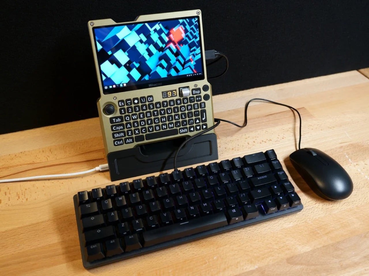
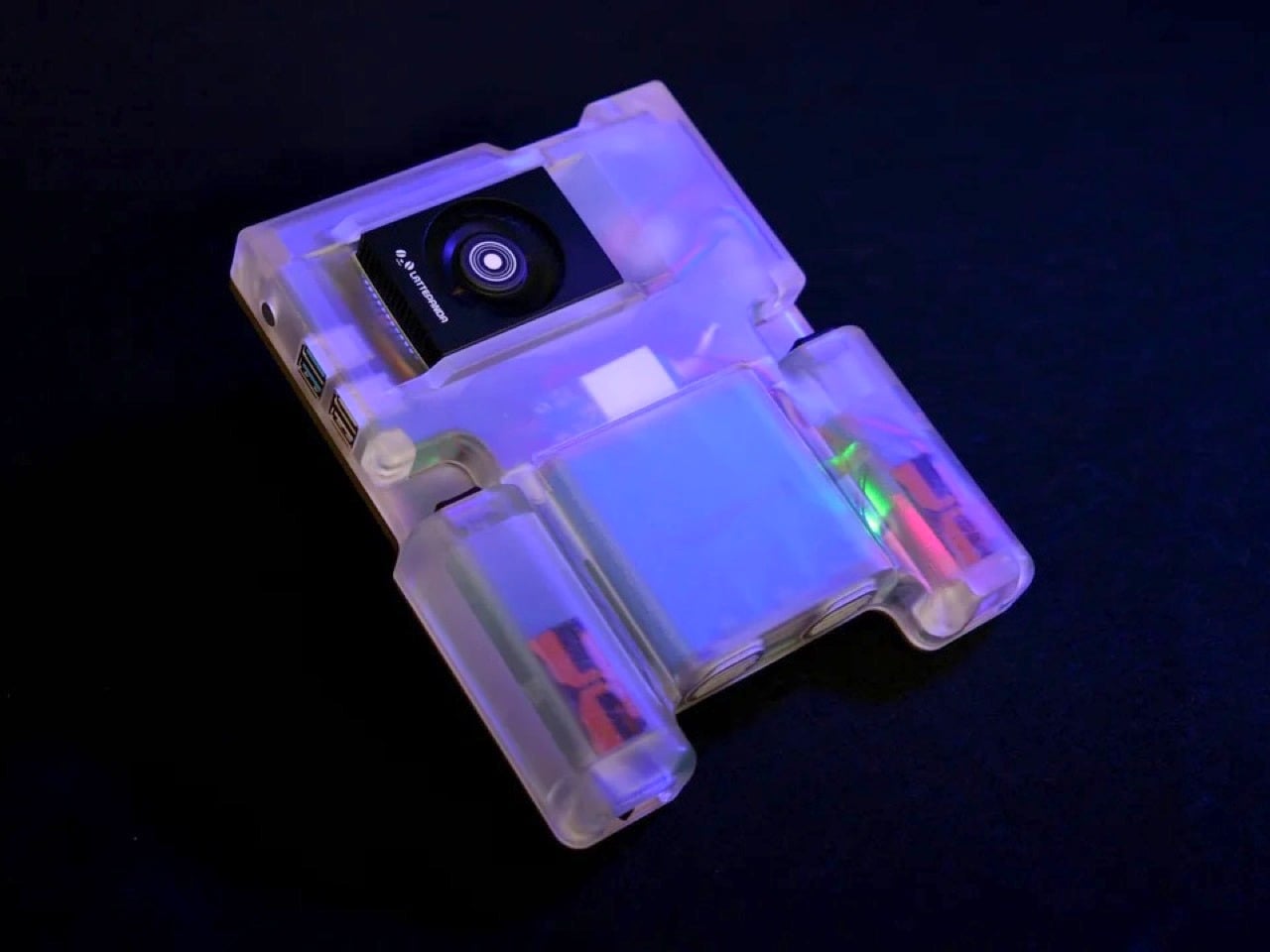
The enclosure is a two-part construction: a translucent resin rear shell that keeps the internal geometry visible, and an aluminum front plate that was CNC machined, anodized, then repainted by hand after the factory “champagne” finish came out looking closer to a flesh tone than the golden bronze Wisce had rendered. The finished device is 36mm thick at its deepest point and weighs approximately one kilogram, which puts it in a different category from a Game Boy but well within the range of something you’d actually carry. A 3D-printed dock props it upright on a desk with the HDMI port and USB-C charging accessible, turning the handheld into a functional desktop workstation when paired with an external keyboard and mouse.

What makes this build genuinely compelling, beyond the craftsmanship, is how clearly it articulates a design philosophy that commercial manufacturers keep fumbling. Devices like the GPD Win 5 chase gaming performance and end up compromising portability or pricing out most buyers. The Steam Deck nails the gaming use case and handles general computing as an afterthought. Wisce’s machine is neither of those things. It’s a full x86 desktop OS in a form factor that fits in two hands, with physical controls that were chosen specifically for the way humans hold objects, a battery system that actually communicates with its user, and a screen bright and sharp enough to make the whole proposition feel current. The handheld PC category failed twenty years ago because the hardware wasn’t ready. This build suggests the hardware has been ready for a while, and we’ve just been waiting for someone stubborn enough to put it together properly.

The post Forget the Steam Deck, This Custom-Built Handheld Runs a Full Linux Desktop in Your Palms first appeared on Yanko Design.

DIY Water-Cooled MacBook Neo Just Got A 23% Performance Bump. Here’s How…

The MacBook Neo’s entire premise rests on one audacious question: can a smartphone chip carry a laptop? Apple’s answer was to drop the A18 Pro from the iPhone 16 into a fanless aluminum chassis and ship it. For everyday tasks, the answer is largely yes. For gaming under sustained load, the answer hits a wall at 105°C, where the chip pulls back its clocks to avoid cooking itself inside a case with no fan and no active cooling to speak of. The MacBook Neo is a genuinely compelling machine, repairability included since Apple ditched adhesive entirely and built the whole thing around screws, but that thermal ceiling is a real and measurable constraint.

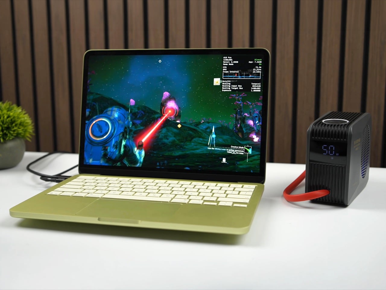
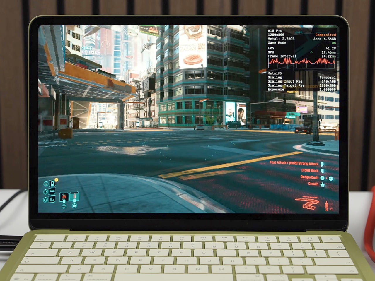
ETA Prime ran the experiment that every thermally curious engineer has probably daydreamed about: what happens when you actually cool this thing properly? First, a custom copper heat sink bridging the chip to the aluminum shell. Then a liquid-cooled thermoelectric Peltier unit clamped magnetically to the outside. Gaming framerates climbed from 30 to 80 FPS. Cinebench single-core jumped 23.5% over stock. The A18 Pro was never the bottleneck. The cooling was.

Designer: ETA PRIME

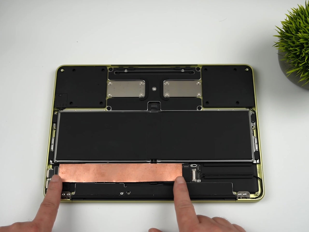
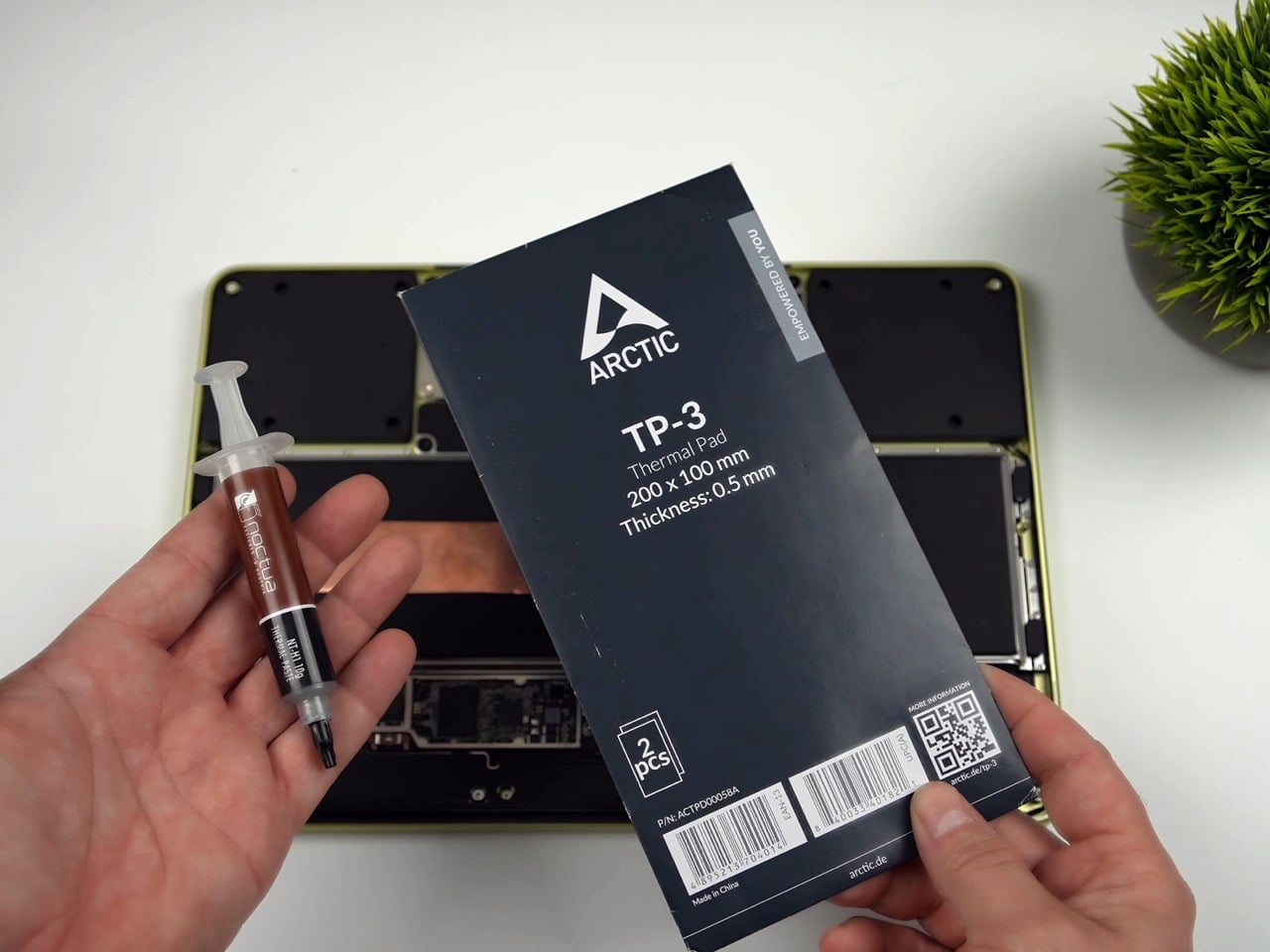
The copper heat sink is the more elegant of the two mods, and honestly the more important one. ETA Prime removed the stock graphene pad using a heat gun, cleaned the A18 Pro die with isopropyl alcohol, and applied Noctua thermal paste directly to the chip. A sheet of copper, cut to cover the full mainboard, sits on top. An Arctic TP3 thermal pad on the upper face of the copper makes contact with the MacBook Neo’s aluminum bottom shell when the screws are tightened back down, turning the entire chassis into a proper heat spreader. The graphene pad was cut in half and kept over the surrounding components for protection, but the CPU die itself is now in a real thermal pathway for the first time. With just this mod in place, No Man’s Sky jumped from 30-31 FPS to 58 FPS, average CPU temps dropped to around 83-84°C, and Geekbench 6 multi-core climbed 9.7% while single-core gained 15.2%. A sheet of copper and a tube of paste did what Apple’s entire thermal design could not.

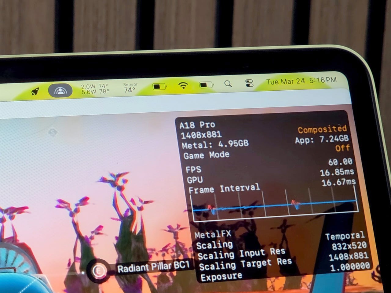
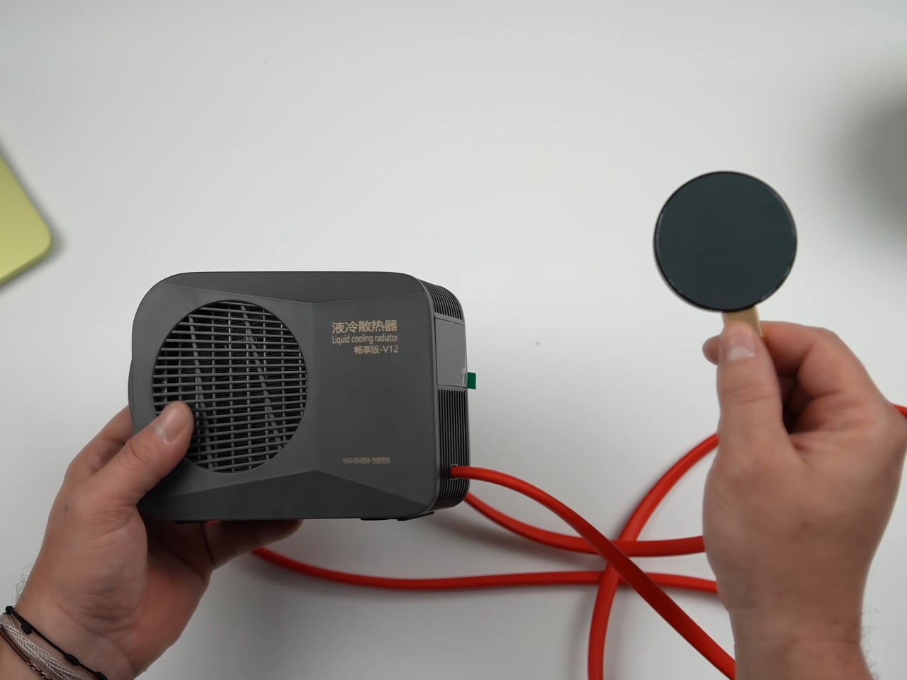
The Peltier cooler is the wilder addition, and it is admittedly overkill in the best possible way. The unit ETA Prime used was originally designed as a phone cooler, a liquid-cooled thermoelectric device with three power settings topping out at 50 watts. One side extracts heat, the other reaches below-freezing temperatures, and ice visibly forms on the cold plate within about a minute of operation. It attaches magnetically to the bottom of the Neo, aligning with the copper heat sink beneath the shell, and pulls the chip’s average idle temp down to 23°C. Under gaming load in No Man’s Sky, the CPU sat at roughly 74°C, and framerates held at 58-59 FPS with VSync engaged. Over a 30-minute sustained session, the machine averaged around 80 FPS at 1408×881 on enhanced settings with Metal scaling set to balanced, compared to the low 30s it would have delivered in stock form.

The benchmark gains with the full liquid cooling setup are worth spelling out. Geekbench 6 multi-core reached 9,394, an 18.6% improvement over the stock 7,921. Single-core hit 3,636, up 17.52%. Cinebench multi-core landed at 1,741 against a stock score of 1,462, a 19% gain, while single-core climbed from 502 to 620, a 23.51% improvement. ETA Prime also tested Fallout 4 running through Crossover, the compatibility layer that lets non-Mac titles run on Apple silicon, and the Neo held a consistent 60 FPS despite relying on SSD swap for additional memory beyond its 8GB ceiling.

The 8GB cap remains the machine’s most stubborn limitation, and no amount of copper or Peltier magic changes that. When the unified memory fills, the Neo starts leaning on SSD swap, which is slower and adds latency that thermal improvements cannot compensate for. It is a real constraint for anyone expecting to run memory-hungry titles at length. That said, the performance ETA Prime extracted here from a chip that costs less than many gaming peripherals is genuinely impressive, and the copper mod in particular requires no permanent modifications and costs almost nothing.

The Peltier is obviously not a portable solution. It draws significant power, runs a liquid loop, and magnetically attaches to the outside of the machine like a barnacle. But the copper mod absolutely is portable, costs next to nothing in materials, and on its own delivers close to double the sustained gaming performance. ETA Prime also tested Fallout 4 running through Crossover on the liquid-cooled setup, hitting a continuous 60 FPS despite the Neo’s 8GB RAM ceiling forcing the system to lean on SSD swap for additional memory. The A18 Pro has more headroom than Apple’s thermal design ever lets it show, and a sheet of copper is apparently all it takes to prove it.

The post DIY Water-Cooled MacBook Neo Just Got A 23% Performance Bump. Here’s How… first appeared on Yanko Design.

LG Just Invented a New Metal to Build the Lightest 16-Inch OLED Laptop of 2026

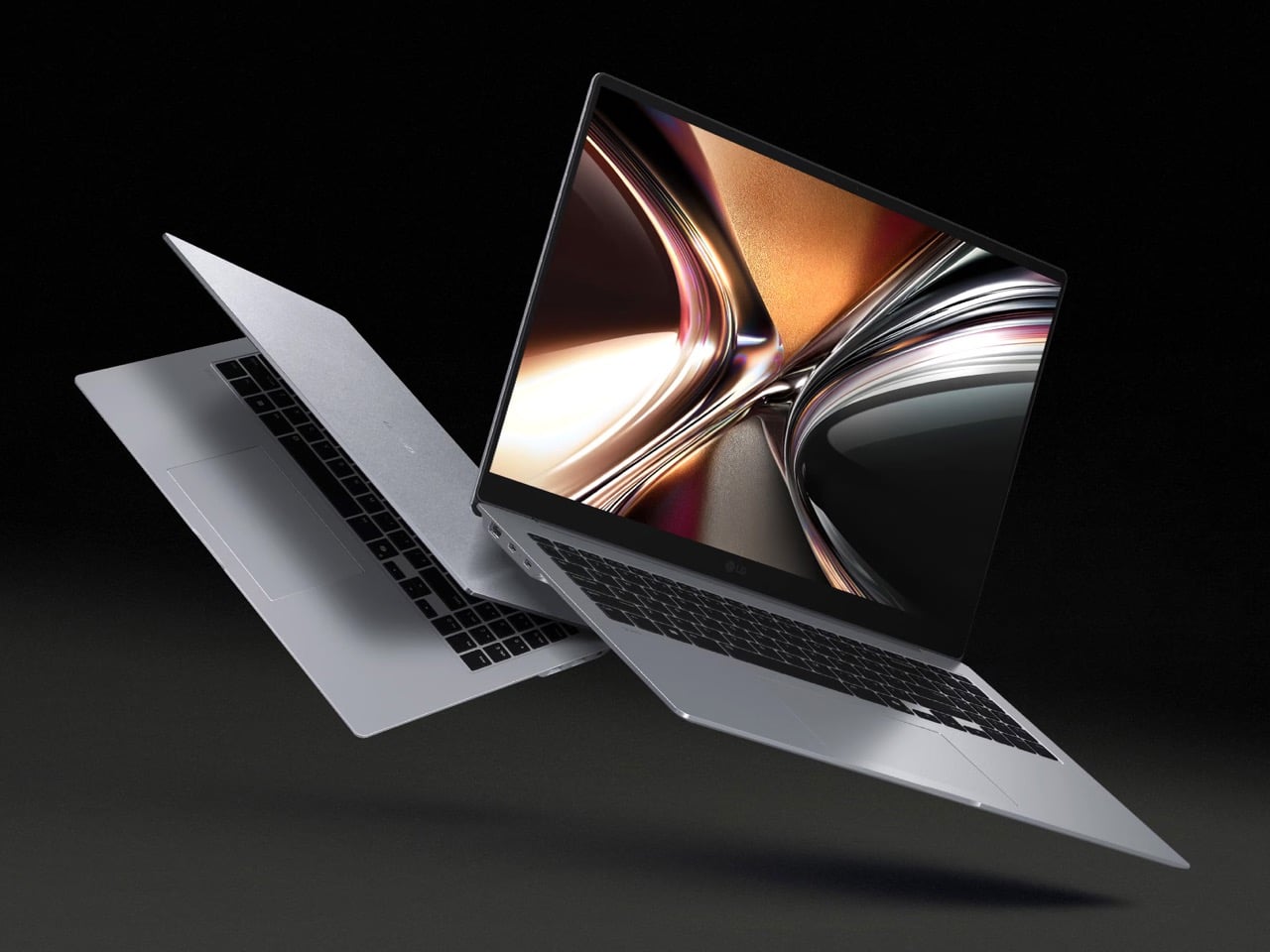
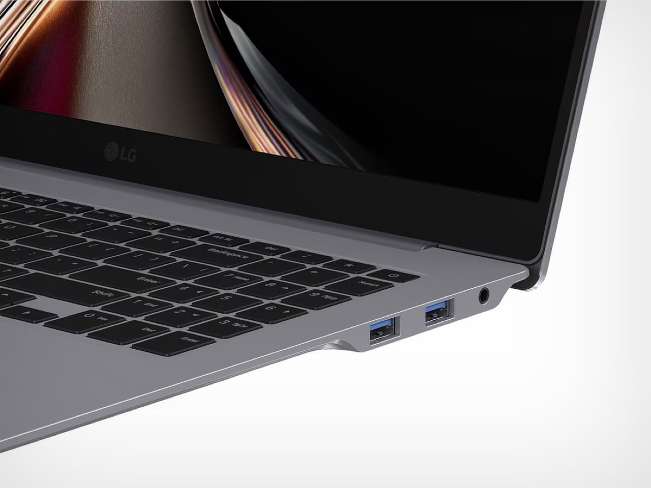
Every laptop manufacturer promises lighter builds, but most of them cheat. They shrink the battery, strip out ports, swap metal for plastic, or just make the screen smaller and call it progress. Real weight reduction without compromise requires inventing something new at the molecular level, which is exactly what LG did. The company spent the last year developing Aerominum, an in-house engineered alloy designed to be simultaneously lighter and stronger than the magnesium chassis that defined the gram line for a decade. The result is a 16-inch laptop with a 120Hz OLED display that weighs under 1.2 kilograms, a figure that sounds like a typo until you actually pick one up.

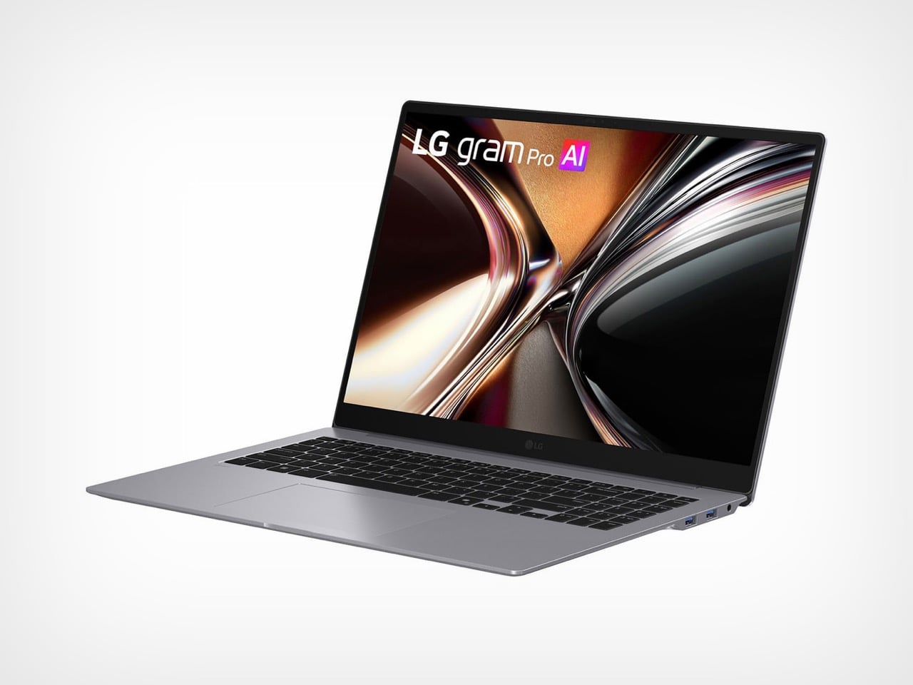
LG introduced three new gram models this week, all built on the Aerominum chassis: a 14-inch variant with Intel Panther Lake, a 17-inch with 32GB of RAM and an optional NVIDIA RTX 5050 GPU, and the headliner gram Pro 16. The Pro 16 pairs its sub-1.2kg weight with a 2,880 x 1,800 OLED panel running at 120Hz, powered by Intel’s latest Core Ultra processors. LG claims the new alloy meets military-grade durability standards while delivering scratch resistance that previous gram models couldn’t match. If the engineering holds up under real-world use, this could finally be the laptop that breaks the portability ceiling for 16-inch displays.

Designer: LG

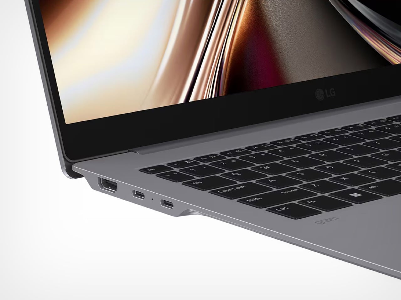
Aerominum replaces the magnesium alloy LG has used across the gram lineup since 2015, when the series first launched internationally. The new material uses what LG calls an “aeroplate structure,” a term that suggests internal geometry optimization rather than just a change in chemical composition. The company also applies a refined atelier brushing technique to the surface, delivering a metallic finish that looks premium without adding the typical weight penalty of anodized aluminum. The scratch resistance claim addresses one of the most consistent criticisms leveled at ultralight laptops over the years: magnesium chassis tend to show wear quickly, and previous gram models were no exception. Whether Aerominum actually solves that problem will depend on how it holds up after six months in a backpack, but the intent is clear.

The gram Pro 16 carries a 2,880 x 1,800 OLED display with a 120Hz refresh rate, a resolution LG markets as WQXGA+. The OLED panel is the differentiator here. LG’s 17-inch model uses an IPS display, which keeps costs down but sacrifices contrast and color depth. The Pro 16 gets the premium screen treatment, and pairing that with a 120Hz refresh rate makes it viable for light creative work and high-refresh browsing without needing discrete graphics. Intel’s Core Ultra processors handle the computing side, though LG hasn’t disclosed specific SKUs yet. The company does confirm support for both on-device AI (via LG’s gram chat powered by EXAONE 3.5 sLLM) and Microsoft Copilot+ PC functionality, which requires certain minimum performance thresholds that narrow down the chip options.

Weighing under 1.2 kilograms puts the gram Pro 16 in the same weight class as most 13-inch ultrabooks, which is absurd for a machine with a 16-inch OLED display. For context, Apple’s 13-inch MacBook Air with M3 weighs 1.24 kg. The Dell XPS 16 sits closer to 2.1 kg, and even Lenovo’s ThinkPad X1 Carbon (a 14-inch machine) weighs 1.19 kg. LG has been chasing this kind of weight advantage since the gram line launched over a decade ago, and Aerominum is the material innovation that finally closed the gap.

The gram Pro 16 will compete directly with premium Windows ultrabooks from Dell, Lenovo, and ASUS, all of which have been adding OLED options to their flagship models over the past two years. LG’s advantage is weight. The weakness, historically, has been GPU performance and pricing. The Pro 16 skips discrete graphics entirely, which will limit its appeal to anyone doing serious video editing or 3D work. Pricing hasn’t been announced yet, but previous gram Pro models launched at premium price points that undercut Apple while overshooting most Windows competitors. If LG can keep the Pro 16 under $2,000, it becomes a legitimate alternative to the MacBook Pro 16. If it creeps past that threshold, the weight advantage starts to feel like an expensive novelty.

The post LG Just Invented a New Metal to Build the Lightest 16-Inch OLED Laptop of 2026 first appeared on Yanko Design.

Posted in Uncategorized | Tagged ,

LG’s World-First 1Hz Panel Gives the Dell XPS 48% More Battery

Battery life has been one of the laptop industry’s most persistent design headaches, especially among Windows notebooks. Despite significant gains in chip efficiency, the display consistently ranks among the biggest power consumers in any portable computer. Most laptop screens refresh at a fixed rate regardless of what’s actually on them, which means the panel keeps drawing full power even when you’re sitting completely still, reading a document with nothing on screen changing at all.

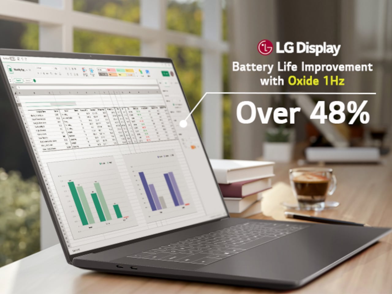
LG Display’s new Oxide 1Hz panel is the first mass-produced LCD laptop screen that doesn’t work that way. Rather than holding a fixed rate, it reads what’s on screen and drops to 1 Hz when the content is static, then scales back up to 120 Hz for video or gaming. LG began mass production on March 22, 2026, claiming the first-ever achievement of this at scale.

Designer: LG, Dell

The technology relies on custom circuit algorithms and a new oxide material applied to the panel’s thin-film transistor. That oxide holds an electric charge longer than conventional LCD materials, letting the screen maintain a still image without continuously refreshing it. LG claims the result is up to 48% more use on a single charge versus existing solutions, which is a significant number if it holds up in everyday use.

In practice, this matters most during the parts of a workday you spend the bulk of your time in. Checking emails, reading through documents, and sitting on a static slide during a meeting are all moments where a 60 Hz or 120 Hz screen burns power for no real benefit. The Oxide 1Hz panel handles those scenarios at a fraction of the usual draw without any visible difference.

When you do pull up a video or launch something that demands smooth motion, the panel doesn’t hesitate. It detects the change and jumps back up to 120 Hz automatically. There’s no mode to switch into, no setting to toggle, and no trade-off to manage. It just adjusts based on what’s happening on screen, which is how this kind of feature should work in the first place.

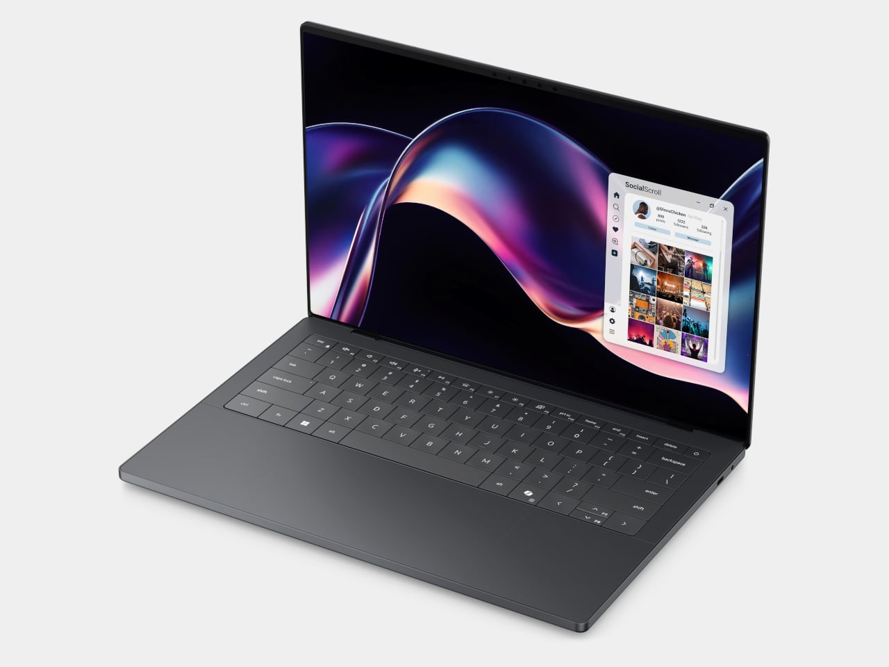
The first laptops to ship with this panel are the Dell XPS 14 and Dell XPS 16 for 2026, both unveiled at CES 2026 in January. The LCD option on both models runs at 1920 x 1200 pixels and 500 nits of brightness. Dell’s OLED option only drops as low as 20 Hz, which means the more affordable LCD configuration actually wins on low-power behavior.

Here’s where it gets interesting from a design standpoint. The display is one of the biggest power consumers in any laptop, so a screen drawing significantly less power during typical use creates real headroom for designers. They can use that headroom to maintain battery size and gain extra runtime, or to trim the battery slightly for a lighter, thinner chassis without giving up the battery life buyers already expect.

Of course, LG is already planning a 1 Hz OLED version of this technology for 2027, which is when things could get more interesting. OLED handles contrast and color in ways LCD can’t match, and pairing that quality with proper low-refresh-rate behavior could push portable laptop design further than it’s been able to go. For now, the Oxide 1Hz LCD is in something you can actually go out and buy.

The post LG’s World-First 1Hz Panel Gives the Dell XPS 48% More Battery first appeared on Yanko Design.

Minimalist laptop with a secondary display minimizes distractions, maximizes productivity

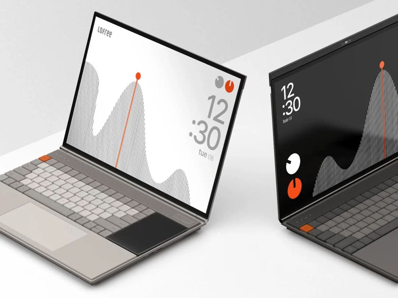
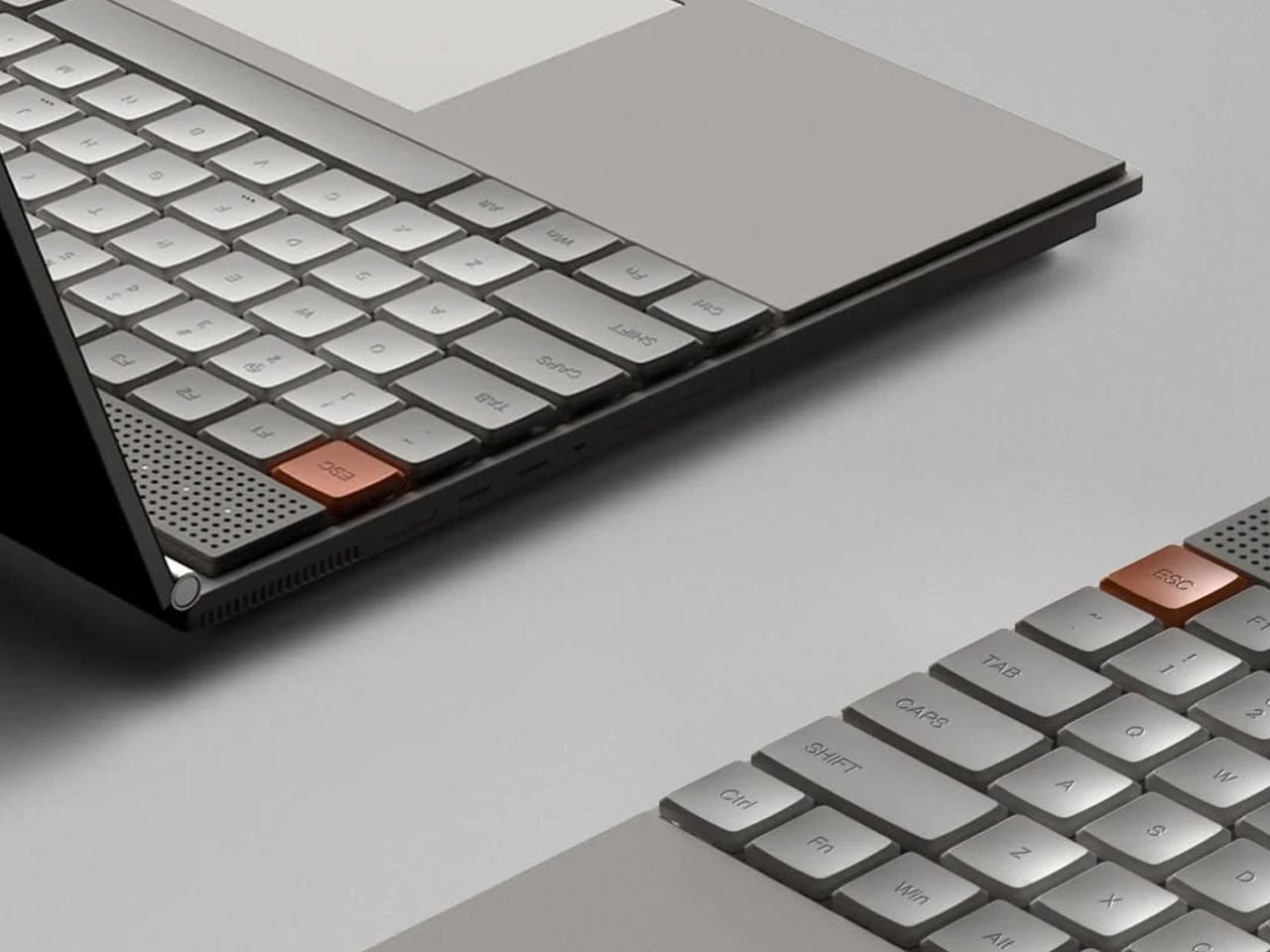
Minimalism in computing interfaces often promises clarity, yet many modern systems still struggle with cluttered notifications, layered menus, and competing visual elements. The Minimal Laptop UI concept explores what a truly distraction-free laptop experience might look like when both hardware and software are designed around the same philosophy. Inspired by the playful yet precise design language of Teenage Engineering, the concept imagines a laptop that feels equal parts creative tool and focused workspace.

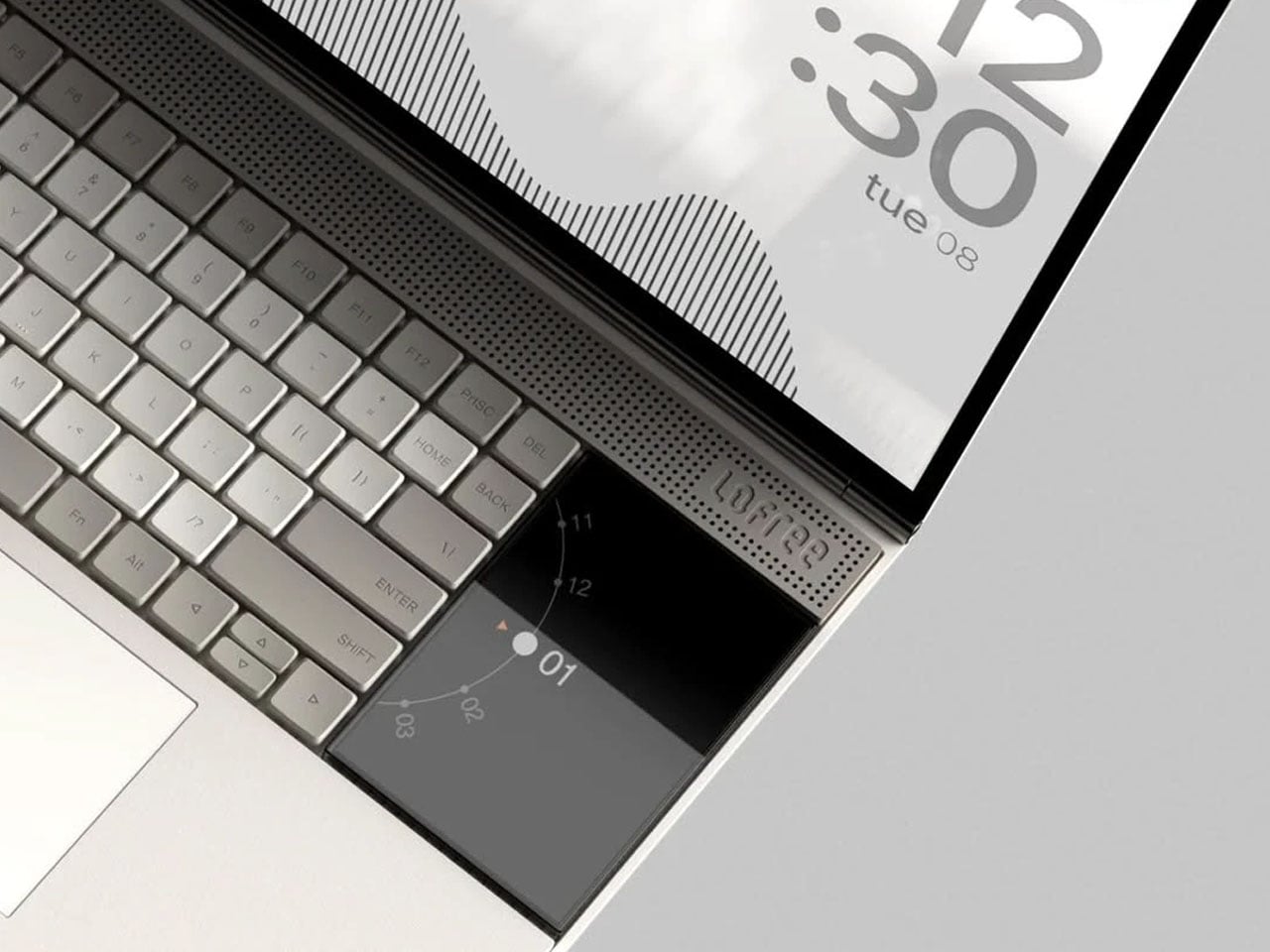
The interface is built around the idea that the screen should serve the task at hand, not compete with it. Instead of filling the display with panels, toolbars, and notifications, the layout relies on strong visual hierarchy and generous spacing. Elements appear only where necessary, allowing content to take center stage. Typography is clean and consistent, icons are reduced to their most recognizable forms, and the overall interface feels calm rather than busy. The result is a digital workspace that encourages focus without sacrificing functionality.

Designer: Nicolas Fred

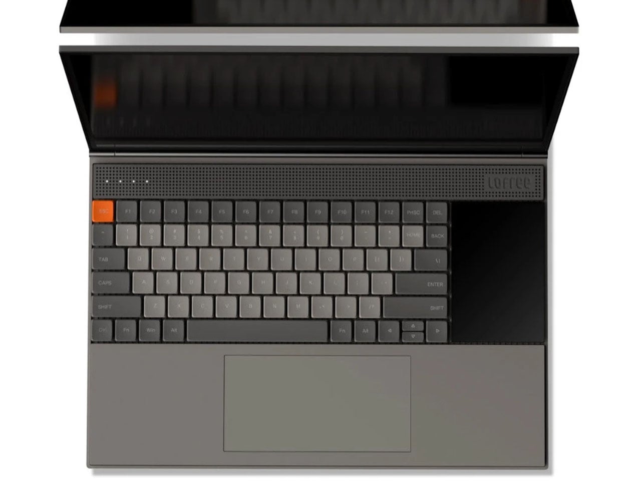
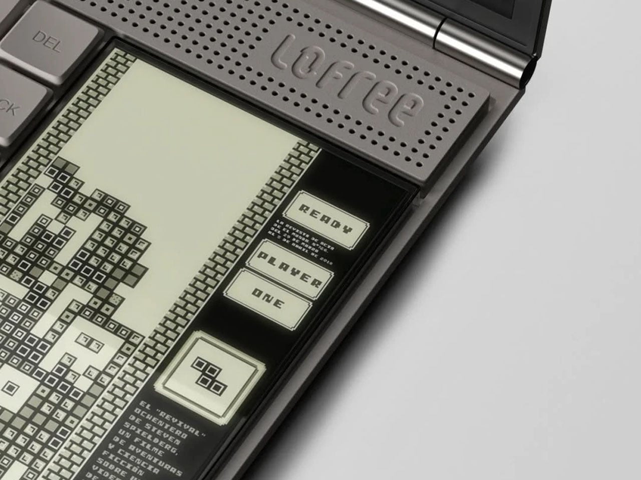
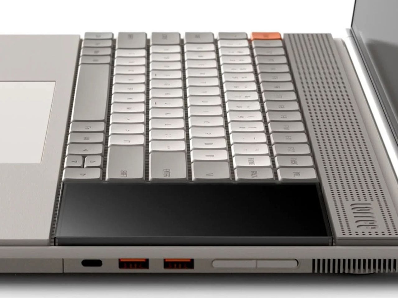
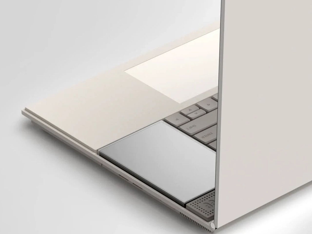
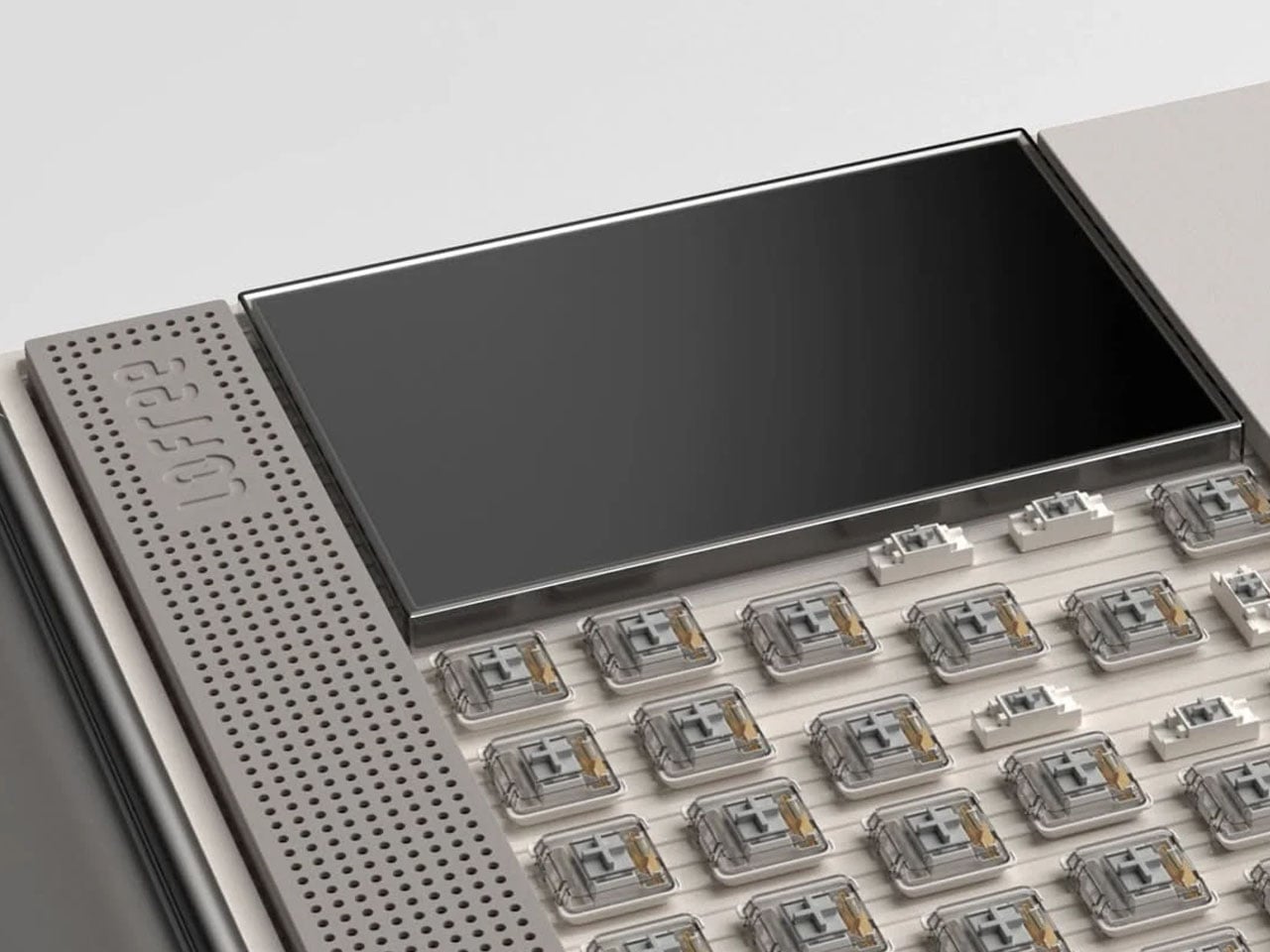
What makes the concept particularly interesting is how it integrates hardware into the experience. Just beside the keyboard sits a secondary display designed to handle the kind of information that typically interrupts the main screen. Notifications, widgets, quick system controls, and small utilities can appear here, keeping alerts visible without pulling the user away from their workflow. By shifting these elements to a separate display, the primary screen remains dedicated to productivity and creative work.

The secondary screen also introduces a playful dimension. Beyond system information and widgets, it can support lightweight interactions such as simple games or quick tools that users can access without minimizing their main task. This layered approach to interaction mirrors the philosophy behind minimal design: instead of removing functionality, it reorganizes it in a way that feels more intentional and less intrusive.

Visually, the laptop reflects the unmistakable influence of Teenage Engineering’s product design. Clean geometric forms, restrained color accents, and carefully balanced proportions give the device a distinctive character. The aesthetic leans toward soft tones and neutral surfaces, allowing subtle interface highlights to stand out without overwhelming the visual environment. It feels modern and creative, yet disciplined enough to support focused work.

Whitespace plays a significant role throughout the interface. Rather than compressing information into dense panels, the layout leaves breathing room around content, improving readability and reducing cognitive load. This approach mirrors principles often used in industrial and editorial design, where space itself becomes an essential component of the experience.


The post Minimalist laptop with a secondary display minimizes distractions, maximizes productivity first appeared on Yanko Design.

Xiaomi Returns to Laptops After Four Years with a MacBook Air Rival That Outclasses It on Paper for $1,275

The laptop market has a predictable rhythm. Apple sets the benchmark, everyone else reacts. Since the M1 MacBook Air landed in late 2020 and redrew the definition of thin-and-light computing, the entire Windows ultrabook category has essentially been running in response to that one product. Some challengers land close, most fall short on one or two crucial dimensions, and the cycle repeats. What makes Xiaomi’s return to the laptop space interesting is that the company has been watching all of this from the sidelines for four years, and the Book Pro 14 it just launched in China reads less like a desperate catch-up attempt and more like a deliberate, calculated swing at a very specific gap in the Air’s armor.

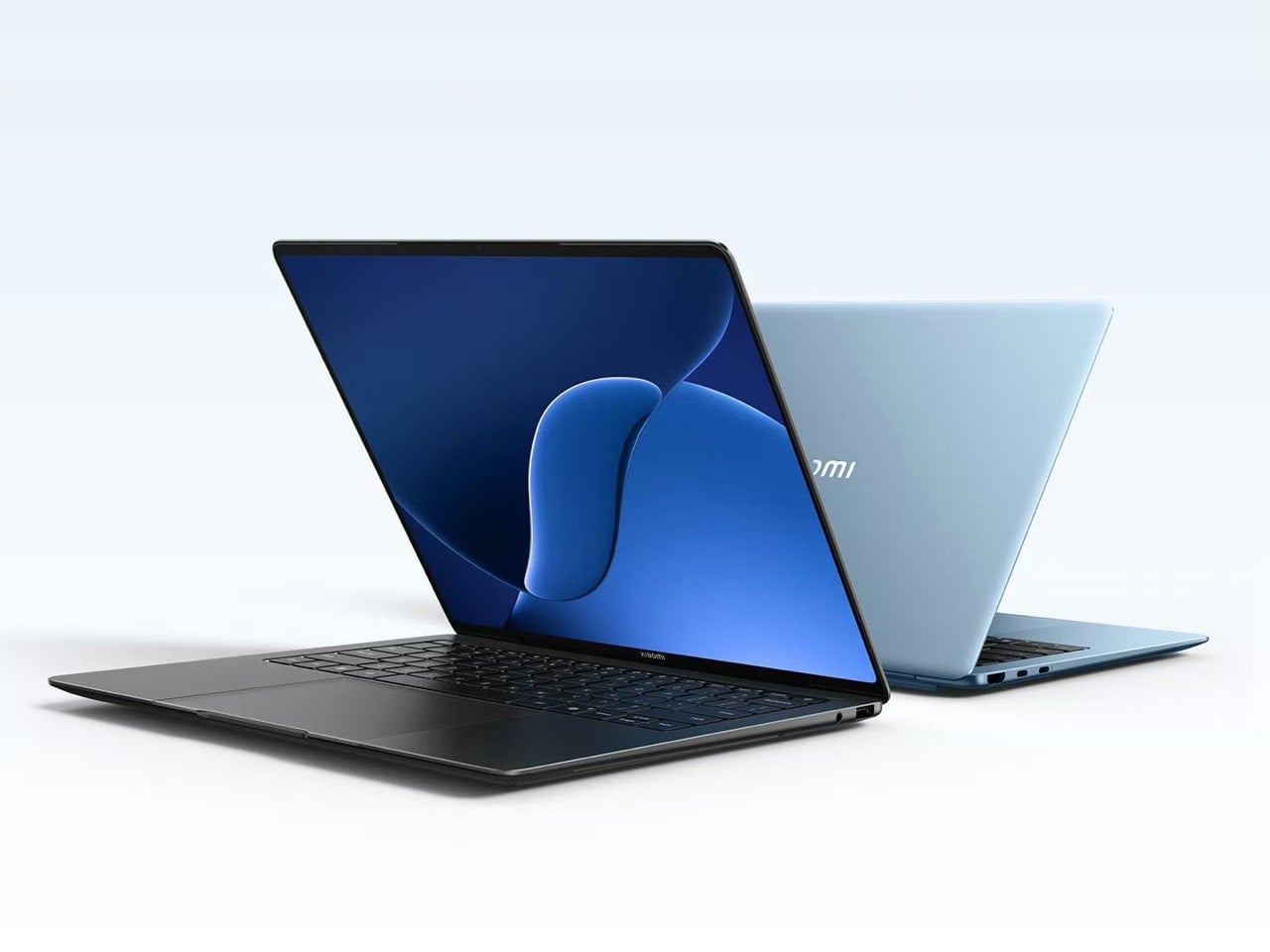
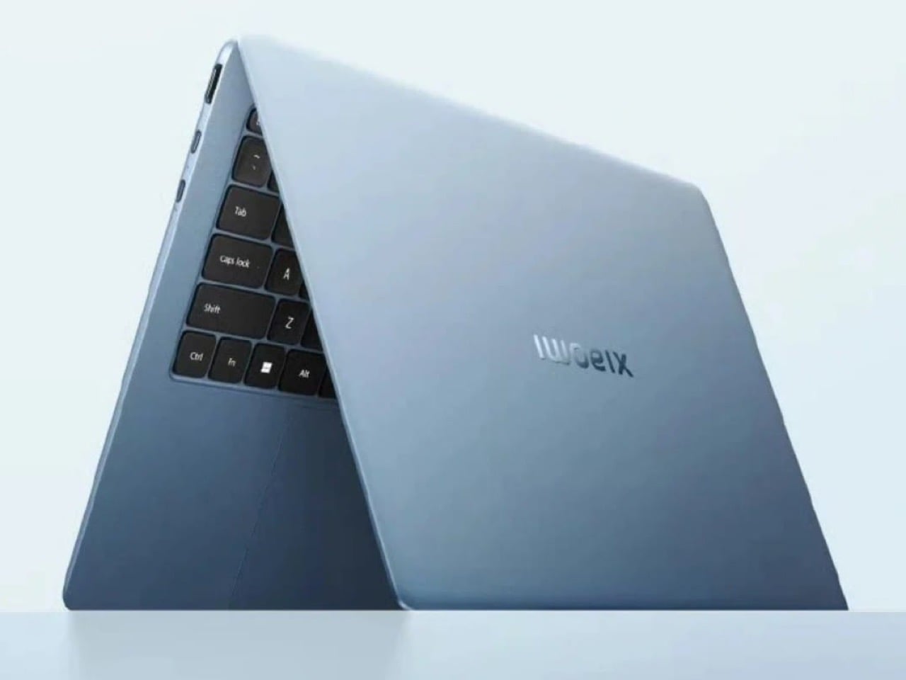
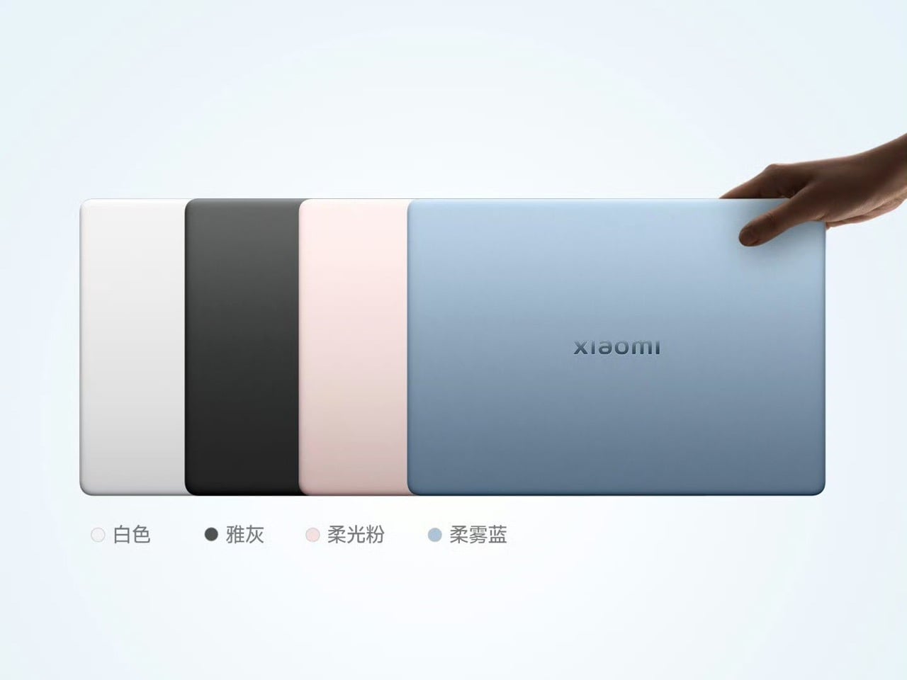
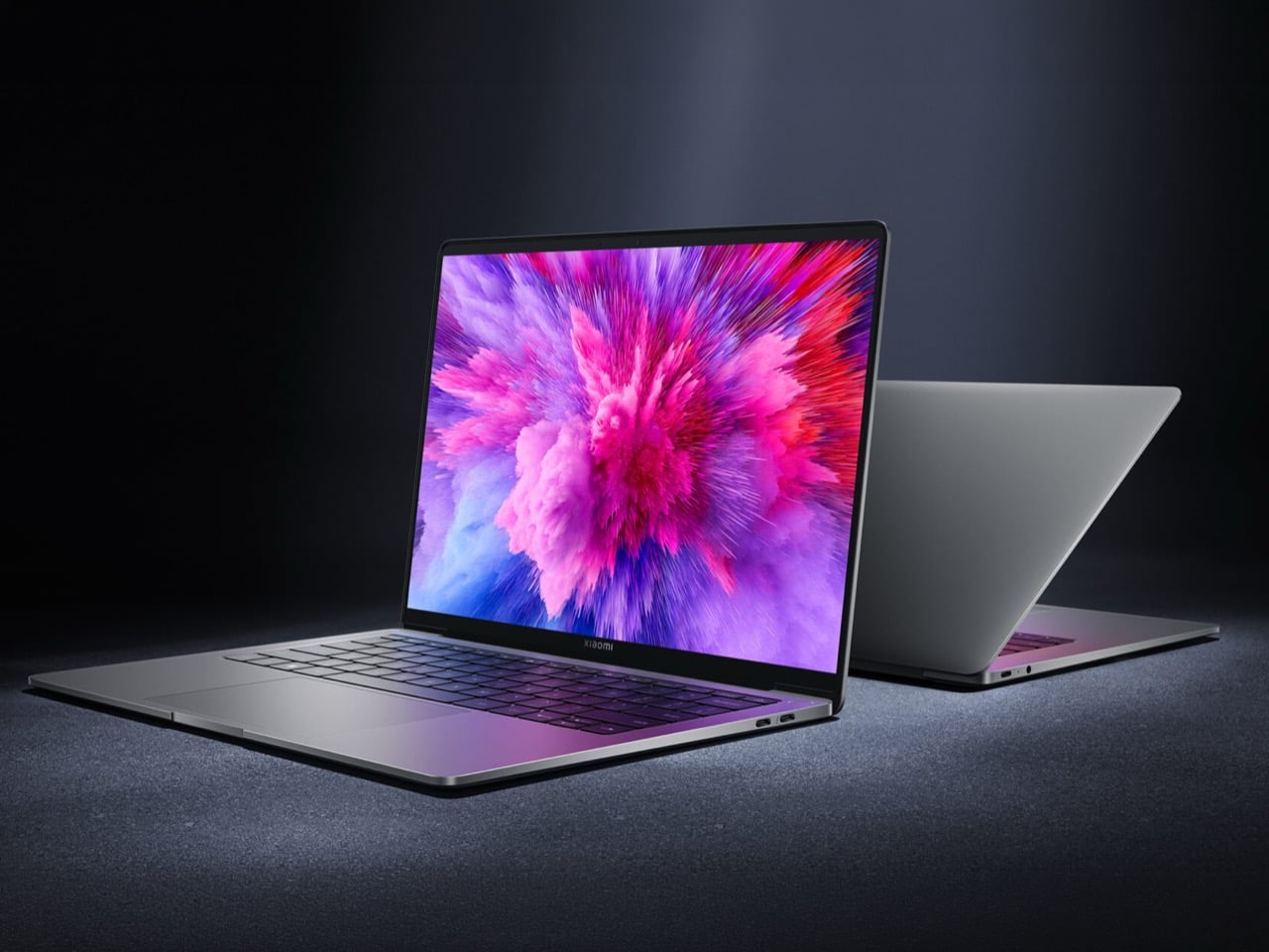
Xiaomi has just made a discreet release in the laptop segment after a four-year break, returning with the Book Pro 14, a capable thin-and-light that positions itself as a direct answer to the MacBook Air. The headline spec is the display: a 14.6-inch OLED panel with touchscreen support, 3.1K resolution, a 120Hz refresh rate, and a peak brightness of 1,600 nits. Under the hood, Xiaomi equips the notebook with Intel’s Panther Lake platform, up to an Intel Core Ultra 7 358H, with 24GB RAM on the base configuration and 1TB of SSD storage. Pricing, when converted from Chinese yuan, puts the laptop at approximately $1,275, just over $100 more than a base M5 MacBook Air, and for that small premium you get a higher-resolution 120Hz OLED panel, more RAM, and a more robust port selection.

Designer: Xiaomi

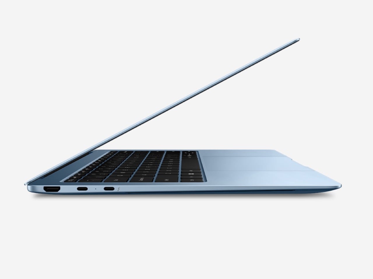
You’re probably itching to ask about ports, because the MacBook Air famously doesn’t pack enough of them. The Book Pro 14 includes Thunderbolt 4, USB-C, USB-A, HDMI 2.1, and a 3.5mm audio jack, compared to the MacBook Air’s two Thunderbolt 4 ports and a headphone jack. That is a meaningful difference for anyone who has ever reached for a dongle mid-presentation or had to choose between charging and connecting to a display. Xiaomi’s decision to include a full-size HDMI port and a USB-A jack signals an awareness that real-world desk setups are messier than Apple’s minimalist port philosophy acknowledges. Whether that matters to you depends entirely on your workflow, but it is a deliberate product decision and one that reads as a direct response to a documented frustration with the Air.

The Book Pro 14 achieves a weight of 1.08 kg and a thickness of 14.95 mm through a chassis built from magnesium alloy with a carbon fiber lid. That actually makes it lighter than the M5 MacBook Air, which tips the scales around 1.24 kg, and the thickness is comparable. Keeping the specs cool is a three-channel cooling system incorporating a high-performance fan, a 10,000mm² vapor chamber, and graphene cooling components capable of sustaining 50W of continuous performance. That last figure matters more than it might initially seem. Apple’s fanless MacBook Air is a thermally constrained machine, and sustained workloads do cause it to throttle, a tradeoff that has been well-documented since the M1 era, and a system that can sustain 50W continuously without a corresponding weight penalty represents a genuine engineering achievement.

Xiaomi makes bold claims on the Book Pro 14’s battery life, overshooting even the latest M5 MacBook Air by nearly two hours. The 72Wh battery is rated for up to 19.8 hours of continuous use, with the 100W fast charging system capable of restoring 50% in approximately 26 minutes. The MacBook Air M5 posts similarly impressive endurance numbers in real-world use, so this will be a tightly contested dimension. The Intel Panther Lake architecture powering the Book Pro 14 is also the first Intel mobile platform in recent memory that genuinely changes the conversation around Windows laptop efficiency, borrowing a page from Apple’s playbook by targeting the sub-10W idle efficiency range that made the M-series Macs so compelling. Independent testing will be the real arbiter here, but the stated numbers are ambitious enough to take seriously.

The Book Pro 14 is currently only available in China, with no clear indication of a global release date, which severely limits its immediate relevance for the overwhelming majority of potential buyers. Xiaomi has a track record of launching products domestically and gradually expanding to other markets, and given the attention this machine has received in the first 24 hours of coverage, the commercial logic for a global rollout is hard to argue against. The question is timing. If Xiaomi moves quickly, the Book Pro 14 could arrive in Western markets before the M5 MacBook Air has fully consolidated its footprint. If the rollout stalls or gets diluted through regional variants with compromised specs, the window closes. The hardware is genuinely compelling, and the only outstanding question that actually matters is whether Xiaomi’s global distribution ambitions match what the engineering team has clearly delivered.

The post Xiaomi Returns to Laptops After Four Years with a MacBook Air Rival That Outclasses It on Paper for $1,275 first appeared on Yanko Design.

XbooK’s $1,999 Triple-Screen Laptop Is One Bag Instead of Three Monitors

Anyone who has worked remotely long enough knows the moment a single laptop screen stops being enough. It’s usually the day you’re cross-referencing three documents at once, or the morning you realize your financial model needs a live chart in one window while you edit formulas in another. The standard fix is an external monitor or a portable screen extender, which works fine until you’re hauling a bag that feels like it’s punishing you for being productive.

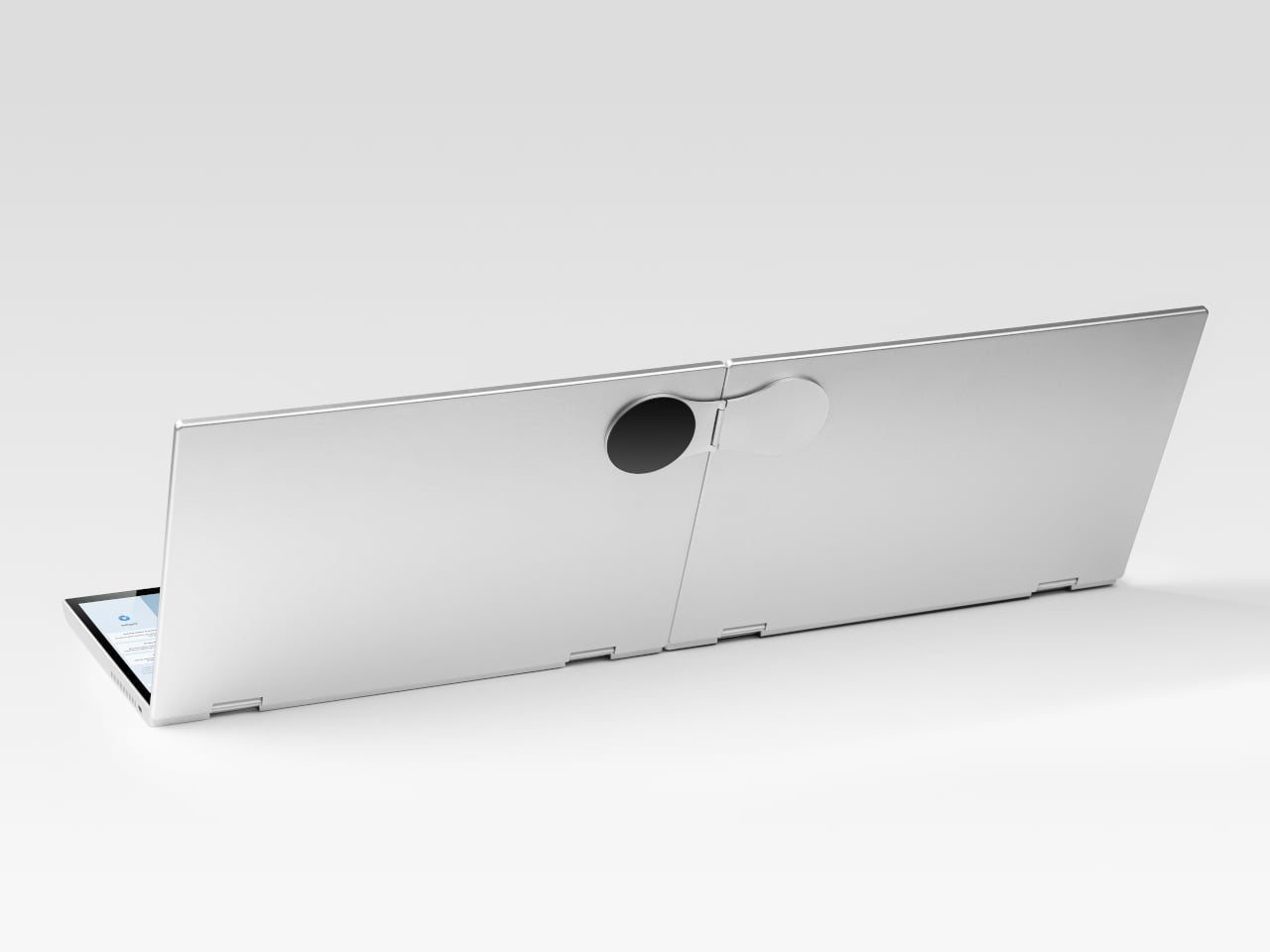
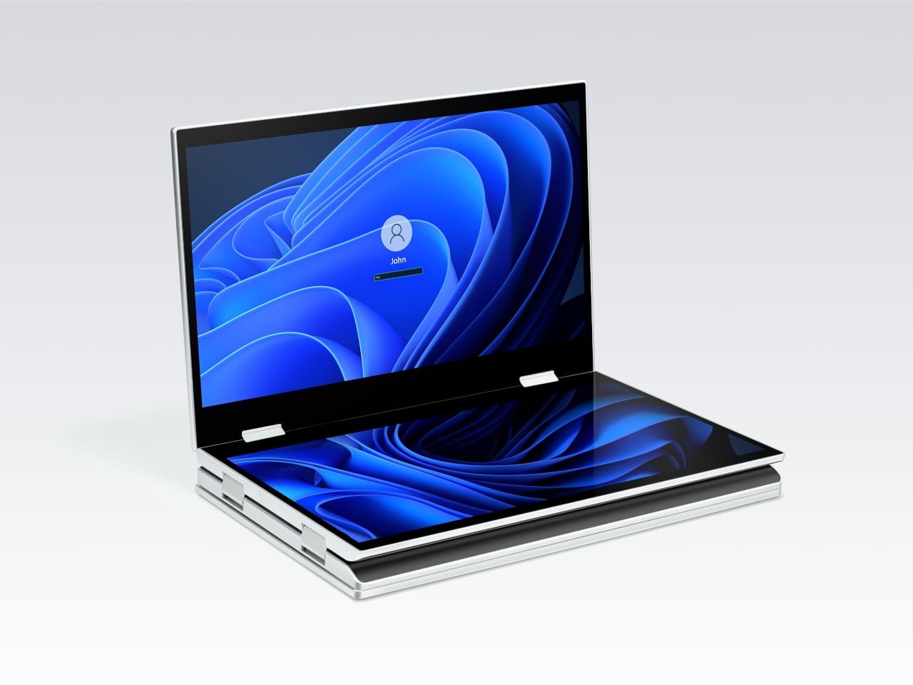
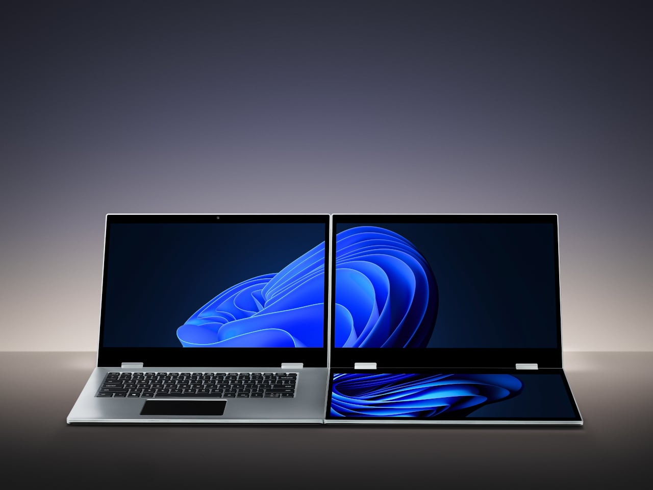
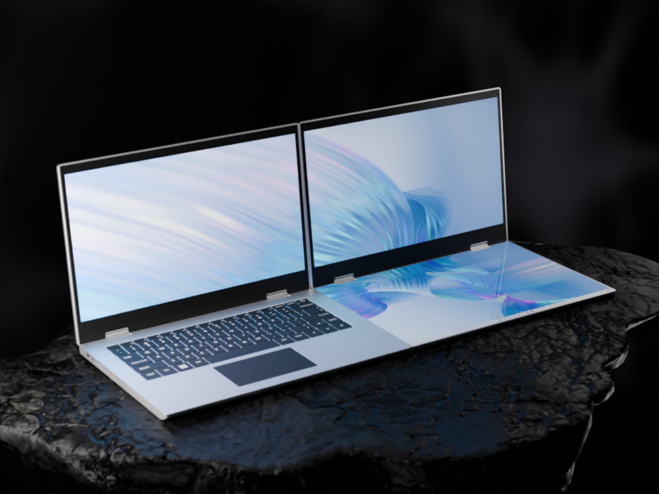
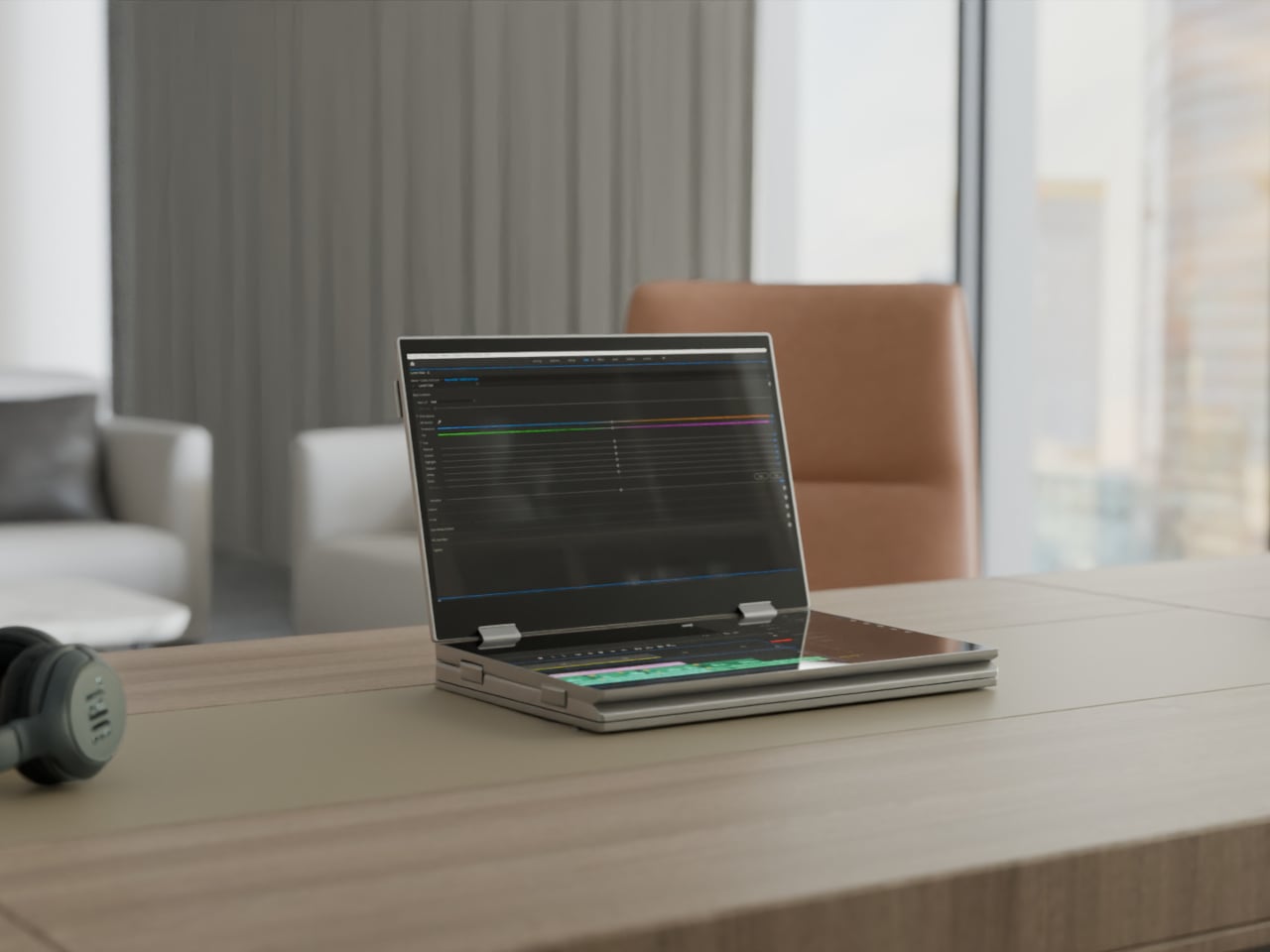
The XbooK takes a different approach by folding three full 14-inch touchscreens into a single aluminum laptop body that closes to just 1.5 inches thick. At 7.5 lbs, it’s heavier than a typical ultrabook. The tradeoff, though, is straightforward: you’re not carrying a laptop plus accessories. You’re carrying the whole setup in one piece.

Designer: XbooK

All three screens run at 1920×1080 with 400 nits of brightness each. The machine is powered by an Intel Core Ultra 7 with 32GB of DDR5 RAM and a 1TB SSD, with Wi-Fi 7 and Bluetooth 5.0 onboard. That’s capable hardware, though nothing unusual for a mid-to-high-range laptop in 2025. What makes those specs interesting here is what they’re pushing: 42 inches of combined touchscreen that unfolds in seconds without a single cable involved.

In full Workstation Mode, all three screens run simultaneously alongside an embedded mechanical keyboard and a 10-point touchpad. Connectivity covers Thunderbolt 4, two USB-C ports, and an AUX jack, with a 1,600×1,200 front camera that’s sharper than most built-in laptop cameras. The 70Wh battery has to power all of that, and battery life under a three-screen load is something any serious buyer should push the company on before committing.

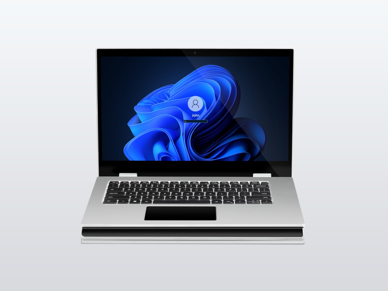
For days when the full spread is overkill, the XbooK also works in a two-screen mode or as a conventional single-screen laptop. The latter folds everything up and makes the device look surprisingly ordinary from the outside, except for the two thick slabs sitting underneath the keyboard. That adaptability is one of the more genuinely practical aspects of the design: you’re not locked into the workstation configuration every time you open the lid.

At $1,999 (down from a listed $2,999), it’s priced for professionals who already spend that much on monitors and docking stations. XbooK ships from the US with orders promised to be processed within 3 to 5 business days. The refund-before-shipping policy and fulfillment language have the texture of a startup still scaling up. Spending that much on a device from a company with no established hardware track record is a different kind of commitment than buying from a brand with a decade of products behind it.

Screen real estate is one of the last things portable computing has consistently failed to solve, and most multi-screen laptop concepts have been either too fragile or too awkward for daily travel. The XbooK has a cleaner physical premise than anything built around magnets or external rails. How the hinges and chassis hold up after a year on the road, though, is still an open question that no amount of spec-sheet confidence can close.

The post XbooK’s $1,999 Triple-Screen Laptop Is One Bag Instead of Three Monitors first appeared on Yanko Design.

ROG Strix G16 vs G18 (2026): Specs, Display, Performance

ASUS Republic of Gamers is back again with its 2026 refresh of the ROG Strix lineup, introducing the Strix G16 and G18 powered by Intel Core Ultra 9 290HX Plus and NVIDIA GeForce RTX 5080 Laptop GPU. Designed for gamers and creators who apparently never close their apps, these machines aim to push high-performance computing […]

The $599 MacBook Neo is Shaking Up the PC Industry: 6 Best Alternatives

Apple has never really done “affordable.” For decades, the cheapest way into the Mac ecosystem meant spending at least $999, and that was considered a deal. So when the company announced the MacBook Neo at $599, or $499 for students and educators, the reaction wasn’t just surprise. It was something closer to disbelief. This is the same Apple that charges $19 for a polishing cloth, and it just put a laptop on the shelf for less than most people’s monthly rent.

It’s not an accident or a moment of generosity. The MacBook Neo is a deliberate move into a market segment Apple has ignored for years: the budget laptop buyer. Students, first-time Mac users, families on tighter budgets. These are the people who’ve been defaulting to Chromebooks and cheap Windows machines, not because they preferred them, but because a Mac was simply out of reach. Apple just changed that math, and the PC industry is already scrambling to respond.

Designer: Apple

More Than a Fresh Coat of Paint
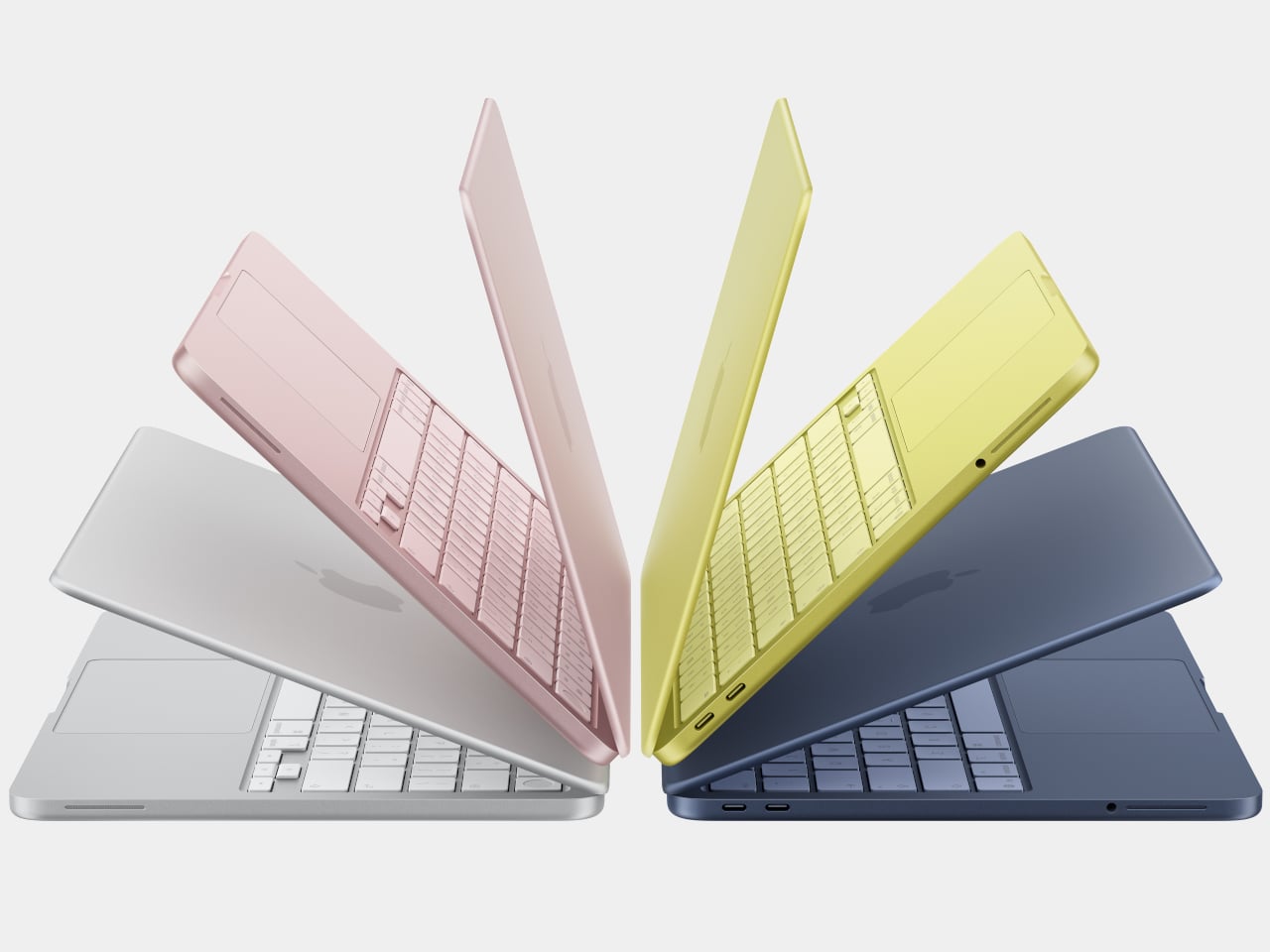
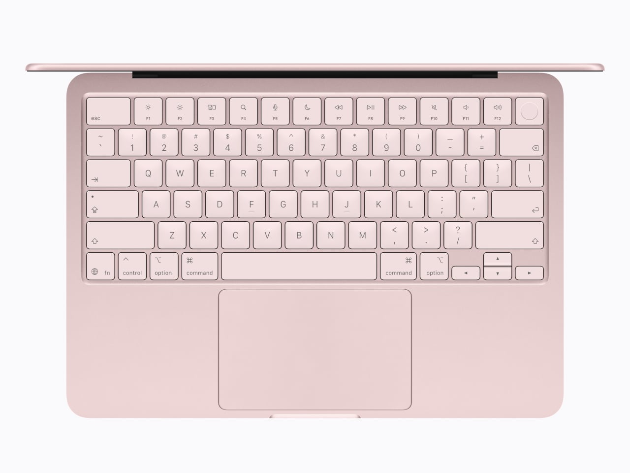
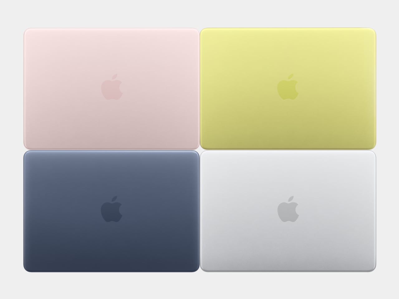
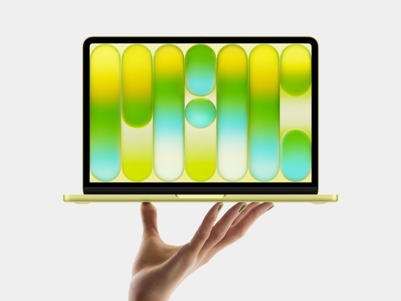
The Neo comes in four colors: blush, indigo, silver, and a sharp citrus yellow. The colors even extend to the Magic Keyboard in lighter shades and matching wallpapers, which is a level of cohesion you genuinely don’t see at this price point in Windows hardware. The aluminum enclosure weighs 2.7 pounds, and the 13-inch Liquid Retina display runs at 2408-by-1506 resolution with 500 nits of brightness, outpacing most competing devices in this segment by a considerable margin. Combine that with up to 16 hours of battery life, and the headline specs read like a mid-range laptop, not an entry-level one.

The chip underneath all of that is the A18 Pro, the same processor that powered the iPhone 16 Pro in 2024. That’s where the picture gets a bit more nuanced. It’s definitely more than enough for web browsing, document editing, streaming, casual photo editing, and AI tasks. What it isn’t is a creative workstation. This machine is fanless, silent, and cool-running, but it isn’t going to replace even a MacBook Air for serious video work or sustained heavy computation. Apple has been honest about that positioning, and the spec sheet backs it up.
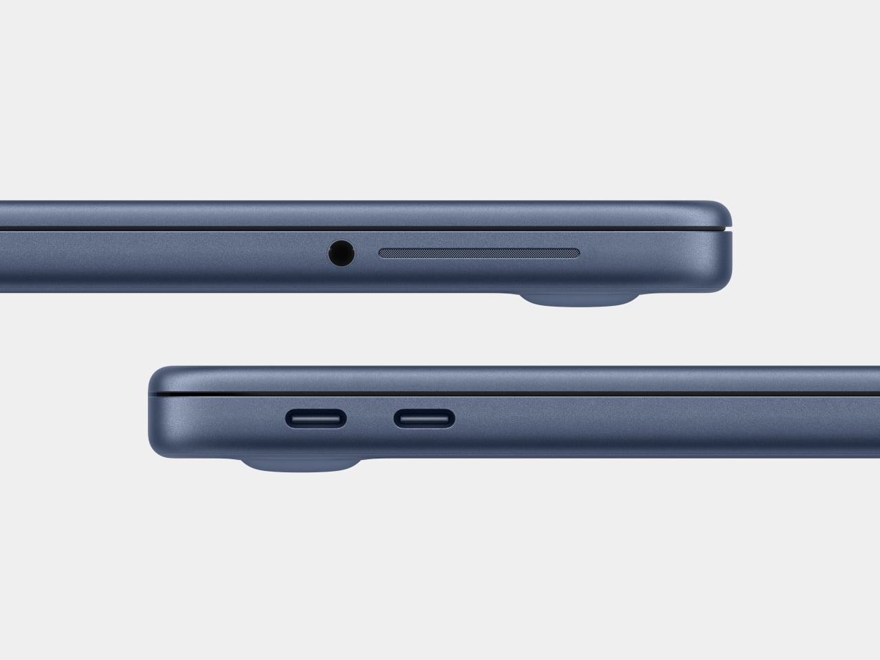
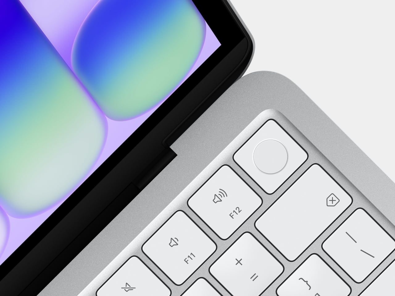
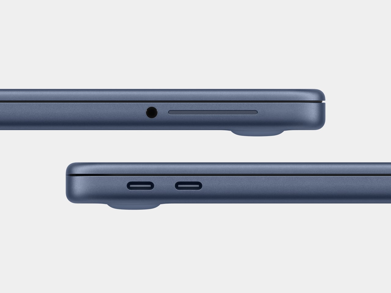
There are also a few caveats beyond the silicon. There’s no backlit keyboard on the base $599 model, which feels like an odd omission in 2026. Fast charging isn’t supported either, with only a 20W USB-C adapter in the box. The connectivity is minimal: one USB 3 port (USB-C) and one USB 2 port (USB-C), the latter topping out at 480Mb/s, which is slow enough to matter if you regularly move large files. No Thunderbolt. No MagSafe. Touch ID is exclusive to the $699 model. These are deliberate subtractions, not oversights, designed to protect the MacBook Air’s value proposition while keeping the Neo’s cost down.

Road Once Traveled: Windows RT

Before getting too swept up in the novelty of the MacBook Neo, it’s worth remembering that the idea of an affordable, ARM-based portable computer aimed at everyday users isn’t new. Microsoft tried exactly this in 2012 with Windows RT, a version of Windows designed to run on ARM chips and released alongside the original Surface tablet. The pitch was appealing: a sleek, efficient, battery-friendly device that could handle the basics and connect to the broader Windows world.

The fact that it failed is pretty much part of history by now. The core problem wasn’t the hardware or even the concept: it was the software. Windows RT looked and felt like Windows but couldn’t run traditional Windows desktop applications. It was a watered-down experience wearing a familiar face, and users who expected full Windows compatibility found themselves stranded. The app ecosystem didn’t materialize fast enough, either, and Microsoft eventually abandoned the platform. Windows on ARM has continued in various forms since then, but it’s never fully shaken the baggage of that first failed attempt.
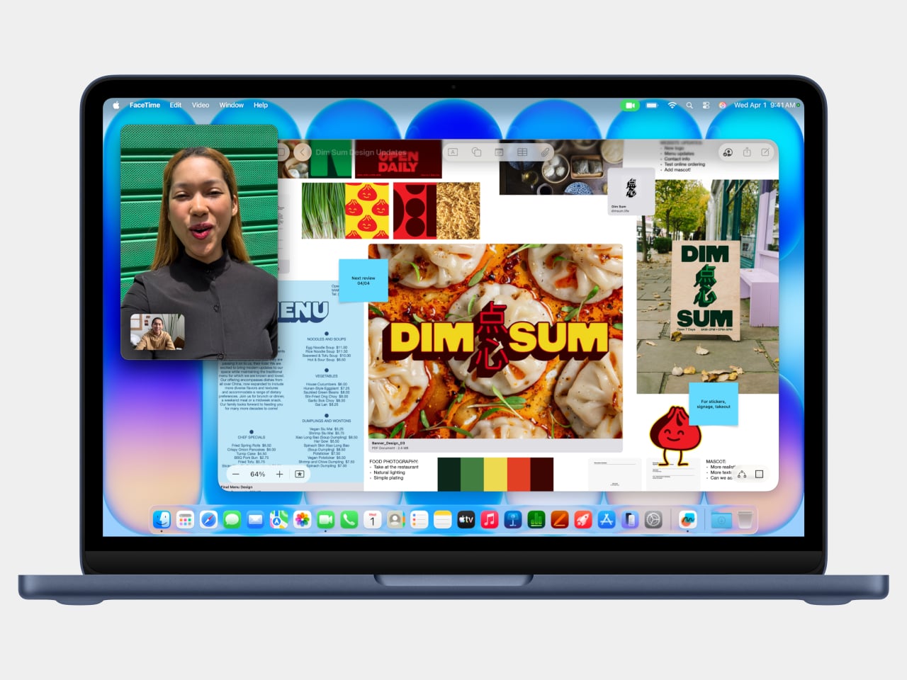
Apple, by contrast, spent years laying groundwork before making its ARM leap. When the company transitioned the entire Mac lineup to Apple Silicon starting in 2020, it didn’t ask developers to build for a new platform overnight. The Rosetta 2 translation layer handled legacy Intel apps smoothly from day one, and Apple had spent over a decade pushing developers toward modern APIs and frameworks through iOS. By the time the A18 Pro landed inside a $599 laptop, the software ecosystem was already there waiting for it. The MacBook Neo doesn’t run a restricted version of macOS. It runs full macOS Tahoe, with access to the same App Store and the same apps as any other Mac, and that is the fundamental difference that Microsoft was never able to bridge with Windows RT.

The best alternatives if the MacBook Neo isn’t for you

The MacBook Neo sets a new standard for what a $600 laptop can look and feel like. That said, it’s not the right machine for everyone. If you’re committed to Windows, need more RAM, prefer a larger display, or simply aren’t ready to switch ecosystems, there are some solid alternatives worth considering in the same price range.

Acer Swift Go 14 (SFG14-73)
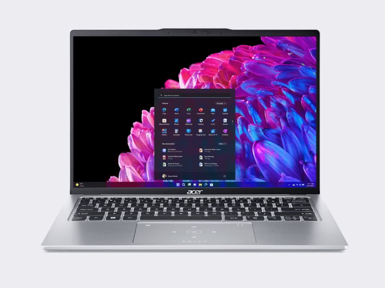
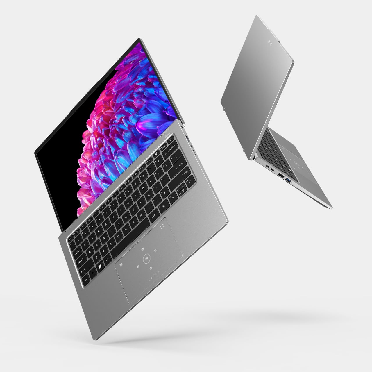
The Acer Swift Go 14 is one of the more compelling Windows options at this price point, running on an Intel Core Ultra 5 processor with integrated Intel Arc graphics, 8GB of RAM, and a 512GB SSD. That’s double the storage of the base Neo for roughly the same $600 price. The bigger draw is the display: a 14-inch OLED panel at 2880×1800 resolution, which is genuinely excellent for a laptop in this category and makes the Swift Go a strong pick for anyone who consumes a lot of media.

Designer: Acer

The trade-offs can’t be ignored, though. Battery life comes in around 8.5 hours, which is significantly shorter than the Neo’s 16-hour rating, and it weighs about 2.87 pounds in a larger chassis. It’s also a somewhat older-gen model, and that sweet price tag is only available in select retailers. If you want a bigger, sharper screen and don’t mind carrying a charger more often, the Swift Go earns a serious look.

Lenovo IdeaPad Slim 3 (15″, AMD)
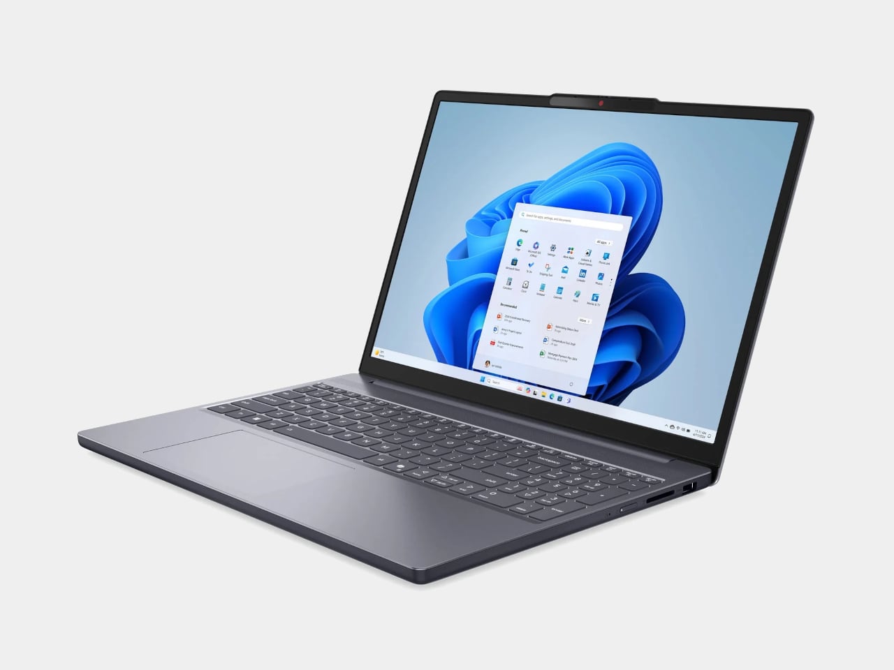
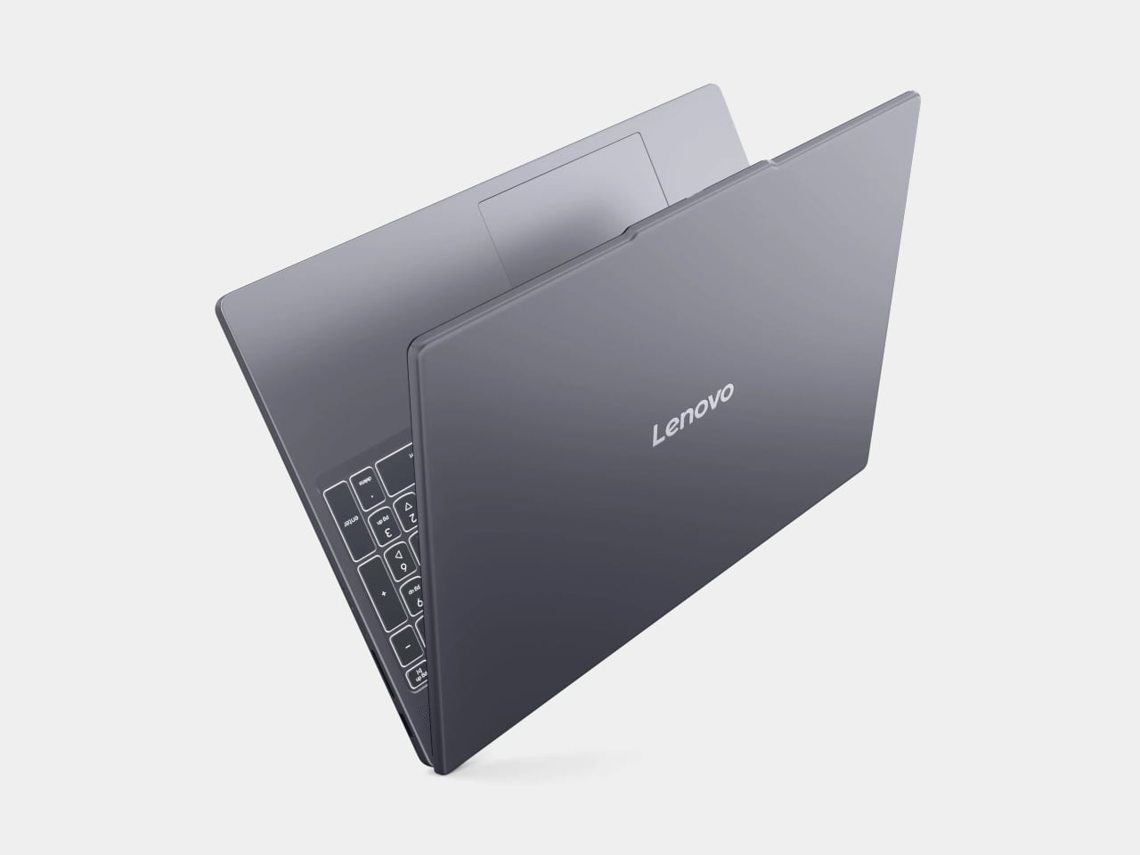
Lenovo’s IdeaPad Slim 5 punches above its price with a more generous hardware loadout than the Neo: an AMD Ryzen 5 8540 processor, 8GB of RAM, and 512GB of storage, all available around the $500 price point. Lenovo also tends to make the best keyboards in the budget Windows space, and this one continues that tradition.

Designer: Lenovo

Where it falls short is predictable. The display is a 15-inch 1920×1200 IPS panel, which is perfectly functional but a noticeable step down from the Neo’s Liquid Retina screen in terms of sharpness and color. The battery life is what you’d expect from a Windows laptop. It won’t make you smile when you pull it out of a bag the way the Neo will, but if raw specs-per-dollar is the priority, the IdeaPad Slim 3 is a difficult machine to argue against.

HP OmniBook 5 (BA1056NR)
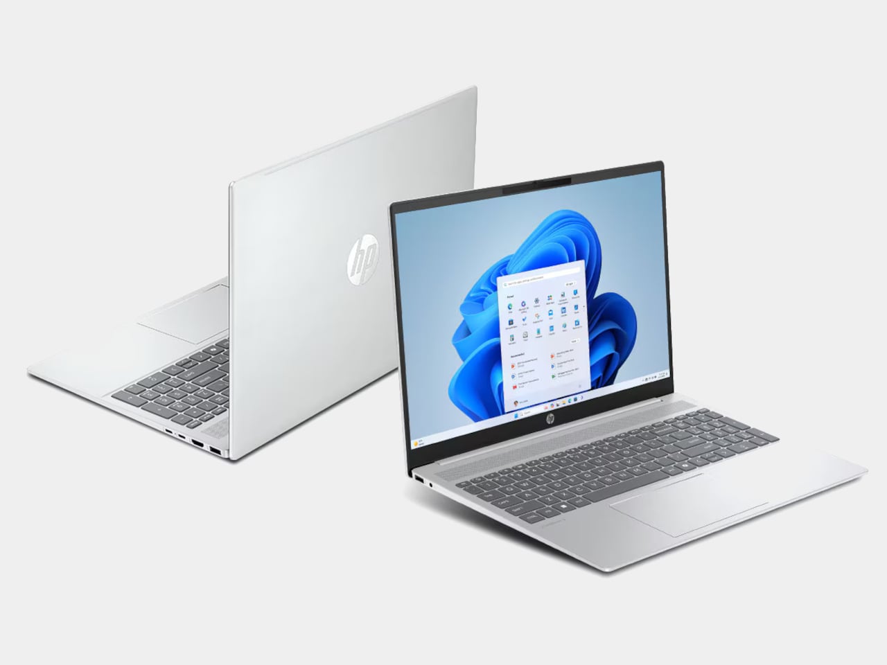
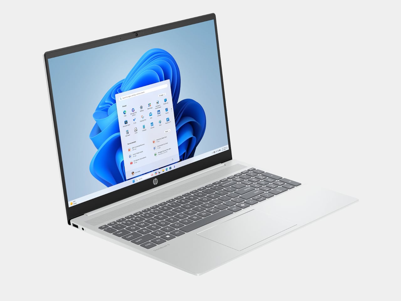
HP’s OmniBook 5 positions itself as an entry-level everyday laptop with pricing that frequently dips below $650, giving it a clear edge over the Neo in pure cost. It runs on modest Intel hardware, comes with a generous serving of 16GB of RAM, and is built primarily for email, web browsing, document editing, and video calls, the exact workload profile Apple says the Neo is designed for. Battery life is rated respectably, and the keyboard and trackpad are comfortable enough for extended daily use.

Designer: HP

The honest version of this recommendation comes with a caveat: the OmniBook 5 doesn’t compete with the Neo on display quality, build materials, or software longevity. The screen is a standard 16-inch 1080p IPS panel in a plastic chassis, and it runs Windows on Intel Core 5 silicon, which is a much older generation than today’s selection. It makes sense as a pure budget play if the price tag is still a stretch, but going in with eyes open about what those savings cost you is important.

Acer Chromebook Plus Spin 714 (CP714-1H-54UB)
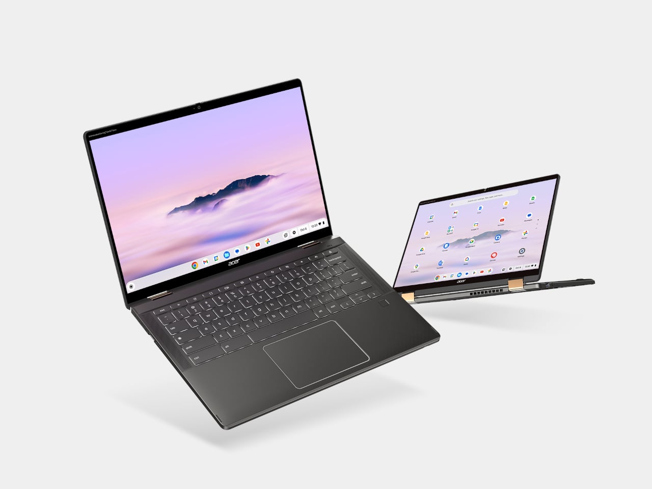
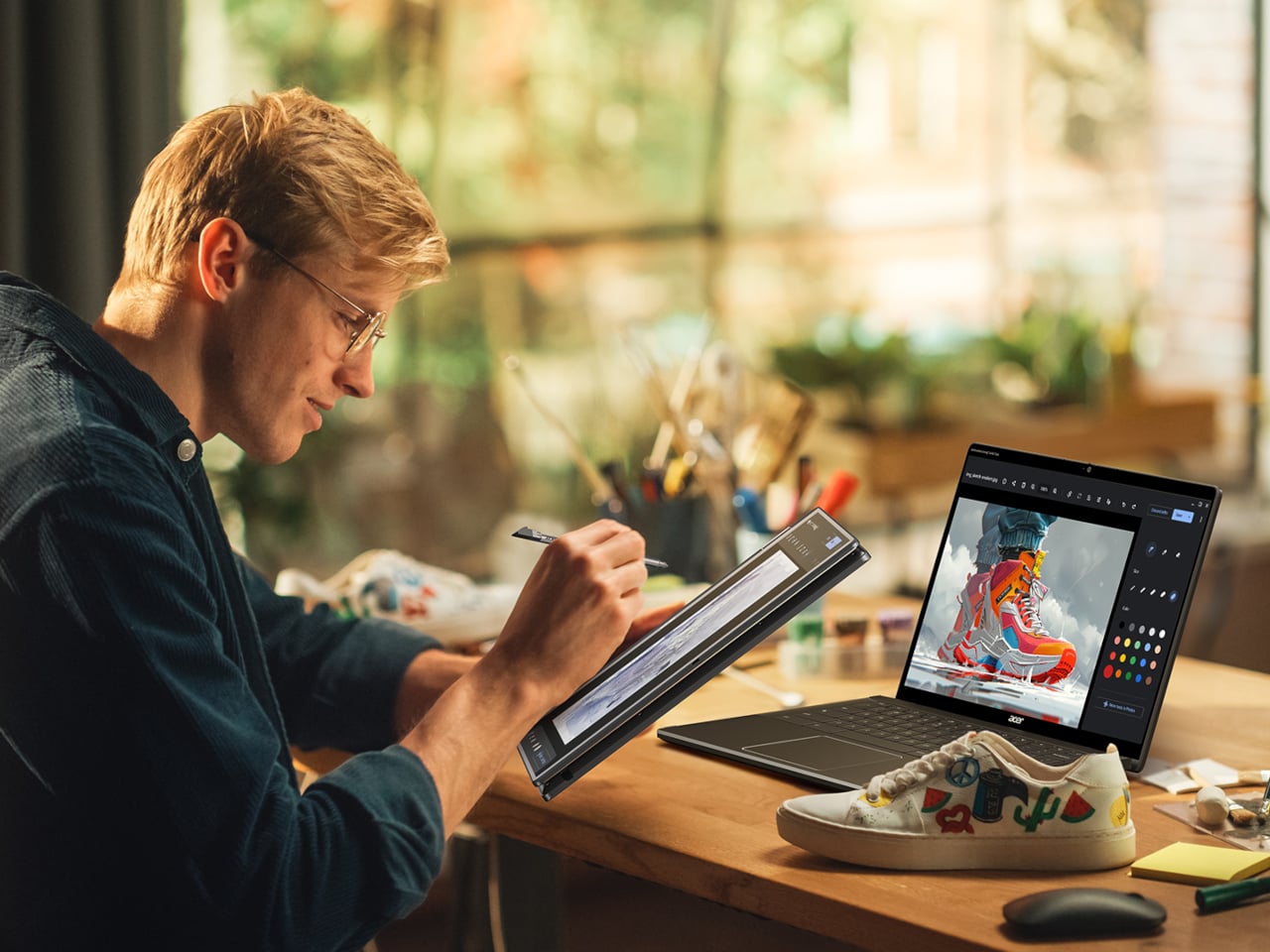
The Acer Chromebook Plus Spin 714 is one of the more capable Chromebooks available around the $530 mark with a discount ($699 in full), and it brings a feature the Neo completely lacks: a touchscreen. Running on an Intel Core Ultra 5 with 8GB of RAM and 256GB of storage, it matches the Neo’s base memory and storage configuration while adding 2-in-1 convertibility and a 14-inch IPS display at 1920×1200. For students, especially, the tent and tablet modes open up use cases that a standard clamshell laptop can’t cover.

Designer: Acer

The limitations are ChromeOS itself, which has narrowed the gap with full desktop operating systems considerably but still trails macOS and Windows for professional app compatibility. Battery life is advertised to be around 10 hours, shorter than the Neo but solid for a school day. At 3.21 lbs, it’s heavier and physically larger, and the display is a step behind the Neo in resolution and color quality. For someone already in the Google ecosystem, though, this is the sharpest Chromebook rival to the Neo in this price window.

Lenovo Chromebook Plus 14 (ChromeOS)
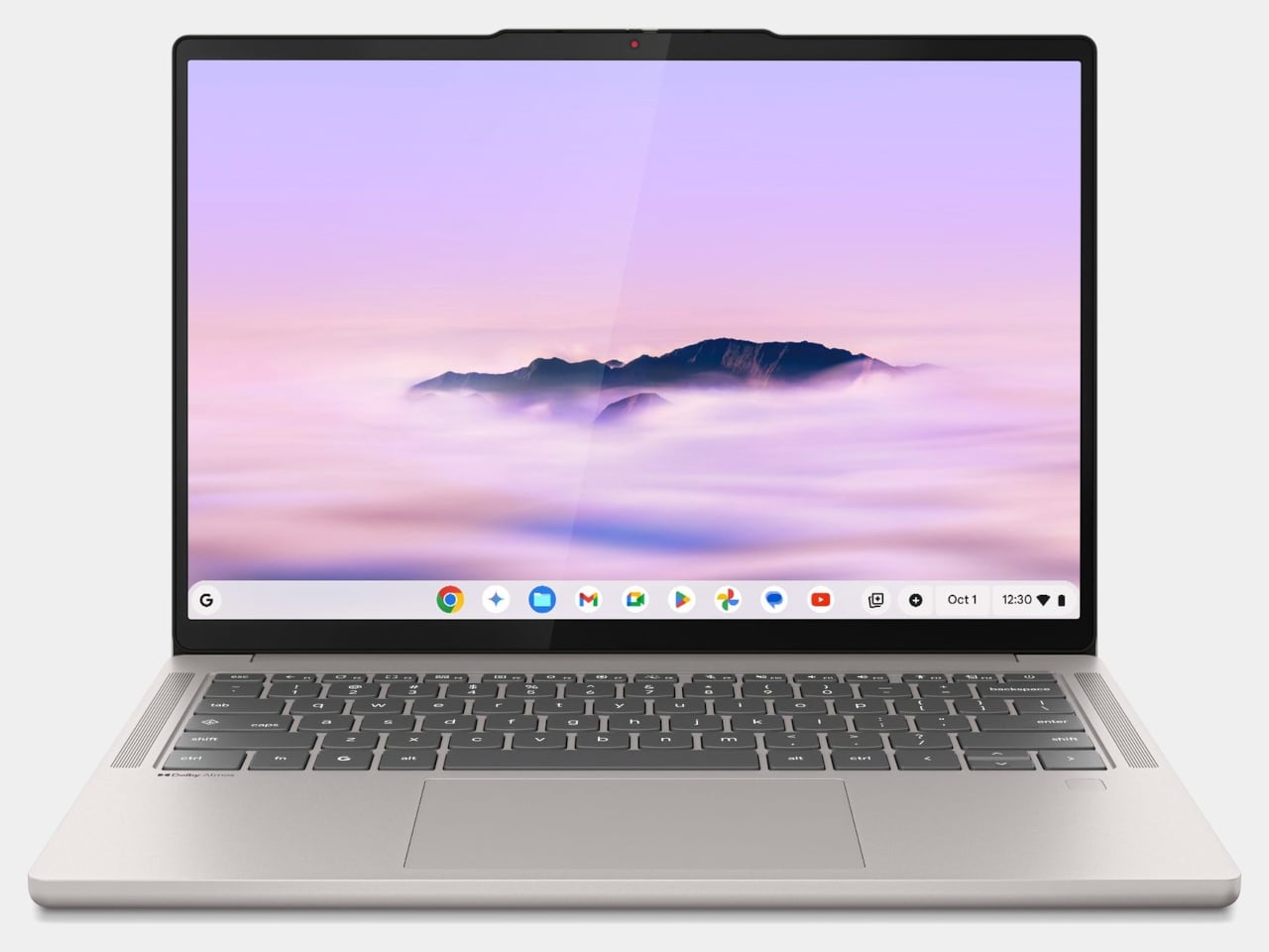
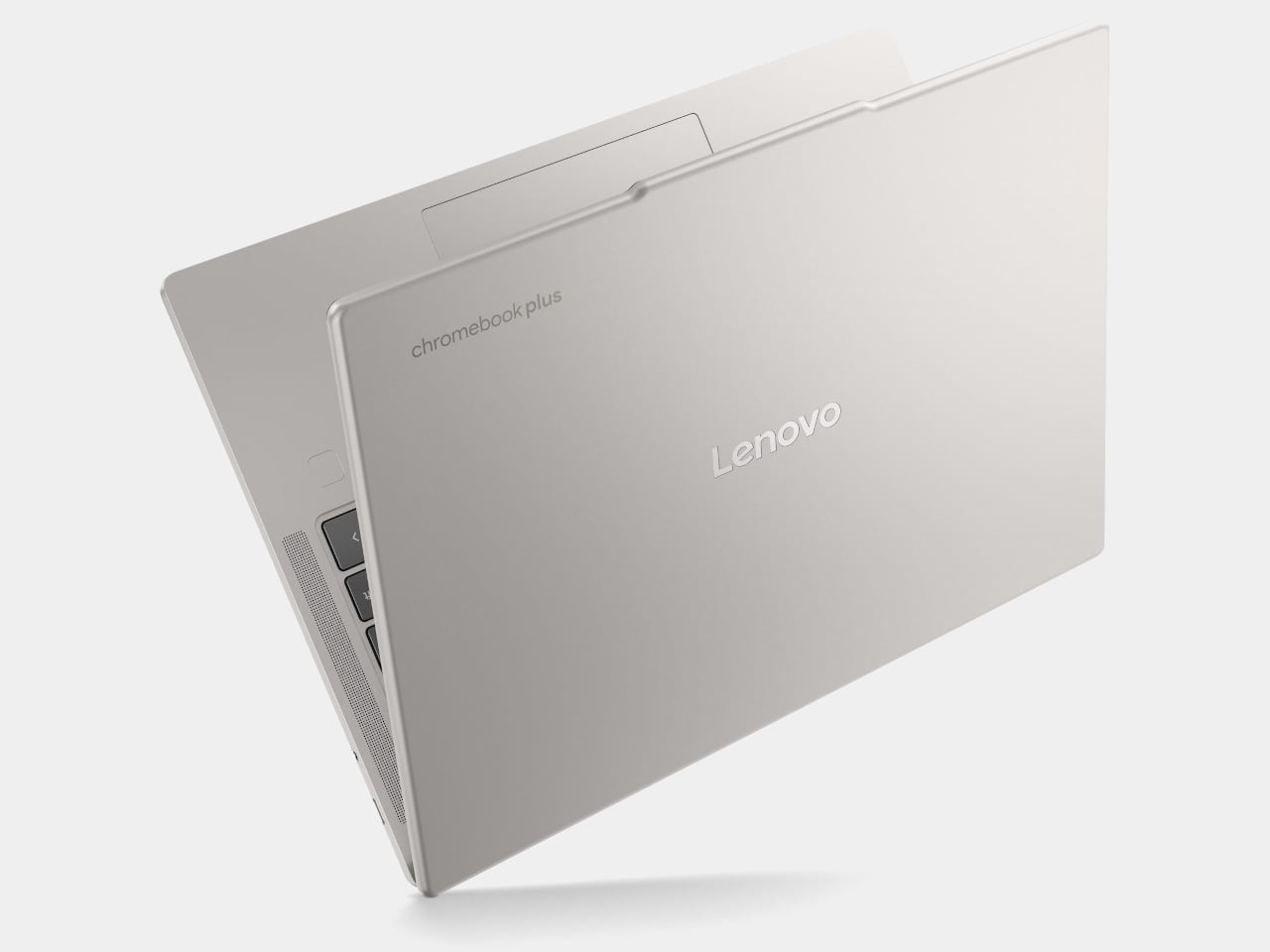
Lenovo’s Chromebook Plus 14 is the premium option in the ChromeOS space, and its headline feature is the display: a 14-inch 1920×1200 OLED panel with touchscreen support at a price of $749. For a Chromebook, that’s genuinely unusual hardware, and the screen quality puts it ahead of most of the Windows competition in this tier. It also supports Wi-Fi 7, runs on an Arm-based MediaTek Kompanio Ultra 910 chip with 16GB of RAM, and offers a build quality noticeably above the typical Chromebook standard.

Designer: Lenovo

The case for it over the Neo comes down to ecosystem preference. If Google Docs, YouTube, and Android apps cover your workflow, the Chromebook Plus 14 delivers a premium screen and a refined experience for less money than a MacBook Air. If you need desktop-class software, the ceiling becomes apparent quickly. ChromeOS has matured, but it still hits walls that macOS doesn’t. This is the Chromebook that makes you reconsider the category, not the one that makes you forget its limitations entirely.

Refurbished MacBook Air M1

It feels slightly odd to list an older Mac as an alternative to a newer Mac, but the refurbished MacBook Air M1 is worth the mention. Available through Apple’s certified refurbished store, third-party retailers, and resellers, the M1 Air frequently surfaces in the $600 to $700 range and represents a considerable step up from the Neo in several areas. The M1 chip is more capable than the A18 Pro for sustained workloads, it has MagSafe-era USB-C with Thunderbolt support, and it comes with 8 to 16GB of unified memory in the base configuration with a more mature, battle-tested macOS optimization story.
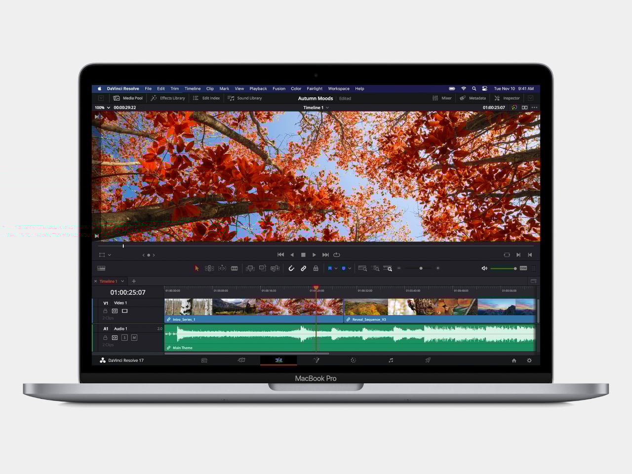
The catch is that you’re buying hardware from 2020, and Apple’s software support timeline means the M1 will eventually age out of macOS updates before a Neo purchased today will. For someone who wants macOS and a bit more headroom without stepping up to the $1,099 MacBook Air M5, the refurbished M1 is a pragmatic option rather than an inspired one. It gets the job done, but it doesn’t have the new colors, and the MacBook Neo, despite its compromises, is the more forward-looking machine.

Wake-up call

Affordable Windows laptops and Chromebooks have never been in short supply. The problem has always been that most of them require accepting significant compromises: dim displays, plastic chassis that creak, battery life that barely lasts a workday, or chips so underpowered that the experience degrades within a year of purchase. Many of the more appealing options in this segment come from lesser-known manufacturers, which brings its own concerns around software support and build reliability over time.

What the MacBook Neo does is reframe the question the PC industry has been comfortable not asking. ARM-based Windows laptops have existed for years, and the Snapdragon X series has made genuine progress, but Windows on ARM still hasn’t found the cultural moment that would turn it into a mainstream category. The Neo’s arrival and the reaction to it suggest that the market for a well-made, genuinely affordable computer aimed at students and everyday users is larger than the industry has been willing to address seriously. Apple just walked in and asked whether cheap and simple was enough, or whether those buyers might actually want something better.

The post The $599 MacBook Neo is Shaking Up the PC Industry: 6 Best Alternatives first appeared on Yanko Design.
Apple Finally Rounded the MacBook’s Corners After 18 Years

For about 18 years, every aluminum MacBook has looked more or less the same. Silver. Angular. Quietly serious. There’s nothing wrong with that. Apple’s unibody aluminum design, introduced in October 2008 and carved from a single block of metal, was genuinely elegant and set the template for an entire industry. But it also retired something along the way: the idea that a Mac laptop could feel chosen rather than just defaulted to.

The MacBook Neo, announced March 4 and starting at just $599, is the first real crack in that template. It comes in four colors (blush, indigo, silver, and a yellow-green called citrus) with enclosure corners that are noticeably softer than any aluminum Mac in recent memory. Whether that adds up to a proper design statement or just smart positioning is worth thinking through.

Designer: Apple

What happened to Apple’s color confidence

iBook G3 Clamshell (courtesy of Wikipedia)

Apple’s fondness for color didn’t always live inside an iPhone. The iBook G3, launched in 1999, came in tangerine and blueberry, and later in indigo and key lime. It was rounded, slightly toy-like, and completely unapologetic about being a consumer product. When the aluminum unibody arrived in 2008, Apple traded that warmth for precision machining and sharp rectilinear edges. Right call for the MacBook Pro. Default for everything else, apparently, for nearly two decades.

The result was a color drought in aluminum Mac laptops that has lasted until now. Silver, space gray, midnight, starlight: all variations on the same mood of professional restraint. The Neo’s citrus and blush aren’t just options on a spec page. They’re a quiet admission that not every laptop buyer wants a device that looks like it belongs in a boardroom. For Apple, that’s actually not a small thing to say at the product level.

Two different stories about corners

M1 MacBook Pro (2021)

There’s a distinction worth making here, because “rounded corners” gets used loosely when describing the Neo. MacBook displays have had rounded screen corners since 2021, which is a display-level detail and nothing new. What’s different on the Neo is the chassis itself. The physical aluminum enclosure is softer at the edges and corners than any aluminum Mac before it, and Apple’s own press materials describe “soft, rounded corners” specifically in terms of how the device feels to hold and carry.

That’s a real shift in the design language. The 2008 unibody was celebrated for machined sharpness, corners you could feel were engineered. The Neo softens that deliberately. It’s not a revival of the iBook, and it’s not trying to be, but the instinct is similar: a consumer Mac that feels a little more like it belongs to you. The notch is also gone, making this the first notchless MacBook since 2020, which quietly tidies up the one thing that made recent Airs feel slightly unfinished.

The repairability angle is actually a design story too

One thing that got a little buried under the color conversation: the Neo is the most repairable Mac laptop in years, and that’s partly a design decision worth noting. Teardowns showed how the whole machine was disassembled in just a few minutes using standard Torx screws throughout. No tape, no adhesive, anywhere inside. That’s a first for a modern Mac. The USB-C ports, speakers, and headphone jack are all modular. The keyboard can be replaced on its own, without swapping the entire top case, which on the MacBook Air currently costs over $370 in parts.

The internal simplicity isn’t accidental. The A18 Pro chip runs so efficiently that the Neo needs no fan at all, which removes a whole layer of thermal engineering that usually clutters a laptop’s interior. The result is a cleaner, more logical internal layout. Whether Apple arrived here from genuine design philosophy or from regulatory pressure (the EU’s right-to-repair push has been building for years) is an open question, but the outcome is real either way.

What it doesn’t fix, and what might come next

It’s not all sunshine and rainbows, of course. The base model has 8GB of non-upgradable RAM, one USB-C port runs at USB 2.0 speeds, and there’s no backlit keyboard. These are calculated trade-offs for the price point, not mistakes, but they matter depending on what you actually need the machine for. And repairability, for all the justified enthusiasm, is still partial: the RAM and storage are fixed at purchase, just like every other current Mac.

Still, the Neo feels like Apple designing for a specific person it had previously ignored: someone who was never going to spend $1,000 on a MacBook Air and wasn’t particularly well served by anything else Apple made. The color, the softer form, the price, the clean internals, all of it points at the same person. What’s genuinely interesting is whether any of this travels upmarket. If a future MacBook Air gets a color story this confident, the Neo might end up looking less like an entry-level product and more like Apple quietly figuring out what comes next.
The post Apple Finally Rounded the MacBook’s Corners After 18 Years first appeared on Yanko Design.