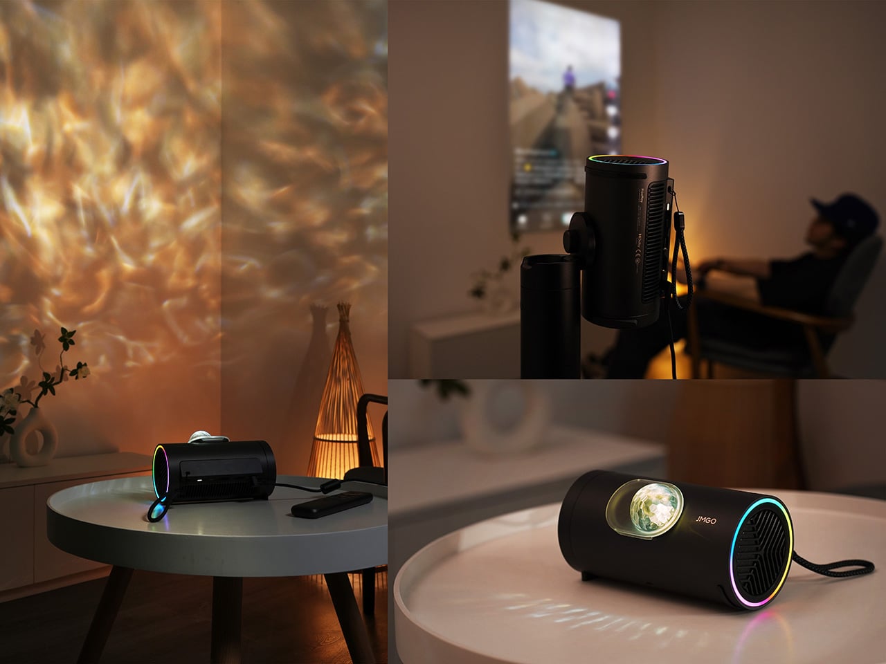
Gaming displays speak in hertz and milliseconds, while most projectors still talk like it’s Blu-ray season. AWOL Vision’s Aetherion series tries to bridge that gap with something ultra-short-throws have simply never had: true Variable Refresh Rate. It negotiates frame timing from 0.1Hz up to 240Hz, syncing its output to whatever your console or PC is throwing at it. Paired with Auto Low Latency Mode and a claimed 1ms-class response, this is a projector that stands as a legitimate contender to high-end gaming monitors, not just a living room appliance for Netflix and chilling.
The rest of the stack backs that ambition. Dolby Vision Gaming support pushes scene-by-scene tone mapping, while an RGB triple-laser light engine and anti-RBE system tackle motion and color artifacts that usually show up the moment you swing a camera in a fast-paced title. Under the hood, a MT9655 chipset with 8 GB of RAM and 2.5G Ethernet handling 1000 Mbps throughput signals that this is not a token “game mode” toggle. It is an attempt to make the projector a first-class citizen in the modern gaming ecosystem.
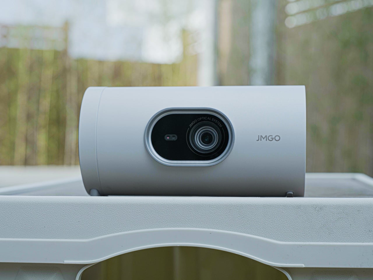
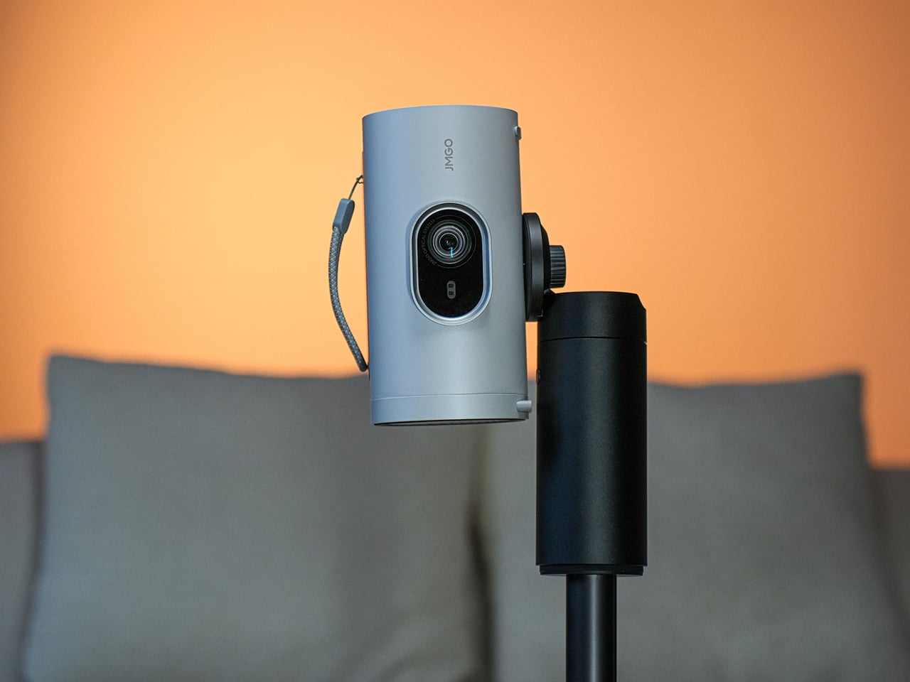
Designer: AWOL Vision Aetherion
Click Here to Buy Now: $1999 $3499 ($1500 off). Hurry, only 223/300 off! Raised over $13.2 million!
![]()
This whole approach feels like a direct response to years of compromise. For too long, you had to choose: the immersive scale of a projector or the responsive precision of a gaming monitor. Aetherion’s spec sheet suggests that choice is becoming obsolete. The VRR implementation alone is a statement, acknowledging that game frame rates are not a static 60fps target anymore. They dip, they spike, and a display that cannot follow that cadence will produce tearing and judder. By building a system that can track that chaotic dance, AWOL is demonstrating a fundamental understanding of what interactive content actually demands from a display.

The underlying hardware seems robust enough to support these claims. The MT9655 is a capable flagship SoC, and pairing it with 8GB of RAM is generous for a projector. That 2.5G Ethernet port is another one of those quiet tells; it signals an understanding that streaming high-bitrate 4K content, or cloud gaming, requires serious bandwidth that standard 100Mbps ports just cannot handle reliably. This is future-proofing, but it is also a practical necessity for the kind of high-performance use cases Aetherion is built for. The entire platform is engineered to remove bottlenecks between the source and the screen.

Of course, a fast projector with poor color is just a fast way to see a bad image. That is where the triple-laser RGB light engine comes in. By ditching the spinning color wheel found in most DLP projectors, AWOL hit an impressive 110% of the Rec. 2020 color gamut, delivering the kind of vivid, saturated colors that single-laser systems struggle to reproduce. To push the boundaries of visual performance, Aetherion adopts the company’s proprietary Anti-RBE (Rainbow Effect) technology, eliminating the rainbow effect that distracts many viewers during fast motion. Their anti-RBE technology claims to cut these artifacts by 99.99% in both 2D and 3D content.

That obsession with image fidelity extends to how the Aetherion handles darkness. Instead of just blasting lumens, the projector uses a 7-level mechanical IRIS to achieve a 6000:1 native contrast ratio. Its proprietary EBL algorithm analyzes every single frame in real time, tweaking the laser output and image parameters to deepen blacks and pull out shadow detail, boosting the contrast ratio to 60,000:1. This dynamic, scene-adaptive approach is far more sophisticated than a simple brightness setting. It is the difference between a flat, washed-out night scene and one with genuine depth and texture.

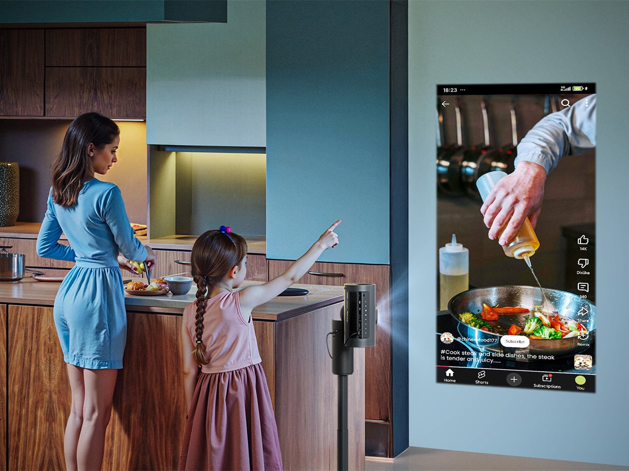
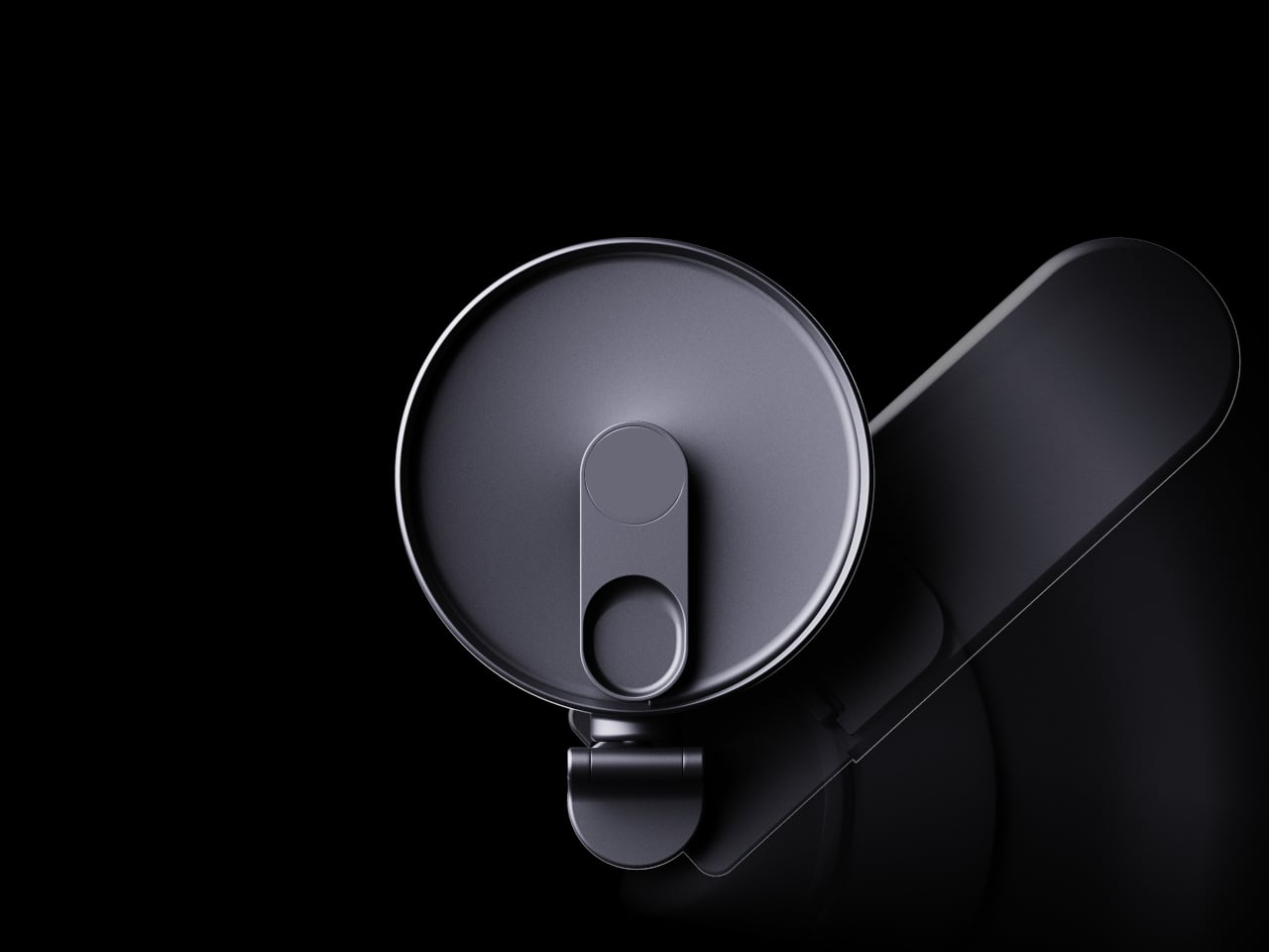
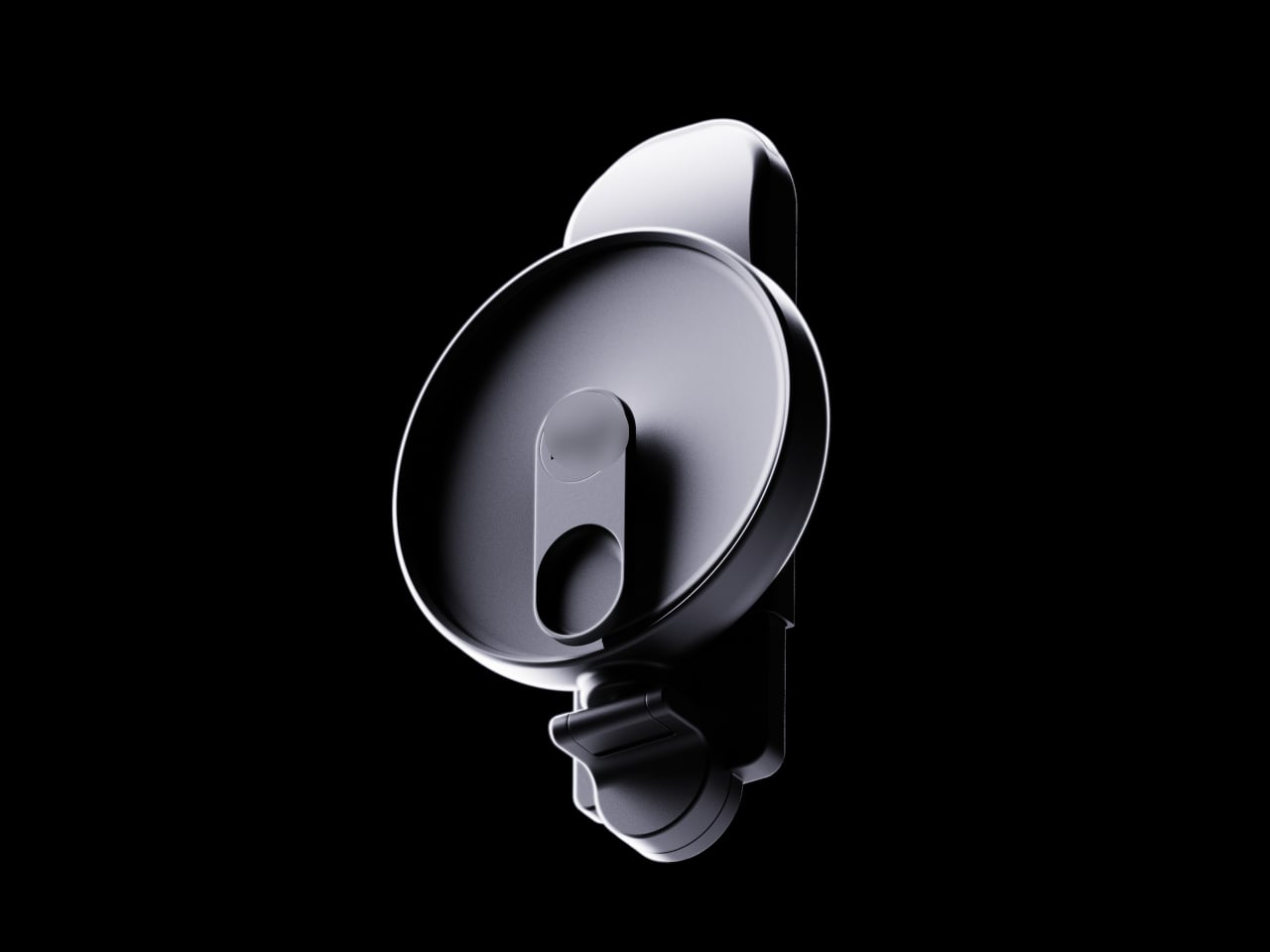
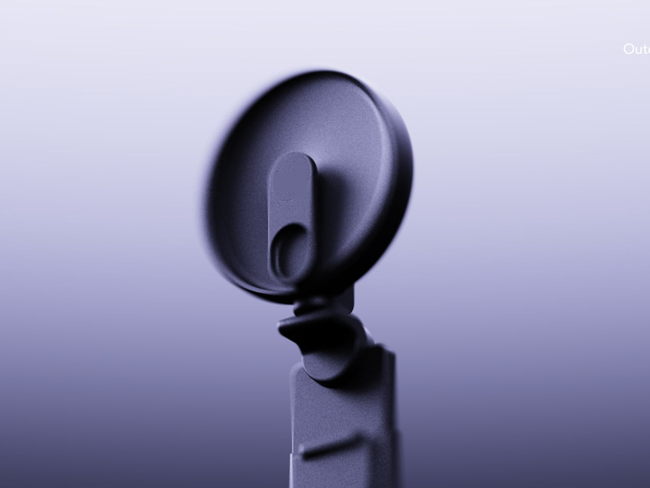
From a user experience perspective, running on Google Android TV 14.0 is a significant and welcome choice. It brings a 4K user interface and broad app support without needing an external streaming stick. The integration with Apple HomeKit, Google Home, and Alexa ecosystems also positions the Aetherion as a proper smart home device, not just an isolated piece of AV hardware. Little touches, like the motorized lens cover that protects the optics from dust, show a thoughtful approach to the daily realities of owning a high-end piece of equipment.

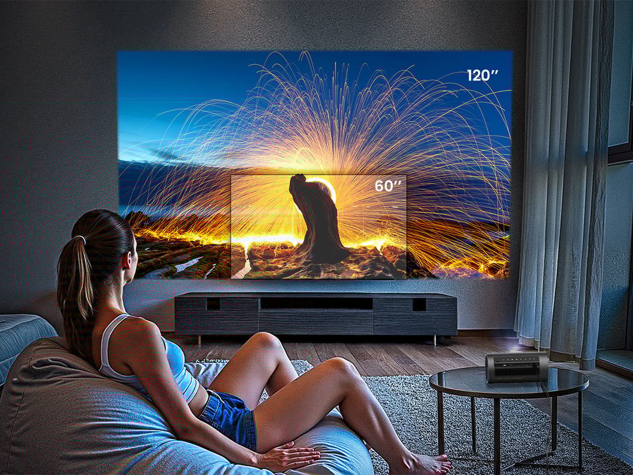
AWOL is also building out the world around the projector, offering a curated ecosystem to support their tech. The launch includes a new 150-inch Fresnel Daylight ALR screen, a seamless one-piece design with a 1.5 gain for brighter images in ambient light. There is also a redesigned Vanish Cabinet made with stainless steel and leather, featuring integrated cooling fans and a hidden bay for a soundbar. This ecosystem approach recognizes that a projector’s performance is heavily dependent on the screen and its placement, offering a complete, aesthetically coherent solution.
![]()
The Aetherion is available in two versions on its Kickstarter campaign. The Aetherion Pro offers 2,600 ISO lumens, while the Aetherion Max boosts that to 3,300 ISO lumens for rooms with more ambient light; both share the same 6000:1 contrast ratio and core technologies. Super Early Bird pricing puts the Pro at $1,999 and the Max at $2,199, which is a substantial 42-51% discount from their eventual MSRPs. If you’re committed to the entire kit, $3,999 gets you the Ultimate Cinematic Immersion Bundle, which includes the Max projector along with a 132″ cinematic ALR screen, and a 4.1.2 ThunderBeat audio system to give the projector its audio oomph. Each projector ships globally with a 2-year hassle-free warranty starting April 2026.
Click Here to Buy Now: $1999 $3499 ($1500 off). Hurry, only 223/300 off! Raised over $13.2 million!
The post 200-Inch Dolby Vision Gaming With 1ms Latency: Inside The Aetherion 4K RGB Laser UST Projector first appeared on Yanko Design.