
Apple hikes prices for most of its hardware
Macs, MacBooks, iPads and other Apple products just got more expensive.

Fighting game hardware has become its own obsession. Serious players spend as much time agonizing over their controller choice as they do drilling combos, and the debate between joystick traditionalists and leverless converts shows no sign of cooling down. The leverless controller strips the directional stick out entirely, replacing it with buttons for movement, a setup many top competitors swear produces faster and more precise inputs.
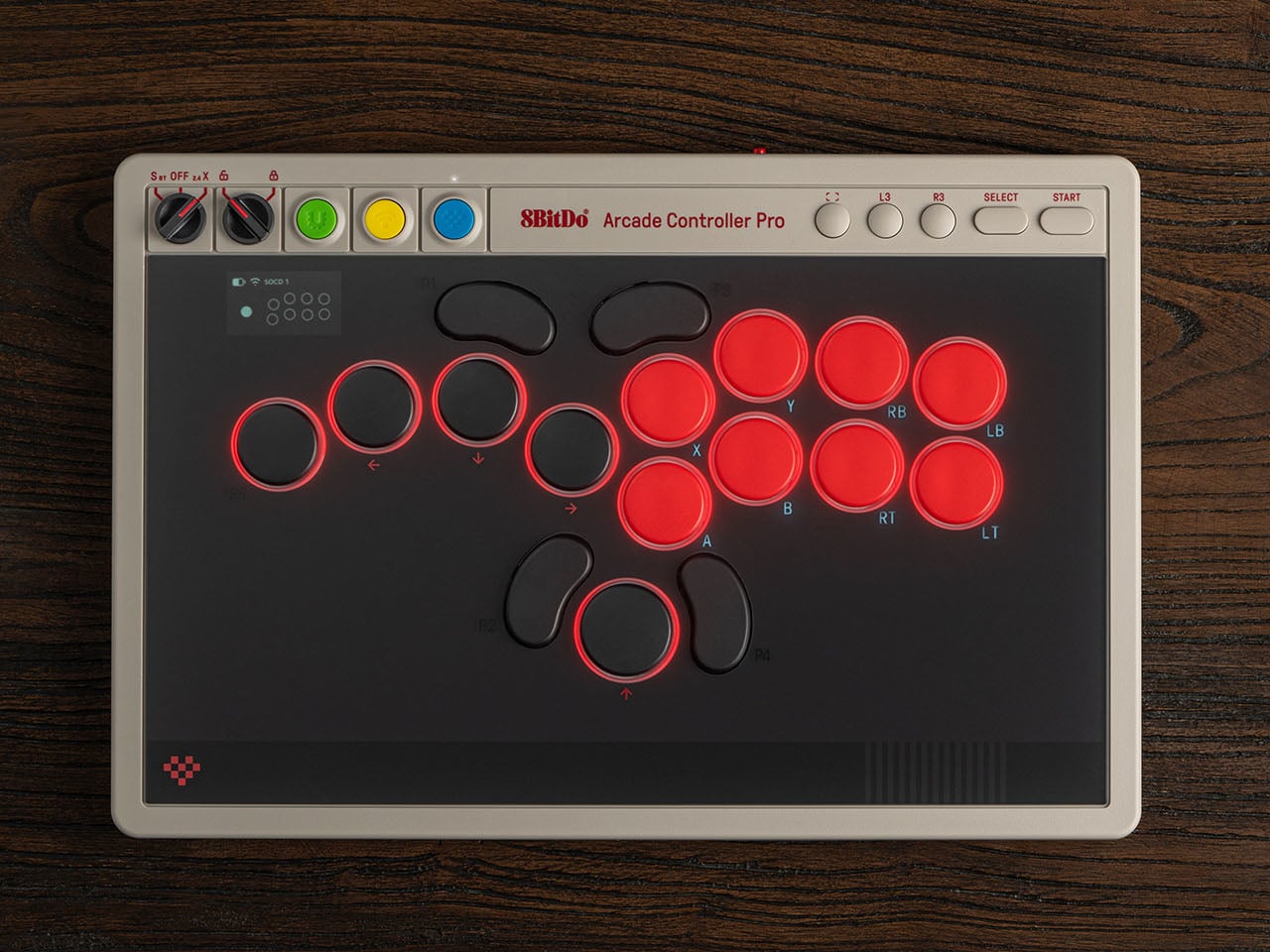
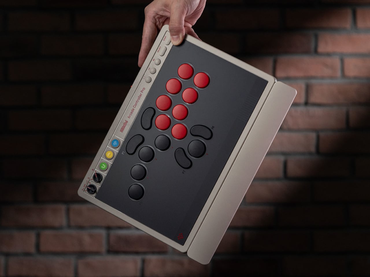
8BitDo released its first leverless arcade controller last year and now follows it up with the Arcade Controller Pro, a more performance-focused update aimed at the serious end of the market. The changes aren’t radical but they’re meaningful, touching everything from the button layout to how you manage settings mid-match. It’s a controller that doesn’t try to appeal to everyone, and that’s precisely the point.
Designer: 8BitDo


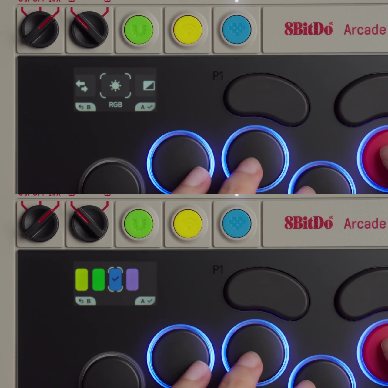
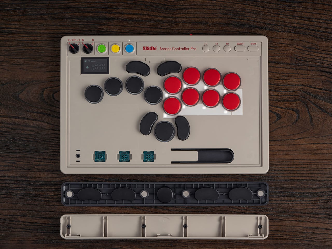
The button layout has been reworked with smaller, more tightly spaced caps that keep everything within natural reach. The programmable button count goes from four to five, with the fifth positioned on the far left to give the left hand more freedom during long sessions. Each round cap installs from any angle, and five flat lock caps come included to cover programmable buttons that shouldn’t be hit mid-match.
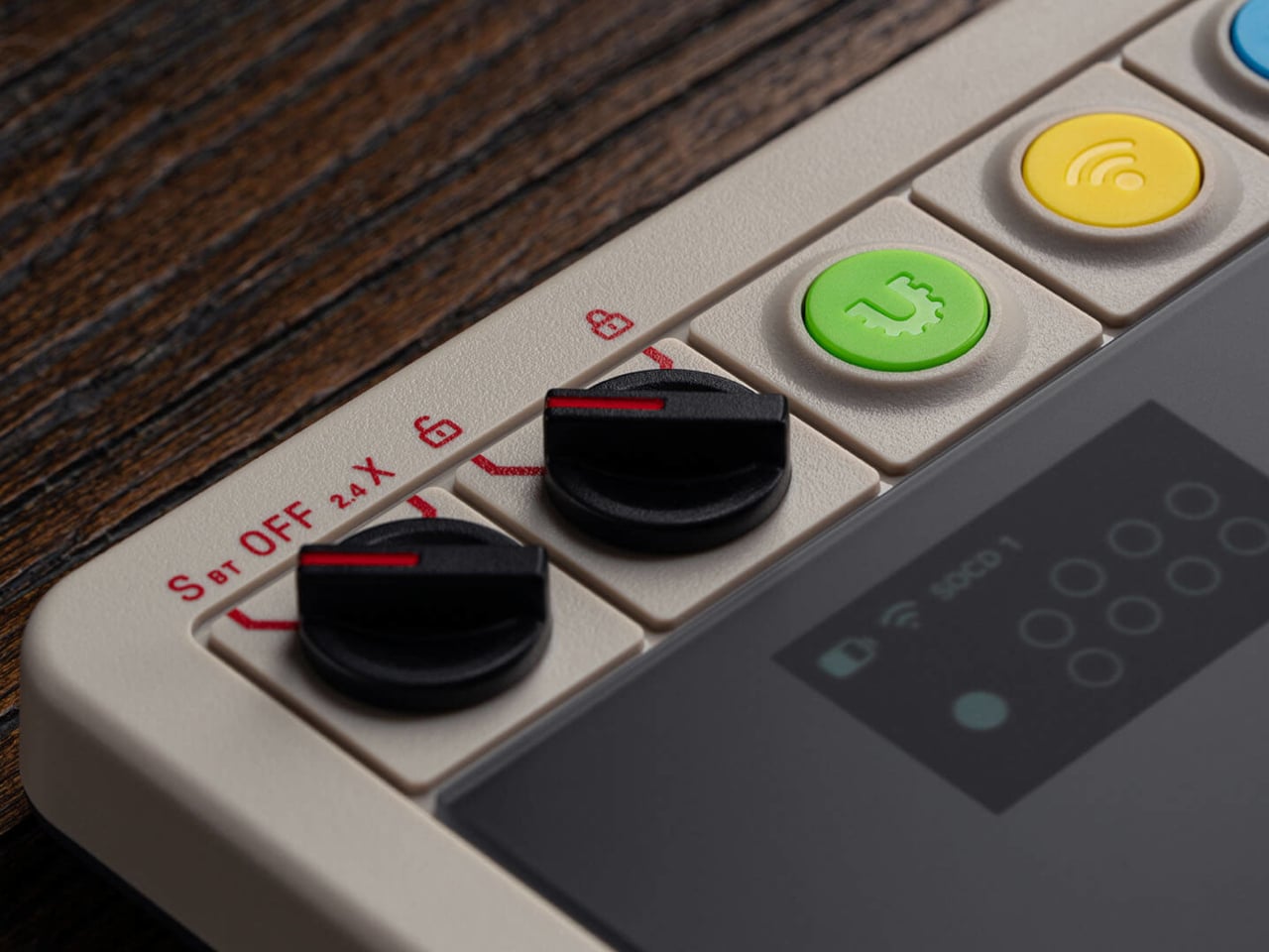
The most notable addition is the 1.47-inch display built into the controller body. It shows your inputs in real time and tracks battery status, but it also lets you adjust settings on-device without opening a companion app. SOCD modes, RGB lighting, and button remapping are all accessible through the screen, so you can make adjustments between rounds rather than leaving your setup to dig through software.
The switches are 8BitDo Core Green low-profile linear mechanicals, co-developed with Kailh specifically for this controller. They’re hot-swappable, and three spare switches, along with a switch puller, are stored inside the controller itself, accessible by lifting the front glass panel. That same interior also houses the accessories compartment that comes with the magnetic wrist rest, which attaches to the front of the unit.
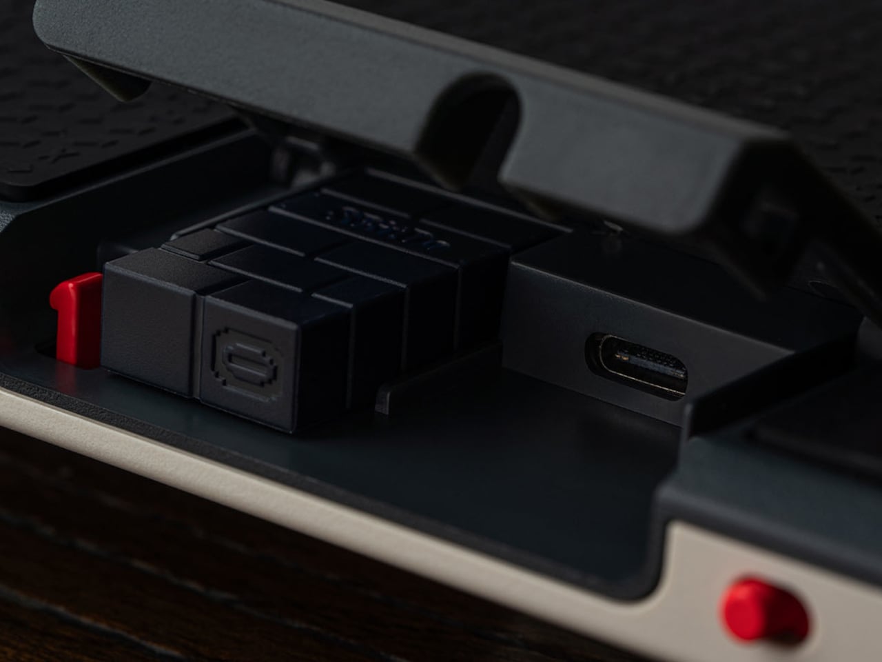
For competitive play, the controller covers the details that matter most in high-pressure moments. A tournament lock on the control panel prevents accidental inputs during a match, and a metal USB-C cable locking mechanism keeps the connection secure so it can’t pull loose mid-fight. Dual USB-C ports, one on the top and one on the side, let you route the cable in whichever direction keeps it out of the way.
Connectivity covers Bluetooth for Nintendo Switch and Switch 2, 2.4GHz wireless for Windows, and a wired USB-C option for both. The 3,000 mAh battery lasts approximately 15 hours with RGB turned off. For players who want to go further than the on-device display allows, 8BitDo Ultimate Software V2 opens up full button mapping and macro creation for an even more personalized setup.
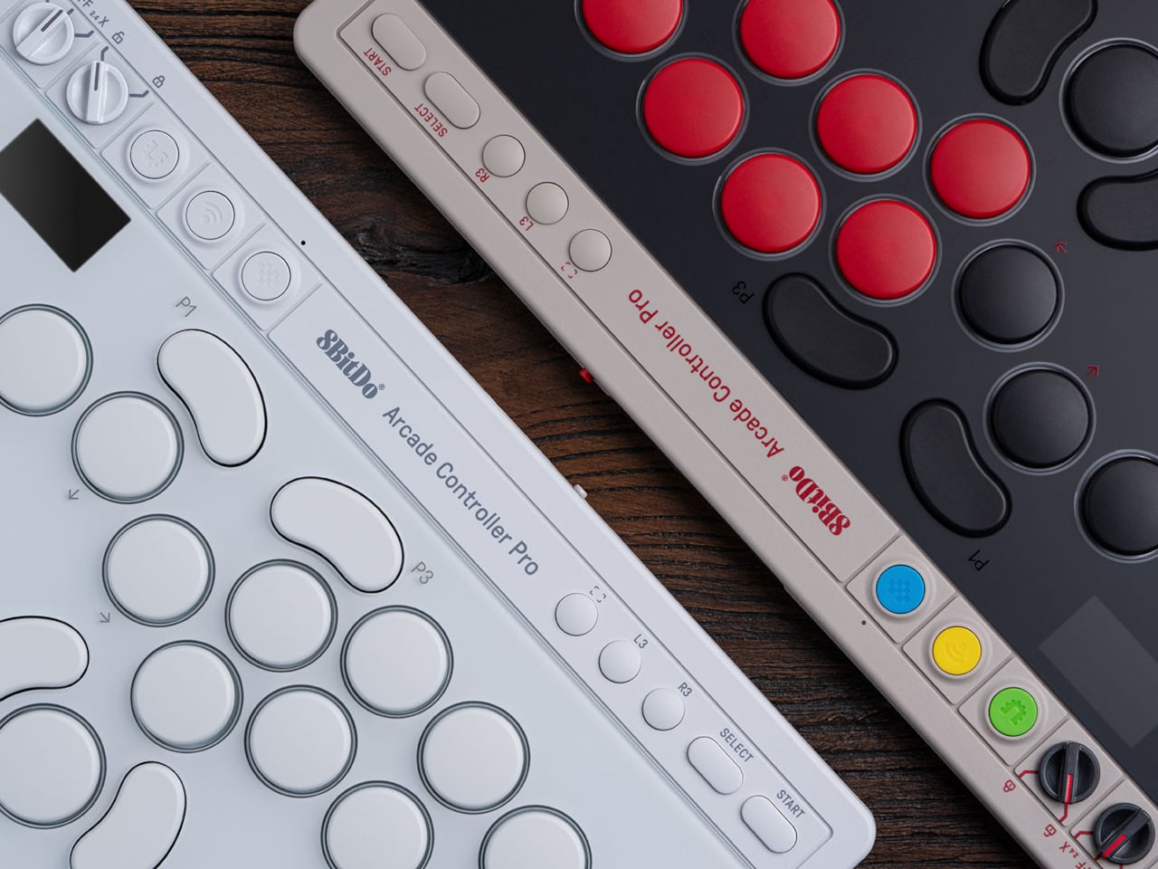

The Arcade Controller Pro is available in a NES-inspired colorway as well as a clean white edition, with a fingerprint-proof tempered glass faceplate and a non-slip silicone underside. A price and release date are yet to be announced. The original Arcade Controller was already a strong entry point into the leverless format, but this Pro model has clearly shifted its sights toward players who already know exactly what they want from a fight pad.
The post 8BitDo’s Pro Fight Pad Has a Screen That Replaces the Companion App first appeared on Yanko Design.
Samsung has once again pushed the boundaries of smartphone innovation with the Galaxy S27 Pro, introducing a new built-in privacy display powered by Flex Magic Pixel technology. This advanced feature enhances screen privacy without compromising display quality, providing a seamless solution for users who prioritize security in their daily lives. Positioned strategically between the Plus […]
The post Move Over Ultra: Why the New Samsung Galaxy S27 Pro Is Samsung’s Real Flagship for 2027 appeared first on Geeky Gadgets.
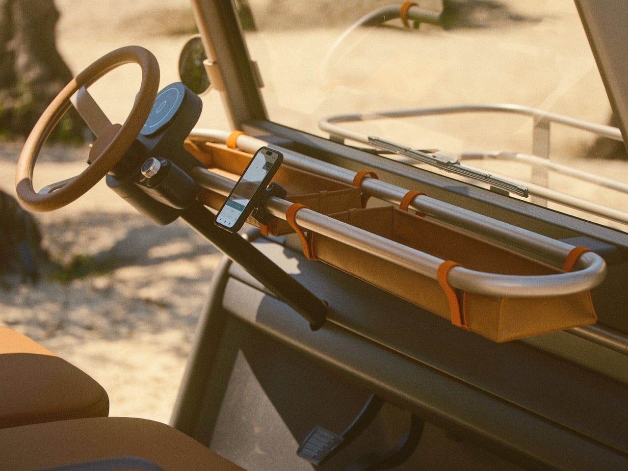
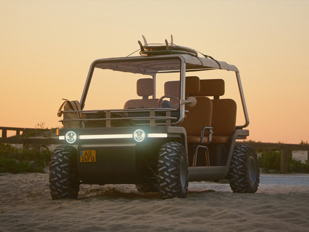
Apple spent somewhere north of ten billion dollars and nearly a decade trying to build a car. The project, codenamed Titan, employed hundreds of engineers and designers, quietly consumed some of the sharpest automotive minds in the world, and was ultimately cancelled in 2024 without a single vehicle reaching the public. Julian Hoenig was inside that room. As lead designer on Apple Watch and Vision Pro, and a key contributor to the Apple Car programme, he spent years thinking about what a vehicle designed with Apple’s obsessive material intelligence and formal restraint could look like. Then Titan died, and Hoenig went and built one anyway.
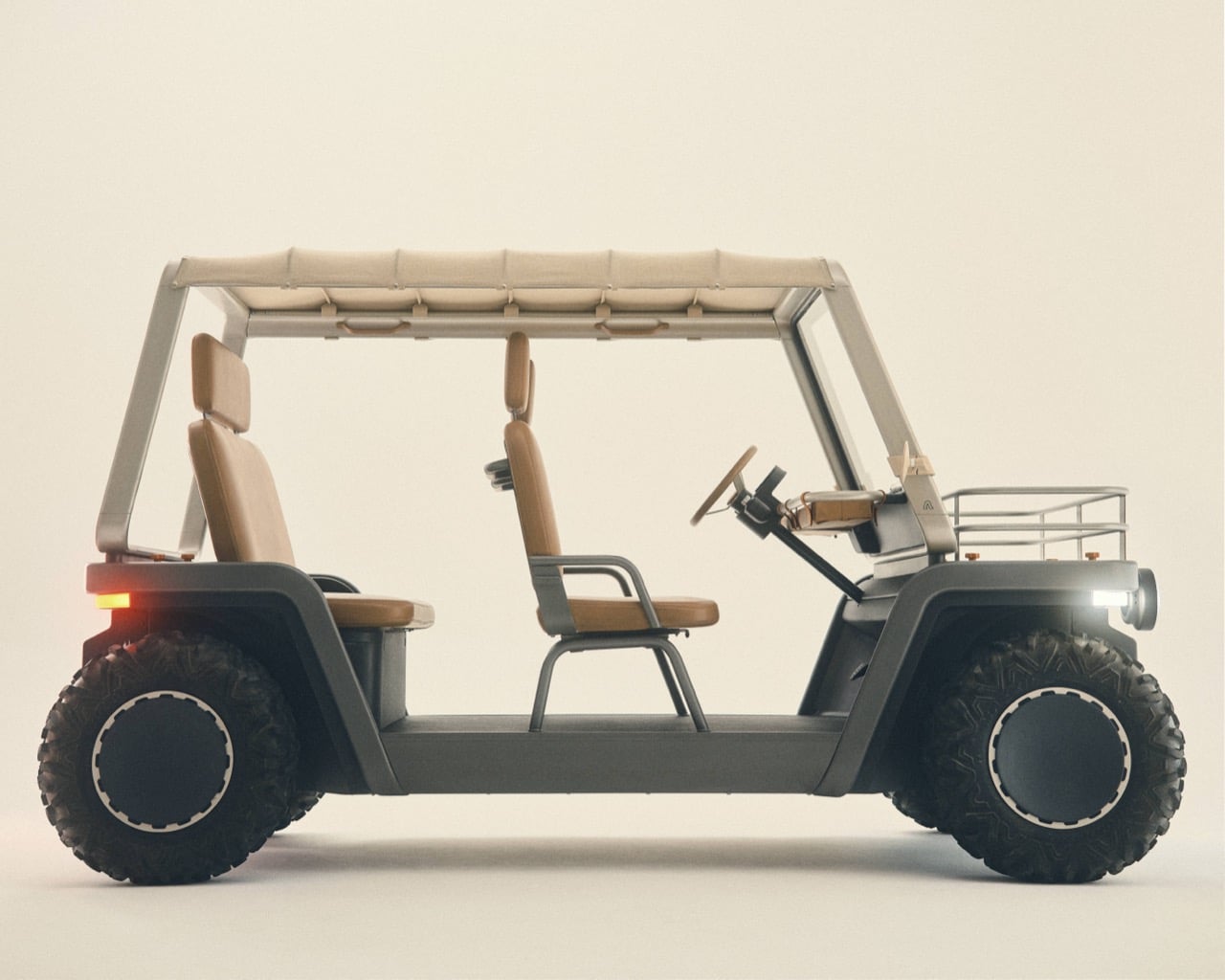
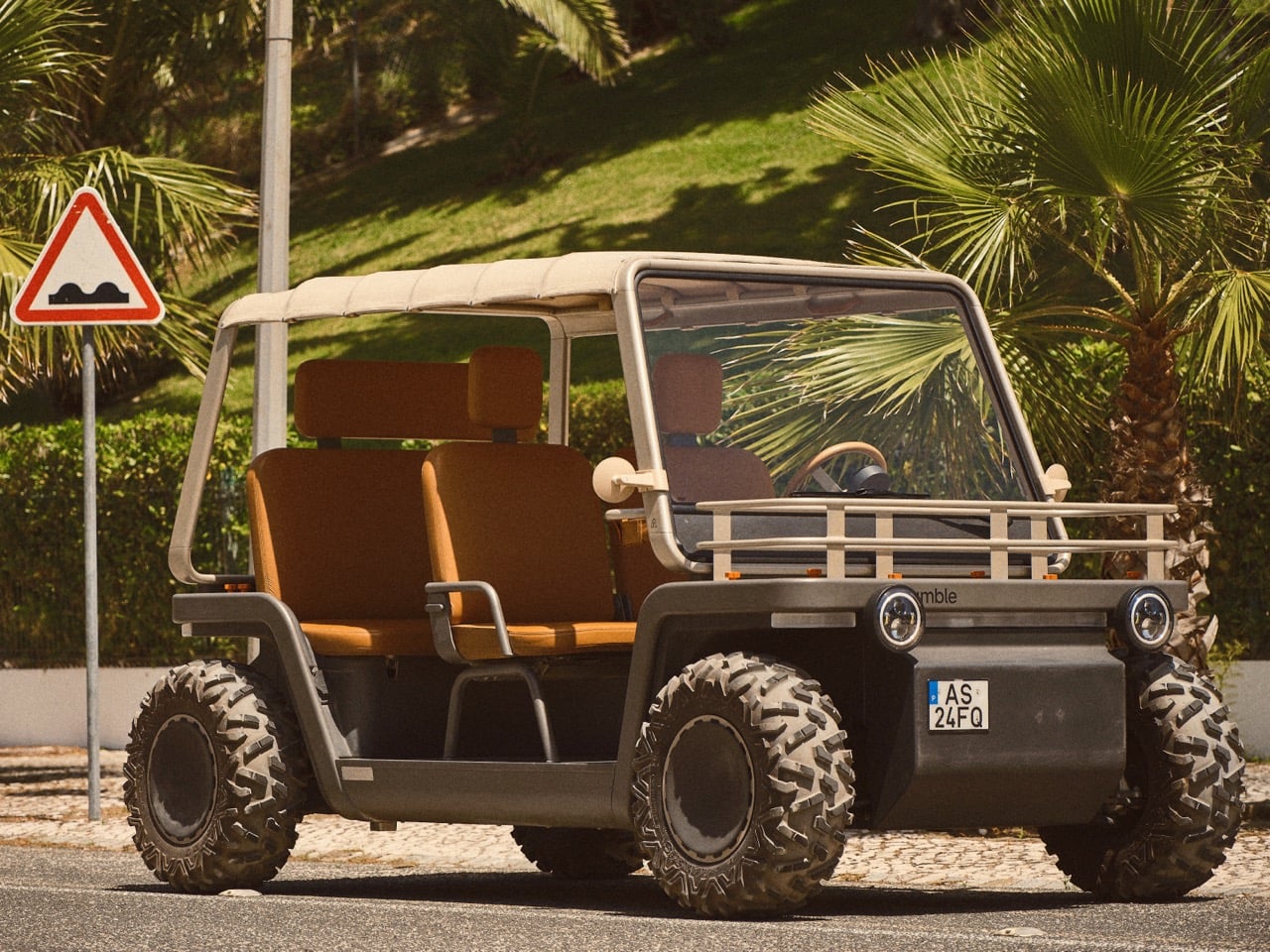
The vehicle he built looks nothing like what Apple would have made. The Amble One is a doorless, screenless, open electric buggy that tops out at 65 kph, weighs 450 kilograms, and is made from aluminum, leather, cotton, and cork. Co-founded with forpeople’s Michael Tropper, Cowboy’s Adrien Roose, and Portuguese hospitality entrepreneur José António Uva, Amble launches today out of Lisbon with a starting price of €20,000 and a waiting list at properties like Amangiri and Six Senses. The design thesis is almost aggressively simple: slow down, open up, and let the place you’re moving through actually reach you.
Designers: Julian Hoenig, Michael Tropper / Amble
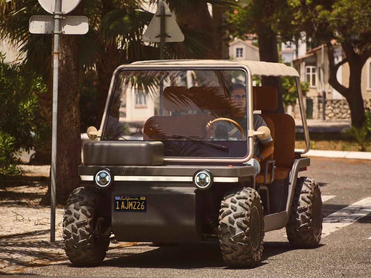
The Amble One sits in a gap in the vehicle landscape that nobody has bothered to properly design for. Golf carts are utilitarian objects engineered for a golf course, not a 780-hectare Alentejo estate. Microcars are city tools dressed up with doors and dashboards. E-bikes put you on two wheels and ask you to negotiate with traffic. The Amble One occupies the space between all three, at 3,200 mm long and 1,480 mm wide, compact enough for coastal paths and private estate roads, but four-wheeled and substantial enough to carry four people with 100 kilometers of range on its 11 kWh lithium-ion battery. The 15 kW motor runs on a 48-volt architecture and charges fully in 5.5 hours on a standard 220/230V supply, the kind of socket you’ll find in every hotel utility room in Europe. The 28-inch wheels and independent suspension are calibrated for the terrain between a manicured lawn and a dusty gravel road, which is precisely where this vehicle was designed to live.

Hoenig’s design philosophy on the Amble One reads as a direct inversion of everything the Apple Car programme represented. Project Titan, at its most ambitious, wanted to create a sealed, autonomous, software-defined pod where the vehicle itself became invisible in service of the passenger experience. Hoenig’s answer here strips the vehicle back to its irreducible minimum: no doors to close you in, no screens pulling your attention inward, no unnecessary separation between the people on board and the environment around them. The material palette of aluminum, leather, cotton, and cork was chosen with aging in mind, materials that develop patina and character rather than scratching and yellowing. Michael Tropper, who shaped the creative direction alongside Hoenig, describes the design as holistic, right down to the sounds the vehicle makes. That level of sensory intentionality is familiar territory for anyone who has watched Apple obsess over the click of a button or the grain of a glass surface.
It would be reductive to frame the Amble One purely as Hoenig’s Apple detox, because the founding team around him brings its own formidable design intelligence to the project. Tropper built forpeople into a 120-person agency behind some of the most considered industrial design work of the last decade, including work for NIO, Arc’teryx, and Herman Miller. Adrien Roose took Cowboy from a Belgian startup to one of Europe’s most design-literate electric bike companies, backed by Index Ventures, by applying consumer electronics thinking to a product category that had been stuck in sporting goods logic for decades. José António Uva spent 14 years restoring São Lourenço do Barrocal, transforming a 780-hectare Alentejo family estate into one of Europe’s most celebrated rural retreats, which means he understands, at a granular level, the kind of journeys the Amble One was built for. The investors backing the company, including Peter Rive of SolarCity and Joe Zadeh, former VP Product at Airbnb, suggest the ambition here extends well beyond a niche hospitality toy.


The comparison that everyone’s bound to make, especially given the timing, is with the Ferrari Luce, which debuted last month and represents the other answer to the question of what former Apple designers do with a vehicle brief. Jony Ive and Marc Newson’s LoveFrom studio shaped the Luce’s exterior and interior, with a design language built around a smooth, continuous, shell-like form and floating front and rear aerodynamic wings. The interior features precision-engineered mechanical buttons, dials, toggles, and switches combined with multifunctional digital displays, and the steering wheel is machined from 100% recycled aluminum. Four electric motors produce up to 1,035 horsepower from a 122 kWh battery, and the car starts at €550,000. Ive’s answer to the post-Apple-Car question is a sealed, 310 kph glass house wrapped in aerodynamic sculpture and priced at a level that makes it purely aspirational. Hoenig’s answer is a 65 kph open buggy in cork and cotton that costs €20,000 and is designed to be driven slowly through somewhere beautiful. Both men drew on the same decade of Apple material obsession and arrived at completely opposite conclusions, which tells you something interesting about what each of them actually took away from Cupertino.

The initial 2027 production run is allocated entirely to leading destinations, with interest confirmed from Amangiri in Canyon Point, Mustique Island, Six Senses Les Bordes in the Loire Valley, and Uva’s own Na Praia in Comporta. These are properties where every guest touchpoint is considered at the same level of intensity that Hoenig would apply to a product surface, which makes the Amble One a natural fit. A golf cart parked outside a Six Senses villa is a minor embarrassment. An Amble One parked there makes a statement about the property’s design values. The consumer-facing 2028 waitlist opens the vehicle to private buyers in Europe and the United States at the same €20,000 / $25,000 price point, which positions it as an accessible second vehicle for a coastal house, a rural property, or a private estate, the kind of context where 100 km of range and a 65 kph top speed are exactly what you need.

The bigger play, the one that makes Amble worth watching beyond the launch story, is that the One is explicitly described as the first expression of a broader platform, with future vehicles planned for more urban environments and new use cases. The Moon Buggy influence Hoenig and Tropper cite is instructive: that 1971 vehicle was purpose-built for a specific terrain and a specific pace, and its design was completely liberated by accepting those constraints rather than fighting them. The Amble One accepts the same bargain, building an entire design philosophy around slowness, openness, and context-specificity rather than chasing the metrics that mainstream automotive culture prizes. Whether that philosophy scales beyond hospitality estates and private communities into something more broadly relevant is the question the next few vehicles will have to answer. For now, the One makes a quietly compelling case that the most interesting vehicle to emerge from the wreckage of the Apple Car programme might be the one that wanted least to be a car.
The post Another Ex-Apple Designer Made An Electric Vehicle (And No, It’s Not The Ferrari Luce) first appeared on Yanko Design.

Apple is preparing to unveil the iPhone Air 2 in spring 2027, a device that promises to blend innovation with refinement. This next-generation ultra-thin smartphone builds upon the foundation of its predecessor, introducing substantial improvements in battery life, camera technology, and processing power. By addressing user feedback while maintaining the sleek, minimalist design that defines […]
The post Apple’s iPhone Air 2 Leaks Reveal 3 Massive Upgrades We’ve All Been Waiting For appeared first on Geeky Gadgets.
Google’s latest update to its AI ecosystem, Antigravity 2.0, introduces a modular architecture that separates its features into two distinct applications: a VS Code-inspired Integrated Development Environment (IDE) and a chat-based agent interface. This shift is designed to cater to specialized workflows, offering enhanced customization and productivity. One standout feature is the inclusion of dynamic […]
The post Why Google Just Split Antigravity 2.0 Into Two Separate Apps appeared first on Geeky Gadgets.

Large language models (LLMs) are being deployed in areas where their decisions can have significant consequences, including healthcare, finance and robotics. AI Grid highlights a critical issue: many LLMs lack comprehensive “world models,” which are necessary for anticipating the outcomes of their actions. For instance, a robotic system without such predictive capabilities might fail to […]
The post Action Blindness is the Dangerous New Flaw Plaguing AI LLM Models appeared first on Geeky Gadgets.

The Galaxy Z Fold 8 series is poised to redefine the foldable phone market, offering significant advancements in durability, performance, and design. If you are considering an upgrade, understanding its standout features, pricing, and market positioning will help you make an informed decision. With Apple’s iPhone Fold delayed until 2027, Samsung has a unique opportunity […]
The post What Samsung Isn’t Telling You About the Galaxy Z Fold 8 appeared first on Geeky Gadgets.