2025 Volkswagen Golf GTI Review: Car of the Year


PROS:


  • Exceptionally balanced chassis favors control over spectacle

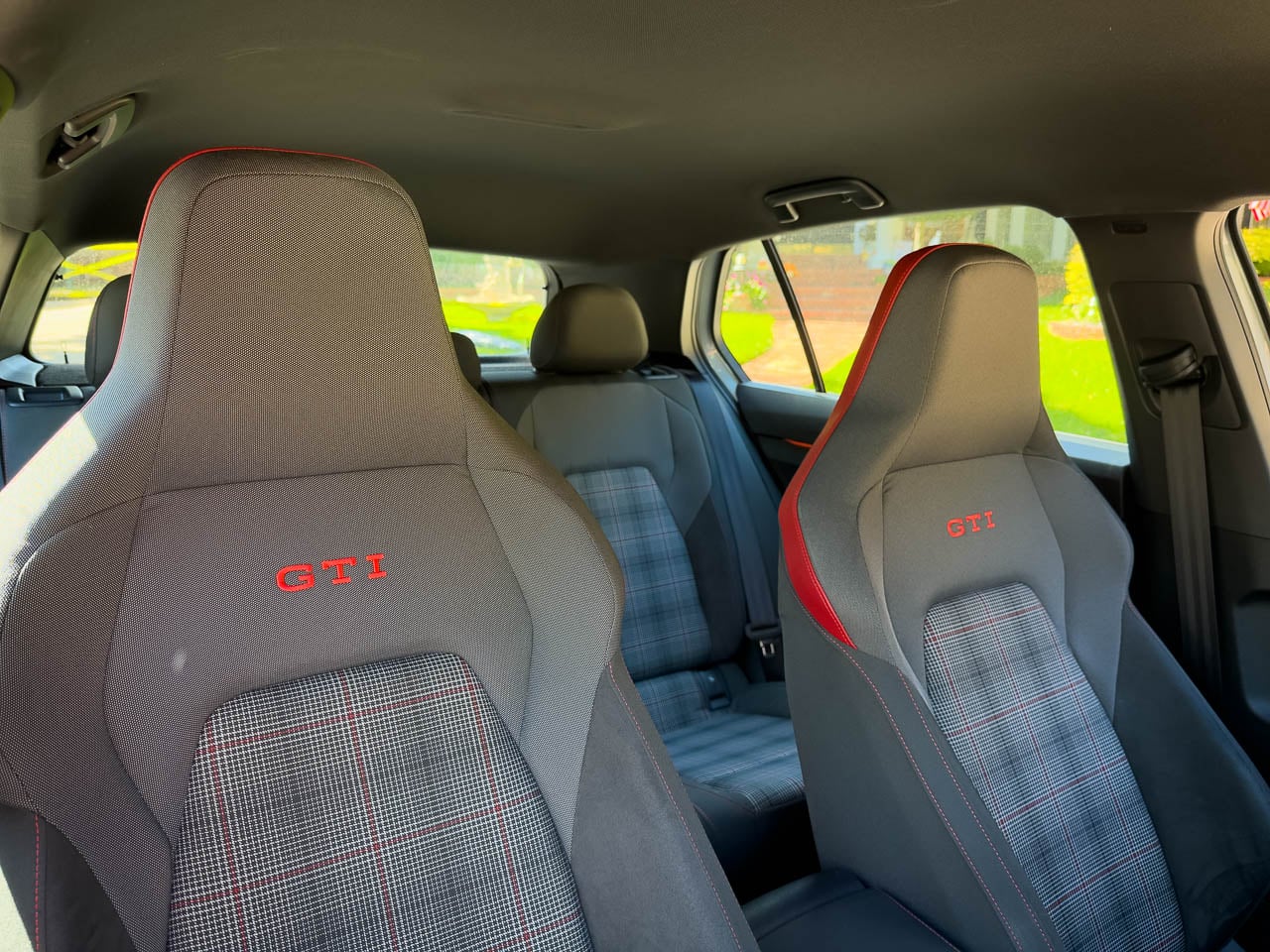
  • Clark Plaid seating blends comfort, grip, and heritage

  • Torque rich powerband rewards real world driving

  • Daily usability achieved without sacrificing design intent

  • Restraint driven design feels complete and confident

CONS:


  • Touch sensitive controls reduce tactile certainty

  • Front wheel drive limits ultimate track theatrics

RATINGS:

AESTHETICS
ERGONOMICS
PERFORMANCE
SUSTAINABILITY / REPAIRABILITY
VALUE FOR MONEY

EDITOR'S QUOTE:

The GTI wins not by doing more, but by knowing when to stop.

award-icon

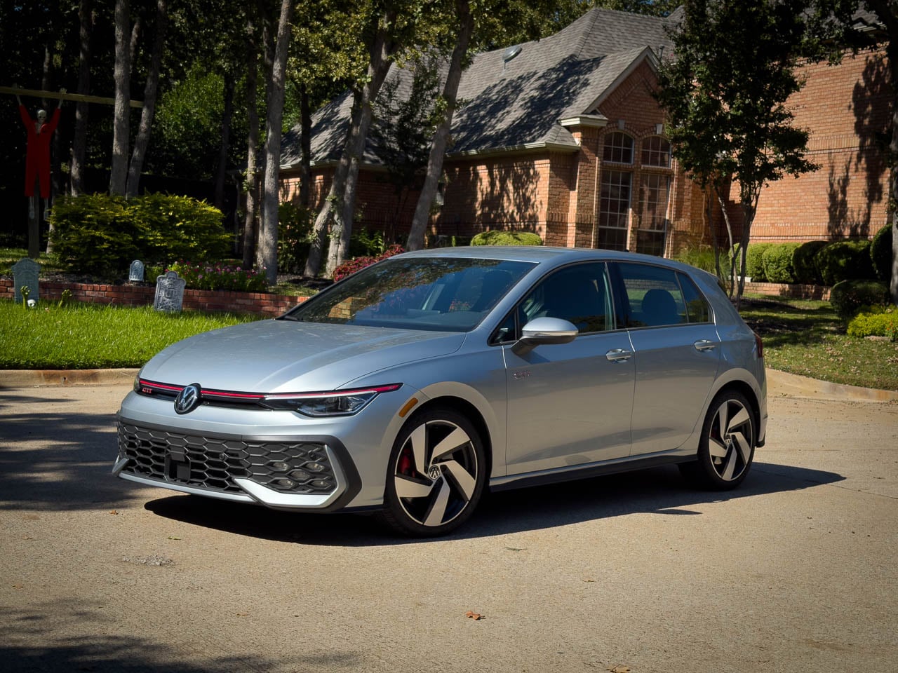
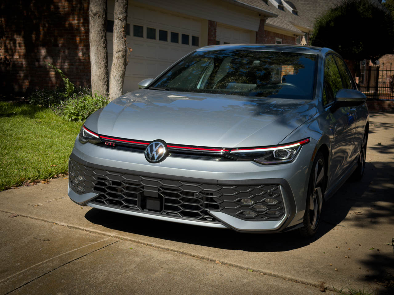
Forty years into its production run, the Volkswagen Golf GTI faces a question most performance cars never survive long enough to answer: what happens when the formula is complete? The 2025 model responds not with reinvention but with refinement so deliberate it borders on philosophical. Look at the grille: a single red line, unbroken, tracing the car’s width before disappearing into the headlight housings. No additional accent. No secondary flourish. That line is the thesis statement. Where competitors chase headline numbers and aggressive styling cues, the GTI presents something rarer in automotive design: the confidence to stop adding.
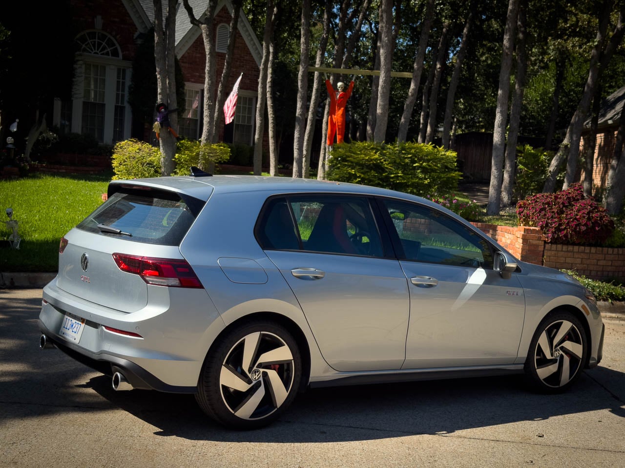
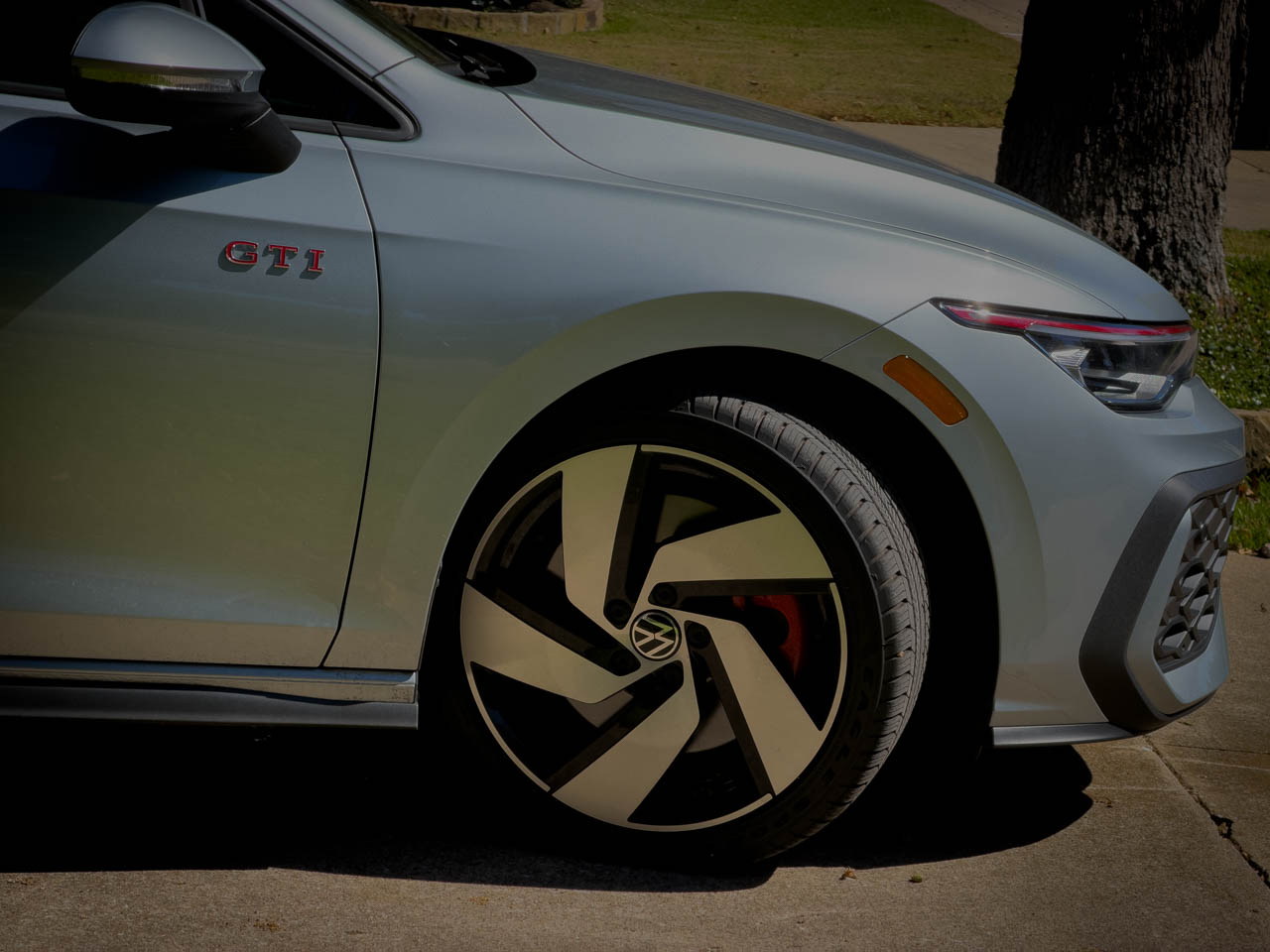
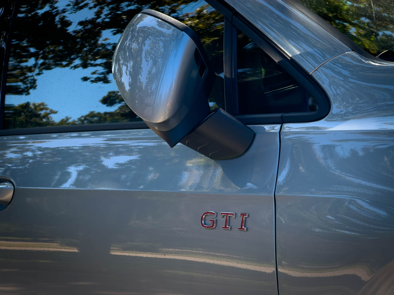
The exterior reads as studied understatement. Body lines remain clean, uninterrupted by vents or scoops that would suggest performance requiring constant explanation. The silhouette sits low without crouching, planted without posturing. In Alpine Silver Metallic, our test vehicle demonstrated how surface finish interacts with the car’s subtle curves, catching light across hood creases that reveal themselves gradually rather than announcing their presence.

Material Language

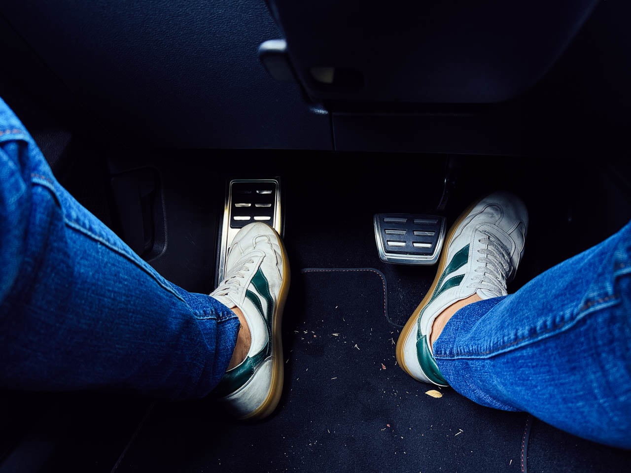
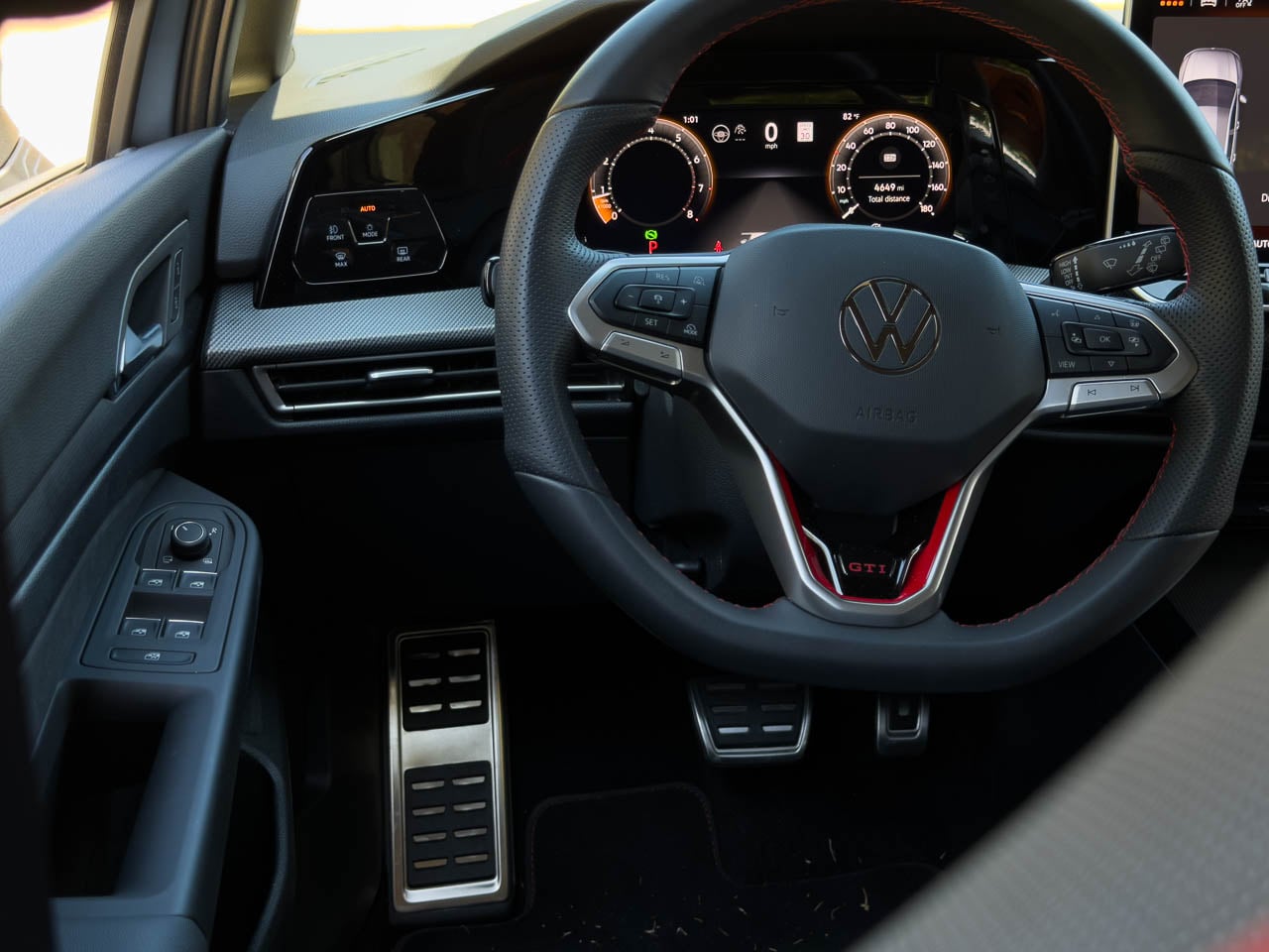
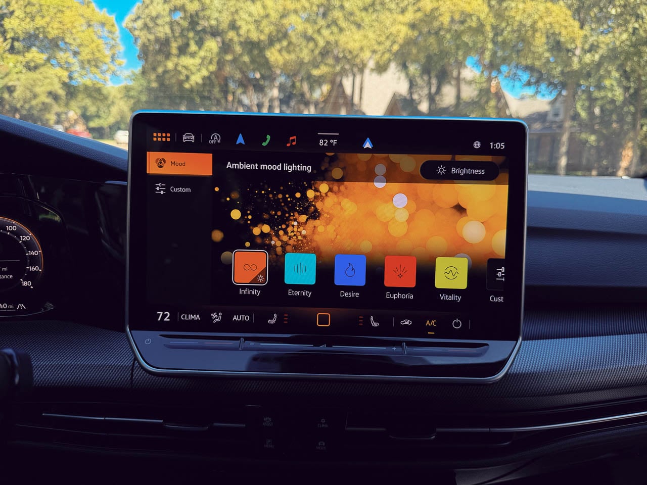
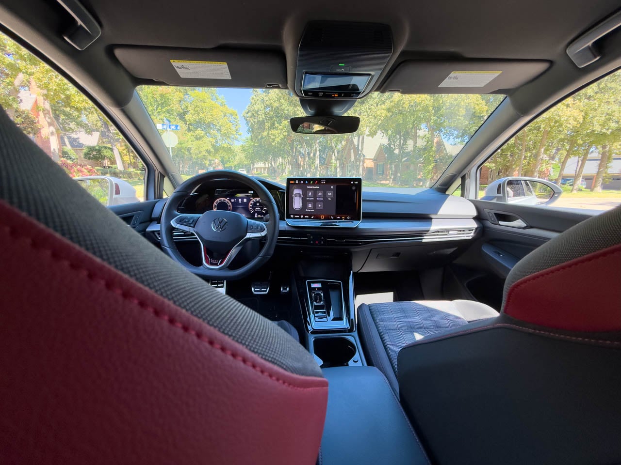
Inside, the cabin architecture prioritizes tactile hierarchy over visual spectacle. The flat-bottom steering wheel occupies the central position in this material conversation, wrapped in leather that wears smooth at the nine-and-three positions within the first few hundred miles of use. Stainless steel pedals catch light from the footwell, their brushed finish contrasting with the matte black plastic surrounds. Red ambient lighting threads through the dashboard at night, the only concession to interior theater.
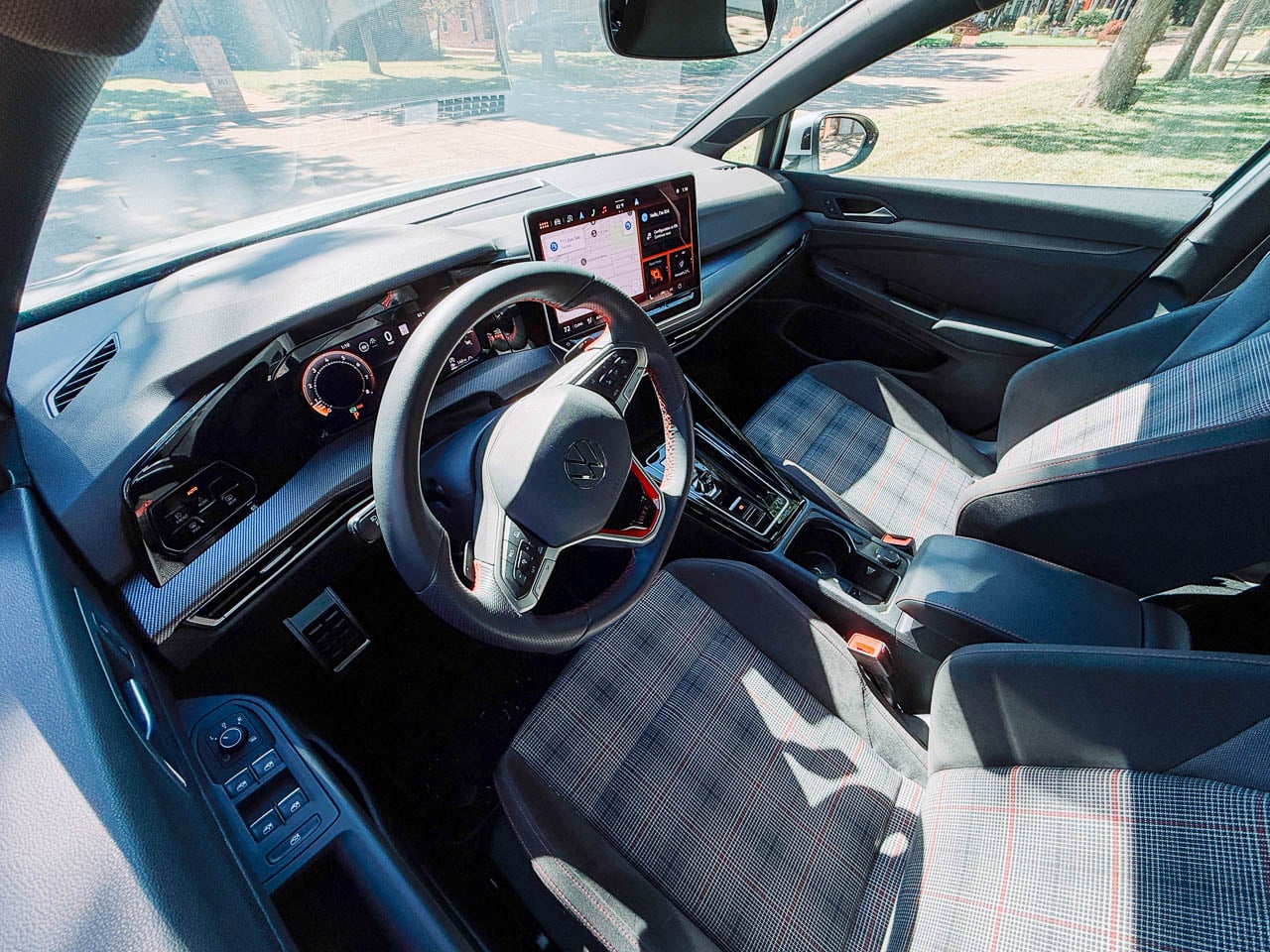
The Clark Plaid seats deserve separate consideration. This textile pattern has appeared in every GTI generation since 1976, and its persistence represents something beyond brand consistency. The weave itself tells a story about Volkswagen’s understanding of what performance seating actually requires: grip during lateral loading, breathability across temperature changes, durability that improves rather than degrades with use. Bolster foam density sits firmer than typical sport cloth, shaped to contain rather than squeeze the occupant. The fabric’s black and gray threads intersect at angles that catch cabin light differently depending on sun position, creating visual movement even when the car sits still. After a four-hour highway stint from Dallas to Austin, the seats demonstrated no pressure point fatigue, a claim many leather-wrapped alternatives cannot make. This is functional heritage, not nostalgia. The plaid works because the problem it solves has not changed.
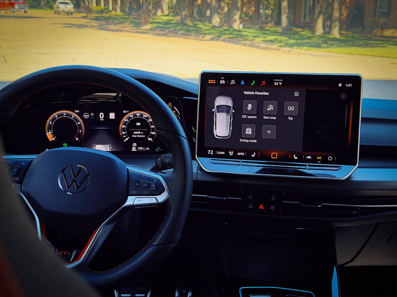
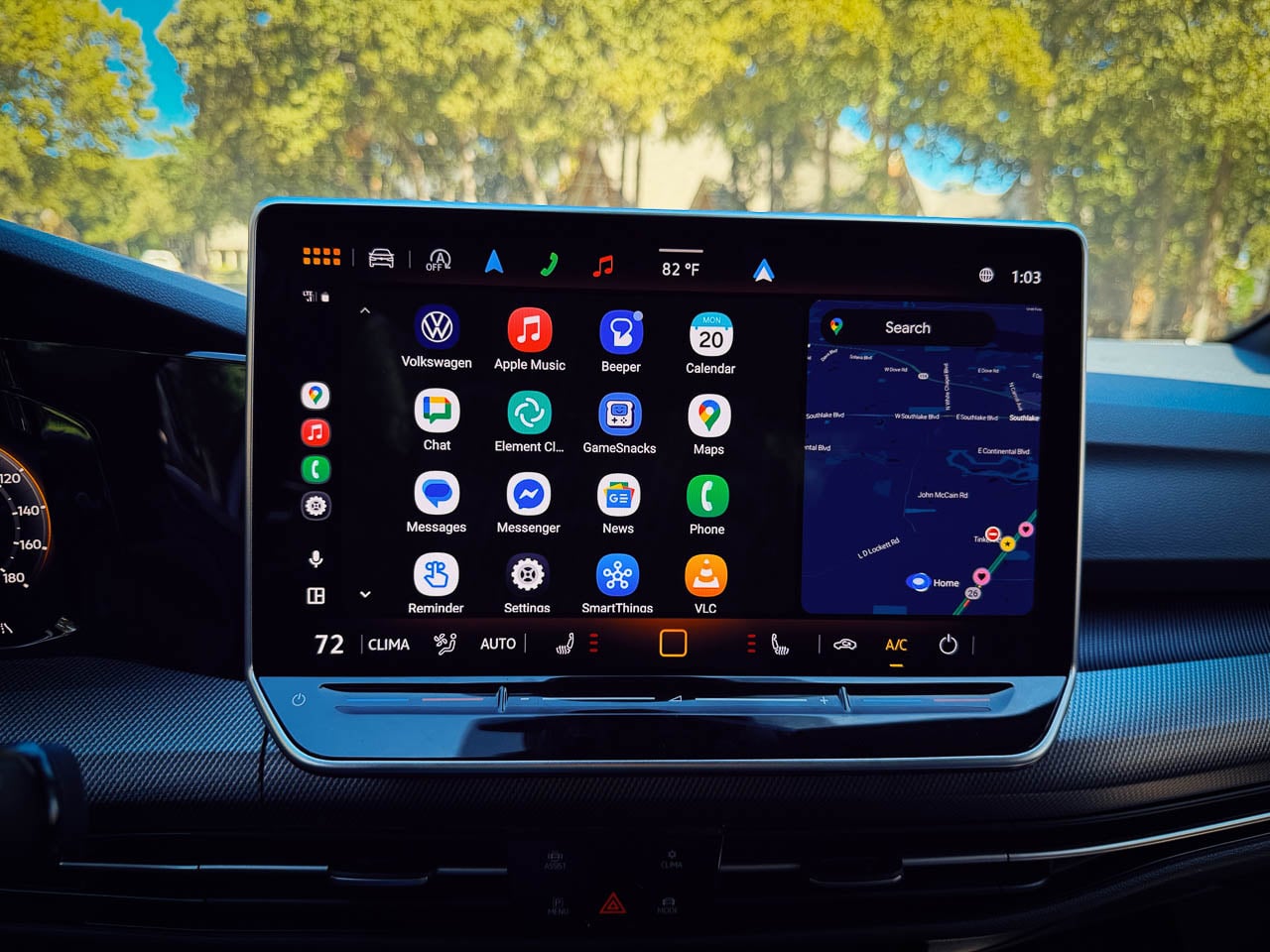
Dual 10.25-inch displays span the dashboard width, their bezels thin enough to suggest a single continuous surface interrupted only by the steering column. Touch-sensitive sliders for climate and volume occupy positions along the center console where physical controls once lived. This represents the GTI’s single visible concession to interface trends over tactile tradition, a trade that prioritizes visual continuity at a modest ergonomic cost. The adjustment period is real but brief.
Chassis Philosophy

The mechanical architecture beneath reveals Volkswagen’s approach to performance engineering. The 2.0-liter EA888 engine produces 241 horsepower and 273 pound-feet of torque, figures that appear conservative against current competition. These numbers obscure the delivery character. Torque arrives at 1,600 rpm and sustains through 4,300 rpm, creating a powerband that rewards partial throttle exploration rather than demanding full commitment.
Our test vehicle carried the seven-speed DSG dual-clutch transmission, a choice that alters the car’s personality without diminishing it. Upshifts compress into moments brief enough to feel like hesitations rather than events. Downshifts arrive with rev-matching that sounds intentional, the exhaust note rising through an acoustic signature tuned to communicate engagement without theater.

The VAQ electronic limited-slip differential manages front-wheel traction with intervention subtle enough to require attention to notice. Corner exit acceleration produces no wheel scrabble, no steering correction, no sense of mechanical systems working to contain mechanical excess. The differential’s operation suggests integration rather than intervention, a chassis behaving as a single coordinated system rather than independent components managed by software.
Dynamic Chassis Control adaptive dampers present a genuine choice rather than a marketing checkbox. Comfort mode absorbs expansion joints and surface imperfections with compliance that transforms the GTI into a credible highway cruiser. Sport mode firms the response enough to communicate surface texture through the steering rim and seat cushion. Steering weight builds progressively from center, carrying none of the artificial resistance that plagues many electronically assisted systems. Brake pedal travel follows the same logic: firm initial resistance, progressive bite, linear relationship between input and outcome. The spread between these settings covers sufficient range that drivers will likely settle into a preference rather than toggle constantly. These are not remarkable specifications. They are evidence of calibration discipline.

The Architecture of Usefulness

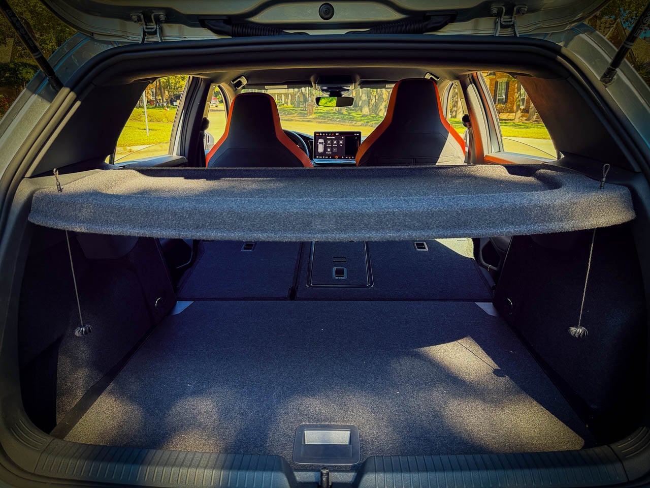
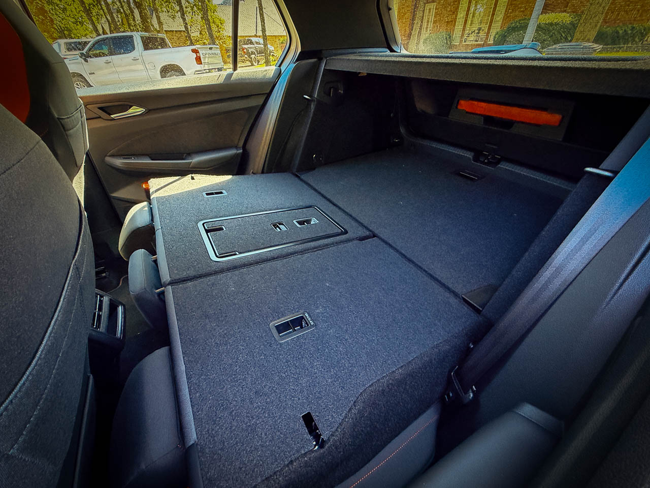
The hatchback form factor delivers practicality the GTI’s sedan competitors cannot match. Rear cargo volume expands from 22.8 cubic feet with seats upright to 52.7 cubic feet with the rear bench folded, the rear seatbacks folding via a single pull lever that releases with satisfying mechanical precision. The load floor sits level with the rear bumper height, its carpeted surface firm enough to slide boxes across without catching. This utility exists without visual compromise, the roofline maintaining its sporting rake while enclosing genuinely useful interior volume.
Rear passenger space accommodates adults across moderate distances. Legroom measures adequate for passengers under six feet, though knee contact with front seatbacks remains possible depending on front occupant positioning. Headroom proves more generous than the roofline suggests, the seating position dropping occupants low enough to clear the tapering roof glass.
The rear door apertures open wide enough for easy entry, their weatherstripping creating a soft thud on close that communicates build quality without conscious attention. Small storage solutions appear throughout: door pockets sized for water bottles, a center console bin deep enough for phones and wallets, map pockets behind the front seats. For a vehicle this compact, the packaging efficiency represents thoughtful spatial engineering.

The Value Proposition

At $33,860 as tested, the GTI positions itself not against the Civic Type R or GR Corolla but adjacent to them. This is strategic design territory. Volkswagen occupies the space where daily usability and driving engagement overlap, ceding the performance margins to competitors who build cars requiring accommodation. The Type R demands you rise to its level. The GR Corolla rewards commitment with drama. The GTI meets you where you already are.
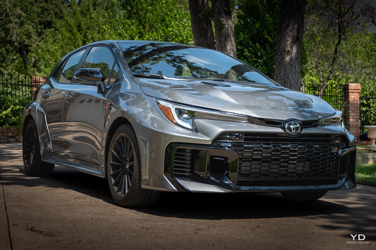
2025 Toyota GR Corolla Premium Manual Review

The four-year bumper-to-bumper warranty and two years of included maintenance read as confidence in the object’s longevity, not as purchase incentives. This is the rarest positioning in contemporary automotive design: a performance car priced for accessibility that does not apologize for what it excludes. The GTI excludes excess. That exclusion is the product.

Resolution: Why This Is Our Car of the Year

The 2025 Golf GTI represents something increasingly rare in automotive design: a product that knows what it is and refuses to pretend otherwise. The chassis does not apologize for being front-wheel drive. The power figures do not strain toward competition with larger engines. The interior does not disguise its price point behind aggressive styling that overpromises.
What remains is a vehicle that executes its intended purpose with precision that approaches elegance. The hot hatch formula, refined across four decades, arrives here in what may be its final evolved form before electrification rewrites the category’s rules entirely. For drivers seeking performance that integrates into daily life rather than demanding accommodation from it, the GTI presents an argument for restraint that carries more conviction than any competitor’s argument for excess.
The 2025 Volkswagen Golf GTI is Yanko Design’s 2025 Car of the Year and earns our Editor’s Choice Award because it answers the question that matters: can a performance car be finished?
Yes. This is what finished looks like. Not the absence of ambition, but the presence of conviction. Volkswagen built the GTI they intended to build: complete, coherent, and resolved. In the final years before electrification rewrites every assumption about what a driver’s car can be, this is the closing argument for internal combustion restraint.

The award goes to the car that knew when to stop.

The post 2025 Volkswagen Golf GTI Review: Car of the Year first appeared on Yanko Design.
2025 Lexus IS 500 F SPORT Performance Review: Designing Space for a V8 in an Electrified World

PROS:


  • Linear V8 response - Naturally aspirated powertrain delivers tactile throttle connection

  • Rear wheel drive architecture - Traditional chassis balance in an AWD-dominated segment

  • Cohesive visual identity - Flare Yellow package unifies exterior and interior design

  • Mechanical limited slip - Torsen differential enhances predictable corner exits

  • Daily performance tuning - Comfort-biased chassis suits real-world use

CONS:


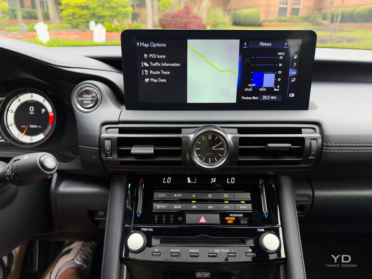
  • Dated infotainment - Interface feels a generation behind modern rivals

  • Fuel economy penalty - Significant consumption costs for daily driving

RATINGS:

AESTHETICS
ERGONOMICS
PERFORMANCE
SUSTAINABILITY / REPAIRABILITY
VALUE FOR MONEY

EDITOR'S QUOTE:

An unapologetic design preserves mechanical joy while others chase efficiency.

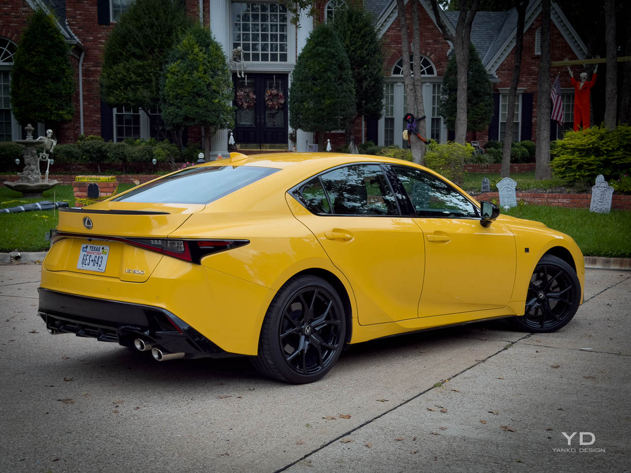
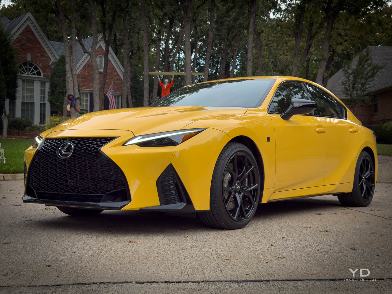
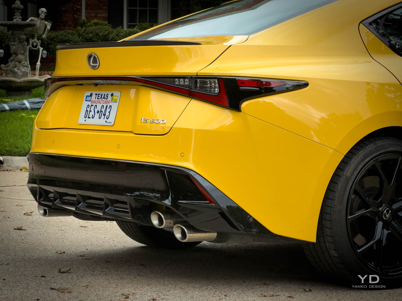
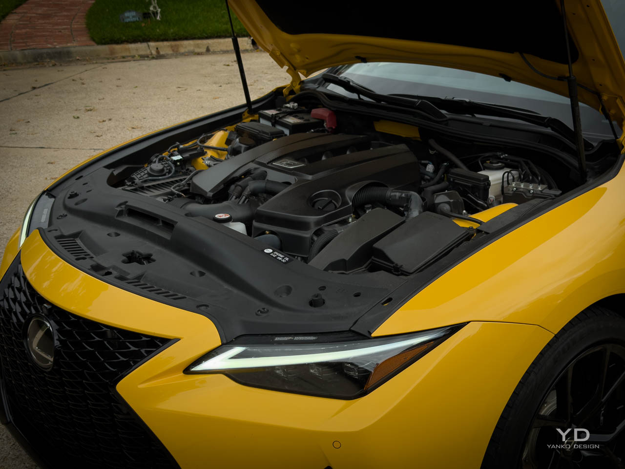
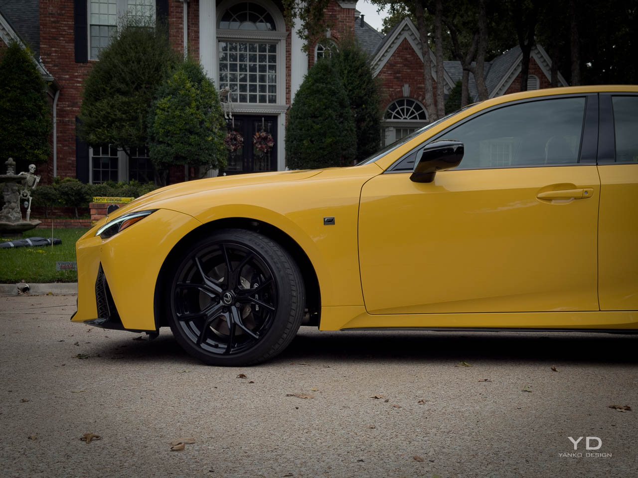
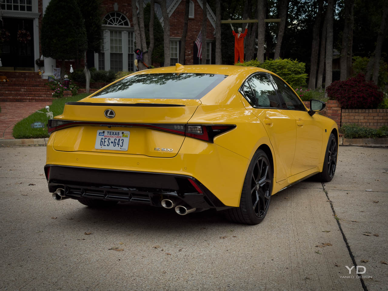
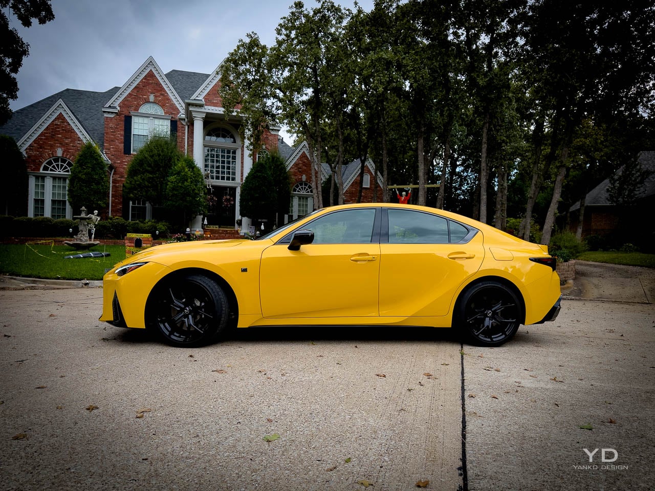
Flare Yellow bodywork catches parking garage fluorescents like a warning flare. Quad exhaust tips broadcast displacement before you turn the key. The 2025 Lexus IS 500 F SPORT Performance Premium arrives unapologetic while most luxury sedans in 2025 spend their energy explaining away downsized engines and turbocharger compromises. In a market segment that has largely abandoned both of those choices, this combination reads less like a product strategy and more like a design philosophy made physical. The sedan occupies a strange position: compact luxury dimensions wrapped around powertrain architecture that most competitors retired years ago. That tension between contemporary shell and analog holdout defines every interaction with the car, from the first ignition cycle to the hundredth highway merge.

Designer: Lexus

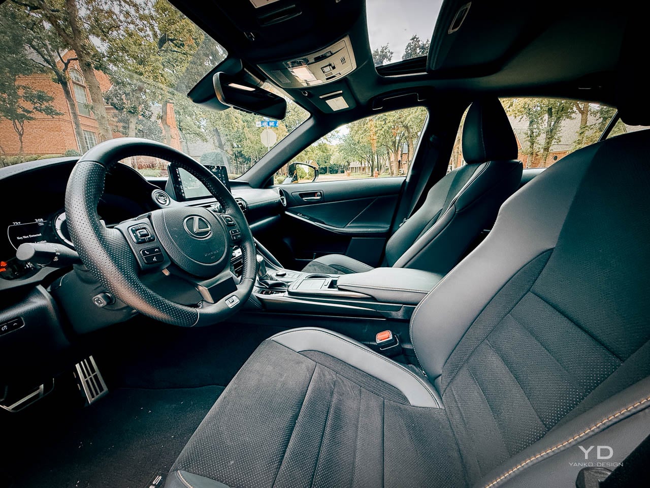
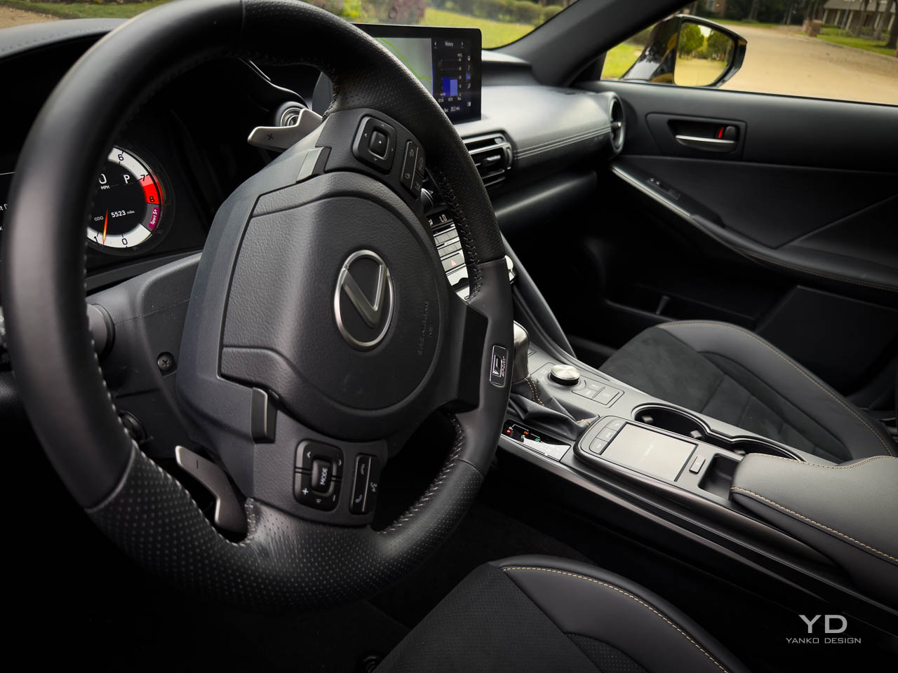
Flare Yellow is not simply a paint option here. Lexus positions it as a complete appearance system, bundling 19 inch black forged alloy wheels, Ultrasuede interior inserts with yellow stitching, matching seatbelts, illuminated door sills, and coordinated floor mats. The color becomes a unifying thread that connects exterior surfacing to cabin touchpoints, transforming what could be a single aesthetic choice into an integrated material language. At $4,050 for the package, the investment purchases coherence rather than mere visibility.

Exterior Form Language

Aggression arrives through geometry rather than applied decoration. The spindle grille dominates the frontal view, its lattice pattern creating depth and shadow that shifts with viewing angle and ambient light. Triple beam LED headlamps flank the grille, their layered optical elements suggesting technical complexity even at rest. The overall stance sits low and wide, with wheel arches that fill their openings without the exaggerated flaring that characterizes some performance variants.

Moving rearward, the roofline descends in a continuous arc that terminates at a ducktail spoiler integrated into the trunk lid. Quad exhaust tips emerge from the rear diffuser, their stacked arrangement serving as the primary visual signal of the V8 beneath. The proportion relationship between greenhouse and body mass reads as deliberately compact, the cabin volume compressed relative to the sculptural surfaces surrounding it. This creates the impression of a machine built around its mechanical core rather than a passenger compartment with propulsion attached. The 19 inch wheels and aggressive fender surfacing work to visually manage nearly 4,000 pounds, making the car read lighter and wider than the scales suggest.

Interior Material Hierarchy

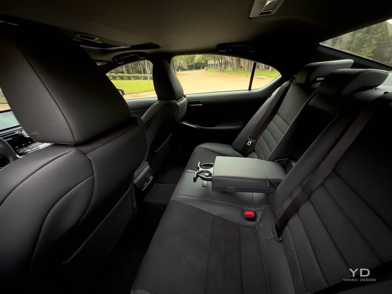
Inside, tactile engagement takes priority over digital spectacle. NuLuxe trimmed seats provide the primary contact surface, their bolstering firm enough to communicate sport intent without creating discomfort during extended use. The Ultrasuede inserts in the Flare Yellow package introduce texture variation that catches fingertips differently than the surrounding synthetic leather, establishing a sensory hierarchy across the seating surfaces.

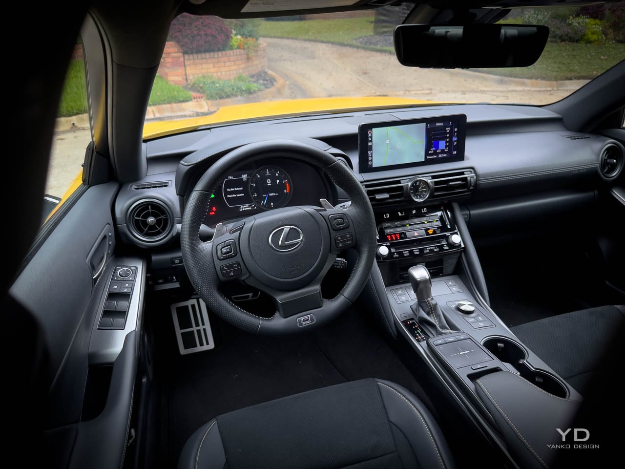
The steering wheel arrives wrapped in leather with a heated element, its rim diameter and grip circumference calibrated for hands that expect direct mechanical feedback. Aluminum pedals replace the standard rubber units, their knurled surfaces providing positive purchase under aggressive inputs. Satin trim accents break up the interior darkness, creating visual rhythm without the reflective distraction of polished chrome.

The Mark Levinson audio system occupies the acoustic environment with authority. Its 17 speakers deliver the kind of spatial imaging that justifies the premium trim designation, filling the cabin with presence that matches the V8’s mechanical drama.


The interface through which that system operates represents the cabin’s most significant temporal artifact. A 10.3 inch touchscreen accepts finger input but also responds to a trackpad controller mounted on the center console, a legacy interface element that creates immediate friction. Reaching for the screen to tap a climate shortcut feels natural until you remember the trackpad exists; defaulting to the trackpad means dragging a cursor across a surface designed for touch. Two design eras compete on the same console, and neither fully wins.

Powertrain as Sensory Design

Numbers tell part of the story: 472 horsepower at 7,100 rpm from a 5.0 liter V8. What matters more is how that power arrives. Natural aspiration means throttle response arrives without the intervention of turbocharger spool, creating a direct relationship between pedal position and acoustic output. The engine announces its presence through a broadband exhaust note that builds intensity with engine speed, the quad tips providing the exit path for a sound that functions as the car’s primary experiential feature.

The sprint to 60 arrives in the mid four second range, figures that place the IS 500 behind several turbocharged competitors on paper. The gap narrows in lived experience because the V8 delivers its power in a linear curve rather than a turbocharged surge, allowing the driver to modulate output with precision that boost dependent systems struggle to match. The eight speed automatic transmission shifts cleanly in sport mode, though it lacks the dual clutch immediacy that defines the segment’s sharper offerings.

Rear wheel drive completes the mechanical architecture, a configuration increasingly rare in this segment where all wheel drive has become the default assumption. The Torsen limited slip differential, a helical gear system that transfers torque mechanically rather than through electronic intervention, manages power distribution to the rear axle. Its purely mechanical operation provides predictable behavior at the adhesion limit, sending power to whichever wheel has grip without the response lag of clutch pack systems. Exiting a tight corner under throttle, the result is smooth, progressive traction rather than the sudden electronic clamp of stability nannies fighting for control. Adaptive suspension and upgraded brakes with enhanced cooling address the chassis requirements of the additional powertrain mass, though these systems tune toward comfort rather than track aggression.

Dynamic Compromise

Nearly 4,000 pounds announces itself the moment the road curves. The IS 500 weighs approximately 3,973 pounds in tested configuration, mass that reveals its presence during direction changes and hard braking. Push beyond street driving limits and understeer arrives predictably, the front tires reaching their grip threshold before the rear can rotate the chassis. The steering provides adequate weight but filters road texture in ways that prioritize refinement over information density. These are characteristics of a car tuned for daily use rather than weekend autocross, a calibration choice that aligns with the comfort of the seats and the isolation of the cabin.

The brake pedal requires calibration of expectations, its initial travel soft before building resistance. This tuning prioritizes smoothness during traffic deceleration but reduces confidence during aggressive threshold braking. Stability control intervention arrives earlier than competitors allow, limiting the exploration of chassis dynamics even when the driver seeks that engagement.

On a fast two lane road at seven tenths, the character clarifies. The V8 pulls cleanly out of corners while the chassis absorbs mid corner bumps that would unsettle lighter, stiffer competitors. Push harder and the front washes wide, but within the envelope of spirited street driving, the balance feels deliberate rather than deficient.

These compromises reflect a deliberate design decision: Lexus tuned for the commute, not the canyon. That calibration disappoints enthusiasts seeking sharper responses but serves the owner who wants to live with a V8 daily. The IS 500 prioritizes living with the V8 rather than extracting its maximum potential, a choice that makes the powertrain accessible across driving contexts rather than demanding specific conditions for enjoyment.

Value Positioning and Market Context

At $69,539 as tested, including destination and the Flare Yellow appearance package, the IS 500 positions itself against both four cylinder luxury sedans and more focused performance machinery. The competitive landscape has shifted around this car: BMW offers turbocharged inline sixes, Mercedes deploys electrified four cylinders, and Alfa Romeo provides sharper dynamics at similar price points. Against this field, the IS 500 competes on differentiation rather than specification superiority.

Fuel economy penalties are explicit and substantial. The EPA rates the powertrain at 17 mpg city, 25 highway, and 20 combined, figures that translate to approximately $3,200 in annual fuel costs. Over five years, that adds roughly $6,500 more than average. Environmental ratings land at 4 out of 10 for both fuel economy and smog, reflecting the consequences of maintaining natural aspiration while competitors optimize for regulatory compliance.

The value proposition depends on what the buyer prioritizes. Powertrain character over lap times. Exhaust note over efficiency. Mechanical simplicity over technological sophistication. For those criteria, the IS 500 delivers experiences its competitors have abandoned. The car exists because Lexus chose to preserve something rather than optimize everything.

Design Intent Realized

As a design object, the IS 500 F SPORT Performance Premium prioritizes a specific experience over balanced capability. The naturally aspirated V8 in rear wheel drive configuration represents a powertrain topology that market forces are eliminating, preserved here in a package refined enough for daily use. Flare Yellow demonstrates how color can function as a design element rather than a decorative choice, unifying interior and exterior into a coherent material statement.

Limitations and character prove inseparable. The weight that softens handling also supports the sound deadening that makes the V8 a companion rather than an assault. The infotainment system that frustrates also maintains the physical controls and clear hierarchy that digital native interfaces have abandoned. Fuel consumption that punishes the wallet finances the displacement that creates the acoustic experience.

Assembled in Tahara, Japan, the IS 500 wears a five star safety rating from NHTSA across all categories. It arrives as a complete product rather than a work in progress. Its design intent is preservation: holding space for a powertrain philosophy while the industry accelerates toward electrification. Whether that intent justifies the compromises depends on what the buyer believes is worth keeping alive. That Flare Yellow paint catching light in a parking garage announces the same thing the V8 announces at redline: this machine refused to apologize. For the driver who values mechanical tactility over interface novelty, the IS 500 answers a question the rest of the segment stopped asking.

The post 2025 Lexus IS 500 F SPORT Performance Review: Designing Space for a V8 in an Electrified World first appeared on Yanko Design.

2025 Hyundai IONIQ 5 Limited AWD Review: Korean Confidence in a Sea of Minimalist Restraint

The electric crossover has settled into a strange kind of visual politeness. Smooth surfaces, quiet cabins, and interfaces that treat personality as noise have become the default, especially in the wake of Tesla’s influence on the category.

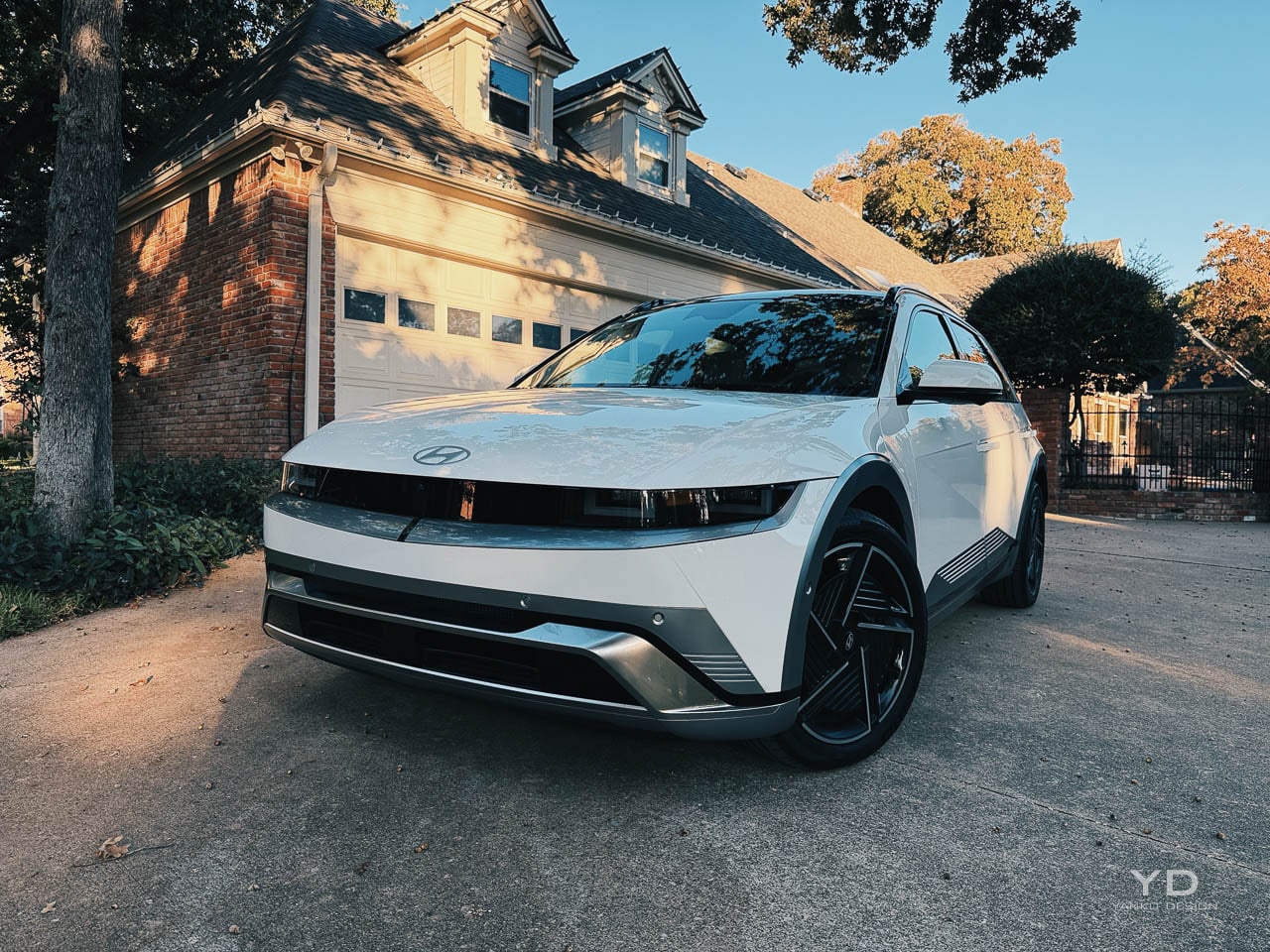
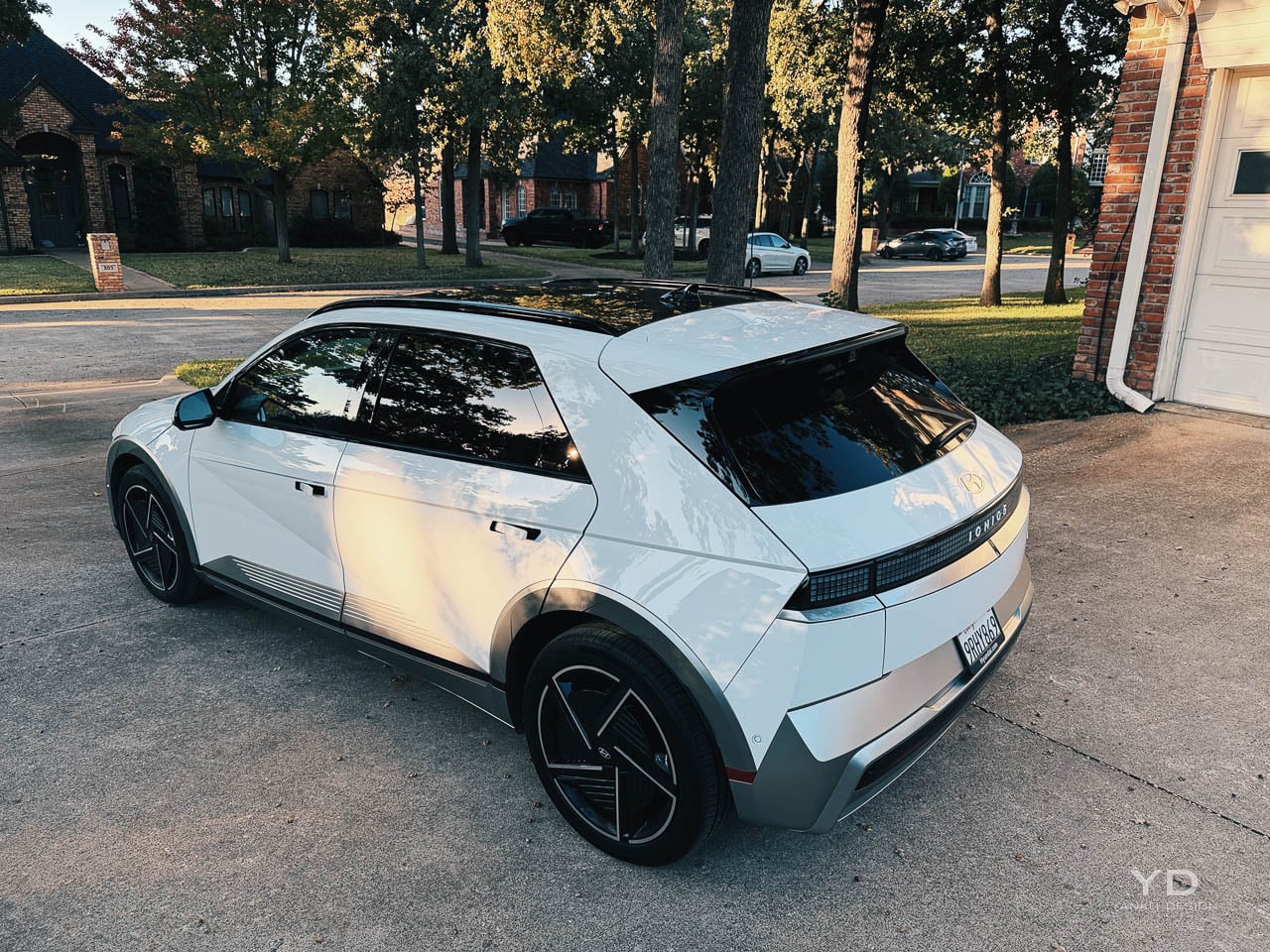
Hyundai’s IONIQ 5 doesn’t play that game. This is a review of the 2025 Hyundai IONIQ 5 Limited AWD, a trim that uses retro reference and daily usability as its counterpoint to the category’s prevailing minimalism. It’s using nostalgia as a design tool rather than a styling costume, borrowing the posture of the 1974 Pony Coupe Concept and re translating it through crisp surfacing, pixelated light signatures, and proportions that look more like a hatchback that grew up than a crossover that learned manners.

I spent about a week with a 2025 IONIQ 5 Limited AWD. The car’s confidence reads immediately in photos, but it lands harder in person, where the edges, the glasshouse placement, and the stance feel intentionally un typical for this segment.

Exterior form language

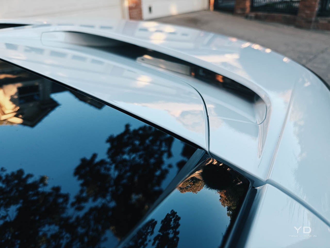
From a distance, the silhouette does most of the work. The long wheelbase stretches the car low, and the greenhouse sits rearward enough that the roofline feels fast without chasing coupe cosplay.

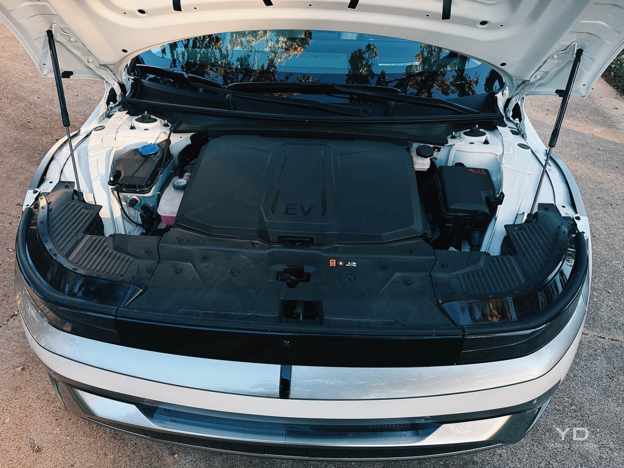
The clamshell hood is a smart visual move because it makes the front end look uninterrupted, almost like a single pressed sheet pulled tight over the architecture. It’s also a practical one, since the panel gaps are cleaner than you expect from a mass market EV.

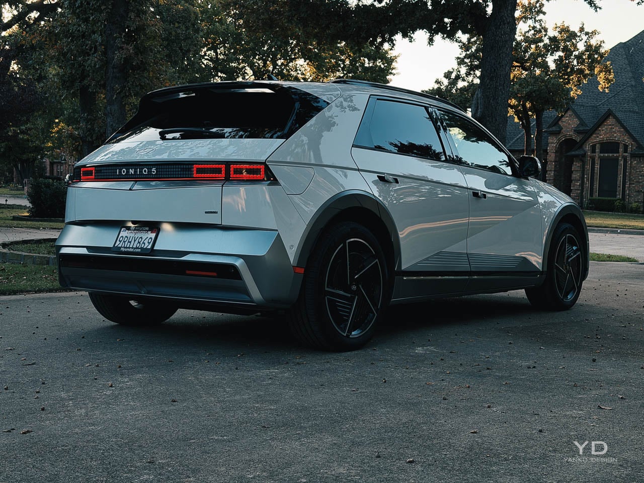
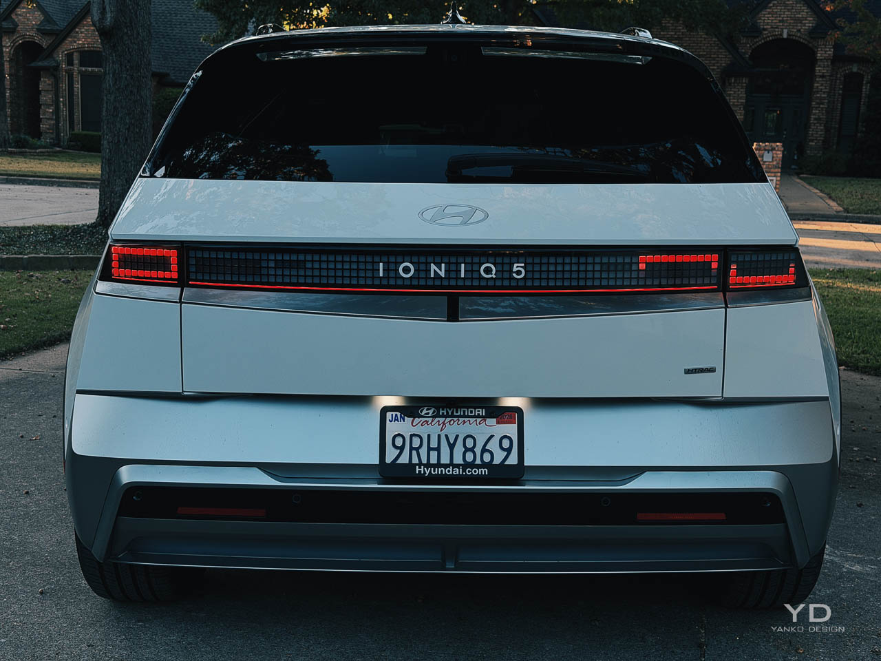
Parametric Pixel lighting is the detail everyone remembers, and it earns that attention. The square motif gives the front and rear a kind of digital legibility, like the car is speaking in a grid rather than a curve.

At night, the effect is crisp rather than theatrical. The sequential turn signals move through those pixel clusters with a controlled cadence that feels engineered, not animated for show.

Up close, the surfacing avoids the common crossover trick of hiding bulk in soft transitions. Hyundai uses flat planes broken by sharp creases, and the light behaves differently as the car rotates through the day, which makes the body feel more intentional than most of its rounded competitors.

The 20 inch wheels on the Limited trim fit the stance well, and you feel the design priority here. More aero coverage would help efficiency, but the open, geometric wheel design matches the car’s pixel language, and that coherence matters when the whole car is trying to be a statement.

Interior architecture

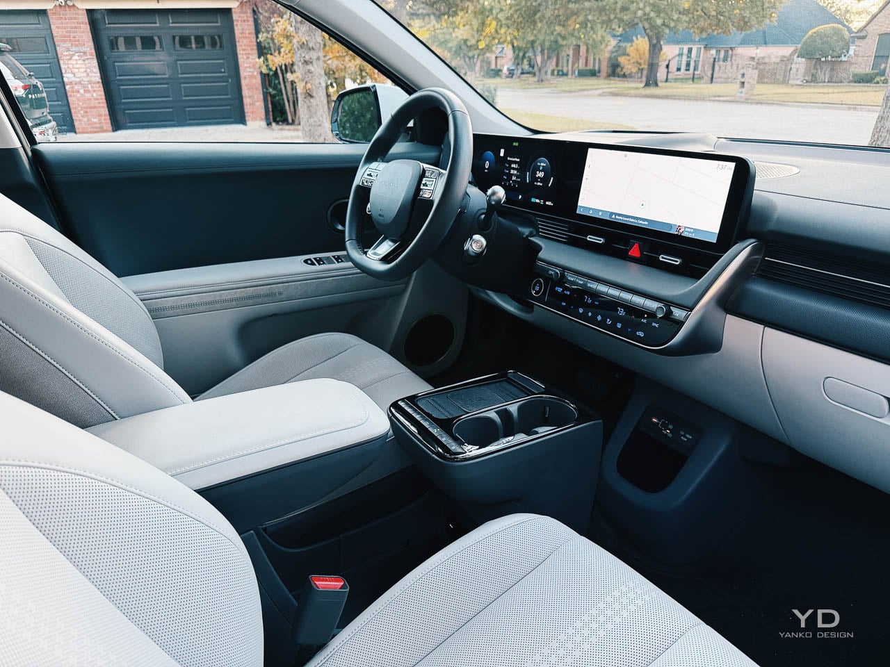
The platform advantage shows itself the moment you step in. The same long wheelbase and clean exterior geometry that make the car look planted also buy you interior length, so the flat floor feels like a design consequence, not a packaging trick.


Without a tunnel, the cabin reads as a continuous volume rather than two rows of seats separated by architecture. That spatial openness isn’t just a spec sheet win. It changes posture, movement, and how the interior feels during daily use, especially when you are sliding bags around, shifting seats, or simply stretching out.

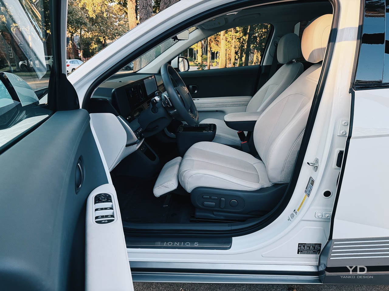
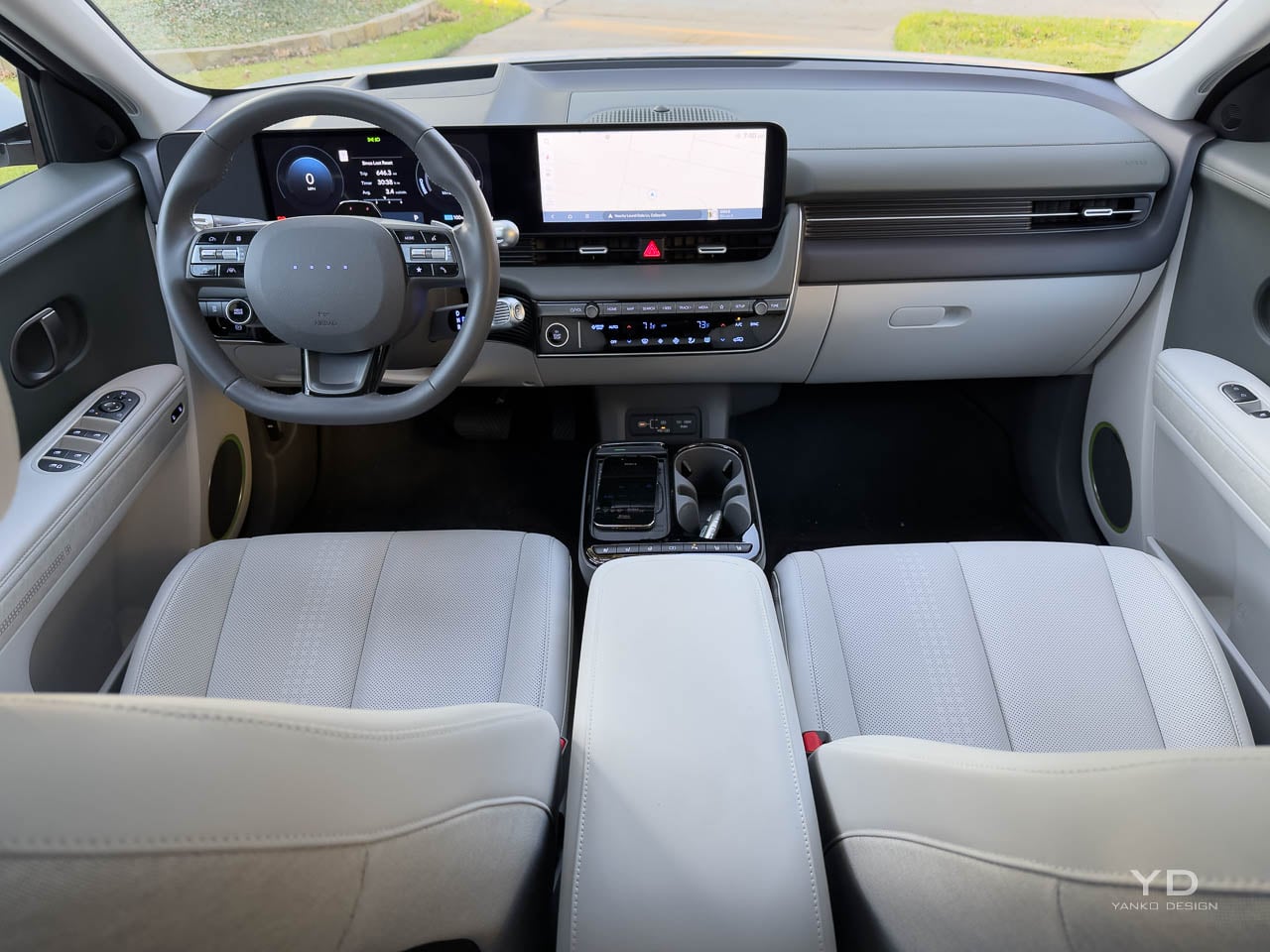
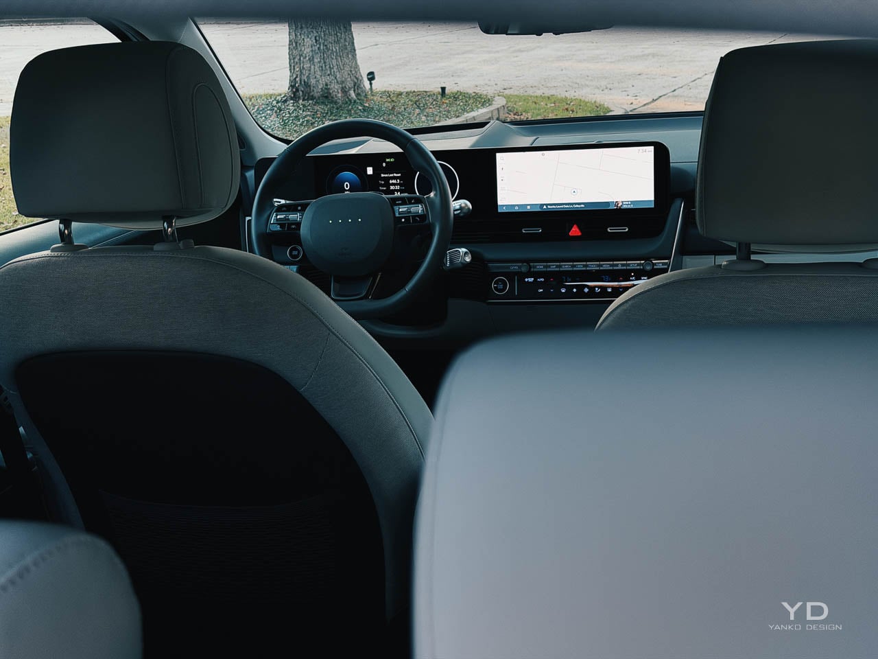
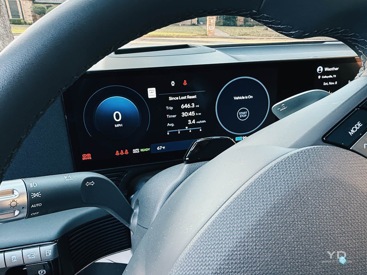
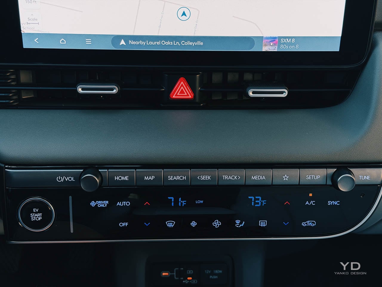
The dash is intentionally horizontal, with dual 12.3 inch displays under a single glass panel. The layout is clean, but what matters more is that it still respects how people drive, with real climate controls that don’t require you to hunt through menus.

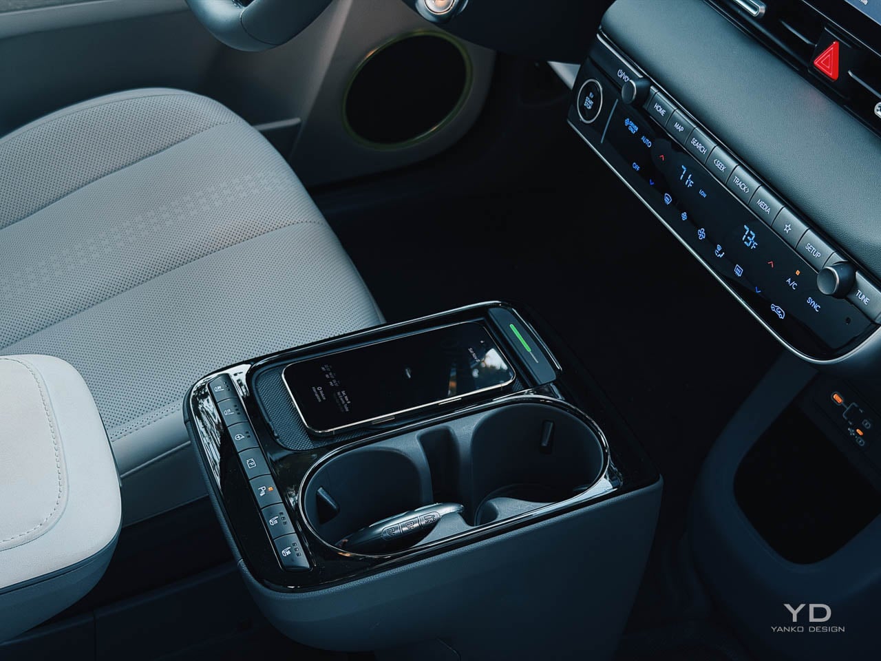
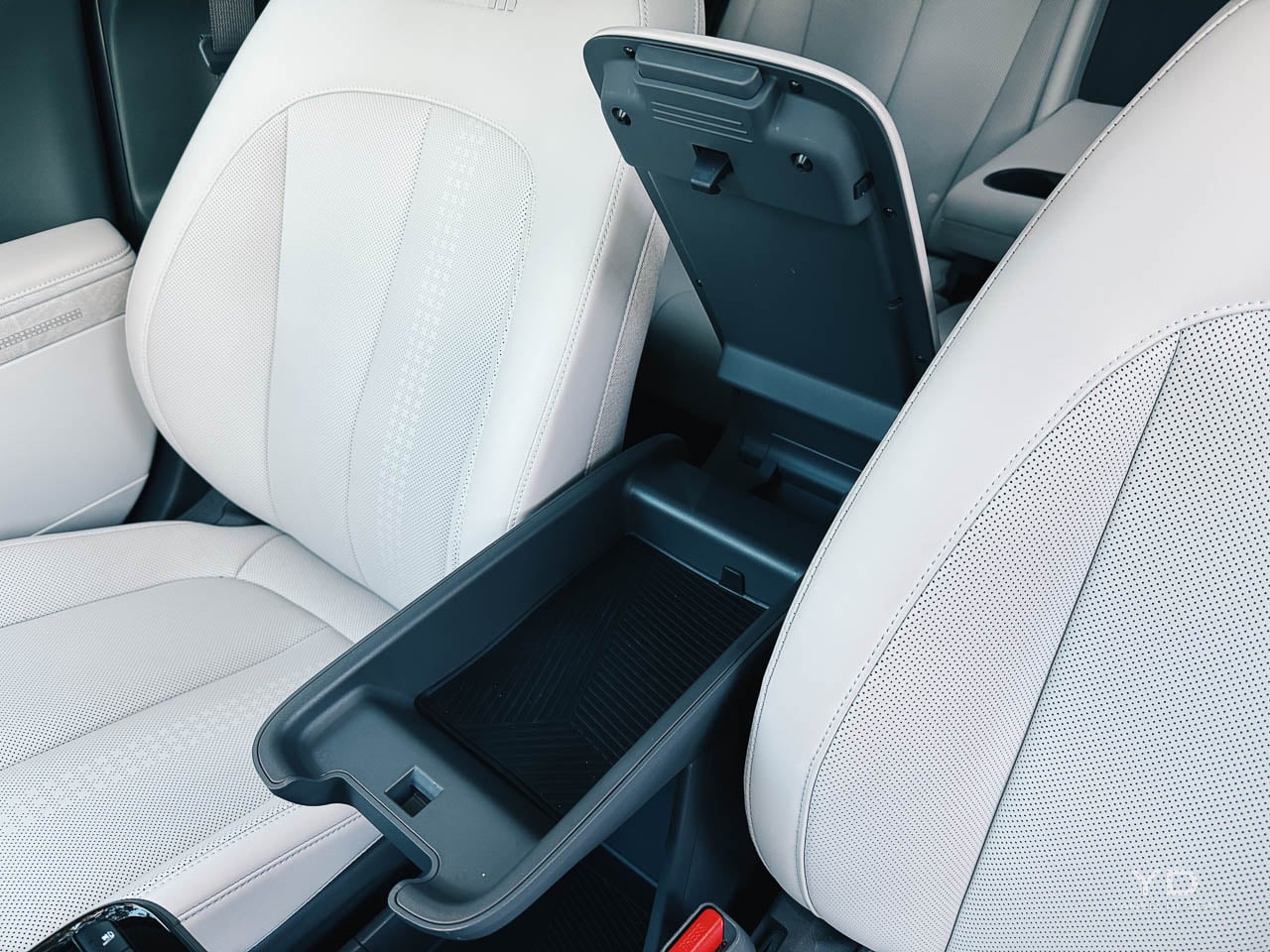
The sliding center console is a small design flex that becomes a real advantage. It lets the cabin behave like a space, not a fixed cockpit, and that matters in a car that wants to feel like a lounge without turning into a gimmick.

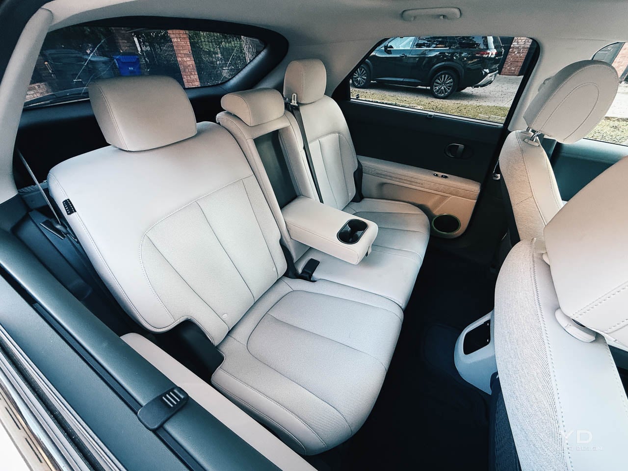
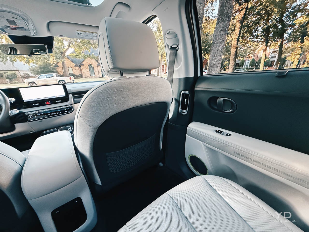
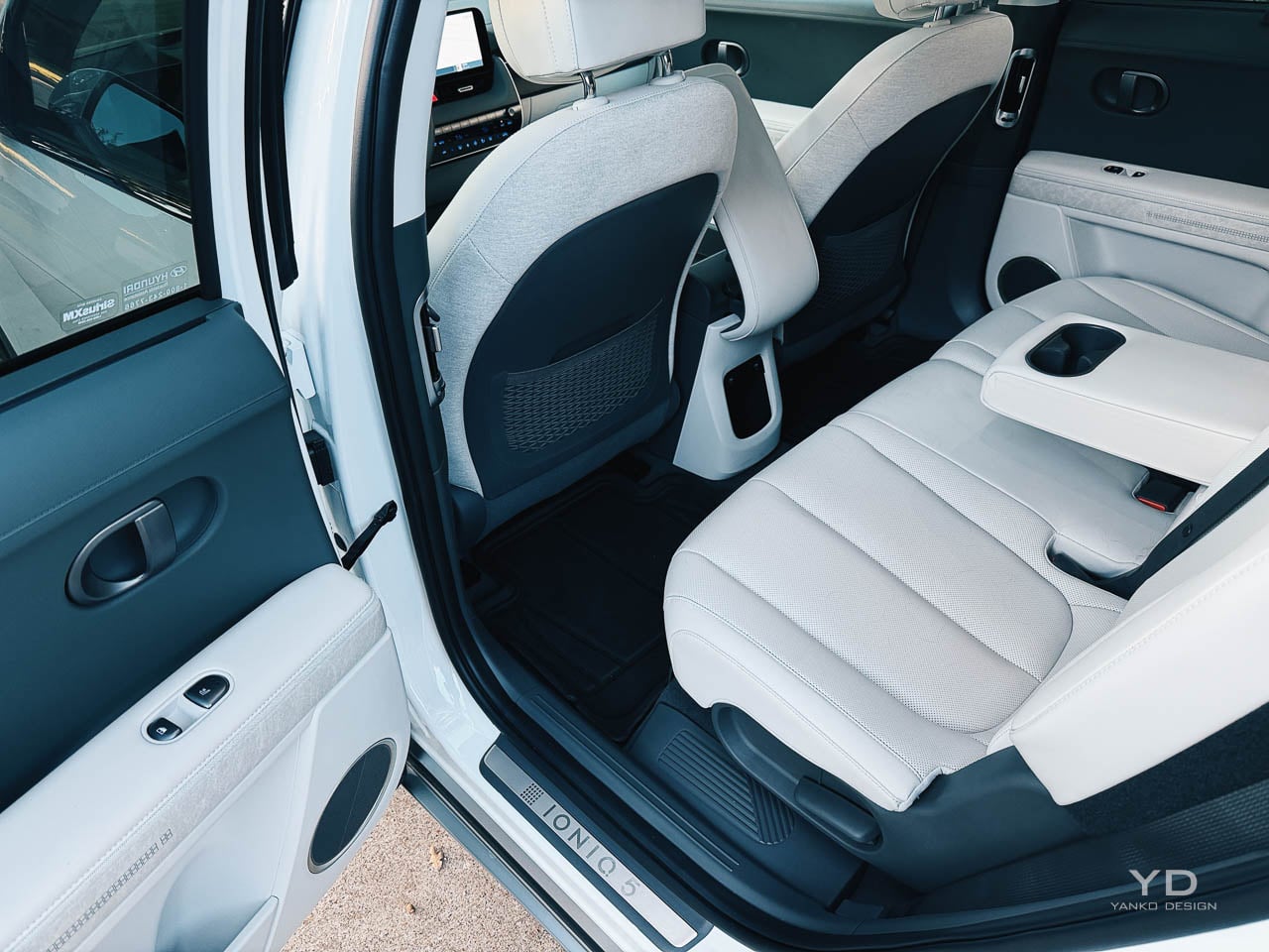
Rear legroom is one of the IONIQ 5’s quiet strengths. The long wheelbase and flat floor make the second row feel more like a class above, and the center seat does not punish you with the usual foot splay.

Material composition

Hyundai leans into sustainable materials without turning the cabin into a sermon. Recycled and bio based inputs are present, but the car does not label itself as virtuous, which is a more confident way to do it.

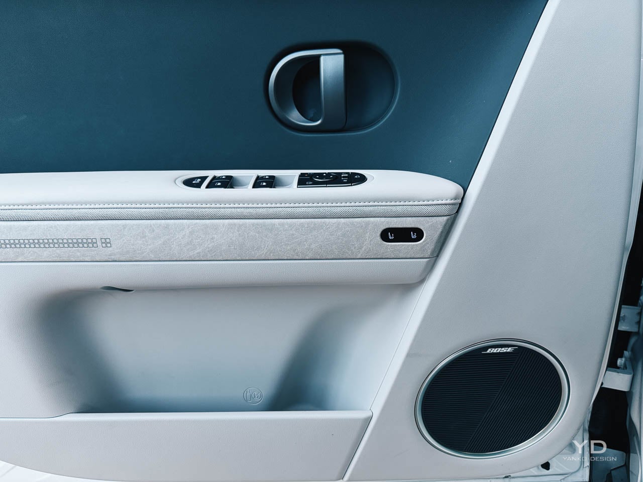
The material hierarchy feels deliberate. Soft touch surfaces land where you actually rest your hands, and harder plastics retreat to lower zones where durability matters more than theater.

Acoustic isolation is better than you expect at highway speeds. Wind stays subdued for an upright windshield, and road texture comes through as a muted signal rather than a constant hiss, which makes the cabin feel more premium than the badge suggests.

Those material choices also set up the longer question: how well does this cabin, and the tech that lives inside it, age over years of use.

Sustainability and lifecycle

The IONIQ 5’s sustainability story isn’t only that it’s an EV. It’s also about how the product behaves across years, because electrification only feels like progress if the pack, the software, and the charging routine don’t turn into anxiety later.

On the power side, the most important environmental benefit is simple: no tailpipe emissions during driving. The more subtle win is how regenerative braking changes the car’s energy rhythm in traffic, turning stop and go into recaptured momentum rather than pure waste.

Battery confidence is a design feature in its own right, because trust changes how you drive and how long you keep the car. Hyundai’s hybrid and electric battery warranty language sets a clear expectation that capacity will not fall below 70 percent of original capacity during the warranty period, which helps put a hard boundary around the usual degradation fear that follows EV ownership.

That’s where the cabin material story, the battery story, and the software story connect. Recycled or bio based trim is a surface level sustainability signal, but longevity is the deeper one, because a car that still feels current, quiet, and psychologically trustworthy five years in is the car that gets kept, not replaced.

In practice, this shows up in boring ownership moments. You’re juggling a commute week and a weekend trip, and you realize you aren’t bracing for a surprise range drop, a glitchy interface, or a cabin that’s started to rattle. That’s the density test. If the car stays calm when your week isn’t, it earns the right to stay in your driveway longer.

Charging also has a sustainability dimension that’s easy to ignore. Faster DC charging can reduce dwell time, but it can also encourage more frequent high power sessions. In practice, the cleanest routine is still boring: charge at home on Level 2 when you can, then treat high power charging as the travel tool, not the daily habit.

Software’s part of longevity now. Hyundai’s infotainment OTA approach, including a defined cadence of updates, is a quiet way of keeping the cabin’s interface from aging faster than the hardware, even if it isn’t the same always evolving story that Tesla sells. It isn’t about constant novelty. It’s about avoiding the kind of slow interface decay that makes a cabin feel old before the materials wear out.

Technology integration

If sustainability is partly about how long the car stays pleasant to use, the interface matters. The interface design is clean in the way Hyundai usually is. The instrument cluster prioritizes range and speed clearly, and the center screen uses a tile logic that responds quickly without feeling like it’s trying to be a phone.

There’s a quiet design decision here that reads better the longer you live with it: the screens don’t try to replace the cabin, they support it. That restraint reduces cognitive load in motion, and it keeps the interior from feeling like a tablet that happens to have seats.

The interesting implication is that the IONIQ 5 can feel modern without demanding constant attention. You spend less time managing the interface, and more time noticing how the space actually works.

The best part is still the decision to keep key functions physical. Climate toggles give you tactile confirmation, and volume control stays a knob, which means your muscle memory can do its job.

BlueLink remote functions are useful rather than exciting. Pre conditioning and charge management work reliably, but the software experience doesn’t feel like the reason you buy the car, which is a compliment in a segment where infotainment can become the whole personality.

Over the air updates exist, but they don’t define the ownership story the way they do with Tesla. The IONIQ 5 feels finished at purchase in a traditional sense, which some buyers will prefer, and others will see as less future proof.

Powertrain character

The Limited AWD’s dual motor layout delivers power in the way modern EVs usually do: immediate, quiet, and oddly composed even when you floor it. The acceleration is the kind that makes merges feel casual rather than dramatic.

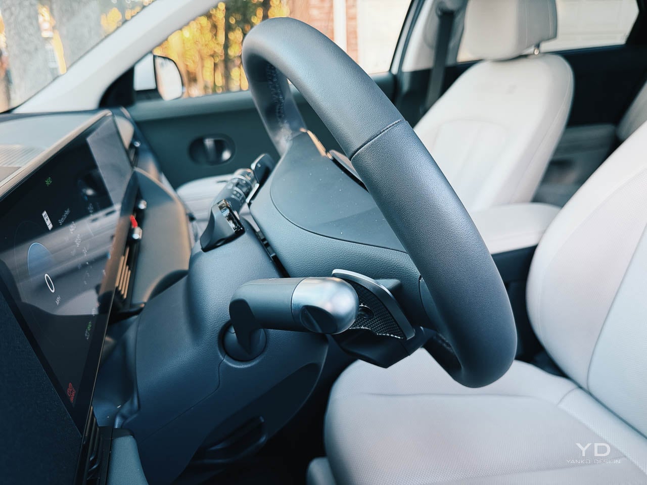
Regenerative braking control through steering wheel paddles is a good piece of interaction design. You can tune the car from near coasting to one pedal driving quickly, and the strongest setting becomes natural once your foot stops expecting engine braking cues.

Brake feel is a small but important confidence marker in a heavy EV. The pedal stayed consistent rather than turning mushy after repeated stops, and that steadiness pairs well with the regen paddles, because the car stops feeling like a computer negotiating with your right foot and starts feeling like a tool you can place precisely.

Daily reality

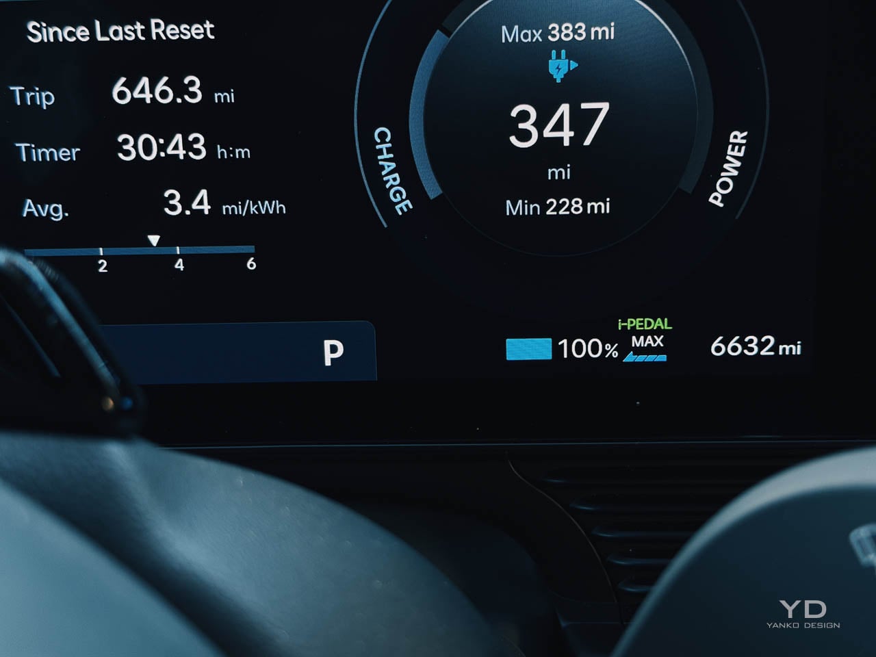
EPA range numbers are always conditional, and the IONIQ 5’s no different. Hyundai lists the 2025 IONIQ 5 Limited AWD at an EPA estimated 269 miles on a full charge, while other drivetrains reach as high as 318 miles, depending on trim and configuration.

Speed, temperature, climate settings, and wheel choice can all move the real number in ways that matter on a trip.

In my time with the car, steady highway driving at typical interstate speeds pulled the effective range down noticeably, while city driving benefited from regen and felt closer to the optimistic story. That swing is normal, but it is worth stating plainly because it changes how you plan charging.

The lived part is the mental math. You start glancing at the next stop earlier than you think you will, then you settle into a routine where you treat home charging as your default and fast charging as a planned tool, which is when the car stops feeling like a project.

Charging is the real unlock, assuming you have access to the right equipment. The E GMP architecture supports very high DC fast charging rates, and on a compatible high output charger the stop time feels more like a short break than a long pause.

Home charging is where the car becomes easy. Plugging in overnight turns range into an every morning default, and the question shifts from can I make it to do I want to plan for the occasional longer day.

Cargo space is usable, but the packaging has the usual EV tradeoffs. The load floor sits higher than some rivals, and tall items feel the difference, even if the overall volume is competitive.

Competitive context

All of that lands differently depending on what you are cross shopping.

The Tesla Model Y remains the benchmark because the charging ecosystem and software cadence are still a category advantage. Tesla’s minimalism is also consistent, even if it feels sterile to some buyers.

The IONIQ 5 counters with design presence and interior warmth. Physical controls, a more generous sense of space, and a cabin that feels intentionally composed rather than stripped make it a better fit for people who want the car to feel designed, not optimized.

Kia’s EV6 is the closest alternative because it shares the underlying platform. The EV6 leans sportier in stance and body language, while the IONIQ 5 leans architectural and lounge like. The choice isn’t about capability so much as which philosophy feels more like you.

Ford’s Mustang Mach E and Volkswagen’s ID 4 sit nearby with different priorities. The Mach E sells a more traditional driver narrative. The ID 4 leans conservative and value driven. Neither matches the IONIQ 5’s combination of space, lighting identity, and form language clarity.

Who should buy this

If you want an EV that looks like it has an opinion, the IONIQ 5 is one of the strongest mainstream options. It is especially convincing for people who care about design coherence, interior space, and charging performance as a daily quality of life feature.

As earlier, the flat floor and the lounge like layout are not just nice in photos, they change the way you use the car. Entry and exit feel less cramped, loading bags is less of a shuffle, and the cabin is easier to treat like a space.

If your priority’s the simplest charging routine across every trip, Tesla’s ecosystem still matters. If your priority is a cabin that feels more human, plus controls that do not punish you for preferring buttons, Hyundai’s approach will feel like the more mature kind of modern.

Design verdict

Hyundai pulled off something difficult here. The IONIQ 5 is distinctive without becoming a costume, and it uses its retro reference as a foundation for proportion and geometry rather than a pile of nostalgia cues.


What sticks is the follow through: the pixel lighting and crisp surfacing are not decoration, they are the grammar that carries through the whole object, right down to how the cabin feels airy and deliberate. That consistency is why the car reads as designed, not merely modern.

The only open question’s aging. Sharp motifs can date faster than soft ones, and the EV market moves quickly. Even if the look becomes tied to this era, the coherence behind it is real, and that tends to outlive fashion.

The post 2025 Hyundai IONIQ 5 Limited AWD Review: Korean Confidence in a Sea of Minimalist Restraint first appeared on Yanko Design.

2026 Toyota GR Supra MkV Final Edition Review: A Farewell Written in Carbon Fiber and Camber

PROS:


  • Refined chassis sharpens every driver input

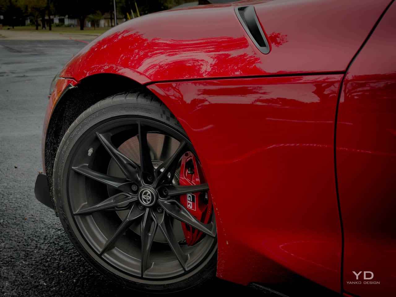
  • Larger Brembo brakes resist fade confidently

  • Distinctive silhouette will age gracefully

  • Manual transmission available for enthusiasts

  • Premium Alcantara and leather interior

CONS:


  • No Android Auto connectivity

  • Limited cargo space and rear visibility

RATINGS:

AESTHETICS
ERGONOMICS
PERFORMANCE
SUSTAINABILITY / REPAIRABILITY
VALUE FOR MONEY

EDITOR'S QUOTE:

The most resolved Supra of this generation, built entirely for feel over flash.

The fifth-generation Toyota Supra has always carried the weight of resurrection, a nameplate revived after two decades of dormancy and built on a platform shared with BMW’s Z4. That partnership invited scrutiny from the beginning, with purists questioning whether the A90 could truly claim the Supra lineage when its heart beat with Bavarian engineering. Toyota’s response, refined across six model years, culminates in the MkV Final Edition: not a reinvention but a declaration that the conversation about authenticity matters less than the conversation about intent. The Final Edition does not chase new power figures or revolutionary technology. It chases feel, that elusive quality that separates cars people admire from cars people remember.

Designer: Toyota

Gazoo Racing’s philosophy has always emphasized the tactile over the theoretical, and this swan song embodies that principle with unusual clarity. Where competitors announce their final editions with horsepower increases and cosmetic packages, Toyota chose to invest in the parts that shape how the car communicates with its driver: bushings, braces, damper calibration, brake sizing. The engineering focus speaks to a different understanding of what makes a sports car meaningful. Numbers translate poorly to memory. The sensation of a chassis rotating precisely at the limit, the confidence of brakes that refuse to fade, the subtle feedback through a steering wheel that actually tells you something: these are the currencies that matter when the production line goes quiet.

The price positions the Final Edition in the upper 60s before destination, typically just over 70k as equipped, placing it firmly in the territory where a Porsche Cayman or BMW M2 becomes a reasonable cross-shop. That positioning is intentional. Toyota is not asking buyers to choose the Supra because it costs less or offers more features per dollar. The ask is simpler and more demanding: choose it because this is the most resolved version of a car that has spent six years learning how to be itself. I spent a week with the Final Edition, and that confidence comes through every time you turn the key.

Exterior Form Language

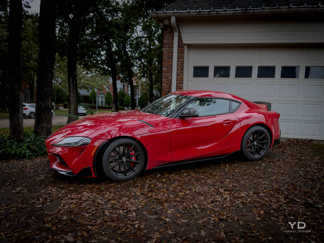
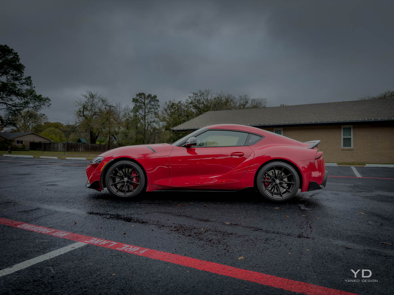
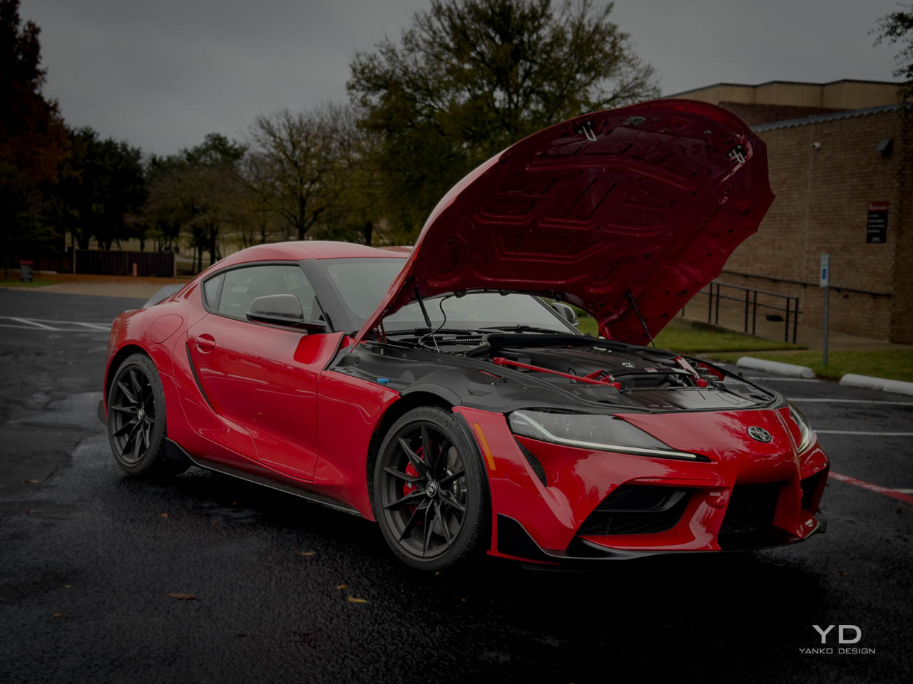
Few sports car silhouettes remain as distinctive as the GR Supra’s, a profile defined by the exaggerated length of its hood relative to the compact cabin and truncated tail. That proportion traces directly to the classic front-engine, rear-drive formula, but the execution here pushes further into sculptural territory than most modern interpretations. A double-bubble roof, functional in its origins as a nod to helmet clearance but now a visual signature, creates a centerline interruption that breaks what could have been a simple coupe arc into something more complex. Light catches the roof differently at every angle, revealing the depth of the sculpting work that photographs rarely capture.

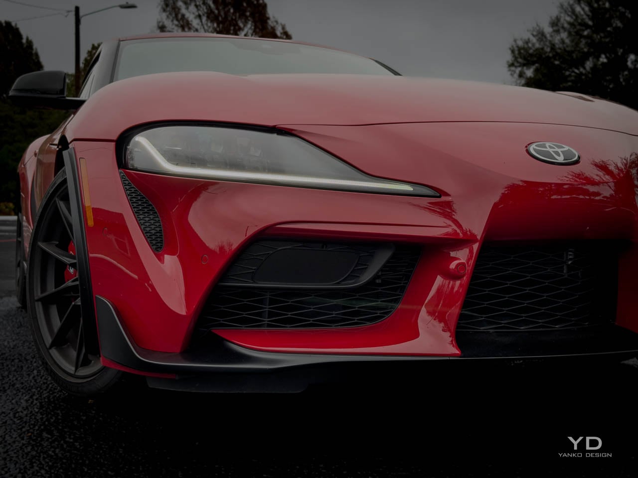
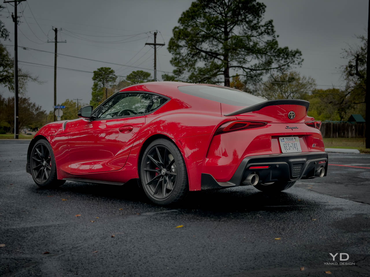
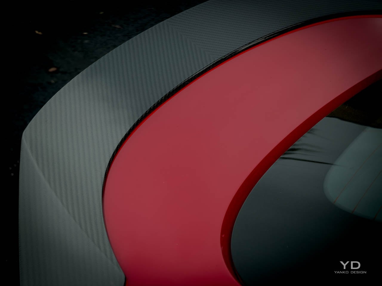
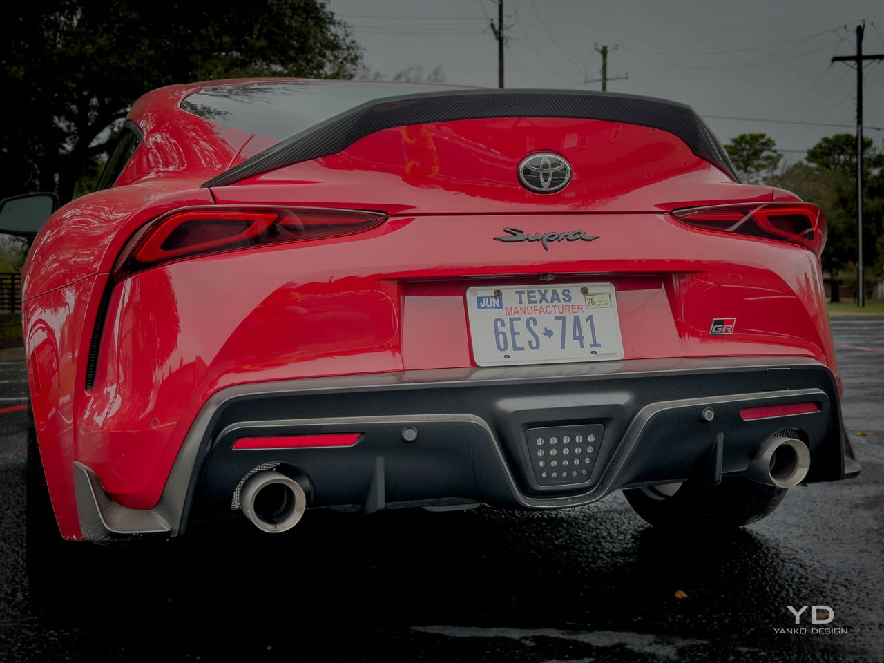
The Final Edition adds visual weight through functional aero components that subtly alter the car’s stance without abandoning the base design’s intent. In person, the carbon ducktail changes the whole rear three-quarter view. A carbon fiber ducktail spoiler extends the rear deck with a lip that follows the body’s natural curvature rather than imposing an aggressive aftermarket aesthetic. Front wheel arch flaps and taller tire spats address airflow management at higher speeds, but their visual effect is equally significant: they emphasize the muscular fender bulges that have always been the Supra’s most overtly athletic element. The matte black 19-inch wheels specific to this trim level darken the car’s overall presence, pulling attention toward the body surfaces rather than the brightwork. That darkening strategy continues with available carbon mirror caps and the optional GT4 appearance package, which introduces matte paint finishes like Burnout and Undercover that transform surface reflections into something closer to fabric than glass. The lighting signature carries forward unchanged from previous model years, with the narrow headlamp clusters and integrated LED running lights that give the Supra its focused, almost predatory forward gaze. Rear lighting uses a full-width bar that connects the tail lamps and creates visual width when viewed from behind. The decision to keep lighting elements consistent with the broader Supra range rather than creating Final Edition-specific graphics reflects Toyota’s restraint. This is a car closing a chapter, not a special edition screaming for attention.

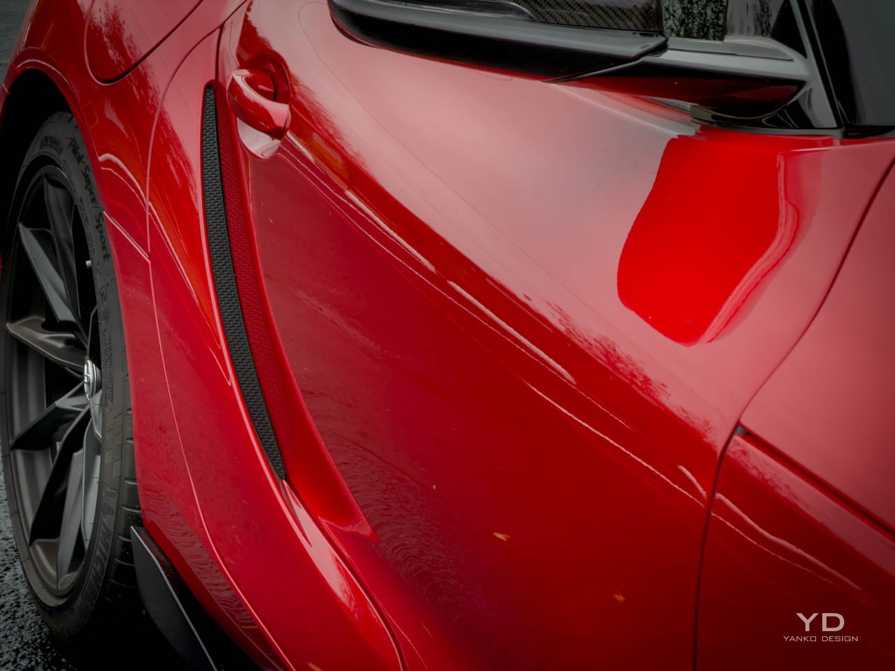
Surfacing across the body panels demonstrates the kind of complexity that requires time to appreciate. The door skins carry compound curves that transition from convex to concave as they approach the rockers, creating shadow lines that change character depending on the sun angle. Fender tops pull upward from the hood line with enough volume to be visible from the driver’s seat, a design choice that deliberately references the original A80 Supra’s visual cues. The hood itself stretches forward with a slight power dome that interrupts what would otherwise be a simple convex surface, adding muscularity without resorting to the aggressive venting common in performance car design.

Where the Supra’s form language succeeds most convincingly is in its refusal to chase visual aggression for its own sake. Many competitors in this price bracket layer on ducts, vents, wings, and diffusers that announce performance intent through visual noise. The GR Supra communicates through proportion and surface, trusting that buyers who appreciate the engineering beneath will also appreciate the design discipline above. I think it is one of the better looking sports cars you can buy right now, and it will age better than most of its rivals.

Interior Architecture

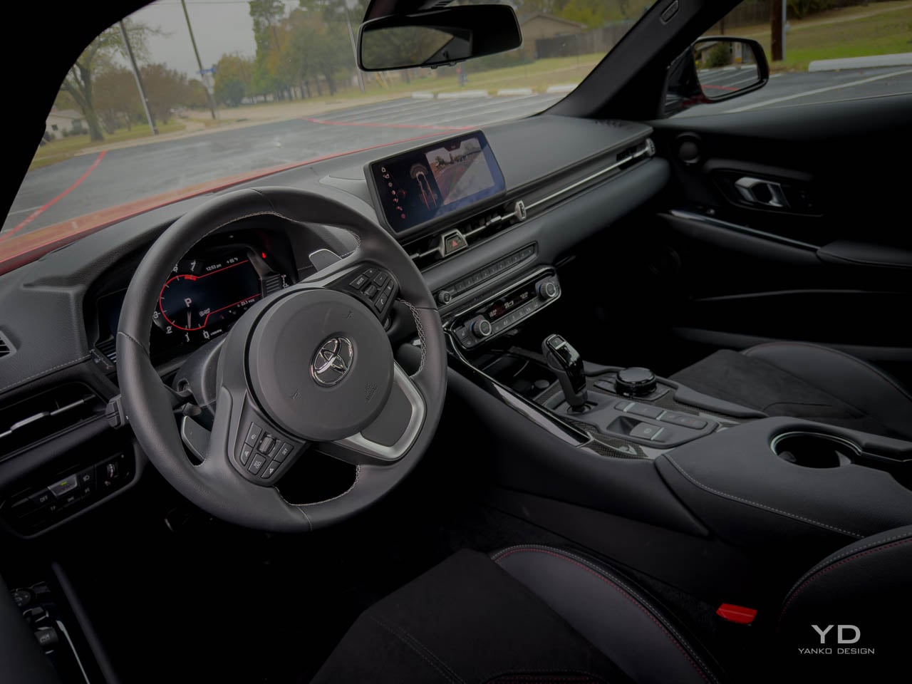
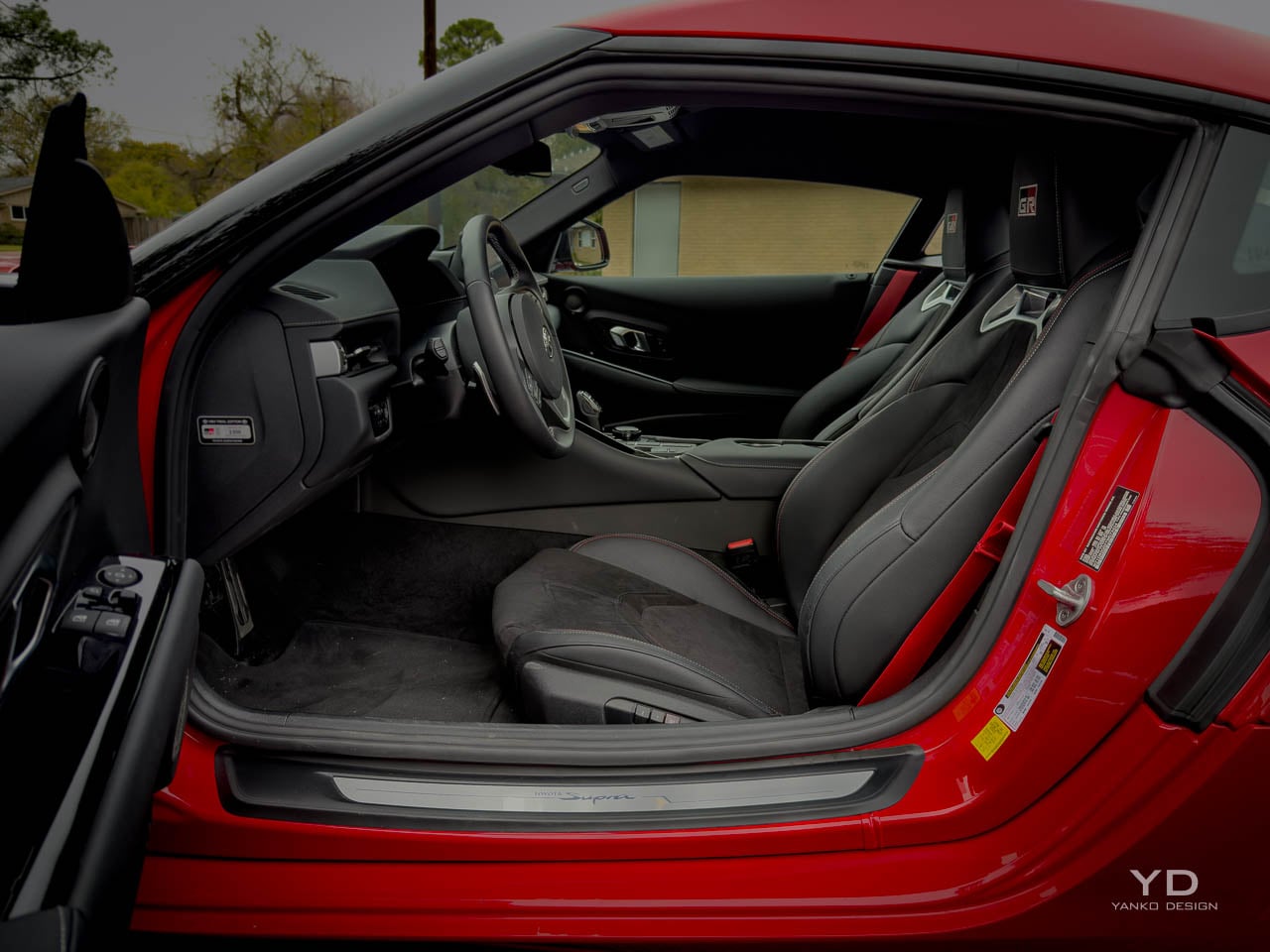
Cabin architecture establishes its priorities the moment the door swings open, presenting a cockpit organized around the driver with almost aggressive single-mindedness. Seat positioning sits low, with the hip point closer to the floor than most modern sports cars permit, creating the sensation of sitting in the car rather than on it. A relatively high door line and the upward sweep of the dashboard combine with that low seating to produce an environment that feels enclosed without claustrophobia, like a well-fitted helmet rather than a restrictive space. The center console rises between driver and passenger, creating both physical and psychological separation that reinforces the driver-focused intent. This is not a car designed for conversation during spirited driving.

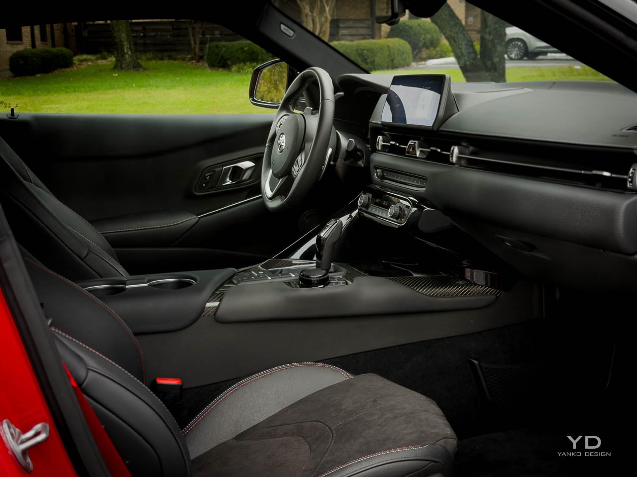
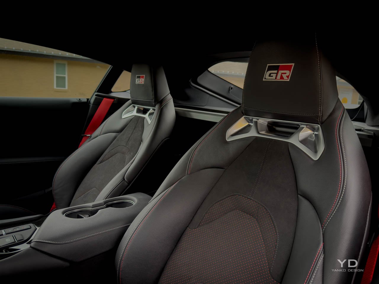
The Final Edition’s interior trim elevates the cabin through Alcantara and leather surfaces with red contrast stitching and GR branding integrated into the headrests and door panels. That red accent strategy walks a careful line: visible enough to communicate the special edition status, restrained enough to avoid the boy-racer look that aggressive color blocking can create. Alcantara appears on high-contact areas where grip matters, and the texture variation it brings is welcome. Leather covers the surfaces where durability and easy cleaning take priority. The combination feels deliberate rather than decorated.

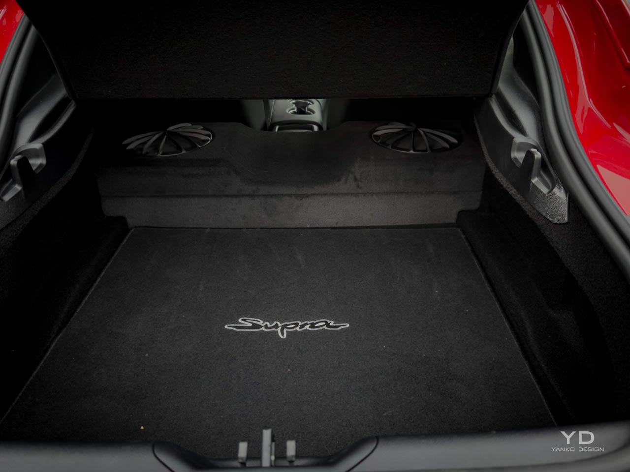
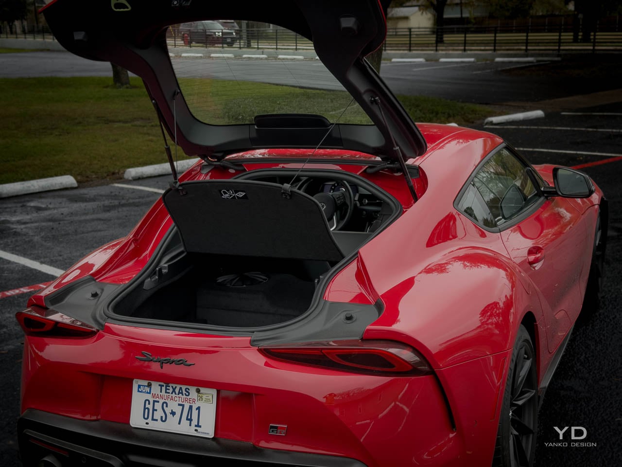
Spatial logic within the cabin follows the classic sports car compromise: adequate space for two adults, minimal accommodation for anything else. The 10.2 cubic feet of cargo behind the seats accepts weekend bags or a set of helmets, but the hatchback opening limits practical access compared with a traditional trunk. I fit a carry-on and a camera bag back there without much fuss. Seat adjustment range accommodates a reasonable spread of body types, though taller drivers may find the roof proximity notable, particularly with the double-bubble sculpting pressing down at the head area. The passenger seat offers less adjustment range, an honest acknowledgment that this space exists primarily to transport someone occasionally rather than to provide equivalent comfort to the driver’s position. The instrument cluster positions directly ahead of the steering wheel in a binnacle that creates visual focus, while the center-mounted infotainment screen angles toward the driver with enough tilt to be visible without requiring a full head turn.

Ambient quality within the Final Edition cabin achieves a level of refinement that earlier A90 models sometimes missed. Panel gaps align with acceptable precision, door closure sounds carry the solid thunk that buyers at this price expect, and the overall assembly feel reflects the maturation that comes with late-production-run refinement. The JBL audio system fills the cabin with competent sound quality that neither embarrasses the car nor elevates it to audiophile territory. Road noise penetration remains higher than in grand touring competitors but lower than in track-focused machines, positioning the Supra appropriately for its dual-purpose character.

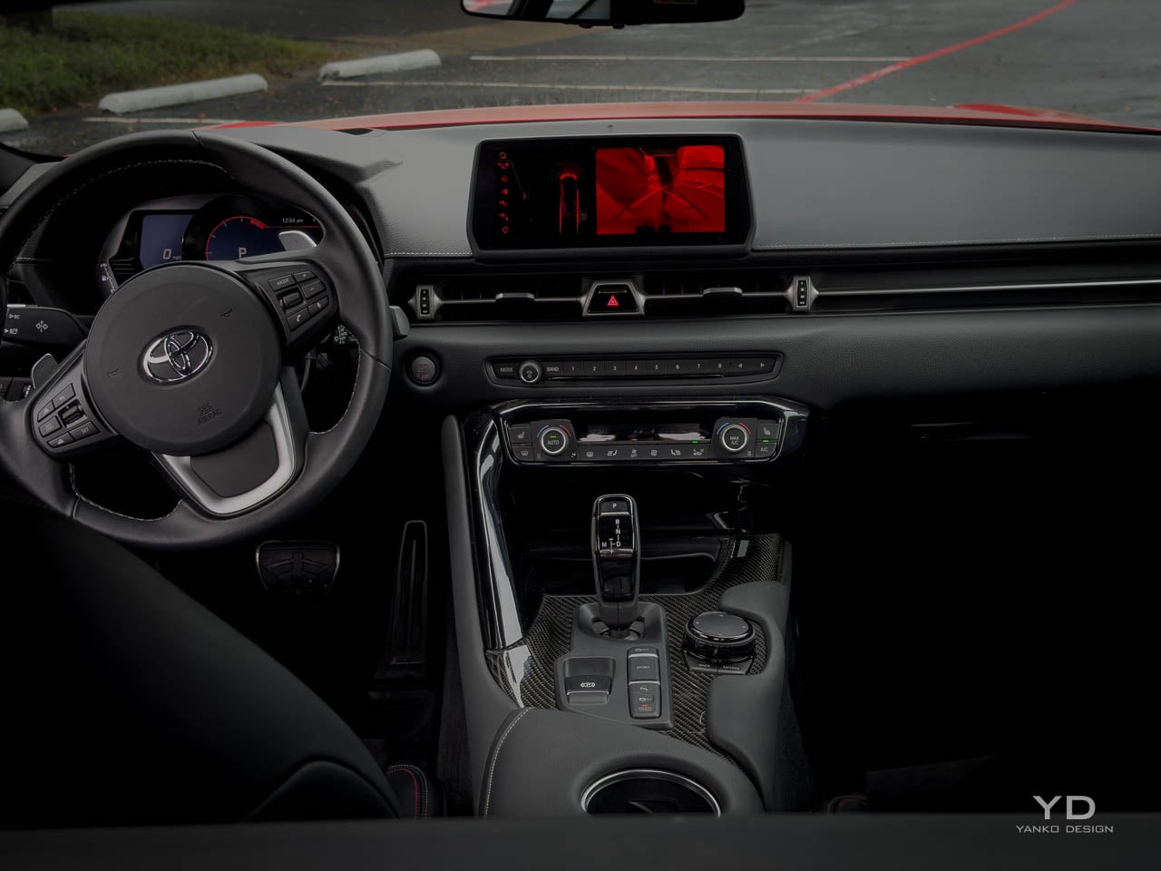
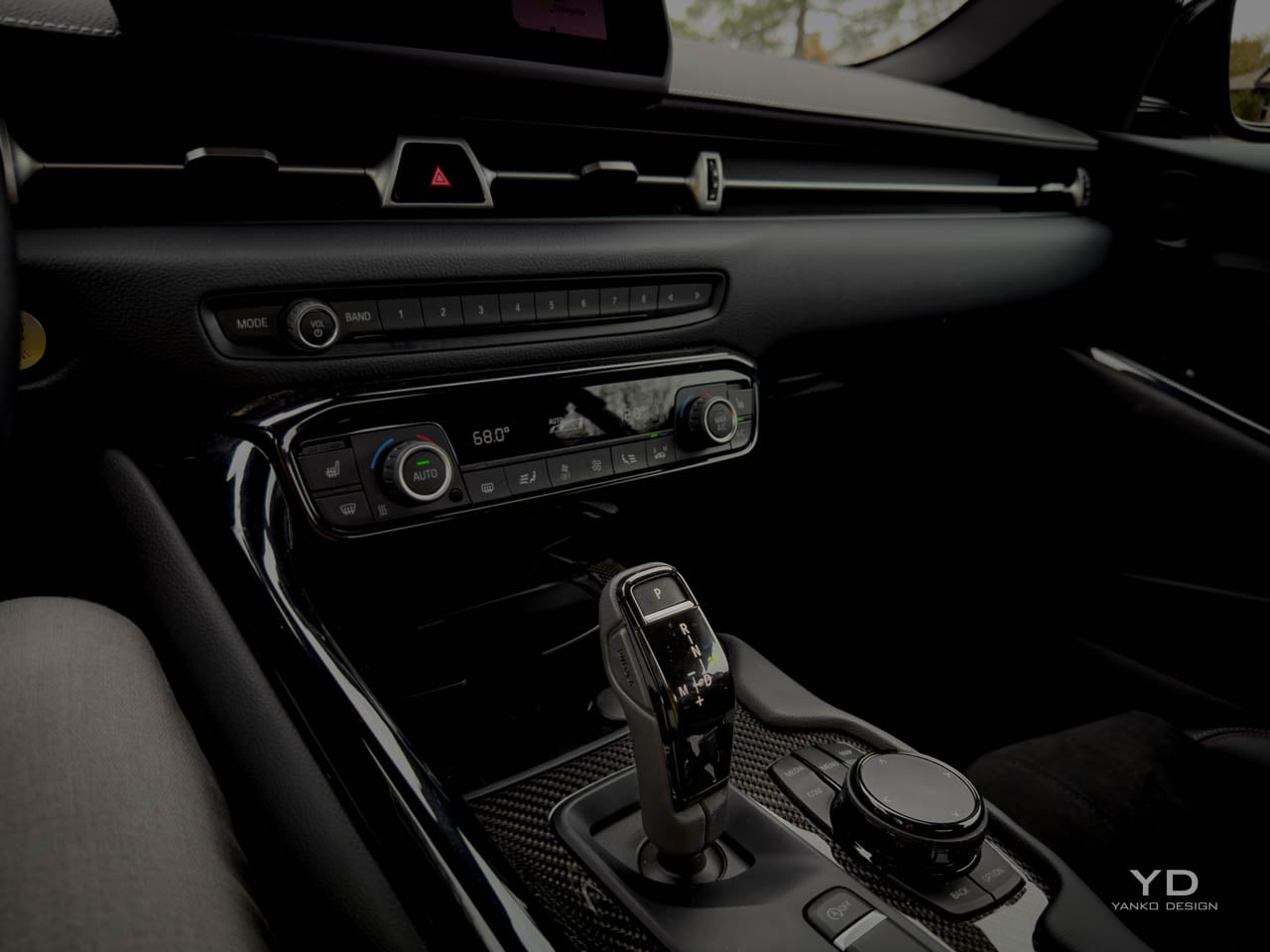
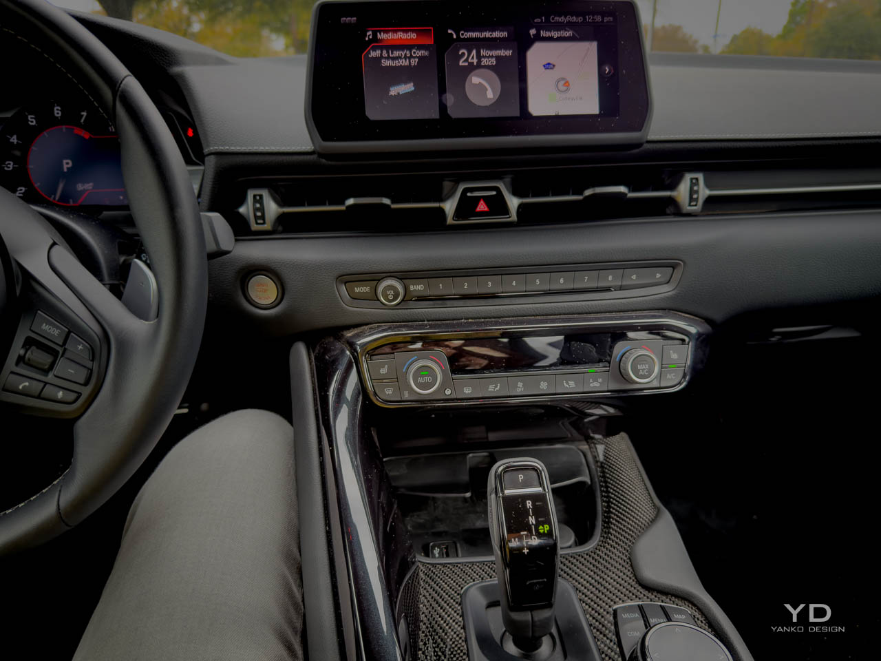
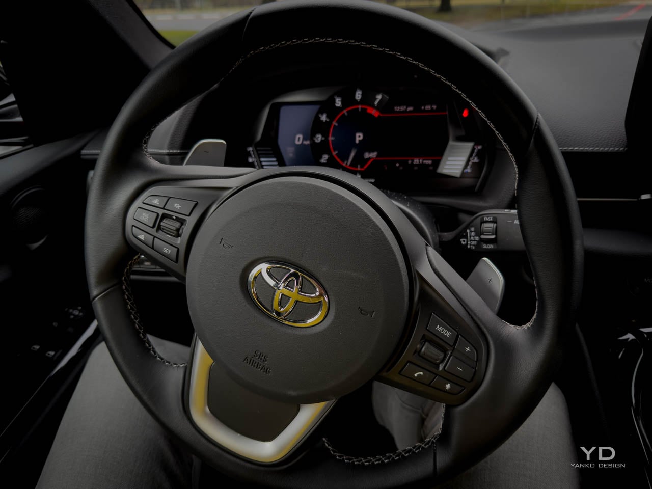
Control surface placement follows established conventions without innovation, which in this context reads as confidence rather than laziness. The steering wheel rim thickness and diameter feel appropriate for the car’s performance envelope. Paddle shifters, on automatic-equipped models, position within natural finger reach. Climate controls operate through physical buttons rather than touchscreen menus, a decision that becomes increasingly welcome as more manufacturers abandon tactile interfaces. The overall ergonomic impression suggests a cabin designed by people who drive rather than by people who design interfaces.

Material Composition

Material selection within the Final Edition demonstrates the kind of thoughtful approach that distinguishes serious sports cars from dressed-up economy platforms. The Alcantara carries enough weight to feel genuine rather than synthetic, and the stitching on the leather surfaces maintains consistent spacing throughout. Hard plastics appear in lower visibility areas, but their matte finishes prevent the cheap, shiny look that dates an interior. Carbon fiber trim matches the exterior pieces in weave and clear coat.

The steering wheel leather provides grip during hard cornering without needing aggressive perforation. The shift lever moves through its gate with the mechanical precision you want from a sports car. Climate control knobs click with appropriate resistance, and even the key fob has the right heft. These details matter more than they should, and the Final Edition gets most of them right.


Sound enters the cabin intentionally. Road surface changes come through the floor clearly enough to tell you about grip conditions. Wind noise picks up above highway speeds, a tradeoff for that slippery shape. The inline-six sounds smooth and present without needing artificial amplification through the speakers. This is a car that wants you engaged, not cocooned.

Technology Integration

The 8.8-inch infotainment display runs older BMW iDrive software that works fine without impressing anyone. Apple CarPlay handles smartphone connectivity, though Android Auto remains unavailable, a gap that stands out as the market has largely standardized around both. The central controller with shortcut buttons takes some learning but becomes efficient with use. Response time is adequate, and the screen resolution reflects the platform’s age without embarrassing the car.

The head-up display projects speed, navigation directions, and basic vehicle info onto the windshield where it belongs. Brightness adjusts automatically, and the information density stays reasonable during spirited driving. Taller drivers may find the projection sitting lower than ideal.

Driver assistance on automatic models includes adaptive cruise, lane departure warning, emergency braking, and blind spot monitoring. These systems work competently without the refined calibration of the best current implementations. The technology overall reflects a transitional moment: physical buttons for climate and common functions, which many buyers will appreciate, but less visual sophistication than competitors increasingly offer. The tech is fine. You are not buying this car for its infotainment.

Powertrain Character

The 3.0-liter turbocharged inline-six produces 382 horsepower and 368 pound-feet of torque through a powerband that emphasizes breadth over peak drama. Torque arrives from 1,800 rpm and maintains presence across the usable range, eliminating the lag and surge that characterized earlier turbo applications and creating a delivery character that rewards varied driving styles. The engine note carries the mechanical smoothness inherent to inline-six architecture, with a refined exhaust sound that announces intent without the aggressive crackle and pop that some competitors employ. Power delivery feels linear and accessible, building predictably with throttle input rather than arriving in sudden bursts that complicate corner exit management.

Transmission choice between the six-speed manual and eight-speed automatic represents a philosophical decision as much as a practical one. The manual offers the engagement and control that enthusiasts prize, with a shift action that has improved across model years to provide shorter throws and more precise gate definition. The automatic matches revs competently during downshifts, executes ratio changes with appropriate speed during spirited driving, and proves unobtrusive during commuting duties. Toyota’s quoted acceleration times favor the automatic slightly, with 0-60 mph arriving in 3.9 seconds versus 4.2 seconds for the manual, though the differences in real-world driving feel less significant than benchmark testing suggests.

The Final Edition’s chassis improvements transform how the powertrain translates through the driving experience. The brake pedal firms up after a few hard stops rather than going soft, which builds confidence when you start pushing. Revised differential control maps improve traction deployment during corner exit, and you feel the rear step just a bit before the diff catches it rather than snapping into oversteer. The stronger front stabilizer bar and recalibrated adaptive dampers maintain body composure under the power application that the turbo six enables. These changes do not alter the powertrain’s fundamental character but refine how that character reaches you through the controls.

Daily Reality

Ownership experience with the GR Supra Final Edition confronts the compromises inherent to sports car design with varying degrees of success. The low seating position that creates driving involvement also complicates entry and exit, particularly in parking spaces where adjacent vehicles limit door swing. Visibility limitations from the small rear window and thick C-pillars require adjustment for drivers accustomed to more expansive glass areas, making parking lot navigation a conscious task rather than a casual one. The firm suspension tuning that provides communication and control on winding roads transmits surface imperfections with corresponding directness, making rough pavement a more present companion than luxury-oriented vehicles would permit.

Fuel economy according to manufacturer estimates reaches 22 mpg in city driving and 29 mpg on the highway, with a combined figure of 25 mpg that reflects the turbocharged six-cylinder’s efficiency when cruising and its appetite when pushed. Real-world numbers will vary with driving style, but the overall efficiency positions the Supra reasonably within its competitive set, neither punishing owners with sports car fuel bills nor pretending toward economy car frugality. Premium fuel requirements add to operating costs in a way that buyers at this price point typically accept as inherent to the category.

Reliability considerations for the Final Edition benefit from six years of production refinement and the BMW powertrain’s established service record in various applications. Early A90 models experienced some software and electronic issues that subsequent years addressed through updates and revisions. The mechanical components, including the engine, transmission, and differential, have demonstrated durability across the ownership community, with major failures remaining relatively uncommon in maintained examples. Service access through Toyota dealers provides convenience advantages over more exotic alternatives, though parts pricing for BMW-derived components can exceed expectations set by Toyota’s mainstream reputation. Warranty coverage follows Toyota’s standard terms, providing the assurance that comes with corporate backing during the initial ownership period.

Storage practicality remains the sports car compromise that no design can fully solve within this package’s constraints. The 10.2 cubic feet behind the seats accepts soft luggage or equipment bags, but the hatchback opening restricts the shapes and sizes that fit easily. The absence of a front trunk, common in mid-engine competitors, eliminates a supplementary storage option that some buyers might expect. Interior storage compartments provide adequate space for phones, wallets, and small items without offering the bins and cubbies that more practical vehicles include. The trunk floor sits high relative to the rear bumper, requiring a lift-over motion that larger or heavier items resist. Owners planning regular cargo duties will find the Final Edition uncooperative.

Competitive Context

Positioning against direct competitors reveals the Final Edition’s distinctive value proposition within a segment rich with alternatives. At approximately $63,000, the Porsche 718 Cayman offers mid-engine balance and the Porsche badge’s aspirational weight, but base models arrive with less power, while equivalently-equipped examples push beyond $80,000. Starting around $64,000, the BMW M2 shares platform architecture with the Supra but wears the M division’s identity, providing comparable performance with a different aesthetic philosophy and higher standard equipment levels. The Nissan Z presents a front-engine, rear-drive alternative at lower price points starting near $50,000, though with less refined chassis dynamics and a less developed interior environment.

Design differentiation within this competitive set reflects each manufacturer’s interpretation of sports car purpose. The Porsche approach emphasizes precision engineering expressed through minimalist design, with restrained surfaces and functional detailing that communicates seriousness without flamboyance. BMW’s M2 adopts a more aggressive stance, with widened bodywork and prominent air intakes that announce performance intent visually. The Nissan Z revives retro styling cues that connect to heritage models, creating emotional resonance through nostalgic reference. The GR Supra occupies a space between these approaches, modern in execution but proportionally classic, dramatic in silhouette but restrained in detailing.

Value assessment for the Final Edition depends heavily on buyer priorities and intended use. Those seeking maximum performance per dollar will find better acceleration numbers elsewhere. Those prioritizing interior luxury or technology features will find more comprehensive offerings at similar prices. Those wanting a daily driver with occasional sport driving will find more practical alternatives with comparable engagement. The Final Edition’s value proposition centers on something less quantifiable: the refinement of a platform that has spent six years developing its character, presented in the form Toyota believes represents its fullest expression. That refinement carries worth for buyers who understand what it represents and holds less meaning for those who prefer specification sheet comparison.

Who Should Buy This

The Final Edition makes the most sense for enthusiasts who already know they want a Supra and want the most sorted version Toyota will ever make. If you track your cars occasionally but mostly drive them on weekends, the chassis improvements and brake upgrade translate directly into confidence. If you care about owning something that will hold its value as a last-of-generation collectible, the limited production run and manual transmission availability help that case. If you need a daily driver that happens to be fun, the standard 3.0 or 3.0 Premium gets you most of the experience for less money. And if you cross-shop heavily on tech features or interior luxury, the Cayman and M2 offer more polish in those areas. The Final Edition is for people who prioritize how a car feels over what it offers on paper.

Design Verdict

The 2026 Toyota GR Supra MkV Final Edition represents a mature conclusion to a generation that arrived with controversy and departs with resolution. Toyota’s decision to invest the Final Edition’s development budget in chassis refinement rather than power increases or cosmetic drama reveals a design philosophy that prioritizes experience over specification. The car that results feels more complete than its predecessors, with the sharpened dynamics and improved braking confidence that track time and engineering iteration produce. Whether those improvements justify the price premium over standard models depends on the buyer’s sensitivity to the differences and the value they place on owning the definitive version of a platform reaching its end. The design choices, from the restrained exterior treatment to the driver-focused interior architecture to the material selections that emphasize quality over flash, communicate intentions clearly enough for interested buyers to evaluate alignment with their own priorities.

Longevity prospects for the Final Edition’s design suggest the kind of aging that rewards restraint. The absence of aggressive trend-chasing elements, the proportion-driven exterior language, the functional rather than decorative interior approach: these qualities tend to preserve relevance as years pass rather than dating the design to a specific moment. The limited production run adds collectability considerations that may influence future values, particularly for manual transmission examples in distinctive color combinations. Whether the GR Supra MkV will achieve the classic status of its A80 predecessor remains for time to determine. What the Final Edition demonstrates conclusively is that Toyota understood what made this generation worth building and chose to close its production run with the clearest expression of that understanding.

The post 2026 Toyota GR Supra MkV Final Edition Review: A Farewell Written in Carbon Fiber and Camber first appeared on Yanko Design.
Blueair 2‑in‑1 Pro Purify + Humidify Review: Clean Air, Skin Care in One

PROS:


  • Dual functionality in a single, well-designed form

  • Top-fill design prevents back strain

  • DermaSense skin mode with intelligent humidity control

  • Long-life, machine-washable components

  • Comprehensive hygiene features

CONS:


  • Large and heavy body feels imposing in small spaces

  • Only available in one neutral color

  • Premium price tag

RATINGS:

AESTHETICS
ERGONOMICS
PERFORMANCE
SUSTAINABILITY / REPAIRABILITY
VALUE FOR MONEY

EDITOR'S QUOTE:

The Blueair 2-in-1 Pro Purify + Humidify makes air quality feel like part of your skincare routine, blending serious performance with bedroom-worthy design.
award-icon

Air purifiers and humidifiers usually look like they belong in a hospital supply closet rather than a bedroom. Most are boxy white appliances with visible mist plumes, blinking lights, and a general vibe that says “I am here to solve a problem” rather than “I belong in this space.” Meanwhile, people who care about sleep quality and skin health are starting to realize that the air itself might be part of the routine.

The Blueair 2‑in‑1 Pro Purify + Humidify feels like Blueair finally designed for people who want both functions but refuse to sacrifice aesthetics or simplicity. It is a tall, sculptural tower that combines serious air purification with gentle, invisible humidification and a skin-focused mode that adjusts humidity based on time of day and room temperature, positioned as step zero in a nighttime skincare routine. Let’s dive in to see if it delivers on its promises.

Designer: Blueair x Above

Click Here to Buy Now: $400 $499.99 ($99.99 off, use coupon code “YANKO20”). Hurry, deal ends in 48-hours!

Aesthetics

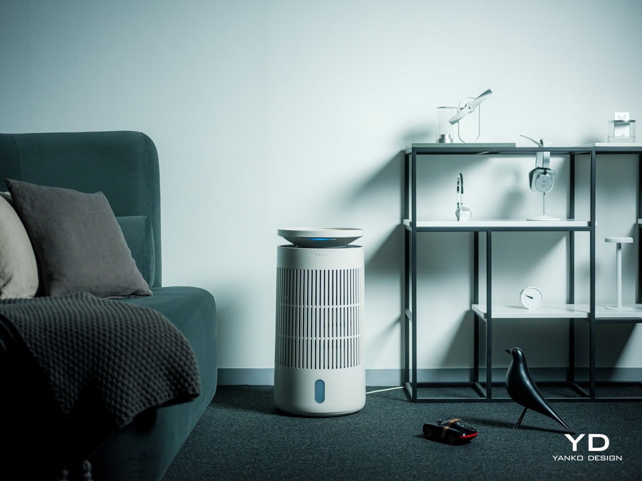
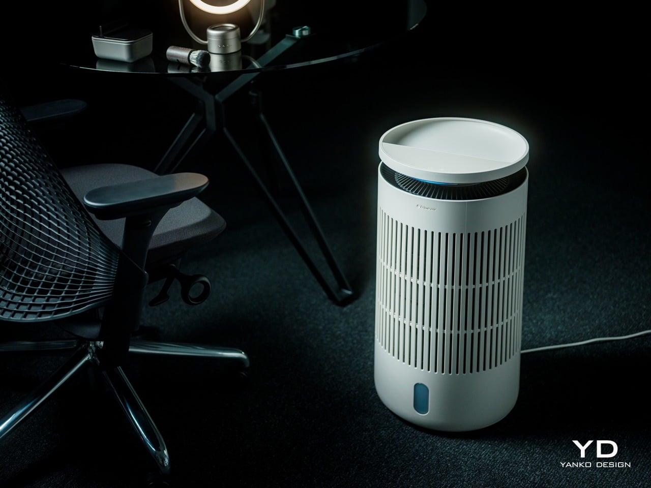
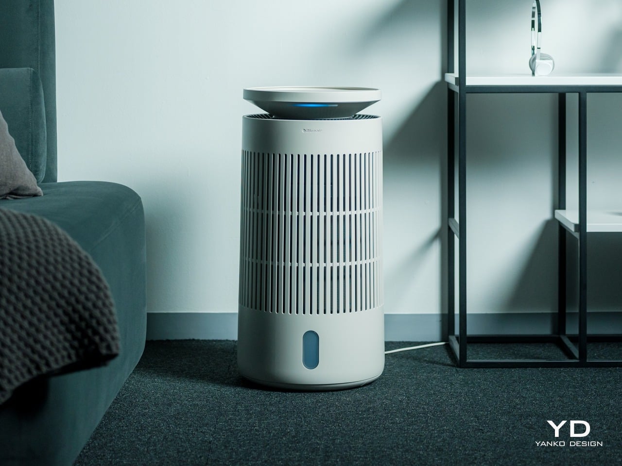
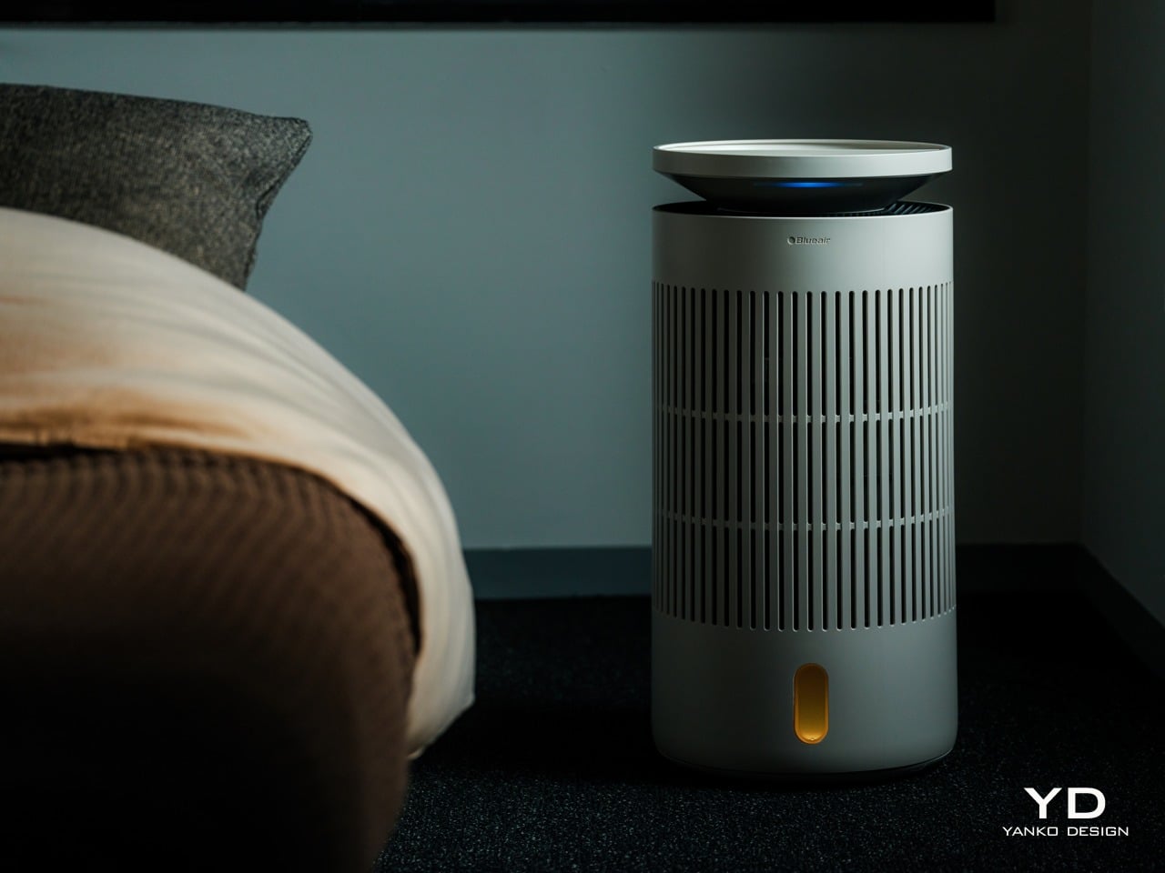
The first thing you notice about the Blueair 2‑in‑1 Pro is that it does not look like an appliance trying to hide. It is a cylindrical tower wrapped in evenly spaced vertical slats, finished in a soft off white that reads somewhere between warm beige and coastal linen, depending on the light. The proportions feel Scandinavian, tall enough to have presence but narrow without crowding the floor.

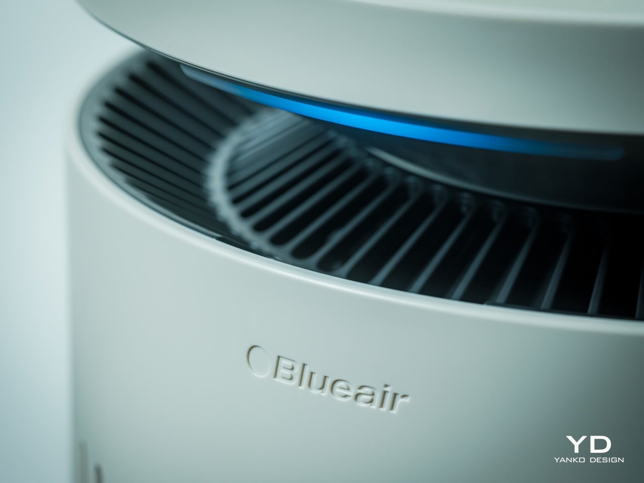
The top disc floats slightly above the body with a subtle gap, and when the device is running, a thin line of blue light glows in that gap, more like a bedside lamp than a status LED. The slats wrap 360 degrees around the body, which gives it a kind of architectural rhythm that works whether you see it from the front or the side.

Near the base, there is a small vertical window that shows the water level and projects mood lighting when enabled in the Blueair app, but it is narrow enough that it does not break the visual flow. The top disc itself is smooth and plate-like, with a matte finish that does not collect fingerprints. The material is still primarily plastic, but it is clearly chosen to feel refined rather than cheap. The matte finish softens reflections and resists the glossy sheen that makes a lot of gadgets look disposable.

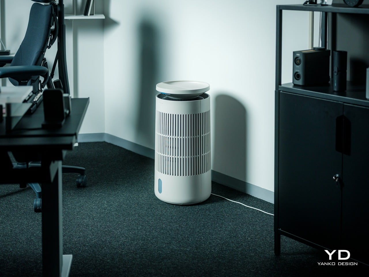
The tower looks comfortable in different contexts. In a bedroom next to wood furniture and neutral textiles, it reads as another piece of the interior rather than a piece of tech parked temporarily. In a small office with dark carpet, floating shelves, and a desk chair, it sits in the corner without clashing with the more technical surroundings, which makes it easy to imagine moving between spaces. The sense you get is that someone thought about how this object would age in a room where it runs every night.

Ergonomics

The Blueair 2‑in‑1 Pro is tall enough that you do not need to crouch to reach the controls, which sounds minor until you realize how many bedside devices force you to bend or kneel just to tap a button. The footprint is compact, roughly a foot in diameter, and the weight gives it enough stability that you can brush past it without worrying it will tip.

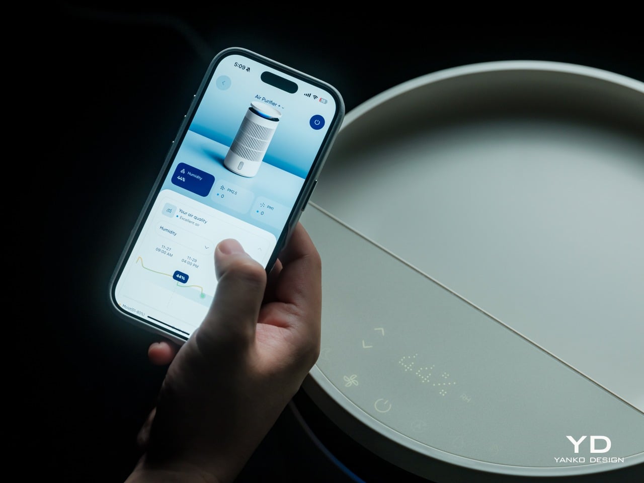
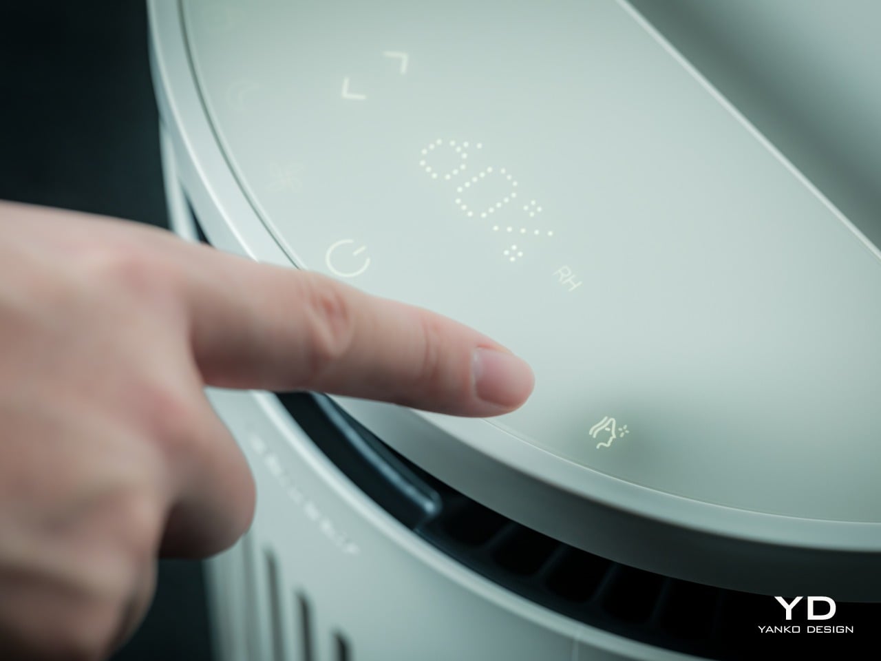
The top surface is where most of the interaction happens. A semi-circular ring houses clearly marked icons for power, fan speed, night mode, humidification toggle, and skin mode, along with indicators for air quality, humidity percentage, and water level. The layout is simple enough that you can understand it at a glance, so switching into auto mode or activating skin mode is a one-tap affair.

One of the most thoughtful ergonomic details is the top fill design. Most humidifiers require you to lift a heavy tank, carry it to a sink, fill it, then carefully carry it back and slot it into place, which gets old quickly and can be awkward if you have back or shoulder issues. The Blueair 2‑in‑1 Pro lets you simply lift the top disc slightly and pour water directly into the opening from a jug or carafe. The smart water sensor and real-time display remove worries by reminding you when the water level is low and alerting you when the tank is almost full.

It feels as easy as watering a houseplant, and for people who want to avoid bending and lifting, this small design choice makes day-to-day upkeep significantly less annoying. There is still the option to remove the tank entirely and fill it at a sink when you want to add a larger volume at once, but most of the time, the top fill is faster and easier.

Performance

Blueair boasts the 2-in-1 Pro Purify + Humidy as the most powerful of its kind, delivering balanced and superior performance in such a compact package. Compared to a leading competitor, its tests have proved it to offer 3x better purification and 2x cleaner humidification. Although we don’t have labs to verify these numbers, our own day-to-day use proved it to work as advertised.

The Blueair 2‑in‑1 Pro is both a capable air purifier and a serious humidifier, which is a harder balance than it sounds. The purification side uses Blueair’s HEPASilent™ technology, which combines mechanical filtration with an electrostatic charge to capture fine airborne particles like dust, pollen, smoke, and volatile organic compounds. The intake and outlet are 360 degrees around the body, so it pulls air from all sides and pushes it back out clean.

The humidification uses evaporative technology that Blueair calls 360° InvisibleMist™. Instead of producing visible fog or mist, it adds moisture to the air in a controlled, gradual way that avoids white dust on furniture and damp spots on nearby surfaces. This matters especially in bedrooms and offices with electronics, books, or wood finishes, where you want comfortable air without worrying about residue or condensation.

The skin and beauty sleep focus is where the device starts to feel like something designed for wellness routines rather than just air quality. The dedicated skin mode keeps humidity in a range dermatologists typically recommend for skin comfort, roughly between 40-60%, and adjusts that target based on room temperature and time of day. At night, when your skin tends to lose more moisture, the device gently raises humidity levels.

In practice, this feels like setting skin mode before bed, going through your normal cleanse and treatment routine, and then falling asleep in a room that feels neither dry nor heavy. You do not wake up with that tight, parched feeling that dry winter air or overheated apartments tend to cause, and your skin does not feel irritated or raw the way it sometimes does when indoor air is harsh.

The Blueair app adds another layer of control and insight without being required for basic use. From your phone, you can set target humidity levels, create schedules for when the device runs, adjust display brightness, and choose between three mood lighting settings that turn the top ring into a warm, normal, or bright glow. You can also see air quality and humidity trends over time.

That said, most of the time you can leave it in auto or skin mode and let it manage itself quietly in the background. The app is there when you want precision or automation, but the device does not force you into it for everyday operation, which feels like the right balance for a bedroom appliance.

Noise is surprisingly gentle at lower speeds. In night mode, the sound profile is closer to a soft fan than a mechanical hum, which many people find soothing as a kind of background white noise. Higher speeds are audibly stronger when the device detects poor air quality and ramps up to clear it faster, but the ability to drop back into quiet operation keeps it compatible with light sleepers.

The device also includes several behind-the-scenes hygiene features that keep the humidifier side fresh over time. A built-in UV pump recirculates water to help inhibit bacterial growth, a wick dry mode runs automatically when the tank is empty, or the device goes to standby to prevent musty smells, and a water refresher module made of activated carbon helps absorb minerals and reduce discoloration.

Sustainability

Blueair is a Certified B Corp, which signals that the company has passed third-party audits for social and environmental impact. This does not magically make the device carbon neutral or eliminate its footprint, but it does suggest that longevity, energy use, and materials were part of the design conversation rather than afterthoughts. For a device designed to run every night, that kind of corporate positioning matters.

The 2‑in‑1 Pro is built around long-life, user-replaceable components. Both the air filter and the humidifier wick are rated for up to twelve months of use, which reduces the frequency of replacements and the amount of waste compared to devices that require new cartridges every few weeks. The wick is machine washable, which extends its life even further and keeps it feeling fresh without needing to buy a new one prematurely.

The hygiene features also support sustainability indirectly. A humidifier that stays clean and pleasant to use is less likely to be abandoned in a closet after one winter, which means fewer devices being replaced prematurely. The UV pump, wick dry mode, and water refresher all work together to keep the system feeling fresh, which encourages long-term ownership.

The housing is still primarily plastic, and this is an electrically powered device, so it has an environmental cost. But combining two machines into one does reduce the total number of housings, motors, and power supplies needed compared to buying a purifier and a humidifier separately. For someone who needs both functions, the 2‑in‑1 approach is a more efficient use of materials and space.

Value

The Blueair 2‑in‑1 Pro Purify + Humidify sits firmly in the premium category with its price tag, which is a real investment for a bedroom appliance. That figure makes more sense when you consider that it replaces a standalone purifier, a standalone humidifier, and in some ways a separate wellness gadget, while also adding design intelligence and app control that many basic units lack.

Space is part of the value equation. In bedrooms and small home offices, floor space and visual calm are both precious. Having one well-designed column instead of multiple mismatched boxes reduces clutter, simplifies cable management, and makes the room feel more intentional. For design-minded homeowners, that reduction in visual noise is a real form of value, not aesthetic preference alone.

The skincare and beauty sleep focus adds another dimension to the value story. For people already spending money on serums, moisturizers, and treatments, optimizing the air they sleep in is a logical extension of that investment. The fact that the device can quietly maintain a skin-friendly humidity range while filtering out airborne irritants makes it feel like a wellness tool that supports the rest of your routine.

Verdict

The Blueair 2‑in‑1 Pro Purify + Humidify is a carefully considered column that manages to be a capable purifier, a gentle humidifier, and a sleep-friendly presence without ever looking or feeling like a clinical appliance. It blends into bedrooms and small offices with the kind of visual ease that makes you forget it is technology, and the ergonomic details like top fill refilling and intuitive controls make it easy to live with day to day.

The 2‑in‑1 Pro makes the most sense for people who care about both design and wellness, who want their bedroom or office to feel like a calm, supportive environment, and who appreciate when technology quietly improves their routines without demanding constant attention. For that audience, this feels less like a splurge and more like a thoughtful upgrade to the air they live in every day.

Click Here to Buy Now: $400 $499.99 ($99.99 off, use coupon code “YANKO20”). Hurry, deal ends in 48-hours!

The post Blueair 2‑in‑1 Pro Purify + Humidify Review: Clean Air, Skin Care in One first appeared on Yanko Design.

Volvo XC60 T8 AWD Ultra Review: Scandinavian Calm in a Segment That Prefers to Shout

PROS:


  • Exceptional interior material quality – Nappa leather, open-pore wood, and real aluminum trim create a tactile experience that rivals vehicles costing significantly more

  • 455 hp with 32-35 miles of EV range – Strong plug-in hybrid performance covers daily commutes on electric power while delivering sports sedan acceleration when needed

  • Air suspension delivers outstanding ride comfort – The Ultra's adaptive suspension absorbs road imperfections while maintaining composed handling at highway speeds

  • Timeless Scandinavian design – Clean lines and understated styling will age gracefully, avoiding the dated look that trend-chasing designs often develop

  • Comprehensive standard equipment – Features like premium audio, advanced driver assistance, and the panoramic roof come included where competitors charge extra

CONS:


  • Infotainment requires too many menu taps – Basic functions like odometer readings are buried in the interface, and response times lag behind the best German systems

  • Premium pricing approaches $80k optioned – The T8 Ultra's as-tested price positions it against well-equipped German rivals with stronger brand prestige

RATINGS:

AESTHETICS
ERGONOMICS
PERFORMANCE
SUSTAINABILITY / REPAIRABILITY
VALUE FOR MONEY

EDITOR'S QUOTE:

The XC60 T8 Ultra proves that restraint can be its own form of luxury. In a segment where everyone is shouting, Volvo built something worth listening to.


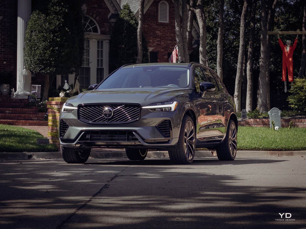
The luxury compact SUV segment has become an arms race of aggressive styling, oversized grilles, and angular creases that shout for attention. Volvo refuses to participate. The 2026 XC60 T8 AWD Ultra arrives as a deliberate counterpoint, a vehicle that communicates confidence through restraint rather than visual aggression. This is Scandinavian design philosophy made tangible: every surface, every proportion, every material choice serves a purpose beyond mere aesthetics. The result is a plug-in hybrid that feels like a quiet room in a noisy building. Where competitors deploy sharp edges and exaggerated haunches, Volvo deploys calm.

Designer: Volvo

The XC60 occupies an interesting position in automotive design language. It neither chases trends nor ignores them entirely. Instead, it filters contemporary expectations through a distinctly Nordic lens, one that values negative space as much as positive form. The T8 AWD Ultra represents the fullest expression of this philosophy, combining Volvo’s highest specification levels with a powertrain that delivers 455 horsepower while maintaining the ability to commute silently on electric power alone. This duality, performance capability wrapped in visual serenity, defines the vehicle’s character. The tension between these elements creates something more compelling than either would achieve independently.

What makes the XC60 significant from a design perspective extends beyond surface treatment. The vehicle represents a mature interpretation of what luxury means in an era of environmental awareness and digital saturation. Rather than adding complexity, Volvo has systematically removed it.

Exterior Form Language

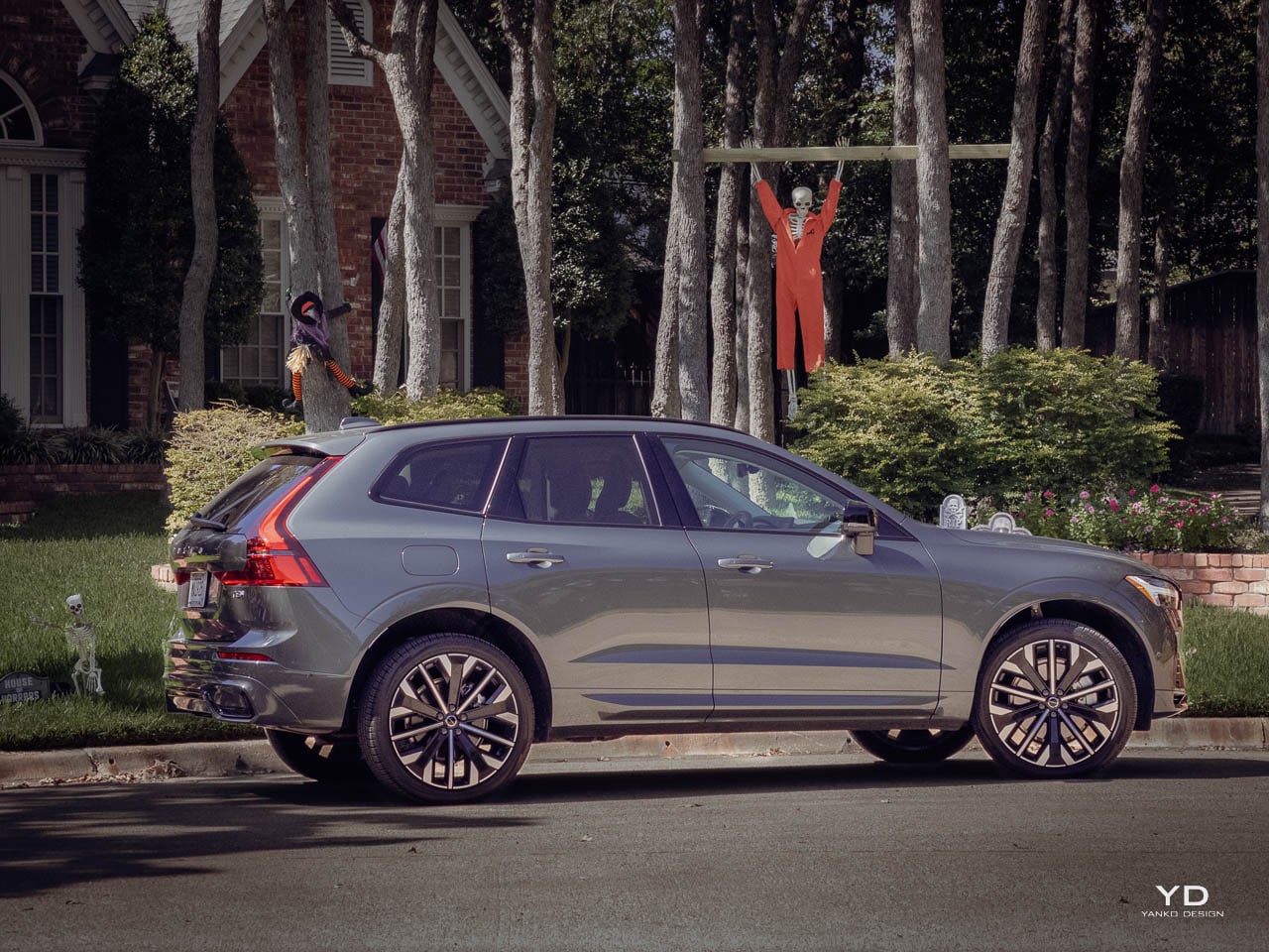
The XC60’s silhouette reads as a refined two-box shape with short overhangs and an upright tail. This proportion feels deliberately conservative compared to the swooping fastbacks and coupe-like rooflines that dominate the segment. The shoulder line runs cleanly from the Thor’s Hammer headlights to the vertical taillights, creating visual length without dramatic surfacing. Wheels ranging from 20 to 21 inches fill the arches appropriately without overwhelming the body. The overall effect suggests competence rather than performance, substance rather than flash.

Volvo’s signature lighting elements anchor the design. The Thor’s Hammer LED headlights have become as recognizable as BMW’s kidney grilles or Audi’s rings.

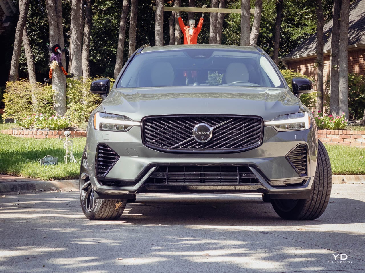
The 2026 refresh brings a cleaner grille treatment that echoes the larger XC90, with diagonal bar elements replacing previous iterations. Black internal housings within the headlight assemblies add depth and modernity without requiring additional brightwork. The lower fascia integrates real airflow openings at the corners, avoiding the fake vent epidemic that plagues the segment. Parking sensors and the forward camera system disappear into the design rather than appearing as afterthoughts. The front face communicates premium positioning through execution quality rather than aggressive styling, a distinction that matters as the vehicle ages. Designs that rely on current trends date quickly. Designs that prioritize proportion and finish quality remain relevant longer.

In profile, the XC60 reveals its proportional confidence. The greenhouse maintains a traditional three-box rhythm with proper A, B, and C pillars rather than the floating roof illusions that have become common. Window surrounds in chrome or black depending on specification provide subtle accent without excessive ornamentation. Roof rails sit low and functional. The overall side view could almost be mistaken for a wagon at certain angles, a reference to Volvo’s estate car heritage that feels intentional rather than accidental.

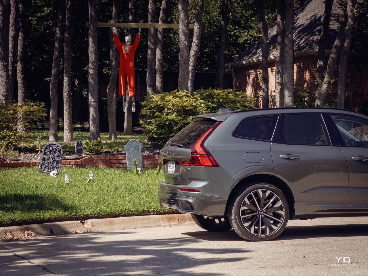
The rear design employs tall, smoked LED taillights that climb the D-pillars in a signature pattern. VOLVO block lettering spans the tailgate cleanly. T8, Recharge, and AWD badging identifies the powertrain without cluttering the surface. A subtle diffuser-style lower bumper treatment with integrated reflectors replaces visible exhaust outlets, acknowledging the plug-in hybrid’s ability to operate without combustion. The paint palette reinforces the design philosophy: Crystal White Metallic, Onyx Black Metallic, Denim Blue, and Vapour Grey. These colors reward close inspection rather than demanding attention from across a parking lot.

Interior Architecture

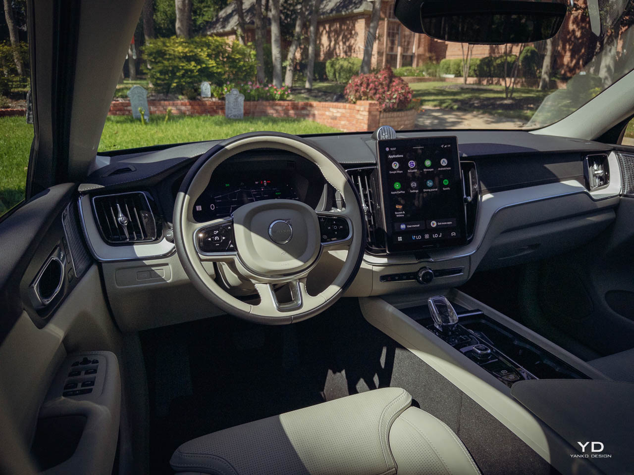
Opening the door reveals the XC60’s primary design statement. Where the exterior whispers, the interior speaks clearly about Volvo’s priorities. The immediate impression is of a cocoon, a space designed for occupants rather than spectators. Surfaces flow horizontally across the dashboard, creating visual width and calm.

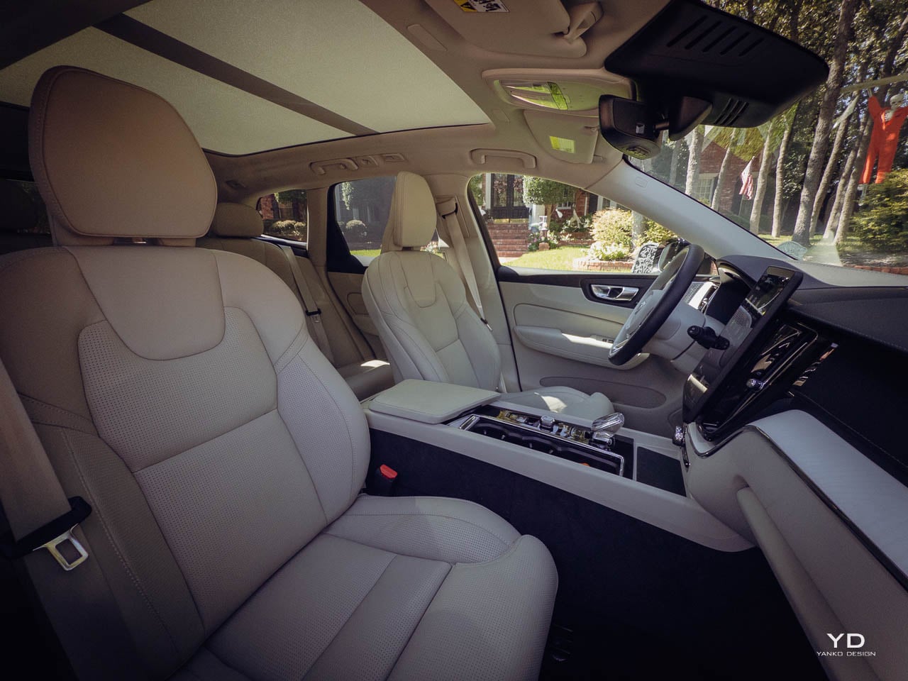
The Ultra trim layers Nappa leather across the seating surfaces with substantial bolstering and careful stitching. Available colorways include Charcoal for those who prefer darker, more enveloping environments and Blond for an airier, more open feel. Both options demonstrate restraint in their application, avoiding the contrasting piping and excessive quilting that some competitors use to signal luxury. Material transitions occur at logical boundaries rather than arbitrary decorative lines. Real open-pore wood, metal mesh, and textured inlays provide tactile variety without visual chaos. The surfaces invite touch rather than discouraging it.

The center console demonstrates Scandinavian minimalism in practice. A portrait-oriented 9-inch touchscreen dominates the interface.

Below it, a small number of physical controls remain for frequently used functions. The volume knob uses a knurled metal finish that rewards tactile interaction. On higher specifications, an Orrefors crystal-style shifter replaces the standard gear selector, introducing a jewelry-like element that catches light without demanding attention. The panoramic moonroof, standard or widely available depending on market, brings natural light into what might otherwise feel cave-like in darker trim configurations. This interplay between enclosed comfort and external connection runs throughout the interior design.

Seating architecture prioritizes long-distance comfort over sports car support. The front seats offer heating, ventilation, and massage functions in Ultra specification, with adjustable lumbar support and thigh extenders for taller occupants. The seats themselves provide substantial cushioning without feeling soft, maintaining shape and support over extended drives. This is furniture designed for hours of use rather than showroom photography. Rear accommodations follow suit with a gently reclined backrest and support that favors two adults comfortably over three-across capacity. The cabin is honest about its size: this is a compact luxury SUV, not a full-size family hauler.

Storage solutions appear throughout the cabin without disrupting the visual calm. A larger-than-previous center console bin holds items out of sight. Cupholders position logically. Door pockets accommodate bottles and smaller items. Bag hooks and nets behind the front seats provide additional organization in some configurations. The cargo area maintains a broad, square opening with practical load floor height. Split-folding rear seats create a flat surface when more capacity is needed. The plug-in hybrid packaging, often a compromise in other vehicles, preserves useful cargo space without major intrusion.

Material Composition

Material selection in the XC60 Ultra reveals Volvo’s understanding of tactile luxury. Soft-touch surfaces cover the dashboard and upper door panels, providing warmth that cold leather cannot. The leather appointments on the seats use proper grain texture rather than the over-processed smoothness that signals synthetic origin. Stitching appears precise and consistent, following design lines rather than merely holding materials together. The contrast between different textures, matte leather, polished metal, open-pore wood, creates visual interest through material honesty rather than applied decoration. Each surface communicates what it is made from without pretense.

Lower cabin areas use plastics that feel dense and well-fitted rather than hollow and cost-reduced. Panel gaps remain tight and consistent throughout.

The metal trim elements, appearing on speaker grilles, door handles, and climate control surrounds, use actual aluminum rather than chrome-look plastic. These details matter because they accumulate into an overall impression of quality that either supports or undermines the purchase price. At this specification level, the details support the price consistently. The XC60 Ultra feels expensive because expensive materials have been used in places where human contact occurs.

Volvo’s approach to material selection extends to environmental considerations without compromising luxury perception. Leather alternatives appear in some configurations using recycled materials and more sustainable processing. Wood trim sources from responsible forestry programs. Metal finishes use processes that reduce environmental impact. These choices remain largely invisible to occupants but align with the brand’s stated values and appeal to buyers who consider lifecycle impact alongside immediate tactile experience.

Technology Integration

The XC60 T8 Ultra runs a Google-based infotainment system that represents Volvo’s commitment to simplicity over complexity. Google Assistant provides voice control. Google Maps handles navigation with traffic-aware routing. The Google ecosystem allows app access without requiring phone mirroring, though wireless Apple CarPlay remains available for those who prefer it. The 9-inch portrait touchscreen displays information clearly with quick response to inputs.

A 12-inch digital instrument cluster ahead of the driver offers configurable views including a large navigation map, trip data, and driver assistance status. Information hierarchy follows logical priorities: speed and essential warnings remain prominent while secondary data occupies peripheral positions. An available head-up display projects key information onto the windshield, reducing the need to look away from the road. The display can read speed limits and traffic signs, overlaying them in the driver’s line of sight. These technologies serve practical purposes rather than existing as specification sheet items. The question Volvo seems to have asked is not “what can we add” but “what should we show.”

Some functions require menu navigation that feels deeper than necessary. Odometer readings and certain vehicle settings live multiple taps into the interface.

Audio options include Harman Kardon and an available Bowers and Wilkins system depending on package and market. The latter delivers clarity and richness that transforms the cabin into a listening environment worth experiencing. The sound system represents genuine acoustic engineering rather than speaker count marketing. For a vehicle designed around calm and comfort, high-quality audio integration aligns with the overall philosophy. Poor sound reproduction would undermine the cabin’s premium character.

The technology package demonstrates appropriate restraint alongside capability. Rather than introducing features that require user adaptation, Volvo has implemented systems that work in expected ways. Climate controls respond logically. Navigation provides sensible routes. The instrument cluster communicates without confusion. This sounds like a low bar, but the automotive industry regularly introduces interfaces that prioritize novelty over usability. The XC60’s technology feels like it was designed by people who actually use cars rather than by teams seeking differentiation through complexity.

Powertrain Character

The T8 plug-in hybrid powertrain pairs a turbocharged 2.0-liter four-cylinder with an electric motor on the rear axle and a starter-generator between the engine and 8-speed automatic transmission. Combined output reaches approximately 455 horsepower and 523 pound-feet of torque, according to Volvo’s estimates and independent testing. Acceleration to 60 mph arrives in 4.4 to 4.5 seconds, figures that seem incongruous with the vehicle’s reserved styling. This is substantial performance delivered without visual announcement. The vehicle looks calm and moves quickly when requested.

The 18.8 kWh battery provides electric-only range of approximately 32 to 35 miles. This distance covers typical daily commuting for many drivers, allowing pure electric operation for routine trips.

When the battery depletes, combined efficiency settles around 28 mpg. Hybrid operation achieves approximately 63 MPGe. Multiple drive modes, including Hybrid, Pure/EV, Power, and configurable settings, allow drivers to prioritize electric operation, preserve charge for later use, or access maximum combined output. The powertrain flexibility means the XC60 can behave as a quiet urban electric vehicle or a responsive highway cruiser depending on circumstance and driver preference.

The driving experience prioritizes refinement over excitement. Throttle response feels progressive rather than aggressive. The transmission shifts smoothly in normal operation and responds quickly when more power is demanded. The engine remains quiet unless pushed hard, which the vehicle’s character rarely encourages. With the available air suspension on Ultra trim, ride quality emphasizes comfort over sporting sharpness. Body motions stay controlled without feeling harsh. Road imperfections disappear into the suspension rather than transmitting through the structure. Steering provides adequate feedback for confident placement without sporting precision. The XC60 T8 Ultra drives like it looks: composed, capable, and disinclined toward drama.

Daily Reality

Living with the XC60 T8 Ultra reveals strengths that matter more than specification numbers. The cabin’s noise isolation creates a quiet environment at highway speeds, making conversation easy and audio systems worth using. The seats remain comfortable over extended drives, maintaining support without creating pressure points. Climate controls work effectively, and the available air quality monitoring adds practical value in urban environments where exterior air quality varies.

The air suspension’s height adjustment proves useful beyond ride quality. Raising the vehicle provides additional ground clearance for rough roads or driveway approaches.

Lowering it at highway speeds improves aerodynamics and eases entry in low parking structures. The system operates automatically based on conditions, removing the need for driver intervention in most situations. The 360-degree camera system and parking sensors make placing the vehicle in tight spaces manageable despite dimensions that require awareness. The rearview camera displays clearly and inspires confidence during reversing maneuvers.

Some compromises exist within the daily experience. The infotainment system, while functional, lacks the polish of certain German competitors. Response is good but not instant. The interface is logical but not intuitive. This represents adequate execution rather than impressive achievement. Fuel economy, when operating in hybrid mode after battery depletion, requires more frequent stops than three-row crossovers or smaller luxury SUVs. The premium fuel requirement adds cost over regular-grade alternatives. Pricing for the T8 Ultra specification sits in the low to mid 70,000 dollar range before options, with well-equipped examples approaching 80,000 dollars. This positions the XC60 against mid-specification German rivals with established prestige and strong dealer networks.

The vehicle serves specific needs exceptionally well. Commuters with charging access at home or work can operate primarily on electric power, reducing fuel consumption dramatically. Families who prioritize cabin quality over maximum cargo flexibility will appreciate the material choices and seating comfort. Buyers seeking luxury without visual aggression will find the XC60’s restraint appealing rather than disappointing.

Competitive Context

The XC60 T8 Ultra competes against established German plug-in hybrids and traditional luxury crossovers. The BMW X3, Mercedes-Benz GLC, and Audi Q5 offer similar dimensions with different design philosophies. German competitors typically prioritize sharper styling, sportier dynamics, and more tech-forward cabins.

Volvo’s approach differs fundamentally. Where German brands emphasize cockpit-like driver focus with large screen arrays and aggressive surfacing, the XC60 creates a lounge-like environment that serves passengers equally to drivers. Material quality matches or exceeds German alternatives at similar price points. Design vocabulary speaks a different language entirely, one of restraint rather than assertion. The XC60 often offers a modest EV range advantage over many German plug-in rivals, providing practical benefit for drivers who can charge regularly. The power output, approximately 455 horsepower combined, exceeds most segment rivals while the acceleration times remain competitive with dedicated performance variants.

Value within the segment depends on buyer priorities. The XC60 T8 Ultra includes features that cost extra on some competitors: air suspension, premium audio, advanced driver assistance systems. Buyers who value standard equipment over brand prestige may find the Volvo offers more content for comparable money. Those who prioritize established luxury badge recognition or sportier driving dynamics may prefer the German alternatives. The competitive landscape rewards Volvo for differentiation rather than imitation.

The Design Verdict

The 2026 Volvo XC60 T8 AWD Ultra represents a coherent design philosophy executed with consistency and restraint. Every element, from exterior surfacing to interior materials to powertrain calibration, supports the same message: luxury does not require aggression. The vehicle proves that calm confidence communicates premium positioning as effectively as visual drama. This is design maturity applied to the luxury compact SUV segment, a category that often rewards excess over editing.

For buyers who recognize that vehicles shape daily experience through accumulated small interactions, the XC60 offers compelling value. The material quality supports years of use. The technology serves rather than complicates. The powertrain provides capability without demanding attention. The design will age gracefully rather than dating quickly. These qualities matter because vehicles occupy significant portions of our lives and our attention. The XC60 T8 AWD Ultra creates space for calm within transportation. In a segment defined by competition for visual attention, that restraint becomes its own form of statement. Volvo has built a vehicle that trusts its quality to communicate luxury without requiring volume. The execution justifies that trust.

The post Volvo XC60 T8 AWD Ultra Review: Scandinavian Calm in a Segment That Prefers to Shout first appeared on Yanko Design.

Poco Pad X1 & Poco Pad M1 Review: Budget Tablets That Challenge the iPad

PROS:


  • Strong display for the money

  • Complete accessory ecosystem

  • Big batteries

CONS:


  • Neither tablet is light enough for comfortable one-handed use

  • Fully kitted-out X1 with Floating Keyboard and Focus Pen gets expensive fast

RATINGS:

AESTHETICS
ERGONOMICS
PERFORMANCE
SUSTAINABILITY / REPAIRABILITY
VALUE FOR MONEY

EDITOR'S QUOTE:

Poco Pad X1 and M1 are not perfect, but together they deliver more screen, battery, and versatility than almost any other budget tablet pair right now.

Poco built its name on phones that punch above their price, and now it wants to do the same on your coffee table. With Poco Pad X1 and Poco Pad M1, the brand is not just throwing out a couple of cheap tablets. It is trying to turn its budget DNA into a fuller ecosystem that covers gaming, work, and everyday media.

You can feel that ambition in how these two models are drawn. The Poco Pad X1 is a slightly more compact, high refresh performance slate, tuned for games and quick multitasking on an 11.2-inch 3.2K display. The Poco Pad M1 steps up to a 12.1-inch 2.5K panel and the largest battery Poco has ever shipped in a global device, aiming to be the big screen that carries you through movies, sketching sessions, and long days away from a charger.

Designer: Poco

If you have been eyeing an affordable Android tablet for gaming, streaming, or light work, should you reach for the sharper, faster Poco Pad X1, or the larger, more relaxed Poco Pad M1? In this review, we will live with both, compare their strengths, and help you decide which one actually fits your desk, your bag, and your budget.

Aesthetics

Poco Pad X1

Poco is not trying to reinvent tablet hardware with Poco Pad X1 or Poco Pad M1. Both follow a familiar rectangle with rounded corners, flat sides, and a camera module that sits quietly in one corner. On Poco Pad X1, the focus is clearly on framing its 11.2-inch display as efficiently as possible. Poco Pad M1 takes the same basic formula and scales it up with a 12.1-inch panel.

Color choices on the Pad X1 and the Pad M1 are simple. They both come in Grey and Blue. Grey leans more gunmetal and understated with a contrasting yellow accent around the camera module, while Blue reads a little more casual and friendly, but neither option is loud or experimental. Both tablets use a metal unibody design for the main shell, with separate parts for the camera island and buttons, and a big Poco logo stamped in the center for instant brand recognition. The Poco Pad X1 uses a square camera island, while the Poco Pad M1 switches to a softer oval, which gives each model a slightly different signature when you flip them over.

Poco Pad M1

Taken together, the two tablets look exactly like what they are meant to be. They are straightforward, modern Android slabs that fade into the background and let their screens and specs do the talking. For budget-friendly hardware, that quiet, functional design approach feels like the right call.

Ergonomics

In the hand, the main ergonomic difference between Poco Pad X1 and Poco Pad M1 is simply size and weight, but neither is a true one-handed tablet for long stretches. The Poco Pad X1, with its 11.2-inch footprint and 500 g weight, is the more compact of the two. It is easier to manage on a sofa or in bed than the larger Poco Pad M1, but you will still want a second hand or some support if you are holding it for a long time. Even though the Poco Pad X1 is relatively slim and light for an aluminum unibody tablet with an 8,850 mAh battery, with dimensions of 251.22 x 173.42 x 6.18 mm, it does not quietly disappear in one hand the way a smaller 8 or 9-inch device might.

Poco Pad M1

Poco Pad M1 stretches that template out to a 12.1-inch diagonal with dimensions of 279.8 x 181.65 x 7.5 mm and a weight of about 610 g, which puts it clearly into big tablet territory. It is still slim, but the larger footprint makes it even less suited to long one-handed use, especially if you are moving around. Instead, it feels more like a tablet you rest on a table, prop up with a cover, or pair with its official keyboard, where the extra screen real estate really pays off for split-screen apps, video, and drawing.

The accessory ecosystem around the Pad X1 and the Pad M1 makes them versatile, but in slightly different ways. Poco Pad M1 is compatible with the optional Poco Pad M1 Keyboard, Poco Smart Pen, and Poco Pad M1 Cover, a trio that turns it into a very capable small-screen workstation. The cover folds into a stand and adds a built-in holder for the pen, which makes it easy to move between bag, desk, and sofa without worrying about where the stylus went. The keyboard is lightweight and easy to carry, but the keys feel a bit plasticky in use, which slightly undercuts the otherwise solid metal body of the tablet.

Poco Pad X1

Poco Pad X1 has its own dedicated set of accessories. It supports the Poco Pad X1 Floating Keyboard, the Poco Pad X1 Keyboard, the Poco Focus Pen, and the Poco Pad X1 Cover, which together give it a surprisingly flexible setup for both work and play. The cover folds like origami and doubles as a stand, letting you enjoy the tablet vertically or horizontally, and for horizontal use, you can choose between two different viewing heights.

The Floating Keyboard is the standout here. It adds some weight and only offers a modest tilt range, but the key feel is excellent for this class, and the trackpad is responsive and accurate enough that you quickly forget you are on a tablet accessory. Clipped together, the Poco Pad X1 and the Floating Keyboard behave much more like a compact laptop than a budget slate with an afterthought keyboard, which makes it far easier to treat this smaller tablet as a real writing and work machine when you need it.
 

Performance

Living with Poco Pad X1 and Poco Pad M1 quickly shows how differently they lean, even though they share a lot of DNA. The Poco Pad X1 is the sharper and faster option, with an 11.2-inch 3.2K display at 3,200 x 2,136 px, around 345 ppi, and refresh up to 144 Hz in supported apps. It can hit about 800 nits peak brightness, supports Dolby Vision and HDR10, and uses a 3:2 aspect ratio that feels very natural for reading, web browsing, and document work, helped by TÜV eye care, DC dimming, and adaptive colors to keep things comfortable.

Poco Pad M1

The Poco Pad M1, on the other hand, trades a bit of sharpness and speed for sheer size and flexibility. Its 12.1-inch 2.5K panel runs at 2,560 x 1,600px with around 249 ppi and up to 120 Hz refresh, plus 500 nits typical and 600 nits in high brightness mode. You still get Dolby Vision, DC dimming, and TÜV certifications for low blue light, flicker-free behavior, and circadian friendliness, along with wet touch support that keeps it usable with damp fingers.

Poco Pad X1

Both tablets use quad speakers with Dolby Atmos and Hi-Res support, so you get surprisingly full sound from either. Crucially, the Poco Pad M1 also adds a 3.5 mm headphone jack and a microSD slot for up to 2 TB of expandable storage, which makes it a much easier media hoarder and a better fit for wired headphones and speakers. The X1 relies on its internal storage and wireless audio instead, which suits its more performance-driven, travel-friendly role.

Poco Pad X1

Poco Pad M1

Performance and gaming clearly favor the Poco Pad X1. It uses the Snapdragon 7+ Gen 3 with 8 GB of RAM and up to 512 GB of storage, and combined with the 144 Hz panel, it feels like a handheld console that also happens to be good at multitasking and productivity. The Poco Pad M1 steps down to the Snapdragon 7s Gen 4 with 8 GB of RAM and 256 GB of storage, which is still more than enough for apps and casual gaming, but clearly tuned more for streaming, browsing, and note-taking than for chasing every last frame. In practice, the Poco Pad X1 is the one you reach for when you care about smooth, high refresh gameplay, while the Pad M1 is the one you leave on the coffee table for everyone to use.

Poco Pad M1

Battery life follows the same logic. The Poco Pad X1 pairs its 8,850 mAh battery with 45 W turbo charging, which Poco says can go from zero to full in about 94 minutes, and my experience matches that claim in day-to-day use. The Poco Pad M1 leans into a 12,000 mAh pack, billed as the largest battery in a global Poco device, with up to 105.36 hours of music playback, around 83 days of standby, 33 W charging, and up to 27 W wired reverse charging so it can top up your other devices.

Poco Pad M1

Poco Pad X1

On the software side, both run Xiaomi HyperOS with Xiaomi Interconnectivity and Google’s AI hooks, so you get shared clipboard, call and network sync, Circle to Search, and Gemini support whichever size you choose. As for cameras, Poco Pad X1 pairs a 13 MP rear camera and an 8 MP front camera, while Poco Pad M1 sticks to 8 MP sensors on both sides. The results are perfectly fine for video calls, document scans, and the odd quick snap, but nothing special, which is exactly what you would expect from tablets at this price bracket.

Poco Pad M1

Poco Pad X1

Sustainability

Poco is not making a big environmental branding play with Poco Pad X1 and Poco Pad M1, but there are a few practical touches that matter if you plan to keep a tablet for several years. The most important one is long-term software support. Both Pad X1 and Pad M1 are slated to receive four years of security updates, which gives you a clearer runway for safe everyday use. For budget tablets, that commitment is still not guaranteed across the market, so it is good to see Poco spell it out.

Poco Pad M1


That longer support window pairs well with the hardware choices. The aluminum unibody shells on both models feel sturdy enough to survive several upgrade cycles, and the generous storage options, plus microSD expansion on the Poco Pad M1, reduce the pressure to replace them early just to fit more apps or media. It is not a full sustainability story with recycled materials and carbon tracking, but if your definition of sustainable starts with buying something that will not feel obsolete or unsafe in two years, these tablets are at least pointed in the right direction.

Value

The Poco Pad X1 and Poco Pad M1 both land in the affordable bracket, but they scale very differently once you add accessories. The Poco Pad X1 with 8 GB of RAM and 512 GB of storage is $399 USD, which feels fair for the Snapdragon 7+ Gen 3 and high-end 3.2K 144 hertz display. Its accessories are priced like mini laptop gear, with the Floating Keyboard at $199 USD, the X1 Keyboard at $129 USD, the X1 Cover at $49 USD, and the Poco Focus Pen at $99 USD. A fully loaded X1 setup quickly pushes past $600 USD, but in return, you get a compact tablet that can genuinely stand in for a small laptop and drawing pad.

Poco Pad X1

The Poco Pad M1 starts cheaper at $329 USD for 8 GB and 256 GB, and its add-ons stay firmly in value territory. The M1 Keyboard is $99 USD, the M1 Cover is $29 USD, and the Poco Smart Pen is $69 USD, so even a complete kit undercuts an equivalently kitted X1 by a healthy margin. Factor in the microSD slot and 3.5 millimeter headphone jack, and M1 clearly aims to be the better deal for big screen media, note-taking, and family use, while X1 makes more sense if you are willing to pay extra for performance, storage, and that excellent Floating Keyboard experience.

Verdict

The Poco Pad X1 and Poco Pad M1 end up serving two somewhat different roles. If you prioritize performance, the Poco Pad X1 is the clear choice. The Snapdragon 7+ Gen 3, 3.2K 144 Hz display, 512 GB storage, and excellent Floating Keyboard make it feel like a serious little work and gaming machine, even if the full setup gets expensive and you give up the headphone jack and SD slot. If you care more about big-screen comfort and value, the Poco Pad M1 quietly wins. The 12.1-inch 2.5K screen, quad speakers, 3.5 mm jack, microSD expansion, huge battery, and cheaper accessories make it a better fit for big-screen media and everyday productivity.

Poco Pad X1

Whichever way you lean, you are getting more tablet than the price suggests. For context, Apple’s base iPad costs $449 with only 64 GB of storage and a 60 Hz screen. The iPad still has a faster processor and a tighter app ecosystem, but Poco gives you bigger batteries, sharper displays, and a lot more storage for less money. Pick the Poco Pad X1 if you want compact power and a great keyboard experience. Pick the Poco Pad M1 if you want maximum screen, battery, and flexibility for the money. Either way, you end up with a tablet that feels more considered than most of what you will find at this price.

The post Poco Pad X1 & Poco Pad M1 Review: Budget Tablets That Challenge the iPad first appeared on Yanko Design.

Poco F8 Ultra Review: A Bold All-Rounder Balancing Gaming, Camera, and Bose-Tuned Audio

PROS:


  • Bose-tuned 2.1 speaker system

  • Excellent all-rounder

  • Large battery with fast wired and wireless charging

  • Strong main and telephoto cameras

CONS:


  • An 18mm-equivalent ultra-wide camera is less versatile

  • Noticeable price increase compared with the F7 Ultra (but mostly justifiable)

RATINGS:

AESTHETICS
ERGONOMICS
PERFORMANCE
SUSTAINABILITY / REPAIRABILITY
VALUE FOR MONEY

EDITOR'S QUOTE:

An expressive all-rounder that excels at games, media, and photography, the Poco F8 Ultra delivers on its premium flagship ambition.

Only about eight months after its first “Ultra” attempt with the Poco F7 Ultra, Poco is already back with the Poco F8 Ultra and its sibling, the F8 Pro. Following the success of the F7 Ultra, this doesn’t feel like a one-off experiment anymore. It feels like Poco is serious about staking a claim in the premium flagship space.

This time, Poco isn’t just chasing raw specs. The F8 Ultra doubles down on performance with the latest flagship chipset, pushes imaging with a new Light Fusion 950 main imaging sensor and 5x periscope camera, and, for the first time, brings in Bose to co-engineer a 2.1-channel speaker system. On paper, it looks like a full-scale all-rounder aimed at gaming, media, and photography all at once. The question is whether it really holds up that premium flagship claim in daily use. Let us dive in and find out.

Aesthetics

The Poco F8 Ultra is visually dramatic in a way many flagships are not, especially the Denim Blue variant I received for review. Poco offers two color options for the global model, a unique Denim Blue and a more classic Black, and the whole design is built around a bold horizontal camera bar across the top of the back panel. This rectangular bump stretches almost from edge to edge, immediately anchoring the look and giving the phone a strong graphic identity. On the Denim Blue model, the bar is finished in silver, while on the Black version, it is blacked out to blend more seamlessly with the rest of the body.

Within this camera bar, the layout is carefully staged. On the left side sit four camera units, each framed by its own silver ring, with the LED flash neatly integrated among them. On the right side, Poco embeds the subwoofer module, marked with a “Sound by Bose” logo at the center, so the audio story becomes a visible part of the design rather than something hidden inside.

Color and material choices reinforce this expressive stance. The Denim Blue variant uses Xiaomi’s third-generation nano tech material, which mimics the depth and weave of fabric while resisting fingerprints and smudges. It has a tactile, layered surface that feels more like tech streetwear than a simple painted back, and while this playful, youthful look will not be everyone’s cup of tea, it gives the phone a distinct, energetic character.

The Black version takes a more understated route with lightweight glass fiber and a refined matte sheen that catches light in smooth gradients. It offers a quieter but still premium look if you prefer something less attention-grabbing, and it is likely to age more discreetly in daily use.

Ergonomics

Ergonomically, this is still a big phone. The Denim Blue variant measures 163.33 x 77.83 x 8.3 mm and weighs 220 g, while the Black version is slightly slimmer and lighter at 163.33 x 77.82 x 7.9 mm and 218 g. In the hand, the difference is subtle, and for my grip, the width in particular makes it a bit of a stretch to reach across the screen, which is worth noting if you have smaller hands or prefer narrower devices.

Both the display and back panel are flat, giving the phone a clean profile. Rounded corners and subtly curved aluminum edges soften the grip and reduce pressure points during long gaming or video sessions, and the weight feels well-balanced along the center line, so the camera module does not make the phone feel top-heavy.

The Denim Blue back adds a gentle grip and naturally hides smudges, which suits case-free use. The matte Black finish feels smoother but is still controlled and resists fingerprints and smears, so it stays looking clean. In both finishes, the textures are chosen as much for comfort and practicality as for style.
The physical controls are also well placed. The volume rocker and power button on the right sit low enough to reach without stretching or shifting your grip, which helps offset some of the phone’s width. The ultrasonic fingerprint reader is positioned about one third of the way up from the bottom of the screen, right where your thumb naturally rests, so unlocking feels quick and effortless.

Performance

Inside, the Poco F8 Ultra runs on Snapdragon 8 Elite Gen 5, Qualcomm’s latest flagship chip. It also includes a dedicated VisionBoost D8 chipset for visual enhancement and game optimization. This secondary chip can push supported game titles up to 120 frames per second, upscale visuals to 1.5K resolution, and apply Game HDR to enrich color. Together, they give compatible games a sharper, smoother, more cinematic feel. Running HyperOS 3 based on Android 16, the phone stays snappy and smooth even when you are multitasking.
Poco F8 Ultra boasts the largest display in the brand’s F series with a 6.9-inch AMOLED panel using Poco HyperRGB.  The screen runs up to 120 Hz in supported apps, so scrolling, animations, and games feel fluid, and combined with high brightness, strong contrast, and deep blacks, it delivers a vivid, high-impact look rather than a muted, neutral one.

The audio side of smartphones is usually overlooked, and most built-in speakers still sound flat. Poco’s partnership with Bose pushes against that pattern. The F8 Ultra uses a 2.1 channel system with stereo speakers and a dedicated bass driver, tuned to emphasize depth and space rather than just volume.

In my experience, Poco’s claims of deeper bass and a wider soundstage hold up. The F8 Ultra delivers a solid, weighty low end that gives music, films, and games more physical presence than most phones in its class. Held in landscape, the stereo image feels wide, with instruments and effects clearly separated instead of merging into a single blob of sound.

You get two Bose-tuned modes, Dynamic and Balanced. Dynamic adds punch and low end for games and action, while Balanced keeps mids a bit cleaner for dialogue and acoustic tracks. On top of that, there are genre-based EQ presets and a custom 10-band EQ from about 141 Hz to 13.8 kHz, so you can fine-tune the sound to your taste.  The speaker system will not replace good headphones, but it clearly raises the bar for built-in phone audio.

On the camera side, the F8 Ultra treats imaging as a proper flagship feature. The 50 MP main camera uses Xiaomi’s 1/1.31 inch Light Fusion 950 sensor with an f/1.67 aperture and optical image stabilization, and it produces vibrant images with wide dynamic range and good detail even in difficult lighting.

The 50 MP 5x periscope telephoto sits at a 115 mm-equivalent focal length with an f/3.0 aperture and OIS. It reuses the same sensor as its predecessor but pairs it with a periscope structure, which allows much higher zoom while better preserving image quality. The result is pleasing compression with natural-looking bokeh and solid dynamic range, especially in good light.

A 50 MP 18 mm-equivalent ultrawide completes the rear trio, although its relatively narrow field of view means you can often just step back and use the main camera for better image quality. The 32 megapixel front camera with its automatic 0.8x wide-angle mode makes group shots easier without forcing you to stretch your arm as far. For video, all three rear cameras support up to 4K 60 FPS, with the main camera also capable of 8K 30 FPS, while the front camera is limited to 4K 30 FPS.

Battery life and charging match the performance focus. Poco finally gives the Ultra line a bigger pack in response to user feedback, with a 6500 mAh battery that is the largest yet in a global Poco F phone. It comfortably handles heavy gaming, media, and camera use across a day, and when you do run low, 100-watt wired HyperCharge, 50-watt wireless charging, and 22.5-watt reverse charging give you flexible ways to top up or share power.

Sustainability

Poco’s approach to sustainability on the F8 Ultra feels more practical than ambitious. Hardware durability is solid, with IP68 water and dust resistance and Poco Shield Glass helping the phone survive daily knocks, drops, and the occasional splash. That kind of protection does reduce the chance you will need an early replacement after a single accident, which is still an important part of using one device for longer.

On the software side, Poco offers 4 major Android OS updates and 6 years of security patches. While that is not class-leading, it is still notable. Some rivals now promise longer OS and security support, reasonably future-proofed. Overall, the F8 Ultra does not stand out as a sustainability champion in either software longevity or broader eco-friendly initiatives.

Value

Poco offers the F8 Ultra in two configurations. The 12 GB RAM and 256 GB storage model is priced at $729, while the 16 GB RAM and 512 GB storage version comes in at $799. During the early bird period, Poco cuts $50 from the base model and $70 from the higher tier, bringing them down to $679 and $729, respectively, which makes the step up to 16 GB and 512 GB particularly tempting.

There is a clear price increase compared to the previous Ultra, but it feels justified by the upgraded display, dual-chip performance stack, camera system, audio, and larger battery. In the current flagship landscape, the Poco F8 Ultra still lands firmly in the bang for buck zone. It undercuts many premium rivals while delivering comparable or better gaming performance, a more ambitious camera setup, and a genuinely strong media experience, so the overall value proposition remains one of its strongest arguments.

Verdict

Poco F8 Ultra feels like a confident step up from the F7 Ultra, not just a faster sequel. It combines a bold design, a huge 6.9-inch AMOLED, a genuinely impressive Bose-tuned 2.1 speaker system, and a serious camera stack built around the Light Fusion 950 main sensor and 5x periscope. Snapdragon 8 Elite Gen 5 plus the VisionBoost D8 chip deliver top-tier gaming performance with stable high frame rates, while the 6500 mAh battery and fast wired and wireless charging keep that power usable all day.

It is not a perfect package, especially if you want the absolute best camera system, have smaller hands, or care deeply about long-term sustainability. The phone is wide, the ultrawide camera is less versatile than the rest of the system, and the software support window is only average in a segment that is rapidly improving. There is also a clear price jump over the F7 Ultra, even if the upgrades mostly justify it. If you want a compact, understated device, this is not for you, but if you want a big, expressive all-rounder that excels at games, media, and photography, the Poco F8 Ultra delivers on its premium flagship ambition.

The post Poco F8 Ultra Review: A Bold All-Rounder Balancing Gaming, Camera, and Bose-Tuned Audio first appeared on Yanko Design.

Realme GT8 Pro Review: A Flagship You Choose With Your Heart

PROS:


  • Ricoh GR partnership on the main camera

  • Distinctive design with modular camera island

  • Outstanding battery life and charging speed

CONS:


  • Ricoh GR mode is limited to the main camera

  • Ultra-wide and front cameras lack autofocus

  • Software support is good, but not class-leading for the price range


RATINGS:

AESTHETICS
ERGONOMICS
PERFORMANCE
SUSTAINABILITY / REPAIRABILITY
VALUE FOR MONEY

EDITOR'S QUOTE:

This is a phone you pick with your heart as much as your head, because you really have to want that design story and the GR experience.

The announcement of Realme’s partnership with Ricoh was a surprise, and now the highly anticipated Realme GT8 Pro is here with another twist in the form of an interchangeable camera plate on its back. This is not a subtle move, and it signals that Realme GT8 Pro is not trying to be just another sensible flagship. Instead, it arrives as a phone that wants to make a statement the moment you turn it over in your hand.

At the same time, this is still a serious piece of hardware built around the Snapdragon 8 Elite Gen 5, a huge 7000 mAh battery, and a vibrant 6.79-inch display. Realme is clearly aiming to step out of its value-focused comfort zone and into the premium flagship ring, where expectations are much higher, and mistakes are more visible. The real question is whether this bold, personality-heavy approach makes the GT8 Pro a genuinely great all-around phone, or a beautiful experiment that only a certain kind of user will truly appreciate.

Aesthetics

Pick up the realme GT8 Pro, and the first thing your eyes lock onto is the camera island. Realme has turned the rear camera housing into a modular design object that you can swap and restyle. Different camera decoration plates change the shape and graphic language of that camera bump, which means the back of the phone becomes a kind of customizable badge. It feels more like a piece of streetwear design than a typical rectangular slab, and it sends a clear signal that this phone sees photography and personality as central to its identity.

The plate is held in place with two tiny screws. The design that comes with the Diary White colorway we received is a round silver colored plate, and Realme also sent a separate rectangular silver colored plate. Realme has even released the 3D design file to invite people to create their own camera plate designs for the GT8 Pro. It is purely non-functional, and you could easily call it a gimmick, but it is a playful gimmick that fits the character of this phone and gives designers and tinkerers something fun to explore.

Realme keeps the core lineup tight with two main colorways. Diary White pairs the aluminum frame with a glossy glass back panel that catches reflections like a piece of polished ceramic. Urban Blue switches to a vegan leather back panel that brings a more tactile, fashion-focused vibe and feels closer to a premium accessory than a slab of tech. Both finishes are tuned to catch light and attention rather than fade into the background, which reinforces the GT8 Pro’s role as a visual statement.

On top of these two color variants, Realme offers the Dream Edition as part of its three-year partnership with the Aston Martin Formula 1 team. This special version comes dressed in Aston Martin Green with yellow accents and an aerodynamic-inspired design. The phone arrives with a round camera decoration plate featuring a carbon fiber finish, which adds a motorsport texture that feels premium.

Inside the special box, you also get the square deco plate, a SIM ejector tool shaped like a racing car, a Torx screwdriver for swapping plates, two phone cases, and a charger. The phone itself comes preloaded with custom Aston Martin Formula 1 team wallpapers and icons, so the collaboration extends into the software experience as well.

Ergonomics

This is a large phone with a 6.79-inch display and a 7000 mAh battery, so it has real presence in the hand. Both colorways share the same footprint at 161.80 x 76.87 mm, which means you are firmly in big phone territory. You feel that size immediately, yet the curved edges and carefully rounded corners do a lot of work to soften the bulk and make it feel less intimidating.

The differences appear when you look at thickness and weight. Diary White comes in at 8.20 mm thick and weighs 218 g, while Urban Blue is slightly thicker at 8.30 mm but actually lighter at 214 g. In practice, these numbers are close enough that you will not notice a dramatic contrast in day-to-day use. Diary White, with its glossy glass back, feels sleek and cool, sliding more easily against your skin and into pockets. Urban Blue with its vegan leather has a paper-like feel with tactile 3D characters, according to Realme, which gives it a more textured, design-forward personality in the hand.

The power and volume keys sit within easy reach on the right side of the frame. Their placement makes it simple to adjust volume or lock the screen without shifting your grip too much, even on this tall device. The fingerprint scanner is located at roughly one-third of the height from the bottom of the display, which makes it easy to unlock the phone and continue straight into navigation with the same thumb movement.

Performance

Inside, the GT8 Pro is powered by the latest Snapdragon flagship chipset, the Snapdragon 8 Elite Gen 5, and that choice sets the tone for the entire performance story. This chip is designed for demanding multitasking, heavy gaming, and advanced AI features, and the phone leans into that with confidence. Realme pairs the main chipset with either 12 GB or 16 GB of RAM, along with 256 GB or 512 GB of fast UFS 4.1 storage, depending on the configuration. On the software side, Android 16 with realme UI 7 sits on top, bringing a colorful, feature-rich interface that still keeps most interactions intuitive and approachable.

On the front, the GT8 Pro boasts a 6.79-inch LTPO AMOLED panel with a 1440 x 3136 px resolution and a maximum refresh rate of 144 Hz. It supports Dolby Vision, HDR10, and HDR10+, which gives you rich contrast and vivid highlights when watching compatible content. Realme claims a peak brightness of up to 7000 nits and 2000 nits in High Brightness Mode. These numbers are usually achievable only in very specific lab conditions, but in real life, the GT8 Pro display is genuinely very bright and easy to see under strong sunlight. The stereo speakers are loud and clear as well.

On the back, the Realme GT8 Pro boasts a triple camera system. The main camera is a 50 MP unit with a 1/1.56-inch Sony IMX906 sensor, an F/1.8 aperture, optical image stabilization, and electronic stabilization. The telephoto camera uses a 200 MP 1/1.56-inch Samsung HP5 sensor with an F/2.6 aperture, again with both optical and electronic stabilization. The ultra-wide camera is a 50 MP unit with a 1/2.88-inch sensor and an F/2 aperture.

The camera system is where the GT8 Pro tries to carve out a unique identity. Realme has partnered with Ricoh and borrowed the GR branding, a name that carries a lot of weight in the world of street photography. Realme says this partnership has been four years in the making, and that it goes deeper than simply slapping a GR logo on the phone. The goal is to weave Ricoh GR DNA into the GT8 Pro and bring the spirit of GR-style photography into a smartphone.

Ricoh GR mode is limited to the main camera and offers fixed focal length presets at 28 mm, 35 mm, 40 mm, and 50 mm equivalents. As someone who enjoys a good telephoto camera, I was initially disappointed that Ricoh GR mode does not extend to the GT8 Pro telephoto lens. However, the more time I spent with the phone, the more this decision started to make sense. As mentioned earlier, Realme and Ricoh are trying to bring the soul of GR photography into the GT8 Pro, and the GR series is best known as an iconic tool for documentary-style, walk-around shooting.

Ricoh GR, Standard

Within GR mode, you get a set of film-inspired looks called Standard, Positive Film, Negative Film, BW, and Hi BW. Each of these can be treated as a starting point rather than a fixed recipe. You can dive in and adjust parameters such as saturation, contrast, sharpness, and grain for each look, then save your tweaks as custom presets, up to six presets in total. It feels very much like building your own GR profiles, which is a big part of the appeal for people who love tuning their cameras and crafting a personal visual style.

Ricoh GR, Positive Film

Ricoh GR, Negative Film

Do I still wish for a Ricoh GR mode on the telephoto camera? Absolutely. At the same time, I am quite happy with the Ricoh GR mode on the main camera. The Ricoh GR mode produces photos with a less processed, more natural look, and the ability to fine-tune and save your own presets makes it feel personal rather than generic. There is also a full Pro mode on Ricoh GR mode available if you want manual control, which rounds out the experience and lets you treat the GT8 Pro more like a serious camera than a simple point-and-shoot.

Ricoh GR, B&W

Ricoh GR, High-contrast B&W

Of course, if you just want a quick snap that is ready for social media, the regular photo mode delivers sharp, vibrant images (that could be a bit too much)  with excellent dynamic range. The 200 MP 3X telephoto is excellent too, capturing plenty of detail and holding up well even when you crop in or zoom further digitally. Both the ultra-wide camera and the 32 MP front camera lack autofocus, which is a limitation, but they still produce clean, punchy images.

Video recording is equally ambitious. The main camera and the telephoto camera can both shoot 4K video at up to 120 FPS and 8K video at 30 FPS. The ultra-wide and front cameras can record up to 4K at 60 FPS. The footage looks very good, with solid dynamic range and vibrant color that holds up across different lighting conditions. You can even record Log at 4K 120 FPS, which gives you more flexibility for grading.

Battery life and charging are among the most dramatic strengths of this phone. The GT8 Pro carries a 7000 mAh battery, which translates into serious endurance in real-world use. The 120-watt wired charging, using the proprietary SuperVOOC charger that is included in the box, can refill that huge battery from empty to full in around 45 minutes, which feels almost absurd for this capacity. For the first time on a Realme global phone, you also get wireless charging at up to 50 watts. This combination of a massive battery and very fast wired and wireless charging means battery anxiety becomes a rare feeling rather than a daily concern.

Sustainability

The GT8 Pro quietly builds a solid sustainability story around its bold design. The front is protected by Corning Gorilla Glass 7i, and the body carries IP68 and IP69 ratings, which together help the phone survive drops, scratches, dust, immersion, and even high-pressure water jets. A device that can handle more abuse is a device you are less likely to replace early, which is an underrated part of sustainability.

Realme also pays attention to materials. The Urban Blue variant uses a vegan leather style back crafted from a recycled material and natural dye, which gives it both a softer environmental footprint and a more crafted feel in the hand. On the software side, Realme promises four years of Android OS updates and five years of security updates. I do wish Realme offered even longer support at this price range, especially as some rivals are pushing update timelines further. Still, it gives you a reasonable sense of confidence that the GT8 Pro will stay usable and secure for several years.

Value

Realme GT8 Pro is positioned as a proper flagship, and the pricing reflects that ambition. In China, the 12 GB and 256 GB configuration costs 3999 Chinese Yuan, which is roughly $550. In India, the same configuration is priced at 79,999 Indian Rupees, which comes much closer to around $960 at current conversion rates.

That Indian price pushes the GT8 Pro straight into ultra-premium territory. At that level, you are cross-shopping it against flagships from Apple, Google, Samsung, and established Chinese rivals. The hardware feels special, especially with the Ricoh partnership and the modular design, and it ticks most of the boxes for a modern premium flagship. Whether it feels like good value, though, depends a lot on your market and on how much you personally care about the GR experience and the design story.

Verdict

Realme GT8 Pro feels like a flagship that actually wants to be noticed, with its modular camera island and even an Aston Martin Formula 1 edition, yet it backs that flair up with serious hardware. Between the Snapdragon 8 Elite Gen 5, the 2K 144 Hz LTPO display, the Ricoh GR-tuned main camera, and that massive 7000 mAh battery, this is not a phone that cuts corners quietly. It is a device that tries to turn every surface and every spec into a talking point.

That ambition does come with trade-offs. The size and weight will not suit everyone; the GR experience is focused on the main camera rather than the full system, and the pricing in some markets pushes it into direct competition with very established premium players. Still, it feels like a very compelling, characterful choice. In the end, this is a phone you pick with your heart as much as your head, because you really have to want that design story and the GR experience.

The post Realme GT8 Pro Review: A Flagship You Choose With Your Heart first appeared on Yanko Design.